Monthly Archives: September 2014

National Waters, Legal Fictions, and Rivers of Fertilizer

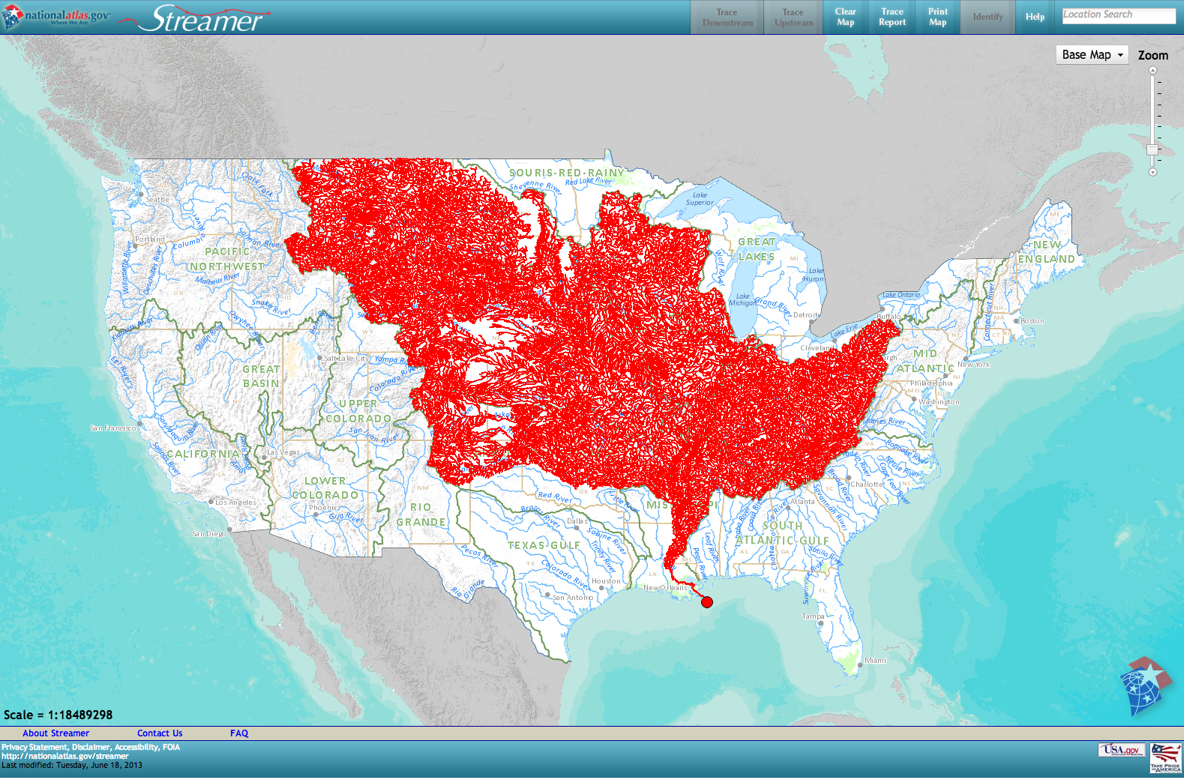
If drawn maps rely on distinguishing lines of property, territoriality, or even shorelines, the overlaps of more interactive web maps provide new strategies to trace the complexity of relations between land and water.  The projection of the network of rivers within the United States Jason Davies mapped above, in the header to this post, creates an entrancing web of the body of rivers less as a network, but a nourishing group of waterways.  The map’s beauty provokes us to rethink relations between land and water.  In rendering rivers, rather than territory, it suggests how a dynamic mapping of layers and overlays from directly and remotely sensed data might lead to a range of new cartographical strategies to chart the increasingly complex relationships between land and water in ways that would be less concerned to abstract the waterways or supplies of water from their surrounding environment, but to integrate water into the landscape and ecosystem which it nourishes–or the ways that the entry of pollutants into that hydrographic network might compromise local ecosystems across the country.

To be sure, the apparently pristine pathways that irrigate a disembodied nation in Davies’ map are not so static as they might seem, but his map calls attention to the need to map this body of waters as a constantly challenging collective that registers its fluidity and the changing nature of its composition:  to be sure, not only are not all waterways on the map, but despite omissions the delineation suggests a delicate ecology increasingly in need of being mapped–and increasingly challenging to be embodied.  It is no coincidence, perhaps, that even as Davies created a utopian image of an unpolluted riverine network, it is in response to the attention that the 1972 Clean Water Act gave to the “national waters” of the country that a clearer mapping of these very waters have been called to attention.  If only to stop the range of legalistic reinterpretations of “national waters,” we face increasing challenges to coherently map rivers in isolation from wide the augmentation of phosphorous and nitrogen in surrounding lands, and difficult to disentangle from numerous questions of irresponsible misuse.  No doubt Davies would admit that his data on rivers are not meant to hide the multiple sources of pollution and human diversion of the nation’s hydrography.  Even in a recent rendering of the National Hydrography Database (NHDPlus v2) by the Pacific Institute estimates the magnitude of river flows across the lower 48, show a gage-adjusted record of flow in cubic feet per second as a quite pristine blue:

Average Anual Flow
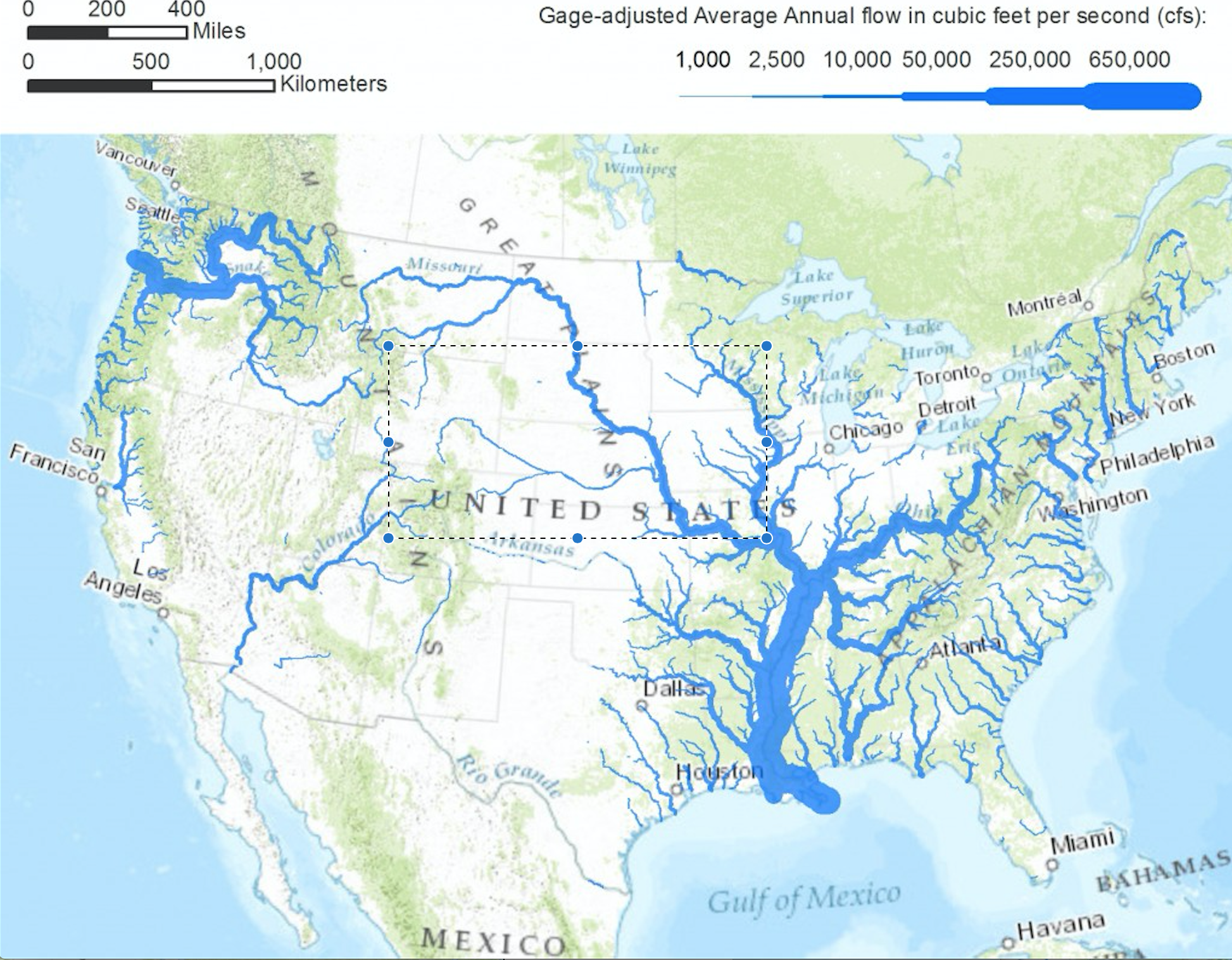
Matt Heberger/Pacific Institute

But the elegance of his hydrographic map, which morphs the fragile constellation of the riverine network of national waters, challenge readers to read the magnitudes of rivers’ flow, but preserves the raster image as an elegantly designed artifact.

It almost provokes us to develop something like a truly comprehensive cartography of the “national waters” the Clean Water Act first addressed in the deep need it isolated to protect the “untrammeled” identity of national parks or woodlands.  Even as we emend the perhaps unnecessarily broad language of “national waters,” which verges on attributing a misleading uniformity to water and to only include those waters that lie on the surface of a land map–and not deep within the ground–it behooves us to work with something like a new map.  To create this map, we must exploit rich data on water diversion and water quality to create a far more dynamic set of models to register the increased impact of pollutants not only on single points of entry into above-ground water, in addition to groundwater, man-made diversion, and return water and run-off into our nation’s rivers and lakes, as we seek to develop not only a better map of water-use but of the risks of polluting significant bodies of drinking water through continued inattentive agricultural policies or policies of drilling.  The attention that a new map could compel to the fragility of the landscape, and perhaps the dynamics of water-use, is particularly relevant.

There is a deep-lying prejudice to registering only above-ground waters as part of nation’s hydrographic network, one that was perpetuated in early terrestrial cartographies, that only viewed the water from the land, and was perpetuated in the USGS surveys that focus on surface water alone.  The disembodied electric blue network in the header to this post almost recalls the fulsome praise that the French Renaissance cartographer Maurice Bouguereau dedicated in his 1594 atlas to the rivers of his native France for providing “water and ornament” to the realm and contributing to its vitality, as if to suggest the pastoral nature of his nation in neoclassical poetry.  Unlike the sinuous rivers which Bouguereau lent prominence as navigable waterways and nourishing streams by the use of his burin, both by straightening their course and increasing their prominence beyond other existing national maps, to create an atlas whose extremely detailed potomography of his whole country wen long unsurpassed, the relation between land and water that includes groundwater reserves, watersheds, and drainage must depart from seeing the hydrographic network from a landlocked point of view.

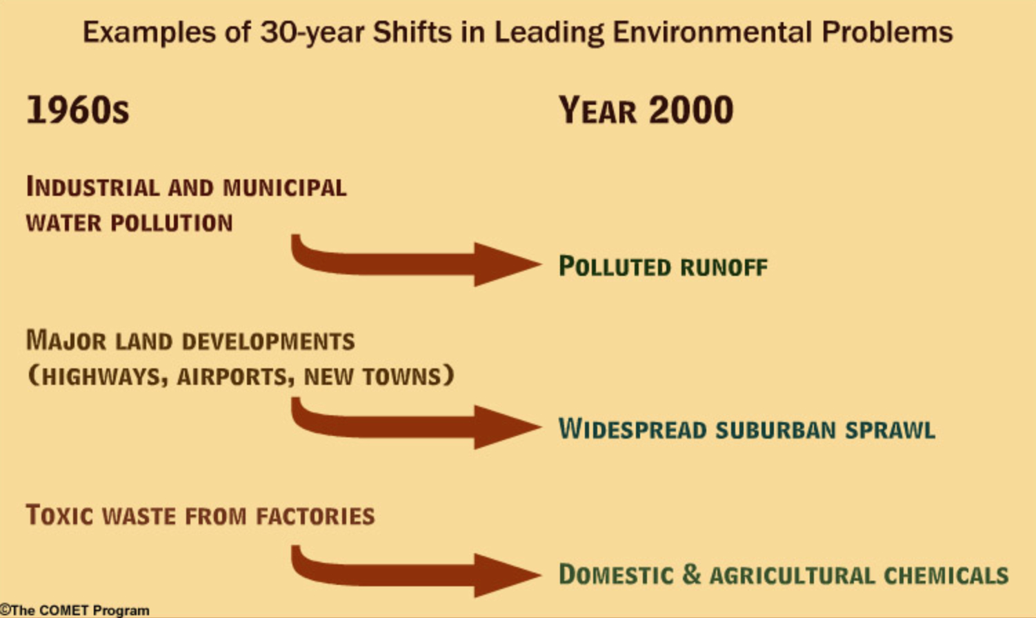
Two huge changes that have occurred in our water system since the framing of the Clean Water Act that suggest the need to reframe its coverage of national waters:  both the increasing scarcity of freshwater that is drinkable, and its decreasing amount, and the need for agrarian efficiency in diverting and recycling water, and a far more complex relation of industry to water supplies.  Whereas most stipulations of the 1972 Clean Water Act were framed from the growing danger of augmenting single-point pollution in the 1960s and 1970s, in continuing to protect the purity of our “national waters,” we are in danger of inadequately mapping rivers only as points of pollutants entry into pathways of national nourishment alone.  Whereas once industrial pollutants were discharged into water, the evolution of agribusinesses and fertilizer spreading means that we far past the era of single-point pollution of the 1970s, when threats of chemical discharge and pollutants were primarily posed by manufacturing industries.  In other words,, relying on a simple map of a system of isolated waterways as pathways open to navigation runs the risk of ignoring the greatest dangers of pollution to waters–from the levels of phosphorous in fertilizers returned to the ocean in agrarian return waters, from the entry of pollutants into diminishing groundwater reserves, or from hydraulic fracking, as well as the diffusion of pollutants into the waters from agricultural return waters.

The early modern hydrographer Bouguereau boasted he crafted an atlas to display a detailed landscape of those waters that the nourished France; we are in need of a suitably dynamic atlas which, beyond extant maps of navigable waterways, orient viewers to waters within a landscape of over-use, poor land management or drought.

French Hydrography from MB

1.  Our network of rivers is less able to be embodied than their ecological equilibria monitored for the entry of pollutants from wastewater, industry, or agricultural run-off, and as subject to diversions.  Dynamic web-based maps can orient us to the causes and effects of water scarcity rarely faced before, to allow us to chart the effects of agriculture and industry on water-use across the country, in order to document and trace the changed character of our national waters–especially in the moisture-challenged West.  We demand dynamic maps of the national waterways in our own age of water scarcity and water diversion that will try to comprehend the increasing likelihood of the absence of drinkable water in several counties of California’s Central Valley–an atlas able to map land from the point of view of its waters, and more dynamically map rivers in relation not only to landscapes but to the available data of water-use.  Indeed, the availability of such dynamic web maps provides an opportunity to synthesize a far greater range of data than Bougereau had at his disposal–he usually traced and synthesized extant maps, increasing the sinuosity or curvature of a river or stream–within a far more subtle range of map signs.

The possible atlas that we might shape of national waterways reveals a shifting relation between water and landscape, in other words, and more accurately map waters in relation to land-use.  Whereas Bouguereau sought to expand the potomography of France beyond the navigability of rivers as a hydrographic network of wealth, recognizing streams, rivers, and lakes as something akin to a national resource, the changing economy of water, a mapping that foregrounds the relative scarcity of water, the fluidity of its presence, and the instability of its purity presents more of a shifting picture of national waters no longer able to be surveyed from fixed or stable shores.  Indeed, any consideration of national waters demands not only the multiple sources of potential impurities but demands to include both the depletion of groundwater reserves as well as wetlands, and the risks of the increased diversion of waterways based on permits issued in times of far greater (relatively speaking) plenitude of water as a commodity.  Rather than focus on the plenitude and abundance of the national waters that Bouguereau took as a synecdoche for national greatness, we must encourage increasingly compelling cartographical strategies to orient the viewer to the character of the national waters in an age of their increasing absence, and meet the challenges of registering how the  diminution and pollution of waters will increase the value of those pure waters that remain.

More dynamic maps of the national waters compellingly engage debates about defining the “national waters” of the United States or that “nexus of waters”–an almost poetic circumlocution whose parsing has become both increasingly crucial and contentious in recent interpretations that revisit the 1972 Clean Water Act.  If the Act’s passage ensured the cleanliness of national waters, what constitute these waters has been increasingly questioned.  Increased parsing of the meaning and subject of “national waters”–distinct from “jurisdictional waters” of legal oversight or “territorial waters” around nations–as comprehending navigable waters and waters having a “significant nexus” to them, while compelling, provide little clear precedent.  For such waters have been left poorly clarified, overly difficult to pin down on maps, and omit groundwater as much as the impact on water-systems of granted water-rights.  Any map of waterways must, in short, recognize that the waters of any land constitute a particularly fluid subject of oversight, including data as well as maps of geographic precision to gain consensus about what the body of “national waters” constitutes.

Do “national waters” refer only to those waters that have direct entrance on navigable bodies of water, or might they indeed exclude those man-made ponds, lakes, or ditches storing agrarian waste draining to rivers, directly or indirectly, as well as the groundwater that is rarely mapped as a body of water per se, and which the CWA does not address?  While court rulings have included playa lakes, intermittent streams, prairie potholes, wetlands and watersheds, the 2006 Supreme Court ruling  Rapanos v. United States defined them as “relatively permanent, standing, or continuously flowing bodies of water ‘forming geographic features,’ that are described in ordinary parlance as ‘streams[,] . . . oceans, rivers, [and] lakes,” thereby reducing the  integrity of the nation’s waters in which the EPA must prevent point and nonpoint pollution sources, as well as providing assistance to publicly owned treatment works for the improvement of wastewater treatment.

An elegant image of our nation’s riverine paths was created by CartoDB’s senior data scientist, Andrew X. Hill, that reveals the problem and potential of maps to render the flow of water around the topographically quite variable surface of the lower forty-eight, by rendering their directionality of their flow in different shades:


rivers and directional flowAndrew X. Hill/CartoDB

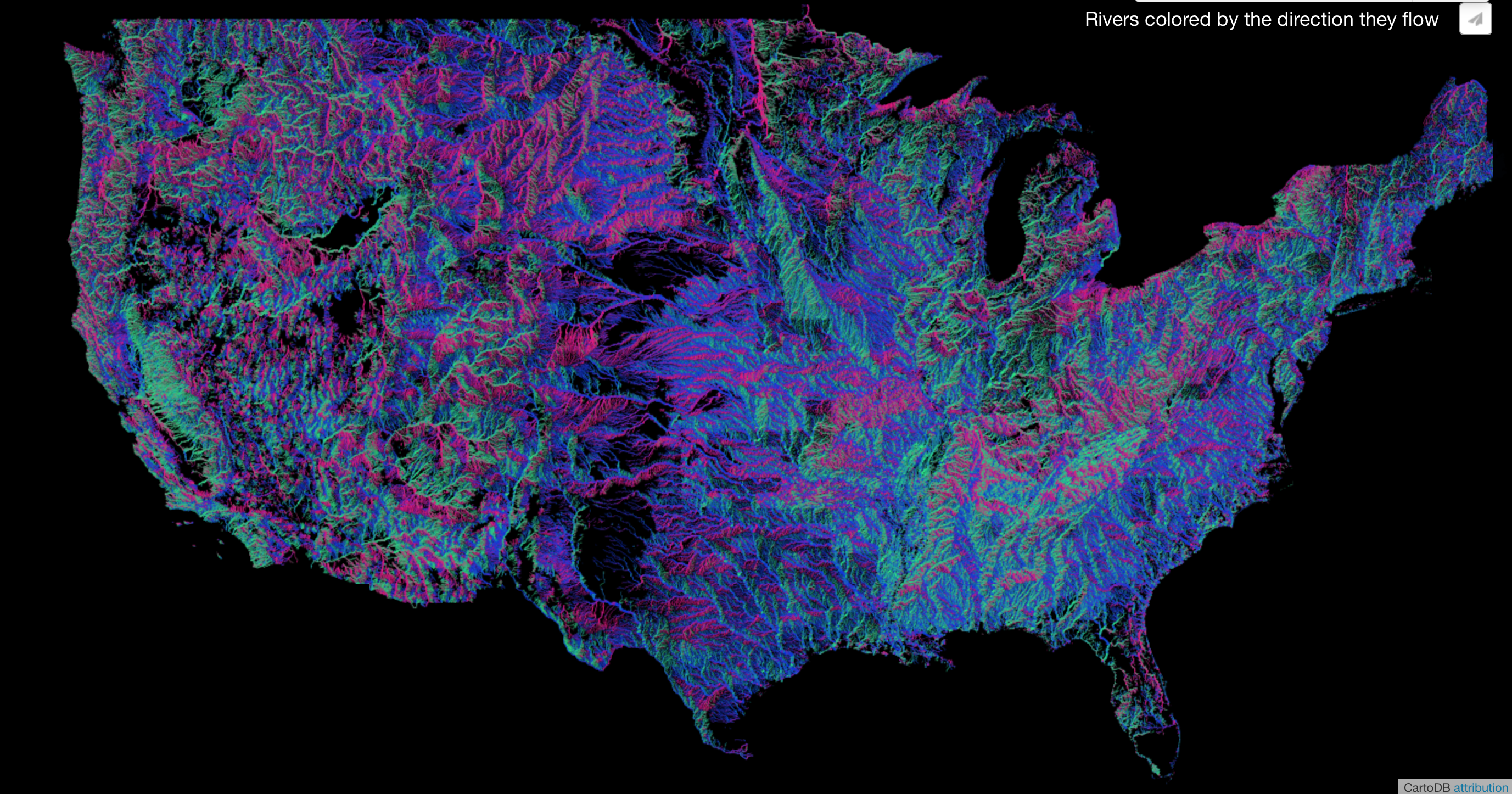
The color-coding of rivers by directionality in a postGIS platform creates a tacit appreciation of the relief of the country, in ways that would make the tracking of the possible dangers of pollutants even more concrete.

1.  In a recent response to a ruling advancing a rather restrictive notion of discharges to “navigable waters” not including wetlands, the ruling limited the authority of the Army Corps of Engineers over the “national waters” by excluding waters not directly connected to navigable waters from their jurisdiction in the CWA.  Despite the appeal of the above delineated blue network of rivers as a fragile lattice of nourishment, the complexity of defining the “national waters” suggests the deep fragility of the network of waterways, flowing, standing, or somewhere in between when it is determined only by a continuous surface water connection to permanent waterbodies, so difficult is it to determine where one waterbody ends and the wetland begins.  While maps suggest one objective image of that jurisdiction–an appealing one, to judge by the image in this post’s header–the complexity of judging sources of pollution that are less likely to be less from point-source pollution to broadly dispersed pollutants in an agricultural or industrial region suggests that the entry of pollutants into a network of water is a less compelling model of regulation than when the CWA was framed.

The difficulty of managing the continued purity of the “national waters” led to a non-majority decision excluding wetlands from the “national waters” by the Supreme Court.  But the 4-4-1 decision gave ground to Justice Kennedy’s criteria of attention due to any “significant nexus” of waters that affects the physical, biological or chemical integrity of downstream navigable waters that has become something of a legal precedent.  The pragmatism of Kennedy’s elegant locution still challenges the application in maps, however, as it leaves the issue of “significance” not only open to interpretation but in need of clarification since it is difficult to consider consensus-based.  Data maps offer a basis to construe the nature of Justice Kennedy’s “significant nexus” of waters that embodies their flow.  But the challenge of focussing on a “significant nexus” as worthy of attention, as in recent years the points of entry of different sources of pollutants is often distributed widespread across a region–rather than likely to enter the waterways at one point of entrance–in ways that challenge the supervision of local pollutants.  A word map may actually provide a better form of orientation, here, than a point that posits single-point pollution, so multiple are current risks to water purity.

contamination

The locution of defining a “significant nexus” might be best understood through the potential damages that pollutants or construction might incur, in other words, rather than through the attempt to defining those geographic features that make them worthy of attention.  Unlike paper maps, or static maps, dynamic web maps can uniquely chart the fragility of the fluid nature of water-flow and water-use, expanding importantly on the “geographic features” aspect of the 2006 decision and better serve to express one’s relation to the blue expanse of water that the conventions of paper maps–which lack the signs or conventions to describe the variations and variability of water quality, pollution, or diversion and color all water a uniform light blue–may lack.  Of particular significance here is the gauging the continued permitting of point sources of pollution, parsing a “significant nexus,” and in muddying the relations of groundwater to national waterways.

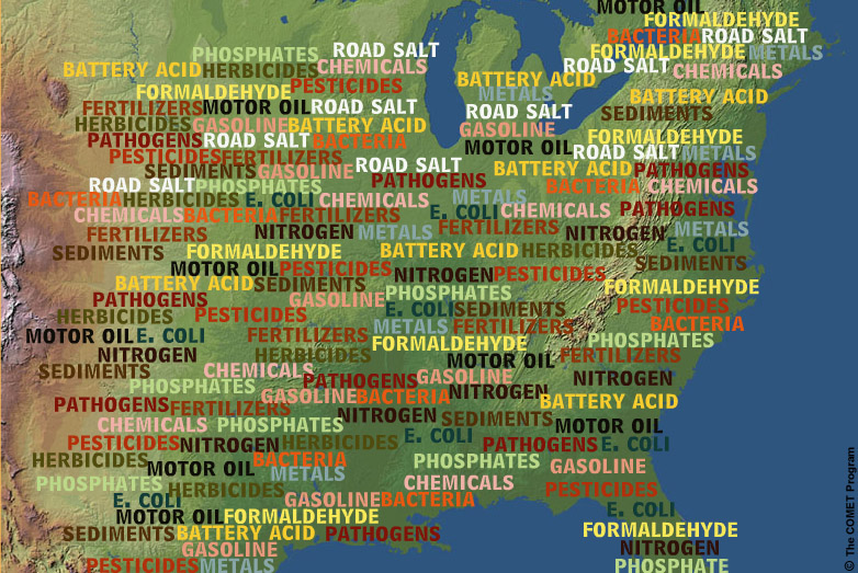
More recent maps made by the USGS of watersheds that contained “impaired waters” in the United States–water bodies containing excess sediment, nitrogen, phosphorous, or pathogenic organisms–chart the extent of water-quality standards across the country.

epamap

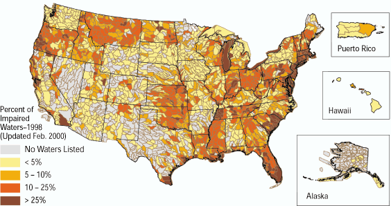
Environmental Protection Agency (1998)

For the continued intersection of point sources with the entry of pollutants, while monitored officially by the Environmental Protection Agency (EPA) and falling in their purview, demand to be linked more clearly to the broader project of ensuring the chemical, physical, and biological integrity of the nation’s waters by preventing point and non-point pollution sources and improving wastewater treatment plants.  (Debate about the definition by which the breadth or size of streams included in the national waters suggests it is a subject of ongoing debate.)   By mapping measurements of the local contamination from industrial, agricultural, animal feedlots, and municipal governments–including the now-exempt agrarian irrigation return flows that carry fertilizer, salinity, and Nitrogen contents into waterways–web-based maps could offer, more than a static map, a necessary layer on which the new nature of the our national waters could be read in ways that might better register threats of environmental pollutants, according to the Comet Program.

Point source to non-point source pollutants


Even a static map might set a basis to imagine the data such a web map might include:


Discharged Toxins in RiversMother Jones (uncredited map)

2.  More dynamic maps might effectively both resolve questions over not only what constitute national water systems but how we might best act to protect those waters.  Such maps might help determine whether the riverine network of national waters extends to artificial ponds, lakes, or ditches that are often repositories of agrarian waste, or the relation between groundwater and the national waters–a significant question in parts of the drying-up West, where low groundwater supplies have not hampered pumping or the concession of often-wasteful water rights.  Web maps offer forms to help embody the shifting and fragmented constellation that make up our “national waters” beyond “geographic features” which are often designed to map land, rather than water–and web-based maps can chart how they have changed and will change over time.  For the need to provide a more dynamic ways to embody the “national waters”–encompassing water waste, agrarian return flows into streams and rivers, levels of pollutants, and groundwater levels–offer a sufficiently dynamic picture of an ecology of water that is in the process of change and fluid.  Although we can continue to map a disembodied riverine network, we can only embody the fluid spaces of our national waters through the continued challenges that they are poised to face, best understood as the end-product of a shifting relation to waterbodies and waterways, and not a pristine image of nourishing a Virgin Land.  The complex permits allowing water use and diversion paint a picture that is even then difficult to synthesize or comprehend.

Debates over interpreting and defining “national waters” have provoked an uncomfortable plurality of glosses not likely to be resolved in a static map.  But a web map can best orient viewers to those waters subject to government oversight, and new hydrographic maps of the United States have tried to respond to doubts raised about what exactly “national waters” include, and what sorts of waters they include.  Debate about the parameters of “national waters” is intense because it delimits what areas mandated by the 1972 Clean Water Act to be kept free of pollutants and preserved in their integrity–and to what extent the Act is an optative or enforceable model.  If the intent of the law has been interpreted as only limited to navigable bodies of water, the potential exclusion of streams, tributaries, ditches, headwaters and agrarian return flows have called into question what the body of national waters is in ways that web maps offer opportunities to measure water-use, gauge water diversion, and embody the environmental effects of water waste and of pollutants.  As much as to celebrate the aesthetic idealization of a virgin land and promise of agricultural abundance, more dynamic web maps offer something stronger than a cautionary note of how water levels and quality offer a more adequate and reliable map of how waters are adversely impacted by land use.

The evolution of mapping tools give a basis to parse whether “national waters” constitute every body of water in the country–and to distinguish what bodies of water that merit inclusion within that once self-evident but now benighted category.  The ways that maps can most dynamically render the inter-relation between water bodies to offer a more compelling picture of the effects of water management and use in an era of water’s lack?   Such a map of water management and use may most effectively and persuasively compel us to better refine how we define a legal relation to our national bodies of water:  does the below map indeed offer a comprehensive picture of the future network of our national waters?

Tile Vector map of Unfair INsularity

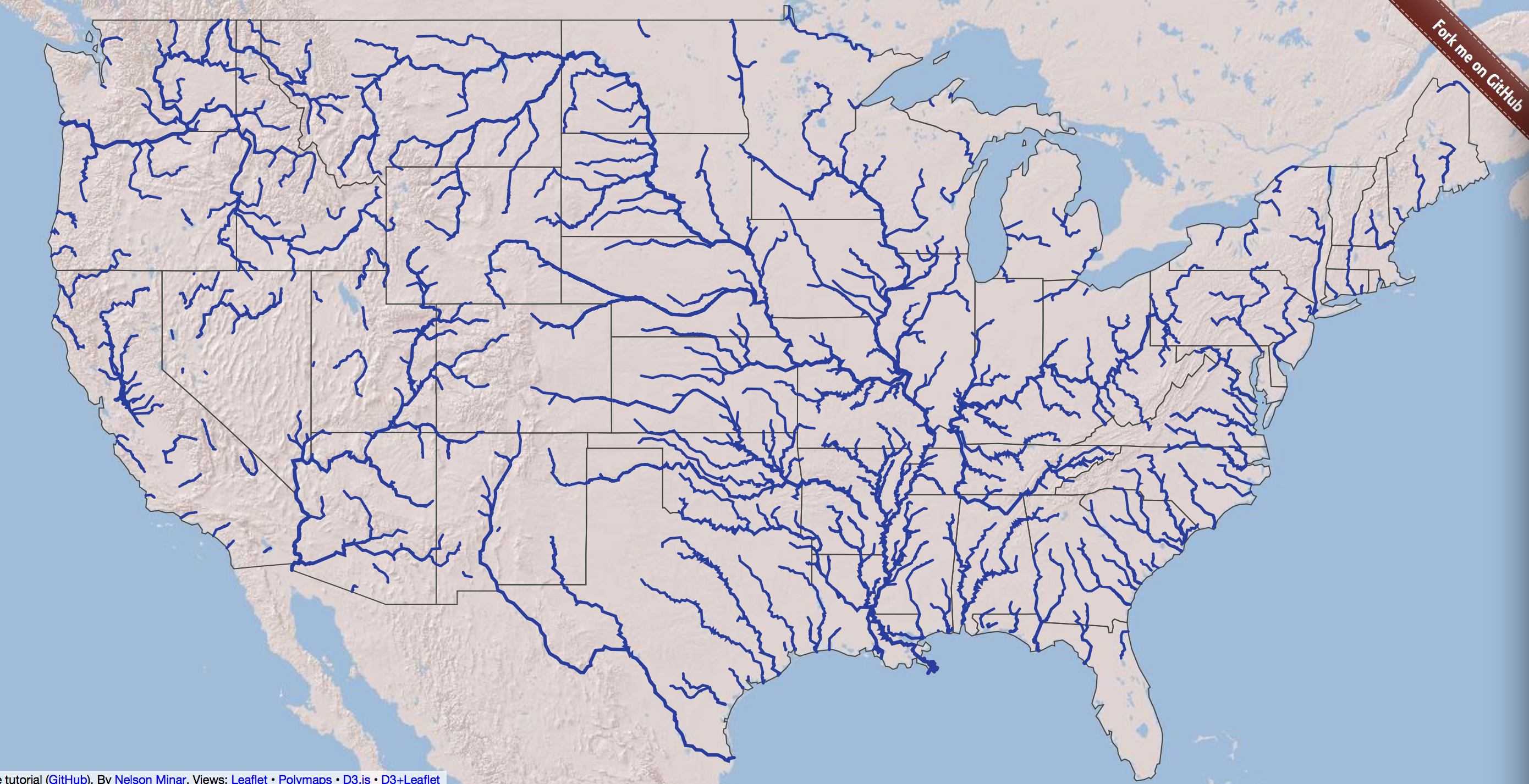
All of these rivers might be considered “waters,” given the deep ecologically interconnected natures of their paths; the aesthetics of the digitized projection in the header to this post, designed by Davies based on data from Michael Bostock, below, offers a landless image of a well-nourished land, irrigated by natural tributary networks discounting canals, man-made ditches, or man-altered ditches. stands as an eloquent response to the difficulty that the definition of national waters has come to face.   Debates over the real jurisdiction of these waters–and their relation to property claims or industrial use–threatens to encourage something more like despair than idealization of the celebration of riverine nourishment one feels after seeing Davies’ map of a water rich continent.  Can we better define who has rights to use their waters, or to what event they can pollute their flow, so that their tributary networks don’t exclude canals, streams, or man-made ditches?

The multiple and different claims of water-use have resulted in something of a legal quagmire of defining the “national waters” across the apparently pristine fluvial system that is embodied below:  “national waters” are more narrow than “jurisdictional waters” and clearly lie within the territorial confines of the country.  Yet the range of legally sanctioned uses of groundwater and rivers relies on claims of property ownership and industrial uses difficult to simply follow a paper map.  It is far easier to idealize the riverine network than draft maps to define “reasonable use” of groundwater or reasonable standards of cleanliness–or what makes up a rationale for the appropriation and diversion of waterways within “reasonable use.”  The pressing need to map more effectively groundwater use, overdraft, or pollutants returned to waterways is compelling, and the objective image isolating a nation that is irrigated by natural tributary networks and unmapped watersheds suggests an inadequate basis to register the complex relation of water to land pollutants and to the land, accentuated by their lack of attention to actual levels of regional groundwater reserves.
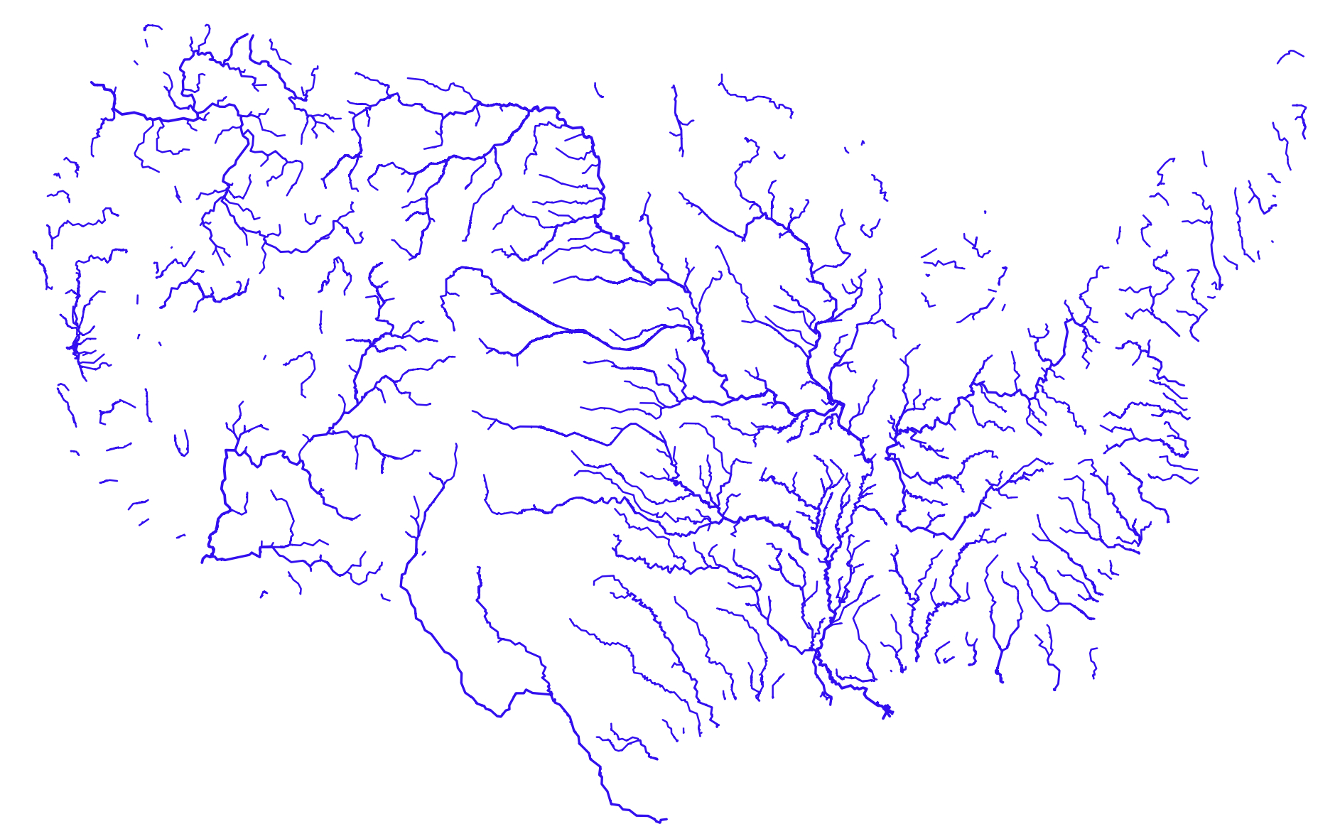
River Map of US--Bostockian, by Jason Davies

Jason Davies

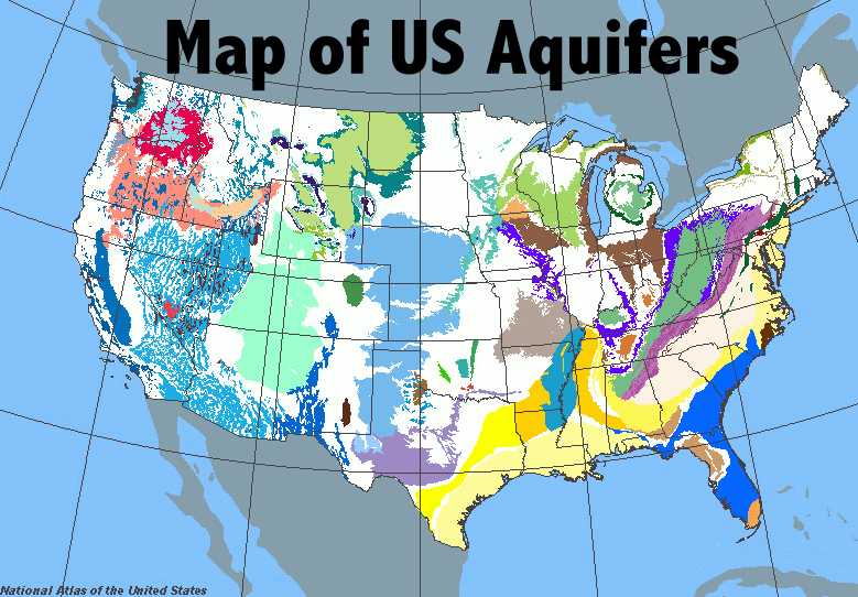
The lattice-like web of bright blue riverine pathways reveals a visually compelling icon of agrarian fertility by mapping the “blue streets” that run across America.  As in any map, questions arise for cartographers of what is a river:  the Russian River is left out as a water source in California, and regional rivers in Mendocino like the Noyo or Little River seem compressed to one.  Does the map imply categories of what bodies of running water it recognizes as a river?  Such questions are of import to designing maps of national waters for the EPA, which is directly concerned with addressing the nature of the pollution of “national water” or an adjacent “nexus of waters” which the Clean Water Act has been interpreted as addressing.   The notion of an objective system of rivers seems less crucial, especially in water-challenged areas, as defining the potential entry points of pollutants or as posing the question of water bodies whose purity from pollutants demands comprehensive oversight–on account of the multiple and actually undefinable points of entrance of pollutants that such a map either glosses over or omits:  indeed, it might make more sense to spend less attention on discrete rivers than a map of the nation’s groundwater aquifers–the best template on which to judge the relative pollution of national waters and especially of drinking water, yet which the national hydrographic maps do not take into account.  Indeed, the map is only based on the best data on which it is based.  The map of riverine courses offers a form of way-finding, but not for adequate water-management.

groundwater3Mission 2012; www-atlas.usgs.gov

The issue of mapping and remapping the national waters is a major enterprise for the Environmental Protection Agency, working often in concert with the USGS.

The Environmental Protection Agency has indeed taken some heat for detailing its own maps of the waters and wetlands of each of the 50 U.S. states, defining in the last year a National Hydrographic Dataset that embraces the varied types of waters in the country, from streams and water bodies (lakes, ponds, etc.) to “adjacent waters”–in short, “the waters” of the United States themselves that the Clean Water Act’s authors concerned and addressed–in a massive act of constitutional clarification to define the limits of pollutants and maintain the integrity of the aforesaid waters in perpetuity.  Rather than only address waters that were navigable, or the question of what the traditional understanding of navigable waters is, the agency sought clarification on what such waters were outside the broader rubric of territorial seas to clarify the purview of the wages over which they have jurisdiction–and debates about whether to preserve the exempt status of waste treatment centers or converted cropland from the body of “waters of the United States.”

The resulting clarification of national hydrography traced in “Streams and Waterbodies” tried to set a standard nut was quickly feared as a posturing to seek control over private lands, but constitutes an early attempt to fashion a standard to differentiate surface water features across the United States.


Streams and Waterbodies

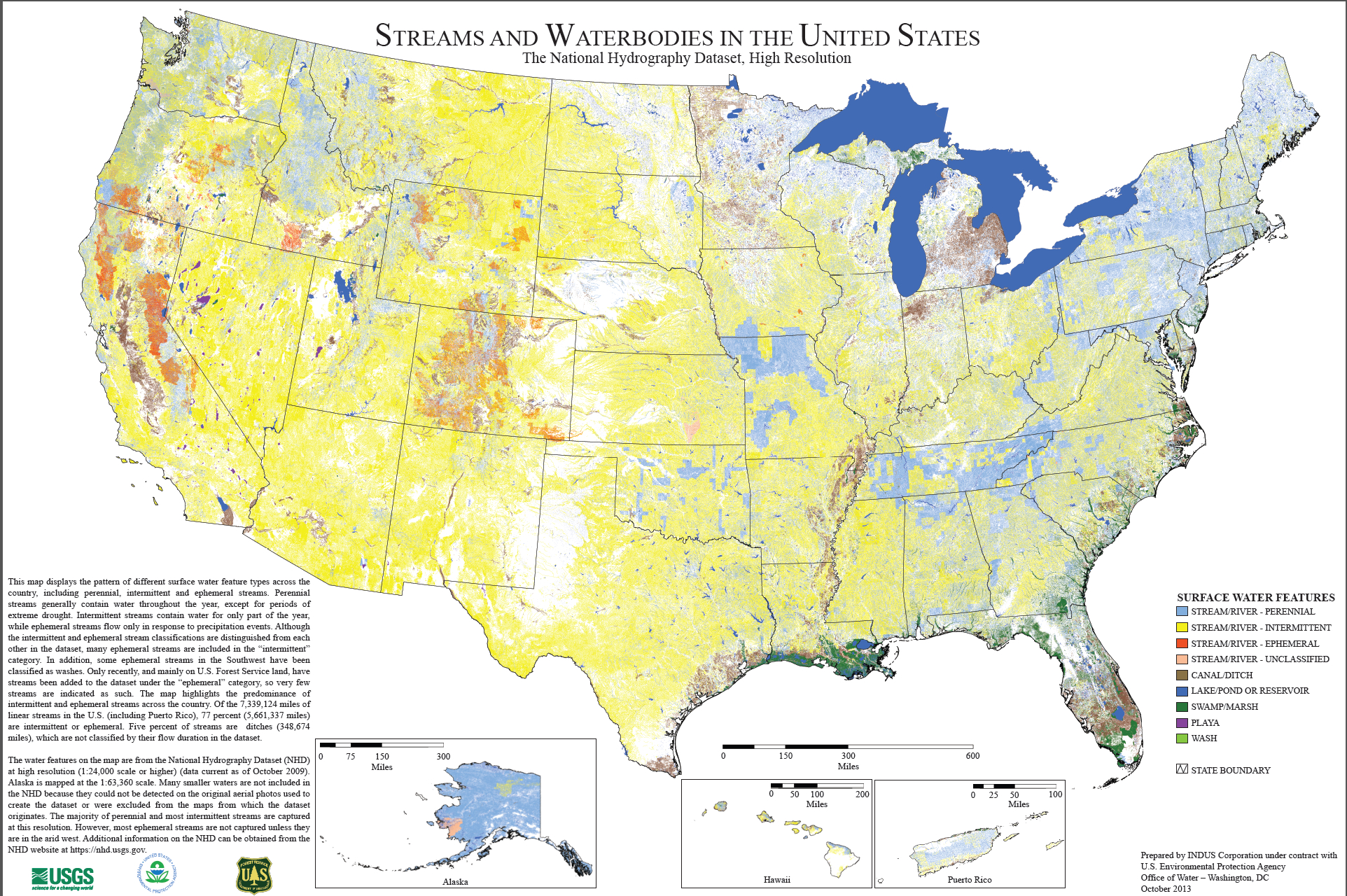
The remapping of these water bodies–surface water features that cast as comprehending stream water, perennial, intermittent, ephemeral, or unclassified, canals, lakes, ponds, reservoirs, playa or just “wash,” so as to comprehend them all, manmade and “natural,” within the scope of the standards for pollution that are applied to the national waters.

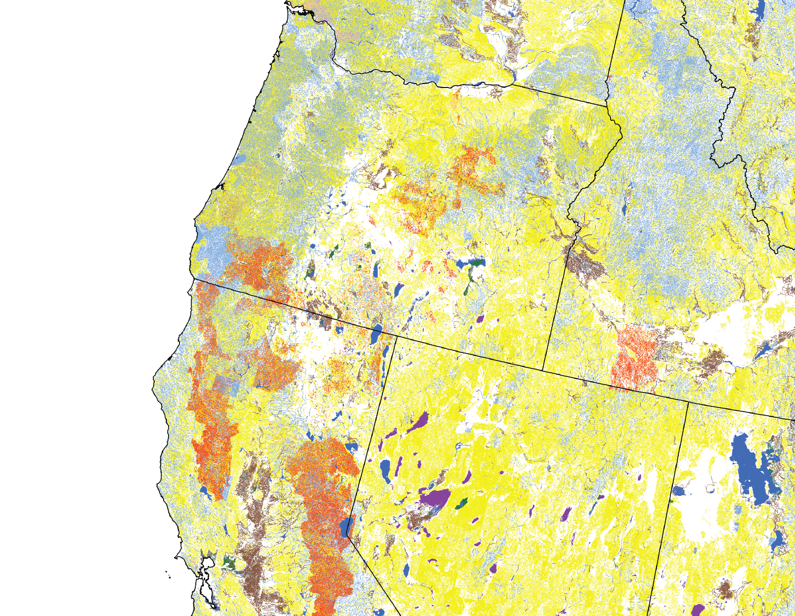
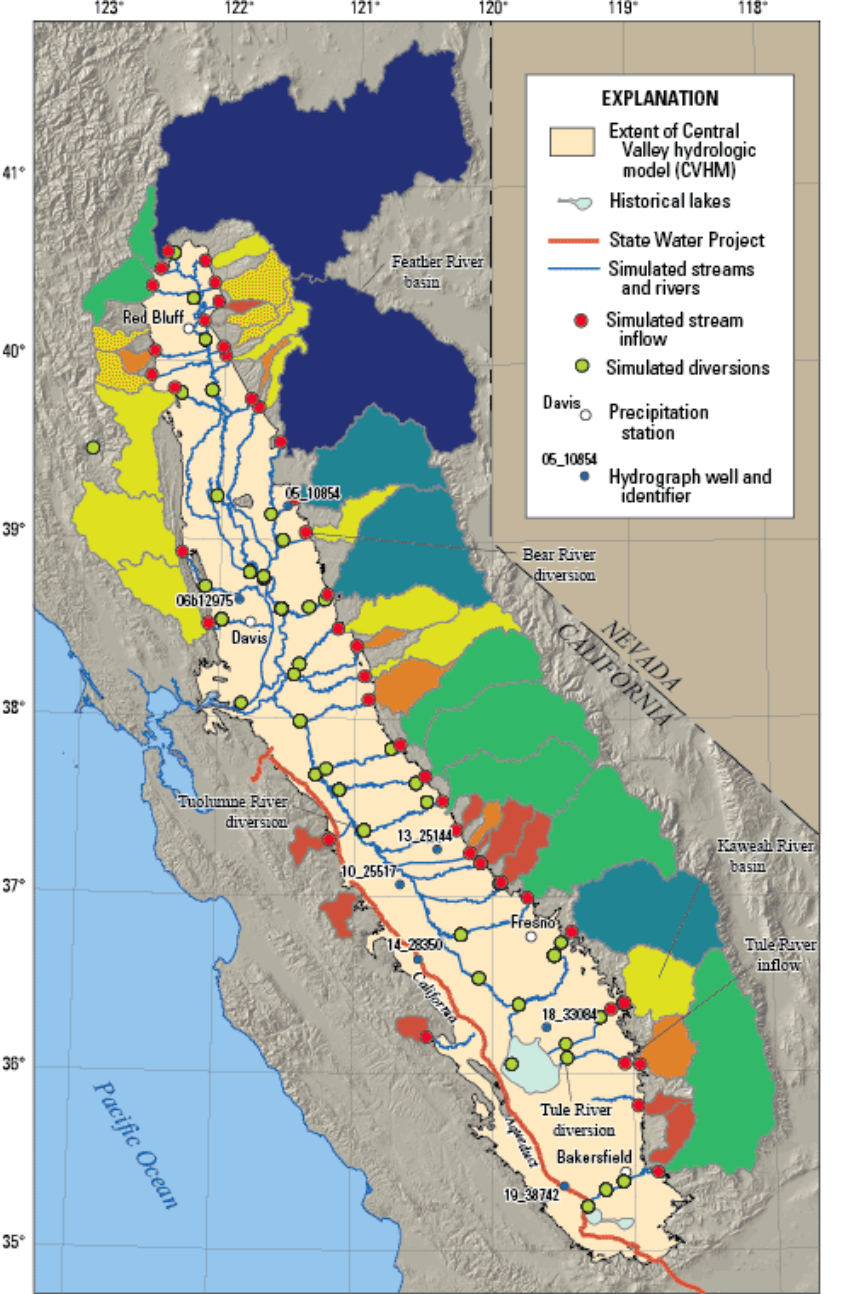
They range in complexity even in the Bay Area alone, viewed thanks to the considerable scale of the USGS projection, is dauntingly comprehensive, at the impressively discriminating scale of 1:63,360:


Bay Area Water Types

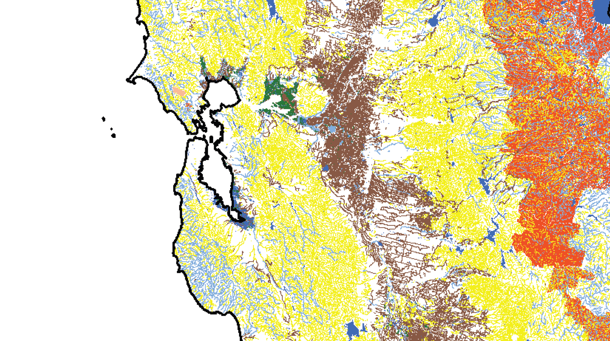
In a larger section of the complete map, if its shades of granularity in this intensively farmed area comprehending the Central Valley and High Sierra are less clear, the complexity of what it means to be water in the United States are tantalizingly evident.


Norhtern California

The fragility of this network of waterways has begun to be measured and mapped by public interest nonprofits whose web maps effectively distinguish the claims, ownership, or rights of water use across the country, and indeed suggest some of the standards for mapping local pollutants. Interactive web-based maps offer  interactive tools to track both rights and relation of industries to bodies of water with a level of detail never possible, directing a new level of attention and access to relations between water-use and industry by remapping the context of riverine waters in the United States to illuminate levels of chemical pollution.

The access that they offer to the landscape, and a range of stories that they both tell about it and invite viewer to zoom in to better examine at the same time as our access to a precious common need like water is increasingly challenged due to environmental change.  Maps cannot freeze or forestall changes, but offer versatile tools to track the effects that agricultural or industrial claims make upon our national waterways.   For while we are used to the legal fictions that dominate much of corporate life in contemporary America–yes, of course Amazon exists as a corporation only in Seattle, where it operates from its sole warehouse, and from which it sub-contracts to many nondescript warehouses, just as many companies base headquarters or P.O. Box offshore in the Cayman islands or elsewhere, to subvert national tax codes; Richard Branson lives on a Caribbean island Necker which he bought in 1979, purely for health reasons, we accept grudgingly, rather than to avoid paying taxes on his business empire or personal wealth of £3 billion, moving to the British Virgin Islands where tax on income is nil, even if he incorporated the British flag into his corporate logo.  He is as a result required only to pay taxes on UK income; what constitute personal earnings outside of Britain are exempt.  Similarly, the owner of airbnb himself resides at no actual address but instead regularly travels.  But one ascends new heights of legalistic terms and legal fictions to parse the undefined category of “national waters” as verbal geography in which man-made sites are absent–the prospect of such reprising is especially perilous, given that water is hardly fixed in any given location–in the manner of a town or city–and by nature circulates in space, or might reasonably be polluted at multiple points independent from its status, and such pollutants will be always carried down water.

3.  The compelling interest to discriminate varieties of water usage within a map by distinct coloration demands new inventiveness to use maps as machine to think about terrestrial and territorial space, and remap inhabited lands from the point of view of water-use.  The need for the above maps lie in creating a  precedent to track water bodies themselves not distinguished on a map–where all share the colors light blue without much variation or discrimination.  Pinning down both water usage and “water rights” on a map has been a sort of fiction which American law has long engaged, often without employing clear map signs; one result is the difficulty of using map-colors or conventions to map the effects of declines in groundwater levels or overdraft, groundwater management, squander of water, groundwater contamination, polluted agricultural return water and the effects of existing water rights on ecosystems.  Such changes in water use are especially difficult to map given its fluid nature.  But one can start to scrutinize these questions carefully through a map of granted water rights, which grant “permission to withdraw water from a river, stream, or ground water source for a ‘reasonable’ and ‘beneficial’ use” of the 250 million acre feet of water in California.

The historical concession of “water rights” within the state of California are particularly complex, tied to local agrarian industry and the water-sources and the precedent of staking claims to water rights in the Gold Rush, and rarely construed from the point of view of the best provision of future water needs.  Despite the standing rejection back in 1903 that stripped Californians of Anglo-Saxon rights of possessing waters on wells dug on lands that whose deed they own, and a consequent prohibition on unregulated pumping on any tract of land, it is striking that given the endemic scarcity of water in the state, as of now no regulations on the book prevent pumping water or diverting rivers to protect the integrity of the “national waters” from poor water-management.  The restriction on well-digging did not seem to include prevalent practices of groundwater pumping.  California has been the only state not to restrict pumping, even as the depletion of aquifers only recently compelled the state to review this all too laissez faire policy in use.

Indeed, the absolute lack of regulation on groundwater extraction that has historically encouraged California farms has created large loopholes and exceptions for the Water Resources Control Board.  The inadequate regulation of groundwater–regulations that are “sorely needed,” according to Graham Fogg a groundwater expert at UC Davis–and its waste has led directly to the eventuality of the current “chronic lowering” of aquifer levels, and created collapses of overlying lands, and increased subsidence after heavy pumping of groundwater has significantly lowered the ground level.  Even as 80% of the state lands in California has been classified as being in the highest category of drought–and reservoirs like the Almaden in San Jose virtually dry, reduced to trickles–debate on regulating water-pumping have only recently begun with the requisite seriousness.


California Reservoirs

Current legal entitlements permit diversion of water from their source allegedly to serve the public interest.  But do these entitlements constitute the best use of our national waters?  These entitlements include, unlike most of the United States, jointly by the claims of property holders for water passing their lands by riparian rights, not requiring government approval , and appropriative rights of staking claims by posting public notice, now prevalent in agricultural uses of water as well as private land ownership. The web of water use has been greatly beneficial to agriculture, but raises questions not only of the diversion of water or groundwater extraction, but of the considerable pollution agricultural return waters.  The complex web of water usage requires all uses to be “reasonable and beneficial,” but creates difficulties of affirming that a given nexus of water would fall under EPA jurisdiction, and how the multiple claims brought for the water forms a considerable challenge for the EPA to monitor effectively in ensuring their continued cleanliness or lack of significant biological or chemical pollution.  The role or status of waters that did not have a “significant nexus” to other territorial waters as lying within the “water of the United States,” and as outside the purview of the CWA.  Sanctioned access to waters as defined by existing water rights constitute something of an exception to maintaining the “chemical, physical, and biological integrity” of the “national waters of the United States,” in a patchwork of promised water rights that fragment how we understand their integrity.  Indeed, the recognition of the need to accommodate claims of owners of properties next to water while ensuring that the diversion or appropriation of water matches “reasonable and beneficial” use.

The web of different varieties of water usage in California alone is worthy of attention both because of the shortages of water that threaten the state’s economy and the variety of legal rights to water-use that the state sanctions.  Different water rights create a complex quilt of recognized access to bodies of water that suggest just how complex overseeing or managing agrarian or industrial water usage is, let alone mapping its use.  Yet increased stressors on state groundwater in California and environmental challenges to such precious resources, when combined with challenges of global warming, compel the need for increased attention to developing strategies of mapping water and water use to speak back to industry and agribusiness.  The recent revelation of permits for oil-drilling and discharge of waste into California aquifers, issued after the 1974 federal Safe Drinking Water Act set standards for clean public drinking water for all Americans, suggesting that the contamination of aquifers were at risk at some 2,553 injection wells across he state, suggests an even more troubling issue of poor and inadequate oversight within the state.  Later revelations that some 3 billion gallons of wastewater from fracking in California was illegally injected into central California drinking-water and irrigation aquifers has compelled the Environmental Protection Agency ordered a review of the waste water sites that were shut down in July 2014, when the presence of toxic fluid in the waters, including carcinogens like arsenic, thallium and nitrates, led to Health Violations to be issued by the Central Valley Regional Board.  The sustained risks that such groundwater has long faced have only come to light, it seems, in a period of risk of severe drought.

Despite recent challenges of the pollutants that enter through the exemption of waters flowing from irrigated agriculture across the state, irrigation return flows include not only selenium and sodium-rich minerals harmful to animal environments, and populations, but agricultural drainage water and return flow above and below the ground that include pollutants which can affect drinking water quality, while not constituting a discharge of “point source” pollutants that the wording of the Clean Water Act pointedly prohibits as including “any discernible, confined and discrete conveyance, including but not limited to any pipe, ditch, channel, tunnel, conduit . . .”   Notwithstanding the clear attempt at comprehensive language in CWA section 301(a), its framers did not address discharges of pollutants into wetlands or wildlife areas in return flows from agricultural irrigation–although such return flows involve pumping polluted waters in untreated irrigation return flows, often collected in culverts, channels, and ponds and then discharged.  Both salinity accumulations and nitrate contamination from fertilizer pose threats to drinking water in California in cities like Davis and Fresno, whose groundwater supplies are threatened by the presence of salts, often result of treated wastewater, and of high quantities of nitrate discharge. Such measurements provide  basis for gauging and limiting water rights, no doubt, in such moisture-challenged regions of the state.

Notwithstanding knowledge of water rights, can we start to map more responsibly the effect of agricultural return flows, both on the state’s water supplies as well as widespread stock watering (dedicating waters to livestock) across the state?  Does the stewardship of “national waters” not extend to the control over the diversion of waters for agricultural needs in much of the Sacramento and Central Valleys, and their potential effects on the land as they re-enter the water systems shown below, often increasing its salinity?


California Water Map

California Water Rights LegendCalifornia Water Atlas


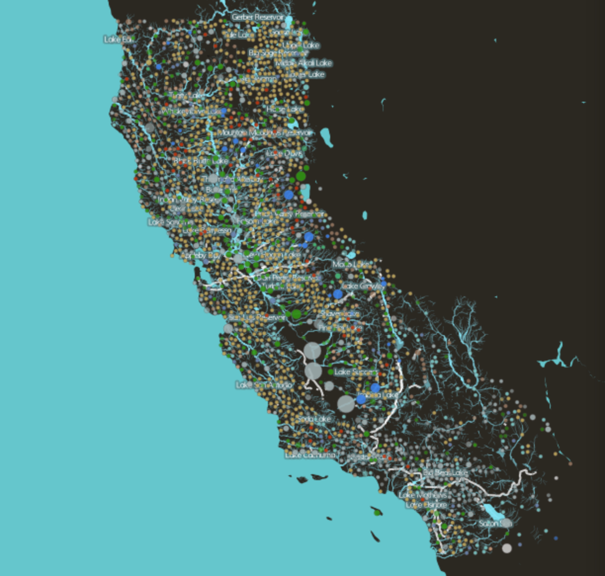
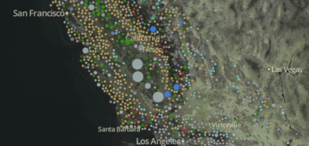
The above data for the California Water Atlas, based on face amounts collected by California’s  State Water Resource Control Board together with measurements of daily stream gauge values by the United States Geographical Society, can be examined at the recent clickable webmap at California Water Rights:  the detailed synthesis provides the most comprehensive picture of water usages and availability–an especially useful map when the scarcity of water and conservation needs must be better tracked and understood.

The arrogation of claims proves even more difficult to “map” with comprehensive clarity, combining coverage by private ownership and water-use rights, difficult to join to the “waters of the United States,” given the reluctance of encompassing varied water-usages or of tracing water rights that have been granted along riverine web within a single regulatory system.  If the mapping of a distinct topography seems a gambit to “freeze” the image of national waters, at a time when increased drought challenged their availability for the future, the claims for water usage constitutes layers of different water usage that is necessary to be read with considerable care.


California Water Rights

Simulated Streams

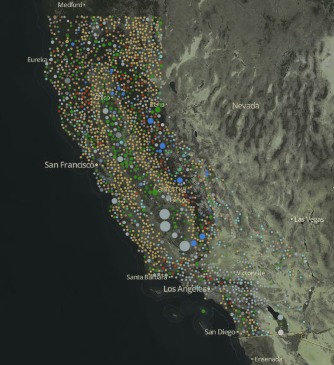
The colorful dots gauge the wide range of reasons recognized for the diversion of water across the state, and claims for water usage along the rivers’ paths.  It’s difficult to process the plurality of rights in anything like a single comprehensive image given the range of water rights staked around the rivers running into northern California’s San Francisco Bay or from the High Sierra, or the loss of massive amounts of water diverted to irrigate the central valley; the complex mosaic of artificial canals and reservoir or diversions against the natural paths and bodies of waters suggests a wide aggregation of claims to water codified over time, whose complex map remains sadly unknown to most even in an era of state-wide drought:


W Rights in Efflux of water in Bay Area

California Water Rights LegendCalifornia Water Atlas

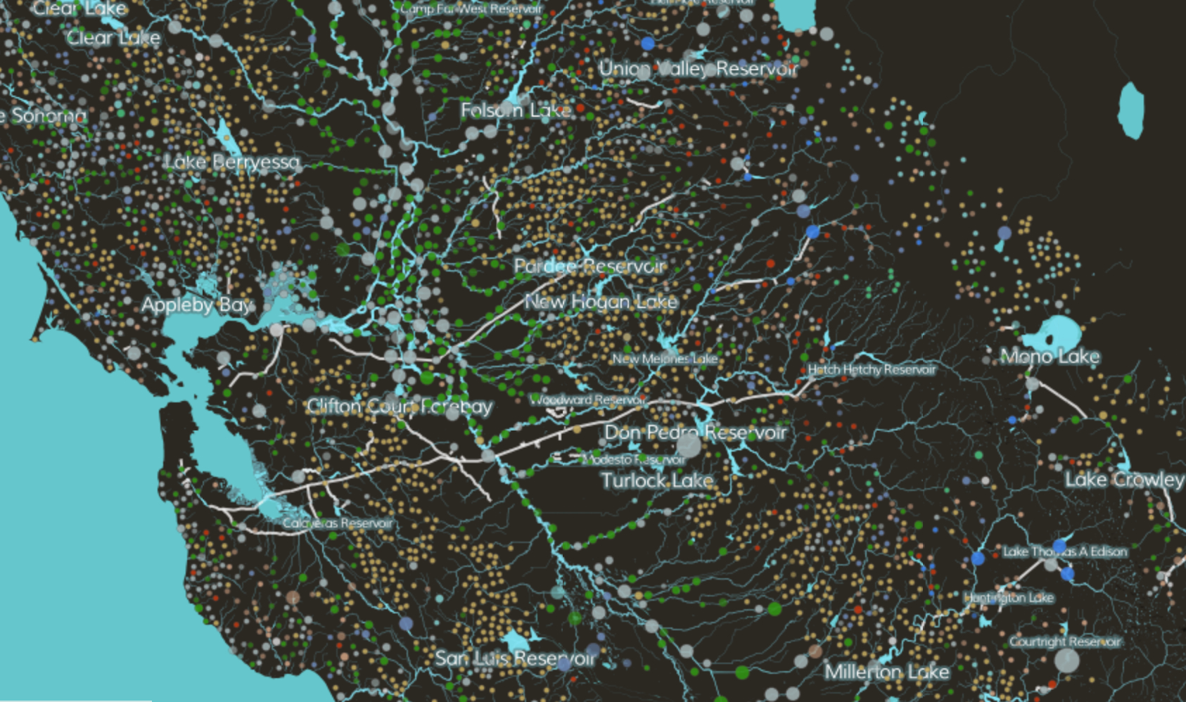
The veritable mosaic of distinct claims for water-rights inland of the Bay Area show a complex adjudication of water-rights around the rivers that run into the San Francisco Bay.  Their mapping maps the region’s settlement against its rivers, revealing a hidden economy of water usage that has accreted over the last century and a half, and suggesting the largest sites for the diversion of waters along a dense riverine web:

Water Use Mosaic outside East BayCalifornia Water Atlas


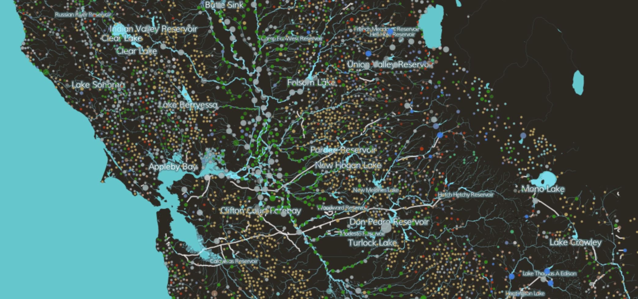
The crazy quilt of water-rights claimed for stock watering in the Central Valley include licensing for irrigation, fire protection, fish culture or recreational needs, as well as domestic use, begin to trace the complex variety of water use–some rights are merely “claimed” or “cancelled” no doubt made on largely local decisions, without an overall picture existing of water usage across the state–as well as several revoked water claims.  Sort of a negative map of areas of dense settlement–San Francisco is itself entirely black, since it also lacks any above ground water-source, whereas the dense outflow of water along the Central Valley and through Sonoma County meets agricultural uses.

But the agrarian regions of the state are distinguished by a broad belt of a variety of water claims.  Better monitoring of agricultural return flows in tandem  with groundwater supplies could offer the sort of necessary synthetic image of water usage that would effectively benefit the state not only as it faces an era of increasing stresses brought by drought.  Indeed, monitoring return flow from agricultural regions could direct more attention to levels of nitrate contamination from agricultural fertilizers that returns to the drinking water–which , especially as decreased steam flows have effectively decreased the amount of groundwater supplies, are increasingly salient.


Central Valley

Simulated Streams

Hydrologic Watershed


Particularly significant to this post are the multiple exemptions from the EPA’s regulation or from the regulation of the Army Corps of Engineers, the body designated with the waters’ protection by the CWA.  Indeed, they afford a somewhat terrifying loophole to original intent of the law in how we understand the need to construe their cleanliness and proscribed limits on pollutants that enter their waters.  For how can we limit the waters of farmland from the mandate to maintain the “chemical, physical, and biological integrity of the nation’s waters,” at the same time as we try to keep the riparian network clean, and recognize existing industrial uses of water as not, in fact, able to be controlled, and presuming that they do not create disturbances to that integrity that we continue to oversee?  Indeed, while groundwater use in California was approached with a misguided belief in its continued presence, while the pumping of water has drained riparian ecosystems and reduced surface supplies, agrarian discharge has effectively more highly polluted a diminishing amount of water.

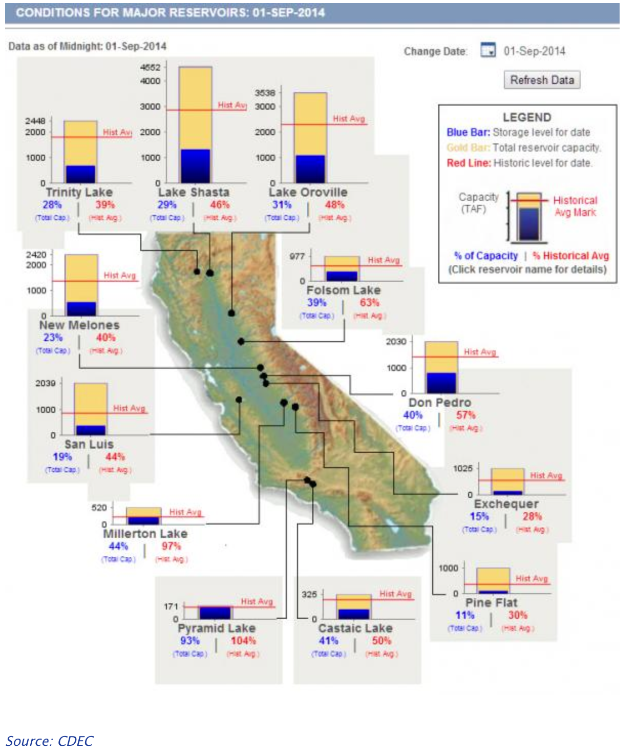
All of which reminds us of the need for mapping the other side of how the irrigation of the land promised to lead to the bountiful cultivation of crops with the westward progress of Empire–and the need to develop strategies for mapping the often poorly defined presence of water in land.  We have recently learned of the increased loss of water in the state’s major reservoirs–whose startlingly low levels demand monitoring water-rights with better consideration of their impact on local groundwater levels or poorly supervised and managed usages for livestock and cropland, or municipal, domestic and industrial markets.  A map that might readily refreshed of these levels of California state reservoirs suggest the widespread depletion of reserves of waters in ways that might serve to trigger limits on groundwater use–or greater attention to limits on waters for municipal use in areas with low groundwater, low water tables, or low water in reserve.


California Reservoirs

The absence of these reserves–clearly part of our “national waters”–has been less widely remarked.  Yet even as groundwater levels have declined, the amount of available reservoir has dramatically dropped further, on would think putting more pressure to bear on water waste. But the fears of a coming mega-drought in the future of the region makes such attention to local land-use especially important–and make it incumbent to think of the need for a better road-map for the future.


_80977955_rcp8.5_soilmoisture


Needless to say, the policies of pushing water down through a system of aqueducts to nourish much of the Central Valley and Southern California demands an enormous expenditure of energy:  unlike Roman aqueducts, these are not built to flown, majestically, downhill with the sway of gravity.  So much energy is required to pump an acre-foot of water through the system of aqueducts that criss-cross the state in the State Water Project, indeed, that Heather Cooley, director of the Pacific Institute’s Water Program, notes that the energy needed to pump that acre-foot from the Delta to Southern California is itself almost equivalent and comparable to the amount of energy required to pump an acre-foot of sea water through a desalination plant–giving rise to the call to consider coastal desalination plants a useful alternative once more.  A problem seems apparent in the economic abstraction of costs of energy from the role of waters and pollutants in a broader landscape.  For those plants already springing up in the Southlands’ coastal communities to convert saltwater to drinking water would produce an dumping of brine water to the coasts that could create a destruction of a delicate offshore ecosystem from the Farallon to the Channel islands.

Such a threat to ecosystems from desalination are also present in the diversion of waters and agrarian returns, but are best exemplified in the destruction of the aquatic habitat in the Gulf waters, which the final section of this post will conclude, making due on a consideration of the mapping of the national waters of the United States.


image
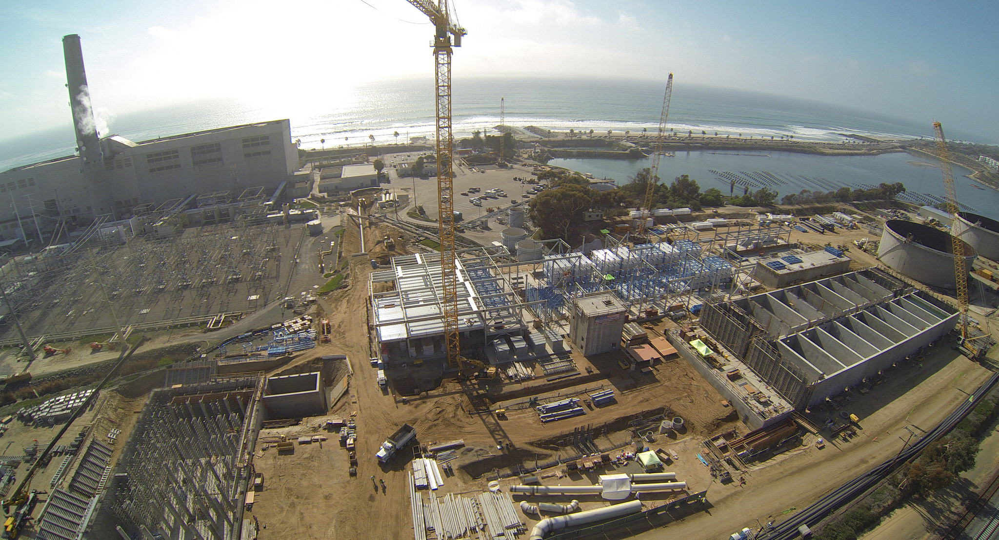
Carlsbad, CA Desalination Plant


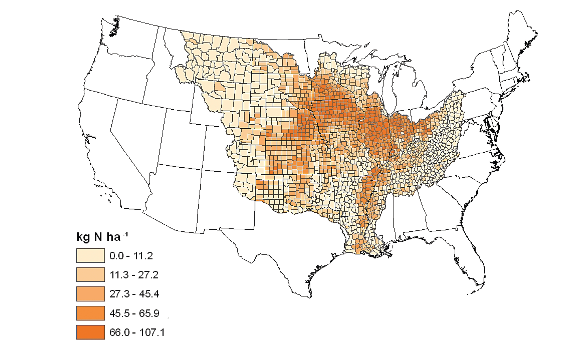
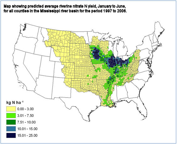
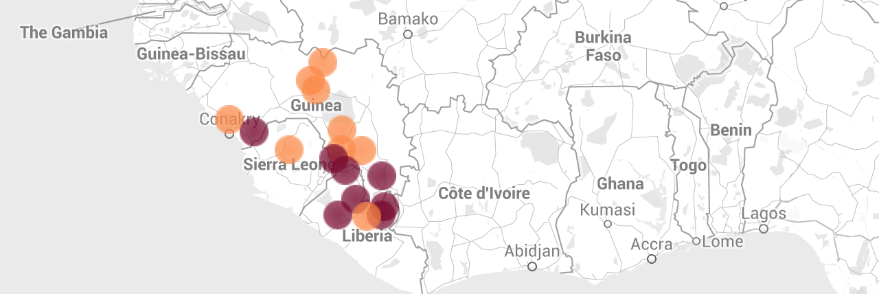
4.  As the diversion of waters has adversely affected local environments, both by agrarian return waters that bear increased traces of salinity and nitrates, the national waters of much of the Mississippi basin bear a similarly terrifying imprint of industrial farming.  Moving to the effluents deposited in rivers in the wide farmlands of middle America, one can read their prominence and density in Jeffries’ national map with new eyes.  For the annual nitrate yield from highly fertilized farmlands along the Mississippi from its start to the Gulf of Mexico in particularly striking as it heightens the pollution that enters a formerly rich agrarian land, with unclear consequences.

Recent decades have seen a startling rise in the flow of the remnants of chemical fertilizer into the Gulf.  Adding the unseen enrichment of the crop lands of the basin, active area agribusiness augmented local fertilization of lands in the decade from 1997-2006 increased the runoff of nitrogen wastes in noticeable ways, according to the non-profit Ceres, which charted the extent of nitrogen pollution across it basin, reflecting the marked increase in ethanol plants in regions of agricultural pollution that enter the broad range of interconnected waterways that contribute to the Mississippi River to which they lead.


Streamer


Their effects on the land show the increasingly compromised character of the “waters of the United States,” looking only at Nitrogen risks around the Mississippi basin and surrounding shallow groundwater.


Miss Basin average annual fertilizer

nirtogen-risk-map


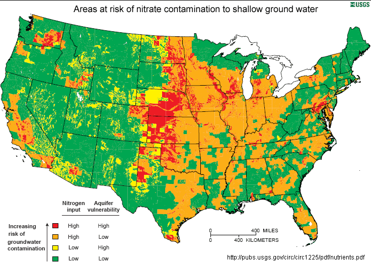
We can look more closely at this striking level of shockingly widespread groundwater contamination confining ourselves to the area around ethanol plants around the Mississippi River’s basin.  In the below map, whose “red” layer registers a very high level of nitrogen pollution, plants are noted by black dots in their actual location–one can comprehensively survey in it the extend of nitrogen delivery into watersheds, in something like a secret history of local land-use suddenly made all too plain to survey:
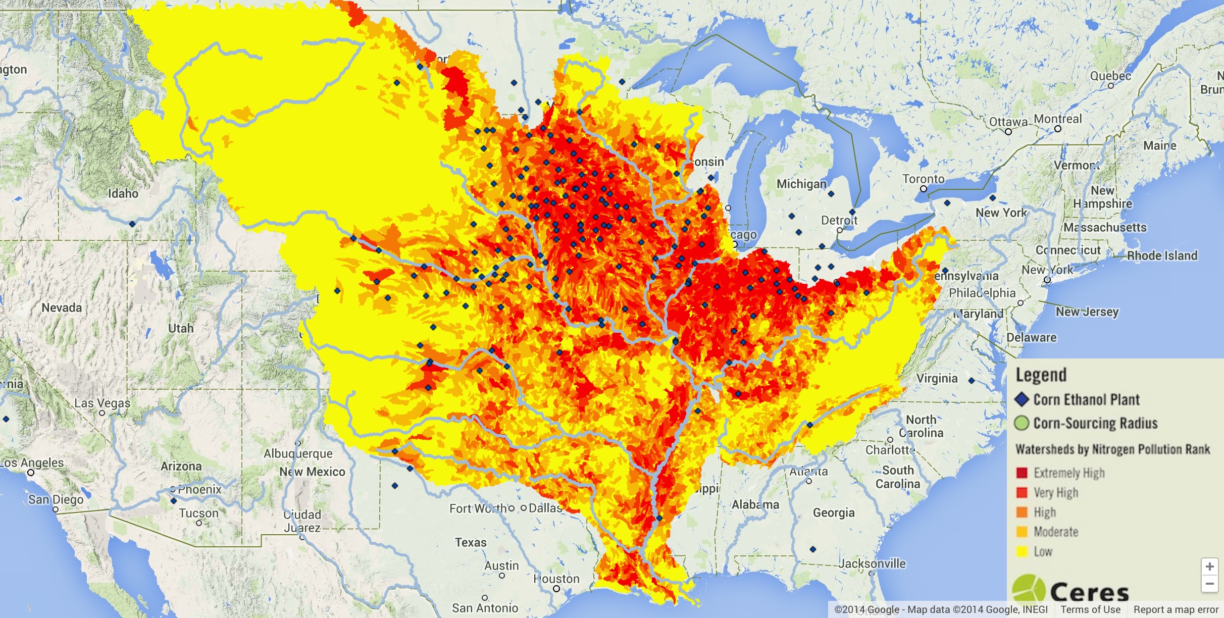
 

Nitrogen Pollution of Miss WatershedsCeres

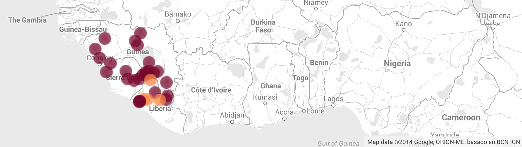
One can focus on expanse corn that surrounds and supplies these plants, here illuminated with light green bubbles, to communicate the intertwining of ethanol plants with the local agricultural economies:
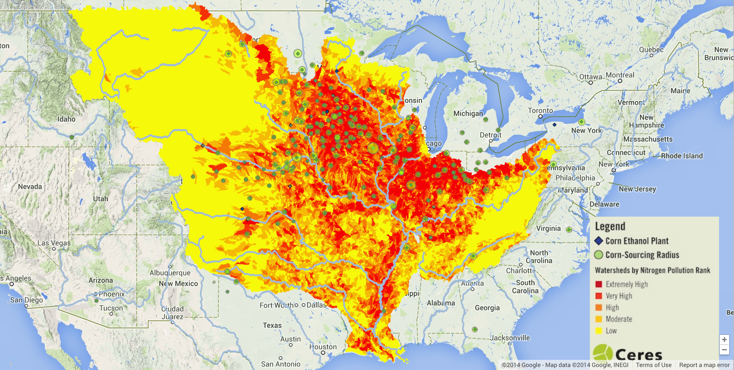
 

Courn-sourcing Radii includedCeres


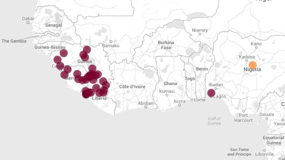
The density of sites that deliver high agricultural pollution to local waterways has created a clotting of Nitrogen pollution that stands to fundamentally alter the very notion of the national waters’ inviolability:


Watersheds of High N PollutionCERES/Google Maps


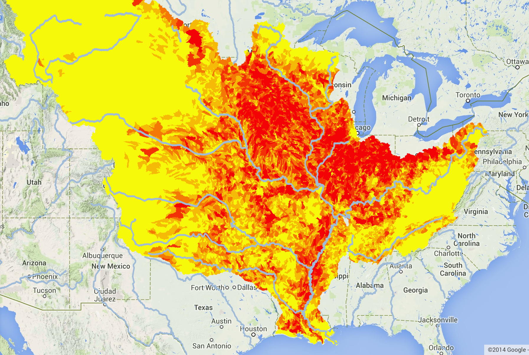
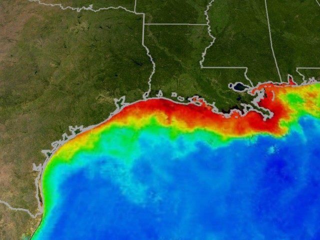
One result of such habits of land-use across such a large share of the nation is to imbue an almost radioactive glow to saturated waters that enter the Gulf of Mexico, where waste-water standard developed in the CWA in 1972 have only begun to be developed to curb the resulting “dead zone” in the oxygen-starved Gulf of Mexico, where the enforcement of the CWA obligingly turned the other cheek until quite recent years–and we still await standards for the many industrial wastewater treatment centers along the Mississippi:


stelprdb1045285

General_Collection_deadzone1

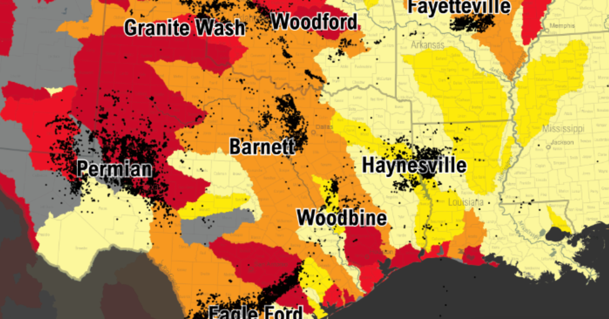
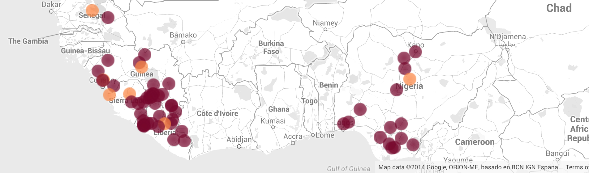
Could the dangers of the changing relations between water and landscape be more clearly mapped?  The concentration of almost half the number of fracking wells in sites where water scarcity is greatest and water stresses extreme creates a further and even more tragic wrinkle in how we view the national waters of the US as “clean.”  In such areas, 80% of allocated waters have already been allocated for existing industries, municipal, agricultural, or industrial users, leaving few real supplies available, and the risk of water contamination and pollution extremely great.  If we map a black dot for each and every site of hydraulic fracturing or fracking in the United States against a projection of variability in water stresses, the resulting graphic in almost the same area of the Mississippi basin suggest not only the availability of cheap lands ready for reconversion, but a large national landscape that stands largely depleted of water supplies across almost all of the western states, and little of an encouraging image of the dangers posed by hydraulic fracking to the ecology of the deep south.
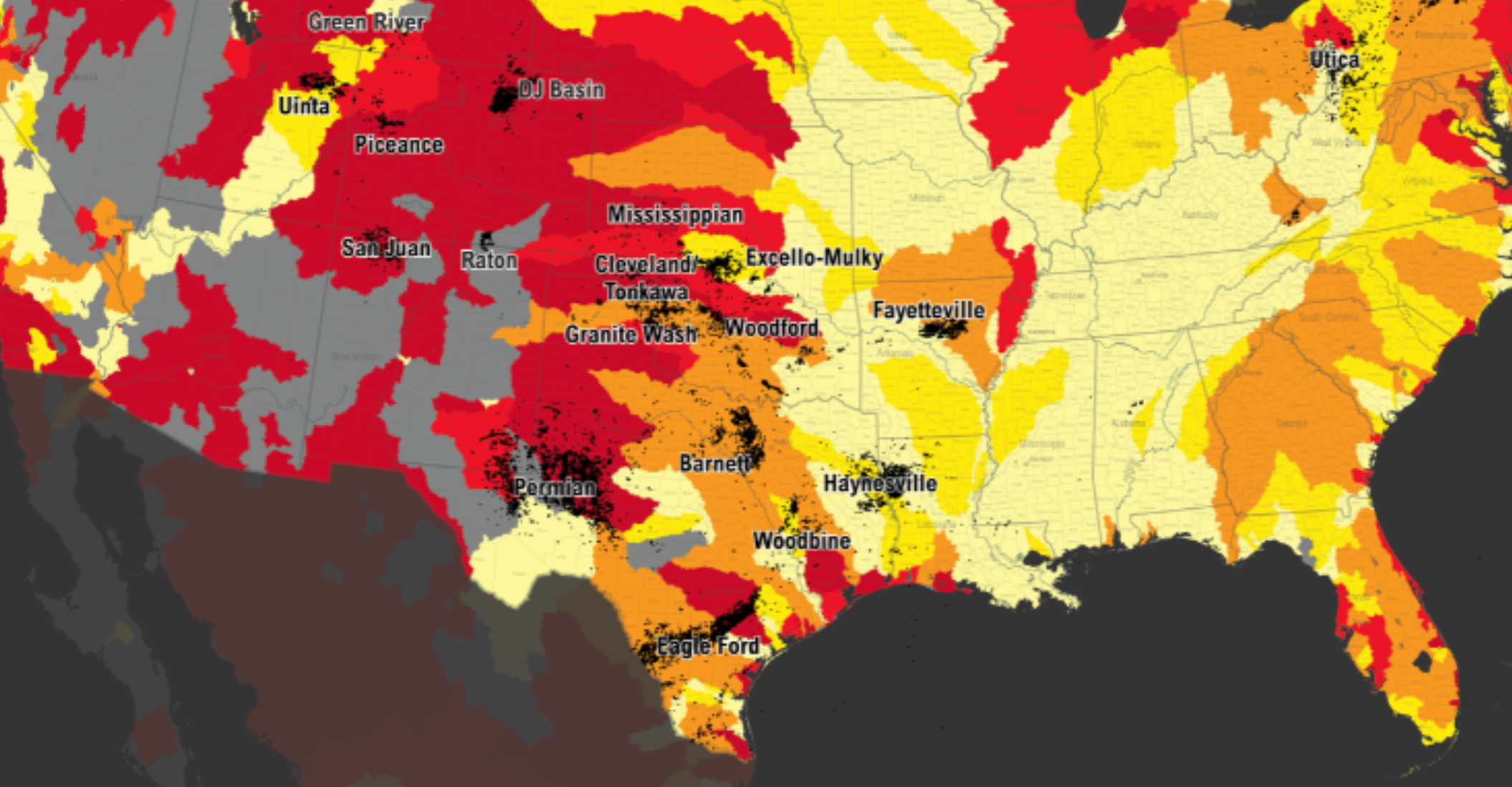
 

Water Stress Dots- Shale and Hydro-FrackingCeres/Google Maps


Zooming in by enlarging the map’s scale the pronounced density of a range of hydraulically fractured oil and gas wells that are clustered around the Mississippi suggests an alternate use for water around the waters of the Mississippi, a concentration of intense water demand, rich with the potential of future pollution.  Deep concern about the future plowback of wastewater–chemically enriched waters designed to loosen up shale deposits the better to extract or free oil and gas from underwater reservoirs–into national waters.  Whether these waters enter drinking water supplies or not–their impact is not yet fully known, and under study–the apparent violation of the Clean Water Act’s provisions for the national waters has often gone unremarked.


Fracking Concentrations?


Can we ever isolate the image of a pristine web of blue waterways on a white field in the same way?


Tile Vector map of Unfair INsularityNelson’s vector tile web map of rivers across United States


These rivers do not exist, save as a selective base-map from which we must better recognize the need to watch their relation to farmlands and industry in future web maps in ways that might adequately register claims of water use, allowing continued lamination of layers onto the fluvial network that we would be wise to take as a basis to remap their relation to the surrounding lands.

3 Comments

Filed under American Rivers, clean rivers, Clean Water Act, data visualization, Fracking, megadrought, Safe Drinking Water Act, webmaps

Mapping Ebola’s Recent Spread–While Barely Containing Our Widespread Fears

Tracking the progressive advance of Ebola virus in West Africa in an animated HealthMap projection created an eery sense of inevitability of the virus’ unprecedentedly rapid diffusion.  But the mapping on a Google Maps platform so removes the virulent spread of the virus from any context, noting suspected and confirmed infections and fatalities in a bubble map, to poorly embody the scale and scope of threat of contagion.  Omitting the distinct terrain over which the strain has expanded from rural areas to urban slums, and the complex vectors of the new strain’s transmission almost conceal the reasons why this outbreak has been so hard to contain adequately, and leave one raising perhaps unanswerable questions about the delay of an orchestrated or more effective response to contain or try to control its increasingly exponential spread.

The rapidity with which microbes from the very rainforest allows the virus spread to highly vulnerable populations of Guinea, Liberia and Sierra Leone, as well as, recently, both Nigeria and Senegal–populations particularly vulnerable to the current strain–foregrounded in a time-lapse sequence of those infected with the deadly virus uses a Google Maps platform and template to map the spread, but might be taken as something of a challenge to better map the virus by refining our image of the virus’ transmission and catastrophic spread.  If such widely circulated maps provide a basis for describing the challenge of containing the virus’ spread, they also present a challenge for better mapping the transmission of Ebola virus and reviewing reasons for slow response, perhaps as we hoped the contagion would not emerge to be so virulent as it has become.  Were we confident in the containment of the disease, or were we not mapping the multiplication of pathways of its transmission?  What sort of maps can we now make to better understand the specific distribution of the disease?  Did our own reliance and use of apparently exacting maps, which were only as good as the data that they were fed, conceal a delay in broadcasting early warning signs to the world?

If this is the case, it makes sense to ask if an unwarranted trust in the metrics of mapping has contributed to a lack of clear understanding or reporting on how the disease has spread.  The outbreak that has outpaced previous outbreaks of the virus in central Africa challenge our models for mapping Ebola the spread of the deadly virus–whose mortality rate has at times been estimated as high as 90%.  Even notwithstanding the low resistance of the populations of West Africa, and its location in a region of recent urbanization–unlike the rural areas of Central Africa where outbreaks had been previously confined–the unprecedented levels of human-to-human transmission challenge us to map the contagion we seek to control in ways that can best process the very rapid transmission of the virus and its advance across six countries with varying rapidity.

Ebola Climbs

The numbers noting rate of mortality in the above map threatens to overwhelm our sense about the virus’s spread by privileging the rapidity of its contagion and not examining causes for its diffusion or vectors of its virulence.  The HealthMap announcements have become the recognizable image of its spread.  But despite the apparent authoritative HealthMap graphics as mapping the disease’s first appearance on March 19, a full “nine days before the World Health Organization formally announced the epidemic,” notwithstanding the considerably large investment in Health Map of the US government’s Intelligence Advanced Research Projects Activity (IARPA), rather than standing at the forefront of health reporting and surveillance, the first maps HealthMap issued in fact antedate the first news conference of the Guinea’s Department of Health of the Ebola outbreak, reported in the first news articles on a “hemorrhagic fever” which summarized the news conference of the Director of Disease Prevention, Dr. Sakoba Keita.  While we have focussed on the HealthMap graphics for the authoritative clarity with which they mapped the virulent disease’s outbreak, forecasting systems played little role in detecting the virus–and little advanced news of the outbreak beyond traditional news sources.

The rhetoric of the map has masked the lag that occurred in the first diffusion of news reports of the hemorrhagic disease.  The unfolding of the maps of the disease’s spread display a similar reluctance to listen or observe on the ground, but rather to synthesize data in what has become something like a proxy for direct observation or reporting.  The limited spatial context for the generic Google Maps platform used on HealthMap especially obscures, on account of its lack of spatial precision, the complexity of new vectors and sources of transmission that differentiate this outbreak from Ebola outbreaks in the Democratic Republic of Congo over the past fourteen years.  For it maps the disease only by registering numbers in vague national conglomerates–often using incomplete numbers reported by local agencies.  While the first cases appear to the Guinean forest, the spread infection to urban areas and slums offers a powerful chart of the outbreak that–unlike earlier outbreaks of Ebola in central Africa–gained a virulence that challenged both public health authorities and residents who had little exposure to the animal-born disease.

The crowding of states with tan and brown bubbles to designate human suspected or confirmed infections obscure the dynamics and dangers of Ebola’s transmission to a rapidly urbanizing landscape, and are silent on the dangers of confronting the wide range of potential pathways of its transmission that we seek–and indeed are ethically obliged–to contain.  Maps provide forms for embodying as well as tracking diseases, practices of mapping can both communicate the exponential expansion of fatalities of infected victims across space, and suggest potential future strategies for their containment.  Were we only hoping that, as earlier outbreaks in the Central African Republic or DRC, the West African outbreak would be contained, without considering the multiplication of vectors by for its contagion, or the new terrain and new populations to which it had spread?  Or did we fail to map its dangers as quickly as we could have done?

456092182_leetaru_9-25

1.  The lack of qualitative or specific details in these maps treat them as registers of the exponential expansion of epidemiological updates. Whereas no previous outbreak of a strain of the diseases has produced more than several hundred cases, the virulence of the specific strain of Ebola, previous confined to rural areas, may rest in the multiple vectors of its transmission and the difficulty containing new vectors for the transmission of Ebola, easily communicated through contact with bodily fluids or blood, leading to a far greater expansion of human-to-human transmission of the disease than occurred in recent history.  Shock at its spread displaces   the vectors of contagion by which Ebola has so rapidly and virulently spread.  Indeed, the current reproductive rate of the disease suggests its expansion will continue most dramatically.

When epidemiologist Michael T. Osterholm warns “the Ebola epidemic in West Africa has the potential to alter history as much as any plague has ever done,” the comparison may illustrate both its extreme danger and potential significance, and a need to reconsider how we have charted the contagion’s spread.  Plague was, of course, misunderstood as a miasma and not examined as being transmitted from the bacteria carried on fleas resident in rats.  While we don’t still know the natural reservoir of the virus, or the relations between different strains of Ebola virus, the pathways of its contagion challenge our ability to map the vectors of viral transmission–and the mapping tools we might better use to contextualize its virulent spread from its epicenter in the Guinean forests.  Despite repeated warnings of the dangers that the consumption of infected carcasses as bush meat constituted a neglected source of its transmission, the expansion of human-to-human transmission has obscured its animal-born origins.  The continued possibilities for infection from the meat of carcasses of animals infected with the virus moreover creates new problems as the WHO works to contain the spread of microbes dwelling in the very rainforest that spread to vulnerable populations in Guinea to recur in Liberia and Sierra Leone, as well as Senegal and Nigeria–whose populations seem particularly vulnerable to the current strain.

The need for a map that charts the spatial transmission of the disease, which has itself proceeded jump borders and region divides with ease.  Such boundary lines name the different public health authorities that are forced to face the ravages of Ebola, which may offer a haphazard barometer to calibrate the global danger of the danger, but might obscure the ways humans were infected by the virus in recent months. Already by March 23, cases of the virus were suspected near where it claimed its first victims:

By march 23 ebola

HealthMap/Boston Children’s Hospital

The first documented documented cross-border spread of the disease, according to tropical medicine specialist Dr. Estrella Lasry, occurred in late March–about the time that the outbreak was first reported by Guinean authorities to the WHO.  In over just a month, by April 20, the distribution of suspected cases had dramatically grown, in ways that would have already suggested the substantial threat of its growing incidence of what had been confined to inland areas, and had not been associated with the region:  the migration of the disease from forested and rural areas to cities marked the first time urban occurrence of hemorrhagic fevers in urban slums, in crowded areas where it dramatically spreadoverwhelming health care workers whom it affected in great numbers, and the fear of its international spread prompted  military-enforced cordon sanitaire at border areas, as more affluent areas trusted in their access to superior health care protected them from the growing diffusion of the infectious disease even as it spread.

April 20 Ebola

HealthMap/Boston Children’s Hospital

The concentration of infections seem relatively concentrated, but had taken on particular virulence on in Liberia–a country with limited health care facilities or health-care workers.  And by July 8, the area of those infected by disease had grown broader and deeper in density, and any hopes that the outbreak would stay in a concentrated area disappeared, although international attention was only gained as the virus arrived in Nigeria in later that month.

Ebola July 8

HealthMap/Boston Children’s Hospital

And on August 5, as the contagious virus decisively multiplied in Nigeria, which, one would think, eyebrows were first raised:

ht_ebola_outbreak_map_august_4_jc_140805_16x9_992

HealthMap/Boston Children’s Hospital

The number of confirmed cases not only had grown, but the number of confirmed cases in Guinea and Liberia indicated that the disease was spreading both toward the Côte d’Ivoire.  As of September 16, the virus had grown to new proportions and scarp, an epidemiological emergency only partly intimated by the crowded bubbles that hint at the changed profile of the infection even as they offer frustratingly few tools to process it:

Ebola Sept. 16

HealthMap/Boston Children’s Hospital

Providing a means of grasping the spread of a disease and the dangers that it poses is an inherent property of the map, but the obstinacy of not reading the disease’s widespread infection is difficult to explain fully.  Could it be that the multiplication of the vectors for the disease’s transmission were inadequately mapped?

Yet plotting confirmed incidence of Ebola tells only part of the story of the expanding risks of infection in the sub-Saharan continent, and the silences of the HealthMap graphic compromise its informative value.  Recent predictions that the spread of infection by Ebola across West Africa will continue for twelve to eighteen months have confirm, if this was needed, the global scope of the health disaster, as the cascading influence of the spreading contagion for which we have no vaccine challenge the region’s food security.  The expected spread of Ebola virus in new areas will continue to raise compelling questions of the ethics of care–and of the availability of provisional vaccines that will be developed as they are tested–as more than 70,000 people in much of sub-Saharan Africa seem to lie at risk–according to the fifty-two received alerts for Ebola in just a week in mid-September.

52 Alerts in Last Week

HealthMap/Boston Children’s Hospital

How did it travel so quickly after being apparently contained so long?  How safe can it even be to remain, at this time, in Liberia, or to send medical doctors and workers, needed nurses, and temporary hospitals there?

This post focusses attention on the ethics of how we have mapped the virulent disease both at a remove from the landscape and surroundings where it has occurred, and the sense it makes to continue to tabulate confirmed or suspected cases of infection.  For we have charted the current spread of Ebola virus spread to at risk populations, suppressing panic at its exponentially expanding scope, as we try to imagine how the infections might be contained by charting the number of humans infected, omitting the virus’ relation to vectors of transmission or hosts that may warp the dangers faced by people who might become infected in coming months.  Although there is the danger that the current strain may mutate to an air-born virus, as some fear, tracking its human-to-human transmission might be placed into better relief by considering both the paths by which the virus migrated into urban areas and jumped to humans from animal hosts.

A chief difficulty of continuing to map Ebola against a base map of national frontiers and boundaries is that it contains the virus lies in locating it within fixed boundaries and perimeters–and misleadingly suggest a controlled outbreak.  Maps of the region foreground numbers of dead and infected along a blank topography, moreover, in ways that conceal the potential for a qualitatively rich map of the virus’ spread from the Guinean forests, where the recurrence of the highly contagious disease first broke out in humans.  Such projections of the virus ignore important questions of how the vectors or courses of transmission the outbreak have made it so difficult to contain:  for we often read the maps for the possibility for human-to-human contagion, although the spread of the virus seems to mirror the possibility of several sources of Ebola’s transmission to humans from its animal hosts.

Indeed, the spread of the virus mirrors the fragility of the broadleaf forests that run from Guinea to Sierra Leone in the West and the Cote d’Ivoire, Liberia, Nigeria and Togo to the East, mapped below–an ecosystem that is an environmental “hot-spot” whose diversity is so endangered by slash-and-burn agriculture and irresponsible mining to be among the most “critically fragmented regions” in the world.   The terrain reflects the contours of  regions in which Ebola has spread from the very bats and primates from whom we believe the highly contagious strains of Ebola jumped.  We neglect at our peril possibilities of recurrent transmission from animal hosts as we seek to map the spread of contagion at a remove from the continued consumption of such animal host as “bush meats.”   The widespread contacts with meats of monkeys, rat, and bats–all affected by the virus–from the fragmented forest may have contributed to its spread to more heavily populated regions where we are now struggling to contain its transmission.

Guinean Forests

The coincidence of these regions suggests the need to map distributions of animal inhabitants as we chart Ebola’s dramatic spread across areas it rarely occurred previously–beyond the transmission of the virus by human hosts.  The spread of the disease has occurred without proper precautions or an establishment of best medical practices.  The worst Ebola outbreak ever  confronted by doctors and medical staff was regularly met without necessary protective gear in many West African hospitals for much of the summer.  As if in a terrifying apotheosis of Ivan Illich’s argument of the abundance of “iatrogenic” diseases whose transmission grows in hospital settings, we face descriptions of the frequency with which hospital beds and rooms covered with smeared feces, urine, or blood–the very prime vectors for contracting the virus–were the norm.

The inadequacy of facilities to control or treat the highly infectious disease’s spread has been facilitated not only by health-care breakdowns but an inadequate understanding or mapping of its epidemiological causes, masked in the above graphic, leading President Obama to propose the contribution of multiple mobile hospitals in order to bolster local health-care.  As we brace for waves of panic, challenges to food security with a far more limited harvest, and rising food prices, map-makers will be challenged to chart the waves of multiple impact of the simple virus across the continent.

Have we understood the best models for mapping a disease that has been imagined as specific to humans, but which has not only infected as it has jumped to humans from the animal population, but seems to have jumped from rain forest populations of fruit bats, antelope, great apes, and chimpanzees through local food supplies?  Although once the virus has migrated to humans, further pathways of infection will be human-borne, the continued danger of Ebola’s spread through meats and contact with animals’ blood suggest a proliferation of the virus’ impact we need to assess in order to contain most effectively.  Controlling the transmission of the virus’ transmission, which can occur through contact with the effusion of blood or bodily fluids from infected bodies, or spread from contact with cadavers, is now feared to spread to up to fifteen nations–of which some 22 million people stand to be at risk.  The maps of the risk of the infection have, indeed, displaced maps of actual infections or local mortality rates as the focus of international news–as what was at first a West African phenomenon has been replaced by a startling “heat map” of the broader populations at risk for virulent disease, whose infection of which is shown as spreading like an unstoppable cancer across Central Africa toward the Democratic Republic of the Congo and Burundi.

The eye-catching graphic in the Daily Mirror used data of at-risk populations across Africa to create a graphic of the disease boring a radioactive hole in the continent’s interior.  But the numerous absences and silences in this attention-getting infographic–as the Google projections of confirmed cases and deaths from Ebola in this post’s header–distort its communication by the remove at which they lie from the local landscape.

Ebola map

Daily Mirror; Sunday, September 14

Is this eye-grabbing graphic most informative guide to the progress of the devastating disease, if it tracks the range or human infection by Ebola alone?  And could one better understand the multiple “populations at risk” that it illuminates, not only in Guinea, Sierra Leone, Liberia and the Ivory Coast, but Togo, Angola, Uganda, Cameroon, the CAR, DRC, and Burundi by the migration of the virus and  the local transmission of viral infection?  Would this offer a better base map to chart the containment of successive waves of infection?  How would this change our notion of the best practices for the effective containment of the disease?

2.  The World Health Organization hoped last month to control the outbreak of Ebola over nine months to only 20,000 human infections.  But difficulties of controlling numerous vectors of the transmission of the disease through contact with bodily fluids now suggests the reality of soon facing 20,000 cases in one month  that will be increasingly difficult to contain.

Ebola’s spread raises questions of the best practices of mapping the devastating outbreak, and of communicating Ebola virus’s transmission:  so physically devastating and gruesome is the virus, which is notoriously difficult to contain with success, or even to treat by intravenous replenishment, that viewing the virus outside the lens of human-to-human transmission is difficult.  But the huge risks of transmission compels we consider what criteria to adopt to map to best  process the disease’s spread and contagion.  National maps of the distribution of illness make little sense in communicating that spread.  The rapidity with which  microbes focussed in the very rainforest that seem to have spread to vulnerable populations in Guinea to recur in Liberia and Sierra Leone, as well as Senegal–whose populations seem particularly vulnerable to the current strain.  The outbreak at first concentrated in these three countries was no doubt encouraged by their increasingly urbanized and interconnected populations, especially among the high levels of poor who live in dense slums, whose populations who depend on the foraging of “bush meats”–the term for local animals in surrounding rain forests on which many depends.  Such animals not only seem the hosts from which Ebola “jumped” to humans, but have themselves, due to deforestation, suffered from shrinking forest land, moreover, in ways that have restricted their regional habitat (and that of the virus)–augmenting the risk of a “spillover” of Ebola across species in these regions that it is deeply unethical not to map.

The silences of the info graphic conceals deep changes, including the expansion of a network of roads that have multiplied routes of contact of meats from rural areas to urban slums, that have shifted the ecosystem of the Ebola virus itself.  As we consider turning our attention to mapping the location of the virus and its varied hosts, we stand to gain much from what might be called  a “deep map” of Ebola both less widely discussed and understood, for all the emphasis on the dangers of eating bush meats, and better communicate what underlies the disease’s dramatic distribution.

FAO World's Forests 2000

FAO

Absences of endangered forests are by no means the only silences of info graphics depicting the virus’s spread.  The most prevalent way of mapping Ebola’s incidence by national boundaries and human habitation presents a striking contrast with the extent to which its hosts have been bats and other animals as rats and monkeys–whose consumed flesh is known as “bush meats.”  The meats constitute a prevalent form of nutrition among poor in a region without traditions of husbandry.  As much as the virus might be easily contracted by person-to-person contact, we may have focussed on contact of infected bodies, given both the horrors of hemorrhaging and bleeding in an uncontrolled manner so horrible watch and humiliating to experience, and our belief in familiar microbial transmission of influenza or other microbial diseases.  This concentration on hand-to-hand contact may however have perhaps led us to focus on the bodily fluids of the infected as a vector of the transmission of the disease.  Although such meats are now publicly prohibited from consumption by several governments, animals such as bats seem frequent hosts of the virus, although few mappings of the incidence of bat colonies have been attempted to determine the possibilities or potential for the virus’ geographical spread.  Could one map not only the presence of disease in populations of fruit bats, a common for of bush meat, and the routes of their harvesting and transport for sale to urban markets?

Such a practice of mapping is recognized by Oxford researcher Nick Golding as necessary to offer “the first step towards understanding where outbreaks of the disease might occur in the future,” as well as help “prepare for future outbreaks and to deal with the current one we need to understand how human movements cause the disease to spread once it has entered the human population.”  Indeed, while the disease is found in animals over a broad territory, the outbreaks of disease among these animals are rare, and the ability to detect infections in animals militate against the ease of such mapping, the ability to synthesize a variety of social and environmental factors where Ebola might be transmitted to people from host animals might be mapped in order to be correlated with the past occurrence of human infection from Ebola.

The mapping of such possible animal hosts of Ebola is not new or unavailable.  But a mapping of the simple distributions of animals who serve as hosts for Ebola–from fruit bats to chimpanzees to cane rats–provides a basis to examine the entrance of Ebola virus into local food chains.

0908ebola-hosts

BrainerdDispatch, based on data from WWF and WHO

Thryonomys_range_map

Wikipedia Commons

–and maps onto the range of populations mapped as being at risk:

1410462125569_700

Catholic Online

To do so would present a compelling alternative mode to track spread of the virus from the first epicenter in Guinea to Liberia and Sierra Leone ,where it has been particularly virulent, and to Nigeria, and illuminate links that exist from the surrounding forests from urban centers on which health authorities have concentrated attention.  To process the alarming spread of Ebola virus across West Africa, our use of maps to track the illness poses unique questions of how a virus judged to be hosted by animals (fruit bats or great apes or chimpanzees) in the continent’s interior has rapidly spread along its coastal populations as well as rural regions, that demand more advanced tools of mapping to track adequately.

As we synthesize increased data about the precise location of Ebola’s initial outbreak, its pathways of infection, as well as its future risks, it makes sense to increasingly adopt such models to process the virus’ geographic distribution.

3.  The recent closure of national borders follows the logic of quarantines for those infected with the virus, and reflecting the maps that specify nations whose citizens have been infected with the virus–rather than of controlling the vectors of its transmission.  Might pathways of the handling and consumption of meats be mapped against the spread of Ebola, to create a more complex map of the virus’ diffusion as we work to contain its spread most effectively?  Examining other pathways for the transmission and contraction of Ebola might lead to a more effective attempts to contain its spread, to be sure, even as we focus on rates of suspected or confirmed infections that are reported by national agencies or available to the World Health Organization and CDC, and at least complicate the picture maps might offer of its containment.  As it is, the progress of Ebola from rainforest environments is often labeled a “social problem” difficult to contain due to “deep-seated beliefs and cultural practices” as well as inadequate health care, and not mapped on the ground.  One stares at the progress of figures of mortality and infection in maps, questioning if they even display the full range of the infected, hoping to contain their future spread across the continent, without describing the range of narratives or social processes that have facilitated the contagious disease that they purportedly track.

We have most often mapped the outbreaks and incidence of Ebola across West Africa by tallying infections and mortality in bubble maps that show sovereign frontiers, but might better map to trace the complex narratives by tracking so viciously contagious a virus against the changed landscapes where it has spread to understand the climates and environments in which it has appeared as we seek to contain the over 4,366 cases of infection so far confirmed.  Despite valuable charts and tables that “map” the spread of Ebola virus across West Africa from March 2014, the tally of infections hardly begin to process the shock of the dramatic levels of mortality but both barely chart the striking process of the disease, at the same time as their alarmist tone effectively heightens our deepest fears of contagion.

The recent proliferation of web-based maps chart the unfolding of the incidence of a virus previously successfully contained in remote areas in the African continent, but long feared to spread beyond its shores, as we picture terrifying screens for scenarios of a global health crisis caused by the tendril-like threads that seem to move from hosts with such ease as to complicate their vectors of transmission and confound the idea of what it would be to map the disease’s spread:  as we come to conceive of Ebola as able to move from contact with an infected individual’s bodily fluids, mapping the spread of the virus seems the only way to grasp the meaning of its reappearance and difficulties of its containment.  (The complication for West African food security as the virus has both increasingly claimed lives of rural populations and spread to the interior of the continent.)  The microbe’s spread is poised to create a devastating web of indirect risks of global proportions, where risks of transmission have grown, despite a widespread ramping up of clinical trials by GlaxoSmithKline.

By tracking the virus as if it were transmitted has spread only by human-to-human contact, and by excluding the transmission of the different strains of the virus from animals, we may be short-sighted in perpetuating only a part of the picture of Ebola’s rapid spread.  Alternate scenarios for viral containment among local populations forecast situations where the possible numbers of individuals infected by rates Ebola virus could range from 20,000, if conditions stay roughly the same, to as high as 60,000 if conditions worsen–and, should conditions for treatment and containment improve, or a vaccine developed for humans, below 20,000.  Although the geographic migration of the deadly disease is challenging to track, the maps we make of its incidence raise as many questions as they do red flags and suggest the importance of dedicating attention to Ebola’s spread.

The ways in which we map the virus raises questions of what sort of story we want to tell about the rapid spread of Ebola virus.  Ebola is transmitted by contact with the blood or liquids of the infected.  But the spread of the virulent strain is due not only to human-to-human contact–as suggested in many of the maps or the most inflammatory prognostications of possible avenues of its future global spread–but also in the body fluids or tissue of other hosts, such as animals, whose distribution are for more difficult to map.  As we contemplate the litany encoded in the distribution of over 2,400 deaths caused by the virus and over 4,700 infected, according to recent metrics of its fearsome spread, and a huge future fatality rate, given the absence of any vaccine; notwithstanding several promises to start testing a vaccine for humans, limited successes have been reached for individual treatment, despite the recovery of two Americans flown to Atlanta.  The pathways of the virus need to be mapped both from its first confirmed cases in March 2014 and from the case suspected in Guinea in December, 2013:  but difficulties to chart multiple possible vectors of transmission complicate the effect or informative nature of a tally of those infected, or afflicted.  (While we do not have a vaccine, the tremendous gravity of the situation is evident in the WHO’s recent acceptance of that experimental drugs to treat Ebola patients would indeed be ethical so long as it involves patients’ consent.)

Such maps may erase the very vectors and hosts in ways that obstruct a clear understanding or picture of the terrifying process of the disease across the continent–as we risk essentializing the disease or seeing it as a consequence of inadequate health care.  The drastic manner that the virus dissolves linings of the internal organs of the body by hemorrhaging and bleeding, perpetuate images designed doubtless to increase fears of the further spread of disease whose very symptoms–the discharge of blood and bodily fluids from bodily orifices, and, as blood fails to coagulate, something like the dissolution of linings of bodily organs–so horrific to experience so as to obscure other vectors for Ebola’s transmission.  (Practices for treatment by intravenous replenishment of blood and electrolytes pin hopes on the reconstitution of one’s bodily fluids.)  But the practice of mapping the disease’s incidence may tell only partial stories about the incidence of illness, and offer narratives inadequate to translate into health policies:  for they ignore the danger of the transmission of Ebola in animal meat, and the migration of the disease from rural to urban environments.

Has our fear of the transmission or communication of Ebola by contact with bodily fluids led us to focus, as in the case of SARS, only on the bodies of those afflicted with the disease?  Ebola virus was almost only found in Africa since its discovery in 1976, fears of its migration off of the continent have almost subsumed understanding of the contradictions of its apparent localization in central Africa, where the first cases were discovered in Zaire and Sudan, contained on account of their remote locations, but with high fatality rates in all its strains.  The absence of a vaccine or isolated antibody, the basis for much modern medicine, have increased deep fears about human-to-human communication of the viral disease, exploited in such films as Contagion and partly domesticated by the marketing of stuffed Ebola microbes.  The paramount questions of its containment and isolation–the goal of the World Health Organization–and the difficulty of raises questions of how medical supplies, infection control, and treatments can be maintained, and the ethics of medical treatment without tested vaccines, as the geographical spread of the disease across two geographically removed regions faces problems of being contained–especially when its communication is not well understood or studied.  The most recent panic provoked by the arrival of two infected Americans infected with Ebola virus in Atlanta’s Emory University hospital elicited immediate fears of the expansion of the virus and sympathy.

But the existing caseload of Ebola victims in all countries seems likely to surge in coming weeks across West Africa, and its spread difficult if not impossible to contain, despite attempts to do so by quarantine.  The virus’ spread have not been mapped in nearly the sufficiently sophisticated tools to comprehend the nature of its virulence.  We continue to privilege human contact with blood, sweat, bodily fluids, or diarrhea of human victims, so terrifying is the apparent breakdown of bodily structures Ebola provokes.  The difficulty of administrating the intravenous electrolytes to stave of its terrifying spread is all but secure, and the HazMat suits and protective gear mandated to be worn in the presence of cadavers of Ebola’s victims or the infected underscore needs to circumscribe contact with the diseased.  Indeed, the fixation on the confinement of the bodies of the ill in continued disputes over plans to quarantine Ebola victims suggest a difficulty of mapping the disease’s spread by local governments and international health organizations.  For while Doctors Without Borders/Médecins sans frontières doubts the value of quarantines ill in “death houses” to contain the virus–pointing to the number of cases that will go unreported and the risk of lack of food and clean water for those with the virus–even if they have also established isolation houses in hopes to contain the virus from spreading to further states as the Ivory Coast.  But attention to the constraining of bodies may obscure other avenues for outbreaks of the disease

Yet the logic of its spread may have been poorly mapped in relation to the environments where its progress has been most terrifying.  The challenge of how to project the expanse of widespread waves of infection by Ebola virus across much of West Africa are hardly met by a static map of the region in which it has spread–which treats the environment as a passive field against which the viral infection has spread.  As of August 31, the WHO reported over 3,600 confirmed, probable, or suspected cases of Ebola virus in West Africa,–and the number of people affected by the haemorrhagic disease has indeed recently exponentially grown, as reported cases have multiplied by over 50%.  Could a mapping of the sites of outbreak and transmission of the virus offer a way of telling a story about the physically ravaging and highly contagious virus, or even process the sheer information overload of so many infected or deceased?  Mapping the virus’ rapid and terrifying spread, as much charting its incidence from Guinea to Senegal, and beyond Nigeria, through their populations to Sierra Leone or Nigeria since its first appearance risks projecting fears of the danger of communicating the virus to populations worldwide that remove it from any cause, and limit our response.  This post seeks to raise several questions about what shown in the organization of information in these data maps–and if one is not just tallying demographics not readily updated and lacking clear geographic specificity–and how to map the local outbreak as a global health risk.  As we continue to process further information about the vectors of infection and the needs to contain infection among animals as well as humans, we can hope for more effective mapping of the incidence of Ebola, both in relation to urban centers, slums, and rural areas, as well as to areas of forests from which bush meats come.

NG Ebola Map

National Geographic

4.  The problem of charting local emergencies has become one of mapping a health crisis of truly global proportions.  Even if it is now confined to a region in equatorial Africa, mapping the communication of the virus raises question of what it means to track the outbreak of Ebola, its relation to previous outbreaks, and the incubation of the disease that allowed its rapid spread.  The relative lack of epidemiological sophistication by which maps tally reported cases of infection or mortality in bubbles fails to capture how the very geography that facilitated the contagious’ virus rapid spread by treating the base map of the virus’ communication as an oddly static field, and viewing humans either as potential vectors of infection or passive victims.  For most of the maps of Ebola’s rapid spread seem to confirm the scariest fears of “losing the battle to contain” the virus for which there is no known vaccine, and which has previously ravaged the African continent.  Geographic containment of the disease is a priority of the World Health Organization, the data maps of its spread in West Africa have offered a screen on which to project fears and concerns of outpacing efforts to control a disease whose spread through bodily fluids of people or animals–and the possibly placing the virus into broader circulation among humans once again.

This highly infectious variant of previous Ebola outbreaks in the continent appears to have been likely underreported since the possible earliest case last December.  While known vectors of its communication are poised to multiply, the practice of containment is impossible to achieve by quarantine and isolation of patients in sick-houses or containment of traffic between national borders:  while the sealing of national borders in hopes to create barriers that might prevent the cross-country mobility among the possibly infected stands at odds with recent rapid expanding urbanization and geographic mobility in growing cities of this very region:  demographic changes brought by increasing urbanization, deforestation and geographical mobility have transformed West Africa’s living geography in the past decade, effectively bringing the city closer to forests where the epicenters of past Ebola outbreaks.  Yet the specter of confined borders or the creation of confines stands to create undue stress on relations between doctors and local populations to slow the infection’s spread or arrival of medical staff and supplies, if not generate panic and mutual distrust within local populations at the same time as weekly count of infected exceed 500, with many likely to be unreported.

Quarantines have offered somewhat effective means of containing Ebola.  Their prevalence as a tool to combat Ebola echoes attempts to contain plague in seventeenth-century Italian cities, when the isolating the afflicted within cordoned city-state or regions as soon as possible fit new understandings of the transmission of disease by individual bodies.  Quarantines separated people known to carry the plague, segregated by analogy to goods exposed to plague or disease that remained for periods of forty days [quaranta giorni] in order that  miasmatic “pestilential air” could dissipate, and the rapidly growing numbers of those infected with plague be effectively circumscribed.  The practice of quarantine emerged before plague hospitals, and the same sort of isolation once again emerged as a coordinated reaction to unidentified virulent diseases such as the recent outbreak of SARS:  quarantine managed plague with shifting efficacy from 1347-52, as cities instituted quarantines of neighborhoods or goods in the face of a disease against which there was no known or effective medical response–encouraged or facilitated by the drawing of a fixed spatial boundary on terrestrial maps, as in this late seventeenth-century plan of the barriers that would contain the plague in seventeenth-century Bari.

Is this emphasis on the human-to-human transmission of disease the correct strategy to apply to Ebola?  The spatial containment of bodies of the infected and ill–who are often asked to lie in isolation wards that are deemed an effective death sentence for those effectively removed from medical care–oddly mirrors early modern reactions to pestilence despite our more effective concepts of tracking disease:  although effective if they occurred quickly, the scope of Ebola virus in the region suggests a range of factors have shaped true transmission of a disease beyond close contact with bodily fluids, or its human hosts:  are human bodies rightly presumed to be the sole agents in need of containment, and the sole subjects to be confined?

Cordoning Bari

Containing Plague in Bari (1690)

Is an emphasis on the danger of human-to-human transmission, the sort of transmission that quarantines seeks to limit, an adequate response?  Closed national borders have so far followed the logic of quarantines for those infected with the virus–rather than of controlling the vectors of its transmission.  If barriers have contained disease when created quickly, the vectors of Ebola’s transmission are so challenging to map to make analogous quarantines by cordoning off West African regions offer a sort of exemplum of the misleading picture of the pathways of infection that the Ebola virus might exploit.  Fifty thousand people were quite recently forcibly barricaded in Monrovia to isolate the Ebola virus’ spread, limiting access of inhabitants to food or drinkable water and no doubt increasing their desperation, fearfulness and sense of fatality.  The first two Americans reported to be infected with Ebola virus, Dr. Kent Brantly and Nancy Writebo, have been transported from the continent, and to Atlanta, to recuperate in isolation chambers set up by the CDC in Emory University Hospital, the former recently released after being cured.  Is such a dramatic contrast in understandings of the etiology or response to the disease unconscionable?  With numbers of those affected by the Ebola virus now seem destined to rise exponentially, with some West African countries experiencing an increase of 50% last week, the specter of further quarantines and fears of the airborne transmission of the virus are misplaced.  Although the contact with dead or ill bodies is one clear means of transmission of the disease, its long strands are rooted in the body’s fluids–and its most virulent strain yet encountered seem able to have “jumped” from animal meat to humans, and prove particularly difficult to contain in cases where the disease is advanced.

120729101443-ebola-virus-story-top

The initial response of the United States Center for Disease Control and Prevention was to issue bulletins restricting non-essential travel to Guinea, Liberia and Sierra Leone, in the hopes to create distance between the US and the re-emergence of the disease.  African nations followed suit, terrified by re-emergence of the deadly virus and the lack of any public health response that was deemed effective:  Nigerian airlines cancelled flights to Freetown and Monrovia in an attempt to contain human contact with the infected; Nigerians angrily blamed airplanes for allowing passengers infected with Ebola to enter the country as opening the pathways to transmission of the disease.  But presumption that victims of Ebola constitute the prime subjects needing to be contained, or quarantined, or that the disease could be bound and frozen, kept within the boundaries of states where the virus, not only hamper coordinating medical reactions to Ebola and needed supplies, as well as food, but offer a no-exit strategy that may fail to contain the disease or address the actual vectors and incubators of its rapid geographical spread through several cities across the central Continent.  If trade provides a crucial means for the communication of disease, which is not only particularly aggressive but may mutate in the face of resistance.

Rather than being an isolated instance, historian Tom Koch, who has studied the uses of maps to embody the spatial distribution of diseases from the early modern period to the present, warns that “rapid viral and bacterial evolution brought on by globalization and its trade practices” pose deep challenges to how we contain future outbreaks of disease as well as to our practices of medical protocol and ethics.  The reactions suggest a terrifying widespread return of medical quarantine as we face increasing fears of contagion as unable to be contained.  The need for containment is itself echoed in the mirrors maps manufacture about the disease’s rapid spread, and what better maps might exist in an age when our mapping abilities to track the transmission and probable bearers of the highly infectious virus.

5.  The figure of infected victims of Ebola crossing national borders has become a standard and repeated image of the transmission of disease and the challenges of its containment.  A widely read report of late July described with considerable panic the arrival in an airplane of a man infected with Ebola who collapsed in the airport of Lagos, Nigeria, infected with the Ebola virus.  It provoked increased fears about the very vectors of Ebola’s transmission, including airborne transmission (which is impossible) and exposure to the environments where the bodily fluids of its victims have been present.

The communicative value of even the most accurate epidemiological maps of the virus’ rapid outbreak may have failed their readers–as this powerful visualization from National Geographic–in communicating the nature of its transmission, despite its terrifying suggestion of its spread in West Africa serves to emphasize the global threats that Ebola’s spread pose.  Although disease maps provide clear tools to understand the spread and pathways of communication of a disease, the highly virulent and rapidly moving nature of the virus, whose spreading transmission has multiplied because of both growing density of urban population sizes and the increasingly interconnected nature of populations in the region.  Given the increased health risks that are the result of huge changes in West African urban geography, both the simple tally of cases of Ebola the snapshot-like nature of most distributions by country only skim the surface of the depth of multiple stories–and terrifying fears–about the virus’ rapid spread across the West African coast.  For the story of Ebola is increasingly about the new vectors of transmission that result from the relation of the cities to the interior, in ways obscured by data distributions that collectively group numbers of cases and deaths–mutely enumerating the daunting count of those infected and deceased, but without telling a clear story about its geographical spread across a rapidly urbanizing region.

NG Ebola Map

National Geographic

The spread of Ebola across four nations since April, when it was first reported to have spread from an epicenter in a rural Guinea, is unprecedented in the relative rarity of its geographic spread and the rapid bodily decline of those it has infected raises questions of how medical supplies, infection control, and treatments can be maintained, across two geographically removed regions–as the existing caseload of Ebola will likely surge in coming weeks.  The odd mapping of the incidence of Ebola by nation contrasts with the extent to which the hosts of bats and other animals whose flesh is consumed known as “bush meats”–and not person-to-person contact alone, despite the horrors of hemorrhaging and bleeding in an uncontrolled manner so horrible watch and humiliating to experience.  Although such meats are currently prohibited from consumption, the virus’ rapid spread provokes fears of containing increasingly porous boundaries between nations in West Africa, but such containment and isolation may discount other sources of the bearers of disease at multiple sites, or the over two thousand afflicted with Ebola.  And, if bats are indeed the hosts of the virus, few mapping of the incidence of bat colonies have been attempted to determine the possibilities or potential for the virus’ geographical spread.  Could one map not only the presence of disease in populations of fruit bats, a common for of bush meat, and the routes of their harvesting and transport for sale to urban markets, as a basis for the spread of the virus from the first perceived epicenter in Guinea to Liberia and Sierra Leone where it has been particularly virulent, as well as Nigeria.  Might pathways of the handling and consumption of meats be mapped against the disease?

Ebola Outbreak Poster

Is the danger of the disease’s fatality underestimated in the graphic posted above?

6.  Can we explain the dangers of its communication by maps that do not adequately chart the spread of the virus’ outbreak by a range of vectors?  The effort of humanitarian mappers, using OpenStreetMap mapping templates, readily applied mapping techniques to track the first outbreak of infections from April 2014 occasioned an early attempt to trace the spread of the virus from rural areas, and define its Guinean epicenter and routes of travel to coastal towns from the regions around Gueckedou, as Doctors without Borders requested the OpenStreetMap Humanitarian team to map the outbreak in an effort to define with greater precision the spread and immediate impact of the disease, using Bing’s high-res imagery of the region, and maps from Airbus Defense and Space as well as overlaying satellite images with MapBox Streets/Digital Globe to track incidence with a resolution absent altogether from most large-scale maps.  The collective effort of 200 mappers to locate over 100,000 buildings and some hundreds of miles of roadways supplemented the absence of adequate maps of the region of Guinea, the site of the first hemorrhaging confirmed caused by Ebola virus.  At the same time as worries already began of the spread of the virus to Liberia and Sierra Leone, the mapping helped establish the epicenter in Guinea and radius of the outbreak.  Despite the far greater complexity and geographic range of Ebola’s spread, such maps might be beneficially integrated with other overlays in attempts to try to understand the mechanisms of its rapid spread in an area for which we often lack adequate maps.

HUOSM ebola mapped in March 2014

Wired/OSM Humanitarian Team

The level of local detail in such early maps already pinpointed the breadth of its transmission, and raises questions about the role of human-to-human transmission as the sole vector of the virus, which has been argued by the World Health Organization in July to have been transmitted by wild animals, such as bats, but in addition to bush meats from wild animals, in the local pig farms that often play hosts to the bats.

Some of the precision of these maps has been lost in the later maps that seem emphasize occurrences of probable or confirmed and suspected cases in “countries” and regional “districts,” rather than in an inter-related web of the transmission of the disease.  The result of the tracking of cases came to embody the sources and centers of fears of its spread, as the confirmed or probably cases of infection were mapping against the continent as a whole, so that the spread of infections gained a new look on the map as a field of red that demanded to be contained, juxtaposed by the specters of historical sites of infection, as if to augment local fears of its future spread, and to understand the migration from regions of Guinea and Sierra Leone to other ports along the shoreline of West Africa as Dakar, suggesting that the spread of the virus has not only outstripped medical abilities in the area, but that the spread of the disease invaded an entire district which would need to be isolated or quarantined–as requested most recently by Theo Nicol, Sierra Leone’s Minister of Information–and not public health officials–to respond to the spread of the disease into the country, in ways Doctors without Borders (MSF) cautioned were without benefits and in face quite detrimental to medical care, nourishment, or establishing needed trust of medical professionals:  the mapping of confirmed cases as if confined to a given administrative region reflects a reality of public health administration, but a distorting image if one would like to map the vectors of its communication.  (The historical cases of former outbreaks of Ebola in the CDR or South Africa were another strain of the virus, and, while reaching into the collective memory, not related to this outbreak, which began with a similar jump of the virus from animals to humans.)

The spread of Ebola in West Africa in relation to “Historical Cases” magnify its danger, but oddly contain the virus to the African continent’s sub-Saharan regions.

Ebola cases--confirmed, probable, historical

7.  The mapping of “historical cases” of related Ebola virus outbreaks may introduce more than a bit of a red herring.  For although they similarly seem to have begun from similar reservoirs of monkey or bat hosts, relations between the viruses is not clearly understood, despite similarities between the Guinea virus and the Zaire Ebola virus (EBOV) lineage; nor are links between their different reservoir species or hosts and the virus outbreaks understood, although the relations are presumed in the coloration of the above inset map of the African continent.  The vectors of viral transmission may create a map quite distinct from the earlier inland growth of Ebola in both Central and South Africa.  For  outbreaks of Ebola may have all been incubated first within the animal populations in ways not communicated in the above maps.  At the same time, the natural cycle of transmission of Ebola within the forest remains largely unknown, creating problems understanding its transmission–although its appearance in and transmission from animal populations has been clearly identified as the basis for its spread at the forest’s edge in rural Guinea.

The spread of the virus across three countries by late July already made it the deadliest breakout of the contagious virus in the continent as it moved from Guinea to other edges of the forested interior, in ways that the CDC map below does not clearly describe, but explain the odd dispersion of cases reported around the border between Guinea and Sierra Leone.   When Liberia shut most of its border points in late July in an effort to contain the disease and halt the virus, it had already spread across at least four nations, leaving possibilities of its future containment optimistic at best, in an attempt to isolate the migration of infected individuals given deep preoccupations at continued geographic mobility in the region.

guinea-map

The confines created around those districts with suspected or confirmed cases in April, shortly after the spread of the deadly virus had been mapped, misleadingly places the problems of quarantine on each nation–Mali; Guinea; Sierra Leone; Liberia–and not to define the impact of infections on local society or analyze the channels of its transmission, apparently able to have jumped national boundaries with ease in areas.  We perform a far less sophisticated mode of mapping outbreaks by identifying its incidence in isolated districts, without the greater geographic or spatial specificity the OSM map tried to chart–and perhaps have provided a misleading map that raises false hopes for being a ground-plan to its spatial or geographic containment.  But the multiplication of incidence has of course made the process of mapping impossible, and fears of under-reporting widespread.  Such a mapping might be particularly important, however, since the evidence suggests that the combination of increasing human penetration into rain forests, and increased human contact with meats in urban centers–in addition, most significantly, geographical mobility between goods from rainforest areas to growing urban slums, creating channels and microclimates that are increasingly likely to change the patterns of the transmission of Ebola in ways maps might better track in order that the virus could be more effectively contained.  In an era when satellite-based mapping and GIS systems could make questions of human penetration into forests, contact with animals, distribution of bats and other species, and population density in urban slums where Ebola has spread could stand to be mapped in quite potentially significant epidemiological ways.

The recent growth of populations in West Africa that are living in urban slums from the Ivory Coast to Senegal suggest an especially dangerous topography for Ebola’s growth, which is left silent or unspoken in most infographics of the region, despite its significance in understanding the social shifts that magnify the transmission of the deadly virus.

slum-population-in-urban-africa

The considerable growth in urban areas and slums in Conakry, Bamako, and Dakar make them terrifying incubators for human hosts, again absent from infographics of Ebola’s current spread.

urban-growth-rate-in-africa_12bb

The distinctions of local distributions are unfortunately erased in flat “impact maps” which highlight danger zones of travel, and not effectively map the virus’ transmission and spread or the environments in which it has grown–the flat colors of data maps, prepared relatively quickly with whatever data is at hand about Ebola, and not the region, seem almost to hide, rather than try to foreground, the dangers of the virus’ spread and the dangers of its migration from rural to urban areas.

At the start of the virus’ spread, attempts to localize its incidence expanded the number of fine-grain maps in circulation–although the mapping of incidence onto the urban and rural environments was rare, as were fears and concerns about the mutation of the virulent disease.   The rapidity with which Ebola spread through Liberia and to Senegal makes the distinction between “confirmed” or “suspected” cases, or indeed an administrative mapping of the topography of Ebola less valuable in understanding its transmission or the possibilities of its potential spread by vectors or the overlap of incidence with even a road map of nations that might track the paths of geographical mobility by which removed outbreaks could be related to one another.  Although fourteen of Liberia’s fifteen counties report cases of Ebola, what does such a spatial distribution tell us about the disease save of the dangers that the administrative response must face?  Data on the large numbers of populations of the slums of Monrovia were not even available to the United Nations in its mapping of slum populations, shown above, from 2009–although the terrifying density of populations in urban slums in growing cities in Sierra Leone, Guinea, or the Cote d’Ivoire are striking, as is the massive urban growth of the city of Dakar (Senegal) or Conakry (Guinea), not to mention the large city of Bamako, which lies terrifyingly near to the suspected cases of Ebola in one district of Mali.  (There seems no data available in the UN map of urbanization about Monrovia.)

If in 1990 there were only some 24 cities in Africa whose population exceeded one million, the number of cities with more than a million inhabitants had doubled by 2011, and has exceeded that proportion by 2014, and many of these urban agglomerations are concentrated in West Africa in ways that have dramatically shifted the landscapes across which Ebola has so far most intensely spread.

West African Urban Agglomerations, 2011

The movement of the virus to these cities was terrifyingly close in April, when it seemed inevitable, or evident, but few measures of adequate containment were articulated or in place as the virus advanced from Guinea to Mali and Liberia.  But the shifts of urbanization that have occurred in the region were oddly absent in most of the maps that describe the disease’s spread in districts of Guinea, Sierra Leone, Liberia, and Mali–the size of urban populations only become prominently realized in maps of contagion after the virus arrived in Dakar.

EVD-outbreak

8.  Boundaries between states however provide a limited information to allow us to track the disease’s spread or its scope.  The responses to the spread of highly infectious virus by August was to shut the borders crossings and frontiers between nations, in a terrifyingly shortsighted miscalculation of the spatial geography of viral containment, and misplaced allocation of resources, since the virus had already spread to Guinea.  When Liberia shut most of its border points in order to contain the virus’ progress to the south, was the area of infection from Gueckedou already too progressed to rely on national frontiers as a basis to staunch its spread?  Were other possible causes or vectors of disease less addressed?

Confines around Ebola_detail

While the map rightfully suggests the importance of human-to-human transmission, it oddly omits the very animal populations that both suffer from the disease and from whom Ebola is prone or apt to jump.  Closed national borders follows the logic of quarantines for those infected with the virus–rather than of controlling the vectors of its transmission.

Continued consumption of bush meats across much of West Africa suggests a far likely route for the transmission of Ebola than person-to person contact.  The difficulties of preventing the consumption of bush meats that were infected with the disease–including fruit bats, rats and monkeys–though widely suspected to be as the chief bridge between humans and animals in the region.  The transmission of disease in meats–either uncooked or by butchery–can cause itself multiple centers for the transmission of the disease from infected humans, not tracked by the concentration on human incubators of the disease.   Despite the current ban on consuming bush meats, the possibilities of such a transfer of the virus through consumption poses a decisively high risk and is potentially difficult to enforce.  Many villagers openly blame the arrival of medical teams for the virus’ spread, even as fruit bats and antelopes and rats have disappeared from the markets of the main towns, attempts at curbing the consumption of animals that are both plentiful in the forests and provide a prime staple to meet local nutritional needs of urban and rural poor in an area without animal husbandry; such curbs on the butchery and sale of bush meats are however most often met with incredulity among many–“Banning bush meat means a new way of life, which is unrealistic”–in regions without animal husbandry, and the eating of potentially uncooked meats or handling of dead infected animals from the forests effectively multiply the potential for further human-to-human transmission of the disease.  A ban on consuming bush meats–Liberia forbade its consumption and shopkeepers selling bus meats were jailed in attempts to retract its consumption in Nigeria–was less effective in practice, and pushed trade underground.  Bans on the importation of bush meats into London reveals fears of the meats as vectors of transmission that are difficult to control in West Africa, but have gained less attention than they deserve.

Ebola in Liberia

Ahmed Jallannzoe, EPA

9.  The policy seems to hope to contain the spread of bodily fluids that are associated with its transmission from those inhabitants infected with Ebola, as if the enforcement of clear boundaries could prevent future transmission in an era when far great border-crossing and dramatically increased interconnectedness of urban populations across West Africa.  Indeed, the mapping of the epicenter of its “outbreak” seem to be beyond the point, if important to register, in dealing with its spread:  the unwarranted closing confines with Sierra Leone and Liberia rests on the conception that human-to-human transmission  constitutes the sole or primary sources of its incubation.  But this inference may be false, according to Mapping the Zoonotic niche of Ebola virus disease in Africa, who suggest that the transmission from infected humans is in fact surprisingly low.  The absence of attention of a topography of the network of transmission of the disease, and of the presence in animals, as well as humans, would offer a far more complete picture of its transmission beyond the numeric tabulation of the dead in datasets.

What could a more dynamic terrestrial mapping of the spread of disease show, beyond the fears for its further expansion?  In what ways does the embodiment of the virus’ spread in maps of the districts of West African nations poorly communicate the nature of its spread–or the relations between Ebola virus’ spread and recently increased connections between large urban centers on the coasts to rainforest areas previously less often penetrated by purveyors of goods for urban food markets.  Indeed, health authorities would do well to monitor then expanded unrestricted or reviewed traffic of foodstuffs and plants from vendors who move with increased access to the deforested rainforest areas on new roads into growing cities, even if the virus is already out of the bag:  for the very roads linking regions that were previously with far less contact with one another create new pathways for rapid transmission of the virus, as much as they might be seen as forms of regional modernization.

Other maps might offer unwarranted alarmist images of the potential pathways of Ebola’s feared future spread.  The justifiably intense fears now emerging about the uncontrolled spread of this hemorrhagic fever have grown after the spotting of several cases in Senegal and seems possible to be transmitted on any flight out of Dakar within the contents of a plane’s shipments.  We map the increased fears of cross-border transmissions of the dread disease in a particularly terrifying fashion, forecasting future distributions of illness by transposing a map of airplane flights from Dakar into a graphic that might be read as one of the exponential growth of the airborne transmission of a disease, in ways that misleadingly label the global health crisis as one of transmitting Ebola out of Africa, rather than trying to contain or understand the mechanics of its rapid spread on the ground trough far greater international aid before the outbreak itself is truly cataclysmic, and no longer possible to be mapped locally:

senegalFlightsMapJL

Mother Jones, September 4 2014

Despite the good intent to emphasize the global nature of the epidemic, the graphic removes attention from the on-the-ground story that the same magazine had been tracking so compellingly.  For all the knowing ways of getting the attention of readers of a progressive magazine, the image of the proliferation of Ebola on airplane flights may even minimize the questions of either its spread on the ground or provoke a rhetoric of quarantine.  The map of airplane flights from Senegal’s capital does suggest the huge changes in human connectivity that have emerged in the past decade, as if they stand to change the transmission of the deadly virus into a focus of global attention.   But the alarmist tenor of the map, which colors potentially affected countries in yellow as if to display how much of the globe could be touched by the bodily fluids from infected passengers leaving Dakar, suggests only potential channels of travel–and is not in facet based on actual reporting of disease.

The map almost seems to advocate the need to pursue a logic of quarantine and containment, so terrifying is the scenario of the virus’ potential spread.  Do the flight pathways tracked by Google Flight Search map potentially expanding pathways of Ebola virus’ communication in ways that play upon our fears, and, even as they ostensibly invite us to consider how the disease might be contained, deflect questions from situation on the ground that we are all too likely to see as if it is far removed?  Or are we already there, given the recent mapping of 140 alerts for the hemorrhagic virus that are already evident worldwide on HealthMap?

Alerts--International significance

In the case of West Africa, might it be prudent, as Pigott, Golding et al. suggest, to monitor the presence of disease in fruit bat populations and Great Ape populations to try to contain the outbreak of a disease whose outbreak is commonly associated with hunting and butchering, as much as contact with infected humans’ bodily fluids?  Despite the risks of contagion from the fluids of the dead, the mapping of diseased populations is often the most fearsome–and least preventative–means to track Ebola’s incubation and chart the virus’ spread.  Do such maps effectively perpetuate ungrounded fears of human-to-human transmission by regarding infected local inhabitants to be exclusive vehicles of contagion, since they are the subjects whose mapped distribution minimize the attention we might pay to the transmission of the disease by animals and especially rodents, monkeys, pigs, and widely ranging populations of fruit bats?

Rather than being a purely human-borne disease, despite the huge multiplication of human-to-human transmission, the transmission of Ebola through animals, uncooked bush meats, including apes, fruit bats, rats, porcupines, and non-human vectors has dramatically grown since from August.  The geographic spread of the virus did not follow regions that were geographically contiguous, but spread from multiple epicenters in the region, in ways perhaps dependent on animal hosts and the possible cross-species jumping of the disease from bats to apes and others.  The maps of local health authorities and treatment centers against the spread of reported instances of Ebola offer images of overwhelmed health institutions which surrounded by the virus’ spread, hampered from reaching inland areas affected: major treatment centers in the region appear to be swallowed in a sea of Ebola infections, themselves overwhelmed by risks of infection they are inadequate to handle.  They exploit justified fear of the virus as a source of infection by displaying the paucity of hospitals  field laboratories to study to the incubators of the virus’ spread or be trusted to staunch it, as well as the deep need for international aid to contain the further spread of the virus and care for its victims.

ebola-map-aug14-1200px

CDC

The map charts the spread of a disease as overwhelming medical capacities which are positioned in a far smaller area than the areas where confirmed case of Ebola have been reported.  Its design of placing the few clusters of treatment centers far removed from the expanse of afflicted almost confirms the decreased trust between healers and patients for a virus which not only lacks commensurate medical response:   treatment centers seem lacking in ways that could stave off the dangers of the virus’ inland spread.

The authoritarian images of control over cities by armed forces, or militias that fumigate streets or men in white HazMat suits, recuperating the body of the dead that were formerly attended by family, suggest an imagery of antibiotics and antiviral spray in Monrovia’s Duwala marketplace,  as if to acknowledge the fatalism of the virus’ spread and the only means of stopping it with antibiotics and law and order–notwithstanding the huge potential risks of panic.  (Indeed, the huge risks of decreased harvests and local food supplies, whose prices are poised to spike to levels never seen in West Africa, have already led the UN and FAO to secure and transport masses of foods from rice to maize and cassava.  Even the recent ban on consuming bush meat may further dry up other needed sources of nutrition.)  The promise for the arrival of American soldiers and military–while a needed reinforcement of personnel–cannot but raise fears and questions about the future multiplication of vectors of transmission of the disease, and of their arrival without coordination of the application of best resources to policy of containment.

enhanced-buzz-18737-1409238330-12

Stringer/Reuters

enhanced-4535-1406913957-10

AP Photo/Abbas Dulleh

10.  The unprecedented intensity of this West African outbreak has moved from Guinea in March 2014 and then Liberia and Sierra Leone, onto Nigeria and the Democratic Republic of Congo, reveal a potential multiplication of vectors of infection clearly knowing no national bounds and beyond the mandate of any local authority.  But it does little to provide a causation image of the historical necrology of Ebola it mutely registers, and places so suggestively to the apparently geographically broader, if less virulent, outbreak of Ebola in earlier years:

_77398785_ebola_deaths since 1976

BBC News; 28 July 2014

The BBC’s info graphic illustrates the intensity and increased risks that the current outbreak of Ebola poses.  But in projecting the data onto a relatively blank base map, it oddly removes attention from the situation on the ground that it fails to map sufficient detail.  The reluctance to encode further information than that disseminated by WHO and CDC creates a limited view of the transmission of Ebola on the ground, despite the impressive use of intense coloring to focus our attention on the expanse of its recent outbreak.  Despite data from such apparently reliable sources as the WHO and CDC, the map offers few guides for reading its mapping the incidence of outbreaks of and fatalities of Ebola virus by proportional nested circles, and presumes that the variants are Ebola are not different from each other, although it does suggest a broadly focussed geographic incidence in a similar region–and apparently similar ecosystems, putting aside the outlying outbreak in South Africa.  The absence of individual or collective narratives that it tells leaves one confronting the sheer numbers of the outbreaks, but hanging in the air.  Might the mute order of the data distribution be more helpfully placed in overlap with other data, in order to foreground its relation to other potential causes of these viral outbreaks?

Even less helpful, of course, are the maps that redden the entire central band of the continent as a source of infectious viral disease.  The maps that are proliferating online and in the news tell us little  of epidemiological value about Ebola virus’ spread, so much as they reveal the chance of infecting the entire continent, reminding viewers of the multiple sites of the outbreak and recent spread of the virus across the expanse of much of the central continent in alarmist fashion, as if to suggest the danger of neglecting the disease that had previously dedicated the Ivory Coast and CAR.

Ebola-map

The African, September 14 2014

To be sure, the detailed country by country regional spread of the illness suggests the benefits and needs of clearer tracking, and a unique topography for the pathways viral transmission has so far taken, raising multiple questions about the relation between human and animal vectors that encouraged the unique topography within which it has most rapidly spread, but also the distinct topography among reported victims of the disease.  Are these counts accurate, one wonders–do they rely on accurate door-to-door screening to tabulate the numbers of those afflicted by Ebola-like illnesses, or depend on the counts of health authorities and hospitals?–and can they forecast its future spread?   When the World Health Organization is now predicting some over 20,000 cases of a disease that has no known cure, the limited areas of exposure seem reassuring, but the map of confirmed cases offer little sense of a road-map to its future cure–even if they misleadingly suggested areas of its containment last July.

ebola-map_

Jide-Salu, July 31 2014

11.  The difficulty of establishing a clean dataset on the ground in these regions is, in a sense, compounded by the exclusive mapping of human cases of the transmission of the disease–which has, at the same time as displaying particular virulence in humans, been widely reported across populations of great apes across Africa–including the gorilla and chimpanzee–to an extent which has so far not been mapped or not mapped with nearly the same prominence as human cases and deaths.  Hunting and handling of bush meats appear the most likely causes of outbreaks of the virus, although the dangers of human-to-human transmission are particularly high risk during home care and funerary preparation of infected cadavers.  At the same time, they discount the extent to which the increased urbanization of West Africa–and its own expansive rise of urban populations–create a human density where the disease might be difficult or impossible to contain, and the vectors of its transmission uncontrollably spread.

Much of the mapping of the occurrence of Ebola outbreaks past or current occurs without noting Ebola’s presence in apes or fruit-bat population.  As if significant, they somewhat stubbornly retain the boundaries of the modern sovereign states.  In this late-July chart from the Economist, has the cumulative spread of the virus was mapped against the population of fruit bats who are credible vector of transmission across species throughout the continent, to judge band in this case it is based on a rough mapping of the ecosystem where fruit bats live, rather than the number of bats who are themselves hosts for the disease or, say, infected apes.  (And the result seems equally–if not more–alarmist, since not all fruit bats can be said to carry the virus, and the scientificity of the image that it presents undermines the intensity of this localized outbreak on the Western coast.)

Economist mid-July

The Economist

Reading the map, one imagines its spread was a public health crisis reveals the poor quality of public health in Africa, rather than that most western medicine has been particularly ill-equipped to understand the spread or the vectors of its disease.  But the map oddly conceals the different viruses of Ebola that have appeared in the past fifty years in Africa, and the increased virulence of the current disease.  For although the incidence of Ebola in the Central African Republic now seem to be confirmed as a separate, less virulent strain, the overlap in the map of incidence and the bat population suggest the danger that infected animals transmit the disease in ways not constrained by human-to-human contact.

Meanwhile, the map omits the routes of the transmission of the butchery and migration of uncooked meats to cities and slums on rainforest-to-city roads that seem to be a major route for the disease’s transmission.  The difficulties of reaching rural areas where the dependence on bush meats is particularly intense–and distrust of foreign doctors or medicine has the potential to be considerably stronger–might create a distinct map that foreign aid organizations might approach the growing epidemic.  Local insistence against the danger of consuming bush meats that might be uncooked or handling raw meats and widespread refusal to accept the interpretations of medical aid workers in much of the continent poses a serious health risk–and underscore the importance of confronting this resistance in providing aid to West Africa.  The reasons why a base-map of the habitat of infected fruit bats and bush meat consumption have been less prominent in the mapping of the outbreak suggests the limits of relying on base-maps to understand the spread of the disease.

12.  The recent dependence on the recycling of existing geographic and news maps of West Africa have been less informative of the vectors of transmission or incubation of the deadly virus.  They almost indeed seem to generate the illusion we are able to locate and control the disease whose spread we are still at such pains to try to control by effective quarantine–the three-day country-wide “lockdown” that is proposed in Sierra Leone suggest a desperation at confronting the disease, with the rationale of taking an updated count of mortality rates and number of those afflicted, and may well provoke a deeper erosion of trust between the sick and health-care providers, that would encourage many to disguise the symptoms of illness or not seek out care, at the very time that a better understanding of the basis for its spread need to be understood.

Despite the intentionally misleading opinion of the Nigerian government asserted that the haemorrhagic disease in question was in fact not Ebola virus, but Dengue–though this has few grounds for being true–provided an interesting distribution of this insect-transmitted disease across specific latitudinal parameters might lead us to re-dimension our own ways of mapping Ebola against a variety of base-maps, perhaps focussing less exclusively on human victims–even as we mourn their tragic deaths, and see such deaths as a barometer of the global catastrophe of the virus’ spread–by shifting from the counting of the dead that Ebola has claimed than the animal vectors which communicate the deadly virus, or the changes in human populations from urban population density that have increased the transport of meats and butcher shops that have made it more likely for people to come into contact with the deadly virus.

Dengue

6 Comments

Filed under data visualization, epidemiology, Mapping Ebola, Mapping Ebola in West Africa, mapping the containment of disease

Reading the World as It Is Worn on One’s Shoulders

The recent official prohibition issued in the Republic of the Union of Myanmar against tattooing a map of the country “below the waist” at the risk of carceral punishment suggests an unlikely overlap between mapped geography and bodily topography.  In according symbolic status to tattooed maps is not particularly new–but the degradation of the country by a permanent tattoo inked below the waist has rarely been seen as meriting fines and a sentence of up to three years imprisonment.  The decree reveals a heightened concern for the debasing of a national map in a country riven by some of the longest running ethnic strife and civil wars in the world:  U Ye Aung Mint informed a regional assembly at Mandalay that the government worried that while “this [same] symbol tattooed on the upper part of the body because it might demonstrate the wearer’s pride in their country, but a tattoo on the lower part disgraces the country’s pride,” he sought at a time of civil unrest to prevent “disgrace” of the map when it was transposed to “an inappropriate part of the [human] body” and written on one’s skin as an intentional insult to the nation inscribed on the body.

Perhaps because the art of tattooing has been an import of Americans into Iraq, rather than a local art, that was prohibited by the dictator Saddam Hussein under Islamic law, when it was considered haram and a desecration of God’s creation of the human body, an increasingly adoption of the map-tattoo was more of a conscious imitation of American occupiers, and an import of the American invasion of the country:  indeed, often inspired by the tattoos seen on the skin of foreign soldiers, the rise of tattoo parlors in Baghdad is something of a novelty–as are the mostly angry designs illustrating flaming skulls, razor coils of wire, or heavy metal band logos that were increasingly sought out in tattoo parlors in the war zone–even if Iraqi-American artist Wafaa Bilal used his body to create a map of American and Iraqi casualties, the latter of which were revealed to audiences under uv light.  But the emergence of maps as signs of  bodily resistance to ISIL‘s hopes to redraw a Levantine map–in an eery reworking of the growth of tattooing as a means to identify the bodies of those fearful of dying unclaimed in the Iraqi War–seems a particularly striking oddity as an illustration of patriotism and iconic badge inscribed on the body:


Iraq-tattoo-map-650_416


The tattooing of world or national maps on one’s own body is more often less intended as an elevation or degradation than a celebration of a map’s formal elegance–dissociated from a form of spatial orientation.  But the newfound popularity of maps as tattoos reveals an only somewhat unexpected transposition of the virtuosic artisanal craft of map making to one of the most productive areas of inventive printmaking, or perhaps the arena of artisanal production that touches the greatest growing not-that-underground audience of visual consumption and display.  While graphic designers readily transpose any image to any surface, there is something neatly cheeky about transposing the global map to the most local site of the body:  a return of the scriptural forms of mapping in an age of the hand-held, and an assertion of the individual intimacy of reading a map–reducing the inhabited world to a single surface–in the age of the obsolescence of the printed map.

The bodily inscription of maps might be seen as an act of political protest in Myanmar, and tattooing offers a declarative statement not easily removed from one’s body, but the abstract image of the map seems more often cast as a decorative art among groups rapidly searching for engaging (and ultimately visually entrancing) forms of bodily adornment rarely seeking to insult the integrity of the territory by linking it to the lower-regions of the body authorities seem to fear.  Given the proliferation of tattooed maps, we might join a hero in Geoff Nicolson’s crime novel which features the forcible tattooing of territorial maps on the bodies of victims in observing, once again, that “the map is not the territory.”

Despite the relatively recent decline of the printed map, the elegance of the map’s construction makes a widespread migration of the format and symbolism of engraved maps onto human flesh across the world as a decorative form of bodily marking an almost foregone conclusion.  Could the elegance of the delineation of the map’s surface not have migrated to body art sooner or later?  The vogue seems to correspond not to a shifting threshold of pain, but the expansion of tattooers’ repertoire, and the search for increasingly inventive images to be written onto the skin.  Unlike the expansion of tattoos that mark place or origin, or offer bearings of travel, the growing popularity of its most highly symbolic forms recuperate the deeply scriptural origins of cartography, as the stylus of tattooing consciously imitates the elegance of the burin and imitates a lost art of map making whose formally elegant construction is now displayed on one’s skin.  The humiliation implied of degrading the territory by mapping it to the “lower” body parts in Myanmar seems removed, however, from the recent fad of appropriating the map’s design as a form of visual expression.  Historians of cartography, take note of this new surface of cartographical writing.

Seafarers used tattoos to plot their oceanic migrations without regard for territorial bounds, and sites for public reading, as it were, of one’s past travels.  The tattoos of sailors or merchant marines used to be symbols of world travel, by charting oceanic migrations:  tattoos offered self-identifying tools to a seagoing group and evidence of sea-faring experience–the “fully-rigged ship” a sign of rounding Cape Horn; the old standard of the anchor the sign of the Merchant Marine or the sign of Atlantic passage; dragons signified transit to the Far East; a tattoo of Neptune if one crossed the equator–and the ports often noted, in the form of a list, on a sailor’s forearm.  (The icon seems repeated with some popularity in the eight-point compasses often observed on inner wrists among the tattooed crowd in Oakland, CA.)  Only recently did the prevalence of modern tattooing led to the circumscription of permissibility for tattoos as a form of “bodily adornment”:  in January, 2003, Navy personnel were newly prohibited from being inked with “tattoos/body art/brands that are [deemed] excessive, obscene, sexually explicit or advocate or symbolize sex, gender, racial, religious, ethnic or national origin discrimination . . . . [as well as] tattoos/body art/brands that advocate or symbolize gang affiliations, supremacist or extremist groups, or drug use.”  The fear that conspicuous gang-related affiliations would challenge the decorum of membership in the Navy eclipsed the innovation of marking experience of world travel, in an attempt to contain the practice of tattooing that was already widespread among Navy officers.

So popular is the tattoo as an art of self-adornment that the Navy’s explicit proscription was partially rescinded by 2006, suggesting the inseparability from the navy and the tattoo, and the separation of tattoo from travel:  tattooing would from then be permitted, the US Navy ruled, only if the tattoo in question was neither “indecent” or above the neckline, so long as it also remained registered in the tattooed individual’s military file.  In a country of which over one-fifth of whose population possesses at least one tattoo, according to a 2012 national survey, the practice was less easily tarred with accusations of indecorousness, and might even hamper the number of eligible naval recruits.  The diffusion of tattooing as a form of self-adornment has in part made maps particularly popular genres of tattooing, as a way to track mobility and worldliness beyond the seafaring set.  The adoption of the map as a flat declaration has a sort of nostalgic whimsy born of anachronism.  In an age when our locations–and travels–are stored on smartphones that encrypt data of geolocation into KML files, the map is a trusty declaration of intention as much as of orientation, the tattooed map reveals a public form of reading and a fetishization of the map as legible, if coded, space–although cartographical distortion is rarely an issue with the tattooed, who prize the map’s elegance more than debate about its exactitude of the precision of transferring expanse to a flat surface:  what is written on the body seems distorted perforce, given the curvature of body parts as the upper back or its irregular surface.  And for whatever reasons, the difficulty of ordering uniform graticules seems to make them rare in the tattoo art collected below from Pinterest–where the growing popularity of the map as icon seems something like a popular logo of individual worldliness, if not an inscription of something like a personal atlas–or whatever one is to make of the map in the age of digital reproduction.

The proliferation of the map as a form of invention, both as form of generic wonder and a potentially personalized site of self-decoration, might be said to reflect the expanded audiences that emerged for the first printed maps as treasured commodities for public (and personal) display in early modern Europe.  But the popularity of noting space and place personalized tattooing represents one of the best instances in which one can make the map one’s own.   Mr. William Passman, a retired 59 year old financial planner from Louisiana, collects maps of the countries he’s visited in an interesting and highly personal manner as a basis for his own personal travelogue that he has inscribed (or dyed) on his upper back.  Passman’s decision to tattoo a graphic travelogue of his journeys to different continents stands at the intersection between a culture of conspicuous tattooing and the age of the info graphic:   he chose the template of a blank world map, roughly in the iconic corrected Mercator projection, actually inscribed on his back in an unusual way, as a chart or mnemonic device to note countries he visited during his life, treating his skin as the canvass for an atlas for his travels.


map from 59 yr old from Louisiana, William Passman


The backpacker, outdoorsman and blogger treated the tattooing practice as something like a diary–or log of travels written on his own back–that could be readily updated and expanded at tattoo parlors, and ready updated as it was reposted online.  And so when Mr. Passman had time to visit Antarctica, a new favorite tourist destination, he added the country that was omitted from the already expansive tattoo on his back, significantly expanding its coverage and apparently taking up (or taking advantage of) most all the available surface skin that remained–creating a virtual (if also quite physical) travelogue of his experiences:


Passman added Antarctica--retired financial planner


Passman intends to “update” his set of tattoos beyond the 75-80 countries he had visited when last interviewed, and is eager to add countries upon his return, treating his body as a legible diary.   A recent visit to Antigua hence prompted a visit back to the local Tattoo parlor to alter his personal map:


article-2395504-1B4E4A7A000005DC-175_306x423


The coloration of the back dispenses with the four-color system of cartography, seeming to use a stylized system of its own.  Passman began to tattoo a blank map on his upper back, delineated carefully to thicken certain coastal shorelines, and a blank slate as if to facilitate their coloration–


Tattoo-map-2-650x487


–most cartographical tattoos remain monochrome, as if in order to better preserve their graphical design and to recall the aesthetic of early modern map engraving, and push the limits of personal adornment by inscribing something like a cartographical text on one’s own body.  (Tattooing was, in early modern Europe, viewed as distinguishing indigenous peoples who imprinted “finer figures” into their skin, unlike Europeans.)

The deep-skin-dying of maps of global expanse seems to court the macrocosm-microcosm conceit of the Renaissance, locating the whole world on the single body of one resident, condensing expanse to a symbolic form in ways that only maps can do, complete with the visual devices of engravers to signify the spaciousness of the chart and the substantiality of territories by darkening their edges’ interior, in vague imitation of the shading on the coasts of land regions in engraved shaded lines of intaglio maps.


shady-world


Other maps formats of world map tattoos suggest the format of Old World/New World transposes nicely onto two feet, with an eight-point compass inset:


31-incredible-map-tattoos--large-msg-137321155637


It is striking that he is not alone, although it seems that Antarctica and Greenland may be absent from the templates of other tattoo artists, and which Fed Jacobs judged to be “the most popular cartographic tattoo”, of the maps on upper backs, usually appearing without the addition of the southernmost continent:


tumblr_lbfoo6f0aH1qzj1pdo1_500


mapnom backTricia Wilson’s Tumblr site


map-1


If these images of the generic upper back tattoo–a bodily region not the most painful to be inked, if fairly high on the pain scale, taking longer to tattoo and also to heal–although that compass rose to the right of the spinal column seemed to have hurt given its pink surrounding skin–suggest the map as a form of bourgeois adornment among a Facebook-using set, one can see this map-tattoo catching on as a conscious sign of cosmopolitanism, in this image from Inked magazine, at times revising the conspicuous display of globalism in this Atlas-like image of sustaining the earth on one’s shoulder, for a far less exhibitionist image befitting the pedestrian world-traveller:


msg-137321161171-1


Glyphs from maps, like compass roses, are especially treasured forms of adornment, with directional signs or without, like this exquisitely colored compass rose from a nautical chart, designed in Crucial Tattoo in Salisbury, MD by Jonathan Kellogg:


Inked by Jonathan Kellogg, Crucial Tattoo in Salisbury, Maryland


More rare is a map that emphasizes the graticule’s transposition of terrestrial curvature–or a map that is actually antique in its inscription of separate hemispheres:


map-tattoo12820374687085


hondius

Henricus Hondius, Nova Todas Terrarum Orbis Geographica ac Hydrographica Tabula (1641)

Or, in a widely repinned work by Annie Lloyd of considerable elegance:

Inked Mag by Annie Lloyd?


Is there a sense that the tattoo shows one in morning for the disappearance of the paper map?  Or a devaluation of the real world, whose form is now effectively incorporated as a form of purely personal adornment?

The pleasure of the world map’s spatial curvature might, however, might be better transposed to the present in one image posted from Miami, Florida, whose contour lines seem inscribed onto the curvature of embodied flesh in ways that invite the experience of map reading more than only celebrate the map as a static symbolic form, as “infinitely entertaining .  .  . to give you pause,” expanding the cartographical canvas to the entire back, arms, and side, as well as the tops of the shoulder, treating the body as the ultimate surface of inscription:


tat


What is the logic of making such maps, not too easily consulted by oneself, for one to carry around, save as providing the extension of making one’s own body a text for others to read?  If, to be sure, this can be achieved in fairly exhibitionist ways, the imaging of the world can literally transform one’s body to texts that recuperate the elegance of the engraved map, replete with the transposition of parallels and meridians to the curves of the back and arms, in ways can’t help but invite the body’s surface to be close read that almost seem a dare or challenge to even a passing observer, expanding the inscribed surface of the body to almost make the body no longer recognizable as flesh:


cool-tattoo-world-map-body


And the practice of taking the back as the surface for world-mapping may have heavily ironic, as much as celebratory or encomiastic ends.  The encomiastic function of maps lends itself to something like mockery in this retracing of the itinerary of the Red Army’s Long March, here before life-like wax images of two icons of the March, Mao Zedong and Zhou Enlai, which cannot help but evoke the costs that the March wrecked on actual living bodies:


china-map-back-tattoo

China mapped on one’s back, facing Mao Zedong and Chao En Al


The exhibitionism of cartography can mutate what is an emblem of unity for personal ends, as this image that transforms the surface of a strictly cartographical text, inscribing the map not on shoulders but one’s chest, and rewriting the contours of mapped space as a glyph-like colored design:


carola-deutsch


Given the popularity of the heart-shaped sign as an almost plastic tattoo, not only a currently fashionable, but a compellingly popular graphic to inscribe one’s emotional commitment on one’s flesh,or as an anatomically precise image, is it a matter of time that we see the occurrence beside the flaming heart tattoo, or “heart lock,” of the cordiform world of the Renaissance cartographer Oronce Finé?  Or is it too challenging to needle?


tumblr_n7dviinbey1s83h8do1_1280Houghton Library


More modest in scope, the tattooed map can of course also offer a nice example of locally rootedness, rather than cosmopolitanism, as in this person from the French region of Brittany, hearkening back to something like a sailing chart or the scroll of a treasure map in its cursive toponyms:


14941089696_37bed65e0a_o


Or of a the bathymetric conventions of the precipitous depth of the mountain lake to depict sites even more specific as a place and time, making them somehow more mysteriously compelling by a detailed map than the mere addition of the name could offer:


tahoe


For those inclined to more literary identifications, and whimsical definitions of provenance in an anti-territory, rather than an actual one, one might express the limitless of one’s affiliation by an image of the map, as if it were a badge of affinity to C.S. Lewis’ secret world, as well as invite acknowledgment of a sign of common readership–in ways that broadcast the scriptural significance of the Narnian map and the domains of the kings and queens of Cair Paravel (and land of Aslan):


maptattoo


Or, in ways that great one’s body as an even more expansive text, the equally mythologized territory of Middle Earth as a way of expressing an alternative orientation to the world, replete with J. R. R. Tolkein’s own cartographical evocation of a neo-medieval scriptural realm, as if to invite viewers to enter into the complexities of its imaginary space of Middle Earth, with a detail that evokes true fandom in apparently obsessive form, if not a battle between good and evil:


middleearth


These tattoos are particularly difficult to remove, and not particularly legible, but that seems beside the point.

The migration of the map from the paper to the skin seems to treat the map as the ultimate aestheticization of body and the expansion of the treatment of flesh as inscribed surface:  the tattoo is most often an image of transcendence than of pinning one to a location, using the power of maps to escape spatial categorization.

But perhaps the utmost expression of the obsolescence of the map in tattoo remains the simple contrast between tattoo and image, and the apparent revenge, in this photo, of the body against the map, which seems to remind us in the deliberately anachronic juxtaposition of contemporary technologies of travel from the antiquated map:


tumblr_msivikUJju1s6u543o1_500


2 Comments

Filed under digital reproduction and maps, maritime tattooing, Navy Tattoos, tattooing, tattooing models