Syria, for now, remains on the map. But in the course of over two years civil war aged across Syria, the government of Bashar al-Assad has stock-piled chemical weapons as a last line of security in multiple sites. President Barack Obama’s administration has made use of chemical weapons against Syria’s population a justification for military attacks against or intervention in the country. But the prominence given to drawing this “red line” on the use of such weapons neglects to assess the pragmatic results of any intervention, and the nature of what form on-the-ground intervention in the relatively shifting state would take–or what ends such military actions would be able to serve.
The direction of the situation is not good, to be sure. The number of Syrians reported killed, abducted, gassed, or poisoned during the civil war over the past two and a half years, tabulated by Syriatracker, clearly centers the focus of violence around its capital city, Damascus, and is probably vastly under-reported:
The on-the ground situation is more complex than this map of reported violence: especially if one looks at the disparate groups that have independently continued (or sustained) the ongoing rebellion against the Syrian government, or, even more strikingly, at the huge number of internally displaced Syrians, a number greater than anywhere else in the world; and the number of Internally Displaced People is difficult to count; estimates are 4.25 million–almost 1 in 5 Syrians. The consequences of this displacement are impossible to map.
The situation on the ground has provoked this displacement through the fragmenting of the Rebellion into multiple fronts. An important and informative interactive Al Jazeera map of groups in the Syrian rebellion provides a far more complex measure of divisions among rebellious groups that have attracted different financial and military backing to overthrow Assad also challenging to map: rebels on different fronts include the large Northern Front near Damascus to Aleppo Front, Idlib Front, and Eastern Front, some in uneasy relations to one another, and is worth examining in depth at its website, in order to understand the mosaic of divisions in a landscape whose sectors are often pointlessly divided between “rebel-held” and those where Assad is dominant:
Al Jazeera English
The above image of the fragmented nature of local control, and the independence of each group from one another, suggests the difficulty of defining a clear point of entrance and reveals the nature of ‘proxy war’ that has expanded over two years since the Arab spring, as the response to the Arab Spring of April 2011 that challenged the Assad dictatorship were almost randomly attacked by a violent militaristic security forces that echoed the violent tactics of Bashar’s father, firing live bullets into crowds of protestors and unarmed civilians, killing many innocent children, in acts of carnage and terror documented by Human Rights Watch as killing 587 civilians and over 250 children that emulated the theatrical mass-assassinations orchestrated against Syrians by his father, Haifez al-Assad. The repressive violence of these events, before civil war, increased the range of foreign bankrolling independent factions of rebellion, which is misleadingly cast as uniform by a map of anti-government forces as the below two-color map devised for Max Fisher of the Washington Post, which borders on intentional political disinformation:
Despite using a uniform color to denote “rebel presence” as a single, uniform beige to mask divisions within “rebel presence” and the numerous individual deals that the Assad regime might make within them–and mask the actual of what David Brooks and others correctly identify as a “proxy war” between Russian planes flying from Iran over the nation, Hezbollah present in Syria, and with multiple “combustion point for further waves of violence.” The war is, in fact, not properly “civil” at all, so much as a broader war for the realignment of Middle East politics–and despite the attempts of previous administrations to involve rebel groups within the negotiation, the readiness with which the Trump administration seems more ready to strike–or threaten to strike?–from the eastern Mediterranean, Persian Gulf, and Red Sea–with less attention to the ethnic composition of Syria, than its own show of strength.
We have been particularly ill-served to understand the nature of this “proxy war” by the reductionist attempt to map ethnic diversities in Syria as if they revealed an internal fragmentation of a nation that is being driven apart by exterior forces. Such a map implies that the many sectarian divisions masked by the creation of the Syria’s borders account for instabilities among rebel groups, as if they are inherent in a multi-ethnic state as an amalgam of faiths destined to implode, regardless of the brutality of the two generations of the Assad regime:
Yet the divided nature of the country lies in part in the improvised nature of resistance to a totalitarian regime, and the culture of violence that has been normalized within the Assad regime and within Assad’s security forces–the notorious Air Force Intelligence (إدارة المخابرات الجوية), whose ties to chemical weaponry have been substantiated in the recent past.
The drawing of stark divisions between areas controlled by different fronts and subject to government control obscure the near impossibility of drawing these lines of distinction along clear territorial boundary lines–and prepare a deceptively simple image of Syria’s future. One BBC news-map helpfully re-dimensions the local conflict, mapping government positions toward the coast and eastern cities, around holdouts and temporary redoubts of rebel resistance–although clear mapping of their division is difficult given the shifting landscape of alliances and lines of territorial defence among highly mobile guerrilla forces, who often tactically withdraw, rather than face military engagement, but can’t map the shifting lines of opposition or control–or the relations between the fronts that are themselves supported by different constituencies in a patchwork of strongholds:
BBC/Syria Needs Analysis Project
The map poses deep questions of what intervention would mean without a clear map even available to be read. They also reveal how much the debate about war is being waged not only in words, but maps. The focus of global attention is not only on the violence that has divided the country for over two years, to be sure, or the humanitarian disasters created by the many refugee camps on Syria’s borders, but allegations of the use of chemical weapons. Yet the mapping of Syria’s disasters and composition are central to any discussion of military intervention.
And we now have a map of where strikes might be directed against air force bases and sites of chemical production, courtesy Foreign Policy magazine, which uses a Google Maps template to mark the storehouses of potential chemical factories and air bases targeted as primary sites of missile attack:
What sort of a vision of Syria as a country does it describe? The visually striking deployment of skulls-and-crossbones icons to designate locations of plants that produce chemical weapons is scary, and so much so that it almost evokes incursions by pirates along the Mediterranean coast–as much as sites of chemical weapons. (Of course, such sites would not in themselves be targeted, but the decision to avoid them depends on the accuracy of military intelligence; the decision to target all pharmaceutical factories also poses a future crisis for already over-crowded Syrian hospitals.) But it suggests a rather blunt map of the notion of military intervention, and reveals the difficulty of projecting a limited surgical strike against selective sites that are removed from the Syrian population.
In the light of the relative military success of the long-distance bombing strikes into Algeria, it seems tempting and morally compelling option to end the violence and self-evident terror of gas attacks by unseating the Assad tyranny, or by providing Syria with a clear warning–although what it would warn we are not sure–against purposefully deploying chemical agents against its citizens.
The map raises many questions by marking so many facilities along Syria’s Mediterranean coast. It makes one wonder how such a map became so easy to reconstruct–and the wisdom of allowing such a plan of attack to be rendered public on the internet. For the map suggests that strikes can be easily launched, in a sort of war conducted from aircraft carriers at a distance against Iran’s close ally, firing Tomahawk cruise missiles at them from American warships moved to the eastern Mediterranean–although it’s relatively easy construction has led many to openly wonder why such a detailed range of options would be publicly leaked by the White House in such detail, even indicating the targets of a strike of one to two days against fifty specific sites. (Reuters found redeployment of many key army, air force, and security headquarters buildings in central Damascus that might attract U.S. cruise missiles, and poison storehouses, if not sites of production, could be moved.) Would it be worth the potential danger of hitting a storehouse of sarin or FX?
Targeting chemical factories, moreover, does not address the likely existence of available chemical arms–although attacks render their release more likely. Every chemical plant is not the producer of sarin and mustard gas. In imagining the raids on the air-bases and potential sites of chemical weapons, the map takes advantage of a registry compiled by the Nuclear Threat Initiative locating where weapons are either manufactured or stored. Yet despite the offensiveness of chemical gasses, their repellent nature, and their close historical association with threats or attacks of terrorism, what sort of counter-attack on the Syrian population the government would unleash as a response to the attack is not clear. The attempt to paralyze Syrian aircraft who might attempt to deliver them seems worthy, but the bombing of potential plants risky at best. Bombing sites of chemical production doesn’t sound like that great an idea after all, however, since this would most likely disperse the very gasses that they contain–with more dangerous effects than the uses of Sarin or FX against the Syrian population–if such targeting would of course not be intentional.
The incommensurable relation between an air-raid or selective missile strike with storage-sites of chemical weapons has led several to question the value of such attacks, even after knowledge that the government may have intentionally used poison gas against its own citizens. There is a small likelihood of eradicating more than a small portion of stockpiled chemical weapons in the country, since, unlike biological weapons, most probably will only be widely dispersed by such a blast–and conceivably hurt civilians as they more widely and rapidly disperse, considerably raising the bar for “collateral damage.”
How any such sort of attack will change “action on the ground”–and the questions of what military strike can alter the humanitarian and moral disaster that Syria has already become–remind us of the pressing need to have a clearer map of the action on the ground than a Google Map can reveal, as we examine consequences of a “limited air strike” beyond the hope to cripple the Syrian airforce or discourage the terrifying possibility of further use of poisonous gas against an opposition–and ask if a “limited air strike” is possible in this complex geopolitical microclimate.
Lastly, the mapping of clear targets and divisions within Syria’s boundaries obscures a hidden–but important–map of refugees on the borders of the country. As well as having internally displaced millions, the fragmentation of fronts in the country have created a growing humanitarian crisis in camps on Syria’s borders, and the 3.5 million refugees who are estimated to leave the country by the end of 2013 for neighboring regions, further fragmenting and dispersing the country’s population:
Color-coded according to the largest number of Syrian refugees received in each country, we range from deep purple in Lebanon (more than half a million refugees dwell), and just less than half a million are in Jordan and Turkey, and smaller numbers in Iraq and Egypt – 161,879 and 75,456. This alternative geopolitical map serves as a negative view of the strategic relations between he nations. It also poses a problem of how each of these countries respond to the crisis: such a data-visualization fails to render the different immediate challenges of each refugee family, their poverty, and their amassing on the borders of each region, rather than throughout the country. For this is a humanitarian disaster waiting to be mapped.
Given the difficulty in mapping the multiple divisions within the country into rebel and government forces, and the crises of internal and external displacement of Syria’s population, we must resist seeing mapping clear targets of attack. The maps of clear divisions in the country as a clear opposition of forces are distorting filters that are more distracting than they are informative, with overly neat and tidy boundary lines. The complex conflicting rebel factions supported by backers, and the sort of power vacuum that would be created by significant and serious destablization of the country or desperate responses (or the shifting of responsibility) that strikes against the country’s remaining inhabitants might trigger.
Syria’s conflict of course exists not only as a map of frontiers and inhabitants. Worldwide, it should be remembered, there remains significant opposition to military intervention, charted by Mona Chalabi and Charlotte Henry in the The Guardian’s datablog–not only because of longstanding alliances between Iran and Syria, or Syria and Russia, but exceedingly complex questions of what ends intervention would accomplish–and what outcomes it would produce, as well as how it would be sustained.
Viewing the conflict in Syria not only through the lenses of national alliances, but by what can be best mapped on the ground, must become more central to US foreign policy objectives. We cannot “chastise” or “wound” the Assad regime without realizing that we may wound the country, or erase it from the map.
All too easily, from the point of the United States, at least, we risk viewing the conflict either too much on the micro level, or at a remove of the capacity of bomb strikes, paying far less attention to the delicate nature of the situation on the ground. Indeed, the faux apocalyptic tenor of some maps of imminent war that is tragically advanced by right-wing bloggers, that strip the power of cruise missile strikes from their context–
–suggests a removed image of the ability to launch air strikes against a nation at a remove from the ground, and an ability to “target” strikes–the illusion of GPS–at a single dot, without registering the huge impact such strikes would have on a country and is inhabitants. In an era of shooting first and asking questions later, by 2017 we use maps to fire from the hundred and five missiles on Assad’s “chemical weapons facilities” as “surgical strikes” by tools able to pinpoint chemical weapons storage and research facilities outside Syrian cities, as if they have a fixed non-human target to eliminate.
Targeting of Syrian Capital on April 14, 2018/Hassan Ammar/API
Can the promise of mapping with such precision inflate a sense of the ability to intervene from a remove, targeting targets outside Damascus as the Barzah Research and Development Center, or the Him Shinshar complex outside Homs, without terrorizing the Presidential Palace, and without worrying that such armed interventions will not eventually escalate, as they dramatically change the experience on the ground?
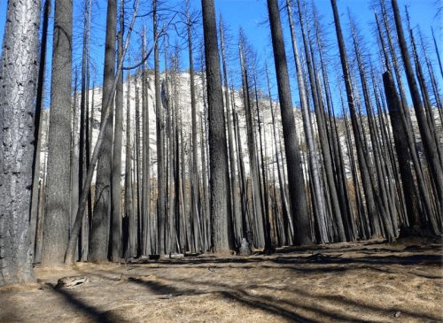
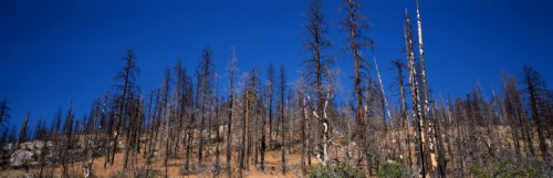
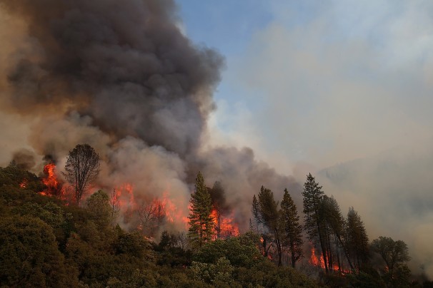
The enormously destructive spread during the summer of 2013 of a wildfire that began just outside Yosemite National Park, as an illegal fire begun by a hunter spread to consume almost 5,000 acres of protected lands. The scope of its spread challenges skills of mapping, and raises questions of managing wilderness and containing wind-driven flames. Even at a distance of three years, the costs of the unmanageably rapid spread of fires is visible in the charred remains of burnt trees that stand, as carbonated sentinels, along the highways one is likely to enter Yosemite Valley. They are reminders of the fire that began in the nearby Stanislaus National Forest and raged uncontrollably over weeks, consuming almost 260,000 acres of protected lands in the Sierra Nevada over two months. Even today, expanses of scorched areas with limited green after-growth mutely pose the sort of questions we are compelled to return to maps to resolve, but that current techniques seem inadequate to resolve by imposing layers over a terrestrial base-map.
The mapping of fires is both a cutting edge technology of interactive web mapping, able to track progress, intensity, and rates of evacuation from burning lands with local burn rates with a degree of GPS precision able to synthesize a greater range of data about fires than we have earlier had at our control. But are the maps of fires effective measurements of the scale of destruction or even the pathways of communication of dangers from fire–a danger increased with the growing number of unsupervised fires in wilderness areas where many homeless are increasingly based, and adequate resources not dedicated–and the spread of fire is simply not able to be that easily mapped.
The steep costs of such fires are not only unable to be comprehended, but so is their scale. If we map fires to better understand their spread–and the speed at which they travel, as well as the violence of their impact on protected terrain–The cost of this inability to chart the rapid spread of the fire suggest the difficulty to grasp the immensity of the costs of its current danger to the Eastern Sierras–a monumental expanse whose protection constitutes among the most valuable of America’s assets–both the difficulty of charting the ferocity by which fires threaten to destroy, the need for their prevention, and indeed the costs of failing to conceptualize the destructive costs of fires’ containment. For if the charred remains of dead redwoods and sequoia suggest the unstoppable progress of the fire in the hot summer of 2013, they remind us that increased summer heat threaten to incredibly steep costs and pose future challenges for mapping the spread of firespace.
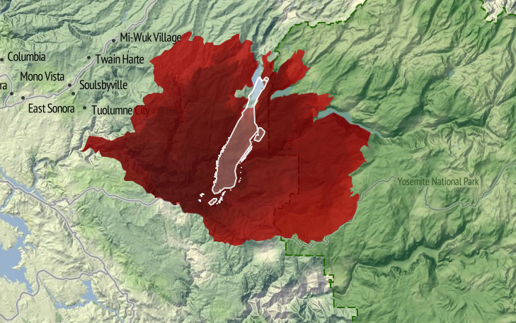
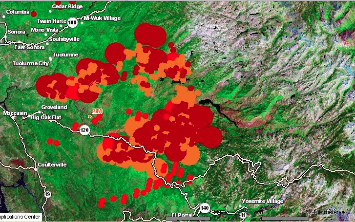
The terrifying rapidity with which the 2013 forest fire spread to become the largest-ever fire in recorded memory in the Sierra Nevada mountains posed such difficulty to be controlled from the middle of August that demanded to be mapped, but its expansion challenged the adequacy of mapping tools. The fire not only led to evacuations from the park as it extended into northwestern Yosemite, and to call for increased numbers of forepeople to control the blaze, as its shifting distribution and spread pressed so many firefighters into active duty to contain its growth, by both representing and masking its causes for and proportions and the difficulty of controlling its spread.
For although a number of fires occur yearly in Yosemite Park–either by lightning strikes, unattended campfires, or lapses of attentiveness, the specificity of the 2013 rim fires’ spread was due not only to its expanse, or proximity to Hetch Hetchy Reservoir, but to the winds that drove it, which distinguished it from other fires that are more easily controlled. For the rapidity of the spread of the fire distinguish it from the range of wildfires along the west coast that Ben Jones, using government data, mapped from 2002-2012 in Tableau.
Whereas most of the fires that occur in the western part of the country were during the summer months, and most were caused as a result of lightning strikes, the vast majority were less than a quarter acre in size–and only a handful (one hundred and fifty-eight in a decade) exceeded 5,000 acres. The fire of 2013 consumed over 250,000 acres, making it a striking challenge and almost unique case to map its geography and spread–and providing an almost predictable worst-case scenario given the radical reception of the snow-pack in the Sierras that year–a decline that has only continued in recent years.
Yosemite Conservancy–Snow Pack around Half Dome
Much as the weather systems in the Valley and mountains are notoriously difficult to forecast or record, the winds–like the swaying of the slender Lodgepole pines, among the first to move into a burned environment, or the increasing density of trees across the Sierra Nevada, or the density of old-growth trees as the Douglas fir or Ponderosa pines that fill Stanislaus and Tuolomne counties, and run into the confines of Yosemite outside which they lie. And yet we are compelled to turn to the maps that so elegantly charted the troubling progress of the fire over a sequence of days, drawing out the progress of forest burning over weeks, even as we were fed new maps daily, together with weekly composites, of the progress from which we were perforce geographically removed. Watching and mapping the spread of the fire became increasingly dramatic and compelling precisely because of the difficulty with which it was contained–as if the fire resisted the abilities for synthesizing and bounding its own spread as it rushed in high winds across tree tops, breaching the boundaries of roads and approaching areas of denser settlement.
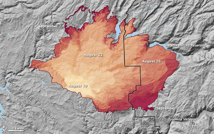
Spread of the Rim Fire from August 19 to September 2, 2013, as reported on InciWeb. Credit: NASA Earth Observatory
After consuming over 257,000 acres, the Rime Fire is 92% contained–two giant sequoia groves preserved–and trapped in a fixed perimeter at a low intensity, and the number of fire-fighters down from over 4,500 to 287. But the rapid expansion of the fire raises questions of containment, continuity, and scale beyond the categories we can most easily comprehend–say of cities such as Manhattan island, here trapped in the red expanse of blazes, or Berlin–images that adopt the familiar format of territorial maps. For while these images effectively communicate the size of the region to which the blaze expanded, they also create a false equation by which to understand its origins, spread, or possibilities for its eventual containment.
But such mapping of expanse provides little communication of the nature of its human causation, or of the difficulty in the reversal of its spread, while they impress its expanse. The values of measurement, scale, and proportionality which determine the construction of maps provide less value as criteria to map a fire that is able to leap from the underbrush to branches and the crowns of red pines, sugar pines, cedar, ponderosa pine and Douglas fir–among which fire travels in ways less understood by metaphors of terrestrial continuity, whose rapid expansion is facilitated and fed by decades of neglect at thinning forests on the park’s perimeter on account of substantial reductions of funding for adequate preventive firefighting by controlled burns of underbrush. (And the consequences of such reductions will be felt further by drought and higher, where the temperatures in the western United States bound to increase fire frequency by drying and warming landscapes.)
The result created something of a tinderbox in the Stanislaus forest, where the extensive undergrowth helped to ignite the fourth largest forest wildfire in California since 1932–a blaze that only slowed as it met far less underbrush in Yosemite National Park itself, where it also encountered far less dead wood, overgrown forests, and debris on the forest floor.
Justin Sullivan/Getty Images
If the terrestrial map provides a poor visual metaphor for the communication and progress of the fire, maps also provide limited tools to understand the dynamics of fire containment. To speak of “footprints of actively burning fires” in Yosemite Park not only misleads. It mis-represents the abilities for the fire’s containment and impending danger of its astounding spread from a small canyon in the Stanislaus Forest. Unlike the image implied by a single ‘footprint’ of clearly defined bounds, multiple fires that have spread from Yosemite Park’s rim into the park itself in ways that cannot a single block or region, as is by now increasingly evident with the spread of the fire Labor Day weekend into the San Joaquin valley and the spread of smoke into the Valley itself, obscuring the very views for which the park has been so long known with dense smoke and leaving a burning smell in the National Park that has not only symbolic resonances as a region of protected wilderness, but is a historic example of the protection of a preserve of wildlife and old forest growth. It is difficult to register the destruction of space and place watching the spread of the fire’s leading edge over several weeks on an animated map of its almost unstoppable progression: http://gu.com/p/3tgff/tw.
To be sure, the historical spread of fires in the park due to lightning strikes can be understood as a process of forest management, as Kate Wilkin has shown by using color-coded polygons to trace the quilt-like nature of historical fires in the mixed conifer forest in Illilouette Creek Basin in the Upper Yosemite wilderness.
The quilt-like nature of historical forest fires in the park however contrast to the immediate ways that we map the progression of a fire. The mapping of the expanse of a fire that crosses roads, boundaries, and other mapped lines poses problems that are not only cartographical in nature, but address the effectiveness of communicating the fire’s spread to the interested public–and the danger future wildfires pose. The demand for compiling an updated image of the fire’s progress in the hopes to capture the destructive phenomenon that raged for several weeks and consumed an expanse of over 350 square miles–almost 100 of which lie in the boundaries of Yosemite National Park–and which threatens to overwhelm and destroy its precious landscape. For most maps fail to embody the fire’s own contours, causes or impending expanse.
Repeated re-use of the “footprint map” of the fires in media outlets minimize the facts of its spread or existence of a clear perimeter around the “rim” fire by confining it to a fixed area, in ways that the animated map recapitulates in mapping the gradual if jerky expansion of an ink-stained red expanse to fill nearby canyons and valleys as it comes to border and surround the Hetch Hetchy reservoir itself. Indeed, much of the fire that has burned in the Stanislaus Forest has remained off the radar–though this has been where most of the burning has occurred–given the dominant media focus devoted to Yosemite Park’s wilderness–and the region’s iconic status as protected wilderness in the national imagination: indeed, the fire is more compelling than the fourteen active or contained fires in the state that are mapped on the California State Fire Map by transposing CAL FIRE data to a Google Map of the region, replacing the usual pinpricks by swirls of red flames to denote alive fires, and white flames to denote those “contained.” A “contained fire,” in this iconography, commands less visual attention, if not being discounted–despite the map’s benefits viewers, the remove of its map signs from the landscape they are overlaid is a particularly perilous way to foster public discussion about fire dangers.
The moral failure of abdicating abilities of creative mapping to communicate the process or movement of fires has severe implications for our ability to appreciate, understand, and combat their spread–especially in the benign construction of the containment of a fire’s spread. Similarly, notwithstanding the intent to try to map the entirety of the area engulfed by flames, the mutable areas engulfed by fires and the discrete paths of its travel, and the travel of smoke or ash, are masked and left silent in the mapping of its “footprint.” Unlike the “footprint” of a building, house or complex, indeed, the fire resists definition by boundaries, or to be easily controlled, although that image has been repeated in new stories about the “rim fire” that cannot be safely contained, as if to quell fears of the difficulty of drawing boundaries around its recently expanding brushfires that threaten greater destruction of the oak, pine, and older growth trees in the park’s upper reaches. The 94 square miles of national wilderness consumed by fire in northern Yosemite over Labor Day weekend, up from only 74 square miles the previous day, have been unable to be contained because dense smoke obscures aircraft visibility sufficiently to obscure pilots who might otherwise drop water to contain the blaze, although they have since begun to fly once more as of September 1.
The difficulty to map changing nature of the fire–and the limits on firemen’s ability to control it–need to be better registered and more effectively communicated if it is to be adequately described. For even if it is tempting to isolate the burning region as removed from the most-visited destinations in the park or locations of many campsites, the failure to map the fire both conceptually seems an obstacle in clarifying its dynamic–or even the plurality of fires that have begun to burn. Given the small portion of the fire controlled, which grew quite slowly from 2% to 9%, given its poor accessibility, and, only more recently, to 12% and 15%–as if the doubling of the percentage under control could match the expansion of the wildfire, its mapping might better reveal the obstacles to control its spread, indeed, rather than process a set region or place that has been evacuated of inhabitants. It’s unclear, in short, how maps of the fire process the disaster’s scope or meaningfully present the relation of firefighters to it: if not negligible, the relatively minuscule share of controlling its rapidly growing expanse rely on Google Maps to chart the fire’s expanse in relation to human habitations or sites of evacuation in problematic ways; maps of the fire’s perimeter and coverage inadequately represent the disaster’s situation or dimensions, and their re-use in most newspaper and media outlets confuse the fire as a human event–or an event that impacts human settlements–even though it surely does in part. But the result is to confuse the object of the map, and the nature of the fire with its threat to residences near to or in the park, and the drama of resettlement outside the most threatened region.
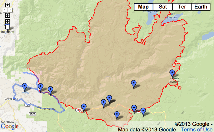
August 24, 2013 map of closures and evacuations in park
Map the US Forest Service website, August 24, 2013
For the impact of the fire is surely its destruction of a habitat long preserved and sanctioned for wildlife in the Sierra: a map of its relation to sites of human evacuation suggest only a small part of its impact in an area long preserved from settlement, by privileging areas from which residents have been asked to relocate or withdraw–and fatally confuses or misrepresents the nature of the fire by privileging its relation to human settlements and sites of evacuation, as if that would magnify its dangers. The dryness in the forests that have contributed to their spread remain unmapped in such schematic projections, as are the currents of high winds that facilitate its spread, as the fire remains a block to be combatted and confined–its flickering boundaries in most maps of the region are a reminder of its extremely rapid spread. The inadequate nature of abilities to map its rapid spread inside the borders of Yosemite Park, or to control its rapid progress in the back-country just four miles away from Hetch Hetchy Reservoir, and then at the reservoir, posed deep questions of how to map the growth of and control over the fire, and the ways that maps of fire communicate a convincing relation to its spread by demarcating a fixed perimeter in red–or shading the entire firespace in red.
This is not to say that there is an absence of maps of the fire’s spread, but that they are–in general–absent form the news cycle, in its search to provide an up-to-date snapshots of the fire’s progress and the impact that it is having on human settlements. The spread of the fire from a canyon in the Stanislaus Forest provides a compelling image of the spread in high heat with prevailing winds, moving in jumps from the upper branches of trees as well as passing along the dried out underbrush. But few, as below, use an informative backdrop of the potential for fire-risk to plot the fire’s widening perimeter, compiling data of fire progression over the weeks of August 17-28 by GIS software to orient viewers to the fire’s rapid expansion and to the dangers of the fire’s further spread:
The powerful overlaps of data in the Esri map that integrates wildfire potential in the region with the fire’s spread uses layering of data to create a dynamic surface to map fire progression. In sharp contrast, images deriving from Google Map templates place pastel pinpricks to individuate sites of evacuation in the parks in a field of green, as if to allow us to read the spread of the fire a human story in a far more static map–relinquishing responsibility to map the spread of the fire. More than providing actual or precise information, the maps are removed from the fact of the fire–which is oddly absent from them, as is the nature of the fire’s rapid spread. The presence of the fire is even muted by the placidly pale iconic markers that Google Maps employ–periwinkle markers and a light green screen–seem antithetical to the violence of the very fire it charts, or the brush, oak, and pine that fuel its continuing spread. One would not know that the fire has been burning for more than a week, or that it was in danger of consuming some 225 square miles, and could easily send out sparks a mile and half beyond its current perimeter. As the rim fire in Tuolumne County, CA has expanded far beyond 150,000 acres–four times the size of San Francisco–little help or solutions seems to materialize for its extinction, even as huge amounts of flame retardant and water are dropped over the region by fixed-wing tankers. More recent visualizations of the fire incorporate the icon of an isolated yellow flame in a map of evacuations, closures, and shelters for evacuated outside the rim’s periphery.
But attempts to chart the huge damage of wildfires in terrain maps of the “rough footprints of actively burning fires” can barely communicate the progress of its destruction. From a small canyon fire, the brush fire has consumed oaks, pine, and threatened giant Sequoia trees, in what might be the largest recorded wildfire in California history: it resists being mapped. In fact, rather than being contained, in other words, the problem of mapping a fire never more than 7% contained has not been confronted by the news agencies that pretend to map its spread. The stop-action image of a bounded range of danger suggests an almost wishful level of control over a fire that has increased in size by over 10% each day, the slow growth of the proportion of its containment from 5% to 2%, back to 7% and then to 15%, if comforting, seem less statistically meaningful–especially with at least fifteen more days expected until the fire is contained in mid-September. How much more likely is the lack of control only to grow as it expands?
The map is mute on these questions, or barely registers a response. More problematically, the maps “lie” in drawing clearly demarcated boundaries of control for the viewer, to use Mark Monmonier’s phrase in How to Lie with Maps, reducing the multiple effects of the raging fires to an entity mapped only in relation to settlement–despite its far larger destruction of the wild–erases how the fire has transformed the land. An early image from the Los Angeles Timesconfined itself to highlighting spot fires in the perimeter that was threatened seemed to conceal the fire’s rapid spread in almost every direction of wilderness in the National Park as much as they illustrate its danger zones:
If all maps are translations, the ability to translate how fires have spread from a small brush-fire of some 400 square feet in a remote canyon of the Stanislaus forest to consume over 250 square miles challenges the ability of any map. The distribution of fires on August 23 was already less circumscribed, as the rim fire seems to have rapidly expanded along the mountain tops, light orange clouds providing evidence of recent burning. Shifting mapping to a terrain-view, and measuring fire activity, raises an entirely different set of dangers, in this map of August 23, if the ring of fire still seems limited to the rim, and only vaguely suggesting the danger of its spread and the limits of being at best only 5-8% contained for several days, if containment has grown to 20%:
Indeed, the map conceals the lack of much of a strategy to deal with a blaze that has become increasingly difficult to contain save by letting it burn itself out. While the map of boundary lines lain over a landscape map is removed from the nature of the fire’s progress, the recent perimeter of fire is oddly removed from the fire’s effects in comparison to the map of its progressive expansion from Stanislaus Forest to the border of the National Park.
A more recent map, including a further array of MODIS satellite-sensed thermal hotspots and active fires in an Esri overlay map provides a more realistic, if substantially scarier, image of its evolution as a growing heat source–the practical problems of mapping the fire’s expanse to an entire shore of Hetch Hetchy Reservoir also suggest the steep challenges of its containment.
One of the deepest worry of many in reaction to the maps is of course the relation of the fire to the landscape. The fire of course threatens the region of wilderness that the park was dedicated to preserve–a nationally sanctioned wilderness within Yosemite park whose pristine old-growth forests that have been enshrined in our collective memory within a long tradition of American photography. The mythic photography of Yosemite’s wilderness was nicely undermined in Roger Minnick’s famous 1980 color chromogenic print of a visitor contemplating the Valley’s glacial waterfalls from Inspiration Point–her hair pinned up within a kerchief of its prominent sites. Despite the touristic appeal of the region, the image of the natural splendor of sheer rock cliffs, waterfalls and trees remains a central to the American imagination of wilderness.
Some maps distance worries of natural destruction by placing the National Park at a reassuring distance from the raging fires, accentuating the fire’s distance from the Valley, and the old-growth regions of giant Sequoia–mapping the expanse of the park in relation to the more delimited region fires have spread, as if distinguishing the smaller bounded region that is burning from a much larger whole, as in this fairly uninformative map that seems to separate the fire from the park, which is silent about the pathways of the fire’s spread or expansion.
Yet as the fire spreads, even at 20% contained, the threat of particulate matter entering the drinking water that the reservoir supplies is not over. Meanwhile, the older trees and considerable biodiversity that provided a rallying cry for the Park’s creation from the 1890s are now threatened, as, continuing the military metaphor of combatting the fire, the San Francisco Chronicle has asked if the giant Sequoia have “finally met their match,” as if preparing to say goodbye to the oldest trees in the park that Roosevelt loved–and that have lived in the park for over 1,000 years. The maps disseminated in the news do not often register the lack of rainfall in the region, often noted by some commentators on the fire but crucial to comprehend both its spread and the challenges of extinguishing the wildfire. Fires are not that uncommon in the state, or Northern California’s forests and parks, based on national climactic data; but if fire-risk is widely measured and announced, maps give immediacy to that risk: over 400 square miles of forest fires are being combatted across the state by over 9,000 men and women. While the map may minimize the expanse of the Yosemite fire and its , and risks naturalizing the spread of fires across the state, a map of the eight fires currently burning in Northern California reminds us of the constraints by which they would be adequately able to be controlled.
The multiple sites of wildfires, and the muting of the dangerous phenomenon by abstract icons, do remove relative the experience of the fire and its danger. But the image of the designated area of wilderness perhaps most feared to be threatened and violated by this year’s out-of-control rim fire–the fear of whose loss may be tragically prefigured by the emblematic loss by incineration of Berkeley’s Tuolumne Family Camp outside the park, whose buildings and trees were obliterated by fire on the weekend of August 25, having served campers since 1925. The burning was commemorated in a recent public vigil in the city of Berkeley, CA, a poignant expression of loss amidst mind-numbing procession of images of flames. For the symbolic nature of burning in a pristine region of wilderness, less accessible by roads and less able to be travelled by vehicles, lies at a base of the many anxieties about the forest fire in the news. Indeed, the sanctioned nature of the Yosemite Wilderness as distinct from a simple National Forest, and existing with its own decorum of wildlife conservation, and a relative minimizing of human garbage or refuse, and of power vehicles, is a preserve of wilderness region whose loss would be even more incalculable:
The demarcation of “wilderness” may seem obtuse, either as a designation in need of designating (in order to be protected). But it reflects how few areas of wilderness exist: the mythic pristine nature of the region, and the danger that its very inaccessibility poses to fire control, combined with the danger of fires to the densely forested area, filled with dry, dead wood as well as underbrush, making the fires so difficult to contain by firefighters or equipment, and suggesting something of an inevitable narrative of loss and destruction that works toward its tragic denouement. A significant part both of the compulsion and oddity of attempts to map the fire’s spread is the very contingent nature of any mapping of wildfires, and the fact that one is mapping something that is difficult to contain–as opposed to containing an image of nature readily comprehended in a map. The purportedly unforeseen velocity with which the fire spread of course make difficult any single capture of events within a map difficult–and even more difficult than mapping lines of military engagement and war. Metaphorically mapping the fire as engagements on a line of combat begs questions of how the fires might ever be contained–save by burn-out fires that attempt to stave the fire’s spread by controlled burns, downwind of the larger fires, between the perimeter of the main fire and a line of control.
Jae C. Hong / AP
These fires raise questions of the dangers of identifying the fire as a single entity in need of monitoring or control. What is being mapped in a plot of burning trees, when fires in the upper branches notoriously jump from tree to tree, in ways difficult, or extremely challenging, to control from the ground? Should one map vectors of transmission, and intensity of heat, as well as location? Or the high winds that now threaten to carry the fire further north into the park? These are aspects that seem to challenge the conventional newspaper maps that use Google Maps templates to locate the fires–and are difficult to digest because they effectively rhetorically diminished potential impact of a fire that would so rapidly spread, even in trying to map it to discreet locations in space that have been identified as dangerous to human populations, obscuring the nature of the burning across the region.
These maps diminish the danger of the fire in a sense, by omitting the extent to which the extraordinary dryness of the region will only lead the fire to spread rapidly. What is the way, one must ask, that fires travel or “know” space, or what sort of continuity exists for fires that the notion of a mapping of terrestrial continuity fail to show or reveal? The question of the further igniting of fires, or the time-indexed travel of fires, is a bit more challenging to read, but far more informative as a model to understand the problems of how it can be combatted or contained, and the manner that it threatens to impinge on the so-called “green perimeter” of the forest itself–even minimizing the fragility of the perimeter that is shown as if it were a fixed line. More importantly, perhaps, they shunt aside questions of how the fire would be contained and provide limited public understanding of the disaster, by perpetuating the image of a contained disaster, even as banner headlines scream about the rapidity of its expansion in the air in a region that has long been parched without rain, and whose high risks for fire were long noted. This map, of August 23, provides a view of the initial spread on Friday, based on the US Forest Service’s Remote Sensing Applications Center (RSAC), based on the analysis of spectral bands in satellite imagery of areas with expanded wildfires better to visualize local variations in the intensity and spread of fires in expansive regions as Yosemite National Park:
And reveals its approach to Hetch Hetchy’s shores, and rapid spread to the center of the rim–and the set of consequent dangers to water supplies minimized in recent news reports of Monday, August 26:
The spread is evident from the intensity with which wildfires spread during the previous day:
The value of this map, of course, is a primary concern with mapping the fire’s spread, then situated within the human settlement of the area, but using map conventions to fit the unique characteristics by which they fire spreads. Already one can see the stark spread of the fire over an entire region, and the relative impossibility of containing the inevitable inward spread of the fire from the rim, toward what seems an inferno of dense pine and oak, as well as burning overhead threatened giant Sequoia trees and redwoods.
Although the techniques specific to active fire maps are widely used specific to the Dept. of Forestry, a panicked tweet urgently worried that the fire’s spread had been minimized (and inadequately mapped) to reduce the extent of the fire by August 25, as if the spread of the fire toward the end of had been suppressed–and the proximity it seems to have gained to the Valley and to Yosemite Village.
The influx of large numbers of fire fighters from other states helped contain the fire, by last count, some 15%, a statistic that might mitigate its current spread. But little has been said in the media–until quite recently, and then only in select places–about the relation of this fire’s spread to a Congress that depleted needed funds for fire-fighting abilities or fire-suppression technologies. If a casuality of the 24-hour news cycle, the budget cuts come not only from fiscal irresponsibility but a reluctance fueled by stubborn refusal of climate change deniers to recognize that the forests have become increasingly flammable, as water as diminished in such areas as the region of the High Sierra. Even as the fire rages, the US Dept. of Agriculture mandated a spending freeze on forest restoration programs and firefighting budgets to help maintain fire awareness at high levels, although the Dept. of Forestry has spent more than a billion dollars on fires suppression this year, and 1.9 billion the previous year. This may well be the unspoken story lying within the story, and the one whose effects are still waiting, tragically, to be adequately mapped.
The drastic reduction in the Sierra’s snowpack has continued to raise alarms, but all too little has been done to contain or prepare for the need to contain wilderness fires, or the potential losses of nationally protected landscapes they risk destroying.
Reduced Snow Pack in the Sierra Nevada Mountains in August, 2014
Immediate access to images, maps, and other information makes us wax nostalgic for postal delivery on a 24-hour clock, and stamped snail mail six days of the week. Even the labor of licking and affixing a stamp seems antiquated now.
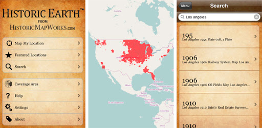
If the notion of allowing a thirty-day wait in red bold letters is the best addition to this artificially aged virtual post card, the app “Historic Earth” offered touchscreen reminders of the pastness present in a landscape that was ever mapped for a short time, in a neat if cautionary collaboration between university libraries and iTunes.
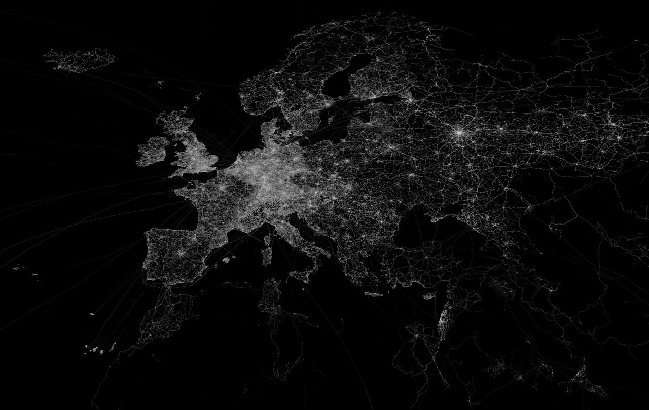
The re-use of maps that this app encouraged provide an interesting case of the circulation of older maps that digitization allowed. It’s as if Google Earth teamed up with an expansive archive of older maps, allowing us to summon on screens images of place which retain feel and detail and of paper originals, which were georeferenced to modern maps of the actual positions where one stands, using the background of an OpenStreetMap to suggest a layering of a map of actual space. (OSM is a crowd-sourced alternative to Google Maps that provides a platform to load maps inspired by Wikipedia, whose over 600,000 contributors offer GPS readings, often taken with simple handheld units, aerial photographs, and other geospatial data, in the largest collective mapping project on Earth; the non-proprietary notion of the map OSM uses lends itself especially well to “Historic Earth.” The service is also popular as an alternative to default backgrounds in GPS receivers.) The astoundingly large trace-density of OSM in Europe alone make it a perfect model for providing a background for older maps, as is made clear in a map Eric Fisher plotted of its specificpoint density:
The value of such a comprehensive open-source database facilitated the very features of geolocation “Historic Earth” boasted as its central selling point–providing an easily adjusted template of even broader scope than the uploaded maps covered. The concept of geoindexing a variety of older maps for daily reference is exciting, but the curiosity in older maps of all places was not uniform for all sites even the marketers realized that the interest of split-screen historical maps of few places were as compelling as those of the built environment of New York City, and even these poorly translated to an iPhone’s small screen:
The contrast of a cut-screen overlay was :
How did the OSM background help “Historic Earth” work to view local landscapes through the screens of old maps? On the one hand, the app “Historic Earth” provided a great way to appreciate the map as a human artifact–as well as, more obviously, an earlier sedimentation of human space. The maps that were made available in the app–formerly available from iTunes at bargain basement prices of $3.99 (£3.99 in the UK), uploaded from digitized images of the Osher Map Library, synchronized to one’s own GPS-determined position. Rather than map actual space, or presume a single point of view, the app offered users a form of virtual time-travel through scanned media: the experience of looking at an archive or junk store (or glove-compartment) is collapsed into the real-time consultation of a range of maps of wherever you are; the maps rotate in synchrony with your current location–so long as that location has been mapped. (The availability of maps of North American cities is evident in the below screen, for example, especially of the Northeast, LA, and Midwest, as well as parts of the Northwest around Seattle: urban views, one would guess, would work the best on this sort of app.)
Representations of a geographic space were geo-indexed for viewers, who could choose the epoch, from among the available years! The strikingly high-res app reflects the large collection of digitized maps of Historic Map Works, which already boasted a “geographic time machine.” The app goes further than digitization by providing a crucial element of geocoding to index this sizable virtual archive of over one million property maps, old road maps, antiquarian atlases, nautical charts of oceans, star maps, and views of place. Their digitized collection constitutes something of a veritable grab-bag of images–predominantly focussing on North America and including England and Ireland, and while this is not able to provide the universal coverage one would like, the collection mirrored a considerable market-share. In short, the app provided access to the world’s largest single collection of geocoded maps, both to “map the history of cities, times, buildings and landmarks” and “watch the landscape change over time.” Historical Earth offered viewers readily accessible proof that all landscapes had a history.
Whereas Historical Map Works grew out of the internet ancestry industry, with the somewhat interesting demand to ‘visualize where your ancestors lived,’ albeit in schematic form, the app offered a counter-map to Google Maps, or anti-Google map, at the same time that app’s coverage grew, by exchanging a standard or uniform Google Earth visualization for the proliferation of a multiplicity of maps from historical eras–raising questions, I suppose, of where the market lies. The expansion of this app at a heady time of the expansion of totalizing catalogues of images on-line mirrors the extreme optimism of a widely usable web interface for digitized maps. But the range of time that folks seemed interested in looking at old maps was limited, in comparison to other mapping software. Unfortunately, the app launched in October 2009 received mixed reviews, and folded the following year, despite the 32,000 high-resolution images of American cities and multiple antiquarian maps it promised to correlate. But the app deserves examination as a response to the widespread digitization of images.
Historic Map Works met the antiquarian in us all with the desire for a material record of place, by allowing us to order our own “personalized maps” of place suitable for framing above the fireplace or in one’s library, a ready-made family heirloom. In contrast, the app would allow one to flip through a variety of maps at any site, through views oriented relative to your actual position, providing a record not only of space but, documenting “changing space perception” as Urban Tick put it, by comparing the changing manners for representing the salient features of a place where one is actually located. The special feature “lock frame when browsing maps” allows one to select a demarcated frame of reference–and a rubric for placing one’s position relative to areas of the maps one might want to consult–to make it far easier than dealing with originals that might demand a similar practice of orienting oneself to each map as one goes through the requisite period of initial orientation to gain one’s bearings.
But is this really not a diminishing of what one might call map literacy, or the ability for reading information from maps? In a kind of antiquarian’s Google Street View, one can look through sepia-colored lenses at the past, condensed at a safe distance and with only an aura or hint of materiality, arrayed on the screen of one’s tablet or phone, adjusting the map by a slider in the same way that one reads Google maps, panning and zooming on a touch-screen, and in essence forgetting how maps are read. It creates, as well, some wacky hybrids, so that one can imagine oneself keying one’s position to a mid-19th century map while strolling in lower Manhattan, by the same iconography of a Google Map:
That could be fun. Or, if it would be any use, while driving in a landscape that you thought was familiar, but might want to see exactly how upper Manhattan looked and was mapped a hundred and fifty years ago:
Needless to say, it flattens history: we see, rather than inhabited lands, lines of property (old real estate maps) and architectural views, all represented in synchrony with the present GPS-derived screen, with little sense of their evolution (make your own links) or social geomorphology, to coin an absurd phrase to capture the gamut of forces that shaped the world in its current disposition and form.
Speaking of dispositions and maps, flattening history on maps can work in at least several (or multiple) ways, even the end result is two-dimensionality. There is something of a self-referential circularity to the practice of mapping–albeit a compulsive one of providing a total image of the earth’s surface–analogous to the use of OSM in the ill-fated if temporarily super-popular on-line version of Monopoly City Streets–but along the lines of the basic diachronic question, “Isn’t it amazing how much things have changed over the last 1,800 years?” This underlies, and is even openly asked, by the Washington Post‘s Max Fisher in the synoptic survey of all world history in but 40 maps, a post recently cobbled together from varied sources.
It took more than the simple ten whose design Peter Barber of the British Library judged worthy to be named the ten “greatest” maps to sum up human history as well as effective cartographical communications and shifts in cartographical media: to be sure, Fisher adapted the maps from a website boasting “40 maps they didn’t teach you in school, but essentially offers a Robinson global projection (or the variation of the Mercator projection that serves as the Google Maps template) to ask informed readers “how many of this map’s divisions are still with us today?” and break down a variety of economic databases or Gallup Polls on a multicolored data visualization. Two measure such stereotypically quasi-racist questions whether national Muslims worldwide “believe in democracy rather than a strong leader” or view “religious conflict” as “a very big problem” in their countries: these maps serve to reveal “big secrets” that we already suspected, in short, or provide us, as the map of countries that possess nuclear warheads; North Korea’s missile range, or the infographic that sadly compares economic inequality in the United States to the rest of the world–in each case transposing sourced data to familiar (if not generic) cartographical schema.
My favorite two are typical in being less about rendering space, spatial relations, or really even the explanatory ability of the map: the first, revealing who “loves and hates America [i.e., the United States], an emblem of our current isolationism–
–and another that maps “self-love,” but also reflects the meaningless nature of emotional “liking”–in the sense, itself residing in that meaningless, promoted by Facebook culture–of where people feel “most loved yesterday” in the world:
Each map poses as a sort of revelation about global conditions in a pretty half-hearted way: folks aren’t that happy in central Asia, but Americans and Canadians, as well as Brazilians and Australians and South Africans (and Saudi Arabians!), seem pretty well off! One is tempted to read the greyness of Russia as a gruff “there is no data here,” but it is a more believable probably less than half. The ‘map’ of Central Africa is sad, but does it map that much anyway, except what we already expected? In spite of the global purview of each, re-use of identical cartographical templates in each of these images diminish their cartographical arguments–or obscure in intentional manner the power of the map as an argument.
Fisher’s map is likely to celebrate in somewhat jingoistic and reassuring fashion of explaining what one already knows, as in the affirmation of “where it is best to be born” whose broad swaths of blue and expanse of red only obfuscate variations in the economic data used to decide what “best” means:
It’s odd that Fisher only included two maps weren’t digital constructs or data visualizations for his post at WaPo. Both of these are in fact newly designed maps, and both border on cartoons: a historical missionary map of Africa of ca. 1908 and a 1990 map of a Russian political scientist Igor Pannarin, inexplicably chosen, prognosticating dissolution of the United States would split into six distinct pieces by 2010, each parts of separate sovereign states, in a reverse fantasy.
Only these maps out of those that Fisher posts make clear arguments, either as propaganda or wishful thinking (or fantastical projections)–but both do so in ridiculous forms. The other maps, deriving from a digital sphere, celebrate the transparency of the map as an elucidation, that hint at ethical problems in the naiveté of the re-use and circulation of maps in the blogosphere that echo the range of ethical problems Ellen Ulman associated with the “digital environment.”
Perhaps this environment is yet another inflection of a post-modern condition: does our ability to map most everything undermine or empty reading maps as sources or categories of information or to read them as descriptions of space?
Mortality is mapped to gain a grasp of geographical distributions of illnesses over space. The mapping of death helps to embody the pathways of disease, and allow us to see otherwise inapparent vectors of transmission, which have historically provided crucial ways to assign meanings to a disease’s effects and pathways. In ways, the map manufactures and embodies the pathways of a disease’s infectious spread: the rise of deaths in the borderland between the United States and Mexico can only be mapped as a dereliction of national responsibility that charts an erosion of civil and moral codes. The recent erosion of civil law and attacks on immigration law conceal a longstanding withdrawal of responsibility along the border, opening the way to creating the borderland as a military jurisdiction—rather of civil law.
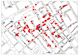
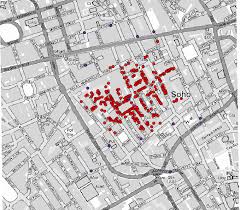
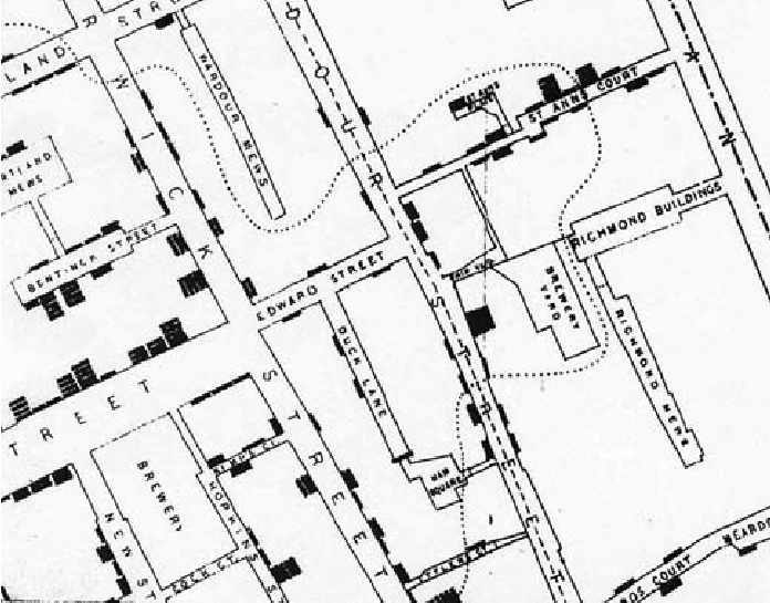
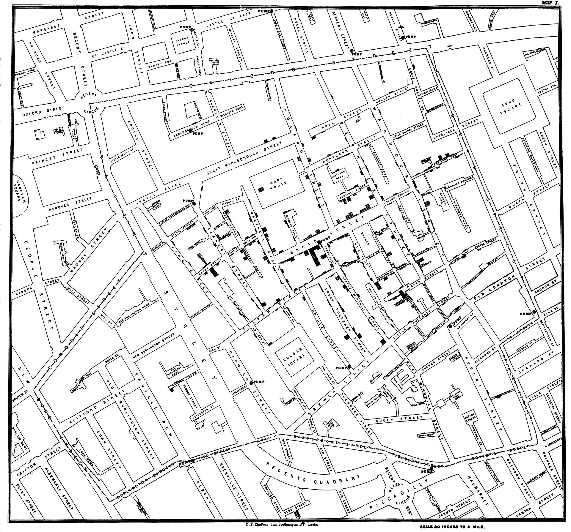
We have long mapped diseases to grapple with their causation. Even before the bacillus of a disease might be known or seen, the founder of modern epidemiology, John Snow, critiqued miasmatic theories of contagion by mapping the distribution with which cholera spread across London neighborhoods during the 1854 London epidemic, visualizing the disease as a social network of contagion by a dot map of neighborhood outbreaks that used a dot map to as proof that “nearly all the deaths had taken place within a short distance of the [Broad Street] pump” whose water was a vector of transmission. The distribution of mortality around public fountains provided a basis to demonstrate vectors of contagion for Dr. Snow, and by mapping all deaths from cholera to have occurred in recent years in relation to one pump on Broad Street in relation to London’s thirteen city wells by a voronoi diagram.
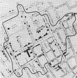
By locating each and plotting the distribution of deaths from cholera in the city in relation to the significant incidence of deaths form cholera near specific street-pumps revealed a way to grasp infectious transmission from the Broad Street pump that embodied a new notion of contagious diseases that challenged miasmatic transmission—making for the first time a clear spatial argument about how disease existed and moved in an urban environment, and presented a second map, with clearly traced polygons to indicate routes of transmission to the local parish showing routes of walking by which the disease was transmitted—using the recent mapped deaths from cholera in London Edmund Cooper tabulated—
—in hopes to encourage a level of civic engage about the origins of cholera infections that had plagued Londoner’s for twenty eras in the city’s fabric.
The source of deadly infections that this famous data visualization revealed suggests the communication of fatalities by a clustering that indicated clear routes of the spatial communication of a viral infection, focused on a large subset of deaths in close vicinity to the Broad Street pump, even without bacteriological or microscopic evidence.
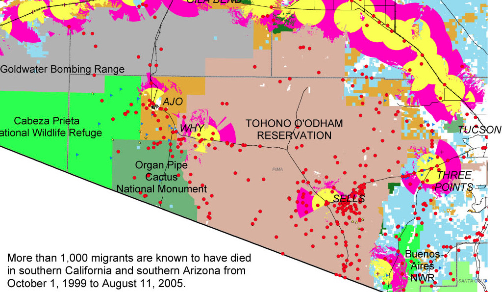
The exact distribution Snow organized contrast to the terrifying distributions of the deaths of migrants seeking passage across the border, which resists any extraction of an explanatory framework or conclusion, but raises questions about the inhumanity of the terrain we have created.
Dot maps of migrant deaths follow no such clear distribution, and has no sense of transmission form a single site. It forces us to acknowledge the deep problems of the criminalization of immigration on the Mexican-US frontier by charging its human costs. The sites of mortality from hunger and thirst are tragically dispersed over a far great undefined space, but embody the human costs of existing border policy, even a decade before Donald J. Trump used the management of the southwestern border as a campaign talking point to pole vault into public politics.
No similar diagrams can be drawn to elucidate the range of dead bodies discovered in the desert of migrants who were attempting transit into the United States for better homes: can one better explain their deaths b a virtual miasma of cruelty that fills the air of the border zone. Their deaths were caused by dehydration and starvation, as well as cold, but suggest nothing so much as a miasma of neglect. The distribution of deaths of migrants in the Organ Pipe Cactus National Monument, adjacent Cabeza Prieta National Wildlife Reserve, and O’Odham Reservation already illustrated a dereliction of national responsibilities.
The map is a deeply tragic reminder of the loss of life that is forgotten in the dry expanses of these deserts where the border, such as it is, lies, and the distinctly disturbing regime of a lack of interest or care for human fate that—even with the mortality of children in detention camps at the border—still can stretch incredulity at the evidence it offers of a large theater of cruelty. They recall the denial of burial to the bodies of enemies in the ancient world, left as prey to dogs and vultures: the Enlightenment jurist Giambattista Vico faced considerable difficulty explaining to his readers that there was a time when the bodies of anyone was left unburied in an earlier age in his Scienza Nuova, “an inhuman custom—so contrary to what the writers on natural law of all people’s claim to have been practiced among any nation— . . . which [once] prevailed among the barbarous peoples of Ancient Greece,” described in Homer’s Iliad, and at which he marveled as “crude, coarse, wild, savage, volatile, unreasonable and unreasonably obstinate . . . and foolish unreasonable customs,” far removed from his own age and from the imagination of his readers, so “discordant” was it with our own civil age. Yet the unburied dead whose bodies have been located in states of extreme decomposition along this border zone reveal a discordant reminder of the return of such an inhuman custom on the borders—and within the borders—of what we consider is a region that is distinguished and administered by civil laws. Whether this region can be rightly considered a region of lawfulness or civility seems to be raised and put on the front burner by the discovery and attempted identification of the human remains discovered lying in the desert, often dramatically decomposed, of migrants’ bodies dating from the administration of George W. Bush.
If Vico could scarce imagine the barbarity of leaving bodies exposed to the elements even in war—and the spectacular cruelty of the dragging of the body of Hector around the perimeter of Troy three times—among those who “were held to have spread humanity across the world,” given the sheer physical disgust of leaving the body unburied, and given that “all gentle nations certainly concur that souls [of the unburied] remain restlessly on earth, wandering around their buried bodies,” from Guinea to Peru to Mexico to Virginia to New England to Siam, the readiness of Christians to leave the dead unburied by the border, if not intentionally, haunts the border region with its own inhumanity. The violence of this early heroic age was before the age of laws of nations, for Vico, and belonged to the age of “violent and impious men who dared to enter the cultivated fields [] in pursuit of the weak who had fled thither to escape them,” and belonged to “the vulgar customs of the barbarous Greece” of Homer’s day, and adequate burial in fact constituted one of the three institutions of human society—with marriage and religion—in ways that betray the huge remove of a heroic era, which incredibly lacked burial customs or rites, from our own.
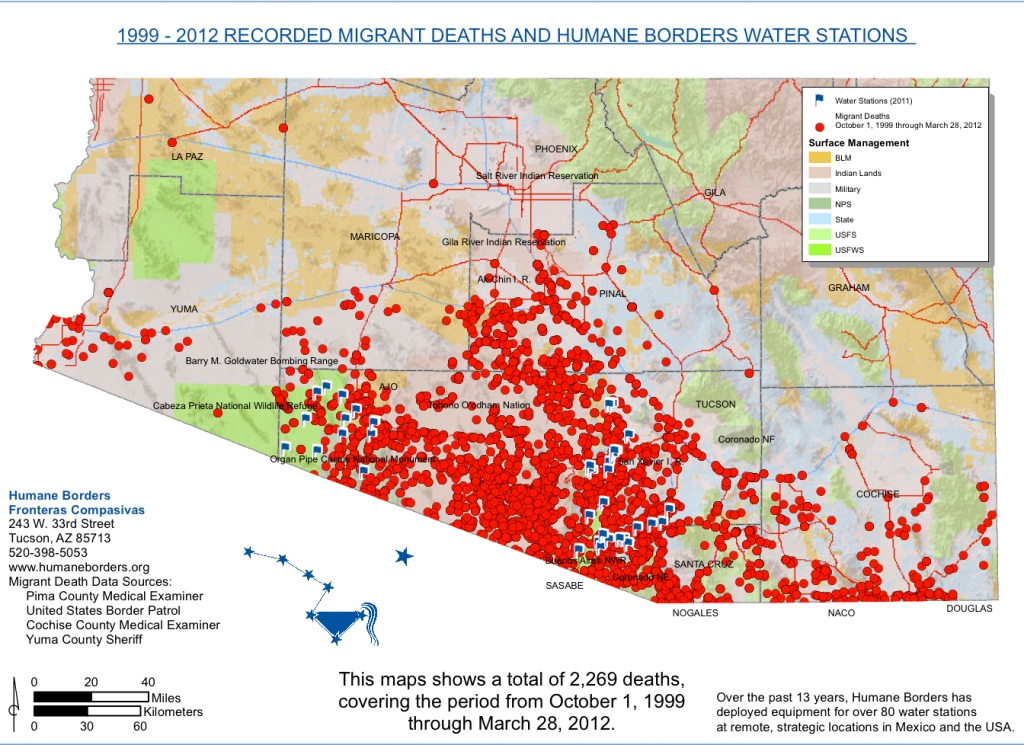
Yet the abandonment of unburied bodies has returned in the no-man’s land of the US-Mexico borderland, where the abandoned bodies of would-be migrants fall between governing bodies and accepted customs. Migrants that were stopped during the course of their attempts to reach a new life in the US were clustered at a distance from the border but reveal the amazing distances many undocumented migrants travel before they collapse, without food, and most often out thirst and dehydration–leaving them exposed as “prey to dogs and vultures” in the very horrifying ways that Vico was so horrified. The recent spatial distribution of such abandoned cadavers and corpses, left without any rites of burial, force the viewer to scrutinize its mute surface of dots against a deceptively pastel base map as if they might magically be able to glean or recuperate the silent, forever-lost stories of migrants who lost their lives attempting to cross the border, and the stories of whose travails and travels can never be told. The ends of their lives, reduced to the finality of a bright red circular dot in the data visualization, out of scale, arrests attention but is disarmingly and alarmingly flat, resistant to any further narrative or even identifiable name. Over 2,000 dead migrants whose bodies were retrieved at a significant distance from the border suggest their desperation to make their way across the border by clandestine routes, and the extreme climactic difficulties that they face, with few adequate provisions for crossing deserts whose expanse they feel forced to travel to search for jobs–risking their lives to do so.
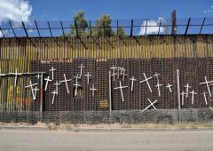
Ex Voto painted to express thanks forsuccessful crossing of the Rio Grande
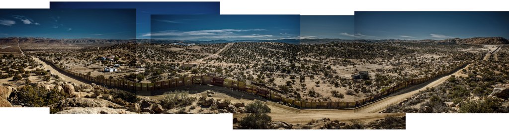
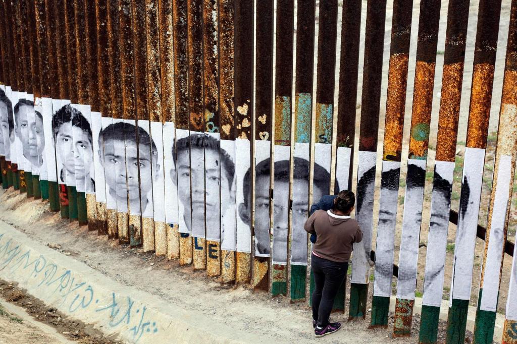
If the many migrant deaths of those attempting to cross the border between the United States and Mexico are often expressed by crosses that are hung on sections of the fragmentary “border wall,”—
—the precise distribution of the dead in sites of their death is rarely preserved in public memory, and the archive of dead migrants who did not survive passage is rarely assembled as a geospatial record.
The number of the dead remains but a fraction of those who have actually died attempting to travel north, leaving detritus and lost objects in their wake that only beg deciphering as images. For although their overlap suggest something like a clustering that might belong to an external infective agent, the alarming nature of the red points call attention to the human costs–and the anonymity of lives lost–that are the victims of the intense dangers of border-crossing that migrants accept and undergo, who we have forced to accept and risks of dehydration, heat stroke, hyperthermia, and starvation which have killed them.
If the deaths of those attempting to cross the border will probably never be know with precision—and is often lost to oblivion—the recovery of human remains affords a grim picture of the actuality of recovering the dead, and the attempts to name, identify, commemorate and memorialize their fates as well as prevent the loss of their identities, despite the jarringly abstract geospatial symbology of this map, and the minuscule proportion of those remained that have been so far identified.
This project of memory and memorialization, echoing the imagery of northward passage in the famous Underground Railroad taken by fugitive slaves taught to recognize the handle of the Big Dipper to follow the North Star to find their path to freedom, “Follow the Drinking Gourd,” the symbol of the constellation has been adopted by the Humane Borders organization which has identified remains and sought to allow them offer needed geospatial assistance to migrants in their search to find a path north.
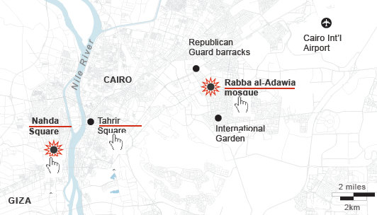
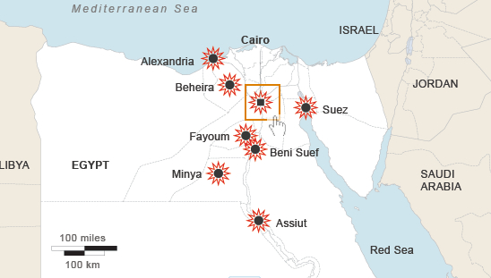
With an overwhelming display of strength usually reserved for clearing Palestinian settlers from villages in the Sinai or Gaza, Egyptian police forces descended at 7 a.m. on the sit-in at Nasr Villages’s Raba’a al Adawiya Square, near to the Raba’a al Adawiya mosque in Nasr City; indoor viewers watched non-stop footage on their television sets. Attempts to map the site have been oddly silent about the crackdown as an erasure of both a physical site of congregation and a symbolic site of open congregation, whose symbolism was tied not only to the mosque but to its autonomy–and less clear on how the symbolic connotations of the site mapped onto its destruction, for all the photos of both carnage and charred remains.
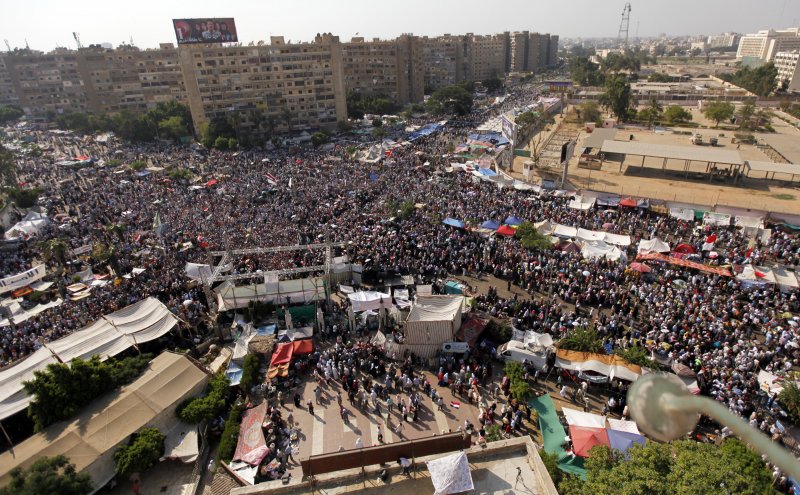
The demonstrations had been themselves some sort of micro-city, a testament to the organizational abilities of the Muslim Brotherhood, with entrances, checkpoints, and security committees. Other sites to register protest emerged, but were more easily cleared because, unlike the Raba’a Square, they were far less open or established, and less clearly defensible, leaving the two largest sites of demonstration at the university in downtown Cairo and at the mosque; protesters congregated at the mosque from June 28, or before the Constitution was suspended on July 3, which became the epicenter of protest; after government demands to end sit-ins August 11, the Raba’a sit-in dramatically grew.
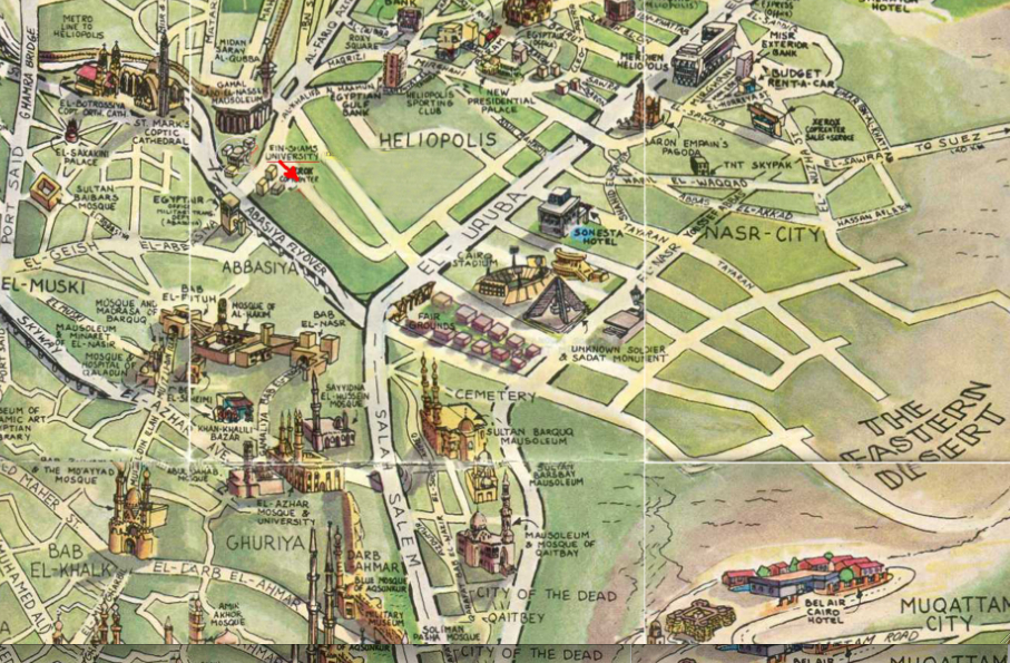
The site of the “camp” itself, however, six miles in proximity to Tahrir square on an intersection of two-way streets beside a mosque, occupied a substantial chunk of civic space:
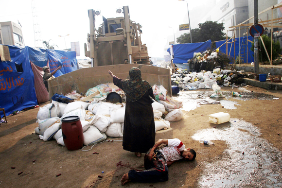
There was an initial attempt to map the “Morsi Sit-In” on the Al Jazeera network, as if to reaffirm its size. But the template of Google Maps can hardly come to terms with the mini-city created by the organization of entrances and check-points around the mosque, let alone the violent nature of the eradication of protestors–steamrolling the place, dispersing protestors by fire and tear gas canisters, and violating the site of the mosque. The occupation grew around the traffic hub of El-Nasr road, around the hub or nerve-site of the mosque itself, that convey its breadth and “infrastructure” as a movement. The map’s red dots of settlements are densest around the mosque, and define the ring around the neighborhood that had been surrounded with entry points before the order was given for army soldiers and police to move in, firing tear gas canisters to disperse the crowd and advancing into the square, where fires burned as police reportedly arrested more Muslim Brotherhood leaders as well as protesters who occupied the square, and entered the mosque itself: encampments burnt, the barricades surrounding the mosque destroyed, officers fired live ammunition as well as rubber bullets on retreating demonstrators, and protestors burnt tires around the last space the Islamic Brotherhood held in Cairo.
But the intersection of El Nasr Road in Rabaa al Adawiya functioned as a vital and living site in ways difficult to map without bodies.
The entrance of armored bulldozers on August 14 seems to have intentionally obliterated any trace of the occupation of the square, where settlements had sizeably increased from August 11, killing upwards of upwards of 623 and wounding thousands. Since vouching two months ago to protect Mohammed Morsi’s presidency “with soul and blood,” the protestors in Nasr City equated their occupation of the Cairo square with the occupation of Tahrir Square, a site earlier filled with anti-Morsi protestors, but the initial site of and platform for anti-Mubarak protests: Morsi supporters by the mosque promised sought to rest the voice from those in Tahrir who had called on him to leave in late June. The protestors who have settled in the square have created a sort of miniature city, much as Tahrir Square had been, as a public space, complete with tents, lavatories, improvised kitchens, and even dormitories, giving it a clearly contestatory role in the city’s geography–now cleared of inhabitants, save improvised clinics, hospitals, and improvised morgues. If Tahrir provided a sort of voice of the nation that call for Mubarrak’s resignation, and later for the end of the Morsi government, Raba’a seems something like a counter-voice of public debate: the occupiers refused to leave until those at Tahrir disbanded. While the al Adawiya mosque had been a site of site of assembly and congregation of the dissolved Shura Council–planning to convene its opening session from July 21, a site of a shadow government of Islam from July 21, in response to the disbanding of the Shura as a legal body. (Although press coverage has focussed on the mosque, it has ignored the dual function of the mosque as an alternate site of governance.) The mosque is now in ruins; the Al-Imam mosque also in Nasr City an impromptu morgue.
The territory around the mosque and the building was a focus of military aggression by Egyptian troops, as if the site of meeting needed to be obliterated from cultural memory. The response to the sit-in in Raba’a reveals it to be as politicized a territory defined by streets as the Parisian barricades, where every inch was contested. The government’s prime charge was ostensibly that they had come to obstruct traffic at a busy intersection in Cairo, and obstructions had to be cleared from the site. But the mass arrest of protestors and the violence of the response to clear the square, evident in the below photographs, suggest that a decision to obliterate any sign of their presence was the symbolic capital of Muslims in the city. The notion of obstructions to traffic was not only a pretense, but a metaphor for how the Generals felt about the protest.
Indeed, to feign to hear to other voice within the demands than a traffic obstruction is belied by the extent of any material remains of the tents, houses, and dormitories that existed there, as if to erase them from a historical record as well as to preserve their control over a divided urban space.
Mohammed Abdel Moneim/AFP/Getty
Detention of demonstrators near Raba’a al-Adawiya mosque. AFP/STR/Getty
AP/Ahmed Gomaa
Was the site of the mosque the target of such destruction? And after the fires at the Square, the mosque itself was burned, its sides were charred by smoke and interior demolished, as if to destroy the symbolic center of the protest itself that had provided shelter and refuge for debate from June: after armed forces dispersed attempted to continue the sit-in in Moustafa Mahmoud Square in Giza, subsequently to the dispersal in Raba’a, protests marches have been organized in response from some thirty Giza and Cairo mosques to Ramses Square.
REUTERS/Mohamed Abd El Ghany
As violence spread into other neighborhoods in Cairo and to cities throughout the country, with churches and government buildings desecrated or destroyed, Egypt’s government declared a thirty-day state of emergency, and a curfew. The next day, the deployment of armored vehicles around Tahrir Square the next day seemed designed to prevent the capture of another stage of public visibility. Soldiers also stand guard over the ruins of the mosque where the protests began.
Bryan Denton for The New York Times
The square in Raba’a was filled with crowds from early July, according to Business Insider:
The site of the mosque and the center of the protest is now being swept clean, the crowds long scattered and dispersed. The violence has spread to other neighborhoods and cities that might not be able to be clearly mapped, after troops violated the significance and integrity of the square.
One might remember that a very different, if antiquated, image of the integration of mosques within the skyline of Nasr City, Heliopolis, and the surrounding neighborhood:
We read more maps than ever before, and rely on maps to process and embody information that seems increasingly intangible by nature. But we define coherence in maps all too readily, without the skepticism that might be offered by an ethics of reading maps that we all to readily consult and devour. Paradoxically, the map, which long established a centering means to understand geographical information, has become regarded uncritically. As we rely on maps to organize our changing relation to space, do we need to be more conscious of how they preset information? While it is meant to be entertaining, this blog examines the construction of map as an argument, and proposition, to explore what the ethics of mapping might be. It's a labor of love; any support readers can offer is appreciated!

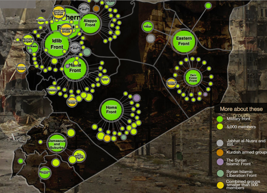
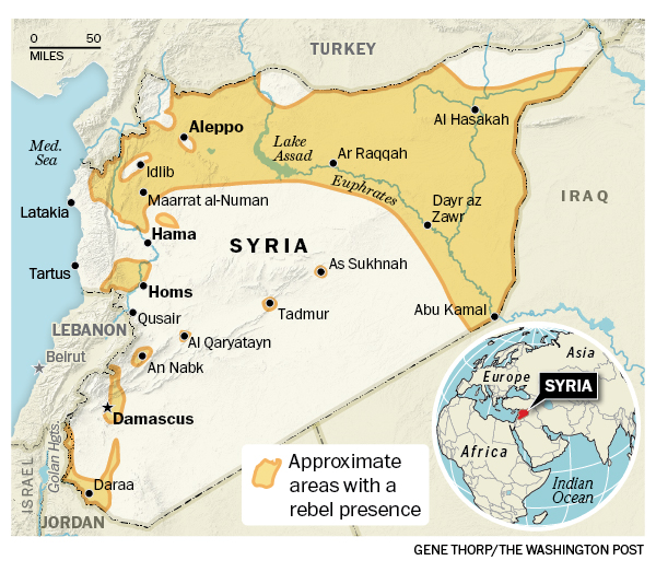
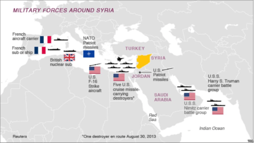
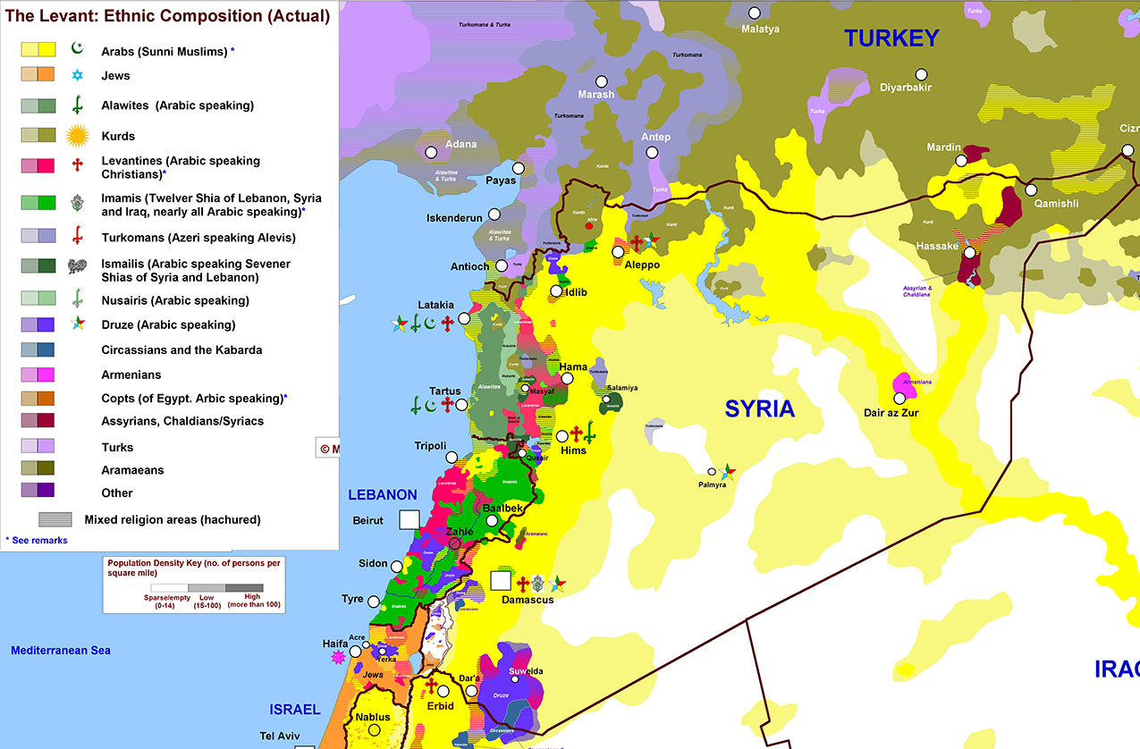
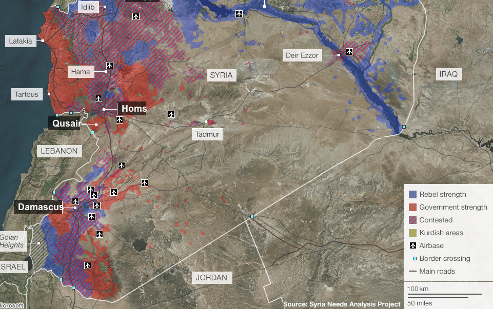 BBC/Syria Needs Analysis Project
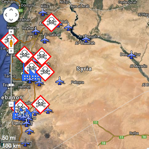
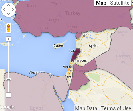
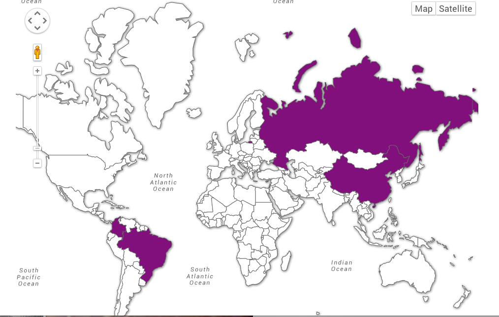

 Targeting of Syrian Capital on April 14, 2018/Hassan Ammar/API
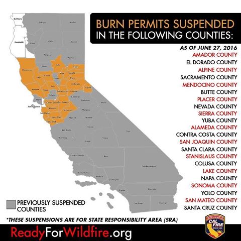

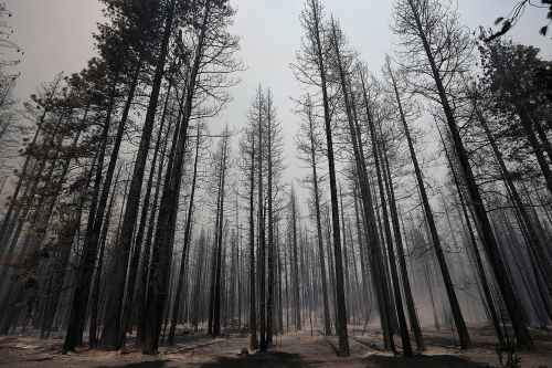 Burnt Trees Shortly after Rimfire