Monthly Archives: July 2014

On the Proposed Balkanization of California

Timothy C. Draper fondly reminisced that “I grew up in the state that was number one in education, the number one place to do business and the best place to live.”  The venture capitalist who brought the nation hotmail, Skype, and Tesla was savoring the new mental landscape that he argues would be recaptured by remapping California as six separate states. That simple cartographic intervention, and the “autonomy” it would serve to return each region–or all of its six new states to be carved from it–would fulfill the ideals of a rapidly receding past, and allow each to independnetly confront the problems of a crumbling infrastructure, poorly performing public schools, and pension obligations for state workers, and taxation practices that he judges unfriendly to business.  The “start-up guy” sought to restart the project of California in 2014, spending $5.2 million to liberate each of the state’s six parts, which failed to make the ballot, if it gained the national spotlight thanks to Stephen Colbert. The self-defined “start-up guy” returned to the table to reparse the largest state in the union in 2018, when the notion of national division gained traction in the national news, with hopes to give a greater tax franchise to at least two of the regions–the rump “California” around Los Angeles and Orange County; “North California;” and “South California”–as if to allow citizens to self-sort themselves into their own “like-minded” communities and unique styles of governing, to reboot the largest state that had just become too populous into three.

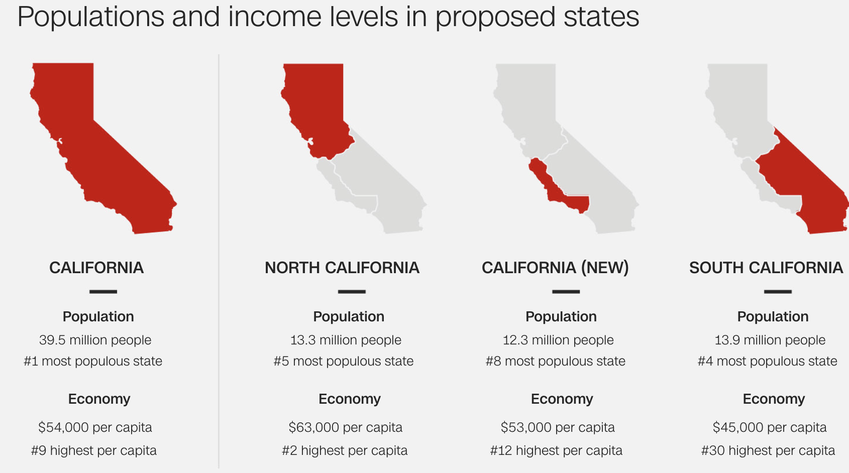
The insistence of these aspirations to cartographic self-definition suggests, in other words, the fiction of independence that Silicon Valley has been selling the nation for some time. As Draper has argued American would be best by adopting Bitcoin as its national currency, cutting out the Federal Reserve as so much excess baggage, the big stakes questions as land maintenance, coastal commissions, and Fish & Wildlife would be deferred, as would many questions of ecological conservation and fire management that are currently on the front burners of most Californians. By persuading us to see the state as a set of discrete regions, however, bushy-eyebrowed Draper hopes to urge voters to realize his political strategy to divide California into six cantons of different hues.  And when he rolled out the project for dividing the state–and its resources and economy–once again into three states,  one named simply “California” on the coast below San Jose to Los Angeles, bounded by the “Northern” and “Southern” California, as if in an attempt to make the map look clearer, Draper seeks to persuade voters to overlook the complex web of natural resources (like water), but huge discrepancies in public education, pension plans, transportation needs, and water management that demand resolution in coming decades–and in effect heighten the levels of inequality already permeating the state, as well as diluting its political voice.

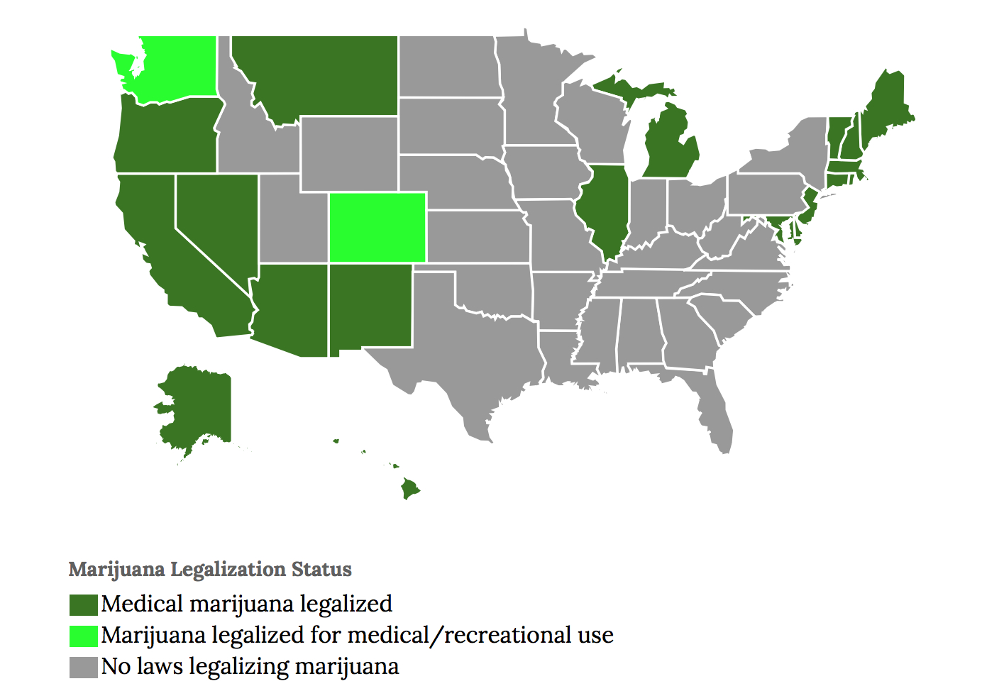
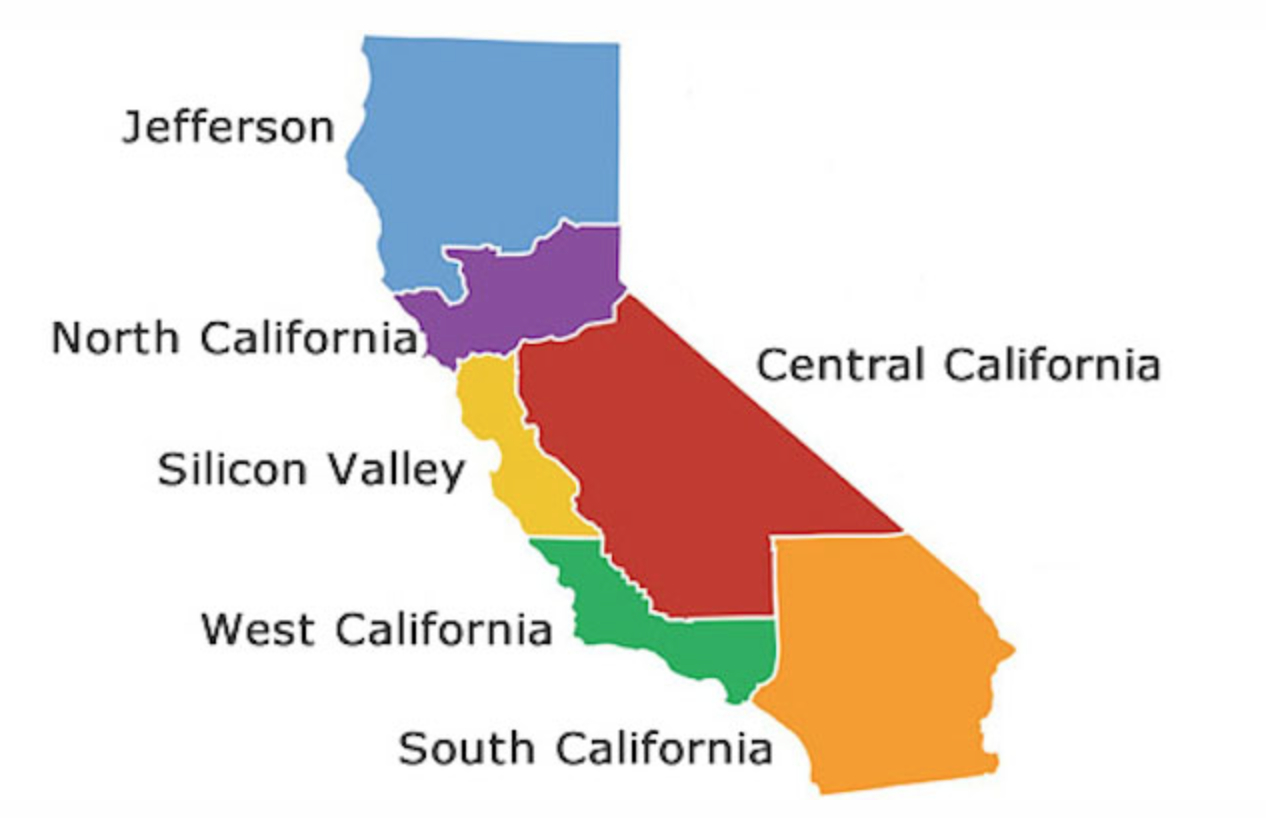
A six-color map of the state offered the rallying call to generate support for his map to renewed economic prosperity–a spectrum intent to underscore inherent differences between each region.  The cartographic division of the state became a logo for a movement, found a nice logo in six colors, designed to strike a key in reflect the parched nature of the more arid (purple; red; orange) and waterless or irrigated areas of the state, and to suggest they were best left to fend for themselves, especially, perhaps, the orange Southern California and the Imperial Valley and bright red Central California’s desert. The coastal communities would have their liberties, and the tax franchises that went with them.

New Map of California

Draper’s initiative to “divide” California into six California’s–six separate states–picks up the inventive cartographies of division that partition the United States into more “rational” or “reasonable” mega-regions, macro-states, or mini-countries, and betrays what little sense he has of the environmental or ecological status of the state.  His proposal stands at odds to how, back in 1837, the German-American jurist Franz Lieber famously doubted that merely altering hues of any map could affect its political economy. He doubted that “the face of our country would change” as a result, and saw little impact for changing a map’s color-scheme, and hoped that “if the engravers were able to sell their maps less boisterously painted and not as they are now, each county of each state in flaming red, bright yellow, or a flagrant orange dye arrayed, like the cover produced by the united efforts of a quilting match.”  Lieber had studied topographic mapping in Dresden before coming to America, and meant to contrast realities of political economy with the coloration of maps–probably contrasting the four-color maps of the United States to those of Prussia with his Berlin-trained mind’s eye; the flagrant color-scheme of a map, however, becomes a device for Draper to urge that we remake California into six “political entities” that most of those living in them wouldn’t actually recognize.

In treating California as a landmass whose extent is able to be parceled into six–or three–blocks, the iconic visualization presumes “California” is not a landscape bound by coastal rivers, streams, glacial ice-pack, or viaducts, but might be parsed as the graphic designer wishes, in what seems the utter alienation of map from place.  By converting California to six cantons, the hope is to remake the state as six more manageable mega-regions to bridge perceived distances between government and Californians.  Draper represents the remapping of the state as a means to reconnect its residents to a model of good government in something of an extension of the argument of states’ rights.  The graphical division of the Golden State into six entities, maxi-regions or mini-states, each emptied of local meaning and purged of cities, provides the rallying cry of the venture capitalist’s movement for the May 2016 ballot, having gained over 1.3 million signatories of in-state residents–at the time of its submission in mid-July–and of a charge that Draper hopes would open up the possibility that other states follow the lead of his movement to break into separate states as well.

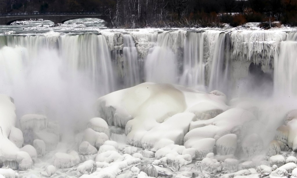
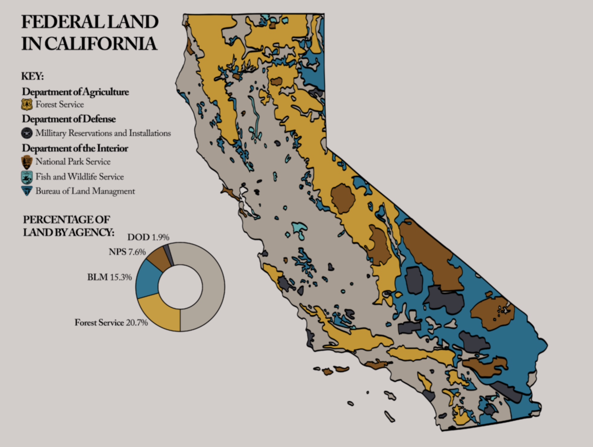
The return to the map as an iconic form of taking self-consciousness as Draper urges is a bit odd, to be sure, for a libertarian. For the image of the map as an icon of national destiny–the pentagon of France; the “lebensraum” of Germany; the unity of China–has a distinctly nationalist heritage, as does the call for a Red-State America with disturbing similarities in its contours to the Confederate States of America. The map indeed conceals, by a nice slight of hand, how much of California is “open space” managed by the U.S. Forest Service, Department of Defense, or Bureau of Land Management, in its attempt to carve up neat bundles of California in the hopes that these would align–or soon come to align–with independent interests. Fearing the administration of wilderness areas of the National Park Service or Forest Service during the Trump regime, Governor Jerry Brown had indeed not only filed a spate of twenty-four law suits against the Trump administration in 2017, the first year of the Trump Presidency, but questioned the validity of any attempt by the chief executive to sell or exchange land rights in the state, by pronouncing them void ab initio, without review by the State Land Commission, fearing the dismantling of hard-won environmental protections across the state.

The defense of undeveloped land that Brown holds dear and near was a pre-emptive strike that provoked a quick legal response from Jeff Sessions’ DOJ: “California was admitted to the Union upon the express condition that it would never interfere with the disposal of federal land,” he cautioned, defending the “rightful prerogatives” of the Interior Department, U.S. Military, and Bureau of Land Management “to buy, sell, exchange or donate federal properties in a lawful manner in the national interest” that should rightly make Californians fear the actual intent of the U.S. Government. While the admission of California to the United States in 1850 indeed stipulated that “the people of the said State, through their legislature or otherwise, shall never interfere with the primary disposal of the public lands within its limits,” the mandate for the state’s defense over those public lands may well be, in an era of accentuated climate change and fire danger, the rationale for rationale for administering public lands had so dramatically changed since the expropriation of public lands from indigenous tribes and mandates of public land management that the threat of their misadministration or maladministration by the rapacious Interior Dept. of the Trump era had grown pronounced–and fears of the placement of lands of the Bureau of Land Management and National Parks had been warranted, given the stunning removal of public lands protections in the first year of Trump’s administration, mostly directed to review the protections of federally owned lands from oil and gas drilling, groundwater mining, logging, and offshore drilling–all triggers for immediate protection–as well as removing responses to climate change from the administration of Park Service lands. The real fears of leasing lands for oil and gas extraction had led to the leasing of 223,200 acres of public lands to private individuals in FY 2014 alone, and the expansion of such leases would render the potential influx of cash as music to Draper’s libertarian ears.

While Draper’s initiative of the “Three Californias” was not openly framed by the tussle over land management over open spaces or wilderness areas, the fact of the federal management of 45% of California’s territory provoked fear of a slippage of protection of grazing rights, timber and forest management, and development of extractive industry that were cleverly concealed by the Three Californias, and which render California a fairly unique target of free market forces. The anger DOJ barely concealed in sniping at the “extreme state law attempting to frustrate federal policy” that Attorney General Sessions may have been born from venting about the state’s resistance to policies of border protection, and the incarceration of “illegal” migrants, with the pretense of drug enforcement, but created a unique opening for Draper’s initiative, an economic bottom-line of as limited ethical scope and compass one might associate with Don Draper, the fictional composite protagonist of “Mad Men,” but aligns closely with the brutal calculus of Tim Draper’s broad-strokes vision of governmental reform. Perhaps the true base-map, if often hidden, that lies beneath the busting up of California as a state are the network of environmental protections and protection of public lands and coasts, enforced by state regulations and commissions, that would be removed by the division of the state into cantons that would be open to the free market, pried from a vision of environmental stewardship.

Continue reading

1 Comment

Filed under California, data visualizations, environmental stewardship, Six Californias, Timothy Draper

Weed Maps?

The

Whereas the criminalization of marijuana over the past decades strove to push the stuff literally off the national map, the last election opened up the frontiers of the legalization of pot in ways one could scarcely imagine in previous decades.

For the rethinking of the efficacy of a “war on drugs” offered a new map of the legalization of cannabis as a recreational pursuit and legitimate business.  The rise of legal marijuana dispensaries in many states of the nation have created yet a new manner of mapping our national divides–itself a favorite national past-time.  From the illustration of which states have enacted laws of marijuana legalization as a substance and, increasingly, as a crop–


Marijuana Legalization map


–or, to offer a more updated account of “decriminalization” as well as “legalization” in a map of quite unharsh lavenders, light blues, and sea greens:


Map-of-US-state-cannabis-laws.svg   Legend MariJ Map clean


Only recently, the newsletter of our local organic farmer, while allowing the stupidity of “trying to outlaw a plant,” took the time to explain to his customers that, despite some demand for the inclusion of the crop in the harvest boxes currently on offer from his farm, “medicinal herbs” long lay off of his radar, and would involve him with a “milieu of doctors, patients, quacks, drama, stress, illness, research and recovery” that were not quite what he had ever planned to dedicate himself:  “just because marijuana is legal doesn’t mean I choose to grow it,” Andy explained, while offering that the past two years had already seen a “green rush” on farmlands in much of Central California, grabbing land in the hopes of its future legality as a crop in ways that have placed a new pressure on renting and locating greenhouse space as marijuana growers are posed to drive up rent–although the market for growing grass has also attracted a new demographic to agricultural farming, in his opinion leaving us posed to have an oversaturated market.

The new green of the nation has been seen as a market for financial futures–

cash crops.png

–but we’ve only begun to navigate its availability on the ground, trusting perhaps on the free market to provide for weed dispensaries in many states that have recently “gone blue” of making it legal, creating islands of legality in a sea of decriminalized (if illegal) orange, and sites where it is illegal (red) or where its illegality is less often enforced (pink).


NAFTA decrim mari.pngWikipedia/Creative Commons


These broad brush-strokes of cartography demand a far finer grain, or course–to show their impact on the ground.  And a finer grain has arrived with the entrepreneurial folks at Weed Maps who have painstakingly collated, shortly before the vote for legalization, those local dispensaries where medical marijuana was available.  The topography of pot was delineated with qualitative ratings, offering a range of scale to which one can zoom to reveal a geography of availability and even openly ranked dispensaries that are perhaps the closest available we have to sanctioned standards.  Users can click on the clickable icons of dispensaries that appear on the screen with precise geolocation, differentiating “laboratory tested” from, presumably, riskier, and delivery services from in-store only.

A Google Maps template essentially provided a new iconography of pot, particularly useful when one is addressing customers and taking laws for medical cannabis at their word.  Issues of legibility and economy in a map lies always at the crux of cartographical invention, and we might look at these early models of mapping as a sort of prototype that has sprung up on a website that includes such euphoric messages of encouragement of abundant capitalization as “Congratulations Washington!  Legal Weed Has Arrived!” and ponders “What a long, strange road to legalization it’s been in the Evergreen State.” Consider the local density of outlets in the Bay Area, in a map offering a busily synoptic overview of the rich efflorescence of the weed economy, as a promising point of departure:


Bay Area Weed Map


Hard to read, you may say, and too crowded and complex in its iconography, not to mention for readers with occasionally addled brains?  The interactive map produces its best results by hovering over specific sites, but in the large-scale version just gives an idea of the abundant range of buying options available. But let’s just focus on buying clubs around the East Bay:


East Bay Dispensaries


and take advantage of the range of ratings and select reviews that you would not usually expect to find on Yelp!:


Rating and Reviews


This could be of use for the traveller–not many legal dispensaries in Fresno or Reno–or for whittling one’s abundant range of options down to the lab-tested–


Lab Tested


or, to restrict oneself to both recreational AND lab-tested–


Bay Area Recreational, Lab-Tested


or, shifting the geographic terrain a bit to a nearby destination, to explore the rankings of regions closer to the Sacramento foothills:


Sacramento Foothills--review and rank


And you might do a double-take at finding out how quickly demand has driven the rapid growth of dispensaries that have sprouted up around greater Seattle:


Dispensaries in Washington


For this inventive appropriation of the Google Maps API and the ranked range of selectivity that might best suit the searcher of legalized cannabis, we have to thank the folks at “weed maps” for the mash-up, even if one wished they used an OSM base map, whose “open access” options might allow easy mapping of the proliferation of future sights of sale.  Even though recreational use of marijuana is not legal in 48 states of the union, Weed Maps CEO Justin Hartfield, a visionary and a man on a mission, projects annual earnings of upwards of upwards of $30 million, and uses his mashup as something like a crusade to keep marijuana in the hands of user.

The iconography of mapping marijuana’s availability can get curious as an early mashup.  Often, for example, despite the inventive and unconsciously playful iconography, one gets some nice visuals, but most maps are often all too crowded–as one can already see in those of the Bay Area, with information and odd juxtapositions, as in the proverbial New Jersey delivery truck seeming poised to carry cannabis to Manhattan through the Holland Tunnel–


Some of the Iconography is Cool


The API reveals some nice “weed islands” that will be useful to note, even in states where legalization is the norm, as Rhode Island.


Weed Islands?


While quite rudimentary in design, the proliferation of push-pins pointing to places to purchase pot posit a pivot in themselves in the changing topography of cannabis in the new millennium.  More than anything, it just shows the relative rapidity with which marijuana is openly on the map. So, go forth and map?  It’s a lot easier to negotiate the topography.  Hartfield himself boasts at having lit up “almost every day” for fifteen years, as a medical marijuana customer who was impressed with the extreme openness of information about pot options at his local dispensary, which gave him the idea of mapping quality and availability, so that “people can do their own research.”

Mapping such a mashup seems a start for revealing something like a new landscape:  if legalization advances, of course, as advocated quite recently by the New York Times, the newspaper of record, and the ranking of quality reaches mainstream consumers, the WeedMaps ratings system might merge with or be overwhelmed by Yelp–although the data already accumulated, and the audience that they’ve reached, seems to put them a leg up.  “We know more about the plant and love the plant,” Hartfield observed, perhaps with something of a sly smile, “than anybody else.”

Despite the complex global landscape of legality–


1200px-World-cannabis-laws.pngWikipedia–Multiple Authors


–the excitement of this islands of blue largely on North America’s Pacific coast have created considerable commercial interest in the possible open markets for pot.

2 Comments

Filed under Google Maps, Google Maps API, marijuana, marijuana legalization, medical marijuana, weedmaps

Mapping the Wobbliness of the Polar Vortex

Since we use the conventions of map making to endow solidity, or reify, even the most abstract ideas, it is interesting to examine how the ‘Polar Vortex’ has spread across the mass media as both a meme and icon of the current weather patterns of the new millennium.  Rather than map place by a matrix of fixed locations alone, maps of the Vortex offer a visualization of temperature variants that reveal an anomalous weather conditions that track the Vortex as it moves, intersecting with place, across the stratosphere into our own latitudes, tracking not only a “cold front” but, globally, the disruption of the path of the circumpolar winds, or splitting of the vortex from the north pole.  We are most likely to “see” the Vortex as an incursion into our own map, effectively dividing the country (yet again?) this summer into regions of cold and heat.  The currency of visualizations of the Vortex reveals not only a meme, but a model for encoding multi-causational weather maps.  Indeed, the mapping of the divergence from usual temperature range reveals the anomaly of a north-south weather front with the solidity of a national divide, raising deep questions of its forecast of extreme weather throughout the year more than offering something like a “poor man’s vortex.”

PolarVortex2

As the term has gained wide currency as a challenge within data visualization world for throwing weather systems into legible relief, it set a new bar for producing visualizations that are challenging to fully comprehend.  The Polar Vortex is mapped as it moves, as if on its own, across the stratosphere into our own latitudes, condensed in a range of data visualizations of stratospheric or tropospheric low-pressure fronts, in ways that map onto current quandaries of atmospheric and climactic imbalance.   The animated superimposition of weather patterns condensed in a range of data visualizations of stratospheric or tropospheric low-pressure fronts themselves map onto concerns about climate change, and conjure narratives of global atmospheric change and climactic imbalance:  the disruption of the usual harmony of the polar jet stream perhaps maps onto both notable rises in polar temperatures or torrential rains off the coast of Japan, but whether due to a spike in northern pacific offshore typhoons or openings in polar ice cover, the markedly increasing waviness of the vortex has allowed increased amounts of cooler air seep south once again, in an eery echo of last January’s mid-winter chill, that has lead weatherpersons to scramble for clarifying narratives about the return of that green blob.  (To be sure, back in January, the naysayers of climate change parsed weather maps as counter-evidence to global warming, allowing them to indulge in alternate meteorological realities, before they were batted down in two minutes by the President’s Science and Technology Advisor, Dr. John Holdren.)

Weatherman scrambling to gloss

twins-gfs

Offering a marvelous array of vowels and pattern of assonance, with a name befitting a Marvel comics super-hero as much as a weather pattern, the Vortex is a touchstone of climate change and a great case of how we have yet to ken the global as intersecting with the local.   But we have unfortunately trended to oscillate, as it were, in our maps between national weather maps, where the Vortex made such a splash as a newsworthy low-pressure pattern, to maps of patterns in global environmental change, that might better direct attention to changing meteorological realities.

Part of the problem is adopting a point of view on the weather that we are tracking–or of viewing the Vortex as a stratospheric phenomenon around the polar regions, or charting a weather pattern forecast as occurring within our nation’s bounds.  The reprise of the spill of northern air into the upper United States returned the Vortex into national news this July has provided a basis of the latter, to judge by this new visualization that projects the cooling temperatures in the northern United States, as a deep wave in the Jet Stream brought colder air to the Northeast.  Even if the cooling air that arrived was not arctic, the pattern of its arrival to the continental US this summer has prompted some significant debate among meteorologists who have glossed the map in alternate ways, almost entirely still focussing, oddly enough, in a reprise of the mid-January news blip on the Vortex, on the unit of weather in the United States in isolation from a global context.  The anomaly of the “Vortex” has become something of shorthand for a southern swing of cold air from north of the Great Lakes, produced by a decreased disparity between polar and sub-polar continental temperatures that lower the latitude of the jet stream, according to some research that has been endorsed by the National Academy of Sciences, and increased its waviness as the Arctic warms.  The maps serve to embody the increasingly newsworthy weather in the Northeast, reaching down to the southern states as if an invading army as much as a meteorological cold front, placing the anomaly of the displacement of cold air against the screen of an iconic national map on which it has been superimposed.

polarvortex-321x214AccuWeather.com

The map recalls a similar dispersion of circumpolar winds from the arctic into the lower forty-eight already called the “most upsetting” data visualization of the winter of 2014.  The drift of circumpolar winds at stratospheric levels offers a compelling means to understand the arrival into the Midwestern states of cold air once more from the north during the mid-summer of 2014.  Rather than only being a meme of the media, or being coined as a manifesto a group of avant-garde modernist meteorologists who found energy in the abstraction of weather forms, the term tracks the dispersion of the circumpolar whirl usually uniformly swirling about the pole offer both a rogue arrival into our national climate and a sort of emblem of an imbalance of circumpolar stratospheric harmony by pushing down the arrival of winds from the Pacific ocean.

650x366_01161752_hd30-2AccuWeather.com

The benefits of shifting iconography to the global are immediately apparent if only because they reveal the divergence of the weather system from a meteorological status quo.  The cycle of wind, usually located in the mid- to upper troposphere, has apparently begun to split or splinter from it usual centers above Baffin Island and Siberia as its air warms, and moves below the arctic regions.  The displaced vortex, which migrates below the arctic circle in the stratosphere, reflects the warming of temperatures at the poles, creating currents able to funnel the figurative migration of arctic air currents to sub-arctic latitudes, even if the air in question this July might more likely be northeast Pacific more than arctic in its provenance.

Displaced Vortex-full color windsEarth.com

The local is, however, far more easily digestible for viewers of The Weather Channel, and the Vortex is shown as an intersection of the global with the regional weather map.  Collating data from divergences or temperature anomalies from a database covering local temperatures in 1981-2010, the spectrum of a “heat map” tracks currents of cold across the backdrop of the lower forty-eight in an easily digestible manner that packed so big a punch for folks trying to puzzle over the freezing over of roads, local lakes, or back yards:

Vortex in States

Once more thrown off-balance, it sends cooler air below the lower forty eight and forty-ninth parallel, making it national news as a dramatic aberration that marked the entry of intense cold.  Data visualizations provide new tools of making the meteorological concept legible in ways that gain sudden particular relevance for audiences familiar with weather maps, for whom immediately powerful associations of shifts in the measurements of regional temperatures will pop out at viewers of a forecast or weather map, forcing them to pay attention to the meteorological imbalances they portend.

400x266_01221625_weekendcold

Recent global maps of the Polar Vortex offer more than an icon of the transcendence of territorial boundary lines systems, by processing and portraying the Vortex as an expansion and  breaking off of cold air outside the restraints of an arctic air system.

November2013_polar_vortex_geopotentialheight_mean_Large

The dramatic splitting of the arctic jet, due to atmospheric pressure anomalies, was mapped by NOAA in this data visualization of July 2014, of a splintering of the vortex, in apparent response to the warming of our poles, hastened by the diminishing snowfall and ice-cover that create new chilly islands or microclimates on the ends of a warming pole we often seen as lying so far away:

July Polar Vortex 2014

The disruption that results brings the displacement of arctic winds that most often sit anchored around the polar region.  A “weak” polar vortex, interacting with arctic ice-cover decline and reduced snow cover, was some time go modeled as resulting in a meandering arctic jet stream and occasional detachment of a polar weather systems and consequent decline or weakening of pressure gradients of the vortex, and consequent reconfiguration of the arctic jet stream:

N_Jetstream_Rossby_Waves_N

Has something like this occurred?  The dynamic visualization of weather maps in five colors and striking contour lines provide clear tools to visualize its speed and energy, in ways that might even have helped resurrect a term that had languished in meteorological lexicons from at least 1853, when the “continued circular gale” was described as flying “more rapidly and more obliquely . . . carried upward to the regions of the atmosphere above,” as lying in the ambitions of a “great Air Map” but based on the recent 1851 NOAA mapping of “great undulatory beds of the oceans . . . for all practical purposes of navigation.”

great polar vortex

But now we have a recognizable image that can be tracked over a recognizable terrestrial map that concretizes the Vortex in ways that its winds can be understood as extending over a region of truly global expanse.

Tracked in terms of actual temperature anomalies, in the winter of 2014, when newscasters and NOAA (the same agency) mapped the migration of cold air southwards of the pole into our frontiers, far outside the usual path of the jet stream, in a disturbance of the weather systems worthy of national news last January, in a data visualization which tracked a green (or purple) blob whose forced migration of frigid air from the polar regions that disrupted weather patterns with national consequence as it migrated out of Canadian airspace.

500_mb_Mon_night


Vortex in States

In the dramatically eye-catching graphics of television’s mass-media, as the bulge of purple and magenta of detached low-pressure systems migrate south, crossing the very same borders to which we are increasingly sensitized in our national news media, albeit at tropospheric altitudes no fence or border guards could ever patrol.  Indeed, the map suddenly suggests the increasing vulnerability of our delicate weather systems, echoed by the language with which the Polar Vortex’s “EXTREME COLD” loops invasively southward across our northern border, cutting off Pacific Air:

650x366_01161627_hd31-1

650x366_01161752_hd30-2AccuWeather

The apparent incursion of its jet stream into the bounds of our national airspace, as in this image of cold air migrating across the northern border, results in the proliferation of metaphors all too often violent in tone:  Climate Central may have only adopted the robust rhetoric of sportscasters when it described high pressure systems in quite athletic terms that “block the eastward progression of weather systems, like an offensive lineman protecting the quarterback from the other team,” allowing the air that circulates around the arctic to start “spreading tentacles of cold southward into Europe, Asia, and North America.”  Less dynamically interpreted and understood once cast in global terms, rising temperatures at the poles–the very sites where, we should note, global warming is occurring at a rate twice the global average–displaces the previously concentrated flow of a jet stream of cold air from its arctic abode.

Of course, few seem ready to tie this to the diminishing ice-cover of the north pole, which still seem a leap too far to be made logically. Oddly, the meteorological mechanics of the expanding split-off of polar winds is modeled as an incursion of weather patterns echo the metaphorics of a military situation map of fixed borders, a historic hold-over for national weather organizations like NOAA:  the global image of wind velocities around the pole, depicted below, is oddly absent from what is actually a global phenomenon.

polar-wind-displaced-vortex-2-1-14Earth.net

But we are all too used to interpret and read weather maps with both a sense of voyeurism for our friends and relatives, but from a subjective lens.Despite the adoption of globalized images from our friends at National Geographic, who used Mass FX Media’s animation to visualize circumpolar air flows, and despite the continued live monitoring of wind-flows at “Earth,” the isolation of the nation in the maws of the vortex is so readily discussed as the “most upsetting map of the winter,” as if the migration of the pool of arctic air into the northern United States were best understood as a disturbance of national temperatures.

The similar narrative about the Vortex in national forecasts stands in contrast to the maps of rising temperatures, but create a visual modeling of a meteorological distribution that almost resembles an invasion.  Even though the distribution and speed of the Vortex in summer is usually slow, the polar air however seems to be arriving from across the border with unstoppable velocity, the below global visualization, also based on a similar distribution of deviations from average temperatures craft a similarly compelling large-scale weather pattern–albeit one occurring some 3,000 feet above the earth’s surface–in which, rather than reveal a lack of equilibrium, arctic air dips south across the forty-ninth parallel and past the Mason-Dixon line, confirming its occurrence as a shift of national consequence.

19g70jjap4syugif

Because the “most upsetting map of the winter” tracks the pooling of arctic air into the northern United States created a disturbance of national temperatures into the Eastern United States and much of the central region of the country.

Wasn’t it once more reassuring to understand the polar regions, its topography unknown, as somehow removed from the atmospheric currents than being mapped around the world?

UNEXPLORED POLAR BLUE

The wonderfully protean animated map of disequilibria in the harmony of stratospheric currents of cold polar air within the jet stream opens breaches across national boundaries, albeit at considerable elevation, and also offers a way of tugging at one atmospheric phenomenon to unpack a web of inter-related phenomena.  Unlike maps of habitation or land-surface, the map traces a low-pressure system at high altitudes far above the settled or occupied land, but intersecting with it in ways that conjure a failed ability to contain colder air over the polar regions.  (Taking the iconography of weather maps as transparent, the blogosphere has suggested the adoption of charges of circumpolar intoxication.)

The distribution of stratospheric air whose flow is charted in global map as an irregular anomaly of temperatures’ spread, is perhaps most concretely rendered by the iced-over bodies of water it left in our own upper latitudes.  The striking freezing over of the Great Lakes, covering some 88% of the lakes’ surface area by mid-February, a greater proportion of seasonal ice-cover than ever registered, and surpassing the 82% record of 1996, according to Caitlin Kennedy of NOAA, which render the striking concentration of ice in frozen lakes a concrete map of the local effects of truly polar weather.

GreatLakesIce_610-1

The material manifestation of the cold on the surfaces of those five lakes–all frozen solid, to appearances, save Lake Ontario, seem as concrete a result of the consequences of climactic change one might have in a chart, by placing the ice-covered lakes in a local landscape.

What seemed the displacement of the frigid polar air to the Great Lakes became something like a confusion of the local and the global in the news media that was played out in weather maps.  Of course, the meteorological mapping of this winter’s Polar Vortex in Canadian outlets seemed more the status quo, with most of the country facing sub-zero temperatures:

640x480_currents_ca_temperature_i1

The US “low temperature map” used a slightly different temperature spectrum, but preserved a more alarmist image of anomalous weather conditions even in the National Digital Forecast:

temperature spectrum us vortex

The striking visual by far was from a site located exactly on the US-Canada border, an  eye-catching a frozen Niagara Falls, that icon of liminality:

52d0f434d39a1-1024x614

The distributions that charting the mid-July summer chill newly arrived in the Midwest and much of the East coast of the United States from Canada is less striking, even if it will bring dips of twenty to thirty degrees form the normal.  NOAA omits Canada completely from its prognostications of the arrival of the coming cold, as befits its role as a national agency, and restricts its purview to United States coastal territories, even though it would make the graphic far more credible to offer a greater coverage.  It provides something of a summertime counterpart, however, in which the probability of lower temperatures than usual seem to create a ring about the same lakes, radiating almost to the Atlantic coast:

NOAA POLAR VORTEX

Where is the center of this new system of cold air? With roots in Hudson Bay–where else?–the polar air will be spinning southwards at the upper levels of the atmosphere, spinning southwards toward the United States. There were past migrations of arctic air over Quebec and Maine, back in late January, 1985:

Polarvortexjan211985

The Detroit Free Press even seized on a recent NOAA projection of a similar displacement of arctic air, that locates the center of cool air migrated toward Michigan, forming a pool of air that had descended into the central United States, as if to cast the event as something like local news, even as it suggests the rise of two weather systems:

safe_image.php

The occurrence isn’t strictly polar, or arctic, in its origin.

But the results are the consequence of a sort of distorting decentralization of the polar cold air outbreak that hovers around the arctic circle, running around the pole and allowing or protecting cold air from drifting south, containing cold air or not it its high altitude low-pressure system.  (Of course, the west coast is poised for a dryer and hotter-than-normal week.)  The decline of snow and ice around the Pole, combined with the warming of the wobbly gulf stream, will allow the chilly polar air to spill southwards to the plain states, covering not only Canada but spilling outside the low-pressure system and over to the seaboard, in a sort of nervous breakdown of meteorological model behaviors.

The disturbances of equilibria in our weather maps makes it worthy of more than symbolic note. The increasing variability that the waviness of the outer line of the low-pressure system, or jet stream, related to the declining snow cover in the far north, in the a “warm Arctic-cold continents” pattern, where the compact containment of colder airs was broadly breached.

Jan5_Nov14-16_500mb_geopotentialheight_mean_620

The lack of equilibrium in the stream of polar winds–distinct from the widening polar ozone hole–opens up more of the terrestrial surface to chilling shifts in temperature. As much as the embodying a low-pressure system, the map is a narrative of the disruption of climactic harmony, and view toward the future of weather systems world-wide.  The results of the wavy polar vortex, joined with rising world temperatures, create a map of bizarre spottiness in average world temperatures that is difficult to conceive or map, precisely because its high-altitude distribution is difficult to transfer from a spherical to a flat surface, and because its distribution unfairly privileges the tracking of cold air in ways that seem, misleadingly, to fly in the face of the maps of our overheating world.  This past January, NOAA crafted a digital globe that displayed the distortion of local temperatures distorted beyond the norm, with cold displaced from its polar resting place, resulting in a cognitively useful modeling of a disjointed jigsaw of cold and warm air, where the warmer deviations of global temperatures spick not only over western Russia and Alaska, but at the polar regions itself.

polarvortex_airtempanom_610NOAA Climate.gov

The result is a jigsaw reveals the breaching of cold air from the cap of winds that encircle the polar cap has a enough of touch of biomomorphism to echo ecofeminism; the forcing of warmer air patterns resembles a blurry sonar image of curled-up embryonic twins resting in a womb as if evoking the shape of future weather systems, offering a biomorphic visual metaphor for something like an eery augur of a future holding limited possibilities for an afterlife–and of the unknown future of our planet’s atmosphere.

2001SPACEODYSSEYABOL1

2001

Leave a comment

Filed under Climate Change, climatology, meteorological maps, NOAA, polar vortex, weather maps

The Betrayal of Sykes-Picot? Mapping the Expansion of Violence in Syria’s Civil War

In the shadow of two large, formerly centralized states–Iraq and Syria–the “Islamic State” has spread across their common confines in ways that seem to re-map the Middle East.  The surprising success of the ISIS in Syria has been striking in the face of fatigued fighters of the Free Syrian Army, who, exhausted by fighting three years after the uprising began, have enjoyed considerable success in the face of the attrition of rebel fighters.  Even as the Assad government worked to retake significant ground in the country’s center and north, the new stability of ISIS has drawn on Sunni ties and allegiances deeper than national ties, and promised greater regularity in food supplies that have enjoyed wide appeal in a worn-torn country.

How to map the basis of this appeal, and how to chart the entity of the Islamic State has frustrated western cartographers and news maps alike, despite the proliferation of maps to track the unfolding of day-to-day events on the ground.  Recently, the possibility that “it may be too late to keep it as a whole Syria” that John Kerry acknowledged–and that the prospect of dividing the country between forces controlled by and loyal to Bashar al-Assad in Syria’s northwest–would be a painful rejection of a secular Syria.  It would also be a capitulation of sorts to Russian interests of securing a rump state of Syria to defend their airbases and deepwater naval bases in Tartus, established since 1971, confirmed by the cancellation of a huge $13.4 billion debt for Soviet-era arms sales in 2005 of which Russia is loathe to abandon as it is the basis for continuing arms sales and its sole tie to the Mediterranean.  The capitulation to the division would effectively abandon parts of the country to the Islamic State, Hussein Ibish has argued, as a “Little Syria” would effectively be a Russian client state, and a strong ally of Iran.  The current plan for partition seems to take its spin from the Russian demands for a sphere of influence, but would carve Syria in ways that erase the state.  A cartographical archeology reveals the deep difficulties in preserving the current theoretical national boundaries of the multi-ethnic state.

The boundaries between Syria and Iraq drawn for the interests of occupying British and French powers at the end of World War I and fall of the Ottoman Empire at the Sykes-Picot Accord of in 1916, is being altered in the region’s current map:  yet the deep destabilization created across the former provincial regions of the Ottoman empire reflect problems in defining allegiances in a map.  The increasingly tenuous ties across the region are tied as often to the provision of bread or the guarantee of temporary security in regions which have suffered ongoing lack of stability in past years–or any ties of food or health security–as they are to the effective tolerance of an ongoing civil war that has destroyed national infrastructures.  The severe instability across Syria that has ramped up support of ISIL, making the Islamic State a credible opposition to Bashar al-Assad, that reflect less the undue carving of the Ottoman Empire’s expanse than continued juggling of a system of alliances to secure oil, with little attention to the country’s inhabitants, that have allowed us to tolerate or suspend attention to the deep instabilities revealed in Syria’s civil war, and to the effective implosion of its state.

The newly centralized state that has emerged after the truncation of its name from the “Islamic State of Syria and the Levant” to “ISIS” transcends the notion of national boundaries.  As much as reject the reconfiguration about the littoral region of the Levant, in pivoting from the Mediterranean region of the Levant, ISIS has tried to assume the status of a state that is able to recuperate the notion of a mythic caliphate as a point of resistance.  But it is deeply rooted in the Syrian revolution, and a good portion of ISIS fighters have not only come from Syria, but have left the Syrian Free Army for ISIS, a more credible opposition to Assad’s regime, dissatisfied with their own leaders, and attracted by the clear vision of a state that the Islamic State provides.  The declaration of a New Caliphate not only “seeks to redraw the map of the Middle East, but dismantle the shortcomings and maladministration that is associated by earlier mappings of the region, and with the corruption of the Syrian state.

Its future survival however raises questions what sort of unity and coherence exists within a region out of the deep instability of Syria’s civil wars.  There is a clear tension in articulating a “State” in dialogue with extant maps, including the many maps drawn and redrawn across the region since World War I, in the hope of securing more fixed territorial bounds than existed in the Ottoman Empire, and a rejection of the territorial entities that seem to have been created in a colonial past for the ends of replicating a Eurocentric balance of powers, as much as the needs or allegiance of local residents.  Although ISIS promises to promote “justice and human dignity” for Muslims everywhere, the creation of such universal claims to over-write existing formerly centralized states in the region–dismantling any pretense of unity or national centralization that used to exist in Iraq, or of the imploded state of Syria–only mask a deep fracturing as individual oil companies back the break-up of oil-rich northern regions of the former Iraq in ways that may yet happen in other regions of the Middle East.


Continue reading

2 Comments

Filed under Bashar al-Assad, ISIS, Islamic State, Middle East, Syrian Civil War