Tag Archives: weather maps

Saturated Shores in Southeastern Texas

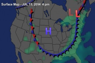
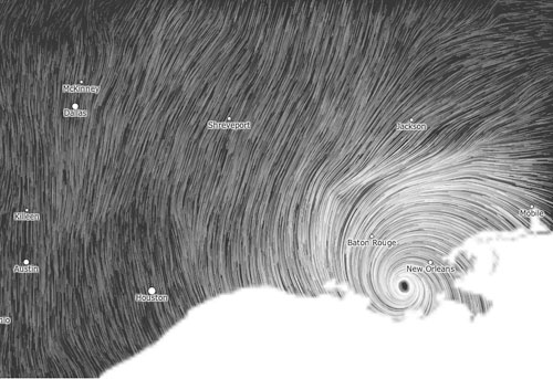
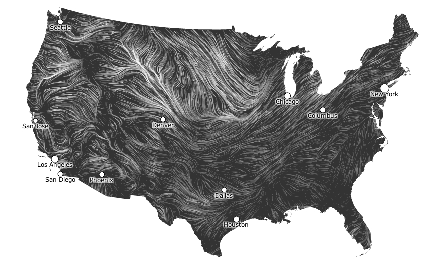
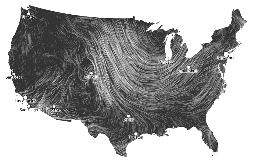
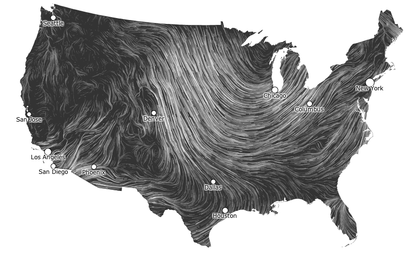
There is almost no trace of the human, or of the extreme overurbanization of the Texas coast, in most of the maps that were created of the extreme flooding and intense winter rains that hit Galveston and Houston TX with the windfall of Hurricane Harvey.  While maps serve to orient humans to the world–and orient us to human processes and events in a “human world,” as J.B. Harley and David Woodward put it, the confused nature of relations between the human and natural world, is increasingly in danger of being mipmapped.  Data visualizations of extreme weather that erase the modification of coastal environments provide a particularly challenging means of orientation, as news maps are suspended between registering the shock of actual events–and trying to contain the natural emergencies that events of extreme weather create–and the demand for graphics that register natural calamities and the ethics of showing such calamities as “natural”–or even what the category of the natural is in coastal regions that so heavily modified to modify actual weather events.

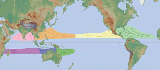
The ethics of orienting viewers to the rainfall levels that fell in Houston after the landfall Hurricane Harvey Part of the huge difficulties lies in adequately orienting viewers in ways that register a changing natural world–how we are mapping rainfall, for example, or the approach of hurricanes, or are rather mapping the new relation of rain to built surfaces and landcover change that lack permeability for water, facilitating flooding by storms whose potency is changed by the greater atmospheric content of a warming Gulf of Mexico, which the ground cover of Houston, Galveston, and the Texas shore are less able to absorb and return to the Gulf. The area is, itself, something of an epicenter of the increased number of hemispheric tropical cyclones–which demand warm water temperatures above 80 80°F / 27°C and a cooling atmosphere and low wind shear–often led to the Gulf coast.

NASA Earth Observatory/Tropical Cyclones through 2006

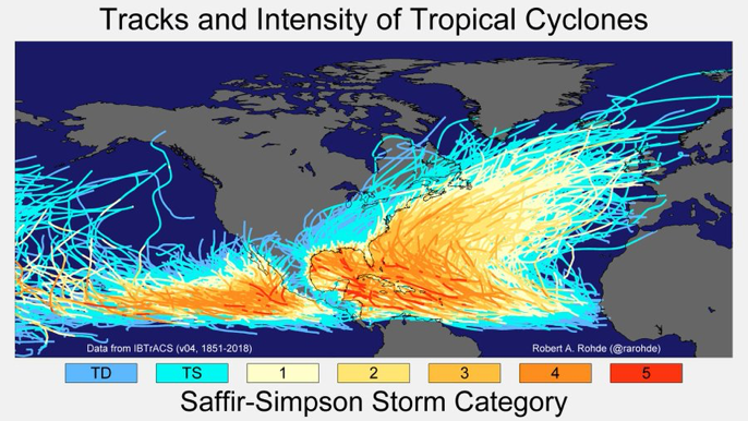
–those that come ashore at Galveston hit a seashore that is eminently unprepared to accommodate an influx of water that the paved surface has rendered all but impermeable. If the problem of global cyclones that can become hurricanes is truly global–

NASA Earth Observatory/150 years of Tropical Cyclones

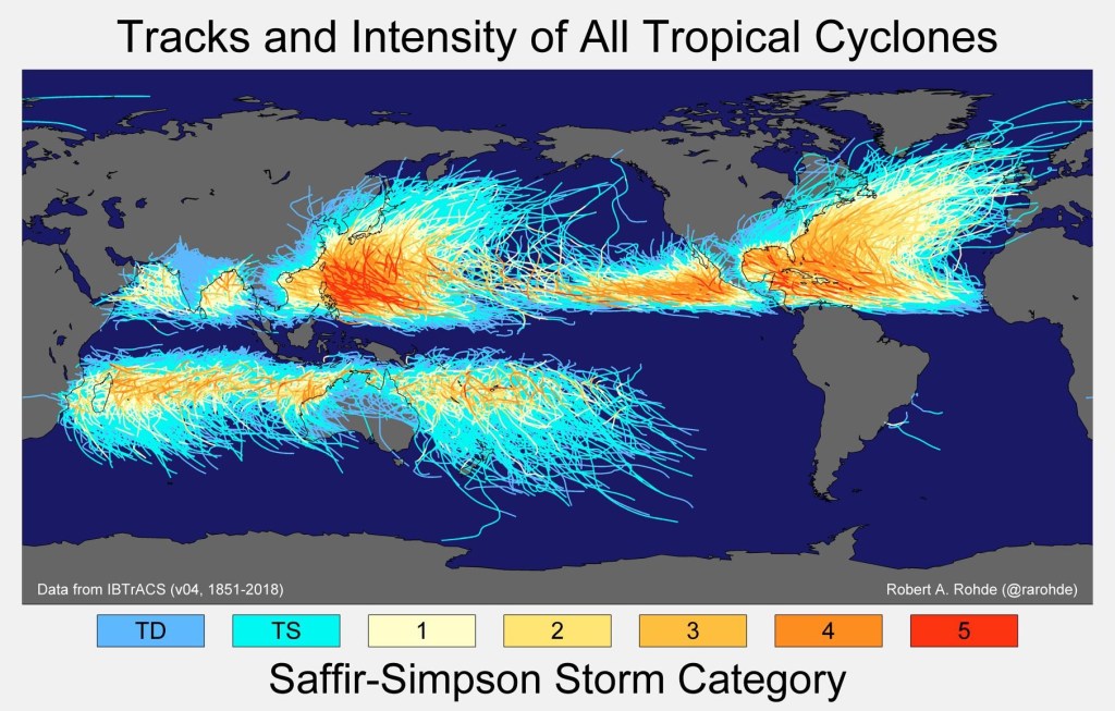
–the intersection between cyclones and areas of paved ground cover is problematic to the southwestern states, and most of all to Texas, Louisiana, and Florida, where water absorption has been anthropogenically reduced in recent decades. At the same time, few other areas of the inhabited world are so widely “tracked” as the destination of tropical cyclone formation..

NWS JetStream Online School)

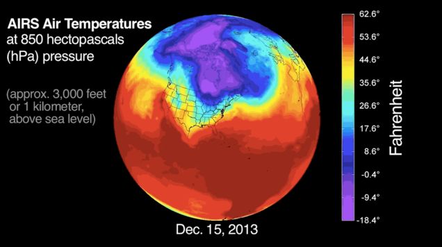
The problem is partly evident in the choice of new color ramps that transcend the rainbow spectrum of measuring the intensity of rainfall in the recent arrival or ground fall of Hurricane Harvey, which condenses the great difficulty of using old cartographical categories and conventions in order to capture or communicate increasingly extreme weather conditions. in an era of climate change.  But the cartographic problem goes farther:  for it lies in the difficulty of registering the changes in relations f how rain dropped meets the ground, mapping relations between complex processes of warming and atmospheric warmth that lead to greater humidity across the gulf region to ground cover permeability that leaves regions increasingly exposed to flooding.

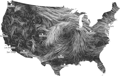
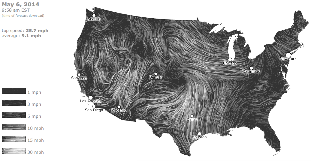
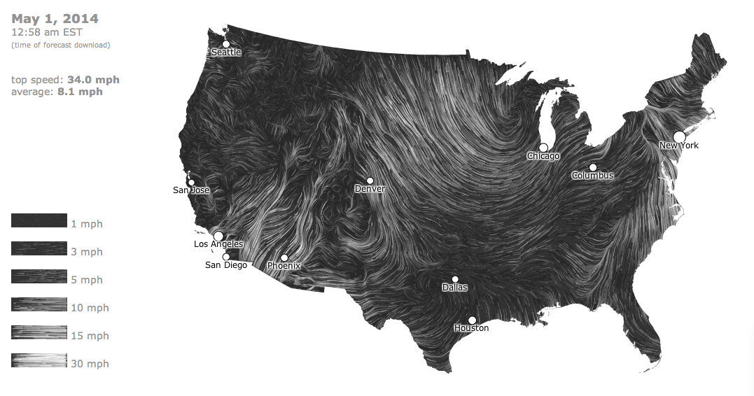
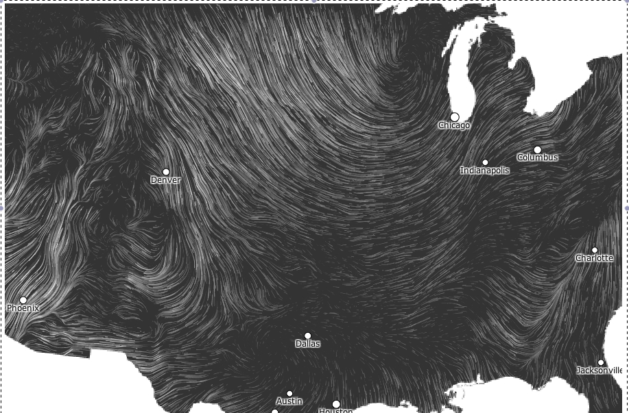
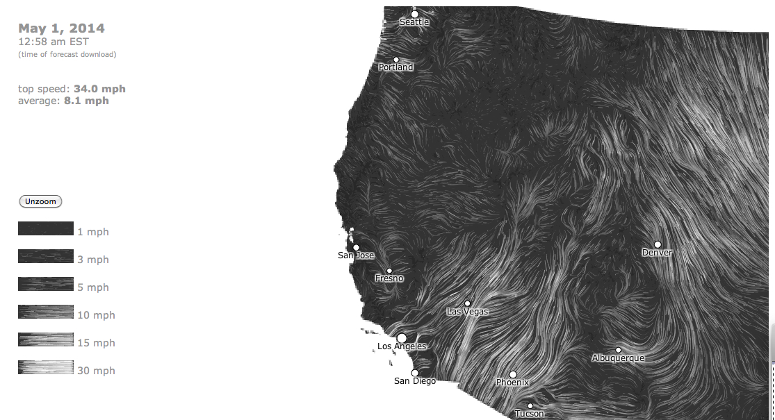
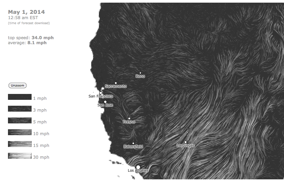
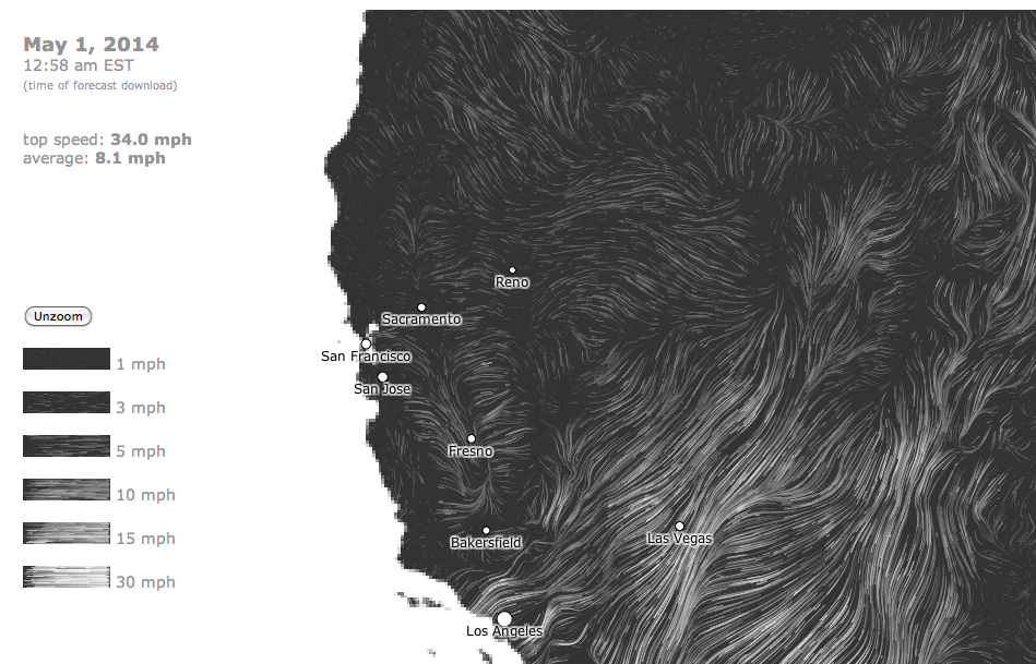
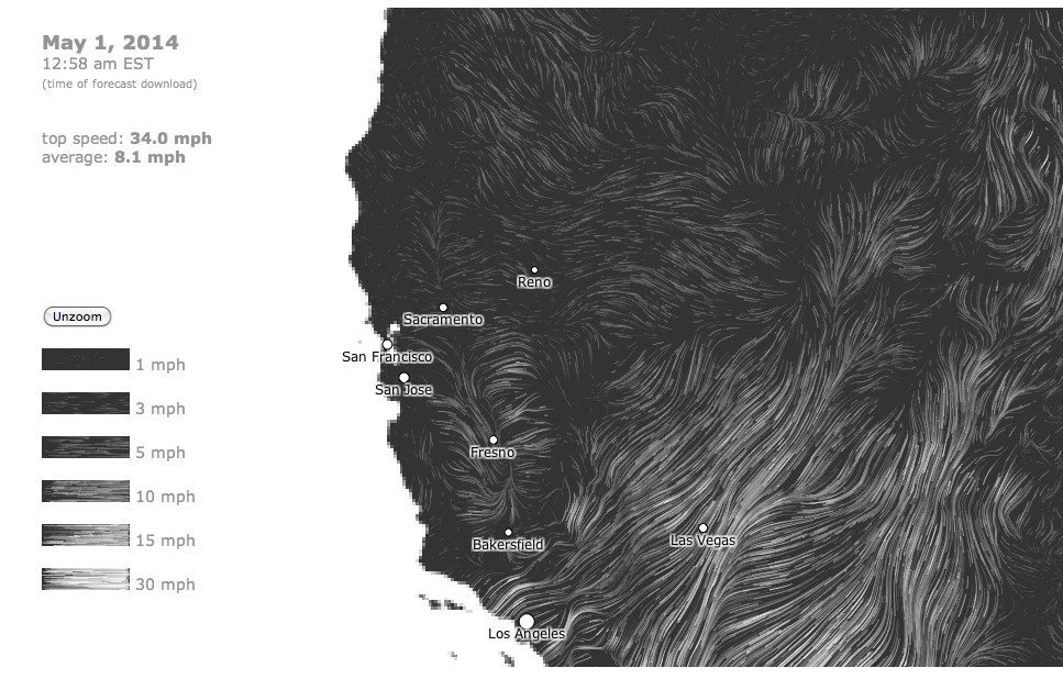
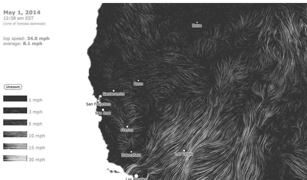
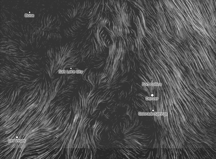
The relentless logic of data visualizations based on and deriving primarily from remote sensing are striking for rendering less of a human world than the threat of allegedly “natural” processes to that world.  Perhaps because of the recent season of extreme weather we have experienced, weather maps may be among the most widely consulted visualizations in our over-mediated world, if they were already widely viewed as the essential forms of orientation.  But the pointillist logic of weather maps may fail to orient us well to extreme events as the hurricane that dumped a huge amount of water on overbuilt areas to include the human–or the human world–seem a tacit denial of the role of humans in the complex phenemona of global warming that have, with the warming waters of the Gulf of Mexico and ever-increasing ozone over much of the overbuilt southeastern Texas shore, created a perfect storm for their arrival.

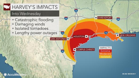
This failure to include this role haunts the limited content of the weather map; including the role of humans in maps of extreme weather events indeed remains among the most important challenges of weather maps and data visualization, with the human experience of the disasters we still call natural.  And although the subject is daunting, in the spirit of this blog, we will both look at the communicative dilemmas and difficulties of eye-catching color ramps and their deceptiveness, and poetic difficulties of orienting oneself to shores.  For as the disaster of Harvey is depressing, it compels raising questions of the orientation to the shifting shore, around the national epicenter of Galveston, where the landfall of Hurricane Harvey focussed our attention on August 27, 2017–

90-7
wpc-5day-0Z-8.28.17

–and the meaning of place in an saturated shoreline, where the sea is somehow part of the land, and the land-sea divide blurs with a specificity that seems as if it may well be increasingly true in an approaching era of climate change.  And as we depend on the ready generation of maps based on remote sensing whose relentless logic is based on points, we risk looking sight of the role of place in determining the relations of rainfall to shoreline in maps of coastal flooding that remove remote observations from the built environment that flooding so drastically changes, challenges and affects, in ways that may elide specificities of place.

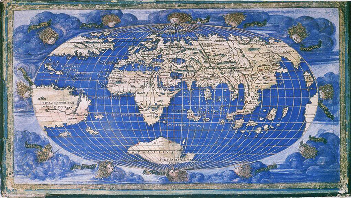
At a time when we are having and will be destined to have increased problems in orienting ourselves to our shores through digital maps of rainfall, the unclear shorelines of Galveston sent me to the bearings that a poet of an earlier age took her bearings on the mapped shorelines of the place where she had been born, and how she was struck by a bathymetric map to gauge her personal relation to place, and saw place in how the changing shoreline of the northern Atlantic were mapped in the maritimes, in a retrograde form of print mapping in a time of war.  For the way the mapped shore became a means by which Elizabeth Bishop gained bearings on shores through a printed map of coastal bathymetry to access the spatiality of the shore–how “land lies in water” and the blurred relation of land and water that the bathymetric map charts–in an age when the materiality of the map was changing, with the introduction of aerial composite maps from the early 1930s, as the rise of aerial composite maps removed the hand of the mapmaker from the map in an early instance of remote sensing–

5852167

Cartography Associates/David Ramsey: Historical Map Collection: Composite of 164 Aerial Views of San Francisco by Harrison Ryker/Oakland, 1938, 1:2000

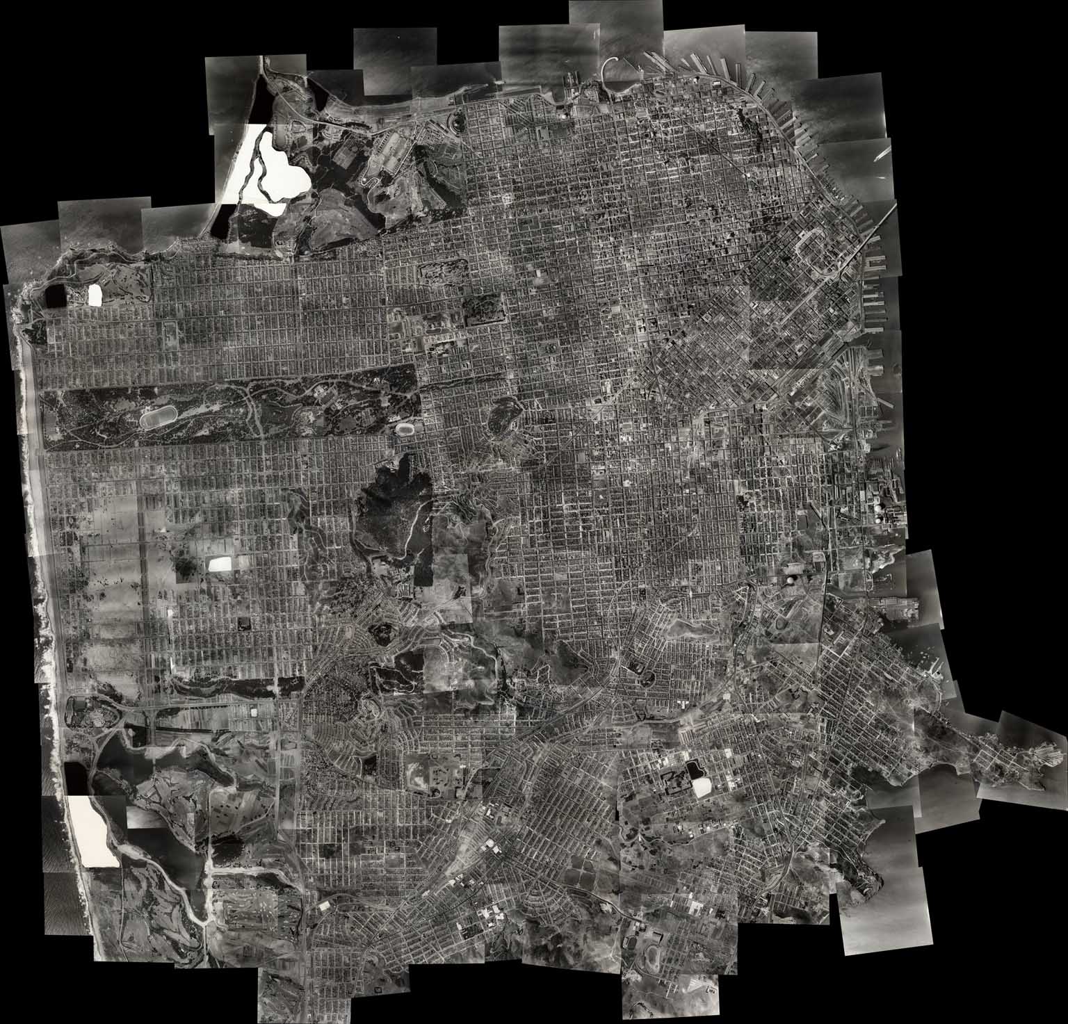
–in a medium of aerial photography that focussed on land to the exclusion of water, and that all but erased the relation between water and shore just a few years after Bishop quickly wrote her poem in Christmas 1935 about coastal “edges” of land and sea.  Ryker, who developed techniques of aerial photography used in the mapping of the shores of Puerto Rico for the Fairchild Aerial Camera Company, as well as photographs of the devastating Berkeley Fire of 1923, went into business in 1938–the year of his map–as a map publisher, with a patent for the stereoscope used to interpret aerial imagery,  and must have performed the massively detailed mapping of San Francisco in one hundred and sixty for images taken from airplanes from 1937-38 as a sort of calling card, soon after Bishop wrote her poem, before manufacturing a range of stereoscopes of pocket and desktop versions for military ends that were widely used in World War II by the US Army.

Before war broke out, but in ways that anticipated the coming war, the printed bathymetric map must have resonated as a new reflection on the impersonality of the aerial view; Bishop was suddenly struck when she encountered the materiality of a print map on Christmas 1938 as the art of cartography was already changing, responding to the drawn map under glass of the Atlantic as a way to recuperate the personal impact of place.  Her poem powerfully examined the logic of drawn maps utterly absent from the digitized space of rainfall maps of a flood plain, deriving from data at the cost of human inhabitation of place–and in envisioning data to come to terms with the catastrophic event of flooding distancing or removing the craft of mapmaking from the observer in dangerously deceptive ways.  And so after wrestling with the problems of cartographic representation using remote sensing, while recognizing the value of these readily produced maps of rainfall and the disasters they create,

1.  For weather maps are also among the most misleading points to orient oneself to global warming and climate change, as they privilege the individual moment, removed from a broader context of long-term change or the human alteration of landscape.  They provide endless fascination by synthesizing an encapsulated view of weather conditions, but also  suggest a confounding form of media to orient audiences to long-term change or to the cascading relations of the complex phenomenon of climate change and our relation to the environment, as they privilege a moment in isolation from any broader context, and a sense of nature removed from either landscape modification or human intervention in the environment, in an area were atmospheric warming has shifted sea-surface temperatures.  The effects on the coast is presented in data visualizations that trace the hurricane’s “impact” as if its arrival were quite isolated from external events, and from the effects of human habitations on the coast.  The image of extreme flooding is recorded as a layer atop a map, removing the catastrophic effects of the flooding from the overpaved land of the megacities of southeastern Texas, and the rapid paving over of local landcover of its shores.

90-7

.

Such visualizations preserve a clear line between land and sea, but treat the arrival of the rains on land as isolated from the Consuming such events of global warming in color-spectrum maps.  The data of rainfall translate data into somewhat goofy designs represents a deep alienation from the environment, distancing viewers in dangerous ways from the very complexity of global warming that Gulf coast states encountered.

Such data visualizations seem dangerously removed notion of how we have changed our own environment, by describing a notion of “nature” that is immediately legible, as if it were removed from any human trace or of the impact of modification of the land, and by imaging events in isolation from one another–often showing a background in terrain view as if it has no relation to the events that the map describes.  Although weather maps and AccuWeather forecasts are sources of continual fascination, and indeed orientation, they are are also among the most confounding media to orient viewers to the world’s rapidly changing climate–and perhaps among the most compromised.  For they imply a remove of the viewer from space-and from the man-made nature of the environment or the effects of human activity form the weather systems whose changes we increasingly register.  By reifying weather data as a record of an actuality removed from human presence at one place in time, they present a status quo which it is necessary to try to peel off layers, and excavate a deeper dynamic, and indeed excavate the effects of human presence in the landscape or geography that is shown in the map.  We are drawn to tracking and interpret visualizations of data from satellite feeds in such weather maps–or by what is known as “remote sensing,” placed at an increased remove from the human habitation of a region, and indeed in a dangerously disembodied manner.

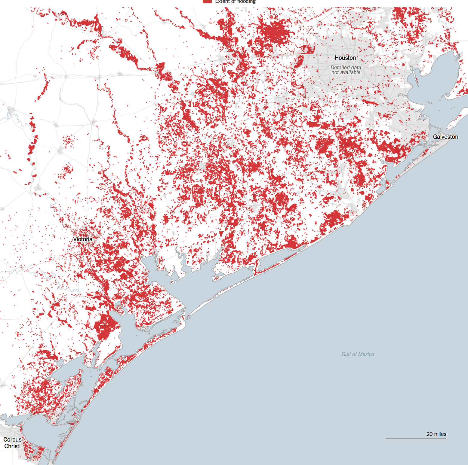
Visualizations resulting from remote observation demand taken as a starting point to be related to from the human remaking of a region’s landscape that has often increasingly left many sites increasingly vulnerable to climate change.  But the abstract rendering of their data in isolation from a global picture–or on the ground knowledge of place–may render them quite critically incomplete.  The remove of such maps may even suggest a deep sense of alienation form the environment, so removed is the content of the data visualization form human presence, and perhaps from any sense of the ability to change weather-related events, or perceive the devastating nature of their effects on human inhabitants:   their stories are about weather, removed form human lives, as they create realities that gain their own identity in images, separate from a man-made world, at a time when weather increasingly intersects with and is changed by human presence.  While throwing into relief the areas hit by flooding near to the southeastern Texas shore at multiple scales based on highly accurate geospatial data, much of which is able to be put to useful humanitarian uses–

Harvey flooding_1.jpg

Dartmouth Flood Observatory/University of Colorado at Boulder, August 29. 2017

1504094467hurricane-harvey-flood-map.gif

Maps of the World

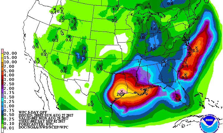
–the reduction of floods to data points creates a distorted image of space renders their occurrence distant from the perspective of folks on the ground, and places their content at a considerable remove from the complex causality of a warming Gulf of Mexico, or the problems of flood drainage by which Galveston and Houston were beset.  Indeed, the multiple images of that report rainfall as an overlay in a rainbow spectrum, at a remove from the reasons for Houston’s vulnerability to flooding and the limits the region faces of flood control, in broadcast Accuweather images of total rainfall in inches advance a metric that conceals the cognitive remove from the dangers of flooding, ora human relation to the landscape that the hurricane so catastrophically affected.  Can we peel under the layers of the data visualization, and create better images that appreciate the human level on which the landscape stands to be devastated by hurricane rains, as much as tracking the intensity of the growth of rainfall over time?

90-5.jpeg

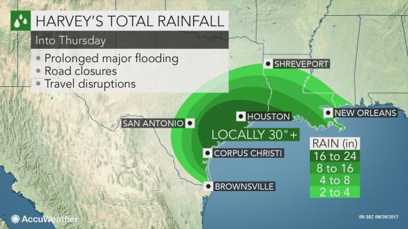
AccuWeather, Rainfall levels by Thursday

90

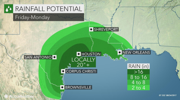
AccuWeather, Friday to Monday

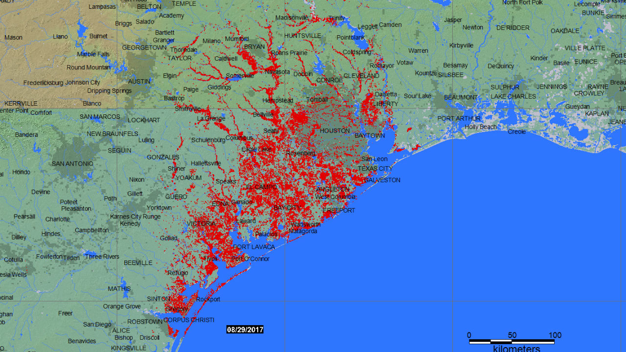
Such layers of green, meant to suggest the intensity of rainfall that fell over land, reveal the concentration of water in areas closes to the Gulf of Mexico.  Even the most precise geographical records of the dangers of flooding in the floodplain of southeastern Texas with little reference to the historical modification of the region by inhabitants–

Harvey flooding_1

Dartmouth Flood Observatory at University of Colorado, Boulder/August 29, 2017

–and conceal the extent to which the landscape’s limited ground cover permeability has left the region far more susceptible to flooding, and elevated the risks of the emergency.  The problem of reading any signs of human presence into these “images” of precipitation provoke problems of disentangling remote sensing data from knowledge of the region’s recent urban growth and the consequent shift in local landcover.

The perspective of our relation to these events is often as fleeting and as existential as they flood us with data, which we viewers have little perspective or tools to process fully.  The onrush of recent remote sensing maps batter us with an array of data, so much as to lead many to throw up their hands at their coherence.  Even as we are  still trying to calculate the intensity of damages in Puerto Rico–where electricity is so slowly returning that even even after four months, almost a third of its 1.5 million electricity customers still lack power–and the cost of fires in southern California.  We look at maps, hoping to piece together evidence of extensive collateral damage of global warming.  Yet we’ve still to come to terms with the intensity of rainstorms that hit southeastern Texas–deluging the coast with rainfall surpassing the standard meteorological chromatic scale that so misleadingly seems to offer a transparent record of the catastrophe, but omits and masks the experiences of people on the ground, digesting swaths of remotely sensed data that take the place of their perception and experience, and offering little critical perspective on the hurricane’s origin.

The rapidity with which rain challenged ground cover permeability provides both a challenge for mapping as a symptom of global warming and landscape modification:   the mapping of “natural” levels of rainfall blurs the pressing problem of how shifting landcover has created an impermeability to heightened rains, and indeed how the new patterns of habitation challenge the ability of the coast of the Gulf of Mexico to absorb the prospect of increased rain in the face of decreasing groundcover permeability, and the extreme modification of the coastline that increasingly impeded run-off to the Gulf.

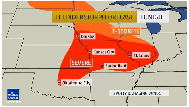
2.  Across much of southeastern Texas, a region whose growth was fed by the hopes of employment in extractive industries, real estate demand and over-paving have unfortunately intersected with extreme weather in southeastern Texas in ways which dat visualizations have had trouble exposing, but which raise a curtain on the coming crises of a failure of ability to accommodate increased levels of rainfall  If the lack of precedent for the intense rainfall in Galveston Bay generated debate about introducing a new color that went beyond the rainbow scale employed in weather charts, what seemed a problem of the cartographic color-spectrum suggested a problem of governability and indeed government response to extreme weather conditions.  How to register the dangers of rainfall that goes of the scale or standards of measurement?

One must consider how to orient viewers to the intensity of consequent flooding, and to its consequences and better prepare ourselves for the arrival of deluging rains without falling back on the over-freighted metaphor of rains of biblical scope.  How many more hurricanes of increasing intensity can continue to pound the shores, by whipping precipitation from increasingly warming waters and humid air?  The cumulative pounding of tropical cyclones in the Gulf stands to create a significantly larger proportion of lands lying underwater–temporarily submerged lands–with radically reduced possibilities of drainage, as hurricanes carry increased amounts of evaporated water from the humid air of the warming gulf across its increasingly overbuilt shores. in ways that have changed how the many tropical cyclones that have crossed the land-sea threshold since NOAA began tracking their transit (in 1851) poses a new threat to the southeastern coast of Texas, and will force us to map the shifting relation between land and water not only in terms of the arrival of hurricanes, or cyclonic storms–

–but the ability of an increasingly overbuilt landscape to lie underwater as the quantity of the Gulf coast rainfall stands to grow, overwhelming the overbuilt nature of the coast.

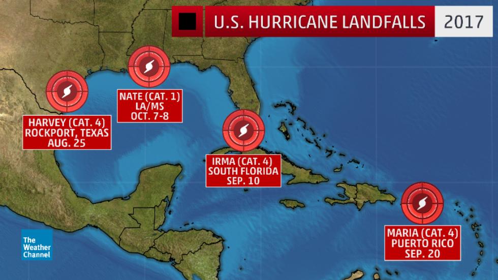
Most maps that chart the arrival and impact of hurricanes seem a form of climate denial, as much as they account for climate change, locating the hurricanes as aggressive forces outside the climate, against a said backdrop of blue seas, as if they  are the disconnect.  Months after the hurricane season ended, the damage for hurricanes caused have hardly been assessed in what has been one of the most costly and greatest storm damage since 1980 in the United States,–including the year of Hurricane Katrina–we have only begun to sense the damage of extreme weather stands to bring to the national infrastructure.  The comparison to the costs of storm damage in previous years were not even close.

But distracted by the immediacy of data visualizations, and impressed by the urgency of the immediate, we risk being increasingly unable to synthesize the broader patterns of increased sea surface temperatures and hurricane generations, or the relations between extremely destructive weather events, overwhelmed by the excessive destruction of each, and distracted from raising questions about the extremely poor preparation of most overbuilt regions for their arrival, and indeed the extent to which regional over-building that did not take the possibility of extreme weather into account–paving large areas without adequate drainage structures or any areas of arable land–left inhabitants more vulnerable to intense rains.  For in expanding the image of the city without bounds, elasticity, or margins for sea-level rise, the increasingly brittle cityscapes of Galveston and much of the southeastern Texas shoreline were left incredibly unprepared for the arrival of hurricanes or intense rains.  Despite the buzz of an increased density of hurricanes to have hit the region,

1851_2013_mjrhurr2

the questions of how to absorb hurricanes of the future, and to absorb the increased probability of rainfall from hurricanes in the Gulf of Mexico and its shores, suggests questions of risk, danger, and preparation that we have no ability to map.  What, indeed, occurs, as hurricanes themselves destroy the very means of transmitting on the ground information and sensing weather, and we rely exclusively on remote sensing?

Destroyed satellite dishes after Hurricane Maria hit Humacao, Puerto Rico  REUTERS/Alvin Baez

To characterize or bracket these phenomena as “natural” is, of course, to overlook complex interaction between extreme weather patterns and our increasingly overbuilt environments that have both transformed the nature of the Southeastern Texas coast and have made the region both an area of huge economic growth over time, and have paved over much of the floodplain–as well as elevated the potential risks that are associated with coastal flooding in the Gulf Coast.  To be sure, any discussion of the Gulf of Mexico must begin from the increasingly unclear nature of much of our infrastructure across land and sea, evident in the range of pipelines of gas and oil that snake along a once more clearly defined shore charted by ProPublica in 2012, revealed the scope of the manmade environment that has both changed the relation of the coastal communities to the Gulf of Mexico, and has been such a huge spur to ground cover change.

The expansive armature of lines that snake from the region across the nation–

pipeline_line_map

ProPublica, Pipeline Safety Tracker/Hazardous liquid pipelines are noted in red; gas in blue

-and whose tangle of oil pipelines that extend from the very site of Galveston to the Louisiana coast is almost unable to be defined as “offshore” save as a fiction, so highly constructed is much of the national waters in submerged lands in the Gulf of Mexico–

gulfofmexicopipelines

ProPublica, Pipeline Safety Tracker/Hazardous liquid pipelines are noted in red

They indeed seem something of an extension of the land, and a redefinition of the shore, and reveal a huge investment of the offshore extractive industries that stand to change much of the risk that hurricanes pose to the region, as well as the complex relation of our energy industries to the warming seas.  Yet weather maps, ostensibly made for the public good, rarely reveal the overbuilt nature of these submerged lands or of the Gulf’s waters.

Despite the dangers that such an extensive network of hazardous liquid lines along the Gulf of Mexico, the confusion between mapping a defined line between land and water, and visualizing relations of extreme weather disturbances as hurricanes in the Gulf of Mexico and local infrastructure haunts the extremely thin nature of the sort of data visualizations that are generated about the dangers of hurricanes and their landfall in the region.  For all too often, they presume a stable land/sea divide, removed from the experience of inhabitants of the region and how we have remade the shore.

3.  How can we better integrate both a human perspective on weather changes, and the role of human-caused conditions in maps of extreme weather?  How can we do better by going beneath the data visualizations of record-breaking rainfall, to map the human impact of such storms?  How could we do better to chart the infrastructural stresses and the extent to which we are ill-prepared for such extreme weather systems whose impact multiplies because of the increased impermeability of the land, unable to absorb excessive rainfall, and beds of lakes and reservoirs that cannot accommodate increased accumulation of rainfall that  stand to become the new normal?  The current spate of news maps that provoke panic by visualizing the extremes of individual cases may only inspire a sort of data vis-induced ADD, distracting from infrastructural inadequacies to the effects of global warming–and leaving us at a loss to guarantee the best structures of governability and environmental readiness.

Indeed, the absence of accurately mapping the impact and relation between landcover, storm intensity, rainfall, flooding, and drainage abilities increases the dangers of lack of good governance.  There need not be any need for a reminder of how quickly inadequate mapping of coastal disasters turns into an emblem of bad governance.  There is the danger that, overwhelmed by the existential relation to each storm, we fail to put them together with one another; compelled to follow patterns of extreme weather, we risk being distracted from not only the costs but the human-generated nature of such shifts in seasons between extremes of hot and cold.  For as we focus on each event, we fail to integrate a more persuasive image of how rising temperatures stand to create an ever-shifting relation between water and land.

Provoked by the rhetoric of emergency, we may need to learn to distance ourselves better from the aerial views that synthesize intense precipitation, tally hurricane impacts, or snowfall levels, and view them less as individual “strikes” or events and better orient ourselves to a broader picture which put us in a less existential relation to extreme weather.
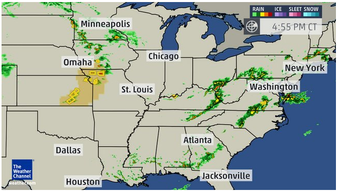
2017-four-us-hur-landfalls_3

The Weather Channel

We surely need to establish distance to process syntheses of data in staggering aerial views on cloud swirl, intense precipitation, and snowfall, and work to peel back their striking colors and bright shades of rainbow spectra, to force ourselves to focus not only on their human costs, or their costs of human life, but their relation to a warming planet, and the role of extreme of weather in a rapidly changing global climate, as much as track the “direct strikes” of hurricanes of individual names, as if they were marauders of our shores:  their creation is as much tied to the changing nature of our shores and warming sea-surface temperatures, and in trying to create a striking visualization, we deprive ourselves from detecting broader patterns offering better purchase on weather changes.

direct-strikes

The Weather Channel

If patterns of weather maps epitomized by Accuweather forecast and projections suggest an exhilaratingly Apollonian view on global and regional weather patterns, they also  shift attention form a broader human perspective in quite deeply pernicious ways.  Such maps provided the only format for grasping the impact of what happened as the hurricane made landfall, but provided little sense of the scale of inundations that shifted, blurred and threatened the coast of the Gulf of Mexico.  They provide a format for viewing floods that are disjoined from victims, and seem to naturalize the quite unnatural occurrence of extreme weather systems.  Given the huge interest in grasping the transformation of Hurricane Harvey from a tropical storm to a Category Four hurricane, and the huge impact a spate of Category Four hurricanes have created in the Gulf of Mexico, it’s no surprise that the adequacy of the maps of Hurricane Harvey have been interrogated as hieroglyphs or runes of a huge weather change:  we sift through them for a human story which often left opaque behind bright neon overlays, whose intensity offer only an inkling of a personal perspective of the space or scale of their destruction on the ground:  while data maps provide a snapshot of the intensity of rain-levels or wind strength at specific sites, it is difficult if important to remember that their concentration on sites provide a limited picture of causation or complexity.

All too often, such maps fail to offer an adequately coherent image of disasters and their consequences, and indeed to parse the human contributions to their occurrence.  This post might be defined into multiple subsections.  The first actions suggest the problems of mapping hurricanes in the Gulf of Mexico in relation to flooding in data visualizations of the weather and the overbuilt region; the middle of the post turns to an earlier poetic model for considering the relation between land and sea that visualizations all too easily obscure, and the meaning that the poet Elizabeth Bishop found in viewing relations between land and sea in a printed map of the Atlantic; after returning to the question of the overbuilt shore compounds problems of visualizing the Texas coast, the final section, perhaps its most provocative, returns to Bishop’s reading of a map of the Atlantic coast.

What such new weather maps would look like is a huge concern.  Indeed, as we depend on weather maps to orient us to place ourselves in the inter-relations of climate change, sea-level, surface temperatures, and rain, whether maps cease to orient us to place, but when best constructed help to describe the changing texture of weather patterns in ways that can help familiarize us not only to weather conditions, but needed responses to climate change.  For  three months after the hurricanes of the Gulf of Mexico caused such destruction and panic on the ground, it is striking not only that few funds have arrived to cover costs of rebuilding or insurance claims, but the judgement or understanding of the chances for future flooding have almost left our radar–perhaps pushed rightly aside by the firestorms of northern and southern California, but in ways that troublingly seem to forget to assess or fail to assess the extent of floods and groundwater impermeability  along the Texas and Louisiana coast.  The problems that preparation for future coastal hurricanes off the Gulf of Mexico raise problems of hurricane control and disaster response that seem linked to problems of mapping their arrival–amd framing the response to the increasing rains that are dumped along the entire Gulf Coast.

Indeed, the chromatic foregrounding of place in such rainbow color ramps based on GPS obscure other maps.   Satellite data of rainfall are removed from local conditions, and serve to help erase complex relations between land and water or the experience of flooding on the ground–by suggesting a clear border between land and sea, and indeed mapping the Gulf of Mexico as a surface as if it were unrelated to the increased flooding around Houston, in maps prepared from satellite imagery, despite the uneasy echoes of anthropogenic causes for the arrival of ten hurricanes in ten weeks, in ways that suggest how warming waters contributed to the extreme inundation of the Gulf Coast.  Despite NOAA  predictions of a 45% likelihood of ‘above-normal’ activity for the 2017 Atlantic hurricane season, with, a 70% likelihood of storms that could transform into hurricanes, the images of inundated lands seem both apocalyptic and carefully removed from the anthropogenic changes either to the ocean or land that intensified their occurrence so dramatically on the ground.

Dartmouth Flood Observatory Flooding Harvey

 Dartmouth Flood Observatory

Harvey flooding_0.jpg

Dartmouth Flood Observatory/August 29, 2017

Is it possible to recuperate the loss of individual experience in such data maps, or at least acknowledge their limitations as records of the complexity of a changing climate and the consequences of more frequent storm surges and such inundations of rainfall?  As we seek better to understand the disaster relief efforts through real-time maps of effects of Hurricane Harvey as it moved inland from the Gulf of Mexico, shifting from Category 4 Hurricane from a tropical storm, we tried to grasp levels of rainfall that spun out of 115-mile-an-hour winds across southeastern Texas that damaged crops, flooded fields, ruined houses, and submerged cars, we scan stories in hope of clues to assess our position in relation to increasingly dangerous weather systems whose occurrence they may well forebode.  At a time of increased attention to extreme weather has long developed, the gross negligence of climate change denial is increasingly evident:  it recalls the earlier denial of any relation between hurricanes and climate change, when increased hurricanes were cast as “the cycle of nature,” rather than as consequences whose effects have in fact been broadly intensified by human activity.

Current attempts to map the toll of record-smashing hurricanes focused almost exclusively on point-based data view rainstorms largely as land-based records; even as they intend to monitor the effects of Harvey’s landfall by microwave censors, they risk seeming to isolate real-time rainfall levels from the mechanics warmer air and sea-surface temperatures which result from human-caused global warming, not relating increased storm surges or inundations to achanges in coastal environments or climate change.  To render such changes as natural–or only land-based–is irresponsible in an age of reckless levels of climate denial.  Indeed, faced by the proliferation of data visualizations, part of the journalistic difficulty or quandary is to integrate humanistic or individual perspectives on the arrival of storms, rendered in stark colors in the increasingly curtailed ecosystems of newsrooms which seek simplified visualizations of satellite data on the disaster, which fail to note the human contributions to the travails that are often reserved for photographs, which increasingly afford opportunities of disaster tourism in the news, emphasizing the spectator’s position before disasters, by images that underscore the difficulties in processing or interpreting the proliferation of data from MODIS satellite feeds:  we can show the ability to measure the arrival of torrential rains, but in offering few legends, save the date and scale, but offering few keys o interpret the scale of the disaster.

The looming portent of human-made climate change, however, underlies the poor predictions that NOAA offered of perhaps 2-4 major hurricanes this Spring, and the lack of a new director for NOAA–on which local and state agencies depend to monitor the nations shores and fisheries–suggested the, from June to September, which left states on their own to make decisions and plan for disaster mitigation programs and better flood maps.  (The danger of appointing a newly nominated director, Barry Myers, who is a strong supporter of the privitization of weather maps and an executive at the private Accuweather mapping service, suggests the difficulty of determining the public-private divide in an era of neoliberalism, and a free market of weather maps that were once seen as central to national security and standards of safety.)   There are two hidden scales on which we read these opaque maps of global warming and globalization and local inundation are triply frustrating.   For all the precision and data richness of such point-maps of largely land-based rainfall, local temperature, or flooding, the biases of such instantaneous measurements seem to fit our current governing atmosphere of climate change denial, and dangerous in erasing how such storms are informed by long-term consequences of man-made climate change.  (As the mapping tools of coastal weather seem destined to change, what sort of change in direction for NOAA coastal maps do we want:  the appointment suggests the terrifying possibility of a return to the Bush-era proposal nominee Myers supported that prohibiting the agency from producing any maps already available in the private sector then threatened federal weather lines to go dark–lest they literally compete with ad-supported websites private providers–and shift federal information offline?)

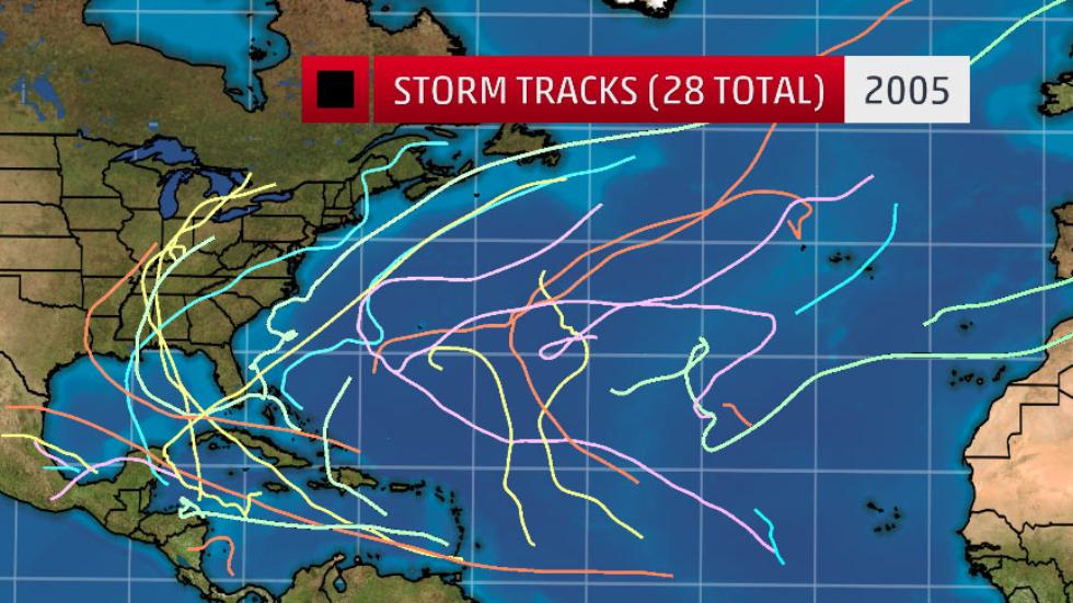
For making moves toward the future readability of weather maps may well be at stake in critically important ways.  The 2005 proposal that Myers backed would have eliminated the National Weather Service, even while exempting those forecasts needed to preserve “life and property,” would in essence have returned the weather services to a pre-internet era, even as the most active hurricane season including a record breaking fifteen hurricanes and twenty-eight storms began in the gulf coast, including the infamous hurricane Katrina.  The proposed bill would have prevented NOAA from posting open data, and not only readily available to researchers and policymakers, in ad-free formats, free of popup screens, but allow them to make their own maps on the fly–ending good practices of posting climate data would work quite dangersously to prevent development of tools of data visualization outside commercial models of rendering storms and hurricanes as if environmentally isolated.

2005-tracks-update.jpg
direct-strikes

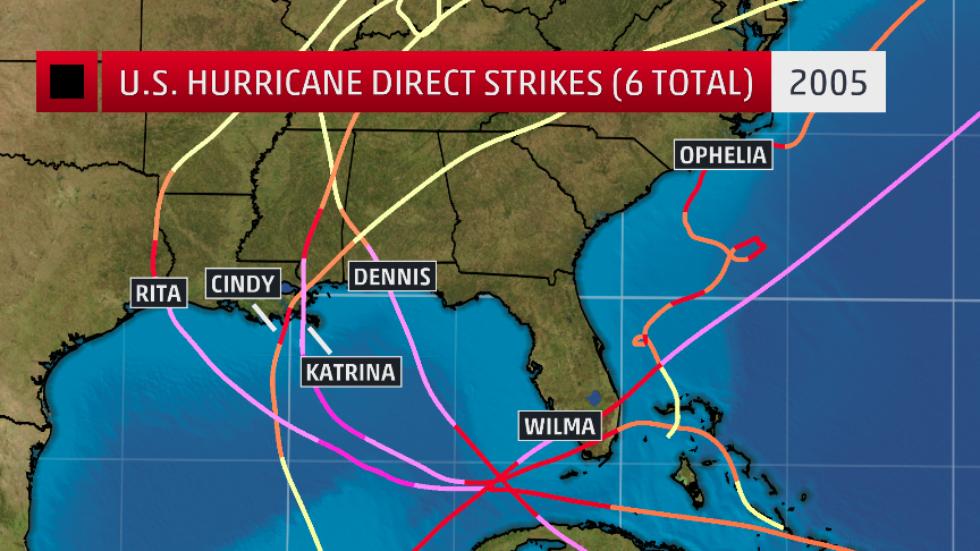
A deeper problem of providing such limited weather maps of tropical storms may be the subtexts about the relation of human causes to weather they convey, and the absence of a greater narrative of the transformation of a global ecology or of the ecology of the Gulf Coast.  The curtailed images of “nature” they present by symbolizing rains, winds, floods, or submerged regions in appealing hues as natural–raise questions of the odd simplicity of the absent storylines:  cheery colors erase or bracket complex questions of climate change, the human contribution to extreme weather events, or the human experience of suffering on the ground:  Rita, Cindy, Katrina, Dennis, and Wilma seem not part of the environment, epiphenomenal interlopers moving across a static deep blue sea, in an apparent dumbing down of the mechanics of hurricane or storm formation in a rainbow spectrum removed from a human-made environment.

Continue reading

Leave a comment

Filed under anthropogenic change, climate change, coastlines, ecological disasters, gulf coast

Mapping the Wobbliness of the Polar Vortex

Since we use the conventions of map making to endow solidity, or reify, even the most abstract ideas, it is interesting to examine how the ‘Polar Vortex’ has spread across the mass media as both a meme and icon of the current weather patterns of the new millennium.  Rather than map place by a matrix of fixed locations alone, maps of the Vortex offer a visualization of temperature variants that reveal an anomalous weather conditions that track the Vortex as it moves, intersecting with place, across the stratosphere into our own latitudes, tracking not only a “cold front” but, globally, the disruption of the path of the circumpolar winds, or splitting of the vortex from the north pole.  We are most likely to “see” the Vortex as an incursion into our own map, effectively dividing the country (yet again?) this summer into regions of cold and heat.  The currency of visualizations of the Vortex reveals not only a meme, but a model for encoding multi-causational weather maps.  Indeed, the mapping of the divergence from usual temperature range reveals the anomaly of a north-south weather front with the solidity of a national divide, raising deep questions of its forecast of extreme weather throughout the year more than offering something like a “poor man’s vortex.”

PolarVortex2

As the term has gained wide currency as a challenge within data visualization world for throwing weather systems into legible relief, it set a new bar for producing visualizations that are challenging to fully comprehend.  The Polar Vortex is mapped as it moves, as if on its own, across the stratosphere into our own latitudes, condensed in a range of data visualizations of stratospheric or tropospheric low-pressure fronts, in ways that map onto current quandaries of atmospheric and climactic imbalance.   The animated superimposition of weather patterns condensed in a range of data visualizations of stratospheric or tropospheric low-pressure fronts themselves map onto concerns about climate change, and conjure narratives of global atmospheric change and climactic imbalance:  the disruption of the usual harmony of the polar jet stream perhaps maps onto both notable rises in polar temperatures or torrential rains off the coast of Japan, but whether due to a spike in northern pacific offshore typhoons or openings in polar ice cover, the markedly increasing waviness of the vortex has allowed increased amounts of cooler air seep south once again, in an eery echo of last January’s mid-winter chill, that has lead weatherpersons to scramble for clarifying narratives about the return of that green blob.  (To be sure, back in January, the naysayers of climate change parsed weather maps as counter-evidence to global warming, allowing them to indulge in alternate meteorological realities, before they were batted down in two minutes by the President’s Science and Technology Advisor, Dr. John Holdren.)

Weatherman scrambling to gloss

twins-gfs

Offering a marvelous array of vowels and pattern of assonance, with a name befitting a Marvel comics super-hero as much as a weather pattern, the Vortex is a touchstone of climate change and a great case of how we have yet to ken the global as intersecting with the local.   But we have unfortunately trended to oscillate, as it were, in our maps between national weather maps, where the Vortex made such a splash as a newsworthy low-pressure pattern, to maps of patterns in global environmental change, that might better direct attention to changing meteorological realities.

Part of the problem is adopting a point of view on the weather that we are tracking–or of viewing the Vortex as a stratospheric phenomenon around the polar regions, or charting a weather pattern forecast as occurring within our nation’s bounds.  The reprise of the spill of northern air into the upper United States returned the Vortex into national news this July has provided a basis of the latter, to judge by this new visualization that projects the cooling temperatures in the northern United States, as a deep wave in the Jet Stream brought colder air to the Northeast.  Even if the cooling air that arrived was not arctic, the pattern of its arrival to the continental US this summer has prompted some significant debate among meteorologists who have glossed the map in alternate ways, almost entirely still focussing, oddly enough, in a reprise of the mid-January news blip on the Vortex, on the unit of weather in the United States in isolation from a global context.  The anomaly of the “Vortex” has become something of shorthand for a southern swing of cold air from north of the Great Lakes, produced by a decreased disparity between polar and sub-polar continental temperatures that lower the latitude of the jet stream, according to some research that has been endorsed by the National Academy of Sciences, and increased its waviness as the Arctic warms.  The maps serve to embody the increasingly newsworthy weather in the Northeast, reaching down to the southern states as if an invading army as much as a meteorological cold front, placing the anomaly of the displacement of cold air against the screen of an iconic national map on which it has been superimposed.

polarvortex-321x214AccuWeather.com

The map recalls a similar dispersion of circumpolar winds from the arctic into the lower forty-eight already called the “most upsetting” data visualization of the winter of 2014.  The drift of circumpolar winds at stratospheric levels offers a compelling means to understand the arrival into the Midwestern states of cold air once more from the north during the mid-summer of 2014.  Rather than only being a meme of the media, or being coined as a manifesto a group of avant-garde modernist meteorologists who found energy in the abstraction of weather forms, the term tracks the dispersion of the circumpolar whirl usually uniformly swirling about the pole offer both a rogue arrival into our national climate and a sort of emblem of an imbalance of circumpolar stratospheric harmony by pushing down the arrival of winds from the Pacific ocean.

650x366_01161752_hd30-2AccuWeather.com

The benefits of shifting iconography to the global are immediately apparent if only because they reveal the divergence of the weather system from a meteorological status quo.  The cycle of wind, usually located in the mid- to upper troposphere, has apparently begun to split or splinter from it usual centers above Baffin Island and Siberia as its air warms, and moves below the arctic regions.  The displaced vortex, which migrates below the arctic circle in the stratosphere, reflects the warming of temperatures at the poles, creating currents able to funnel the figurative migration of arctic air currents to sub-arctic latitudes, even if the air in question this July might more likely be northeast Pacific more than arctic in its provenance.

Displaced Vortex-full color windsEarth.com

The local is, however, far more easily digestible for viewers of The Weather Channel, and the Vortex is shown as an intersection of the global with the regional weather map.  Collating data from divergences or temperature anomalies from a database covering local temperatures in 1981-2010, the spectrum of a “heat map” tracks currents of cold across the backdrop of the lower forty-eight in an easily digestible manner that packed so big a punch for folks trying to puzzle over the freezing over of roads, local lakes, or back yards:

Vortex in States

Once more thrown off-balance, it sends cooler air below the lower forty eight and forty-ninth parallel, making it national news as a dramatic aberration that marked the entry of intense cold.  Data visualizations provide new tools of making the meteorological concept legible in ways that gain sudden particular relevance for audiences familiar with weather maps, for whom immediately powerful associations of shifts in the measurements of regional temperatures will pop out at viewers of a forecast or weather map, forcing them to pay attention to the meteorological imbalances they portend.

400x266_01221625_weekendcold

Recent global maps of the Polar Vortex offer more than an icon of the transcendence of territorial boundary lines systems, by processing and portraying the Vortex as an expansion and  breaking off of cold air outside the restraints of an arctic air system.

November2013_polar_vortex_geopotentialheight_mean_Large

The dramatic splitting of the arctic jet, due to atmospheric pressure anomalies, was mapped by NOAA in this data visualization of July 2014, of a splintering of the vortex, in apparent response to the warming of our poles, hastened by the diminishing snowfall and ice-cover that create new chilly islands or microclimates on the ends of a warming pole we often seen as lying so far away:

July Polar Vortex 2014

The disruption that results brings the displacement of arctic winds that most often sit anchored around the polar region.  A “weak” polar vortex, interacting with arctic ice-cover decline and reduced snow cover, was some time go modeled as resulting in a meandering arctic jet stream and occasional detachment of a polar weather systems and consequent decline or weakening of pressure gradients of the vortex, and consequent reconfiguration of the arctic jet stream:

N_Jetstream_Rossby_Waves_N

Has something like this occurred?  The dynamic visualization of weather maps in five colors and striking contour lines provide clear tools to visualize its speed and energy, in ways that might even have helped resurrect a term that had languished in meteorological lexicons from at least 1853, when the “continued circular gale” was described as flying “more rapidly and more obliquely . . . carried upward to the regions of the atmosphere above,” as lying in the ambitions of a “great Air Map” but based on the recent 1851 NOAA mapping of “great undulatory beds of the oceans . . . for all practical purposes of navigation.”

great polar vortex

But now we have a recognizable image that can be tracked over a recognizable terrestrial map that concretizes the Vortex in ways that its winds can be understood as extending over a region of truly global expanse.

Tracked in terms of actual temperature anomalies, in the winter of 2014, when newscasters and NOAA (the same agency) mapped the migration of cold air southwards of the pole into our frontiers, far outside the usual path of the jet stream, in a disturbance of the weather systems worthy of national news last January, in a data visualization which tracked a green (or purple) blob whose forced migration of frigid air from the polar regions that disrupted weather patterns with national consequence as it migrated out of Canadian airspace.

500_mb_Mon_night


Vortex in States

In the dramatically eye-catching graphics of television’s mass-media, as the bulge of purple and magenta of detached low-pressure systems migrate south, crossing the very same borders to which we are increasingly sensitized in our national news media, albeit at tropospheric altitudes no fence or border guards could ever patrol.  Indeed, the map suddenly suggests the increasing vulnerability of our delicate weather systems, echoed by the language with which the Polar Vortex’s “EXTREME COLD” loops invasively southward across our northern border, cutting off Pacific Air:

650x366_01161627_hd31-1

650x366_01161752_hd30-2AccuWeather

The apparent incursion of its jet stream into the bounds of our national airspace, as in this image of cold air migrating across the northern border, results in the proliferation of metaphors all too often violent in tone:  Climate Central may have only adopted the robust rhetoric of sportscasters when it described high pressure systems in quite athletic terms that “block the eastward progression of weather systems, like an offensive lineman protecting the quarterback from the other team,” allowing the air that circulates around the arctic to start “spreading tentacles of cold southward into Europe, Asia, and North America.”  Less dynamically interpreted and understood once cast in global terms, rising temperatures at the poles–the very sites where, we should note, global warming is occurring at a rate twice the global average–displaces the previously concentrated flow of a jet stream of cold air from its arctic abode.

Of course, few seem ready to tie this to the diminishing ice-cover of the north pole, which still seem a leap too far to be made logically. Oddly, the meteorological mechanics of the expanding split-off of polar winds is modeled as an incursion of weather patterns echo the metaphorics of a military situation map of fixed borders, a historic hold-over for national weather organizations like NOAA:  the global image of wind velocities around the pole, depicted below, is oddly absent from what is actually a global phenomenon.

polar-wind-displaced-vortex-2-1-14Earth.net

But we are all too used to interpret and read weather maps with both a sense of voyeurism for our friends and relatives, but from a subjective lens.Despite the adoption of globalized images from our friends at National Geographic, who used Mass FX Media’s animation to visualize circumpolar air flows, and despite the continued live monitoring of wind-flows at “Earth,” the isolation of the nation in the maws of the vortex is so readily discussed as the “most upsetting map of the winter,” as if the migration of the pool of arctic air into the northern United States were best understood as a disturbance of national temperatures.

The similar narrative about the Vortex in national forecasts stands in contrast to the maps of rising temperatures, but create a visual modeling of a meteorological distribution that almost resembles an invasion.  Even though the distribution and speed of the Vortex in summer is usually slow, the polar air however seems to be arriving from across the border with unstoppable velocity, the below global visualization, also based on a similar distribution of deviations from average temperatures craft a similarly compelling large-scale weather pattern–albeit one occurring some 3,000 feet above the earth’s surface–in which, rather than reveal a lack of equilibrium, arctic air dips south across the forty-ninth parallel and past the Mason-Dixon line, confirming its occurrence as a shift of national consequence.

19g70jjap4syugif

Because the “most upsetting map of the winter” tracks the pooling of arctic air into the northern United States created a disturbance of national temperatures into the Eastern United States and much of the central region of the country.

Wasn’t it once more reassuring to understand the polar regions, its topography unknown, as somehow removed from the atmospheric currents than being mapped around the world?

UNEXPLORED POLAR BLUE

The wonderfully protean animated map of disequilibria in the harmony of stratospheric currents of cold polar air within the jet stream opens breaches across national boundaries, albeit at considerable elevation, and also offers a way of tugging at one atmospheric phenomenon to unpack a web of inter-related phenomena.  Unlike maps of habitation or land-surface, the map traces a low-pressure system at high altitudes far above the settled or occupied land, but intersecting with it in ways that conjure a failed ability to contain colder air over the polar regions.  (Taking the iconography of weather maps as transparent, the blogosphere has suggested the adoption of charges of circumpolar intoxication.)

The distribution of stratospheric air whose flow is charted in global map as an irregular anomaly of temperatures’ spread, is perhaps most concretely rendered by the iced-over bodies of water it left in our own upper latitudes.  The striking freezing over of the Great Lakes, covering some 88% of the lakes’ surface area by mid-February, a greater proportion of seasonal ice-cover than ever registered, and surpassing the 82% record of 1996, according to Caitlin Kennedy of NOAA, which render the striking concentration of ice in frozen lakes a concrete map of the local effects of truly polar weather.

GreatLakesIce_610-1

The material manifestation of the cold on the surfaces of those five lakes–all frozen solid, to appearances, save Lake Ontario, seem as concrete a result of the consequences of climactic change one might have in a chart, by placing the ice-covered lakes in a local landscape.

What seemed the displacement of the frigid polar air to the Great Lakes became something like a confusion of the local and the global in the news media that was played out in weather maps.  Of course, the meteorological mapping of this winter’s Polar Vortex in Canadian outlets seemed more the status quo, with most of the country facing sub-zero temperatures:

640x480_currents_ca_temperature_i1

The US “low temperature map” used a slightly different temperature spectrum, but preserved a more alarmist image of anomalous weather conditions even in the National Digital Forecast:

temperature spectrum us vortex

The striking visual by far was from a site located exactly on the US-Canada border, an  eye-catching a frozen Niagara Falls, that icon of liminality:

52d0f434d39a1-1024x614

The distributions that charting the mid-July summer chill newly arrived in the Midwest and much of the East coast of the United States from Canada is less striking, even if it will bring dips of twenty to thirty degrees form the normal.  NOAA omits Canada completely from its prognostications of the arrival of the coming cold, as befits its role as a national agency, and restricts its purview to United States coastal territories, even though it would make the graphic far more credible to offer a greater coverage.  It provides something of a summertime counterpart, however, in which the probability of lower temperatures than usual seem to create a ring about the same lakes, radiating almost to the Atlantic coast:

NOAA POLAR VORTEX

Where is the center of this new system of cold air? With roots in Hudson Bay–where else?–the polar air will be spinning southwards at the upper levels of the atmosphere, spinning southwards toward the United States. There were past migrations of arctic air over Quebec and Maine, back in late January, 1985:

Polarvortexjan211985

The Detroit Free Press even seized on a recent NOAA projection of a similar displacement of arctic air, that locates the center of cool air migrated toward Michigan, forming a pool of air that had descended into the central United States, as if to cast the event as something like local news, even as it suggests the rise of two weather systems:

safe_image.php

The occurrence isn’t strictly polar, or arctic, in its origin.

But the results are the consequence of a sort of distorting decentralization of the polar cold air outbreak that hovers around the arctic circle, running around the pole and allowing or protecting cold air from drifting south, containing cold air or not it its high altitude low-pressure system.  (Of course, the west coast is poised for a dryer and hotter-than-normal week.)  The decline of snow and ice around the Pole, combined with the warming of the wobbly gulf stream, will allow the chilly polar air to spill southwards to the plain states, covering not only Canada but spilling outside the low-pressure system and over to the seaboard, in a sort of nervous breakdown of meteorological model behaviors.

The disturbances of equilibria in our weather maps makes it worthy of more than symbolic note. The increasing variability that the waviness of the outer line of the low-pressure system, or jet stream, related to the declining snow cover in the far north, in the a “warm Arctic-cold continents” pattern, where the compact containment of colder airs was broadly breached.

Jan5_Nov14-16_500mb_geopotentialheight_mean_620

The lack of equilibrium in the stream of polar winds–distinct from the widening polar ozone hole–opens up more of the terrestrial surface to chilling shifts in temperature. As much as the embodying a low-pressure system, the map is a narrative of the disruption of climactic harmony, and view toward the future of weather systems world-wide.  The results of the wavy polar vortex, joined with rising world temperatures, create a map of bizarre spottiness in average world temperatures that is difficult to conceive or map, precisely because its high-altitude distribution is difficult to transfer from a spherical to a flat surface, and because its distribution unfairly privileges the tracking of cold air in ways that seem, misleadingly, to fly in the face of the maps of our overheating world.  This past January, NOAA crafted a digital globe that displayed the distortion of local temperatures distorted beyond the norm, with cold displaced from its polar resting place, resulting in a cognitively useful modeling of a disjointed jigsaw of cold and warm air, where the warmer deviations of global temperatures spick not only over western Russia and Alaska, but at the polar regions itself.

polarvortex_airtempanom_610NOAA Climate.gov

The result is a jigsaw reveals the breaching of cold air from the cap of winds that encircle the polar cap has a enough of touch of biomomorphism to echo ecofeminism; the forcing of warmer air patterns resembles a blurry sonar image of curled-up embryonic twins resting in a womb as if evoking the shape of future weather systems, offering a biomorphic visual metaphor for something like an eery augur of a future holding limited possibilities for an afterlife–and of the unknown future of our planet’s atmosphere.

2001SPACEODYSSEYABOL1

2001

Leave a comment

Filed under Climate Change, climatology, meteorological maps, NOAA, polar vortex, weather maps

Mapping a Century of Rising Heat

RISING Temperatur esNew York Times

The color-saturated mapping of regional changes in temperature across the contiguous United States provided a commanding visual for the front page of the New York Times of May 6 to capture changes in the US climate:  placed on  conspicuously above the fold and standing alone, just below the headlines, the graphic served multiple functions in a strikingly effective way.  The weather map that was first released by the Obama White House elegantly and effectively served–in ways that words could not–to combine several narratives of climate change that synthesized  the findings of a recent committee of scientists on the wide-ranging effects of global warming.  This is an unprecedented victory of the map, the most effective single tool to describe the complex process of a veritable cascade of environmental shifts, by selectively focussing on a known variable of local warmth.   The orange and bright reds of the map arrest the eye in ways an article or headline could not, and effectively provoke a cascading set of side-effects and reactions to occur in readers’ minds that served to grasp the finality of warming’s consequences.  As one mind quickly moves off the map of stark changes of temperature to the effects of future droughts and increased aridity of soil, consequent crop-shortages, and subsiding ground-levels, imagining the marked depletion of cool air, streams and rivers that would dry, and an increasing dependence on energy to create artificially cool environments. 

Although it is static, the historical map suggests a spectral future forecast for the nation that dramatically moved from back pages to headline news.  It mirrored a roll-out of the announcement as part of a dialogue with weathercasters on television news programs in a gambit to engage the public in the question of climate change.  Indeed, the graphic mimicked the presentation of weather maps on TV, images of the national forecast that the Weather Channel has made all too familiar.  Even if the map documents changes of the previous century, it shares the iconic status of the sort of severe weather forecast that The Weather Channel has accustomed us to interpret and to see.  We’re now trained so often to interpret and to read similarly colorized  climatological forecasts to trace regional emergencies that the Times‘ map seemed to recuperate these conventions to make a polemic point not so much about the past–“US Climate Has Already Changed”–but about the possible futures that the map forebode.  For weather maps offer the most acceptable medium of future predictions, where they have currency as credible tools for short-term forecasting.

Thuderstorm Forecast

The range of information in the map that summarized a century of rapidly shifting local climate temperatures How could such a gamut of consequences be convincingly understood or presented other than in a map?  The visual immediately triggered multiple questions of effects on species, forests, farmlands, new sorts of vegetation, and shifting insect populations described in the article, which a reader some decades ago would be challenged to link.   The effectiveness with which the map implicitly summarized the ramifications of these potential changes, or provoked its readers to react to its orange and read heat-distributions, presented an ominous vision of the future, as well as the historical past of a century of warming weather that the headline announced.  As if with the ominous fatality with which science fiction authors like Arthur C. Clarke described the future of a world battered by asteroids, the map opened up a view on the consequences of environmental change in a future world, even if its headline announced an event firmly rooted in the past century, synthesizing as it did the findings of two periods in the past hundred years.

The finality with which the map released by John P. Holdren documented a change that had already occurred across the nation’s regions, but made it to every weather bureau and station across the country, as if to maximize the newfound familiarity of audiences to engage meteorological maps as a way of making its own polemic (and of course partly political) point of how drastically rising temperatures stand to redraw the familiarity of the world.  Extending far beyond earlier warnings  voiced by the UN, or the pronouncements of an Inter-Governmental Panel on Climate Change whose  report documented the melting of the ice-caps and collapse of sea ice in the arctic, the migration of many fish out of their habitats, and impending dangers of rising seas.  Perhaps these global images were too remote, or difficult to visualize.  The powerful invocation of the weathercaster seemed to give greater reality to the scary prognostic in the contiguous United States, and concretized the multiple threats of climate change in an image that confirms the changing nature of the ground beneath our feet.  Some may criticize the focus on the United States alone in an interconnected world, as if the isolation of our country’s climate somehow removed it from a global problem and dilemma, or placed undue emphasis on the effects of emissions on the climate in the US.  But the image of actual experiences spurs a call for reaction and response, and, in an echo of the tactics of the Obama administration, reveals the increased “cartographical literacy” in the reading and interpreting forecasts in persuasive national weather maps.  

Forecast and Warming

The emulation of the televised weather forecast is no doubt what makes the map appear so immediately effective.

The map of the entire country was in ways a counterpart to the images of November 2012, around the time of Hurricane Sandy, simply titled “What Could Disappear,” which asked viewers to imaging the shifting coastlines of rising seas, and pictured the coasts that rising ocean waters could redefine, submerging beneath the sea low-lying areas of what we consider habitable land–as well as flooding all of Galveston, TX and some 45% of Long Beach.


What Could be Lost The New York Times
 

But rather than engage with complex claims of climatological futurology, the front-page graphic was both at the same time historical in perspective and even more apocalyptic.  In announcing or intoning “US Climate Has Already Changed,” it reminded us of the consequences of rising temperatures at a historical remove that was still part of our present and an uneasy glimpse to the future we have mad, using tense whose finality foreclosed debate in quite incontrovertible ways.  The map’s comparison of temperatures over a century effectively resolved debates, separating the actual consequences of climate change on a familiar environment from debate about its mechanism and reminding us of its man-made origin, and untangling the dangers of the changes that it wrought from the cascading (if terrifying) mechanism of ocean levels rising, habitats altering, fish migrating, the extinction of species, and deaths of coral reefs.  The map was able to link itself to a multiplicity of lived experiences and actual fact, and conjure a scarier–precisely since undefined–picture of what was to come–an era of increasing heat.  (Its associations might almost be as apocalyptic as the hallucinatory surreal  dream from a 1959 episode from Rod Serling’s The Twilight Zone, “The Midnight Sun,” in which the earth exits its elliptical orbit and moves toward the sun, warming the nation so much as to induce crazed radio weathercasters to stray incoherently off script and panicked Americans to flee abandoned cities en masse to Canada in search of cooler climes.)

The particularly powerful graphic of the map of regional variations in rising temperatures was quite devastating in its depiction of how–despite some regional differences–none save rare pockets of settled land experienced anything approaching a decline in reported weather temperatures.  For those that did, mostly concentrated in the lower Mississippi basin, they experienced quite slight declines:  it presented an image of a continent on fire, almost about to be consumed by flames, burning from its edges, if, the accompanying article noted, increasingly soaked by torrential rains.

RISING TemperaturesThe New York Times

The  growth of areas already warmer on an average of some two degrees suggested an encroaching of scarlet red blotches across the land from all sides, particularly in southern California and Arizona, Utah and New Mexico, the northern eastern seaboard, and the Great Lakes, with Bob Dylan’s native Hibbing seeing the greatest temperature change of over a massive three degrees.  The map powerfully synthesized the effects of human-induced climate change in ways that are not only impossible to rebut, using findings of a national  committee that has been in existence for over a decade–but was by far the most effective among the various interactive graphics it released.  The simple synthesis in a four-color map of the contiguous US immediately showed rising temperatures in some of the more inhabited areas of the nation, from New Mexico to Southern California, to the New York-Washington corridor.

In selecting a map to represent the consequences of climate change that were detailed in the report, the images suggested less of an infographic than a sort of disease map of a climate that has gone off the tracks.  Even if it might be faulted from its insistence on removing the US from the world, and focussing on one place within a complex web, as well as flattening its findings in cartographical form, the image is powerfully links the land to a set of abstract changes we cannot fully comprehend, but whose effects we can perceive.  This is the stunning victory of the static map.

2 Comments

Filed under "Midnight Sun", Global Warming, Inter-Governmental Panel on Climate Change, John P. Holdren, Rod Serling, The Weather Channel, weather maps, weathercasting

Windswept Lands

Warm wins that rise in the high plains have increasingly driven the fires that have devastated California, hurricanes battered our costs, and driven unprecedented showers that have flooded southeastern Texas.  But winds are rarely mapped, or even perceivable in maps, although winds were once a central part of the maps known as portolan charts designed when the primary means of long-distance voyaging was navigation.  But data now stands to integrate the winds–once shown as heads that buffeted human history or at least human travel–


venice Agnese_Portolan Atlas


00but are increasingly able to be incorporated into our own maps of disasters, if only to fully understand the fluidity and vulnerability to which we are exposed by high winds.  Indeed, it is increasingly clear that we are better able to read the relations of geographic locations and the information of data visualizations only by including the winds in their surfaces, at the same rank, or level, as the sites of human habitation that maps have long prized.   But if the winds shown on global maps are confined to its margins as embodied personifications, less quantifiable than the graticule of longitude and latitude but vestiges of an older traditional of nautical charting where the provided directionality as well as the force of gales that would provide a basis to orient one’s sails,


rosellimap700


the place of the winds are able to be inscribed on the surfaces of many recent data maps.

The ready availability of huge datasets about wind-strength indeed offers multiple formats for modeling an increasingly dynamic relation to space, and perhaps to incorporate them within the legibility of the map .  Indeed, the processing of remotely sensed data allows for frighteningly rapid condensation and synthesis of what can be called information within a single map.  And the recent NOAA based on modeling weather conditions in a real-time wind map is particularly neat in how it invests the currents of air that swirl above land and sea with a hue of their own, as if to invest them with character as a subject of mapping and give them a new level of visibility.  Set against a night sky, where details such as topography or ocean currents are conspicuously silenced, the lines of winds appear in neon blue relief off the California coast, showing an elegance of serpentine motions are tracked with far more wonder than the static terrestrial map:

wind

The flowing electric blue lines used to render wind move with a sleekness as if to promise immediate access to meteorological actuality that seem to blend the screen with current wind conditions, and provide that most fantastic of illusions of a map of the present-day that almost sends tingles up our neck in providing a map of events that seem actually to be transpiring.  The maps have in fact led reporters to gush thanks to the US government for its funding of the project with tax dollars, creating new conditions for the visibility of currents of air to which we are ineluctably drawn in an almost zen manner.  The GIF suggests a mapping that is based on looking at the overlooked, or rendering the smoothest of airborne sensations with cartographic legibility.  It echoes the recent ability to encode data from sensing stations in a transfixing image of swirling gusts that seems far more animated than the flat topographical base map that lies beneath.

sssss

The attraction of these maps is more visual, in fact, and somehow more seriously phenomenological, than having to do with geographical information, save as it suggests the increasingly fluid nature of all information flows.

The dynamic nature of wind maps renders an idealized perspective whose content asymptotically approaches a view that is almost entirely abstracted or removed from the inhabited world, based on the mathematical models for projecting and tracing the currents and intensity of wind over land:  indeed, in the marvelously idealized data-driven maps, wind currents create whirls of whorls over the lower forty-eight.  The website hint.fm uses real-time images of the inroads winds make across the territory of the United States, distinguishing gradations of gustiness by wisps of differing intensity to describe a space not only removed from the inhabited world, but whose elegant tracery enacts an aerial drama across in an artificially demarcated mapped space too vast to comprehend, but offers a sort of atmospheric ballet of the wind’s shifting directionality and intensity, as if traced by a multitude of individually situated geographically dispersed weather vanes oriented by the shifting winds across the lower forty eight.

Wind Map website image

If the image recalls something like a smoke-filled room, it is more of a wind-filled continent, where blowing winds cross borders, rivers, and plains in an image of the bounds of the contiguous forty-eight states.  The cartographers, or artists of technological visualization, Fernanda Viégas and Martin Wattenberg are dedicated to “work [that] explores the joys of revelation” and in converting local data to suggest natural currents that existed before highways carved the continent into itineraries–like the “blue roads” of rivers run across the land–but their constantly shifting trails mark a weirdly curved space in a situated perspective rarely able to have been captured before.  Even on a “mild day,” the winds give a sort of dramatic intensity to the organization of space oddly removed from the cartographer’s art, which is quite passive in the sense of offering a surface to be inscribed by the movement of the air, as wind curves around the nation’s great plains in currents of a recognizable patterns or flows that approximate stop-action photography.

wind_west_to_east

Looping Denver

Sure, there are specific moments of meteorological intensity when winds line up in a recognizable pattern–a tornado or hurricane–in ways that define a geographic focus of interest or attention, as in the vortex of Hurricane Isaac as it approached New Orleans,

wind_isaac_zoom

but all too often the dispersal of attention is the rule, as one watches the patterns that winds themselves generate.

This charting of currents is one of the most precious dreams of early map-makers:  to chart the very presence of winds across the land and sea, early symbolized by the rhumb lines that were so important for nautical navigation in early modern and medieval charts, where they communicated the basis of projecting travel across oceans otherwise rarely noted or known how to be represented in the surface of the map itself:  even the lines surfaces of the waves on which ships gently rock and sea monsters rear their heads is only a suggestion of the winds that run across their surface.

Olaus Magnus

The wind-map is abstracted from territoriality in a sense, as were the oceans:  its formal focus on the United States, derives from its synthesis of predictions of the National Digital Forecast DatabaseLaura Kurgan has suggested how much the big data of cartographical operations like Google Maps or Google Earth were not only enabled but indebted–and informed by–the declassification of satellite views during the Clinton administration, which created something of a boondoggle of available data for American mapping firms, if it also informed the very strategies of global surveillance that Google inherited:   the delicate wind-maps Viégas and Wattenberg conceived and coded suggest less of a governed land than a territory inhabited by air, in which the unfurling curling currents of wind estheticize the bounded nature of territory:  migrations of flows of air that course above the terrain, tracing inroads of whitespace into the blackened map of the lower forty-eight until, over a sufficient amount time, the entire region would be wiped white or erased by air currents, and present only where wind-velocity was nil, in an atmospheric vanishing act of a truly windswept land, where winds course across by crossing out space and inevitably white-washing inhabited lands.

Winds over US whitening out whitening #3

Drained Nation Whitening #6

In another sense, the wind maps register the messiness of local interaction, so absent from the idealized rendering of the map, even if that interaction and specificity lies above where human interaction occurs, and creates a network of a sort that is constantly reconfigured before our eyes as it is drawn and redrawn in trajectories with comet-like tails.

Modelling Wind Flows 12-58 EST-4

The modeling of wind gusts across the contiguous United States suggests a new sense of the spectatorship of the D3 map, although real-time of the map qualities maintain an illusion of an actual meteorological surveillance of the skies.  Just as we cannot watch the unfurling of wind-currents of different velocities over the space that is mapped, they define the dispersal of wind currents across space as if at a remove from actual habitation:  the fine lines that recall stop-action tracing of six levels of gustiness across the nation are extraneous to sites of habitation, because habitations are not what is being described, or included in the data that drives the map:  the conventions recall streets or waterways or rivers, but follow a set of mathematically modelled swirls and whorls that render air apparent over the land that we more usually map, in a view to currents far above the ground.  And yet the mesmerizing drama of modeling data of wind currents is so elegant and engaging that it is hard to stop watching: its ambitious organization charts a record of our world at a remove from the categories of mapping that we are more habituated to scan.  In a way, the windmap is the most elegantly estheticized of terrestrial or worldly maps, because it is also the most etherial.

USA Windswhirls May 1 12-58

What is the subject of the map is the flow of data that is so oddly anthropomorphic, casting the map as a hirsute surface and second skin, even as it describes the velocity of air currents above the land abstracted from any view of place?  Do the wind-currents create or seem to sculpt a sense of place in their whirls and eddies, giving a concrete palpability to the map’s surface that somehow runs against the flattened isotropic surface of a map?  Is it still a map, now that any sense of spatial indices are erased, and centers of habitation are dramatically reduced?  Or is it a screen?  One of the beauties of this projection is that as one zooms in to the ground, further cities appear in the map, providing the needed points of reference that would be too busy in the larger scale versions, where they would obscure the beauty and drama of the inroads made by the winds that circulate across the lands.

Shaggy USA

There is specific period eye that is attracted to the data visualization, familiar with reading data distributions rather than describing a topographic space in naturalistic terms of portrayal.  If the United States seems a shaggy dog, the most mesmerizing of D3 tricks in the book is to watch the ongoing expansion of wind currents across the Rocky Mountains, Desert, and California, from an imagined t-zero at which the calculations are assumed to begin, as winds begin to be inscribed, as if on an etch-a-sketch in reverse, and give contours and form to the blank black area that the first screen seems to map, suddenly giving it a texture that is specific to a date and time when the download of whether data began, until it gains something of a meteorological image of wind flows.

West Coast Winds 1

Califn Currents #3

Calif Currents #4

Calif Currents #5

Californai Currents #7

Is this sort of data visualization, as attractive as it is, a map?  The processing of the distribution of air currents is difficult to stop watching because of the elegance with which it makes us look at the winds that we notice but have such a hard time collectively grasping, and because of the currents, eddies, whirlpools and lines of different flow that the wind map increasingly reveals, so that it gains a coherence in itself that it initially lacked. The idea of mapping air is intensely appealing, because it acts, as a map, to make visible what is so easily overlooked or otherwise has no concrete identity by which to be grasped.  The parallel currents, if approximating a familiar natural appearance of a hirsute coat, are nonetheless quite conceptually difficult to envision in their relations to one another or totality.  The best reaction is one of wonder–wonder at being able to find a visual residue tracking the unrelated sensation of wind:  this is mapping, in a sense, as an exercise in synesthesia, where sight replaces the sensation of wind on skin.

There are elements of translating sense-based observations to a format of visual modelling in all maps, but the oddity of removing the array of wind-velocity from sense-peception of course seems odd because one rarely thinks of spatially locating winds with precision or fixity.  With closer examination of the trajectories of gustiness one notices, first, the odd pockets of calm across the land, oddly coincident with some cities, and probably not only because their buildings block the velocity or intensity of air flow, in what can appear like racing currents or overlain strands:

Pockets of Calm?

And then the country, as it is inevitably drawn by an invisible hand of the forces of the winds, cumulatively gains the contours that it originally lacked:

Modelling Wind Flows 12-59 ESTModelling 12-58 EST--3Modelling Wind Flows 12-58 EST-4

1 Comment

Filed under CityLab, comet-like tails, D3, Fernanda Viégas, Google Maps, hint.fm, Martin Wattenberg, National Digital Forecast Database, NOAA, wind-maps