Tag Archives: art and cartography

Natures of San Francisco

A man in the city,” wrote American novelist William Gass, “has no natural thing by which to measure himself.” But self-measurement is increasingly difficult to gauge in an age of global warming, and increased catastrophic weather. We are with less of a rudder than in the past. When Gass wrote, two thirds of the way through the last century, he was describing cities on the east coast of the United States with the wry bitter logic of a longtime midwesterner. Most cities were clearly bounded, we had no sense of urban sprawl, even if the United States was still–as it is now–distinguished by the highest per capita urban areas of any industrialized nation in the world. If San Francisco was predominantly green, bounded by the Bay and Pacific Ocean, dotted with parks and green space, although its development has been confined by faultiness, as much as by environmental strictures on urban growth and neighborhood improvement associations.

If we imagine interconnections of the Bay Area by analogy to transportation infrastructure, we might approach a deeper understanding of the migration patterns and natural presence that continues amidst the growth of ground impermeability and urban footprints. There was a deep tie to nature present in San Francisco, after all, back when some fifty daily ferries that in the 1930s, a century ago, shuttled an annual fifty to sixty million passengers across the Bay waters, and a quarter left the water through the Ferry Building daily from the hundred and seventy ferries making daily landing. The bay offered a deep structures of Bay Area before the Bay Bridge and Golden Gate definitively reshaped the webs of transbay travel, that we might argue offer a means to reconnect to the land. It was not only for reasons of public transit that Lewis Mumford bemoaned the end of a relation to a rich ecosystem on the bay waters for which the Bay Area opted in budding a bridge linking Oakland and San Francisco, which quickly sent “a once unnecessary volume of private traffic between them, at a great expense in expressway building and at a great waste in time and tension, spent crawling through rush-hour congestion.” The volume precipitated a demise of past public transit webs, hardly resolved by the underwater tunneling of the Bay Area Rapid Transit at huge expense.

Cross-Bay Ferry Transit in San Francisco Bay and Ferry Building, Post Card sent 1930

The casualties and damages on the Bay Bridge since the bridge was built have sent many to hospitals and injured more, unlike the pleasures of open-air transit across bay waters gleaned in from tninted postcards. If the old hand-tinted photographs of an urban “sky line” suggests a closer and far more intimate relation to bay waters on ferry lines, it offers an important point of departure to take stock on the persistent presence of nature in the city by the bay. We often sense nature only through the calls of owls and morning doves, and increasing number of families of crows searching for food, is there not a therapeutic benefit of trying to map the relation to natural habitats across the ever-expanding ecological footprint of urban space, even as so many commuters daily drive to and around San Francisco in our cars, more than by foot? Even if the massive freeway once designed to run along the bay was cancelled, only by mapping the resilience of a relation to nature can we take stock of the rich biodiversity that exists in the city, in hopes to cultivate it both on the ground and in our minds.

The place of nature of San Francisco may have constricted, but cartographers have recently realized its importance to map. If measurement has been outsourced to numerous devices–from not only height and weight, but caloric intake, income, carbon footprint, and racial identity, the mapping of the proximity between nature and the city in the Bay Area is concentrated in San Francisco, bound by beaches, hills, and habitat. As a Midwesterner, Gass was aghast at the notion of nature in the city, and of the reduced relation to nature in urban life: “Nothing can live and remain free where he resides but the pigeon, starling, sparrow, spider, cockroach, mouse, moth, fly and weed, and he laments the existence of even these and makes his plans to poison them,” Gass writes with acid specificity, winding up to the final punch: “His parks are potted plants.” The reservoirs of green that interrupt the urban footprint of San Francisco are hardly afford a coherent ecosystem. But the relations of urban and rural that have animated many west coast cities has created a demand to reconsider and to remap relations of “urban” and “rural” that were once clear dichotomies, pushed by the increased absence of open spaces that once surrounded cities like Portland, Seattle, or San Francisco.

Indeed, if the Golden Gate Natural Recreational Area, a Marin-based park that hosts two thousand plant and animal species over nineteen distinct ecosystems shares the largest boundary with an urban environment of any national park, the focus on conservation that brought together what has been heralded as a “new urban park” was created by cobbling together public and private lands that redefined the value and relation of the constellation of interconnected parks to urban space that presents a compelling model for a new urban park” outside of the growing city, and a new relation of nature to the city than Gass experienced. Awareness of the biophilic needs of urban inhabitants for contact with urban greenspace, that has prompted active redesign urban environments in an overpaved world, responding to evidence greenspace reduce stress and mental illness, mapping the presence of nature in the city cannot be reduced to parks. As our contact with nature and the natural is endangered or at risk of deterioration, the perspectives that open space around San Francisco offer on the ravines of built space make the case for remapping urban space and open space a Nature in the City has worked to do, focussing not on human settlement of built space, but privileging the inversion of how habitats intermingle with the built environment of a city like San Francisco, shifting a tacit prioritization implicit in all maps. San Francisco is, of course, the beneficiary of the huge area of the nearby Delta, through which over 40% of run-off from the Sierras have long flown, bringing with them sediment from the mountains that flows to the sea, creating alluvial deposits that have made it a nexus for fifty mammal and fish species, from salmon to striped bass to sturgeon to steelhead trout and endangered smelt, and a stop on the Pacific flyaway from Canadian geese to sandhill cranes, and a habitat for over two hundred bird species, twenty reptiles and amphibians, attracted by sediment-rich marshes of the watershed’s historic wetlands and open lands. Can we map their presence in the city nearby? Or do we not have to do so better than in the past?

1. In ways that invite the recession of the “city”–just barely visible as a skyline a full three quarters across the view form Loma Alta Open space, in Marin–the Nature in the City map inverts the equation, by asking us to view the city in its relation to surrounding habitat that still presents a living ecosystem that enters the city’s paved streets.

San Rafael Bridge and San Francisco Skyline Seen from Loma Alta Open Space, Marin CA

Long before politicians railed against cities, asking where the heart of the nation’s heart lay, this icy put-down summoned the identity of the interior to dismiss the paltriness of urban parks as poor replacements for the nature world. But the if the built centers of San Francisco have grown in recent years–both in its downtown skyline and neighboring Oakland–as any departing airplane can see–the maps we make of our changing cities demand we attend to how they invite us to explore and navigate urban space in all its dimensions–including the role of the city as an ecosystem, as much as a built structure.

We bristle in San Francisco at the dismissal of our built environment, or verticality as a measure of cosmopolitan urbanism. From the seat of the departing plane, one might forget that the city not only borders significant greenspace across the Bay, but that San Francisco and the East Bay are living habitats–an area we who live there are more sensitive as a site of potential loss, whose greenspace demands preservation as an ecology that many city dwellers often fail to note. As more mindful outfits like the Nature Conservancy seek to preserve a public consciousness of the need to mitigate incursions of urban areas into the urban greenspace, we might ask not only how to convince public planners and developers to be more conscious of such incursions–and the serious problems that they create for fire, as well as compromising ecology and habitat. While the most rigorous conservation plan. based on the Bay Area “Greenprint”–a model soon to be expanded to all California–suggests the proximity of critiical ecosystems in need of protection in their “Mitigation Wizard” that takes a base map of sensitive species’ habitat–

–the intersection it creates between habitat and potential extra-urban growth is designed to better help us negotiate the futures that the Bay Area might meet. Tracking the density of species in critical ecosystems lying in proximity to the Bay Area’s urban agglomeration, different levels or criteria of conservation can be entered against current natural science observations of sensitive habitats of up to one hundred species around San Francisco’s wetlands, forests, and grasslands that can create a dialogue between areas ecological sensitivity in close proximity to urban growth. The hope is to offer a baseline for mitigating the effects of urban growth–and to elevate those concerns to a level comparable to the attention to property that is increasingly seen as vulnerable to sea-level rise, the aridity, fire risk or soil subsidence as consequences of warming and temperature rise, acknowledging local ecosystem integrity as consequences of anthropogenic change.

2. There is a need for pictorial maps to inspire us to orient ourselves to habitat in urban space. We who live in the city are more accustomed to see a unique sort of habitat, and a confluence of not exactly rural but open space and green corridors in an urban environment. Even as vertical crowding may eclipse its green, the urban ecosystems they nourish prevent the symptoms of urban dysphoria associated with built environments, and notwithstanding threats of seismic disturbance or sea-level rise. Novelist William Gass’s rather bone-chilling evocation of the coldness of rural isolation eclipses the real work of nurturing deep ties to a abundant ecosystems in San Francisco’s built space. And in an age when trees, and urban greenspace, face threats of car pollution, extreme weather, and the uprooting of trees to make way for construction sites or trim branches for urban safety or interference in above-ground power lines in many Bay Area cities, the value of absorbing CO2 and preventing floods by absorbing water have created a virtual boom of greening urban space.

Increasingly, we are attendant to the urban habitat they offer, beyond the cult of verticality as a metric of urbanity. Trees have been increasingly seen as presenting a basis for the future flourishing of cities and sustainability of urban space, with the growth of greening projects across the developed world: since 2007, an active New York City overseen by Bloomberg rooted over a million trees in urban space, and have taken root in London, where Mayor Sadiq Khan aims to make it the first “National Park City” while Paris is building four inner-city urban forests by 2020. While building heights provided a measure of a metropolis in the twentieth century, projects of urban greening have led to a search for more climate-tolerant trees–including “resilient” non-natives, like the three-toothed maple, even if urban planners are wary of invasive non-natives: Ireland’s commitment to plant 440 million trees by 2040, and hopes in Ethiopia to plant five billion seedlings in a year suggested a positive project of greening before the coronavirus pandemic, and an optimistic foot-forward re-engineering of the urban biome of unprecedented scale.

1. It was not always that way, and the spate of overbuilding in San Francisco has led it to aspire to a vertical landscape, as if out of envy of urban skylines of the east coast. If environmental dysphoria might be countered by planting of trees, San Francisco has gained a skyline of something like skyscrapers–as if in spite of its seismic risks–

–while the place of nature in the city in San Francisco, rather than on its outer bonds or beyond its walls, even before construction of a looming Salesforce Tower, we seek still to see as a site for outdoor recreation–

–if we may, as in a recent encomia to the city’s often beleaguered transit authority, bracket its impact as a building by reducing its size, and presence on our skyline, by continuing to render its towers as roughly equal to the TransAmerica Tower familiar as a point of reference that once dominated it in the past, as if its skyline remained roughly uniform.

The transformation of overpaving urban space has led to city maps that are more reliant on a strictly automobilistic perspective, as Google Maps and Bing are drawn from the perspectives of a space that is inhabited by cars, more tan the wildlife of the city: the perspective of the walker in the city is less easy to approach, in maps that are biased by their exclusion of open space that is so important to one’s mental health and sense of place: if the American West was once defined by its open spaces, “where the pavement ends,” the pavement that spreads out from cities to the burgeoning Bay Area makes it a sort of transportation hub, where cars move along its freeways and downtown, often clogging Market Street, increasing a market for new navigational tools of traffic flow, rather than the open spaces that drivers might even neglect if they did not also wander the neighborhoods off the beaten path: the decal of urban wildlife associated with the car’s perspective is, unsurprisingly, marked the pigeon as an urban inhabitant of peaking into this automobilistic world as if from an Archimedian point–

–whose cocked beaks and blank eyes emerge from the car door’s gleam to note the increased compromising of a biophilic relation to urban space.

And if we may still sense the city is present in nature, overlapping with bodies of water in ways one can still smell in its oxygenated ocean air, one want to map its relation to its environment, and find environments of living species that coexist in and with it, from raven nests or occasional hawks and odd coyote, or the pleasures of the butterfly, cormorant, and heron–that we too often fail to notice and to see, as if to cut off aspects of urban livability to create the environmental dysphoria we seek to avoid.

The sense of San Francisco as surrounded by the Pacific and freshwater basins, and a confluence of saltwater and freshwater, and a terrain whose sandiness and lack of bedrock has limited its urban growth. But the clear and unmistakable sense of being on the water, or lying close to it on three sides–defines a sense of what it is like to move in its micro-climates, and indeed the rewriting of its shores, while expanded by landfill, have resisted the possible dramatic change of an elevated freeway that bound its edges. If one can look back wistfully at the redefining of its relation to land and sea, there is a sense that even if some of the shorelines around the Embarcadero have clear breakfronts, and that undersea rivers, underground shipwrecks, and some bays are overpaved–

–that the older pre-1854 exists in the ocean air that enters its shores, if the coast is fixed. For if the low structures around the shoreline reflect in large part seismic risk, there is will to remain a model urban area, unique and exemplary even in an age of globalization and climate change, not entirely low-lying, but facing significant threats from sea-level rise. The overlapping of ocean and land environments are nicely captured in the species, from shorebirds to insects to thistle to prehistoric radiolarian, that populate the surface of San Francisco in the elegantly dynamic, if static, full-color map from Nature in the City, which presses web-sources and online data into a new illustrated paper form.

3. Fostering of a changed relation to urban habitat has left the Bay Area and city far less insularly defined in relation to nature than most other places in the United States: Rebecca Solnit rightly observed the old geographers were wrong only in one–if one significant–way in describing California as an island, which extends to San Francisco. In California, one finds, still, significant surviving greenspace, cultivable land, and open space, that while under threat, in proportion to much of the eastern seaboard extends to San Francisco and much of northern California, and significant parts of the southern coast. If the state is known for giant redwood forests and sequoia groves, strikingly significant habitats enter San Francisco’s own natural ecology in its urbanized space.

The recalibration of the place of nature to which San Francisco has been long open has long been measured as something that is threatened and endangered in its scarcity, as paving of asphalt and concrete have dramatically changed its landcover, toward a shift to appreciate and embrace its nature, and indeed embrace the benefits of cultivating not only plants, but rather ecophilia. The celebration of an urban environment far often reduced to being mapped for seismic peril and proximity to fault-lines offers a deep picture of the specific formation and sustainment of a rather unique coastal habitat, both based on accurate data and pushing the boundaries of data visualization to excavate a rich record of–and promote a wonderfully tactile relationship to–broad concerns of ecology and environmental history.

The engaging design of the 2018 map commissioned by Nature in the City begins from a datapoint of each and every tree and green space the city offers, but fosters a productive way of looking at the urban environment, different in that it focusses far less on the pests we often seek to eliminate from our homes with urban fastidiousness, than to appreciate the range of species beside which city dwellers live, despite their frequent focus on roads of paved concrete: in a map that embraces the city at the end of the peninsula from bay to sea, the living cornucopia of habitat that spans the urban environment offers a new way to understand this urban space.

Nature in the City/2018

Although ecosystems are the most living areas of cities, they remain hidden from view on city maps of the built landscape or paved roads that define the mobility of “urban” life.  

But we often fail to orient ourselves to the extent of urban environments in most maps–especially as we privilege the images of the city seen from the air, as if on landing and take-off, rather than on the ground. The changing vulnerability of cites to climate change and extreme weather has directed increased attention to the vulnerability and instability of urban space, in ways we are still taking stock through maps, the question of what maps best orient us to the future of the city have provoked increased attention from maps of sea-level change, to maps of vulnerability to earthquakes and seismic risks. No city has been more subject to such demands for recalibrating its lived space, perhaps, than San Francisco, the city that is most conspicuously built on several fault lines–so much that the expansive recent downtown rebuilding is cast as a “seismic trap” or a disasters waiting to happen–showing the spate of high-rise construction–

–against the backdrop of the widespread urban devastation of the 1906 earthquake on its hundred and twelfth anniversary, as if to suggest that the memory of that devastating event has receded into the past of public memory.

And if San Francisco was long haunted by the devastating downtown fire that spread through the city with the earthquake of 190 destroyed a good section of the inhabited city, as if it is burned into public memory. The recent shift in rebuilding of elevated buildings allowed to be constructed in the downtown region half almost reflexively prompted the worries or concern of a “seismic trap” in which recurrent seismic tremors threaten the city, and an incursion of nature of underground plate tectonics might even more consequentl disrupt the urban plant once again.

Are the danger of such seismic shocks a different image of the sudden entrance of nature into the city?

Continue reading

1 Comment

Filed under data visualization, ecology, environmental geography, San Francisco, urban ecology

Fruitvale Station

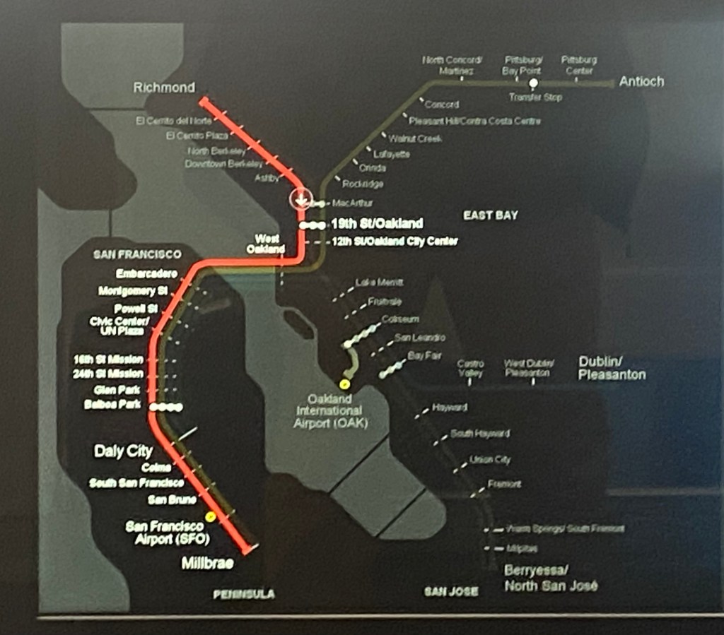
When I took public transit to a legal clinic near Fruitvale Station in hopes for help to contest an eviction notice my family and I had received this past January, I felt a growing sense of entering a new social topography that I didn’t often see–and not only because it was the first time I had experienced eviction or anticipated a legal confrontation with my landlord.  The oppositional landscape of the gentrifying city was immediate, but was most vividly concretized by seeing the altered transit map in the car I took to a legal aid office–where the name for the station I was headed was covered by a decal (in a glorious act of cartographic resistance) that renamed the station after Oscar Grant, who had been shot on its platform after taking part in New Years Eve celebration in 2009, by a white BART officer.  

The decal placed on the urban transit map  in the header to this post served to reorient the viewer to an urban landscape that had been changed by cycles of gentrification, many of which had propelled so many residents to the urban periphery in Oakland. Indeed, the city has created a new sense of the suburbanization of many neighborhoods erasing the presence of former inhabitants, it seems to engage the social geography of the city, and the guerilla-style renaming of the station served as more than a marker and a reminder of a past that resisted urban exclusion, or resisted the dynamics of urban change in a city where I suddenly noticed my own precareity on the way to my appointment with legal aid.

There was some comfort in the decal affixed to the wall of the car. It created a chasm in the landscape in that BART car, in some way echoing the huge urban rioting and unrest following the killing of a twenty-two year old in the city–rioting that recalled the uprisings in urban America after the assassination of Martin Luther King. Jr., when the army was called in to northwest Washington, DC to avert social catastrophe. The memory was still so hard to negotiate that only a decade after the event did BART’s Board of Directors name a road near the station after Oscar Grant, an alley between 33rd and 35th avenues, to mark that unnecessary death.  Rather selfishly, or out of fear, I was not thinking about the tragedy of his killing so much as the shifting landscape of Oakland and my relation to it.

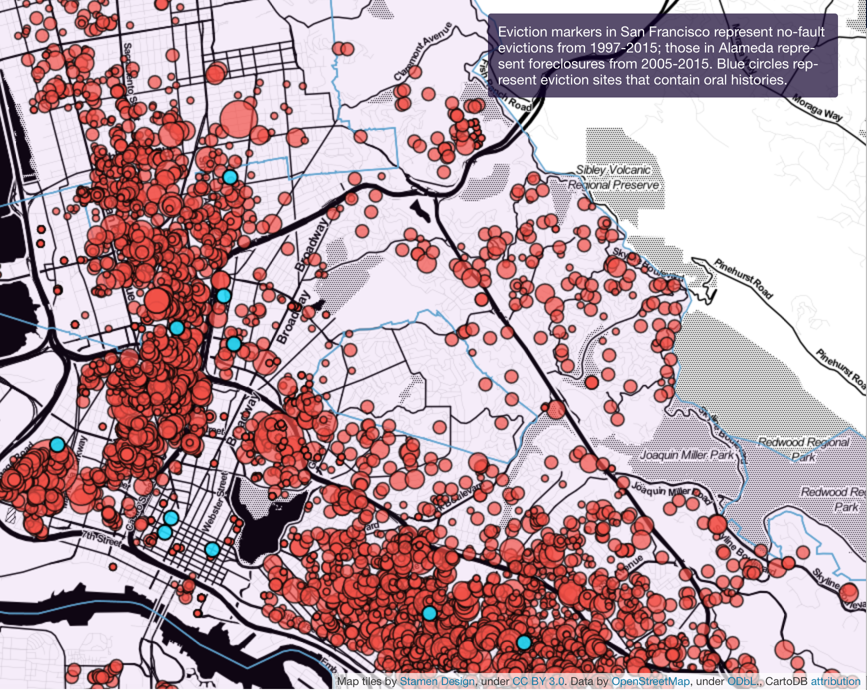
The changes of rapid gentrification are beginning to be mapped by the Anti-Eviction Project, whose maps chart trace the residues of renters’ place in Oakland’s housing market.  The decal oriented me to the changing urban landscape of Oakland, and served as a reminder of the precareity of urban residents as cycles of gentrification forced many living near Fruitvale Station itself, to relocate, recording something like a residue of displacement, that echoed the adoption of a tree as the new urban icon, suggesting a suburbanization of much of urban space, known now for farmers markets and the “unseeing” of many of its earlier residents, and erased much of its urban past–and indeed erased their faces.

A sense of presence was announced with clear resistance in that sticker, commemorating the shooting of Grant, a young twenty-two year old whose shooting provoked a level of rioting and looting that was reminiscent of the rioting in America cities after the assassination of Martin Luther King, Jr, catastrophic disruptions that led to the army to restore security, was, to be sure, a protest against racial inequality and overt racism of the BART officer.  But the sense of instability that it registered in the transit map arrested me as a new site of orientation on a rapidly disappearing past, and as it somehow became an anchor or point of stability that orient me in the changing urban space, increasingly fluid and unsure, where I’d received an eviction notice in 2018.

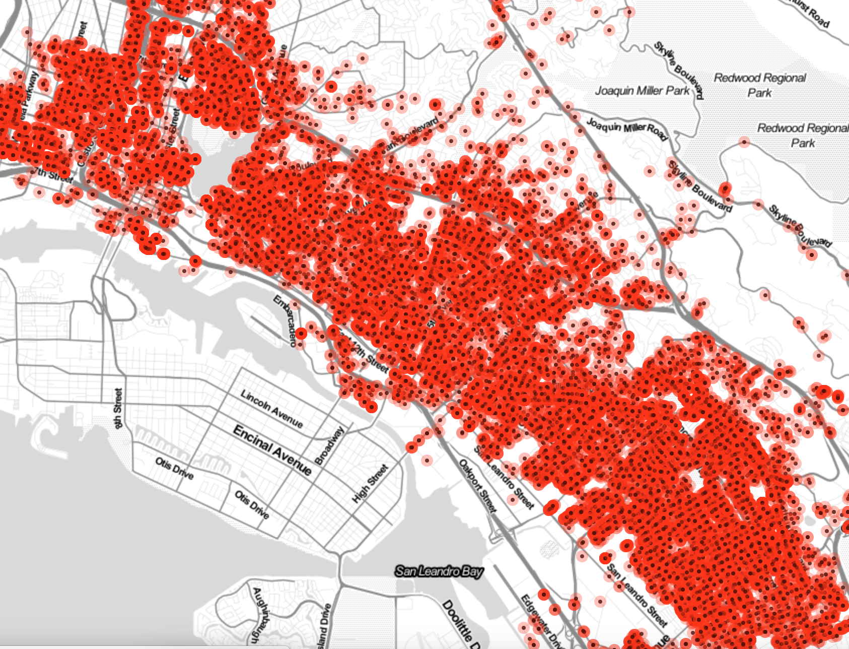
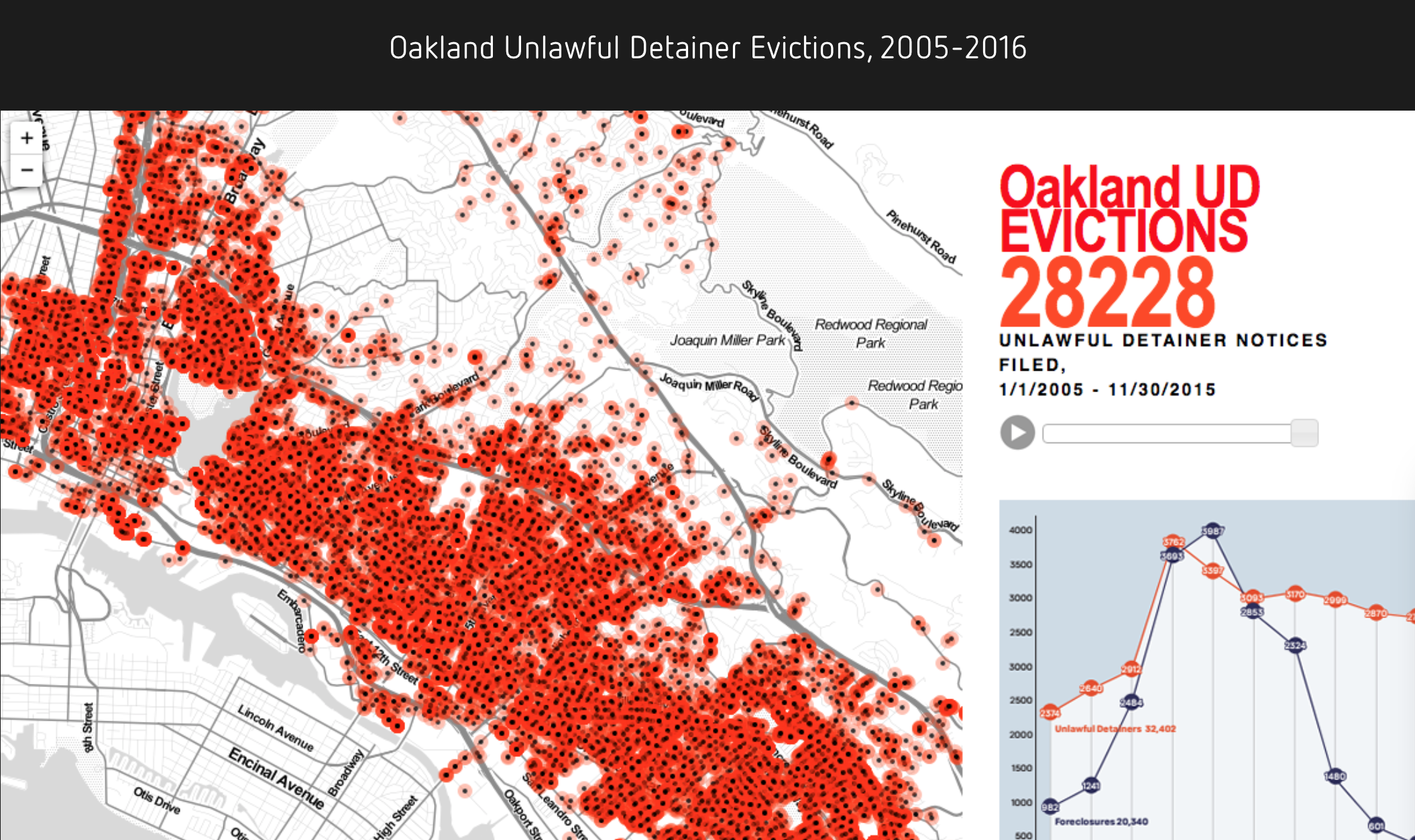
The effect of cycles of gentrification–if not its engines–are evident in maps of the unlawful detainers served in the city in the past decade, and instability of the urban landscape that this has created.  Visualizations of massive displacement of renters in the Bay Area chart escalating evictions in amped up real estate markets.  The result is  suggests of the changing nature of the commons or of public space over the past decade, as Oakland emerged as a prime site of private residence and rapacious landlords, and the city became something of a microcosm of the heightened pressures that the Bay Area experienced.  The contracting commons is hardly able to be captured in point data.  But a map of unlawful detainers issued across the city suggests  the nature of the earth change, a swarm of ladybugs or less prosaic leeches feeding on the city’s neighborhoods, and ingesting its vitality:  the arrival of predators that occasion such unlawful detainers suggest that the economy of home ownership nourish a form of master-slave relations.  For across neighborhoods of radically different income levels, the shifting populations that have filled housing markets are mirrored by an ethnically shifting neighborhood, and a lowering of economic diversity.    Even in the cordoned off area of North Oakland where I lived, the invasion of unlawful detainers had been felt not only from afar, but within what was a formerly African American neighborhood where home sales approached and far surpassed $1,200,000 for a two bedroom.

.

ladybug crowd.png

The extraordinary density appeared to track the outbreak of an epidemic or urban virus, the embodiment of the affliction of the city by landlord evictions mapped from 2005-15 seeming to be spread in strikingly uniform manner from North Oakland, where I lived, to Fruitvale in an evil effervescence or infestation of increasing gentrification and displacement of long-term residents.

Alameda Evictions

Over the previous years, I had only watched largely through maps at how evictions had transformed much of the East Bay–an area already fractured with strong social divisions–and the Bay Area at large.  But the foreclosure landscape that had transformed the Bay Area was something I hadn’t seen at first hand, but had suddenly become disorienting after receiving a 60-day notice to vacate the premises of what was my family home for almost fifteen years.

Unlawful Detainer Notices Filed, 2005-15

The surprise news had left us facing a legal landscape little familiar, but increasingly ready to reach out to social services with which we’d had no familiarity, and to face a landscape of landlord evictions that has been the byproduct of rising property values across the East Bay.  And so the ride to the social services non-profits that are congregated around Fruitvale Station, a community that has long been of special resilience, seemed the only hope we had of legal redress.  And the remapping of that station–where I headed on public transit–by renaming the station in gesture to a decade-old event piercingly revealed the unstable ground of social justice in Oakland, and made me feel better than since we were first served notice.  The alternate embodiment of that map, created by a decal, seemed a powerful gesture of resistance as BART approached Fruitvale Station, and I reflexively looked from the map to the panel that hung above the BART platform a few times.

east bay

Although my dispute with my landlord was resolved, if quite contentiously, the sixty-day move-out notice concretized the economic pressures that have rewritten Oakland communities, and the deep disparities between landlords and renters–and the increasingly adversarial roles of landlords and predatory buyers of buildings in the face of the promise of greater rents– reminded one of the possibilities of legal contestation or assertion of renters’ rights for many in a city where I’d been tensely aware how rents had increased immensely and property revaluations was actively pressing populations on something of forced migration to far flung suburbia from Modesto to Visalia to Fresno to southern California.  Arriving at Fruitvale Station to avail myself of public services was entering, if temporarily, into the unknown landscape of the disenfranchised.

Continue reading

5 Comments

Filed under Bay Area, counter-map, mapping BART, mapping place, Oakland

Ink-Jet Wonders and Other Printed Curiosities

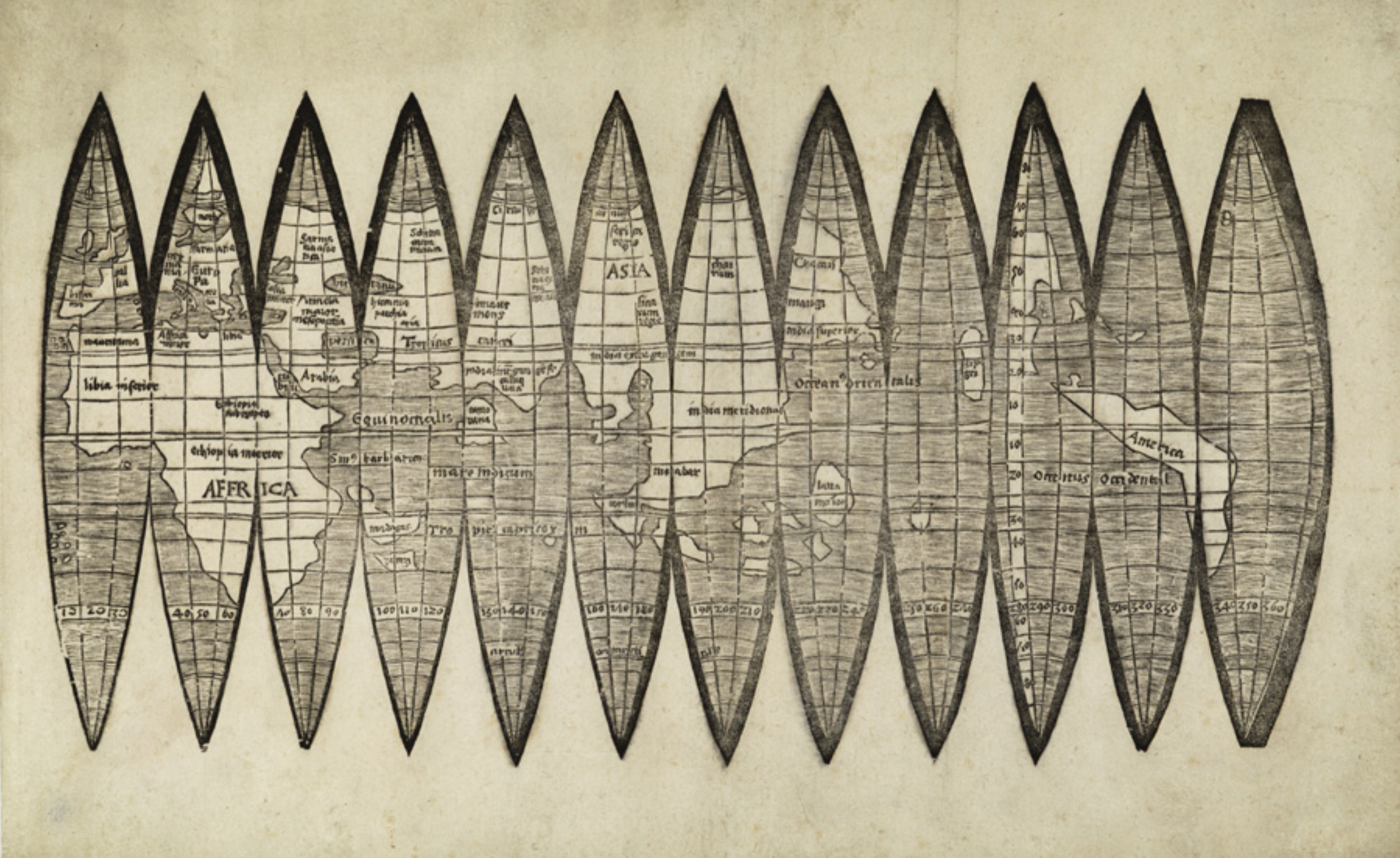
The appeal that was exercised by a newly discovered set of gores that arrived at Christie’s announced was considerable.  The map constituted one of the first mappings to show the place of America on the globe–and indeed to map the globe as a globe.  The considerable attention that the gores slated to go to auction in mid-December attracted must have lain not only in their rarity, but the cult of priority of the naming of place.  The gores exemplified the declarative role of mapping to designate place, as well as a geometric organization of global continuity shortly after the discovery of the new world, but it was hard to imagine that the appeal of the gores in our increasingly pixelated, pointillistic, and fragmented mediated sense of space was not in the solidity with which they seemed to embody “America,” both on the map and on a globe.

The gores were highly valued as the first image that mapped America–and assigned it a name–whose almost cultic prestige had grown allowed viewers view a watery western hemisphere, since described by antiquarians as the “birth certificate” of America, in an ahistorical but nineteenth-century fashion, for bestowing the name of the European navigator Vespucci on the continent that he had described in a set of letters that widely circulated in Europe from 1503, and provided a written account that oriented readers to to the New World, describing a vicarious sort of witnessing the unknown that expanded the demand for global maps as they were widely reprinted.   Amerigo Vespucci described the long shorelines of a New World  that allowed a distinctively modern way to view a rapidly expanded image of the inhabited world, and allowed Waldseemüller–even if the humanist cosmographer who had trained as a theologian rarely travelled beyond his town of St. Die, near Strasbourg, but exploited the printing press to reconcile Vespucci’s findings with precepts of map projection derived from cutting edge cartographic tools.  And when he adopted the format of the mathematician Apian to render the world on gores, he used the graphic techniques of projection to lend solidity to the first narrations of the New World.  So it was quite surprising that the forged copy of gores that almost made it to auction in 2017 belonged to the same visual culture of online images–the culture of image capture and digital reproductions–as what seemed a worm-eaten sheet of printed paper was found to be created by tools of digital photographic reproduction, with little human trace of an engraver’s hand, although they seemed strikingly similar to the long unknown image of a material rendering of the post-Colomban world.


MUNICH WALDSEEMULER in Peckham, 1504:1510pngUniversity Library of Munich, ULM Cim. 107#2. Courtesy of University Library of Munich

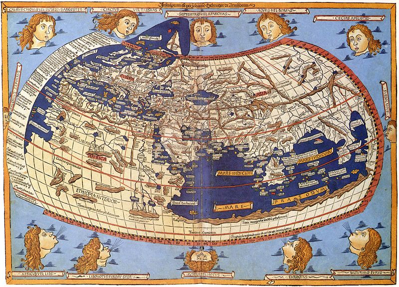
Indeed, the similarity between the online diffusion of the image and the reproduction of the fake seems a modern rewriting of the intense attention that Waldseemüller and his circle of geographers in St. Die embraced the tools of early modern engraving to design multiple woodcut maps in the first decades of the sixteenth century, in order to meet a fast-growing market for globes that lent legibility to the world.  But the new forms of legibility that the online reproductions prized–so distinct from the printed images of the early sixteenth century–seem something like a moral fable of the different levels of spatial legibility of different ages, if not two period eyes.  The gores that cosmographer Martin Waldseemüller and his St. Die circle had designed were printed in 1507 had been long prized as the earliest example of an identification of the New World as America, in honor of Vespucci.  In an elegant description of the entire surface of an earth as yet not fully known, but able to be mapped in a woodblock form, the gores adopt and incorporate aspects of recent engraved maps and nautical charts in a synoptic visual digest.  The gores form part of a distinctly cosmographic project of rendering the world on a graticule of parallels and meridians, and vaunting the adoption of an ancient global geometry for transposing the curvature of the inhabited surface of the globe to a sectional globe of two dimensions, despite their limited toponymy, and balance their comprehensive coverage with the treatment of the map as a canvas to advertise the new naming of America, expanding the map’s surface far beyond the manuscript tradition of Ptolemaic maps and orienting viewers to the predominantly watery surface of the world.


800px-Claudius_Ptolemy-_The_World


The single sheet that seemed early modern map gores for a short bit of time seemed to belong to the first records naming the continent after the navigator, and clearly gained their value as such as a piece of paper:  the announcement of a new discovery of the sectional rendering of the world’s surface by regular intervals of thirty degrees appeared to offer an early geographic primer modernizing Ptoleamic geography, based on the first nautical charts of the new world.  The attempt to chart global space for Renaissance readers who remained in Europe were long associated with the cosmographer Martin Waldseemüller, the mathematically-trained theologian and cartographer known for creating several global maps, and for writing one of the first treatises of cosmography to adopt Ptolemaic principles to explain and describe the principles for mapping the New World.  By announcing the adoption of a new set of tools as a new descriptive framework in a manner similar to his 1507 cosmographic wall-map, which unified the nautical charts of America Vespucci with a Ptolemaic framework of world-mapping; the sheet of map gores supersede traditional nautical charts in a form of world-making.

Indeed, the single sheet seemed to seek to promote universal geometric tools to unify an expanded global expanse:  the new sense of the “cumene” would not be recognized by Ptolemy or ancient mappers, and gave an expansive portion of its surface to oceanic expanse, registering a new conception of a terraqueous world.  The graphic image following Ptolemaic principles of projection incorporated Vespucci’s accounts and nautical maps in a new model of cosmographic knowledge, inviting readers to experience vicariously his travels to the New World, and to understand the greater value that he attributed to maps and cosmographical knowledge to arrive at this site across the ocean in another world:  much as Carlos Fuentes has recently offered an indelible picture of the epistemic paralysis of the monarch Don Felipe, a barely disguised version of Philip II, as a semi- autistic ruler doubting the existence of a new world that was not comprehended in the palace to which he has withdrawn in Terra Nostra (1975), a massive novel whose literary structure mirrored the tripartite structure of the palace Philip II commissioned to include maps of all the Spanish possessions, the embodiment of the globe on a set of twelve elegant map gores would condense and rebut such the imperial stance of utter disregard to the new world that possessed Fuentes in his novel.  The careful construction of the globe’s surface onto indices offer a global purview that might be called the first age of globalism.


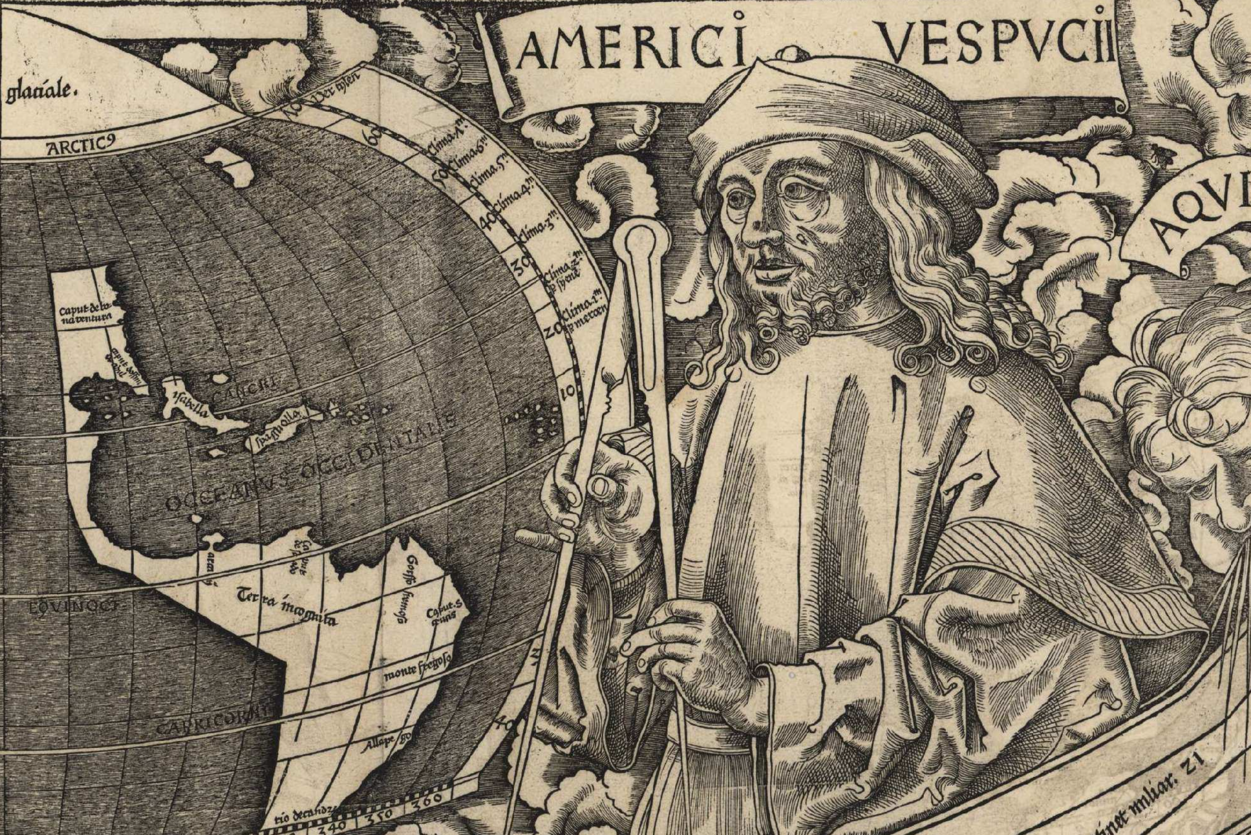
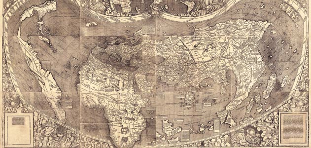
1. Waldseemüller’s single sheet map condensed the cosmographic principles the he had followed in series of elegant wall-maps that foregrounded the artifice and difficulty of the composition of the world map.   Waldseemüller and his circle had actively promoted standards of global legibility, using Ptolemaic precepts in a triumphal manner to celebrate the power of naming, charting, and mapping new lands for European audiences that invited ways of telling, describing and narrating Europeans’ spatial relation to a new world.  The large wall-maps that he produced in over a thousand copies promoted modes of reading globalist relations  facilitated by copious textual cartouches and inventive decoration, that underscore its cosmographical nature as a product of writing, drawing, and design to affirm the growth of oceanic expanse that defined the continents.  The wall map was hardly free of what Edward Tufte might call “chart junk” on its exuberant margins, but conveyed tthe excitement of heralding a new graphic synthesis of a global map over which Vespucci presided in one lunette, adding continents of a new hemisphere to the known globe, offered a cartographic solution to a problem of ordering terrestrial space.


Vespucii On Map

Waldseemuller-Map-631Martin Waldseemüller, Universalis Cosmographia secundum Ptolomei Traditionem . . . . / Library of Congress


The image is no less than celebration of the new status of cosmographical arts that elevate the medium of engraved images to tools of global description.  If the twelve-sheet c wall maps Waldseemüller’s school composed, designed, and whose engraving they closely supervised set a new standard for the elevation of cartographical skill from a technical craft to a new model of knowing and seeing–and a way of making epistemological claims, as much as using transmitted forms, in ways that linked the art of mapping as a scribal technology to cultures of telling, describing, and demonstration, the wall maps invite viewer’s eyes to comprehend space outside a situated position.


Waldseemuller_map_2Martin Waldseemüller, Universalis Cosmographia secundum Ptolomei Traditionem . . . . / Library of Congress


In a counterpart to the large wall maps that he designed and sold, Waldseemüller expounded the modern precepts to orient one in space and synthesize global knowledge by parallels and meridians in his Introduction to Cosmography (1507).   The slim volume,  the basis for his identification with the unsigned gores, seven as a manifesto for the twelve-sheet engraved global wall map, over which preside busts of Ptolemy, the ancient geographer who formulated the mathematical precepts of terrestrial projection on a graticule, with America Vespucci, combined the modern experience of navigation with the ancient precepts of learning and naming place.   Waldseemüller himself never travelled far beyond his native Strasbourg, but invested the map with authority to communicate geographical knowledge as a token of modernity of embodying a global geographical knowledge, albeit a modernity now displaced by the grid.  Waldsemüller’s projection has the energetic displacement of the authority of a nautical chart, echoing how Vespucci declared his competency in his letter to arrive at the New World even “without the knowledge of sea charts” prized by navigators, being “more expert in navigation than all the pilots of the world.”   The gores staked a similar model of expertise of reckoning and calculating distance and place by a new matrix of latitude and longitude that they embody:  the preeminence of the graticule as an epistemological tools of global geography that expanded the scope and nature of geographical knowledge lasted some four hundred and eighty years until it being displaced by grids.  Indeed, the value that the map was readily assigned suggests its survival in a distinctly post-scribal culture of mapping.

Did the value that the auctioneers assigned the map gores reflect these grandiose knowledge claims?  The gores elegantly translated knowledge of the earth’s newly discovered hemisphere to indices the viewer could readily process and digest, foregrounding the new name that it proposed for the continent named after the Italian navigator.  But they assumed a new status in the age of digitized maps, and Google Earth images of global interconnectivity, which may have been paradoxically elevated by the newly antiquated image they acquired.  Rather than being sold as emblems of knowledge, the new image of the gores that Christie’s claimed to bring to public auction had gained an immeasurable status after the earlier auctioning of similar gores for above a million dollars, not to mention the unprecedented price that the United States Library of Congress agreed to pay in 2003 of $10 million for the sole surviving edition of the large wall map Waldseemüller had engraved, the one copy of the thousand-odd he had printed, of which it was something of the poorer cousin, but which had been widely touted as the “birth certificate” of America, and the map on which Waldseemüller had proposed using the name of the Florentine navigator Vespucci who had described the long coastlines of the New World in his printed letters.

The set of map gores, a complementary spherical map that Waldseemüller had described making, provided an early image of global totality that gave a similar dominance to the line–indeed, the geometrically determined line–to orient viewers to a global surface.  When the late historians of cartography David Woodward and J.B. Harley tersely defined the map in “purposely broad” terms, at the outset of the monumental History of Cartography, an extremely elegant series since expanded over multiple volumes, as “graphic representations that facilitate spatial understanding of the world of things, concepts, conditions, processes, or events in the human world,” they may have been thinking of the graphic lines of the gores as such a facilitation of spatial understanding.  For the gores process the encounter with the New world, the travels of the navigator, and the recovery of Ptolemaic precepts of world-mapping, and the naming of the newly discovered continents in the western hemisphere on a clearly graphic construction.  Woodward and Harley’s emphasis on “graphic representations” recuperated the ancient Claudius Ptolemy’s use the Greek verb  γράφειν (graphein), or “to write,” and Waldseemüller’s assimilation of that verb of the act of writing to engraving tools; it caused much revision, even by Woodward himself, of its lack of allowance for cross-cultural comparisons, but suggests a significance of writing systems as a mode of ordering space.  Waldseemüller appropriated the authority of the verb in print, giving the engraved line a deictic sense of displaying space–


Single Sheet UNM

Waldseemüller-Globus.jpg

Waldseemüller School, 1507 Globe Gores/Badische Landesbibliothek


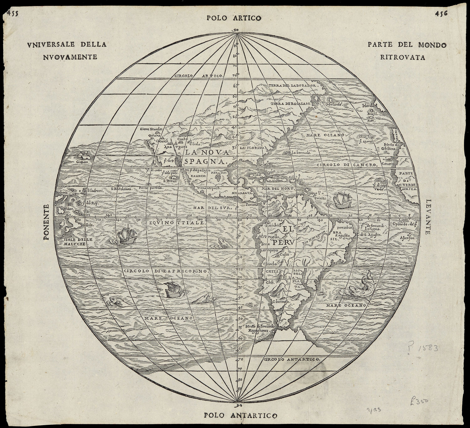
–in a map of globular design of the sort that Woodward idealized as the culmination and embodiment of cartographical principles, in a globular map of the sort that was more readily defined in a more familiar globular form by 1583, here shown in two images of the same year in “universal rendering of the newly discovered parts of the world,” printed in Italian, or discovered parts of the world, which emphasize nautical travel as the basis for the incorporation of place on the globe, and reveal the increased scope of geographical exploration in the intervening eighty years.


Globular Italian Map Parte del Mondo Ritrovato 1583


Globe_terrestre_de_Jacques_Vau_de_Claye_(1583)


More broadly, however, “graphein” might be understood as the trace of the human that orients themselves to the world, hand-drawn or manually rendered.  These were soon shown to be absent from the gores:  indeed, the blurring of the very lines of the gores that went to auction suggest that they belong to a new visual culture of scanned images and photographic reproduction.  The very traces of graphical operations were permuted and erased in new ways, as is the sense of a human presence, in ways that suggest the distance of our own visual culture from Waldseemüller’s world, in ways that the forger never intended.

In their groundbreaking History of Cartography, David Woodward and Brian Harley had celebrated the line as the means of graphical orientation, in what now seems an elegy to the art of printing.  An unforgettable image remains clear in my head of David Woodward in his basement, in Madison, WI, running maps off a letterpress printer, and hanging them to dry on strings by clothespins, and his love of the ink applied to the engraved plate to present a precise rendering of space.  But the fake set of gores that reached auction were not printed or drawn, let alone in the Renaissance or during Waldseemüller’s life, but probably printed some five hundred years later, from a scan of the map in the James Ford Bell Library’s website.

The gores that arrived at auction this December suggest far less of a clear trace of a human hand, and perhaps belong to a different visual culture of online images.  Indeed, the astronomical value that the single sheet was invested may be a symptom of our entrance into a different visual culture of mapping–indeed, the sheet that seemed to be valued at more than a sheet of gold of the same size suggests the fetishization of the paper map in an era of web-based mapping, and mobile GPS.  The fake gores suggestedthe translation of Ptolemaic terms to a visual culture that privileges the dot and the grid as a basis for orientation, rather than the engraved line, but where the aura of the writing of space persists, and the paper map fetishized in a world that increasingly relies exclusively on mediated digitized images.  The set o fraudulent gores is itself something of a post-modern artifact,–less concerned with the authorities of narratives of discovery, but able to admit the false authority of the map as objective, and almost ready to accept the value of its aura even if it was only an image grab printed on old paper.

Continue reading

Leave a comment

Filed under fake maps, globalism, globalization, Mapping the New World, media studies

Fit to Print?

The iconography by which maps address their viewers might be framed in productive ways within historically situated economies of visual attention with interesting results.  For as much as they reflect practices of production, the ways that maps have engaged viewers who struggled with new ways to grasp expanse reveal a dialectic between graphic invention and a larger marketplace images, despite the tendency of those who style themselves historians of cartography to focus on their formal qualities or the mathematics of geographic production.  From their insertion at conspicuous places within some of the earliest printed world histories, mapmakers actively courted readers’ attention by crafting increasingly persuasive claims in aesthetically challenging ways, and by raising the stakes of their abilities to process expanse.  The promise to crafting a satisfying harmony of comprehensive global coverage has long existed in uneasy balance with their narratives.

The success by which cartography and art communicate globalism might benefit from tracing the ways in which globes have long tried to engage their viewers’ attention.  The woodcut of a world map below, designed circa 1490, defined a global purview for readers in ways intended to be cognitively satisfying, promising to orient them to unseen regions by scattered rivers and landmarks, even if they did so by using means that seem antiquated, being both of restricted scope and mediated by inherited ideologies of empire, Christocentric beliefs, and specifically Eurocentric models.  But the promise of expanding horizons led this bold two-page map to be prominently placed in a universal history to mark the recession of waters in a post-diluvian world, suspended in the hands of Noah’s three sons–Shem, Japheth, and Ham–serves as a blank slate to inscribe a global history that proceeds to span across generations to the Resurrection of Christ.

If the map of the world is crude by what we think of as modern standards, and possesses no clear spatial indices, the symbolic power of a planisphere of clearly Ptolemaic origins was modern:  the engraved schema provides ways of orienting viewers to the lavishly illustrated book’s s expansive content as a comprehensive condensation of collective histories about the world’s regions–making good on the recent authority of such projections along latitude and longitude to reveal an aggregate history charging the growth of worldly and ecclesiastical power over the emergent consciousness of a global expanse, centered roughly on Jerusalem, inscribing a succession of empires over terrestrial space.  Indeed, the discoveries of the New Worlds that were mentioned in the 1493 Nuremberg Chronicle (a compilation of universal history of somewhat scholastic origins known as the Liber chronicarum or “Book of Chronicles”) occupy small place in the service of describing the chronology of a succession of imperial ages that culminated in the ascension of the Holy Roman Emperor Maximilian I.  The early world map that seems to have derived from a Florentine archetype was used to describe the recession of waters after the Noahic flood in ways whose power existed to set the stage for the rise of Greek and European empires, rather than the discoveries.


world chronNuremberg Chronicle (1491); fol. 13 (Anton Koberger, Nuremberg)


If maps no longer convey such a stable sense of narrative progress, and such an engraving would no longer seem a marvel, most maps do considerable work in engaging an economy of visual attention.  The world is with fewer open spaces than it was for Noah’s three sons, and global history resists linear narratives, despite the resilience of similarly terrifying apocalyptic notes, at times fed by a rage for biblical prophecy that generated sufficient demand for tracking daily fluctuations of a Rapture Index available for online consultation.

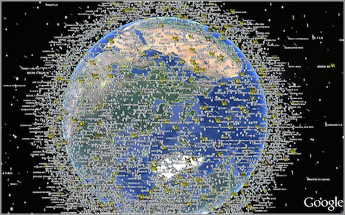
Globalization demands adequate expression by a visual image that can engage its viewers, hopefully by more than the material underside of the interlinked–perhaps a map more fully revealing of the shifting nature of individuals’ relation to the inhabited world.  At a time when the earth is crisscrossed with media systems whose signals are relayed along 6,300 tonnes of satellites–and over 8,000 physical objects that orbit its surface and will outlast its inhabitants as a necklace of debris–we lack maps of how we inhabit the world or have remade our relation to it.

satelites-espacio-google world view

f52b92777d7ed50b6fe40c82165a2476

Such computer-generated visualizations offer the chance to visualize the satellites that track our changing global positions and information flows, relaying media world-wide over a multiplicity of interconnections:  the image reveals what lies outside our visual abilities or comprehension–and which we would be otherwise all too apt to forget otherwise– by using government data to allow us to visualize the multiple layers at which satellites orbit our planet, even if they make it hard to track the wide array of signals that they transmit, intercept or surveil.  But they were absent from the multiple covers that served to catch readers’ attention in the global-themed relaunch issue of the New York Times Magazine, a striking photograph of a suspended glowing globe, shot in a studio setting with an exposure that disorientingly overlaps the toponyms of Africa and South America, whose equatorial line seems to cut the globe in an unfamiliar place.

The maps offer an angle to contemplate the stunning long-exposure image of a rotating globe editors of the Magazine recently commissioned from photographer Matthew Pillsbury as a cover illustrating the rapidly changing world for a relaunch issue.  The lit globe seeks to communicate both “the idea of chaos in the world, and how this is something we have all learned to deal with,” the design director observed.  But the cover of the New York Times Magazine designed by Pillsbury demands attention both for how it holds the viewer’s interest and renders the globe as its ostensible subject.  The photograph is an artistic interpretation, and compelling illustration that reveals multiple relations between art and cartography, as much as it describes the relations between nature and culture or between news media and globalization.  But if the image was intended to convey the “speed at which our world is changing” to readers, and presumably represent the news covered in its pages, it gives pause–even as an image that reflects on current quandaries of abilities to sustain the successful illusion of a promise of comprehensive news coverage in an ever-changing world.


1.  The almost transient shadow toponymy in the globe as Pillsbury managed to photograph so that the names of Venezuela, Bolivia, and Brazil congregate in a ghostly region off the shore of Africa, and Europe is suitably displaced to its upper regions, suggests the shifting focus of the news, and even questions the familiarity of reading the globe though that most conventional didactic of mapping forms, a globe of the sort one might have encountered in a schoolroom when learning about world geography for the first time:  the apparent overlapping of continents and blurring of the northern hemisphere destabilize our surety of global geography in an intriguing way, set, disembodied, above the words “HELLO, WORLD,” ask we re-examine the map we thought we knew.

The five-color globe that appears in the header to this post is, in fact, while a welcome departure from the templates of Google Maps, similarly opaque in the very inscrutability of the very glittering image of earlier attempts to map the earth that it offers.  Pillsbury’s long-exposure photograph of a spinning lit globe deserves interest as an advertisement of how the newspaper of record mediates news from a perspective that narrates a version of world news increasingly interlinked and less stable through a strikingly retro medium of mapping as a glowing globe.  The photograph addresses how the shifting of what once seemed immovable territorial boundaries circa 1989 have not only been redrawn but shift with an unforeseen fluidity challenging to comprehend.  Yet more than inviting us to interrogate relations, or the mobility of global populations and goods, the image almost aesthetically distances the spinning globe from viewer as much as it reveals levels of entanglement of places to one another and intensified contesting of sovereignty.  The blurred five-color surface of the spinning globe seems to abstract mapping from human geography.  It not only suggests the opacity of its ostensible subject; indeed, it almost asks the observer to throw up their hands in something passing for marvel at the illegibility of a large area of familiar regions, and at the increasing entanglement of current events.  It almost revels in being intentionally opaque, however, as if to say that the old indices of orientation just won’t work or clearly be commensurate to the take on current events that it will describe.


2.  To be sure, in an age of the proliferation of maps on multiple platforms and hand-held devices, it’s refreshing to rehabilitate the schoolroom globe, and almost ask us about our current world’s distance from it.  Oddly, however, Pillsbury’s cover employs an almost antiquated didactic object, a school map, relinquishing interactive mapping tools, to suggest the quick-changing world.  By spinning a schoolroom globe at high velocity to craft a visual pun to illustrate global change, the cover raises as many questions as it answers.  What seems a conservative cartographical format-if here used somewhat tongue in cheek–as an icon of cartographical authority is almost prosaic.  The sheen of the surface takes advantage of the conventional five-color globe of the world to seem to suggest a surface whose very colors and hues are so blurred to render them and all surface toponymy illegible, as much as an image of totality of global relations.  As may befit the newspaper of record, the globe is steadfastly traditional in its familiar five-color design:  it suggests a space by no means fixed, where boundaries around countries are redrawn and surfaces blurred for all practical purposes, but only tweaks the most standard image of the global coverage to suggest a disorienting sense in which we might lose familiarity in its geographical contours, rather than promise truly comprehensive coverage.  

For the globe’s illegibly blurred surface almost erases the considerable varieties of mapping by which we’ve come increasingly to understand and orient ourselves to the world, and almost relinquishes hopes for a new ethics of a world view, but just suggest the inadequacy of imagining the ideas of terrestrial location, proximity and geopolitics as received from earlier school globes.

RP-30501-2

Is it that the idea of boundaries of knowledge are just not so clearly fixed after all, or that the problem of providing a single authoritative viewpoint is being explicitly acknowledged?  What does it seek to illuminate?

12-Raised-Relief-Ocean-Adventurer--pTRU1-2910038dt

More troubling, Pillsbury’s photograph of a glowing globe offers us no place to decipher almost a single word:  the effect is almost to see words swimming across its ghostly surface, unlike the transient figures that inhabit urban spaces in his stunning body of photographs of urban spaces.  The notion of a commission from the photographer to create an image of global coverage might be misplaced.  For Pillsbury has worked primarily in cities like New York, Paris, Venice, or London, using his knowledge of the local to much advantage, as well as Japan, more recently, where he’s taken advantage of a Guggenheim Fellowship to  turn his lens toward explorations of Tokyo’s public spaces.  His subjects have been less global than relentlessly cosmopolitan in scope.  Pillsbury’s recognizable style is more than a sign that the Times seeks to cultivate readers as the hip newspaper of record by the image in this post’s header, as much as suggest an actual global purview of different spaces.  The picture is almost a way of conveying just how difficult the job of the news is to convey all that’s fit to print, in a time when the world seems spinning faster than ever before.


3.  As an artist who has investigated the relations of crowds to urban space the spaces in New York that he knows well, often working to illuminate the “performance” of identity in interior or cavernous public spaces where individuals and crowds congregate, Pillsbury has cleverly employed extended exposure to blur the boundaries among individuals  in urban space and place.  The result is to question the relation of the individual to settings that might be otherwise familiar.  The extended exposure of the globe is less of a site for staging events or a setting, than a surface just out of contact with the viewer’s eye.  Despite the suitability of Pillsbury’s medium to observations of the interaction between individuals and images, or crowds visiting museums, such images are effective as encouraging ongoing visual investigations by expanding time in exposures from a few minutes to an hour that is collapsed into a single image.  They indicate the changing “geographic imagination” by which we all inhabit different spaces.  The spinning globe is photographed less to offer a record of lived space than an almost fetishized surface as an object, more than inviting viewers to consider the spaces that they inhabit; if the urban spaces can never be stopped or reduced to a purely static form, the globe is always in motion and hard to perceive save by the brightly lit sheen it presents.  It recalls a past legibility of space, rather than propose a prospect of continued legibility.

The photograph on the cover of the Times Magazine, despite its candy colors, contains a clear note of melancholy of the absence of hopes for adopting a clear relation to space, even as it radiates contentedness in that realization.  The photograph is perhaps best taken as a meta-observation on the success with which maps can continue to command interest in a changing world.  The candy-colored globe is an icon of cosmopolitanism, not primarily oriented toward coverage, blurring the notion of one-to-one signification, and almost attesting to its own inadequacy.  That is not, however, the most confident self-image for journalism to project.  And it hardly helps that we have to wade through about fifty pages of full-color advertisements for high-level commodities and financial services, speckled with small articles, until we find articles about the world in the Times‘ recent “Global Issue” that meet the promise its title posed, but raise some of the issues about which we might want to learn if we could better distinguish its spinning surface after all.


Spinning a Globe to show speedNew York Times Magazine


4.  The photograph interstingly contrasts to how Pillsbury regularly runs long exposures to pose topics of visual interest that invite us to look at how spaces are inhabited in new ways, raising compelling questions about the construction of space and how we live in it, the globe’s familiar surface offers more of an elusive object of desire and a commodity–and not provide a space that invites us into it, and whose business invites us to sort outs its contradictions.  For if the issue doesn’t really invite us to look at the world, so much as the advertisements suggest the globalized economy it serves, the sort of select writing that we have to wade through glossy ads to find is a deserved reward, but hardly a point of entrance.

Another of Pillsbury’s images of a strikingly similar color palette suggests the pronounced permeability of place to humans, and explores a living geography defined by human interaction in ways static maps can rarely either work to successfully register.

Pillsbury_Matthew_RobotRestaurantTokyoTV14628_2014_0© Matthew Pillsbury / Courtesy of Benrubi Gallery, NYC


But the ghostly presence of the illegible globe almost suggests a world that can’t be grasped, about which we are as mesmerized as challenged to process information.  Rather than invite the reader to interpret global space, the image seems a farewell to geography as a matrix of information, rather than the promise of global coverage made by most earlier symbolic maps in newspaper mast-heads or the animated backdrops of nightly news television shows.


globe by paraidesNew York Times


One senses that there is less interest in the history of an icon of spatial inter-relations, and networks of relationships, than an insider knowledge of how far we have come from the sorts of globes we used to use in school.  The photograph seems to gesture, however, to a long history in the twentieth century that takes the globe as a promise of the coverage that the news–or a news channel–could offer, if its iconic role seems to have considerably atrophied as it grew increasingly antiquated in current news graphics, which cultivate far more dynamic modes of visual engagement.


5.  The iconic marquis of De Lauer’s News Stand in Oakland, CA, whose range of international papers made it a mecca of the hard-to-find remains a survivor of the on-line.  The globe of its marquis dates from the Cuban Missile Crisis, as is perhaps evident in its charmingly corny magnification of the United States.  The globe so prominent behind the name “De Lauer’s” in the marquis provides a notable predecessor of the symbolic promise of mediating global information, and the purchase of the authority of the globe as a promise of the delivery of objective information to a shifting readership of news; even if the prominence of the United States on the map belies the fact of the range of international news it continues to sell, the marquis illustrated the inter-connected nature of the world delivered in print daily to the door of an Oakland news stand.


DeLauer's StorefrontOakland, CA

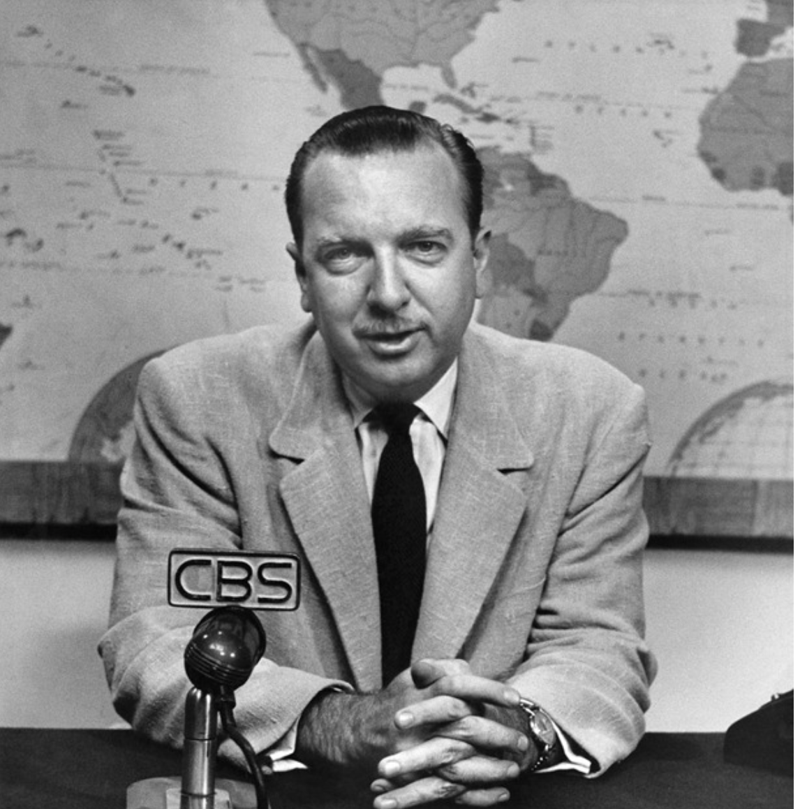
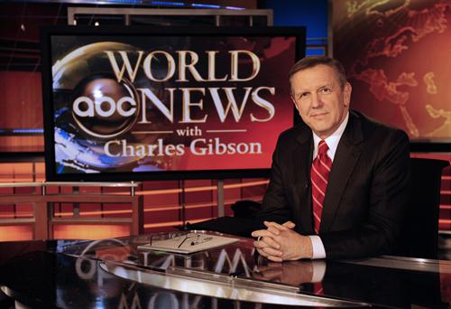
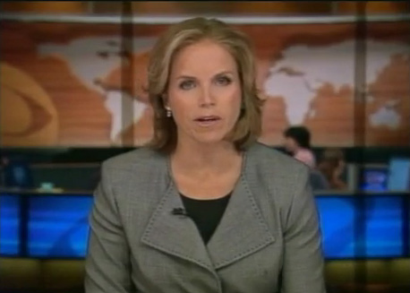
The image of the newscaster reading the globe was easily transposed to early television news for some years as an authoritative setting of addressing a public audience of viewers, back when news was of a considerably more univocal enterprise.  What now seems too a tired template for breaking news has retreated to a background of increasingly schematic form, no longer the authoritative site of enunciation from a position of expertise it was for Walter Cronkite’s newsroom, even as the studio backdrop map was recently reinstated for current newscasts.  The map in front of which Cronkite spoke was something of the objective correlative of  the reliability of the individual newscaster, or a sign promising continued confidence in his pronouncements, and was updated in the famous equal area Goode homolosine projection that was adopted for CBS Evening News.


cronkite

Cronkite sd

cronkite wall map

 Walter Cronkite (c. 1968)

It’s unclear if this is still the case, even if the network has recently resurrected the same backdrop, it seems to lack comparable authority.

r-SCOTT-PELLEY-large570

The stability of the globe has atrophied in network news, receding to a backdrop with strikingly less signifying power.  The globe has become a glyph of reduced prominence and authority–not only because of compelling graphics, but as its meaningfulness seems increasingly worn and holds less promise or stages a narrative of global coverage not clearly attached to a somewhat overly tired symbol.  No longer corresponding to the omnipresence of proliferating online maps in our worlds and on our other screens, the world map seems a superadded surplus, almost an older piece of mental furniture pressed into new service.

abc

The world map is often pressed into service as a supporting graphic rather than an authoritative point of reference:

world news.

cbs4

15_after_effects_news_template

2

It’s hard to say how much a static map can pose the pretense of authoritatively describing a terrain that seems so rapidly shifting and whose dynamics of power it could hardly capture.  It is difficult to assert  the globe’s a promise of comprehensive coverage, or successful a medium to hold the viewer’s attention.


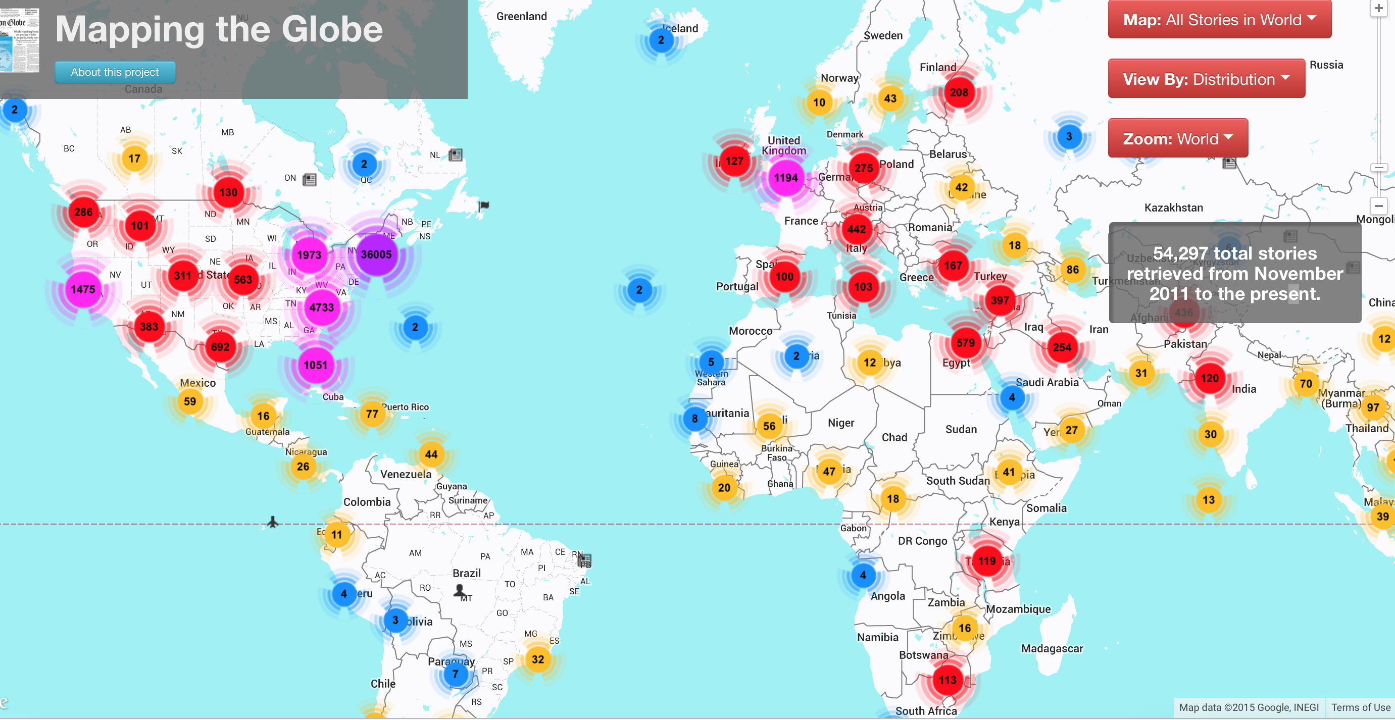
6.  To be sure, the continued promise that the globe makes is not truly able to be taken so seriously, as well, given the multiplicity of news sources that we tend to presume, and the difficulty of assuming that one source would credibly count as a fount for universal coverage.  Although global coverage remains an icon of authority, the geographical distribution of news items printed in the Boston Globe, MIT’s Center for Civic Media‘s project “Mapping the Globe” demonstrates, by showing the return on the promise of global purview promised in the newspaper’s masthead against its stories–demonstrating a predictably skewed coverage in 2011-15.  If reflective of recent global “hot-spots” in Egypt, Syria, Pakistan, and Iraq in that period, the skewed nature of their current coverage directs attention to and mediates a picture of global politics to its readers which one can easily re-imagine as distorting actual its proportions in response to proportions of the paper’s coverage:

boston globe:world

While this partly depends on the paper’s distribution, and putting news on the table that will grab attention–and this interactive map will allow viewers to investigate the map at much further depth, below its surface, by hyperlinks to the exact stories about each region that they can scroll through, as if by a toponymical indexing of the newspaper’s coverage of recent events:

boston globe news

Articles per capita MA

It raises questions of the picture of the world that we see refracted in the news stories that the Globe prints, and what it effectively filters out of the mix to provide its coverage of news.

glboal map

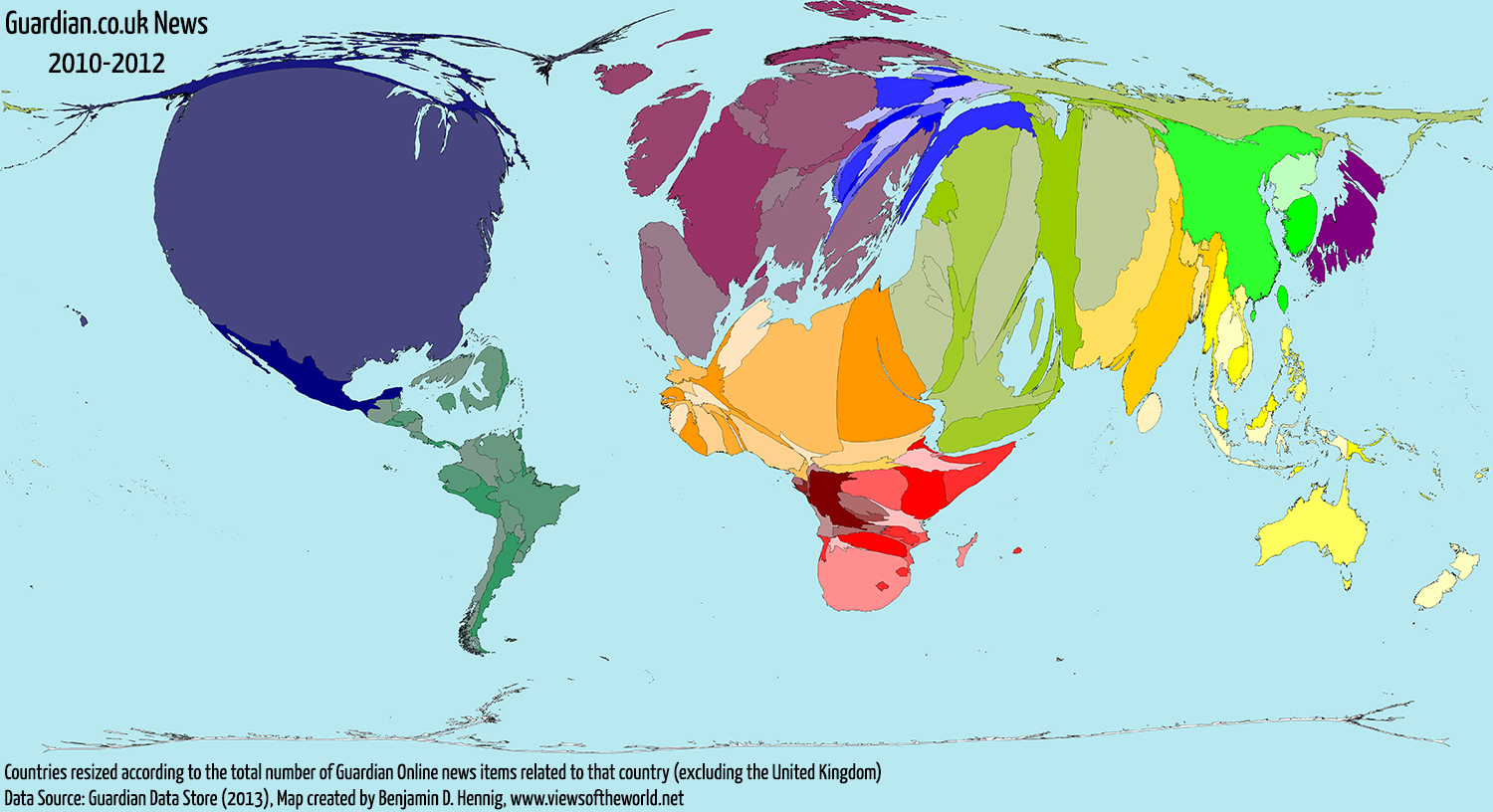
The result, based on a morphing of the world map by data about stories related to countries in the Guardian newspaper, 2010-2012, was remapped accordingly by the energetic and enterprising cartographer Benjamin Hennig, in a cartogram that reveals the distortion of hemispheric privileging of space in the newspaper’s coverage, while maintaining the actual land/water ratio:  the result instructively magnifies the mideast, US, and Europe, echoing of distortions of the Mercator globe, while magnifying the AfPak region and Iraq, much of the Middle East, and both Japan and the Koreas:

GuardianNewsWithoutUK2010to2012_AllStories

Even without actually drawing an proportional cartogram of global areas covered in stories that reach print, such as that created by developers of Worldmapper, from Hennig to Danny Dorling, which rescale the size of nations in proportion to how often it is mentioned in online news items, or to create metrics of places corresponding to the size of articles newspapers devote attention to them–and perhaps have retained active bureaus–newspapers hard-wire our brains to a global map or worldview we all too readily internalize.  The worldview leads us to expect stories from regions of the world, and to suddenly make space for others–Ukraine; Liberia; Nigeria–aware that they may suddenly may disappear.  This might be called the world we bring to the paper, as we first click on its homepage or physically open its pages, as much as the world that the paper covers.  But the blurred world of shifting toponymy that Pillsbury preserves is more often one that lies just out of reach.

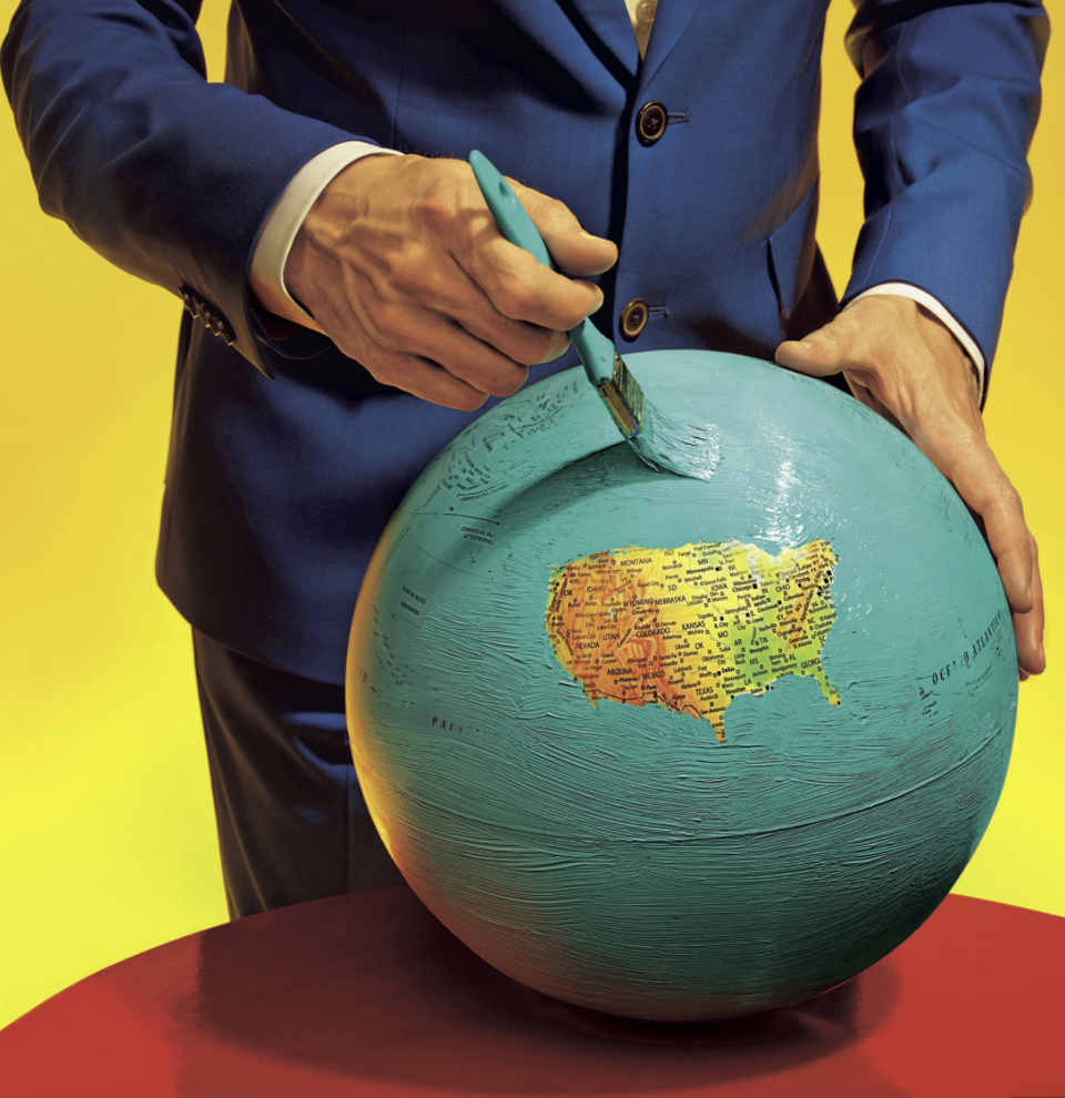
In terms of the acknowledgement of the blinders by which the world’s news is actually mediated, it’s nice to close with the combined tension of peace and violence created by the coexistence of obliteration of information and an ideal of harmony refigured by far more ironical image created by Maurizio Cattelan and Pier Paolo Ferrari for the same Magazine.  Cattelan and Ferrari provocatively painted of a repainting of the globe’s surface that both conveys a suggestion of blissed-out harmony of the island of the lower forty-eight states, and a terror of obliterating all existing toponymy save that in the forty-eight states between the Atlantic and Pacific oceans, save the partly obscured lettering noting both oceans.  This masking of a map shows an optimistically if terrifyingly blinkered news, a sense that the world is best in our hands when we’ve obliterated most all that is outside our immediate purview, prepared by what seems a man in a dark blue serge suit, who is calmly and decisively moving a brush studiously to conceal most of the surface of the inhabited world with baby blue paint, in a sort of Brave New World image of preparing What We Want To See as much as ‘All the News that’s Fit to Print’–and wonder if its consequences are so pure–and who is the suitably anonymous man in the blue serge suit who is doing the overpainting, anyways.   (It echoes the rendition of a perpetually sunny scenery in Google Maps, though even Google is more forthright in offering geographical coverage.  But it would be hard to offer less than shown below.)

Cattelan DetailCattelan/Ferrari

The multi-media image of a painted-over globe seems to record the censoring of what we need to know, and what is to be seen–and presents us with the manicured image of what we know best if not a view of the world where censorship is the new norm.  In the post-Snowden world, we cannot help but think about NSA’s efforts to infiltrate internet carriers and compromise global telecommunications networks without concern for international law–or treatises with the sovereignty of neighboring countries in the Caribbean:  in this globe there is “an equal measure of terror and peace,” although  the peace lies in obscuring of the world outside of the United States by blanketing the entire world with coats of light turquoise latex paint.

Cattelan's US 48Cattelan/Ferrari (detail)

Both images provoke us to consider the ways that the image provide commentaries on news as a space for learning around the world, or to orient ourselves to the dynamics by which we describe and are invited to investigate the world.

The mediated nature of news is, of course, not so tacitly commented on by the image of the editorial team that assembled the updated Magazine, young folks huddled around a large-screen Apple monitor of pretty similar ethnic identity and economic background, preparing the image of the world that will be soon ready to be consumed.  Has the screen replaced the globe?

22edlet_ss-slide-U7WL-articleLargeNew York Times

Leave a comment

Filed under Art and Cartography, globalization, news coverage, news graphics, News Maps

Crafting an Imaginary Atlas for a Dystopianly Disproportionate World

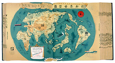
What is one to make of the silkscreen prints Hong Hao assembles from digitized versions of antiquated printed world maps?  While dispensing with anything like an exact correspondence to the world, each creates a fantasia of borderlands, and offers something of a wry response to the frustration at imbalances of globalization, as much as they appropriate antiquated cartographical conventions and forms.  Hao’s silkscreen prints manipulate scans of older global maps, he’s argued, as a set of confines or parameters to draw the world in new ways, but in doing so deploy the conventions of mapping to empty the familiar authority of the conventions of cartography.  The huge success of his production of world maps in the series Selected Scriptures, which this ambitious and eclectic printmaker began in the 1990s, but dramatically expanded after 1995, have reached a demanding public.  Is there appeal how they question how we see nations as best described on a map as they make foreign–and winkingly poke fun at–the authority of the print map as a register of the nation-state or territorial boundary lines?  Or does it lie in the special appeal of their static form, presented as a classical sewn binding of an encyclopedia, in an age when most of the maps we use are downloadable networked media?  In an age of online and digitized maps, Hao seems careful  to design the sequence of maps as situated and constructed forms, that open to the viewer in the site of a stable book.

But the maps that he produces also chart an increasingly globalized world, no longer subject to the confines of antiquated or inherited cartographical forms he creatively has appropriated, and seem to gesture to the construction of a warped world of a less clear balance of power or status quo, concealing many unseen networks of financial exchange or political relations.  The introduction of corporate logos, upbeat slogans, and fractures of linguistic translation into the imaginary corpus of maps Hao has produced with astonishing invention and rapidity question not only the hold of the power of maps but the medium of mapping, by dislodging the conventions of mapping from a familiar story and by suggesting the outdated nature of narratives of bounded territories and balances of power, as well as to indicate the increasingly skewed nature of global relations.  If Hao has chosen the silkscreened image to be confined by antiquated formats of mapping, unlike the screens we use to view maps on hand-held devices, his crafted silkscreens take the map as a liberatory form to reorganize global space in something of a provisory or provisional fashion for their viewers to contemplate.  In ways that dispense with notions of geographic correspondence or way-finding, and adopt the conventions of mapping to undermine western narratives, Hao distances us from paper Rand McNally maps in ways as appealing as they are successful on the international art market.   In appropriating Western conventions for viewing global space, Hao surely comments on the power of mapping as a symbolic form and graphic practice, if only by undermining and defamiliarizing the coherence of the map as a record of familiar territory:  not only do his silkscreen prints mutate forms of mapping, by altering names, locations of countries, color-schema and mirroring continents in wry ways, but adds weird arrows, graphs, and currents mark the ties of countries and continents.  Rather than confusing the surface of the map, the direction of viewers’ attention to the map seem to reveal fractures and imbalances in the globalized world, even if in ways that seem to undermine–or question–the map’s own claims to reality, by releasing the map from claims of accuracy or indeed truth-claims.

The appeal of these images among his other attempts to synthesize an eclectic variety of scaned brightly colored objects from everyday life seem quite distinct.  For not only do they indulge in the translation of maps to Chinese culture (and a global art market), but they raise questions of how all maps are translations of reality in ways that are comforting in an age of the web-based map.  If Hao severs the map from claims of precision or forms of way-finding, he rehabilitate antiquated structures of mapmaking, now somewhat foreign to our period eye, to orient us to the impossibility of proportional mapping in a truly disproportionate globalized world.  The images Hao defines are extremely popular as a sort of response to the failure of globalization, and indeed the failure to create a new map of the modern world.  The sustained return to the map as a medium seems quite unlike the numerous ways that artists have long referenced the authority–and formal objectivity–of mapping as a register of the political status quo, in how they question the vision of global unity that maps and politics that maps have so long bequeathed.   For if Hao uses the palette of mapping as a clear set of constraints to in Selected Scriptures, an inventive sequence of silkscreen prints that create revisionary maps of the world’s countries, begun from 1992-95,  dismantle the oppressive presence of the map in our world to question the new hybridization of map making by moving it out of a “western” art.  There is a sense for many art critics of a Duchampian inspiration; each seem to announce “This Is A Map,” or maybe even “This is a New Atlas” as a ready-made form.  Hao reached back to the conventions and forms of printed Rand McNally-esque mapping forms–if not an earlier cartographical sublime–appropriating the claims of novelty and reduction of information as an elegant and economic statement of truth to make an artifact that  lies between found objects and the “ready-made,” even as his final products seems to satirically advertise their own cheapness and untrustworthiness as a vehicle:  the translation of the format of mapping in much of these works not only undermines its authority, but suggests an impatient and persistent attempt to find meaning in the map.

Hao’s sequences of silkscreen prints chart dystopia in faux open pages of an imagined traditional thread-bound Chinese encyclopedic text–as if to create the fictional broader corpus of which each form part.  While they do not pose as recreations of an actual experiential world, they seem to comments on the mapping of the world that have particularly pressing urgency to the material presence of the map in an age that is increasingly online.  Hao’s work, including imaginary pagination from the encyclopedia of knowledge from which they ostensibly derive, register glimpses of an atlas that charts the oppressive nature of global divisions, or an imagined atlas of the social construction of space, if not of an attempt to start dialogue with a “new world order.”  The prints appeal s a way of romancing the hand-made map, in an age of the web-based maps and a surfeit of digitized data, however, by recycling such foreign, if familiar, conventions of printed maps to orient the viewer to a disorienting world.  In place of the data visualizations that chart the process of globalization, Hong’s recourse to screening maps to show inequalities and disparities seems by no means accidental.  For Hao takes the map’s surface as a field for further manipulation:  the world seems an open book, in the silkscreen prints shown below, made after the original series, and use the cartographical surface as a charged field for modification, inversion, and inscription, adopting the abilities offered by digitization to create a mock-permanence in his prints.

Take two examples.  The very mutability of the medium of mapping in his work suggest not the tyranny of modern mapping, but the provisory nature with which maps translate space for their viewers, and the indiscriminate nature of how they present global inter-relations as a space that can be read in “Selected Scripture, page 1999, The Memory of Millennium” (2000).  If all maps are translations, these are quizzical ones, as much as physical ones–filled with corrections, misprints, and ways of subverting their own iconic authority as maps, and glimpses of an imagined atlas of a nonexistent world.
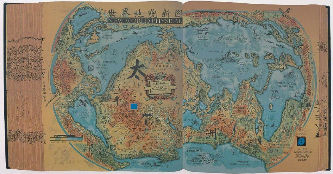
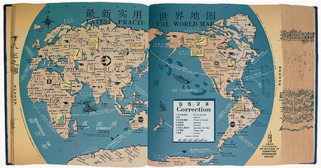
 

NEW WORLD PHYSICAL 2000

Latest Practical World Map


In the first, the excavated distorted “North America Ocean” and “South America Ocean” are dotted by odd arms and insignia, their actual confines warped to create imagined lakes and emblems of airplanes and Microsoft, unlike the “Asia Ocean,” and oceans become land mass.


America's Microsoft Explorers


In the scanned maps Hong has altered and manipulated, America might be expanded, renamed as the PRC, Asia folded into obscurity save Japan, and Canada foreshortened into a swelling United States, all to upset viewers’ expectations for reading their surface, which he reiterated in “New Political Map, 2” (2000), “New Political Map, Which One” or “New World No. 1” (2000), repeatedly playing with the constraints of mapped space in ways that not only skew actual relations, but invite us to recognize the arbitrariness with which we map our mental space or are accustomed to do so.
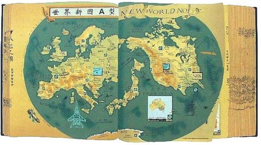
 

%22New World No. 1%22 p. 2001


Hong Hao was trained in printmaking, and values the medium of silkscreen prints as versatile tools not only to sort objects and create catalogue, but to treat the map as an ordering device.  The series of Selected Scriptures, which are distinct from much of his work in their ostensible unity, are distinct from Hao’s interest in sequence of assemblages that are characterized as mosaics of found objects, for the maps he has invented are anything but disinterested collections of visual information or compilations of objects.   Hao’s sharply observed maps are not aestheticizations, so much sharply observed post-modern satires, and comments about the recoding of information systems and the processes of the translation of information that occur in maps.  In his powerful series based on the clever appropriation of older maps, the antiquated nature of the maps allows them to be treated as a new expressive field.   For Hao’s Selected Scriptures (1992-2000) seems to ask us to about the role of visualizations in suggesting the global imbalances of networks of power often removed from actual terrestrial relations in an our over-mapped world, treating the map less as a totalitarian constraint or a set of fixed conventions than something like a musical piece that could be assembled, varied, and reorganized in sharply provocative ways.  Hao has created skillful digital transpositions of world maps in his silkscreen on heavy wove paper, as if to recall their craftsmanship and artifice to contrast to the mechanical reproduction of serially produced maps of topical concerns.  The contrast of materials of their subject and handmade production recall the power with which printed maps once assembled the lived world, in ways that masked all its inequalities and absence of proportions, working within the structure of the maps to undermine their content and reveal the very inequalities that they concealed.  Hao has claimed to be especially attracted to historical maps as being “capable of inspiring ideas on what we take as common knowledge” and as “almost the most direct and most economical way to know the world.”  But the economy of mapping by no means limits his variation of his range of artistic expression in this series:  Selected Scriptures exploit this economy of graphic expression and its organization as an inspirational guide for playing with their formal transcription of space, redeploying the map as a new arrangement of space in works that bear such self-titled silkscreen prints as “Latest Practical World Map,” “New Political World,” or “New World Physical“–to cite the prominent English typeface in his Selected Scriptures series.

Several of Hao’s set of maps, which appear below, capture the promises of how maps make new claims to organize the world’s totality in readily legible ways that make us look at maps in new ways, alternately whimsical, quizzical and ironic look at space.   In an age of online and digitized maps characterized by the near-constant mapping of financial transactions, geographic locations, and activities, Hao’s images are less about “found” maps than the rediscovery of the assembly of space from digitized images maps and varied map detritus that he wields and transfers onto his chosen medium.  For he has adopted the particularly copious formal syntax of mapping, preserving the appearance of cheaply printed maps that he emulates, to ask how successfully maps might ever translate an image of our world, subtly reshaping their economy to upset their meanings–evacuating the map of any sense of wayfaring tools, but enriching its symbolic form.


1.  The formats of mapping that Hao appropriates are, of course, removed by several generations from our own notion of map-use or the medium of mapping in modern life.  If it is increasingly confusing how to orient oneself to an increasingly imbalanced world whose inequities have been put on display in how news media often ignores most inequities in the inhabited world–not to mention the disproportionate threats of global warming to ecosystems, regional economies, and global food supplies–Hao assembles more light-hearted–if deadly serious–maps that invites us to engage the mystifications on maps.  Artists have long worked with maps.  But rather than offering an aestheticization of the map’s surface, as Jasper Johns, whose re-used the familiar image of the names of states in the United States, repainted to transform a well-known image,  converting familiar conventions of maps to encaustic, in an etherial blurred space of dripping paint that obscured clear lines of legal divides, and render the conventions of four-color mapping a ghostly haunting blur rather than a symbol of space–
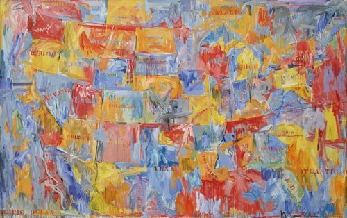
 

CRI_159124


–Hong Hao actively remakes the surface of the map as a map.  And his works demand to be taken for that reason as maps, or at least as interventions in practices of mapping, rather than images that appropriate cartographical images, conventions, and signs.

Hao’s maps map, of course, a globalized space as a space into which the artist makes his own interventions, although his work is in ways resonant with Johns’ evacuation of mapping forms.  For Hao’s maps re-assemble the disparities and tyranny of the globalized (over-mapped) world.  The disparities within the global economy has the danger of being recapitulated, of course, in ways that he lampoons.  The collective atlas that he imagines, which collectively run against the global maps we carry around in our heads, or the maps that we use to try to come to terms with unimaginably complex implications of global military constellations and warming processes.  Already, in a work that predates the Selected Scriptures, Hao’s “The World Distribution of Guided Missiles” [sic] (1992), a monochrome silkscreen print replete with the mythical beasts and figures that recall the figures on medieval portolan charts for ocean travel, shocks us with the explicit charting of state secrets.  It also suggests a new playful engagement of the map as a communicative form, even as he works to expand the boundaries of a map’s informational value.  When he locates the bulk of guided missiles in Antarctica, the effect expands the map as a record of inhabited space, repurposing of the cartographical iconography with which he knowingly plays:  in this map, the effect is oddly to diminish the appearance of the world’s size:  at the close of Operation Desert Storm, of Gulf War, and the inundation of airwaves with images of US fighter jets on a sustained campaign of aerial bombing more extensive than expected, and provoked counter-attacks, Hao imagined the world as cowering from missiles poised for launch in the “World Distribution” silkscreen i seem to translate the cheaply printed paper ink map into his own image that magnified China at its approximate center.  As much as translating western cartography into a new art language of classical Chinese origin, Hao seems to confront the difficulty of mapping power in this and his many subsequent silkscreen prints.


World Distribution of Guided Missiles (1992)


The disproportionate prejudices in these maps are well-known.  Global warming, a concept few can claim to understand, is also the,  most mapped–if perhaps most disproportionately mis-mapped–is repeatedly wrestled with in a variety of maps that try to lend the process a concrete appearance.  Despite the fact that 40% of the world’s population lives within sixty miles of the shore, and  200 million people live within five meters of sea-level, the disparity of the dangers of shifting shorelines that are poised to shift dramatically with global warming are only partly evident in an interactive “Global Heat Map” produced by the Union of Concerned Scientists:  and the extreme dangers that the shifting shorelines poses for low-lying countries is by no means limited to the United States, even if this sometimes seems the case in our own news media or the relative blindness or radical shortsightedness government working papers on shoreline sensitivity–subtitled “American Starts to Prepare–on the impacts of global flooding of low-lying lands.  (Even if there are exceptions in American media publications.)  The deepening disparities of our own mental maps–evident in the apparent perplexity that one out of six Americans in where in the world Ukraine is located, according to the Washington Post, which almost makes one wonder if the survey was credible or if it generated sarcastic responses–the lopsided maps we contain may make Hao’s imaginary  corpus of lost maps apt commentaries on global inter-relations, as much as a formal syntax for creative expression.  But they grapple, if in a light-hearted way, with the problems of mapping the globalized world.


2.  Hao’s work is a retrospective recreation of a cartographical sublime that reaches back to a lost medium of paper maps.  The particular productivity of mapping as a new form of invention in Hao’s work from the late 1990s, suggests a particular neat coincidence of how maps speak to power, or power through maps, that interestingly mirrors the growth of online mapping:  although Google Maps was only launched just less than a decade ago, in 2005, shortly after Steve Coast created a free, editable map of the world, OpenStreetMap, based on Wikipedia, in 2004, the first online mapping service, MapQuest, If OpenStreetMap responded to the inability to freely download government-run and tax-funded projects like the Ordnance Survey in England, as these mapping projects have expanded, the epistemic remove of maps such as those that Hao uses–and the apparent chronological distance of a map created by silkscreen, but belonging to a printed encyclopedia bound as a classical Chinese book–gains new appeal as a rehabilitation of mapping as an aesthetic medium and as a tool for imagining and locating geopolitical abstractions.  Unintentionally, the rise of GPS and geocaching as modes of map making, satellite imagery, digital searchability, the branding of Google Maps and the Google map viewer, and dramatic expansion of use in over one million websites of the Google’s API, have conspired to so remove the five-color map from our “period eye”, that its epistemological antiquity may be increasingly difficult to distinguish from the thread-bound classical encyclopedia Hao’s Selected Scriptures referenced.  (Google’s corporate logo is absent from Selected Scriptures, but the presence of Internet Explorer and other corporate insignia suggest a need to locate the web-based map on the borders of what we once new as the world’s inhabited territories.)

Yet the weird notions of contiguity of a flattened earth that Google Maps has perversely re-introduced–reinstating a continuous block of Eurasia and Africa, for example, isolating China, Australia, and North America–mirrors the  oddness with which Google Maps has rehabilitated its own variant of the long-discredited and cartographically retrograde biases of the Mercator projection, a handy solution to the flattening of the earth’s surface to coordinates of straight lines of latitude and longitude but which amply distorts its surface, irrespective of actual land-mass, but whose convenient centering on Europe provides the basis for all Google-derived web-maps.  (China’s role in this internet society is contested, with most social networking sites banned in the country, including Facebook from 2008, Twitter from 2009, and Google+ as it was introduced–despite relative open-ness to LinkedIn, reborn in China as 领英, pronounced “ling ying”).


Contiguity in Google Maps


For all the personalized coziness of the Google Maps Navigation, Google Street View, or My Maps, this close variant of the quite retrograde Mercator projection has perpetuated a primarily targets that Hong skewers as a frozen model of global relationships of power, which is striking for how it eerily corresponds to Hao’s “New Political World” (1995), whose evocation of the modernity of rewriting the world’s geopolitical structures is not only reminiscent of the early modern cartographers Mercator or Ortelius–the former’s “Nova et Aucta Orbis Terrae Descriptio ad Usum Navigantium Emendate Accommodata” [“New and more complete representation of the terrestrial globe] properly adapted for use in navigation]” of 1569 and the Nova totius terrarum orbis geographica ac hydrographica tabula . . .” of 1570–but also to announce new political configuration of landmasses in relation to one another.  Although Hao didn’t prominently include Google’s logo among the logos of international corporations  in the sequences of maps he has designed from 1995, his work succeeds by upsetting our Westernized confidence in mapping, more than playing with cartographers’ formal conventions.

And if Ortelius prided himself on drawing national boundaries and distinguishing the world’s expanding number of continents, Hao’s silkscreen prints take pleasure in redrawing boundaries, reconfiguring the shapes of countries, and shifting and switching toponyms, as if to describe a world less defined by boundaries than the continued symbolic authority that maps have long continued to exercise.   Indeed, rather than accessing or retrieving data in the format of a map, we are presented a map in the legible form of an open book and private space, even if we are invited to imagine the audience of readers for whom such a map might be mechanically reproduced.

The maps are forms of imagining a conscious redesign of the balance of power and populations that antiquated static maps once mapped.  Indeed, Hao’s reassembly of the map may as a form of memory might even recall the famous translation of the Ortelian project in 1602 by Matteo Ricci, working with the astronomer, mathematician and geographer Li Zhizao (1565-1630), who engraved it, in ways that affirmed the dynamic and interactive nature of the actually static nature of a woodcut print map.  (Although Hao may not reference this famous notion of cartographical translation, his appropriation of the format of world-mapping seems to intentionally reverse the trajectory of Ricci’s importation of cartographical iconography and place-names on a somewhat comparably busy and densely crowded symbolic field.)
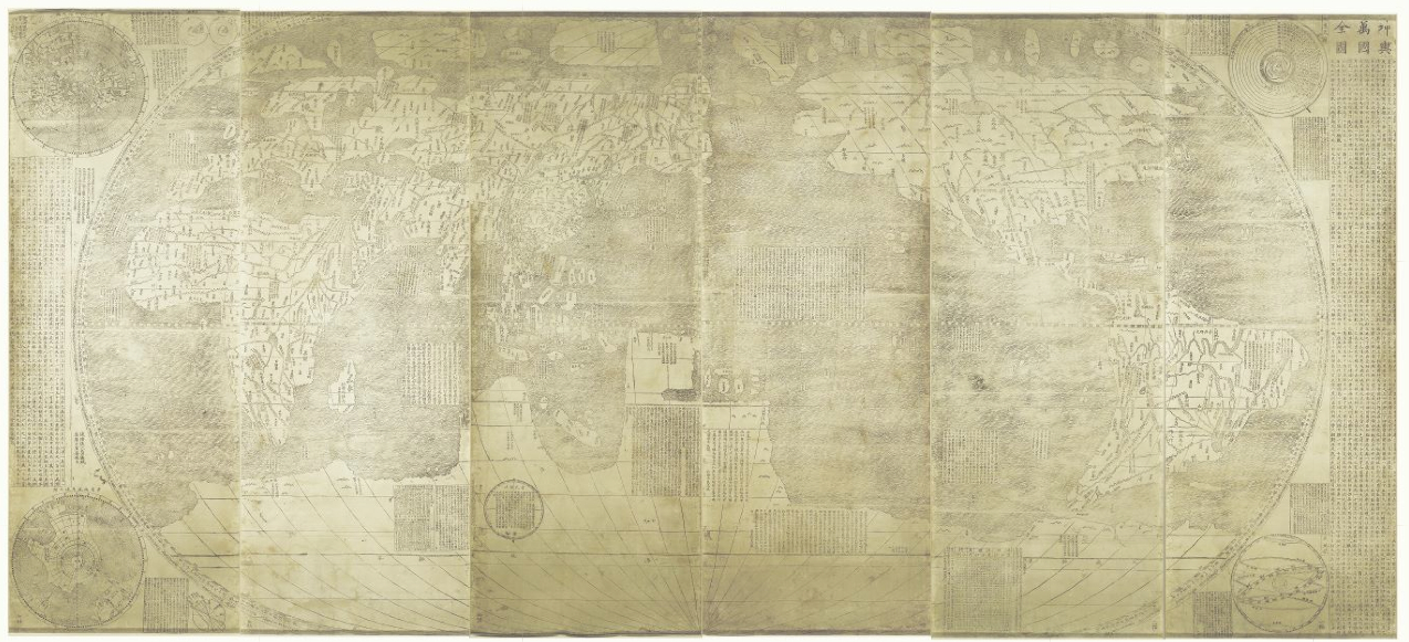
Ricci Map 1602James Ford Bell Library

Hao’s subversion of western mapping as a national political tool is often too crudely cast as reaction to the western–and American–dominance of constructing the world map, and an incorporation of traditional cartographical tools within a “Chinese” art.  This is too simple, and too readily essentializes “western” and “Chinese,” and where these works of art lie in relation to map making as a craft–or how Hao’s art relates to the currency of the mash-up as a map.  For Hao works with antiquated maps–indeed, making maps, rather than than only find them, to play new stories out on their surfaces–and indeed its distance from the imbalances of authority in our geopolitical world.  Reading the surface of the distribution of political power in the eponymous “New Political World” (1999) in the Selected Scriptures project playfully inverts the notions of legibility to demonstrate a balance of power regularly elided:  the playful projection of geopolitical values is exploited to present a new way of reading a familiar demarcation of terrestrial expanse divided by naturalized boundary lines, playing fast and freely with some of the iconography from news maps or other cartographical images.

If we love to read maps to move across space, and cross frontiers drawn in space, the shifting toponymy and place-names that we encounter in the imaginary Atlas of Hao’s device opens up a world we’re sad to read but that we can at the same time also recognize as something that the anonymous mapmaker has synthesized.  Hao’s work suggests a uniquely hybrid creation, as well as a satirical relationship to the Rand McNally political atlas, which seems its primary target at first.  Hao, who graduated from the Beijing Academy of Fine Arts the year of the suppression of protests in Tiananmen Square, has specialized in transposing digitized images to silkscreen prints that skew the actual geography of the world in his prints, much as they play with the reproduction of five-color maps in print culture with the format of an hand-made artist’s book, but derive from reproduced images scanned, digitally altered, and reproduced as silk screened images, linking traditional crafts, the Cultural Revolution, and modern digitized media to deconstruct and repackage (or redeploy) the map as a political statement.

The weird translation of cartographical images is part and parcel of the project, evident in the irony of the most “accurate” map in the Selected Scriptures, the “World Defenge Layouy Map” [sic] (1992), a variant based on Hao’s earlier 1992 work:
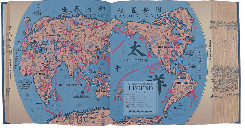
 

Scriptures Hao

Hao’s new map of nations illuminates military power by relatives geographical sizes of nations to reflect military power, recycling the map as a metaphor.  As much as it suggests a cheap reproduction, with its title seems suspiciously printed in uniformly spaced letters, the image of a “new political order” is meant to dislodge our expectations for reading a map centered on t:  and on the map, although the pathways of world travel include a sailing junk, but are dominated by fighter jets among large pinyin characters that immediately strike a western viewer, and reminding us that all maps are both constructions and translations and that, indeed, the power of the map in part lies in its success in translating reality to a seamless whole.  In Hao’s Scriptures, the integrity of the map is disrupted by the shifted orientation in the digitized images of names, landmasses, and pastel hues, as if to recall the mass-produced posters on cheap paper that recall Maoist times, the upbeat candy-colored pastels worthy of PAAS Easter Egg paints rather than a five-color map.  They describe a scary surface of disproportionate global powers, with the PRC at their center, now straddling the Atlantic and Pacific, whose places are oddly reversed, as if one emptied a Rand McNally map of toponyms and reshuffled their location, as if to mock the faux disinterested nature of maps from the  perspective of the current PRC, which finds itself somehow between the Atlantic and Pacific, in the place of North America, an expansive Israel to the North, and the United States displaced from its position of power:


%22New Political World%22Metropolitan Museum of Art


3.  Artists have been making maps–or using maps to make art–since before the first printed atlas, if not since the first globe.  But Hao takes the map to excavate it of meaning, and ask about the oppressive world system we have inherited, playing with the oppressiveness of that system and the almost light-hearted pastels of artificial colors (pink, yellow, orange, blue and green) we use to divide the inhabited world in printed maps to suggest that the map has little bearing on it.   The odd remoteness of the historical map offers a “tool to think” that exposes the discrepancies of our mental maps of geo-bodies.  Hao all but ignores the actual geographical contents that are the ostensible subject of a map:   and as the project progressed, the maps he creates have an increasingly ironic organization of space.  Reading the surface of the distribution of political power as referenced in the eponymous “New Political World” (1999) plays with notions of legibility that are regularly erased or elided within print maps, but seem especially pregnant with the distance of time:  the playful adoption of the map’s projection of geopolitical values is exploited in Hao’s work in order to present a new way of reading a familiar demarcation of terrestrial expanse that is divided into naturalized boundary lines, playing fast and freely with some of the iconography from news maps or other cartographical images:  Hao’s map of nations illuminates military power by relatives geographical sizes of nations to reflect military power, but even its title seems suspiciously printed in uniformly spaced letters:  and on the map, although the pathways of world travel include a sailing junk, but are dominated by fighter jets among large pinyin characters that immediately strike a western viewer, reminding us that all maps are both constructions and translations.

The power of the map in part lies in its success in translating reality, so that the PRC now occupies where we expect the United States:


New PRCMetropolitan Museum of Art


The humorous reconfiguration of space in these maps transpose space and place with a flighty flippancy foreign to any actual land map.  Why is Hong Kong now at the mouth of the Mississippi, in the place of New Orleans?  The legibility of the rest of the world is almost made ridiculed, not only as the ocean off of what seem Alaska’s shores is labeled “Atlantic Ocean,” but since the region is actually Uganda, nestled beside the newly bordered Israel and Chad, creating a perverse geopolitical world that seems an absurdist collage of what might be:  as the People’s Republic of China now occupies, save in Florida and parts of Norther California, most of the land that one might associate with the United States; to the north, Israel lies lazily across current Canada; London is dispatched to the South Pole; Canada is relocated to a strip of diagonal land in Eastern Africa, beside the Indian Ocean; Europe divided between Vietnam and Mozambique as if their names are dislocated from the geographic fields in which we are accustomed to find and locate them.

Hong Hao all but ignores the actual geographical contents that are the ostensible subject of a map:   and as the project progressed, the maps he creates have an increasingly ironic organization of space.   Many of Hao’s works trumpet their modernity in analogous, if tongue-in-cheek fashion–“The New Political World Map” (1995); “The New World Survey Map” (1995-96); “The New Geographical World,” Selected Scriptures p. 3085 (2000)–as if they offer windows on a newly registered reality to readers. Is ‘place’ less of a signifier, in the map, than the global distribution of power?   The sizes of countries are ordered, not only in terms of the military and economic power of nations, but in ways that upend the semantics of the legibility of space, despite the familiar color-scheme.  The result is often a fairly scary image whose totality one pays far more attention to, decoding the configuration of countries and assessing their sizes with an eye to power perhaps far more than geographic relationships, which are–witness the fighter jets–of far less import today.  The clearly cultivated flimsiness of a mistranslated map, standing askew to the actual world and placing Asia at its center, pushing mirror reflections of Europe to its margins, and dispensing with America, in ways that not only skew spatial relationships but show the reproduced map as a field for staging imbalances of power.
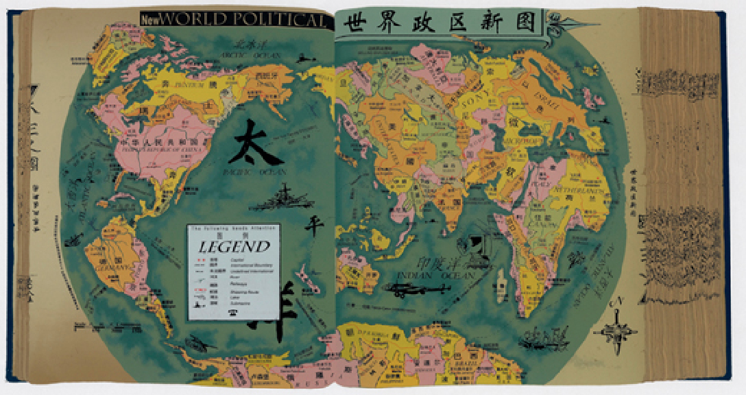
 

New Political World Hao

National Gallery of Canada


hong_hao_art_atlas2_400

Selected Scriptures, p. 1999, The Memory of the Millennium” (2000) assembles a grab-bag of cartographical inventions around an inversion of land and water, so that oceans that connect and separate continents now seem landmasses:  as if to exploit the map not only as construction, but assemblage of cultural artifacts that desperately press space into readily legible terms, Hao presses the fertility of the format of the map as a signifier into his service to new extents:  emblazoned with the prominent descriptive legend “New World Physical,” the map is difficult to orient oneself to even more than his earlier work, its oceans (NORTH AMERICAN OCEAN; AFRICA OCEAN; EUROPE OCEAN) erase landmasses, as if to repurpose this most conservative of media so that where once lay land, oceans are overburdened with objects.  Weird graphs erase any familiar promise of the legibility of mapped space.  The didactic iconography of educational maps becomes a repository for graphs, varied iconographic detritus from warships and the logo of internet explorer:
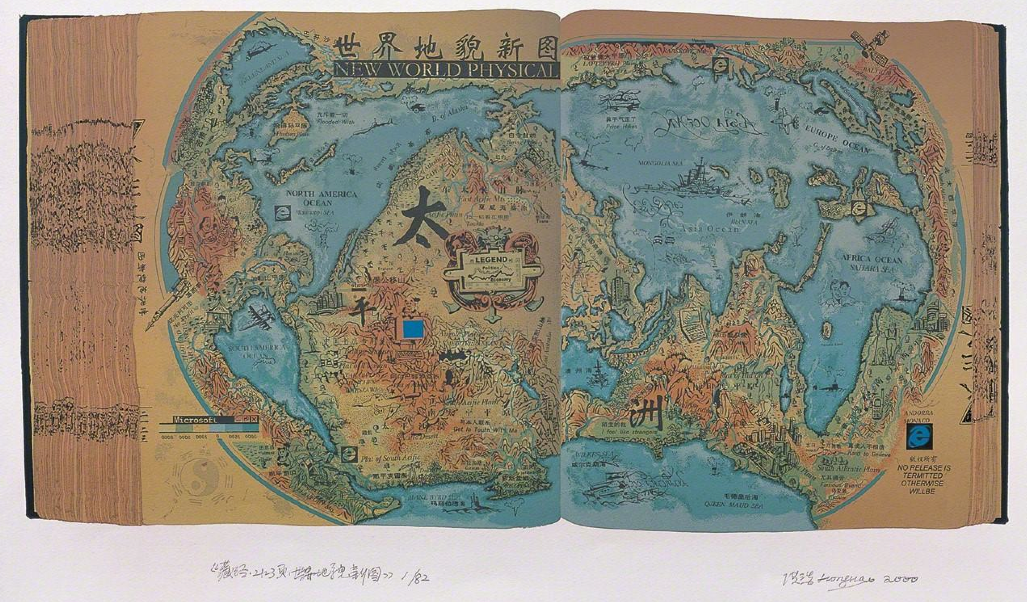
 

Memory of the Millenium (2000) Artsy Artis


The playful array of translations in the map–both translations among mechanical processes of reproduction, and contexts for viewing maps, as well as translations of map-signs, conventions, and toponymy–play with the “novelty” of the map and its antiquated medium to make a new material object for readership.  By using a base-map, scanned from a four-color map of Westernized derivation that seems printed on foolscap typical of the posters of the Cultural Revolution, which Hao cast in the form of a traditional hand-made book in  a set of individual silkscreens, as if it belonged to a corpus of lost maps in the Chinese tradition, rather than informed by Western cartography.   We are a far cry from the Eurocentric “Map Translator” functions, if the adherence to a cartographical structure and the color-scheme is oddly familiar:  Hao takes the the levels of translation, indeed, in a much more playful and wryly sarcastic direction that exploits the almost generative fertility of the proliferation of meanings in mapping forms, that consciously reveals the power of mapping forms that are left as a neutral backdrop in the image that uses the Google Translate API.  To be sure, unlike the Google API, the maps Hao crafts, if in their collective dizzy the viewer in percussive ways, rather than retrieve or access data, present a fixed tableaux.


Map Translator_Nation State


Some of the other imagined pages Hao designed from Essential Scriptures of 1995, as “Latest Practical World Map,” manipulate and lampoon the sense of practicality of a map, even as they introduce emblems of consumerism as much as militarism within the map the maps themselves, in ways that play with their surfaces by renaming continents so that countries, continents, and cities are no longer recognizable, hydrography abstractly symbolized and an eery globalism illustrated in the surface of the map itself–and slogans such as “Be satisfied” or “Be careful” will later give way to those of free market neo-conservatism, from “Control, gain, own, exploit” to “Fame and fortune:  you can have both”:  these maps have been compared suggestively to a traditional Chinese landscape in which the manipulation of the conventions of landscape become a register for a subjective state of mind, although in Hao manipulates conventions takes aim at their ostensible objectivity, and indeed the images of globalism they present:  the conceptions let silent in the map are used as commentaries on mapping practices, or on the concepts of globalism.  Or, the map becomes a surface for an almost random generator of slogans and injunctions–“BE SATISFIED,” “BE LONELY,” “BE CAREFOL,” “DON’T BELIEVE,” “BE LONELY”–that suggest the alienation of its viewers.   Whatever constitutes the practicality of a map, the combination of odd translations, even odder graphs, juxtapositions of slogans and generic injunctions uses the historical remove of the map-as-image and inscribed surface to puncture its utility and authority, and point up some of the odd ways of reading truth into maps.


Latest Practical World Map bigArtis


4.  What, indeed, constitutes practicality in a map, and how is the translation of the world to “practical” terms defined?  Practicality suggests that it offers ease of ready consultation by readers, but we find a surplus of significations that mimic many maps in their almost distracting quality.  Many of the slogans that are on the map–“NO RELEAE IS TERMITED OTHERWISE WILL BE–subvert any sort of reading for sense.  Indeed, Hao’s intentional layering of odd  translations (BE CAREFOL), odd graphs, juxtapositions of slogans and generic injunctions uses the historical quality of the map-as-image to puncture the very notion of utility, and point up some of the odd ways of reading truth into maps.

Hao’s “New World Survey Map” engages playfully with the ways maps symbolize the proportionality of space in powerful ways, reduced Asia, as it magnifies Japan, but shows the globe wonderfully distorted with the magnification of Europe and America, in a playful accentuation of the disproportionate distribution of weapons and political influence.  Or is this the image of the political order that the West–or an exaggerated and hugely magnified Europe and [North] America and Japan–purports to create and legitimize at such political organs as the UN Security Council?  In the below map, the “legend” is of little help, but the map says enough, shrinking oceanic expanse and magnifying countries that are bloated in the disproportionate attention that they receive from news channels, or in international political bodies, as if to render a map based on their prominence in a world historical record or online news-sources:


New Topographical  World Map


This utterly “othered” “New World Survey Map” (1995) punctures the hegemony of the map, and stubbornly it refuses to relinquish the truth-claims of a map:  if the westernized cartographical tradition to diminish all Asia save the Japanese, which it so greatly magnifies.


5.  The invention of re-inscribing the cartographical surface in these silkscreen prints provided Hao with a particularly rich vein of production among his varied projects, and one that met a large audience.  “New World No. 1” (2000), Selected Scriptures, p. 2001, contracts the known world to a scary picture of three imagined continents or landmasses, surrounded by warships, arms, and satellites that suggest their military might:  where the Typus Orbis Terrarum is a contraction of Eurasia and the United States, who bracket the vastly expanded island of Japan, improbably raised to the status of a Superpower among them, and only a hint of Antarctica to the south.   America is emblazoned by iconic “lounging ladies” between Las Vegas and Texas, this map is emblazoned by the odd emblems of progress from the ancient Skylab to Internet Explorer, as if this “New World No 1″‘s order were antiquated already, its seas haunted by blueprints of jet fighters or warships, inhabited surface surrounded by satellites circulating its perimeter, as if floating in outer space.


New World No ! bitArtis


The image of a new book of world history and global powers is particularly powerful, not only for disturbing the mapping of a stable geopolitical orders that maps perpetuate, in a sort of inversion of the Peters’ projection disturbed our preconceptions for seeing the world as imitating or mirroring a political order, but inviting us as viewers to make and remake the maps that perpetuate political orders and biases in our minds, and how the an atlas for a disproportionately under-represented world might be renegotiated by its readers.   The reproduction of these cartographical orders of representing global powers becomes a sustaining theme in Hao’s work, so infinite and unending is the variety of silkscreen maps that he produced, almost haunting by the disproportionate images of the world and by maps as the flimsiest of representations that continued to be accorded a significant weight for so long:  the map is lampooned as a reproduction, albeit one with deep westernized connotations of arrogating claims for totality to itself, while presenting a diminished image of what it purports to map.  Indeed, the flimsiness of its reproducibility is evident in the difficulties of its translation, laden with “corrections” and odd graphs seem to record the map’s remove from the viewer, lampoon the tyranny of its own absurd assertions.


Latest Practical World Map bigArtis


6.  Hong Hao is by no means alone in questioning the inheritance of mapping forms.  His work is evocative of Ai Wei Wei’s interest in the hybridization of Western commercial logos and ‘traditional’ art forms, apparent in his powerful statement of the naturalization of his “Map of China,” (中国地图) (2006).  Ai Wei Wei’s work that might be said to literally translate a map of the frontiers of China into the stolidity of a classically Chinese material–wood of Qing dynasty temples–that might be verging on sacrilege.  The “map” suggests the consolidation of the official map of China from fragments of the past, as much as a terrifying isolationism, unlike Hong Hao’s odd global refigurations.  Yet Wei is far less interested in the symbolic conventions and legibility of the map than what might be called its iconic form–even if his work indulges in some of the same questions of the synthesis of old materials and practices with modern symbolic forms, and the translation of maps to new media.

Yet rather than present the “fantastic and absurd” world “governed by violence and greed,” Ai’s art-map forces us to find the map in and that is refigured from it, even as it asserts the isolation and frontiers of the unit of the Peoples’ Republic of China, as if a continuous tree trunk.  In translating actual geographic frontiers to something that looks like it emerged from a 3D printer more than a map, Ai Wei Wei invites viewers to linger over the shifts in shading on its face, even as it distances the map as powerful construction, emptying the stale medium of the map of its stale symbolic authority by translating it to another medium:  in the above, the PRC is fashioned out of Qing dynasty wood; the below, out of recycled cartographical imagery.


Ai Wei Wei

New PRCMetropolitan Museum of Art


Both images ask what sorts of opaque surfaces, rather than mirrors, something like a map creates.  But  perhaps the playful irony of distancing any of the positive associations–if any still remain–from globalism in a more engaging view of the legible conventions of a bounded map, Wei comments on the fetishization of the form of the map and its delineation of naturalized frontiers.  Hong Hao’s work seems more engaging, and more familiar, because it speaks more incessantly to our own habits of reading of maps, and the increased business of the making of the map’s surface as a format that increasingly unceasingly begs to be read and re-read.  Hao returns us, with comfort as well as to produce considerable unease, to the reading of the map’s surface, making fun of its transparency and referentiality at a time when online maps dispense with claims for transparency or signification that now seem to be artifacts of letterpress typesetting or print.  Hao’s maps recall objects of serial production–and he indeed seems to be serially producing such artifacts for an eager art market–in ways that recall habits and formats of reading space that are in many ways no longer accessible or familiar, but which register the difficulty of the possibility of undertaking an ethical mapping of the inhabited world.  Not connected, and not networked, Hao’s almost serially reproduced maps gesture to the translation of the authority of the static map from another time.  Rather than offer images delivered by the screen or accessed remotely, even if he does not think so, Hao’s maps translate back to western eyes as cartographical eye candy and comfort food.
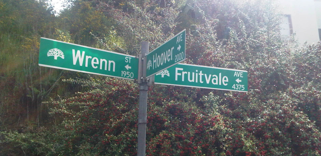

Leave a comment

Filed under Beijing Academy of Arts, Google Translate, Hong Hao, Map Translator, OpenStreetMap, silkscreened maps