
The recent election of the new mayor in Oakland, California, raises interesting questions of political pluralism, because it is an unexpected outcome of the relatively recently adopted institution of ranked-choice voting. Although the hope of the practice of ranked-choice Voting–hence “RCV”–of inviting voters to select their top three choices in a given election, rather than confine their choices to but one, has been an attempt to address a crowded field of candidates for national and state-wide positions, the institution somewhat unexpectedly led to the front-loading of the recent Oakland Mayoral Race, and the feeding of a predictable media frenzy, as well as to the blurring of several of the candidates’ messages in a media haze. Indeed, the front-loaded race, when combined with the elimination of a primary, risks featuring an expanded cast of characters invited to declare their candidacy in order to jockey for the position of assembling alliances across an economically and culturally diverse city in ways that may have consequences that are practically, as well perhaps also as psychologically disenfranchising in unintended ways, as they serve to disguise the deep social and economic divisions to which the city.
While the concept of “ranking” voters’ preference for multiple candidates in a local election has been historically promoted as a means to express choice. By shifting voting practices to accommodate the relation of voters to a widening field of candidates, RCV is promoted as producing a more equitable way to determine the winner based in a tight race. However, the crowded field of candidates and tacit alliances of sharing constituencies reapportionment may effectively compromise the fraught place of minority rights in contemporary America. For though the candidates were ranked in ways that seemed to bridge economic divisions between neighborhoods and districts within the recent mayoral election, the relatively new practice of ranking three top choices stands to further distance the electorate–pyschologically or actually–from the candidates they might choose, and rather than ensure the flexibility that the policy of such “ranked” voting is intended to afford, creates both a splintering of constituencies across a diverse city such as Oakland as a consequences of attracting a broad slate of candidates to represent different constituencies–in cases when no single candidate is able to bridge constituencies–and indeed table the issue of bridging constituencies rather than assembling alliances of more propertied groups that could exacerbate existing social divides, and encourage long-term disenfranchisement to a degree that is toxic to healthy participatory democracy. It may be that the record decline in turnout across California was due to the lack of compelling issues that were brought to the table or seen as realistic by Oakland voters, but the distribution of the votes also suggest the degree to which RCV allows a candidate who was only the first-place vote of a decided non-majority share of the electorate both to campaign most extensively on a platform for those candidates most likely to vote, and to represent the interests of several sectors of the city.
Whether Mayor Libby Schaff-the victor of the recent race, will be able to continue to represent the entire city, or feel it sufficient to respond to the needs of the constituents who she was elected to serve. Mayor Schaff’s first mayoral actions, both of boosting the police force–and calling law enforcement “the highest priority that is in Oakland–as well as outlawing night-time protests in the Oakland streets, in response to complaints of protesters’ violence from shop-owners, suggest priorities not geared to representing the whole city–as does her dedicating her first day as mayor to visit the city’s police force. The share of the $2.4 billion budget Schaff has allocated to policing closely adheres to her mantra that “Oakland is very short on police”–but difficult to square with the economic problems so many city agencies face.
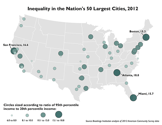
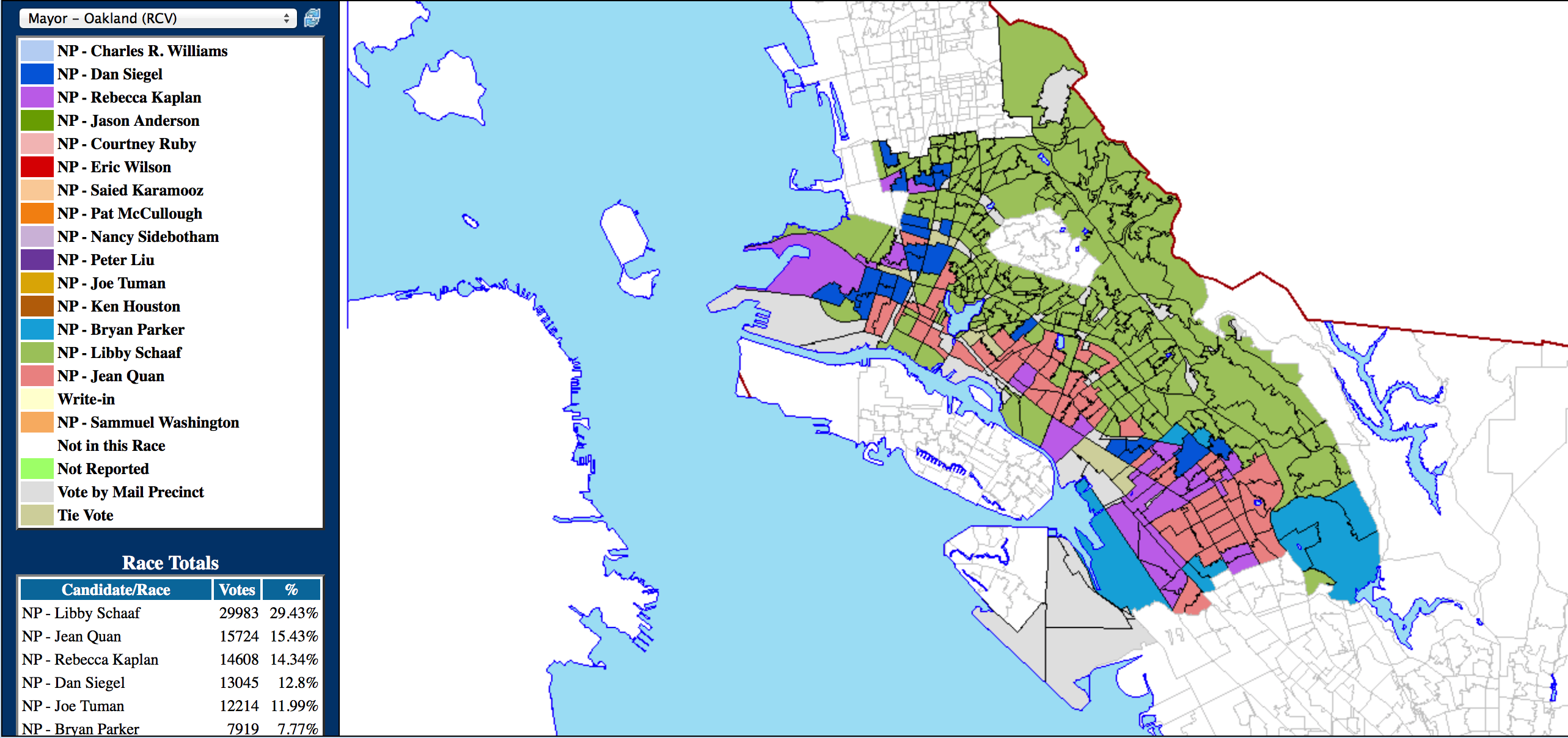
Looking closely at a detailed interactive map of mayoral votes crafted by Jeremy Dupuis of the Registrar of Voter, what divisions are revealed between different first-choice votes for Oakland mayor present of the city and its social composition? The question is striking if only because of the sophistication with which the recent RCV mayoral ballot created of the city’s changing demographic composition. How the ranking of candidates in a ballot of fifteen choices seems to orient the viewer not only to voting preferences but the contrasts of the changing social composition of Oakland as a whole–and raises questions of how minority interests and deep social and educational differences can be adequately registered in any election. Indeed, in a city like Oakland, recently deemed by the centrist Brookings Institution the seventh most unequal city in the United States, as a result of its recent gentrification, the jury is out as to whether Ranked Choice Voting has unintentionally increased the city’s increasingly pronounced social fissures. With RCV having elicited some ten candidates for mayor in 2010, leading to a nail-biter of a conclusion in which the lead vote-getter of first-place choices lost in the final tally of ranked ballots, the list of candidates grew to fifteen by 2014. The havoc of the unique post-Ferguson climate, in which massive protests closed the freeway in Oakland, echoing Occupy, and increased anxiety through city streets about urban security, may have hastened the fears about safety on the streets and police security that had already played so large in the early November election, where she won 62.8% by ranked-choice voting with all precincts reporting.
Based on not-yet-certified but complete numbers, the distribution of first-place votes for Libby Schaff was concentrated in the hills and surrounding areas–Districts 1 and 4–was clear. Low voter turnout shaped the closeness of the race, and lack of information about the voting system may have increased suspicions that mirrored the persistence of deep social a divisions, whereseparate constituencies offered few credible challenges, and consensus unclear. While Libby Schaff was the top vote-getter by far, her deeply limited contact with many residents in some urban precincts suggests a division around lines of prosperity that’s particularly troubling to the city’s future. Did RCV unintentionally encourage an already deep divisions in the electorate, or exacerbate the divisions between neighborhoods of an increasingly economically divided city, eager to protect and consolidate its newfound prosperity?
Tom Dupuis/Oakland Registrar of Voters
The division of votes reflects a divided urban tapestry, in which the reassigning of votes led one candidate to blossom in ways that reflected the strong second-place finish among similar candidates, as this visualization of Dave Guarino shows, by tracking the increasing share of “extinguished” votes first cast for other candidates that Schaff gained–and the great proportion she gained from pro-business candidate Joe Tuman, to consolidate her victory and garnering over twenty percent of votes cast for mayor, which were probably cast from similar geographic regions of the city–sensitive to his message of being strong on crime. The streams of Tuman’s 9,000 plus votes ran to over three candidates, but three profited from them, and Schaaf drew more from this pool of votes than any other extinguished ballots.
Although the process of the reassignment of “extinguished” votes in successive rounds of recounts that confirmed the plurality of votes for Libby Schaff (16.433%) in four rounds of reassigning ballots confirmed the election of a candidate for whom consensus seems to have exited, the foregoing of any primary in the Mayoral race may have created an oddly stacked ballot, where a large field of candidates allowed Schaff to assemble a plurality by drawing heavily from Tuman’s supporters after repeated rounds of reassignation of votes’ second choices. (Although the votes were not geotagged, the apparent combination of votes for Tuman and Schaff seems to replicate a distinct economic division of the city.)
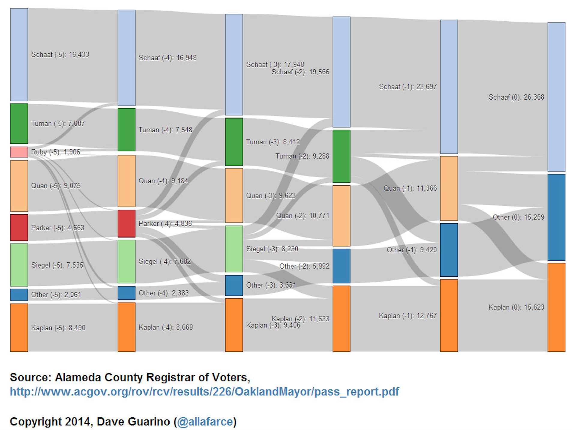
The streams of votes that created the Schaaf victory, with still less than 30% of the vote, may call into question the best means of giving Oaklanders a place in the selection of a new mayor, and developing the city’s poltical voice. Does the replacement of the open debate of a primary with a Ranked-Choice scenario allow the best presentation of ideas, or does the strategic timing of endorsements in a crowded non-primary election help manipulate the vote, creating a distorted picture of voters’ selections, combined with a historically low turnout, that doesn’t reflect the concerns across the city?
The interactive version of extinguished votes suggests only part of the picture in a race were few votes, not long before the election, were even decided–and less than half of the voters seem to have been ready to select all three of their votes. Does the apparently low level of selecting more than one candidate suggest that voters who chose to identify multiple candidates could more easily effect its outcome, in which a rump essentially votes for the city as a whole?
1. The selection of a mayor by RCV ballot was a fascinating opportunity to forge consensus across the city’s diverse but clearly segregated neighborhoods, long divided by different vested interests and politics of fear. While RVC provides a way of resolving a crowded field in ways that reflect a large number of voters’ choices, is it the most democratic way of encouraging open debate about mayoral candidates?
The divisions between candidates orients viewers to a social topography that speaks volumes to the difficulty of imagining a relation to public space in Oakland, CA. It indeed speaks to the increased withdrawing of urban neighborhoods from a shared public space in the city: despite the assembly of a strong victory by a former City Council member who attracted just under 30% of first-place votes in a very crowded field, Libby Schaaf, the distribution of what regions chose Schaaf first suggests something of the difficulty voters faced in coming to a consensus, or collectively get behind one candidate to address the city’s interests, although RCV was adopted to elect the mayor of Oakland since 2010 as a way to make all votes heard in the city–and prevent voters from worries that candidates would cancel out each other’s votes.
One of the salient issues about which Schaaf and a crowded field of fourteen other mayoral candidates jousted was the question of how to reconcile the presence of poorer neighborhoods–40% of whose residents live below the poverty line, and are traditionally less likely to express their voice at the ballot–and the high (perhaps highest in the country) per capita rate of recorded robberies. Indeed, the daunting unemployment rate of 11%, substantially higher than the national rate of 7%, and markedly greater than the region rate of 5% in a metropolitan area with San Francisco and Fremont, in ways that mirror a tendency to find more long-term unemployment in western states and urban areas since 2007. (Given the substantially greater chances of long-term unemployment among blacks and those without high school diplomas, and as underemployment among blacks hovers at 20%, according to the National Urban League, Oakland seems a tempest waiting to occur.
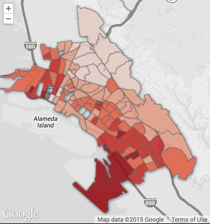
Even a Google Map distribution reveals drastically developing disequilibria in the correlation between families living in poverty and death rates in Oakland–
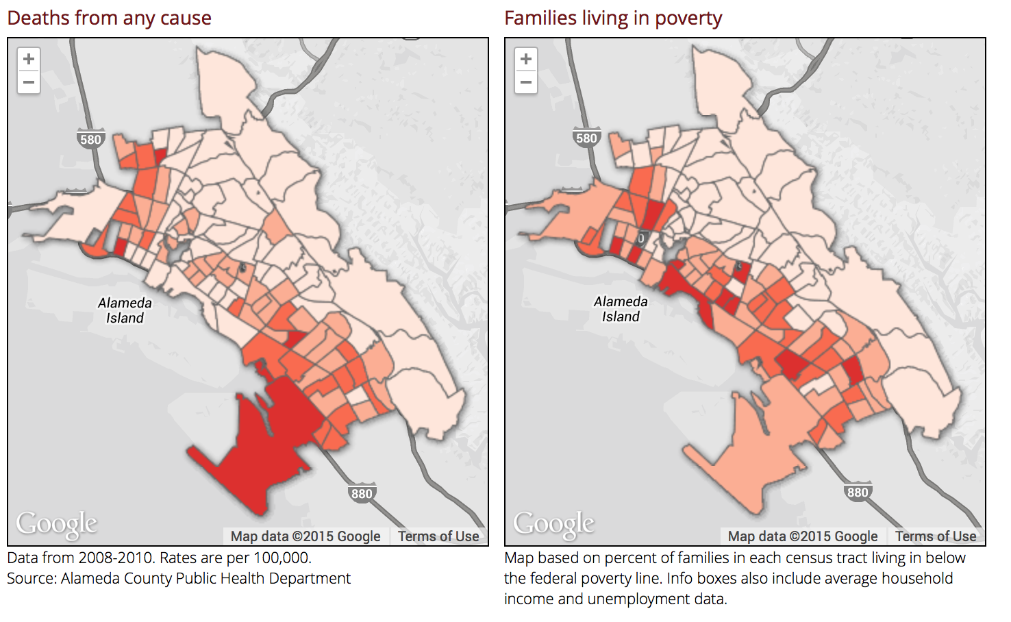
or Oaklanders’ statistical life expectancy, according to statistics of the Alameda County Office of Public Health–
How likely does the notion of creating common grounds within a city of such drastically divided life-situations, and does the expansion of possible mayoral candidates in fact give most Oaklanders a clearer political voice? By reading the screenshot of the interactive map released by the Alameda County Registrar of Voters shown in this post’s header in relation to a range of open data on the city’s population, and specifically to fear of crime in the city’s affluent areas, this post tries to suggest that deep divisions in fact continued to animate the ways that candidates courted votes of precise demographics, and indeed how RCV reveals that the city broke behind candidates in distinct socioeconomic groupings.
The concentration of better health and high employment in specific areas and neighborhoods of the city poses steep challenges for creating common political priorities for the city. If income inequality have expanded in urban areas across the nation–
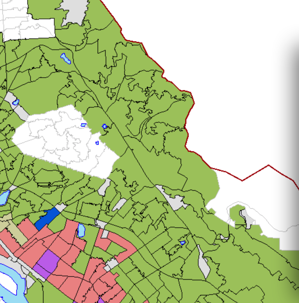
–the question of how our political systems will best accommodate or respond to these inequalities poses a dilemma of national import: will the voices of poorer voters be marginalized from elected offices, or better leverage power in a simple majority vote? and what candidacies and platforms can our electoral system work to best foster? Particularly striking is the clear parallel–unintentional, no doubt, on the part of the Registrar of Voters or the mapmaker, Tim Dupuis, of light pea-green first-place votes for Schaff, and the deeply engrained social divisions that remain from the HOLC map of Oakland residences, dating from a very different historical era which, in today’s society, one would not like to remember, but whose historic persistence continued effects on the city’s economic division cannot be denied.
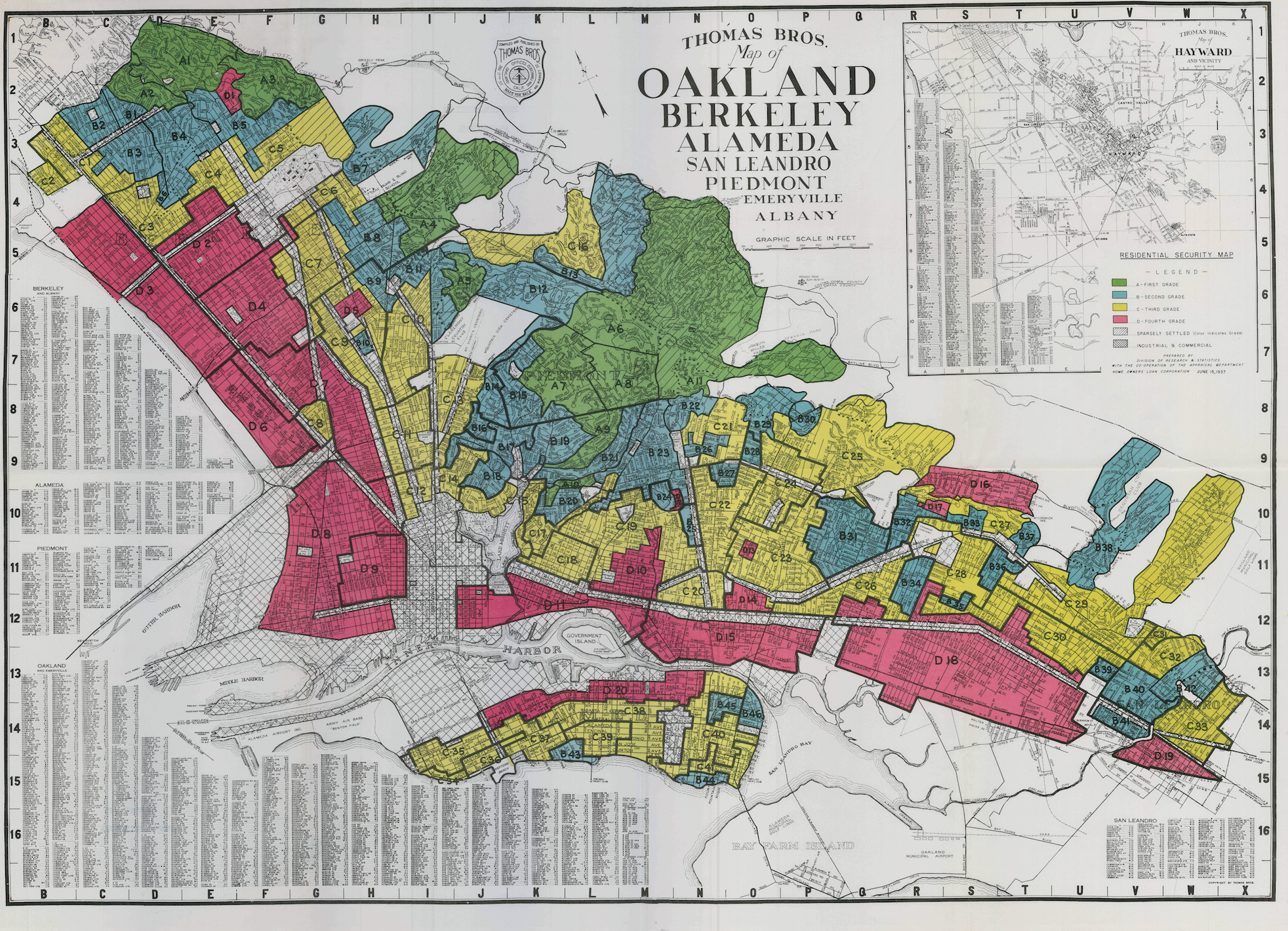
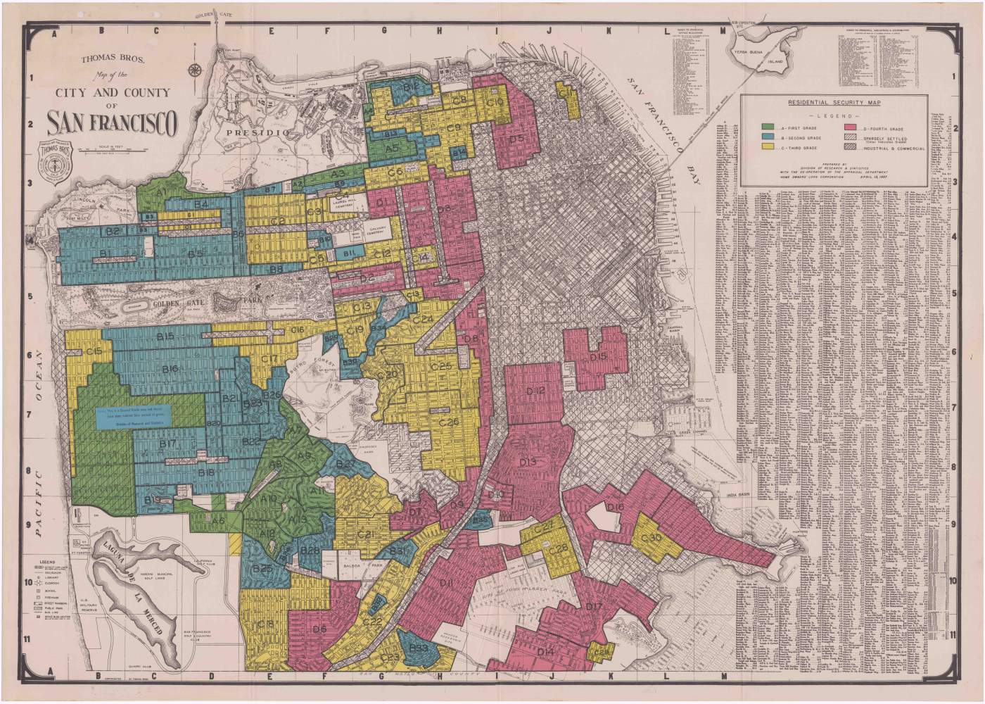
Despite the clearer lines of dominant voter preference the Dupuis’ interactive map reveals, the echo of the divisions in the historical HOLC map of Oakland, indicating regions regarded as being of worthy investment and refinancing suggests a record differentiated attitudes to the role of local government. Indeed, the persistence of these divisions in voting tendencies, level of education achieved, income, and home ownership in the East Bay contrast dramatically to the recent rewriting of the historical topography of regions of redlining in much of the downtown area of nearby San Francisco–even if the city shares its own dramatic inequalities around Hunter’s Point:
The apparent parsing of the vote along lines of demographic difference in Oakland’s recent RCV mayoral election enabled the historical splits in the city to be placed in prominent relief, as the dominance of hills’ voters, buoyed by a broader urban prosperity, fragmented the interests of a divided electorate in the city’s lower-income areas. Despite some measured analysis of “how complicated the election’s outcome really was,” the splintering of votes that it reveals suggests deep fault lines that further public data can help to unpack–and suggest the deep role that fear and fears of the need of greater policing played in determining the voter turnout in an election that was long close in the polls, and even at some date deemed a “toss up” with almost 40% undecided, and Schaff in third place, before she received Jerry Brown’s October endorsement.
What can the division of voting preferences in the Registrar’s map tell us about how voters’ selections were made to create the appearance of a landslide among fifteen candidates?
2. Dupuis’ interactive map breaks into the first-place votes that dominated individual neighborhoods of the city in ways that raise questions about how individual candidates addressed the needs of the city as a whole. The “nuanced glimpse” it has been vaunted to offer of Oakland might be best analyzed through an exercise of “distanced reading” of the trends in the urban populations it helps unpack. The geographic distribution of local consensus is communicated to a great extent in the division of first-place votes for mayor of Oakland in the recent mayoral election of 2014. While we often discuss ‘data scraping‘ as a way of extracting information from computer files in a format that is easily readable and interpreted by human readers, the point of this post is to “scrape” the screenshot of first selections of candidates in ways that read its results in more problematic ways in relation to a variety of open data already compiled about Oakland–and often translated to readable visual form.
Much as “web-scraping” aims to transform unstructured data on the web into structured data able to be more readily analyzed and examined, this post tries to unpack the screenshot of voters’ preferences as a guide to orient viewers to the city’s changing social topography, and ask what the striking homology between voting preferences and urban fears means for Oakland as a city. For a distanced reading might constitute “screen scraping” the distribution of votes, without querying its actual data, statistical basis, or programming, to analyze the image of the city’s divisions that the screenshot captures and even the visual modes by which it presents voters’ primary choice for mayor in 2014 as a reflection of the new social character of Oakland’s urban space. Although the symbolic forms by which it reveals what seems to be a decisive electoral victory, the data that it offers can be usefully situated in relation to a range of sources of open data on the city’s changing character. Rather than adopt the practice of “scraping” the image as a metaphorical strategy alone, such “screen scraping” aims to render more legible the data overlays that the screenshot of voting choices suggests by placing it in relation to other images based on open data. For whereas most city maps celebrate harmony, indeed, the screenshot reveals deep and clear rifts–and oddly lends prominence to the very socioeconomic and cultural divisions which voting seeks to mask or symbolically elide.
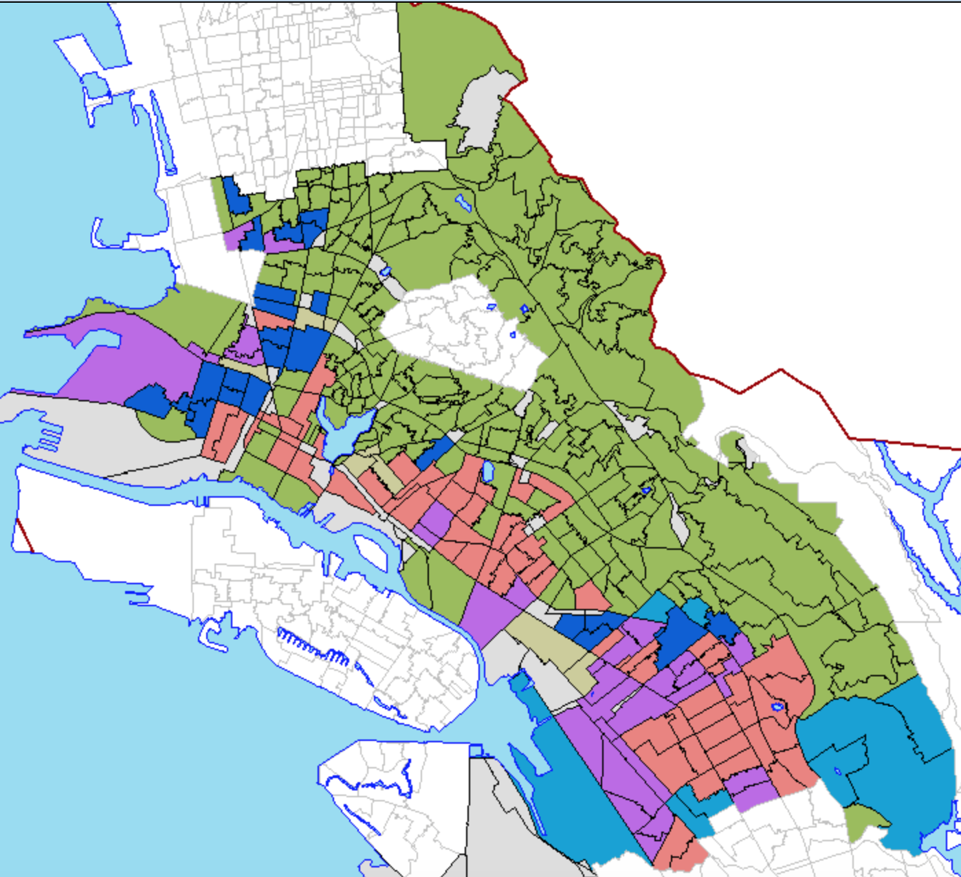
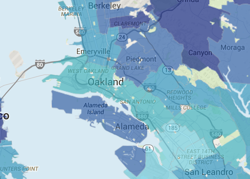
Geographical maps create diverse texts for viewers, the distribution or data visualization of first-place votes across the city provides an opportunity to read the particularly challenging question of representing the political priorities and preferences of different districts in the city in a single elected official. As much as the distribution of Oakland’s first-place votes have provoked insights into Libby Schaaf’s popularity, it deserves to occasion further considerations of how the plurality she assembled, if numerically far beyond the vote counts of other candidates, is based on the new divisions by which the city may be plagued. The big “light green doughnut” overlay in the screenshot of the ‘map’ the Alameda County Registrar of Voters Tom Dupuis called a “treasure trove for anyone interested in examining the nuances of the election outcome or Oakland’s current political landscape” reveals less of a stable landscape, than reflects uneasy relations among Oakland’s inhabitants and divisions in education, economic well-being, and access to safe housing with which the city struggles. Dupuis’ carefully upbeat rhetoric belies the deep rifts that political representatives of the city will need to address.
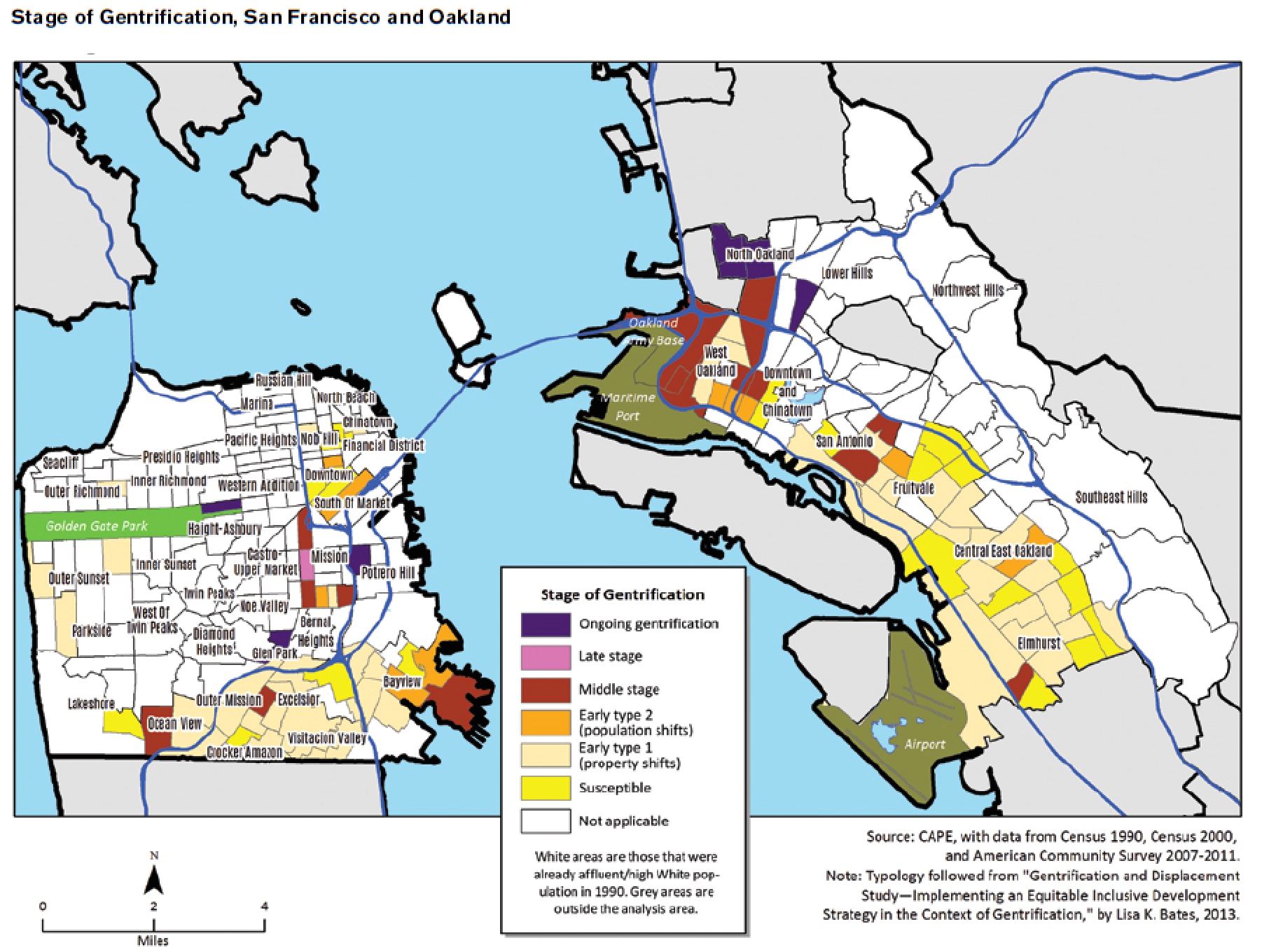
Schaaf’s strong finish marked something of a swing back along the pendulum between Oakland moderates and progressives. The distribution registers a new direction for the electorate, based on the selection of someone who defined herself apart from local interests in Oakland: Schaaf’s candidacy attracted a unique clustering stretching from the districts in the hills to the area around downtown and Lake Merritt but reflects the rising home values in Oakland geography which have radically redrawn its political geography. As the below maps reveals, ongoing processes of rapid gentrification has occurred not only in the Lower Hills of Oakland, but in North Oakland, and “early stage” gentrification has begun in much of the city, even as “Middle Stage” is noted in the Dimond district and areas formerly rundown. The below 2013 map of “Stages of Gentrification” in the Bay Area is worthy of attention as of 2013 is perhaps most interesting for how it orients us to levels of gentrification from San Francisco to the East Bay. But the consequences of such steep demographic changes have effectively shifted the political topography of Oakland in ways that bring to the surface new stresses on attitudes to public space–and of politically confronting the deep socioeconomic problems of infrastructure, prison recidivism, low high school graduation and high truancy rates, and placing other urban issues on the front burner of local politics, all visible in the American Community Survey.
The issues that dominated the recent mayoral election were not any of the above, but rather “public safety”, which became a central issue along which candidates strove to distinguish themselves: the hot-button issue provoked the fears of a growing section of the voting population about living in an urban space, indeed, and revealed an increased desire to retreat from public space in ways that seemed to underserve the city as a whole. The long, green corridor spooling over the complex contours of the districts that ring the polity of Piedmont reveals how support for Schaaf rested in the Hills regions, migrating to the more affluent areas of Oakland, where residents were drawn by her positive trumpeting of a focus on crime–without raising the spectra of criminality and its containment, as the more moderate candidates, or addressing the low rates of graduation from the city’s high schools, the impact of prison recidivism and the revolving door of incarceration, or poor health.
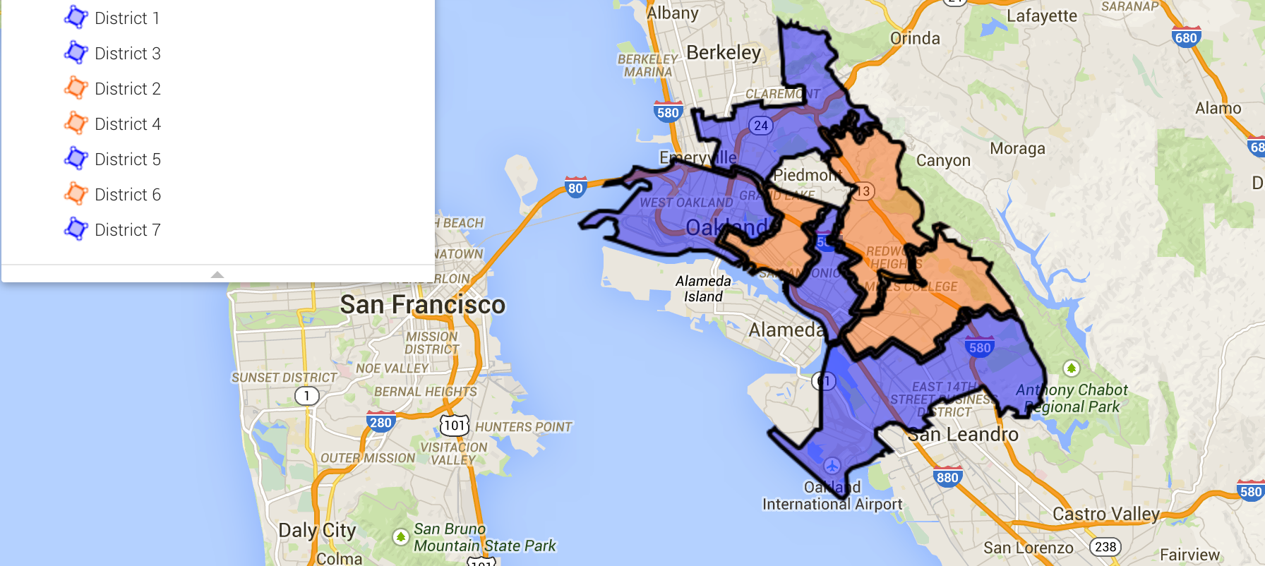
The annulus of light pea-green first-place votes cast or Schaaf crest around the independent city of Piedmont, a tree-lined residential area separately incorporated since 1907, over 75% self-identifying as white, suggest a division between hills and flats that is not absolute, but indicates a troubling story about the difficulties of bringing a range of necessary issues to the forefront of the mayoral election–and the problems of finding a mayor for the entire city–and suggests uneven values of urban realty, more than a basis for civic concord. The districts in the hills around Piedmont–one; four; and two, in clockwise order–created a growing division in the city’s districting that
The colors chosen to designate those areas where Shaff won a first-place finish oddly echo the semantics of the USGS coloration of the topography of the city:
But while both these maps show the green areas of Redwood Regional Park on the cit’s borders, the suburban leafiness of the park captures the areas where Schaff’s candidacy did best raises questions of growing divisions among the city’s diverse neighborhoods.
Oakland’s uneven economic topography creates distinct problems of forging political consensus of its own. But does the proliferation of political perspectives that the alternate selections encouraged by Ranked Choice Voting (RCV), used to elect the mayor of Oakland since 2010, but still occasioning considerable confusion at the polls, demand that voters familiarize themselves with a range of candidates in ways that tend to further segment and sectors its voters?Despite the well-intentioned hopes to allow all votes to “speak” at the polls, the deep fear that RCV has narrowed the expansion of political involvement of voters, and increased the appeal to local constituencies to create a clear plurality, bodes badly for the cultivation of the city’s public space. Selecting Oakland’s mayor has followed guidelines adopted with a range of California cities since 2006, but may do a deep disservice to expressing the public interest: rather than selecting one preferred candidate, voters are invited to list their top four preferred choices.
But we lack a suitably adequate legend legend to read first-place votes distribution in the mayoral election. Even as we’re compelled to acknowledge that even with just a hair below 30% of the first-place votes–at 29.43%–Schaff won almost twice as many first-place votes as the second-place current outgoing mayor, Jean Quan–a former school board member and community activist, whose local image as a leftist was tarnished both due to budget shortfalls and as both soft on crime and too ineffective or just nervous in allowing a police crackdown of the Occupy Movement (in ways she would regret). (The response of collective dissatisfaction led the former community activist to move toward the political center, and to so vilify Quan to organize a recall effort that long stymied the end of her term, and divided the city’s politics with considerable vitriol and dissensus to levels which almost obscured serious political debate in the mayoral election.
3. The difficulty of building political consensus in the city was however also not served by Ranked Voter Choice. Indeed, the encouragement that it gave multiple politicians to declare their candidacy not only obscured the major issues facing the city, but seems to have effectively allowed a relatively small share of the electorate to choose the election’s result, which damaged the possibility for the mayor to forge close ties to the city’s diverse groups. In ways that seem perilous for the public good or city’s representation, the contraction of issues at stake in an RCV election may have increased the splintering of the city into separate constituencies, ill-suited to meet its varied needs. As a result of the division in the electorate, it often seems that issues as growing prison recidivism, public maintenance, poor health care and high drop-out rates or the public transit system and housing seem to be abandoned or suppressed, and the issues of crime assume a prominence as “public safety” issues that it’s questionable that a mayor can address: the odd circumlocution, claimed to be the focus of multiple candidates and several forums, and redefined as a prominent top issue with the prominent emergence of multiple private security firms across several city neighborhoods, have used the construction of “public safety” to divide the city’s public good in profound ways. For did the circulation of the issue of “public safety”–a term bandied about in the election a sort of code name for urban fear–create the decisive geography by which districts that lent their first-place votes?
To be sure, the division of political interests in Oakland tend left collectively, even more than in other metropolitan areas, but the city is also an odd microcosm of the sort of schizoid politics that have come to characterize California as a whole, which, rather than a reliably “red” or “blue” state, while voting Democratic in presidential and national elections, tends much more deeply blue along its semi-urbanized coast, and turns deep red in its interior.
But the process of “Ranked Choice Voting” was intended to ensure that in the deep blue of the Bay Area, no candidates would effectively cancel one another out, by dividing the ballot, by allowing each voter who fully grasped the system to cast three ranked votes for a single office.
The adoption of the practice of “Ranked Choice Voting“(RCV) was approved in 2006, when Oaklanders approved the electoral law to involve the electorate and prevent the eventuality of a splintering the vote. The measure was introduced after considerable frustration that voices of the electorate were not being heard when the example of Al Gore and Ralph Nader competed for votes against George W. Bush in the 2000 Presidential election: although California’s northern coast is solidly Democratic in voting, the deep debates about what counts as progressive is particularly heated in the Bay Area. The combination of a dramatic expansion of declared candidates for mayor–ten by 2010, rising to fifteen in 2014–combined with historically low voter turnout in a city of uneven education and political mobilization–creates problems of not increasing a field of candidates who are linked to districts’ specific interests–and indeed to the competition for scarce resources by city districts. Although RCV was blamed for how the majority first-choice candidate of 2010, Don Perata, was upset by the preponderance of second-choice votes for Quan, as ballots were reallocated after the candidates were eliminated. The strong number of second-place votes cast for Schaaf in 2014 cemented her recent victory in ways that legitimated the first-place choice of a small, and socio-economically distinct, sector of the city.
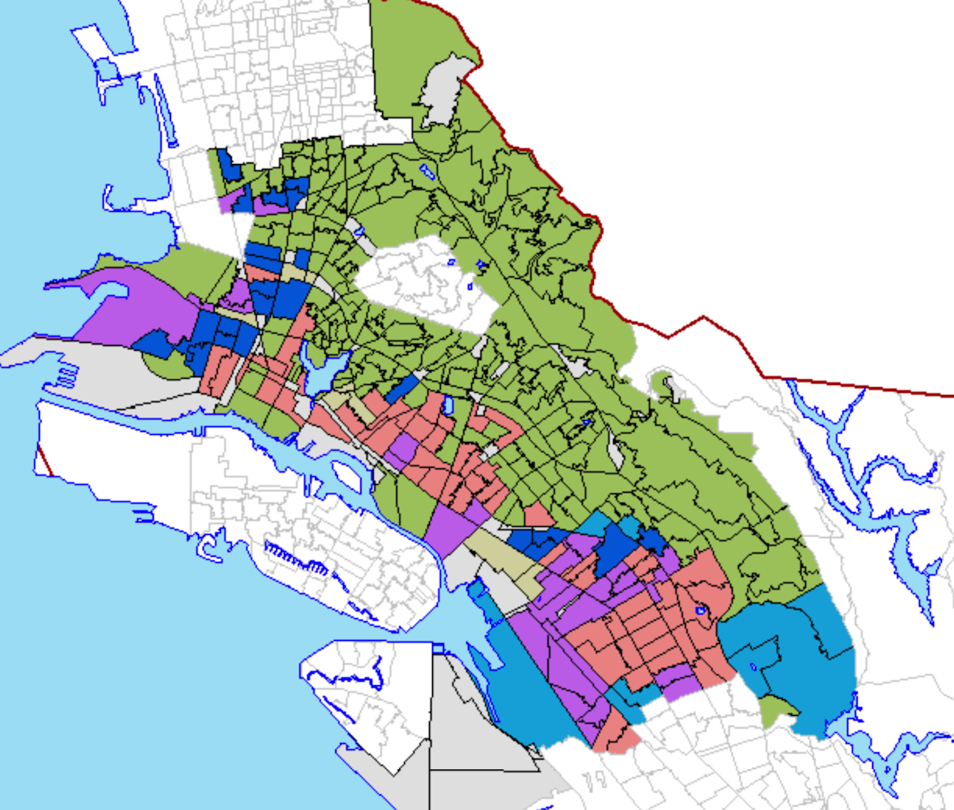
The election of 2000 raised the fear that one’s vote would not influence the final tally, as well as encourage the unwanted election of a Republican President, and fed a deep frustration at single-candidate voting and led folks to search for mathematical alternatives to count votes that would both to preserve every voter’s voice and prevent a “wasted” vote. But the institution of RCV is still being assessed, and its implementation demands to be considered in how it plays out in different situations. For the practice demands a literacy with the new form of the ballot, unclear in a city like Oakland, where its adoption moreover does not seem to have helped to manufacture consensus, plagued by both deep divisions of interests difficult to reconcile and dercreased involvement of voters in elections, both magnified by fears and by growing socio-economic divides. It seems to create a problem of mapping the social space onto a political space of representation, complicated by the fact worst turnout for a November mayoral election since they started in 1990, about 14% lower than in 2010, and an estimated 55.7% of residents’ registration in time to vote. Oakland has been long, divided, to be sure, by special interests and local constituencies, as well as by corrupt politicians who have manipulated these divisions to their benefit. The move away from the city’s divided path will be long. But compelling questions are raised of healing exacerbated socioeconomic divisions, as well as reducing special interests, by the very fact that so small a portion of the city’s residents decided the election, where lower than 35% voted for the current Mayor-elect, can represent a small part of the city and the city as a problem in microcosm of the alienation from American politics. (Dissatisfaction with how a hiving off of some neighborhoods from others led many to try to remap Oakland’s districts to create a greater ethnic and racial–and economic–balance led local journo-cartographer Jesse Douglas Allen-Taylor to try to puzzle out a more equitable proportional mapping of districts based on the 2010 Census by shifting boundaries to cross hills and flatlands.
Whereas district topographies work to preserve specific enclaves in some fashion, and partition hills from what were predominantly urban areas–
–the proposal to expand districts bordering Piedmont to embrace more of the area of West Oakland and to shift East Oakland to embrace parts of the hills stemmed form an attempt to gain districts of better ethnic and economic balance:
The perception of clear tensions among the city’s districts leads to direct competition for schooling, policing, and other resources, but the proposal was not adopted, and the economic growth of districts 1, 2 and 4 create a new division of property in the city.
Did the adoption of instant run-off voting, which places a focus on a general election in which candidates compete to be individually ranked by all voters, best respond to the steep socioeconomic divisions of the city?

Does the institution of RCV, which invites a plurality of candidates to declare themselves for individual interests, encourage political fragmentation in a city long-known for its moderate-leftist divides? Does RCV invite a more democratic process or accentuate a proclivity to create distinctly self-interested voting blocks? The light-green ocean that seems to float over the city in the above screenshot encircles the hived-off city of Piedmont, long separate from the city, defining the range of districts where Oakland’s mayor-elect of Oakland became the first-place choice; their uniformity contrasts to the range of candidates that appealed to specific sectors of the city. The expanding slate of mayoral Democratic candidates reflected the scuttling of the primary in favor of a system of selecting three top candidates out of a field, progressively eliminating those candidates receiving the least votes from a final tally, reassigning votes based on second- or third-choice selections.
The coalition Schaff successfully assembled across select neighborhoods primarily seems to have responded to a narrative of increased policing and of maintaining “public safety”–as well as a compelling promise to sustain increased government transparency of ‘open’ government to relieve a city long plagued and divided by special interests. But addressing a distinct sector of Oakland may come with costs. What can the divided nature of first-place choices tell us of the challenges that any future mayor will face in assembling local consensus across the city? While the practice ensures all voices of voters are expressed in the final result, the almost topographic variations of elevation along which the city vote split raises questions about how RCV encouraged the city’s votes to break along interested lines, and if it offers the be the best way of creating consensus in the field. Oakland’s rapidly transforming economy–much of which has driven the current economic boom–created unintended synergy with the possibility to elect the mayor by a plurality which, while thought the best path to create consensus in a diverse city, may exacerbate the deeper and more salient divisions in the city’s economy. The division to an extent creates an apparently legible manner that the city divided along partisan lines in casting its first choice votes, based on the different interests that each candidate reflected and with which local residents identified, raising questions of how Oakland’s diverse neighborhoods translate into a coherent political space.
4. Before investigating the above screenshot of how first votes were cast tells us about the division of Oakland’s votes on clear lines, and lets us examine how the institution of Ranked Choice Voting decided the mayoralty on second- and third-place votes, and unpack the fracture lines in the above map by a range of open data of the election, and of the shifting political topography of a city riven by educational and economic divisions in ways that make consensus difficult to define in the city across the bay.
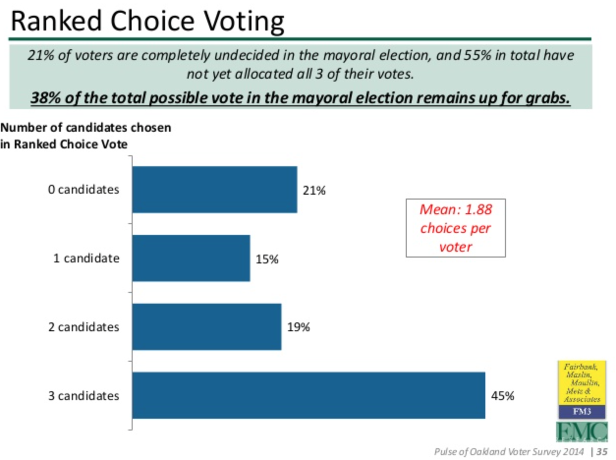
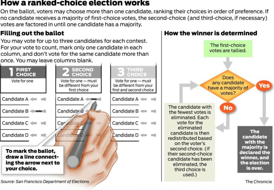
The innovative institution of Ranked Choice Voting , or RCV, asks voters to select their top choices, to be counted in rounds of successive elimination of candidates obtaining the fewest votes–forgoing a preliminary two-party primary before a General Election. By inviting voters to consider all candidates to select three top choices, the adoption of RCV tacitly encouraged a broad range of candidates to declare their candidacy, and helped five candidates continue their races until Election day–ranked voting had been decisive in the results of the 2010 election, and polls were hesitant to predict how the selection of second and third choices might alter a field where candidates hovered around 20% commitment. But the mechanics of reassigning votes in RCV became problematic in a year of historically low voter turnout–when the approximate percentage of Oaklanders turning up at the polls of 45% seemed consistent with a dramatically low turnout statewide of only 46%. The institution depends on familiarity with its practice: voters who stay home from Ranked Choice ballots not only find their votes discounted, but voters fail to complete the selection of three candidates, find their first choice is eliminated and vote effectively discounted–creating potential difficulties of silencing voters unfamiliar with the system, or seeking to use it in the most advantageous manner.
But the importance of receiving broad responses for the ballot–shown here with instructions– depends on the voters’ close attention to the candidates, essentially a good thing, and overcoming the possibility that a new ballot alienated some. The likelihood voters treated their ballot strategically as an opportunity to cast a symbolic or sympathetic vote, reserving their more practical vote for second-place vote, created a the possibility of a distinct difference in how voters approached their ballots across the city’s different economic classes and view the ballot as making a calculated selection corresponding to their interests. It also means that the variety of candidates create a unique opportunity to look at how Oakland votes, which the remainder of this post will try to examine, comparing a range of open data visualizations to examine the underside of the distribution of the vote.
In inviting voters to select four top preferences among the candidates. By dispensing with a primary, it opens up the possibility of a ballot of expansive choices, and potential alliances. But does Ranked Choice Voting create the best consensus in a city of widely economically varying populace or divided demographics? This post skeptically interrogates the mapping of the results of RCV, and raises a question of how Ranked Choice intersects with low voter turnout that increasingly plagues the state. The distribution of the vote suggests that as much as to best preserve a conclusion of consensus across lines of neighborhoods, the possibility that a plurality offers a victor in RCV may encourage pre-existing divides, and indeed echo an earlier geography of urban division in Oakland, although it was adopted to conserve individual voters’ voices by asking candidates to present themselves collectively to the city’s voters.
Yet a clear consequence of its acceptance that was perhaps unforeseen is to encourage candidates to compete for all voters and compete with each other in ways that appear more democratic than a system of top-heavy primary elections. The institution of RCV has effectively created strategies for seeking a plurality of votes, rather than a majority, by rewarding the possibility of the reallocation of votes, and elimination of candidates not able to assemble a coalition: if the fielding of ten candidates in 2010 created the opportunity for a competition for second-place votes, the reallocation of “exhausted” ballots allowed a clear majority to be assembled in 2014. An unforeseen effect may obscure its democratic process, and allow candidates to create coalitions with each other, and give greater electoral weight to sectors of the population who craft apparent consensus through a plurality, or who constituted the most effective voting block. Some evidence might be found of the limits of creating actual consensus in Tom Dupuis’ elegantly colored and cleverly designed an interactive map too read voters’ choices across a crowded field of fifteen candidates. It reveals social divides and the effective symbolic sectorization of votes in a crowded field of fourteen candidates.
As much as the map gives viewers a “nuanced glimpse” of the results, as the Registrar argued, it reveals the distillation of the steep competition for votes in a real roller coaster of an election which enjoyed multiple front-runners at different times, with polls suggesting narrow gaps and alternate eventual outcomes. Did competition among fifteen candidates foster a fracturing of the city’s first-choice votes, hamstringing the crafting of consensus in ways reflected in the socio-economic rifts revealed in the Registrar’s map? Did the division of voters’ preferences that emerged, more to the point, serve the public good? It might be that these lines not only offer evidence of the city’s continued growing socioeconomic fragmentation, but are encouraged by the procedure of reallocating the votes for candidates who received fewer votes according to the institution of Ranked Choice Voting: such a model of reallocation of votes encourages us to accept these divisions as a reflection of the division of multiple interests in the city, in ways that almost make us throw up our hands at the idea of arriving at a clear consensus within the sort of crowded field of candidates, and leave us wrestling with how a winner could be anointed to represent Oakland.
The difficulty of involving the city in a process of voting where sectors of the city seem already–given low turnout–disenfranchised seems particularly grave; RCV may well disenfranchise those less literate with ballot choices. The levels of turnout across the city demand to be mapped more clearly, but the screenshot of the map provided by the Oakland Registrar of first-choice voting already demands analysis in relation to a range of other open data maps for the clear topography in attitudes that it reveals. Although issues of being tough on crime and promoting public safety dominated the recent 2014 election, it is striking how effective a pro-policing strategy came to be in pulling out the vote for Schaaf–although it was first articulated by Joe Tuman and followed up on by Jean Quan and Bryan Parker–in those neighborhoods bordering the regions of the city where the highest number of homicides were most historically prominent and densely concentrated in prior years:

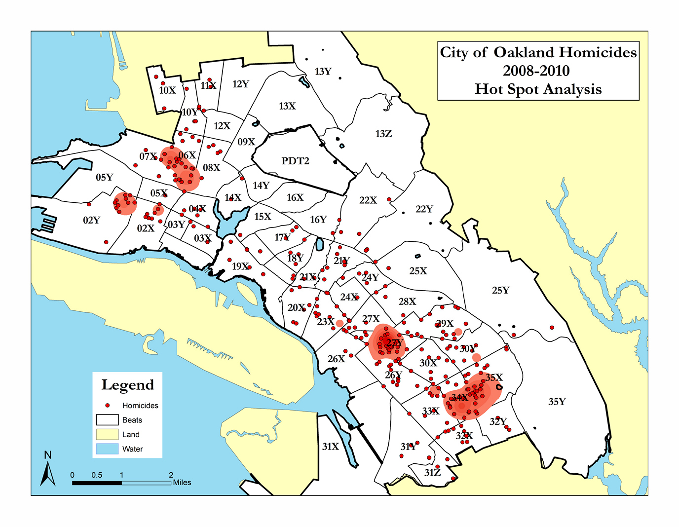
In the overlays that distinguished the neighborhoods in this post’s header, color-coding distinguish districts by which candidates received the greatest share of first-place votes: the fractured mosaic reflects the city’s current economic divisions as if they are tacitly concealed in the legend that accompanies it, in ways that raise pressing questions of the winner’s ability to truly speak for Oakland, when the districts seem divided around the I-880/I-580 corridor. Despite Schaaf’s clear ability to win many votes outside the hills areas, and around Lake Merritt, this post suggests that these may show the topography of urban wealth to which her candidacy appealed.
This magnified map of voters’ first choices in Oakland’s recent election was effectively shaped into a majority vote for Libby Schaaf after six repeated rounds of re-assigning second- and third-choice votes and eliminating candidates. Despite the considerable (if unwarranted) fears RCV would delay its final outcome, as it had in previous years, one winner was winnowed from fifteen candidates, as over six rounds, Schaaf acquired a clear plurality of the popular vote and appeared a veritable landslide whose pea-green flood appears to flow from the hills across neighborhoods without ambiguity: this, it says, is Oakland today. As viewers habituated to similar infographics that present conclusive images of the status quo as if had transparency, and had no history, it might make sense to consider how RCV encouraged considerable fragmentation of voting in the city, and to note the different perceptions of the city’s needs expressed in the division of the electorate between larger and often less-densely inhabited districts in hills and more compressed districts in urban flats.
Although the below map of first-choice votes in the race conceals the quite considerable courting of different populations and vigorous contestation of the vote’s outcome–Rebecca Kaplan, who made a strong showing in 2010 mayoral race, was for a time favored over Mayor Jean Quan; strong polling was common for other candidates–an intense competition for voters concealed in the final tally. Of course, in opening the field to so many candidates, the practice of RCV presumed the ability of the voters to distinguish the varied platforms of each candidates–something that was increasingly blurred in the increasing emphasis many paid to crime that won votes of more monied voters, and the upbeat narrative she provided of an Oakland that was doing well–and one whose residents deserved better law-enforcement.
The compelling division between sectors of the city grew in how to confront the question of urban crime, and its high robbery rate–judged by the FBI to be the highest in the country. For as crime has grown, the police force has shed some 20% of its staff since 2010, the date of the last mayoral race, in ways that have led police to bemoan a failure to respond to high crime rates by adding more patrols. Although Quan has instituted community patrols, the recent rise of private security firms in Oakland has led to a growing distrust of the status quo or office of the mayor to protect many urban neighborhoods–and created a deep quandary over what sort of expenditures will best serve the city’s residents.
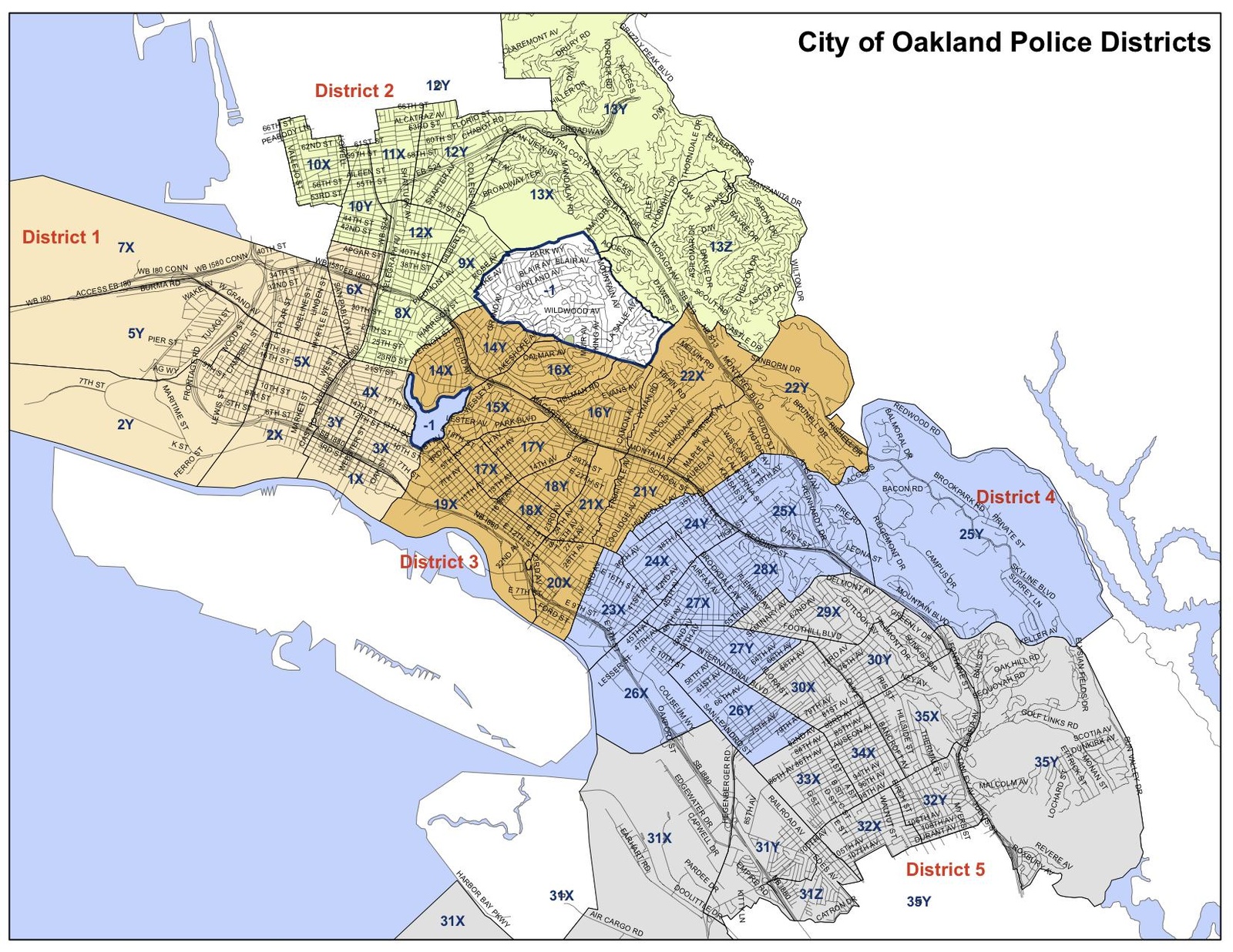
5. A narrative of failure of local leadership has elided the decline in crime that occurred during Jean Quan’s tenure, and the benefits brought from the rise of the effectiveness of the neighborhood community policing in Oakland that Quan had long championed–and the aligning of districts to encourage community policing. While both changes contributed to a significant drop in homicides and robberies, as well as residential burglaries across some fifty-three Neighborhood Councils within police beats already, the increased density of Neighborhood Policing Beats and focussed nature of Neighborhood Crime Prevention Councils in Districts 3 and 5, in East Oakland did not address all residents. Indeed, the areas that felt they needed more policing prioritized a narrative on public safety–and where the narrative of cementing the Oakland Police Department with neighborhood committees actually appeared to have been less effective.
The notion of a need for containing “crime”–and the linkage between “public safety” questions defined by widespread criminality–“economic” and “property crimes” rather than homicide–and seen as a basis for economic growth”–forged a specific argument that is directed to a demographic which could be expected to be reliably turnout in the election. Despite the difficulty of one candidate attracting a clear overall majority, the data visualization barely conceals the divides across the city, and conceals the huge divides in voter turnout across districts in 2010 helps reveal deep fault-lines between individual districts. Such a divided voting populace clearly favors the candidates who raise issues that resonate with the divided darkly-colored demographic of the city–and don’t even need to compete for over half the city–or two-thirds the physical plant–from West Oakland, East Oakland, or the area near the Port, whose turnout was already known to be less than half in 2010. With turnout declining city-wide by 2014, does the Registrar’s map reveal a coalition of propertied voters who have come to speak for Oakland as a whole in an increasingly fragmented city, where the interests of mayoral candidates address “property crimes” that almost seem code for urban fears, removed from the models of community policing Quan helped introduce.
 Courtesy Ofurhe Igbinedion
Such significant if predictable disparities most probably grew by 2014, and were known to all candidates.
Despite the validity with which the above map illustrates the predominance Schaaf’s choice in first-place across much of the city, it also reveals clear divides. In an era when the infographic seems a sort of speech act, having an enunciatory value bordering more on the declarative, than inviting analysis, the map demands to be unpacked for what it tells us about Oakland, however, rather than the degree it depicts a consensus that invests a mantle of authority on Schaaf as mayor. For the map begs questions of what sort of consensus was created around the Oakland mayor–and with what authority was Schaaf effectively anointed representative of the entire city is a crucial question worthy of consideration, especially in relation to the practice of Ranked Choice Voting.
6. In a city as ethnically and economically divided as is historically the case in Oakland, the dynamics of Ranked Choice Voting create complicated questions of political representation and the best means of investing local residents in elections, of far more interest than mechanics of tabulating votes which have received so much attention in Oakland’s most recent mayoral elections. Such questions might be best considered in the analysis of what sort of coalition was created in Oakland’s Ranked Choice Voting system. Does the map that shows the pea-green flood of first-choice votes for Mayor-Elect flowing down from the hills to meet a mosaic of districts show a city divided or reveal consensus for the entire city, or in fact echo the deep historical divisions within the city? It threatens to resuscitate some of the city’s darker specters and deepest divides, as the segregation long supported and effectively encoded by the “racist housing policy” of the Home Owners’ Loan Corporation, long accepted across America as a tacit form of racially-based housing discrimination in housing that classified neighborhoods as worth real estate investment or not.
Although the pea-green hue that designates the block of districts who selected Schaaf as their first choice resonates with the leafy green of the many trees that still line Oakland’s streets, how closely does the map map onto the the socioeconomic boundaries of a newly divided city? In a city that is still scarred by the mortgage market dictated in the still-notorious HOLC real estate maps which date from the Depression, but shaped American cities like Oakland until the 1960s, the valleys of economic growth that long characterized Oakland continued to inform the way that echoed how the electorate divided across the city’s property lines–if only in how they note the “best” areas for investment in light green, a hue that is quite eerily analogous to the Registrar’s coloring of the districts who listed Schaaf as their first choice for mayor:
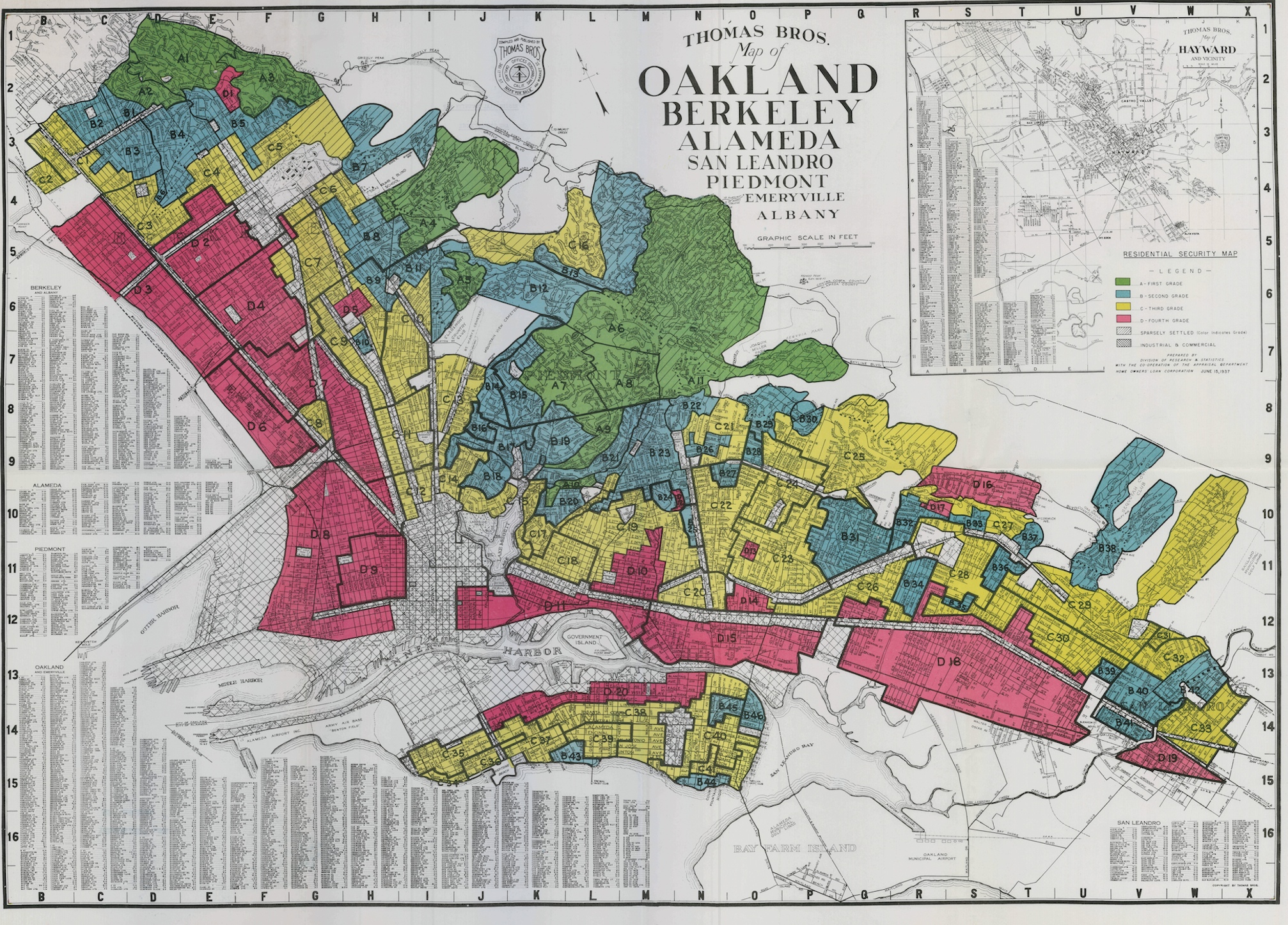
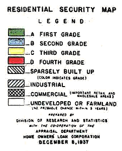
The clear family resemblance of the color-scheme of this “Residential Security Map” transmitted from the days of the HOLC’s authoritative voice suggests that RCV may not create the most open new space to define an open political space in Oakland’s future–and indeed the recuperation of a somewhat analogous five-color scheme of coloration in the Registrar’s map, albeit with the expansion of the hills area of “First Grade” residences, seems to augur a new civic divide. This return of the long-repressed seems hardly a coincidence, but indeed suggests the scary persistence of a policy of segregation underlying current Oakland politics, from which debates over the need for political “leadership” distract. The constraints that such HOLC ranking of regions introduced in the local housing market provide a scary point of entrance into the distribution of different mayoral candidates across city neighborhoods: for their distribution reveals the deep division between “left” and “moderate” in Oakland’s election, already familiar from the 2010 race between the moderate pro-police Don Perata in the hills, and his distancing from the more left-wing candidates who won other areas of the city. Oakland’s real estate market is, to be sure, not similarly divided today, but the curious comparison of these visualizations of the divisions of the city’s populations provide something of a starting point to analyze the divisions of corridors and regions within how Oakland broke for different mayoral candidates in 2014. Jean Quan quite awkwardly strove throughout her term to distance herself from her community-organizer origins, and embrace more moderate creds, but her failure to unite the left in ways led to the fracturing of a large body of votes between herself, Rebecca Kaplan, CIty Auditor Courtney Ruby, and ex-Quan appointees labor lawyer Dan Seigel and former Port Commissioner Brian Parker. The odd resurgence of the sectorization of Oakland by antiquated real estate “codes” exposes the underside of its economic growth.
The practice of federally mandated redlining created strong obstacles across neighborhoods to being serviced by insurers or equity loans that prevented many of the same urban areas from developing, effectively skewing the mortgage market against neighborhoods in ways that were engraved into the city’s physical plant. The divisions that the color-coded map of the Home Owners’ Loan Corporation pictured above caused a deep disinvestment in areas judged to be “hazardous”–“D,” shaded in red–or “declining”–“C,” shaded in yellow– obstructed loans or insurance to poorer areas that effectively discriminated on racial lines, and prompting a suburban outmigration at the expense of Oakland’s poorer urban areas. While these sectors were not exactly the same as the economic fault-lines that structured the 2014 mayoral vote, but they clearly chromatically echoed its essential contours, and in an almost eery manner resonate with the demographic alliances that determined the election’s results. One wouldn’t want to suggest reading the distribution of first-place choices for mayor in the 2014 election against a redlining map of the 1930s, but that map set a basis for home-ownership and settlement of the city which left a strong imprint on its socioeconomic fracturing, even before freeways were built through its heart.
That boundary lines of that big green doughnut of first-place votes that is situated in the hills in the screenshot of the map of the Registrar of Voters, and balanced around Piemont, gives special insight to a city demanding to be explored by open data available on the city’s population . . .
7. This post seeks to examine the distribution of votes in specific neighborhoods. For while the sectors of redlining were not exactly the same as the economic fault-lines that structured the 2014 mayoral vote, the divide among current Oakland voters clearly chromatically echoed the Home Owners’ Lending Corporation’s essential contours, and almost resonate with the demographic alliances that determined the election’s results. This post suggests the benefits of an exercise in “distant reading” to unpack divides among first-place votes for Oakland’s mayor, less in terms of the following the contours of proportional voting than to distinguish the varied interests that might have motivated–or be accentuated by–the expansion of an electoral field to multiple candidates. The comparison of the map of the Registrar might read against a range of maps of the city’s demographic divisions to better a contextualize the visualization of first-place choices in relation to the issues that drove the recent election, and the different degrees of involvement of such a radically diminished electorate.
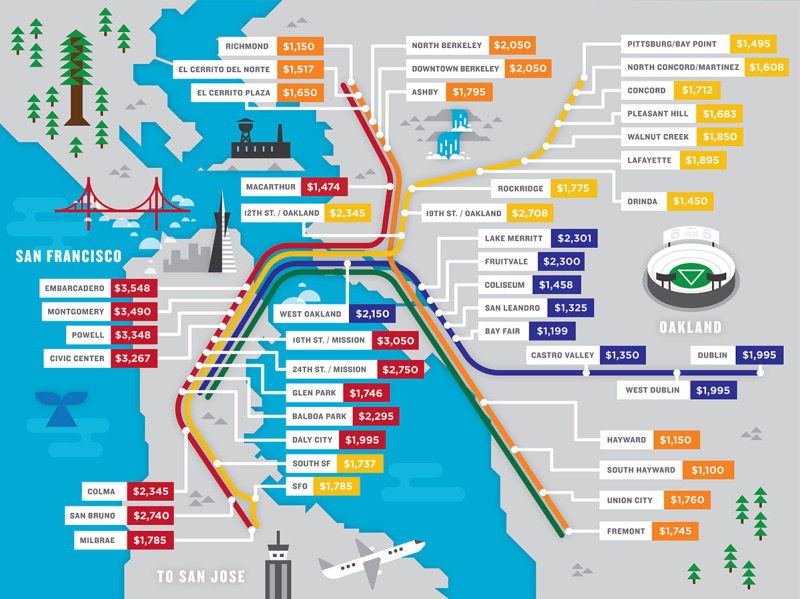
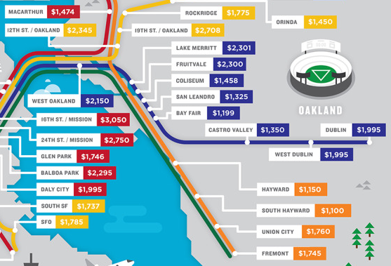
To start to unpack this division of electoral preferences, some substantial GIS-spadework might allow one to read the vote against the city’s shifting demographic. For the electoral splintering can be read in relation to the shifting terrain of property valuation that has recently transformed the East Bay. A recent map–of somewhat questionable accuracy, which RadPad engagingly imagined by mapping costs of renting one-bedroom apartments after a BART map to suggest that migration from San Francisco rentals (where $1 million now gets a home-buyers just over 1500 square feet) drove up demand for East Bay rentals in ways that pushed monthly costs of one-bedroom units beyond what many residents could afford. It’s unclear what sort of data the map uses, but its hope is to take the very icon of interconnectivity across the Bay Area that BART creates to reveal the intensifying the relative sectorization of an already economically fractured city. The new market for living East Bay, shown as surprisingly more expensive than one might have imagined, prominently placed significantly high rents around Oakland’s “downtown”–19th and 12th Street–as well as in Lake Merritt and Fruitvale.
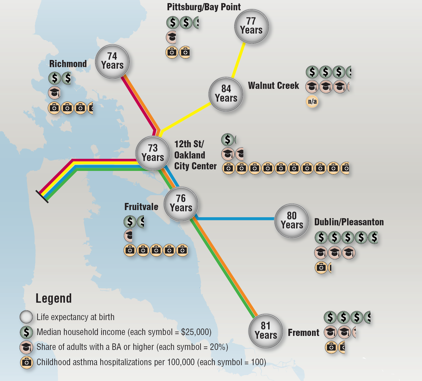
The emergence of strikingly similar divides across the city that the BART system links is foregrounded in a map showing the steep gaps between life expectancy in areas on the same public transit lines–from a slightly earlier period–so clearly linked to the huger divides in average income at different stops in the East Bay, and the huge increase in rates of asthma in Oakland’s City Center and Fruitvale, in contrast to the outlying areas outside of the urban pollution, and the far lower educational levels of what “Oakland” consists.
Such a demographic spread suggests the steep challenges of creating a representational unity across the city, although it only starts to reveal the fracture lines of economic wealth and urban affluence that have emerged within the economic growth of Oakland in recent years, but were reflected within the shifting constituencies that existed for different mayoral candidates in 2014.
While not offering the best screen or field conducive to electoral analysis of the vote distribution, given its lack of continuity or coverage, the pointed map that pushed rents for a one-bedroom that of $1,100 or $1,200 to the far corners of Hayward or Richmond, our outside Oakland itself. While not necessarily accurate, and omitting parts of the city, the map suggests a relatively rapid redefining of the profile of the East Bay. For a huge range of Oakland where the BART offers an increasingly crowded morning commute, renting one-bedroom has increased to over $2,000/month, only declining below $1,400/month outside of the Oakland that exists on major traffic arteries, with quite a considerable depression along the same transit line that stops at the Coliseum, Bay Fair, or Hayward, and a notable peak in downtown Oakland and Lake Merritt–and few one-bedrooms in Rockridge are available for as low as $1,775/month, or the availability of rentals Fruitvale at the same rate as Lake Merritt.
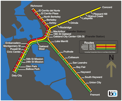
Yet indeed the BART map in any of its iterations offers little basis to map or represent “Oakland,” both because of its clearly non-representational nature, and in the clear original intent to bridge the Bay Area, and amalgamate its space, irrespective of water and land divides–a point that was most strongly made in its original version of 1972, or in the more expansive map that blurs Oakland into a web of regional transit.
8. For a snapshot of the city’s economic divides–divides extending to the completion of High School or life-expectancy, one can more easily map a microcosm of the “wealth-gap” Thomas Picketty has described. A similar map of variations in home-prices reveals the steep challenge of creating consensus across the same city in even greater detail and relief. More accurate and more illuminating is the most recent landscape of the listing house prices Trulia generated for Oakland as a heat map in Google Maps, which reveals far deeper rifts between desirable neighborhoods and valleys of undesirability that makes the divided terrain all the more legible than the cute distribution of rentals along BART commute rail. It offers a more effective vehicle to understand the topography of voting, and indeed contrasts with the image of high-priced rentals in Oakland, by illustrating the deep drops in realty prices across a large swath of the city:
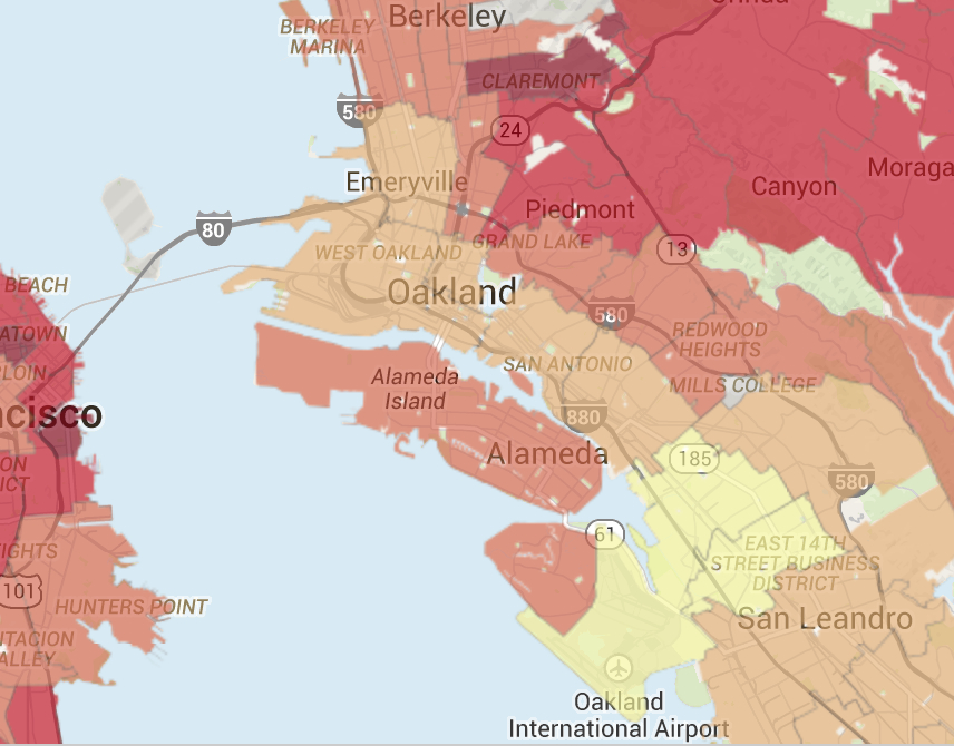
As does a heat map of houses’ valuation raises similar questions of common grounds, and of the geographic limits of Oakland’s economic revival, which provides a worthy preface to re-examine the stark differences that regions of Oakland selected their first-choice in mayoral candidates:
The electoral map of mayoral choice must be viewed through the lens of these landscapes, and of framing consensus across a shifting economic terrain, where propertied interests are increasingly primarily opposed to and fearful of a growth in property crime. By excavating the electoral map through a public data, the results of the election might be better analyzed in relation to the changing composition of Oakland’s neighborhoods–even independently from the multiple reasons for the strikingly low turnout in the city–with only some 55.7% of eligible voters registered in October 2014 and voting some 14% lower than 2010. Of the 47.4% voting turnout the election inspired, in a system of Ranked Choice Voting, where votes for some candidates are eliminated, fewer than 35% of actual voters decided the election’s results. The map in the header suggests where they lived.
Rather than accept the short-term record of the divisions of electoral preferences, this post tries to mine the Registrar’s data visualization and create a set of maps that offer a deeper context for the election as a whole than the layering of electoral choice show. The point is not to naturalize the divides in Oakland, indeed, but to see how they can be worked with and overcome. And the goal is not to unpack economic bases on which vote divided, or suggest the increasing economical inequalities across the city, but entertain questions of how Ranked Voting, in a strikingly low turnout, helped candidates manufacture consensus around what almost seem non-issues, by increasing the increasing strident and oppositional development of political debate during this year’s mayoral election and by encouraging competition for votes speaking for only a part of the city, in ways that might deepen effective disenfranchisement across the city.
9. The practice of ranking candidates sought to keep consensus among voters–in a city which long lacked a serious Republican candidate, the idea of choosing three alternatives appealed. But in manufacturing consensus by an effective collapsing of the urban electorate, RCV created a narrowing of political debate, by minimizing the impact of those who don’t decide to select a full panel of three candidates or erroneously select the same candidate for three posts or listing only one choice in the erroneous belief they would benefit the candidate, although the reverse is the case.
Far more crucially, the victor of Ranked Choice Voting raises questions of the legitimacy with which the entire city feels their presence reflected in the mayoralty in a race that was as narrowly contested as that between Schaaf, Kaplan, Quan, Siegel, Tuman and Parker–who indeed often had trouble distinguishing their own voices for voters. The conferral of victory by reapportioning votes belies the fact that they are often only supported by a plurality in a crowded field such–as that of the choice of fifteen candidates for mayor in Oakland CA, where the newly adopted system of RCV also makes it virtually impossible to win a majority mandate–or to organize their campaign in ways that curry specific constituencies. In an age of increasingly low turnout, moreover, the costs of RCV in creating an imagined consensus among many candidates may outweigh the benefits of giving a voice to all: for unless more voting can be encouraged across the city, is the ranking of individual choices really a means of enfranchising the city as a whole? Although the opponents of RCV often point out that its main danger is to dilute the effects of a party’s endorsement, the intervention of the California Governor and one Senator tilted the balance in Oakland voting, even late in arrival, to Schaaf.
Unforeseen costs of RCV may lie in the low turnout that it can unintentionally provoke, as candidates curry actively voting sectors of the population, instead of confronting the issues that confront the city as a whole. If the election was celebrated as lacking without ambiguity, based on the “genuine connection” with Oaklanders, the rapid tabulation of votes reveals that her victory of the popular vote, although both evident and created without ties to unions that have so heavily influenced local Oakland politics in the past, despite the great success she had in transcending easy type-casting as “from the hills,” and, not contented to rest on her base of support, reach out–leaving her as the favored second- and third- choice alternative for many, mostly who were well-off but tired of a perceived lack of leadership. Schaaf’s deep victory was in many ways a victory for the status quo that benefitted in her ability to move “beyond the hills” as a result of RCV.
The fractured terrain in the mapped electoral results of what candidates districts selected as their first choice raise questions about the possibility of asserting the symbolic authority of majority–and demanded six rounds to be decisively resolved. Despite aiming to increase all votes’ significance, there are some indications RCV did not encourage learning about choices, but may have helped instituted an uneven distribution of how voters selected three choices–and an attempt to appeal to specific and indeed increasingly distinct demographic constituencies, and out of desire to form a plurality of votes. Whether or not all voters indeed complete three choices, there is the danger that some votes counted more than others as rounds of the tally eliminated candidates, and that the list encouraged a fragmenting into camps of consensus–and that the victor is invested with a symbolic legitimacy that does not in fact reflect the true magnitude of their support–and create the inevitability of a non-majority victor, whose legitimacy is in a sense, as it was recognized since the system devised in 1871 by an architect in Massachusetts, William Robert Ware, and it was adopted in Australia since 1918: the system has only been adopted in local elections, there is support to use it to “break the two-party [system’s apparent] deadlock” on voter-choice in America, and respond to an increasingly partisan polarization of politics in Washington. How its results might be mapped–and what sort of coalitions or political practices it might encourage–demand attention and consideration.
The uneven adoption of selecting three ranked choices by “instant runoff voting” may, for one, privilege the voice of certain voters who select three choices in a crowded field. in the eventuality that not all exercise the option to select three choices, as requested in the ballot, RCV “counts” votes in potentially disproportionate ways. And in the case of close competition between multiple candidates–as the fifteen candidates who announced in the recent race, of which at least up to five were considered polled credibly–the collapsing of the electorate around a set of candidates could manufacture an effective landslide majority victory of the sort that instant runoff voting is able to stage. There was shock, to be sure, at the election of Jean Quan in a startling upset victory over favored insider Don Perata, when his apparent lead of almost 10% among first choice votes evaporated after the tabulation of second- and third-choice votes in later days directed the vote to candidate Quan–in ways that may have brought an ebb in its adoption after some seventeen Californian municipalities embraced it after 2000. But the sort of manufactured victory by which Libby Schaaf arrived at a “landslide” victory of 63% created a sense of consensus as other candidates dropped out of the pool in successive rounds, and their votes were redirected to second choices. Schaaf attracted as many first-choice votes as her closest competitors, Quan and Rebecca Kaplan, combined. The mapping the distribution of votes Schaaf gained reveal what Alameda County Registrar of Voters Tom Dupuis rightly called a “treasure trove for anyone interested in examining the nuances of the election outcome or Oakland’s current political landscape.” Yet rather than reveal a stable landscape, the overlays of dominant voting preferences suggest a surface whose content needs to be excavated to reveal its deep divisions.
For rather than picturing a coherent landscape, the conceit of transparency Dupuis adopted belies how the distribution of votes mirrors the city’s fractured social divides, and the economic fault-lines and lack of a single political vision. If the notion of a landscape itself expands the metaphorical definition of the map, the conceit of how votes map Oakland’s political landscape acknowledges that districts’ different first-choice candidates mirrors the city’s clear socioeconomic topography. Laying electoral returns over neighborhoods masks the persistent uneven levels of income, educational completion, or ethnic composition in the city, but translates its inhabitants to a register of political allegiance among the fifteen candidates in ways that suggest the distinct demographics each courted–and the fault-lines that the results of the election were intended to mask. The social landscape of the last election is striking–Schaaf clearly captured the well-off hills, whose properties have considerably higher values, and the other candidates crisply divided the social mosaic across Oakland’s other neighborhoods. Although RCV was not statistically central in shifting the proportional division of first-choice votes in this election, the expansion of the field of candidates RCV both encouraged and enabled each candidate to identify with a demographic or interested community that echoed and opened the fault-lines of interestedness across the city.
The quite fractured “landscape” revealed in the electoral map of Ranked Choice Coting conceals the underlying narratives that shaped the election–and the alliances and allegiances that developed during the campaign around the fears of public safety, as much as issues of Oakland’s economy, jobs, or public sector. Such narratives were not about RCV, but seem unleashed by ranked voting: the color-coded Registrar’s map reveal salient splits of allegiances near the port of Oakland that do map onto the city’s social landscape: the more irregular boundaries of districts for Schaaf, hued pea-green, contrast to the rectilinear bounds of the city blocks in East Oakland, reflecting property values which voting works to resolve. The resolution of a majority in RCV is difficult because of the ability it opens for candidates to address a distinct demographic, and reap benefits from a self-selected regional consensus, and not the consensus of the city at large, so that the candidates’ policies oddly refracted the city’s needs. Indeed areas of the city more removed from BART lines that promise to cut commute times to San Francisco, the results of the voting remained in stark contrast to the plurality who voted for School. (They were also no doubt plagued by lower turnout.)
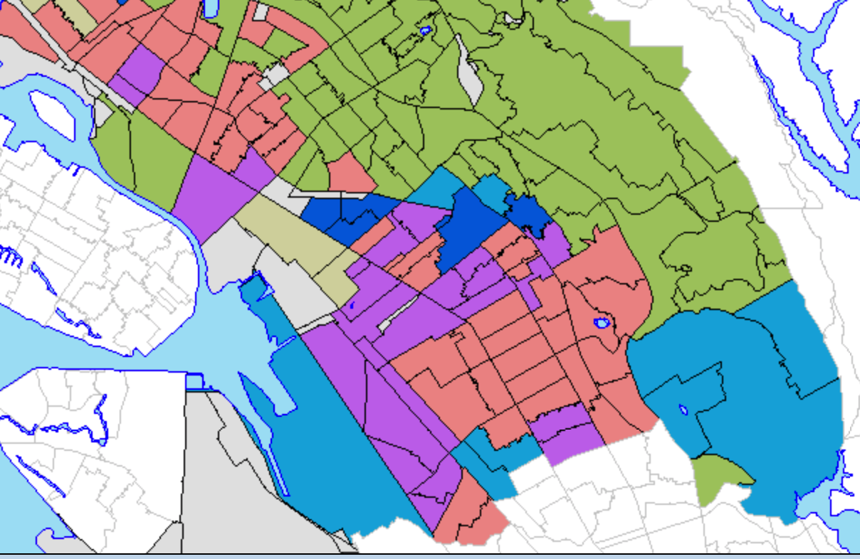 East Oakland electoral districts, color-coded to reveal first-choice votes
One of the hidden narrative that the visualization of first-votes in Oakland’s districts effectively masks is the question of prioritizing public safety by expanding policing that a distinct demographic demands.
Considering the massive media blitz on the sometime scandal of the triumphal victory of outgoing mayor Jean Quan–defying electoral predictions and received wisdom, considerably less attention has been paid to how RCV affected the recent election of Libby Schaaf. Attempts to map the distribution of Schaaf’s recent victory over a crowded field may reveals the complexity of its claims for equal political representation, and the effectiveness of a narrative of increased policing–and mayor Quan’s relations with the police–that became so central in mayoral debates. Schaaf’s selection raises questions of how ranked voting translates into a system of political representation and the political liabilities of ranked ballots as a political institution. In ways that suggest a sophisticated marketing to a select demographic, Schaaf’s team successfully cultivated an interesting demographic constellation of hipster and suburban voters based on a Brown-like campaign that particularly appealed to this group for updating the image of Oakland as city–as much as addressing its social problems. Even as newspaper articles poked some fun at the institution in blaring “not even ranked voting could save [mayor] Jean Quan this time round” against Schaaf and several old competitors from 2010 who competed for left or moderate votes, Schaaf’s victory revealed a surprisingly distinct geographical grouping of votes. Schaaf attained a majority of votes after redistributing the votes of supporters of “lower-ranked candidates” receiving a smaller share of first-place votes–and rapid tallying an impressive 63% of the vote and the immediate impression of a groundswell of support for a candidate who was in fact only the first choice of less than a third of voters.
10. The map of voters who split for Schaaf in their first ballots is moreover troubling in suggesting how strongly her support was based in the more economically well-off areas where she gained a clear majority of votes that weren’t splintered in effective suburbs of the city–rather than the poorer “downtown” areas and the flats, and the increasingly vibrant areas of Grand Lake, North Oakland, and Lake Merritt, as well as the suburban Trestle Glen, Glen View and Montclair: the coalition is a non-majority grouping which built a huge amount of momentum in the election’s final two months. It’s creation is striking not because of how it mirrors a wealth divide–though it largely does–but because of how clearly it seems to have grown in reaction to perceived needs to contain personal and especially property crimes, and reject apparent insufficiencies of the current mayor’s crime policies–as much as a vision of governance.
Even as the electoral map showing Schaaf’s victory is abstracted form the city’s complex social topography, the windy lines of the electoral districts Schaaf carried as primary choice indicates their far greater property value. But the point of this post is to suggest that the issues that came to the fore in this campaign–issues of containing crime and increasing policing, rather than less attractive ones of urban blight or a crisis in public education, youth truancy, and social welfare–drew together an increasingly economically prosperous electorate who felt threatened by the criminality in the city, and on the edges of the demographic of the flats.
11. The choice of color by which to color districts with a majority of first-place votes for Schaaf clearly echoes the green of the City of Oakland’s new inclusive oak-tree emblem, if not the leafy region of the hills–but will it invest Schaaf with authority as the selection of the entire city?

While Ranked Choice Voting gave broader participation to voters and allowed a range of candidate would would not “draw votes” from each other, there was some anger at the 2010 victory of Jean Quan. The recent expansion of candidates complicated questions of arriving at an accurate outcome, or a conclusion able to accommodate the diverse interests of communities across the city. For one, the result depends on understanding and selection of alternate choices: for at crowded field that divides without a clear majority winner gives strikingly significant roles to second and third choices to create a final tally of votes that elected a mayor, and assumes that all voters are included in the subsequent rounds of dividing the vote.
Candidate Schaaf benefited from associating herself with the image of a young, hip Oakland, whose economic development is clear in a range of high-end restaurants, boutiques, galleries and hip locales. But actual enfranchisement was something at odds with the expanding role that policing played in the competing visions of the mayoral candidates, and the clear appeal that policing seemed to gain for voters. On the tail of the late-arriving but dramatically delayed joint endorsements from Governor Brown and Senator Barbara Boxer, sporting semiotically-charged and sophisticatedly hip wooden oak-tree earrings–that recuperated the stylized swirls of the curling branches of an oak tree adopted as an urban icon during Brown’s tenure, intended to improve the city’s image, and emblazoned on its street signs at considerable cost, to match Brown’s vision for renewing the city’s downtown: Schaaf promised an analogous message of growth with environmentalism, even if she fell short on policy plans.
Libby Schaaf/KQED
The wooden oak-tree earrings inconspicuously flaunting the icon, first introduced by Jerry Brown to update the city’s flag and suggest its vibrancy and inclusiveness, the tree became adopted as an emblem of the campaign. It almost presented a manicured vision of transcending the problems that faced Oakland and seems tailored to a precise demographic, even if its branches suggest an embrace of the city’s diversity. Schaaf’s candidacy, long rooted in the hills, compel one to map the coalition she assembled in the context of RCV; the layers of electoral voting the Registrar provided might be better read less by contextualizing the voting block she assembled–and the narrative of public safety that animated the last months of the campaign–in the range of open data maps to explore the actual diversity and divides in Oakland’s neighborhoods’ relation to property crime. But the mechanics of ‘Ranked Choice’ must be reviewed in relation to the recent mayoral contest to examine the narratives of political representation that unfolded in the election and framed the electoral divisions of the city, rather than letting the electoral map speak alone.
12. Yet the openings RCV allows in Oakland’s political debates and future should be the central topic of this post. The mapping of what districts preferred individual candidates in the recent mayoral election this November also suggests the prominence of clear coalitions created by such “instant run-off” voting to allow non-majority candidates to assemble a majority. The map can only be read with a review of how the practice of such “instant run-off” voting expanded the field of candidates so widely to dilute their effectiveness in assembling a consensus choice.
While the goal of Ranked Choice Voting was to increase each voter’s enfranchisement–especially in a situation where first choices may be filled without a second choice being made–the result is often to capitalize on the system: much as Kaplan and Quan had asked their supporters to use the ballot by listing each other as second choices, a dominant power structure to be able, in such a crowded field, to assemble sufficient votes in surprising ways, moderate candidates like Courtney Ruby, Bryan Parker, and Joe Tuman invited their supporters to rank one another, at the last minute, in an unsuccessful attempt to stave off Schaaf’s rise in the pools–she received more votes than they did combined. If the secondary choices can determine the election, however, RCV also presumes both that all voters will select three choices for mayor; if all do not make three choices, but leave the remainder of their ballot empty, their voices will count less than those enumerating three choices. For if Ranked Choice Voting was designed to eliminate the need for run-offs and their cost, Ranked Choice Voting has provided a mode of amassing consensus, it gave far greater say to those who complete their full three choices: as candidates with low percentages of votes were eliminated in successive rounds, and their constituents’ second and third choices are tabulated and reallocated, instant-runoff voting allowed Schaaf, whose plurality as first choice (29.43%) to gained the necessary majority (63%) as the field of fifteen candidates narrowed, and second- and third- choice votes entered her column.
This November’s mayoral race provided less of a surprise victor in a deeply contested field in previous years: RCV was not nearly as critical in this year’s mayoral race. But ranked choice voting provided a curious way of refracting how a plurality of the city’s population mirrored the city’s social divides. If voting is increasingly tied to different expectations of what Oakland’s communities could most hope from a mayor, in the low-turnout election statewide–46% statewide–attracting more anti-Quan votes than strong backers of candidates, anti-status quo candidates may have attracted voters to the polls in ways that propelled the late-rising candidacy of Libby Schaaf, a special assistant to Jerry Brown when he served as Oakland’s mayor. Belied by the apparent dominance Schaaf held across the hills, the election was in fact a roller coaster of a vote for several months: many early polls had favored City Council at-large member Rebecca Kaplan by over 50%, with a majority ready to not re-elect Mayor Jean Quan, but for the past two years, significantly over 50% of polled Oaklanders have named “crime” as the major issue the city faces–63% this year, down from 70% last year–with fewer folks citing the economy or education, though these factors seem closely linked.
As may become too common in future urban elections, fear of inadequately addressing public safety emerged as a showcased compelling issue in the recent election, increasingly overshadowing other issues from unemployment to eduction, and propelled by Quan’s cycling through four police chiefs and city administrators in four years, and the parallel grassroots growth of ‘Neighborhood Watch ‘ campaigns. As Trestle Glen resident Tuman showcase effective “crime-fighting” in a “five-point plan” for reducing crime and the causes of crime in Oakland, from placing more police on the streets, improving response times and developing crime-prevention strategies, Schaaf picked it up and ran with it by asking voters to “reject that crime is a tax you have to pay to live in Oakland,” in April. With crime, community-police relations, and hiring and training more police, Quan’s forced lay-offs of officers issues of that odd neologism public safety led candidates to promise rises in the police force–if Oakland’s police include some 665 officers, candidates have promised to increase the current 707 officers currently funded to 800 (Parker), 836 (Kaplan), or 900 (Tuman). Even before the recent decision not to indict Darren Wilson, the police officer who shot and killed the unarmed Michael Brown August 9, increasing Oakland’s police force would have been unpopular to those marching in solidarity with Ferguson in Oakland–as elsewhere in the nation–to demand an end to the increased militarization of local police whose targeting of specific groups was felt to endanger safe neighborhoods.
No one, surprisingly, asked if more police is actually what Oakland needs–and few pointed to the fact that the reduction of the police force by Mayor Quan actually mirrored a reduction of crime in the city, rather than creating conditions for its increase in a city that long resisted police presence. One might have had good reason to question whether the increase of policing equates to a growth in public safety. And in the face of recent conflicts with police from Ferguson to Staten Island, and from the protests at the police’s killing of Michael Brown (hands raised) to protests at the killing Eric Garner (“I can’t breathe“), the increase of police presence is by no means popular thing citywide. The historic downturn in crime in the first years of Quan’s tenure was however obscured as candidates piled on the mayor in blaming her for an inconsistent relation with building a trained body of police in Oakland since an April debate–and leading both Quan and Joe Tuman to enlist the none other than the once-not-popular former LAPD Chief and current NYPD Commissioner and national strongman William Bratton to burnish their images. Framing the election around policing re-dimensions the mayoral race by focussing the electorate on issues that appealed in selective to specific demographics, and perhaps relegated other, more immediately pressing issues–education; unemployment; the local economy–to the back burner, bestowing public prominence to policing in ways that cannot but alienate another demographic, and make them less likely to vote.
Candidates’ increasing appeal to the containing of crime spoke primarily to more affluent propertied Oaklanders, and may have alienated much of the electorate, as much as educating them to the city’s broader needs. One might indeed ask if a future scenario of police violence is only waiting to arrive in Oakland’s streets. In a city which spends some 40 percent of the general funds budget on police, the notion of expanding the police force means and policing equates to augmenting the already large share of funds on policing, raising questions of the future budget of the city that only recently emerged from the threat of receivership. The complex narrative of a reduction of policing at the same time as a rise, albeit followed by a recent reduction, in urban crime, and fears joint specters of receivership and compliance since the Occupy movement have detracted attention from a mandate on public safety. But even in the recent police responses to post-Ferguson protests, the sort of response that increased policing and confrontation with police would generate–tear gassing; containment by batons, rubber bullets or tasters and other practiced tactics of policing; almost inevitable racial profiling–whether a growth of policing is what Oakland needs to spend money on deserves to be debated. Before looking at some maps of crime in the city, let’s begin from the electoral map of first-ranked votes to suggest how the narrative of preserving public safety and containing crime appealed to specific demographics in Oakland, and how specific sources of fundraising supported this narrative of the need to restore public order and contain crime. Does the presence of more police, in short, which presage a force equipped with military arms that suggest far greater expansion of possibilities of confrontation with protestors or civil unrest actually bode well for the city?
 Emily Robinson
13. At the same time as each candidate drew on different levels of discontent with the status quo, candidate Schaaf most closely identified herself with the project of continuing Oakland’s recent economic growth–and gained significant support from monied interests in a field of fifteen. The image of growing Oakland distinguishing herself within the five front-runners, including outgoing Mayor Quan, at-large City Councilwoman Rebecca Kaplan, Port Commissioner Bryan Parker, or labor lawyer Dan Siegel–rather than a focus on crime. But although Schaaf’s victory cannot be attributed to Ranked Choice Voting in ways that brought the current mayor to office, she emerged as victor from a contest in a crowded field of those who sought to claim the left of folks more moderate than Mayor Quan, her tacit championing of a law-and-order narrative.
The consolidation of consensus indeed emerged with relatively rapidity over a short period of time around the mayor-elect, distinguishing the moderate Schaaf not only from a wide field but two former front-runners, Rebecca Kaplan and Jean Quan. Schaaf emerged to defeat a crowded field, including the city’s current mayor, although the first choice of less than 30% of the popular vote–by the final count, however, she had pulled ahead by over 60% in the policy of Ranked Choice Voting described above. And in a policy where voters who were more likely to chose a full range of candidates–there doesn’t seem data to see how many folks didn’t select the full list, or how many ballots were disqualified by selecting the same choice three times–this created something of an artificial mandate to be the mayor of the whole city, even if her support was clearly concentrated in demographically somewhat specific areas. And in a year when turnout was so low to barely approach 40%, it is hard to say that her candidacy ever reached the broadly based support that her ostensible majority victory portends.
The electorate was moreover informed by what issues attracted folks to the polls in a low turnout year. The paradox of how Ranked Choice relies on attracting more voters to the polls–and works best when voters take advantage of the ability to make all votes count–a very uneven turnout gives somewhat disproportionate voice to selective constituencies as well as to support second- or third-choices. And here is where the effects of Ranked Choice Voting may have been somewhat different from intended, and somewhat skewed the vote in the favor of those who would be more likely to select a full range of three choices, and to respond to a candidate who claimed to be able to reduce urban crime in ways that appealed to more suburban areas of the city.
Although ranked voting is intended to increase the and prevent competing candidates from extinguishing each other’s candidacy, and it has fulfilled both ends to a great extent: Schaaf clearly won the coalition of the Hills outside Piedmont, Crocker Highlands, and North Oakland, with most all of the Lake Merritt area. But she will soon find herself enmeshed in negotiations with the big unions in the city (including SEIU and police), the city’s notoriously fragile infrastructure of old roads, bridges, and highways, and school system, which may break the back of her trumpeted fiscal conservatism. Did the coalition that backed her so strongly–and allowed her to raise more money than any other candidate–create a powerful enough Montclair–Hills-North Oakland-Adams Pt.-Glenview alliance to address the city’s urban problems? In the face of low turnout throughout the city, the plurality that Schaaf assembled suggests a model for envisioning alliances outside of a political party.
It’s not the best omen that the city split in her election–with many greater-income, whiter neighborhoods going for Schaaf, who represents the wealthiest region of Oakland–but even a worse one that the divides represent a social split that is all too evident in Oakland’s communities. And while the map that reveals Schaaf’s strong victory suggests a continuity of green supporters that ran down from the Oakland hills, whose squiggly roads almost correspond to greater property values, the distrust that went for Schaaf tended to peter out when they encounter the straight-lined districts of the lower-income formerly working class urban areas, or so-called “flats,” where the demographic is distinctly different.
The far whiter and economically better-off neighborhoods that cluster around Piedmont and East of Lake Merritt, neighborhoods of relatively lower crime and less density, as well as lesser diversity, went collectively for who seemed the most familiar candidate, endorsed by Jerry Brown and Barbara Boxer. This is the same region, one might note, where CommunityCam allows us to chart one of the most sensitive indices for fear in an urban setting: how closely residents of the city monitor its public spaces or finds it necessary to survey itself: the 272 known surveillance cameras that are placed specifically in downtown Oakland and some 810 cameras city-wide reveal a map of monitory insecurity that is indeed amazingly dense for a relatively small area, where video monitoring is particularly diffuse. The placement of such video cameras in the neighborhoods form Lake Merritt to the estuary and Jack London Square, a downtown nestled by I-980 and I-880, registers a notably dense topography of suspicion and fear that gave great appeal to the promises of increased policing both Schaaf and Tuman offered, and provides interesting insight into the underside of Oakland’s plans to develop downtown area as a commercial center.
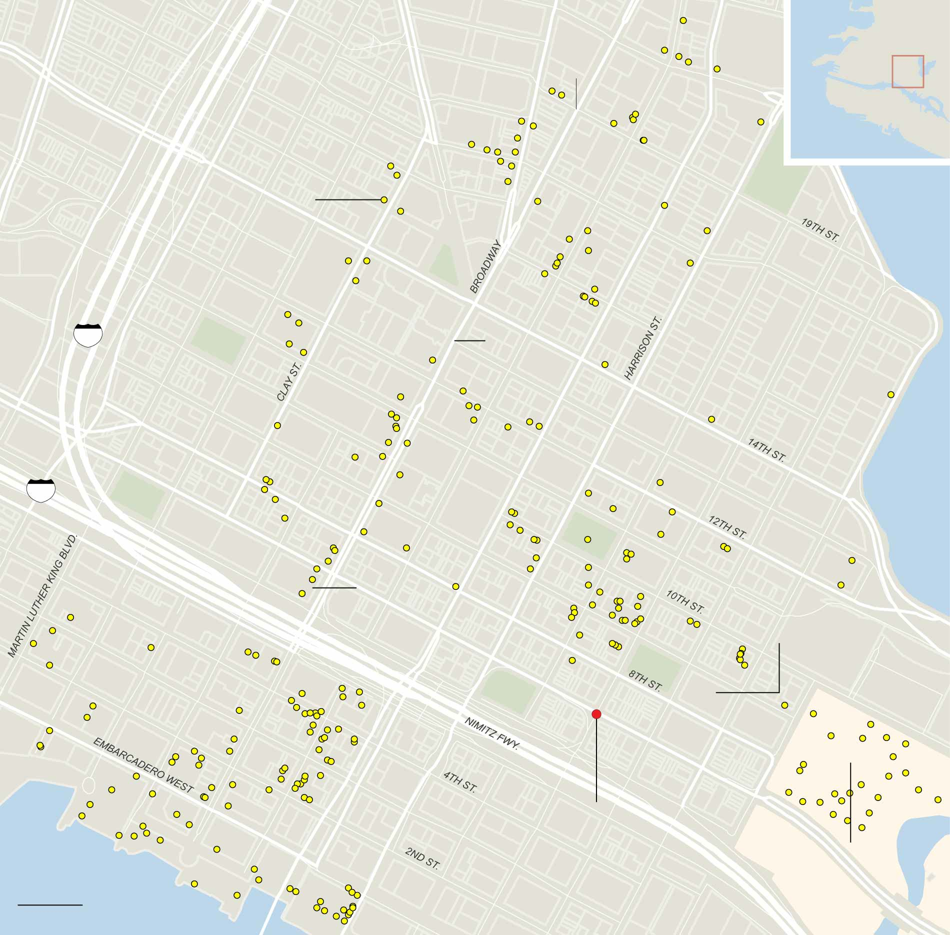
The benefit Schaaf drew from voters of other moderate candidates in growing the plurality of less than a third of voters who chose her as their first choice–29.35–to put her over the top arrived with in ways that gave an unsurprisingly rather homogeneous demographic. While amassing just under a third of the votes in a field of 15 is a considerable achievement, each of the five candidates among whom the field long seemed contested and surprisingly up for grabs in recent polls before Schaaf received the endorsement of former Oakland mayor and Oakland resident Jerry Brown’s early October.
14. This post began form examining the interactive datamap released by the Alameda County Registrar of Voters of which the distribution of first-place votes for candidates. Although it has been presented as revealing “complexity” in the election’s final victory, rather than there reflecting the “landslide” suggested by final tabulations, it shows the city split in perhaps predictable ways around who could best serve the public interest. Strikingly, districts that backed Schaaf for first choice are curiously contiguous and of higher property values; districts dominated by Quan’s supporters were contiguous with those won by Schaaf’s fellow council member Rebecca Kaplan, and raise-the-minimum-wage advocate Dan Siegel won districts that also gave large numbers of votes to Kaplan. Kaplan, Quan, Parker, and Siegel offered distinctly viable alternatives to Schaaf in the flats, it appears; Quan and Kaplan combined received more first place votes than Schaaf, and the voter turnout was often extremely low.
The narrow margins of victory in areas outside District 1 and District 4 also made those districts decisive, and suggests her victory needs to be seen as far less decisive. (During the 2012 mayoral election, riding on the get-out-the-vote drive of the Presidential election, Oakland voters turned out at 76.4%, and the high turn-out helped tap an electorate that put Quan over the top over the polls’ favorite, Don Perata–in ways that gave RCV a bad name, and led no jurisdictions to adopt it after Quan’s victory.) Yet the visual jiujitsu of the infographic created an impression a majority of electoral districts selected her as first choice, even among a wide field of candidates, privileging the pea-green expanse in the less densely populated hills.
Registrar of Voters/Alameda County
A close-up reveals Schaff’s “sea of pea green” stopping around the hills and City of Piedmont and those districts distinguished by equilateral bounds:
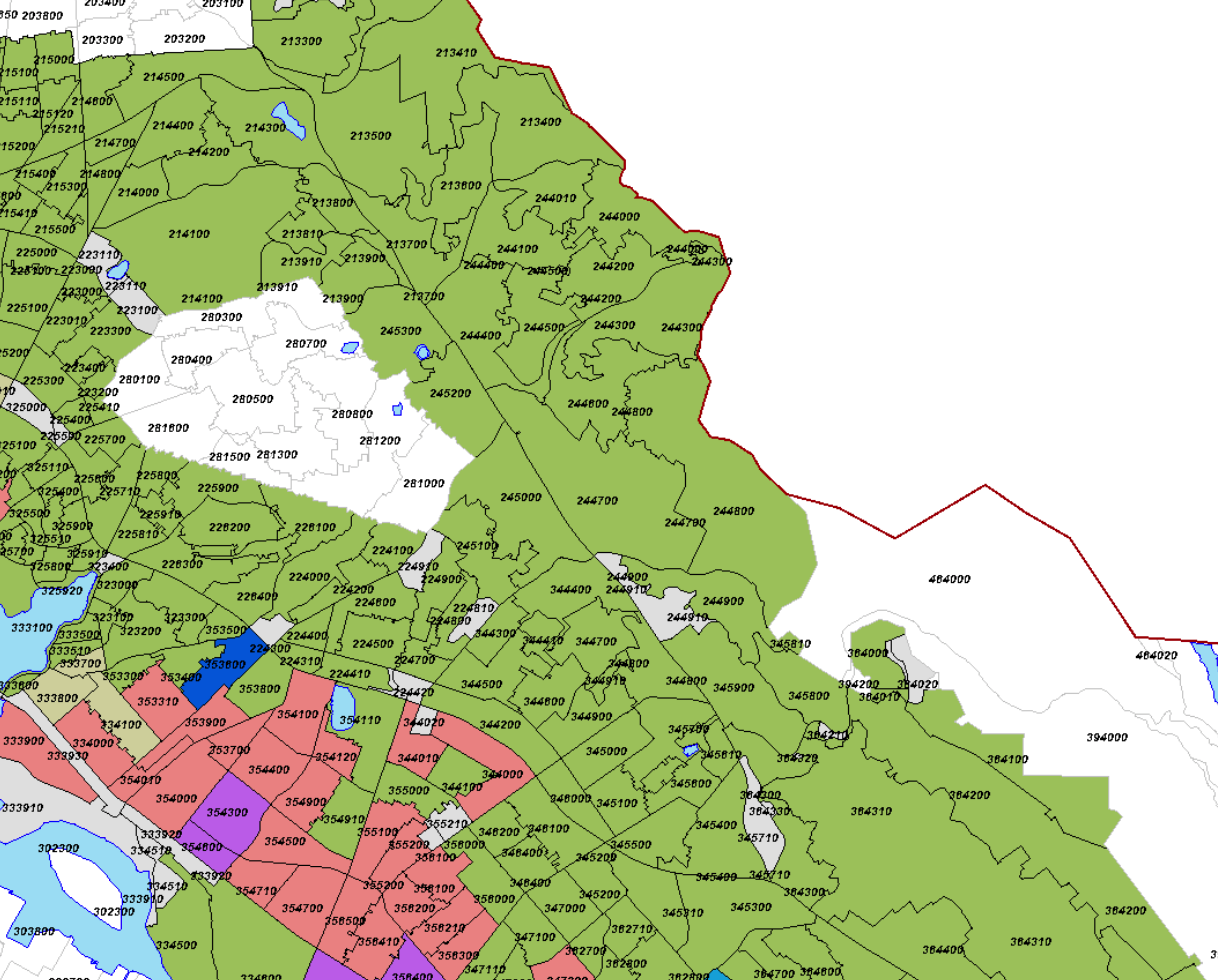
Is the economic transformation of the city the grounds on which Oakland has elected a white mayor? The area of the Oakland “hills” were those where Schaaf clearly won by her greatest margin, extending from North Oakland to San Leandro, where curving roads indicate elevations–including the wealthy Montclair–while her competitors were far closer in those areas associated with the “flats,” where Kaplan and Quan were closely behind in the tally–or in fact won the district. With far less than a third of the total votes so far–29.43%, a number not yet able to be officially verified–the segment of the city that she represented was quite socio-economically distinct, in ways that a simple map of winners of districts cannot depict, for all the interest. With four candidates receiving over 10,000 votes for first place in the second mayoral election organized by “Ranked Choice Voting,” in which voters select three ranked candidates, consensus is difficult to define as it often broke along electoral districts.
But the existence of clear corridor in the above map selecting Quan, Kaplan or Siegel as first-choice votes suggests an absence of strong connections to Schaaf in poorer areas of the city near the I-580/I-880 corridor.
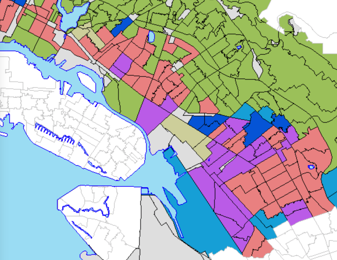
Is the failure of Schaaf to appeal to this swath of the city a bad omen for facing its unique problems, or sense of being left behind Oakland’s temporary economic recovery?
Further examination of the map would require excavating the layers of RCV and margins of Schaaf’s victories–higher in the hills; narrower in the flats–her dominance in two hills districts (District 1 and District 4) made her campaign quite hard for a crowded field of mayoral candidates to defeat. Endorsements from Brown and Boxer were perhaps less the point than the hope inspired by the message of renewal, and deep concerns for safety that she seemed to echo. For all the discussion of the “nuanced glimpse” that the electoral map provides into Schaaf’s victory, the divide it draws seems all to familiar–and the division between folks it excludes of the political process clear. A clear advantage that emerged for Schaaf within the process of ranked voting only as she picked up the votes of those who had supported economist Tuman, who had finished fourth in the initial ranked-choice tabulation, picking up over 4,000 votes which gave her the absolute advantage of 49.5% of the popular vote in the penultimate round of reticulations of the popular vote, leaving Kaplan with 26.69 percent and Quan with 23.76% of the votes, and neither with a real chance–unless no voters who listed them first had chosen Schaaf second. Yet if as much as 15% of the electorate selected only one candidate in the election–and less than half actually allocated all three votes in the election, the effective voting imbalance that RCV creates demands investigation–if only to map where those districts where ballots that did not enumerate three choices were cast.
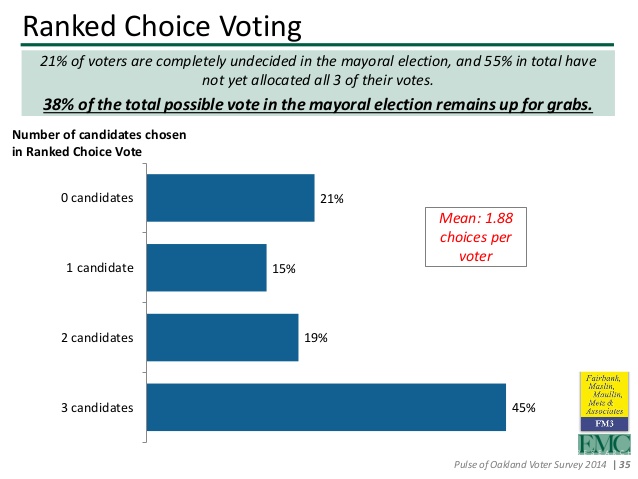
Tuman–the only candidate who did never held a political or governmental post, but the most vociferously in favor of increased policing, who went so far as to associate his plan with NYPD chief and LAPD vet William Bratton in his search for burnishing this image–had focussed on crime, economic growth, and parking enforcement, and had finished fourth in the mayoral race of 2010; a communications professor at San Francisco State and paid political commentator, he seems to have bolstered his own career, as much as being a credible candidate, and carried no districts. “Tuman’s vote” was undoubtedly a central means by which Schaaf obtained a decisive victory; his popularity was based in wealthier parts of the city, including Crocker Highlands, and a central platform was putting 300 more police on Oakland’s streets, and to boost the local economy by relaxing parking restrictions downtown. And when his own ballots were exhausted, a considerable number were transferred to Schaaf’s column, putting her far over the top–and creating the appearance of the elegant alchemical transformation of a “tight” race into a “landslide.”

15. The question of whether the recent success of much of Oakland’s economic transformation over the past two decades, which culminated in the he growth of the Quan years, has led to an atrophying and lack of engagement with the huge area of East Oakland, and what consequences that will bring for the city as a whole. The area we might do well to concentrate upon–the more dispossessed region of East Oakland, which gets less coverage and was less affected by Oakland’s recent economic growth or real estate boom, destined to be sandwiched between two interstate freeways that serve as obstacles to urban renewal, provides both the greatest statistical source of Oakland’s criminality as well as the site less well served and most in need of help–and seems to have tended to Kaplan and Quan.
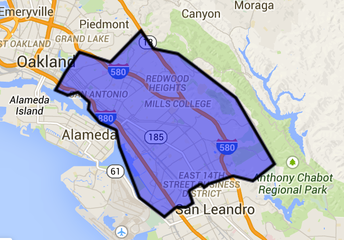
This is the region where the highest numbers of shootings have been concentrated:
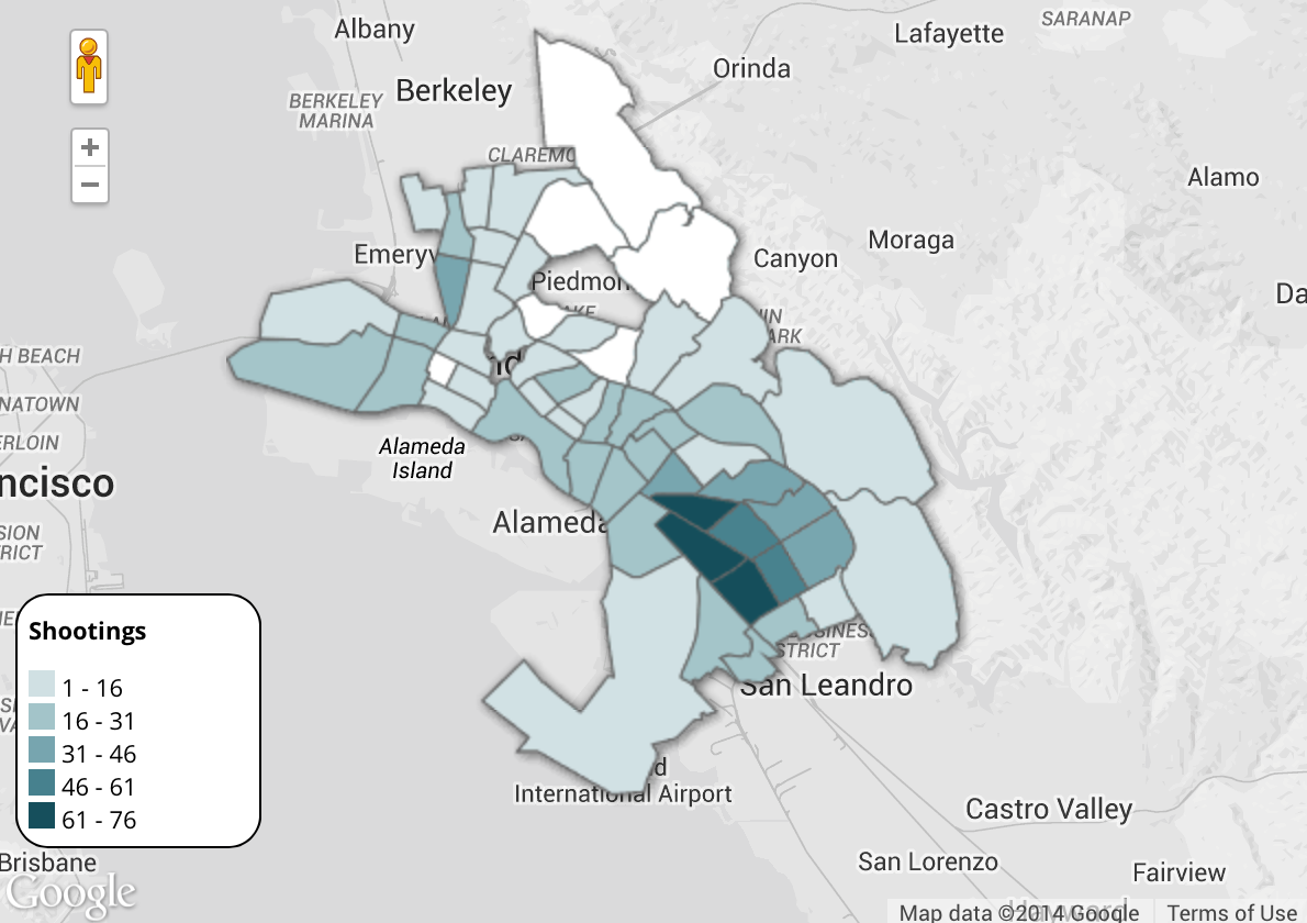
The victory by a candidate who was named first choice by less than a third of the electorate–as of now, 29.4%–suggests that she cannot be a choice of the entire city, but her constituents break on a clear divide. Libby Schaaf has been argued by some to represent the area of the hills, an accusation she has strongly and effectively resisted in a strong campaign. But the electoral map strikingly almost echoes a division between income, evident in how a mapping of what Oakland families lived below the poverty line in 2012, though the current distribution reaches from Adams Point to Lake Merritt, traces the boundary of thee light green districts which selected Schaaf as first-choice–and echoes Oakland’s racial divides:
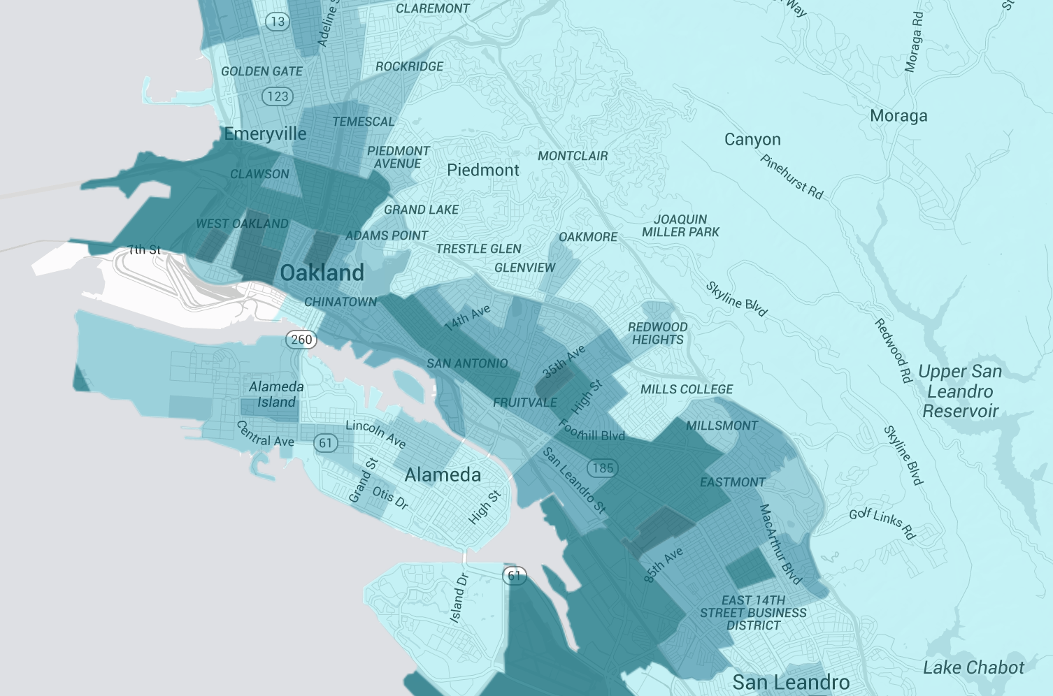

Put another way, the poorest areas of Oakland are crammed between its two largest interstate freeways that run across the city, and this area did not tend to select Schaaf as a primary choice:
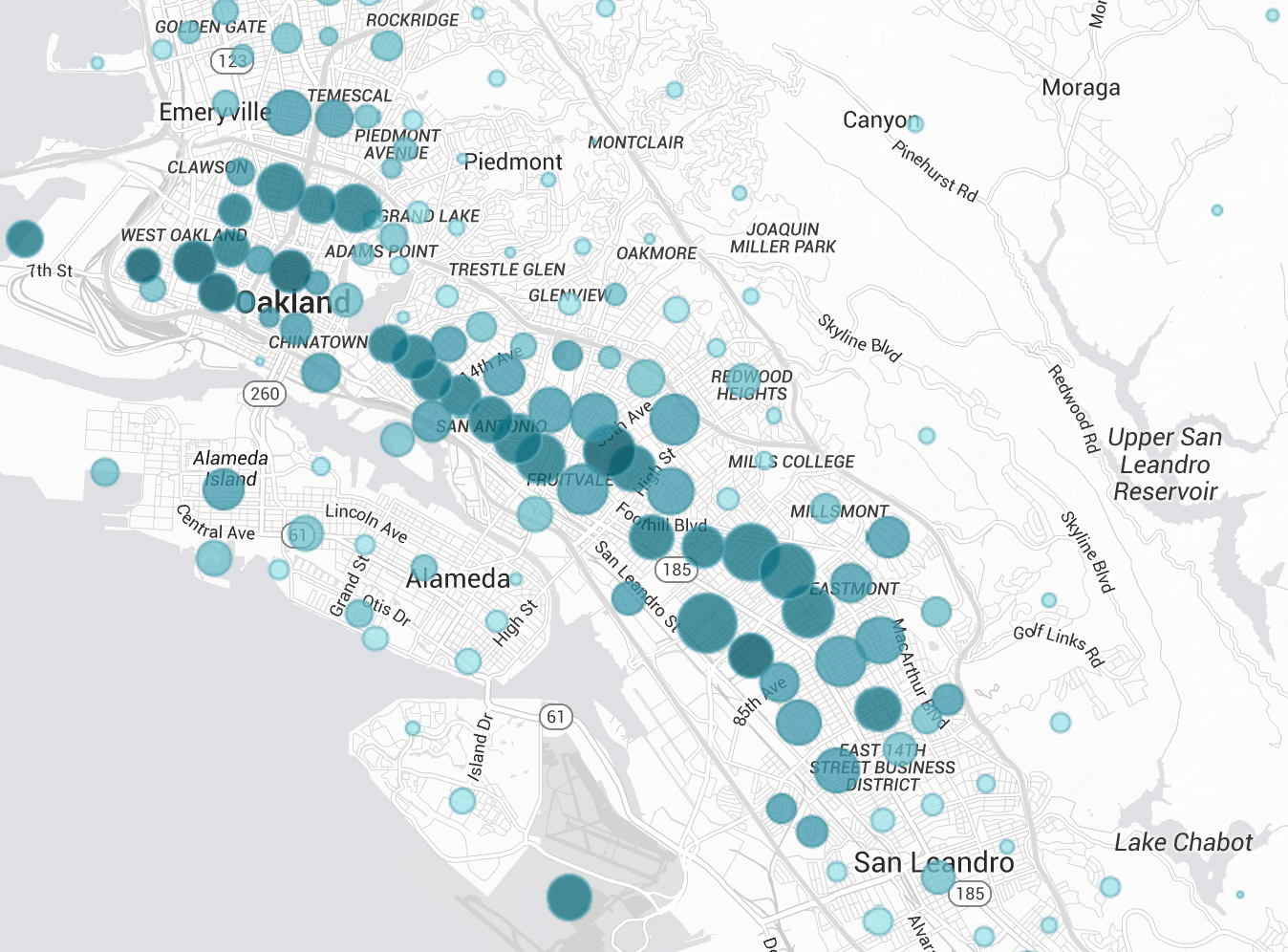
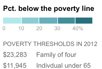
The voters did not make up their mind about this election with conviction, to be sure: if Quan was the first woman to be mayor of the city, Kaplan, Schaaf and Quan had been regarded as front-runners, although in a poll taken only three weeks before the election, 21% of Oaklanders polled hadn’t yet decided on their first choice, and 55% had yet to select first choices in the ballot.
The folks who seem to have been most committed to voting, however, seem to have disproportionately voted for Schaaf, distrusting Quan and attracted by Schaaf’s message of being hard on crime. And the nasty ill-spirited sentiment that high-crime areas supported Quan because of her current crime policy, content with the status quo, and that “some groups would like to keep incompetent leadership like Quan in office.” Although anecdotal, the mean-spirited sentiment indicates a deeply single-minded animosity filters the reading even of the distribution of the popular vote–and a deep ignorance of the attitudes on the streets to a police force that, in seniority and salary, the predominance of whom hail largely from out of town as of 2012-13–creating a particularly unbalanced topography of law enforcement as well as political economy that plays out on the ground in interesting ways.
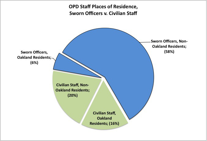
In mapping the residences of police against commensurate salaries, a troubling picture emerges of the demand to ‘put more officers on the street’ that has unique resonances, as it seems to run against the very notion of community policing. The deep antagonism of many Oaklanders to the police that existed before its militarization had heightened long before recent protests at the disproportionately increased attention to the testimonies of police officers in both shooting the unarmed Mike Brown in Ferguson and suffocating Eric Garner in Staten Island, NY, or cutting off the flow of blood to his brain. The below map both raises questions of how Oakland’s expenditures on its police is effectively directed toward surrounding suburban areas, and about the disconnect between neighborhood areas and the cops who police them.
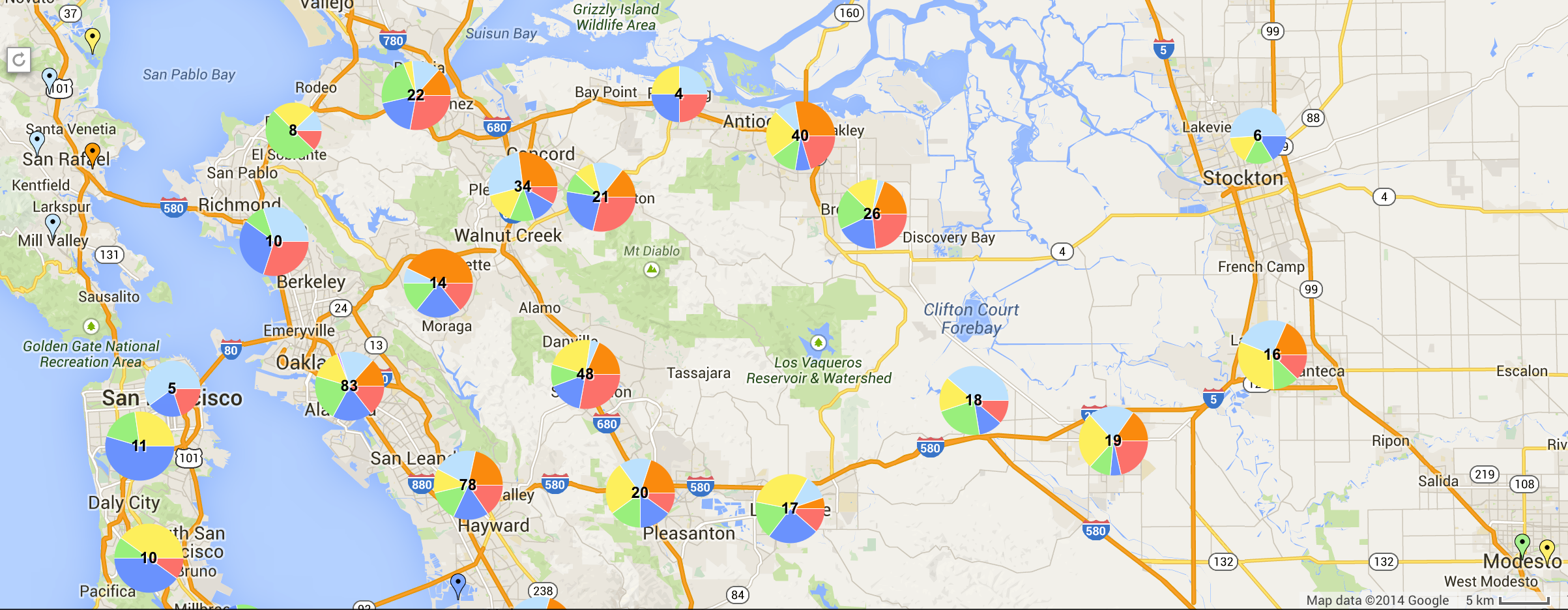
![]()
Oakland Police Department Officers’ Residency mapped by salaries/Financial Year 2010
The disproportionate share of cops retired or active that live outside of the city–and the amounts of money that is directed to pensions of retired officers living outside the city–has long received much criticism as a means of extracting urban wealth.
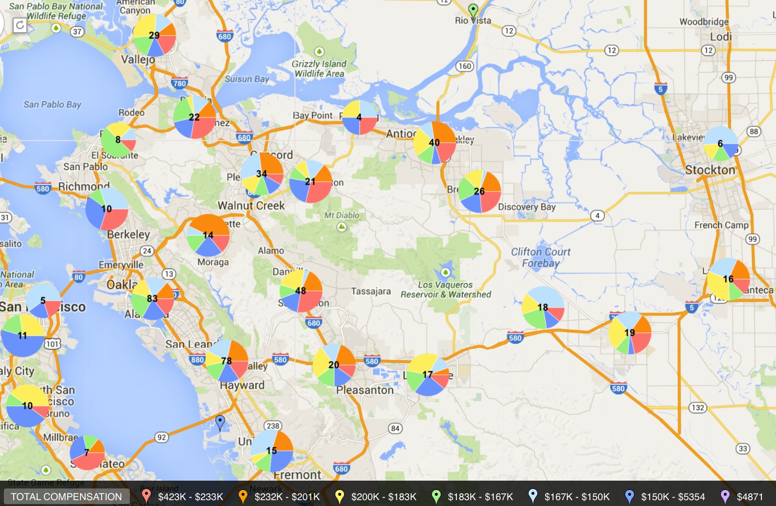
The accusation that some folks would prefer fewer police on the street also betrays deep ignorance of the uneven distribution of a poor voting turn-out: even at the high turnout of 2010, the threshold was not above 45% for many of the poorer areas of the city, and was dominated by districts in the hills and the San Pablo corridor, according to this map from public data made with TileMill by GIS Analyst Ofurhe Igbinedion.
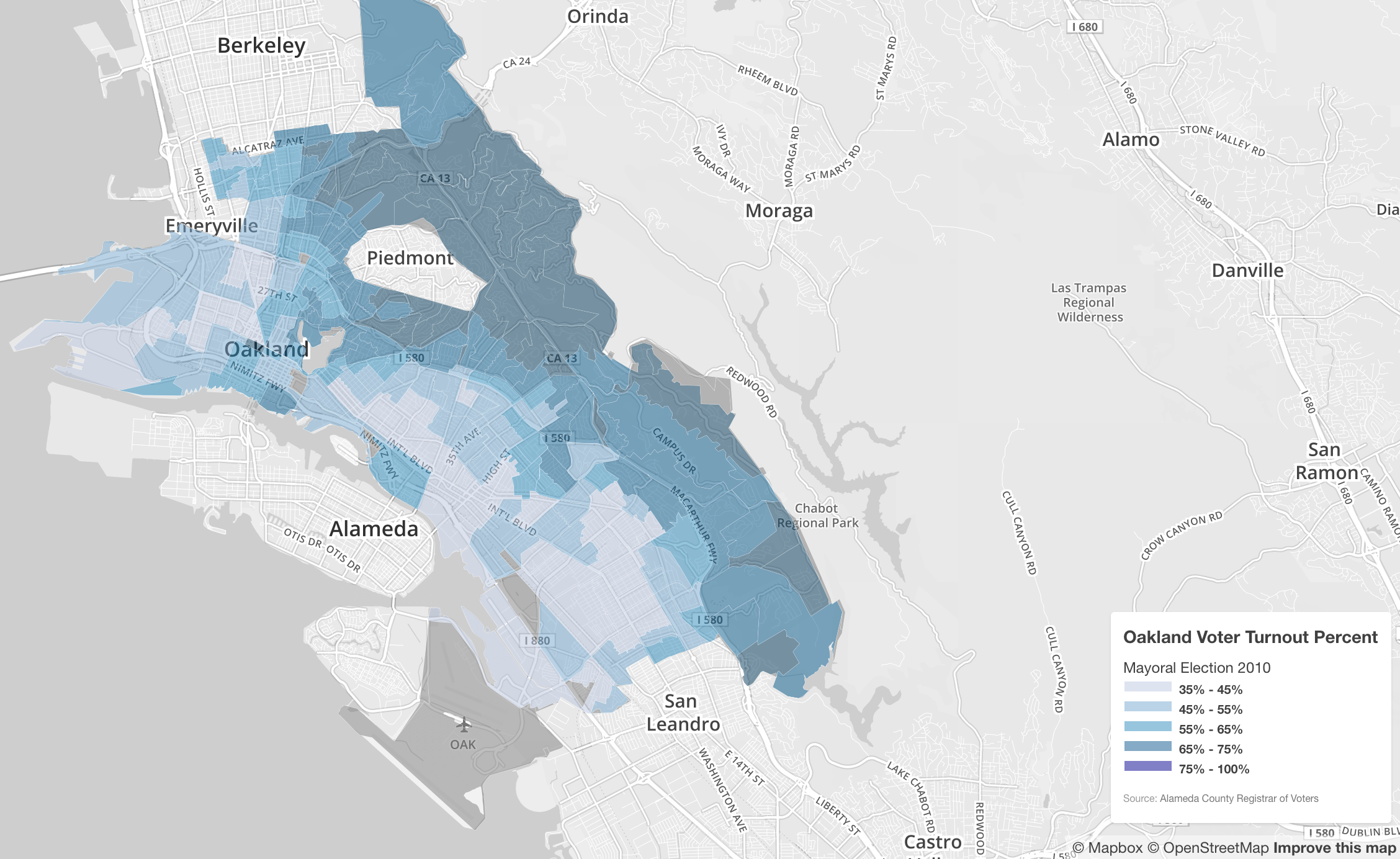
The deep gray trough of low-turnout along International Blvd., and below I-580, even in a high turnout election, mirrors the remove of many Oaklanders from the mayoral election.
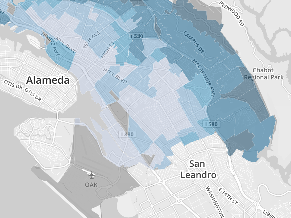
Of course, whether RVC is understood by the electorate unfortunately seems to remains unclear: former Mayor Jean Quan was successful by asking voters to choose her as their second choice in 2010, and the difficulty with predicting the election lies in a difficulty to predict how second- and third-choice votes are decided. But the uneven readiness to select three choices in the current election may leave many votes disproportionately counted.
16. Returning to the present race, the comparative investedness of Oakland neighborhoods in the recent race is evident in a map showing which areas were dominated by which candidates–what regions of the Bay Area were dominated by donors to candidates–that helps track how over one million dollars of campaign money was raised in the race among the four most successful fund-raisers, Schaaf ($421, 267), Quan ($357, 284), Parker ($348,882), Kaplan ($280,876), Tuman ($261, 665) and Siegel ($206,882), which raise pressing questions about the equity of campaign finances–and shedding some light on the disproportionate amount of money spent on votes in this election. Indeed, the close ties that this suggests of Schaaf both to vested monied interests in Oakland and in nearby areas which invested heavily in a vision of a well-governed and -policed Oakland–from Alameda to Pacific Heights Marin to Orinda, Walnut Creek and Pleasanton–suggest a considerable inflow of money from outside of Oakland.
Although Schaaf spent “least per vote” among the top candidates, her amount spent was far higher than almost all her competitors.
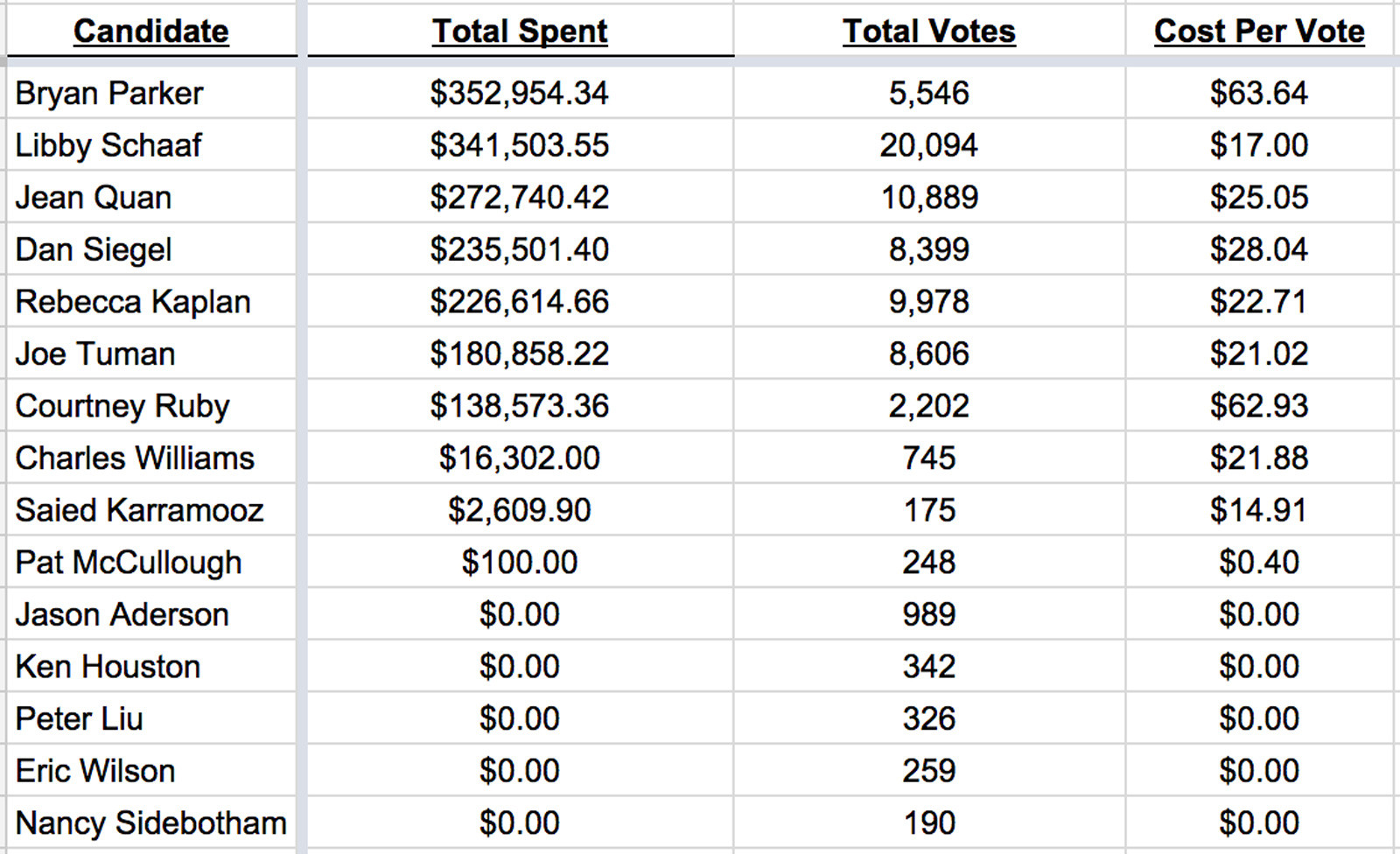
The deep ties of Schaaf’s campaign to a monied interests in wealthier regions around Oakland, as much as they depended for donations on the communities in the Oakland hills. The geographic distribution Open Disclosure offers is striking since it suggests a distinctly uneven distribution of the fundraising economy that has come to drive the mayoral elections, from Marin to the Peninsula to Orinda, Pleasanton and Walnut Creek. It shows the disproportionate role of neighborhood fundraising in determining Oakland’s elections, lest one was not aware of it, even in the face of campaign contribution limits per individual of $700 or $1400. For a range of wealthier regions of Marin, San Francisco, and Oakland’s hills enriched Schaaf’s treasury, drawing from the Marin and Pacific Heights lands of Jerry Brown and Barbara Boxer, while Tuman, Ruby, Kaplan and Siegel largely enjoyed their own very local constituencies, and Quan and Parker drew from several areas in Oakland and San Francisco.
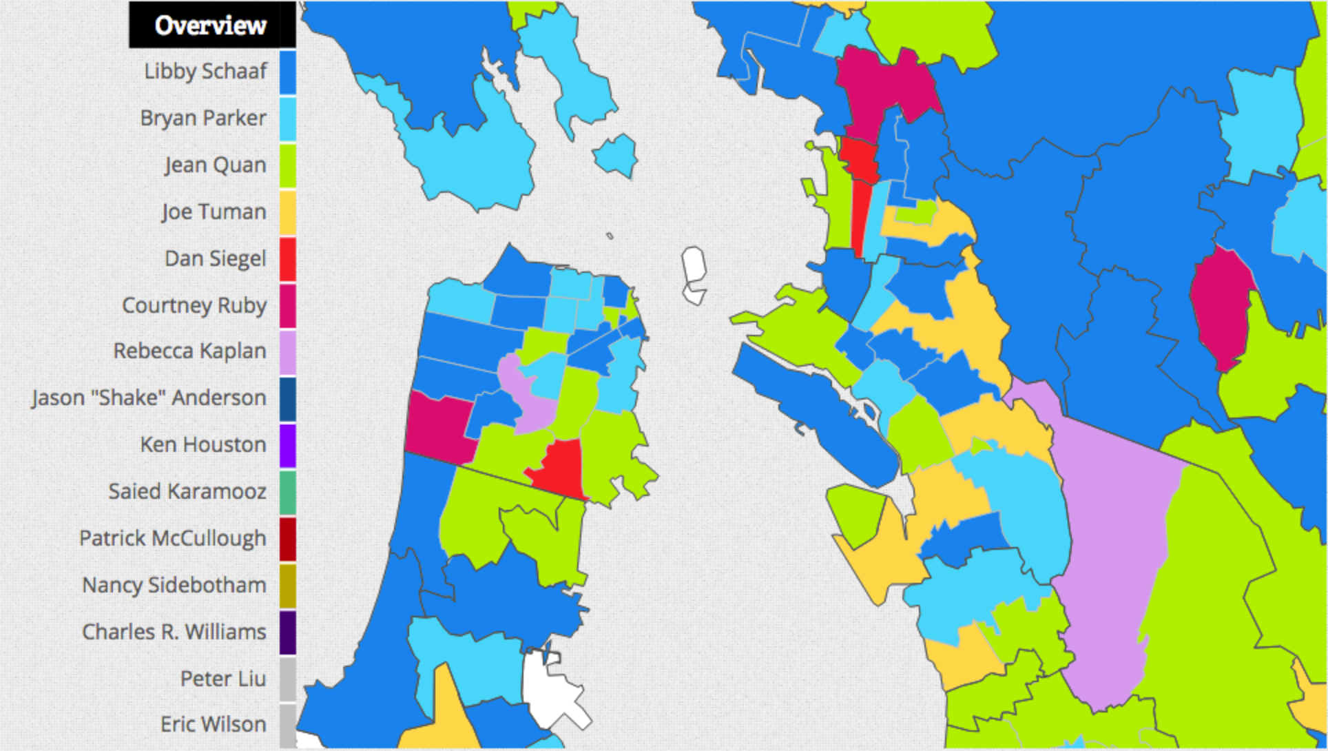
The candidate who raised the most money in the end in each ZIP code suggests a deeply uneven distribution indeed, with Quan increasingly edged out by Tuman and Seigel downtown, and Kaplan eating into some of Schaaf’s core hills constituency, in ways that were not evident in first choice votes on election day–and Courtney Ruby reveals similar support (the colors, confusingly, are switched for candidates here, though the scheme reflects most successful fundraising):
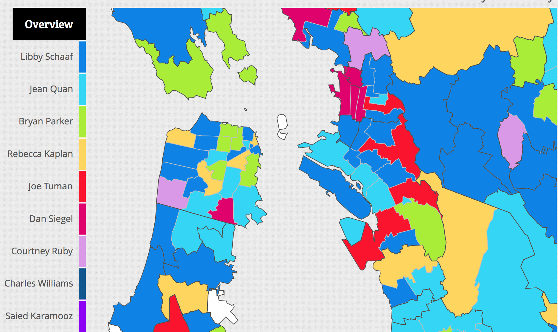
The differences where candidates were most successful in raising money reflects the final distribution of votes, though the votes were concentrated in Oakland alone, of course, and do not follow a division by ZIP. The calculations of contributions mirrors, unsurprisingly, some of the electoral data, although Schaaf’s contributors seem to translate into more votes. But these do not clearly mirror a picture of how Oakland looks. Put another way, Schaaf’s contributions were clustered not entirely but primarily in north Oakland and the hills–
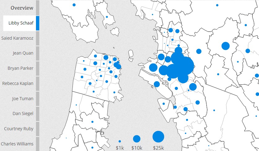
and were not nearly as evenly distributed across Oakland neighborhoods as, say, those of Rebecca Kaplan
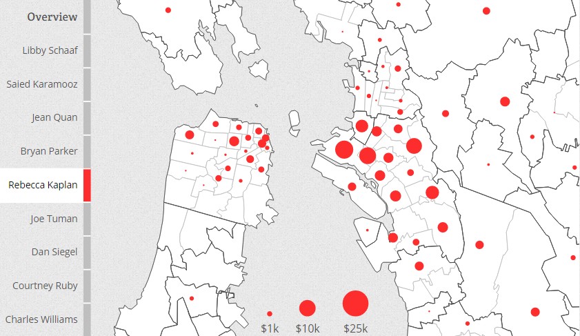
What differences existed between the folks who supported Schaaf, both by donations and first choice selection, and other areas of Oakland that selected other candidates as first-choice?
Unlike the hills, much of Oakland is a renter-majority city, in which many residents struggle to find affordable housing. A range of community-based organizations formed to respond to issues of low-income renters offer data indicates that upward of a third of these renters are regularly confronting issues of habitability and substandard housing, despite government efforts to the contrary–many of whom voted, when they turned up at the polls, for other candidates. The same divide also maps loosely onto Oaklanders who face habitability issues–such as mold; lead paint; cockroaches; disrepair; lack of heating–in the dwellings that they rent–one index of renters v. homeowners that remains starkly geographic in Oakland, as do contentedness with the habitability of their residences:
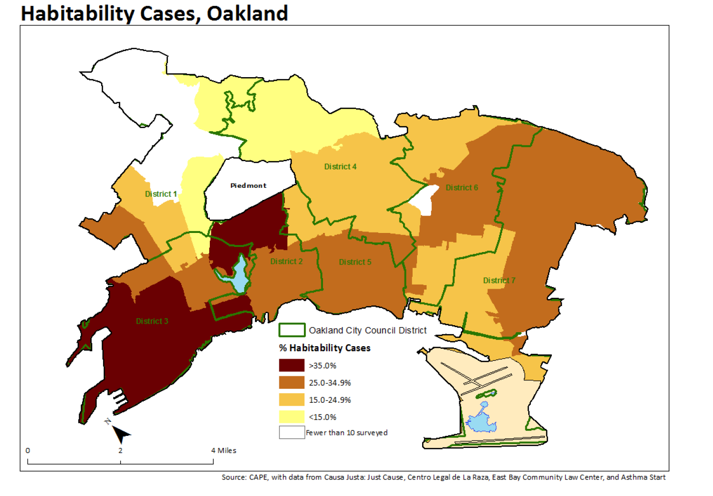
or emergency visits to hospitals for asthma over the past year, which are compared here to the county rate:
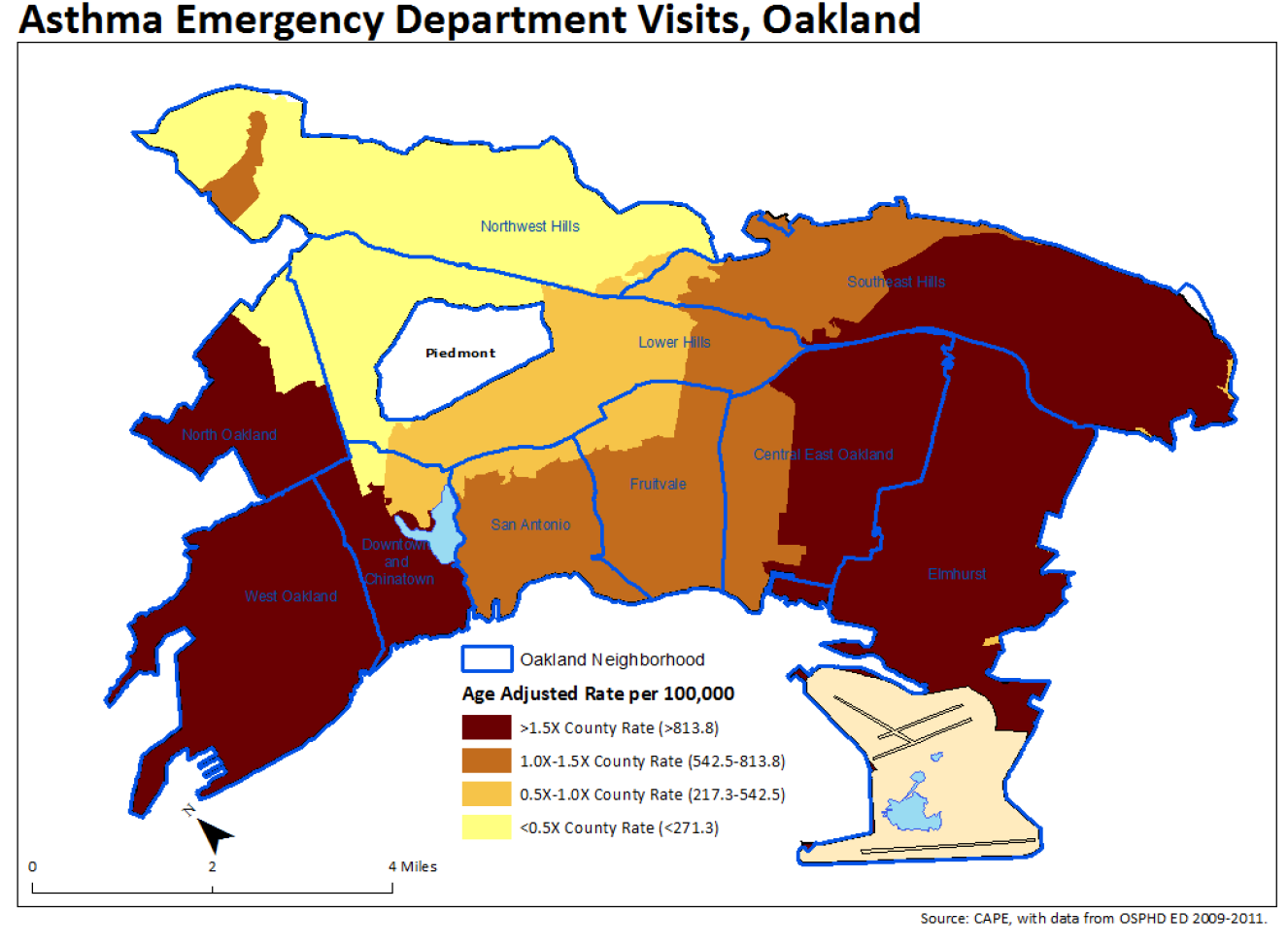
Those areas significantly above the county rate did not tend to select Schaaf as their first choice, raising questions about how these neighborhoods view her as mayor. (While Schaaf was a preferred candidate in many, the low voter turnout needs to be mapped for the last election.)
The unanswered question such data maps place squarely on the table–the elephant lurking in the room–is how well Schaaf will represent the city as a whole.
17. It is too early to raise such concerns explicitly, but the large number of eligible voters who did not even cast a ballot in the city speaks volumes. “East Oakland is a part of this city that really needs investment and love,” Schaaf noted more appeasingly, in somewhat touchy-feely tones that one wonders what they actually mean. For the city remains split in interesting ways, with many working-class sections solidly for Jean Quan, who was rejected by those in better-off areas, and Rebecca Kaplan fielding many votes in other areas, and Dan Siegel, a pro-labor lawyer and long-time strong-armed Oakland lefty, getting others; Bryan Parker, an African-American business man and director of the Port appointed by Quan, did well only in those areas closest to the port.
Mayor Quan’s rocky tenure over the last four years alienated many for different reasons, but partly through no fault of her own: she had upset the favored candidate in 2010, after he was associated with political corruption and police unions, allying herself with a range of candidates who were, unlike their rivals who were less firmly rooted in the city, dedicated to improving Oakland. But subsequent her performance in relation to the Occupy movement tarred her candidacy, even as the cuts and lay-offs she sanctioned in human resources, social services, the City attorney, parks, zoos, and museums had fomented Occupy protestors–and led to a recall effort. Mayor Quan had notoriously won the 2010 election because of the system of Ranked Choice Voting: voters selected her as second-choice in ways that elevated her above conservative democrat rival.
Schaaf, the occupant of the District 4 seat that Quan vacated, in her own campaign stressed not the problems of the city but its “awesomeness” in her campaign, celebrating the city’s newfound economic, and emerging as the anti-crime candidate able to uplift Oakland. But Schaaf was never the populist grass-roots community-organizer Quan had been, however, and the ties that Schaaf holds to middle-class voters suggests some degree of potential working class alienation. (Don Perata had won the hills, promising to put more police on the streets; but Quan claimed much of downtown.) An increasingly salient index of a crisis in public confidence lies, as Michael Sierra-Arevalo has noted in October, is the growth of private security firms in the hills-areas of Oakland. Indeed, the hiring of private security firms reveals growing distrust of the city police by literally taking policing into one’s own hands in crowd-sourced ventures, and a writing off of the ability for Oakland’s police department to provide necessary security. Oakland seems to suffer, almost endemically, from an almost chronic absence of officers patrolling the streets. Unlike most of the rest of the country, Oakland has indeed experienced dramatically rising crime rates in recent years–even as a significant part of the city enjoys an economic revival and an inflow of new monies and rising property values. The external sign of such a revival is the blossoming of high-end restaurants in the Temescal and Downtown, from Lake Merritt to 51st Street, but the growth in crime in nearby areas. Indeed, Oakland was touted as “robbery capital of America,” and the below mapping of police beats in the city didn’t help Quan.
Districts bordering on high-crime areas were not strongly against Quan, although Quan did not win Redwood Heights or Fruitvale–but the image of the mayor as soft on crime was most dangerous for her in the outlying areas of the hills. Even though she pulled a surprise in 2010 by winning as a non-career politician who upset the popular pro-union candidate Don Perata by a margin of just 2,000 votes. Quan’s promise to focus on revitalizing Oakland by using her skills at working in local issues–and improving Oakland as a city, she gained a bad image first with an unseemly waffling in response to the Occupy movement and then in unpopular reductions in the police and social service and never really emerged as effectively combating a rising tide of crime or able to claim a mantle of urban renewal in 2014.
18. The search for choosing candidates that might better address questions of public safety suggest the benefits of reading such a demand for more policing of the city against recent maps of crimes in Oakland, and reveal a growing expansion of criminal activity beyond the poorest areas of the city between I-880 and I-580, stretching to San Leandro.
The striking rise of crime areas–if not focussed in Montclair, Mills College, Trestle Glen, or Redwood Heights, was too close to be comfortable for folks to stand behind Quan’s anti-crime performance as mayor:
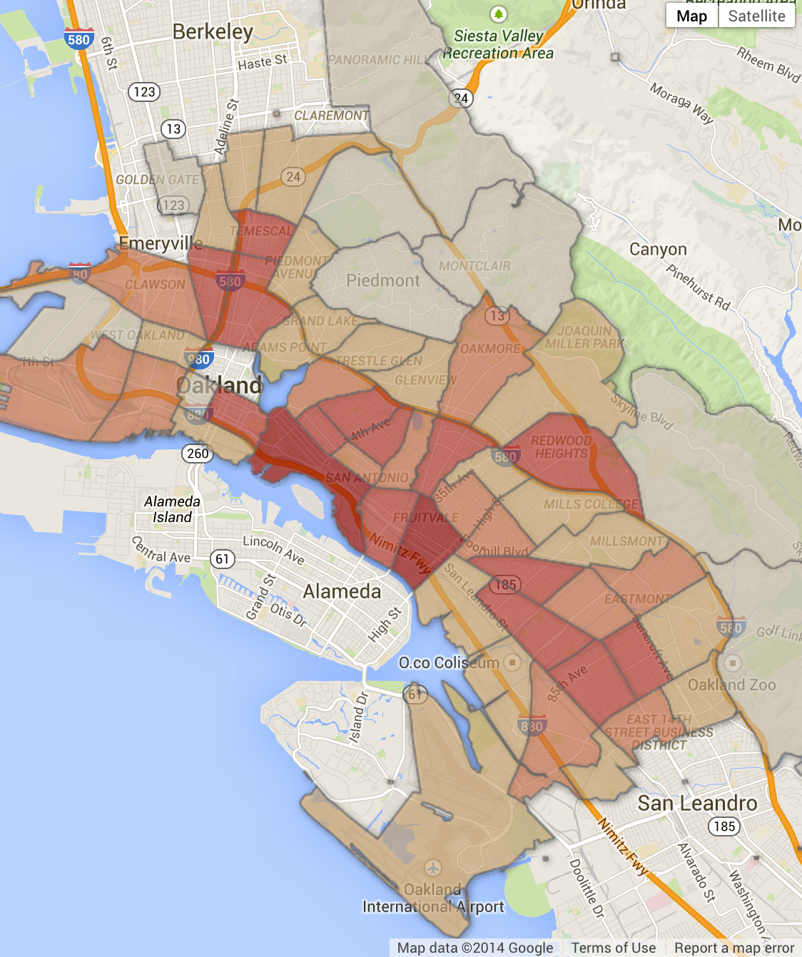
Yet the recent rash of robberies in Oakland’s diverse neighborhoods seems unquestionably to have been on the minds of voters because crime had moved beyond the region between the I-580 and I-880, and began to appear in critical ways in voters’ consciousness in North Oakland, Trestle Glen, the Dimond District, and Glen View or near Mills College for the first time:
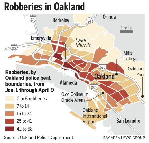
Even as the real estate market has been brisk, the presence of police is precarious, and the growth of neighborhood crime has led to a blossoming of private security firms in direct response to the distrust of the police: the growth of such firms from Skyline-Hillcrest to the Dimond district, from Crown Hills to Claremont, from Lake Merritt to Crocker Highlands, has escalated across Oakland’s middle class neighborhoods in response to fears about crime. It would be interesting, and opportune, to map the diffusion and establishment of such private security details in Oakland over time, which extend from Glenview to the Dimond district, as well as Kings Estates, Temescal, and Maxwell Park, and Crown Ridge near Merritt College. In large part, this has mirrored how a growth in Oakland’s economic health since 2009 has paralleled a decline in officers on the street–from 830 officers in January, 2009, 615 officers currently patrol the streets of a city of roughly 400,000 people, according to city police records, or about 167 officers per 100,000 citizens. The recent spate of crowd-funding for private security patrols in Oakland, unified in their common charge to “take back” one’s neighborhood, united “like-minded folk” to disaggregate from the city’s common protection. Rockridge City Council Member Dan Kalb hopes that the rise of such private security details will never be taken as a substitute for police, but only as a supplement. But it will be hard to turn back the spread of such local details in many areas, which reflect on the nature what sort of public spaces we want to create–and might cause us to be more introspective on our community movements.
The narratives that such private security patrols trumpet may have played a large role in the race for mayor. They certainly stirred strong pubic emotions and debate. By promising investigative professionalism and more patrol cars, such private security companies claimed to offer an ability to “meet both your security needs and your budget” when police seem discredited. Local security patrols are hardly viewed as a substitute for police–and may create underlying conflicts or communications problems with police–but they are nonetheless accepted as a necessity and, increasingly, crowd-sourced to respond to fear about decreased neighborhood patrols and low police protection with rising robberies (up 54%), burglaries (up 40%), and car theft (33%). (San Jose has, however, rejected the idea of such crowd-sourced private patrols.) And they cite the following Property Crime Index to bolster their points, by the specter of the rise in property crimes in Oakland’s neighborhoods in ways that seem far above either California’s or the nation’s as a whole–although one would expect so much of an urban setting of endemic poverty, high truancy, and unevenly funded public education:
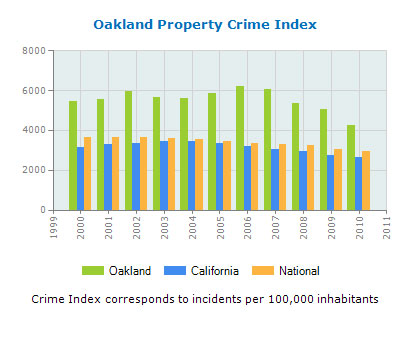
There is, to be sure, a regional rise of such security firms. (In Latin America, the opportunism and collusion of police has increasingly led them to be less trusted as keepers of the peace or security, private security firms have started to comprise a growing part of the local economy: the AP has recently described how private firms fill “security gap” across Latin America, ensuring the transport of cargo that is coveted by criminals in northwestern Mexico by international firms, or protecting wealthier clients: in places where “people don’t necessarily trust the cops.” Private security officers outnumber local police 2 to 1 globally, and 4 to 1 in Brazil, 5 to 1 in Guatemala, and 7 to 1 in Honduras. Such firms employ some 4 million agents across the region, creating an industry that, if it keeps up with 9% annual growth, is projected to become a business generating $30 billion by 2016–offering private protection to those who can afford it, and asking fellow-citizens to fend for themselves. This can have unintended consequences not yet seen in Oakland, but perhaps foreseeable: in Venezuela one private security worker estimated that 25% of his fellow-guards commit violent crimes during off-hours.)
The neighborhoods in Oakland where crowdsourced funding has been used to create private security firms are increasingly employed are on the outskirts of the downtown, rather than in those areas. These more monied areas such as Rockridge, Trestle Glen, or Crocker Highlands are of course in essence divesting from their trust in public government and transferring money out Oakland–while paying low property taxes, and not wanting to raise them, they are playing off of an image of a city that is ineffective in fighting crime or dealing with criminality. The image of ineffectual city government that this practice perpetuates instills and distrust of existing government, and creates an image of a need to contain crime and criminality in Oakland’s poorer areas, and indeed to better police those areas that lie on their margins. And indeed by looking at the crime statistics in Oakland as a whole, one can add a needed layer of information to the emotions of the electorate that lie beneath the Registrar’s interactive map, peeling back the color overlays to reveal some of the deeper fears that not only motivated the election results, but also perhaps a paratext that demands to be considered beyond the map of the election’s results.
19. Libby Schaff’s appeal beyond the crowd who inhabit the hills may largely lie in her clear focus on the perceived dangers of public safety that are increasingly of concern in many areas outside of Piedmont or the hills, where property crime appears on the rise. How did this appeal make her so much more successful in attracting votes within a precise demographic of the population that we don’t often identify with Oakland itself? (And how can we not think that she was elected as white Oakland’s mayor?)
A persuasive answer may lie in her focus on crime. The outpouring of support derived partly from endorsements, and what the city council member advocated for improving the performance of police. The mayor-elect trumpeted a “laser-like focus on public safety,” a code word for crime, an increasing concern for the city as a whole, but the complex relation between the mayoralty and the police, and a move to a candidate who had a less apparently oppositional relation to police; Quan had not only suffered poor relations with police during the Occupy Movement, but had faced the resignation of two police chiefs one after the other in 2013. The desire to contain an apparently growing level of criminality–at times, rampant criminality and property crimes–into the area between the I-580 and I-880, and diminish its spread in Oakland as a whole, played a large role.
The large support that Schaaf won from District 4 and surrounding hills areas suggests a reluctance to recognize Schaaf as one of their own across a large range of some of the less privileged and lower class areas of Oakland, and indeed raise a challenge for Schaaf’s mayoralty. Perhaps one might look more closely at the rise of crime over Quan’s tenure, and indeed the longer view that would provide a needed perspective on the situation in Oakland that Quan first confronted when coming to office in 2012. These slightly antiquated maps of simple or aggravated assaults and violent crime (noted in brown) and property crimes (green) by which ever-versatile Michal Migursky mapped in Oakland by open data in 2008, which were so clearly concentrated between 880 and 13 freeways, or the non-affluent urban areas, and preponderantly in those that lie below the 580 freeway that formerly bisected the city’s neighborhoods.
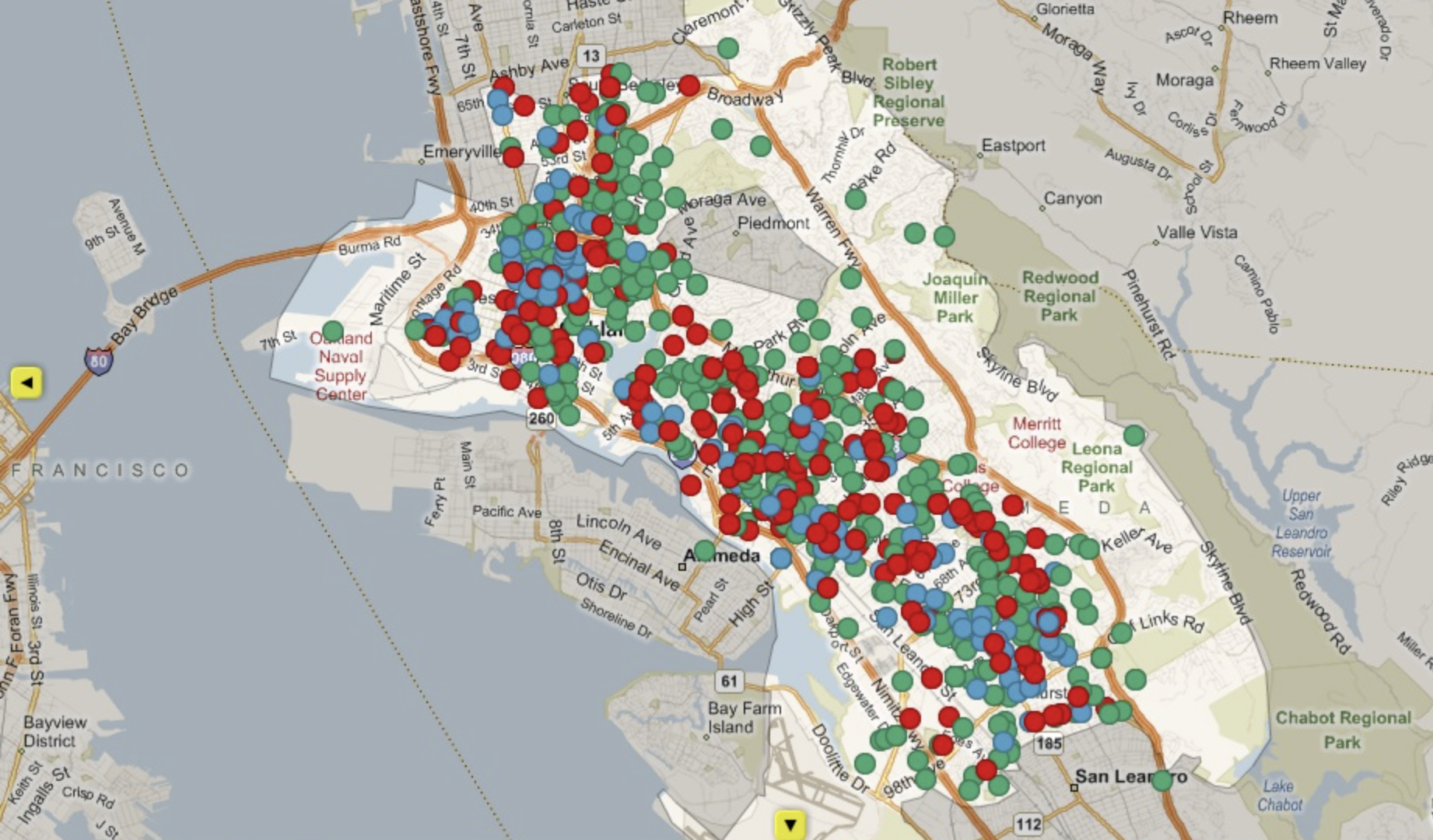
The distribution of hotspots of automobile and residential burglaries in 2012 reveal a strikingly similar concentration, although the dispersion of crime through the city, although a low density of crimes–marked by circles or triangles–clouds the entire city, in ways that made hills residents quite conscious of an apparently expanding impact of robbery in their neighborhoods:
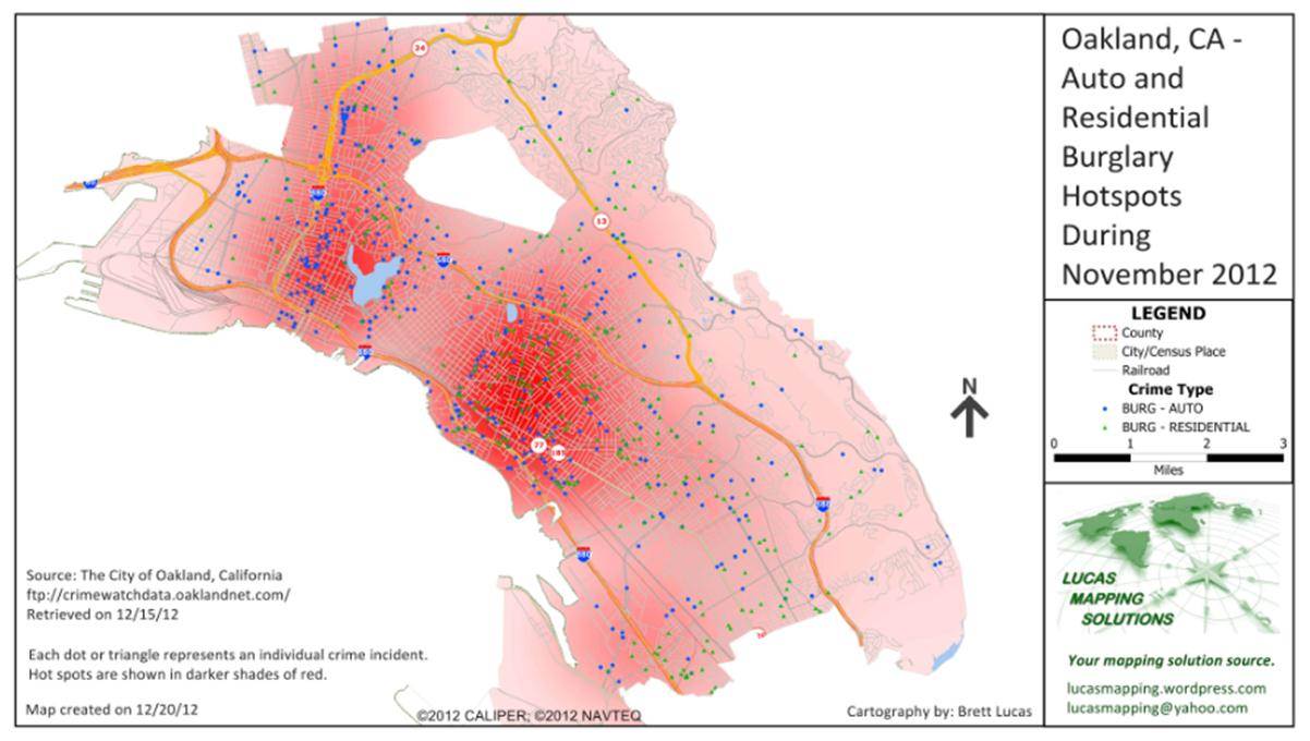
And the fairly terrifying clustering of 290 robberies and homicides over a months between September and October, 2013 reveals a concentration in those areas where Schaaf did not carry the vote so clearly:
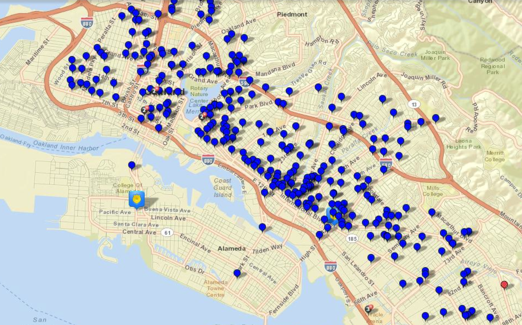
The larger picture shows an even more specific concentration over that month:
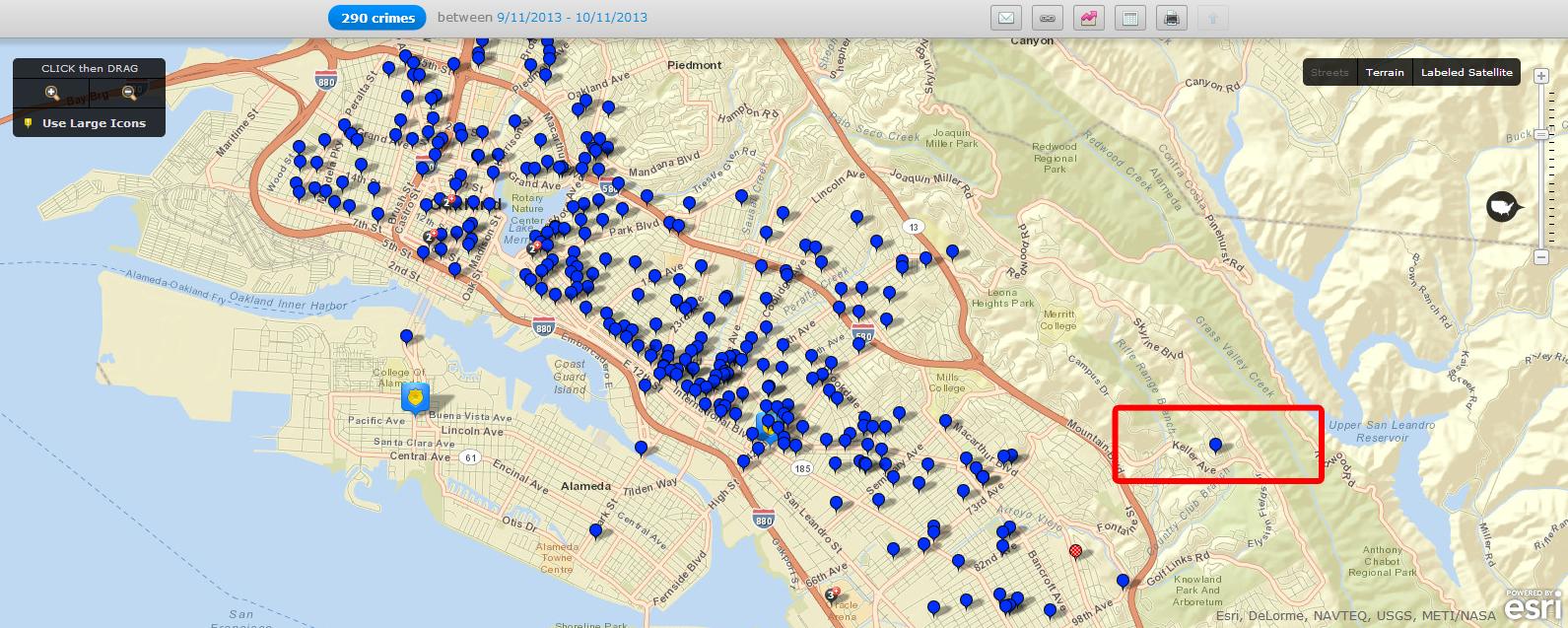
The month mirrors the Trulia Trends Crime Maps, which created a compelling heat map of the region of the Bay Area for 2012, with a similar focus on areas west of the line created by the I-580 freeway which bisects the city east and west, and almost seems to have its epicenter in Fruitvale and Seminary:
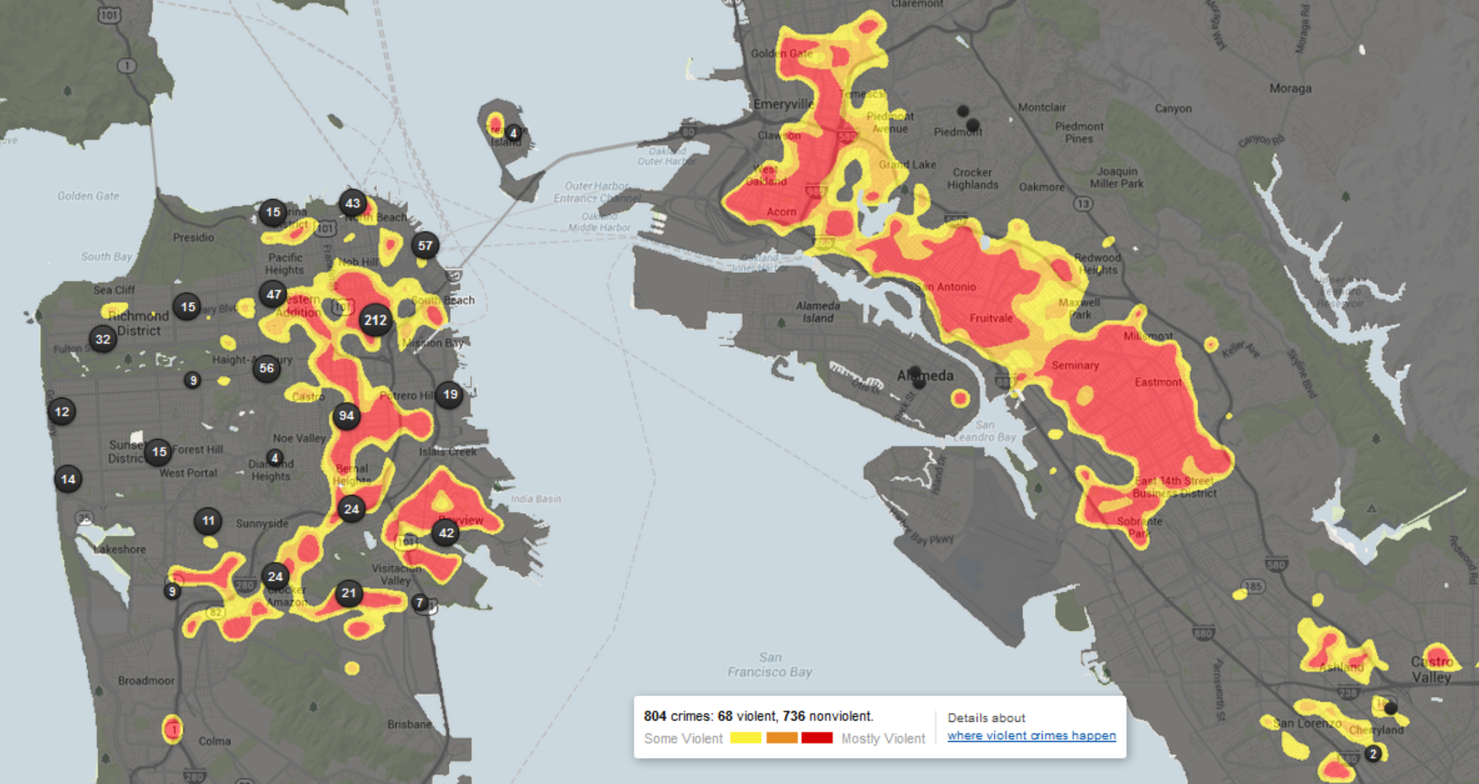
The Oakland Police Department’s own community crime-mapping website, CrimeMapping, reveals a strikingly similar, if less legible, distribution of 275 crimes in Oakland over the last month, with a preponderance of automobile thefts (purple mini-icons) and scattered robberies (blue masked face mini-icons), and a broad smattering of assault crimes overwhelmingly focussed between the I-580 and I-880 during the first week of December:
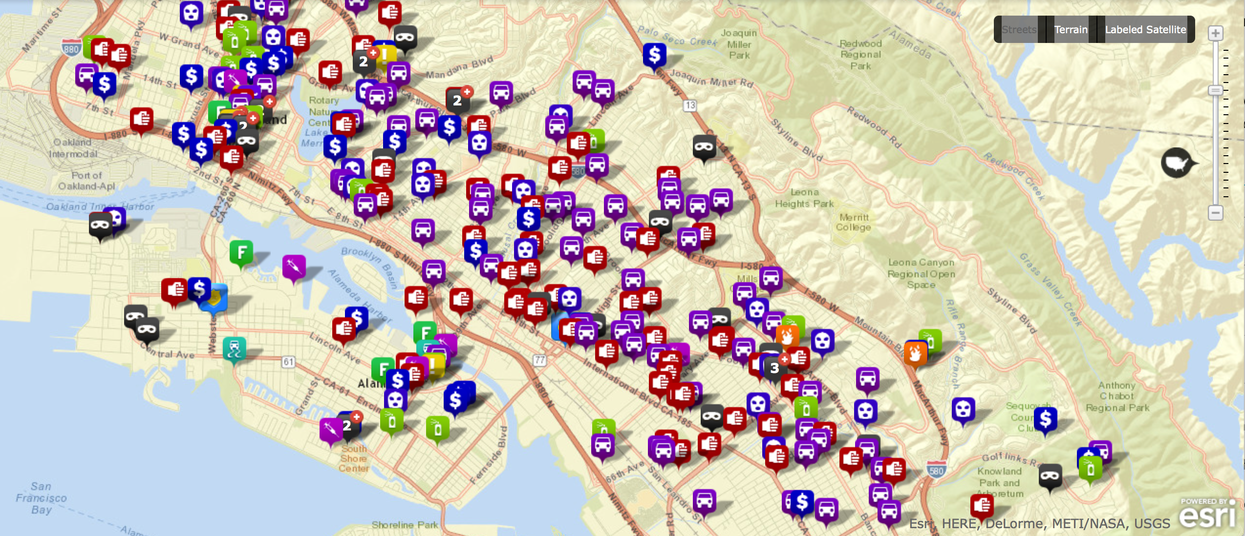
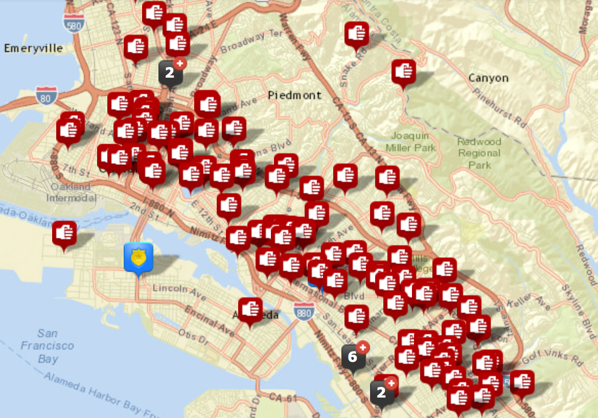
But burglaries, for example, were spread far more widely over the same period of December 4-10:
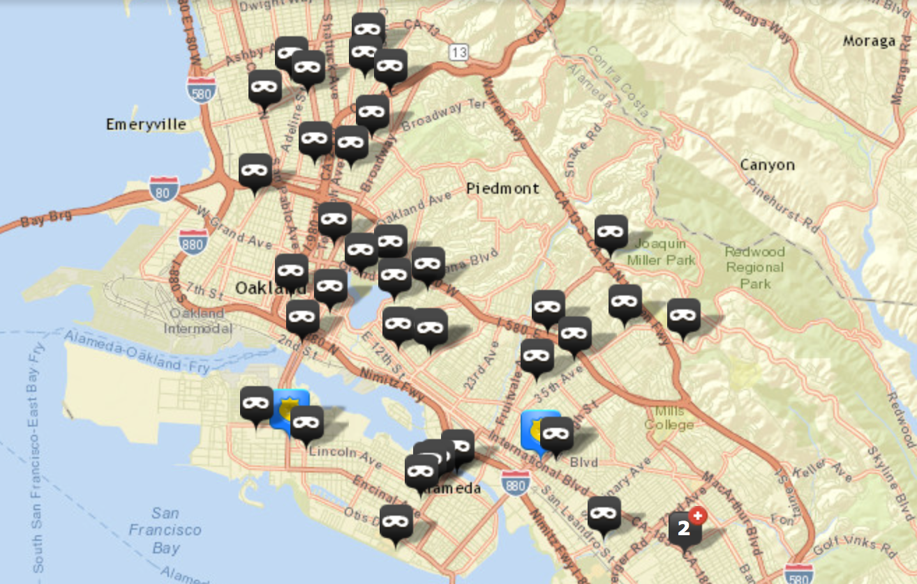
and a still somewhat broader distribution of automobile theft:
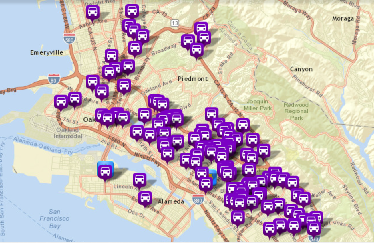
These areas of crime are the areas that the Schaaf supporters want to contain, and trust Schaaf to be able to contain from the city’s other half.
20. These maps underscore the somewhat slightly schizophrenic identity of Oakland, CA as a city. They reveal the steep challenge that the mayor will face generating a sense that, as a woman born in the Oakland Hills, will be able to direct needed economic intervention in: though most any American city has its slums and poorer neighborhoods, this is an area that is almost neglected, as i as a result of the freeways that cut across the city’s communities and revealed its deep rifts. Put in the best light possible, the election of the mayor might be an occasion for introspection on what we want Oakland’s mayor to seek to work to achieve.

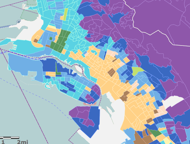
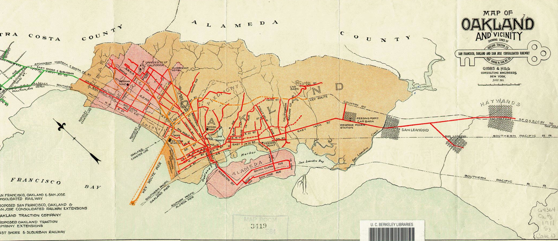
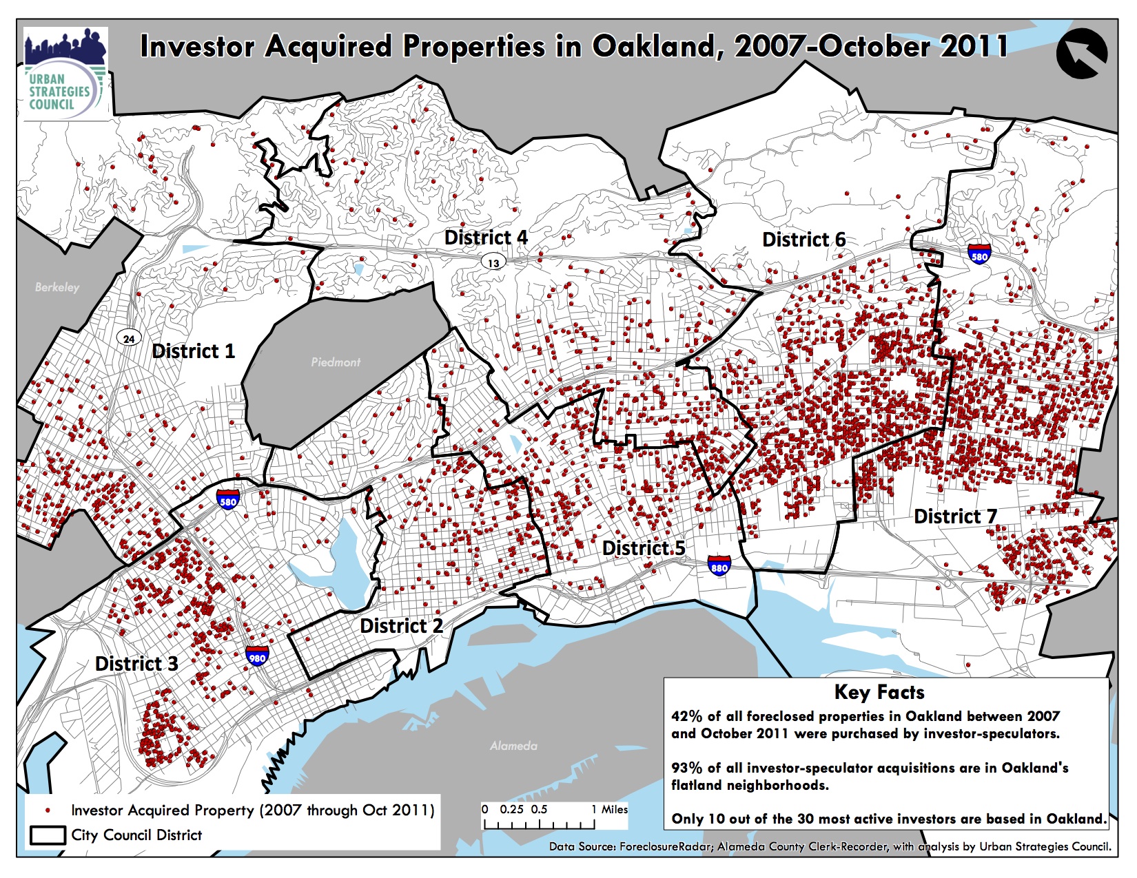
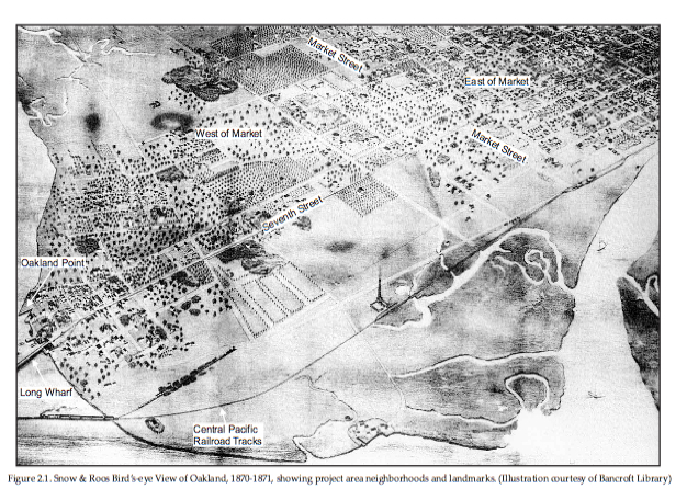
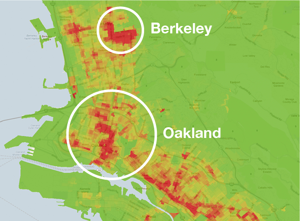
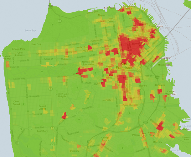
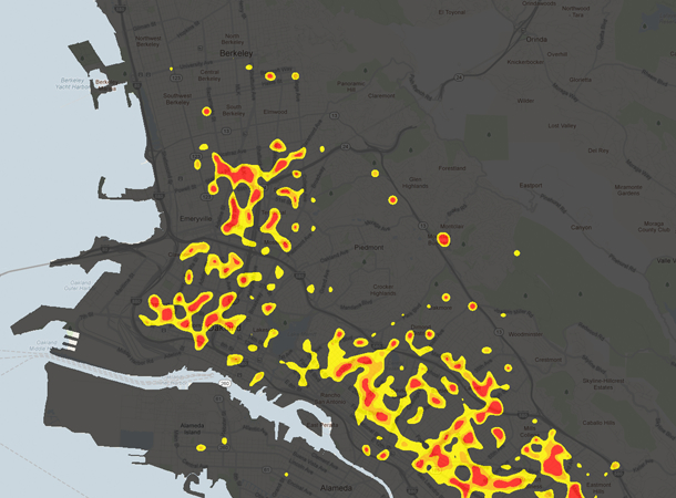
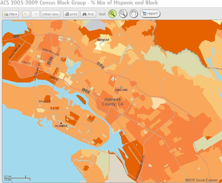
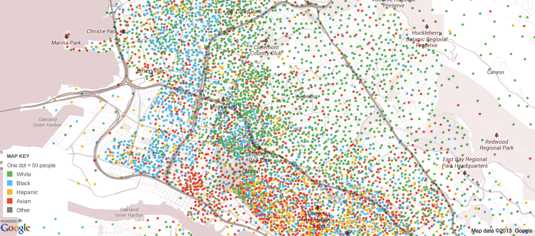
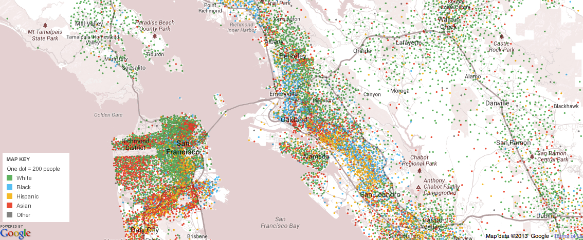
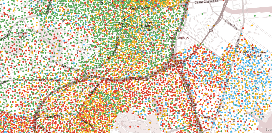
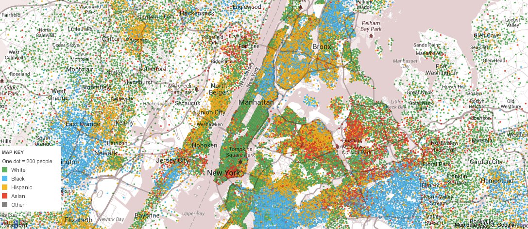
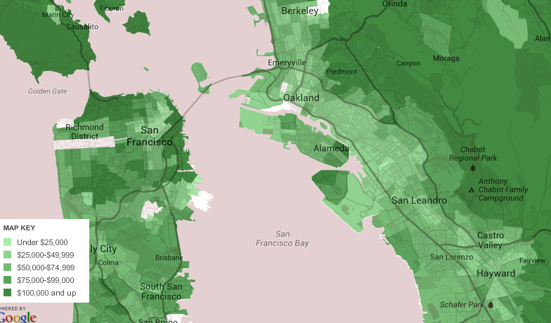
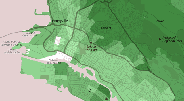
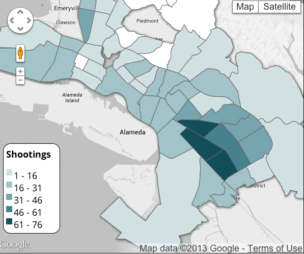
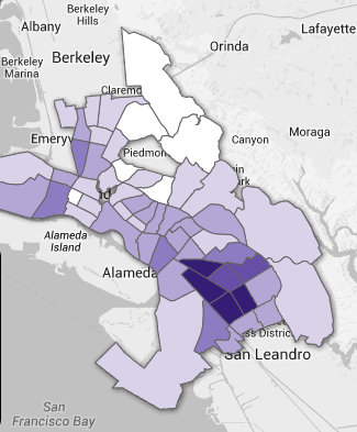
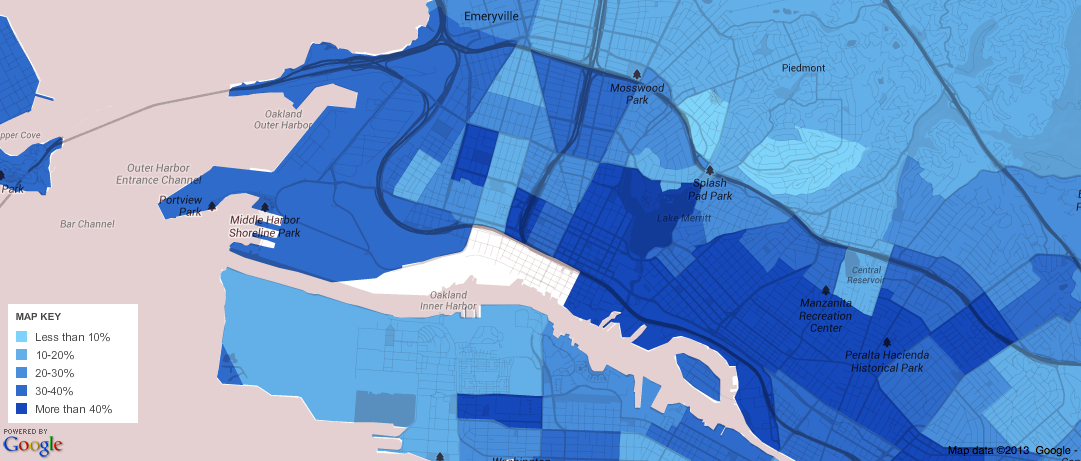
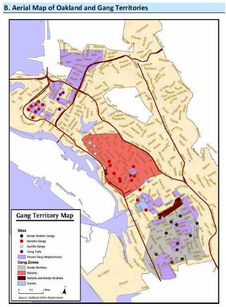
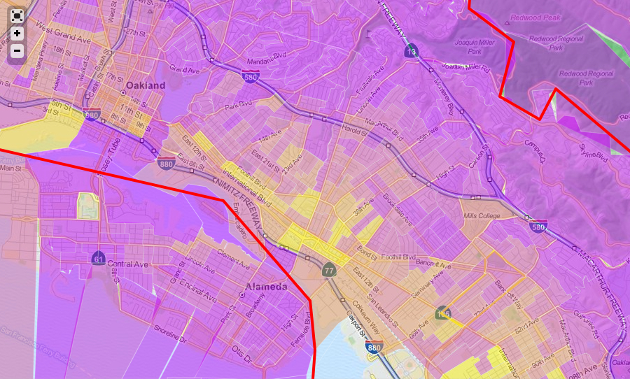
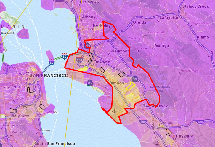
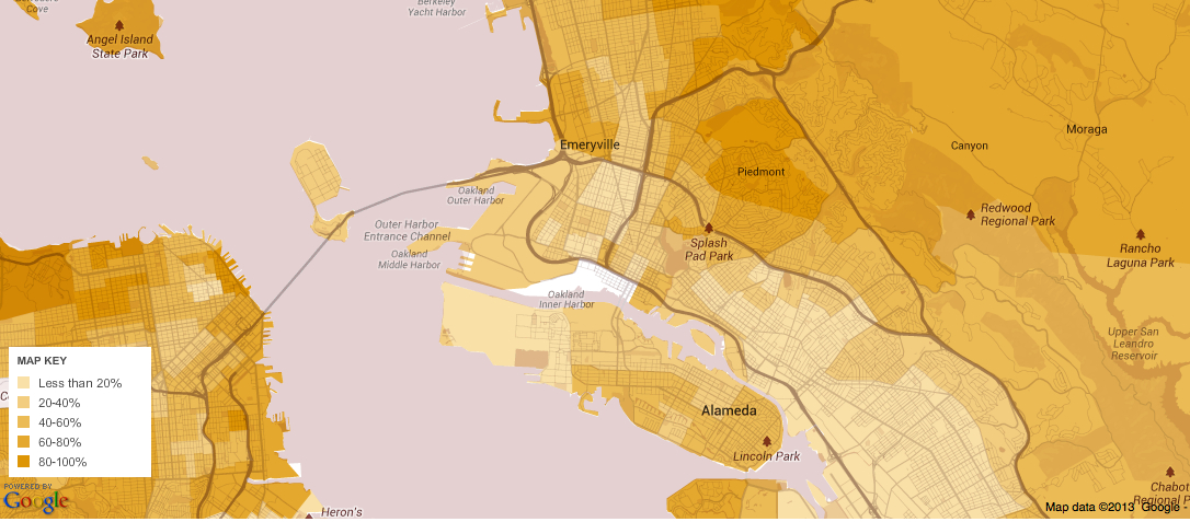
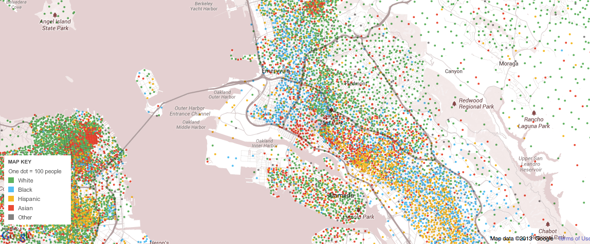
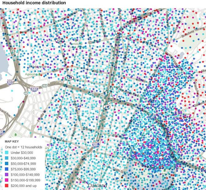

 Open Flights


 .
.
