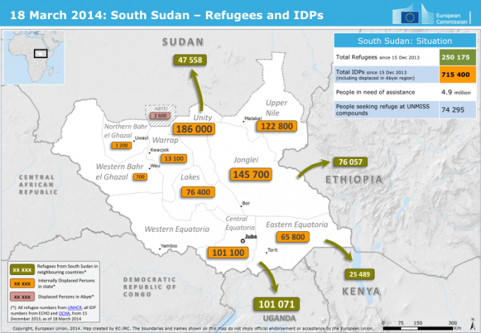
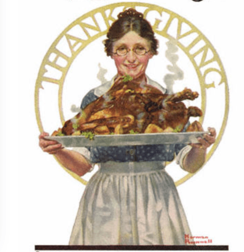
We all map our relation to the world by the tokens of food that we assemble on our dinner plates. But on the carefully prepared meal of Thanksgiving, we face the orchestration of a full harvest plate–sweet potatoes from the earth; turkeys fed over a year from grain; celeriac or Brussels sprouts for something somewhat green–seem a statement of global harmony. The meal is a sign that all is right in the old agrarian world we have long left.
Yet the annual sacrifice of the native bird perpetuates a faded agrarian geography of the nation, is also a false geography: much as the Presidential pardon of the turkey, long promoted by the Poultry and Egg National Board and the National Turkey Federation, who first gave President Truman a bird to pardon, has cast the sacrifice in pointedly national terms–mythically tied to President Lincoln’s supposed clemency of one turkey in the Civil War era at the request of his son, Tad, in 1863, the year of the Emancipation Proclamation, as if to commute the bird’s sacrifice, is often cast as an event of returning to ethics, and joining the nation. Cemented by the time an enterprising Rhode Island poultry dealer, Horace Vose, boosted his brand by sending several well-fed members of his flock to the White House occupant to promote his stock, the conceit of yearly offerings or pardons served to cement the bounty of a seasonal sacrifice of turkey to national health. It must have been especially striking that outbreak strains of Salmonella have been boldly mapped onto the nation by the Center for Disease Control. The increasingly terrifying visualizations of the spread of fowl-borne infections seem a sad reflection on the nation, transforming what was a native bird into a vector of contagion and disease in over-extended food networks where farms are defined as producers or providers and procedures of laying eggs and raising chicks or slaughtering and butchering meat geographically dispersed on an industrial scale.
The expansion and commodification of a brisk trade in turkey meat goes beyond the holiday season, but the data on breakout cases of food-born Salmonella infections seem to multiply in recent years as turkey consumption grows or is planned to grow each November. And the CDC issued choropleth of recent breakouts invites us to reflect on the changing state of turkey suppliers and distributors, the industrialization of food, and the fate of the bird whose conversion into a product bred for consumption may carry multiple attendant public health risks, concealed by perpetuation of a false geography of Thanksgiving as an occasion of bounty of the harvest, with its image of a season of abundant plenty. Has the continued provision of abundant turkey for Thanksgiving season created a danger of overbreeding, since the icons of the meal in post-World War I America became promoted as an occasion for rendering thanks? How, if so, can we come to reconcile the spread of Salmonella and the nostalgia for consuming a bounteous harvest at an open table duirng the Thanksgiving feast?
The remove of a fictitious scene of purely domestic provision that seems borne after the national disruption of World War I seems further receded, but is increasingly clung to mark time and visit loved ones.
It is little surprise that the feast day that is so closely tied to the nation–and the alleged return to the agrarian calendar in what Philip Roth rhapsodized as that “neutral, de-religionized ground of Thanksgiving, when everybody gets to eat the same thing,” which was blanched of ethnic associations or even protestations of faith, and provided a sacrament of secularization in America for those who saw it as an event with “nobody sneaking off to eat funny stuff–no kugel, no guilt fish, no bitter herbs, just one colossal turkey for two hundred and fifty million people–one colossal turkey feeds all,” has been displaced by the increased presence in our society of the production of turkeys on industrial scale, and the attendant opportunities for microbial infection that have expanded with the parcellization of the life-cycle of turkeys in response to market demand evident in the splitting of numerous “farms” into hatcheries, growing farms, breeder farms, “growing out” farms, slaughterhouses, meat-preparation and distribution sites, which complicates any perpetuation of a national myth focussing solely on the raw and the cooked, or the wild land cultivation of the bird–with little foresight of the far-reaching consequences of the transformation of the bird into an increasingly industrially-farmed product.
There is a tie between the annual sacrifice of a turkey to national citizenship and well-being, tied to the pleasure of tryptophan-induced containment that goes far beyond consumer satisfaction, but seems to get at a sense of well-being. It is as if the fruits of the harvest are shared every Thanksgiving in a recognition of thanks, easily susceptible to its own new age twist. The tainting of that colossal bird that the emergence of antibiotic-resistant Salmonella strains threaten to overturn is deeply symbolic: for the bird is a symbol of plenty, able by extension to affirm not only economic well-being but satisfaction of the nation as a whole–or afflict the nation as a whole, in a time when the spread of cases of Salmonella infection so often associated with undercooked turkey meat that has increasingly appeared in prepared foods if not already arrived in the sanctum of the Thanksgiving table.
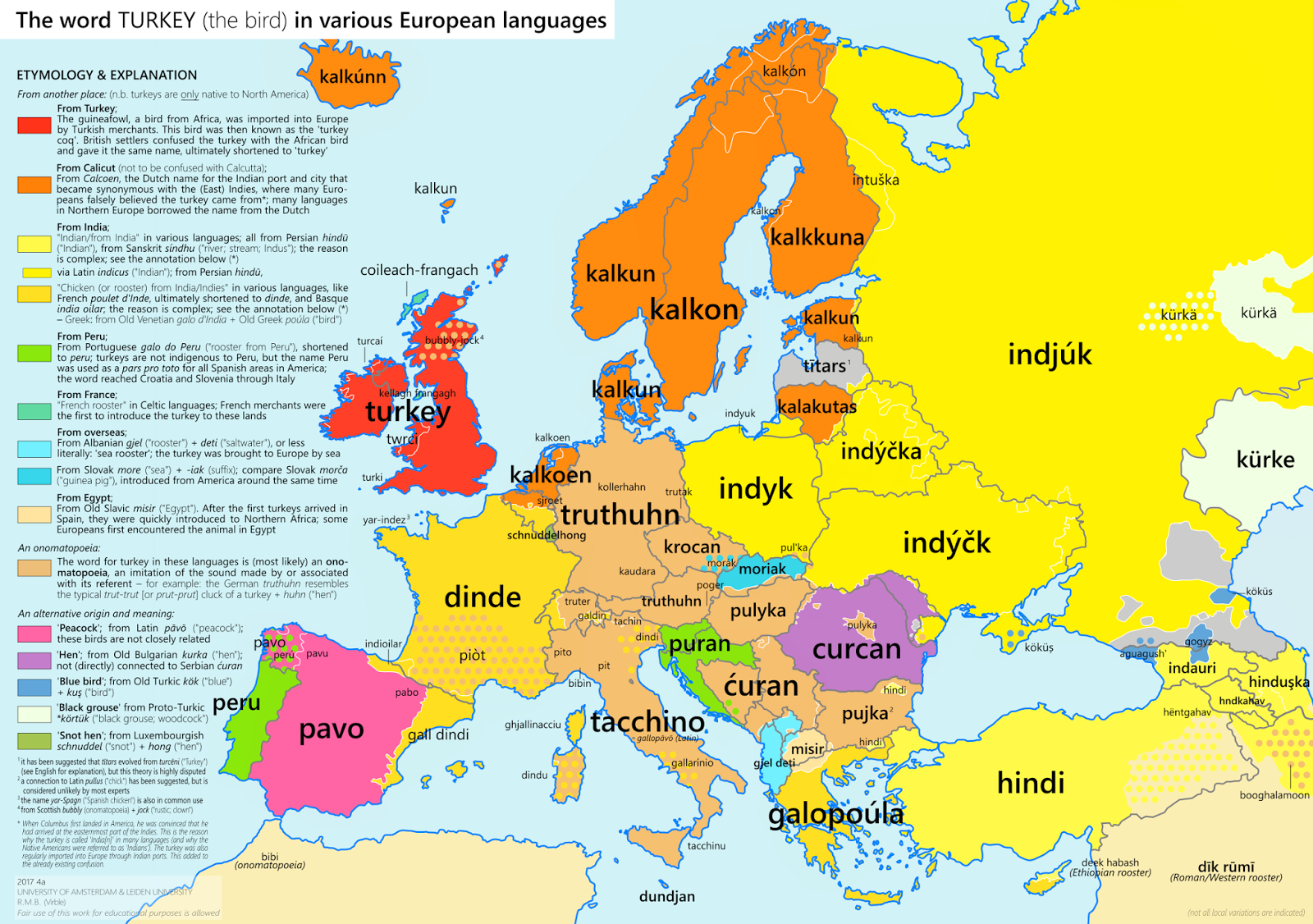
It is bizarre that the New World bird of distinctive appearance was already long labeled as an outsider, as if treated as a bit of a refugee. Although it arrived from the New World with chocolate and coffee, if from North America, the naming of the low-status bird that provides an annual image of bounty was rarely granted insider status, and rarely mapped correctly—but was long labeled a foreigner, in European languages: as English linked it obstinately with a Turkish provenance, confusing it with the African guinea-fowl, Spanish and much of central and Eastern Europe identified it as from India by an unrelated nomenclature, rather than the “indies,” nd Celtic northerners seems to have believed it from France, embedding the poor bird in a lexicon of geographic disorientation and almost compulsively attributing it an unclear origin in ways akin to shrugging shoulders, while all Scandinavia seem to have linked the fowl readily to Calcutta. The Armenian image of “sea rooster” most clearly acknowledges its overseas origins but is as unspecific as possible, although the sea-faring Portuguese show some greater interest in naming the foul with geographic precision in calling it a galo do Peru. The onomatopoeic appellations that spread throughout Mediterranean countries seem striking, but the cartographer May have been over-eager in assimilating the truthuhn to a gobble, given possible linguistic migration from other Saxon lands, and assimilation to a sort of hen.
The mystification of the current bird to a vector of infectious disease is far less interesting to ponder on a purely intellectual plane or as a cultural construction, unless we admit our American readiness to assimilate our foodstuffs to a poorly regulated free market.
The current mission of the CDC to tracked and report to the nation outbreaks of Salmonella infections has recurred each Thanksgiving in recent years. The set of infographic of reported infections of antibiotic-resistant outbreak strains of Salmonella registers a deep upsetting of the balance of the holiday season, even if its subject is really ground turkey meat. The appearance of such statistical measurements on the eve of the national feast day seem emblematic of the atrophying of our national well-being and an erosion of bounty; it bodes to mar the release tryptophan-induced soporific sensations, upset stomaches and intestinal afflictions, more than boosting serotonin by a healthy carbohydrate binge: raising the specter of salmonella outbreaks threatens to mar preparations for the “American pastoral par excellence” by ruffling the feathers and increasing fears of most families with images of infectious outbreaks of diarrhea, stomach cramps, and poor sleep.
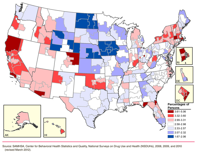
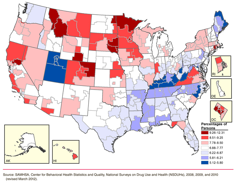
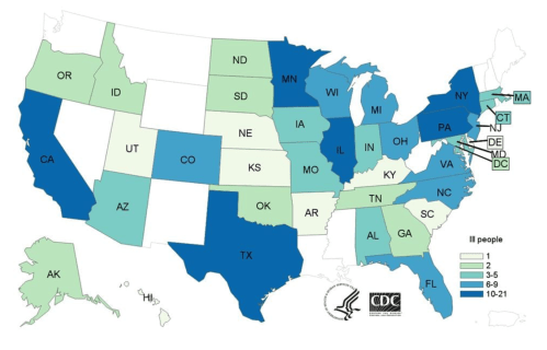
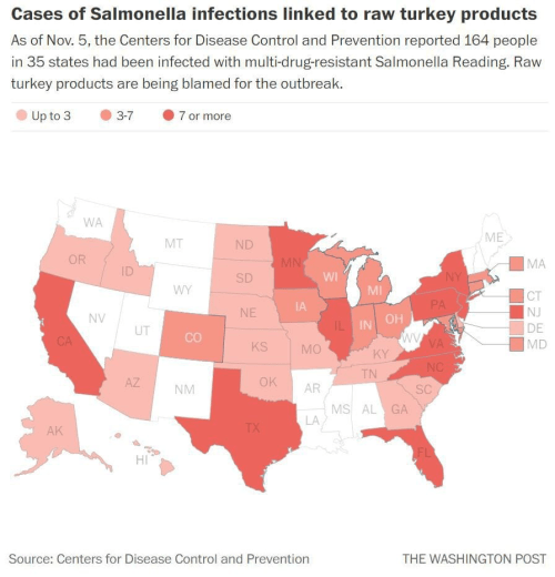
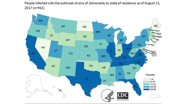
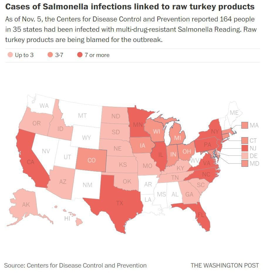
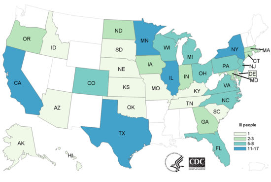
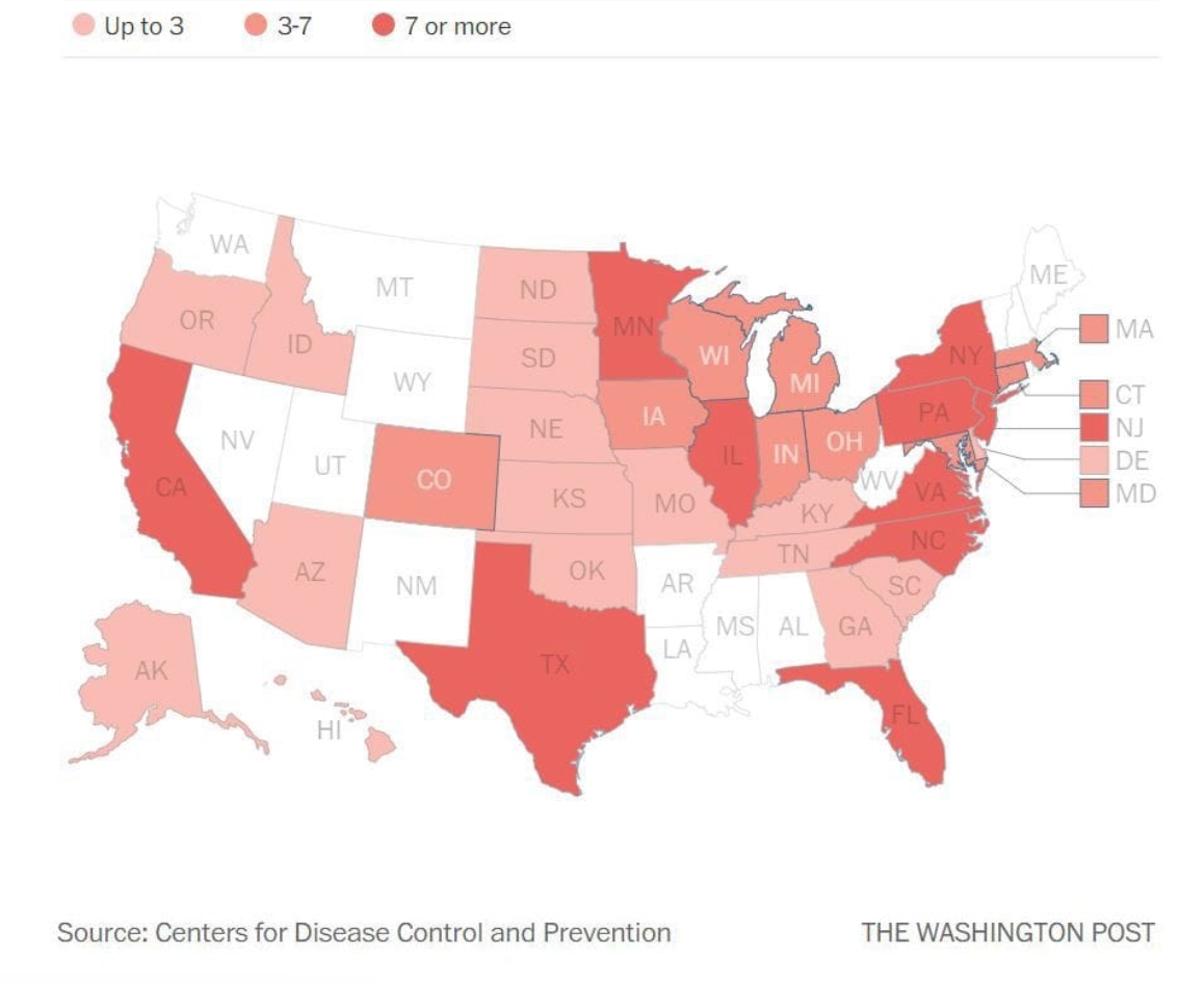
Even if tied quite explicitly to “raw turkey products”–an increasingly popular item in animal food as well as in turkey burgers–the national scale of such infections on the eve of Thanksgiving seem to have demanded being mapped in a cartographic coloring associated with underdone turkey meat. And WaPo seized upon it, just at the start of Thanksgiving plans, to reveal a national chorography whose color ramp suggests undercooked or raw meat, warning its readers of the danger of raw turkey products at a time when the turkey has increasingly become a product–as much as a sign of the finishing of a harvest. The data vis warns us to consume only the well-cooked, although the distribution of reported cases of infection by multi-drug-resistant strains of Salmonella found in raw turkey says little, in fact, about where the consumed turkey derived from or was first shipped: the states of Arkansas, Mississippi, and West Virginia are curiously without reported cases, although each is relatively dense with turkey producers and farms, although such turkey-farming centers as Minnesota and Texas are lit bright pink.
The increased difficulty of confining the spread of salmonella outbreaks among turkeys, and the broad scope of the network of turkey distribution every Thanksgiving casts a frightening pall on the American institution long celebrated as that “neutral, de-religionized ground of Thanksgiving, when everybody gets to eat the same thing,” as Philip Roth once rhapsodically wrote, which saw “nobody sneaking off to eat funny stuff–no kugel, no guilt fish, no bitter herbs, just one colossal turkey for two hundred and fifty million people–one colossal turkey feeds all.”
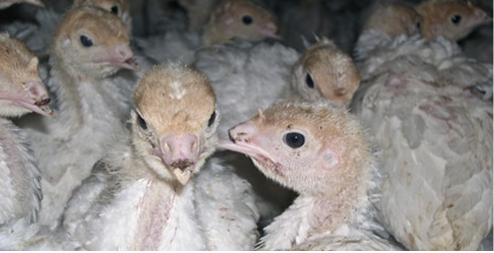
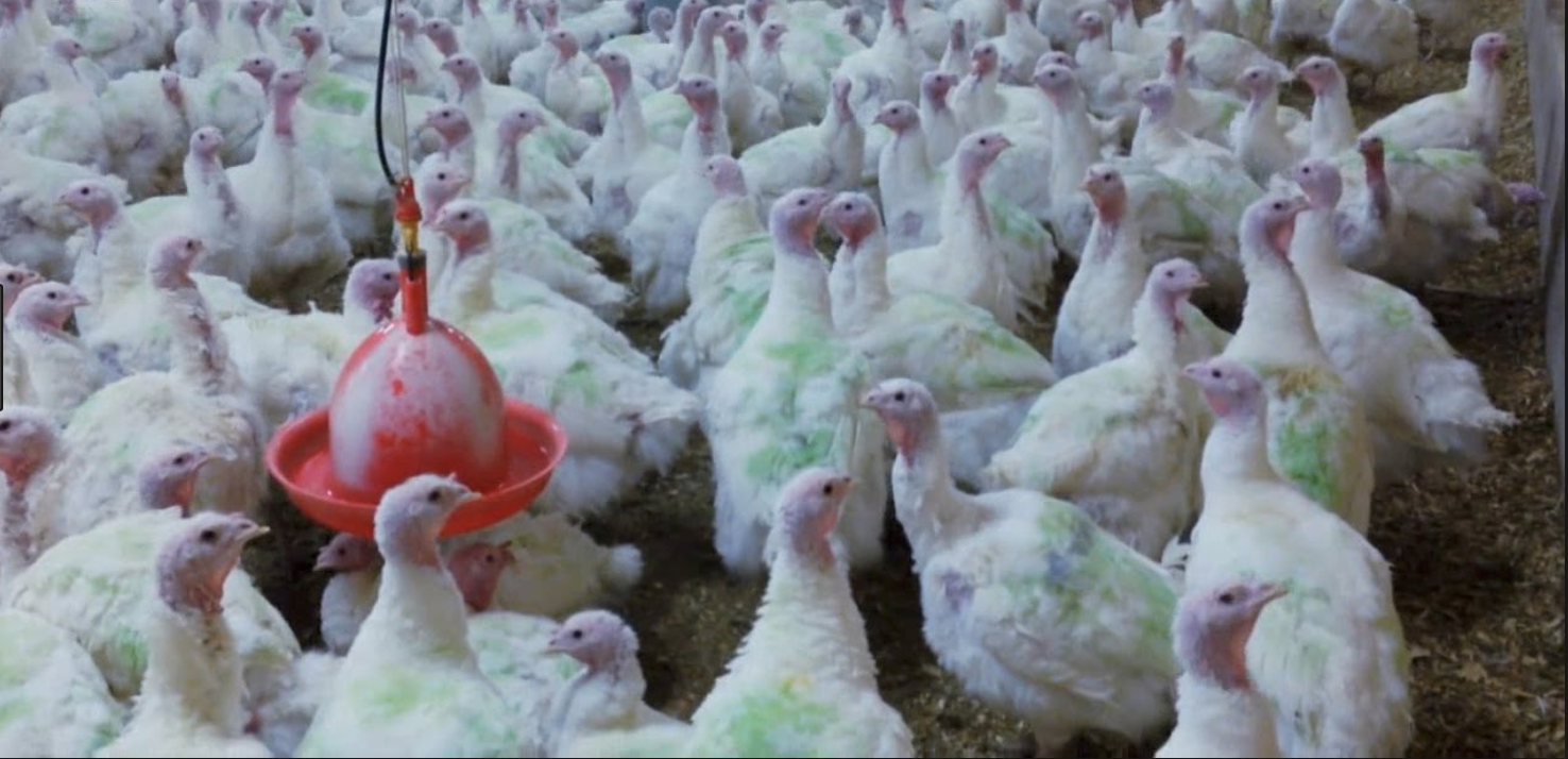
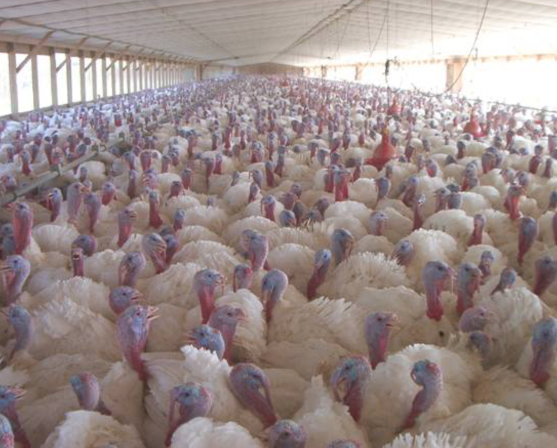
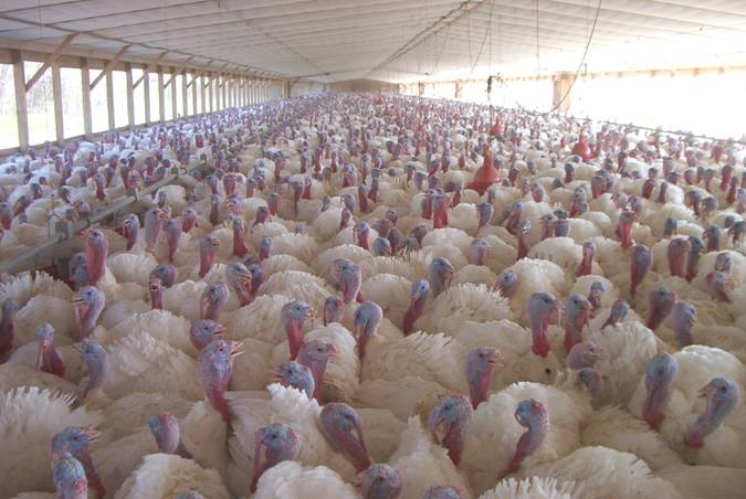
For fears of the infection are no longer stemming from one colossal bird which we all partake, but the emergence among turkeys bred for eating with antibiotics and hormones of a fear that the consumer will be the one making the sacrifice, as specters of diarrhea, cramps, poor sleep, upset stomachs, and vomiting replace the soporific sensation tiredness from binging on tryptophans in ways akin to an accidental (or intentional) overdose of melatonin, with stuffing, sweet potatoes, and more than enough pumpkin pie on the side in a true glucose binge, which may make many feel like they were sacrificing their stomaches and selves, and forget the forty-six million turkeys sacrificed each Thanksgiving, which we still see fit to balance with the Presidential pardon “or commutation” of one turkey’s life. The turkeys, for their part, have lived packed tightly into two and a half to four square foot spaces, breathing dusty air laced with ammonia and whose oversized frames, developed for breeding for markets, beaks and toes removed from an early age, are fed antibiotics in ways that may encourage the growth of antibiotic-resistant bacterial strains, as if by a logic of breeding and producing birds for holiday tables–
We cling to the false geography of rural harmony in the assembly of imagined agrarian traditions on the Thanksgiving table seems internalized by the marketing of turkey meat by turkey distributors in the social media posts of Jennie-O distributors of turkey. Despite the falsified geography of independent turkey farmers that Secretary of Agriculture Sonny Perdue perpetuates in his visits to family farms on the eve of Thanksgiving, turkey meat has become one of the most processed meats, and the most redefined “product” of the factory farm complex, as its availability for the Thanksgiving season creates a unique schedule of slaughtering, meat-processing, and poultry-distribution has created numerous possible avenues for bacterial infection. The demand for turkeys for Thanksgiving has led to the creation of single strains of birds–a hybrid white larger and faster growing than wild turkeys–far removed from the environment of wild turkeys. In response to markets, a species bred from artificial insemination and designed for eating has emerged, whose reproduction is engineered to ensure fewer males, more productive hatching, and structured the lives of turkeys to accommodate the annual prominence of the Thanksgiving feast.
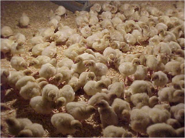
Indeed, if the expansion of factory farm meat upended any clear relation between the raising of turkey and the bucolic image of the Thanksgiving table, turkey meat has become favored “products” far from animal husbandry. From the arrival of small poults at growing farms where they grow to 24-30 pounds in weight, and are prepared to be shipped to breeder farms, to produce eggs that provide markets with turkey meat, raised separately from males less they be injured while mating, hens are artificially inseminated once a week, and all eggs are collected to be stored off-site in temperature controlled incubators with thousands of eggs, to be delivered to larger farms less than twelve hours after hatching. The truly Taylorist production schedule on which turkeys are farmed at “grow-out” sites to sizes demanded by market tastes before they are transported to processing plants.
Such sad images of factory farming only remind us of the degree to which the finely-tuned operations of turkey production on which the “life” of turkey stock depend. For the birds’ lives are indeed determined by their conversion to carcasses, unsurprisingly, as they lead lives increasingly dependent on a via dolorosa dependent on cutting up at processing plants and arriving as commercial products, if not at dinner tables. Is it any wonder that an alarming number of pathogens have been regularly detected in turkey meat, creating considerable alarm at the discovery of Salmonella infections in prepared turkey meat?
The preparation of the bird that predates the division between the raw and the cooked, placing the “lives” of the birds in relation to the demands for Thanksgiving. Fears of Salmonella infections suggests not only the blurring of the cooking of turkey meat, and the conversion of the raw to the cooked, but the blurring of birds bread in unhealthy conditions for conversion to cooked turkey.
The false geography of the potlatch of the Thanksgiving table has perverted poultry production in the industry of factory farming around profit-margins of poultry providers and public tastes–for specialized cuts, ground meats, whole carcasses, and birds of different weights–as what once was a celebration of harvest has come to organize a complex timetable and cycle of production of raised turkey meat, whose illusory relation to the harvest and the land is perhaps best revealed by the temperature-controlled indoor sex-segregated contexts in which turkeys are raised, and the limited options of motion that most turkeys have in the course of their lives, compared with the huge distances that their carcasses travel cross country, or the shipments from hatcheries to breeder farms to growing farms to slaughterhouses to processing plants to meat distribution plants, in ways that make us wonder what distribution the “health” function of their iPhones might show if their motion was tracked, and how greatly the distance of their travels would contrast with their actual options for mobility in growing pens.
The increased infectious outbreaks that the arrival of bacterial infections of Salmonella in ground turkey meat seem to have threatened to upset the most American of family meals, however, as the fears of contaminated turkey meat have threatened an alternate imaginary of the nation preserved by the long faded image of family units among an infinite number of holiday tables.
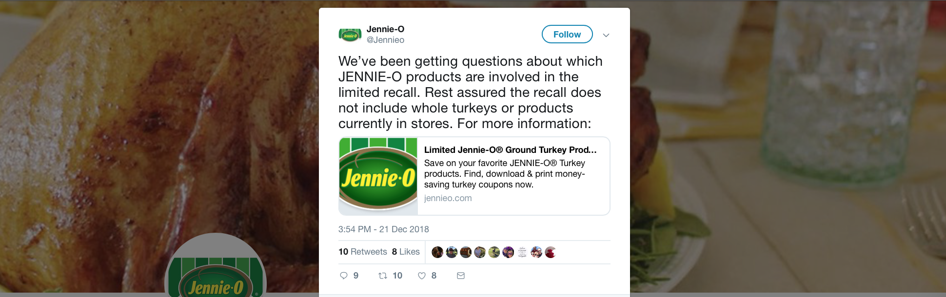
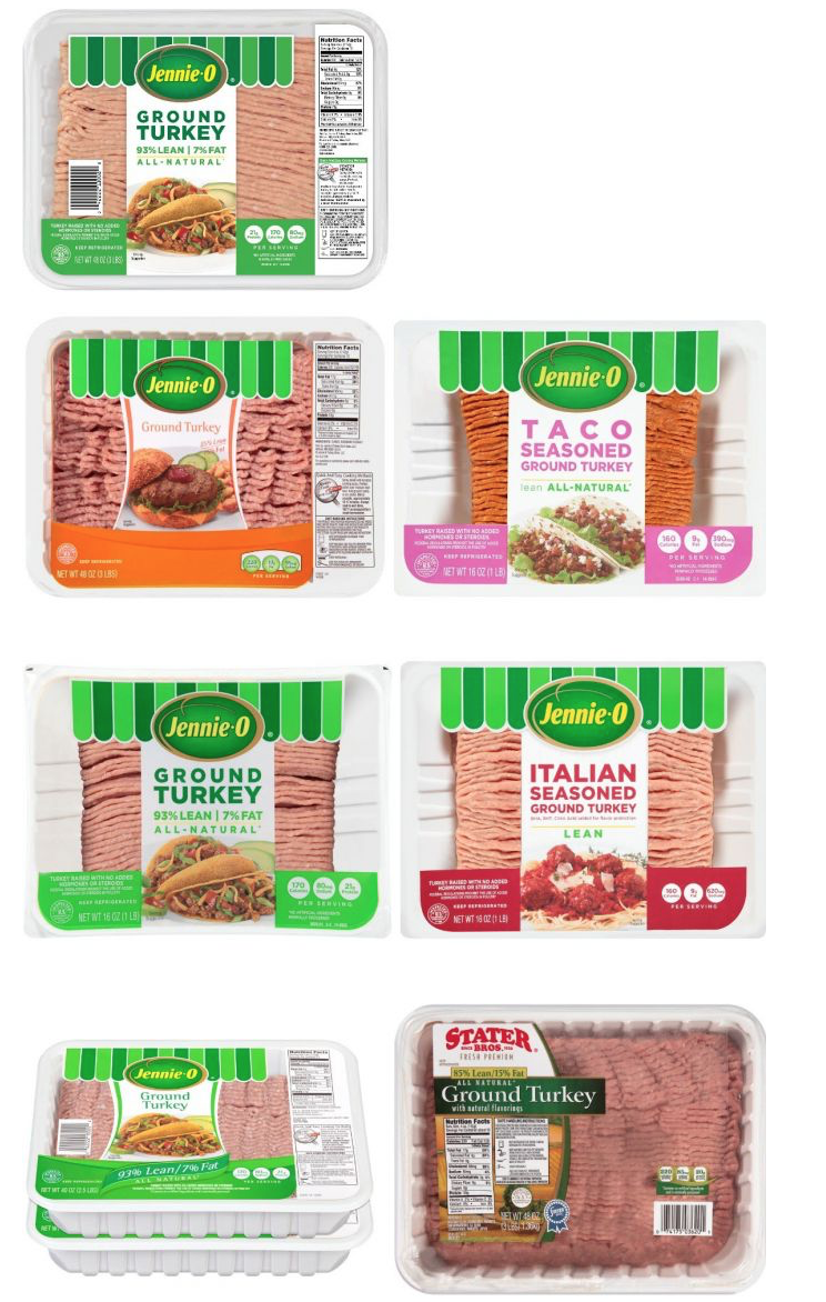
The Thanksgiving plate seems a vestigial reminder of the harmony of the food cycle. While it is enough of a soothing celebration of something with its own complex feng shui to be the background of Jennie-O tweets, the gemütlichkeit of Thanksgiving and myth of the dinner supports a gastronomic reminder of domestic harmony is upset by the increased numbers of infections of turkey in ways that warrant national announcements and concerns from the CDC; each plate on the table is set in perfect order, as an image of the harvest is gathered in a sort of counterpoint on one’s own meal plate. But the harmony of that microcosm was disturbed by seasonal warnings of dangers of infections that this time arrived with increased urgency during the Great Turkey Recall of 2018. Ground turkey continued to be recalled by Jennie-O to the tune of over 164,000 pounds as the salmonella outbreak continued, amidst fears of a government shutdown. And even as fears of troop withdrawals from Syria and Afghanistan raise deep concerns for he nation, the infectious outbreak widened by Christmas, leading producers to assured consumers that the lots of contaminated meat were labeled P-579, to preserve the healthiness of farmed turkey as warnings about Salmonella spread over half the states in the union, and only a small portion of the Salmonella outbreak strains in the nation that had already occurred by 2017, believed to derive from contact with live poultry or uncooked poultry parts in the nation.
Warnings of the safety of turkey meat are regularly issued by the Centers for Disease Control, or CDC, each Thanksgiving in recent years. The state-by-state parsing of outbreak strains to alert the public for consumption warnings, reveal the broad distribution of infected turkey meat, and their limited clustering suggest the wide range of possible vectors of contamination–
–and if the spread of infections from turkey meat from November 2017 had been tracked across twenty-six states given the dangers of handling or consuming poultry and in the dangers of the butchery, preparation and distribution turkey-meat, as much as its preparation in kitchens across America.
The persistence of the numbers of hospitalizations and infections that were traced to turkey meat suggests less of a clear map of the spread of infected meat–if it documents the incidence of reported cases of Salmonella–than the remove of turkey from local agrarian geography. In an era when the vast majority of poultry is farmed, and the seasonal consumption of turkey meat drives turkey production in ways that put increasing pressures on the production of a large number of turkeys in a small temporal window sufficient to accommodate the arrival of some fifty million birds in time for Thanksgiving, the existing network of slaughtering, refrigeration, and shipment of turkey meat may not allow for adequate meat safety. The annual production cycle of batches of designated fresh and frozen poultry designed to arrive in time for the holiday season has created multiple stresses on turkey meat’s distribution, and indeed on the handling of turkey parts, as well as the multiple way of packaging, seasoning, and flavoring turkey meats to meet consumer demand, as Philllip Clauer has noted in his helpful description of the “modern turkey industry,” as the packaging of turkey products in ways designed to meet a large choice for consumers, both by processing turkeys for individual parts–

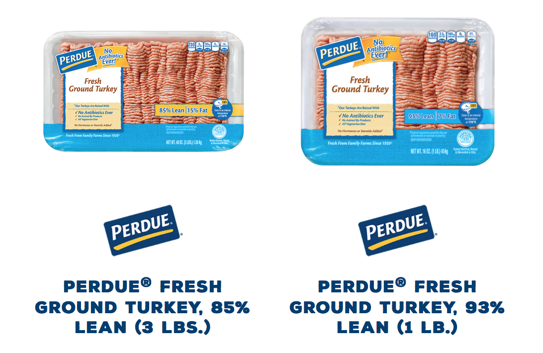
–and offering seasoned varieties of ground turkey, which greatly expand the number of individuals handling turkey meat, by seasoning, marinating, and flavoring what is sold as a “healthy” choice of “all-natural” lean meat for consumers.

The initial warnings of Salmonella poisoning of “all-natural” turkey meat gave alarming immediacy on the eve of Thanksgiving, when turkeys would be arriving in refrigerators nationwide, on their way to ovens, kitchen counters, sinks, and eventually reach their destination on household tables. As infections spread to thirty-five states, the constellation of states which saw over seven infections–New Jersey, Pennsylvania, Florida, Illinois, Minnesota, North Carolina, Virginia, Texas and California–provided testimony to the threat of actual infection of the nation, that spread from turkey processing plants often located at a distance from factor farms where most farmed turkeys are raised in crowded conditions.
The national feedback loops let processing plants calibrate the demand for whole turkey for each Thanksgiving Day and through Christmas. But it has raised alarms that the arrival of turkey meat is less safe than usual. Even as producers assured the public on social media that the outbreak strain was limited to ground turkey, and not whole animals–“Rest assured the recall does not include whole turkeys or products currently in stores”–as if this would inspire calm in the poultry markets, graphics of expanding numbers hospitalized across the nation has raised continued fears–only partly restrained by assurances that Jennie-O distributed with promotional coupons, and assurances about eating turkey “when properly cooked”–and that contaminated ground turkey had been labeled lot “P579” produced in Minnesota in the week October 21-2.

While such warnings narrowed the source of the contamination that had by now spread nation-wide, the extent of the national distribution of ground meats from specific sites confirmed the industrial scale of the production and distribution of turkey meat.
The CDC is right to exercise a degree of vigilance over reported cases of Salmonella infections and their strains, and WaPo was right to publicize just how many states have been struck by multiple reported cases of contaminated bacteria-bearing turkey meat–even if the mapping of a “spread of infection” is hardly able to be deciphered even by the best epidemiologist’s sleuthing, and suggested subliminal cautions about consuming any sort of undercooked meat, one possible clear culprit.
Mapped across multiple states, and derived from antibiotic resistant strains of the foodborne virus, the product recall of ground turkey was so disturbing to receive in mid-November offered a reminder of dangerous disequilibria in our food production and distribution complex among some of the largest distributors of factory farmed turkey meat on which the nation has come to rely for creating the appearance of culinary harmony.
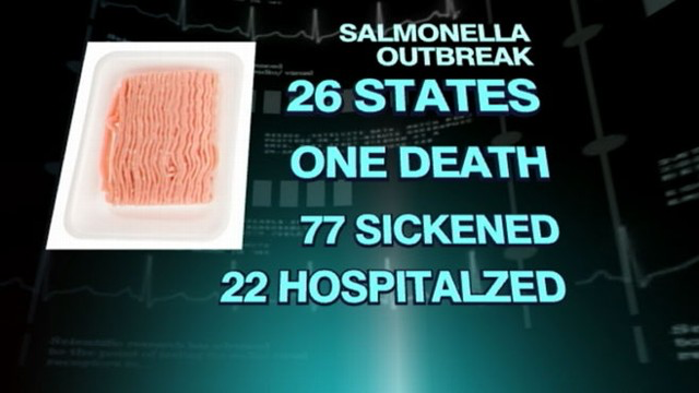
Although we carefully compartmentalize away from the recipes or preparation of the annual feast, a division between the live animal and its carcass, the origins of disease are increasingly tracked with one hundred and sixty four taken sick. The possibility of a bacterial infection being “widespread in the turkey industry” created fears of a broad outbreak–reprising the terrifying antibiotic-resistant outbreak of Salmonella of 2011 in both turkey and beef, which were also focussed on Salmonella Hadar in Jenny-O turkeys–a subsidiary of Hormel–and Salmonella Heidelberg in Cargill Meats.

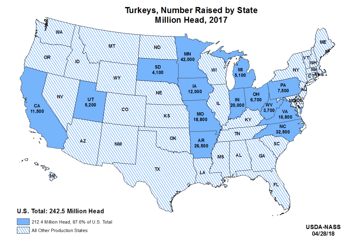
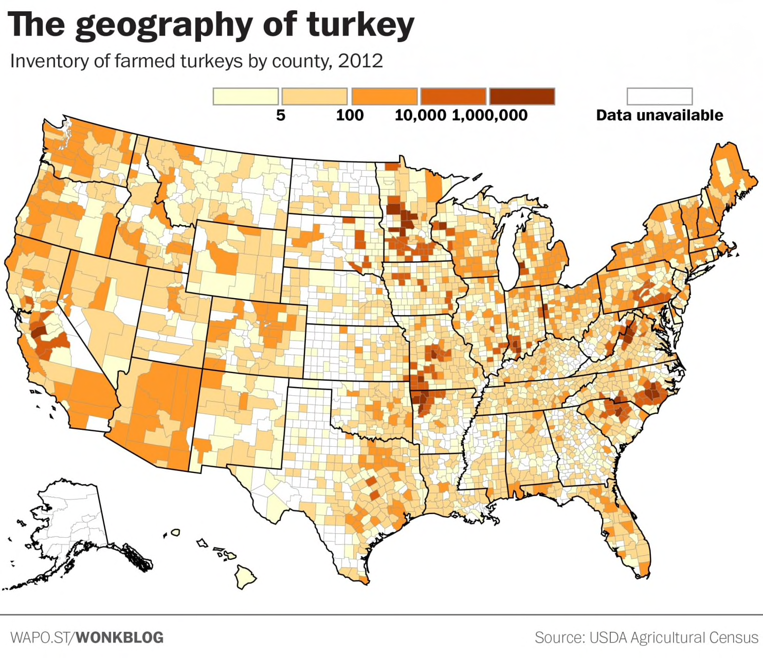
Indeed, the image of Thanksgiving celebrating fruits of the harvest is upended in the current industrial scale production of turkey in our nation: the industry around Thanksgiving orients the hatching and raising in large indoor cages of millions of birds for November arrival in supermarkets and shops stands at such remove from the seasonal harvest and old agrarian calendar to make us realize the tensions between the current landscape of factory farms with the image of the provision of wealth focussed on the bird arriving well-cooked at one’s holiday table–as the specter of birds infected with antibiotic resistant bacteria at some or several points in the process of farming or producing birds designed for our dining room tables. If the production of turkeys in America–densely concentrated in parts of Minnesota, Iowa, Arkansas, Omaha and Texas, in more extreme geographic concentration than other varieties of poultry, when assessed by value–
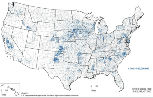
(2007)/https:/USDS Animal Health Demographics, 2010
–in ways that contrast sharply with the actual broad distribution of wild turkey across regions of the United States–

–or the actual broad number of local farms where poultry is raised.
The concentration of the farmed turkeys that arrive at Thanksgiving tables, and in American markets, arrive from a far more restricted area. The result of this concentration poses possibilities of introducing infections, within the distribution of turkey meat. Although the agrarian illusion of Thanksgiving as a bucolic, authentic, and rural event is removed from large cities and sites of urban pollution and grit, the clusterings of mega-farms in fact stands as something like the crooked spine of a nation.
The striking density of such farms suggests the degree to which turkey farmers are increasingly bent by the market tyrants from Butterball, Hormel, Cargill, who determine the interface between the national demand for turkeys and the condition and welfare of their supply. The calculus of Turkey production pivots, unsurprisingly, on Thanksgiving, where the demand for the birds seasonally peaks. Such concentration of poultry production reflects its reliance on the production of readily available grain, and especially soybeans, that constitute the bulk of turkey feed.
With three of the folks who were taken ill with Salmonella working or tied to someone who worked in facilities that either farm or process birds for eating, or raising turkey meat–raising questions about the exposure of those who work on farms to antibiotic-resistant bacteria–or from raw turkey that was intended as pet food. The outbreaks of bacteria resistant to multiple antibiotics, from ampicillin to tetracyclines to streptomycin, may be tied to prophylactic antibiotics adopted in industrial-scale factory farms. Despite the proposal to introduce an outright ban on using tetracycline at sub therapeutic levels, the failure to adopt such restrictions has created the situation where three quarters of all antibiotics used in the United States are used on livestock: back in the late 1980s, the rates of administering antibiotics to humans and animals had been roughly equal. And the introduction of a diet of antibiotics in an expansive industry of turkey production.
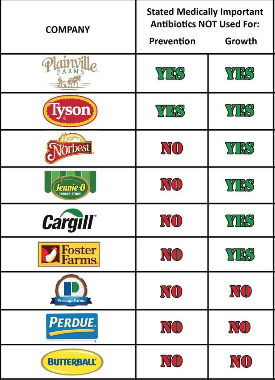
The mis-use of antibiotics to increase the size of raised birds–a danger to which turkeys are particularly vulnerable, as they are prized and valued for their size and the rapidity of growing birds to a large size–even if the FDA discourages using antibiotics to promote growth, the absence of any regulatory enforcement as to what amounts constitute proper prevention has opened a large loophole in American farming: Norbest, Jennie-O, Cargill and Foster Farms prohibit using antibiotics for promoting growth, but not for disease prevention, creating a broad opening top the use of antibiotics, as Food Animal Concerns Trust (FACT) found in 2015, when it survived the feed additives that major United States producers of turkeys–including Cartill, Tyson, Jennie-O, and Perdue–and the beta agonist Ractopamine, which has been banned in the European Union, but remains legal in the United States.
The production of turkeys in this agrarian-industrial complex runs like clockwork. Fertilized turkey eggs are incubated for a month before hatching, resting to grow for three to four months in farms, and are shipped to a slaughterhouse or processing plants for predation for markets in time for Thanksgiving celebrations, as if inexorably attracted by the annual calendar of consumption generates a production schedule that is something of a dialectic, exerting undue pressures of production on factory farms to produce turkeys of increased size (who wants small birds? few did until recently) who are best produced through extra antibiotics, in a sort of “dosing” of the sacrificial bird before its ritual sacrifice. Rather than sacrificed for the harvest in a natural way, farms have perfected a strategy to produce sufficient birds of needed size that constitutes a production schedule mirroring the harvest, but introducing a few mechanical tweaks hinging upon transport, distribution, and demand: of the turkeys hatched each spring, slaughtered birds are refrigerated to temperatures below 40 degrees Farenheit, but above 26 degrees, in time to arrive in something like the fresh frozen state by late October or early November for the preparation of the Thanksgiving table.
The prominence of Thanksgiving in the lives of the farmed turkeys as the fulcrum along which raising birds turns is not oriented to the farm, or the seasons, in other words, but the elastic market that determines how fifty million birds can be supplied to those wanting to repeat the national ritual of Thanksgiving feasts. If technology was recognized as the subject of the contemporary historical tragedy in the technicians of production, the mechanics and techniques of turkey raising may post part of the problem. For the production schedule offers multiple opportunities for bacterial infection that must make them particularly sensitive to carrying food-borne disease. The slaughtered fowl shipped out to retailers respond to the levels of demand marketers find, allowing them to shift some carcasses designated for lunch meats, individual breasts and legs sold in packages, or ground turkey back into the processing of whole birds, suggesting the actual fluidity between ground turkey meat and the birds arriving at Thanksgiving table.
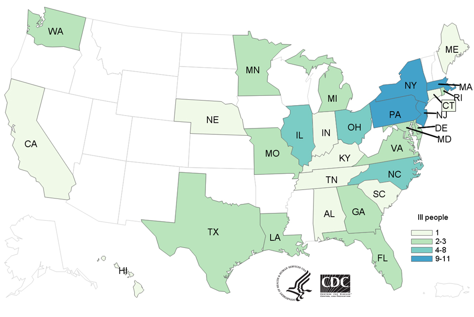
The extent of these fears were readily tapped by recent maps of the feared outbreaks of Salmonella infections from tainted supplies of turkey, transmitted in undercooked meats, that seems poised to threaten to frustrate the harmony of the social potlatch of harvest foods, as warnings of the danger of infectious disease have spread, with Thanksgiving only weeks away, across thirty-five states–in a reprisal of fears the previous year of the first reports of cases of a bacterial strain distinguished by its resistantancn to antibiotics. The discovery and identification of the strain of antibiotic-resistant Salmonella Reading prompted fears for a Thanksgiving outbreak of infections, which rather than mapped with the level of detail that would reflect the detection of the outbreak in sampled raw turkey products from some twenty-two individual slaughterhouses and seven meat-processing plants, were described only in a state-by-state distribution of total reported infections rather than the actual vectors of infectious disease: the Washington Post designed the below infographic to alert its readers to the worries of a spread of tainted turkey meat, coloring states with the greater number of reported infections as if in more underdone shades of meat, but their removal form any sense of the sits of distributors or slaughterhouses concealed rather than clarified.
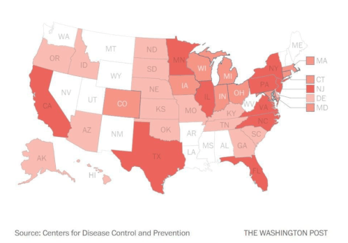
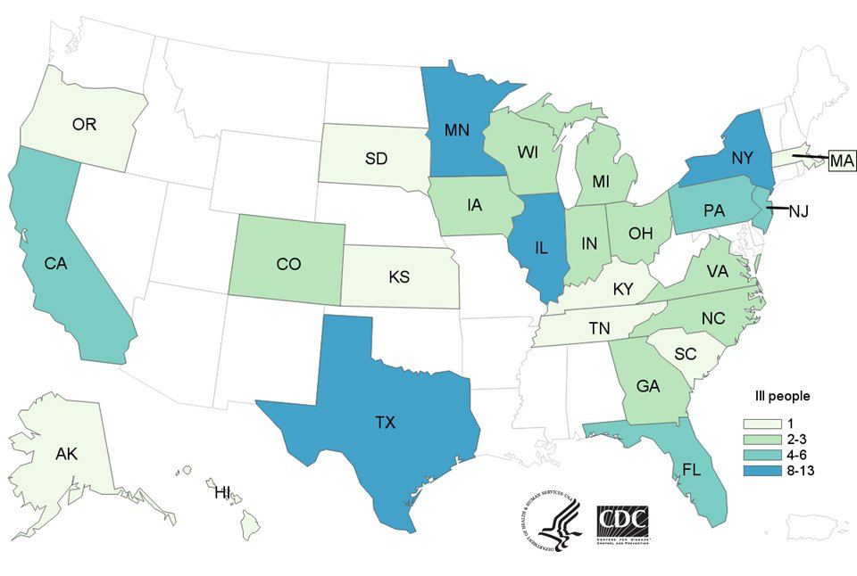
The color ramp on this infographic derived from public records released by the CDC. If its immediate message was to remind viewers of the dangers of serving underdone turkey meat, the deep understory may have been a lack of full transparency how the government agency hid the identities of the turkey suppliers identified and suspected of slaughtering, distributing, and selling the compromised meat. The watchdog Center for Science in the Public Interest (CSPI) has noted in the past the danger of agencies protecting the suppliers with considerable vested interests in keeping the turkey-industrial complex that carries millions of birds to American holiday tables on time for this national feast. The fears of such a relinquishing of responsibilities of good government is perhaps not surprising in the current pro-business atmosphere of Trump’s Washington, with Georgia chicken family magnate Sonny Perdue the nation’s thirty-first secretary of the USDA; Purdue somewhat generically retweeted the public cautionary food safety warning to handling bird carcasses,but without mention of the outbreak–inspiring the quick response that the “best” defense was in fact to “only eat veg” over the holiday feast.
And if “talking turkey”as an expression of speaking frankly has been argued to have originated in the open spirit of the holiday–if also possible in “talking cold turkey” as a way of discussing actual facts may have arisen within the context of the holiday–less about contact with native Americans than the recreation of bonhomie and openness at the holiday table–the alternatives of pleasant conversation and frank discussion both stand at odds with the current concealment of an actually accurate map of food safety. For the distribution of toxic turkeys and their origin in the supply chain or in factory farms seems concealed for know of left unclear in maps that register the arrival –evident in recent identification of sources of tainted meat suppliers as Tolleson, the source of many of the contaminated turkeys, to beef products sold and distributed by sources tentatively identified for the public as including Kroger, Laura’s Lean and JBS Tolleson generic. The uncertain landscape of bacteria in fresh, processed, and frozen meat raises fears of food-born diseases as something like a self-made dirty bomb.
From the perspective of the USDA,”food safety” is described less in terms of the conditions in which birds are raised for sale, than to the kitchen practices of preparing and cooking the bird, a familiar ritual of cleaning and defrosting the meat, as a set of four”best practices” of delivering the safest bird to the holiday table–
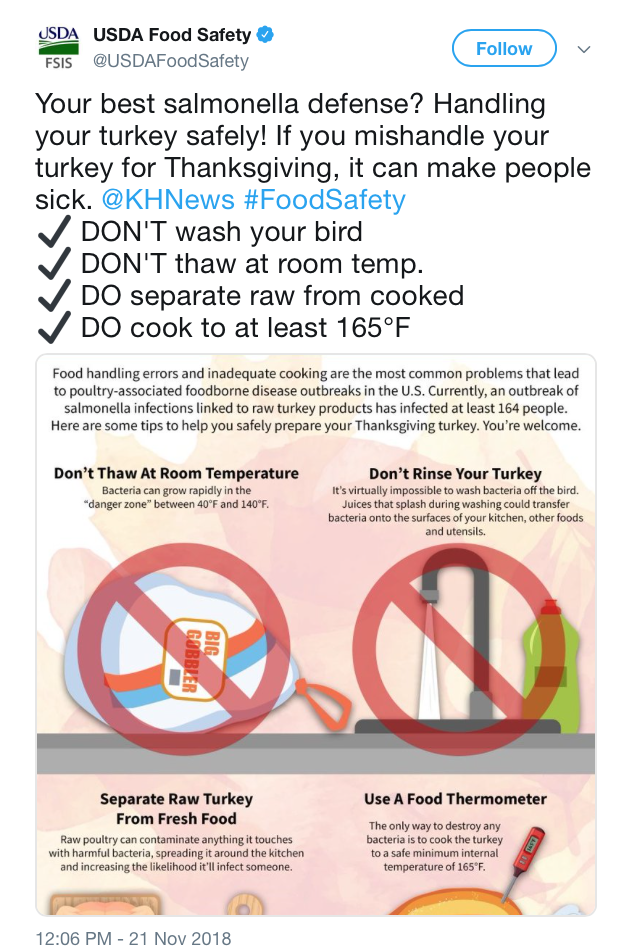
–rather than addressing the questions of how such a strain was introduced, or the steps that should be taken in bagging, buying, and storing potentially infected turkey or chicken carcasses, as if to shift the onus to the consumer and the preparer of the holiday meal, rather than the question of how the breakout diseases correlated to the increasing dependence of turkey distribution on factory farms and large meat-processing plants.
Tracing down the origins of the bacterial presence of different Salmonella strains seems to have been far from the minds of the officials who issued assurances confined to food preparation, in hopes to assuage public fears, and dampen suspicions that infections were endemic to the turkey-industrial complex. USDA Secretary Sonny Purdue–scion of a firm of Turkey suppliers–and not exactly a disinterested source, but more of a representative of the industrial farming of poultry meat that presents itself as “fit & easy’ and “fresh”–and “changing the way we treat chickens” and with a commmitment to animal care–
Perude may have been profesionally distracted on social media, to be sure, between attention to tampering down alarms of the damage caused by Hurricane Michael across the Florida panhandle and the Camp Fire and Woolsey Fire in California, which unleashed alarms about forestry, agriculture, and water infrastructure. But the deceptive moves to pin the epidemic of wildfires on inadequate or lacking “forest management”–rather than climate change seem to be mirrored in his direction of public attention to the cultivation of best practices of poultry preparation to the exclusion of any acknowledgement of the widespread discovery of antibiotic-resistant bacteria within the very sorts of turkey meat that his family business has long prepared. Even if he tweeted on November 22 to followers to enjoin them to be conscious that “if you are preparing a meal, please remember we have American farmers to thank for the bounty,” erasing the industrial-scale structures of poultry farming –even as Perdue presided over the deregulation of the poultry industry, undoing powers that earlier administrations gave to small farmers who raise antibiotic-free fowl or work on contract for meat industry players–Butterball, Jennie-O, Cargill, and Farbest Foods–to bring charges against them for abusive distributive practices, introduced under the Obama administration to provide better guarantees to control meat production, in hopes to “control frivolous litigation,” that would and prevent agribusiness meat processing companies from setting terms to family farms–continuing the USDA’s existing regulations for meat packers and stockyards would only serve, poultry lobbyists argue, to “open the floodgates to frivolous and costly litigation,” but leaves distributors and agribusiness to dictate the terms of turkey sales, production, and livestock conditions.
But the alarms about the quality of the birds raised by our nation’s largest suppliers of turkeys should not be lost in the instability of the spread of fires in high-population areas and increased damages from natural disasters. Perhaps the only acknowledgement of the fears of contaminated poultry bearing antibiotic-resistant bacteria were present in the public promise that Purdue would share oversight of culturing food livestock and poultry cell-lines with the FDA, prospectively producing a new regime of food safety for the future. The infographic from WaPo couldn’t not respond, in the meantime, to growing suspicions that the birds that would soon lie on our tables derived from tainted meat, and that the holiday stood to increase our vulnerability across the nation to uncomfortable intestinal disquiet. However, it makes sense to ask whether the deregulation of farm conditions and livestock conditions would not act–as President Barack Obama predicted of Citizens United decision allowing the deregulation of funding of political campaigns stood to “open the floodgates for special interests—including foreign corporations—to spend without limit in our elections,” by removing any restrictions for livestock raising.
It remained striking that among Perdue’s extensive visits to family farms, @SecretarySonny was notably silent about the concerns for the spread of infected meat within the Turkey-industrial complex of United States farms and poultry distributors. Perdue preferred to tweet out openly promotional images of Secretary Sonny visiting favorite small-scale suppliers of Thanksgiving birds to his followers, a farm producing but 30,000 birds a year–unlike the factory farms from which most of the fifty million birds arrive at American Thanksgiving tables–within other promotional images of the Secretary visiting family farms that seem to be carefully curated to suggest his ties to the family farm, and to a bucolic image of where our healthiest turkeys are bred–overlooking the dominance of four firms– Butterball, Jennie-O, Cargill, and Farbest Foods–in the distribution and slaughtering of turkeys, and the dominance that larger firms will continue to have over family farms, driven by the demand to produce larger birds more quickly to fill a growing market for turkey meat.
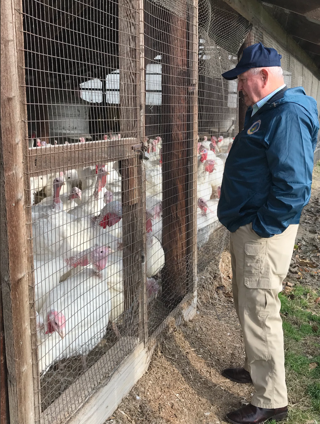
USDA @SecretarySonny’s tweet about his November 12, 2018 visit to Lee Farms in East Windsor NJ
If Perdue’s tours of family farms and promotion of American farmers on twitter suggests an agrarian paradise dedicated to prosperous family-based animal husbandry, the active social media feed provokes a picture of wholesome husbandry far from the range that occupies such a prominent place in the American imaginary that is regularly reactivated every Thanksgiving, sharply dissonant with the American farmscape, or the distribution networks that dominate how farmed turkey meat arrives at our tables, as the Secretary of Agriculture does his part in sustaining the illusion of a rich agrarian landscape blended harmoniously with a farmscape where the bounty of the land still exist in a “great outdoors” rather than in a market for processed meat–promoting the idea that Minnosota, the capital of farmed-raised turkeys, raises those turkeys outdoors, rather than in large, indoor hangars.

–or in the pre-packaged sales of farm-raised turkey meat.

The current distribution of infections from antibiotic-resistant strains of Salmonella in turkey meat run against the bucolic vision of the harvest holiday, and suggest the danger of dependence on a constellation of factory farms and large farms serving distributors of cut, ground, and whole birds. The discovery of vectors of infectious disease haven’t been traced within the food supply cycle with any fine grace, but suggest the national level of disquietude and unease at the possibility of a breakout virus in the birds soon to arrive at our tables.
The data viz seems designed to trigger unease at breaches between the categories of holiday tables and the factory farms that are so often sequestered in discrete categories, and indeed upset the vision of a smooth circulation of turkeys from farm to table. By breaching the domestic and the large-scale distribution of meat in the nation, categories usually kept neatly separate, fears of communicating bacterial infections through undercooked turkey meat seemed materialized in the data visualization authoritatively provided by the CDC, whose newly tweaked palette revealed the dangers of the divide. For despite the clustering of an immense amount of wealth in poultry products in areas where canola grains, a staple in bred turkey diets, are cheap, able to convert low-cost grains to valued poultry products–often removed from their most common sites of slaughter for the bulk of the American market.


($182,247,407,000; dot=$20 Million value of poultry)
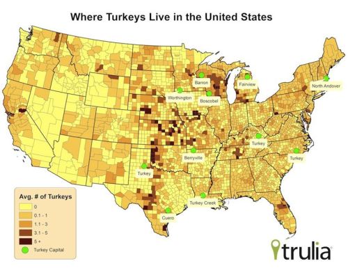
The divide between the clustering of distribution centers for American poultry markets seemed removed from the ones which arrived in our refrigerators to be basted in ovens, in annual idylls of domesticity. The creation of a USGS Breeding Bird Survey suggests the increased density of such “turkey capitals” that are in three cases named “Turkey,” as if they are the modern remnants of old factory towns, where talking turkey presumably means serious business and a way of life.

The concentration of that the wealth of poultry overlaps with the current states where bred turkeys remain concentrated in quite disproportionate ways, let alone disturbingly unclean living conditions, and where they lay in waiting en route to slaughterhouses before arriving at distribution networks, including two Wisconsin towns that announce themselves as the “turkey capital” of their state; the belt of turkey heads across the middle of the nation–or from Minnesota to Iowa to Missouri to Arkansas–
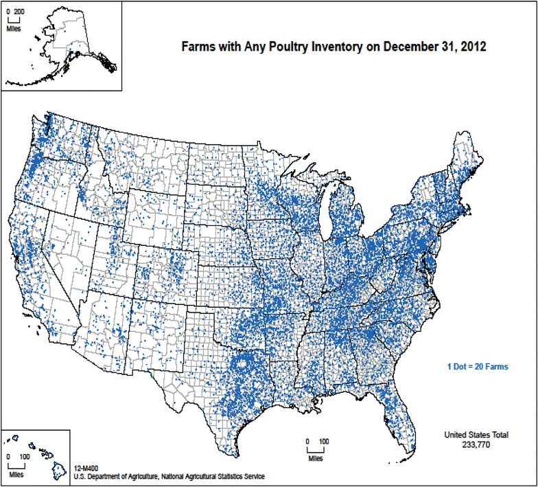
The dramatic geographical concentration of inventories of turkey farms in the United States six years ago already raised questions about the health consequences of such intense overcrowding of poultry farms–even if we don’t seem to measure the concentration of farmed turkey that have grown increasingly concentrated, placing literally millions and millions of farm-bred birds, many raised for the Thanksgiving table, in dense concentrations at factory farms with little sense of the growing worries of public health that such concentrations might cause or provoke, as the demand for the bird long limited to holiday feasting has grown as a “healthy” option and an alternative choice for fresh pet food.
While that may not seem to have much to do with the turkeys that arrive, fully cooked, at our tables–

And even if we forwent eating turkey this Thanksgiving for reasons of taste and expedience, as well as a smaller table, the topical findings of an antibiotic resistant Salmonella strain set off broad alarms about food preparation.
For the detection of multi-drug resistant Salmonella strains in a “multi-state outbreak” tied to raw turkey raises specters of a national infection, and raises some very current questions about the anthropology of meat. As if Salmonella were threatening the nation by crossing the borders of our Thanksgiving tables, rather than born in the fabric of our factory, the tallying of cases of poisoning and hospitalization couldn’t help but be read as cautionary of a public health disaster, warning us to fully cook our traditional Thanksgiving meats to contain the danger of contracting diarrhea, abdominal cramps and fever, through severe and possibly fatal foodborne bacterial infections. The map’s color ramp adopts a normal Color Brewer ramp, using it to render the range of reported cases of Salmonella infections by a shade of increased undercooking of turkey meat, in a barely subliminal message–

–designed to recall the shades of uncooked meat that offer the clearest subliminal message of the vectors of infection, all of a sudden giving it an immediate narrative of local poisoning–even if the “map” is far from geographically or epidemiologically specific in its state-by-state breakdown of the “breakout” of the disease–and seems a teaser to imagine the potential future epidemic of the consumption of a spate of undercooked holiday turkey.

We’ll be cooking far fewer than the two hundred and fifty million turkeys raised in a year. And if free-range birds are popular, increasing numbers of turkeys are also clustered in smaller spaces and in far fewer states in overcrowded factory farms makes the infographic showing recent cases of Salmonella tied to the consumption of turkey meat disconcerting on the eve of Thanksgiving, and almost a reflection on the state of the nation’s food safety.
The color spectrum of underdone meat triggers perennial fears haunting America’s day of thanks, alerts all viewers to the dangers of under-cooking the bird or failing to wash hands, under the surface lies the conditions in which living turkeys are kept while raised for a holiday repast, among ammonia-laced air, in crowded conditions, and with poultry litter rarely kept clean or pristine. Even if the outbreak was in turkey products, such perennial concerns about the transmission of bacteria in the cleaning, stuffing and cooking of the holiday bird are all condensed in that infographic, and its ramp to correspond rather creepily to the guidelines for preparing turkey flesh as the vector for future outbreaks after Thanksgiving meals, even if the large bulk of reported cases seem to have derived from ground turkey meat.
Continue reading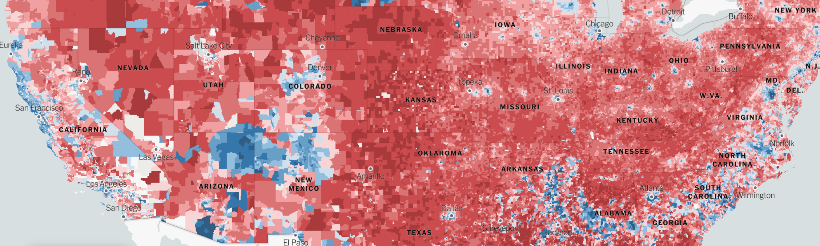
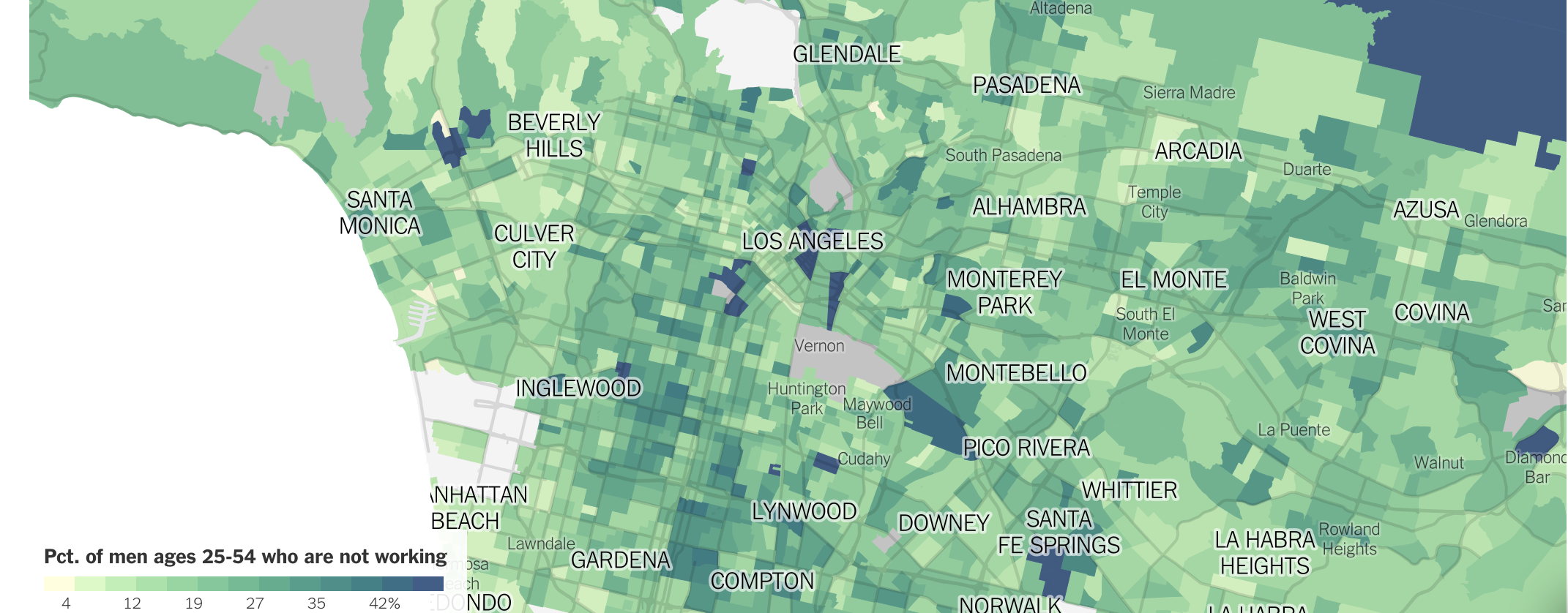
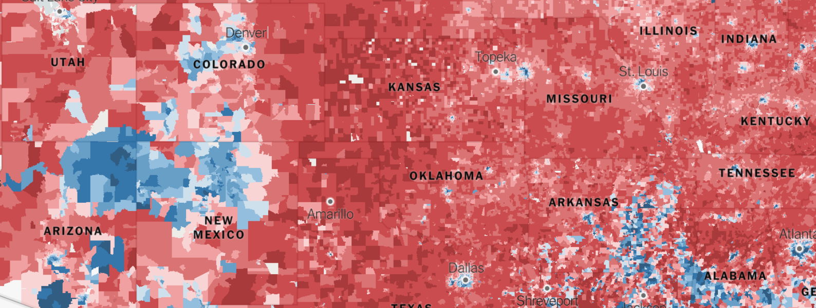 Detail of above
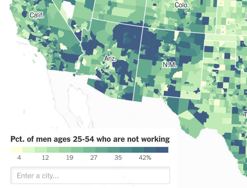

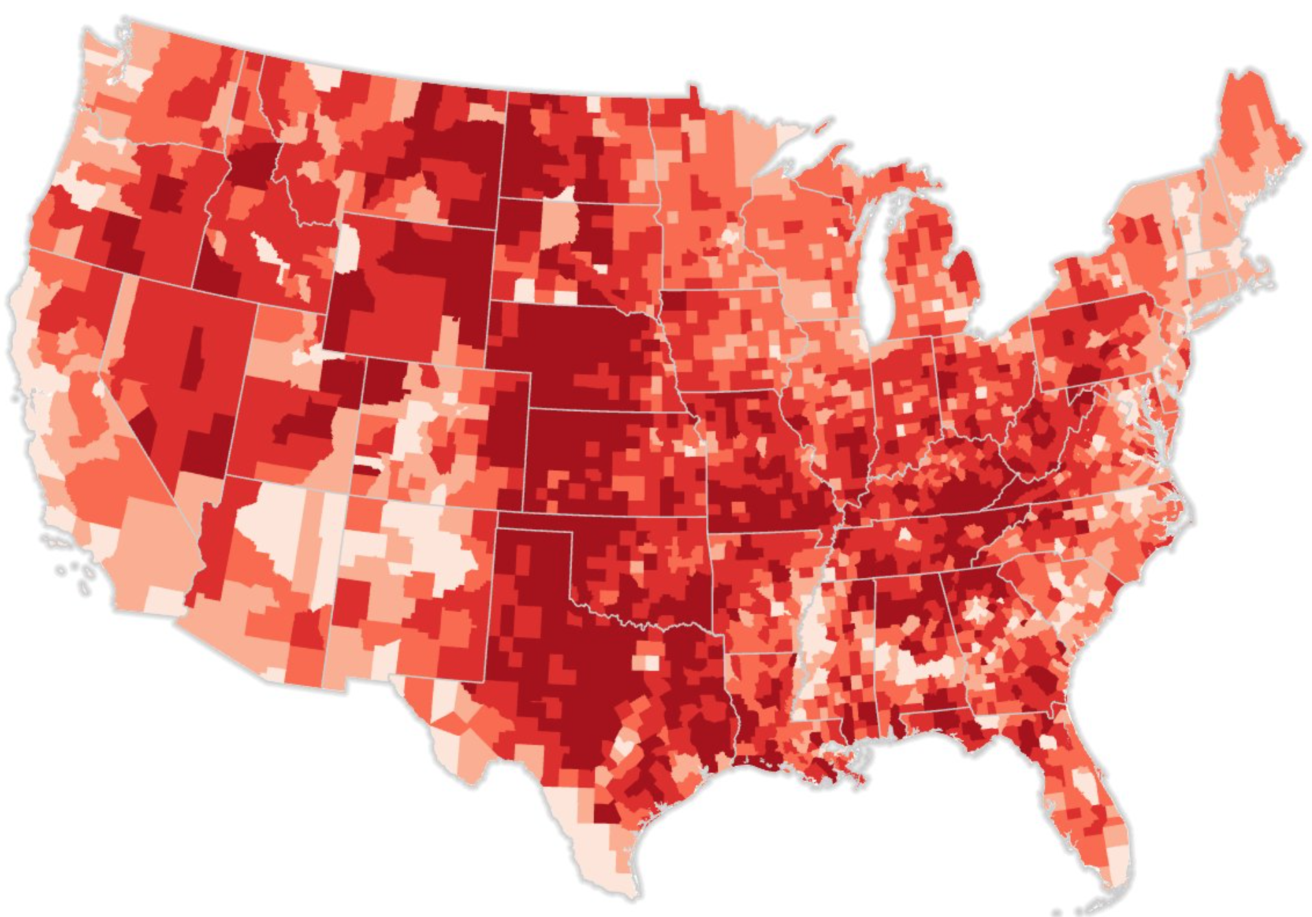
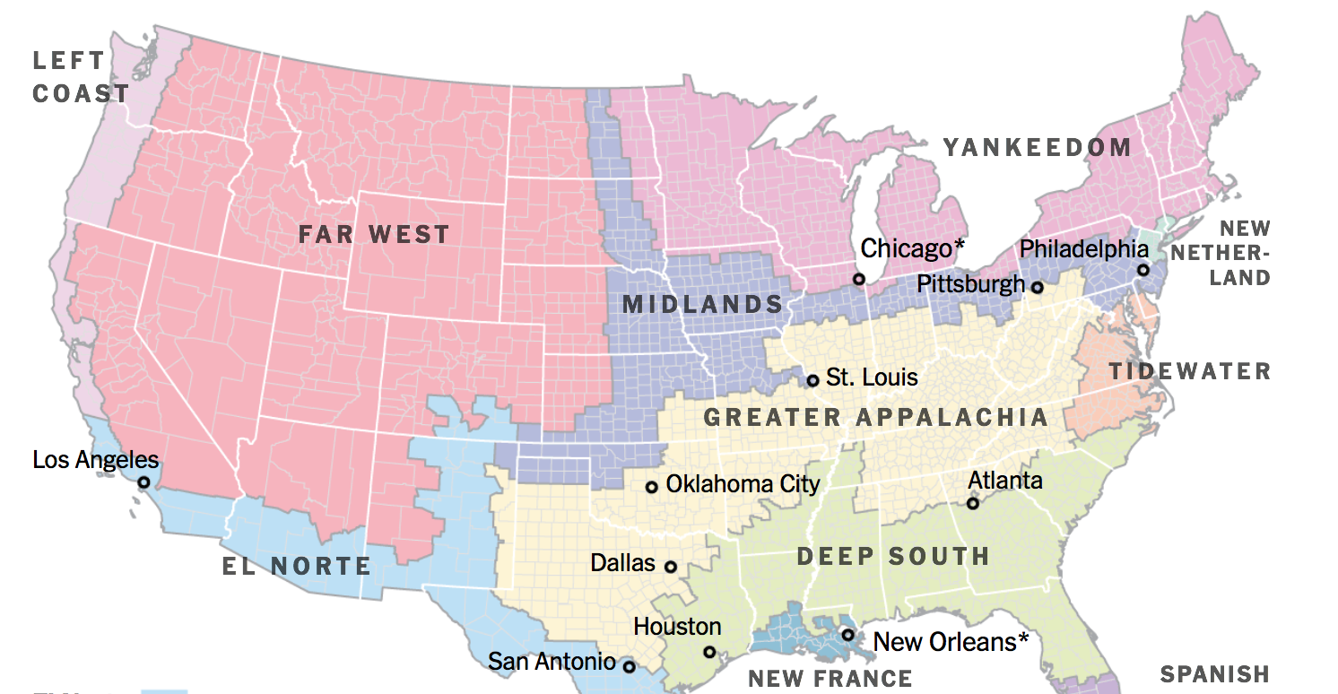
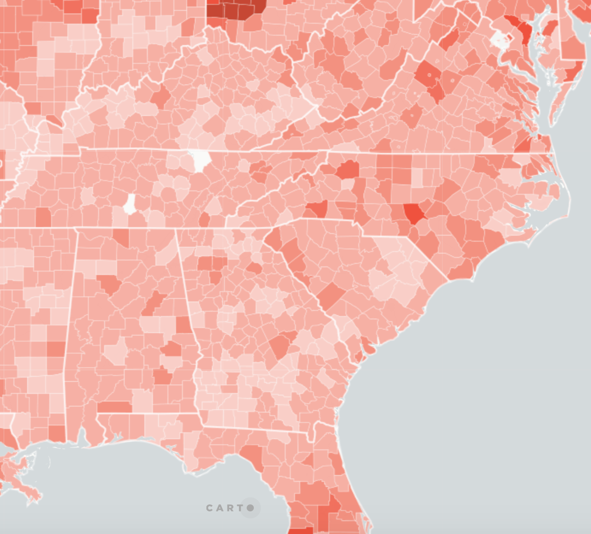
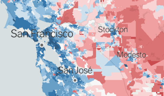
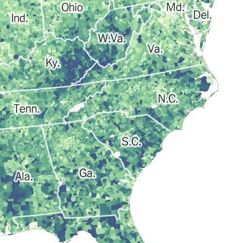
 Area roughly corresponding to Greater Appalachia/Mapbox/New York Times
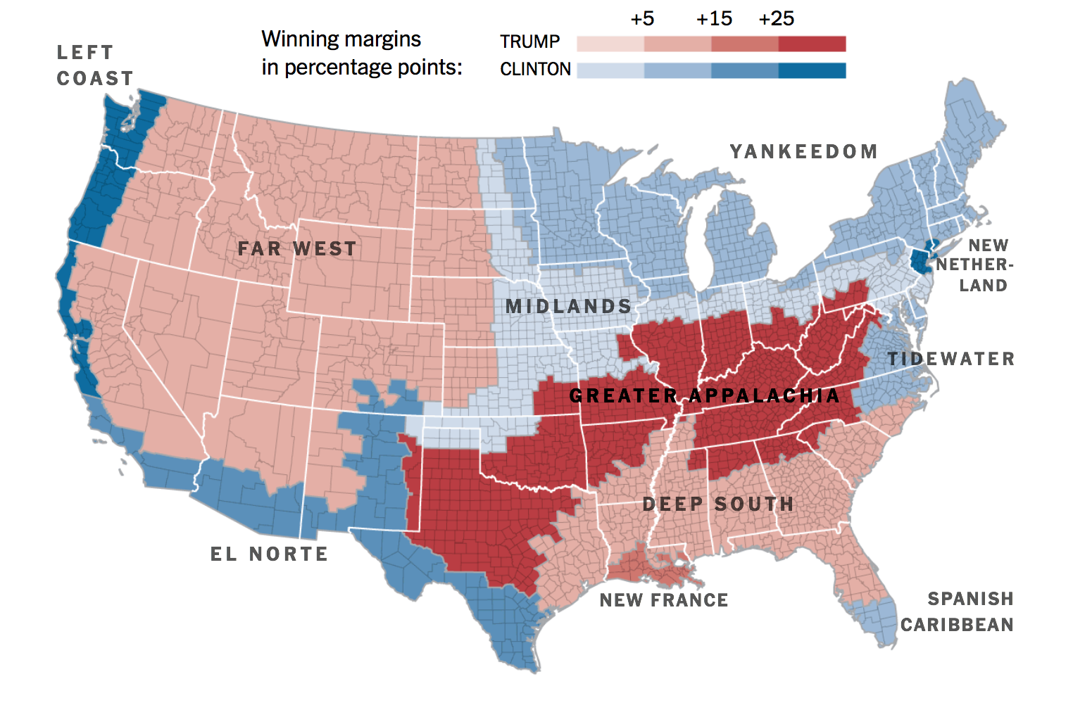
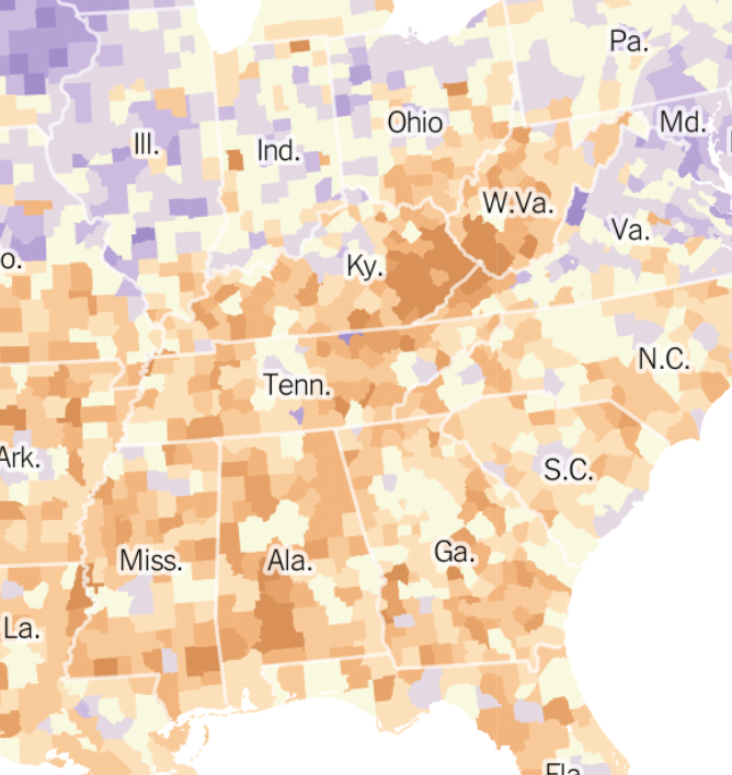
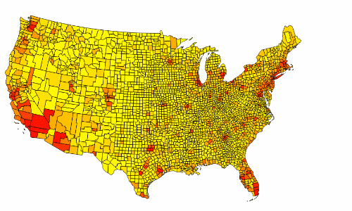
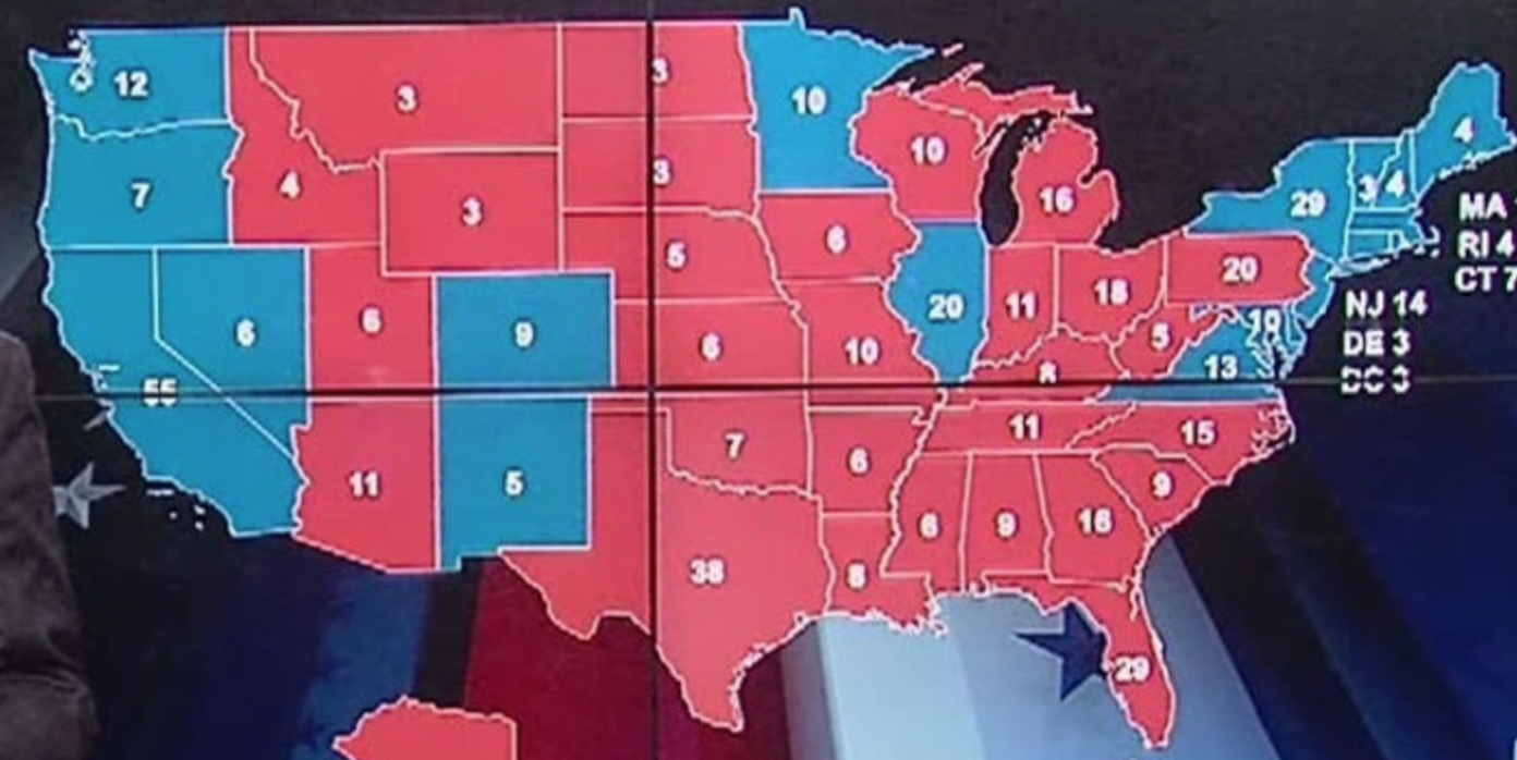
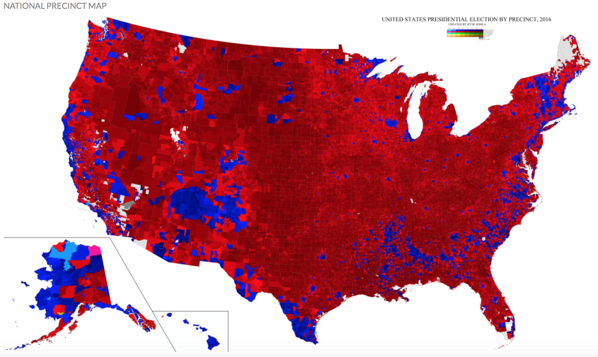
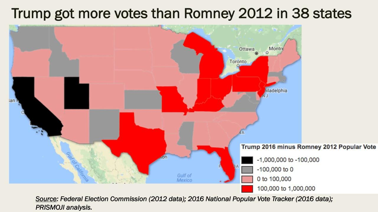
 Ryne Rhola/Mapbox (2018), 2016 US Presidential Election