Tracking cellphones is not strictly speaking a practice of mapping, so much as one of surveillance or data collection. Yet the increased dependence of our National Security Agency on cyber-surveillance amassing big data has so convinced parts of our government of the ability to render something like an actual map of activities that threaten the state that the compilation of something like a comprehensive metadata map has created the illusion of assembling a map that will ensure our security. “Our business processes need to promote data-driven decision-making,” the agency coolly notes, and circumscribes its goals as “to answer questions about threatening activities that others mean to keep hidden.” The recent expansion of the mission statement of the NSA to intercept, weed through and filter out threatening personal communications transmitted on cables in email or by phone communications that are grabbed from the air with an air of self-justified righteousness that conceals their potential invasiveness and criminality, however, opened the floodgates to data collection of all metadata.
The right to sift through all communications that pass across the internet or are mediated by satellite without apparently intruding on their content offers the chance to assemble a clearer picture of an individual as more data is gathered in bulk: the more information amassed, rather than selective use of criteria, paradoxically provides the more accurate picture of the person mapped–and an image that is, in fact, more likely far more intrusive than the content of phone calls. As whistle-blower William Binney put it so succinctly, “When you take all those records of who’s communicating with who, you can build social networks and communities for everyone in the world. And when you marry it up with the content, you have leverage against everybody in the country.”
The recent revelations of Edward Snowden and others have provided fairly chilling examples of the extent to which government agencies like the NSA have taken the internet as a particular sort of extraterritorial domain. While the expanse of the internet seems vast, the proprietary relation to the passage of information along internet cables created a logic for culling metadata that evacuated claims of individual privacy, whether it travelled within the sovereign bounds of the United States our outside of them. The view that information that travelled on the internet was ipso facto subject to the authority of the United States government enabled a redrawing of boundaries of the invasive or intrusive, viewing the data that travelled outside and around the personal communications subject to culling in secret fashion: culling information on its cables has both shifted the definition of individual privacy in considerable ways, and, as it has provided the potential to map people by metadata argued to be surrendered to US companies that serve as providers, and, by extension, to the US government. (Soon after Snowden revealed documents, printed in the Washington Post, that detailed how the US government used Google cookies to track individual suspects, CEO Eric Schmidt claims to have considered the possibility of moving its servers outside of the United States.) The government built on its supervision of distribution of internet domain names and addresses, with limited legal ground, to assert ownership of private information; if the claims of ownership routinely made by the government agency, which has embedded systems of passive surveillance onto the material geography of the internet, may have been made out of the need to secure the country from threats, it has been based on the misguided belief that “tracking” all communications create readable “maps.”
Whether such maps would indeed track immanent threats or security risks is less clear than the preposterous assertion of the right to create a detailed map of all individual’s actions. If the aim for such comprehensive mapping seems an illusion of the right to know ass, the elevation of the degree of surveillance that this would accept over US citizens is not only unwarranted but shockingly arrogant as a claim. The transparency by which the agency represents their passive monitoring of communications exchange to collect data along the high speed optical cables is all too clear in their maps–which mark the sites of funneling information from undersea transmission cables. It is indeed striking how, by mapping a space of information’s transit over which they defensively assert the ability to intercept, in a sequence of maps purposefully erasing sovereign entities from a traditional world map. And while these sorts of maps illustrating the points of the interception of messages at crucially located nodes of the internet made known in the declassified images released by Edward Snowden, the peculiarly self-confident reposting of similar and analogous maps on the NSA website reveals the unquestioning confidence and assertion of the justifiable right to listen in on and surveil the data streams and communications traveling across undersea cables or by satellite transmissions to intercept signs of potential dangers to the nation–although what the nation save an entity in need of protection by worldwide monitoring remains unclear.
For while without traditional legal per se precedent, the map of NSA access to and interception of internet communications and traffic is an extension of the notion of the protection of borders that has gained attention to become so problematic after the events of 9/11, when the relation of the US to other almost intentionally amorphous and unlocatable rogue “terrorist” networks has magnified a sense of those borders’ vulnerability, and intentionally evoked the Orwellian concept of the “Homeland”–rather than the nation–to extend protection to conduits that pass across international waters, in the hope of surveilling and collating all possible potential threats.
In a skeletal apparatus of the interception of information that is defined by the alliances among intelligence systems, the world is redivided by the NSA in terms of the signals able to be monitored and received by the largest stations or nodes of interception, rather than its actual space:
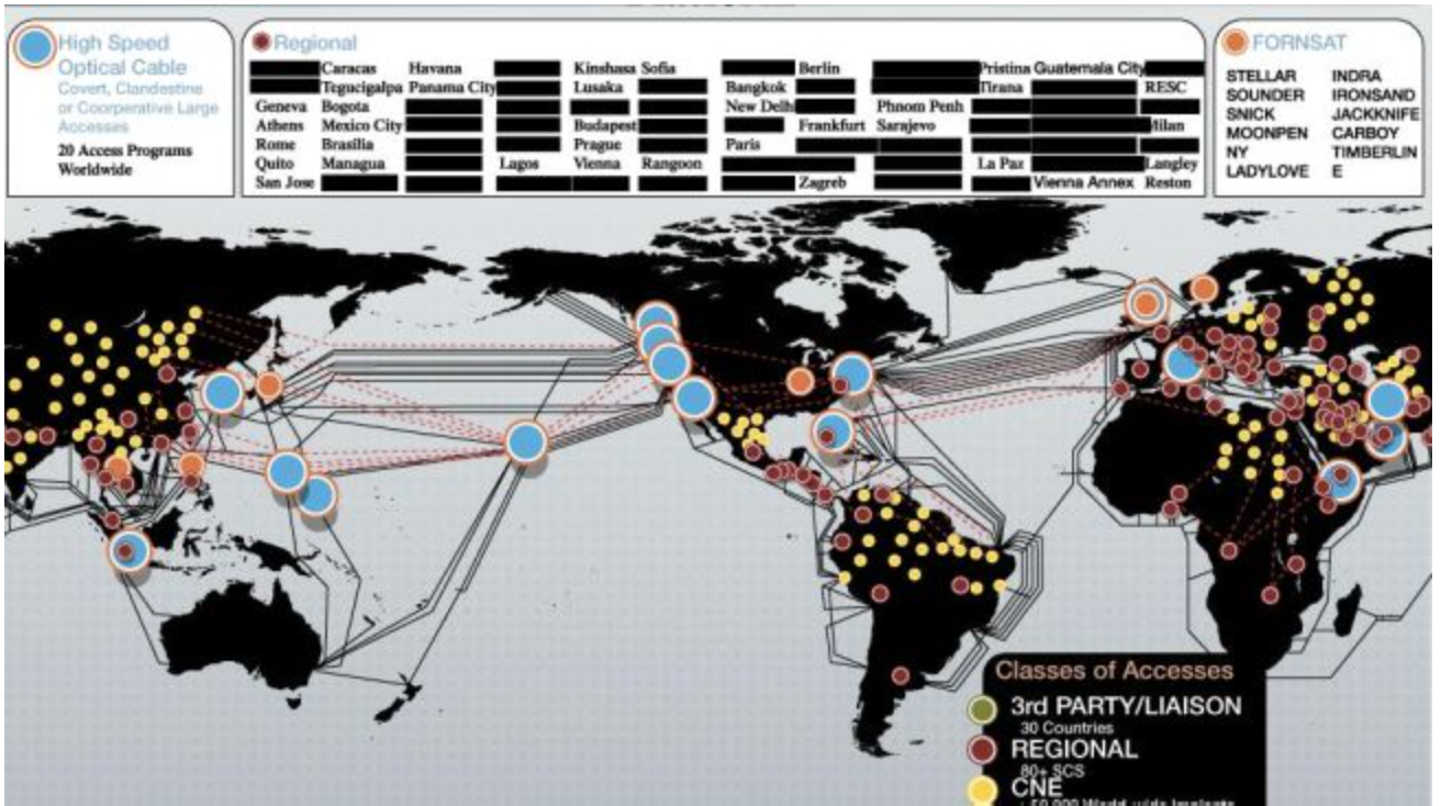
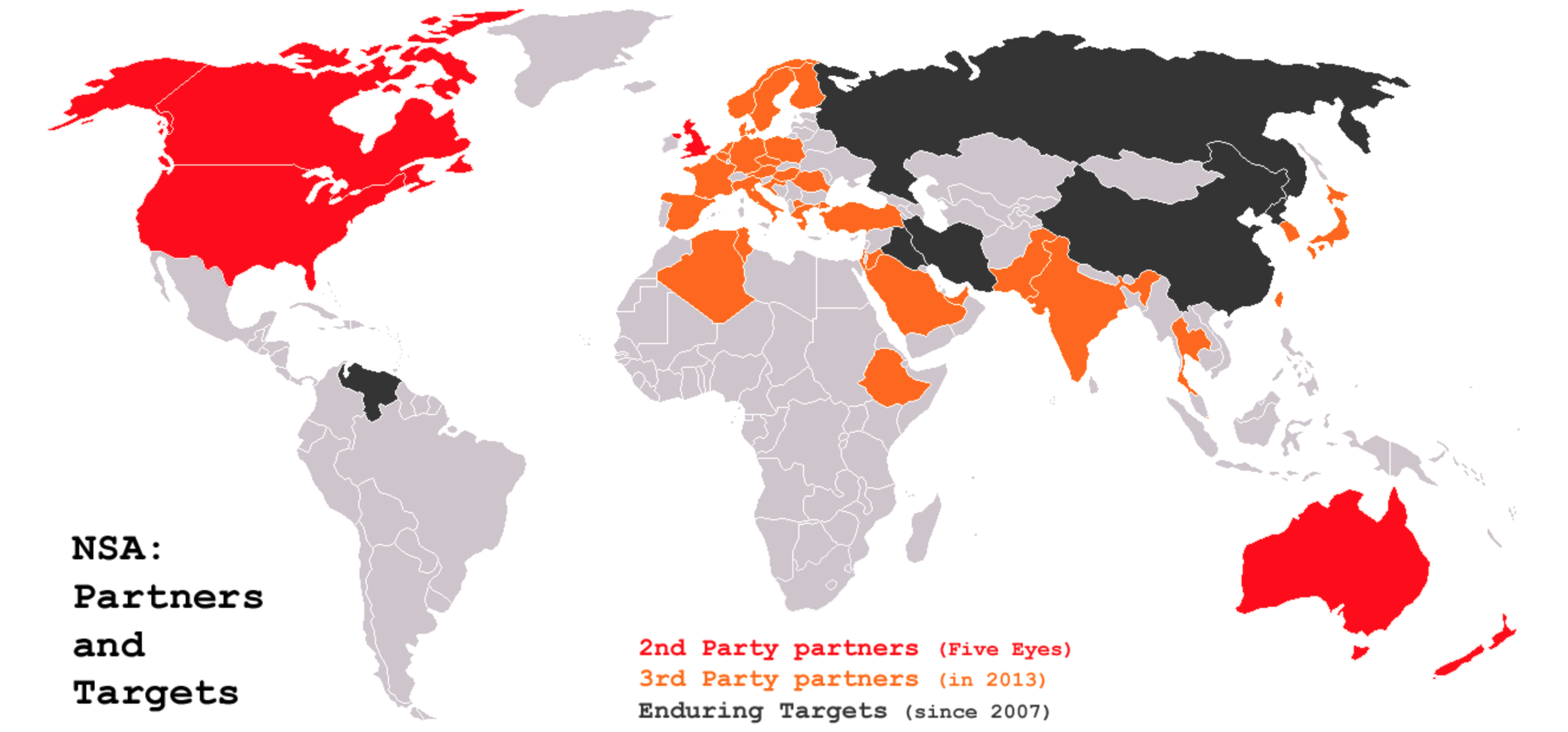
The basis for such surveillance has rested in an ability to triangulate the vast bulk of signals transmitted along the cables of the internet, and satellite transmissions of cellular phones, along the so-called “Five Eyes” partners in surveilling–England; Canada; Australia; For the network of passive and active surveillance by metadata accumulation–and indeed monitoring of all email and phone communications–is based on a division of the world between those who are surveilled and those who are partners in the surveillance, in ways that create the central distorting lens through which the NSA divides the world into those who are monitored, those doing the surveilling, and those who are assisting with its operations, even if most of the signal interception occurs among the “five eyes” of the US, Canada, England, New Zealand and Australia, to provide global coverage of activity worldwide:
Indeed, the massive project of amassing of telephony metadata, including guides to position, email metadata, and a “Treasure Map” based on foreign data and other Signals Intelligence–Sigint–all suggest a ballooning business of data collection in the hope to process or track suspicious movements or activities deemed to be dangerous to the United States.
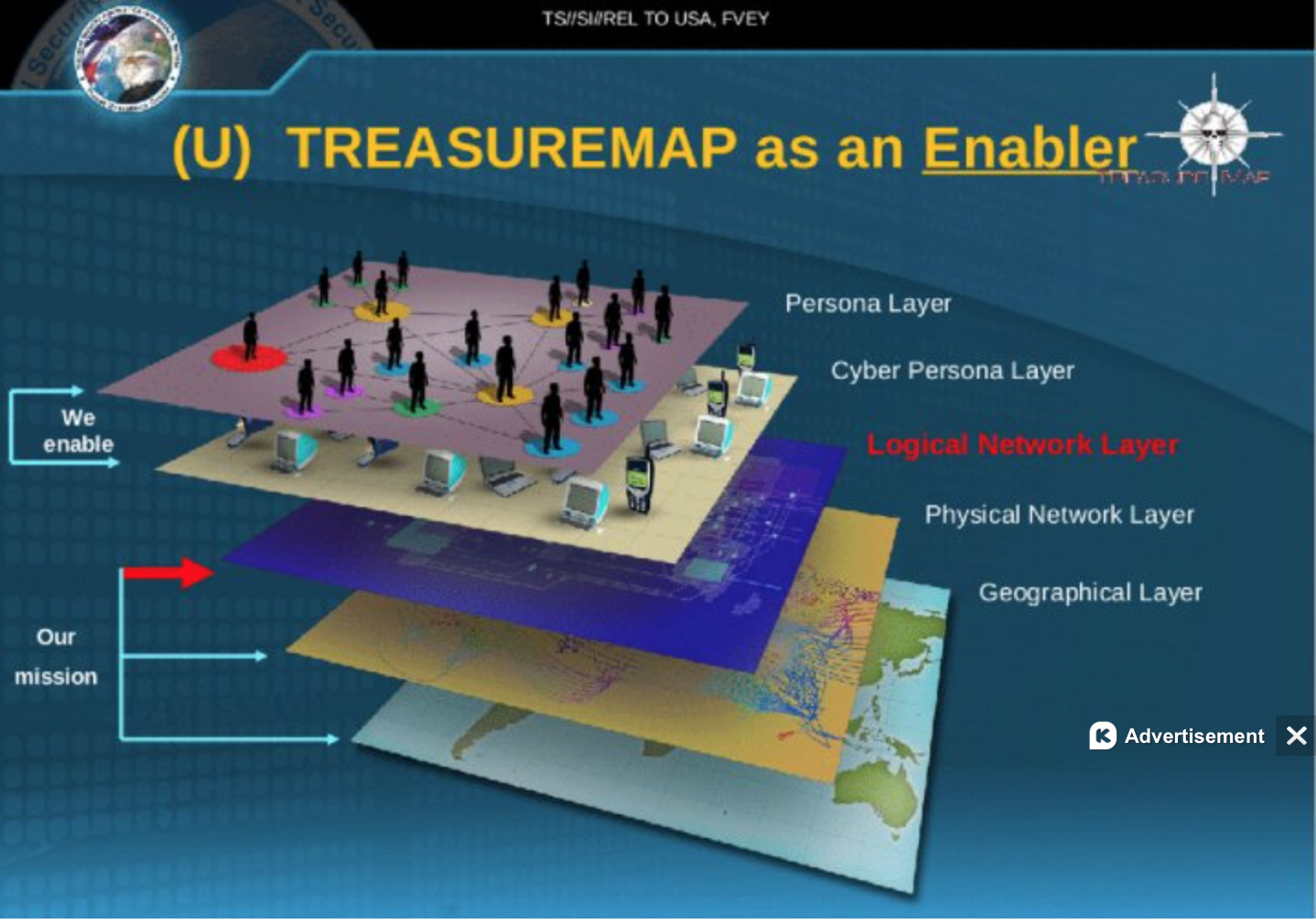
The “Treasure Map” distinguishes layers of the interface with cyberspace and individuals and geographical space. But the weird aesthetics of the blackening out–or greying out–of the inhabited world and centers of inhabitation oddly persist in most often using the empty and evacuated outlines of tradition maps to map the sites for collecting information. All routing guided through global networks is amassed from all internet exchanges in the hope of creating a comprehensive map of relevant threats from all possible surveillance stations, including from a range of candy-color-coded cables that seem wrapped around the world, with a noticeable set of blindspots around Iran and Iraq and Afghanistan and Pakistan:
Yet how is this volume of data ever processed–or ever read selectively enough to create a trustworthy or reliable map? Despite “ensuring that we are focussed above all on threats to the American people,” as an NSA spokesperson recently affirmed, has led to continued bulk collection of metadata out of a belief that ‘knowledge is power’ has itself abandoned the hope of mapping a valuable synthesis–and turned into a data collection engine of its own, expanding to process data acquisition from some 30 to 50 million users, by gathering some 5 billion records to track and try to pinpoint the locations of individuals world wide, using cell phone towers as tools of triangulation to track their users within a vast database able to store the locations of hundreds of millions of devices through the offshore cables that connect networks globally in ways that sift aggregated intelligence to map individual locations and connections of existing intelligence targets. The comprehensiveness of purview and data suggest a redefinition of the function and nature of how data collection informs a map–and redrawing the boundaries of individual privacy.
Although the massive network is designed for collecting geolocation data, the absence of clear lines of selectivity suggests a deep mis-use of the term “map” for the rationale for a rapidly expanding are of intelligence-gathering. The graphing of metadata offers an in illusion of information control, but one which substitutes for that diverts attention from the benefits of a selective map. The justifications about the need for “mapping” such ties in a visualization moreover conceals and diverts attention from containing such acts of surveillance. It is sady apparent that the ostensible gathering of data about terrorists and terrorism provided a pretext for the NSA and US government to bolster their own authority to collect data, as Glenn Greenwald argued in one of his final posts for The Guardian, as if this were a goal in itself–and that the agency’s data-collection abilities are a rationale for their continuation, out of a misguided belief in the greater coherence of the sort of map that they might provide.
The hunger for such intercepted data to be sequestered and analyzed is overwhelming, even without recent disclosures that such excessive amounts of data from contacts, address books, buddy lists, and in-boxes. The N.S.A. emerges as an overflowing vacuum cleaner of data, whose dominance in data collection serves to assert its importance in the world. Such expansive data banks allow the N.S.A. not only to store but map out social connections of any person whose information is captured, creating its own kind of social graph, the proliferation of data about such inter-connections might feed the most paranoid vision of a map of any society, network, or association, and to transform them into potential targets whose surveillance might be justified–to the extent to which they have encouraged new servers to offer a level of encryption designed to evade the NSA’s spying eyes. The trust in our abilities to map terrorist networks has driven the expansion of clandestine mapping skills, fueled by the lack of walls to protect individual privacy and the growing demand to map the rather spectral links of alleged terrorist networks that allegedly continue to threaten national interests.
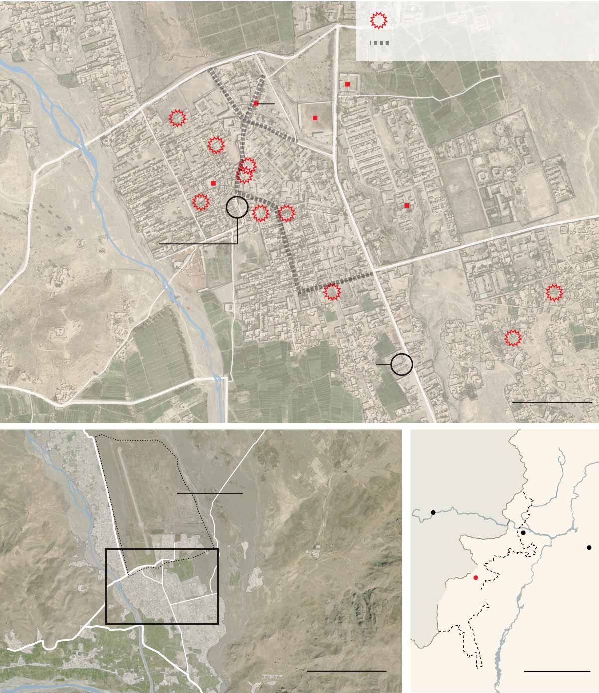
Unlike earlier government intelligence collection, such data-collection is often recorded and preserved as a map if not a social graph: for as NSA mines social media to create graphs of social networks boating comprehensive coverage, they present a map–and not only in a metaphorical sense–of potential threats, targeting potential networks of terrorism as if to track threats to the nation by rendering pushpins in Pakistani territory–as this NSA map, labelled “top secret,” suggests.
Data siphoned or intercepted the internet is far less embodied and material than the physical media of maps. But in its conversion to the sources that are rendered on a base layer, they seductively promise to resolve the problems of mapping the unmappable–the spectral networks of al Quaeda or the Haqqani network or Al Shabaab–all by targeting cell phones with the illusory precision of a Google Maps pushpin.
The mapping of intercepted data-flows–and consequent tracing graphs of social networks–run against the selective visualization in most maps, however, by mapping potential sources of data or discussion with a precision that is far more illusory than their actual content. In part, there is no clear way to map such compendious data, and in part they raise the very questions familiar to other modes of data visualizations that present themselves with the authority of an objective map–but are based on the qualitative nature of the data that they employ. Indeed, by rendering data in the authoritative terms of a map, they elide the determination of GPS position with the precision of terrestrial coordinates. The creation of this map is extremely important to the increased authority that the NSA claims, this post argues, both on symbolic levels as a strategic image that commands assurance in the maintenance of its programs at great cost, as well as a strategic tool that conveys accuracy in the implementation of unjust “targeted” air strikes.
These ‘maps’ created by intercepted metadata are less concerned with the lay of the land, to be sure, than the ability to synthesize the large numbers of data “grabbed” or siphoned off data networks, using “big data” to create a comprehensive image of hidden dangers.
The accumulation of digital metadata is deeply troubling in the lack of respect for privacy. But the tracking and compiling of metadata records in data visualizations seem to claim an illusion of comprehensive coverage that is also misleading: they abandon a clear protocol of mapping selective sites of interest or of linking information to locations, but use the map both as a template and interface to track and target actual locations and a way to legitimize and justify comprehensive coverage. And, lastly, they exploit the power of a rhetoric of mapping to normalize the grabbing IP addresses and disclosing information to readers. While most of these centers seem located in the United States, several serve as platforms for foreign intelligence collection. Although this map of data collected by the NSA–with hotspots signaled in red–seems to respect national boundary lines, it maps a broad range of regions acrosswhose networks we known we listen in upon.
From at least 2007, the NSA’s goal of “electronic mass surveillance” through data-mining provided a sinkhole of government funding. But it has recently expanded as a projection of assembling something of a map not only metaphorical in nature: NSA patents extend far beyond obtaining cell phone conversations and data from satellite monitoring stations to U.S. Army Signal Intelligence Officers, and intercepting conversations of citizens of the U.S.–to include geographically locating a specific computer site, presumably by tracking location from cell phone towers. The resulting maps and social graphs create precedents for disclosing information in ways that suggest an erosion of individual rights, even as they claim to map networks that pose a national threat: the map provides a powerful tool to express the mission of the Department of Homeland Security to “secure the nation from the many threats we face” and for processing big data secured from online sources in a persuasive readable format, but privileges the power of engines of data-sorting over the readability of an actual map, or the relevance of its content. Compiling data via digital geolocation goes beyond an intrusion of privacy, to use public funds to create a virtual map of webs perceived social threats at considerable expense.
What sorts of searchable databank are we creating in the new NSA centers, and what to they portend? It is troubling that such surveillance sets a new level of intrusiveness, and raises questions about the merits of generating such a map both for its invasiveness and the breadth of its purview. Despite the illusion of total information that the metaphor of mapping provides, monitoring a virtual fire hose of social media posts, telephony metadata, email records, or other data threatens to become a project in and of itself. If the NSA’s hope for “owning the internet” were described by former NSA senior executive and whistleblower Thomas Drake, the abilities of tracking the latency of multiple network communications to allow communications networks to be given a geographically location or topology, according to a 2005 patent granted to the National Security Administration, or NSA, so as to remotely extract locations from cellphones–perhaps identifiable as the NSA tool “Airhandler” that approximates and geographically places the location of sent data, that go beyond content surveillance to locate users’ positions.
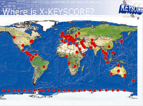
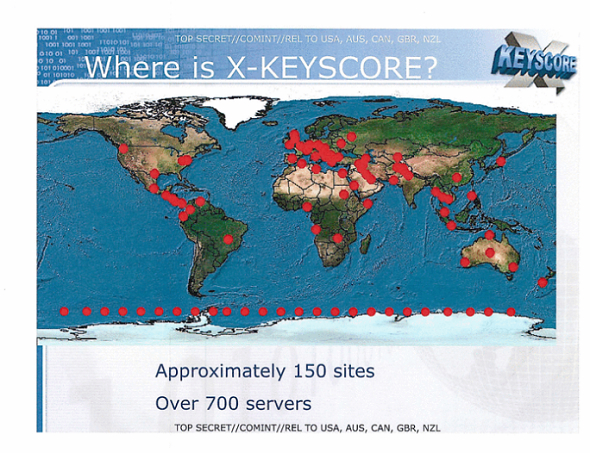
Such projects of intelligence-gathering have given momentum to bankrolling new forms of surveillance that parallel the NSA’s growth by a third since the attacks of Sept. 11–and reflect devotion of a roughly two-fold expansion of its budget to procure intelligence for tracking and targeting presumed terrorists. The data collected has won a prominent place in the President’s Daily Briefing, which regularly includes information obtained through the from NSA’s Geolocation Cell, a project dedicated to tracking people geographically in real time: we have moved away from “Minaret” or “Mainway,” the NSA’s call database, to new programs of more expansive data-mining projects such as X-Keyscore, Boundless Informant, and Prism–engines which boasts to parse big data into clear data streams.
The embrace of metadata by the NSA through such surveillance of telecommunications networks at a cost of $20 million a year, stored from millions of users for one year, exploited the “home-field advantage” of databases of internet companies in “one of the most valuable, unique, and productive” for the NSA, grabbing data from such servers as Skype, Facebook, Google, and Yahoo for military ends, without oversight: such databanks presumably provides targets for the sites of drone planes, as well as legitimize the ongoing expansion of drone attacks from 2002 to 2013 that have claimed over 4,000 victims in an undeclared aerial war in Pakistan, Yemen, and Somalia–exemplified in the large number of civilian deaths in places in northwest Waziristan region of Pakistan in towns such as Miram Shah where, rather than being contained, have increased to an extent that can be called a Human Rights abuse both in a new Amnesty International investigation and a separate Human Rights Watch report on American drone strikes in Yemen. The shifting maps that are created from cell-phone use and internet surveillance may, indeed, create faulty targets that were targeted by the NSA to “flag” terrorists. According to maps such as the below, the NSA presumably targets suspected terrorists in the region. Indeed, the official release of the now-ubiquitous Google Maps in 2005 provided something of a template, as we have seen, for imagining the expansion of drone attacks far beyond whatever the Pakistani government had approved–strikes now estimated to have killed between 2,525 and 3,613 people in Pakistan since 2004, and maimed countless more.
It is true that Section 701 of a FISA Amendment permits data collection on foreigners, and has effectively permitted a huge increase in the abilities to mine data collected from warrantless interceptions of multiple service providers: the map is bizarre in mapping the flows of data monitored and collected, in a mapping of links of collection, as much as collection, that rather than describing actual populations presents an image of the links in the world which we can readily access. Such maps might indeed deflect attention from the situation on the ground, as they come to substitute for actual geospatial intelligence.
For the systematic collection of data creates a map shaping foreign policy, as well as a credible illusion of power. Indeed, if dramatic increases in drone strikes from 2008 in Pakistan bay be explained by operators’ practice or drone technology, the dramatic expansion in intensity reflects how such data served to rationalize remotely pinpointed attacks–green pinpricks note attacks ordered during the Obama administration from 2009, less than 2% of which hit high-profile militant targets; those red and yellow correspond to those under the Bush administration. It is amazing that only after their continuation for more than ten years have they been publicly resisted by the Pakistani government. To erase the deaths that occur from errant drone strikes or from bystanders, red and green pushpins provide a suitably emotionally distancing device.
When mapping drone strikes on a more concrete local map of a recognizably urban area of Waziristan, Miram Shah, we might prefer to employ equally disembodied icons of explosions.
The expanded reliance on metadata to track terrorists is both “very, very intrusive,” and a crude metric to deploy drone strikes. The expanded unquestioned use of such surveillance has created a self-consuming practice, funneling a floodgate of data for review with limited selectivity or often refinement: the huge expansion of drone strikes undoubtedly hindered the battle against extremism, killing far many more civilians than the militants against whom they were targeted.
Indeed, recent suggestions of the extensive involvement of the NSA in these drone killing programs suggests the extent to which cyber-surveillance, and the siphoning of radio messages, metadata and seized laptops provided a basis to track a presumed al-Qaeda operative who had been followed since 2004, Hassan Ghul–or to kill a man presumed to be him–by a drone strike in Mir Ali, based on email from Ghul’s wife about her “current living conditions” that was the fruit of the SIGINT campaign waged by the NSA. “We provided the map,” said a former intelligence official presumed associated with the NSA, “and they just filled in the pieces,” describing the NSA as having 20 times the budget as the CIA in the Federally Administered Tribal Areas in northwest Pakistan believed to be a center of Al Qaeda operations: the same agent is quoted as saying “NSA threw the kitchen sink at the FATA,” including the creation of long-term data repositories of logs, digital information, all to “help NSA map out the movement of terrorists and aspiring extremists between Yemen, Syria, Turkey, Egypt, Libya, and Iran,” reads a quoted document cited by the Washington Post, including “thousands” of chat logs. If the obtaining of this information is of questionable legality, the use of such a map to target individuals becomes instrumental in achieving a violation of international law.
 Photo:AFP/File
Predators and Reapers have long bombed training camps, Al Qaeda operation networks, and leaders in the region with hundreds of civilian casualties–and have recently expanded to target sites in Yemen and other countries, in explicit violation of international law.

If the intrusiveness on individual privacy may be criminal in its intrusiveness, the use of such radically disembodied data to “map” networks by social graphs is not only a refinement of data into a spectrum, as suggested in the icon below, but in fact a far more messy image–less a “circumscribed, narrow system” President Obama imagines than a floodgate of unfiltered data in a system of visualization with scary precedent for surveying our citizenry and “allies”–and quite a blunt instrument and limited metric, instead of the precision its advocates claim.
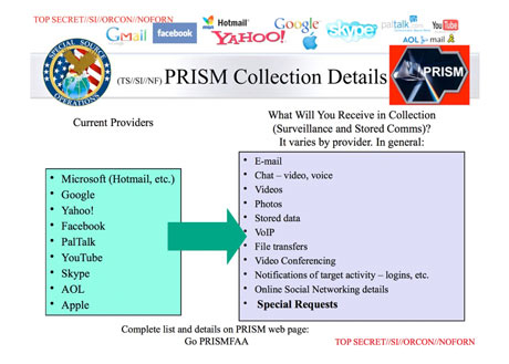
Without knowing what PRISM is, it seems a means to synthesize multiple sources of collected metadata relating to foreign intelligence.

1. Privacy and Grabbing Social Networks
Wire-tapping surveillance began as a front of the “war on terror.” But the increasing data-banks of interaction networks create a mappability of space not rooted in location–even if locations are duly noted–so much as in filtering the multitude of network exchanges that take place at something like a dozen junctions of the internet–junctions which a spatial map can hardly serve to record or transcribe, to graph networks of individual interest.
Such graphs lack the prospects or gradients, sites of inhabitation, rivers, forests, or grassy slopes: the bleached skein of the information highway is a negative of the qualitative embodiment of place, and rather graphs an etherial network, floating in the ether, but with contours the NSA tenaciously tries to decode. What sort of readable social graph does their siphoning off of radically disembodied streams of data, based on the thread-bare skeins of metadata.
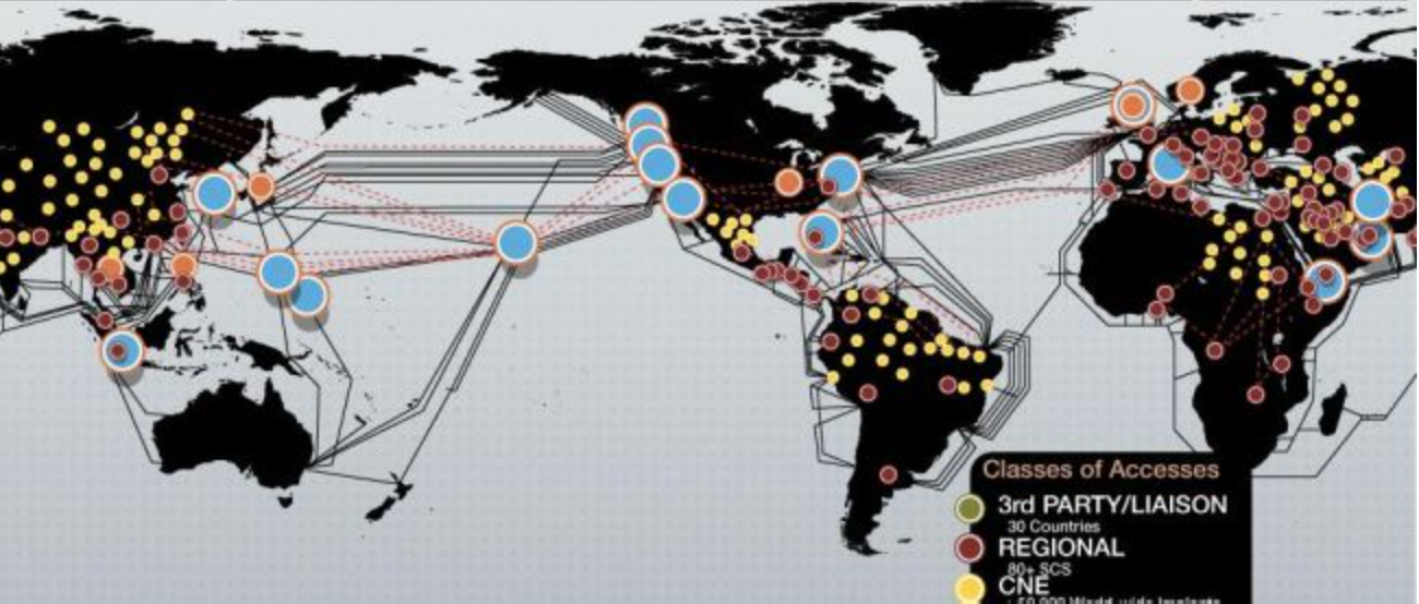
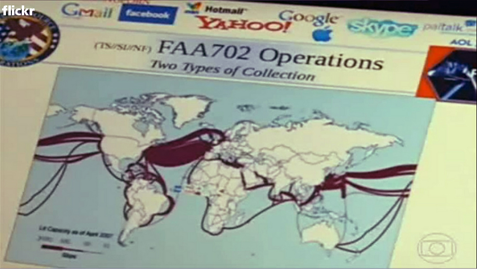
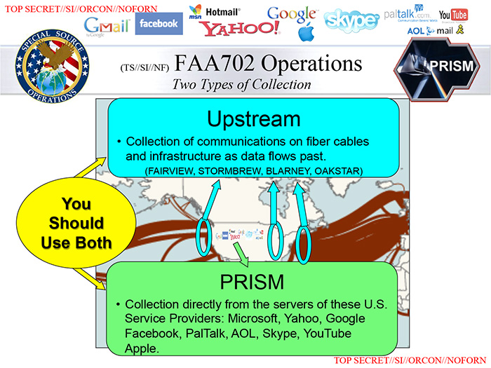
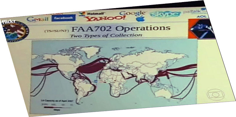
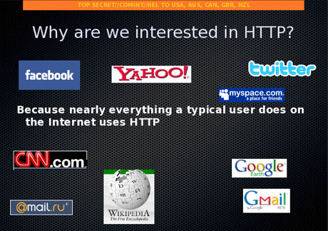
The promise “Boundless Informant” offers to “graphically display the [collected] information in a map view . . . with no human intervention” based on metadata records suggests a more radically disembodied concept of “mapping” that stands to become a sort of local model for compiling masses of big data, without scrutiny of what utility such “maps” afford–or violations of individual privacy. The legality of creating such an expansive database by intercepting and decoding streams of data in large part turns on the degree to which their individual invasiveness is construed as “unreasonable seizures” of personal papers and effects–but before our government invests more monies in such projects, more attention should be paid to the very real qualitative limits hopes for “total information” conceal. The surreptitious mass-tracking of cellphone data suggests a hidden form of surveillance, indeed, more extensive than drone flights or CCTV: as a round-the-clock mapping of both position and contact with others, it provides a constant target of geolocation as well as situating individuals, unbeknownst to them, within social networks, purchasing habits, website visits, as well as call logs, that can provide a predictive index of habits, tastes, socio-demographic profile, circles, and even daily activities. PRISM collects data from a range of servers or NSA “providers”, as this NSA Power Point slide, released by Edward Snowden, makes all too clear:
The dominance of this type of “profiling,” however, also suggests an impoverishment of the cartographical landscape; it is predominantly attuned to data-mining as effective and immediate mode of intelligence-gathering, and, for all its informational datasets, whose contours are often less informative or qualitatively accurate than it would suggest, given the unfiltered information that it includes, which temptingly promise an illusion of total information–an illusion deriving in no small part from invasive powers that skirt legal protections of privacy that the same agencies have long desired to overstep or outright deny. The concept of individual privacy is, most accept, protected by the Constitution, despite the claims of some “originalists” questioning a “right” to individual privacy, in the Fourth Amendment of the Bill of Rights; the amendment expressly protects citizens from unreasonable seizure of personal records by state agencies when not judicially sanctioned or supported by probable cause; recent critics have expressed concern that infringements on privacy also stand in violation of the personal rights expressed in the Ninth Amendment. Any restriction to rights of privacy would effectively entail redrawing the map where rights granted by the Constitution apply, or circumscribing regions where they are suspended.

To be sure, the warrantless wiretapping of digital communications is only the beginning of the large range of maps daily compiled and collated from the data derived from citizens’ purchases, internet connections, telephony metadata, and social networking, if recent testimony is to be believed, that provide a basic “map” of subjects of suspicion: the precedent of sharing of users’ phone logs with companies, it has been ruled, leaves them not protected by a right to privacy, although the expansiveness of associated metadata provide a basis for the predictive mapping of individual persons that approaches the infringement of privacy: from tabulating the tracking of spatial position, personal ties to individuals or groups, websites visited, and store receipts, a profile emerges verging on invasive surveillance, potentially compromising in its totality. Although there is no attempt to resolve the disembodied content of such secretly siphoned data, there is an odd exchange between the rhetoric of objective mapping of location or place and sorting data as a way of constituting the individual and his/her associates: mapping as an exercise to locate the subjects of observation which are not, by definition, present on a normal map. Indeed, the redrawing of a map of rights was presented as an almost serious issue by Amnesty International.
The demands of the U.S. Office of Homeland Security to amass bulk data by social network surveillance is something of an extension of the rights already claimed to allow surveillance and policing by border patrols and drones within 100 miles of any international crossing–and the search and seizure of electronic devices at any border crossing–and the expansion of drone surveillance in the nation’s borders. The circumscription of individual rights creates a “constitution-free zone” within the United States:

For Orin Kerr, as Nick Szabo, seizing of laptops near borders effectively creates a similar cordon of the suspension of constitutional rights. Such a suspension has occurred in the regions overseen by judges in the fourth, fifth, and ninth circuits, all of which have all upheld the right for border exceptions to search through laptops or storage devices. But most often, fears of the constraints of surveillance have been quantitatively measured by border guards or their use of drones–including unmanned “drone” flights planned for expanded domestic surveillance, some mounted with “non-lethal weapons” to be employed against “targets of interest” to the Dept. of Homeland Security. (The echo of the expansion of drones that target houses and Pakistani populations are, however, eery.) To be sure, this attention of borders the areas around actual borders could create comic conundrums of surveillance to the north, but the map of surveillance is in itself scary as a new way of imagining the national landscape or national liberties:
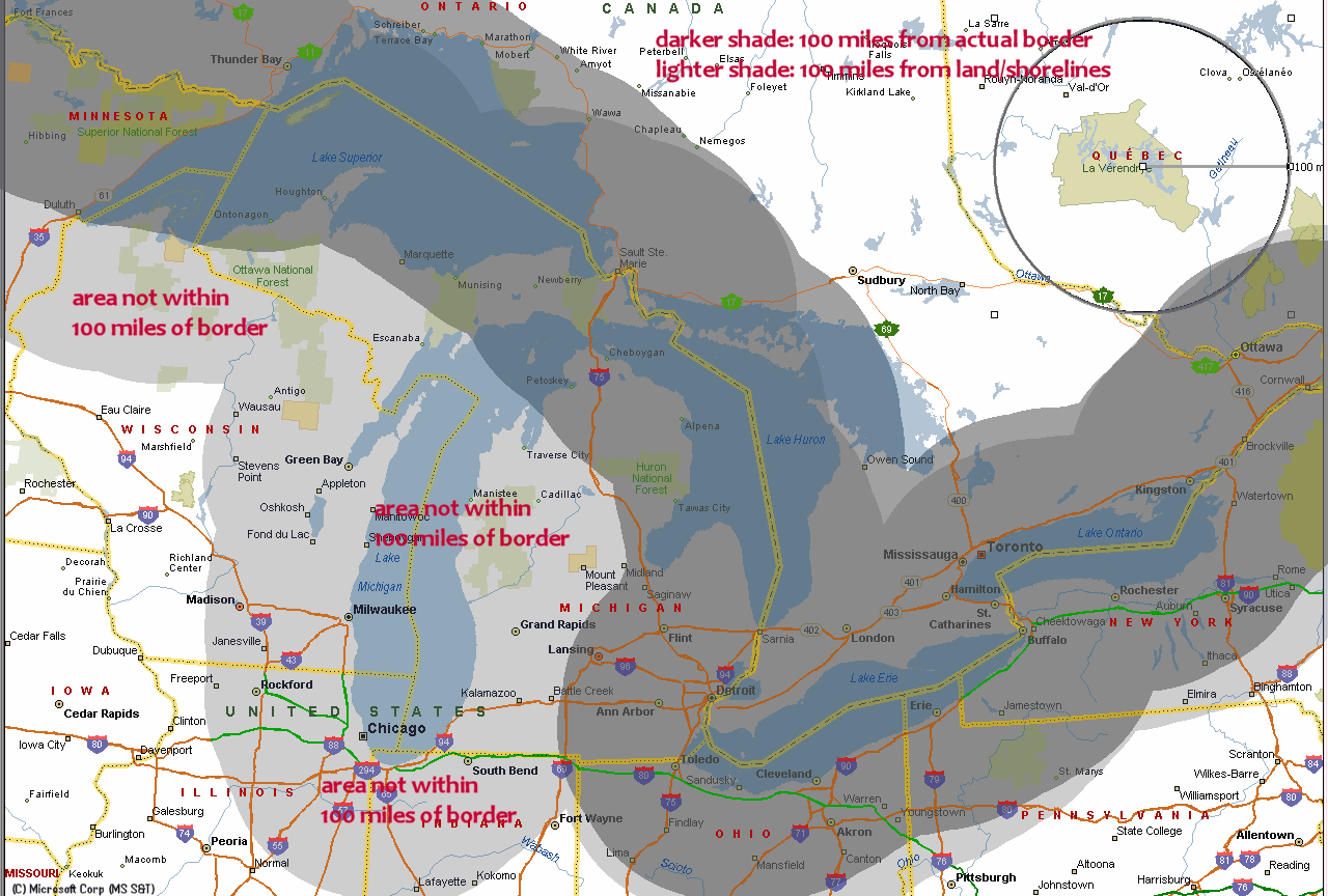
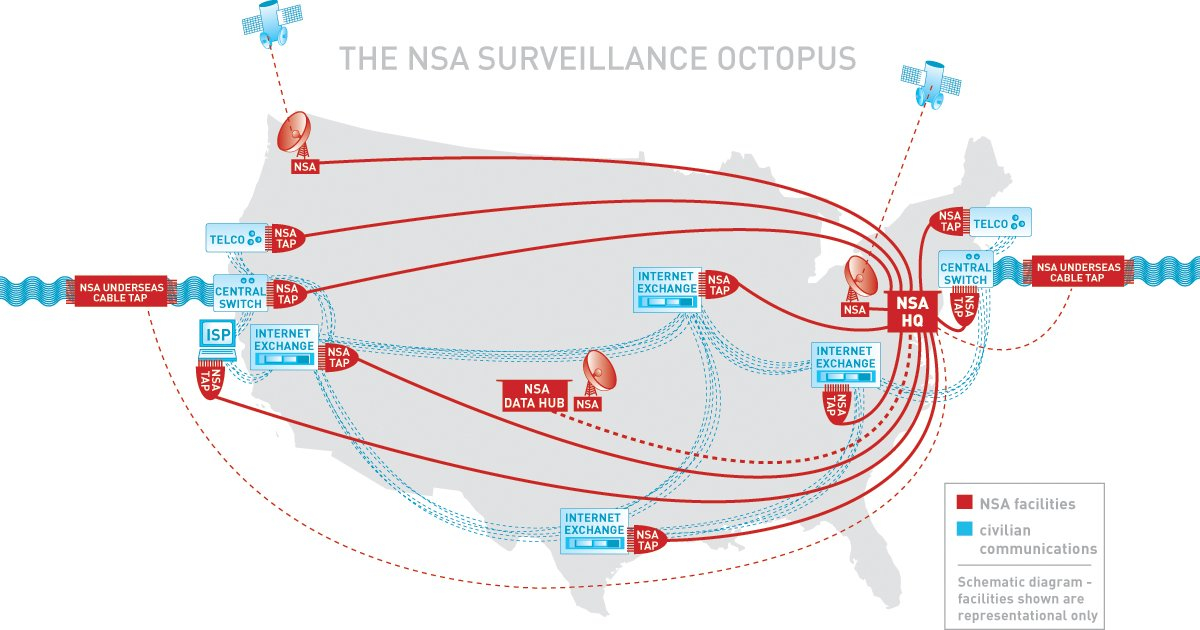
These maps point up the problems for how we map the landscape of civil society or the shifting contours of public space. It is impossible to use a terrestrial projection to “map” the shifting contours of the suspension of individual’s rights to privacy, if recent leaks are trusted–of which a land-map offers a misleading analogy. The medium of a paper or static map cannot encompass the qualitative level or extent of information processed at such collection centers–measured in yottabytes, as much as by indices of spatial position–and which we are only beginning to use maps as an interface. The web of data flows that enter this surveillance octopus are not only developing a nation-wide ecology of their own, but seem to threaten to take our eyes and attention away from the geopolitical map that they seek to monitor and tabulate.
The individuation of a ‘hidden’ or secret map of social networks that can be grabbed off internet communications provides a source of intelligence whose data analytics have so dramatically grown in the twelve years since 9/11 that there is no clear model for selective mapping, but for compiling a totalistic map of people-centric proportions. Much as the kind folks at MIT’s Media Lab have offered a PRISM-like program to map your own social networks from your Gmail, yahoo, or MS accounts, in template of “DIY Spying”–
–the social graphic and network mapping that lead to clear problems in the over-collection of data from scouring some millions of email address books daily by the NSA’s own Special Source Operations Branch, described in the Washington Post by Bart Gellman and Ashkan Soltani. All in the interests of the nation’s security, a dragnet of data flows grabs hundreds of millions of contact lists from e-mail and instant messaging accounts without external oversight, including the addresses of many Americans.
The result of information tracked provides “metadata” to assemble a range of individual portraits based on surveillance and composite mapping of individuals’ ties. Indeed, if the collection of email address books that makes up so large a share of the data that NSA obtains, together with “buddylists” and in boxes, so much that the hacking of an account under surveillance by spammers to send bulk emails threatened to create an overflow in the collection system–leading to a shift in philosophies of data-collection, driven by the proliferation of data email servers generate, and the lack of selectivity they allow from the some 250 million address books that NSA analysts collect every year–creating the new problem of “Content Acquisition Optimization.”
2. The Social Network as Map
A single regional or global map cannot comprehend the level of current surveillance or data interception in a readily readable form. There’s no clear or apparent ancestor for such surveillance over so broad a purview or scope, although attempts to pinpoint and track potentially dangerous groups of citizens suggests something of an ancestor to maps of potentially dangerous networks by intelligence networks–as those made of all Moslem student groups to try to control an unstable situation in response to the twin towers’ destruction in New York City after 9/11–when the feeling that dangers existed that almost couldn’t be mapped produced a near-mania for mapping to which an expansion of “legal” domestic online surveillance represent the final logical extension. Although such maps simply plotted known organizations, social network graphs seek to map the coherence of threats perceived from around the world. 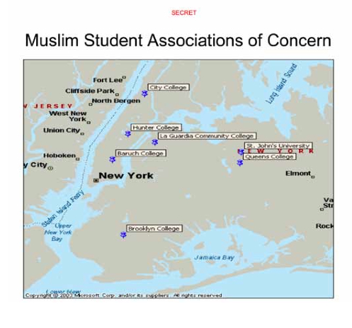 They also reveal the expansion of local observation, infiltration, and surveillance within the New York City Police Department’s “Demographics Unit,” with direct assistance from the CIA, that are only now being investigated by the ACLU as having violated restrictions against domestic spying.
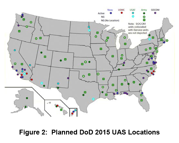
Since then, domestic spying has expanded in ways we can only begin to chart, in a massive race for bits of possible intelligence that shows little respect for privacy, and little chance of abating. Surveillance flights from airports in every state in the nation seems to guarantee the safety of a national space, here suggested by the broad coverage of surveillance drone flights from multiple airports across the United States planned for the coming year. This map of the unmanned flights that are managed and maintained by the Department of Defence, a map of prospective departures of unmanned surveillance flights, boast near-national coverage with particular attention to the Eastern Seaboard and border with Mexico to the nation’s south.
 Yet if drones monitor but the surfaces of daily events, they track only the crests of waves in comparison to the deep tracking of currents of information flow by the NSA. The mass surveillance of transactional records communicated along the backbone of the internet from Quantico, Virginia, described by Seymour Hersh as among “the largest database ever assembled in the world.” Mass surveillance on this level, based on phone data, banking records, email, spending habits, flights and web searches, were described in 2008 as one end of the NSA expanding its “Total Information Awareness Program”–without sacrificing its acronym–to the “Terrorism Information Awareness Program.” In ways that long earlier provoked consternation from the ever-vigilant Senator Ron Wyden, such data-sifting blurred domestic and foreign surveillance, given the sensitivity and revelatory nature of information transacted online, intercepting roughly 75% of internet traffic in the United States through such high-powered programs like Blarney, Fairview, Lithium or Stormbrew, despite its limited legal authority to do so, by filtering data streams of domestic communications to be snared within the parameters increasingly finely-woven wefts of nets in the sea of telecommunications.
Since the 2003 United States’ invasion of Iraq, these programs have grown: an increasing attention has gone to data collection and intelligence surveillance to provide a better image of the undefined missions in which we are engaged as a nation. Indeed, a reliance on surveillance corresponds to the relative disintegration of civil government. The increasing the role of the NSA as a secret system of intelligence collection serves, it seems, to locate cell phones, even when off, and collect emails and store oceans of data to define potentially dangerous networks in the name of counterterrorism–or, as the NSA saw it,“to make the agency’s global enterprise even more seamless as we confronted increasingly networked adversaries.”
And yet. The totality of communications assembled do not necessarily create the continuous coverage of spatial location as a map. Although the scrutiny of telegraphic data, cables or letters sent during wartime in other periods was standard, the sheer amount of data synthesized has little precedent, and if citizens were placed on “watch lists” by the NSA, data-maps of social networks suggest breaking a new frontier in individual privacy. If Frank Church announced back in 1975 that “the United States government has perfected a technological capability that enables us to monitor the messages that go through the air” as a capability that could be easily turned on the American people, urging that its actions must always operate within the law, the NSA increasingly claimed rights to surveillance of global coverage. In 2002, DARPA established an “Information Awareness Office” with a mandate of “Total Information Awareness,” appropriating the masonic ‘Eye of Providence’ in ways PRISM’s logo referenced–but casting a glance over AfPak nations and the Middle East, the prime regions NSA seeks to monitor, using a globe to remind us of the locus of danger it seeks to control:

The DARFA disembodied eye suggests its omnipotence in an age of information control that is an odd appropriation of the all-seeing eye of the new age marking America’s foundation in a far more bucolic landscape.

“Scientia est potentia,” reads the legend of the DARFA seal. But what “scientia” is at work? The demand to locate and track, and identify and search, real-time “actionable intelligence” grew after 9/11 rapidly, with the demand to provide global coverage–offering a map disproportionately concentrated by 2007 on Pakistan and Iran. Yet what sort of coherence does is mapped, and with what “accuracy”? In data-driven visualizations, is the data conditioned by the sorts of social networking sources that are used?
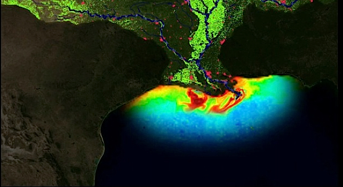
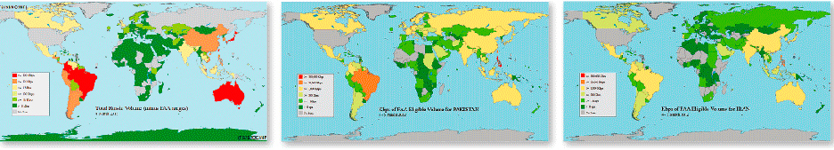
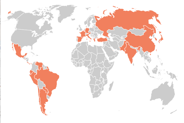
The mapping of internet usage–represented below by three pictographic “global heats maps” of ties to Russia, Pakistan, and Iran, showing relative volumes of internet ties in red–with surveillance of data from India immediately following.
The dedication to surveillance by the internet and confidence in internet levels as a source of surveillance may obscure deep disparities in global access to the internet. But twenty-nine countries have reported NSA internet surveillance.
And the internet provides a key example of belief in the ability to tap into a global information system–much as the key interception of data from Brazil provides a means to track information not passing through the United States. But it may underplay the limited access and use of internet sites worldwide, despite the global share of Google + Facebook:
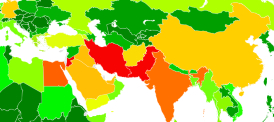
In the below map, Boundless Informant tracks intelligence collections from foreign computer networks, with a lopsided focus on disembodied data-mining is apparent: sites marked yellow, orange or, in most intensive surveillance, red, reveal a concentration on Iran (subject of some 14 billion intelligence reports that year), and Pakistan (13.5 billion)–with our Jordanian “allies” third (a close 12.7 billion), and Egypt fourth (7.6 billion), as Boundless Informant processes upwards of 97 billion bits of information worldwide as of 2013, according to this secret map generated by the NSA, and allowing its user to consult the relative volumes of sources of data-collection.

Given the astounding volume of data surveyed, it is striking how poorly connected we seemed to be to Egyptian intelligence or Iranian intelligence, among the clear “hot-spots” of countries most subject to mass-surveillance within the Middle East (Jordan and Egypt) outside Pakistan and Afghanistan and India.
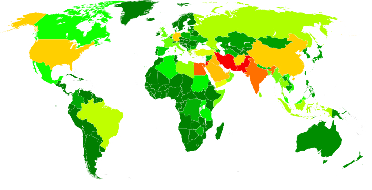
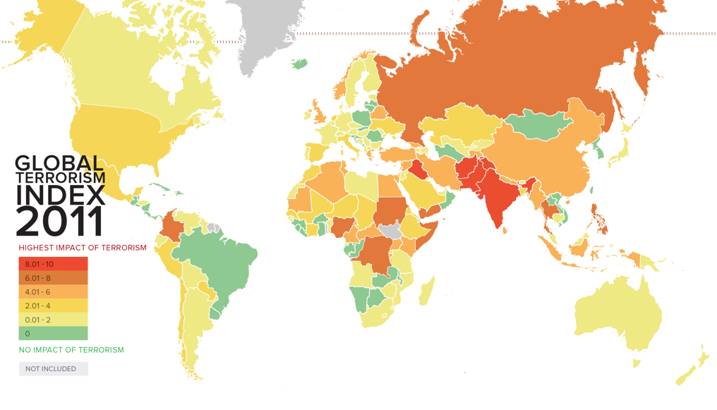
Areas of pronounced data-surveillance contrast to the 2011 global “heat-map” of areas judged by the Institute for Economics and Peace to be most affected by terrorism in its annual Global Terrorism Index:
Are such threats seen as less linked to our sense of sovereignty?
It seems as if we are less clear about the maps such metadata might be measured against, so radically disembodied is the data that they grab. The data-banks of metadata compiled with FISA approval has however supposedly led to amassing a huge reserve of potential clues to identify other terrorist networks–mostly by “gathering data on the incidence of calls made to and from his phone by people associated with him and others,” data for which, since “there’s no personal identifier involved, other than the metadata from a call,” warranted no warrant at all. The expanded the filtering of metadata–now done for two-thirds of all emails–creates a set of data banks too complicated to navigate meaningfully, and which stand at a curious remove from a larger geopolitical landscape.
3. The Metadata-Driven Landscape
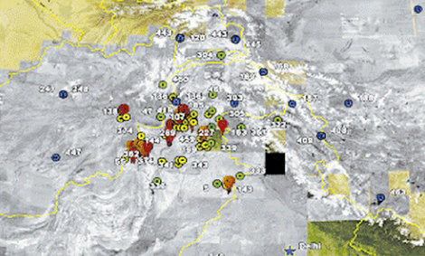
The data mined and tracked is so radically disembodied to provide an incomplete or partial picture of the very sites on which “we” have focused most intensely–for which we are not particularly successful in mapping political environments. Indeed, the odd picture of what the areas that NSA obtained crucial information from suggested an Orwellian redrawing of the North American–here labeled simply “Homeland” (in something of a geographic deformation of whoever drew the chart)–even though the map locates most “terror disruptions” far outside the areas to which NSA monitors:
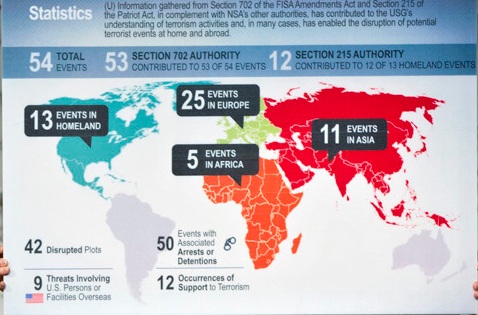
“13 EVENTS IN HOMELAND?” What is the “Homeland” that is mapped above, but a imaginary realization of an amalgamate lands of shared intelligence, or a distortion of data mining? This map, allegedly “declassified” this past July, was produced to substantiate the claim that the interception of messages by the NSA without warrants over fifty times had thwarted over fifty terrorist activities across the globe–even though no evidence has been produced to substantiate this claim and there seems little substantiation that the NSA was involved in some of these ‘plots,’ that their disruption required warrantless surveillance, or that any prosecutions were ever attempted–despite the circulation, like a meme, of the number of “at least fifty” or “fifty-four separate” plots.
The map served to substantiate the need for a system of surveillance that utterly disregarded sovereign lines. Its construction appears the creation of the very computers programmed to do data collection–or the fantasy of the mindset of national intelligence collection with little actual regard for geopolitical sovereign boundaries. (The odd map elicited considerable interest as a de facto unannounced annexation of Canada and Mexico. “Is this a way of blending in Canadian and Mexican terror activity disruptions (which, we’ll remind you, is different from actual plots interrupted) to give a larger sense of the NSA’s success at halting terrorism within our borders?” asked Atlantic Wire.)
Indeed, data collection has provided a basis to crystallize the attituded of the US government to a world as if no sovereign boundaries existed, and in which just as data can be siphoned off the internet, international sovereignty can be violated at will. NSA has recognized the new mode of data collection PRISM or Boundless Informant allow as programs collecting voluminous amount of information.

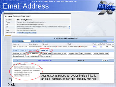
The report by Glenn Greenwald that a previously unreported X-Keyscore gives the NSA “nearly everything a user does on the internet” and allows employees to search a vast database with “no prior authorization” made one wonder what all those computing drives stored–and to what end they assembled data into data visualizations that became the guiding maps of NSA activities.

While invasive in their filtering of email subjects, addresses, and content, the suggestion of amassing and filtering data is perhaps more apparently impressive than their actual results. Of course, the sheer power of sifting through such data is a form of power, perhaps evident in the mastery FOX news tries to communicate to viewers by outfitting its newsroom with gigantic monitors capable of detailed data visualizations, and the odd belief that large screens show or hold more data.

The big charts in the newsroom monster-tablets reflect the scale and scope of data mining now widely discussed as perfected by the NSA. The daily monitoring and storage of internet data, telephone calls, email, text messaging and GPS tracking regularly shared among interconnected government agencies at “Fusion Centers” across the nation, parsing the content of web-based content of frequently vapid interest. As of 2009, some 72 such centers already existed–one in each state save Idaho–run by the Dept. of Homeland Security as “the centerpiece of state, local, federal intelligence-sharing for the future.”
The hope is that tapping into the backbone of the internet can create a record of messages communicated by our enemies, and a large enough database to map their potential terrorist activities by whatever means–in this slide that recalls an earlier map of data collection, and which boasts the promise of disregarding boundaries of national sovereignty by “upstream” collection of communications in the name national safety:
Relative to PRISM, the hope for global coverage was very much the aim of X-Keyscore, the result of numerous syntheses of corporations’ donations of their metadata, although this seems only to create an illusion of data-control of a truly global scale, focussed on Europe and the Middle East, but with tight coverage of Pakistan and Central America, as well as Indonesia.
Where are these oceans of radically disembodied data stored? Recently, the construction of the Utah Data Center in Bluffdale of one trillion terabytes–or one yottabite–at a cost of $2 billion. This large data farm will, from the fall of 2013, constitute the centerpiece of a range of interconnected NSA data centers located across the country: as the jewel of the security necklace, five times the geographic size of the US Capitol, it will be the center of data-collection, dwarfing the White House, CIA, and Pentagon in information charts, which are all but satellites through which data is funneled to be interpreted, synthesized, and visualized–though the contours of the assembled map remain startlingly unclear.
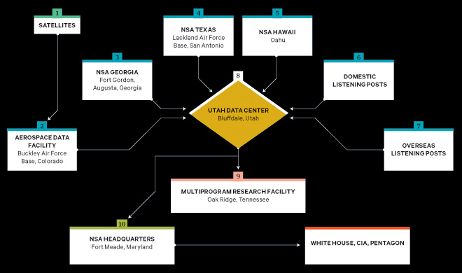
P
erhaps mapping the web of surveillance from Bluffdale would be a job for a modern cartographer as much as mapping Bluffdale, where Apostolic United Brethren came to practice polygamy with piety, away from the rest of the world. But the map’s dots might not really need be connected, as the information feeds lack any physically embodied location–especially when one considers the geospatial nature in which the conflicts are framed. For new maps of information flow are no longer rooted in place. The structure o all maps are designed to best encode data, but the tremendous mind-boggling expansion of data generated from the buzz of online exchanges that will be monitored in Utah, where the early Mormons focussed on their own skills to decode a revealed truth made manifest in God’s new land are designed to intercept, synthesize, and analyze data streams in ways that to render paper maps obsolete. The data daily generated so greatly qualitatively supersedes the ability to render them on paper and antiquate the concept of a paper map: no single map could register the shifting nature of relationships and synthesis of variable data within the expansion recently obtained by the NSA for trawling a profile-map of individuals, beyond foreign nationals or web-traffic from foreign sites, suggests something more akin to data aggregation than actual analysis or selective mapping: the project for “large-scale graph analysis on very large sets of communications metadata” provides a way to map the profiles from any internet traffic, pinning visits to websites, phone calls, credit card use and GPS-position, FaceBook friending, photos or likes–all serving to pinpoint us by the data streams we generate daily by smart phones, credit cards, or cell phones–as distinctly individual as a finger print.
The hope of such a compilation of potentially compromising data–or potential networks of dangerous terrorists–emerged as a huge project of intelligence during the increased chaos of the Iraq War. The result was to gain a window in US counter-intelligence surveillance from the FISA court, however, that NSA had long desired on a huge range of phone calls and data streaming within the USA from comprehensive communications routing data of all calls made on the Verizon network, within the US and abroad, from the duration of the calls, connected numbers, and time of call, and even location, if thought to be communicating with, to, or about Al Qaeda:
Recently, considerable attention has been directed to phones as “trackers” that disclose location and and social ties by “frictionless surveillance”–invasive devices which, Paul Ohm argues, effectively “track, store and share the words, movements and even the thoughts of their customers”–and even track locations to predict future locations than one would ever wish to corporations: the cell phone stares back!

If telephony metadata is ostensibly collected in relation to “foreign intelligence” targets, the resulting graphs of networks of social relations in relation to a foreign “agent” or organization identify individual locations and contacts that even expanded beyond a need to check for a tie to “foreign” ties from January 2011, the expansion of programs capable of still greater collection of data and social network synthesis has emerged as an even more prized security tools as comprehensive portrait of individual behavior. (One of the Powerpoint images Edward Snowden downloaded suggested the degree to which, according to an intelligence budget document, the N.S.A. spends more than $250 million a year on its Sigint Enabling Project, which “actively engages the U.S. and foreign IT industries to covertly influence and/or overtly leverage their commercial products’ designs” to make them “exploitable”–including pre-encryption access–a goal since the mid-1990s, leading to a public warning from Lavabit’s funder that “Without Congressional action or a strong judicial precedent, I would strongly recommend against anyone trusting their private data to a company with physical ties to the United States”–in a war against terror, the American people’s privacy seems to be loosing.)
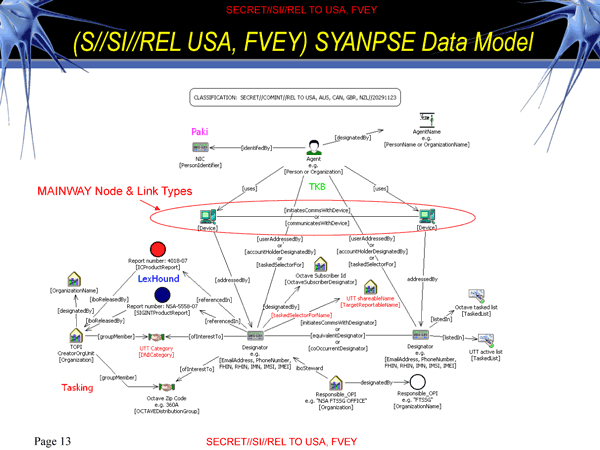
Yet perhaps ambitions to comprehensive coverage of signals in SYANPSE seems so Faustian it ceases to map of terrorist cells–or snaps the synapses of anyone seeking to synthesize such a gathering of such heterogeneous conduits of data removed from a context of ideological or religious conflict. There is a striking absence of clear selective criteria within this “map” challenges its level of meaning–even as it threatens to violate individual privacy by an expansion that threatens or skirts legal restraints on surveillance. This makes the devotion of such single-minded dedication to an expansion of an internet dragnet–and indeed to break new forms of encryption that encode online communication–particularly questionable. In part, the circulation of data has effectively downplayed the spatial distributions as primary registers of information. In maps driven by the need to encompass the statistical image of a totality, the demand to register such a quantity or breadth of data shift from the sort of detailed qualitative picture of a topography of human settlement or record of human habitation, or even of their actual locations–all absent from the “information” sourced from privileged sites upstream the internet’s architecture from multiple data streams before being sifted on the massive mainframe computers back in Bluffdale, UT.
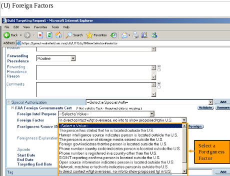
Whereas the amount of information filtered out in a drawn map serves to process the situation of place in expanse, the selective criteria for mapping are omitted from networks culled from such massive data streams that any search for a name of a “foreign factor” might generate: the acceptance that any email even discussing or relating to “foreign” events seem particularly ironic here, since it grants a stunning exception to the legal protection of the rights of American citizenry on any pretence that bearing on foreign intelligence, rather than only the communications of foreign nationals. The irony lies in the broad purview that this grants the NSA to assemble a map of domestic intelligence. The scramble to identify potential targets in the United States plays out in the internet’s ether, removed from the usual and familiar divides of actual sovereign borders, and hangs from the hope of finding a compromising exchange of messages waiting to be overheard from our rich data banks. Queries are generated by snoops, as much as folks with terrorism expertise:
Despite the breadth of potential queries of user-activity, web-histories, or email contacts, the expansive database rarely generates lists that map onto more than a suspicious landscape, and even when the phrase-driven dragnet through personal correspondences offers a poor matrix to parse information or snare communications beyond input values or potential actual contacts–and almost seems a self-generated search of expanding data flows that the filters collect.

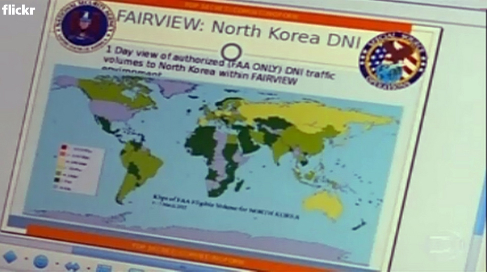
The mapping of traffic that the Digital Network Intelligence received from its FAIRVIEW program–an “umbrella program” tapping into intercontinental fiber-optic cables–of North Korea’s ties to the world in one day suggests the monitoring a constantly changing map of internet traffic, by transposing such data to an interface with a familiar map:
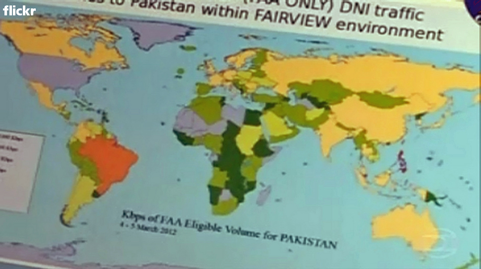
Or the similar ties of traffic to Pakistan, which reveal substantial traffic to and from Brazil:
What sorts of “environments” do these maps of data mining reveal, and how much can they be trusted as predictive sources? Note how a map of the Middle East and Persian Gulf, situated behind the statistic that NSA boasts, blends into a sequence of digitized information, as if the landscape were the data that is mined by the X-Keyscore Program:
4. Metadata-Driven Maps
The networks drawn from amassing newly generated data recalls the logical operations by which digitized maps are regularly updated with amazing speed, but without a similar filtering device. Data-driven maps often dispense with filters in the need to provide a total map as if this would provide a decisive advantage in detecting potential networks of terrorists and thwarting plots whose actual dimensions are only shadowily known: indeed, a premium rests on the totality of data encompassed, rather than the criteria of selectivity they adopt. In this, they reflect a new variety of mapping forms, as much as they express the desideratum of total surveillance.
How has this come to replace an actual map of local rights? Partly by the odd parsing of strictures against warrantless surveillance of Americans as permitting the surveillance of non-Americans.
NSA apparently presumes not only that such signals of communication can be tracked–doubtful even before Edward Snowden released several NSA Powerpoint images–but that the amount of information provides a meaningfully selective social information: after former Secretary of Defense Robert M. Gates and Attorney General Michael B. Mukasey cleared the screening of metadata “without regard to the nationality or [actual] location of the communicants,” in the “Defense Supplemental Procedures Governing Communications Metadata Analysis” in 2008, opening the door to maps of social network analysis, justifying its expanded surveillance by drug smuggling or the clandestine weapons’ trading or foreign businesses. Even as General Alexander refuses to openly respond to questions about NSA gathering of large quantities of data of American citizens, this change opened a veritable floodgate on data storage and analysis skirting safeguards for invasiveness that may expand plans to process upwards of 20 billion “record events” daily.
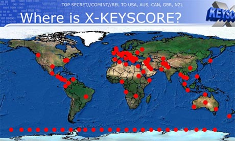
The result is a map of global listening posts and interception of data that creates a distorted image of the world, as well as our picture of the respect for individual rights: X-Keyscore validates the all-seeing and omniscient qualities of the NSA.
Whereas accuracy was a premium in the selectively drawn map, the value of accuracy shifts when it is assumed to lie within the system whose data is mapped rather than the map itself, and whose authority lies in the multiple servers or listening posts from which data intelligence is collected–and not the points from which an actual map is synthesized–and no integrity of individual ownership of metadata is respected.
The resulting map is an image of the monitoring of internet communications that eerily recalls Big Brother. The failure to filter selective data in a simplified image might be pointed to as creating the ballooning of data potentialities in these ostensible counter-terrorism data banks of “record events” that the NSA seeks to protect as its own. The range of data collection filtered from the metadata gathered by the NSA culls mediated data, as much as it provides a selective “map,” from which we can then select suspicious profiles. Yet the map is a poor model for explaining its power, even as it justifies the purloined data-collection processes that the government is currently expanding.
The question of the legality of arrogating communications is, in a sense, masked over by the promise of total information control that is expressed within this map–an information control that encompasses both local positions and strategic communications within groups. As a recent article by Laura Poitras and James Risen suggests, the question of what this means for individual privacy demand to be answered: under the title of “better person centric analysis,” without even a business-like hyphen, seems an expansion of snooping activities: the map is a justification for wire-tapping and surveillance, collecting information without the coherence or concreteness of a record related to geographic position.
The hegemony of the data visualization risks creating a radically disembodied map: if data-collection is not about creating a map per se, but the constellation of data used in geolocation is a map, if one with few filters: the term “map” may suggest disinterested objectivity in data collection, or naturalize our acceptance of such”analysis” as a “map.” There is a clear tendency to invest the search with a logic of creating a comprehensive map–as in covering the globe’s terrestrial expanse–in the names for such programs, but such a map will not only never be drafted, and can never reflect the actual arrangements of any networks of terrorist cells, given their constantly shifting profile. Yet intelligence networks as X-Keyscore continue to map the ongoing “real-time” internet activity in comprehensive fashion, in hopes to assemble a predictive map of individuals and identify targets of future surveillance world-wide, and illustrate the scope that will comprehend the broad purview of the United States’ global war on terror, in order to emulate the all-seeing eye of Total Information Awareness.
The resulting data visualization may be, as well as disrespecting of individual privacy or local sovereignty, a fantasy of totalistic synthesis that is more distracting than clearly conceived. For “X-Keyscore” synthesizes data from everywhere, in short, covering a map of web-traffic from which there is no evasion. But although the data culled and synthesized from such sources as GPS, telephone logs, email communications, or social networks in “social network graphs” extrapolated from “signals intelligence” based on something on the order of 20 billion “record events” daily–this is quite a substantial rise from the 1.1 daily cell phone calls or 700 million daily phone records that the “Mainway” program processed in 2011–how much does this create a federal dragnet to individuate potentially dangerous individual activities? We have come to store metadata and content alike about US citizens for five years online and for an additional 10 years offline to permit “historical searches” of past activities in the name of national security. But the lack of any filter suggests a failure to map-a failure of imagination to map, by accumulating so large a range of records that it presents each an every one. Rather than map locations in a fixed manner or orienting a viewer to inter-relations within a whole, the coherence of the map is less a question than the contours and limits of individuals by crucial signposts of their daily lives and interaction.
The resulting map of “social network profiles” described in leaks synthesized 164 different forms of social relations in but 60 minutes to “chart community of interest profiles” in a convincingly comprehensive fashion. But the limits of the resulting data visualizations are alarming. The culling of an individual profile within this data gives new sense to the ‘filtering’ of information within a map: for programs that allow NSA to reconstruct profiles of an individual from multiple streams of data powerful as an identifying and, effectively, a surveillance too: by tailoring the mapping to a specific person or individual, the 20 billion “record events” taken in daily constituted a basis to map individuals within a potentially incriminating network, and in so doing to orient the intelligence networks to areas worthy of further attention. (Although it has been the case since 2008 that the FISA court only stipulated data can only be collected if at least one end of the exchange be foreign, there is no constitutional protection of the privacy of “metadata”–often far more incriminating–which can be used “without regard to nationality or location,” legitimizing mapping of individual profiles by social network graphing, when able to be justified by its relevance to procuring foreign intelligence.)
The result is less a mapping of networks per se than mapping a new language of privacy. The mapping of the ‘metadata’ of a call’s time, location, length, and billing filters content draw relations between devices to discern webs of connectivity or “signals intelligence”–defined by the NSA as “collecting foreign intelligence from communications and information systems and providing it to customers across the US Government, such as senior civilian and military officials“–ostensibly filter out content for the shadowy foreign networks, although they can also store content via wiretaps or email exchanges. The map they offer of internet use is distinct from the map of global inhabitation, or even of a statistical visualization of place. Place is, as it were, flattened to reflect the globalization of its primary concerns: mapping data flow becomes a practice in itself whose paranoiac practices of data collection necessitate colossal computer banks and decoding centers as large as cities to oversee the daily expansion of channels of information-flow catalogued as potentially worthy of interest, informative or not. While all data is potentially with interest, the pre-mapping and imagining that valuable information will of necessity flow along familiar channels–Facebook; Gmail; Yahoo; maybe even somehow LinkedIn–oddly supposes that our own habits of information-generation are the same as those we’re guarding against–and that controlling those channels is the best basis for preparing oneself.
Land-maps act as useful filters by limiting information so as to embody distributions and spatial variations in new forms. The networks graphed filter out all but the signal pathways of information–or signals intelligence. The results gain their value by encompassing the almost exponentially growing range of data and information that they process, rather than creating a spatial distribution of them. The linkages they create provide a sort of skein in which to sift through or catch suspicious characters and “draw” a schema of relations among them. This occurs at a significant price tag: Poitras and Risen describe a multiyear budget of $394 million dedicated to “rapidly discover and correlate complex relationships and patterns across diverse data sources on a massive scale,” as of 2008, to synthesize the culling of phone numbers, e-mail addresses and IP addresses by such a dream of “Better Person-Centric Analysis.” The program that was designed to “rapidly discover and correlate complex relationships and patterns across diverse data sources on a massive scale” maps individuals in social networks from the totality of information and metadata that they have grabbed.
As early as 2006, USA Today reported that the NSA had “been secretly collecting the phone call records of tens of millions of Americans, using data provided by AT&T, Verizon and BellSouth” and intentionally “using the data to analyze calling patterns in an effort to detect terrorist activity.” A document Poitras and Risen cited dating to 2008 cited an “Enterprise Knowledge System” designed to allow the government to chart and locate potential targets of surveillance–or speedily discern targets of state intelligence, to better map them in clandestine form–and to graph them from 2010. NSA director Keith Alexander continues to ensure us that this is the only means to “connect the dots” between foreign phone lines and phones in the United States’ shorelines, echoing fears of the terrorist plots of 9/11/2001, although the fears of surveillance of US citizens as abusing its surveillance powers in ways that echoed the abusive targeting of NSA surveillance during the Vietnam war in the top-secret Minaret program. By 2007, the NSA itself estimated 850 billion “call events” stored in their databases and accessible to searches. And so the NSA Powerpoint rather cheekily asks recruits to consider the rhetorical question by a collage of trademarks and logos from which they actively siphon data:
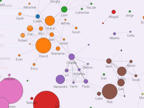
The totality of connections amassed by the NSA programs eerily mirror how Mark Zuckerberg discussed his hope to “take these separate maps of the graph and pull them all together, [so that] then we can create a Web that’s smarter, more social, more personalized, and more semantically aware” in “Open Graph,” a composite image of overlays among, say, the smaller businesses mapped in Yelp, musical choices in Pandora, and searches in Yahoo. Analogous ambitions for mapping the totality of information however raises questions about abilities to track individuals that violate their rights to privacy and effectively spy on their activities in ways that they can never know. How we can chart data overflows in information watersheds such as Facebook, Gmail, Google, Yahoo, and Twitter raises questions of how we map today, when the huge databases that are readily available online offer the possibility of generating maps to assemble a total image–often less linked to geographical certitude, and decouple the very category of place from distribution–but a cartographical landscape shaped by disembodied data. The limits of the sorts of “maps” this creates of individuals should be apparent, given the considerable price tags on these operations and the huge investment of manpower in turning up social ties.
The interests such a map serves are less evident than the logic by which data-driven maps capture, and the sorts of landscape that they ostensibly reveal from a totality of information. They seem to be informed not by descriptive tools of mapping, but the ways that “data driven maps” inventively employ cartographical visualizations to explain complex concepts, illustrate relationships or tell a story using GIS tools, using tools to build layered maps to describe geographic data–by focussing less on human populations’ actual distribution than on the map as an expressive, layered medium to reveal spatial networks in visually effective ways, by grabbing data and then plotting it in effective ways. The data-driven map has a logic derived from disembodied data, in other words, which it seeks to embody–rather than impose order on a transcription of spatial distributions.
The NSA’s aim for total and apparently seamless coverage of global networks says a lot about how we map data. by funneling data into visualizations that often stop short of the clarification of social practices they illuminate, the agency seems consumed as they are with the promise a map of terrorist networks–in which ‘space’ ceases to be the primary capacious container of meaning, reflecting how tracking is removed from spatial coherence, and probably unable to “sort” the information it collects in a coherent vision.
The data-driven map is constructed to interface with other maps, rather than creating a map in itself. It creates a map whose very disposability derives from the immediacy and rapid changes among data it so readily incorporates and generates in a recognizable visual form. This widespread use of maps as interfaces, familiar from many data visualizations, presents something of a shift in how space is conceived within a map. It has interesting parallels with the articulation of a determined spatial map in early modern Europe, because it creates an image of coherence where spatial measurement is less the subject of the map. Yet such “maps” risk devaluing space, by diminishing the meaning or category of place; encoding place as a value (rather than a category) and visualizing data against a cartographical interface is removed from creating a map, although it creates a similar confidence of totality and omniscence.
This post might stop here, given its length, but it is helpful to cite two cases of how place is a diminished category in recent “maps” based on the large-scale generation of data. Let me close with two examples. The meaning of “place” shifts as we organize “big data” in maps in ways that parallel the data mining and visualization to which the NSA has come to dedicate such attention–and which seem a model for the processing of large-scale data-collection from the internet.
6. Still More Data-Driven Maps
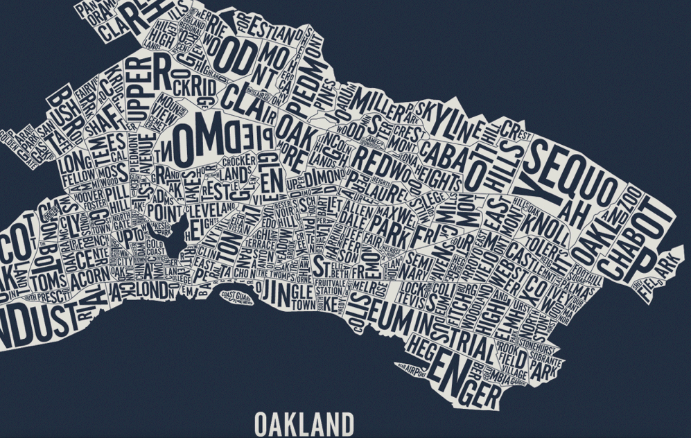
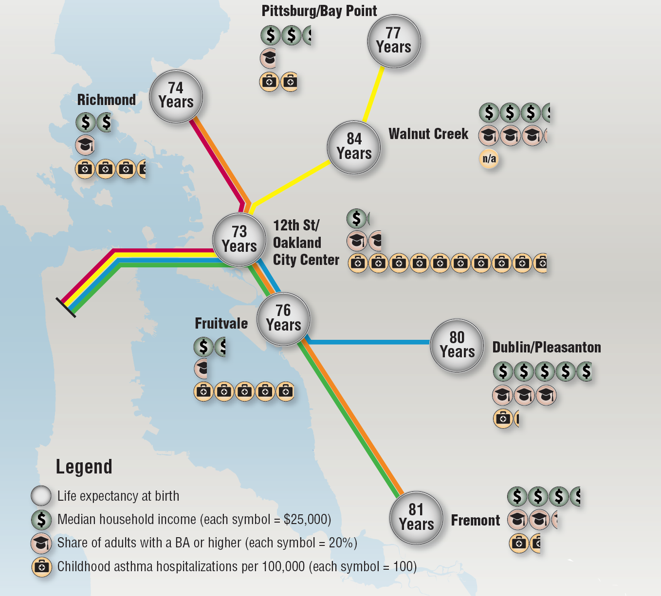
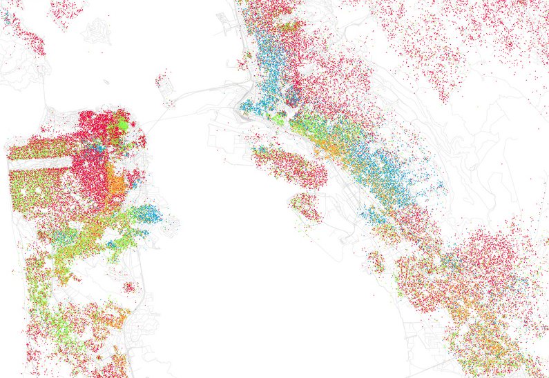
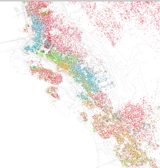
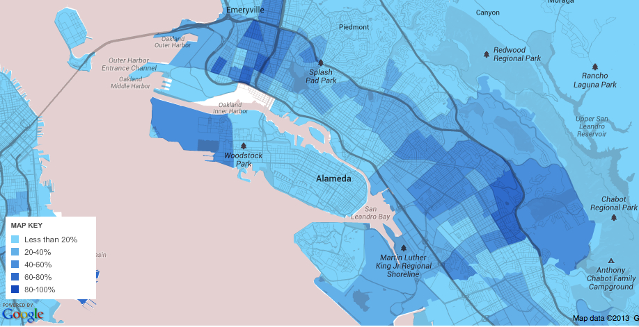
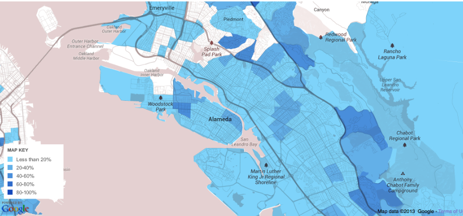
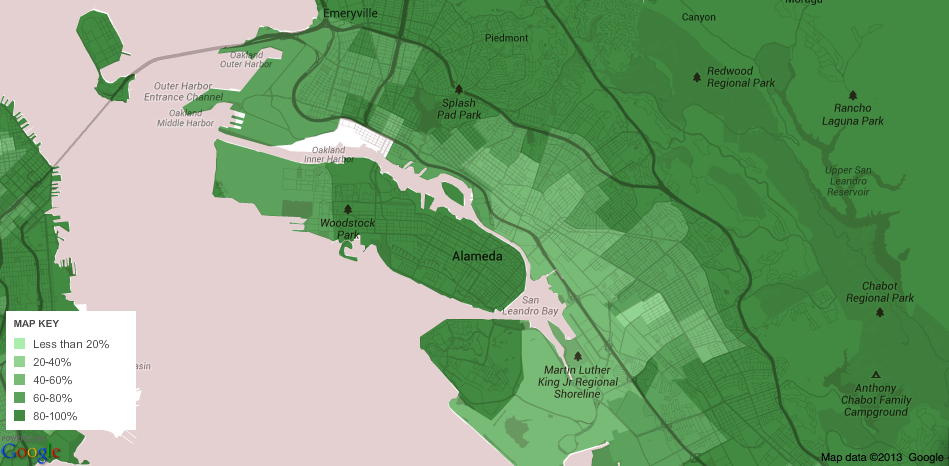
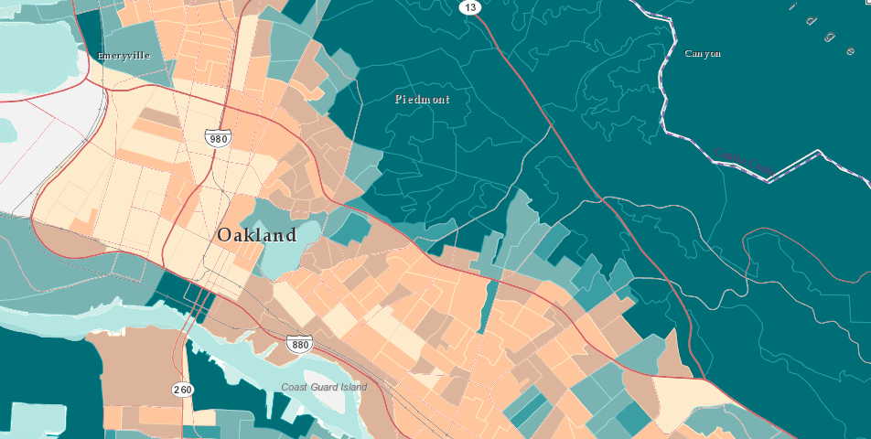
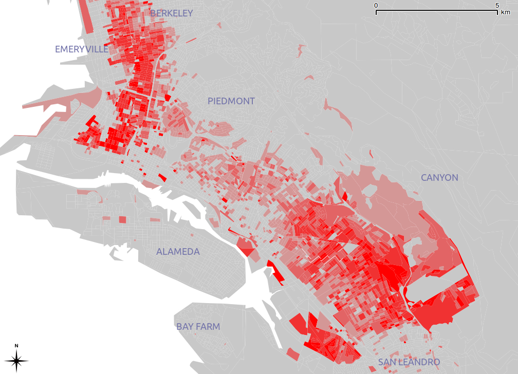
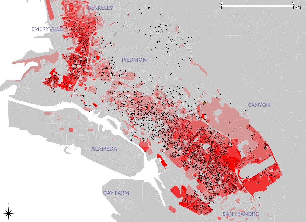
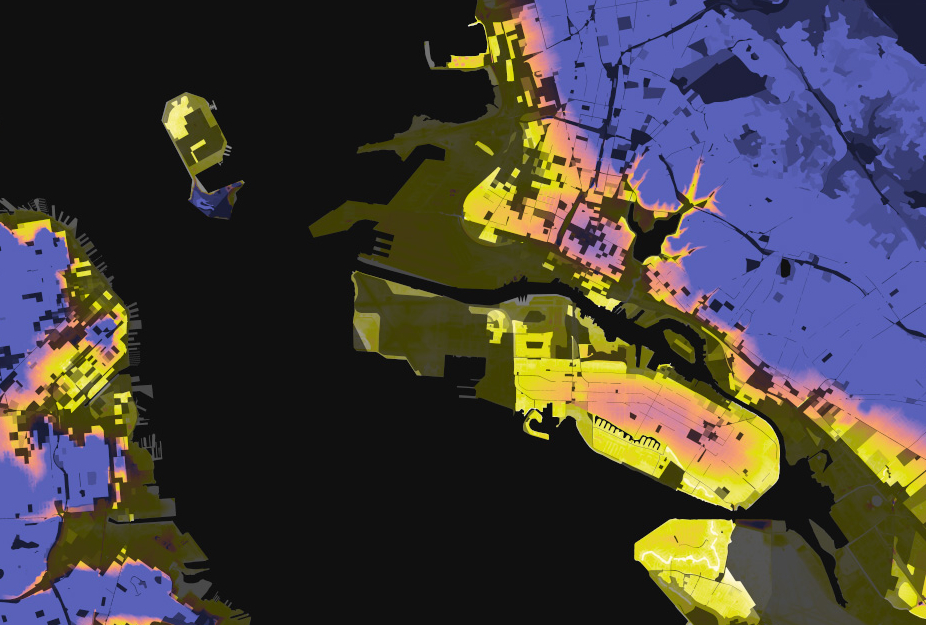
Two examples of how maps provide compelling ways as graphic interfaces for “big data” offer a powerfully seductive model for the expanding the collection and analysis of surveillance data in our cities. The statistical demographer Dustin Cable designed a striking racial dot map based on the 2010 Census to provide a ‘snapshot’ of the nation’s population. Cable took data from each of the 8-million odd census blocks in the nation to create a broad-brushed visualization of the entire nation’s population–noting each person the census registered in a synthesis able to be magnified, navigated, and explored as an alternate landscape, readily viewable in all its totality. But the presuppositions and amalgamated categories by which he did so, if they create a fascinating picture of population variations, are not only created with a considerably broad brush-strokes, but suggest some odd presuppositions of the integrity of the five categories of racial “identity” that he used. The map sought to create a “composite image” of the nation, although it did not preserve the defining features or individuality of its subjects, so much as create an imagined notional subject of observation in itself. Rather than filtering information, the digitized compendia aims to visualize networks from generated data not ordered in a framework of reference, but that orients one primarily to itself–or the data that it collects or has collected. In ways that make one wonder what it’s use is anyway, this computer-generated map assigns a dot to each person in the United States that it filters and displays in a scattering across census blocks, even though the “dot” corresponding to each person is itself smaller than could be rendered in the pixels of the computer screen. As if an attempt to resolve in digital terms Borges’ famous story about the construction of a map as large as the territory that it seeks to map, the problems that ensue from an absence of selective criteria in mapping readily generated data recalls other similar Faustian shema to comprehend masses of data in an age of information overload–data generated from information networks. Indeed, the census data that Cable uses is spread locally into the units of census blocks–odd descriptive categories that often run across neighborhoods, states, or county lines, and provide more of a pastiche on the local level, if a nice pastel on the national.
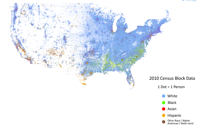
Indeed, the muting of many colors in the one-dot Census Block map seems to downplay both yellow dots marking “Hispanic” individuals, or indeed many of the catch-all “Asian” dots of red, save in their heaviest concentration, as does the scattering of dots within each census blocks, to downplay their visibility in a sea of light blue. Even in an age of the recognized diversity, the map casts the country as by and large powder blue–or caucasian.
Were does it map diversity, save on the coasts? The one-dot map boasts a total visualization of a dataset boasts a richly chromatic distribution of populations in the Bay Area and San Francisco East:
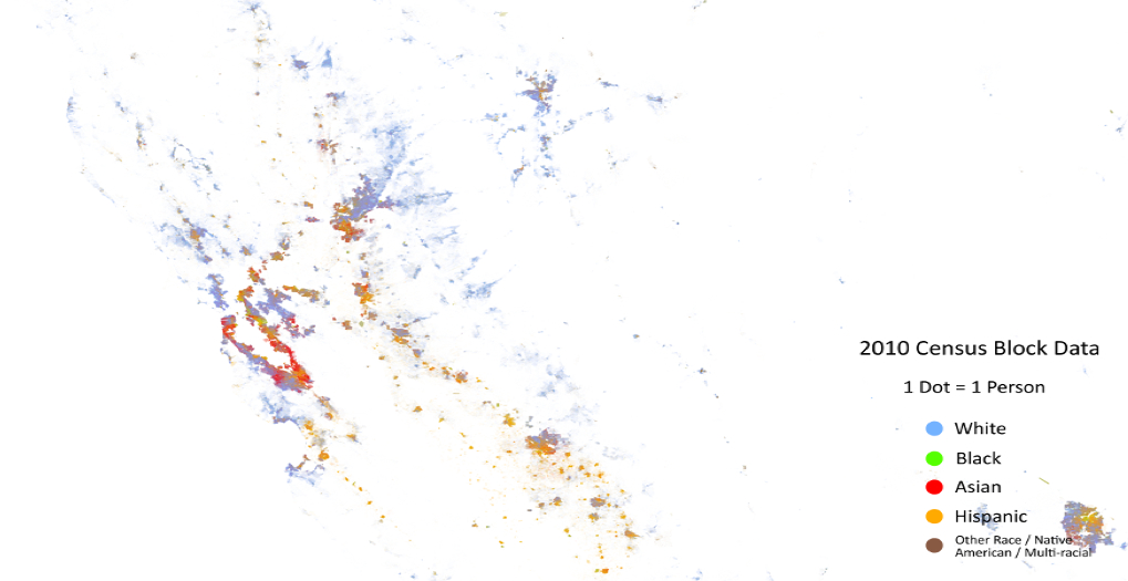
Despite Cable’s hope to provide a statistical “snapshot” of the American population in a single image, the categories parsed and colors employed serve to register non-whites more than to give a portrait of diversity rooted in self-identification. California’s coastline, taken as a whole, reveals a fascinating mosaic, although one in which the value of a “dot” is so blurred that the picture is less of a meaningfully measured distribution than an aestheticized view, whose categories are less meaningful–“Asian”? “Hispanic”? “Other”?–than its author might hope to communicate. What is going on in projecting these categories into a map more redolent of inherited and outdated “racial” divisions than he would care to admit. They are used as generalities to parse the amounts of big data that the census provides, rather than as categories that retain meaning on a local level–or serve to negotiate the local and general in the manner of an actually fine-grained map.
The map provides a minimal fine-grained distinctions of integration or lack as a result: the impossibility of granting enough space to visualize each dot’s relation to one another provides limited visibility to parse relative integration even in a map that fills the confines of a large-screen television; the census block provides a gross yardstick for diversity, but an incomplete metric to distribute California’s population.
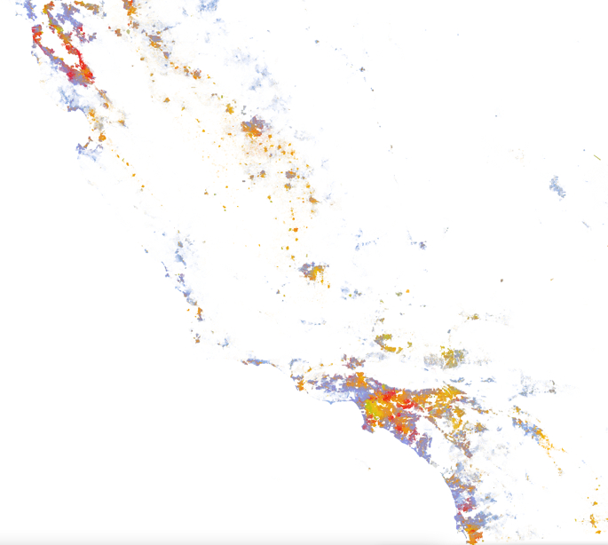
There is minimal ability to impose meaningful distinctions or extract meaningful distinctions from the map, despite the admirable nature of its one-dot-per-person esthetic, on account of the well-intentioned aim to render the population visible: limited screening of data among the 308,745,538 dots leave each smaller than a pixel on your computer screen; the resulting “color-coded” snapshot that is more effective in revealing the smudges of colors, rendered by the variety of purples and teals, that might map ethnic or racial integration in urban areas, most likely by the overlapping of “red” “White” and “blue” “Asian”–a fairly meaningless category not created by the Census itself, but by Cable using more refined census data–but often masking actual divisions more apparent at smaller scales, but difficult to render or parse at the gross map of the United States; moreover, the dots are not distributed with spatial accuracy, but distributed in a random scattering within each census block, to magnify integration.
The simple questions of how we inhabit space are difficult to map, given the overwhelming demand not to filter anything from a map. The data, in other words, is greater than a visualization is able to render. In similar ways, the “Sigint” data culled by the NSA suggest a mapping of the inhabitation of information networks, and the complete relinquishing of space. If minimal geographic information is present in Cable’s statistical map, the filtering of space from what I will call the Sigint map is even more pronounced, and a premium placed on its rapid generation. Whereas Cable generated the map, once having entered data of the entire nation, in some five hours against a Google API, rapid fire surveying of the communications web occurs with similar speed, removed from any illusion of an actual “space.” The filtering of data in each case provides few tools or handles to process the data on which they’re based.
The absence of space–its filtering from data visualizations–raises questions of the problems of drawing meaningful distinctions from a map, and specifically of the relations between individuals and a map. Space is not a homogeneous and recognizable extent that a territorial map can bound, delimit, and define. Rather, how space now exists for most Americans is far less tied to place than they were in the immediate past, given frequent geographic mobility and shifts in landscape: the mutability and erosion of space is something of a crisis in epistemological practices or familiarity, that compels us to create new spaces that are more familiar. I close with a very striking data-driven map tracking population by data compilation. The data visualization that is projected on a map is based less on rootedness or location than by taking web-traffic as a proxy for spatial situation, to suggest the notional construction of place in our cartographical landscapes. Some of the most impressive maps expressive of the mobility of Americans in recent years are those compiled by the realtors Trulia and graphic design group Stamen to track visits to realty websites in different cities across our increasingly mobile nation: rather than a track individual mobility and relocations, the maps compiled by Stamen and Trulia map interest in relocation and possibilities of geographic mobility–by mapping searches for homes suggest desires to relocate to different places, rather than geographic mobility. A lack rootedness of populations in a place or community can reveal disengagement and lack of responsibility for a given place. This example of people moving from New York reveals a rather restricted level of imagining what other areas of the nation they could live in, here based on the rather limited data sampling of October-December 2011:  Outside the city–if one counts Long Island and Poughkeepsie as in the metro area–Atlanta, Palm Beach, Miami and Los Angeles are the dominant sites for prospective movers. One could make arguments about blue-staters only moving to blue states. But this restricted range of interest in geographic mobility contrasts in ways with, say, Los Angeles, although they reflect each others’ general interest in limiting cross-country migration to one another’s region. Some Angelenos look at San Francisco, or Sacramento, but are focussed primarily on Riverside, Orange County, and Oxnard, yet as well as Las Vegas, San Diego, and Phoenix, suggesting a far more extensive regional mobility.
  To be sure, the question of restriction of a compelling interest in geographic mobility is evident in cities as Cincinnati to relatively nearby cities n the final months of 2011:
Or, to take an even more prominent case, from, say, Fresno:
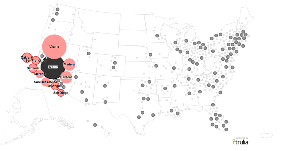
In each case, a temptation for wide mobility–if only of the voyeuristic observation of realty sites–is evident in America. And a considerable spread of regional interest–as well as a less pronounced national interest–is evident if one maps those looking at houses in, for example, Oakland:
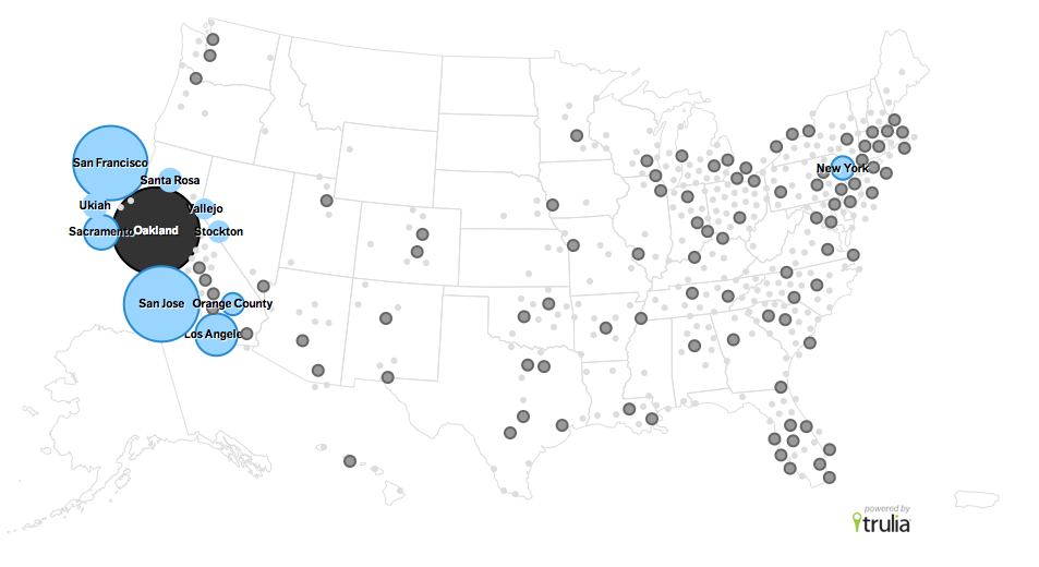
And an even broader range of interest across the nation–at least from Chicago, New York, Washington, Houston and Phoenix–if one surveys those examining potential moves to San Francisco:
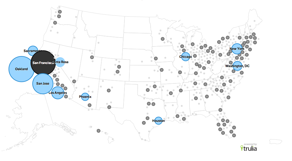
Of course, this data is skewed by those who have access to look at realty websites, and by the far greater web-traffic that results from a densely populated set of cities on the east and west coasts. But it is striking how less mobile the nation in general seems to think of itself. When we map in each of these different cases, the map seems more evocative of the authority of the territorial maps which they so faintly echo but which they effectively erase; as if to question the meaningfulness of place as a construct, the perhaps unintended divorce of location from data undermines communicative effectiveness by the decoupling of place from distribution, however–the mapping of flows, in place of spatial relations or networks of geographic travel, suggests not only a new age of map making, but a wanting lack of filters within the map. If the ways we read maps were based on our acceptance of filters, and an absence of the registration of totality in favor of the selective choices of the cartographer, data visualizations serve to synthesize a range of data as much as defining the criteria of selectivity that privilege the readability of a spatial distribution alone. What this means for the claims of and reading of maps is unclear, but the notion of place is the category that informs the reading of maps, but less of readily accepted construction or presupposition for how a uniform expanse is able to be read. We are, however, using the forms (and promise) of maps to decode information flows to grant some orientation on the networks we can’t perceive. This is true both in our visualization of census data or data visualizations of searching websites as well as of graphing personal information: but the promise of mapping creates a logic of comprehensive coverage that they don’t possess. The attribution of such goals of total information may divert our attentiveness or abilities of interpretation from real-time events–much as the project for eavesdropping on internet communications and telephone calls may have taken a greater share of the intelligence market than understanding our relation to the Iraqi people, or our geopolitical maps of Iran and Iraq. The US seems to assume too often a sort of empyrean map-maker’s view of the situation on the ground, in the confidence that we need total information coverage–and it is what can best protect us. We may all end up employed in Utah, trying to decode encrypted wisdom that reminds us of our status as a privileged people, privileged by our access to technology rather than our liberties.
We also may end up remembering this age of increased filtering of internet users as being as antiquated as this map of internet empires, whose servers are only seem omnipotent but serve but a portion of the inhabited world, and have only a loose hold on geographic expanse: