
When the first maps displayed extended voyages to the New World, directing viewers’ attention to previously unknown coasts were undoubtedly as relevant to their viewers as their landlocked interiors. When we focus on the landscapes that the maps present of a new space, or the naming of new lands, we forget that shores represented both the first sites of contact and exchange, and the primary destination of oceanic travels–and the primary site of argument that a map is able to construct. We impose our own criteria to read maps primarily as registers of place or location–as if by analogy to our own paper maps as wayfaring tools–rather than as forms to register the shifting relation between land and sea, or as tools to contemplate the possibility of oceanic travel to other lands.
The tradition of nautical charting and books of islands--isolari–provided a sense of the extension of nautical space and seascapes, against which the description of new shores might be measured, for one, and assessed, which was recuperated in new ways in the recently discovered globe, not previously known, whose situation of islands in the world’s oceanic waters is so visually impressive.
In reading early modern maps as a critical apparatus rooted of geographic reference points, imbuing them with claims to precision or accuracy which they imitate or attempt to render, we minimize the sort of rich arguments that maps and globes can make about figuring transit to unknown lands or rendering them visible. And so, it would not be surprising if the recently celebrated discovery, of a globe whose shorelines and braided ocean–filled with monsters and fish–are painstakingly and carefully rendered derived, with the copper Lenox globe of which it appears the sole surviving bronze cast, long considered one of the earliest maps of the New World, dated from the sixteenth century. The inclusion of the most intriguing clue–perhaps a sort of rebus–in the Lenox map, long roughly dated from the early sixteenth century, not only of fish and ships, but of a sailor perched in the prow of a caravel, poised as if viewing land to which he waves, suggested a theme of voyaging, discovery and contact in the small-sized globe, whose form of representing nautical expanse it seems a not so oblique comment on the audience of the map’s commission–and the difficulty of imagining nautical voyaging across the watery expanse that the globe mapped.
 New York Public Library-Lenox Globe
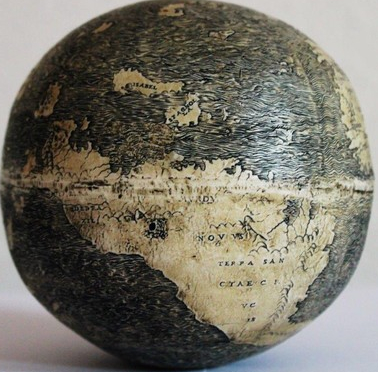
To analyze the two globes–one designed with a burin on the surface of conjoined halves of ostrich eggs; one cast and of unknown date or provenance–one must begin from the arguments that they make about space, and in particular the large and conspicuous role that they assign water. If a relatively recent fraud, the prominence of waters on the small globes, which provide one of the first images of New World islands of “Spagnola” [Hispaniolia] and “Isabel” [St. Isabel] offer one of the first records of nautical discoveries. The excessive emphasis on the reading of early modern maps for proofs of geomorphological discoveries or terrestrial measurements detracts from the novelty of portraying expanse and argument of the map renders a construction of inhabited space beyond the boundaries of the known world: the didactic manner in how early modern globes serve to exploit the synthesis of graphical information on their surface as a distinct form of cartographical invention–and of the dynamic inclusion of seascapes as a compelling and particularly plastic tactile feature of an early world map–quite unlike the seas in the elegant Cantino Chart that distinguished Spanish and Portuguese territories in the New World.

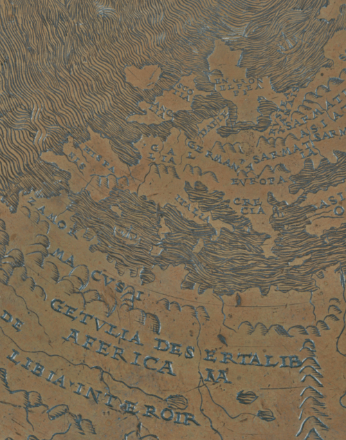
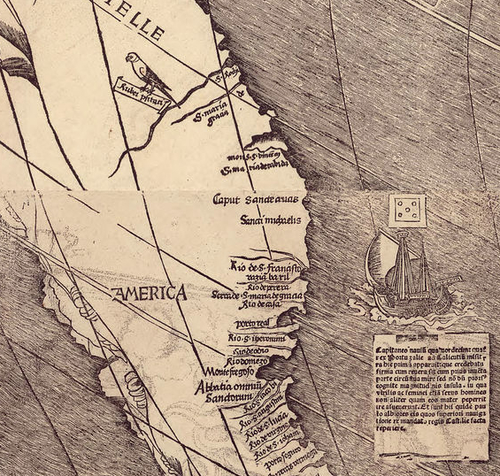
And far more clearly spatially situated in a maritime region that made clear in the woodcut of New World islands of Salvatoris, Hyspana, Ysabella, ferdanada, and Conception printed with Columbus’ Letter, De Insulis super in mari Indico reports (1494).
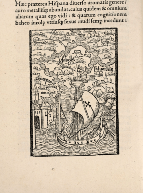 Osher Map Library, De Insulis nuper in mari Indico repertis (1494)
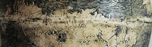
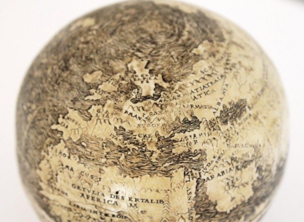
If this is evident in the eggshell globe in the banner, it is also evident in the hollow copper alloy Lenox Globe, long considered one of the earliest to depict the islands of the Indies that Vespucci had described in his widely reprinted Letters. The discovery of a possibly prior artifact of the globe, a recently discovered globe made of on joined halves of ostrich eggs, or ‘Eggshell Globe,’ which may derive from a potentially even earlier date would suggest it the first map to name or depict the discovery of America, and to be the first discovery of a globe or cartographical record crafted on a different medium than paper or vellum. Few early sixteenth century globes survive, and none drawn on eggshells. But the question of its date of creation is raised in compelling ways both by the sketchy image of the “Mundus Novus” it presents, and the apparent intention to illustrate the discoveries that Amerigo Vespucci had first described in the letters printed in 1507. The Lenox globe and its ostensible prototype present a uniquely tactile announcement of the discovery of the New World islands that almost seems to emphasize the itinerary of oceanic travel by which it was arrived at–as if to suggest the itinerary across the ocean, past the Azores, in which one seems to move from the abstract form of islands as they appeared in isolari to the concrete forms of the new islands themselves with their new names.
 New York Public Library-Lenox Globe
The image is an odd echo of the islands that were described in woodcuts in editions of Vespucci’s letter in its designation of the islands–and in the fascination with maps of islands of the New World that were widely reprinted during the early sixteenth century.
Piero Martire d’Angiera (Seville 1511)
If Vespucci’s letters formed the naming of the newly discovered continent “America,” the toponym was only widely adopted after Martin Waldseemüller’s multi-sheet 1507 wall-map, recently arrived in the Library of Congress, which synthesized Spanish and Portuguese discoveries, taken as the basis for the subsequent acceptance of the new continent’s name. But there seems new evidence for naming the New World on the Lenox globe and its eggshell prototype. Both suggest a more tactile announcement of the New World. The 1507 wall map labeled a “Mundus Novus,” echoing Vespucci’s letters, linking the engraving to the circles where Vespucci’s letters were read. The status of Waldseemüller’s twelve-sheet wall-map as the first mapping of the new world has been called into question by how the eggshell globe offers a basis to read the Lenox Globe as an alternate expression of the New World’s discover, not mapped by indices of longitude and latitude but carved or cut into its surface with particular care and attentiveness.
The “eggshell globe,” first reported after being found at an antiquarian fair two years ago, and radiologically dated to 1500, depict in considerable detail the shores of the New World and indeed foreground the possibilities of travel to them–unlike many contemporary maps. That it does raises curious questions about its relation to contemporary cartographical media, from the degree of care devoted to representing the continuity of whose oceans to the care of showing the relation of the islands to Europe–now reduced, as one might imagine the news of discoveries could suggest, to far smaller size. While the Lenox globe was never clearly dated, the artifact of eggshells may provide a new context to read its surface and its distinctively alternate mode of global mapping. Despite the globe’s small size–its dimensions are identical to the Lenox Globe–the globe the size of a softball seems not only a decorative artifact, but a mapping of the oceanic remove of the New World that could be readily studied and glossed by audiences less familiar with sea charts or Ptolemaic maps–and their role in situating Europe’s relation to surrounding ocean waters.
 New York Public Library-Lenox Globe (detail)
While the Lenox Globe has been chiefly dated by its disposition of landmass, it is the earliest globe to devote such attention to the detailing of the watery surface: if the dating accepted by the Washington Map Society is retained, the globe of carved ostrich eggs attached at the equator would be the prototype of the Lenox Globe, and not a detailed copy created at a later date. This post examines the globe as a creative response to the deep interests in describing relations between land and water–and both the opportunities and dangers of possibilities of ocean travel in ways that revise the subject of earlier world maps, by examining the globe’s surface in comparison to the digitized images of contemporary engraved woodcut maps and the nautical “portolan” charts from which it was synthesized. While we have often applied underlying positivistic assumptions and approaches to our understandings of the compositional synthesis of cartographical forms, the globe–and the Lenox cast that seems to derive from it–raise questions about how the synthesis of cartographical information afforded particularly creative ways to consider an individual relation to the disposition of terrestrial expanse. For the globe raises questions of the encounter of the individual with mapped space that a comparison with contemporary maps might better allow.
 New York Public Library–Lenox Globe (detail)
1. Since it offers one of the earliest globe to depict the Americas, the globe has provoked nearly global media attention as challenging the priority of Martin Waldsemüller’s learned cosmographical treatise. Identical to the bronze alloy globe stored in the New York Public Library since a fortuitous mid-nineteenth century discovery, prized as an undated but early image of the Americas of c. 1510, slightly posterior to the large 1507 twelve-sheet wall map Martin Waldseemüller designed, a copy of which has recently arrived in the Library of Congress, in which the cosmographer synthesized Portugese and Spanish discoveries and identified the New World “America.” The Hunt-Lenox Globe has continued to receive less scholarly scrutiny after the conclusion that it post-dated the twelve-sheet wall map that the humanist Martin Waldseemüller designed to illustrate Amerigo Vespucci’s account of his voyages to the New World for a humanistic audience in April 1507. But the detailed image of the inhabited world’s carefully braided waves and delineated coasts have somehow received less attention, despite their particular innovation as a consideration of the shifting nature of a terraqueous globe. The peculiar delineation of the braided waters on both globes–the potential ‘original’ and ostensible indirect bronze cast–deserve as much interest as a way of showing a tactile record of terrestrial expanse. Its unique design raises compelling questions both of iconography, but of the reading of mapped space.
For by reorganizing the world’s surface on a modernized variant of Claudius Ptolemy’s ancient schema of terrestrial projection on ruled parallels and meridians, the previously unknown “Eggshell Globe,” which has attracted media attention generated by its owner–but been observed by few–raises renewed questions about how the distinctive depiction of the ocean surface might relate to the date of its actual invention and the circulation of nautical records in early modern Europe both before and after the projection Waldseemüller engraved in St. Die in 1507. The particular plastic presentation of Portuguese navigational records in both globes direct attention to the understudied process of the transference and translation of information from Portuguese navigational records, and the synthesis of maps in a particularly convincing visual form. The newly-discovered artifact, carved on conjoined halves of shells of ostrich eggs, has not only returned new attention on the Lenox Globe. It has raised compelling questions about the practice of translating data from nautical charts predating the naming of the New World after the Florentine mapmaker Amerigo Vespucci, and the relations of its quite tactile surface to the curvilinear projection Waldseemüller designed of Ptolemaic form , and a basis for its iconographically peculiar illustration of oceanic expanse. The braided waves in the ocean surface across the surface might suggest something like a polemic response to existing paper maps. The hollow, copper alloy Lenox Globe, composed of two halves joined at the equator, is dated circa 1510, based on geographic content, makes it of less concern than the Waldseemüller projection. Could it and the “eggshell globe” be of even earlier date, however, and predate the acceptance of the delineation of a separate space of “America” on Waldsemüller’s map? Given that their shorelines so drastically diverge from how Waldseemüller delineated its coast, the different style of mapping may suggest a unique cartographical intelligence of depicting oceanic expanse.
The eggshell globe and Lenox Globe suggest a unique mapping of oceanic expanse, foreign to nautical charts or other cartographical media, that seems designed to demonstrate the amazing nature of the voyages that Vespucci first described. The inclusion of nautical records in world maps had provided a conspicuous basis for their revision of the inhabited world not easily recognized. Waldseemüller’s attention to the arrival of the prominently indicated ship, traveling westward with the wind billowing its sails, seem to make good his claim to create a map derived from the reports of sailors–““according to the Discoveries of Amerigo Vespucci and Others”, as his 1516 map later claimed to be ordered “iuxta Hydrographorum Tradtionem [according to the tradition of navigators]“, the map presents a more coherent model for imagining the watery expanse traversed to arrive at the New World that would have preoccupied its readers. If the ship that sails westward in the map in how Waldseemüller represented the discoveries of navigators in a format of learned geographical inquiry for readers based on landlocked regions situated ports and rivers on parallels and meridians, the Lenox globe and its near-identical carving in the sphere assembled from joined halves of eggshells reveal considerable artifice as assemblages that depict a surface of potentially perilous travel–as much as the foreign parrot Waldseemüller included in his map.
These near-identical globes reveal unique compilations or syntheses of cartographical information, distinct from the Waldseemüller map. The identical figuration of the surface of the discovered globe, carved on conjoined halves of ostrich eggs, reveals a striking care to representing oceanic waters that deserves to direct new attention to the embodiment of a new medium of travel even more clearly than in the Hunt-Lenox Globe: if the waters are similarly suggested to provide a medium of travel in the globe of Waldseemüller, the presence of their intricately braided design reveals the distinct cartographical ingenuity in the Hunt-Lenox and its purported prototype. Both artifacts refigure the world’s oceanic expanse in distinct ways, offering evidence of the translation of nautical charts to new readers.
For rather than rendering oceans as blank regions of intersecting rhumb lines, all three images stake arguments about the ocean’s traversability and power in an illustration of marine itineraries. The Roman geographer Strabo had sustained that “from both the evidence of our senses and from experience we learn that the inhabited world in an island, for wherever it has been possible for men to reach the limits of the earth, sea has been found, and this sea we call ‘Oceanus.'” The globes translate new nautical findings to the senses of their observers. Did their translation of oceanic expanse reveal a revision of viewers’ cognitive relation not only to a new continent, but to ocean waters? Despite significant media attention to the discovery of the globe by its owner, the unique design of both globes suggest an understudied process of cartographical transference and translation of information, if not the sublimation of the printed map or hand-drawn chart to a distinct medium. Despite the expansion of nearly global media attention to its possible precedence of existing globes, the existence of such a cartographic record as either an argument of terrestrial or terraqueous unity has not been examined, or any evidence suggested of how both globes, of identical size, were presumably read, since they lack any division of their surface.
Guiding concerns with priority constrained interest in the spherical copper Hunt-Lenox globe, stored at New York City’s Public Library, despite the clear modernity of its illustration of the recently discovered islands Vespucci named and described in the Mundus Novus, since its appearance–as that of the “Eggshell Globe” below–suggests the circumnavigation of South America. Yet the delineation of the “Mundus Novus” as a distinct continent, if derived from charts that resulted from Portuguese missions to map the southern continent five years before 1506, mediate discoveries for a public familiar with Vespucci’s claim in his letters of 1503 to have reached fifty degrees of the Antarctic circle in 1501. J.B. Harley noted notions of “accuracy” in maps are quite often misunderstood, without the awareness that any map must be placed at “the end product of a chain of processes,” and that it is to be expected that “several distinct types of accuracy may have to be accepted” as coexisting in the same map, often by necessity, to meet an expectation of continuity or harmonious order. Such different standards may respond to the needs to craft a record of apparent terrestrial continuity or indeed coherence. And the privileging of “accuracy” as a guide to understand the dating and relation among maps discounts the sorts of new arguments that a map might make in orienting readers to the New World.
2. In ways that suggest a new synthesis of nautical maps to a globe of detailed tactile form, the globe suggests, unlike the azure blue marine expanses shown in the flatly-colored illuminated projections that map the world’s surface on a ruled graticule in surviving codices of the ancient geographer Claudius Ptolemy’s treatise on world-mapping, titled the Geography to reflect its status as a summa of terrestrial cartography. Both globes both suggest a new translation of the map to a tactile space that is foreign to most earlier manuscript maps, as if to sketch the traversal of oceanic expanse, or processing the epistemic encounter with the ocean as a medium of travel, in powerful graphic arguments through pictorial symbolic conventions largely foreign to how Ptolemy’s cartographical practices were received.
The inclusion of a qualitatively rich representation of oceanic surface in the globe stands in sharp counterpoint with the flattening of oceans in Ptolemaic projections that privileged the flat surface of the map. In sharp contrast to such earlier manuscript maps, the much-heralded announcement that a recently purchased “Eggshell Globe” which appeared several years ago at a London antiquarian fair is the original model and design from which the Lenox globe was cast, if true, would make it potentially the “oldest globe of the New World” ever discovered to include results of Portuguese navigation to the New World. Dismayingly little is known about the survival or past owners of this curious artifact–or about its emergence on the market. But although the assertion that the delicate artifact of durable ostrich egg shells has been somewhat uncritically celebrated in online and print world, if greeted with some skepticism, the assertions that the globe was the product of Leonardo da Vinci’s hand, made with strikingly limited documentary support, raise fascinating questions about its particularly innovative figuring of water across so much of its surface. Indeed, the proposed re-dating of the globe as the original of the Lenox Globe has been covered largely uncritically by international media, the attribution of the globe to so extensively studied an artist as Leonardo has been dismissed as “sheer nonsense”–or judged less probable–but is largely sustained. The close or identical resemblance of the globe to the Lenox globe has been largely examined for how its geographic details–from the island of Hipaniola to much of South America, labeled “Mundus Novus,” and islands identified with Newfoundland. But the discovery of the putative original design of the waters that cover the globe have received far less attention for how they carved egg translated nautical discoveries to carved or cast surfaces in particularly inventive ways.
The inventive role of the mapping of oceanic expanse is strikingly unlike earlier maps from portolan charts themselves to the 1492 painted Erdapfel whose synthesis is credited to Martin Behaim, in Nuremberg–the first known globe to incorporate Portuguese discoveries. For they suggest something far closer to commercial arguments about the possibilities and ends of oceanic travel, as much as a simple transposition of cartographical discoveries to a spherical surface, beyond a synthesis of geographical findings. All too often, historians rely on created notions of accuracy on terrestrial expanse, instead of the assembly of a nautical record or continuous shoreline, in ways that may unduly constrain our interpretations of early modern maps. Yet the inclusion of the Vespucci letters or Mundus Novus in early editions of Waldseemüller’s 1507 Cosmographiae Introductio (Introduction to the Science of Cosmography), where it served as a sort of appendix to his world curvilinear map that proposed a new model for assembling the New World, never before tried, suggests that the isolationhow the map was read, and indeed how it offered a text that could be read through consultation of the letters of Vespucci that were so widely reprinted in European centers of printing from 1504 that it provided a model for the poetics of global cartography: the reprinting of Vespucci’s letters from 1504 as a written account of the Mundus Novus, often in translation, so often included a enjambment in its subtitle of the phrases “superioribus annis . . . invento/Albericus Vesputiis” to encourage polemic attacks on Vespucci’s arrogance in arrogating credit for the New World’s discovery diffused in Waldseemüller’s map and booklet: the positioning of his map suggests a poetics of map-reading, however, in which the projection could be consulted as a basis to situate and plot an account of “new discoveries,” rather than an artifact of autonomous precision.
The poetics of mapping had so radically shifted for demonstrative ends after the publication of Vespucci’s text because his letters provided a new basis for reading maps among audiences scarcely familiar with cartographical conventions. Globes such as the Hunt-Lenox and its purported prototype lacked meridians and parallels, but afforded similarly inventive claims in their innovative graphic design. With a clearer understanding of the innovative poetics of world-mapping as a way to process a relation of other lands, it makes sense to ask what audience was the “Eggshell” globe made to date its creation, as much as focus exclusively on the geographic information it contained. Did it depict global travel and transoceanic contact, as much as a precise land map? Did as yet unkown cartographical information circulate in Europe, as John W. Hessler has concluded based on his use of polynomial warping to analyze Waldseemüller’s 1507 map of South America, that predated Magellan’s circumnavigation of the continent? In identifying the coasts of the New World as the “Terra San/ctae Cr/uc/is”, the globe follows correspondence to Pedro Alvares de Cabral known it Italy from 1501, and printed in maps from 1508, that suggest its designer boasted the most recent cartographical data from nautical charts, rarely employed save in a world map of circa 1507/8 by Johan Ruysch, considered the first map to show newly discovered American lands.
3. The legibility of the disposition of these lands is placed in even better evidence in the globe that appears to be its prototype and model, which create a clear sense of imposing a sense of legibility on terrestrial expanse more striking than in many early modern globes:
 Washington Map Society/Portolan
Despite the absence of lines of latitude or longitude in the globes, the manner for rendering nautical space treats the map as an argument and a narration of sailing across the ocean in ways that are rarely–if ever–evident in early modern maps. Since being heralded in Portolan as “the earliest surviving globe to depict the New World,” the uniquely tactile artifact or “Eggshell Globe” has been less explored, in the significant and almost world-wide media frenzy significant media attention that has been directed to its possible dating of 1504. Although no clearly reliable date has been as of yet assigned the object, the complex rendering of waters on the globe may provide an important–and neglected–piece of evidence as to its significance and its potential relation to Leonardo’s uniquely innovative models of cartographical design. Overpowering in the complex care of creation that it immediately communicates to its viewer, the artifact assembled from conjoined hemispheres seems not only identical to the Lenox globe in its description of interior topography, riverine paths, and suggestively naturalistic shorelines, but particularly overpowering in its tactile rendering of the oceans that cover the globe. It is particularly striking its unheard of attention to the mediation of water, absent in earlier cartographical records, and almost unique in mediating navigational discoveries to viewers in kinesthetic form–a form that illustrates a fascination with the fluid dynamics of ocean waters, and the possibility of imagining an actual oceanic expanse greater than had ever sought to be represented or communicated in maps.
Assuming these oddly identical globes are related, the pair provides a unique case of the replication of cartographical records in a plastic form, foreign to the manuscript or printed organization of maps or the nautical charts from which they derive, but which suggests the intense interest in assembling nautical charts to communicate terrestrial expanse, and indeed the limits of global knowledge.
4. The similarities between these unique globes may put the date of composition of each earlier than previously considered. The Lenox Globe was purchased only as late as 1855, and previously was unknown, for how it, in a relatively small object of 345 millimeters in circumference, or 112 mm. in diameter (4 1/2 inches), perhaps made to be read as a synthesis of nautical charts. The curious “Eggshell Globe” suggests that rather than being the sole object to process such nautical maps, the globe might have enjoyed a currency, not known or recorded elsewhere, to process terrestrial space.
The rhetoric of the presentation of cartographical evidence in the globes focusses distinct attention on the earth’s watery surface to an extent that locates motion on its surface. Both globes suggest a unique translation of the cartographical content of maps for new audiences of readers to an extent to which current media hubbub about the “discovery” may have obscured. For the extent that water appears in both as an animated aspect or part of the globe suggests a new appropriation of maps, often confined to land, to suggest the primary role of water as a force in the natural world, in ways that make both striking ways to present the discovery of the New World–described by the first sailors who returned with Columbus and which were published as an account of the islands of the New World in 1501-2. And the particularly animated attention to the depiction of water on the surface of the globe may be the best grounds for the otherwise fairly daring attribution of the globe to Leonardo da Vinci or to members of his workshop. But the unique format of representing waters may offer the strongest evidence, not developed in earlier writings on this curiously compelling artifact, that Leonardo’s own hand can be discerned in the innovative globe. Indeed, Leonardo was surely attentive to the reception and mediation of the discovery of newly mapped information that arrived in Florence and northern Italy in nautical charts, evident in both globes. But the addition of a new object to the widely-studied Leonardo canon may be worthy of attention, as it dates from the same time that Leonardo experimented with new techniques of casting in the late fifteenth century.
The remarkable nature of the attention to the water in both globes as a dynamic way of reading and figuring terrestrial expanse has, surprisingly, gone unremarked. The collation of early modern terrestrial cartography collectively described sites of initial contact, but rarely if ever evoked the oceanic expanse that was travelled to arrive at these places across the sea, although the distances of travel not only could barely be conceived by landlocked men, and must have been one of the most difficult concepts to communicate for audiences practiced to a limited extent in reading mapping forms, or conceiving of expanses of marine travel. Even if the Lennox Globe is stored in an armillary sphere of later construction, the common size of such globes may suggest a similar apparatus for reading terrestrial locations.
Such issues are raised by the attention both globes seem to give to the oceans to the medium of travel, as much as its routes–and the detailing of the oceans to suggest the forcefulness of the medium of water and a strikingly tactile relation to its expanse, in which the form of the ocean is imbued with a sense of restlessness and motion in its relief that reflects a new direction for map-making as a medium. At the same time as the cartographer’s delineation of the shorelines of the New World offered crucial tools imagine palpable connections to another continent, the globe suggested the effort and even as they also invited the viewer to contemplate its inland regions. Whereas contemporary maps of air-travel articulate networks that cognitively challenge viewers’ relation to space, free from topographical impediments or physical obstacles, the first maps of the New World offered their viewers ways to move through space, and tools to apprehend a shifting idea of globalism to their viewers. Although the comparison is anachronistic, much as links in the below map of air-travel provides a clear an image of global inter-connectedness to be the cover-image for a popular recent text of world-history—

–both early modern globes seem to have actively configured comprehension of global ties across the oceanic expanse in ways that direct attention to the ocean as a decisive medium of travel in ways that make them distinctive cartographical artifacts.
If we attend to the early modern map with attention less to the connectedness of the continents, than their distance, the worked surface of a recently discovered globe engraved on an egg-shell reveals an active contemplation of a reconfigured oceanic expanse. The above map of airline routes allows its viewer to leap over obstacles and the human construction of shorelines in the manner of airplanes, in ways deeply troubling for a book aspiring to be an educational guide–foregrounding Europe and the new hub of Abu Dhabi–befits a textbook that covers world history to 1500. But the radical nature of the discovery of the globe made of two conjoined semispherical halvses of ostrich eggs, which I’ve discussed in earlier post on the artifice of Renaissance mapping, emphasized the expansive waters that cover and link the globe in the surface in ways that suggest a more complex demonstrative function of comprehending globalism. Indeed, by inviting viewers to contemplate that suggests both the pleasure of reading mapped space and the difficulty of imagining and defining the legibility of a continuous record of space. Indeed, the interlocking between ocean and terrestrial shores maps are strikingly foregrounded in this recently discovered globe, as comprised by open seas as landmasses. One discovers the immensity of global expanse in the very continuity of its detailed worked surface in ways that are rarely recorded in most early modern printed maps.
The tactility of both globes’ surfaces appear to take stock of the nature of the expanse of oceanic travel, the artisan who designed the globe attended to the delineation of shorelines in ways that challenge our assumptions that maps primarily define routes of land-travel: if the shoreline was increasingly seen and drawn as distinct from the oceanic waters in most printed early modern maps, the prominence of the oceans in this globe figures viewers’ relation to space in ways that sharply contrast to how we are accustomed and indeed fixated to mapping a measured relation to the land. While the globe lacks any measured indices of latitude, the visual relation to the undulating waves of the ocean’s worked surface suggests a new interest in contemplating the mechanics and scope of its watery expanse that reflects the concern in Leonardo da Vinci’s circle with the depiction of the globe’s seas and their relation to the land of the Mundus Novus.
 Washington Map Society/Portolan/Stefaan Missinne
Could a conceptual relation to the interior even be defined, indeed, in an age when the New World was only begun to be apprehended as a distinct land mass?
5. Such issues arises from the discovery of this deeply didactic globe, whose considerably small size, in comparison to many later printed maps or portolan charts, belies its dense synthesis of recently arrived cartographical information with a strikingly plastic realism. Within the evocative landscape that seems to have been carefully embellished and prepared in the two hemispheres of the globe by a single hand, or burin, with amazing attentiveness to the transcription of local detail, indices of location and place-names are strikingly less apparent, especially in comparison to many Renaissance maps and charts which would seem to have informed it, than the overall evocation of the vastness of terrestrial space and of the “Mundus Novus” from the old world. In ways that recall a model that could be readily consulted in relation to both nautical charts and early Ptolemaic maps that circulated in elite libraries in Italian courts and select parts of Europe from the 1480s, the eggshell globe–an apparently unique medium for inscribing cartographical information–seems to belong to a unique medium of early modern globes, often celebrated for their uniquely compelling craftsmanship, that offered a new reading of terrestrial space. Despite the limited notation of seas or bodies of water, whose naming was prohibited by the intensive application of a unique iconography for registering the ocean’s expanse, the worked surface of the globe suggests early evidence of the attempt to communicate the image of the globe that had emerged from recently-arrived nautical charts, and presents particular excitement in converting and expressing their findings in plastic form.
“Space” was first imagined along routes of ocean travel and the ocean understood as a surface of nautical travel on which routes of travel were able plotted and improvised by the close of the fifteenth century, when the first nautical charts arrived in early modern Europe, and early modern Italy, from portolans of sailors from Spain or Portugal. And the ‘Eggshell globe’ raises fascinating questions of how oceanic space could be understood as a medium, rather than as a barrier to travel, that might be applied to the reading of other early modern globes in provocative ways. For although the New World was beginning to be mapped in increasingly dynamic ways, charts seem marked by a deep awareness of the inadequacy of the ability for a credible mapping of the seas. This makes the attentiveness to the mapping of the seas–and its pronounced emphasis on oceanic expanse–particularly striking in the “Eggshell Globe,” whose unprecedented attention to the detailing of the watery surface of the terrestrial globe makes it particularly striking as an artifact. While using shorelines inherited from the format of nautical charts to frame a meditation on the globe’s watery expanse, the detailing of the water’s surface as a mode for rendering expanse echoes the ways that Leonardo da Vinci lavished attention on waters of rivers and oceans as the “vetturale di natura,” analogous to the blood that animated the bodies of animals and men, by assigning the water surface of the globe a primary role in its mapping. There is indeed an almost a consciousness in its fabrication, and in the detailing of the braided seas, of how oceans linked the newly discovered continents to the rest of the inhabited world, as if the globe itself neatly demonstrated Leonardo’s firm assertion that “la terra, ch’è scoperta dalle acque, sia molto minore che quella che da esse acqu’è coperta,” as well as his deep belief in the waters’ independent nature as something of a vital force–and source of untold energy as the vetturale di natura–in worldly cosmology and in the earth’s surface: the globe suggests an astute record of a created world that was both changing constantly with the water’s ebb and flow, and whose mechanics reveal a record of its properties to an extent foreign to most all early modern maps.
The striking eggshell globe lack any of the spatial indices that are familiar from Ptolemaic projections, but its attention both to the equator line and the line agreed to at the Treaty of Tordesillas, apparent in the Cantino planisphere of 1502, dividing Spanish from Portuguese lands in the New World by reference ot the Cape Verde islands–evident to the far right on the globe, establishes a demonstrative if not didactic scope for its fabrication. Yet the waters between Europe and the islands of Isabel or Spagnola are more compelling of attention.
 Washington Map Society/Portolan
The globe that was engraved on two conjoined halves of shells of ostrich eggs seems the original from which the apparently identical surface of the still-undated hollow Hunt-Lenox Globe conserved in the New York Public Library was cast, is of particular interest for the unique material means by which it maps the sea, as well as the New World–or “Mundus Novus“: for it offered a particularly dynamic tool to imagine the relation to the newly discovered continent, not employing indices of longitude or latitude, but providing a distribution of inhabited lands. The attentive care with which the extremely learned artisan worked its surface, undoubtedly consulting nautical charts, and including the recently concluded “Treaty of Tordesillas” that divided lands claimed by Portugal and Spain, and islands Columbus had discovered, suggest the joing novelty of measuring and discovering a New World, extended interestingly to the waters on which an increasing number navigated. The copper globe, a serendipitous discovery in a Parisian antique shop, purchased by Henry Stevens after he quickly recognized its value. (Stevens soon consulted an expert who had worked, incidentally, for the U.S. Office of the Coast Survey–later Coast and Geodetic Survey–charting the coasts of the United States, given its clear interest in mapping how land and ocean meet.) But the implications of the unique figuration of the New World’s shores in this striking artifact have only begun to be explored.
6. The mapping of intersection of environments of land and water has been less prominent focus of the history of cartography, compared to the far clearer truth- ad knowledge-claims of maps. This is partly since the maps of nautical travel and terrestrial cartography are deemed–either in retrospect or not–distinct cartographical media, but also because it is difficult for us to separate maps from their knowledge-claims, and to see them as ways of constructing hypotheses about the world. The relatively quick mapping of the globe in early modern Europe demanded that previously distinct media of mapping informed one another and intersected, as mapmakers sought to reach broader audiences in print, and synthesized a broader range of visual sources to fashion maps of increased tangibility of its entire expanse. The map provided an argument not only of terrestrial unity but a compelling record with fixed boundaries as a terraqueous body, that joined land and sea, as much as a terrestrial surface: the historian Eviatar Zerubavel provocatively and compellingly examined maps as records of the spatial comprehension of the New World in Terra Cognita, and one can envision a dialectic in which maps created new surfaces of visual investigation of terrestrial contiguity and workshops for organizing curiosity in the ability to mediate terrestrial expanse through naturalistic illustration that were not confined only to elite audiences. These maps increasingly shifted the notions of the accuracy by which world maps registered expanse, and the information that was mediated within the design of a map or globe.
The attentive care that the globe-maker who constructed the “eggshell globe” clearly dedicated to its aqueous surface in particular–which he used an almost palpable field against which ships sail, fish emerge, and sea monsters rear their bodies–as well as to areas where land and sea intersect or adjoin suggests the conscious artifice of mapping in ways that are unique among contemporary globes and printed cartographical media. In this sense, the globe suggests an object of learned curiosity. Globes served as contemplative objects in elite libraries in the ancient world. But the stunning artifact of the “Eggshell Globe”–a detailed rendering of the unity of land and sea whose relatively small size of just 4.4 inches–112 millimeters in diameter–engraved on conjoined halves of separate ostrich eggshells of equal diameter–belies its detailed worked surface. Although much of the surface was blank, and its poles open oceans, despite the limited size of the globe restricted available surface a number of places were clearly identified in humanistic capitals for orientation, as islands of Isabel or Hispaniola, the prominence of whose discovery was mapped at what we now see as magnification, each placed within the rippling crests of almost vibrating oceanic waves that convey the impression of a sea that laps against the shore to bridge the intersection of water and land, and indeed take stock of the distance (and terror) of its oceanic expanse–rather than its terrestrial population or areas of human inhabitation. Indeed, the sheer amount of watery surface that fills the globe is a terrifying expanse that vividly communicates the arduous nature of Columbus’ then-recent transoceanic travels–much as the delineation of the coasts and inlets of the new islands suggests a keen interest in the littoral configuration of shorelines where the ocean both led to and touched the New World. Rather than map routes of nautical navigation–in the manner of Battista Agnese’s vellum nautical charts of the mid-sixteenth century traced Magellan’s 1519-22 epic global circumnavigation, or later maps of Sir Francis Drake’s circumnavigation–the globe suggests the obstacles, even as it hints of the potential benefits of travel across its aqueous expanse.
Early modern maps figure the seas offer a context for examining how the recent discovery of global expanse on the ‘Eggshell Globe‘ in ways discussed in an earlier post on the artifice of Renaissance mapping. But the globe also reveals the intensive reading of maps as tools to imagine the nature of oceanic expanse to communicate the oceanic surface that bear further investigation, and indeed may provide clues to its authorship. For the discovery of the alleged model of which the Hunt-Lenox Globe–while still of unknown origins–provides compelling evidence of imagining the shifting arrangement of the waters of world, and even of the sea-monsters that inhabited it, perhaps echoing biblical discussion of monstrous underwater inhabitants, as well as the ships that traversed its undulating surface. In ways that prefigure how Herman Melville famously found that “meditation and water are wedded forever,” and the globe engraved on conjoined halves of ostrich eggs reveal a continued and ongoing fascination with reading the swirling ocean waters, even more evident than in the globe itself than the copper cast: the extent of its surface dedicated to the waters that filled the areas between continents, which is displayed in so much greater detail on the globe than the cities, rivers, or divides of terrestrial expanse. Despite the prominent capital of humanistic lettering that identify large landmasses, the globe reveals a new premium on the accuracy of maps from a nautical context, and a new interest in the value of globes as media of naturalistic terrestrial descriptions.
 Washington Map Society (Portolan)
Indeed, what is most striking about the ‘eggshell globe’ recently discovered, and the cast in the New York Public Library that mirrors it, are not the coastlines, derived from recent nautical charts, or topography of continents’ mountainous interior, but the restlessness of the undulating of the flowing waters that run across its surface. The flowing of waters on its surface, if evident in the Hunt Lenox globe, is all the more evident because of the sharp contrasts between the lines of incised black in the eggshell globe both by their contrast to the interior and the craft of the quite carefully and elaborately worked surface of this rather small artifact that barely fits the palm of a hand.
7. If its size served to allow ready consultation for a reader who turned the weighted object in their hands, and no doubt read it in consultation with a more expansive nautical chart or the regional maps of an early printed volume of Ptolemy’s classic treatise on world mapping, whose editions entered elite libraries with their large, multi-colored maps, most often hand-colored, from the late 1480s, the globe provided an alternative medium for reading the continuity of terrestrial expanse that suggested the watery links between continents, and considerable expanse of its oceans, which shifted the ancient geographer Ptolemy’s emphasis on the expanse of inhabited lands–the classical notion of the ecumene. The regions of terrestrial habitation and their rather detailed topography is noted with some detail in the worked surface of the globe, but the form of attention that it primarily compels directs attention to the sharp division between regions and the surrounding watery expanse with a rather striking attention to the coasts, estuaries, rivers where land and water connect, as if the portrayal of the watery web that winds around the world constituted the primary object of artisanal attention in the globe. We have not adequately seen or noted the foregrounded relations between water and land–or those that link land and water–in the matte surface of the cast that lies in the New York Public Library, although the braided surface of the water is just as apparent, perhaps because their engraving is less mesmerizing in the undulation of its lines, or less revealing of the considerable attention of its fabricator to representing its watery expanse, as well as newly discovered lands, or a route to Japan.
The startling identification of the eggshell globe with the circle of Leonardo da Vinci has more occasioned considerable attention as an internet meme and newsflash than it has been situated in a the broader context of cartographical implications–since the announcement of the “discovery” by the self-identified “globe expert” Stefaan Missinne. The globe certainly dovetails with the representational concerns of an artist like Leonardo, whose work was so often and repeatedly attracted to the regions where land and water meet, and for who may have been drawn to fabricating a terrestrial globe strikingly different than existed in earlier maps of the inhabited world. Although the globe seems tied to the contemplative scope that globes had long enjoyed in the ancient and early modern world, discussed by Christian Jacob and Denis Cosgrove, and many others, serving as an object of study and a sign of learning, as well as a condensation of encyclopedic learning and cosmographical skill, the slippery surface of its wavering waters suggests a tactile sense of a distinct medium of travel that is more attentive to the physical surroundings of place than many historians of cartography have sufficiently allowed.
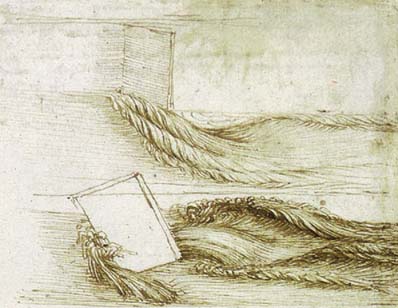
In contrast to the celebration of the much detailed printed twelve-sheet wall-map designed by Waldseemüller, the worked surface of the small globe in the New York Public Library has received less study or global attention in recent years But both the discovery of the eggshell globe, and recently proposed identification of its stunning representational artifice deserve new scrutiny both as they have been dated and identified with the work of Leonardo da Vinci. Leonardo’s cartographical expertise derived partly from his geometric interests and skill as a surveyor and engineer, but despite some sketches that reveal curiosity in Ptolemaic schema of projection, the majority of whose maps covered regions in the Italian peninsula, and most particularly Tuscany. And the “eggshell globe” seems un-Ptolemaic in its lack of concern with delineating or nothing parallels, although it does indicate the equatorial line as a seam between its halves and corresponds to a clearly measured diameter that Leonardo had elsewhere derived. Most strikingly, Leonardo’s assertion that the size of the globe was 7000 miles were adopted in the proportions of the Eggshell globe, intriguingly linking Leonardo’s cosmographical ideas to the globe, as Missinne has strenuously sustained. But the detailed rendering of waters on its surface offer a particularly striking echo of the sustained attention to hydraulics on which Leonardo focussed in his Notebooks–here in pages of c. 1513 and c. 1508-9–in ways that have not begun to be adequately or systematically explored.

The unexpected attribution of the globe would perhaps challenge our concepts of Leonardo as a mapmaker. Leonardo’s maps for the most part reflect responses to individual commissions: naturalistic images based on Leonardo’s terrestrial surveys of the Arno valley and Tuscan landscape are well-known–in addition to maps that proposed a system of Milan’s waterways and fortifications or the situation of Imola, drawn for Cesare Borgia. But the intersection of this globe with information recently mediated by nautical charts presents a particularly innovative synthesis of cartographical data whose unique assembly deserves examination not only as a mediation of charting traditions, but a conceptualization of the map as an argument for apprehending the disposition of land and water across terrestrial space. Leonardo left a curious freehand drawing of a world globe in 1495 of just 4 cm. in diameter, suggesting his interest in mapping the New World, and seems to have considerably later crafted eight gores, dated ca. 1514, that privileged the toponomy of the expanding world.

It is striking how Leonardo considered the luminosity of the moon not only as a reflection of the sun’s light, in remarks in the Codex Arundel, but as potential evidence of the waves that characterized its watery surface: indeed, the wrinkled or rugged surface Leonardo attributed to the moon in order to understand the shifts in the reflection of light from its surface reflect the depiction of the waves of windswept oceans on the globe with striking similitude. Leonardo usedstrikingly concrete terms to posit the existence of waves covering much of the surface of the moon analogously to the earth. As the oceans reflected light from the surface of the world’s seas–“quello che li prestano le le nostre acque nel refletterli il simulacro del sole,” he argued imperfections in the watery surface of the moon mediated the reflection of solar luninosity: “di che si compone il mare della luna e il mare della nostra terra, . . . sempre rugoso, o poco o assai, o più, o meno, e tale rugosità è causa della dilatare l’innumerabili simulacri del sole, che nei colli e co[n]cavità e lati e fro[n]ti delle innumerabili rughe si spechiano,” thereby reducing its radiance from how its watery surface would appear, Leonardo argued, if “la spera dell’acqua, che in gra[n] parte . . . veste la luna” were uniformly spherical. For Leonardo, the “waves of the moon[‘s seas] mirror the sun in the hollows of the waves as well as on the ridges, and on the sides remain in shadow.” In this description of a watery surface of the lunar landscape, dated circa 1509, Leonardo reflected at length on the shifting “angle of incidence” of the sun’s rays on the roughnesses created on the spherical body of the moon by the “l’onde della luna spechiano il sole così nelle lor valli come nelli colli, e li lati restano oscuri;” comparing the moon’s body to spherical object or mulberry, whose brightness derives from the angle of incidence on the hollows of its waves [“ne’ lati della luna li fondi dell’onde non vedono il sole, ma si vedono le cime d’esse o[n]de”], describing to himself “the innumerable images of the solar rays reflected from the innumerable waves of the sea, as they fall upon waves [L’in[n]umerabili simulacri che dalle innumerabili onde del mare reflettono li solari razi, in esse onde percossi].”
Did the fashioning of a watery globe provide Leonardo with an analogous structure to imagine the moon’s surface as filled with waves?
8. Unlike Leonardo’s several attempts at mapping Europe’s form or the Italian shoreline in his Notebooks, which are either schematic or incomplete, the map betrays a sustained careful attention to a project of globe-making that seems unprecedented–save in these probably quite subsequent set of gores. But his discussion in an opaque note of “el mio mappamo[n]do che à Giovanni Be[n]ci” in the Atlanticus. For Richter, this map was executed by his school, or simply in his possession, to be distinguished from his projects of canalization near Florence or Milan. Yet the attention to creating a complete record of the world’s continents in with close attention to the detail of a copious variety of islands and circuitous–rather than conventional–shorelines, suggests a clear interest in creating the map as something like an argument of the ordering of space.
The curious globe creates something of a similar argument of the world’s newly discovered spaces on an immense oceanic expanse in the “Eggshell” globe that will doubtless attract far broader attention in coming years. The identification of the globe with Leonardo derives not only from iconographic similarities of orographic detail of mountains and cresting waves, or the intense interest in the shorelines depicted from nautical charts–evident in the cast of the eggshell globe. For the globe also reflects the unique measurements and proportions of the globe Leonardo had described in the Leicester Codex, 35v as of a “grossezza di 7000 miglia di diametro” (a “miglia” being 3,000 Florentine braccie commune), of which the Mediterranean was but one eighth [Leic. 6b]. Leonardo’s sustained attentiveness to the relation between the water and land in the earth as a whole [Leic. 36a], as well as to the questions of the oceanic waters’ ebb and flow, and indeed to the global uniformity of sea-level, reflect his interest in describing the mechanics of the relation between the ocean, which he rarely saw, and Mediterranean, and may have been nourished by the availability of a range of cartographical materials in those very years, which pictured Europe more of an archipelago than a landmass.
The globe closely reflects Leonardo’s deep concerns for materially representing water, introducing the curved shorelines and estuaries into the surface of a world map. Such concerns were often omitted on earlier maps, to be sure. And although Missinne’s claims focus attention on asserting the authorship of the globe by Leonardo’s biography and the presence of cartographical materials in Florence and Pavia after publication of Vespucci’s three 1501-2 letters describing the results of his own four voyages, and his conclusion that America was indeed a separate unknown continent, this post will examine the eggshell globe as revealing a radically new way of recording, revealing, and perceiving terrestrial space. And although significantly less attention has been paid to how the “eggshell globe” ran against, and altered, existing traditions of mapping, charting, and describing terrestrial expanse, such a revision of mapping practices would have been characteristic of how Leonardo would direct attention to the practice of reading space on a globe and provoked attention to the relations between terrestrial and watery expanse in particularly inventive ways.
The crafting of the eggshell globe attended so closely to the working of watery surfaces within a globe both with intended effects both of considering the phenomenological relation to the globe’s surface as a natural description–a question closely linked to his other varied projects of scientific investigation–and to compel readers to attend to how its surface arranged expanse to offer a new performative reading of terrestrial space it provokes in ways ran against other existing mapping forms by its close reading of the relationship between water and land, and the relation between water and land that was implied by the discovery of a new continent–“Mundus Novus,” as the letters engraved on the globe pronounce. Far beyond simply mediating the discovery of the world to readers, the globe suggests particularly provocative ways of discovering the continuity in global space as a relation between water and land that its readers might compare to other existing cartographical media to contemplate global continuity and imagine their relation to the continuity of global expanse, and a clear interest in bridging the often distinct areas of nautical charting and terrestrial or global maps. Indeed the humanistic capital lettering that identified its regions–Italy, France, Germany and Spain among them–suggest the detailed crafting of a legible object of study whose surface could be easily read and whose toponymical content was authoritatively and elegantly identified.

Despite the limited toponymy on the small globe, its maker devoted considerable care to the delineation and engraving of an accurate coastlines is uniquely combined with the delineation of a naturalistic mountainous interior to suggest unprecedented naturalism. Notwithstanding the apparent unlikelihood of an unkown attribution of a globe to Leonardo, the deep concern with mapping of waters–a subject foreign to the Ptolemaic tradition of world-mapping, and absent from many later early modern globes–is oddly foregrounded within the “eggshell globe” in ways that make it a subject worthy of renewed scrutiny as a cartographical fabrication as a hydrographic record, and indeed a medium of geodymanics if not ecological imagining, that echo Leonardo’s own naturalistic interests. Although the typeface on the globe suggest scribal involvement in a collective project, the apparent use of letterpress type demands investigation.
The elegantly engraved miniature globe seems closely informed by concerns for the geometric measurement of bodies, and reflects the sustained attention he gave to Ptolemaic conventions of map projection, evident in his experimentation with the globe’s surface, sketched with some attention to the proportions of its land masses circa 1490 in the Notebooks. Indeed, its diameter and size follow the dimensions which Leonardo specified in his Notebooks. But Leonardo sketched maps in his Notebooks that united Leonardo’s geometric measurements of bodies, and Vitruvian principles of architectural symmetry, with questions of physical geography. Such concerns seem to animate and motivate the several maps Leonardo devoted to the coastline between Rome and Naples, drawn in the Windsor ms., that establish hypotheses about the terrain, and attend to the flow of water by rivers and canals from the mountainous interior to the Mediterranean–or the better-known image of the Mediterranean basin in the Codex Atlanticus, a sea that he oddly described in the Notebooks as the greatest river in the world–“the greatest river [il massimo fiume], which moves from the sources of the Nile to the Western ocean [Oceano occide[n]tale],” where it “reunites with its ocean, the father of the waters.” If the Mediterranean was reduced from the mare nostrum, did the remark suggest discovery of far greater oceanic bodies that encircled the world in the “eggshell” globe?
9. Does the globe reveal the excitement at Leonardo’s discovery of a measured oceanic expanse? Can the considerable concern directed to the water–and indeed to the mapping of ocean waters across a global expanse–reveal an indication that both dramatically distinguished the globe from other maps, and suggest the concern that Leonardo showed in depicting points of possible contact with the open waters of the sea, not only in its indication of potential ports and sites of contact with the unknown inland, but the hydrological dynamics of oceanic expanse whose rippled surface concealed deep currents and surface tides? In a time when we are paying renewed attention to how we map the shore–or, indeed, map shorelines as clear divides–it is interesting to consider the changes in the meaning of the shore as a category in early world maps. Although nautical charts of the sort known as “portolans” or nautical portolan charts primarily delineated coastal shores, the maps’ contents are traditionally taken as mapping routes of nautical travel: they provided the graphic representation of coasts incorporated in early world maps of Ptolemaic derivation, even if the “Ptolemaic” maps only silently transposed the shorelines from nautical charts to suggest something approximating a credible image of the inhabited world, removed from actual observation, and often of necessity surmised.
The integration of perspectives from nautical charts created a new sense of exactitude in maps, linked to the accuracy of the coastline’s curves, as much as the gradients of longitude and latitude, Water is decidedly not the subject of these maps–since water is separated and seen as distinct from (and not related to) the notion of the ecumene or inhabited world–even when the populations being mapped existed on the water, island archipelagos, or centers of nautical trade. The blinders with which the “inhabited” world was registered and recorded excised ocean-going and the sea for sixteenth-century readers of maps that we have to some degree inherited in privileging the terrestrial as the sole site of human habitation–the subject of terrestrial mapping and indeed of the Ptolemaic ecumene, which was reproduced in maps read by humanistically-educated readers from the later fifteenth century–as no longer bound by the sea or an oceanic boundary, in which in c. 1490 the inhabited world was ringed by something like a buffer zone of a multitude of unidentified, imagined, incredibly numerous islands, many perhaps uninhabited themselves.

Few manuscript maps either cite or acknowledge their sources and models, especially when it comes to the determination of shores: their collective knowledge is presented as an authoritative distillation: although nautical charts needed crucial data for maps of Europe and the greater Mediterranean created for and included in lavishly illustrated codices of Ptolemy’s ancient treatise on terrestrial mapping that began to circulate in increasing numbers from the mid-fifteenth century, they were never cited: the maps presented themselves only as collective knowledge, as this map of islands in the Aegean that derived from a nautical map or isolario tradition so popular in Italy and the Mediterranean. As humanist editors of the treatise newly entitled simply the Geography amplified it with ‘modernized’ maps designed in increased numbers from the 1460s, the maps often transmitted toponyms inherited from the ancient world–and augmentations of a castigated text edited independently from cartographical forms–whose craftsmanship was assumed authoritative, and was presented, concealing specific sources, as a replication of the artifice of terrestrial and territorial mapping, in ways that state authorities and sovereigns all too often recognized as of powerful symbolic forms that acquired new value by noting spatial divisions and frontiers for their potential readers.
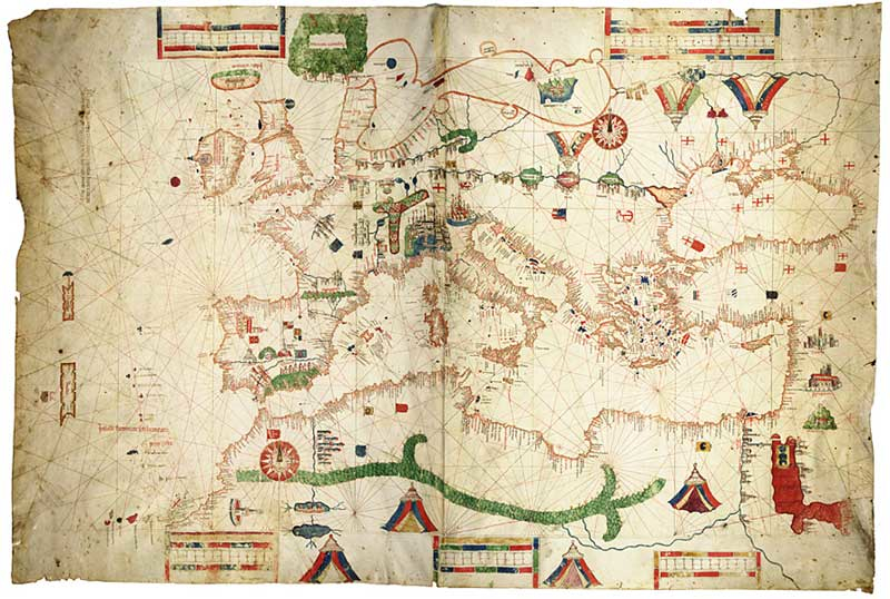
The format of nautical charts is often read from the point of view of Ptolemaic mappers that omit credit, since they preserve the authority of a Ptolemaic world-view. Were such Ptolemaic maps made only for audiences who lived on shore? Mapmakers continue to assume that charts’ informational content and accuracy lie only in coasts, and that the charts themselves served only–in the manner of the Dutch rutters displayed in trading houses in the Netherlands–to provide guidelines for tracing courses of ocean travel (routes described in writing in actual portolans) or commercial routes for trading, rather than expanse for sovereign ends: so much is suggested by the wind-roses that accord with compass directions, lines probably traced on top of many portolan charts, rather than serving as a network to determine geographic position; it has been questioned that the most elegant vellum charts that survive, intended as supplements to a written portolan, were used on board of ships. The precious charts provided useful prototypes for courses, stored onland at major ports, like Barcelona or Genoa or Pisa, the major centers of their production. (Surviving contracts for their design from the early fifteenth century in Barcelona involved painters, suggesting their value as objects and goods, before they were collected as luxury items, in the manner first studied by the historian Angelo Frabetti in sixteenth-century Italian courts, where these images of geographic totality circulated as princely gifts as well as worldly decorations.) And in the manner that charts included the coastal cities and promontories, or mouths of rivers, naturalistic markers are conspicuous in the globe.
Charts could be easily disregarded as sources. The apparent disregard for terrestrial expanses and proportions in these charts placed the tradition of charting outside a practices of terrestrial mapping, and the priorities Ptolemy articulated for terrestrial maps constructed on latitude and longitude as ensuring continuous and proportional transpositions of measured distances. Many highly valued charts distorted expanse from a given port’s point of view–as this magnificent 1489 chart of the Mediterranean made by the little-known Genoese charter Albino de Canepa, which is now stored at the James Ford Bell library in Minnesota in their historical maps collection; the delineation of coasts gives a pride of place to Albino’s native Genoa. Although privileging Genoa as a site for maritime departures, whose toponyms crowded along their coastlines with a scribal density removed from territorial sovereignty in their blank interiors. The maps note few sites of inhabitation that are not ports. Given the unclear protocols of such mapping practices, their content not only contrasts with the premium on terrestrial contiguity in geometric projections of terrestrial cartography. These charts however mediated a clearly defined, if less recognizable, notion of space: space is not uniformly proportional in these maps, and appears to be recorded without clearly coherent logic as a quantified transcription. But rather than only record the shoreline, or line between land and sea, such charts gained wide currency as a way of policing both commercial transactions, recent research suggests, and maritime trade.
 James Ford Bell Library, University of Minnesota
10. We have, perhaps, unwittingly internalized the unfair prejudices of map-makers who privileged geometric forms as tools to validate the transcription of uniformly continuous terrestrial surfaces as far superior illustrations of expanse: although such map-mapmakers exploited and adapted the coastlines of nautical charts, they discounted their accuracy, and concentrated on augmenting cities in their territorial interiors–proliferating toponymy within shorelines earlier isolated as liminal surfaces for to register knowledge with limited and only off-hand bearing to territorial boundaries or border lines.
The recent attention to how such “portolan charts” encoded sovereign claims of terrestrial governments may complicate this picture. For such research calls into question that the notion of coastal stations on shores were discreet registers without bearing on territorial sovereignty, and may have served as attempts to extend national sovereignty and law into regions of the sea in ways that had few precedents in the concepts of territorial jurisdiction that were formulated and transmitted in Roman law. Despite the rarity of noting territorial sovereignty in medieval maps–notions of the imperium (imperial law) or commune (and communal law) mapped poorly onto the delineation of terrestrial space–and to establish a frontier of maritime policing in attempts to control and monitor threats to the disappearance of goods at while they were in the process of being transported by merchants at sea. Does this offer a new suggestion for how to map the sea, or map, as it were, and to map not only land, but to map the offshore as a newly known realm?
Recent scholarly attention to the context of producing maps has suggested that the coastlines in such charts offered a basis to encode littoral exchanges and an increasing territorialization of maritime space greater than presumed. Rather than see the coastal culture of the Mediterranean as removed from domains of land, the increased presence of commerce and piracy within Mediterranean waters placed governmental jurisdictions offshore to a far greater extent than the perspective of terrestrial cartographers who minimized the utility of nautical charting to draw jurisdictional lines would suggest. Emily Sohmer Tai has revealed the relations between charts and land cultures through a medieval legal database of instances of “approximately 750-800 cases adjudicated in various courts throughout the Mediterranean between approximately 1200 and 1410” in which merchants or merchant investors who accused attackers at sea of stealing from their ships in a violent manner [violenter] in ways deemed “in modo piratico [in a piratical manner]” that contravened extant treaties or alliances. The protection of marine waters seems a surrogate for the protecting of national sovereignty, in other words, in an era when the protection of maritime trade was a primary basis for protecting commerce and maintaining treaties with commercial allies.
As much as the charts reveal something of what John Gillis called a “seaboard civilization,” they extended the jurisdictional claims of landlocked courts into the ocean seas–in a culture that saw itself surrounded by frighteningly unnavigable seas, as this cartographer of the late fifteenth century had so powerfully imagined, in what is not a globe proper, but surely provided a sort of surrogate globe to imagine the oceanic surroundings that ring the islands of the inhabited world and Antipodes in the pre-Columban era.

The juridical status of the marine chart as a register of what coastal authorities were responsible for policing the seas near their land jurisdiction, Tai suggests, and in fact preserved a much more detailed image of sovereign control of the oceanic expanse that such charts depict, evident for Tai in the practice of “marking water” as subject to sovereign control to an extent that later Ptolemaic charts, which predominantly privilege terrestrial space, appear to neglect, or not address: the fulfillment of clear needs to define marine sovereignty, or extent jurisdiction into the waves in ways that were not directly addressed in Roman law or communal statutes. If shores are the true ‘borders’ in these charts–the earliest of which lack territorial boundaries in the manner that was so decisively introduced in the “modern” maps of treatises of global geography of the late fifteenth century–this echoes a clear sense of the literally “liminal” space of the shore as a site of incursions within the seaboard civilizations of the Mediterranean world. The delineation of the Treaty of Tordesillas in both globes, if taken as part of the evidence of their Portuguese provenance for Peter W Dickson, including its mapping of South America–the “Mundus Novus“–as a distinct continent. Or would the disputes about ties to the New World rehearsed in charts suggest less a direct tie to Portuguese mapmakers than to the disputes that were addressed in Portuguese charts and nautical records?
The expression of such claims for marine sovereignty in a seaboard civilization no doubt explains the continued production of such nautical charts long after one imagines them superseded by Ptolemaic maps of terrestrial expanse: they provided a means to determine the extent to which corsairs acted as agents of maritime sovereignty or jurisdiction, much as the annually appointed “Captains of the Gulf” selected by the Venetian Senate afforded protection to sailors in nostro gulfo, and a guarantee of commercial protection from piratical incursions: hence the importance of flags of local sovereignty that were removed from terrestrial borders–but which were increasingly tasked with maintaining the peace of the seas–although suits of restitution pressed against communes seem rarely to have been pursued, properties seized by corsairs might be restored to owners, especially once it returned to land, Tai finds–the legal penalties pursued against corsairs meant to act in state interests definitely increased. The questions of commercial liability may have been as significant to portolan chart-makers as the nautical routes of travel that a ship might follow to its final course.
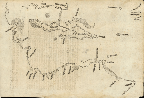
The depiction of coastlines as surrogates for local terrestrial jurisdiction provides a baseline to read the shifting depiction of the seas beyond the Mediterranean in the decade after Albino de Canepa’s stunning Mediterranean chart. Although the maps of nautical travels–the same “portolan charts”–provided the basis for mapping islands in the New World that recur in the maps of Francesco Rosselli (1445-1513), perhaps a relative of the nautical mapper Petrus Rosselli, whose 1506 nautical planisphere–if not mapping the entire world’s surface–so dramatically expanded the confines of oceanic expanse from earlier portolan charts of the Mediterranean to suggest a paradigm shift in mapping, pressing oceanic expanse far beyond the frontiers of known claims of sovereignty. (Slightly later maps of the world such as the 1502 planiphere of Alberto Cantino, based on a secret Portuguese map, perhaps of the Padrào Real, for the Este family of Ferrara, clearly noted the division of jurisdiction decided at the Treaty of Tordesillas, that parsed the authority of Portuguese and Spanish rulers along fixed meridian–unlike the Rosselli maps or charts, which seem less concerned with drawing jurisdictional lines of sovereignty than crafting a uniform terrestrial space on a measured graticule.) The presence of the line drawn at the Tordesillas treaty in 1494 provides not only potential date for the globe, as it was revised in 1506, but a level of expectations for the audience for which it was designed. Although it is the only meridian of longitude noted on the globe, three hundred and seventy leagues west of the Cape Verde islands.
11. Once one shifts from the Mediterranean to the expanse of a global ecumene that includes the oceanic expanse to be traversed to arrive at the New World, measured by clear meridians and curved parallels.
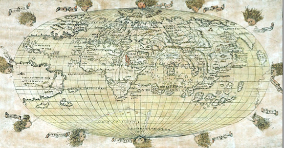
The first maps that painstakingly affirm sovereignty of the isles of Hispaniola and Isabella introduce a vast unknown watery expanse of unknown dimensions for viewers to contemplate the distances needed to be traversed. The prominence in the globe of the recently found “Hipsane isole” in maps such as the Rosselli’s engraved oval projection, if limited to 180 degrees of latitude, invited its viewers to scan the oceanic expanse and provide a source of Columbus’ fourth voyage–and which Columbus had described in De insulis nuper in mari Indico repertis, and Vespucci’s further descriptions of the discoveries of 1501-2. Mapmakers registered these discoveries in visually compelling detail in a reduced terrestrial space of 345 millimeters circumference and 112 millimeters diameter, under four and half inches, in the so-called “Hunt-Lennox Globe,” stored within a bronze armillary sphere: the globe, long dated circa 1510, details two continents in the western hemisphere has recently been compellingly tied to the arrival of nautical charts in Florence and Pavia in the first decade of the sixteenth century, and new questions posed about the authorship of what was long assumed an ornamental construction–but may have offered a new model to conceive a unified terrestrial space.
 New York Public Library
For all its cartographical modernity, the copper “Hunt-Lenox Globe” imagines a short distance between New World islands and Japan [“Zipancri” here, a terminology Marco Polo’s writings had widely diffused], directs its viewers’ attention to the greater oceanic expanse between the islands. The attribution of this relatively small globe–the size of a large grapefruit or softball, of dimensions just greater than sat easily in one’s hand and weighted at its base–suggest the largely water-covered nature of the world that reveal not only the excitement of the islands that Vespucci described in his popular Mundus Novus based on voyages to South America in 1501-2, writing from Lisbon to Pier Francesco de’ Medici, and which Rosselli successfully mapped on a blue surface in this colored version of the same map stored in the British National Maritime Museum. This map, with its illustration of islands open for exploration and potentially containing unseen riches, both seems to exaggerate the proximity of the new lands to Europe by ocean travel, rendering them as relatively accessible on the open seas, rather than to clearly embody or offer a defined cognitive relationship to the ocean’s expanse.
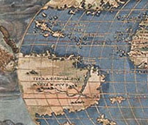
The roughly contemporary globe that has been recently discovered of the terraqueous world that was engraved on egg shells is particularly striking for its inclusion of a detailed representation of the sea–indeed, as precisely a representation of the oceanic surface’s ripples and waves as in the prized “Lenox Globe,” perhaps a cast of the unique “Eggshell Globe,” as described in some of Stefaan Missine’s recent publications based on his own unique and detailed observations of the globe, which served to communicate the discoveries of nautical charts by concretizing the viewer’s phenomenological relation to the ocean’s physical expanse through actually tactile forms to communicate the relation of land and sea, which sharply contrast to earlier cartographical tools. Did the identical size of these globes suggest that they were meant to be read in relation to comparable armillary spheres?
 New York Public Library
12. Both the Hunt-Lenox Globe, long considered the earliest in existence, and the globe engraved on the unique medium of an eggshell serve as an astounding register of geographical discoveries. The remainder of this post will direct attention to the affinities in how Leonardo da Vinci repeatedly returned to the question of circulation of waters in the detail of its hydrographic rendering in ways that the worked surface of the globe reflected. For the globe returns to the waters in ways that reveal a deep affinity if not a sort of graphic argument about space that shares deep affinities with the particular interest that Leonardo in particular showed to the relations and differences between the circulation of waters. For as much as the Hunt-Lenox globe is striking in its delineation of islands from “Isabel” to “Zipancri” [Japan] that could be readily reached by oceanic travel, the intense working of individually cresting waves of the sea it is even more striking–as in the eggshell globe itself–for the understanding of oceanic dynamics that its wavy lines communicate: the aquatic lines to define this globe indeed suggest a sort of hydrographic learning that make it a particularly innovative means to demonstrate the viewer’s relation to its expansive ocean, as well as newly discovered isles whose shores it so carefully represents, with an apparent precision whose detail is strikingly unlike the conventionalized sickle-shaped inlets and bays typical early modern nautical charts and seem to derive from first-hand observation–and least to trumpet how they stand as a proxy for directly observed coastlines.
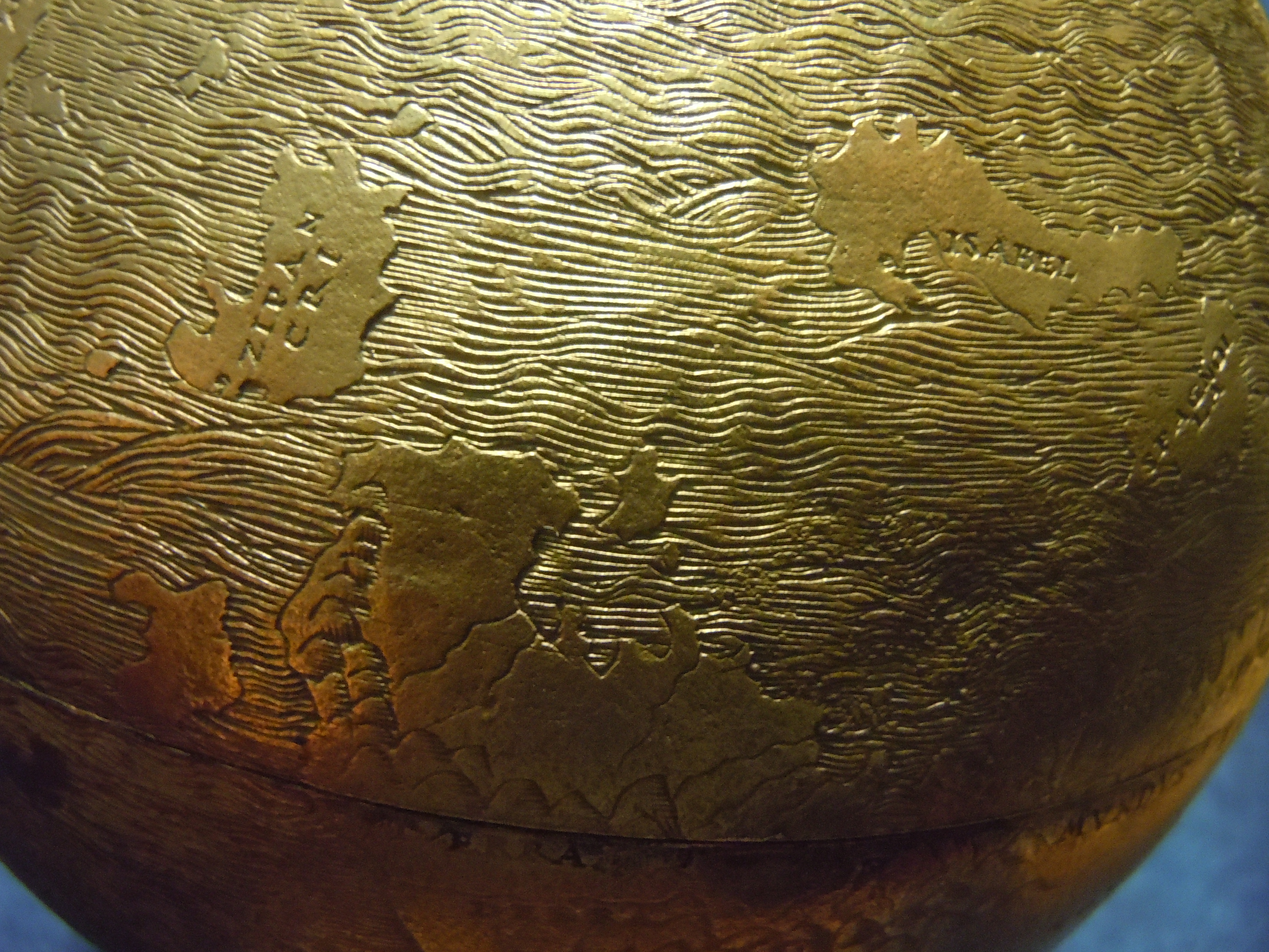 New York Public Library
The creation of this magnificently engraved globe seems to predate a clear notion of cartographical authorship or precision–given the deeply collaborative nature of encoding nautical information within maps and borrowing data from nautical chart. The detailed working of its surface clearly engaged in a clearly explicit dialogue or dance with other images of these newfound isles, the “Hispane Insule” Rosselli would map in his far more famous and widely known oval projection of the world. In the Rosselli projection, unlike the “eggshell globe” and its cast, the Hunt-Lenox globe, Rosselli specifically tried to locate on longitudinal lines for his readers–lines that were apparently omitted on the eggshell globe and its casts made. But the elegantly engraved “eggshell” globe might be credibly argued to have been intended to be read in concert with recent nautical charts or Ptolemaic planispheres, and addressed to an audience familiar with the arrangement of newly discovered lands, and eager both to admire their novel disposition and newly discovered coasts and to contemplate the proportion of land and water on its surface. For the globe seems to rehearse multiple concerns familiar to Leonardo as a reader not only of Ptolemy but a connoisseur of cosmographical learning from Albertus Magnus on “the nature of places” and the Ptolemaic concept of the terraqueous globe and Sacrabosco. But rather than depict the oceanic expanse as “flowing around the earth on all sides and encircling its boundaries,” as Isidore of Seville wrote, the ocean is represented as a medium of travel and surface of dynamic flow, unlike the flat blue surface in most Ptolemaic planispheres, in ways that uniquely mediated the recent discoveries of Iberian navigators.
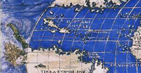
13. This shift–from mapping land, or “terra,” to mapping the coherence and relations between land and sea–presented the New World less as something of a floating island than a world defined by the relations between land and water long before Waldseemüller presented land and sea as continuous. For there is particularly evident excitement in the “eggshell globe” of taking mapping into the sea and of mapping the immensity of oceanic expanse in particularly ambitious ways analogous to Leonardo’s conjoined naturalistic and geographic interests.
The limited attention to the representation of ocean waters in most printed maps might remind us that one of the deepest problems of representing the terraqueous world was expanding the world’s expanding watery surface in a coherent frame, noting a navigational expanse beyond the coast-hugging confines of the Mediterranean. The hydraulic image of traversable waves and ocean surfaces indeed makes the globe particularly distinctive among early modern maps–for the moment putting aside the important questions about its authorship and the date and circumstances when it was crafted–on account of the tactile manner that it makes inescapable the ocean as a palpable presence to the viewer, and the unprecedented manner that it calls attention to the problem of rendering the ocean’s surface as one of hydraulics.
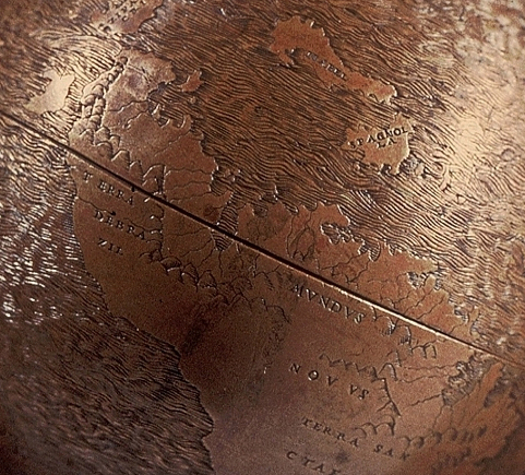
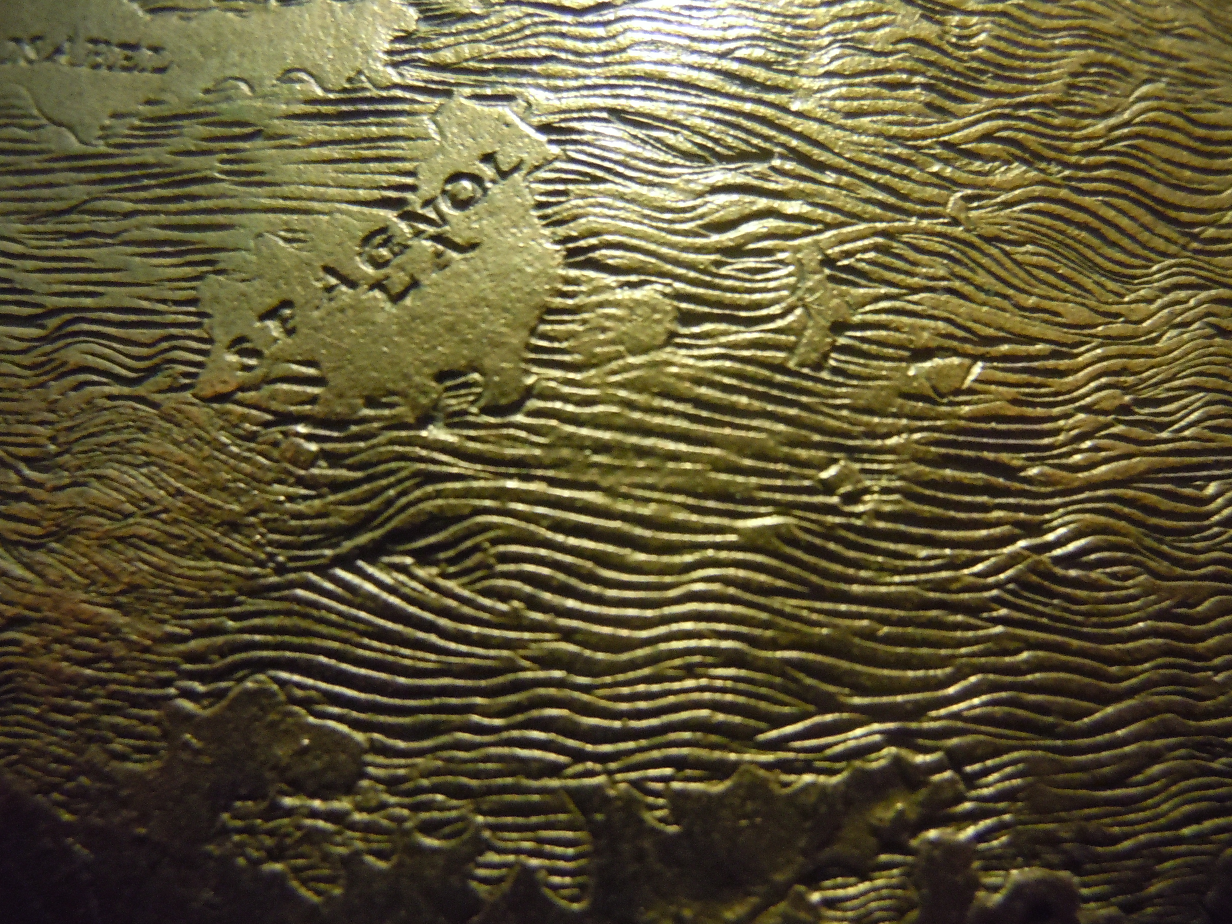 New York Public Library
Could the detailed contours of these shorelines, drawn no doubt from nautical charts, reveal the sort of cartographical omnivorousness that was typical of Leonardo da Vinci? The idea is appealing, given the documentary evidence that Leonardo readily adopted some of the expansive detailed maps of the area of Tuscany in Italy, circa 1503, more extensively rendering the riverine network with which he had gained familiarity as an engineer, mapping far more naturalistic and plastic renderings in chiaroscuro of multiple regions of his native Tuscan coastline and Valdichiana, as well as near Rome, which reveal detailed application to the level of hydrographic detail that could be compellingly included in a land map. These extremely elegant rendering of terrestrial views, even if they derived from and were designed to administrate important projects hydraulic cartography, reveal a new pleasure of reading their contents and the sketching of rivers, lakes, mountains, and even houses that were continued in his later mapping of the Pontine marshes, and suggest an intense and perhaps unparalleled appreciation of the pleasure of reading expansive prospectives in maps.
Most importantly, perhaps, Leonardo’s ready experimentation with cartographical forms illustrates an eagerness both to collaborate on the maps of other engineers–he seems to have consulted the earlier pioneering chorographic maps of Tuscany in his own maps of the region, attributed to Pietro del Massaio, to whose observations he added significant plasticity if not accuracy, adopting the map as a form to embellish and design as a graphic and almost pictorial medium: the chorographic map offered Leonardo a manner of compiling information as a collective construction of integrating shared observations. Leonardo’s own contribution of riverine paths, which he rendered in far more detail than his predecessors’ maps–even if he may have followed how their coastlines exaggerated promontories and longitudinal compression–in order to fashion a far more tangible image whose local topographical details he rendered as perspective views of a quite different medium, and whose spatial indices he seems to have abandoned. In the Lenox globe, there are also no indices of measuring spatial expanse–save the equatorial line and indication of the Treaty of Tordesillas that were so often noted in nautical charts.
The attribution of this original terrestrial globe to Leonardo is most certainly big news worthy of revising the scope of Leonardo’s own geographic interests and pursuits–not only because it suggests that a piece by the artist-engineer who has been so widely studied went unattributed and unacknowledged for five centuries, but because no mention of such a globe was ever made in the inventories associated with Leonardo’s library or possessions, and no clearly explicit reference to so striking an object exists in contemporary literature. But it makes sense. And the creation of the globe of such particularly striking exquisite detail to the depiction of a huge watery expanse is particularly resonant with many of Leonardo’s preoccupations and interest in the watery bodies of the world. In the first stages of his mapping, Leonardo had in the past focussed on the quite detailed orographic mapping of Tuscany, whose shaded relief maps from 1474 to 1505 combine chiaroscuro and naturalistic shadow, coloring their content to communicate elevations omitted within existing maps of the region, to better reveal the riverine paths in the Arno Valley as “interwoven with a network of veins all joined together” along the sides of mountainous topography. Could the experience of mapping Tuscan mountains and coastline–shown below–have provided Leonardo with an example and model–if not a laboratory–for depicting mountains on the surface of the globe in the figurative fashion, shown below in a specific detail and on a bronze cast of the “Hunt-Lenox” globe? The comparable nature of Leonardo’s assertion that the size of the globe was measured as 7000 miles were adopted in the proportions of the Eggshell globe, intriguingly linking Leonardo’s cosmographical ideas to the globe, as Missinne has strenuously sustained. But
 New York Public Library
Although such naturalism must have been of huge cognitive important in directing the attention of any early reader of a terrestrial globe–or any mapper of the globe’s surface in an age of limited nautical or aerial travel–the globe is striking in that it suggests some of the deep concerns for representation and understanding of water, and the ocean’s flow, assiduously studied, noted, and represented in freehand by Leonardo within his surviving Notebooks. Is the organization of the globe’s watery regions, from the ocean’s waves to the hydrographic detailing of riverine paths to estuaries, evidence a similar investigation of the natural world, translated to cartographical form?

Washington Map Society/Portolan
Leonardo’s graphic production suggested a similar sensitivity, to be sure, beyond iconographic similarities, of the areas where the land meets the sea, and the course of rivers that empty their fresh waters into the saline waters of the ocean. The numerous estuaries on the equatorial coasts of the “Mundus Novus” south of Hispaniola clearly suggests and opens up of its riches to prospective mariners. The Mundus Novus was essentially revealed as permeable to trade and settlement, as the globe-maker opened up its shorelines by the detailing potentially navigable riverine mouths along its norther shores, as if revealing of a multitude of harbors, inlets, and estuaries where ships might dock and come to shore–and indeed where they might sail un into its still widely unknown interior and imagine the relatively accessibility of its shore.
14. These elements were no doubt borrowed from nautical charts, but received a new audience within the far smaller format of the globe, where they were posited as problems that an observer of nature as Leonardo might ponder as sites of the entry of water from the mountainous interior of the New World, as much as estuaries where boats could enter into port. Although the “shoreline” was not clearly understood as a category, the mouths of rivers multiplied along the “Mundus Novus” in ways that were particularly propitious to its settlement, or at least the viewer of the globe, who saw the estuaries as potential sites of commerce and exchange more than of entry to its interior, inland of which important trading cities might be founded, or storehouses and warehouses of traders might develop.
While both the Hunt-Lennox globe and the so-called “Eggshell Globe” (evaluated separately in an earlier post as an artifact) served as an astounding register geographical discoveries, these globe suggests a deep but long unobserved tie to Leonardo’s world and the arrival of information about the New World in Renaissance Italy–and to the discovery of the inhabited world that the arrival of such maps would undoubtedly have provoked. For the very manner that the surface of the globe is worked returns repeatedly to the question of circulation of waters in the detail of its hydrographic rendering, revealing a sort of graphic argument about the particular interest that Leonardo in particular showed to the relations and differences between the circulation of waters in the world and its relation to blood in human bodies, in a sort of recapitulation of the analogy between microcosm and macrocosm that provided one angle underpinning his physical thought.
The potential inclusion of a carefully etched and detailed terrestrial globe–let alone a globe made from the rounded ends of ostrich eggs laid in the zoological gardens of Pavia’s court that were comparable in size–would cast new light on many of Leonardo’s projects and especially his cartography. (Near Pavia’s Certosa, according to Stefano Breventano, stood a walled enclosure for raising ostriches, as well as other dedicated to rabbits and bears, all described in a late sixteenth-century treatise on the city’s antiquities, which were artifacts of Sforza court, and no doubt a specific treasure familiar to its courtiers.) While it would suggest considerable immersion in the discovery of the New World, and the expense and care of fashioning a globe among Leonardo’s patrons, its completion would reveal an intense application to the detail of its physical completion as well as its construction–both in the determination of landmasses and seas, their seamlessly detailed integration, and in its physical preparation, and the completion of a major work of art–as well as the interest that the fabrication of such a globe might have held for him and his patrons. The precise selection of eggs of a fixed diameter, moreover, may reveal conscious planning of the expansion of the practice of map-making as a distinct medium, and an exploitation of the benefits of casting, rather than printing, allowed for creating a physical record of the newly discovered world.
Indeed, perhaps, if confirmed, one of the major works registering the appreciation of materializing a compelling record of other continents, and for Leonardo’s application of himself to geographic thought not only in relation to Imola and Tuscany–to areas of which we have his detailed surviving maps–but to a rendering of the harmony of a global map by processing a range of data that he (or its engraver) would have recovered and transposed from nautical charts’ clearly articulated coastlines to the surface of a spherical globe–and to present a sense of the coastal contours more clearly articulated than many nautical charts.
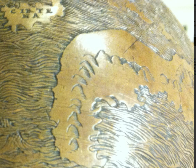 New York Public Library
No known explicit mention of a globe created out of two conjoined halves of ostrich eggshells exists in Renaissance cartography or studies of early globes. But the ingenious construction of spherical body by joining identically shaped rounded ends of shells seems an ingenious manner of molding a natural form into a perfect–or almost perfect–sphere as a template to cast future globes, perhaps only one of which has survived. The survival of this particular globe in the New York Public Library, where it arrived after having been sold by an unknown Parisian aristocrat in response to the imposition of high property taxes after the 1848 revolution, placing it in a place of curious prominence as the Hunt-Lenox Globe, remained attributed to an unknown artist and dated to before 1510. The lack of attribution has long been something of an unanswered historical puzzle. The recent discovery of a globe that is its exact model, whose humanistic capital lettering of toponymy provide the only secure clues to its origins or provenance, suggest the globe may be a cast of this distinctive spherical prototype made by engraving the surface of an egg, and that other copies of it either may well exist or have existed at one time.
The “Hunt-Lenox” globe is identical to the eggshell globe from coastlines to Italianate humanistic lettering, making any chance the globe is a copy or even a different object increasingly unlikely. A close-up of Europe and the Mediterranean in a bronze cast of that globe alone, the identity of their shorelines and scribal attentiveness reveals as much. As the “eggshell globe” from which it was cast, the Hunt-Lenox globe foregrounded watery expanse in the Mediterranean as a body contiguous to other oceans suggests a sense of the unity of the world’s waters–despite the diversity of the toponymy of its lands–that seems to echo a deeply Leonardan idea of the image of the ecumene, less interested in the notation of cities or ports than in the configuration of lands around the Mediterranean basin and how its waters opened to the still wider sea, designated in the globe by such intricately braided waves:
New York Public Library
The casting of this globe suggests a precise rationale for the engraving of the eggshell globe on such exact proportions, and an attempt to reproduce an image of the mapped world on a physical object contemporary with the very age when the first world maps were printed. The image of the Mediterranean and north Africa shows identical clear humanist block lettering, and detailing of coastlines, islands, and distinctive pattern of oceanic waves, and mountainous orographic detail–all leaving little doubt but that the two globes of exactly the same size derive from one another, and that they appear to demonstrate deep concerns with the shorelines and estuaries as mapped from the points of view of mariners on open waters, rather than terrestrial surveyors, revealing deep concern not only for where one could put in at ports, but with the waterfront as a liminal point of entrance to new lands, raising hopes as the do with prospects of trading with a populated interior: if the absence of place-names in the areas of the New World and Africa which it maps are disorienting, the borrowing of ports and estuaries, presumably from nautical charts, raise interestingly new questions of the globe as an advertisement or prospectus for the validity of routes of oceanic travel and points of potential contact and trading with an interior whose riches were widely vaunted. The curious absence of any armature or stand from the original globe, moreover, suggests an interest in the globe as an object of discussion and reflection, but also as a curiosity, removed from an apparatus of measurement, and far more tied to techniques and conventions of terrestrial representation.
The photograph of a cast of the cast–it is a modern bronze cast of the copper Hunt-Lenox globe–is moreover of such a distinctive combination of Ptolemaic cartography and the contours of a nautical chart that it appears to illustrate the practice of the graphic revision of Ptolemaic geographic models through the practice of engraving of its spherical surface, in ways that suggest an active attempt to grasp the shifting image of the newly discovered Americas–or the island of Spagnola described in a letter written by Amerigo Vespucci about his voyage with Columbus, printed in 1501, in a compelling visual argument about the new arrangement and nature of terrestrial space as an interlocking surface of land and water: the depiction of the islands, surrounded by seas, offers something of an early narrative of the experience of oceanic travel, rather than only a demarcation of terrestrial expanse. This implicit narrative content of the globe, as both a measured surface and a surface suggestive of the dangers of travel and perils of oceanic expanse, have been insufficiently noted, as have the almost phenomenological record it creates of the world’s surface.
 New York Public Library
Leonardo would have translated the news Vespucci first published in Mundus Novus (1504) and which from 1503 were already known in the several maps that Vespucci had himself made, based on nautical charts, of the Columban voyages. The globe records an incomplete if expanding knowledge of terrestrial expanse, indicated by the close proximity of these new islands, Spagnola and Isabella, to the vaguely known area below Japan (“Zipancri”) and the New World islands in the upper right hand corner, shrinking the Pacific Ocean to accommodate proportions of the diameter Leonardo had in fact determined and assigned the worldly globe of 7000 nautical miles:
 New York Public Library
Despite no positive proof of its attribution, the globe more clearly links the interest in the mapping of the unknown to the mapping of the sea. The a region often associated with the monstrous and the dangerous–a fear, of sorts, recapitulated within the oceanic animals that dot the globe’s waters, in an echo of the exotic animals often pictured on portolan charts. The sea remains an unknown in the globe, whose dangers are illustrated by the proxy ship that finds itself voyaging on its surface, sails billowing and almost rocking rhythmically on the waves that surround, curving in gentle undulations as if lapping against this boat’s prow as it heads to the newly discovered islands of the New World:

Compelling, if tantalizing, details about the globe’s attribution may lie in the distinct introduction to this globe of what might be called the “graphic markings” of cartography, or graphemes, that create the globe, from its distinctive orography to its depiction of oceanic waves. For they clearly recall Leonardo’s specific interests in the motion of waves on the surface of the sea, which he rendered in such detailed distinctive curling interlocking waves in exploratory sketches within his Notebooks, and indeed in the circulation of waters in the world, and suggest something close to a signature in his work not only in their form, but their elaboration as a means of considering and detailing the relationship between water and land as a way of compelling visual attention, and investing the water with a sense of perpetual motion. In ways that echo Leonardo’s own underscoring the artist’s sense of the importance of fluid dynamics and mechanics in its intertwined waves to communicate a sort of vital force–much as the energetic turbulence he invested in river that he explicitly compared to breathing into the oceanic seas–the globe seems oddly animate, as well as offering a record of wayfaring, travel or discovery: indeed, as much as present a narrative field for global discovery, in ways Missinne has argued, or a record of Gaspar Corte-Real heading westward “trying to find new territories”, the globe might well be identified with Leonardo as a contemplation of the globe’s oceanic expanse, and the concerns that Leonardo voiced in his Notebook “G,” of the problems of measuring oceanic navigation, and the impossibility of applying forms of measurement as rotating wheels to measure marine trajectories “se non nelle superfitie piane e immobili de’ laghi”: the oceanic surface that the globe depicts suggest a surface of intertwined waves in which such invention –“se l’acqua è di moto più o me’ velocie che’l moto del navilio . . . in modo che tale inventione è di poca valitudine”–and that the method, ascribed to Leon Battista Alberti in the same Notebook, of judging distances between islands no longer practical. Does the globe describe alternative trajectories of travel?
In ways that resonate with Leonardo’s deep belief that water looses purity when stagnant, gaining a foetid quality in marshes, the swirling waters through which the ship navigates concretizes a clear sense of the motive force of the oceans that led him to compare, in Codex Leicester about 1508, water as analogous to the role that was played by human blood within the body’s veins. Indeed, the sense of water as a vital force within the world–both a motive force in the medium of global travel and a dangerous force for terrestrial navigation–provides a deep analogy to the unique figuration of water in both the Lenox and “eggshell” globe. In the image below, beside comments on the mixing of sweet and saline waters at the mouths of rivers, he returned repeatedly to the physics of the independent movement of waters on the surfaces of rivers or as waves, as the waters at floodgates, in these images from the Hammer (Leicester A, fol. 13) and Arundel (f. 39) codices, which reflect deep concern with the turbulence of waters in their detailed representation by carefully drawn patterns of elegantly nested curvilinear lines that resolve the curving currents to a finely-detailed pattern of tracery:
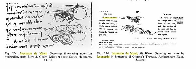
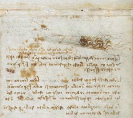
Leonardo meditated at several places in the Madrid II codex on the successive breaking of waves upon the banks of the shoreline, which from the equal power of the breaking from their peaks more than their base against each other as they hit and withdraw and hit the shore again. The globe displays a similar concern with the constant rhythm of ocean waters as a site of almost obsessive visual engagement that seems specific to Leonardo, and is of a sort that is strikingly absent from almost all modern maps:
 Madrid II, 64r
These iconographic similarities of the oceanic cresting of waters and the flux and reflux of waves only constitutes the surface of Leonardo’s intensive inquiries into the mechanics of waters’ flow and the relation of oceans to the coast. Leonardo’s fascination in the cresting of oceanic or riverine waves and their retreats is evinced in his quite poetic meditation on their successive breaking against the shore: “L’onde refress[e] dalla percussion che prima si fece per loro nelllargine, si sconteranno nel mezo del fi'[u]me. E sse saran d’equal potentia, equalmente indirieto salteranno.” Leonardo described the physics of waves after careful observation and calculation of their flux and arc, in a poetic meditation on the physics of the successive breaking of waves upon one another as they withdrew from the shore that mirrors the attention to the identically worked surfaces of the eggshell and Hunt-Lennox globes: “The wave reverses itself backwards and turns over, breaking against the shore and returns beneath, as the successive wave that comes from below, hitting it from below, and reverses itself runs once again [L’onda ‘aroverscia indierieto e ttorna di sopra, e percossa nel lito fa il tomolo e ritorna di sotto, e ssi scontra di novo nella sucedente onda che viene di sotto, e lla percote di sotto, e lla riarroverscia di nuovo indirieto, e cosi’ successivamente seguita“]. Leonardo’s extensive study of hydrologic mechanics had produced a considerable graphic studies of the mechanics of waves:

The very mobility of the ocean waters on the globe suggests the deeply interactive context in which Leonardo pursued his interests in water, as a sort of hydrologist, deeply embedded in debates on fluid dynamics, as much as a graphic artist: if Leonardo’s interest in the globe was animated in no small part by the complex project of transposing the discoveries recorded in nautical charts to its curved surface, the intense study of water circulation that pervades the Notebooks and range from the mixing of sweet and saline waters to the turbidity of water and the dynamics of their flow are recapitulated on the exquisite care that the engraver of the globe devoted to the water’s surface. As a draughtsman who sought to describe the rendering of its flow, Leonardo resorted to a biological analogy: “Observe the motion of the surface of the water which resembles that of hair, and has two motions, of which one goes on with the flow of the surface, the other forms the lines of the eddies; thus the water forms eddying whirlpools one part of which are due to the impetus of the principal current and the other to the incidental motion and return flow.” The swirling waters on the globe’s surface indeed suggest the rising and falling of the tides.

The artist’s intensive application of attention to the representing of ocean waters on the globe’s surface recalls the assiduous care Leonardo devoted to representing waters far beyond other maps, and the attention he had devoted to the flow, flux, and reach of oceanic waters, as well as to the quantity of water that travelled through riverine mouths. These topics that recur in the Notebooks Leonardo kept with him have often been seen as private concerns, but suggest a basis for developing a distinct model for naturalistic observation. So much is exemplified by the ecologically minded remark about the circulation of global waters: “all the lakes and all the gulfs of the sea and all inland seas are due to rivers which distribute their waters into them, and from impediments in their downfall into the Mediterranean–which divides Africa from Europe and Europe from Asia by means of the Nile and the Don which pour their waters into it” [A 83b]. And while his hydrological concerns most often dwelled on questions of river ecology, tied to his projects and observation of the Arno and rivers in the Apennines, the globe provided a surface to explore not only riverine mouths–each of which is detailed with care in the globe–but the interpenetration of rivers with terrestrial expanse and to the sea.
Extreme sensitivity to depicting sch ecotonal relations on the globe–the points of transition between and betwixt bordering ecologies of land and water–was a topic to which Leonardo was particularly sensitive to drawing and keen to register and communicate. So much seems evident in the sketches by which he mapped riverine estuaries in his native Tuscany. Leonardo was indeed a liminologist avant la lettre, although the methodical study of rivers and inland waters was only coined by François-Alphonse Forel (1841–1912): “limen” suggests a threshold not limited to a doorway of a residence, and Leonardo betrayed significant interest in the opening of waters on the shore. Leonardo da Vinci revealed significant interest in his Notebooks in the limen or coastal estuary focussed on the mixing of waters and the geology of the coast as a threshold or border of ecotones: his interest in any subject never existed in isolation, and his projects of cartography and geographic interest existed in a holistic context that often focussed on the limen of rivers or mountainous topography. Did he extend these interests to such careful translation of the shorelines and estuaries of the New World on the engraved surface of the eggshell globe?
Similar concerns are strikingly betrayed in the detailing of rivers that arrive at the shoreline estuaries of the Mundus Novus, and which are clearly far more analytically engraved and rendered in the eggshell globe or Lenox Globe than they appeared in previous nautical charts from the Cantino chart of c. 1502, the first (fragmentary) depiction of Portuguese discoveries of the New World or the 1517 Miller atlas–was this hypothetical, or did it betray deep concern and awareness for the investigation of the sources of riverine mouths? Did it suggest sites for prospective or extant ports that could serve as mouths of exchange for mariners, and networks for prospective oceanic trade, or settlement?


The considerable hydrographic detail of the “eggshell globe” suggests a complete knowledge of the riverine topography of much of the Mundus Novus in which a network of rivers descend to the meet the oceanic sea, providing likely entrepots of trade, mapped from the perspective of early modern mariners who saw the coasts, as John Gillis has written, as borderlands and sites of exchange, rather than as fixed borders, grasping the nature of the shore as a permeable boundary that permitted entry and exchange with unknown areas, offering a basis for landing as well as sites for exchange to a deep, unknown interior and its bounty: much as early modern cities were built along rivers, indeed, the riverine mouths may have suggested points of prospective settlement and trade, much as they did to the French of a slightly later period, along the mouth of the river that they called the St. Lawrence.
Leonardo may have become particularly interested in the flow of these rivers to the sea, and the melding of freshwater and saltwater at the ocean shores, based on his own work on the project of lining Florence by a canal through to Pisa, and to the Mediterranean, in an attempt to have the Mediterranean enter Italy inland. The artisan who engraved the globe seems similarly attentive to illustrate the extension of rivers from the shore of lands in the New World to its interior, as if to similarly suggest the arrival of products from the inland continents on its shores.
New York Public Library
15. Leonardo asks himself in his Notebooks “what impediment could be great enough to stop the course of the waters which do not reach the ocean,” and the perpetual cresting of each wave of oceanic waters “breaks in front of its base” so that what was before highest lies now lowest” [Ash. III, 25a] but whose surface remains–when there is no storm–at “an equal distance from the center of the earth” [A 55b]. The flow and ebb of tides and waters over the body of the earth, creating a “swelling and diminution in the height of the seas . . . . [as the] sea of water is being incessantly being drawn off from the surface of the sea” [Leic. 6b] almost seems depicted on the watery “eggshell” globe, where breaking waves of the sea are incessantly moving on the globe’s surface, much as the sites of incessant motion in Leonardo’s painted works. The waves of water, underscored by sea monsters, ships and mysteriously if inviting suggestive marine fishtails–all prepare the viewer for a true sense of the encounter with the unknown. The maker of this globe included a glorious sea-monster, holding a “Y” in its maws, after Jonah, who appears to be far more fantastically detailed and terrifying in aspect than the animals familiar from nautical charts, evoking as well the “great sea monsters” God created that are described in Genesis, and suggests the mystery of the sea, as well as the sort of fantastic caricatures Leonardo took such care to render in detail in the Notebooks:
 New York Public Library
This sense of the unknown ocean waters as being itself a set of inhabitation–almost instead of and as a juxtaposition to the interest in detailing the inhabitants of the land–makes the globe a remarkably ethical record of expanse, and creates a sense of perpetual motion on its surface reminiscent of the incessant motion displayed in so much of Leonardo’s work. The haunting of the globe by this immense fish, which recalls the “marvelous thing” or fossil of a whale that Leonardo describes himself as having discovered at first hand in Arundel f. 156, in an apostrophe that reveals the deep psychic impression that his encounter made on him: the care of its depiction echoes the claim of admiration at this large fish, the fossils of whose branching dorsal fins occasioned a meditation on mortality as much as an evocation of a past traveller on ocean waves. “O powerful and once-living instrument of formative nature, your great strength of no avail, you must abandon your tranquil life to obey the law which God and time gave to creative nature. Of no avail are your branching, sturdy dorsal fins with which you pursue your prey, plowing your way, tempestuously tearing open the briny waves with your breast. Oh, how many a time the terrified shoals of dolphins and big tuna fish were seen to flee before your insensate fury, as you lashed with swift, branching fins and forked tail, creating in the sea mist and sudden tempest that buffeted and submerged ships… O Time, swift despoiler of created things, how many kings, how many peoples have you undone? How many changes of state and circumstances have followed since the wondrous form of this fish died here in this winding and cavernous recess?”
The depiction of the globe’s surface–an area inhabited by immense fish, and an impasse that future navigators to the New World must cross–draws heavily on recent nautical charts for its geographic content, as well as for the line of terrestrial sovereignty determined at the Treaty of Tordesillas, so often noted in charts. But it runs against the conventional map signs of either charts or Ptolemaic terrestrial maps, abandoning the orienting device of the wind-rose or compass, or the indices of Ptolemaic geography: running against these forms of mapping, its author seems to discover a new way of mapping the watery surface of the world that was of such intense interest to him, organizing a view of the interlocking surface of water and land that we have forgotten, but with which we might do well to refamiliarize ourselves. For rather than replicating an idealized image of the world’s surface, in the manner of ancient geographers, or a cosmographical image of the globe, he assigned a striking materiality to its interlocking elements that emphasize its almost living nature.


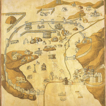


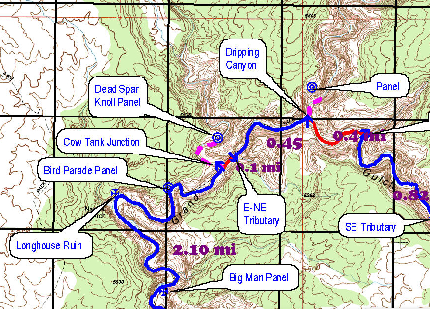

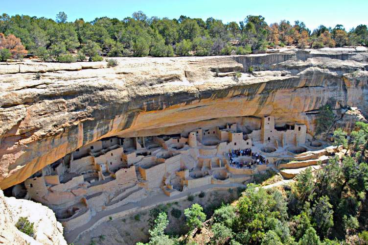
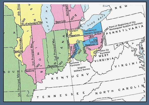


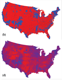

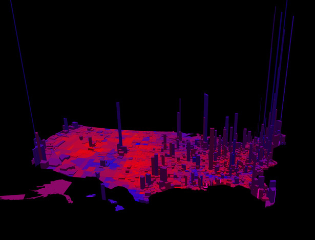
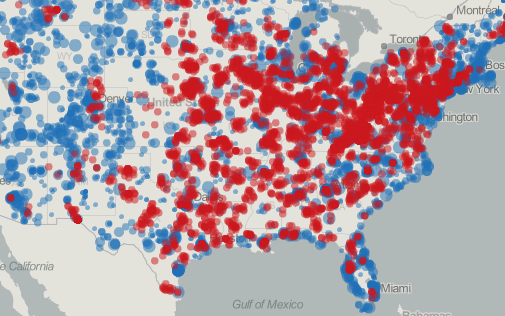

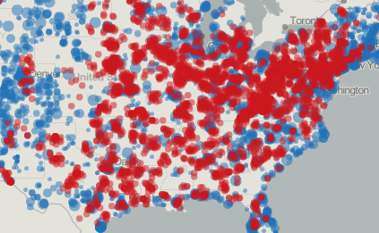
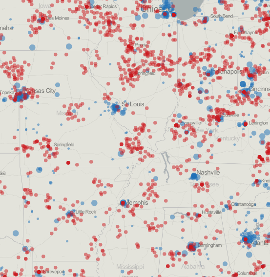
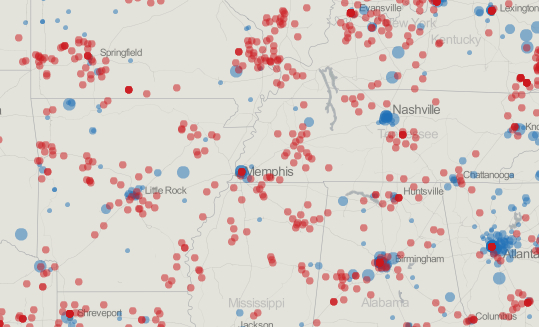
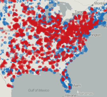


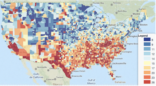
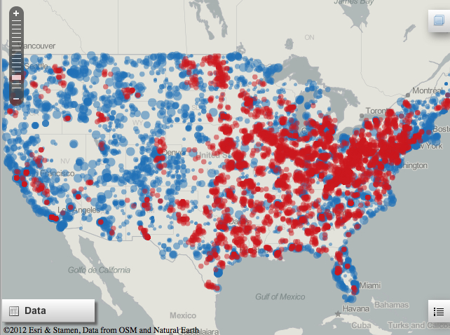

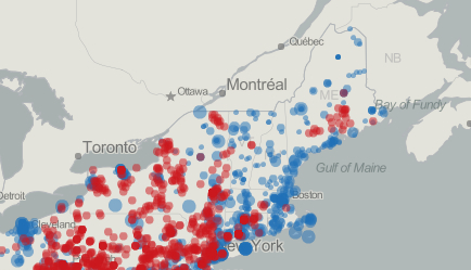

