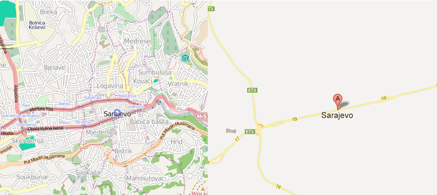
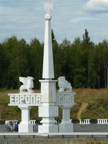
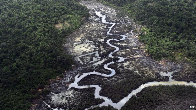
As if doing an asana into a terrain-view surface of Kathmandu, or leaning too forward into a map screen to place his head into its tiles, a sportily dressed male icon in the Antipodes Map plunges across the map to its other side. The imagined transit through rendered topography seems noteworthy of an alienated relation to place, despite the proliferation of toponyms on the surface of a screen. Although the site is dated, the avatar is an emblem of the reduced interactivity on offer in most web-based maps, and something like a prisoner in the platform that he was intended to promote, and the poverty of how we use coordinates as a way to organize screen-based maps that remove from cartography from an art and perhaps–more seriously–the observer from the map. At a time when the world demands more detailed observation and scrutiny–and Donald Trump proposes not only to do less to slow climate change, but give broad profiles to climate change deniers in his incoming administration, the importance of mapping climate change seems likely to be curtailed, in ways that raise the danger of an alienation from map-based inquiry. At at time when we need something stiff to take our mind off what’s going on, the teasing use of the map in the Antipodes Map seems almost an emblem of uncertainty.
For the staid Google Maps platform, despite its richness in place-names, hardly suggests the landscape of where you would end up in the world. The platform maps the location where you would suddenly re-emerge by showing its antipodal counterparts of any location on a map screen. But the illusion of hexadecimal accuracy conceals the maps generated from a toponym could in fact be located most anywhere: the map is impoverished of meaning. If the icon exists in almost comic way, it suggests the seriously diminished expectations of a map and their expanded claims for trust in their certainty, the website creates non-utilitarian maps, stripped of any navigational use of actual way-finding, that make one feel the slippery epistemic consequences of one’s remove from a globe. Indeed, it makes one wonder if the embrace of such a platform suggests an endemic alienation from the local against which we seem condemned to struggle. The figure in the map is almost something of an emblem for the “end of the map,” and the consequences of the adoption and diffusion of platforms of impoverished interactivity. Even in an age where expanding abilities of interactivity have redefined video games, musical composition and screen use, why is the map with such lowered expectations? There seems to be a clear sense of removing attaching narrative coherence to its form, despite its hugely rich narrative possibilities.
The algorithms underlying the Antipodes Map are simple. They playfully promise the possibility of re-emerging on the “other side of the world” in ways that suggest the remove of the globe from our geographic unconscious. Provided for an audience of bored armchair travelers from bored office-workers to zoned-out insomniacs, the paired maps of antipodal locations claim to be about place, but suggest the remove of the viewer from their content. This is partly because the rather sterile landscape is stripped of any use for navigating or sense of orientation, and its remove from the operations for travel that the map actually presents–stripped of much sense of the local or the spatial, it is as if the map were a way to play with spatial travel, so compelling that it might substitute for geographic knowledge, so removed is it from much any sense of actual presence with which a viewer can interact. In a sort of caricature of an online map, it is a low-tech cartographic formulation of place that seems to expose the consequences of our increasing remove from a world of tangible paper maps. Indeed, the easy generation of misleading mapping at such an extreme cognitive remove may not only perpetuate the sense of global chaos that Donald Trump purveyed with such success, but the misreading of the voting landscape that made his election so much of a surprise. The comic image of burying one’s head in a map certainly gains added resonance after the 2016 general election for President of the United States as an allegory about the costs the alienating viewers from place whose tiles are stripped of scale and cleansed of much local detail.
Although it’s difficult to take full stock of the diminished role of the globe in daily life, the limited presence of a relation to place or spatial differences that is perpetuated in the Antipodes Map seem particularly acute for the problematic question of how we map “place” today. In an era when we increasingly stitch together georectified satellite images of the globe, bemoaning an absence of coordinates may seem hopelessly antiquated–but the problematic meaning of “place” in a globalized economy seems mirrored in the dislocated sense of place that is present and perpetuated in many overly schematic maps–and the difficulty to mediate place, or to tell an effective narrative about place in the set of GIS tools that are available in most web-maps, whose terrain view backgrounds hint strongly at homogeneity. The increased slipperiness of grasping place in the raster tiles of a slippy map seems to inflect the level of trust that the modeling of electoral projections sustained this past month, and a failure to register the declining numbers of voters in the map echoes the sense of banality in the maps’ properties–and their remove from telling non-generic stories about place. The troubling absence of a road map for the future may even increasingly make us come to yearn for the tangibility and stability of the maps to which many have said farewell.
1. It is more than somewhat ironic in an age of increasing border controls and confinement that the Google Maps engine provides an almost entirely notional relation to place in how the Antipodes Map. For the website, which employs maps as a sort of device, takes advantage of online mapping to create an image of antipodal points of any “place,” promising to help users to “tunnel to the other side of the world”–showcasing a virtual escape from the more densely inhabited regions of the earth to that uninhabited region through to an antipodal point in the Indian Ocean, in the image of someone in a pose ever so slightly resembling downward dog, but with their head immersed in a map’s face, as if entering the sea of map data to re-emerge, mermaid like, off the coast of Australia–the very region once described as the Antipodes.
But despite the antithetical or oppositional nation of the Antipodes–or the firm belief in an artistic localism the Antipodean Manifesto advocated in 1959, proclaiming “Dada is as dead as the dodo and it is time to bury this antique hobby-horse“–place is not that clearly differentiated in a website that constructs antipodal relations generated by adding 180 to latitude and a negative sign to longitude is as almost sterile as its flat base map. With brio, the Melbourne-basd artists who launched the Antipodean Manifesto asserted it “only natural that we should see and experience nature differently in some degree from the artists of the northern hemisphere,” against the ascendancy of American abstract expressionism, with a flourish of place-based common sense; yet the local is lost in the diversionary algorithms for imaging complementary cartographies of geographic location that are less rooted in place, than seem to aspire to transcend it.
As much as doing downward dog on the slippery surface of a slippy map, the figure in the map seems almost to bow to the authority of geolocation in the web-based map that almost says goodbye to the relation of the viewer and the map.
In an age that increasingly seems to pride itself as existing “after maps,” the website offers the metastasis of a form of mapping, fitting for an age when we are tracked in web maps, but maps have ceased to exist as objects with their own formal properties. It’s almost fitting how the Antipodes Map website provides viewers with an opportunity for cartographical interface maps from any place concretely render the sense of how geolocated maps exist in our heads–in fact, so immersed in maps are we that we rarely can resurface near the international dateline off the coast of New Zealand. The cartographical fantasia that’s engineered on the old-fashioned webmaps of the website is emblematic of the loss of the globe, however–it recalls the paradoxes of imagining travel without a physical map: we don’t travel in maps, perhaps because we are already in them. In an age that both is inundated by maps, and lacks them, the screen cartoonishly absorbs the spectator viewing the map’s content, with a half-hearted attempt at irony at placing you next to the International Date Line in danger of being attacked by sharks. The sense of impending danger might exist almost anywhere, given the multiple narratives that might be hung atop the awfully opaque surface of a Google Map.
Although the stitching together of images would be impossible without coordinate systems, they are sublimated in most satellite imagery and web maps, which exist with hidden coordinates, recently reborn in an age of digitized mapping forms as the UTM. The gridded lines that once guided readership and visual attention to some degree, as well as explaining the nature of the transformation, have receded into the background as a layer beneath their surface, tacitly accepted, not part of the map’s surface and without any deictic function of indicating place–as if we don’t need them any more to read the map’s surface or place locations; the map has gained a formal coherence as a picture plane.
The absence of indication or reference points remind one of the wonderfully cloud-free satellite mosaics of Planet Labs, which balance spatial precision with the “accuracy” of the visual georectification within a coordinate system, but it has recently receded entirely, as the coordinates have vanished and disappeared as indices. Terrestrial coordinates are the conspicuous absence we rarely take stock of in our web maps as most cartographers fit satellite maps into most any mapping matrix as a base map– stitched together as a mosaic of pixellated forms to provide a disembodied relation to a virtual landscape, whose rendering assembles a place for us in a weirdly disconcerting cartographical pastiche.
 “Laos,” Planet Labs
The coherence of this map is of course predominantly pictorial, with far less premium placed on the projection. With so many models for achieving smoothness in what now are called maps, programs for georectification take the place of base-lines, as the assembly of maps take their reference from LandSat, stitching together a mosaic that adjusts for any photographic distortions, warping each pixel to terrestrial curvature to create a coherent image seems as if it is completely removed from geographical coordinates–which are banished to tacit signs, as if relics of a past relation to a map’s face.
Because of this, the suddenly unexpected prominence that the system of coordinates gain again, as if in a return of the repressed, is so surprising in the somewhat outdated Antipodes Map. While the website streams Google Earth locations in familiar tiled map imagery, the hidden use of a system of coordinates is its central and animating conceit. As in the header to this post, the engine of the Antipodes Map bears out its the promise to match any location to its antipodal location, as if suddenly pairing any screen map with its counterpart as if in a cartographically-enhanced ADD by playfully juxtaposing any place on the globe with its antipode in a semantically bizarre visualization map-engagement–
–that is an illustration, perhaps, that the map exists in your head.
But the Antipodes Map seems to render the flexibility with which map data has come to supersede maps in somewhat accurate ways. It’s no surprise, perhaps, that in our map-inundated era, Gary Johnson was left confounded by questions of what “Aleppo” was–a sausage? a fashion statement? something a President is expected to handle?–almost exasperated for lack of context to place the place-name. Are we all in danger of finding ourselves increasingly lost in the opaque surface of maps? We may be faced by a limited range of stories able to be attached to or hang around place, as place-names are situated abundantly in generic landscapes with few clear claims for their physical actuality, or to the stability of place.

2. The on-line viewer of the Antipodes Map is cartographically rendered as lost in the map or as entering the surface in which he takes refuge–as if to invite the viewer to enter through its surface to arrive at a location’s terrestrial antipode. It is an easy slight of hand but a bizarre semiotic conflation that seems to perpetuate the illusion of frictionless travel web maps allow: the instant generation of map situating the viewer on the corresponding point on the other hemisphere echoes an image of global inter-connectedness that the constraints of a web-map don’t allow it to ever provide. We indeed seem to fall into our screens, or into the terrain-view base maps that they generate, in the Antipodes Map website, that has revived the life of an early modern or medieval geographic concept of the weighted harmony of the place of landmasses or continents on the globe to provide a diverting disorientation to the world as viewed by Web Mercator, our current de facto default for imagining indexed tools of spatial reference on coordinates, for lack of a globe.
Despite the considerable analytic benefits of slicing up the continent and country into differently sized map tiles, the maps that cannily re-segment the country into units may have led to a lack of clarity in much of the nation for what it meant to pursue votes–no doubt complicated by the overdetermined distribution of votes, and the nature of turn-out, and the range of local policies of voting were so systematically altered over years.
To return to the Antipodes Map, the inspiration of this post, the website has the odd quality of defining place in a post-cartographical world, dispensing with the map to organize a sense of place independently from a map’s legends, words, or narratives, as if it was a readymade version of truth, to whose authority viewers enjoyed a largely passive relation, and whose immateriality contains some disorienting features of its own.
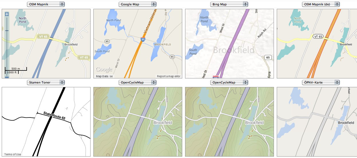
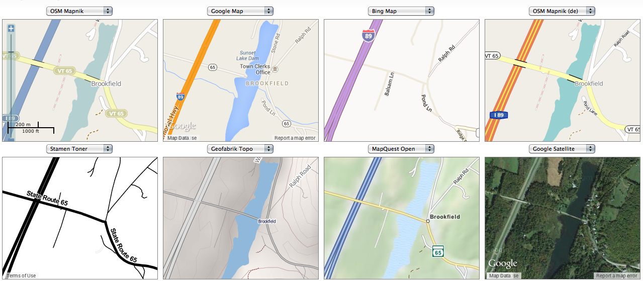
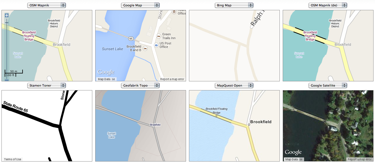
 Open Street Map
3. One cannot but worry deeply that the absence of material coherence has quite recently resurfaced in the U.S. Presidential campaign of Hillary Clinton. The apparent failure to plan a pragmatic strategy to win the electoral college for Hillary Clinton’s campaign, as we replay its narrative and promise within our heads in an attempt to grasp where we might have gone–or just went–so sadly wrong. Despite the reassurance for which we turned repeatedly to political forecasts, the poor prognosticative value endemic to most all data projections that were produced during the final months of the campaign almost removed us more than oriented us to the political problems of the country. Even if we almost didn’t grasp what happened, the problem of missing the people behind the numbers–or somehow seeming to describe the electorate, not wanting to look at the voters, the maps produced now seem to betray the inherent fraudulence of any such forecasting as an exact art, and the dangers of their analogies as forecasts to the weather or competitive ports– without looking at the margin of error or fate of the undecided, fetishizing figures rather than issues, led analysts to endow a misleading degree of solidity in the opinion poll maps.
Whether due to a lack of clear messaging by the candidate, or of just being outclassed by another storyline, something just seems to have been not visible or escaped detection– despite the reliance of the highly talented Clinton team electoral maps and big data. For if data was ostensibly what Clinton’s team so relentlessly pursued, one can’t but worry that some did so, somehow, without looking that closely at the landscape and realities that lay beneath it. Buoyed by expectations for higher voter turn-out and far greater voter interest, the attention to advertising markets on unreadable territories somehow increased. Why, one wonders, even during its final weeks, rather paradoxically pursued advertising markets so aggressively it took its eyes off of the “electoral map” of voters, to shape its strategy out of ideal aspirations for arriving at a political consensus that seemed in reach in Ohio, North Carolina, and Florida, as well as Arizona. What were the reasons for selecting as the major markets for television advertising states she didn’t need to win, and directing precious resources in a quest that seems now, with the benefit of retrospect, most misguided. For in focussing on them, her campaign seemed to ignore votes in Wisconsin, Michigan, and almost Pennsylvania–and the important down-ballot priorities in those states–maybe taking for granted their historical support for a Democratic candidate as able to survive without active cultivation–in ways that were almost, incredibly, oblivious to a landscape defined by increasing voting restrictions.
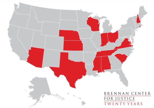
States Implementing New Voting Restrctions in the 2016 Presidential Election
One fears that by being egged on by a data-driven optimism, inspiring a last-minute appeals to the all-but-out-of reach, the disturbing allocation of resources seems a particularly dangerous error, unwisely hoping for a victory across an east coast time zone for viewing audiences on the nightly news on election night, or enticed by the elusive promise of a broad victory, which in retrospect seems so very self-indulgent, or at least misguided by the overselling of the precision in models of voting, and ignoring just how many wait until deciding how to cast their vote, especially when 12 percent of the electorate claims being undecided, but broke late for Trump in ways that invalidate any security in polls-based prognostications as a guide on where to place your money.
For in failing to defend bread and butter of the Democratic party the Democrats may have crashed the ship of state atop the rocky symbolic politics of a general election. During a campaign that became increasingly unhinged from policy questions, and waged by vicious but misleading ads insinuating outright criminality but fixated on soundbites–Build the Wall!; Drain the Swamp!; End NAFTA!–slogans seem designed to boost voters energy but distract attention from actual economic issues and global dangers or disequilibria. The consequence of Democrats saturating certain markets, buoyed by what we now see as unreliable polls, has resulted in the increasing sense of uncertainty that now afflicts the world, even if they may have seemed to make so much sense as a guide to saturate selective media markets–setting apart the content of those ads and their effectiveness. The regions where unions once defined the project of getting out the vote found that their members were just not voting Democratic after all in 2016, the ongoing decline of unions‘ strength had significantly changed the dynamics of the voting map. (And where many were expected to vote Democratic in the past, that just wasn’t going down.)
The dissonance of such changing where money was spent seems terribly sad. The intensity of the ad campaign might be selectively distributed to a set of states where investments were perhaps either not enough or were maybe not clearly warranted anyway, as the airwaves were apparently flooded with Democratic ads in an overly optimistic way, as a barrage on the airwaves was assumed to sway people to one side in the final weeks of the most contentious presidential contest in recent memory. This was almost a sustained hope to pummel one side with an intent that may have escaped actual possibilities, but remained skewed to the ever-elusive targets of North Carolina and Florida in ways that are retrospectively tragic, and removed from the distribution of electoral votes–


 Campaign Spending on Television Ads in General Election, Aug 9-Oct 25 (Bloomberg)
 Campaign spending on television ads in 2016 Presidential Race, September2-November 7
While the content of the ads can’t be ignored in assessing the value of these markets, the way that the media markets were so clearly cut up by someone in the Clinton camp make one raise eyebrows that big buying in Michigan, Wisconsin, Georgia, Maine and Arizona seemed not only to abandon the vaunted fifty-state strategy, but fell short in generating enthusiasm or response. It’s hard not to wonder, even if it many not get us anywhere, since it might help to reflect on the sorts of narratives that maps might better allow us to frame and to reflect on the advantages and consequence of doing so. The disarming geographical clustering of media elites, the distance from their lives from the majority of Americans, and the inability to report on a broad range of social conditions create a perfect storm for failing to reflect how most of the actual voters lived, and the increased remove of most journalists from the nation, with broad suspicions of media “elites” and their pronouncements, remain a significant problem for journalists to serve a public. But it remains fundamental that the false promise of a certainty of synthesis lies also in the data-driven delusions that allowed many to not see the potential real weaknesses Clinton might face–and not the strengths she might gain–and less on the dangers that were implicit in getting out the vote in the strange, new landscape of voting restrictions.
Could Clinton campaign’s projections have taken the eye off an electoral map, by removing a sense of niche markets from an effective overall narrative of electoral victory? Ronald Brownstein already feared such an eventuality in the works, wondering openly if the campaign was overly attracted to assembling an apparently attractive advantageous coalition of voters, which weighted their attention to the map of apparently obtainable electoral votes that so unfortunately didn’t ever materialize. In attempts to assemble an increasingly diverse electorate that they hoped would turn out for them, it’s hard not to ask, without recrimination, if they were driven by data and margins of possibility–or enticed by the possibility of projecting huge margins of victory across the map, in ways didn’t help the campaign to focus more intensely on the people behind it or the places where they lived, not to mention the distributions that the electoral college reflects.
The “rational over-confidence” that led them to aim for long-shot down-ballot benefits in Nevada, North Carolina, and across the South, suggests Alex Lundry of Deep Root Analytics has argued, may have led to a rather stunning neglect of core states that so surprisingly migrated in the end to the Republican column, in ways that redrew the national political map few data projections imagined and pollsters or pollsters predicted. It may make no sense to look back in anger. But was an absence of attention to the “heartland” in favor of devotion to urban areas in Florida, Pennsylvania, and North Carolina a consequence of undue trust in data visualizations? Could it be that the seductive illusion of intriguing electoral scenarios was created at the cost of curiously disembodied data in a market of political prognostication–as wide trust in models and figures helped move Democrats’ eyes off the prize in the political map? For while Trump inundated ad markets in Ohio, Michigan and Pennsylvania with particularly nasty misleading attacks on personal character, the Florida market gained irrational magnetism as a site to stop his Train, in ways we have to resist pondering if only to keep our heads.
Bracketing the current electoral disaster, are there genealogies of trust in data, and mediating the country through an electoral map, in the dismantling of the material map? They are tied to an acceptance of an age after the map, in which we’re guided by the promise of comprehensive coverage at one’s fingertips–and persuaded that it would be possible to put them “in play” since we seem so empowered by the data we’ve assembled in an apparently coherent map, that we ignore its other fault-lines.
The premise seems so compelling that to be worth tracing in greater detail. Could the embrace of digits led to ignoring individual voters, as probabilities and the compelling nature of alternate scenarios and visualizations of past history dangerously took one’s eyes off how recent elections in 2012 were determined largely by the nation’s new socio-economic map?

 Mark Newman/2012 election cartograms
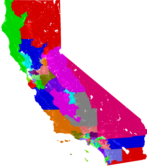
There are optimistic signs of the possibilities and options for refiguring the huge problems in democratic representation, as by creatively using data distributions that we have to create better centered electoral districts in less interested ways–shown here in the state of Georgia–that could reduce gerrymandering by redistricting through simple GIS.


Impartial Automatic Redistricting (2010)
Indeed, many plans for redistricting can lead to a more effective model of representation to which special interests, and bureaucratic slowness, have not led us to adopt, with potentially quite undemocratic results, in large part because of the huge cost of the transformation in voting practices. But is the cost of such a failure increasingly apparent in the ways we form and select government for all?
And anyway, is the geographic allotment in California with greater sense as such a map?
 Impartial Automatic Redistricting (2010)
The alternative possible plausible map offering voters more equitable distributions of equidistance by automatic redistricting seems, in the abstract, potentially more reasonable, and removed from the interested division of districts in the existing map.
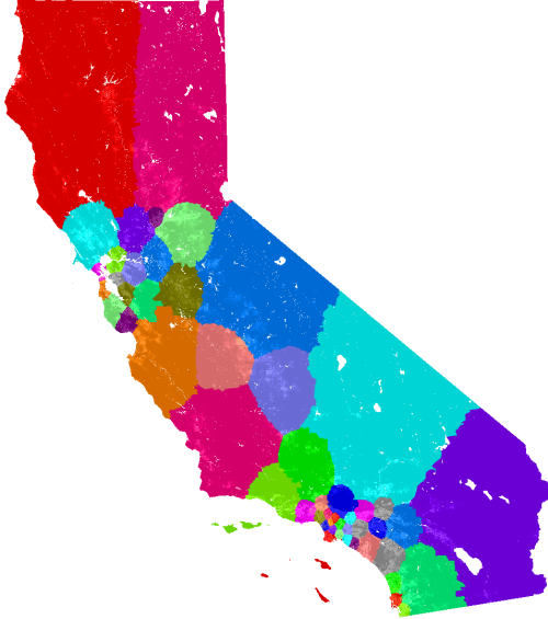 Impartial Automatic Redistricting (2010)
Perhaps the difficulties of redistricting are daunting, but the tools of mapmaking indeed have made them increasingly possible, if not for the difficulty of undertaking national changes that cut so sharply against entrenched interests of existing representatives who have nurtured bonds to their constituents, and would feel challenged by the compact district of a new electoral map, even though the older map is effectively infected by existing interests to easily confirm the redrawing of district.
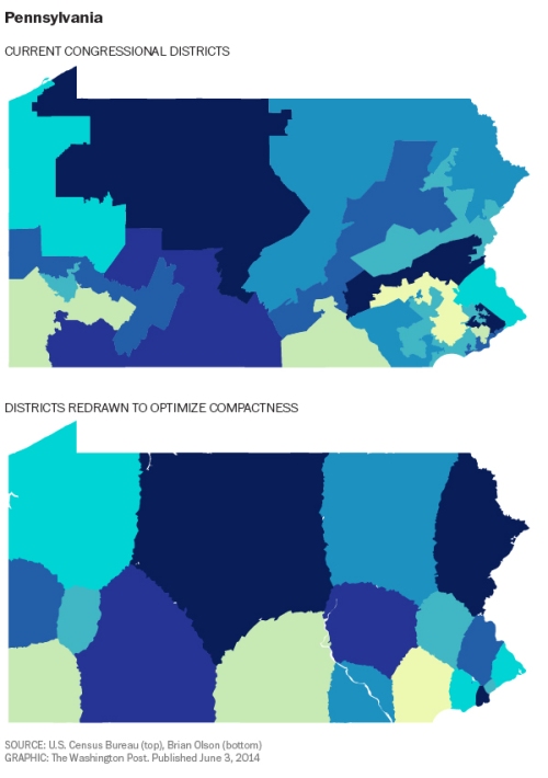
Or have we been overly disempowered by platforms of mapping, in ways that have allowed them to serve individual interests in overly explicit ways? Indeed, the possibility that mapping platforms are tied to an unwarranted overconfidence in data and in the manipulation of individual votes seem to have been present in both sides of the 2016 vote, as plans for exercising rights to create a more equanimous image of voting representation remains in an earlier era–as, perhaps, the electoral college itself, may overly distort voting in ways that we are too often compliant.

If we have long been attracted and attached to the descriptive power of the map–
–is the medium not only interfering with the message, but overly disorienting?
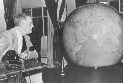
4. The enduring absence of a globe may be an eerily enabling underside of globalization, in which the never-ending wonders of internet are given something of an enabling basis in a range of maps that erase a contextualized view of place. The imagined freedoms guaranteed by uniform access to online information on the world wide web may have origins in the sense of liberation from geographical divisions of mapped territories that many maps once seemed, after all, to perpetuate so falsely as a bad ideology of the state. One feels hard-pressed to imagine the democratization of the “flow of information” as leveling the playing field, save by its flattening of the earth. But let’s move to a rosier age. But the desire for the liberation of such a global vision of information might start in the “big picture” that maps provided for folks like R. Buckminster Fuller and of course Stuart Brand, who famously took the globe as an image of big issues and complexity.
For the economy of online information that derived from such initial optimism and indeed near-utopian aspirations to emerge from geographical constraints of Cold War nationalism has produced a spatial imaginary that has all but dispensed with place, by positioning it in a new matrix of geolocation. Despite initial eagerness to envision global unity as proclaimed in the 1960s in the iconic interrogative Brand’s clever button posed in northern California on or around March 22, 1966. For Brand hoped a more complete image the world could provoke a release from the ideology of a national map and a holistic attitude to environmental care as if by an interrogative of greater imaginative force–
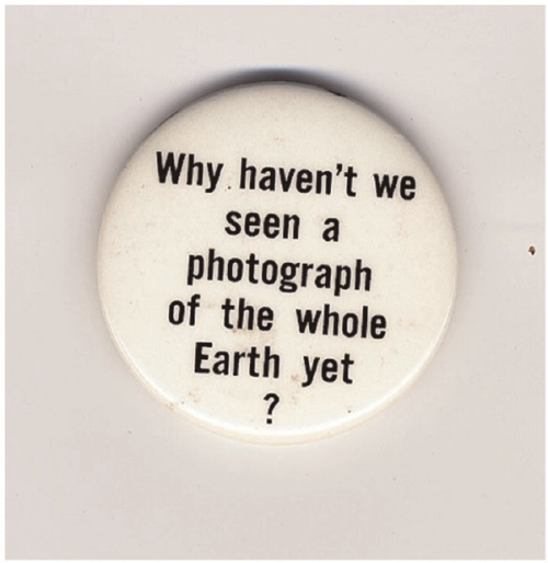
–the notion of the “Whole Earth” that Brand and crew believed to be almost in reach back in 1968 has more than somewhat receded from sight.
Brand had bravely advocated expanding one’s cartographical comprehensiveness to remap connections in a new picture for his audience. He became an evangelizist for the “Whole Earth” perspective and offered broad “access to tools,” by boosting the breadth of its contents, and cramming information into the dense layout of its pages that optimistically erased one’s sense of disconnect to actual uneven distributions of wealth and, er, tools. But by providing inter-connections by “big picture thinking,” Brand promoted a wonderfully holistic vision in the Whole Earth Catalogue, that Bible of “Holistic Thinking” aiming to remedy an absence of attention to complex, interconnected systems of which Brand dedicated himself whole-heartedly, by the sheer force of making a more open and comprehensive map to display the whole “big picture” in its copious abundance, enticing readers to trace extensive interconnections in the world that the Catalogue revealed.
 Fall, 1968
Stewart Brand and company viewed cartography both as an illustration and a model for the understanding of “big systems” he sought to illuminate in the Whole Earth Catalogue, providing an image of complexity of the “whole Earth” that interacted over an extended space in ways that cartography provided a metaphor to reveal. Viewing the “whole Earth” sought to provide ways of revealing unseen connections between places and also offered with brio a ticket to understanding whole specialized systems and bolstered the hubris of bridging a gamut of specialities. If this made the Whole Earth Catalogue a precursor to the internet and World Wide Web in its aims to reveal the breadth of the ongoing state of play, it was also embodied in the notion of a playful game in which the earth’s fate lay in the balance–echoed in how Brand imagined players of the cooperative game Slaughter shifting sides to prevent the earth from ever being pushed “over the edge” to one side–in an undisguised metaphor for preventing real slaughter from occurring during the war.
 Whole Earth Catalogue, March 1970 (MOMA)
The notion of a game inspired by volleyball using a ball painted as a globe sought to turn players’ energies toward protecting any team from pushing the earth over the “edge”–a fear increasingly emergent in the Vietnam War, by focusing on preventing it from falling–or, in a version modeled after Tug-of-War, by shifting sides in order to prevent the ball/earth from ever crossing too far across one line, and trying to maintain its stability.
For back when Brand and his friends optimistically enjoined NASA and the Soviet Union to ‘‘finally turn the cameras backward’’ towards the planet earth to provide a picture of the world, posing the question first on buttons he hocked at the University of California campus in Berkeley, the notion of a new mapping of a global world and its connections would open a perspective that liberated users from what seemed hackneyed nationalistic values and promising notions of interconnection to ideas and information in new graphic forms. The idealistic promise of global coverage didn’t create such a release, even long after the button-selling of Brand was chased off of Berkeley’s campus, but Brand’s idealistic notion of the power of global coverage informed the internet’s promise to provide information everywhere, by allowing unprecedented access to maps in ways world-changing in itself.
To be sure, the liberating force of the internet lies in its ability to provide information everywhere, but it remains true that the surface of the world wide web is anything but a uniform surface or playing field.

The absence of a level field in internet use continues even after Facebook‘s efforts to saturate the planet with free wifi, already evident in those most connected to Facebook–
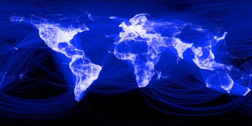
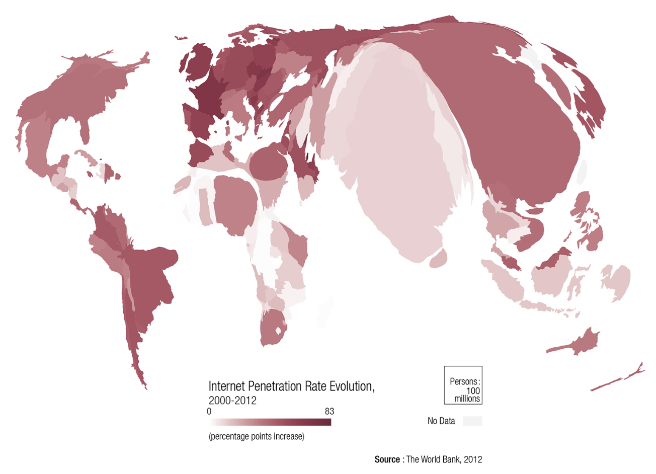
The obstacles to the dream of comprehensive online exchange hasn’t happened, and may not, given the uneven nature of the global penetration rate of the internet, whose global spread is broken down nationally on a cartogram warping of space by population, and shows deep whole in much of Africa and South Asia, and a lopsided evolution of web-use, convincingly rendered by the clever cartographer Luc Guillemot–
5. Paradoxically, if inevitably the generation of most online maps is overwhelmingly and resolutely local, in the sense that it is only accessible in quite unevenly distributed ways–it would be wonderful to see the scope of the scale at which Google Maps is accessed in different places and regions, if such data were open; as it is, we rarely see the “whole earth” as Brand imagined, so much more focussed are we on tracking national political events or elections, or mapping the settings and spaces we travel and spread of local weather variations. We map where we are in maps of air travel on view in airplanes, Waze apps we use to view traffic flows, or the crime maps of neighborhoods and, on a broader scope, the weather maps of nations, states, or regions, which have a sense of actuality that exploit most maps’ existence on a server, always able to be reformulated to track meaning and flows for our eyes, and indeed even to put us into its content.
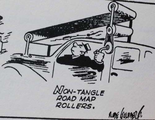
Encouraged by the near-ubiquity of wifi and internet services, we use smart phones as navigational tools to trace our locations on winding roads, taking our eyes off of the itinerary, almost to the degree Rube Goldberg’s cartoon of Non-Tangle Map Rollers prefigured–running the danger of taking eyes off of the road on which we are driving.
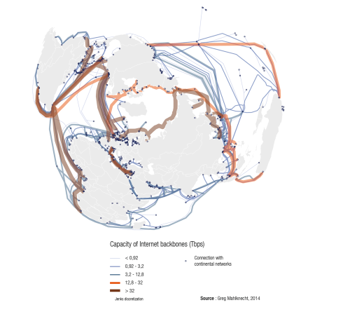
There is not such a utopian sense of how information actually flows online through the ether, to be sure. Indeed, there are still clear winners and losers for the speeds of information exchanges that the speed of internet exchanges creates–and are not evident on Brand’s “whole Earth,” which still seems to provide the mental model to which online mapping aspires–despite the actual differences in the backbone that enables such online communications and the advantages it allots residents of certain regions: for rather than provide a unified global image of à la Brand, cartographer Luc Guillemot’s recent map of internet capacities reveals intractable inherent differences in the sizing of information highways for different regions–and give the lie to the free-floating of information along the cables and backbones on which they are transmitted among different regions, by mapping the actual quantified capacities at which they run.
The ways that we might understand the vision motion of information better have only begun to be mapped. But the continuous provision of infinite information faces multiple material constraints. The enticing image of the expanse of the global net has clear weaknesses, to be sure, as does the hope of expecting universal access to online maps.
So what of the whole earth? Where did it go? The proposals and presuppositions of the Google Maps template and of Web Mercator are rarely interrogated, but in the name of subsuming information to utility, and actuality to web tiles, the map engine does odd things, removed from experience, as a semantic web of spatial reference–like suppose a uniformity of land and water, render and reify abstract spatial positions removed from local context, and reinstate a flat-earth perspective that would be less familiar from a globe, that provide an array of tools to conceive of place–from tracking to geolocation.
6. The framework of spatial reference generated the Antipodes Map streaming Google Earth locations in familiar map tiles imagery. As in the header to this post, the engine bears the promise to match a map of where you are to the earth’s other side, analogously online information-sharing promises to place any user at any site, and by using the very same engine. As internet-based maps provide a network of ready-made mapping whose instruments are accessible to all–despite the clear constraints that undergirds the internet and renders it less of the open area for free exchange.
The Antipodes Map engine is itself an artifact of the age in which any map is readily generated and supplied, more than exists. It is an emblem of the utopian premises of the hyper-personalization of online maps–rather than present a record of the inhabited world, the site marks place for viewers by a search engine alone–and situates place in an otherwise undifferentiated expanse: the map revels in the status of place in the map-engine as a “quasi-object” and of the map’s user as a “quasi-subject,” to use terms Bruno Latour coined as tools to understand the networks in which each exist; for the Antipodes Map website itself serves to trace networks of calculating place on an online map engine by a coordinate network, preparing a readymade sense of local landscapes disembodied from place and with little context, and removed from current political events or human habitation.
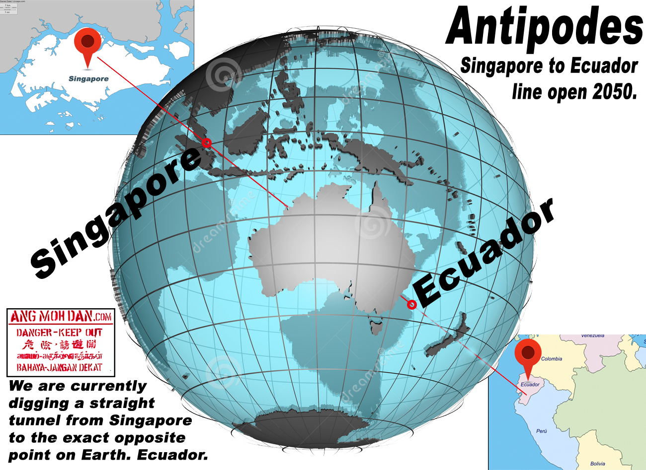
There is no Jules Verne-like majesty of imagining the construction of an actual tunnel, as a corridor running through the earth’s core, here advertised as a project to open to visitors tired of global air travel, linking Singapore and Ecuador, that is promised to be constructed from Singapore by 2050, which might provide the very sort of transport it imagines in an imagined physical corridor–
It oddly remaps place that preclude any sense of embodied travel, in a gloriously impoverished sense that sees the map as not only the medium, but simulacrum of travel.
The frictionless sort of travel that online mapping claims to provide to its users has been interestingly incarnated in an online Antipodes Map, if the magic of generating a web-map has admittedly lost much of its early initial sheen. The search engine light-heartedly bills itself as a virtual “tunnel to the other side of the world” that half-exploits the decreasing availability of concrete media and forms of mapping in a “globe-less” society, whose lack it seems to mourn. Many may mourn the symbolic centrality of the globe as a talisman of interconnectedness in the age of web-based maps, but the performance of the web-map and the surrogate reality that it offers viewers in a new network of map-use is celebrated in the engine as if to overcome the lack of the materiality of the map. The engine allows, by an easy trick, instant generation of the web map from any set of coordinates, as “our ‘man’ will dig a tunnel from selected location, right through the center of the Earth, up to the other side of the world which will be represented on Right Map.”

Although the lack of scales in the two windows of the map-generator negotiates the fact that much of the world is water, the possibility for altering scales allow considerably bizarre symbolic, and even odder as a way to lend a sense of presence to the formally abstract and generic screen map–lending a notional materiality to the web-map that almost celebrates the map as a simulacrum that’s ready to be fashioned around where you are, wherever you are, immediately.
For if the screen map declares it to be nothing so much as a “quasi-thing,” recalling a map in its pixellated forms existing only for the beholder for whom it is conveniently remade, and reassembled, that emulates the apparatus of map-viewing on a Google Maps platform.
7. Indeed, the engine almost openly celebrates the rebirth of the new status of the map as a “quasi-thing“–which almost ceases to register spatial variations–where geodetic data exists only in a relation to the viewer or users of the platform, rather than inhere in the map, and place a “quasi-subject” that exists in a social network of map use and is provided for the user of a mapping service. Place, in other words, emerges in the act of consulting the map and GS84 coordinates readily generates it, and place exists as a consequence of a technology of map-reading–and a network of reading place as it is generated on search engines–and as it circulates online in a network of map reading. Although the Antipodes Map was not particularly successful as a search engine on its own, it recreates the same networks of map-reading to generate place through the immediate assembly of map tiles. The Antipodes Map has little to do with actual Antipodes, but less dynamic GIS version that echoes the physical interactivity for reading space H.A. Rey so appealingly rendered in the illustrated children’s classic How Do You Get There?
Rey’s fold-out images offer visual surprises that dramatically addressed the problems of modern navigation of an age, as if to socialize children to problems of transportation, that responded to the increased mobility of the mid-twentieth-century, and indeed the increased possibility of a surprising degree of geographic mobility due to contingent circumstance that Rey himself experienced. Rey’s classic book sometime seems a valiant attempt to put a good face on the history of displacement and mobility Rey himself experienced–but recalls a tyranny of the map that has become a far less sensitive visual medium in the a dangerously disembodied absence of a sense of self amidst the tiles of Terrain View. The interactive mapping site suggests a nostalgia for the globe, by suggesting the notion of global antipodes can be easily rewritten for the screen, is subtly mirroring the imaginary of the smooth travel that the internet and many platforms of web-mapping openly promote, even as many face increasing obstacles to geographic mobility. Any obstacles to mobility seem miraculously erased in the user-friendly promises to immerse oneself in the map and be transported to an antipodal point–albeit one that comes up quite short on any spatial experiences at all.
For if How Do You Get There? was permeated by a sense of place, and may indeed echo how the intrepid children’s book illustrator might have mused on the varied conveyances of his narrow escape from Paris to Lisbon and through Rio de Janeiro, in Brazil, to New York City from bicycles to transatlantic ships, it offers a visual sequence of problems of transport and the most apt vehicles to move from one site to another, inventively exploiting the fold out pages in the paper product of the book to mimic movement across spatial divides across which different vehicles can transport you, retelling the radically expanded transit possibilities half way between the innovation of the ocean liner and the jet age: the first image poses problems of transportations to which solutions immediately emerge by raising half the page, to reveal the conveyance allowing one to move across a medium–


The growth of new possibilities of transit is implicit in every page of Rey’s book, most often poignantly told from the child’s point of view, as if to offer a guide that can orient them to both the local and global, and newfound mobility in urban and global space.
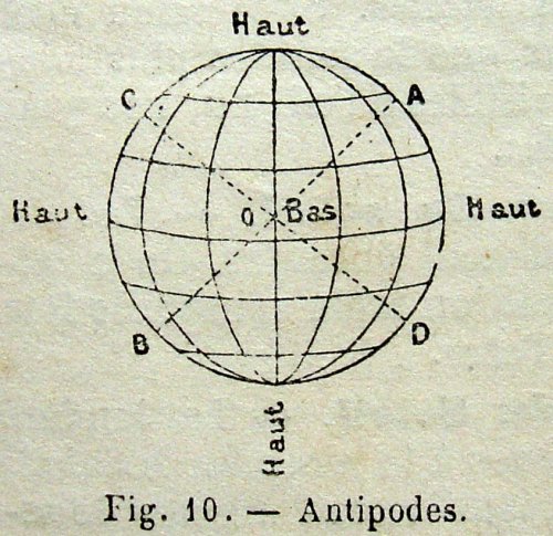
In contrast, current users of “Antipodes”–a service whose plan lacks relevance to the actual Antipodes, a concept that maintained the balance and global harmony of the world’s continents, which came to refer specifically to the large southern landmasses New Zealand and Australia in much of the northern hemisphere–
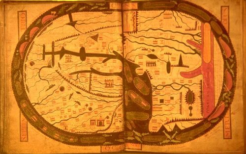 St. Sever (1030 AD, following Beatus Renanus)

–but rather relates antipodal points that intersect the earth’s center in a straight line, mapped on projected coordinates.
There is a sense in which the dual maps presented to viewers clearly recalls juxtaposition images in parallel slide projectors, as a sort of comparison of the formal shift in settings that the map takes the viewer or generates a place. Rather than offer the material visual surprise of actively unfolding a paper flap, the parallel images that recall parallel projection from two projectors in the slide lectures given in darkened halls of art history lectures of a generation (or several) ago, to focus the attention of his audiences on the Formgefühl of projected images to unmask a syntax of art. The twin map-screens of different scales in the Antipodes Map are clunky because they echo how parallel slide projectors provided an apparatus, from magic lanterns to the slide projectors, for art historians to compare and contrast styles Robert Nelson once described as an inheritance from the Swiss art historian Heinrich Wölfflin–who employed dual projectors to give viewers the sense that they witnessed and hence best appreciated the content of images.
8. The juxtaposition of two map screens less openly celebrate the work of art more than the speed of the instantaneous generation of images, of course. But the Antipodes Map is similarly intent in the miracle of creating a juxtaposition of antipodal locations, as if place was merely something that arose from the comparison of locations. The basic suasive apparatus of the website’s map engines echoed how the material apparatus of projectors that became such a staple for orienting beholders to stylistic differences, and appreciate a work of art. They seem to celebrate the online map, despite its visual dullness of its form.
The contrast immediately generated between a provided place-name and how the engine locates its antipode by the magical apparatus of an online map engine; users are invited to enter the sketchy simulacrum, and to identify with the icon in slacks and a white shirt who seems to reappear at a corresponding point, albeit almost always at radically different scales–that exploit the frictionless nature of the virtual map as an accurate interface.
The aesthetics of the website obscure distance, by allowing one to move by the input of any toponym to two points in the world, and find its corollary in the opposite hemisphere automatically generated. The coordinates of longitude and latitude are suddenly, as if by a magical sort of travel, spatially re-situated by polar opposites of place represented by adventurous figurines who seem to stick their head in the ground, as in the manner of an ostrich, only for it to reappear at the corresponding antipode on the terrestrial sphere. The website lists the range of actual antipodal cities that make one wonder what meaning lies in antipodal relations–Manila and Cuiaba (Brazil); Shanghai and Buenos Aires; Taipei and Asuncion (Paraguay); Aukland and Seville; Singapore and Quito; Suva, in Fiji, and Timbuktu; Hamilton, New Zealand and Tangiers; or Masterton (New Zealand) and Segovia–beyond suggesting the extreme over-inhabitation of much of the current ecumene.
Indeed, “tunneling through the world” will allow one to move from through an infinity of antipodes, as from Split, in Croatia, to its actual antipodal point off New Zealand by a hexadecimal coordinate system of Google Maps,–


–in ways that suggest the antipodes don’t actually “exist” as a place, but only in the relative terms that exist in a Web Mercator projection of WGS84, which in the map screen can be imagined as two points between which web-maps allow one to physically move, and coordinates that can be readily juxtaposed.
The conceit of the simulacrum of the map through which one passes, as if to another world, to its antipodal counterpart, is a cool tool to vaunt the power of the web map with apparent precision. Tunneling through the virtual screen will surprisingly transport you from one city to another. Iconic humanoid stick figures, our new stock figurines of surrogate explorers within the screen map, are immediately oriented to a mapped place abstracted from any vehicle of travel by the GIS mapping engine, on a website that seems glibly to treat the map itself as the medium for imagining one’s voyage to a point of parity on the globe by analogy to Google Street View, as if one might poke one’s head through the world’s surface, and treat the conveyance of the map as a way to shrink space.
While the logic of calculating terrestrial coordinates of antipodal points is ridiculously simple–by simply switching out North (N) for South (S) in each latitude; subtracting the longitude from 180° and visualizing the result in Google Maps–
–the visualization is profoundly bizarre symptom of a globe-less culture, where coordinates exist not on paper, or on a spherical surface, but rather on a screen–and may suggest something of an a nostalgia for the globe as an object of contemplation, despite the sense that it is a far less adequate substitute, whose interactive format is a bit more of a parlor game quick to become outdated in the age of online mapping.
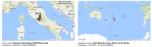
The formal trick of the interactive Antipodes Map invites us, perhaps for want of a paper map, to dive through the surface of the map, and presents the flat surface of the screen map as if it were a surface through which one could travel through a now-absent globe, as if through a looking glass, between such antipodal points as Rome and New Zealand–
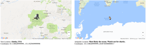
or Denali Park in Alaska to the even colder regions of the Southern Ocean near Antarctica’s edge–
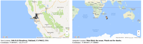
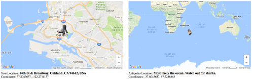
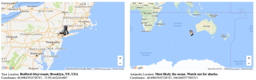
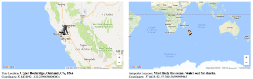
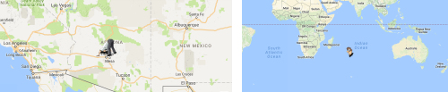
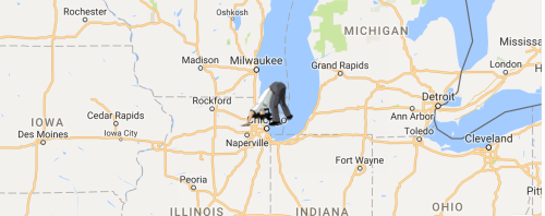
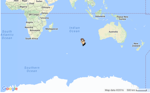
and imagine easy transit from Oakland CA to the Indian Ocean–
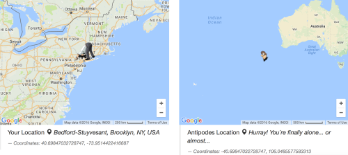
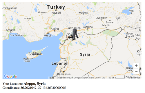
or from the West Bank and Jerusalem, as if to escape the constraints of increasingly obstructive boundary barriers, to beside the international dateline in the South Pacific–


The notion of such smooth cartographical getaways are flights of fancy, but can’t help but make one think of the actual mobility of refugees who increasingly crowd the surface of the world whose itineraries are all the more fraught. Has it been a coincidence that as globalization is based on new modes of mapping borderless travel and data flows without frontiers, frontiers of economic differences are increasingly constraining ever-increasing numbers who are not often on our mental screens?


Perhaps the magic of shifting place in the Antipodes Map is a product of a society where our travel intensity is so susceptible to place-shifting and where upwards of 700,000 are up in the air at any moment, and over a million paying passengers flew daily in 2015, and airlines are expected to fly 3.6 billion passengers by 2016.
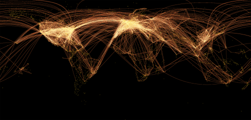 Michael Markieta (Arup)–60.000 air routes
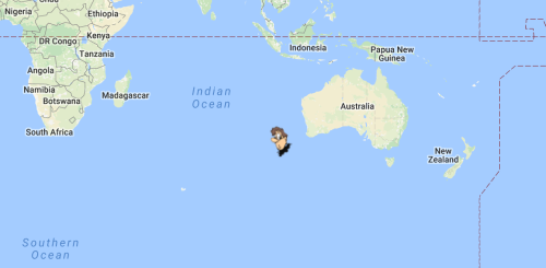
In an era of massively accelerated geographic mobility connecting some 7,00 airports, there is something crazily believeable about the playful conceit of the Antipodes Map: one might readily imagine one can stick one’s head into the land only to re-appear, presto changeo, on the other side, as if by sticking one’s head into the ground, one might reappear on the other side of the globe. We are removed from the sense of a globe–despite the use of terrestrial coordinates; the website rather provides a sort of Flat Earth Project, now is cast as sort of paired Moebius strip, using the visual metaphor of entering head and hands first though the pixellated map of New York,
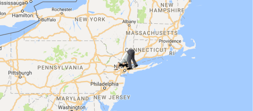
–one might be conveyed by the search engine, as the map gives way, in all of its faux materiality, and we appear at the opposed set of terrestrial coordinates, off the coast of Australia, in a metaphor for the cognitive difficulties of world navigation by smart phone, using a projection that expands Antarctica to a prodigious size the it serves as the footer of the screen:
Resolutely and radically anthropocentric, if similarly antiquated–much as the conceit of compare and contrast with dual slide projectors, the variation on Google Street View places the humanoid and seemingly male figure in an abstracted landscape, in ways that incarnate an idealized interface between man and map, loosened free from any environmental context or actual spatial orientation, save longitude and latitude.
One can move in to closer scale, to be sure, and focus on a specific neighborhood or intersection of streets in a city before symbolically tunneling to the other side of the world, or reappearing on the matching coordinates in the other hemisphere: but place is less here understood as a place of habitability, or inhabitation, so much as the coordinates mediated on a screen and as a sort of place-marker, familiar from Google Maps, with only marginal reference to its topography, and not a space for settlement or inhabitation.
The fictional cartographic conceit entertains an imagined transit of childhood–digging a hole to China?–but rather than present an actual adventure, à la Jules Verne, one celebrates the versatility of the flimsy artifice of the flattened screen, which suddenly and playfully invests itself perhaps with a health share of faux materiality, as if to announce the lack of global bearing or geographic learning that are in the end required for new tiles to assemble and reassemble themselves at convenience, to show you where you are, and no real need for a conveyance to arrive anywhere in embodied form, and to celebrate that no resistance or friction to imaginary travel exists any longer in a globalized world.
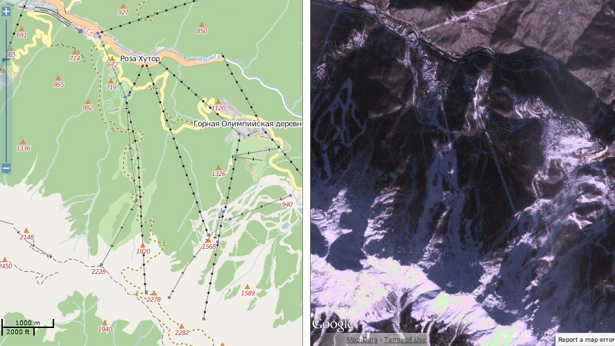
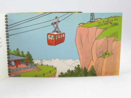
Sometimes the icons may seem odd, not to mention out-dated, as if one was doing asanas in the midst of a forest near Nepal, where all of the previously familiar constraints of travel are erased by the imagined access to space that the terrain map provides.
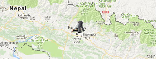
We can move, frictionlessly, to tunnel across the world in this cartographical fantasy from a site located beside a lake–
to an unkown site in the Indian Ocean–
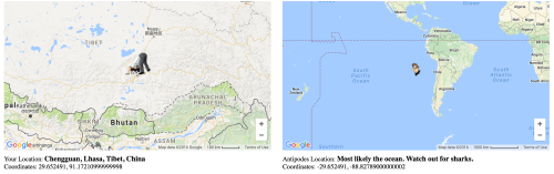
or indeed from the Himalayan mountains of Tibet to off the coast of Chile–
The oddest aspect is the utter absence of a sense of conveyance, as if a celebration of the fact that what exists is not reality, but only, and absolutely, the fantasy of a flattened map.
If Ray celebrated the opening up of the landscapes of travel by different conveyances, as if to celebrate the transit across space for readers, by orienting them to challenges that almost seemed impossible–

–the notion in this search engine seems to be that there is no landscape, but that by playing with maps, in an innocent way, the contours of the globe are not only easily transformed to a hand-held pixellated screen, the new medium of the map–
–but that one almost doesn’t even need to see anything in the map as a set of spatial relationships, but can use it to lead to situate oneself immediately in the static landscape ties that the search engine generates.
How to reconcile the constraints in which so many live clustered on the side of borders that defined economical disparities, or just outside them, with the unbounded optimism of the online map that can track our position at any place in the inhabited world seems a problem of world-making, if one that mapping may not alone resolve.