
Like a patient rising from bed to look in the mirror for superficial signs of illness or searching for visual evidence of clouded thoughts after a hangover, we compulsively turn to data visualizations for bearings on our body politic, preoccupied by its bruised appearance and searching for visual distillations that tell the story of its apparent fracturing into red and blue. Anyone reading this blog is compelled by the search for a rendering in iconic form of this sharp chromatic divide by which we seem beset, as if to mute its edges and suggest that a possible contexts of such stark political divides. But how one can provide an account of the map–or map the meaning of these divides–has created a cottage industry of visualizations, images that serve both as glosses and counter-documents, against which to gainsay the meaning of the impasse of the most current electoral divide of 2016.
We seem to search for a sign of meaning in our body politic, if not in our representational institutions, and to understand political divides less as signs that all isn’t *quite* all right, and the coherence can be found in how the democratic process balances local interest. But most importantly, we seem to try to process deep concerns that the electoral map lied: for if the electoral map is in some sense a powerful measure of our coherence as a community, it seems important to affirm where that coherence lies, if it does indeed still exist–and can be detected in a map.
And in the long aftermath of the 2016 Presidential election, it is not surprising, somehow, that we are still eager to understand or imagine what that “new America” is or what a new map might reveal. Uncertain in our ability to question our representational institutions, we are pressed to ask how our electoral predictions “lied,” and whether the electoral map itself “lied” by serving to magnify the political voice and agency of a demographically diminishing region. At a distance of two and a half years from Donald Trump’s surprising election as U.S. President, we continue to seek more refined district-by-distict distributions to pore over the stark chromatic divides, reading them as tea leaves for some sign of what will happen with the 2018 midterms, or as entrails to divine what to look for in our nation’s future. And then we try to reframe the issue, and see what we can salvage about our actual divisions.
Skilled at reading maps, and at detecting their distortions, we also seek to recuperate a sense that maps do not lie. We pore over data vis to restore a sense of unity in an era when it seems we’re saliently divided by race, class, and religion, but are compelled to locate a sense of home in those divide, and seek a sense of balance and objectivity that can distill the intense rhetoric of deep-lying divisions. For rather than suggesting or asking how an electoral map may lie in ways that balanced a widespread sense of shock with a skepticism that that was our map.
And the continued skepticism and uncertainty in the meaning of the divisions of the electoral map lead us to try to dissect and parse their meaning, filtering and sifting their data within other data vis to illuminate, by new granularity and spectra, a broader spread of variables, in hopes to unlock the questions and overcome the challenges that our representational system pose. We peek deeper into its red heart, as if in hopes to find the coherence or possibility for change in its red center, as if in a form of national introspection performed on the most superficial of registers, whose “truth” cannot even be gainsaid, hoping that it lies there, perhaps in the heightened distortion of electoral votes that distilled from district maps.
 Detail of above
Do electoral maps lie more than other maps? Any is something less like a reflection of actuality, than a puzzle, in which we can uncover not only telling traces among electoral divides But the new configuration of space that the 2016 election bode, as well as the greater sensitivity that we like to think we’ve gained at measuring spatial configurations in meaningful terms. The attractiveness of remapping the voter distribution may be a bit of a red herring and distraction from the magnification of divides elaborated in internet chatrooms from 4chan to 8chan, as much as above ground, but the searching for new signs in the entrails of the voter maps–a post-mortem on the body politic–carries as much sense as the foreboding that the representational institutions of states, counties, and other traditional geographic units might make less sense as a basis for structuring a truly representational democracy.
Seeking to stabilize current fears of a crisis of our democracy, we keep on returning to maps, insistently and repeatedly, as if out of trust for grasping how politics is shaped by deep-seated divides by finding a new way space is configured–as if that would help us understand the appearance of our divides. And so, in hopes to digest the dilemma of representational democracy in we look for cartographical terms, to provide it with some grounding or objectivity, that offer some sense of purchase, other than by affirming the intensity of our divisions and to see that the institutions of political representation we’ve long trusted might make sense with the migration of populations to urbanized areas or the recasting of politics discourse in dissatisfaction with the status quo.
Perhaps, convinced of our increasing savviness to read the display of information in a colored sheet, we try to grasp the distributions of data as a configuration of space by which to grasp what happened in the 2016 election, What is shown to lie in the deep splintering–does this take many by surprise?–across a body politic and economy afflicted by a politics of intense opposition seems suddenly normalized and explained by maps that normalize our divisions, and set them before our eyes. But we have been poring over maps of the nation for years–or at least multiple election cycles–to be able to better process the tensions between regionalism and federalism in ways we might be able to come to terms with or effectively digest as presenting–and representing–an actual record of the status quo that is not so fragile.

The representational system is oddly sidestepped, of course, by placing the divisions of a fractured electoral map in terms that see it as a lay of the land. The questioning of the fifty-state primary system–or whether our version of representational democracy best accommodates local interests in a fifty-state system–are not seen as being able to be adjusted to balance regional interests or economic needs better, but reflect a lay of the land. So much is suggested in by the growth of tribal senses of belonging that provide affective ties that lack in the state or even region, and span space in ways that online groups and news sharing seem to have filled an increasingly pronounced need for meaningful political involvement, in ways television once afforded a social glue. The deep uncertainty and sense of social dislocation that defined the 2016 Presidential Election in the United States, manifested in the mistakenly salvific power of social media memes seem to have gained as a substitute for other forms of belonging, seems to find a resolution in the power of maps.
Of course, this was the third election cycle that we were divided by maps, and electoral projections, a division that Trump–and his allies, whoever they may be–only sought to exploit and reflect, or unleash with greater intensity by playing them for whatever they were worth in broad circulation. Maps provided a form to counter that dislocation. The rage for maps to comprehend an icon of the spatial promise of a United States has led, empowered by GIS, to an intense search for a more meaningful system of maps than that of counties, states, or congressional districts that the economic realty of the metropolis can no longer afford. The role of GIS here is less instrumental than a sense at grasping for straws to identify the meaningful regions on the map, puzzling the potential for future unity in a terrain whose political processes and practices map poorly onto its divisions.
We were compelled just not to make sense in a fundamental way of the coherence of the political map, if it existed, but to process what it means for a rearrangement of political constituencies. If any map presents a puzzle that can be read for its argument, we compulsively returned to the past-time of glossing the electoral map as a way to find resolution. We returned to data visualizations, especially if paradoxically, as a trusted form of post-traumatic healing, and continue to look to them to try to embody and diagnose our deepest divides, if not overcome those seemingly salient divisions. Faced by a feeling of fragmentation we turn to maps to better grasp where these divides lie and to try to bridge their fractures. We turn to maps, to prevent a sense of loss, or prevent the foreboding of a lost unity, and deep-seated fragmentation.
Whether maps can do so much reparative work is open to question, as is the power of maps to explain the deep discomfort at our social divides. Since they are so salient, and oppressive, the thought goes, they must be able to be mapped. The relatively recent re-imagining of the nature by which the United States are united led, during the heat of the last election, to a proposal of ordering districts around the metropoles that were foreign to if linked with them–Seattle, San Francisco/Bay Area, and Los Angeles and San Diego were his in this cartography of mega-regions where urban corridors defined the map’s meaning, as much as the regions in which they were nestled or situated, emphasising a metro-cartography of political identity keeping with the times.

Dissatisfied with the state as a parsing or unit that was forward-looking, we accepted new geographical units as “megalopolis” to designate the sites that have superseded the city in this cosmopolite model of America, reflecting hubs where the large bulk of the GDP is located, and economic interests increasingly located, although this may neglect the extent to which GDP is linked not only to abstract able figures of income generated, but urban snarls, pollution, garbage production, and greenhouse gases and other forms of waste, using a variation on a five-color map to suggest the units of productive regional planning that might be able to better connect localities–or local needs and economic interests–with a federal government perceived as distant and removed.
1. The notion of using the map to reaffirm a connectivity and continuity that seemed lacking provided a new way to ramp up our 2-D cartographical concerns less to foreground fractures than meaningful commonalities which could be acted upon as the borders between states seemed far less meaningful to suggest economic connectedness, and indeed national borders seem less profitable fictions to provide possibilities for future economic growth–and indeed the state university structure provided a far less practical basis for public education, despite its value, as public universities seem more removed from educational opportunities or research funds, and others are somewhat vengefully recast as public employees, teaching mission be damned.
The map affords a prospect of tangibility and coherence, particularly compelling in its abandonment of the “state” or “county” as a unit of the polity, and appealing in its potential encouragement of a new sense of infrastructure–a term that provided such an appealing keyword way back in the midst of the 2016 American Presidential election–even if the New Map for America was presented for the lower forty-eight as a sort of forward-looking economic blueprint before the General Election, as if to orient us to a vision of the pastels of a future less brash than the red vs. blue electoral map, its regions far more recognizable, and decisively upbeat, from Cascade through the Great Lakes and Texas Triangle to the Southeast Manufacturing Belt. The hope is to respond to a sense of dislocation by more meaningful economic units, and indeed an agenda to move forward advanced in Connectography: Mapping the Future of Global Civilization, a hopeful manifesto to shift debate from territorial units and semantics to a vigorous statement of economic power.
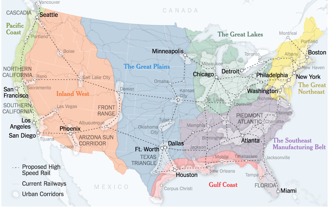
The shifting of attention to the divides in our electoral map to a the sorts of channels of connectedness Parag Khanna proposed were not to be–or aren’t yet, so strong was the localist and isolationist tide against them. The cartographical intervention was a view of globalization that was sunny–and with an emphasis on affirming possibilities of connectivity, as opposed to the terrifying sense of an exposure of unraveling and intransigence that the formation of a Trump Train–rather than the sort of proposed High Speed Rail lines–were proposed to create as a new economic infrastructure for a nation that seems increasingly unsettled, and seems increasingly unsettled, and might be hoped to be healed by a remapping of its economic interconnectivity, rather than its divides–an image of interconnectivity that the election erased.
To be sure, the use of the map to affirm needed connectivity (and continuity beyond proximity) among states was long realized to lie in the potential of the map to create further connective lines of communication and economic development. The promotion of surveying projects, from the railroad lines by Abraham Lincoln through areas of Appalachia in Kentucky and Tennessee, where the President realized the possible vitality of an economy not rooted or based on enslavement of populations provided a basis to encourage unionism. Walt Whitman saw, in 1860, the nation as a great nation “of many nations,” and Lincoln argued to survey the region to increase its connection, and offer a new basis to integrate the economic complexities of a union divided on an apparently intractable political debate. The notion of mega-regions and economic corridors is not, in this sense, so new at all; fostering economic interests has long been tied to the need to try to envision future possibilities in maps–a need that the 2016 Presidential election has undoubtedly necessitated, although the Trump administration seems dedicated to obscure that need.
2. But if the model was conceived in the midst of a tense primary season that saw political splintering and a large fear of depression in a search for a politics of meaning, the fears of a distance from Washington, DC became the victors of the 2016 Presidential election, as we saw a new and apparently heightened red-blue division imposed on the nation that we have been still trying to wrestle or digest and place in political or historical context, and to parse meaning from a map that seems all too neatly clean-cut after all–unless the fracture lines were indeed that strong that the nation might once again divide, as if reporting on the electoral results were a sort of performance art.


The fissures of red and blue reappeared again as what seemed a safe bet of a Clinton majority victory repeated, although newscasters and talking heads found it hard to say anything interesting about it, just three days from the 2016 Presidential election. But the confidence of these electoral projections that seemed to give a fragile if solid coherence to a Clinton electoral victory, if one that would hardly unify the nation–
–but contain its increasingly evidence divides, rather abruptly ceded to a sea of red, where alternate projections failed to alter the depths of a geographic solidity of those voting for Trump, even if a majority of them seemed resigned that the election would not make a substantive difference. As multiple electoral night watch parties disbanded with disillusionment, we were resigned to accept these divides, not knowing whether the geographical cleavages had either surfaced or crystallized in the actual electoral map, but suggested a somewhat surprising rejection of the status quo, and an eery sense of a red state continuity, as though we were divided regional blocks after all–
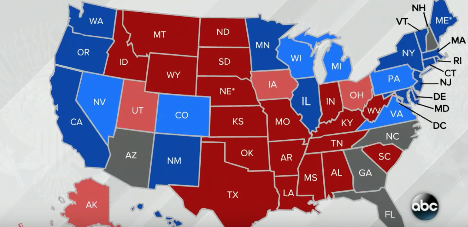
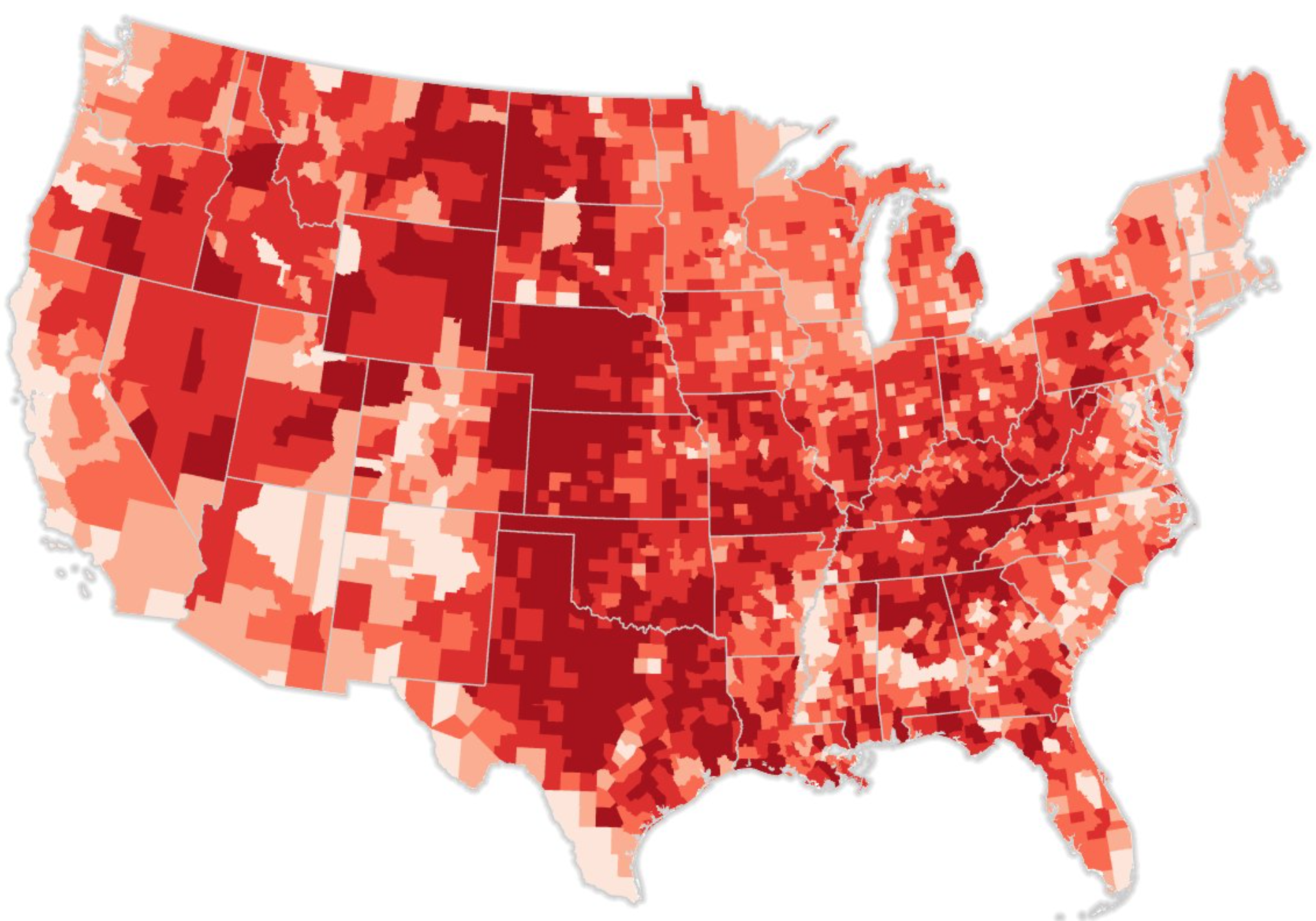
–and so we pored over visualizations of the nation’s new voting patterns that were increasingly and perhaps over-generously provided to stunned media viewers with a sense of collective trauma, to be processed only by reviewing endless cartographical parsings of the deep reds of the adjusted choropleth of 2016 revealed the coasts could hardly understand the intensity of the interior, seeming to reveal a convincing record of a deep-set urban-rural divide in a map of county-by-county voting trends.
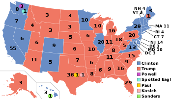
The map of electoral votes was just as widely championed by Trump himself, of course, who not only seemed to have installed it in the White House, but to present his candidacy as victory over the interests that he proclaimed had “rigged” the election, as if it provided a demonstration that the process not so rigged. (For Trump followers, the championed results, in which the President “elect” exulted, might have in the “Fake News” of predictions of his electoral defeat, and the false predictions of their marginalization from the country.) In an election when “rigged” seemed to have defined the 2016 Presidential election as it was used to invest emotions by different candidates, Trump had exulted in what applied equally to the economy, political process, and judicial inquiry as if applied to a “system” that he seemed to disdain, if only to recognize that the “hot term” he used became a basis to showcase his alleged outsider status. But the electoral map provided, for all its distortion of population, an argument that the “rigged” nature of the vote and “system” was undermined by the electoral system–the same system that he may have called “rigged” at one time. Trump’s claims for having “introduced the term”–“I’m the one that brought that word up!’–was in fact suggested to him by Roger Stone, who argued within two months after Trump descended his escalator to announce his candidacy, and recommend he base his candidacy on claims ‘the system is rigged against the citizens’ and that he is the lone candidate–did this offer any ideas to Bernie Sanders?–‘who cannot be bought.’” Trump didn’t immediately adopt the term, but by the Spring of 2016, the term became used to insert himself into a corrupt system of which he could be the savior.
Trump ran so insistently and deftly with the idea to make it his own, treating it as a term to cathecting with his rallies. He soon began to inveigh against the whole “rigged, disgusting, dirty [political] system” as being rigged, first the Republican primary and then the Democratic, discrediting the electoral process as a “rigged, crooked system that’s designed so the bosses can pick whoever they want” that revealed itself to be during the primaries to be “totally rigged to keep incumbents in power.” Arguing that the word was his intellectual property, as he had used it before Bernie Sanders or Hillary Clinton adopted the term he claimed to merit authorship for having introduced into the election, it cemented new constituencies in an age of increased income inequality, playing very well to an anti-establishment crowd as a new language of empowerment–so that the electoral map seemed to some a populist victory.
After insisting and bemoaning the extent to which the voting process was “rigged” during the primaries and into the general election by parties and elites, openly fostering distrust in the political process, the narrative suddenly switched when the electoral map–that map that so shocked the nation–was presented as a true victory that rather preposterously confirmed the success with which Trump had presented himself as not beholden to outside interests to a specific audience, as if it was a record of reality. Enamored of the map of electoral votes’ distribution, Trump presented the electoral map as confirming a populist victory that occurred against all odds., at the same time as his skill at gaming a system of electoral votes. He wanted the Washington Post to display the map on its front page, as if to announce it as a new reality, a hundred days into his administration, in a bizzarro illustration of his desires to run the press, asking reporters Aren’t you impressed by this map?¨–and regaling reporters with copies of the map as a testimony of reaching a broad audience of voters, as a source of pride and a deeply personal accomplishment of which he was the author, as well as a form of evidence he wanted the entire nation to be entranced–whose stark divisions he even had framed for the White House, as a confirmation of the extent of his appeal outside of coastal media elites.

The electoral map showed a defeat of the so-called “elites” on both coasts. The majority of voters’ opinion mattered less than how divided we had become, over the next year and a half. It was hardly a surprise to find these divisions, but their salience seemed a strong shift in political decorum. As Trump’s Presidency continued, we mapped rise of hate crimes inspired by Trump, as if to conjure the sense his Presidency and rhetoric had changed the nation, and suggested a new meaning of the term “red state” based not on majority voting but confirming a sense of deep-seated anger against an “other” embraced by a good share of the nation, as if tolerance for violence not acceptable elsewhere.
The crisis in belonging seemed, in this red-hued preoccupation, almost about blood, and innate differences, and an anger that had been unleashed either on the campaign trail or its social media spin-offs and detritus, where suddenly the most marginal of voices, rarely recognized in print, began to circulate, and reached a large and strikingly contiguous electorate, from which “we” were actually removed.

3. Which brings us to the deeper crisis of understanding how much of the nation seemed to rally around the idea of a need to garrison and fortify a southwestern border long left intentionally open, as if this would somehow Make American Great Again, and affirm its aging economy, persuaded they had been huckstered by international trade accords, as protection of the border gained greater reality than the civil liberties and rights of due process by which the nation was, for an actual strict constructionist, long defined.
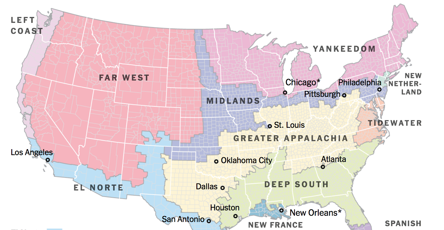
The demand to think “beyond states”–plus ultra!–has been conceived not as a possibility of growing connectivity, but as resigning ourselves to deep divisions as if they were embedded in the territory in the revival of what were argued somewhat misleadingly to be “southern interests” or heritages, and accommodate and instantiate in a map that Colin Woodward has long argued reflects the dynamics of their original settlement–rather than economic development and local political cultures–as if to accommodate the “local cultures” of politics, such as they are, as fundamentally distinct economic patterns that transcend the division of states or economic development.
Possibilities of new sorts of economic interconnectedness be damned, Woodward would have us recognize the long shadows attitudes toward work and not toward race, education, gender, or religion cast across the political fracturing of the once United States, as if to suggest that the notion of being united was itself a bit of a big fraud, or a pretense needed to unite what were long fundamentally different regions, in a new fracturing that reflects eighteenth-century precedents as if to trace the differentiation of ethnic or racial stock in ways that he claims effectively map on our own political divides, and offer new tools to help us understand different points of view that even a Continental Congress was foolhardy to pretend they could ever adequately reconcile, so steeply do they haunt the current polity.
The oracle of Freeport, ME reminds us that “regional cultures” have existed since the era of the continent’s first colonization in ways that command attention, despite the burning issue of apparently recent hot-button concerns from terrorism or immigration, despite their salience in the political debate and their prominence in motivating sectarian hostility. In a sense, the map may consolingly remind us that Trump has not appealed to “Make America Great Again,” but festered its deepest historical divisions and divides; its commanding division into colors of distinct hues a refutation of the idea that we are living in an era without intersectionality, where divisions deriving from historical priority trump any of the effects of economic inequalities and disparities of income. It indeed seems to naturalize race relations that have gained ugly prominence in recent years as being a world that must be accepted as “modeled after the slave societies of the ancient world,” where “democracy is the privilege of the few,” as if this were a tenable cultural position but demands to be appreciated as such. Rather than describe racism, or race relations, Woodward lets us know that “black people confronted” dominant cultural norms, a formulation that strips them of much agency indeed–or denies it altogether, more accurately.
The quite flat five-color schema of 2013 was recycled in the news, perhaps, because of how it seems to erase the far more finely grained visualizations of the election that appeared in late July 2018 in the newspaper of record, five days previous, as if the precinct-by-precinct map of Ryne Rhola could be made to disappear beneath the far flatter overlays of Colin Woodward’s breakdown.

For Woodward’s map viewed the United States not as a composite of populated blue islands in a sea of chromatic shades of red that slid to scarlet expanse, but rather crisp lines whose constitution was defined in the eighteenth century, and perpetuated in the self-sorting machine that the United States has become, arguing that the affinities of each place attract their own political brand–a notion that Woodward emphasized in the new iteration of this map that adheres more closely to the national boundaries of the lower forty-eight.
 New York Times/Colin Woodward (2018)
Forget any preconceived ideas of geographical mobility or migration, Woodward enjoins: the map suggests the computational shape-sorter that the deep circuits of the United States’ history has defined.
That such divisions inform the breaking lines of the new “partisan landscape” hardly require a five-color map. But Although meant to displace a divide between urban and rural, they may remind us that we are in fact living in an age that might be as easily cast–and we’ll return to this–as a trumping of the local, where states have faded away with the accentuation of local interests. In ways that are filtered and refracted though the relative homogeneity of media markets and the traditions of certain areas of the nation where immigrants are indeed less openly welcomed or accepted may tend to the slogans of America First championed by Trump, and lines of gender are differently drawn. Such regions might be less likely to be sympathetic in a deep way with a woman who reminded them, rightly or wrongly, of coastal elites, and accepting of the very caricatures of coastal elites that Trump, in a canny exercise of deflection and personal rebranding, managed to project on her–palling with Goldman Sachs; attending as Secretary of State to foreign relations and not the American worker–that the more removed regions would accept.
The divisions in the “partisan landscape” of the nation that Woodward presented are considerable and are economic–
 New York Times/Colin Woodward (2018)
–but curiously suggest the deep red remove of the very region of Appalachia that President Lincoln once sought to integrate better both economically and infrastructurally in the United States, but has sadly lagged further behind, and felt further removed from Washington.
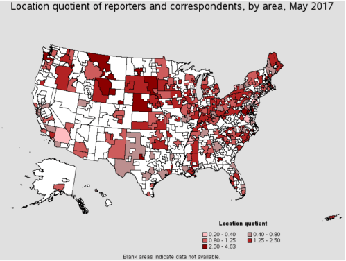
And not only from Washington, DC, but from the complex of the news that is so demonized by President Trump as being an “enemy of the people” today. For though it is never made precise who this collective is–“the people”–it is not the folks who read newspapers or watch the nightly news, but those who feel far less represented in them, and by them, and less familiar with them to less present to them–for the known density of reporters and correspondents appears an odd echo of the parsing of the lower forty-eight into “Yankeedom,” “Tidewater,” “Greater Appalachia,” “Far West.” and “Left Coast,” as not only different media markets, and different areas that are represented in the news–
 Dept. of Labor, Bureau of Labor Statistics/Occupational Employment Statistics
 Dept. of Labor, Bureau of Labor Statistics/Occupational Employment Statistics
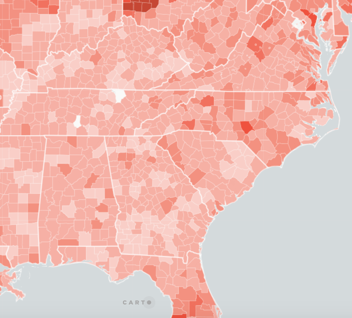
–but that feel alienated from its constitution of reality, because that stands at a remove from their lives and regions. The existence of pronounced “news deserts” in areas as Appalachia suggest a fragmentation of our news economy that weakens local solidarity and opinion, and creates large voting blocks that are terrifyingly coincident with the paucity of local news sources, as Chisolm’s below burnt red interactive Carto data vis rather scarily reveals, as it invites and allows one to explore in even more fine-grained from over the lower forty eight. The blanked-out regions of lightly hued regions reflect areas aggrieved areas by the absence of a diversity of local newspapers–institutions long identified with reflection on local political institutions and practices. They are, in other words, afflicted with the absence of a plurality of avenues for the shaping of public opinion and political debate, and bound to rely one less active political debate.
The striking thinning out in many regions of Appalachia as well as the south of so-called “news deserts” is not a longstanding historical divide–the death of the local newspaper is
 America’s Growing News Deserts/Columbia Journalism Review (2017)
–in which limited investigative reporting on local issues, discussion generated by print, and indeed informed local political decisions and checks on local power seems to create a vacuum into which rushes a new tribalism of largely symbolic issues.
The difference between these regions is not necessarily so continuous, or suggestive of nations, despite the startling continuity in “news deserts” and areas of the low level of occupational employment of journalists or correspondents that is its correlate. Deep divides of terrifying continuity are at basis economically driven, and seem impossible to reduce only to cultural divides–or reduced to existing historical divides, so much as an erosion of local institutions designed to foster reflection on political institutions and discourse.
The increasing gaps in sites where only one newspaper–or no local news–exists will be made up for in new ways, but the growth of News Deserts from 2016 marks a change in the information economy, and a change in which the role of newspapers in constituting and encouraging the community long existed. The rise of digital news outlets that have taken up the nourishing role traditionally and long played by journalism is promising, but the attack on the few remaining news sources that exist and on which folks rely stands as a new challenge, with the number of reporters covering local news having dropped in half since 2004, and some 1,800 newspapers–many venerable institutions in communities that helped make new communities–having folded in the same time, leaving all the tanned out regions with one newspaper, and the burnt siena dots counties with no local newspaper at all–areas reliant on other news sources and online information, according to Penelope Muse Abernathy of UNC’s Center for Innovation and Sustainability in Local Media, which points more deeply at the need for a new business model for local news, but also the increasing vulnerability of many counties–and many individuals–to the older, less educated, and poorer, farther from metropolitan areas in parts of Texas, the Dakotas, Alabama, Florida and Georgia, where our democracy may fracture.

The problems of an engaged citizenship through newspapers is not, of course, the only line of fracturing in the social body.
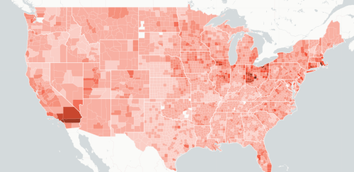
The increased divergence of the age at which women have a first child in different regions of the United States suggests a huge difference in life-perspective–or “life style”–which is clearly identified with those areas of denser presence of reporters, correspondents, and news reporting, suggesting a huge difference–and deep divergence–among the priorities, and negotiation of labor markets. Although the different preferences for childbirth in the United States’ regions are not a big surprise for many women, the strikingly different age of women at birth maps onto the “regionalism” and regions of the United States in striking ways, unsurprising in an era when birth control and abortion are seen as the “issues” that define political divides–both around appointments to the Supreme Court and around what makes up privacy, personhood, and rights. The pronounced oscillation around the age of a mother at her first birth is striking, not only in its divergence but the large span of the nation where birth is defined at twenty-four years of age, and what this mans for families and women’s work–and of female experience at the same time as the first female candidate became nominated by a major party–and the huge gaps this created.

New York Times: Birth Age Gap in the USA (2016)New York Times: Birth Age Gap in the USA (2016)
Does the puzzle fit together better now, looking at the relative number of reporters and correspondents employed and stationed in areas of the United States, and the remove of many regions–either apparent or real–from the media markets that exist, and the sense of alienation and remove of those areas from actualities reported in the “news”?
Woodward’s “map”–updating or revisiting the divisions he had in fact foretold in 2013, just after President Obama’s second election as President, reprised for readers always hungry for a good data vis, that distilled confusion to stark lines of a 2-D paper map, called less “nations” (as he previously had) than “regions” which transmitted through the ages the spirits of their respective colonizers, in a complete revision of the image of the nation as a melting pot, economic integration and disparities of wealth be damned.
Rather than a melting pot having ever existed, the oracle of Freeport has it, distinctions between a Puritan legacy with assimilates others by championing a common good, the multicultural materialism of Dutch founders, the manorial society of the British gentry, quakers and pluralistic protestants of the midlands, and rigorous independence of the Scots Appalachians abut slave-holding southerners from the Barbados and Spanish-American periphery, shaping the nation’s fractured political present: aside from some limited intersection of these realms, the melting pot not only never existed, but “deep cultural” values provided an optic that refracted every political event of the twentieth and twenty-first century, as if a deep memory of the mind that we will not escape. The rigorous and purposive historical flatness of Woodward’s “map” seems a point of pride.
The schematic map recalls a study sheet for high school U.S. history, claiming to reveal a landscape that lets scales fall from its viewers’ eyes. Such radical essentialism–or deeply conservatory if not reactionary cartography–reminds us with considerable offhand pluck that we’re in fact far less mobile than we would like to think. Rather than dig into the data in any depth, the map “shows” that we remain dominated by almost essential cultures that have been perpetuated by local institutions for all our championing of free will; we are, yes, really cultures, but cultures that no person can actually make. Indeed, Woodward had originally cast the divides as separate “nations” that were both in evidence “today,” but revealed a deep geography of eleven nations in a 2013 map first published in the fall of 2013 as a guide to the “deep differences” into who he argued people in the nation sort themselves, as if into political preferences. If a degree of self-determination surely remains, geography has the commanding upper hand, Woodward seeks to let us know, but his argument verges on an environmental conditioning by which the continent’s settlement runs against the idea of any easy arrival at consensus: indeed, “to understand violence or practically any other divisive issue, you need to understand historical settlement patterns” that defined the matrix.
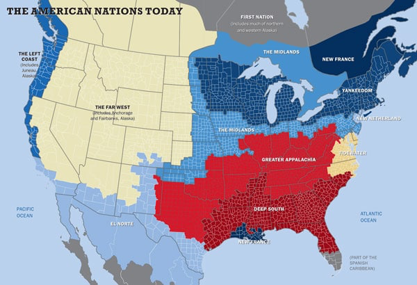 Washington Post/Colin Woodward (2013)
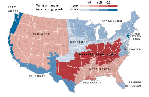
Woodward responded to the stark fragmentation of the electoral map in 2012, to be sure, but has reprised his divisions again to explain the Trump phenomenon, and effectively raise questions about the midterm elections as if to suggest that no real deviation from a foretold story will occur. And it is no surprise that the area of Greater Appalachia he has mapped, colored bright red in the image of 2013, which consciously riffed on the red state/blue state divide, without mentioning it. Indeed, those “eleven nations” break into what look like voting blocks,–even if they are meant to remind readers that “lasting cultural fissures” were established by “Euro-American cultures [that] developed in isolation from one another,” reflecting how “the American colonies were [first] settled by people from distinct regions of the British Isles” who we shouldn’t confuse. Woodward presented his map as evidence of deep roots for the sectarianism we think of as modern, and “there has never been an America, but rather several Americas,” even if we all share one legal code. Deadlock is natural on gun control or other issues,–but to appreciate that you “need to understand history” that political debate cannot alter.
When Woodward revived the twelve nations as divides as tools to explain a sense of regional divides to replace the truism of thinking about America in a rural/urban dichotomy, he wanted to go deeper than the big data of a district-by-district map and its information overload. But leaving aside that his geographic divisions handily capture some of the largest cities and urban areas in the “Left Coast” and “New Netherland” region, the map seems deeply flawed in its use of voting preferences in an era when voter turnout is notoriously low–voter turn-out was not substantially lower than in other years, but hovered about 58%–and the areas where Trump surprisingly outperformed the previous Republican Presidential candidate in a majority of states–

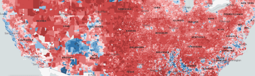
The divisions map most precisely on regions that perceived their economic remove from the coastal elites with whom the Democrats have been wrongly identified. Indeed, it is not surprising that the Greater Appalachia region that Woodward’s original 2013 map cast as bright red assumes a pretty monochrome hue when chopped out of the elegant Mapbox visualization, suggesting that that region played a large outsized role in the last election, or as much as Purple America, and occupies the heart of the area where Trump outperformed Romney in the 2016 election, reconfiguring the red-blue divide. The deep crimson area, with scattered islands of blue to the east and north, where Greater Appalachia ends, suggests less a new nation than a remoteness,
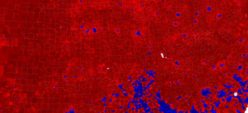 Area roughly corresponding to Greater Appalachia/Mapbox/New York Times
not only removed from broadband or access to health care, but relative per capita income rates in relation to the United States average, completion of high school, ethnic diversity, and women in the workforce and unemployment among young men–in short, a nation apart from the nation, less exposed to racial diversity and who the federal government had let down in its priorities.

New York Times (2015), tan counties from below average; violet (above average)t
This was just the sort of area where Hillary Clinton would have the hardest time with her message, and possessed striking insularity.
 U.S. Census Chartbook, 2010 (2011)
The trap of thinking in states may distort the above map, but the increased number of votes seem rooted in “Yankeedom,” as well as “Greater Appalachia” and “Midlands,” than the logic of Woodard’s map would have us believe. Of course, Woodward’s map might be more convincingly read not as a divide between rural and urban, but a heightening of the local, and a collapse of cross-regional collectives that once animated our politics and were known as parties, or groups that bargained for collective interests as unions.
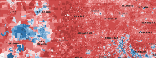
For it surely takes into account the deep crisis in our democracy of a disconnect that many feel compelled to seek affective ties that are deeper than the remove they feel from Washington, and hard to find in a map. It is saying something that even a year and a half from Trump’s inauguration as President, we continue to return, as if to find more information, to even more detailed parsings of the political map that might allow us to explore and, more importantly, come to terms with the extent of fracturing in our political landscape, where urban “voter islands” in Denver, Minneapolis, St. Louis, Chicago, Washington DC, Atlanta, Miami, Houston, Phoenix, San Francisco, Seattle, Boston and New York are so strikingly pronounced–and try to understand what that heightened insularity can mean.
 Ryne Rhola/Mapbox (2018)
We are asked to use the map to avoid being in a “political bubble,” and to explore the area that you “know”–no doubt where you reside, where everyone first turns in a map–as if to measure what you expected that you knew against the “extremely detailed map” of our political divisions, courtesy of Mapbox, where even the divisions in a reliably “blue state”–as where I live, California–can be parsed in greater detail, as if to gain intelligence of the political lay of the land, in time for the mid-terms, and to learn what districts you might to go to canvas or contribute to a political campaign, as possible on many partisan apps,
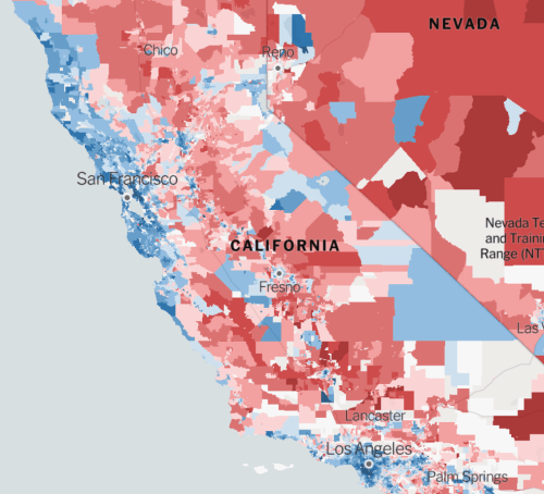 Ryne Rhola/Mapbox (2018), 2016 US Presidential Election
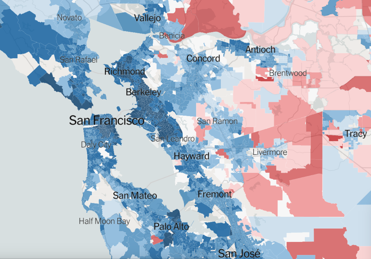
The divisions in political or electoral preference seems hardly surprising, but the divides show up as stubbornly sharp in the Bay Area, whose insularity is long supposed and often championed, but where the directive to “explore” an area you “know” to see if you live in a political bubble seems all too apt.


For the “areas you know” still seem ones that you can’t quite get your head around, too much like bubbles than regions, where fault lines of political opposition are located a bit more inland, but seem sadly inscribed on the land.
The maps remind us that, rather than live in nations, we seem to live in tribes.

