
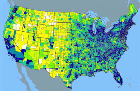
The fetishization of infographics in television news has spread not only to print, but to our ability to map collectives and process data across media. The fetishization reflects the readiness to imbue infographics authority as a communicative form, perhaps depending as much on the reduction of news teams and shift to computer-assisted reporting as it does to the greater certainty of GIS. The readiness to sell information and the premium on winning audiences–or offering viewers splendid click-bait–has led publications to cultivate the infographic in ways that reflect how data visualizations indeed seem to be supplanting the authority of maps.
The infographic and mapping of political preference and opinion has gained the status of a speech act of particular synthetic power that has paralleled the growth of political analysis, although that analysis has often assumed the level of glossing the distribution of opinions, preferences, and employment on a map–as if in a perpetual search to find some coherence, or indeed to search for the possiblity of consensus in them. The hegemony with which computer-assisted reporting and news graphics that sectorize space with color-coded abandon may be deeply embedded in how the medium is the message, however, as much as being a by-product of Geographic Information Systems or computer-based analysis. For the images are, to put it simply, user-friendly, and designed for surface reading–as if they processed a complex political process through snapshots or thin condensations of the status quo.
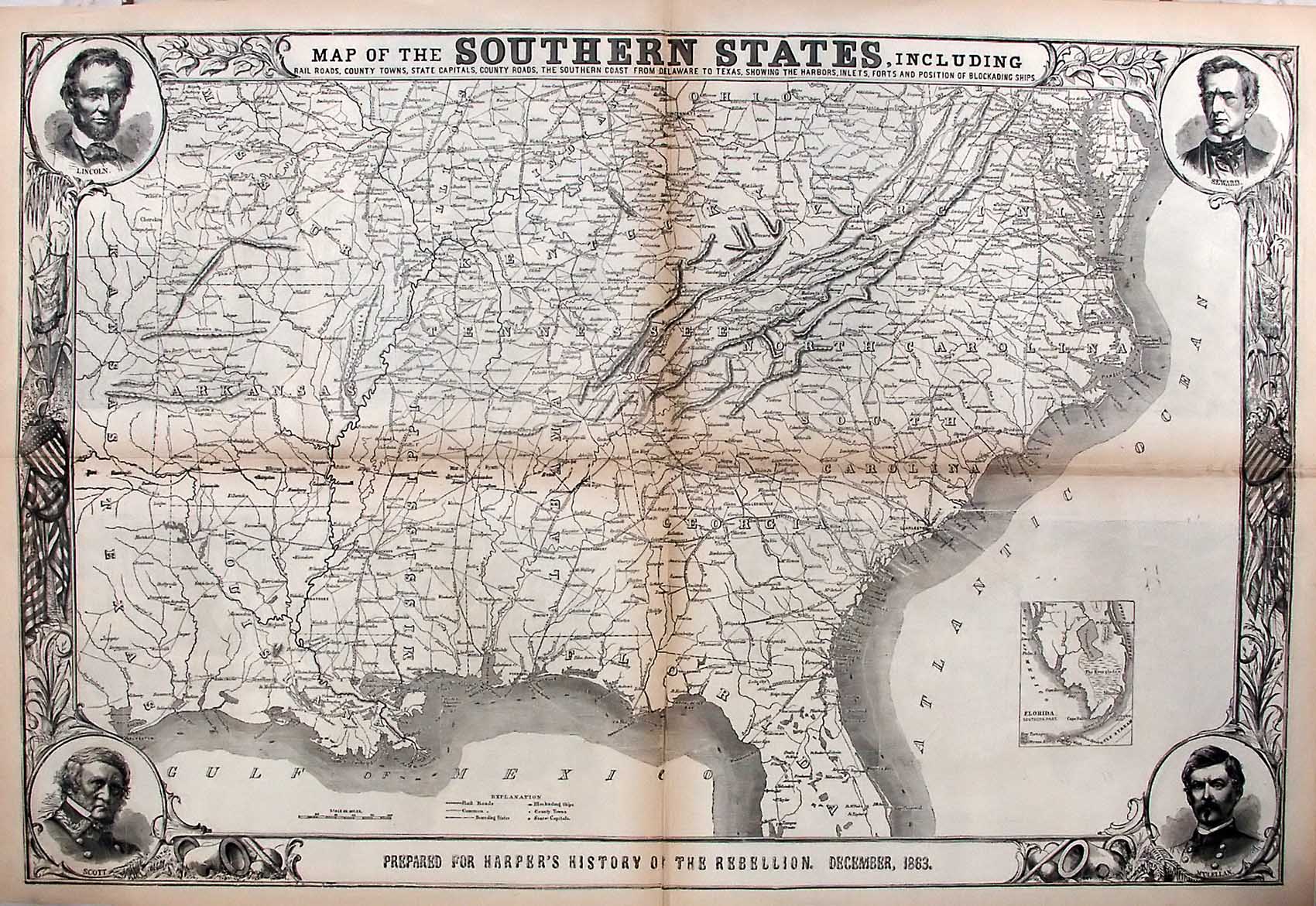
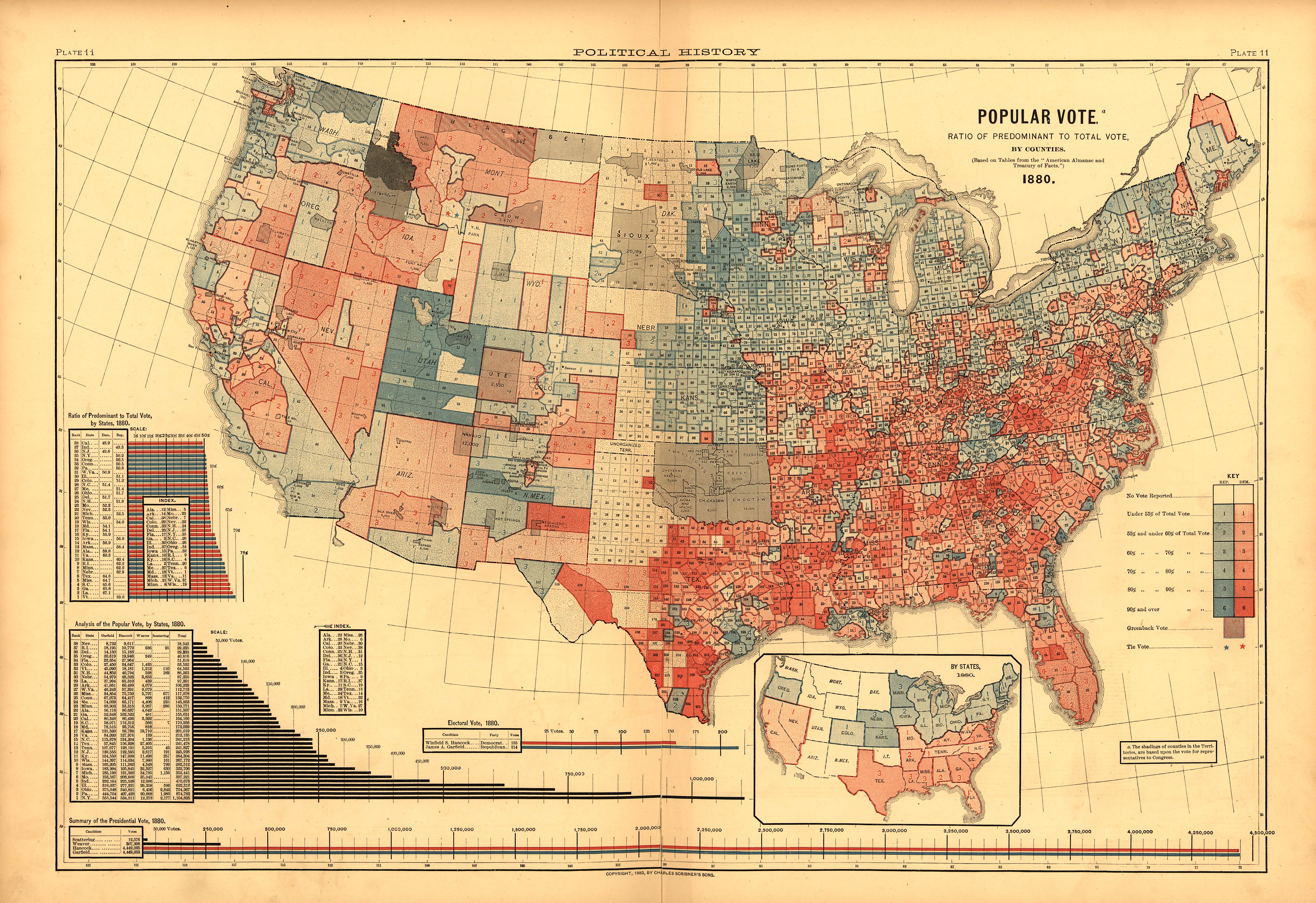
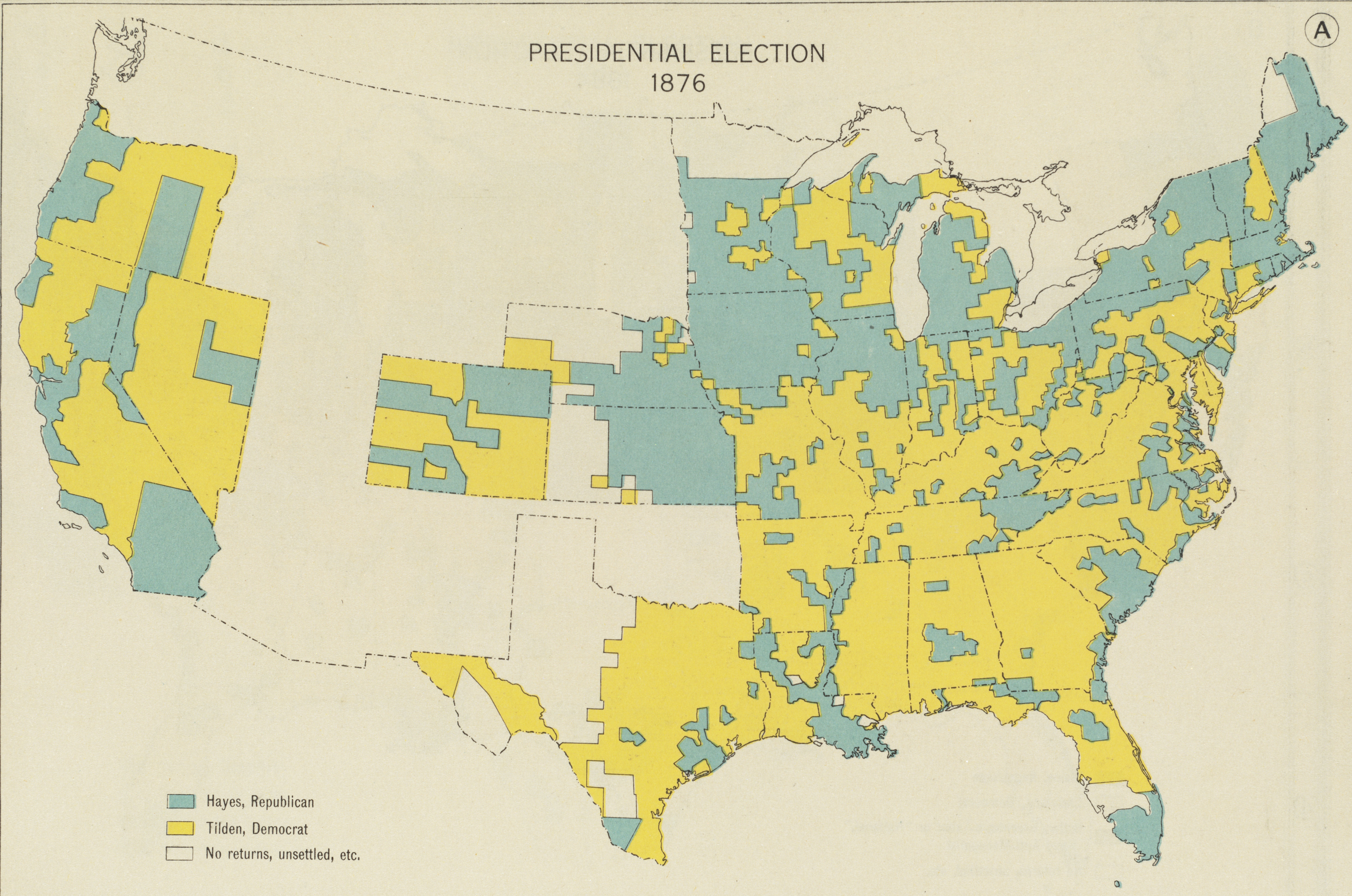
Given the growing symbolic authority of infographics, for reasons ranging from the downsizing of newsrooms to the contraction of attention of the consumers of news to the reduction of politics to an oppositional contest, the historian Susan Schulten is right to call attention to how Henry Gannett compellingly synthesized the divided vote of the 1880 presidential election, and the clarity that his county-by-county coloration of the United States measured the division of the country after two polarizing Presidential elections. After the confusion of the results of the division of national consensus in 1876, when Samuel Tilden’s victory of the popular vote was overturned in Congress by a Historical Compromise, the need to resolve the distribution of votes in 1880 emphasized the legibility of how voting translated into the electoral college. It also mapped the survival of anti-abolitionist sentiment across the Southern states, and the difficulty of ever enacting the policies that would enfranchise African-American voters in those seats or strongholds of the anti-Reconstruction Democratic party in the South. The Garfield presidency was not able to implement the promise of Reconstruction, to be sure, but along the coasts and midwest, particularly in the north, assembled an irrefutable consensus that Henry Gannett took great pains to embody in this 1883 map, in ways that recall his tenure as Supervisor of the U.S. Census.
 Library of Congress
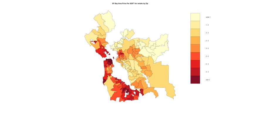
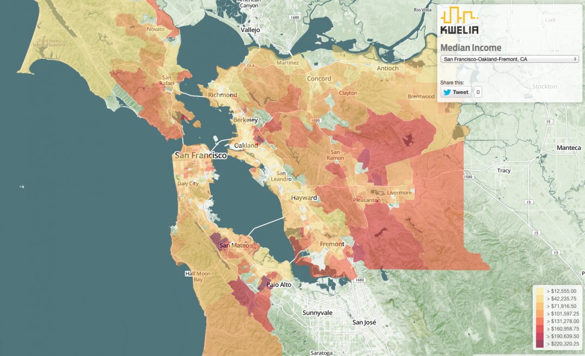
The embodiment of the United States that Gannett provided has long been with us, and has oddly continued to persist in some form–if with perhaps less clearly drawn and delimited lines, to be sure–to the continued image of a dichotomous divide within the Gas Tax Latitudinal Divide that has recently returned, ostensibly to trace the inequities of taxes that residents of different states are asked to bear–California first and foremost, but closely followed by New York, Connecticut, and Hawaii.
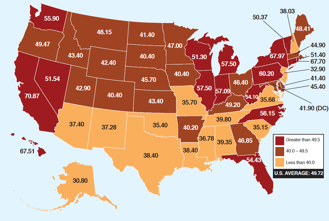
What sort of embodiment of the nation does this map offer, if not one that is destined to evoke the unduly regressive interference of states outside of the Deep South?
In ways that measure the collective memories of secessionist sentiments, the map seems an after-image of the survival of anti-Union sentiment, or at least rejection of the program of Reconstruction that Republicans supported, and saw as the logical outcome of the Civil War. But while quelling the actuality of Southern Secession, The dichotomous distribution of contrasting shades coloring the continent in counties shaded by two alternate primary colors both recorded the transition to a shifting society after emancipation–when privilege remained restricted to whites, effectively, and the deep difficulties overcoming of division between north and south.
Rather than show the nation divided, his map of the country celebrated the new basis of political union, even if its striking distribution of the popular vote provided an early data map of a politics of polarized public opinion eerily familiar to the divisive politics dividing the country–echoing a map by which cotton was grown across Southern States, which undergird deeply felt economic divisions. But the map of the country that takes its spin and meaning from the historical moment of the memory of southern secession is quite distinct from the political snapshots of the present-day, and their emphasis of the shifting physiognomy of the nation’s mosaic of political opinion.

Gannett’s use of the format of mapping as a means to display his data attests to the level of trust accorded to the statistical map as offering a legible image of that provides something of model for our own info graphics, but also the historical importance of a time when national fracturing loomed larger in public consciousness than it ever had. Although it is less interested in the divides that separated the nation than the ability for their reconciliation by an electoral system, and less dedicated to depicting a national fracturing than a crafting of consensus, and evoking the diminished resistance to eliminating race-based distinctions, it also provides a striking map of their survival. For in providing a statistical record of the vote, Gannett and Lewes divided the country in ways that were distinct from the recent national maps arranging of ethnic populations, slave populations, African-American presence, geological surveys, income distributions or population density, but presented a pressing portrait of the nation. Yet rather than offer a single declaration of the current division of the country, the map seeks to sketch a changing national canvas in relation to the deepest debates which divided the nation, and to chart the emergence of a status quo in detailed fashion.
Rather than echo the sorts of political divides familiar from political infographics today, Gannett’s map inescapably referred to the specific temporality of the moment of secession and its overcoming–and the scars that the traumatic historical experience of Secession and Civil War on the nation, at the same time as their supersession. But the complexion that the statistical map embodied bore not only traces of those scars, but of its quite recent supercession. The statistical “facts” on which these maps were based chart an after-image of an acceptance of the place of Reconstruction in the nation’s political life, rather than seeking to naturalize the divide for readers, and it gained meaning for viewers in relation to the divide of the Civil War. The lithograph that he prepared for the 1883 Scribners Historical Atlas returned to the recent division of the nation among a range of mapping activities that sought to embody the nation’s coherence in new ways, and takes its meaning in no small part in relation to the performance of national identity. Readers of Gannett’s map could not avoid reading the distribution in relation to the historical event of secession and its aftermath, and the current campaign for Reconstruction across the southern states that the Republican party advocated. The map encoded a deep dissonance between visions of the country.

1. Printed maps constituted the nation in powerful new ways by 1860, casting it with new power in terms that stretched from coast to coast–and which they allowed to be read, by 1895 in a beauteous landscape that stretched “from sea to shining sea.” The map individuated the somewhat troubled nature of the new nation.
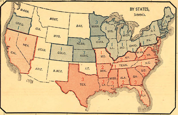
Gannett’s map indicated an unmediated representation of the country’s political complexion, whose authority lay in both the image it offered of the nation and the diminution of the after-image it presented of the secession of southern states. The coloration of the each country suggests an image that partly mirror the line of southern secession of eleven states in 1860-1, varied shades of pink, carmine and scarlet distinguishing counties where the vote tended increasingly Democratic, and sky blue, azure and deep blue those tending increasingly Republican, in ways that track the “afterimage” of secession, that almost fall along a line of latitude, where the most carmine seem clustered, below Missouri, itself distinguished by several pockets of blue, at the latitudinal parallel 36°30′ forms part of the boundary between Tennessee and Kentucky, but red also extends far northwards, covering an area whose expanse almost obscures the victory of Republican James Garfield’s decisive victory in the face of the “solid South’s attempt to overthrow the Government,” as the Bismark Tribune put in repairing the election’s results on November 5, with a victory of 213 to 147 electoral votes. To understand the victory’s scope, however, we must look both at the great intensity of some blues, especially in Western territories, and at the distribution of the electoral vote map, inset, which neatly suggests the current containment of southern separatism.
 Library of Congress
Rather than show the archetype of a north-south divide, the map–unlike the inset distribution of the electoral college–reveals pockets of varied intensity, as if to question the definitiveness of a geographic break in the “solid south” to which mappers would return determine challenges to envisioning national unity, and which very recently has returned to haunt the divide of recent data visualizations of the 2014 midterms. But rather than create a national divide, the 1880 election saw what was, for the period, a decisive result: “the country is spared the anxiety and uncertain which would have followed an indecisive result,” reported the St. Johnsbury Caledonian in the state of Vermont, “the question of Democratic or Republican supremacy . . . settled at the polls, and the settlement will not be contested,” as it had been in 1876. “No uncertain voice had echoed in the country “from shore to shore,” as if to echo the convergence of the westward expansion of the union and the traumatic closure of the Civil War–despite the persistence of a deep divide evident in the southern states.
 Library of Congress
The triumph of arriving at consensus was the central take-away from Gannett’s map, as well, rather than the persistence of political division across the land. The balance between the survival of a clear dividing line and the arrival of consensus is however the central story that underlies the map of the 1880 Popular Vote: for the continuance geographic break that Gannett’s pioneering statistical map revealed undeniably charted the presence of resistance to Reconstruction–and the trauma of restoration of voting rights and the attempted erasure race-distinction–in the area of seceding states, but unavoidably resonates with today’s polarized political climate for reasons not entirely clear to define, though they seem to respond to the deep level of personal animosity toward the current U.S. President, Barack Obama. Recent infographics focus on such divisions as a “red surge” across southern states evoking data distributions that parse populations to understand their bases, the projects of the cartographical consolidation of the nation in post-Civil War years celebrated its symbolic unity and conceal the specter of fracture-lines on which current visualizations harp.
The map Gannett devised showed the containment of the memory of Southern secession in ways that affirmed the nation’s unity, and showed a historical depth that our current infographics rarely allow.
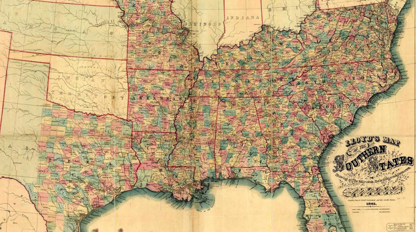
2. The considerably impressive local detail of Gannett’s 1883 infographic–its local sensitivity–contrasts with the finality of the on-demand infographics that news outlets readily present of a divided nation. Gannett’s map seems to register the opening of a divide between regions that cut the United States into two, in the aftermath of the Civil War and Secession, that intimates the infographics that forecast recent American midterm elections, or those repeatedly diffused in subsequent visualizations of the distribution of senate seats, described in part in my previous post, it also celebrates the nation’s continued unity in ways that would inform his career as the “father” of government map making in subsequent years: the project and dynamics of “mapping the nation” was raised in Gannett’s attempt to reconcile the after-image of the south’s secession with a definitive image the republic’s unity makes it particularly valuable to examine, recoloring the populations of individual counties previously synthesized in the 1863 Lloyd’s Map of the Southern States as the votes of citizens in the larger body of the United States abutting “Indian Territory.”
The map of the divides the Confederate States of America within the continent imprinted a latitudinal divide in the cartographical symbolization of space as it was compiled by the US Government c. 1895, in which broad generalities barely legible spread across regions to designate open expanse (“Northwest,” “Trans-Mississippi,” “Northern”)–representationally concretized into red-line bounded states.
 Detail of “Map of the United States of America showing the boundaries of the Union and Confederate geographical divisions and departments, Dec. 31, 1864.” (1891-1895) (Courtesy Rumsey Associates)
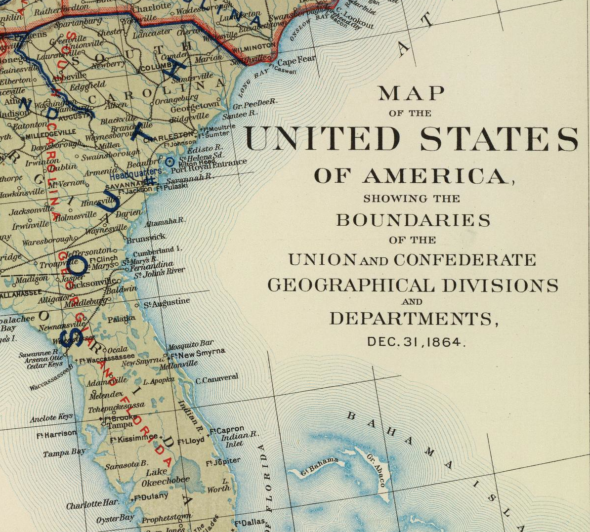
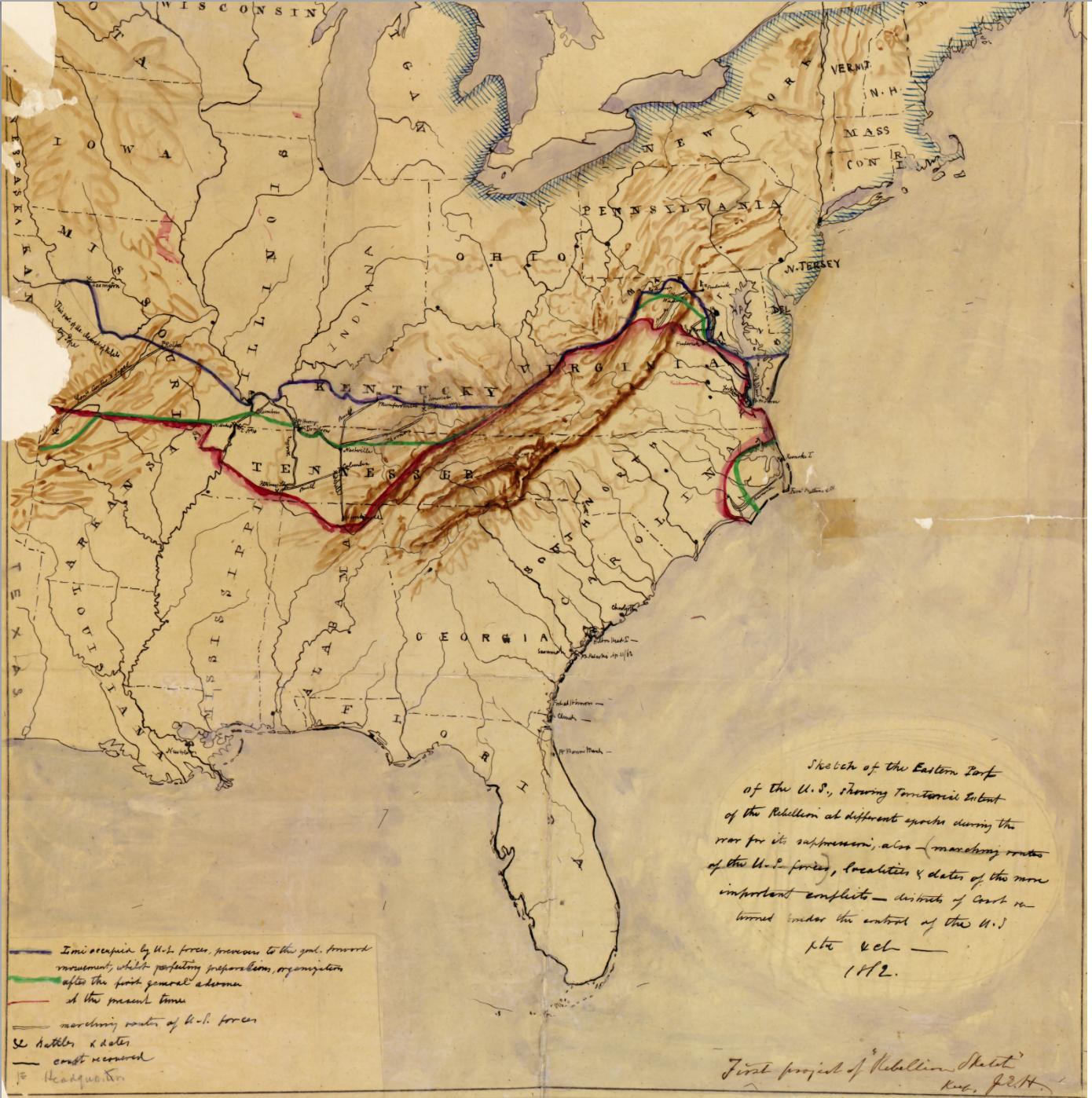
–though a manuscript map that figured secession, “showing territorial extent of the rebellion in different epochs during the war for its suppression” oscillated around the latitudinal divide, in ways that later maps of the popular vote would implicitly address or come to terms, even while they ostensibly map current events.
But the persistence of the latitudinal line, a state boundary that, rather than the Mason-Dixon line, seemed to define the boundary of resisting the end of the legalization of slavery, created the clearest temporal sign of trauma during the hindsight of Reconstruction, when the attempted enforcement of equality and erasure of boundaries based on the construction of race were for the first time addressed, albeit in ways not easily resolved.
Gannett defined a data-map colored to indicate different percentages of the vote by varied intensity in ways that uncover a historical depth of reluctance to support the program of Reconstruction advocated in the Republicans platform, providing a new way to dive into the local details of the entities that had been described on the surfaces of previous maps, as if to trace an after-image of the survival of the Confederate States of America.
3. The strange conceptual space of the infographic is just beginning to be examined in ways that place its broad brush-strokes of colors in the context of a new way to imagine the nation. In part, the consolidation of a mass of data in a graphic artifact replicates the problems of processing overwhelming amounts of data in a clearly legible form, distilling the shifting population of the nation into terms that can be comprehended at a glance that makes reduced demands on its readers. It offers little opportunity to examine the relative “thickness” of these changes, or to try to unpack the surface all too often represented in a clear chromatic divide.
To meet the charge to process data flows by redistributing them in different visual forms, as if refracting the nation through a glass, the data visualization implies a nation that is always riven by fracture lines. Such an image was perpetuated by focus groups, demographers, and television commentators, eager to continue discussion about the numbers pollsters parsed from exiting voters, to fill up the drama of the denouement that follows the closing of the polls, but also offer strategic insight into the activities of each campaign–and judge the campaign’s strategic effectiveness in messaging, as much as its message. The demand of such infographics is to put viewers in charge of a broad range of data that they materialize, blending cvs files into divisions of high-contrast color, materializing by a set of keystrokes a correlation similar to that which Gannett had earlier labored so hard to achieve in order to give the map a degree of accuracy that might best confirm the results of the 1880 presidential election.
The role infographics offer to orient viewers to the nation’s divides was felt for the first time in the aftermath of 1880, when the collating of unity and cartographical consolidation of the mapping of nation raised questions of what divides were readily able to be surpassed. The question of how current infographics swallow up the local in the regional–or subsume it in the administrative region in which the local is situated–provide a new way to orient one to a political expanse. Contemporary infographics resist excavation by presenting images that allegedly record objective national divides. But the far more complicated story about the nation early statistical presents make them particularly compelling. The very blindness to the past in data visualization claiming to create a snapshot of a present political status quo alone make one turn to these earlier embodiments of the nation’s electorate, both to ask if they are really echoed so strikingly in our own division between “red” and “blue” states–though we now use an inverted color choice, using red to designate Republicans, and not blue as in the map in this post’s header–or what such colors now embody. The nation is embodied in Gannett’s map for viewers to explore, as if a palimpsest of the retention of Confederate collective memories.
Despite the insistence of newscasters to present up-to-date images of fractured political preferences, this post seeks to look under info-graphics’ surface, and unpack the image of a divided nation that infographics which the recent Senate elections perpetuate, creating a record of the short-term that ripped from historical context. For in describing the results as condensations only of the preferences of the American people, info-graphics like those of the 2014 midterm elections offer a deeply impoverished sense of their historical background. Using the format of the map to increase the symbolic divisions of the nation as if to naturalize the varied rifts they allegedly expose, trying to convince their viewers of their relevance–divides embodied in far more complex and nuanced ways in earlier statistical maps.
Denis Wood has suggested that the historical lifespan of the map lasts but five to six hundred years, and that the function of the map to embody the state may have already been eclipsed by our current fixation to use GIS to materialize conceptual objects we otherwise lack the terms to discuss. Wood meant that the power of embodying the state–or the link of the map to the state–has changed in ways that have since eroded. But the persuasive power of older maps provide to parse the country haunts data visualizations in interesting ways, as their own echoes of the unity and coherence of the nation reappear in them, even if they sere as less persuasive forms of embodiment. The function of symbolizing the coherence of the nation informs Gannett’s mapping of the popular vote, even as it offers new forms of embodying the nation that depart, for one of the first times, from a record of its physical geography or landmarks. While an antecedent to the bleached nature of info-graphics, where panels of colors replace a palpable nation, they tease us with the notion of embodiment, using the map to describe the fragmentation that afflicts our political system in ways that are both far less easy to read and less satisfying as texts–and frustrating as intentionally incomplete images.
Blindness toward the past that is so characteristic of most infographics spurs one to investigate the resonant divides of the earliest data maps of the breakdown of the Presidential vote of 1880–a map made at the culmination of the creation of exact statistical maps designed that created legible records designed to persuade viewers of the nation’s continued unity. This statistical survey charted the distribution of the popular vote with exquisite care in the wake of a polarizing break in the electorate among the issue of Reconstruction in those post-Civil War years. Gannett realized the historical import of the electoral data as a way to create something of a composite portrait of the nation–following the Francis Amasa Walker’s detailed distributions of the country’s population and racial composition–with the realization of the benefits that the vote could be graphically tabulated in ways that would break down along similar divides. The result was not one he might have thought would both so stubbornly persist or be accepted as an unchangeable fact–and be naturalized as part of the nation–but provided an after-image of the reactions to Reconstruction across the South.
If Gannett mapped the popular vote’s distribution to suggest the diminishing of the after-image of secession in many Southern states, the notion of political polarization that has seized the media and political coverage exploit the ways that maps constitute an image of the nation’s coherence in potentially pernicious ways, by painting a politics of division, rather than consensus, that prey on the anxiety of intractable differences and evoke specters of a divided country that echo how the country was embodied in earlier maps. But the recent decline of the power of maps in how we symbolize the nation or understand it makes info-graphics weak after-images of the divides that were, in the past, so deeply felt.
4. The level of accuracy with which county-by-county data allowed Gannett to parse the polarization of voting patterns across the United States helped visualize lingering divides betwixt northern and southern states. The divide told a story of the weight with which the recent historical past sharply divided into two hues, opening local variations for the viewer to explore that have expanded far beyond what Gannet’s original scope may have been: for to modern eyes, Gannett’s visualization revealed an after-image of resistance to Reconstruction across the reputedly gracious South–one which should not demonize the region, but raise questions about the persistence of economic inequalities and inequalities of citizenship and education that Reconstruction partly sought to remediate.
The effect of mapping is less of performing a history of a nation, in the manner of most printed maps of the nation that were posted in public places and classrooms of nineteenth-century America, than of opening a breach that not only haunts the nation today, and mapping a scar which almost irrevocably threatens to disrupt the continuity of our political space. Gannett’s maps make us ask about the ability of mapping as a way of telling a story about the persistence of memories across the land as registered in the genre of infographics, in order, a bit perversely, to interrogate the extreme superficiality of most info-graphics’ historical depth. Mapping the popular vote in 1880 framed both the memory of the trauma not of the South’s defeat, but of resistance to Reconstruction within the Republican party’s platform–and a hope to surpass a political divide of opposition–by producing an image of national consensus to which many urbanized areas of the South contributed, rather than reflecting the continuation of Southern separatism across the land.
In ways that predate the post-Tufteian elimination of “chart-junk” and elegance of graphical economy of tools of data visualization, Gannett insisted in modern ways on the primacy of the visual as a means of displaying and grasping the deep divide across the nation that the aftermath of Southern secession had wrought, and had recently played out at the ballot box. Unintentionally, however, the deepest aftereffects that his complexional map reveal among counties across the growing United States was to delineate a divide whose after-image continues to haunt our current political economy in ways we have not fully understood. For Gannett’s early elegant visualization is a telling snapshot of the lines of difference that continue to haunt the practice of representative democracy in the purportedly United States, as well as a model of facing the disparities in voting preferences that data visualizations can best hope to record. The degree of current tacit acceptance or naturalization of this divide among the recent midterm Senate races is particularly troubling, because it suggests a tendency to allow it to persist.
Gannet took advantage of the increasingly better tabulation of the popular vote to chart its distribution with attentive care through shades of coloring provide one of the first attempts to geographically define the distribution of the vote–and measure the persistence of a deeply-runing divide. Although less based on polls that would forecast the election or tools of current events, than a historical map of a significant election, the map raised questions about the future unity of the country for readers in pointed ways. To be sure, Gannett’s map offered less a snapshot of an ever-receding past, of course, than a record of the steep demands to heal the divided Republic, but it is something that we can’t but regard with a twinge of recognition: his map of the break within the 1880 popular vote traced a crisp “after-image” of the experience of the secession of Southern states from the union, providing a counterpoint to secession, whose many after-images also understandably haunts how the electorate divides today in ways difficult to fully process.
Gannett’s inset map visually translated the popular vote’s distribution to electoral votes. The result was particularly striking, and engaged the increasing role that maps gained in the later nineteenth century as tools and symbols that embody the coherence of the nation. It perform a story or narrative of national unity that contrasted with the division of the popular vote, and seemed to explain the representational institutions of the Presidential election. If the symbolic disruption of national unity was the shocker of Gannett’s map, it also traced a specter similar to that which we face in confronting and trying to mine information from info-graphics of the distribution of voting preferences across the United States in the previous weeks. The very power of the story of national unity that maps had come to perform in public spaces threatened to unravel, dislodge, or be shaken in ways that the possibility of a post-Civil War fragmentation demanded viewers to confront–but, sadly, persist today and pose steep national challenges.
Gannett would surely have been quite surprised to know how the after-image he traced continued to haunt the electorate almost a century and a half after the fact. But he would surely have been pleased to note that the breakdown of the vote he statistically mapped continued to offer a point of reference to understand and apprehend the legibility of the historical persistence of the split in the nation’s politics he measured.
For Gannett’s map is striking; historian Susan Schulten has perceptively realized it’s import as a precursor to our own interest in how info-graphics offer an image of national divides that might be overcome–or might haunt us. In an age when and the dangers of the loss of the VRA have created something of a crisis in voting protections, and at a time when census blocks comprising 75% or more people of color are clustered in contiguous blocks to minimize their electoral presence and impact, the sense of a trust in an image of the nation seems especially important. The transparency with which Gannett rendered the national divide of the 1880 election is indeed haunting, not because of the ingrained nature of political preferences or the lower geographic mobility in a region over a hundred and thirty-five years, but the problems of embodying political representation the map of the 1880 Popular Vote itself records.
 Library of Congress
To be sure, the divides in current maps do not clearly reflect the clear carmine pockets of red of anti-Republican opposition. But the steep economic inequalities underly the relevance with which Gannett’s 1880 map continues to embody breakages of national unity. A map of Gini coefficients of income distributions in the United States today reflects in the distribution of persistent income inequalities, to be sure, a divide that is reinforced by low median incomes, populations living below the poverty line and low levels of education:
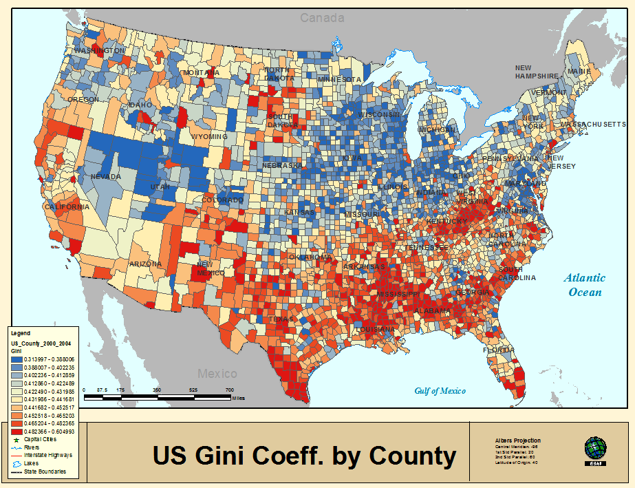
This 2000-2004 map dates but from a decade ago, but itself preserves another eery after-image of the divide Gannett already mapped, and which is only partly continued in a mapping of the number of “active hate groups” that the Southern Poverty Law center found in 2013 persisted below the latitudinal divide of 36°30′–despite the over one thousand active such groups found in the country.


If the divide in the map between North and South suggest a political polarization we thought only existed in recent time, the rejection of most southern counties to vote Republican–and participate in the project of Reconstruction–is oddly echoed in the refusal to raise local taxes on gasoline consumption as my last post suggested. (This contrasts to the more vague Twitter map of hatred, which suggests a more angry nation, or a divide in the open expression of race-based anger–
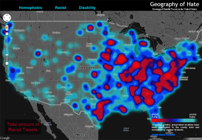
–but clearly reflects the actual manifestation of institutional acceptance for asocial virulence.)
A 2004 map using data from the Southern Poverty Law Center charted the density of the distribution of such groups however reveals a distinct weighting to the Deep South:

And in the confetti of antipathy that cluttered in specific cities, in another visualization from the Southern Poverty Group, a cluttering centers in the Deep South.

The widespread confetti of hate-groups distributed in 2004 across the nation lay across the nation’s cities; but when read against regions of such groups’ specific local and regional densities, it, strikingly, clearly continues to privilege the very same trapezoidal structure lying below the latitudinal divide.

5. Gannett’s 1883 map celebrated the refusal of the South to successfully secede from the Republic–and to obstruct the election of a single President–the divide it documents records the deep scar lines that existed in the country for several presidential terms after Lincoln’s death. It testified to the deep hope in how statistical maps would provide a new image of a united nation. More than measure or encode territory, Gannett distributed electoral data in ways that help us judge or measure our own distance and temporal remove from it, and, as it were, orient one’s sense of bearings on the divides of national unity it reflected, as well as divides in political preferences that the recent proliferation of infographics that parse “red” and “blue” states with different signifiers attached to each. This raises questions about the continued embrace of a divide along lines of Secession as a future model of politics increasingly naturalized in our national landscape.
Contemporary national maps with which Gannett’s must be contextualized emphasize the performance of the nation’s symbolic unity unlike many earlier maps, and reveal the possibilities of printing maps for a large audience of readers and students, many of whom would read the map not only as a way to orient themselves to the nation but to naturalize the composition of the continental span of the United States’ continental expanse.
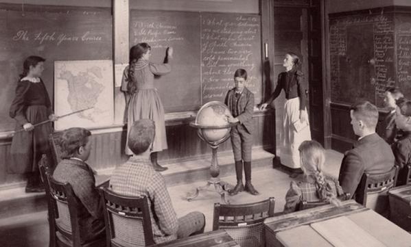
In the wake of the 1880 election, Gannett created a conscious self-portrait of the nation for the Scribners encyclopedia of statistical maps that uncoincidentally sought to measure and explicate the possibilities of coherence that the election revealed, allowing the data to speak to readers at an unprecedented county-by-county granularity that exploited the new currency of the publicly displayed map as an image of the nation. The Gannett map’s division of the country into counties reflects those images increasingly publicly displayed for didactic and pedagogic ends in schools, offices, train stations, and city halls replete with topographic signs and transportation routes–although it was evacuated of them, and replaced them with a tally of the vote to map a symbolic digest of political institutions rather than a guide for spatial travel–disrupting a symbolic form of national unity that prominently featured in the typical rural schoolroom circa 1873, if one can trust the Universal Exhibition held that year in Vienna–though the display of worldliness was partly designed, no doubt, to impress continental viewers by such conspicuous placement of emblems of geographic instruction.

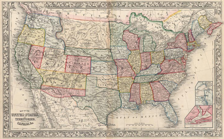
Indeed, the shift in consuming maps after the civil war–when newspaper readers had tracked the progress of Union armies across the south, read and commemorated different battles, and received correspondences from loved ones in a landscape destroyed by war would have rendered even the divided electoral map that Gannett drew deeply pacified, and a tacit agreement to resolve the distribution of dissent by other means. Gannett indeed seems to have mapped such a divide between northern and southern states in its county-by-county distribution in ways that illustrate the dramatically increase in literacy in maps as accurately mediating the national vote. While Gannett’s map showed pockets of Republican voting in the southern cities during Reconstruction in considerable detail, to be sure, but also suggested a national divide that could still be preserved, if not to create the unity of the United States preserved in national maps like that of Augustus Mitchell, showing the regions beyond the Mississippi the Union created in the Dakotas, Nebraska, and Utah in an attempt to enlarge by legislative fiat the number of non-seceding states.
The divide would continue to persist, of course, long after the 1880 election. In ways viewers would readily detect, the 1883 map revealed the cultural memory of collective affront at the continued presence of federal troops to ensure the policies of Reconstruction and the , beyond a simple record of spatial relationships–an issue that had already led to the passage in 1878 of the Posse Comitatus Act, designed to prohibit armed forces from acting as a police force inside the country–but where the army’s role in enforcing civil rights clearly remained contentious. Gannett’s map revealed an oppositional divide in the electoral distribution which seems eerily familiar to our own political division–it renders the extent of a story of the affront perceived across the southern states far more dynamically textured than the rather generic templates of much contemporary digital map design. in ways displaced from its original intent of describing the translation of the distribution of the vote it delineated a clear reluctance to support a Republican platform across the southern states.
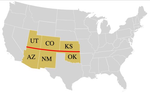
6. Gannett’s mapping of the reluctance to adopt the Republican platform of Reconstruction is sharply unlike the divide between gasoline taxation across of the country that was popularized on the blog disseminated by the folks at Exxon-Mobil to suggest reasons for gas’s uneven price, but that image–for all its dependence on fact–clearly depends on a familiarity with map readership of the separate polity of the south, and the unconscious image of a divided nation that defined southern secession. For all its insistence on an uneven distribution of taxes, the uneven distribution it reveals has gained traction as an icon of tax disparity on account of these associations, no doubt, even if rather than being rooted in relation to an actual historical divide, the graphic suggests only the independence of select states–New Hampshire, Missouri, and an expanded version of the Old South–that compel us to wonder about the apparent latitudinal divide on the imposition of gas taxes as if it were something of a new Mason-Dixon line along the 37th parallel.
The divide in the popular vote’s distribution Gannett revealed in the 1880 presidential vote reflected historically specific political responses to Reconstruction. But its divide is nonetheless interestingly echoed in a quite contemporary map as a way to document in detail the disparity in taxes on the price of gasoline. For the Gas-Tax Divide, if generic in its features, seems inhabited by national divides of over a century ago. If the American Petroleum Institute intended to depict local resistance to impeding access to fill one’s tank at the lowest possible cost, and document the local variations in the price of gas that were instituted by local tax policies, the latitudinal division reflects the priorities of individual counties, far more than an artifact of the surveying of the boundary lines of States, and mapped less an image of separate sovereignty than a suspicion of curbs on unfettered consumption of gas below the 37th parallel.
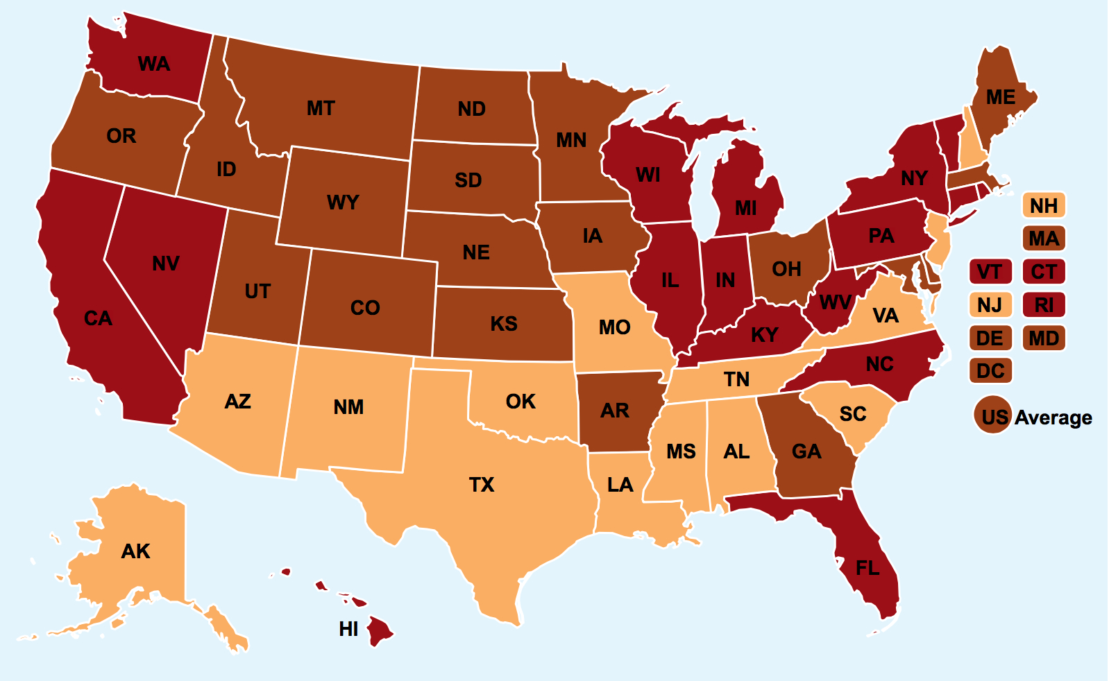
The light ochre monolith below the latitudinal divide? If it echoes the distribution of the Popular Vote in Gannett’s map of the 1880 election, and falls along a clear line of latitude, the break offers an unclear a record of political affiliations.
7. The “informational graphic” seems to recycle the conceit of dividing “red” states from “blue” states both in recent parsing of senatorial races and in the tabulation of Presidential races–in ways that crystallized during the aftermath of the election of 2000. Whereas Gannet, adopting the colors of the American flag, connoted not just opposite ends of the spectrum, but the coherence of the nation, the connotation of fragmentation and opposition was invested in the bicolor map when “blue” was cast as the color of liberalism during the reporting of results of the 2000 American presidential election. The choice of “blue” as the color-choice to designate the Democratic party was not only decided by the NBC graphics department–David Letterman famously gave broad currency to the notion of such an opposition when he tried to resolve heightened anxiety at the uncertain results of the election when he somewhat Solomonically (in hindsight, optimistically) suggested that the US Congress “make George W. Bush president of the red states and Al Gore head of the blue ones.”
The history of divides between “Red” states and “Blue” states perhaps respond to a need for meaning our chorographical collective, as much as they essentialize the attributes of any region or location as distinct. But they tellingly employ the patriotic hues from the primary colors–red and blue–not only to visualize either end of the spectrum, but to suggest the continued coherence of the data visualization in a map. There is less intensity strong enough to generate such perceptual after-images in a map, or presume after-images might be expected to exist, given the shifting political landscape of polarization, which suggest something like a search for narratives of differences that is mediated through political institutions process a political space.
For Gannett, the choice of hues employed to elucidate the bitterly contested election rendered the abstraction of party affiliation at a time that the divide between platforms around the Republican platform of retaining the federal military in the southern states during Reconstruction, creating a fierce anti-Republican divide across the South who voted strongly Democratic as a result.
 Library of Congress
The analogy between electoral divides across such spreads of time suggests moments of alternate embodiments of the nation–with which Gannett, as Supervisor of the U.S. Census, was no doubt particularly sensitive.
8. All maps tell complex stories about continuities in a national landscape that the individual map rarely explicitly describes, but which are often suddenly apprehended with a shock of recognition as the familiarity of their distribution embody seems so eerily familiar. Although we look at the matter of maps as temporally removed, rather than remaining rooted in an inaccessible past, the landscapes maps create can throw into relief the actual divides that they seek to describe in accessible ways. Even as artifacts of striking authorship, maps offer templates by which to trace trajectories in space that, rather than being inherently bound to the region they describe, and might be read as revealing a collective regional cultural memory or unconscious. Reading such maps for after-images offers points of comparison and departure to read their spatial distributions–and offer indispensable points of reference and comparison to read meaning into later maps, as well as a basis for interpreting their terrain. The non-physical topographical markers and divides in current maps such as that of gas tax levels in the United States demand a degree of historical depth to remove them from the admittedly polemical roles that groups as the American Petroleum Institute intended. For in registering distinct landscapes of populations, even after a century, north-south cultural divides emerge, mapped in the below distribution between “red” and “blue” counties that Gannett sketched eerily mirror our attraction to mapping red and blue states that dramatize the divide in far more muted hues. Its statistical basis seems eerily familiar as a synthesis of a gaping divide that challenges its viewers to wonder how that divide might ever be bridged.
Gannett sought to refine existing cartographical techniques and lithographic tools of representation to define the historical distributions of local populations and ethnicities over time in the United States in elegantly artistic if didactic ways, coloring regions in ways that blend aesthetics and cartographical to frame a complex narrative that measure the intangibles of national unity from the data available on its inhabitants. Perhaps unsurprisingly, the story implicit in his mapping of the political divide that was inherited from the Civil War resonates not only with present distributions of lower taxes on petroleum in compelling ways. It offers evidence of a continuity in problems of concluding a national consensus that continue a century later: Gannett elegantly converted the data of the presidential election of 1880 in a particularly appealing way designed to forge unity by capturing its divides in the delicate balance of color-schemes on a map’s face, and created a striking image that seems to haunt shifting attitudes to accepting a tax on gas from which it stands at a remove of almost a century-and-a-half.
By examining disparities among political preference for parties at an unprecedented visualizations of variations across the country of considerably fine grain for the 1883 Scribners’ Encyclopedia, Gannett clearly mapped a strikingly stark political polarization in the United States which bore deep scars of civil war. It has gained attention for its eerily familiar family resemblance of mapping the current gulf between red and blue states. It seems to recapitualite a contested narrative it seeks to resolve as well as inventively retell. In ways that have continued to sculpt a political landscape of the new century, and the elections of 2004 and 2008, the elegantly synthetic two-color info-graphic that Gannett devised imaged the continued divisions of the country as a form of political consensus, if of a fairly fragile sort we turn to maps to recreate across space.
In the wake of the secession of Southern states from the Union, statistical visualizations of the states served to explain the distribution of electoral votes as a decisive factor in the designs of printed maps of the country to render the dissonance among the geographic size of regions respectively won by Republican Tilden and Democrat Hayes, Susan Schulten observed, in an omen for the nation’s centenary: deep distrust over the continued presence of federal troops in the south to enforce Reconstruction Republicans advocated is registered in the anti-Republican vote across the south. The division in the popular vote was troubling in 1876, because Tilden’s majority was preserved in the electoral college–in ways that led engravers as Henry Clay Donnell, Henry Kowalski, and Charles S. Israel to devise for the U.S. Election Map Co. an image that mapped the electoral college across presidential elections as states were mapped from 1789 to 1876, in parallel to Gannett’s own efforts, in a nineteenth-century version of Sparks’ minute-long video:

The chronological sequence of maps of the voting distributions over the first twenty-three presidential elections responded to growing interest in the wake of the divisive election in which the US Congress overturned the popular vote to historicize the apportionment of electoral votes and voting results, revealing a recent statistical familiarity with tabulating results that was perhaps particularly pronounced by 1880. Such a sequence sought to affirm the consensus arrived between different regions, in order to process the political shifts of the expanding nation in cartographical terms.
The cartographical sequence of electoral apportionment is an argument for the nature of representational democracy, and a historical reaffirmation of the institution of the electoral college, as much as a digest of past presidential elections. After Republicans had cast themselves as the party of saving the union in 1876, Census Superintendent Gannett devised the idea of a detailed county-by-county account of the distribution of the national popular vote of 1880 whose publication was designed to overcome a vision of division by showing the local depth of Democratic votes for the Republican candidate, Garfield, that made his victory–as narrow as that of his predecessor, Rutherford B. Hayes, which had been only resolved by the electoral college–a form of crafting consensus and affirming the electoral system as well as well as a persuasive statistical synthesis of big data, on of the first of continued efforts to pioneer statistical geography he devised to chart and affirm the nation’s continuity as much as document a national divide.
In the above expansion of the tools and techniques Gannett used in the 1883 Statistical Atlas of the United States, Donell, Kowalski, and Israel mobilized the forms of maps created a visual record of how counties leaned Democratic and Republican across the nation that its viewers could readily interpret and analyze, defining an electoral divides to describe not only spatial relationships in a fixed distribution, but embodied distinct voting preferences across counties by differently hued shades of blue and red to represent the entire electorate and election’s outcome–in something of a precedent to Sparks’ compelling animated video of the shifting political divides between the electorate which have only recently crystallized into a firm red v blue divide.
By tabulating the vote in spatial terms, Gannett achieved a sense of continuity and regional identity that has continued significance in the after-image it creates of war. By defining local variations as if they themselves constituted an actual terrain–employing a recognized geographic apparatus to describe the processes of representative government–he quite compellingly register deep divides that still starkly divide the nation a decade after the Civil War, even if off of the battlefield. He would have been impressed by the continued reluctance of a similar region to refuse the imposition of local gasoline taxes, and by the continued resilience of the opposition revealed in his own earlier info-graphic to have gained such rhetorical prominence during the Obama’s two presidential campaigns.
9. Gannett resolved an astounding geographic specificity to chart the legitimacy of Garfield’s victory after a bitterly contested election in 1876, when the electoral vote had in the end famously revised the outcome of the popular vote. For Tilden could claim a majority of the popular vote, but the pro-business New York Governor had lost the electoral college. That election’s results had been sent to Congress, where a 15-member Electoral Commission sought to determine the validity of the contested popular vote and its translation into electoral counts and gave the victory to Hayes in the Compromise of 1877–or Corrupt Bargain–which ended the federal involvement in local southern elections during Reconstruction by the Republican party, and, despite Tilden’s victory in the 1876 popular vote over Republican Rutherford B. Hayes, modified the Republican platform for federal supervision of the civil reforms that would be part of Reconstruction. Despite Hayes’ previous strong support of protecting the civil rights of newly freed slaves in the south, he continued his earlier promise that the Southern states to no longer be occupied by US federal troops to enforce civil rights in his administration but rather, as Hayes put it, enjoy “the blessings of honest and capable local government,” despite the clear continuation of measures explicitly designed to obstruct universal suffrage from poll taxes to intimidation.
The presence of federal troops across the south had been rejected in the Southern vote, and as part of the compromise that guaranteed Hayes’ victory, the Republican allowed Southern autonomy, gaining the misreported electoral votes of southern states in order to capsize Tilden’s majority vote, given his broad support not only in the Northeast, midwest, and West, but the most populated regions of the south, including along the Mississippi and Carolina coast.
Tilden’s over-ready acquiescence to the electoral configuration after Hayes’ challenged the electors from South Carolina, Florida, and Louisiana–in spite his having gained a plurality of the popular vote by the then-quite-considerable margin of over 300,000 votes–sadly sealed the end of his political career. But the heavily contested nature of the election, and, no doubt, the difficulty of the narrative that it posed about the nation, also mandated the more detailed county-by-county remapping of the election of 1880–and which the modern reproduction of a county-by-county count revisits to show the limited votes for Tilden across Southern states.

In the face of the building bitterness of the Southern states over the program of Reconstruction Republicans had advocated in their platform, Rutherford B. Hayes had earlier promised for the Southern states to no longer be occupied by US federal troops to enforce civil rights, but to rather, as Hayes put it himself, enjoy “the blessings of honest and capable local government,” despite the clear continuation of multiple measures that were explicitly designed to obstruct a universal franchise across the South and southern states–from poll taxes to intimidation, helped him reach significant support across South Carolina and along the Mississippi, often from newly enfranchised voters, although the majority of southerners had voted against Hayes. The Gannett projection avoided the drawn-out sense of political stalemate that had haunted the 1876 election and its injury to a democratic process.

The stinging victory of the Republican left considerable bitterness of dissatisfaction in the outcome for the Democratic party, however, in the face of much suppression of the vote, and deep scars across the land that the election of 1880 did not erase. The relative independence of what often appears as a distinct enclave in the south did not only depend on the memory of the Civil War, often framed as resistance to Reconstruction. Even as the presence of federal troops across the south had been rejected, as part of the compromise that guaranteed Hayes’ victory, in ways that the Voting Rights Act would replace by the oversight of the Dept. of Justice on changes to voting practices in order to ensure greater national uniformity of access to the ballot box. The image of the rejection of Reconstruction, refusing the incursions of armed forces to teach a culture of equality, echoed in the reversal of returning federal troops to ensure the integration of Little Rock Central High School or Representative John Lewis’ vigorous call for martial law in Ferguson, Missouri after the tragic shooting of the 18 year old Michael Brown, and a similar need to federalize the Missouri National Guard “to fight the fires of frustration and discontent” across America–and the federalization of the national guard in Montgomery, Alabama during civil rights struggles of the early 1960s that Lewis knows so well. (The recent expansion of a “no-fly zone” over Ferguson that was approved by the FAA to contain media coverage by creating a blanket of some thirty-seven square miles seemed to exclude police actions from public media attention, and subtract it from news coverage–a troubling violation of the First Amendment rights–was designed to subtract the police’s relation to protesters in the St. Louis suburb from national debate.
The local response to the riots in Ferguson suggest a militia-style intervention in the demonstrations that attracted uncomprehending and aghast global coverage. Indeed, the local expenditure in the St. Louis county police to replenish their stock of needed “civil disobedience equipment”–including riot helmets and related gear, tear gas, pepper balls, plastic handcuffs and grenades–has approached $175,000 since the reaction to the riots following Michael Brown’s killing by local police, including “LiveX” brand pepper balls that boast themselves to be ten times hotter. Amnesty International recently noted the danger of “Equipping officers in a manner more appropriate for a battlefield may put them in the mindset that confrontation and conflict is inevitable rather than possible, escalating tensions between protesters and police.”
10. The results of the 1876 popular vote belied their geographic distribution in ways that are visible in the above recreation, where the majority of the land seems colored Yellow, and created new challenges for . As a result, Gannett sought to educate viewers in the translation of the vote to electors, and no doubt to conclusively persuade of the decisiveness of the bitterly contested presidential election, by documenting the extent to which, despite the strength of anti-Republican sentiment throughout the south left, Garfield conclusively won the presidency. Gannett’s map, while registering the suppression of African American vote in much of the south, responded to a pressing problem of the need to map the nation’s continued unity within the popular vote–as much as register its political divide around those pockets that revealed clear clusters of Republican votes in this reconstruction for schoolroom teaching about the distribution of the vote from 1932 that provided the regional breakdown within states that Gannett’s statistical mapping would allow on a county by county level.
Gannett’s visual explanation of mapped the distribution of the popular vote into electoral votes, tracing the complex distribution of pockets of counties of voting, and transferring the distribution of the popular vote to the electoral votes far more effectively than the less refined or elegant distributions that were engraved of the country to explain the outcome of the vote in 1876–when the matter had, after all, been resolved by committee–after two alternative sets of electoral returns were submitted by the southern states of Louisiana, South Carolina, and Florida, in ways that left the outcome of the election in balance–and demanding a greater proof of electoral returns in 1880–even if the cartoonist Thomas Nast had used the electoral map to predict the Republicans would carry the nation from California to Maine.

A far more variegated map of the distribution of votes was required to tell the story of Republican victory for James Garfield that was understood across the nation as a referendum on Reconstruction–partly explaining the fear that the vote would result in a division of the country that replayed a secessionist divide of the Missouri Compromise. The story was particularly complicated of how the Republicans continued to carry the nation, but demanded, by 1883, the results of the 1880 election to be commemorated by a far more detailed map for viewers to scrutinize. The zones of deepest carmine red in counties in Louisiana, Texas, Missouri, Arkansas, Alabama, and South Carolina create a canvas of deep distrust and map something of a dissonance in the nation in reaction to policies of Reconstruction and an agitation for strongest shifts in sovereignty. The multicolored map allowed one to read the balance of popular and electoral votes in the country, and was clearly prepared for an audience eager to visualize the continued integrity of the Republic and construe relations between popular and electoral votes, reflect on operations of political sovereignty, and, indeed, to try to visualize and fashion consensus from the contentious elections results in peaceful fashion, where dense pockets of republicanism across the south, particularly along the Mississippi and around New Orleans, as well as South Carolina, seem to testify to the presence of the votes of enfranchised former slaves.
The electoral division turned on the issue of the continued autonomy of the South, and effectively continued the dispute of the Civil War off the battlefield: the north-south divide migrated from the battlefields to the ballot-box. The county-by-county mapping distributed the popular vote and beside a translation of the election to electoral votes represented something of a conclusive resolution for the bitterly contested election. The map registered almost palpable opposition to continued presence of federal troops, reacting to the feelings of infringement on local liberty from federal military oversight of the South during Reconstruction in the election whose traces can be seen in cultural memory when federal troops much later allowed the Little Rock Nine to attend an integrated High School in 1957, if seems to have been remembered by few when Representative John Lewis responded to the deep distrust occasioned by local police’s August 9 shooting of eighteen-year-old Michael Brown in 2014 by requesting that President Obama declare martial law in the small St. Louis, Mo. suburb of Ferguson after violence erupted in the streets: it seemed the proper reaction given mutual miscomprehension about the still unexplained ten to eleven pistol shots–an act that only led to an almost informal late-September apology from the local police chief.
Missouri and Arkansas contained particularly deep regions of crimson as former slave-holding states, where memories are strong. (Missouri still lies on the other side of the gasoline-tax divide, if it is geographically located above the parallel that sets off most states in the American Petroleum Institute’s map.) Is it unfair to note that as Gannett mapped a divide that reacted to the infringement of using federal troops to ensure civil liberties across the South, he transcribed a cultural memory that echoes even a century off, and generates its own after-images of resentment at civil liberties? Missouri is, of course, seen as a less reliable “red” state than it was in 2000–when it went for Bush over Gore–but remains, interestingly, on one side of the Gas-Tax divide, even if it lies mostly entirely above the most prominent meridian’s divide.
11. Gannett’s infographic parsed county-by-county voting tallies of the election, years later, to clarify the impact of Hayes’ victory; the economy of the inset map of the electoral college succinctly symbolized Garfield’s Republican victory in an icon of national unity. The cartographical image might now raise questions for some about the distribution of electoral votes that it records, and the heavy number of electors from the southern states, but it used the map to bind the continued coherence of the states in the republic at that time, explaining how the affirmation of Colorado’s statehood effectively tilted the balance of the electoral count. But given the prominence of the issue of autonomy of the formerly seceding states in the union, it’s striking for the density of deep crimson in multiple blotches below the thirty-seventh parallel: their intensity holds the viewer’s eye , despite the lightness of the light blue shading in northern and midwestern states.
The dividing line served as a basis to articulate deep desire for autonomy and the withdrawal of federal presence oddly continued in current politics, and reflects a line that the US government had as recently as 1875 contracted the surveyor Chandler Robbins to find as a boundary line between Arizona and New Mexico, running along the 37th parallel from the four corners monument–the very same line separated the greatest concentration of anti-republican votes, and would encourage the growth of Southern Democrats, and the latitude seems a fold along which the nation divided into two just a generation after the wake of the Civil War, but although Utah, Arizona and New Mexico did not yet have electoral votes in the Presidential elections as other states, Gannett revealed a clear divide on the latitudinal line between the rosy pink states north of Tennessee and Virginia, and the deeper red reserved for the Deep South.

The infographic effectively summarized the historical and sociological divide in deeply symbolic ways. It affirmed a resolution before the expansion of the United States that relayed the future expansion along the lines decided by the Missouri Compromise: unlike the simple geographic distribution of the popular vote in the election would suggest, the particularly contentious election was only resolved in a decisive manner by confirmation of statehood for Colorado its one electoral vote tipped the scales to Hayes and handing him the presidency.
The image suggests the increased expectations of cartographical literacy to read and interpret, that seems to mask over the deep divide between North and South which would repeat the division of the Civil War itself: the reader of the map would note with surprise the considerable number of electoral votes assigned Minnesota, Kansas and Nebraska, which serve as a counterweight to the greater electoral votes of Southern states, that uniform swath of red encompassing a considerable share of nation’s geographical territory. Hayes’ presidency rested on midwestern states as Ohio, Iowa, Nebraska, and Kansas but also masked a division in the country parsed in the first data-maps and demographic infographics: the map is also startling since it reflects political divides from recent elections: the color-scheme almost holds, irrespective of shifts in political affiliation over one hundred and twenty-five years. The dextrous distribution of the popular vote Gannett mapped was reprinted in Scribner’s Statistical Atlas (1883), for viewers to scrutinize local variations in the distribution of election returns at fine grain on the county level.
 Library of Congress
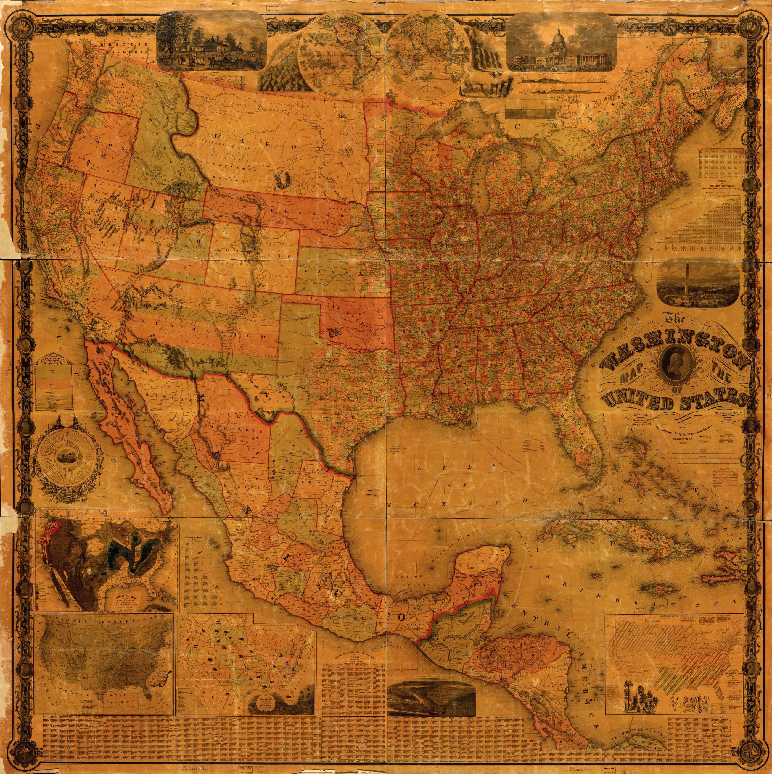
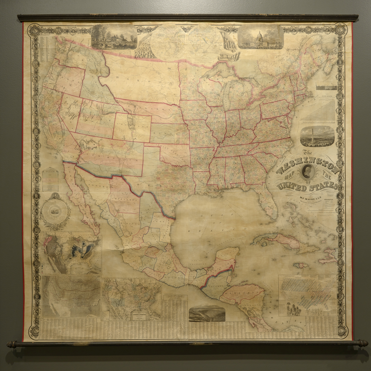
The lithograph was designed as a cogent explanation of a national divide, something of a counterpart to the famous chloropleth lithograph of slave-holding states which Alexander Dallas Bache devised based on the 1860 Census with the recent German immigrant Edwin Hergesheimer (1835-89), or the instructional wall maps like the so-called “Washington Map” Matthew Fontaine Maury mapped from the Census–“States Marked thus * Claim to have seceded from the United States,” the legend of the latter reads, presenting itself as an explicit performance of the continued claims to national sovereignty of the United States. On the eve of the US Civil War (1861-65), Maury, then Southern Secretary of the US Navy, mapped a Republic in ways that silenced clear fracturing, following a county-by-county cartographical practice but intentionally omitting the geographical divide that would open like a chasm in maps such as Gannett’s in later years.
All are, in a sense, evidence of a turn to the resolution of crises of national representation and the dramatically increasing “map literacy” of the late nineteenth century American reading public, or map-mindedness, that suggest the extent to which thinking with and through maps provided new forms of symbolizing and understanding national unity in readily reproducible form.
Yet we are also, for reasons it demands to be explored, both less attracted by attention to the complicated nature of divisions, and perhaps, given the amount of data by which we are increasingly overwhelmed, more eager to resolve disparities into monochrome voting blocks. The divides we seem to imagine always existed or only increasingly solidified emerged as something like a means to heal how the performance of the unity in the map had been torn asunder in the Civil War, but was in fact able to heal, rather than to ossify or be accepted as an inevitable and insurmountable divide that so often seems to continue to cut across the land.


![Desnity of Population [of US]](https://dabrownstein.com/wp-content/uploads/2013/04/desnity-of-population-of-us.jpg)

