
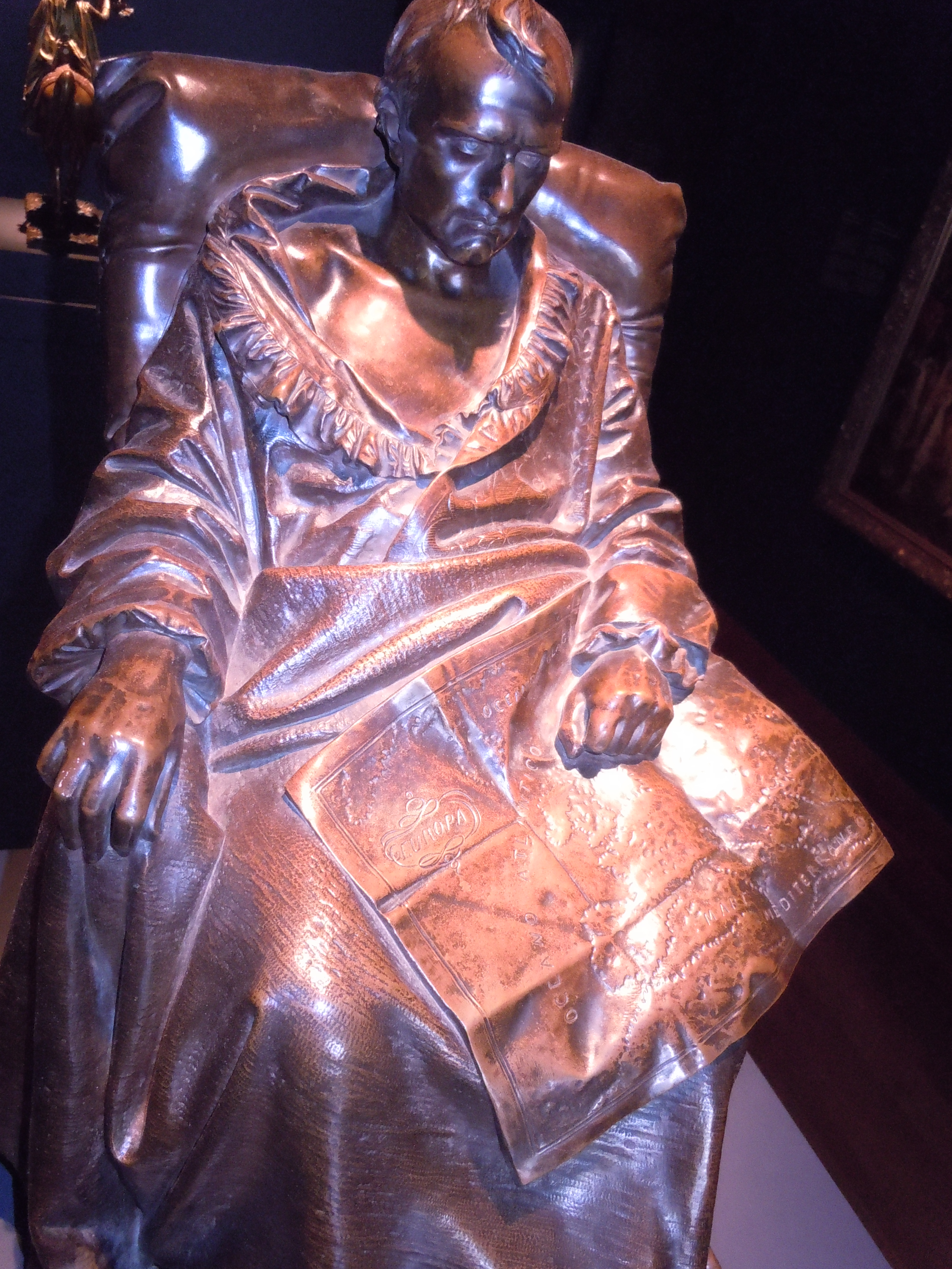
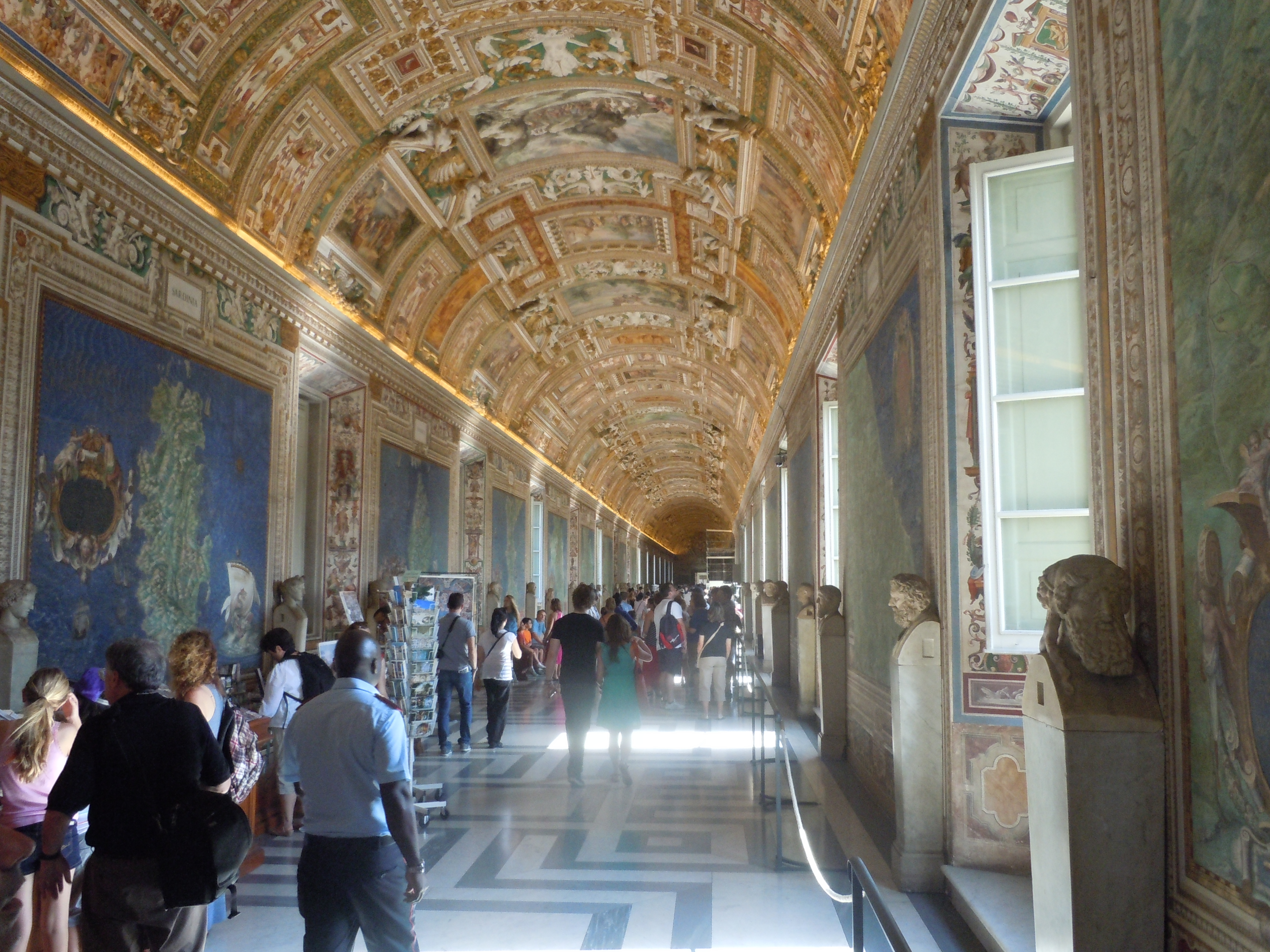
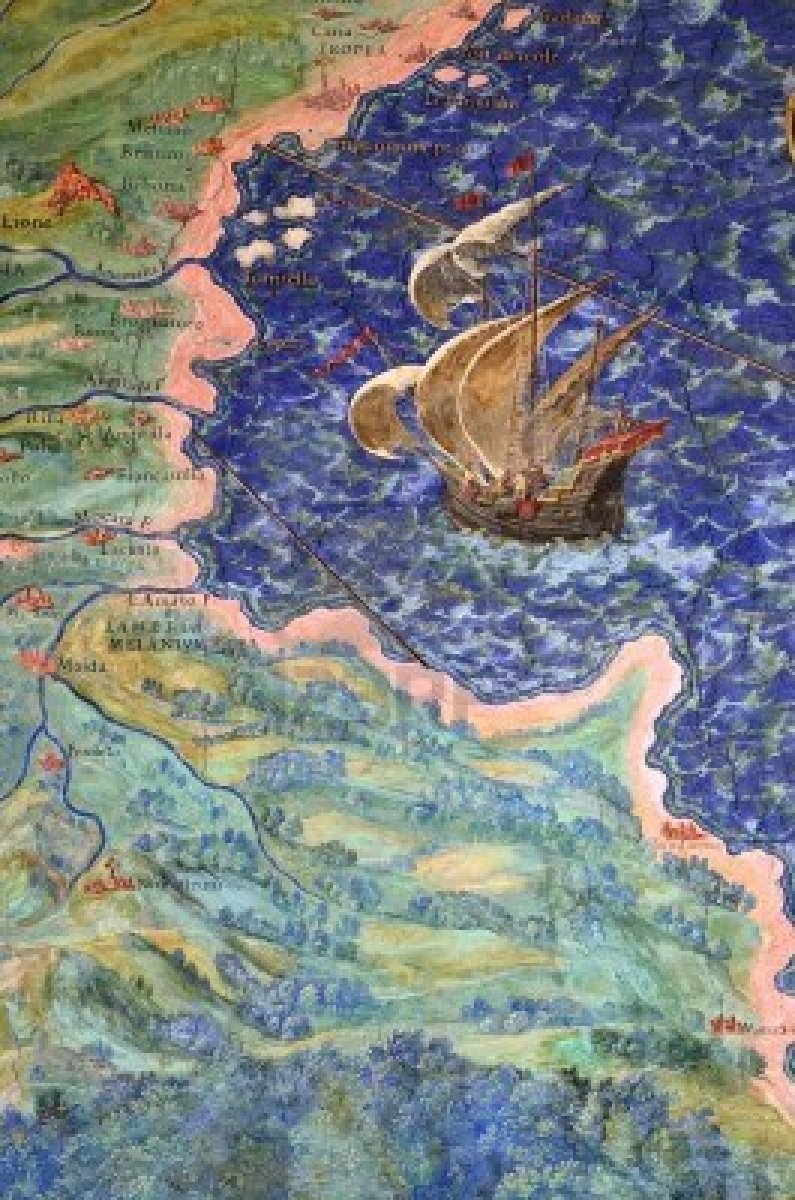
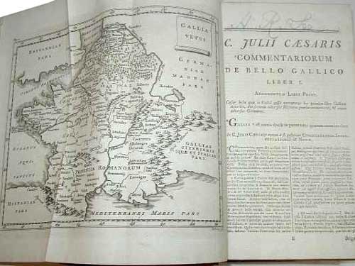
The illusion of a billowing bar of scale hanging from the mast of a ship, just above an aquatic monster, appears at the base of one of forty maps that Fra Egnazio Danti painted of an expansive image of the Italian peninsula. When the cycle of consecutive painted maps, each three meters wide, was designed by the mathematician Danti in the Vatican palace at the request of Pope Gregory XIII from 1577 to 1581, a map of “Italy” already existed in print. But the sequence of maps that were organized in a “Gallery” that allowed the reforming pontiff to view the peninsula and nearby islands. As much as it embodied a coherently unified territory, or mapped the territory onto the structure of the church, the cycle embodied a vision of the church–although it is often viewed as prefiguring a territorial entity in the peninsula.
The project of mapping the region lay partly in the bravura ambitions of the Dominican cartographer, who travelled in the circuits of more than a few Reformation cardinals, but the ambitious reforming Pope. Although the cycle is long studied as having been designed for a specific site and audience of viewers, the monumental ‘cycle’ of maps is deeply embedded in notions of cartographical authorship that emerged in the sixteenth century, and were often focussed in the trade of engraved maps. Among the several visual signatures Danti included in a cycle that expanded maps based on his own active surveying of the papal states–the regions of the Romagna, where he lived, as well as Umbria, Sabina and Lazio–noting both “the plans of cities and fortresses in detail . . . with the [topography of] nearby hills” and sites that linked the politically divided region. Yet if each of the thirty-eight panels of the cycle map regions of the peninsula, a truism is inverted in the cycle: the map is not only the territory, or the territory transcends the conventions of the terrestrial map.
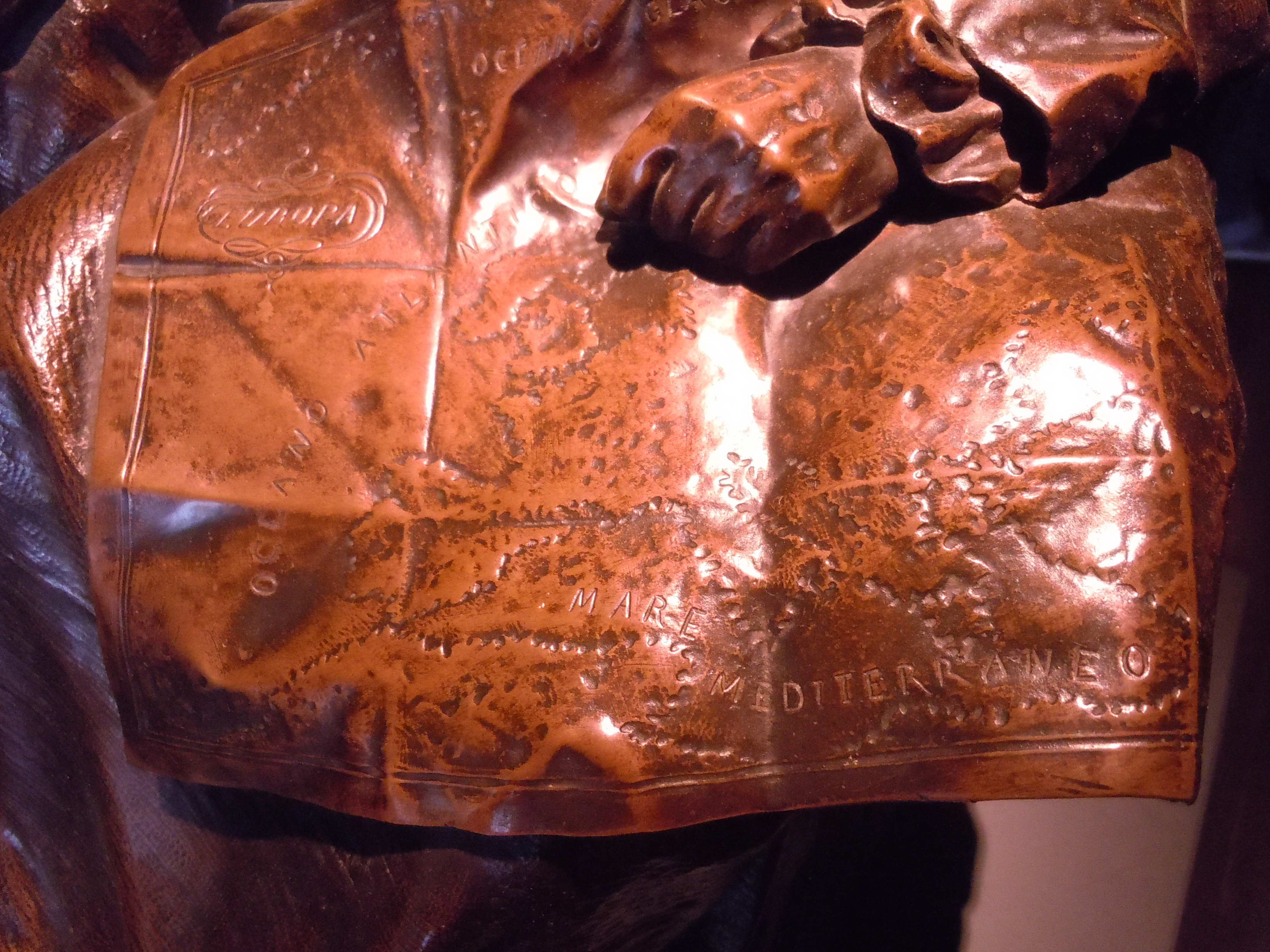
The scale bar hanging on the ship’s sail is a motif that reflected the transcription of the region. If you have a scale bar, you have a map one might say. Scale provided the basis for uniform mapping, and for manufacturing a coherent transcription of the region. Fra Egnazio Danti, who would become the he pope’s cosmographer, worked intensively on constructing the inventive cycle of maps by subsuming the conventions of cartography in an expansive pictorial field in ways that fit a familiar classical program of palace decoration–adopting the conventional tops of using world maps as images of imperial authority to present the spiritual preeminence that Rome held both across the multiple regional states in the Italian peninsula and, by extension, in the greater Mediterranean and known world. Danti inventively included the conventional scale bar on a sail billowing from a ship’s mast, famously converting the abstract conventions of map making to a greater pictorial design in the monumental cycle of maps. It is emblematic of the conversion of a cartographical to a pictorial register in Danti’s larger enterprise: for Danti converted the static conventions of cartographical representation to a living landscape, as much as acting as a state cartographer. In an age of the reproduction of printed maps, the most lavish of which were hand-colored or colored by printed blocks, the lavishly painted cycle of maps was an exercise in opulence, for whose construction it seems no expense was spared in its execution and planning: striking in its rich blues and vibrant greens, the set of maps that draw from a range of nautical maps and terrestrial charts present an abundant landscape from the facing maps of the peninsula viewers of the cycle encounter.
Danti’s transformation of the cartographical register to the pictorial field is the subject of this blog post; the curved scale-bar shown on a billowing sail was the signature by which he naturalized “Italy” as homeland of the church. But be warned. This post is oversized: rather than read it in its entirety, or before doing so, scroll between them both to explore Danti’s artifice and the map’s monumentality, to savor their combination of pictorial and cartographical registers.


Danti was a skilled cartographer who had created several painted maps of the world’s regions, modeled after the regional maps of the Venetian cartographer Gastaldi, for Cosimo I, as well as other painted regional maps for prominent churchmen in the previous decade. As Francesca Fiorani has shown, he was a likely recipient of Gregory XIII’s attention, when he appeared in Rome to help reform the liturgical calendar for the post-Tridentine era among the pontiff’s massive projects to renew the worldly order of the Counter-Reformation church. Having taught artistic perspective to painters in Florence, Danti was keenly conscious of the relations between cartography and art, and eager to realize his accomplishment after proposing ambitious (unrealized) projects of engineering, hydraulics, and calendrical reform to Cosimo I. The totalistic hope of mapping the peninsula at so great a scale–and of planning a series of maps that covered the peninsula and surrounding islands in the largest freestanding set of maps that ever existed in early modern Europe–no doubt gained some inspiration from the totalizing project of projecting plans for calendrical reform, the largest such reform to have occurred or been attempted since when Sosogines proposed calendrical reform to Julius Caesar. Gregory XIII is often attributed a similar imperial pretension–the corridor where the cycle is stored emulated the ancient notion of a palace walkway described by Vitruvius and its central window recalled the architecture of the Constantinian palace in Constantinople.
Yet rather than map the world, the cycle confined itself to the imaginary region of “Italy”–the region where a network of vescoval offices and pastoral parish priests was strongest, and whose confessional identity was most secure. “As there were many Reformers, so likewise Reformations,” wrote Thomas Browne in his Religio Medici about fifty to sixty years later; “every Country proceeding in a particular way and method, according as their national Interest, together with their Constitution and Clime, inclined them.” “Because the name of a Christian is become too general to express our Faith,” Browne observed, there was now “a Geography of Religion, as well as Lands, . . . every Clime distinguished not only by their Laws and Limits, but circumscribed by their Doctrines and Rules of Faith.” The Gregorian cycle illustrates the climate of the Italian peninsula to naturalize it as the historical homeland of the church, forcing us to re-examine how mapping the peninsula means defined coherence for the pope.

- The mathematician Egnazio Danti
Danti’s ambitions met the ambitions of the Boncompagni pontiff in the monumental cycle of maps. The relatively inconspicuous detail of the “Passus Geometrici Communes” indicated the scale in one among forty panels that map regions of the peninsula at three scales, among many figural personifications, ornate frames, and textual legends in the cycle. But it combined the same artifice and craft that Danti wed, and as such constitutes a sort of signature of Danti’s blending cartographical and pictorial registers of meaning: it compels attention as emblematic of how the cycle recast a familiar cartographical convention in an image of sophisticated perspectival form of distance-point perspective that he later championed. It suggests that rather than simply map a territory–or remind us that the map is the territory–the map is a way of thinking about the territory. If what you have is only a map, you start to think about the bounding of territories: what you have in the Gregorian cycle is a pictorial surface that asks us to up-end a consideration of maps as territories, by mapping both a transcendent notion of the privileged nature of this territory to the church and the history of this particularly privileged relationship.
1. The pictorial and cartographical are both enlisted by Danti not only for aesthetic ends alone–if there is plenty of diversion in the cycle–but for creating a new relation to space, and indeed of celebrating the constitution of a new relation of the worldly church to space–not a bounded space, to be sure, but an expansive space of a timeless peninsula. The coherence of the cycle is able to be processed from individually framed landscape views of different scale, rather than within a single framed viewed along demarcated indices. Carefully constructed views of the Italian peninsula encourage viewers process ties between its regions by a combination of historical vignettes, textual legends, and personifications, based on his mapping of the mountainous regions known as the papal states between 1577 and 1578. The map cycle responded to the elevation of cartographic authorship. Although the cycle of maps was painted by several hands, the identity of the cartographer is present in the cycle in several visual signatures in the cycle, by which the inventive nature of the cartographer leaves a sign of itself. One such sign is the instruments of surveying: they recall Danti’s own skill at instrument-making. The splendid wind-roses recall Danti’s measurement of the winds–now emblazoned with the Barberini emblem of Urban VIII, they first bore the Boncompagni crest of Gregory XIII, as do the gold lines of winds’ directionality across the maps’ azure oceans.
But the billowing scale bar is a ‘signature’ that invites us to join the pictorial rendering of landscape to the seas in a new vision of “Italia Magna.” While not politically unified, the region was depicted in the fifth region of the inhabited world in Ptolemy’s Geography and was commonly mapped as a unit by 1571; earlier maps had been printed in Venice and Rome in the 1560s. Although scale constituted a frame of reference to view maps as particularly plastic media–but in Danti’s cycle, even if scale of each panel is noted, the cartographer dispensed with grid or graticule, save indices on each ornate frame. Danti seems not to have regarded the cycle as primarily cartographical in the sense of printed maps that demarcated the bounds of the inhabited world on a uniform graticule. Indeed, rather than present the inhabited world, it depicted the how the Catholic church inhabited the peninsula by enumerating the abundance of relics, houses of worship, resident vescoval seats in the larger cities, and seminaries across the peninsula’s multiple distinctly bounded and named regions, in way that re-wrote the criteria of data that maps contained far beyond the locations of cities and prominent topographic variations. The scale bar is a signature of pictorial, as much as cartographical, competence,.
The multiple maps are far more dispersive of the viewer’s attention than a map. Rather than direct visual attention to a subject, as a painting, moreover, multiple details compel viewers to traverse the corridor in wonder. Yet the cycle synthesized the harmonious order over which the pontiff and his successors would preside. Let’s pay attention to how Danti combined terrestrial maps with nautical charts in particularly inventive ways in the cycle, much as Ortelius had in his Theatrum Orbis Terrarum, and the particular effects to which he did so.

Cartographical authorship and originality was often something of a slight of hand in early modern Europe: most maps were more dependent on the synthesis of findings and readings than a single cartographer’s surveying skill; maps combined hydrographic measurements and nautical charts with terrestrial surveys based on the determination of terrestrial position.
Danti organized the continuity of landscape in the cycle so that the viewer gains a new relation to the coherence of the historical organization of the peninsula, both by its expansive views and its unprecedented scale. The construction of the cycle artfully conceals the limits of Danti’s own surveys. The surveys that Danti undertook of these regions is one reason for the expansion of the ‘papal state,’ but the magnification of the scale of the regions was due partly to the difficulty of gaining permission to survey other regions of the peninsula, but also to the centrality that Gregory wanted to give the role of the church in the preservation of a unity that the region had first gained in the era of Augustus. The notion of a newly inaugurated ‘Pax Gregoriana’ in Gregory XIII’s pontificate explicitly echoed the mythical renewal of a ‘pax’ Augustus had achieved is perpetuated by the view of the peninsula that Danti was asked to present to his patron–as much as the magnification masks the limits of Danti’s surveying or the cartographer recognition of the constraints and limits of his ability to survey the entire peninsula. Despite its impression of the considerable exactitude and accuracy of recent nautical charts, the cycle invites that we read and process the landscape of the peninsula, recently described by both Guicciardini and Machiavelli as divided by enmity and competing factions or parties, as a harmonious whole.
2. The magnificent corridor dedicated to the Italian peninsula and surrounding islands are the largest freestanding cartographical image of its period. The cycle offered a new way to map the continuity of a region that predated the coherence of the peninsula, or of course the Italian nation: it was popular to cartographers of the fascist era in no small part because it assimilated surrounding Mediterranean islands to the image of “Italy” that the Roman pontiff Gregory XIII had ecclesiastically united by a set of resident bishops. But Danti mapped the coherence of the peninsula not as a state but within the church, at whose apex the Roman pontiff stood. Danti’s cartographical assemblage reflects the expanding cartographical vision of the early modern world: based on the surveys Egnazio Danti had personally conducted a limited region in the peninsula, joined to a synthesis of existing maps, and painted by several hands; the dramatic multiplication of maps on the walls of the magnificent gallery reflect the proliferation of printed maps of the peninsula and the world in early modern Europe–both as visual commodities and objects of curiosity.
Did he seek to redefine the map as a visual commodity when he boasted of his skill in rendering “topographia” shortly before he undertook the commission to map the papal states? He vaunted his ability to create an image of a landscape whose coherence bested the chorogaphic city views geometers or painters rendered by combining surveys and naturalistic views. Danti claimed cartographers could “fool” the eyes of observers as well as painters–if not better than them–by drawing an equivalence between the pictorial artifice of naturalistic landscapes and cartographical proficiency in designing, synthesizing, and collating information in regional maps. Viewers entering the corridor first found two facing maps of the peninsula, whose contents are shown at still greater scale in thirty-eight subsequent regional maps, three meters in breadth: by mapping the peninsula at greater scale and detail than any maps before this point, the copious detail as well as hydrographic variations almost challenge viewers to process its unity, even as each panel seems to promise to transcend existing maps by the considerable learning of its historical vignettes and mention of specific detail in textual panels.
The cycle reflects a growing familiarity with cartographical conventions and with maps as visual media in its re-use of the format of mapping. The commission reflected the current interest in printed maps as wall-hangings, as a sequence of maps , complete with cartouches, with multiple textual panels and scale-bars, in trompe l’oeil painted frames. All of this calls attention to the particular application of the cartographer to the medium of mapping and raise questions about how the maps were read. Danti’s expansive cycle of map’s has often been compared to Abraham Ortelius’ contemporary world atlas in its synthetic scope based on both nautical charts and regional maps, as well as a new projection of terrestrial continuity–Danti’s cycle similarly mapped the unfolding Christian history across the Italian peninsula, raising metaphorical questions of historical continuity as well as continuity across terrestrial divides. Despite their multiple frames of reference, the bridge political and terrestrial divides, and suggest a bound confessional unity. And although Ortelius’ project is often cited in relation to Danti’s cycle, the far more familiar printed regional maps that divided the Italian peninsula to political entities were more closely engaged by Danti’s project.
3. Danti expanded the peninsula of Italy to document the central role that the peninsula played in the history of the church. Contrast the continuity that Danti created among a sequence of maps to the expansive cycle to the synthesis of expanse that Ortelius had unified is impressive for the amazingly broad compass of inscribing a known world across two hemispheres:

A learned historian of ancient cartography who has specialized in the semantics of the map, Christian Jacob, observed the innovative manner in which Ortelius’ atlas, the Theatrum Orbis Terrarum, employed pictorial iconography, textual content, and cartographical symbolism in a coherent cartographical imaginary in the previously printed Theatrum: Danti emulated this overlap in almost playful ways, suggesting the quantity of maps that he synthesized with his own surveys of such northern and central Italian regions as the Romagna, Lazio, Umbria, and the Marches. The cycle of maps however effectively refashion the intellectual medium of mapping at the same time that Ortelius had defined the first world atlas as a synthesis of global knowledge. Danti’s cycle seems a concrete reaffirmation of the unity of the invisible body of the church, and a dispersal of the body of the church over a notion of place deriving as much from Dominican traditions of memory–the locus of the church–as much as geographical sense of place, and designed to reconcile the continued claims to ecclesiastical universality of the church with the historical specificity of its location in Italy.
Historians who have studied Danti’s expertise and learning have broached his deep engagement with the Ortelian project; but the cycle reveals Danti’s engagement with Ortelius’ work in synthesizing cartographical forms for unique effect as a way to mediate his cartographical expertise in his craft. But unlike the Ortelian imago mundi, Danti’s map reminds us of the lush landscapes within azure blue seas, whose decoration with lapus lazuli paint makes the cycle of maps especially stunning to the observer, and especially effecting as a way to process the relation of localities within a universal frame of reference. The restricted scope of the cycle of over forty maps of over three meters wide each is belied by how their expansion over the length of the Gallery collectively affirm the peninsula’s historical centrality to the church from the time of the conversion of Constantine–depicted on its vault–to the recently concluded Council of Trent, which had proscribed vescoval residency in each of its major cities. Danti may have willingly accommodated his cartographical skills to members of a curia who felt deeply in need of affirming the ecclesiological importance and centrality of the peninsula in the Christian world, and indeed in illustrating the ecclesiological integrity of the peninsula in an age when acceptance of the universality of the church had been undermined. Ortelius drew from multiple sources that the engraver synthesized in a harmonious whole. Danti echoed this ideal of a uniform distribution of terrestrial expanse in the cycle of maps in the Vatican palace, but playfully reveals its dependence on external sources, as if to acknowledge the fragmented practice of mapping, and its origins in a sort of pastiche or bricolage: the cycle is more an assembly of maps than as a coherent construction, and frustrates viewers who might be accustomed to viewing it from one point of view.
Hence, many images of city views are shown in trompe l’oeil fashion in the cycle of regional maps, partly to allow a combination of views of different scale, but also to acknowledge the range of maps circulating in the later sixteenth century.

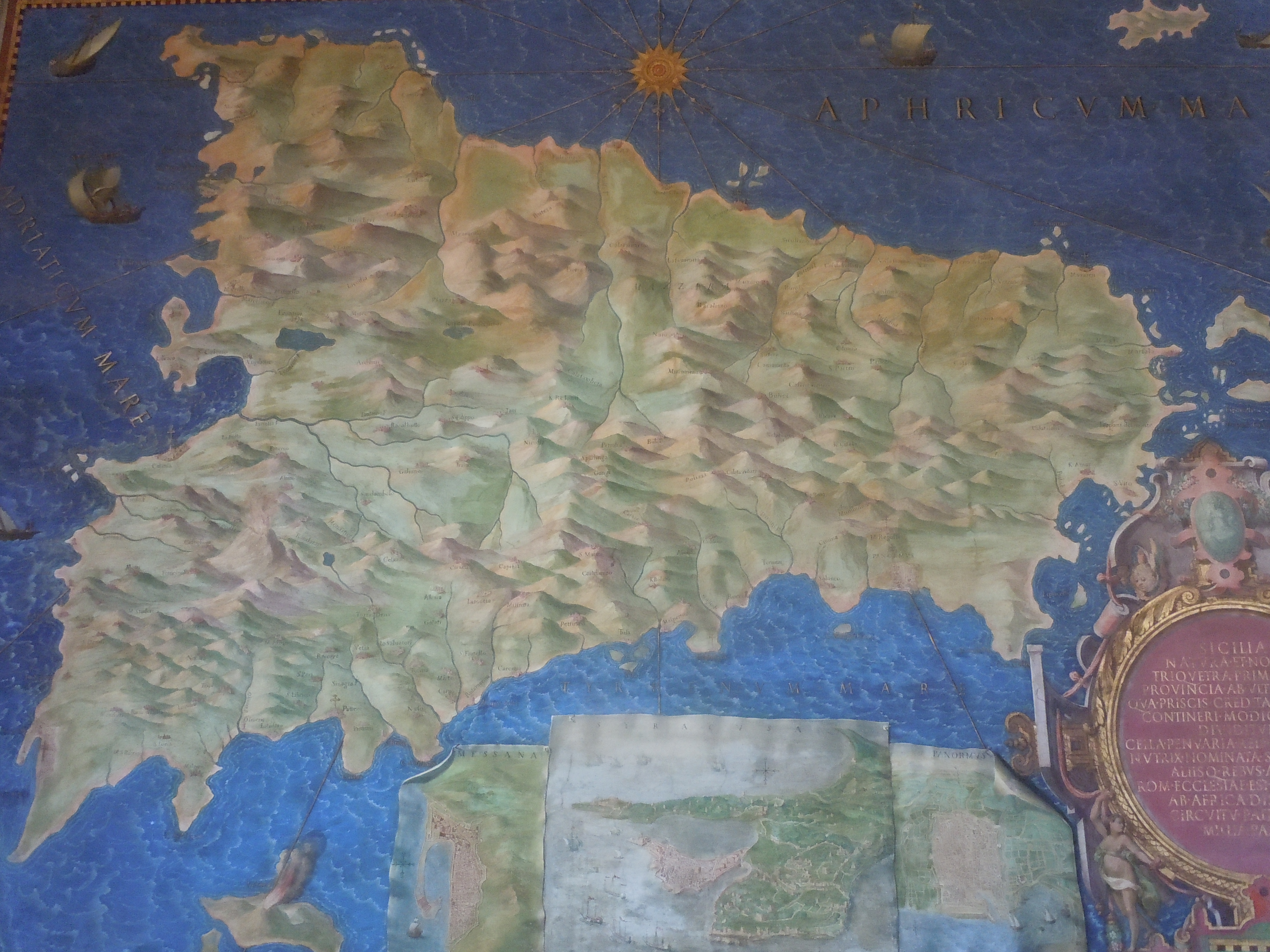
A map of the island of Sicily, with inset views of three cities

The Romagna, where Danti lived, city views as inset views
This raises considerable questions about the nature of the cartographical authorship of the cycle, or at least suggests the potential divisions within the very region whose coherence the cycle ostensibly maps. The question deserves attention; this post places Danti’s work within the growing commerce of maps of his time.
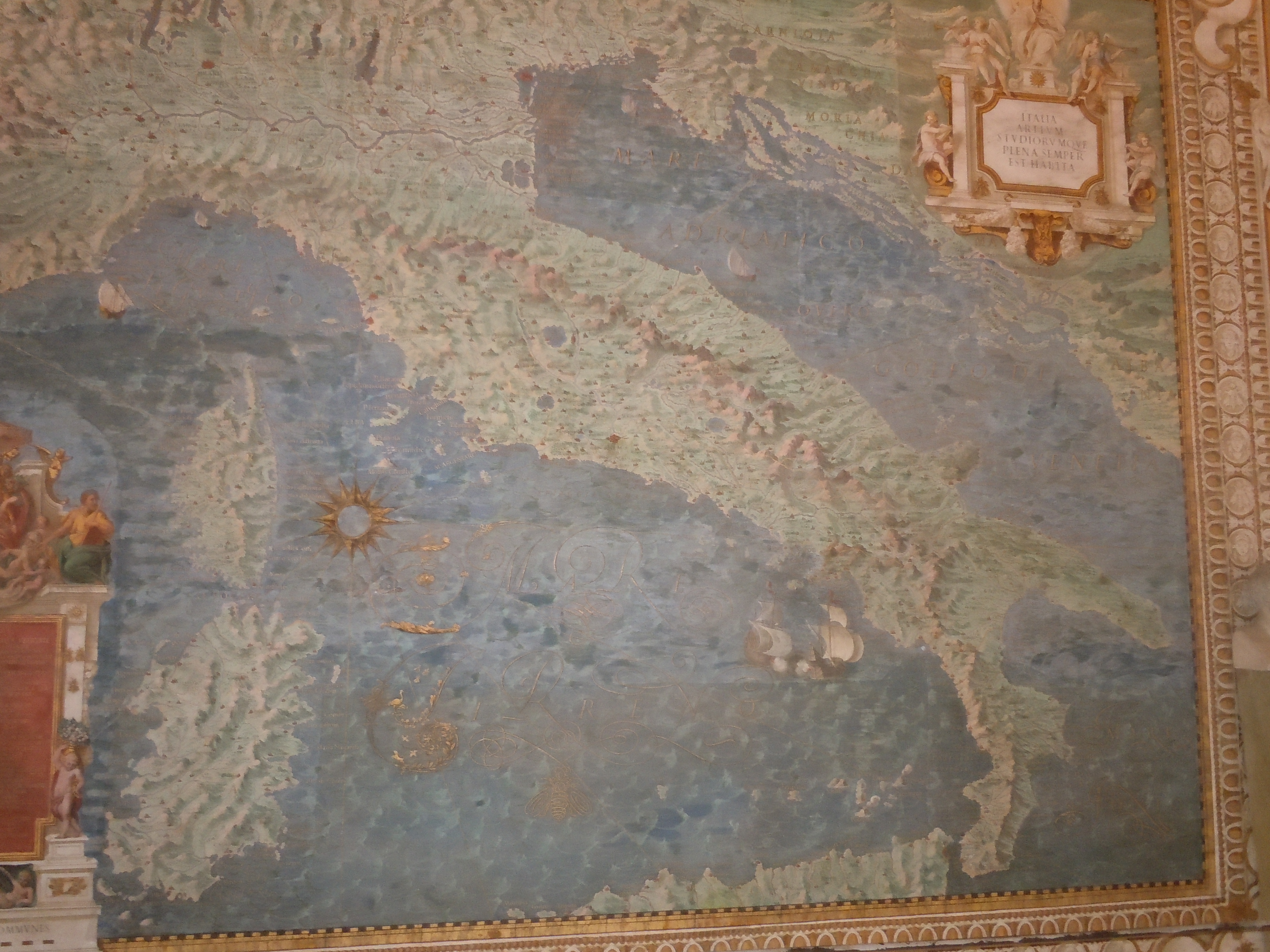
4. The cycle is after all dominated by pictorial virtuosity. Each is cast in the form of distance-point perspective–rather than as a uniformly flat surface–even if they are surrounded by metric indices. The lower sixth of most regional maps include a dense foliage of landscape, so that the maps appear more like images recede in distance-point perspective, and extend proleptically and expansively to the coasts or seas that surround the peninsula, whose Adriatic and Ligurian coasts are respectively shown on each side of the corridor. Despite the grand scale of the entire affair, the verdant landscapes in these views emphasized the abundant flourishing of each region at almost every site. The landscape is almost that of a Christianized pastoral–removed from the divisiveness, war, banditry and struggle that characterized much of the Italian peninsula at the time that the cycle was commissioned and from the late 1520s through Gregory XIII’s pontificate. The image of a bucolic pastoral is underscored by the verdant foliage, and by figures who wander peacefully and at rest through each scene.


Such a conflation of cartographical and painterly skills has led some to assume Danti collaborated with his brother Vicenzo, an accomplished painter, to create its unique design. But surviving drawings that Danti took from his surveys of the Romagna–the only set of his drawings to survive–suggest the care he took to sketch local details to synthesize his maps, and his eye to local detail, even in such a broader project of mapping. A map, after all, successfully synthesizes the local with the universal, and holds the two in harmonious balance with each other, or creates the fiction of such a balancing act. That balance between the local and universal is the central thematic of the Vatican cycle, as much as the comprehensive mapping of the peninsula’s expanse.
5. Danti expanded one region to the monumental hallway or Gallery, in a sense, to proclaim the central importance that the region continued to have within the Catholic church. This much is revealed in the Boncompagni eagle that surveys the entire complex from one end of this architectonic complex:

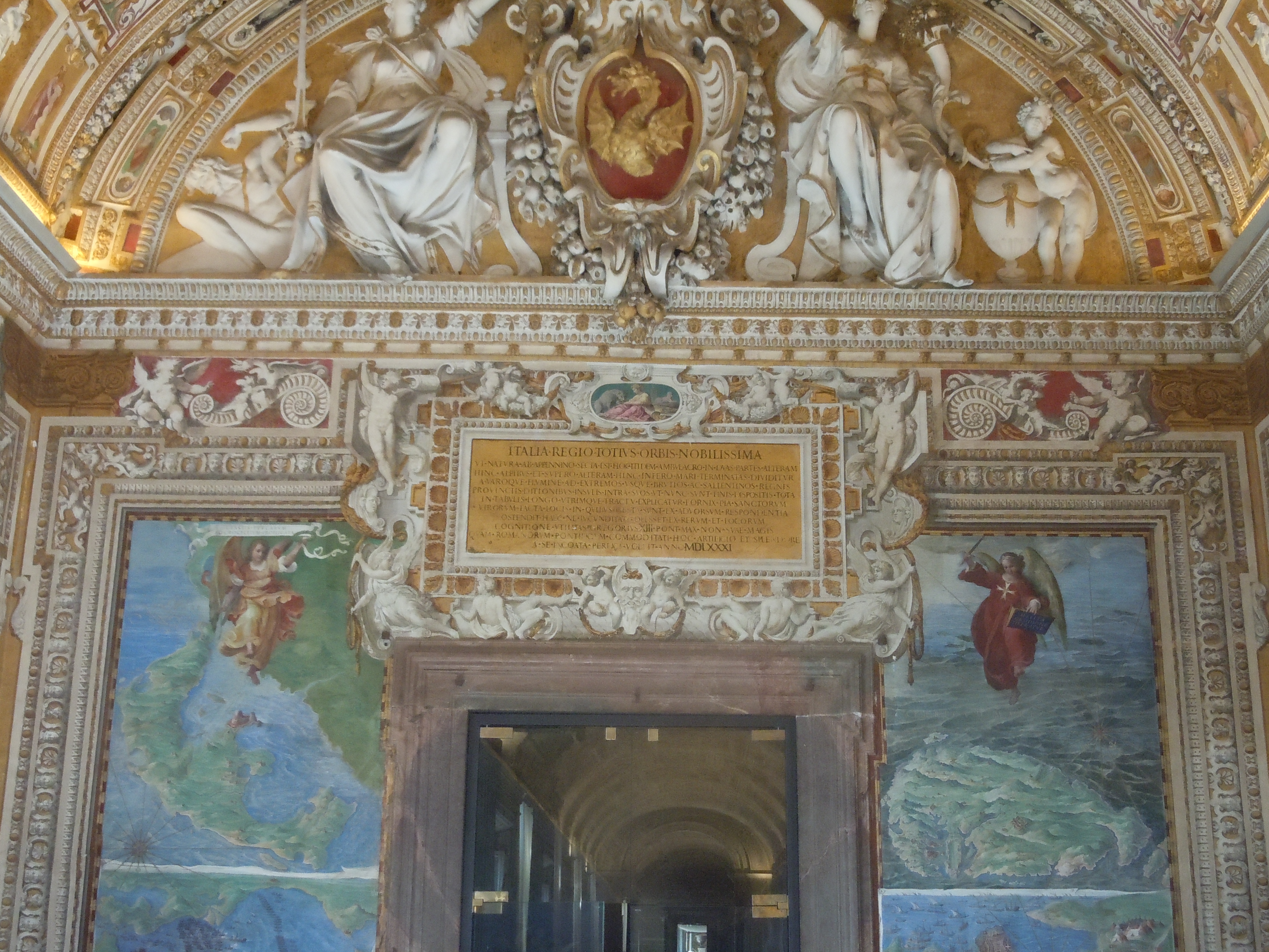
The corridor is placed in quite a particular location in the Vatican itself, overlooked by tourists who view the Gallery with the Vatican museums–they connect the pope’s private quarters and the Vatican itself, just over the Belvedere courtyard, along a corridor that progresses from north to south, and as such constitute a familiar space through which the pontiff not only moved in his daily transit while in Rome, but which he or members of the curia might also allow visiting dignitaries to view. The cartographical surfaces of the maps are often inscribed with a dizzying array of historical events that viewers find difficult to process, so much as behold with wonder, the use of cartographical forms to celebrate the integrity of a divided region was explicit to its viewers:

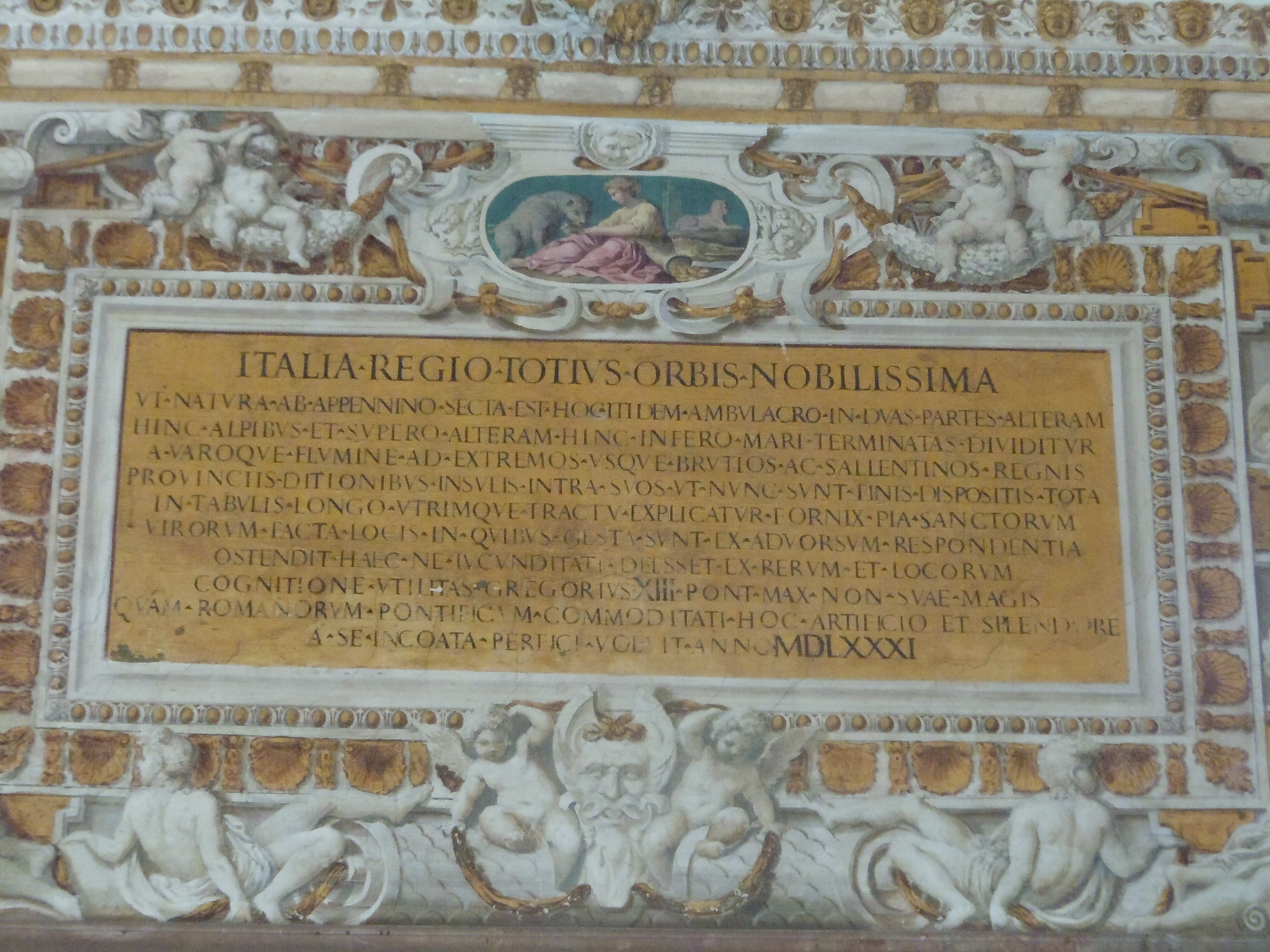
The cycle represented “Italy, the most noble region of the entire world,” announced the original inscription of 1581–reminding visitors of the commensurate nature of this monumentalization of mapping forms encompass a peninsula that Pliny himself had used the same words to describe.
The monumental complex of maps in which these two details stand (among many others) is disorienting both because it is itself an overwhelming space, and because unlike most contemporary printed maps, the landscape maps seem to emerge from their frames, rather than being dominated by surrounding indices. Danti supervised the construction of the cycle with a talented equippe of hand-chosen painters–many of whom had specialized in landscape as a genre, such as the northerner Matthias Bril. The forty views along the corridor are of shifting scale and directionality, as if the synthesis of such a wealth of local cartographical data led to the expansion of the scope of a project of terrestrial mapping to a degree that the viewer is hard-pressed to retain a clear sense of their terrestrial coherence or continuity as they move along the majestic and monumental corridor.
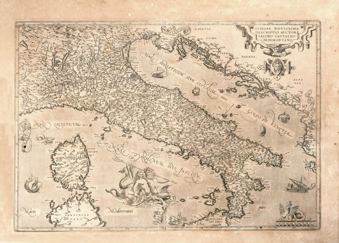
6. As such, the cycle provided a variation upon the impressive synthesis of political bounds, hydrography, and mountain ranges credited to the Venetian cartographer Giacomo Gastaldi (fl. 1545-62), a surveyor born in Lombardy whose maps created in Venetian employ distinctly centered the peninsula around the “Venetian Gulf” or Adriatic ocean, and would continue to be reprinted multiple times in a serial fashion in the decades after his death. Gastaldi’s projection had importantly popularized the legibility of the inhabitation of the region by hydrographic and orographic markers maps that delineated its political and jurisdictional divisions, as well as providing a massive data synthesis: Gastaldi was widely credited with a largest number of engraved maps of the peninsula that circulated in the later sixteenth century, mapping of the peninsula’s political divisions, as the popular 1561 “Italiae Novissima Descriptio” pictured below.

Danti’s commission must have responded to both the authority and familiarity of this map, by remapping the peninsula at far greater scale and noting a different range of relevant sites. Gastaldi’s authorship of the synthetic map was widely asserted in these popular maps, even if they show a variety of orthographic corruptions of his name. To be sure, the engraved image of “Italia Magna” provided one source for the two facing maps of the Italic peninsula that viewers encounter upon entering the complex, whose organization of the peninsula it respects, including only a northern corner of the island of Sicily–partly under dominion of the Spanish monarch Philip II. The echo of the form of Gastaldi’s projection, which also included much of the Istrian coast in the Adriatic, is evident:
But, unlike the Gastaldi map, Sicily was in fact mapped in full detail within the following sequence of regional maps that line the walls of the Gallery, displaying its topographic variety with a considerable wealth of pictorial detail unable to be captured in an engraving:

For Danti’s cycle re-imagined the project of peninsular map to capture a vision of the peninsula with new coherence, albeit a coherence distributed over forty maps in the Vatican Gallery. The multiplication of numerous views of the peninsula served both to expansively map the peninsula, as if to deny its boundaries, and to suggest that no single point of view or bounded map could encompass either its variety or the wealth of its local history. Danti’s project seems to map and encompass the variety of spiritual riches and sacred testimonies in the peninsula that would be particularly valued by the Boncompagni pontiff and his successors as testimony of the triumph of peninsular unity in the church, showing a region whose tranquility and liberties was protected by both the papacy and the saints.
As cartographer to the Venetian Senate, Gastaldi had himself craft a map of “Italy” for the ducal palace in Venice, imitating the lost maps of Antonio de’ Leonardi of the peninsula’s situation in the Adriatic, which had won wide praise before their 1577 destruction as “una tavola d’Italia così perfetta nelle sue misure” that copies of the painted map were avidly commissioned by “diversi Principi.” The printed peninsular map that long bore his name, in varying orthographic forms, was expanded and refined by numerous engravers in the peninsula, including in Rome. The map that was often reprinted from original plates in different cities was always associated with the Venetian cartographer, no doubt as a sign of his authority, and collated a complex hydrographic network in the peninsula but also, from the 1561 map, delineated its regional jurisdictional divisions.
7. The many regional maps in Danti’s cycle did not reveal the unity of the region, but assembled coherence of a somewhat fragmented collective to foreground its confessional unity. The multiple cartographical sources on which Danti relied became, in the cycle, a synthesis of numerous literally separate multiple sets of printed or drawn maps. Three chorographic images embedded and illusionistically affixed on maps of regions he knew at firsthand–Tuscany and Romagna, the “Bononiensis Ditio”–distinguish them as the best mapped. These city views celebrated the sources of the wealth and virtues of the region: in thirty-eight individual maps, trompe l’oeil images of oblique plans and views of these cities are included on their margins to emphasize their flourishing, from the pentagonal walls of Bologna, placed in green fields near the Apennines in a map of the “Bononiensis Ditio”, to the fortifications of Parma, views of the majesty of Venice and an inset view in Latium of Rome, the expansive view of Palermo in Sicilia, an aerial view of Naples in the image of “Campania,” and a more ichnographic plan of Milan in its Duchy.
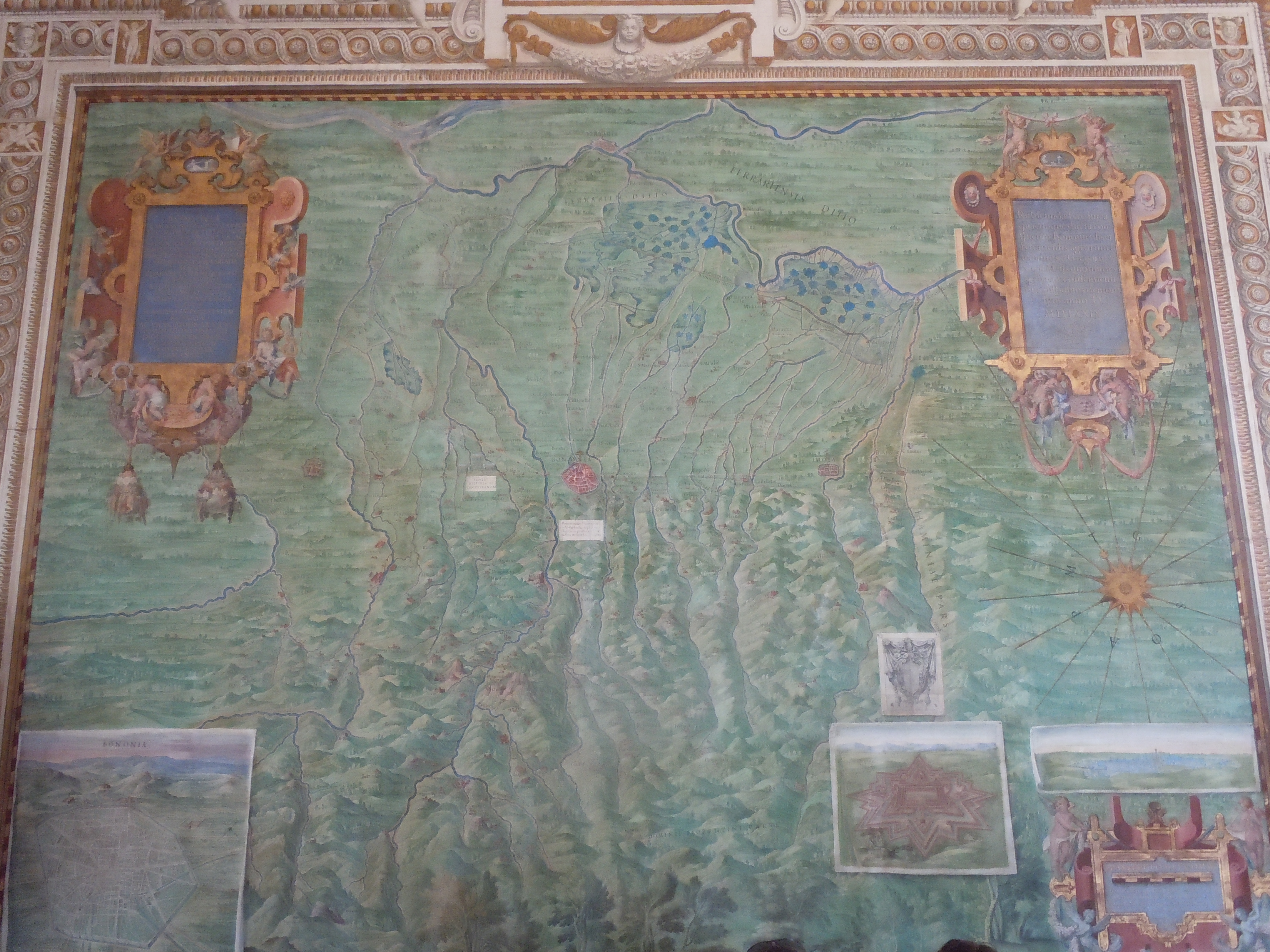
The multiplication of these perspectives may disorient viewers who must negotiate different scales and even angles of elevation before every panel in the cycle, and suggest the unease within the peninsula’s poltical geography of the late sixteenth century. Indeed, the remove of sovereignty from the unifying coherence of the cycle is at first particularly disarming, as it foregrounded the fragmentation of the very region that it ostensibly united: many panels indicate the boundaries of terrestrial rule, as that of Bologna, where Danti had long lived and whose confines Danti had recently determined for Gregory XIII–it’s evident in the red boundary line in the map below that separates Ferrara from the Bolognese territory.

The integrity of the peninsula is expanded in the cycle, whose division of the region devoted specific attention to the unity within it of the regions overseen by papal dominion or government. Oddly, but perhaps only disturbingly for a modern viewer, is the magnification of the maps that show the regions of the so-called ‘papal states,’ administered by papal legates or governors, relative to the maps of other regions of the peninsula–a fact usually explained by the fact that these six provinces were surveyed by Danti himself on horseback, while the other maps were synthesized from a range of other cartographical forms. In a sense, this privileging of the papal states in the cycle underscores the ‘good government’ and harmony of the regions that the papacy oversaw. If the entire peninsula echoes the cultivation of the green topography of the peninsula, as a metaphorical extension of the pastoral care that the pontiff devoted to the peninsula, the region known as the ‘papal states’ are cast as privileged sites of Christian history. The expansion of this region surely suggests both the privileged relation that these regions in the peninsula enjoyed to the church, and the wealth of evidence of divine favor that was revealed in them.
In the cycle, the regions gained integrity through their governance by the church, in contrast to the division of the peninsula into jurisdictional boundaries within the peninsular map of 1561. The mapmaker seems to have bound together these different regions, integrating them within a monumental progression that celebrated a variety of evidence of both the abundant testimonies to the faith of inhabitants of different regions, enumerating or cataloguing an abundance of relics, houses of worship, resident vescoval seats, and seminaries. He did so to illustrate the harmonious order over which the pontiff and his successors would preside. It is no surprise that Rome had seen a proliferation of individually printed maps by 1577-81, the period when Danti worked to organize the cycle: as Gastaldi’s peninsular map circulated in Rome through reprints of Jean Lafrery, Francesco Camoccio mapped individual regions in the peninsula—including Ancona (Luchinum, 1564), Puglia (Venice 1567, Bertelli; Almagià XXXVI ), Lombardy (1564), and Corsica (n.d.; 1562), and Corfu (1537; Berteli 1564; Camocio 1568)—also sold by Lafrery’s shop. Danti bound these individual maps together to create the illusion of a harmonious landscape map through his art.
Two particularly interesting “news maps,” documenting recent military engagements of the Holy League at Lepanto, a grand victory over the Ottoman fleet, where they were led by Gregory XIII’s natural son, and the Siege of Malta, a further victory of Christian forces in the Mediterranean. Both maps were widely reprinted in order to explain the stunning nature of both engagements, and both of these maps were themselves incorporated into Danti’s cycle by its exit. Both are complex narratives about engagements that were recent in the popular memory, unlike many other historical events noted in the cycle.


Lepanto, with naval siege below Military maps of Malta showing naval engagements
The resulting pastiche of maps in the cycle embodied a unique relation to the peninsula of Italy as an imaginary region or land, as much as a territory, in ways that may have made Ortelius less interested in Danti’s project of mapping than Danti had hoped, for it effectively shifted a cartographical discourse of terrestrial mapping to a sacred register, to define the “future” and nature of Italy from Rome, as much as to present a cartographical record of terrestrial inhabitation of the modern world. As the cycle rebutted charges of the fraudulent nature of the papacy’s claims to worldly power, the cycle presented a “Magna Italia” subject to and benefitting from spiritual guidance and pastoral care, rather than being plagued by civil dissensus or lack of harmony as a community, erasing the competition among its varied interests by unifying them within a harmonious landscape over which the viewer’s eye could travel with delight.
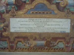
8. Much has been made of the role of the pontiff’s governance of the church during the Counter-Reformation as a mirror of monarchical rule, and the governance of Gregory XIII in the peninsula has been often read as an illustration of the papacy’s sovereign aims. The cycle of maps might be argued to optimistically map a future “Italia Magna” unified by the church, rather than by a worldly monarch. A clue to this coherence is in an inscription below the map of Ferrara, added after the completion of the cycle, that describes it as having been ripped from papal domains by the Holy Roman Emperor Henry III, but restored to the lands of the church by Clement VIII, Gregory XIII’s successor:
Or the representation of towns that had been returned to the papal states under the rule of the Boncompagni pontiff. Each of the cities that was returned to papal administration is shown not only in a verdant Italian landscape but below the Boncompagni crest, a winged dragon in flight:

This detail is impressive for the care of noting the Boncompagni emblem:
![Quae loca in depi[c]tis tabula](https://dabrownstein.com/wp-content/uploads/2013/01/quae-loca-in-depictis-tabula.jpg?w=225&h=300)
But the protection offered by the church to regions in the peninsula lay as much in how the church preserved religious and confessional unity in the face of the fragmentation of the Christian world. The fragmented peninsula which embraced all of its regions as well as the surrounding islands is a synecdoche for this unity. The symbolic unity of the regions transcends the sovereign boundaries that the cycle notes. For in the Vatican cycle of maps of Italy’s regions, each region is shown beneath color portraits from the saint that its inhabitants most widely venerated–who stood as an intercessor to God more direct than the pontiff himself, but affirmed the fidelity of its inhabitants to the church. The cycle indeed mapped the vescoval network whose local residency was affirmed and enforced at the Council of Trent: each map carefully noted the seats of bishops.
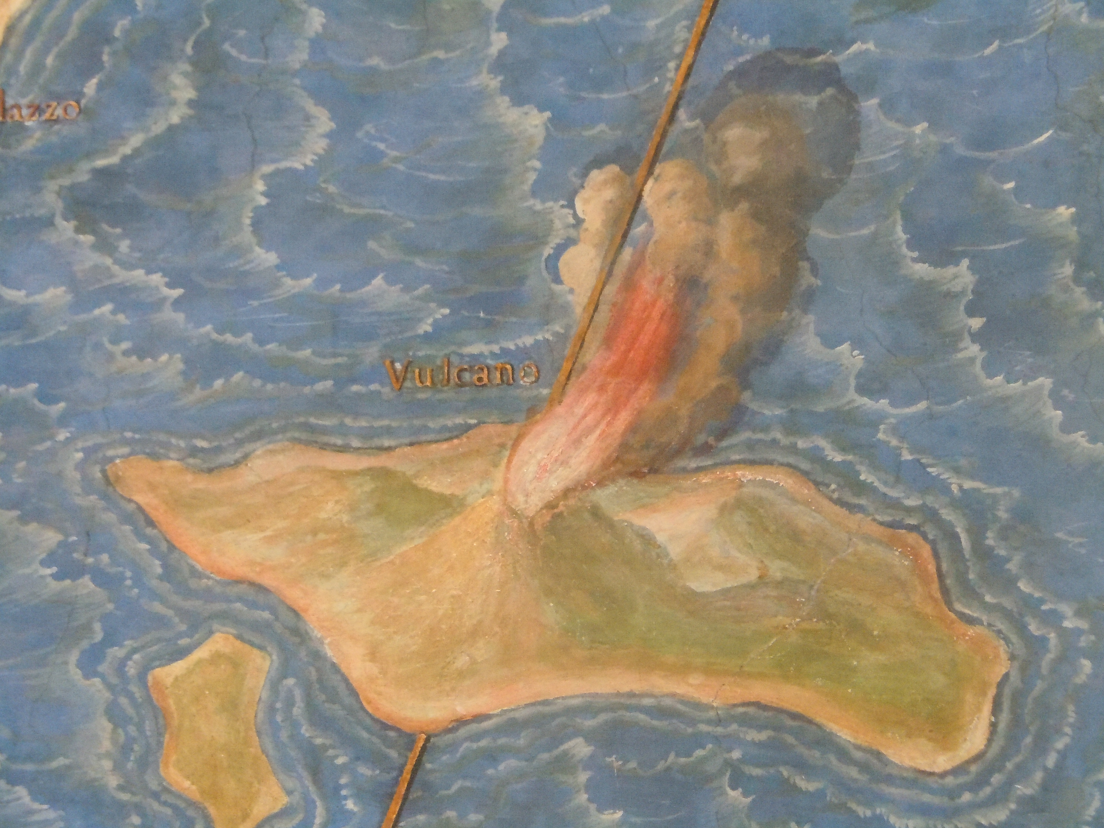
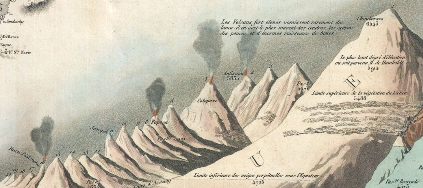
9. This image of the unity of the ecclesia is perhaps the fundamental achievement of the cycle. It trumped the very question of terrestrial continuity. Nowhere is this more apparent than in the expansion of a number of surrounding islands among the forty panels that divided the peninsula on the walls of the Gallery. Many of these islands, like this volcano, are isolated, cut off from the mainland by lapping waves of azure seas.

The cycle however suggests a degree of symbolic unity that could not be mapped in strictly terrestrial terms–in the manner of a nation or monarchy. Rather than being limited to the peninsula’s land, the cycle was less modeled after an atlas than the expansive structure, unique to Italy, of the compilation of island maps in a printed isolario–a composite book of successive discreet island maps that was particularly popular in sixteenth-century Italy. The term “atlas” was of course coined when Ortelius sought to explain his synthesis of maps of different regions in the world in a “collaborative venture in large-scale data collection” that linked its different individual regions. “Because every part of the world will have its own map as well in this book, and will be discussed at some length,” Ortelius announced to readers of the Theatrum Orbis Terrarum, which promised complete coverage by incorporating recent nautical maps, island charts, and surveys, “we will therefore refrain from discussing those here, and restrict ourselves to the seas, since together with the land they constitute the entire globe.” In contrast to the novelty of the unity of the atlas, the cycle of maps Danti designed suggested a variation of the island-book, or isolario, several of which had been extremely popular during the sixteenth century, and which Italian printers and engravers had to a certain degree specialized not only in Venice but in Florence and Rome.
Danti’s signature is literally present in one panel of text in the cycle. The panel is not evident in the cycle to most observers, somewhat hidden in an original Latin inscription above one portal. But although the cycle was a collective project, Danti seems to have distributed his signature as a cartographer in multiple details, and, it is evident in his correspondence, felt a close connection to the unique construction and arrangement of pictorial and cartographical imagery in the cycle of maps. One such signature may lie in the scale bar draped graciously and elegantly across the sail of a passing ship, threatened by the waving tail of a massive sea-monster of fantastic form. Danti’s achievement was after all perhaps not the synthesis of terrestrial unity, but that of mapping coherence in a region that transcended the divisions of the peninsula from its surrounding islands–a region that included not only the papal states, and indeed not only the peninsula, encompassing not only Sicily, a region over whose jurisdiction Gregory XIII challenged Philip II, but islands as Malta, Cyprus, or Corfu, the site of the recent victory of the Holy League against the Turks at Lepanto, which was shown as evidence of the continued divine favor in the form of an angle who overlooked the recent military confrontation of 1570.
The sailing emblem of the “Passus Geometrici Communes” is a virtuosic illustration of skill by a master of perspective; it echoes the technical tools by which the cycle maps united its divided sovereignty, and transcended the geographic or terrestrial distances between the mainland peninsula and its outlying islands. In contrast to these divisions, both jurisdictional and geographic, the cycle affirmed the seat of the Roman church in Rome–the city stands at the approximate center of the corridor. Such a signature is emblematic of the work done by a cartographer able to unify the Catholic Church’s presence in the peninsula and its surrounding islands, and mediate its unity.

 Pierre-Jean Chalencon
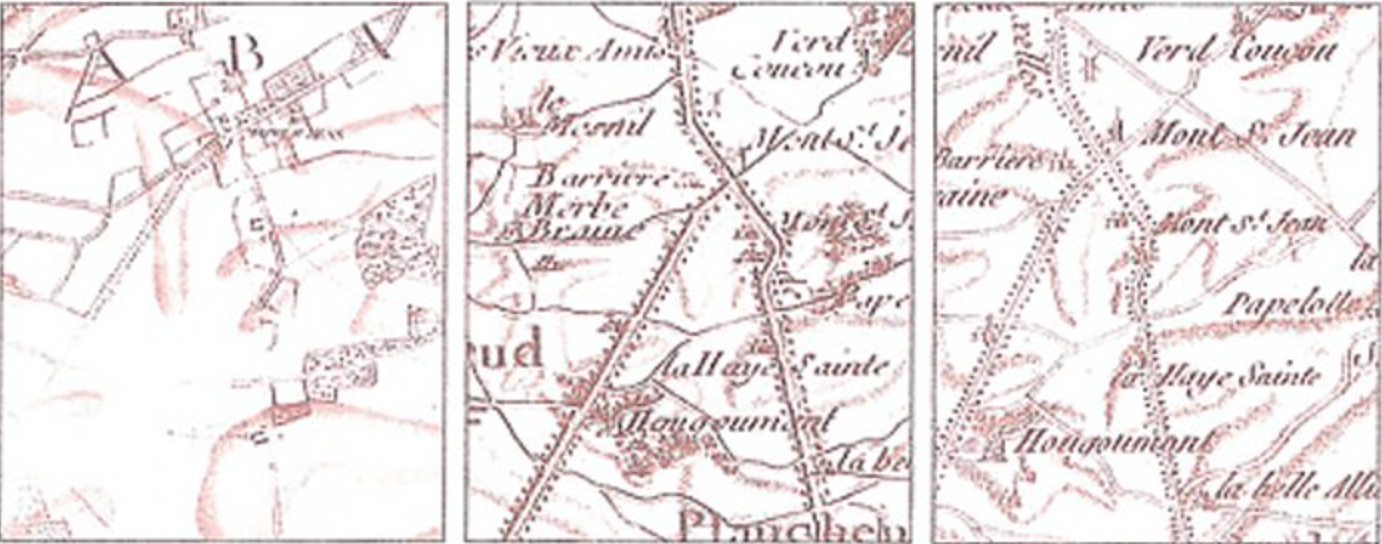 Hand run map and the errors in perpetuated in the printed map that seems used at Waterloo


![Quae loca in depi[c]tis tabula](https://dabrownstein.com/wp-content/uploads/2013/01/quae-loca-in-depictis-tabula.jpg)
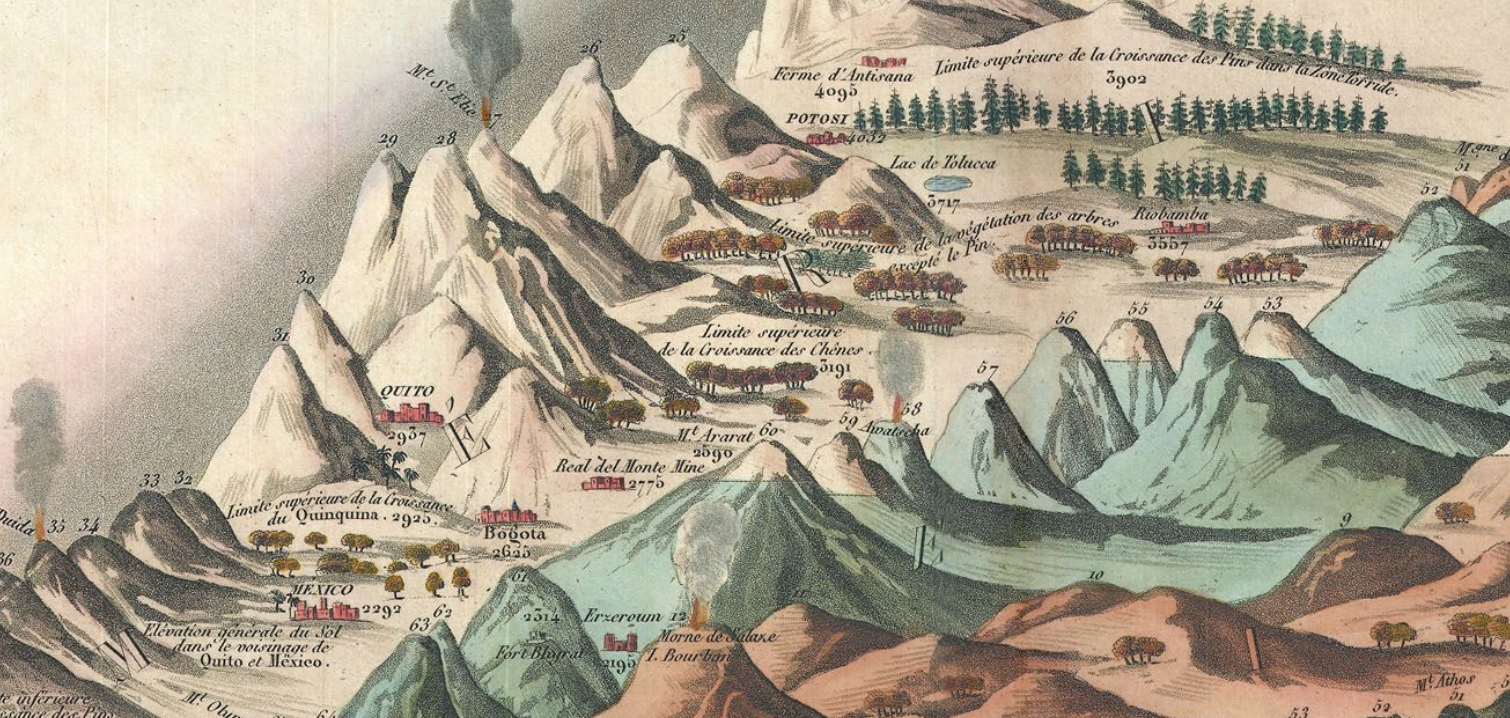
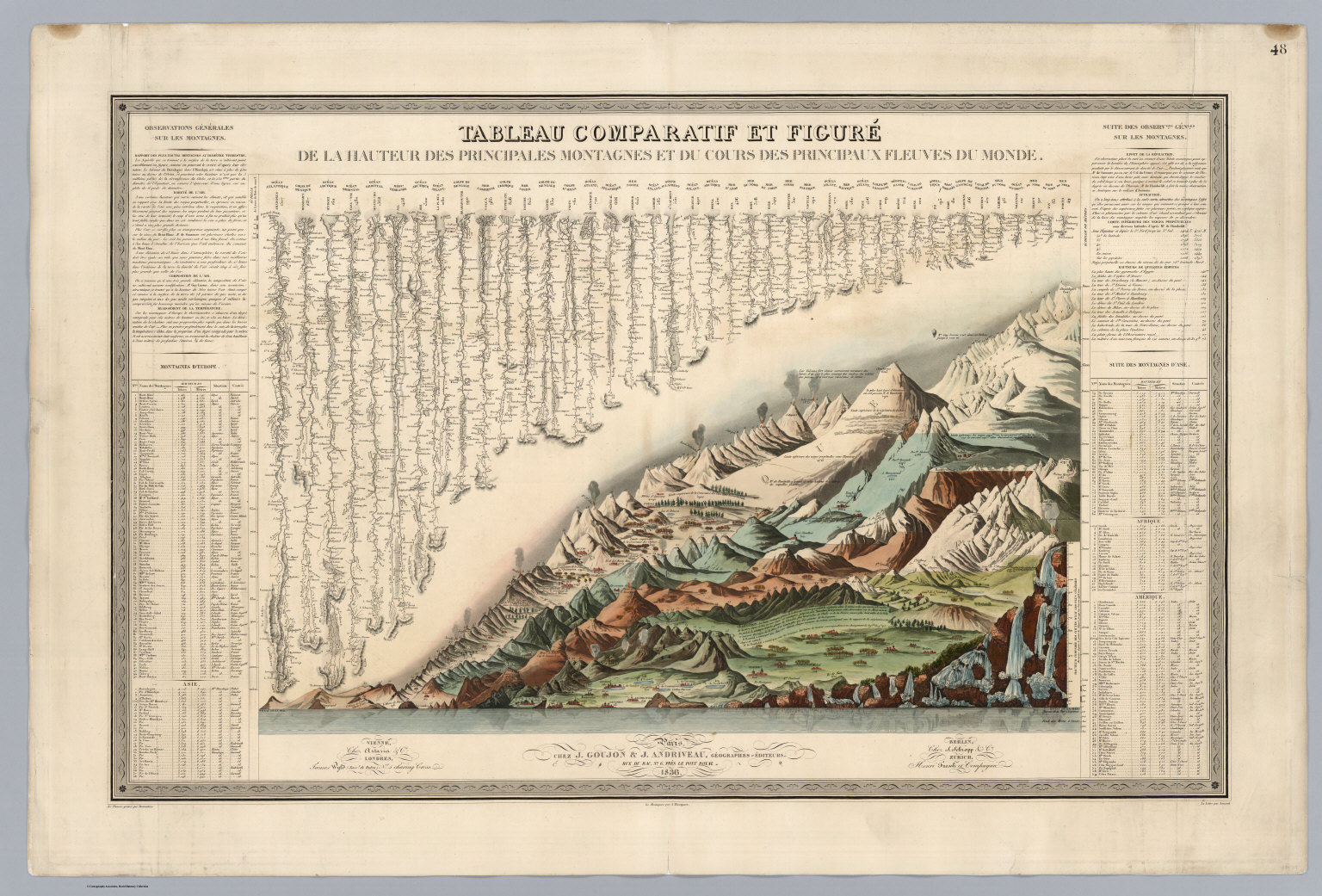
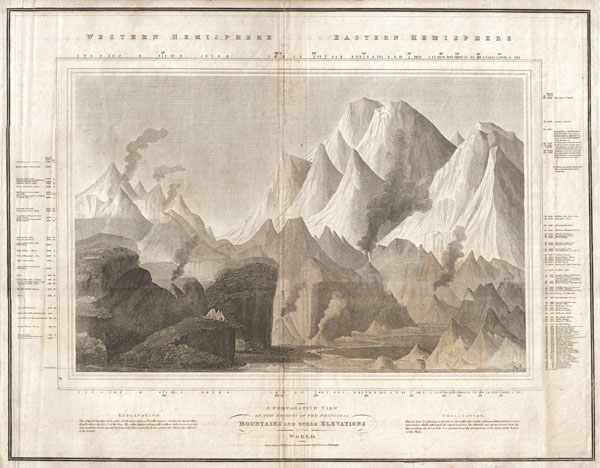
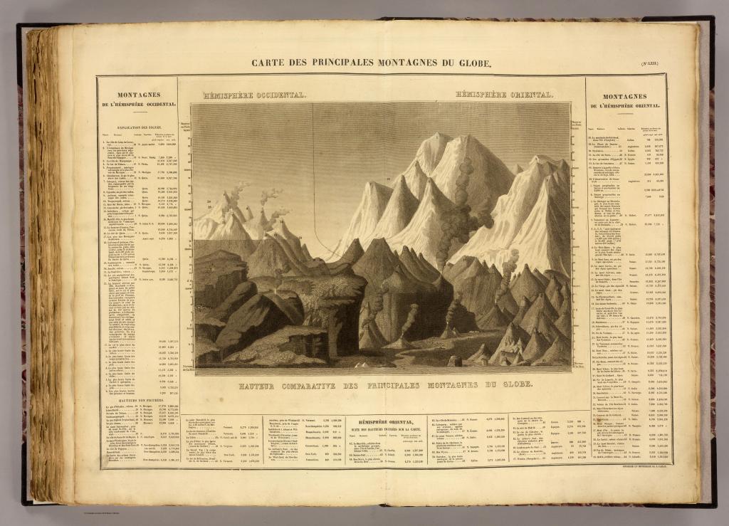
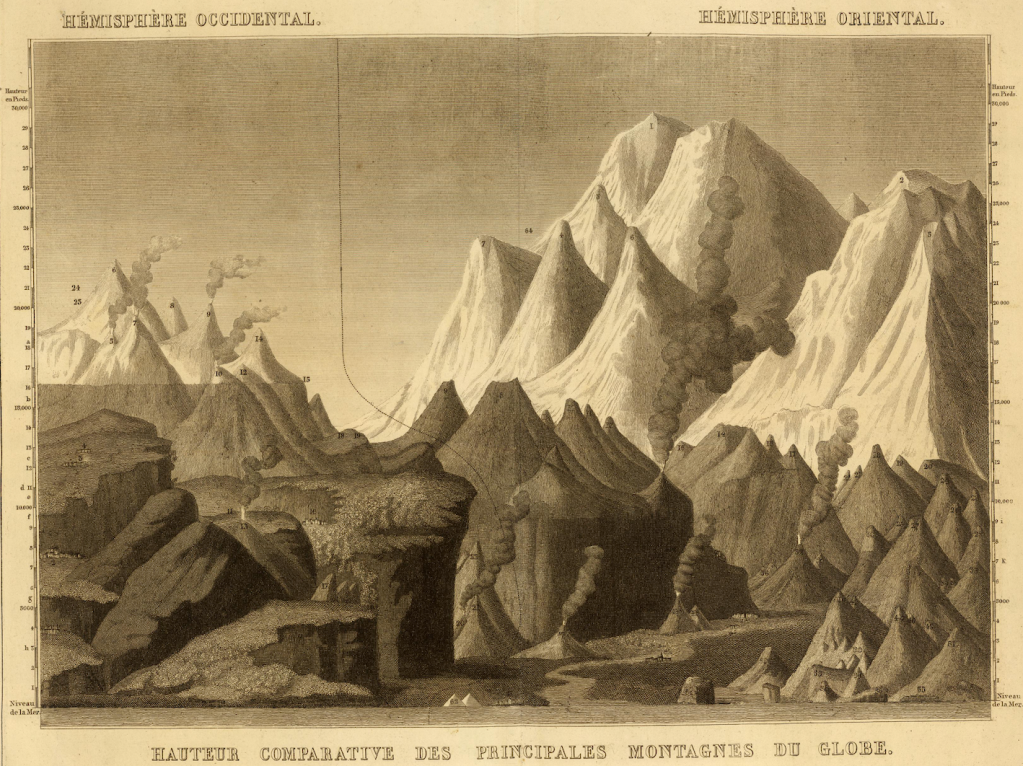
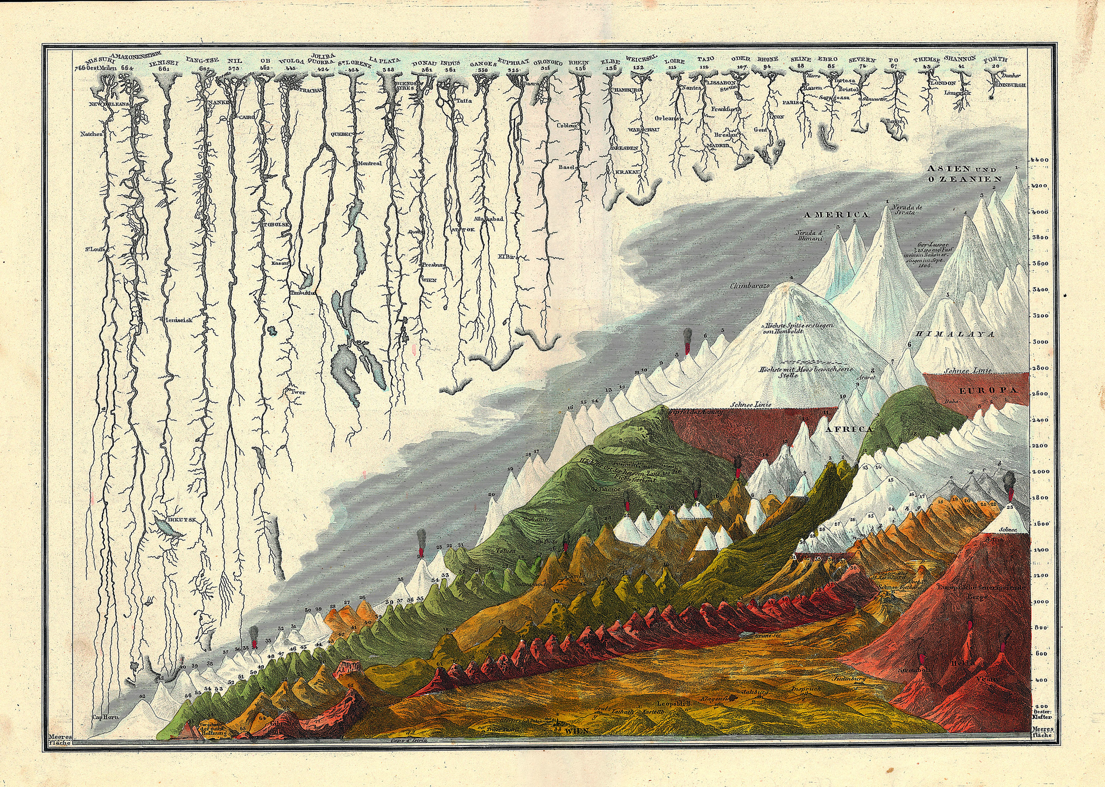
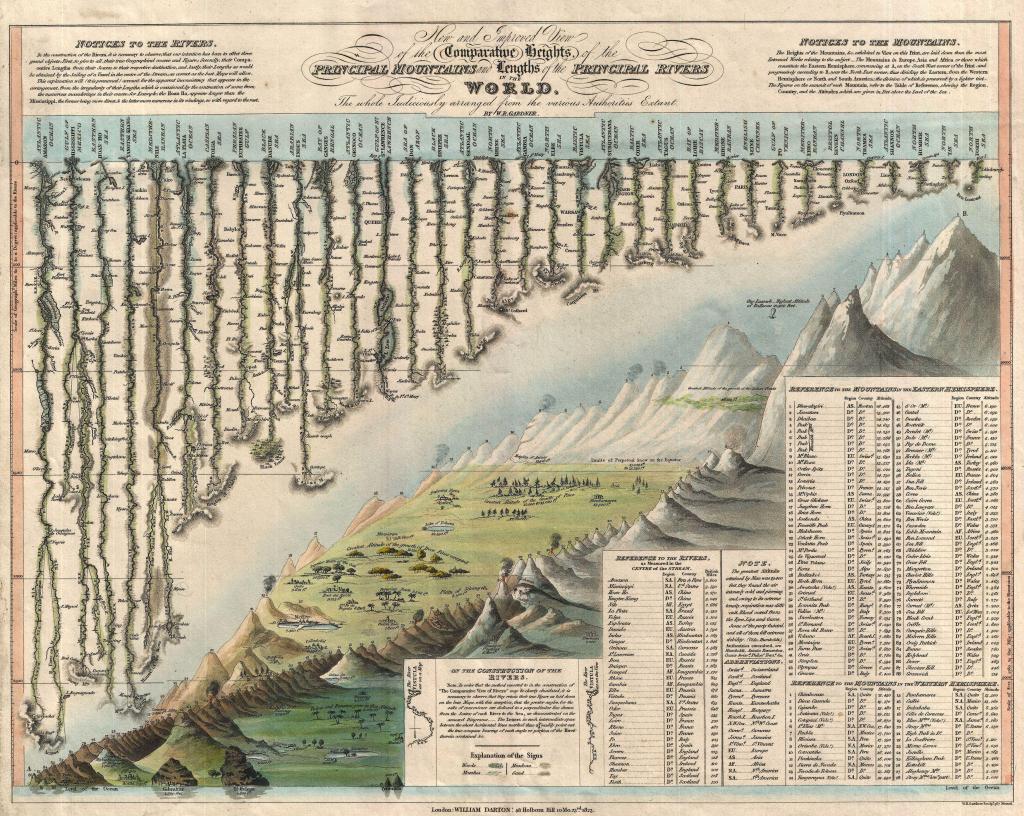
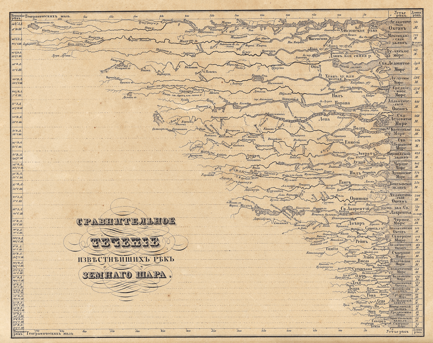
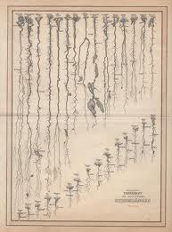
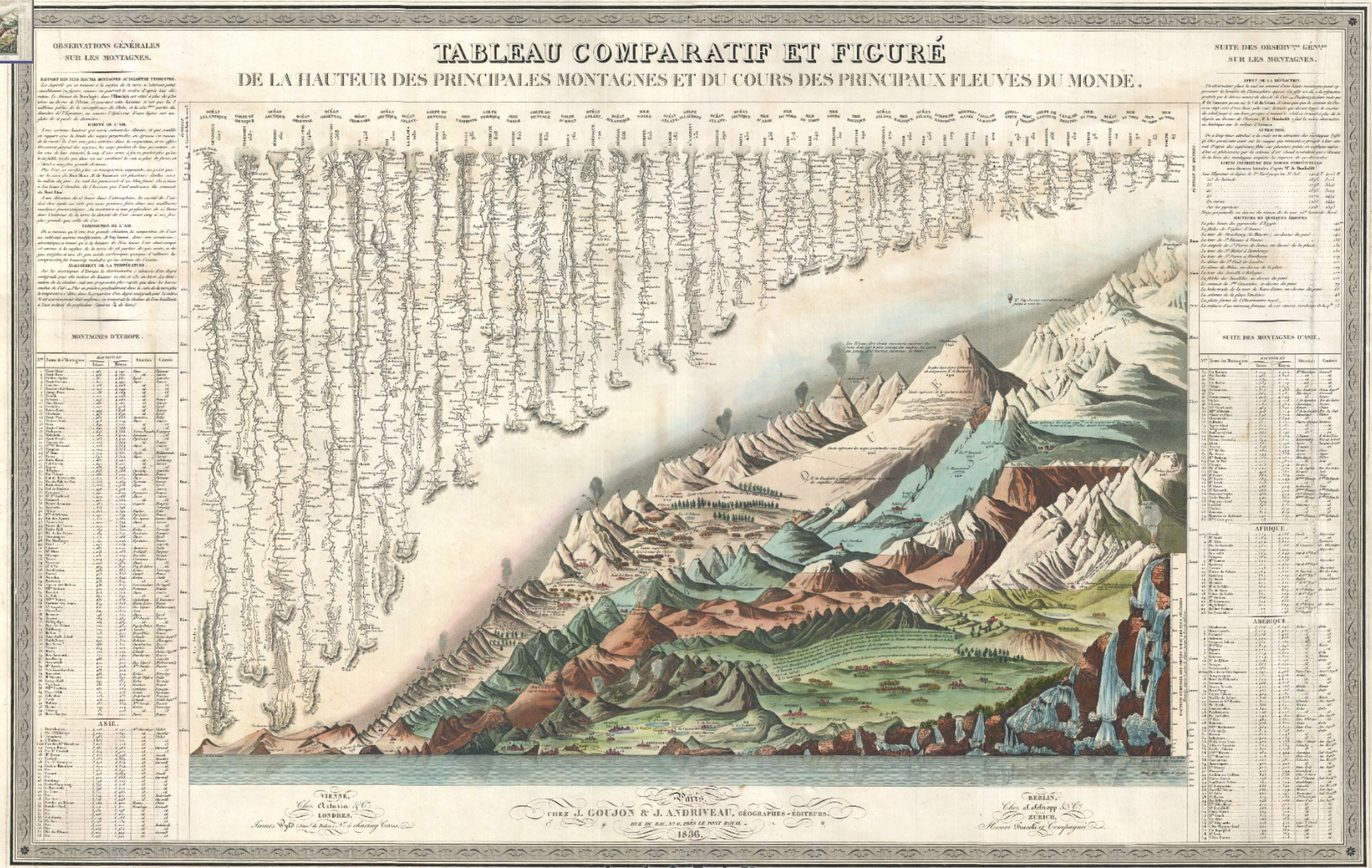
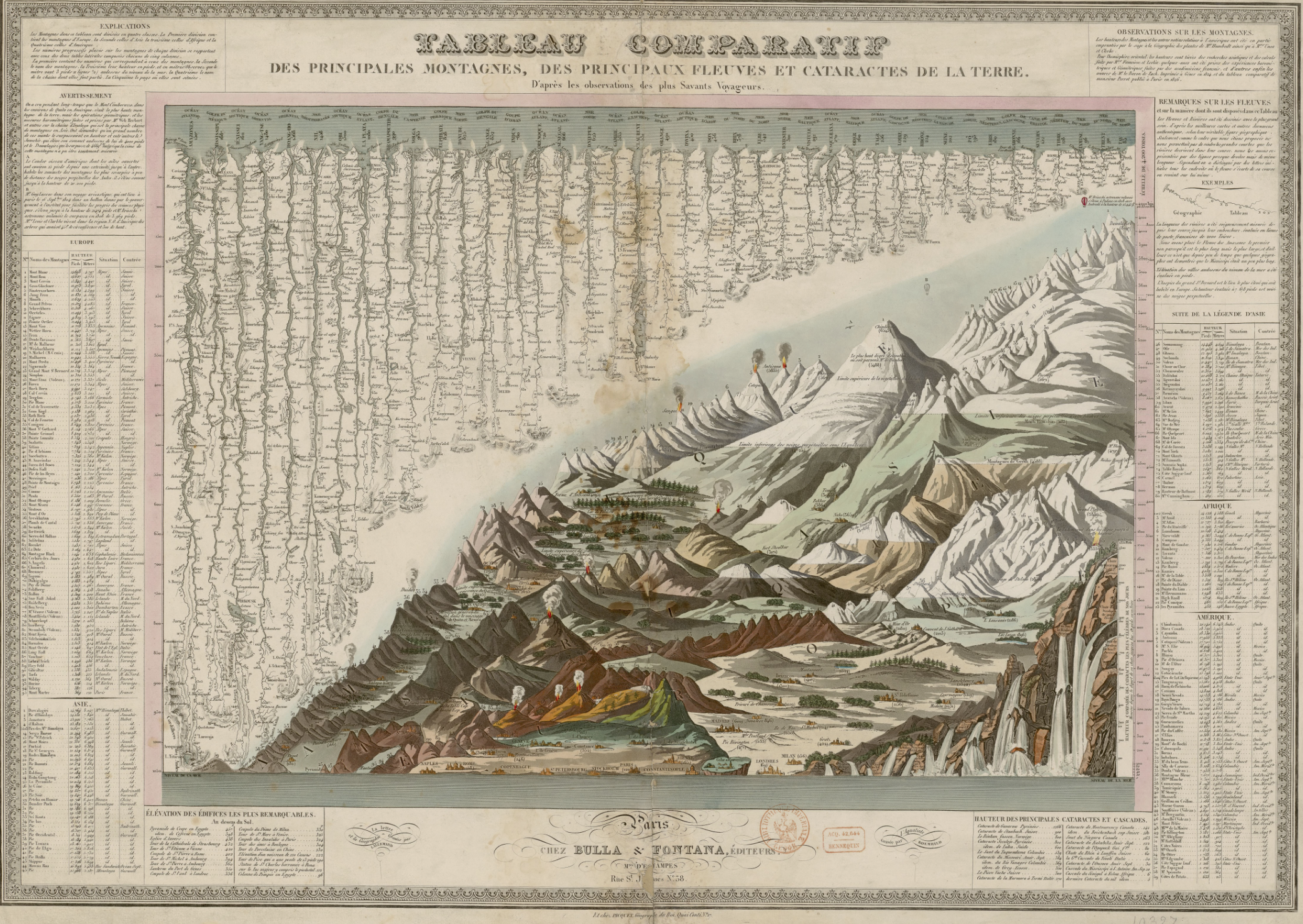 Bulla & Fontana, Tableau Comparatif des principales montagnes, des principaux fleuves, et cataractes de la terre


 .
.
