While we are increasingly deadened by data visualizations that track the infectious spread of COVID-19 across the world and country, their logic has often been implicit. As much as tracking real-time data of deaths and “hot-spots” in the world and the nation, we trust the data viz to orient us to the infectious landscape to better gain understanding of viral spread. We seek to grasp nature of the virus’ transmission, and perhaps hope that we can better grasp its spread. We depend on these daily updates to retain a sense of agency in the chaos, but realize that they are provisional, contingent, and selective snapshots, based on testing, and exist at a time delay from the virus’ actual distribution–without much predictive value. We maddeningly realize they are dependent on testing rates and reporting, and only as good as the datasets which they re-present.
On the heels of a 5% statewide positivity rate on December 5, 2020, California was declared in a state of shut down in all its counties. It almost seems that such graphics have started to fail us, as the spread of the virus overflows the boundaries of the map and permeates its space. The choropoleth renders individual counties all but indistinct, the state drowned in widespread infections, with only a few of its less populated regions as refuges. With a flood of purple overflowing the coastal counties, the delta, the Central Valley, and the entire south of the state, was there even any point in mapping the danger of viral spread beyond a state of red alert?
Dec. 5, 2020
While mapping offers little comfort in the era of saturation of heightened risk, the color-codes alert inhabitants to the danger of increased stresses on the public health system–as much as visualization challenges to translate tools of data aggregation to visualize the pandemic., as December 6 rates grew by December 19. As we shift to map a decreasingly multi-colored state by the moderate, substantial and widespread virus, and widespread cases seem to flood the state, the map offers a security of some sort of monitoring of the pandemic’s spatial spread.
The sea of purple is like Spinal Tap going raising the volume “up to eleven,” and are a sign that we are in unexplored territory that won’t be accommodated by a simple color ramp–or, indeed, a familiar cartographic iconography among our current tools of styling space. While we are used to maps embodying meaning, what the colors of the map embody–beyond risk–is unknown. To be sure, at a time when fatalities from the coronavirus in the south of the state have skyrocketed from the middle of the month, hitting records in ways terrible to even contemplate, the field of purple is a deeply human story of loss, as a surge of hospitalizations have flooded the entire healthcare community, and stretched facilities of critical care beyond anything we have known, filling half of intensive care beds in LA County at Christmas. 2020 enough to make it hard to feel any relief in the close of a calendar year, as if that unit still held any meaning, and very grim about 2021: and while the CDC allowed that there may already be a new, more contagious strain, in the nation two days before Christmas, the arrival of the more contagious strain in California and Colorado increased alarm before New Year’s.
San Francisco Chronicle, December 6 2020
SF Chronicle, December 19, 2020
How to get a handle on the novel coronavirus that we have been pressing against COVID-19 dashboards since March to grasp better, and will we able to do so in 2021?
Whatever sense agency the maps impart, it is an agency that is only as good as the compromised sense of agency that we expect in an era of geolocation, on which most maps track reports of infection. Even as we face the rather grim warning that we are waiting for the arrival of a vaccine that, in the Bay Area, rates of immunization face steep obstacles of vaccine distribution due to pragmatics of freezer space required, training of extra health care workers, and monitoring and tracking the two-stage process of vaccination, we will depend for public sanity on maintaining clear communication in maps. The actual tracking of the novel coronavirus doesn’t translate that well to a state-wide model, or a choropleth, although it is the method for public health advisories that makes most sense: we do not have small-scale public health supervision in most of the nation, although they exist at some counties. The stressed Departments of Public Health in areas are without resources to manage COVID-19 outbreaks, public health compliance, or retaliations for public health violations: and the effort to create public health councils to manage compliance and violations of public health orders may be seen by some as an unneeded bureaucracy, but will give local governments resilience in dealing with an expanding epidemic, at the same time as governmental budgets are stressed, and no body of law about COVID violations exists.
Rather than map on a national or state-wide level, we can best gain a sense of how much virus is out there and how it moves through attempts of contact tracing–even if the increasing rates of infection may have gone beyond the effectiveness of contact tracing as a methodology that was not quickly adapted by a federal government the prioritized the rush to a vaccine. The basis for such a map in LA county can reveal the broad networks of contagion, often starting in small indoor gatherings across the region, and moving along networks of spatial mobility across the city and San Fernando Valley, and help embody the disease’s vectors of transmission as we watch mortality tallies on dashboards that give us little sense of agency before rising real-time tolls.
ESRI
If such ESRI maps suggest a masterful data tracing and compilation project, the data is large, but the format a glorification of the hand-drawn maps of transmission that led to a better understanding of the progress of Ebola on the ground in 2014, used by rural clinics in western African countries like Liberia and Rwanda to stop the infectious disease’s transmission and monitor the progress of contagion to limit it–as well as to involve community members in the response to the virus’ deadly spread.
We may have lost an opportunity for the sort of learning experience that would be most critical to mitigate viral spread in the United States, as no similar public educational outreach was adopted–and schools, which might have provided an important network for diffusing health advisories to families, shifted predominantly to distance learning and providing meals, but we became painfully aware of the lack of a health infrastructure across America, as many openly resisted orders to mask or to remain indoors that they saw as unsubstantiated restrictions of liberty, not necessary measures.
Hand-Drawn Public Health Map of Ebola Transmission in Liberia(2014)
We are beyond contact tracing, however, and struggling with a level of contagion that has increased dramatically with far more indoor common spaces and geographic mobility. Yet the broad public health alerts that these “news maps” of viral spread offer readers omits, or perhaps ignores, the terrifying mechanics of its spread, and the indoor spaces in which we know the virus is predominantly acquired. The rise of newly infectious mutated strains of the novel coronavirus was in a sense inevitable, but the rising tension of what this means for the geographical distribution and danger of the coronavirus for our public health system is hard to map to assess its wide distribution, and we take refuge in mitigation strategies we can follow.
Why have we not been more vigilant earlier to adapt the many indoor spaces in which the virus circulates? It bears noting that the spread of virus in the state was undoubtedly intensified by over a hundred deaths and 10,000 cases of infection to spread in the density of a carceral network, which seems an archipelago incubating the spread of viral infections in the state. We only recently mapped the extent of viral spread across nineteen state prisons by late December 2020, tracked by the Los Angeles Times, but often omitted from public health alerts–
Coronavirus Cases Reported in Nineteen California Prisons, Dec. 21, 2020
–and the density of Long-Term Care centers of assisted living across the state, which were so tragically long centers of dangers of viral spread, as the New York Times and Mapbox alerted us as the extreme vulnerabilty of elder residents of nursing homes, skilled nursing facilities, retirement homes, assisted-living facilities, residential care homes who cannot live alone was noted across the world. The data that was not provided in the grey-out states interrupted the spread of infections among those often with chronic medical conditions was not surprising, epidemiologically, but terrifying in its escalation of the medical vulnerability of already compromised and vulnerable populations–and steep challenges that the virus posed.
unlike those greyed out states that fail to release data on deaths linked to COVID-19 infections, congregate on the California coast: while the New York Times depicted point-based data of the over 100,000 COVID-related deaths in nursing homes are a small but significant share of COVID deaths, exposure for populations with extraordinarily high probability of possessing multiple possibilities for co-morbidities is probably only a fraction of infections.
We strain to find metrics to map the risk-multipliers that might be integrated into our models for infectious spread. It seems telling to try to pin the new wave of infections in a state like California to increased contact after Thanksgiving–a collective failure of letting up on social distancing in place since March–as the basis for a post-Thanksgiving boom in many regions of the state, using purely the spatial metrics of geolocation that are most easily aggregated from cell phone data in the pointillist tracking of individual infections in aggregate.
New York Times/CueBiq Mobility Data
Based on cell-phone data of geolocation, a proxy for mobility or social clustering that offered a metric to track Americans’ social proximity and geogarphical mobility–including at shopping centers, oceanside walks in open spaces, and even take-out food curbside pickups, as well as outdoor meals and highway travel, few counties curbed aggregation as one might hope–although the fifty foot metric accepts the many outdoor congregations that occurred, well within the Cuebiq metric, wearing or without masks. A magenta California registered pronounced proximity, grosso modo, discounting any mindful innovative strategies in the state.
Increased Spatial Closeness within Fifty Feet/CueBiq/Graphic NBC News, Nigel Chiwaya and Jiachan Wu
It is stunning to have a national metric for voluntary mobility, rough as it is, to measure internalization of social distancing protocols and potential danger of a post-holiday COVID-19 bump. To be sure, we are stunned by geolocation tools to aggregate but risk neglecting the deeper infrastructures that undergird transmission, from forced immobility. While geolocation tools offer opportunities for collective aggregating whose appeal has deep historical antecedents in measuring contagion and anticipating viral transmission by vectors of spatial proximity, geospatial tools create a geolocation loop in visualizations which, however “informative” perpetuate a spatiality that may not clearly overlap with the actual spatiality of viral transmission.
Even if we demanded to map what were the novel coronavirus had “hot-spots” in mid- to late March, as if processing the enormity of the scale we didn’t know how to map, aggregating data without a sense of scale.
March 26, 2020
Across the summer, it seems best to continue to map daily numbers of cases, relying on whatever CDC or hospital data from Hopkins we had, trying to aggregate the effects of the virus that was spreading across the country whose government seemed to provide little economic or medical plan, in maps that tallied the emergence of new cases, as new hotspots appeared across the land, meriting attention difficult to direct.
We are plowing infections and mortality with abandon in a steady diet of data visualizations that purport to grasp disease spread, that were once weighted predominantly to the New York area, even as they spread throughout the nation by the end of March, but remaining in the thousands, at that point, as even that low threshold was one by which we were impressed. The tracking of the local incidence of reported cases seemed to have meaning to grasp the meaning of transmission, with a pinpoint accuracy that was assuring, even if we had no way to understand the contagion or no effective strategy to contain it. But we boasted data visualizations to do so, focussing on the nation as if to contain its spread in antiquatedly national terms, for a global pandemic, not mapping networks of infection but almost struggling to process the data itself.
After all, the John Snow’s cholera maps of John Snow are the modern exemplars foregrounded in data visualization courses as game-changing images as convincingly precise pictures of infection progressing from a water pumps in London neighborhoods is often seen as a gold standard in the social efficacy of the data visualization and information display. The elevation of the pinpoint mapping of cholera mortality in relation to a water pump from which the deadly virus was transmitted in a nineteenth-century London neighborhood:
John Snow, “Cholera Deaths in Soho”
The Snow Map so successfully embodies a convincing image of contagion that it has taken on a life of its own in data vis courses, almost fetishized as a triumphant use of the plotting of data that precisely geolocated mortality statistics allow, and can indeed be transposed onto a map of the land to reveal the clustering of death rates around the infamous Broad St. pump, that created a legible vector of the transmission of diseases in the Soho neighborhood, so convincing to be touted as a monument of the data sciences.
Open-Air Water Pumps Tainted by Cholera measured in John Snow’s Map
Snow is lauded for having effectively showed that, in ways that changed scientific practices of collective observation and public health: rather than being communicated by miasmatic infections that spread to low-lying London from the Thames, mortality rates could gain a legibility in proximity to a pump that transmitted an infectious virus, often presented as a conceptual leap of Copernican proportions (which it was, when contrasted to miasma that emanated from the Thames to low-lying areas–if it anticipated a bacteriological understanding of viral transmission). The association of danger with the water procured on errands from neighborhood pumps however replaced the noxious vapors of a polluted river, as in earlier visualizations of the miasma that lifted the noxious fumes of the polluted Thames river to unfortunate low-lying urban neighborhoods, who were condemned by urban topography to be concentrations of a density of deaths of more striking proportions and scale than had been seen in the collective memory.
Snow made his argument by data visualizations to convince audiences, but he mapped with a theory of contagion. But if Snow’s maps works on how the virus is communicated in outdoor spaces–and how a single site of transmission can provide a single focus for the aggregation of mortality cases, COVID-19 is an infection that is most commonly contracted in indoor spaces, shared airspace, and the recycled unfiltered air of close quarters. And the indoor spaces where COVID-19 appears to be most often transmitted stands at odds with the contraction in outdoor common spaces of the street and service areas of water pumps, that create the clear spacial foci of Snow’s map, and the recent remapping by Leah Meisterlin that seeks to illuminate the urban spaces of the contraction of cholera in a digital visualization as a question of intersecting spatialities.
Current visualization tools compellingly cluster a clear majority of cholera deaths in proximity to a publicly accessible pump where residents drew water where viral pathogens that had colonized its handle. But we lack, at this point, a similarly convincing theory of the transmission of the novel coronavirus SARS-CoV-2.
But the logics of COVID-19’s communication is nowhere so crisp, and difficult to translate to a register that primarily privileges spatial contiguity and proximity–it is not a locally born disease, but a virus that mutates locally across a global space: a pandemic. And although contact-tracing provides a crucial means of trying to track in aggregate who was exposed to infection, we lack any similarly clear theory to metaphorically grasp the contagion–and are increasingly becoming aware of the central role of its mutation to a virus both more infection and that spreads with greater rapidity in confronting the expansive waves of infection in the United States–as if an escalated virulence grew globally in the first months of this rapidly globalized pandemic.
Our dashboards adopted the new versions of web Mercator, perhaps unhelpfully, to offer some security in relation to the nature of viral spread, which, if they served as a way of affirming its truly global scope–
NextStrain
–also suggested that global traffic of the virus demands its own genomic map, as the virus migrates globally, outside strictly spatial indices of global coverage, and that perhaps spatial indices were not the best, in the end, for accounting for a virus that had began to develop clear variants, if not to mutate as scarily as many feared, into a more virulent form.
And it may be that a genomic map that allow the classification of viral strains of genomic variability demand their own map: for as we learn that genomic mutation and variation closely determines and affects etiology, communication of the viral strains offers yet a clearer illustration that globalization articulates any point in terrestrial space to a global network, placing it in increased proximity to arbitrary point not visible in a simple map, but trigger its own world-wide network of markedly different infectiousness or virulence.
NextStrain
From December 4 2019, indeed, we could track emergent variants of the virus best outside of a spatial scale, as much as it reminded us that the very mobility of individuals across space increased the speed and stakes of viral contagion, and the difficulty to contain viral spread, in the interconnected world where viral variation recalled a flight map, set of trade routes, or a map of the flow of financial traffic or even of arms. Mutations were understood to travel worldwide, with a globalism that a spatial map might be the background, but was indeed far removed, as we moved beyond questions of contact tracing to define different sizes of genomic mutation and modifications that we could trace by the scale of mutations, not only the actual places where the virus had arrived.
Was place and space in fact less important in communicating the nature of COVID-19’s increasing virulence?
The maps of genomic variation traced not only the globalization of the virus, but its shifting character, and perhaps etiology across some thirty variants by late April, that show both the global spread of the virus, and the distinct domination of select strains at certain locations, in way that researchers later theorized the ability to “track” mutations with increasing precision. If researchers in Bologna defined six different variants of coronavirus from almost 50,000 genomes that had been mapped globally in laboratory settings to map variants of the virus whose signatures showed little more variability than strains of the flu in June, variations of signatures seemed a manner to map the speed of coronavirus that had traveled globally from by February 202 to the lungs of the late Franco Orlandi, an eighty-three year old retired truck driver from Nembro, Italy, whose family could not place China on a map when, following diagnostic protocol, attendant physicians in Bergamo asked if Orlandi had, by chance, happen to have traveled to China recently.
NextStrain
Despite lack of serious mutation, thankfully, the data science of genomic sequencing of the COVID-19 cases triggered by genomic mutations of SARS-CoV-2 genome of just under 30,000 nucleotides, has experienced over time over 353,000 mutation events, creating a difficult standard for transmission into equivalent hot spots: some hot spots of some mutations are far more “hot” than others, if we have tried to plot infections and mortality onto race, sex, and age, it most strikingly correlates to co-morbidities, if all co-morbidities are themselves also indictors of mortality risk. While the mutations have suggested transmission networks, have the presence of different levels of mutations also constantly altered the landscape of viral transmission?
It makes sense that the viral variant was tracked in Great Britain, the vanguard of genomic sequencing of the novel coronavirus as a result not only of laboratory practices but the embedded nature of research in the National Health Services and the monitoring of public health and health care. Enabled by a robust program of testing, of the some 150,000 coronavirus genomes sequenced globally, England boasts half of all genomic data. Rather than being the site of mutations, Britain was as a result the site where the first viral variant was recognized and documented, allowing Eric Volz and Neil Ferguson of Imperial College London to examined nearly 2,000 genomes of the variant they judged to be roughly 50% more transmissible than other coronavirus variants, magnifying the danger of contagious spread in ways feared to unroll on our dashboards in the coming months. As teams at the London School of Hygiene and Tropical Medicine studied the variant in late 2020 in southeast England, they found it to be 56% more transmissible than other variants, and raised fears of further mutations in ways that rendered any map we had even more unstable.
The virus SARS-CoV-2 can be expected to mutate regularly and often. While England boasts about half of all global genomic data on the virus, of the 17 million cases of SARS-CoV-2 infections in the United States, only 51,000 cases of the virus were sequenced–and the failure to prioritize viral sequencing in America has exposed the nation to vulnerabilities. And although California has sequenced 5-10,000 genomes a day of the novel coronavirus samples by December, and Houston’s Methodist Hospital have mapped 15,000 sequences as it watches for new viral variants; an American Task Force on viral variants will be rolled out early in 2021, as the discovery of viral mutations haves spread across five states in the western, eastern, and northwestern United States. While it is not clear that the viral variant or mutations would be less susceptible to polyclonal vaccines, most believe variants would emerge that would evade vaccine-induced immunity.
We think of earth, wind and fire as elements. Or we used to. For the possibility of separating them is called into question in the Bay Area, as wind sweeps the smoke of five to seven fires, or fire complexes, across the skies, we are increasingly likely to see them as layers, which interact in a puzzle we have trouble figuring out. Indeed, the weirdly haunting daily and hourly maps of air quality map the atmospheric presence of particulate matter by isochrones brought late summer blues to the Bay Area. Blue skies of the Bay Area were colored grey, burnt orange, and grey again as cartoon plumes of soot flooded the skies in a new sort of pyrocumulus clouds that turned the sun red, offering a disembodied traffic sign telling us to stop.
Clara Brownstein/October 1, 2020
Fire season began by remapping the town in terrifying red that registered “unhealthful,” but almost verging on the “hazardous” level of brown, based on local sensors monitoring of ozone, but is also registering a deeper history defined by an absence of rain, the lack of groundwater, the hotter temperatures of the region and the dry air. The map is both existential, and ephemeral, but also the substrate of deep climate trends.
AQI Chart on Saturday, August 22, 2020/AirNow (EPA)
Is fire an element we had never before tracked so attentively in maps? We did not think it could travel, or had feet. But wildfire smoke had blanketed the region, in ways that were not nearly as visible as it would be, but that the real-time map registers at the sort of pace we have become accustomed in real-time fire maps that we consult with regularity to track the containment and perimeters of fires that are now spreading faster and faster than they ever have in previous years. And soon after we worried increasingly about risks of airborne transmission of COVID-19, this fire season the intensity of particulate pollutants in the atmosphere contributed intense panic to the tangibility of mapping the pyrocumulus plumes that made their way over the Bay Area in late August. As the danger of droplets four micrometers in diameter remaining airborne seemed a factor of large-scale clusters, the waves of black carbon mapped in the Bay Area became a second sort of airborne pathogen made acutely material in layers of real-time Air Quality charts.
The boundaries of fire risk charts and indeed fire perimeters seemed suddenly far more fluid than we had been accustomed. When we make our fire maps with clear edges, however, it is striking that almost we stop registering the built environment, or inhabited world. As if by the magic of cartographical selectivity, we bracket the city–the sprawling agglomeration of the Bay Area–from the maps tracking the destructiveness and progress we call advancing wildfires, and from the isochronal variations of air quality that we can watch reflecting wind patterns and air movements in accelerated animated maps, showing the bad air that migrates and pool over the area I life. The even more ephemeral nature of these maps–they record but one instant, but are outdated as they are produced, in ways that fit the ecoystem of the Internet if also the extremes of the new ecosystem of global warming–the isochrones seem somewhat fatalistic, as they are both removed from human agency–as we found out in the weeks after the Lightning Siege of 2020 that seemed a spectacle of the natural world that rivaled the art of Walter de Maria in their grandiosity of time-lapse photography–
–the horizontal line of artificial light from Santa Cruz, unlike the images that De Maria created from The Lighting Field, remind us of the overlap between inhabited spaces where conflagrations in the dry wildlands that spread as the fires struck, and in way far less difficult to aestheticize than The Lightning Field set in a desert removed from human population, but was built as an isolated field for time-stop photography.
The CZU complex brought widespread devastation across areas of extra urban expansion in the Santa Cruz Mountains was almost a map that registered the expansion of residences to the very borders of forests. We haven’t ever faced the problem of maintaining and clearing in weather this dry, even if we have mapped the clustering of fires in the wild land-urban interface: but the strikes ignited underbrush lain like kindling, on the boundaries of the raging fire complexes. If the burning of underbrush by fire mitigation squads seeks to create fire lines in the mountainous landscape to create new perimeters to forestall the advance of major fires, working along a new fire line even as what is still called wildfier smoke travels across the nation, far beyond the Bay Area.
While watching the movement of fires that them in inhabited areas like shifting jigsaw pieces that destroy the landscape across which they move. These marked the start of megafires, that spread across state boundaries and counties, but tried to be parsed by state authorities and jurisdictions, even if, as Jay Inslee noted, this is a multi-state crisis of climate change that has rendered the forests as fuel by 2017–for combined drought and higher temperatures set “bombs, waiting to go off” in our forests, in ways unable to be measured by fire risk that continues to be assessed in pointillist terms by “fuel load” and past history of fires known as the “fire rotation frequency.” When these bombs go off, it is hard to say what state boundary lines mean.
Fire Threat Risk Assessment Map, 2007
If San Francisco famously lies close to natural beauty, the Bay Area, where I live, lies amidst of a high risk zone, where daily updates on fire risk is displayed prominent and with regularity in all regional parks. These maps made over a decade ago setfire standards for building construction in a time of massive extra-urban expansion. But risk has recently been something we struggled to calculate as we followed the real-time updates of the spread of fires, smoke, and ash on tenterhooks and with readiness and high sense of contingency, anxiety already elevated by rates of coronaviurs that depended on good numbers: fire risk was seen as an objective calculation fifteen years ago, but was now not easy to determine or two rank so crisply by three different shades.
Fire Risk Map, 2007
When thunderstorms from mid-August brought the meteorological curiosity of nearly 12,000 dry lightening dry strikes from mid to late August 2020, they hit desiccated forests with a shock. The strikes became as siege as they set over three hundred and fifty-seven fires across the state, that rapidly were communicated into expansive “complexes” of brush fires.
We map these fires by state jurisdictions, and have cast them as such in policy, by borders or the perimeters we hope to contain barely grasp the consequences of how three quarters of a million acres burned up suddenly, and smoke from the cluster of fires rose in columns that spread across state boundary lines as far as Nebraska, and how fire complexes that spread across three million acres that would soon create a layer of soot across the west, eerily materialized in layers of GIS ESRI maps of environmental pollutants, while toxic particulate mater released in plumes of black carbon by the fires cover the state, rendering the sun opaque where I live, in the Bay Area, now Pompeii by the Bay as smoke at toxic levels blanketed much of the state.
They even more serious map, to be sure, was of fire spread: but the maps of air quality set the entire western seaboard apart from the nation, as if threatening to have it fall into the ocean and split off from the United States,–even if the burning of its open lands was more of a portent of things to come, they were a historical anomaly, lying outside the record of fire burns or air quality, if the poor air quality traced the origin of black carbon columns of smoke that would rise into the nation’s atmosphere.
Donald Trump has presented a new notion of the Presidency to the United States: the open claim to be President of only some of the nation, and to have that model of Presidential rule become the standard for political decisions. This policy was not Trump’s own decision: the retreat from any interest in bipartisan governance that had been the basis for American politics for two hundred years began in the pitched nature of pointed acrimony in the United States Senate that erased the decorum and respect among different interests in a model of collective action for over two centuries.
Already by 2011, the nation divided into spectral schema suggesting slight chance of local bipartisan governance, disguising often narrow margins of political victory, despite eighteen states where Republicans controlled both the legislature and governor’s mansion in 2011, some eighteen were split.
Republican States, 2011
While the pitched fervor of some of our national divisions bears the imprint of faith-based movements, they are replicated in the pointillistic logic of the electoral plans of REDMAP–a concerted attempt of regional redistricting. For the reconfiguration of electoral districts has staked out a problem of governance as a strategy of victory that would erode the project of governance, by privileging “states” as an amassing of electoral votes,– rather than positing the coherence of the interests of the nation as a whole. The concept of governance seems fragmented, bolstered by regionalism, states rights discourse, and the cruel new isolationism of go-it-aloneism.
Recast in the optics of the 2020 election as a choice between “darkness” and “light” of truly terrifyingly Manichean proportions, evoking near-apocalyptic scenarios to recast public debate as issues of identitarian self-interest. The divide of states on the 2000 electoral map, which didn’t change much over eight years, enshrined a blue versus red state logic, dovetailing with a deeper plan of retaining electoral control. This was the map was dramatized on election night in a television drama that suggested the contingency of voting preferences, and the election night reveal of the electoral map in the seventh season of The West Wing, in 2006. At a time television newscasters needed to remind their audience states shaded blue sent electors to vote for Democrat Matt Santos (modeled in 2004 on then-Illinois State Senator Barack Obama, who just delivered the nominating speech at another convention), red ones for his Republic opponent, Arnie Vinick–Campaign Director colored a dry-erase board as results were announced.
The West Wing, “Election Night” (April 2006)
Obama provided a model for Santos as a candidate not defined by race, pivoting from race to underlying unity among red and blue states, but the restate-blue state divide was militarized. And when Barack Obama was re-elected in 2012, the Republican state legislators in Virginia, Michigan, Wisconsin, Pennsylvania, and Ohio adopted the idea of ensuring Republican victories by rigging the Electoral College according to the congressional districts that they had redesigned, rather than in bulk, in the hopes to skew the distribution of electors by the congressional districts they had guaranteed would be firmly red, having designed districts that even in what were considered “blue” states had “red” legislatures. m so that districts would be assured that they would not be “outvoted” by urban metro areas would dictate a future.
This gave rise to the logic that asserted the “rural” non-metro regions should reclaim a place at the table by recrafting representational politics to give new meaning to those who increasingly feared–or felt–that their vote just didn’t count but felt that their futures on the line. By redrawing districts, legislatures magnify rural interests outside large metro areas, offering a logic magnifying their political representation through congressional districts as power bases and political divides: not by blue and red states, but by a red republic, in need of its voice. The plan to self-segregate matched a strategy of segregating separate electoral votes from the popular vote worked by recasting electoral districts on party-skewed lines, independent of any geographic shape save benefitting one party, at the expense of another, at violence to the republic. It was echoed in a tactic of political obstructionism that provided the logic for “red” areas to be increasingly opposed to current governmental policy in the Obama administration.
The reduction of debate between parties may have begun on a local level, but metastasized nationally in legislative maps. The rationale of legislative bodies has shifted on local levels from a representational logic of governance to a pitched battle–as only one party wields legislative power in all but one state in the union.
The disorienting nature of an overdetermined power play means that there is not much discussion or debate in the local states, or legislative bodies, but a sectarian consolidation of demographic identity as destiny.
The division of parties cast “red” and “blue” as forms of governance essentialized the color-choices made in news maps as almost existential terms. Indeed, the increased casting of the 2020 Presidential election as a battle between “light” and “dark” was gained distinctly apocalyptic undertones fit for the age of the Coronavirus, mapping the current elections as a referendum of the “future of American democracy” or, for President Trump, a “bright future” and “dark future” whose oppositional terms echo a religious eschatology. Was it any coincidence that the separatist blood-stained banner of the Confederacy reappeared at Trump campaign rallies in 2016, jumping the logic of a chromatic divide into opposing visions that could be understood as a nation divided in war?
Brandon Partin of Deland, FL, releases Confederate Flag For Trump at 2016 Trump Campaign Rally in Kissimmee, FLA/Evan Vucci
As candidates proclaim themselves to constituents as an “ally of light, not darkness,” the choice of the election has turned on the complexion of the nation’s political future in ways that concretize the removal of maps of support of political parties as an existential struggle for the nation’s soul, removed from questions of political representation.
The eery blocks of political division were apparent in the long led-up to the election, as the fracture lines in the nation were only less apparent because of increasing tension as to which way the highly colored states in play would slide, and how the electoral prism would mediate the popular vote.
The notion that a specter of socialism haunts America, to be promoted by the Democratic Party, is the conclusion to a logic of deeply sectarian politics of belonging.
The politics deployed wrenching topoi of danger and difference, in terms not only of grievances, but of a starkly divided landscape that raised the question of the very possibility of political consensus and the pragmatics of political representation. And while rooted in the renewed role of religious zeal in partisan politics, the fervor of opposition to–and defense of reducing insurance for pre-existing conditions–by laws like the Patient Protection and Affordable Care Act–Obamacare–as if they were articles of faith.
Yet as the 2020 election had quickly shaped up into a contest of chromatic separatism–
–the deeply oppositional dynamics of the divided landscape bode deep difficulties in governability.
2016 Presidential Election, County by County Voting Predictions
If elites have long harangued lower classes for continuing behavior that continued to spread disease, interpretation of the spread of illness has rarely divided so strikingly along separate interpretations. It is as if life or death matters were open to public debate: rarely have reactions to an infection been able to be received so clearly along partisan lines. While reaction to COVID-19 were long cast in partisan terms by the President, our Fearless Leader of Little Empathy, as far overblown, the surprise was perhaps that even as the data grew, and the exponential growth of infections in American cities began, the decision to announce Shelter-In-Place directives in hopes to “flatten the curve” shuttering non-essential businesses with increased fears of overloading public health facilities. As anti-vaccination movements grew in the United States, the skeptical strain of coronavirus denialism grew with anti-federal government movements, and the weak national public health policies in America created an uneven topography of health care as the mapping of infections provided no real sense of orientation at all: no one knew what to expect, but the uncertainty of prognosis created levels of unprecedented anxiety about disease spread, as we all visualized the worst, and grew more addicted to maps than ever before, and on more insidious platforms, remapping the causes, consequences, and corollaries of Covid’s spread–and trying to “stack” data visualizations, as if we were all experts not only in infectious disease and epidemiology, but of data visualizations–how hard could that be, actually?–too.
Faced by drastically uneven hospital bed capacities in individual states, reflecting existing fears of hospital bed capacities for intensive care units or floor beds, and deepening fears of needs to add increased beds across the nation, to confront a major public health emergency. Using different scenarios of increased needs for beds based on infection rates, a relatively moderate need for beds: infection of a fifth of the population in six months would compel expanding existing capacity for beds in multiple western states already hard-hit form infections, like Washington and California, east coast states, including Massachusetts and New York, and Midwest’s like Ohio, Michigan, and Minnesota, and many pockets of other states, including Louisiana. Actual fears of such an impending emergency of public health emergency —
–grows even sharper if one allows oneself to imagine an expansion of infection rates to 40%–not unheard of for the highly infectious novel coronavirus–over the same six month period:
1. Even as “Shelter-in-Place” measures sought to staunch the spread of infections across the nation, the uneven nature of the measures adopted by state governors, mayors, and counties suggested a fragmenting of the nation, as the governors of many states reacted to the issuance of shelter-in-place orders or stay-at-home directives by declaring their separate rule of law, in the words of Alabama’s Governor, “we are not New York state, we are not California–right now is not the time to shelter in place.”
Shelter in Place Measures Confined to Bay Area/Washington Post, March 15
Yet if the confirmed infections of the novel coronavirus seemed concentrated in preponderance in Louisiana, California, and New York, the virulence of its transmission was far more widely distributed, Philip Bump created a simple overlay to show, and the readiness of imposing measures of restriction were often resistant to accept school closures, or shuttering bars and restaurants as a means to restrain the virus’ spread.
Such choropleths are poor indicator of concentration and dispersion of infection, or of the “hot-spots” early watchers of the novel coronavirus hoped to isolate, folks commuting from counties of identifiable outbreaks created an immediately far more complicated map of viral dispersal, often crossing state lines and state jurisdictions at the very start of March, as work commuting alone bled from 34 counties into 1,356–even into Mississippi!
Despite some a lone call the President impose a national shelter-in-place order, but the response of asking for a collective sacrifice would be hard to imagine. But the animosity that Trump revealed to any governors who tried to impose a policy of social distancing has intensified a new sense of federalism, as the increasing opposition that President Trump has directed toward Governors who have responded with attempts to enforce social distancing led, mutatis mutandis, to a new call for “liberating” states from social distancing requirements, President Trump announced April 21 that “We are opening up America again,” with great content, heralding an “opening” across twenty states comprising two-fifths of the nation’s population, if partial reopening are only slated in eighteen states.
But how could one say that the need for social distancing was not increasingly important, in a nation where health care is not only not accessible to many, but that hospital bed capacity is uneven–and would need to be ramped up to serve the communities–
–but that many areas are distant from ready testing, diagnosis, or indeed the ability for easily accessible health care? What is COVID-19, if not a major wake-up call for disparities in public health and medical access?
New York Times
–and many regions suffer severe health care professional shortages, that have been obscured in the deep shortages of health professionals, according to Rural Health Info, who have revealed these gaps in the following infographic, but many towns in each county remain difficult to get to hospitals in time in cases of emergency or need.
2. The legitimacy offered to “re-opening” states for business channeled a rousing sense of false populism across the nation, courting possible onset of a second wave of infections by easing llocal restrictions on social distancing–although testing is at a third of the level to warrant safe a transition, several governors claim “favorable data” to justify opening shuttered businesses. But when @RealDonaldTrump retweeted an attack on public safety measures against COVID-19 that were enacted in California and other states to slow airborne viral infection that labeled the closures of bars, restaurants, and theaters as revealing local states’ “totalitarian impulses” in the face of COVID-19, as having effectively “impaired the fundamental rights of tens of millions of persons” and flagrantly abrogating constitutional rights and natural liberties: the endorsing of a tweet of former judge, Andrew Napolitano, of an open “assault our freedom in violation of Constitution” demeaning sheltering policies as”nanny-state rules . . . unlawful and unworthy of respect or compliance,” inviting the sort of social disobedience, encouraging the stress-test on our nation that the pandemic poses be generalized?
COVID-19 Infection Rates in United States/New York Times/March 27, 2020
While the calls to prevent violations of the U.S. Constitution have grown in recent weeks from March to April, it makes sense to question the validity of an eighteenth-century document to a public health emergency–or to abilities to respond to a zoonotic disease of the twenty-first century. Never mind that such arguments ignore the reserving of rights of state governors in the U.S. Constitutions Tenth Amendment to protect the safety, health, and welfare of the inhabitants of their territory, is the ability to manage state health not a calculus for public health officers, rather than a partisan debate? There is a despicable false populism and rabble rousing in decrying “nanny-state rules” as “unlawful and unworthy of compliance,” and covers for “assaults on freedom” as a Lockeian natural right. Yet in retweeting such charges and denigrating policies of social distancing as “subject to the whims of politicians in power,” President Trump perpetuated the notion that medical consensus was akin to an individual removed from public concerns. In doing so, Trump echoed the opinion of a member of his own Coronavirus Economic Advisory Task Force, Heritage Foundation member Stephen Moore, to protest “government injustices” echoing false populist calls to “liberate” Michigan and Minnesota from decrees of Democratic governors. As Moore called for further protests, opening a group, Save Our Country, dedicated to agitating for the reopening of states, out of concern for the “abridgment of freedom” of sheltering in place.
The call to arms over a rejection of social distancing emphasized the translation of the pandemic into purely partisan terms, and echoed the partisan resistance to the states-right discourse of a rejection of health care, using the panmdemic to divide the nation along party lines.
3. The weekend before SIP was announced in the East Bay, my daughter’s High School suspended, and I snuck out in the mask-free days for a Monday morning coffee at my favorite café, where my friend Mike caused some consternation in line by ordering through his black 3M facemask. The mood was survivalist and grim, but we stopped outside our local Safeway, as if to provisions before an impending lockdown, looking for half-and-half. Staring me in the eyes, Mike said with some resignation that the massive mortalities in northern Italy were our future in a week at most, as the spreading waves of infections migrated crosscountry, approaching in something like a delayed real time; the question was only when “It’s gonna happen here.”
What was happening across the Atlantic Ocean was trending not only on social media, but was being attentively followed by epidemiologists like Dr. Cody, apprehensive of the state of development of pubic health across the entire East Bay.
The Public Health Officers in the region had been haunted by the vision, alerted by the tangible fears of the Santa Clara Public Health Officer, Dr. Sara Cody. That very day, Cody was convening the coming early Monday morning, gripped by a sense of panic for a need for action, as the public drinking festivities of St. Patrick’s Day loomed, and as Chinese health authorities curbed travel and cancelled New Years celebration, even if its airborne communication was doubted, in hopes to contain an outbreak that still seemed centered in its largest numbers in Wuhan province–
Quartz, January 22, 2020
4. It was if we were watching in real-time image the global ballooning of COVID-19 infections in the Bay Area feared was on its way to Silicon Valley, or the entire Bay Area, as the virus traveled overseas. The lockdown that had begun in northern Italian towns in a very localized manner from late February when a hundred and fifty two cases were found in Turin, Milan, and the Veneto, had, after all, only recently expanded to the peninsula, filling Intensive Care Units of hospitals or transforming them to morgues. Although elegant graphics provided a compelling narrative, with the benefit of retrospect, that “Italy’s Virus Shutdown Came Too Late,” the interactive story of a “delayed” shutdown after the February 24 shutdown of sites of outbreak within days of the first identification of an infection in Milan, across two “red zones” around Italian cities, and the March 3 cordoning of larger areas.
February 24, 2020 Lockdowns in Northern ItalyLockdown in Response to COVID-19, March 8 2020
The reluctance to impose a broader shutdown over the northern economy created a tension between commerce and public health that led to a late ‘shutdown’ of the movement across the peninsula by March 10 to prevent infection risks, haunted by public health disaster.
Multiplication of COVID-19 Cases in Italy, February 27-March 12, 2020 BBC
Fears of the actuality of a similar public health disaster spreading under her nose led Dr. Cody to convene a quick check-up with local public health officers to see if they registered a similar alarm, and what policy changes were available across a region whose populations are so tightly tied. And the need to convene a mini-summit of Public Health Officers to take the temperature of willingness to recommend immediate public policy changes was on the front burner, as one looked at the huge difficulty of containing the outbreak in Italy–often argued to not have been responded to immediately enough, but revealing a full public health response that the Bay Area might not be able to muster, as Italy’s hospitals were flooded by patients with infections and was on its way to become the site of the most Coronavirus deaths.
Vivid fears a growth of COVID-19 filling the hospitals and emergency rooms after St. Patrick’s Day–an event for a far larger audience contracting the aggressive virus–led Dr. Cody to arrange a group call among the Public Health Officers in San Matteo and San Francisco early Monda. Dr. Cody had broad epidemiological training was rooted in an appreciation of contagious disease–including contagious diseases outbreaks like SARS, H1N1 influenza, and salmonella, and had worked on planning for public health emergencies and completed a two yer fellowship in Epidemiolgoy and Public Health, managing E. coli outbreaks as an Epidemic Intelligence Service Officer with CDC. Fears “crystallized” quickly of a scenario of similarly exponential rise in case loads making Silicon Valley a new epicenter outbreak of an epidemic overwhelming the public health services. As she quickly contacted Public Health Officers in San Francisco and San Matteo, to contemplate a response, by March 8, a lockdown in all Lombardy and other states was declared, as COVID-19 cases multiplied, in a chilling public health disaster replicating the lockdown in China.
In contrast to the uncertain public health numbers from China, as the city’s airport, highways, and rail stations, images of massive mortality from health care disasters in Italy were haunting and suddenly far closer in space, even if cases of viral infection were already reported in each province, Macao, Hong Kong, and Taiwan–revealing a global pandemic that linked place to a global space in ways difficult for some to get their minds around. The honesty that came out of Italy was an alarm.
The Bay Area health authorities were looked with apprehension at the arrival of St. Patrick’s Day celebrations, after the exponential growth of infections from COVID-19 in the region: Dr. Mirco Nacoti had just published an eye-catching account of the catastrophic conditions of Ospedale Pap Giovanni XXIII in Bergamo that weekend, describing the levels of general contamination of caring for COVID-19 patients, for whom over two thirds of ICU beds were reserved, and filled a third of 900 rooms in thd peer-reviewed NEJM Catalyst; he described phantasmagoric scenes of a hospital near collapse as patients occupied mattresses on the grounds, intensive care beds had long waiting lines and with shortages of both masks and ventilators, and poorly sterilized hospitals became conduits for the expansion of diseases. The clinical model for private care incapacitated, as patients were left without palliative care; a surge of deaths in overcrowded wards overtook China’s community-based clinics at such higher death rates of 7,3% Italian doctors plead felt incapacitated by the surge of cases overflowing at intensive care units from March 9-11 as a model for mass infection, before COVID-19 was declared a pandemic.
The desperation of a staged re-enactment of Michelangelo’s Pietà of L’Espresso were a few weeks or so off. While the spread of infections in our region had not yet begun, ant eh below photoshoot by Fabio Buciarelli did not appear until April 5, we were still formulation the desperation of confronting the ravages of disease we lacked time to develop any reactions, processing current or impending mortality rates.
Fabrizio Bucciarelli/COVID-19 Pietà. 5 aprile 2020, L’Espresso
The danger of trusting scientific modeling, or data, and fostering deep suspicions of trusting data on confirmed infections, or modeling that suggested the danger of failing to practice social distancing.
5. Decisions to “shelter in place” promised to “slow the spread” of COVID-19 transmitted widely in group settings, and able to create a public health disaster in the Bay Area, and was quickly followed by Santa Cruz county. After the growth of cases in Santa Clara county–whose rates of infection doubled over the weekend to 138 as of Monday–the absence of a any national restraining order save a suggestion to social distance, as Seattle cases of infection had grown to 400–and some 273 cases of infection had appeared over th weekend, despite limited testing availability.
The clear eventuality of a public health disaster, after a directive closing bars, night clubs, and large gatherings, as well as many school closures in San Francisco and the East Bay–where my daughter attends Berkeley High, whose doors shuttered on March 13; Los Angeles’ mayor, Eric Garcetti, closed bars, gyms, movie theaters, bowling alleys and indoor entertainment on late Sunday night, as Gov. Newsom encourage all elderly to self-isolate immediately. The 6.7 million in the Bay Area early agreed on the need for a “shelter in place” order as a basis to control the spread of COVID-19 that had been discovered in the region on March 16, 2020, anticipating the nation by some time.
The closure of all non-essential businesses in the seven counties sprung from the epicenter of Santa Clara county–Silicon Valley–but included affected a much larger area of commuters, no doubt, across an interlinked region of commuting far across the northern state to twelve other counties.
The cases in Italy would only grow, creating a textbook case of the exponential expansion of illness that killed a terrifying number of physicians in hospitals on the front lines against its expansion, as the arrival of medical supplies and medical viral specialists from China increased the logic of the lockdown as a response to its spread.
The evident stresses on the health care system of Lombardy, where a terrifying number of physicians on the front line contracted the virus and died, in the wealthy region of Lombardy, distanced the disease whose effects were projected or distanced onto China, and provided a clear scenario that Cody understood could be repeated, with even worse consequences, in the crowded population and limited health facilities of Santa Clara County: her own close ties to public health authorities in Italy made the exponential growth of cases from February 21 across the peninsula seem a preparatory run-through for a future disaster, as China was sending increasing medical supplies and specialists to Italy in a global story as a pandemic was declared in China March 11; northern provinces were declared under lockdown March 8 quickly extended to the nation, as a spike in 1,247 cases were found on the previous day.
When Cody urgently alerted San Francisco Public Health Officer, Dr. Tomás Aragón, to discuss the fears of a new epicenter of COVID-19 spread in Silicon Valley, they did not start by contemplating their authority to issue a legally binding directive to shutter businesses in the region. But as they discussed consequences of the exponential increase in Santa Clara County and the greater danger of facing an analogous overwhelming of pubic health hospitals as in Italy, haunted by a danger of a similar scenario overwhelming public health, and Cody’s tangible fear, Aragón floated the idea of a shutdown, acknowledging their authority of acting without permission of governors.or mayors or county supervisors; the call touched on a series of calls to debate options, including the most dramatic — a lockdown order–which seemed the only certain means to enforce isolation and social distancing haunted by the image of the increased diagnosis of COVID-19 across the Italian peninsula that would indeed only be publicly released March 18. Two days later, Governor Newsom expanded the policy to the entire state; the time lag meant that by late April, almost half of all infected with the novel Coronavirus in California were found in Los Angeles County, and were facing the prospect of overloading its public health system and hospitals.
Diagnoses of COVID-19 in Italy/ Ministero di Sanitá, March 18 2020
The influence of the health care provider Kaiser Permanente was unseen, but the preventive agenda of the health provider can be seen in a sense in the shadows of this quick consensus among six Public Health Officers. But the qyuick defense of the decision–soon followed by dozens of states since–suggests the prominence of Kaiser Health Care in the dynamic of emphasizing preventive health care, and in anticipating epidemiological spread. Cody’s brave insight into the fact that northern Italy provided a rehearsal for the public health disaster, shifting from the ban on mass gatherings to a concerted effort to isolate millions, was less apparent to the nation.
The ambling course of the Flint River has been too often misguidedly vilified as a center of the high lead levels that have created such a toxic crisis of high lead levels in the city’s water, as if to give a geographic source for its woes, rather than the aging local delivery system of its pipes. Yet the recent suggestion that a range of older industrial towns from New Jersey to Maine to Pennsylvania are beset by similar woes create in aging urban infrasctructures nation-wide suggests it only muddies the waters to give false specificity of the dangerous waters of the Flint River, 142 miles long. Many of the older regions of pipes for water used lead or lead solder–some 250 schools and daycare centers nation-wide are beset by dangerous levels of lead in drinking water.
Yet the demonization of the “dirty” river points a finger at one body of water as the source of E.Coli, neurotoxins, and lead: CNN has incorrectly identified the river as “a notorious tributary that runs through town known to locals for its filth.” Even Flint native Michael Moore complained of how the city’s mostly African American residents were forced to drink “from the toxic Flint River,” isolating the rivers as a source of toxicity as if to delimit it as a source of public danger rather than acknowledging or adequately mapping the structural, rather than environmental, difficulties of controlling lead leeching from pipes, at the risk of neglecting the benefits of river systems in urban environments.
And with declining spending on cleaning up lead pollutants and dangerous pipes, the infrastructure of water treatment and plumbing seems a danger of national health that disproportionately targets poorer communities, far more seriously than do drugs, terrorism or crime. If the increased malleability of lead has long encouraged its fabrication into pipes, originally by the rolled sheets by pipe-makers, the cautionary notes that were offered by the builder of second-century Rome, Vitruvius, cautioned readers of his classical architectural treatise that “Water conducted through earthen pipes is more wholesome than that through lead; indeed that conveyed in lead must be injurious, because from it white lead is obtained, and this is said to be injurious to the human system. Hence, if what is generated from it is pernicious, there can be no doubt that itself cannot be a wholesome body. This may be verified by observing the workers in lead, who are of a pallid colour; for in casting lead, the fumes from it fixing on the different members, and daily burning them, destroy the vigour of the blood; water should therefore on no account be conducted in leaden pipes if we are desirous that it should be wholesome.”
While an aide to Michigan Governor Rick Snyder explained the disaster of contaminants by which Flint’s overwhelmingly African American residents suffered, telling the Detroit Free Press with some deception that “the people of Flint got stuck on the losing end of decisions driven by spreadsheets instead of water quality and public health”–as if they were indeed the victims of bureaucracy of the EPA. Governor Snyder’s office concealed the longstanding awareness of the dangers lead pipes created for residents’ drinking water. The failure of transmission of longstanding knowledge and best practices for treating the water to prevent corrosion of lead pipes is hardly a secret: federal law stipulated its treatment with anti-corrosive agents since 2012–but such recommendations were ignored.. In a move of gas-lighting or media distraction, Snyder openly called for the state to transfer supervision of the lead-rich water to the locally elected mayor, as if this would restore responsibility to the local level.
Yet the possibility that Flint might sue the state for allowing the city’s drinking water to reach residents laden with such high lead levels by failing to mandate corrosion-control treatments, suggest that Snyder is particularly pressed to respond adequately to the suffering Flint’s poor residents have faced.
The problem of aging lead pipes is not new. Although the wisdom Vitruvius’ apparently sensible explanation of the declining vigor of blood among drinking water from lead pipes doesn’t line up well with modern medicine–Vitruvius praised the better “flavor of [water] conveyed in earthen pipes, . . . the purity of the flavor being preserved in them” (VIII.6.10-11)–the dangers of the corrosion of lead pipes is well known, and is a danger in many older urban neighborhoods. Although when geochemist Jerome Nriagu re-ignited debate on how “lead poisoning contributed to the decline of the Roman empire” by pointing to the physiological damage on brain and kidneys of such high levels of lead consumption have may occurred among even upper classes, the immediate consequences of the increased appearance of lead in the water supplies of residents in Flint, MI has provoked real alarms about the unsafe quantity of lead for poorer residents.
For the high rates of lead in Flint in the drinking water of some 666 houses–an eery number that suggests the mark of the beast, or the sign of the apocalypse–suggests not only the targeted nature of lead-levels among what were now largely lower class homes, where water supplies from the Flint River combined with failure to add anti-corrosives to preserve their older lead pipes. The leaching of unprecedented quantities into the drinking water of a cluster of homes–despite the clear stipulation in federal law that 011 study on the Flint River found water from the Flint River demanded treatment with anti-corrosive agents to be a safe source for using as piped drinking water–suggests that rather than coming from a polluted river, the many cities that still have dangerously high levels of lead in drinking water across the nation–many higher than in Flint, including Cleveland, Atlantic City, Allentown, PA, or Philadeplia–decreased expenditures on lead abatement from leaded gasoline or lead paint, or for treating water carried by lead pipes, suggest a growing national health risk.
The dense distribution of older pipes that served communities in Flint, a city whose homes have largely been abandoned by the white middle class, suggests the poor conditions of the pipes that carried water to the African-American residents of the city.
The distribution of lead-laden water in Flint raises pressing questions about the stakes of environmental pollution in an old center of automobile manufacturing, whose lead pipes rapidly corroded over time, as they have in many older cities. the failure to treat or fix water for the older pipes meant that large quantities of the toxic substance–in once case over 10,000 parts per billion (ppb), and often over 1,000 ppb–to have leached from the city’s 5,000 lead service lines and 10,000 lines of unknown composition. If the meander of the Flint River, which the local government shifted to its water source in 2013 an attempt to cut costs, while awaiting the delivery of water from Lake Huron–was long a site of public recreation and part of the city’s public space–
–the healthy nature of the river was long confounded with the danger of its treatment before delivery by the city’s pipes. Despite the higher levels of corrosive chlorides in the Flint River, the river is far less toxic itself than the water drawn from it became as it traveled on Flint’s own pipes. The anthropogenic nature of its poisoning by an older infrastructure of lead pipes has been so often confounded with the nature of the river’s water–occasioning the rise of #itisnottheriver–despite its own rich ecology. The failure to calibrate the quality of the water and their fit with the city pipes however created a , even if the city was compelled to return to Detroit water after the public media attention to the increasingly toxic lead levels in Flint’ drinking water compelled discredited drinking water from the Flint River, or eating the fish caught in it.
Despite much secrecy and delayed action, the discovery of the health consequences of high lead in Flint’s water has raised continued alarms about the levels of lead in much of the United States, both in pipes and in the alarming presence of “legacy lead” form old plumbing as well as crumbling paint, leaded gasolines, and industrial waste, and the alarmingly high levels of lead-presence that is revealed in blood examinations: nation-wide, it is estimated by the CDC that 2.5 percent of small children had elevated blood levels in 2015 above five micrograms/deciliter, running risks of stunted development and adversely effecting children’s brain development.
The discovery of such alarming blood-levels by simple testing raises alarming questions about the nature open nature of data on water quality; the presence of high levels of blood-contamination in many American cities raise questions about how maps can best embody problems of water pollution that seem poised to plague the twenty-first century. Indeed, a recent Reuters map about the high blood-levels lead are based only on available data, but raise compelling questions on the need for efforts to make more data present on blood-levels–as much as on the nation’s infrastructure. The increased blood-levels of lead are difficult to map, as is the presence of lead in water. But the compelling distributions of open data that exists on the blood-levels of lead among small children alone–who are most regularly tested, because their developmental suffering is most acute and signals the possibility of environmental pollution or contamination as “first agents.” The result maps of older cities as Milwaukee, WI–
–raises questions of the need to map the rising health risks that our older industrial infrastructures have bequeathed current generations, and the immense health costs that they are poised to create. As much as to generate disease maps of the distribution of alarming blood-levels, can we use maps to try to take stock of the dangers in the contaminated waters that so many unknowingly drink without any warning of the presence in it of lead? Would we not due best to test and map the danger in water, in addition to the levels of blood? How much of th negation, moreover, can we risk not testing? It is amazing that there remains no data for much of the suburban areas around South Bend IN or Chicago IL, as well as, as we shall see, among the rates of blood levels of lead among children in many cities and most regions of the nation–according to the records of the CDC, which does not require uniform testing–it is clear that-such data should exist in hospital records and be public, and may warrant a new level of public mapping efforts, akin to Missing Maps or Open Street Maps, keyed to public health. Even if water quality data is either suppressed or absent for a small region of the United States as a whole, according to CHR,
Maps are successful tools to translate unwieldly abstractions to terms to images we can comprehend–quite complex multi-causational concepts that range from climate change to mass extinction to El Niño to world pollution and our carbon “footprint” are suddenly able to be analyzed and discussed, if not acted upon. As well as orient us to a physical space, such maps comprehend uncertainties as climate change in graphic terms, and elegantly materialize streams of big data in fixed form, which seem underscore the complexity of our current environments. By embodying an individual image able to capture and synthesize temporal differences of temperature across space, they focus attention on otherwise ungraspable global issues in spatial terms, by knitting the consequences of multiple causation into coherent or at least persuasive form. But can the slippery nature of the flow of water, and the sites of its potential pollution, be effectively mapped?
In mapping “Priority Watersheds for Protection of Water Quality,” Robert L. Kellogg of the Water Conservation Services sought to do so. Kellogg amassed a range of what would now be called big data to create a chorography of the nation that suggested how what was then Big Agra threatened to pollute some of the largest watersheds in America, to provide a “map” of their relative vulnerability. The range of chemicals humans had introduced into the local environment, according to the Natural Resources Inventory provided a baseline of the chemicals introduced in croplands–from nitrogen from fertilizers to pounds of pesticides used–that potentially endangered local watersheds–with the result that most all of the top 400 watersheds in the country were potentially endangered.
The chart is so filled with potentially polluted watersheds to raise the question of how quickly #NextFlint–already used in protesting the Dakota Pipeline, Indian Point, lead abatement projects, and wastewater systems, but no doubt a prominent future hashtag– arrive on Twitter. It is almost not that helpful that Kellogg broke his distribution into risks of fertilizer runoff from fields of corn, barley, cotton, wheat and sorghum–
and pesticide leeching from fields of corn, wheat, sorghum, cotton, barley, and rice–
since the map paints a picture of considerable risk, but one difficult to drill down into.
And although groundwater is an important source of drinking water for many, risk of pollution is notoriously difficult to tie to drinking water in a quantitative manner. Yet the deep discolorations of the broader chorography suggest the delicate nature of our water safety because of widespread anthropogenic alterations of the agrarian environment, which almost make it difficult to distinguish nature and culture.
Variations in local water quality are far more slippery to grasp or chart with certitude–not only because of its relative nature but because of the multiplicity of anthropogenic sources of pollution used n an anthropocene world, as not only sediments, but the points at which heavy metals and carcinogens might more easily enter drinking water supplies. It’s far more likely that the water supplies in Flint, MI–where pollution went undetected for months after a switch in water supplies precipitated the leeching of high lead-levels from pipes polluted drinking water for many of the city’s residents–is less an anomaly of poor maintenance than a case that will recur. For Flint may provide a new standard by which the ongoing contamination of drinking water from old pipes is concealed, unmonitored, and played down by local officials, in ways that a more immediate mapping of sources of water contamination may prevent–and serve to monitor any changes in water quality. While there is less precedent for such mapping, the regular mapping and measuring water quality may provide the only way that we can take stock–and embody–the fragile quality of clean water that leaves our cities’ taps.
If most maps of water that are issued by the government and monitored by the United States Geographical Service take stock of freshwater rivers and groundwater quality, the vast amounts of the water with which most interact arrive through pipes, filtered finished, or otherwise treated in man-made structures before it arrives in our taps. The quality of water supplies that circulate in urban areas is particularly to map–although we map the routes of water’s delivery and the system of pipes that transport water to residences, the water that arrives for domestic or industrial use is necessary but challenging to track independently from potential sites of contamination.
The multiplication of anthropogenic effects on water supplies proves more than challenging to synthesize, let alone to gain permission to publish. This is not only because of the difficulty of mapping the paths of water’s flow, or the varied speeds at which water moves from different sources, or even intersects with pollutants such as run-off or industrial waste. In ways that go far beyond mapping the pathways of water’s flow, coordinating data about where ground water supplies intersect with contaminants especially frustrate representation, if not synthesis, in anything like a cohere system. They are especially difficult to embody in a compelling map. As familiar maps of air pollution, serious difficulties arise in assembling infuriation from multiple sources because of the falsification of self-reported data. But expanding of sites of potential pollutants makes real-time data difficult to interpret, understand, or process. Indeed, the combination of anthropogenic and biogenic effects are difficult to envision or even ascertain. So complicated are the multiple environmental potential vectors of contamination over space to conceive and to express within a single cartographical form, indeed, one must juggle them in multiple maps, greatly complicated calculations of risk, or water purity.
This post takes a stab at suggesting the difficulty of tracking water safety with needed transparency at the same time as the number potentials sources of pollutants and contamination–not all of which are clearly or entirely anthropogenic–continue to escalate. As we still struggle to come to terms with the Flint, MI disaster, it seems important to wrestle with the possible vectors of changes in drinking water quality before doing so in later sections of this post, after the first two sections review the challenges of directing attention to water-quality in a series of online interactive maps from the National American Water-Quality Assessment of rivers and streams developed by USGS.
1. The multiple pathways and courses by which water arrives from rivers, streams, rainfall and aquifers are not the prime obstacles to map water quality. Even without accounting for finished water, the increased multiplication of possible sites for its contamination by toxins are difficult to render or make clear with the desired transparency. And it would be good to remember that a large share of the country, geographically speaking, still depends directly or indirectly on surface-water from rivers or streams, with 90% shade dark blue:
The static nature of even a real-time tracking of surface water quality is oddly removed from the fluid nature of water, if based on the limits of data collection: in the set of USGS maps below, a dense scattering of inverted triangles in various stages of alerts collect local variations in levels of water temperature in a single frame of reference oddly removed from water flow. Interactive maps in USGS WaterWatch on streamflow conditions collect points of data in a series of pointillist snapshots, keyed across a broad spectrum, that invites us to zoom into states and localities; they allow the viewer to hover over localities to survey the temperature of the national waters to tap real-time data compiled at testing sites; we can click to access more legible real-time data in individual states. Most often, these maps track the status of groundwater as an important national good, using local monitoring stations in order to reveal any possible surprises or signs of disturbance.
The level of access to such information serves to create an effective illusion of comprehensiveness and of transparency, augmented by its real-time data. But does the symbolic coherence of such a tallying of data in a convincing map of the lower forty-eight obscure lacuna–from absences in states such as Nebraska or Vermont, almost blank, and are the reasons for surface-temperature change not rooted in local temperatures? The real-time mapping of surface water temperatures collate meteorological conditions that affect surface water in ways that raise interesting questions of anomalies in surface water temperatures that might be assembled with other variables to create a comprehensive picture of the characteristics of the nation’s groundwater from its individual snapshots, to contribute to a record of its safety.
Such a sense of comprehensiveness is communicated best by hovering over regions, and driving down into states, to more closely examine specific instances of water quality by different criteria. But the looming question of how to embody their coherence in more convincing ways for the viewer might be left as open questions for future data visualization.
Several other maps help us to consider such questions better. The data points of real-time local levels of nitrates in surface water–albeit strikingly filled with startling blank spots and lacuna, that advertise its selectivity in agricultural regions–is striking despite the quite limited picture of water pollution it offers, due to constraints of available data feeds.
Both are difficult as a way to grasp or process as a coherent system of flow, oddly. For despite the usefulness to explore as repositories of data and the huge amount of data they serve to process from testing sites across the nation to a wide audience. They raise questions of how such information might be better embodied in more effective ways, but do not even try to show water’s local flow.
Such questions seem return when we move to discharge–water-flow–although the effects of obstruction of water are clearly anthropogenic in character. Records of national distribution of real-time discharge remain compelling to navigate across drainage areas are compelling, inviting us to hover over the dot-like distribution of levels of discharge that enter surface water, whose rainbow-like spectrum note divergences from “normal” levels. Yet if the variations in discharge suggest differences in water’s obstruction, it indicates the huge impact humans and man-made structures exert on water’s flow.
The wonderfully informative sequence of interactive USGS charts cannot help but raise questions about what alternate real-time measurements–in addition to pH and turbulence–might be collated on open-access servers in different ways for new audiences, moreover, and how the notion about open data about water supplies might be expanded to fit current needs. For in an era of increasing water scarcity, the servers on which open data about water quality lie might be developed in far more dynamic ways.
The rest of this post might be read as an extended reflection on that question. An early illustration of the questions that the National Water Quality Assessment rain for this blogger is captured by a compelling image of levels of nitrates in the watershed of the Mississippi–a subject on which I’ve written earlier. The nitrate loading of larger rivers in the United States is evident in a current USGS map of annual loading of nitrates entering the Mississippi River from its tributaries of 2014, comparable to previous years, which more clearly represents the anthropogenic impact on water quality of different watersheds–even if one wishes one could drill down more, or examine the arrival of other pollutants. But the map’s use is particularly significant for what it tells us about the ways farmlands increasingly intersect with water quality.
Despite difficulties in a symbology sufficient to track water’s fluid paths nationwide, the intersection of water with potential sites of contamination which have so broadly proliferated in the modern world to imperil drinking supplies that repeated remapping cannot in itself resolve. We can usefully model hydrologic flows from data points, but the intersection of anthropogenic and biologic and environmental contaminants demand more creative maps–as do the courses along which water flows in major rivers of the lower 48 contiguous states, scaled by average flow and sized in proportion to data gained from “gage-adjusted flow,” creating an organic map of discharge based on the National Hydrographic Database, NHDPlus v2. Can we better track how such water picks up contaminants, mineral content, as it moves through underground paths or joins agricultural runoff, and, if so, how might such information might be better embodied a perhaps more effective way in a national database?
2. The maps raise questions of how to represent the relation of water to its environment. The question might be better expressed by earlier attempts to classify comprehensive records of rivers, waterfalls and global topography, comprehended entirely through their distance or size–if only to consider what information might be most effectively integrated within its representation of the surface water used in daily life, before we move to the drinking water provided by water-finishing stations. For the interest in mapping water was long inseparable form its embodiment in rivers, streams, and lakes, without any possibility or idea of encoding data about its quality on such massive scale as is necessitated by our water supplies.
Indeed, while rivers were long mapped as disembodied courses, in the below map of the world’s rivers, contains, and waterfalls, the transit of fluvial waters is almost quaintly isolated as an ineffective model for mapping the transit of water in the modern world to modern eyes, isolated as it is from any environmental context or relation to their physical surroundings. In ways that seem inconceivable given the premium that maps of water now place on environmental concerns, the discreet pathways of each river is abstracted from their environmental map, and water is mapped in this famous example of synthetic maps as an elegant visual compendium of knowledge, translating discreet mountains, rivers, glaciers, and indeed waterfalls to a coherent pictorial fictional landscape, whose coherence exists in isolation from an ecosystem. The compression of comparative data as an inviting landscape suggest a pristine world we have lost in the age of the anthropocene.
Bulla and Fontana, 1828
If the viewer of such a map seems addressed as a spectator of wonders, the popular genre of a geographical pastiche aims to dominate nature by exact measurements, assembling a world not yet out of balance in a pictorial pastiche whose frame of reference can be fixed and includes only small if significant references to human presence. A similarly unthinkable quarantining of the course of the river from immediate surroundings was continued in the “ribbon-maps” of the Mississippi, which Coloney and Fairchilds in 1866 patented as designs following the course of water, as if it were a Trip-Tik or highway:
Today, by contrast, the variation of local levels of contamination are so great so as to be difficult–if not impossible–to define save by possible chemical and non-chemical contaminants of different levels of consequence. But the USGS maps above raise questions of what data we openly register about water quality. Assessment depends on tracking the presence of possible pollutants as well as finishing agents in hopes to establish some broader index of what might be accepted as “water quality,” although the criteria or algorithm for arriving at such a standard has been widely contested–creating multiple uncertainties for how a map of water quality might be credibly assembled.
Different water quality standards not only exist in different states depending on how that water is used, but drinking water standards not only vary widely but are expressed as targets or guidelines, rather than reflections of actuality–and still differ more broadly among nations in terms of levels of mineral substances, pollutants or bacterial counts.
There is limited data that such maps reveal about what drinking water–the often finished water with which we daily interact. If drinking water is far more open to far more vectors of contamination, as the case of Flint, MI has reminded us, and levels of finishing to which drinking water is subject, it is striking how much of the nation is dependent. But this initial survey of water quality raises questions of what sorts of coherence can exist in maps of water quality, and indeed the difficulty of cartographical selectivity that one brings to any water map. Fortunately, there is an attempt to create rankings of Drinking Water Quality in the state of California, where OOEHA–the Office of Environmental Health and Health Hazard Assessment–has usefully identified eighteen contaminants in drinking water/ and ranked the quality of water across the state at different points by its own metric–but the metric of “water quality” is only as good as the criteria that it employs and adopts, and the measure of water quality by both potential exposure to contaminants and local compliance with Water Board recommendations, while a useful cudgel to increase compliance across the state, skews the purpose of the map to that end, rather than to inviting detailed drilling down into its data: publishing data on water quality is a very tricky matter, with potentially huge impacts on real estate markets, local economies, and more, and easily able to trigger public panics. The ability to drill down into data would provide a needed transparency, however, and environmental awareness.
The reduction of the uninventive datamap to select points of sampling is problematic. The map moreover reduces or limits the rankings of water quality to four, of opaque calculation, and integration of compliance as a factor, may have increased the apparent uniformity of state, where most remains a light tan to reduce alarm. In fact, the data seems massaged to make most of the highly habited regions seem fine and without cause for alarm about water quality–outside of select areas of the Central Valley, whose water quality has long been notoriously open to contamination from agribusiness as well as poor groundwater quality. Should a more dynamic map be created than what we have even from the draft version that has been provided online of what OEHHA calls “the human right to water”?
The increased awareness of the steep public health risks created by poor water, water contamination, and old pipes, has already led to an attempt to remove old plumbing in public school buildings, water fountains, and assess some water mains in urban settings. The map, produced very recently by the state of California, may set a model for future mappings of water–surely the call for submitting written comments to OEHHA suggests attempts at greater public involvement that begin from recognition of a right to clean water–
Even though the indices and metrics of water quality assessments are inconsistent, and may often be discovered to be incomplete, they provide an accessible format to monitor local water supplies, and the right to water. The range of natural and man-made contaminants entering surface water complicates tracking pollutants and potential carcinogens, particularly as a growing range of pollutants that enter groundwater supplies. The dense risks of sites of potential water pollution across the country–mapped by Alex Parks to assess “drinking water safety” in 2015 reveals a country crowded by sources of major pollutant discharge by orange circles–indeed almost obscure the division of counties into quartiles shaded from blue to deep violet.
Radical contrasts in Parks’ index of “water safety” offers a bird’s eye view of steep differences in groundwater purity across the country, distinct from the density of pollutants’ discharge.
The map bears further exploration around the region of the Great Lakes for the patchwork of drinking water “safety”, scaled from deep blue (top 25%) to violet (bottom 25%):
The complication of entries of pollutants into groundwater is a rough if telling shorthand of the huge differences in water quality across the lower forty-eight–especially around the Great Lakes.
The discrepancies in water quality across the United States that Parks calculates are provisionally created from EPA data, in a public health time-bomb waiting to explode with increased water scarcity in coming years–as it already has in Flint’s drinking water.
3. The dangerous levels of the neurotoxin lead found in drinking water in Flint, MI created an immediate sense of the increasing contingency of drinking water supplies. Ever since the crisis was precipitated by the switch in Flint to the water of the Flint River in April 2014, in a flawed hope to save money, we have been collectively scrambling for a way to comprehend the scale of the human disaster and the levels of human irresponsibility or failure to adequately track water quality–and indeed the reasons for the apparent readiness to suppress or conceal questions about water quality within the city, in the face of growing questions.
The very difficulty of pressing criminal charges by Michigan’s attorney general, beyond felonies of misconduct for concealing evidence, misleading regulatory officials about water-quality, and tampering with evidence of lead levels in water quality. While the individuals in question were responsible for such monitoring, the delegation of responsibility to Stephen Bush and Michael Prisby of the Michigan Department of Water Quality for misleading local authorities goes little to remedy the terrible situation or the comprehension of criminal negligence that led lead to leach for so long into drinking water of Flint’s citizens,introducing toxins in their bodies with life-long consequences. The inability to comprehend even the consequences of chronic health difficulties among those exposed regularly to contaminated water are frustrating in the difficulty to remedy any of this exposure–save, perhaps, not insignificantly, depression and stress, and a continuing panicked level of continued concern and terror. The expansion of potential and needed local interventions suggests the difficulty to capture its ongoing toll. (The $5 million currently on the table allotted to cover the costs of mental health needs in Flint barely cover ongoing depression, guilt and anxiety.)
The failure to treat the water after the switch to a different source of water revealed the manifold possibilities for neurotoxins entering drinking water with unmonitored ease in a truly nightmarish way, raising the health care costs of Flint residents and risking compromise of mental health among the 9,000 children six years of age and lower who were exposed to levels of lead in drinking water for over one year. The outright deception of tracing the public water supplies in Flint–a deception the extended from the failure to treat the new water supplies funneled from Flint’s river to criminal failure to administer administer trustworthy tests of local water-quality in the city that would reveal a cross-section of actual water supplies for allegedly “safe” levels of lead–and even a fraudulent design to guarantee lower lead levels from tap water by suggesting residents run their water for several minutes to “flush” residual contaminants leached from pipes.
AP Photo/Carlos Osorio
But the selective testing used a spatial knowledge new pipe lain in the city to obscure the effects of poor water finishing. The deception of skewing tests concealed feared or potential levels of lead in Flint’s water–and an insistence on making them appear to be safe–perhaps more criminal than the egregious negligence of not adequately treating the water in itself. But the two are cases of the sloppy management of the provision of water, raising deep concerns of the levels of commitment and adequate oversight of domestic water not only in Flint but across the country. Indeed, the suspiciously repeated testing of water quality in areas of new water mains to generate low lead levels massaged the statistics to conceal effects of potential negligence in not initially testing lead levels in water that actually far exceeded federal standards to suggest an inadequate monitoring to prevent the dangers of high lead levels from reaching homes. Was this sort of negligence specific to Flint, a poorer suburb or city in Michigan, or does it reveal a disconnect between the testing of water and the responsibility for poor judgment in switching water supplies without considering possible costs?
The case of Flint compellingly illustrates the lack of adequate local oversight, and indeed intransigence of the City Emergency Manager in addressing local concerns, adopting recommendations of health experts or scientists about blood lead levels–and indeed their timely reporting and analysis. But it also embodies the distribution of bad water in America in compelling ways, focussed on the poorer areas of cities with older pipes. And the mapping of blood lead levels (BLL’s) in the poorer suburb presents cases of the mismanagement of water supplies: if we pay, in the United States and other countries, for the finishing of drinking water, the poor management of processed water in residential neighborhoods suggests a lack of adequate oversight not only for disadvantaged groups, but the potential poor management and oversight of local water supplies or the adequate treatment of water-sources for lead pipes. Flint raises questions of the analysis of aggregate data regarding children’s blood lead levels, and indeed of the adequate control and measurement of children’s blood lead levels and exposure through water and other potential vectors of contamination nation-wide.
The tragedy of Flint, MI also raises questions about the lack of information about lead levels in water–complicated by the varied standards employed by different states–needed to better understand how many Flint’s there actually are out there, whose water quality remains to be mapped. For if maps can effectively embody the different levels of exposure to lead from environmental sources or water pollutants, the counts of lead in water is particularly difficult to measure or map.
4. Can we better embody the risks posed by the increased compromising of drinking water across the nation? The problem reflects not only the increasing man-made effects of lead in built environments, but the problems of assessing and juggling the multiple vectors by which carcinogens and other debilitating toxins may increasingly enter drinking water.
We learned ten years ago that over half of the streams in the United States don’t support healthy populations of aquatic life in the lower forty-eight states from the NRSA, with high and rising levels of nitrogen and phosphorous widespread, although the data is not widely mapped and embodied in convincing ways and the presence of phosphorous is generally declining: yet over 13,000 miles of rivers have high enough levels of neurotoxins as mercury to contaminate fish, and oxygen depletion due to nitrogen and phosphorous induced algal blooms is at risk in two out of five river and stream miles; almost half of the biological conditions in rivers and streams are far beyond or approach poor, according to the EPA’s National Rivers and Streams Assessment, which in 2013 rated 55% of 25,000 samples from 2,000 waterways to be “poor” in quality given their high levels of agricultural runoff–and some 40% to have unhealthily high levels of phosphorous–a worsening from 2004. In its snapshot of the National Biological Condition, just slightly over a fifth of the nation’s streams were considered in”good biological condition;” the picture is not good, particularly in the Temperate Plains, Northern Appalachians, and Upper Midwest, according to the EPA’s National Rivers and Streams Assessment of 2014–
EPA/NRSA (2014)
and the status of “wadable streams” across the country was poor, particularly in much of the eastern third of the United States in 2004, when significantly less of the national Biological Condition of stream-water was judged poor–although over two-fifths–and less than a third were judged to be “good” for biological life.
While we discount the presence of microbiological organisms in the water, whose quality was judged by the Macroinvertabrate Multimetric Index (MMI), the poor biological condition in the northeastern Eastern United States–where poor was found in almost two-thirds of streams–suggests the age of only drinking filtered water is upon us. The considerable uncertainty of the quality of much of the water in rivers and streams raises steep questions. It is likely to enter food supplies, if it is not difficult to keep out of finished drinking water that arrives in residential taps by filtration.
The distribution of wastewater treatment varies widely worldwide–
–as does the filtration of finished water, but the treatment of water in industrialized regions is necessitated by the range of pollutants introduced into water supplies.
5. The specific case of the presence of chemical quality of Flint’s water has an immediacy that larger surveys lack, abstracted as they are from actual localities and water quality for consumers. And it integrates any map of water quality with the possible failures of human decisions of monitoring and testing for water quality. Indeed, the case of Flint, MI is so chilling because its local detail paint a picture of maladministration and repeated deception of a community at stunning costs. The scope of the disastrous effects of shifting water sources indeed only came to light because the continued clamoring for attention of local residents was able to attract laboratory testing beyond the local Health and Human Services, even after questions were raised by the appearance of Flint’s tap water, which residents were repeatedly assured was safe to drink–despite its appearance.
The painful narrative of the failure to maintain adequate oversight over water quality in the city that–the failure to administer or adequately ensure the safety of Flint’s drinking water utilities–raises questions of public health safety of deeply national import. Can they be better resolved by better maps? The absence of open data about water contamination–and clear mapping of blood levels of lead for children across America–raises deep questions of public health monitoring across much of the United States.
The vivid presence of rusty water Flint raises clear questions about human decisions to channel water from a local river running through the city long avoided as a source of potable water and of the ability to monitor –but it also raises questions about how better to map the presence of odorless, tasteless contaminants that affect much drinking water in the United States. Yet the absence of open data on exposure to lead in drinking water is difficult to create, if only because of the lack of open data for most states–only twenty-six out of fifty provide data to the CDC, creating a limited map for Sarah Frostenson, since CDC doest require uniformity. But the data that is reported is sufficiently alarming in the high lead levels its shows in much of the country–CDC doesn’t require uniformity–most specifically in the northeast, an apparent time-bomb seems to have been created for high blood-levels of lead in children, despite the different metrics that each state uses to detect lead exposure–and the dramatically differing numbers of children tested in each county for lead poisoning that an interactive version of the below map reveals, in many places approaching or exceeding the ten micrograms per deciliter that the CDC now deems of significant harm–a metric downgraded from the far higher amounts tolerated in the 1970s, leading to huge variances in the limits that individual states now retain–or the considerable average 3.1 micrograms/deciliter to which residents of Flint were exposed. The high exposure rate of over five micrograms almost reached 1%–an inexcusably high rate–in many older industrial parts of the nation.
The notable concentration of blood levels of lead found in children in the northeast and along the Mississippi is alarming–and much of the nation simply lacks adequate reported data on blood levels. Indeed, the shifting threshold of safety that the United States government has recognized as able to reach 30 μg/dL during the 1970s, then lowered to 25, then 15, and finally 10 for the CDC, although the standard consensus is closer to 5 μg/dL. It’s recognized that no “safe” concentration of lead in blood exists, and that the effects of any absorption of lead are irreversible, the blood lead levels for children as low as 2 μg/dL can compromise mental aptitude. Yet it’s estimated that some 500,000 children living in the US between 1 and 5 years of age have blood lead levels above the 5 μg/dL standard.
The absence of accurate open data on water quality and blood lead levels raises serious questions of national governance and responsibility, as pressing as the difficulties of the management of water supplies in Flint, despite the clear grievances of Flint families, and the clear absence of oversight and local suppression of evidence in Flint. The more comprehensive mapping of risk for exposure, based on poverty levels and houses’ ages, as well as on an aging infrastructure, recently tabulated according to a methodology developed by Washington State’s Dept. of Public Health and Rad Cunningham, if not based on medical testing of lead-levels in blood, provides a terrifying glimpse of the potentials of lead poisoning nation-wide that serves as a needed wake-up call–even if the map does not record actual cases of lead poisoning.
While not based on blood levels, the map fills an absence of information about water-purity and raises questions about monitoring of water safety from environmental dangers of built environments–and hence raises the highest risks for areas around older cities, in the Midwest and East Coast alike. As Frostenson noted, “high-risk scores don’t correlate perfectly with an individual’s chance of exposure” with certitude, and many “kids who live in the high-risk areas who might be just fine — they might live in a brand new house, for example” but there are substantially increased risks of coming into contact with lead in aging infrastructures of urban environments such as Chicago, New York, Newark, Los Angeles, and Miami.
But by calculating health risk only in terms of aging infrastructure and buildings, have we stacked the cards against urban environments by the metrics of environmental influences, and paid less attention to the conduits and exogenic pollutants that enter drinking water?
Although researchers had not anticipated such sustained environmental levels of exposure, the case of Flint remains particularly compelling both for its scale of negligence the questions in raises about the possible effects of aging infrastructures on water supplies. The CDC estimates that nationwide 535,000 children ages 1 through 5 suffer from notable degrees of lead poisoning, and the levels of neurotoxins as lead in drinking water in houses, and in Detroit’s west side, a study found one-fifth of the children show lead poisoning in their blood, from city or home pipes, if not from the water source. If the flaking paint introduced lead into local environment and contributes to high blood lead levels in over 24 million homes in America, the distribution of such dangerous neurotoxins in domestic lead pipes, inadequately treated water, and water delivery systems is challenging to correlate to blood tests–indeed, tests measure only lead exposure that have occurred in the past thirty days, rather than the lead that has settled in the brain, soft tissue, and bones of the human body–or mapped in compelling ways. The carcinogen is quickly absorbed in the body to raise questions of how quickly the screening of individual subjects. And the increased vulnerability to the absorption of lead to cognition in young subjects, and difficulties associated with pre-term pregnancy in pregnant women, suggest the variations in how lead levels affect the population at large. And although one can use blood kits to monitor local populations, the potential promise of open data on the presence of lead in water systems, if only a partial measure of the contamination of lead in home pipes, provides a macromap of the potentials of lead exposure as well as an alarm for the possibility of irreversible harm–as well as the considerable anguish about residents’ collective exposure to high levels of ingested lead, a and their concern for having been needlessly exposed to neurotoxins.
The narrative of the continued increased lead levels in residential water in Flint places responsibility squarely on local authorities. The problems of preventing future contamination of local or regional supplies of drinking water rest in questions of responsibility–and indeed liability–for guaranteeing public provision of safe water, with low levels of metals and industrial waste, and even naturally occurring contaminants, and suggest a sad future of the nation’s water supply. The presence of unsafe levels of lead in local children’s blood–even after evidence of the levels of lead at risky levels of 11 ppb in Flint’s water from January-June, 2015 were learned to have existed–first validated public state intervention in the local water supplies from last October 1, although the water was not reconnected to Detroit until mid-month. The very words Flint’s residents use to convey distrust in tap-water–“lead water“–reveals a wariness of public authorities in drinking water, or water for showering, dishwashing or laundry that suggests a frayed social compact about local water safety.
The level of lead would be judged to exceed safety levels in other countries, such as in the nearby nation of Canada, whose occurrence did not seem to necessitate informing the general public. Such egregious lack of transparency about lead levels in drinking water, and the skepticism initially voiced about their presence until the failure to administer corrosion control in the pipes was admitted publicly, not only delayed the decision to avoid tap water for bathing or drinking or cooking, but obscured the magnitude of the issue of environmental toxins known to be linked to developmental disorders. While lead levels can become raised due to exposure to peeling or chipped old paint, living near point sources of environmental contamination, or working with lead, the source from Flint’s water was pronounced given low local lead levels in blood for earlier years.
Flint Journal/Jake May
The absence of clear returns on blood levels suggests a failure of government, not able to adequately monitor the safety of populations’ water supplies or inform residents in adequate fashion.
6. The terrifying succession of events in Flint may be seen as creating a clarion call to make public water supplies’ lead content open data available in readily downloadable form meets a needed level of openness in our potentially failing utilities–and would be a needed wake up call for needed investments in older urban infrastructures. An increased dedication to open data on water, rather than relying on municipal agencies for oversight, or imagining on how communication could be smoother between local agencies, places an onus for analyzing unfinished and finished water supplies on an open platform.
Such a platform could allow citizens to analyze and evaluate independently and effectively prevent any irregular anomalies from being not noticed–and indeed transfer the roles of an engaged citizenry for whom results of water systems, if not local residences, are available, from tax payers whose incomes correlate to water quality. The enormous cost of trace metals and other potential carcinogens are ones for which we all pay in the end–and the cost to society is enormous–the continued absence of transparency on water quality is inexcusable not only in the case of Flint’s bungled reaction to a steady stream of complaints about alteration in the taste, smell, and hue of the water pumped into residences over almost two years, but better materialize a problem on which there is increasing confusion–and inadequate testing, at a time of rising anger at an almost systemic failure to respond to local complaints.
This would of course include the presence of lead in Flint’s water–so terrifying for the irreversible brain damage suffered by children exposed to drinking water with levels of lead ten times greater (or more) than the limits the Environmental Protection Agency (EPA) has recommended for over two years. The particular poignancy of the vulnerability of children in poorer neighborhoods–the most vulnerable, as it were, and the most defenseless–seem less a limit case than a canary in the coal mine for pervasive problems of old pipes, water treatment, and drinking water supplies. Despite clear absence of adequate oversight, and a failure to acknowledge and act on a detected absence of corrosion controls in Flint, open data updates on water quality in real-time may be one of the few things able to restore public trust in drinking water despite the deep distrust of existing monitors of water safety. The question of liability of Flint’s environmental disaster lay with its water manager, mayor, Michigan Department of Environmental Quality and governor as well as with EPA officials.
The failure to respond to local knowledge of the abnormalities of the increasingly discolored and oddly smelling and tasting tap water that was commonly found in faucets in Flint’s homes, and the rashes increasingly skin on people’s skin, lies equally on the city managers who so imprudently went ahead with such a shift in water supplier without changing the additives to water supplies; the governor’s office who rejected individual complaints; and EPA authorities who discounted warnings to investigate individual claims or monitor the shift in local water suppliers, intended as a cost-cutting move that was not fully or adequately researched or monitored. The distributed nature of liability however resulted from little transparency in lead levels: the Michigan Department of Environmental Quality blamed old pipes, with insufficient investigation of the pipes’ stressors; the emergency manager rebuffed an offer to reconnect to Detroit’s water supply in January, 2015; the Governor’s office shunted aside the public health threat the following month; state agencies tested the water, Miguel Del Toral of the EPA realized, to underreported lead levels.
The limited adequate response to observed differences in water quality in Flint were more likely to be dismissed with concealed public awareness of levels of lead in potable water. The recent searchable interactivevisualization of lead levels across Michigan poses critical questions, indeed, of the degree to which the instance of Flint’s poor decision to divert its supplies from the Flint River was the exception. Indeed, it doesn’t seem so, when viewed in a state-wide context, with counties shaded to reveal high levels of lead statewide that placed children at risk–whose measurements which are tabulated here.
A searchable interactive map of the state offers a start for Michigan residents to search local water qualities. By charting the results of testing that revealed high levels of lead among children–an index of particular epidemiological value–it documents a wide distribution of lead levels that even exceed those in Flint. Although based on a variety of tests, it suggests the possibility of multiple cities of considerably higher blood lead levels–as do early reports of potential poisoning by lead levels in water of some 5,200 homes in Ontario which have older pipes, now suggested to number in the tens of thousands, including lead pipes in some 34,000 city-owned connections out of 500,000. Indeed, while most American cities have budgeted for a replacement cycle of pipes of 300 years, according to the National Association of Water Companies, the current estimate cuts that back to 95, according to the American Society of Civil Engineers.
Is a huge problem of possible future sources of contamination looming on the horizon, recalling the lead poisoning from ancient aqueducts long hypothesized to be tied to the Fall of Rome? Despite debate, the ill effects of lead were noted by engineers as far back as Vitruvius, who recommended the use of earthen pipes, rather than lead pipes, which he deemed not only “injurious to the human system,” in domestic homes; Vitruvius remembered the “pallid color” of those working in lead, concluding that the substance was sufficiently “pernicious, there can be no doubt that itself cannot be a wholesome body.” Recent engineers have taken time to concur. The high occurrence of lead leeching from pipes into drinking water illustrate a problem not limited to the United States, whatever slim consolation that brings. But if some 13% of households in Toronto sampled in a Residential Lead Testing program revealed high blood lead levels exceeding the recommended ten parts per billion (10 ppb), the level lies one-third below the accepted threshold that the EPA has suggested to be safe in the United States.
7. The problem lies largely in the elephant in the room of aging household pipes–40,000 homes in Toronto have lead pipes–as do most cities whose water systems were installed over a hundred years ago–suggesting a common problem of urban infrastructure in Washington DC (where about half of the city’s 35,000 lead pipes were replaced, until the Great Recession of 2008), Providence RI, Greenville NC, Sebring OH, Philadelphia PA, and Chicago IL (where 900 miles of the water mains lain between 1890 and 1920 have already been replaced), among other older American cities–and has led the EPA to adjust the Lead and Copper Rule concerning replacement of lead service lines from mains to residences as of August 2015. The cost? It is estimated to exceed a trillion over twenty-five years by civil engineers in the ASCE, and much of that cost will probably be passed on to consumers. In Toronto, as in other cities, this may be complicated by a reluctance to use additives that might mitigate local corrosion in urban infrastructures.
The situation in nearby Detroit has revealed a comparably elevated percentile risk of exposure to lead paint–even if this exposure is not generated through the water. Yet much of the city was found to lie above the 75th percentile of risk:
Data about lead exposure in blood are far more limited, and constrained by the limited availability of data and the irregularity of blood testing:
8. The mapping of blood lead levels provided by the Michigan Department of Health and Human Services reveal widespread recurrence of public health concerns across southern Michigan, potentially tied to water supplies, betraying particular concentrations in urban or older once-urbanized areas, from Detroit to Albion to Battle Creek–although these could come from old paint and other toxins to which children were exposed. Yet the clear localization suggests that a range of problems with older infrastructures, from the demolition of buildings to environmental traces of lead, reflect levels of toxins in urban environments.
While the story in Flint will continue to play out in national news, the many other Flints out there across the state of Michigan–and across the United States–demand to be made as immediate and concrete as possible, and will way as heavily in their huge human costs.
Although the map might be criticized by its unfair profiteering from the Flint’s disaster, whose gravity it effectively minimizes by placing in the context of the multiple sites for presence of lead in older cities and urban areas across much of Michigan, a poor context to assess the systematic failure of Flint’s “emergency manager” to assess the dangers of switching water sources for the city, and the state for not responding to local complaints about water quality, and EPA for tolerating a systematic gaming of water quality tests, the map is not only a cover for Governor Rick Snyder’s policies of crisis management: for it points to the many vectors of lead contamination that survive in a state which we must not ignore, overwhelmed and disoriented by the scope and scale of Flint’s tragedy.
Yet the absence of alarm in Flint over time makes one wonder what a more careful and prominent mapping of lead levels in water might have revealed, and the action it might have prompted. Despite the media attention to the failure of Flint’s authorities to adequately monitor water quality in cases delegating authority to emergency managers hoped to reduce local costs in areas of low tax-revenue, whose failure to manage the alternation of water supplies in adequate fashion–in this case, by continuing the addition of anti-corrosives to the new water–creating what has been described as the “rain of lead” in water from Flint’s pipes, effectively targeting citizens due to a government failure to provide them with treated water–a Federal Emergency, still waiting to be classified as the National Disaster that it is. The range of reasons for lead poisoning that an older infrastructure creates–from paint chips in environment to lead in soil dust–creates a variety of vectors for poisoning, but indicates a problem widespread in water as well.
Although levels for lead in blood were low for comparable urban areas, the rapid rise in lead-levels found in blood in Flint, which doubled over two years, indicated its basis in a human decision to switch water-sources–rather than an issue lying in the urban infrastructure alone. The major difference–and this is why ZIP codes provide a poor proxy to compare the local incidence of high lead poisoning in Flint’s water–is clearly off-the-charts concentrations of lead in residences that rise far above allowed levels, and would in some cases qualify as toxic waste. Indeed, the local levels of concentration at which samples of toxic water must be measured and ascertained means that any general readings of groundwater, finished water or reservoir water are suspect, and one demands local readings of water quality in a range of houses. Whether this would ever be possible is worth asking, for it poses problems of extended oversight, even as it suggests the difficulty of tabulating water quality without individualized reporting of local results–given that individual buildings in close proximity may reveal quite radically different presence of lead. In the case of Flint, the local variation of lead readings approaches ten-fold over relatively little space.
The problem was not in the water’s filters–which were performing well!–but was slowly acknowledged after exposure of a considerable spike in lead in children’s blood levels forced government officials to acknowledge the crisis after repeated insistence from local authorities that “Flint water is safe to drink.” The lack of credence that state officials assigned local complaints about the smell, strange taste, and coloration of water supplies that were tantamount to a dismissal of their local knowledge about the very household water that had arrived in their taps from the Flint River, and led the local government only in October 2014 to issue a “boil-water advisory” to cut high levels of bacteria in the water–six months before high levels of lead were reported, and months before a local automobile plant ceased to use the local water supply in manufacturing, given its corrosive effects.
9. The water didn’t come form a trusty source for drinking water, but lack of local communication about its dangers suggest a weird inclination to turn the other eye. Only by September 2015 was the corrosion of pipes identified as an issue, by which time Flint residents had been exposed to high levels of lead for almost a year and a half–they were only discouraged to use the tainted water supplies in mid-October.
Would a more public mapping of water quality have clarified issues of liability, and indeed diminished the liabilities of state agencies?
Turning the other eye to grievous issues of the disparities in urban environments and but ecologies has a long, and tragic history in America, of which Flint is the most current manifestation. One of the greatest environmental justice issues of recent years has been the dismissal of the existence of the dangers of lead in pipes, drinking water, paint, and gasoline in poorer inner city African American and Hispanics in America. This dismissal not only lead to a virtual acceptance of lead in 1950s America, David Rosner and Gerald Moskowitz have shown, but a failure to redress problems of urban infrastructure. And these failures force us to realize that Flint, MI is from an outlier, but a potential eye-opener for the vectors by which environmental presence of lead has long existed in American cities. Despite the definite failure of delegating authority to emergency managers able to circumvent city practices–as those of the addition of anti-corrosive phosphates to maintain pipes–in ways driven by consideration of tax-payers, rather than the health of citizens, open data on water would also provide a form of civic involvement in monitoring a more transparent relation to water quality of which the nation is increasingly in need.
Despite some deep skepticism for technological solutions to environmental problems, online maps provide a far more transparent basis to assess levels of environmental injustice than available in earlier years. The recent EPA Flint Drinking Water Response created an interactive set of maps for ready view both for lead content in drinking water and residual and trace elements of Chlorine in drinking water supplies in Flint was posted in response to the need to restore public confidence in public oversight of water supplies. It offers the start of a more transparent practice of instilling trust in government’s oversight of drinking water quality in our homes, in an age when the pollutants in water are being shown to be increasingly widespread and to have been irresponsibly monitored.
10. As much as the levels of lead discovered in local water supplies in Flint, MI are a failure of government, it reveals the importance of securing open data about national drinking water supplies. Can this be achieved, and placed online in a transparent fashion available in readily downloadable form? Such levels of openness will be needed as a counterweight to potentially failing utilities and decaying urban infrastructures.
The danger of regular exposure to high levels of lead leached from pipes in Flint’s drinking water system has directed needed attention to the presence of lead in other cities, including Washington, D.C., by Dr. Marc Edwards, not only to the need to better heed warnings about individual water systems from other local officials–doubts were raised about Flint’s water by Miguel Del Toral in Chicago, but ignored and quashed–but by placing online the numbers of the National Water System and an overhaul of the local sampling systems that led to a systematic minimizing of lead levels in drinking water that is particularly dangerous for brain development. The prohibitive cost of replacing lead pipes–damage to public and private water lines in Flint, MI alone are estimated in the application for federal disaster assistance at $767 million–as well as another $200 million on health costs for treating residents exposed to lead in drinking water. At a time when fracking threatens to contaminate public water supplies, a new level of vigilance to the risks of drinking water supplies gains special urgency: over 7,000 municipal or public water supplies are located in close proximity to fracked wells.
But the problems of water treatment and corroded pipes within existing municipal infrastructures are perhaps far broader. The more immediately pressing problems may detract from the dangers posed by potential pollutants from leaking pipelines or fracked wells at this point–although the story of Flint calls timely attention to the importance of securing local water supplies, as its tortured narrative of emergency response raises questions about readiness. The story of the widespread contamination of drinking water in Flint broke, one should remember, was about a failure of openness and public communication. It broke only after a wary resident who suspected her child to have been poisoned by lead in her home’s drinking water personally sent samples of drinking water in her home to Dr. Edwards, a researcher at Virginia Tech. The particularly telling clue that Edwards found was the presence of a neurotoxin in Flint’s water at levels 150-fold greater than the EPA’s established threshold discovered, triggering the arrival of water-sampling kits to concerned residents in Flint who suspected increased toxicity in their water supplies, which eventually revealed the suppression of evidence of the inadequate treatment of drinking water supplies and failure to monitor tap water adequately in the city, disregarding established National Drinking Water Standards.
The apparent disinterest of the water utility to inform all homeowners where lead levels exceed the threshold established by the EPA of 15 ppb (parts per billion) not only created a culture of deep suspicion about municipal authorities, but, after the discovery of levels exceeding 2,000 ppb, a distrust of the deep duplicity of public evaluation of tap water or evaluation of the water’s safety by agencies hired by the city as the Professional Services Industry (PSI). Even after the city of Flint reconnected to Detroit’s water system in October, dangerously high levels of lead had invaded drinking water over a period of years. The sample sent to Virginia Tech from one home included 158 ppb–among the highest level of lead encounter in Flint, where the 90th percentile of measured water of tested homes was only 27 ppb–still almost twice above the recommended outer limit, although others registered 5,000 ppb, levels that the EPA considers ‘toxic waste’ and others were as high as 13,000 ppb.
The two dozen students and research scientists at Virginia Tech would spend the next year analyzing alarmingly high levels of lead contaminationin local water supplies in Flint, MI that had begun after the city’s emergency manager decided to stop purchasing treated water from Lake Huron, and to redirect water from the Flint River to urban water supplies without adequately treatment. The water piped into local residences exposed poor residents to lead to a degree that the municipality and water manager were loath to admit. While expedient, a less neighborly act was rarely performed. Only the public release of complete data of children’s blood lead levels in Flint to news agencies prompted the city to switch back to Detroit water, but the pipes carrying potable water in the city’s infrastructure had already been so deeply and dangerously irrevocably compromised, in a blatant failure of public government that lead to indignant public protests, and only slowly occupied a prominent place in national news. But blood levels provided the only recognized and confirmed indices that made it impossible not to acknowledge the piping of polluted water into Flint residences.
11. Pronounced social inequities and inequalities can be usually lain out in graphics with immediate effects because of the sharp geographic divisions they reveal in government attention to the public good–illuminating deep discrepancies the pointedly local nature of public risk and the need for investment in water management, as well as real risks.
From the actual levels of nitrogen pollution that fertilizer runoff creates along the Mississippi’s watershed–discussed below–to the water in the aging or corroded pipes of urban water supplies that have shed led into multiple municipalities’ drinking supplies. Yet readily accessible levels of chemicals within local water supplies that need to be made public open data have been far too often obscured, a problem demanding public acknowledgement. Although the Government Accountability Office doubts that the EPA possesses sufficient resources or personnel to monitor compliance of drinking water systems and supplies in cities or rural areas, the degree of open gaming of the system by local officials to evade the reporting of high levels of toxic chemicals in drinking water reveals a level of duplicity and evasion with extremely steep costs for the nation’s drinking water supply.
The lack of specificity of high levels of lead in water to Flint that Mike Wilkinson prepared for readers who suspected that city authorities of Flint were alone in playing foul with the city’s water, pressed as they were with low revenues from taxes and a mandate to cut costs from Michigan’s governor, suggest that local decisions can’t be to blame for the widespread crisis in high lead levels in children’s blood across much of Michigan–it is searchable by ZIP–from 2012 to 2014 is not the easiest to search comparatively, but provides a useful start to illustrate the deep difficulties of public water nationwide.
12. The problem of open data on national water supplies is not limited to leaded pipes, whatever risk the use of older pipes poses to drinking water. Many of the most common contaminants in public well-water within the “top ten” are naturally occurring–including radium and radon gas, as well as naturally occurring arsenic, manganese, strontium, and boron, in addition to troubling levels of nitrates that are highest in the public well-water of agricultural areas–significant since public supply wells, if using surface water, serve an estimated 34% of the American population, even though the water is not considered “finished” or prepared for drinking.
Although many of the public wells of surface water across the nation contain considerably high levels of nitrates that far exceed levels recommended by public health authorities–especially in rural areas with a considerable presence of agriculture and Big Agra–
–and of the especially high quantities of naturally occurring arsenic that taint many wells holding surface water for human use, often far above the recommended thresholds–
Such a high presence of arsenic–considered by geochemist Yan Zheng the “biggest public health problem for water in the United States” and a naturally occurring but particularly stubborn taint in private wells. Arsenic is definitely the most toxic thing we drink–it is tied to increased risks of organ malfunction and not regulated in most states. The below point-map compiles degrees of its presence in public water supply systems on a spectrum from bright yellow and red, as befits the levels of alarm its presence raises.
The broad distribution of naturally occurring arsenic concentrations in old industrial areas as well as in California’s central valley, Idaho and Washington state is striking. (The map is based on individual sites of wells and springs, rather than drinking water quality.)
USGS NAWQA Study of 3,350 ground-water samples collected 1973-2001
Many such numbers remain concealed from public knowledge, and not easily accessible; private wells, moreover, are not quantified. Yet according to USGS findings, some one if five–20%–of domestic wells in the United States actually registered at levels of at least one established carcinogenic contaminant, from radon gas to nitrates to arsenic, or unhealthy concentrations of widely recognized carcinogens whose exact levels of danger for bodily ingestion and exposure are unknown. (Nitrate problems of this sort are present in the same proportion of wells nationwide, in some regions up to 40%.) The many wells with danger signs for exceeding one threshold of the presence of a known carcinogen suggest a landscape that needs to be better known–in which the exact locations of potentially “toxic well-water” remain unknown.
Although many of the public wells of surface water across the nation contain considerably high levels of nitrates that exist across the country in the Mississippi watershed.
Ceres
Another visualization of the excess of nitrate-contamination of wells destined for drinking water nation-wide is less limited to the Mississippi, but shows higher concentrations of nitrates on the East coast, as well as in corn-growing areas (South Dakota/Kansas/northern Texas) and California, and parts of Pennsylvania and Idaho).
The timeline of such increased concentrations can be epitomized to some extent by nitrates in California wells, for which a map of growing concentration of nitrates in drinking water 1950-2007 shows impact over time in domestic and municipal wells.
13. An agreement to share open data on urban public water systems is long overdue–and suggests a needed level of public oversight of drinking water supplies of which we are all in need to know. The public online posting of available data on water quality will be able to give needed coherence to threats not otherwise easily calculated or understood, and all too often easily overlooked. And if these graphics are not designed to agitate for public opposition to actually polluted waters–and highly contaminated drinking water no less–the limited attention that the need to secure clean drinking water holds in our political culture says something about the need for better public maps to call attention to the presence of critical pollutants in public water supplies, for which there is rarely a better or more succinct or convincing form of public embodiment than in maps.
Take, for example, visualizations that direct attention to the presence of actually toxic pollutants in water–think again of Flint, MI’s terrible municipal tragedy–which essentially pose a problem of political oversight and legislative monitoring. Taxation of menstrual products are perhaps not nearly so onerous. The openly abject visualizations illustrate the disproportionate environmental and ambient pollution–as, say, to use a national data vis, one displaying different levels of unregulated toxins in the tap-water of major cities as in fact the product of a policy decision–much as the presence of lead in the pipes in Flint, MI, where a decision was somewhere made to cease treat the water with anti-corrosives–even after University of Michigan-Flint altered the city that it had cut off water fountains at its campus in January, 2015, and add filters to others, and GM publicly announced it had ceased using Flint water on newly machined parts from October 2014.
Current E. coli risks usually can be mapped along watersheds. But E. coli levels in Flint’s water from 2014 indicated the difficulty of taking water from the Flint River, even if anti-corrosives were not added to water supplies that would prevent lead from leaching from city pipes–not to mention the over 280 contaminated water supplies in Michigan,including the below counties with high levels of naturally occurring arsenic–even though Michigan’s surrounded by some of the largest freshwater bodies in the world.
The intense alarming ‘red’ of poisoning echoes the instinctive sign for danger, it’s an all too common association of poisoning or peril–although the majority (about 2/3) are unregulated, there are at least 316 contaminants in the US water supply. And although this visualization of the spread of the carcinogenic pollutant tricholoethylene that has leached into the ground and groundwater of Michigan’s Antrim County over a period of ten years, contaminating untold trillions of gallons of water in one of the largest toxic plumes in the country–the pollution from the Mount Clemens Metal Production plant is shown in a neon green that suggests its synthetic unworldliness.
14. Flint’s environmental disaster has rightly occupied the news’ short attention span–in part because of its failure of adequate oversight, and the inexplicable lack of oversight of government agencies. But the poisonous plumes that have entered many local water supplies have proved less compelling forms of attention–less because of poor visualization than because of the difficulty of registering their continued prevalence.
Partly, no doubt, this is caused by the huge clean-up costs associated, which few would want to assume, as well as the reluctance to admit the public relations nightmare of culpability of the significant and ongoing environmental damage done to many local water supplies. Most gaming of public water supplies such as occurred in Flint–and which may be far more widespread than we would like to admit–suggests a deep betrayal of public trust. And the distribution of extremely high quantities of lead in Flint’s water system–based on the results of over 4,000 freely distributed lead testing kits provided to test drinking water reveal a quite complicated distribution, likely to be due to local pipes: even though these tests were administered after the city had switched back to the Detroit water from Lake Huron, and measure the sources of lead poisoning to which people continue to be exposed in Flint seems difficult to determine.
While it does suggest a less disastrous image of lead poisoning, the data map also suggests with considerable detail the complexity of locating sites where lead is in danger of leaching from pipes: the improvident decision to stop treating the water with anti-corrosives invited the opportunity for lead to leach from pipes in neighborhoods, older homes, and possible water mains in need of replacement, but no clear distribution of exposure to lead seems to appear, as the presence of lead in water merits concern at concentrations above 14 ppb for the EPA, which recommends treatment by filters to be sufficient for lead’s presence below 150 ppb: test-kits providers randomized results and may need further follow-ups, but the distribution of select cases of a high presence of lead in clear clusters raises pressing questions of how much the addition of anti-corrosive agents can helpt, and fears of the need to replace pipe at some mains and in a clear concentration–if the disaster appears somewhat contained if still quite pronounced, it is concentrated in quite complicated clusters, to judge by the troubling local density of those violet dots.
Lead poisoning remains, however, by far the most common environmental risk for children in the United States of America–and has long been so. Indeed, the serious long-term contamination of drinking water with lead in Baltimore, from 150 to 1992, in serious degrees of lead contamination to exist in some 150,000 homes; children drank water contaminated with high concentrations of lead in Baltimore City public schools for ten years, and the drinking water supplied city’s water system was awarded a failing grade in 2000-with lead, carcinogenic Haloacetic acids, and trihalomethanes in the 90th percentile of national standards, placing the city on a boil-water alert, stemming from both the lead pipes used in older houses and partly from its proximity to agricultural runoff.
15. We often hear about possibly carcinogens in chlorine-based cleansing agents added to drinking water–the disinfectant by-products (DPB’s) added to drinking water or Haloacetic acids (HAA’s), byproducts of chlorination in water treatment plants–which have received some limited if increased attention from the Environmental Working Group, due to their widespread nature and potentially preventable risk. The shock that over two-thirds of the US population receives tap water with levels of pollutants introduced to combat microbial infections suggests the perils we court by introducing such potentially steep carcinogenic risks–in a world where 70% of global industrial waste is returned to water and pollutes the available drinking supply, including refrigerants and pollutants, with the result that upwards of 50% of worldwide groundwater stands at serious risk.
The color spectrums that indicate groundwater pollutants in dark reds offers an important tool for showing environmental dangers and registering high levels of danger and local levels of risk–although the acceptable levels of pollutants that appear in much water has not even yet been adequately defined.
At a national level, similarly serious deep local disparities can be mapped to show steeply shifting levels of known but unregulated carcinogens such as Hexavalent Chromium forcefully reveal disparities to elicit public action for the inequalities implicit in local regulations. They reveal the potential consequences of a national decision not to regulate potential carcinogens in local unfiltered drinking water–and the sharp disparities of where Hexavalent Chromium most pronouncedly appears.
The unevenness in drinking water quality demands multiple indices.
Or one might well examine the visualization of steeply problematic extent of disparities in the levels of lead that has leached from physical construction materials in areas of New Orleans, including peeling bits of heavy metal paints, or gasoline and other products in the earth and dust, concentrated in inner city environments of older neighborhood in a “bulls-eye” pattern that has been tied to the use of leaded gasoline, and seems typical of most older cities where cars used leaded gas over sustained periods of time.
But even in rural areas, the presence of increased concentration of nitrates in drinking water in townships of lower-density states such as Wisconsin, seem tied to the increased use of fertilizers in farming, more than to leaded gas, although it is absent from the far northern reaches, mirroring areas of densest population and residential settlement, and most intensive use of agricultural farmlands in warmer climes.
How to map risk is never clear. The mapping of risks of the contamination of water sources is however especially pressing, and with the multiplication of possible sources for leaching of carcinogenic chemicals and minerals into public water supplies and surface water, compiling such data in open access sources is an increasingly important issue of public health. While the compilation of such databases is difficult and challenging, only by creating a more adequate set of interactive maps of water safety can public trust be restored in our aging infrastructures.
We read more maps than ever before, and rely on maps to process and embody information that seems increasingly intangible by nature. But we define coherence in maps all too readily, without the skepticism that might be offered by an ethics of reading maps that we all to readily consult and devour. Paradoxically, the map, which long established a centering means to understand geographical information, has become regarded uncritically. As we rely on maps to organize our changing relation to space, do we need to be more conscious of how they preset information? While it is meant to be entertaining, this blog examines the construction of map as an argument, and proposition, to explore what the ethics of mapping might be. It's a labor of love; any support readers can offer is appreciated!


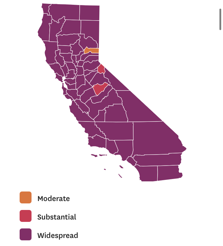


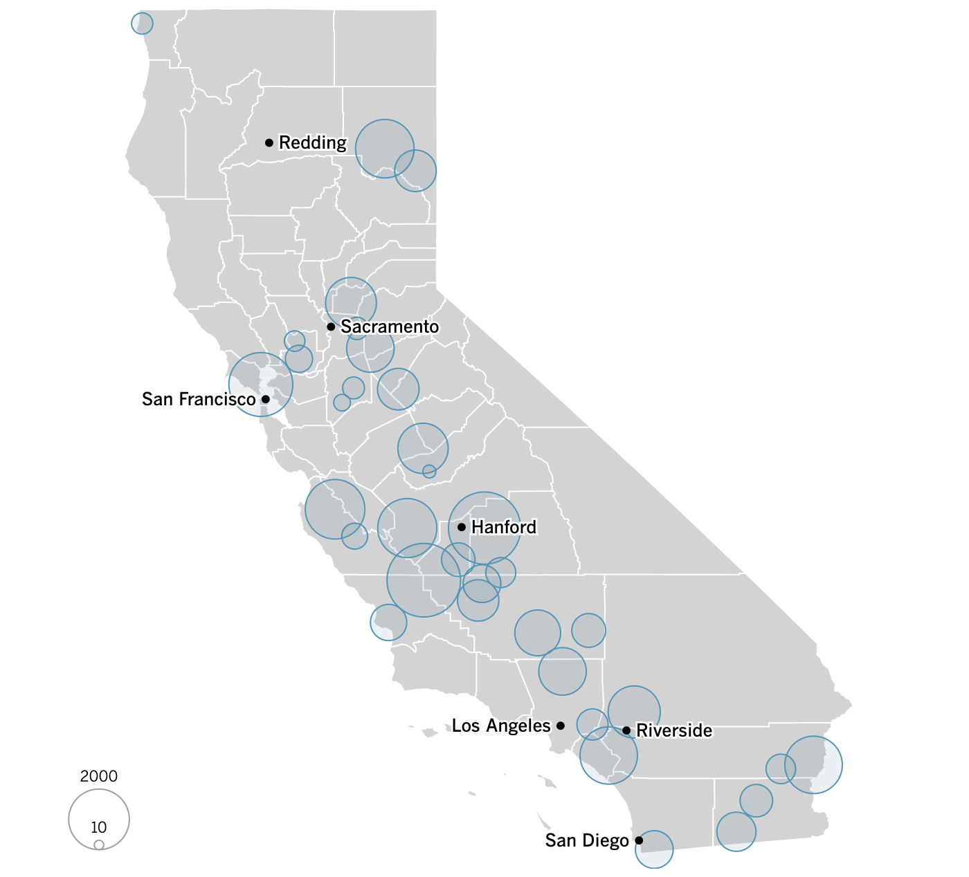


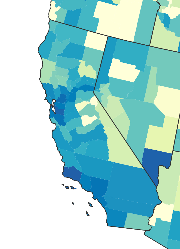


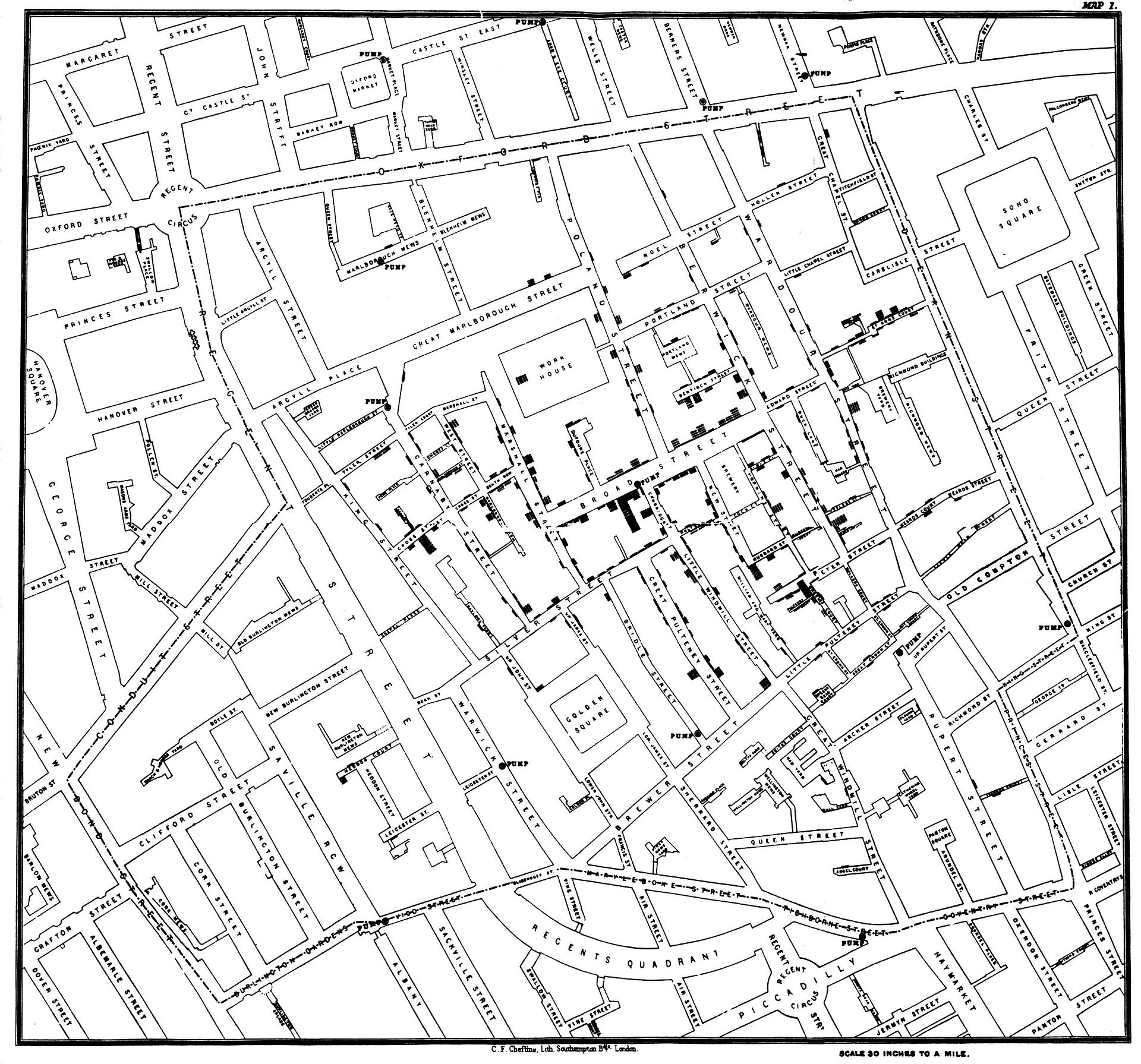
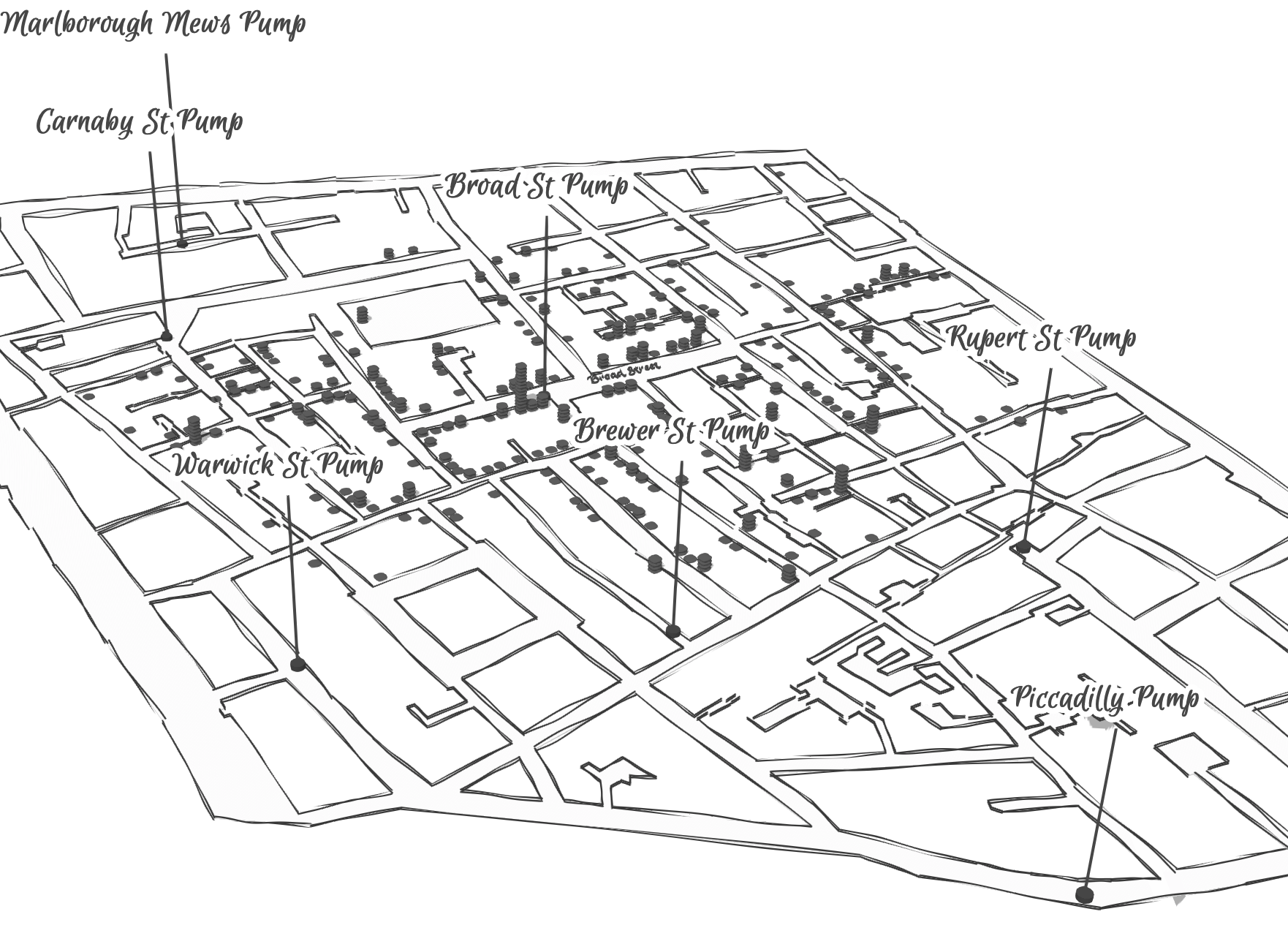

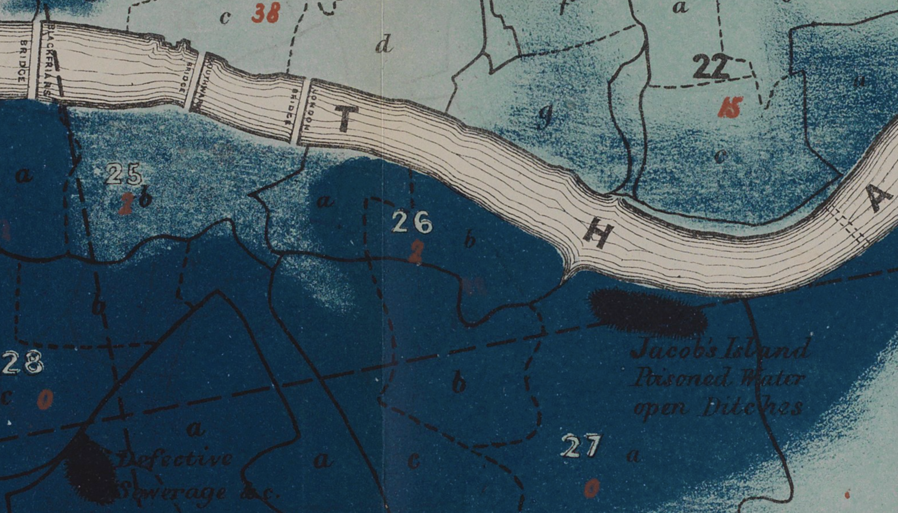


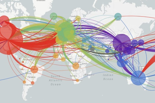

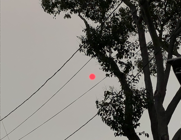
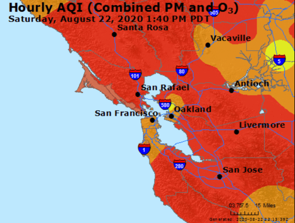
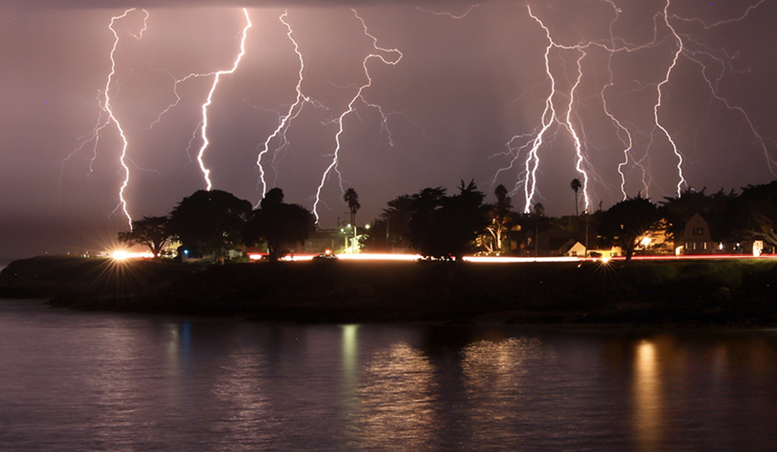


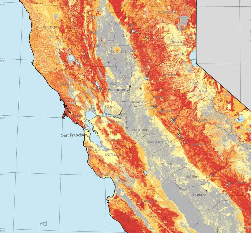
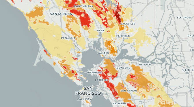
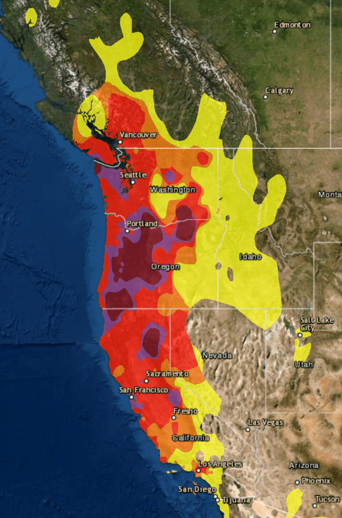

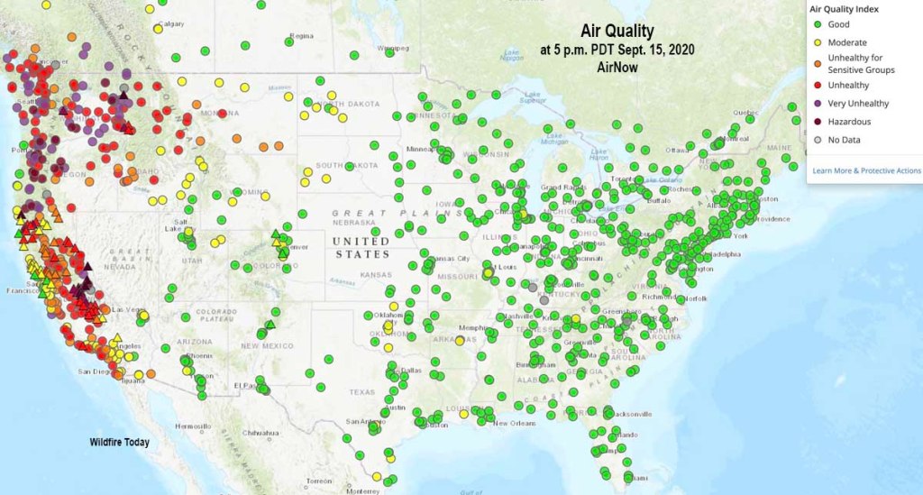
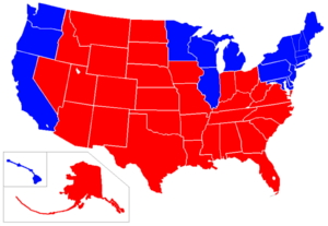
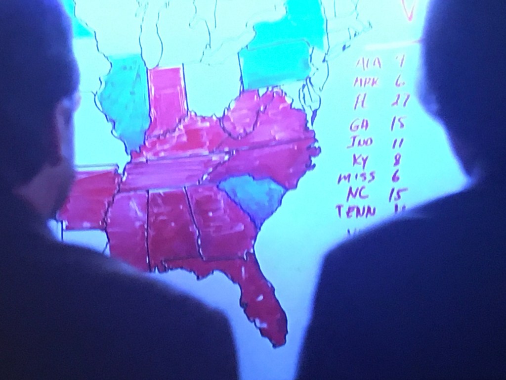
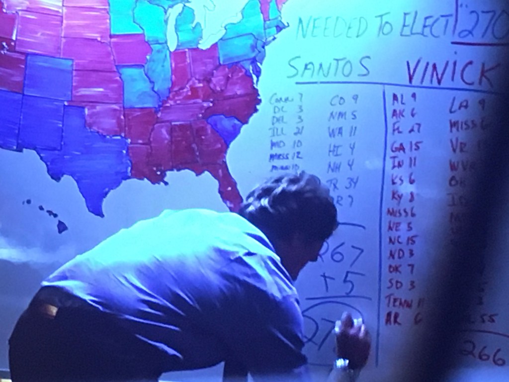
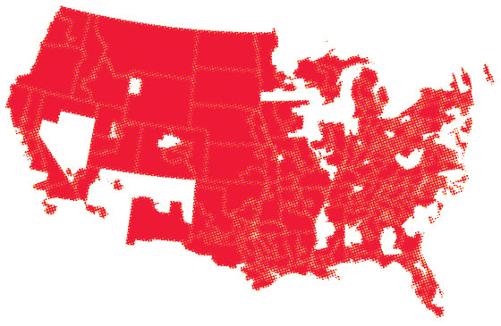
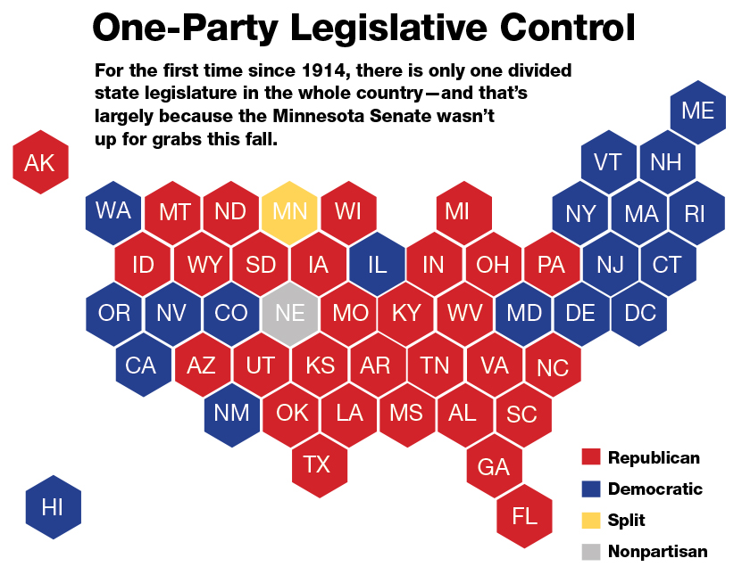

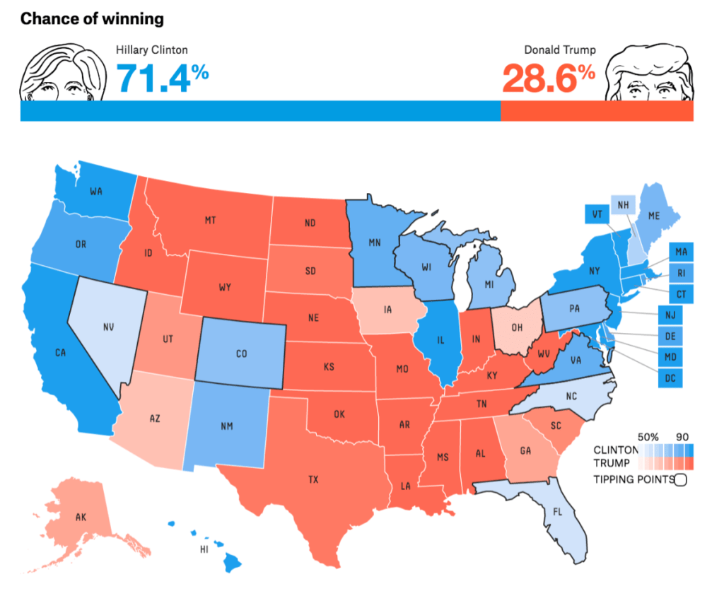

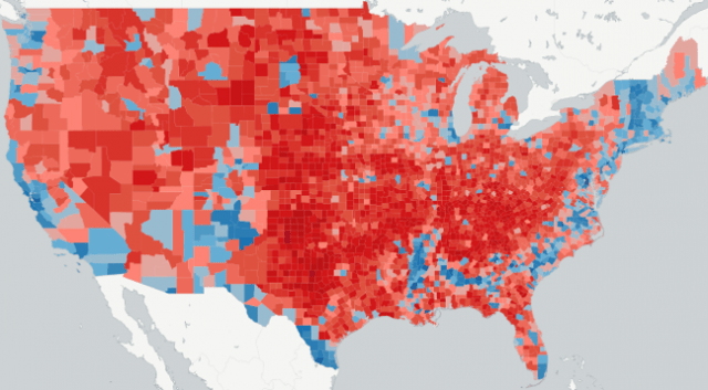
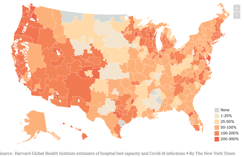
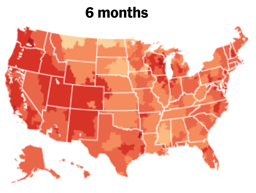
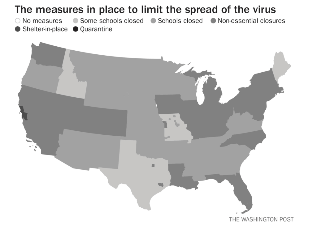
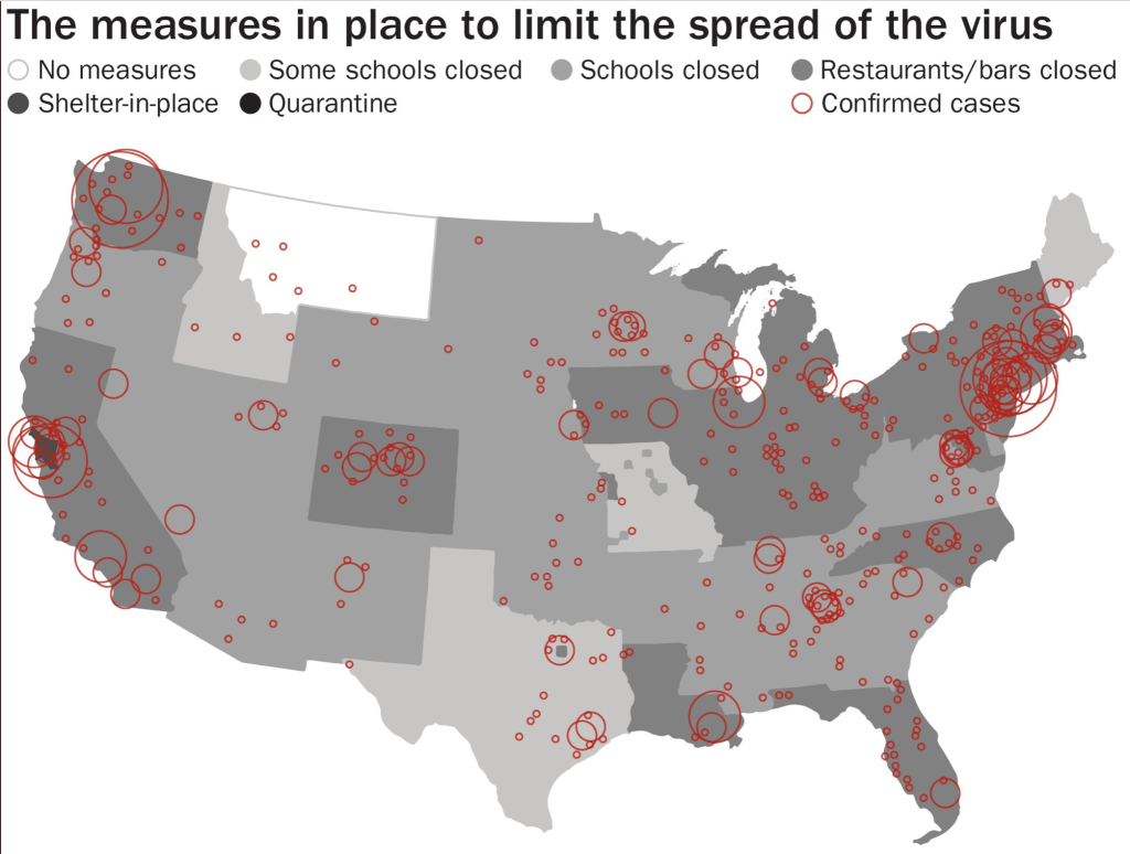
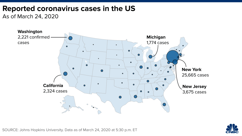
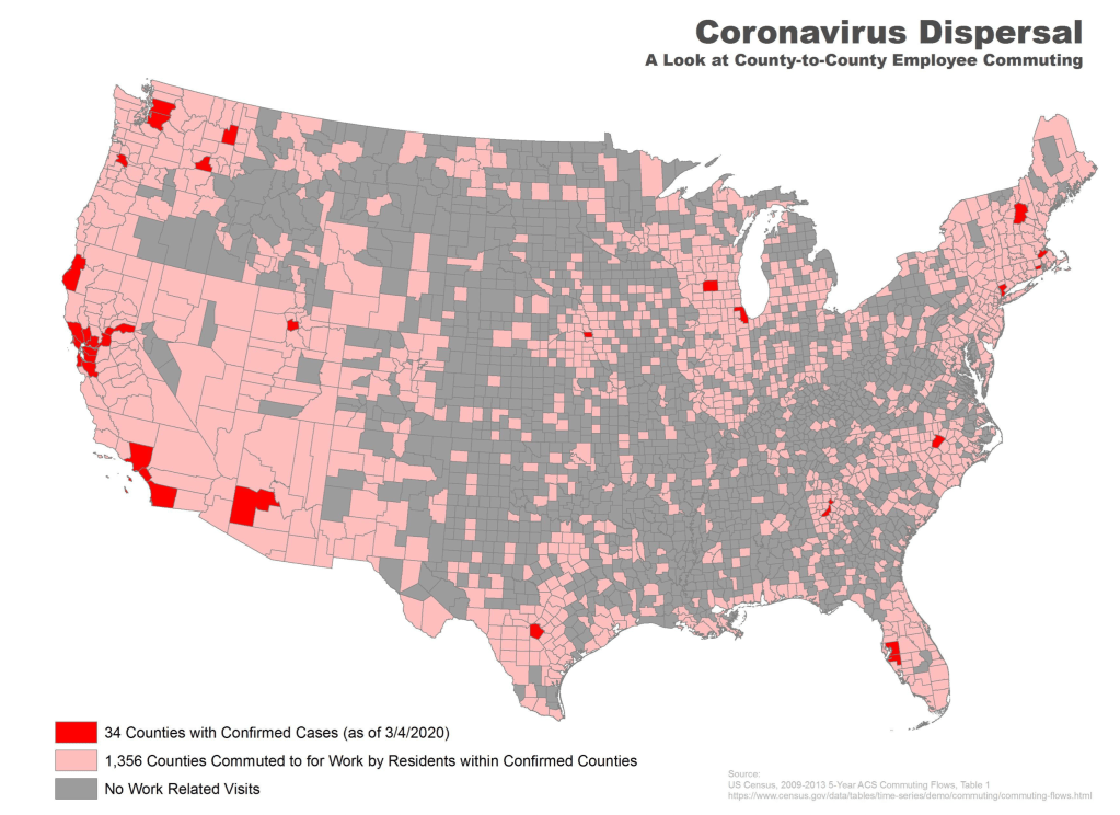
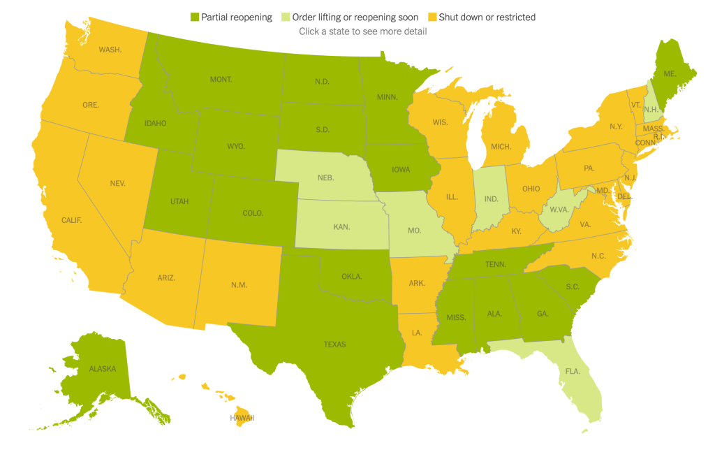
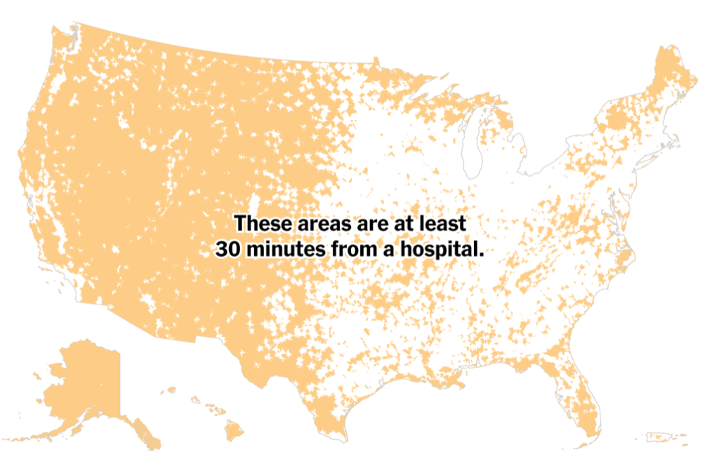
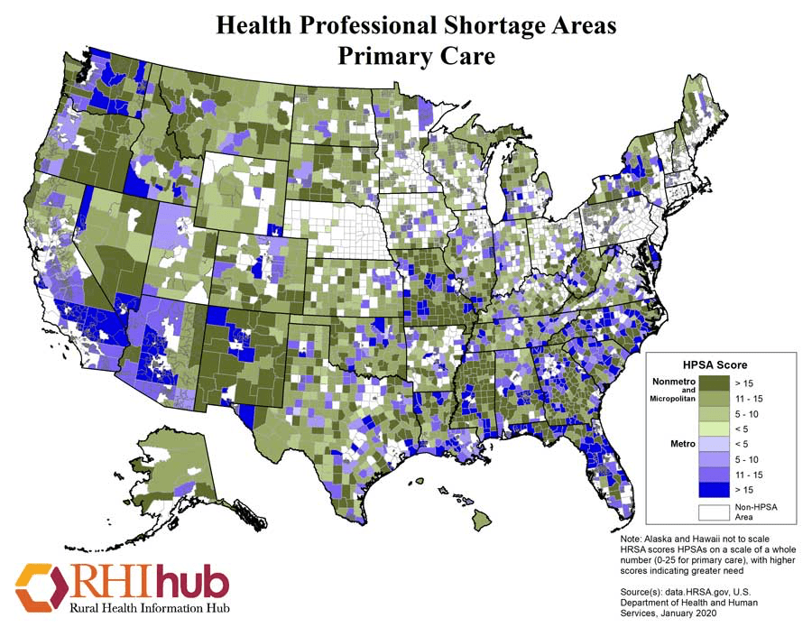
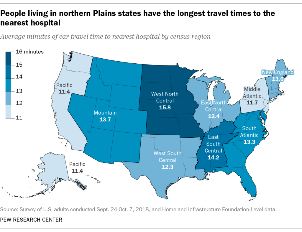
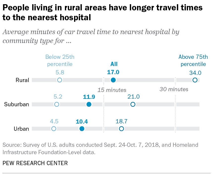
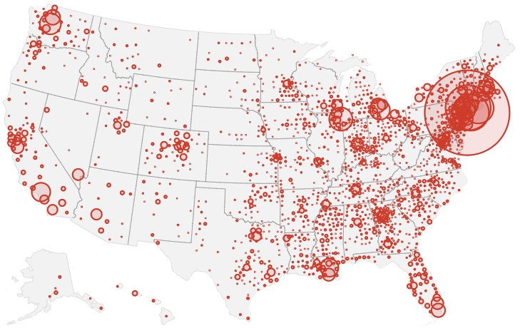

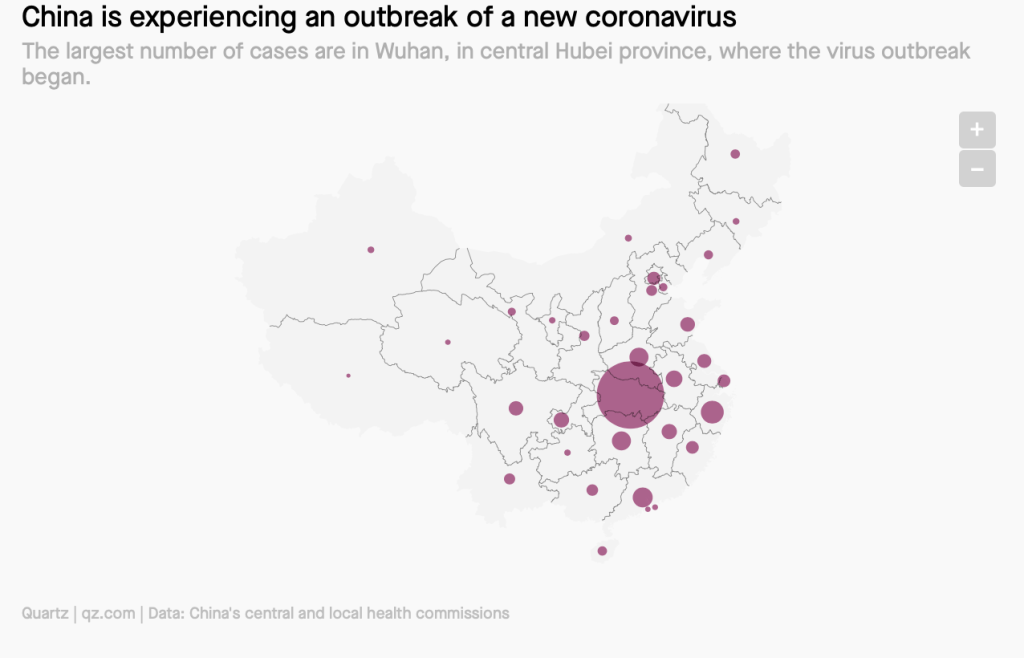
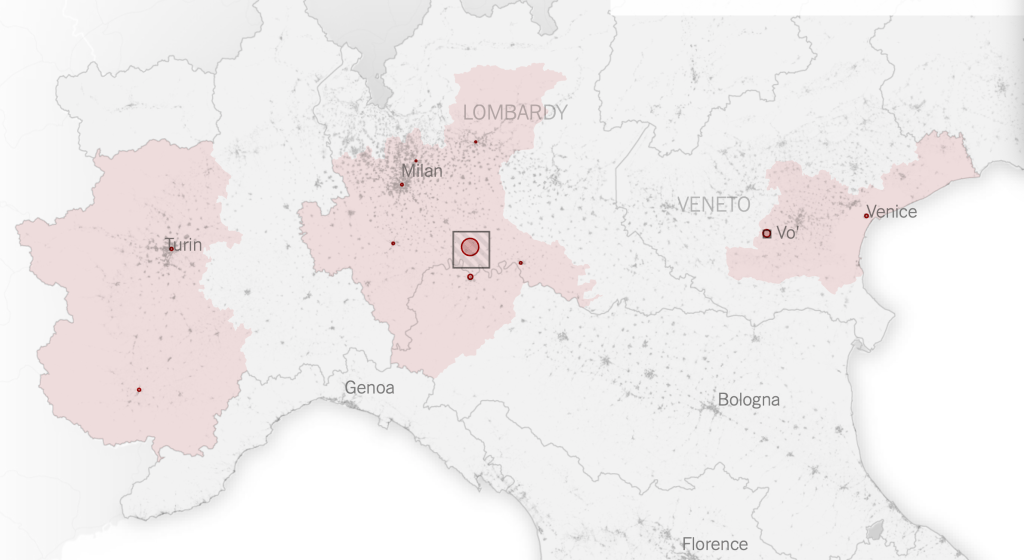
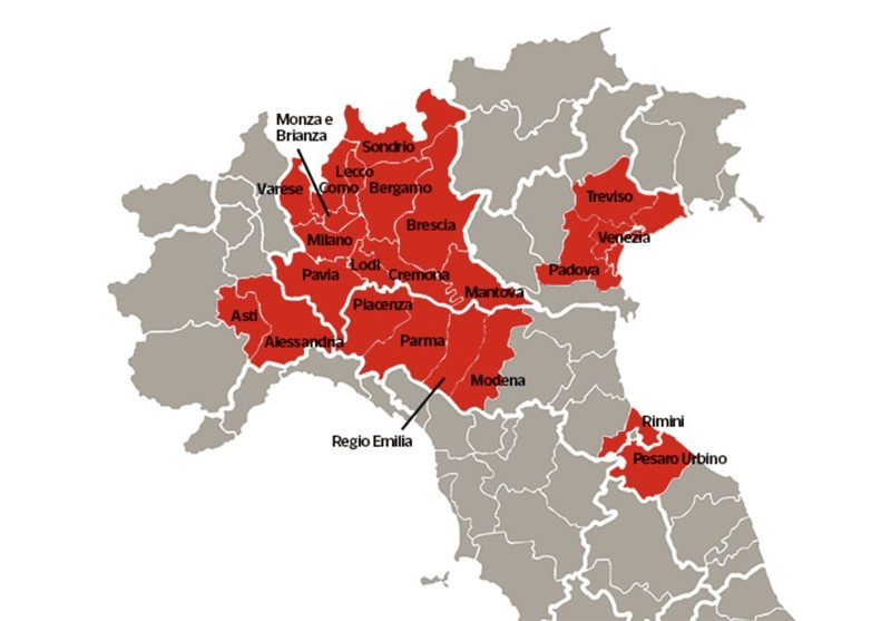
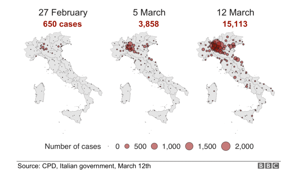
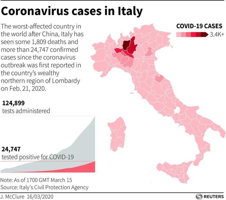
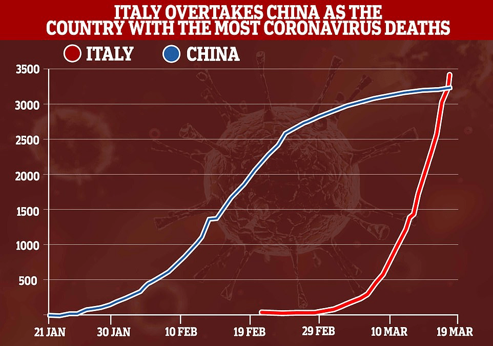
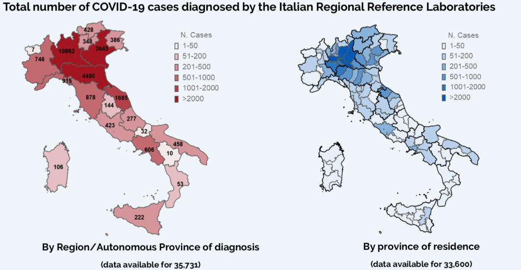

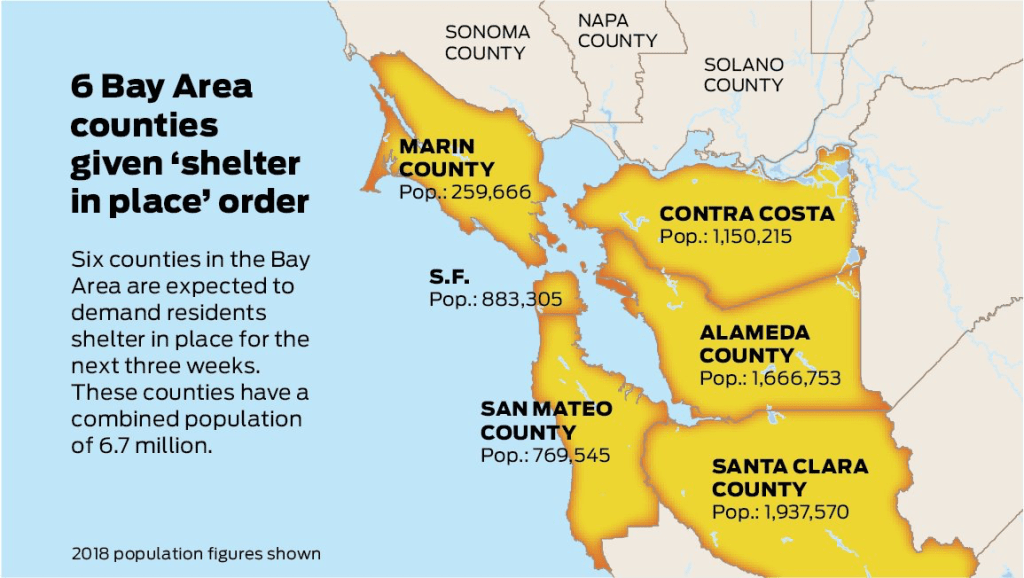
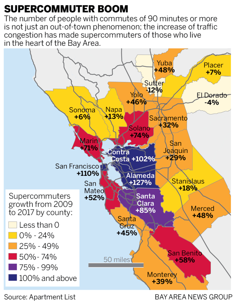
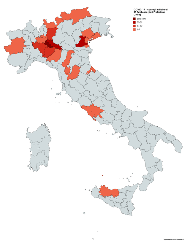
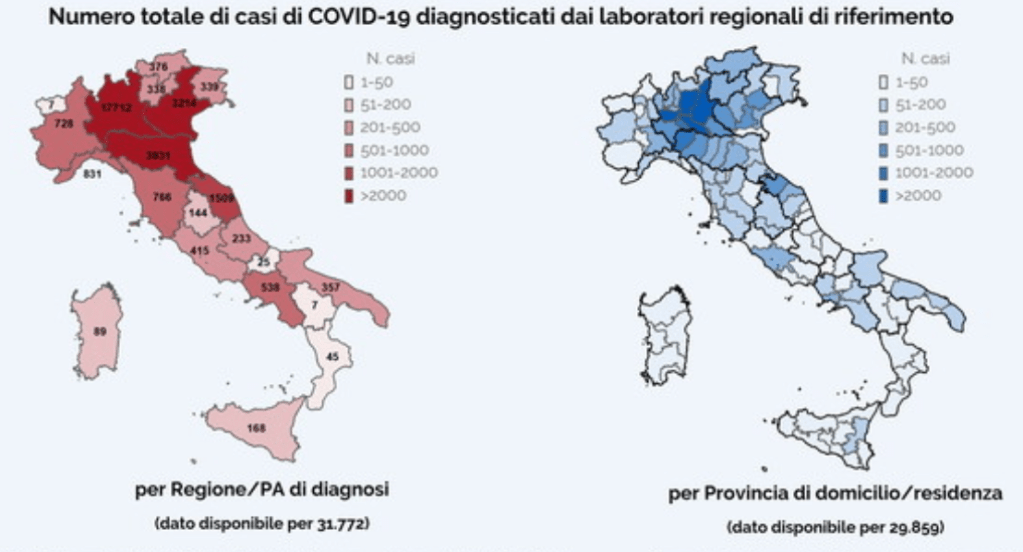

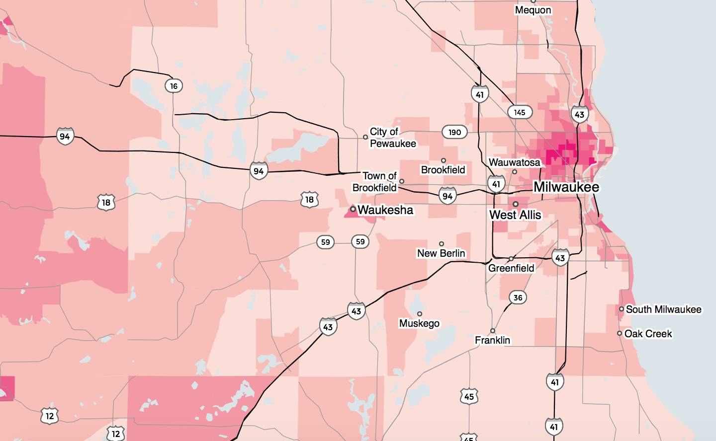
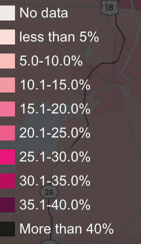
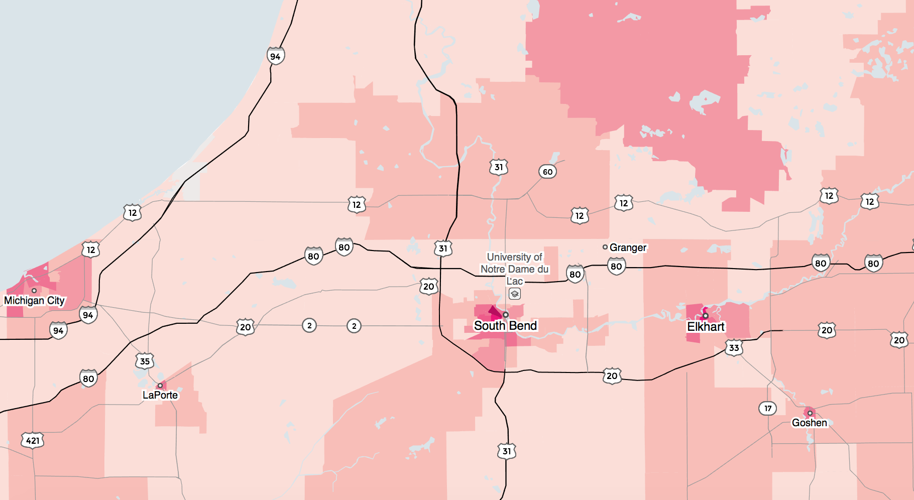


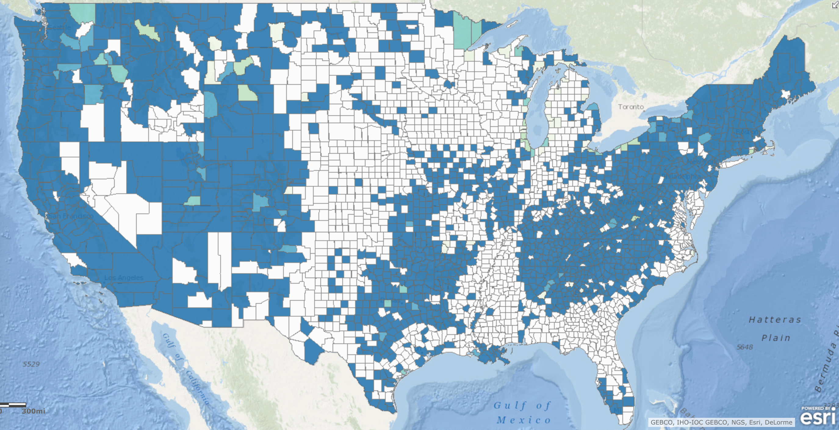
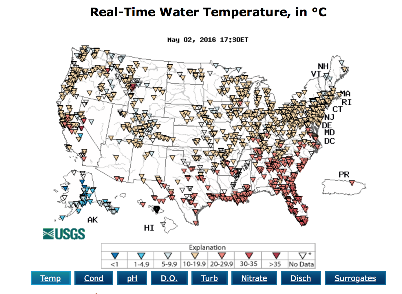

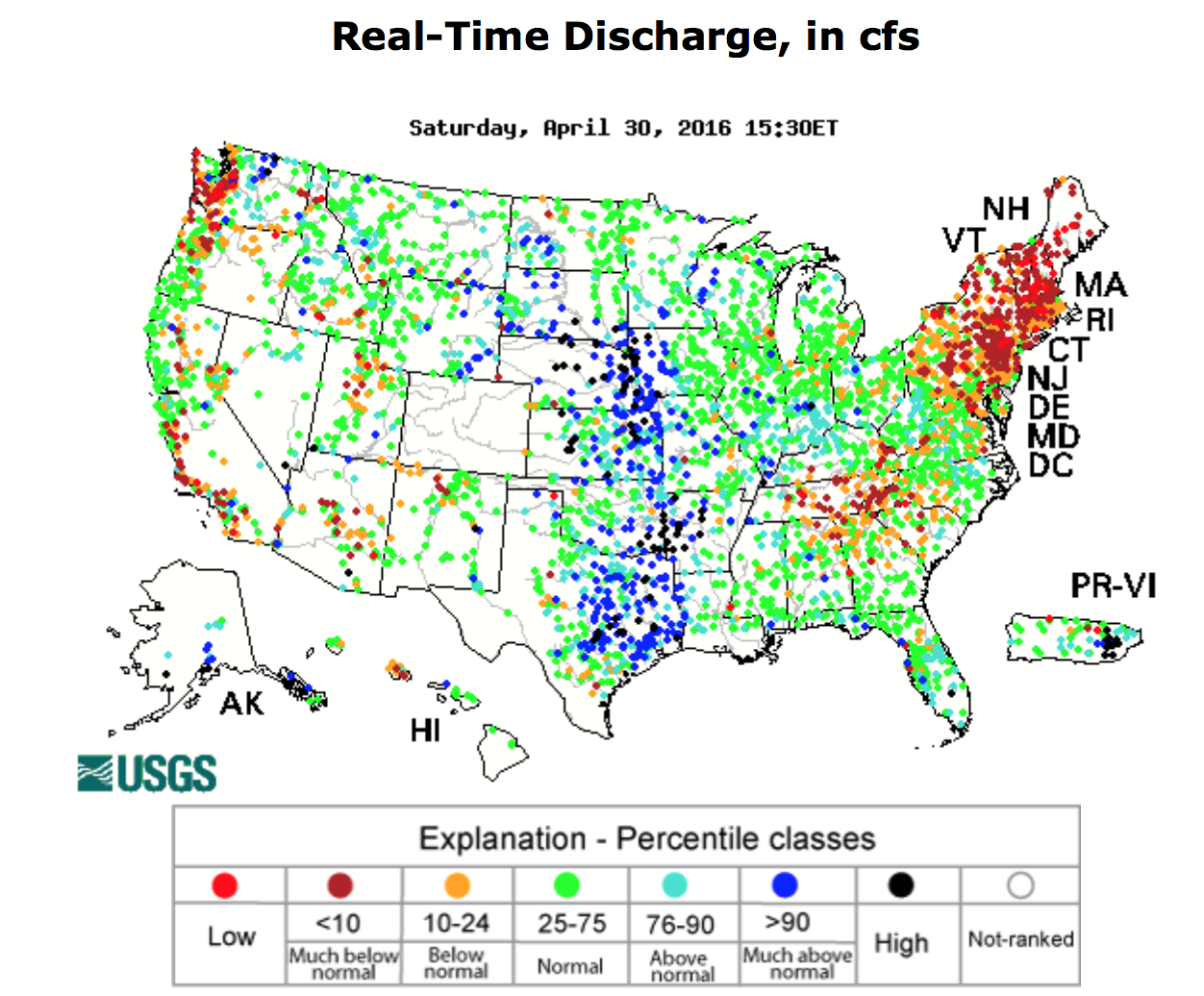

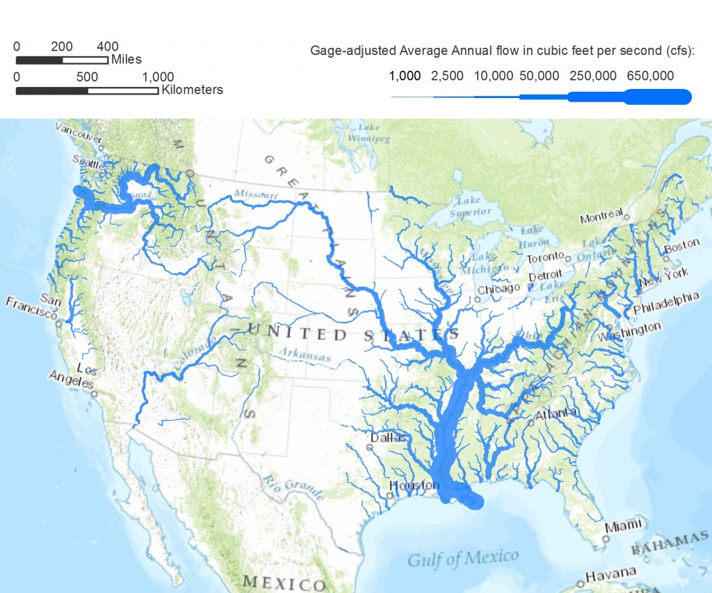
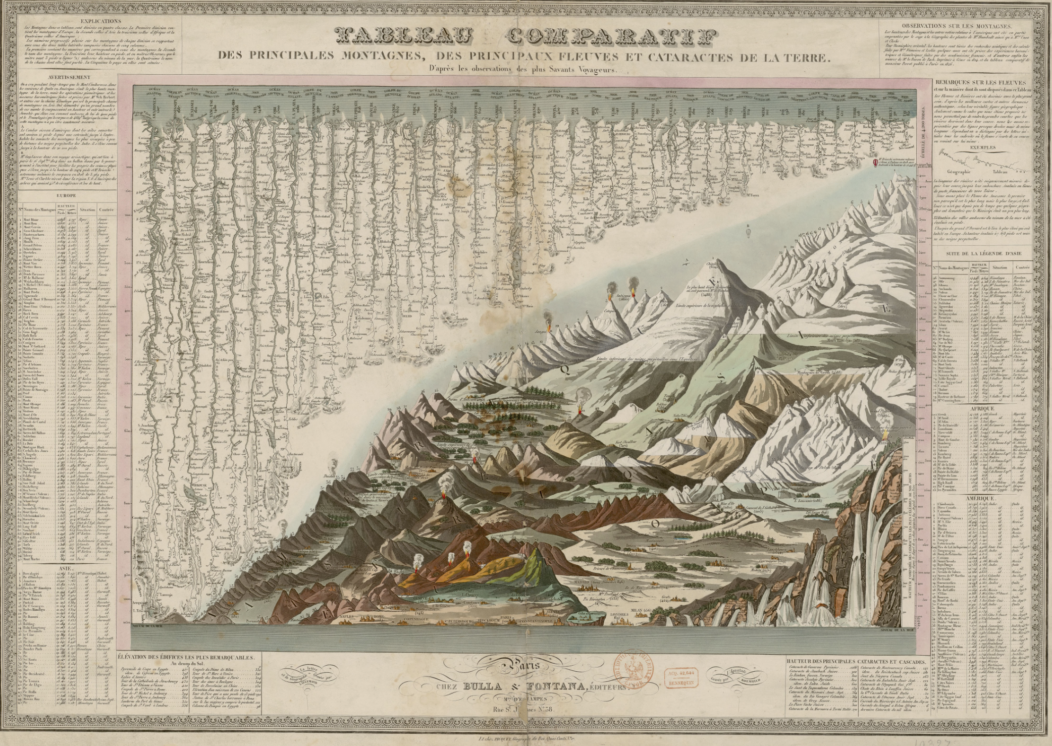
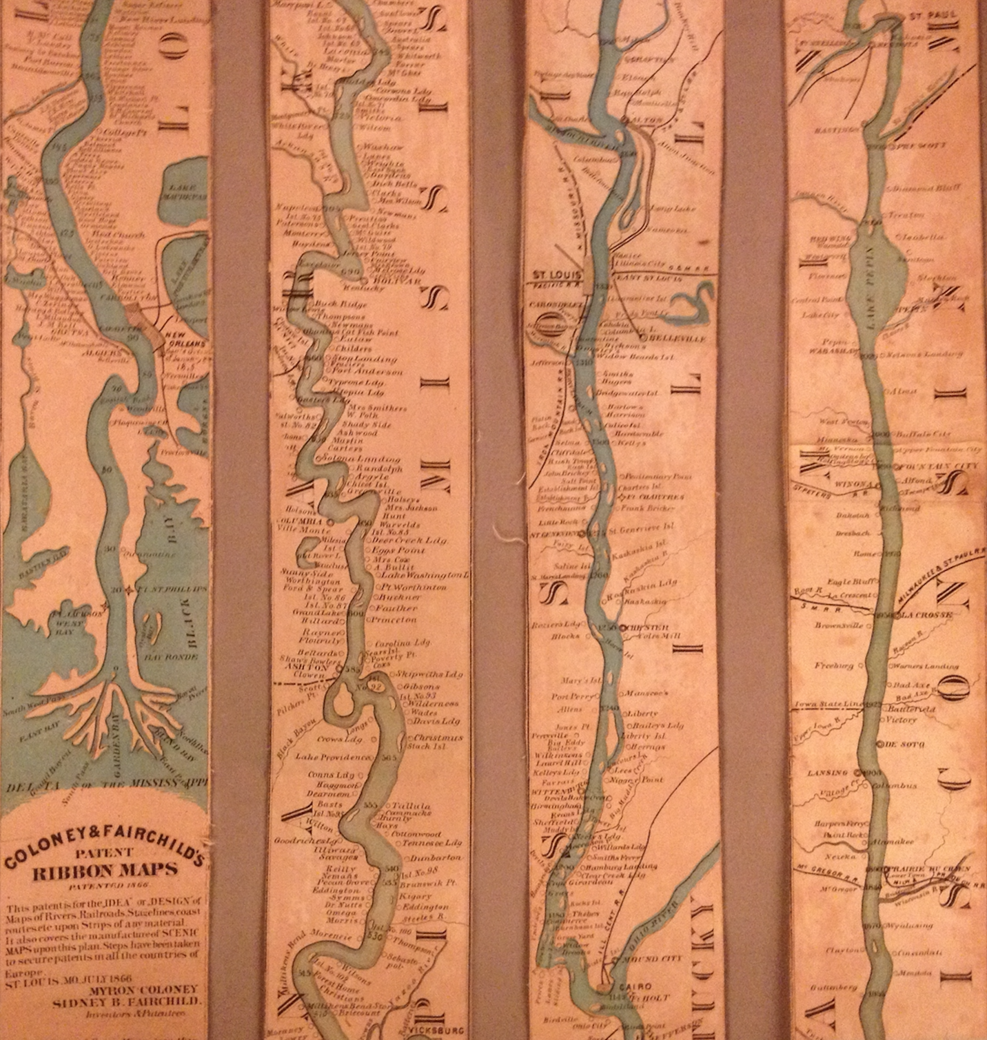
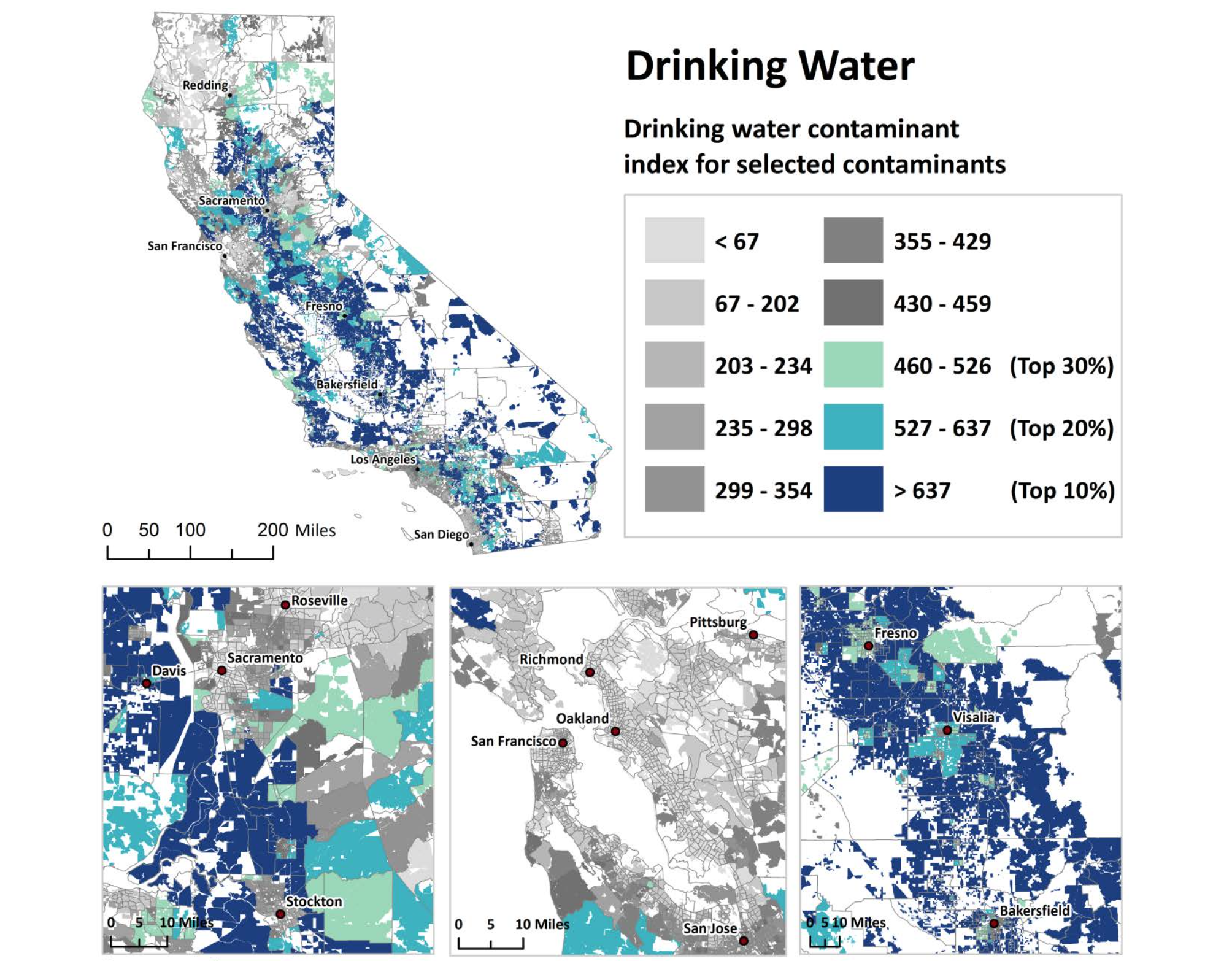
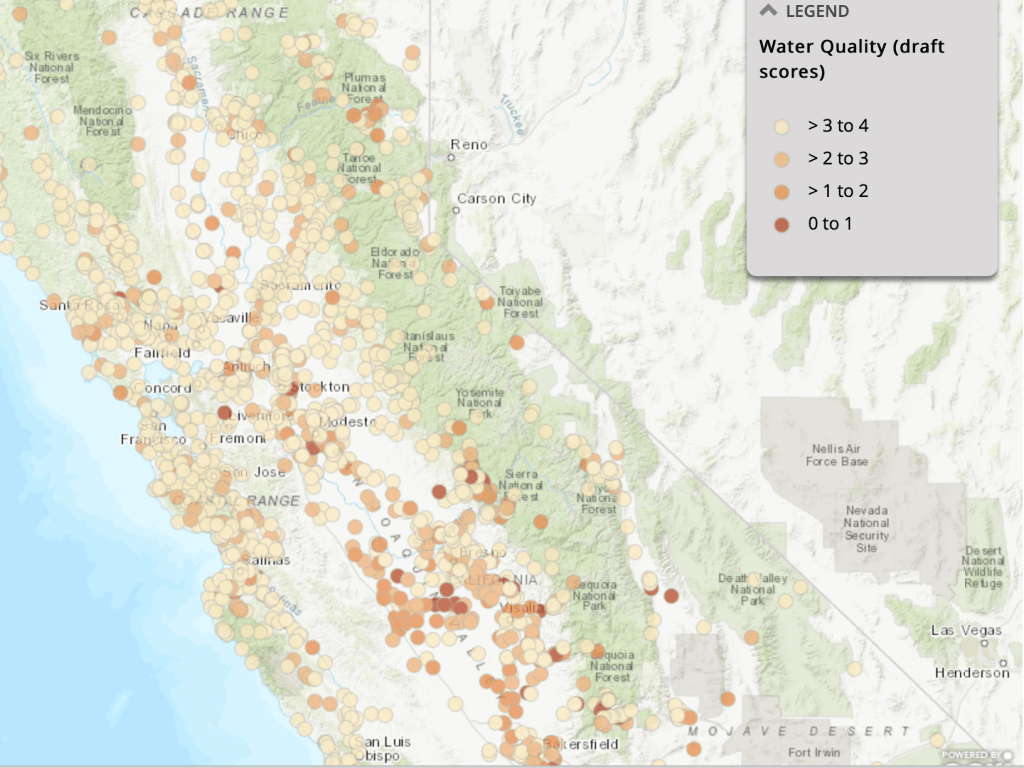


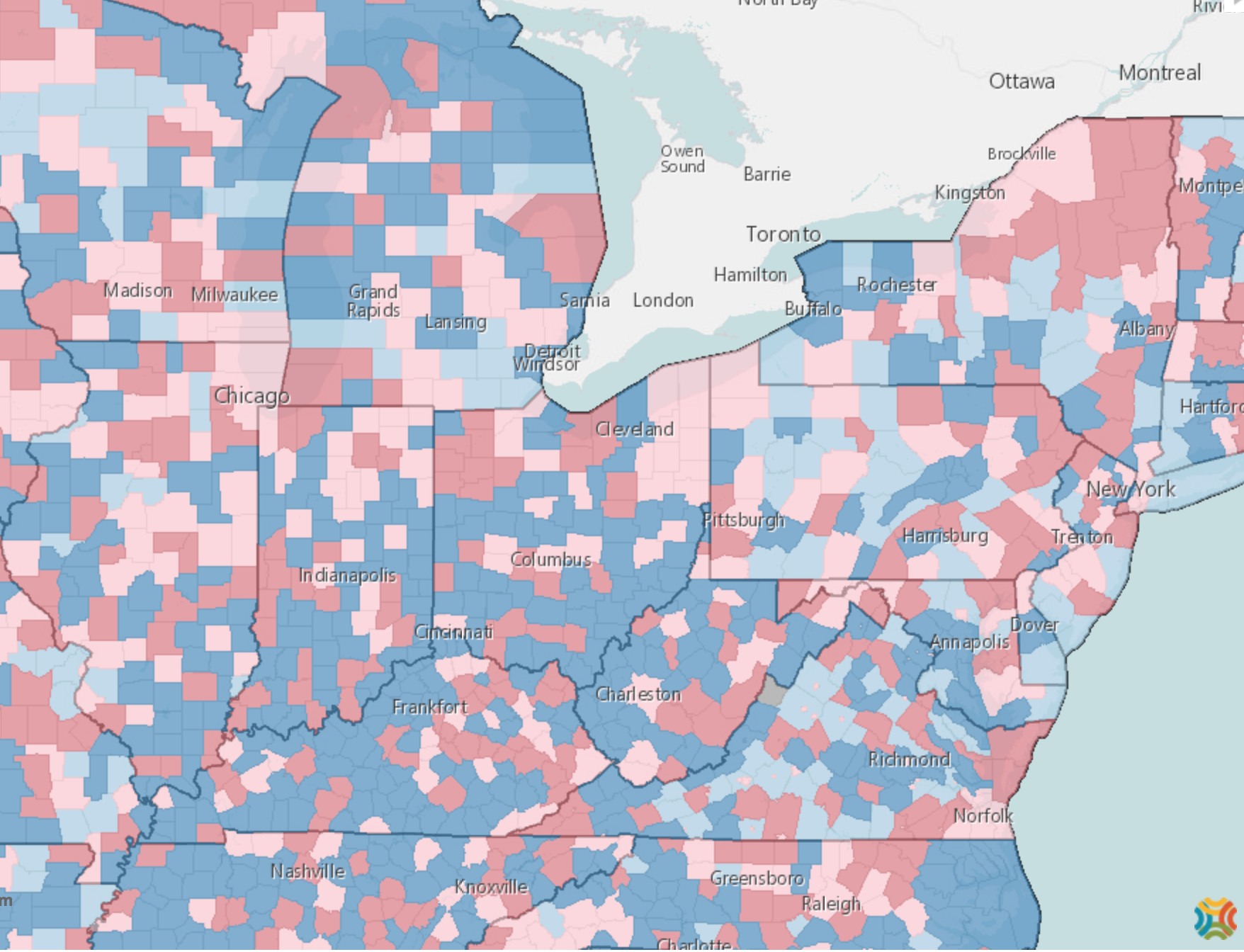


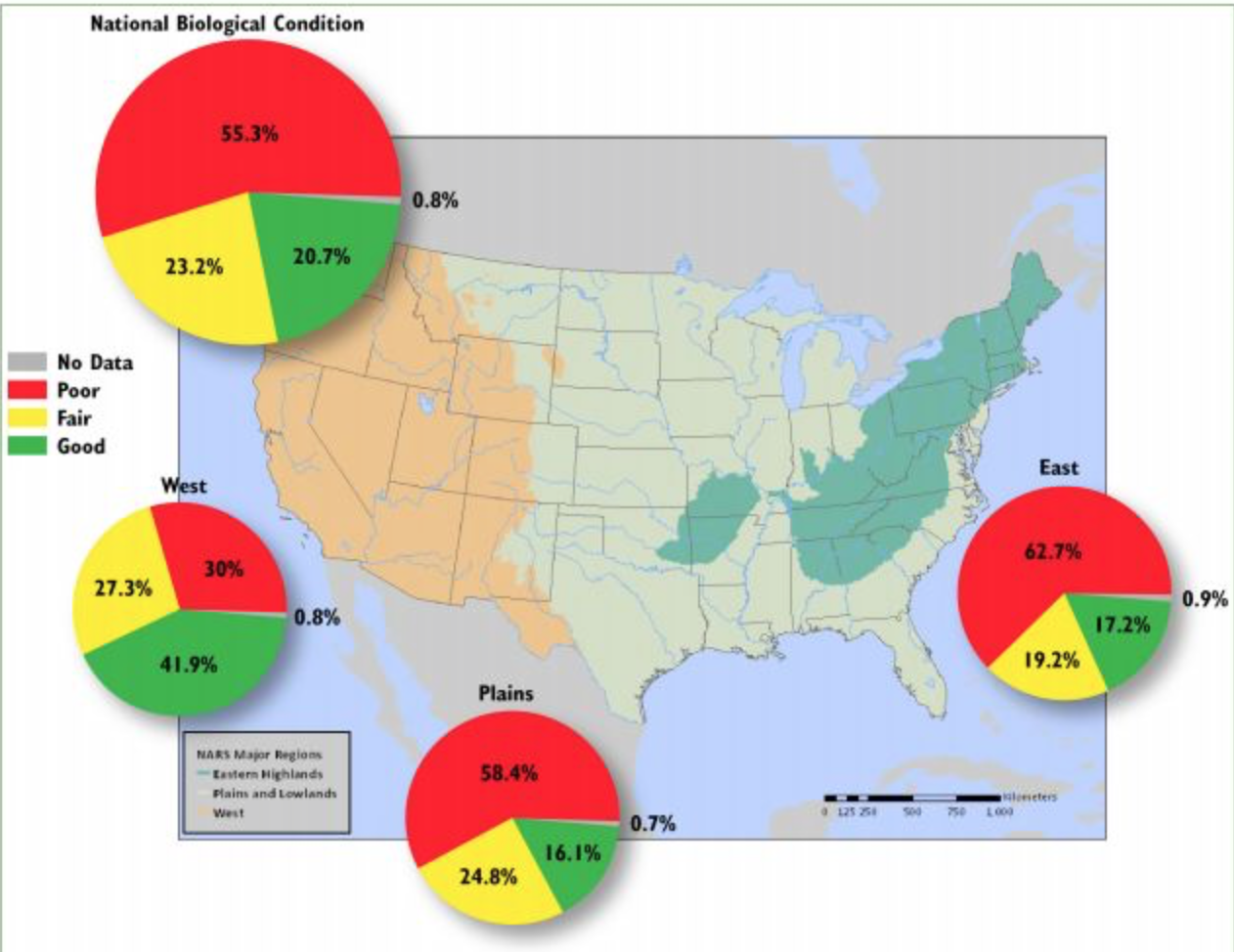
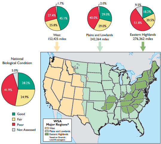
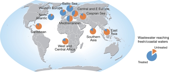
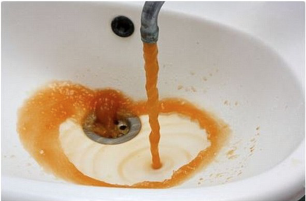
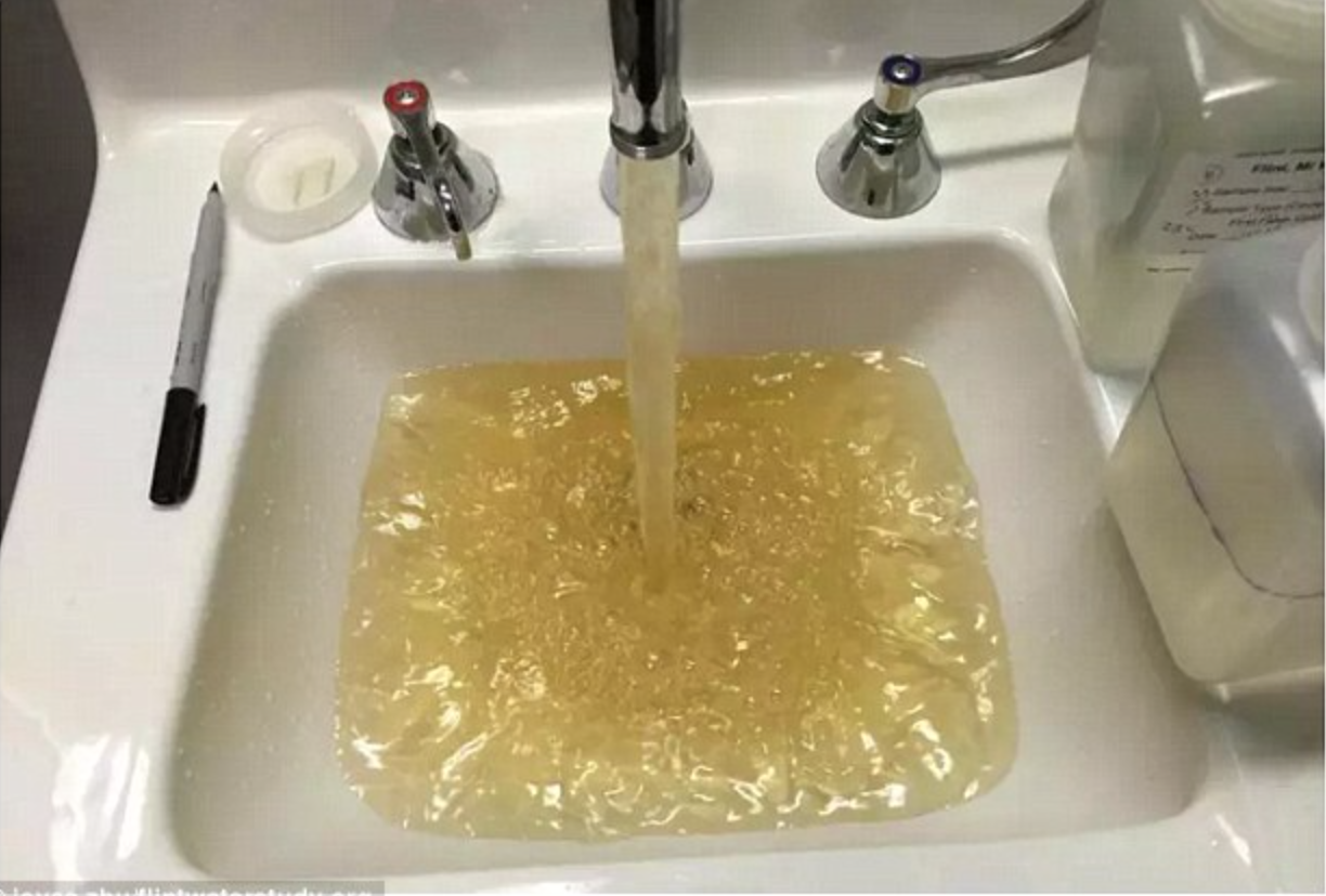
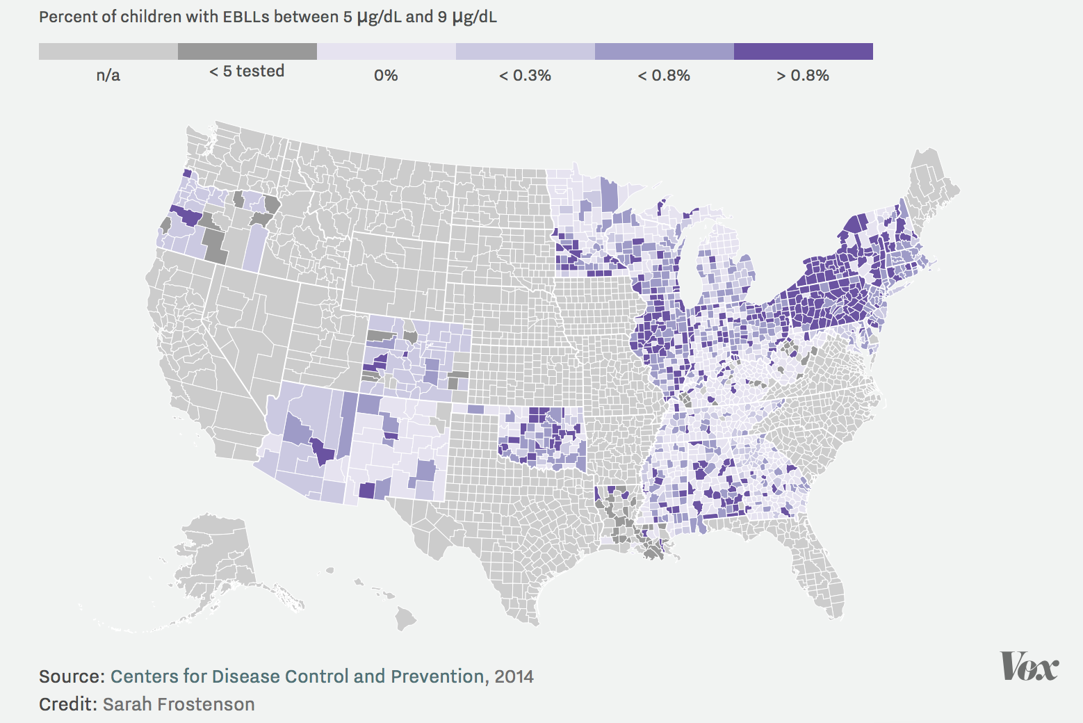


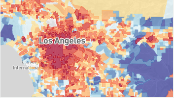


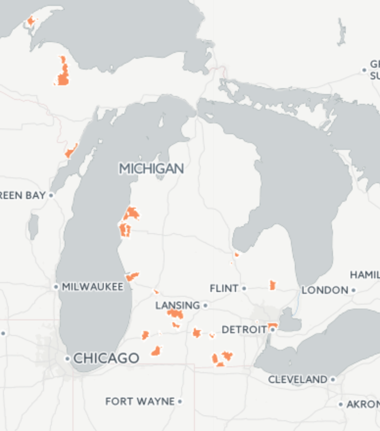
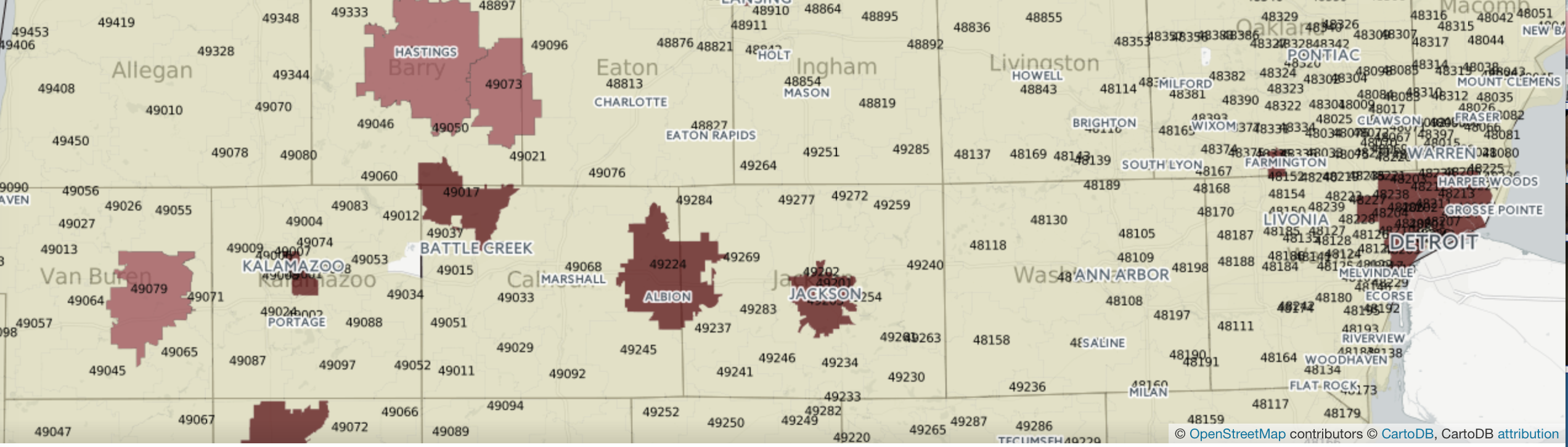
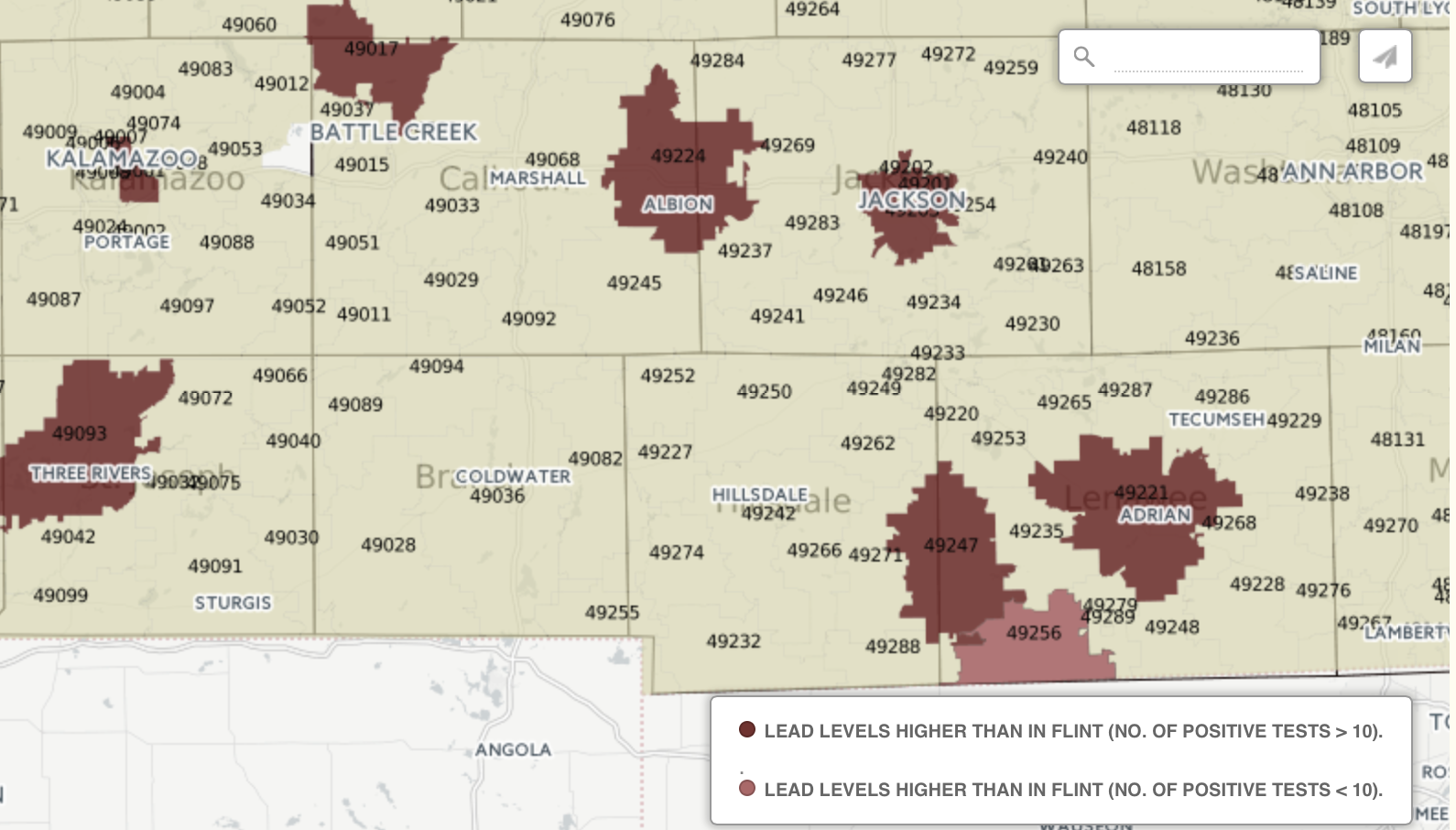
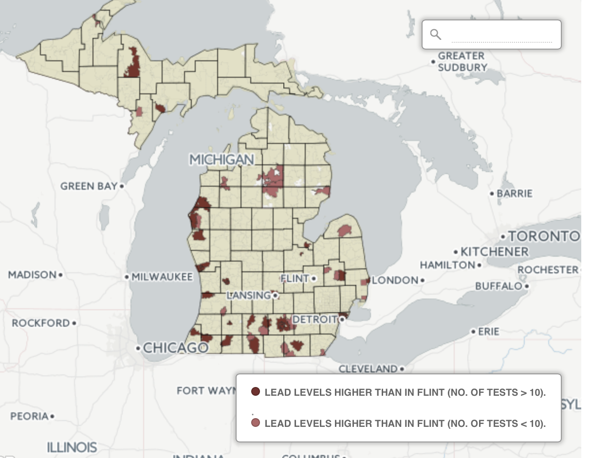

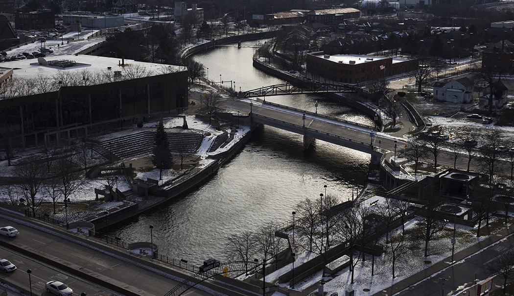


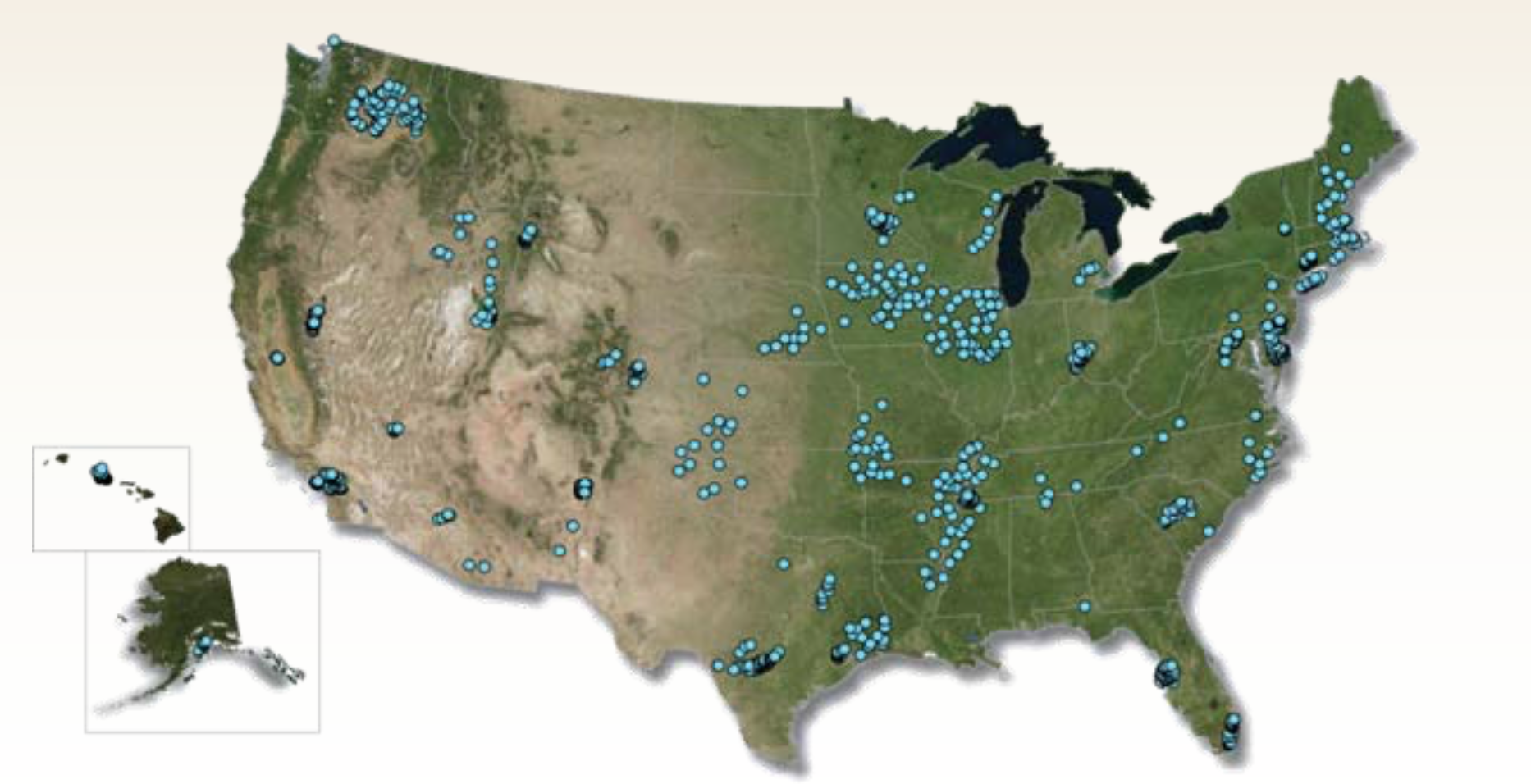
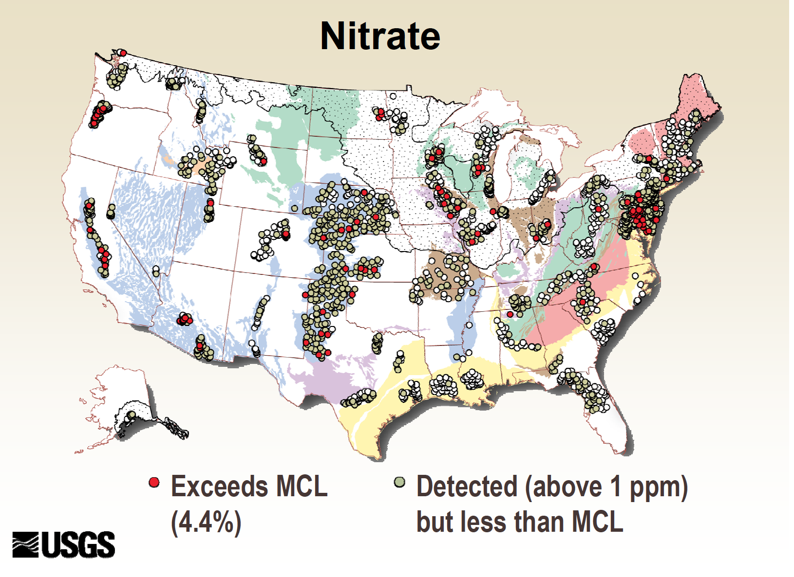

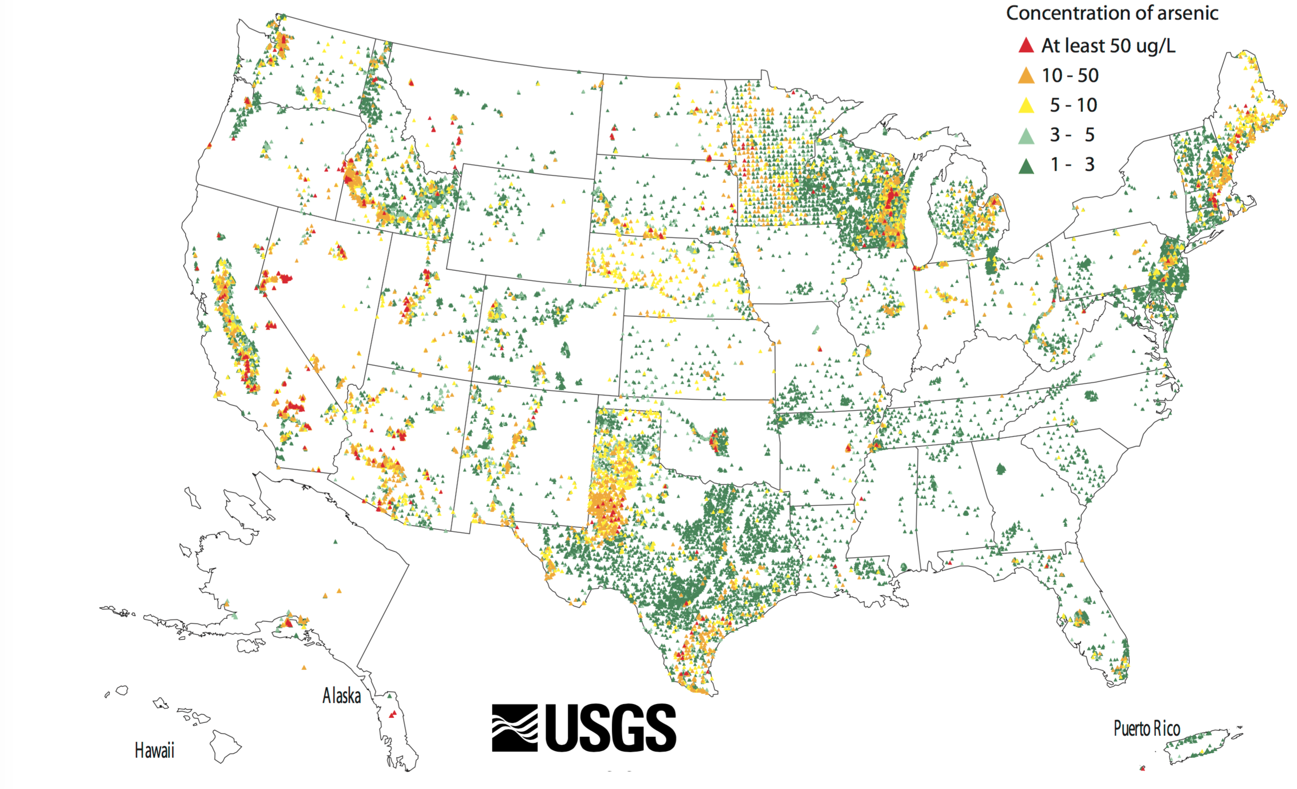
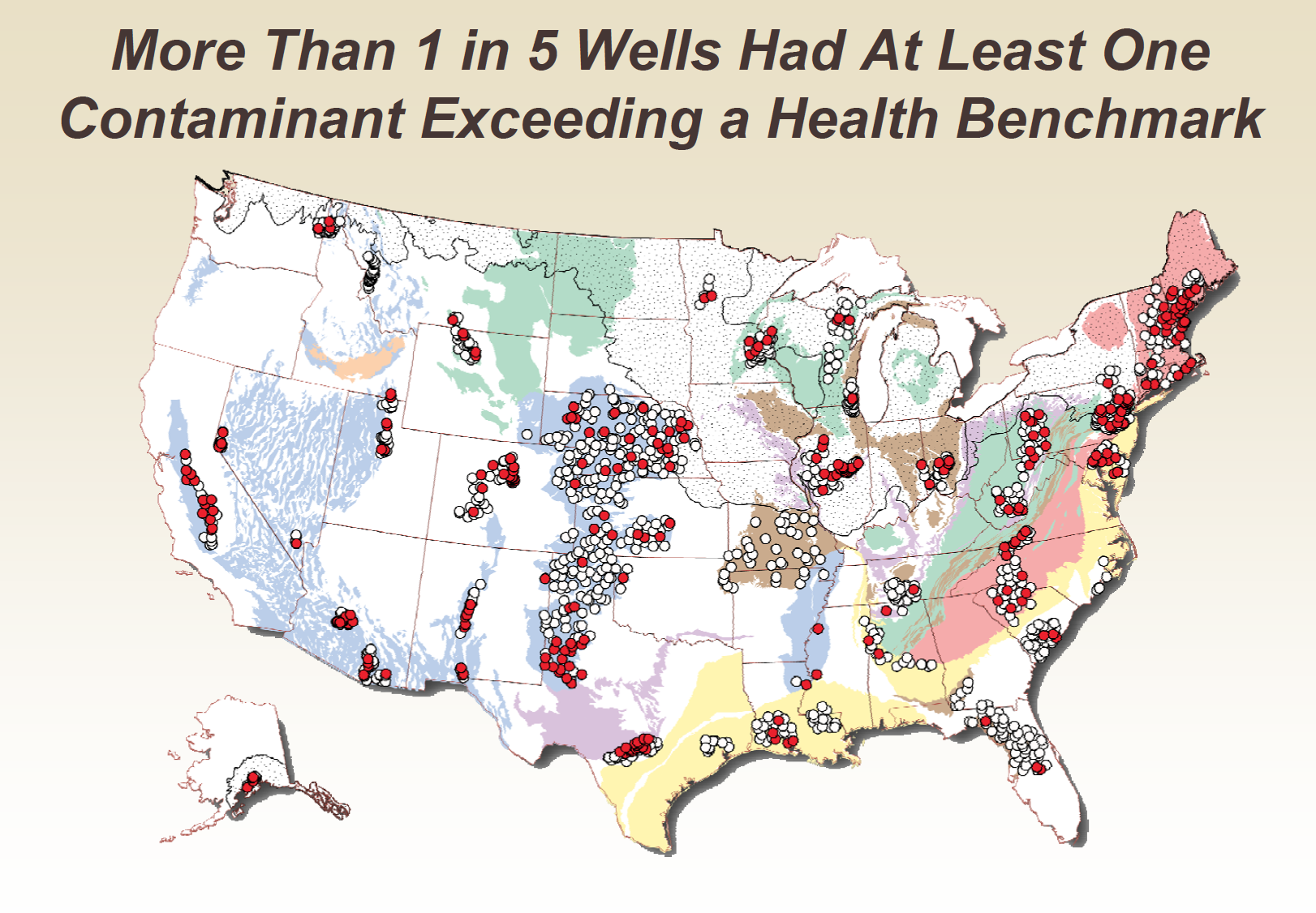
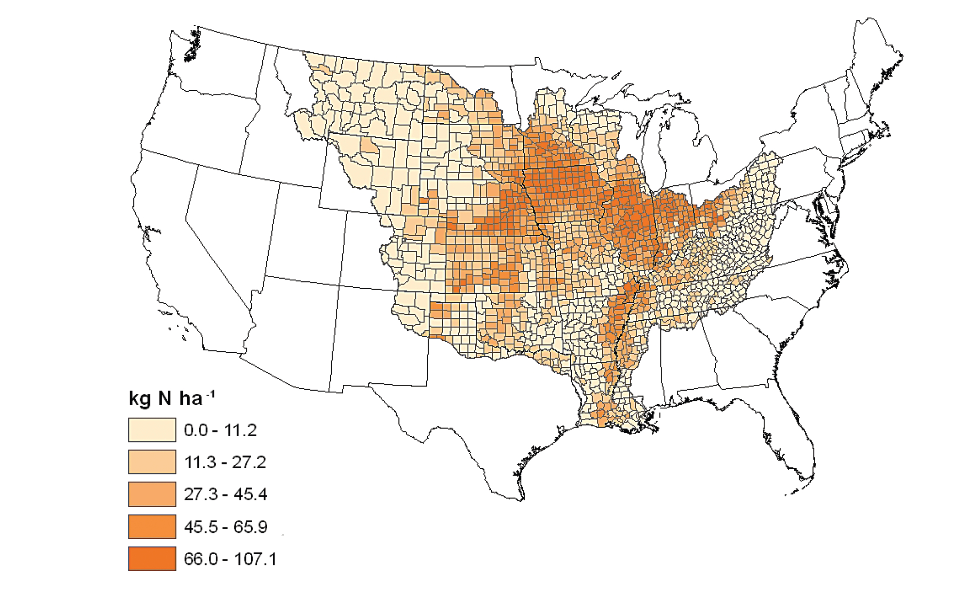
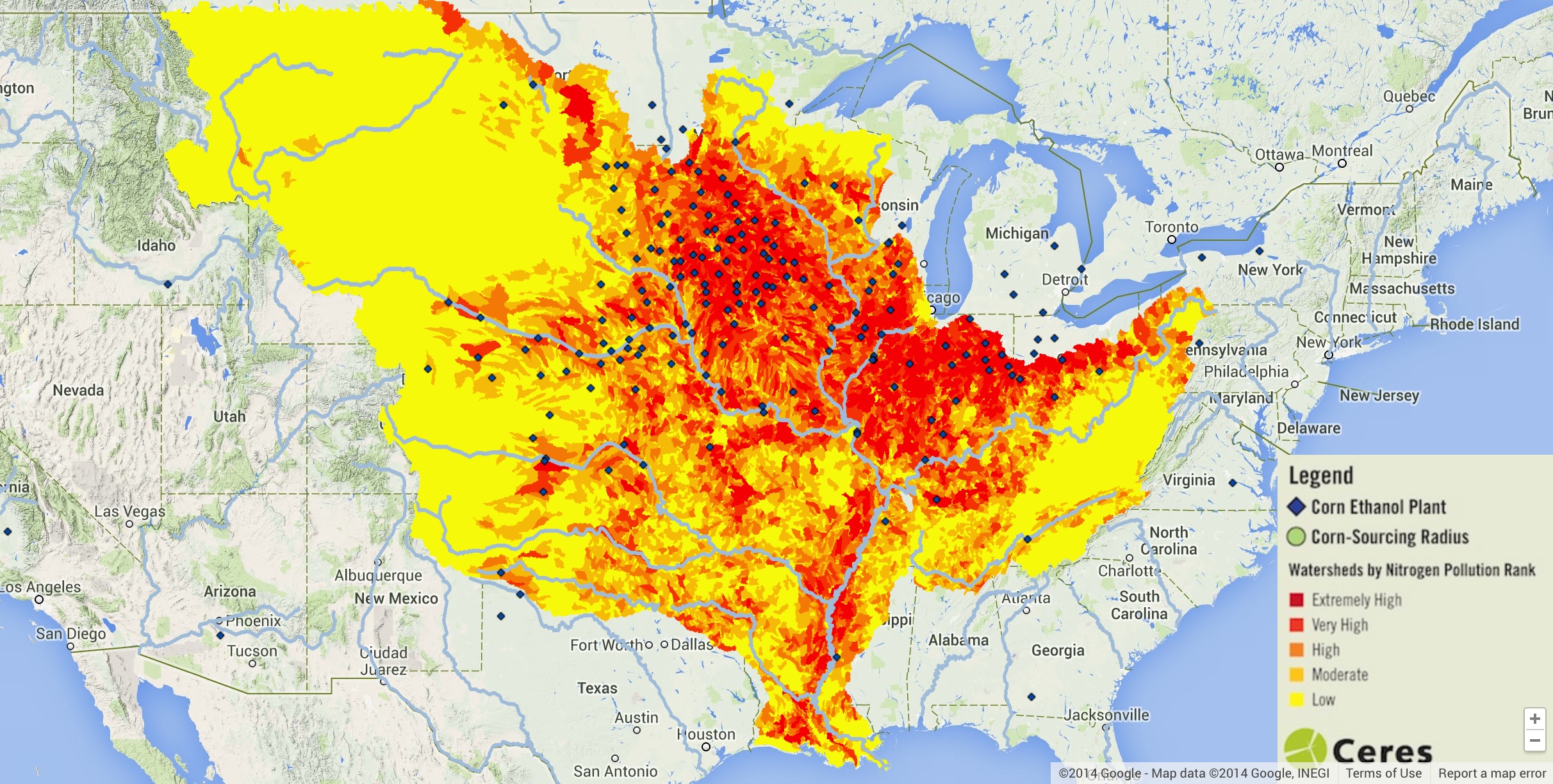


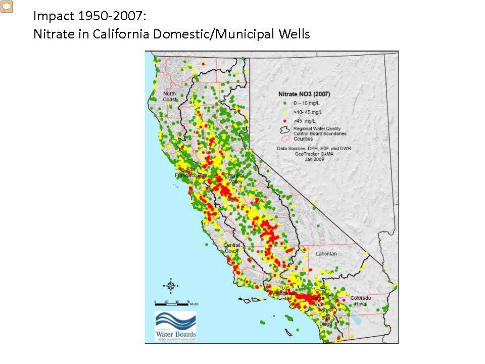
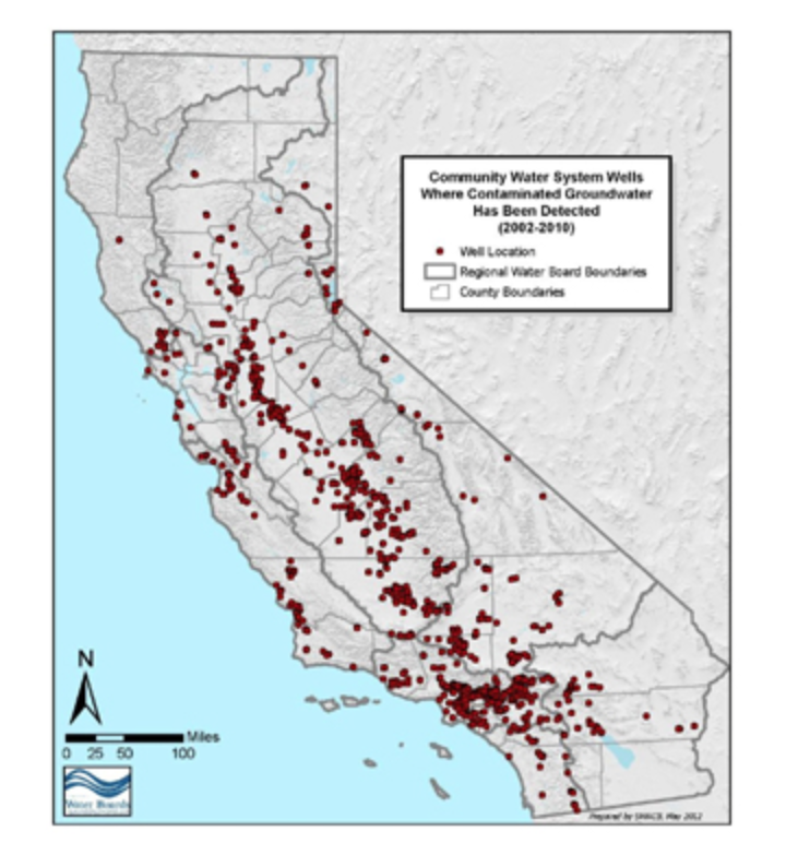

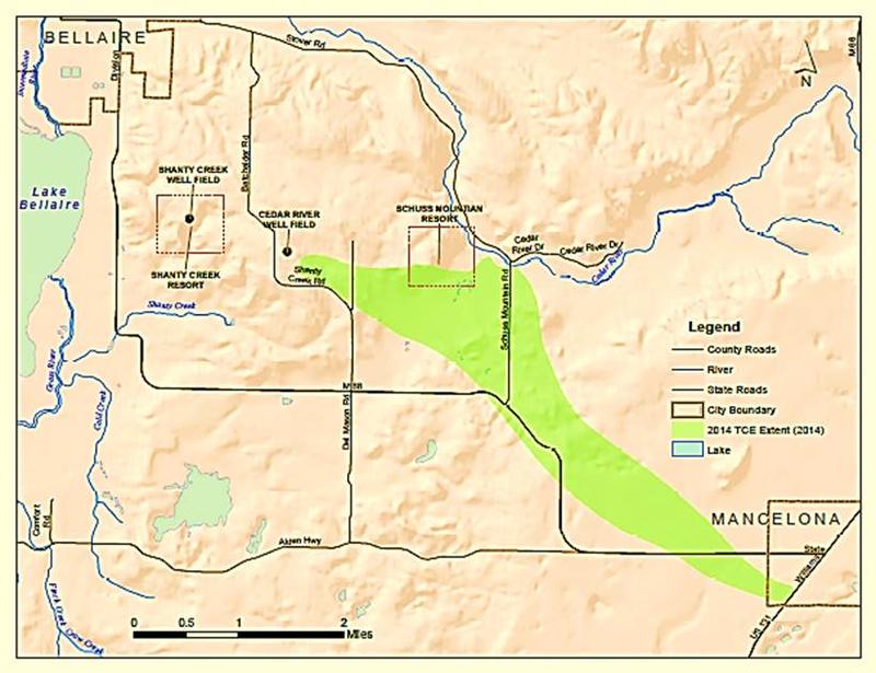


