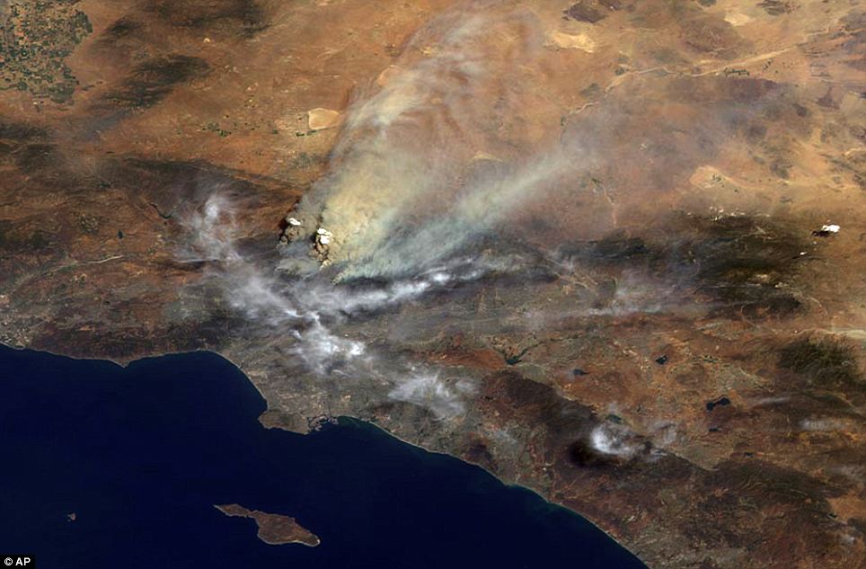
A powerful tradition of critical cartography unites a variety of selectively sourced metadata in a single frame of reference that transforms our own knowledge of space: their continuity and coherence orient viewers not only to their content, but to the world’s inter-relationships, and to make concrete knowledge claims about their content. Although maps usually frame questions about the inhabited world or the world’s inhabitation, the below map of the distribution of earthquake epicenters offers a framework to understand relations among events by presenting their meaning in a geographic framework, flattening temporal change to create new meaning about their relations through a framework of spatial expanse.

Actualities are considerably removed from most maps, which present records of space as opposed to spatial experiences. But the way that maps record a cumulative record of events for their viewer is a neat intellectual trick. For rather than describing the ways things are, the synthesis that the mapper performs culls the products of changes over time and then transform multiple readings into a continuous record whose comprehensive surface is readily scanned.
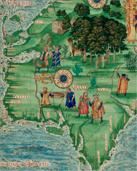
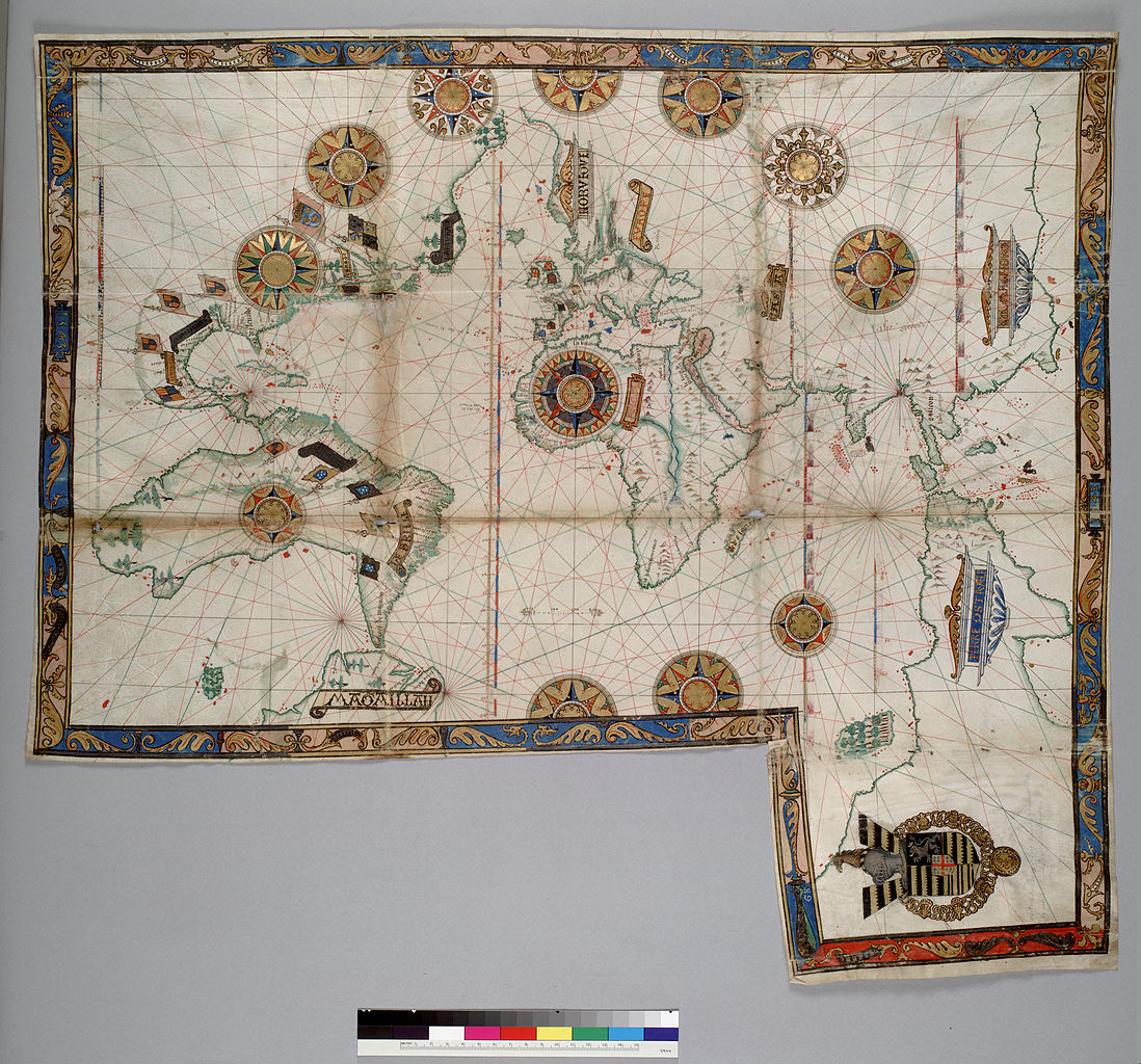
The trick of shaping a visually recognizable synthesis of spatial metadata goes back to how Abraham Ortelius fused nautical charts and terrestrial cartography into pictorial renderings of space. Ortelius effectively united a set of multiple frameworks to process space in a uniform register of image and text, giving its surface comprehensive claims expanded in the first printed atlas of 1572. Both Ortelius’ innovative collection of maps in his Theatrum and his elegantly bounded oval “Typus Orbis Terrarum,” shown below, created legible records that imitated reader’s cognitive understanding of place in landscapes: engraved maps were printed, but the carefully hand-colored image trumped existing maps by artifice and content alike.
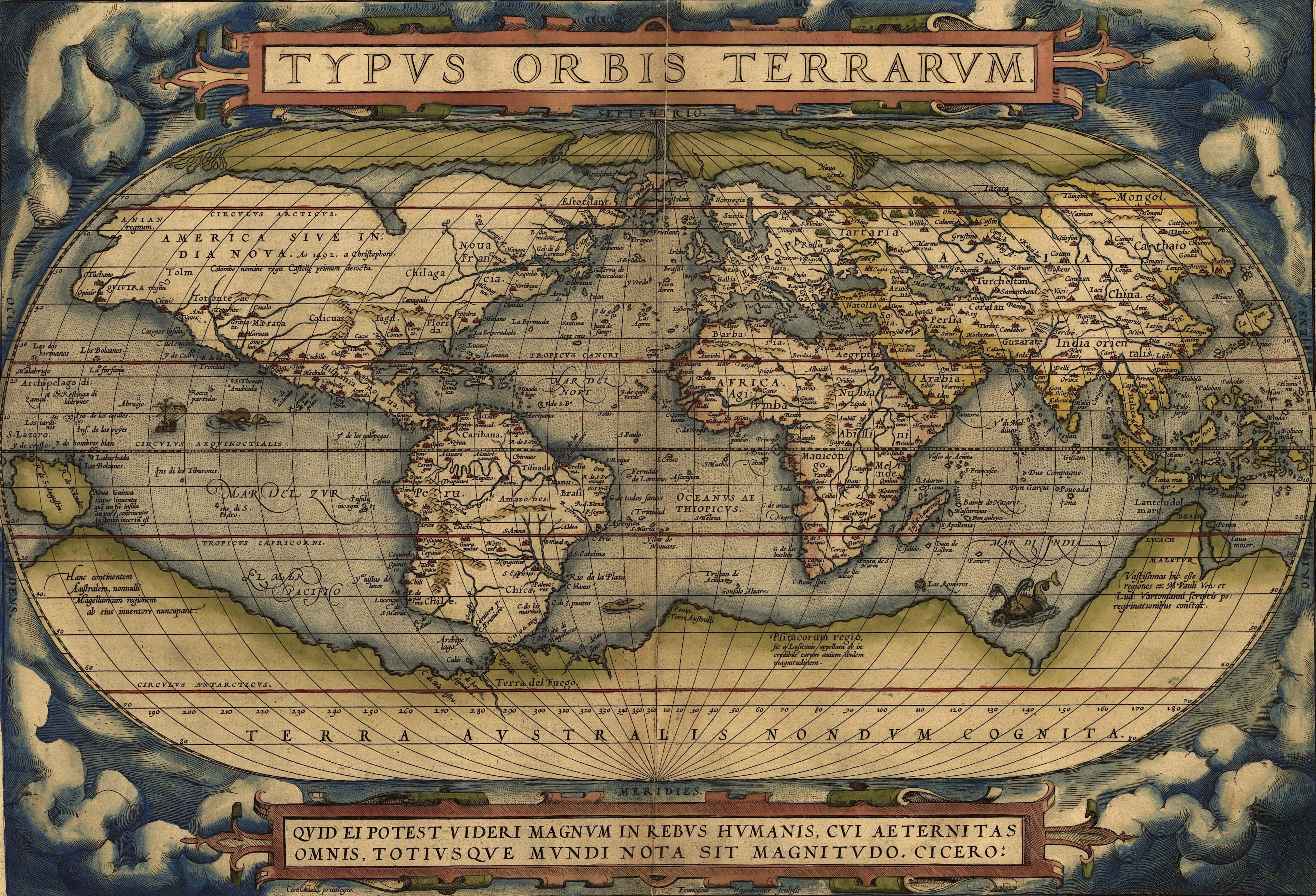
Ortelius’ totalizing ambition to map the inhabited world’s surface in its entirety led him to create a variety of frameworks to interpret the relations of space: whereas the genre of nautical maps and island books were used in sea travel, terrestrial maps provided a basis to describe cities’ relations. By uniting the content of marine maps of nautical expanse, which embraced maps of islands and coastlines, with the maps of terrestrial regions, Ortelius’ maps united multiple frameworks to process terrestrial inter-relations. Rather than being about best practices alone, Ortelius synthesized maps in an image based on the techniques and critical practices of a tradition of close critical reading. The Ortelian format of mapping created a new paradigm for world-mapping, whose influence can be readily seen on the above map of the distribution of earthquake epicenters, for unifying aggregate information in a dynamically readable form.
The staying power of combining different frameworks for understanding expanse created a set of best practices for synthesizing and ordering information for readers, but also a new standard for ordering a sort of common book of spatial knowledge and of the “known world”–combining a variety of frameworks by which space could be understood or rendered.
The map that aggregates earthquake epicenters stands at something like the culmination of an Ortelian tradition, that used the map something like a screen to project a sedimentation of past events. Such a combination of past events on a spatial screen was possible because the screen was itself, as a geomorphological terms, seen as timeless. It’s not a coincidence that the map was first linked to historical pedagogy by the early modern historian Jean Bodin, even before Ortelius, for the critical assembly of a mapped space is a selective notation of past events from settlements to shifting aggregates and boundary lines. Ortelius himself treated maps as a sort of sedimentation by which to understand the configuration of the present, and a basis to process the spatial relations among apparently disconnected events, in maps of St. Paul’s pilgrimage of or of the ancient Roman Empire’s expanse. We’ve continued to use maps as tools to fabricate the association among the occurrences that might seem privileged events, placing them in the spatial context that invests them with a syntactical meaning from which certain patterns emerge–or illuminating the difficulty of knitting events in associations that we might want to better describe.
Recent infomaps continue to exploit ways of using metadata to describe a network that can highlight potential dangers of political divides in our national landscape.

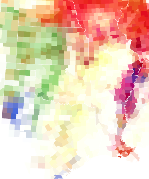
The appearance of the fragmented states of the union in past elections are so compelling as images of a nation divided because they reveal fault-lines of consensus–or the deep contradictions of fault-lines within the same polity. Although this cartogram is not a map proper, it elegantly cross-maps these divisions by the distortion that the political process creates within the voting practices of same political unit in the 2008 United States presidential election:
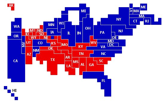
The above cartogram synthesized metadata in a compelling point of reference for understanding where we go from here, or what the make-up of the country was that first elected Barack Obama as president. That said, it is a consensus builder, as much as a way to process a political divide.
If Ortelius pointedly united contrasting frameworks to judge space of nautical and terrestrial form, one can’t help be shocked by the dramatic reduction of spatial frameworks to understand local distributions of place in Google Maps. Shifting tone and subject, there is the worry that the extreme personalization of the metadata in the map-services promised by Google Maps engines is, on the other hand, conceive of the map’s surface less as consensus builder than a sort of personalized image of our relation to expanse–as well as a select synthesis of spatial understandings form ostensibly like-minded folks, or at least folks defining themselves by similar tastes. Rather than preparing a common text for all users, they inaugurate a sense of the map whose selective criteria are determined in alignment with consumer preferences or web-site searches culled from where our search engines might happen to have taken us–somewhat like a hacked TripTik posing for a synthetic image of shared spatial consensus.
The infinitude of customized maps that can be created from mapping web-history onto spatial locations is a disruption or atomization of the map as a printed medium, allowing cartographical selectivity based not on sharing information but customizing spatial records to preferences that Google will determine. The way that Google offers to filter our interest in the world in an apparently benign list of sites of ranked relevance is scary because it removes agency from the reading of the map, and an abandoning of uniform criteria of cartographical selection. The record that is created is fashioned from our past choices, to be sure, but as they are refracted through the prism of web-searches, and mediated by Google Maps. The maps is less a surface that can be explored–eloquently typified for early Christians by Cassiodorus’ advice in De institutionem divinarum letterarum that monks read books geography to perform travels their vows did not allow, and to “visit with one’s mind all those places to which were visited with great difficulties by innumerable pilgrimages”–than a surface one is prodded to explore by a scan of the cache of one’s web history.
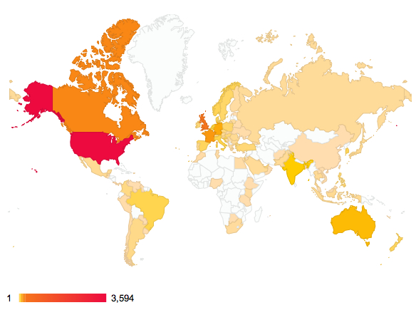
To draw a somewhat improvised analogy, the resulting map that would be crafted would be as distorting of spatial relations as those maps WordPress generates from clicks on this blog’s posts by transposing the spatial distributions of its readers onto a map defined by national boundary lines:

Now, it is useful to know what sort of readers one attracts; the resulting map foregrounds English-language using/reading countries mirroring an Empire that spread from the British island located at the map’s center. Rather than provide a more finely grained map of the distribution of consultation of individual posts, the frameworks that the map itself offers viewers is dramatically diminished, however, by reducing its surface to an infographic of online clicks, in ways that flatten the multiple ways of understanding or rendering space to one dimension, and remove the map from a variety of interpretive frameworks or a diversity of practices to understand space. The inhabited world is rendered via the question of access to wordpress, and the notion of a four-color map used to register the diversity of ways space might be divided by claims of sovereignty, and that distinguished nautical and terrestrial space, or topographic variations, are adapted to denote frequency of clicks on a webpost, and spatial differentiations subsumed to the gradations of usage indicated on a multi-hued color bar that occupies the place usually accorded indexical scale bars used in terrestrial maps.
Space is a secondary axis of information or category against with the metadata of post-clicks can be plotted in flattering ways, as the image itself constitutes a sort of vanity map, rather than a category of its own informational content. Those regions not relevant are shown in ghostly outlines as if to acknowledge politely their existence, but also to indicate their total and utter remove of interest from this dataset. The map seems more designed for self-flattery or worldly vanity. Should ten people in Russia clicked on the site, you get a boost of adrenaline that your bog somehow arrived across a huge landmass, even if the number of clicks on the site are more accurately distorted than clarified by the below usage-map.

One suddenly feels better and breathes a sigh of relief by tweaking the variables to view total clicks and feel confirmed in accomplishing the mission of global colonization, excepting those funny folks in Greenland who may lack internet access:
But I’m too amused by these usage maps, which were only intended to make a point. A similar evacuation of the map’s meaning in registering space is at stake in the Google Map defined by the sites that we have already visited. Evgeny Morozov has recently argued that this is tantamount to a bid to “end public space as we know it,” or, perhaps more accurately–and better yet–privatize public space. The “ends” of Google Maps is to enrich and monetize their own database, and aspire to what Siva Vaidhyanathan aptly termed the “Googlization of Everything,” without registering with that fine a grain local hybridities: the more one maps, the more one erases identities, and categorizes space a means to market the consumer’s illusion of a total access, something that is not transcending a specific perspective but approximating a surveillance behemoth in the name of the interests of a few.
Google Maps mobile app director Daniel Graf vaunted the benefits of splintering of shared models of readability in his persuading potential users of the benefits of plotting entirely personalized maps. “If you look at a map and if I look at a map,” he wondered, “should it always be the same for you and me? I’m not sure about that, because I go to different places than you do.” The loss of critical faculties of mapping in such a practice of “dynamic mapping” is profound. For in equating a map with a personalized history written at a remove from–and that only purports to represent–one’s own experience or interests–the effect is paradoxically to restrict rather than facilitate access to space, by pushing potential encounters with unknown places to the margins of our search. The map expresses Google’s aspiration of “organizing all of the world’s information” for its users, using metadata to approximate the paths that its users might find recognizable or shared sites on its ‘maps.’ But by keying the sites on one’s customized maps to a group of Google Plus Friends or Google Circles, one is restricting and refining the ways maps register an urban experience.
The advantages to advertisers of such a consumer-oriented remapping of public space is clear. In exploiting the expanded versatility of tweaking the map to a customized personal history we are imposing blinders by inviting ourselves to be directed to potentially attractive sites for spending, rather than to explore their distribution in space. Yet by removing the map from a common or shared condensation of meaning and the encryption of preferences and taste of the restrictive community of Google Circles, and reducing the number of critical frameworks to understand spatial distributions and local variety, one is devaluing the sharing of data by the medium of the map and the critical views of space that maps allow. Is this a new image of globalization?
One hopes not, for it reduces globalization to an axis of material consumption or subsumes space to a generalized record of collective aggregate social tastes, where little is left to truly discover. Such maps would suggest not so much the fragmentation of the territories reified on the map’s surface, but the projection of space to conform to our expenditure habits: the proliferation of maps of minor variation and fairly predictable iterations would have little relation to anything than consumer needs, and recast map practices as media for advertisement and product-placement, something like a view of the world as a mall–emptied of its value as a form of indexing or orienting one to space. The maps tell us that we have arrived at a set of “liked” and known destinations, and prompts us to follow established itineraries to places that algorithms have determined we are most likely to, well, like.
The vitriolic ad hominem conclusion of Morozov’s punchy piece faults the folks in Cupertino for projecting the uniformity of their own less multicultural surroundings of California suburbia to the rest of the world via Google Maps apps–an image of sun-lit streets, segregated by income and without infrastructure. But a culture also gets the maps that it deserves. We’ve paved over many signs of natural orientation, flattened hilltops and mountains, and increased disorientation by using freeways and defunding public transit. What sort of a topography remains but that of consumption?