
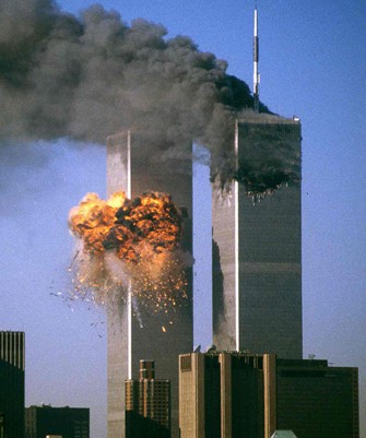
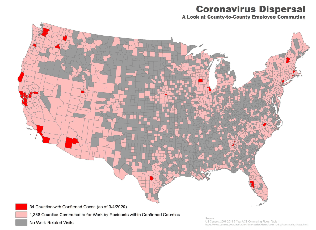
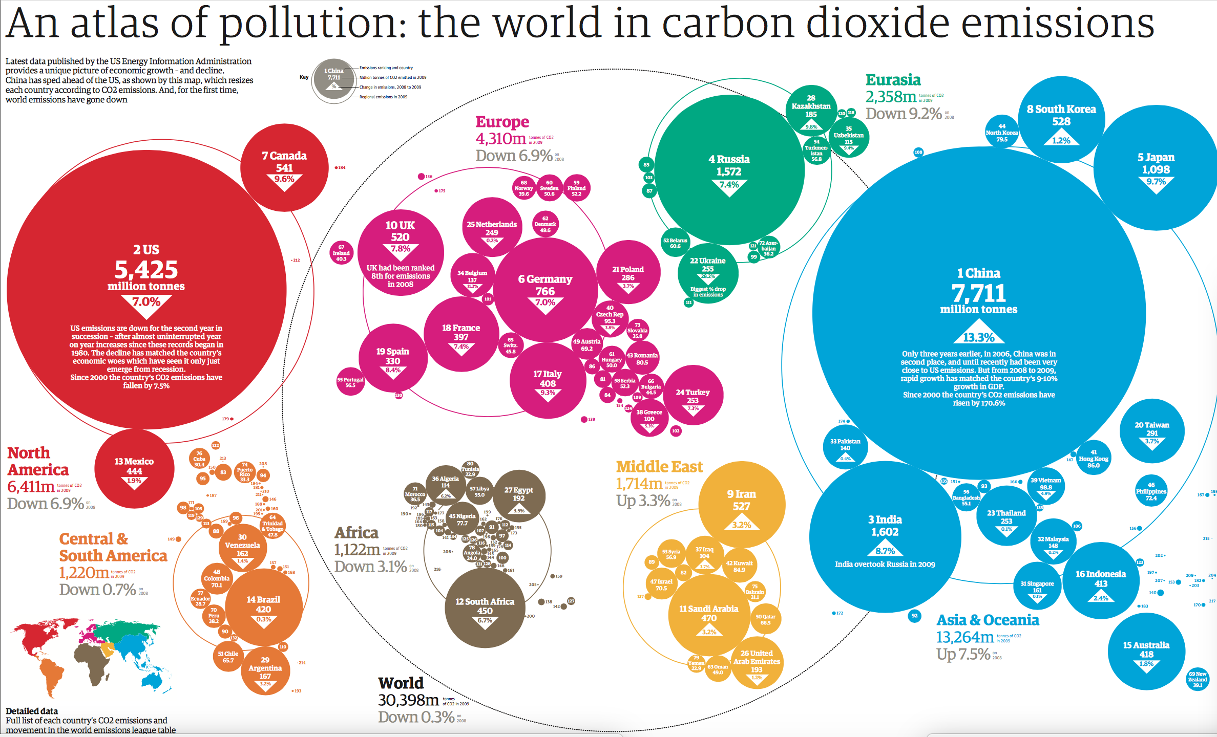
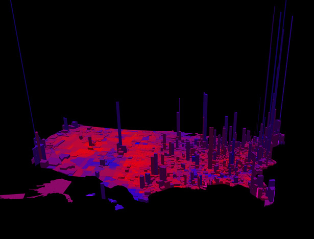
The haunting GIF in the header to this post tracks the rapid return of the Taliban to power as a drawdown of the Forever War. It echoes a sense of inevitable loss–a dramatic ceding of territory, echoing the “loss” of Korea, China, or Vietnam–an un-imagined conclusion to the War on Terror. The terrifying denouement of a collapse of provinces across this virtual Afghanistan seems to suggest a logic deflating bravura of the Forever Wars, in which arms and military materiel were funneled at unprecedented rate to Afghanistan–at a rate that would only be later superseded by the rush of arms into Ukraine. This was hardly, the GIF suggests, the conclusion Americans would have expected from Donald Trump’s promise to “ending the era of endless wars,” but was the end of an era of pretenses to American empire, that sent hundreds of billions of military spending to Afghanistan, inflating the budget for the Department of Defense in unsustainable fashion, and, intentionally suggests an ominous terms a haunting pivot to an unknown future without imperial plans. This is a future where the return of military forces from Afghanistan will upset a global military playing field, where war will no longer be fought in terms of a map of Afghanistan or a level field.
But if the glass can be called half-empty or half-full, its apparently overpowering logic of loss also obscures, by flattening to a few months the long history of post-9/11 period, how wars waged since 2001 has left the United States without any control over the ground game. For by failing to find allies in the ground we’ve been pummeling , unsuccessfully seeking to construct alliances on the ground, the arrival of arms and military technologies have re-written the situation of Afghanistan, or the conflict there in which we were long immersed, in ways few Americans have any memory, and surely won’t be aided in the dramatic GIF that suggests the collapse of the house of cards on which we created a power vacuum filled with only intensified high-powered arms, in what was virtually a powder keg of massive American forces across the Middle East, in an extended military apparatus designed to keep a geo-political map afloat that had no endgame or even game.
It is hard to come to terms with the 9/11 wars without tracking the flow of military technology and tools overseas. Over 9,000 Americans have died, or the hundreds of thousands who returned from the wars, injured in body or psyche, the roughly 6,200 U.S. military personnel, contractors, humanitarian workers and journalists killed in Afghanistan since the U.S. government invaded are left off the map, but the legacy may be greatest for the huge amounts of military materiel shipped into the Middle East–arms that helped in some way to “modernize” the current Taliban, who may have received training from Pakistan intel–as well as the huge losses of population and infrastructure in Afghanistan, where about 71,000 Pakistani and Afghan civilians are estimated to have been killed–a staggeringly disproportionate number in crossfire, bombing raids, drone attacks, suicide bombings in Kabul and other bases, IED’s and night-time raids by NATO or American troops.
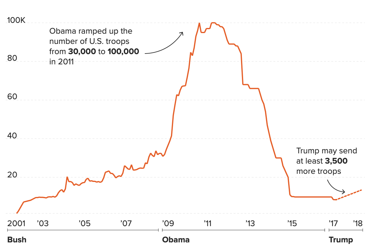
The GiF that purports to document the effects of American withdrawal renders the battlefield of Afghanistan as the rapid falling of provinces as if they were a gameboard, or a mock battlefield, creating a sense of causation due to American withdrawl by the proverbial falling of a set of dominoes. But the limited long-term strategy of these wars is handily elided in what seems the result of an immediate retreat of military presence. The retreat was, however, only the last act of a tragedy on a massive scale, the result of funneling arms rather than promoting national infrastructure in a nation that has limited infrastructure–and which even American forces were compelled to cast and indeed to consider as a tribal society that had no social structures that could be trusted or built upon. The increased lack of trust that dominated relations on the ground were more revealed by the map–as well as the lack of effort to foster a functioning government. Donald Trump may have escalated the arms trade into the Middle East to levels far beyond his predecessor, but the frustration of his successor Joe Biden was perhaps more clear-eyed than is given credit, if intentionally so: “We provided our Afghan partners with all the tools — let me emphasize: all the tools.”
But were tools of war ever enough? Biden’s remarks revealed a combination of deep dissatisfaction at returning to government after four years, and finding the same boondoggle on the table from the Bush years, and apparent exasperation. If he was trying to justify his rapid withdrawal of U.S. troops from Afghanistan as a pivot in prioritizing strategy he had long seen as of limited benefit or without exit strategy, it betrays a deep sense of what might have been different in Afghanistan, or how the map of civil government could have been different–if the arms sent to Afghanistan in military aid was not seen as a sufficient basis to forge a civil society. The vague circumlocution “all the tools” may well come back to haunt both Biden and the world. For in the course of training and equipping a military force of 300,000 provided the basis for delivering much military support, America created spiraling costs of a global arms industry, even if the range of arms offered was not as well-suited to Afghani terrain or as protective as equipment offered NATO troops. (Oryxblog notes the poor protection these vehicles offer against feared improvised explosive devices (IEDs) compared to the MRAPs available to NATO forces in Afghanistan, and offered to police departments across the United States, but not offered to Afghan special forces.)
While the messy exit from Afghanistan appeared an uncoordinated relinquishment of control, the reliance on firepower and bombing raids as the sole veneer of stability in earlier maps of the region is revealed by the map, far more than the crumbling of a once united front of control. The GIF dramatically collapses the past four years as they unravelled over the months from May to April 13 to August 16, 2021; if it is only one of the several theaters of war, it seems to offer a compelling, if distorting story of a fall of provincial provinces in the state that the United States and the failure of rebuilding an infrastructure to which NATO committed from 2008, a loss that seems to ratchet up one’s sense of a lost opportunity. The failure of being able to control Bagram Airfield thirty miles north of Kabul–its control ceded to an Afghan army able to provide cover for fleeing Americans–was a final tragic episode in sustained lack of commitment in the ground game over more than two decades of ignoring the level of local trust that might have better created the nation’s infrastructure.

Indeed, the fraught planning of the withdrawal from Afghanistan, too easily blamed on a failure of “listening to those on the ground” who grasped the critical strategically critical nature of operations of drawing down the war rests is imbued with a sense of loss the mock up maps released by outfits as Long War Journal communicated to the viewers that reveal incomplete tactical awareness of a long-term ground game, but cunningly erased the costs of a war that inflicted such sustained damage on the country–and introduced escalating levels of violence and anti-government opposition–that little trust or loyalty remained after intense military efforts over all those years.
The costs of the pursuing of war and of bombarding much of the nation are never referenced in the maps of the advance of Taliban forces across the nation that suggest a strategic meltdown of ground-game. The “loss” of territory in the flip-book like sets of images recorded a real-time reaction to the transmission of power from American military camps, a transfer of power that was so poorly coordinated to not even allow the departing United States troops to secure Bagram Airfield, miles outside of Kabul, and the Hamid Karzai Airport to coordinate departures.
The narrative of Taliban advance is however mapped as an optic of loss. But the loss is almost hidden from visibility in the very same maps. The failure to compel Afghanistan to present Osama bin Laden and Taliban officers or training camps created the false sense of security of a show of power. It was based on and predicated the false concept of a submission of Afghanistan as best achieved by bloody bombing campaigns, drone strikes, and military incursions. For the loss of what we imagine territory held by our troops seems almost to cleanse the bloodiness of that past history. The advance of the Taliban into areas that were allegedly once in “government control”–or are labeled as such–reveal the spread of an ominous wash of deep crimson across the country as the tragic end of the War on Terror, something of a blood bath in the making, a spurt of pink and deep crimson red–as if the bloodshed was not cast by an American show of power.
Yet it erases the effects of a sustained numbers of deaths, violence and loss of blood, and the deaths of civilians that might have been prevented, already destabilized what was left of the civil government. The absences of governmental structures or webs of local allegiance allowed the superficial sense of stability that the provinces had retained, as American air power left them , and as stockpiling of arms and munitions in many former American bases provided the materiel for Taliban forces to advance even more quickly across space than they had ever expected. The insufficient supervision of arms that arrived at American bases suggested a landscape long permeated by naivite about the agency of Afghan people, and the utter the absence of training of local forces, that anticipated local governmental failure across the Forever Wars.
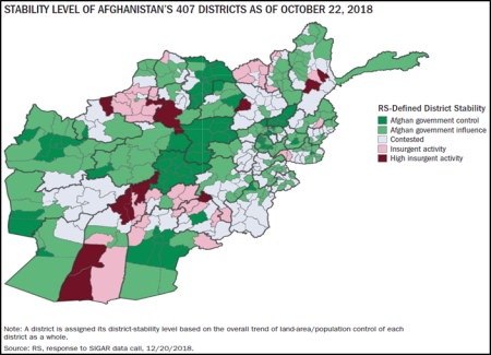
The readiness to point blame at a new President for not listening to the on-the-ground sources is concealed in the maps that suggest an abandonment of areas “under government control” as a betrayal–rather than a culmination of the long-term costs of a failure of effective governance of a land that long lacked centralized governance of the sort that is signified–but not demonstrated–by a map. The very national borders of what was shown to be a “nation” created a sense of false security, belied by the appearance of relatively few areas of insurgent activity across the terrain since 2018, and with little sense of the infrastructure destroyed by sustained bombing campaigns.
SIGAR, January 20, 2019, Quarterly Report to the United States Congress
But the arrival of bloodshed to Afghanistan was something that the United States, of course, brought there on a scale no one had ever before imagined, flooding the nation with arms of a level of modernity as if they would defeat the society we had once called ‘tribal’ and incapable of tactical maneuvering or high-tech weaponry. As the United States assures we are As the area under “Government Control” contracts to an isolated the limited area, leaving us asking how the United States mapped it so badly. As the Government four Presidents promoted military ties contracts to a dot, but the dream of such an independent state now apparently eclipsed and recast into what may now seem more of an inter-regnum between two rulers–Hamid Karzai and Ashraf Ghani–in a Taliban regime. Rather than being cast as a restoration of power, the map illustrated to Americans the fall of an American dream, and an eclipse of the idea of nation-building as a primarily military prospect, that the US Army took over from NATO.
The hope to recreate firm borders of Afghanistan at untold expense fell like a house of cards. The Taliban’s strategic operations for controlling the very roads on which they once attacked American and NATO forces had destroyed the structures long before the troops retreated, as they had paralyzed the country’s movement and flexibility of its soldiers or national infrastructure. The fiction that was long nourished of an Afghan state that America had been able to try to fortify by the importing armaments–the “tools of war”–over more than twenty years. While the map is a visualization that derives from the work of the Foundation for the Defense of Democracies, and poses as a vision charting the erosion or loss of the coherence of a liberal state in the borders of Afghanistan, it both isolates the nation from its broader context in the Middle East and War on Terror–from the United States Central Command (CENTCOM) in Qatar, from the allies of Taliban in Pakistan and elsewhere, or the exit of many Afghan forces as refugees, or the seizure of weapons, humvees, and armored vehicles abandoned by the Afghan National Security Forces (ANSF) who left them behind as they fled north across the border or abandoned their posts. A map of the arrival of firearms and materiel–the procurement of Foreign Military Financing (FMF) and International Military Assistance (IMET) programs that American Presidents are authorized, and with Donald Trump escalated and Barack Obama had previously–would be as helpful, as it would track a vision of a significant increase of security assistance for geopolitical dominance.


The investment in drone escalation as a tactical relation to “space” redefined territorial dominance to replace one of community building, often confusing targets with the territory. Drone strikes not only served to “take out terrorist commanders”–but as if this did not destroy the stability of the fabric of a nation America was allegedly trying to rebuild since 2008–defined a view far from the ground. Over 13,000 drone strikes on Afghanistan alone–a minimum of 13,072 strikes killed in Afghanistan alone over 10,000–conducted by the United States Reconnaissance created a landscape being invaded by foreign powers. The dynamic of incessant drone strikes–conducted by a tool not owned by the U.S. military before the Forever Wars, and now showcased in targeted strikes is an invaluable prism to understand the mapping of the land that appears a hope for peace and end to the Forever Wars, as much as a lack of training, strategy, or American assistance. In ways that make drone strike fatalities pale, the recent estimate of 46,310 Afghan civilians–if below half of the estimated 95,000 dead Syrian civilian casualties of the War on Terror–suggests the way that the United States has benefited form the low presence of reporters on the ground.
The war in Afghanistan was located predominantly in the countryside, and across the many provinces that “fell” to a Taliban newly fortified by the windfall of armaments they accumulated as provincial cities, abandoned by the AFSN, fell. The logic that we had supplied the ANSF with sufficient arms to defend the territory reveals a confusion between the territory and the map–and the theater of combat and the situation on the ground. When Joe Biden marveled at how American-trained Afghan security forces Americans out-numbered Taliban fighters fourfold, and possessed better arms, the 298,000 armed ANSF were thinly spread and at low morale; if trained and armed by Americans, perhaps amounting to but 96,000, they lacked decisive advantage against Taliban force of 60-80,000 whose leaders effectively exploited internal weaknesses off the battlefield.
The real map–or the inside story of the progress of the Taliban across the nation–lay the perhaps not control over districts’ capitols, but the many well-stocked bases, airfields, and army depots long cultivated by American troops. The long-running bases across the country–sites with often mythic and storied names, like Kandahar and Bagram airfield, where tens of thousands of United States soldiers had been stationed from 2001–had posed a site of immense military materiel that the . The Bagram Airfield was a site for drones, of course, but also for storing cutting edge Blackhawk helicopters that the United States committed to Afghan forces, even if they were not well-trained in using or maintaining them, munitions, and firearms, even if the larger American aircraft and drones were withdrawn. As American forces withdrew, the rifles, ammunition, and tactical vehicles–as well as cars–were left at bases that the Taliban had long attacked–as Bagram—and had their eyes and were particularly keen. American commanders, as if intending to disrupt the withdrawal’s smoothness, disrupted the smooth transition by not even telling Afghans before they arrived at the Kabul airport–allowing the looting of laptops from Bagram, as a sort of bonanza, by local residents, before the arrival of Taliban forces.
Over three million items were abandoned by the U.S. Army in Bagram, from food to small weapons, ammunition, and vehicles–presuming that the “tribal” Taliban did not know how to use them–before they down-powered the entire base. Did the generals doubt that the Taliban could ever operate them, or just trust they were secure with Afghan forces? The weapons were poorly monitored. As ammunition for weapons not being left for the AFSN was destroyed, the abandonment of materiel, planes, helicopters and ground vehicles followed departure from ten other bases before Biden took office, often over NATO objections–that bestowed a huge symbolic victory of sorts to the Taliban of having driven foreigners from the land as they long promised, if not one of military materiel as wall. If American military argued “They can look at them, they can walk around — but they can’t fly them. They can’t operate them,” the ludic inversion of Taliban displaying armaments of Americans was profound theater of deep symbolic capital.
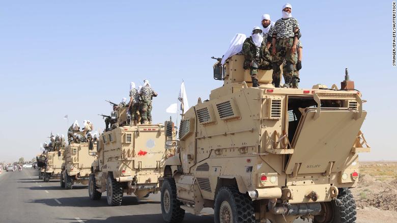
If the hundreds of bases that Americans sent soldiers had long declined to dozens, the withdrawal of American forces without clear coordination with Afghans left a vast reserve of symbolic military material ready for the taking. How much was left at the bases closed in Helmand province, Laghman province, or Kunduz, as well as the bases in Nangahar, Balkh, Faryab and Zabul? Did these sites, and the reduction of American presence in Jalalabad Air Field, Kandahar Air Field, and Bagram not provide targets on which the Taliban long had eyes? The seizure of Kandahar provided an occasion for a triumphal procession of sorts, showcasing armored vehicles, as Blackhawk helicopters flying the Taliban flag flew in the skies overhead. In a poor country, the large prizes of American bases stood out like centers of wealth inequality, stocked with energy drinks, full meals, medical care and other amenities, and stockades were impossible to fully empty as the American bases closed from 2020.


Few gave credence to Taliban boasts 1,533 ANSF joined the Taliban by May, or that June saw another 1,300 surrender, but the numbers of deserters only grew, expanding “contested” areas where Government forces lost ground without a fight. All of this crucial information is absent from the map, but we still believe, despite all we might have learned from Tolstoy, that generals and strategists determine the state of play on a battlefield, without knowing how the war was waged, or that the war was never seen as geopolitical–as it was waged–but across borders and rooted much more locally on the ground, as Taliban entered sites of former bases, and amassed arms caches in a drive of increasing momentum to Kabul–one of the only areas that wasn’t bombed so intensively, hoping it would be a reprieve from the violent bombed out landscapes on the ground.

For a war that was long pursued remotely, the image of territorial “loss” obscured the failure of engineering a transition to democracy. We have already begun debating the extent to which an executive decision-making shouldered full responsibility for the folding of the government of Afghanistan that followed the withdrawal of United States soldiers. –and air cover. We like to imagine that an American President has continued to steer global dialogue about the Afghanistan War, the remainder and reduced proxy of the War on Terror. Perhaps it is that we have a hard time to imagine a sense of an ending, and loose the ability to imagine one, and have lost any sense of a conclusion to the War on Terror that was long cast as a “just war,” against evil, and in terms of a dichotomy between good and bad, as if to disguise its protracted disaster. If we could never “see” the results of a an end to the War on Terror, Orwellianly, we were told it was not endless–Americans must have patience, said President George W. Bush as he promised us he had, to pursue a simple, conclusive, and final end to terrorism, assuring us the war would not, appearances to the contrary, grow open-ended, with a “mission creep” even greater than the Vietnam War. Barack Obama, after he presided over the military surge, hoped to “turn the page” on it in 2016. But any “exit” receded, and may not even be able to be dated 2021–as we imagine–but more protracted and indefinite than resolute–as Barack Obama, who presided over the military “surge”–hoped to “turn the page” and wind down by 2016. The logic of the war grew, as if deriving from Bush’s refusal to negotiate as was requested after the eight day of the bombing campaign, or move Osama bin Laden to a third country, but employ military might to force destruction of the camps of the Taliban, and delivery of all Taliban, fixating on the Taliban escalated the war far as an American struggle, far beyond attention to the situation on the ground.
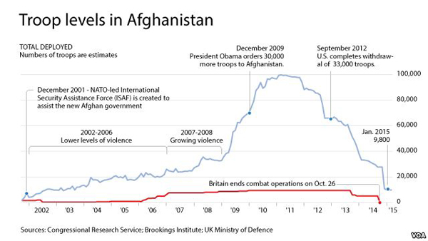
The nightmarish reversion of Afghan territories was seen as the culmination of the withdrawal of American troops at large levels, almost achieved by President Obama in 2016, after the heights of the first “Surge” in 20011, but which was delayed by President Trump. The war that refused to end or conclude was never seen as a protracted struggle–or presented as one–but it was, and perhaps because of this never had any end in sight. “This is not another Vietnam” was announced by the father of that President, President George H.W. Bush in 1990. Americans changed the organizational structure and leadership of Afghan troops with each U.S. President, making it hard to conclude or manage, shifting how Afghans were trained, that must have encouraged a sense of clientelism and corruption of which the Afghan government became increasingly accused–and perhaps introducing a lingering suspicion of corruption and clientelism, more than bringing anything like a modern fighting army or New Model Army. There was never a sense of refusing to leave for fear that the failure that the maps depicted of the collapse of all districts of the new “Afghanistan” depended on continued American investment and support to endure.
Although the rapid reversion of districts to Taliban is far more likely to remain perceived by Republicans as a fiasco in leadership, the poor state of the country and ineffectiveness to work with the increased military materiel it was provided as if the army members did not have to be motivated and organized. The impossibility of mapping the geopolitical interests America felt onto the Security Forces–Lt. General William Caldwell IV reflected Defense Dept. opinion in the military when he assured the world Afghanistan National Security Forces were effective and trained, in fact “probably the best-trained, the best-equipped and the best-led of any forces we’ve developed yet inside of Afghanistan,” by June 2011, after a decade of military training, and only able to get better, even if American Generals were clear they would tolerate a degree of chaos, and didn’t want Afghans to be defining priorities, but only to instill a “particular kind of stability“: by 2016, National Security officials openly worried about the lack of any metrics–levels of violence, control over territory, or Taliban attacks that presented or projected confidence. The distrust, missed assessment and mutual mis-communications between American Generals who promoted and mistrusted Afghan troops whose efficiency they promoted created a disconnect between Americans as they downplayed the military ability of the Taliban, regarded as lacking sufficient air capacity or military prowess to command the nation or pose a threat to the Afghan Security Forces who folded before the Taliban’s military and threats of reprisals.
Is it possible to trace a transfer of military technologies and armaments in the twenty years since the crashing of airplanes into the Twin Towers by jihadist militants and the appropriation of sophisticated arms, night-goggles and humvees of members of the same Taliban who now occupy Baghdad? At the same time as American purchasers of handguns and firearms grew, the transfers of weapons and military firearms to the Afghan areas–UAE; Saudi Arabia; and especially Qatar–in a massive transfer of military technology that paralleled the emergence of the very groups cast as primitive rebels who had commandeered aircrafts to strike the Twin Towers into an efficient user of enhanced military tools and technologies, rather than the primitives who occupied the outer peripheries, but were both trained and prepared to occupy a nation’s center in disarmingly modern ways. Although the image of the plans flying into the Twin Towers presented an image of modernity versus premodernity, a lens through which the protracted war was pursued, as we cast the Taliban as “tribal,” and drove the Taliban into the opium production business, selling “modern” weapons and military tools into Afghanistan, the dichotomy of modern and primitive failed to present anything like a proper lens to pursue the war, although it was one American military had adopted on cue from an American President who had promised a “crusade” in no uncertain terms.
Perhaps the story of the War on Terror, in both its Afghanistan chapter and in other ways, demands to be written, when it is, as a massive transformation from the perspective of a shift of military engagement on the ground, and the military experience of the soldier, or what John Keegan called “the face of battle,” rather than the grand narratives of a conflict of civilizations in which it was framed. If the experience and strategic outlook Keegan emphasized might well be expanded, following increased awareness, to the long-term psychological and physical costs to those who were fighting, the erosion and fraying of the sense of nation and national motivation for combat must be included in the history as well, but the shift in war experience of the soldier must have shifted far more dramatically for how the “sharp end of war” appeared for the generation of the Taliban who matured in a terrain where American weapons had increasingly arrived in abundance to become part of the landscape of the state, and might be understood in terms of the shifting eras of military engagement from being attacked by bombers, targeted by drones–none of which were owned by the U.S. Army before the war, a telling index of engagement that reflects the way the war was in fact pursued at its sharp face. While in America disdain candidate Obama showed for how his opponent thought the military operated by measuring might by its navy or air force–“we have these things called aircraft carriers . . .,” suggesting one might use cavalry or bayonets as metrics in the Presidential debates in condescending tones–the shifting theater of military engagement of the Taliban, from placement of IED devices to the mastery of roadways and local influence–greater than the American soldiers on the ground.

From IED placement to suicide bombers, to rifles, kalashnikov, helicopters, and humvees, Taliban developed a new mastery of terrain, control of road networks for shipping materiel, to a n increasingly sophisticated tactical and performative use of arms and modern fighting tools that altered its experience and skill at the “sharp face of war” that we ignore, or attribute to outside assistance from Pakistani military, preferring to see the Taliban as primitive fighters without access to the technology America possesses and our provision of military “aid” as destined for “Security Forces” alone, rather than for a theater of war.
1. The current appeal of the clear mapping of the “fall” of Afghan districts to Taliban omits any senses of the line of battle. This is perhaps convenient for the military observers, who digest the war as it is pursued by American interests alone, even the NATO presence was increasingly defined in terms of the development of Afghan forces and democracy, although the “military alliance” shared by America and its Afghan ally is most often understood only in American terms. In mapping the “fall” of districts as if they were of purely strategic outposts in a geopolitical game, the map not only ignores the face of battle, but emblematizes the mis-mapping of American geopolitical interests onto Afghan interests. Despite the continued perhaps overzealous promotion of the skills of Afghan Security and the continued presence of American and NATO military failed to transition to Afghan Security Forces, even if we have continued to equip them with robust “tools of war,” without having trained them fully to fight our wars or to imagine their territorial mastery as anything like a strategic advantage for themselves.
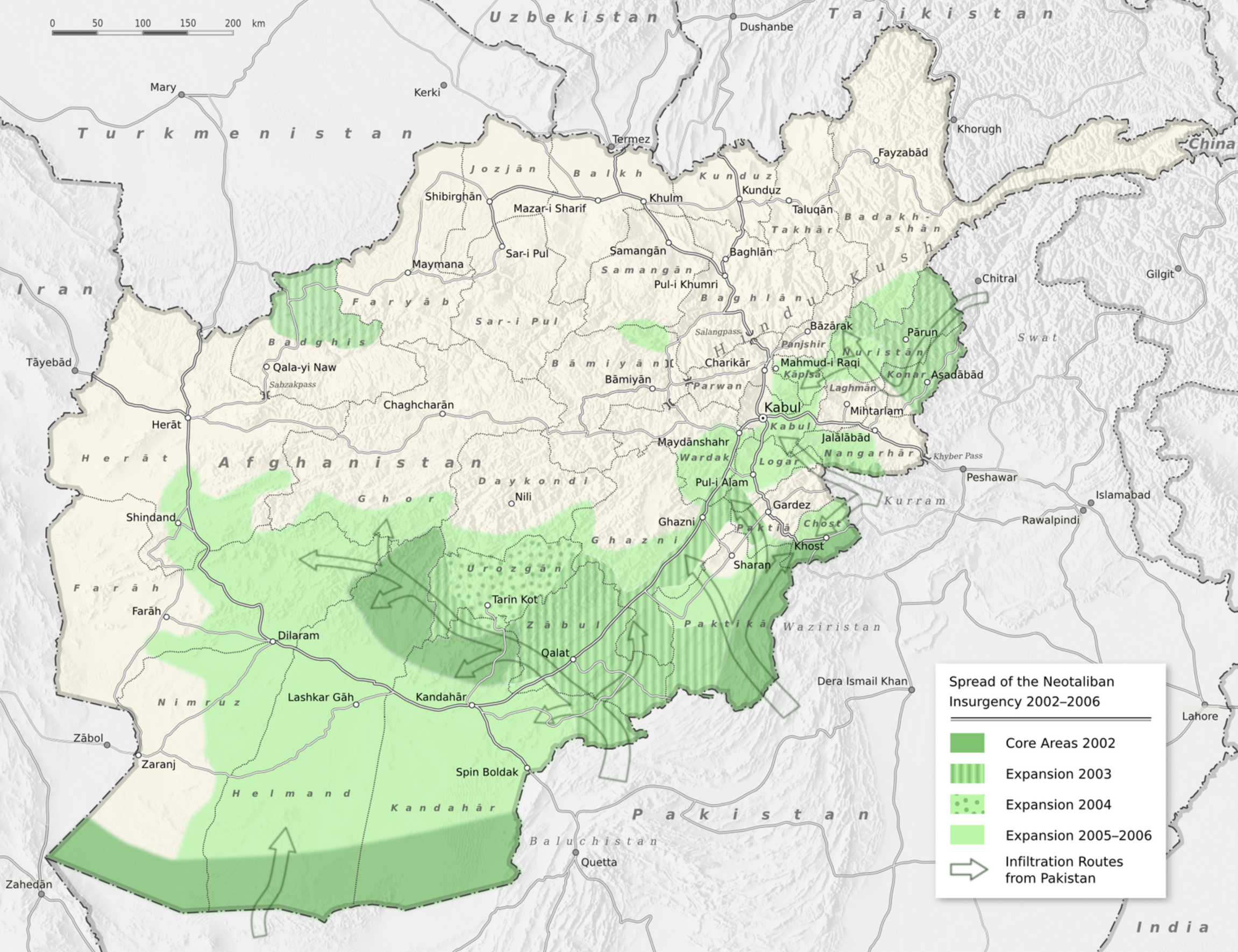
Although the first elected President of Afghanistan, Hamid Karzai, was a friendly figure for Americans, trained in international relations and fond of Islamic philosophy, the promise invested in him as a “transitional figure” uniting “all Afghans” was better received by the British Queen and American President, Americans have been more concerned to map Afghan strategy as if it aligned with American interests, and a global war on terror, which Afghan Security Forces were deputized to adopt. We had long mapped the Taliban Resistance or “neo-Taliban” after the Taliban had been crushed as confined in the mountians, rather than in terms of its engagement with the “sharp face” of battle and its toll on both soldiers and the civilians who lived it. We saw the Taliban as an “insurgency” confined to the mountains as if these were the margins of the nation, and located them in Tribal grounds that were opposed to the vision of a central state–or as the inhabitants of a “Triangle of Terror” they had created.


In the images of Afghanistan’s “fall,” the “face of battle” is conveniently absent. In the visualizations of “district control” that were produced in the maps of the Foundation for the Defense of Democracy and reproduced across Western media, serving lambasted President Biden for some sort of dereliction of duty in concluding a forty-year old poorly thought out war? Democracy becomes something that the United States defends in these maps–or deputized Afghans to learn to defend–but the American President is suddenly seen as asleep at the wheel and not vigilant, the reverse of the image of a powerful Commander-in-Chief we desire, or the necessary and needed military “genius” who can strategically protect the national interests these visualizations reveal to have been tragically imperiled. And so we watch the “fall” of districts that had never gained independent unity, as if they failed to protect themselves from a theocratic opposition. We pretended that the failure was not the entry of increased materiel to the nation, but the global dismay at the levels of arms that are left in Afghanistan–more than are possessed by some NATO countries, and an unknown remainder of the $83 billion of materiel shipped to that nation–and the failure of Afghans to learn to use them against the Taliban, as if they were the exponents shaped by a Triangle of Terror, not affected by the shifting face of battle and “sharp edge” of war.
Increasingly, the promotion of the image of success in containing the Taliban that the U.S. Government promoted was doubted in the press, and seen as not an accurate reflection of the dominant role that the Taliban already had gained and controlled in Afghanistan, but which United States military assessments had rather dishonestly diminished, a scneario in which the maps of the Foundation for the Defense of Democracy provided a needed reality check as the true crowd-sourced story of the limited amount of control that the Afghan Government controlled. The extent to which the misleading military map by which the US government was seen as exaggerating and misleading the public on Afghanistan was US government is exaggerating and misleading the public on Afghanistan reflected the more bracing judgements of the right-wing Long War Journal, which valued its ability to present a clear-eyed view of America’s strategic interests in an unvarnished or not sugar-coated geopolitical assessment that America needed in the Trump era, when the confidence in our own government declined.

We did not ever map the “sharp edge” of war, preferring to view the nation from above, either against a “Triangle of Terror” we sought to bomb and domesticize, or parsed into tribal affiliations that became the preferred means of translating Afghanistan to an American audience, which almost acknowledge the failed imperial fantasy to project Afghanistan as a nation with clear sovereign borders, or to define an objective for Afghan independence that is not backward-looking, and rooted in the cartographic attempts of Great Britain in the nineteenth century, translated into the crucial “buffer” function that might contain Pakistan, and stabilize Central Asia in a geopolitical struggle defined by the War on Terror, and not the situation on the ground, or how Americans altered that situation by their increasing military presence and profile. As the Taliban slowly gained ground over the years, and in which the logic of waging war as a protracted struggle had ceased to be worth the $6.4 trillion American taxpayers have invested in post-9/11 wars through FY2020, in Iraq, Syria, Afghanistan, and Pakistan–and the escalating future costs that the war would mean. As we have lost sight of the logic of continuing the “forever wars” into the Biden Presidency, and the vision of a “just war” has become clouded and polluted in the Trump yeas, we have lost site of any ability to imagine the ground plan for the resolution of the continuation of a War on Terror or imagine at what scale such a conclusion might ever occur.
To be sure, the advance of Taliban was not how we wanted to imagine it as a restoration of “normalcy” or a status quo, and a rejection of a theocratic government for a secular liberal ideal. But perhaps the image of Afghanistan as a liberal state was indeed a failed project, and it only existed in maps that had outlived their usefulness or reflection of the area on the ground. The “fall” of Afghanistan reflects the inability to contain the Taliban from the nation, and the weird blindness that America–and the American military and perhaps military intelligence–have to the effects of war on Afghanistan on the ground, wanting to believe in a clear chain of command, recognizable in other militaries, in the AFSN. The GIF seems to raise as many questions as it resolves of the fall of Afghanistan’s provinces to imagine what that ending looks like. As much as the number of districts that speedily negotiated a resolution of hostilities with the Taliban, the fall of Afghanistan and painful and deadly withdrawal from Kabul has been cast as the final cataclysmic episode of the War on Terror, as if President Joseph R. Biden–and Donald Trump before him–had already decided on a military withdrawal from the region was both long planned, and was indeed a means of cutting losses and leaving a region to re-dimension or re-scale the War on Terror that had been fought.
The mapping of the collapse of Afghan districts to the Taliban, cast as sudden and without any sense of occurrence, seem to justify the continuation of that war, but track the erosion of a territorial war, long morphed into a struggle whose aims are unclear. Maps that suggest a “country” of Afghanistan as land that was lost help us imagine that the authority of US forces might have trumped geography. And so we are retrospectively questioning the reporting of intelligence on the ground, trying to read the records of intelligence, or debate the false confidence projected by U.S. military through the final years of the campaign, as if this were an American decision, and a reflection of American global authority, as a microcosm of the image of the United States in the world theater, and seem to present the reassuring picture of a scenario of global politics in which wars are still fought on the ground, and which the loss of the War on Terror was not a failure of the American military, but the ceding of land by Afghans themselves who lacked ability or conviction to fight the war against theocracy that was largely scripted by American Presidents and military–who were unwilling to share their sense of their mission in Afghanistan with Afghan leaders, certain, as last as 2016, that Afghan “priorities are different from ours”–perhaps making it impossible for Afghans to take charge, as leadership of the nation was less of a gridded battlefield that became the dominant graphic that filtered, processed and mediated the withdrawal of American forces across the mainstream media.
In viewing a nation as a battlefield, we are not looking at the right map, or perhaps not looking at the right maps at all–or at the role that the arrival of military weapons played in the rendering “Afghanistan” all the more difficult to map. Perhaps the exportation of arms to the Middle East and to Afghanistan in the years since the nation’s invasion provides a better legend, and indeed a necessary legend, to map how control slipped out of the increasingly corrupt Islamic Republic of Afghanistan, established in 2004 after the United States as it assumed control of most of the country, which has been ceded–and destroyed–by the advance of the Taliban. The drawdown of troops in the country from the heights of the first surge under President Obama of 10,000 men and women has in fact been declining for years, but we have not noticed, or even looked closely at it. Yet the compelling nature of visualizations of “control” over individual districts by 2020 seemed a sudden loss of the nation, a progression of a fall of provinces culminating in the Taliban taking control over almost all of Afghanistan’s provinces, and entering Kabul, perhaps as Afghanistan seems a fitting theater or field for the master-trope of America’s imperial decline. Indeed, the attention in media maps to the delusion at an apparent absence of groundplan for American extrication or withdrawal.

These graphic visualizations are hardly accurate maps, but conveniently omit all information about the “sharp end” of battle, falling back on the geostrategic place of “control” over provinces–is this by the flags flying in their capitals? what is control in a war-torn area?–that can be understood as an element of a “Global War on Terror,” rather than the ways that the war was fought. As uncomfortable as such images might be, we prefer the “objective” GPS image “mapping” control, not pausing to ask what they miss or distort, or process the war in an episode on the War on Terror, or a lost field of battle for Afghan independence which it has long ceased to be.
The time-lapse visualization in the header to this post, of Afghan provinces shifting from “Government Control” or “Contested” to “Taliban Control” offers an image of dramatic impact, as if it were real-time, compelling as a tragic narrative, but erases the deep roots of the “lightning drive” of Taliban forces, fueled in large part both by absence of administrative unity and a massive uncoordinated influx and abandonment of arms–both left to Afghan Security forces or in caches. So strong was the flow of arms to Afghanistan and Qatar from the United States that the Biden administration only suspended arms contractors from delivering pending arms sales. Caches of arms left abandoned by Afghan Security Forces and, presumably, American military who had left them to be used by Government forces, not only destabilized the landscape of local government, but amplified a landscape by men with guns long fed by the over $40 billion contracts for firearms and ammunition flowing to the Middle East since 9/11. But if Biden assessed the Afghan Security Forces as being “as well-equipped as any army in the world” in contrast to the Taliban–and greatly outnumbering Taliban fighters–the long-term distrust of Afghan priorities and concerns left them with little sense of a common grounds for defense. As Americans were making similar assurances, Afghans were already fleeing in July to Tajikistan, where over a thousand Security Forces had already fled.
The arrival of the Taliban did not embody the victory of a theocratic to a secular regime that Americans have cast the War on Terror. The arrival of the Taliban as an armed infantry group, with its own modern military power, is an unwritten history, but was fueled by the arrival of an increased number of weapon that arrived in the region, and the transmission of military technologies across borders in ways that American governments could not perhaps imagine. Whether they were not exposed to the arrival of high tech arms of US manufacture in previous years or not, the idea that the arms that allowed Taliban members to arrive with speed in Kabul and negotiate a ready capitulation of districts, perhaps with Pakistani assistance, the seizure of of an unaccounted number of weapons caches turbocharged the advance to Kabul, in ways that not registered adequately in daunting images of the shift in districts to Taliban control. Such visualizations map a checkerboard of district that seem to track the government “control” of districts that image the erosion of a secular vision of Afghanistan. The division of Afghan lands into “districts” is almost a shorthand for the localism of Afghan politics, an admission of the difficulty of knitting together a secular state from into a centralized state, was never resolved by occupying forces or the Islamic Republic of Afghanistan. More than confirm the alienation of ethnic groups from the vision of an allegedly secular government, inter-ethnic divisions have dramatically grown in the place of a coherent strategy for forging a multi-ethnic state, emblematized by an unknown CIA analysts’ map of circa 2017, that continued to map a nation bound by the red line of Afghanistan’s historical border–the “Durand” line, negotiated in the last decade of the nineteenth century–a conceit bisecting a region of Pashtun dominance and mountainous terrain that poses questions of Afghanistan’s ‘borders’ as much as it answers them. Was the retention of this imperial cartographic imaginary not suited for the sense that Afghanistan, as Samuel Moyn argued, offered a chance for the “last gaps if imperial nostalgia” in the post-Trump years, that was, improbably, able to play across the political spectrum?
Is it possible that the among of weapons funneled into Qatar, United Arab Emirates, and Saudi Arabia that have disguised the cost of the War on Terror to some degree have created a huge concentration of arms in Afghanistan.

If a rationale for the increased ability of Taliban members both to manipulate negotiations may lie in their attention to negotiations at Doha, their use military weapons may lie in the increased arrival of arms in the region. The escalation of imports and sales of arms to Afghanistan–many not registered or under the radar–escalated in the course of the Afghanistan War, and reflect a growing geopolitical significance that the nation was given to the United States, rather frighteningly similar to Vietnam, if the withdrawal from Afghanistan has been most focussed on as the greatest similarity between these two long wars, both fought at considerable hemispheric remove, only conceivable as they were logistically mapped by GPS. In both cases, wars were pursued across a complex and often oversimplified logistic chain, pursuing an elusive vision of global dominance or geopolitical strategy, whose obstacle appeared a lack of geopolitical “vision”: but was the presumption of a possibility of “global military dominance” that mismapped both military projects from a purely American point of view. The flattening of the effects of waging war only seems to have increased, paradoxically, as the geopolitical significance of Afghanistan overwhelmed the well-being of its residents, blotting it out, as the country modernized by force as it became a focus of the arms trade.
2. The investment of American taxpayers’ monies in the region was astounding, and hardly democratic, so much as a tantamount to a massive dereliction of national vision amidst the faulty reprioritization of mission creep that may be attributed as much to the military-industrial complex as to leadership or governance. Over half of all American foreign military financing arrived in Afghanistan directly by 2008, but aid had long flowed to Mujahideen and other insurgents through Pakistan, yet in later years billions of substantial materiel flowed via Qatar, location of the $1 billion CENTCOM headquarters where Americans coordinated all air operations in Afghanistan–a small nation that became the tenth largest importer of arms in the world, after South Korea, Iraq, United Arab Emirates, from 2015-19, largely from the United States, with contributions from France and Germany, jumping by 631% from 2010-14–becoming the eighth-largest market share in arms imports for 2016-2020 behind South Korea.
The absence of attention to the situation in the ground is nowhere more apparent than in the GIF that is the header to this post, which reveals the “fall” of Afghan districts to the Taliban from April, 2021. We map the hasty conclusion of the long war in GIF’s of districts, as in the header of this post, the flattening of a country that has been divided for over forty years, a form provided by the Long War Blog. The division of inhabitants of the land, or the effects of previous combat on the nation’s infrastructure and sense of security, is hardly rendered in the shape-files that flip from one hue to the other, suggesting a “lightning” advance of a militarized Taliban, evoking a sudden loss of a territorial advantage for which Americans long fought, and for which Aghans are to blame. Yet as much as the linked maps of “district control” suggest a traumatic collapse of the Islamic Republic of Afghanistan, the ally of the past five American Presidents, the maps collapse or elide the deep disturbances the war and importation of arms has brought to the territory that lies beneath the map, or oversimplified visualization of regional control.
source: Foundation for the Defense of Democracy’s “Long War Journal” by Mike Roggio
The quandary of designating Afghan regions by questions of “control” presumed a sense of stability and allegiance more akin to an idealized military map than to the situation on the ground. The checkerboard image of areas of “government” and areas of “Taliban” control became thinly veiled covers for a Global War on Terror in which the United States defined itself on the side of the good, that was current in a variety of maps long after the First Surge. In the context of the broad drawdown of American troops after the First Surge, as US troops level fell below 10,000 and Afghan Security Forces were celebrated for their effectiveness, the Taliban made steady gains on the ground. But the maps that suggested “stability” in government-held areas created a cocoon from which to affirm stability of a regime that never had broad institutional support as if the dangers it faced were from an “insurgency” 2002-6, and promoted an image of government control within the outlines of a national map, arriving from outside of a nation that still had retained its integrity and clear bounds as if they were able to be preserved.
Even as Taliban presence was more clearly established than we liked to map, the image of the Taliban as outsiders in Tribal lands created a sense of justifying a “civilizing mission” that was understood as more pacific than military, underpinned by a myth or conceit that the disciplined bodies of American warriors would beat the undisciplined bodies of the Taliban. This myth was confusing the goals of the military occupation, but creating an increasingly real edge for Afghans who experienced much more fully “the sharp edge of war” both forged increased bonds between the members of the military and the fighters and the landscape among the generations of Taliban fighters, and their logic of responding to a military strategy American generals mismapped on a geostrategic checkerboard–the very checkerboard that Foundation for the Defense of Democracies encouraged us to understand the success, progress, or challenges of combat, and indeed control their fears and responses to technologies of combat imported to the region by the United States.

The deep concern of a lack of “strategic vision” was not the best way to understand military engagement of Taliban forces, or to cast the compact shift of district loyalty after the American withdrawal.
But these terms provided the terms to condemn and bewail the broad geopolitical military failure read into the maps of Taliban advance in August, 2021, apparently confirming that the AFSN had built up as our surrogate was unable to “face” the Taliban militia we continue to cast as “rebels” or “insurgents.” But the negotiated settlement allowed te rapid fall of a number of districts, as while it required the Taliban cease hostilities with NATO and American troops who had negotiated the settlement, the terms allowed Taliban forces to concentrate on negotiating settlements with local regions, exploiting divisions and existing corruption of Ghani’s Afghan government, boosted by the concessions to release 5,000 prisoners in the past, and the opening of jails in districts whose centers they captured or negotiated a solution.
Donald Trump may have escalated the arms trade into the Middle East to levels far beyond his predecessor, but the frustration of his successor has perhaps provided a far more clear-eyed assessment, perhaps more than he is given credit. “We provided our Afghan partners with all the tools — let me emphasize: all the tools,” U.S. President Joseph R. Biden sternly told the nation, in a combination of evident dissatisfaction and apparent exasperation, in justifying his rapid withdrawal of U.S. troops from Afghanistan. The vague circumlocution “all the tools” may well come back to haunt both Biden and the world. For in the course of training and equipping a military force of 300,000 provided the basis for delivering much military support, America created spiraling costs of a global arms industry, even if the range of arms offered was not as well-suited to Afghani terrain or as protective as equipment offered NATO troops. (Oryxblog notes the poor protection these vehicles offer against feared improvised explosive devices (IEDs) compared to the MRAPs available to NATO forces in Afghanistan, and offered to police departments across the United States, but not offered to Afghan special forces.)
It is hard to tally or come to terms with the human cost of post-9/11 wars. Over 9,000 Americans have died, or the hundreds of thousands who returned from the wars, injured in body or psyche, the roughly 6,200 U.S. military personnel, contractors, humanitarian workers and journalists killed in Afghanistan since the U.S. government invaded are left off the map, but the legacy may be greatest for the huge amounts of military materiel shipped into the Middle East–arms that helped in some way to “modernize” the current Taliban, who may have received training from Pakistan intel–as well as the huge losses of population and infrastructure in Afghanistan, where about 71,000 Pakistani and Afghan civilians are estimated to have been killed–a staggeringly disproportionate number in crossfire, bombing raids, drone attacks, suicide bombings in Kabul and other bases, IED’s and night-time raids by NATO or American troops.
Continue reading


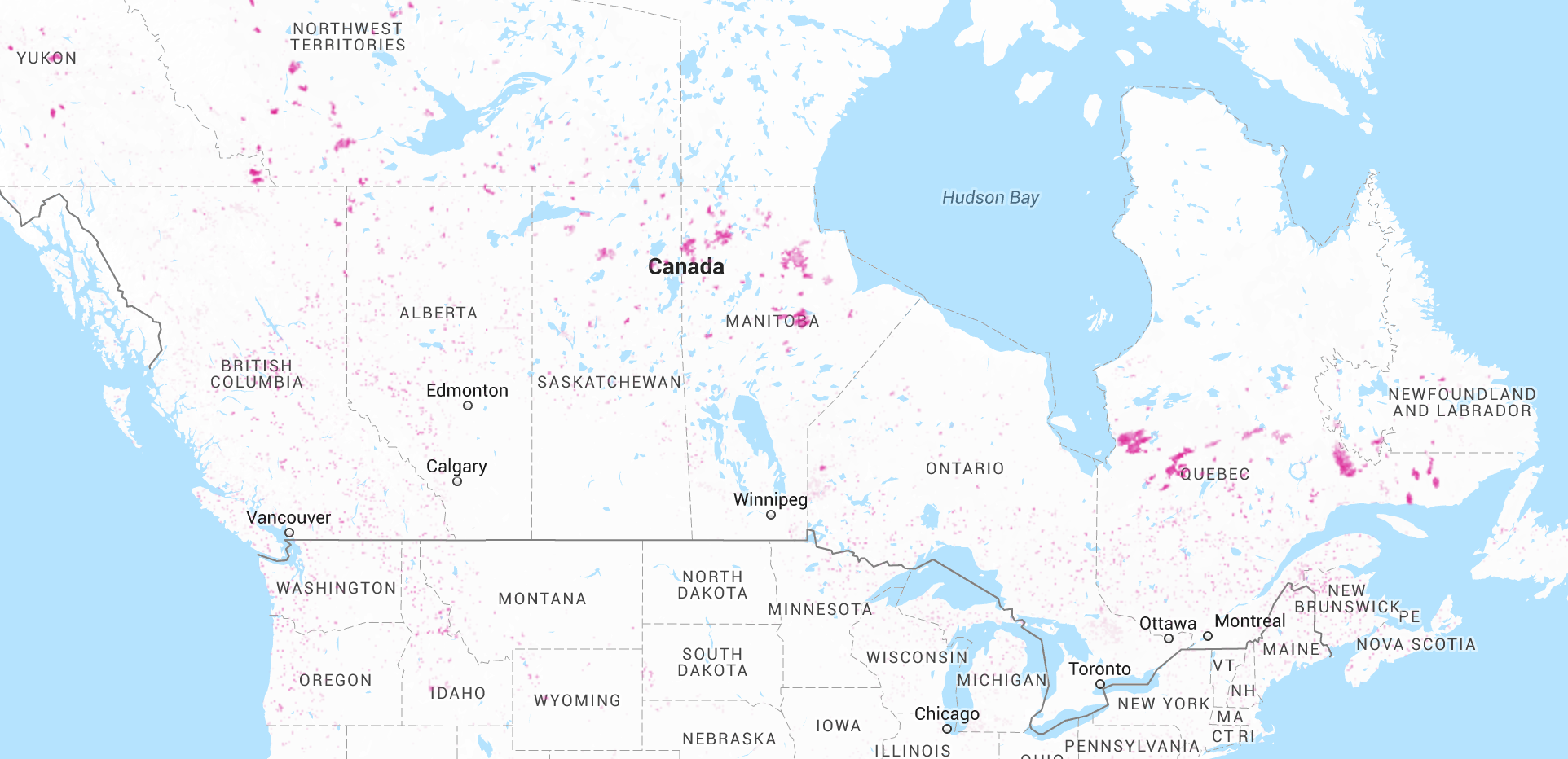
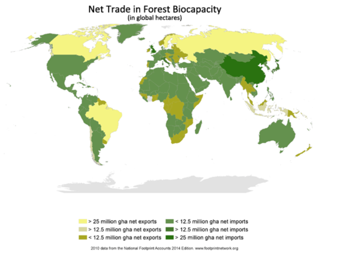
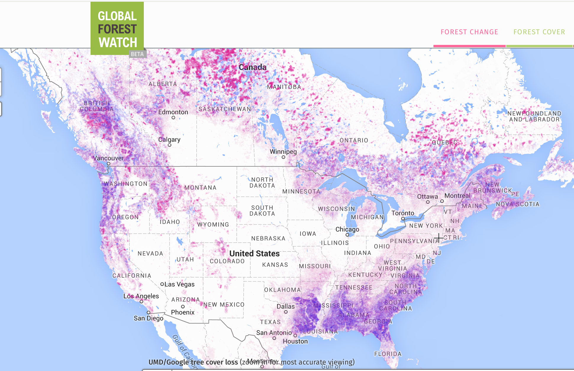

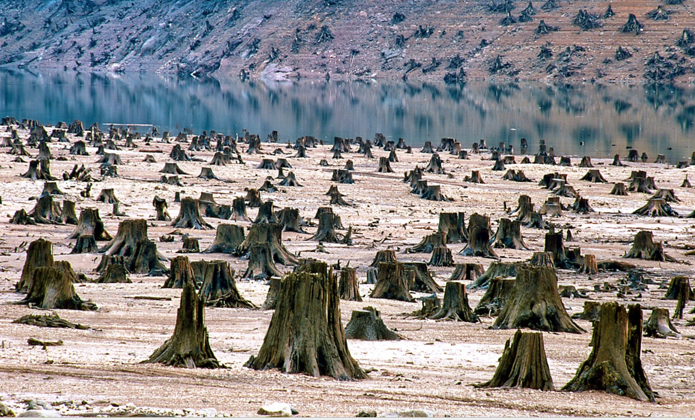

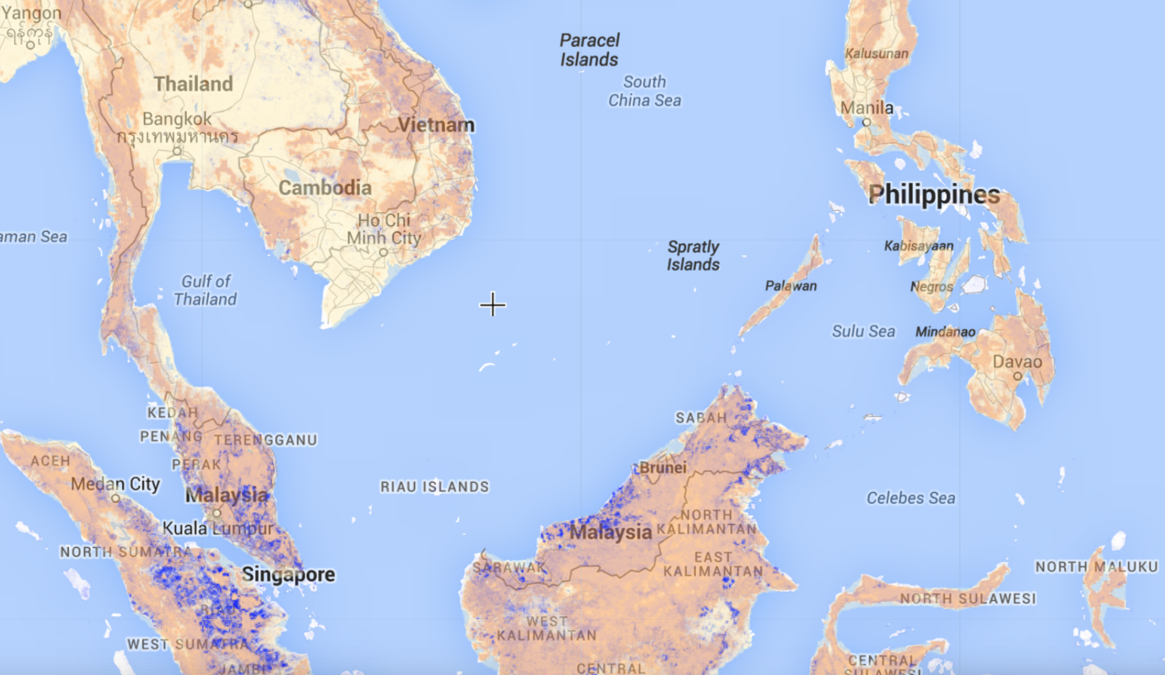
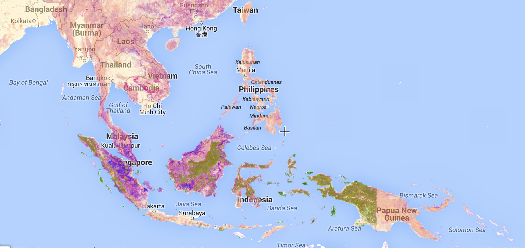


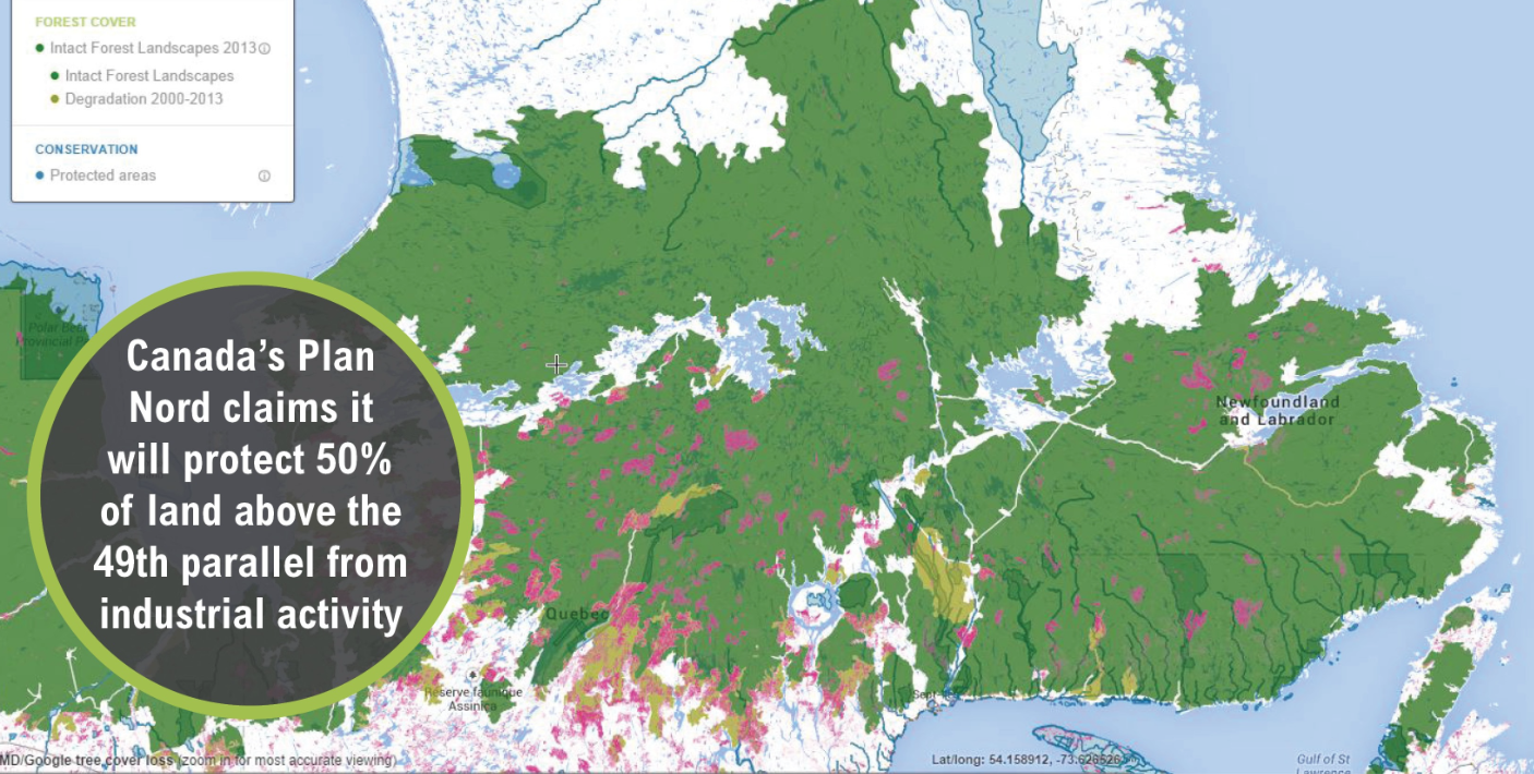


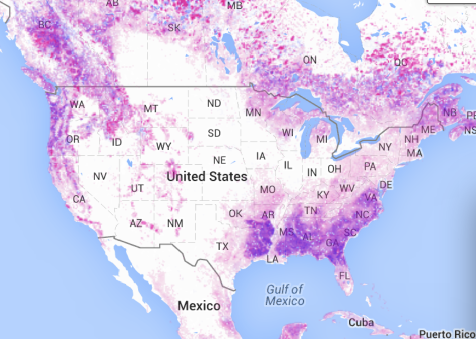
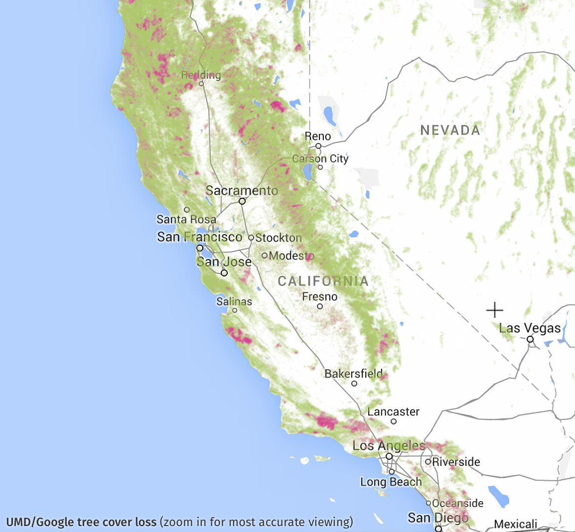
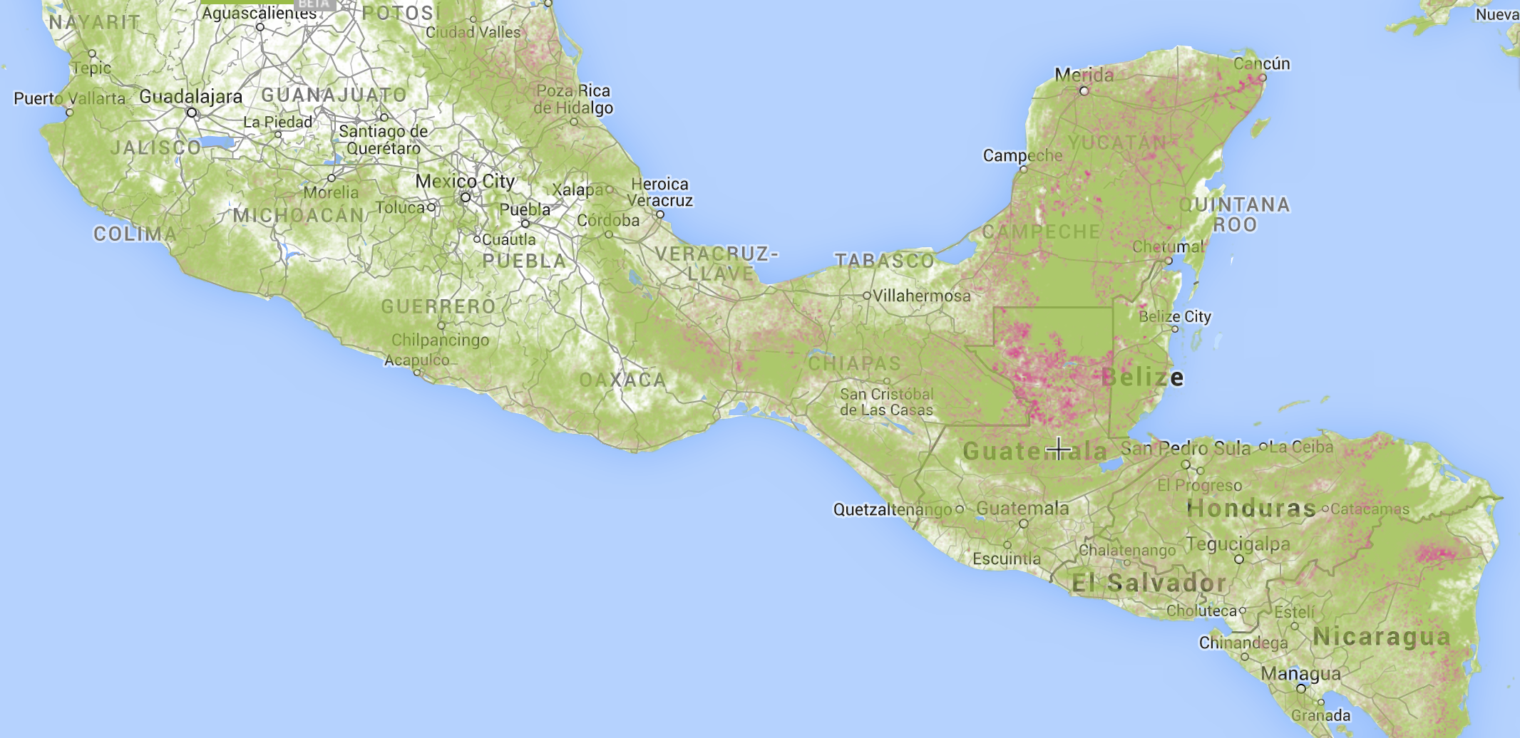
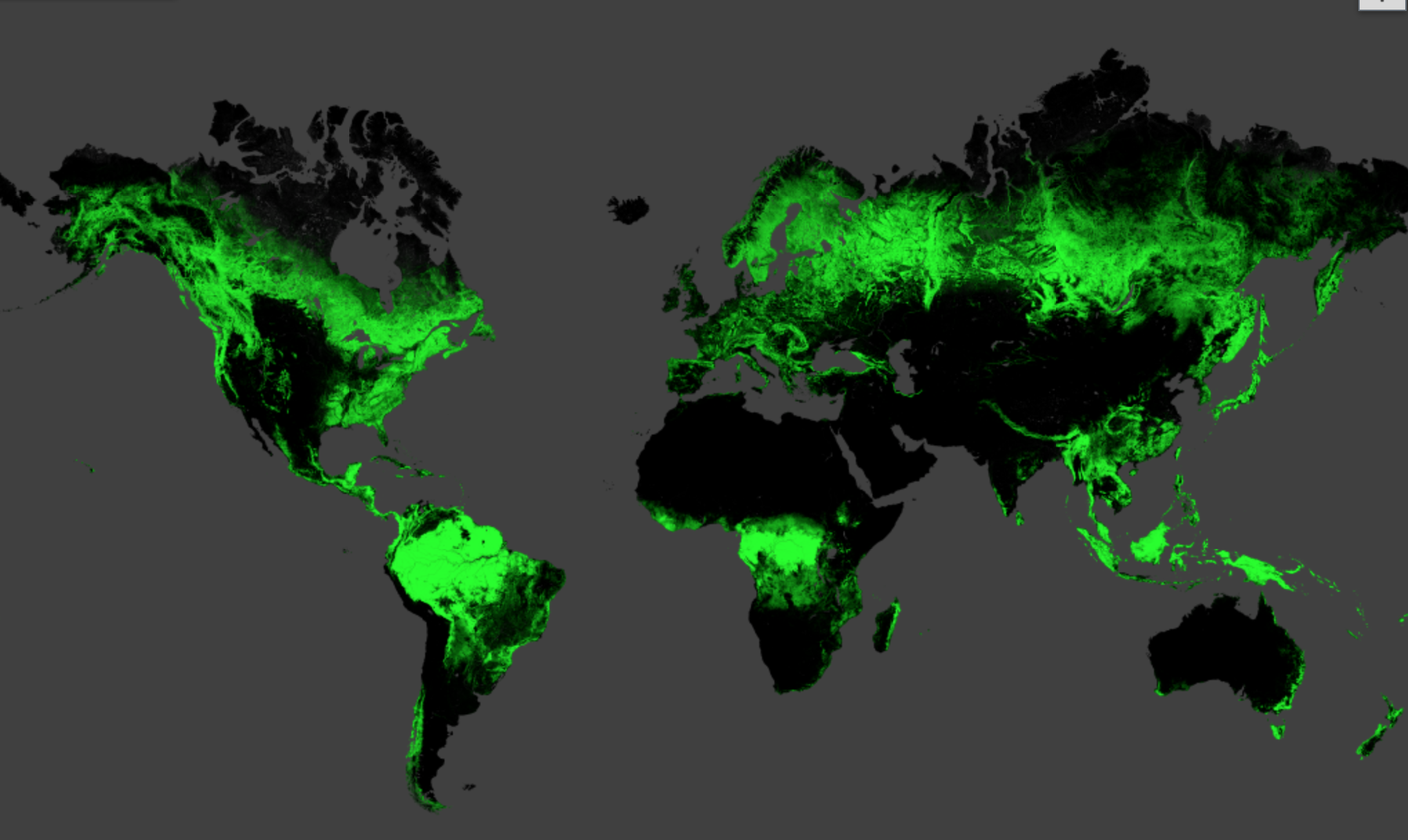
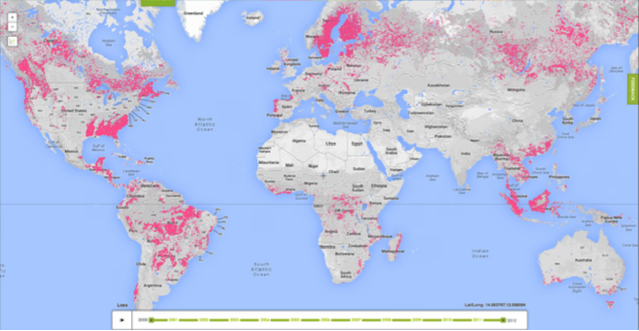


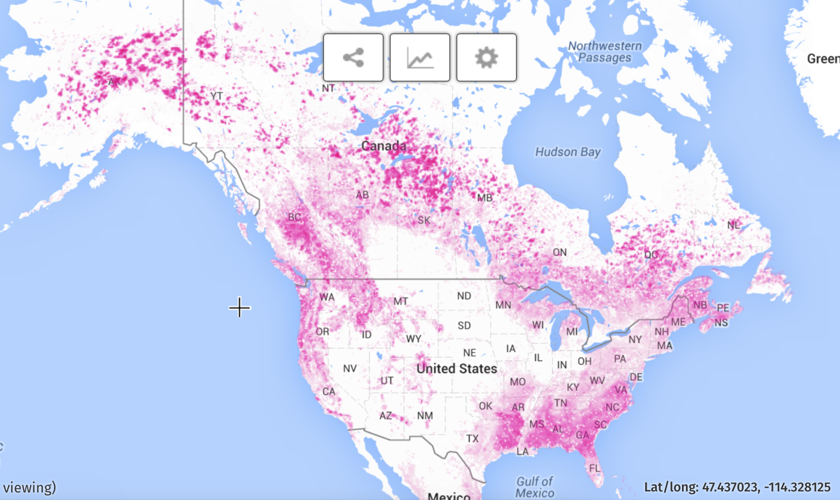


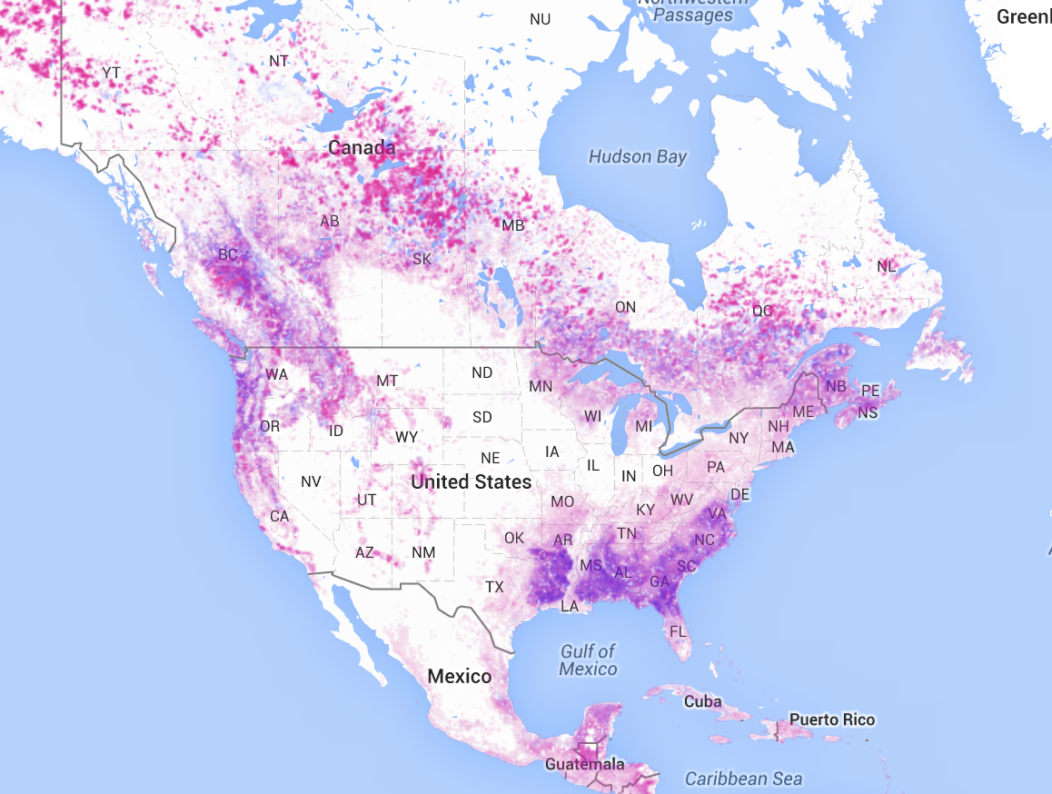
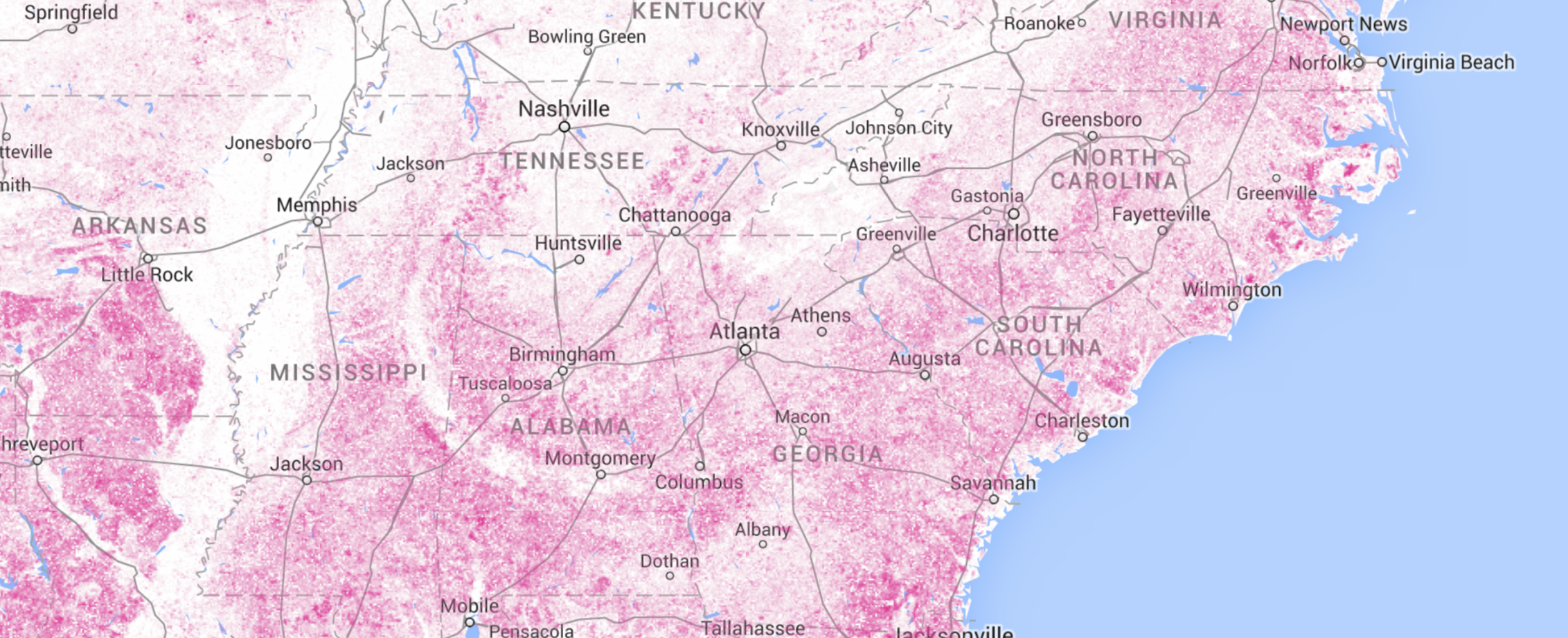
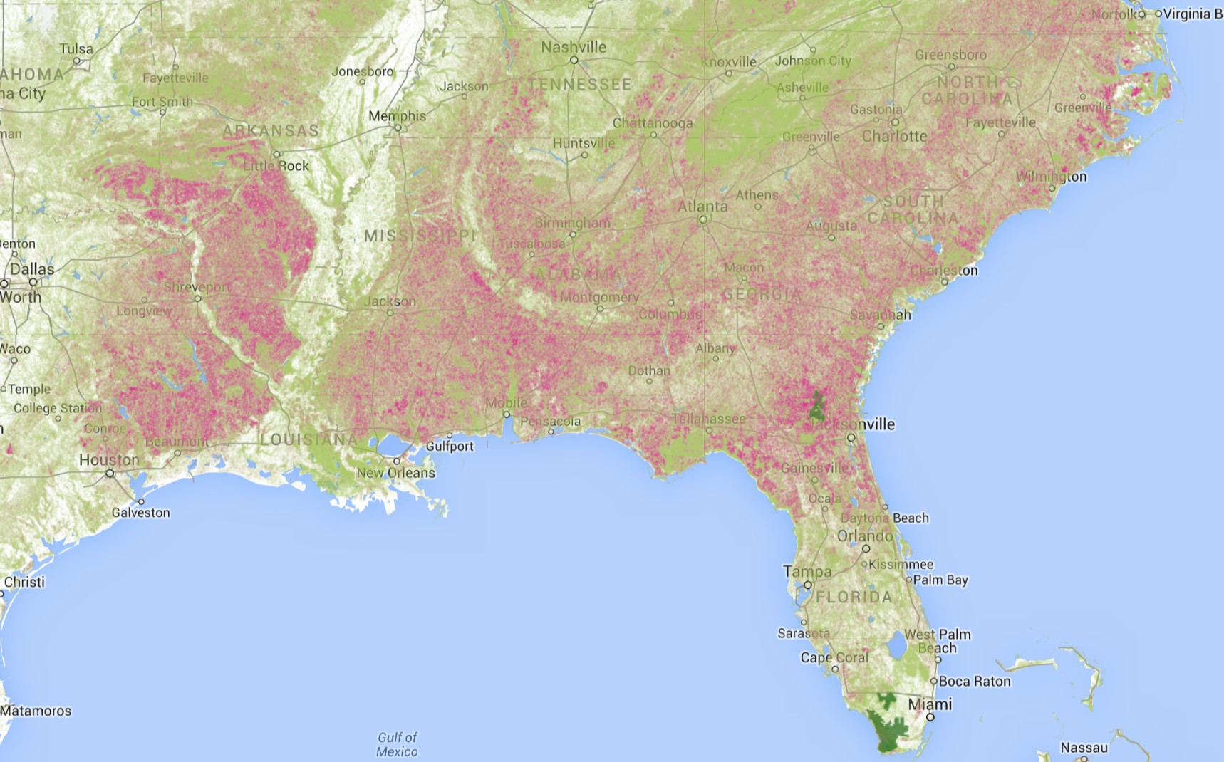


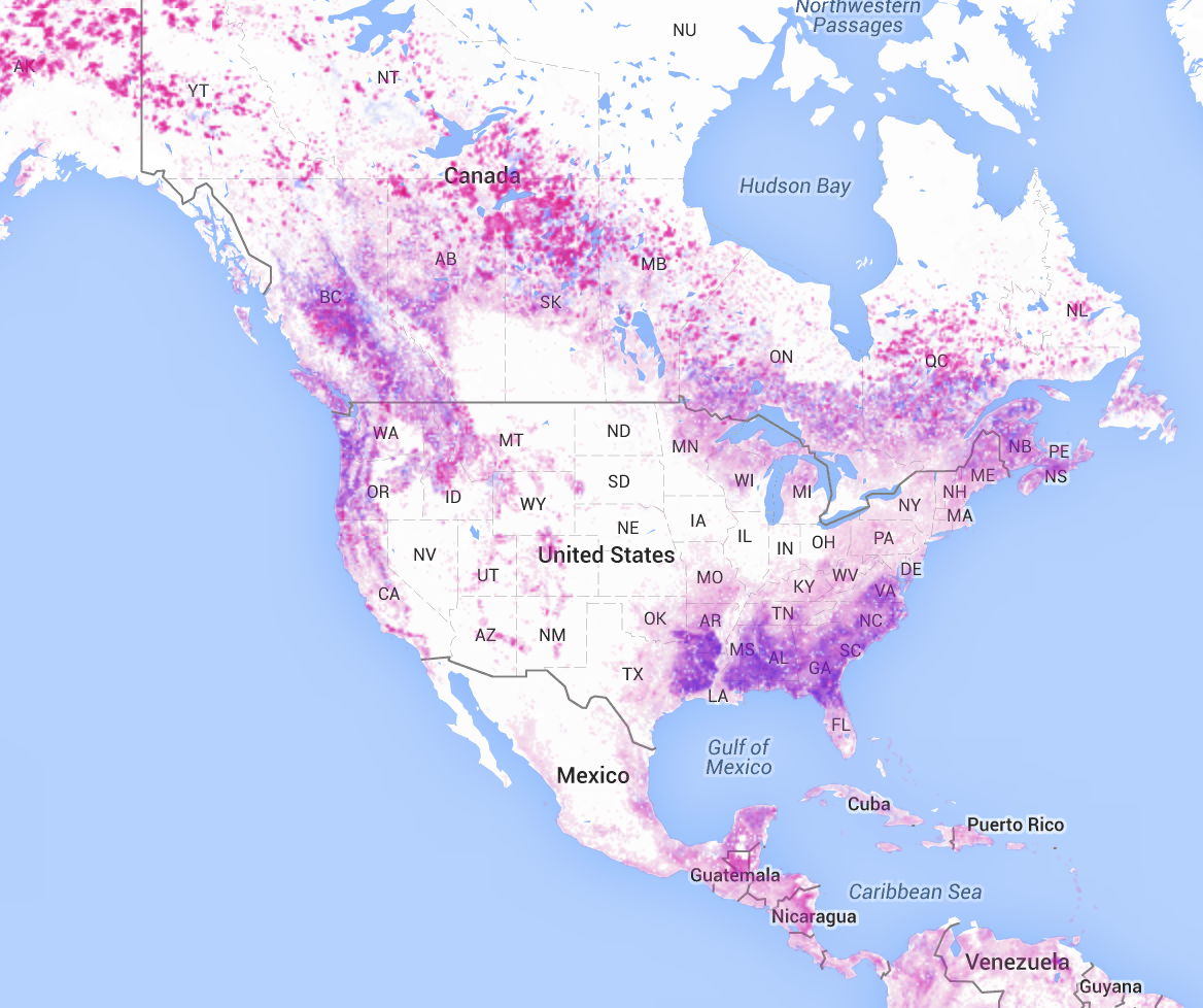
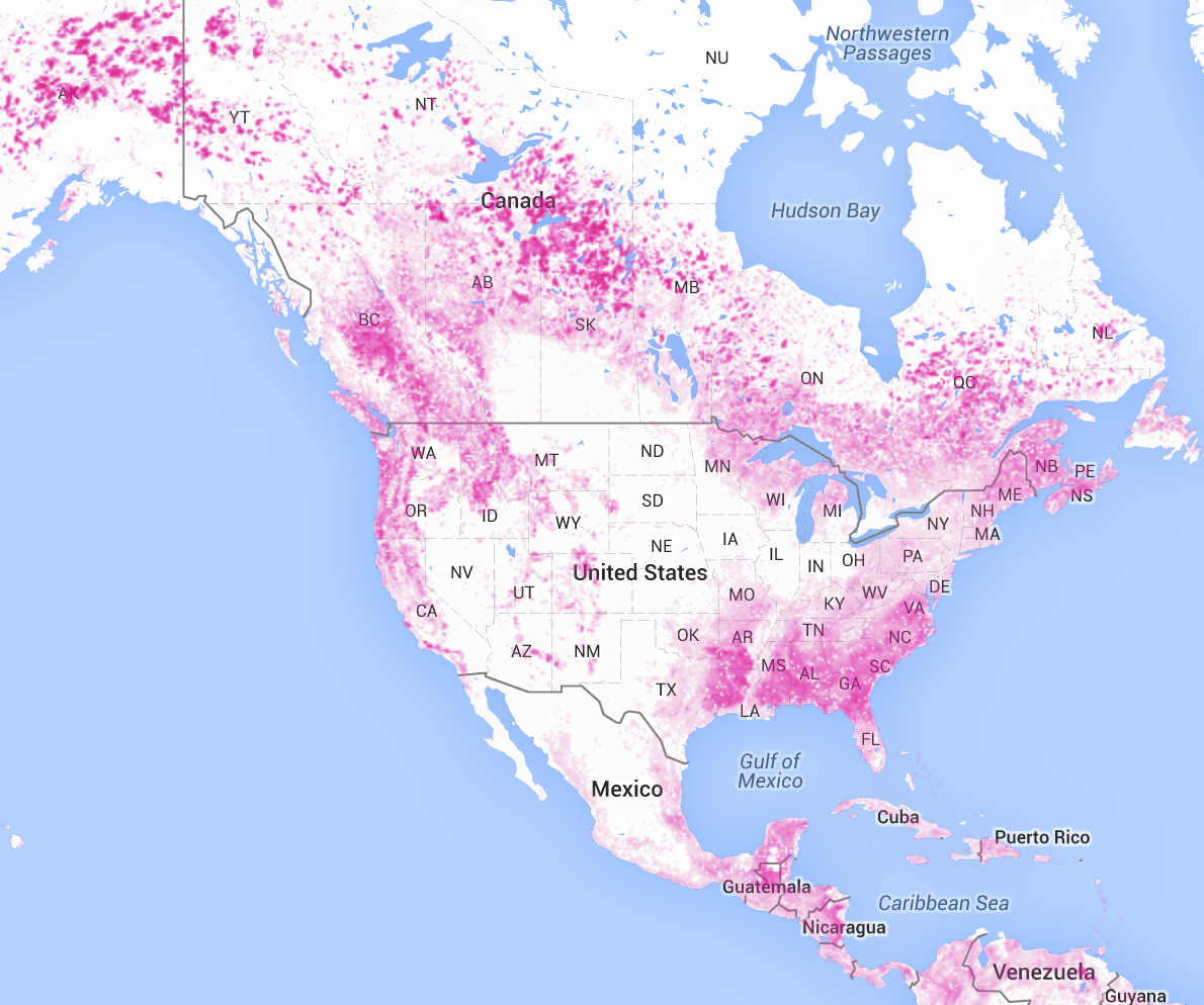

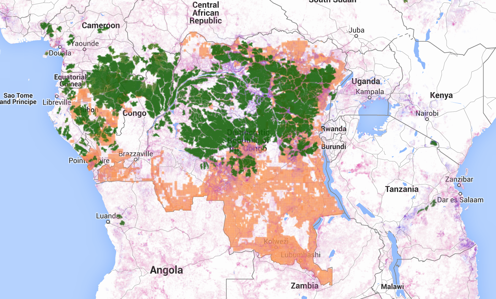
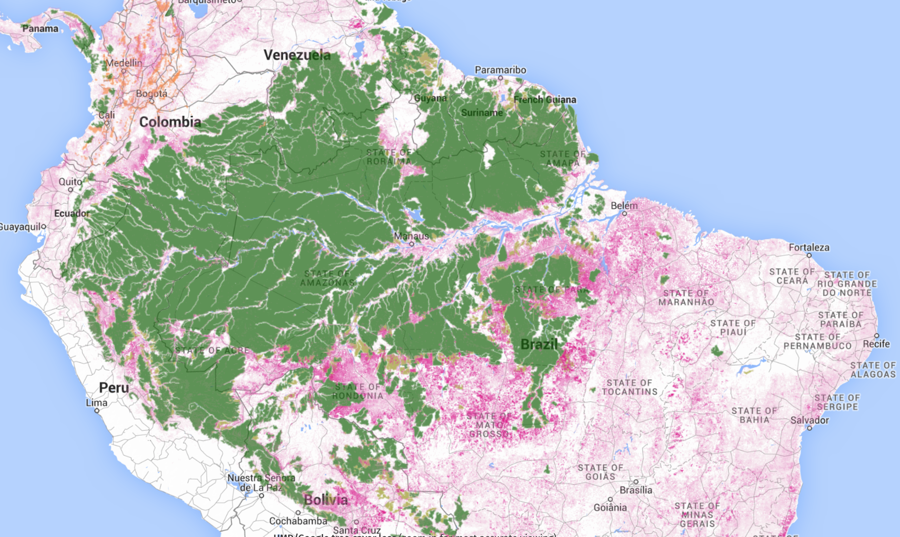
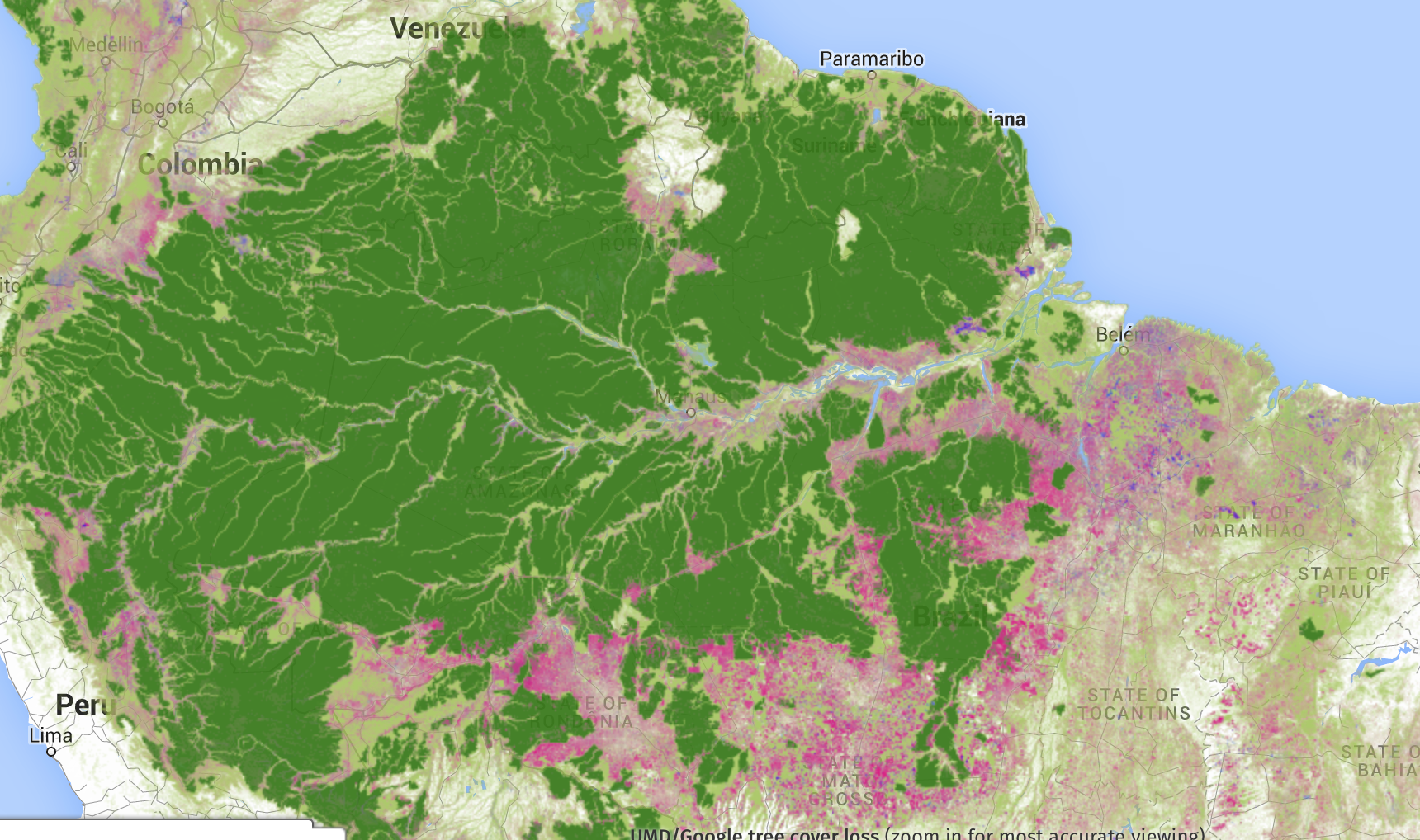
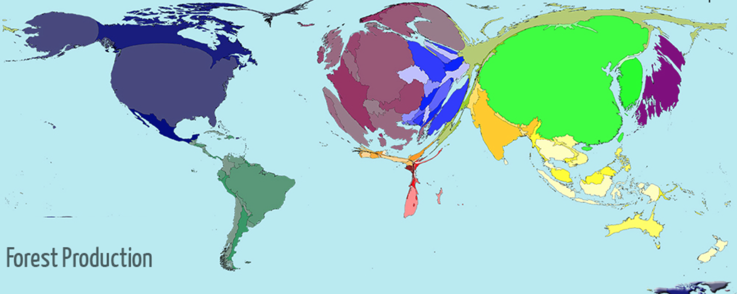
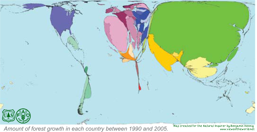


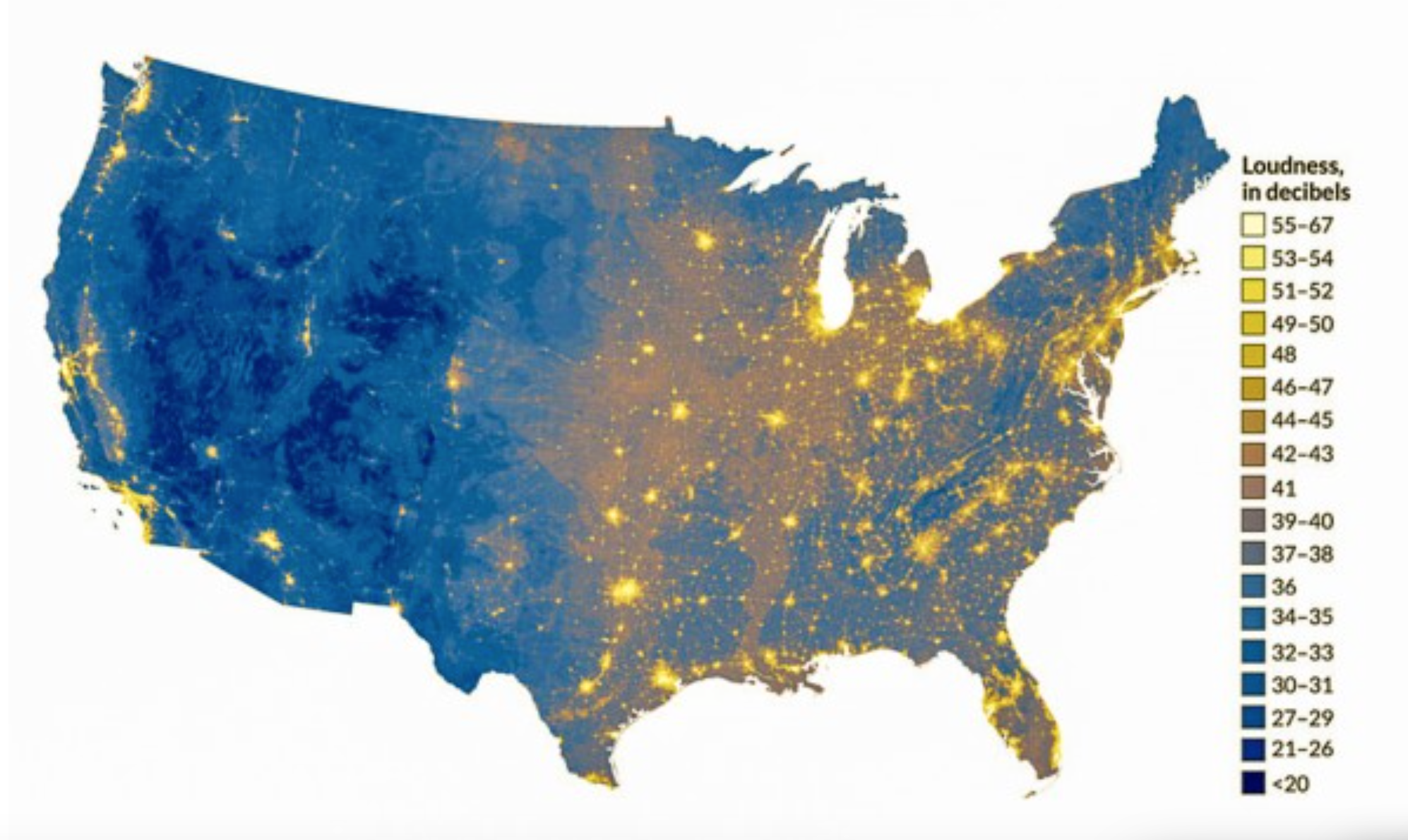
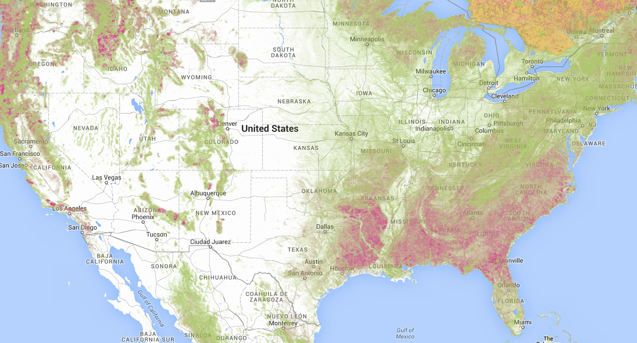
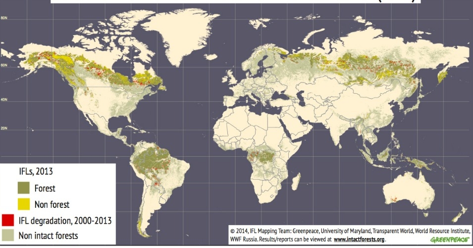
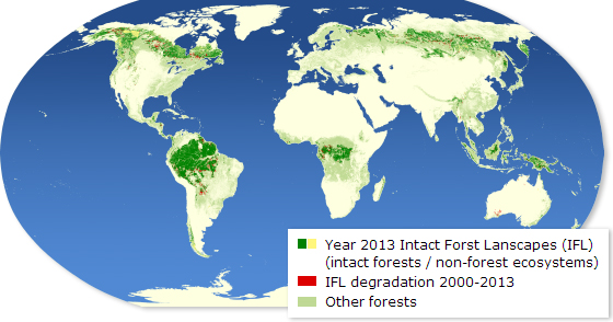
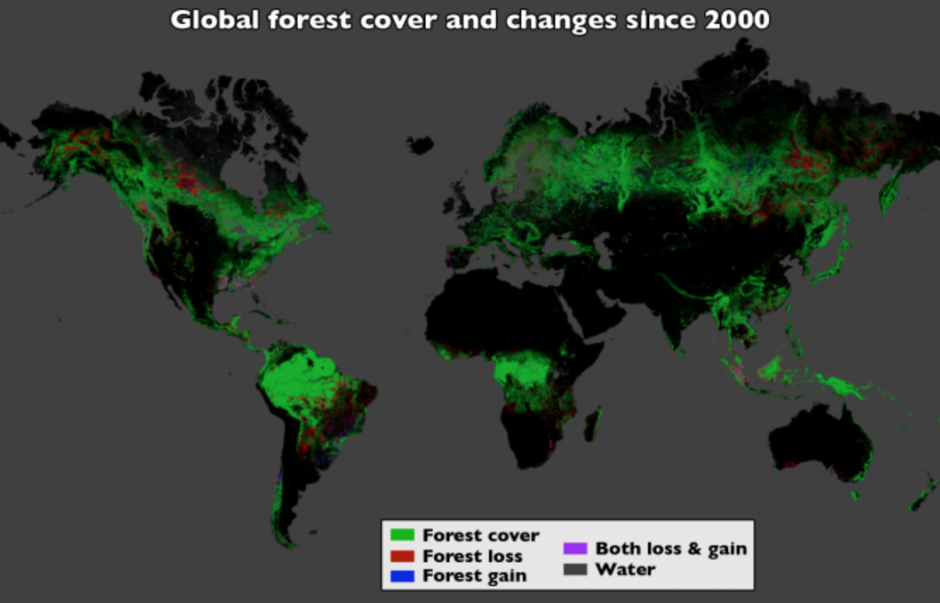
 It is striking, after a somewhat exhausting world tour of the disproportionately skewed nature of forest loss and arboreal compromise, to return to the United States, that remaining densely forested areas in the continent mirrored the striking distribution of the recent map modeling the spread of highly audible levels of anthropogenic sounds across the country, based on data released by the National Park Service, and offer a telling sign of how we inhabit the land in which we live.
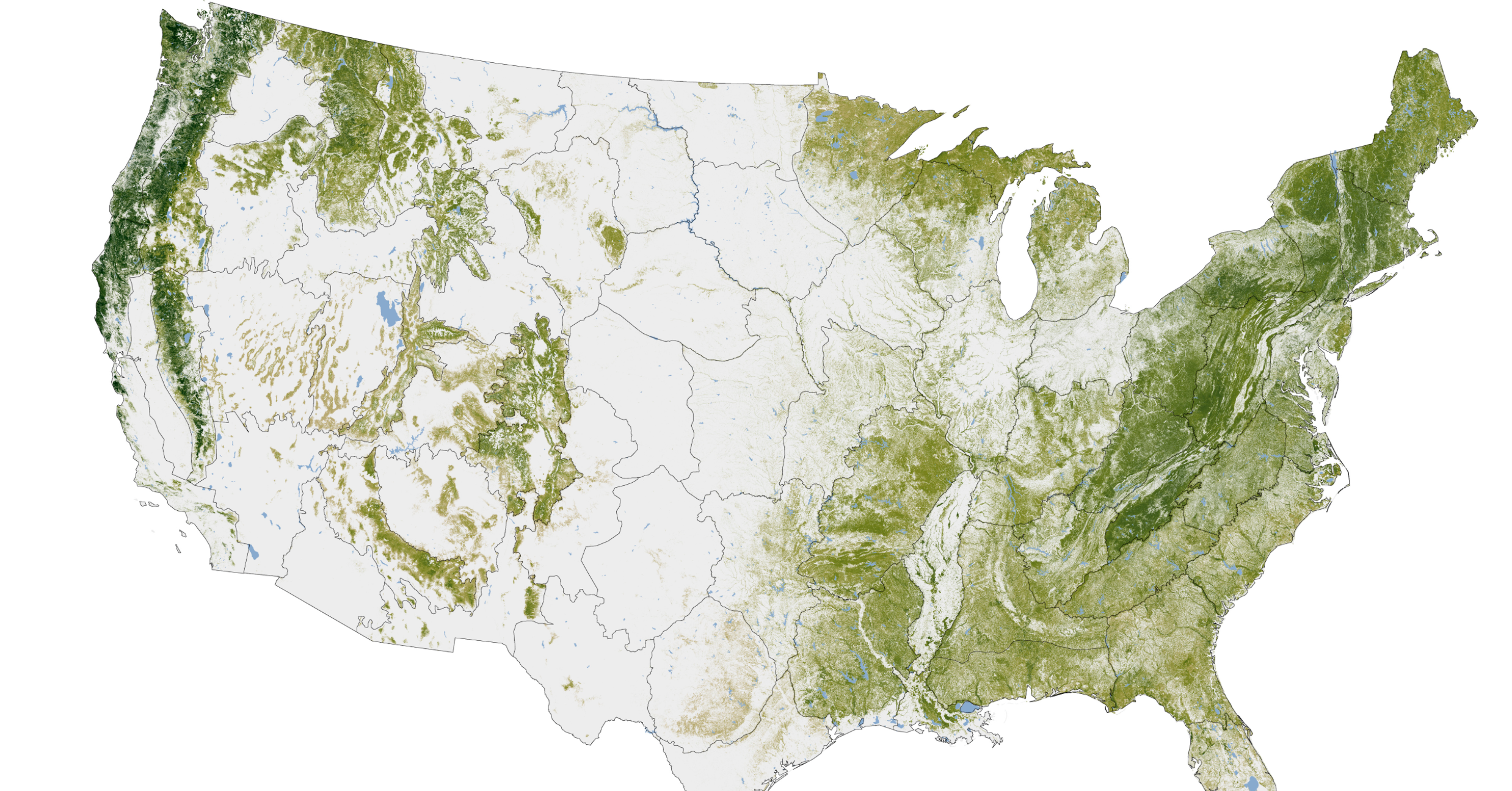


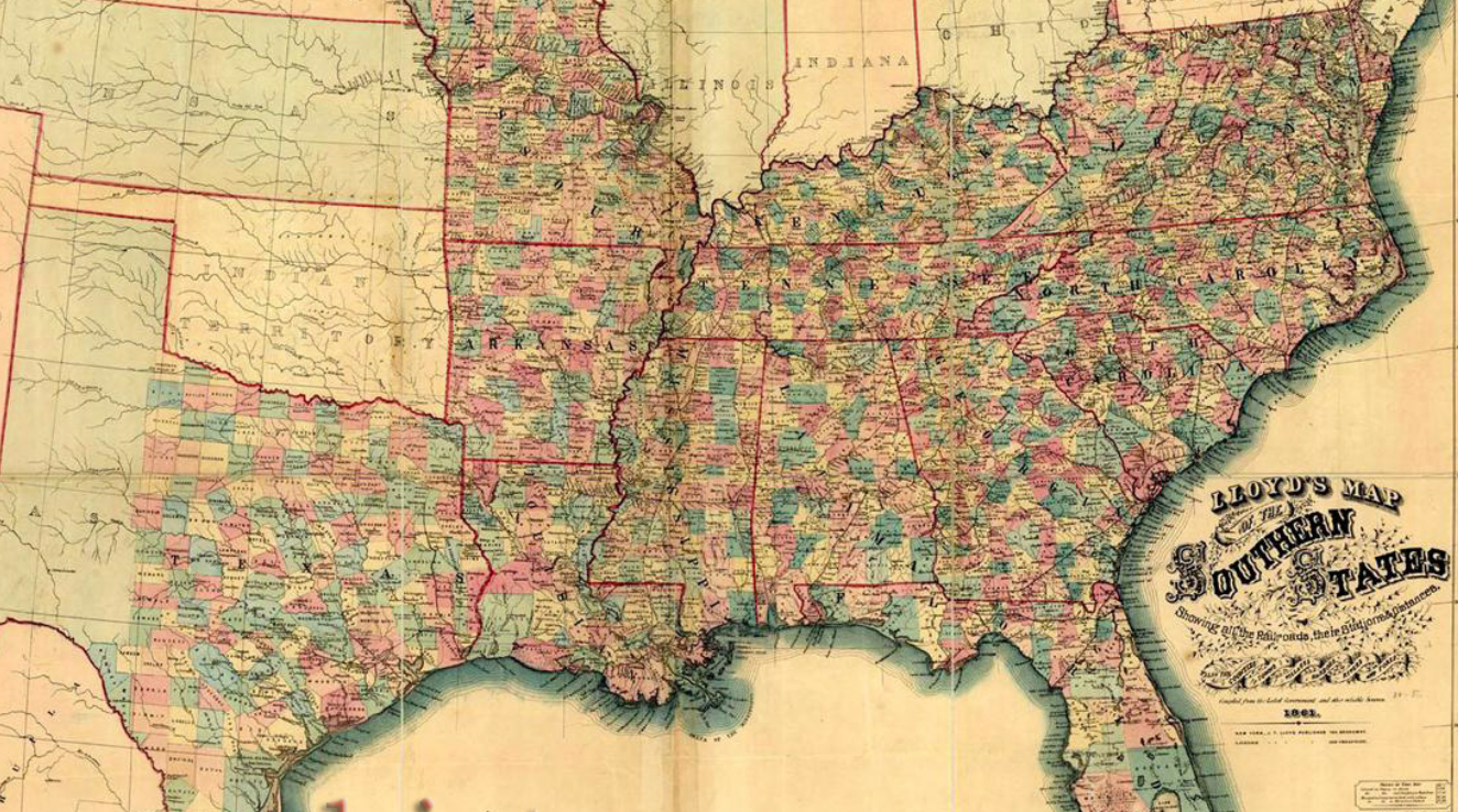


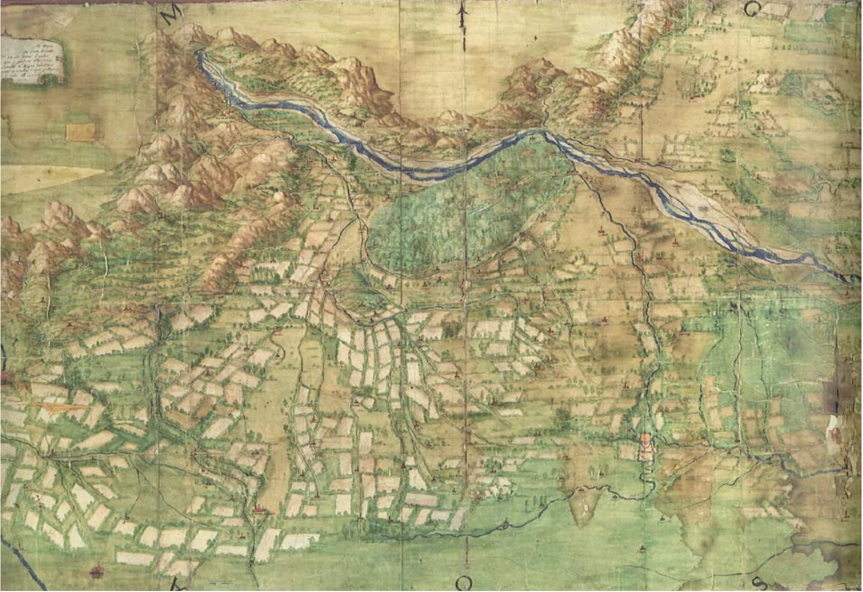
 Library of Congress
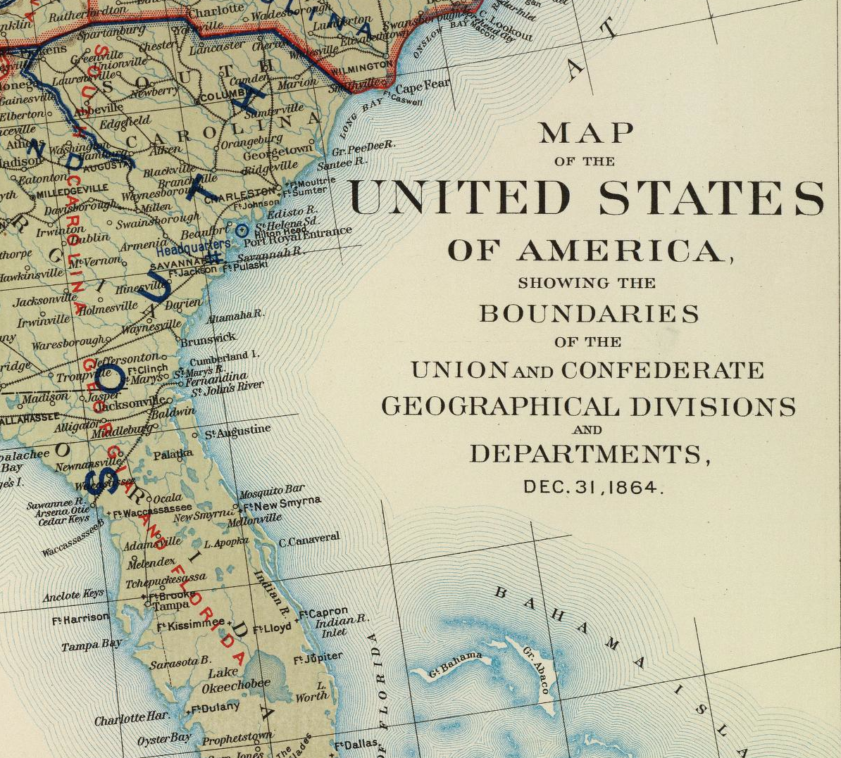

