
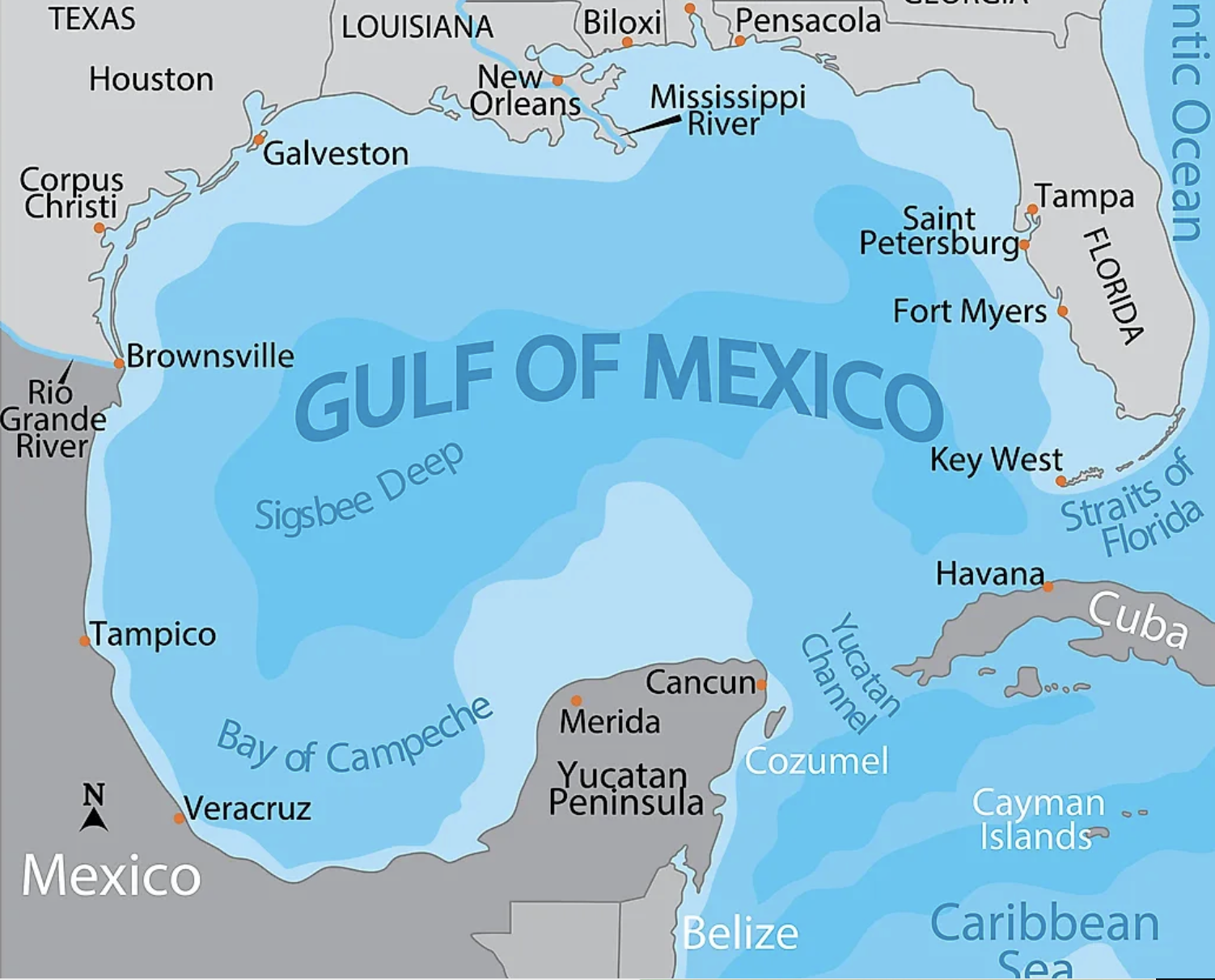
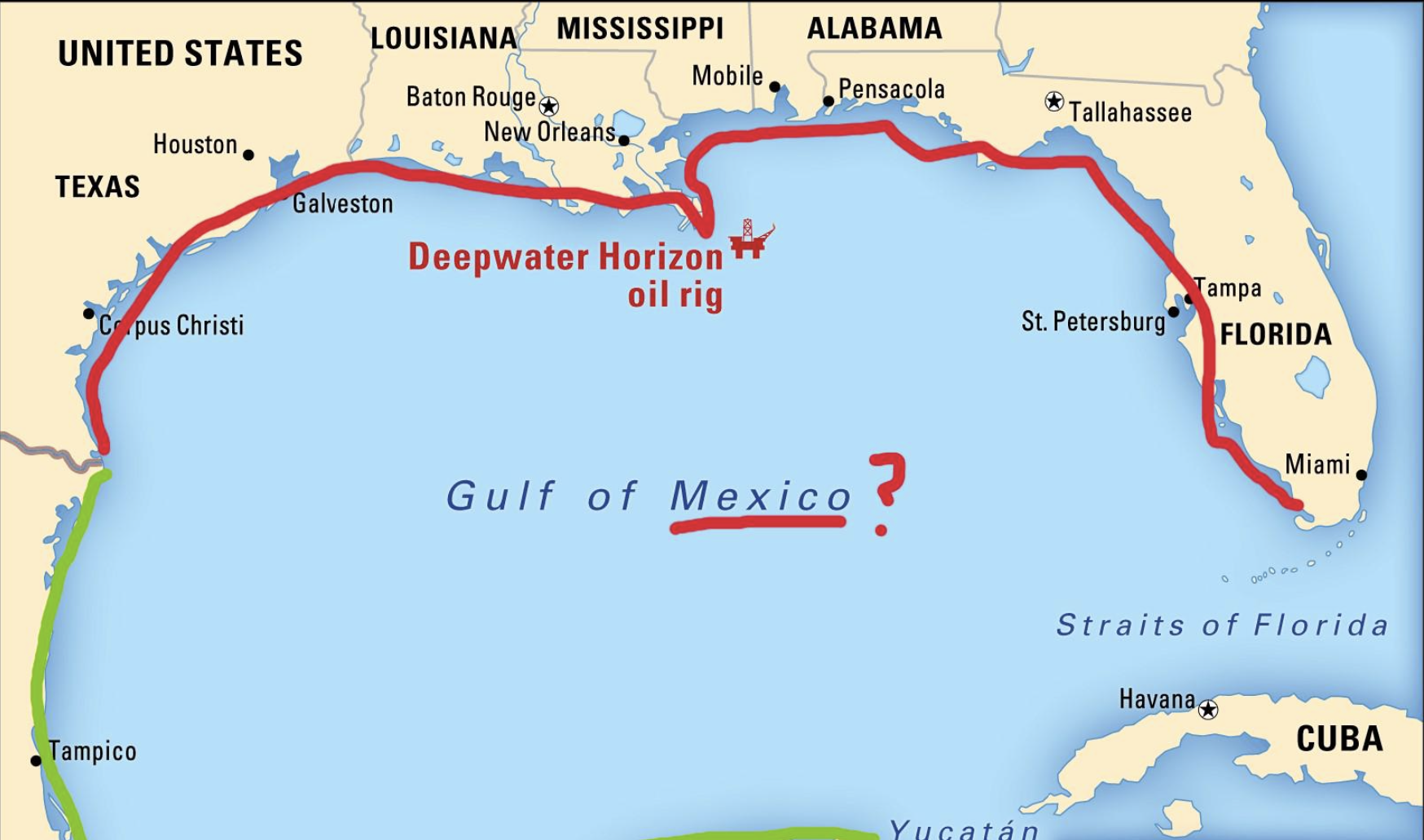
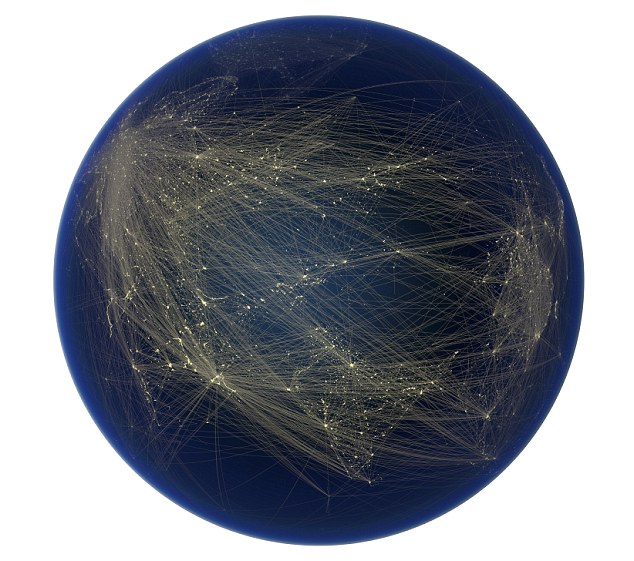
The problem of mapping fires and fires spread in Los Angeles is demanding, challenging, and increasingly frustrating. Exacerbated by the new weather systems of climate change–high, dry winds; dried trees; low groundwater–and the increased combustibility of the landscapes that area among the most treasured in the world, we face so many multi-factorial problems of the origins of any fire that there is no clear smoking gun to place blame. To be sure, before the engines of climate change, we lack the need for assistance to a sprawling urban infrasctructure to provide the water or fire mitigation needed to deal with them.
But if the amazingly destructive fury of the fires that began in the Pacific Palisades this past year reminded no one so much as a dystopian image of Hell of Dantesque proportions–of raging fires consuming buildings, sending firefighters desperately running to staunch the conflagration’s spread against all odds in flaming settings that raged with an intensity one can only call infernal,–

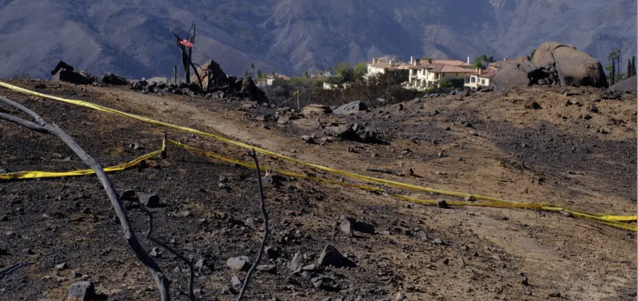
Pacific Palisades Fire/National Geographic/Ethan Swope AP
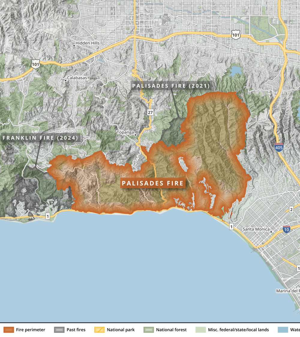
–provoking collective questioning and at least a temporary interrogation of what went wrong. Suddenly, in ways that intersected so eerily with Donald Trump’s inauguration, the built world around Los Angeles, and indeed some architectural treasures of the early twentieth century, were revealed as ephemeral and at risk–not hhugely valuable properties were flattened, but as fires spread across the arid landscape of the Palisades, carried by the embers and sparks that moved in paths we have not clearly traced, the dormant embers of an earlier fire, unextinguished, suddenly rekindled in the forested lands, and rapidly spread in the Santa Monica mountains in the Santa Ana winds to Topanga and Malibu, over 23,000 acres, fanning one of the largest fires in California’s history and largest losses of property and residences the state experienced. Eight months without rainfall created a landscape primed for the destruction of property and forested lands. What followed numerous red flag warnings by the National Weather Service in the Santa Monica mountains and Malibu coast of critical fire risk, amidst what CAL FIRE called “the perfect conditions for a large wildfire,” amidst record dryness and an unprecedented “fuel load” of dry vegetation.
We are rarely ready to think of property and buildings as so contingent, as residents were forced to flee property valued at hugely astronomical sums and nearby towns, suddenly flattened in the flames’ wake, as toxic smooth poured over the region and blanketed the blue skies.

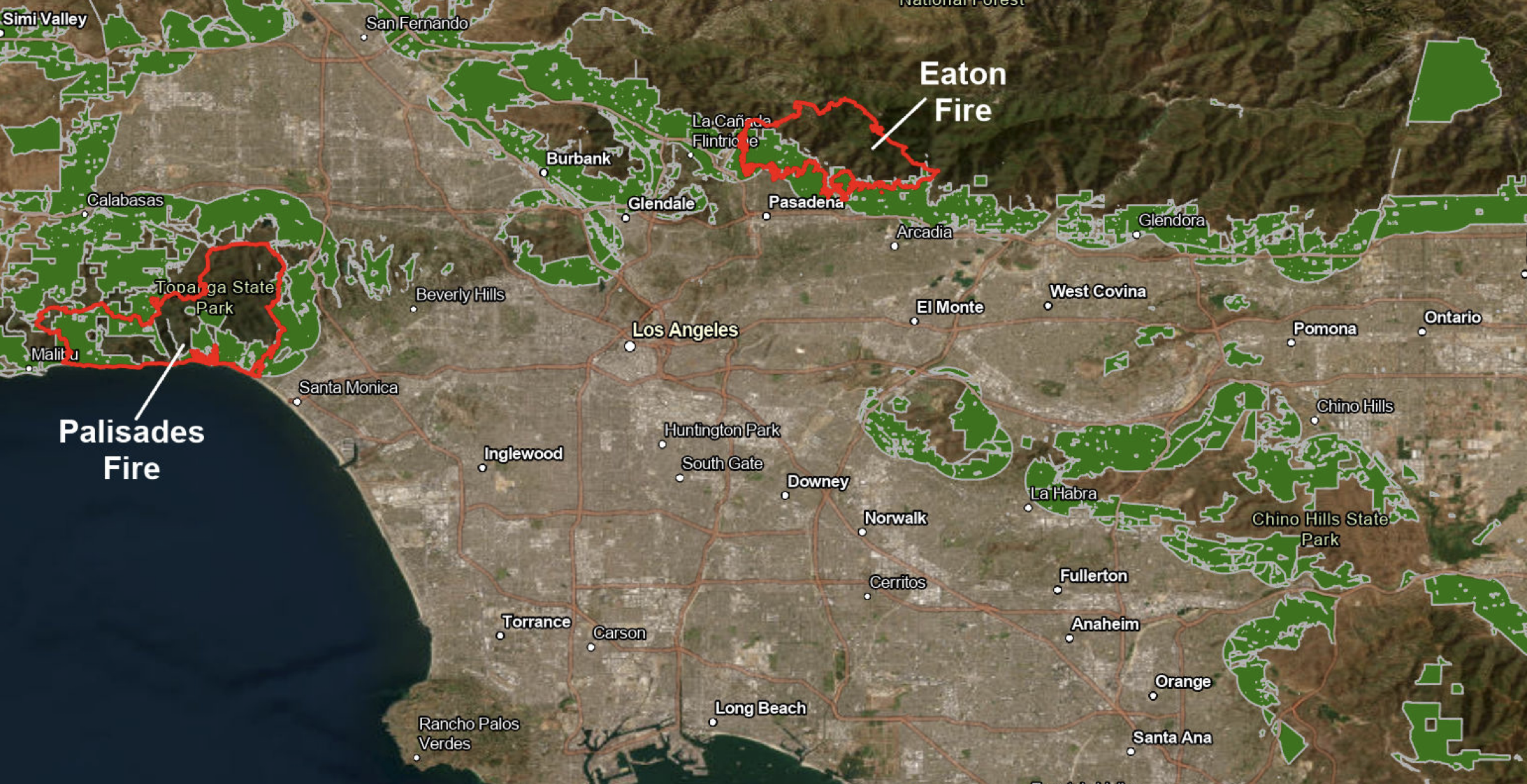
In a dreaded constellation of factors that set new standards for multifactorial explanations–as climate change will–but might be confused by being tied to divine whim, or ill fate, the Los Angeles fires of early 2025 were fanned by otherworldly hurricane-force winds that created fireballs that firefighters struggled to extinguish against all odds. The hurricane-strength winds that fanned the spread of the fire consumed mansions of the Pacific Palisades, a coastal enclave of the wealthy, suddenly more vulnerable to flames. Those less fortunate residents of Altadena, CA were not leaving cars, but fleeing on foot amidst emergency services, masks on mouths in hopes to prevent inhaling toxic smoke, desperately navigating safety beneath skies glowing an eery red seemed an image of hell in the poorer community–where flames reduced homes to skeletal structures–trying to flee to safety from the Eaton fires in nearby communities, where many residences were destroyed and traffic jams created on the interstate that led many to abandon their cars–not the easiest habit for Southern California residents–
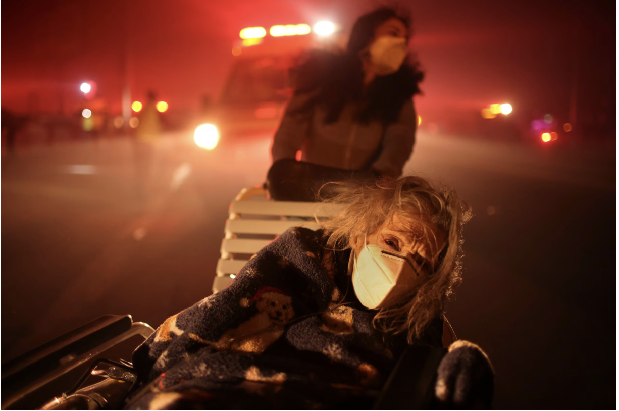

Ethan Swope/AP
The burn area on the edges of the city became impossible for firefighters to extinguish as it consumed the load of dried vegetation under hurricane-force winds, exceeding local reservoirs of water and providing a searing image of the inability of humans to control natural forces in their immediate surroundings–spreading faster and across a burn area far greater than previous fires.
Penitentes/from Wikipedia, using data from CalFire, USGS, USFS, NPS, US Census and OpenStreetMap
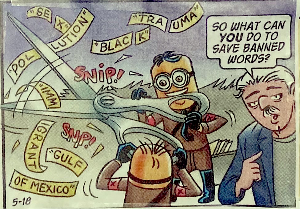
With the knowledge of such suffering and the huge scale of severn fires that had rekindled from an earlier Palisades Fire, the recent discovery that a disgruntled twenty something Uber driver set the earlier fire in the Pacific Palisades intentionally. That he did so on New Years Eve, after having dropped off a fare in the exclusive enclave, and taken a walk in the woods listening to French rapper before flaming garbage pails in Parisian streets, maps the origin of the fires of such incomprehensible scale to a malicious act seems not only tied to a mind more shaped by social media than we ever imagined, but alienated from those exclusive enclaves that he brooked such seeming hatred. The Uber driver who his fares described as angry changed all the talk of the vulnerable nature of the urban periphery and the extra urban woodland-urban interface. The origins of the fire were not mapped by a dangerous geography of increased fire risk, but was as imaginary as real, and somehow not so clearly linked to dryness and full force winds, as the apocalyptical proportions of the fire on the Los Angeles periphery had in fact been already imagined–with the help of ChatGPT–which had on request generated some dystopian images on demand of the divides between panicked residents fleeing raging flames in eery juxtaposition with the image of a bucolic city.
We are prompted to associate ChatGPT with withdrawal from reality, and indeed see it as severing its users (or clients?) from the skills of spatial orientation that we see as fundamental to orient ourselves in a sense of place. Jonathan Rinderknecht’s request to generate images of the burning city seems to have arrived already distanced from reality, perhaps even an addict seeking to delude himself further in the most irresponsible ways to envision the unthinkable destruction of a part of Los Angeles even as red flag warnings abounded in the region’s hills. The ignition of the fires at the very intersection of forested lands and extra urban growth–the intersecting areas where wood is exposed to electric charges and anthropogenic wires known as the Wildland-Urban Interface, for short WUI, seems as if it was predetermined. The blaming of this disaffected man–akin to the blame distribute to communities of the unhoused for setting fires intentionally that are prosecuted as arson–cannot be separated from the anthropogenic landscape of proximity to woodlands, without defensible space, or even clear resources for emergency vehicles, to contain and interact with fires of ever greater intensity, which firefighters may, in even an increasingly vulnerable time when the city is prone to fire risk, create a landscape we lack familiarity to fight and contain, and caused the rapid spread of a brush fire from the aptly named Skull Rock toward the coast to Malibu and down Topanga Canyon, destroying 1,000 houses in hours, hitting the coast in twenty-four, and going on to destroy nearly 16,000 structures in the Woodlands-Urban Interface, where not only roads but houses, communications antennae, gas tanks, and: an astounding 98.25% of the homes destroyed in the Palisades Fire lay in the WUI,
The high risk of building out in the region was perhaps repressed or silenced, in ways that seek to haunt the huge attention that Rinderknecht’s prosecution has advanced, as the fire season begins again, seems almost a smokescreen, sent by the Department of Justice, eager to link the fires to the disaffected young man who was using ChatGPT in order to generate disastrous images, obscuring the real risks of building in the mountains adjacent to forested lands. The rapid spread of that destructive fire calls for mitigation efforts to prevent losses adjacent to wildland fire, and a better mapping of the heightened risk in areas of WUI, rather than incriminating isolated individuals.

Los Angeles Wildland-Urban Interface & Fire Perimeters, Finley Bell/Western Washington University
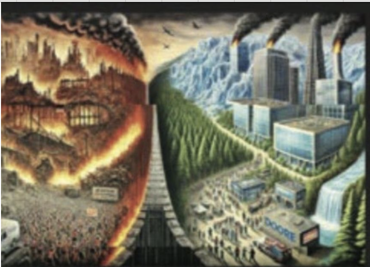
The request the chatbot was given was to depict a city split into two–broken by a grievous class divide–in which the propertied literally partied and chilled as the thick black clouds billowed from the fires that began in forested lands–not much like the areas of Malibu that Mike Davis long ago and so provocatively suggested by let burn. The class divide that animated these scenes were more like a medieval morality play with no clear moral in sight. While the rest of the city was “chilling,” in the request Jonathan Rindernecht asked OpenAI to render on his device. In the image, it seems thousands are fleeing the burning city–long before the actual fires sent residents fleeing after actual Evacuation Alerts. In the images, which almost look like cautionary messages or hateful conjurings, dark smoke blankets the sky. A week after the government shutdown began after Republicans failed to agree upon the appropriations legislation for the coming fiscal year, and emergency response services to disaster response across the nation, with widespread furloughs and cuts in major mitigation and prevention products funded by the Disaster Relief Fund, placing California’s state-wide disaster response abilities in severe jeopardy as they prepare for new threats at the start of fire season, furloughing a full quarter of federal forest service staff in the state, the prosecution of Rinderknecht as the poster boy for criminal negligence fits a pattern of reducing multifactorial problems of fire mitigation to one bad actor, a deviant whose plans were confirmed by the eery nature of the computer generated images of fires he asked to be produce.
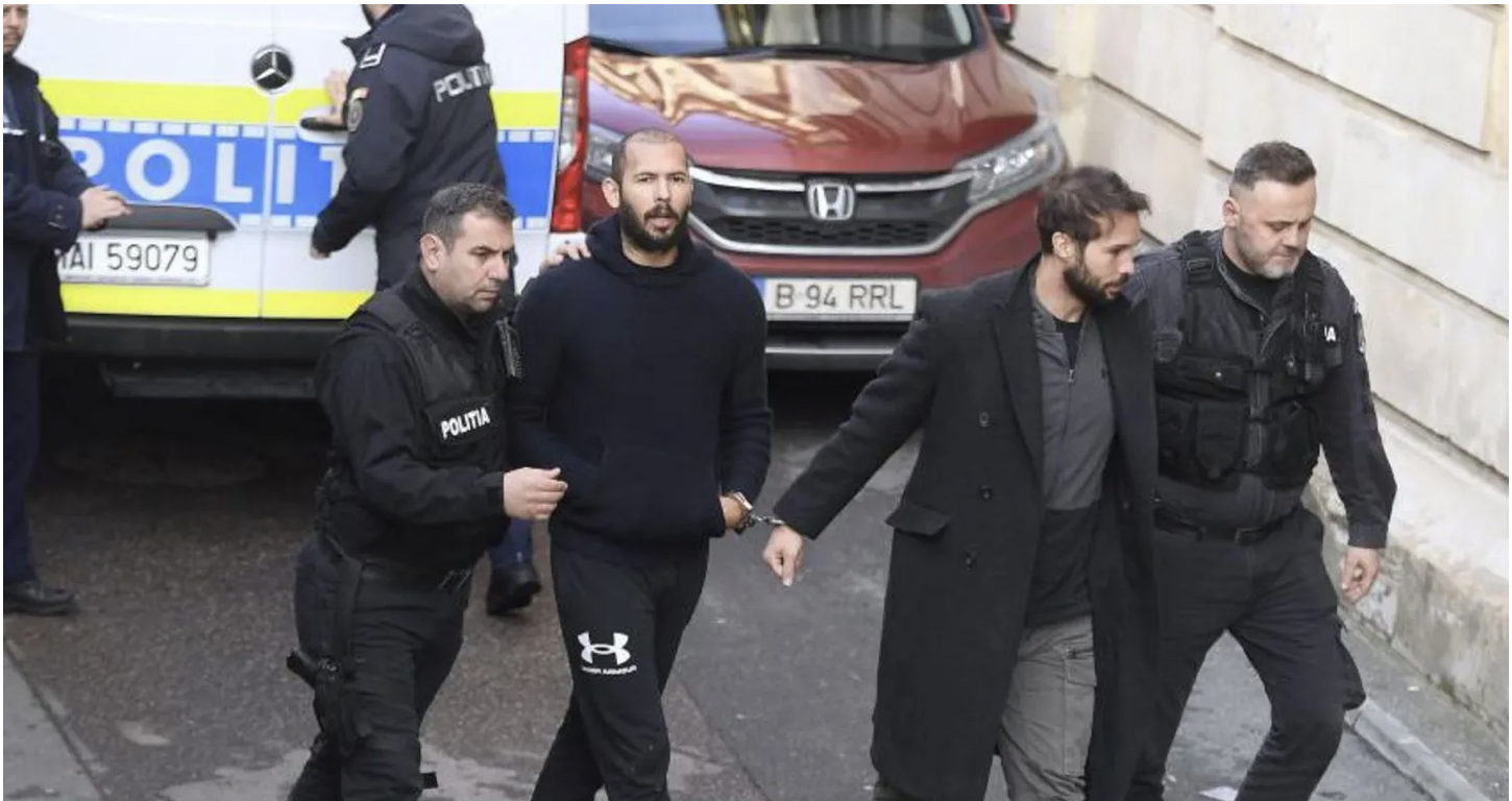
The actual fires have a virtual smoking gun, at last, pinned, for all the unimaginability of their scale of destruction, on a discontented Uber driver int he service economy, who used his sick mind to hamper the ability of rescue services to protect property against wildfire and destitution of some of the nation’s most ecologically delicate coastal landscapes of untold splendor, a bad apple whose lighter sparked seven fires and the greatest destruction of property. And even if CalFIRE has hired thousands of additional firefighters, natural resource professionals, and the state’s governor slotted millions in investments in hopes to protect sensitive communities from wildfire risk, introducing $135 million available in prevention projects and wildfire resistance while spending $72 million across the state since 2019, calling for a new standards of emergency readiness in the March 2025 state of emergency proclamation, the protection against wildfire spread remains pressing, and will be deeply impacted by the shutdown in ways terrible to contemplate by trimming wildfire response statewide before a hotter and drier climate. The federal prosecution of Rincherknecht, who was apprehended in Florida a week into the shutdown, and indicted on three charges of starting the Lachman fire for arson, destruction of property used in interstate commerce, and setting timber on fire, accused an individual of starting the destructive fires whose resignation flattened 17.000 homes and buildings across LA County, dominating the news cycle for a few days. After narrowing the possible proximate causes for the fires’ sudden ignitions under high winds from New Years Eve fireworks to lightning strikes to domestic fires, unhoused, or out of doors camping, the revelation of vandalism of the bucolic landscape of the super-rich revealed Rinderknecht’s location New Years’ Eve at the end of his Uber ride to the exclusive enclave where older fires had rekindled.
Are the revealed charges filed a week after the government shutdown truly in the public interest? The “paintings” a disaffected twenty-nine year old, Jonathan Rinderknecht, generated appeared on his own screen months before the fire. Is this the smoking gun–pardon the expression–that helps us understand the fire so catastrophic in proportions, not due to the failed infrastructure of a fire department not ready to deal with the sudden needs for water and inflammable agents needed to blanket houses built in forested areas, but the mental health of an unstable individual, who ideated the disaster in a diptych he asked be rendered in two panels of people fleeing a burning city whose ostensible neighbors, tied to wealthy conglomerates, “chill” in ways oblivious to the advancing of apocalyptic flames?
The AI bot spelled out, in wayst rarely mapped so starkly, the divide between “haves” and “have-nots” in Los Angeles natural disasters– although the “have-nots” were being visited with a punishment no one should ever face, that resemble not the LA Fires, perhaps, because they look a bit like an AI version of the destruction of Rome. Or are they not possibly a plausible smokescreen? By pinning responsibility on one man with psychological issues who was overcome with intense loneliness, his rage against the city where he lived off what might be called marginal work pushed the question of fire risk to the margins as the arrival of an ever earlier fire season intersected with a sudden decline in emergency preparedness that the shutdown had perhaps coincidentally precipitated–increasing the area of wildfire risk in the state by ending plans for controlled burns in Lassen, Trinity Alps, and San Bernardino County, even as Cal Fire will go ahead with planned burns in Mendocino and Butte. As the state is increasing its wildfire readiness and emergency preparedness, the dystopia of fires again raging across the state that is triggered by Rinderknecht’s AI images is encouraged by Forest Service cuts and voluntary resignations across the state.
Credit: Department of Justice
Rinderknecht was indeed spending New Year’s Eve alone, we learn, and was doing so against his desire, when as if in an act of rebellion and assertion, took out his lighter. He lit the fire shortly before midnight as if to ring in the New Year with real fireworks, without the relative safety of the French rap video of a man lighting trash in a can aflame, but with a similar deliberacy and cool as he seems to have danced in the forest, lighting flames with his lighter at several spots, maybe under the influence as well, and probably feeling deeply alienated and alone that would eventually flatten almost 37,000 acres and kill at least eleven as a result of its spread–and sending plumes of toxic smoke over the region. The plumes of smoke seem to be conjured in the images generated by Chat GPT at the twenty-nine year old’s request almost as chillingly than the spread of flames.
Bucolic may be an overstatement–but the skies are blue and the trees are green in the public parks or verdant space amidst steel and glass skyscrapers reflecting the snow-peaked mountains that seem to pass for nature. The generation of the images of countless fleeing their homes in the mountains on one side of the city as other went about their business behind stiff walls was a projection, of course, of the steep class divides and socioeconomic realities in Los Angeles, seen from the perspective of the Uber driver who ferried folks between neighborhoods of radically different wealth, social opportunity, and environmental access as well as comfort, but was also an image of the panic that fires might cause in the flammable areas of dense habitation, which ChatGPT was happy to provide to the Uber driver, as well as to assure him, after he set the fires in forested areas of the Palisades, that if he dropped a lit cigarette in the forest he would be fully legally responsible–or to see if there was a basis to escape responsibility, even as he returned to watch the flames spread in the Palisades, undoubtedly imagining the damage he would inflict on homes by lighting his own small fires.
Credit: Department of Justice
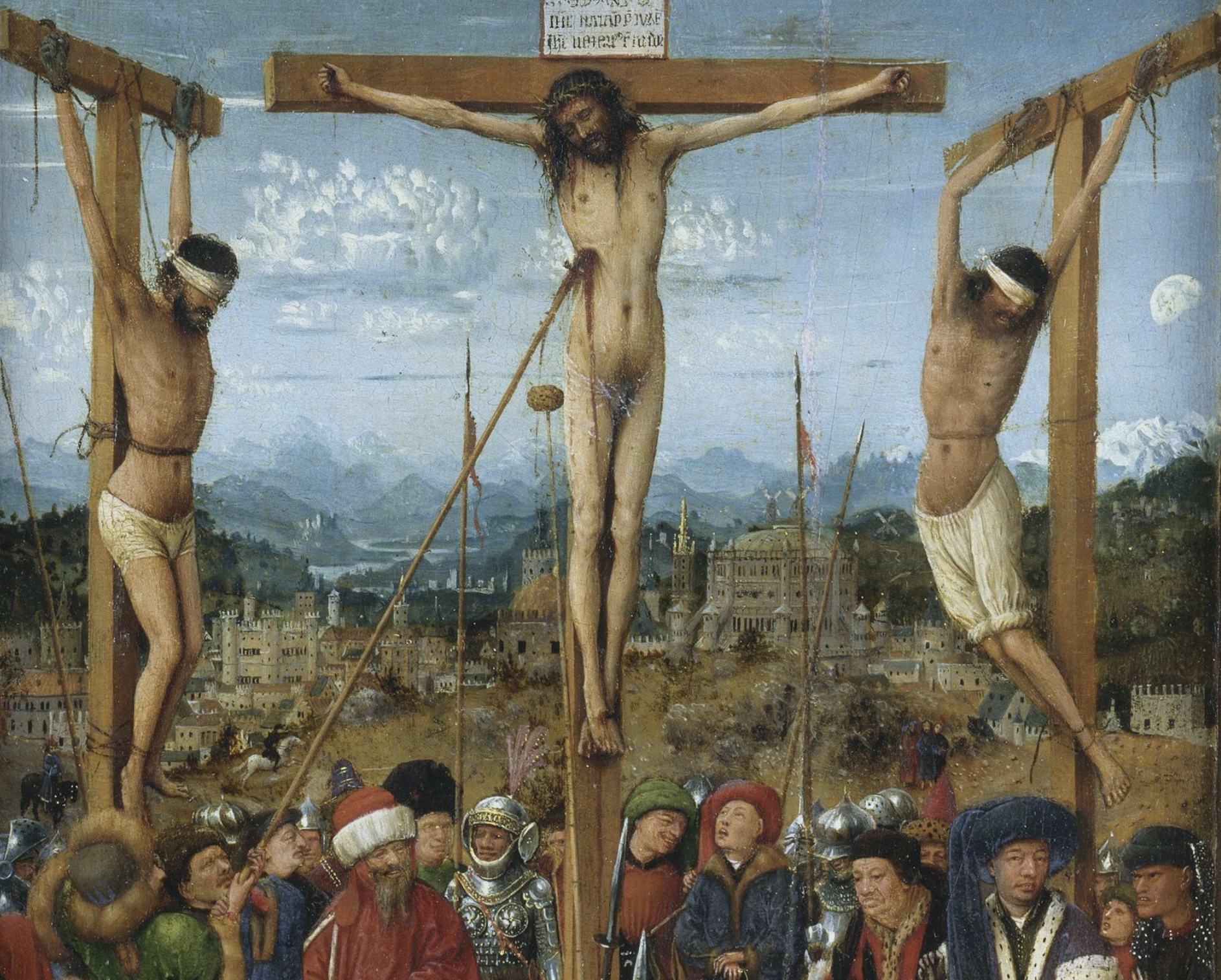
The rings of flames in those AI-generated images, if they draw on the image repository of the internet, courtesy Open AI, might well suggest the cruel fates imagined in the circles of hell, or bolge, by the canonic Florentine Renaissance painter Sandro Botticelli, who rendered the poet Dante and his purple-robed guide, the Roman poet Virgil, overlooking naked poor souls suspended amidst devils in eternal suffering in the rings of hell for all eternity, outside real time,–if the vibe is far more video game than medieval manuscript illumination.
The poet Dante wrote equally informed by theology and astrology, but the painters who illuminated deluxe codices in of Dante’s epic poem of a voyage to the afterlife increasingly employed geography and landscape to transport readers into the afterlife in credible ways, supplying increasingly detailed maps of the visionary poem at the same time as cartographic images combined maps and landscapes, raising questions about the relation of maps to landscapes from an earlier date–


Sandro Botticelli, Dante and Virgil Viewing the Souls of the Damned in Hell’s Eighth Circle, 1480s Canto XVIII
–that stand only to expand like rabbits in the age of Sora, when increased virtual reality may stand to replace the painting as a unit of visual communication. While we’ve seen mostly the faking of known figures, the remaking of alternative landscapes suggests an eery emergent genre of alternative landscape art.
The notion of landscape as map were revisited in the generic if terrifying nature of computer-generated images of burning cities that Jonathan Rinderknecht asked of a bot with which he must have shared some seriously intense encounters, that fashioned an inferno-like experience long before the fires in the Palisades were ever set. We may well find the images hen conjured on his laptop so terribly hard to look at since e it is so difficult to see them save in relation to the maps still in our minds of the LA fires’ terrifyingly fast and destructive spread to the urban periphery whose progress forced 30,000 to flee their homes in fear during the Palisades Fire, which as they spread in January tragically displaced over 200,000 from the Los Angeles area–

Even if one disaffected man with a lighter did not create all the fires that spread with rapidity on the edge of the urban infrastructure–and the rekindled embers of the flames lit by a deranged man with a lighter are hardly responsible all the fires that erupted that month outside of San Diego–

NASA Scientific Visualization of Los Angeles Fires in Southern California Fires in January 2025
–the spate of Southern California fires that were primed by such dry weather and intense winds have remained pressing problems of collective and individual responsibility that led so many to stand dumbfounded before their expanding peripheries, as the fire zones only grew and grew.
But the diptych is a storied genre, due respect on its own as a moralizing genre, first named after a writing tablet in the ancient world and Roman Empire, pairing religious panels for a narrative with visual punch, often for travel and portability, as a deeply powerful image of faith, packing a punch for moralistic ends that had some powerful conjuring of a judgement and apocalypse–often terrifyingly vividly detailed in fantastically spectral ways to conjure a material record of apocalyptic power for moralized ends. While Rinderknecht is cast as a deadbeat Uber driver, and Doordash deliver man, dealing with the emotional fallout of a messy breakup, he came from a family of devout Baptist missionaries, whose evangelism has been viewed at a remove from Rinderknecht’s arson. The director of the Association of Baptists for World Evangelism has worked to keep it that way, in statements reminding all of the very heaviness of the arts of “everyone affected by the Palisades fires—those who were injured, lost loved ones, or suffered the loss of homes and livelihoods,” for whom they “grieve with them and pray for their recovery, comfort, and restoration.” The adult son of one of our missionary families was, he reminded us, unrelated his parents’ ministry works but the very power of the diptych that their son created suggested not only a sense o mental disturbance and destructive impulses, but a moralizing take on the nature of fires in the Los Angeles’ divided economy, able to be imagined as s diptych by all who live there, and demand9ing some compartmentalization as a mental strategy for most. If the Baptist evangelicals insisted publicly on clinging in such moment sot “hope while trusting in the justice and mercy of God, who alone can bring good even out of brokenness,” the diptychs commissioned by the Catholic medieval church where diptychs provided a basis for compelling sermons and devotional messages, as Jan van Eycke helped create in the pairing of a scene of the spectators who watched Christ’s crucifixion with apparent disinterest outside of Jerusalem, as the Virgin and Mary weep, with several patrons, of the work, paired with the Last Judgment and detailed hells cape of the torments that are inflicted upon the sinners and damned.

Jan van Eyck, Crucificioin and Last Judgement (1430-40)/Metropolitan Museum of Art

Detail of Hells cape
Jan van Eycke was a landscape artist of consummate perfectionism and details, who had also painted or created a world map for the Flemish court, if not part of his surviving oeuvre, and the mapping of the contrasts of painful suffering, put in the futurity of the terrifying Last Judgement in the Renaissance diptych, seems collapsed to the present of the burning of Los Angeles, a cautionary statement as much as the product of a deviant imagination, offering a moralized vision of the Los Angeles fires to which spectators in the downtown area seem entirely oblivious as they “chill.”
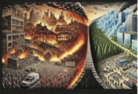
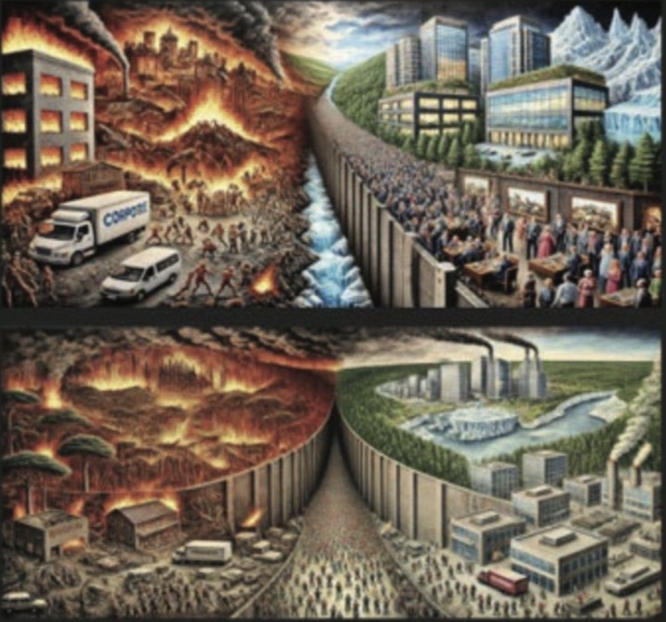
The charge or commission that Rinderknecht gave to ChatGPT was not of a disaster, but a divided canvas, understood in quite pictorial terms, of moral impact. Imagining fires in an urban landscape “divided into distinct parts that blend together seamlessly” is hardly a criminal act. Rinderknecht sought to map the fires to show a featured socioeconomic divide as if the result would be a clearheaded depiction of a socioeconomic divide. He desired a clear contrast between “on the far left, a burning forest” next to which “a crowd of people is running away from the fire” as “hundreds of people in poverty are trying to get past a gigantic gate with a bit dollar sign on it” that symbolized the city’s stark socioeconomic divides: while a “conglomerate of the richest people” relax while “watching the world burn down, and the people struggle” without registering the disaster, “laughing, enjoying themselves, and dancing” per Rinderknecht’s descriptions, asking the chatbot render a nightmarish dream as if for an artistic commission, stipulating that the painting be “detailed and impactful, highlighting the stark contrast and the direct connection between the different parts of the world.” Rinderknecht seems to have sought to make an image that might mend the fences between the glaring economic differences he had trouble living with.
Jonathan Rinderknecht no longer works for Uber, but he must have danced around the Palisades in a dream state of some sort on New Year’s Eve, when he had to drive fares, after watching the kinetic video. He didn’t know that he was setting what would be, after it rekindled from the ashes that had been smoldering after the initial fires were extinguished on New Years Day, no doubt with some annoyance from fire protection folks, but would be on e of the most destructive and deadliest known fires in California history, far beyond the proportions and scale of what Rinderknecht asked ChatGPT to predict, leaving smoldering coastal properties in disrepair, and destroying many homes of the less well-off located further inland, creating the modern version of the inferno of the Palisades Fire that caused so much loss. (The alt right news machine took the story as a way to move swiftly into action, noting Rinderknecht’s anti-Trump social media posts and his readiness to link the disaster of the fires that dominated national news to climate change to the conflagrations, as if all climate change activists are closet arsonists, looking for ways of getting away with it and shifting blame to the skies.)

Few morals can be drawn from the fires, if we are still hoping that lessons might be learned. The scale of the fires that raged across 23,000 densely forested and inhabited acres raged with a destruction that Rinderknecht must have followed on social media and television with nagging fears, having asked that least expensive of therapists and attorneys if one is “at fault if a fire is lift [sic] because of your cigarettes?” in hopes to deflect responsibility or agency for the conflagration that spun out of his intentional acts of arson, moving to Malibu, where all those seaside houses were destroyed, Topanga Canyon, and Altadena, where communities were flattened.
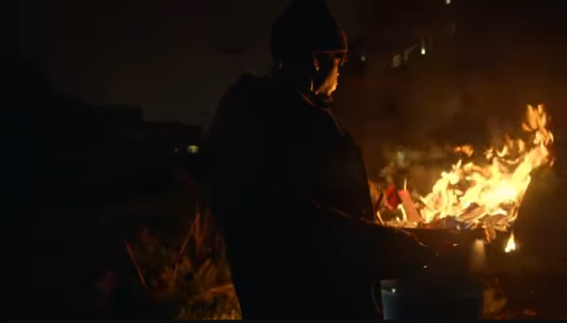
Rinderknecht wasn’t wrong when he blamed climate change, but the peripatetic troubled man who had broken up a few years back with a romantic partner and was on medications had been working for a while in the vast service economy of the sprawling city, navigating its economic differences that seemed as if he wanted to peel apart the gaping Lyellian strata in the city that evident to a delivery man for Door Dash and an Uber driver. As he walked on the trail with a lighter in hand after dropping off fares who reported their driver to be angry, he maybe made a bad judgement call in selecting a song on his iPhone–but probably rather intentionally selected an anthemic song that glorified the pyromaniac’s abandon lighting fires in an urban setting that seemed an image of cool. Johanthan Rinderknecht was, of course, listening to ominous soundtrack of the depths of urban alienation on his iPhone of a sleepless, haunted man walking on another urban periphery, probably Paris, wallowing in his sadness and fantasizing lighting fires as he lights up a joint–or lighting fires in trashcans–as he is walking in a poorer boulevard, or what seems one, captivated and entranced by paper fires set in trash cans at which he stares, hoping to get himself thorough a sleepless night or just numb his pain, turned to the image of rage and destruction on another urban periphery.
Un Zder, Un Thé

Un Zder, Un Thé
On the trailhead on which Rinderknecht walked from his car, above the tony sprawling mansions of the Pacific Palisades, Rinderknecht seems to have been lighting things with his own lighter. The spot was later identified as a crime scene on the rocky bluffs overlooking the ocean off the Temescal Ridge Trail, feared begun by revelers, to judge by multiple glass shards of abandoned broken beer bottles where the embers of the fire reignited on January 7,–a week after Rinderknecht lit his own earlier fires with a cigarette lighter, as the “holdover fire” rekindled from its embers.
Black Migliori/New York Times
To be sure, the setting of fires on the urban periphery is not the breaking of Jacquard Looms–and carries far greater consequences in an age when the intentionally setting fires in Southern California forests should face stiff penalties. Rinderknecht may have been a pyromaniac who willfully set fires to either paper or vegetation in a combustible area of the forest trail he let the car for a walk, but he was responsible enough to come to his senses and try to call 911 after starting fires with his lighter in local vegetation, though cell service forced him to retry multiple times.
Will OpenAI include an automated outreach to 911 for certain suspicious queries to ChatGPT in the near future?
The shift in the valuation of homes in the region that seems targeted by Rinderknecht may have an absurd overvaluation, with prices of homes unthinkably unattainable for most Angelenos but also map onto extreme divides of wealth can make it hard to traverse such economic extreme shifts, of almost seismic divides, stressful in the boundaries of inclusion and exclusion they draw of wealth inequality and “haves” and “have nots” that are increasingly common in many American cities, but are in Los Angeles even more hypertrophic at the luxury residences at the edges of forested lands.

This would be, probably, the least desirable outcome of the pressure that may grow on OpenAI to take responsibility for the fires, as it shifts attention from modes to resolve the underlying reality of the desiccated landscape that global warming and climate change have produced in California–and the fact that fires are almost desired to recur with increased violence in coming years, and the need to expand protective measures in the face of record levels of dryness during the late autumn and winter months.

The need to attribute a sense of human responsibility to one marginalized individual is an odd way to confront the questions we’d been asking about the role of climate change in provoking the fires–but has to be recognized as a perverse attempt to point the finger at a disturbed individual, without whose malicious acts the fires might not have occurred. As we were beginning to turn attention to the many malfunctions and limitations that allowed the fire to spread to rapidly–from problems with water supply, warning systems, and indeed escape routes, some dealt with in an earlier post–gridlock was so intense as a result of the fires’ rapid spread that the Los Angeles Police Department was forced to devote increased attention to clearing roads for the entry of needed emergency vehicles. But the infrastructural problems of the warning systems that should be in place and the firefighting tools we should have are displaced and the weight of responsibility is focussed on the shoulders of a bad actor–perhaps obscuring and hardly helping how we remember the devastating consequences of the fires’ destructive spread or questions of future fires’ prevention.
Deeply alone, per reports, and probably feeling as dark as the nation after Trump’s victory, perhaps the request for a diptych of a scene of a fire of “two parts”–“on one side of the gate and the entire wall is a conglomerate of the richest people, . . . [who are] chilling, watching the world burn down, and watching the people struggle” was almost a projection of his sense of torment in a city whose neighborhoods are so starkly divided by wealth. The notion of “watching the world burn down” was what much of the nation was feeling it was doing, as the greatest fire in California burned, leveling 23,00 acres, as he was listening to an anthem of urban alienation, filled with the idea of how the residents of LA existing in split reality,–perhaps the most successful aspect of the painting ChatGPT generated for him.

Credit: Department of Justice
The prosecutors who released the generated images of a destroyed city seemed convinced that they presented a tight case against him, if they didn’t need to add much to fact that he was watching images of a stoned rapper lighting fires with abandon in urban streets in the glare of streetlamps, iPhones, and headlights of oncoming cars in a late-night urban landscape of increased disorientation and quick cuts of a modern flâneur in its combination of alienation and curiosity of distanced bemusement at the nocturnal street life around him, in which the iPhone is in a sense his only weapon of defense. Jonathan Rinderknecht had, in fact, become. While the moral valence of the flâneur who is a disinterested observer of urban life, who wanders the streets in search of interest, was taking advantage of the keen awareness of the new spaces of modernity for Benjamin or for Charles Baudelaire, albeit expeeriencing a deep for alienation to which the city seems to give rise, Rinderknecht clearly took advantage of his car as he returned to the scene of the crime to contemplate his act: he drove the car back, without passengers, no longer working for Uber, following the fires engines back to the approach the site where the flames were already spreading, hoping that they’d extinguish them after being alerted by his emergency call, if not sensors. Was he not only anticipating the spectacle of spreading conflagrations as consuming property with abandon as he took video on his iPhone from near the spreading fire, coming within thirty feet of its flames to judge by his GPS, as if a moth drawn back to a flame? While we consider the pyromaniac unhinged from reality, the return must have been rather compulsive for one who set the fire, as if to be flooded with some weird rush of emotions as he watched the results of his own handiwork, engaging in the urban environment in distinctly new unexperienced ways.
His very spectatorship of the fiery destruction of this exclusive area of Los Angeles made him a flâneur of urban disaster,–not a new type of flaneur, if one that anticipated the spectatorship of the Palisades fires LA residents watched with newfound disempowerment,–stunned ifpassive before the real-life urban spectacle beyond anything they saw on their television screens, rekindled by hurricane-force winds as it spread beyond the Palisades across 23,000 acres to Topanga Canyon and Malibu–pricey locales to live indeed–as well as Altadena, leveling 6,000 structures and actually clearing multiple communities without much distinction of class, even if it seemed to be targeting the superrich living in Pacific Palisades–the name by which the fire became known. The sense of a watching the actualities of such apocalyptic realities unfold in real time was of course different than the scale of spectatorship of the fires that would rekindle form the fire he set, but he was consuming the information he perhaps might have heard on the radio in all its visual intensity, viewing not the effects of the fire’s spread or its map but the flames he had imagined at first hand, as one hears a pyromaniac is vertiginous before, as if it was a sight of the city, even as he tried rather desperately to distance himself from it, by trying to claim he was hardly at fault legally for having created anything like an actual loss of property:
For when heavy winds whipped up the flames believed to be extinguished on January 7, just in time for Trump’s inauguration, the embers of the Lachman Fire he lit bounced back to create the apocalyptic scenes he had asked GPT to imagine, if the truly dark clouds from which all those imagined people flee, running past what seems an emergency vehicle, seem walled off in a dystopia land of Rinderknecht’s earlier creation, walled off from the utopic image of the city whose residents seem to go about their business at a safe remove from the growing conflagration. The billowing smoke that blanketed forested lands’ skies in the generated image below were perhaps so triggering to compel OpenAI to issue a public statement, disclaiming any culpability for providing these “pictures” of apocalyptic reality that seemed to envision the disaster of the Palisades Fires in almost biblical terms as the end of an empire. The OpenAI team was making sure everyone knew it was absolved of responsibility, for providing that image months before the fire began in a “dystopian painting showing in part a burning forest” as residents flee the specter of spreading flames, desperately doing their best to escape death and destruction by “running away from the fire.”
The images OpenAI allegedly generated for the wayward Uber drive certainly seemed a smoking gun of sorts, to use the completely wrong metaphor that might make one’s hair stand on end: the public release of search histories, web searches, text messages and the like have become the norm for looking for clues to solve a crime, and if the identification of the Palisades fires with arson made it a crime, the dystopia images Rinderknecht asked the virtual chatbot Rinderknecht seems to have regarded as a privileged interlocutor in a dark personal time can’t be reasonably treated as privileged within the penumbra of privacy, if the examination of one’s history of generating obscene images of global disaster–more serious than online pornography?–are certainly admissible in court. The search of search histories may be undisputed as a way to gather information about criminal sources, and is not breaking into the office of a psychiatrist, but Rindeknecht seems, as many, to have regarded ChatGPT as a psychiatrist or therapist of sorts.
The accusation of premeditation seems evident from the apocalyptic images of the black plumes blanketed Los Angeles the region’s once blue skies with smoke of dangerously high levels of fine particulate matter (PPM 2.5) from several wildfires that were spreading into the surrounding hills,–prompting warnings from health agencies as the AQI index rose to 400 or 500 near the fires and “hazardous” within five miles of the fires, and “unhealthy” for the entire city–until those high winds blew the dangerously high levels of smoke away within the week, ending school shutdowns and public health warnings that seemed like COVID all over again.

Venice, CA, covered by smoke from Palisades fire, January 8 2025/Jae C. Hong (AP)

Environ. Sci. Technol. Lett. 2025, 12, 8, 911-917
The static nature of the computer generated image that seemed to forecast all this apocalypse used eerily similar colors. The canvasses that it generated in multiple possible options–did he make his request multiple times?—was so epic in scope it hardly revealed active running of individuals; those standing to the right, with hindsight, can hardly be looked at without imagining them as spectators of the very sort Rinderknecht would turn out to be as he drove back to visit the fire as it spread along the trail he had taken a short walk after dropping off his ride, positions known by his GPS.
The rather generic images that may offer a window to his intentions are in fact strikingly dispassionate, as might be expected for a computer generated image, with little sense of a viewer, so much as recycling imagery from other sources by an algorithm that suggests meeting a set of rather complex specifications to translate quickly into visual form. The virtual “paintings” don’t suggest any emotions, if they are oblivious to the surroundings, hardly seem to be “chilling” in a state of relaxation, if the search engine did add copious waterfalls that suggest the opportunity to “chill” was close at hand. (One wonders how many paintings ChaptGPT is asked to generate for its users, and the remove of the act of “painting” from a backlit screen. Such are among the multiple hazards of commissioning paintings from ChatGPT.)
Credit: Department of Justice
The artificially generated flames to gain such eery resonance even in an image that that OpenAI to remind folks that they fully cooperate with law enforcement following the discovery and that the imagery their app generated did not include any content that went against the company’s policies and best practices. The idea that the generation imagery of a city being destroyed–or even the obliviousness of half a society to the burning of what might be the “whole world”–would place it at fault may seem perverse, but the generation of fictive landscape that somehow have a purchase on the realities we later experience may seem like the virtual images had given him a plan. The fire seemed as if it was somehow something cleansing and redemptive to him, to judge by recent reports, and the generation of an apocalyptic scene of the world’s destruction was not only “dystopian” but seemed about a deep disconnect, if the laughing wealthy of the anonymous conglomerate on the right of the diptych are not clearly “chilling” and enjoying the world burn, but the GPT engine has a hard time with portraying pleasure, if it quickly generates fictional images of cities being destroyed by flames.

Credit: Department of Justice
The generated images of course remind us of the very contrast between fragility and permanence, deep contingencies of built environments, even if fire seems weirdly walled off rom the city to the right, its wealthy residents almost oblivious to the truly Dantesque images of all those small beings in a tortured landscape on the left, that was made at the request of the twenty-nine year old arsonist, who will have a hard time arguing that he didn’t ideate and have any intent to set a fire this large, or to do so in ways that would reflect on the deep social divides of the modern American city that are so strikingly clear in Los Angeles–incarnated by that weird virtually generated wall that Rinderknecht seems to have requested figure so prominently in the images of destruction that he very much wanted to see, and then seems to have sought to start.
The progression of the fire almost seems to taunt the infrastructure of that ideal city that stands to the right, as if to show the underlying pain that exists at the same time at great proximity–and the fragility of an actual dividing line between them, that seems a divide not only of property but an insurmountable wall between emotional states. The ChatGPT search engine is good at making the conglomerate from architectural models, and the pleasure of “chilling” seems to have been captured by snow-capped mountains or what seems a landlocked iceberg that floats beside the skyscrapers of the city that looks only a bit like downtown LA–but those black clouds and fleeing humans look downright medieval, as if the global destruction Rinderknecht asked be generated was apocalyptic indeed.

Credit: Department of Justice
The contrast between those dark skies and the blue skies above the skyscrapers and factories that belch out computer generated columns of smoke can hardly compete with the intensity of the black skies over the left half of the “painting” that seem malbolgeian, and may well be about the future of a catastrophe enabled by the failure to take adequate protective measures in the face of climate change. We do seem to be facing some very hight walls indeed, by which we are pressed from both sides, as the people in the final image, who seem to find no pleasant situation between the incandescent blazes and the chilly box structures, where the appearance of the fires seems to have no clear origin, but is rather an existential condition, as they engulf the city with flames as much as fireballs, in a condition that seems no one will leave, even if this one seems to be set.
The phenomenon of the fire on the margins of woodlands that are increasingly flammable seem terrifyingly somewhat endemic to the expansion of California cities into what is called the “woodlands-urban interface,” as a region of greater dangers to incendiary disaster. But the spread of panorama of urban ties that suggested the dangers of densely populated regions made them an extremely popular conceit of the panoramas that traveled round the country in mid-nineteenth century America, as if in an antebellum sort of internet, providing pictures of far away pleasures and terrors. Such panorama regularly featured the heightened vulnerability of cities’ lower classes to such “urban disasters”, including the firemen made up by members of lower classes, and recent immigrants, as well as those perennial thrill-seekers who approached too close to watch fires spread.
The occurrence of a conflagration amidst the panorama being unscrolled became a stock object due to techniques of lighting and stock tools of dramatic staging as they punctuated touristic itinerary and narratives to reveal sudden urban dangers, offering thrills with warnings to audiences in Buffalo or Lowell, Massachusetts of the dangerous lives of city-dwellers: despite the reassurance that when “a fire occurs in any part of the city, the men at the bells readily know the district in which it is situated and they make the number of the district known to the fireman, by the number of strokes on each bell,” in a reliable system of communication than what existed for the Palisades Fires, panoramas apologized “we see here some of the bustle and confusion and fleeing that is attendant upon a fire, . . . we don’t hear any of the noise. This is not represented on the Painting.” Few paintings can even communicate the sense of individual travail and desperation, if the paintings of Rome burning in 64 AD seems to have come closest to trying to convey as much in the gestures–

Nocturnal Capriccio of Rome Burning, Pierre-Jacques Volaire (1767)
—if the disproportionate nature of Neronic obliviousness to the suffering of the may seemed the basis of Renderknecht’s request–and the rumors that Nero had the fire set himself seems oddly echoed in the sense that the AI generated images prove Rinderknecht’s guilt, evidence of the Uber driver’s confusion of virtual reality with actual fire risk in the Palisades. Mid-nineteenth-century theatrical display of diorama vicariously conveyed the sense of urban spectatorship, however, in vivid ways, that made them a traveling business of sorts for canny entrepreneurs, predating disaster flics, unspooling six-feet high scrolled canvasses before paying audiences in a virtual itinerary of urban space that allowed them to be flâneurs of their own, even if located in the safety of a theater in Massachusetts for several hours, exploring the new social topography of the city and its contrasts of wealth and urban poverty in “moving” images that noted the degraded nature of urban environments with abundant theatrical effects–a display of the contrasts of immense urban wealth beside immigrants’ poverty, from opulent buildings of the wealthy residents conspicuous display balanced by theatrically staged sensational conflagrations that spread among wooden houses of densely built cities.
At the same time as the scale of actual conflagrations were widely reported and experienced as terrifying disasters, their apocalyptic nature of fires of untold scale became a feature audiences promised. The adverts for panorama in published advertisements enticed audiences to attend “the grand and sublime spectacle of the BURNING OF THE PARK THEATER!” The suspected arson of tragic events as New York City’ s Tenement Fire of March 1860 and Great Chicago Fire of 1871 provoked panorama to try to capture their devastation in ways vicariously observed across the country, to process the spectacles of such sudden loss of life in urban landscapes; that fires that left uninhabitable burnt areas, destroying the homes and property of many as they were covered by smoke-filled air and ash (of course absent from panorama) seemed as if they were a precipice of modernity that paying audiences entertained.
The hope to raise money for Relief Funds for the fires circulated nation-wide, for many of the same audiences who might have seen the traveling panorama, inviting they comprehend the scale of loss of the massive “Burnt District” of the Great Fire–almost a city within a city–that had spread through six miles of densely packed urban housing and transformed the shores of Lake Michigan to a salvage region of which stunned inhabitants arrived to snap photographs as they contemplated the scale of loss, the problem of responsibility, and the question of how to move forward in 1871. If the ruins of the fire were compared to a form of disaster tourism, leading many to try to experience the fires by going to the city that agencies would offer customers by dedicated trips “with ample time in Chicago for viewing the ruins” as if they might be transformed or reimagined as the ruins of a Grand Tour in Europe, available at cut rate with even greater effect, the new scale of the fire’s destruction that would rival if not displace historic fires in the scale of its tragedy–flames moving faster even that the Great Fire of London that had started on its wharves in 1666, that over three days destroyed the oldest built up area of some of densely packed wooden structures, in a firestorm fanned by winds that challenged current fire-fighting techniques of firebreaks–


–had created huge numbers of homeless in its wake, only later being rebuilt as dominated by broad streets to reduce the hazards of narrow winding paths, and allow firefighters to better fill their tanks in the future.
The problem of confronting the limits of representation also existed for images generated by ChatGPT. The terror, the huge cost of life, and the massive destruction was not something able to be generated, nor the panicked bustle of the fire. Rinderknecht was a pyromaniac who enjoyed watching conflagrations–though generating fictional burning landscapes is hardly a crime in itself, so much as the condition of urban spectatorship. Would he have paused before parking his car after ferrying folks to their New Years celebrations, hoping to close the year with a bang, and not walking up that trail and listening to the song he had probably selected to set fires on what would be his own final Uber ride? In what set a threshold for new levels of paranoia, the official complaint of neighborhood groups representing Palisades victims at a dozen companies, including major utilities as Southern California Edison and phone networks such as Charter Communications and AT&T, related to the delayed response to the fires that rekindled in the Palisades, were filed just after the public announcement of Rinderknecht’s arrest, when federal prosecutors released the ChatGPT diptychs of urban infernos, seemingly designed to push the question of “fault” in relation to the devastating fires into the past.

Nero Watching Rome Burn, Unknown Artist


