Category Archives: Uncategorized

Intoxicants! (Choose Your Poison)

Indigenous Intoxicants Big

“Indigenous” is a bit of a buzz-word, since now not much is.  Expanding the worthy cult of rediscovering the local but also reminding us of its historical origins, this “Whole Foods”-style map of the wide world of intoxicants is an appreciation of diversity and a true big picture.  In its most recent issue addressing the theme of Intoxication, Lapham’s Quarterly has backed a boggling collage of historical snippets of moments of intoxication past–Casanova’s night on the town; Stephen Crane on opium; Honore de Balzac on the delights of coffee; or the Apple in Eden– with the dimension of space.  The map offers a nicely complementary map to an image of the inhabited world, even if one you won’t see on the walls of elementary school classrooms soon:  is it where there are inhabitants, there are media of intoxication, or that societies grow up around intoxicants?  (Although given teenagers’ habits for self- experimentation, perhaps it should be mandatory to post it in every US high school to encourage global awareness in a provocative DIY way.)

Intoxicants are a measure of sociability, at least.  Beer seems missing from the list, or diminished in the face of Michael Jackson’s claim for the “perfectly reasonable academic theory that civilization began with with beer” in his World Guide to Beer some years ago, a theory that brewer Dave Alexander of Brickseller Brewery summed up that “beer is probably the reason for civilization.”  Archeologist Brian Hayden of Simon Fraser University has both pursued and refined this argument by suggesting that the Neolithic domestication of cereals was largely for domestic brewing, linking beer to the “emergence of complex societies, leading Charles Q. Choi to broadcast that “Beer lubricated civilization,” based on archeological evidence that maps beer to the analysis of human remains found in the Nile delta.  (This is not only an argument in Canada.)

But these theories beg the big picture.  If beer is bread, let’s expand our basket of intoxicants by cocktails that offer grounds for socialization beyond the sixpack in a site-specific map:  rather than a map of where you can go to get intoxicated, the above map takes a wider view, timed for St. Patrick’s Day, by amply recognizing the Mediterranean grape, honey, barley of Mesopotamia, palm wine, beside the grain and hops it calls indigenous to Europe. Broadening our horizons by embracing the prickly poppy, mushroom, peyote, beetroot, embracing the glorious juniper berry as well as the Sonoran desert toad, which join cannabis and coca or the Kola nut, to picture the origins of human sociability in more variegated and broader landscape.  No doubt toads and prickly poppies weren’t as easily domesticated, not to mention Arctic Club Moss, but the big picture provides a nicely bucolic view of varied ecological habitats, as well as providing a new sort of level for what Italians have come to call Agriturismo, just in time for Spring Vacation.  It may give fieldwork a good name, even after Napoleon Chagnon took the dark-green slime dripping from noses of hallucinogen-induced violence among Yanomani as signs of their state of perpetual warfare.

1 Comment

Filed under Beer, Brickseller Brewery, Cannabis, Coffee, Indigeneous Intoxicants, Lapham's Quarterly, Napoleon Chagnon, St. Patrick's Day, Uncategorized, Yanomani

Russian Rocks

What happens when part of a meteorite lands in Chelyabinsk? We use maps to give meaning to the event, marking the site of impact in readable visual terms, and to try to place it in our comprehension through familiar mapping tools.

There are multiple ways to map the path of the meteorite that fragmented into pieces as it fell to earth, evading atmospheric or satellite sensors and causing explosions that injured over 1200 people, as well as its site of collision.  Perhaps the rush to map the event compensates for the fact that we never detected it as it entered our atmosphere, on account of its small diameter.  There is a paradox that in an age of detailed world-mapping, the mapping of such a terrifying event was improvised from a range of readily-generated cartographic resources, and provided a limited view of the human side of the natural disaster-an aspect that was, perhaps understandably more often reserved for video rather than cartographic media. The range of maps that popped up in actual news sources suggested a sort of fumbling for meaning, however, or an improvised making sense of what happened, without much imagination or clarification.

The most vulgar is undoubtedly a graphic reminder this happened in a place known as Russia, and that still has a vaguely pink hue that has adhered from its Cold War past and the image-bank that era has bequeathed us:

map-of-russia

Slightly more acceptable, but excessively abstract, is the “Google Earth” solution of noting a pinpoint, instead of the collision, and using a surfeit of detail in the surrounding region, essentially an imported backdrop from a computer file from Google Earth:
russia-map

Huh?  Only slightly more semiotically refined is the following accusatory blame of where the meteor caused such tragedy, but focussing on the basic information about its distance from Moscow:

images-2

Meaningful mapping is approached by the following, if somewhat whimsical, combination of a political map and world-wide view:  but the whimsical tone undermines the tragedy, the detail to dense, and the region just too green:

map

More impressive is mapping the fact that its impact could have happened at any point during the meteorite’s arc through the earth’s atmosphere:
path-of-meteorite-that-hit-russia

What’s sacrificed here, of course, is the specific–what one would expect from mapping techniques–as the map is simply a screen on which to chart the progress of the meteor, with limited explanatory force.  Most of these ‘maps’ employ existing maps as backgrounds, fields, or templates familiar from other computer-generated media, rather than mapping the site of impact in relation to regions of settlement or natural resources.

Perhaps most striking is the perfect circle that part of the meteorite made, as if a cartoon outline of its form, on the icy surface of this frozen lake, as locals try to understand what happened–not a ‘map’, but a good visual expression of awe as well as a human-sized outline of what the actual scale of the meteoric fragment on impact was:

russia-meteor-strike-lake_64337_610x343

Of course, this lacks many tools of orientation.  But perhaps it is as effective as to dispenses with geographic points of reference and indices, in a word map:

images

For the cartographically obsessive, a Google Earth blog maps all sites of meteor craters created by previous impacts,

http://www.gearthblog.com/blog/archives/2005/10/meteor_craters.html

Google Maps Mania has been quick to create a plug-in for Google Earth browser (via Google Maps) for those interested in comparing the craters.

Wow:

mapsmania

http://googlemapsmania.blogspot.com/2013/02/meteor-impact-sites-on-google-maps.html

2 Comments

Filed under Chelyabinsk, Cold War, Google Earth, meteorites, Uncategorized

Mapping Foods in Oakland

628x471

This rendering of the future site of a University in Berkeley by R. D. Yelland imitates the genre of a real estate ad and bucolic fantasy amidst rolling hills:  after the foundation of great land-grant universities in the middle west, the painting suggests the existence of basic walkways and streets for the university that are framed by banks of local vegetation and trees.  It is not a map of the area, but suggests a prospect of a future map of the region, rendering the vision of a spiritual site for education that inspired Samuel Hopkins Willey when he purchased the land “for the dream of a college.”  It is a place that was not yet defined, but was ready to be mapped and settled as a seat of learning and formation.

(For more images of the site of the university and roads that bounded the area: http://www.sfgate.com/bayarea/article/Eccentrics-Heroes-and-Cutthroats-of-Old-Berkeley-2523725.php#ixzz2KScJDa30.)

The historical remove of this scene is striking, but a sort of agricultural archeology exists today in Oakland and the East Bay that has just begun to be mapped.  This map of urban farms and farming,while of different cartographic form and far more based on actual statistics, suggests how from a number of school gardens in the Oakland Unified School District, at least seven “community gardens” can be identified in the region as well as some neighborhood farms.  Rather than point to a project of ‘regreening’ Oakland, a city without much arable land–and  more notorious than other cities in Northern California for large range of paved areas and highway routes–the map reveals not only renewed attention to urban farming, but a new attitude toward urban space that the expansion of urban gardens has directed attention.  And the map suggests the future prospect for the city as an inhabitable space.

Identified Existing Urban Gardens-Oakland

In the wake of farmers’ markets and the rise of Berkeley’s Edible Schoolyard project, the question of access to fresh vegetables and produce has become a social justice question in Oakland, as in the rest of the nation.  Not only is there a conscious desire to restore active gardens and gardening to urban space, but a large educational role of the garden is evident in how with the help of the California Department of Education’s Garden in Every School program and the University of California Cooperative Extension‘s school garden program, in Oakland nearly 100 childhood development centers and elementary, middle, and high schools have active school gardens to teach science and nutrition.  The network designated by blue dots in the above map of Nathan McClintock reveal an expanding network of  city gardens, which may have laid seeds for the City of Oakland’s Community Garden Program, the gardens of City Slicker Farms and the People’s Grocery, and other programs focussing on rooftop gardens, gardening for kids, and urban urban gardening workshops or centers.

The expansion of these farms do more than try to restore the tie of urban space to local agriculture, or remind us of the farming lands that used to border cities up to the mid-twentieth century, and still border some towns as Madison WI.  Despite the fact that few cows moo in Berkeley, the image of Berkeley as an agricultural region survives in Berkeley Farms,  McClintock mapped the city’s gardens to assess the potential that exists for projects of urban agriculture in Oakland’s large number of public lands.  To be sure, McClintock and his team see limited viability for a  regreening project on a large scale in Oakland–not only is this less in need in a place where agricultural produce is available nearby, but the expense of repatriating and cleaning soils of many public lands, including the Alameda airstrip or the vast number of underground oil storage tanks near the harbor and old train lines (who can imagine urban homesteading near Livermore?).  But as any urban map presents an image of the city, the shift suggests a deeper change in how the city is seen.  And despite the hazards of old house paint, new models of “phytoremediation” use plants to leech metals from the soil, as intense addition of compost may immobilize existing hazardous levels of lead.

But the map draws attention to or adumbrates a shifting attitude to urban space that asks us to reconsider the nature of Oakland’s urban space.  The smaller blue dots that designate school gardens and dot the landscape have in the past decade set the basis for a flourishing of smaller farming areas and several sizable community gardens, most built and cultivated to serve the  communities where they exist; a recent push toward the local sourcing of agricultural produce in the city has given impetus to a broad, if focussed, rise of clusters of local farming, most prominently associated with City Slicker Farms.  Although a large number of plots were zoned for heavy industry in Oakland and modern Emeryville, much of East Oakland is both available and ready for agricultural use.  The goal of using local sources for food was embraced by the Oakland City Council in 2006, when it established the goal of 30 percent  local sourcing, and the attention to the benefits of urban agriculture as a source for local jobs and growth encouraged subsequent creation of the Oakland Food Policy Council.  (For more on the formation of Urban Agriculture movements in the city see http://www.foodfirst.org; McClintock’s study is a model of mapping of the viability of local food sources: http://www.oaklandfood.org/media/AA/AD/oaklandfood-org/downloads/27621/Cultivating_the_Commons_COMPLETE.pdf

McClintock’s map of the relative sizes of these farms reveals that despite the small numbers of urban farms of substantial size, the considerable number (and clustering) of farms above 5 acres in East Oakland in 45 ‘urban farms’ that have changed the landscape of the city in recent years.

Size of Oakland Farms

These farms could never meet Oakland’s demand for greens, despite the hope for a significant production of food from local sources.   They do not return to a vision of the city as garden, but have changed what McClintock calls the “ecological footprint” of the city:   these two maps provide a basis to understand how, if on a lesser level than farming in Detroit and elsewhere, residents have used urban farming to transform the city’s landscape and, by selling to local residents after the model of farmer’s markets, changed those residents’ relation to the land together with their access to fresh food.

Leave a comment

Filed under Edible Schoolyard, Nathan McClintock, Oakland Food Policy Council, Uncategorized, Urban Agriculture

Mapping Knowledge and Mapping Food

Image

What relevance do maps have in a world often organized by database systems that are in themselves often impossible to visualize?  One answer is that the map is not only a visual register of data, but prepares an active correlation of information patterns and raises questions about human relations.  Rather than arranging data, maps show or highlight selective relations between data in graphic form.  Maps do so in ways that generate questions about our relations to space, if not the variety of relations each of us occupy to an otherwise uniform expanse, in order to make space our own; they are as a result particularly useful tools to ask us to consider our sense of place in ways that we might not otherwise find a way to puzzle over and consider, or find a way to concretize.  Although the size of massive database systems escape the kind of an individual, the maps that guerilla cartographer Darin Jensen has solicited and assembled in FOOD: An Atlas raise chart the spaces we organize around through food, and understand place through the intersection of place with how food is produced, exchanged and consumed.

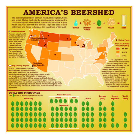
In an age of the unwarranted expansion globalization of food consumption patterns and trade, where the importation and circulation of foods to their consumers often seem shaped by processes irrational in nature, the rationality of the map provides a way to raise questions about how to understand the ways that food sources and substances travel across space both in commercial ways and in raising questions about the efficiency of these systems.   In identifying and rendering a joint database of food production and consumption, we can grasp in an entertaining visual form multiple questions about how we value the place of our food and how food is now valued and exchanged over spaces far beyond the places where it is grown.  We may not know what bacillus of yeast helped the fermentation of the glass of beer we are drinking, even if we prize the origin of our coffee; we can’t visualize or often even know what field of tomatoes provided the basis for our pasta sauce, or the huge range of regions united in the foodstuffs in a plate of school lunch, or where the almonds of northern and central California travel in order to reach consumers from the Central Valley.  The maps in FOOD:  An Atlas provides a range of provocative maps of how food interacts with space that provide a compelling set of questions about our relation to place, and indeed the relation of food to space.  Maps of the global distribution of grains, or of the costs of the same foodstuffs, remind us of how food exists in relation to place, even if food travels globally—as well as the places where food grows.

The compilation is a true atlas of modern life—or of modern tastes for foodstuffs.  The Dutch engraver and cartogapher Abraham Ortelius compiled the first global atlas by sourcing maps from different areas in Europe from his multiple correspondents in the 1560s, obtaining a range of extant cartographical forms of nautical and terrestrial form that he collated in a synthesis of terrestrial coverage that canonically redefined the image of the inhabited world.  Refined and expanded in his own lifetime and after his death, the Theatrum Orbis Terrarum bound these multiple maps obtained from different parts of Europe and vetted in Amsterdam in a single commodity that was immensely popular and, though dedicated to Philip II of Spain, was disseminated over a huge geographic expanse.

The crowd-sourced maps collected in FOOD were sourced in a considerably shorter period of time over the global internet, solicited from cartography listserves and Berkeley classrooms alike, starting from the North American Cartographic Information Society (NACIS) and coordinated through a GIS lab where proposals for mapping were often linked to potential owners of databases, and submitted maps refined for their persuasive visual organization, the transparency of their cartographical iconography and the appeal of their format.  The variety of graphic skills that are applied to map food and food’s distribution are themselves inventive exercises, and suggest the degree of invention that

The crowd-sourcing of the atlas is not only a question of pragmatics, but itself an instance of informational exchange.  On the one hand, Jensen describes how he arrived at “a project of guerrilla cartography and publishing” as the result of a natural desire to make the sort of compilation of maps that “take too long to make,” which led him to “an experiment in doing it faster,” both by relying on crowd-sourcing and local publishing. “It doesn’t have to take two or three years to put out a book or an atlas.”  The anonymity of the crowd sourcing generated a far more imaginatively diverse use of mapping conventions—unlike Ortelius’ interest in universalized norms, they celebrate local diversity of mapping abilities in keeping with the polycentrism of a post-modern age.  Rather than conforming to a single style or aesthetic, each crystallizes specific issues in an individual fashion.  The maps provoke us to consider the relations of place and food, and alter or tweak our relations to the world in mapping the circulation of food wastes, the sites for importing tomatoes for that pasta sauce, or the “food swamps” where junk food constitutes a dominant share of the foods for sale.  Each is brilliant in its own way.  Whereas we know the many authors of the maps that Ortelius collected primarily from his extensive correspondence, as well as the “elencum auctorum” that provided a comprehensive list of the different authors of maps in his atlas and sources that were consulted in its creation, Jensen lists the individual or joint authors of each map–and even invites us to construct our own!

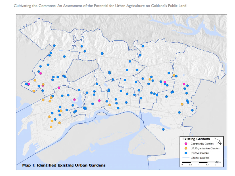
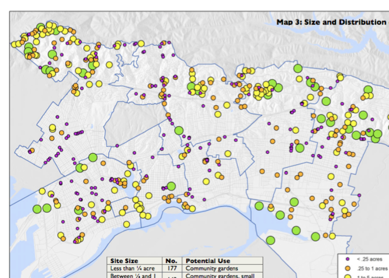
Why create a set of maps of the relations between food and space?  This volume is a way to rehabilitate the use of the map as a way to consider and contemplate relations we construct between place, as well as the product of a local culture of food.  All food is local, even if the world we live in has globalized food as a resource.  The open arguments of maps Darin Jensen and his team assembled in FOOD:  An Atlas provide a collective tool to understand what might be called the irrationality of the globalization of food sources in the transparent and supremely rational language of cartographical forms.  Much as the previous MISSION:  POSSIBLE led us to view one neighborhood in San Francisco in new terms of the distribution of coffee-shops, trees, ethnicities, restaurants, underground gas reserves, parking spaces or sounds, each map in FOOD:  An Atlas provides a distinct corner of the exchange of food as commodities and elegant goods we value for their local origins, as well as celebrating the recent growth in the valuation of the locally produced good.  As Jensen’s map of the Mission noted the rise of artisans in the neighborhood, the mapping of Farmers’ Markets—both in Berkeley and in the United States—offers a view of the rising value of the locally farmed (and even the changing definition of what local farming means) as well as the access and audiences of these markets.  As MISSION:  POSSIBLE provides both a map of a region of San Francisco and a sort of surrogate for orienting oneself in any modern city, FOOD:  An Atlas provides a tool to orient oneself within the global exchange and local production of foods.  The map of areas of urban agriculture in San Francisco that is included in FOOD is a great model of a collective interest in the local production of food in that city, and a sort of template for resisting a growing divorce of food and a local landscape.

To order a copy, visit http://www.guerillacartography.net/home.html

How better to understand the pathways by which select regions of almond-growing enter the chocolate bars sold across our nation, or consider the inequalities of food that dominate the urban and rural landscapes in an era that celebrates famers’ markets?

http://missionpossiblesf.org/

https://www.facebook.com/food.atlas

http://cafarmersmkts.com/

2 Comments

Filed under Abraham Ortelius, crowd-sourcing, Darin Jensen, data visualization, data visualizations, datamaps, Food, Food Maps, Geographical Information Systems, Guerilla Cartography, NACIS, The American Beershed, Uncategorized