Monthly Archives: October 2014

Pumpkin Patches

Pumpkin production is difficult to map onto the celebration of Halloween.  For the celebration of what was once celebrated as All Hallow’s Eve has morphed into a feat of mass-marketing and commercial sales from haunted houses to Halloween Stores like Spirit Halloween–“the largest seasonal national Halloween retailer”–or Party City–making up a projected 7.4 billion dollar business.  And the celebration of the Halloween, long dislodged from the liturgical calendar, has become so clearly part of a commercial more than an agrarian calendar that, if the pumpkin remains the crucial signifier, it’s a floating one, and it is almost hard to remember that pumpkin cultivation was once rooted in an agrarian geography or growing climates, so much is the business of Halloween now measured by metrics like “candy price inflation.”

Yet as much as the Google Maps locator of Spirit Halloween retailers leaves the country awash in a purple confetti of markers, it seems still important to examine the economy of the landscape of pumpkin production that perhaps still undergirds it all.


Spirit Store Halloween


Pumpkin production has so surpassed needs that the squandering of an abundance of gourds in supermarkets seems an apt metaphor for the over-the-top nature of Halloween.  Currently, indeed some millions of pounds of seasonal decorations are annually destined for compost or landfill as are most of the 1.4 billion pounds of pumpkins US farmers produce yearly–and some 18,000 tonnes of pumpkin are disposed of in British waste bins, creating “food waste on a grand scale.”  So drastic is the association of the pumpkin with food waste to provoke to a drive to squash food waste (#pumpkinrescue) by the environmental group Hubbub, who find that the amount of pumpkins going to the trash constitutes about 360 million portions of pumpkin pie.  (And so, similarly eco-conscious Madison WI’s Yard Waste Collection uses boldface to urge its customers, “You can also place your pumpkins with your leaves for collection.  Just add your pumpkins to your leave pile and they will be composted.“)  For the US Dept. of Energy, in an interesting improvisation, the pumpkin has become something of an icon of the project for turning food waste to methane gas, rather than trick-or-treating for candy at Halloween.

All this might be too pessimistic in its remove from the celebration’s participatory value, however, in its focus on agricultural and food waste that so removes the pumpkin from any ritual context.  Before the pumpkin became illuminated that evening, Halloween Apple Bob (or apple dookin) provided the ritual sight for rites of courtship and celebration of fertility around indoor fires.  It’s difficult to know how to map how the celebration collided with the harvest of autumn gourd, and the transformation of the hearth to the pumpkin-head, and Halloween became a season that generated the most expenditures on decorations save Christmas.  (While the evening was once marked by the Apple Bob, the Halloween-Thanksgiving-Hannukah-Christmas-New Year Buying Season marks its integration into a commercial season.)


J._M._Wright_-_Edward_Scriven_-_Robert_Burns_-_Halloween


But it might be worthwhile to map the rootedness of the pumpkin plants in the ground.

Before pumpkins were associated with food waste, the gourd enjoyed staying power both as a food–pies, soups, muffins, and puddings–as well as carving out objects of domestic decoration.  The crowding of pumpkin festivals clustered in dense patches in northern California and across the Northeast are linked to agrarian growing zones–even larger ones, since despite Google Maps’ restriction to the United States in the below, over 5000 hectares devoted to pumpkin growing in Canada make pumpkins an extremely important staple for Ontario farmers–even if only 8% seem destined for canning, or decisively non-decorative use.


map-of-pumpkin-festivals-locations


The native status of the pumpkin hardly guaranteed the remaking of Halloween in America.

Ruth Edna Kelley argued that with the adoption of guising–“What fearfu’ pranks ensue!”–“All Hallowe’en customs in the United States are borrowed directly or adapted from those of other countries” in her 1919 Book of Hallowe’en.  Yet the pumpkin seems an decidedly American innovation–Robert Burns didn’t include even one in his 1785 Scots-English poem of some twenty-eight stanzas–despite the long history of Jack o’ Lanterns.  Despite Scottish origins of “All Hallow’s E’en,” the pumpkin seems a subsequent American addition–probably postdating Washington Irving’s 1820 Headless Horseman who pursued Ichabod Crane, and long before the holiday grew into the over 7.4 billion dollar business it constitutes in the United States, on which the average American will spend $77.52, up from $75.03 last year, including costumes, candy and fearful decorations–some $350 million of which is spent on costumes on pets.


Hessian Horseman


What now inaugurates a commercial season provides an excuse for splurging may have had more modest origins, nice to map back onto the distribution of the gourd. The pumpkinization of trick-or-treating might be linked to the marketing of Halloween postcards in the early twentieth century–and sale of Halloween decorations was only introduced after World War I at Woolworths and Kresge’s–but the celebration of trick-or-treating now seems inseparable from ritualized nocturnal illumination of the hand-cut squash.


fzdfzdf


It is easy to forget trick-or-treating was ever closely tied to the agrarian calendar of harvest in an era of year-round fruits and vegetables.  And the pumpkin seems a Halloween icon of the New World.  But even with the omnipresence of SpiritHalloween stores that dot the nation, always advertised on billboards, it’s nice to remember regional differentiation of zones of pumpkin production–and variations of pumpkin cultivation on which we rely even in an era of industrial farming.  And even if turnips and rutabagas were a choice of Jack O’ Lanterns in Ireland, and other squash were used abroad, the pumpkin is an artifact of globalization, from Bosnia and Herzegovina to Japan to Australia to Hong Kong, we remain rooted in its growing regions.


pumpkincropproductionmap


The global march of the Halloween pumpkin knows no clear bounds.

(Note that even if the US is a big pumpkin cultivator–with most growing in Illinois, Ohio, California, Pennsylvania, and New York state, feeding a market of Halloween needs, far more are growing in China or India, where they are more of a staple of edible consumption, as well as Africa–where Rwanda and South Africa collectively grow over half as many as the US–and, per capita, far exceed it, as does Mexico.


gitn_1118_NGS-Pumpkins


While we think of pumpkin as a New World squash, it is truly global–far more global than Halloween.)

But it’s also deeply local on the edible end of things among those who associate the fruit with tortellini.  After all, the perimeter of the elegant culinary inclusion of pumpkins in pasta remains localized along the Po Valley in ways that seem constrained by the limits of their cultivation, which dates soon after the importation of the seeds from the New World–although the end-product of tortellini di zucca are also globally commoditized, though they might even inspire some to make pilgrimages to Mantua or Parma to taste them.


6a00d8345634d569e2012875da907e970c-800wi


While they might remain localized as edible delicacies for some, prized for that sugary melt-in-your-mouth buttery taste of pumpkin boiled in folded triangles of pasta,  the costumed rite of Trick-or-Treating is mostly about belonging, and recreating the community in a community even in the guise of avatars and ghouls.

It is difficult to draw a map of the celebration of the evening or a global geography of its observation.  To be sure, the growth of regular Halloween Horror Nights at Universal Studios over over three weeks from mid-September, replete both with haunted houses and including vignettes from recent horror films, and complete with live “scareactors” and replete with references to films from The Texas Chainsaw Massacre and Jason Voorhees of Friday the 13th to Doomsday, has spread a fundamentally filmic experience of Halloween readily reproduced within Universal branches to Hong Kong and Singapore from Orlando–and encouraged global interest in Halloween as a multi-day media spectacular clearly designed more for adults than children.


Universal-Orland


Despite a big stir about the global reach of a holiday that has been so aggressively commoditized in America, we might be less shocked by the currency of the holiday as a sign of a globalized culture or artifact of Americanization than see Halloween as residue of an omnipresent media presence which there’s no clear way to map in geographic terms–and where the hollowed out squash simply grabs visual attention on the world wide web and provides an iconic way to mark commercial time, where it becomes an icon of calendrical time even on the web.


googlepump


The currency of the carved pumpkin head made for a popular Google doodle.  But the image was not separated from the act of carving away those gourds in the smashing debut in the quick carving of those massive pumpkin heads outside Google HQ in 2011 Halloween Doodle, in something of a sly reference to the agrarian origins of the region, and its proximity to the pumpkin patches of Mountain View, Hollister, and Santa Cruz where so many Northern California pumpkins are grown:  for the very same time-lapse clip of carving pumpkins  rooted Halloween in the site-specific rite of pumpkin-carving before dusk, set to an antic soundtrack of preparing huge pumpkins for sunset.

The clip seems to suggests the mobility of a rite that can be readily restaged wherever ripe pumpkins are available to be carved up and illuminated to mark All Hallow’s Eve.


Pumpkin Doodle

1 Comment

Filed under #pumpkinrescue, Halloween, Halloween geography, Halloween Horror Nights, Mapping Pumpkin Production, Pumpkin patches, pumpkin-carving, pumpkin-growing, Robert Burns, Spirit Halloween stores, squash food waste, tortellini

Mapping Feline Itineraries

Among crowd-sourced mapping projects, Cat Tracker is something of an innovation:  rather than map a human environment, it is dedicated to mapping the motions of specific outdoor cats–their individual, day-by-day itineraries–rather than create something like a comprehensive map of a region, such as the HOT (Humanitarian Open Street Map Team) mapping of West Africa to track cases of Ebola.  But the mechanics of mapping are strikingly similar, if perhaps not destined for a larger audience.  While the HOT team uses the Bing imagery to trace a set of shape-files on different quadrants of Liberia or Sierra Leone, high-accuracy GPS sensors attached to the harnesses of individual cats provide the overlay for maps of cities to which they are resident, so one can imagine the regular radius of their strolls.

Cat Migration

User experience designer Alex Lee took the time to track his own cat’s motion by an attachable GPS sensor, tracing his motion around a London neighborhood over a few days to track her explorations around his home.

cat-gps-tracking-lg

Where Kitty might go might be quite restricted, and be ompholocentrically concentrated about where she can count on being fed.  Researchers had earlier argued in 2011 that the meanderings of domestic cats are far more spatially restricted or circumspect than the zones of feral cats, one of whom roamed over 1,350 acres in rural areas–the domesticated cat only roamed in the area designated yellow, or usually less than two acres:

3-researcherst

The issues of the rise of feral cats, and the danger of zoonotic transmission of protozoal diseases like toxoplasmosis is a serious issue that is only increased by the considerable breadth of their geographic wanderings.

The availability of sensor-laden harnesses to fit domestic cats with accurate GPS sensors has most rapidly expanded, however, and provoked a parsing of feline itineraries that might strike some as just TMI–although they carry the promise to provide a better sense of how cats interact with their urban environments, and engagement with urban wildlife.  While the initial tracking of cats might map as something like noise–

crittercam restricted

an image of itineraries over several days might distinguish paths or even register that one time that the cat’s owners were out of town, and their pet made an itinerary to their old house in the hope of finding food when it could not locate them otherwise, traveling unerringly for almost a full mile.

Big Feline Excursion

Creating a more complicated overlay distinguishing different days allows one to trace a clear record of the cat’s relation to its environment–and the potential incursions cats make into the wooded areas around towns such as Raleigh, NC, where  Cat Tracker has posted feline itineraries mapped with the North Carolina Museum of Natural Sciences and an online database dedicated to tracking animal movement, Movebank.

1pCID9.AuSt.156

Tallulah K seems to have been attracted by a variety of surrounding rural prey or targets, but avoided most major roads:

Talllulah K

Sometimes cat travels seem to record instances driven by car, as a record of feline meanderings over multiple days shown below.  (It is unlikely, if possible, that cat space and human space were so completely congruent.)

Cat-Tracker

Cat Tracker

Similar results of GPS tracking, perhaps especially entertaining to cat-owners who let their felines  out of doors and wonder about their whereabouts, might provide a composite map of cats from different houses in a single neighborhood, in an attempt to find out what cat-roaming was about, or if it followed any particular logic at all–or what their relations might be called one another’s routes.

_68110711_catsmap

Royal Veterinary College, Structure & Motion Lab

The maps tracked by the Royal Veterinary College offer a basis to answer questions of how cat space maps onto human space, as much as to merely document feline itineraries.

Mapping cats in Surrey may seem like a bizarre surveillance of the domesticated:

catmapforweb_2589178c

Despite the sense that the signs tracking cats have limited legibility, do they signify a premonition of things to come?  On the one hand, this seems an extension of our own expectations for tracking and searching geographic locations.  Mapping seems to have its own logic here, providing the very terms by which we can undertake the variety of projects that technology allows.  Perhaps we’re experimentally using our technologies on our allegedly domesticated animals, as we affix ankle-bracelets with GPS trackers onto sex offenders, and map their residence and whereabouts, at the same as we get used to being tracked ourselves.

That is not to say that the same technology does not have other benefits, or that it should be demonized: but it suggests a fear of wandering, and a potentially intrusive sense of helicopter parenting, if one in which we bring our pets into our surveillance world. But we can look at the other side of the coin as easily, through the attempts to control the ravages that our highways or marine travels perpetuate on wild species. A recent project of GreenInfo Network, with the Santa Clara Valley Open Space Authority, near the city of San Jose, suggested as much. The client wanted to ensure that Highway 101, a well-trafficked artery, could be mitigated in its effects of cutting across an active habitat corridor of wildlife, and specifically how bobcat roadkill could be reduced, and a series of recommendations about the roadway made to the Peninsula Open Space Trust, Since the road runs through a habitat connector, and there is little chance of moving it, the map provider used telemetry data of bobcats’ movements to make recommendations about problematic areas of bobcat’s motions, in the hopes of making recommendations on underground tunnels and alternative transit routes; the image of bobcat itineraries, if echoing to some extent that of domestic cats, was revealed a dense tangle of crossings–

Greeninfo Netowrk
Bobcat Itineraries near 101, Santa Clara Valley

–of feline wanderings and itineraries around the busy road that, in this case, ran through the habitats where bobcats had long lived.

The result was rather astonishing in context: rather than tracking the cat as a possession, the routes were tracked to be tried to be protected, as interested parties and stake-holders were interested to do, and the pathways of feline travel could be preserved in the sense of an on-road onslaught from humans who the bobcats had no clear idea why they were driving across the land they had long wandered.

Leave a comment

Filed under cats, GPS, GPS Sensors, GPS tracking, OpenStreetMap

1.2 Million Lego Pieces Map Resistance to Imprisonment

The Chinese dissident artist Ai Wei Wei was clearly attracted to the prospect of creating site-specific sculptures for the cavernous nineteenth-century prison structures on Alcatraz island, a long unused federal penitentiary which concretized state power in the mind of many Americans over the last century, as a site to reflect on conditions of imprisonment world-wide.  For the now abandoned structures of the hulking prison island still seem inhabited by ghosts of the past, and high on atmospherics, even as its space has been reclaimed by Ai’s site-specific remapping of the spirits of the imprisoned.


Alcatraz island.JPG


For Ai’s art seems to have relaxed into the monumental fortress like buildings of detention in a defiant forms and brilliantly colored works of art; even if he never visited the site, the former setting of forced imprisonment gives resonance to fitting the pavement with portraits that map ongoing global detention of free speech.  The empty monumental structures of the labor hall, individual cells, sites of solitary confinement and prison corridors  reflect on those detained across the globe and the daily difficulty of wrestling with their conditions of continued confinement by different states, from China to the US.  Indeed, the widespread use of solitary confinement in Alcatraz–a pitch black cell for torturing many of its prisoners that was developed by the prison’s former Chief Warden Edwin James and  E.B. Tiller in rooms whose impermeable layers of steel masked the entrance of light or sound in Alcatraz’ Cellblock D from 1940, long a corridor of solitary isolation cells including a room of bare concrete save a hole in the floor, without clothes–


DXFE9J_3119248b.jpg


–with limited interest in the rights or lives of the incarcerated who were allowed to live in an without light or sound and only a metal frame bed, sink, and toilet, and one pair of shorts for up to nineteen continuous days to enforce prison discipline.  Alcatraz was not the first site of isolation by any means, but a site for its preservation where prisoners were forced to Personally, I find it is crucial to use moments of isolation as ways to develop self-control in order as in “control[ling] our inner self, we have won our first battle for freedom,” and the preservation of internal freedoms during imprisonment is celebrated  in Ai Wei Wei’s installation.  And at the same time as the use of solitary confinement has expanded, and unlawful detainees remain in the Guantanamo Bay complex of detention is not able to be closed while it holds five detainees, despite urging to congressional leaders for its closure, it is more than incumbent to remember the need to resist the civil rights violations of such inhumane units of segregation, and to draw sustainable to continue to do so–and to not forget the injustices daily faced by incarcerated populations.


Alcatraz-solitary-confinement-cell-by-Derek-Purdy.jpgDerek Purdy


The cell becomes the only space to “create right” by exercise, meditation, refleciton.  Isolation of prisoners, extended periods of forced solitude, and sensory deprivation is inhumane but continues to be used by many state prison authorities and in the authorities that run and operate units of incarceration the country, where 23-or 24-hour isolation is common and such intentional violations of prisoners’ rights not only in supermax prisons and have exponentially increased as a means to illustrate total control over imprisoned.  If such incarcerated populations are compelled to treat the isolation cell as a laboratory in response to the harsh conditions of dark, unmitigated electric lighting, or cold:  the bright re-imaging the faces of the imprisoned creates the Cell Blocks of Alcatraz as a new sort of performance space to map imprisonment far beyond its walls from the unique perspective Alcatraz offers on solitary isolation,  in contrast to the hard stares of those imprisoned–


Head Shot Pretty Boy Floyd.png


Head Shot.png


We’re actually a part of the reality, and if we don’t realize that, we are totally irresponsible,” the dissident artist Ai Wei Wei has said about his work, and in being “part of the reality [of incarceration] means that we need to produce another reality”–and to map one.  By replacing the colorless pavement of several of the Cell Blocks in Alcatraz with an alternate reality of vibrant colors not only of Lego portraits, but of the colored paper of huge dragons of the imagination, the austere burdens of the grey floors and pale green walls of Alcatraz are in a sense re-inhabited.  Ai’s placement of a set of day-glo images of the imprisoned and detained within a former site of confinement famed as a site of solitary isolation, built in a former fortress in San Francisco Bay to be removed from contact with the outside world, provides a point of reflection on the reality of imprisonment worldwide.

Using a plethora of pieces of lego, ceramic blossoms, and Chinese kites of dragons, and recorded song, Ai has both celebrated the possibility of ongoing resistance in the space of forced sequestration into a message of hope for all those detained, sending, despite his own limited circumstances of travel, instructions for media to inhabit the prison and sought to raise questions of the ever-encroaching global circumscription of freedom that ask us to map and to accept responsibility for the confinement of of global champions of free speech, and indeed to try to open the survival of spirit in the halls of imprisonment.


alcatraz-4.jpg


Ai has long been committed to creating a deeply “social sculpture” and to do so through an awareness of the architectural space in which each of his works is constructed and situated, as well as the sense of space it creates for its viewers or users–from the analogue architecture of his popular blog or twitterfeed to built spaces to the deep sense of cultural inter-relationships that his work communicates.  The canvas of pieces of Lego that temporarily filled the New Industries Building on Alcatraz Island presented an alternate surface of mugshots of recently confined spokespeople or human rights heroes in brilliant colored pieces of plastic–creating the sort of odd juxtaposition of form ant site, media across time, that wasn’t about imprisonment per se, echoing the pixellated images of each figure that we might see in mass media, filling the floor that lies above a basement filled with a wing made of tin teapots and solar cookers–the patience of the imprisoned?–whose confined space stands in juxtaposition with the airy room in which tourists crowded to see–and try to identify–the portraits of politically imprisoned in a mute surface made from $450,000 worth of multicolored pieces of Lego, converting one of the clunkiest of modernity’s concrete metaphors into a tool of subversive playfulness.


ai-trace-detail-2-710x355

The famously outsized scale of many of the pieces in this show recall Ai’s similarly hypertrophied assembly of 1,000 sq meters of plastic backpacks on the facade of the Haus der Kunst that remember the lives lost in the tragedy of a 2008 earthquake in Sichuan province, but the metaphorical wealth of the similarly bright mosaics of Lego have less overpowering impact than the five-color statement of the fragility of life–“for seven years, she lived happily on this earth,” the sewn dayglo backpacks read, bitterly–

Haus der Kunst

–but rather an image of the bitterness of the global status quo.  The flatness of the images push visitors to fathom the depths of the resources of their resistance, if only focussing on the bright surface of their spirits, but don’t expose their hand.

alcatraz14n-1-web.png

Vintge Mug shots.png

The colored pavement of pixellated portraits of one hundred and seventy six recent prisoners of conscience map global imprisonment in a one-brick layer of Lego runs across the grey floor of a cavernous room of the abandoned New Industries Building in the former high-security federal prison.  The choice of a world-famous former prison such as Alcatraz, isolated on an island in San Francisco Bay, by the For Site foundation to locate these technicolor mug shots of detained champions of human rights is particularly apt site.  The temporary construction of 1.2 million Lego pieces serves as a canvas to commemorate the resistance of those charges or convicted of crimes in the complex of one hundred and seventy-six figures create an atlas of imprisonment–from familiar faces from the late Nelson Mandela (imprisoned in solitary South Africa from 1962 to 1989) to Aung San Suu Kyi (under house arrest house arrest in Myanmar for almost 15 of the 21 years from 1989 to 2010) to Liu Xian Bin to Liu Xiaobo (sentenced to eleven years of confinement in 2009) to Edward Snowden (forced to seek refuge in May, 3013 after leaking NSA documents) to the Iranian Shi’i cleric Sayed Hossein Kazemeyni Boroujerdi (imprisoned in October, 2006 in Teheran).  Set in the floor of an abandoned structure of forced detention and prison work, the bright mosaic of faces is eloquent in its muteness and sense of survival.

The pavement of portraits  evoke colorized prison mug shots of those confined on the island.  But they depict prisoners of conscience who are located on a global scope, creating a composite microcosm of different clusters of imprisoned from China to Iran to the United States to Burma to Russia.  The new context for the assemblage of faces, included in Trace, are but one part of Ai Wei Wei’s re-use of the abandoned prison’s monumental buildings.  They offer but a way that the Chinese dissident artist re-inhabits the buildings of the former federal penitentiary on Alcatraz Island in @Large.  The work that testifies as much to his ability to work in different venues while confined under house arrest, as to call attention to the spirit of many imprisoned or confined who are apt to gain less media attention than the three Nobel Peace prize winners among them, and, although now disbanded, testifies both to the brightness and the fragility of resistance:  the pieces are a composite whose delicate construction was always poised to be dismantled; rather than being laminated or glued to one another, the complex of Lego pieces was often nudged, fragmented, or jostled by the feet of visitors who sought to enter spots around the pillars the room of the abandoned New Industries Building to get a better view of the faces, and a sort of memory gallery of the global resistance of a human spirit.

Continue reading

2 Comments

Filed under Alcatraz Prison, Art and Cartography, human rights, performance art, prisoners of conscience

Ebola and our Nation


New fears that the infectious Ebola virus might mutate into an airborne disease have triggered deep anxieties of national safety in recent weeks–and elicited fears about national preparedness rarely–if ever–raised before the arrival of Thomas Eric Duncan at Texas Health Presbyterian in Dallas, Texas.  Those fears are insistently restated and summoned in the range of monitory posters affixed in all hospitals across the country, creating a widespread mapping of the dangers of the spread of disease far more alarmist about the possible proximities of infection than about geographic knowledge: the point is almost to suggest that this modern disease, or potential third plague, will itself transcend spatial categories of the past, for the very reason that the possibility of contagion is augmented through the connections created by airplane travel and indeed that epidemiological understanding of the danger of infection by the disease is mapped as if mediated by the vagaries of the inter-connections afforded by the networks of global airplane travel–even if infection by the disease depends on the exchange of bodily fluids.

The not-so-reassuring sign at an Oakland, CA hospital reminds viewers to remap their possible relations to the disease, and be mindful of the network of possible communication of the Ebola virus by the vector of airline flights, much like that which brought Eric Duncan to Dallas, and the interconnected nature of a disease’s communication in a globalized world.

liberia

The rise of one case of infection that spread in that hospital helped further to transform a dire health emergency located only in West Africa into a danger seeming to lie at the edges of a nation increasingly obsessed with patrolling its borderlands.  How did a virus whose expansion as a world health emergency was so sadly ignored for months as it spread in West Africa come to be re-dimensioned as a subject that, with a dose of posturing, was a concern of national security?  The answer partly lies in the steep challenge to spatially orient individuals to the possible pathways of viral infection, and to hold the fears of potentially new pathways for its contagious transmission at bay.  (The infections of two nurses exposed to the disease raised fears of the abilities that we have to contain the illness in a hospital setting early on.)   Even if concerns that Ebola virus may mutate lack much grounds, given the virus’s unchanging nature over time, the mutation of mapping the spread of a disease in West Africa to tracking possible pathways of communication outside the continent has provoked far more intense reactions than did news of the spread of the virulent disease over several previous months.

Equipped to Handle

Fear is difficult to quantify by exact metrics or measures.  But the increasing density of levels of tweeting with the term or hashtag of Ebola offers a barometer of alarm about Ebola virus’s transmission.  For the 271 million active users of Twitter exploded with 140-character pronouncements about the arrival of the infectious disease across the Atlantic, beyond the expected boundaries in which the highly infectious disease had been first tracked over several previous months.  The rapid expansion of tweets mentioning Ebola illustrates how the virus came to infiltrate (and infect) social media world-wide exploded from the first of October, when the increasing density of tweets in the United States’ 52.7 active users so drastically grew.  The twitter maps show a marked explosion mentioning or tagged #Ebola dating from the announcement an infected Thomas Eric Duncan, a Liberian-American afflicted with the Ebola virus was being treated for the disease in Dallas on September 30.  Within a week, and for the week before his recent death, the virus had migrated to national news when the arrival of a patient afflicted with Ebola in the United States had raised questions of how his arrival had not only been permitted, but how the way that Duncan had gone untreated after arriving at an emergency room in Texas Health Presbyterian in Dallas opened the avenue to the infection.  Even as confidence grew that health risks were minimized, the density of tweets that illuminated the country insistently up to just three days before his death, as if threads that so inundated the twittersphere had themselves grown so intense so as to obliterate the boundaries of the United States, so intensely exchanged were tweets to overload the mapping abilities by firing off some 6,000 tweets per minute with astounding rapidity, compared, according to Time, to a frequency of 100 tweets per minute in the days before September 30.

At the risk of attributing the nation one identity, Twitter users across the country were suddenly passing news of the virus’s arrival in the United States with newfound intensity, in ways that don’t only betray the mass-enrollment of the medium’s 48.2 million US-based users.  The electrifying confirmation of the actual arrival of an Ebola-infected patient spread throughout the country in something like a Great Fear which had been prepared for by the unrelenting news of the infectious virus’s spread across the Atlantic.  While acknowledged, the disease’s spread–or the hashtag–was less clearly an issue of the moment that merited tweeting about.

October 1 Twitter Traffic

October 2 Ebola tweets high

October 3 Twittermap

Twitter Explosion on Ebola oct 5

The mapping of geo-tagged tweets with the hashtag Ebola had dramatically mushroomed as early as October 1–or from the moment news of the arrival in Dallas of the tragically infected Duncan spread.  They register the panic generated as word got out quite quickly that the first case of infection had arrived, undetected, in the United States, not only at the Dallas airport but in Dallas itself, to a local family, in ways that seemed suddenly to confirm both the permeability of our borders and the lack of geographic remove of a virus whose infectious virulence was widely known, but appeared contained in West Africa.  While in mid-September, the extreme intensity of tweeting appears limited to the major cities in the United States, the proliferation of twittered conversations by October 1 triggered something of an information about the arrival of the term in public debate and led to issues that had no prior tie to the infectious disease.  The tweet that the CDC issued describing the spread of the disease by contact with bodily fluids —

–retweeted over 4200 times, bearing the calming words “Ebola poses no significant risk to the United States“–have been balanced by numerous alarmist tweets of the arrival of infected airplane passengers who entered the nation’s purportedly poorly guarded borders and inadequately monitored points of entry.

From a concentration of alarmed tweets largely the coasts of the continental United States, messaging proliferated after the Duncan’s identification as a case of Ebola in the Homeland with an unheard of density that overwhelmed the nation’s cyberspace and clogged up the twitter sphere in something of an information overload as Ebola became the hot topic of 140 characters.

Twitter about Ebola 9:16


October 1 Twitter Traffic

October 2 Ebola tweets high

October 3 Twittermap

Twitter Explosion on Ebola oct 5

It is interesting that while the United States was set aglow with alarmist tweets, as was England, the countries across our borders, Mexico and Canada, show relatively low traffic–as to mark the rebirth of Ebola as a national phenomenon with Duncan’s arrival, at times, by October 2-5, in a startlingly uniform manner across the nation, whose tweeting density cartographically overwhelmed registration of its own borders:  the radii of tweets expanded beyond the shorelines of the continental United States, as if registering the overwhelming nature of national attention to the virus on the internet.  If as early as this last summer, tweets had wondered, with the first news of Americans infected with Ebola to return to the US in hopes of being cured, “How many degrees of separation are between you and #Ebola?,” our friends at Fox posted a handy projection whose alarmist tone seems designed to stoke fears by casting the disease as a national problem by mapping potential treatment centers within our shores, to suggest where those afflicted with the contagious virus might be transported in due time:

Quarantine Stations

Coming shortly before the WHO declared the outbreak an “International Health Emergency” on August 8, the mapping of CDC Quarantine Stations on the nightly news recast the problem of mapping Ebola’s contagion as a problem that might be located within our shores, rather than across the Atlantic ocean.  After all, the map reoriented our attention in relation to the Ebola story as if it were now a national issue.

(The BBC map of early October 2014 that tracked the future displacement of patients that contracted Ebola virus while in West Africa showed the eventual global ramifications of the virus, before the first known case where Ebola virus was contracted in the United States, spreading new fears of transmission that involved state, local, and federal officials; it provides a strikingly poor notion of the spread of the vectors of contagion–

_78177689_ebola_worldBBC

based as it is on a map of countries, rather than pathways of infection, and illustrates the high levels of anxieties around placing Ebola in space.)

The expanding radiation of tweets from major cities charts the emergence of a geographically removed epidemiological crisis of Ebola within the national borders of the United States around a very precise date.  From a phenomenon that was confined to major US cities on a September 28 twitter map, whose points of greatest density were confined to Baltimore and Bethesda, the New York area, Charlotte and Atlanta–

Focus Oct 28 Twittermap

September 30 provided a burst of tweets from Dallas in the center of the country, consumed by tweets–

Focus Sept 30 Dallas Explosion

–which went national by the first day of October that suggest the knitting together of the national twittersphere with new focus by Oct 2 as the entire country increasingly tweeted about the virus’ spread grew to overwhelm the messages that Americans posted on the Internet:

Focus Oct 1 Twitter Explosion National

Focus October 2 Twitter USA

The limitations on tweeting in mid-September in the United States–mostly confined earlier to the northeast and Los Angeles, as well as Texas, was truly explosive.  #Ebola developed conversations in many fronts, at the same time as it was inevitably poised to enter public discourse about the nature of the United States’ borders, until regular checks and screenings at airports and screening agents in full protective gear, poised with thermal guns to greet visitors from the most severely Ebola-stricken nations like Liberia, Sierra Leone, and Guinea, in order to detect elevated temperatures that might betray signs of the fever associated with the virus, and, should need be, placed in quarantine.  But even as attempts to start screening procedures in hospitals and airports, the fears about the invisibility of the disease, and the difficulty of detecting those infected in the earliest stages, has triggered deep-set anxieties (if not paranoid fears) into which several politicians have, however improbably, sought to tap, in ways that create a powerful new hybrid between infectious pathways and national threats.  The difficulty of screening folks who arrive in the country on all flight pathways leaving countries afflicted with Ebola–given that no U.S. Airlines actually fly to West Africa, outside of Lagos and Dakar–and that any restriction of imports to the region would paralyze local responders.  (One of the more widely diffused maps of the accelerated viral communication air flights from West Africa could encourage imagined the arrival of Ebola from Dakar to New York and Washington, DC alone, rather than Dallas.)

senegalFlightsMapJLMother Jones

A subsequent more DIY iteration of a similar map projecting the dangers of contagion from airplane flights, if one of considerably more questionable politics, imagined the multiple flight-paths, this time from Lagos as vectors of disease from Ebola-afflicted countries:

ab33f9ca620ac10e95ee6da85629920e

Such maps raise impossible questions of how to quarantine for Ebola linked to questions of national safety, and oddly removed from a global context in which pathways of viral communication might be charted–or the global count that now exceeds 4,000 deaths.  They have led to multiple maps of the global cases of Ebola to be charted on Wikipedia to more alarmist WordPress blogs, to come to terms with the spread of the fatal disease whose name is now on everyone’s lips–often suggesting, with the intensity of an infographic, information that is somehow being withheld or not fully released to the public.  (The rise of such self-made maps of Ebola, often using data on a Google maps template, has put it into the hands of all to act as muckrakers and unmask the new dangers of the virus’s future spread.)

The “inside story” that has developed on Ebola’s transmission have no doubt generated the spread of miniblogs about Ebola across the twitterverse.  Even the screening measures that are able to be introduced at airports, CNN reminds us, are, in the words of Laurie Garrett, author of The Coming Plague, “something to calm the nerves of the American people, the British people, the French people, and so on” as if this were a first-world problem of anxiety-control; Mary Schiavo, former Inspector General of the US Department of Transportation, dismissed them as “entirely window dressing, because we have to do something,” but have little sense of what to do at any rate.  Schiavo cautioned “there’s much more that needs to be done to keep people safe,” as if the government were being lax.  Yet for a disease that does not reveal symptoms for some three weeks after infection, the tracking of potential vectors of transmission is extremely difficult, if not impossible.  On a related front, shortly after Texas Governor Rick Perry announced at Texas Health Presbyterian that “Professionals on every level of the chain of command know what to do to minimize this potential risk to the people of Texas and this country,” mutated over the following week to a message from a Border Control agent in the Rio Grande Valley that “we might not know how to respond [my italics added].”  “Did they train up or come up with a plan to respond to this? I don’t know,” he added, spinning up new fears in the mind of the general public and linking border-mania to Ebola.  The tie between Ebola and our borders materialized the threat of the virus as a “homeland risk” in ways that prepared for its entrance into national debate; members of Congress like Rep. Duncan Hunter (R-Calif.) preposterously describe Ebola as “another instance of the federal government ignoring the ongoing problems on the U.S.-Mexico border.”

Thomas Eric Duncan’s arrival in Dallas weeks after the mapping of imagined pathways of contagion itself suggests a far more complex threats of a network of indirect flight paths than can be revealed in a map of direct flights from Dakar–and reminds us that the danger of infection on airplanes is far less than the transport of the infected.  The data overload mapped on Twitterfeeds reveals how Americans came to suddenly process their relation to a disease that had arrived on their shores, some seven months after volunteers first rushed to West Africa in hopes to contain the disease’s spread.  The delay was astounding, as was the revealing of the increasingly limited and mutable nature of the attention spans that might be measured by Twitter feeds–and the inevitably metastisization of debate about the arrival of West Africans with the disease not only by airplane–a vector of transmission long feared  as it almost inevitably hybridized with other discourses on national vulnerability.  The first warning from a border guard about the danger of Ebola entering the United States in the Rio Grande came from the suspected apprehension of an Ethiopian, so widespread was the fear of African provenance of the disease that had come to appear as if it lurked just across our borders.

Did the relative lack of tweeting on Ebola in Mexico suggest a lack of interest in the spread of Ebola there, or just the absence of how the disease so readily intersected with fears about the preservation of boundaries?

Despite the confidence of the CDC at the abilities to control and staunch the spread of the disease, a panic rapidly grew around the vulnerability that the arrival of Duncan in Dallas suddenly suggested itself across the United States.   For his illness, the story of his rejection at the hospital, and his ability to pass undetected through the Monrovia airport, beyond the fears stoked by quarantining of those with whom he had close contact, offered evidence that our borders were not secured.  The anxieties that were unleashed were either cunningly paired or themselves latched onto, as if by haphazard association, the obsession with borders in the United States, from the wall that has been constructed to keep out Mexican immigrants from the country; fear of illegal migration was openly conflated with the arrival of a threat from which the US government was insufficiently protecting its citizens.  And in a triumph of isolationist thought, talk radio foresaw that should any US soldiers be dispatched to help with the treatment of West African countries that lack an public health infrastructure, they would turn into vectors for the disease to be brought to the US, in something like a homeland security threat some even cast as a plot to inflict punishment on current residents of the United States for sins of slave-holding, linking the severity of the infectious disease in Liberia to the founding of the nation by former US slaves in a despicable bout of geographic free-association and tragicomic transhistorical whimsy.

The story of #Ebola, it was proved, not only has legs, but will travel with the rapidity of the infectious disease itself, in ways that make it the most attention-getting news item at a time when political pundits are thirsty for news stories that would be able to make a big impact and circulate.  The contrast in twitter maps over the course of just two weeks is striking, as is the spike at the time of the announcement of Duncan’s arrival on US soil:

Twittering about Ebola 9:15

Ebola on Twitter in US

October 2 Ebola tweets high

And by October 3, the United States seemed distinctly obsessed, aside from non-Twitter users in Montana:

Focus Oct 3 ExplosionOctober 3

Focus October 4 tweetmapOctober 4

Focus Radiation of Tweets Octobver 5October 5

Much of this retweeting seems to have lain not only in an understandable fear, as the knowledge grew about levels of Duncan’s compelling tragedy and inadequacy of his care, but much of the tweets were no doubt panic-inspired 140 character alarms, a condensed Great Fear in miniature, as the shock that lurked behind Duncan’s tragic history mutated into intense fears about national vulnerability and preparedness–or national safety.

The notion that Ebola should mutate from a global public health emergency to national threat seems particularly cruel, since the long-threatening virus has suddenly gained such widespread traction after being grafted onto free-floating fears for national security.  A categorical confusion occurred bout the infectious nature of Ebola, which mutated as make Ebola’s attack on the lining of internal organs suddenly gained immediacy.  Despite the concern about the future spread Ebola outbreaks historically confined to West and Central Africa, the illusion of the geographical remove of Ebola created a compartmentalization of public health responses that were suddenly, with Duncan’s arrival in the United States, been breached:

long confined to West Africa

Several public response, as manifested in Pennsylvania health posters, predictably seem considerably more measured:

AR-141019960

But the fears of how Ebola disrupts previous models of the communication of especially virulent diseases seems to reflect how it stands to disrupt our categories of thought, breaking imagined gulfs between cultures and bridging oceanic expanse, in ways that even the utmost vigilance creates no barrier for.  And in an era when making barriers to immigration, to terrorism, and to the new nature of risk.  The readiness to install teams of officials equipped with infrared temperature guns to take the temperatures of all passengers arriving from Liberia, Sierra Leone, and Guinea is by no means a fool-proof method or one even guaranteed to detect the presence of the virus among all passengers, but the intensity of the screening procedures enacted by the CDC’s division on global migration and quarantine (who knew it existed?) to be conducted by customs and border protection officials from the Department of Homeland Security–wearing Homeland Security badges–who are already mobilized and stationed at John F. Kennedy International airport, and already invested with authority to stop and search all international travelers.  Eventually, their place is to be taken by members of the Coast Guard and eventually medical workers under contract with the government at five airports, but the men conducting the “expanded screening measures” are supervised by the Office of Homeland Security’s unit if US Customs and Border Protection.

The link was present in fear of border-crossing allowed the risk of Ebola to grow so expansively across the country.  But the breach was apparent not in the breaking of any actual national boundaries, but in the new category of the “homeland”–from airport screening to border stations to the protections that the government can offer to its residents–in a way that made no real sense, but that suddenly invested a new logic in Ebola virus that allowed it to move from the far-off to the close-at-hand.  All of a sudden, the disease acquired  a new identity as it became a “homeland risk.”

That said, we might do well to pause, even given the dangers that outbreaks of Ebola poses, over the multiple other risks for death in the nation.

causes-of-death-ebola-labels.pngBusiness Insider

For the magnification of the local risk of screening for Ebola, for all its rootedness in a deep instinct for self-protection, seems to mark a turn away from an epidemic that is already worldwide–in a dramatically misleading graphic which, while this map by AmericanXplorer13 has made its way to Wikipedia, misleadingly suggested that local transmission of the virus has spread throughout the Eurozone and to at least three states in the US.

Map_of_Ebola_Outbreak_-_1_October_2014.svg

Map of Ebola Outbreak – 1 October 2014″ by AmericanXplorer13 – Created with tools from Kartograph, released under the AGPL license

The irresponsibility of such a map, or self-made data-visualization, even though it was careful to note that no deaths from Ebola had yet occurred in several regions, almost intimated that the spread of the virus from West Africa, or out of the zone of its “widespread transmission,” had breached the barrier of containment.  Far better is the graphic from the New York Times, which transposed the same data to a far less troublesome data vis, but is so striking for how it attached a medical narrative to the two cases contracted out of Africa it described, but where the slight narratives of different coloration contrast with the anonymity of the ochre spaces that mark “Countries with Ebola outbreaks,” as if the responsibility lay with their governments.  How can one, indeed, give individual faces to the upwards of a thousand cases contracted each week.

Ebola out of AfricaNew York Times

The problem that we face of mapping the international health crisis of Ebola demands more informative ways to map the virus’s transmission.  We are in danger, even in our hospitals, of transmitting cartographies of fear that derive from a demand of soothing incoming patients’ deeply seated fears about the virus as if it might be indeed airborne–when will it mutate, and where?–instead of providing accurate information.  Indeed, the expansion of those countries included in the info graphics that confront patients in a rather hastily affixed sign taped to the welcoming desk found at the entrance of a basic hospital in northern California–where no cases have been reported as of yet, and where no Ebola treatment centers exist–dramatically magnify the precautions taken with those arriving from “countries with outbreaks,” building on the immediacy of the case of Thomas Eric Duncan in ways that seem designed more to prey upon fears than truly to calm nerves.

cartography of fear

The odd adoption of afrocentric colors in the warming poster–green, orange-yellow, and red–evoking an African flag or a Kente cloth fabric or a Rastafarian trim–both tries to remove the disease spatially as resolutely African, and to locate it as a by-product of cultural and human migration that has arrived on our shores.

1 Comment

Filed under Africa, CDC, Contagious Diseases, Customs and Border Protection, Ebola, Ebola Outbreaks, Homeland Security, Mapping Disease, mapping health threats, public health, Twitter maps, Twittersphere

Mapping the New Enemy

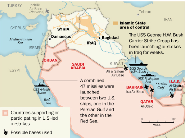
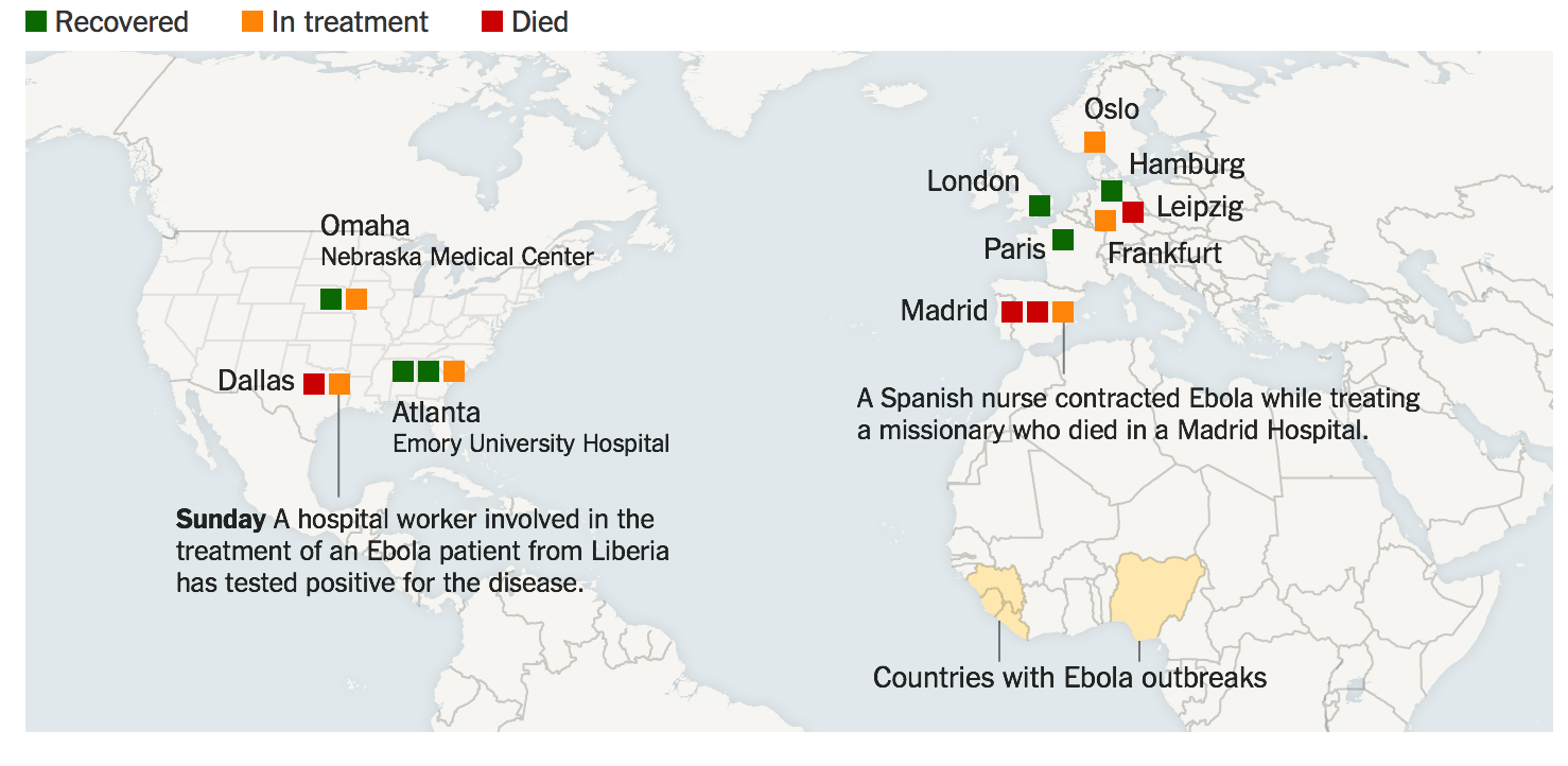
Maps offer a unique tool to display the relation of power to territories, and the use of a magnified map of Syrian airstrikes performed a useful function in the news conference of Defense Department Spokesman Rear Admiral John Kirby.  “We hit them [in airstrikes] last night out of a concern that they were getting close to an execution date of some of the plans that we have seen,” said Attorney General Eric Holder–whose tenure at the Department of Justice must have been more consumed by approving surveillance activities than he had expected–on the eve of his resignation from the Obama Administration.  Using such a circumlocution was tellingly (if not intentionally) obfuscating, in ways that may acknowledge the prominent role of the Department of Defense in the decision to launch such airstrikes.  For the Attorney General–whose tenure at the Department of Justice now seems more consumed by approving surveillance activities than he ever expected–boasted about successfully delivering a round of airstrikes of Tomahawk missiles into Syria.

The map’s finality effectlivly obscured the problematic legal status of launching the airstrikes.  Holder omitted that planes fired into Syrian territory on September 23 was not only mapped in the image issued by the Department of Defense, and explained by its spokesman, Rear Admiral John Kirby, against strongholds of the new enemy to the Homeland identified as the “Khorasan Group,” but defined the legitimacy of airstrikes that had expanded the fight against ISIS to a new enemy.  “I think it’s absolutely safe to say [the group’s plots have been] disrupted,” Chairman of the Joint Chiefs of Staff Gen. Martin Dempsey noted, although he kept alive the justification for future strikes by adding that “their aspiration to conduct attacks in Europe and the United States and elsewhere in the region remains an aspiration.”

The Khorasan Group have yet to make themselves known or confirm their very own existence.  Rear Admiral Kirby described how the attack had disrupted “imminent attack plotting against the United States and Western interests” from the very  “training camps” and “bomb-making facilities,” destroying a “safe haven” they secured in Syria to develop the very sort of external attacks with which ISIS has not been identified and had even distanced its principal goals.  But the existence of “bomb-making facilities,” almost designed to trigger fears in the American public, keying in as they do to a narrative of terrorist attacks against the Homeland, provided a rationale for extending the airstrikes campaign into Syrian territory in order to eliminate the threat that the Khorasan Group posed.  The dangers that were posed by the group against whom the attacks had been directed, according to US Central Command, justified expanding the war that intended to “degrade” ISIS to a broader fight to protect national interests.  The situation maps Kirby showed also mask both the failure to seek broader Congressional authorization for the strikes and the potentially disastrous long-term consequences of continuing such attacks and targeting  sites that involved untold civilian casualties.  Although the map did their best to isolate the targets for these strikes, they illustrated both the pronounced geographic and cultural remove of Department of Defense decision-making, as well as the costs of staging these attacks from aircraft carriers in the Red Sea or Persian Gulf.

Mapping the airstrikes served several functions, ranging from putting the unknown Khorasan Group on the map to lending legitimacy to incursions into Syrian airspace, without Congressional approval or UN support.  Indeed, the flatly declarative map  advanced arguments about the just nature of the war against the “Khorasan Group” by American forces, even if few had heard of the Group only days before.  With the crude map, the presence of sites of danger suddenly assumed concrete locations and had already been vanquished:  eight “Khorasan sites” according to anonymous sources, were hit by Tomahawk Cruise Missiles launched from ships or submarines in the nearby Red Sea and F-22 Raptor stealth aircraft and Predator or Reaper drones, as if those same sites of training camps where alleged threats against the Homeland were being planned did not lie in Syrian territory or the attacks against them did not violate Syrian airspace.  Rear Admiral Kirby, the Department of Defense spokesperson, bluntly summarized the results of the airstrikes with the satisfied resolve of self-justification:  “We certainly believe that we hit what we were aiming at.”

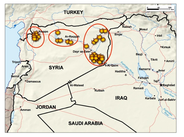
The map before which he spoke at the DoD news conference suggests more targets, but show eight yellow bursts west of the embattled city of Aleppo, where the Khorasan Group is said to be based, close to the border with Turkey.  The strikingly cartoonish map signs that designate targets of airstrikes are akin to explosive bursts as if taken from an outdated video game that suddenly seem the centers of attention in an opaque landscape, which is so different from the recent maps we have seen of an expanding Islamic State–the alleged focus of earlier airstrikes across the region.  And rather than display the movement of arriving airstrikes, moreover, the explosions ringed with orange suggest an ability to attack across the country.

e3358c4b-8dea-4a20-a5fd-e68024fba8bd-620x461.

6d9da11c-b97a-4a58-9b52-a3ae00ba2c11-620x414


Such situation maps immediately circulated on the nightly news and online alike, in a remarkable instance of a single map that has been adopted wholesale to explain and describe the airstrikes effectiveness against targets.  Attorney General Holder’s odd obfuscations seemed desperate attempts to justify the bombing of select Syrian sites, and broader justifications that claimed the airstrikes were performed “out of concerns that they were getting close to” attacks.  This affirms claims that the bombings were needed to stop “imminent” attacks on the “homeland” of the United States, in ways that evoked 9/11–although “imminent attack plotting” was newly qualified in Orwellian Newspeak when intelligence identified plans as “in an advanced stage,” albeit without known targets or actual attacks suspected or needing to be feared.  (The discussion of these bombing strikes from planes and ships conspicuously did not include acknowledging possible civilian deaths or casualties–and neither did  President Obama’s speech to the nation–as civilian casualties reported by the Syrian Observatory for Human Rights including at least 300.)

The signs designating hit targets, akin to dated video games, but seemed, placed on a map, to affirm the remove at which Pentagon mappers of the scene of battle, as if to designate the complete obliteration of a place without civilian casualties:


1252081103943

exgen3

1368984-9


What were these targets they took out, and how immanent was their threat?  The maps issued by the Department of Defense did the difficult work of parsing a national incursion aimed at cells lying within a country but is not part of it, in what seems a new triumph of the logic of a war on terror that knows no bounds.  With “US-only strikes against the Khorasan group” sent into Syrian airspace beside an unspecified number of other international pilots to perform over 200 strikes on a dozen targets, they gave legitimacy to the “Khorasan Group”–evocative less of an insurance firm than an Afghan drug cartel traded on the deep web or Silk Road–as being worthy for attack that did not deviate from a mission ostensibly directed against the expansion of the Islamic State.  Indeed, while the territory that the Islamic State controlled have been so often mapped and re-mapped in recent weeks, the Khorasan Group has suddenly emerged, territory-less, just around September 20, three days before the airstrikes, as “the cell in Syria that may be the most intent on hitting the United States or its installations overseas with a terror attack.”  The maps elevated targets of alleged imminent danger at the same time as apparently wiping them out.

The map persuaded public viewers that our bombing campaign was indeed justified, against the specter of a careful construction of the danger of an immanent “homeland” attack.  The designation of the Khorasan Group was explicit, effective and swift.  Martin Dempsey, Joint Chiefs Chairman, described “imminent attack plotting” as if to compensate for the acknowledgement that, for all its horrors, ISIS did not in itself pose a threat to the United States; Chairman of the Joint Chiefs of Staff William Mayville, a public face for the army, described “The Khorasan group [as] in the final stages of plans to carry out attacks against Western targets and potentially against the US homeland,” although he was loathe to say the effects of strikes definitively degraded or deterred imminent threats to the “West and the homeland.”  The implicit narrative, of course, was of an attack forestalled, and, this time, the eradication of conspirators poised to attempt to hijack another airplane destined for the United States.  The existence of such a super-national entity raised some eyebrows in Syria, as well as in the US-based press; Glenn Greenwald wryly noted how government leaks “after spending weeks promoting ISIS as Worse Than Al Qaeda™, . . .  unveiled a never-before-heard-of group that was Worse Than ISIS™.”

The maps issued by the Department of Defense jumped several steps in logic in order to advance this argument, skipping over questions of international law or powers to declare war.  “Imminent” is a key word by argued the attacks made without Congressional consultation were justified.  They almost represented an interesting illustration of the evolving nature of President Obama’s thoughts on Presidential prerogative.  For the situation map legitimized the prerogative to invade a nation’s sovereign boundaries without Congressional oversight.  If Senator Obama had forcefully argued in 2007 “The President does not have power under the Constitution to unilaterally authorize a military attack in a situation that does not involve stopping an actual or imminent threat to the nation,” holding “military action most successful when it is authorized and supported by the legislative branch,” decisive weight fell on the formulation “imminent threat.”  United States Deputy National Security Advisor Ben Rhodes described the Khorasan Group as holding “very clear and concrete ambitions to launch external operations against the United States or Europe” in ways that justified their inclusion in an already loosely justified attacks on the Islamic State–even if the strikes were clearly removed from the areas under IS control in maps as the below, as if in the hope that this detail would not be noticed.


SYrian Air Strikes

The singling out of this region of attack is a clear expansion from maps of earlier airstrikes that were diffused by Central Command, where bomb-bursts correlated closely with strategic points held by the Islamic State, as if to demonstrate the effectiveness of the response that the United States was asked to contribute in Iraq:

w-CENTCOMstrikes-9-26


The strikes seem planned with the intent to show the ability of the American air force to strike targets in western Syria, even should Turkey not grant them permission to use a nearby air base, as well as to generate a confidence in the US government’s vigilance against terrorist threats.  This alternate configuration of the airstrike map did interesting work by isolating the Khorasan Group as something of a separate entity from other Syrian rebels, worthy of intense attention from American air force.  Although the identity of the Khorasan “Group” was much less clear to most Syrians on the ground, including members of the US-backed Syrian Free Army, among whom some eyebrows were quickly raised about the expansion of the attack; Charles Lister quite damningly questioned the proper nouns as a “label created by officials in the US and has no recognition within Jahbat al-Nusra or al Qaeda circles.”  Indeed, a US official even set the size of the alleged cell as but a few dozen.

The relation of Khorasan Group to the Al-Nusra Front was important for the US to solidify, given that the last folks we should to attack are those aiming to topple Assad.  But the two groups overlap in the eyes of Syrians who watched them at first hand–and speculated as to their danger.  Indeed, since the Al-Nusra Front is dedicated to toppling Assad’s bloody dictatorship in Syria, the attack seems to have deemed important as a means to “take out” an international player in Syria–rather than interfere with Syria’s ongoing  civil war.  In a majestic bit of Orientalist rhetoric, among the “hardened al Qaeda members” killed in the airstrikes was the leader of the al Qaeda-linked Nusra Front, Abu Yousef al-Turki, “also known as ‘The Turk.”’

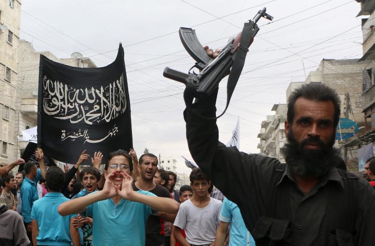
The Khorasan Group were identified as the targets of exclusively US airstrikes indeed do seem to have their own black flag–distinct from that of Jabat al Nusra–that jibe with the evocative hadith from which the name of this “Group” seems to derive:   “If you see the black banners coming from Khorasan, join that army, even if you have to crawl over ice; no power will be able to stop them. And they will finally reach Baitul Maqdis [Jerusalem], where they will erect their flags.”

khorasan-flag

We were familiar with the terrifying mobilizing force of the closely similar flag of the Al-Nusra front, although it lacks scimitars as the Khorasan flag:

image-456128740


Although the Group may only number several dozen folks, the possibly organization was itself persuasively mapped to 9/11.  The Khorasan Group™ were tied to a bomb-maker in Yemen, responsible for terrorist explosives that have been found on air flights, providing grounds for aims beyond the Syrian and Iraqi fronts–apparent validation of their association with Homeland threats to “U.S. aviation”–as if U.S. aviation has come to constitute a threat worthy of defense or surrogate for globalization. “Khorasan members come from Pakistan,” explained former CIA director Mike Morrell on televisions news programs, and “focus on attacks in the West” and even fixate on the aviation industry itself “as a symbol of the West.”  The argument did not go over well in Syria, but played well in the Homeland, where many Khorasan members have been tied to to al Qaeda’s branch in Yemen, AQAP, including al Qaeda’s bomb-builder Ibrahim al-Asiri, of underwear bomber fame and to Musin al-Fadhli, an al-Qaeda insider who knew of plans for the 9/11 attacks, further justifying links to Homeland threats–rather than understanding their actual agendas in Syria.)

The logic of bombs fit closely into the rationale that lent the airstrikes legitimacy.  President Obama explained the parallel ongoing strikes against areas occupied by ISIS, not themselves controlled by Assad, but his opponents, as giving Syrians a choice “in side of Syria other than between ISIL and Assad,” but found it justified to initiate the bombing without Congressional authority as Commander in Chief.  The naming of a precise region in Syria bequeathed a more concrete logic for bombing by mapping a site that became a safe land for “a mix of hardened jihadi from Afghanistan, Yemen, Syria and Europe,” according to unnamed US officials, which by this past September 13 was identified as posing a greater danger to the US than ISIS itself–the original target of attacks, undertaken at the alleged request of an Iraqi state in need of defense from internal dangers.

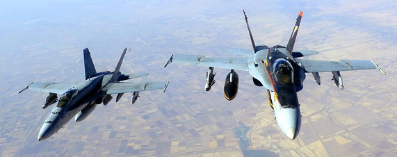
The story led to a rather rehearsed an improvised re-mapping of terror threats–and seems to have followed a search  for how one could possible pinpoint a direct threat to the United States in an area of the Middle East where the Islamic State existed, which could be said to pose concrete threats to American well-being and be seen as lying within the broad rubric “national security” rather than military aggression.  The “cell in Syria” that was “little-known but well-resourced” could pose a direct threat to the US, the Pentagon explained, possessed “training camps, an explosives and munitions production facility, a communications building and command and control facilities.”  Televised graphics suggested the vigilance of F-22 Raptor stealth aircraft overlaying Syria, targeting presumed national enemies:


cbs-article-display-b


The apparent widespread newsleaks that led to clear hyping created a new sense of who we were targeting and why, providing a basis for attacks that did not need Congressional approval, or require more evidence aside from “aspirational” terrorism.  Reporter Ken Dilanian offered the somewhat more “nuanced” take FBI director James Comey offered that “the U.S. did not have precise intelligence about where or when the cell, known as the Khorasan Group, would attempt to strike a Western target,” but that Syria is “a place where we don’t have complete visibility.”  Director Comey offered that the FBI and US government was working with intelligence of “the kind of threat you have to operate under the assumption that it is tomorrow;” in the words of Pentagon spokesperson Kirby, “I don’t think we need to throw up a dossier here to prove that these are bad dudes [italics added].”  Comey backtracked a bit from the “imminent danger” that the bad dudes posed, even as the battle drum had begun.  “I don’t know exactly what that word means,” Comey added when questioned about the dangers’ identified as “imminent,” Dilanian notes quite amazingly.   The group was identified in the media as able to “launch more-coordinated and larger attacks on the West in the style of the 9/11 attacks from 2001,” although by mid-September, or days previous [i.e., earlier] to the strikes, no official pronouncements had yet been made about the Group known as “Khorasan.”

The quite nondescript map of airstrikes unveiled and glossed at the DoD news conference does considerable work to tell a single story about the range of airstrikes US planes made with regional “allies” primarily concerned to communicate the danger Islamicists posed their own states.  The map suggested an intensity of concerted actions, as if all of the airstrikes were directed against a common or single enemy, despite their distinctly separate targets of attack:


screen shot 2014-09-23 at 11.08.47 am.png

The eight strikes convey an odd sense of attacking an uninhabited borderland, which is also the very region where many Syrian refugees have passed on the way to crossing Turkish border:


Graphic


Who are these new folks who our are enemies?  For Thomas Joscelyn, whose The Long War Journal has described the extended war in Iraq and Afghanistan, Khorasan consists of members of “core Al Qaeda” dispatched to Syria by Ayman al Zawahiri, and are embedded in the Al-Nusra Front, but the references of “seasoned al Qaeda operatives in Syria,” provides a new nomenclature of evil by which the US can, as CNN put it, “take the fight to the terrorists” hiding in “safe havens” west of Aleppo which, as Samantha Power put it as if to offer a validation for the ongoing attacks, “The Syrian regime has shown that it cannot and will not confront . . . effectively itself.”  The US-only airstrikes–in which “coalition members” as Jordan, Saudi Arabia, Bahrain, the UAE and Qatar, each eager to address Islamicist threats endangering their own states, were absent–constituted something of the chief area that the US government seems to have wanted Americans to watch.  But the low quality of the DoD map–and absence from it of a layover showing the Islamic State’s regional presence, or terrain–evokes a Google Maps base-map and image, designed less for informational value than to illustrate the clustering of American airpower west of Aleppo–outside regions held by the Islamic State.


SYrian Air Strikes


The ill-defined maps on most new services were strikingly opaque and stripped of local detail, especially for showing such a frequently mapped area of strategic importance to the world.  For they elicited minimal interest in the area or region where the airstrikes occurred, almost disembodied from thickly traced lines marking a sense of territoriality which most folks who have been following the news realize are increasingly of questionable value as points of actual reference or political orientation, but are presumably on the rather minimal base-maps afforded by Google Maps.

e3358c4b-8dea-4a20-a5fd-e68024fba8bd-620x461

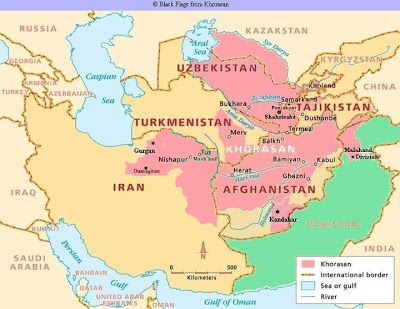
The concreteness implied by the use of this new proper name for a seemingly small group of individuals evokes a land “of the rising sun,” oddly quite similar to the Levant, but invested with tones of violence by the hadith of classical Islamic teachings that describes an army worth joining “even if you have to crawl over ice.”  The pre-Islamic area of Khorasan from the 5th century A.D. till the second half of the 19th century A.D. is no real help–but seems to bring us back to Afghanistan and the AfPak problem of old.  Despite much of the skepticism about how a group “suddenly went from anonymity to the ‘imminent threat’ that became the [compelling] rationale for a emergency air war” coming from the right, who mockingly distinguished “core al-Qaeda” from “al-Qaeda in Iraq” or the “Islamic State” that was formerly “al Qaeda in Iraq and al-Sham,” itself unlike “al-Qaeda in the Islamic Maghreb,” charging Obama with a strategy of “miniaturizing” a problem rooted in the reading of Islamic scriptures that drives Sharia suprematism and the deception perpetrated by a misguidedly Islamophilic President, according to former terrorism federal prosecutor Andrew McCarthy in the National Review; Glenn Greenwald and Murtaza Hussain offer a parallel critique of how news feeds from Washington have incrementally but steadily perpetuated the myth of a deadly Khorasan splinter aimed at attacking America through hijacked planes, feeding legal justification for bombing Syria to a national press ready to recycle with appropriate graphics for broadcast on Nightly News.

The attacks did not hit the “Khorasan Group” seem rather transparently about a form of “degrading” that had little to do with the organization of the Islamic State.  Multiple news graphics on nightly television focussed on targeting of makeshift oil refineries that have financed the Islamic State’s revenues upwards of $3 million/day from oil smuggled out from eleven fields under their control–refineries that our “partners” were eager to help destroy–as if this somehow lessened the danger of collateral damages of airstrikes by legitimizing their targets.  Yet despite the preemption of an ability to “degrade” what is now the richest terrorist organization in the world, existing investment in institutions and bureaucracies that uphold and strengthen Sharia law and governance and an efficient financial network will simply not be able to be destroyed through use of airstrikes alone.

refineriesAssociated Press Interactive

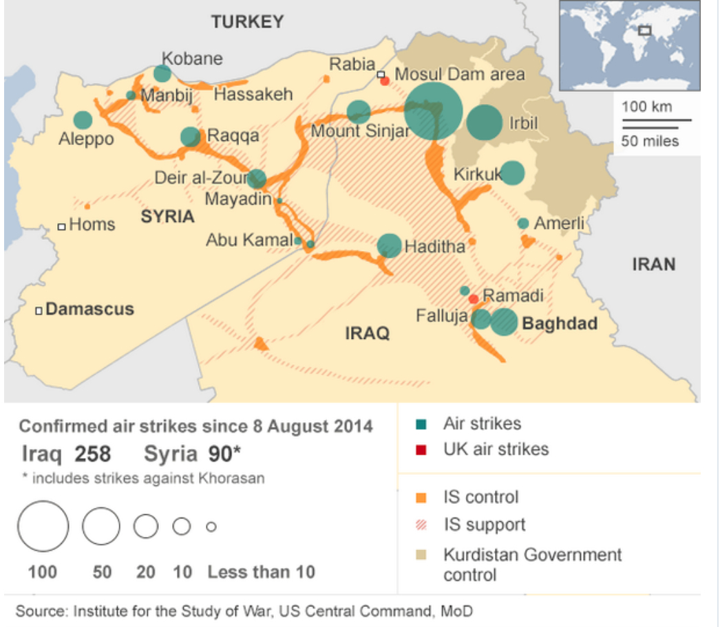
A collapsed map of the extent of “allied” airstrikes over the region tragically reveals, however, the intensity with which the area has continued to be pounded from the skies by manned or unmanned flights already for a series of months, in what can almost be mapped as an extended war of nerves.

Airstrikes Map


The Department of Defence situation maps that described the bombing of the Khorasan Group west of Aleppo served, in reference to a mythic land or region, to embody the enemy in a new way, giving them a redolent name–even if one not actually apparent on the several situation maps so conspicuously displayed, by evoking a group which once constituted a region, or territory, until the late nineteenth century ruled by the “Khorasan” Kings.  Although the term that jihadists used to refer to folks from that area in the world–described by the West as “embedded” in the Al-Nusra Front–suggests a recycling of the toponym perhaps helps suggest a site of mythic struggle for US airplanes to attack, as if to deflect the question that we are not attacking Syria’s sovereign lands without Congressional authorization, if only since the Group seemed to arrive from a different territory.


Khurasan_Ancient_Boundaries_-_Kurasan_e_Buzurg_or_Greater_Khurasan


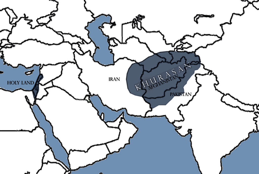
The Khorosan region perhaps gains its very nefariousness since it is not a state, but its statelessness manages to overlap with a region of danger, but itself to possess even more terrifying but less recognizably coherent bounds than the Islamic State–and as if the association of the name with the region of Afghanistan communicated its credibility as a national threat.  (The very fact that Jihadists are themselves widely known to refer to anyone who comes from the geographic area as “Khorasan” raises questions about the integrity or identity of an actual fully-fledged “Group.”)


kho

The name inspires terror, indeed, as, while never used to name the interests of a purported Al-Qaeda cel, it is implicitly linked to the threat of redrawing the map of the Mideast in an imaginary optative geography in which the current group of US allies would no longer exist:

Khurasan


Few would be likely to consult early nineteenth-century printed maps to locate the Khorasan Group or follow the rapidly evolving news, but a simple search would have led to a region suspiciously near to Afghanistan, and not a disembodied “Group” that the Director of National Intelligence James Clapper suggested, when he warned on September 13 with  administration sources of “veteran al-Qaeda fighters . . . who travelled to Syria to link up with the al-Qaeda affiliate there, the Nusra Front,” going so far as to admonish the public that “in terms of threat to the homeland, Khorasan may pose as much of a danger as the Islamic State.”

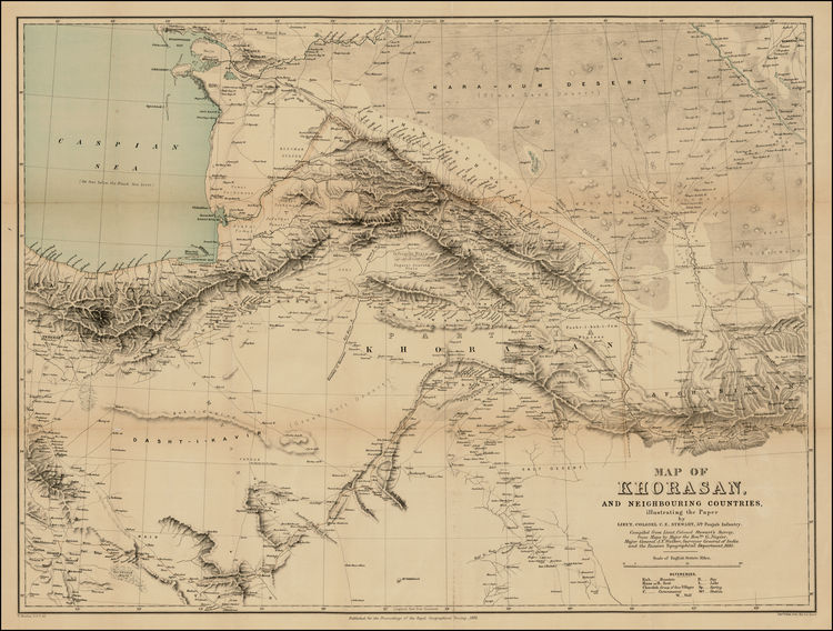
As the thinly informative airstrike maps made their circle on the news circuit, embodying the threat of the Khorasan Group as if it had migrated from Central Asia to west of Aleppo, instead of lying in Syrian “safe-havens,” that constituted a “serious threat to our peace and security” as if they offered grounds that the airstrikes constituted a means “to defend our country.”  The striking thin-ness of the map of airstrikes contrast to even the far greater local detail with which Khorasan was embodied as a region in this 1881 map “Khorasan and Neighboring Countries,” whose topography was delineated with lavish local detail by Lieut. Colonel C.E. Stewart:  if Stewart attempted to concretely render the region, the danger of the “Group” lies in its ability to move, hidden, under the radar as it accomplishes underground and illegal acts of terror both outside and against the recognized group of nations.


29426Wikipedia


Rather than map the lay of the land or encourage interest in its inhabitants, the maps used in news conferences and that migrated to news shows are dense graphics that limit their content to the view from the Pentagon.  It bears remembering that the stories that our current strategic maps tell are far more limited, and seem designed to display far less curiosity about who are the inhabitants of these lands; they go so far as to embody them far less concretely, displaying the overlays of boundary lines between nation-states in thick black lines, as if to create the somewhat outdated illusion that sovereign states of Syria and Iraq still exist in what seems a staging area for war.  The maps situate the location of the strikes against the Khorasan Group–which somehow seems improbably hit without civilian casualties–in the far left cluster of explosions sent by American planes based in the Persian Gulf and Red Sea, using symbols that recall the medium of an old arcade video game so clearly that one is tempted to take the thin view of history they offer as their message–in a radically flattened view of the complexity of ongoing conflicts between Syrian opposition, ISIS, Iraqi troops, and Islamist movements.  What, the message of the graphic seems, else do we need to know?

e3358c4b-8dea-4a20-a5fd-e68024fba8bd-620x461

aleppo and raqqa


Where they are located perhaps seems less the point anyway, since they have been “taken out.”

What seems less widely mapped is the extent to which the folks we are attacking are already surrounded, and we sought to display how even an area near the Turkish border–where the United States has an Air Force Base, but from which the Turkish government would not allow United States planes to fly or missiles launched into Syria–but also lying at much remove from what we have mapped as the expanse controlled by the Islamic State as of September 23, 2104.  It allowed us to defend American interests at the same time as we continued to “degrade” the Islamic State from military bases that lie to the South, as both “allies” like Kuwait, Saudi Arabia, Qatar and Jordan allowed their airspace to be used, at significant cost.


US Allies in the RegionWashington Post, September 23 2014

ISIS Sept 23 map

0923-airstrikes-ai2html-600U.S. Defense Department; Institute for the Study of War; September 23

Coolition Airstrikes
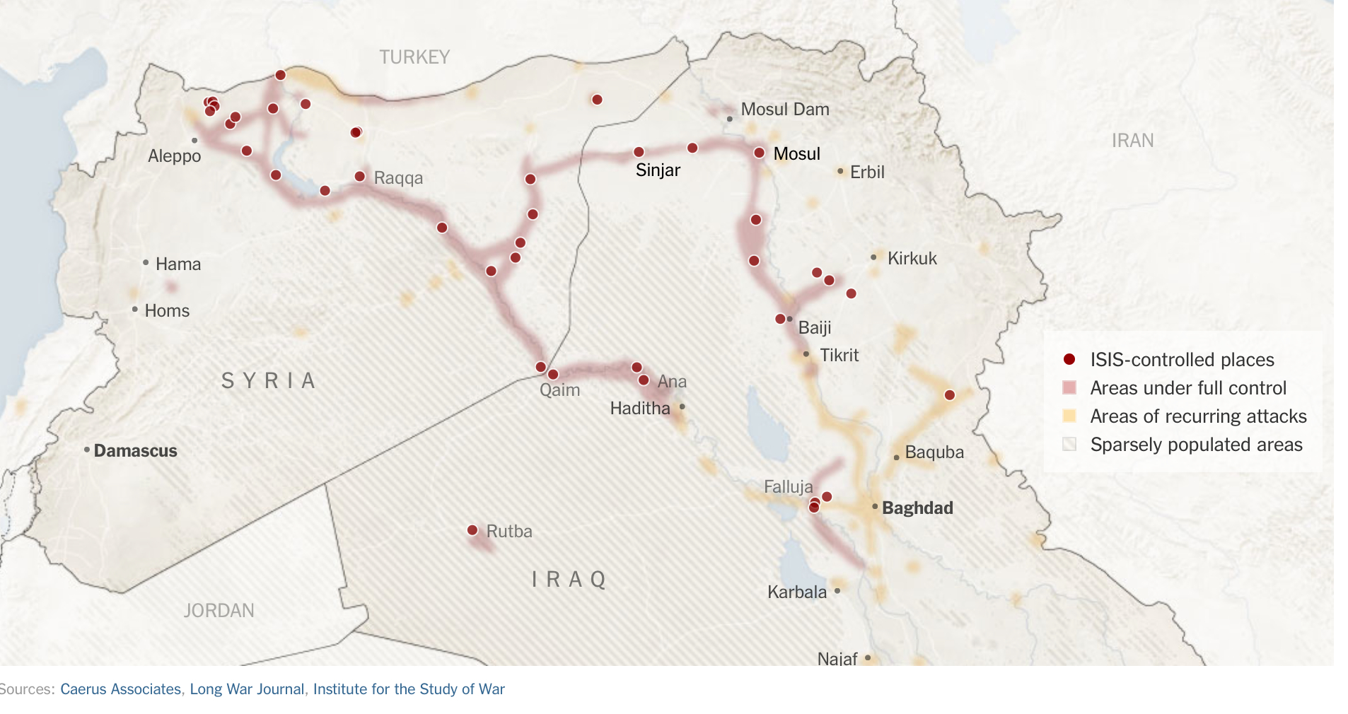
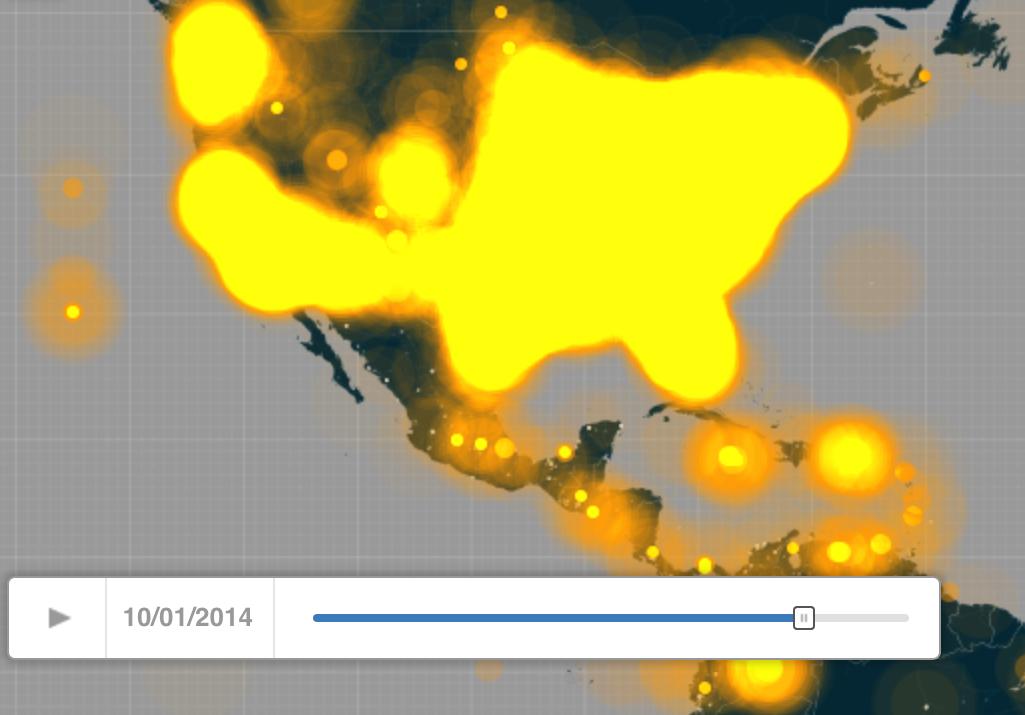
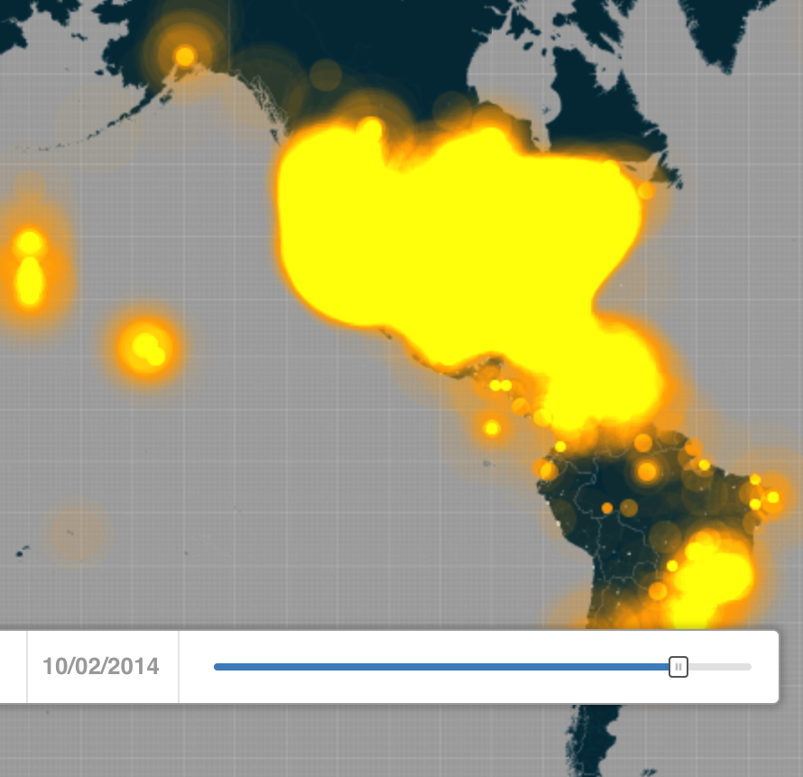
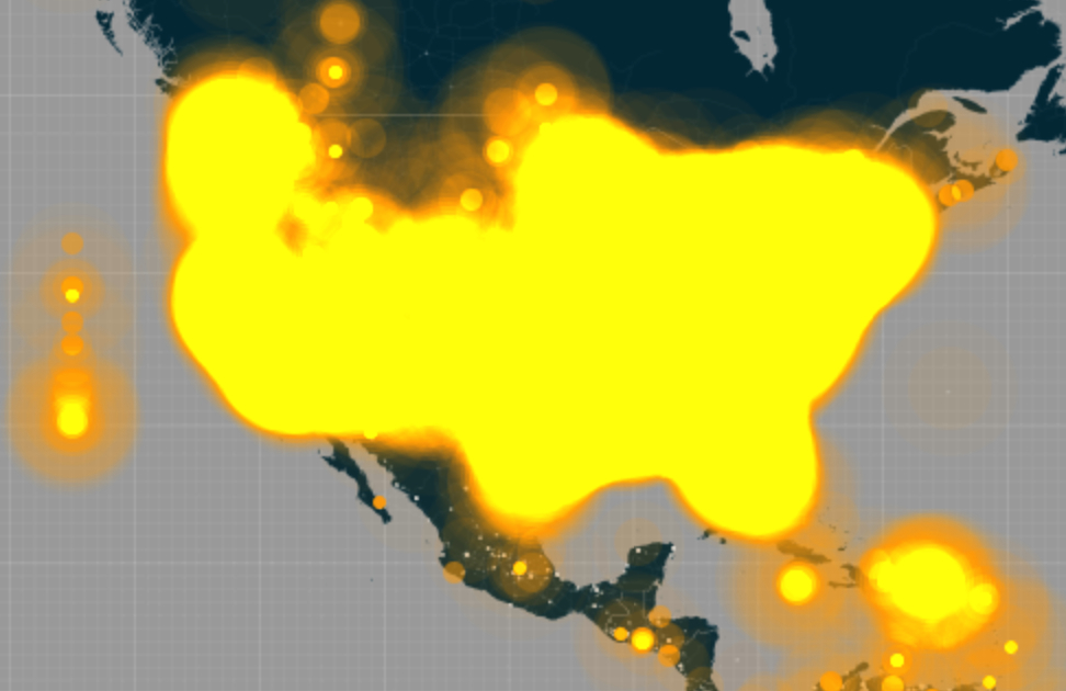
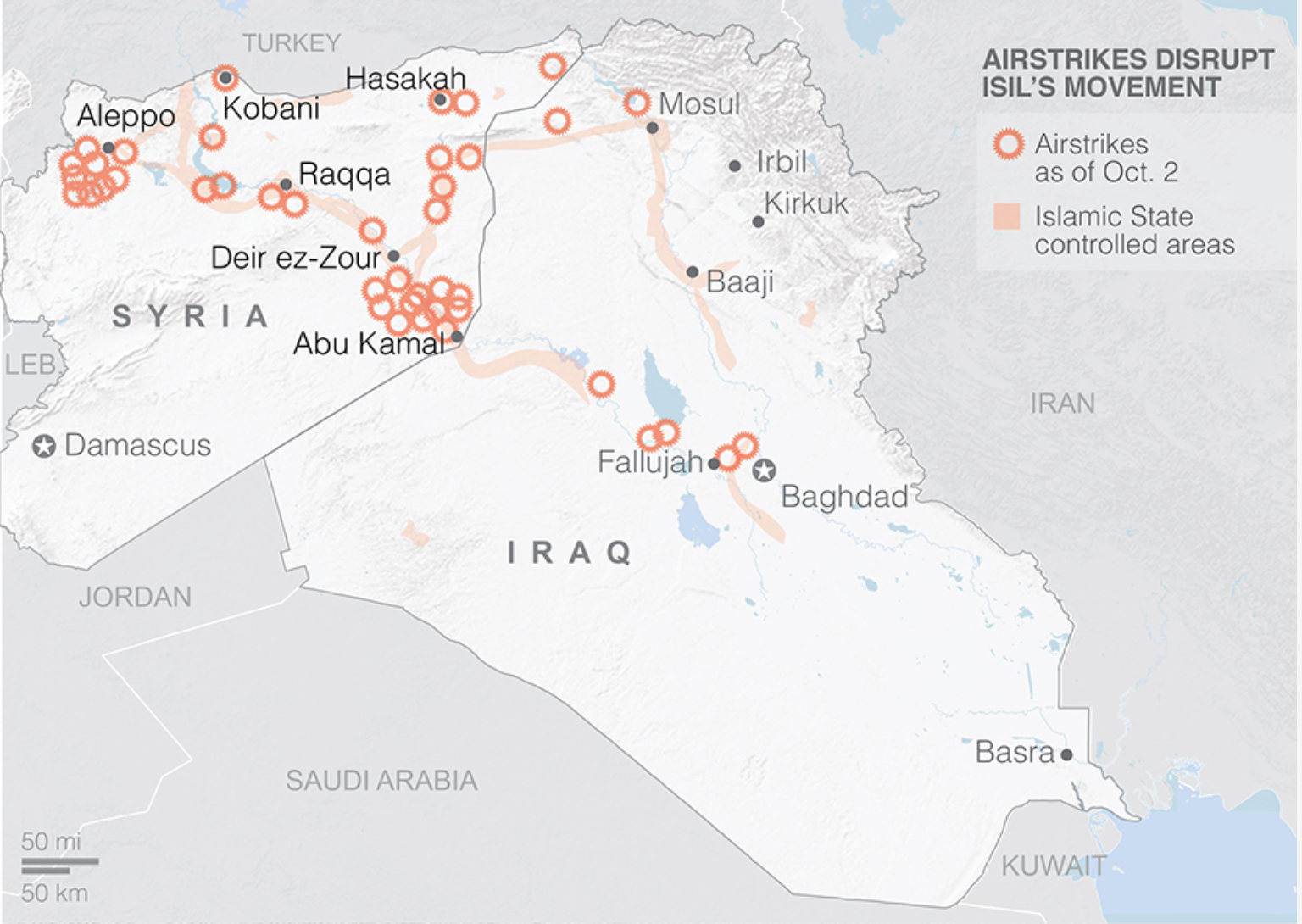
AP Interactive; October 2

BN-EW313_Airpla_F_20141006120849Agence France-Presse/Getty Images


The extreme short-term benefits the Department of Defense claimed for the airstrikes –allegedly stopping planned attacks on the United States–may have unplanned consequence of creating deeper ties between the rebels, Islamic State and Al Qaeda, and cast the US as a protector of Assad.

Syrian reactions to airstrikes have not been mapped sufficiently or in detail.  But unannounced strikes extending beyond attacks on ISIS both raised suspicions about US priorities and intents and suggested an unwarranted deflection of attacking the Islamic State among groups who long hoped that the very same airstrikes would be launched at Assad’s forces, and not at an organization not known to Syrians, who deemed it a creation of the US government and false screen for giving cover to Assad’s government troops to advance.  With houses destroyed, numbers of refugees increasing, and women and children injured in targeted marketplaces in Aleppo, according to the Syrian Observatory for Human Rights, local desperation has grown in direct reaction to foreign interference.  Despite claims the US has a comprehensive strategy to defeat the Islamic State, the attacks seem short-sighted in encouraging the very conditions to encourage the spread of extremism, local instability, distrust, and the isolation of local forces, both breeding insecurity and hurting a crumbling infrastructure.  The reclusive leader of the Al-Nusra Front, Abu Mohammed Jolani, previously presumed dead, foretold the eruption of a “volcano” against the US and its allies would be the consequence of the attacks, and argued that the airstrikes were leaving Aleppo vulnerable to government forces.  “Short-termism” sadly afflicts the strikes whose results extend far beyond the assassination of Al-Nusra frton leader Abu Yousef al-Turki.  Meanwhile, ISIS advanced within shooting range of Baghdad.

The spread of protests across the country against US-led airstrikes raise questions about what their long-term strategic value really was, aside from leading many to question whether western help would ever arrive.  (Questions about the precise accomplishments of the strikes seem deflected by Pentagon spokesmen.)  Protests against the airstrikes are poorly mapped, but seem to have grown from Islamic State strongholds like Raqqa to cities held by the rebel alliance in Idlib province, as Maaret el Numan, or centers of the Free Syrian Army like Talbiseh, near Lebanon, as well as some forty other towns including Homs and Aleppo–some bearing signs such as “The International Alliance Kills Civilians.”


WO-AT876_SYRPRO_G_20140926180820Reuters


For the strikes indeed confirmed deep suspicions that official US policy is less concerned with ending Assad’s dictatorship, lent credence both by the public statements from Assad’s foreign minister that the Assad regime was “OK” with such airstrikes, which implied a collusion between Americans and the Assad regime; the occurrence of the first airstrikes to enter Syrian territory without any coordination with rebel groups to whom they might have offered strategic value seems to have sidestepped any support from the Syrian Free Army or its allies.  For Americans find themselves in the intensely awkward position of relying on the OK of the Assad regime to “downgrade” or attack ISIS in Syria.  The strikes seemed to realize fears and distrust about whose interests the United States wants to serve:  Rami abdul Rahman, head of the Syrian Observatory for Human Rights alleges that the airstrikes illustrate the start of “a phase of targeting civilians under the excuse of targeting the Islamic State.”  In a region where the claim “We kiss the hand that holds the trigger against Assad” is common, it is hard to know how bombings undertaken with the Assad regime’s OK would be seen as constructive.  The bombings may have provoked a rise in Syrians declaring allegiance to the Islamic State.

la-apphoto-mideast-syria-jpg-20140929
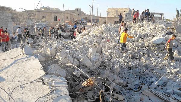
Idlib News Network:  Syrians examining the ruins of a house allegedly targeted by airstrikes in Kfar Derian, a center for Nusra Front opposition


We might remember that most all maps posted above derived from a map that really was carefully staged as a screen, which obscured far more that it revealed.


Up There

3 Comments

Filed under Al Qaeda, human rights, Islamic State, Mapping Terror, Maps and Politics, Syrian Civil War