In an age it is disturbingly familiar for news maps to place us on tenterhooks by grabbing our attention, the existential urgency of the blanket of the continent with icy arctic air was no exception. But if the images of sudden entrance of frigid air shocked most states in the union and lower forty eight, the farther one collapsed the week of freezing cold, the more one could see a clarion call for the re-entrance into the Paris Accords. It was as if NOAA visualizers of meteorological disturbances, newly liberated, were free to show the dangerous consequences of the tippy polar vortex and uncertain weather in an era of extreme climate change. Bright color ramps foregrounded falling temps in rich magenta or icy blue were almost off the charts, from the uppermost end of the spectrum in their duration–below–or in the low temperatures that were advanced–in maps that push the boundaries of expectations with urgency.
As maps of the hours the nation was plunged into subzero trace a purple cold front advanced all the way into the deep south as it spread across the continent from up north, the continent shivered under the icy blues over the mid-February cold spell. As we re-enter global climate accords, and consider what global accords can come to terms with climate change, it seems opportune to consider the alerts that remotely sensed mappings of our changing global climate chart. The chromatic intensity jarred with the familiar spectrum of meteorological maps to shock the viewer: the map challenged any reader to try to place the arrival of cold air and hours below freezing in a frame of reference, to dismiss the incursion of icy air up to the US-Mexico border as an irregular occurrence, more than a harbinger of premonition of the cascading effects of extreme weather, let alone a warning of the limits of our national infrastructure to adjust to it.
If the focus of the NOAA maps of the National Weather Service fulfilled their mandate by focussing on the territoriality of the United States, these images and the news maps made of them communicated a sense of national violation, if not of the injustice of the incursion of such unexpected freezing temperatures and Arctic air, as if it were an unplanned invasion of the lifestyle, expectations, energy policy, and even of the electric grid of the United States, oddly affirming the American exceptionalism of the United States’ territory and climate, as if the meteorological maps that confounded predictions were not a global climactic change.
And in the maps of the fall in national temperatures, as in the header to this post, the news that the nation witnessed a frozen core spread south to the southwest, almost reaching the border, seemed to shift our eyes from a border that was mapped and remapped as permeable to migration, to a map of unpreparedness for climate change, almost echoing the systemic denial of climate change that has been a virtual pillar of the Trump Presidency on the eve when Donald Trump had permanently relocated to Mar a Lago, one of the last areas of the nation that was not hit by the subzero temperature anomalies that spread across north Texas, Oklahoma, Kansas, Missouri, New Mexico and Iowa, plunging the many states we though of as “red” during the past election an icy deep blue interior in mid-February down to the Gulf Coast–as if the colors were a national crisis not of our own making for a nation that had obsequiously voted Republican, withdrawn from the Paris Accords, and allowed the warmer temperatures to be located only in the state where Donald Trump was now residing in Mar a Lago.
–that , as the week of arctic air’s arrival wore on, the newspaper of record glossed by a color ramp of low temperatures few residents southern states expected to be plunged into subzero surroundings. The color ramp they chose to chart how gelid air poured set off a cascade of events and disasters nicely demonstrated cascading effects of climate change on the nation, as the shock of low temperatures sucked the national attention away from the border, and begged one to come to terms with the challenge of climate emergencies in global terms. The frozen core of the nation was a wake-up call, re-re-rendering the familiar Red, White and Blue in faded out terms of the distorted levels of cold the nation currently confronts–the increased escalation of which we are projected to face.
The entrance of gelid air from a polar vortex poured across much of the midwest in unrelenting fashion. Plunging subzero temps hit the Texas coast that overloaded electric grids and shocked weather maps that seemed out of whack even for mid-February, as even the sunbelt of the southwest turned gelid cold as subzero temperatures arrived over a week, plunging the arctic neckline down into Texas, and almost across the southwestern border.
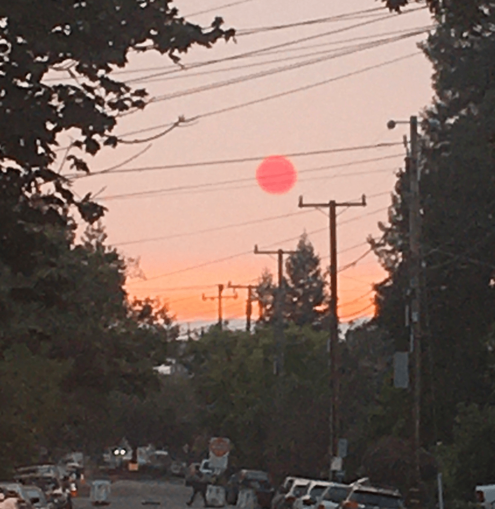
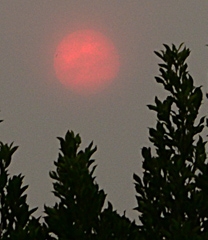
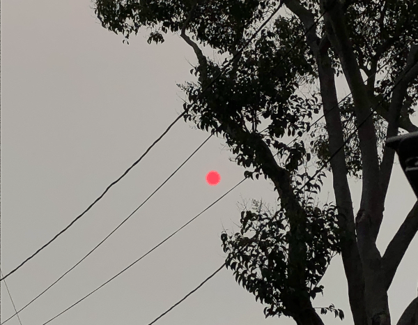
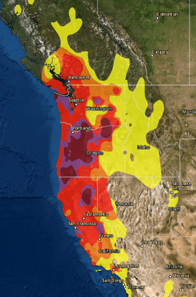
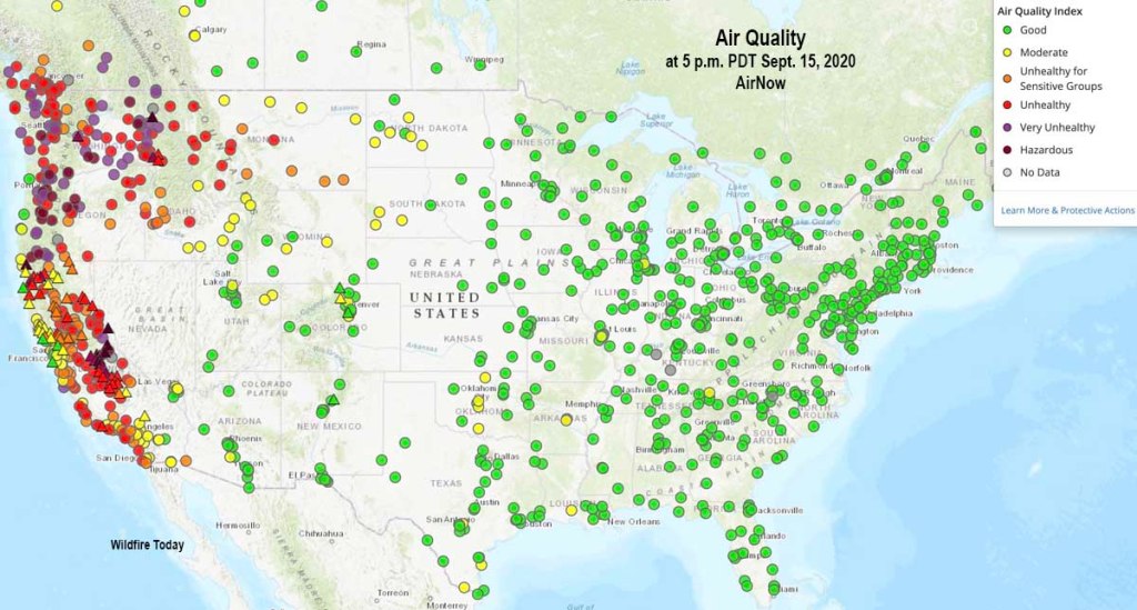
The tracking of local air quality this Fire Season both documents the atmospheric effects of a fire siege of 2020 and provides an eerily contemporaneous way to track the spread of particulate matter from clusters of fires across the western seaboard to be ignited at the end of a long, dry summer in late August. We were not really struck unawares by the dry lightning, but had left forests languishing, not beneath electricity lines–as last year, around this time–but under a hot sun, and high temperatures that we hardly registered as changing the ecosystem and forest floor. This year, the sun turning red like a traffic light in the middle of the afternoon, we were forced to assess the air quality as the blue sky was filled with black carbon plumes that left a grittiness in our eyes as well as in the skies.
October 1, 2020
Confronted with a red sun through pyrocumulus haze, we followed real-time surveys of air quality with renewed attentiveness as an orange pyrocumulus clouds blanketed usually blue skies of the Bay Area, obscuring the sun’s light, suffusing the atmosphere with a weirdly apocalyptic muted light, that were hardly only incidental casualties of the raging fires that destroyed houses, property, and natural habitat–for they revealed the lack of sustainability of our warming global environment.
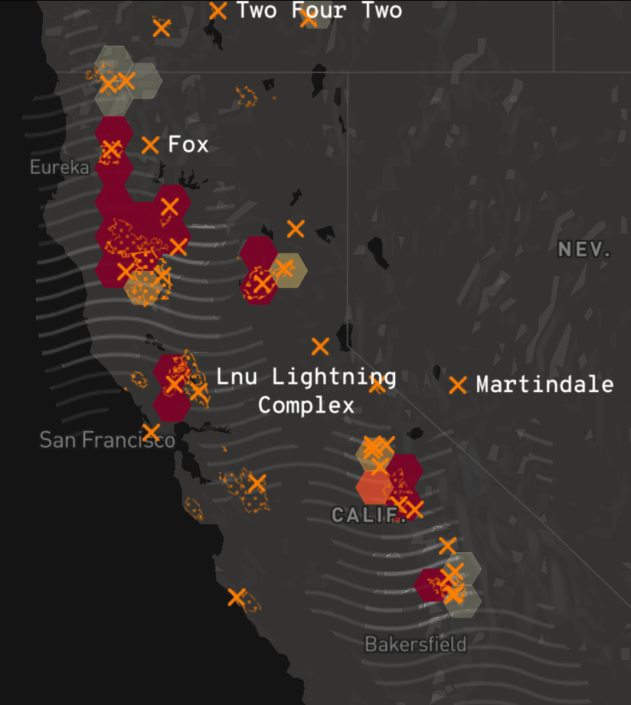
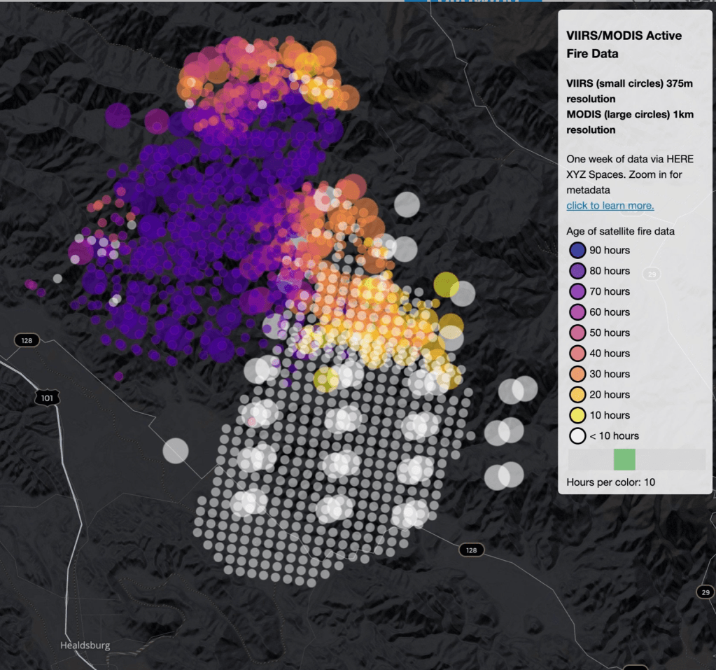
The soot and fog that permeated “clean cities” like Portland and San Francisco came as a sudden spike in relation to the black carbon loads that rose in plumes from the fires, as if the payload of the first bombs set by climate change. The shifting demand for information that evolved as we sought better bearings in the new maps of fires that had become a clearly undeniably part of our landscape was reflected in the skill with which the sites of incidence of dry lighting strikes that hit dried out brush and forest floors, the growing perimiters of fires and evacuation zones across the west coast, and the plumes of atmospheric smoke of black carbon that would leave a permanent trace upon the land, liked to the after-effects of holocausts created by atom bombs by Mike Davis. The measurement of wind carrying airborne smoke emerged as a layer of meaning we were beginning to grasp, a ghostly after-effects of the fields of flams that began from sites of lightning hitting the earth in a Mapbox wildfire map of fields of fire across the states, radiating resonant waves akin to earthquake aftershocks, a lamination on hex bins of the fires that seemed a new aspect indicating their presence in the anthropocene.
The suitably charcoal grey base-map of the state integrates approximate origins of fires, fire spread and greatest intensity of hotspots from satellite imagery courtesy Descartes Labs and NOAA, and air pollution data integrates the fires’ spread across our picture of the state. While human reviewed and sourced, the satellite data embodies the ravages of fire across the state in ways echoed by its black charcoal base map, and reflects the need to develop new visual tools to process their devastation.
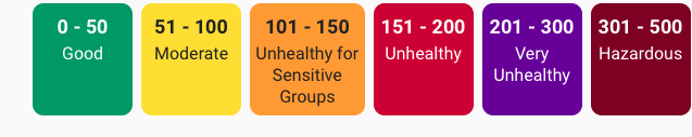
While we began to measure air quality to meet new needs to track ground-level ozone, acid rain, air toxins, and ozone depletion at an atmospheric level, the increased tracking of more common air pollutants since 1990 included airborne particulate matter (PM10 and PM2.5), carbon monoxide (CO), and ozone (O3), we track the effects of wildfire smoke by hourly levels of each at local points, parlaying sensors into newsfeeds as wildfires rage. If stocked with labels of each chromatic layer, are these real-time updates lacking not only legends–but the temporal graph that would clarify the shifting data feeds that lead us to give them the illusion of purchase on the lay of the land we are trying to acknowledge this fire season?
Berekeley, CA October 1, 2020/Clara Brownstein
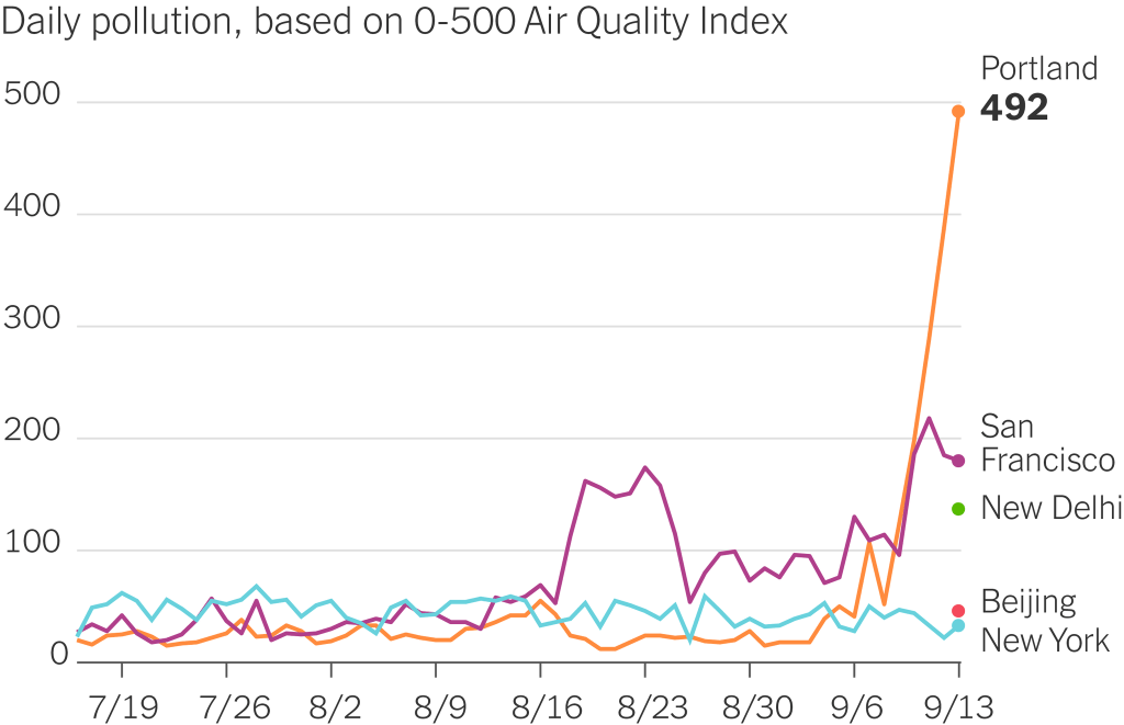
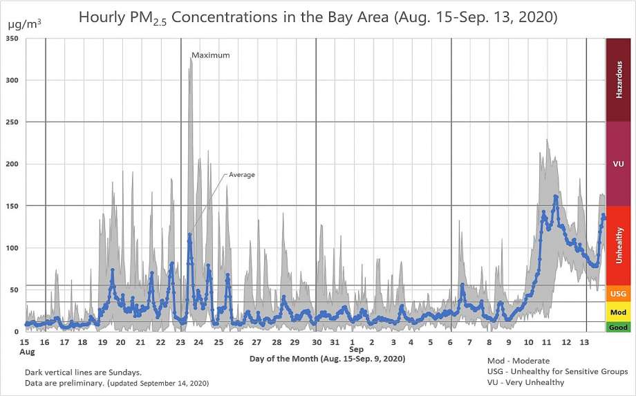
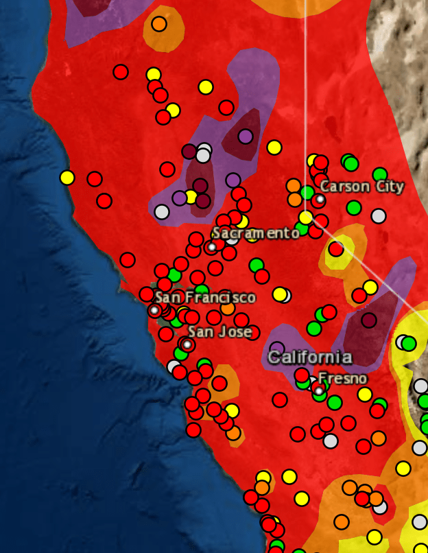
Watching slightly more long-term shifts in quality of air that we breath in the Bay Area, we can see striking spikes of a maximum just after the lighting siege began on August 19, 2020 across much of the state, as air quality decisively entered into a hazardous zone, tracking PPM2.5 concentrations, but entering the worst fifteen air days since registration four times since 1999, when Bay Area Air Quality Management District began reporting the levels of fire smoke in inhabited areas.
Particulate Matter (PM 2.5) Concentrations in Bay Area, August 15-Septmeber 13, 2020/ Bay Area Air Quality Management District
We measure fires by acreage, but the sudden spikes of air quality, while not exceeding the smoke that funneled into the Bay Area during the North Bay Fires in 2017, when the Tubbs and Atlas Fires devastated much of the Wine Country, created a run of high-smoke days, were followed by a set of sudden spikes of the atmospheric presence of particulate matter that we tried to track by isochomes, based on real-time sensor reading, but that emerge in better clarity only in retrospect.
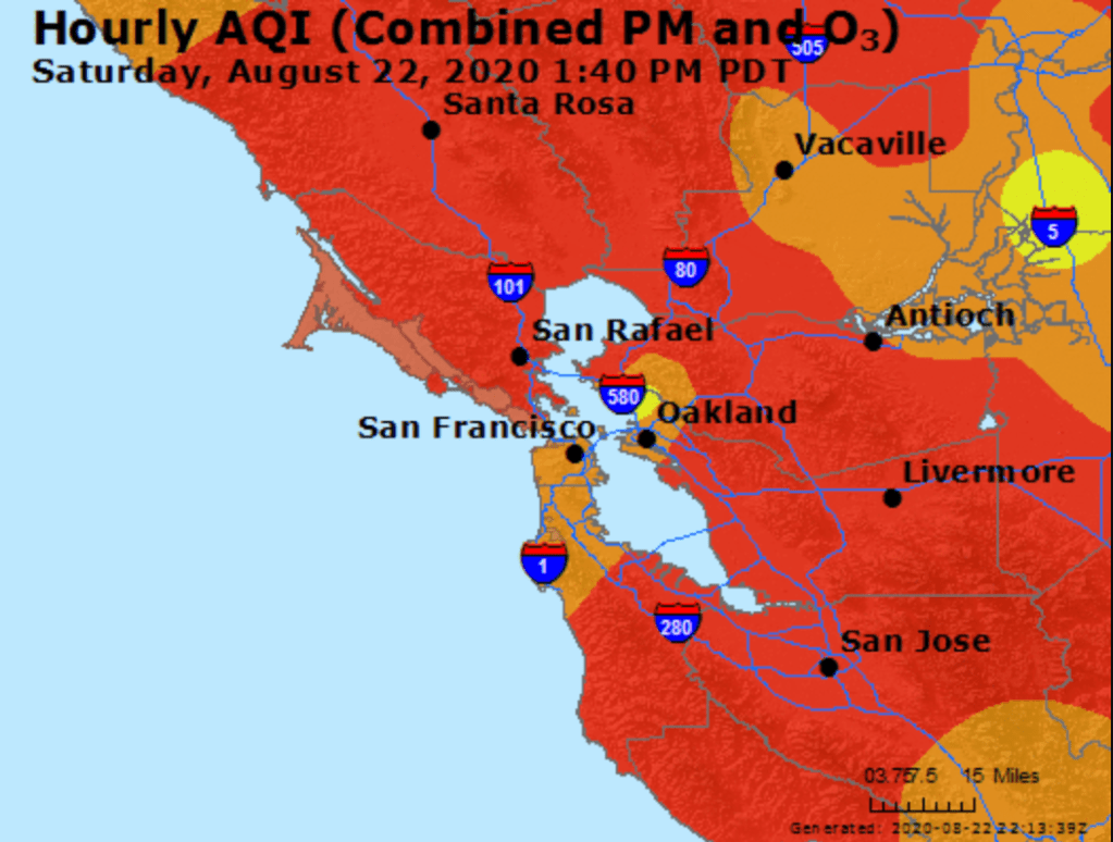
It is true that while the AQI maps that offer snapshots of crisp clarity of unhealthy air might serve as an alarm to close windows, remain indoors, and call off school–
AirNow AQI map in Bay Area after Lightning Fires, August 22, 2020
–as particulate matter spread across the region’s atmosphere. We are used to weather maps and microclimates in the Bay Area, but the real-time map of particulate matter, we immediately feared, did not only describe a condition that would quickly change but marked the start of a fire season.
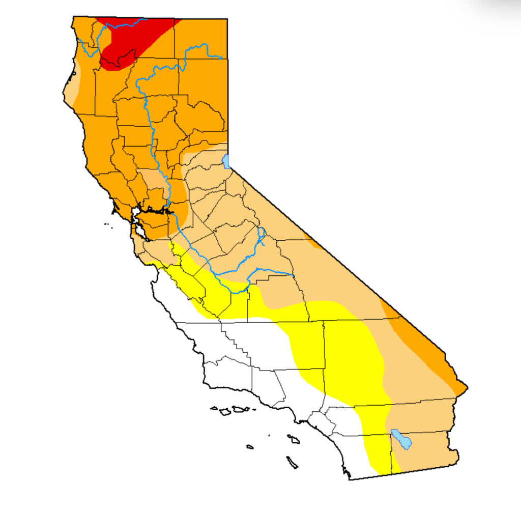
Not only in recent days did the sustained levels of bad air suggest an apocalyptic layer that blanketed out the sun and sky, that made one feel like one was indeed living on another planet where the sun was masked–a sense heightened by the red suns, piercing through grey smoke-cover that had seamlessly combined with fog. Although the new landscapes of these AQI maps generate immediate existential panic, we should be more panicked that while we call these fires wild, they release unprecedented levels of toxins once imagined to be detected as industrial pollutants. The seemingly sudden ways that black carbon soot blanketed the Bay Area, resting on our car hoods, porches, windowsills and garbage bins were not only an instant record of climate emergency, but the recoil of overly dry woods, parched forests and lands as overdue payback for a far drier than normal winter, months and a contracted rainy season that had long ago pushed the entire state into record territory. The lack of soil moisture has brought a huge increase of wildfire risk, not easily following the maps of previous fire history, and persistence of “abnormally dry” conditions across a third of California, focussed in the Sierra and Central Valley–the areas whose forests’ fuel loads arrive carbonized in particulate form.
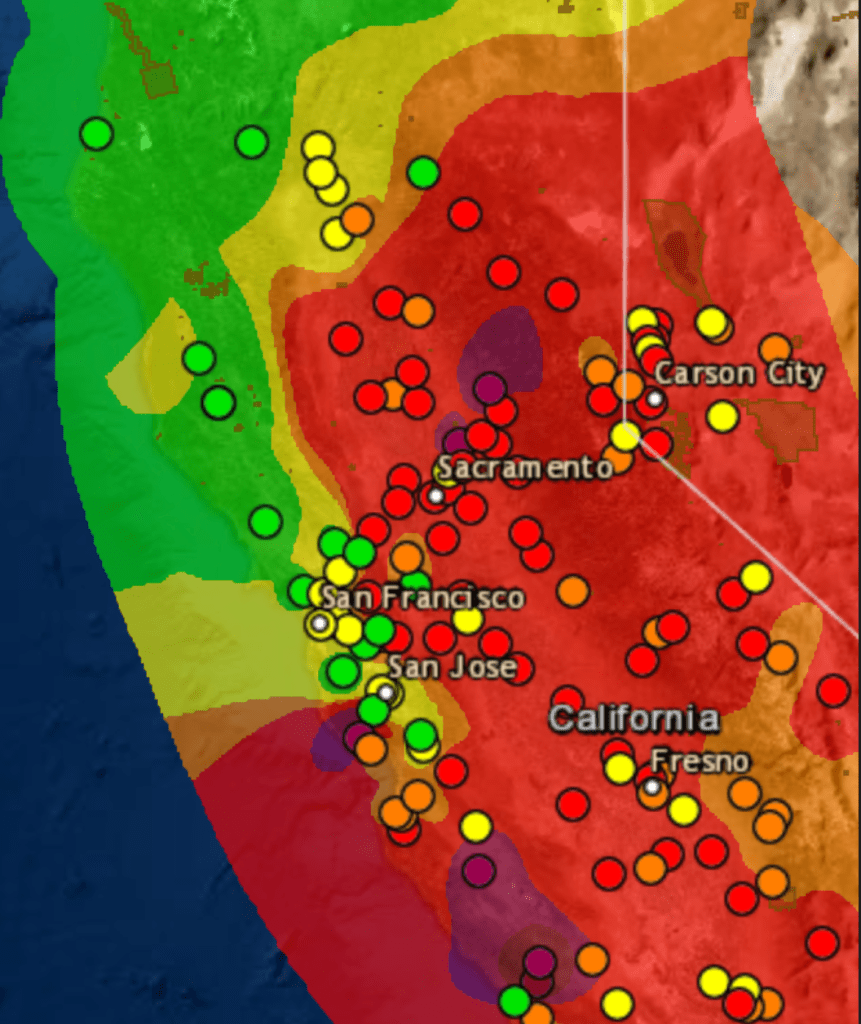
Local monitors of air quality suggest the uneven nature of these actual isochromes as maps–they are reconstructions of what can only be sensed locally, and does not exist in any tangible way we can perceive–but presented what we needed to see in a tiler that made differences popped, highlighting what mattered, in ways that left cities fall into the bottom of the new colors that blanketed the state, in which local sensors somehow revealed what really mattered on August 20: if the “map” is only a snapshot of one moment, it showed the state awash in ozone and PPM.
AirNow/August 20, 2020Air Quality Index
We were in a sort of existential unfolding in relation to these maps, even if we could also read them as reminders of what might be called “deep history”: deep history was introduced by Annalistes to trace climatic shifts, the deep “undersea” shifts of time, on which events lie as flotsam, moved by their deep currents that ripple across the economy in agrarian societies, suggesting changes from which modern society is in some sense free. “Deep History” has to some extent been reborn via neurosciences, as a history of the evolution of the mind, and of cognition, in a sort of master-narrative of the changes of human cognition and perception that makes much else seem epiphenomenal. If the below real-time map was time-stamped, it suggested a deep history of climate of a more specific variety: it was a map of one moment, but was perched atop a year of parched forests, lack of groundwater, and increased surface temperatures across the west: Sacramento had not received rain since February in an extremely dry winter; its inter was 46% drier than normal, and the winder in Fresno was 45% dryer in February. They are, in other words, both real-time and deep maps, and demand that we toggle between these maps as the true “layers” of ecological map on which we might gain purchase.
The levels of dessication of course didn’t follow clear boundaries we trace on maps. But at some existential level, these flows of particulate matter were not only snapshots but presented the culmination and confirmation of deep trends. We have to grasp these trends, to position ourselves in an adequate relation to their content. For the deep picture was grim: most of California had enjoyed barely half of usual precipitation levels after a very dry winter: Sacramento has had barely half of usual rainfall as of August 20 (51%); the Bay Area. 51%; parts of the Sierra, just 24%. And wen we measure smoke, we see the consequences of persistent aridity.
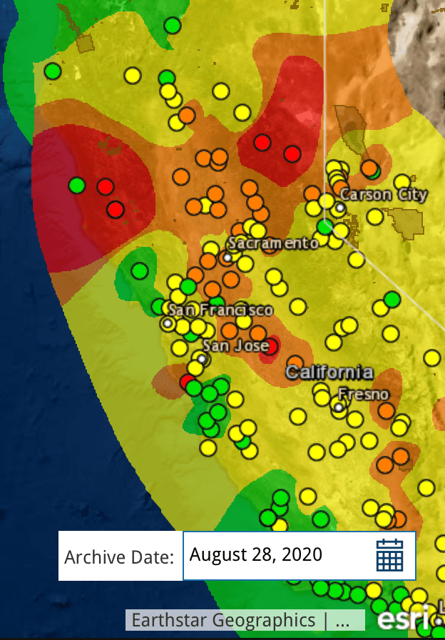
August 28, 2020/AirNowAir Quality Index
These are the layers, however, that the maps should make visible, And while these shifts of particulate matter that arrived in the Bay Area were invisible to most, they were not imperceivable; however, the waves of smoke that arrived with a local visibility that almost blanketed out the sun. Perhaps there was greater tolerance earlier, tantamount to an ecclipse. Perhaps that seemed almost a breaking point.
For almost a month after the first fires broke, following a sequence of bad air days and spare-the-air alerts marked our collective entrance to a new era of climate and fire seasons, fine soot blanketed the state at hazardous levels, leaving the sense there was nowhere left to go to escape.
September 13, 2020Air Quality Index
We had of course entered the “Very Unhealthy” zone. If real-time maps condense an immense amount of information, the snapshot like fashion in which they synthesized local readings are somewhat hard to process, unless one reads them with something like a circumscribed objective historical perspective that the levels of PPM5 provides. In maps that are data maps, and not land maps, we need a new legend, as it were, an explanation of the data that is being tracked, lest it be overwhelmed in colors, and muddy the issues, and also a table that will put information on the table, lest the map layers be reduced to eye candy of shock value, and we are left to struggle with the inability to process the new scale of fires, so unprecedented and so different from the past, as we try to gain bearings on our relation to them.
Of course, the real-time manner that we consume the “news” today
militates against that, with feeds dominating over context, and fire maps resembling increasingly weather maps, as if to suggest we all have the skills to read them and they present the most pressing reality of the moment. But while weather maps suggest a record of the present, these are not only of the current moment that they register. Looking at them with regularity, one feels the loss of a lack of incorporating the data trends they depict, and that are really the basis of the point-based maps that we are processed for us to meet the demand for information at the moment, we are stunned at the images’ commanding power of attention to make us look at their fluid bounds, but leave us at sea in regards to our relation to what is traced by the contour lines of those isochrones.
Bay Area Air Quality Management, PM2.5 Concentrations, August 15-September 13, 2020
We can, in the Bay Area, finally breathe. But the larger point re: data visualizations is, perhaps, a symptom of our inflow of newsfeeds, and lies in those very tracking maps–and apps–that focus on foregrounding trends, and does so to the exclusion of deeper trends that underly them, and that–despite all our knowledge otherwise–threatens to take our eyes off of them. When the FOX newscaster Tucker Carlson cunningly elided the spread of wild fires ties to macro-process of climate change, calling them “liberal talking points,” separate from climate change, resonating with recent calls for social justice movements to end systematic racism in the country: although “you can’t see it, but rest assured, its everywhere, it’s deadly. . . . and it’s your fault,” in which climate change morphed to but a “partisan talking point” as akin to “systematic racism in the sky.”
While the deep nature of the underlying mechanics by which climate change has prepared for a drier and more combustable terrain in California is hard to map onto to the spread of fires on satellite maps, When climate denialism is twinned with calls for reparations of social injustice or gun control as self-serving narratives to pursue agendas of greater governmental controls to circumscribe liberties, befitting a rant of nationalist rage: the explanations on “our” lifestyles and increased carbon emissions, only pretenses to restrict choices we are entitled to make, Carlson was right about the depths at which both climate change and systematic racism offer liberal “lies”–especially if we squint at tracking maps at a remove from deep histories, and cast them as concealing sinister political interests and agendas, the truly dark forces of the sinister aims of governmental over-reach in local affairs.
“Structural racism” is indeed akin to the deep structure of climate change if the cunning analogy Tucker Carlson powerfully crafted for viewers did not capture the extent of their similarities. For if both manifest deep casualties created by our society, both depart from normalcy and both stand to hurt the very whites who see them as most offensive. The extent of inequalities of systematic racism as present in our day-to-day life as is the drying out landscape. And the scope of climate change is able to be most clearly registered by the evident in trends of diminished precipitation, groundwater reserves or temperature change that create environmental inequalities, too often obscured by the events of local air quality or maps of social protests that respond to deep lying trends.
To be sure, the tracking of environmental pollutants underlay the national Pollution Prevention Act of 1990, and led to a number of executive orders that were aimed to set standards for environmental justice among minority communities who long bore the brunt of industrial pollutants, from lead paint to polluted waters to hazardous waste incinerators. And, as we are surrounded by racial inequalities that are visible in systematic inequalities before the law, and have lowered life expectancies of non-whites in America by 3.5 years, increasing rates of hypertension, cancer, and systematic disenfranchisement of blacks–these extensive inequalities hurt whites, and hurt society. As Ibrahim X. Kendi perceptively noted, White Supremacists affirm the very policies that benefit racist policies even when they undercut interests of White people; they “claim to be pro-White but refuse to acknowledge that climate change is having a disastrous impact on the earth White people inhabit.” Is there a degree of self-hatred that among Carlson’s viewers that informs Carlson’s frontal attack on climate change and structural racism as myths, more content to blame non-Whites for structural inequalities.
But these inequalities are evident in the differences in air quality that climate change creates. For if the AQI maps tell us anything, it is the absence of any preparedness for the interconnections of fire, smoke, and large dry stretches of a long story of low precipitation that have created abnormally dry conditions–indeed, drought–across the state.
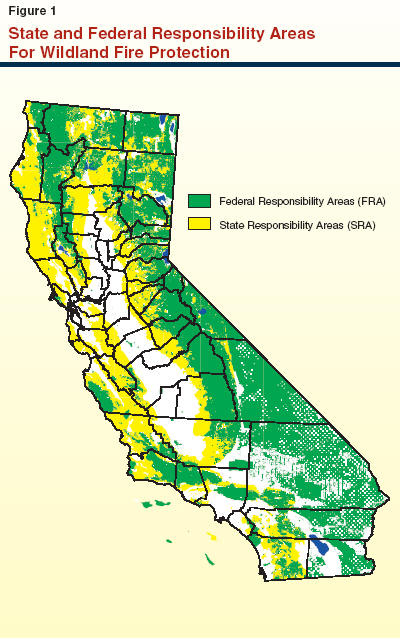
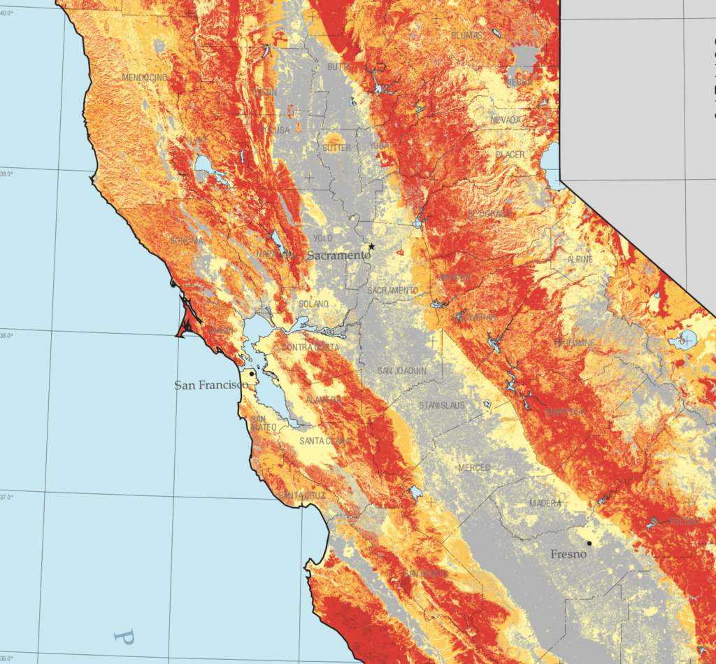
The intensity of severe drought across the conifer-dense range Sierras raises pressing questions of federal management of lands: the moderate to severe drought of forested lands intersect with the USDA Forest Service manage and the over 15 million acres of public lands managed by the federal government manages or serves as a steward.
–that crosses many of the dried out wildland and rangeland forested with conifers and dense brush, a majority of which are managed by federal agencies–19 million acres, or 57%– but with climate change are increasingly drier and drier, which only 9 million are privately owned.
Yet the reduction of Wildland Fire management by 43.98% from FY2020 to FY2021 in President Trump’s budget continued the systematic erosion of funding for the United States Forest Services. As California weathered longer and longer fire seasons under Donald Trump’s watch, Trump made budget cuts $948 million to the Forest Service for fiscal year 2020, after defunding of US Forest Services by reducing mitigating fire risk by $300 million from FY 2017 to FY2019, cutting $20.7 minion from wildlife habitat management, and $18 million from vegetation management–a rampage beginning with cutting USFS research funding by 10% and Wildland Fire Management by 12% in FY 2018! While blaming states for not clearing brush in forests, sustained hampering of managing federal lands rendered the West far less prepared for climate change. As the costs of containing wildfires rise, the reduction of the Forest Service budget has provoked panic by zeroing out funding for Land and Water conservation–alleged goals of the Trump Presidency–and cuts grants to state wildfire plans by a sixth as fire suppression looms ever larger.
By defunding of forest management, rangeland research, and habitat management, such budgetary measures pose pressing questions of our preparedness for the growing fire seasons of future years; stars that denote public land management might be targets for future dry lightning.
We think of earth, wind and fire as elements. Or we used to. For the possibility of separating them is called into question in the Bay Area, as wind sweeps the smoke of five to seven fires, or fire complexes, across the skies, we are increasingly likely to see them as layers, which interact in a puzzle we have trouble figuring out. Indeed, the weirdly haunting daily and hourly maps of air quality map the atmospheric presence of particulate matter by isochrones brought late summer blues to the Bay Area. Blue skies of the Bay Area were colored grey, burnt orange, and grey again as cartoon plumes of soot flooded the skies in a new sort of pyrocumulus clouds that turned the sun red, offering a disembodied traffic sign telling us to stop.
Clara Brownstein/October 1, 2020
Fire season began by remapping the town in terrifying red that registered “unhealthful,” but almost verging on the “hazardous” level of brown, based on local sensors monitoring of ozone, but is also registering a deeper history defined by an absence of rain, the lack of groundwater, the hotter temperatures of the region and the dry air. The map is both existential, and ephemeral, but also the substrate of deep climate trends.
AQI Chart on Saturday, August 22, 2020/AirNow (EPA)
Is fire an element we had never before tracked so attentively in maps? We did not think it could travel, or had feet. But wildfire smoke had blanketed the region, in ways that were not nearly as visible as it would be, but that the real-time map registers at the sort of pace we have become accustomed in real-time fire maps that we consult with regularity to track the containment and perimeters of fires that are now spreading faster and faster than they ever have in previous years. And soon after we worried increasingly about risks of airborne transmission of COVID-19, this fire season the intensity of particulate pollutants in the atmosphere contributed intense panic to the tangibility of mapping the pyrocumulus plumes that made their way over the Bay Area in late August. As the danger of droplets four micrometers in diameter remaining airborne seemed a factor of large-scale clusters, the waves of black carbon mapped in the Bay Area became a second sort of airborne pathogen made acutely material in layers of real-time Air Quality charts.
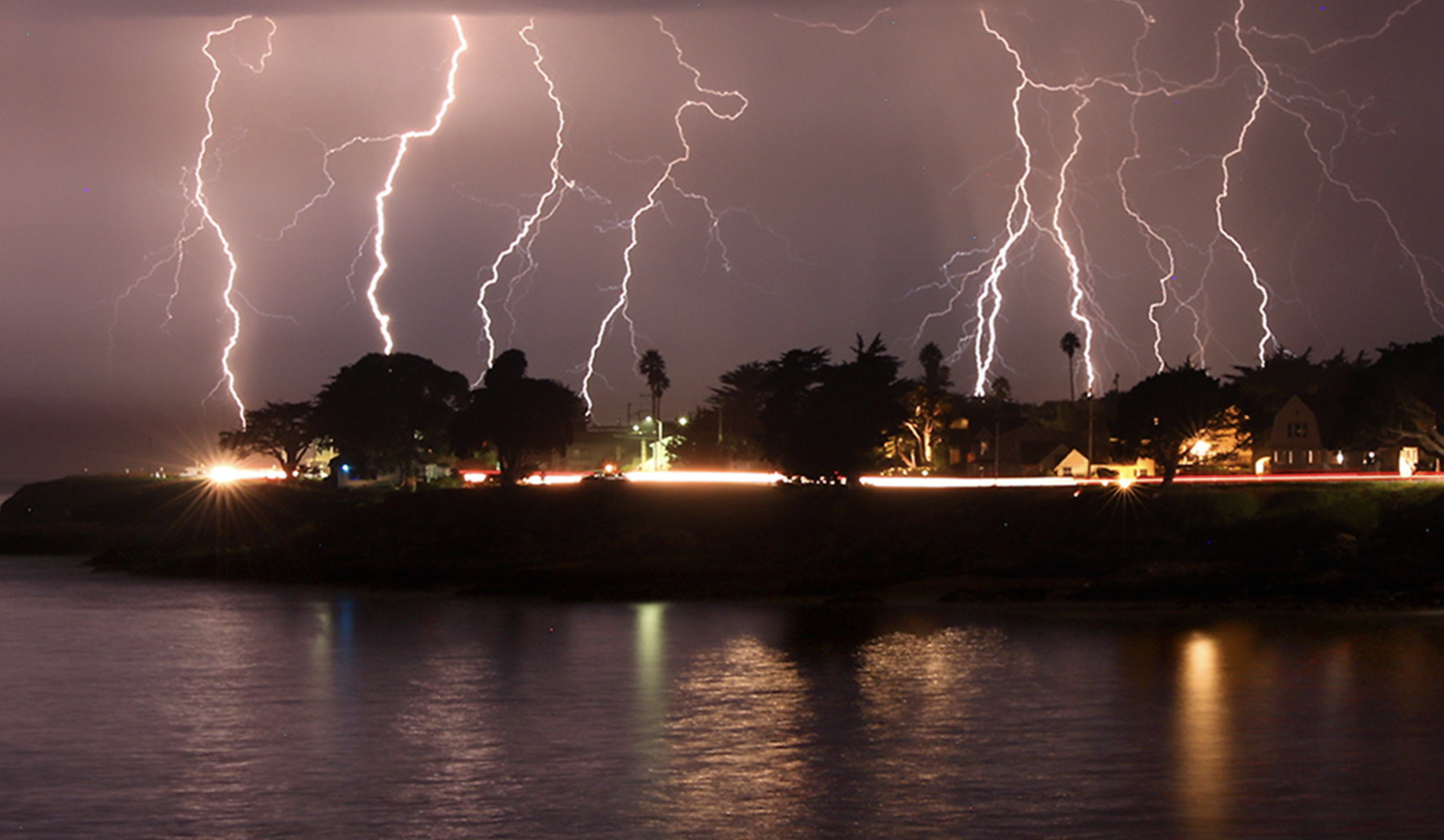
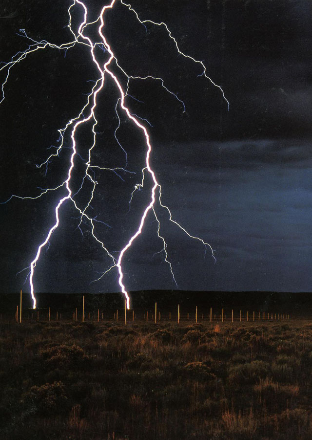
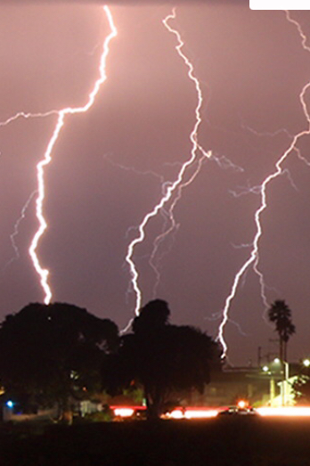
The boundaries of fire risk charts and indeed fire perimeters seemed suddenly far more fluid than we had been accustomed. When we make our fire maps with clear edges, however, it is striking that almost we stop registering the built environment, or inhabited world. As if by the magic of cartographical selectivity, we bracket the city–the sprawling agglomeration of the Bay Area–from the maps tracking the destructiveness and progress we call advancing wildfires, and from the isochronal variations of air quality that we can watch reflecting wind patterns and air movements in accelerated animated maps, showing the bad air that migrates and pool over the area I life. The even more ephemeral nature of these maps–they record but one instant, but are outdated as they are produced, in ways that fit the ecoystem of the Internet if also the extremes of the new ecosystem of global warming–the isochrones seem somewhat fatalistic, as they are both removed from human agency–as we found out in the weeks after the Lightning Siege of 2020 that seemed a spectacle of the natural world that rivaled the art of Walter de Maria in their grandiosity of time-lapse photography–
–the horizontal line of artificial light from Santa Cruz, unlike the images that De Maria created from The Lighting Field, remind us of the overlap between inhabited spaces where conflagrations in the dry wildlands that spread as the fires struck, and in way far less difficult to aestheticize than The Lightning Field set in a desert removed from human population, but was built as an isolated field for time-stop photography.
The CZU complex brought widespread devastation across areas of extra urban expansion in the Santa Cruz Mountains was almost a map that registered the expansion of residences to the very borders of forests. We haven’t ever faced the problem of maintaining and clearing in weather this dry, even if we have mapped the clustering of fires in the wild land-urban interface: but the strikes ignited underbrush lain like kindling, on the boundaries of the raging fire complexes. If the burning of underbrush by fire mitigation squads seeks to create fire lines in the mountainous landscape to create new perimeters to forestall the advance of major fires, working along a new fire line even as what is still called wildfier smoke travels across the nation, far beyond the Bay Area.
While watching the movement of fires that them in inhabited areas like shifting jigsaw pieces that destroy the landscape across which they move. These marked the start of megafires, that spread across state boundaries and counties, but tried to be parsed by state authorities and jurisdictions, even if, as Jay Inslee noted, this is a multi-state crisis of climate change that has rendered the forests as fuel by 2017–for combined drought and higher temperatures set “bombs, waiting to go off” in our forests, in ways unable to be measured by fire risk that continues to be assessed in pointillist terms by “fuel load” and past history of fires known as the “fire rotation frequency.” When these bombs go off, it is hard to say what state boundary lines mean.
Fire Threat Risk Assessment Map, 2007
If San Francisco famously lies close to natural beauty, the Bay Area, where I live, lies amidst of a high risk zone, where daily updates on fire risk is displayed prominent and with regularity in all regional parks. These maps made over a decade ago setfire standards for building construction in a time of massive extra-urban expansion. But risk has recently been something we struggled to calculate as we followed the real-time updates of the spread of fires, smoke, and ash on tenterhooks and with readiness and high sense of contingency, anxiety already elevated by rates of coronaviurs that depended on good numbers: fire risk was seen as an objective calculation fifteen years ago, but was now not easy to determine or two rank so crisply by three different shades.
Fire Risk Map, 2007
When thunderstorms from mid-August brought the meteorological curiosity of nearly 12,000 dry lightening dry strikes from mid to late August 2020, they hit desiccated forests with a shock. The strikes became as siege as they set over three hundred and fifty-seven fires across the state, that rapidly were communicated into expansive “complexes” of brush fires.
We map these fires by state jurisdictions, and have cast them as such in policy, by borders or the perimeters we hope to contain barely grasp the consequences of how three quarters of a million acres burned up suddenly, and smoke from the cluster of fires rose in columns that spread across state boundary lines as far as Nebraska, and how fire complexes that spread across three million acres that would soon create a layer of soot across the west, eerily materialized in layers of GIS ESRI maps of environmental pollutants, while toxic particulate mater released in plumes of black carbon by the fires cover the state, rendering the sun opaque where I live, in the Bay Area, now Pompeii by the Bay as smoke at toxic levels blanketed much of the state.
They even more serious map, to be sure, was of fire spread: but the maps of air quality set the entire western seaboard apart from the nation, as if threatening to have it fall into the ocean and split off from the United States,–even if the burning of its open lands was more of a portent of things to come, they were a historical anomaly, lying outside the record of fire burns or air quality, if the poor air quality traced the origin of black carbon columns of smoke that would rise into the nation’s atmosphere.
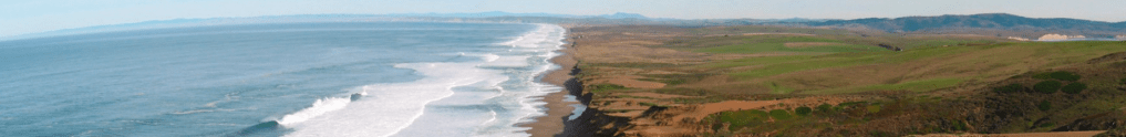
We have long considered man’s impact on the world, but are only starting to be able to chart the vastness of the scope of anthropogenic change. And wen it comes to the contraction of shores and beaches that has been forecast in current climate scenarios, the oldest of human environments, the shoreline and coast, seems in danger of drastic reduction at a scale we have rarely considered. The shifting littoral landscapse of the world have ben long neglected, if they are turned to each Earth Day for coastal cleanups and have been the site of intense preoccupations as a result of sea-level rise, as we have protected much of our national seashore.
National Seashore (National Park Service)
But the prospect of an accelerated global erosion of coastal landscapes, and the loss of beaches, have only begun to be processed as triggering cascading consequences from disturbing ecological niches and coastal economies to the human relation to the natural world–a new relation to global ecology that we may well lack the vocabulary and structures to map on adequate scale to process, let alone discuss.
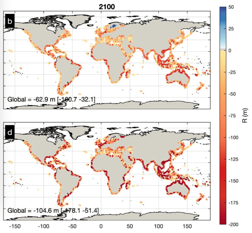
But the mapping of coastal retreat that is projected for the coming century charts the magnitude of the scale of impact of human-created modification of a global environment in NOAA’s Fluid Dynamics Project calls for a broader reckoning of the impact on the global environment that stands to be created by coastal retreat akin to a global pandemic like SARS-CoV-2, and a remapping of the global shorelines that we have a very limited chance to come to terms with in any active context; terms like East and West don’t work in a climate catastrophe that does not differentiate not only nation states but that we lack the narrative categories to come to terms with in terms of economic inequalities, but suggest a crisis of global proportions that contrast with the delicate organization of space on shorelines near our home in their brute redrawing of the increasingly impermanent sandy shore projected for 2100, according to a rather modest climate change scenario.
The discovery of margin of the shoreline in the middle of the twentieth century as a privileged site of intense biodiversity risks obliteration as a particularly fragile ecosystem. Yet the shoreline habitat is now a site of unprecedented vulnerability. (The same stretch of sensitive shoreline habitat was quickly closed to comply with shelter-at-place directive, given the range of urban residents who drove to flood its trails, beaches, and shoreline as a way to find balance, many standing transfixed before the waves in a particularly stressful time, seeking purchase on a moment few could really grasp.)
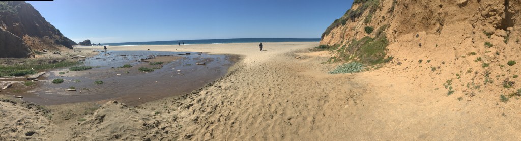
McClures Beach, Inverness CA
The seashore seemed a natural place of reflection. But it was hard to imagine the sensitivity of these littoral lands. While the national seashore at Point Reyes is a unique preserved coastal environment, where eroding cliffs meet sands along broad strips of beach whose low grade offers habitat to coastal birds, grasses, and shellfish, in a meeting point of fresh and salt water, the beauty of the coast seemed a perfect refuge in a time of disorientation.
This blog has long discussed the specter of anthropogenic change, but in the panic of COVID-19, it seemed clear that we lack the mode to talk about the scale, continuities, and complexity at which such world-changing processes will occur. The future loss of shores would be quite difficult to imagine, even if one stares at the remote sensing maps that predict the effects of sea-level rise.. So many had voyaged to the shores as if by instinct during the COVID-19 coronavirus outbreak in 2020, from Long Island to Marin, to the extent of disturbing many coastal residents, who read searching for break from anxiety by acts of coastal distancing as an unwelcome promotion of the danger of importing viral spread.
In England and elsewhere, many departed from the city, in search of a new environment, by traveling to the coasts–where they were greeted, similarly, by protests by those who saw their arrival as a harbinger of infection. Many public beaches, concerned about close contact, have outright closed, as coastal communities do their best to dissuade visitors seeking to escape infection in Hawaii, Moab, Alabama, North Carolina or the Gulf Coast–in ways that cut us off from the shore as a place of reflection and rumination.
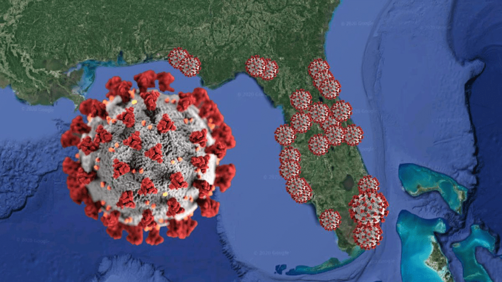
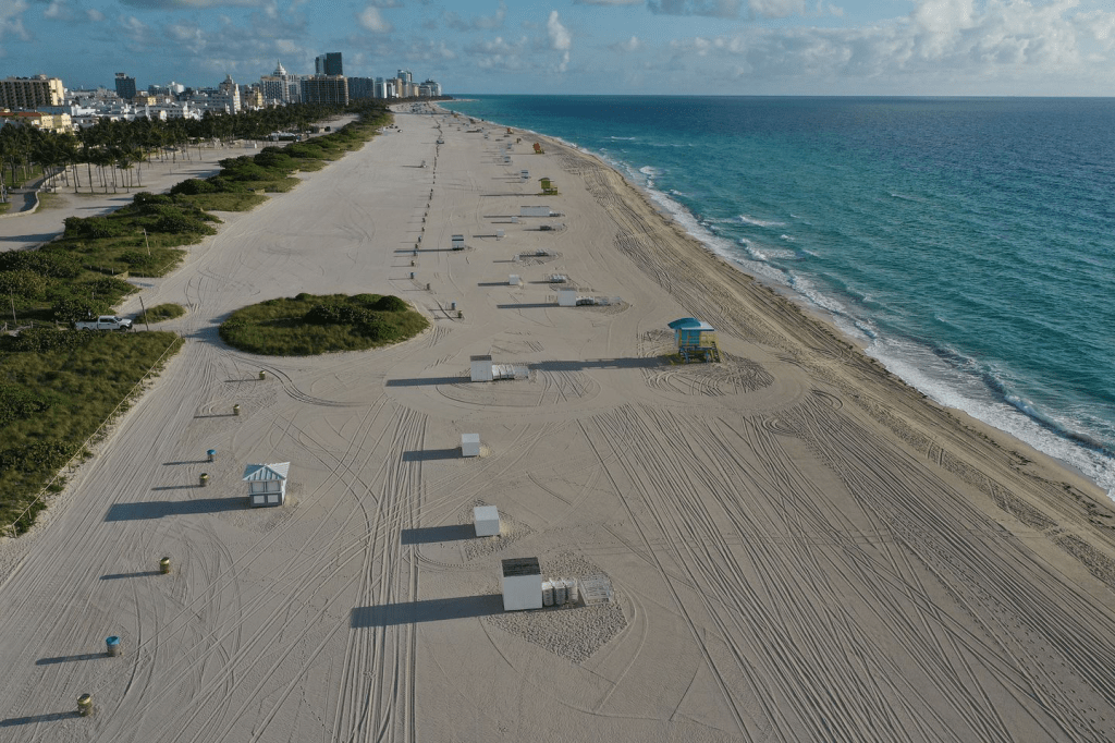
If undue media attention may be directed to bemoaning college students on Florida Spring Break, we must remember that Florida’s Governor, Ron DeSantis, ostensibly encharged with securing the state’s well-being and public welfare, stubbornly insisted on keeping beaches open in the state the shore until Easter, to allow “students to party” on Miami Beach, Fort Lauderdale, Clearwater Beach, and other “hotspots” of pleasure into hot spots of viral infection: DeSantis, never one to stop claiming higher ground, hypocritically or not, only turned his wrath on the partiers after facing a lawsuit from the state Attorney General, and even as communities closed beaches, refused to shutter state beaches to limit the spread of the Coronavirus that were a vital parts of the state’s economy–reluctant to close them until local municipalities intervened.
John Raedle/Getty Images
Shifting the blame to foreign travelers–and insisting on self-quarantining visitors from New York state or New Jersey–he sought to keep them open for business, by casting them as more vital than viral. DeSantis refused to accept the national scope of the problem, defending an economy that depended on tourism, elevating the economy over national health–and keeping them open a week after the closure of Disney World, after trying to keep a “six feet distance rule” to “stop large crowds from congregating,” as if the crowding was an issue, more than human proximity and contact–and refusing to take leadership on the issue by “deferring” to local government and causing confusion.
As fhe Florida Governor reflected on the large number of elders in the state population, and their potential hindering of his own chances for re-election, it seems, did he alter his stance entirely, and beg the President to declare a national emergency, as the spread of the virus led to thousands of layoffs, with all non-essential businesses closed in coastal communities, as De Santis issued a state of emergency March 9, 2020.
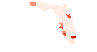
Initial Florida Sites of Coronavirus Outbreaks of COVID-19 Infections/March 9, 2020
Meanwhile the COVID-19 data timeline by mid-March had spread across Central Florida, with cases of infection clustering on the shores. While the map that sizes the isolated pathogen as its symbol of COVID spread seems freakish, the telling newspaper graphic captures well the problem of coming to terms with the transmission of infections along the beach–superimposing the specter of an overlay of the COVID-19 pathogen as if colonizing or as blossoming along Floridian shores.
Orlando Sentinel
The abandonment of the closed Miami Beach–one of several citie that refused to keep its beaches open, as infection spread, as they knew what was really best for them–seemed to confirm the shore’s status as a natural site of reflection. The scope of projected reconfiguration of future shorelines would effect a deep change in the human relation to the shoreline, as much as the shoreline as a site of shelter and habitat.
Joe Raedle/Getty Images
For environmental geographer Clarence Glacken, the “traces on the Rhodian shore” were signs of civilization and the human modification of the environment that were fundamental to historical processes of change. The reference of the title of his survey of the modification of land through the industrial revolution took its reference point as antiquity–the image of the philosopher taking geometric figures drawn on the shores of Rhodes where he was shipwrecked as evidence of human habitation. The anecdote was prized by Vitruvius as evidence of the ability of geometry to frame the environment, and respond to it; Glacken took the image of the shores as a leitmotif for a magisterial survey of relations to the natural world that we now observe expanded and refracted in the remote sensing that tracks the broad impact of how industrialization has inscribed human relations to the environment far beyond Glacken’s four on the environmental influences on human history and man’s remaking of the environment. And the problem of the continued access to shores, and future of the shores, makes us go back to some of the early work of Glacken to recover its new relevance, if only because of our failure of models to come to terms with such massive anthropogenic change.
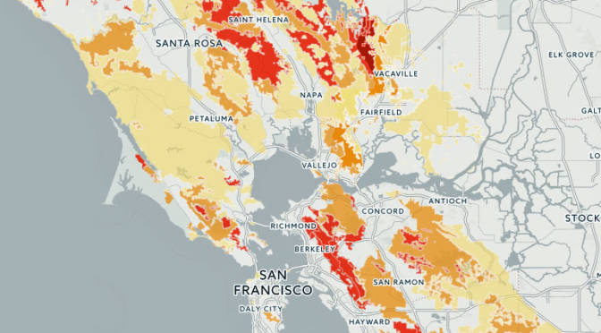
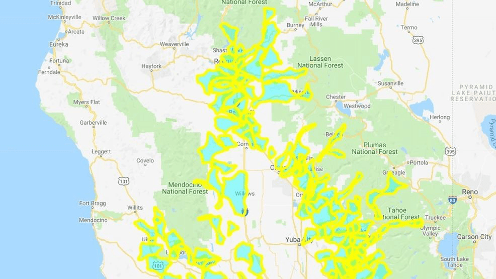
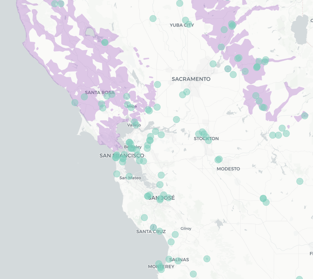
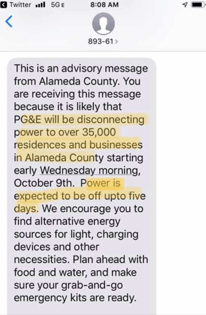
The announcement in California of the arrival of random power shut-offs this fire season sent everyone scrambling to maps. In order to stop fires spread of fires, the impending public safety power shut-offs crashed websites as folks scrambled to get updates in real time, frustrated by the relative opacity of maps in a hub of high tech mapping and public data, as the impending possibility of power shut-offs wreaked neurological chaos on peoples’ bearings. From mapping fires, we transitioned to the uncertainty of mapping regions where consumers would lose power in an attempt to prevent fires from spreading due to strikes on live wires of broken limbs, branches, or failed transmission structures whose immanent collapse were feared to trigger apocalyptic fires of the scale of those witnessed last fires season, as the largest fire in California history raged for days, destroying property and flattening towns, burning victims who followed GPS lacking real-time information about fires’ spread.
In an eery mirroring of looking to maps to monitor the real-time spread of fires, which we sensed in much of California by smoke’s acrid air, the expectancies to which we had been habituated to consult real-time updates was transferred to the availability of electricity, in a sort of mirror image unsurprising as the outages were intended to stop fires’ spread. The decision to continue public power safety shut-offs as a part of the new landscape of controlling fires’ spread in future years–perhaps needs to be accepted for up to a decade, although this was walked back to but five years in recent years.
Expanded power shut-offs justified by needs for public safety suggest how much climate change has changed the expanded nature of fire risk. But in an era when the vast majority of televised segments that aired on network television– ABC, CBS, and NBC combined–despite an abundance of powerful image and video footage the 243 segments on destructive wildfires raging across northern and southern California, a type of public disinformation seems to have been practiced by most news outlets that served only to disorient viewers from gaining any purchase on the fires, colored by the shifting validity of climate change denial as a position among their viewing public: only eight of the news media mentions of the fires, or 3.3%, mentioned climate change as a factor in the fires’s spread, from October 21 to November 1, as the spread of fires in northern California grew that precipitated public power shut-offs. If new cycles shy away from citing climate change as a factor on the spread of fires, most of the mentions came from specific weather reporters, from NBC’s Al Roker to CBS’ Jeff Berardelli, extending the range of fire seasons and area of burn, the silo-ization of such explanations were rarely digested in mainline reporting. And if FOX ran 179 segments on the fires, more than other cable networks, climate change was mentioned in 1.7%, with most segments mocking the contribution of climate change.
If we are poorly served by the news media in reporting the fires and downplaying climate change–or indeed criticizing California for poorly maintaining its forests’ safety, as President Trump, the eery landscapes provided by PG&E raise questions about the messages they communicate.
But the electric green maps of a startlingly unnatural aquamarine, yellow, and orange suggested a strange distantiation of the landscape in the age of Climate Change. The electrified hues of the maps, which monitored the possibility of customers loosing electricity in many districts, reveals a level of poor management and lack of any coherent strategy for climate change as much as the huge area that is served by PG&E, and the man-made infrastructure of electricity and transmission towers, which courts have rightly decided the privately-owned power agency that serves state residents is responsible for.
While we follow the news, even among the most die-hard news addicts, the prospect of “public safety” power shut-offs seemed unannounced and irresponsible, and a premonition of a new landscape of risk. For the shut-offs that were announced as impending by PG&E reflect a deep insecurity of fires, climate change and perhaps what we feared was a collective unpreparedness to deal with a new set of implications of climate crisis we have not even been able to acknowledge or even fully recognize, but which seemed spinning out of control–even in the nature of maps that were made of it–and to betray a lack of imagination, creativity, and foresight, abandoning the long-term view.
The sense of emergency electrifies a landscape whose woodland-urban interface is electrified by aging power structures and transmission lines, carrying increased current to extra-urban areas. And there is a fear that the long-term view is lacking, as we continue to turn to maps, even months after the first shut-offs were announced to forestall fears of a raging fire season. As we map the expanding sense of risk to respond to both demand for currently updated real-time maps for fires, and the calamitous images of apocalyptic fires raging that dominate the news cycle and make us fear the near future, or have a sense of living with a deferred sense of emergency at our doorsteps. And so when we received a text message of impending loss of electricity, we turned en masse to maps to learn about outages at risk, alerted to the need to ready ourselves as best we could by our local government-
Extreme fire prevention funding, precarious in the Trump Era, stands to be abolished as the Dept. of Interior retreats from federal fire programs: the Wildland Fire Office, funded at $13 million in 2012, if slated to be abolished in the Trump era, in an agenda denying climate change, lacks funding, undermining close scientific examination of a new topography of fires, even as climate change has increased the costliness of fires and the ferocity of their spreads. If the costs of the Camp Fire of 2018 grow beyond $10 billion–or over six times as much as the Oakland Firestorm of 1991–those costs and the cost of insurance liabilities only stand to grow. As we confront poor planning of climate readiness, as we lack real images of extinguishing fires’ spread–and imagine the temporary shut offs can intervene as a deus ex machine to prevent fires’ spreads all we have to forestall the fears of spreading flames and intense firestorms or whirls.
In the Bay Area, where I live, the danger of the new firescape is so pressing, and so impossible to process, that we can only digest it as a danger that is ever-present, akin to living in an active seismic area, but we cannot process in a static or dynamic map.
But this is an area of risk that we are living cheek-by-jowl beside in ways that are truly unfathomable. As the power shut-off zones have been expanded in clearer detail by PG&E in response to the growing gustiness of winds that threaten to compromise the safety of residents as well as the aging electric infrastructure of the state, we are oddly haunted by past promises to maintain or upgrade our national infrastructure–the promise to rebuild national infrastructure was itself an energizing call of the Trump campaign–only to be demoted by being assigned, with improved veteran care, the opioid addiction, workforce retraining, and the Middle East peace to Jared Kushner, in ways tantamount to moving it to the way back burner, soon after being mentioned in the State of the Union as a non-partisan issue in January, 2018.
And yet, the spread of fires with increased rapidity, across landscapes that remain highly flammable, has created terrifying imagers of a highly combustible landscapes, where the recent growth of fires–in this case, the Kincade Fire that did began only long after the shut-off policies began–chart the spread of fires across terrain multiple times larger than cities, moving across the landscape rapidly, driven by unprecedentedly strong offshore winds: the passing overhead of satellites charts its expansion, making us fear the expansion of the next pass overhead as realtime images of the durations of fires only grows.
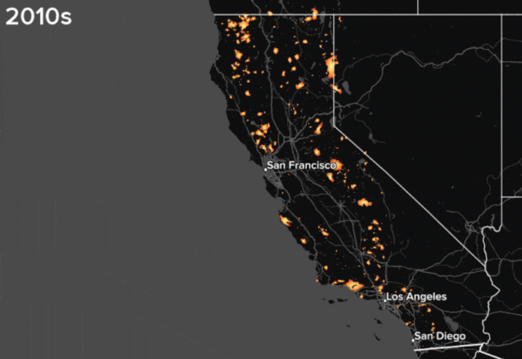
Sure, the current landscape had long seemed to be burning up at a rate we had not begun to adequately acknowledge–as Peter Aldhous promptly reminded any of us who needed reminding in Buzzfeed, providing a GIF of CalFire’s data of areas of California that had burned since the 1950s, decade by decade, in an animation of red bursts of flames atop a black map, that seemed to eerily illuminate the state by the 2000s, and hit much of the north by the 2010s, as they close,–illuminating fires as a state-localized crisis–
Peter Aldhous for Buzzfeed from CalFire and frap.fire.ca.gov
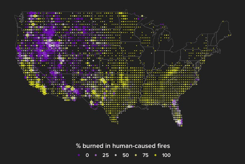
but the scope of human-caused fires that have consumed land, property, and habitat are a truly endemic crisis in California, he showed, in ways that he suggested reflect a parched landscape and the uptick of human-generated fires that are a direct consequence of climate change, especially in a region of increased residential construction. This sense of illumination places a huge onus on PG&E for its corporate responsibility, and the very notion of distributing electricity and power as we once did,–and illuminates the imperative to think about a new form of energy grid.
Indeed, the parsing of “human-caused fires” as a bucket suggests the real need to expand the classification of wildfires. Whereas most earlier fires were caused by lightening strikes in the western states, the expansion of housing and electricity into areas suffering from massive drought–as if in an eery reflection of the spread of “slash fires” across the midwest during the expansion of railroads that caused a rage if firestorms coinciding with World War I–press against the category of fires as wild. The deeper question that these maps provoke–as do the data of Cal Fire–is whether the term wildfires is appropriate to discuss the hugely increased risk of fires that damage or destroy property and land.
We read more maps than ever before, and rely on maps to process and embody information that seems increasingly intangible by nature. But we define coherence in maps all too readily, without the skepticism that might be offered by an ethics of reading maps that we all to readily consult and devour. Paradoxically, the map, which long established a centering means to understand geographical information, has become regarded uncritically. As we rely on maps to organize our changing relation to space, do we need to be more conscious of how they preset information? While it is meant to be entertaining, this blog examines the construction of map as an argument, and proposition, to explore what the ethics of mapping might be. It's a labor of love; any support readers can offer is appreciated!


