Tag Archives: particulate matter

Air Quality

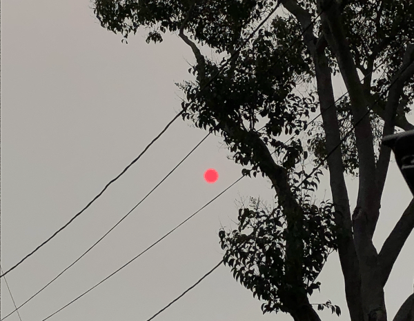
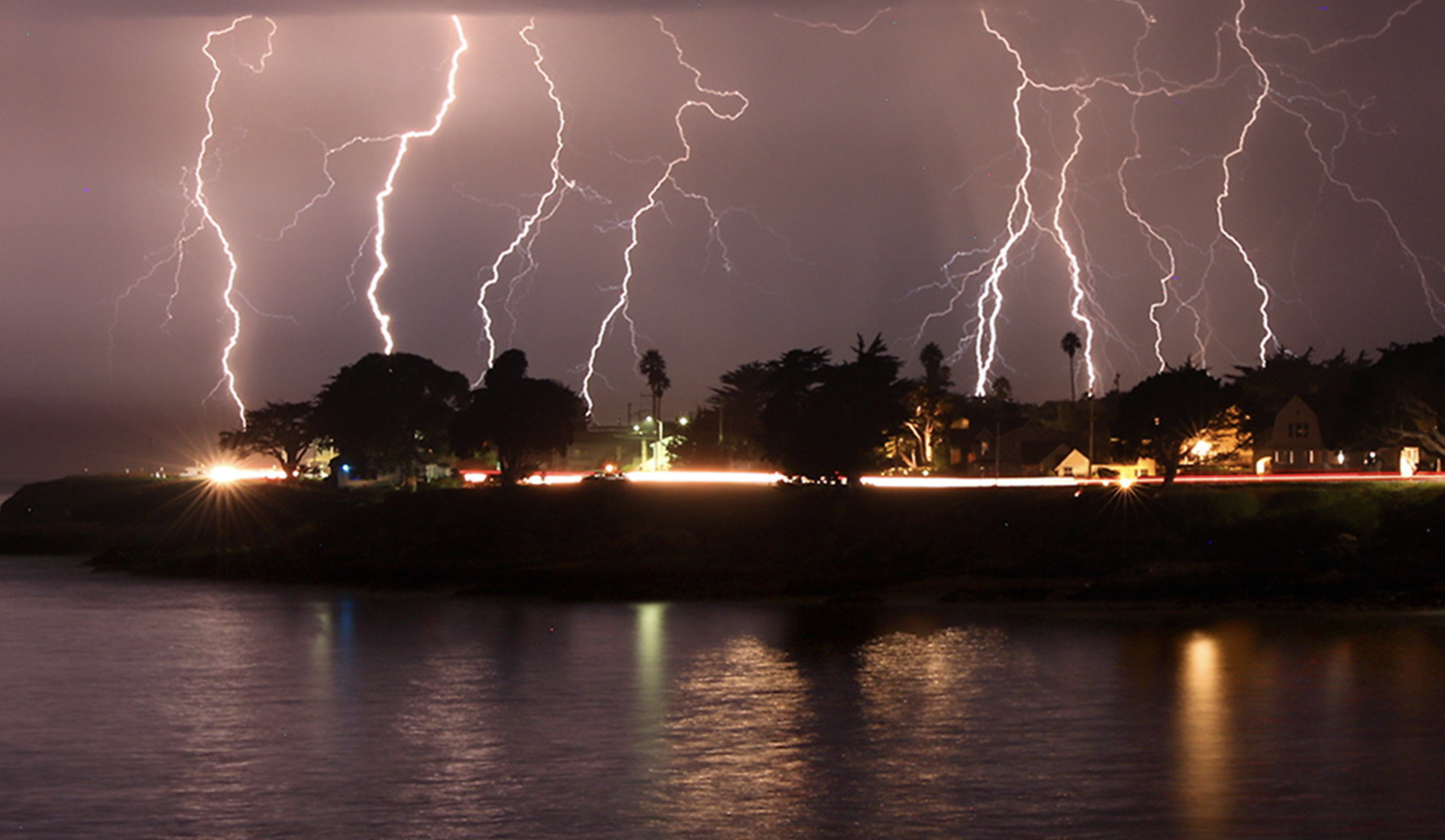
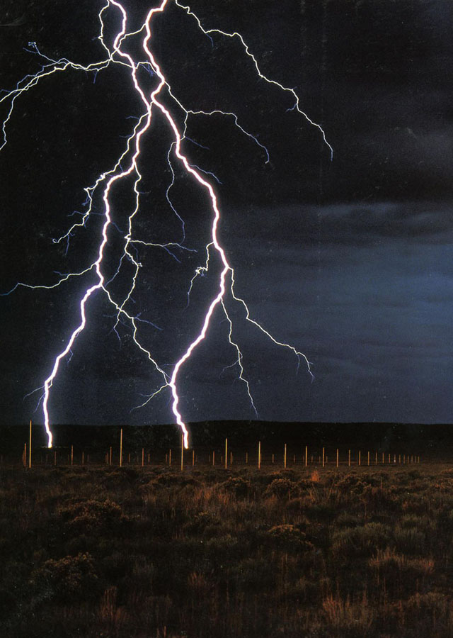
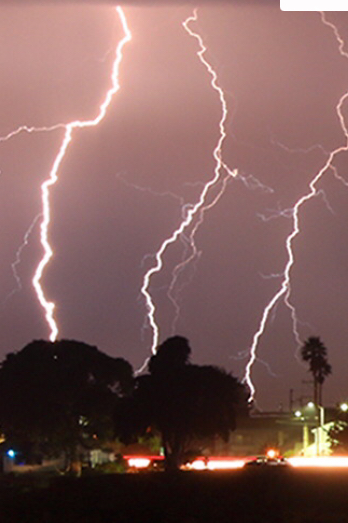
The tracking of local air quality this Fire Season both documents the atmospheric effects of a fire siege of 2020 and provides an eerily contemporaneous way to track the spread of particulate matter from clusters of fires across the western seaboard to be ignited at the end of a long, dry summer in late August. We were not really struck unawares by the dry lightning, but had left forests languishing, not beneath electricity lines–as last year, around this time–but under a hot sun, and high temperatures that we hardly registered as changing the ecosystem and forest floor. This year, the sun turning red like a traffic light in the middle of the afternoon, we were forced to assess the air quality as the blue sky was filled with black carbon plumes that left a grittiness in our eyes as well as in the skies.

October 1, 2020

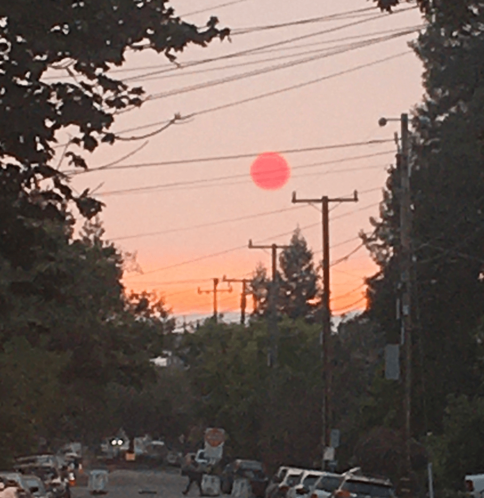
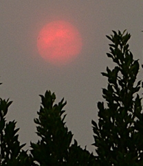
Confronted with a red sun through pyrocumulus haze, we followed real-time surveys of air quality with renewed attentiveness as an orange pyrocumulus clouds blanketed usually blue skies of the Bay Area, obscuring the sun’s light, suffusing the atmosphere with a weirdly apocalyptic muted light, that were hardly only incidental casualties of the raging fires that destroyed houses, property, and natural habitat–for they revealed the lack of sustainability of our warming global environment.

EPA/World Air Quality Index/New York Times September 15, 2020

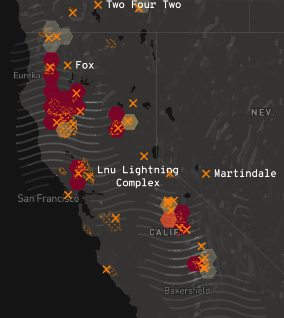
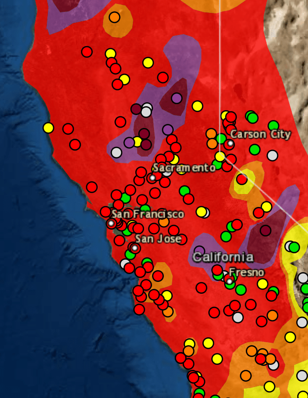
The soot and fog that permeated “clean cities” like Portland and San Francisco came as a sudden spike in relation to the black carbon loads that rose in plumes from the fires, as if the payload of the first bombs set by climate change. The shifting demand for information that evolved as we sought better bearings in the new maps of fires that had become a clearly undeniably part of our landscape was reflected in the skill with which the sites of incidence of dry lighting strikes that hit dried out brush and forest floors, the growing perimiters of fires and evacuation zones across the west coast, and the plumes of atmospheric smoke of black carbon that would leave a permanent trace upon the land, liked to the after-effects of holocausts created by atom bombs by Mike Davis. The measurement of wind carrying airborne smoke emerged as a layer of meaning we were beginning to grasp, a ghostly after-effects of the fields of flams that began from sites of lightning hitting the earth in a Mapbox wildfire map of fields of fire across the states, radiating resonant waves akin to earthquake aftershocks, a lamination on hex bins of the fires that seemed a new aspect indicating their presence in the anthropocene.

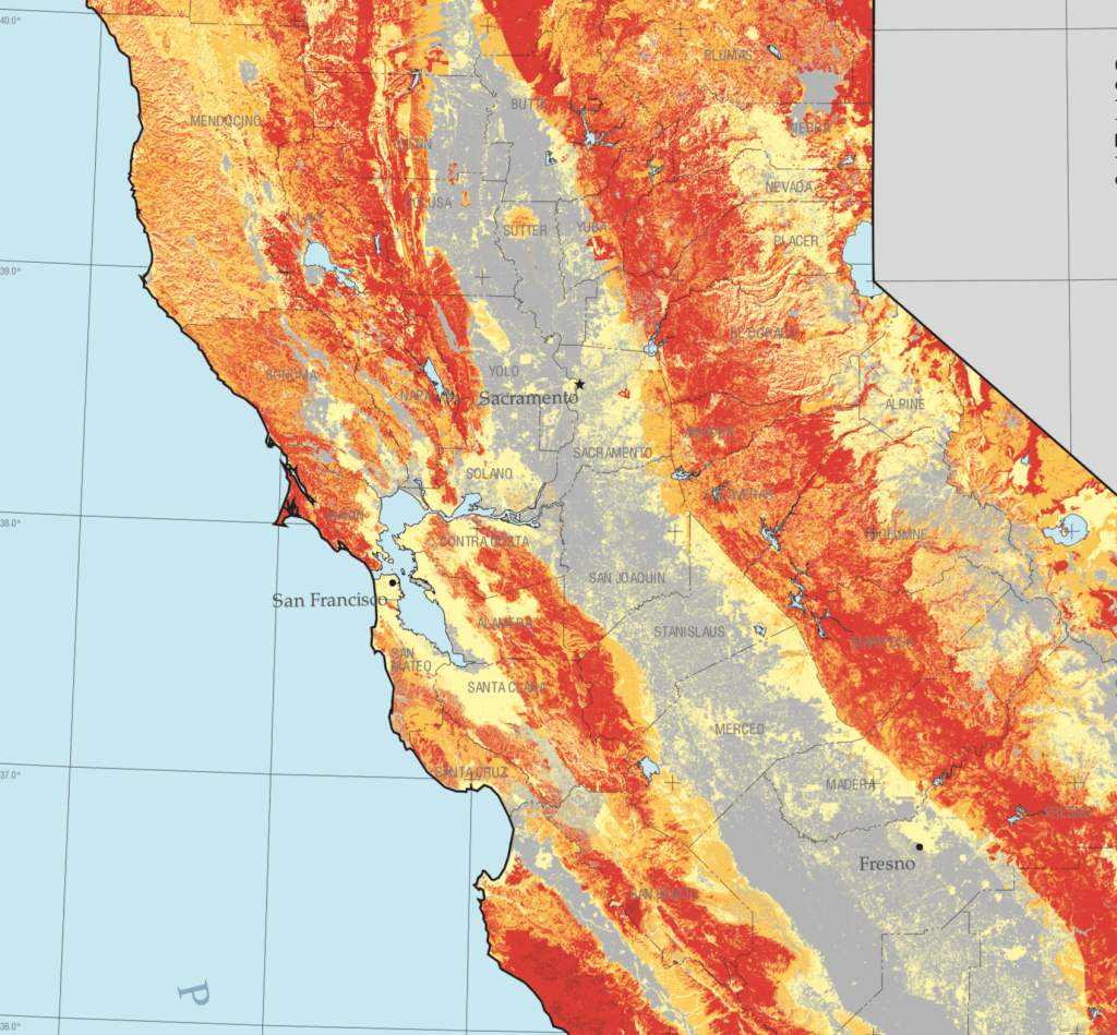
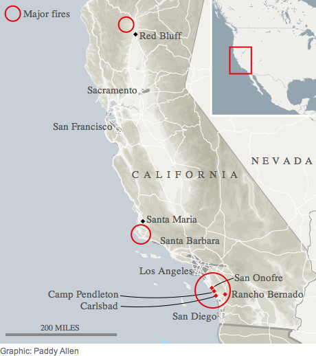
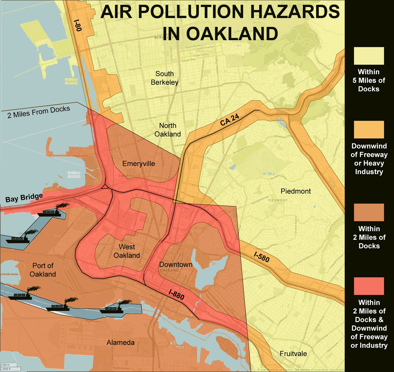
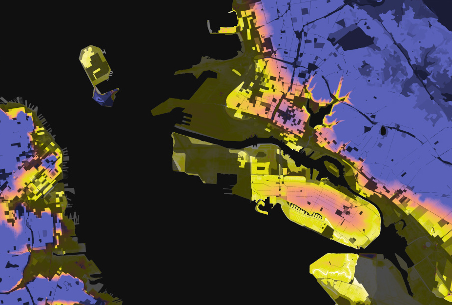
The suitably charcoal grey base-map of the state integrates approximate origins of fires, fire spread and greatest intensity of hotspots from satellite imagery courtesy Descartes Labs and NOAA, and air pollution data integrates the fires’ spread across our picture of the state. While human reviewed and sourced, the satellite data embodies the ravages of fire across the state in ways echoed by its black charcoal base map, and reflects the need to develop new visual tools to process their devastation.

Mapbox Wildfire Maps/CalFire Data/OpenStreetMap/Los Angeles Times Sept 28, 2020

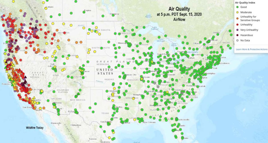
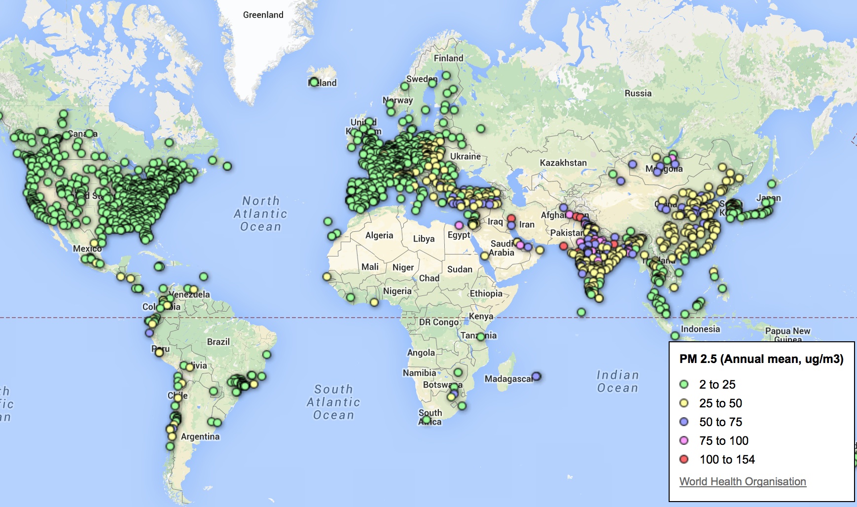
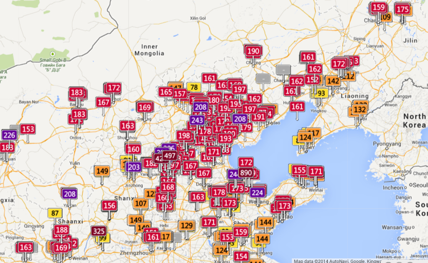
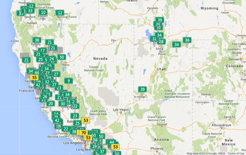
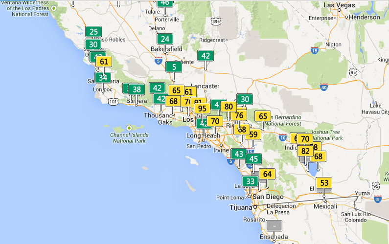
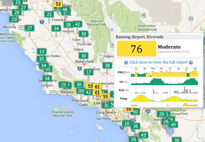
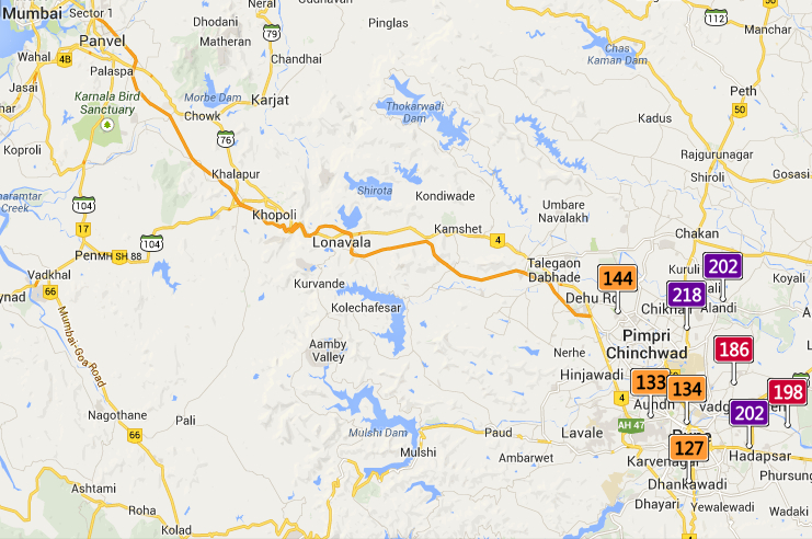
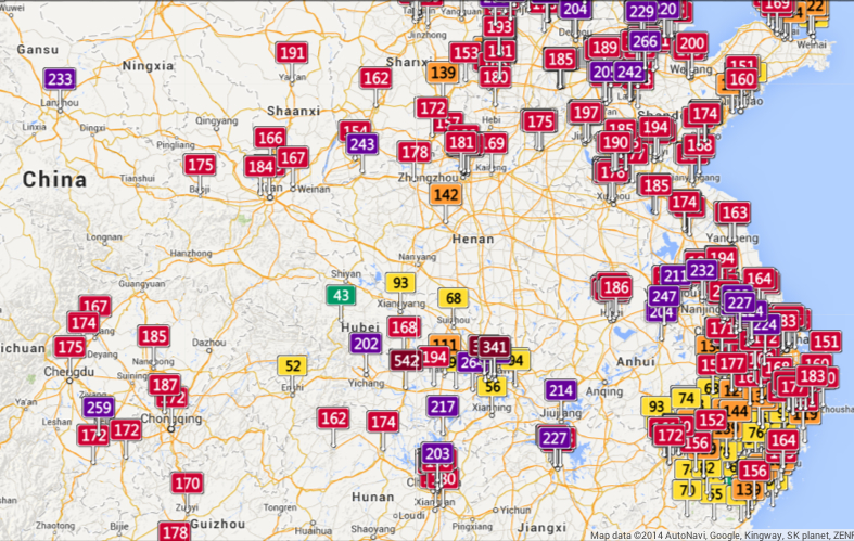
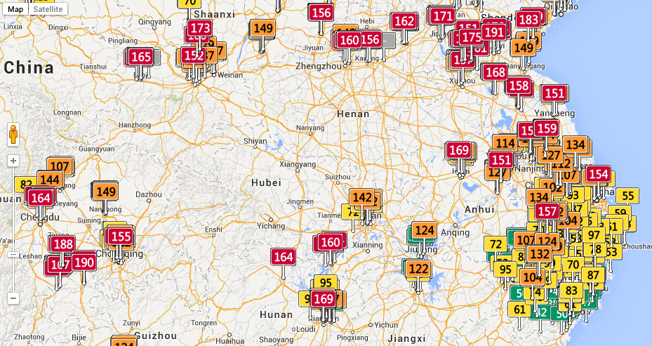
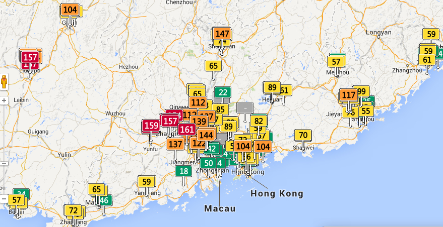
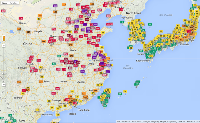
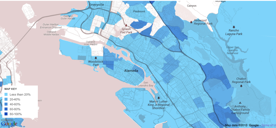
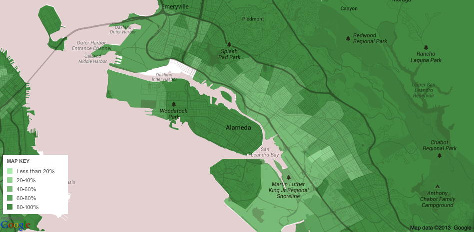
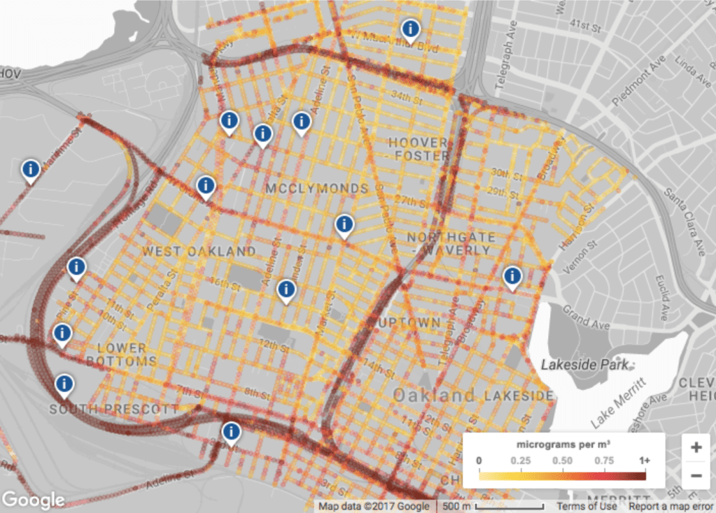
While we began to measure air quality to meet new needs to track ground-level ozone, acid rain, air toxins, and ozone depletion at an atmospheric level, the increased tracking of more common air pollutants since 1990 included airborne particulate matter (PM10 and PM2.5), carbon monoxide (CO), and ozone (O3), we track the effects of wildfire smoke by hourly levels of each at local points, parlaying sensors into newsfeeds as wildfires rage. If stocked with labels of each chromatic layer, are these real-time updates lacking not only legends–but the temporal graph that would clarify the shifting data feeds that lead us to give them the illusion of purchase on the lay of the land we are trying to acknowledge this fire season?

Berekeley, CA October 1, 2020/Clara Brownstein

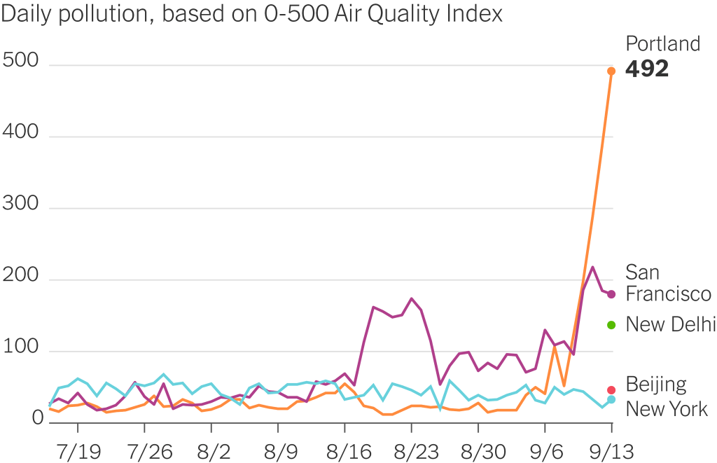
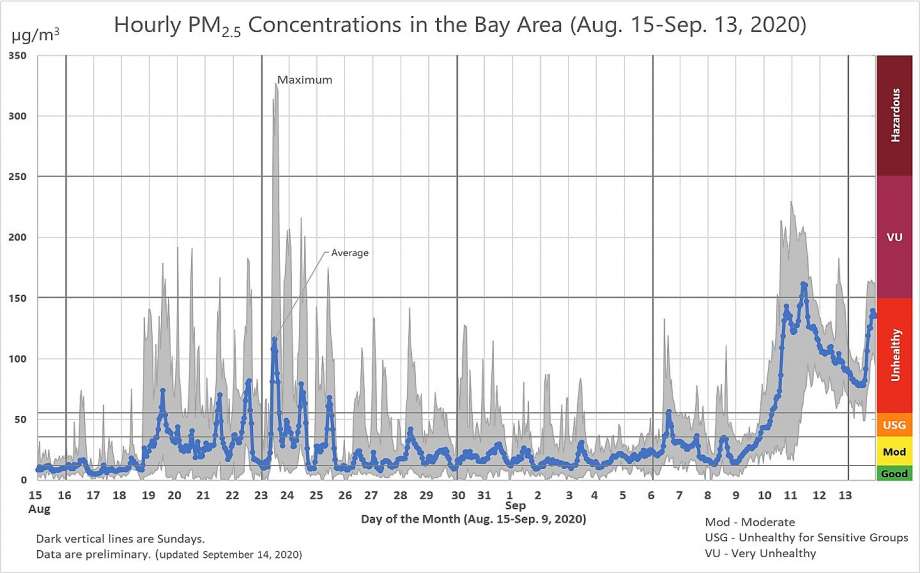
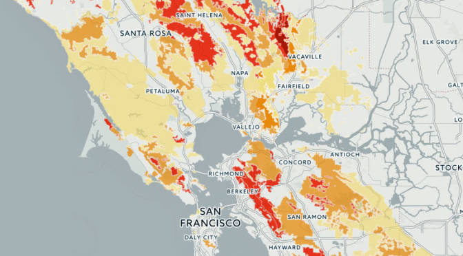
Watching slightly more long-term shifts in quality of air that we breath in the Bay Area, we can see striking spikes of a maximum just after the lighting siege began on August 19, 2020 across much of the state, as air quality decisively entered into a hazardous zone, tracking PPM2.5 concentrations, but entering the worst fifteen air days since registration four times since 1999, when Bay Area Air Quality Management District began reporting the levels of fire smoke in inhabited areas.

Particulate Matter (PM 2.5) Concentrations in Bay Area, August 15-Septmeber 13, 2020/
Bay Area Air Quality Management District

We measure fires by acreage, but the sudden spikes of air quality, while not exceeding the smoke that funneled into the Bay Area during the North Bay Fires in 2017, when the Tubbs and Atlas Fires devastated much of the Wine Country, created a run of high-smoke days, were followed by a set of sudden spikes of the atmospheric presence of particulate matter that we tried to track by isochomes, based on real-time sensor reading, but that emerge in better clarity only in retrospect.

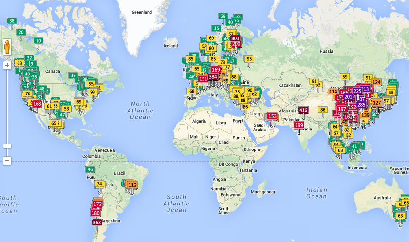
It is true that while the AQI maps that offer snapshots of crisp clarity of unhealthy air might serve as an alarm to close windows, remain indoors, and call off school–

AirNow AQI map in Bay Area after Lightning Fires, August 22, 2020

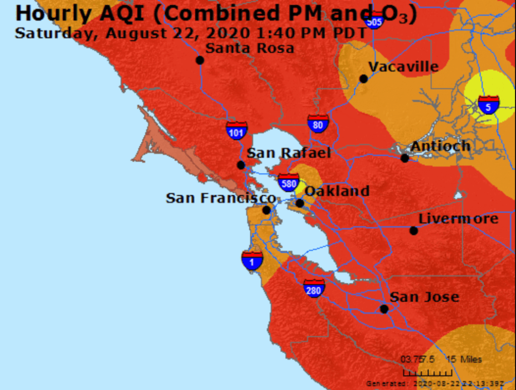
–as particulate matter spread across the region’s atmosphere. We are used to weather maps and microclimates in the Bay Area, but the real-time map of particulate matter, we immediately feared, did not only describe a condition that would quickly change but marked the start of a fire season.

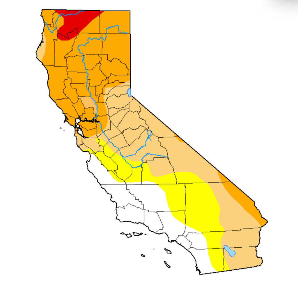
Not only in recent days did the sustained levels of bad air suggest an apocalyptic layer that blanketed out the sun and sky, that made one feel like one was indeed living on another planet where the sun was masked–a sense heightened by the red suns, piercing through grey smoke-cover that had seamlessly combined with fog. Although the new landscapes of these AQI maps generate immediate existential panic, we should be more panicked that while we call these fires wild, they release unprecedented levels of toxins once imagined to be detected as industrial pollutants. The seemingly sudden ways that black carbon soot blanketed the Bay Area, resting on our car hoods, porches, windowsills and garbage bins were not only an instant record of climate emergency, but the recoil of overly dry woods, parched forests and lands as overdue payback for a far drier than normal winter, months and a contracted rainy season that had long ago pushed the entire state into record territory. The lack of soil moisture has brought a huge increase of wildfire risk, not easily following the maps of previous fire history, and persistence of “abnormally dry” conditions across a third of California, focussed in the Sierra and Central Valley–the areas whose forests’ fuel loads arrive carbonized in particulate form.

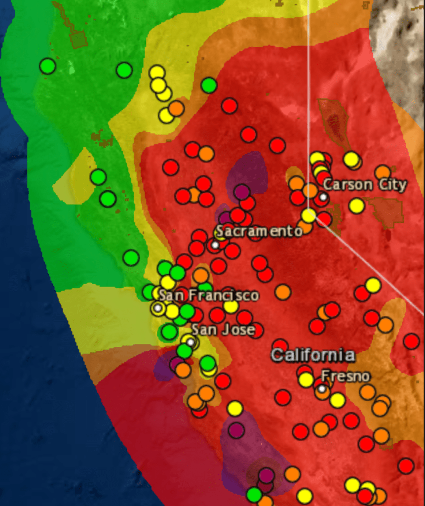
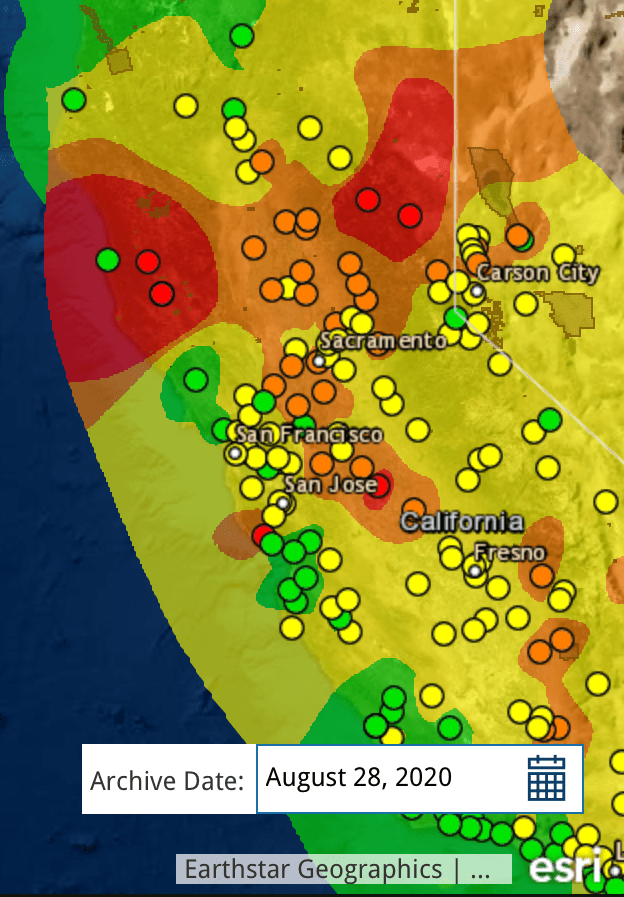
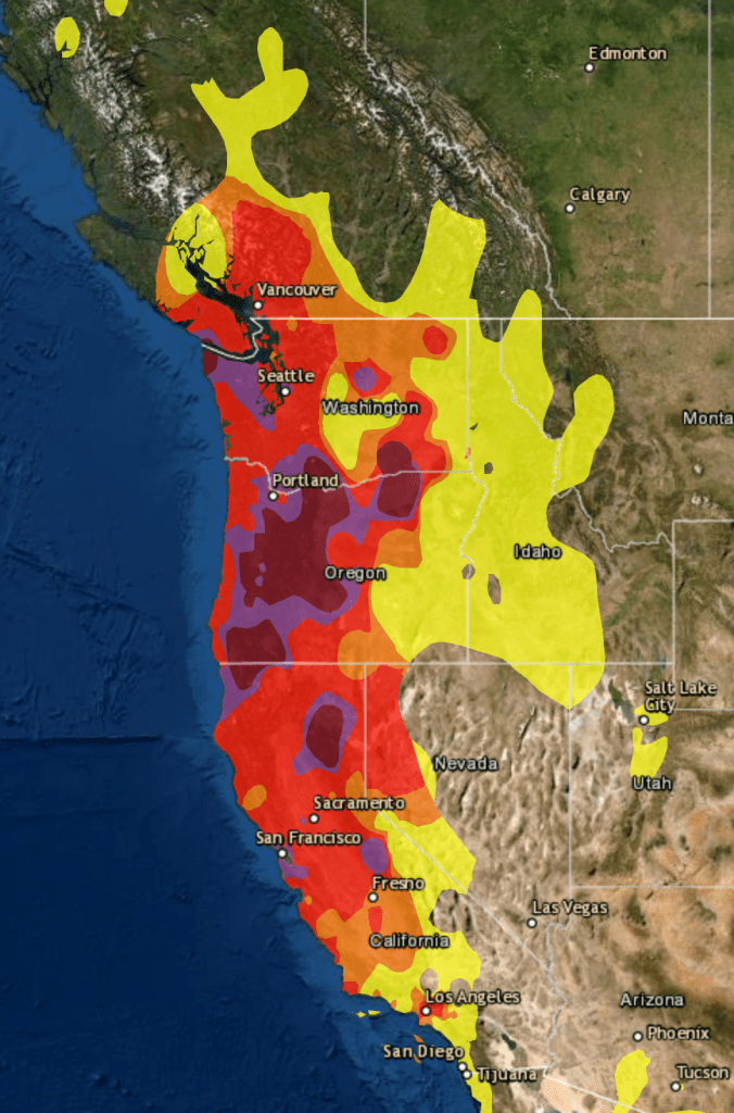
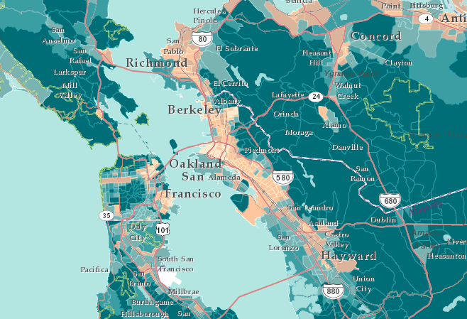
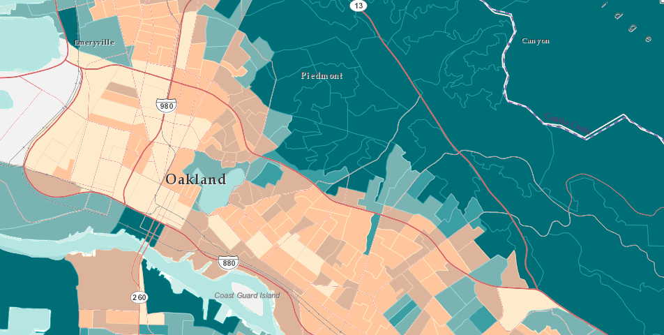
Local monitors of air quality suggest the uneven nature of these actual isochromes as maps–they are reconstructions of what can only be sensed locally, and does not exist in any tangible way we can perceive–but presented what we needed to see in a tiler that made differences popped, highlighting what mattered, in ways that left cities fall into the bottom of the new colors that blanketed the state, in which local sensors somehow revealed what really mattered on August 20: if the “map” is only a snapshot of one moment, it showed the state awash in ozone and PPM.

AirNow/August 20, 2020
Air Quality Index

We were in a sort of existential unfolding in relation to these maps, even if we could also read them as reminders of what might be called “deep history”: deep history was introduced by Annalistes to trace climatic shifts, the deep “undersea” shifts of time, on which events lie as flotsam, moved by their deep currents that ripple across the economy in agrarian societies, suggesting changes from which modern society is in some sense free. “Deep History” has to some extent been reborn via neurosciences, as a history of the evolution of the mind, and of cognition, in a sort of master-narrative of the changes of human cognition and perception that makes much else seem epiphenomenal. If the below real-time map was time-stamped, it suggested a deep history of climate of a more specific variety: it was a map of one moment, but was perched atop a year of parched forests, lack of groundwater, and increased surface temperatures across the west: Sacramento had not received rain since February in an extremely dry winter; its inter was 46% drier than normal, and the winder in Fresno was 45% dryer in February. They are, in other words, both real-time and deep maps, and demand that we toggle between these maps as the true “layers” of ecological map on which we might gain purchase.

The levels of dessication of course didn’t follow clear boundaries we trace on maps. But at some existential level, these flows of particulate matter were not only snapshots but presented the culmination and confirmation of deep trends. We have to grasp these trends, to position ourselves in an adequate relation to their content. For the deep picture was grim: most of California had enjoyed barely half of usual precipitation levels after a very dry winter: Sacramento has had barely half of usual rainfall as of August 20 (51%); the Bay Area. 51%; parts of the Sierra, just 24%. And wen we measure smoke, we see the consequences of persistent aridity.

August 28, 2020/AirNow
Air Quality Index

These are the layers, however, that the maps should make visible, And while these shifts of particulate matter that arrived in the Bay Area were invisible to most, they were not imperceivable; however, the waves of smoke that arrived with a local visibility that almost blanketed out the sun. Perhaps there was greater tolerance earlier, tantamount to an ecclipse. Perhaps that seemed almost a breaking point.

For almost a month after the first fires broke, following a sequence of bad air days and spare-the-air alerts marked our collective entrance to a new era of climate and fire seasons, fine soot blanketed the state at hazardous levels, leaving the sense there was nowhere left to go to escape.

September 13, 2020
Air Quality Index

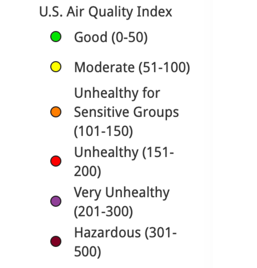
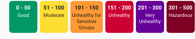
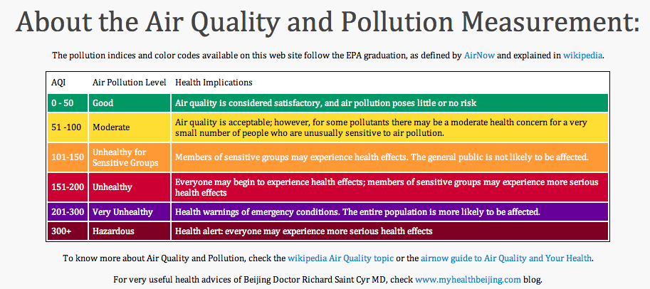
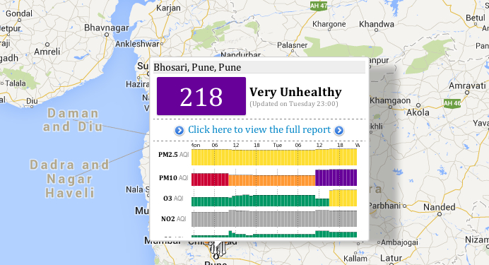
We had of course entered the “Very Unhealthy” zone. If real-time maps condense an immense amount of information, the snapshot like fashion in which they synthesized local readings are somewhat hard to process, unless one reads them with something like a circumscribed objective historical perspective that the levels of PPM5 provides. In maps that are data maps, and not land maps, we need a new legend, as it were, an explanation of the data that is being tracked, lest it be overwhelmed in colors, and muddy the issues, and also a table that will put information on the table, lest the map layers be reduced to eye candy of shock value, and we are left to struggle with the inability to process the new scale of fires, so unprecedented and so different from the past, as we try to gain bearings on our relation to them.

Of course, the real-time manner that we consume the “news” today

militates against that, with feeds dominating over context, and fire maps resembling increasingly weather maps, as if to suggest we all have the skills to read them and they present the most pressing reality of the moment. But while weather maps suggest a record of the present, these are not only of the current moment that they register. Looking at them with regularity, one feels the loss of a lack of incorporating the data trends they depict, and that are really the basis of the point-based maps that we are processed for us to meet the demand for information at the moment, we are stunned at the images’ commanding power of attention to make us look at their fluid bounds, but leave us at sea in regards to our relation to what is traced by the contour lines of those isochrones.

Bay Area Air Quality Management, PM2.5 Concentrations, August 15-September 13, 2020

We can, in the Bay Area, finally breathe. But the larger point re: data visualizations is, perhaps, a symptom of our inflow of newsfeeds, and lies in those very tracking maps–and apps–that focus on foregrounding trends, and does so to the exclusion of deeper trends that underly them, and that–despite all our knowledge otherwise–threatens to take our eyes off of them. When the FOX newscaster Tucker Carlson cunningly elided the spread of wild fires ties to macro-process of climate change, calling them “liberal talking points,” separate from climate change, resonating with recent calls for social justice movements to end systematic racism in the country: although “you can’t see it, but rest assured, its everywhere, it’s deadly. . . . and it’s your fault,” in which climate change morphed to but a “partisan talking point” as akin to “systematic racism in the sky.”

While the deep nature of the underlying mechanics by which climate change has prepared for a drier and more combustable terrain in California is hard to map onto to the spread of fires on satellite maps, When climate denialism is twinned with calls for reparations of social injustice or gun control as self-serving narratives to pursue agendas of greater governmental controls to circumscribe liberties, befitting a rant of nationalist rage: the explanations on “our” lifestyles and increased carbon emissions, only pretenses to restrict choices we are entitled to make, Carlson was right about the depths at which both climate change and systematic racism offer liberal “lies”–especially if we squint at tracking maps at a remove from deep histories, and cast them as concealing sinister political interests and agendas, the truly dark forces of the sinister aims of governmental over-reach in local affairs.

“Structural racism” is indeed akin to the deep structure of climate change if the cunning analogy Tucker Carlson powerfully crafted for viewers did not capture the extent of their similarities. For if both manifest deep casualties created by our society, both depart from normalcy and both stand to hurt the very whites who see them as most offensive. The extent of inequalities of systematic racism as present in our day-to-day life as is the drying out landscape. And the scope of climate change is able to be most clearly registered by the evident in trends of diminished precipitation, groundwater reserves or temperature change that create environmental inequalities, too often obscured by the events of local air quality or maps of social protests that respond to deep lying trends.

To be sure, the tracking of environmental pollutants underlay the national Pollution Prevention Act of 1990, and led to a number of executive orders that were aimed to set standards for environmental justice among minority communities who long bore the brunt of industrial pollutants, from lead paint to polluted waters to hazardous waste incinerators. And, as we are surrounded by racial inequalities that are visible in systematic inequalities before the law, and have lowered life expectancies of non-whites in America by 3.5 years, increasing rates of hypertension, cancer, and systematic disenfranchisement of blacks–these extensive inequalities hurt whites, and hurt society. As Ibrahim X. Kendi perceptively noted, White Supremacists affirm the very policies that benefit racist policies even when they undercut interests of White people; they “claim to be pro-White but refuse to acknowledge that climate change is having a disastrous impact on the earth White people inhabit.” Is there a degree of self-hatred that among Carlson’s viewers that informs Carlson’s frontal attack on climate change and structural racism as myths, more content to blame non-Whites for structural inequalities.

But these inequalities are evident in the differences in air quality that climate change creates. For if the AQI maps tell us anything, it is the absence of any preparedness for the interconnections of fire, smoke, and large dry stretches of a long story of low precipitation that have created abnormally dry conditions–indeed, drought–across the state.

California Drought Monitor, Sept. 17, 2020/Brad Rippey, U.S. Department of Agriculture

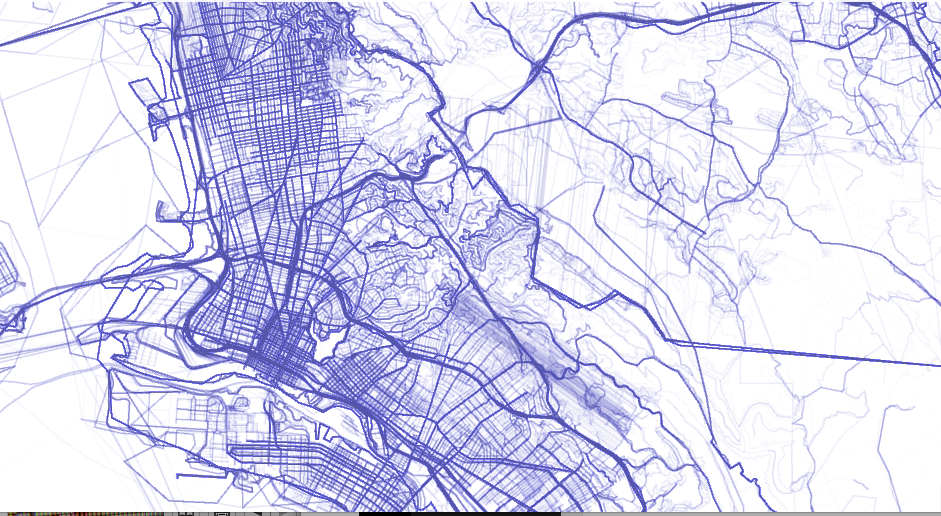
The intensity of severe drought across the conifer-dense range Sierras raises pressing questions of federal management of lands: the moderate to severe drought of forested lands intersect with the USDA Forest Service manage and the over 15 million acres of public lands managed by the federal government manages or serves as a steward.

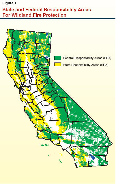
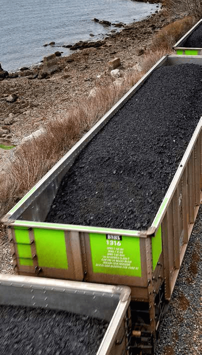
–that crosses many of the dried out wildland and rangeland forested with conifers and dense brush, a majority of which are managed by federal agencies–19 million acres, or 57%– but with climate change are increasingly drier and drier, which only 9 million are privately owned.

Ownerships of California Forests and Rangeland
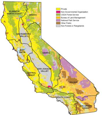
USDA Forest Service Management (Purple), National Parks (Lavender), Bureau of Land Management (Orange)

Yet the reduction of Wildland Fire management by 43.98% from FY2020 to FY2021 in President Trump’s budget continued the systematic erosion of funding for the United States Forest Services. As California weathered longer and longer fire seasons under Donald Trump’s watch, Trump made budget cuts $948 million to the Forest Service for fiscal year 2020, after defunding of US Forest Services by reducing mitigating fire risk by $300 million from FY 2017 to FY2019, cutting $20.7 minion from wildlife habitat management, and $18 million from vegetation management–a rampage beginning with cutting USFS research funding by 10% and Wildland Fire Management by 12% in FY 2018! While blaming states for not clearing brush in forests, sustained hampering of managing federal lands rendered the West far less prepared for climate change. As the costs of containing wildfires rise, the reduction of the Forest Service budget has provoked panic by zeroing out funding for Land and Water conservation–alleged goals of the Trump Presidency–and cuts grants to state wildfire plans by a sixth as fire suppression looms ever larger.

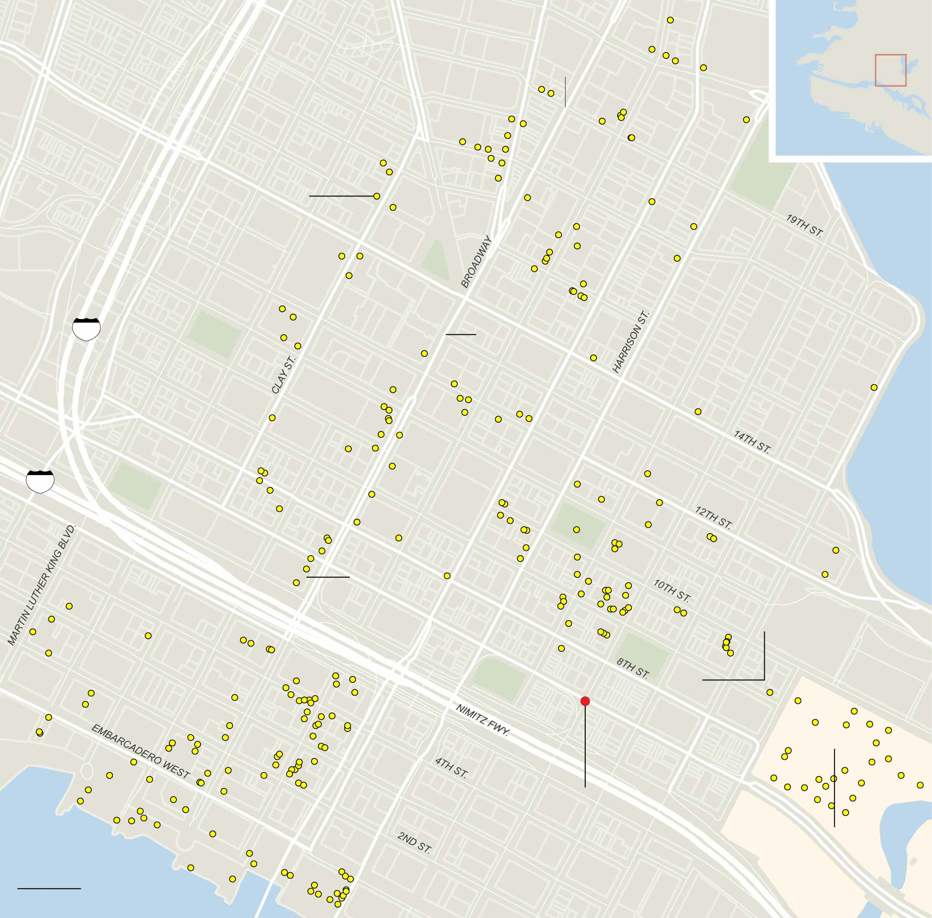
By defunding of forest management, rangeland research, and habitat management, such budgetary measures pose pressing questions of our preparedness for the growing fire seasons of future years; stars that denote public land management might be targets for future dry lightning.

Ecosystems of California (2016)

1 Comment

Filed under Climate Change, climate monitoring, climate sciences, data visualization, fires

Earth, Wind, and Fire

We think of earth, wind and fire as elements. Or we used to. For the possibility of separating them is called into question in the Bay Area, as wind sweeps the smoke of five to seven fires, or fire complexes, across the skies, we are increasingly likely to see them as layers, which interact in a puzzle we have trouble figuring out. Indeed, the weirdly haunting daily and hourly maps of air quality map the atmospheric presence of particulate matter by isochrones brought late summer blues to the Bay Area. Blue skies of the Bay Area were colored grey, burnt orange, and grey again as cartoon plumes of soot flooded the skies in a new sort of pyrocumulus clouds that turned the sun red, offering a disembodied traffic sign telling us to stop.

Clara Brownstein/October 1, 2020

Fire season began by remapping the town in terrifying red that registered “unhealthful,” but almost verging on the “hazardous” level of brown, based on local sensors monitoring of ozone, but is also registering a deeper history defined by an absence of rain, the lack of groundwater, the hotter temperatures of the region and the dry air. The map is both existential, and ephemeral, but also the substrate of deep climate trends.

AQI Chart on Saturday, August 22, 2020/AirNow (EPA)

Is fire an element we had never before tracked so attentively in maps? We did not think it could travel, or had feet. But wildfire smoke had blanketed the region, in ways that were not nearly as visible as it would be, but that the real-time map registers at the sort of pace we have become accustomed in real-time fire maps that we consult with regularity to track the containment and perimeters of fires that are now spreading faster and faster than they ever have in previous years. And soon after we worried increasingly about risks of airborne transmission of COVID-19, this fire season the intensity of particulate pollutants in the atmosphere contributed intense panic to the tangibility of mapping the pyrocumulus plumes that made their way over the Bay Area in late August. As the danger of droplets four micrometers in diameter remaining airborne seemed a factor of large-scale clusters, the waves of black carbon mapped in the Bay Area became a second sort of airborne pathogen made acutely material in layers of real-time Air Quality charts.

The boundaries of fire risk charts and indeed fire perimeters seemed suddenly far more fluid than we had been accustomed. When we make our fire maps with clear edges, however, it is striking that almost we stop registering the built environment, or inhabited world. As if by the magic of cartographical selectivity, we bracket the city–the sprawling agglomeration of the Bay Area–from the maps tracking the destructiveness and progress we call advancing wildfires, and from the isochronal variations of air quality that we can watch reflecting wind patterns and air movements in accelerated animated maps, showing the bad air that migrates and pool over the area I life. The even more ephemeral nature of these maps–they record but one instant, but are outdated as they are produced, in ways that fit the ecoystem of the Internet if also the extremes of the new ecosystem of global warming–the isochrones seem somewhat fatalistic, as they are both removed from human agency–as we found out in the weeks after the Lightning Siege of 2020 that seemed a spectacle of the natural world that rivaled the art of Walter de Maria in their grandiosity of time-lapse photography–

Shmuel Thaler, CZU Lightning Strikes
Walter de Maria, Lightning Field, 1977
Shmuel Thaler, CZU Complex (2020), detail

–the horizontal line of artificial light from Santa Cruz, unlike the images that De Maria created from The Lighting Field, remind us of the overlap between inhabited spaces where conflagrations in the dry wildlands that spread as the fires struck, and in way far less difficult to aestheticize than The Lightning Field set in a desert removed from human population, but was built as an isolated field for time-stop photography.

The CZU complex brought widespread devastation across areas of extra urban expansion in the Santa Cruz Mountains was almost a map that registered the expansion of residences to the very borders of forests. We haven’t ever faced the problem of maintaining and clearing in weather this dry, even if we have mapped the clustering of fires in the wild land-urban interface: but the strikes ignited underbrush lain like kindling, on the boundaries of the raging fire complexes. If the burning of underbrush by fire mitigation squads seeks to create fire lines in the mountainous landscape to create new perimeters to forestall the advance of major fires, working along a new fire line even as what is still called wildfier smoke travels across the nation, far beyond the Bay Area.

While watching the movement of fires that them in inhabited areas like shifting jigsaw pieces that destroy the landscape across which they move. These marked the start of megafires, that spread across state boundaries and counties, but tried to be parsed by state authorities and jurisdictions, even if, as Jay Inslee noted, this is a multi-state crisis of climate change that has rendered the forests as fuel by 2017–for combined drought and higher temperatures set “bombs, waiting to go off” in our forests, in ways unable to be measured by fire risk that continues to be assessed in pointillist terms by “fuel load” and past history of fires known as the “fire rotation frequency.” When these bombs go off, it is hard to say what state boundary lines mean.

Fire Threat Risk Assessment Map, 2007

If San Francisco famously lies close to natural beauty, the Bay Area, where I live, lies amidst of a high risk zone, where daily updates on fire risk is displayed prominent and with regularity in all regional parks. These maps made over a decade ago setfire standards for building construction in a time of massive extra-urban expansion. But risk has recently been something we struggled to calculate as we followed the real-time updates of the spread of fires, smoke, and ash on tenterhooks and with readiness and high sense of contingency, anxiety already elevated by rates of coronaviurs that depended on good numbers: fire risk was seen as an objective calculation fifteen years ago, but was now not easy to determine or two rank so crisply by three different shades.

Fire Risk Map, 2007

When thunderstorms from mid-August brought the meteorological curiosity of nearly 12,000 dry lightening dry strikes from mid to late August 2020, they hit desiccated forests with a shock. The strikes became as siege as they set over three hundred and fifty-seven fires across the state, that rapidly were communicated into expansive “complexes” of brush fires.

We map these fires by state jurisdictions, and have cast them as such in policy, by borders or the perimeters we hope to contain barely grasp the consequences of how three quarters of a million acres burned up suddenly, and smoke from the cluster of fires rose in columns that spread across state boundary lines as far as Nebraska, and how fire complexes that spread across three million acres that would soon create a layer of soot across the west, eerily materialized in layers of GIS ESRI maps of environmental pollutants, while toxic particulate mater released in plumes of black carbon by the fires cover the state, rendering the sun opaque where I live, in the Bay Area, now Pompeii by the Bay as smoke at toxic levels blanketed much of the state.

They even more serious map, to be sure, was of fire spread: but the maps of air quality set the entire western seaboard apart from the nation, as if threatening to have it fall into the ocean and split off from the United States,–even if the burning of its open lands was more of a portent of things to come, they were a historical anomaly, lying outside the record of fire burns or air quality, if the poor air quality traced the origin of black carbon columns of smoke that would rise into the nation’s atmosphere.

Wilfire Today, AQI Map/Sept-15, 2020
Continue reading

4 Comments

Filed under Active Fire Mapping, American West, Climate Change, data visualization, fires

Mapping the Inequities of the Anthropocene

The notion of the Age of the Anthropocene has inspired an attempt to pinpoint the thresholds of contemporary environmental change.  The recent maps that register the shifts in the Air Quality Index at specific sites offer a way to register the impact of anthropogenic impact on the breathed environment that are especially compelling in tracing the momentous impact that man-made industry–and specifically the burning of coal–has in propelling global inhabitants into an age of the Anthropocene, and indeed in impacting local environments.  The changes of global climates pose peculiar difficulties of mapping by placing ourselves as viewers outside of the momentous changes they describe.  For the notion of mapping the arrival of the Anthropocene–or the signs of the visible impact humans left on the environment raises questions of how a map can trace the footprint humans have left on the earth’s biosphere.  If the epoch of the Anthropocene challenges one to position oneself outside the very processes in which one knowingly or unknowingly takes part, or indeed capture the consequences of a geological change in the biosphere to human life.

Do the differences of the AQI provide a sufficiently compelling map of the local dangers of potentially catastrophic environmental change?  Recent “revisionist ecologists” or self-styled pragmatists have called for forging or discovering possible “Paths Toward a ‘Good’ Anthropocene,” as Andy Revkin discussed at his New York Times Dot Earth blog, which stresses not the ecological evils of a narrative of global pollution, but the potential that values determine necessarily tough choices, striking debate that has reverberated in the Twitterverse as a perilous promise or a necessary evil under the hashtag #Anthropocene.  Revkin’s “Paths to a ‘Good’ Anthropocene,” has struck a nerve as subverting the core beliefs of Environmentalism by tweaking it with the prefix New, under the banner of eco-pragmatism.  One part of the basis for such “eco-pragmatism” seems to be the tired nature of the narrative of environmental ecology–or rather, of the alarmist hue that, for Keith Kloor, has morphed over the years from talk of a plundered planet a sixth extinction, and a baked planet to characterizing a planet under severe ecological pressure from multiple directions.  The narrative of the anthropocene, an odd term adopted in common parlance, narrates less a disaster than a widespread constellation of impacts of the human on our notions of nature, of sexual reproduction and differentiation, of genetic transmission, and on the geological record or livability of the atmosphere.

Can maps help this debate, by charting a differentiated view of “impact” and its geographical differentiation and spatial distribution, or in other words tracking anthropogemoc changes in hopes to mitigate its effects?

Can practices of mapping offer means to capture and conjure that constellation of changes, or tools visualize the momentous mechanisms of climatological change in which the human is folded into the environment–and economic activity inscribed in nature–that might most effectively communicate its arrival?  Can effects of the Anthropocene be tracked over space?  As Shakespeare imagined “his cheeke the map of daies out-worne” in Sonnet 68, as if the face were a map of temporal changes wrought by time,  so that “when beauty liv’d and dy’ed as flowers do now,/ Before these bastard signes of faire were borne,/ Or durst inhabite on a living brow,” the maps below of local levels of air pollution bear the scars of time and global capital. To track the disparities that mark the close of the Holocene is to trace the introduction of previously unforeseen limits on the expansion of human activities and indeed the sphere of human freedom.   While the entrance into the Anthropocene has been laid at the footstep of industrialized nations with considerable justification, rather than being understood only as a category of geological time, the odd currency of the geological term with a geography of the earth’s habitabilty.  

The difficulty–if not near-impossibility–of returning to a healthier presence of CO2 in our atmosphere “from [current levels] to at most 350 ppm” voiced by climatologist Dr. James Hansen–and the organization 350.org– might be less easily solved than they hope, and might even risk orienting discourse on the Anthropocene toward remediation and restoration of equilibria.  Indeed the hope for such a return to a level of safety from current levels surpassing 400 ppm are not only a huge change from early eighteenth-century levels of 275 ppm, may distract attention from the deeper consequences of the enmeshing of the human in the biosphere:  the deeper inequities of our globalized economy are revealed in a more variegated map of our entrance to the Anthropocene.   The disproportionate contribution of industrialized countries to carbon emissions create well-known ethical questions of the distribution of shared responsibility for a crisis in climate change given the unequal distribution of the anthropogenic origins of climate change, emblematized by the disparities in fossil fuel emissions worldwide–which most ominously ballooned from the mid-1960s to the present day.

Carbon Emissions

Despite the use of maps to localize disparities in fossil fuel emissions, map smog map smog or define localized ozone holes, no greater detail is available in maps than disparities in air quality.   As we struggle undertake to trace such disparities, it is especially striking web-based maps reveals deep discrepancies in how levels of pollution have constrained questions of habitability at local levels, already evident in the imbalances revealed in data taken from the World Health Organization of the variations in the distribution of local means of small particle matter less than 2.5 microns across the earth.

Global Particulate Matter 2:5 WHO

The challenge of translating changes in the biosphere to a static map is not easy.  Even visualizing the range of changes runs the risk of reducing or distracting the intensity of their impact.  Dipesh Chakrabarty has aptly observed how environmental change constitutes “as a geophysical force, [a situation where] we now wield a different kind of agency as well – one that takes us beyond the subject/object dichotomy, beyond all views that see the human as ontologically endowed beings, beyond questions of justice and human experience.” For the very reason that we are immersed in its changes, we are challenged to read the record of massive changes and shifts in global environment of the sort registered in a map.

But the regional distributions of variations in that manmade environments have been recently readily synthesized on a Google Maps API to provide a scary spectrum of how we alter polluted air quality in real time:  the shifts in select areas of the world–even if these areas which release pollutants that of course disperse worldwide–reveal one image of the uneven distribution of our entrance into the era of the Anthropocene. And although the ethics surrounding the degree to which over-industrialized countries have over-contributed to the advancing of markers of the dawn of the Anthropocene–from global warming to increased CO2 emissions to ocean salinity–the spectrum of the local distribution of air pollutants demands to be read.  The coding of such pollutants in the AQI keys each region by its departure from acceptable levels of health–and indeed the departure from standards of the Holocene, based on different levels or parts per million of contaminants able to lodge in the lung.

legend with promos

If the dawn of the Anthropocene presents itself as a counter-discourse to a globalized economy, raising the multiple specters of the risks and dangers of unfettered economic development and growth, it reflects inescapable constraints on those very practices and presumption of human liberties:  for it articulates “biogeochemical processes which [not only clearly] imperil the human species’ life-support system; it is also the antithesis of a politico-ontological condition central to modernity: freedom,” as Ben Dibley has observed in his Seven Theses on the Anthopocene, and articulate the parameters or constraints in which human freedom must henceforth now be re-understood–constraints in which mechanisms of the market might be able to secure and to perpetuate livable conditions of an easily habitable space.

Mapping real-time concentrations of pollutants offer snapshots of specific moments, rather than images of a geological “deep time” or defining a single tipping point of long-term ecological flows.  But the discrepancies in global air pollution registered in a real-time air quality index map charts reported measurements of airborne pollutants in a Google Maps API to trace a shifting canvas of how we are now engaged in the alteration of the environment. While misleading to some, in its claim that “Good” levels of pollution exist in many regions, the distribution raises stunning divisions in the levels of local atmospheric contamination based on air quality indices.   As of today, the map suggested particularly localized pockets of pollutants, with a surprisingly large number of sites marked red (Unhealthy; 151-200 AQI, as defined by AirNow) and violet (Very Unhealthy, 201-300 AQI), and three sites in Delhi, Finland, Austria, and Coyhaique, Chile viewed of Hazardous air quality levels of over 300, which qualifies for a health alert. This sort of mapping of the man-made environment, where discrepancies in air pollution can be readily registered, offers something of a map of anthropogenic effects.  Variations in pollutants offer blunt tools to trace the disparities of anthropogenic impact on the global atmosphere–or to register a “local” distribution of the geophysical forces of the impact of Anthropocene.

pokets of pollutants

As one scrolls across or zooms in to discern the different distribution of colored placards that dot the map’s familiarly and largely light green surface, one readily flags something like environmental divides across both large regions of the global atmosphere, as well as specific noticeable differences of place, no doubt relating to industry, and shifting standards that raise the question of whether entrance to the Anthropocene is indeed the other side of the coin of globalization, or how much local, regional, and indeed striking national differences persist in this mapping of inhaled air, clustering in individual countries’ different standards of emissions for industry or automobiles.

Mapping Air Divides

The cartographical labels in the above map tracking air-pollutants offers a new grounds for the label “Red China” by the density of its clustering of unhealthy levels of air pollution as of this May 22:

%22Red%22 China

A recent study from the researchers at  Berkeley Earth has measured the devastating effects of such levels of pollution, caused mostly by coal-burning, on China’s population, and does better by discriminating the levels of specific pollutants:  the lack of restrictions on coal-burning contributes a devastating number of deaths of 4,400 Chinese each day, totaling some 1.6 million annually, on account of the diffusion of airborne particles of less than 2.5 microns in diameter–able not only to lodge in the lungs, but be absorbed into the bloodstream, in ways that t take the notion of the Anthropocene to the level of the embodied.  Based on hourly readings at some 1,500 stations in mainland China, Taiwan and Korea, the distribution of almost entirely man-made pollutants can be tied with relative certainty to increasing rates of asthma, strokes, lung cancer, and heart attacks.  And the numbers are shocking, from the concentration of particulate matter in the particularly pungent sulfur dioxide, released by burning fossil fuels, or nitrogen dioxides, a toxic pollutant emitted from the widespread combustion of petrochemicals:

PPB China
Alarmingly high levels of pollutants greater than 2 ppb/hour.

It is no surprise that sites of industry where coal-burning is allowed offer more clearly defined sites of concentration of Sites of industry divide and readily distinguish air quality dramatically worldwide and in North America, revealing the local impact of the human on the biosphere:

Lake Eirie pollutants in air around Lake Bad Air Belt in Georgia, May 21 3 pm

The largely “green” California, whose ocean rim encourages a high quality of air, even with its own well-known pockets of pollution in its Southlands:

California Green? May 21, 3-18

Piled up green rectangles don’t all equally signify healthy air quality, one should again note, but the discrepancies from Los Angeles to Tijuana, Mexico are nice to place in relief.

Southern California Air

Given the increased amounts of small particulate matter of a radius of less than 2.5 microns in much of southern California, whose clickable feature show the somewhat overly bulky embedding of data in this world map–

PM 2.5

the proportion of this particularly pernicious pollutants to entering and lodging within human lungs can’t help but recall a current rash of uncontrolled fires searing southern California’s coastline this mid-May, themselves tied to the effects of human presence:

California Fires mid-May 2014

Such considerably broad variations in air quality force one to wander more broadly over the slippy map’s surface,  exploring ties, evoked in how Ben Dibley’s characterized the Anthropocene as newly emerging global apparatus folding global economic relations in the geographic that creates the “terrestrial infrastructure for global capital.” The arrival of an Anthropocene, Dibley clarifies, “signals a geological interval since the industrial revolution, where, through its activities, through its numbers, the human species has emerged as a geological force now altering the planet’s biosphere,” evident in the exponential growth of the human population and the arrival of new geographical strata of Anthropocene rock built to serve the needs of ever-expanding inhabitants:  concrete highways, sidewalks, parking lots, airports and landing strips, or Superfund sites of toxic waste or garbage patches and trash vortices, steel shopping centers, loading zones, or the earlier mines, garbage dumps, and railroad depots that collectively signify the remaking of the inhabited world, but whose totality comes to create parameters for future growth.  The changing global apparatus to the earth system in which the human is an agent appears the underside of a narrative of modernization, whose inescapable telos is not emancipation from natural forces or limits, but entrapment by them:  freedoms to pursue economic development become the primary threats to the support system enabling human life.  Despite difficulties in relying on Google Maps as a measure of the constraints on that freedom, the measure of atmospheric pollutants lift a corner on the increasingly circumscribed limits that actually curtail individual freedom. Its measurement is particularly compelling for what they suggest about how economic development tied to the project of modernity come to constrain the world’s continued inhabitation by human life–as the pernicious nature of the development of Abu Dhabi throws into relief.

Emirates and Abu Dhabi 5.21, 3-10

This sort of a map is predicated on the numbers on which it is based.  The variations in measurements of air quality are striking on the Canadian border, perhaps revealing different standards or sampling practices.

Lower Canada

Europe offers interesting variations in quality of healthy air, with most danger signs located in the UK and North Sea:

%22Europe%22 in Air Pollutedness   Ireland, North Sea and Germany may 21, 3 pm

Central Europe, thought a bear of industry and coal, seems both highly monitored and at the same time roughly comparable to England:

EU Air

But the pocket of air quality that is literally off the charts one day near to Ankara–999–raises questions about how relatively low readings are in cities quite nearby.

Ankara and Turkey, May 21 3-06 pm

To be sure, Anatolia can also, in other real-time maps, seem quite green on other days:

Anatolia can also be so Green

Real-time air pollution seems egregiously under-reported in South Asia, however, despite real high readings in two concentrations that seem quite situated at first glance:

Southern Asia:india

But a slightly magnified scale reveals greater local detail in a polluted zone:

near Rajiv Gandhi Infotech Park

Even if the readings of unhealthy air quality around Pune and Mumbai, if concern for alarm, are not comparable to Ankara:

Near Mumbai   Pune--Very Unhealthy!

The accessibility of a full report of air quality of any place on a pop-up screen suggest a level of detail, to be sure, that this post does not do justice. But one is impelled to marvel at the stark inequities in the Anthropocene, both surprising and unjust, from Mexico City to Ankara or China:

Mexico City at continental divide   Ankara and Turkey, May 21 3-06 pm

The striking global inequalities of concentrations of air pollution that seem particulate endemic across China cannot, however, help but give pause for the hazardous concentrations of particulate matter that they indicate.

Chinese Cities

Despite a dangerously uniform measurement of particulate matter (AQI) verging on or surpassing 200, the concentration in Shanxi provide is particularly striking near its shore, and reaches an apex of 890 in Shangdong province, despite poor air quality of particular unhealthiness in the gulf:

Shanxi Province, pocketsin ports

The remarkably high levels of air pollutants along the Yellow River is particularly alarming and striking, since pockets of particulate matter of less than 10 microns, particularly dangerous to the respiratory system, approach hazardous levels in Shangdong (890), and even finer–and more dangerous–clusterings of much more dangerous particulate matter of diameter less than 2 microns, able to lodge more deeply in the lungs, reach hazardous levels in Bizhou.  Have the health risks been conceived?

Clusters in Binzhou   Binzhou

In the south of China, from Chengu to Hubei to Anhui provinces, one can trace a stream of red flags along rivers, and multiple regions of unhealthy air quality deep in the interior:

Chengdu to Hubei

The far better air quality in the Guangdong region, in sharp contrast, reveals concentrations of airborne pollutants outside of the port of Hong Kong.

Guangdong Province-outside Hong Kong

But what to make, on the eve of the accord between China and Russia on natural gas pipelines, of the apparent absence of limits on air pollutants in so very much of the PRC?

Mapping Air Divides

The commercial tie-in is rather obvious, and the map may be a marketing device for masks made to filter out particulate matter, in a wonderful example of cartographical product placement:
Facemasks

Leave a comment

Filed under 'Good' Anthrpocene, 350.org, Andy Revkin, anthropocene, AQI, Berkeley Earth, Mapping Air Pollutants, Mapping Air Quality

More Better Mapping of Oakland’s Populations

OAKLAND

Maps have long been described or conceived as windows–analogous in ways to pictorial perspective–that invite viewers to look into a space in new ways.  But both word maps as the above, made of the names of Oakland’s almost 150 different neighborhoods, or more statistically derived data visualizations of the city are mirrors that present a less homogeneous or continuous image of the city that we want to see:  if the roughly type-set image above suggest a make-do approach of the somewhat scruffy post-industrial port city with big loading docks, but erase its dirt or drastically depressed areas with lively type.

Data visualizations offer mirrors of the city’s inhabitants and shifting neighborhoods that are both dependent on the source-data that they use, and how they obtained it, but also on the dynamic layers that digital mapping allows us to place as overlays on the base-map of the city’s mountains and shores.  While these maps are only as good as the data that they use, they reflect back some of the divisions in the city that we might not otherwise notice or want to see.

And while not based in prose in the same manner as the Ozan Berke’s word-map that nicely knit together the city’s 146 vastly different neighborhoods, they offer ways of reading the city’s multiple divides.  The increased data that is available from Open Oakland and other sources will doubtless offer further–and far more refined–images of the city’s deep differences and their bridging, and can serve as better and more detailed maps of its populations.  But in the meantime, the sorts of mirrors these maps offer can also provide ways to imagine paths toward a future for Oakland, and better understand ways forward in its public policies.  Many of them draw from the American Community Survey, created by the US Census and discussed in earlier posts, but all seek to focus attention on the city and to serve, as mirrors, to show differently refracted visions of its divides, in the hope that few distort Oakland’s diverse populations.

A famous image of the distinctly uneven distributions of Oakland’s inhabitants is clear in a recent mashup of maps of the Bay Area Rapid Transit system’s public transport map–or, more simply, BART map–with the very zip codes that the American Community Survey mapped, which offers a condensation of the remarkable disparities and differences between income, education, child health and life expectancy at separate stations on the same public transport lines:

BART Health Map:Life Expectancy at BART stops

While, to be sure, the system includes suburbs such as Walnut Creek or Fremont, its focus on the East Bay  immediately indicates the deep divisions in a city where a BART stop can take one between areas of over ten years difference in life expectancy, and two more stops down either line sees life expectancy rise by seven or eight years once again.  The huge rise in childhood hospitalizations because of asthma in the City Center–far greater than in Fruitvale–suggests the unique pollution habits of a city whose air quality is still shaped by its proximity to a port.

The image of the diverse city whose neighborhoods are bound together as one unit starts to reveal fissures when one examines its ethnic and voting distribution at a somewhat finer grain, adding to the historical variations in the picture of the city summarized and surveyed in an earlier post.  The problem of mapping those populations adequately, both to reveal the ongoing inequalities and spatial injustice within the city, is not inherent in the city’s structure or divisions, but something that compels visualization in a myriad of ways, and in which we can look for different understandings of the shifting nature of the city’s socioeconomic (and sociocultural) divides.  As well as mapping the lay of the land, mapping the habitation of space creates even more of a “mirror” on the organization of th eplace.

Census_Mosaic

The census mosaic only shows part of the inhabitants’ picture.  Indeed, perhaps a “racial dot” map can be rehabilitated, rendering one dot/twenty-five people, to create a rough distribution Bay Area-wide that respects the looser definition of “neighborhoods,” and does not impose strict racial segregation, as in this image by Eric Fischer, using red dots representing whites, blue representing blacks, green representing Asian and orange Latino populations, in trying to prevent  overlapping and blending of color-points,  and better to define neighborhoods as an ethnic or racial enclave:

Racial Map SF--25:dot Eric Fischer
Oakland Alone--Fischer

Fischer seeks to respect Bill Rankin’s cautionary words that boundaries of neighborhoods are never so stark as on informational graphics, and that a cartographical index of one dot for twenty-five people is better able to allow “transitions also [to] take place [registered] through gradients and gaps” in the map’s surface, suggesting an urban geography without clear boundary lines, clear spatial differentials clearly emerge across the neighborhoods of Oakland, CA:

And while the city was once historically predominantly black, or African American, in its population, one still found clearly define enclaves of blacks that are, sadly, starkly isolated in census blocks, based on results of the 2005-9 U.S. Census:

2005-2009 % Afr Am Oakland

One can map, in relation to the racial composition of the city, the relative percentages of kids in public schools, one index of its community, and the stark dividing lines created by some of its highways and major roads, which divide the regions of the hills from the flats, where few kids attend private schools.

Elementary School Kids in Private Schools

This is given much further definition by the map of those who have completed high school, already used in in my earlier post in a slightly different version, which suggests a chasm between cultures of neighborhood far deeper than race alone.

High School Graduation

Perhaps the starkest underpinnings of this cultural divide is a map using the 2010 Census to define an ESRI visualization, of the city’s divide in income levels in the city and outlying areas:

oakland's Income in bay Area

Which one can zoom into for the City of Oakland, revealing a clearer divide in incomes around  Highway 24, still using Census Blocks, that again reveals some intermingling albeit with sharp divergences in Oakland that stand in sharp contrast to the larger Bay area:

Median household Income East Bay-Oakland in it

To track a deep change in the population of the city that occurred in only recent years,  Pietro Calogero tracked racial displacement from many neighborhoods that illuminate this divide in incomes, around the aftermath o California’s housing crisis.  The map of foreclosed real estate in west and southeast Oakland, the former “industrial areas,” which stand in sharp contrast to wealthier areas in the hills, to illuminate an economic ravaging of the city that shows up in no other way in a simple map–and indeed masks innumerable individual stories of foreclosure and moving out:

Foreclosures OAK

Although perhaps the map of foreclosed houses is difficult to tie to race, Calogero comes closest to revealing stories with a map in choosing to map how African American families were in fact disproportionately effected by foreclosures, and how former African American neighborhoods were gutted from the inside out as residence became unsustainable:

African Americans and Foreclosure in Oakland

The effective narrative of racial displacement that these dynamic maps isolate and present is not only compelling, but raises questions of social justice–and perhaps of social justice and urban mapping.   Despite the broad interpretation of displacement, both when occupied by owner or purchased as an investment, the clear overlap between categories of race and foreclosure seems not only unjust, but a deep crisis, underscoring and mirroring the deep segregation that continues in so many American cities.

And the repercussions of this sort of segregation are evident in the apparent disenfranchisement of despair, revealed in this simple map of voter participation that Ofurhe Igbinedion so astutely thought to create from Alameda County electoral data, which shows a valley of voter absenteeism in an area where the 2010 voting held low potential or positive prospect:

Oakland Voter Turnout

(Igbinedion’s striking–and dismaying–map, reduced in size above, may be viewed in far greater detail here, and will be posted in full with a commentary at http://www.infoalamedacounty.org).

The huge fall-off in turnout among the same population of a territory of disclosure suggests a political disconnect scary in its dimensions, if sadly typical for most American inner cities.  But the cavities of voter turnout in an election for which turnout was itself particularly high–or just short of 75% (74.52%)–suggests a sense of a politics of abandonment.  What, indeed, did the election accomplish for a large percentage of the city?   What resonance did the candidates even hold, or could they hold?  The topography of disenfranchisement is arresting if not puncturing of a vision of a city united in its neighborhoods, and sort of undoes the unity of its own mapping of continuity.

It is a sort of inversion of density.  Mapping the density of population in Oakland by census blocks reveals not only clear neighborhood divides but a uniquely geographic dispersal of demographics, most dense between the freeways and thinning out to the hills and the flats:

Oak Pop Density

There may be real reasons for not living by the shore below the freeway:  the area is not only late-industrial, but the ships spewing sulfur dioxide and pollutants exceeding standards for vehicles that are registered in the United States create a spew of particulate matter over the downtown area not confined to West Oakland, but reaching in to Chinatown, Emeryville and the Downtown area, areas downwind of the port, in this truly terrifying map, posted in 2013 by Sarah Brady and Alfred Twu, and charting the sulfur dioxide and particulate emissions of ships, using the Port of Oakland Emissions Inventory:

oakland-port-and-highway-air-pollution-map

The map reveals regions with air pollution up to 10 times the national average a couple of miles from the port, but whose effects increase risks of cancer and asthma extending twenty miles inland, creating a poorly-known map of particulate matter as an argument to raise pollution standards in Oakland’s port.  Notwithstanding the much-vaunted clean-up of the Port of Oakland, which were aimed primarily at legal safeguards at the level of diesel particulate emissions–emissions that have been largely blamed for sever respiratory problems among local residents–which have indeed decreased from 261 tons to some 77 tons in seven years. (If this was a reduction of 70%, the stated goal of the Port is to further reduce the emissions by 80% by 2020; since July 2009, ships have been required to use low-sulfur fuels within twenty-five miles of the coast, however, and the sulfur-dioxide emissions tied to asthma are not likely to decrease.). And a clearer drilling down of this data–for long, but one station for monitoring air quality even exiusted in Oakland, on Grand Avenue and Poplar, revealing how a stream of heavy trucks with diesel engines that power through the industrial region, and emit particulate matter to Chinatown and Fruitvale:

tHoodline via Google

The data visualization of micrograms of particulate matter per cubic m suggests how much this “tale of two freeways” needs to be examined in detail, and how many questions of environmental justice that the unregulated emission of particulate matter deisel engines disseminates across urban streets: the citizen science group  West Oakland Environmental Indicators Project (WOEIP) is currently engaged in a more detailed study and analysis of West Oakland air quality which the Environmental Defense Fund has helped fund, and they will parrtner with UC Berkeley, to create a clearer distribution of particulate matter of different levels–including ultra fine particulate that can cross the blood/brain barrier–in different regions, with special attention to the possible impact of ultra fine in the exhaust entering West Oakland and other neighborhoods from the 880 freeway and McArthur Maze–emitting some 22 known carcinogens in the urban environment. Both traffic arteries move dangerously high levels of particulate matter through sensitive communities including schools, hospitals, clinics, and childcare centers, in what Emeryville City Council members have come to call a “Carpocalypse.”

MacArthur Maze/Bella Nathan

Despite the suspiciously long silencing of interrogating the clear environmental quandaries of living near freeways, and silence about the impact of the heavy trucking tied to the Port of Oakland on the nearby poorer industrial neighborhood, would the release of such an array of carcinogenic matter be tolerated in other neighborhoods? The demand to use the rail lines to transport coal through Oakland’s Emeryville and West Oakland to the revitalized Port could be placed on the back burner of future city planners and cargo terminal directors in decisive fashion if levels of particulate matter to which residents are exposed is found to reveal: although the Oakland City Council barred proposed handling and storage of coal and petroleum coke at the Port for Oakland Bulk and Oversized Terminal LLC at a parcel the Army abandoned in 1999 that is new the harbor, a ban supported strongly by the Sierra Club and San Francisco Baykeeper. (Any port workers with prolonged exposure would be exposed to even greater health risks.)

The ban is argued to constrain foreign and interstate commerce on which the Port depends, and the city cannot regulate or restrict; coal transit was only banned after the land parcel was purchased and local jurisdiction over rail-borne coal shipments are unclear, despite its potentially aggravating environmental effects: the city has only lost the suit, indeed, as the effects of coal trains have not been studied as a vector of air pollution, despite fears that coal dust could blow off the open-topped cars able to lose up to one ton of dust between mines and port, and release 60,000 pounds of toxic fine particulate matter, on top of the diesel fumes emitted by their locomotives.

Can maps prove that the open-air transport of coal, designed for export, indeed pose a significant public health danger for Oakland residents? Although adding further diesel fumes and coal dust to Bay Area air–especially the dust of bitumenous coal mined in Utah, which has been encouraged by the Trump administration, lifting restrictions on strip mining and extraction of coal that would travel through Oakland, for which the Utah Transportation Commission has been instrumental in negotiating export rights at Oakland’s terminal, without any consultation or contributions of Oakland city council or residents–in April 2015, or before the first hearings in Oakland to study the health effects of the transport of coal and coke, and a broad–over three quarters of Oaklanders–opposition to the transport of coal on railway lines increasingly close to city residences cheek by jowl and often running along I-880–adding significantly to already dangerous levels of particulate matter by diesel engines and open-air cars bearing coal to the Port of Oakland that is in many ways emblematic of the city’s old industrial zone. After a downturn in Utah coal production in 2009, and hopes located the expansion of opening new areas of mining and new mines in 2011, opening the former Grand Staircase Escalante National Monument was long on the front burner of the coal industry–long before Trump told supporters in Salt Lake that “very distant bureaucrats . . . don’t know your land, truly, and don’t care for your land like you do,” and technically oened the regions to coal extraction–even if few corporations have undertaken to negotiate with the BLM for exploring old mines to operate in coalfields that the state had mapped, as if to entice speculation back in 2008.

Utah, Annual Review and Forecast, Coal Production and Distribtuion

Although local jurisdictions are with limited authority over the goods shipped by rail companies like BNSF, but do have authority over marine export. However, most existing studies on coal transport examine different grades of coal through rural areas and populations,–not large cities already possessing dangerously high levels of particulate matter that are densely inhabited. (Oakland has in response terminated construction on the old Army base, but is currently faces suit again.). The question of rail lines that would carry coal-bearing freight in close proximity to schools, churches, parks, and residences in downtown Oakland–a site of commercial revitalization–may raise attention to environmental hazards that West Oakland would even face far more.

OSM map of Rail Lines and I-880 near Port of Oakland CA

The data visualization of micrograms of particulate matter per cubic m suggests how much this “tale of two freeways” needs to be examined in detail, and how many questions of environmental justice that the unregulated emission of particulate matter deisel engines disseminates across urban streets: the citizen science group Woing its own study of West Oakland air quality in partnership with UC Berkeley, with funding from EDF, to create a better visualization of how environmental toxins are released in high-traffic corridors, and create new demand for remediation and social justice.

It’s not uncommon to value (and inhabit) property away from the shoreline.  Examining relations between elevation and population density in the wake of the shifting consciousness of the relation between water-elevation and land-use after Hurricane Sandy, Stephen von Worley offered the following interesting alternative visualization mapping elevation and population density on a spectrum moving from white to yellow to orange to blue, to show the sharp divide between hills and flats in the East Bay:

Stephen Whorley, Elevation and Poopulation Density (2010)
scale von whorley

A nice register of how this space is actually used or perceived, and, equally important, moved through, based on a collation of the adjustments to Open Street Maps of the city, suggests the well-travelled nature of Oakland’s major arteries and downtown roads.   How might this be registered in the surface of the map? is a question that is nicely resolved in this map of Oakland’s self-mapping of its major roadways.

Oakland, McConchie-every line, every point- Oakland

Alan McConchie–Stamen design

The Open Street Map view of Oakland, rendered so distinctively by Alan McConchie, tells a perfect story of the inhabitation of Oakland’s space by its routes of mobility, recalling the sort of GPS-derived maps increasingly common from artists like Jeremy Wood, who practiced “drawing with GPS” as a line of work:  it would be interesting to be able to map street-use at different times of the day, if possible, though deriving data of the abandonment of downtown Oakland when dark is undoubtedly difficult.

The divergence of nighttime and daytime is evoked, if not measured, in Michal Migurski’s brilliant layering of a “heat map” of crime–based on police visits per unit of time–over an OSM template, both layered with a semitransparent streets that interact smoothly with the underlaid data; the combination of layers effectively allowed Migurski to adapt a heat-map of crime to downtown Oakland, using police visits per unit of time as a metric as part of his active and for its time particularly innovative Oakland Crimespotting, in the hope that the HeatMap APIs won’t obscure either context or specifics, and provide a legible text.

map-13

One could argue that this mapping of hot-spots excessively illuminates those areas of BART stops, where more police calls would tend to occur–and, in the case of 12th street and downtown, more street folks congregate.  But the increased number of calls provides a basis to register local attention to crime and property protection, or how the city sees itself.

WATCHING Oakland

And how Oakland maps its own crime, or tends to monitor its own possessions, is foregrounded in this striking map of the downtown density of security cameras, often placed in response to fears as much as evidence.  This final map of the installation of security cameras downtown points up the increased anxieties of its safety, almost in response to and the perceived need to monitor public life, and registers the odd dynamic of a downtown business zone that has few residents, and whose topography of suspicion vastly changes as one moves from daytime into night–when downtown is increasingly abandoned by workers or street populations.

We’re clearly fascinated by the different images of the city’s different composition and divides, and in understanding how best to work within them, or to heal them as best we can. The mapping of security cameras–if focussed in the downtown area–reveals a sense of deep divides, and a perceived in security, no doubt partly voiced as inadequate police coverage among businesses, as much as the city’s residents.  This map, also a mirror, in part doubtlessly contributes to the image Oakland projects, an image that is underscored by deep divide Eric Fischer revealed in his remarkable ‘Bay Area’ map of photographs uploaded by “tourists” v. “locals,” red v. blue, in a database that charts a tale of the visual interest of two cities:

Eric Fischer- Locals v non-Locals in SF:Oak

There are many other, more positive maps of the city’s populations, no doubt, and other mirrors that reveal great changes in the city’s diverse communities.  But only by understanding the lay of the land, as it were, and situation of these communities, can we hope to understand the unique challenges that the city faces.

The ambitious investment by a generous benefactor of a whopping $34 million in Oakland’s job-training and education efforts in the summer of 2015 may be the start of a broader investment in what the city has to offer.  The distribution of needed resources by the San Francisco Foundation seems both brave and smartly apportioned:  the decision to focus on specific neighborhoods, and improve the access of those regions to both in-school training and potentially productive housing to public health and from public instruction to community arts groups seems a good one, and breaks down along lines that the city could use, with East Oakland getting an important and much-needed injection:

OaklandOpportunityImpactOverview-1024x663

If many public services are lacking in Oakland–and the poor fit between local economy and job-training has been endemic to much of the city–this seems at least to be a fortunate and very well-intentioned start.

The huge impact on introducing training and resources for early childhood education, trauma and health specialities, and, in part, conflict resolution, provides an important start to break from the deep divisions that have long been present in public education, and the lack of needed resources for many public schools not located in neighborhoods that are able to subsidize or assist needed programs.

Impact on Oak Schools

2 Comments

Filed under city maps, data visualization, environmental footprint, Oakland, urban racial divisions