In an age it is disturbingly familiar for news maps to place us on tenterhooks by grabbing our attention, the existential urgency of the blanket of the continent with icy arctic air was no exception. But if the images of sudden entrance of frigid air shocked most states in the union and lower forty eight, the farther one collapsed the week of freezing cold, the more one could see a clarion call for the re-entrance into the Paris Accords. It was as if NOAA visualizers of meteorological disturbances, newly liberated, were free to show the dangerous consequences of the tippy polar vortex and uncertain weather in an era of extreme climate change. Bright color ramps foregrounded falling temps in rich magenta or icy blue were almost off the charts, from the uppermost end of the spectrum in their duration–below–or in the low temperatures that were advanced–in maps that push the boundaries of expectations with urgency.
As maps of the hours the nation was plunged into subzero trace a purple cold front advanced all the way into the deep south as it spread across the continent from up north, the continent shivered under the icy blues over the mid-February cold spell. As we re-enter global climate accords, and consider what global accords can come to terms with climate change, it seems opportune to consider the alerts that remotely sensed mappings of our changing global climate chart. The chromatic intensity jarred with the familiar spectrum of meteorological maps to shock the viewer: the map challenged any reader to try to place the arrival of cold air and hours below freezing in a frame of reference, to dismiss the incursion of icy air up to the US-Mexico border as an irregular occurrence, more than a harbinger of premonition of the cascading effects of extreme weather, let alone a warning of the limits of our national infrastructure to adjust to it.
If the focus of the NOAA maps of the National Weather Service fulfilled their mandate by focussing on the territoriality of the United States, these images and the news maps made of them communicated a sense of national violation, if not of the injustice of the incursion of such unexpected freezing temperatures and Arctic air, as if it were an unplanned invasion of the lifestyle, expectations, energy policy, and even of the electric grid of the United States, oddly affirming the American exceptionalism of the United States’ territory and climate, as if the meteorological maps that confounded predictions were not a global climactic change.
And in the maps of the fall in national temperatures, as in the header to this post, the news that the nation witnessed a frozen core spread south to the southwest, almost reaching the border, seemed to shift our eyes from a border that was mapped and remapped as permeable to migration, to a map of unpreparedness for climate change, almost echoing the systemic denial of climate change that has been a virtual pillar of the Trump Presidency on the eve when Donald Trump had permanently relocated to Mar a Lago, one of the last areas of the nation that was not hit by the subzero temperature anomalies that spread across north Texas, Oklahoma, Kansas, Missouri, New Mexico and Iowa, plunging the many states we though of as “red” during the past election an icy deep blue interior in mid-February down to the Gulf Coast–as if the colors were a national crisis not of our own making for a nation that had obsequiously voted Republican, withdrawn from the Paris Accords, and allowed the warmer temperatures to be located only in the state where Donald Trump was now residing in Mar a Lago.
–that , as the week of arctic air’s arrival wore on, the newspaper of record glossed by a color ramp of low temperatures few residents southern states expected to be plunged into subzero surroundings. The color ramp they chose to chart how gelid air poured set off a cascade of events and disasters nicely demonstrated cascading effects of climate change on the nation, as the shock of low temperatures sucked the national attention away from the border, and begged one to come to terms with the challenge of climate emergencies in global terms. The frozen core of the nation was a wake-up call, re-re-rendering the familiar Red, White and Blue in faded out terms of the distorted levels of cold the nation currently confronts–the increased escalation of which we are projected to face.
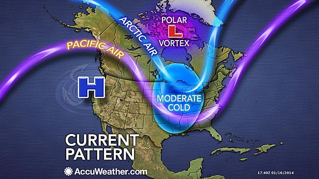
The entrance of gelid air from a polar vortex poured across much of the midwest in unrelenting fashion. Plunging subzero temps hit the Texas coast that overloaded electric grids and shocked weather maps that seemed out of whack even for mid-February, as even the sunbelt of the southwest turned gelid cold as subzero temperatures arrived over a week, plunging the arctic neckline down into Texas, and almost across the southwestern border.
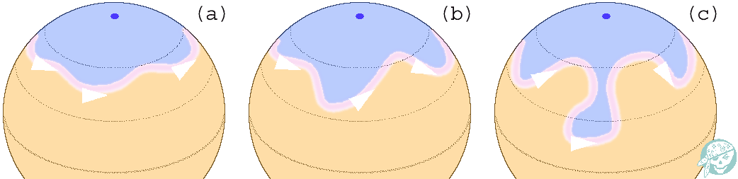
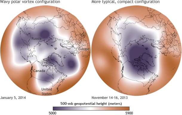
Since we use the conventions of map making to endow solidity, or reify, even the most abstract ideas, it is interesting to examine how the ‘Polar Vortex’ has spread across the mass media as both a meme and icon of the current weather patterns of the new millennium. Rather than map place by a matrix of fixed locations alone, maps of the Vortex offer a visualization of temperature variants that reveal an anomalous weather conditions that track the Vortex as it moves, intersecting with place, across the stratosphere into our own latitudes, tracking not only a “cold front” but, globally, the disruption of the path of the circumpolar winds, or splitting of the vortex from the north pole. We are most likely to “see” the Vortex as an incursion into our own map, effectively dividing the country (yet again?) this summer into regions of cold and heat. The currency of visualizations of the Vortex reveals not only a meme, but a model for encoding multi-causational weather maps. Indeed, the mapping of the divergence from usual temperature range reveals the anomaly of a north-south weather front with the solidity of a national divide, raising deep questions of its forecast of extreme weather throughout the year more than offering something like a “poor man’s vortex.”
As the term has gained wide currency as a challenge within data visualization world for throwing weather systems into legible relief, it set a new bar for producing visualizations that are challenging to fully comprehend. The Polar Vortex is mapped as it moves, as if on its own, across the stratosphere into our own latitudes, condensed in a range of data visualizations of stratospheric or tropospheric low-pressure fronts, in ways that map onto current quandaries of atmospheric and climactic imbalance. The animated superimposition of weather patterns condensed in a range of data visualizations of stratospheric or tropospheric low-pressure fronts themselves map onto concerns about climate change, and conjure narratives of global atmospheric change and climactic imbalance: the disruption of the usual harmony of the polar jet stream perhaps maps onto both notable rises in polar temperatures or torrential rains off the coast of Japan, but whether due to a spike in northern pacific offshore typhoons or openings in polar ice cover, the markedly increasing waviness of the vortex has allowed increased amounts of cooler air seep south once again, in an eery echo of last January’s mid-winter chill, that has lead weatherpersons to scramble for clarifying narratives about the return of that green blob. (To be sure, back in January, the naysayers of climate change parsed weather maps as counter-evidence to global warming, allowing them to indulge in alternate meteorological realities, before they were batted down in two minutes by the President’s Science and Technology Advisor, Dr. John Holdren.)
Offering a marvelous array of vowels and pattern of assonance, with a name befitting a Marvel comics super-hero as much as a weather pattern, the Vortex is a touchstone of climate change and a great case of how we have yet to ken the global as intersecting with the local. But we have unfortunately trended to oscillate, as it were, in our maps between national weather maps, where the Vortex made such a splash as a newsworthy low-pressure pattern, to maps of patterns in global environmental change, that might better direct attention to changing meteorological realities.
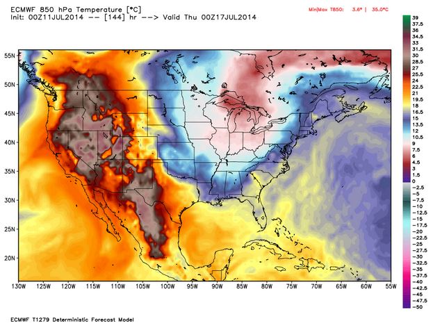
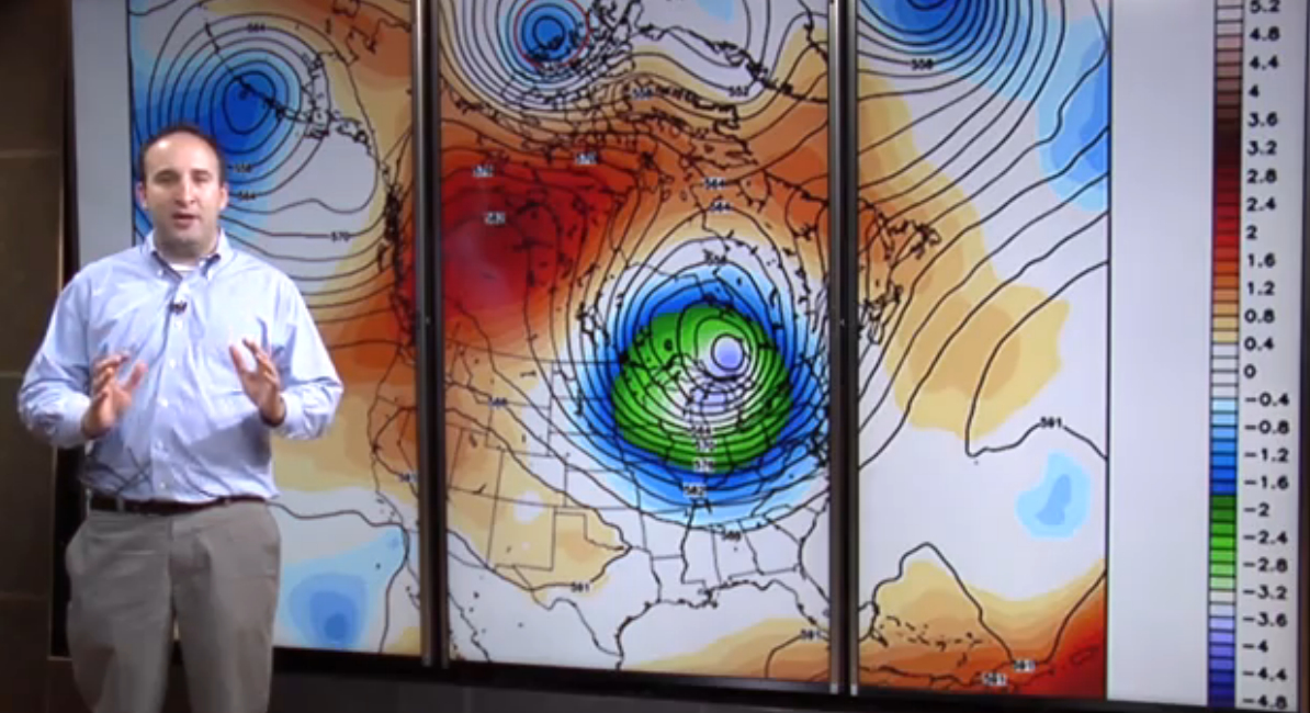
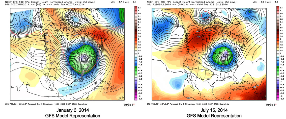
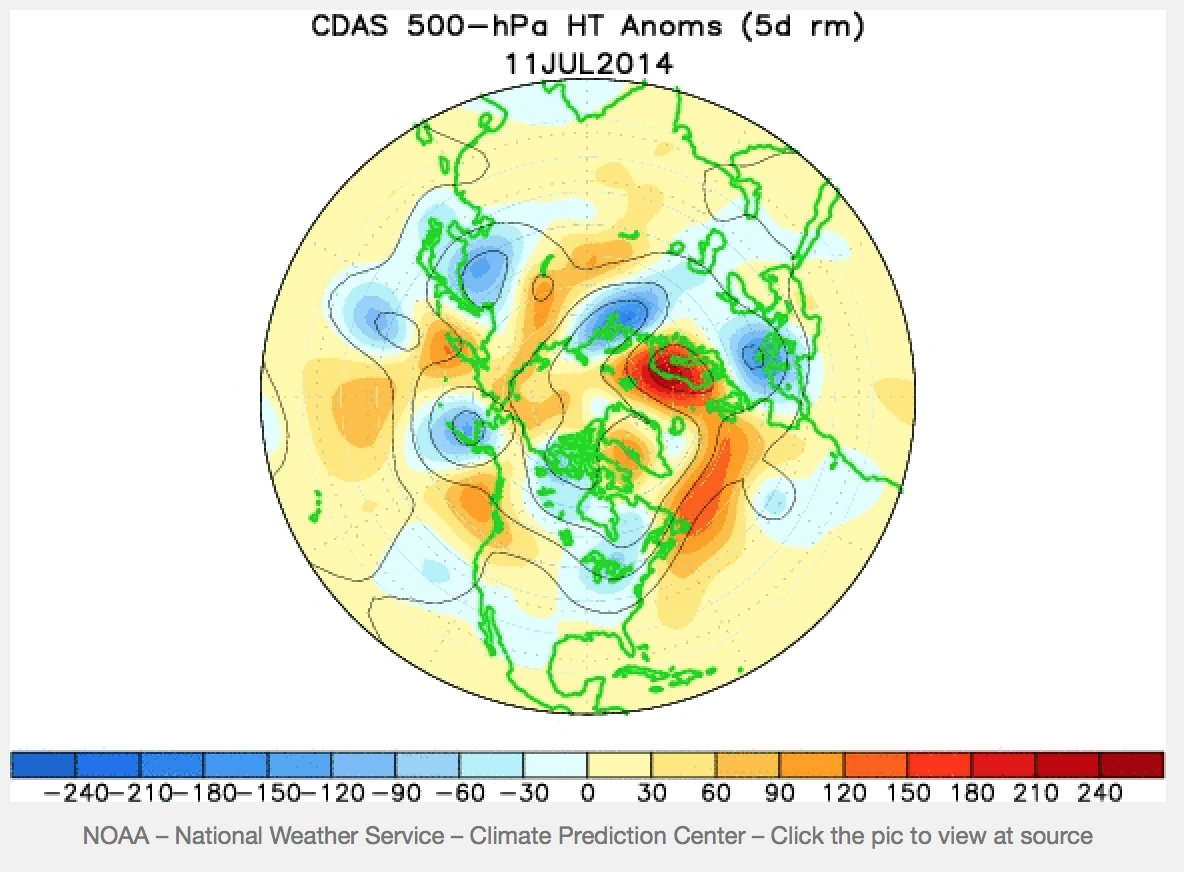
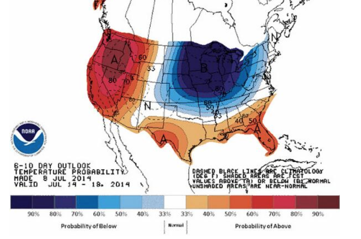
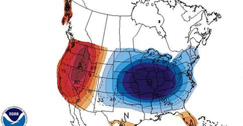
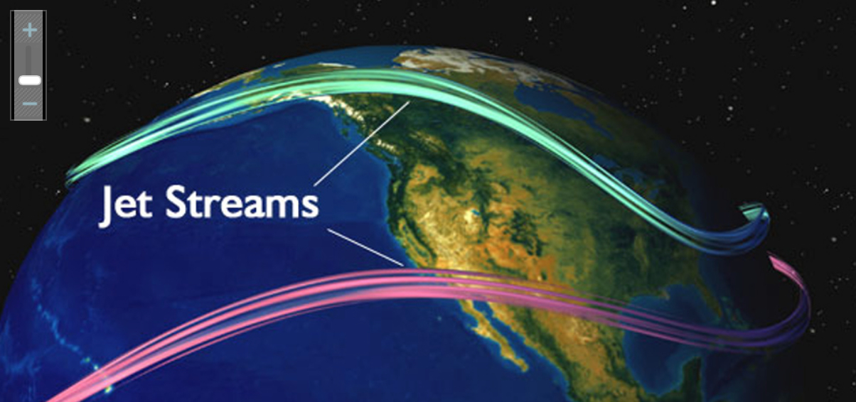
Part of the problem is adopting a point of view on the weather that we are tracking–or of viewing the Vortex as a stratospheric phenomenon around the polar regions, or charting a weather pattern forecast as occurring within our nation’s bounds. The reprise of the spill of northern air into the upper United States returned the Vortex into national news this July has provided a basis of the latter, to judge by this new visualization that projects the cooling temperatures in the northern United States, as a deep wave in the Jet Stream brought colder air to the Northeast. Even if the cooling air that arrived was not arctic, the pattern of its arrival to the continental US this summer has prompted some significant debate among meteorologists who have glossed the map in alternate ways, almost entirely still focussing, oddly enough, in a reprise of the mid-January news blip on the Vortex, on the unit of weather in the United States in isolation from a global context. The anomaly of the “Vortex” has become something of shorthand for a southern swing of cold air from north of the Great Lakes, produced by a decreased disparity between polar and sub-polar continental temperatures that lower the latitude of the jet stream, according to some research that has been endorsed by the National Academy of Sciences, and increased its waviness as the Arctic warms. The maps serve to embody the increasingly newsworthy weather in the Northeast, reaching down to the southern states as if an invading army as much as a meteorological cold front, placing the anomaly of the displacement of cold air against the screen of an iconic national map on which it has been superimposed.
AccuWeather.com
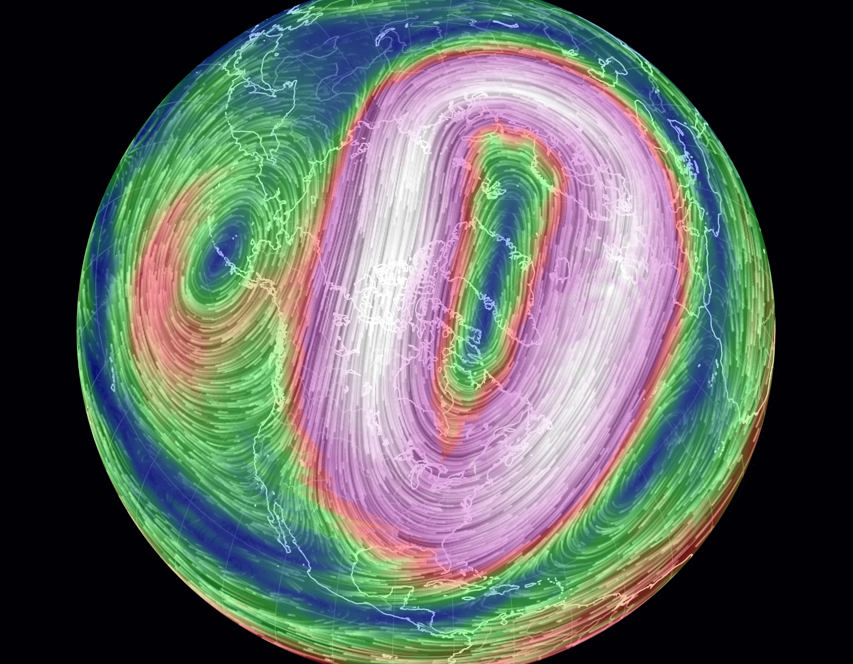
The map recalls a similar dispersion of circumpolar winds from the arctic into the lower forty-eight already called the “most upsetting” data visualization of the winter of 2014. The drift of circumpolar winds at stratospheric levels offers a compelling means to understand the arrival into the Midwestern states of cold air once more from the north during the mid-summer of 2014. Rather than only being a meme of the media, or being coined as a manifesto a group of avant-garde modernist meteorologists who found energy in the abstraction of weather forms, the term tracks the dispersion of the circumpolar whirl usually uniformly swirling about the pole offer both a rogue arrival into our national climate and a sort of emblem of an imbalance of circumpolar stratospheric harmony by pushing down the arrival of winds from the Pacific ocean.
AccuWeather.com
The benefits of shifting iconography to the global are immediately apparent if only because they reveal the divergence of the weather system from a meteorological status quo. The cycle of wind, usually located in the mid- to upper troposphere, has apparently begun to split or splinter from it usual centers above Baffin Island and Siberia as its air warms, and moves below the arctic regions. The displaced vortex, which migrates below the arctic circle in the stratosphere, reflects the warming of temperatures at the poles, creating currents able to funnel the figurative migration of arctic air currents to sub-arctic latitudes, even if the air in question this July might more likely be northeast Pacific more than arctic in its provenance.
Earth.com
The local is, however, far more easily digestible for viewers of The Weather Channel, and the Vortex is shown as an intersection of the global with the regional weather map. Collating data from divergences or temperature anomalies from a database covering local temperatures in 1981-2010, the spectrum of a “heat map” tracks currents of cold across the backdrop of the lower forty-eight in an easily digestible manner that packed so big a punch for folks trying to puzzle over the freezing over of roads, local lakes, or back yards:
Once more thrown off-balance, it sends cooler air below the lower forty eight and forty-ninth parallel, making it national news as a dramatic aberration that marked the entry of intense cold. Data visualizations provide new tools of making the meteorological concept legible in ways that gain sudden particular relevance for audiences familiar with weather maps, for whom immediately powerful associations of shifts in the measurements of regional temperatures will pop out at viewers of a forecast or weather map, forcing them to pay attention to the meteorological imbalances they portend.
Recent global maps of the Polar Vortex offer more than an icon of the transcendence of territorial boundary lines systems, by processing and portraying the Vortex as an expansion and breaking off of cold air outside the restraints of an arctic air system.
The dramatic splitting of the arctic jet, due to atmospheric pressure anomalies, was mapped by NOAA in this data visualization of July 2014, of a splintering of the vortex, in apparent response to the warming of our poles, hastened by the diminishing snowfall and ice-cover that create new chilly islands or microclimates on the ends of a warming pole we often seen as lying so far away:
The disruption that results brings the displacement of arctic winds that most often sit anchored around the polar region. A “weak” polar vortex, interacting with arctic ice-cover decline and reduced snow cover, was some time go modeled as resulting in a meandering arctic jet stream and occasional detachment of a polar weather systems and consequent decline or weakening of pressure gradients of the vortex, and consequent reconfiguration of the arctic jet stream:
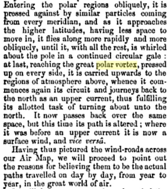
Has something like this occurred? The dynamic visualization of weather maps in five colors and striking contour lines provide clear tools to visualize its speed and energy, in ways that might even have helped resurrect a term that had languished in meteorological lexicons from at least 1853, when the “continued circular gale” was described as flying “more rapidly and more obliquely . . . carried upward to the regions of the atmosphere above,” as lying in the ambitions of a “great Air Map” but based on the recent 1851 NOAA mapping of “great undulatory beds of the oceans . . . for all practical purposes of navigation.”
But now we have a recognizable image that can be tracked over a recognizable terrestrial map that concretizes the Vortex in ways that its winds can be understood as extending over a region of truly global expanse.
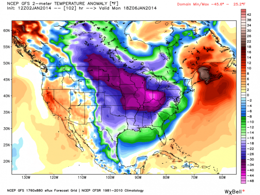
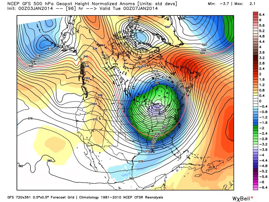
Tracked in terms of actual temperature anomalies, in the winter of 2014, when newscasters and NOAA (the same agency) mapped the migration of cold air southwards of the pole into our frontiers, far outside the usual path of the jet stream, in a disturbance of the weather systems worthy of national news last January, in a data visualization which tracked a green (or purple) blob whose forced migration of frigid air from the polar regions that disrupted weather patterns with national consequence as it migrated out of Canadian airspace.
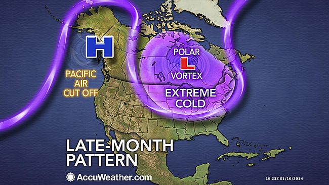
In the dramatically eye-catching graphics of television’s mass-media, as the bulge of purple and magenta of detached low-pressure systems migrate south, crossing the very same borders to which we are increasingly sensitized in our national news media, albeit at tropospheric altitudes no fence or border guards could ever patrol. Indeed, the map suddenly suggests the increasing vulnerability of our delicate weather systems, echoed by the language with which the Polar Vortex’s “EXTREME COLD” loops invasively southward across our northern border, cutting off Pacific Air:
AccuWeather
The apparent incursion of its jet stream into the bounds of our national airspace, as in this image of cold air migrating across the northern border, results in the proliferation of metaphors all too often violent in tone: Climate Central may have only adopted the robust rhetoric of sportscasters when it described high pressure systems in quite athletic terms that “block the eastward progression of weather systems, like an offensive lineman protecting the quarterback from the other team,” allowing the air that circulates around the arctic to start “spreading tentacles of cold southward into Europe, Asia, and North America.” Less dynamically interpreted and understood once cast in global terms, rising temperatures at the poles–the very sites where, we should note, global warming is occurring at a rate twice the global average–displaces the previously concentrated flow of a jet stream of cold air from its arctic abode.
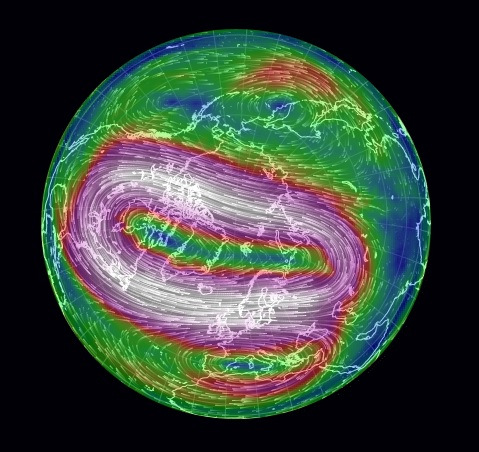
Of course, few seem ready to tie this to the diminishing ice-cover of the north pole, which still seem a leap too far to be made logically. Oddly, the meteorological mechanics of the expanding split-off of polar winds is modeled as an incursion of weather patterns echo the metaphorics of a military situation map of fixed borders, a historic hold-over for national weather organizations like NOAA: the global image of wind velocities around the pole, depicted below, is oddly absent from what is actually a global phenomenon.
But we are all too used to interpret and read weather maps with both a sense of voyeurism for our friends and relatives, but from a subjective lens.Despite the adoption of globalized images from our friends at National Geographic, who used Mass FX Media’s animation to visualize circumpolar air flows, and despite the continued live monitoring of wind-flows at “Earth,” the isolation of the nation in the maws of the vortex is so readily discussed as the “most upsetting map of the winter,” as if the migration of the pool of arctic air into the northern United States were best understood as a disturbance of national temperatures.
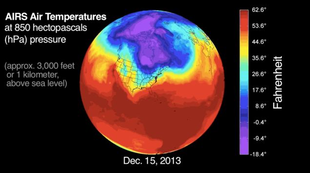
The similar narrative about the Vortex in national forecasts stands in contrast to the maps of rising temperatures, but create a visual modeling of a meteorological distribution that almost resembles an invasion. Even though the distribution and speed of the Vortex in summer is usually slow, the polar air however seems to be arriving from across the border with unstoppable velocity, the below global visualization, also based on a similar distribution of deviations from average temperatures craft a similarly compelling large-scale weather pattern–albeit one occurring some 3,000 feet above the earth’s surface–in which, rather than reveal a lack of equilibrium, arctic air dips south across the forty-ninth parallel and past the Mason-Dixon line, confirming its occurrence as a shift of national consequence.
Because the “most upsetting map of the winter” tracks the pooling of arctic air into the northern United States created a disturbance of national temperatures into the Eastern United States and much of the central region of the country.
Wasn’t it once more reassuring to understand the polar regions, its topography unknown, as somehow removed from the atmospheric currents than being mapped around the world?
The wonderfully protean animated map of disequilibria in the harmony of stratospheric currents of cold polar air within the jet stream opens breaches across national boundaries, albeit at considerable elevation, and also offers a way of tugging at one atmospheric phenomenon to unpack a web of inter-related phenomena. Unlike maps of habitation or land-surface, the map traces a low-pressure system at high altitudes far above the settled or occupied land, but intersecting with it in ways that conjure a failed ability to contain colder air over the polar regions. (Taking the iconography of weather maps as transparent, the blogosphere has suggested the adoption of charges of circumpolar intoxication.)
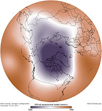
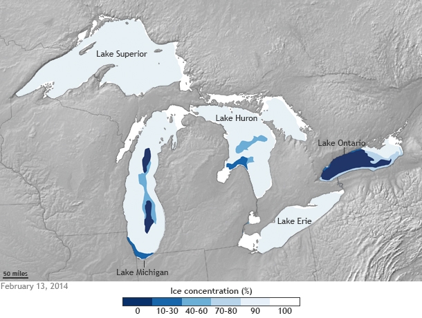
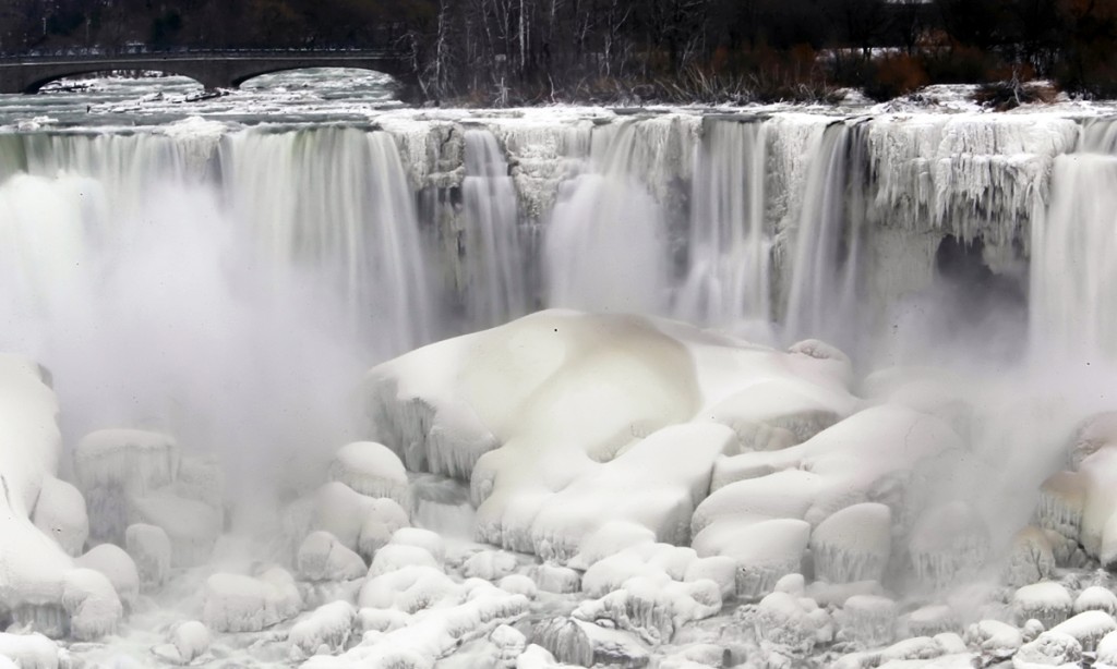
The distribution of stratospheric air whose flow is charted in global map as an irregular anomaly of temperatures’ spread, is perhaps most concretely rendered by the iced-over bodies of water it left in our own upper latitudes. The striking freezing over of the Great Lakes, covering some 88% of the lakes’ surface area by mid-February, a greater proportion of seasonal ice-cover than ever registered, and surpassing the 82% record of 1996, according to Caitlin Kennedy of NOAA, which render the striking concentration of ice in frozen lakes a concrete map of the local effects of truly polar weather.
The material manifestation of the cold on the surfaces of those five lakes–all frozen solid, to appearances, save Lake Ontario, seem as concrete a result of the consequences of climactic change one might have in a chart, by placing the ice-covered lakes in a local landscape.
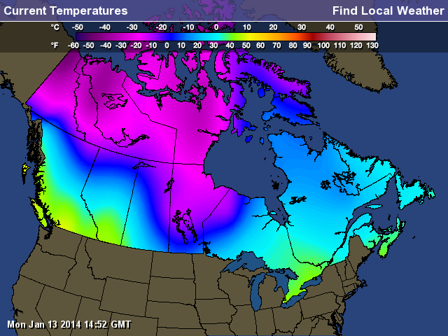
What seemed the displacement of the frigid polar air to the Great Lakes became something like a confusion of the local and the global in the news media that was played out in weather maps. Of course, the meteorological mapping of this winter’s Polar Vortex in Canadian outlets seemed more the status quo, with most of the country facing sub-zero temperatures:
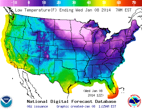
The US “low temperature map” used a slightly different temperature spectrum, but preserved a more alarmist image of anomalous weather conditions even in the National Digital Forecast:
The striking visual by far was from a site located exactly on the US-Canada border, an eye-catching a frozen Niagara Falls, that icon of liminality:
The distributions that charting the mid-July summer chill newly arrived in the Midwest and much of the East coast of the United States from Canada is less striking, even if it will bring dips of twenty to thirty degrees form the normal. NOAA omits Canada completely from its prognostications of the arrival of the coming cold, as befits its role as a national agency, and restricts its purview to United States coastal territories, even though it would make the graphic far more credible to offer a greater coverage. It provides something of a summertime counterpart, however, in which the probability of lower temperatures than usual seem to create a ring about the same lakes, radiating almost to the Atlantic coast:
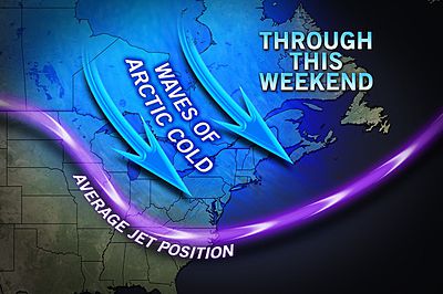
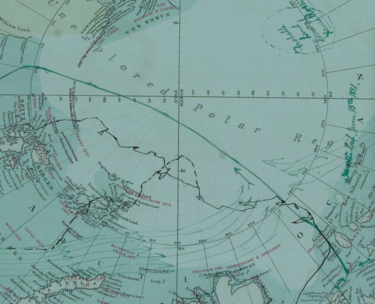
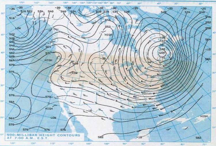
Where is the center of this new system of cold air? With roots in Hudson Bay–where else?–the polar air will be spinning southwards at the upper levels of the atmosphere, spinning southwards toward the United States. There were past migrations of arctic air over Quebec and Maine, back in late January, 1985:
The Detroit Free Press even seized on a recent NOAA projection of a similar displacement of arctic air, that locates the center of cool air migrated toward Michigan, forming a pool of air that had descended into the central United States, as if to cast the event as something like local news, even as it suggests the rise of two weather systems:
The occurrence isn’t strictly polar, or arctic, in its origin.
But the results are the consequence of a sort of distorting decentralization of the polar cold air outbreak that hovers around the arctic circle, running around the pole and allowing or protecting cold air from drifting south, containing cold air or not it its high altitude low-pressure system. (Of course, the west coast is poised for a dryer and hotter-than-normal week.) The decline of snow and ice around the Pole, combined with the warming of the wobbly gulf stream, will allow the chilly polar air to spill southwards to the plain states, covering not only Canada but spilling outside the low-pressure system and over to the seaboard, in a sort of nervous breakdown of meteorological model behaviors.
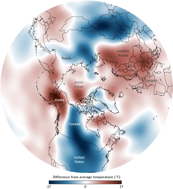
The disturbances of equilibria in our weather maps makes it worthy of more than symbolic note. The increasing variability that the waviness of the outer line of the low-pressure system, or jet stream, related to the declining snow cover in the far north, in the a “warm Arctic-cold continents” pattern, where the compact containment of colder airs was broadly breached.
The lack of equilibrium in the stream of polar winds–distinct from the widening polar ozone hole–opens up more of the terrestrial surface to chilling shifts in temperature. As much as the embodying a low-pressure system, the map is a narrative of the disruption of climactic harmony, and view toward the future of weather systems world-wide. The results of the wavy polar vortex, joined with rising world temperatures, create a map of bizarre spottiness in average world temperatures that is difficult to conceive or map, precisely because its high-altitude distribution is difficult to transfer from a spherical to a flat surface, and because its distribution unfairly privileges the tracking of cold air in ways that seem, misleadingly, to fly in the face of the maps of our overheating world. This past January, NOAA crafted a digital globe that displayed the distortion of local temperatures distorted beyond the norm, with cold displaced from its polar resting place, resulting in a cognitively useful modeling of a disjointed jigsaw of cold and warm air, where the warmer deviations of global temperatures spick not only over western Russia and Alaska, but at the polar regions itself.
NOAA Climate.gov
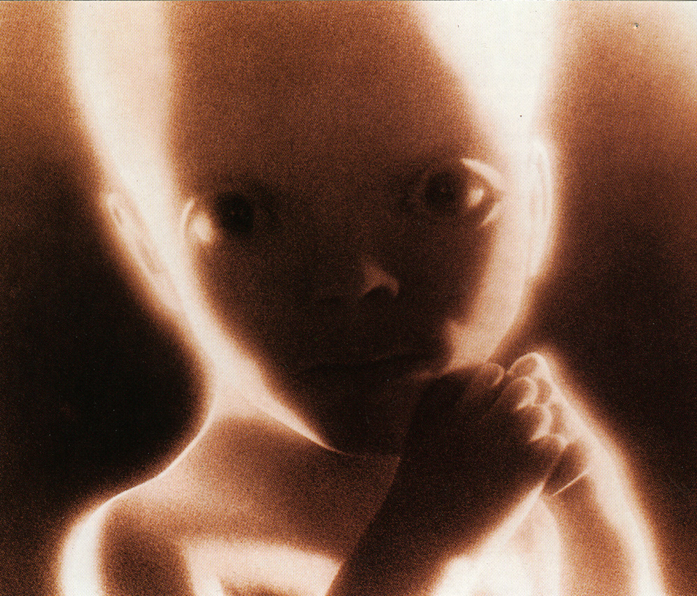
The result is a jigsaw reveals the breaching of cold air from the cap of winds that encircle the polar cap has a enough of touch of biomomorphism to echo ecofeminism; the forcing of warmer air patterns resembles a blurry sonar image of curled-up embryonic twins resting in a womb as if evoking the shape of future weather systems, offering a biomorphic visual metaphor for something like an eery augur of a future holding limited possibilities for an afterlife–and of the unknown future of our planet’s atmosphere.
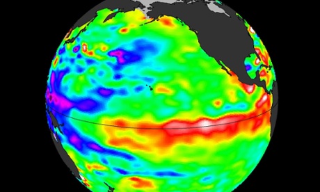
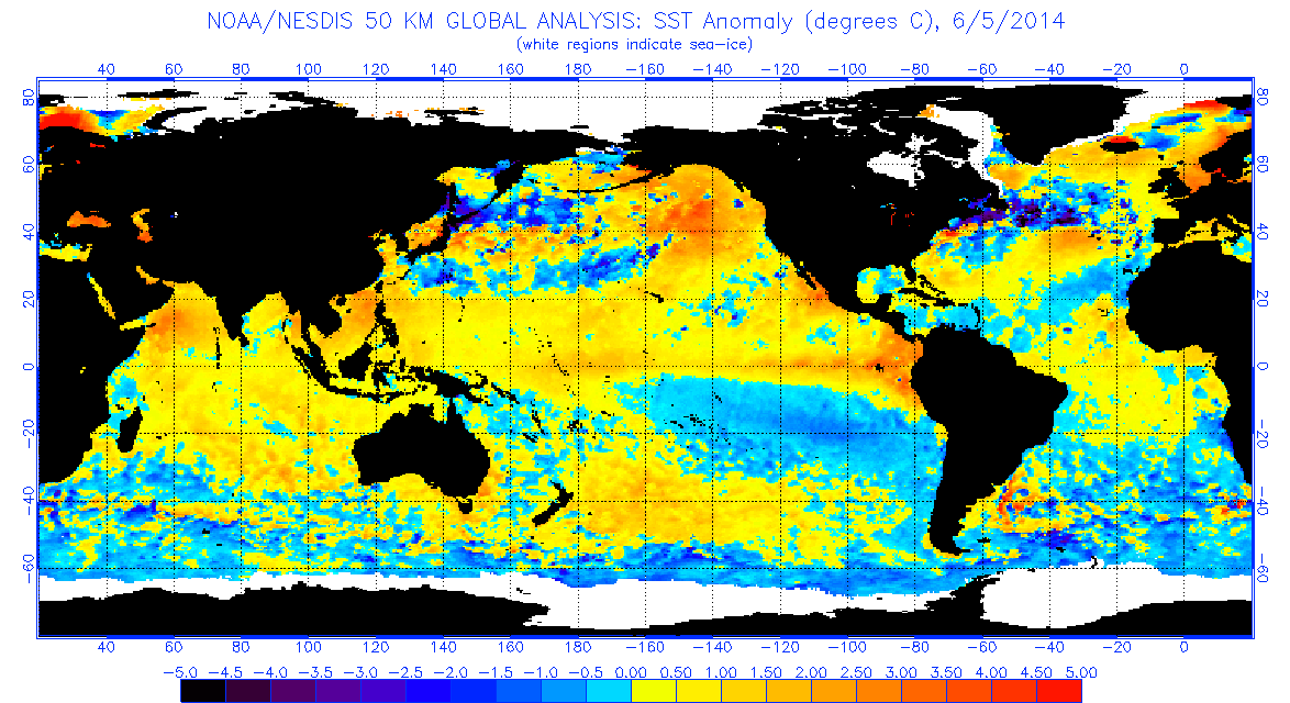
Classical terrestrial world maps–either the detailed terrestrial world projections that associated with the atlas-makers Mercator and Abraham Ortelius or those terrestrial planispheres noting cities and ancient monuments of Ptolemaic design–were based on a need to find a solution to how to transfer the curved surface of the world to a flat surface. When we are talking about global events–from warming to El Niño–we need to synthesize global variations in a spectrum of a set of surface temperatures that only a satellite can assemble, and to read them as inscribed on a global surface. The virtual image of weather changes depend on information removed from actual landscape, or inhabited land–but rests on the persuasive power of a compelling image of the earth’s curved surface in the synthesis of a coherent image of ocean temperatures over a continuous expanse of the earth’s surface: although undoubtedly provoked by the world’s inhabitants, and a revealing record of the anthopocene, the mapping of oceanic temperature is something of a record of climatological impact and of the increasing need to come to comprehend shifting temperatures of the word’s oceans in truly globalized terms.
Is this map more powerful because it recalls a familiar globe, and because it promises to mediate record of the ocean’s equator that would be otherwise totally unable to be visualized in a coherent visual form? The global visualization creates a compelling record to understand the odd embodiment of a shifting pattern of climate prediction, even if the synthesis lacks reference to a cartographical model or a set of scribal practices. The map provides a way of detecting (and indeed predicting) unusually warm ocean temperatures that create El Niño, in ways that trace the preconditions to create a cascade of climactic changes provoked ocean surface topography through a visual syntax akin to a weather map: the virtual globe deploys digital media to map movement across and motion through oceans, tracing shifts in subsurface ocean temperatures over space that would be otherwise concealed from sight: the silhouettes of the continental masses not only displace attention from the land, but subordinate land weather patterns to the irregularities changes in atmospheric pressure and sea temperatures that they foreground in a strikingly technicolor map whose hues mirror heat-sensitive readings, rather than areas of settlement. (Continents are only present as ghostly images in these maps that direct our attention and interest to the phenomena sensed in ocean waters.)
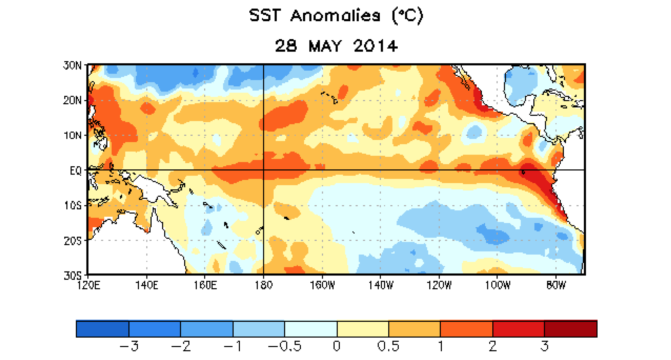
The satellite thermal map of the swelling of seawater around the equator, generated by NASA’s Jet Propulsion Lab, tracks the temperatures beneath the swelling of oceanic waters to forecast El Niño oscillations this summer and fall. By tracking significant sea surface temperature anomalies, they trace changes to gauge the possibilities of potential future major weather disruption of the globe, and to try to comprehend the shifts in temperature that might change weather systems in so drastic a way to impact food chains, agricultural economies, and climactic experiences in similarly out of the ordinary ways, exposing the otherwise hidden shifts in ocean temperatures by catchy chromatic spectrum of colors around the equator.
Rather than only trace migrations, the map marks pronounced sea surface temperature rise across the Pacific is suggested by the surface’s deep crimson reds, extending from the islands off Singapore. The Google Earth satellite view contrast to the arboreal distribution of the topography more evident, as if to embody the threat that it poses to the landmasses that are the usual focus of world atlases.
The spread of warm waters across the Pacific indicated in such maps echo the famous charting of sea-temperature anomalies of 1997-98 El Niño, which La Niña followed, when the end of trade winds led warm waters to slosh Eastward, pushing cooler water down from the surface, and interrupting the feeding habitats of fish and aquatic environments and interrupting the local marine food web. The map traces shifts in surface temperatures by tracking of anomalies in the below video to suggest an advancing augmenting of surface temperatures across the equatorial Pacific.
The anomaly of equatorial sea-temperatures across the Pacific is most easily pictured by mapping the greatest warmth in red: the visualization of global variations across the ocean surface suggests sustained pattens of temperature rise, mapping not only temperatures but their divergence the form the median, and tracing patterns in their variability over time–far more meaningful in the global ecosystem than the relations between surface temperatures tout court.
The result is a new globalist map, tracking not countries and border lines or borderlands, but that “other ecumene”–that other inhabited world–of oceans and ocean life:
At least the hope is to start to direct attention to it, and to an area of the world’s temperatures that are not often mapped. The above visualization rests on an ability to synthesize a coherent constellation of multiple factors–prepared in a cogently digested form–but proves a guide to local imbalances and deviations, in the hope that we can grasp the global impact of these increases in the collective image that results, offering considering subtlety to register local shifts across space that help reveal the whirls, eddies, flows and sloshes across the ocean seas, even if it might require far more learning to interpret in its consequences than the more familiar sorts of weather maps that we are used to access on line. While not a globe or a sphere that earlier globe-makers might recognize, the elegantly articulated silhouetted continents suggest contre-jour qualities of the map, as if demanding that we start to try to pay attention to the deeper temperature changes in the seas that will reveal how shifts in atmospheric pressure create temperature shifts that will lead to a redistribution of nutrients in the ocean created by the consequent shift in upwelling and alter rainfall patterns worldwide or create droughts or typhoons as the result of an unusual warming of waters just below the ocean’s surface.
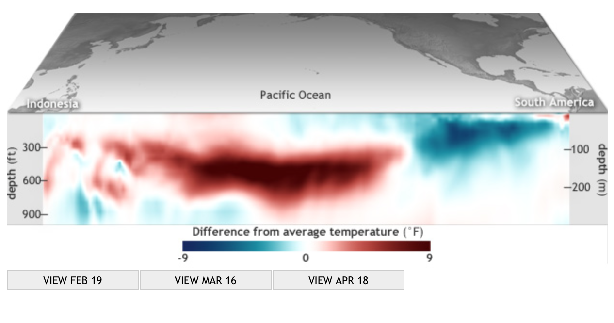
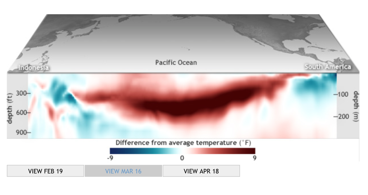
The dazzling image of the surrounding medium that conditions and prepares the climactic variations of the unmapped land to which they are so deeply linked, create an image of a global weather system we are only slightly prepared to come to understand. The map’s comprehensive coverage of ocean temperatures is a shocker of a visualization, employing a rainbow of gradations of color to striking effect that combines both the exactitude of pinpoint images and the tools of digital visualization. It is a sort of learning experience or primer on the immensity of global climate change, creating several deeply intractable pockets of climate change all closely located offshore, scarily noting the surprising relative proximity of the warmest areas to those regions, shown in white, which designate the remaining regions of polar ice, at the same time as the change in temperature seems embodied at an odd remove from the viewer or the surrounding shores. Similarly generated maps created from remote sensing constitute some of the greatest emblems of the environmental disasters of our time. Other options used by NOAA to chart the swell in temperatures in the upper 300 meters of the Pacific ocean in 2014 track a growing swell of something like an oceanic monster that grows in swells beneath its surface, evoking something of a large-scale sea monster that gradually began to reach across the Pacific toward the shores of South America, against the easterly winds that usually send surface water west across the Pacific.
The progress of waters beneath the ocean’s surface seem to track an animated entity in this set of subsurface charts, which capture the progress of the slosh of water magnifying the subsurface temperatures across the Pacific out of actual proportions to increase the visibility of temperature changes that seem to flow as if they were submerged underwater almost biomorphic forms resembling monstrous worms or undersea tornadoes that channel currents of churning heat that span the pacific, deep below the ocean’s surface:
mid-February, 2014
mid-March, 2014 mid-April, 2014
In a Kelvin wave, pushing from the warm waters of Indonesia to South America, the slosh of ocean waters can prompt the cascade of atmospheric events. The bounded parameters of the visualization are limited to the ocean, but are meant to provoke a similar imagining of the potential events that such a swell might trigger, and provided one of the first indications of a probability of possible climactic shifts over the months to come. Despite the specificity of readings that it can coherently synthesize, the chromatic blending of these measurements in a real ‘heat map’ of ocean temperatures create a false demarcation of categories, by removing the temperature changes from their effects in magnifying their deviation from the norm. Mapping the ocean as a surface of travel or site of navigation has long challenged the categories of visualization employed in land maps, if only because of the fact that the notion of oceanic space challenged the categories that were developed to visualize surface topographies.
The synthesis of mapping temperatures at different depths track migrations of water in the medium of the ocean is perforce removed from the specificities of place transcribed and tried to be pinpointed in earlier engraved maps, that tried to render legible the currents, routes, currents and eddies of the sea, or to record the variations in the underlying ocean floor. The globalist maps of the ocean’s temperatures that result offer something more like an animated graphic, instead of an objective form, because they lack clear contour lines or fixity that were the basis by which so many earlier ocean maps tried to calibrate currents, negotiate sea-routes, track winds, or map the topography of the ocean’s floor.
The embodiment of the expanding biomorphic swell in subsurface temperatures, mapped as extending across the Pacific, renders the shift in temperature as gliding contra corrente. They offer a major change in the claims and abilities of totalistic mapping of the oceans, and in the attribution of embodied characteristics to the ocean–which emerges now, if in ways that seem metaphorically misleading, as somewhat organic, as if it were something of a separate living entity from the land, which almost gained its own context, rather than appearing as either a surface for viewing nautical travel–
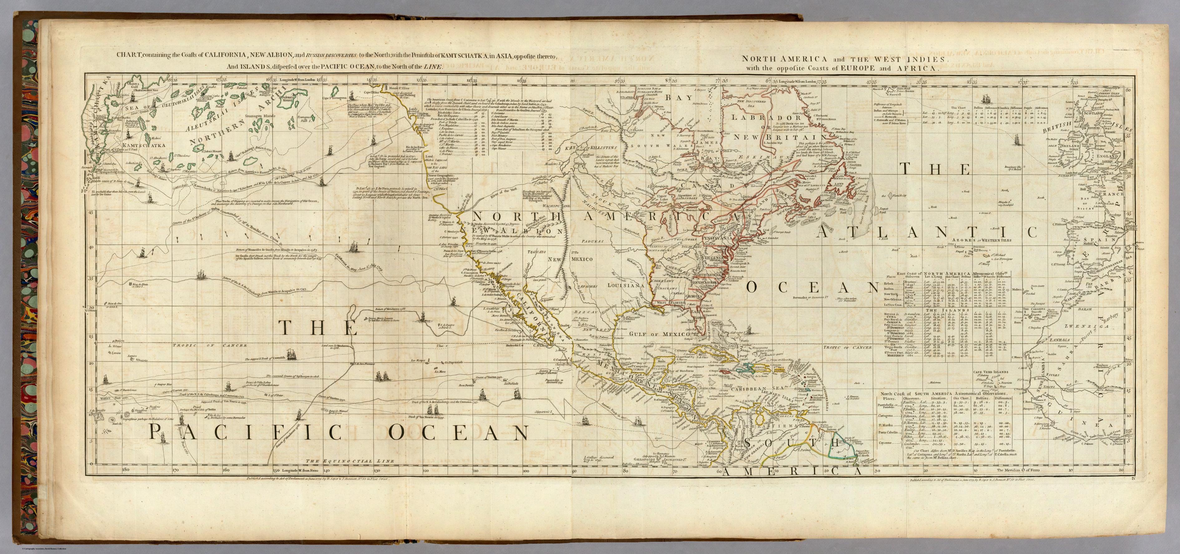
Rumsey Associates
–or the result of an array of bathymetric bearings of submarine topographies by collating depth-soundings taken by sailors on weighted lines.
Of course, the topic of the maps–global climate change–is itself removed from the precision to mapping nautical location to calibrate calculated routes, path, or place as marked by means of a line, and understand risks of nautical travel, and a concept of travel rooted to the ocean’s superficies. The maps of oceanic temperatures not only reflect the transferral of maps from paper to the far more heavily pixellated medium of the screen, but a search for visual formats of embodying shifting temperatures that were often elusive as subjects of global mapping in earlier charting traditions.
As such, they suggest, in the rhetoric of uncovering hidden changes detected by satellite, both the need to try to process global shifts in temperature in tactile terms, an eery remove at which the changes in oceanic temperature lie from the viewer, hinting ominously and only by extension about the likely possibility of future risks of global climate change to which the world’s inhabitants are now, as if suddenly, finding themselves to be subject.
The new premium on taking stock of mapping temperature change is about learning to visualize the migration of ocean temperatures as if by analogy to a weather chart–and indeed the resemblance to the images of cold fronts on the Weather Channel seems striking–but in ways that take into consideration how these movements in temperature migrate in currents and swells through and across the ocean’s own watery medium, and cannot only be considered in the localized perspectives of the individual points of a depth-charge. For the mapping of oceanic temperatures are not only a way of mapping the communication of heat, or the rising temperatures of the world and its atmosphere, but the newly inter-related concept of what it means to be warm.
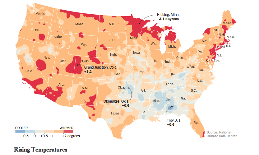
The color-saturated mapping of regional changes in temperature across the contiguous United States provided a commanding visual for the front page of the New York Times of May 6 to capture changes in the US climate: placed on conspicuously above the fold and standing alone, just below the headlines, the graphic served multiple functions in a strikingly effective way. The weather map that was first released by the Obama White House elegantly and effectively served–in ways that words could not–to combine several narratives of climate change that synthesized the findings of a recent committee of scientists on the wide-ranging effects of global warming. This is an unprecedented victory of the map, the most effective single tool to describe the complex process of a veritable cascade of environmental shifts, by selectively focussing on a known variable of local warmth. The orange and bright reds of the map arrest the eye in ways an article or headline could not, and effectively provoke a cascading set of side-effects and reactions to occur in readers’ minds that served to grasp the finality of warming’s consequences. As one mind quickly moves off the map of stark changes of temperature to the effects of future droughts and increased aridity of soil, consequent crop-shortages, and subsiding ground-levels, imagining the marked depletion of cool air, streams and rivers that would dry, and an increasing dependence on energy to create artificially cool environments.
Although it is static, the historical map suggests a spectral future forecast for the nation that dramatically moved from back pages to headline news. It mirrored a roll-out of the announcement as part of a dialogue with weathercasters on television news programs in a gambit to engage the public in the question of climate change. Indeed, the graphic mimicked the presentation of weather maps on TV, images of the national forecast that the Weather Channel has made all too familiar. Even if the map documents changes of the previous century, it shares the iconic status of the sort of severe weather forecast that The Weather Channel has accustomed us to interpret and to see. We’re now trained so often to interpret and to read similarly colorized climatological forecasts to trace regional emergencies that the Times‘ map seemed to recuperate these conventions to make a polemic point not so much about the past–“US Climate Has Already Changed”–but about the possible futures that the map forebode. For weather maps offer the most acceptable medium of future predictions, where they have currency as credible tools for short-term forecasting.
The range of information in the map that summarized a century of rapidly shifting local climate temperatures How could such a gamut of consequences be convincingly understood or presented other than in a map? The visual immediately triggered multiple questions of effects on species, forests, farmlands, new sorts of vegetation, and shifting insect populations described in the article, which a reader some decades ago would be challenged to link. The effectiveness with which the map implicitly summarized the ramifications of these potential changes, or provoked its readers to react to its orange and read heat-distributions, presented an ominous vision of the future, as well as the historical past of a century of warming weather that the headline announced. As if with the ominous fatality with which science fiction authors like Arthur C. Clarke described the future of a world battered by asteroids, the map opened up a view on the consequences of environmental change in a future world, even if its headline announced an event firmly rooted in the past century, synthesizing as it did the findings of two periods in the past hundred years.
The finality with which the map released by John P. Holdren documented a change that had already occurred across the nation’s regions, but made it to every weather bureau and station across the country, as if to maximize the newfound familiarity of audiences to engage meteorological maps as a way of making its own polemic (and of course partly political) point of how drastically rising temperatures stand to redraw the familiarity of the world. Extending far beyond earlier warnings voiced by the UN, or the pronouncements of an Inter-Governmental Panel on Climate Change whose report documented the melting of the ice-caps and collapse of sea ice in the arctic, the migration of many fish out of their habitats, and impending dangers of rising seas. Perhaps these global images were too remote, or difficult to visualize. The powerful invocation of the weathercaster seemed to give greater reality to the scary prognostic in the contiguous United States, and concretized the multiple threats of climate change in an image that confirms the changing nature of the ground beneath our feet. Some may criticize the focus on the United States alone in an interconnected world, as if the isolation of our country’s climate somehow removed it from a global problem and dilemma, or placed undue emphasis on the effects of emissions on the climate in the US. But the image of actual experiences spurs a call for reaction and response, and, in an echo of the tactics of the Obama administration, reveals the increased “cartographical literacy” in the reading and interpreting forecasts in persuasive national weather maps.
The emulation of the televised weather forecast is no doubt what makes the map appear so immediately effective.
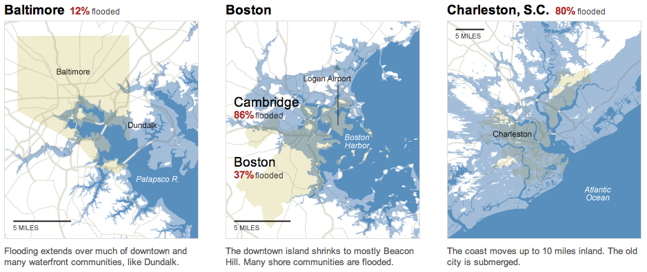
The map of the entire country was in ways a counterpart to the images of November 2012, around the time of Hurricane Sandy, simply titled “What Could Disappear,” which asked viewers to imaging the shifting coastlines of rising seas, and pictured the coasts that rising ocean waters could redefine, submerging beneath the sea low-lying areas of what we consider habitable land–as well as flooding all of Galveston, TX and some 45% of Long Beach.
The New York Times
But rather than engage with complex claims of climatological futurology, the front-page graphic was both at the same time historical in perspective and even more apocalyptic. In announcing or intoning “US Climate Has Already Changed,” it reminded us of the consequences of rising temperatures at a historical remove that was still part of our present and an uneasy glimpse to the future we have mad, using tense whose finality foreclosed debate in quite incontrovertible ways. The map’s comparison of temperatures over a century effectively resolved debates, separating the actual consequences of climate change on a familiar environment from debate about its mechanism and reminding us of its man-made origin, and untangling the dangers of the changes that it wrought from the cascading (if terrifying) mechanism of ocean levels rising, habitats altering, fish migrating, the extinction of species, and deaths of coral reefs. The map was able to link itself to a multiplicity of lived experiences and actual fact, and conjure a scarier–precisely since undefined–picture of what was to come–an era of increasing heat. (Its associations might almost be as apocalyptic as the hallucinatory surreal dream from a 1959 episode from Rod Serling’s The Twilight Zone, “The Midnight Sun,” in which the earth exits its elliptical orbit and moves toward the sun, warming the nation so much as to induce crazed radio weathercasters to stray incoherently off script and panicked Americans to flee abandoned cities en masse to Canada in search of cooler climes.)
The particularly powerful graphic of the map of regional variations in rising temperatures was quite devastating in its depiction of how–despite some regional differences–none save rare pockets of settled land experienced anything approaching a decline in reported weather temperatures. For those that did, mostly concentrated in the lower Mississippi basin, they experienced quite slight declines: it presented an image of a continent on fire, almost about to be consumed by flames, burning from its edges, if, the accompanying article noted, increasingly soaked by torrential rains.
The New York Times
The growth of areas already warmer on an average of some two degrees suggested an encroaching of scarlet red blotches across the land from all sides, particularly in southern California and Arizona, Utah and New Mexico, the northern eastern seaboard, and the Great Lakes, with Bob Dylan’s native Hibbing seeing the greatest temperature change of over a massive three degrees. The map powerfully synthesized the effects of human-induced climate change in ways that are not only impossible to rebut, using findings of a national committee that has been in existence for over a decade–but was by far the most effective among the various interactive graphics it released. The simple synthesis in a four-color map of the contiguous US immediately showed rising temperatures in some of the more inhabited areas of the nation, from New Mexico to Southern California, to the New York-Washington corridor.
In selecting a map to represent the consequences of climate change that were detailed in the report, the images suggested less of an infographic than a sort of disease map of a climate that has gone off the tracks. Even if it might be faulted from its insistence on removing the US from the world, and focussing on one place within a complex web, as well as flattening its findings in cartographical form, the image is powerfully links the land to a set of abstract changes we cannot fully comprehend, but whose effects we can perceive. This is the stunning victory of the static map.
We read more maps than ever before, and rely on maps to process and embody information that seems increasingly intangible by nature. But we define coherence in maps all too readily, without the skepticism that might be offered by an ethics of reading maps that we all to readily consult and devour. Paradoxically, the map, which long established a centering means to understand geographical information, has become regarded uncritically. As we rely on maps to organize our changing relation to space, do we need to be more conscious of how they preset information? While it is meant to be entertaining, this blog examines the construction of map as an argument, and proposition, to explore what the ethics of mapping might be. It's a labor of love; any support readers can offer is appreciated!