Monthly Archives: February 2013

Cartographic Craftsmanship, or the Social Life of Maps

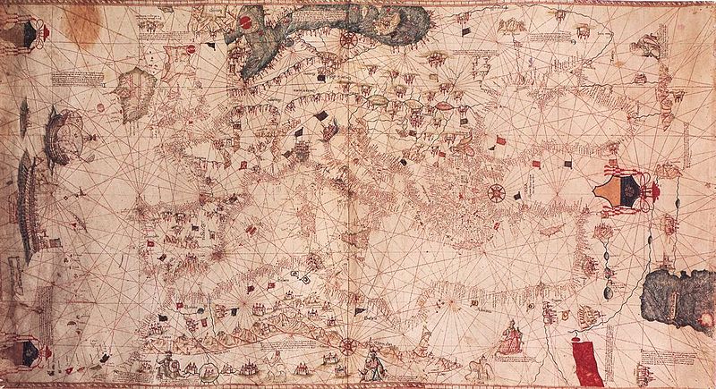
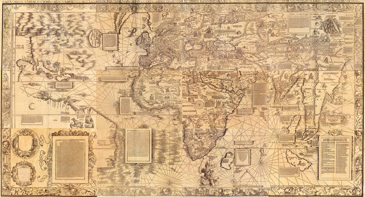
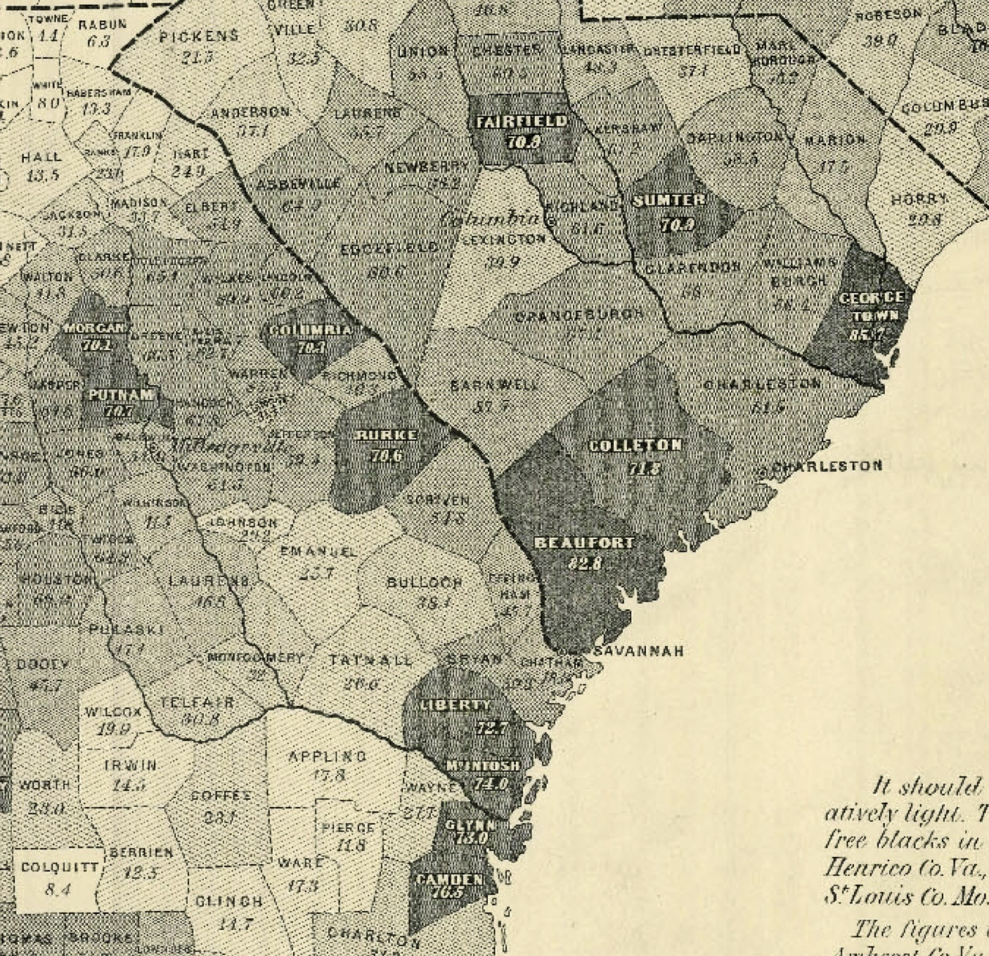
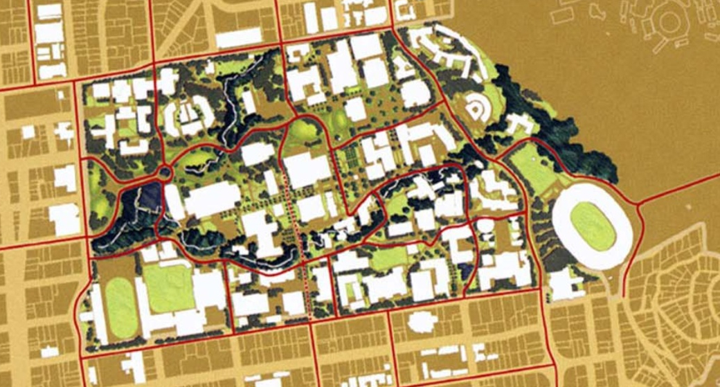
When he left Lisbon in 1502, the secret agent Alberto Cantino found a way of smuggling an elegant planisphere when he left Portugal for Ferrara, probably rolled up in his suitcase, that evaded the censors of that day’s TSA. Perhaps he rolled it up his sleeve. For the planisphere–a representation of the entire surface of the world–contained relatively classified information about the discoveries in the New World of import to the Portuguese that Cantino seems to have gleaned from mapmakers in Lisbon while he was visiting, and is the first chart to show the coast of Brazil and islands known as Fortunate, and the clear path around the Cape of Good Hope to the Indian Ocean:  he hoped that it was “in such high quality . . . and drawn in a manner that pleases your Excellency [è di tal sorte, e spero che tal manera piacerà a V. Exa],” suggesting the care with which the Este spy had procured the nautical chart.  I’ve discussed the aura of maps and charts in an earlier post; the delicate greens and red, and delineated shores, conjure the removed oceans with an aura of announcement, fitting new knowledge into a basic schema defined by lines of latitudes, not present in charts, as well as rhumb lines for nautical guidelines, whose points of reference were defined by a compass rose from which they radiated:

Cantino Map

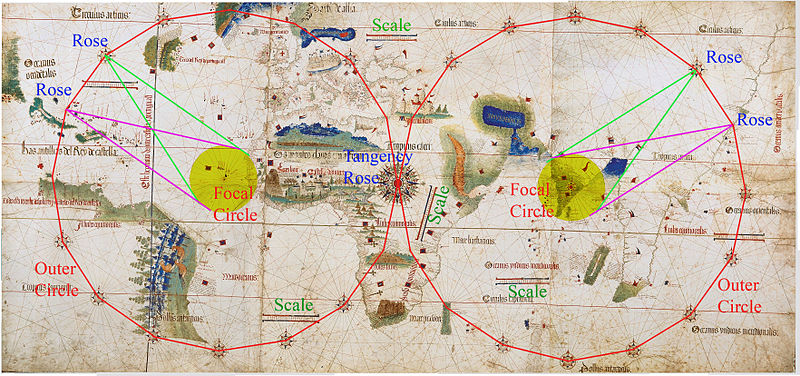
The astounding accuracy of many of the coasts of this chart profited from a long tradition and protocol of nautical charting, with a peculiar manner of noting nautical expanse.  The chart reveals the discoveries of Pedro Álvares Cabral, a nautical explorer, who Cantino probably did not know.   Cabral had recently returned to Lisbon, and when Cantino arrived there, with the pretense of seeking to trade horses for the Este court, he must have sought him out on his secret mission to procure maps of the discoveries for the Este family.  The map might have copied the secret master-map the Portuguese maintained, or Padrão Real, of Portuguese discoveries; they were magnified unintentionally beautiful “Carta de navigar per le Isole novam trovate in le parte di India” which misidentified its subject, but provided the first geographic knowledge of Brazil.  But it clearly either superimposed or referenced the directional wind-roses of nautical charting, ostensibly for reading orientating directions at sea, although perhaps as befits a planisphere of the entire earth, is constructed about two “focal circles” of thirty-two points each:

800px-Compass_grid_Cantino_planisphere_(1502)

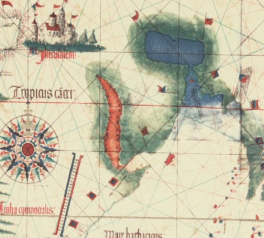
The planisphere arrived in Italy as a sort of wonder of mapping multiple forms of knowledge, as well as a synthesis of expanse.  The recent 1494 Treaty noted as bisecting the Brazilian coast, had given part of the landmass known now as South America to the Portuguese monarchy which the map shows as the most exotic area it depicted–the map seems to trumpet the luxury of an area that the Portugese sovereign Jaoa II had concealed from Ferdinand I.

Isole Fortunate

How did it speak to its new audience?  The craftsmanship of an unknown Portuguese painter or cartographer may be surprising given the high stakes of its procurement from a government particularly secretive about recent discoveries in the New World.  The geographer and historian of maps George Kish described an early fifteenth-century contract for the depiction of a portolan chart, a genre of coastal mapping that developed in Europe in the early fourteenth century, that specified the involvement of both painters and mappers; the partnership seemed natural in so valuable a creation as a map or portolan chart: the hide on which it was drawn was itself grounds for the further investment in pigments and decorative motifs, as in the illustration of inhabitants of Sierra Leone.  Part of this was also because of the riches that these maps suggest in far-off lands, and part because the tradition of nautical charts was only to mention the names of ports that dot the regions’ shores, rather than their interiors–which remain blank:  other terrestrial place are limited to Jerusalem and the ports of departure and arrival, and space expanded over the seas rather than the terrestrial expanse they enclosed.

180px-Compass_rose_Cantino.svg


The protocols of charting are unclear, as is their orienting function.  The use of these protocols in drafting the Cantino chart may have shifted as charts gained a display value of their own and adressed audiences distinct from the commercial trading houses who earlier seem to have kept them.  Although  associated with nautical routes, charts gained a distinct display value as audiences sought to process discoveries for audiences less familiar with nautical travel, or with commercial exchanges over oceans.  In the sixteenth century, as Angelo Frabeto has shown, nautical charts gained a popularity and interest in Italian courts of central Italian courts in the mostly landlocked Romagna, near Ferrara.  The already fanciful components of nautical charting expanded in these charts, which were less dense and stark than predecessors, and suggest an early tradition of combining artifice and cartography that predate printed maps.  The map Cantino brought contained a specific treasure-chest of disjointed bits of information and lore, discontinuous but joined by being enclosed in the velvet case constituted by the map itself, from the mountains of northern Africa to the birds of Sierra Leone, and the image of the city of Jerusalem, all shown without particular care for scale.


Affrica and castles in Guinea

The genre suggests not a limited ability to consider other expanses, so much as a disinterest in picturing them.  The manuscript reproduction of these charts reflected an interest in the most recent ‘news,’ and the colored vellum  charted voyages that were not made, much as, ahistorically recalling the later uncanny adoption  the motif of the ‘wind-rose’ that defined orientations of travel or the winds, Joseph Cornell’s “Object (Roses des vents)” (1942-53); Cornell placed fragments of a map of the remote Great Australian Bight amidst shrunken coastlines that Cornell had never seen, planets that were as far away, and emblems of imaginary voyages, and the compasses that might take him there:

Rose des Vents


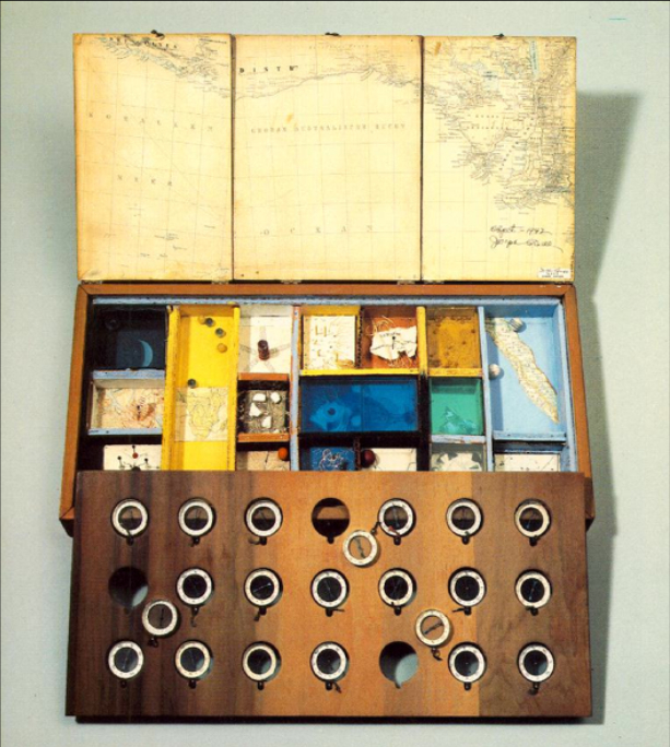
As Cornell’s box, the fragments of green shoreline in Brazil in Cantino’s map assemble the scattered expanse over which the Portuguese had travelled in a semblance of unity–the unity of an expanding expanse.  Whereas the fragility of all worldly phenomena–as of the crafted miniature of the universe’s expanse–a subject that was thematized in Cornell’s perverse if beautiful boxes, the fragmentary pieces of lunar or terrestrial maps serve as pivots of perspectives of viewers, as well as a nostalgia for the aspirations toward total visual knowledge that echo Cornell’s childhood and adult consumption of engravings in nineteenth century books of science.

The Cantino map expanded the protocols of nautical charting, which it combined with other forms of mapping to offer a range of curiosities couched in the surface of the map, together with convention from nautical charting of coloring the Red Sea red, or painting an exotic bestiary of parrots on Brazil’s verdant shore, and locating, crisply,  the islands’ shores themselves– although the eager cartographer magnified their own coastlines out of scale and proportions, despite his inclusion of a line of longitude and bar of scale.


Cantino selection

The expansion of a tradition of nautical charting to a hybrid form distinguishes the Cantino map, which faced a very different audience of readers once this ostensible copy of a secret map reached Italian shores.  The Este family  interest in this chart lay in how it revealed far-off lands that associated with ocean travel by the Portuguese, who had mapped islands in the Pacific beyond Cape Verde and the Azores in the early fifteenth century. When Cantino smuggled the chart to Ferrara in 1502, he saw it as completing the mission on which Ercole had sent him to procure secret information about “the new islands” discovered by the Portuguese, and the result of his discussions with several Portuguese explorers who had traveled to search for a Northwest Passage to Asia.  It was copied into new engraved maps of the Americas, and provided a protoype for the printed 1516 Carta Nautica.

The map centrally communicated, from the Portuguese perspective, the legitimacy of possessions in the New World, demaracted at the boundary line adjudicated and confirmed at Tordesillas, which leads one to imagine it derived from a seat of central authority.  Two disembodied bars of scale on the map’s surface suggest the measurement of terrestrial inter-relations, and its preparation for careful scrutiny of a studied eye.

Isole Fortunate

The Cantino map hence played with the protocols of charting.  Rather than insist on uniform coloration of the ocean, to prevent obscuring rhumb lines, but to maintain its elegance, as the cartographer colored certain regions a light green, by confining the blue paint to the Mediterranean, Baltic, and unbounded Caspian sea, the map combined a pictorial artifice with the practice of charting or representing oceanic space–the Mediterranean had its own portolan chart, and perhaps didn’t demand that its expanse be represented in a similar style.  The combination of artifice and nautical protocols exemplifies the huge expansion of the purview, as well as containing the first news of the Brazil in Italy, which was soon diffused in other charts and maps.

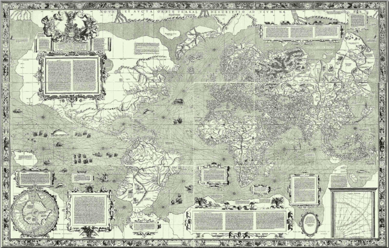
The Cantino chart might be measured against the sort of artifice in earlier fifteenth century charts, popular chartings of the Portuguese voyages to the African coast.  The chart that arrived in Ferrara from Seville dramatically expanded the purview,  toponomy, and perspective of nautical charts the Este  knew, to be sure, such as Grazioso Benincasa’s detailed 1494 mapping of the African shore:

800px-Grazioso_Benincasa._Biblioteca_Universitaria,_Bolonia.1482


Benincasa’s 1482 nautical chart densely collated costal ports but adopted the similar carefree style of decoration–probably the work of a painter–to the mythical monarchs that inhabit an imagined uncharted terrestrial expanse.  The image seems more fanciful, and designed with the desire to appeal to audiences by its  and was the culmination of a series of portolan charts and nautical atlases of the prolific Anconitan mapmaker, following his study of Mediterranean cities that from the 1460s to included western African ports, as well as mythical islands, and dense textual legends of geographic information.  Inland areas are blankly traversed by the same rhumb lines, which echo compass lines, and the truth-claims were much more limited, and land-masses probably entrusted to painters with limited first-hand knowledge of the region.  Benincasa’s chart colors the Red Sea red , too, following a tradition of charts, and Jerusalem and several biblical cities in iconic miniature.

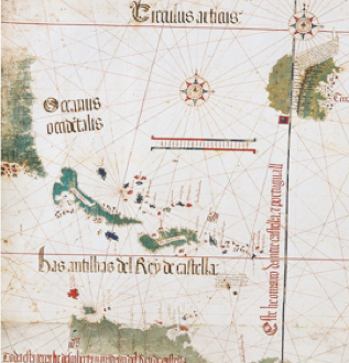
The Cantino map offered a new way of reading the map–one which mimimized these curiosities.  For one, the thick and prominent line of longitude in the “Cantino” map has received significant attention, together with its depiction of the Fortunate Islands, Antilles, and Azores, for this defines and demarcated the new region of sovereign possession.


Line from Tordesillas and parrots


The changed social life of these maps suggests new uses of the map as a field for understanding space–perhaps less ready to note fanciful riverine paths and foreign sovereigns or kingdoms, and more to conform to criteria of inclusion.  If one considers the new circumstances of reading the portolan that arrived in Ferrara, and its use to imagine and consider space, we might offer a reading revealing more than the differences in place-names it includes, or the conventions of mapping.  Although the format of mapping seems the same, the “manner” and “quality” of the map addressed a different sort of audience, despite the common origins of its prototypes.

The aura of the map was not limited to its conventions.  The material objects of wonder from the New World that populated the Cantino map are most striking, however, in how they illustrate an early interest in items of exchange.  The unity of the portolan chart is very different, of course, because it includes the Fortunate Islands of the sovereign of Castille, as well as the Brazilian shore, and a chunk of its richly green interior, cut off from the unknown mainland and in Portuguese possession, as if to show off the charmed jewel of the new lands that the chart encompassed.  The chart’s inclusion of a disconnected shoreline of Brazil assembles a makeshift sense of unity by noting the broken fragment of the New World to the lower left, foregrounding it as both a sort of promises of new riches, and a means to stake possession of a territory by no means yet entirely concrete, the feathers of whose birds might be better known than any other aspect of the chart.

Parrots in Brazil

The chart was kept in the Este library in Modena, but stolen when anti-Austrian Modenese looted the palace in 1859.  The map remained temporarily lost, before being found later that year in curious circumstances of re-use as the folding screen or door in a sausage store or butcher shop.  (Some portolan charts became book-covers; others were cut into strips as bookmarks or otherwise recycled.)  The Cantino planisphere, reused as a screen, was temporarily stripped of its attraction as a promise of new possessions.

Leave a comment

Filed under cartographic accuracy, Joseph Cornell, Mapping the New World, Nautical Charts

The Revenge of Geography?

On a smaller scale than Robert Kaplan’s pre-determined predictions of the fate of worldly empires, the damages and deaths caused by the floods brought by Hurricane Sandy revealed the revenge of geography on specific regions and neighborhoods: particularly to the square mile near Staten Island’s eastern shoreline in a topographic “bowl” became the most dangerous place to be during the storm.

With the ocean level rising at a rate as rapid as two feet every hour, an elevation of 2-4 feet made this area victim to a flash-flooding of almost biblical proportions, all too familiar from the low-lying regions of New Orleans:  shortly after breaching the boardwalk and running over the Boulevard at 6:30 p.m. in the evening, waters poured into the square mile area filled with former beach houses–located beneath Father Capodanno Blvd. and roughly between Midland and Dorp Beach–in a truly scary revenge of geography on its inhabitants.  Ocean waters breached the beachfront road, ran over the Boulevard, and filled the ‘bowl’ of some 2,000 houses in minutes.  Several inhabitants, either ignoring or not giving heed to the imperatives to evacuate low-lying areas, or just not expecting the rush of waters to be so intense, were trapped in the rushing tidal flood, and 11 people drowned, ages 2 to 85, as the natural strorm drainage system couldn’t come with the huge influx of ocean water.

Screen shot 2013-02-27 at 9.47.32 AM

The catastrophic proportions of the natural disaster are difficult to map, partly because mapping implies a disinterested relation to space that still seems difficult to process in the face of tragedy, and partly because the map is not an adequate map of the intersection of these lives with the storm.  WNYC’s map of the relation between low-lying areas and the deaths is pretty clear.  But one wishes one could have provided a better warning system while one reads this interactive map–what were John K. and John C. Filpowicz doing in their basement?  When they ran downstairs to avoid gale-force winds, did they imagine it was watertight?  Can we somehow turn back the clock?

These demographic data in this small sample conform to a broader perspective, as they echo the intersection of two groups.  Of the hundred deaths attributed to Hurricane Sandy, over half were older that 65, according to the New York Times, and a considerable majority occurred in Staten Island or Queens; many inland tragedies that occurred in the mainland attributed to fallen trees, due to the wind that were the source of that exaggerated ocean tide, but were most often far less clustered.  The individual narratives are the most meaningful level at which to understand the course of the Hurricane, but one can’t help returning for some sense of meaning to the larger maps.

For the maps provide some sense of a healing in relation to the event as well.  It is true, the tragedy isn’t one of the settlement of the area, or even of the lure of the beach, but lay in something of a denial of geography.  One would have hoped that cartography could have assisted in the evacuation, but in the end, the inrush of waters created a tragedy for which few folks were adequately prepared.  Tragic deaths occurred mostly on the margins of the lowest-lying regions, where the need to evacuate was perhaps most easy to discount, as if there, the strength of the storm somehow easiest to ignore.

To view the map in an interactive format, and read individual names of those who died, gloss your cursor over the same view of the Staten Island coast at this page, where this particularly grisly sort of tragedy is mapped.

In order to distance this tragedy, and to situate or frame it in an understandable context, it’s a help to compare this local map, and its street-by-street topography, to a broader regional map of the toll associated with the hurricane, and perhaps then to pivot to map of the entire city, against which the tragedy in the Staten Island shore might be placed–or mapped–in contextual perspective.  For this, we descend into the symbols and anonymity of GoogleMaps, with its sanitized view of the devastation:

Sandy Map Big

We don’t need to maps to tell us that the densest records of mortality occurred in New York City, or to follow the distribution along the Jersey coast.  And its hard to know that this map is satisfying, each yellow glob masking its own narrative of the end of a life.  When I look at this map, not so oddly, however, I miss the narrative that is provided for the Staten Island beachfront.  For the above large-scale map has the authoritative remove of a historical map, in some sense, and puts me at too much of a remove from the scene to comprehend the natural disaster–translated as it is to a generic Google Maps template, with the cost of the loss of human life erased, if not sanitized, in a dense clustering of a multiplicity of yellow suns.

And I go back to the map of New York, using the program to zero in, where the clustering of orange blobs is striking, and leads me back to the Staten Island neighborhood with a calmer mind, trying to balance their stories with the other lives that intersected with the storm:

Sandy-mid


There is limited comfort in this somewhat antiseptically muted map, and I might prefer a set of sequential weather maps of the region. But it’s still something that I linger over, trying to press meaning from, before going back to the grittier map of that low-lying Staten Island Beach.

Leave a comment

Filed under Hurricane Sandy, Interactive Maps

A Well-Drawn Map: the Aura of the Projection

All maps are simplifications.  Cautionary words of the section on “Map Data” in the introduction to a 1986 edition of the near-canonic Goode’s World Atlas advise cartographers to find some way to best select objects or information worthy of representing, evaluate their relative importance, and “find some way to simplify their form.”  The statement acknowledges the risks in any mapping, of which Goode himself was aware, and aims the mapmaker toward crafting a disinterested map.   Then comes the barbed disclaimer:  “Because a well-drawn map creates an aura of truth and exactness, the cartographer should caution the reader against interpreting the generalized data too literally,” cautions the  introduction.  The problem was the distortions that maps created; in the first atlas that he printed, Goode had questioned the format of straight parallels and meridians that intersected perpendicularly for compromised its relative accuracy, or for presenting an untrustworthy image of terrestrial relations.

The American geographer John Paul Goode (1862-1933) directed considerably attention to the failure of the reliance on perpendicular parallels and meridians in Mercator’s projection, and the distortions of relative national size and, more broadly, geographic interest this created:  Goode’s attack on the geometric distortion of the map was a recurrent theme of his public lectures, and when he decided to organize a new educational atlas from 1908, he designed his work to offer a new sort of educational tool for encouraging interest in geography.  His hostility to the Mercator projection, despite its considerable artifice, was a basis for  designing the world map for this atlas:  in promising to introduce a new format of terrestrial projection before the congress of American Geographers’ Association that year, he condemned the Flemish cartographer’s 1569 cylindrical projection as “evil”  and promised a new format of terrestrial projection be used in American schools to train students in world geography in ways that he felt were inadequately served by the many distortions created by “mapping” the earth onto an imaginary cylinder around the earth, as  Mercator had proposed in the most famous of the several world maps he designed.

413px-Usgs_map_mercator

“Frequently,” Denis Wood enjoined readers,”[cartographers] do not mean what they say, they rarely practice what they preach, and have managed to order their maps to preserve to preserve the implications of transparency for the general reference section,” as if suggesting that half of the game was to persuade readers.  Mercator did not try to assert transparency for his projection, but provided extensive explanations of both its mathematical construction and distortions of the poles in framed legends, if he did not admit that the map became untrustworthy beyond 70 degrees on each side of the equator line.

When Goode tilted his lance against Mercator‘s 1569 projection, he objected to the misleading viewers by organizing parallels and meridians in perpendicular relation to one another.  The map effectively expanded northern regions of the world, as the then-iced-over Greenland and Antarctica as a result.  The cylindrical projection rectilinear graticule of parallels and meridians resembled a geometric grid–a notion, while clearly flawed, provided a compelling basis for Mercator to straighten the rhumb lines of nautical maps, and integrate information from nautical cartography to a world map.  The flaws in the projection were known:  even ancient geographers had debated the uses of such a rectilinear grid, and found it discounted terrestrial curvature.  Mercator however returned to this ancient form as a way to map straight lines of nautical travel on the map’s surface, adjusting its form to accommodate nautical maps by allowing distances between lines of latitude to increase as one moved north or south from the equator.  His innovation was to maintain a perpendicular relation between meridians of longitude to parallels of latitude–as they are on the surface of the earth–at each point on this projection, which allowed local relationships to preserve accuracy.

The result did not sit well with the pragmatic ends of instruction Goode desired.  Goode vociferously attacked the faults of the Flemish cartographer’s cylindrical projection as perpetuating cartographical errors.  He believed that its idealized had long deflected criticisms of their accuracy and distortions.  Its errors lay not so much because the projection privileges the size of Europe–as was later argued–but in how it granted large territorial expanse to Greenland, and did not extend a similar bias toward America suitable for Americans to learn geography.  Despite engraving a large projection of the world in sixteen sheets, Mercator never designed his projection to serve as  wall-map, akin to those used in to American schoolrooms for geographic study.  Mercator, a printer and editor of multiple projections as well as a geographer, and was not committed to one schema of global projection alone that had become identified with his name and authorship.  (Mercator himself preferred a curved sinusoidal distribution of the earth, organized around a central meridian, to the cylindrical because of its ability to maintain accurate distances.)  But the projection epitomized an inaccuracy and distortion often recognized–as by Goode–to be the cost of any world map.  To devise a more legitimate and pedagogic projection for the classroom setting, that  school atlases would use as educational tools, Goode fused Homolographic and Sinusoidal projections in a Homolosine Projection in 1916, coining this term and presenting it as a more suitable projection for instruction and the basis for what became known as the “Goode’s World Atlas” for Rand McNally.

The projection not coincidentally restored North America to prominence in the first sector of its flattened orange-peel segments.

800px-Goode_homolosine_projection_SW

This iconic map, prefiguring the corporate logo of Trans World Airlines, used decidedly wavy meridians to remind his readers of the equatorial bulge in the round surface of the world, and make clear its transformation of a curved world, rather than–as Mercator–transposing round surface to “spread on a plane the surface of a sphere” for readers.  The map explicitly showed students a picture that affirmed the world’s spherical nature, as if lest anyone be led to believe that it was flat.

Goode affirmed the advantages of this teaching model in many public lectures that he gave through the country.  Goode believed that despite giving the appearance of accuracy and regularity of its perpendicular parallels and meridians to readers trained in geometric graphing and Euclidean geometry, the map was pernicious.  In dedicating his career as a geographer and educator to “to making geography a simpler and more enjoyable subject to learn” he started from the map itself.  As well as a productive cartographer,  Goode was a proselytizer of the benefits of truth in mapping; as the power behind the Rand McNally Atlas, and a tireless advocate of the benefits of atlases in education, as well as the teacher of an entire generation of American geographers.

The Mercator projection did not sit well with his insistence on a pragmatic value for maps.  These concerns might be likened to John Dewey‘s interest in both transparency and logical relations.  Dewey in fact dwelled a bit on the “Mercator projection” that Goode detested briefly when he investigated the relation between a country and its map in writings on mathematical discourse.  John Dewey observed how “the similarity of the relations of the map and those of the country is the product of taking maps that have in fact been perfected through performance of regulated operations of surveying in isolation from the operations by which the map was constructed.”  “In the ordinary Mercator map,” he noted, “if the polar regions are taken to be relative . . . to the equatorial regions, “there would be misrepresentation.”  He observed with rue that “there is a morphological enlargement of polar regions in the Mercator style of map; in the cylindrical, their shape is distorted, while areas are correct . . . when the directive function of the map is left out of consideration it must be said that no map is “true,” not only because of the special ‘distortions’ mentioned but because in any case a map represents a spherical upon a plane surface.”  He was intrigued by the  system of relations constituted by a map:  “In the ordinary Mercator map, if the polar regions were taken to be relative (in the sense defined) to equatorial regions, there would be misrepresentation.”  Dewey revealed his concern with the functional relation between country and map, as well as the instrumental role of maps in “such operations as traveling, laying out routes for journeys, following movements of goods and persons,” finding the distortions in the Mercator projection made it lacking on both grounds.

As Goode dedicated his efforts to restore pleasure to studying geography, his attack on the “aura of truth and exactness” of maps hints at the deeply seated nature of Goode’s criticisms of retaining the equiangular projection associated with Gerard Mercator in schools as a guide to world geography–not only did its limited preservation of global accuracy rendered it practically unusable at latitudes above 70˚ but the map provided little relation to an existing political geography or an amenable geopolitical image of terrestrial geography.  Mercator’s aim in his 1569 sixteen-sheet map was to present straight lines of sea-travel, or nautical course, rather than preserving terrestrial proportion, transforming  East-West travel so that meridians and parallels were perpendicular, and “linear scale” was equal at any point–although uniform scale not maintained.  The resulting distortions of “expanse” at latitudes significantly above the equator are clear to observers who noted its perpendicular intersections of meridians of longitude and parallels of latitude:

350px-Mercator_projection_SW

These distortions are increasingly accurate with the regional surveying of the globe dramatically expanded; Goode would have none of its expansion of Greenland to the size of Africa by the early twentieth century–a result of the projection schema transmitted by applying Mercator’s procedures, more than of Mercator’s original map, whose intent was less directed to terrestrial coverage than reconciling previously opposed standards of nautical and terrestrial cartography.

The harsh condemnation of the misleading “aura of truth and exactness” in maps such as Mercator’s projection is telling, and although it wasn’t written by Goode, continued his cartographical crusade.  Although Goode’s deep concern with the use of the projection and geography’s acceptance in school curriculum is understandable, it is curious that the work of a geographer closely associated with the printed maps as Goode sharply condemned the “aura” of truth in maps so sharply.  “Aura” here meant the misleading nature of its authority, but also suggested the staying power of the map as an art form, and the way that the artifice of map-making persuaded viewers of an appearance of accuracy and accurate inter-relationships.  But it can’t help but recall how Walter Benjamin discussed the lack of aura in printed works of art.

The editor of Goode’s atlas who condemned the “aura” of maps as the Mercator projection was probably unaware of how Benjamin discussed  the loss of “aura” of art in an age of mechanical reproduction.  For Benjamin, mechanical reproduction had the cost of removing the work of art from a ritual context, and artworks in reproduced form contained a diminished sense of the trace of the hand or the materials of their original construction.  This was not entirely a negative process, but an acknowledgment of a fait accompli, for Benjamin.  The aura to which Goode’s editor objects might lie, for Mercator’s work, both in the authority of its iconic form that was uncritically transmitted and in Mercator’s hand-engraving of the image–in which he not only combined the most recent nautical cartography.  Although we now distinguish Mercator’s projection as a mathematical solution for preserving the Euclidean form of a map and reconciling navigational courses with compass bearings, Mercator’s artifice lay in his practice as a map engraver.  His map was fundamentally a description, misunderstood as a mathematical equation, which uniquely synthesized charts and projection and elegantly described both the mathematics of his projection which he pioneered with maps of both poles that the projection did not allow.  It created a new “aura” for the printed map, as it were, to allow it to compete with the appearance of discoveries on recent nautical charts.

The map he created echoed a tradition of learned humanistic geography, removed from nautical practice, to be sure, but eager to incorporate its practical results, much as the earlier map of the humanist Martin Waldseemüller of Strasbourg, who in 1507 combined recent nautical results from sailors with his considerable geographic learning to treat the map as a medium and forum for illustrating geographic knowledge–boasting that his woodcuts demonstrated the discoveries in Indies and Americas “more truthfully and exactly” than existing maps or charts.  The comparison to Waldseemüller’s 1516 Carta Marina is perhaps more telling, since it clearly seems to adopt the growing aura and appeal of manuscript nautical “portolan” charts as bearers of new information; the Carta Marina, distinguishing itself from his global projection, included place-names identical to those that appear in charts executed by the fifteenth-century nautical mapper of the African coast, Grazioso Benincasa of Ancona.  It also follows the form of map projection that we associate with Mercator, who likely emulated this map:

Waldseemuller 1516 carta nautica

Both the cartographer who never left Strassburg, Waldseemüller, and Mercator responded to the growing fashion for nautical charts, and acknowledged their derivation from the genre of nautical mapping to attract new readers.  The “aura” of Mercator’s map lies in the revealing role of his hand in synthesizing maps, combining geographic texts, and combining the conventions of noting direction on rhumb lines with the measured spacing of parallels and meridians.  Both create a similar engraved image bound by an elegant frame:  rather than give prominence to notches that correspond to lines of latitude and longitude, Mercator also painstakingly ‘framed’ the map in an ornate manner, dedicating attention to an elegant banded frame, and including many panels of geographic texts that would reward the sort of careful study that its large form allowed.

Benjamin’s  point wasn’t limited to the Luddite’s antipathy to the mechanic.  It has continued to provoke new claims of the role of art in an age of reproduction and of reproduced art, indeed, and at least in part came out of his interest in film as a medium:  but his observation that printed reproductions of art lacked the “aura” of use-value specific to a work of art was closely tied to the very “aura” that Goode’s editor sought to distinguish his maps from, and of which Mercator was very much a part.  For Goode seemed to distance cartography from “artistic” aspects of engraved maps of Mercator’s day, and to assert what might be called the more “logographic” function of map making.  Mercator’s projection is not often thought of as aesthetic or artistic, and maps are not often considered works of art.  In the manner that it uniformly straightened its bearings to approximate a satisfying equiangular graticule, and is a bit of an esthetic creation of itself:  its frame is far more conspicuous than its measured indices.

The artifice of preserving the angles of incidence in the terrestrial graticule, if not the size of land mass framed the world in the form of a framed picture, after all, albeit in engraved form.  Although Benjamin’s “aura” seems to exist in the relationship between observers and a work of art.  the art of mapping had so dramatically expanded in the world of sixteenth-century engraving that his map was a cognitive achievement of the mathematics of re-distributing space along straightened parallels and uniform meridians.  In straightening bearings to recall an equiangular graticule of Euclidean form, in contrast to the curvilinear projections included in many Renaissance editions of Ptolemy’s treatise on world geography, Mercator mapped the world in a satisfying Euclidean space, preserving the angles of incidence in the terrestrial graticule, that invested a new aura in a planisphere as a readable expanse.  The projection reduced or omitted the “unknown lands” that earlier cartographers had noted; by directing attention to its indexing the “habitable world,” and limiting regions near the poles, the projection also conveniently restricted its coverage of unknown regions.  And it omitted medieval geographic constructs as the Antipodes or Sea Monsters that appeared in earlier maps.  In their stead, the projection reconciled conventions to “read” space, and refined a model for imagining and tracking travel through space–even if it was not used on ships for doing so.  Unlike a simple nautical projection or ship chart of the sort that existed in manuscript, however, it projects expanse to a indexed matrix.

The 1569 edition of the map of sixteen sheets survives in but three examples, yet was a sort of luxury product in itself when it was first sold and sold briskly in the decade after it was devised.  The noted meridians and parallels together with  the rhumb lines of portolan charts, ordering expanse both on uniform meridians and alternate modes of notating terrestrial expanse on land and water.  It lacked prominent notches on its frame, and would probably not be used to read or approximate terrestrial position.  It’s often argued Mercator devised the conformal projection for the use of sailors, who could transfer the bearings of rhumb lines on nautical charts to its graticule, since he entitled his “Orbis Terrae Descriptio ad Usum Navigantium Emendate Accomodata” [Description of the Terrestrial Globe Correctly Amended for the Use of Sailors].  The map did not lead sailors to abandon charts, although Mercator identified it as “corrected for the use of sailors.”   Its market might have been distinct from sea-goers, however, despite his acknowledgment of the benefits he gained from their findings:  the map synthesized the results of navigation through his artifice in a new comprehensive image readily read by landlubbers more than for the use of those at sea–constraints in taking accurate compass bearings at sea made it less trustworthy  at sea, Mercator would have known.  By synthesizing results from Spanish and Portuguese charts, he sought crafted another way of framing the individual reader’s relation to space, by adopting hybrid signs in his map.  Although ostensibly made for the use of sailors who could transfer bearings rhumb lines on nautical charts to its graticule, given limited abilities to secure the reliable compass bearings at sea, the map was probably easily read with the aid of a compass by those ashore in an age when compasses were valued commodities and luxury goods.  This is was the audience among whom it was most likely viewed.  (Partly because of the success as a map as a projection that preserved local scale, it is still retained on Google Earth:  it also of course fits nicely into the frame of a computer screen.)

800px-Mercator_1569

Mercator intended the sixteen sheet projection as a record of global knowledge, capitalizing on the increasing authority of nautical maps.  It was something of an encyclopedia, describing the origins of rivers and the world’s seas, and limiting the range of “unknown lands.”  In doing so, Mercator presented the map as an autonomous form of comprehensive geographic knowledge in revolutionary ways, framing an argument about an individual relation to space, as it were, and construing an individual relation to expanse.  Stephen S. Hall enjoined we acknowledge the relative nature of all maps recently by noting how, over time, we develop our personal geographies, or “her or his private meridians,” advising“I Mercator; you, Mercator, too”:  but Mercator provided a template for a deeply individualistic relation to the totality of known space, by bringing all resources of terrestrial description to bear on the task.

Which brings us back to its aura and artifice.  For the projection was successful as a canonic model to transcribe the indexicality of the entire globe–and affirmed a new relation of the reader to the surface of the map.  This was Goode’s problem.  The persuasiveness of encoding an accurate record of space was exactly what gave Goode suspicions, and which Goode’s editors were keen to perceive.  Mercator had in 1569 tacitly asserted his ability to transform expanse to a planisphere that could be read on both rhumb lines or parallels and meridians.  He noted that his projection delineated a new model of projection whereby to “spread on a plane the surface of a sphere in such a way that the positions of places shall correspond on all sides with each other;” even though it clearly distorted the size of Greenland and Antarctica, or diminished the expanse of South America and Africa, this was of less concern to his readers or to the readers of sixteenth-century maps:  no one was going to stake claim to these lands, for one, and the seas were of greater import than the areas near the poles.  The inaccurate presumption that these leaves were used to create a wall map–and an advertisement for global dominance–was only imagined in the late nineteenth century.  For a more proportional map of global coverage, Mercator himself preferred a sinusoidal projection.

The power of Mercator’s transformation of space is the relative absence of local distortion due to its conformal construction, giving it a staying power that has continued in different forms through Google’s maps.  The means by which it maintained its conformality were Goode’s problem, however, for he saw the map as perpetuating a geopolitical deception outdated in the modern world.  One might recall that when Brian Harley sketched the outlines for a history of mapping, he began from how “cartography was [long] primarily a form of political discourse . . . concerned with the maintenance of power.”  The staying power of Goode’s map, interestingly, can be roughly tied to the political dominance of America in the “short” twentieth century, or from 1914 to the 1960s, when the Mercator projection was revisited, not only by the German journalist Arno Peters’ equal-area projection. Peters showed sensitivity to the visual construction of maps as forms of propaganda, when he promoted the projection, noting how the map privileged one area over others.  But Mercator’s projection had already long been defunct for geographers even before 1961, when Arthur Robinson devised a global projection to map the earth’s surface as a flat image with significantly less distortion than Mercator mapped.

450px-Robinson_projection_SW

2 Comments

Filed under atlasses, Goode's World Atlas, John Paul Goode, map projections, Mercator Projection

Mapping Slavery in the United States in 1860

In debating the values of data visualization maps, I’ve gone both ways.  The value of maps as specific arguments–and tools of spatial orientation–respond to the value of the selective criteria that cartographers foreground in them, after all.  Less inventive differentiations of spatial distributions “flatten” the map’s surface, and limit their value to the map-reader.  Their arguments are not as interesting, one might say.

The early visualization of this elegant choropleth map employed data from the Census of 1860 it translated into visual form to map the density slave population across the recently seceded Southern states. Long touted as an important strategic tool, the rhetoric of an isolated mapping of the Southern states framed debates about the Civil War with greater  subtlety than current tiresome choropleth maps of “red” vs. “blue states.”  The 1861 lithograph marked the density of slave-owning in pockets by darkening sites of the greatest slave population, perhaps to mask the ownership of slaves throughout the South and point to the defenders of a slave-based economy.

1861 slave population map

If the census provided a basis for Edwin Hergesheimer and Alexander Dallas Bache to create the map, a collaborative government effort as much as an independent enterprise of the commercial engraver Henry S. Graham, the use of statistical cartography prefigured the mapping of social or political trend in the field of human geography.  While the recent German immigrant Hergesheimer created the pro-Union map from figures in the Census after his work on the US Coastal Survey, the translation of the results of the Census into visual form proceeded because the Coast Survey’s Superintendent.

Although a deeply collective project, Bache’s recent success in assembling a team to map the coastal survey gave him a new public profile, and prominence, to back the project of mapping a visual record of data assembled about slavery in Southern States.  The map tellingly reveals Hergesheimer’s deep Liberal opposition to slavery as an institution and the pro-Union belief of supervisors of the eighth national census, but its visual explanation of the origins of secession intentionally focussed attention around slavery debates.  Printed in September of 1861 after hostilities had begun, and ten states had seceded from the Union, it isolated the evil of slavery in the seceded region, and highlighted the centers of slavery’s institution even before slavery became the central issue of the war.

Hergesheimer and Bache were instrumental, too, in adopting the most current techniques of mapping to portray the differentials of slave-owning in the Confederate States just before the South’s Secession.  The half-tone engraving he designed to show slave-holding states in the “Southern States of the United States in 1860” foregrounds discontinuities in the national territory by using figures he derived from that year’s national census.  Known as a “Slave Density Map,” the lithograph exemplifies cutting edge statistical mapping and an artistic use of half-tones to depict the seats of the evils of slavery in seceded regions of the United States in a piece of pro-Union propaganda:  slavery existed throughout the Southern states, but was concentrated “down river” in Mississippi, Georgia, South Carolina and Texas.  The lithograph provided something of a moral map of the region beyond which Lincoln sought to forbid the expansion of the slave-economy.  Printed and sold by the government in wartime ostensibly for the benefit of Union Soldiers, the single-sheet map used half-tones to differentiate relative variations each county’s relative density of slave-holding across the Southern states.   But although the map presents itself as an appeal for wounded veterans of a war in which soldiers were so dramatically injured, its mapmaker aimed not only to raise funds through direct sales but broadly encourage the war effort by illustrating slavery as literally darkening the nation.

With considerable cartographical sophistication in charting variable densities of slave-ownership, the map illustrated striking discontinuities in the nation and  even suggested divisions in the Confederacy at the outset of the war:

Slavery Map 1860

Bache was a deeply moralistic man, as well as a former Lieutenant in the Army who, after graduating from West Point until 1829 designed coastal fortifications  before he rose to head the Smithsonian.  Bache had won national eminence as the head of the United States Coastal Survey, using a team of trained surveyors, several university observatories, and many field assistants to triangulate the coastlines from a base-line near Annapolis.  Based on readings from numerous sighting stations, the map extended west to California and endured through the twentieth century.  After mapping the shorelines of the United States, Bache devoted himself to mapping its islands of slavery.

Most maps made in wartime are valuable strategic tools to orient troops, as much as map vulnerabilities.  But this map was not made for a lack of cartographical records.  (It did not meet a desire for cartographical knowledge, for example, as the many paper maps shipped to Kuwait during the 1990 Gulf War–often incorrectly considered the first war fought by GPS–as 67 highly detailed topographic line maps of the region, some bathymetric, at the incredible scale of 1:50,000.   Incredibly, the Army lacked  accurate maps of Kuwait, and these were quickly prepared during the war based on remotely sensed satellite images.)  Bache’s map had far less apparent strategic use, identifying pockets where a slave-based economy was particularly dense, and all but ignoring physical topography or population centers.  But the map was compelling as an image of the divided nation.  Bache and Hergesheimer designed the map for a civilian populace, using the 1860 census to create a visually compelling distribution that revealed regional disparities in “slave-ownership” and the population identified as slaves to reduce the scope of the confederate secession.

The map provides an image of the nation taking stock of itself, or learning to look at its divisions–a rare thing.  Bache and Hergeshemier’s map of this nexus of the Southern economy was ostensibly sold to raise funds for “Sick and Wounded Soldiers of the US Army,” or veterans, as gothic script in scrollwork crisply notes.  It’s been argued that the map identified possible pockets of resistance, or possible seats of opposition to Union forces.  Lincoln consulted the map after the war, to consider ways to encourage the Southern economy.  But the elegant map roots the struggle of the Civil War in disparities of slave-ownership in the South, to question the fierceness of opposition to the Union, or to show the enemy and stakes in the war.  By starkly differentiating each county’s degree of reliance on slavery by shades of grey, it offered viewers a stark map of racism in parts of the region–if it also perhaps perpetuated racism  unwittingly in directing attention to the suffering of soldiers who could benefit from its sale and not sufferings inflicted by the economic institution of slavery.

legend

But the map also made its point of isolating slave-ownership in select regions of the Southern states, in ways that masked the continuity of slavery across the region.  The remove of the Southern states from the North, and isolation of precise regions where the practice of slavery was most extreme, echoed Bache’s belief in the political uses of science by applied cartography to national needs and for the public good.

It is interesting that Hergesheimer’s design for the map followed Bache’s success in precisely mapping the nation’s shorelines as Superintendent of the Coastal Survey.  The project established Bache’s credibility in large-scale surveying.  The new survey not only used the survey of coastal lines to map the interior, but may have provided Hergesheimer and Bache to turn attention to the occupants of the land as the US Government desired at that point.  The actual survey of coastal lines offered a sort of template to construct the map of slave-holding populations by using nine shades of half-tones to darken regions in differing degrees that created a compelling image of the fractured nation, and minimized the widespread nature of the social acceptance of slavery in seceding states.  The detail of the shore and coastal islands throughout suggests that the US provided not only contour lines for the map, but a template for national coherence–the unstated if implicit subject of the Slave-Holding map, and a central preoccupation of the wartime government.

The map of slave-holders adapted census information to the basic contours of states to map aggregate variations of slave-owning in states.  Although the map is given the strategic value of predicting resistance to the Union troops, it was probably most valuable for its inspirational or hortatory appeal as much as its accuracy.  Bache tried to expand the public functions of cartography in the map by adapting recent statistical methods to compellingly map two different worlds within the same nation.  A career military man and scientist, Bache was a public servant committed to the public utility and good of surveying and meteorology–a counter-part to Matthew Fontaine Maury, the polymath oceanographer and cartographer who served in the Confederate Navy 1861-5 and was Bache’s long-time nemesis:  Maury, whose cartographical interests I discussed in an earlier post, and who had himself hatched the ill-fated scheme for slave-owners to resettle from southern states to Brazil’s Amazon Valley in the early 1850s.  Bache’s map is both a detailed picture of social divisions and an image of a divided nation.  If this unlikely project was impractical, Bache’s map focussed on the seats of the slave-economy in seceding Southern states.

Susan Schulten noted in 2010, in a blog post to which I’m indebted, that Bache’s map shows a striking concentration ownership of slaves on the shores of the Mississippi, where cotton crops dominated, Alabama and the low-lands near South Carolina (which enslaved the majority of its population) and eastern Virginia; she suggested that this snapshot of slave-holding had strategic value to determine sources of greatest resistance in the Confederacy as well as for Lincoln to consider future economic development of the South.  The map must have constituted something like a “news map” for readers eager to understand the actual numbers of slave-owners in the deeper south, and the relative degree to which slave-owning had continued to endure in the Republic.  Parts of the broadsheet provided a strikingly compelling illustration of the locations of slave-ownership and an economy of slavery where Cotton was still King, as much as the Southern states as a whole:

Mississippi

Slavery was widespread in both Charleston, South Carolina, and Savannah:

Savannah and South Carolina

And, similarly, a pointed reliance on slavery around the area of Galveston, Texas:
Galveston

But there are multiple ways to read the project for designing the map.  The image of slave-holding lands provided a victory map for the Union soldiers, who sold it to raise money for their fellow-veterans who remained sick or injured, as if to stake the agenda for a need of remapping the nation, echoing a Jeffersonian idea of the use of surveying as a foundation for democracy.  It was the map by which Lincoln used to follow Union troops as they liberated slave populations, or understand the seats of rebellion, but had huge power in graphically stigmatizing Southern states.  It was also an idealistic statement of the goal of ending slavery in the war effort.

This striking legend that explained the iconography of the map’s nine variations in shading, placing the greatest “free blacks” in large towns:

Legend in Slavery Map

The innovative exercise in terrestrial cartography was also the last attempt to quantify slave-holding in the nineteenth-century, although it integrated public records that were later widely accessible.

It was, sadly, also the final time the Federal Government revisited the topography of slave-holding with similar precision. The failure to remap the same distribution seems one of the more stunning  cartographical silences of the twentieth century.  Bache’s impetus to draft the map might be informed by his long involvement in public education and belief in the public utility of the sciences; he effectively lent  a polemic character to conventions of statistical mapping by exploiting the different gradations of shading available to the engraver to craft a useful piece of early printed cartographical propaganda.

Indeed, its use as a piece of propaganda in wartime may have outstripped its potential as  guide to military strategy.  Lincoln regularly studied the map, according to his portraitist Francis Bicknell Carpenter, who found the president studying the map with considerable intensity in 1864, during the six months when he lived in the White House to paint the portrait “President Lincoln Reading the Emancipation Proclamation to His Cabinet.”  But his inclusion in the image of the choropleth map that accentuated national divisions reflected his interest in illustrating Lincoln’s “statesmanship” and “solid integrity” in bridging the nation.  By his own account, Lincoln had taken great pains to explain to Carpenter both the origins of “his adoption of the Emancipation policy” and his decision to draft the Proclamation from late July 1862, before he put it aside until being sure of military victory.  “I resolved,” Carpenter wrote in his memoirs, “to represent the scene [of Lincoln reading the Proclamation to his Cabinet] without the appliances and tricks of picture-making, and endeavor, as faithfully as possible, to represent the scene exactly as it transpired; room, furniture, and accessories all were to be painted from the actualities.”  Did the room actually include the map of slaves still ‘owned’ in the South?

Emancipation_proclamation-1

Carpenter’s state portrait depicting Lincoln reading the Proclamation to his Cabinet placed the lithograph in a small but a prominent role that most observers would not fail to notice.   As if to illustrate the subject of the recently issued Proclamation, if not the thoughts that weighed on the conscience of the President, the map emerged from behind a chair at the painting’s base.  Lincoln loved the portrait.  The map is the essential subject of his discourse; Carpenter made good use of it to capture the stakes of the Proclamation.  The nine bars of graduated shading in the map stand out among printed books in the group portrait, reminding viewers, both recording a moment of triumphalism and presidential dignity, and suggesting the uphill battle for implementing the Proclamation in the deepest South.  The map speaks volumes:

Visualizing Slavery-Carpenter

It reminds us not only of Lincoln’s hope to transcend social divisions.  Before Carpenter included it to illustrate the grand subject of Lincoln’s address–and Steven Spielberg also used the map in “Lincoln,” behind Daniel Day Lewis’ shoulder–the 1861 lithograph provided a tool to imagine political coherence in a more perfect union, urging men to enlist and others to get behind the war.

2 Comments

Filed under Abraham Lincoln, American history, choropleth maps, Slavery, US Coastal Survey

Cartographic Selectivity and the “Objectivity Question”

The comments elicited by readers of the imagined maps of Manhattan island  that I discussed in my last post were so interesting because they mistook the selective criteria of mapping for their objectivity.  The personalized maps featured in the Magazine of this past Sunday’s New York Times appropriated cartographical tools to  render personal spaces in the anonymous city, recalling the way we map the neighborhoods we live in and how they change with time.  But readers of the online version blamed them for offering limited perspectives of the city.  This was especially true of those posted by former city-dwellers who didn’t recognize the city as it existed in their own minds–or maps, and felt that their own mental maps were under-represented or neglected and just, sadly, not there.  We all have subjective maps that divide social space in our minds, that don’t line up at all with judging the accuracy or objectivity of maps.  As Becky Cooper, the curator of these maps, puts it:  “I’m really, really bad at geography. But I think it helped me to see maps more as biography.”  Cooper’s collection of maps are very different from, say, Cohen and Augustyn’s volume Maps of Manhattan that Tony Hiss introduced.  And they only gesture to what Henry James called the city’s “primal topographic curse”–its street grid–or the many neighborhoods that can be mapped and were mapped in the island.

Some blame might be assigned the limited demographic range of those invited to map their memories of the city, or map their memories of particular sites in a far more diverse city:  the selective criteria that each adopts might just as well be read as an invitation (or opportunity) to map your own image of the city, and otherwise unremarkable sites that you remember in identical cartographical outlines.  These maps transfigured existing maps of the inhabited island, mapping the island as inhabited by you, mapping individual memories, objectivity be damned and cartography full speed ahead:  rather than erase the role of the cartographer, behind the veil of objectivity, the cartographer becomes you.

The practice of selective notation of what qualify as a prominent site fits an age when AAA sells Trip Tik Guides that pride themselves as  accurate routing maps for trips, consciously designed as counterparts to comprehensive road maps of a region.  Trip Tik Guides hearken to medieval route-maps, providing a very selective guide–if a comfortingly narrow guide–to a world where we may all too often suffer from information overload:  they winnow the basics from the maps, a service that the AAA folks are proud to offer for any twelve destinations from any zip code.  AAA meets ADD, in other words:  these maps can help us decide what to pay attention to, or allow us to read a map when we might be too easily distracted by its contents to navigate effectively with them, or be tempted to stray off course by the inviting name of a region or a coastline that can’t fit our itineraries, or just help us plan an itinerary for our entire weekend trip.

Objectivity or the rhetoric of objectivity are central to the market for terrestrial maps.  But that rhetoric should not conceal that all maps are not only selective, but use selective criteria to make sense of space.  The  sharpness of contrasts of their selectivity as records that orient us to space–and the mental ties their selective criteria create in space–is a measure of the usefulness of maps as tools to think about a space that seems a dauntingly undifferentiated expanse before we’ve been there to visit and make it our own.

In the medieval maps known as “mappaemundi,” or maps that represent the world, “the religious importance of towns . . . determined their location and their prominence,” as John Gillis put it, rather than their location or size.  There seems some comfort in not plotting a sense of space, and of privileging Jerusalem’s position  in how medieval T-in-O maps, and the early printed world maps that retain the Holy City as their center, for the very reason that not many places even needed to be named other than Jerusalem in a map of global space.    The divisions of space in this 1485 world map suggests less interest in comprehensively identifying places or dividing space to scale than describing the configuration of lands around the city called “hierusa” and Holy Land, even as it claims to “lay everything before our eyes,” including the origins of our oceans, including “the sources of the Red Sea and the Indian Ocean”:


macrobian_1483

Most of the map, including the “terra incognita” of the mythical Antipodes, is blank.  Before the increasing

population of space, terrestrial expanse was still more or less undifferentiated in 1493, when sites worthy of memory were few, and maps’ contents were not read by audiences familiar with few places or sites.

Regional identifications were few, and confined to known landmarks and major rivers, all of which are less detailed than the sons of Noah, Shem, Japheth, and Ham, who hold the planisphere by its corners, as if it were a tablecloth, or the puffed cheeks of the nine curly-headed winds who float in the intermediate frame:


Schedel map small


So we might ask what are the criteria that we use to differentiate space, as much as wonder about the accuracy with which we denote place.  The new emphasis in maps of ordering place by terrestrial coordinates of location defined a model for reading space in quantifiable or measurable terms, in which a graticule of parallels and meridians offered terms for the viewer to judge distance and scale.

The selective criteria of later maps reflected not only knowledge of toponymy, or discovery an abundance of place-names, previously unknown, but the cartographical ability to delineate meanings in space.  Successful criteria of selectivity allow maps to make space available to the viewers, and cartography provides a sort of public ‘good’ to understand public space.

Although this sort of juxtaposition would not be possible to most, precise urban surveys allow maps of provocative maps of overlays, presenting maps less as sources of information than a sort of resource to “think about” space and imagine public space, particularly advantageous to urban planners.  I had hoped to include different maps of the UC Berkeley campus, one that construed spatial relations on directions, another by mapping creeks, and the last highlighting in blue routes lanes of wheelchair accessibility.  Each differently privileges information for different readers–and offers multiple views of the very same ‘space’–one concerned with routes of access and travel, another with spatial orientation to finding the individual buildings for university classes.


wc accessile campus routes ucb


large_campus_map


Let’s turn to San Francisco’s space, however–more challenging to map and more recognizable, and offering examples more semantically complex.  The below maps explicitly construe relations that are hidden to observers, although with considerable spatial precision, as this visualization that performs a layover between crime, trees, and cabs in San Francisco, overlapping three data sets to  visualize a Venn diagram. This is not a simple visualization of data, but a unique topography based on selective criteria:  the concentration downtown of cabs (and hence potential witnesses or bystanders) do not lessen crime more effectively than the planting of trees; though it’s hard to see trees as an active crime-deterrent, the overlay tells us about how we construct our neighborhoods as living spaces.  Or, as the man who made the map, Shawn Allen, put it, “I’m still not sure if it’s significant, or even interesting, but here it is.


cabs, crimes, trees in sf.


The versatility and value of the selectivity mapping techniques depends on the readiness of the cartographer to perfect a legible iconography–as well as its ability to surprise and invite viewers to reconsider space by revisiting the socio-economic differentiation of a space that we might already daily move through.

The mapping of food access is a good case in point of how maps make space look different.  Although this map includes no toponyms or place-names, the synthesis of data into a tricolor spectrum of a data overlap creates a topography of food choices available in each neighborhood.  It poses questions of how food constitutes a neighborhood’s attraction and the constraints its inhabitants face, or consider how these choices arose.  Another map employs a color-drenched spectrum, glowing in flourescent hues that denote relative access to food markets across the city:  the spectrum dominates names of the city neighborhoods, to reveal a topography of food that underlies their divisions.

FoodMarketScore


One might better understand the constraints its inhabitants face by a more traditional map of retail stores–both in terms of different regions’ quality of life, as well as real public health risks.  This alternate data visualization is at a finer grain, identifying seven varieties of sites of retail food stores of different colors, with liquor and convenience stores noted by a simple dot of black.  This makes the map both more detailed and less easily readable for some, but provides a meaningful view of the city’s urban space.


Retail foods SF


Successfully selective criteria can help create a map that is a better public resource.  To craft these maps of neighborhoods better, we’ve even begun to push against the preference for the visual, in maps poised to break sense-based walls as well as esthetic boundaries to register an aural dimension:


Sound Map of Missionjpg

3 Comments

Filed under Food Maps, Mapping Manhattan, San Francisco, sound maps, Stamen design, T-in-O, UC Berkeley Campus Map

Self Made Maps

Many online responses to the arto-carto project of Mapping Manhattan remind us of how the biggest challenge of any cartographic totalistic idealized view is to record local details with fine grain: it’s no coincidence the chorus of posted responses to the maps in today’s New York Times often complain about the loss or absence of specific individual neighborhoods, or the absence of economic diversity (and ethnic diversity) in the beautiful colored maps.  As an exercise of collective map-making, the project that Becky Cooper ideated and planned, “Map Your Memories,” provoked each cartographer to record their own view of that island, rendering it as inscribed with memories of their own.  This open call perhaps provoked the deep-seated nature of responses it has met, evident in the energetic nature of good-hearted responses Mapping Manhattan has elicited from online readers over the past few days.

map_2

The call to “Map your Memories” asked a range of writers, artists and other would-be cartographers to record individual memories in the outlines of a map of Manhattan island of vague north-south orientation.  The book stands on its head maps’ implied claims of objectivity, by treating media as a screen to project memories, whose individual design reveals their topography to be imprinted with haphazard collections of personal associations or reminiscences.  The white upper-class basis for these mapped perspectives  is implicit in their subjects– lost gloves, volumes of Proust, chick-lit, cups of non-Starbucks-brand coffee, lovely one bedroom apartments, or stages of urban fear; the maps are something like open invitations to play Proust.

They are rightly, and also wrongly, criticized as upper-class white bourgeois artifacts, since that is what they openly are–no one would presume to credit them or mistake them from objectivity.  (That might not be the audience that the New York Times wants to address, but is after all the audience of Abrams, the art-book publisher.)  The playfulness of some of the maps clearly perpetuate these myths playfully transform Manhattan to echo something like a medieval zone-map, where torrid zones of uninhabitability, and in fact are divided by zones where the mapmaker would never set foot or know:

map_5

In quite a few, boundaries of class are visually thematized and reified with a certainty familiar from  the medieval “here lie monsters,” or Odyssean sea-monsters, or an edge of the earth from which one might easily be able to fall . . .

tumblr_mibz79u24w1qzbevlo1_500

These maps celebrate the artifice of cartographical fiction-making, reading more like the maps of Jules Feiffer and Norton Juster, or of the sensibility of that great medievalist JRR Tolkein.

I prefer to read other maps as a range of responses of common DIY creative reactions to the plague or deluge in most of our big media of weather maps, visualizations of databases via GIS creations or simulations, where detail provided by surveying is lost or filtered out for a schematic view of the whole, reactions that are apparent in their sheer cartographical abundance or ecstasy of naming with which each cartographer is offering a map of their own.   I see a sort of reaction to the dramatic diminution of the art of the cartographer in Google Earth or the Weather Channel, where big color-drenched screens, sometimes over-saturated with details or more often just clotted by hues to signify climactic variations or cloud-cover, replaced the selective criteria of mediating topography or settlement via cartographical art. Such a diminution of the act of creative cartography is, after all, an imaginative failure, as much as a shift in cartographical media.  Contrast the abstraction characteristic of many GIS-generated maps to the abundance of local meanings that distinguish the series of maps that Cooper has assembled.  There is a joy of celebrating the individual that has led so many of the online comments to beg for their own memories to be inscribed in the maps, as well as those of the authors.

This is evident in the visual celebration of the mapmaker’s art in the lovely watercolor map submitted by Markley Boyer, one of the few historical imaginations, of the imagined bucolic past of Manhattan as a field of green, surrounded by a sea of blue.  This map most reminds me of the impact of the tools that our cartographers use, as much as their level of artifice.

map_0

In this material remapping Manhattan as a lost Eden, the author of Manahatta: A Natural History of New York City, has reclaimed the artifice of map making in richly saturated colors and applied sponge.  This Manhattan of the mind is mapped at several degrees removed from the actual inhabited island–as are all the maps in this volume–but the degree of artifice by which it stands at a remove from the island reminds us how much all mapping records the relative richness of a vision of self.

5 Comments

Filed under Becky Cooper, Feiffer Map, Manahatta, Mapping Manhattan, mapping memories, Markley Boyer, Proust