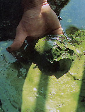
Access to pure freshwater seems an innate right, and freshwater lakes conjure pristine landscapes. But the twinned threats of global warming and industrial farms threaten to alter the geography of watery world in an apparently definitive fashion, as rivers, ponds, and lakes across America–and the world–have been found to be teeming with toxic algae. In what seems to be a brazen photoshopping of photographs of the Great Lakes, the apparent aquatic “greening” of formerly fresh waters in fact carries quite sinister associations. The abundant algal blooms in the Great Lakes recall the modern miracle of the annual greening of the Chicago River each St. Patrick’s Day, but are of much more anthropogenic origin. Appearing at regular times and places, they raise a corner on a changing relation to the worldly environment.
But they are also–in the manner of all “offshore” events–both particularly challenging to chart or to measure by fixed or clearly demarcated lines so often employed in terrestrial maps. Rather than being photoshoppped, the satellite maps make points difficult to interpret or decode, even if they trigger immediate danger signs of the dawn of a different world, and a quite different national map of the extent of our potable water. They prompts questions of how to map man’s impact on the shifting environment of the Great Lakes.
Populations of algae move with the currents of local waters, as the blooms of pools enter rivers and rush down streams, as a weirdly alien presence in water supplies that have impacted fish in many ways, and stand to impact humans as well. As we start to chart our relation to their presence, their emergence in select spots of the US and other countries demands to be connected to one another, or placed in a causative web geographic as much as environmental. The nature of this greening suggests a new presence of the bacteria in the world. For Northrop Frye, the “green worlds” in Shakespeare’s plays connoted a pivot scene of action–an extra-urban environment producing to reflective individual insight of a personal nature but also a setting to overcome natural challenges that stood for inner obstacles. The argument that Frye formulated in 1957 paralleled the earliest ecological movement–one thinks of the founding of the Nature Conservancy (1951), as well as the Wilderness Society (1935) and Defenders of Wildlife (1947), but also of the success of blocking the damming of the Colorado River at the entrance to the Grand Canyon National Park, and the fruits of many volunteers in the Civil Conservation Corps that, before the war, put many men to work on conservation projects. The critical moment of the appearance of green algae in waters across midwestern America suggest not only an environmental challenge, which in 2011 cloaked one-sixth of Lake Erie’s surface, but prompt needed reflection on both a local and a global struggle with environmental change–linked not only to rising temperatures, but to the increasing over-saturation of nitrate-rich fertilizer in agricultural run-off.
Algae populations are not usually mapped as the populations, but the recent spread of algae in what was once called American freshwater lakes and rivers has not only generated significant media attention and concern. For it posed problems of locally mapping of algal growth in compelling ways–not only for fishing or swimmers, but for communities and regarding the potability of water piped into public circulation. While algal blooms are the concern of environmental studies or marine biologists, more than geographers, their inescapability as part of the impact of humans on the environment force us to include them within our spatial experience and geographic horizons: it is as if the very bucolic settings we had known are being reconfigured as nature, and dramatically scenographically redesigned, and their origins remain ineffectively mapped, even if they are often bounded by vague warning signs. Where did these blooms arise, and can we relate their inland flourishing to the mapping of their marine migration? Can they be placed, more importantly, not only in a given set of waters that are polluted, but within a web of land-use that unintentionally geographically redistributes nitrates and phosphorous so that they tip the crucial quotient of algal populations and bacteria in the waters that lie in rural areas, near to farmlands? The abundant greening caused by rural pollutants pose a major ecological imbalance still neither comprehensively acknowledged nor assessed.
Ages before online memes circulated about dating of the anthropocene in the guise of critical thought, George Perkins Marsh declaimed the widespread environmental changes effected by human actions as anthropogenic in scope. Back in 1860, Marsh bemoaned dangers posed to mountaintops and deforestation and evoked the losses that were the result of dried water channels, reducing meadows to parched infertile stretches and creating sand- or silt-obstructed streams where irrigation occurred, poetically lamenting the shifting ecology which “converted thousands of leagues of shallow sea and fertile lowland into unproductive and miasmatic morasses”: Marsh’s 1874 The Earth as Modified by Human Action was written in the hope “to suggest the possibility and the importance of the restoration of disturbed harmonies and the material improvement of waste and exhausted regions.” It set the template for Paul Crutzen’s later dating the “anthropocene” and its diffusion as a critical concept and a form of global introspection about our environment: and as that impact becomes ever more apparent, the recent appearance of toxic algal blooms. Algae blooms offer one measure for mapping the advent of anthropocene. Can one map the dawn of the anthropogenic in cartographical terms? Actively mapping such population in freshwater and marine bodies of water are as visually striking an index as any of the impact of poorly agricultural planning and practices on living geography. In a sort of stunning irony or counterpoint to the nosedive of the worldwide algal mass by 40% over the past sixty-five years, a huge reduction of biodiversity of marine ecosystems altering the marine food web, the appearance of algal blooms is less linked to human impact on the environment. Could expansion of the ozone hole, and global warming, be easier to render compellingly in a graphic map, and toxic algae harder to register in compelling cartographical forms? Or is the appearance of blooms just too overwhelmingly entangled in multiple circumstantial factors that already assume inevitability–from global warming to chemical fertilizer–that the map seems a fait accompli?
Marsh was also an active champion, of course, of a more custodial relation to the water, forest, and the land. The problem of mapping algal blooms in a coherent or compelling manner is problematic, even though the data is there, and the visualizations in snapshots of lakeside scenes arresting. The recent rise of “toxic algae” are, while apparently visible to Google Earth, difficult to decipher on maps, or even in satellite images, which carry ominous signs of a changing global geography with immense impacts to human and animal life alike–the effects of whose shifting bacterial populations radiate out from local ecosystems to human disease, but are rooted in a deep uncertainty that something in our bodies of water is either just out of kilter or deeply wrong. But the hardest question is how to compel attention to these maps, which provide a basic charge for understanding and communicating how the blooms spread, as well as the networks of causation that contribute to such strikingly hued waterborne algal populations.
This 1999 image of algal blooms off the southern coast of Devon provides a visualization of the spread of harmful blooms of toxic algae that have hurt the whales and dolphins who have ingested them, as other fish. Dissecting data visualizations of the prominence of such toxic algae or “harmful algal blooms” in oceans or inland raises pressing questions about their nature and causation, and about the salient mechanics that might be revealed in how such blooms might be better or more clearly mapped in web-based platforms. In an age of the omnipresence of Google Earth, or satellite views of significantly high resolution, as well as MODIS, as well as the imaging spectrometer MODIS aqua of high resolution launched in 2002, the measurement of water populations should not be difficult to define: but the presence of algal blooms requires increasing introduction of data layers based on local detection, in ways that the surface appearance of all aquatic environments just cannot register alone. Algae provides a case for looking at the unmapped, and mapping the sort of rapidly reproducing migrant bacterial populations in aquatic environments that are otherwise particularly difficult to detect by superficial observation–until they have already rapidly progressed or bloomed.
Algae’s presence in lakes was rarely a mapped population or identified as a species until the spread of toxic “harmful algae blooms” (HAB’s) and alarms over cyanobacteria: algal populations have recently gone off the charts, and the explosion of their accumulated biomass has created huge alterations both in food web dynamics–and sucking off most of the oxygen in waters on which fish depend–as well as increasing the growth of bacteria that themselves pose dangers to human life, best known in the bacterial spread of the so-called “Red Tide” of Karenia brevis that flourished in ocean waters off the coast of Florida during the late 1970s–but more terrifying, and considerably more difficult to track, across the freshwater lakes, ponds, and rivers that are often sources of drinking water. Mapping and charting the presence of bacteria in waters is notoriously difficult, born as they are by currents, weather, water-depth and amount of refuse that locally enters waters, and the alarming visuals of chromatic variations caused by algal presences in aquatic environments poses practical challenges to visually represent in maps that combine dispassionate distance and analytic engagement.
These maps are less fun or enjoyable to read, if only because they so often bear bad news. The adverse effects of algal blooms on local animal populations and food webs are even more difficult to track along clear analytics, although a varied range of metrics and maps–from MODIS satellite views of remote sensing to GIS plotting of specific readings to Google Earth views and aerial photographs. Even as folks are downing Spirulina and eating Kelp, the pernicious cyanobacteria of green-blue algae blooms, The effectiveness of the beauty of mapping algae is difficult to effectively use as compelling narratives, however, whether about that danger, or in ways that overcome the difficult distaste of the un-kelp-like sludge of algal blooms, about the alarming spread of Harmful Algal Blooms (HAB’s) either off the shores of the United States or as effectively clogging food webs in its lakes. As of 2013, health authorities issued advisories and warnings on algal blooms at 147 different sites and untold cost and environmental impact due to such harmful blooms, of which no systematic collation seems to exist.
Mapping the presence of such HAB’s is not only a question of reporting locations of efflorescence, but of mapping both the causative webs by which they seem to emerge with the deposits of phosphorous-rich fertilizer and waste in rivers and runoff, as well as mapping the impact of blooms within food webs and food-cycles, although it is often discussed primarily or solely in regard to its potential dangers to humans–given the neurotoxins that it has produced in rivers, lakes, and even waterfalls in Minnesota, as well as Michigan, Illinois, Kentucky, Pennsylvania, Vermont, Ontario, Ohio, and even the Sacramento River delta, in addition, most famously, to Lake Erie–whose shallow waters encourage algae blooms, and where locals of recently sought a joint US-Canadian agency called for the immediate imposition of fixed limits on local fertilizer use. If over 140 sites of algal blooms are present in the bays, ponds, and lakes of New York State alone, and in many lakes across the world, the widespread occurrence of such blooms have been tied to fertilizer runoff, but their endemic presence in so many freshwater lakes have only relatively recently been systematically tied to outbreaks of disease.
Only now is the huge efflorescence of algae blooms being linked both to the production and broadcast dispersion of industrial fertilizers. One back story that demands to be mapped is the effect of the longstanding encouragement that farmers in the United States have received to minimize plowing of their lands, less the huge carbon mass that regularly tilled lands release not only erodes the atmosphere but degrades the soil itself; tilling costs more to pursue in a systematic way, and, especially in large farms, has been discarded as farms have shifted their equipment for tilling to a program of “no-till planting” that uses machinery to drill seeds into undisturbed soil, and scatter fertilizer atop in prepared pellet form that needn’t be entered into the soil by tilling machines–even though such pellets depend on rains to enter the soil, and up to 1.1 pounds of fertilizer per farmed acre enter rivers directly in rainwater, as a result, rather than serving to fertilize the soil, working to effectively unbalance ecosystems far beyond the bounds of farmed lands.
Harmful algae blooms’ explosive off the charts growth responds to a confluence both of high usage of fertilizer in crops and lawns, intensified by rapidly rising temperatures that foment their spread in freshwater and seawater alike: the expansive growth of algae seems something of a by-product of our current global warming trends, as the increased summer heat provides an optimum occasion for spurts of algal growth, nourished by streamed-in phosphorous and other animal wastes, in ways that change the microbial populations of freshwater lakes. And the world of rapidly growing algae has deep consequences for public health. For rather than the edible sorts of seaweed, the toxicity of algae in freshwater systems is all too likely to foster bacteria-levels in human drinking water and fish that are not usually seen, making the mapping of stagnant water algae of increasing concern in much of the midwest and northeast–especially nearby sites of large-scale or industrial agriculture. What are the best ways that algae can be mapped, or that the mapping of algae can be a proactive safeguard on the responsible stewardship of the toxicity of agricultural and lawn run-off?
The blaming of substandard practices of fertilizing soil and huge expansion of chemical fertilizers with phosphorous, combined with the increased problems of storing waste, create a new geography of pollution that renders human impact salient by the spread of an algae bloom crisis around the Great Lakes, which since 1995 have emerged in the Maumee River that feeds the Great Lakes and runs through many factory farms in these inland lakes: increasingly, Kansas is reporting widespread algae blooms in lakes, as well as Pennsylvania and Kentucky, according to the Kentucky Department for Environmental Protection blog and which the Courier Journal describe as the first cases beyond the lower Midwest.
Even when not toxic in nature, the problem of uncontrolled algae blooms lies in their absorption of all oxygen from the body of water in question. The predictive maps of expansive algal blooms specifically in Lake Erie, where aerial photographic visualizations recorded the record levels of 2011, warn of the spread of toxic blue-green algae–a harmful algal bloom (HAB), focussed on the lake’s western basin, based on the careful reading of the nutrients that flow into the lake. The new levels of algae that have steadily increased in recent years, hark back to the algal blooms of the 1960s and 1970s in the same region of the lake. But the blooms have recurred with a new intensity, spurred by hot weather and an increased amount of phosphorous, sewage, and manure into Ohio lakes and streams, boosting the blue-green cyanobacteria to new levels last summer that more than doubled previous years–increased by the accepted practices of broadcasting fertilizer on fields without tilling, and the reluctance of the Environmental Protection Agency to issue any warning on cyanobacteria in these waters–even after the algal blooms broke previous records in the summer of 2011–although we know that colorless odorless carcinogens like microcystins can linger long after the blooms have left. Mapping the blooms proses a problem of going beyond geo-visualizations or aerial photography as a way of mapping the flow of bacteria and subsequent algae blooms that deoxygenate waters in an easily legible form, or linking the toxicity of blooms to set intensities.
Are we even close to cultivating the ability to read the levels of toxic agents like microcystins in algae blooms, or able to find reliable ways of transcribing their potential harmful side-effects? The specific case of Lake Erie, specific both since it is one of the densest sites of such blooms and on account of its low water-level, may itself be predictive of the danger of algal blooms in future years.
The 2011 bloom was rapid and sudden, as is apparent in two aerial photographs of the lake snapped just five months apart, between June 1 2011 and October 5, which illustrates the blossoming of the algae under the summer’s sweltering sun:
 New York Times; source: NOAA Centers for Coastal Ocean Science; data from NASA MODIS sensor
If not a map, the green coloration of the algae highlighted the frontiers of its expansion so effectively as if to isolate that one feature within the aerial photograph. Such local photographic “mapping” of the density of toxic algae blooms is perhaps the most compelling chart of their impact. But the expansion of algal blooms, if similar to that covering 300 square miles in 2003, now threatens to spread across the entire southern shore, has been closely tied to new levels of toxicity, producing liver and nerve toxins, and creating a dead-zone of oxygen-depleted fish. If not as severe as it was in 2011, when remotely imaged by MODIS satellite revealed a particularly disturbing concentration of cyanobacteria close to Detroit and along several spots of the lake’s shore, before extending from Toledo to Cleveland in 2011.
The existence of sediment in the Great Lakes revealed a distribution of particularly thick portions of algal spread, no doubt particularly notorious due to its low average depth of just 62 feet. At the same time as Western Lake Erie continues to experience a fairly unprecedented resurgence of toxic algal blooms, health advisories and “do not drink” orders have been issued by the state of Ohio, although Michigan, which lacks a formal monitoring program to monitor waters’ purity, has not issued any: the current debate on the Farm Bill has led to a jeopardized program of Conservation Stewardship and fails to include controls to encourage farmer’s to monitor their effects on water quality–or even to set uniform standards for the toxicity of HAB’s to drinking water, local ecosystems, or lake life.
The spread of their population in the lake was visible on Google Earth:
The intense concentrations of algal blooms can be likewise revealed due to remote sensing of the absorption of light in the lake’s water, to image the toxicity of the most polluted of the Great Lakes. based on data from the International Space Station.
Looking at lake Erie provides something of a well-mapped test case of algal blooms. Most of the blooms are typical of the over 200 toxic blooms in the United States, due to run-off of fertilizer and manure in rivers and lakes, often carried by heavy rains, often confined to the northwest, but spreading throughout the high farming regions of the midwest, where phosphorous no doubt increasingly leaches to water supplies–leading to public health warnings and closures of lakes or beaches. Rainfall has increased the flow of agricultural run-off and nutrient-rich storm water into rivers and lakes, providing food for algae to grow to toxic levels. Indeed, the National Oceanic and Atmospheric Administration has developed an early detection and forecasting system for the Gulf of Mexico by using remotely sensed data to monitor harmful algal blooms beyond the Great Lakes and Chesapeake Bay–some of the largest repositories of freshwater in the United States–and in over one hundred and forty sites as of the summer of 2013. And the clean-up of many Minnesota lakes has led to a call for reducing the use of nitrogen-rich and phosphorous-based fertilizers by some 45%, although no realistic ways for achieving the goal–which might not even be as high needed to reduce algal blooms–has been defined. The difficulty that occurred when a satellite photograph of Lake Ontario suggested a similar efflorescence of blue green algae blooms of cyanobacteria in that large body of water led an overwrought panic-attack to be voiced on Twitter, as the photograph that ostensibly boded the local arrival of an onslaught of heptatoxins, already problematic in Hamilton Bay, to have metastasized to the lake as a whole.
But the “bloom” was a boom of plankton–mostly plankton like diatoms, and chrysophytes, dinoflagellates, in other words, which are often mistaken for blue green algae in remote sensing, although blue green algae blooms just a small amount of it, and little cyanobacteria–was an optical illusion. The apparent errors in the imaging of algal blooms suggest a greater difficulty in its accurate mapping, and makes us rely on self-observations by water-sampling for certitude.
This is not to minimize the danger. But only to warn of the limitations of tracing by superficial observation. The actual potential for the sudden spread of HAB’s in the continental United States is in fact quite serious, however, as is the need for ensuring water-quality standards in many rural regions–from questions of potability to the eventuality of die-offs of fish.
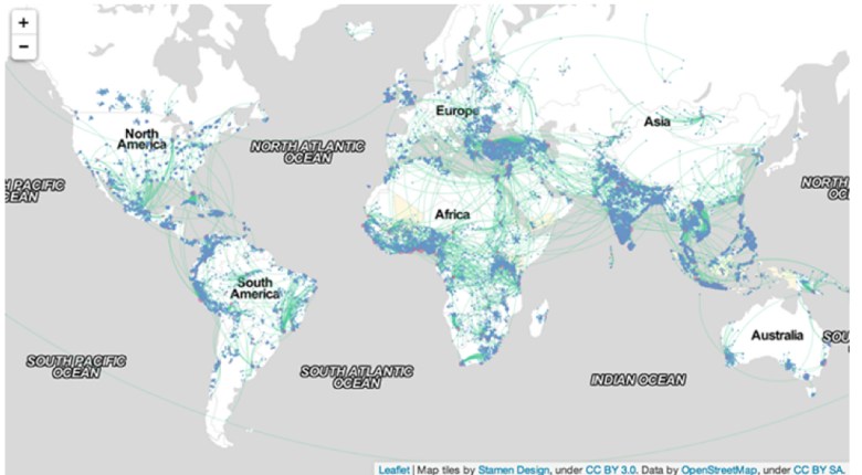
The interest of this very broad-scale map is the proximity of blooms to large-scale farms raising cows and pigs: such concentrated animal feeding operations (CAFOs) generate unduly concentrated amounts of livestock waste in precise locations–termed “liquid lagoons”–thee liners of whose storage tanks regularly leak in heavier rainstorms, creating a manure run-off from poorly regulated sites into lakes. The EPA estimates that over half do not have Clean Water Act permits, creating deep problems of local stewardship that becomes evident in the efflorescence of toxic algae blooms–but only long after the fact–in ways that reveal the ingrown nature of poor standards of agrarian stewardship. Living in the right town, we might see such headlines as Citizens of the Town of Lincoln, Kewaunee County are concerned that the Kinnard Farms Inc. plan to manage 70 million gallons of untreated animal waste doesn’t protect groundwater from contamination, or How Big Meat is taking over the Midwest, describing the widespread multiplication of permits for such “poo lagoons” in the landscape to hold the refuse of the 19.7 million pigs raised annually in that state alone, and the return of a booming industry in 2011.
Lying down water of such overflowing containers of animal feces creates a possibility of toxic contamination that is particularly difficult to contain–especially when fueled by an unnatural abundance of phosphorous and nitrates that has all too often been insufficiently or ineffectively tilled into agrarian lands. The contamination of so many of Minnesota’s lakes offers a sad case in point. The striking case of green waterfalls in Minnesota suggests something like a direct inversion of the rural picturesque–and a compelling need for new standards of river pollution or run-off, as well as intensive attention to the tilling of fertilizer so that it remains buried as much as possible underground.
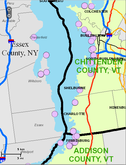
Somewhat more ecologically conscientious states, like Vermont, removed from the landscape of the factory farms, have begun to provide interactive local maps to measure and track the intensity of algal blooms, of “blue green algae tracking,” as this map recording the blossoming of green by the shores of Lake Champlain–a tourist destination–that are considerably interactive and detailed, as well as allow a considerable fine-grained detail of local reporting that are incorporated into visual overlays for ready consultation each day.
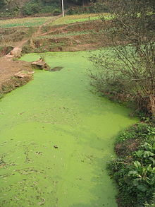
Others, like Florida’s inland waters, have seen massive toxic algae outbreaks that have killed manatees, fish, and birds, as well as dolphins in the Indian River Lagoon, where fluorescent green slime filled the river this past summer, leading to widespread health warnings. Of course, such a menace is not only localized: the actual specter that is haunting the mapping of algae comes from China–where, coincidentally, few controls exist on fertilizer or greenhouse gasses, and algal blooms fill large, slow-moving rivers like the Sichuan.
In the course of preparation for the 2008 Olympics that the Chinese government pulled some 1,000,000 tons of green algae from the Yellow River, famously, relying on some 10,000 soldiers in the project to remove the waste, leading folks to just negotiate with algal blooms as they appear, and their relative toxicity not to be tested.
The disquiet conveyed by the images of raking algic scums off the Yellow River, or of swimmers happily standing waste-deep in the light green blankets of what looks less like fresh parsley than artificial coloring can only be viewed with the alarm that Bartholomew Cubbins witnessed the arrival of Oobleck in the Kingdom of Didd. (We might reconsider the assumption that the last printed work in the Dr. Seuss corpus, The Lorax, was the one most directly about the physical environmental.) Indeed, the comparisons of Oobleck to HAB’s seem unavoidable given their sudden ubiquity across so many of the changing climates of the United States and world.
Mapping something as imaginary as Oobleck might be an apt association, if intentionally slightly ridiculous if evocative comparison, but the odd appearance of green toxic slime in freshwater deposits evokes the sudden omnipresence Oobleck quickly acquired in all Didd.
The fear of self-generated Oobleck seems implicit in much literature. Indeed, Qingdao’s 2013 summer scourge of “surf like turf” meant the arrival of what locals called “sea lettuce.” Perhaps from the farms of Nori on Japan’s Jiangsu coast, or from irresponsible farming in China itself, the consequence of a massive failure of marine stewardship created currents of harmless-to-humans algae running toward the center of the Yellow Sea. The blooms, given the run-off of nitrate-rich fertilizers from farms and industry, didn’t seem to threaten beaches often used as centers of tourism, but created an odd sight of bathers luxuriating in the aquatic lettuce they were told had not toxicity. The algae are often regarded as harmless to humans. But harmless to fish they are not: the algae serves as a ravaging of the aquatic ecosystem: bright green beds of algae were deemed a “large-scale algae disaster” by the Shandong province, and 19,800 tons of it cleared as it started to decompose, releasing noxious fumes of toxic hydrogen sulfide gas, at a cost of over $30 million. The relation between harmful algae and the local ecosystem or food chain has not been fully explored to map, despite the wide ramifications of its impact on the greater food chain.
The explosion of algae blooms has been linked to the rise of the so-called red tides in the Gulf of Mexico, has already hit our coasts as well: southern California coast and Florida have both placed a new premium on mapping the density of algae that flourish in these warm ocean waters, which have long been worried to disrupt local ecosystems and food chains, before the toxicity of fertilizer-fueled algal blooms started to appear inland. These tides have largely been treated as dangers to marine life, and specifically to the shellfish regularly harvested there, however, and were consequently charted and mapped in relation to water currents, salinity, and winds, to get a picture on their sources of origins of these concentrations of dinoflagellates of reddish hue that so rapidly accumulated along the Florida coasts from purple to pink, and which seem–despite their name–to be entirely independent of tidal flows, but were toxic to birds, fish, and mammals, and potentially harmful to human beings when consumed in shellfish. The awareness of this vector of transmission has led to the monitoring of these early HAB’s, which have disrupted fisheries along the Atlantic as far north as Maine, and, according to some were witnessed in Canada as early as 1793 in British Columbia: but far more recent measurement of red tides in northern California, where they created a massive die-off of shellfish, the Gulf of Mexico, the Southwest Florida coast, Malaysia, Maine, and Massachusetts, killing fish, manatees, and shellfish like abalone, has led to increased NOAA alerts and concerns of respiratory irritations at beach shores.
Is such efflorescence due not only to lower rainwater that flushes the system of oceans, and increased warming, but also to the nitrate-rich outflow of fertilizer from Florida plains, and indeed the Mississippi? The lack of tilling in larger farms, driven by the needs to produce more crops in their growing seasons, has encouraged the dispersion of high-grade fertilizer across the Midwest, most of whose runoff enters the same waters. Indeed, the inland growth of HAB’s echoes historical documentation of the approach of “red tides” that endangered shellfish and fish living along Florida’s western coast in recent decades.
The ability to survey the massive growth of Karenia brevis organisms in the warm shallow waters of Florida’s western coast, and the dangers that they posed to local fish and marine life, benefit from the extension of data and record-keeping along the Florida waters since 1954 by multiple agencies. The data creates a context for data visualizations of the expansion of the “red tide” of HAB’s in ocean waters near to an exceptionally rich and endangered ecosystem, but also one huge stretches of whose coast falls under environmental protections for endangered species, and whose waterfront economy enjoys far greater protection than most inland lakes. By exploiting the largest continuously recorded database of Harmful Algal Blooms in the United States–and world–we can examine the spread of sites of the Red Tide of 1979 in relation to ocean currents, which appear, based on data from Florida Marine, clearly clustered in shallower waters by the ocean coast: maps track the abundance, intensity, and duration of growth of Karenia brevis by color, switching to rectangles for the largest, and the extent of their presence by shape-size, based on data collected on November 1979, Christmas 1979, December 20, and January 20, 1980. They reveal the algal spreads as moving quite rapidly from being concentrated around Tampa Bay along the coast to Naples in dense brightly colored blooms that flourished for the longest time near bays, often in the shallower waters sometimes within the red line marking a distance of 18 kilometers off the coast, where they have most contact with shellfish. The evolution of these animated static maps provides a temporary solution, based on intensive compilation of water data by the Florida Coastal Commission, but provides an exception of the degree of successful visualizations of algal presences in aquatic environments.
The “tide” returned in 1985 to the shallow waters off the beaches and coastal inlets of western Florida, pictured with a key of the local density of blooms which is also applicable to reading the above images, and the increased presence of blooms on New Year’s Day 1986:
More recently, Florida’s Fish & Wildlife Research Institute charted the same coastal waters of its coasts. By using readings that were based data for the NOAA Ocean Service and Satellite Information Service, who registered high levels of marine chlorophyll by MODIS Aqua imagery, bacteria clearly hovered especially, when present, around the Floridan shores and coves in which they multiply. Does this suggest that they are specific to shallower, warmer waters, or more likely densest at the very point when they enter the seawater in such high concentration from the land? Commonly known as “red tides,” these off-coastal aggregations of algae, again Karenia brevis, seem largely in decline on Florida’s southwest coastal waters for the present, but had long flourished on its relative shallow ocean shelves.
Or, in October 2013,
But the bacteria and algae are focussed not so much offshore–notwithstanding the so-called Red Tides–but rather in the very estuaries and inlets where freshwater leaches out into the surrounding seas, evident in this self-reported data of algae via Google Maps, where sightings were crowded upstream the inlet of the St. Lucie St. Park Preserve, with a congestion that travelled up the course of its river.
Indeed, the particular porousness of these offshore waters in the below engraved map, which shows a region characterized and distinguished by circulation of rivers in wetlands and estuaries, so long characteristic of Florida and much of the American south, struck early cartographers as so distinct by its density of estuaries. The map, in the context of this blog, provides a striking contrast as Ooblek-free, even if its territory was far more submerged and coasts follow far more irregular lines. This early eighteenth-century map–possibly 1720-30–this version courtesy of the expanding on-line collections of David Rumsey, offers the start of something like a cartographical archeology of the region, whose coves and inlets evoke a pristine Gulf of Mexico, fed by multiple rivers from the southern plains still inhabited by Native American Peoples:
Florida at that time was described by the cartographer as a “Neck of Lakes and Broken Land, surrounded by man-eating Indians, whose Straits were nourished by streams, before being included in Herman Moll’s Atlas, with its rendering of glorious irregular shorelines, inlets, and islands that suggest a Florida before the expansion of landfill and filling in of much of the southern state. There is something akin to a raining of Oobleck in Florida, the sudden and widespread appearance of HAB’s in modern maps of different states offers a point of entry into how the map can be taken as a rendering and record of man’s impact on and relation to the land, or of how our maps of human knowledge provoke questions of how to map man’s own relation to the remaking of the environment, less by setting the benchmark of a given date, but by how it slowly started to be filled up with lots of sorts of shit, all of human origin or introduction. To look at the elegant bird’s eye map that John Bachmann designed of Florida, among his many images of the southern states of America of 1861, printed as a collective “Theater of War,” the mapping of the water surrounding the peninsula shows a much more clearly integrated web of land and water. In the panorama the peninsula is colored a light green oddly reminiscent of the algal blooms, but the green land, fertile with rivers crisscrossed with estuaries and permeated by lakes where brackish waters surrounded archipelagoes of islands, each its own flourishing ecosystem, and shipping docks, suggest an interpenetration of green land and water in a settled land.
Northrop Frye coined he notion of travel in and to the Green World as a dramatic device evoking a crucial passage, which the protagonists must survive in order to restore balance to the actual world and to the plot. One could argue that travel to old maps, rather than being only a form of antiquarian indulgence, provides and affords something of a parallel site of reflection on our environment. The Green World that they present is an “other world,” and a world that seems increasingly distant as our own bodies of water are polluted, and we might look back to maps to see the lived environments we are in danger of loosing–and loosing sight of. Viewing old maps like that in Moll’s Atlas after reviewing the above data visualizations and overlays is chastening and ethical, in ways, something like returning to a site of meditation on a relation to a world we have lost, and perhaps a way to turn back the tide of inevitability that informs our relation to the mapping of algal blooms. Whether we can restore balance to our world may seem another story, assembling a coherent map of toxic blooms of algae that recur around the world, we can map its distance to the world we knew, and ask what sort of balance lies in our own.
But it is the “other world” of blooms of green algae that the run-off of industrial agriculture appears to have bequeathed that is the world that seems, for the moment, far more likely to be left with us. Without mapping the growth of such recurrent aglal blooms, and tracking their mechanisms of causation and varying intensity–feared only to increase in an age of global warming–the other world will become our own.


