Category Archives: Interactive Maps

Mapping the Quake beneath American Canyon

The ways of mapping the effects of latest 6.1 earthquake–the largest in a quarter of a century–raise questions not only of the damages it left in its wake, or tragic human injuries, and property loss, but the web of services it disturbed.  The expanse across which the quake’s rumbling was felt at 3:20 am endured only twenty seconds but seemed to last several minutes, shaking the sides of buildings and houses, waking panicked residents, and breaking 50 gas lines and 30 water mains, leaving some 10,000 without power.  In ways that oddly echo the interconnected nature of communication networks, the quake centered in American Canyon was hard to embody or illustrate, if the measurement of the rumbling along the stretch of major faults lying along the San Andreas Fault that lies between the Pacific and North American tectonic plates was exact.


earthquake-620x412


The “shake map” quickly generated by CISM revealed a quite specific concentration of incidence, some 6.7 miles underneath the earth’s surface, whose effects reportedly woke sleepers in the early morning both in San Francisco and Oakland, and as far as the South Bay and Davis.


Screen-Shot-2014-08-24-at-21.21.08


The distribution of losses created by Napa restaurant closures and damages to buildings or rows of shattered unopened wine bottles might be on some minds–and a multitude of isolated images of individual incidents proliferated on social media, even as maps were created to track its impact.  But for all the many images of local damages and disruptions, from trailer parks to freeway ramps, posted on Twitter and social media, images of the web of outages in PG&E outage maps seemed the most compelling representation of the effects of its wake, even if the most abstract–and in a Google Maps format, that reveals the extent of the energy supplier’s range of gas lines and power lines.


outage map pg&e after quake


legend pge


The comprehensive coverage of the map–and the surprisingly uneven progression of individual outages from the epicenter–make the map a clearer synthesis of the earthquake’s impact than the dramatic footage of fires in trailer parks diffused on news agencies, or the images of damages to unreinforced masonry buildings in downtown Napa.  The distribution that it reveals are both more convincing and readily apprehended descriptions of the cascading effects of the earthquakes in this region than the specific descriptions of injuries and damage paraded on the nightly news.

The range of individual maps generated in response to the event convey a less vivid sense of its disruptions, perhaps as they were less immediately able to register its impact in ways viewers could apprehend.  The USGS generated their own crowd-sourced “Did you feel it?” map, somewhat less scientifically, that tried to measure the dispersion of intensity around northern California, taking the 3:20 am quake–and not its several aftershocks–as its focus:


nc72282711_ciim

The geocoded responses provided data for an intensity map over a surprisingly restricted area, using 21,000 unsolicited responses:


nc72282711_ciim_geo

Later that morning, service seemed to have been partly restored, but if the range of local disruptions reported at 11 am diminished, their effects also apparently extended far beyond the aftershocks experienced by inhabitants of nearby regions:


Outages, 10-49 am


legend pge


By mid-afternoon, or 2:30, the disruption only slowly diminished.


PG & EOutages 2-30 pm

legend pge


Even though such automatically generated maps lack an author, the data they display organized a collective story for readers by which to understand the scope and scale of the earthquake’s effects.

Yet such maps might also serve as greater sources of information.  The greater engineering superstructure of the Bay Area–including highways, exit and entry ramps, gas mains, airports, public transportation, rail lines, and sewage systems–are all particularly serious potential sites of damage still difficult to be adequately mapped.  Indeed, the parallel expanse of a still relatively poorly mapped network of gas lines in the PG&E system–many of which recently existed only in the very paper forms in which they were originally drafted years ago–makes the final and continued effects of the earthquake difficult to determine.  The web of aftershocks indeed shadow the expanse of a poorly mapped web of gas lines across Northern California that has yet to be fully monitored for leakages in an antiquated system or even comprehensively mapped, whose potential leakages could trigger a disaster more serious than the San Bruno explosion of a natural gas pipeline in 2002, for which PG&E sustains it has no responsibility.


Gas Transmission Pipelines PG&E


Focussing only on the mapped network on natural gas pipelines in northern California that might have experienced breakages or fissures in the American Canyon quake, whose particularly dense network of gas mains around Napa is here mapped at greater scale:


Gas Main Network, larger scale


The questions of liability that would be raised by the inadequate mapping of the state, condition, and quality of existing gas mains around the Bay Area to public safety make it mandatory to release a full and comprehensive mapping of the quality of existing gas main lines and the potential dangers to which they would be exposed in earthquakes, far beyond the documented physical damage to buildings.  As much as counsel customers on its Facebook page “If you smell gas or are experiencing another electric or gas service emergency as a result of this earthquake, please call 1-800-743-5002 immediately,” and caution them that “If you shut off your gas service, do not turn it back on,” the availability of a truly comprehensive map–unlike the above maps provided by PG&E’s GIS system, “as a courtesy and for general information purposes only,” without a disclaimer that the map’s information is accurate without independent verification.

3 Comments

Filed under American Canyon Earthquake, Community Internet Intensity Maps, crowd-sourced maps?, GIS, Interactive Maps, Mapping Earthquake Damages, Mapping Earthquakes, Northern California, USGS

D3 Maps the Filling-Up World

D3 images, or data-driven maps, shift with the content that they seek to display.  They in other words provide tools of spatial analysis unlike static maps or terrestrial projections:  for rather than reflecting or arranging data in a static form, by analogy to a window, such maps reveal the changing data that drives their design.  Such maps lend themselves in timely ways as tools able to chart a changeable terrain–or the shifting configuration of a distribution–which often are tied to data feeds, rather than employing a fixed dataset.

Since D3 maps are often able to take advantage of their mutable forms by being incorporating new data, using it to determine the rendering of a shifting actual space or set of inter-relations.  So the mapping growth of population in the world’s countries is a classic example of a D3 tools of visualization, determined by the growth of residents in each country:  although the base-map of the recent simulation of world birth/death rates by software developer Brad Lyon is a familiar grey projection of the continents, the constant data feed that shapes the map, locating individual births and death in specific places, and tabulating the greatest numbers of births in individual countries, is also a visualization of Tobler’s first Law of Geography:  that “Everything is related to everything else, but near things are more related to distant things.”  For the changes in global population are understood in the unit of the entire inhabited earth in this very catholic map, rather than as able to be confined to the borders of individual countries.

Among the benefits of using D3 visualizations to chart the rhythms and rates of births and deaths is a channelling of immense amount of information that is both a tremendous ramping up of cartographical omniscience that the viewer can often barely process or register in its totality–for the edges or contours of the map can be changing constantly, rather than the map being designed to reflect a stable dataset.  The popular new map of changing numbers of birth and deaths in the global population provides a neat visual example of using maps to geo-tagged births and deaths to part of a nation, offering, in either simple screen or beta-version simulation, something that would not be possible in a static or simple paper map.  In a visualization of the drumroll of births and deaths, the resulting map creates a record of the inhabited world that is “eerily omniscient” as James Hamblin aptly put it in The Atlantic, and God-like in its observation of births and deaths everywhere:  as the map’s odometer-like upper panel trucks past the 7 billion, 93 million mark, we are asked to face the challenges of comprehending on individual terms what truly approaches, if only asymptotically, something close to a God-like perspective on mankind.

By visualizing an approximate record of “world births and deaths in real-time,” in a map that extends to its literal meaning the notion of the “inhabited world,” the content of this map challenges not the borders of maps, as do so many D3 projections, but the viewer’s own boundary of self, or the meaning of this endless tabulation of the appearance and disappearance of lives on the planet and the regions of their greatest increase.  This single frame of the ongoing graphic portraying a record of world populations over the globe’s surface, in what might be called, with more than a wink, a truly existential map of the place of humanity in the world:


Visualizing Birth and Death world Wide at 5-27 Oct 30 2013


Never mind that the countries are only light grey outlines, and the subject of geography is secondary to the map’s shifting contents.  At issue is not how we inhabit the space, and not the centers of population or their distribution, but a statistical ping of each birth and a death that can be easily geo-located, blips of text that overwhelm and even detract attention from a grey base-map that seems to recede below each announcement, until they entirely bury the map, no doubt as our population will bury our world if its numbers proceed to grow by a further 44 percent by 2050.

There is no need to ask where these people will live or how they will be fed in this visualization:  we can wonder that all we like as the number of births proceed unimpeded, always far in the lead of the counting off of individually tragic deaths.  But in their collectivity, the amassing of these numbers is difficult to comprehend or register–and not only because of the relative objectivity of the simulation.   As one looks at the data visualization and the so rapidly increasing numbers of its statistical simulation, it starts to become evident that the perspective it offers is just not tenable for a viewer to start to process; its numbers perform an odd if awesome balancing act between concrete actuality and abstraction impossible to really comprehend, and we wonder where this data flow derives, as its ticker-tape pop-ups jerkily transport us to half-familiar or unfamiliar cities as it notches population growth, and the map is buried by textual banners–much as their viewer is buried by an unweildly surplus of information.

Software developer Brad Lyon used some ideas and concepts of Mike Bostock’s D3 maps in order to create a real-time register of births and deaths worldwide–or a simulation of them–that the viewer could gape at in wonder, and view almost as the objective correlative of the bulging population of the world.  As was recently reported in The Atlantic, this digitize simulation charts the contours of the inhabited world, expanding the use Lyons made of United States Census data in his popular simulation map, designed with Bill Sneebold, to create a  visual readable interactive map of the country’s population.

The overwhelming effect is immeasurably more dizzying than looking at a paper or static map.  But perhaps this also conveys some share of the immensity that must have overwhelmed classical viewers, unlikely to have ever been able to process information of far-off lands, in early images of the classical concept of the bounded ecumene.  The cartographical canvas is both familiar and  disorienting, if only because of the size at which every birth and death appears, generating banner toponyms rapid-fire progression that one can allow oneself to imagine reflects the actual swelling of population numbers across the world in real time.  The immensity with which the momentary geo-markings of this tally invests new claims in a pretty standard projection of the planisphere; highlighting specific places in what almost seems a random-generator makes its surface a field that is entirely disorienting in its surplus of detail:  as soon as one finds ‘news’ of a death here, in Khasakstan, there is a birth in Bolivia, and two more in Punje, so that numbers  Starting from the very moment that you open it up, and continuing until the screen becomes completely illegible as ticker tape birth and death announcements utterly obscure its surface–


10;24 to 10;53--Oct 30

or until you get in a hazy-headed stupor and realize that you’ve been watching the register doing its’ job for too long, and just have to leave the room since you can’t really keep up with all this–is an real-time image of the inhabited world, and a reminder we may have just have access to too much data.

The visual register in the screen image not only announces each and every birth and death with a punctual precision that is always eery, but keeps a tally of the totals and their distributions in each country, and they all cause one to be reminded relentlessly that births always outstrip deaths.

Visualizing Birth and Death world Wide at 5-27 Oct 30 2013


In ways that mapping the boundaries of mapping the world challenges the boundaries of self, the popping of up sites of individual birth and death on the simulation, which occurs below a population counter of the high velocity of our course of global overcrowding, the map is mind-blowing because it challenges the boundaries of what the viewer can hold in her or his head, as much as because of its terrestrial coverage–there is a sort of hortatory “look here!” “no, here!” “here goes again!”–that calls one’s eye back to the day-to-day nature of lived experience that is so often outside the horizon of maps, and rooting them in an ostensibly exact record of the transit of time:  from 5:10:26 p.m. to about 5:30 on October 30, births occurred at a rate of 4.2 per second, as 4,210 lives began, a large number (about a sixth) in India and a fourth in India and China, compared to 1,879 reported deaths during the same interval:  the explosion of population is captured nicely in that chunk of less than twenty minutes.


Visualizing Birth and Death world Wide at 5-27 Oct 30 2013


And indeed it seems, at first, that the number of births in China and India dominate the map overwhelmingly, as they also  form by far the greatest percentage of births world-wide, according to the data feed, as text appears that clutters the expanse of the terrestrial world, as if to provide a dizzying counter-map to the stability of terrestrial contours, that will eventually obliterate the map itself:


Births and Deaths in Asia?


But then one realizes that this is a conceit of the format of the map, or its display of geo-tags, which oddly cluster over the area of Eurasia as they are generated by incoming data, even if they are from cities in the midwest of the United States.

Of course, it’s not like you never knew that folks were regularly born and died in this world, even in places that you’d never been or will ever visit, but this almost “odometric  perspective” of individual lives clicking by, new ones popping up in places and others vanishing elsewhere, could either be a Buddhist envisioning of the ephemerality of being or a worrying sign of just how quickly things are crowding up.

Take a look at the beta version in Google Drive:

https://googledrive.com/host/0B2GQktu-wcTicEI5VUZaYnM1emM/

The post-modernity of this form of D3 mapping takes the ancient idea of the expanse of the ecumene, but turns it on its head:  the population takes over, swallows, and erases whatever qualitative content was on the map, as the base-map starts descends to irrelevance, and, illegible, is unable to offer us any bearings at all.  As much as offering a material subject, the D3 map unwittingly charts the ephemerality of the ecumene.

Leave a comment

Filed under data driven maps, data visualization, Google Drive, Interactive Maps, mapping population, mapping the populated world, Mike Bostock, terrestrial cartography

Mapping Populations in the Open Seas

Eric Carle commemorated the tragic story of the 1992 loss at sea of some 28,800 rubber ducks from a container ship in Day-Glo colors in “Ten Rubber Ducks Overboard.”   But rather than encountering multiple marine creatures in their adventures, the orange rubber children’s bath toys were in fact carried on quite circuitous routes of nautical travel:   after leaving Hong Kong, individual ducks migrated over fifteen years along ocean currents across the polar regions to as far West as the islands of the Hebrides and eastern France, or as far South as Peru’s coast.


Rubber Duckies


We don’t know the exact numbers, but at least several seem to have avoided, happily, the treacherous waters of the Northern Pacific Gyre of the Great Pacific Garbage Patch–which sadly remains the unfortunate fate of so much plastic substances and waste–where a large portion no doubt lie.


North_Pacific_Gyre_World_Map


Carle took poetic license to reduce the ducks to ten in his 2005 board book, leading them to meet  seagull, geese and whales on their picturesque voyages in the seas.

11470365


Whereas Carle offers readers a narrative of charting how the plastic bathtub toys encountered a live flamingo, pelican, sea turtle, seagull, whale and, of course, a group of live ducks, recent maps of ocean populations portray a population that churn beneath one’s feet so rapidly as to challenges a static mapping of the range of its inhabitants–and the changing nature of its populations of the waters, in a range of maps that leave behind the inhabited earth to foreground shifts in the inhabitation of the seas.

Digitized projections narrate the currents of marine biodynamics narrative in a far more three-dimensional fashion than the voyage that Carle charts in charming tissue collage.  Digitized projections of the shifts of ocean use similarly bright colors to visualize the shifts in oceanic populations tied both to global warming and atmospheric pollutants.  They offer dynamic tools to re-imagine the uses of maps, providing a less prosaic narrative of marine residents that the ducks encountered, and give new urgency to the informational (and narrative) content of oceanographic maps–even as they tracked a similar narrative of the scariness of the interaction between the “natural” and man-made.


Carle's Ten Ducks


The dynamic mapping of oceanic populations suggests ways of responding to the shifting climates of oceans–rooted less as bucolic preserves of nature or wildlife, than as spaces actively reshaped by the human presence and industries.

The visualizing the increasing ‘jellification’ of oceans, created by both global warning and the effects of modern industry, has gained increasing attention as the increasingly abundant populations of jellyfish  floating along the currents of ocean waters have begun to be mapped, and the permanence of their presence in the oceans begun to be assessed.  The overcrowding of jellyfish in the ocean waters have led oceanographers to worry about the impending ‘jellification’ of the seas that would only spare the Peruvian coasts, and a veritable swarming of jellyfish not only in China, where they might be eaten, the northeast waters of America, the Mediterranean, and Alaska but around the Antarctic:


Jellification


The wide blooms of the jellies bode not only bad news for swimmers’ jellyfish injuries, and led to record numbers of those treated for stings–in Barcelona, upwards of 400/day–but to fishing economies, as the proliferation of the stinging blobs that can cope with increased pollution, murky waters and algae blooms more than other ocean inhabitants, and threaten the food supplies of fish in overfished waters, by competing for zooplankton, as well as nets of fishermen.  They flock in large numbers to polluted waters  and overdeveloped shorelines with specific intensity.

Among the prime beneficiaries of global warming, jellyfish blooms lead to the release of toxins to oceanic areas and enclosures of farmed fish, jellyfish invasions are described by oceanographer Josep Maria Gili as a simple message of the oceans to mankind: “Your are destroying me.”  Driven by currents and carried in the ballast water of tankers and container ships, jellyfish not only displace local populations, but face reduced predators, including, potentially, the monster jellyfish Nemopilema nomurai, with its six-foot bell diameter.


JAPAN-JENVIRONMENT-CLIMATE-JELLYFISH


Despite considerable worries that there is actually more plastic than plankton in the ocean, suggesting less mutually convivial relations between synthetic objects and marine life than Eric Carle would have:  indeed, oceanic gyres where plastic products tend to be trapped–and some of the ducks no doubt resulted–swirling around in a region twice the size of the state of Texas, that might in time form a destination of disaster-tourism of its own.  In the gyre, plastic refuse often outnumbers marine plankton by an astounding and terrifying factor of six to one.


gyres


As much as mapping the distribution of plastics in the ocean, ‘mapping’ plankton populations provides a snapshot of varied distributions of these microscopic inhabitants of the ocean’s expanse.  The mapping of the larger plankton populations congregated on the poles, and pteropods in the most crowded seas–as well as huge “dead zones” where oceanic plankton recedes–in a complex mosaic of local ecosystems, evident in the computer-generated MAREDAT distribution of photosynthetic plankton, and showing the abundance of zooplankton, that do not use photosynthesis, in comparison to photosynthesizing phytoplankton, and a range of plankton varieties:


zooplankton

A smaller-grained image of a phytoplankton distribution creates a wonderfully iridescent map of plankton’s oceanic presence in this global distribution of chlorophyll producers–until one can read its legend, or grasp the low levels of populations in areas of the deepest blues, near to the equator.


phytoplankton-concentrations1-1

Fig14_83


This spectral map of plankton distributions conceals the  shifts with seasonal variation, but one can see in these images of plankton populations (based on data generated by NASA’s MODIS instrument) that the distribution of these mostly oxygen-producing microorganisms has higher presence in colder climes, removed from most human effects, where their higher quantities are registered as yellow–in contrast to the absence of dark blues.   (The entire plankton atlas database is available online.)  The shifts of phytoplankton is marked by a seasonal ebb and flow, however, almost echoing a tidal chart, whose annual flux is tracked in speeded-up time in this digitized “map” based on satellite registrations, in this holistic time-stop graphic of the oceans’ smallest inhabitants.


plankton-gifNASA/Goddard

The above visualization echoes the distribution of sea-surface chlorophyll, now averaged out from between 1998 and 2006, to reveal the rise of large “dead-zones” poor in plankton in the oceans, which bode poorly for waters furthest from land:


sea surface chlorophyll


Regionally, plankton favor colder waters, but its growth is stimulated and nourished, as this map of levels of chlorophyl worldwide in  September, 1988, which shows the autumn northern sun nourishing a band of chlorophyl plankton, when southern seas are just begun to bloom:


chlorow2NASA

The result is a visualization in which, even in a flat projection, one can see land and earth alike teeming with life, as a SeaWiFS instrument scans the world’s oceans for phytoplankton even as it scans the earth’s surface to look for plant life, by measuring the global circulation of carbon in order to track photosynthesis on land and sea like:


NAS MAPS PLANKTONNASA Scientific Visualization Studio (2001)–SeaWiFS (Stuart A. Snodgrass)

In this synthetic global view, the dark blue areas of low plankton are similar to the aridity of orange deserts, which also provide no chlorophyll–or oxygen–to the atmosphere.

Somewhat similar seasonal variations are nicely revealed in relatively recent visualizations charting their monthly distributions in the Mediterranean, whose warmer waters of the summer (from May to October) especially diminished the plankton populations in its southern edge, closer to the equator, when the north African coast seems to lose its populations, only to be replenished by January, in a set of images that reveal the variability and resilience of local populations:


chlorophyll med


The increased limits of oceanic zooplankton suggests the shifting nature of the oceans, and their close relationship to our atmosphere.


Zooplankton


But it does not measure their variability–or the specificity of distinct plankton populations that far off waters and streams hold, and their lack of discrimination weakens the effective understandings of oceanic biodiversity they communicate.  New tools for visualizing these unseen micro-populations that generate so much oxygen on our planet were developed to visualize specific plankton distributions, first prepared for San Francisco’s Exploratorium, based on plankton variety, producing a map of greater discriminating power.  The user-friendly map “Living Liquids” was planned by Jennifer Frazier with a computer scientist and help from the MIT’s Darwin Project and the Center for Visualization Interface and Design Group at UC Davis, to create a map of plankton distributions that visitors to the Exploratorium could explore.  Living Liquids began from a fluid base-map of varied regional phytoplankton distributions that focussed viewers’ attention on the oceans as a site of rich chromatic and ecological variations, without discriminating between them, to encourage exploration:


Plankton Visualization

Plankton Legend

The images of such large expanses of declining populations of plankton paint an unpretty picture of our oceans, that parallels the fear of jellification of ocean seas, but also allows us to “see” a richly variegated image of where plankton live–and what type of plankton live where–that provide a clearer holistic image of oceanic populations, using an interactive touch-screen to zoom in on close ups to reveal and explore qualitative diversity within the distribution of local plankton populations with more immediacy than a four- or five-color map allows, creating an illusion of being able to scoop up a handful of water at any place and view it under a microscope, switching registers of visual investigation and exploration.

Plankton View 4

Plankton Viewer 8

Plankton Viewer 6

The complex visualization of the nature of micropopulations is dramatically distinct from a static map; its actively  readable surface is a tool of independent investigation in itself.

Local maps of ocean populations also provide crucial tools to frame an exploration of causes for the local variability in such microscopic micro-organisms that examine the specific impact of local industrial change on the living landscape of the sea.  If not three-dimensional, such maps chart a nuanced picture of the biodynamics of marine diversity than the static maps of marine life, and powerful tools to register shifting temporal distributions and densities in the boundaries of specific oceanic populations.

To select but one example of oceanic maps of the impact of human life on biodiversity, let’s start from the dangerously low oxygen levels in the Gulf of Mexico–caused in part by marine pollution.  The massive changes in the Gulf’s waters afflict both deep sea populations and phytoplankton alike, has created a “dead zone” of diminished distributions that by 2009 increased worries that pollution–largely caused by fertilizer run-off that augments the presence of nitrogen in the waters and create algae blossoms–and may eventually lead to a local ecosystem collapse.  (The so-called “dead zone” came to occupy an area larger than the state of New Jersey, before ocean currents changed its shape.)  Similar “dead zones” threaten to expand near the habited shore world-wide, increased by global warming.

deadzone2


Yet concerns for the growth of oxygen-deprived regions worldwide, paralleling oceanic jellification, create conditions for the abandonment of waters by fish and shrimp alike in “hypoxic” regions, whose number has doubled every ten years since the 1960s, with huge economic consequences for regions as the Gulf of Mexico, whose hypoxic conditions are colorfully mapped by red below during the previous year:


gulfofmexico


Which brings us back, almost full-circle, to the rise of global populations of jellyfish, and maps onto a change in the population of the open seas.

Leave a comment

Filed under chlorophyl plankton blooms, hypoxic regions, Interactive Maps, jellification, Living Liquids, mapping hypoxic regions, mapping jelly fish, mapping sea surface populations, marine biodynamics, Marine mapping, oceans, oxygen-deprivation, phytoplankton, plankton maps, rubber ducks

The Revenge of Geography?

On a smaller scale than Robert Kaplan’s pre-determined predictions of the fate of worldly empires, the damages and deaths caused by the floods brought by Hurricane Sandy revealed the revenge of geography on specific regions and neighborhoods: particularly to the square mile near Staten Island’s eastern shoreline in a topographic “bowl” became the most dangerous place to be during the storm.

With the ocean level rising at a rate as rapid as two feet every hour, an elevation of 2-4 feet made this area victim to a flash-flooding of almost biblical proportions, all too familiar from the low-lying regions of New Orleans:  shortly after breaching the boardwalk and running over the Boulevard at 6:30 p.m. in the evening, waters poured into the square mile area filled with former beach houses–located beneath Father Capodanno Blvd. and roughly between Midland and Dorp Beach–in a truly scary revenge of geography on its inhabitants.  Ocean waters breached the beachfront road, ran over the Boulevard, and filled the ‘bowl’ of some 2,000 houses in minutes.  Several inhabitants, either ignoring or not giving heed to the imperatives to evacuate low-lying areas, or just not expecting the rush of waters to be so intense, were trapped in the rushing tidal flood, and 11 people drowned, ages 2 to 85, as the natural strorm drainage system couldn’t come with the huge influx of ocean water.

Screen shot 2013-02-27 at 9.47.32 AM

The catastrophic proportions of the natural disaster are difficult to map, partly because mapping implies a disinterested relation to space that still seems difficult to process in the face of tragedy, and partly because the map is not an adequate map of the intersection of these lives with the storm.  WNYC’s map of the relation between low-lying areas and the deaths is pretty clear.  But one wishes one could have provided a better warning system while one reads this interactive map–what were John K. and John C. Filpowicz doing in their basement?  When they ran downstairs to avoid gale-force winds, did they imagine it was watertight?  Can we somehow turn back the clock?

These demographic data in this small sample conform to a broader perspective, as they echo the intersection of two groups.  Of the hundred deaths attributed to Hurricane Sandy, over half were older that 65, according to the New York Times, and a considerable majority occurred in Staten Island or Queens; many inland tragedies that occurred in the mainland attributed to fallen trees, due to the wind that were the source of that exaggerated ocean tide, but were most often far less clustered.  The individual narratives are the most meaningful level at which to understand the course of the Hurricane, but one can’t help returning for some sense of meaning to the larger maps.

For the maps provide some sense of a healing in relation to the event as well.  It is true, the tragedy isn’t one of the settlement of the area, or even of the lure of the beach, but lay in something of a denial of geography.  One would have hoped that cartography could have assisted in the evacuation, but in the end, the inrush of waters created a tragedy for which few folks were adequately prepared.  Tragic deaths occurred mostly on the margins of the lowest-lying regions, where the need to evacuate was perhaps most easy to discount, as if there, the strength of the storm somehow easiest to ignore.

To view the map in an interactive format, and read individual names of those who died, gloss your cursor over the same view of the Staten Island coast at this page, where this particularly grisly sort of tragedy is mapped.

In order to distance this tragedy, and to situate or frame it in an understandable context, it’s a help to compare this local map, and its street-by-street topography, to a broader regional map of the toll associated with the hurricane, and perhaps then to pivot to map of the entire city, against which the tragedy in the Staten Island shore might be placed–or mapped–in contextual perspective.  For this, we descend into the symbols and anonymity of GoogleMaps, with its sanitized view of the devastation:

Sandy Map Big

We don’t need to maps to tell us that the densest records of mortality occurred in New York City, or to follow the distribution along the Jersey coast.  And its hard to know that this map is satisfying, each yellow glob masking its own narrative of the end of a life.  When I look at this map, not so oddly, however, I miss the narrative that is provided for the Staten Island beachfront.  For the above large-scale map has the authoritative remove of a historical map, in some sense, and puts me at too much of a remove from the scene to comprehend the natural disaster–translated as it is to a generic Google Maps template, with the cost of the loss of human life erased, if not sanitized, in a dense clustering of a multiplicity of yellow suns.

And I go back to the map of New York, using the program to zero in, where the clustering of orange blobs is striking, and leads me back to the Staten Island neighborhood with a calmer mind, trying to balance their stories with the other lives that intersected with the storm:

Sandy-mid


There is limited comfort in this somewhat antiseptically muted map, and I might prefer a set of sequential weather maps of the region. But it’s still something that I linger over, trying to press meaning from, before going back to the grittier map of that low-lying Staten Island Beach.

Leave a comment

Filed under Hurricane Sandy, Interactive Maps

Mapping Friendships? Facebook Maps Social Networks

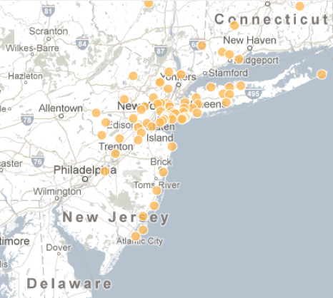
The recent growth of web-based “social networks” inspire maps no longer rooted in terrestrial relations, but stand to become vertiginously unmoored from them:   maps often help us to grapple with the distance between them, as much as to orient us spatially to their relationships, but the blobs on this series of maps oddly disaggregates the inhabitants from the land, focussing less on their spatial situation than their relative degree of web-presence.   Indeed, in ways that very inventively rewrite the map as a throbbing surface, rather than a static interface, the attachments of folks to the interactive space of Facebook becomes cast as the subject that is being mapped–as well as being the datasource from which the map’s dataset derives.

Thanks to the creative folks at Stamen design, we have a beautiful interactive global map of Facebook users, whose bold colors offer a neatly clickable index of social networking over space.  The map is not an innovative ordering of space, but illustrates the network’s global reach in a twist on the project of mapping the inhabited world, shared by Ptolemy and Abraham Ortelius alike.  But let’s ask what’s at stake in crafting a visualization culled from archived data gathered from users’ profiles–as much as celebrating the virtuosity of the clickable map as a chart of the social network’s reach, as if it were able to map as previously unquantifiable (and indeed ultimately almost ephemeral) value as ‘friendship’ might be.

World's "Friendships" on Facebook

Many maps employ self-reported data.  In a sense, the map of Facebook use–or the self-identified “Friendship Map”–charts global inter-relations, like the global maps of national distribution of GDP, provenance of coffee beans or even pathways of the migrating whales, both discussed in earlier posts.  But whereas  maps objectively mediate terrestrial inter-relations–and inter-connectivity–the notion of connectivity has been re-appropriated in the images of “Friendship” that Facebook commissioned, as has the meaning of the word “Friendship” itself.  On the one hand, this map is a celebration and triumphal illustration of Facebook’s near-ubiquity.  But it is also with clear limits, even if they are unacknowledged.  Anyone not on Facebook is absent from the map, since connectivity is generated from profiles that are registered online.

Facebook connections allowed the folks at Stamen to generate instantaneous images of web-use, making this sequence of clickable maps a truly interactive treat, as well as a visual feast.  But the effect is also to present the data generated from Facebook use as endowed with the allegedly objective criteria of maps, and to normalize Facebook’s criteria of “friendship” in apparently objective terms.  Although the very notion of geographic connectivity is fundamental to map making, the maps that are used as the templates to indicate the “connections” of friending in the Facebook platform invest a sense of objectivity and meaning in trends of friending that elevates the medium as the basis to generate further information to a degree that boosts Facebook’s criteria of meaning, as much as provides analytic tools:  if “the medium is the message,” the medium is not cartography, although the multiple images echo the authority of cartographical forms, but Facebook itself.

This is particularly pernicious, and bears some examination.  The maps on this site visualize aggregate friendships on Facebook as quivering blobs of connections that pulsate as with life of their own.  Although claiming objective authority of a map, the aggregates map “friendship” as Facebook has defined it, and embody and reify the data FB use itself creates and generates:  this is a map of FB use, in other words (rather than of web use in general), and a vision of the interconnectivity Facebook promises and the very “Friendships” that it creates.

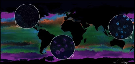
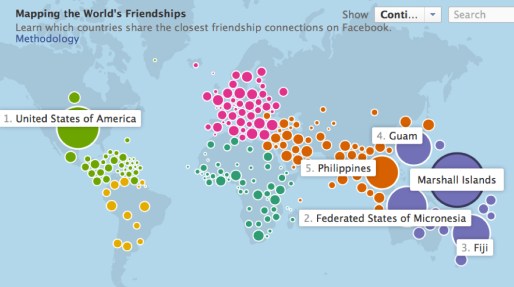
Take a look once again at the snapshot of the connectedness of the Marshall Islanders who use Facebook:

World's Friendships on Facebook


Such a map is decidedly not a territory–nor could it be confused with one.  But if “all maps are arguments,” in Harley’s words, and conceal interests, as much as show meaning, the interests concealed in these “Maps of the World’s Friendship” demand considerable unpacking.  For to me, the multiple maps that Stamen design unveiled last September 12 are something like post-modern versions of earlier corporate emblems.

The aggregate views of information born of Facebook use essentially trumpet the inter-connected world that Facebook promises as a matrix achieved by corporate interconnectedness, in other words, in ways that update the familiar stream-lined modernist logo of global unity Pan Am once used to promote itself as the “world’s most experienced airline,” able to provided air service to all regions of the world by airline jets.  The Pan Am emblem emptied the familiar format of projection from toponyms or places, as if to illustrate the lack of obstacles to air travel and the global surface that its flights promised to link.  The logo owned by Pan American World Airways erased places in favor of the latitudes that link the world bridged by flight paths and no longer in need of land maps, no doubt intentionally offering the new map the airline corporation promised to provide to its users.


277px-Pan_Am_Logo.

The interactive map of Facebook connectivity are constantly evolving and generated at a given moment, and, unlike the static emblem, as if living independently from the viewer, but embodying actual FB use.

The contrast is interesting on iconographic grounds as well as stylistic ones.  The generation between these visions of global interconnectedness has led to a map of greater sophistication and persuasiveness of interactive form, and one that seems, like Facebook, user-friendly and value-free:  but the map of Facebook users is particularly insidious, as ‘friending’ and connections are rendered by the web-based platform itself.  In comparison to the Pan Am logo, rather than merely provide an illusory image of the promise of global unity, the map is a triumphant image of the actual interaction that the web-based platform promised: “friending” provides the metric of global interconnectedness and the sole standard of national interconnectivity.  Although the map can be re-centered at a click in order to map the connectedness from a different point of view, the “point of view” does not really change. In the text above the map, “friendship” doesn’t appear in scare quotes:  it in fact normalizes Facebook use as the sole index of contentedness and inter-connection.

Let’s examine specific cases to ask what is revealed or viewable in these multiple maps, which represent a proliferation of different data visualizations as much as providing a basis for geographical or spatial orientation. To do so, return to the “map” of Facebook connectivity in the Marshall Islands, which maps Islanders’s global connectedness via Facebook friendships:

World's Friendships on Facebook


The notion of mapping an emotion or state of mind–friendship–suggests the sort of positivism of early twentieth-century phrenology, or the comic maps of lands of contentment, like the early modern “Carte du Tendre“–an imagined geography described as a “topographic and allegoric representation” by Mme. de Scudéry in seventeenth-century France–as a geography of Love, complete with a river of Tenderness that runs through towns named after different stages of tender affection.

There’s a wonderful paradox of mapping the intangible as concrete, or mapping the ineffable–how often do we invest deep significance in the word “friend” after fourth grade?–in graphic terms, as if to make manifest the good-will that exists as if it were a physical topography.  (The notion of such mythic lands is re-inforced by dividing the map into color-coded continents, as if an emotional Olympic games between different parties.)  But it is more the hubristic belief of Facebook in their own metrics, doubtful in any event, than a positivistic belief in the ability to locate sites of well-being in the body or on the planet.

What’s the metric here?  Hopes of visualizing interconnectedness among Facebook’s users is more of an advertisement for their web-based platform than a visualization of disinterested data, and it’s not at all certain that this converts to a metric of well-being:  the huge number of connections boasted by residents of the Marshall Islands, Guam, Fiji, and the Philippines may derive from a sense of disconnectedness among the American populations in these regions, and a reliance on FB as a platform to remain in contact with their relatives in a different time-zones.  Although the Marshall Islands were only occupied by the United States until just less than thirty years ago–American forces left in 1986–the 10% of the population of American origin maintain extremely close ties to the US, and, more tellingly, the top destination for Marshallese ex-pats is the US.  “Technology bridges distance and borders,” Mia Newman boasts from Stanford on the FB website itself, as, due to the grace of this platform, “Individuals today can keep in touch with their friends and family in completely new ways — regardless of where they live.”  In a world characterized by dislocation and isolation, Facebook provides social ties.

The appeal of the map is of course to advertise how Facebook trumps geography, and one might do well to return to the interested nature of this map as a corporate logo:  “Immigration is one of the strongest links that seems to bind these Facebook neighbors,” the website informs us, if this was a discovery that the platform allowed; having (and maintaining) a lot of FB connections isn’t that surprising given the dislocations caused by such out-migration over recent years.  Flipping to the site itself,

[http://www.facebookstories.com/stories/1574/interactive-mapping-the-world-s-friendships#color=continent&story=1&country=MH],

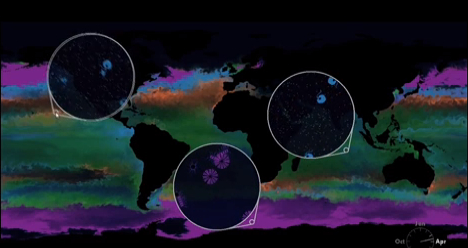
watch with awe as color-coded aggregate bubbles quiver with connectivity,  as folks update social profiles, making new connections, adding “Friends”, or, as I happened to do last night, de-Friending others.  Clicking on the variable of ‘language’ on the site, we can see or imagine close ties between the Marshallese and the Philippines, and note with some surprise that the dominance of red (English) on the map, the improbability that non-English speakers in the islands nonetheless register the greatest number of connections.  This omits the different uses of “Friending” or “FB Friendship” among each region, of course, we failed to add, as it assumes that use of Facebook conventions is as universal as Facebook’s global reach.

The deepest attraction of the site is its interactive feature by which the map at a click newly configures itself from the perspective of dfferent FB users.  The movable centering of the map doesn’t change the geographic distribution of place, but rather  reveals how connectivity is centered in the globe from different national aggregates, which can also be segregated by language.

Experiment at the link here, to explore the fluidity of this new mode of mapping the world’s population, and abstracting one’s web-presence from the world.

[http://www.facebookstories.com/stories/1574/#color=continent&story=1&country=HT]

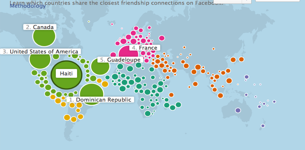
In this case Haiti, the “map” correlates the number of Facebook connections in the country and numbers between countries in ranked order that are a bit surprising, given the prominence of Canada, until one imagines the number there of Haitian refugees:

Learn Which Countries Share

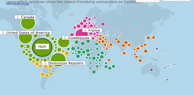
The links among active FB users, cast here in terms of language groups, ostensibly responds to the question of who “shares the closest friendship connections,” although the reasons for those connections are not able to be clarified–although the illumination of linguistic ties clearly helps.  The huge prominence of Haitian ties to the Dominican Republic and Canada is not a big surprise; if the slightly lesser ties Haiti enjoys to the United States may be, it is not surprising that the proportional ties to France rank a close fourth.  This is a map, however, of dislocation, and attempts to bridge physical divides, as much as it is of friendship ties–or even a measure of friendship per se–so much as the type of “friendship™”  that Facebook seeks to market and be able to offer:  friendship that is less in, as it were, meatspace than cyberspace.

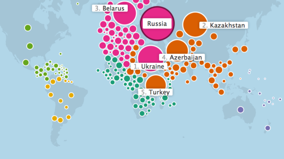
In contrast, the close ties of Russia to the Ukraine, Kazakhstan, and Belarus might be better explained by their recent division from a formerly united regional territory, albeit one that was ethnically diverse:

Russia's %22Friends%22

These maps display salient ties of economic and linguistic relations, to be sure, yet filtered through the economy of Facebook use.  The dramatically interactive map measures different perspectives of the world through the sum totals of FB users in one region or nation–a self-selected group–based on the criteria that that group imposed on the map.  Unlike other maps, where the data is cherry-picked and chosen and balanced by the mapmaker to conceal or pinpoint interests in an objective manner, Facebook has culled the data for this map–created and devised by Stamen Design–based on data that is not only essentially self-reported, but represents not only a portrait, but Facebook’s ability to mine the data archived by user-preferences and to assemble its own data of the aggregate of regional Facebook communities.

The result is a fantastic vision of totality through the eyes of the Facebook network, in which we can “click” on any country to view its population’s “connections” to other areas of the world.  What else does the map tell us?  Little more than the economic ability to dedicate large amounts of time to FB, or the state of emotional dependence on expanding one’s connections–or, more accurately, the acculturation of FB as a way of maintaining ties.  “Economic links, through trade or investment, also seem to be strong predictors of country connectedness,” Mia Newman informs us as she seeks to interpret the map for readers who have stumbled upon it and seek to understand this new configuration of the globe online.

Since we’re championing interconnectedness, let’s look at the potentially more isolated country of Pakistan:

Pakistan 1

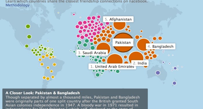
The ever helpful text panel–as the legend that must always be read with care in any map–calls special attention to Pakistanis’ ties to Bangladeshis, an effect of their unity in colonial times, but is less than illuminating about what are the classes of Facebook users in the former South Asian colonies, or what are the groups using the platform:  perhaps the emphasis on the fourth largest aggregate site of connections distracts from the comparable ties to users in Afghanistan, or the surprising permeability of the Indian-Pakistani border.

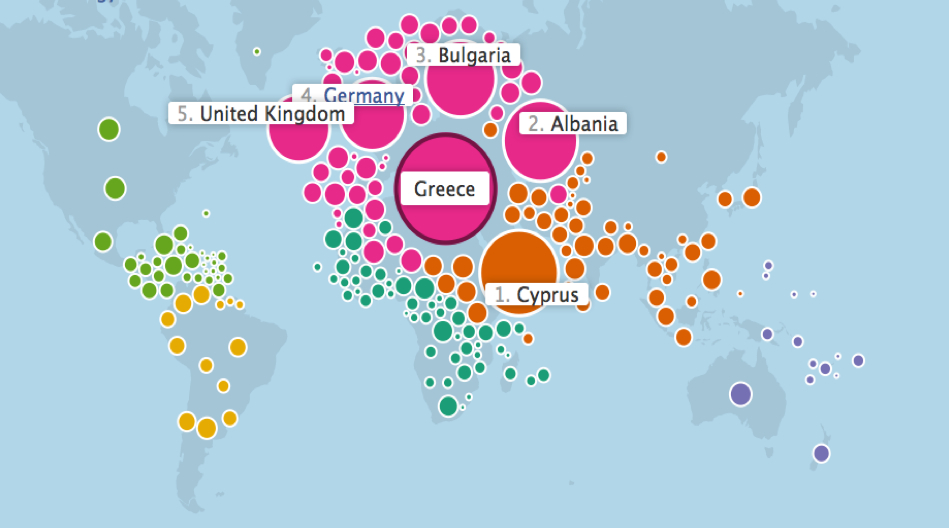
The multiple FB connections of inhabitants of Greece, however, and the generous radii of countries in Eastern and Central Europe, belies the notion that interconnectedness is a metric of economic vitality.

Greece.

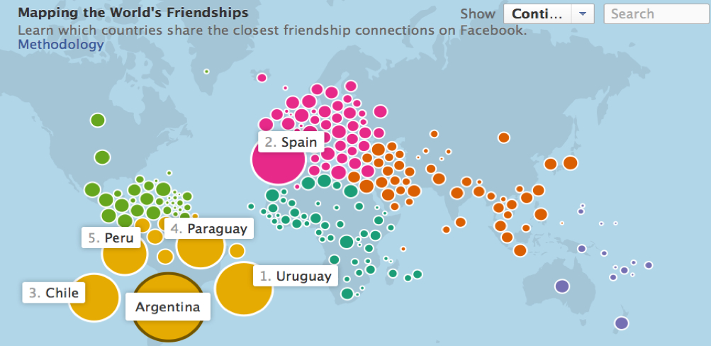
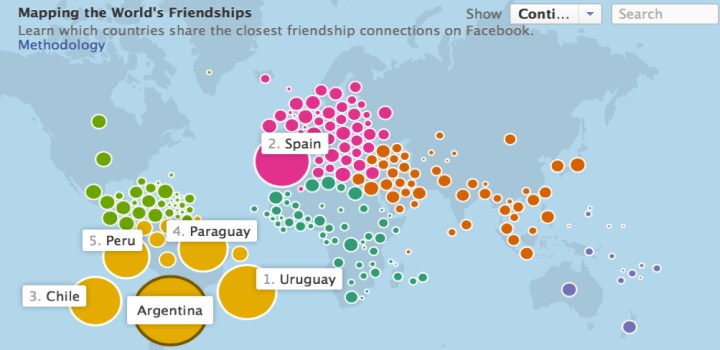
There’s a lot of FB activity in Micronesia–but are Bulgaria and Serbia hotspots of economic vitality or cooperation?  Are Chile and Argentina sites of stability, or is Mexico?  Is Argentina really a center of stable labor relations and a model of free markets that we are instructed to read the map as providing evidence of?

Argentina's Friendship and Labor Market

The arrangement of a configuration of bubbles of different colors are beautiful, and the pulsation of colored blobs dramatic, but the group of users are particularly difficult to identify, as are the habits by which they might “friend” their “friends”–or the networks they create.

Does–to chose a limit case–an absence of FB interconnectedness in China really reveal that the country is moribund economically?  In the manner that North Korea drops off Google Maps, although we all know that North Korea is not known for its open-access, there is no point of reference on which to click or metric to view for the largest of the world’s economies.

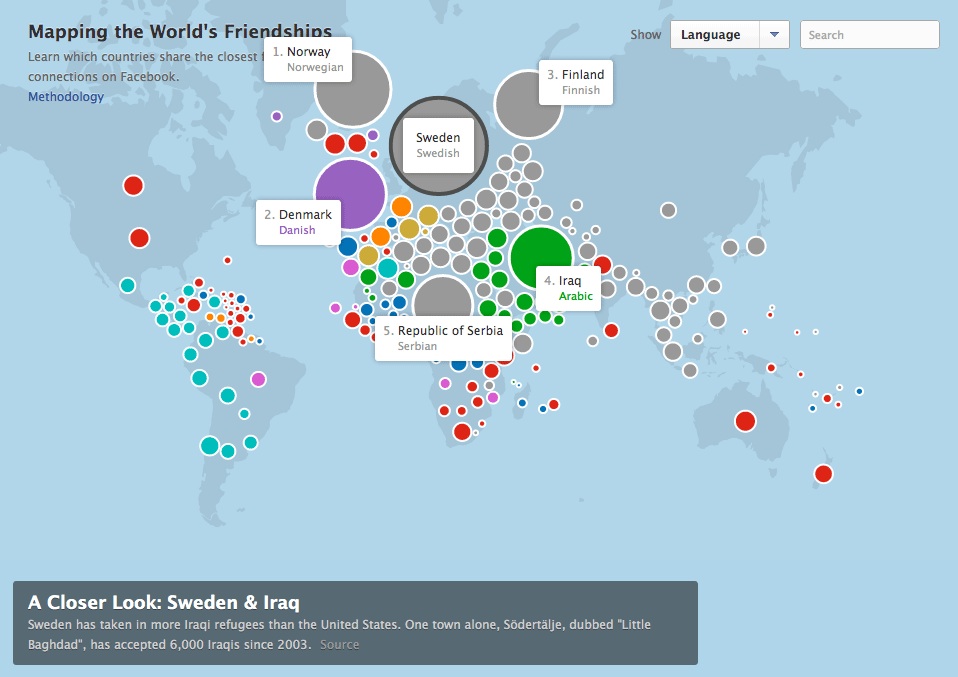
The limits of mapping FB use as a form of “friendship” rests on a combination of economic benefits, security, and desires for companionship that jointly contribute to online “friending” and the archiving of “friends.”  Not only is there a uniform level of “friending”–so that the necessity of economic “friendship” is equated with the ties of countries of origin among immigrant communities–but the homogenization of these different gradations of “friendship” obscure the potential benefits of legibility in this dramatically interactive map of Swedish FB users’ ties to geographically proximate and distant members of the FB community.

As the test notes, it shows the close ties of the Swedish market to Norway-not surprisingly–Denmark, and Finland, but also the ties of refugees who have arrived in Sweden, a preferred site, from both to Serbia and Iraq.  These recent settlers in the region, unlike the Scandinavian nexus, document a “friendship” to parents, schoolmates, or extended family– the database FB has culled suggests a deep desire to continue an imaginary with these faceless “connections,” and the lack of ability to make easy contact with these ties among immigrant communities, rather than the depth of their connections.

sweden's friendships

In the end, these are wonderful maps of our own making, whose indices are a better reflection (or projection) of what connectedness means to us–connectedness now being a relation that Facebook has now both defined and designed.  Whereas the old Pan Am logo surely maps geographical interconnectedness, as do all maps, the series of user-generated maps of Facebook connectedness map the extent of networked interconnectivity:   they are less truly maps, in some sense, than data visualization schema, that render in pictorially iconic form the data that Facebook is able to collect.  All maps reflect their makers to be sure; the maps of Facebook connectivity, more than perhaps anything else, illustrate the range of data Facebook is able to mine.  Perhaps this is the real function of the maps, which parade the range of information and “closer looks” that Facebook has access to.

For what goes unsaid–and remains unsaid–in this endless sequence of maps is the variations among the penetration of Facebook within each country–it is assumed to be complete, and to rester anyone that one is interested in taking measure of, as if it were the metric of Who Really Counts.  Yet the wide disparities within the extent of Facebook’s currency (or, if you will, adoption) in different countries not only widely varies but might be itself mapped, as something like a corrective to the data streams that the above maps claim to oh-so-conveniently organize.

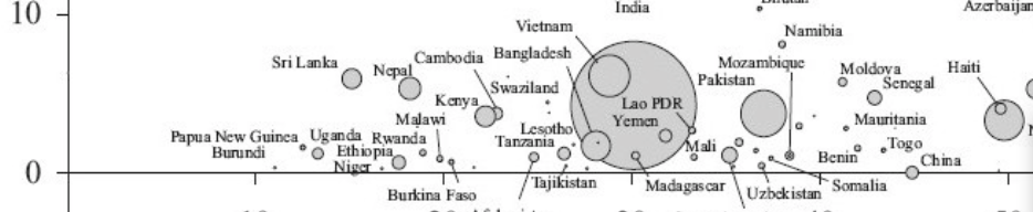
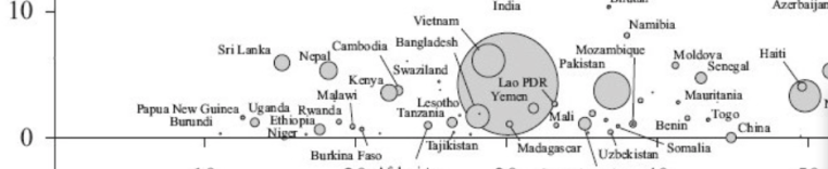
The distribution of the differential sin Facebook’s adoption in the population at large might be usefully remembered in this far yet brilliantly colored but useful bubble map, which chats the intensity of Facebook’s penetration in the population, based on site-registered active users around 2012 from a variety of sources, from a project of Elvin Wyly and Larissa Zip, which attempts to map the more socially-networked world that Facebook boasts it can offer access to.  Although the ranking of urbanization of countries is problematic–given the local variation in a largely rural nation as India that possesses large cities–the huge size of connectedness that was privileged in the urbanized areas of brazil, the United States, UK, Uruguay, Chile, France, Columbia, Turkey, Argentina, Malaysia and the Philippines, as well as highly urbanized Singapore and Hong Kong–irrespective of actual geography or population size.  (India is the outlier of a largely unorganized country with high FB users, but the undoubted majority of its users are concentrated in cities or urban areas–Facebook does not release or record precise geophysical location; the relatively small user numbers for Iraq, Ukraine, Afghanistan, Ethiopia, Uganda, or China seems to show regional poverty.


paste74

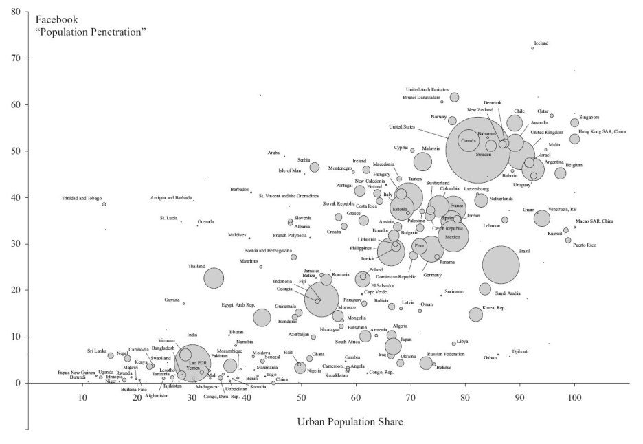
The outsized boast of mapping “The World’s Friendships” conceals the very absence of the non-networked, the new disenfranchised who the ideology of Facebook erases from the map–and who are poised to become the unnamed hordes of the inhabited world, whose lives are less visible in a globalized world, although we absent India, Kenya, China, Rwanda, Ethiopia, Nigeria, Nepal and Uganda at considerable risk.

Unurbanized Low-FB presence

The “Maps of [Facebook] Friendship” are fundamentally ways to advertise the very sort of datasets that Facebook is able to sell to companies that want its records of page-views, if by orienting folks to the very metrics that Facebook has at its fingertips.

What we get is a sense of the reliability and credibility that the data Facebook possesses to orient us to the webspace that Facebook has created, using the trademark of being a “friend”–that crucial desideratum in an economy when credibility seems hopelessly confused with web presence and social connectedness intertwined with virtual contexts and contacts mediated over Facebook and LinkedIn–is able to be mapped with apparent accuracy, of an almost positivistic tenor, albeit allowing for the fluidity that is itself so characteristic of the web as a medium and of Facebook as a virtual interface.

Leave a comment

Filed under bubble maps, data visualization, Facebook, Facebook Friendship Map, Facebook Urban Penetration, FB users, Interactive Maps, social media, social networking