Tag Archives: GIS

Sea Surface Temperatures

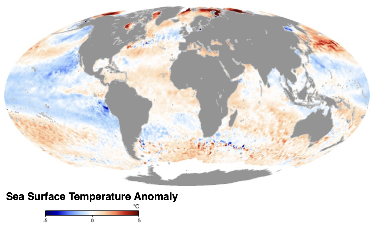
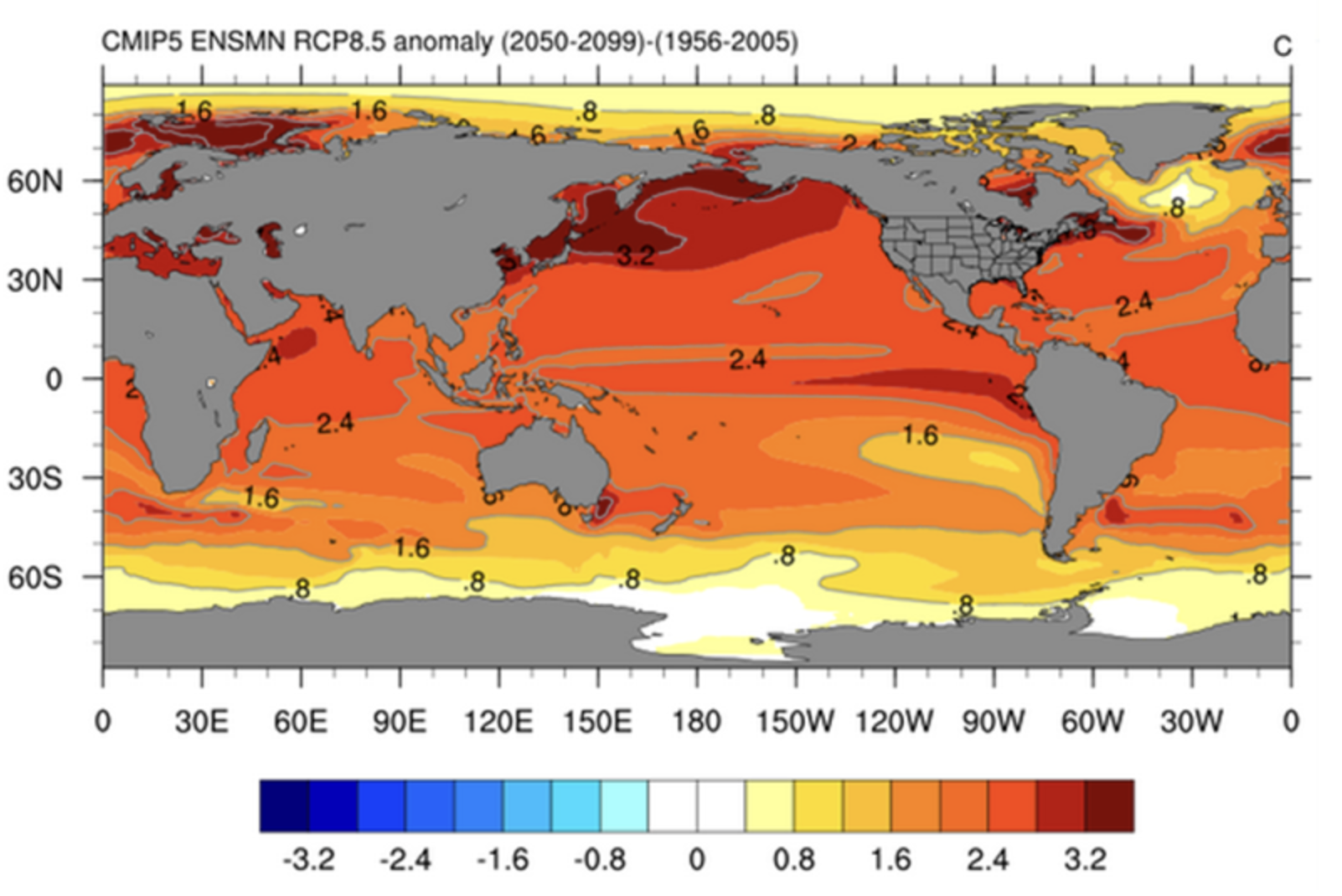
With global ocean surface temperatures shot way off the charts by mid-March, beyond forty years satellites have monitored sea surface temperatures, we’ve been struggling valiantly to map the changes in sea-surface temperatures, both globally and locally, in satisfactory and meaningful ways. The disruption poised to cascade across the planet in what might be the summer able to make climate change a less contentious issue of politics or partisan polarization. Maps of the remote sensing of surface temperature–sea surface temperature in specific–are shocking as they broker even deeper forms of estrangement, rendering the global temperatures against a baseline of the postwar period. The accumulated data from the first era of remote earth observation by satellite has generated a terrifying picture about which we lack a storyline, or a way to narrate our own relation. The problems of a metageography of impending global collapse that lacks any narrative resolution, more properly, and compels us to attend more closely to the conventions and imagery of how we map sea surfaces to interrogate more closely what we are actually seeing in such maps.

The totality of global warming are nowhere more evident than in the charts of sea-surface anomalies of temperatures, which pool red and orange on the planisphere in unearthly ways, but the correlation of remotely observed temperatures that deviate with standards of a century ago that showed foxing or burning over a decade ago, as the “hotspots” of intense rising temperatures near Greelnaldn, in Hudson’s bay, or off the coast of Maine and Siberia in July 2009 or even more strongly in September, 2011–but demand us to investigate the changing relation of land and sea.

July 2009/ NASA Earth Observatory

September, 2011/NASA Earth Observatory

–that have reached such record levels to lead Earth Observatory scientists to describe long-term effects of global warming by diagnosing that the global ocean “has a fever,” with disparities from past averages above three degrees C, not a lexicon of hyperbole, but suggest the inevitability of what early modern physicians would call fast approaching critical days–the discrimination of the moment when the patient will become “critically ill” or persevere, but that challenge us to classify the nature of such critical onset, as the ancient physician Galen felt fevers turn to more severe or worse forms at measurable moments, registering the temporal progression of fevers in his case histories that form the basis for modern clinical records to classify the effects of the fever in its  ‘quotidian’, ‘tertian’ or ‘quartan’ stage. But we sadly seem to lack the same sophistication for record-keeping of global warming, in the age of the Anthropocene. If Galen distinguished fevers by the responses they required from physicians between those that were acute (‘fast’, oxys, or celer) and chronic (‘slow’, chronios, tardus), the action of this oceanic fever requires is particularly acute.

Although Galen suggested that the “best physician” would take care to distinguish and discriminate the causes understanding the imbalances of vital humors that he argued caused illness, the causes that underlie such entirely anthropogenic rises in ocean heat have been increasingly debated and even suppressed, even if there is more than adequate indications that the consumption of energy and burning of extractive fuels have creat4ed and exacerbated temperature anomalies–and little interruption has occurred in the increased extraction of oil and gas under the optimistic slogan of “energy independence”–not actually providing or producing sufficient energy for a nation but exporting more fuels than one imports.

August 21, 2023/NASA Earth Observatory

The startling results of remote earth and sea observation stands as an odd counterpart to the iconic “blue marble” that became such a slogan of aspirations to global environmentalism almost a full half century ago. Yet the layers of these mapping tools seem, as the rage for composite forms of IKEA furniture, that arrives in assemblage components, to suggest a readymade far from Marcel Duchamp, as if to respond to the magnification of an imagined “migration crisis” by which the nation is challenged. If that crisis may be in fact false, or imaginary, even if migration rates have changed, and most migrants have arrived in the United States for work. The assemblage of the Border Wall is an elision of the identities and the experiences of migrants themselves, or the routes they travel or their work and trades.

IKEA Börder Wåll (2017)

The layers of our environmental maps of ocean temperature anomalies carry ideological presuppositions leaving us purblind to the massive scale of ecological changes in the global ocean, or ability to steer the results of global warming and planetary change by better grasping its effects, rather than creating indelible images of fear. As the practicalities of building a “Border Wall” with the cheapness Candidate Trump had promised, the proposal to create a readymade Börder Wåll that was a far more affordable option at less than $10 million–exactly $9,999,999,999.99 with a five-year guarantee–used the iconic instructions of the Swedish furniture company to imagine a version able to be assembled by screws and Allen wrenches whose pressboard standing a full ten meters tall. If the more affordable assemblage of the border wall was a potent figure for the political emergence of a salesman with little to offer the nation save the image of security, the layers of the remotely sensed map offer a similarly terrifying othering of the global surface, as if the known world were suddenly at variance from the world that we knew, if not destabilizing the very blueness of the seas.

In the famous “Blue Marble” images taken by those aboard the final Apollo 17 to the moon in 1971, we recognize the continents bathed in a sea of bright blue–continents we recognize from the map, but now see, for the first time, a powerful map, lit by the sun before our eyes. The blue nature of the earth is its most overwhelming aspect, however, unlike a map, as if we can see the sea below sparse cloud cover against the Arabian Peninsula, the Indian Ocean visible from the polar ice cap, with the earth’s other continents for the first time ever: we recognize and identify Africa, Madagascar off its coast, and clouds swirling over the ocean, no nations in evidence. It is othered, but made more recognizable, defined more than by nations by the brilliantly illuminated azure of oceanic blue that seems for all practical purposes to dominate the world’s surface beneath clouds.

cool-space-picture-5.jpg

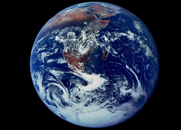
The icon of “Apollo’s Eye” soon the most reproduced in world history–an image of technological progress, but also a snapshot from space, taken off-hand at 20,000 miles per hour, a disappearing or receding planet, lit up by the sun, even thought the 70 mm camera on board was not intended for non-scientific ends, and the aweing nature of the film snaphsot was only recognized as it was develped by a film technician as a portrait of the planet. Although its authorship of who reached for one of the several Hasselblad’s not stowed away for more properly “scientific” purposes on the Moon in order to taken one of the great images of space tourism: one of the first remotely “sensed” images of the earth tilting toward the sun’s rays illuminates its blue oceans that are recognizable under swirls of cloud-cover, revealing recognizable continents–Africa; South Asia; Antarctica–from a perspective never before experienced. MODIS satellite reveal show the current oceans no longer as blue, but greenwith phytoplankton as oceans warm the acceleration anthropogenic carbons in the ocean, incubated by human-caused climate change or “planetary warming.” The Blue Marble now definitively receded so that it seems not a Hasselblad image but might be a photoshopped, the seas no longer offer an image of the Blue Marble. And nowhere is the alteration of sea-surfaces evident than in their temperatures, a gradient relatively new to GIS, but all too compelling if also problematic to render in convincing ways. Can we better render the layers of the warming ocean in ways that allow us to better come to terms with the effects of planetary warming?

cool-space-picture-5.jpg

Blue Marble Photograph by member of Apollo 17 Crew Commanded by Eugene A. Cernan

The Blue Marble image was widely reproduced in global newspapers. But it was only recognized as of interest soon after it was developed by a technician. What NASA called “AS17-148-2272” would be quickly adopted as the “Earth Day” flag. But if it was never definitively credited, and was only in a sense “discovered” by the technician who developed it, its appeal grew as it was consumed by an audience eager to imagine what the members of the space flight teams saw, and as they existed the Earth’s atmosphere. Its immediately recognizable emotive and inspirational power as an image of the earth’s totality as never seen grew, in part, because it was snapped as the winter solstice approached; the full illumination of planet Earth’s vibrant blue oceanic surface appealed as a moral centering, as it became a basis for the Earth Day Flag. Its recognizable nature was not only the crispness of its geographic outlining of continents as they lay and appeared on a terrestrial map,, but, unsurprisingly perhaps, as they echoed and modernized the very claims of divinity that early American environmentalist Henry David Thoreau found as he left Concord ‘s society and his daily job to contemplate the blue waters of Walden Pond he had praised as “cerulean” a hundred and twenty five years earlier, in a wor that was widely read by modern environmentalists in the 1950s and 1960s. The deep blue ocean surfaces from the polar cap of Antarctica to the Mediterranean, around the coast of the entire African continent and stretching to the Persian Gulf, was a counter-map to national maps of borders familiar from school maps, but asking we alter perceptions of the “blue marble” delicately suspended without strings as an image of strength and stability, without any, or at least apparently without any, technological mediation.

But the image of the blueness of those oceans is now undeniably an image that has receded in space, not an eternal image of timelessness, and transcendence, but a definitively receding past, as satellite observations of unprecedented oceanographic detail and range that allowed high-quality ocean color data by the MODIS-Aqua satellite systems announce an inevitably greening of the surfaces of the global ocean. The blue marble icon i, confined to the past, and an artifact of the past, after the anthropogenic alterations of phosphorus and carbons in the global ocean has, in an era of anthropogenic global warming, so boosted phytoplankton populations to recolor the ocean. The new surface ecosystem indicate new variety of microscopic organisms photosynthesizing in the global ocean, and carbon-enriched phytoplankton populations whose abundance in global oceans have “turned the seas green” and “othered” the ocean that was once such a pristine blue.

The iconic call to environmental consciousness map of the blue-drenched seas taken 28,000 miles from Earth at a point where the manned spacecraft crossed the point an Earth fully illuminated by the sun is definitively of the past. Eugene A. Cernan, the commander of the last manned lunar mission who claimed to have taken the photograph claimed to capture the crew’s collective astonishment at the spaceship’s transit before the sun. But he has returned multiple times to the sense of deep surprise by which undoubtedly melancholy window-gazing brought a sudden defamiliarization of earth and disorientation of the observer as much as a feeling of transcendence. It was removed from technology, but made him the most privileged observer of earth with a clarity and simplicity that had in fact been never experienced in history. The placement of himself was as strongly resonant as the fleeting nature of the perspecive, and “Do you know where you are at this point in time and space, and in reality and in existence, when you can look out the window and you’re looking at the most beautiful star in the heavens — the most beautiful because it’s the one we understand and we know, it’s home, it’s people, family, loved, life — and besides that it is beautiful?” The stunning image comprehending oceans and continents with “no strings holding it up,” “in a blackness that is almost beyond conception” in a soothing defamiliarization of awe.

The “blue marble” immediately hat was reproduced globally in print newspapers was an icon of globalism and an image of transcendence before it was an icon of environmentalist Earth Day that would spur a new consciousness of those blue waters’ preciousness and purity by showing them as if they were indeed Walden Pond. The photograph registered an oceanic expanse that appears timeless, and so intensely blue, a pocket of living life that might be modern version of Henry David Thoreau’s praise of the transcendent vitality of Walden Pond’s “cerulean” blues that reflected the sky so intensely as a mirror. (Let’s dwell a bit on this comparison: if Thoreau described the pond as “the landscape’s most beautiful and expressive feature” as “earth’s eye,” “looking into which one the beholder measures his one nature,” and his most prized companion during in “this mode of life” away from Concord, as he grew “suddenly sensible” of a sufficient space nature afforded, we are filled with dread at maps of rising surface temperatures that seem to bode an end to seasonality.) The awe the Apollo 17 Commander Eugene Cernan claimed to be compelled to snap the first image of the earth’s surface, entirely illuminated by the sun’s rays from Apollo 17, the south pole tilted sunward before the winter solstice and oceans illuminated as a seat of life seem a modern updating of Henry David Thoreau’s sensation of being in a privileged site of contact with the divine at Walden Pond. (Cernan’s claim was contested, but he felt the image akin to a re-centering of self.)

The Apollonian view that was communicated globally became an icon of technological progress and of re-familiarization of the earth. This was so much so was this the cast that the image that was reproduced globally with an unprecedented rapidity–a signe of the new globalization of the news–became adopted as an icon of the ecological movement of the first Earth Day, first observed two years previous in 1970, as if to acknowledge how the photograph taken by Cernan or another of his crew effected a changed relation to global space. In sharp contrast, the planispheric image of the increases in global temperatures is a deep dread, provoking an absence of orientation or storyline: dread is the only word for viewers’ disorientation before maps of rising surface temperatures that reveal the disparity of recent global temperatures from the recent past. Is it any coincidence that the seaborne Sargassum proliferated in the mid-Atlantic in record-setting ambient ocean water?

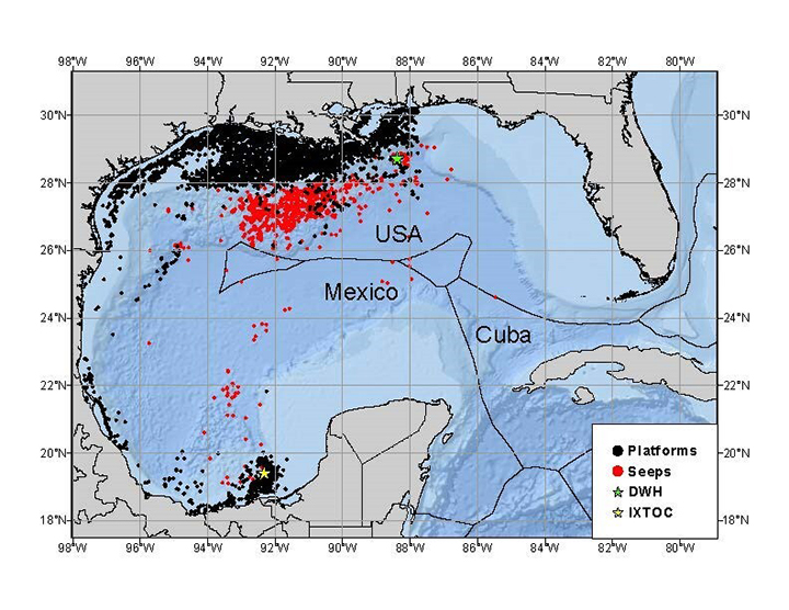
They bode an end not only to seasonality, but the vitality of the global oceans–if not the vitality of the habited world itself. Nowhere is this more apparent than the slick of petroleum that have appeared at the great site of marine diversity and vitality–the Gulf of Mexico–that has become a hub of the offloading of global oil supplies to the Americas for processing, seen as a “chokehold” for daily maritime oil transport of the 56.5 million barrels that traveled on maritime routes–about 63% of world’s total oil production. Indeed, the critical maritime routes for the global transit of oil were long referred to as “chokepoints”–

U.S. Energy Administration, based on 2013 data of Lloyd’s Intelligence, Panama Canal Authority, Suez Canal Authority

The registering of land temperatures monitored from satellites at a closer distance has created far more terrifying images of defamiliarization this summer and in recent years. The temperatures anomalies is hard to recognize as anything like a map that we might easily recognize, and indeed push the boundaries between cartography and art. If all art may be about estrangement–ostranenie for Russian formalist literary critic Victor Shklovsky and his circle–or “defamiliarization” of the known, the estrangement of global warming temperatures area shocker and an artistic narrative we do not know what to make of save as a learning model for the entrance into the new era of the Anthropocene.

If the politics of estrangement was for Shklovsky rooted in a new sense of life become art, and a revolutionary estrangement of self, global warming seems the utmost in estrangement, although what living through global warming honestly remains hard to come to terms or conceive. It is, for one, outside of our familiar narratives, save the apocalyptic, and we may tend to the apocalyptic as a result. But, this post will suggest, the danger is in a sense deeper than a failure of narrative alone and in ways that we may take a clue from the Russian formalists themselves to understand: for the formal presuppositions of visualizing and of mapping sea temperatures as continuous with land, and as able to be mapped in the same terms as the anomalies of land temperatures, is an ideologic construct and choice, independent of the content of the global maps of raising temperature: for we flatten the sea temperatures at our own risk. Flattening the ocean expanse as if it were akin to land temperatures ignores the extent to which greater heat that drive increasing global temperatures have been storied within the ocean, and the risks of rapidly cascading nature of changes in ocean temperatures that anthropogenic change has produced.

Indeed, the critical ways that mapping sea surface temperatures and mapping ocean resuources as if they were sites for extraction, akin to land-extraction, has led to an increased dependence and sanctioning of offshore waters for extractive drilling, as nations from Canada to Russia to the United States to Argentina to Mexico aim to expropriate underground reserves of oil to boost their national economies and trade, auctioning off lots to the highest bidde, or subsidizing offshore drilling of gas and oil. These huge anthropogenic changee masked or concealed by relying on the relatively surperficial maps of remote satellite sensing of sea surface temperatures alone.

By the middle of June, the GIS anomalies of global temperatures from a baseline of my pre-college years revealed how much personal history had intersected with a radical change in global climate. One’s life memories somewhat incredibly and suddenly in synch with global epochs, reminding me of how very unlike global temperatures for most were compared to the normal in my own memory as well as that of the planet–a daunting prospect and possibility indeed to get one’s mind around. (It’s hard, however, not to wince at the echo of the fractured partisan topography in this map of global temperature change, even if the confine of blue to the arctic regions and western and northeastern United States ; the carmine warming temperatures looming over Canada is quite hard to dissociate from the dry forests that ignited in fires across so much of the nation this summer.)

The view from a generation–if not a life perspective–showed a modeled planisphere hard to get one’s mind around, scorched by temperature anomalies, from the ocean off of South America, the arc under the Aleutian Islands, the hot-spot off of west Africa and burn holes of Europe and Siberia. The warming of the global atmosphere was long seen as “one of the most pressing problems of the twenty-first century,” the global maps of heightened atmospheric warming due to elevated carbon levels now a full 50% above preindustrial levels–and larger than ever seen on earth since three to five million years ago–according to paleoclimatic data–make it hard to place the climate changes amplified by greater methane, nitrous oxide, and fluorinated gases. It is a register of the all too human art to burn carbon, if not just a deeply depressing image leaves one drained of any agency; it is hard to stand before it with anything like the exultant transcendence of fifty years previous.

As carbon levels continue to crest above 420 ppm, we look back at the high levels of CO2 fifty million years ago, average temperatures reached about 10°C warmer than today and the planet ice-free, with sea-levels lapping shores two hundred feet higher above current sea-level. One can segment it many ways, but the huge escalation of temperatures of the oceans–which have stored a vast amount the growing heat we experience on earth, or a whopping 93%–moves unlike how heat is experienced in land, but reflects the most densely populated coasts–and densest sites of anthropogenic waste–

–in the global ocean.

The warming of seas were long recognized just several years ago–in relation to a dataset from the twentieth century and first two decades of the twenty-first–in ways that call attention to just how much atmospheric heat the global ocean has absorbed into its own waters in the past century–and how much more it has additionally absorbed, perhaps putting it over the top as a site able to sustain life, in recent years. If death was the “master fear” that philosophy was able to conquer for stoic philosophers from Seneca to later Romans, able to be overcome to conquer fear itself, the increasingly inhospitable global oceans suggest little to meditate upon we have an ability to process save their own evanescence as habitat for life: the images are perhaps not records of a life lived, but are literally the collective residues of “lives lived” in the twentieth and twenty-first centuries. There is no known script of how to live that they offer for virtue or nobility.

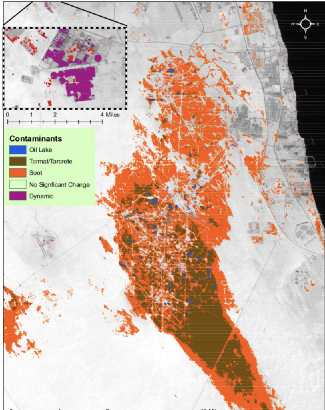
We are increasingly pessimistic about our world view, and the maps of global warming fit with an increasingly pessimistic world view that has been seen as a problem of global purpose, at least from the US-led invasion of Iraq in 2003 without debate that after eight years of conflict saw “shock and awe” lead to wide questioning if it was worth fighting. If the 3.4 million aircraft sorties that dropped the equivalent of 640 Hiroshima bombs in Cambodia and Laos had cast a shadow over America’s global purpose for one generations, the burning of 700 out of control oil field fires lit by retreating Iraqi forces as they withdrew from Kuwait under fire: as U.S. and allied troops arrived to defend the fields in a war of a hundred hours, of bombing sorties of air-launched cruise missiles, Iraqis lit wells as they retreated to blanket the air rendered unbreathable for soldiers without gas masks in improvised smoke screens of toxic with particulate matter. As “allied” intervention destroyed an amazing 3,000 tanks and 1,400 armed personnel carriers in a matter of days, with countless other vehicles, the plumes of 700 gushing wells were lit, creating up to 300 oil lakes in the desert whose pollution of the soil is as deep as four meters today, now hardened to sludge leaving lakes that are toxic today, even as almost two and a half million cubic meters of sand were cleared. Concservationists remained concerned about continued effects on humans and the environment.

The very commodity over which the war was fought became an aggressive act for the military advantage, squandering petroleum resources the west valued in an age of ecological aggression the transformed the Greater Burgan oil fields into an anthropogenic inferno. Wells were commandeered in a scorched earth policy of unprecedented scale, an environmental disaster that cost over a billion to extinguish, individual wells only able to be extinguished at a rate of one or two a day, as forces were anticipating billions to reconstruct the fields the United States led “allied” forces to defend. The anthropogenic effects may be obscured by of the sovereignty of Empire, far beyond the bounds of the nation state, and the bounds of the Kuwaiti oil fields.

If the logic of direct intervention in the 100 hour war depended on the myth of effective global military apparatus ready to wage a “just” war, asserting military control over Iraqi and Kuwaiti oil fields in the logic of war, the lighting of oil rigs and gas rigs by retreating troop and bombs improvised a network of resistance, blanketing the region with smoke that made aerial surveillance impossible and useless, and offered deep health risks to those troops with “boots on the ground.” As wells burned they ignited the very source of one of the sources of shipments of crude to be refined in the Gulf of Mexico, where much global petroleum is offloaded. The arrival of petroleum in the Gulf’s dispersed system of refineries and multinational companies was a basis for the extension of “American interests” to a region in the Gulf seen as so critical to the globally extended economy to justify the “just war” by American-led forces. The global web of oil refineries across the coastal region was a way in which the wealth of the United States was preserved and transportation economy fed. If oil spills had declined in recent years in U.S. marine waters, the offloading of forign oil in a network of refineries established in American waters in a site of deepewater oil and gas production was a basis for the extension of American “sovereignty” that had ignored the anthropogenic effects of oil toxins was released in the war, if far beyond the US coasts.

Oil Toxins Pervasive in Gulf of Mexico

If America was stunned that the United States had coordinated the Iraqi invasion of the oilfields in Kuwait, the new source of most oil refined by American oil companies on shore, the war that was fundamentally about blurred borders, and control over the continued flow of extracted petroleum and gas for commodities, the burning oil fields took back the very grounds of production by lighting the oil rigs as torches in the night.

“Kuwait Oil Spill, 1991” by Christopher Gomez (2016)

The anthropogenic scars of the 1991 war with Iraq created warnings of a nuclear winter never to materialize in 1991, burning of hundreds of thousands of barrels released one and a half billion barrels of crude into the environment including “oil lakes” burning for months created but 2% of global emissions. A further hundreds of thousands of barrels of oil from oil field rigs gushed through most of 1991–a record of anthropogenic harm predating Paul Crutzen’s popularization of the concept of a geological epoch distinguishable by its environmental archeology. While the Anthropocene is dated as most evident from the 1950s, as the acceleration of technologies and explosion of atomic bombs left new residues on mountainsides and the planet, the invasion came at the end of the Cold War, at a time when the mobility of troops across the planet had grown in a converse of globalization. The ability to move troops to “invade” or “free” Kuwaiti oil field by aerial bombardment, that mobilized thirty one nation alliance against “military targets” by B-52 strikes and hellfire missiles to prevent Iraq from occupying the oil reserves on which America depended was called a “just war,” but the intervention led to the combustion of eight hundred oil well rigs, three quarters catching fire and burning, and fifty gushing oil onto the ground, until they were capped in October 1991.

The drive to protect oil and gas led to oil fires burning, releasing about 355,000 tons of crude. Their destruction was a retaliation of the sovereign control of speedy troop movements in an intervention that paradigmatically revealed a new sense of Empire asserting sovereign control over Kuwaiti oil fields in a self-defined “just war.” It became a monument of anthropogenic alteration of the landscape by an environmental disaster of new proportions and scale. If the term “boots on the ground” only gained currency in the Invasion of Kuwait, the term that dates in the military from the hostage crisis in Iran suggests the limits and frustration of global mobility, but conceals how the grounds of the region were altered in decisive ways, responding to how the United States showed its readiness to move anywhere in the world with a massive show of force of unprecedented scale, in a new multi-national effort difficult to map or narrate as a story of “boots on the ground,” or to register in the consequences of how multi-national forces intervened in oil fields in Desert Storm.

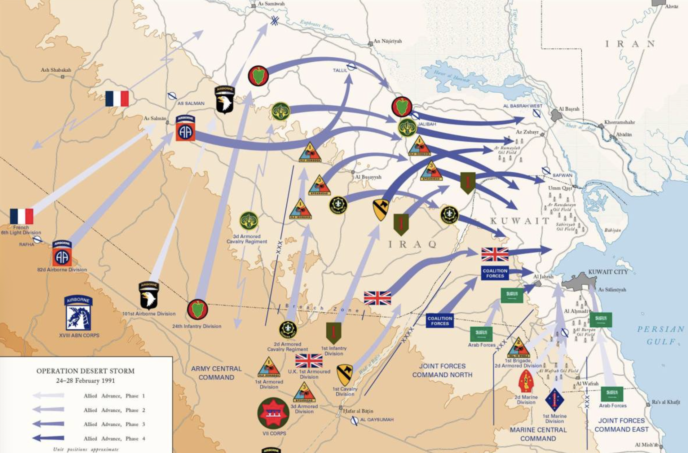
Operation Desert Storm/U.S. Aarmy

The burning of wells by retreating Iraqi troops left a residue left across the desert sands. Accumulated soot from petroleum refineries and carbon–“tarcrete”–spread as a residue of the war; the dark plumes continued to spew400 metric tons of particulate matter of 2.5μm daily from oil wells with over a hundred million cubic meters of natural gas; sixty to eight million barrels of oil directly entered the Gulf in a major environmental disaster that affected the entire ecosystem, as at least fifty oil wells gushed to the ground and eight hundred were destroyed with explosives, if the total carbon emissions were 2-3% of the global annual anthropogenic burning of fossil fuels and but 0.1% of global CO2 emissions. The local density of soot in the Arabian peninsula lowered climate temperatures by 10 degrees C, and covered extensive areas in Kuwait, Northern Saudi Arabia and the Gulf. Gushing wells flooded the oil fields with lakes of petroleum of up to ten hectares, polluting the Gulf, nearly fifteen thousand million cubic meters of oil leaching in Burgan alone–a site of major air attacks–and 22.5 thousand million in total, much from the armored tanks an munitions were abandoned by soldiers in the desert.

Air Attacks and Major Clashes where Depleted Uranium Rounds Fired into Kuwaiti Oilfields

If the 1991 invasion was a critical starting point in staging a deep environmental estrangement than the rise of the new form of military intervention Negri and Hardt argued epitomized the global interventions for just wars in the new legal formation of Empire. The aggressive American-led military intervention ostensibly to “maintain peace and order” by ensuring the smooth circulation of petroleum extraction from the oil fields of Kuwait and Iraq that were the true targets of western desire. But was the burning of oil wells on the border of Iraq not an active rejection of the claims of this new formation of Empire to the Kuwaiti oil fields? Before a feared economic disintegration of multinational claims, the military intervention and conquest sought to construct a global order superseding time to replace it with “free markets,” Negri and Hardt argued, beginning from the military interventions that precipitated the Gulf War.

In response, Iraqi troops set rigs on fire by wresting control of the very underground deposits of petroleum defined as the economic resources of the region, using the infrastructure of energy companies to upend the peaceful new neoliberal order so blithely unilaterally proclaimed. The consumption by combustion of the gushing rigs that were an infrastructure of global energy networks were appropriated as the sites of resistance against the western “peace-keeping” forces that arrived from the air. Who is to say it was not staging resistance on the ground, from the ground up? The redirected anthropogenic effects of a massive project of extraction as Iraqi troops unexpectedly released improvised smoke-cover undermined the organization of a planned international military intervention of a “just war” monitored from above by satellites as a massive disproportionate show of force and deployment of troops by obscuring it from satellite monitoring from a new theater of war. If the war depended on an effective image and logic of military control over Iraqi airspace, the seven hundred oil rigs that burned as a monument to the Anthropocene offered an improvised network of resistance, blanketing the region with smoke that made air surveillance impossible, subverting mapping military progress by satellite from the ground and subverting the smooth exercise of power over the space of what was define as a Just war against Iraq.

When Oil Fields Burned (1991), Sebastião Salgado/Amazonas

If the months leading up to the invasion of Iraqi-held Kuwait met the criteria of Christian “just war” doctrine formulated by St. Augustine, and refined by the scholastic theologian Thomas of Aquinas, the claims of legitimacy of an invasion to secure peace in the region was closely tied to apocalyptic outcomes: as retreating Iraqi forces lit the abandoned oil fields, even if the feared “Nuclear Winter” or year without summer did not materialize, the dense plumes of smoke spreading hundreds of kilometers from multiple points in oil fields set a new standard of fear in haunting images of burning oilfields streaming black smoke, as periodic oil fires have since haunted the region. The model of imperial authority was maudlin if not blatantly absurd. Could the pastoralism of Kuwaiti shepherd corralling sheep and goats–most of whom are in fact migrant workers from Uttar Pradesh or other Indian states–be more mismatched than against the apocalyptic billowing black clouds that drove streams of particulate matter across the skies?

Was the fear not an attempt to come to terms with the unprecedented global scale of such then-devastating environmental aftermaths? The oil plumes streaming hundreds of kilometers across the horion have provided a topos to which later wars in Iraq and Afghanistan have returned, an image of the iconic burning of oil once stored underground, in reserves–releasing more than twice as many barrels of oil into the Persian Gulf as the Deepwater Horizon would release in the Gulf of Mexico, and spreading eight times as many across the desert.

The jarring image of the burning blazes of the swells in a region defined by its pastoral economy suggested the deeply dissonant historical circularity of the claims to Empire that were at stake across borders, as troops on the ground were sent to defend multinationals’ interests–if with democratic pieties–the first great neoliberal war defined by alleged defense of Kuwaiti sovereignty by a “line in the sand” was the first war of Empire, for Negri and Hardt, in a boundless, universal space: the plumes spreading to international air space–as well as a hazard for those breathing on the ground:

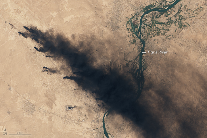
Plumes from Kuwaiti Oil Wells Burning around Kuwait City in April 7, 1991 from Space Shuttle Atlantis/ NASA’s Earth Observatory

The streams of black particulate matter that was so toxic to the lungs of those with “boots on the ground” defending oil fields in Kuwait were grasped in global terms, less in terms of Empire than another global climactic events–if this time released by man, blaming the Iraqi troops for loosing the fires in response to massively disproportionate air fire launched against them for a famously brief hundred hour war entitled “Operation Desert Storm,” a multinational military seizing of oil fields cast as a “just war” but revealing increased global energy dependence on extracted crude.

The black smoke issuing from burning rigs were feared to englobe the world in a “little ice age” akin to the black ash clouds that were emitted into the global atmosphere at the 1883 volcanic explosion of Krakatoa, or four volcanic eruptions that had earlier led to the expansion of the Arctic Sea circa 1275-1300, leading to the expansion of glacial valleys in Europe from the Alps to Norway, in a similarly global cataclysm of man-made origin, and came to be paradigmatic of the definition of barbarism versus civilization, or the economic status quo, or democracy versus totalitarianism. Burning of oil fields, many not fully exhausted or capped until November, 1991, spewed or released petroleum into the desert and river or Gulf for up to eight months, creating new “oil seas” of toxic character, set a stage for the burning of gushing and roaring in future wars in northern Iraq that have colored the desert landscape with a dark anthropogenic pall of thick, dark smoke, repurposing a geography of oil fields as geopolitical tools of, normalizing the burning of 4.6 million barrels/day by 2016-17 whose blanket of fine carbon dust blocked solar rays to cool local temperatures.

Oil Fires in Iraq

The pessimism of purpose in the world extends to the and infects the warming of our global temperatures, as if to condemn us to a history of carbon extraction of which the Gulf War was the iconic turning point. Temperature rise is easily seen as part of a pessimistic world picture we cannot intervene, as if evidence of inevitable products of life of a carbon-burning age, the rise of temperatures. the age was spurred by the billions made from the postwar extraction of carbon-rich fuels have been the stimulus of an overheating planet, bringing temperatures of oceans and land alike–albeit in importantly different ways–to a tipping point, starting from that harrowing moment of apparent apocalyptic images of burning oil wells in 1991, the spewing of tarcrete seemed to confirm the arrival of an age of the Anthropocene before the word emerged in the critical literature–an age defined by the spread of economies of extraction as the dominant means of moving far beyond sovereign bounds.

The increasing quantities of “accidental” spills that have been occurring in the United States since 2010 alone have led to a blossoming of pipeline leaks, shipping accidents, train derailments and industrial disasters that have revealed the downside of the extractive industries the government overabundantly subsidizes and funds: over half the spills were of crude oil, and a further third petroleum products, and a sixth highly flammable gas. The small number of leaks of ammonia and other highly volatile liquids made from petroleum should not detract from their high levels of their toxicity: the greatest number of accidents of costly crude spills whose clean-up can continue for years range from petroleum products such as diesel or gasoline, to liquefied natural gas or crude, have an unsurprising epicenter around the Gulf of Mexico, per Visual Capitalists Preyash Shah, and can include the very liquified CO2 products under high pressure regularly transported in pipelines, commonly used for carbon capture storage. If almost have of such spills have been mapped in Texas (site of 40% of the almost 5,000 spills that were mapped in the twelve years 2010-2022, the leaking of crude and natural gas plumes across the density of offshore platforms along the Louisiana Coast is downright terrifying.

U.S. Oil and Gas Spills, 2010-20122/Visual Capitalist, 2022

It is all too problematic that the very same companies benefitting form gas and oil extraction are now at work–from Occidental Petroleum to Exxon Mobil to Chevron to Shell–on the unproven Direct Air Capture technologies, misleadingly billed as a means to achieve emissions reduction goals set in the recent Paris Climate Accords and as the corporate ticket to “carbon neutrality.” This is the new gospel of a soft neoliberalism in which the government would outsource aging infrastructure of energy extraction to capture carbon from the air at the very site of its release by energy corporations. If a “soft neo-liberalism” at the edges of the nation state, the expansion of public-private partnerships that extend offshore into Gulf of Mexico, beyond the edges of the nation, are haunted by the terrifying LandSat images of a landscape of hundreds of oil fields burning out of control.

For in reaction to the 1991 arrival of American-led “boots on the ground” forces in Kuwait, who waged all-night battles on the Euphrates, Iraqi troops repurposed the underground reserves of subterranean oil fields to super-abundant Molotov cocktails thrown into the atmosphere far beyond sovereign bounds. The striking televised footage of the global dispersion of carbon ash, that almost replaced teh expectant footage of a ready and easy victory, anticipated the billowing towers of the foormer World Trade Center, belching black smoke from the combusting contents of the tankers of airlines that later flew into the twin towers. If the towers billowing black smoke in lower Manhattan was an icon of the War on Terror and of the Gulf War, the unstoppable release of those hundreds of oil fields senselessly burning oil, as if to reappropriate the crude bound for western tankers in the Gulf, and energy markets abroad, the staking of oil sovereignty in the Atlantic seems to bring the reserves extracted far, far closer to home. T he unpromising and unproven promise of carbon removal by Direct Air Capture seems to rewrite the wounds of Middle Eastern wars of oil sovereignty closer offshore, mapping a new image of petrosovereignty in an age of Empire. Carbon removal is promoted as a way of justifying petroleum and gas extraction in an era of extreme climate change–and climate activists urged to support carbon removal by Direct Air Capture even as oil companies have treat it as grounds to continue drilling, producing and using fossil fuels.

We are argued to have no other option, but our backs are up against the wall if we hope to stay the rising of ocean temperatures. There may be virtue in recycling, but the density of this color spectrum, tending from red to carmine, only illuminate a massive shift on a scale we have no clear ability to presume a personal relation to–or perhaps even the cognitive ability to grasp fully. We stand before these maps haunted by a deep dread, a fear that is perhaps debilitating more than empowered, but perhaps diminished by what has preceded, and with no sense of rational decision–although we are tempted to arrive at many a quick fix to steer back from the apocalypse of warming oceans. Can the deep reds be anything other than a warning of warming to come, a continuation of the global trends of dramatically increased ocean warming and sea surface heat.

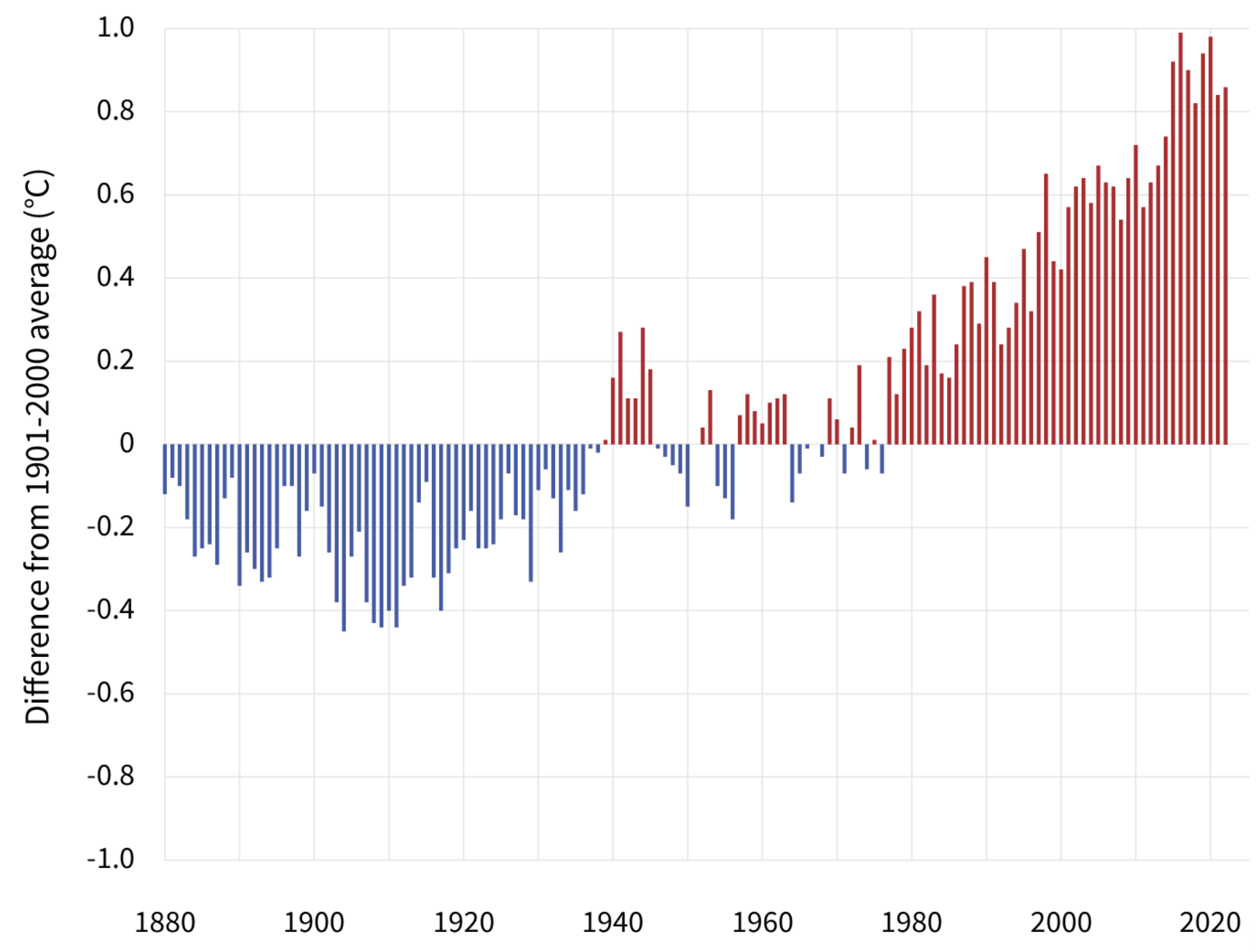
Trends in Global Sea Temperatures in Twentieth and Twenty-First Centuries (1901-2020)/EPA 

The rasterization of the global ellipsoid suggests a dangerous distance from the mechanics of warming, even if it maps the globe on a jarring color ramp we have not seen before, or are likely to be able to interpret. The very etheriality of these raster maps of temperature anomalies are striking as they cast the ocean on a distinctly red color ramp. As if in synchony with the massive waves of coral bleaching in global oceans–whose impact and scale we cannot yet calculate–we find things of the impending nature of ecosystemic colapse that fills with palpable dread, but is more striking in its absence of any fitting narrative. If the story is tragic, and existential in scope, the cognitively disarming nature of these pixellated maps are as strikningly removed from any material basis, and lacks any clear distance to comprehend as it is bereft of any narrative.

It seems the lack of clear narrative, and the alarm of red, leads to such perhaps well-intentioned but tragically desperate cries for help as Just Stop Oil protestors calling for the immediate end of fossil fuels by using orange florescent spray paint to target the neoclassical Radcliffe Camera icon of Oxford’s Bodleian Library, spraying a fluorescent orange on a structure built 1737-1749 to embody Enlightenment ideals. The Palladian domed building might typify the Enlightenment, targeted as if the root of deep ignorance of the consequences of extraction, but also illustrates an inability to imagine any end-game save cessation of use of extractive fuels across the entire global economy. The rugged demand–Just Stop Oil!–suggests a purblind view of the interests at play–is it only government or any government, or isn’t the problem a little more manifold? can orange spraypaint to deface a heritage structure really make a mark, or is it just a muffled cry for help?

Hugh Warwick/October 10, 2023

Welcome to truly desperate times. The intense orange removed by power0hoses hours after a disgruntled Oxford student and his mate seem to have repurposed the immediacy of Nike’s corporate slogan suggest nothing less than an existential sense of the teetering image of the world’s environment that could not but echo the insisted on recent temperature trends that have lasted the lives of the ecological activists, twenty-one and eighteen year respectively, taking a stand against the markedly uncontrolled increased warming of land areas and wildly shifting extremes of seasonal temperature that had led to the expansive melting of arctic regions. Following the alarming colors of temperatures changes NOAA features on the Climate Dashboard, the spread of rising temperatures by over half a degree Fahrenheit/decade are truly causes for alarm.

Climate Dashboard: Changes in Climate Temperature by Decade , 1993-2022

But the deep orange hues of the slogan of the Just Stop Oil folks earnestly demanding “no new oil, no new gas or coal” are calling for a “deliberate disobedience” that the spray-painting of Radcliffe Hall–a symbol of Oxford–inaugurates across three weeks of action from October 29, akin to a reckoning, designed to appeal to students, promises a greater sense of agency and empowerment in a world where “No-one’s going to save us, we have to come together to do that for ourselves” in time for Halloween, as if to grab the steering wheel on a car that has been driving out of control, and force the hand of civil government by collective actions of “deliberate disobedience”– assuming equivalent existential urgency of the dispossessed: “what will the Government do? Concede to our demand, or crack down and arrest us all?” The Oxford protests, on the heels of the spraying of Bristol’s Queens building with the same bright orange paint, urging all faculty and students to join in the “civil resistance,” led to the Oxford student to claim to be “taking action to resist the destruction of my generation,” noting the scale of the climate crisis of which “Oxford academics are fully aware of,” but despite knowledge of fast-approaching “unsurvivable heat and humidity” that will force “hundreds of millions of people will be forced to move, or die” is tantamount to genocide.

Before “the annihilation of everything we care about,” the Oxford student who defaced a site of study by florescent orange paint seemed to interrupt quiescent study. On the heels of the spraying of a building in Bristol’s Queens building with analogously orange industrial paint, asking all university students and faculty to unite in a “civil resistance” to extractive energy, the Oxford undergraduate felt he was “taking action to resist the destruction of my generation” in existential terms, decrying how “Oxford academics are fully aware of the scale of the climate crisis” but ignore it. As a member of Just Stop Oil, a coalition committed to forcing the government to end “all new licences and consents for the exploration, development and production of fossil fuels in the UK,” he was confined of the need to stop a narrative of planetary warming that has an inevitably tragic end.

Have we failed this generation, and indeed failed the cause of climate change, by maps that assume an impending disaster of warming that offer no possibility of change or berth of safety or remove? This seems a Eurocene, to be sure, as much as an Anthropocene, of unconscionable harm to habitat range, environment, and ecosystems as a massive amount of energy has been insistently raising global temperatures by extra unwanted heat. The recent rasterization of our ocean maps–we map less bathymetry than temperature anomalies in the daily coral reef watch–recast the ocean as haunted by color ramps we have never seen before, pressing us to create stories and gain a grasp on what has been happening with the oceans as they warm in dangerous directions across the north.

The liability of such raster maps may lie in their eery ethereality: a pixellated space distances us from the materiality of climate change. For rasterization problematically offers an eerily immaterial way to view global warming unhelpful in its terrifying immateriality, as if blocks of predestined pigment sprayed across the ellipsoid outlines globe at a distance and from on high mark the bleaching of ocean life. It is terrifyingly inappropriate not only in its lack of narrative–if the story is tragic, and it is existential to boot–but cognitively disarming as it is removed from any precedent, wrapping the surface of a globe as if spray-painted across the flat ellipsoid disk we struggle to map to particular losses, filled with forebodings of increaed global warmth.

But we have hard time focussing on the shores as endangered areas by the disproportionately warming global ocean, overwhelmed by data that we are cognitively challenged to process. The late historian John Gillis warned us often of the danger of such assertive and short-sighted “turning one’s back on the sea”–and Gillis was worried that we had done so as a culture and society to our great detriment–rising ocean heat and sea surface temperatures remind us of the disproportionate amount of heat that has been absorbed in global oceans, and the danger of having remade the ocean as a vital habitat. For the shores have been unjustly ignored, as a space whose ecology we might do well to focus as sites suffering from anthropogenic change. We have a hard time focus on the vulnerability of the shores as ecosystems, indeed, so often do we see surging seas as a threat to human habitation of the shoreline, rather than having a broader sense of the threat to the ocean biome as a threat from largely anthropogenic warming. Yet as they are so vulnerable, and so potentially rich with significance as vital membranes of the planet. they are precisely where we must attend with greater atteniotn, as we try to parseunprecedented risks of overheating.

Even as country-based promises to reduce rates of carbon emissions became the talk of the town after the Paris Accords, with few imagining reductions likely for most of the developed world, before the United States withdrew from the global accord, which had pledged to cut 52.4 billion tonnes of emissions, on a global scale, little probability of the reduction to goals by the highest emitters–China; Western Europe (EU); Brazil; Canada; Japan–we face the global impact of planetary warming with few guideposts, precedents, or narratives to process catastrophic climate change.

We risk casting anomalies of surface temperatures and indeed looming rises in surface temperature as but the latest flattening of the world’s surface, eliding differences of land and sea temperatures that fails to come to terms with the cascading consequences and scale of anthropogenic climate change. For the most striking aspects of the rising surface temperatures on the planet may be the rising warmth of ocean waters. And the registering of global waters suggests, not paradoxically, both the liability of a focus of most mapping on the land–and extension of terrestrial coordinates to the oceanic surface, as if the anthropocentric claims of land maps might be extended, with brash or unwarranted assurance, into the ocean, without appreciation of the degree to which oceans have absorbed the great preponderance of anthropogenic heat: does an anthropocentric map of land effectively elide the extent of anthropogenic influences on global surface temperatures? Offering a private record to observe temperature variations that are remotely sensed, we may be foreclosing our relations to our own surroundings, and indeed of the relation of species beyond the human to the oceans as globally vital habitats.

But in mapping temperature rises as part of a continuation of land temperature anomalies, we may not grasp the full extent of the problem–and only risk entering into a climate apocalypse. So, indeed, runs the presuppositions implicit in the newly vaunted technologies of Direct Air Capture (DAC), the neo-liberal promise of carbon sequestration, by projects promising to capture carbon at the sites where it is produced that is being entrusted–bottled at the source!–that seven of the largest oil and gas companies are promoting as a public-private venture to “remove legacy emissions” even as the oceans warmed. For DAV is billed as the new mission of energy companies to use their existing infrastructure in offshore a reas to make good on the danger of the climate scenarios such maps threateningly propose, treating the recent promise of Direct Air Capture, if unproven, as a awaits public funds to “flow into the [existing energy] sector so it can scale,” with Occidental Petroleum floating promises to remove one million metric tons of CO2 every year by what is billed as a model for what the “best, most sophisticated, most committed companies” in the oil and gas businesses who are rooted in extractive industries should do “to preserve our industry over time.” Occidental Petroleum’s CEO is making a rather desperate argument as the nation’s energy companies have their backs up against the wall if they want to continue to emit more carbon, with carbon being the prime contributor to and accelerator of anthropogenic climate change.

For if its technology is unproven, it ostensibly or plausibly offers carbon-based energy companies an basis to sustain DAC can leverage a write-off able to balance out costs of future carbon emissions by using machines on the drawing boards to “pull carbon from the air” of unproven efficiency, erasing future costs of carbon burning, and overlooking the past costs of carbon emissions energy companies have themselves so conspicuously historically contributed.

Fossil Fuel Emissions Inventory per Capita based on 2000 Census/Kevin Gurney and Vulcan Project, Purdue

The unproven technology uses the very tools of extractive industry to inject and store carbon in the earth’s surface, , creating a tool akin to double-entry bookkeeping to balance the costs of future energy develpment against the removal of carbon that may well in the end return to the earth’s atmosphere without ever needing to reduce emissions. “Direct Air Capture” is a new language of soft neoliberalism, fulfilling needs to acknowledge the untenable scale of costs of carbon emissions, but scaling up their own responsibilities to reduce emissions by promises to sequester carbon in underground reserves, of putting the greenhouse gases back where the oil was extracted years ago, and indeed filling up old empty oil mines with carbon reserves in the Permian basin. Although the largest DAC plant removes only 4,000 tonnes of CO2 from the air per year, the logic of an enormous growth of investing in technologies of Direct Air Capture plants could eventually and only by the middle of the twenty-first century extract a full gigaton of the carbon released into the atmosphere.

Proposed and Operational Direct Air Capture Facilities, 2018/Global CCS Institute

Global oceans have absorbed a preponderance of anthropogenic heat over the past seventy years– some ninety percent of excess heat that was trapped in the earth’s atmosphere since 1955–that makes them perhaps the clearest single register of the extent of anthropogenic contribution to climate change. Yet our monitoring of sea surface temperature adequate, based on a points, hinders rather than help the scale of climate change that is occurring in the global oceans. It is perhaps a hard pill to swallow, that cannot be sugar-coated, but the deep reds of temperature anomalies present a stronger picture than the levels of temperature rise of the planet’s surface, and its detail demands far more unpacking and deeper drilling into its detail, to use a poor metaphor, to unpack in satisfactory ways.

It is otherwise hard to grasp the alarm registered in the header to this post. The very land-based tools of mapping that have allowed us to track landcover and agricultural productivity by GIS overlays may have been far less helpful in grasping the scale and of the anthropogenic modification of global oceans–and the to grasp the changes in global oceans that will help to process or come to terms with the consequences and scale of rising sea surface temperatures, and the contribution of anthropogenic contributions to rising global temperature that are at risk of changing the global habitat and our relation to the surrounding world at the levels we demand to understand. Fort he very tools of geographic mapping are ones that arose in terms of mapping from the perspective of a state–effectively, of seeing like a state–that led us to understand land use, as much as anthropogenic change. Yet the state has sold increased offshore drilling rights to many oil companies, in ways that have set the stage for planning offshore Direct Air Capture plants in sites like the Gulf of Mexico, increasingly treated by 2018 as a pubic-private density of point-based drilling sites, even as sea temperatures rise. The network of old wells abandoned permanently and temporarily on lands that the the US Government leased to energy corporations suggest a basis for the encouragement of a man-made shoreline tied to an infrastructure of energy extraction by 2018 that was difficult to change or every fully separate ourselves.

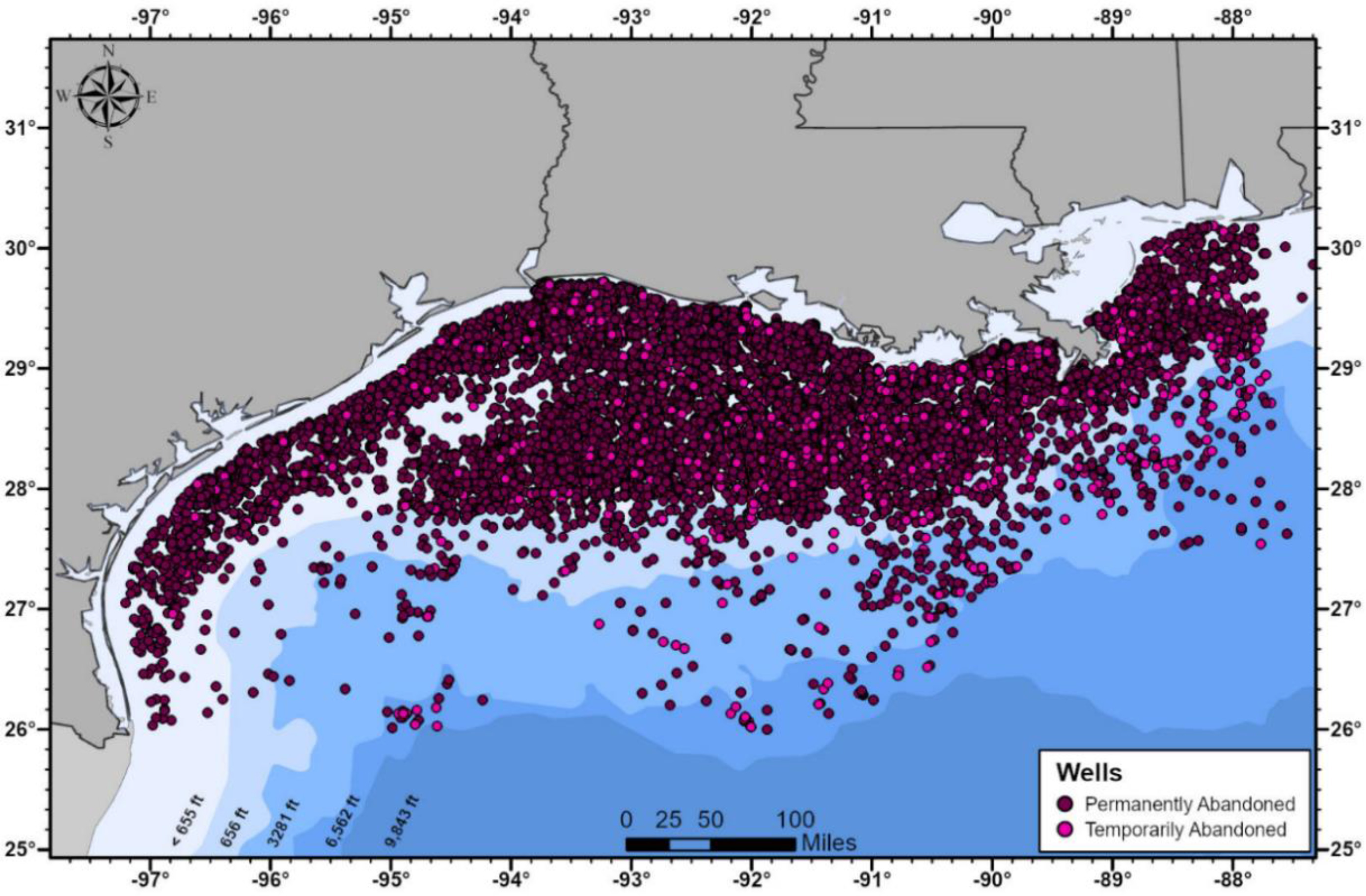
Permanently or Temporarily Abandoned Oil and Gas Wells Leased in Gulf of Mexico, 2018/Enverus 2018National Energy Technology Laboratory, Undated

GIS layers helped engineer the most effective site of carbon sequestration in offshore regions of the well-mapped geological terrain of the Gulf of Mexico, already crisscrossed by a density of pipelines for optimal sites for low-cost offshore storage of optimal geologic suitability, despite the existence of clear risks of locating extractive industries offshore beside a wetlands that bordered on a rich marine ecosystem that was delicately stuctured as a complex oceanic habitat. The reference points for storing are the cities where workers at the new plants would live–Mobile; Houston; Corpus Christi; Biloxi–rather than the ecologically delicate salt marshes, wetlands, and estuaries that are critical to shorebirds, and spawning sites for crayfish, oysters, shrimp, mink and alligators. The choice sites for subzero storage of the coast of Louisiana lie within the offshore continental shelf, as if an extension of territorial claims of the well-mapped underseas regions long studied by the energy industry.

Favorable Locations for Offshore Storage of Captured Atmospheric Carbon, 2022

This may be the fate of the pointilistically mapped seabed, a weirdly compromised cartographic flattening of the offshore. For the oceans–the very life-giving areas from which we arose, and on whose edges human society long lived–offer the clearest register of the anthropogenic image of human-caused temperature rise, although, perhaps paradoxically or more probably circularly, the deeply anthropocentric systems we have mapped or registered land by a point-based system may be inadequate to register the impact of rising sea surface temperatures on planetary health.

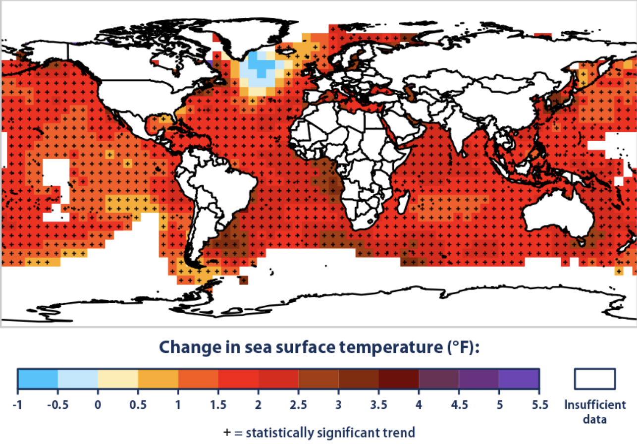
Change in Global Sea Temperatures in Twentieth and Twenty-First Centuries (1901-2020)/EPA

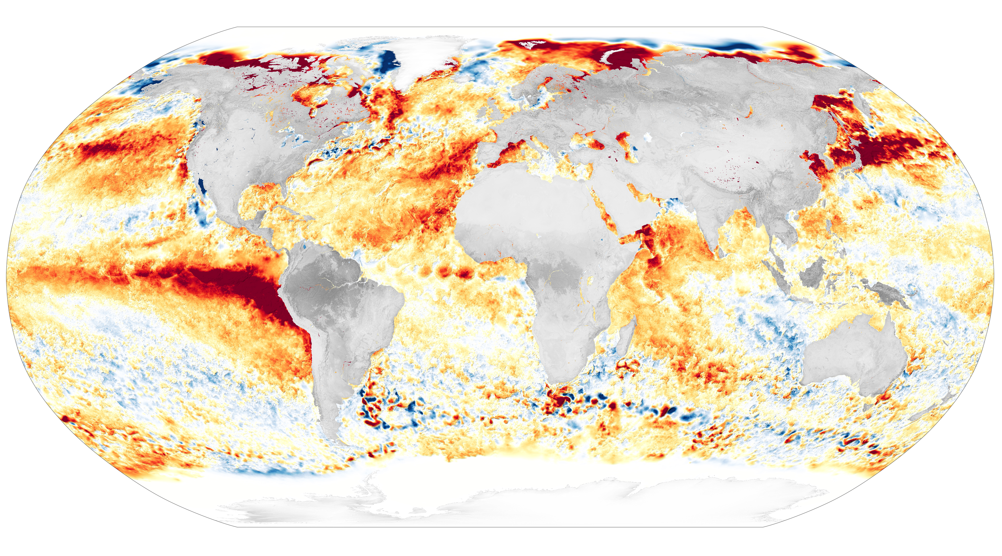
–but how much our recent maps of marine monitoring are not evident as much in point-based registering of anomalies, but specific sites of ocean heat, with a troubling density off the coast of Japan, in the Persian Gulf, and in the Gulf of Mexico,as well as the Eastern Seaboard.

Marine Monitoring of Global Ocean Heat Trends, 2005-2019

This contribution is difficult to map, or map to satisfaction as the result of human activities. But the stubborn nature of these deep carmine reds suggest, of course, a change that goes far beyond politics, and, if we might be glad for the light blue airbrushing on part of the Arctic Ocean and Greenland’s edge, the ice-free arctic and warming of antarctic ice shield seems much more terrifying signs of where we are headed, with a warming Atlantic–and Gulf of Mexico–a cause for alarm. If Canadian rock singer Neil Young dryly lamented in “Mother Nature on the Run” that 1970s would change the environment of the planet, his dreamy, druggy, hallucinogenic if anthemic call for help paralleled major breaks from the baseline of global temperatures. For from the postwar era through the 1970s, weather changes reveal the deeply disruptive nature of the global climate to which we are headed–and the step difficulties of visually communicating temperature anomalies. Were increasing surface temperature from 1900-2020 already hinting at the consequences of a failure to incorporate rapidly shifting temperatures farmers would faced by the late 1960s, in a 1970 album reflecting on how rising temperatures of the late 1960s and increased pollution created a powerlessness before a changing landscape, parallel to declining agricultural productivity?

If Young was not necessary a student of the Canadian Land Inventory, as a twelve year old set his sites to be an egg farmer–and to be a student of scientific agriculture at the Ontario Agricultural College to “learn to be a scientific farmer” after having tallied the improvised inventory of “Neil Eggs” as he organized sales of a chicken coop in close contact with Ontario farmers before listening to Chuck Berry, Fats Domino, and Elvis Presley replaced his raising chickens and selling eggs. The environmental anthem anticipates Young’s fierce opposition to factory farming since the mid 1980s, shunning venues serving foodstuffs from factory farms–venues “fed by factory farms.” But the oracular nature of the song covered by Patti Smith, after I’d written much of this blogpost, in Golden Gate Park, first made me wonder how the roots of the Canadian Land Inventory was unsuited to measure the changes in sea surface temperatures and indeed offer a meaningful narrative context for global temperature changes.

Extreme heat itself endangers farm workers–most U.S. farmworkers endure dangerous levels of heat three weeks of each year, beyond historical levels of heat exposure, growing to two months by the current century’s close per a recent study of the actual concentration of agricultural workers in America who will suffer from such a shift against the regions that are in upper quartiles for community resilience–suggesting the lack of abilities we will have to absorb or respond to such critical even if apparently “small” changes in temperature across the United States, shifting the productivity of farms in an era of climate change projected under different models or scenarios.

How to include people in the map, or how to include lived experience of other animals? We have perhaps all retreated into the comfort of our own buildings, retiring to contemplate rasterized images of modeled temperature changes in air conditioned rooms. The shifts in temperatures captured by eye-catching rasters offer limited narrative context to process such rapidly accelerating shifts of global surface temperatures. And if we presume to hope to “capture” carbon to turn back such rapid and unsustainable swings of surface temperatures in future years by continuing to allow carbon emissions, we are perhaps allowing ourselves to be the victims of cartographic distortions that fail to register the consequences of how oceans–in ways we have not fully been aware–have been absorbing up to 90% of anthropogenic global warming.

The arrival of July brought the warmest July on record–tempting a bitter riff on Stevie Wonder’s album by calling it “Hotter than Julys” about “making the earth a burning fire,” over a full degree centigrade–1.12°C (2.02°F)–above the 20th-century average of 15.8°C (60.4°F), raising questions of mapping anomalies meaningful, as the monitoring revealed a level of warming so beyond average that one might distinguish record temps warmest as something that the entire planet had not experienced, and that raises questions not only about the world, but our relations to the world–the Umwelt, that zoologists appropriated from idealistic philosophy at the turn if the twentieth century to acknowledge how different species used the senses to map external lived environments –that we are going to be forced to come to terms as our environments reached record heats.

The agency of animals in perceiving the world is less the point of this post, however, than the radical accomodation of Umwelt that such record shifts in ambient land and sea temperatures pose–and how we can recognize and communicate them beyond simple color ramps. The recent record marine temperatures raise questions of the warming of sea surfaces, in fact, that demand to be distinguished as a reservoirs of heat we have perhaps poorly mapped in describing the land-sea continuity of maps–a continuity that was long heralded as a modern innovation of terraqueous cartography in the early modern world–that might be less helpful when it comes to grasping the effects of heating oceans and the rising sea-surface temperatures and oceanic heat waves remote sensing tools currently reveal.

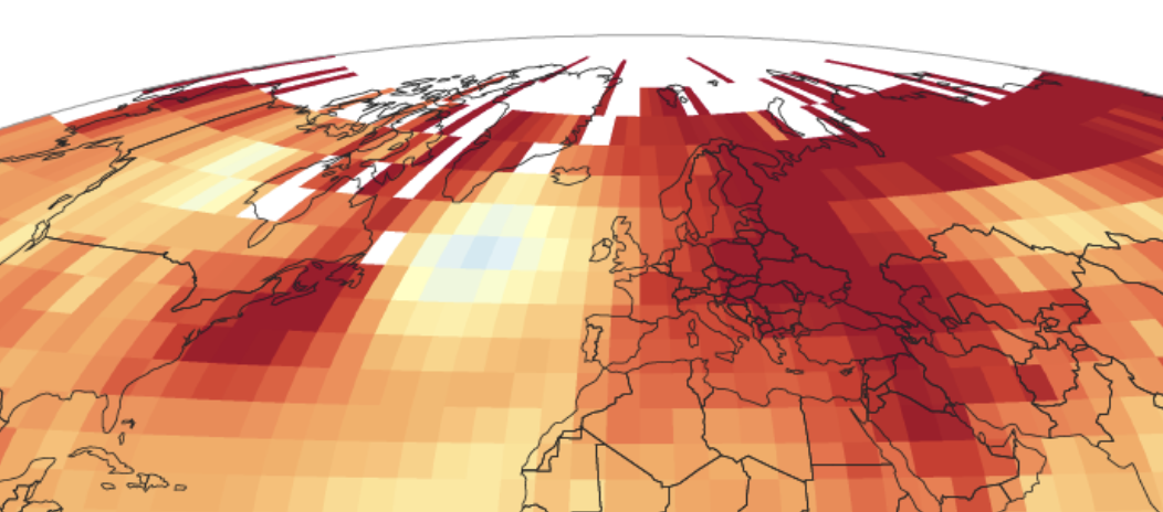
Record Land and Ocean Temperature Percentiles in July, 2023/NOAA

The pinning of heat to pixels renders not political polarization, but even more toxic disturbances of equilibria of global temperatures–but an even more bracing problem of organizing our relation to a rapidly warming world. These quite literal heat maps paint a scary picture of the complex distribution of warming across land and sea over a century of of warming, synthesized from the first era of fairly uniform data in global temperature maps.

But are the rasters tracking warming able to communicate the imbalances of these significant anomalies of global warming by almost three degrees in some spaces of the global ocean–and some a few regions–an increase that follows the yearly rising of surface temperatures from just before 1980. This was the very time that Young–son of a prominent Canadian newspaperman who as a daily columnist for the Globe and Mail had a knack for reporting–was chronicling quite recent spiking in global surface temperatures before 1970 when Neil Young called our attention to the new scale of pressures we put on the planet, at what would be watershed of rising temperatures that only escalated over the next fifty odd years. By some odd coincidence that may not have been that odd, Canadian government began to monitor land-use management in ways that would lead to the formation of early geographic information systems, as Canadian geographer Roger F. Tomlinson began using aerial surveys–using large-scale photogrammetric maps–to create visual information forms bridging computers and geographic data. By collating data about wildlife, forestry and the census to increase agricultural productivity, Tomlinson offered new ways of seeing like a state rather than like a farmer, in ways that claimed a benefit for farmers and farms across Canada..

But data on resources was privileged beyond data on warming–“heat” was not even a category of inventorying land information in maps, at a uniform scale and overlay, in ways that allowed “layers” to be read overlapping factors on a basic dot-grid, able to incorporate census data, that would reduce the manpower for resource mapping beyond the capacities of actual staff. Canadian surveys amassed databanks beyond human abilities to assimilate an inventory of land-use information, able to store information in readily usable form in a computerized inventory of overlapping layers jto process the scale of information overload in maps of environent, land use, and productivity that humans cannot process or analyze in an instant library of statistics stored on tape, but not maps–even as any point on the earth’s surface “can be identified by numbers” to allow a synoptic inventory of land quality to devise new practices of land use.

Tomlinson coined of “Geographic Information Layers”–long before he joined ESRI, down in he San Bernardino Valley outside of Los Angeles on the Pacific coast–as a public respository of land use. The weighty term itself predates a century of rising heat, however, and its inventories largely bracketed temperature and the effects of heat waves’ differently deleterious effects on land and sea. The Canadian government was presented by Tomlinson as the landowner akin akin to a farmer forced to make decisions but who had “hasn’t got too much idea about the climate” or the water on his property he has just inherited, forced to make decisions about how to plant the right seed for his family. The very same questions, he explained in a classic CBC promotional short, were pressing to addressed both by the farmer who inherits a plot of land, but can be extrapolated to the nation’s management of millions of miles across Canada in an inventory.

The result that “the map has been converted into numbers” allowed readings of land quality at every hundred feet across the country, now readily accessed in hours, stored on tape on a grid aligning census tracts, water rights, and the fertility of the soil, placing jdata in the hands of decision makers in a public library of land. By replacing the human eye’s relation to landscape by an interface of soils, climate, topography, wildlife, forest capabilities and census tracts by subdivision in a profile of the nation, map layers were analyzed at multiple scales to zoom in on local land use at points and polygons,–

Saskatchewan’s Land Capaibility for Wildlife, Canadian Land Inventory (1976)

–merging files and coordinates of the Canada Land Inventory that have provided abasis for optimal land use and government investment that offered a tempting basis for similar inventory of the nature of atmospheric changes on a global scale. Yet a farmer’s local knowledge is different in feel and texture than the point-based layers Tomlinson optimistically advocated as a national mapping model–in ways that is not captured in the massive inventory that classified the land.

But the land use inventory presumed a stable definition of “nature,” that he current escalation of temperatures when Neil Young composed his anthemic song about Mother Nature being “on the run” as a fugitive or convict around 1970s, as temperatures started to rise yearly, shifting the crop yields in the data that Tomlinson measured for he Department of Forestry and Rural Development by stacking up layers that would align point-based data for cartographers’ benefit on any land-map.

Neil and his father Scott Young famously lived outside of Toronto, on an Ontario farm, and would have been aware of the Land Use Inventory, but also of the problems of a shifting sense of nature that it did not easily capture in its discrete point-based layers of information. Yet the rising surface temperatures of the late 1960s and later years that won a large and continued audience for Canadian guitarist Neil Young’s anthem in his first great solo record was rooted on working on a farm responded to the increasing anthropogenic nature of rapid temperature change–as much as the fears of nuclear apocalypse and technological advances–that inaugurated an escalation of above-average land temperatures through the first fifth of the twenty-first century far beyond what Young himself had feared or envisioned, difficult to reduce to but a single layer of a map.

Surface Temperature against Average (°C/NOAA, data: National Centers for Environmental Information

We are not cognitively attuned to imbalances, and dramatic departures from the status quo. If cognitive biases that lead us to prefer status quo relations where things remain the same are common basis for poor decision-making, the desire to prefer that things stay the same is an especially pernicious error in assessing the anthropogenic contribution to climate change: we allow ourselves to be seduced to maintain the status quo, to minimize risks, but have occluded the imperative and huge benefits of reducing the disruptive cascade of ecosystemic shifts of such consequence to be impossible to process in terms of the two-color schema of red and blue.

It is hard not to worry that the tools of registering such rapid shifts of surface temperatures offer a poor sense of our relation to the natural world–or help to clarify the rapid shifts in the biological of the world that will be and are experienced by other creatures. For the stark shifts of temperature changes map a misleading balance sheet of environmental change that is oddly distanced from the relation of organism to the planet, or a tally of benefits and costs that occlude the relation of organisms to the to the surrounding world, that should be the true centering of any understanding of climate change. The compromised relation to surrounding environments that the plotting of value in underground deep-sea energy reserves is a distortion privileging the point-based location of value, removed from the oceanic environment or critical dangers of warming waters of the global ocean waters. As the habitats of oceans shift in irreversible ways, the ability of creatures to relate to the world, or to perceive their surroundings, changes, and we are caught, as a deer in the headlights, without a clear way to grasp either the scale or effects of changes in the global ocean.

We trust we still have time to withhold judgment–as if fears of losses of once abundant petrochemicals can occlude an appreciation of potentially hugely favorable gains, driven by fears that declining oil prices might hinder profits to drill over 50-60,000 more new oil wells annually–

200714 Rystad Global Drilled Wells

and as the expansion of inland drilling in the southwest’s Permian basin has continued to expand of every increasing depth, reaching unwarranted heights, driven by demand for profits and continued petrochemical security, driven by the illusion of an abundance of underground petroleum reserves. nd the increased depletion of near-shore wells that were drilled off the Louisiana coast in the Gulf of Mexico back in 1938 have led to the growth of an offshore archipelago of 3,500 platforms off the continental shelf of the United States, and along the continental slope, leading to a boom in wells under a thousand feed of water on federally leased land–deepwater and ultradeep rigs, whose risks challenge notions of environmental responsibility in a larger network of active gas and oil pipelines, processing plants and offshore structures in leased lands on the outer continental shelf.

220128 Cx Rystad Permian

New Wells Drilled Annually in Permian Basin in Texas and New Mexico

Perhaps we have little clear ways of registering the scale at which anthropogenic contributions add to the warming of the global ocean, or of planetary seas. We have no clear basis to represent this growing contribution, let alone to narrativize or narrate our own relations to the rapid acceleration of climate change and its multitude of consequences of a warming world. Our maps are not at fault, but have their limits as they reify the conditions we live in–rather than our contribution to them, whose specter is perhaps all too evident in the world’s largest gulf, a marginal sea of the Atlantic whose seaward boundaries provide one of the greatest challenges of coastal management.

The Gulf of Mexico is itself an anthropogenic space, where’s the seamless bridging of land and sea: as well as a proof-of-concept of liabilities of mapping a continuity of land and sea by leasing of federal lots for platforms for extracting oil and gas of increasing depth, far deeper than five to six thousand feet below sea-level. The expansion of deepwater mapping has grown dramatically since 2000, by energy companies growth eager to match demand for gas and oil as abundant in “national” waters; the government is eager to license to ensure the ability to “keep” energy prices down. If the current plans to invest billions in unproven tools of “direct air” carbon-capture promises a reduction of greenhouse grasses and new commitment of industry to greening, by “vacuuming” emissions at their source,” that would allow us to address the “carbon problem” with no change in our consumption of fossil fuels. Even as it promises of erasing the onerous emissions are unproven the promise to allow carbon dependence is widely promoted by energy companies: public funding of Carbon Capture and Sequestration would sanction the continued expansion of the largest offshore energy infrastructure in Texas and Louisiana, and boast the adoption of the best mapped geological region to sequester captured carbon for 559 BN metric tons of carbon storage.

Off-shore Geologic Carbon Sequestration in the Gulf of Mexico (GoMCarb) -  Earth and Environmental Sciences Area

Offshore Carbon Sequestration in the Gulf of Mexico/Helen G. Prieto 

The promise of investing public funds in a boondoggle of corporate “greenwashing” is promoted as the “evolution” of a new American landscape of Carbon Capture and Storage (CCS), by subsidizing Occidental Petroleum to build corporate-sized “direct air” carbon capture and storage plants ready to imagine as a a new national infrastructure dedicated to construct “hubs” of carbon capture to be piped to “injection” sites where it might be stored or “sequestered.” Planned carbon “sequestration” projects are paired with green-lighting bids for offshore sequestration on federal lands lying in one of the most studied geological basins and potential sinks, the Gulf of Mexico–a site of expansive offshore energy infrastructure that is currently promoted as “the largest volume regional geological sinks in the United States for large-scale Carbon Capture and Sequestration.” The region that has a large number of depleted oil fields, already owned or leased by energy companies, essentially, is promoted (and extrapolated) as a bonanza of Gigatons of carbon storage.

The continued mapping of the man-made offshore environment of the Gulf of Mexico is plotted as a prime site to capture of carbon. The transformation of the Gulf of Mexico to a site of future carbon storage fulfills a fantasy of absorbing fossil fuels’ pollution from the skies without reduced dependence on petrochemical fuels, detracting attention from the very edges of marine habitat oil and gas extraction threatens. The very premise of “Direct Air Capture” takes eyes of the maps of global warming and many modeling of the effects of ocean warming.

Proposed “Direct Air Capture” plants would imitate the very functions performed by the very coastal ecosystems–salt tidal marshes; kelp ecosystems; and even the open ocean–or are argued to do so on a broader scale than the sequestering and absorbing of one to two tons of carbon per hectare in existing salt tidal marshes, or the Florida Everglades, whose mangroves and peat soils have huge carbon stocks, and carbon sinks valued at $3 billion, if reduced by pollution and climate change. Spending over $6 billion in carbon capture projects along the Louisiana coast to sequester the carbon produced at refineries, making the state’s coastline into the carbon capture capital of the American South–but suggest the abstraction of costs and balances of carbon in maps of unproven possibilities of capturing carbon across the state, even as ocean temperatures rise at rapid rates.

 Industrial CO2 Emitters against Potential Biomass Residue Availability/Carbon Mitigation Initiative

Yet the seductive promise and premise of carbon capture is perhaps best understood as a way of keeping the actual problems of anthropogenic global warming that has already shifted the qualitative character of our global oceans in increasingly irreversible ways. The operational metaphor of “vacuuming” carbon at sites of emission is billed with unwarranted optimism as a technological fix for states that are notable  CO2 emitters who produce potentially dangerous biomass residue. The trust in technological fixes claim that coal-fueled plants can continue to burn brightly, but stored underground, as more petroleum and gas is removed from the offshore fields by “blue hydrogen” or “green fuels” that claim energy companies can lower their carbon profiles–by giving license to further pollute, and place continued risks and environmental stresses on the Gulf of Mexico. While the coastal forest in the watershed of the Mississippi as it enters the Gulf might sequester two to four tons of carbon/acre, annually, if rehabilitated as a “blue carbon” reserve by conserving, replanting, and restoring coastal forest, black mangroves, and receding salt marsh.

Yet investment flowing to carbon capture diverts funds of energy companies from projects of coastal restoration, that is pressed to reduce massive emissions of greenhouse gasses by energy companies, as we continue to burn increasing quantities of extracted carbon fuels–a decade after the goals for reducing emissions were set, and carbon emissions began to fall nationally. Might we not better call out the illusory promise of DAC not blue-washing, obscuring the effects of prospecting and extraction from global oceans acutely felt at the delicate habitats of coastal edges? For only by looking more at these edges can we fully come to terms with the anthropogenic environments we have created, subsidizing energy companies at the hopes of reducing the prices of energy in national markets in responsible ways, and come to terms with the blinders we have kept on the extent to which we have redesigned the coastal environment of a our “national” ocean of underseas energy reserves for national markets.

The building of projected “Direct Air Capture” plants at a rate of thirty a year from 2020-2050, per the International Energy Associations, and fifty a year from 2030-40, and forty 2040-50, would allow global energy consumption to grow, and the petrochemical plants to expand with them.

Would not such plants–and areas for geological storage of CO2–not be a bonanza for energy providers, as their prohibitive cost would demand public funding to delay and eventually reduce their huge cost, to allow air travel to be a climate-neutral, or of net-zero emissions, while it relies on carbon fuels, and the plants’ own costly operation be run either by renewables or non- or low-carbon fuels. The geography of “renewable energy sources” and “CO2 storage” provide a numbing assurance that erase the salience of the very useful artifacts of these global anomalies, treating the world’s surface as a smooth repository for “storage” of the gasses that accelerate climate change.

Existing Direct Air Capture Plants and Planned CO2 Storage Facilities/International Energy Association

If the hundred and thirty DAC plants are allowed to proceed, they are argued to guarantee net zero emissions by 2050. But the promise that the plants are argued to gain efficiency and reduce costs only by a huge investment of funds in an unproven technology, although we have already begun to cataclysmic effects of a warming oceans. Are we not being invited to adopt a selective amnesia of the huge effects of off-the-charts anomalies of land and sea temperatures and their effects?

This post, ranging widely over ocean space, seeks to given more materiality to the screen-like maps of ocean anomalies that have provided the most common media we rely on to grasp climate change with the necessary detail or grasp. Specific sites provide a basis to drill down these global anomalies onto on a local level. For only by doing so can their dizzying array of detail be fully appreciated and taken stock of for its effects, and the scale of anthropogenic change be appreciated. The useful “baseline” of a land-sea temperature might be appreciated as an artifact of postwar globalization–transverse global grids having been adopted roughly contemporaneously by German Wehrmacht aerial photography and the United States Army Corps of Engineers as the coordinate reference system for global war, due in part to the professionalization of cartographic corps and the challenges of mapping across borders in World War I, pragmatic questions of firing and land-sea coordination, as well as working across the often separate and distinct coordinate systems of European nations. But the very illusion of continuity of land and sea temperatures are less helpful to appreciate the scale of anthropogenic climate change we have witnessed in recent years and over the summer of 2023. Has the imposition of a gridded map of energy extraction helped to ignore the sensitive and intensely rich habitats of the shoreline and coast–watersheds, wetlands, as marshes–as areas of vulnerability and protection?

The question of linking land and sea temperatures in a smooth surface was inherited from the mid-century postwar era. It has informed the presuppositions of weather maps, and is common to the mapping of extreme global temperatures. But the realization of the intense levels of heat stored and sequestered in ocean waters this summer has sent a jolt through the mapping of rising sea-surface temperatures of extreme intensity far beyond normal, raising questions of how to process a global warming monster of heat stored offshore as it presses against the thin margins of cool coastal waters that crash against California’s shores,–are as terrifying as the maps of recent fires’ spread in an overly dry state, or maps of low groundwater levels in California and other regions. Although the California drought in over, it seemed oddly apt if deeply disquieting that the ocean heat wave now threaten the states’ shores in marine infernos lying off of our green shores.

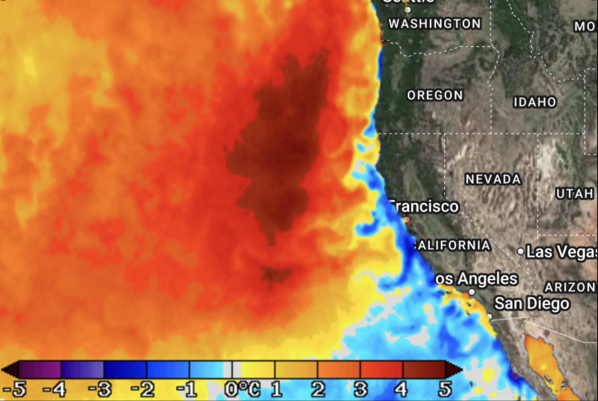
Category 4 (Extreme) Marine Heatwave off the West Coast of the US, nearly 5°C (9°F) above Normal/NOAA

The intense heat wave satellites recently registered off the coast of California, where I live, was unprecedented as it was a weather system where water temperatures peaked almost ten degrees Faherenheit above mortal, has developed off the West Coast of the US, with water temperatures peaking nearly 5°C (9°F) above normal. As much as the Category 4 (extreme) marine heatwave was an event of local shock, it had been advancing across the Pacific Ocean for them. Rather than registering a deceptively flat synoptic view, the image of marine monitoring is a story that exists at multiple scale, the seasonal weakening of colder deep sea waters that cool the coasts in upwellings may bring significantly warmer waters off California’s coast than habitual for Pacific waters, the “Category 4” Marine heat wave risks provoking offshore harmful algal booms, compromising coastal ecosystems, and causing die-offs in coastal waters of mussels and other intertidal species that risk upsetting the marine food web.

The cognitive confusion of ecosystemic disruption is hard to get one’s head around as it exists contemporaneously at multiple scales. Can one map, however, within those layers, the contribution of anthropogenic influences on these stories of cataclysmic change? The complexity of telling a story about ocean warming–let alone a powerful or positive one–seems to be the difficulty of shoehorning the global scale of surface temperature warming in readily graspable terms. While we live locally–mostly–and perceive temperatures in the atmosphere around us, or the immediate ambient surroundings, processing the terrifying range of global temperatures as anomalies places cognitively demands on us as we contemplate the prospect of weather systems we have no means of controlling, if we are wrong to bracket weather systems among circumstances beyond our control. The difficulty of processing the dissonance between how heat is stored and processed on land and at sea, and indeed out the extent to which ocean waters are storing and sequestering ocean heat may offer the clear-eyed appraisal of the extreme weather systems that have shaped the summer of 2023. The inability to come to terms with the cascading effects of such anomalous warming on such a scale is undeniably existential, and we don’t narrativize existential issues well.

Our maps seem to be challenged, and of little help. The very ellipsoid reference system featured in our global weather maps threatens to distance itself from lived world as a pixellated screen by which we witness global warming with alarm, forced to seek moorings before deep red rasters of alarming anomalies, however, that quite convincingly seem to supersede the geopolitical borders of the nation-state, if not raise questions of scales that nation-states seem unable ever to resolve. The red and blue coloration of the regions of America, set in an eerily similar terms to a map of partisan divides, are even less easy to come to terms–if with effects even far more disempowering.

The recent rasterization of our ocean maps–we map less bathymetry than temperature anomalies in the daily coral reef watch–recast the ocean a color ramps than we have seen before. If the massive coral bleaching of this summer has become a token of the sudden nature of ecosystemic collapse of global warming, the loss of coral reefs a microcosm of climate apocalypse, pressing us to create stories and gain a grasp on what has been happening with our oceans and ocean temperatures as they start to warm in dangerous directions across the north.

The liability of such raster maps may lie in their eery ethereality: a pixellated powder distancing us from the materiality of climate change, rasterization is an eerily immaterial way to view global warming unhelpful in its terrifying immateriality, as if blocks of predestined pigment sprayed across the ellipsoid outlines globe at a distance and from on high mark the bleaching of ocean life. It is terrifyingly inappropriate not only in its lack of narrative–if the story is tragic, and it is existential to boot–but cognitively disarming as it is removed from any material basis, but the map is haunted by a lack of distance, wrapping the surface of a globe as if spray-painted across the flat ellipsoid disk, which we struggle to map onto the particulars of the loss of life in the global ocean. As m much as the dark rids of rising anomalies are located in oceans, it is difficult to link the flousescent colors to the tragedy of the blanched reefs of the Florida keys, whose deathly whiteness of long flourishing staghorn coral, and quite vulnerable elk horn coral, seem blanched if not boiled in the heating up of the ambient coastal oceans of which we are suddenly all shocked observers.

Coral Reef Restoration Judges the Bleached Coral at Looe Key Coral Nursery/Jason Gulley

The absence of boundaries and sovereign spaces from the map of temperature anomalies tells a great lie of the uneven distribution of warming, apart form the different contributions of individual nations to the release of greenhouse gasses and carbon fuels, and continued extraction of carbon-based fuels that have been the predominant contribution to temperature change. If the ellipsoid without national borders is indeed an icon of globalization, it too handily lacks any accounting or inventory of the contribution of greenhouse gases to climate change. Global warming was long the greatest treat to coral reefs of global oceans, as algae leave–or “jump ship”–from the living tissues of coral polyps, even as ocean acidification has slowed the growth of coral skeletons needed for a vibrant ecosystem. If coral blanching has gained heightened attention as a die-off in our coastal waters, fed by the dramatic images on globally streaming media, global oceans have already been widely impacted by warming since 1950, dramatically decreasing the biodiversity of these delicate and unique habitats in oceans by a stunning 63% since the 1950s. Ocean heat waves of direct anthropogenic creation have dramatically triggered mass coral bleaching events of reefs already compromised by overfishing and inadequate ecosystemic protections.

Global coral reef cover declined quite dramatically below the baseline in the early 1960s in ways witnessed by indigenous cultures who sounded alarms for conserving reefs by a more sustainable blue economy, as if monitoring of reef ecosystems was only registered as coral bleaching approached national waters of economically developed nations. As bleaching has entered the EEZ’s of developed nations, we would do well to take stock of the deep dangers of the myopia of global warming. The scale of global diminishing of reef cover by over 50% from 1957–2007 is parsed by shifting rates of loss of coral coverage ranging from 4.7-6.8%, even as Caribbean countries, Thailand, or Japan saw modest increases in reef health, didn’t gain global attention until it arrived at our geopolitical doorstep, even if long feared. Even as some 90% of living corals in global reefs were lost from 1980 to 2020, projects of coral restoration–suspiciously funded by the United Arab Emirates. But as the recent spate of uncontrolled tragic wildfires across the island of Maui have led to a sudden worry about the entry of carbon into coastal waters on rare coral complexes of long tourist attraction of its pristine beaches, the threats to coral ware only seen once they are on our doorstep. Maintaining the array genetically diverse varieties of twenty species of coral, of over 1,3000 putative genotypes, poses challenges not only for marine sanctuaries but a globalizing world as oceans warm, driven predominantly by global consumption of fossil fuels.

Changing Percentages of Coral Cover In Exclusive Economic Zones, Tyler Eddy, et al, 2021

The shifts in the blue landscapes of coral cover suggest that the cataclysmic collapse of reefs off of Florida’s coast was not so sudden or unexpected on a. global scale. Yet ecological safeguards and monitoring were not yet attended This post suggests some ways to re-materialize those anomalies. By rendering them not only as a wash of rather inevitable ineluctable tides wrapping around the ellipsoid, those pixels might be more clearly cognitively rooted in material geographies of overly rapacious petrochemical extraction of petrochemicals that has given new meaning areas lying in the offshore those coasts. For the spaces that suddenly gained new materiality in the postwar period of a mania of mapping that led to the reordering of the offshore as a national energy market as an abundant mine of carbon energy for the nation led to an accelerated offshore prospecting, as offshore seabeds gained new materiality in maps as a site able to be extracted for growing energy markets that redefine the seabed and seepage of gas and oil into the global ocean.

Yet the immateriality of our rasterized maps of temperature may distance us from our impact of petrochemical harvesting from the largest ecosystem on Earth are heavily impacted by anthropogenic climate change. Their distancing helps us forget that how, on a local to global scale, it is not only the oceans that have formed a reserve for adverse weather systems, but how oceans have long absorbed human-made heat, and change the very shortest that are among the most diverse ecological areas hosting vital ecosystems, whose stable if quite delicate structure may be a site where changes in climate are disproportionately felt. The point-based pixellated maps of measuring temperature change are dangerously thin as they are distanced from the environment of the ocean, and near-coastal, as well as the coastal environments whose wetlands are so critical to shorebirds, migrating birds, coastal species, and other wildlife.

Nearly 400 species of bird live in the Gulf of Mexico–a “super breeder” environment and keystone habitat–of high avian intensity– from the snowy plover, egrets, spoonbills, to bobbies and frigatebirds who nest in the Southern Gulf of Mexico. These bird populations–and other neotropical and neoarctic migrating populations who use the Gulf as a critical flyover stop for feeding. The coastline may be more threatened by plastics and fishing line than oil, the region already threatened by man-made coastal development–it was not even regarded as a critical areas of wetlands threatened by saltwater intrusion (like northern California’s Sacramento Delta or Delaware) or industrial pollution (as New Jersey)–if that changed by 2010. But the sensitivity to coastal development and petroleum extraction revealed by the Deepwater spill with an immediacy few had imagine, leading to a short-lived push for safety standards for oil and gas to protect threatened flyover habitat by which many migrating birds are nourished as they travel north.

Threats to Migrating Birds in Gulf Of Mexico by Population Growth and Coastal Development

Despite the considerable power by which rasters place into relief a synoptic screen of regional temperature anomalies, their totalistic scope is difficult to parse with the necessary patience and specificity. They invite us to register temperature shifts in the global oceans expected to trigger a change in near-coastal habitat, as if the shores–that site where man historically evolved, as well as one the first sites of mapping, seems in danger of being rewritten, in ways that should shift the focus of our worries from sea-level rise.

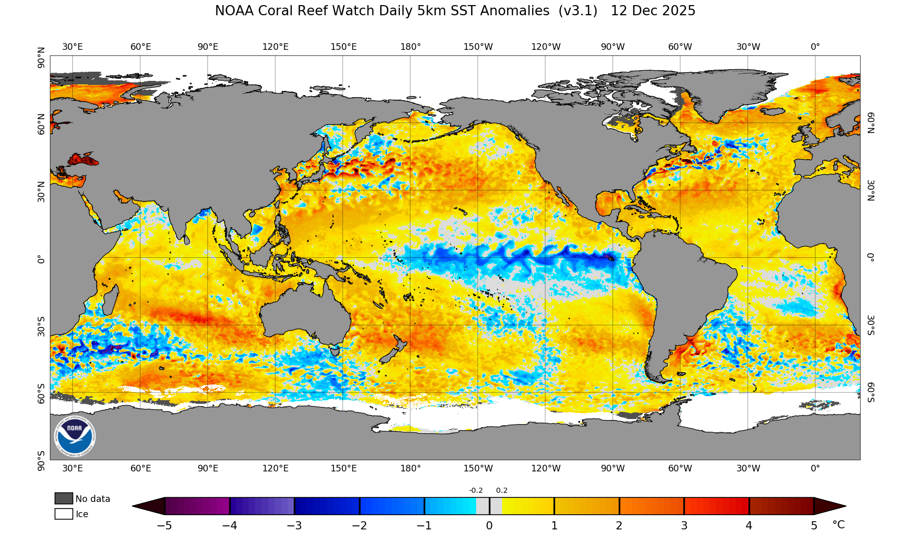
When Solnit argued we are paralyzed by our inability to tell a story about climate change, she raised objections of failure of narrative is one of not being able to see a possibility for change, or a livable future: in arguing that we risk being paralyzed by a lack of ability to tell a story about climate change that allows us to see clearly, or creatively enough to understand our power to retain a sense of agency before the massive data of climate change, she may be suggesting we are at risk of being cognitively overwhelmed by and drowned in widely circulating stories of die-offs due to warming, as so many desperate signals of all-but-inevitable climatological defeat–in the polar caps, for example, diminished sea ice thickness create a surplus of ice-melt sends far less salty, warmer water into the global ocean, threatening to shift the colder deep-water masses that drive ocean circulation.

Yet is this not also a failure to map the ocean waters in ways that do not leave us drowned in data? Is the circulation of deep-water masses so remote to be difficult to comprehend in how super-saturated colors that call our attention to global warming, of which the appearance of indigo is so striking and so terrifying–as if blue waters peak through the thin ice shelf on the edges of once floating ice. Does the electric blue swirling about the edges of the arctic shelf that call attention to our eyes as a dangerous abnormality not also register the thin ice on which we collectively stand?

We struggle to encompass both the immensity of a global story that does not drown us in disempowerment. We are indeed acutely aware of lacking a story that presents options for responsibility; we have trouble coming to terms with how to find a place for the local or the individual in totalizing maps whose projections cow us before the gears of an altering climate, their data lying on the surface, as it were, in haunting spills of color whose apparent immateriality makes their actual effects difficult to grasp.

The saturated rasters pixellate a world indelibly haunted by climate change, pools of dark ink swirling to create a tipping point of inevitable rupture from the past. As much as mark an environmental “tipping point,” the effects of global capitalism is to conspire to delay ecological consequences and ruptures, effectively testing nature’s ability to absorb shocks as it teeters toward potential collapse. By casting the thinning ice shelf on the edges of as opening an all but inevitable cascading of still greater, future dangers–projections of sea level rise, coastal flooding, erosion, habitat destruction–we fail to render how technologies of energy extraction have changed the ocean, or the long-term testing of the elasticity of nature by testing the limits of the natural world to absorb increased waste and the detritus of consumption, while extracting and appropriating natural wealth of petrochemicals as a national bounty that has no effect on local ecologies.

If the testing of the first atomic bomb by Robert Oppenheimer was long appreciated as heralding modernity in New Mexico’s desert landscaped; effectively black-boxed, the story of the stresses that it exposed the environment and local inhabitants went unquestioned. The increased effects of anthropogenic pollution are however, as Kohei Saito argues, in a rather telling ecological critique of capitalism, no longer able to be absorbed in the world; we attempt to register the shifts in data in maps, all too often, without trying to tell a story of the inroads of natural wealth or the possibilities of environmental regrowth, if not obscuring the very possibility.

The masses of data in current projections of temperature rise appear all too inevitable–unable to be assimilated to a story, because they seem to truly allow little place for us in the world, or might take our focus off of the hopes for diminishing the accelerated sea-surface warming that may alter global ocean circulation and the rise of the global ocean. Indigo tracery served as hieroglyphics of a future melting ice sheet in 2019, in the cutting edge NASA satellite photographs of Earth Observatory that revealed a melting midsummer pooling of indigo waters in ICESat-2, the most sensitive tool yet to measure the surface of the world’s largest ice sheets in Greenland or Iceland–regions that threaten to add significantly to sea-level rise in coming years, as the world is losing over 200 billion tons of grounded ice annually by the thinning surfaces of ice sheets–as if blue indigo ink were pooling on their surface.

And a clipped elevation raster with a blue color ramp of Antarctica, enlisted indigo to register the increasingly low elevations where the Antartican ice shelf currently meets the sea, as a saturation of deep indigo of lower elevations at the ice shelf’s shore. This indigo demands more materiality.

Is it trying to recuperate the pristinity of the indigo ringing the arctic poles in the very first polar projection by Renaissance cartographer Martin Waldseemüller? The haunting Waldseemüller engraving of the arctic oceans and channels feeding unknown blue waters harbor multiple seas of its own, themselves with islands of uncertain edges. The cartographic rebus–itself a microcosm of the compass–offered an enticingly new vantage on a spherical world–imagined a northern ocean still not sufficiently mapped at whose center lay a giant magnetic mountain at “due north,” from which four flowing rivers combine functional reference points of four cardinal directions with the microcosm in an convincing conjectural cartography of areas few Renaissance explorers explored save Martin Frobisher and James Davis, whose nautical accounts were the basis for invented polar isolario not rendered or appreciated with true interest in most Renaissance planispheres.

The newly mapped “glacial ocean” was no longer the site of abundant fantastic islands, but a separate sea lying as if in wait above the northern edges of the world’s continents, whose frozen islands whose edges had not yet been fully mapped, was a remnant of “T-in-O” microcosms, four frozen rivers flowing beyond a multitude of islands whose edges were, enticingly, not yet mapped, and might well be, as Waldseemüller had wanted the readers of his map to imagine, to be inhabited by pygmies. The fantasia of light blue waters and edgeless islands around the poles was one improbably inhabited by pygmies, whose flower-like perspective on the world opened an iridescent fantasia on map colors, unlike Gerardus Mercator’s maps–the reedition by the Amsterdam based cartographer Jodocus Hondius was more of a hybrid conjectural cartographic rebus, with edges of continents of North America, Asia, and Europe peaking out of the sides with part of California, as if inviting readers to puzzle their assembly of an unseen perspective of the Typhonian, Scythician, Mirmanskoi, Petzorke and Hibernian oceans in the northern glacial sea–Nova Zembla and the Straits of Anián, and a giant whirlpool that threatened direct navigational access–each with a heritage in Russian literature of Vladimir Nabokov or Straits of Anián, to construct as an imaginary division between North America and Asia that offered grounds for early modern cartographers to believe in a Northwest Passage. The current blurring of the pole driven by greenhouse gasses have grown in a new era of globalization, poised to re-blur the edges of arctic and antarctic ice shelves.

Gerardus Mercator, Septentrionalium Terrarum (1606 edition by Jodicus Hondius)

Waldseemuller’s cartographic conjecture of semi-frozen regions of the Northern Pole left its indelible imprint of indigo in recent remappings of ocean currents and the polar ice shelf. If the fanciful assemblage of a quadripartite pole nestling the stony magnetic mountain–a “black cliff of immense height” that created the very same due North on which Dutch navigators had relied was in fact nested in oceans, ringed by mountains just outside where we now place the polar cap, inside the red perimeter of an arctic circle ringing the Mare glaciale, as literary as cartographical space.

At the time, many assumed the pole itself featured a giant, magnetic mountain.

Can its imprint of indigo also be an invitation to invest new materiality in a region for which we risk defamiliarizing in rasters? Is the material basis of indigo–a distinct new color of the seventeenth century, not only for Newton but as an abundant luxury import from the Indies, a natural dye–“true indigo”–that was the product of increased global commerce, and perhaps a hint of the new materiality? Deriving as a modern hue of textiles born from a global Atlantic exchange, imported by Spanish colonists to plant and harvest in plantations of the New World, from the Carolinas to Guatemala,–a boom market for in natural dyes was magnified in Europe’s textile wars, and the fueling of its industry by new fashions for striking colors. Unlike the celestial blue of lapis, the market for the trade in textiles was based on a commoditization of colored fabrics that, far from being associated with celestial blues, were signifiers of status in a market of woven commodities.

Demand for textiles was the economic engine of a first era of globalization, from beyond the Indian Ocean to the Americas, as demand for fashions grew capital in seventeenth-century transatlantic trade. If the burning of petroleum and petrochemicals has been by far the greatest engine of the Anthropocene, the dependence of the current age of globalization on unbounded markets of petrochemical extraction that have created an indelible imprint of Anthropocene–extending from global oceans marked by floating gyres of garbage patches to microplastics in ocean waters and the increasingly impreganated plastic seas to the textile fibers detected in human breast milk.

Read more: Sea Surface Temperatures

There remains a dangerously deep risk of de-familiarization of the planet due to data overload. These global trends are so cognitively overwhelming, even in an age of globalization, the rising tide of ocean temperatures seem destined to overwhelm, and not only on the coasts and coastal environments. We have trouble trying to sense this change, as temperature anomalies become the tool in trade to represent an extreme overload of heat burdening the world far from the equator by a blanket of unprecedented warmth both off the charts and physically hard for humans to sustain.

Climate Reanalyzer, Climate Change Institute, University of Maine, based on Environmental Prediction Global Forecast

The appearance of “excess heat” that ranged considerably above average for late July, which was literally hotter than most all Julys since Steve Wonder’s nineteenth studio album was released–enormous stretches of six continents were as much as fifteen degrees Fahrenheit warmer. The powerhouse graphic sent a global alert to caution we were in historically unchartered territory.

Climate Reanalyzer, Climate Change Institute, University of Maine, based on Environmental Prediction Global Forecast

The current calculations of heat stress on the human body in direct sunlight–“wet bulb temperature”–is a measure of heat stress, is in a sense the reduction of that temperature change to the basic common denominator of the human body. Although the point-based assessments might map to isotherms, in a broad way, the outliers might be so extreme to render this pointless. And the current water temperatures in western Florida of over 90°F or 32°C in the Keys, three or four degrees greater than land temps.

The land is both inhabited–and we are suffering from overwhelming excess heat. But the record heat absorbed in the global oceans and rather unprecedented effects of rising Ocean Heat Content—-water temperature change times the density of water times its heat capacity–has led the Gulf of Mexico to rise 1.8°F since 1950, and in May 2022 almost two degrees Fahrenheit above the 1981-2010 average, fed by the deep fast-moving warming waters that long intensified the Gulf’s heat. (The red is here denoting the rapidity of the Loop Current that enters the Gulf from the Western Caribbean; the indigo denotes the relatively still waters along the coasts and semi-enclosed sea, shown in a combination of rasters and vectors of warm Loop Current’s sudden influx to the Gulf.)

Ocean Heat Content of Loop Current Entering Gulf of Mexico May 2022/image: Navy Research Lab

The recent alerts that NOAA issued to alert the Florida Keys to the threat of widespread coral bleaching in late July transform the once-bucolic waters off the sleepy southern Florida coast into a dark red danger zone may make coral a surrogate for humans. The rasters that shift attention from the land offer a salutary alert and caution, but their saturated colors are hard to process without alarm.

The recent risks of coral bleaching in the Gulf of Mexico’s waters may be so powerful not only as coral is a keystone species, of broad impact across the ocean ecosystem, whose living reefs offer food sources that promote or foster biodiversity in tropical waters, whose very structures and food sources promote biodiversity, and allow the ocean waters to function as a carbon sink, the image is apocalyptic as a record of the declining vital signs. Are corals a proxy for wildlife from migrating landbirds to a vast and vital coastal ecosystem centered in wetlands, whose habitat and food sources would be threatened to be compromised by petrochemical accidents or potential spills?

The density bird stopovers along regions of the shore and wetlands map an area most vulnerable to maritime spills or pollution. A single spill would compromise a vital stopover habitat mis-mapped as a shoreline, and not a resting and feeding site for birds making returns north after a thousand mile migratory flight to search for food that will equip them to continue their journey north. If the striking density of bird stopovers in the Gulf of Mexico might suggest a value that is erased by the mapping of value in offshore lots leased for excavating oil and gas.

Distribution of Migratory Landbirds around the Gulf of Mexico | Land  Imaging Report Site

Predicted Avian Biomass in northern Gulf of Mexico per Weather Surveillance Radar Data. uploaded from USGS Distribution of Migratory Landbirds around Gulf of Mexico

The red rasters hemming in Florida’s coast recall the unhappy ending of the father and son who wander across a post-apocalyptic America in that first gothic novel of climate change, The Road, which eerily doubles as the first novel of post-9/11 America. Father and son travel on foot to an ocean whose surface is not at all blue, as promised , but reveals itself in the book’s final pages as a “vast and shifting heavily like a slowly heaving vat of slag,” transformed to a “the endless seascrawl” as if itself rewritten. “I’m sorry it’s not blue, he said,” the father manages, whose son, expectations long diminished, replies “That’s okay.” It is not the coast of Florida, but it might as well be the coast of a massive coral die-off, of dead zones, littered by detritus of nuclear or atomic ash. But this is not the story we want to tell, invoking a leap of faith at a gray, grimy mournful end.

This is one, archetypical, story of climate change, and not the one we want to have. It is a story of love and despair, as grimly post-apocalyptic as one might imagine, if deferring the apocalypse, but only not to tell us how it ends, but to suggest something akin to spiritual if not religious consolation. That is, perhaps, as far as it gets as a story of hope. But the alerts NOAA released seem increasingly of a sea shorn of life, if not yet covered with post-apocalyptic ash, registering an apocalyptic reality that might only find redemption, William Gibson has suggested, in a more recent twist, we might only be spared by by a virtual surrogate alternative reality.

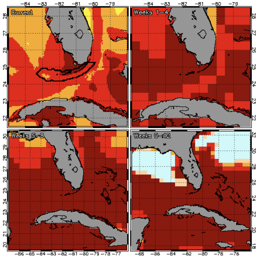
Regional Heat Stress Map for Florida Keys/Coral Reef Watch, NOAA (July 26, 2023)

The threats of the absence of equilibrium in such a map fly directly in the face of an image of hope, as well as the recommendations the International Energy Agency planned as a roadmap to net zero emissions of approving no more new oil or gasfields for development from 2021. Not only the United States have granted far more licenses to fields, many of which are offshore and an increasing number in the Gulf of Mexico–if the Gulf of Mexico became regarded as a “national ocean” from the 1950s, new wells may be slated beyond national waters.

If April is the cruelest month, as the world regenerates, “breeding lilacs out of the dead land,” June is the month of pronouncing on impending anomalies of global melting as lilac drifts to the northern climes. If lilac offers the color for cooling waters, in most ROYBGIV color ramps, each summer, lilac seems to be moving farther and farther to the poles, as the equatorial regions approach 35C, the withdrawing of cold water to the poles is in a sense an occasion of mourning, with Whitman, a sense of loss. Newton may have introduced indigo in the rainbow spectrum–as Thoreau was to give prominence to Cerulean, another tertiary color–to affirm the sacred geometry of the rainbow, after first finding five colors and then adding orange, but its prominence in the Opticks (1704) denotes the rim of warming waters on the blue-violet edges of arctic regions, levels of lilac in the north suggest the scarcity of cold, cresting the arctic regions of water where ice melts. May be the uncanny warmth of indigo has made it into a default of warmer ocean become an omen of warming waters that lead to an unstoppable glacial collapse, not only in the west Antarctic, as indigo seems the apt color of the danger of a feared potential rise of global ocean-level by over a half-meter, and triggering a rise of several meters more–and the fear of an inevitable retraction of the edges of the Antarctican ice shelf of global consequence.

Global Impacts from Shrinking Ice, Visual Capitalist/Research by Niccolo Conte; Design of Mark Belan

And the uncanny warmth of the near-arctic oceans, ever warmer in recent years, as the warming underbelly of floating ice, seem a fearful record of the warming waters set to trigger large and potentially sudden changes in sea-level rise. Even if we are confounded by alarming carmines and deep reds in raster maps of landsea temperature anomalies in recent months, the warming waters of lilac and indigo speak rather deeply to the warming of arctic and sub-arctic waters.

Thwaites Glacier in West Antarctic Ice Sheet/NASA/AP

Does telling a potted but pertinent story about indigo as color offer a surprisingly global tale of markets and man-made world? Indigo has a history, and the history of indigo as a plant dye that entered European luxury markets as a craze for vividly colored clothes in the seventeenth century would boom in the eighteenth, but made it the most noticeable color of note to the English eye when it was included in the spectrum in the Opticks (1705), when it had challenged the longstanding use of woad to color wool. No doubt reflecting the dominance that material versions of blue had secured in the market for colored fabrics before the discovery of Prussian Blue in the early eighteenth century, a precious resource and prime product of harvests in colonial settings in the West Indies used in the textile industry whose importation was already a prized if not dominant import from 1650 in the transatlantic trade from Spanish colonies, “the most famous of all dyes” no longer arrived from India, Newton would have been familiar with the stability of “true indigo” as a universal dyestuff, if one deeply compromised and affected by the War of Spanish Succession, whose purity as a ground vivid color grew in the textile trade–by the late eighteenth century the East India Company exported over a million pounds of the dyestuff from Bombay and Surat as gild restrictions on its importation eliminated or reduced, as Spanish indigo replaced the Indian origin of Indicum, notwithstanding the plant’s historical toponomastic origins. (Recall the blue dresses worn by Vermeer’s women beneath their linen veils in their private, whose vivid Delft blue made us privileged witnesses of global ties of commerce in quotidian interiors of scrubbed walls.)

The global origins of indigo in the transatlantic trade is aptly tied to a first age of globalization, as much as for elevated reasons of mystical harmony or the spectrum of available paints–whose warmth finds new if dissonantly telling prominence in our ocean maps.

The scarcity of indigo from India was challenged as New World imports reshaped luxury textile markets to feed a growing markets for fashionably vivid colors. But the scarcity of indigo in early modern European markets seems apt to illustrate the shrinking margins of cool waters that are driven by anthropogenic climate change, as global markets for energy prospecting oil and gas fields have released greenhouse gasses es into the atmosphere with seemingly irreversible consequences.

Warmer indigo waters create a slippery if critical band of sea surface temperatures above freezing that has encroached the edges of global arctic oceans–the very region that the scientist James Lovelock, father of climate studies, cunningly chose to be the last remaining temperate region of a climate apocalypse, in The Revenge of Gaia (2006), where the flipping of the global climate due to greenhouse gasses and ended animal life has forced polar migration for its few remaining survivors: those compelled to travel to the only cool sites of the Arctic, migrating to the few remaining oases with camels they have presumably fled where temperatures only cool as the sun’s rays dissipate. If Lovelock’s was a clear-eyed cautionary tale about the stresses on the global system humans created, the equatorial heat already spanning oceans in contemporary maps of eighty and ninety degree water have clear red foci of intensely electric carmine in the Persian Gulf and Gulf of Mexico, and off of China’s coastal waters, that have received less attention than the individual buoys that register “record” heat cresting the magical metric of 100°F. The novelistic retelling of the “Gaia” hypothesis viewing the earth as a coherent organism able to be seen as a self-regulating system in 1972 was dramatically disrupted in ways that offer a bracing story of the consequences of a climate out of balance of which indigo may be an apt indicator indeed.

Melting is something foreign to the waters of the Gulf of Mexico, where we were already breaking significant records in Spring. But we are increasingly relying on new carmines as we used new violets last year to register the extreme heat wave that strained power grids in the west in a previous heat dome in September 2022 that colored the Central Valley, Las Vegas and Phoenix shades of violet as a hot air mass settled over wester states for multiple days. We had warning. We suffered the warmest May on record. per the European Union’s Copernicus Climate Change Service; global sea-surface temperatures hit record highs in May and June, as it became clear that this summer was less of a season than a record of extreme heat.

By early July, a heat dome engulfing southern states around the Gulf of Mexico pushed the color ramp to deep reds, and meant triple digit temperatures of excess heat scary heat dome, whose isotherms span the border, in a reminder if we need it that global disruptions do span borders; El Niño stands to create record global July temperatures, as warm weathers off the global oceans wrap themselves around North America, raising lands temperatures upwards of a hundred degrees Fahrenheit in new record temperature anomalies.

Weather Bell/July 10, 2023 Forecast by American GFS model (F)

The rising sea surface anomalies suggested extraordinary temperatures of an intensity we’ve rarely experienced, and are challenging our color ramps moving toward darker and darker carmine. The temperatures around the coast of Florida are not limited to the threatened ecosystem of its Keys, where water temperatures above 100F° in late July lead to wide die-offs of coral reefs.

The isotherms tracking landsea temperatures make it hard to get specific or drill down into amidst the array of alarming datapoints. But the deviations of anomalies of sea surface temperatures are a terrifying hint of what might be in store, the Gulf Stream carrying warmer waters than ever to the Arctic North, warming the Baffin and Labrador Seas, as well as parts of Hudson Bay–show lowlands. These regions are already among the fastest warming in the planet–projected to warm at a rate three times higher than the global average, sending fewer cooling winds across Canada and offering less of an amenable subarctic habitat for whales or polar bears.

Dark red and orange map shows Atlantic sea surface heat

Sea Surface Temperature Anomaly (Centigrade), June 14, 2023

If June is the month to register the first anomalies of summer months, July has become the time of realizing extreme warming is going off the charts. These temperature records are anomalies we had not imagined, and stretching beyond color ramps with which we are familiar. And they are being circulated with far more alarm than the sense of inescapability already present as the 1980s presented the hottest decade on record–including five of the warmest years since 1890. If the arming of arctic permafrost was first detected in the 1950s–as dozens of exploratory oil wells were drilled in Alaska’s North Slope, the inevitability of global warming was tied to the fears greenhouse gas emissions would bring an exponential growth of CO2 levels in the global atmosphere, forecast to reach the benchmark threshold of a doubling of preindustrial standards by 2030 in the early 1980s, if no reduction of emissions were taken, and the earth entering a path toward irreversible warming of 2 to 5°C by 2020 and a doubling of carbon dioxide levels in the global atmosphere.

If the optimistic hope was to slow warming and carbon doubling until 2060, worries of coastal flooding and erosion–or of land erosion in places like the Gulf of Mexico leading to ocean flooding–the dangers of sea-level rise that is primarily due to fossil fuel combustion–as well as deforestation–has been replaced by even more anxiety-producing stories of the warming of ocean heat and its effects.

The focus of rising sea surface temperatures have striking continental focus in the waters of the Gulf of Mexico–characterized by a surface temperature anomalies from the 1950s, partly due to the low level of the ocean from the seafloor, rising by the mid-1970s and by 1990 at extraordinary rates.

Fig. 3.

Time Series Chart of Average Sea Surface Temperatures at Ocean Surface and Ten Meters in Gulf of Mexico

We are hard pressed in the middle of July to realize how sea surface temperatures are poised to escalate with El Nino. But they are so deeply red in places like the Persian Gulf, that global site of oil production, and in the site in our own national waters touted for possible future oil extraction–the Gulf of Mexico. These are among the most anthropogenic areas of the world, made for intense offshore petroleum extraction, where oil seepage and spillage may create a uniquely elevated ability to capture heat in their swirling current coursing in its semi-enclosed ocean waters.

Lilac hues signifying colder global waters are pressed to the Arctic and Antarctic, at the boundaries of or outside the bounds of human settlement. And lilac is a scary reminder that few colder water will be sent southward in the Meridional Overturning Circulation that sends colder, saltier water across global oceans that drives marine upwelling. But if this is the global, the story is in many ways local, too, as the changes in the heat of the Gulf’s surface waters, even before El Niño and La Niña, are warming those gulf waters as astounding rates as they swirl in that semi-enclosed sea-

Climate Reanalyzer, Global Sea Surface Temperatures/July 22, 2023

–and by the end of the month, just four days later, Sea Temperature was introducing lilac in its ramp for global oceans, in an extraordinary expanse, and rightly so, to register the rising ocean temperatures at the equatorial belt as a cause for alarm. Lilac is the only way to communicate these extremes, perhaps, to catch one’s eye, as perhaps Newton knew it would have, as it was feature in any rainbow, but as Newton must have known indigo well from the common use in early modern England of imported indigo dyes–indigo discharge printing of saturated colors long before William Morris prints, in indigo chintz–that were so popular that by 1720 the Calico Act restricted global trade of calicoes and indigo dyes to appease wool gilds who used woad plants, assessing fines for “Use and Warings in Apparel of imported chintz, and also its use or Wear in or about any Bed, Chair, Cushion or other Household furniture”–true indigo gained status to catch or arrest the eye, as indigo or lilac in our maps of current sea surface temperatures. The weaker dye from European woad–the isatin tinctoria of colder climes–was never as vibrant as the imported indigofer tincotria. Before restriction of the luxury import, Newton would have known the treasured dyestuff of “truer” imported indigo: the luxury trade of woad ensured Languedoc’s wealth in 1705 as “the richest in Europe,” but indigo displaced woad’s currency as a guarantor of credit was displaced by indigo, as it displaced the chromatic organization of dyers gilds–red, white, and yellow; green, black, and blue–derived from Aristotelian: indigo’s intensity was implicitly modern in Newton’s rainbow spectrum, unlike blue.

But indigo and lilac haunt the color ramps of sea surface temperatures as extremes, at the arctic edges and the equatorial zones, at the super-hot and indigo waters at the poles formerly freezing “warming hotspots” of the north.

World Water and Global Sea Temperatures, www.seatemperature.org/July 26, 2023

We may have to live with more indigo–just above freezing, where surface water shifts to marine blue–in the rasters of our maps of sea or sea surface temperatures, and try to tell the clearest story possible. This should be a story that is far more explicitly anthropogenic in nature, but a story few maps tell. To do so would be to remind us of the materiality for these changes, and indeed the materiality of Newton’s inclusion of indigo in the rainbow spectra on which our color ramps and buckets rely. The deep reds of those isotherms–whose reds seem so much heavier, impinging itself on the global ocean, no longer bridges land and sea in a topography of heat, given problems of translating land heat to the heat of the surface, force us to contemplate the anthropogenic effects on ocean environments. Whereas Romantic art promised a merging of the human with the natural as an ideal, subsuming the natural to art, the art of mapping anthropogenic influences on nature is central to the intensifying problem of mapping our current relation to our climate emergency.

We might well return to the global synoptic maps of ocean warming, enhanced by appreciation of local detail that are the best ways of gaining access to their meaning and cascading effects. The rapid rise in sea surface temp was not a record, although its surface temperatures had been rapidly rising, but hovered around the 80°F threshold. While the nightly news graphics seek to command attention as an immediate existential threat, however, the deep causes of the surrounding seas’ growing temperatures and the challenge that they pose for oceans’ memory demand greater attention and appreciation for the long-term changes in governance that have gotten us here–the transformation of the Gulf of Mexico to a sort of open bank account of perpetual national oil reserves, able to be claimed by seabed rights, that seep to the ocean, pumping of groundwater to feed crops and cities, phosphorous flows to the coastal ocean and into the sea, deluded by what may well be illusory hopes to inject waste into wells that themselves seep offshore.

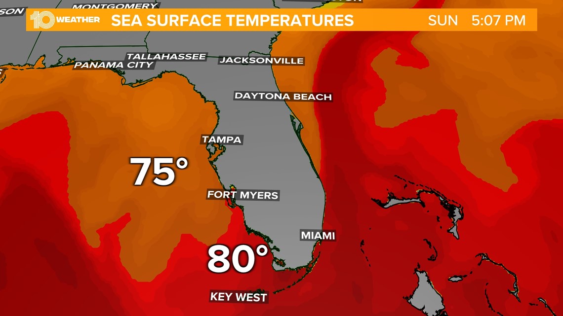
The danger signs of red, the sign of danger flags, red alerts, and blood, have been intensifying in the color ramps of overlays that we place on ocean currents in the maps of sea surface temperatures for several years. Yet rather than see the oceans as passive victims of climate change, the maps we make might seek to register or appreciate the active anthropogenic nature of those changes in sites like the Gulf of Mexico and the western and eastern Florida shores. Terrifying climate records had been announced nationwide, of course, by mid-June, before catastrophic rainfall hit New York and Vermont, with accumulated humidity condensing in the air, as anomalies of notable escalation hit the climate community from the first days of June 2023–following the warmest May on record, of a new high by quite a margin, as Antarctic sea ice suddenly shrunk to record lows, setting off alarm bells about global sea surface temperatures that haven’t been able to be silenced.

The outrageous color ramps of astounding rises in sea surface temperatures register a remarkable change in coastal waters, as global oceans hit record highs, with the ocean temperature rising as oceans absorbed the lion’s share of excess anthropogenic energies and a pronounced warming of the North Atlantic Ocean and the Gulf Stream that has sent warming waters to the North Atlantic, in a spectrum of red and blue that suggest the end of the cooling waters of the Arctic Ocean–as well as a global picture of climate change, if we needed one, rooted in the anomaly of sea surface temps across the globe. But as we wonder how those changes will be relate to local government–or how mjuch they outstrip the ability of any local government to respond–the crisis must be seen as one of governmentality, as much as climate.

Dark red and orange map shows Atlantic sea surface heat

In posting the deep lavenders off the chart temperatures that surrounded the coast of Florida this early summer, he Newspaper of Record shifted our attention to the corals, and the danger of their bleaching, beyond indulge in the effects on humans alone of these rising temperatures alone: they weren’t inviting us to take the “animal turn,” but turning attention to how the surprising spectrum was not only about when it was good to swim, but concretized the warming as a living record of marine health, akin to a charismatic keystone species. The warming is rarely tied explicitly to government, but an early engraved map of Florida might hint at the difficulty of mapping clear boundaries of land and sea–a Google maps artifact, but also one of mapping softwares–not because of its greater accuracies or inaccuracies, but the complex relations between land and sea that are suggested around the Gulf of Florida, both in the land-sea fracturing that defined the ‘state’ and its government, and the dotted lines of those far less sharply defined shores.

As K. brevis sends unprecedentedly ballooning neurotoxins s into the Gulf of Mexico and to Florida’s Gulf Coast waters, yet again, and blows onshore to trigger lung symptoms for many, as it enters the air, we are reminded of how much land and sea are tied, in the rusty red tide lasting for months off of Florida’s western coast washes a shore, we might ask about the porous nature of good government in Florida, both East and West alike, by looking at the appreciation of this porous boundary of the shore that was central to early maps of the region–not only before landfill led to the remaking of the state, but before we were convinced of a firm separation of land and sea.

Sailors of course paid more attention not only to the existance of islands in the Gulf of Mexico, where their crafts would run ashore, but to the great sand banks as the Great Bank of the Bahama (or Great Bahama Bank) that is one of the largest of the world’s fringing reefs, even in an era of routine sand pillaging and illegal sand mining. But as our shores have become too narrowly defined, as we have viewed them as the edges of government. As we imagine the shores overly sharply defined, the irony may be, unregulated drainage of sewage, industrial fertilizer, and urban wastewater create decisively warming temps around that quite critical coastal margin, where warming temperatures enter into that purple, reminding us yet again, in way, howe much anthropogenically caused heat oceans are trying to absorb–and how off the charts the rises in temperatures are to the ocean’s memory. The presence of and threatens to ocean memory might well be part of the stories that we tell about climate change, and indeed made central to them.

Indeed, rather than see the ocean as a glassy surface, as if the surface temperature were a record of the sea surface, suspended by an illusion of calm waters, we need maps that allow us to look deeper in maps, to the areas underneath, as this post has tried, and noting what else is on the surface of the seas as they circulate ever-warmer waters off sensitive coastal environments. So much is suggested by the coral reefs, dotted zones in danger of being bleached at higher temperatures. Rebecca Solnit invites we entertain the climate crisis as “in part a storytelling crisis,” a crisis in which we find ourselves “hemmed in by stories that prevent us from seeing, or believing in, or acting on the possibilities for change.” The foreclosure of possibilities are perhaps nowhere as evident in the finality of the color ramps of maps of global climate that trigger our alarm; color ramps of sea surface temperatures are, in their opacities, perhaps as much as fault as being part of that problem. They are an ultimatum, as much as any thing like a narrative, as much as a late-arriving warning sign and a cry for help: the stark disequilibria of something so large as a global climate or “surface temperature” is hard to grasp with anything like traction, let alone weave a story around.

Yet the problem of mapping a story of where we are requires more depth, and detail, of appreciation and perhaps wonder, as much as fear. As much as posing existential issues of impending ruptures in ocean habitat and even in ocean memory, we might pay better attention to the local scales of what is lost. For the inattention to the changes that are already quite evident in the membranes of coasts and the margins of shores, stories that don’t leave us much room to move. They are multiply depressing stories about about politics, or governance, and the irresponsible expansion of seabed governance to mine and extract non-renewable energy sources as petroleum and natural gas, to supply petrochemical needs. Yet the stories that we tell are perhaps so depressing as they ignore and are rarely addressing shores as lived environments or enduring habitat but the steep fears and constraints of coastal risk and of both urgency and emergency.

We are perhaps far, far beyond investigation, regulation, rehabilitation, or clean up of isolated sites contaminated by the spills and discharges. But we must look deeper into the maps, perhaps beneath the frustrating opacities of crimson and the misleadingly gentle lavender. Hui Shi of the Farallon Institute in Petaluma, CA suggests that similarity in ocean surface temperature from one year to the next is the best “simple metric for ocean memory,” independently from atmosphere-ocean exchanges, as a systemic change in ecological memory. Another way to see this, of course, is by remembering the long permeable membrane of Florida shores, an implicit part of its good government, and one that has been neglected in the erasure of banks, reefs, and undersea health that is long part of the region, and erased by the reduction of the region’s “government” to the policies of one state–and to call more attention to the role of good government in the very porous relation of land and sea in Florida’s government, that appreciates the state’s integral connection to the Gulf of Mexico as well as the “Gulf of Florida” and Atlantic Ocean.

We map the sea-surface temperatures around Florida by a color ramp, as if they were similar or about the same as land temperatures. they are not. Not only does the ocean absorb a huge amount of anthropogenically driven climate change. The disruptive nature of marine heat-waves are less similar to those on land, as they can be more intense, and more sudden, and even more directly impacting human health and disrupting abilities of meteorological assessment and prediction, and compromising our relation to the shores. If ocean warming accounts for some 63% of the stored heat of the planet, rising temperatures of expanding oceans threaten coastal communities, and undermine the very clear lines we drawn in most of our maps–including weather maps–that fix edges between land and sea as distinct divides. They are not, and this is a casualty, perhaps, of the graphic syntax of the map, which signals a divide, rather than a membrane or, better yet, medium.

The oceanic amnesia between rapid sea-surface temperature changes can be mapped, scientists have argued, in a neat cognate of a sea-surface temperature map, in terms of increasing amnesia–a sort of memory-decline on a global scale–that is jarring because of the choice of blue as a metric of declining memory, and a decline in the continuity between temperatures between one day and the other, that is not only in the water of the ocean, but also its habitat and ecological stability and vitality–the very problem of the coral reefs that are the focus of the Times article. The discontinuities of sea-surface temperatures suggest a major disrupter, in other words, tied to different scenarios of climate emissions, reflecting decreased thermal inertia of the uppermost layer of the ocean, as it grows shallower in response to anthropogenic warming.

graphic of earth

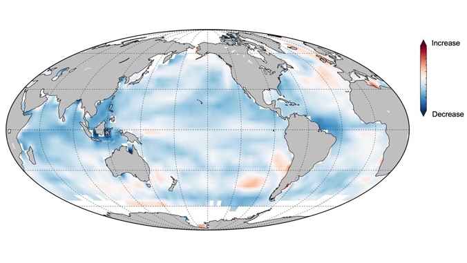
 She, et al., Science Advances (2022) 

She’s metric for “ocean memory” is perhaps a far better and significant chart than the existential immediate sea surface temps, and demands to be placed in a sense of temporal duration, tied to the degree of ocean memory that seems to have existed in the last century, and over different possible emissions scenarios, for the coming decades. He suggests a need for attention to the management of marine ecosystems–which we regard in a largely quite laissez-faire manner–and expansion of government from land-based regions to oceanic environments, and to those sensitive margins of land and sea–watersheds, swamps, tide pools, shores–where life is increasingly abundant, but are also increasingly determinant of biotic and environmental health, in ways that makes them health multipliers. If clever folk at the island-centric UH Mānoa have documented the increased ocean heat anomalies from 1993 to 2019 in the upper layers of oceans, those very sensitive registers of ocean memory, of seven hundred meters in depth, the warming of 53% of global oceans suggests a decline in memory, of some significance, with but 3% of global oceans able to be characterized by cooling trends. From 1968 to 2019, whereas ocean warming was found in 72-9% of global oceans, cooling confined to but 1-2%, in a terrifying trend that only mirrors the dangers of the scale of such a massive memory loss.

chart

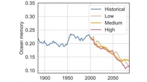
If speculative in nature, the historical depth of a discussion of long-term ocean memory suggests something quite distinct from the structural sort of histoire immobile as is fitting the ocean sea: rather than rooted in economic arrangements that we can map by structures, the slipping away of ocean memory suggests a receding shoreline, or a failed ability to grasp the sudden changes of weather that increasingly characterizes the sea, an erosion, in other words, of a measure critical to ocean health not rooted in the day-to-day nature of surface temperatures, or the disputed averages of temperature over time, but of the ability to navigate the coming sharp changes in ocean health, which, with a majority of humans living on or near the shores, we should be compelled to attend. We risk, as my late friend John Gillis reminded us often in his final years, “turning our back on the shore,” imagining the healh of the oceans to exist independnetly of the land, and the ocean able to be mapped as an extension of the topography and heat of the land.

Another way of seeing this absence of continuity of temperatures might be in terms of the setting tight the oceans offer: the predictability of the warmers as hospitable environments, in other words, rather than as sites of escalating temperatures approaching trigger points for the massive die-offs we have seen. To be sure, surface temperatures are not only reason for die-offs. But they are at play in them, and probably more than we realize: the failure of oceanic environments to be hospitable environments are not only able to be measured by individual digits of Centigrade and Fahrenheit, but, as oceans are absorbing ever greater surface temperatures, of ecosystems most affected by solar irradiation, the rise of sea surface temperatures in the Gulf of Mexico between 1970 and 2020 stands out–warming at twice the rate of the upper layer of global oceans, as ocean heat content in the region has risen so dramatically to raise questions about environmental ocean management–and to explore reasons for the imbalances in Ocean Heat Content (OHT) globally in relation to anthropogenic activity in the upper 700 meters of the ocean, that can help track marine heatwaves that have become greatly more prevalent in the past century.

And the Gulf of Mexico–which receives runoff from over a hundred and fifty rivers from thirty-one out of fifty states, is a sort of distillation of the polluted content of our American rives, in ways that riverwater from more than 150 rivers and runoff from 31 of the 50 states, including nitrogen and phosphates, as well as offshore petroleum-producing zones, a main cause for hypoxic zones and harmful algal blooms, is notably warming at twice the rate of the world’s oceans.

If coastal Florida had seen a distinct rise of temperatures in the heat content of offshore waters, a huge stress on marine environments, in the 1990s and early twentieth century, the recent escalation of heat waves across the Atlantic and Gulf Stream suggest a real reason for panic, tied to displacing habitat, and less salty–and less dense–ocean waters, that are especially dangerous to the vitality of oceanic environments–and the danger of die-offs, often not mapped by digits alone. Far better to focus on and scrutinize trends, disturbances, and abrupt shocks to the ocean’s environment, and to the mitigation of those shocks issuing from the land, and interface of land and sea, where toxins and industrial discharge and pesticide runoff leaches offshore freely. Even a relatively circumscribed “deep view” of warming trends from, as it happens, the start of the Trump era, reminds us, by its dark red blotches, of the warming waters off of American coasts, warmed by the Gulf Stream that carried Caribbean waters from the Gulf of Mexico along the eastern seaboard.
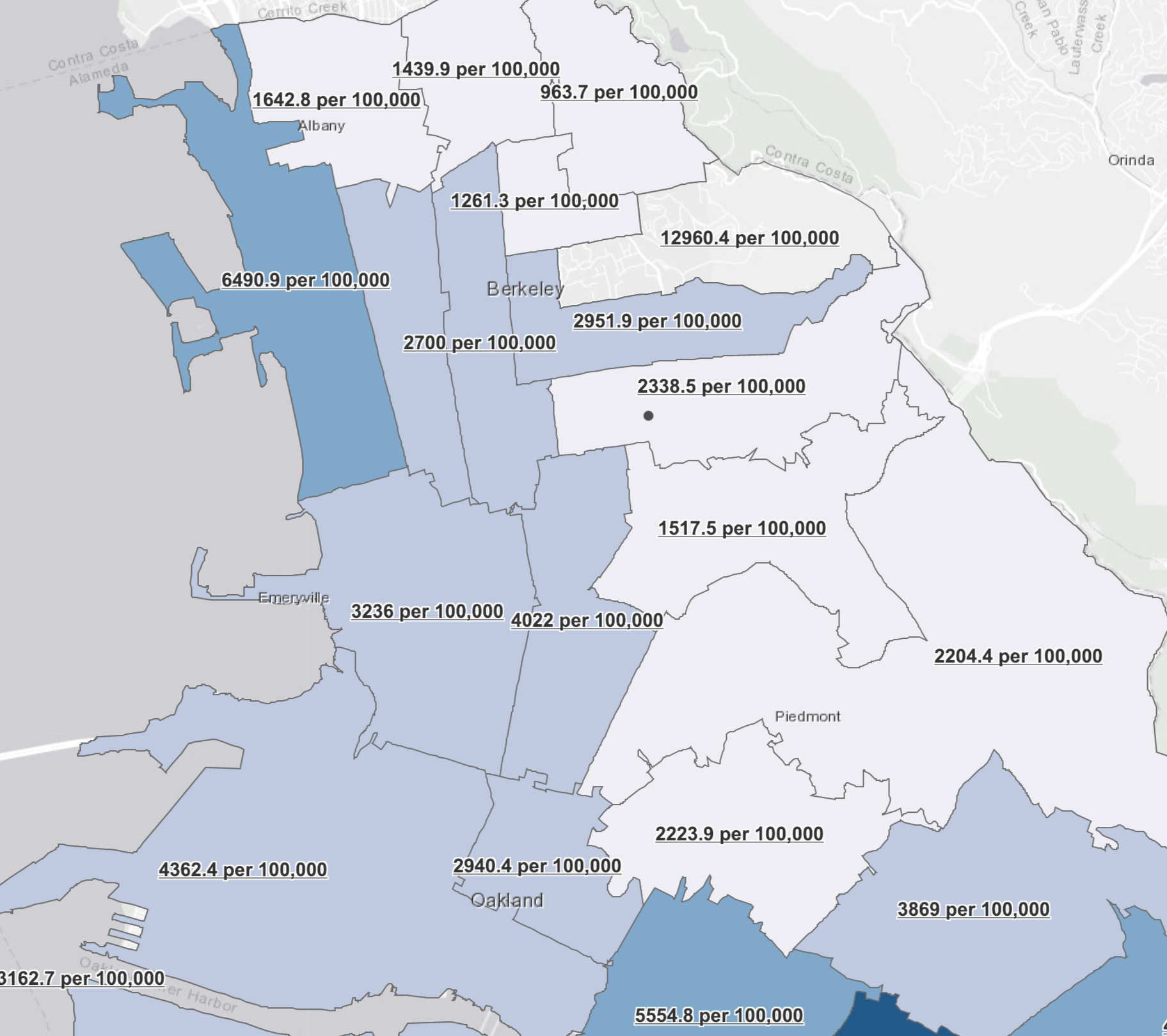
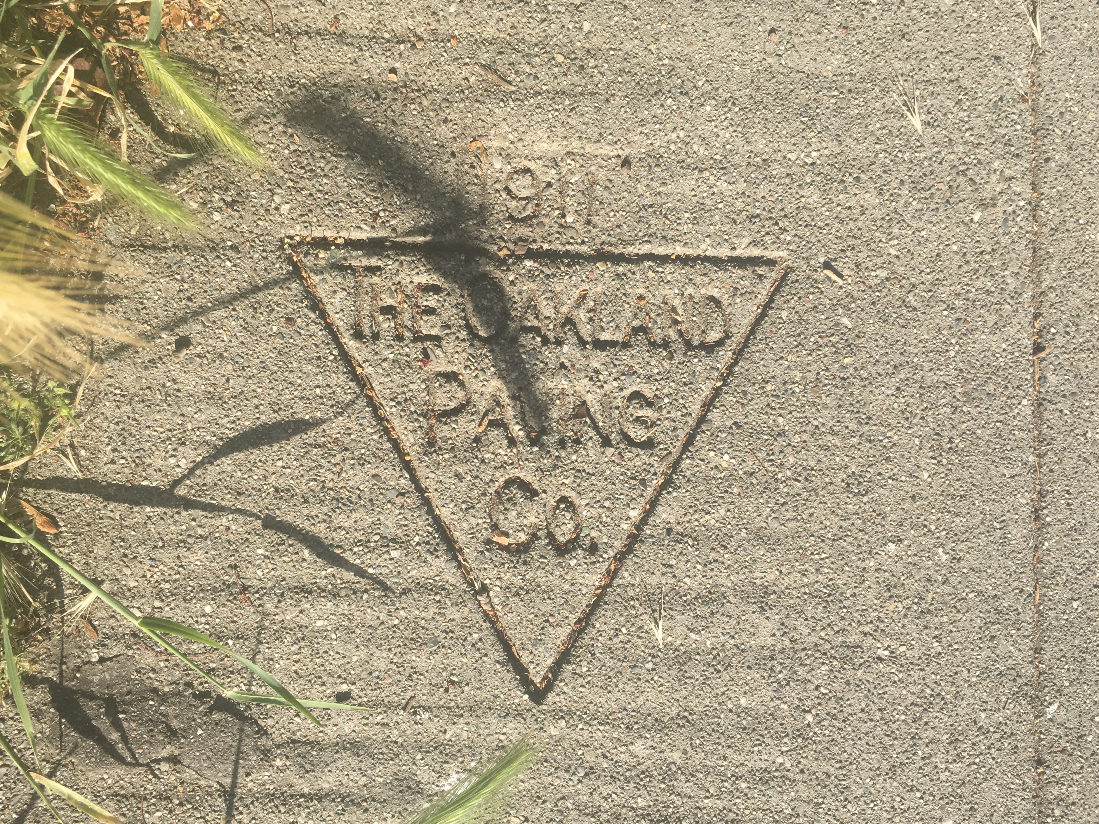
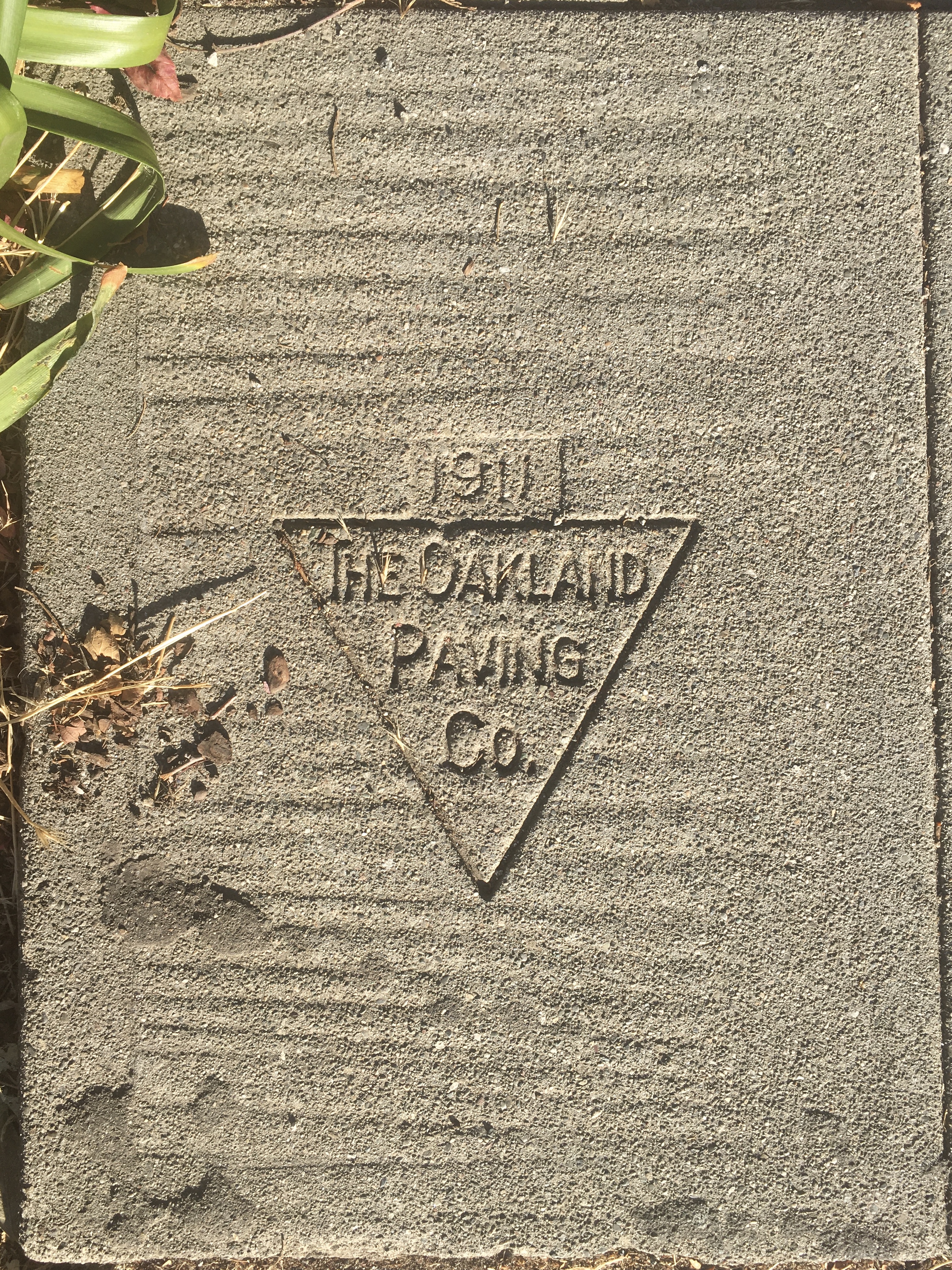
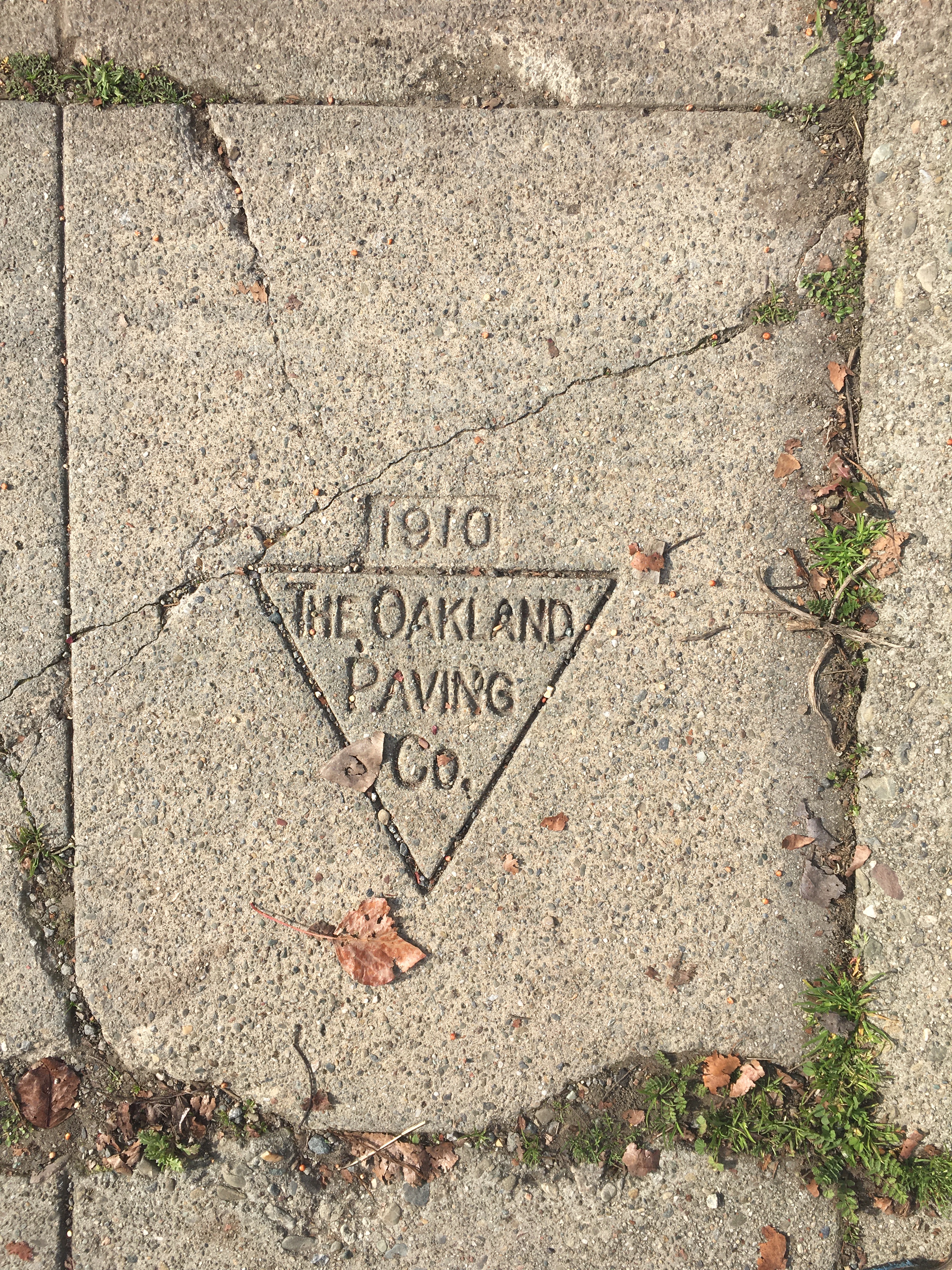
1 Comment

Filed under anthropocene, anthropogenic change, global warming, ocean warming, remote observation

Metageographic Pavement

Seeking direction in the coronavirus pandemic, isolated amidst escalating anxieties, increased vulnerability to a virus crossing borders brought a vulnerability our infrastructures seemed more than ever to be unable to sustain. The danger of introspection was tempered by alarm, as a shock at the unaccustomed sense of the evanescence made far less remote stories of plagues, as we turned to their pasts to process the new normal of pandemic life. Trapped in tenuous relation to the present, walks offered a new release into a new temporality, and escape from a temporality of mortality that seemed to be a countdown to something new: and if many turned to trees as the sentinels of monuments to a more living present, as if in a combination of the historian and flâneur, I started to seek out imprints of the contractors and pavers who had covered Berkeley’s and north Oakland’s residential communities over a century ago with pedestrian pavement. Each print provided evidence of their arrival, from the century’s start of the century, through the 1940s, in booms of post-war expansion beside wartime stamps. Such “points of historical interest” seemed a form of creative tourism, as we were seeking tangible signs of a sociable present that was frayed. As much as trees, these provided a new way of thinking about time, of living with radical uncertainty, and of seeking a foundation by securing existential as much as epistemic stability in such uncertain times.

Was this new age of pavement, of restricting housing and covenants, or a sort of sociability among the ghosts of lost neighborhoods and communities, made poignant in an era or episode of increased social distancing by its very materiality? Searching sidewalks for these traces of human settlement seemed an act of resistance to the tracing of patterns of mortality we watched every day. As infection rates rose, and we were immersed in a real-time reaction to a pandemic, sidewalk walking passed was adventure in an age of social distancing. As COVID-19 made us enter another period of anxiety unlike the recent past, new viruses sending us to the seventeenth century, contemplating these names seemed fossilized traces of previous moments left in the cement of my Berkeley neighborhood provided a tactile story that seemed necessary to embrace. Paradoxically, I had long read these stamps without much attention to dates, or to their temporal remove. But the proximity of these long dead men whose imprints lie across Berkeley and Oakland, perhaps more than other cities, gained new legibility, or acquired a legibility to me as I walked around a bit aimlessly, looking for orientation, and finding it, surprisingly, not on a screen but underfoot. While the prints near my own house were mostly from the 1930s, along Shattuck Avenue, finding multiplied sites of “historical interest” seemed a mending or attending to the community, able to be imagined as in the public interest.

The return to walking during the pandemic–fed by a rather shell-shocked need for processing, for finding connections, or restoring deeply stressed and frayed ones, made the elegant crisp lines of stamps pass for forms of sociability certainty, and encounters, as if one could assemble the history of paved space with a certainty that was revealed far more clearly than the new period unfolding in real time.

I didn’t know anything about F.E. Nelson, but the escutcheon of the contractor whose work from as early as 1910 off Piedmont Ave. that continued on sidewalk stretches through the 1920s seemed a line of time that placed a sense of history into the stretches of cement that they poured and smoothed for individual homes, material traces of urbanization and built space that paralleled the start of an anthropogenic period of the paving of land in the Bay Area that marked the end of an earlier nature of land use and the carving of space into neighborhoods that might be seen as a form of settler colonialism and possession, cementing a sense of an ending to the indigenous land use practices studied in Berkeley by Peter Nelson (no relation as far as I know), taking ownership of residences in an urban agglomeration of the past, if one of far less density or land value than today. As an era of ever increasing percentage of pavement and resurfaced space across northern California, and the Bay Area, detecting hints of the first paving, a century ago, that began to shift earlier notions of land use, offered more than a sense of psychic stability.

It was a material record of a past presented with some reassurance to the pedestrian that the ground was solid. The apparent antiquity of these markers of early paved surfaces, not resurfaced for over a century in a pocket of relatively low real estate development and mobility, became not a sign of privilege but reassuringly comforting as a continuity of a bedrock of shared life, or a solid sense of place, in the past lives of pavers whose names I had not noticed often but seemed to compensate for empty streets in a state when the Shelter in Place policy and work from home ethos reduced foot traffic, some of which had blurred the sidewalk markers left in concrete by contractors as a sign of their skill in engineering pedestrian space. It seemed a form of writing or inscription that evolved in some sense since the more rudimentary public lettering of some earlier dates–a stamp of 1907 was among the earliest near by house–on Woolsey Street–if an early evidence of a distinct modernism of the start of paved life.

C. J. Lindgren, Prince Street

These inscriptions stamped in the pavement of old contractors–“sidewalk stamps,” many have it, or simply “imprints”–were always something I had overlooked. But if Robert Musil argued in prewar Europe that the remarkable thing about the intentional urban monument was that it was something that went unseen–“that one does not notice them;” that “there is nothing in the world that is as invisible as a monument”–and that their impact receded as they became part of an urban landscape, as if displaced by the media environments of the twentieth century as outdated in their materiality, these stamps gained an unforeseen monumentality as they seemed far more human than the monuments of escalating rates of infection, mortality, and jaggedly time-series graphs of mortality that broke parameters with regularity. The monuments seemed more human, more impressive, as a site of the lived environment I had somehow overlooked, so that even feint imprints, worn by the feet of past pedestrian traffic, seemed to stare back at me, in some recognition, from a temporal divide, as evidence of a pedestrianized space of the local past. If set by homeowners, to be sure, several of the imprints seem relics of a. past I could not fail to see as staking out the pedestrianized spaces of other pasts as I walked to a volunteer shift, offering access to a different sense of place from the U.S. Depression, barely left on their footworn surfaces. I was perhaps too ready to interpret as a marker of older pedestrian paths that were once walked down.

2200 Carleton Street, Berkeley CA

Few regarded these imprints as monuments–if, as I saw with some surprise, years later, the imprint of the very same firm that had paved sidewalks in my neighborhood off of Prince St., the Oakland Paving Co., had not only paved sidewalks deep into Berkeley in the early twentieth century–

2201 Woolsey St., Berkeley CA

–had indeed merited museumification as a historical relic and as a monument–in the driveway to the colonial revival residence I found housed the Berkeley Historical Society, housed in an old turn-of-the- century 1902 gated house close by the university in one of Berkeley’s first residential districts–as if the Society had by its good graces preserved this old relic, of a slightly different font of a stamp, maybe dating from different date, that seemed to confirm its archeological value as a marker–the lettering used in an imprint stamped 1911 up the street from my home, without inverted “n”‘s or a uniform font.

2318 Durant St., Berkeley CA

But the following of the evidence of what I took as a pedestrianized spaces of the sidewalk seemed a humanization of space, in a time of existential estrangement and uncertainty. As I walked in horror at escalating mortality rates, the names popped out as if they gained status as unrecognized improvised memorials–as much as humanized space. The shift reminded me of the effect cultivated intentionally in literal “stumbling blocks,” or stolpersteine, placed in urban pavement in Berlin and, later, other German cities, as monuments that gained such immediate relevance that they spread to Belgium, France, Italy, Poland, Hungary, Moldavia, Lithuania, Slovenia, Croatia, and Ukraine. These stones, set in existing pavement to make walkers “stumble” in a pavement of memory, to pause and read least we fail to recognize the scale of loss of former inhabitants, were at least operations. As I payed respects to F. E. Nelson, for example, or the paving of Fulton Street’s few houses, this was almost better than a novel; to be sure, he was never violently and systematically evicted with force, or killed with his family, but the record Nelson left on the ground, or the man in his crew who inadvertently inverted a letter in his name, seemed insight to a moment in an early manmade past. Was the same man unsure what year it was, 1900 or 1920?

2180 Dwight St., Berkeley CA

But these were not names of such living ghosts, if left without the intentionality I started to invested in them. I imagined an Oakland aristocracy on the scriptorium of the sidewalk, as I came to recognize as an aristocracy of the pavement, those artisan families of the venerable Schnoor, the generations of Greek pavers of the Salamids, from Frank to A[nthony], or the Oakland Paving Co. The city of Berkeley has long passed costs of repaving onto home owners, and the process of paving was on most residential neighborhoods done piecemeal, residential house by residential house, for the most part, rather than, as in many cites, by urban planners: the traces of voices of the past seemed, as ghosts to be alive in new ways, paradoxically, in the emptier sidewalks I navigated in the pandemic, as I turned to them for signs of life in what felt like a project of excavating lived space as living space had suddenly contracted.

Was there a sense of self-reliance of the most odd search for virtue, in this identification of the lettering of pavers’ signs? If the ornate frames of some might reveal the prosperity after World War I, when the escutcheons of pavers seemed to court the art nouveaux, as did some older service building facades, the intact notion of many of these signatures in the cement seemed like signs of turning to face the present, or to face an other, or enacting a sort of conversation at a time when conservations were so stressed. This was a sense of a deep history lying flat for any pedestrian on the sidewalks pavings that were done for single homes in Oakland and of particular historic density in the neighborhood where I had moved, where I didn’t know the names of neighbors as much as the contractors who had surfaced the sidewalks. These names, like imaginary memoranda, seemed missives from a forgotten era, providing something of a counter-map all of a sudden before the maps purporting to track contagious spread of COVID-19, spikes of mortality rates from New York City and other global hot-spots, that sent a shuddering x-ray of sorts on the social order of the nation.

If the scrivener was the lowliest order of scribe, often overlooked, as administrative copyists who seemed to embrace the role embracing public servants, notaries, scribes, accountants and petitioners of an earlier era, before a current era of specialization and deputized proxy, the names pressed in the pavement were akin to witnesses of the spread of private housing beneath the open skies of the Bay Area. And if ominous markings of stenciled black spray-paint had alerted pedestrians in North Oakland to the sites of black-owned houses in communities of African American homeownership, the sidewalk imprints served as scribal residue of reminders of the shifting grounds of home ownership, that I became increasingly attuned to tracking in the pandemic, as remaining signs of a tangible relation to the past, least it be lost, in an era of increasing insecurity so that one didn’t have to feel quite so rudderless.

It was in the pandemic that I discovered how many had curiously remained legible underfoot, untouched by the spate of remodels, in many blocks of Berkeley and Oakland, offering a tangible collective testimonial of the past, that seemed suddenly reassuring as an act of bearing witness, when we were uncertain of what we were bearing witness to. As the testimonies of the lowly scriveners who produced a volume of work that went unseen under the the edifice of legal productions they sustained, as the description of the copying clerk hired to “prepare an extraordinary quantity of deeds to copy” who impressed his employer by his “modest, quiet, gentlemanly demeanor, and his intense application to his duties” evoked Bartleby the Scrivener, for Melville, the dates names seemed a form of public writing to sustain the city of an earlier era, to which I might have escaped or placed myself at an angle to the present.

These scriveners of cement traced the block-by-block settlement of Berkeley. long before its gentrification, perhaps, but anticipating it in personal stretches of sidewalks of grades of cement from different local quarries,–they could not prefer not to, but they etched urban social stratification. in ways that anticipate our own era of increasingly starkly drawn social inequalities. If I had tried to gain a moral compass in relation to the increasing deaths that were evident, say, in the creation of the largest mass grave in Hart’s Island in New York City, the site of burial of unclaimed bodies of those kin or without family relations. As the oldest site for the burial of the unclaimed and poor for over a century was opened again as a resting place for the unclaimed victims of COVID-19, the reopened cemetary legally owned by New York States’s Prisons, was emblematic of the loss of life and deep wound that the pandemic placed in the city where I grew up, on another coast, where few sidewalks bore any name.

COVID-19 BZrial at Hart’s island, New York City February 22 2021/Lucas Jackson Reuters

The mass grave in this new Potter’s Field was emblematic of the early modern nature of our collective confrontation with mortality and disease, in those days when the principles of infection or possibility of vaccination was remote. A sign of the utter failure of community, or of communal practices being stretched to the breaking point, and unprecedented stress placed on our system of public health, the sense of a need for finding home and community and the face-to-face–all those targets of Weberianism–emerged at full force. In contrast, the names on the ground each morning or late afternoon walks were not only a way of marking space, but ordering time.

I was reading the names of these pavers, strikes were long left on Berkeley’s sidewalks, were tabulated as part of its distinctive built landscape, as points of contact less overwhelming, as small drops of mortality, as it were, less overpowering and more measured, if as intense, that tied me to a world before. the so-called Spanish Flu, and to the work lives of a measured past as a way of restoring a face-to-face community I was without. If the sidewalk became a sort of re-enchantment of space, it was a form of mapping, or remapping, by reading old traces stamped in concrete, spatially sorted out as traces of the city past in very human signage of the earlier century.

We could only stare, open-mouthed, at the visualizations aptly showing the ballooning infection and mortality rates by growing red splotches, akin to the blood coughed up by tubercular patients, along the map. All the while trying to grasp the scale of death and their rate of growth, we contemplated the possibility of ever “flattening the curve,” but were often even gawking as a passive spectator of dashboards of exponentially growing cases, like the first observer of a new mortality map. The effect was a bit disarming, like loosing our purchase or indeed stability or being, like historian of science Lorraine Daston put it, feeling one’s way in the dark like an early modern scientist, wondering if we had any purchase on how infections spread. The sense of place seemed to deepen, however, not only because we traveled less in California, where we tended to shelter in place, and even the ambient noise of car traffic fell, but we developed something like a new sense of place, perhaps as a reassurance given the insecurity of most maps of infection the news cycle seemed to blare. In their place, the names etched, stamped or traced by framed imprints seemed to gain volume, as if to echo the building of old space,

As if remembering the intentionality of a “need to walk,” to explore the areas where we live,” imagining a destination we were approaching, even if we did so without having anything so precise or fixed in mind, we seemed to disengage from the GPS in healthy ways while traveling more on foot. Rebecca Solnit found a sense of place serves as a “sixth sense,” and described the need to cultivate “an internal compass and map made by memory and spatial perception together,” in Savage Dreams–an important book on the landscape wars in the American West that describes the relation to the landscape as a form of civil disobedience. The time-stamped sidewalk stamps that I began to notice in new ways as they seemed to speak to me around the sidewalks of Berkeley, CA seemed a compass on a pandemic by returning attention to an imagined if real local community of the long dead, in which I tried to find some stability as our web social contacts shrunk. Walking in my neighborhood, I was remotely observing a flurry of activity of residential sidewalk paving–at a temporal remove was an act of cultivating that sixth sense of spatial perception, finding forgotten landscapes and a surprising sense of spaciousness in the scriptorium of the sidewalk, developing an almost unhealthy focus on the materiality of names set in cement more than a century ago as if they offered a reassuringly material past. The stamped icons were often almost baroque, art deco, or geometric forms, seemed haiku paring name and date, as if one could trace some hidden web of work set on sidewalks in the lost reality of years past.

As much as I wanted to critique the present, the amount of information–and lack of it–overwhelmed. Could one adopt a clear critical stance by removing oneself from newsfeeds? The absence of walking on the streets seemed a zen-like reprieve from online stress, there were far fewer aperçus of the urban to discover in questing about with one’s eyes alert to the surroundings, but the sidewalk stamps seemed to gain a weight I’d hardly noticed in the past, as if marks of another, removed, maybe more harmonious time. If the figure of the flâneur is associated with a passionate connoisseur of the bustle of urban life, the relative emptiness of Berkeley CA became a space of which I was keenly aware not because of the fabric of the city or alienation of capitalism, but the relation that I had to the sidewalks beneath my feet, and the encoding of telegraphic scripts they offered in the worn cement of another time of over a century ago. The strikes from 1918, 1906 and 1904 suggested a town only emerging from the conventions of real estate and private residences that now fill the streets of Berkeley today, as signs of an early form of settlement–or early real estate market that seemed to boom already before the San Francisco great earthquake of 1906, that terrifying horizontal displacement of the San Andreas fault that in less than a minute sent powerful rumbles from its offshore epicenter across the region and, destroying many houses and buildings to displace many across the bay.

Oakland Paving Co. Imprint on 2919 Newbury St., Berkeley CA

These old stamps, as I ventured outdoors on long walks, offered contact less with the bustle of inhabited spaces, than their increasingly resonant echoes of pasts, but were almost something suddenly worth study. The stamps stood for a new sort of contact with urban space, that almost made me stop in puzzlement and take me out of the present-day. This seemed a sort of urban archeology of the everyday, encountering what might be a sort of architecture at my feet. On these walks, perhaps, I was maybe channeling the first self-proclaimed botanist of the pavement, Walter Benjamin, trying to formulate an urban critique by situating myself in new surroundings. The stamps seemed, for a time, something like talismans able to redirect cynicism of the moment.

The stamps set before local single family residences before the wars of the twentieth century were signs of a booming real estate market, but an industrialization of pedestrian life. While I’d never thought much about Berkeley or California in concrete terms before the 1920s, the stamps of pre-war Berkeley traced a settlement of urban space with a tactile nature–and the slip of that inverted “N” in stamps of the Oakland Paving Co, an accident of setting letters, welcome as an ability to touch the past, as if newly conscious of a more contingent present I seemed to have lost clear compass bearings on. Maybe in response to unneeded panic, I welcomed the remapping of a community in these old stamps as if they were reassuring names, as if in contact with the traces that these engineers of the sidewalks left on the ground below my feet, whose often elegant geometric escutcheons seemed like clues of local housing patterns and portals to another time.

Oakland Paving Company, 1904/2919 Wilbury St., Berkeley CA
F.E Nelson Escutcheon, 1910 (?)/Bateman Street, Berkeley CA

The sudden sense of connoisseurship of the pressed pavement seemed an earlier letterpress era of print, a sense of legibility far easier to decode than viral transmission, mutation, and decoding genomes, but also a removal from the present. As I was starting to find my footing to walk in these almost abandoned streets, the dissociative rhythm of finding markers from an earlier time seemed a way to escape the present and its anxieties. I started to find a sense of a lost order that seemed to be traced on the pavement as I walked the empty sidewalks in the late afternoon, streets abandoned, names started to seem lists, or even doubled as a set of gravestones, as if infected by the growing sense of mortality as I felt its weirdly imposing effects.

I spend a huge amount of time, walking, as if emptying my mind, facing the stoic silence of stamps set into those stony surfaces, as welcome recognizable touchstones. Perhaps they offered antiquarian busywork, as if cataloguing signs of time past kept at bay the uncomfortable sense of pausing any natural rhythm of the day, or a reprieve from anxieties that hinted at an “oceanic” feeling of Sigmund Freud cast as a sense of oneness with the world. The improbable survival of such stamps offered a reminder of past, if also of loss, whose very fragility was testified by being obsured or erased by foot traffic–as an early stamp on Benevenue Ave., near by local community independent coffee shop that the main online source on these curious stamps omits–the sidewalk before the 1922 building was paved by an Italian-American immigrant duo of pavers based in Oakland, whose incursions into Berkeley date from 1922.

J. Triberti and F[rank] Massaro, Oakland, c. 1923/6475 Benvenue Street, Berkeley CA

The talismanic names seemed able to ward off the cynicism of the moment. At the time, with little script , and an illusory sense of the stoppage of time dominant in my conscious, the sidewalk markers of old and long-dead pavers seemed to speak to me. Amidst the tally of a surrogate for psychic stability of sorts amidst increased step-counts and improvised destinations of an oddly existential air, I was looking for a path for stability and seeking distance on the pandemic in the century-old stamps set in the concrete pavement like early claims of private property. The puzzle of this piecemeal paving of sidewalks, driveways, and pathways before houses seemed itself an imrprovised formation of a “city” as a real estate gambit, evident in the early maps–this from 1906–of the area on the Berkeley-Oakland border where I live.

A Map of Oakland, Alameda and Berkeley, 1906, detail (Berkeley-Oakland Border as Thick Dashed Line)

The map that was in essence the streetplan for the area I was renavigating by pavers’ marks was the included in thick green outlining the ‘Fire District’ in San Francisco, the proximate disaster all but absent from the Oakland and Berkeley maps, on its recto, a destroyed zone of the city where for several days after April 18, 1906, a fires had raged that killed 3,000 and displaced many more: the disaster was not included or in evidence int he map, that seemed hardly to register the shock or aftershock of the minds of those who used it. But as thirty fires consumed over 490 city blocks, and 25,000 buildings, the disaster brought the overflow or migration to the East Bay: arcs drawn over the map registered the distance from the Main Line of the Southern & Pacific railroad and thick green lines the Key Company bus lines, that linked the East Bay and San Jose, in the map of 1906, as if mapping the distance from San Francisco, for those who had to leave the city.

If echoing the concentric zone maps designed by the urban sociologist Ernest Burgess to map the sociological organization of criminality, race, and other social groups in the young metropolis of Chicago, mapping “dubious dancehalls,” the composition of families, the sharing of domestic space with lodgers or relatives, or diagnosed manic-depressives to better understand the “subcommunities” of urban space. The “zone maps” that plotted Burgess’ social observation were rather–familiar from the Bay Area?–be used to reflect or map “commute time.”

Concentric Circles in Candrian Map, 1906-2

Perhaps there is not evidence in the pavers of the “hidden wars of the American West” Solnit so powerfully traced–if they were effectively reclaiming once indigenous land as private property, that battle had been effectively lost. But the immigrants who paved these pathways in a piecemeal fashion with realtors suggested the mosaic of the East Bay’s past. The wars of private property and single-family housing were fought on its front lines in Berkeley, as it turns out, and the conventions and contracts among private real estate owners and real estate schemes that were the seeds of Berkeley–and, for that matter, of the University of California’s premier campus, relocated with plans of William Hillegass and Franics Kittredge Shattuck to sell a portion of land to the University of California. (Shattuck and Hillegass had partnered in a livery stable in what is downtown Oakland, by the current Jack London Square, and the streets to which they lent their names in Berkeley defined parameters for the old College of California.). And those distance arcs emanating out to Berkeley from downtown Oakland illustrate the demand for real estate that led a flurry of sidewalks to be built, transforming the landscape in years after the 1906 earthquake.

Travel Arcs from Main Line in 1906 Street Map

The sidewalks preserved traces of these stamps, of less storied men, isolated fragments not worn by footsteps of pedestrians or lost to time. Their survival seemed to provide way stations that were guides to a lost trail of the built residences in the East Bay by resourceful men, suddenly invested with a weird heroism I’d been loath to attribute as crafting the stability of a past geography of early twentieth urbanization and public space, even as our social fabric had tragically frayed. These unknown men who left definite traces in the sidewalk stamps of what now seems modesty–Blake & Bilger Company, founders of the Oakland Paving Co.; J. Catucci, Gen[eral] Con[tractor]; Spring Construction Co.; C. Burnham–seemed like heroes of the forging of an earlier city, even if it was more of an extra-urban enclave.

Unlike the screaming outside and overbold pronouncements, the reticence of the geometric sigla pressed into concrete were the safe spaces in a pandemic filled with disinformation and dread. As each inch of the public sphere was filled with cautions or false security, the hidden trail was a weird way of giving some purpose to long walks in the early morning and late afternoon. If critique was a way of distancing oneself from online panic, the strikes provided a sense of grounding

Displaying IMG-2516.JPG

The forgotten names on sidewalks of these old engineers of the city not only hearkened a sense of modernity, not yet obscured by the shuffle of feet and still peeking over a century of pedestrian traffic, time-stamped with barely legible dates like 1908, 1904, 1906, or 1912, but exultant markers of the achievement of modernity: they had paved the ancestral Ohlone lands for private residence, and the boosterish hiving off of private residences, just before but no doubt stimulated by the great quake across the bay–when the twenty foot movement of one tectonic plate sent so many suddenly homeless fleeing San Francisco seeking temporary security in the old East Bay, increasingly consumed by real estate markets of time past. I was, of. course, retreating from the datascreens of mortality and hospitalization, of COVID infections and of excess mortality, finding a more tactile antiquarianism in the insignia and escutcheons of an earlier era that were basically old advertisements for the benefits of solid, level paving, whose date maybe was primarily an indicator of how long they would endured. And it was that endurance that appealed to me in an age of suddenly and unexpectedly heightened awareness of all of our contingency.

J. A. Marshall, undated stamp at Whitham House (1899), 2198 Blake St., also used by Marshal in 1899

The stamps of pavers was in a way a placement of “Berkeley” on the map, 1899-1918. If many, seeking orientation to what was unfolding, exasperated at the overflow of global maps of pandemic spread that were intellectually impossible to balance with one’s fears for those loved, many looked to the classics–Defoe’s Journal of a Plague Year, Manzoni’s The Betrothed, or Camus’ The Plague. (A copy of the latter arrived for my daughter by post, as if to keep her up with the latest existential quandaries, although it remained unread.) The texts framed in the ground, set like time capsules of a past century, seemed to provide a weirdly comforting grounding–if not orientation–as if they became the deep history of place against our quandary. Indeed, the paths that I seemed to be tracing or finding of the paving of sidewalks outside of single-family homes seemed to be a path-finding, of sorts, to the landscape of private property by which the East Bay landscape is now predominantly defined. What more apt way to witness the pandemic unfold?

What could one read effectively, anyways? As we isolated in place, I tended came to consult the inscriptions stamped on the pavement by contractors, as if they were the neighborhood elders. For in the moments of small excursions by foot, and in walking increasingly only on foot, despite diminished pedestrian encounters, I looked for bearings from epidemiological disorientation in the sense of deep time that the sidewalk stamps of my Berkeley neighborhood offered, as if to gain from the a sort of psychic stability. The discovery one day of a 1912 stamp set twice in the concrete before a house that did not look nearly that old began a search to escape to the traces of a past world on the Berkeley-Oakland border, but continued as the sidewalk stamps of earlier generations became a solitary hunt for. a lost community, or a substitute for the sidewalk sociability that I treasured as neighborhood life.

Walking more widely with less in mind than other periods, I began to read these imprints as transactional sites of memories, on the pavement I daily walked up to where Claremont Avenue bound from 1905 a subdivision promising residents “sunshine and hills” in single family residences. The close cousin of the imprint framed a trans-dimensional memory of place, history, and housing that seemed to pop into relief on relatively empty Oakland streets. And when I found, nearby, a set of stamps from 1904 from the same company, the sense of imagining the pouring of the streets I walked with regularity, before and after dinner, as a solace form the anxiety of deep disruptions of urban contexts. In a weirdly isolated search for social reparations, I seemed to find a sense of solace in imagining their historical context: tracing the dates and legibility of these signs of the security of a community that was frayed.

The Oakland Paving Company, 1911/Prince St., Berkeley, CA

Oakland Paving Company, 1904/2619 Newbury St., Berkeley CA

I came to think of the imprints pavers had stamped on the ground as a surviving unnoticed network, a reassuring social network I could help rise from the dead to reconstruct traces of an imagined past village community, when concrete was mined from Oakland, Albany, and Emeryville quarries. On walks, I became the imagined intermediary of a past I had not noticed, communing silently with men like Blake & Bilger, Frank Salamid, the Schnoor Bros. (or their progenitor, Paul, who showed up as early as 1908) and even the Oakland Pavement Co. as I traced the local genealogies on what must have been the newly modern form of paved sidewalks that were a feature of what had emerged soon after the San Francisco Earthquake of 1906 as a site of single family residences, and a refuge, in those days, from fears of tremors. The comforting company of these inscriptions that from an earlier era, predating World War I or World War II, and the catastrophes of the twentieth century, seemed a perfectly available form of escapism, at first, to navigate the world that was until recently uncomfortably crowded by the false fraternity of Tech. Bros poaching local real estate–and raising its prices–from Silicon Valley.

Amidst the challenges faced by the nation, amidst the rising specter of increasingly apparent deep-set inequalities, disparities, and deficits of public health, I fancied to be able to uncover an old urban infrastructure encoded in the century-old names stamped into the ground, pavers’ stamps of a tactile legibility I’d long ignored, but seemed removed from the dizzying distance of records of mortality, hospitalization, and viral spread that seemed almost impossible to comprehend or assess, and both reassuringly material–and present. The imprints on local sidewalks gained an increased interface that I’d rarely felt, even after living in North Oakland and Berkeley for far over twenty-five years, as the names of long passed contractors, cement pavers, and construction firms appeared as offering evidence of a sort of urban infrastructure, revealing a lot about place and the longstanding status of the single-family residences in my neighborhood; reading the scattering of cement inscriptions excavating a sense of place by sidewalk engineers, tracing a deep archeology of place that was shaped by real estate markets, social inequalities, and a half-way house of urbanization in the early days of the expansion of the East Bay to which I retreated readily, as if reading signs from what seemed the first pavers of the ground.

The earliest “strikes” dated were from over a century and a quarter ago–1899 or 1905, and even a 1901 and 1904–the majority charted the expansion of the city, and the shifting cast of characters who framed driveways, pavement, and on the city streets, offering a distraction from that peeled me from confusion or fears of contraction of the virus. Moving up the street on which I live, confined to the 2000’s blocks, I started reading the ground as a remove from the global, even imagining a lost village community of the time when mining pavement came from local quarries, engineers had names, that fictionally rooted me in ways that seemed welcome. If in Graduate School as an early modern historian, we’d joked that we were spending summers on researching the unexplored archives of early modern Oakland and its relation to the Mediterranean economy, riffing on the great French historian Fernand Braudel’s insistence to expand n the perspectives on historical time, space, and even periodization or events, it seemed that traces of early modern Oakland lay in the cracked pavement at my feet, a neglected history of neglected records as deep as they were confine to the superficial, at my feet, tracing mobility patterns in Oakland and Berkeley in a profound way that one could tease out to read the city in concrete, even as the raging pandemic traversed borders and challenged medical science.

As I walked to coffee and manufactured errands, taking stock of the empty streets, the individual imprints left by pavers from between the 1906 earthquake and the Great War seemed a form of public memory. Perhaps there was a greater sensitivity to them to champion as we were debating memory as a nation, if at a far less local scale. The stamps set in concrete sidewalks near by house staked a claim for permanence, before the Great War, and before the ‘Spanish’ Flu raged, trumpeting with an optimism the newly constructed lands of a built East Bay.

The sidewalks of sold lots of what were once indigenous lands staked a claim as a new part of the city, expanded be the entry of folks from the city across the bay, but also an entitlement of lots for new housing–literally, titles–that the real estate corporations and construction firms built, a sense of a signature on the ground that was asserting a new form of mapping residential neighborhoods. And taking these imprints, as the 1911 one I came across near my house, invitations to think about time, and about the new contours of place, I came to think of them as a secret sort of map, very much imbued with the materiality of a receded past that still informed the neighborhoods, the troweling of sidewalk lain over a century ago suddenly seeming both an optimistic assertion of permanence and a melancholy record of the past, when the landscape was redefined by concrete resurfacing. But these were heralds of the single-family residence, testimony to early work paving the sidewalks or driveways of individual lots, distant echoes of that gospel of propertied American individualism, that seems to have hurt us so in dealing with the pandemic as a problem of public health, or occasion to invest in public health policy.

There is something similar about these prints that recalls the early wall-building, before the establishment of the law, that Romulus had staked around Rome’s limits that separated the civilization of the city from the surrounding barbarism, as pathways and roads that, as Vico had it, into the institutions of human society by the building of roads and walls around fields.

2308 Prince Street, near Halcyon Park, Berkeley CA

The legibility that these sidewalks assumed as part of a historical record, long overlooked, seemed almost a source of security, and a form of memorialization, far more than antiquarian curiosity. Perhaps the prsence of fewer pedestrians altered human geography to remind me of the delicate construction of our sense of place, the flat surface of the pavement provided a weird surrogate for the absence of familiar faces on the street. In an age when we were reading webmaps, synthesizing global data of infection rates across countries and states, the local lens of the pavement had a concrete sense of specificity that those webmaps lacked.

Shattuck Avenue, Berkeley CA

–that even if undated seem far older evidence of the Oakland Paving Co., lugging cement quarried from the old Bilger Quarry in Oakland’s Pleasant Valley that from 1910 offered, as “The Oakland Paving Co.” met the need for metamorphosed sandstone for macadam and concrete to pave Berkeley’s sidewalks, in the years after the San Francisco Earthquake, meeting the demand for paved streets in the East Bay over a century ago. My historical training seemed to click into gear, shifting from the webmaps of the pandemic’s spread to the poetics of the paving of the sidewalks I had long pounded since arriving in the East Bay almost thirty years ago, without giving much notice to reading what was lying under my feet, as the geography of the repaving of the city popped into unexpected historical relief as the mute stones started to speak as I looked down at them.

1332 Walnut Street, Berkeley CA
1607-11 Russell St, Berkeley

This rediscovering of the local in the midst of the pandemic was a remapping of place, as we were trying to process global maps modeling the spread of infections and, soon, mortality, that almost resembled a flight path map without the vectors of transmission that we were asked to reconstruct. For in contrast to the smooth sections of finely grained grey paving, the mixed macadam of earlier eras surprisingly offered a site of dialogue and historical orientation as material culture, a point of dialogue while moving far less to meditate about how we mapped space and place. As the numbers of flights contracted, and we grew less global, we measured ourselves in relation to a global pandemic that we seemed only oddly able to see in local terms. But perhaps this was, yet again, only another iteration of the fate of globalization.

The global diminution of air traffic occurred as we were tracking the spread of a virus across national borders, moving in global webs of claustrophobic mobility and transportation across borders with a heightened smoothness that was forging transnational linkages of the most deadly sort, eroding the concept or use of national sovereignty over public health, the lines of these early pavers of sidewalks offered a local text whose superficiality seemed oddly comforting to trace and almost profound, meta-geographic markers of an earlier era before gridded space was widely accessible–as if it offered another way of negotiating with the dead. As global traffic slowed, and we sheltered in place, and afternoon or morning somewhat aimless walks became a form of meditation, the sidewalks became a weirdly present interlocutor.

Post-COVID International Airflow (ICAO), 2020

As much as fiction provided a respite from the specter of infection that became existential as it approached our space, blurring boundaries and destabilizing ourselves left us searching for a playbook, pavement provided a needed form of orientation, the work calendar interrupted. The storied names of the pavers of the cement sidewalks on the Berkeley-Oakland bore offered a parallel text to one of loss, as the names of contractors and pavers gained presence as a story of urbanization, and urban inequities, reactivated by the landscapes of loss.

The old sidewalk stamps left by pavers’ that dotted the border between these Bayside cities of a patriarch of one of the family of pavers whose work fed the city’s increased population after the 1906 Earthquake killed over 3,000 and destroyed 28,000 buildings–leaving some 25,000 homeless, growing the East Bay residential centers seemed in the pandemic to gain a commemorative cast as sites of mourning.

On or about April 18, 1906, the pavement set by men who owned quarries in different parts of the East Bay–Oakland; Rockridge; Berkeley; El Cerrito–set a new infrastructure for residential housing, whose echoes we still felt on the edges of a real estate market of extreme gentrification. The evidence of earlier construction firms who seized once indigenous lands was less evident as a pedestrian while sheltering in place in Berkeley, CA, than the materiality of these signs perhaps monitory and perhaps memorializing, but literally concrete. The crisp lettering left by the Spring Construction Co. on Regent Street and Benvenue Street on Berkeley’s southern border was spied by Lincoln Cushing on a schoolyard in Albany, without a date, and far crisper capitols.

6440 Regent St., Oakland CA (Spring Construction Co., Berkeley 1905)
John Adler, 1916; 6410 Regent St., Oakland CA

In a season of increasing questions of commemoration, memorialization, and remembrance that were rising across the country, the sense of a hidden topography able to be traced by rose to the sidewalk’s surface. Once seemingly stolid “pavement strikes” set on sidewalks of north Oakland of the post-quake era seemed almost ephemeral, whose status as signs of the old expansion of an residential neighborhood might have seemed monumental–Look upon my works, Ye Mighty, and despair!–seemed suddenly transient signs, an old geography peaking up at intervals amidst transforming real estate markets that have carved up the East Bay over the last twenty years. The post-quake signatures left by pavers from College Avenue–“Paul Schnoor, 1909“–to off Ashby–“Oakland Pavement Co, 1904,” with an inverted “N”–or off Telegraph Avenue–“Burnham Co., 1908“–plotted the booming if not forgotten benchmarks of a past, revealed the engagement of the engineers of new neighborhoods by agents who elevated themselves during the Depression by elevating themselves 1920’s to 1940’s as “Masters of Concrete” as if engineers of place and built space on the blurred border between Oakland and Berkeley.

6459 Benvenue Avenue, Oakland CA

Was I walking in an old urban topography to escape the present, or looking to these benchmarks with a knowing sense of the lack of stability that they offered, peaking through a landscape of high gentrification as oddly uncomfortable echoes of a distant past?

Walking around my neighborhood with increasing frequency, I began to think of myself as not wandering to coffee shops and errands, but, more purposefully, as we all needed to embrace a sense of purse, doing research in the concrete archives of North Oakland sidewalks, searching for material signs of the past. When Walter Benjamin famously described the flâneur not only as a stroller, but as engaged critic of modernity whose act of navigating urban space had its own intentionality, in Franz Hessel’s Sapzieren in Berlin, moving in open urban spaces as an act of resistance, not bound by planning grids, but to appreciate “its charming disorder, branches crackling underfoot, the rustling of leaves on neglected narrow paths.” If Benjamin saw urban walking as “botanizing the pavement;’ the cracked concrete names traced a natural history of Oakland. amidst scattered leaves that told a hidden history.

6140 Canning St., Oakland CA

Before the moniker “Master 4 Concrete” adorned pavers’ strikes in the 1920, these signatures seemed deeply fragile, yet a remapping of streets I fancied to watch from a distance. Like rare surviving benchmarks of a past Bay Area built on Ohlone land, these century0old names evidence of the reshaping of the settlement of the Bay for Anglo residences, that survived by chance, seemed oddly transient sites. I almost mapped them not as signs of pride taken in careful work, but as something like the mass graves under the sidewalks, mortality in the air, and signs of a sense of transience, as much as permanence, as they gained something of almost Ozymandian resonance asking me to look upon the manufacture of such sidewalks as I seeemed to, in fact, despair, a grim sort of flâneuring indeed.

These were the architects of a new sense of modern built space, after all, that paralleled the growth of the first writers on public walking–the art of the flâneur won currency, after Baudelaire as one who “walks the city to experience it,” in 1863, even if I was walking to experience its absence and the pastness of its past. The encounter of a name of the once venerable patriarch of a family of pavers, forename slightly cut short by the repaving of part of College Avenue, was akin to evidence of the dense artificial stone paving of 1908, on the Oakland-Berkeley border, two years after the Great Earthquake sent tent-camps of refugees to the East Bay, as one of the first forms of urban infrastructure of crushed stone–paved sidewalks!–laid quarried sandstone, basalt, jasper, gravel, and schist over macadam to create a walkable urban space, sometimes sandwiched within new cement blocks.

6048 College Avenue, Oakland CA

I walked to remember the city, and to know it, to distance our destabilizing sense of not knowing that we find comfort in putting to work these humanist texts to gauge their relations of illness in a epidemic or pandemic, to reactivate their readings of texts that have lain dormant in whatever ways they could? The flattening sense of the pandemic oddly echoed the trumpeting of globalists in the benefits of a flat world, as the virus seemed to move across global cruises, in airplanes and airports, in conference centers, restaurants, trading routes, and motorcycle rallies, unmooring our own sense of controlling space or situating ourselves in a “safe” space. And if I found Montréal’s public health outfits warned me against such lounging and pedestrian familiarity on a visit to the city–no flâneuring, please!–the attempt to gain purchase on the city with some distance in Oakland seemed second-nature.

Gare Central, Montreal, public notice

The attempt to gain purchase on space, or on the global space of disease, led me to look at the flatness of space that I negotiated on walks, examining the pavement of Berkeley CA to find orientation in the markers on the pavement, often left as stamps in the concrete by the sidewalk pavers whose lives and urban infrastructure I payed more attention to as a reminder of the incomprehensible loss of life. The stability of these old paving marks suggested a sense of the often overlooked–if not unexamined–traces of urban infrastructure, that expanded from the time that horse-drawn wagons carried gravel from quarries as far as Alameda or El Cerrito to motorized fleets carrying over 300,000 cubic yards of gravel, macadam, and rock around the Bay Area.

These often broken sidewalks seemed grim evidence of the breakdown of our public health framework. While no one much cites Tom Friedman these days, “disease” was one of the few ways in which the world appeared unflat for the journalist who became a booster of globalization: the “un-flat” nature of India and China was, Friedman feared, most apparent in risks of disease, but where he argued the internet offered the closest to salvation of an impending flattening; yet the rise of this new emergent disease arose on account of accelerated modernization of China where the encroaching of urban expansion and growth into the hinterland from where this new pathogen seem to have hailed, per the World Health Organization. And we looked at the maps of infection’s spread from this point in the map to find that the world was indeed rather flat, in the unpredictable pathways it frictionlessly spread among populations by trains, planes, and ships without any barriers among developed countries, in the shock that we suddenly perceived that regarding this pathogen, the world was hardly “un-flat” at all, and the flattening effects of technologies of sequencing of the virus were less pronounced than how the virus moved along or disrupted the “large, complex, global supply chains extending across oceans” that for Friedman were such an unmitigated good that the “unflat” experience of the world was remedied by Bill Gates.

We are, or were, trying to process a topography of death rates but fell back looking for tools to process the effects of the arrival “emergent infectious diseases” as we entertained their origins in the degradation of ecosystems and encroachment of formerly protective boundaries between humans and animals that have increased the risks of pandemic disease as zoonotic diseases have entered densely inhabited cities as if marauding dogs. The incommensurability of all earlier literature with the global pandemic is nicely suggested in Phase Six, a pandemic novel Jim Shepherd was writing as the COVID-19 outbreak occurred in Wuhan, whose ominous title was “designating for anyone who might have missed it by this point by this point that a global pandemic was officially underway.” The weird rapidity of the transport of that RNA strand that so readily replicated in human bodies by zoonotic transmission traced and mapped from the global wildlife trade. The dry imprints of once wet cement stamped as evidence of an earlier sense of place, and somehow seemed to speak to the tangibility of an earlier era, which I read them as if from the other side of a temporal divide.

In the piercing sunlight of several days when I was most likely to walk, the intriguing nature of the stamps took me to a present while the virus was taking us all over the world. Shepherd was in the course of telling a global story in compelling local detail as COVID-19 broke, but after Global Public Health reported 90% of epidemiologists foresaw the emergence of a pathogen, not yet identified, would lead to over 150 million deaths. The toll was one-and-a-half to three times as great the global influenza pandemic of 1918-20. Shepherd may literalize ’emergent diseases’ of unknown transmission vectors and incubation for the pathogen that emerged from the frozen tundra that was being mined for rare metals, one of the array of cataclysms of global melting with which we have not yet come to terms, as CDC epidemiologists valiantly struggle to map in a chilling novel pointed up fears of a pandemic suddenly unfolding in real time. It was as if the world had caught up with the fictive world he was writing, and as I was caught up with pre-pandemic fiction that imagined the now-arrived present, an eery Moebius strip was complete.

We returned to the influenza pandemic misidentified as the “Spanish” Flu, to seek bearings on the growth of an actual pandemic threat, feeling a vulnerability for which we lacked clear guidelines of response. The recurrence of the dates before the Spanish Flu arrived in San Fransisco that I crossed on some stretches of pavement alone seemed significant as they suggested an apparent lacuna in the marks left on Berkeley sidewalks and across North Oakland’s residential geography. As I stared at the pavement on nearly abandoned streets, scanning the asphalt for signs of understanding, I found the strikes of old contractors or pavers something like an interruption or a punctum, making me pause in my tracks. COVID was forcing us to come to terms with those we lost, in new ways, and as I took breaks for psychological balance, single names seemed like community remembrances of those forgotten in the last century. I had recently moved from one of the leafier areas of north Oakland to an area of far “oranger” hue, at least not of the kelly green canopy I’d been accustomed, and the marks left by pavers were perhaps more evident, as the streets were certainly less populated than they once were.

Tree Equity in Berkeley/ARC GIS//American Forests

As the United States closed its borders in response to the global spread of COVID, and the virus spread across the globe, while we all studied global maps of virus vectors, variants, and mutations to try to track its spread, I walked in neighborhood streets with a combination of apprehension and a need to find solid ground, or tried to affirm the signs of the community where I lived. It was perhaps not by accident that the contractor Richard Schwartz identified the massive growth that the city experienced after the 1906 San Francisco earthquake, as refugees expanded the population of Berkeley and its paved streets by half in a month–growing from 26,000 residents to 38,000 overnight, as Berkeley and Oakland set up large refugee camps and tent cities in response to an unexpected influx of unhoused. As COVID-19 plunged many into poverty, increased gaps in wealth, and dispossessed many, and placed refugees in crisis, I searched the cracked sidewalks of my own city for signs of our relation to a global crisis.

Bancroft Library, UC Berkeley (c) Regents of the University of California

Many then fleeing San Francisco arrived in settlements despite the absence of infrastructure–the largest number displaced arrived in vacant lots open on Adams Point, north of Lake Merritt, if not in the military camps that were set up in San Francisco, if not the “earthquake cottages” on wooden platforms, akin to the “tiny homes” in Oakland and Alameda for unhoused and at risk youth or now via AirBNB. In Berkeley, settlements were quickly established without galvanized steel to accommodate those suddenly unhoused, creating a landscape of refugees living in lots.

As we processed the pandemic, we were, predictably ever more addicted to comprehending global maps than narratives, as if finding increased justification for social media addiction in refreshing dashboards of hotspots, hoping for bearings on the infections, hospitalizations, and deaths might arrive. We seemed to be tabulating in our heads and reading from the newfound authority of our screens, internalizing geodata of uncertain authority, it was increasingly therapeutic to imagine the pleasure of discovering new geodata on neighborhood sidewalks, making alternative maps that seemed affirming in my mind. Movement curtailed to some extent, the antique pavers’ strikes on the sidewalks seemed akin to dated billboards above a ringroad, each dated name seemed a refreshingly concrete reminder of location and located-ness in the modern pavement set a century ago. As I walked in more confined places than usual around the streets that lay effectively as they did when the earthquake hit and the exodus of refugees to Berkeley occurred, seeking stable ground and hopeful of new residences–at a time when few streets seemed to yet exist or be paved above Claremont Avenue, and few lots were even sold.

Oakland, Alameda, and Berkeley (1906), Herman Anton and B. W. Candrian, (c) 1906/David Rumsey Map Collection

Although the exact border between Oakland and Berkeley had changed, and many streets’ names by the Bay, my flâneur-like walks seemed to track or investigate the expansion of residential sidewalks as if to observe the expansion of modern life at a historical distance. I began to walk to navigate that shadow geography of the past, by old marks on the pavement, opening the archive of stamps left on the concrete sidewalks in order to date residential neighborhoods or look for early clues in paving, to sketch something like a metageography of the neighborhood to keep the present at bay.

Map of Oakland, Alameda and Berkeley (1906)/Detail of South Berkeley and North Oakland, courtesy Rumsey Collection

As he developed and expanded Leaves of Grass at the turn of the last century, Walt Whitman about 1890 evoked the “populous pavement” in his Manhattan. The near abandoned pavements of the north Oakland residence where I seemed to spy a strike from as early as 1906 outside of my door, much abraded by footsteps and time, the triangular stamp of the venerable firm “Blake and Bilger” dated 1907–the year after the arrival of San Franciscan refugees in the East Bay–suddenly triggered a sense of deep time that hanging out with these pavement marks in solitary morning or late afternoon walks seemed therapeutic, a distance point as the name of the population of dead contractors removed me a different time, one where the Bilger Quarry by what is now Pleasant Valley from 1910 offered, as “The Oakland Paving Co.,” more than enough metamorphosed sandstone for macadam and concrete to pave Berkeley’s streets, if that pavement was clearly cracking over time. But the company that had sent its mark, complete with inverted N’s, from at least 1904 offered evidence of a

2201 Woolsey Street, Berkeley CA
2394-96 Ellsworth Street/Berkeley CA

The pavers’ strikes popped from the pavement as discoveries of surviving snapshots of the residential expansion that escalated in the East Bay accelerated from around the time of the 1906 San Francisco Earthquake, in a search for residential stability and safety became, mutatis mutandis, sites of bearing and orientation on the pandemic’s escalating trends.

1609 Russell St., above California St., Berkeley CA

The areas of sidewalk paving that seem to start from around California Street in Berkeley seemed to offer teasing traces of the past history of the region, peaking out as an older archeology of place. But the divide that was clearest followed the divide of Shattuck Avenue, where I lived, a divide above which, as an elderly black homeowner who is my neighbor noted, lived not a demographic defined by race–but “racists.” Or was the divide Sacramento Avenue, the closest to the Bay that I saw marks of the veritable paver Paul Schnoor, whose signature on the pavement that dates from 1908 was “Schnoor & Son,” probably from before World War I and predating strikes of the growing business identified on other sidewalks as “Schnoor Bros.,” one of the most common Oakland strikes from 1918 through 1927.

The sharp racial divide of residential housing formed in the Bay Area was an earlier deep demographic fault line in Berkeley, where contractors stamped newly laid pavement in 1922, 1928, 1930, 1931, or even around the same time Benjamin elevated the street-walker to the level of a critic of the corrosive effects of modernity and capitalism in Paris, as much as a chronicler of the present that Baudelaire imagined, a witness to the divides that afflicted modern life, who walks the streets to register modern pains in street signs, crowds, facades, or fashions of dress. What, exactly, was not to criticize? The pavement that seemed so often to be cracked around these contractors’ early strikes stood as a sharp reminder of the fraying social fabric and aspirations undergirding this isolated residential community.

438-40 60th Street, near Howell

Of course, the streets were more empty in the pandemic, but the faces of past divides seemed to open like an archive set in concrete beneath my feet, peaking out at rare intervals. The strikes of pavers seemed akin to sites of geolocation to map the transformation of the Bay Area by the paving of residential roads, premonitions perhaps of the terrifying escalation of real estate prices that have led the population of unhoused to jump in Oakland by almost 50% from 2017 to 2019, the worst in the Bay Area, and encampments to grow in Berkeley by a full 13%.

The set of historical stamps I’d so often overlooked assumed a sense of a forgotten narrative central to the neighborhood’s shaping, long overlooked; they were perhaps snapshots of a history of effective segregation of residential community, that echoed the social stresses that emerged so clearly in the pandemic. I started to photograph them, as if to document this shadow geography of north Oakland, as much as looking into the past, to avoid the present; I was of course trying to map fixed surface or meaning in the ground as so much that unfolding in the maps of rates of infection with which we were all interfacing too often.

I passed dated markers which on increasingly empty streets seemed to regain their role of marking laid sidewalk as they were memorials–many reaching out as witnesses from the very time that Benjamin wrote of the transformation of urban space in Paris’ new social divides of urban spectatorship. Several, I noted, were from the first decade of the century, dates or final digits at times abraded with time or just left off–as if to suggest the rapid business of sidewalk paving contractors faced in Oakland from 1906, one of the earliest imprints I detected from the Blake & Bilger Company of Contractors, who would soon afterwards merged with the Oakland Paving Company, as if to declare the near-monopoly that the quarry then located on Pleasant Valley near 51st Street afforded adequate gravel to pave city streets.

Blake & Bilger Sidewalk Strike/Berkeley CA

The individual stretches of residential pavement in North Oakland and Berkeley, a consequence of the historical sales of residential units which contractors paved and signed with strikes to advertise their wares, gave sidewalks a board-game quality, the different years of whose laying seemed to jump out like snapshots of the past, suggesting a topography of settlement and residential units of the city years before the Earthquake of San Francisco of 1906 and its related fire encouraged settlement across the bay.

2936 Ellsworth St. Berkeley CA

If contractors’ strikes provided clues for the old residential neighborhood, ephemera, miraculously not rubbed out or repaved from gentrification, I smiled at the interruption of strikes of concrete contractors by a geomarker that seemed of the early days of mapping, when we were only beginning to internalize geolocations by our handheld phones. The paving of streets before World War I and the post-war pandemic of the Spanish Flu seemed eerily present in the pavement, staring back at me, as an image of the modernity of Oakland CA, on cracked old residential sidewalk of 60th Street, just above Telegraph,

440 60th Street, Oakland CA

that promised a “Home Stead” in the street, an early imprint left by an Italian-American immigrant paver, Frank Salamid, who legend has it left his career as a barber to pave Oakland’s residential streets after the 1906 Earthquake hit, creating a new market for urban homes. The name “Salamid” now recurs on so many North Oakland streets over a period of forty years, per geographer Andrew Aldren; the stamps of his brother, Angelo, who had emigrated in 1914, were among the first recognizable words my daughter used to recognize. Aldren, who richly charted the traces of contractors like Frank and Angelo Salamid on Oakland streets as “fossils in the city’s hardscape,” long before the Pandemic hit, the evolution of stamps Frank and Angelo’s contracting company left indeed date from 1909, soon after the quake forced the city’s expansion and sale of residential properties, but the snapshot near my preferred coffee shop offered a surprising view of another time, surviving in surprisingly crisply drawn cuts.

460 62nd Street, on Canning Ave., Oakland CA

When I cleared the leaves, it seemed to reveal it was set from 1909, and a nearby stamp around the corner suggested Frank Salamid had begun to ply his craft of concrete masonry by paving some of the sidewalks in the area where Angelo would continue at a later date, when he took over the company and its stamp became a squat diamond.

459-65 63rd Street, Oakland CA

The pandemic period produced a maddening claustrophobia over time, of trying to find diversions and also novelties in increasingly restricted familiar routes, as the sense of discovery was dulled in moving in a time we seemed to have lost direction, and collectively as much as individually demanded better bearings. Was there a meta-geographic meaning in these century old strikes, that might root meaning in a period we were inescapably addicted on our news feeds to daily data vis of infection rates, mortality rates, and hospitalizations, feeling the fraying of the social fabric suddenly intensify?

The pleasures of the truly metageographic conceit that was set on this part of Berkeley’s pavement seemed to interrupt or puncture the deep anxiety with which those other datamaps haunted my mind, as a single geographic point in space became the focus of my attention.

Antipodes Sandwich, Geodata on Prince Street at Halcyon Park

I had to laugh when I came across the “Antipodes Sandwich” geomarker planted in one spot of concrete–a precise spot of geographic coordinates on a urban cul de sac, if maybe not so precise as would warrant the fanciful proposal to place a piece of bread to make a sandwich.

Less able to concentrate to narratives, I took short interruptions of the problems of processing rising tallies. And if one pandemic drive was a compulsion to follow rates of infections, mortality, virus variants, and, now vaccination rates, to try to make order of world whose disorder seems more prominent than ever, in the forced calm of the cone of social distancing.

As much as reading narratives, we were all trying to put together stories, and the ephemeral markings I walked past on the way to get my morning coffee seemed more pregnant with meaning, the stylized signatures in antique letterings in contractors’s strikes on the modern pavement of the past seemed messages of another time.

Shnoor Bros, College Avenue, Oakland CA

As we scrutinized maps of the progress of the pandemic in the United States, trying to understand the pathways on which it travelled–the circulated air of hotels, airports, airplanes, or hospital wings, and the terrifyingly expanded topography of elder care across the world–the solid pavement offered a comforting concreteness, rooting familiarity in an apparently comforting sense of place.

The old marks not obliterated or scuffed off by the feet of pedestrians seemed reassuring, marks of the first residential sidewalks on the Oakland-Berkeley border constituted a “metageographical pavement” along an unclear differentiation of Berkeley and Oakland, ephemeral markings of an age of industrial production and expansion of the turn of the century, when the first residential sidewalks were lain for individual residences, in a sort of patchwork quilt of sidewalks that distinguish the region from most modern urban pedestrian space.

2031 Prince

Looking at these old signs of another era, I guiltily found inappropriate comfort in a “boring passion for minutia” by displacing attention from the pandemic in new ways. Sophie Atkinson re-read Robert Walser’s solitary pilgrimages with new appreciation in the pandemic–an attachment to walking without destinations–that found timely resonances of a comforting cosmopolitan nature during her extended walks in lockdown London. There was something of a sense of reclaiming the the known environment by these mobile practices of visiting the streets on which one had only recently walked, without any worry of infection or infection’s spread, as if one was steeling oneself by a reactivation of one’s investment in space. Walser, poetic prophet of post-modernity, she walked daily in search of an unexpected suddenly “significant phenomena, valuable to see and to feel,” by which “the lore of the country and the lore of nature are revealed.” As if on a similar sort of pilgrimage, searching for terms to discuss the comfort walks provided, observing and studying “every smallest thing,” an effacing self-surrender helped me to attend to local details of the material detritus of the overpaved world, as a way of remapping boundaries and proving his abilities to leave circumstances of confinement, was balanced with a drive for distancing current complaints–less with an eye to one’s destination, than a practice of re-orientation.

This was not contentment, but almost a policing of boundaries. There seemed something like a hidden network that was suggested by these old markers set in the wet concrete some generations ago–before the Spanish Flu, or before two World Wars, or our own Forever Wars, in the seemingly troweled imprint left four blocks East of my house, where I was first surprised to see evidence of the sidewalk paving that grew to accommodate Berkeley’s new residential neighborhoods where I currently lived, but whose once intentional bucolic remove suddenly seemed in fact quite distant indeed. Et in Arcadia Ego, indeed.

2308 Prince Street, Berkeley CA

Travel beyond the nearby counties effectively curtailed, I walked without any destination, for bearings on the situation. But I gained distance and escape, perversely, by looking, as if with renewed distance, at the strikes that local pavers left on the streets of Berkeley, circa 1909, casting myself in an unproductive flight of pandemic provoked anxiety and fancy at looking at what seemed archeological ruins of a present past. As the cracked common spaces in Oakland and the United States seemed increasingly apparent, I was trying not to aestheticize the broken pavement as ruins, but to find in them a basis for the social fragmentation of the pandemic, if not the frayed social fabric it revealed, as if to try, a bit naively, to map a sense of its deep divides. As the ground seemed to be cracking under our feet each day of the pandemic, the mute voices of these pavers of the past animated by imagining the marks they, long dead, had set in the ground as a distinct signature of modernity–J.E. Nelson, C.J. Lindgren, Esterly Construction Co, dating from at least 1904-12 in Berkeley and Oakland.

\Many of these names recur through stamps from the 1920s, unsurprisingly, as it began to seem almost a form of observance to notice how these long left signs their lives threaded through the Berkeley community that I now walked.

3330 Bateman Street, Berkeley CA
Blake and Bilger Company, ’09, 3067 Bateman Street, Berkeley CA
C. J. Lindgren, 1907 Prince Street

Was there a sense of familiarity of the pavement as a retreat or respite from the internet searches for information about the pandemic? The stamps following the 1906 Earthquake across the Bay framed the streets in another disaster, but seemed to offer a weirdly satisfying concrete relation to the past. The reveries of this solitary walker turned to an invisible sort of map, an alternate local map, as I sought some signs for needed security that lacked in the daily count of morality and hospitalization in the pavement that promised something like access to an elusive if somehow tangible past.

My favorite as i walked up Prince Street to my neighborhood coffee shop, a struggling site of collectivity, each morning, was the overeager Esterly family’s Construction Corp. seemed to so benefit from a booming business post-quake to not even keep up with the years, circa 1907-08, as the concrete sidewalk pavers filled increasing orders for paving residences in the developing residential areas on the South side–areas where the pavement had miraculously endured, with houses, as the residential communities intensified.

2420 Prince Street/Berkeley, CA

While this mark left by Esterly Consruction Co. is technically left undated, lacking a final digit, the strike and its concrete mix echoes and parallels a nearby stamp on Alcatraz Ave of 1907.

1907
609 Alcatraz Avenue, courtesy Andrew Aldrich, Oakland Underfoot (2010)

As if reading a one-to-one map that lay atop the neighborhood I lived, whose trades were apparent on the ground, I bore down on the micro-geography of the concrete sidewalks near my house, reading the names of pavers traced in the pavement as if ports of access to different ages. For the years that pavers stamped in strikes a century earlier, taking some sort of comfort in the clarity of the dates of their creation, mapping a sense of their coherence as benchmarks of an earlier era in the unstable ground beneath my feet, as if seeking a measure of clarity, a point of bearing on the area I’d been living in Berkeley CA but sought new purchase. The flat statements of these names and dates, dislodged of much context, and telegraphic in meaning, seemed to hint at a deep history of bordering, private property, and the establishment of a single-residence zoning in Berkeley I had never fully taken the time to appreciate–a truly “deep history” that haunted the area where I had comfortably sheltered in place, lying on the surface of the sidewalks where we had never thought to look, the detritus of Oakland’s modern space.

And at the same time as I started to haunt the corners of the internet, to construct an immigration narrative of my own family from Austro-Hungary and the Lower Carpathian region, during the sense of social isolation of the first pandemic year, as a sort of inversion or compensation for social isolation, the meditation on the isolated names pressed on the pavement of a century ago–around the first time that the boats carrying my family docked in New York and Montreal, from 1890s to the 1920s, the streets of Berkeley were paved. On morning and afternoon walks, as if fancifully tracing evidence of a deep history of the neighborhood as if in compensation for social distancing, digging deeper to an elusive past as I walked.

If the strikes of pavers were not reflective of the building of houses constructed in this largely residentially zoned area, paving city streets and sidewalks was an important movement of urban modernization, an early urban infrastructure, now invisible, along with the installation of sewer systems, electrical wiring, and gas pipes–the sort of urban infrastructure that was now being so deeply tried. While I often seemed to notice a stamp bearing of an even earlier year–1886!–revealed “1986” after clearing away pine needles; Mason McDuffie planned the first residential developments in Oakland in 1887, but the late 1890’s were rare to see on local pavements. If the driveways made by C.E. Orff or Jepsen in the 1920s and later, remaining some of the few unrepaved sidewalks in the area of Berkeley I had recently moved, an early planned residential neighborhood of the early twentieth century.

I’ve long considered paving as among the earliest of urban infrastructures. In the late nineteenth-century, the norm of dirt streets were replaced by downtown sidewalks made by pressed bituminous concrete, over rocks, surfaces of compound cement concrete–“art[ificial] concrete”–of sand, cement, and aggregate provided a modern form of building the city and urban neighborhood. Unlike in the East Coast where I grew up, the paving of sidewalk remained, as common in the western cities, provided by local property owners, and I could trace the urban plant of the city through the ostensibly ephemeral often anonymous marks left by pavers. I became fascinated with the uniquely dated texture they gave city streets, as if they offered a hidden architecture of urban space.

As if on an archeological dig, I traced signs in the sidewalk while walking absent-mindedly as evidence of the impact of the housing boom after the 1906 San Francisco earthquake on the micro-geography of the pavement, unpacking what seemed hidden history of the local, lying in plain sight underfoot, where they survived, marking the redesign of the residential community in the very years of the destruction of downtown San Francisco in the 1906 Earthquake and Great Fire that sent many across the bay in search of firmer land and residential property.

2108 Essex Street Berkeley CA

I discovered a virtual collective of old librarians, local historians, sidewalk aficionados with iPhones, with interest in filling cel phone memories with images of the evidence of the ground. In an age of increased atomization, the stone signatures seemed an imagined lost community of the area that were compiling the traces of trans-bay migration of a century ago, now a map that might be read as a dispersed set of portals to root oneself in a deeper sense of place and of time, rooted in the scare of the 1906 fire that sent many across the San Francisco Bay and nourished by the hope to segregate new communities, by the rise of covenants among residential communities, evident in post=1910 cities after the Great Migration, but already present in the late nineteenth century, but that flourished in the building of new gates, fences, and policies not limited to concrete, in which local builders like Mason McDuffie had specialized before segregated housing was outlawed, as groups like the Claremont Improvement Club adopted strict covenants that limited home ownership to those of “pure Caucasian blood,” reflecting the adoption of racial hierarchies in censuses from 1850, founding Claremont Park as a pastoral residential community below the Berkeley Hills by 1905, just before the earthquake, advertised in a color brochure complete with map, addressed to an imaginary “San Francisco businessman” as a site for calm repose across the bay, before the earthquake rattled San Francisco homeowners.

If The Oakland Paving Co.’s imprints of 1904 and 1912 near my house–earlier than Oakland sidewalks made from cement from the Upper Rockridge Quarry on Pleasant Valley and Broadway, used from 1910–suggest the value of paving on Berkeley’s expanding residential borders. The tasteful emblem of the inverted triangle on the sidewalks near the submerged Temescal Creek, undergrounded by culvert in north Oakland for elegant private residences off Claremont Ave. or to repave residential Berkeley streets for newly built neighborhoods, a transformation being a case of boundary drawing and social exclusion.

Ayala St. Oaklahd, CA

–or finding the same paver’s craft on Ellsworth Street in Berkeley, closer to my house,–

Some stamps lain by contractors, often specific to the day, seemed to set a basis for a residential neighborhood that seemed to be fraying in the pandemic, but that they seemed to remind me of, as ghosts of the un-remote past. If Lewis Carroll famously described a one-to-one map that had not ever been unfolded–“the grandest idea of all! We actually made a map of the country, on the scale of a mile to the mile!” that “has never been spread out” as farmers objected it would block out the sunlight, a map rolled out where it peaked through from the past; segregation of Berkeley’s neighborhoods began before 1906, promising areas of exclusively “residential character” removed from the “advancing tide” of “flats or shops,” in neighborhoods whose exclusively “residential character” was the result of racially restrictive clauses in property deeds and covenants on which developers like Mason McDuffie relied to boost their investment in neighborhoods’ exclusivity, hiring Frederick Law Olmstead to design the Claremont Hotel and Claremont Park community at a geographic remove from the city. The residential lifestyle allowed children to roam “out of doors! out of doors!” without night clubs or alcohol in prominent places, in East Bay enclaves exclusively for “Caucasian buyers”–not for “any person other than of the Caucasian race,” home ownership policies stipulated, with the result of mapping an exclusive residential neighborhood as early as 1905-1911 in the East Bay, or just before the Earthquake hit.

The shaping of that past neighborhood peaked up from the ground at select spots during the pandemic, revealing another world that rhymed in disturbing ways with inequalities today. If by 1907, West Berkeley was distinguished by streetlights, paved streets, telephones, and factories like soap and glassworks, and an industrial development fueled by the influx refugees from the city, invisible lines became increasingly important to define and defend. The new pavement added before World War I modernized the area of Berkeley and North Oakland for home owners in a new language of real estate and social class. As I seemed to be able to detect the names of a new generation of contractors of the post-quake years–Frank Salamid, J. O. Adler, and others–the rapidity of making a residential area, from below San Pablo Avenue up to College Avenue, seemed to gain focus, which I would not have detected with anything like that attention if time hadn’t paused, or seemed to pause, in pandemic days.

6401 Regent Street/Oakland, CA
1008 Grayson Street, Berkeley CA

Jorge Luis Borges’s Del rigor en la ceincia embraced the conceit soon after World War II, describing, as American military engineers re-drafted national maps by geospatial coordinates that wrapped around the world, described a society that abandoned one-to-one map coexisting with the nation’s territory as it became “cumbersome”, as this large paper map was reduced to tattered fragments in some “western Deserts,” I imagined I found hints and clues that were central to the spatiality of South Berkeley’s Oakland border in the time-stamped impressions preserved in the pavement underfoot, as I embraced a sort of exploration of the surviving evidence as if excavated clues. The turn of the century provided an origins story for the residential community and its divides.

433 63rd Street/Oakland CA

If roads to hell are paved with good intentions, the pavement strikes that stood out as marking space and time paved a space for single-family residences, sections of residential sidewalk paved for individual houses, bearing signatures of the forgotten artisans who converted what was once an empty property lot into a site of residence, leaving a sign of the quality of their work and the promise of future expansion of residences: these very pavers set the ground-plan of home-owners’ neighborhoods, the foundation of a shadow property association of the past. The sense of these strikes as something set by past lives–and defining past neighborhoods–was a microgeography dating from the early twentieth century, even before the Spanish Flu, but seemed to define as set a part a new area of paved sidewalks for single-family residences, that were newly settled after having been sold as, presumably, unpaved lots, probably at the edge of Berkeley, if now along the line of a north Oakland-Berkeley divide. The turn of the century definition of the comforts of home ownership across the Bay from San Francisco, defined as a preserve of private property, was a story that was inscribed in the pavement, if one I rarely took stock of or knew. The stenciled names below my feet revealed a topography of social differences and dividing lines. Was this a new form of memory, that I had been walking over and was suddenly, as much of the nation, trying to piece together?

Displaying IMG_8163.jpg
2936 Ellsworth Street; Berkeley CA

The concrete sidewalk offered a tangible sense of the past, at the same time as a refreshingly tangible sense of time. At the same time as I looked up to notice a flower, tree, or park in new ways after weeks of deprivation of contact over the first year of the pandemic, as we continued to shelter in place, but my eyes turned to the ground in hopes for transcendence or finding some sort of different news, as if signs on the ground described possible sites of contact with an earlier world.

Was this only being middle aged? Or were there some deeper transactions I might have with the pavement, few other interlocutors being present on the city streets, as if in confirmation that we had entered a new era? As if walking with downcast eyes for unnoticed signs of old benchmarks and pavers’ names, I traced contracting and expanding routes as a pedestrian, looking downward to find meaning. And compelled by the keen awareness of temporality that seems to have affected me most at the start of the Pandemic, wondering what sort of era into which we were entering, and if we would ever leave it, the physical remove of these strikes, many from before the Spanish Flu which so many had seen or tried to see as a precedent for the diffusion of illness across the nation, and across the world, with high mortality rates, seemed to leave me scrambling for dates in hopes for drawing such seemingly futile senses of equivalence–or for reminders of a time before pandemics–as if rediscovering a new material relation to the past.

The Oakland [sic] Paving Co. in Berkeley, CA (1904) Ellsworth Street., Berkeley CA

As newspapers came to be too exhausting to read and depressing in news, or the dashboards devised by tracking apps devised to convert databases of infections to the palettes of webmaps for ready legibility,–

–even as we had no clear sense of the mechanism or spread of contagion, or the arrival of the first cases of infection in California and the United States. If walks seemed to create a fragile measure of normalcy, tentatively, before electrifying news, the comfort of the tangibility of old traces on concrete seemed a form of security. If Walter Benjamin had famously looked back on the dangers of mechanical reproduction as a premonition of fascist media in the 1930s, after fleeing Nazi Germany to Paris, perhaps the craft-like manual nature of the individual imprints struck from frames and contractors individual signatures from bygone eras of Oakland and Berkeley’s past–strikes that continue to the present, and current dates–offered a reassuring micro geography of meaning. Seeking something far more fixed on which to focus than the rising rates of infection whose statistics seemed both the focus of much news reporting–if suspect as incomplete–I searched for fixed meaning about the local in these stamps, that seemed to fix a map of urbanization. And the old stamps in the neighborhood I lived from 1908 or 1912 began to trace a web of their own of urban paving, as I spied a 1901 stamp–suspiciously early?–off of Telegraph Avenue for the Oakland Paving Co., or followed the family histories contained in the stamp of Paul Schnoor’s early 1908 stamps to the expansion before the Great War of the new firm Schnoor and Son on a Rockridge driveway, cast in concrete, in 1912-13, and the prolific heirs of the Schnoor Bros. across much of Oakland from the 1920s to 1930s, a boom era of paving by all likelihood and surviving evidence on the sidewalks on which I started to daily walk.

This was a way of re-navigating my neighborhood, at a remove from the present, contemplating a deep history when we were in overdrive processing web-maps of the diffusion of the virus we were loath to call a pandemic, and as human-to-human transmission of the disease was confirmed and teh CDC warned us that “disruption to everyday life may be severe,” in mid-February, in what would seemed one of the understatements of the millennium. Was this a new wartime, as the global pandemic was declared by March, 2020, with its echoes of a global war? Critic Benjamin had of course fled Germany seeking signs of reorientation in the course of the flâneur in Paris, habituating himself with the modern sense of the streets as an exotic immersion in the senses. For me, the thin sense of contact that these stones offered in the time of social distancing were a far more muted surprise, meeting a search for sold testimonies in concrete form, as it were. It elevated wanderings as a new form of “botanizing the pavement” abandoned by most other passersby. Moving along empty streets without familiar faces, I read names of the architects of the sidewalk, taking comfort in and searched for names as if I could better acquaint myself with where we were.

I half-humorously fantasized that I was remapping space–that the odd exercise in antiquarianism on which I was thrown back, my daily work rhythm stopped, was a tiny effort to rectify inequality, a micro-reparation of the increased evidence of the social costs that the pandemic revealed.

Spring Construction Co., Berkeley CA 1905; 310 Benvenue, Berkeley CA

How could such rates of infection be processed, especially as they were woefully incomplete? The epistemic unease at the security of mapping, or objectivity of these data maps that were queried, questioned, and re-examined, contrasted with the pressing urgency of trying to read the multiplying varieties of the novel virus itself, suggesting just how much we were still learning and needed to learn; the conceit of tallying the signs that seemed in full gave my apparently aimless walks a sense of purpose, as a form of reparation for a world out of whack, whose discrepancies of health-care, infection rates, and uneven levels of public trust seemed finally unmasked and on full view. Amidst the pandemic’s increasingly uncertain ground, I started to walk farther than usual from home, and walk with greater intensity of seeking an imagined goal, or justify my new status as something of a flâneur, dedicated to find the first pavers of main arteries like Telegraph Avenue and College Avenue in Berkeley CA from around 1908-9–the imprint of “Burnham,” or shortly after the Great Fire and Earthquake of 1906, met outmigration from San Francisco across the Bay, was registered by the surviving names of pavers, sharing the name of a contemporary city planner, Daniel Burnham, who worked in San Francisco and others, as the Spring Construction Co, who helped create local urban monuments as the Claremont Hotel.

Burnham 1908; College Ave., Berkeley CA

–or the overworn escutcheon on Telegraph Avenue, off Alcatraz, apparently lain in 1909.

Alcatraz and Telegraph, 1909

The names echoed the Berkeley-Oakland divide, from the 1905 paving strike of Spring Concrete Co., Berkeley, at the old craftsman house sitting at 3100 Benvenue Avenue., on the outside limit of the Berkeley border, to where the Berkeley-Oakland border emerges on College Avenue, at what is now the home of La Farine bakery, emblazoned by escutcheon strike of an industrious local family of pavers–the Schnoor Bros. who bridge three generations–dated 1924.

The doorway is non-descript, but the strike is evidence of sidewalk paving enshrined steep divides of income, today reflected in differences of infection rates among contiguous Bay Area cities, historically marked, long before their recent gentrification, by an open racial as well as a very steep economic divide. If sidewalk paving began by marketing “‘art’ stone”–artificial stone–by contractors as a modern replacement for brick or wooden boards, the lots that were sold for houses in residential areas shaped by laying wet concrete mix.

443-47 McAuley Street, Oakland CA
6421 Regent Street, Oakland CA

Were these Italian craftsmen keen to take the job as masons to craft the cement with necessary smoothness as they entered the city’s economy, or were they just arriving at the right time? Signing the paved sidewalk was not only the reflection of a craft–“Whenever a skilled person makes something using their hands, that’s craft,” reminds historian of craft Glenn Adamson–but a deep if superficial craft of memory. In staking out of regions for settlement along a clear Berkeley-Oakland divide, these strikes along the border set the terms for a terrain of marking out new residential areas of home ownership. Were these pavers not leaving tokens of their craft as contractors, in defining often Arts & Crafts residences in Berkeley CA, registering the imprint of their own handiwork, or just leaving their mark in the city?

Was one indeed able to map, as I imagined, the arrival of the very sidewalk of Spring Co. Concrete to the quarry John Hopkins Spring acquired on the former Berryman ranch in North Berkeley, site of Spring Construction Company, mined from conglomerate in what is now La Loma Park in North Berkeley, whose was quarried in North Berkeley 1904-9, and after areas near Codornices Park, Cerrito Canyon, that helped pave much of Thousand Oaks, and pavement bearing the Blake & Bilger triangular imprint to the Blake & Bilger quarry on Glen Echo Creek, near the Rockridge shopping center, owned by the Claremont Country Club, today, a site of mining metamorphosed sandstone, later run by the Oakland Paving Co.? Or was it from Blake’s El Cerrito quarry? A micro-geography of East Bay pavements seemed a hidden geography in itself waiting to be unpacked, of the quarrying and fragmenting of the hillsides of the East Bay–leading to an opening of quarries in Diamond Canyon, Hayward, prospecting in Livermore, as the search for sources of limestone, metamorphosed sandstone, quartz chert, and basalt grew in the early twentieth century with a greater demand for dressing the surfaces of sidewalks in locally sourced concrete. The Jepsen Bros. had owned quarries from 1912 to pave driveways and sidewalks that extended from Albany to North Oakland and beyond.

On often directionless walks seeking peacefulness, I looked with unaccustomed intensity at uninhabited streets for a sense of grounding, if not re-assessment, if the search may well have begun as my eyes looked downward as if by default. Walks without a destination led me to seek a perspective in an imagined sort of convalescence–a respite from oppressive data visualizations that were hardly a means to come to terms with the collective obituaries framed in the unfamiliar concept of “cumulative” deaths. I was struck by the somewhat random dates on the sidewalk in my Berkeley neighborhood, where “1911” arrested my eye–before the Spanish Flu pandemic!–or 1909, 1930, or 1936 pavers left inscribed nearby. If as a flâneur of the pandemic, finding and collecting the names of pavers seemed almost a search for transcendence by composing an alternate necrology of the neighborhood, as if a form of dealing with death, as the estimated deaths inexorably rose–even if they were all undercounts. The surety of walking offered an alternate form of tallying, as names of pavers became memorializations of individuals, akin to an imagined meeting, as if gathering information for an imagined alternative report; my income low, and indeed dubious, there seemed to be some ready temporary comfort in the small enchantments of the sidewalk to balanced with the global tragedy with perhaps few counterparts, if we often invoked the Influenza Pandemic of 1917-18.

2308 Prince Street; Oakland Paving Co. 1911

The traces of grading the porous pavement were as visible as a laying of concrete that was smoothed out a century ago; just three to four hundred paces eastward, across Telegraph Avenue, the earlier strike peaked out of pavement cracking with more evident signs of time, where the paver seems to have left off a final digit, situating letters or plugs in a grid of sorts to arrange a company logo, that seemed a partner record of the material past.

I was bearing down on the local with a similar intensity on often aimless walks, as if searching for evidence or bearings. For turning to the local detail as a site of something like transcendence became a way of distancing a global disaster, or holding it at bay–and a profession of tracking a local topography of mortality as well. If Walser’s walking led to the melancholic realization that “I was a poor prisoner between heaven and earth, and that all men were miserably imprisoned in this way,” after his flights of fancy, the dates and names on the ground provided some sort of grounding that I needed to process mortality rates and the shifting maps of infection rates.

For all the rapid creation of charts of mortality rates that were painstaking crafted by epidemiologists and journalists in line charts that projected different possible counts, our expectations for certain data were frustrated as if looking into the abyss of mortality: the very fact that only a bit more than half of global deaths are registered–six in ten, the ballpark figure of the World Health Organization tells us, if 98% in Europe and 91% in America; the death toll of the novel coronavirus in Wuhan is guesstimated to be up to ten times as great as the reported 4,848 in the capital of the Hubei province, or as much as half a million, if reported global deaths pushed beyond four point two million, dizzying numbers if incomplete.

Financial Times, confirmed COVID-19 morality rates in UK and USA, March 2020-March 2021

The complexity of crafting a simple line graph of confirmed deaths and those due to complications of COVID-19 had us contemplating line graphs as specters of human mortality, whose complicated crafting don’t conceal so much as reveal the limits of certainty, and made me search not for global but grounds for transcendence underfoot. And in the days of social distancing, on walks that seemed perhaps aimless, but tried to find a sense of balance before the rising curves, following traces of the past set in the pavement seemed a sort of escape from the rising numbers, if not a destination. Daily walking was a rediscovery, as the trips from the house where I lived became less important for their points of arrival, pressing against the boundaries of the present condition, less in flight from something, than a type of convalescence from watching disparate rates of mortality and hospitalization rise, as my attention attended to something else.

If figures of infections, hospitalization, and mortality death haunted the air, solitary walking became a response to a restlessness–in the morning or late afternoon–and I was readily accepting the sense of the walks as haunted, or with added melancholy, in ways that seemed states of distraction and something of a befriending of loneliness, if not what past as sociability. Walking, for Walser, offered peacefulness as a way of seeking out being arrested by coming across the individual name, and the odd specificity of the date at which the pavement was lain, smoothed and left to set. Walter Benjamin felt that the walks the author devotedly took must be understood as with a spirit of discovery as a form of convalescence, “newly sensitized to the outside world,” there was perhaps a search for collective convalescence in the undue attentiveness birdsong, flowers, pavers’ names, as if struggling to combat or imagine a future remove from an overwhelming melancholia. In history graduate school, a friend and I had listened to slightly more senior students describe summer research plans of visiting archives with lightly veiled satisfaction, and imagined our intent to exploit the unexamined archives of early modern Oakland, where we lived, echoing how the French historian of the Mediterranean, Fernand Braudel, had described Istanbul’s unstudied archival treasures of Mediterranean trade, in his own search to gain a new perspective on deep time of a longue durée that seemed more than ever sadly out of reach.

It almost seems, in retrospect, as if I was discovering the existence of that very archive of lost communities inscribed in the pavement strikes–bearing dates from the 1920s and 1930s, at times a decade after the turn of the century–a material archive of early modern artisans or craftsmen who were technologists of the community that defined the old edges of built space and its boundaries, of an era before pandemics, and before, even, the Influenza pandemic of 1917 to which we reached back for bearings in search for a precedent for reactions to the spread of COVID-19, and how the pandemic was challenging modern notions of transmission, contagion, science and even space.

I gathered names on the ground as if points of orientation, finding stamps and strikes of pavers whose names were set in the pavement with century ago an alternate register of mortality. The dizzying sense of temporal distance offered a perspective a century ago–before the 1918-20 pandemic of the “Spanish” Flu entered California, were somehow a distance on our own sense of modernity and the disarming unpreparedness for the pandemic, which seemed as if we were entering a new era, and indeed one of historical rupture. As if a new historical epoch, of an end of confidence of modern control over the spread of disease, whether of the control of inter-species jumps of viruses, and a new range of “zoonotic” diseases, or the mutation of the new viruses that arose, if not from global warming, from

Spring” Construction Co, Berkely CAL. 1905 (2420 Woolsey St., Berkeley CA)

Early pavers’ names are a bit ubiquitous in many of the older residential neighborhoods of Berkeley, CA, where the developers of lots seem to have regularly paved sections of sidewalks for tracts where houses were built, giving them on odd patchwork nature, and resulting in pavements that are often repositories of information of historical development and the segregation of areas.

which I read as if I were uncovering an often unread archive paved beneath my feet in the micro-geography of my neighborhood, in images with only retrospective senses of clarity, as we tried to come to terms with the historic nature of the pandemic’s spread. Strikes left by early pavers–“Burnham-1908;” “F. Stolte-1930;” “P. Barelle-1938;” “J. Anderson 1936”–of names and dates presented as epigraphic evidence beneath my feet akin to levels of time, v snapshots of a stratigraphy of the Berkeley-Oakland neighborhood I lived, “Burnham” resonantly echoing that of a contemporary urban planner, as I gathered evidence about the area I wandered, as if it were a profession.

For if earlier years of the possible pandemics feared to spread globally had been numerous–near-misses of the fear of H1N1 expanding globally in 2009, of MERS in 2013, Ebola in 2014, and Zika in 2016–the coronavirus spread in ways unseen since the avian-born pandemic of 1918-19, harder to map, track, or conceptualize; visualizing the virus became a cottage industry and a collective rush to create the best visualizations possible. As I tried to retreat from the spread of infections and hospitalization, and indeed the growing uncertainty of both tallies, the dates beneath by feet on the pavements along the Oakland-Berkeley border provided a form of retreat, pavement punctuated by dates that seemed–1909; 1923; 1938; 1930–to mark a sense of the anonymous architects of this urban border. With less of a sense of transport and reverie than Walser, if with a similar dedication to what he called, only partly facetiously, his berüf–“without walking, I would be dead, and my profession would be destroyed”–the sense of opening oneself to “thinking, pondering, drilling, digging, speculating, investigating, researching, and walking” gained a sense of investigating the quite deep history of breaks in neighborhoods in the micro-geography that I started to examine as etched in concrete. Whoever “walks only half-attentive, with only half his spirit . . . is worth nothing,” Walser said of the dedication he assumed, while walking, attentive to houses, advertisements, social transactions, as if to re-familiarize himself with the world as a therapy–to “take fresh bearings,” with a degree of industry, as a “Field Marshall, surveying all circumstances, and drawing all contingencies and reverses into that net of his,” in a calculus of metropolitan space, if with far fewer social transactions–but in fact mostly to “maintain contact with the living world,” lest we be shut at home, before the virtual remove of Zoom.

The paving of the street that defined the edge of the exclusive Oakland neighborhood formerly a farm until 1905–set aside for an upscale residential community–had been paved by the local quarry in 1912. The date gave me new bearings on the present, that gained a spiritual side, as well as a form of taking bearings: Walser found a microcosm of the world and lovely homes, “walking and contemplating nature,” richer than what Walter Benjamin cast as “botanizing the pavement,” albeit a lovely phrase–for me, the collection of older marks on the pavement began as a curiosity, but turned to navigating historical levels inscribed in a surface as lines of exclusion and inclusion that the earliest dated pavers’ strikes bore witness, and made up for the few numbers of people on the street, in what seemed among the earlier surviving sidewalks that were paved in the this neighborhood.

3086 Claremont Avenue, Berkeley CA
2340 Ward St., Berkeley CA

The paving of this Oakland-Berkeley area was defined by early residential zoning, restricting local populations to whites and often by income, effectively, and expressed in stipulations of residential home-ownership. The border was increasingly legible in the local maps of mortality and COVID-19 infections. Putting into relief my sense of the fuzzy border of gentrification, one could not be struck by the discrepancy of increased infections-as, later, increased vaccination rates–between Berkeley and Oakland. The barrier seem, in my own neighborhood, loosely defined, but defined different expectations and experiences of the virus, poorly understood if only read by that odious term, concealing so much, of “comorbidities.” As we discussed how much the novel coronavirus was indeed a sort of rupture, or how significant COVID-19 was both epidemiologically and, at a deeper level, historically–wondering if the possible narrative of an endpoint of escalating infections would be a return to “normal,” or if “normal” really made sense as a place to return–the architecture of this local municipal border seemed to make sense as something I sought. to decipher in what might be called, perhaps uncharitably, an episode of pandemic flânerie, or a search for a space for reflection and a hope for distance that city walking might offer to cope.

Did it make sense to look retrospectively at the ‘Spanish’ Flu, or why no historical ruptures were created by its spread? The maps offered a chilling reminder of the difficulty of stopping its spread to populated areas, across the nation, that was oddly comforting in the progression of pandemics over space if haunted by rising curves of mortality. And as we watched our own time-series graphs of the temporal progression of rates of death and mortality, questioning the undercounts, role of co-morbidities, and trying to peak under the hood of the data visualizations to grasp its spread, the dizzying global scale of infection rates, hospitalization rates, and mortality rates gave us all on the fly crash-courses in demography and epidemiology which we had to admit our grasp was pretty unclear. The learning curve was so daunting, if so basic, that it seemed for a historian more important to gain distance in the past, and preceding pandemics.

Second Wave of “Spanish” Flu Reaches California as it Spreads across America, 1918

As we tried to map the progress of the coronavirus, its origins, and contraction in different rates, we turned with security to the clearest form of visualizing the pandemic, the time-tested time-series line graph, that basic tool of visualization most fit for something so daunting as mortality, which had been a basis for tallying the estimated total of the fifty million killed in the 1918-19 “Spanish” Flu pandemic, a tally of mortality we would later approach. While the 1918-19 pandemic was a removed event, the curves of mortality on time-series graphs tracked a sense of the compression of deaths to a linearity of time; rates were tallied weekly of the avian-born pandemic in an eerily identical graphic space of data visualization, which was echoed in the similar kinship of tools adopted to contain its spread–masks, hand washing, quarantine–as tracking the progression of time across the old x-axis and the rates of hard to comprehend escalating deaths along the y-axis distanced them with a helpful sense of anonymity.

Spanish flu

As much as we were braced by how the progress of the pandemic revealed vulnerabilities of public health systems, the pandemic had posed stress test of the global information network–both in charting and sharing information about infections and identification of the coronavirus genome, and in educating the public about its treatment, and locating access to accurate sources of information.

The difficult to process nature of arranging these humblest of graphs in terms of total cases of COVID-19–a basic tally, but one hard to say was accurate; new cases per day, a metric that seemed to suggest how much of a handle we had on the pandemic’s spread; confirmed cases per million; or the rates of infection in different nations, that oddly removed the spread of mortality as if we were viewing the challenge of combatting the virus as a spectator sport. Due to the official public denial of its danger or threat in the United States, and in the proliferation of online newsletters, uneven public tracking of infection rates by the CDC, multiple sources of ostensibly authoritative advice from whether it was healthy to exercise outdoors given the dangers of droplet dispersal from others, needs for frequent hand washing or gel disinfectant, and dangers of pubic space grew. We moved through space differently, in the Bay Area, projecting to different degrees a cone of six feet distance, internalizing distance as a social good as we sought to remeasure our relation to a fractured social body.

Public Notice for Social Distancing, San Francisco
p

4 Comments

Filed under Bay Area, Berkeley CA, Oakland CA, pedestrian space, urban geography

Where Do I Go?

As if doing an asana into a terrain-view surface of Kathmandu, or leaning too forward into a map screen to place his head into its tiles, a sportily dressed male icon in the Antipodes Map plunges across the map to its other side.  The imagined transit through rendered topography seems noteworthy of an alienated relation to place, despite the proliferation of toponyms on the surface of a screen.  Although the site is dated, the avatar is an emblem of the reduced interactivity on offer in most web-based maps, and something like a prisoner in the platform that he was intended to promote, and the poverty of how we use coordinates as a way to organize screen-based maps that remove from cartography from an art and perhaps–more seriously–the observer from the map.  At a time when the world demands more detailed observation and scrutiny–and Donald Trump proposes not only to do less to slow climate change, but give broad profiles to climate change deniers in his incoming administration, the importance of mapping climate change seems likely to be curtailed, in ways that raise the danger of an alienation from map-based inquiry.  At at time when we need something stiff to take our mind off what’s going on, the teasing use of the map in the  Antipodes Map seems almost an emblem of uncertainty.

For the staid Google Maps platform, despite its richness in place-names, hardly suggests the landscape of where you would end up in the world.  The platform maps the location where you would suddenly re-emerge by showing its antipodal counterparts of any location on a map screen.  But the illusion of hexadecimal accuracy conceals the maps generated from a toponym could in fact be located most anywhere:  the map is impoverished of meaning.  If the icon exists in almost comic way, it suggests the seriously diminished expectations of a map and their expanded claims for trust in their certainty, the website creates non-utilitarian maps, stripped of any navigational use of actual way-finding, that make one feel the slippery epistemic consequences of one’s remove from a globe.  Indeed, it makes one wonder if the embrace of such a platform suggests an endemic alienation from the local against which we seem condemned to struggle.  The figure in the map is almost something of an emblem for the “end of the map,” and the consequences of the adoption and diffusion of platforms of impoverished interactivity. Even in an age where expanding abilities of interactivity have redefined video games, musical composition and screen use, why is the map with such lowered expectations?  There seems to be a clear sense of removing attaching narrative coherence to its form, despite its hugely rich narrative possibilities.

The algorithms underlying the Antipodes Map are simple.  They playfully promise the possibility of re-emerging on the “other side of the world” in ways that suggest the remove of the globe from our geographic unconscious.  Provided for an audience of bored armchair travelers from bored office-workers  to zoned-out insomniacs, the paired maps of antipodal locations claim to be about place, but suggest the remove of the viewer from their content.  This is partly because the rather sterile landscape is stripped of any use for navigating or sense of orientation, and its remove from the operations for travel that the map actually presents–stripped of much sense of the local or the spatial, it is as if the map were a way to play with spatial travel, so compelling that it might substitute for geographic knowledge, so removed is it from much any sense of actual presence with which a viewer can interact.  In a sort of caricature of an online map, it is a low-tech cartographic formulation of place that seems to expose the consequences of our increasing remove from a world of tangible paper maps.  Indeed, the easy generation of misleading mapping at such an extreme cognitive remove may not only perpetuate the sense of global chaos that Donald Trump purveyed with such success, but the misreading of the voting landscape that made his election so much of a surprise.  The comic image of burying one’s head in a map certainly gains added resonance after the 2016 general election for President of the United States as an allegory about the costs the alienating viewers from place whose tiles are stripped of scale and cleansed of much local detail.


Different Scales antipodes.png


Although it’s difficult to take full stock of the diminished role of the globe in daily life, the limited presence of a relation to place or spatial differences that is perpetuated in the Antipodes Map seem particularly acute for the problematic question of how we map “place” today.  In an era when we increasingly stitch together georectified satellite images of the globe, bemoaning an absence of coordinates may seem hopelessly antiquated–but the problematic meaning of “place” in a globalized economy seems mirrored in the dislocated sense of place that is present and perpetuated in many overly schematic maps–and the difficulty to mediate place, or to tell an effective narrative about place in the set of GIS tools that are available in most web-maps, whose terrain view backgrounds hint strongly at homogeneity.  The increased slipperiness of grasping place in the raster tiles of a slippy map seems to inflect the level of trust that the modeling of electoral projections sustained this past month, and a failure to register the declining numbers of voters in the map echoes the sense of banality in the maps’ properties–and their remove from telling non-generic stories about place.  The troubling absence of a road map for the future may even increasingly make us come to yearn for the tangibility and stability of the maps to which many have said farewell.


1.  It is more than somewhat ironic in an age of increasing border controls and confinement that the Google Maps engine provides an almost entirely notional relation to place in how the Antipodes Map.  For the website, which employs maps as a sort of device, takes advantage of online mapping to create an image of antipodal points of any “place,” promising to help users to “tunnel to the other side of the world”–showcasing a virtual escape from the more densely inhabited regions of the earth to that uninhabited region through to an antipodal point in the Indian Ocean, in the image of someone in a pose ever so slightly resembling downward dog, but with their head immersed in a map’s face, as if entering the sea of map data to re-emerge, mermaid like, off the coast of Australia–the very region once described as the Antipodes.

But despite the antithetical or oppositional nation of the Antipodes–or the firm belief in an artistic localism the Antipodean Manifesto advocated in 1959, proclaiming “Dada is as dead as the dodo and it is time to bury this antique hobby-horse“–place is not that clearly differentiated in a website that constructs antipodal relations generated by adding 180 to latitude and a negative sign to longitude is as almost sterile as its flat base map.  With brio, the Melbourne-basd artists who launched the Antipodean Manifesto asserted it “only natural that we should see and experience nature differently in some degree from the artists of the northern hemisphere,” against the ascendancy of American abstract expressionism, with a flourish of place-based common sense; yet the local is lost in the diversionary algorithms for imaging complementary cartographies of geographic location that are less rooted in place, than seem to aspire to transcend it.


Antipodes.png


As much as doing downward dog on the slippery surface of a slippy map, the figure in the map seems almost to bow to the authority of geolocation in the web-based map that almost says goodbye to the relation of the viewer and the map.

In an age that increasingly seems to pride itself as existing “after maps,” the website offers the metastasis of a form of mapping, fitting for an age when we are tracked in web maps,  but maps have ceased to exist as objects with their own formal properties.  It’s almost fitting how the Antipodes Map website provides viewers with an opportunity for cartographical interface maps from any place concretely render the sense of how geolocated maps exist in our heads–in fact, so immersed in maps are we that we rarely can resurface near the international dateline off the coast of New Zealand.  The cartographical fantasia that’s engineered on the old-fashioned webmaps of the website is emblematic of the loss of the globe, however–it recalls the paradoxes of imagining travel without a physical map:  we don’t travel in maps, perhaps because we are already in them.  In an age that both is inundated by maps, and lacks them, the screen cartoonishly absorbs the spectator viewing the map’s content, with a half-hearted attempt at irony at placing you next to the International Date Line in danger of being attacked by sharks.  The sense of impending danger might exist almost anywhere, given the multiple narratives that might be hung atop the awfully opaque surface of a Google Map.


rome-to-antipodes-near-new-zealand


Although the stitching together of images would be impossible without coordinate systems, they are sublimated in most satellite imagery and web maps, which exist with hidden coordinates, recently reborn in an age of digitized mapping forms as the UTM.  The gridded lines that once guided readership and visual attention to some degree, as well as explaining the nature of the transformation, have receded into the background as a layer beneath their surface, tacitly accepted, not part of the map’s surface and without any deictic function of indicating place–as if we don’t need them any more to read the map’s surface or place locations; the map has gained a formal coherence as a picture plane.

The absence of indication or reference points remind one of the wonderfully cloud-free satellite mosaics of Planet Labs, which balance spatial precision with the “accuracy” of the visual georectification within a coordinate system, but it has recently receded entirely, as the coordinates have vanished and disappeared as indices.  Terrestrial coordinates are the conspicuous absence we rarely take stock of in our web maps as most cartographers fit satellite maps into most any mapping matrix as a base map– stitched together as a mosaic of pixellated forms to provide a disembodied relation to a virtual landscape, whose rendering assembles a place for us in a weirdly disconcerting cartographical pastiche.


Laos Spatially accurate.png“Laos,” Planet Labs


The coherence of this map is of course predominantly pictorial, with far less premium placed on the projection.  With so many models for achieving smoothness in what now are called maps, programs for georectification take the place of base-lines, as the assembly of maps take their reference from LandSat, stitching together a mosaic that adjusts for any photographic distortions, warping each pixel to terrestrial curvature to create a coherent image seems as if it is completely removed from geographical coordinates–which are banished to tacit signs, as if relics of a past relation to a map’s face.

Because of this, the suddenly unexpected prominence that the system of coordinates gain again, as if in a return of the repressed, is so surprising in the somewhat outdated Antipodes Map.  While the website streams Google Earth locations in familiar tiled map imagery, the hidden use of a system of coordinates is its central and animating conceit.   As in the header to this post, the engine of the Antipodes Map bears out its the promise to match any location to its antipodal location,  as if suddenly pairing any screen map with its counterpart as if in a cartographically-enhanced ADD by playfully juxtaposing any place on the globe with its antipode in a semantically bizarre visualization map-engagement–


aleppo-antipodal


–that is an illustration, perhaps, that the map exists in your head.

But the Antipodes Map seems to render the flexibility with which map data has come to  supersede maps in somewhat accurate ways.  It’s no surprise, perhaps, that in our map-inundated era, Gary Johnson was left confounded by questions of what “Aleppo” was–a sausage?  a fashion statement?  something a President is expected to handle?–almost exasperated for lack of context to place the place-name.  Are we all in danger of finding ourselves increasingly lost in the opaque surface of maps?  We may be faced by a limited range of stories able to be attached to or hang around place, as place-names are situated abundantly in generic landscapes with few clear claims for their physical actuality, or to the stability of place.


tiles.gif

tiles.jpg


2.  The on-line viewer of the Antipodes Map is cartographically rendered as lost in the map or as entering the surface in which he takes refuge–as if to invite the viewer to enter through its surface to arrive at a location’s terrestrial antipode.  It is an easy slight of hand but a bizarre semiotic conflation that seems to perpetuate the illusion of frictionless travel web maps allow:  the instant generation of map situating the viewer on the corresponding point on the other hemisphere echoes an image of global inter-connectedness that the constraints of a web-map don’t allow it to ever provide.  We indeed seem to fall into our screens, or into the terrain-view base maps that they generate, in the Antipodes Map website, that has revived the life of an early modern or medieval geographic concept of the weighted harmony of the place of landmasses or continents on the globe to provide a diverting disorientation to the world as viewed by Web Mercator, our current de facto default for imagining indexed tools of spatial reference on coordinates, for lack of a globe.


zDNb5.png


Despite the considerable analytic benefits of slicing up the continent and country into differently sized map tiles, the maps that cannily re-segment the country into units may have led to a lack of clarity in much of the nation for what it meant to pursue votes–no doubt complicated by the overdetermined distribution of votes, and the nature of turn-out, and the range of local policies of voting were so systematically altered over years.

To return to the Antipodes Map, the inspiration of this post, the website has the odd quality of defining place in a post-cartographical world, dispensing with the map to organize a sense of place independently from a map’s legends, words, or narratives, as if it was a readymade version of truth, to whose authority viewers enjoyed a largely passive relation, and whose immateriality contains some disorienting features of its own.


OpenStreetMap_homepage.pngOpen Street Map


3.  One cannot but worry deeply that the absence of material coherence has quite recently resurfaced in the U.S. Presidential campaign of Hillary Clinton.  The apparent failure to plan a pragmatic strategy to win the electoral college for Hillary Clinton’s campaign, as we replay its narrative and promise within our heads in an attempt to grasp where we might have gone–or just went–so sadly wrong.  Despite the reassurance for which we turned repeatedly to political forecasts, the poor prognosticative value endemic to most all data projections that were produced during the final months of the campaign almost removed us more than oriented us to the political problems of the country.  Even if we almost didn’t grasp what happened, the problem of missing the people behind the numbers–or somehow seeming to describe the electorate, not wanting to look at the voters, the maps produced now seem to betray the inherent fraudulence of any such forecasting as an exact art, and the dangers of their analogies as forecasts to the weather or competitive ports– without looking at the margin of error or fate of the undecided, fetishizing figures rather than issues, led analysts to endow a misleading degree of solidity in the opinion poll maps.

Whether due to a lack of clear messaging by the candidate, or of just being outclassed by another storyline, something just seems to have been not visible or escaped detection– despite the reliance of the highly talented Clinton team electoral maps and big data.  For if data was ostensibly what Clinton’s team so relentlessly pursued, one can’t but worry that some did so, somehow, without looking that closely at the landscape and realities that lay beneath it.  Buoyed by expectations for higher voter turn-out and far greater voter interest, the attention to advertising markets on unreadable territories somehow increased.  Why, one wonders, even during its final weeks, rather paradoxically pursued advertising markets so aggressively it took its eyes off of the “electoral map” of voters, to shape its strategy out of ideal aspirations for arriving at a political consensus that seemed in reach in Ohio, North Carolina, and Florida, as well as Arizona.  What were the reasons for selecting as the major markets for television advertising states she didn’t need to win, and directing precious resources in a quest that seems now, with the benefit of retrospect, most misguided.  For in focussing on them, her campaign seemed to ignore votes in Wisconsin, Michigan, and almost Pennsylvania–and the important down-ballot priorities in those states–maybe taking for granted their historical support for a Democratic candidate as able to survive without active cultivation–in ways that were almost, incredibly, oblivious to a landscape defined by increasing voting restrictions.


VRA restrictions.png

States Implementing New Voting Restrctions in the 2016 Presidential Election


One fears that by being egged on by a data-driven optimism, inspiring a last-minute appeals to the all-but-out-of reach, the disturbing allocation of resources seems a particularly dangerous error, unwisely hoping for a victory across an east coast time zone for viewing audiences on the nightly news  on election night, or enticed by the elusive promise of a broad victory, which in retrospect seems so very self-indulgent, or at least misguided by the overselling of the precision in models of voting, and ignoring just how many wait until deciding how to cast their vote, especially when 12 percent of the electorate claims being undecided, but broke late for Trump in ways that invalidate any security in polls-based prognostications as a guide on where to place your money.

For in failing to defend bread and butter of the Democratic party the Democrats may have crashed the ship of state atop the rocky symbolic politics of a general election.  During a campaign that became increasingly unhinged from policy questions, and waged by vicious but misleading ads insinuating outright criminality but fixated on soundbites–Build the Wall!; Drain the Swamp!; End NAFTA!–slogans seem designed to boost voters energy but distract attention from actual economic issues and global dangers or disequilibria.  The consequence of Democrats saturating certain markets, buoyed by what we now see as unreliable polls, has resulted in the increasing sense of uncertainty that now afflicts the world, even if they may have seemed to make so much sense as a guide to saturate selective media markets–setting apart the content of those ads and their effectiveness.  The regions where unions once defined the project of getting out the vote found that their members were just not voting Democratic after all in 2016, the ongoing decline of unions‘ strength had significantly changed the dynamics of the voting map.  (And where many were expected to vote Democratic in the past, that just wasn’t going down.)

The dissonance of such changing where money was spent seems terribly sad.  The intensity of the ad campaign might be selectively distributed to a set of states where investments were perhaps either not enough or were maybe not clearly warranted anyway, as the airwaves were apparently flooded with Democratic ads in an overly optimistic way, as a barrage on the airwaves was assumed to sway people to one side in the final weeks of the most contentious presidential contest in recent memory.  This was almost a sustained hope to pummel one side with an intent that may have escaped actual possibilities, but remained skewed to the ever-elusive targets of North Carolina and Florida in ways that are retrospectively tragic, and removed from the distribution of electoral votes–


floridanoth-carolina-ohio-penn

campaing spending TV ads.pngCampaign Spending on Television Ads in General Election, Aug 9-Oct 25 (Bloomberg)


ad-map-final-week2016-presidential-cmapignaCampaign spending on television ads in 2016 Presidential Race, September2-November 7


While the content of the ads can’t be ignored in assessing the value of these markets, the way that the media markets were so clearly cut up by someone in the Clinton camp make one raise eyebrows that big buying in Michigan, Wisconsin, Georgia, Maine and Arizona seemed not only to abandon the vaunted fifty-state strategy, but fell short in generating enthusiasm or response.  It’s hard not to wonder, even if it many not get us anywhere, since it might help to reflect on the sorts of narratives that maps might better allow us to frame and to reflect on the advantages and consequence of doing so.  The disarming geographical clustering of media elites, the distance from their lives from the majority of Americans, and the inability to report on a broad range of social conditions create a perfect storm for failing to reflect how most of the actual voters lived, and the increased remove of most journalists from the nation, with broad suspicions of media “elites” and their pronouncements, remain a significant problem for journalists to serve a public.  But it remains fundamental that the false promise of a certainty of synthesis lies also in the data-driven delusions that allowed many to not see the potential real weaknesses Clinton might face–and not the strengths she might gain–and less on the dangers that were implicit in getting out the vote in the strange, new landscape of voting restrictions.

Could Clinton campaign’s projections have taken the eye off an electoral map, by removing a sense of niche markets from an effective overall narrative of electoral victory?   Ronald Brownstein already feared such an eventuality in the works, wondering openly if the campaign was overly attracted to assembling an apparently attractive advantageous coalition of voters, which weighted their attention to the map of apparently obtainable electoral votes that so unfortunately didn’t ever materialize.  In attempts to assemble an increasingly diverse electorate that they hoped would turn out for them, it’s hard not to ask, without recrimination, if they were driven by data and margins of possibility–or enticed by the possibility of projecting huge margins of victory across the map, in ways didn’t help the campaign to focus more intensely on the people behind it or the places where they lived, not to mention the distributions that the electoral college reflects.

The “rational over-confidence” that led them to aim for long-shot down-ballot benefits in Nevada, North Carolina, and across the South, suggests Alex Lundry of Deep Root Analytics has argued, may have led to a rather stunning neglect of core states that so surprisingly migrated in the end to the Republican column, in ways that redrew the national political map few data projections imagined and pollsters or pollsters predicted.  It may make no sense to look back in anger.  But was an absence of attention to the “heartland” in favor of devotion to urban areas in Florida, Pennsylvania, and North Carolina a consequence of undue trust in data visualizations?  Could it be that the seductive illusion of intriguing electoral scenarios was created at the cost of curiously disembodied data in a market of political prognostication–as wide trust in models and figures helped move Democrats’ eyes off the prize in the political map?   For while Trump inundated ad markets in Ohio, Michigan and Pennsylvania with particularly nasty misleading attacks on personal character, the Florida market gained irrational magnetism as a site to stop his Train, in ways we have to resist pondering if only to keep our heads.

Bracketing the current electoral disaster, are there genealogies of trust in data, and mediating the country through an electoral map, in the dismantling of the material map?  They are tied to an acceptance of an age after the map, in which we’re guided by the promise of comprehensive coverage at one’s fingertips–and persuaded that it would be possible to put them “in play” since we seem so empowered by the data we’ve assembled in an apparently coherent map, that we ignore its other fault-lines.

The premise seems so compelling that to be worth tracing in greater detail.  Could the embrace of digits led to ignoring individual voters, as probabilities and the compelling nature of alternate scenarios and visualizations of past history dangerously took one’s eyes off how recent elections in 2012 were determined largely by the nation’s new socio-economic map?


countymaprb512

countymappurple512.pngMark Newman/2012 election cartograms
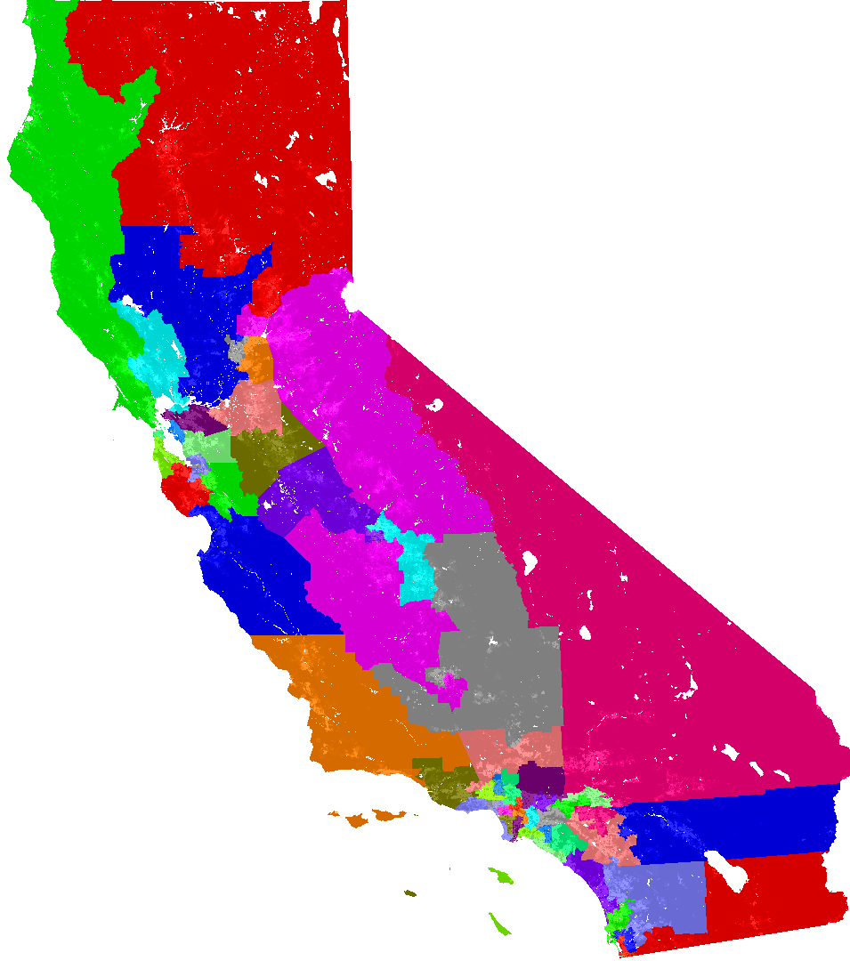
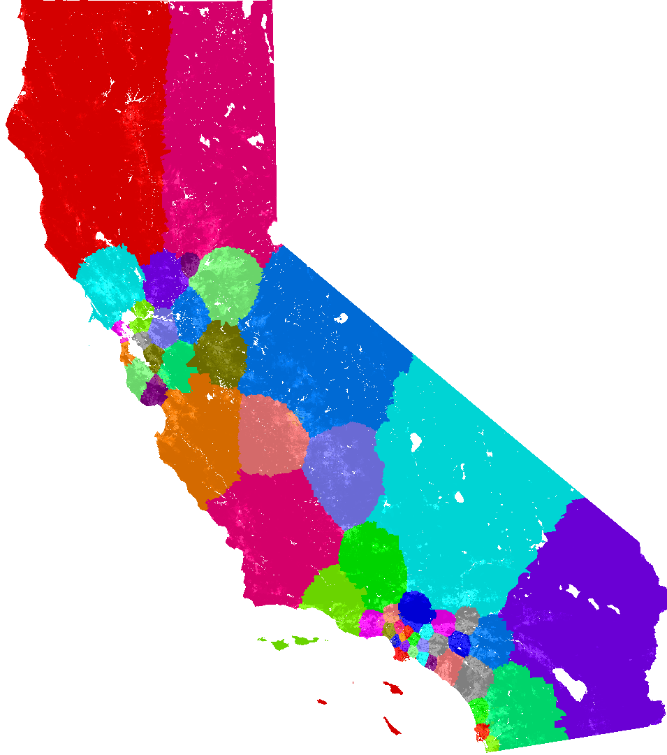
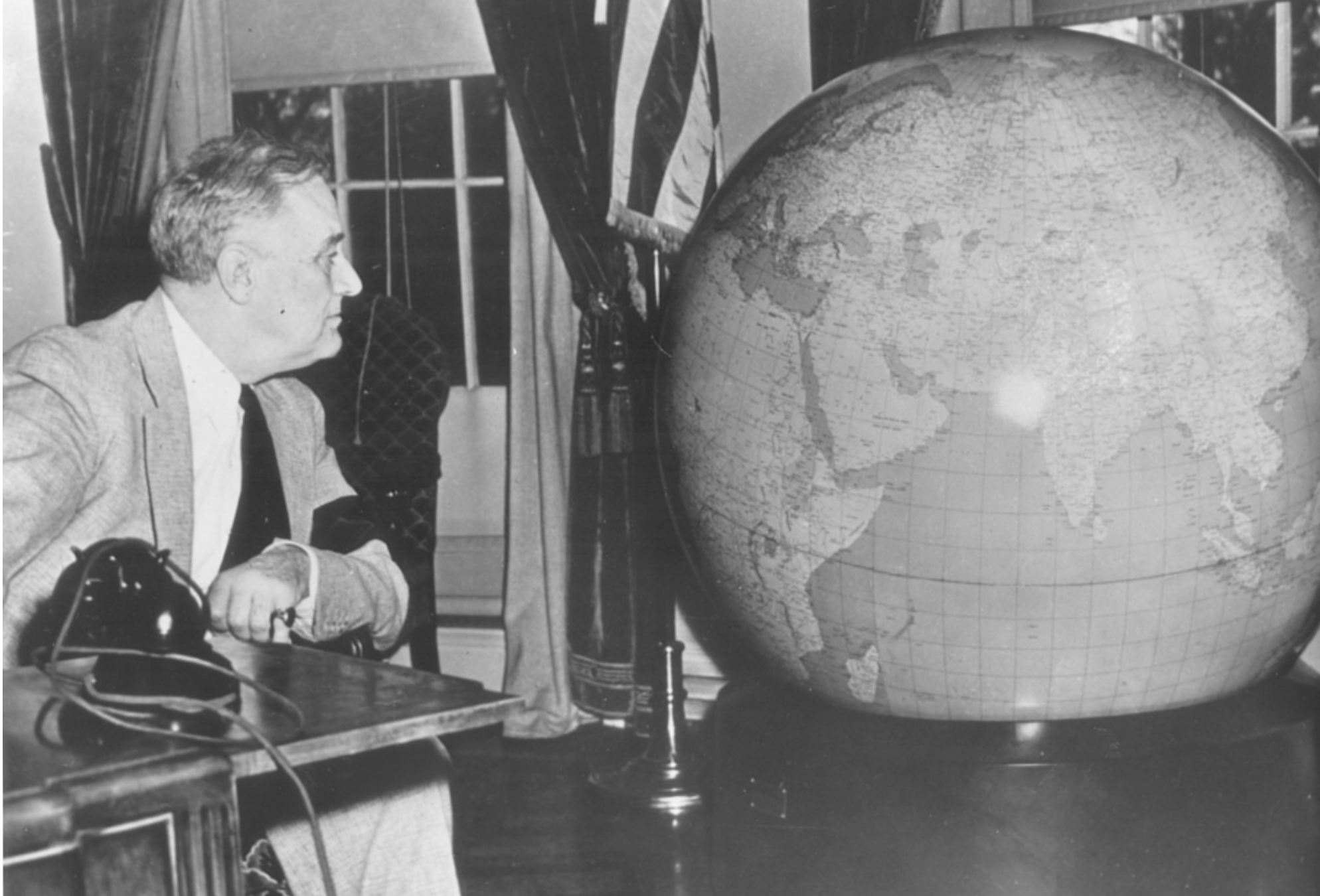
There are optimistic signs of the possibilities and options for refiguring the huge problems in democratic representation, as by creatively using data distributions that we have to create better centered electoral districts in less interested ways–shown here in the state of Georgia–that could reduce gerrymandering by redistricting through simple GIS.


Impartial Automatic Redistricting (2010)


Indeed, many plans for redistricting can lead to a more effective model of representation to which special interests, and bureaucratic slowness, have not led us to adopt, with potentially quite undemocratic results, in large part because of the huge cost of the transformation in voting practices.  But is the cost of such a failure increasingly apparent in the ways we form and select government for all?

And anyway, is the geographic allotment in California with greater sense as such a map?


CA.pngImpartial Automatic Redistricting (2010)


The alternative possible plausible map offering voters more equitable distributions of equidistance by automatic redistricting seems, in the abstract, potentially more reasonable, and removed from the interested division of districts in the existing map.


map-1.pngImpartial Automatic Redistricting (2010)


Perhaps the difficulties of redistricting are daunting, but the tools of mapmaking indeed have made them increasingly possible, if not for the difficulty of undertaking national changes that cut so sharply against entrenched interests of existing representatives who have nurtured bonds to their constituents, and would feel challenged by the compact district of a new electoral map, even though the older map is effectively infected by existing interests to easily confirm the redrawing of district.


pa-map.png


Or have we been overly disempowered by platforms of mapping, in ways that have allowed them to serve individual interests in overly explicit ways?  Indeed, the possibility that mapping platforms are tied to an unwarranted overconfidence in data and in the manipulation of individual votes seem to have been present in both sides of the 2016 vote, as plans for exercising rights to create a more equanimous image of voting representation remains in an earlier era–as, perhaps, the electoral college itself, may overly distort voting in ways that we are too often compliant.


RFD-map-votes-sfSpan.png


If we have long been attracted and attached to the descriptive power of the map–


fdr-and-glorious-globe


–is the medium not only interfering with the message, but overly disorienting?


4.  The enduring absence of a globe may be an eerily enabling underside of globalization, in which the never-ending wonders of internet are given something of an enabling basis in a range of maps that erase a contextualized view of place.  The imagined freedoms guaranteed  by uniform access to online information on the world wide web may have origins in the sense of liberation from geographical divisions of mapped territories that many maps once seemed, after all, to perpetuate so falsely as a bad ideology of the state.  One feels hard-pressed to imagine the democratization of the “flow of information” as leveling the playing field, save by its flattening of the earth.  But let’s move to a rosier age.  But the desire for the liberation of such a global vision of information might start in the “big picture” that maps provided for folks like R. Buckminster Fuller and of course Stuart Brand, who famously took the globe as an image of big issues and complexity.

For the economy of online information that derived from such initial optimism and indeed near-utopian aspirations to emerge from geographical constraints of Cold War nationalism has produced a spatial imaginary that has all but dispensed with place, by positioning it in a new matrix of geolocation.  Despite initial eagerness to envision global unity as proclaimed in the 1960s in the iconic interrogative Brand’s clever button posed in northern California on or around March 22, 1966.  For Brand hoped a more complete image the world could provoke a release from the ideology of a national map and a holistic attitude to environmental care as if by an interrogative of greater imaginative force–


Figure-1-Campaign-button-1967-by-Stewart-Brand-Urging-NASA-and-the-Soviet-Union-to.png


–the notion of the “Whole Earth” that Brand and crew believed to be almost in reach back in 1968 has more than somewhat receded from sight.

Brand had bravely advocated expanding one’s cartographical comprehensiveness to remap connections in a new picture for his audience.  He became an evangelizist for the “Whole Earth” perspective and offered broad “access to tools,” by boosting the breadth of its contents, and cramming information into the dense layout of its pages that optimistically erased one’s sense of disconnect to actual uneven distributions of wealth and, er, tools.  But by providing inter-connections by “big picture thinking,” Brand promoted a wonderfully holistic vision in the Whole Earth Catalogue, that Bible of “Holistic Thinking” aiming to remedy an absence of attention to complex, interconnected systems of which Brand dedicated himself whole-heartedly, by the sheer force of making a more open and comprehensive map to display the whole “big picture” in its copious abundance, enticing readers to trace extensive interconnections in the world that the Catalogue revealed.


Whole Earth Tools.pngFall, 1968


Stewart Brand and company viewed cartography both as an illustration and a model for the understanding of “big systems” he sought to illuminate in the Whole Earth Catalogue, providing an image of complexity of the “whole Earth” that interacted over an extended space in ways that cartography provided a metaphor to reveal.  Viewing the “whole Earth” sought to provide ways of revealing unseen connections between places and also offered with brio a ticket to understanding whole specialized systems and bolstered the hubris of bridging a gamut of specialities.  If this made the Whole Earth Catalogue a precursor to the internet and World Wide Web in its aims to reveal the breadth of the ongoing state of play, it was also embodied in the notion of a playful game in which the earth’s fate lay in the balance–echoed in how Brand imagined players of the cooperative game Slaughter shifting sides to prevent the earth from ever being pushed “over the edge” to one side–in an undisguised metaphor for preventing real slaughter from occurring during the war.


Whole Earth March 1970.pngWhole Earth Catalogue, March 1970 (MOMA)


The notion of a game inspired by volleyball using a ball painted as a globe sought to turn players’ energies toward protecting any team from pushing the earth over the “edge”–a fear increasingly emergent in the Vietnam War, by focusing on preventing it from falling–or, in a version modeled after Tug-of-War, by shifting sides in order to prevent the ball/earth from ever crossing too far across one line, and trying to maintain its stability.

For back when Brand and his friends optimistically  enjoined NASA and the Soviet Union to ‘‘finally turn the cameras backward’’ towards the planet earth to provide a picture of the world, posing the question first on buttons he hocked at the University of California campus in Berkeley, the notion of a new mapping of a global world and its connections would open a perspective that liberated users from what seemed hackneyed nationalistic values and promising notions of interconnection to ideas and information in new graphic forms.  The idealistic promise of global coverage didn’t create such a release, even long after the button-selling of Brand was chased off of Berkeley’s campus, but Brand’s idealistic notion of the power of global coverage informed the internet’s promise to provide information everywhere, by allowing unprecedented access to maps in ways world-changing in itself.

To be sure, the liberating force of the internet lies in its ability to provide information everywhere, but it remains true that the surface of the world wide web is anything but a uniform surface or playing field.


unknown-4


The absence of a level field in internet use continues even after Facebook‘s efforts to saturate the planet with free wifi, already evident in those most  connected to Facebook–


connessione-facebookFacebook Connectivity Lab


The obstacles to the dream of comprehensive online exchange hasn’t happened, and may not, given the uneven nature of the global penetration rate of the internet, whose global spread is broken down nationally on a cartogram warping of space by population, and shows deep whole in much of Africa and South Asia, and a lopsided evolution of web-use, convincingly rendered by the clever cartographer Luc Guillemot–


global-penetration-of-net-2000-2012Luc Guillemot


5.  Paradoxically, if inevitably the generation of most online maps is overwhelmingly and resolutely local, in the sense that it is only accessible in quite unevenly distributed ways–it would be wonderful to see the scope of the scale at which Google Maps is accessed in different places and regions, if such data were open; as it is, we rarely see the “whole earth” as Brand imagined, so much more focussed are we on tracking national political events or elections, or mapping the settings and spaces we travel and spread of local weather variations.  We map where we are in maps of air travel on view in airplanes, Waze apps we use to view traffic flows, or the crime maps of neighborhoods and, on a broader scope, the weather maps of nations, states, or regions, which have a sense of actuality that exploit most maps’ existence on a server, always able to be reformulated to track meaning and flows for our eyes, and indeed even to put us into its content.

Encouraged by the near-ubiquity of wifi and internet services, we use smart phones as navigational tools to trace our locations on winding roads, taking our eyes off of the itinerary, almost to the degree Rube Goldberg’s cartoon of Non-Tangle Map Rollers prefigured–running the danger of taking eyes off of the road on which we are driving.


Rube Goldbert's Non-Tangle Road Map Rollers.png


There is not such a utopian sense of how information actually flows online through the ether, to be sure.   Indeed, there are still clear winners and losers for the speeds of information exchanges that the speed of internet exchanges creates–and are not evident on Brand’s “whole Earth,” which still seems to provide the mental model to which online mapping aspires–despite the actual differences in the backbone that enables such online communications and the advantages it allots residents of certain regions:  for rather than provide a unified global image of à la Brand, cartographer Luc Guillemot’s recent map of internet capacities reveals intractable inherent differences in the sizing of information highways for different regions–and give the lie to the free-floating of information along the cables and backbones on which they are transmitted among different regions, by mapping the actual quantified capacities at which they run.

00.pngLuc Guillemot


The ways that we might understand the vision motion of information better have only begun to be mapped.  But the continuous provision of infinite information faces multiple material constraints.  The enticing image of the expanse of the global net has clear weaknesses, to be sure, as does the hope of expecting universal access to online maps.

So what of the whole earth?  Where did it go?  The proposals and presuppositions of the Google Maps template and of Web Mercator are rarely interrogated, but in the name of subsuming information to utility, and actuality to web tiles, the map engine does odd things, removed from experience, as a semantic web of spatial reference–like suppose a uniformity of land and water, render and reify abstract spatial positions removed from local context, and reinstate a flat-earth perspective that would be less familiar from a globe, that provide an array of tools to conceive of place–from tracking to geolocation.


6.  The framework of spatial reference generated the Antipodes Map streaming Google Earth locations in familiar map tiles imagery.   As in the header to this post, the engine bears the promise to match a map of where you are to the earth’s other side, analogously online information-sharing promises to place any user at any site, and by using the very same engine.  As internet-based maps provide a network of ready-made mapping whose instruments are accessible to all–despite the clear constraints that undergirds the internet and renders it less of the open area for free exchange.

The Antipodes Map engine is itself an artifact of the age in which any map is readily generated and supplied, more than exists.  It is an emblem of the utopian premises of the hyper-personalization of online maps–rather than present a record of the inhabited world, the site marks place for viewers by a search engine alone–and situates place in an otherwise undifferentiated expanse:  the map revels in the status of place in the map-engine as a “quasi-object” and of the map’s user as a “quasi-subject,” to use terms Bruno Latour coined as tools to understand the networks in which each exist; for the Antipodes Map website itself serves to trace networks of calculating place on an online map engine by a coordinate network, preparing a readymade sense of local landscapes disembodied from place and with little context, and removed from current political events or human habitation.

There is no Jules Verne-like majesty of imagining the construction of an actual tunnel, as a corridor running through the earth’s core, here advertised as a project to open to visitors tired of global air travel, linking Singapore and Ecuador, that is promised to be constructed from Singapore by 2050, which might provide the very sort of transport it imagines in an imagined physical corridor–


antipodes2


It oddly remaps place that preclude any sense of embodied travel, in a gloriously impoverished sense that sees the map as not only the medium, but simulacrum of travel.

The frictionless sort of travel that online mapping claims to provide to its users has been interestingly incarnated in an online Antipodes Map, if the magic of generating a web-map has admittedly lost much of its early initial sheen.  The search engine light-heartedly bills itself as a virtual “tunnel to the other side of the world” that half-exploits the decreasing availability of concrete media and forms of mapping in a “globe-less” society, whose lack it seems to mourn.  Many may mourn the symbolic centrality of the globe as a talisman of interconnectedness in the age of web-based maps, but the performance of the web-map and the surrogate reality that it offers viewers in a new network of map-use is celebrated in the engine as if to overcome the lack of the materiality of the map.  The engine allows, by an easy trick, instant generation of the web map from any set of coordinates, as “our ‘man’ will dig a tunnel from selected location, right through the center of the Earth, up to the other side of the world which will be represented on Right Map.”


different-scales-antipodes


Although the lack of scales in the two windows of the map-generator negotiates the fact that much of the world is water, the possibility for altering scales allow considerably bizarre symbolic, and even odder as a way to lend a sense of presence to the formally abstract and generic screen map–lending a notional materiality to the web-map that almost celebrates the map as a simulacrum that’s ready to be fashioned around where you are, wherever you are, immediately.


different-scales


For if the screen map declares it to be nothing so much as a “quasi-thing,” recalling a map in its pixellated forms existing only for the beholder for whom it is conveniently remade, and reassembled, that emulates the apparatus of map-viewing on a Google Maps platform.


7.  Indeed, the engine almost openly celebrates the rebirth of the new status of the map as a “quasi-thing“–which almost ceases to register spatial variations–where geodetic data exists only in a relation to the viewer or users of the platform, rather than inhere in the map, and place a “quasi-subject” that exists in a social network of map use and is provided for the user of a mapping service.   Place, in other words, emerges in the act of consulting the map and GS84 coordinates readily generates it, and place exists as a consequence of a technology of map-reading–and a network of reading place as it is generated on search engines–and as it circulates online in a network of map reading.  Although the Antipodes Map was not particularly successful as a search engine on its own, it recreates the same networks of map-reading to generate place through the immediate assembly of map tiles.  The Antipodes Map has little to do with actual Antipodes, but less dynamic GIS version that echoes the physical interactivity for reading space H.A. Rey so appealingly rendered in the illustrated children’s classic How Do You Get There?

Rey’s fold-out images offer visual surprises that dramatically addressed the problems of modern navigation of an age, as if to socialize children to problems of transportation, that responded to the increased mobility of the mid-twentieth-century, and indeed the increased possibility of a surprising degree of geographic mobility due to contingent circumstance that Rey himself experienced.  Rey’s classic book sometime seems a valiant attempt to put a good face on the history of displacement and mobility Rey himself experienced–but recalls a tyranny of the map that has become a far less sensitive visual medium in the a dangerously disembodied absence of a sense of self amidst the tiles of Terrain View.  The interactive mapping site suggests a nostalgia for the globe, by suggesting the notion of global antipodes can be easily rewritten for the screen, is subtly mirroring the imaginary of the smooth travel that the internet and many platforms of web-mapping openly promote, even as many face increasing obstacles to geographic mobility.  Any obstacles to mobility seem miraculously erased in the user-friendly promises to immerse oneself in the map and be transported to an antipodal point–albeit one that comes up quite short on any spatial experiences at all.

For if How Do You Get There? was permeated by a sense of place, and may indeed echo how  the intrepid children’s book illustrator might have mused on the varied conveyances of his narrow escape from Paris to Lisbon and through Rio de Janeiro, in Brazil, to New York City from bicycles to transatlantic ships, it offers a visual sequence of problems of transport and the most apt vehicles to move from one site to another, inventively exploiting the fold out pages in the paper product of the book to mimic movement across spatial divides across which different vehicles can transport you, retelling the radically expanded transit possibilities half way between the innovation of the ocean liner and the jet age:  the first image poses problems of transportations to which solutions immediately emerge by raising half the page, to reveal the conveyance allowing one to move across a medium–


unknown-9

inagll_031810_300pxc


The growth of new possibilities of transit is implicit in every page of Rey’s book, most often poignantly told from the child’s point of view, as if to offer a guide that can orient them to both the local and global, and newfound mobility in urban and global space.


bus.png

a_h_rey_page_open

In contrast, current users of “Antipodes”–a service whose plan lacks relevance to the actual Antipodes, a concept that maintained the balance and global harmony of the world’s continents, which came to refer specifically to the large southern landmasses New Zealand and Australia in much of the northern hemisphere–


207C.JPGSt. Sever (1030 AD, following Beatus Renanus)

207d2


–but rather relates antipodal points that intersect the earth’s center in a straight line, mapped on projected coordinates.

There is a sense in which the dual maps presented to viewers clearly recalls juxtaposition images in parallel slide projectors, as a sort of comparison of the formal shift in settings that the map takes the viewer or generates a place.  Rather than offer the material visual surprise of actively unfolding a paper flap, the parallel images that recall parallel projection from two projectors in the slide lectures given in darkened halls of art history lectures of a generation (or several) ago, to focus the attention of his audiences on the Formgefühl of projected images to unmask a syntax of art.  The twin map-screens of different scales in the Antipodes Map are clunky because they  echo how parallel slide projectors provided an apparatus, from magic lanterns to the slide projectors, for art historians to compare and contrast styles Robert Nelson once described as an inheritance from the Swiss art historian Heinrich Wölfflin–who employed dual projectors to give viewers the sense that they witnessed and hence best appreciated the content of images.


8.  The juxtaposition of two map screens less openly celebrate the work of art more than the speed of the instantaneous generation of images, of course.  But the Antipodes Map is similarly intent in the miracle of creating a juxtaposition of antipodal locations, as if place was merely something that arose from the comparison of locations.  The basic suasive apparatus of the website’s map engines echoed how the material apparatus of projectors that became such a staple for orienting beholders to stylistic differences, and appreciate a work of art.  They seem to celebrate the online map, despite its visual dullness of its form.

The contrast immediately generated between a provided place-name and how the engine locates its antipode by the magical apparatus of an online map engine; users are  invited to enter the sketchy simulacrum, and to identify with the icon in slacks and a white shirt who seems to reappear at a corresponding point, albeit almost always at radically different scales–that exploit the frictionless nature of the virtual map as an accurate interface.


bed-stuyaustralian-indian-ocean


The aesthetics of the website obscure distance, by allowing one to move by the input of any toponym to two points in the world, and find its corollary in the opposite hemisphere automatically generated.   The coordinates of longitude and latitude are suddenly, as if by a magical sort of travel, spatially re-situated by polar opposites of place represented by adventurous figurines who seem to stick their head in the ground, as in the manner of an ostrich, only for it to reappear at the corresponding antipode on the terrestrial sphere.  The website lists the range of actual antipodal cities that make one wonder what meaning lies in antipodal relations–Manila and Cuiaba (Brazil); Shanghai and Buenos Aires; Taipei and Asuncion (Paraguay); Aukland and Seville; Singapore and Quito; Suva, in Fiji, and Timbuktu; Hamilton, New Zealand and Tangiers; or Masterton (New Zealand) and Segovia–beyond suggesting the extreme over-inhabitation of much of the current ecumene.

Indeed, “tunneling through the world” will allow one to move from through an infinity of antipodes, as from Split, in Croatia, to its actual antipodal point off New Zealand by a hexadecimal coordinate system of Google Maps,–


–in ways that suggest the antipodes don’t actually “exist” as a place, but only in the relative terms that exist in a Web Mercator projection of WGS84, which in the map screen can be imagined as two points between which web-maps allow one to physically move, and coordinates that can be readily juxtaposed.

The conceit of the simulacrum of the map through which one passes, as if to another world, to its antipodal counterpart, is a cool tool to vaunt the power of the web map with apparent precision.  Tunneling through the virtual screen will surprisingly transport you from one city to another.  Iconic humanoid stick figures, our new stock figurines of surrogate explorers within the screen map, are immediately oriented to a mapped place abstracted from any vehicle of travel by the GIS mapping engine, on a website that seems glibly to treat the map itself as the medium for imagining one’s voyage to a point of parity on the globe by analogy to Google Street View, as if one might poke one’s head through the world’s surface, and treat the conveyance of the map as a way to shrink space.

While the logic of calculating terrestrial coordinates of antipodal points is ridiculously simple–by simply switching out North (N) for South (S) in each latitude; subtracting the longitude from 180° and visualizing the result in Google Maps–


Antipodes.JPG


–the visualization is profoundly bizarre symptom of a globe-less culture, where coordinates exist not on paper, or on a spherical surface, but rather on a screen–and may suggest something of an a nostalgia for the globe as an object of contemplation, despite the sense that it is a far less adequate substitute, whose interactive format is a bit more of a parlor game quick to become outdated in the age of online mapping.

The formal trick of the interactive Antipodes Map invites us, perhaps for want of a paper map, to dive through the surface of the map, and presents the flat surface of the screen map as if it were a surface through which one could travel through a now-absent globe, as if through a looking glass, between such antipodal points as Rome and New Zealand–


Rome to Antipodes near New Zealand.png


or Denali Park in Alaska to the even colder regions of the Southern Ocean near Antarctica’s edge–


Denali Park:Antarctic Southern Ocean.png


and imagine easy transit from Oakland CA to the Indian Ocean–


rockridge-to-indian-ocean


or from the West Bank and Jerusalem, as if to escape the constraints of increasingly obstructive boundary barriers, to beside the international dateline in the South Pacific–


The notion of such smooth cartographical getaways are flights of fancy, but can’t help but make one think of the actual mobility of refugees who increasingly crowd the surface of the world whose itineraries are all the more fraught.  Has it been a coincidence that as globalization is based on new modes of mapping borderless travel and data flows without frontiers, frontiers of economic differences are increasingly constraining ever-increasing numbers who are not often on our mental screens?


Perhaps the magic of shifting place in the Antipodes Map is a product of a society where our travel intensity is so susceptible to place-shifting and where upwards of 700,000 are up in the air at any moment, and over a million paying passengers flew daily in 2015, and airlines are expected to fly 3.6 billion passengers by 2016.


air_routes-1Michael Markieta (Arup)–60.000 air routes


In an era of massively accelerated geographic mobility connecting some 7,00 airports, there is something crazily believeable about the playful conceit of the Antipodes Map:   one might readily imagine one can stick one’s head into the land only to re-appear, presto changeo, on the other side, as if by sticking one’s head into the ground, one might reappear on the other side of the globe.  We are removed from the sense of a globe–despite the use of terrestrial coordinates; the website rather provides a sort of Flat Earth Project, now is cast as sort of paired Moebius strip, using the visual metaphor of entering head and hands first though the pixellated map of New York,


New York.png


–one might be conveyed by the search engine, as the map gives way, in all of its faux materiality, and we appear at the opposed set of terrestrial coordinates, off the coast of Australia, in a metaphor for the cognitive difficulties of world navigation by smart phone, using a projection that expands Antarctica to a prodigious size the it serves as the footer of the screen:


Near Australia.png


Resolutely and radically anthropocentric, if similarly antiquated–much as the conceit of compare and contrast with dual slide projectors, the variation on Google Street View places the humanoid and seemingly male figure in an abstracted landscape, in ways that incarnate an idealized interface between man and map, loosened free from any environmental context or actual spatial orientation, save longitude and latitude.


phoneix


One can move in to closer scale, to be sure, and focus on a specific neighborhood or intersection of streets in a city before symbolically tunneling to the other side of the world, or reappearing on the matching coordinates in the other hemisphere:  but place is less here understood as a place of habitability, or inhabitation, so much as the coordinates mediated on a screen and as a sort of place-marker, familiar from Google Maps, with only marginal reference to its topography, and not a space for settlement or inhabitation.

The fictional cartographic conceit entertains an imagined transit of childhood–digging a hole to China?–but rather than present an actual adventure, à la Jules Verne, one celebrates the versatility of the flimsy artifice of the flattened screen, which suddenly and playfully invests itself perhaps with a health share of faux materiality, as if to announce the lack of global bearing or geographic learning that are in the end required for new tiles to assemble and reassemble themselves at convenience, to show you where you are, and no real need for a conveyance to arrive anywhere in embodied form, and to celebrate that no resistance or friction to imaginary travel exists any longer in a globalized world.

Sometimes the icons may seem odd, not to mention out-dated, as if one was doing asanas in the midst of a forest near Nepal, where all of the previously familiar constraints of travel are erased by the imagined access to space that the terrain map provides.


kathmandu


We can move, frictionlessly, to tunnel across the world in this cartographical fantasy from a site located beside a lake–


Chicago.png


to an unkown site in the Indian Ocean–


site-in-indian-oceran


or indeed from the Himalayan mountains of Tibet to off the coast of Chile–


lhasa-tibet


The oddest aspect is the utter absence of a sense of conveyance, as if a celebration of the fact that what exists is not reality, but only, and absolutely, the fantasy of a flattened map.

If Ray celebrated the opening up of the landscapes of travel by different conveyances, as if to celebrate the transit across space for readers, by orienting them to challenges that almost seemed impossible–


15038531

15038532


–the notion in this search engine seems to be that there is no landscape, but that by playing with maps, in an innocent way, the contours of the globe are not only easily transformed to a hand-held pixellated screen, the new medium of the map–


bed-stuyaustralian-indian-ocean


–but that one almost doesn’t even need to see anything in the map as a set of spatial relationships, but can use it to lead to situate oneself immediately in the static landscape ties that the search engine generates.

How to reconcile the constraints in which so many live clustered on the side of borders that defined economical disparities, or just outside them, with the unbounded optimism of the online map that can track our position at any place in the inhabited world seems a problem of world-making, if one that mapping may not alone resolve.

2 Comments

Filed under data visualization, geolocation, Google Maps, interactive maps, mapping place

Self Made Maps

Many online responses to the arto-carto project of Mapping Manhattan remind us of how the biggest challenge of any cartographic totalistic idealized view is to record local details with fine grain: it’s no coincidence the chorus of posted responses to the maps in today’s New York Times often complain about the loss or absence of specific individual neighborhoods, or the absence of economic diversity (and ethnic diversity) in the beautiful colored maps.  As an exercise of collective map-making, the project that Becky Cooper ideated and planned, “Map Your Memories,” provoked each cartographer to record their own view of that island, rendering it as inscribed with memories of their own.  This open call perhaps provoked the deep-seated nature of responses it has met, evident in the energetic nature of good-hearted responses Mapping Manhattan has elicited from online readers over the past few days.

map_2

The call to “Map your Memories” asked a range of writers, artists and other would-be cartographers to record individual memories in the outlines of a map of Manhattan island of vague north-south orientation.  The book stands on its head maps’ implied claims of objectivity, by treating media as a screen to project memories, whose individual design reveals their topography to be imprinted with haphazard collections of personal associations or reminiscences.  The white upper-class basis for these mapped perspectives  is implicit in their subjects– lost gloves, volumes of Proust, chick-lit, cups of non-Starbucks-brand coffee, lovely one bedroom apartments, or stages of urban fear; the maps are something like open invitations to play Proust.

They are rightly, and also wrongly, criticized as upper-class white bourgeois artifacts, since that is what they openly are–no one would presume to credit them or mistake them from objectivity.  (That might not be the audience that the New York Times wants to address, but is after all the audience of Abrams, the art-book publisher.)  The playfulness of some of the maps clearly perpetuate these myths playfully transform Manhattan to echo something like a medieval zone-map, where torrid zones of uninhabitability, and in fact are divided by zones where the mapmaker would never set foot or know:

map_5

In quite a few, boundaries of class are visually thematized and reified with a certainty familiar from  the medieval “here lie monsters,” or Odyssean sea-monsters, or an edge of the earth from which one might easily be able to fall . . .

tumblr_mibz79u24w1qzbevlo1_500

These maps celebrate the artifice of cartographical fiction-making, reading more like the maps of Jules Feiffer and Norton Juster, or of the sensibility of that great medievalist JRR Tolkein.

I prefer to read other maps as a range of responses of common DIY creative reactions to the plague or deluge in most of our big media of weather maps, visualizations of databases via GIS creations or simulations, where detail provided by surveying is lost or filtered out for a schematic view of the whole, reactions that are apparent in their sheer cartographical abundance or ecstasy of naming with which each cartographer is offering a map of their own.   I see a sort of reaction to the dramatic diminution of the art of the cartographer in Google Earth or the Weather Channel, where big color-drenched screens, sometimes over-saturated with details or more often just clotted by hues to signify climactic variations or cloud-cover, replaced the selective criteria of mediating topography or settlement via cartographical art. Such a diminution of the act of creative cartography is, after all, an imaginative failure, as much as a shift in cartographical media.  Contrast the abstraction characteristic of many GIS-generated maps to the abundance of local meanings that distinguish the series of maps that Cooper has assembled.  There is a joy of celebrating the individual that has led so many of the online comments to beg for their own memories to be inscribed in the maps, as well as those of the authors.

This is evident in the visual celebration of the mapmaker’s art in the lovely watercolor map submitted by Markley Boyer, one of the few historical imaginations, of the imagined bucolic past of Manhattan as a field of green, surrounded by a sea of blue.  This map most reminds me of the impact of the tools that our cartographers use, as much as their level of artifice.

map_0

In this material remapping Manhattan as a lost Eden, the author of Manahatta: A Natural History of New York City, has reclaimed the artifice of map making in richly saturated colors and applied sponge.  This Manhattan of the mind is mapped at several degrees removed from the actual inhabited island–as are all the maps in this volume–but the degree of artifice by which it stands at a remove from the island reminds us how much all mapping records the relative richness of a vision of self.

5 Comments

Filed under Becky Cooper, Feiffer Map, Manahatta, Mapping Manhattan, mapping memories, Markley Boyer, Proust