Category Archives: Facebook

Facebook Tracks Migrations across Borders: Harvesting Data, Ten Years In

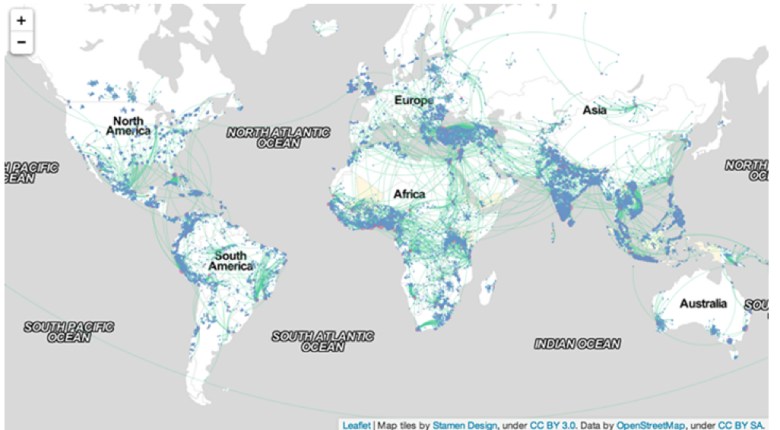
The pleasures of all forms of mapping respond to the deeply satisfying ends to which they process ties across space for viewers, allowing them ways to access space through spatial networks that one never before had the pleasure to observe:  and watching these connections and webs appear in a graphic template gives one a new sense of imagining travel across space, but also an almost innate pleasure of seeing how places are tied.  The multiple frogleaps between shores and across countries in the above world map suggests a shifting notion of the inhabited world.  With Facebook at its tenth anniversary, the immense amount of data that the social network generates offers opportunities to map impressive patterns of interconnectedness which shift attention from those borders which have long defined nation-states or indeed the bounds between land and sea.

In ways that might well be signs of the times, and surely aim to chart a sort of post-modernity, the maps of connected identities offer striking ways to see the world less in terms of its divisions than the links web-based communication allows one to harvest.  Indeed, without depending on the nation as the unit of meaning:  Facebook’s project of comprehensive social graphing has maps populations and social networking by tracking a combination of individuals and aggregates over space–at least, across self-reported locations.  Facebook has already showcased its data as a means to map friendships in ways that suggest a new way of reporting linkages in the very sort of social networks it promotes.  If all maps map human knowledge, these data maps also visualize space outside of spatial constraints:  but a new type of mapping emerges by tracing populations on the basis of how its users self-identify as birth cities and cities of current residence.  For Facebook engineers map actual spatial distributions by big data of the sort economists admire measuring, but most have found hard to discern.  They are worth attending to in some detail, not only to ask about the data on which they are based, but to examine the beauty of their construction.  By charting patters so compelling, they also force one to wonder whether the real story they tells go beyond the reach of the world-wide web–and what ways to best understand the geographical connectedness they actually reveal.  Perhaps we can begin by asking what sort of vertiginous views they offer of the world and its inhabitants, and how we can best relate to the stunning images that Facebook engineers seem to have taken such pleasure to produce–and whose visual economy seems so pleasurable to view.

After a decade of storing Facebook-generated data in a thick dossier of computer files, Facebook claims the ability for a sort of aggregate mapping, but one that erases individual stories:   its aggregates conceal the somewhat obvious fact that it tracks the self-selected members of Facebook users, and showcases them as if they offered a comprehensive enough record of the inhabited world to base a definitive social graph of global populations.  Perhaps Facebook users are the population that we want to notice, or the population that it makes sense to track–but this limitation of data is a liability as much as a strength–and because it treats the usual boundaries that have long offered practical constraints to travel and exchange as superseded, aside from the unstated boundary lines that divide China or North Korea from the other countries of the East.  The map suggests a new sort of human knowledge of connectivity and of the different sorts of markets, presumably, that those who are web-connected participate and are attracted by or move within.  The map that results is striking both because of its erasures of the border-lines and boundaries–and maps webs and arcs of population links without clear reference to spatial directionality.  The skein of ties that emerges has become somewhat iconic, and has also provided a sort of template or inspiration for the map of users’ “migrations” or shifting geographic locations in ways considered below.

Given the intentional elision of individual story-lines that is characteristic of the data being harvested, it’s important to try to untangle the maps it makes from the data on which they are based–if only to understand the bias of the picture they present:  a demographic restricted to their users, as well as based on data that is self-reported and without any objective control.  Rather than tracing the unidirectional movement associated with moments of migration driven by famine, slavery, war or ethnic tensions, the strikingly geometric maps Facebook engineers created reveal patterns of connectedness of special interest in tracking geographic mobility, but also in mapping (and perhaps describing) the new patterns of interconnectedness Facebook engineers would probably like to associate with the Facebook networking site.  The oddness of using the self-generated information on a site of social networking as demographic data may reveal a thirst for processing big data; once invested with the aura of objectivity, the collective patterns it reveals can erase individual stories as much as synthesize completely credible and coherent narratives.Connectedness is fascinating to track.  And such information like place of birth and city of residence are not considered categories massaged for personal advancement.  But the internet offers enough screens of concealment and opportunities for disguise that the social graphs Facebook makes tend not only to lack objectivity, but base themselves on data pontentially massaged by users–who, living in the suburbs of one city or in a nearby village, may report themselves as living in the best-known largest nearby city readily recognized, less in an act of deception, but in ways mistakenly treated as objective in character.

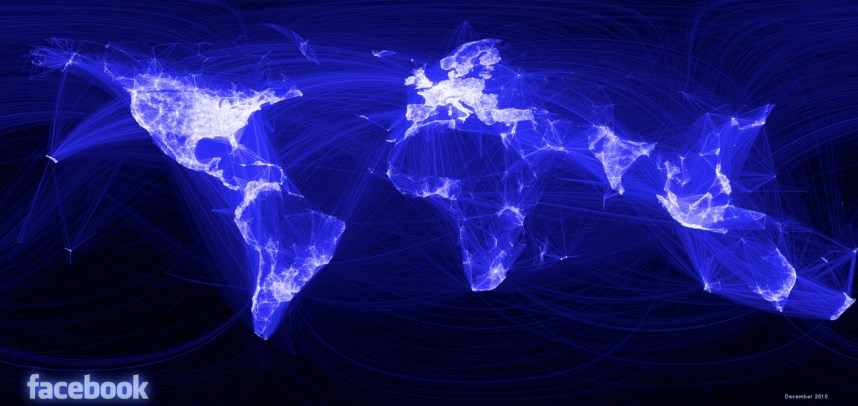
If all maps tell stories in how they embody meaning, the stories that the maps based on Facebook data suggests demand unpacking, if only since their numbers are so apparently comprehensive and large, as well as the stories that they submerge.  One story they promote, which we might not accept, promotes an increasingly inter-connected world; others that it conceals is the specific stories about who is connected to whom and why.  With almost half of Facebook users identifying two hundred friends, the webs created by the data purely of Facebook connections reveals an inter-connectivity that privileges the densest distribution of populations in North America and a broad sense of Europe, with a particularly active groups of users also dispersed in Central America, Peru, Argentina, Anatolia (Turkey), Nigeria, South Africa, Pakistan and India, and Indonesia.  This map of global “friendships,” developed by Facebook intern Paul Butler in 2011, offers a “social graph” of some 500 million people, linking users’ friendships to actual coordinates of latitude and longitude to create a visualization in a sort of media mash-up, illuminated by an intense if other-worldly backlit glow of FB blue.  The map of social networking that results suggests not only who is networked, rather than density of habitation but of course also maps the density of the culture of social networking that has come to stand, especially for Facebook, as a sort of index of modernization.  The equality between Facebook use and modernity recalls how closely the ‘Twitterverse’ maps onto the maps onto the global flight-paths of airline routes, as new study has found, suggesting that airline connections between cities provide a statistically valid proxy for twittering to sites beyond one’s own hometown–and the ties that Twitter makes in virtual terms should not be in any way that distinct, after all, since “Twitter is part of the real world” as is the internet, as Matthew Battles astutely observed, and tweeting is shaped by real-world social ties, even if it offers a new media for communication.  But it would seem a misleading inversion of cause and effect to take tweeting as an out-and-out proxy for modernization, equating it with the tracing of ties commerce and capital flows.

The question is not about the data of Twitter vs. Facebook, but about how big data is used to create the multitude of variant maps generated by Facebook media, including this map of ties among its users.  The multitude of variant maps generated by Facebook media seem particularly striking for their post-modernity in how they elide or ignore the frontier as a primary unit of meaning in world maps.  Is this map an illustration of of the acceptance of Facebook as a part of one’s identity, and do the great arcs themselves constitute something of an accurate index or emblem of post-modernity?  While Facebook is actively interested in promoting is own ability for harvesting data, many of the maps of friendship, migration, and social ties of course read a lot like images of its ability to promote social networking.  The arcs of light that map online ties not only mirror the sort of etherial airline map that seems as good a predictor of twitter ties–does this suggest the similar likelihood of access to airplanes as access to tweeting?–but a gauzy penumbra spun around the earth’s inhabitants who sit spellbound before backlit screens, luxuriating in the proxy embrace of on-line connections and affections? It’s always important to ask what sorts of abstractions that any map seeks to communicate through the tenuous bonds they draw linking actual regions.

Paul Butler's map of friendships

Is this a new story the habitation of the select areas of the information-sharing world that Facebook links?   The above image tells one story about the inhabitants of the world, or rather of a specific world,  and a strikingly suggestive one in how Facebook’s data defines the worlds inhabitants as its users.  For there is no doubt a certain amount of estrangement from other forms of communication that this image, linking pairs of cities weighted for how many friendships exist between them, also maps, varying the intensity and brightness of lines’ coloring by the number of friendships shared as a way of mapping “real human relationships” across space in ways that Facebook does not note explicitly:  the map devised by Facebook’s infrastructural engineering team is a map of the very distances that Facebook as a medium is best able to bridge.  If perhaps just as revealing of access to computers, digital literacy, and wealth, the arc drawn across the empty spaces of deep blue that are oceans charts the networks of inter-connectivity among which news travels, memes grow, personalized photos shared, and a sort of quasi-information society exists, by the construction of the social network on which it travels.  This “globology” reflects less the currents of cultural contact, migration, and exchange that define global history, but something analogous to the cartographical flattening of it, viewed through access to the options of like, connect, dislike, or share that Facebook offers its users.  It charts the options that have shaped, to one extent or another, a transnational psychology of communication.

Which makes the ambitions of Facebook engineers to map patterns of “coordinated migration” an interesting case in mining of new trends in geographic mobility from the massive amounts of data that they collect, if only because of its goals to map actual spatial position over time.  The somewhat-recent maps of what FB term “coordinated migration,” based on the patterns of relocation that emerge from self-reported data of the site of birth and current location of FB users.  The result of the database’s collation is to track and define the lines of the global phenomenon of urban migration, once reserved for larger industrial cities or metropoles, but not significantly broadened across the world, both to population growth and a drying up rural prospects and jobs in the magnets of urban metropoles.  The idealized format of these arcs of migration create a social scientific aura of explanatory simplicity, and serve to affirm the notion that individual itineraries respond to an economic marketplace.  The boast of Facebook to chart such pathways with accuracy has been critiqued for its use of private data without evaluation through the scrutiny by peer review, and may deviate from standards of impartially objectively derived data, or by using publicly listed self-identification to endow with the graphic objectivity (or appearance of it) on a map.  The maps make tacit claim to reveal the real attraction of populations both from neighboring cities in the same country, or, in South East Asia and India, from neighboring countries, by the web of tiny green arcs discussed in greater detail below, provide a useful filter for sort of big data economists have problems measuring of global migration, and indeed to distinguish quantifiable migration numbers and patterns in different regions of the world.  Once again, frontiers are less significant than the ties of cities that the data input by Facebook users enter into their pages, and which they map.

Underlying questions remain, but seem to be waiting for further or future analysis.  For one, how, Sheryl Sandberg, do these patterns of migration map out along gender lines?  In mapping “destination cities” by red dots, and “origin cities” by blue, the design group Stamen has helped render a smooth arcs of migration as a set of naturalized movements, in order to throw into relief the relative density of a phenomenon of “coordinated migration” around the world, but creates a naturalized web.  They give one useful key to read meaning from these idealized arcs by setting them against a global map coloring regions of relative urban growth in 2000-12 pale yellow, in the sort of compelling image  compressing a density of variables to simple graphic forms of which Tufte would be proud:  routes replace cities that they link, or that appear as numinous purple blurs that remind us of the messiness of mobility; the crossing of frontiers replaces frontiers, which must be deciphered by the limited role of crossings from China, whose very existence is only implied by paths of emigrants abroad.

Coordinated Migration #2

The mottled blotches of blotting-paper blue to which the thickest green trails lead indicate the fastest growing markets of production that provide the magnets from nearby countries as well as for regional residents.  The linking that the map tracks suggests a sense of populations in flux, and of the market-driven nature of the migrations that Facebook’s data tracks, and whose intense mobility is a sign of relative modernization as much as social unrest.  The broader linkages such data implies between Facebook and the global process of modernization is, certainly, good publicity, no doubt, if largely on the level of a subconscious association.

But the emergence of what Facebook has christened in quasi-sociological jargon as “destination cities” might be taken with a grain of salt.  But the data that Facebook has so far collected is also an inversion of a somewhat embarrassing incident that occurred at Facebook back in 2010, when Pete Warden devised with the inventive project to scrape the public Facebook profiles of 210 million users in the United States to derive the clustering of networks that divided the country according to FB ties, creating his own national map, but then withdrawing the offering of the data as public when Facebook threatened suit, but had to allow him to keep up the map he derived from the data–brilliant if only for its definition of clusters that would never be rendered in a printed map, with eponymous if imagined toponyms as SocialistanMormonia or winning ones like Stayathomia, designating the greater northeast and midwest–a region viewed by most as revealing less geographic mobility, but which wouldn’t appreciate that name.

United FB regions

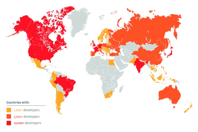
The map, soon taken down, may have encouraged a sort of counter-posting of a heat-map that announced the world-wide distribution of Facebook developers, which seems designed to celebrate their global geographic diversity, rather than social or geographic segregation, to dispel the notion that they are concentrated in the United States or, in terms of the city where most FB developers live, San Francisco.  (The coloration of whole countries based on local concentrations of software developers finds all of North America painted red.)

Facebook-Developer-Heat-Map

But the huge amount of data that Facebook has developed in a decade-long harvest is hard not to want to map, if only to see what sort of visualizations it produces.  And the three or four maps they issued tracking the benefits of ten years of social networking have led to the claim to reveal new patterns of social migration to cities or urban metropoles that are the equivalents of hot-spots in a globalized world.  The shading yellow of regions the World Bank found marked by high “urbanization growth” over the same period–2000 to 2012–creates a simple context to situate the migration, although it would only really make sense to chart that growth in population over a broader period  corresponding pressures that impacted those who were migrating in ways tracked during this period as a way of registering, or so Facebook would like us to think, some of the primary forces that have reconfigured a globalized world on which Facebook has a clear take.  The cities noted as cross-national destinations reveals a sense of global mobility and inter-connectedness with which Facebook wants to promote, to be sure, linking a sense of globalism with its product’s global reach, but wrap the world in a skein of green lines link with differing intensity selective cities an towns, suddenly giving prominence to the links of a potentially economically prominent demographic.

Coordinated Migration #2

The elegantly arcs of migration charted from original residences are quite impressive localized illustrations of geographical mobility:  if the result might not be truly comparable to how Aude Hofleitner, Ta Virot Chiraphadhanakul and Bogdan State have decided to evoke the many “large-scale migrations [that] are an important part of human history,” the chart reveals micro-patterns of geographic mobility by neat green lines would make a social historian turn green with envy, mapping “flows” from hometowns to current cities.  The responsible social historian would ask whether those nice curved swirls map along a symmetry misleading in portraying actual paths that those migrations took–many, one could speculate, were routed through multiple other cities or post-modern metropoles, as the line connecting any two points anywhere is rarely a perfectly smooth trajectory or arc:  the visualization betrays, in this sense, the data-centered models from which they derive, and are, in a sense, less revealing of a picture of actual populations.  But the floral patterns they create, spinning from blue-dots of geographic origins to red dots of final destination or current habitation, document a fairly radical shift toward urban in-migration, reminiscent of nineteenth-century Europe, and a huge attraction to sites in coastal west Africa, not only Lagos, whose urban population’s growth by almost one-fifth reflecting the expansion of the city and oil-production, but also Dakar, Accra–whose urban growth also approached 20%–, Ghana, the Gulf of Guinea, and Nairobi, as well as Dar es Salaam.  (One suspects that this is but a shadow of the true migration of populations, since it only represents data from the social network that Facebook runs, and is silent about its very selective picture of folks with internet access and net-literacy.)  But the migration of Nigerians it tracks to Lagos is nonetheless prominent.

Could this data not be usefully cross-mapped with the growth or social compositions of destination cities in more provocative ways?  What sort of visualization would that create?  Can it be refined, by accessing data like the changed place of Facebook users over time, creating a somewhat more messy, but perhaps more informative, way of tracing patterns of migration, than a graphic that seeks to underscore as well as illustrate the notion of a “coordinated migration” from smaller towns to metropoles?  To be sure, the arcs used to denote the alleged concentration of migration area a way of softening the image of Facebook’s data, making it more organic part of the map, and not serve as an apparatus of any accuracy.  The arcs are aesthetically engaging as a way to illustrate each “destination city” by its reach to its hinterland–or to other cities of origin–to visualize and showcase the massive amounts of data that it has collected, much in the way that Facebook has engaged in multiple ways to visualize the scope and extent of data that it generates over a huge expanse of the world, if not to suggest it forms a way of tracking the inhabited world, under the name of Data Science, always keeping that data anonymous.

The map of major destinations of folks in the two year period of 2010-12 is striking for how it reveals a changing face of global socio-professional mobility that seems specific to some classes.  The usage of circle arcs in the streamlined OSM cartographical data is almost as misleading as it gets if one thinks that the arcs mirror the messiness of routes of actual spatial migration.  But the abstraction of defined population currents offers an abstraction of presumably “eminently hirable” individuals looking for more profitable lines of work, linking the Facebook populations with the up and coming professionals of the future, as much as with job mobility.  The yellow highlighted areas of notable urban population growth create a backdrop that increased the legibility of this slightly restricted map, and others below–one  wishes for a bit deeper patterns of urbanization and rural pressures–at times far preceding the decade we are describing in these maps.

Coordianted Migration--Africa

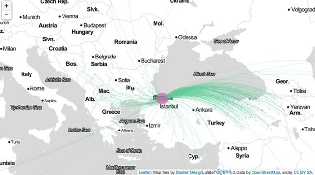
The graphics are particularly striking visually, and effective as compelling images of global patterns, even if they also might not be that deeply informative:   they trace a collective social history of urban in-migration in Istanbul, the city Facebook’s researchers found to have the greatest “coordinated migration,” largely as it is the greatest metropole in a largely rural but rapidly “westernizing” country whose infrastructure has greatly transformed–as if Facebook use was a predictable index of economic modernity and, by extension, growing markets for its advertisers.  The foci Facebook’s data has illuminated here indicates as “growth towns” such destinations as Nairobi, Lagos, Port Harcourt, Accra, Kumasi, Kampala, and Dar es Salaam, but purged of the living conditions in those sites.

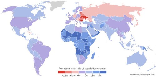
But a more complex super-imposition or layering of not only urbanization, but annual rates of populations’ change worldwide, in ways that the United Nations has also charted in ways that would be of particular importance for such coordinated migrations, which focus, say, not only on Mali’s and Kenya’s urbanization, but growth in Zambia, the Central African Republic, Chad and Tanzania–and explain why these are to differing degrees loci of the very migratory pressures that Facebook has detected.  (All data deserves to be mapped, but the Facebook seem to privilege almost exclusively the very data that they generated, in order to showcase the trends that its use is able to detect, but some maps are misleading enough that they are perhaps less better drawn.  This leads to some complications, both since the data is not made public and controlled, but also since it is not able to be combined by other data or metrics in responsible ways.)

Population Growth UN Charts

The transformation that these maps chart might be one of the huge expansion of internet users–the maps map their own data, after all.  The clustering of such users in a rapidly growing city like Istanbul is particularly compelling, and interesting reveals the huge amount of in-migration from the less sparsely populated areas of Anatolia around the Black Sea that led to the city’s growth by almost 12% in 2010-12.  It would especially profit from a charting to areas of the city–if possible–or the expansion of the city itself, as well as the growth of other Turkish cities from which those arriving in Istanbul hail:  are these towns declining, and just dying, or are they also growing at a comparable rate?  Do folks moving to Istanbul list actual home-towns, or the nearest large villages?  Istanbul is perhaps also unique in being a modern metropole drawing educated populations from many nearby Macedonia, Bosnia, Bulgaria, Albania and Hungary, as well, it seems, the Ukraine–in a sense of the rebirth of the Ottoman Empire, but in ways distinctively lopsided to the East:  a blanket of green gauze of strings of differing intensity whose arcs blankets the northern regions of Anatolia bordering on the Black Sea.

To Istanbul!

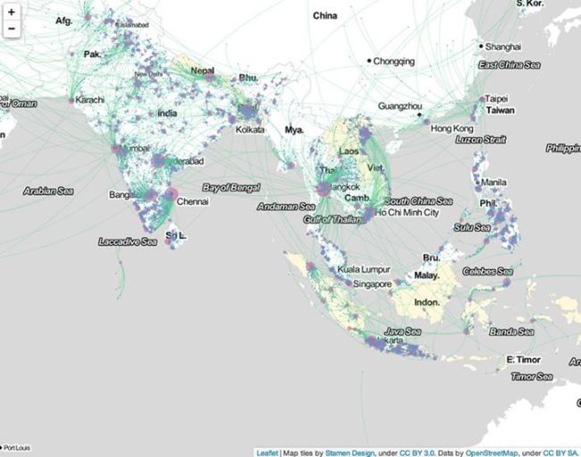
The simplified elegant light green arcs in the above map and its above counterparts stand in quite sharp contrast to the rapid circulation of populations mapped in what is by far the densest and in senses most complex map groups India, South-East Asia (Thailand, Cambodia, Vietnam, Philippines, Singapore, and Malaysia)–almost a data-overload itself–or of the specific stories of these immigrants.  Of course, the question of why this region–embracing really at least three, but probably four sub-regions, should be seen as a collective is not clear, but it is essentially “the rest of the world” aside from the main regions Facebook has parsed.   The graphic suggests a far more massive amount of mobility that is almost difficult to distill to a single image or map.  (China is absent from the dataset, because internet use is so less common; public self-identification is also no doubt far more rare, and foreign, anyways.)   There was quite explosive growth in this period in Bangkok (significantly over 10%), Hyderabad (a bit under 15%, or 14.4%), and Chennai (also slightly under 15%, or 14.4%); one wonders more about the social demographics that motivated this growth, and how much of it maps onto the Facebook users who it maps.

The loss of the stories of individuals who are immigrating to cities is almost part of the point of these maps:  there is no story that needs to be told about this immigration, because it is a process of migration that responds to uniform global pressures we all recognize, which are specific to the demographic of Facebook’s users.  This sense of a story is far from Satyajit Rays’s vision of “The Big City” of the immigration of rural villagers to their new life of searching for commercial employment in the banks, mechanical sales, and lawyers electrified Calcutta.  For the migration to the city that dominates each regional state–rather, the data charts the growth of emerging metropoles as Chennai, in southern India:  it charts mobility from cities to cities, inter-city mobility, among a I-think-that-I’m-probably-quite-employable demographic of relatively educated Facebook users who are most often online, and would coincidentally provide a selective demographic for advertisers to reach.  Indeed, large swaths of rural territories are essentially unmapped, save by the intersecting bright green arcs that cross over their terrain, as if without Facebook users, they did not deserve to be mapped–or, at least, without necessary data, fall out of it–as if to locate the intensity of migrations around its rim, although quite a few sole threads of migration originate from its empty interior.

The image of a growing South Asia is, however, particularly interesting for the number of itineraries it traces out of China, migrating to Taiwan and Hong Kong for the most part, as well as South Korea and the Philippines; the active clustering of Facebook users along the coast suggests that it is were the true action is occurs, as if to rewrite the attention usually paid to charting China’s escalating economic growth.  The vibrancy of ties across borders (and across seas) is striking, as a certain demographic seems irresistibly drawn by Taiwan, and others to Thailand (Bangkok) or Cambodia and Vietnam, whose arcs reveal notably dense ties of geographic mobility.

Coordinated Migration--Asia

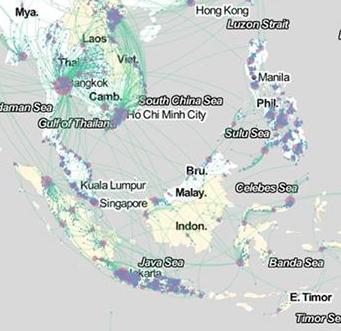
Whose stories is revealed in this amazingly dense map of neat green arcs, which, if they simplify the messiness of the individual stories they collectively track, seem intended to create a sense of a coherent network of meaning that might not be present in the area’s economy but is actually extra-national in nature:  these migrations seem links of like to like, and of educated to industry.  One however wishes for greater resolution in an image such as the above:  what is going on in the Philippines, for example, where Manila is not so much the central hub one might expect, but that each island seems to have its own centers of aggregation and congregation, is unclear; out- and in-migration also seems mixed, as it does around Djakarta and to an extent in southern India and Sri Lanka.  Would a close up, say, of Polynesia or at least of the area around Singapore be of help in discerning what patterns of “coordinated migration” might emerge? The huge urbanization of Java, Bali, Indonesia, Laos and Vietnam, and the circulation in populations in the rapidly growing region, as well as any other political and economic pressures on this sea of population shifts.  Many of the arrivals in Bangkok are from within Thailand, moreover, rather than from other countries, suggesting a very traditional pattern of migration within linguistic and cultural units, rather than the global circulation that such maps might be expected to chart, or might at first glance appear; similar interior migrations characterize Vietnam and, it seems, the Philippines, where much migration even appears specific to each island.  How, to use a metric that Facebook has cleverly adopted in its map of friendships across nations, can one view these ties through the lens of shared languages or linguistic similarities?

Philippines

There appears considerably less defined patterns of migration, it bears observing, in the United States.  What does this mean, or might it indicate?  (Or, which seems likely, are Facebook users in the United States just less interested in noting the cities where they live after they geographically relocate, by updating their profiles?)

The patterns provide a new way of reading ties within the map that trump, or erase, geographic proximity, in ways that seem of interest in tracking, for example, the shifts of economical mobility that might be tied or associated with NAFTA.  What is one to make of the far lesser webs of connection or migration in the North America, where there seems, save for the Cubans who have arrived in Miami, far less social mobility or a zero-sum game?  Facebook works–and thinks–in coordinated networks in this case, and finds little similar coordinated migration within North American cities; even in the international migrations from Mexico and Cuba, which seem to be potentially overstated–they reflect the number of Cubans in Miami that state their origin as Havana or Cuba; one can detect less of a coordinated action than a mass movement, in the case of migration from Mexico, than what might be  of a phenomenon chain migration, rather than one independently coordinated, and determined more by family links than economic need.  Three different patterns of migration seem to be evident in the three countries shown below–even though the Stamen projection seems to erase national boundaries or borders by rendering them as equivalent to regions or states:  Canadian cities draw amost exclusively from the surrounding province,  unlike most of the US, save North Dakota and New Mexico; Mexico shows active cross-national migration patterns, perhaps based on familial ties, the engineers note, to such major destination cities as Chicago, Houston, Dallas, and Los Angeles.

Coordinated Migration in US

So do the above mapped elegantly detailed distributions, given the selective nature of their self-reported data, mean anything definite at all? The skein of green lines of differing intensities wrap the world in a variety of ways that contrast, for a start, with a simple map of flight paths:  what remains untold, however, is exactly what demographic the Facebook family has been able to attract.

It is hard to say what they mean exactly, as a result, or how much they provide indices of mass migrations, even though this quite valuable data should by no means be dismissed.  Since it depends on self-reporting of information, they capture a small number of the actual migrations that occur between countries, by migrants who are less likely to log their travels in internet profiles or lists of friends, but the data that the engine of Facebook has, ten years into its existence, managed to compile, and is now eager to show the world that they are able to track.  Of course, the data is only data–and it’s of interest to create a map of data, if only to see what results.  And the somewhat over-determined data of who uses Facebook–folks who are geographically removed from their loved ones?–may be difficult to map as a trend.  It provides a compelling collective visualization among folks who belong to that demographic that often reveals the persistent meaning  of the local and regional in a so-called globalized world.  Perhaps it doesn’t really map a world that is less rooted in geography–Google, after all, generates the GDP of a small country in itself, after all–and where place isn’t supposed to be so great a determining factor or constraint in most markets and lines of work.  The question is what such trends of migration–if that is what’s being charted–mean, and what corner they raise on a map of larger trends of relocation.

Leave a comment

March 5, 2014 · 3:04 pm

On Viewing the Flattened Past

Immediate access to images, maps, and other information makes us wax nostalgic for postal delivery on a 24-hour clock, and stamped snail mail six days of the week.  Even the labor of licking and affixing a stamp seems antiquated now.


Google Classic


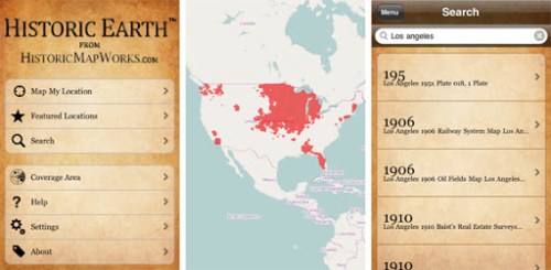
If the notion of allowing a thirty-day wait in red bold letters is the best addition to this artificially aged virtual post card, the app “Historic Earth” offered touchscreen reminders of the pastness present in a landscape that was ever mapped for a short time, in a neat if cautionary collaboration between university libraries and iTunes.

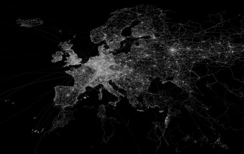
The re-use of maps that this app encouraged provide an interesting case of the circulation of older maps that digitization allowed.  It’s as if Google Earth teamed up with an expansive archive of older maps, allowing us to summon on screens images of place which retain feel and detail and of paper originals, which were georeferenced to modern maps of the actual positions where one stands, using the background of an OpenStreetMap to suggest a layering of a map of actual space.  (OSM is a crowd-sourced alternative to Google Maps that provides a platform to load maps inspired by Wikipedia, whose over 600,000 contributors offer GPS readings, often taken with simple handheld units, aerial photographs, and other geospatial data, in the largest collective mapping project on Earth; the non-proprietary notion of the map OSM uses lends itself especially well to “Historic Earth.”   The service is also popular  as an alternative to default backgrounds in GPS receivers.)  The astoundingly large trace-density of OSM in Europe alone make it a perfect model for providing a background for older maps, as is made clear in a map Eric Fisher plotted of its specificpoint density:


1280px-OpenStreetMap_GPS_trace_density

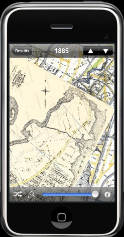
The value of such a comprehensive open-source database facilitated the very features of geolocation “Historic Earth” boasted as its central selling point–providing an easily adjusted template of even broader scope than the uploaded maps covered.  The concept of geoindexing a variety of older maps for daily reference is exciting, but the curiosity in  older maps of all places was  not uniform for all sites  even the marketers realized that the interest of split-screen historical maps of few places were as compelling as those of the built environment of New York City, and even these poorly translated to an iPhone’s small screen:

The contrast of a cut-screen overlay was :

Historic EarthTM 1885 iScreen


How did the OSM background help “Historic Earth” work  to view local landscapes through the screens of old maps?  On the one hand, the app “Historic Earth” provided a great way to appreciate the map as a human artifact–as well as, more obviously, an earlier sedimentation of human space.  The maps that were made available in the app–formerly available from iTunes at bargain basement prices of $3.99 (£3.99 in the UK), uploaded from digitized images of the Osher Map Library, synchronized to one’s own GPS-determined position.  Rather than map actual space, or presume a single point of view, the app offered users a form of virtual time-travel through scanned media:  the experience of looking at an archive or junk store (or glove-compartment) is collapsed into the real-time consultation of a range of maps of wherever you are; the maps rotate in synchrony with your current location–so long as that location has been mapped.  (The availability of maps of North American cities is evident in the below screen, for example, especially of the Northeast, LA, and Midwest, as well as parts of the Northwest around Seattle:  urban views, one would guess, would work the best on this sort of app.)


historicEarth01.7Ves6uAjM23Z


Representations of a geographic space were geo-indexed for viewers, who could choose the epoch, from among the available years!  The strikingly high-res app reflects the large collection of digitized maps of Historic Map Works, which already boasted a “geographic time machine.”   The app goes further than digitization by providing a crucial element of geocoding to index this sizable virtual archive of over one million property maps, old road maps, antiquarian atlases, nautical charts of oceans, star maps, and views of place.  Their digitized collection constitutes something of a veritable grab-bag of images–predominantly focussing on North America and including England and Ireland, and while this is not able to provide the universal coverage one would like, the collection mirrored a considerable market-share.  In short, the app provided access to the world’s largest single collection of geocoded maps, both to “map the history of cities, times, buildings and landmarks” and “watch the landscape change over time.”  Historical Earth offered viewers readily accessible proof that all landscapes had a history.

Whereas Historical Map Works grew out of the internet ancestry industry, with the somewhat interesting demand to ‘visualize where your ancestors lived,’ albeit in schematic form, the app offered a counter-map to Google Maps, or anti-Google map, at the same time that app’s coverage grew, by exchanging a standard or uniform Google Earth visualization for the proliferation of a multiplicity of maps from historical eras–raising questions, I suppose, of where the market lies.  The expansion of this app at a heady time of the expansion of totalizing catalogues of images on-line mirrors the extreme optimism of a widely usable web interface for digitized maps.  But the range of time that folks seemed interested in looking at old maps was limited, in comparison to other mapping software.  Unfortunately,  the app launched in October 2009 received mixed reviews, and folded the following year, despite the 32,000 high-resolution images of American cities and multiple antiquarian maps it promised to correlate.  But the app deserves examination as a response to the widespread digitization of images.

Historic Map Works met the antiquarian in us all with the desire for a material record of place, by allowing us to order our own “personalized maps” of place suitable for framing above the fireplace or in one’s library, a ready-made family heirloom.  In contrast, the app would allow one to flip through a variety of maps at any site, through views oriented relative to your actual position, providing a record not only of space but, documenting “changing space perception” as Urban Tick put it, by comparing the changing manners for representing the salient features of a place where one is actually located.  The special feature “lock frame when browsing maps” allows one to select a demarcated frame of reference–and a rubric for placing one’s position relative to areas of the maps one might want to consult–to make it far easier than dealing with originals that might demand a similar practice of orienting oneself to each map as one goes through the requisite period of initial orientation to gain one’s bearings.

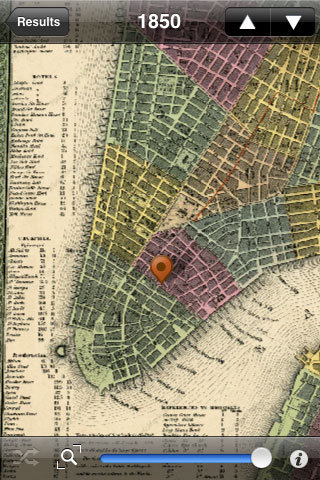
But is this really not a diminishing of what one might call map literacy, or the ability for reading information from maps?  In a kind of antiquarian’s Google Street View, one can look through sepia-colored lenses at the past, condensed at a safe distance and with only an aura or hint of materiality, arrayed on the screen of one’s tablet or phone, adjusting the map by a slider in the same way that one reads Google maps, panning and zooming on a touch-screen, and in essence forgetting how maps are read.  It creates, as well, some wacky hybrids, so that one can imagine oneself keying one’s position to a mid-19th century map while strolling in lower Manhattan, by the same iconography of a Google Map:


9134_310253195696_2317062_n


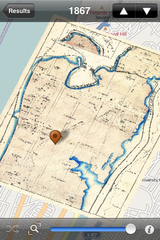
That could be fun.  Or, if it would be any use, while driving in a landscape that you thought was familiar, but might want to see exactly how upper Manhattan looked and was mapped a hundred and fifty years ago:


9134_310253200696_1174201_n

Needless to say, it flattens history:  we see, rather than inhabited lands, lines of property (old real estate maps) and architectural views, all represented in synchrony with the present GPS-derived screen, with little sense of their evolution (make your own links) or social geomorphology, to coin an absurd phrase to capture the gamut of forces that shaped the world in its current disposition and form.
Speaking of dispositions and maps, flattening history on maps can work in at least several (or multiple) ways, even the end result is two-dimensionality.  There is something of a self-referential circularity to the practice of mapping–albeit a compulsive one of providing a total image of the earth’s surface–analogous to the use of OSM in the ill-fated if temporarily super-popular on-line version of Monopoly City Streets–but along the lines of the basic diachronic question, “Isn’t it amazing how much things have changed over the last 1,800 years?”   This underlies, and is even openly asked, by the Washington Post‘s Max Fisher in the synoptic survey of all world history in but 40 maps, a post recently cobbled together from varied sources.
It took more than the simple ten whose design Peter Barber of the British Library judged worthy to be named the ten “greatest” maps to sum up human history as well as effective cartographical communications and shifts in cartographical media:  to be sure, Fisher adapted the maps from a website boasting “40 maps they didn’t teach you in school, but essentially offers a Robinson global projection (or the variation of the Mercator projection that serves as the Google Maps template) to ask informed readers “how many of this map’s divisions are still with us today?” and break down a variety of economic databases or Gallup Polls on a multicolored data visualization.  Two measure such stereotypically quasi-racist questions whether national Muslims worldwide “believe in democracy rather than a strong leader” or view “religious conflict” as “a very big problem” in their countries:  these maps serve to reveal “big secrets” that we already suspected, in short, or provide us, as the map of countries that possess nuclear warheads; North Korea’s missile range, or the infographic that sadly compares economic inequality in the United States to the rest of the world–in each case transposing sourced data to familiar (if not generic) cartographical schema.
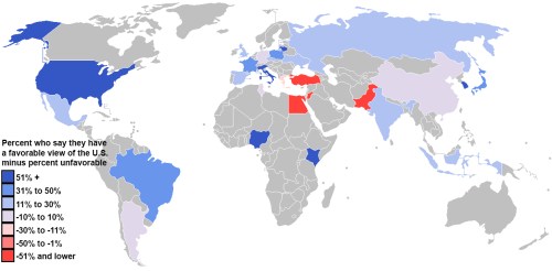
My favorite two are typical in being less about rendering space, spatial relations, or really even the explanatory ability of the map:  the first, revealing who “loves and hates America [i.e., the United States], an emblem of our current isolationism–
map-opinion-of-us
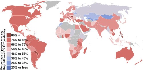
–and another that maps “self-love,” but also reflects the meaningless nature of emotional “liking”–in the sense, itself residing in that meaningless, promoted by Facebook culture–of where people feel “most loved yesterday” in the world:
love-map
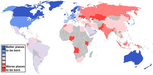
Each map poses as a sort of revelation about global conditions in a pretty half-hearted way:  folks aren’t that happy in central Asia, but Americans and Canadians, as well as Brazilians and Australians and South Africans (and Saudi Arabians!), seem pretty well off!  One is tempted to read the greyness of Russia as a gruff “there is no data here,” but it is a more believable probably less than half.  The ‘map’ of Central Africa is sad, but does it map that much anyway, except what we already expected?  In spite of the global purview of each, re-use of identical cartographical templates in each of these images diminish their cartographical arguments–or obscure in intentional manner the power of the map as an argument.
Fisher’s map is likely to celebrate in somewhat jingoistic and reassuring fashion of explaining what one already knows, as in the affirmation of “where it is best to be born” whose broad swaths of blue and expanse of red only obfuscate variations in the economic data used to decide what “best” means:
where-to-be-born-map3
It’s odd that Fisher only included two maps weren’t digital constructs or data visualizations for his post at WaPo.  Both of these are in fact newly designed maps, and both border on cartoons:  a historical missionary map of Africa of ca. 1908 and a 1990 map of a Russian political scientist Igor Pannarin, inexplicably chosen, prognosticating dissolution of the United States would split into six distinct pieces by 2010, each parts of separate sovereign states, in a reverse fantasy.
Only these maps out of those that Fisher posts make clear arguments, either as propaganda or wishful thinking (or fantastical projections)–but both do so in ridiculous forms.  The other maps, deriving from a digital sphere, celebrate the transparency of the map as an elucidation, that hint at ethical problems in the naiveté of the re-use and circulation of maps in the blogosphere that echo the range of ethical problems Ellen Ulman associated with the “digital environment.”
Perhaps this environment is yet another inflection of a post-modern condition:  does our ability to map most everything undermine or empty reading maps as sources or categories of information or to read them as descriptions of space?

2 Comments

Filed under counter-map, digital environment, Facebook, georeferencing, Google Classic, Google Earth, Google Street View, Historic Earth, Historic Map Works, Igor Pannarin, infographic, Max Fisher, Open Street Maps, Peter Barber, Robinson Projection

Mapping Friendships? Facebook Maps Social Networks

The recent growth of web-based “social networks” inspire maps no longer rooted in terrestrial relations, but stand to become vertiginously unmoored from them:   maps often help us to grapple with the distance between them, as much as to orient us spatially to their relationships, but the blobs on this series of maps oddly disaggregates the inhabitants from the land, focussing less on their spatial situation than their relative degree of web-presence.   Indeed, in ways that very inventively rewrite the map as a throbbing surface, rather than a static interface, the attachments of folks to the interactive space of Facebook becomes cast as the subject that is being mapped–as well as being the datasource from which the map’s dataset derives.

Thanks to the creative folks at Stamen design, we have a beautiful interactive global map of Facebook users, whose bold colors offer a neatly clickable index of social networking over space.  The map is not an innovative ordering of space, but illustrates the network’s global reach in a twist on the project of mapping the inhabited world, shared by Ptolemy and Abraham Ortelius alike.  But let’s ask what’s at stake in crafting a visualization culled from archived data gathered from users’ profiles–as much as celebrating the virtuosity of the clickable map as a chart of the social network’s reach, as if it were able to map as previously unquantifiable (and indeed ultimately almost ephemeral) value as ‘friendship’ might be.

World's "Friendships" on Facebook

Many maps employ self-reported data.  In a sense, the map of Facebook use–or the self-identified “Friendship Map”–charts global inter-relations, like the global maps of national distribution of GDP, provenance of coffee beans or even pathways of the migrating whales, both discussed in earlier posts.  But whereas  maps objectively mediate terrestrial inter-relations–and inter-connectivity–the notion of connectivity has been re-appropriated in the images of “Friendship” that Facebook commissioned, as has the meaning of the word “Friendship” itself.  On the one hand, this map is a celebration and triumphal illustration of Facebook’s near-ubiquity.  But it is also with clear limits, even if they are unacknowledged.  Anyone not on Facebook is absent from the map, since connectivity is generated from profiles that are registered online.

Facebook connections allowed the folks at Stamen to generate instantaneous images of web-use, making this sequence of clickable maps a truly interactive treat, as well as a visual feast.  But the effect is also to present the data generated from Facebook use as endowed with the allegedly objective criteria of maps, and to normalize Facebook’s criteria of “friendship” in apparently objective terms.  Although the very notion of geographic connectivity is fundamental to map making, the maps that are used as the templates to indicate the “connections” of friending in the Facebook platform invest a sense of objectivity and meaning in trends of friending that elevates the medium as the basis to generate further information to a degree that boosts Facebook’s criteria of meaning, as much as provides analytic tools:  if “the medium is the message,” the medium is not cartography, although the multiple images echo the authority of cartographical forms, but Facebook itself.

This is particularly pernicious, and bears some examination.  The maps on this site visualize aggregate friendships on Facebook as quivering blobs of connections that pulsate as with life of their own.  Although claiming objective authority of a map, the aggregates map “friendship” as Facebook has defined it, and embody and reify the data FB use itself creates and generates:  this is a map of FB use, in other words (rather than of web use in general), and a vision of the interconnectivity Facebook promises and the very “Friendships” that it creates.

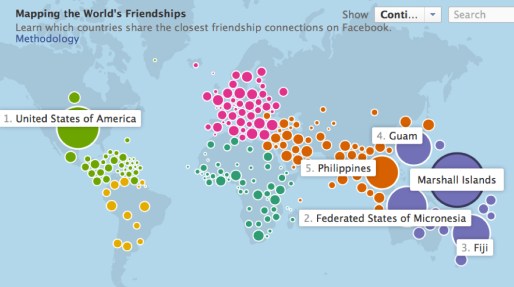
Take a look once again at the snapshot of the connectedness of the Marshall Islanders who use Facebook:

World's Friendships on Facebook


Such a map is decidedly not a territory–nor could it be confused with one.  But if “all maps are arguments,” in Harley’s words, and conceal interests, as much as show meaning, the interests concealed in these “Maps of the World’s Friendship” demand considerable unpacking.  For to me, the multiple maps that Stamen design unveiled last September 12 are something like post-modern versions of earlier corporate emblems.

The aggregate views of information born of Facebook use essentially trumpet the inter-connected world that Facebook promises as a matrix achieved by corporate interconnectedness, in other words, in ways that update the familiar stream-lined modernist logo of global unity Pan Am once used to promote itself as the “world’s most experienced airline,” able to provided air service to all regions of the world by airline jets.  The Pan Am emblem emptied the familiar format of projection from toponyms or places, as if to illustrate the lack of obstacles to air travel and the global surface that its flights promised to link.  The logo owned by Pan American World Airways erased places in favor of the latitudes that link the world bridged by flight paths and no longer in need of land maps, no doubt intentionally offering the new map the airline corporation promised to provide to its users.


277px-Pan_Am_Logo.

The interactive map of Facebook connectivity are constantly evolving and generated at a given moment, and, unlike the static emblem, as if living independently from the viewer, but embodying actual FB use.

The contrast is interesting on iconographic grounds as well as stylistic ones.  The generation between these visions of global interconnectedness has led to a map of greater sophistication and persuasiveness of interactive form, and one that seems, like Facebook, user-friendly and value-free:  but the map of Facebook users is particularly insidious, as ‘friending’ and connections are rendered by the web-based platform itself.  In comparison to the Pan Am logo, rather than merely provide an illusory image of the promise of global unity, the map is a triumphant image of the actual interaction that the web-based platform promised: “friending” provides the metric of global interconnectedness and the sole standard of national interconnectivity.  Although the map can be re-centered at a click in order to map the connectedness from a different point of view, the “point of view” does not really change. In the text above the map, “friendship” doesn’t appear in scare quotes:  it in fact normalizes Facebook use as the sole index of contentedness and inter-connection.

Let’s examine specific cases to ask what is revealed or viewable in these multiple maps, which represent a proliferation of different data visualizations as much as providing a basis for geographical or spatial orientation. To do so, return to the “map” of Facebook connectivity in the Marshall Islands, which maps Islanders’s global connectedness via Facebook friendships:

World's Friendships on Facebook


The notion of mapping an emotion or state of mind–friendship–suggests the sort of positivism of early twentieth-century phrenology, or the comic maps of lands of contentment, like the early modern “Carte du Tendre“–an imagined geography described as a “topographic and allegoric representation” by Mme. de Scudéry in seventeenth-century France–as a geography of Love, complete with a river of Tenderness that runs through towns named after different stages of tender affection.

There’s a wonderful paradox of mapping the intangible as concrete, or mapping the ineffable–how often do we invest deep significance in the word “friend” after fourth grade?–in graphic terms, as if to make manifest the good-will that exists as if it were a physical topography.  (The notion of such mythic lands is re-inforced by dividing the map into color-coded continents, as if an emotional Olympic games between different parties.)  But it is more the hubristic belief of Facebook in their own metrics, doubtful in any event, than a positivistic belief in the ability to locate sites of well-being in the body or on the planet.

What’s the metric here?  Hopes of visualizing interconnectedness among Facebook’s users is more of an advertisement for their web-based platform than a visualization of disinterested data, and it’s not at all certain that this converts to a metric of well-being:  the huge number of connections boasted by residents of the Marshall Islands, Guam, Fiji, and the Philippines may derive from a sense of disconnectedness among the American populations in these regions, and a reliance on FB as a platform to remain in contact with their relatives in a different time-zones.  Although the Marshall Islands were only occupied by the United States until just less than thirty years ago–American forces left in 1986–the 10% of the population of American origin maintain extremely close ties to the US, and, more tellingly, the top destination for Marshallese ex-pats is the US.  “Technology bridges distance and borders,” Mia Newman boasts from Stanford on the FB website itself, as, due to the grace of this platform, “Individuals today can keep in touch with their friends and family in completely new ways — regardless of where they live.”  In a world characterized by dislocation and isolation, Facebook provides social ties.

The appeal of the map is of course to advertise how Facebook trumps geography, and one might do well to return to the interested nature of this map as a corporate logo:  “Immigration is one of the strongest links that seems to bind these Facebook neighbors,” the website informs us, if this was a discovery that the platform allowed; having (and maintaining) a lot of FB connections isn’t that surprising given the dislocations caused by such out-migration over recent years.  Flipping to the site itself,

[http://www.facebookstories.com/stories/1574/interactive-mapping-the-world-s-friendships#color=continent&story=1&country=MH],

watch with awe as color-coded aggregate bubbles quiver with connectivity,  as folks update social profiles, making new connections, adding “Friends”, or, as I happened to do last night, de-Friending others.  Clicking on the variable of ‘language’ on the site, we can see or imagine close ties between the Marshallese and the Philippines, and note with some surprise that the dominance of red (English) on the map, the improbability that non-English speakers in the islands nonetheless register the greatest number of connections.  This omits the different uses of “Friending” or “FB Friendship” among each region, of course, we failed to add, as it assumes that use of Facebook conventions is as universal as Facebook’s global reach.

The deepest attraction of the site is its interactive feature by which the map at a click newly configures itself from the perspective of dfferent FB users.  The movable centering of the map doesn’t change the geographic distribution of place, but rather  reveals how connectivity is centered in the globe from different national aggregates, which can also be segregated by language.

Experiment at the link here, to explore the fluidity of this new mode of mapping the world’s population, and abstracting one’s web-presence from the world.

[http://www.facebookstories.com/stories/1574/#color=continent&story=1&country=HT]

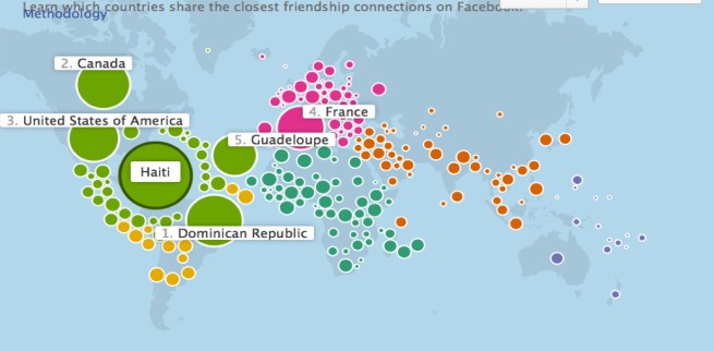
In this case Haiti, the “map” correlates the number of Facebook connections in the country and numbers between countries in ranked order that are a bit surprising, given the prominence of Canada, until one imagines the number there of Haitian refugees:

Learn Which Countries Share

The links among active FB users, cast here in terms of language groups, ostensibly responds to the question of who “shares the closest friendship connections,” although the reasons for those connections are not able to be clarified–although the illumination of linguistic ties clearly helps.  The huge prominence of Haitian ties to the Dominican Republic and Canada is not a big surprise; if the slightly lesser ties Haiti enjoys to the United States may be, it is not surprising that the proportional ties to France rank a close fourth.  This is a map, however, of dislocation, and attempts to bridge physical divides, as much as it is of friendship ties–or even a measure of friendship per se–so much as the type of “friendship™”  that Facebook seeks to market and be able to offer:  friendship that is less in, as it were, meatspace than cyberspace.

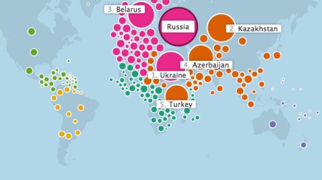
In contrast, the close ties of Russia to the Ukraine, Kazakhstan, and Belarus might be better explained by their recent division from a formerly united regional territory, albeit one that was ethnically diverse:

Russia's %22Friends%22

These maps display salient ties of economic and linguistic relations, to be sure, yet filtered through the economy of Facebook use.  The dramatically interactive map measures different perspectives of the world through the sum totals of FB users in one region or nation–a self-selected group–based on the criteria that that group imposed on the map.  Unlike other maps, where the data is cherry-picked and chosen and balanced by the mapmaker to conceal or pinpoint interests in an objective manner, Facebook has culled the data for this map–created and devised by Stamen Design–based on data that is not only essentially self-reported, but represents not only a portrait, but Facebook’s ability to mine the data archived by user-preferences and to assemble its own data of the aggregate of regional Facebook communities.

The result is a fantastic vision of totality through the eyes of the Facebook network, in which we can “click” on any country to view its population’s “connections” to other areas of the world.  What else does the map tell us?  Little more than the economic ability to dedicate large amounts of time to FB, or the state of emotional dependence on expanding one’s connections–or, more accurately, the acculturation of FB as a way of maintaining ties.  “Economic links, through trade or investment, also seem to be strong predictors of country connectedness,” Mia Newman informs us as she seeks to interpret the map for readers who have stumbled upon it and seek to understand this new configuration of the globe online.

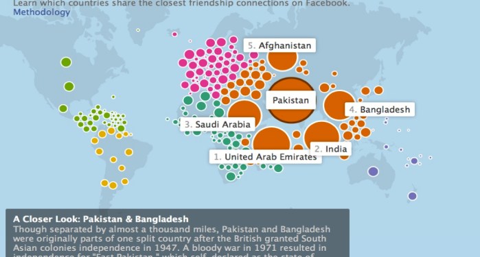
Since we’re championing interconnectedness, let’s look at the potentially more isolated country of Pakistan:

Pakistan 1

The ever helpful text panel–as the legend that must always be read with care in any map–calls special attention to Pakistanis’ ties to Bangladeshis, an effect of their unity in colonial times, but is less than illuminating about what are the classes of Facebook users in the former South Asian colonies, or what are the groups using the platform:  perhaps the emphasis on the fourth largest aggregate site of connections distracts from the comparable ties to users in Afghanistan, or the surprising permeability of the Indian-Pakistani border.

The multiple FB connections of inhabitants of Greece, however, and the generous radii of countries in Eastern and Central Europe, belies the notion that interconnectedness is a metric of economic vitality.

Greece.

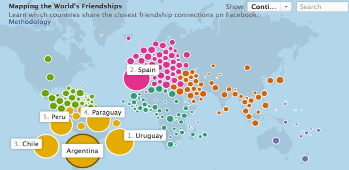
There’s a lot of FB activity in Micronesia–but are Bulgaria and Serbia hotspots of economic vitality or cooperation?  Are Chile and Argentina sites of stability, or is Mexico?  Is Argentina really a center of stable labor relations and a model of free markets that we are instructed to read the map as providing evidence of?

Argentina's Friendship and Labor Market

The arrangement of a configuration of bubbles of different colors are beautiful, and the pulsation of colored blobs dramatic, but the group of users are particularly difficult to identify, as are the habits by which they might “friend” their “friends”–or the networks they create.

Does–to chose a limit case–an absence of FB interconnectedness in China really reveal that the country is moribund economically?  In the manner that North Korea drops off Google Maps, although we all know that North Korea is not known for its open-access, there is no point of reference on which to click or metric to view for the largest of the world’s economies.

The limits of mapping FB use as a form of “friendship” rests on a combination of economic benefits, security, and desires for companionship that jointly contribute to online “friending” and the archiving of “friends.”  Not only is there a uniform level of “friending”–so that the necessity of economic “friendship” is equated with the ties of countries of origin among immigrant communities–but the homogenization of these different gradations of “friendship” obscure the potential benefits of legibility in this dramatically interactive map of Swedish FB users’ ties to geographically proximate and distant members of the FB community.

As the test notes, it shows the close ties of the Swedish market to Norway-not surprisingly–Denmark, and Finland, but also the ties of refugees who have arrived in Sweden, a preferred site, from both to Serbia and Iraq.  These recent settlers in the region, unlike the Scandinavian nexus, document a “friendship” to parents, schoolmates, or extended family– the database FB has culled suggests a deep desire to continue an imaginary with these faceless “connections,” and the lack of ability to make easy contact with these ties among immigrant communities, rather than the depth of their connections.

sweden's friendships

In the end, these are wonderful maps of our own making, whose indices are a better reflection (or projection) of what connectedness means to us–connectedness now being a relation that Facebook has now both defined and designed.  Whereas the old Pan Am logo surely maps geographical interconnectedness, as do all maps, the series of user-generated maps of Facebook connectedness map the extent of networked interconnectivity:   they are less truly maps, in some sense, than data visualization schema, that render in pictorially iconic form the data that Facebook is able to collect.  All maps reflect their makers to be sure; the maps of Facebook connectivity, more than perhaps anything else, illustrate the range of data Facebook is able to mine.  Perhaps this is the real function of the maps, which parade the range of information and “closer looks” that Facebook has access to.

For what goes unsaid–and remains unsaid–in this endless sequence of maps is the variations among the penetration of Facebook within each country–it is assumed to be complete, and to rester anyone that one is interested in taking measure of, as if it were the metric of Who Really Counts.  Yet the wide disparities within the extent of Facebook’s currency (or, if you will, adoption) in different countries not only widely varies but might be itself mapped, as something like a corrective to the data streams that the above maps claim to oh-so-conveniently organize.

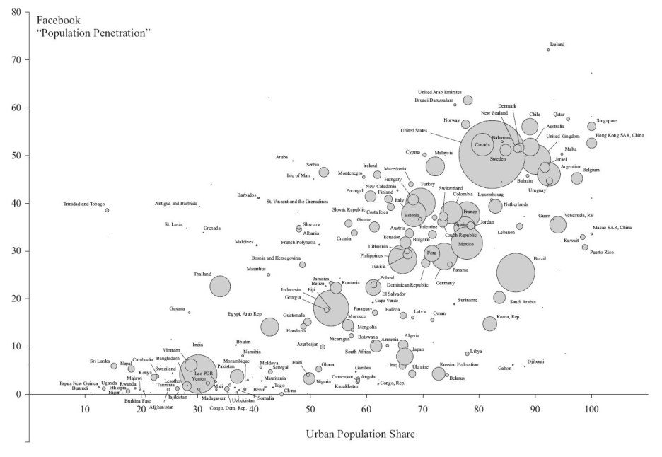
The distribution of the differential sin Facebook’s adoption in the population at large might be usefully remembered in this far yet brilliantly colored but useful bubble map, which chats the intensity of Facebook’s penetration in the population, based on site-registered active users around 2012 from a variety of sources, from a project of Elvin Wyly and Larissa Zip, which attempts to map the more socially-networked world that Facebook boasts it can offer access to.  Although the ranking of urbanization of countries is problematic–given the local variation in a largely rural nation as India that possesses large cities–the huge size of connectedness that was privileged in the urbanized areas of brazil, the United States, UK, Uruguay, Chile, France, Columbia, Turkey, Argentina, Malaysia and the Philippines, as well as highly urbanized Singapore and Hong Kong–irrespective of actual geography or population size.  (India is the outlier of a largely unorganized country with high FB users, but the undoubted majority of its users are concentrated in cities or urban areas–Facebook does not release or record precise geophysical location; the relatively small user numbers for Iraq, Ukraine, Afghanistan, Ethiopia, Uganda, or China seems to show regional poverty.


paste74

The outsized boast of mapping “The World’s Friendships” conceals the very absence of the non-networked, the new disenfranchised who the ideology of Facebook erases from the map–and who are poised to become the unnamed hordes of the inhabited world, whose lives are less visible in a globalized world, although we absent India, Kenya, China, Rwanda, Ethiopia, Nigeria, Nepal and Uganda at considerable risk.

Unurbanized Low-FB presence

The “Maps of [Facebook] Friendship” are fundamentally ways to advertise the very sort of datasets that Facebook is able to sell to companies that want its records of page-views, if by orienting folks to the very metrics that Facebook has at its fingertips.

What we get is a sense of the reliability and credibility that the data Facebook possesses to orient us to the webspace that Facebook has created, using the trademark of being a “friend”–that crucial desideratum in an economy when credibility seems hopelessly confused with web presence and social connectedness intertwined with virtual contexts and contacts mediated over Facebook and LinkedIn–is able to be mapped with apparent accuracy, of an almost positivistic tenor, albeit allowing for the fluidity that is itself so characteristic of the web as a medium and of Facebook as a virtual interface.

Leave a comment

Filed under bubble maps, data visualization, Facebook, Facebook Friendship Map, Facebook Urban Penetration, FB users, Interactive Maps, social media, social networking