Tag Archives: Manhattan

Mapping Trump

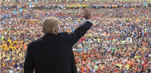
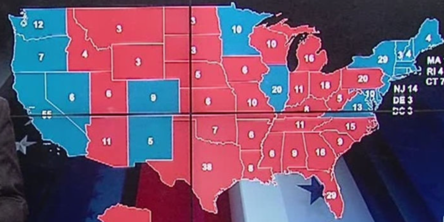
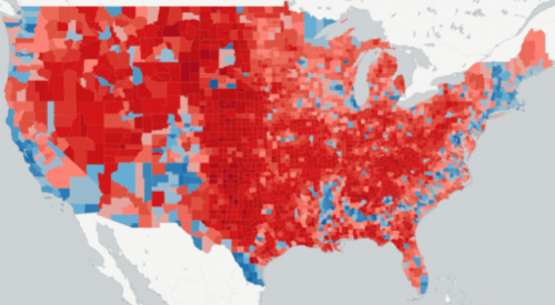
As news anchors stared directly at the camera on Election Day 2016, they might gesture mutely to the apparent dominance of Donald Trump’s presidential victory, shown the blanket of bright red polygons that took the viewer’s breath away by their sheer continuity affirmed that the people had spoken definitively.  The map was a bit of a total surprise, evidence of the disproportionate appeal of Trump across most states other than the coasts.  And it is an icon with which Trump has taken to celebrate in an almost proprietorial way as the result of his labors and his own hard work that he tried to celebrate in addressing the Boy Scouts’ annual jamboree this year.  Casting a now-forgotten moment of compact between himself as Presidential candidate and the nation, incarnated in a map, and presenting it as a personal triumph, he recalled the electoral map as a definitive rebuttal of a “dishonest” press and media, urging we all “remember that incredible night with the maps and the Republicans are red and the Democrats are blue; that map was so red, it was unbelievable,” and rhapsodizing how the map struck so many dumb with disbelief so that “they didn’t know what to say?”  The electoral map, for Trump, provided the ultimate confirmation for a “dishonest press” and “dishonest media,” but just how honest was that map, anyway?


Trump at Jamboree.png


The map seemed to show a dramatically lopsided margin of victory, but it of course concealed just as much.  It seemed to celebrate red nation, indeed, until one considered the concentration of population, and drilled deeper down into population distributions than an electoral map can reveal.  The map however remained so cognitively powerful that the geodemographics of the 2016 Presidential election seems to mark the return of a landscape of blue vs. red states, and a sense of the self-evident nature of a newly redivided republic.  The promise of national maps to parse the division of the popular vote–a conceit fundamental to the electoral college–however creates a false sense of the breadth of support or the links between an individual candidate and the land–distilling the distribution of the vote into a false if compelling continuity of a sea of bright red.  And it is not a surprise that the map has become a favorite demonstration of the extent of Trump’s popularity, and the myth of a landslide victory not seen in earlier years.  Even if its geodemographic illusion demands to be unpacked, the scale immediately gave rise to the magnification of a margin of victory that is entirely to be expected from Trump.

But for a national figure who has convinced what seem continuous swaths of the nation’s so-called heartland he could speak for their interests, it is striking that despite some considerable variations among voting patterns, the intensity of that red block so clearly endured.  The distribution illustrated the intensity of the affective relation to the candidate, or rather the failure of achieving any deep to Clinton as a candidate–but became a symbolic icon of Trump’s claim to represent the nation’s ‘heartland.’

reference-mapBen Hennig, from results of 2016 US Presidential Election

The geodemographic conceit was not much evidence that he actually did.  Despite the strength of such affective ties, Trump has only slim familiarity with that heartland–and rarely showed much tie to it.  Despite the compelling nature of the geodemographics that suggest Trump’s close tie to the nation’s center, the region Candidate Trump convinced was ignored by the media and press alike was largely avoided by Candidate Trump.  And few of its interests can be said to have been sustained by the President we now have, whose electoral success in the upper midwest will be hard to measure with a feared decline in health care subsidies, should the Affordable Care Act be repealed and Medicare gutted, leaving older working class voters in the cold, as a new tax code does little comfort.

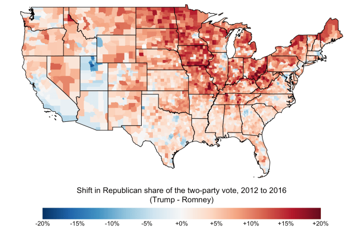
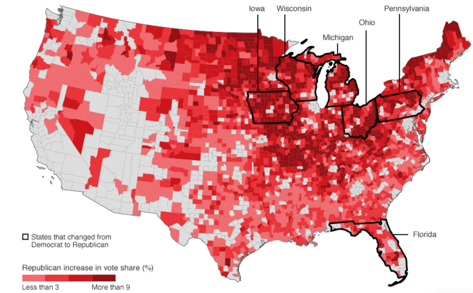
But was Trump ever so tied to the band of red running vertically down the country?  For the region that voted for him is increasingly becoming disaffected, as he qualifies his opposition to NAFTA and his assurances about the need to construct a border wall, in ways that raise questions about his strong showing across middle-America and his identification with the people’s will.  Yet the iconic map itself may have provided for Trump himself a bit of a mirror illusion–as if to trigger a sense of recognition of his identification with the entire nation in ways that came as something as a surprise, it also effectively validated his long-time aspirations to the presidency, not only for the media, but for himself.  To be sure, the notion of a “heartland victory” reflected the growth of a tendency to shift Republican on a county-by-county level, which reflected a targeting of the midwestern states that seem to have been conducted below the eyes of team Clinton in the 2016 US Presidential election; Trump’s vote share substantially grew in Ohio, West Virginia, Iowa, Michigan, Wisconsin, Minnesota and Missouri.


Republican Blush.png


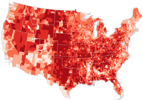
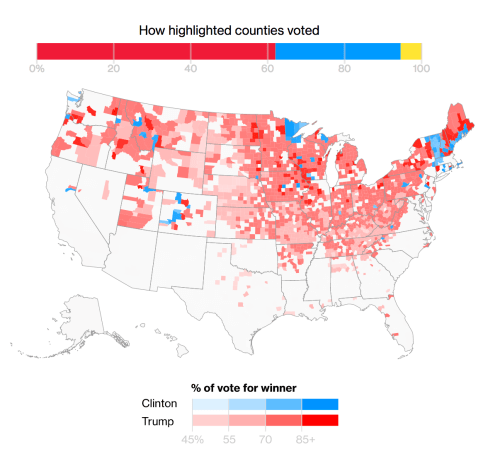
By normalizing the same choropleth of Trump votes, or using a color ramp that will foreground the percentages of voting intensity, a recommendation for all future voting maps Kenneth Field rightly suggests, the deep intensity of reds are brought out better, focussed almost in targeted sites in ways that might merit more retrospective scrutiny.


Trump votes normalized choropleth.png

Kenneth Field

But the deep reds of the electoral map were the most compelling to The Donald, and continue to lead him to retreat into rhapsodies, some eight months after the election, in Cedar Rapids IA, about how “Those electoral maps, they were all red, beautiful red.” As much as Trump has seemed to be processing the legitimacy of his victory well past the first hundred days of his term, a framed version of the electoral map infographic is rumored to have been hung, framed, as an icon in the Trump White House for visitors, to which he can point only to ask, as if in desperation,  ‘Aren’t you impressed by this map?’”  The map has become something of a calling card to which Trump seems both boastful and still gleefully processing, perhaps precisely because it was so often broadcast on TV.  The image transformed to a wall-map seems a needed confirmation of the areas that sent him to the White House, and has become a distributed visual for news interviews, as if its presence reminds interviewers that they are engaging with the representative of the real country.


C_kshitVoAE0vfh.jpg


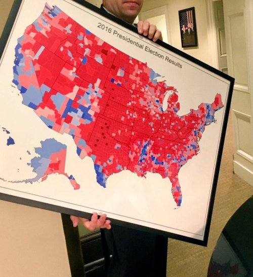
Why post the map on the wall?  The infographic presumably captures those areas of the US where Trump must continue to address outside Washington–and of the disempowerment of the mainstream media–as if to remind him of his ongoing sources of strength.   Trump cannot conceal his pleasure to continue to crow, reveling in his unexpected ability to cathect with voters across so much of the northern midwest if not the silent majority of the national interior, and the map confirms a moment of joy:   the map of a “sea of deep crimson” offered credible needed visual confirmation of the legitimacy his newfound power that responds to continued crises, and a sort of symbolic consolation:  Trump, as if planning a billboard to the nation, requested no one less than the Washington Post run the image on his hundredth day in office, perhaps in hopes to brainwash the nation by the repetition of that apparent sea of deep, deep red.  It reveals, moreover, the very silent majority that Trump had long evoked:  Trump’s skill at resuscitating the Nixonian conceit of a “silent majority” supporting the Vietnam war and rejection counter-culture became a bulwark of sorts against the press; it  was particularly pleasurable as it re-appeared within the very news maps that the media produced which were broadcast on television screens, in ways Trump himself wants to continue to broadcast.  Trump not only holds TV in famously high regard–even if he did not mostly watch television for all of election night–it is almost credible that the iconic electoral map was framed for the White House walls, if distorting , offered a recollection of the magnitude of his margin of victory that must be comforting to show guests.

The considerable shock of the electoral results led many readers to recognize the reduction of support for the Democratic candidate, so well-qualified, to isolated regions near the more diverse and reliably Democratic coasts.  The visualization of disembodied counties for Clinton registers an immediate anxiety in projecting the angst of isolation from the same heartland, as if to show what seem only pockets of Clinton supporters in a very tenuous archipelago with outposts hewing predominantly to the nation’s coasts, as the outliers of the vision of America that Trump was able to propose.  As much as showing the lack of contact of Clinton’s messaging to so many counties in the in-between “forgotten heartland” that the Trump vote seemed so successfully to invest coherence in, the image shows a heartland that is almost abandoned by Clinton voters who seem not to have migrated from the country, but seem exiled from an increasingly fractured nation, in their own filter-bubbles, in which their own place has been rendered up for grabs.


clinton_v2-Artboard_6.pngTim Wallace/New York Times

The geodemographic illusion of such fracturing however belies the sharp dissonance that a deeply provincial figure long resident in one of the nation’s largest metropoles felt to much of the country and the nation that he so convincingly claimed he was able to represent.  Trump’s ability to have convinced much of the country he could guarantee their continued safety lies in contrast with the limited presence Trump ever remained in many of the regions that the force of his Presidential campaign so solidly and deeply colored red.  The clear divisions in the country that emerged in the 2016 Presidential election revealed a clearly widening set of divides between islands of populated blue and regions that trusted different news sources, more suggestive of a divide driven by eduction than wealth, using available census data on education from the Data Observatory in a CARTO visualization of the lower forty-eight, to create a more finely-grained record of the distribution of votes that allows the chromatic vacation to pop–

Carto Trump.pngMichelle Ho‘s Carto Blog

While the “split” between “heartland” and “blue islands” pops out better in the above courtesy the Carto dashboard, the surface of a flat map can conceal the extent to which the vote broke among more and less populated counties, as the following sizing of counties by votes received by Clinton (blue) or Trump (red).

Coutnies.png Carto

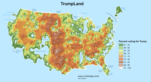
The thin distribution of red dots calls into question the existence of “heartland” in the nation, and how much the notion of a coherent heartland is the creation of a map, suggests the extreme oddity of an election where votes so clearly broke with electoral votes.   Notwithstanding the visualization of Alexis Egoshin being picked up on right-wing sites as a basis to argue for the need to continue the electoral college to represent the mass of land, pictured as a plateau, with which Trump won decisively, and could be called “TrumpLand” as it was so solidly voting in his favor–

trumpland-1.png

–the thinly stretched archipelago of Tim Wallace might defy geographical explanation, and be rooted as much in media bubbles, fractured politics, anti-immigrant sentiment as it can be said to be geographically determined, and perhaps the tendency that we have to believe that there could be a geographic explanation at the root of the Trump victory, or a definable “Trump” community or constituency might be more tied to the contingency of information economies than anything as easily mappable in purely objective terms.

1.  Trump’s own overly inflated claims to represent the red expanse of the rust belt was, for one, most strikingly undermined, however, by his regular return flights on his Boeing jet to his New York penthouse while on the campaign trail.  For as he campaigned, Trump maintained a remove from much of the country, even as he evoked the “rusted-out factories scattered like tombstones across the landscape of our nation,” and excoriated the policies that he claimed created them, urging voters to “take our country back again.”

While we are still trying to understand what he meant by “American carnage” save as a way to conjure fear, and a landscape beset by violence and “drugs pouring into our country and poisoning our youth,” within an “environment of lawless chaos,” the exaggerations of specters of social threats that proliferate from Trump’s mouth seem to be as emotionally figurative as they reflect actuality, and more a reflection of the America on television news than statistics.  The call to “shake off the rust” appealed, however, by binding themselves to the possibilities of “wistful time travel” that Donald Trump’s candidacy seemed to promise voters, as Zadie Smith has keenly observed.  Who better, in fact, to convince most of the country that he could bring it out of the shadow of threats of terrorist attacks that 9/11 has continued to cast across much of the nation, as if creating a bond of reassurance that stood in for any other tool of manufacturing consent.

And the tie was reified in maps.  A land map magnifying the extent of Trump’s 2016 US election results in the electoral tally was widely trumpeted by right-wing news sites, as well as the nightly news, to proclaim Trump’s was a landslide victory–even though the differences in popular voting was not only decisive, but Trump’s own relation to the nation he now leads is poorly understood.

Trump can be claimed to have converted more far more Republicans to his candidacy than recent Presidential candidates, but Trump was long an outsider.  And Trump’s imaginary tie to nation seems just that, despite some considerable crowing over Trump’s close relation to the American heartland that he claims as deeply tied to and to be the territory that he best represents–

electoral-trump

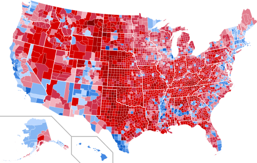
–although these stark divisions in the distribution of voting patterns disappear in the district-by-district electoral votes map posted by Mark E. J. Newman in clearly contrasting stretches of red and isolated islands of blue with only the occasional all-blue state.

county-map-2016University of Michigan/M.E.J. Newman

But the map of the distribution of electoral votes is only the start of the attenuated relation Trump has to the country.  Trump’s insistence on an alleged “mandate” or a “massive landslide” seems designed to provoke collective amnesia by its repetition–Trump’s own convictions seem born from the illusion of democracy displayed in broadcast electoral maps on TV news.  For the vagaries of the current electoral system meant that a shift of four counties from one state to a neighboring state, data scientist Kevin Hayes Wilson pointed out, would have redrawn the map of the election, and our picture of the nation to a more comforting baby blue–although this tantalizing alternate reality is not to have been, but is in fact not so far away at all:

imrs-1.php.pngKevin Hayes Wilson/Redraw the States

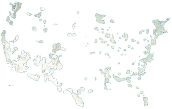
Yet the victory of a continuous stretch of red is so iconic that the mapping of votes by counties is taken as an affirmation of regions of deep scarlet, as if the county is a meaningful unit for displaying voting tendencies:

United_States_presidential_election_results_by_county,_2016.svg

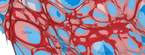
The image of “red” states or counties is so potent, however, that the image is taken as evidence of the appeal of Trump’s promise to “Make America Great Again”–as if the slogan spoke to the heartland–that converting the map of counties to a cartogram which sized counties by population and voter size seems to be a weaponized warping of the nation for polemical intent, in which the center of the heartland has been stretched into a skein of thing red strands that slighted the region by stripping it of its political voice, as if created by a leftist cartographer who polemically diminished the heartland by rendering it as so much connective tissue in contrast to the prominence of blue cities.

Stretched thing

vote share.pngBenjamin Hennig (detail of Hennig’s cartogram of 2016 US Presidential election)

The rendering of the heartland as a stretched skein of what seem ruts in the American landscape seems the polemic of a leftist cartographer from a metropole, to many, ready to slight the heartland in favor of the magnified cities whose names appear on the map.

hennig skein

To be sure, the tea leaves of county voting patterns do parse voter populations:  to be sure, Trump did almost twice as well as Clinton in those counties that were at least 85% white, rural (fewer than 20,000 inhabitants), and won huge preponderance of the votes–70%–where less than 20 percent of the population has a college degree.  But the continutiy that one can translate into spatial terms is much less clear, and the county is not the clearest organization or translation of a voting bloc, despite the clearly greater diversity of the cities, and the dominance that Trump exercised in counties that were predominantly–85%–white, in ways that may have single-handedly overturned the electoral map, and were the audiences to whom the visions of prosperity Trump promised most appealed, and where the Democratic candidate’s losses in comparison to Barack Obama were big–and where Trump won almost twice as much of the counties.

80%white.png

Bloomberg, “The Voters Who Gave Us Trump” (Nov. 9, 2016)

But, by and large, the rhetoric of the red intensity of maps perhaps have originated as pollsters talking among themselves, and against each others’ expectations, as much as the distribution of a close connection to the candidate; the intensity of the red appeared in a contrast of the predictions of the popular vote distribution against the actuality, even if it seemed within a margin of error, as the final actual distribution–

2016-presidential-elections-actual-county-level-results-map-e1484740439135

Beta News

–broke ever so slighty, but so definitively and so strikingly, from their expectations:

The-final-2016-presidential-election-app-county-level-predictions-e1484740495640

Beta News

2.  Trump’s claims for a personal relation to the nation is far less apparent.  It demands to be scrutinized, as it only seems demonstrated in electoral maps.  Even though seven out of ten Republicans voiced expressed a preference for America of the 1950s rather than that of today, and Trump’s candidacy both entertained and invited such acts of willed nostalgia, it’s hard to believe Trump’s own proximity to the nation’s heartland is based on “lived” experience.  The surprising story of Trump’s campaign may be the alchemy by which he cemented a bond among evangelicals, with the help of his only nominally Catholic running mate, Mike Pence, paired with the poorly thought-out strategy of Hillary Clinton to focus on cities, rather than rural areas or the economically depressed areas that reject the effects of globalization, which could have spread those blues out along the map with far greater surety–a need that the map of Hayes Wilson reveals by the washed out areas of even the states whose delegates she won.

For while growing the share of Republican voters across several states presumed to vote Democratic, including many in the so-called “rust belt”–here colored dark red–

trump-increases-republican-votesBBC

–President Donald Trump seems himself to be quite alienated from the very folks whose economic interests he persuaded he would strongly defend, and less than ready to spend time there, save in his Florida estate, the new Winter Palace, Mar-a-Lago, ensconced as if forever a foreigner to much of the nation.

3.  The familiarity that Trump created with the nation seems rooted in an imaginary, built on the lifestyle of the Trump brand–even though his election leaves us with a shrinking horizon of expectations.  To say Trump ever knew much of the country is not only an exaggeration, but an outright deception that was willfully perpetrated if not orchestrated by his campaign.  Despite the broad appeal of a Trump lifestyle, Trump seems to have little connection for the man in the street or his job.  But his keen sense of playing the salesman for his brand, which promises to be a central part of his Presidency, led him to have so much practice at delivering people’s fantasies and recasting the art of promising anything but the greatest product ever to “innocent . . . exaggeration.”

For his policies betray little familiarity with the nation, beyond empty sloganeering, evident the belief that a repeal of the ACA would help the nation–when it would most likely, as Paul Krugman noted, “send the numbers right back up—[after] 18 million newly uninsured in just the first year.”  And the imposition of punitive measures against American companies who chose to locate their production overseas or in Mexico, and even more punitive tariffs against foreign competitors demand to be called out as instances of economic bullying, rather than anything like a realistic economic policy or plan.  And the notion of a 20% import tax would be passed on not to the Mexican government, but to heartland consumers who would pay for it in their purchases.  And ending the American Care Act would put almost a half a million aging folks off of health care, in ways we cannot yet fully map, but will have deep consequences for the very deep red “heartland” that Trump champions.  And as Anwar al-Awlaki, the radical Islamic American-born al-Qaeda preacher, foretold that the “West will eventually turn against its Muslim citizens,” Trump has successfully made his prophecy an actuality.  (“You were a nation of ease,” al-Awlaki had addressed the United States ominously, inviting a similar sort of time, but “imperial hubris is leading America to its fate.”)

Although Trump claimed to speak for the country, he was most famous for retreating to the confines of Trump Tower:  he was, confessed long-time political operative Roger Stone, something of a homebody.  His attachment to owning properties in Manhattan and his estate in Mar-a-Lago were so great to start rumors Trump declined to make the White House his regular residence as President.  And when Trump regularly returned to New York City or Mar a Lago, he always kept most of New York at a remove while sequestered in Trump Tower.   While totaling some 276,000 miles in the air by late September since announcing his candidacy for the U.S. Presidency  on June 16, 2015, Trump traveled over half of the days since announcing his candidacy, even while visiting far fewer places than other Republican candidates and fewer than his Democratic opponent, Hillary Clinton.  And if one is to judge his familiarity with the country in terms of the cities where he chose to build and promote hotels as evidence for the sites he earlier visited, it is striking that the sites of Trump’s North American properties are located on its coasts, or outside of the very areas where his campaign was so wildly and only perhaps improbably successful.

North Am Trum Properties.png

For on the campaign trail, Trump buzzed about the country to create the sense of direct contact with constituents even without spending that much time in a single place, but regularly returned to New York, he may have visited places like Brooklyn, where Clinton’s campaign was based, far less frequently–and spending a considerable amount of time on the campaign trail sleeping in Trump Tower, if not resting in the large bed stationed in his 757; tweets from sites on the campaign trail conveyed his endless motion, but many began “just returned from . . .” in multiple tweets during the early days of the primary.

Were the steady accusations of his opponents’ tiredness but projections of his own somnolence or power naps?

Somnolence.png

Trump was regularly cast by ABC news as Palm Beach’s Most High-Profile Homebody by the year’s end.  Trump was no doubt tired out by the extensive campaign where he projected his exhaustion first onto Jeb Bush and then, more dramatically, Hillary Clinton:  for two weeks in December, rather than assemble his incoming cabinet, the PEOTUS remained in the sumptuous Mar-a-Lago, rarely leaving the estate for golf and dinner at the Trump International Golf Club, or Christmas Eve mass, and meeting with his transition team just “a stone’s throw from the croquet garden,” before returning to Trump Tower in January to assemble the rest of his incoming cabinet in the nineteen days before his inauguration–and expressed reluctance in leaving his aerie in Manhattan for periods of a week after assuming the Presidency, proposing frequent returns to his three-story penthouse on the 58th floor of Trump Tower for family time during his Presidency.

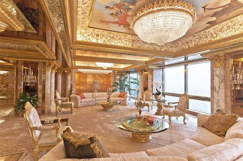
4.  Even if he has warmed to the White House’ decor and furniture soon after moving in, Trump is a man who has stayed put in his lavish multi-floor apartment for much of the last three decades, and it has provided the perspective from which he looked at the United States–and may offer a perspective from which the strong opinions of his policies were formed.  For a candidate who saw the sumptuous quarters designed in Louis XIV style as a tribute to his creation of his own self-image, was his creation of a time-frame also particularly revealing?  Did his identification with an apartment decorated in 24-karat gold and marble and furniture and tapestries  in Louis XIV style with a Tiepolo ceiling put him in ideal place as a candidate to promise a project of time travel to Americans seduced by his timeless lifestyle–

15trumpwomen-ivanacomp-master675

so effectively isolated as he was from the changes in the external world over the past twenty to thirty years?  (And doesn’t being called a “homebody” mean quite a different thing for such a home?)  For a man who grown up in a house with four white columns that were adorned with a confected crest and coat of arms and white columns, as a palace set apart from Queens, N.Y., with twenty-five rooms and nine bathrooms, the palatial abodes that he has continued to created for himself and his family similarly stepped outside of time.

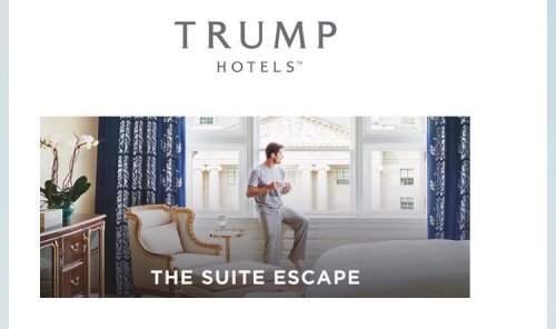
The series of luxury hotels with which Trump’s name has been synonymous promote lifestyle packages promote pastiches of European luxury that are, after all, the tricks of the trade of a master hotelier–whose expertise is to offer an escape to a new comfort zone.  Since winning an election for United States President seems to provide only an extension of the art of escapism he has already refined in the political sphere that can translate to the trade of the hotelier, it seems no surprise that recent publicity even integrated the image of the White House facade to a promise of escapism at Trump International located in Washington, DC–even if this reveals something of a conflict of interest or confusion of jobs, or rather imagines the sort of “Suite Escape” in which Trump Hotels specialize the possibility of looking at the photoshopped blanched federal Environmental Protection Agency  through drape-graced windows in utmost Trump luxury, even if it does, as Philip Bump noted keenly, capture the “mess of conflicts of interest” that Trump is now likely to himself face far beyond that hotel.

c3i8vuhwcaa5x5e

c3kmsa4wyaavo2z-jpg-large

5.  For it seems that a large part of the promise of Trump Hotels is to offer to assemble for their eager visitors pastiches of the “finer things of life,” such as the guesthouse in the Blue Ridge foothills, combining a Georgian-style mansion with old-world elegance from Waterford crystal chandeliers, oil paintings, and statuary in surroundings recalling the Tuscan countryside; every one of his Trump International hotels or Trump Hotels is prized for its own thematic program of interior decoration that offer to their visitors.  This is distilled in the utterly escapist residence Trump loves in Trump Tower, whose time-shifting decor to transport one to an idyllic past, free from social consequences or concerns, that might be the emblem of the escape he offers the country.

inside-trump-tower

The notion of Trump sequestered, as a self-made Rip van Winkle, is somewhat appealing.  Donald Trump rarely travels, and seems something of a homebody, flying home regularly while he was on the campaign trail on his private jet–and asking the Secret Service to follow him home, on an air company he owns.  To the tune of $1.6 million, agents accompanied him on regular return flights on TAG Air, on which he logged some $6 million personally, boasting “I could be the first presidential candidate to run and make money on it,” as he walked to the bank, even outfitting his own ostentatious Boeing 757 jet at a cost of $1 million that situated his own name prominently in red, white, and blue. Trump often made late night trips back to New York during the Presidential campaign, to sleep in his own living quarters, according to the New York Times.  (The cost of outfitting his plane in suitable luxury may have given Trump grounds to criticize current government contracts with Boeing for the real Air Force One of $4 billion–“Cancel the order!“–although the mechanics of what was entailed in that plane were probably not in his grasp.)

trump0715-force-one.jpg

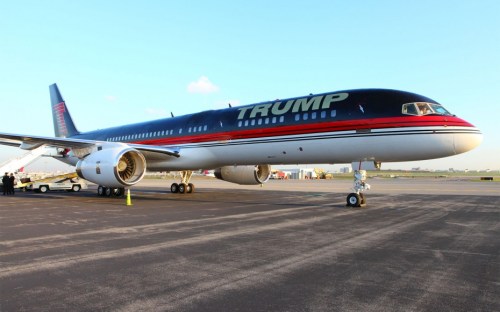
All those daily flights home on “Trump Force One” to sleep in Trump Tower during the Iowa Caucuses were at first feared to cost him some votes across the midwest.  Trump had regularly returned to his morning view of Central Park and his lavish home quarters, however, and seemed to relish returning with regularity during the campaign.  He didn’t allow any press members to accompany him on these flights, though the staff grew.  But he didn’t hesitate to outfit the luxury jet which was a frequent backdrop for news conferences and televised appearances, at a cost of an extra cost within the 3.8 million taxpayers payed to Tag Air, Inc., to operate the jet which approximated his personal quarters in Trump Tower, from a master bedroom approximated with silk wall coverings, mohair couch that converts to a bed, 57-inch television, home theater, shower and gold-plated toilet on this fuel-inefficient plane–all the while insisting on returning to his penthouse in Trump Tower almost each and every night.  (Trump claimed his flights were funded by checks he wrote to his own campaign, and the sale of MAGA hats and souvenirs at rallies, but the $27,000-$36,000 increase in daily operating costs of such regular flights home–the result of a deep resistance to overnighting outside his home long noted on the campaign trail–left the Secret Service sending a tidy check of $1.6 million for much of 2016 to Trump’s own airplane company.)

6.  The web of financial ties to Trump are far-flung in their nodes, and their ties to members of the incoming Trump cabinet–including Betsy “Ah, Betsy; Education, Right?” DeVos–and seem to stretch to areas only begging to be fully mapped, but which extend far, far beyond the properties of the Trump Organization.

Trump Mafia.png

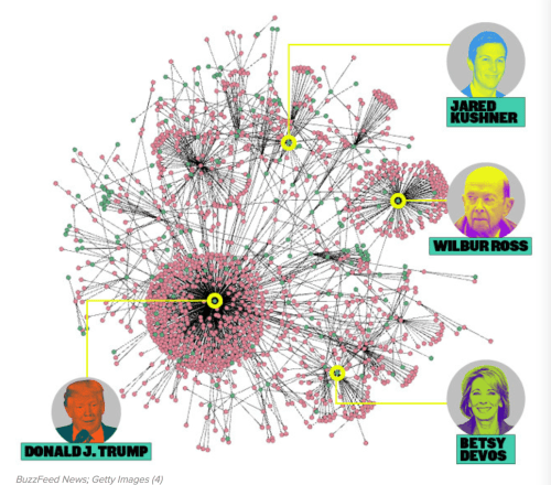
–in a virtual web of business connections, many concealed within his tax statements.  The ties to much of the nation and newfound legitimacy and recognition of the Trump brand seems undeniable–even if Donald Trump, Jr. dismissed the idea that Donald, now that “he’s got real stuff he’s got to deal with” and “real people’s lives,” is anything but occupied with his governmental duties or realizes the extent to which hid new platform of recognition might encourage the expansion of a luxury hotel chain to new regions of the country.   While scoffing at the “notion that [President Trump] is still running the business from the White House is just insane,” however, the network of hotel chains he has administered provide something like the template for Trump’s notion of his relation to space, as the deals he brokered with construction firms, cities, and property taxes have provided him with the basic tools by which he seems destined to project Presidential authority.  Even as Trump sons Eric and Donald, Jr., the surrogates of his hotel empire, claim “There are lines that we would never cross, and that’s mixing business with anything government,” the inescapable confusion is one from which they will benefit.

Indeed, the range of hotel properties Trump owns are wide-ranging, although notably removed form the African continent or Australia, not to mention an almost entire absence in Asia, restricting interest in South America to the tourist destination of Rio and a planned residential development in Uruguay; and with no properties in continental Europe outside Istanbul–and an avoidance of Mexico which, for the owner of a chain of luxury hotels and hotelier, seems almost to be rooted in something like a deep personal dislike–

48d41a986339f80a89695e2609f368fd71dc0653-1

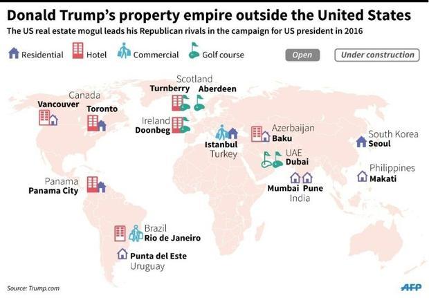
The selective seats of Trump International perhaps befits an entity long styled as “real estate super-brand” and linked to the lifestyle it marketed.   But the absence of Trump’s ability to market the Trump lifestyle and brand of hotel destinations in Europe, save the recent and requisite golf courses in Scotland Ireland, may reveal a long ambivalent attitude to Europe and NATO countries, given the absence of Trump interests outside golf courses in Aberdeen, Tunberry and Doonbeg.  (Indeed, Trump took no time after assuming the Presidency to rail against the EU based on his own experiences from “another world” of business–based on the firm refusal  of the EU to resist a proposed seawall on the dunes of Trump International Golf Links and Hotel in Doonbeg, Ireland, on the grounds of the environmental protection for endangered animals.  Trump was forced to curtail his planned seawall, the basis for the objection–an endangered snail–post-dates his aversion to expanding Trump International in Europe.

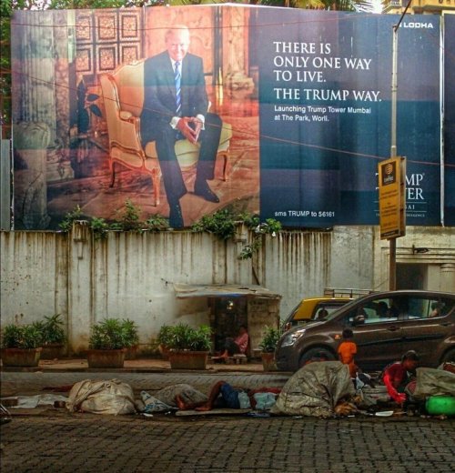
But is emblematic of the disproportionate scale with which Trump seems to view the world.  While mocking local disturbances faced by his building projects as annoying disturbances, he promotes his vision of a single way of life cobbled together from historical periods, providing residents a view from Mumbai at the Park at a remove from the poverty of homeless families who sleep on cardboard on Mumbai’s streets–in an image long suspected to be photoshopped.

58681cd31500002f00e9ddcc.jpegPaul Needham (2014)

The withdrawal of Trump Tower is the opposite of global engagement, but is the site to which Trump seems to invite us all to retreat in an age of global refugees.  Is it any coincidence that the self-confessed germaphobe so fearful of contamination from crowds is most inclined to adopt metaphors as floods, swarms, or infectious to describe the experience of refugees as threats to the social body, metaphorically re-framing their plight at a remove from social, politics or economics–and insisting on our need for better self-protection?  The distorted view from Trump Towers elides the experience of many through the distorting lens of real estate.

7.  Indeed, Trump’s gift for getting his name put on every empty surface known to man–including Trump-themed fiction–seems to have been taken as an excuse for his interest in political representation, which it is not.  But it is no secret that business interactions have most importantly shaped and helped formed Trump’s world view.  And the somewhat striking absence of Trump hotels in much of Eurasia–save residential developments in Seoul, and some under construction in Mumbai, Pune and the Philippines–raises questions not only of the appeal of the version of Trump glitz that they offer, but also of the place of these actual locations in Trump’s current mental map; the distance of the Trump brand entirely from the neighboring state of Mexico is more than clear, and may derive from personal distaste.

The presence of properties under construction in Uruguay, India, and Makati may indicate constraints of the Trump lifestyle, whose limited truck in Europe is not destined to grow in the future.  The relative absence of Trump’s presence in Asia–save Baku–suggests not only a compromised notion of geography for Trump, but an untimely withdrawal from international markets that analyses of the previous administration suggested place millions of jobs at risk.  How can we collectively trust a man with so compromised a notion of geography to can the Trans-Pacific Partnership?  The punitive measures proposed to be taken against companies making products overseas suggest a deeply skewed notion of the place of the American workplace in the global economy, and punitive measures against foreign competitors, suggest a limited and deeply narcissistic notion of global economic transactions, distant from and out of touch with the distribution of global populations.

populous nations.png

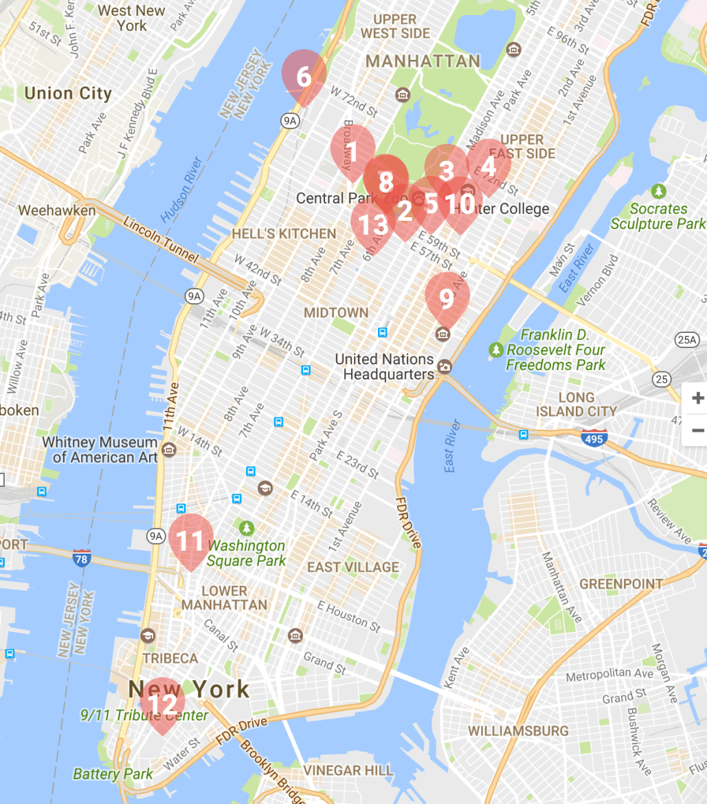
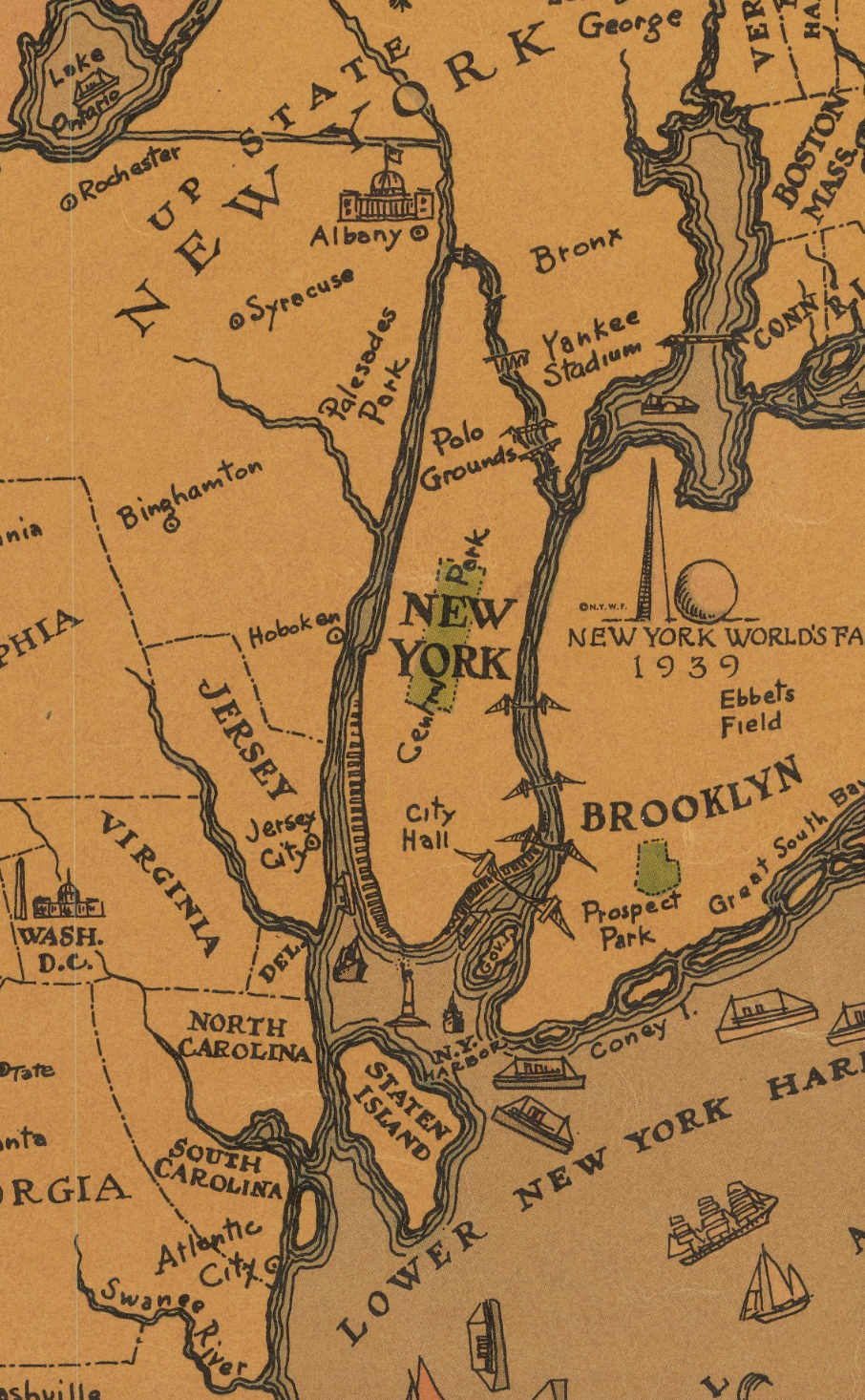
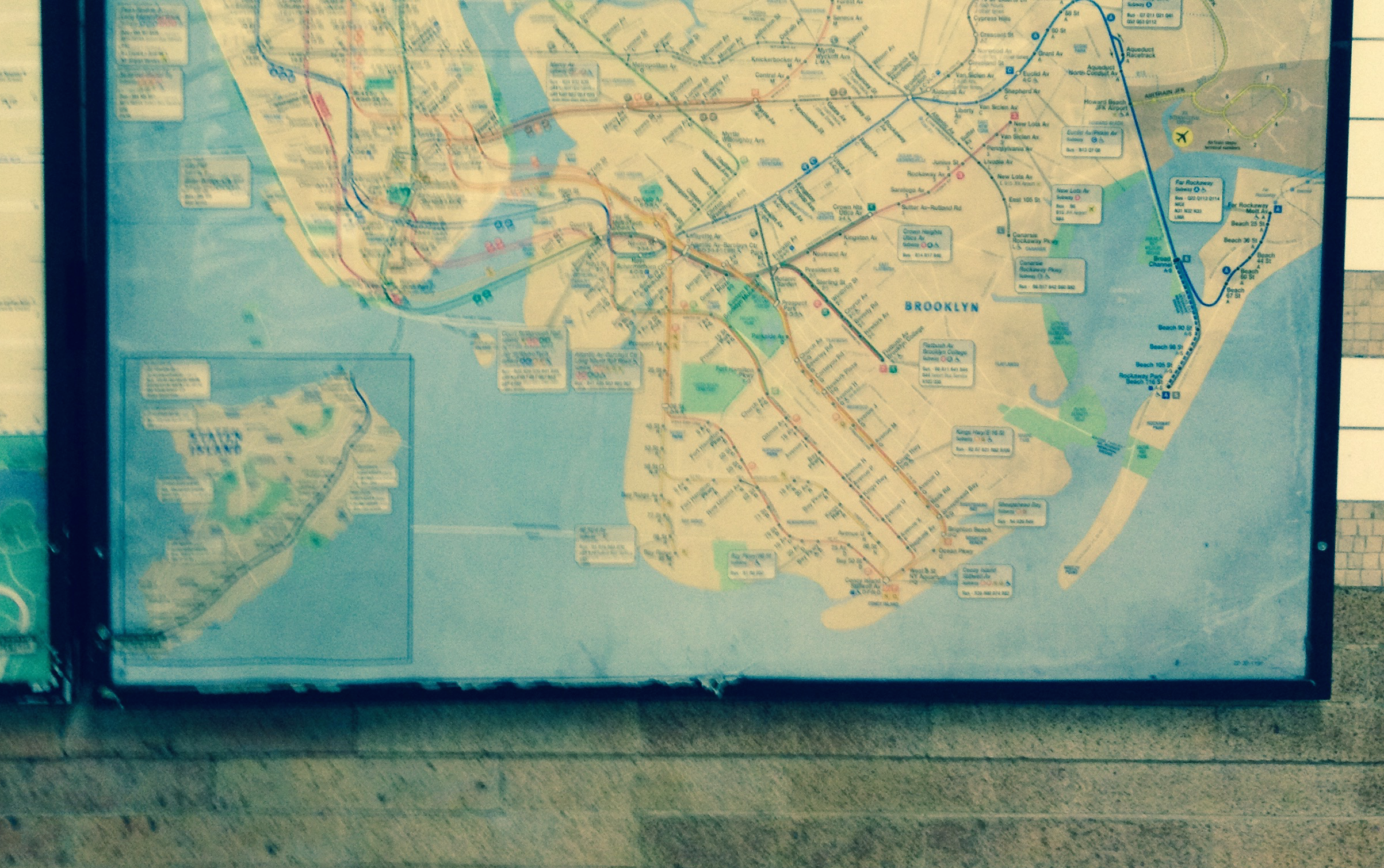
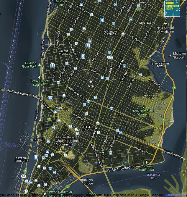
The remove of a spatial imaginary of real estate was long prominent in Trump’s mind.  The sharply concentrated and geographically small circuit of properties Trump owns in New York suggests not only a limited knowledge of the huge diversity of New York City but define the notion of the Trump lifestyle he has sold to America as an outer borough boy.  It betrays his narrow range of interest in coveted properties around Midtown and Trump Tower, revealing Trump’s longstanding interest in focussing his sights on Manhattan, despite his father Fred’s disinterest in the far fancier borough–and his open discouragement to Donald for chasing such properties from a firm that had roots from the Verrazano Bridge to the Long Island border, and offered middle-class housing, for hubris in reaching beyond his Brooklyn roots.  Is the focussed expansion of Trump Properties into Midtown, by now long naturalized by its epicenter at Trump Tower, a form of inter-borough envy with roots in the class conflicts of New York City’s urban geography?

Such inter-borough rivalry seem to have guided not only the expansion of Trump properties as it expanded to the area around the future Trump Tower, site of the tony area of Tiffany’s, the Plaza Hotel and Central Park South–

Trump NYC.png

–but the position in which he sees himself in relation to the world, and the caricature of the populist millionaire that became the conceit of The Apprentice and since become a basis for Trump to sell himself and his brand to the country.

Indeed, the eagerness of Donald to move to the toniest areas Fred Trump disdained, by casting himself from the “streetwise son of Brooklyn’s largest apartment builder,” allowed him to expand his stylized image as a colossus of Manhattan, but to disdain the outer boroughs of New York City as a place to plant the gold-plated image of his name.

Fred and Donald.png

In staking claims to building in such a restricted area of Manhattan, Trump may have used midtown as a sort of arena or performance space to broadcast his identity with such well-polished sheen that it served as a launching pad for Reality TV, long before declaring his Presidency.

8.  More scarily, however, is that the quite limited previous experience Trump gained with world affairs from his perch in New York seems destined to shape the judgements that he shapes on issues of global consequence:  as being in Queens and looking at Manhattan defined Donald’s appreciation and interest in power, the very tactics of aggression that worked for him to launch his brand in New York has become generalized in the trademark launching of hotel facades, and the confrontational bullying of world leaders seems to be the chosen metier of foreign policy, as cultivating allies and personal rapports; divisions between personal space and national destiny seem far closer than in the past, who seems to see foreign policy as conducted in confidence and in tête-a-tête rapports; foreign non-immigrant workers of HB-1 visas are viewed as “cut-rate” bargains, analogous to foreign construction workers; constant commentary on foreign affairs in Twitter permitted; brinksmanship is a working strategy; market negotiations as a primary means of statecraft with overseas partners and adversaries alike.

Trump’s deep need to impress world leaders takes precedence over policy or statements of national interest; tax-cuts are for corporations, whose rate is cut to 15 percent, and tax brackets collapsed from seven to three–while omitting how the US government would be able to afford the cuts.  Trump works on small-scale corporate deals with companies about aircraft, but the big picture seems to slip away.

For Trump’s apparently unremitting focus on staking claims to what he considered higher status in New York City’s real estate market, and to promote his name in doing so, developed with an intensity that led him to continue to stake claims to that status for new arenas.  This began in New York City, greedily and relentlessly, from the West Side Highway where his promise of a waterfront apartment building led the city to permanently close an exit ramp, to Soho, to Wall Street.  This apparent search seeming to chase an image of prestige in the mirror of his own gold-plated marquee, combining deep desire with disinterest in much of the external world, almost desiring only to look in the mirror of the gold reflective surfaces naming the multi-billion dollar towers to which the developer lends his name and the status they take pains to create.  Trump indeed boasted to a biographer Harry Hurt III, back in 1993, about having the best living room view in all of New York City, by virtue of being able to see from his Trump Tower apartment his own name on all sides:  beside the Hudson River in the West Side Yards; on Third Avenue, atop the thirty-nine story Trump Plaza or the fifty-five story Trump Palace.  Hurt compared it all to a child-like fantasy: mirrored in miniature on the ultimate stage of self-indulgent fantasy, as Trump’s name is branded not only on buildings but also “on a Monopoly-tyle board game branded ‘Trump'”, in a sort of ubiquity that needs its own constant affirmation, and itself engenders a desperate need for confirmation of loyalty and admiration.

For Trump seems to have lived in an extended or protracted mirror stage, where the materials of building provide themselves the foil for revealing the “I” that the builder seeks to cultivate, forged in a pre-linguistic stage but continuing as a distorting monumentalization of selfhood that desires to obscure if not obliterates the very map across which it spreads, disorienting the viewer.  The reality of the Trump presidency seems retaining the sheen on the name that seems to gain a greater aura the more that it is reproduced.

Gold reflective.png

Trump Tower

tower.png

lv-trump-t

But how long can that last?  While Trump boasted that his ability to have “added show business to the real estate business” is an apt characterization as “a positive for my properties and in my life,” is the nation able to be defined as his property, or is he able to fulfill the fantasies of his constituents through inflated promises and empty patina?

Rather than build such bold pronouncements of self without oversight in Washington, DC, Trump seems to offer the nation new ideas of the landscape of governmental authority.  For rather than seeing the role of the Presidency as representing the nation, Trump seems to have relentlessly presented the function of the Presidency as expanding own his personal enrichment at the cost of the nation–and indeed at the cost of the Presidency’s historical prestige.

c3ejxivwaaaytfr

Comments Off on Mapping Trump

Filed under American Politics, data visualization, Donald Trump, electoral maps, real estate

Mapping Our Shrinking Shores

Coasts have provided the primary cartographical invention to understand the risks that erosion pose to property:  the coast-line is the boundary of the known land, and determines the outer bound of the real estate.  But the coastal fixation of the landlubber privileges the illusion of the fixity of the shore.  More than ever, assumptions about the fixity of shorelines must fall away.  Perhaps the most haunting take away from the Surging Seas web-based map of global shorelines forces us to take into account the inevitable mutability that must be accepted with the rising of ocean-level associated with climate change.

The web-map presents itself as a set of tools of analysis, as much as cartographical techniques, by which the rise of sea-level that has already risen globally some eight inches since 1880 stands to accelerate–emphasizing the alternate scenarios that the acceleration of sea-level rise stands to bring over the next hundred years, introducing a new concept of risk due to coastal flooding.  The availability of accurate GPS images of the elevations of homes have provided the possibility of sketching scenarios of sea-level rise to create readily zoomable maps of elevated ocean levels that confront us with at least the image of the options which we still theoretically have.  The contrasting futures created in this cartographical comparison shocks viewers with a salutary sort of operational paranoia only increased as one fiddles with a slider bar to grant greater specificity to the disastrous local consequences of rising sea-levels world-wide.

shanghai

In ways quite unlike the wonderfully detailed old NOAA Topographic Surveys which map shorelines at regular transects, or T-Sheets, recording the high waterline of tides across 95,000 coastal miles and 3.4 million square miles of open sea, the coastline is less the subject of these web maps than levels of potential inundation.  In a negative-mapping of possibilities of human habitation, blue hues invade the landscape in a monitory metric emphasizing the regions at risk of being underwater in a century.  Whereas scanned T-Sheets can now be viewed by a historical time-bar slider, the fixity of space or time are less relevant to the web maps than the gradients of possible sea-level rise caused by carbon emissions might force us to confront.

Surging Seas forces us to confront the possibilities of the future underwater world.  The infiltration of a deep shade of blue commands the eye by its intensity, deeper shades signifying greater depth, in ways that eerily underscore the deep connection that all land has to the sea that we are apt to turn our backs upon in most land maps, showing the extent to which a changing world will have to familiarize itself to water-level rise in the not-distant future.  It’s almost paradoxical that the national frontiers we have inscribed on maps has until recently effectually made impossible such a global view, but the attraction of imagining the somewhat apocalyptic possibility of sea-level rise seems almost to map a forbidden future we are not usually allowed to see, and has a weirdly pleasurable (if also terrifying) aspect of viewing the extensive consequences of what might be with a stunning level of specific and zoomable local detail we would not otherwise be able to imagine, in what almost seems a fantasia of the possibilities of mapping an otherwise unforeseen loss, not to speak of the apparent lack of coherence of a post-modern world.

For the variety of potential consequences of disastrous scenarios of sea-level rise posed can be readily compared with surprisingly effective and accurate degrees of precision, in maps that illustrate the depths at which specific regions stand to be submerged underwater should sea-level rise continue or accelerate:  zooming into neighborhoods one knows, or cities with which one is familiar, the rapid alteration of two to seven feet in sea-level can be imagined–as can the fates of the some 5 million people worldwide who live less than four feet above sea-level.  For if the shores have long been among the most crowded and popular sites of human habitation–from New York to London to Hong Kong to Mumbai to Jakarta to Venice–the increasing rapidity of polar melting due to climate change stands to produce up to a seven feet rise in sea-level if current rates of carbon emissions, and a mere four degree centigrade rise in global temperature stands to put the homes of over 450 million underwater, which even the most aggressive cutting in carbon emissions might lower to only 130 million, if rates of warming are limited to but 2°C.   (If things continues as they stand, the homes of some 145 million who currently dwell on land in China alone are threatened with inundation.)

The recent review of the disastrous consequences of a rise of two degrees Centigrade on the land-sea boundary of the United States led Climate Central to plot the effects of a-level rise of at least 20 feet on the country–and foreground those regions that were most at risk.   The webmap serves as something like a window into the possible futures of climate change, whose slider allows us to create elevations in sea-level that the ongoing melting of the polar ice-cap seems poised to create.  As much as offer compare and contrast catastrophes, the immediacy of recognizing the degree to which places of particular familiarity may soon stand to lie underwater performs a neat trick: for whereas a map might be said to bring closer the regions from which one is spatially removed or stands apart, making present the far-off by allowing one to navigate its spatial disposition in systematic fashion, the opacity of those light blue layers of rising seas obscures and subtracts potentially once-familiar site of settlement, effectively removing land from one’s ken as it is subtracted from the content of the map, and charting land losses as much as allowing its observation.

The result is dependably eery.  The encroachment of the oceans consequent to rising sea-level propose a future worthy of disaster films.  But the risks can be viewed in a more measured ways in the maps of sea-level on the shores of the United States calculated and mapped by Stamen design in the Surging Seas project that allows us to imagine different scenarios of sea-level rise on actual neighborhoods–the set of interactive maps, now aptly retitled Mapping Choices, will not only cause us to rethink different scenarios of shifting shorelines by revisiting our favorite low-lying regions, or allow us to create our own videos of Google Earth Flyovers of different areas of the world.  Mapping Choices provides a way to view the risks and vulnerabilities to climate change made particularly graphic in centers of population particularly low-lying, where they testify to the clarity with which web maps can create a vision of imagined experience as we imagine the actual losses that global warming is poised to create.  And although the recent expansion of the map to a global research report, allowing us to examine possible global futures that are otherwise difficult to comprehend or process the potential risks posed by the inundation of low-lying inhabited regions for a stretch of thirty meters, the potential risk of inundation is perhaps most metaphorically powerful for that region that one best knows, where the efficacy of a simple side-by-side juxtaposition of alternate potential realities has the unexpected effect of hitting one in one’s gut:  for debates about the possibilities of climate change suddenly gain a specificity that command a level of attention one can only wonder why one never before confronted as an actual reality.

Alternate Scenarios

Maps are rarely seen as surrogates for observation, and web maps often offer something like a set of directions, or way finding tools.  But the predicted scenarios of sea-levle rise allows one to grasp the local levels of inundation with a specificity that allow risk to be seen in terms of actual buildings–block by block–and wrestle with the risks that climate change portends.  The lack of defenses of populations in many regions are definitely also at great risk, but to envision the loss of property and known space seems oddly more affecting in such an iconic map of Manhattan–and somewhat more poetic as an illustration of the fungibility of its hypertrophied real estate and property values.

Of course, the data of Climate Change allows a terrifying view of the future of four degrees centigrade warming on low-lying Boston and the shores of the Charles, as the city is reduced to a rump of an archipelago–

Boston

or the disastrous scenarios for the populations in the lower lying areas of Jakarta–

Jakarta

or, indeed, in Mumbai–

Mumbai

Viewers are encouraged to imagine the risks of the possible alternate futures of just two degrees with an immediacy that worms into one’s mind.  The possibilities that GPS offers of instantaneous calculations of shoreline position and elevations allow one to view a potential reality where one can focus on individual streets with inspirational urgency.

But such scenarios seem somehow particularly graphic illustrations of risk for those regions where there has been a huge investment of human capital, as New York City, where it might seem credible enough to be mapped that they are poised to melt not into air but vanish beneath ocean waves.  For if Marx predicted with spirited apocalypticism at the very start of the Communist Manifesto that capitalism would destroy value to money as it expanded into future markets, as market forces abstracted all things into money–and “all that is solid melts into air”–the twentieth-century expansion of possibilities of environmental and human destruction have lent unprecedented urgency.  While for Marx the metaphor of melting of inherent value was the product of the capitalist system, the capitalist system bodes a strikingly similar image of sinking into the seas.  For huge expanses of the old industrial city–the piers and the old manufacturing zones, most all of the Jersey shore and area around Newark, Long Island City and the Gowanus canal seem sink apart from the shoreline in the future New York that Surging Seas creates, in ways that seem the consequence of industrial production and carbon surging far beyond 400 parts per million (ppm), with the addition of some 2 ppm per year, in ways that make it a challenge to return to the levels deemed healthy–let alone the levels of 275 ppm which the planet long held through the mid-eighteenth century.

That drought, hurricanes, disappearance of arctic ice (up to 80% in summertime) and rising sea levels are tied to the growth of greenhouse gasses hint how global capital might be closely linked to the sinking into the seas, and suggest the surpassing of a tipping point of climate change that is the counterpart to melting into air might be viewed, in New York City’s economic geography, as if to offer a poetic reflection of the migration of capital into the financial centers of the city downtown from its piers or areas of industry–

NY:NJ

–although half-hearted joking references to Marxist maxims (or geographers) is hardly the topic of this post, and the island of high finance that would be created in downtown Manhattan would hardly have ever been planned as an island.

Lower Manhattan Island?

What one might someday see as the lopping off of much of lower Manhattan might be far better tied to the runaway markets of a free-trade economy, rather than rational planning, and has no clear correspondence to property values.

lopped off lower Manhattan

Indeed, the mapping of the prospective loss of those residential parts of the city “where poor people dwell” (as do minorities) is undeniable, if one looks at the 2010 American Community Survey, regarding either in the city’s distribution of ethnic groups or households earning below $30,000, who remain the most vulnerable to the danger of rising ocean levels.

ACS 2005?

Income under 30,000American Community Survey (2010)/New York Times

But the disappearance of the Eastern Parkway and the Jersey shore are a blunt reminder of the extreme vulnerability of the built environment that lies close to sea-level–

Eastern Parkway and Atlantic Avenue above the seas

–and an actually not-too-apocalyptic reminder, but the mapping of consequences of man-made change that goes under the rubric of anthropocene, and is most apparent in the increasing quotient of carbon dioxide in the atmosphere and the warming that this may bring.  For if it has been approximated that there has already been a rise of sea-levels by some eight inches since 1880, the unprecedented acceleration of that rate, which will increase the dangers of floods from storms and place many of the some three thousand coastal towns at risk, are likely to increase as the sea level may rise from two to over seven feet during the new century.

350ppm-chart-300_fixed

The distribution is by no means uniform, and more industrialized countries, like the United States, are producing far more particulate matter, although they have been recently overtaken by China from 2007, and have atmospheres above 380 ppm in the Spring, making them more responsible for rendering higher temperatures–although the lower-lying lands below the equator may be most vulnerable to the consequences of climate change.

Screen Shot 2015-07-13 at 8.20.11 PM

Screen Shot 2015-07-13 at 8.21.44 PMScreen Shot 2015-07-13 at 8.22.35 PMVox– A visual tour of the world’s CO2 emissions

The increasing levels of particulate matter are attempted to be more locally mapped in Surging Seas.

The changes extend, in a nice dramatic detail, into the Central Park Meer rejoining the East River with the predicted inundation of much of the posh residential area of Manhattan’s East Side, all the way to Fifth Avenue.

Truncated NJ and absent upper East side

It is difficult not to compare the scenarios sketched in Surging Seas maps to some of the maps of those future islands of New York that Map Box and others allowed Sarah Levine to create maps of the heights of buildings from open data after the pioneering maps of Bill Rankin’s 2006 “Building Heights.”   When Rankin remapped Manhattan by taking building height as an indirect index of land value, he saw the island as clustered in distinct islands of elevation above 600 feet:

manhattan-heights

Radical Cartography (2006)

Levine used similar data to chart the fruits of Mammon in buildings above sixty stories.  Maps of skyscrapers beside the gloom of Surging Seas suggest those towers able to withstand the rising seas brought by global temperatures jumping by just two degrees Centigrade.  If one moves from the map of the bulk of lowest sections of lower Manhattan–

Two Inches in Lower Manhattan

with reference to Levine’s brilliantly colored carmine mapping of the highest buildings in the Big Apple, above forty-seven or fifty-nine stories, which one imagines might provide the best vantage points that rise above the rising waves, especially when located on the island’s shores.

Mapping NYC by Sarah

Sarah Levine Maps Manhattan

There’s a mashup begging to be made, in which the tallest buildings of over fifty stories at the tip of the island peak up above the cresting waves, and the rump of buildings in lower Manhattan offer contrasting vistas of the city’s contracting shores.  The buildings that create the canyons of urban life, the buildings of elevation surpassing sixty stories might suggest the true islands of Manhattan’s future, as much as the points that punctuate its skyline.

Sarah's Lower Manhattan

The realization of this possible apocalypse of property made present in these maps offer the ability to visit impending disasters that await our shorelines and coasts, and imagine the consuming of property long considered the most valuable on the shore–as rising seas threaten to render a whispy shoreline of the past, lying under some six meters of rising seas.  The prospect of this curtailing of the ecumene, if it would bring an expansion of our nation’s estuaries, presents an image of the shrinking of the shores that suggests, with the authority of a map, just how far underwater we soon stand to be.

Eastern USASurging Seas: sea level rise after 2 degrees centigrade warming

All actual maps, including Levine’s, provide authoritative reporting of accurate measures with a promise of minimal distortions.  But visualizations such Surging Seas offer frightening windows into a future not yet arrived, using spatial modeling to predict the effects of a rise in sea-level of just five feet, and the potentially disastrous scale such a limited sea-level change would bring:  the coasts are accurate, but their inundation is a conservative guess, on the lower spectrum of possibilities.  For in a country in which 2.6 million homes are less than four feet above current sea-levels, the spectral outlines of chilly blue former coastlines peak at a future world are still terrifying and seem all too possible, as much as potential cautionary tale.  The concretization of likely scenarios of climate change remind us that however much we really don’t want to get there, how potentially destructive the possibility of a several degree rise in ocean temperatures would be.

Leave a comment

Filed under Climate Change, coastal flooding, data visualization, global warming

Is Staten Island Bigger than Manhattan?

The counter-intuitive answer is not only “yes,”–but by over twice as much, as the early navigators of New York Harbor would have had no time negotiating, especially if you considered its large submerged underwater land mass that dwarves other boroughs. Rising sea-levels may mean that sea levels many parts of the reduced or shrunken shoreline of a future Staten Island will lie underwater by 2050, ending the integrity of Staten Island as an island, would reduce “Staten Island” to a tortured archipelago, covering its beautiful beaches by tidal waters able to submerge shoreline of coastal neighborhoods, so that the islets and sand left are left about as large as Manhattan. But the heightened insularity of Staten Island is a picture far different than the borough’s continuity presents residents.

Map

The reaction of size with a projection of sea-level rise would reduce the geographic expanse of Staten Island, but it already occupies a less prominent place in the current cartographic rendering of the five boroughs. In fact, due to an act of somewhat irresponsible cartographic persuasion that has infiltrated the spatial imaginaries of most New Yorkers riding public transit, and rarely visiting the island’s shores.

The cartographic contraction of New York harbor in the current subway maps compartmentalize Staten Island as an inset that reduces its apparent size in the metropole for many New Yorkers who may not visit the borough, or visitors to the city. Even at a rise of two meters, the Staten Island would be not much reduced–

–if an incredibly rise of thirteen meters shrinks the sizable borough, if one uses the slider bar on a recent glorious rasters of an interactive map–

To focus on one “island” contrasts with the future borough’s prominent place in a coastal cartography of islands, mapped after the Revolutionary War–Staten Island featured prominently in a rich coastal cartography–Rhode Island; Block Island; Martin’s Vineyard Island, and Long Island–at the Peace of 1783–since obscured.

The United States Laid Down from the Best Authorities, agreeable to the Peace of 1783

Familiar coastal continuities have been increasingly displaced and erased by a geography of transit, and the overpopulation of the other four boroughs of New York. The greater weight given to the density of different boroughs in current maps suggest how far removed in time and space from a time when “Manhattan” could be called “York Island,” in this 1740 harbor map–one of the first to naming the Hudson River that traced the shores of the marshes that once covered part of the island and its shallows with considerable care, centrality in the harbor north of the Raritan River and south of what was boasted as New Jersey’s richest oyster bed.

John Carwitham, “Plan of the Harbour of New York” (1740)

For although few early mappers would have neglected the size of Staten Island, that perhaps neglected borough of an otherwise racially diverse metropolis, its actual landmass–58.69 square miles to Manhattan’s mere 22– Staten Island indeed almost approaches the size of the sprawling borough of Brooklyn, but remains the least inhabited by far, with fewer than 500,000 residents, and seems at times epistemically as well as politically removed from other boroughs.  

Is the low density of its habitation part of the reason that it has for so long held a lesser role in the spatial imaginary of most New Yorkers, and indeed the spatial imaginary that is projected to the nation and to much of the world? Even if it has been amplified by landfill, and lost its marsh, the larger size has been radically reduced, in the spatial imaginary of Manhattan residents.

NYC mapped

Wikimedia

The growth of Staten Island’s current far more suburban character makes it the least populated–and the whitest–of all of New York City’s boroughs, as well as the last of the boroughs to be incorporated in the city–as the island was not only joined with Richmond County, but known as Richmond long after the city’s incorporation in 1898, and only changed its name in 1975. The cultural distance that existed between the boroughs was such that when Leontyne Price sang the first notes of Anthony and Cleopatra in the new Metropolitan Opera stage in Lincoln Center in 1966, “determined to do her country proud,” she confessed to being overcome from the very first note she sung by the “thought I was singing to Staten Island,” the amplifying acoustics of the concert hall seeming to amplify her voice across a cultural divide: Staten Island evoked the huge distance the new opera hall might have even allowed her voice to travel.

Was the overpowering nature of bridging a divide mere cultural elitism? Not at all–removed in politics from much of New York because of its distinct demography, the perceived image of Staten Island was reduced in the mental geography of most New Yorkers–as it is in the geography of mass transit that is perpetuated by New York City’s MTA, that common proxy arbiter of transit distance, despite its obvious distortions. For the universal authority of this symbolic map of the New York subway system, one of the most-read maps in the city, even if it has been often redesigned, distorted the relative size of the boroughs to increase the legibility of the network of trains.

NY MTA

For this former refuge of French Huguenots, if joined to the city’s 1898 incorporation, was long mapped–shown here a decade prior to the incorporation of the boroughs, in 1889, as something belonging also vaguely to the offshore, containing far less congestion and less defined by a fixed north-south street grid in the manner of other boroughs, and indeed with small settlements on its shores, even if the map was titled “Staten Island,” the name was oddly all but absent from place-names on the map’s face, running along the interior of its southernmost shore. When the great Concord naturalist, Henry David Thoreau, was a Staten Island resident back in 1843, tutoring Emerson’s son for the summer, he wrote the Sage of Concord of the beach with with great affection, even if professing to miss both Concord and the Walden Woods.

The island offered a sort of point of transcendence over New York harbor, akin to what John Gillis has called an “island of the mind,” long before Thoreau set up house outside of Concord on the shore of Walden Pond on Emerson’s old wood lot. Thoreau reassured the Sage of Concord in a letter from Staten Island that he would always “carry Concord ground in my boots and in my hat,” even if he rather convincingly claimed to his mother that “the sea-beach [of Staten Island] is the best thing I have ever seen,” a solitary shore where “you only remember New York occasionally,” however chafing it might be to have your “dwelling place . . . only considered a neighborhood to a great city,” tied together by a boat that left Staten Island five to six times a day as he visited local publishers to print his work. The sense of apartness from the city in Staten Island was something of a happy medium for the budding writer, set apart from the bustle of urban life. Was it a premonition of the retreat to Walden as an imagined island from which to observe the world?

While Thoreau was deeply dismayed by the problems locusts caused to the island’s forests and fruit trees, worrying about the locust eggs that would lie in the trees until they made their reappearance in 1860, he was dismayed at a din that could be heard from offshore sailors off its coasts, and it seemed a world apart from urban sounds of other boroughs. He was content to remain there for stretches of three weeks at time, without leaving the island’s shores, observing the local dogs, cats, and fowl that seemed to live on the locusts fallen from trees. If he loved the crabs and horse-shoes “dancing like sea-fowl on the surf,” the common onion that filled the island’s fields so fully regularly “spoils the cream and butter for the market, as the cows like it very much,” he told his sister Sophia, hinting that of the two schools on the island, one for girls, might provide a place Helen might work, and promised to “keep my ears open for her in such directions,” as if he might readily move there.

Thoreau was “living seven and a half miles from New York” in Castleton, the site of the Military Hospital and public health quarantine grounds, an edge of the United States, indeed, and convincingly boasted that living on the south shore convinced him to commit to “I must live along the beach,” before he moved to Walden, awed at the ability to “see what that great parade of [ocean] water means, that dashes and roars” in ways he had never seen as a New England mainlander, years before he lived at Walden, as the river pilot had never seen the ocean, which made him fell that the busy wooden sidewalks of Wall Street were much farther than seven miles. Was there any chance that Walden might have been Staten Island?

The later real estate development of the region where he used to climb the highest hill and feel as if a lookout on the edge of America, watching the Narrows “through which vessels bound to and from all parts of the world chiefly pass,–Sandy Hook and the Highlands of Neversink (part of the coast of New Jersey)–and, by going still farther up the hill, the Kill van Kill, and Newark Bay” as he watched sloops go up the Hudson, “which seemed going over the edge of the earth . . . “

Richmond COunty.jpgRichmond County (1889), New York Public Library-Digital Collections

Years before the Metropolitan Transit Agency relegated Staten Island to the status of a cartographic inset of reduced scale, Daniel Wellingford’s 1930 pictorial map, A New Yorker’s Idea of the United States of America, sought to capture the distorted geographic imaginary reflecting the over-inflation urban Manhattanites gave their metropole. The disproportionate size of Manhattan seemed to fit the hubris of designating it as the site of the 1939 World’s Fair to be reprinted that year, when the Trylon and Perisphere seemed cast as a monument to American progress as great as state’s capitol–or indeed most other cities in the New Yorker’s own urban imagination.

Daniel Wallingford, “A New Yorker’s Idea of the United States, circa 1939-40/ courtesy George Glazer Gallery

Daniel Wallingford designed the striking pictorial map prior to the city’s purchase of the elevated tacks of the IRT that created the interborough transit system joining Manhattan with the Bronx and Queens in a single system, apart fromStaten Island; the map relegated a reduced Staten Island to the Deep South, intentionally casting it as the smallest borough, dwarfed by the island of Manhattan, Queens, Brooklyn, or the Bronx–figuring it as about four times the size of Prospect Park, as if it were an afterthought below the Statue of Liberty, as a region few visitors of “the City” would think to explore, lying in the lower harbor, removed from the cosmopolitan vision of the other boroughs.

The novelty map contemporary to the World’s Fair allows one’s eye to rest on Central Park and the all caps font of NEW YORK that dominates the eastern seaboard, as the Trylon and Perisphere command attention in a Long Island that seems a counterweight to all of western New York. The map may mock the global identity of New York City assumed, magnifying all boroughs save Staten Island as large coastal islands along the seaboard from Albany to North Carolina, but relegated the fifth borough, Staten Island, without attractions and apart of inter-borough transit, off the coast of North Carolina–as if the Lower New York Harbor lay at the lay near Savannah, Georgia. It called New York City a “nation within a NATION” of some 7.000.000 inhabitants, “known as New Yorkers,” collecting a “composite of NEW YORKERS’ ideas concerning the UNITED STATES” deriving from the “patient research” long before Saul Steinberg’s View from Ninth Avenue exaggerated its cosmopolitan provincialism on the cover of a eponymous magazine, eliminating Staten Island or other boroughs.

If the Steinbergian cartography of 1976 was indeed a Manhattanites view of the world, or perhaps that of the reader of the eponymous magazine, the question of Staten Island’s relative size is not only a quiz show. The current borough’s actual geographical size is such a surprise due to the longstanding cartographic distortion of its boroughs, and not only on the transit map. The borough remains less populated, to be sure, and mapped by the proportion of the city’s residents, using data from the 2010 US Census, as revealed in one of Ben Hennig’s cartogrammic warpings of space, here shrinking each borough in proportion to its population–which both illustrates and shows by re-rendering the borough’s size to correspond with its number of permanent residents.

Hennig's shurnkenStaten

But the counter-intuitive nature of question may also be based, to cite Streetsblog, that the quite pastoral area to which one often arrives by ferry on one of the few remaining free pleasure-rides, offering an easy opportunity for photo ops in the New York Harbor beside the statue of Liberty, is also among the “least walkable” of areas in the city, and despite its interestingly old architecture and churches, often finds passengers boarding the next ferry to return, rather than explore the less densely populated site of residence that they reach by taking the sole remaining remnant of the ferry system that once connected residents of boroughs in an era before such bridges as the Verrazano or Triborough were erected.

WalkScoreMapNew-York1

More surprisingly, hence, Staten Island’s population produces considerably more garbage and waste in comparison to other boroughs–at least to judge by the mapping of some 274,000 tons of trash that New Yorkers generated in five boroughs in September of 2011.  The tally of collective trash, made before the dispersal of urban refuse to such far-flung sites in Ohio, Pennsylvania, Virginia and South Carolina, found that some 99.4 lbs. of trash and recycling combined were generated by its residents per person–over twice what Harlem’s 11th district generates, illustrating a stark citywide difference in patterns of consumption.  As well as being considerably larger, the scope of garbage generated in the city’s borough reveals a disproportionate increase in the amount of trash–recyclable and not–coming out of the less populated expanse of Staten Island.

Trash Collection NYC:Staten Island

And if the island is not the largest of the boroughs, by any means, if one includes the large if submerged sand bars that form part of its landmass–if they are rarely registered on most land maps—the extent of “sandy Staten Island,” whose sandy Raritan Bay was a site for oyster cultivation, rich with shellfish, is both of greater expanse than many other boroughs, but a considerably greater geomorphological presence in the region–as early nineteenth-century nautical maps of the arrival in New York Harbor reveal–at a time when the Island was far more sparsely settled on its shores.

Despite the size of the island, the cognitive dissonance of Staten Island’s considerable actual expanse seems echoed in its relatively diminished size in current metro transit maps, across multiple iterations since the 1970s, that have offered one of the most famous urban symbolic visualizations of spatial relations in the city, and the most widely encountered.

Such maps perpetuate a deeply distorted view of Staten Island as limited to the Upper Bay, and excluding the regions nearest to New Jersey or the Jersey shore, may have been all too easily falsified by the spatially disproportionate coverage of the five boroughs in the MTA subway map, which marginalizes the sizable island–which lacks major lines of subway service–out of scale, by showing it at a reduced size in the lower corner of a map where a hypertrophied Manhattan occupies and expands across its center.  For the talismanic transit map is a document of the spatial imaginaries transit-goers citywide, after all, in the most widely consulted guide to spatial orientation in the five boroughs.

NY MTA

To be sure, the PATH map suggests a similar slighting of the borough’s expanse, in entirely omitting its very existence:

PATH Rail System

And the ferry map is not gracious to Staten Island outside of and apart from St. George:

Ferry Commute to St. George

But the disproportionate coverage of the inset view of the borough in the MTA transit map on the tiled wall of each and every subway stop in New York City which distorts Staten Island’s size most profoundly to confuse the spatial imaginaries of all subway riders, as it brackets Staten Island as a world apart, in an inset hardly noting its own shift to a different scale.

inset view

However, this was not always the case:  in fact, the lure of Staten Island was indeed rendered more pronounced in one of the early maps of the Statin Island Rapid Transit Railroad Co., of 1893, which adopted quite the reverse strategy in depicting the topography of the sizable island as a destination of pleasure and unparalleled scenery–at least, as the promotional pamphlet announced, “the Most Beautiful Scenery within a hundred miles of the Metropolis,” and the “Finest Bicycle Roads of any suburb of new York,” making it well worth the excursion to future borough that was suggestively promoted as “the Wage-Earner’s Paradise,” “The Family Man’s Refuge,” and “The Married Man’s Friend.”

For Magnificent View

Boasting the “Finest Marine View in the country [sic],” the map that these legends beckoned one to unfold portrayed an island of compellingly detailed topography, inviting readers to take the cruise to the “People’s Playground” and “Greatest of all Summer Resorts” offering “Exquisite Views,” if not the “Beautiful Cloud Effects” that could be witnessed from “Excellent Roads” suitable for “Easy Riding” of up to some twenty miles round-trip distance:

Nice Topo

Whereas the boroughs of Manhattan, Jersey City, and Brooklyn are two-dimensional street plans, Staten Island unfolds for the viewer in full glorious shaded relief, using shading to suggest impressively dramatic changes in elevation of hilly terrain in oblique fashion:  the mountainous topogrpahy of Staten Island is rendered in detail by shading their slopes by hachures to give presence to sloping hills of the borough showing them in a tactile elegant relief, complimented by the streams that run to its beaches, as if to conjure a clearer landscape for the map-reader’s eye.  The detailed landscape appears almost rural, as if to compel city-dwellers to voyage to the island that is shown with such greater topographic concreteness than other boroughs.

While the one-time Staten Island Rapid Transit Company pushed a different sort of pleasure tour as an itinerary than most contemporary MTA maps, which boast continuous coverage of four boroughs, the separate transit system of the other island borough in the late nineteenth century suggested the unique terrain that it sought to offer for all New Yorkers, in a truly democratic medium of leisure.  Since then, the marginalization of transit-systems to a rubric of spatial inter-connection has led Staten Island to be reduced to the position of an inset view in the MTA transit map–reducing the sense that it is both actually so close to Coney Island, and creating a false spatial imaginary for many New Yorkers until they take the Ferry ride.  But the distinct demographic, lifestyle, and voting preferences of the borough force it to stand apart, perhaps distanced from the city as a whole, and maybe bearing less attentive observation within the city’s melting pot.

Indeed, this 538 mapping of Facebook likes of the Presidential primary of 2016–here, Clinton in Green and Trump in Tan–suggests the Democratic/Republican fault lines that seem to plague the calculation of a Staten Island v. Manhattan divide, and somehow spatially distort the relation yet once again–and, perhaps, another reason for distancing the proximity of such highly contrasting political preferences within the electorate.  Indeed, in terms of its voting patterns, Staten Island–as many of the outer areas of the boroughs–stands apart and at a decisive remove from the more densely populated boroughs of New York City, and is perhaps all the more mentally distant from city politics.

Trump:ClintonFiveThirtyEight

The great equalizer is, of course, death, and the binding together of the city in the face of COVID-19 has, perhaps, been a striking equalizer, proving that even a non-living virus knows no boundaries between space or time, although not even the decreased population density of Staten Island has saved the rate at which the novel coronavirus has infected inhabitants, even if the island long seemed so spatially removed.

7 Comments

Filed under cartographic distortions, map scale, Metropolitan Transit Authority (MTA), New York City, Staten Island

Urban Modernity, RIP: Mapping Marshall Berman Mapping Modernism

The meaning of place seems especially difficult to retain in an age of increased mobility, when information flows are increasingly removed from any site, and offer multiplying perspectives.  The work of cultural critic Marshall Berman (1940-2013) provides a clear eyed way to recuperate modernism through the inhabitation of place.  Berman, a long-time New York City resident and echt urbanite, created rich qualitative maps of literary modernism that rhapsodized cities as places–as privileged and vital sites of generating meanings that were rooted in place.  Even after his recent death, it’s hard not to be struck by the vitality that he mapped as rooted in cities, and whose existence he never stopped reminding us about and celebrating.  A native New Yorker, Berman wrote from committed engagement in New York’s space and shifting fluidity, and in his works mapped the sense of fluidity or perpetual permutability of urban life.  He showed us, in so doing, that maps are not only imposition from above, or Olympian views, but can map daily encounters best registered on city streets.  Even when I best knew Marshall in the 1970s and 1980s, he was one of the inveterate street-walker of the Upper West Side and Broadway who exulted in most everything he noticed on the street.  Marshall maybe increasingly became an inveterate street-walker who took pleasure in public space, and enjoyed claiming for himself a spot on the street, finding a sort of release and liberation on the night-time sidewalks, in Times Square, or at the diners where he so loved to sit.

In retrospect, I imagine his championing of the street’s energy came from the magnum opus he was then completing, All That is Solid Melts into Air (1982)–but that his love of street-life also shaped his voracious exploration of the space of literary modernism through the act of being in public.  For Berman quickly recognized that the depersonalization of urban life was not only the trauma and drama of modernity, but, transfigured by literary expression, also a privileged site for individuality.  In ways that are still resonant, his generous mapping of the modernity among cities extended from the city that he loved to the modern urbanism.  R.I.P., Marshall.

Berman’s sudden and unexpected death in a booth at the Metro Diner, at the heart of the Manhattan Upper West Side, can’t but provoke a reflection on his relation to the concept of urban space, from the sense of public space he lived and explored relentlessly as an observer and city-dweller to that which he read so very widely to excavate and explore with a canny sense of the personalized human geography.  For Marshall loved the lived urban environments and continued a life-long fascination he had with the living nature of a streetscape illuminated by electric lights, as if an ecosystem of the Great Barrier Reef, whose deeply modern possibilities he always felt beckoned and invited and which he was eager to explore.  Marshall’s recent death has prompted several emotional reflections that note the inescapably autobiographical aspects of his work, some of which he would himself, surely, be the first not to hesitate to note.  Marshall’s work was, first and foremost, that of a public intellectual who bridged personal criticism with urbanism.  For Berman often described his engaged writing on modernism and modernist projects of urban space as part of the creative projects of his life.

Continue reading

Leave a comment

November 22, 2013 · 4:02 pm

Green Urbanism? Blue Urbanism?

Since maps invite their viewers to enter an image of the natural world, as well as to relate places to the broader geographic context in which it lies, they offer increasingly useful perspectives to relate the ocean to the land.  The perspective they offer on all regions has long been rooted on the land,  however.  And the coasts–and indeed the dangers–for adhering to such a “landlubberly perspective” on our rising oceans are increasingly apparent.  A perspective that privileges mapping inhabited lands –and orienting viewers to a set notion of place–places us at a particularly disastrous disadvantage when assessing questions of climate change, or reacting to the increasingly lethal storms, tsunami, and typhoons encountered as the inevitable consequences of climate change, and that coastal cities–from New Orleans to New York to the devastated Philippine coastal cities of Tacloban, Ormac or Baybay–seem condemned to repeat.

In continuing to rely on maps whose perspective denies that of the future expansion of oceanic seas, we threaten to lose perspective on our changing relation to the sea.  We have long found threats of the invasion of ocean waters difficult to integrate in an inherited image of the city as a bounded entity, and continue to draw clear lines around the cities in which we dwell:  our maps draw clear lines between land and water.  Perhaps this is because waters seem so difficult to circumscribe or bound, and the fluid relation between land and water difficult to render accurately or draw.  When an influential movement of urban architecture and planning calls for a greater integration of the natural world–so often bound outside of cities or city walls–within urban entities, they retain the notion of the bounded city.  Recuperating the term the entomologist and biologist E.O. Wilson coined, “biophilia,” to express the “innately emotional affiliation of human beings to other living organisms” in human nature that demanded attention, they argue that cities need to promote contact with nature, since, Wilson argued, such contact provides a spur to creativity, productivity, and well-being.  The planning of “biophilic cities” is dedicated as a movement of urban design to “contain abundant nature” in their structure.  The championing of “model cities”–such as Perth or Singapore–are promoted as examples of the “biophilic” age of urban architecture.

Yet are these models (often located in semi-tropical climates) not limit cases where we can most easily integrate oceanic waters into a built environment?  For by isolating the city as a unit in which to restore nature, there seems more than a bit of bio-fetishism in singling out new spaces where blue waters can enter an urban environment:  the optimism of its evangelical tenor as a movement of urban planners, dedicated to reframing the reintegration of cities with the watery surroundings has gained a broad charge and dedicated following, including partner cities that border on water such as San Francisco, Portland, Milwaukee, Vitoria Gastiez (Spain), Birmingham (England), and Wellington (New Zealand).  While the benefits of such urban architecture appear considerable, the challenges for expanding the role of the ocean in the horizons of city-dwellers seem only the start of restoring the historical isolation of the city from watery life, or integrating the oceans within our future urban planning.

The movement of blue urbanism is an illustration of courageous dedication to a project of reintegrating aquatic and urban environments–at least, presumably, before the shores of cities will be redrawn by ocean waters.  The considerable cognitive benefits claimed for these more enriched urban networks build on movements for integrating networks of urban “green-spaces”–including not only parks but green-belts and even forests is a reasoned reaction to urban sprawl and overbuilding and way to take charge of the built environments we create.  “Blue urbanism” would comprehend a watery frontier, offering opportunities for immersing children in rivers, urban parks, watery excursions, and underwater ambients which surround cities.   Blue urbanists espouses an improved integration among the fauna and flora lying near aand around cities within something like a green belt–and espouse the value of an analogous “blue belt” as a way to foster a new attachment to the waters and their shores, rather than seeing them as limits of built city.

Yet does emphasis on the human benefits of such contact carry a all too narrowly restricted notion of what a watery surrounding might be?  The watery oceanic borders of cities are in themselves rarely mapped, though the shifting waters of the Gulf Stream and other currents determine the shoreline inhabitants of North America, but might a map provide a fuller perspective on the interchanges and ecosystems lost by drawing firm barriers between urban and ocean life?

1.  The “blue urbanism” that Timothy Beatley advocates wields the rhetoric and best practices of green architecture’s “integrated network of urban space” to invite us to re-imagine cities’ relation to the shores on which they border.  Yet there is concern that such projects of rebuilding turn away from the depth of our historical remove from the waters that surround our cities–an increasingly pragmatic concern after the very fragility of this divide has been so traumatically revealed in recent decades, from damages inflicted on US cities by Hurricanes Katrina and Sandy or, afield, the Indian Ocean Tsunami and super-typhoon Haiyan.  The ecology of biophilic design, for all its benefits, could benefit from a broader global ecology, basing itself less on the benefits of human friendship with the biosphere, and being more oriented to global contexts of the cost of climactic shifts by looking back to the geography of the past–lest the affections of biophilia border on the bio-fetishism of the philistine.  The precepts of adaptation and resilience to mitigate bad policy decisions are of intense importance; historic maps offer base-lines to qualify the alienation of cities from their shores that compliment the need to build green and blue belts.  The maps we have drawn about urban areas may provide a basis to recuperate the integration of life along the shorelines we have lost, in short, and the nature and settlement of life along the city’s shore–as well as the ways that oceans serve less as a barrier to than interface with the shore.

While we map the trespass of waves over the finely drawn boundary lines of territories, measuring incursions across demarcated shorelines and property lines, and mourning the scope of damages and loss, we seem to remediate via maps–much as how OSM-mappers have begun to chart buildings and routes in the Philippines for delivering humanitarian supplies, as a way of rebuilding, if at first in virtual form–to restore urban infrastructures in digital form.

Mapping Tacloban via OSM

Yet these maps do not comprehend, for lack of a better word, the sea.  The terrible human costs of each of these events serve as something of an intimation of the threats global warming poses to urban environments, and invite rethinking notions of ‘planning’ replacing the imagined stability of  a built frontier of urban society with a more permeable line of inter-relations, even as we come to appreciate how little conscious “planning” went into the drawing of earlier boundary lines.  Both the human and material costs of these events compel an appreciation of the role of the shoreline, as well as intimations of the threats global warming poses to urban environments and indeed the world we have built.

Homes in Samar provinceReuters

Naturalists have recently begun to realize the power of maps to invite reexamination of our relations to place, however–often by using historical maps to excavate the shifting historical relation to the natural world that have led us to draw such finely parsed lines between planned urban environments and their surrounding waters to assess the costs of these sorts of fantasies of spatial distinction:  if we don’t build on the water, we cannot ignore it but at our collective peril.

Map offer a particularly precise if plastic means to situate place that are able to register deeper, less easily visualized, chronological changes and global contexts, or shifts within a regional ecosystem that would be otherwise difficult to conceive.  In age of rising oceans and global warming, maps draw relations between local settings and global changes to help assess the extent to which global warming threatens to obliterate or erode the stability of our concepts of place.  Maps of the circulation of waters around specific cities compel us to rethink an inherited oceanic boundary.

2.   Can a “blue architecture” invite us to re-imagine bifurcated schema of ordering of space to which we have reduced the relation between land and sea to a simply drawn line?  Or have we lost a relation to the land that a new building project cannot recover without clearer lenses to view the relation between water and planned environment, and to be invited to appreciate a clearer register of the relations between coastal cities and the surrounding sea, and, indeed, of the delicate interdependencies that are the basis for our sense of place, and underwrite how we imagine “place” as a category?  A historicized art of mapping stands to call attention to the ecosystem that might lurk beneath the threat of climactic change, and understand the changes they pose to local ecosystems.  The art of mapping provides unique tools to invite viewers to consider local settlements, and develop tools to re-imagine a relation to the sea new building projects alone cannot foster.

Sanderson's Base Map

We can appreciate the huge changes wrought in a relation to the shore by how a cartographical reconstruction of Manhattan island revealed in this stunning 1782 British Headquarters map drawn at the painstaking scale of 6 1/2 inches per mile reveals the island’s coastline as it was experienced by Lenape tribespeople.  Using the watercolor map as the base-map for his digital reconstruction of the local environment, landscape ecologist Eric W. Sanderson of the Wildlife Conservation Society worked over five years to create GIS database, geo-referencing landmarks and sites to reconstruct the forgotten landscape based on 200 control points.

Sanderson’s completed map has a beauty that invites viewers to explore a computer generated landscape’s verdant arboreal landscape and rich wildlife, moving with amazing apparent precision over a web of lost streams, rivers, and hills that agricultural and urban development erased over time–most all of the more than 570 that distinguished the island Lenape members to give the name “Mannahatta,” the ‘island of many hills,’ and to map over 627 varieties of plants in the island, and the 233 types of birds and 24 different mammals who lived in its delicate interstices of interlaced ecosystems, in its swamps, ponds and the estuaries of its shores.

The older shoreline strikingly engages one’s mental map of Manhattan’s shore.   It jar one’s notion of place, and shift the stability of shorelines, streets, and riverine banks within one’s head.  Superimposing data from a Google map visualization of the verdant forests, ponds, streams, and marshes before four centuries of landfill shrunk its coastal geography, the map reveals a huge change in place in a powerfully persuasive graphic form.

Indeed, the superimposition of the shifted maps–the street grid and coastal drives laid above the earlier contours of the island’s expanse– is compelling by the complex cognitive dissonance it creates, placing multi-lane expressways and drives on the expanded edges of the island, so that they run across the marshland estuaries of the Lower East Side or cut into the blue waters around the island, suggesting the actual de-naturing of the landscape even more than the de-naturing of place that all Google Mapping templates seem to afford–and far more eerily reminding us of the extent to which we’ve effectively distanced ourselves from the expanse that the island once occupied as well as the ecosystems that it held.

Welikia 1609 Map of Mannahatta

3.  The remove of the world of this island situated on merging saltwater and freshwater, and with a dynamic verdant ecology is apparent from Markley Boyer’s stupendous digitization, which recreates the island seen by Henry Hudson in 1609, and which, if not a map per se, compels us to both explore its content by mapping them against our own experiences and spatial imaginaries.  The almost palpable landscape invites us to explore its content, as if as it invited Henry Hudson and his men in:

Mannahatta's verdant paradise 1609
These now absent beaches, marshlands, and estuaries in the landscape offer a striking contrast to the current shore.

Mid-Manhattan
The integration of its coasts to the river echo the shorelines that John Randel, Jr. famously mapped in delicate watercolors in a detailed rendering of its many hills between 1818-20, even as the grid of streets was lightly traced and projected above a far less level urban topography, where the city descended in differently manners to the rivers and estuaries on its shorelines, most of which have been erased by time:
Randall Farm Maps

Boyer’s glorious digital reconstruction recreates the shimmering presence island of hills, rivers, and trees that Lenape knew in its speciated glory, mapping the messiness of that shore in ways that inspire a vision of or compelling case for the optimistic dream of restoration of these shores:
Mannahatta:Manhattan from south
4.   Maps offer persuasive forms to re-think cities’ relations to oceanic shores, perhaps more compellingly altering deeply set attitudes than new practices of planning to integrate more fluidly and esthetically water and land.  Although Beatley calls, at http://www.biophiliccities.org, for new attitudes to the surrounding world, and fostering a new culture of lifestyle, curiosity, and an integration of the tactile presence of the seas in “blue urbanism,” we  might better appreciate the nature of the frontier created between city and water not only in the benefits of immersive aquatic environments in cities, but respond to the absence even of registering seas in urban planning by examining how we came to map a disconnect between cities and ocean– and the cultural divide that has emerged between shore and urban space that was elaborated from the mid-nineteenth century, and is now deeply established by zoning, districting, EPA standards and urban planning texts.

In asking to extend our concepts of cities to the oceans that surround them, we might work not only to make new maps, but use old maps to be mindful of the need to extend our sense of place through the refiguration of urban spaces–noting how maps mark and register the depths of the cultural divide between urban and oceanic space, and examining maps to chart the losses of a shifting historical relation between the city and ocean.  Such a remapping of the city’s relation to the land is echoed in the recent interactive mapping project of Stamen Design, Surging Seas, which tracks rising sea-levels caused by storms or flash-floods, mapping sea levels in relation to the inhabited land–and visualizing a nine foot rise in sea-level of nine feet, here in lower Manhattan, based on data from Climate Central.

Stamen-TriState Submerging Seas
And the interactive site allows one to track what changes would happen if the sea-level were to rise it to a ten full ten:

Surging Seas--NYC, 10 Feet

5.  At a recent discussion in San Francisco’s Exploratorium about relations between land and sea promoting such a “Blue Urbanism,” the relations between place and global change rightfully gained considerable attention.   Most presentations focussed on specific examples of cities, but the problem was pressingly (and depressingly) relevant given the recent typhoon.  Occurring in a room exhibiting such splendid shifting nine-panel global color video projections, courtesy NASA’s LandSat satellite photographs or the Goddard Flight Center, of Global Precipitation Levels, Sea Surface Currents and Temperatures, Ocean Currents, or, below, Global Aerosols, they seemed to provide a unique context for rethinking the presence of the local in relation to the sea.  For only in rethinking built relations between land and sea, and the compartmentalization that led to the diffusion of aerosols, the shifting of water temperatures, and  changes in the level and salinity of oceans over the past one hundred years, can we measure the human footprints already left on environment.

Global Aerosols Exploratorium

One such remapping of such relations and attitudes might begin from maps, it began to appear–and from the inspiration maps might provide to remap relation around San Francisco, not only by seeing how space was filled by the city–or the urban conquest of space–but rather how the negotiation of the boundary with the sea was based on spatial practices of such longstanding nature, entailing and perhaps rooted in the representational practices of defining space as an area of settlement and urban planning–and a practice of planning that sees space as filled up by housing projects that cut off the marine space of the sea.

The projected maps on plasma screens raised questions of how to rethink the sedimentation of such deeply set cultural practices, if only by providing a context for the dramatic remapping of urban environments at a remove from the ocean’s ebb and flow–or relate place to a far broader context of environmental change.   When Rebecca Solnit recently offered a haunting analogy between global warming to the processes of gentrification that threaten the fabrics of urban neighborhoods–both occurring with blinders to the overall structure and coherence ecosystems, whether the social ecosystem of urban space or global ecologies, and of removing oneself from our role in creating a scenario of global warming or urban change.

6.  The history of spatiality and of spatial practices that define the city may suffer, one soon realized, from the separation of such “spatial practices” from an appreciation of urban environments.  The circumscription of the spatial is partly inherited from the conceptually pioneering–if idealizing– strain of thought in the work of the French sociologist Henri Lefebvre, whose notion of in The Production of Space was rooted in an Aristotelian or Kantian categorization of space as a human creation.  For when Lefebvre distinguished forms of apprehension among social practices, representations of space, and symbolic models of spatial representation, he refined how Aristotle cast position as a category of human apprehension and Kant affirmed space as an attribute of human judgement–rather than an ecological space of multiple species’ interaction, or indeed of biological overlap.  Instead of commodifying space from a human point of view, we fail to register either local specificity or the density of coexistence around place:  maps can return attention to all too often forgotten margins of settlements, and effectively reconstitute place in a greater environment.  A similarly broad sense of the sea-shore as a “primeval meeting place of the elements of earth and water, a place of compromise and conflict and eternal change,” as much as opposition, was suggested by Rachel Carson, who suggested the basis for understanding the shorelines by “the long rhythms of earth and sea that sculptured its land forms and produced the rock and sand of which it is composed”–and the biological communities specific to each.  She chose a map of the Gulf Stream as a sort of emblem for the situated knowledge of the shore, using a version of the 1769 chart of Benjamin Franklin based on the working knowledge of a Nantucket sailor, Timothy Folger, that is the end-paper for her 1950 The Sea Around Us; Carson praised the map for transmitting understanding of ocean currents–and for the first time locating the course of the equatorial Gulf Stream, or “Gulph Stream,” on a map, in ways that embodied a tacit familiarity with the flow that many sailors well knew, but which Franklin, as Postmaster General, was frustrated to find absent from any chart.

seaarndusop2
The recovery of the rare original Franklin-Folger map showed a pointedly less centrally defined Gulf Stream than the composite map reprinted above, but illuminated a new need for mapping oceanic expanse–in this case, for the postmaster general to elucidate the greater time needed to traverse the Atlantic from England, which world maps or charts had long excluded, in failing–or, more accurately, not knowing how–to map the seas.

Franklin- Map

7.  The question then becomes how to adequately map the seas, as much as urban space.  The ability to register and communicate familiarity with place–and with a watery space–is particularly lacking in most urban maps.  The absence is a considerable difficulty for adequately registering knowledge of the sea on its own terms, or the shoreline and its inhabitants.

Or can we use maps to register a shifting knowledge of the ocean’s shore?  One charge for spatial history would be to excavate the construction of space in different environmental contexts.  If it is to extend beyond the recapitulation of space as a human construction, “space” might be more adequately placed in a global–and less of a human–context by recognizing and affirming space as an ecological category.  One place to start would include the negotiation of deeply set cultural categories of division and differentiation that are framed in maps, taking the map as a human artifact–rather than a representation or a practice, a model of interaction that conditioned and provides evidence of lived experienced.  For the tendency to idealize space at an Apollonian remove–an image perpetuated, to be sure, in maps which subject the cognition of space to human understanding–abstracts space as a category of apprehension, rather than registering the density of interaction through a suitably “thick mapping” across boundaries, borders, and regional change that recuperate buffer zones, watersheds, and shorelines we have lost–in ways the art of mapping is uniquely suited to portray.

The challenge of recuperating the network of estuaries and streams that once surrounded the low-lying areas around the San Francisco Bay, for example, might negotiate with how we constitute the terrain for urban life by drawing a clear divide from the surrounding waters–or the perpetuation of the fantasy of drawing a clearly demarcated line dividing water and land.  Rising seas once flooded a river valley to create San Francisco Bay, whose many inhabitants  long existed in relation to a less clearly defined shore.  Maps can reveal how humans have interacted with the Bay over time that created deep mental barriers to interaction.   One can trace the shoreline moving in hundreds of feet inland, and slowing in past centuries to but a millimeter a year, or a city block over the last century, as a  shape-shifting feature with which bay residents have negotiated in different ways since a time when people lived near the bay, and negotiated with its salty marshlands, as a map of native American Shell Heaps that ring the bay eloquently reveals by noting the clear buffer zones that inhabitants created on beaches to meet rising tides.

BayShellmounds 001

The maps registers crucial details of the negotiation with marshlands and wetlands now lost or recently restored, outlining an image of interaction with the sea that is not immediately recognizable, and difficult to negotiate with our own changed landscape.

The particular coastal region near El Cerrito indicates the building up of these mounds to create a permeable barrier from the resident crustaceans along the marshlands running from north of Albany Hill to behind Point Isabel–now landfill, then a remote rock in the Bay.

BayShellmoundsCerrito)

The salt marshes, and the five creeks that fed them, are evident in this detail of the 1856 US Coastal Survey:

Salt Marshes

Yet as people moved inland from an 1850 shoreline was reduced by almost a third all of a sudden in last fifty years in a quite rapid and decisive manner, to create a new sense of the stability of the shoreline that segregated land and sea which will be particularly challenging now with the rise of sea levels projected global warming.  The illusory stability of the shoreline is however inevitable . . .  and the bay on track to expand again by 2100, to return to its size of 1850, in ways that pose disastrous consequences for such overbuilt regions of low elevations.  All low-lying areas are threatened by this projected expansion of the ocean, from Foster City to the treatment plants near to the Bay, to Oakland and San Francisco’s low-lying airports . . . and Oakland’s port.  In cities with waste facilities, oil tanks, refineries, ports and airports lie close to the water, as in Richmond, Oakland, the Carquinez Strait and Albany, ocean waters pose very real environmental threats illustrated by the tsunami’s breaching of the Fukushima Daini power plant.

8.  Can we redesign the shoreline differently?  Observing these low-lying areas that stand in close relation to the water in this map of 1850, we might consider the importance of beaches that can constitute a natural buffer to the shore, and the need for restoring their role as transitional zones and regions that has been so precipitously eroded in our environment.  For the erosion of such transitional spaces–and the overbuilding of the shores–has rendered more vulnerable low-lying areas such as Albany, Emeryville, Oakland or El Cerrito, encouraging blinders about the potential possibilities of future risk.

Sandy beaches that once circled San Francisco similarly served as barriers to the encroachment of the sea.  The loss of beachfront corresponded to a huge expansion of reclamation by landfill, and a resulting loss of estuaries, widely known around the Marina, and evident in the expansion of the city’s shores from an 1895 USGS topographic survey:

Lost Land SF-Historical Creeks and Shore marina detail

The loss of estuaries, creeks, and rivers in the entire peninsula of San Francisco since 1895 is less well-known, but even more dramatic:

SF Built Out:Loss from 1895 Topo

Will the process of getting to know the shoreline again provide a way to make them stable barriers once again?  Will we be able to provide natural resources by fluvial deltas, and support the growth of these buffer zones to do better on a second chance, by expanding an estuary system linking to the ocean that was so drastically mis-designed in the 1950s, when it was even proposed–if the proposal was reversed–to pour more landfill into the Bay, and re-zone the estuary, in order to fill an expanding housing market?

Bay or Rivewr

While it was not so prominent as the urban planners had proposed, the dramatic loss of such crucial buffer zones as tidal wetlands is evident in a comparison of first coastal survey of 1850  in this overlay of coastal maps, courtesy the San Francisco Estuary Institute, detailing the configuration of the coastline as it was and as we have made it,  over the century and a half of urban growth throughout the Bay Area–and the dangers that this poses:

baynature_829

The map cannot begin to conjure the shifting dynamic within the landscape and ecosystem we have lost–although the system of dykes and landfill suggests the beginning of the possible excavations of a lost shoreline.

This image of the expansion of the city’s urban claims to housing derives from a cultural and deeply anti-ecological view of the city as a site of stability–and ocean was seen as a site of antagonism on which, in the domesticated image of the bay, the city could rightfully expand–and the estuary be recast as a river to accommodate housing needs.   In starting to change our attitudes to our shorelines, and to view them as sites for other residents and as permeable barriers, we might start from changing our attitudes to the sea:  and remember, with Rachel Carson, that it is through our expansion of the “artificial” nature of cities that we have forgotten and somewhat brazenly rewritten our relation to the shoreline and the sea.

florida-coastline

Maps, of course, forge bridges between nature and culture in provocatively engaging ways–and engage viewers by mapping these relationships.  If we are starting to remap place in provocatively interactive ways, the challenge is to best map the shifting relation between place and the global changes that call for an extensive remapping of place within the world.

Leave a comment

November 14, 2013 · 10:19 am

The Recent Resurgence of Manually Made Maps

A somewhat celebratory survey of the recent rage for manually designed maps affords a veritable visual smörgåsbord of aesthetic pleasure and innovative graphical design.  It is interesting and tempting to compare them to the craftsmanship of manuscript maps, a subject discussed in an early post in this blog.  But the survey oddly makes little reference to the notion of the ‘counter-map’ that resists the omnipresence of the digitized map, and the manner we have come to be immersed in the traffic and generation of digitized maps.  To be sure, these are images suitable for framing.  But the appeal is in part a knee-jerk reaction to the satellite photo or the schematic land view.

In mediating a more fully stylized map of first-hand knowledge of urban areas clearly reacts to the increased hegemony of Google Maps–add your own business here!  map your way to work!  note your favorite coffee shop or restaurant near work!–as a plastic form of collective memory.  And, of course, a data resource on which Google can draw  in its own work.  The hand-drawn map is the map stripped of metadata and made without surveying instruments.  For the self-made map re-invests the format of mapping with a vibrancy and immediacy to enliven inhabited space once more–and indeed enliven the medium of the map that seems to slip out of our grasp as it turns up on our hand-helds, and even tracks our own habits of shopping, physical movement, data usage and cel phone use.  When we see the self-made map–and we buy them because of this–on Etsy or in the house of hipsters, we re-recognize places, and subscribe to how they define our emotional relation to space in ways that many other web-based maps make us feel more alientated.

If our memories are recorded in our maps, which note centers of interest, sites of pilgrimage, historical buildings, or public parks, the processing of how we track places worldwide in Google Maps is not somehow wrong or diminished, but has the sad effect of erasing any sense of specificity.  There is a display value of the map that is diminished from its reappearance on a tablet or smart phone, but also a dramatically reduced range of semantics or iconography:  it’s hard to imagine Charles Sanders Pierce, who enjoyed his spell of work on the conventions of map making and determination of spatial coordinates for the US Geodetic Survey, dressed in a neon shirt emblazoned with a corporate logo, using his expertise to boast of the benefits of Google Maps in tutorials.  The semantics of the Google Maps project is geared not toward innovation, but streamlined synthesis and ready access, after all.

And there is something of an erosion of display-value of the digitized map approximating Walter Benjamin’s concept of aura, since the refinement of data in digitized form approximates a concept of disembodied mechanical reproduction:  the emotional tie to the map is in a sense severed, the trace of the hand absent, the physical touching of the map’s surface gone.  These maps provide the clues and signs to reconstruct a mental map of place in one’s mind’s eye, rather than synthesizing the authoritative satellite composites whose clicks release downloaded data, but draw fewer associations from synaptic ties.  The focus of enriching the map’s metadata removes any trace of the hand.

Mapmakers like the artist Jenny Sparks set out to recuperate the specificity in place that still exists and see the map as a medium to invite the viewer to explore.  While there’s a tendency to map a uniform green, Sparks’ comprehensive imaginary but copiously detailed ichnographic stark rendering of the collective architecture of elevated skyscrapers in New York in 3D, in ways that collapse street-view into a crisp crowding of built boxes.  The map, interspersed with memories and words, includes Bob Dylan on 4th Street; Beatniks in Greenwich Village’s Washington Square; and the Farmer’s Market on Astor Place, and is interactively enriched with text.   Sparks winks at the zoom function of Google in the elevated buildings  of Manhattan, each carefully drawn, and words that unpack the cornucopia of memories that the built space of the city holds, as some sort of metonymy for its residents.


New York map by Jenni Sparks


The pop-up three dimensionality of the map plays with the flattened two-dimensional view of maps, but suggests a bird’s eye view into which viewers can peer.  A few close-up details of Sparks’ self-made map of reveal how the skilled placement of words among 3-D buildings in her imagined elevated view draws you into a space linked or bound by the colored avenues of underground subway lines, peering into its so densely cluttered detail:


Close-up of New York map by Jenni Sparks

The closer one looks, the easier to see an image of place saturated with the visual interest that Google Maps just fail to afford, as one falls into the map in order to get to know its neighborhoods, suggesting a unique zoom-in function that the clumsy navigability of Street View only approximates:

Sparks' NYC


The rise of the hand-drawn map not only is a testament to design or a rebirth of a craft, but uses precepts of design to counter the vagaries of digitization Google so actively promotes, in championing the synthetic properties of a register of businesses, places, and personal routes.  I’ve written elsewhere, earlier in the year, about Becky Cooper’s recent anthology of the recent efflorescence of maps that personalize one’s relation to place, almost a collection of tools to encode personal meanings for a broader audience.  These images recuperate the aura of the map and its materiality, its hand-made status and both the physical practices of encoding place and decoding space.

Something similar is going on in how Stephen Wiltshire draws Manhattan’s skyline from memory, lovingly attending the scale, proportions, and perspective views of each of the many skyscrapers whose sight so impressed Wiltshire on his first trip out of England that he promised to move to New York “in the future,” and claimed to have already designed his Park Avenue penthouse.  Wiltshire’s retention of and fascination with urban environments has been discussed by Oliver Sacks, and is the subject of Cities (1989) or Floating Cities (1991).  But his drawings are the intuitive opposite of a map’s abstraction of place by selectivity and spatial remove.


new_york_panorama_banner


Unlike Wiltshire’s intuitive renderings of urban space, the abstraction of space of a place underlies these hand-made maps, which sketch something like a hierarchy of relevance within their totality.  There’s a huge appeal in reclaiming the map as an intimate record of place, as well as an art of encoding meanings that encourage further examination, as this “mash-up map” based on the personal experience of Shawn Watts, and might be best described as his spatial experience of a long-distance relationship, compiling the places they had been together not only in his native Montreal, but in Athens, Washington, DC, and Philadelphia, as well as Montesquieu, France, and reflects his own deep pleasure in “hiding secrets in maps” as opposed to publishing information, and a pleasure in using the map’s form to map or be the surrogate for an interior emotional state:


Shawn Watt's Shutterbug


For Watts, the density of meaning in maps becomes a way to unravel and eloquently express one’s own state of mind in public form, and to invite the viewer to partake in the pleasure of decoding its contents.


Hope Mapped


This somewhat but only partly legible hand-made silkscreen map of London comes in varied colors, populating areas with figures and words to approximate a paper cut-out hanging as much as a map:


553390_479276322084293_1624826968_n

If these maps treat the map as an artwork, the trace of the hand on the map is even more present in the medium of linotype map, recalling Renaissance single-point engravings or woodblocks.  The linotype word-map Marc Webber designed of Amsterdam, a historical center or clearing-house for engraved maps, places front and center the words often absent from Google Earth or many digitized maps to use them to fashion a sculpted cityscape, whose linotype words offer something of an alternate surface to see the city in one’s mind’s eye:


Mark-Webber-Amsterdam-Map-120-x-100cm-Linocu-Print-on-Paper-e1331468741268


In Webber’s ‘map’ of Amsterdam, the written landscape becomes a site to explore and its very surface a sight to ponder; the texture of its woodblock words gains new textural richness as it is seen from different angles, from which the materiality of place-names on its linoleum-like surface increases in impact:


Amst Linotype-Looking at Map's Surface


Moving in to examine details more closely, the map assumes status as a surrogate for the world, as if the one-to-one map of which Borges dreamed or described is suddenly translated to words that substitute for things, as well as to the notion of a word-map:


centraal_station_wider


The Central Station assumes a newfound concrete prominence that transcends its place-name, without the curled Stedelijk Museum beside it, from a distorted view of this mapped space:
centraal_station_close


Somwhat more derivative or second-generation forms of manual mapping already exist on the market, as the sort of silkscreen word-maps popular in New York that maps the city’s neighborhoods, many of which are as much destinations as the city itself–and might provide a tourist map of realty.  If it is meant to evoke neighborhoods, it oddly recalls  real estate, even as its cartographical transcendence of space seeks to create something like a cascade of memories whose every words might serve as triggers, rooted within lived experience.


Manhattan word map


If the map seems a bit of a bare-bones realty map to the uninitiated in New York life, it is far less elegant and inviting than pictorial perspective views realtors employed of San Francisco to enjoin viewers to become settlers.


Vene! Vidi!  Vicet!


There’s far more detail in a linotype word-map of New York City.  The silkscreened map plays with the legibility with which maps use words to arrange space by surrounding Manhattan island with big, looming, isolated blocked fonts–inserting recognizable neighborhoods and cultural monuments in an what seems a more improvised mish-mosh of fonts from a printer’s tray, rather than from a pull-down menu, arranging the text to replicate what might better correspond to the place of regions within our mental geography, all the while emphasizing the extremeley crowded nature of inhabited space in New York boroughs:


New_york1


Sensitive as always to the particularity of place, Marc Webber’s quirkily detailed ‘word-map’ of Paris is more elegantly artisanal in how it fills the surface of the map, exploiting a range of fonts to arrange historical layers and tiers of class and style from the staid if impressive Opera to the lounging letters of Montparnasse, moving rangily down large streets.

Paris map by Mark Webber

The written city is more demanding of a mastery of fonts, to be sure, since it also depends on the arts of assemblage; the word maps sold in the Bay Area provide a nice counterpart since its patchwork of its complicated topography is so impressively dense, and the only area of uniformity seem the Presidio or the landfill regions of Bayview:

SF Word Map GREEN

An alternative to this sort of mapping, illuminating the micro level of street-names, graces the design of one of Upper Playground’s t-shirts, suggesting the relative size of individual streets by their prominence in a list of names, that lends currency to the idea of the wearable “map”:

Upper Playground Tees SF name map

The diversity and unity of nearby Oakland is aptly captured in this patchwork roughly-hewn word map by Oakland native Ozan Berke of its 146 neighborhoods:  the jumbled density is almost rendered illegible by crowding, but with such dexterity that the artist/mapmaker uses to capture its diversity.  The density of some neighborhoods balance the urban intensity of some areas with the far more light settlement of the hills (Montclair, Sequoia; Claremont Hills; Skyline; Joaquin Miller):

Oakland Word Map

dD_Oakland_26x18-PR_2


Writing the unity of the city in a sequence of place-names reconstitute the whole in a new form, as if by magical transmutation or an alchemy of type: this artist adroitly resolves the absence of the seceded largely ‘white’ village Piedmont from the city with the contribution that this town-within-a-city continues to make, writing its “name” as a neighborhood in mirror-writing, the “OMD” among the largest and most eye-catching in the map.

The declarative blending of words with place resonate with the politics of remapping popularized in the urgent signs displayed in the recent Occupy Movement outside Oakland’s downtown City Hall in Frank Ogawa Plaza to the iconography of the protest movement–mapping the helicopters that whirled overhead, but minimalizing their police surveillance to the upper corner of the map, and giving prominence to the placards that protesters held in front of City Hall–the scene at which these maps were sold:


Hella Occupy System Sucks

It is fitting to contrast the map to the elegance of San Francisco should be captured in the distinct media of a paper-cutting map, adapting the Chinese art of  Jianzhi (剪纸):

Paper Cut Out SF

The remove that all place cartographical practice from digital media or design is central, I would argue:  the artist reclaims their own synthesis of a unified whole as the subject of the map.  All evoke the late Saul Steinberg’s over-reproduced map of New York, famous as a poster and originally a New Yorker cover, used to suggest the limited global perspectives of its residents or the centrality of the city in a mental map of the world.  That map has its response in the recent satire of Mad magazine’s “Slimeball” mismapping mediated by and poking fun at the recent failures of Apple Maps.  The revision of the classic Steinberg view of the New Yorker’s View of the World  plays with the spate of failures that app by calling attention to the radical disconnect between even a familair place and digitally mediated map, as if to suggest the depths at which we’ve been had!


MAD-Magazine-NewYorker-View2-2012


The growth of such a range of hand-drawn maps seems to me a reclaiming of place–as well as of mapping skills–that has come to gain a special niche of its own in the craft economy.  We are discontent with the proliferation of maps from which we are increasingly alienated–and which abstract information in ways confined to, say, only three viewing preferences.

There is still a possibility of changing less the digitized reconstruction of space than the notion of what Google defines as information, of course:   and perhaps the range of hand-drawn maps suggests some ways that this might be done.  The above view of New York, or rather its prototype, makes me wonder about maps that reprioritize the structure of information imposed on the templates of Google Maps:  a map, say, that would not note the Russian Tea Room or Trump Center and Empire State, but create historical layers of Automats, bodegas, Chock Full o’ Nuts, and 5-and-10 stores or the shifting confines of invisible ethnic neighborhoods in the city, and the impact of waves of migration.  This falls back on a map of memories.  And then, after all, it probably wouldn’t be hand drawn any more.

2 Comments

Filed under Aura, Charles Sanders Pierce, digitized maps, hand-drawn maps, Jenny Sparks, Jianzhi, linotype map, Marc Webber, Oliver Sacks, Saul Steinberg, Shawn Watts, Stephen Wiltshire, Street View, Walter Benjamin