Monthly Archives: June 2013

Mapping Reactions to Marriage Equity and Equality, at Home and in the World

The radical transformation over just ten years in the status of marriage equality in the United States–progressing from the first prohibition of rights to same-sex marriage and first licenses issued in the state of Massachusetts to the recognition of same-sex marriage nationwide–has “made our union a little more perfect” in 2015 no uncertain terms, as President Obama perceptively observed recognizing the recent decision of the U.S. Supreme Court.   The verdict has also brought us into line with recognition of a social order, and forcefully recognized marriage as a human right.

The ground seems to have changed beneath our feet.  In recent times, the United States was of course a relative outlier in the recognition of the sanctity and legality of same-sex marriage: both just two years ago, and indeed during the ten years when the issuance of same-sex marriage licenses first began.  Although there is continued reference to “insider” sorts of knowledge that may inform pronouncement and recognition by Justice Anthony Kennedy that “It would misunderstand these men and women to say they disrespect the idea of marriage,” and unconstitutional to deny a right permitted by the U.S. Constitution, the apparent rapid change in state policies of recognizing marriage equity-and sanctioning same-sex marriage licenses–did not only have its origins in the retrograde retrenchment of the “Defense of Marriage Act”–a piece of legal attempt to prevent the acceptance of same-sex marriage enacted in Utah twenty years ago back in 1995, which has however been subsequently overturned.

1.  A broader global map contrasting the criminalization of same-sex marriage against its sanctioning reveals that rather than about red- and blue- states, or even political affiliation, debates on marriage equity are actually about human rights and dignity–in the face of which state statutes restricting marriage were disputes about legal definitions of matrimony–and demanded that an accumulation of scores of local legal precedents struck them down.  For dismissing “traditional marriage laws” as both legally retrograde–see below–and of painful personal consequences, and the acknowledgment of civil and natural rights.

Mapping the Legality of Marriage to Death PenaltyMax Fisher/Washington Post

The ancient geographic concept of ecumene described the world inhabited by men–excluding torrid zones that did not permit life, and based the concept that one could circumscribe the limits of its inhabitability.  One could just as easily trace the world inhabited by gay marriage today, noting, however, not actual atmospheric variations in climate or temperature as the prime indices of livability, but mapping the distribution of legally recognized same-sex unions.

Despite the current evidence of ties between maps and surveillance, the maps visualization of the legal permissibility of gay marriage suggests a deep distortion on the appearance that the world’s surface is by and large inhabitable for all–red dots indicating place where gay unions are penalized, in this visualization created by OpenStreetMap contributors in Tableaux.

matrimonio legalizado

While a global visualization of different legal standards reveals that this is by no means a local issue, it does suggest the outlier status of the United States on a question of civil rights, already resolved in the jurisprudential thought as well as social practice in much of western Europe, Canada, Argentina, and Brazil, as well as South Africa.

2.   Such world maps offer valuable context for interpreting the recent reversal DOMA faced within the United States, and Justice Kennedy’s majority opinion on the constitutionality of same-sex marriage.  For they help us better map ourselves in a global context:  we seem more than a bit retardaire in our legal codes in the Anglophone tradition, if you didn’t notice, and perhaps the least cosmopolitan of all:  the 49th parallel cuts a pretty sharp line across North America for gay unions, and a deep break between the US and much of Central America.  (Let’s bet this wasn’t on the short-list of Obama’s conversations with his African allies–at least until he reaches South Africa, a rare case of the legality of gay marriage in that continent.)

Despite a huge change over the markedly a dramatic seachange in the legal definition of past fifty years across individual states of the union, the national policy about marriage inequality in our fragile union seems to make the United States something of an outlier across much of the world’s populations–and most especially in regards to most of its traditional allies.  Before the Supreme Court confirmed the right of marriage for all, the court moved to reject the a huge quantity of local legislation enacted at the state level in striking down the DOMA and Proposition 8 in June 2013.  The court’s decision explicitly reacted to and rejected the decisive progress in LGBT legislation recently charted in 50 Years of Changewhich was recognized by winning an award for the most successful dynamic narrative map.  Its attempting to map and measure local acceptance of marriage, civil unions and domestic partnerships across a starkly divided nation, and indeed the changed tapestry of the nation, ended up describing the changed landscape of marriage equality in recent years across our national union, in ways that effectively worked to map a salient cultural and sociological change over space.  For such a map is a description of a mutation of legal opinion over space, as much as it charts a broad cultural change or a shifting consensus about public speech.

3.  A map devised by Rashauna Mead, Erin Hamilton and Vanessa Wetzel from the University of Wisconsin, Madison, and tells a dramatic parallel political narratives of both the dramatic expanding limits for marriage equity and an intensified polarization among those states denying or legislatively banning civil unions (shaded orange or dark orange) and legal recognition of domestic partnerships, civil union or same-sex marriage (light blue; dark blue; black).  The 2013 map was awarded the NACIS prize for narrative map, and provides an illuminating narrative of legislative change that was so fundamental to Kennedy’s decision.  The piecemeal progression of individual changes toward legal recognition of cohabitation and marriage equality, if a very minority movement until the 1990s, have come to divide the nation within the last five years along increasingly stark lines:

1963 civil rights

1980 civil unions

1997 gay unions

civil unions 2010

Cibil RIghts Marriage Equality 2013

Maps created by: Erin HamiltonRashauna Mead, and Vanessa Knoppke-Wetzel, from Fifty Years of Change

Of course, the divisions defined by such chromatic contrasts are now relics of a past patchwork of legal customs that was primarily defined by local statutes, but which clear pronouncement of equity had to occur to change the map to one hue.

Same Sex Marriage 2015

The increased divisions over an issue that had hardly entered the national legal debate during much of the era of expanding civil rights had at first polarize the nation, but almost inevitably receded into the past as the strength of resistance to marriage equity was struck down.  Put in perspective by this animated info graphic, Fifty Years of Change, the difficulty of crafting consensus on a polarizing issue is apparent, particularly in an era of increased recognition of states’ rights when the assertion of anything like a national standard–even as a matter of human rights–threatens to smack of federal intervention for several of the current Supremes.

Justice Kennedy’s sentiment that human dignity must be respected in a global context, one could argue, even if the United States lags far behind our NATO allies in accepting LGBT civil rights.  Kennedy’s recent forceful (and more compelling) formulation that marriage is a right of self-fulfillment that “embodies the highest ideals of love, fidelity, devotion, sacrifice, and family” is a conservative notion of marriage–but the impassioned defense of equal rights to a union that “embodies a love that may endure even past death” enshrines the notion of equal rights in a powerfully forceful manner.  It essentially emphasizes the injustice of denying the possibility of its fulfillment and their full participation in society. The construal of the right to a marital union and the inability to preserve exclusion from marriage as an institution and ensure “equal dignity in the eyes of the law” reflects less a change in attitudes, but strictest rpreservation of individual rights.

It is striking that the debate about such social and institutional acceptance have become so clearly divided in different geographic locations, even as the world is increasingly globalized.  The widely differing responses that were provoked by the question “Should [your] society accept homosexuality?” showed French and Canadians only mildly supportive of legal recognition of same-sex sacraments, and even less positive response elsewhere, including Brazil, despite strong support in Spain and Germany, and similarly lukewarm support in Japan.  The provocative nature of marriage inequality may put us just barely ahead of the median, if far behind the cutting edge of judicial recognition of individual rights.  But it would be, one senses, for Justice Kennedy, an unwarranted position to deny that right or legally exclude anyone from its obligations and duties.

gay-tolerance-map_630

It is incumbent to try to imagine a future map of areas that hold same-sex marriage an inalienable human right.

4.  The question of social attitudes toward marriage, while often mapped, are not prominent in Kennedy’s stirring opinion.

Despite the uniform blocks used in the above maps, actual maps would require greater granularity of a complex issue–and an attempt to map the variations on the ground in different states’ populations has been increasingly attempted in recent years, as a change in attitudes has seemed to become increasingly diffused both in media and in public debate to a degree unprecedented twenty years ago.  In 2012, City Lab in The Atlantic created a static detailed palimpsest of a map fascinating in its progressive shading and detail of tracing competing attitudes to marriage equality, so rich with variations that it was taken up by Democratic Underground, and particularly popular because it punctured the notion that there was a dominant tendency to reject the social acceptance of marriage of gay couples in the United States–and seems to have registered a tipping point, suggesting as it does a shift in the probability of an eventual common social consensus about same-sex marriage, rather than a deep or irreversible social divide that had long been retained–perhaps reified in a perverse way by recent national elections–as a stubborn spatial imaginary of the limited social consensus about the universality of marriage rights across the United States.

The map, extrapolating from data in create an Esri tapestry segmentation to parse gradations of social acceptance of marriage equality.  Charting differences in intensity by green and yellow, and the strength of opposition in orange and red, the map of public opinions reveals a true tapestry of social attitudes across geographical divides, showing consensus across many states, and even marking far more consensus than ambivalence:

Esri Tapestry--Gay marriage support

City Lab (2012)

There is a bit of a lack of consensus, to say the least, yet a very deep density of apparent unease at gay marriage in specific swaths. The big news of giving greater local detail to these complex negotiations of our notions of marriage suggest the traditional coastal rapprochement in a political spectrum, but a broad shift in the most densely populated areas of the nation. But strict opposition to marriage equality seems too clearly stand in the minority–even in the electoral map–in ways that suggested the possibility of moving toward a more perfect union.   Of course, the question of public opinion is distinct from the question of law, but the accumulation of legal precedents that the granting of broad acceptance of same-sex marriage as a right brought opened a broad window for relatively rapid change.

Such a map of attitudes must be placed beside the changing geography of where spouses of the same sex reside.  Although the legal equality of a right to marriage was not couched in terms of a cultural change by its framers, the spectrum of attitudes revealed in the recent analysis based on county-by-county estimates using the 2010 Census that provides the basis for the map by Gary Gates at U.C.L.A. of where same-sex spouses live.  If undeniably a function of local jurisprudence, it clearly reveals considerable concentrations of such marriages even in areas where same-sex marriage was not itself legalized as well as suggesting a steep opposition of acceptance to same-sex coupling that suggest the long-term struggle the country will face.

Where Same-Sex Couples Live

2010 Census County-level estimates mapped by Gary Gates, Williams Institute (U.C.L.A.)

For all the mosaic of attitudes revealed in the City Lab map of 2012, in other words, that less precise map must be read side by side the contrasts that future Censuses will reveal.  However, the question of individual preferences–and reported data on household status–is not a predictor of legislative change.  By 2014, the accumulation of a range of local precedents and statutes that recognized the validity of marriage as a right attainable by any two individuals of either sex had been effectively recognized throughout the country, making it difficult to deny the right as an individual decision tied to the security of a family, home, and rights to insurance, inheritance or wages:  if a bifurcation existed in local statute legislation across the country, that has some interesting correlations to the above survey of opinions, if it also reveals a deep disconnect between the official policies of many states and their residents–including parts of Michigan and North and South Dakota, and indeed much of Texas.

2014 bifurcation

5.  The rapidity of this historical change is incredible, because it has been so rapid, and, in a sense, so much of a relief for much of the country. Although there exist few clear historical pointers able to be identified for such a widespread legislative embrace of the right to marriage, even if it’s acceptance have been long seen as akin to the racial hatred that are rooted in an even more explicitly odious practices of oppression, the overcoming of oppression seems undeniably healthy in creating a more perfect union in the nation.

For the acceptance of marriage as a right has become undeniable, and the differences in acceptance–if few were able to allow it earlier–decayed in the face of an attempt to deny marriage to all.

Leave a comment

Filed under civil rights, marriage equality, same-sex marriage

Chief Justice Roberts Mismaps Voting Rights in America

When Chief Justice John Roberts, Jr. effectively released nine southern states from the oversight of voting procures and practices in a decision overturning the Voting Rights Act of 1965, withdrawing the federal protection of populations against whom there was past discrimination and effectively judging it to no longer warrant federal review.  The decision was to cease to continue such provisions of oversight–the “preclearance” of any changes in voting laws–that interfered unjustly in how states conducted their elections.  Roberts most strongly objected to using maps to guide such active federal oversight of voter suppression.  By rather castigating the U.S. Congress for relying continuously on historical precedent in repeated re-approval of the Voting Rights Act–or “VRA”–the five Supreme Court justices collectively complained that any continuation of policies mandating which states and local jurisdictions must “preclear” with the Justice Department when changing voting laws, suggesting that failures to “update” the “coverage formula” that was repeatedly reviewed and reinstated since 1965 no longer reflected “current conditions,” even though it had been affirmed four separate occasions by previous supreme courts.

What the nature of such “conditions” were was never specified.  For the actual objection of the Court seems to have lain in the unfair distribution of federal authority that the process of review of changing in voting policy created–and the degree to which it distinguished the relation of specific states to the federal government in ways that Roberts claimed he found issue.  The map of those states subject to review constituted undue federal interference, it must be supposed, with state practices.  Ignoring that the map mandating “preclearance” for any changes to voting laws in states had reflected the evolution of voting conditions on a county-by-county basis after having sustained a series of “incident-free” elections where no complaints were registered or found, the Roberts court seems to have treated the map as the problem in its untoward decision–viewing it not reflecting ‘current conditions’ and unfair in its isolation of said counties and states.  They were less able to see a problem as lying in long-running discriminatory histories; such histories were effectively washed from the books.  For the existence of such a policy, despite whatever its benefits might be, ran against the “equal sovereignty” of southern states as part of the union, despite whatever precedents of voter suppression one might find to support its continuation.  Indeed, despite being broadly upheld as constitutional ad as effective on no fewer than four separate occasions by previous Supreme Courts since 1965.

How timely was the 2013 decision?  In scolding the US Congress and federal government for their over-reliance on history, the court may well be accepting and instituting a blind spot in the discriminatory practices that exist in the United States, and are regularly re-inscribed in election laws–and to do so just in time for the Presidential elections of 2016.


2016 electoin.png


While the Court invited Congress to take time to “draft another formula” which better reflected the “current conditions” in the country, the five justices who supported the removal of protections from the Voting Rights Act, a pillar of national voting practices, seem to have ignored the problem at hand, or its depth.  For they rather petulantly subscribed to a notion of accurate mapping–the need for rendering an accurate record in a map that remained faithful to social conditions–rather than ascertain its benefits.  The argument may have rested on the belief that current cartographical skills vastly outdated those of previous generations, or the belief that history is bunk.

The dangers of the 2013 decision were that they dismissed the effective value of continuing oversight where demonstrable histories of voter discrimination existed–as well as discounted he work that went into rendering a map–or what trying to ascertain what would be the lines of the new map to reflect cases of voter suppression.  Perhaps they imagined that the new map could be drafted in less time than the verbal arguments were presented to the court, and that consensus would be able to be easily arrived at as to its parameters–or that any map would entail similar objections, prima facie.  Although FOX news commentators ridiculed the existence of any practices of disenfranchisement in the states where oversight existed–“nobody is seriously claiming today…that there is systematic efforts on the part of the government in the south to keep people of color from voting,” stated the senior Legal Affairs analyst at Fox News, Andrew Napolitano, ignoring its value in protecting voters from facing discrimination–current restrictions on eligibility for voting in multiple states seem to have multiplied across the country like mushrooms in multiple states, preventing any serious possibility to ascertain their constitutionality in any way, and encouraging the possibility that further policies curtailing voting rights be enacted.


vra


In  a sense, the decision affirmed a strong belief in states rights, but it did so for all the wrong reasons, and in a particularly wrong-headed way.  Chief Justice Robert’s longstanding reliance on constitutional written precedent encouraged him to construe the map of states requiring pre clearance in potentially quite damaging ways–and to change election laws as a stipulation that was no longer historical relevant in ways that could increase disenfranchisement and unease in electoral laws.  Roberts imagined oversight as a vestige of federal interference with states rights, in need of evacuation not only since it had lost its relevance, but since vacating its authority fails struck a blow in defense of the local jurisdiction against federal interference, but he also must have known he was driving a thorn into the side of the Obama administration.  While the repeal of the VRA was hailed by the alt-right as a victory of continued discrimination of whites, as if it was coextensive with Affirmative Action or insinuated the existence of undefined prejudices to what seemed a quarter to a third of the country, the fact that such preclearance reflected actual histories of voter suppression or mythical “voter fraud” in danger of recurring.

Justice Roberts did not only fail to recognize the deeply serious divides in race-based justice across the land, as has been made increasingly evident in the years since, from Ferguson MO to the nation-wide growth of Black Lives Matter; the verdict demeaned the value of protecting voters’ rights or individual access to the ballot.  For Roberts objected to poorly mapping the relation of the Department of Justice to individual regions of the United States–despite their demonstrable history of discriminatory disenfranchisement–on the grounds that “current conditions” did not warrant a review of  local practices of election, he effectively denied the value of such a practice, even while claiming to send the practice back to Congress:  despite notoriously exclusionary practices of the recent past, the continued review of select states’ changes in electoral law lacked “rational” grounds–despite current evidence of ongoing need to protect against discriminatory efforts to reduce the most basic right of citizenship.  Most importantly, the effective “map” of regions of oversight mis-stated the legal question of oversight, by allowing the plaintiffs to frame it as a division of the coherence of how states related to the federal government, rather than an alienation of the most important of all rights to protect to individuals on the ground–whose job the Court should most protect.


Coverage by Section 5


The replication of the map in news agencies has allowed the debate to be distanced on a map from actual circumstances of voters, orienting many to a question that seems truly unfair–“wait, the Department of Justice is only paying attention to discrimination in these states?  Huh?”–rather than to interrogate the reasons why voters might benefit from such continued protection, or that undue vigilance was demanded of the once-seceded South–and indeed constituted an undue restriction on the “equal sovereignty” of southern states.


vra-statesFox News


Section 2, 1982-2005, 6+ per million


The suspicion that he shared for the federal government of undue oversight in local liberties however has little to do with what other members of the Court saw as the importance of protecting the universality of the right to vote.  The division of states in the union that merited review of any potentially exclusionary processes of voting was recently accepted by the US Congress.  But Shelby County brought suit against the state of constitutionality of the review of their voting laws in 2011, and brought the case to the Supreme Court, as a case against the Attorney General, with the argument that the federal government lacked the ability to oversee state voting laws–the “extraordinary circumstance” that warranted such a distinction on account of repeated discrimination against minority voters, Roberts held, no longer exists, or had to be renegotiated, because the map used in 1965 cannot be reasonably retained, and need to be redrawn.  This seems a reasonable historicization of the map:  but it threw out any need for the assessment of longstanding historical discrimination of voting rights that had disenfranchised many and institutionalized intimidation of African American voters.  Weren’t such ugly histories of voter suppression come to terms with precisely because of their unconstitutionality?


lbj-mlk2Lyndon Baines Johnson Presidential Library


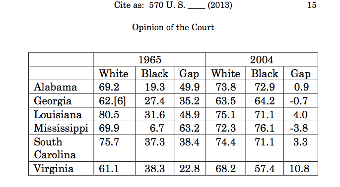
“In 1965, the States could be divided into two groups:  those with a recent history of voting tests and low voter registration and turnout, and those without those characteristics,” the Chief Justice wrote in his verdict.  He then proceeded to strike down key clauses of the 1965 Voting Rights Act on the grounds that the law compelled specific states to seek permission from the federal Department of Justice before changing local voting laws, and in so doing unduly compromised their sovereignty.  The decision had the immediate consequence of opening the floodgates to shifting stipulations of who could vote, from the introduction of Voter ID laws to the ending of voter Registration drives, that seemed designed to –even though the actual map of oversight had been adjusted and redrawn multiple times since 1965, and the notion that an old map was being used for a question to which it was no longer relevant concealed the deep and longstanding historical survival of suspicions on the electoral voice of what were seen as minorities–and for retaining what were presented as the “local liberties” for allowing the continued suppression of the vote.  It is not surprising that the rush to adopt restrictive measures in voting were adopted in time for the Presidential election of 2016, perhaps to disenfranchise  the very populations seen as most egregious in forcing limitations on voters’ access to the ballot box, encouraging states to adopt restrictions on where turn-out could be potential hindered.

The judgement that Roberts so blindly and so forcefully made that “the Nation is no longer divided along those lines” which had been once determined by the discrepancies of “minority” registration and turnout provided grounds to classify Section 5 of the VRA as a historical constraint on states rights without merit because “today’s statistics tell a different story” seems in retrospect to have little merit:  the readiness to introduce new restrictions on voting rights compels the issue to be revisited, perhaps in time for the approaching Presidential election, in order to ensure that full access to the ballot is not only protected but encouraged.  For the occurrence of new restrictions adopted by local state legislatures suggests not only the continuing need for federal oversight–if not a strong tension between local and national policies about voting rights–but a profound misunderstanding of the lack of uniformity in how the nation will be selecting its President, not only possibly privileging the voices of citizens, but effectively diluting the national electorate in untoward ways.  Although the language of the verdict refused to treat the sovereignty of different states in different manner–evoking earlier arguments of states’ rights–the notion that all states are equal in all ways bears revisiting.

When Roberts reasoned that such review of changes in voting policies, from preregistration drives to on-site registration on Election Day, were untoward interferences in states’ rights to hold elections in the manner that they desired, did he indeed encourage the actual differences in how voters were allowed to make their voices heard?  At the very least, forestalling the introduction of new restrictions until their impact is assessed, and constitutionality is reviewed–given the spate of cases in which the constitutionality of Voter ID laws has been questioned–yet the dangers that are associated with a federal trammeling of states’ rights have provoked a broad rejection of the VRA provision for federal oversight of dangerous consequences.


cux3zy3ukaa5txz-jpg-large


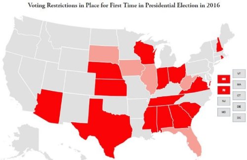
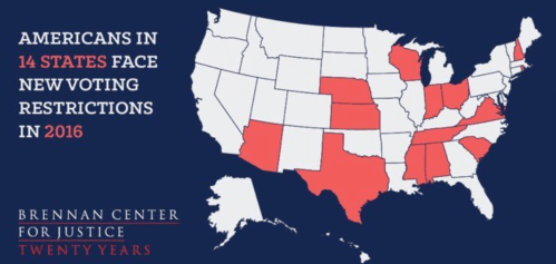
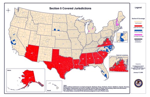
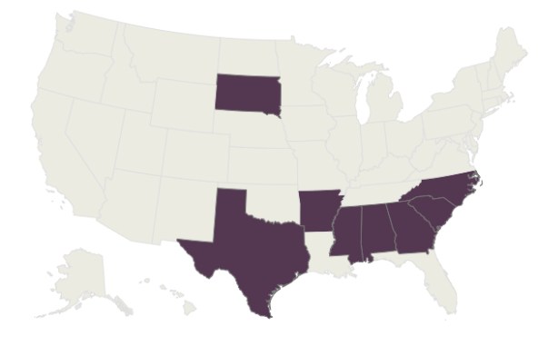
Let’s compare that with the states that were facing mandated federal oversight that was dismissed as outdated and not meriting federal review of electoral policies–not the map of 1965 but a more recent one:  all but one state whose changes in voting policies were subject to oversight in Section 5 of the VRA indeed adopt changes in time for the 2016 Presidential election, but their effectiveness may impact the election.


Coverage by Section 5


It is difficult to grasp the lack of connection between the decision and the nation being mapped.  Indeed, if Denis Wood and others has argued that national maps are a performance of national identity, the amazing nature of the agreement in 1965 to turn attention to the discriminatory practices on voter registration that existed endemically in many southern states–whose legislatures were particularly resistant to and fearful of the expansion of the franchise, and sought to adopt more voter policies that the federal government could practically review–rested in a refusal to subject states to federal oversight that was blind to race-based divisions.  The decision suggests a serious blind spot about how the nation is currently being mapped.  Chief Justice Roberts’s argument rested on asserting the lack of legal grounds for continued federal oversight over local communities that is unmerited at present, since extraordinary conditions now longer exist in the southern states–many of the same which fly the Confederate Flag in their capitals. The range of counties that turned to adopt restrictive policies of registration and voting in time for the Presidential election of 2016 maps (ochre) nicely onto the regions subject to review by the Dept. of Justice of any changes in electoral laws (hatched regions) and indeed the scope of restrictive policies of voting were indeed often noticeably expanded to cover and include nearby counties were large numbers of minority voters, as if the policies of reducing the electorate grew, particularly in crucial states for Presidential voting, as Florida–where the electoral benefits to the victor can even decide a Presidential election.


County by county restriction v. Section 5 coverage.pngThe New Yorker/2014


To stamp such a “date of expiry” on the map of vigilance to laws that exclude or encourage the exclusion of voters from an election of national consequence is not only to deny the work that went into the establishment of criteria of oversight but denies the provisional value of the map as a work in progress:  the Roberts court blithely seems to seek to alter the constitution and performance of national identity, and the labor that goes into the construction of any map, while dismissing the effectiveness of that already adopted.

Chief Justice Roberts asserted that the nature of federal oversight over localities must be uniform across the nation, rather than privilege any region was effectively unduly onerous but also unfair.  Rather, he urged the primacy of rigorously respecting rights of localities. But if his opinion suggested such that current practice unfairly singled out regions as in distinct need of oversight from other fifty states, and that the criteria approved in 1965–and repeatedly renewed, with some exceptions–all of sudden no longer reflected current conditions.  The subsequent state of events have shown that the infringement of rights to vote both to exist in areas where the body politic still suffers from exclusionary practices that have survived in new guise, and sadly permits the encoding of racist practices and dogma in new language in existing voting laws.

Yet it raises questions of what sufficient conditions would be, and why there might not be broader oversight over election laws on a federal level at a time when restrictions on voting rights are actually being introduced.  The Roberts verdict oddly comes on the heals many of the criticisms Republican candidates had only recently expressed about longstanding need to eradicate voter fraud.  But rather than address the needs to reform elections or election law, Roberts argued for the compelling need to remove obstructions of self-determination that had been previously determined on a map of those states sharing past precedents of systematically curtailing universal voting.  For Roberts recognized that policies of pre-clearance had stood “for half a century [as] the most effective protection of minority voting rights“–finding that given distinctions between federal attention to local practices, federal pre-clearance of changes in local  election laws constituted unwarranted distinction among the states in the union–despite the clear grounds for concerns in southern states.

If the purported aim of the verdict was to ensure all Americans retained the same voting rights, opening the door to pending changes in electoral law was the basis by which Shelby County was eager to bring suit against the government led the court to take its eyes of the nation. For while determining that the extraordinary grounds for previously constructing a map of states in need of federal oversight unfairly distinguished how the Department of Justice related to states, as if the review were due only to an extraordinary condition now in remission, it ignored the issue at stake.  By inviting the federal government to rely on a more current map the justices seem to have accepted the ease of redrawing a new map in the age of infographics and data visualizations that are produced nightly for the news–as if that process could be accomplished in time for the next Presidential election in a way that could be given binding fource.  The justices on the Supreme Court may have lacked authority to mandate the construction of such a new map of national voting policy or the competency to do so–but in dispensing with any guidelines for oversight, they willfully opened a conundrum which they must have understood.  The particular derision with which the late Antonin Scalia publicly discussed the “Voting Rights Act”–asking who would ever want to tamper or get rid of a piece of legislation with such a nice-sounding name–reveals either a misguided failure to appreciate its benefits, or past need, or the historically embedded nature of many counties’ voting laws–as was soon revealed in the institution of a range of restrictive policies of voting apparently aimed at curtailing voting rights, if cunningly cast in protecting the rights of those who had already registered.  The refusal to retain a map that ostensibly “was biased” against whites was a stroke of genius for a group of white southerners in a minority-majority nation, and also came with clear political pay-off for the Republican party, as those dissuaded from voting would most likely not vote Republican.


aia2013030701-table1

2008 Presidential Elections exist polls in Alabama, Alaska, Arizona, Georgia, Louisiana, Mississippi, South Carolina, Texas and Virginia


Why weren’t the continuation of a danger of disenfranchisement evident to all members of the Court?

The cross-generational continuity believing that provisions of literacy, English literacy, or indeed the predominance of continued violations of voting rights threaten to dissuade participation in the election, and indeed increase the feelings of distrust in members of the electorate.  The very existence of problems of restrictive policies about voting mandate the importance of keeping expanded locations of registration open, opening the ability of those who haven’t voted to vote, and renewing registration until the last minute.   And despite the introduction of  legislation to restore the VRA in the US Senate, the reluctance of Republicans to endorse such legislation reveals the bizarre transformation of the debate to guarantee the franchise along party lines–in ways that echo the terrifying vocalization by Donald Trump of charges that illegal immigrants he would not permit in the country would be accepted en masse to tilt the vote, and his attempts to undermine the legitimacy of an outcome to the election that did not affirm his victory.   Such bullying of the American electorate of course itself hinders and disrespects the electoral process.  For in dismissing the previous map for areas worthy of federal attention to undue limitations on civil rights, Roberts sided with a longstanding argument first framed during Reconstruction, but examined Southern claims to autonomy as undue interference in states’ rights.  Yet the argument that geographical restrictions of federal oversight were no longer warranted depended on an imagined equality due all states, and a willful neglect of the map of local disparities in how voters are allowed equal access to the polls.


1.  The map became what he tilted his sword against in the opinion that he wrote, leaving Justice Ginsburg somewhat dumbfounded at its limited reading of the law:  the VRA did not mandate a permanent division among states, but the law specified redrawing of a map over time should disenfranchisement be found to no longer occur–in which case it would expire in regions where such oversight was deemed no longer necessary.

So how could the map be effectively fetishized as grounds for legal objection to the oversight of regions where voting practices had not yet gained a respectable track record for respecting the civil rights of all voters?  In granting the petition of an Alabama county in Shelby County v. Holder, No. 12-96, the court placed the Voting Rights Act in its sights in ways that it had sought to do for some time.  Roberts argued that maps of past discrimination bear little “rational relationship” raise questions of the rational relation of a map of oversight to the law–or whether a map of legal oversight can be warranted in light of histories of racial discrimination.  The verdict raises questions of knowing when a new map should be required of regions that have demonstrated histories of disenfranchisement, when a map becomes overly dated in the eyes of the law–and, given how long Congress had labored to determine how the geographic limits specified in the Voting Rights Act could shift over time, when a new map would ever be collated and compiled.  Oddly, the decision seems to deny a clear perception of the lack of equal access in the last presidential election–and Mitt Romney’s decision attribute his defeat at the feet of the promise of Universal Health Care (“Obamacare’) held to minority voters.  In an age when a Presidential candidate can explain his failure to gain votes among minority voters on “the gifts” promised by his opponents to African-Americans and Latinos, dividing the electorate along racial lines, such distinctions clearly exist:  yet Roberts questions the limited effectiveness of mapping specific states as sites of disenfranchisement as unfairly privileging DOJ oversight of select states.

Does a map of regions requiring federal preclearance divide our national territory, in short, or is it by necessity a necessary tool for preserving equal access to the ballot across our nation?  What map would be sufficiently authoritative for Congress to draw up, for one?  Do the maps of discrimination retain validity on preventative grounds, or must they be actually demonstrated?  If the latter is the case, who is doing the counting and reporting the results?  Is it of any importance that the historical preponderance of complaints about voting laws within the United States as a whole from 1957 to 2006 closely reflect a distribution that would expand the mandate the continuation of a similar map–but include the very same regions as sites historically in need of federal oversight of election laws?


voting-rights-usmap

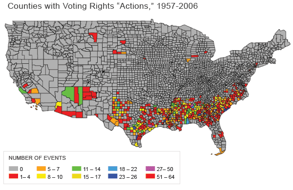
Voting Complaints Voiced at County Level in the Lower Forty-Eight, 1957-2000


Unsurprisingly, this map would reflect many of the same counties where the voting group was likely to be one fifth “minority” voters in 2000, where those attitudes against groups defined as “minorities”–Latinos or African American, usually–were sharpest and most likely to be excluded from voting.


voting1-map1

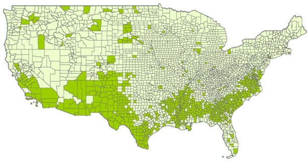
Counties with 20% Minority Residence


Given the Chief Justice opinion that violations of voting rights “should not be too easy to prove since they provide a basis for the most intrusive interference imaginable,” and must be rooted in the explicitly stated intent to disenfranchise, Roberts would probably question the ability to map a history of discrimination at all, of course.  Given that Roberts openly doubted “Congress can impose this disparate treatment [of states] forever” in oral arguments to a 2009 challenge of Section 5 of the VRA, he might well have recused himself from considering the case, but seems to have been eager to provide a precedent for explaining why the undue interference of the Department of Justice over local procedures and warranted a continued need to mandate states to request federal permission for changing election practices.  In arguing for the antiquated nature of mapping a division among the states in the eyes of the law, Roberts questioned criteria for selecting the procedures of voting and elections in specific states, mostly located in the South, under the supervision of the Department of Justice:  strictures on select states created undue divisions in a nation, he argued, dismissing the need for such oversight as a thing of the past–even while praising the benefits it brought their residents.  Yet maps are difficult to move to a discourse of legal reasoning, and a map of discriminatory practices is bound to be approximate and selective, rather than uniformly divide the national space:


Clearance Required


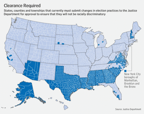
2.  The 1969 Voting Rights Act introduced to rectify widespread blatant discrimination against the voting rights of African Americans, common in obstructing registration, mapped those regions where clearance was required to change election laws or voting practices.  The above map continued to provide an avenue of legal recourse for minorities who faced any practice or intent of disenfranchisement.  The passage of the original Act responded to registration discrepancies in 1965, but its expansion in 1975 covered a range of other subterfuges and nefarious tactics to reach the same ends–most recently, these have expanded to include from restricted polling hours to the introduction of Voter ID’s.  The Chief Justice argued whatever the potential benefits of federal  oversight, the distinction that the VRA drew in its placement of nine states under oversight created a harmful divide in the harmony of the Union of states, independent of the realities of disenfranchisement.  He hence found lack of a compelling reason to require only nine states to obtain federal approval to alter any existing election laws.  In clothing his argument in a federalist claim to state equality, Robert’s  opinion raises the question as to whether mapping practices that obstruct voting  provide an instrument to monitor the insidious but present evil of disenfranchisement or rather serve to divide states’ rights.  For even if the metric of voter registration differences seems outdated to map distinct regions worthy of oversight, continued tactics of disenfranchisement–often achieved by redrawing maps of districting–both suggest that the drawing of lines on maps of political representation demand federal oversight.

How can one map a compelling need to supervise voting rights?  Roberts might well have asked.  By appealing to the uniformity of standards among states as a guiding rational of his decision, or couching his argument as a “division” of the nation, the Chief Justice invokes the lack of grounds to divide how space is abstracted in a map to strike down civil protections for voters, ostensibly to  maintain equality among the states, but to restore the lack of interference of  federal government in regional elections–despite the increasing hostility showed to the growing presence at polls of formerly minority groups.  Many objections to the Act question its viability as a question of “racial entitlements,” as did Justice Scalia, who described the emergence of “black districts [facilitated] by law” in the House in argument.  But the 14th amendment were less central to the decision than the rationale for renewing oversight of election laws in the fifth clause of the VRA, now on the books for over 40 years, and long a target of Chief Justice Robert’s ire because of the federal oversight it allows, and invites Congress to draw a new map of those “jurisdictions to be singled out on a basis that makes sense in the light of current conditions.”  The Roberts court oddly departs here from an argument based on precedent, to pose a federalist argument against singling out individual jurisdictions that are in need of supervision–notwithstanding documented attempts of disenfranchisement in these regions.  For Roberts, the map has “no logical relationship to the present day”:  things have changed, Chief Justice Roberts tells us now; we no longer need to supervise obstacles in voting laws in select states.  Yet do maps ever have such transparently logical relations to ideas or principles?


3.  Maps drawn as tools for determining effective political representation are improperly treated as if they defined entities.  And to argue that the map is simply a division of the polity into separate entities–as Roberts’ decision–obscures the extent to which the purely precautionary nature of review exists to ensure political representation.  Robert’s argument seems to make a categorical confusion between the ways that maps abstract a record of lived experience of disenfranchisement to a region and the abstract categories of rights in legal thought.

The objections of the Dept. of Justice to ‘pre-clearance’ have in fact radically declined since 1965, but this does not undermine the validity of Congressional attempts to map disenfranchisement in the US.


Coverage by Section 5


Yet the map is not a territory–or a means of conjuring an entity–so much as a tool of oversight.  The Voting Rights Act frames a legal avenue for redressing discrimination at the polls or in redistricting–and redressing a level of discrimination not effectively able to be monitored by pursuing suits of local jurisdictions.  Roberts’ opinion withdrew the existing avenue to appeal such insidious discrimination by finding it to violate the uniformity of a map in which all states–if not all voters–were to be treated as equal.  All law is based on abstractions, but his reliance on the abstract autonomy of the state is an odd substitution or sleight of hand, that preserves the autonomy of states’ jurisdictions for the rights of their inhabitants:  it appeals to the abstraction of the state to question the logic of distributing persistent inequalities , rather than the injustices to specific residents of the states.

In a decision that almost mocks the intent to seek to find distinguish discrepancies in voter registration on a map by sharp divides, Chief Justice  Roberts condemned the VRA as a flawed in its attempt to make reality correspond to a map of actual discrimination, and notes that the divisions it maps no longer reflects actual circumstance.  This denies the flexibility that the Act has long had.  The application of the law was not applied only to states, but to jurisdictions with a history of voter discrimination in any form.  Yet Roberts finds that its criteria, although based on alleviating restrictions on voters, imposed unequal burdens on states’ administration of elections, as if the autonomy of states unified in the map be preserved in the face of history, and the government be protected from meddling with how the fifty states map their own representation or internal affairs–even when the outcome is in the nation’s collective interest.

Roberts’ allegation that how the VRA maps “pre-clearance” disrupts the integrity of states distracts from the actual inequality–manifested in inequality and disenfranchisement–by positing a need for equality among the fifty states.  Yet, as many observers have noted, the increased anxiety at an increased number of minority and Latino voters in central and western states might make this the most dangerous time to shrink the map of where impediments to the “any voting qualification or prerequisite to voting,  or standard, practice, or procedure . . . [deemed intended] to deny or abridge the right of any United States citizen to vote on account of race or color.”  Although these terms written in 1965 echo those in the US Constitution, the Chief Justice seems to find a basis to question the assertion by a rosy-hued map of uniform states rights, as if each state best flourishes when left to practice its own electoral practices no matter what practices or means of impeding a broad vote might be a direct result or consequence of them.


us in globe's surface color map


Roberts the strict constructionist seems to question the accuracy of a map of “covered jurisdictions” in need of judicial “preclearance” both as an impediment to states’ rights because it maps a divide he argues no longer reflects “current conditions.”  Yet isn’t a map simply a convenience to create grounds for adequate representation?  While finding the map of covered jurisdictions “out of date,” but accepting a map of all fifty states, he finds the previously sanctioned formula for “pre-clearance” “unconstitutional.”  In the name of the specious argument of “states rights,” he seems to have vitiated the compelling nature of an argument to ensure the votes of all.


4.  Roberts interpreted the individuation of nine states by historical attempts of disfranchisement as “dividing” the nation.  And since these states are no longer defined in a similar manner by policies of explicit segregation of registration or voting, despite clear inequalities in the history of the regional reception of voters’ inalienable rights to vote, the majority opinion took voter registration and turnout numbers as an index of voter discrimination.  Through such a metric, Roberts questioned whether such discrimination continues, or continued in such a clearly mapped manner as he grants it clearly did in 1965.   The VRA defined those states it mandated to seek federal permission prior to altering electoral laws or voting practices to identify those places with voter turnout or registration of minorities below fifty percent, and hence in need of oversight to rectify deep imbalances.  The  seven states were subsequently augmented to include those where a percentage of voting age citizens spoke only a non-English language–Texas, Arizona, Alaska–as they were judged in need of “preclearance oversight” as well since the Act’s historic passage in 1965–suggesting th flexibility with which the VRA was long employed to ensure the equality of voting rights.

Roberts found the divided national map to perpetuate antiquated divisions that “divided into two groups” a unified country.  But the flexibility of how oversight was framed in the map historically varied in response to demonstrated need, as shown in the maps of  oversight compiled in the New York Times, which traced the coverage of states by the Act, coloring those covered since 1965 in deep purple, and those added in the 1970s in violet, and subsequently judged free from such voting discrimination in tan:  the disparate nature of these regions suggests attention to areas in the country where electoral laws merited continued scrutiny by relatively current criteria.

Areas Covered by VRA-and additions
The shifting landscape negotiated evidence of voter discrimination, rather than disrupting national harmony.

Chief Justice Roberts’ opinion foregrounded data compiled for Congress’ 2006 review of the Act to call into question the relevance with which the VRA maps a uniform division of states Congress kept under coverage.  Yet in citing only one metric–discrepancies in voter registration, the original criteria used in 1965–he oddly adopts an antiquated sense of the relevance of mapping in relation to the VRA, throwing out the map on the basis of its antiquated measurement of obstructing universal suffrage, and opening the door to the introduction of further abuses by removing oversight entirely.  Even while calling for basing such oversight on more current data, he avoided looking at the data that was available–summarized in part in Justice Ginsburg’s impassioned eloquent dissent–by confusing one map with the ends of oversight.   And so a declining registration gap served as grounds to question the need for the continued federal oversight:

Voter Registration Gap 1965-2006

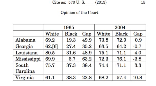
Several of the gaps in these six states survive, and the gap of registration among African American voters has been dramatically reduced in Alabama, Georgia, South Carolina, and Louisiana, which partly reflects the standard set by the Act, but these numbers present only a very partial or selective picture, and a map that does not conform to voting practices.


5.  Yet the assiduousness with which attempts to reduce voter turnout have been since developed in many states listed above in the rise of increased minority voting, and indeed with the rise of the proportion of ‘minorities’ among registered voters.  The lack of uniformity that Roberts finds in the ability of mapping disenfranchisement among those states who were mandated to submit any electoral alterations for “pre-clearance” by the Department of Justice perversely became his basis for arguing that the concept of preclearance should be jettisoned as unconstitutional in the undue constraints it imposed on nine named states–as if the question was the ability to map discrimination, or use a map to regulate voting practices, rather than its continued existence to remedy historical prejudice.  So whereas the Voting Rights Act was persuasively linked to the region placed under federal coverage–or “pre-clearance”–of any changes or modifications to electoral laws or procedure, Roberts ruled that the geographic divide in disenfranchisement that was relevant in 1965 was no longer operative or commensurate with actual historical experience or current data–although the measure he chose to highlight does not conclusively demonstrate this assertion to in fact be the case at all.

But rather than look more deeply at actual data, Chief Justice Roberts appeals to the “fundamental principles of equal sovereignty” among states and record of national unity as if it were abstractly represented on a map, rather than something that played out in lived experience and effective political representation.  The opinion seems partly in the question of trusting an earlier mapping of disenfranchisement.  It ignores the extent to which the Act aims to prevent disenfranchisement; it displaces these questions by those concerning the propriety of mapping out a division in jurisdictions, as if to implying that uniform disenfranchisement was the target of the laws more than its inherently undemocratic evil that disrupted the legal equality of the state in the eyes of federal law, before which all states should have equality.


Maps of the USA


Yet are all states equal in their entitlement to police their own voting rights?  Recent cartographical endeavors to draw maps of political representation by equally distributed units of population reveal that the boundaries of states are approximate realities, rather than the abstract entities Roberts accuses the framers of the VRA of positing.  To distribute population were equally divided to correspond to the shifts in population in the nation, Neil Freeman decided to remap the states to allow chambers of Congress to remedy the disproportionate influence of specific states and prevent gerrymandering.


electoral10-1100


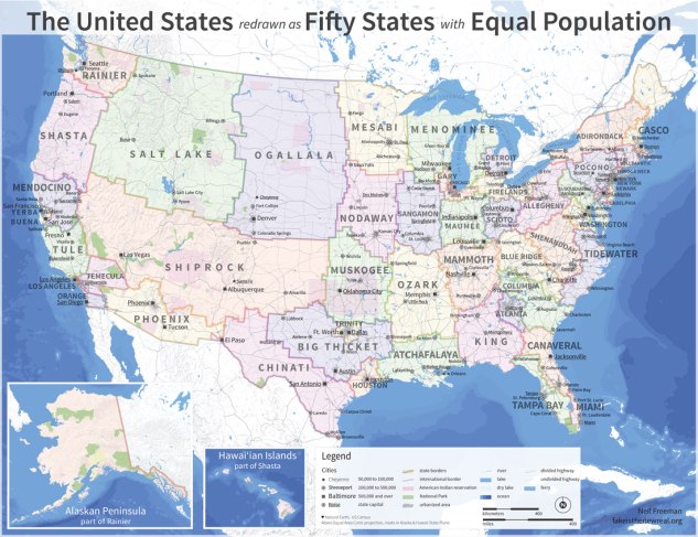
Freeman’s counter-map reminds us of the political convenience of such abstract entities, and the incoherence of some of our states as entities.   It reveals the poor approximation that the existing divisions of states gives voters in the nation, effectively privileging votes of residents in the more  thinly populated prospective regions of “Salt Lake,” “Ozark,” “Shiprock” or “Ogallala.”

Can the division of federal oversight be understood as an approximate and imperfect but necessary tool analogous to that of the electoral college?  Such abstractions are imperfect tools for considering local electoral practices, but are the units that exist as units of electoral law, rather than as legal abstractions whose jurisdictions are in need of projection.  Indeed, these convenient units for political administration poorly reflect population density–in fact, the limited density of the area of federal oversight seems less densely inhabited, and more isolated from broader cultural norms.


Cartogram of US popation on grid


6.  The Voting Rights Act served as a preventative that decreased a marked discrepancy among the registration of whites and minorities in these states.  Yet in gutting its enforcement, Roberts found poor logic in arguments that preclearance has itself diminished potential electoral abuse, asserting it impossible to prove with rigor this as the case, and noting this lack of rationality contrasts to the undue “burdens” that the division creates.

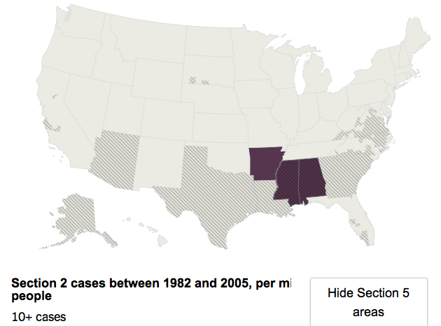
The Chief Justice may have effectively distorted the question in an optic of states rights.  But this argument seems anything but rational or watertight, with 81 percent of the voter discrimination complaints of voting practice lay in the areas where the VRA sustained “preclearance” of changes and/or modifications in voting law or elections–the region of the states who lost or settled the largest number of cases in favor of minority voters between 1982-2005, as Judge David S. Tatel had noted in the appeals court’s decision, if one focusses on those regions that lost 6 or 7 cases per million people.


Section 2, 1982-2005, 6+ per million

Lost or settled cases


This map of the settlement of cases that violated Section 2 of the VRA might, Chief Justice Roberts could object, fail to map in identical fashion onto the boundaries that the VRA enshrined–and the second excluding both Virginia and North Carolina, and providing little rational for the validity of the existing map of areas whose election laws merit more careful observation and protection.  But this point denies the imperfect conventionality of all mapped entities–and the confusion in conflating the abstract unity of the map and experience of the jurisdictions it maps.

A map that measures at lest ten successful settlements of cases that minority voters brought of disenfranchisement in the years between 1982 and 2005 defines a similar  region as worthy of oversight:


Over Ten Voting Discrimination Cases settled in favor of Minority Voters


The question turns on what sort of maps best show current conditions of civil rights.  But a deeper problem in Robert’s argument the difficulty to select a single map  with a level of logical consistency as a record of conditions, given the selective nature of mapping:  the map is not the territory, but construes it.  To object to the divisions a map creates misunderstands its instrumentality.

Roberts found “Today the Nation is no longer divided along those lines” revealed by low registration and turnout, and finds little rational by which the division should be preserved since “today’s statistics tell a different story.”  The story Justice Ginsburg offers for “the completion of impressive gains thus far made” as a way “to combat voting discrimination where other remedies have been tried and failed” against “‘the blight of racial discrimination in voting'” to give, as Oliver Wendell Holmes argued in 1903, “relief from [that] great political wrong.”   The curbing of such a wrong perpetuated either by a state or its residents was the aim of the VRA, and the benefits were directly attributed to its reauthorization in 2006.

But Roberts seems to argue from the map that the unity of law is disrupted by the federal imposition of different norms.  This despite fears of active “redrawing of legislative districts” to dilute the rising power of minority votes,  that  effectively segregate the distribution of minority votes by lines of race, drawing distinctions designed to minimize the effects of those votes, independent of registration or attendance at the polls that actively diminish the increases of minority representation:  Congress found many “second-generation barriers” arising in different forms which demonstrated “the need for continued Federal oversight” in these specific regions, Congress determined, and included among other things the purging of voter rolls of minority voters; dual voter-registration schema; restricting of early voting practices or curbing late voting; openly expressed fears of African-American turnout increasing; and intentional redistricting designed to eliminate those districts where minorities were majorities–a practice noted in Shelby County itself as recently as 2008.  The act, Justice Ginsburg argued in her forceful eloquent dissent, might be retained “[in those] jurisdictions as to which its application does not transgress constitutional limits.”


7.  It is accepted that maps of oversight are in fact instrumental tools of political representation.  Abigail Thernstrom of the American Enterprise Institute has written pointedly that the primary reason for defending Section Five of the VRA is to secure African-American constituencies in “racially tailored districts” that protect minority seats; she sustains the abuse of Section 5 by a Department of Justice to block Voter ID laws that would have the effect of limiting the voting franchise.  And instead of protecting against disenfranchisement, the law’s current form has provided a basis for preventing “multiracial coalitions,” Thernstrom argues, and effectively continue to limit the focus of African-American politicians–with polarizing results.  Yet the rise of minority voting blocks has also provided regions which stubbornly tend to support Democratic candidates, making redistricting a partisan issue.  In other words, the law undermines our polity–never mind its accuracy.

The redrawing of electoral maps in response to Roberts’ ruling so that they minimize minority votes is an inevitable irony of Roberts’ failure to see any reason to map of federal oversight on specific states.  Within two hours after the public announcement of the Supreme Court decision–in a move either premeditated or revealing insider pre-knowledge of the decision to come–when Texas’ Attorney General Greg Abbott announced the return of voided voter-ID legislation designed to curb minority voting together with a new redistricting map limiting Hispanic and African American voters–both previously blocked as discriminatory, unveiling a new map of the map of Congressional districts in the state that effectively minimized the impact of a growing number of Latino votes in ways that are not revealed in the limited metric of registration.  In fact, Abbott could barely contain his glee,  tweeting to the world “Eric Holder can no longer deny #VoterID in #Texas after today’s #SCOTUS decision.”


Talbot Maps Texas


The redistricting in no small part responded to the growth of minority voters in the 2012 election, designed to restrict the effects of district demographics–it can be viewed in clickable form here–that responds to the recent dramatic rise in non-white voters in the state.


Texas Electoral Map


Both changes had been earlier blocked by the Department of Justice for targeting growing minority communities in the state of Texas, by passing the most stringent Voter ID laws in the United states.  Critics of the map–“drawn in secret by white Republican representatives, without notifying their black and latino peers,” according to Aviva Shen,” or Voter ID, argued that it would effectively diminish minority votes.  Local resident Mack Green observed ruefully, “Travis county looks like something drawn by 5 malevolent and blindfolded pre-schoolers. . . . . Gosh, can this be the rampant voter fraud Republicans are fighting to prevent?”  Unsurprisingly, a range of states are collectively moving to re-adopt previously banned Voter ID laws, in ways that promise to change the electoral map:  Attorney Generals in Alabama, Arizona, South Dakota, and South Carolina all want to institute Voter ID laws that they argued the Voting Rights Act impeded.  Is this related to the election of President Obama with huge majorities of African-American, Asian-American, and Hispanics, but less than half of white votes?  Ari Berman questioned the relation to recent controversies around past evidence of voter suppression: “There’s a particular irony to the Court killing Section 5 just months after a presidential election in which voter suppression attempts played a starring role.”

The map of voting rights will in the coming months quickly be redrawn elsewhere in response to the court’s short-sighted decision to remove preclearance across nine states.  It is ironic that Chief Justice Roberts’ argument began from the imposition of an unfair division of the map that the federal oversight had first created.  One can only hope that “dignity” will re-emerge as a standard by which to enforce a redrawn region of oversight.

2 Comments

Filed under 2016 Presidential election, institutional racism, minority voters, Southern States, Voting Rights Act

Assembling Globes from Plastic Bricks: the Medium is the Message

If the medium is the message, what happens when the medium is the assembly of interlocking pieces of Lego?

The expressive value of all maps reflect their material media, from printed single-line engravings to digital images.  But plastic Lego pieces are rarely considered to have the definition or subtlety of line used in terrestrial map making.  The below image seems a poorly pixellated jpeg, but the globe assembled from blocks of tan and blue bits that sits in Legoland, California is in fact a virtuosic assemblage of colored plastic pieces sure to catch your eye. While the globe is yet another display of the artifice of LEGO, there is a sense in which it stands as a p translation of an imperative to map, from how the disposition of continents situated on the globe foreground the exact assembly of LEGO and color choices it offers, it the material presence of the globe it offers in an age when we map the terraqueous surface in grids, and increasingly by layers, nodes, and rasters across national bounds.

Legloand Globe

For the assembly of LEGO tiles is a material translation of the mechanics of assembling less a picture of the world, than synthesizing datapoints in a new image which acknowledges its own mediations and assembly:  the Lego figurines below look at the surface of a paper map somewhat studiously, as if ready to translate it into their own domain.  Th citation to map new regions to allow assistance to reach them is a call, after all, to map  places in more comprehensive map tiles, and make the “missing maps” that don’t yet exist for so many sectors that may face high needs.

C9F0AD69-BFAA-463F-84D9-446D257F876B

Why assemble a map from Lego that is five feet in diameter?  Perhaps the assembly of Lego globes and maps tells us something about our own relationships to mapped space, an area increasingly dependent on design?

The map is not the territory, but the ultimate simulacrum.  The interest in fashioning Lego globes is also an indication of how mapping has provided a visual form to challenge new media, and several folks had been tempted to rise to the challenge of create terrestrial from Lego, even before they saw or visited Legoland.   Lego aficionado Eric Harshbarger‘s 48 stud “model of the earth from plastic bricks” is based on rings around a north-south axis, which occupied its builder for some twelve hours, who copied an inflated globe made in China; beneath it, Darren Izzard’s more faithful replica of the Legoland structure seems to be kept in his back yard, as a treasured example of his virtuosity and skillfulness in assembling and planning the spherical design of pieces of rectangular form.  The globe seems a bit of a jokey masterpiece of translating the three-dimensions of the terrestrial sphere to a two-dimensional surface and back again to a chunky three:

Eric Harshbarger's Globe

204347770_907035b59b_z

And self-styled “brick artist” Nathan Sawaya took clear pride at his alternative Lego globe, which expanded the two-color globalization e to a broader acknowledgment of topographic variety, extending to maps his demonstrated productivity in his chosen medium of brick art:

world-globe-6

But something about the mapped terrestrial sphere makes it a natural subject of Lego as a medium, beyond just a challenge of snapping pieces of the right color together in a spherical body.  W. W. Wally almost gushed when he credited Neil Armstrong for the inspiration for his 2012 prototype of three colors, which he based on the method of assembling a Lego sphere that he credited to Bruce Lowell.  Is there some convergence between the idea and techniques of globe-making from plastic colored bricks, which Wally boasted he was able to expand to a version using 1500 pieces of plastic by a method he considered copyrighting?

Wally

In some sense, the assembly of Lego globes marks a recent resurgence of the DIY craft of globe-making, but also of the ornamentalization or trivialization of the globe as a legible map.  Wally made his by employing a Google Earth overlay to design the globe’s surface in multiple colors, sort of projecting the image of the terrestrial sphere in a David Hockney-like technique or an early Chuck Close method, although Wally willingly accepted the constraints that the Lego palette of colors imposed on the completed version—which indeed seems to assemble tiles as so many Lego blocks:

Wally Google Earth

There is something of the trivialization of the pattern of mapped space in all this, or a trivialization of maps as patterns.   But there is also an echo of resistance to the dematerialization of maps in the globalized world, where we are more apt to speak of “nodes,” “tiles,” and “polygons” than regard the map as a piece of paper, and in which “maps” less increasingly embody a territorial unit or sense of sovereignty.  In a world where the boundaries between nations mean less, and maps are more usefully constructed about wiring or online communities than by geographical proximity, the resurgence of the Lego globe is something like the last site of the map’s retreat or the last stand of the authority of the map as symbol, as well as the demand for new map designs, demonstrated in the huge and almost innate popularity for the use of more artisanal-feeling base-maps, as the palette used Stamen design’s rightly-praised Watercolor style.

For Watercolor restores the role of design to mapping to make it far less datacentrically designed, restoring an absent sense of materiality for which one increasingly longs to the surface of a map; even if its palette betray one stylistic color-changes not reflect the extent of paved land in San Francisco or capriciously introduce phantom green space in San Francisco Bay, it conceals the seams of map tiles in a way that restores the pictorial quality of a web map—

SF Greenspace Stamen

—in ways that reminds us of the romance of materiality of map design we have often lost.   In other words, it restores pleasure to map-reading, by reminding our eyes of the materiality of the image of mapped space.   It offers a relief to viewers’ eyes that is akin to the entertaining nature of the assembly of LEGO maps, which even if they are not used as guides of way-finding or spatial orientation, affirm a sense of human mastery over space of n the manner of an ancient map. Continue reading

2 Comments

Filed under authenticity, Lego Globes, Legoland California, Simulacra, Theme Parks

Geo-Visualizing an Over-Inhabited World

Terrestrial mapping has long represented the inhabited world and its limits.  The rich tradition of medieval map making testifies to the variety of place and distribution of human populations over climates and outside torrid or uninhabited zones; the post-Renaissance or post-Ortelian tradition invited their readers to explore and trace limits of the inhabited world for educated audiences, as well as providing tools to move within it.  In ways that reflect the problem of mapping the over-inhabitation of a globalized world, the variety of recent cartograms of Benamin D. Hennig–digitized cartograms that pose the problem of mapping over-inhabitation–suggest the problems of mapping human inhabitation in a globalized world.  While these images are not actual projections of space, they stage “para”-cartographical arguments by searching for new solutions to visualize the inhabited world.

The models of “geo-visualization” that Hennig created over the past decade seem to take the notion of the mapping of an ecumene or inhabited world seriously, by organizing visual argument about the shifting settlement of a global space that challenge familiar models for mapping space or the primacy of orienting viewers to accurately demarcating a record of inhabited expanse.

globe map

Of course, the familiar spherical projection offers viewers an easy way to internalize their understanding both of the globe, and the place of the US in it–and an icon of geography, as much as a map per se.

But is it accurate?  What does it really tell us that we don’t know?  The popularity and currency of Hennig’s cartograms suggest different models of geovisualizing that reflect the contraction of space and terrestrial distance in understanding human relations.  If these maps are less concerned with economic inequalities, or capital relations, they suggest how population trumps space as a useful way of ordering global relationships, and raise questions of the relation between legibility and maps in provocative ways.

Much as the projection popularized by the journalist Arno Peters of Bremen boasted an equal-area distribution on the surface of a global projection, by adopting the mathematical projection much earlier devised by the complex Scottish clergyman who was himself a popularizer of astronomy, James Gall, to stage a popular polemic about cartographical bias.  Gall’s interest in the stars led him to note the alternative of an equal-area projection as an alternative tool to order the curved surface of the world, but UNESCO adopted Peters’ projection in 1968 out of the conviction that it provided a more equitable–and less occidentally biased–record of relationships, and a corrective to an implicit bias that Peters argued permeated the cartographical record.

The global projection bearing Peters’ name is unlike projections named after the men who devised mathematical solutions to visualize expanse, since it was not devised by him:  it rather aimed to query the faithfulness of the coverage of other world maps; rather than present himself as a cartographer, Peters acted more as a cultural critic of maps whose work heralded the expanding field of cartographical ethics.  Peters invested Gall’s map with a new argument by re-presenting it as a polemic response to an ideology of mapping that privileged Europe and the United States by pointing to how Mercator’s model of global projection was often favored because it had so strongly privileged the size of specific regions of the world where it had been devised, expanding their presence as it dramatically reduced the expanse of Africa and creating a massive Greenland that concealed its relatively few square acreage.

The resulting image was so popular as a corrective revisionist map to sold and hung aa a hipster shower curtain by the 1970s and 1980s–similar to the one currently available from Urban Outfitters has abandoned Peters’ form:

ba2ed96338ebe708156572de71e75153


While a novelty, the image is suggestive because Peters would argue for the pernicious nature by which the above map proposed a transparent record of global expanse by perpetuating a litany of geographic falsehoods in the actual distribution of terrestrial expanse.  He advanced the equal-area projection as a more legibility record, faithful to actualities, not because of its precision but because of his deep concerns for the persuasive effects of maps’ arguments.  Peters worked as a journalist, but received his doctorate as a historian concerned with political propaganda, and the persuasive uses of images led him to champion its faithfulness to area as a corrective to the historic distortion of relative land sizes, adjusting meridians to show the actual relative sizes of countries in an equal-area projection that inaugurated a broad interest in cartographical ethics that was refined by Brian Harley’s later work.  The result was  a compelling counter-icon to Mercator’s model:

Peters BW
Hennig’s cartograms are in many ways the heir to the Peters projection.  In contrast to addressing the discrepancies of land-mass size, Hennig’s Worldmapper offers a variety of models for ordering space to reflect its actual inhabitation–or density of dwellers–rather than their bounds–by the permutation of the globe to a cartogram whose distribution provides nothing like a model to travel through space, but a model for mapping the distribution of human occupation of space on a grid or graticule that denoted  a measured expanse; Henning explains its construction in a useful slide show on his methods of data visualization.  Although each of the cartograms he devised are not visualizations of expanse, they explore the flexibility of maps as arguments in similarly dynamic ways.

The below cartogram visualizes the human occupation of space, revealing a record of the occupation of expanse not yet available in shower-curtain form, to reflect the surpassing of 7 billion in 2013:

Wrold Mapper Gridded Pop Cartogram

The wispy lines at the extremities of landmasses in the above image is less striking than the bloating of India and China, or ballooning of Japan, or the butterfly formation of South America–all of which remove the subject of space from the map.  Does space even matter on the human planet, where spaces are often less relevant than how people have filled space, Hennig asked, and might it not make sense to describe “the living space of humankind” as an ocean-free “population planet” in a modern mappamondo for the globalized age that registers space only by regions’ relative habitation, but represents our own post-Ortelian perception of the contraction of the interconnected nature of how we now inhabit an inhabited expanse:

%22Human Planet%22 by Hennig

If the mappaemondi of the middle ages were compelling representations of terrestrial expanse before nautical charts gained wide currency, and when tools of surveying were not linked to the preparation of a uniform visualization of expanse, Hennig has specialized in fabricating new tools and formats of gridded cartograms by which to visualize the inhabitation of terrestrial expanse.  “Nature” is not the subject of the Hennig population-based projections, so much as something like cultural distortions of space, and the mediation of space in his rendering of his digitized map of the “population planet” provide as exact a mode of dividing the inhabited world as we might have, despite its distortion of terrestrial relations and land-size.

The deeper question Hennig’s map poses is the primacy of space as a dominant analytic category for drafting maps.  A self-styled expert in the formats of “geovisualizing in the age of globalization,” Hennig provides formats for visualizing inhabitation more radical than Peters by adopting the techniques of digitization to rethink the prioritization of “space” in how we discuss or conceive of the inhabited world or ecumene, and indeed expanding the possible formats for digitizing global projections in an era when space might no longer be a determining factor to measure or even primarily understand its inhabitation.   If the ecumene has been the project of world cartography from the ancient western world, Hennig expands the visual argument of the map dramatically in response to the shifting experience of space in the Worldmapper project as a whole.

Hennig’s geovisualization provides a clearly radical mode of re-figuring  expanse when focussed only on the United States’ expanse:  if not suggesting the inadequacy of an electoral college to represent the nation, given the bloating of urban areas’ density in relation to the entire country, the cartogram suggests how the nation’s population occupies its frontiers:
Cartogram of US popation on grid

We might see this cartogram as a record of the relative inefficiency with which we occupy national space, without attending in concerted ways to local resources or density of settlement.  Even without including questions of economic activity or of the revenues generated by local businesses, a similar geovisualization of Canada raises similar questions of how the inhabitation of a region distorts our experience of expanse and provides keys by which that expanse might more accurately be represented to complement traditional images of terrestrial geography:
Worldmapper, Canada

The explosion of urban populations raises numerous questions about the effectiveness of land-use, also raised in this earlier post.

ind

Hennig also offers the chance to visualize hot-spots by shifting the norms of the five-color map:

Untitled 9

Hennig has in one case expanded the notion of the cartogram that extends the ability to map inhabitation, and present a mapped region as a record of how space is actually occupied.  The cartogram began from a new set of techniques to achieve an alternate visualization of population in real-time, recording the areas lit during night-time in a composite photo from a NASA satellite, using techniques based on recording permanent light sources, to map the illumination of night-time areas, and foregrounds urban areas in new ways by their constant illumination:  New York’s metropolitan areas is something of a blinding flash in this image created from data derived from the United States’ Defense Meteorological Satellite Program.  The composite effectively maps the location of the distribution of illuminated areas, sketching blotches of urban areas and skeins of the lattice of highways, and locating regions permanently illuminated by electric lights, providing something of a reverse-record of the starry sky in the new artificially illuminated world we have made:

US Illuminated from Space
The map is a record of the expenditure of man-made energy, and of illuminated settlements, rather than habitability.  The digitization creates the illusion of a geosynchronous illumination of regions at night that effectively synthesize, a map of urbanization and that maps the global surface by one alternative index of settlement:  nocturnal illumination.  The result view suggests huge stretches of illumination that contrast to how many areas it reveals as dark, but suggests just how much of our world is permanently lit:

earth_lights_lrg

The same projection of illumination was recently placed in global context by Hennig.  His inventive combination of the distribution of night-time illumination against the distribution of population as an alternate index of global inhabitation, and of the remaking of inhabited environments.  The lopsided  nature of much of the inhabited world’s nocturnal light is striking for how it reveals how accustomed we are to live with permanent streetlights:  although Hennig is write to note that it is only from a Western perspective that we might confuse permanent illumination with inhabitation, the map that results does suggest the density of centers of illuminated inhabitation at only select regions of the map, and the concentration of areas of illumination to one another in the equal area projection Hennig created in 2010, the “Real World at Night” in 2010.

Earth at Night--NASA photo and equal-pop projection

But one senses Hennig’s  “Real World at Night” presents illumination of nocturnal expanse is a record of a different sort of inhabitation.

The cartogrametric revisualization of the globe’s inhabitation creates questions of whether other forms of world-mapping are sufficient tools to understand expanse.  They raise questions of the validity of tools of projection as records of inhabited space.  Hennig has used similar tools of digitized global visualization to make points about visits to his own website, in the manner of Google charts, to reveals the limitations of access to the internet, but also familiarity with mapping tools–which it makes sense to include as a screen–and suggests a demand for re-envisioning the ecumene:

Hennig's Visitors

Or, in a more legible image that tracks the breakdown of visitors to the site in order to remap the proportional size of regions across the globe:

Hennig's Maps' Online Visitors 2012 Hennig went on to map nations’ proportional expenditure on military needs, independent of their population, in a stunning image of global priorities, or of the distorting nature of expenditures on military engagement in the West:

Mapping Military Expenditures

Given concerns of the Western cartographical traditions with “inhabitation”  and its limits, perhaps Hennig’s most adventurous statistical cartogram traces the remoteness of places from a city or urban area, using distance from cities or urban areas as a way to magnify those places that are less accessible by car or road along a similar grid, allowing us to read inhabitation distinct from population density:

MapOfLonelyPlanet

Scrutiny of a segment of the gridded map of relative isolation reveals discrepancies even more pronounced in specific locations, as the expansion of the cartographical grid denotes and signifies the relative isolation of mapped spaces in relation to nearby inhabited cities or towns:

A Lonely Map detail

The result is a quasi-map of how we occupy space that extends some of the themes of Hennig’s cartograms, but provides an even more challenging way to revisit the mapped surface of the inhabited world in ways that reveal patterns within its inhabitation, or the way that the map is, in fact, less a true or accurate marker by which to measure the territory’s inhabitants.  The odd shrinking of distance in our inhabited world by the expansion of areas of greater remove is not definitive, but suggests both by the huge shrinkage of Europe and the United States something of a new Peters Projection:  by recording the shrinkage of terrestrial distances automobile traffic, as much as air-traffic, has allowed, the map of the remove of places from easy access is a record of over-inhabitation, and of an inhabitation that insists on the ready transversal of distance upon demand, and discrepancies of the perception of space within an allegedly uniform expanse.
To be sure, Hennig’s maps are anthropocentric, as much as the medieval mappaemondi of climactic zones.  But what maps are not?  Analogous cartograms suggest eloquent counter-arguments of how space is inhabited, and how populations are distributed unevenly across an inhabited expanse.

Leave a comment

Filed under Ecumene, equal area projection, geovisualizing, James Gall, over-inhabitation, Peters Projection, Real World at Night, United States Defence Meteorological Satellite Program, Worldmapper

The World Once in Oakland

There are multiple layers of nostalgia in the antique map once found in the familiar marquee of De Lauer’s Super News Stand in downtown Oakland, California.  The sign was long an emblem a comprehensive range of world news sources and foreign newspapers, the dated map as a relic of an old sense of news. The map that so dramatically foregrounded the prominence of the United States in such an exaggerated fashion is both heavy with nostalgia of a past sense of the global centrality of north America in world news, and also of a time when the news was able to be mapped or derived from different fixed news bureaus, and bridged places otherwise removed from one another as proudly displayed on its magnificent if quite intentionally geographically distorted marque.

De Lauer's Globe

The black and white marquee of De Lauer’s Super News Stand seems a time-capsule of an earlier sense of Oakland as news entrepot, and of an era when newsprint provided a primary sense of immediate access to the wider world.  Amidst fluted pairs of caste-bronze gas street lamps in downtown Oakland, a kitschy illuminated globe marks a site of pilgrimage for newsprint, founded by a family who sold newspapers from pushcarts since 1907–both a mecca of the printed word and monument to past empires of print.  The intentionally distorted globe on Broadway carries maps, but uses the image of the US-as-world to boast of the breadth of its array of some three-hundred plus American and foreign newspapers and some 6000 magazines was a paradise of crumbling paper and glossy picture magazines, from fashion to crafts to hunting arts, complemented by comic books, triangular sandwiches and an array of cigarettes and cigars.  The magazines that often seem dog-eared from use are encyclopedic in variety, and extend back to the roped-off adults only area in the back, and are flanked by paperbacks.  (Rumors has it that incense from nearby Chinatown was burned regularly to disperse the smell of newsprint.)

The 24-hour round-the-clock schedule, before the news cycle contracted, doesn’t help the slightly worn appearance and feel of the store that might be at odds with its boast for such comprehensive news coverage.  But it symbolized a sense of easy access to news sources in an earlier era of print, as a venue to which anyone could obtain to at virtually any time of day.

delauers with papers at hand

Beside Oakland’s Tribune Tower, between 13th and 14th on Broadway, De Lauer’s Super Newsstand boasts a range of papers from round the world, and a wide selection of foreign magazines whose scope its patrons boasted did not exist west of Chicago.  Laid out in the sort of space usually reserved for a small supermarket or bookstore, its deep interior has the spaciousness of a sort of library and proud arcade of the quotidian, linking “your home town paper” to the world, back when newsprint linked the world.  And where else to buy books of superheroes than a super newsstand?

news marquis

Built beside the line of old streetcar lines and trolleys that formed an extended network across the city until 1958, De Lauer’s was a destination and a site of the distribution of news, whose papers from the Tribune Building next door spread across the East Bay–the dense business in the downtown area is evident in this Key Car Map of the old city center around the Broadway line and nearby Feeding Point by the Lake:

Oakland Key Car System

The site described as the best site of its sort west of Chicago was a survivor of downtown Oakland, whose own map had changed so much from the bustling department stores of the 1960s.  It was the site for comic books, foreign news, fashion magazines, and more, before gossip, cooking and craft magazines dominated the press.   The luminescent globe on its marquee carries the sense of global news coverage and the optimism of the early 1960s–before the 1968 riots or 1964 Free Speech Movement–that placed North America triumphantly stretched across and filling its parallels and meridians beneath the banner of the one-of-a-kind newsstand itself:  De Lauer’s Brings You the World, it still boasts, with a grandiosity of a world’s fair under a single roof, even in an age when newswires are readily accessed on the internet, and print seems a charmingly antiquated medium ill-fitted to the 24-hour news cycle.

But what about that map?  The globe on its axis is illuminated as something of a relic from an age of the Magazine Emporium; the marquee of the Super News Stand on 13th Street charmingly symbolizes the illusion of comprehensive coverage in an era of world news mediated by print, that occasioned the marked distortion of the prominence it gave North America:

De Lauer's

The prominence is more than a slight distortion of the prominence of America on the globe–

globe map

–but echoed the centrality of news that affirmed the connected place of America in the world, as well as the profusion of newspapers and sources in the United States.

The emblem of news funneling from all over the world into one newsstand was the premise not only of De Lauer’s, but of the world of print media that it nourished, now sadly an artifact quickly receded with the advance of on-line news, where we are less focussed on the global importance of American news, or, for that matter, the authority of one site to present world news.

cronkite

The ostensible focus on the world and actual depiction of North America on the marquee is not meant as a cartographical argument, but echoes the limited concern with other regions or territories in this uncredited map showing the “dependent territories” of the United States, from a classic 1904 manual of American history, which similarly foregrounds the United States as central to a global context and obscures other national boundaries in a uniform gray:

Uniteed States and Dependent Territories

But geographic knowledge was not the point of the De Lauer’s logo or marquee, so much as the comprehensiveness of their stock; De Lauer’s concentrated on all the nation’s newspapers, if it also expanded to include a range of those world-wide, in a gesture of cosmopolitanism of the city, and a complement to the grandeur of the Tribune tower, constructed in 1923 after Renaissance Venice’s bell tower of St. Mark’s–as UC Berkeley’s Campanile–as if to echo the grandiosity of claims to empire on the sea, and is inflected with a distinctive Moorish style.  But the grandiosity of the terra cotta apex of the Tribune Tower suggests the bold design of the storefronts of older buildings in Oakland’s once-grand downtown, several buildings of which are adorned by arte nouveau reliefs.

Tribune Tower

(The sense of Oakland as news entrepot was even more evident in the previous if less majestic tower on the building that resembled a transmission tower and recalled the early role of radio, long before broadcast news:

before

The subsequent expansion of the 20-story tower added to the building in 1923 reflected gave it a more elegant sense of keeping time for downtown.)

The newspaper store had grown rom a single outdoors newsstand, first moving into the Tribune Press building on 12th Street, the expanded 1301 Broadway store housed a wide range of papers and magazines, complemented by books, postcards, school supplies, maps, cigarettes, energy drinks and souvenirs, a repository of the news and arcade of daily communications from the newswires more than a 5 & dime store. De Lauer’s oddly became a bit of an intellectual hangout by the 1970s as a site of leftist magazines.  From the 1970s to 1980s, the illuminated marquee on Broadway was a sort of beacon of world-wide news sources and foreign magazines within Old Oakland’s downtown–where newspaper offices are still clustered in the city, encompassing the world’s news and leftist reviews, and, before the accessibility of world-wide news sources in online form, selling to a wide range of folks and providing a sense of open-ness which perhaps later led the store to permit homeless to camp out by its windows’ permanent 24-hour glow.

Newspaperman Charles DeLauer had worked tirelessly at the stand seven days a week until his tragic death at age 91–committed to providing out-of-town newspapers, racing forms, and foreign as well as national magazines twenty four hours a day, even weathering a declining market for news and the rise of cable news, and, back in the past, the rise of USA TODAY, which featured its own newspaper kiosks and dispensaries on American sidewalks, looking like a familiar television set as a trusted news source. If the market for many were killed by the internet, the building consolidated in downtown Oakland a family business that had once represented some forty newsstands and wagons across the Bay Area–a Bay Area far reduced in size from the present. It has long earned praise for surviving an era of news streams and digital feeds, as well as latching its revenues to glosser magazines and a source for hard-to-locate newspapers for migrants, although its now better known for illuminating the transsexual prostitutes who stand beneath the bright lights of a distinctive gleam, after the downtown neighborhood seems to shut down.

222751882_d43825178e_m

The landmark was rumored to be threatened with closure in 2008.  It was saved for a reprieve by an Oakland non-profit, but by he had reached his nineties the aging De Lauer was overwhelmed with fears that the time had come to close the curtains on a store from which over three hundred papers once circulated:  “This is a business that time is passing by because everybody has a computer,” he observed stoically, fearing the end of viability of his Catholic commitment to print.  As rumors circulating it was shuttered and provoked an outpour of support, just a month before the already retired De Lauer died of lymphoma and leukemia, the shop stocking 300 newspapers was bought by Citrine Advisors, and the store remains afloat, doing a brisk business of not only cigarettes but triangular cello-wrapped tuna fish sandwiches and soft drinks, energy drinks, adult magazines, paperbacks on world history–and range of local and state maps.

The wonderfully retro imprecise confident cartographical crest De Lauer’s long boasted illuminated Broadway twenty four hours a day, by the Civic Center BART, was never so much an actual map. It was an emblem that celebrated the promise of an all-embracing information center of the world before the world wide web, content stored not online but in the magazine racks of the old print arcade; the sign declares the United States to be the information center of the world, and the world as existing and refracted through the United States American Press Corps–contemporary to the Pan Am logo, the global map, designed just before the Cuban Missile Crisis, as an image of global dominion punctured by panic about Soviet missiles once about to be located on that island–an island notably absent from the map on the Super News Stand’s storefront.

The departure of that map, once so central to the store’s public image, in recent years has removed it to a lost Oakland, and left the place once adorned by its the map, now sadly stripped of marquee and only an abandoned wall–the store’s name appearing only as a decal on the window–

sripped-of-marquee

–reduced to geometric shapes, as if yet another casualty of the internet economy, which has transformed the storefront into only a Mecca for glossy magazines.

marqee-facade
It was, after all, only the range of magazines stocked gave a new sense to the global map that hangs outside the store.
It was long a hub from which newspapers once flowed through the East  Bay, and from which you can obtain all seven papers distributed by the Alameda News Group, as well as a range of out-of-town newspapers that are hard to obtain from the few vending boxes that still dot the streets.  The illuminated-globe logo of this 1960s emporium announced  a cross between a library and entrepot of world news, and the store, still surviving in the digital era, now survives by selling food and porn, like a steadfast guardian of the printed word and random convenience store.  It remained more than an icon, but an active center:  open in the 2010 riots at the same time that all other Oakland stores were boarded up, and doing  brisk business at the same time as the 2011 Occupy movement led to more shuttering of stores in July and August, when the store provided Occupy protesters with an unending supply of sandwiches, power drinks and cigarettes as they made headlines in the news.  Yet after years of running in the black, the store now run and by Fasil Lemma, who had long helped De Lauer keep the business afloat, with his partner Abdo Shrooh for over four years, is feared to have found a new tenant–and a 7-Eleven had already leased the site in 2011, although their permit was still awaiting pending city review.
neon

Leave a comment

Filed under History of Oakalnd, maps and advertising, News Maps, nostalgia and maps, Oakland

Re-Writing Mapped Space: Maps as Texts

The Atlas of True Names   (2008) promises a legible cartographical surface clarifying confusions–although this enterprise is, in fact, less of a rebuttal to the deceptions of maps than based on whimsical fancy, the placid surface and mutely authoritative capitals of its densely written surface are something like a response to the comprehensive coverage of Google Maps.  Here, erudition crowds the visual surface of the map that draws its viewer onward across its surface on something more like a treasure hunt for amusement than a normal trajectory through space.  The text-based format of the map, whose traditional appearance and muted topographic coloring are equivalent to a calm reassuring voice, are a very retro surface, but as one looks closer, familiarity gives way to surprise:  for the translation of each place-name into the literal meaning of its signifier unpacks the familiar surface of the map.  The product on view gives new meaning to legible cartographical representations of expanse–or for that matter to maps as texts–by providing a map of the “true meanings” of toponymy in other maps, by a kind of reductio ad absurdum of etymological origins.

As we look at it, to be sure, we seem to be falling down something of a rabbit-hole, of which maps hang on each side, as for Alice; for the map  retains few familiar names.  The maps in the Atlas of True Names remind us of the extent to which our understanding of mapped space is determined by the location of names we read on maps’ surfaces, as much as other map signs.  Rather than use big data, the map of North America boasts data as small, and apparently as old, as one can get:


USA_1000


There’s more than a bit of wacked-out humor in the map’s subversion of the schoolroom hanging map used to study the states’ capitals or high-school text of history.  But just as the notion of “United States of The Home Ruler” seems inconceivable in a pre-Homeland Security world, and independent of etymological reconstruction, between the staid “Land of Settlement” and prosaic “Navel of the Moon,” the politics by which this atlas retrofits the map as object merit examination as remapping an inhabited space.  As much as a novelty, the marketing of this atlas returns us to the map we grew up with, and winkingly suggests what good map-readers we are.

In recasting such a familiar region with “true” place-names, map-reading becomes an exercise not only of re-reading toponyms with a thesaurus in hand, but an exercise of refamiliarizing ourselves with the naming of places that we know.  The notion of locating truth in maps might unintentionally echo an eery undercurrent scarily similar to the right-wing thirst for transparency in politics:  the shifted place-names of this project of re-mapping boasts the title of the “The Atlas of True Names” as if to curry to a skepticism in how place-names determined by multiple interests–even if the exercise in whimsy also aspires to enchantment.  Replacing the names we’d expect encourages to read the cartographical surface with the sort of pleasure of discovery of place-names we might have while headed to a radiant Emerald City past Truth Mountain, Winkie River and Rigamarole.

1927 Oz Map


But we’re in Kansas; not in Winkie-Land.  For American readers, the flattening of places into a register of quasi-scriptural authority of place seems to be an echo of the sort of national essentialism of the map–even if this was far removed from what the pleasant couple who designed it in their native Lübeck, here the “Lovely City,” might have actually intended.  Indeed, the negotiation of place names that began from custom and usage, is all but erased in the replacement of toponymy with a “true” origin that leaves Texas “Land of Friends” and Maine the “Land of Folks” and just reminds us of the darned problems of relating signifiers to signified.  Cuba as “Place to Find Gold” is transposed from a treasure map, but once removed from “X-marks-the-spot” deictic pointers, seems robbed of meaning.

Consider, for one, the range of names that were lost or purged from the maps that we use to navigate the Bay Area alone, let alone the entire American West, in this intensive compilation of native names for place in circa 1760 since erased from our own cartographical records of the same area:


Solnit_Names_070610-1


Or consider the active role of colonizers in the renaming of regions, places and islands over time and human history so evident in the band around the equator:


Colonization around Equator


Which brings us to the odd title of the atlas, sold for an unclear audience.  The claim to be “true” seems particularly questionable in its flattening of the historical richness  of the thick descriptions any map recapitulates.  While I don’t want to question or assail the attempt to “re-enchant” a space whose meanings mutated over time, the problem of viewing the layers of history as a matter of direct translation forgets that the past of any place is itself another country, if not a sequence of multiple worlds, that a one-to-one re-matching also threatens to impoverish at the same time as essentialize.   And as much as re-enchanting, there’s the sense that this pair of married cartographers, Stephan Hormes and Silke Peust, put their readers in the position of Alice, who “had not the slightest idea what Latitude was, or Longitude either, but she thought they were nice grand words to say,” but found the words compelling and so intelligent. Truthfulness and maps are an odd combination:  the map is a register of actuality, but a polyglot rendering of actuality.

Yet as if disclosing hidden knowledge, even while barely maintaining a straight face, the unwitting effect of the “True Names” project is to flatten the historical accretion but also multi-cultural negotiations that provide the back story of the formation of place-names on the map.  The heaviness of “The Land of Settlement” that overhangs the familiar forty-eight, and the prosaic “Land of Cloudy Water” and “Land of the Shallow Water” aside, and even the romance of the “Land of the People with Dugout Canoes,” or “Land of Folks,” the notion is that this map has the true stuff for its readers.  Like the “Houses at the Foot of the Mountains” or the “Land of the People with Tall Caps” north of modern Pakistan.

The Anglicized toponymy of place is not only an etymological translation, but a sort of re-rendering of loci that invests the surface of the map with a epic-like declarative identification.  Of course, you don’t have to wander far:  Paris is the “City of Boat-Men,” and England (Great Britain) “Great Land of the Tattoed,” as any reader of Julius Caesar’s Gallic Wars might remember his description of the blue-painted men standing on the cliffs of Dover.  Hormes created the map together with his wife with aspirations to recreate ” an insight into what the people saw when they first looked at a place, almost with the eyes of children” as they encountered its topography, as if wandering for the first time in a country before time and seeking to capture local particularities, or to see the place for the mythical primeval time.

The inspiration of this map, and indeed for the treatment of mapping as a commercial enterprise, is less a report actual localities or surveying, than a removed activity of toponymic transcription, here under the guise or mask of Teutonic erudition more than compilation of unknown spaces; the idea is to make known space unknown or known again.  The aim is a sort of time-travel and a wiping clean of the slate of culture:   “Through the maps, we wanted to show what they saw,” he explained, eliding the palimpsestic quality of the map itself.  But the standards are not particularly high, as the goal seems to be to amuse.  There’s a certain failure to capture the acts of translation whereby a current English or American name descended from a French or other place-name, as Buffalo NY from belle fleuve, or for that matter recast “Rome” which appears as “Central City,” or even New York’s stint as New Amsterdam until 1644:  and even as late as 1630, colonists noted the divergent spellings of Mattachusetts, Massatusetts Bay, and Massachusetts, without seeing the need to arrive at orthographic stability.  And so perhaps a history of toponyms’ mutation can be included in the online version, bedecked with hypertext.   But learning is not the point, of course; and neither is a history of usage.

There is quite a bit of fun in imagining the renaming of the continuous 48 states with new identities like recasting Illinois as the “Land of Those Who Speak Well” or “Land of the Pale Faces,” even though the latter might now cover the entire continent:


map detail North America


The imaginative etymological reconstructions are a source of delight, if they don’t always successfully re-enchant mapped space and may also raise eyebrows.  Few won’t love such place-names like the “Land of the Cloud Water” or “The Sea of Weeds” or “Navel of the Moon” that give a quasi-biblical authority to what we usually read on the surface of the map most of us have known from first or second grade. Even despite the familiarity of some names–“Oakland” and “Salt Lake City” among them on the map, the diversity and history of the transmission of place-names are somehow flattened out to a single surface in one fell typographical stroke. It might be, moreover, that the location of ‘trueness’ in the names suggests both a sense of what the surface of the map usually hides and a barely conceals the right-wing paranoia at a conspiracy perpetrated even against us map-readers–echoing if not somehow analogous to the fears of a conspiracy that the falsity of Barack Obama’s Hawaiian birth-certificate has been recently reconfirmed which vigilant readers of the Wall Street Journal continue to post in the responses to articles for whoever is listening.  The renaming of “true” place-names somehow contains an element of rectifying the deceits long perpetuated by state-trained cartographers obscure, with a healthy skepticism toward the authority transmitted in maps:  this almost seems  the latest echo of Richard Hofstadter’s paranoid streak that shapes politics, in which politics was an “arena for angry minds” –if not in such Manichaean terms as Hofstadter argued, but rather a sense that the signifiers associated with the place might be better decoupled from them, lest we naturalize the map’s surface, or mistake it for the territory.

One can imagine the scriptural significance that certain readers would paradoxically invest in the 2008 corpus of maps.  Although the two practiced cartographers mobilized an array of Old World erudition, and they clearly took some pleasure in tracing back, from the port of Halifax, “Remote Corner where Rough Grass Grows,” the act of renaming was something of an inversion of the cartographer’s task of “put[ting] as much information as possible in a single image.”   For in this case, the image is not what makes the information assembled accessible after all, so much as a the quasi-scriptural authority invested, with some imaginative leaps, in place-names that repopulate its surface, and shift the ground beneath one’s feet.  How is Hudson’s Bay (and other places linked to proper names) given true immediacy when Heartion’s Bay? Quasi-scriptural is not a misnomer given the solemn intoning of places like “Land Towards which the Sea Flows” or “Mountainous Land” across the map.


Einfaches CMYK


The sort of transparent legibility of the printed word seems vaguely Lutheran in its notion of a return to a scriptural truth, and indeed it echoes the enjoyment Luther himself took in including in his German-language Bible a supplemental map of the Holy Land.  The map, derived from the circa 1509 map Lucas Cranach had engraved of the region, was intended to satisfy readers’ curiosity of Holy place-names.  The reprinted version of Cranach’s map, with its toponymy expanded, is an example of the promise print offered to the legibility of the surface of the map.  Here is a version reprinted in a Dutch Bible of the 1542, revealing the course of Exodus and lending concrete meaning to those temporally removed events so that one could witness them anew:


Cranach Bible Map Holy Land toponyms


The sort of legibility that print promised provided access to an assembly of spatial relations that was not earlier in the ken of most readers.  The landscape map that provides a basis to understand Exodus invested a material presence to a set of quasi-mystical names long transmitted without a clear sense of their actual locations.   We are now perhaps not reading a map, but playing something like a post-modern parlor game. In contrast to Cranach’s useful collation of toponyms in the sacred text, many of these etymological reconstructions are amusing to imagine as modern road maps.

“Mom and Dad!  We’re finally at the City of Many Fish!  And I can see the Peak of the Bearer-of-the-Annointed-One Dove in the distance!” “Hurray!  We’re at Place by the Meadow in the Land of Friends!  Let’s get out of the car!”  This is the absurdism of etymological archeology, erasing the traces of population or local history in the hopes of a new essentialism of world myth. While all this is overwhelming, a focus on one contested region of the world–and attendant diminishing of wacky amusement that comes with time and repeated map-reading–suggests the odd comfort that comes from an erasure of the multicultural contexts of the evolution of place-names discussed, among others, by how George R. Stewart famously romanced American toponymy in his historical account of place-naming that traced in a somewhat dry manner the negotiation of practices place-naming, ceremonies of possession, and textual corruptions mediated and brokered by inter-cultural contact and aspirations, documenting the translation of French or Indian terms to Anglicized place-names or orthographic shifts over time.

Indeed, a somewhat reverse pattern of trying to map primeval names for places from their modern proper nouns seem to cast some doubt on the philological rigor of the project as a whole:  the city first identified in the map’s first edition as “New Wild Boar Village,” was back-traced from “Nova Eboraca” (New York), despite the boar having questionable homonymic relationship.  (‘New Yew-Tree Village,’ reads the current map, although one isn’t sure how that relates to an earlier encounter with space not mediated by a number of encounters with lexicons; old maps, which might have provided “New Amsterdam,” are not noted or considered.)  Yet the prosaic image of yew-trees offer little sense of what York meant to the Romans or Britons, and the Latin toponymy might not even have been primarily vegetal in intent.  Other familiar places seem similarly distorted by an etymological imaginary or fanciful but sloppy erudition:  “Saint Little Frank One” seems a forced upstream etymology of “San Francisco,” inanely confounding “frank” as proper name and adjective.  And how does “United States of the Home,” with its unintended echo of the Homeland Security Department, line up with Amerigo Vespucci?   Why (on earth) is the city of fallen angels, “Los Angeles,” more transparently or truly registered as “The Messengers”?

What’s gained in the new linguistic transparency that this re-insertion of English toponymy for a rich cultural canvas of the surface of the map?  The more circumscribed focus on a map of the western US and southern California make more clear what’s lost in the flattening of historical encounter with space, however much it might satisfy the English Only crowd, a sanitized landscape where we are given the impression of being able to truly understand what the foreign tongue both mystified and masqueraded as euphonious for our ears, so present in much of the American midwest.


Sample_W_US-1


Some of the unsettling unheimlichkeit of the map may derive from the impression that the place-names have been taken off the map, put in a vat of acid, or a very hot rinse, and then put back in place on its surface.  Recasting the map as something like a Google Translator program’s reading of place seems to respond to fears of the messiness of globalization, by rewriting the maps in our own lingua franca to erase the multicultural messiness found on the map.  With everything has now been translated to English, at last, a properly legible text promises a true uniformity to project English only on any foreign labeling of place, extricating the map entire from its web of polyglot diversity in a newly proprietary way. The result is something of a comic fantasy of map-reading that has a somewhat J. R. R. Tolkein-ish tinge, or, in the case of the Land of Five Rivers, Horsemen, and Turtles, the sound of Dada-ist language poetry that calls into question the cultural specificity of very process of naming places on maps.  “Once the names have been taken back to their roots and translated into English,” Hormes and Peust boast, “it is immediately apparent that our own world has an extraordinary affinity with Middle-earth,” we learn, “clearly rooted in Man’s observation of his natural environment and [the] physical location of a settlement.”  (Holmes admitted that his own interest in maps can be traced back to a childhood obsession with The Lord of the Rings, which presents a toponymy “so clear that  every child understands it,”–even before the cinematic recreation of Mt. Doom let it enter most kids’ imaginations–in his map the Mediterranean is after all “The Sea of Middle Earth.”)

Am I wrong to see something monolithic and oddly neo-fascist in their alleged “re-enchantment” of a drawn, or re-written, cartographical space?  The sort of verbal dominance over localities may be less explicit, but it is somehow just as insidious, if not tongue-in-cheek about the authority maps hold. I don’t mean to be so harsh.  Although its authors openly aspired “restore an element of enchantment to the world we all think we know so well,” and allow readers to “take a look at the world with fresh eyes,”  even the Atlas of True Names “United States of the Home Ruler” or “Great Land of the Tattooed” playfully suggests a level of transparency to the map that seems to push  back against globalization by returning to a familiar idiom and tongue.


California


If Stewart’s classic study of American toponymy traced the negotiation with American Indian place-names, the reduction to one language is a cultural flattening of the surface of the map, in a somewhat paradoxical Enlightenment project of making inhabited space visible–or lisable–in the sense that legibility trumps space or cultural remove.  But the mobilization of this linguistic erudition into an enterprise pushing back against the world connected by the internet to restore wonder of creating an identifiable relation to space onto the surface of the individual map. The problem with attempting to restore such a sense of wonder is magnified when we deal with other cultures, where one finds echoes of the land of Marco Polo on the Spice Route, from the “Land of the Tribal Homelands” and “Land of the Fire-Keepers” (Azerbajan) along the “Golden Mountains” to “Riceland” (China); the “Town of Happiness” lies comfortably near the “City of One Who Aspires to Enlightenment,” perhaps the city of naked philosophers or gymnosophists inhabiting the edges of the worlds mapped by medieval men.


sample_w_asia


There is a certain Teutonic Enlightened strain in the bleaching of past history in the name of one mother (or father) tongue.  Shifting the names of places is a way of getting you to pay attention to the entire surface of the map for something surprising or out of the ordinary, but also flattens the aura of far-off places in a sadly normative fashion, creating something like a new level of two-dimensionality by robbing places of the imagined accretions and associations all place-names have.  There’s something sad of the absence of the romance of the map that results, in which even London seems pretty absurd as the “Unfordable River Town,” though the unaffordable river town it might be.


England--IMpotance of


Indeed, the romance of space is entirely tied to the euphonious nature of place.  Even Frances Mayes herself might have trouble writing about the Tuscan Sun by living outside The Blossoming One, in the sun-drenched Hilly Mountains–the very practice of cross-cultural translation that she professes is itself flattened by the absent assonance in the  toponymy that these maps of Italy and Tuscany afford budding poets.  Even though “The Land of Calves” and “Rainland” seem romantically appealing in their own right:  but they don’t sound like the euphonious landscape filled with ginestre and tromboni, as well as the lovely vibrant tastes of basilico.


Italy in English


White-washed to an English rooted in etymological derivations, the landscape is in an odd way de-peopled or depopulated as it is removed from how place is spoken, and re-mapped, by the people living in its landscape.  There’s a child-like naiveté we get from reading the maps’ place-names, which mystify even the locations that we know all too well. There is the odd sense that from a space in fragments, these cartographers are trying to create a new wonder of the whole, arrogating authority of naming to themselves in the name of recuperating an initial primeval confrontation with a topographic landscape.  The task seems in part to invest immediacy in the world as it is encountered in each place in a comprehensive topographic map–without considering the synthetic nature of the fabrication of cartographical space, and although this seems at odds with the synthetic construction of a uniform distribution of spatial relations.  It seems the cartographers took a digitized image to re-write the toponyms they found with evocative substitutes, but chose to keep some, as “Oakland,” “Riverside,”  “Long Beach,” or “Salt Lake City,” as such were sufficient topographic descriptors in themselves.  In seeking to preserve the essence of each name as much as they can, they may unwittingly undermine  forging continuity in the heterogeneous surfaces of mapped space.

2 Comments

Filed under "Atlas of True Names", cartographic whimsy, Frances Mayes, Google Maps, historical maps, Middle Earth, native toponymy, Winkie-Land