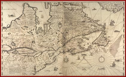
We often can’t detect traces of cartographers in their maps. Yet Samuel de Champlain left multiple clues concerning his new world encounters the maps of New France printed between 1612 to 1632 in Paris. Champlain’s experiences are not encrypted in emblems, moreover, but explicitly recorded in his depiction of a territory whose rivers he opened for navigation and commerce through a set of maps printed in Paris, as well as by actions as a proxy of the French realm.
Champlain mapped the interior of New France as Hydrographer Royal shortly after he gained the charge to secure trading rights in New France from about 1602, which led to some twelve sojourns in the New World from 1603-35. His encounters are not only noted but prepared for a French audience of readers in his maps: and while Champlain is cast as an explorer, so much as tracking his own exploration of the region, the multiple maps he designed and printed in Paris staged graphically dense appeals for the New World’s settlement, not only marking outposts of French settlement, but investing value in a region earlier described as “frozen wilderness” as a land of viable trading partners, rich in beaver and otter pelts, cod, and fruits–mapping the New World, as it were, from France.
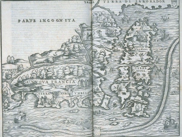
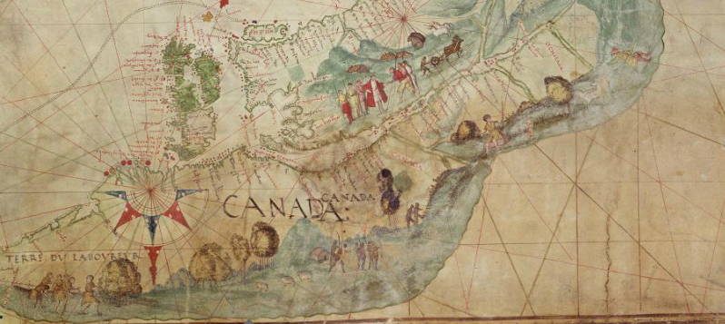
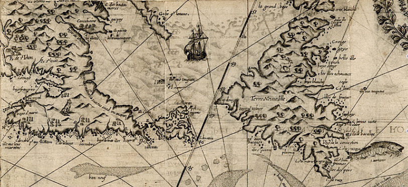
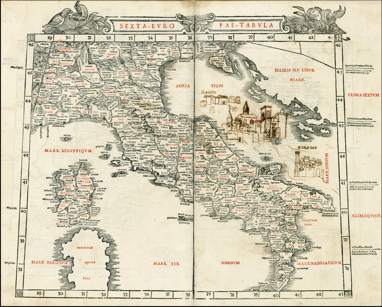
Whereas the prolific cartographer Giacomo Gastaldi had provided the earliest qualitative map of the region of the “Terra del Labrador” and “La Nuova Francia” in 1556, synthesizing nautical maps probably made from those of Jacques Cartier with rich qualitative details of the region an its inhabitants, as well as its plenitude of marine fish, the abundance of islands and crisscrossing rivers suggested a need for navigating by canoes, more than an outpost of easy nautical approach, but a richly peopled region.
When Champlain returned to the region Jacques Cartier had more cursorily mapped in his 1545 “nauigation faicte es ysles de Canada, Hochelaga, et Saguenay” by expanding the account in Cartier’s Brief recit & succincte narration of his travels up the river, using the toponyms known to Europeans through Cartier’s account, to expand detailed cartographical canvasses whose rationales for its settlement were adopted by missionaries to make their own arguments of conversion. As he travelled on what we call the St. Lawrence, for Champlain “la riviere de Canada,” he incorporated native Amerindian accounts to map the resources of New France. Champlain’s hidden need was to present both an image of Amerindians as potential trading partners, and to present an image of the territories as open to future settlement, expanding Cartier’s manuscript journals, published in 1598, not as wild regions from which Cartier had returned from Canada with two indigenous from the Gaspé peninsula, before returning with several Iriquois chiefs and promising a route that extended west and promised passage to China.
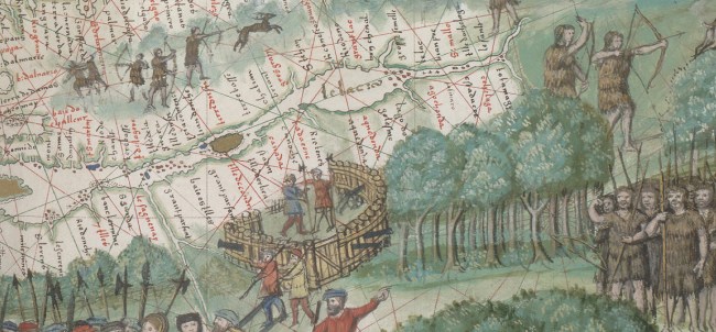
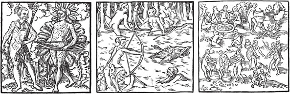
The routes that Cartier described may have seemed perilous, extending through lands of “men living without knowledge of God or use of reason [vivans sans cognoissance de Dieu et Sans usaige de raison]” and on the edges of the known world. The maps that were drawn of the river now known as the St. Lawrence offered graphic–and quite colorful–visual testimony of “sauvages” who wore no recognizable clothes and lived outside walled settlements they were apt to defend, showing the indigenous armed with bow and arrow, and ready to fight with a ferocity that necessitated construction of small fortresses from abundant trees.
Champlain rather presented himself as an intermediary to the New World, echoing his given name of a prophet, visionary and seer, called by God to be an advisor to Kings, as a prophet of new worlds. he cultivated the image of a prophet who advised the nation fit the role Champlain styled himself as an intermediary of judging areas of potential trade in the New World. From the time he served as a captain of a Spanish ship to “Porto Rico,” Mexico, Colombia, the Bermudas (Santo Domingo) and Panama to the persuasive images of regions that he mapped for French settlement from 1603–travels described in his 1604 “Des Sauvages: ou voyage de Samuel Champlain, de Brouages, faite en la France nouvelle l’an 1603 [Concerning the Primitives: Or Travels of Samuel Champlain of Brouages, Made in New France in the Year 1603]. The title was probably chosen by the printer, and perhaps also the name New France, but in calling the Amerindians “Sauvages,” he colored the book’s reception. The term later invested with connotations of incivility or wildness, of lacking habitations, material possessions, or even wearing cloths, of such absolute and deep-set difference so that by the mid-seventeenth-century Jesuits as Allouez asserted Europeans doubted the ability even to convert Amerindians to true Christians, seemed far more fluid.
Later missionaries adopted cast the task of ‘civilizing’ as necessary precedent to evangelization–a recognition that “qu’il faut rendre les sauvages raisonnable” before their conversion, as Fénelon wrote in 1671, combined their nomadism or lack of stable residence with indigenous tribes’ recognition of French territorial sovereignty of the land. But the mission to “civilize” was not always to clearcut. Michel de Montaigne had humanely played with the very expectations readers brought to the term when he had sought to reason on the relation of New France (Brazil) and his own readers’ habits in the 1580 essay “Des cannibales” that Greeks called all foreign nations “barbares,” the inhabitants of what we call South America “there is nothing barbarous and savage in that region [n’ya reinde barbare et de sauvage en cette nation], from what I have been told, except that each man calls barbarism [barbarie] whategver is not in his own practice.” When he wrote “Ils sont sauvages, de mesmes que nous apellons sauvages les fruicts que nature, de soy et de son progrez ordinaire, a produicts,” Montaigne played on the word that Champlain used, noting the “vitality and vigor” of their “virtues and properties” as not yet debased “to gratify our corrupted taste” [les avont seulement accommodées au plaisir de nostre goust corrompu].
For Montaigne, rather than being truly “barbarous” are so in the sense they are “fashioned very little by the human mind, and are still very close to their original naturalness [pour avoir redeu fort peu de façon de lesprit humain, et estre encore fort voisines de leur naïvfité originelle],” as if to invert customary standards of judgment that Champlain relied upon: their laws are more natural than ours; we may indeed today lack the ability to judge the purity of their lives, lacking altogether the esteem for artifice that dominates France, or ability to esteem the absence of occupations, wealth and poverty, or servitude, as well, he extrapolates, vices of lying, dissimulation, slander, envy, or indeed belittling, or the violence of firearms and bodily violence in their wars. While Montaigne surmises with reference to the defiance captured indigenous show to their torturers, he surmises that not only is cannibalism of a dead man not less barbarous than physical torture before acknowledging if “these men are indeed savages—by our standards; for either they must be or we must be: there is an amazing gulf between their souls and ours [voilà des hommes bien sauvages; . . . il y a un merveilleuse distance entre leur forme et la nostre].” The marvel of the New World whose inhabitants were displayed at court become, in Montaigne’s hands, a “wonderful distance” or “amazing gulf” between the inhabitants and Europe.
The conceit of a distance that was not so much spatial as cultural contested the prejudgments made on the civilization of the indigenous of New France. Champlain’s map made a similar promise of direct contact with the New World that Montaigne had placed in a man more familiar discussing with merchants and sailors than men of law. Champlain was the very ‘honest broker’ of information akin to the travel Montaigne trusted rather than cosmographers. “Sauvages” described the depths of otherness which habits of eating “wild food” that went uncooked to the nomadism and lack of religion that missionaries returned repeatedly in describing Amerindian life as utterly foreign to Europe or European culture. The evocative title that the printer gave to Champlain’s account of his encounters transformed the search for natural resources conducted after the governor of Dieppe, Aymar de Chaste, asked the Royal Hydrographer to help expand his monopoly on the fur trade at the trading post of Tadoussac, based on Cartier’s accounts, and then, after de Chaste’s death, from 1604-7, plan the settlement of Acadia to make good on its Governor’s patent on trading rights.
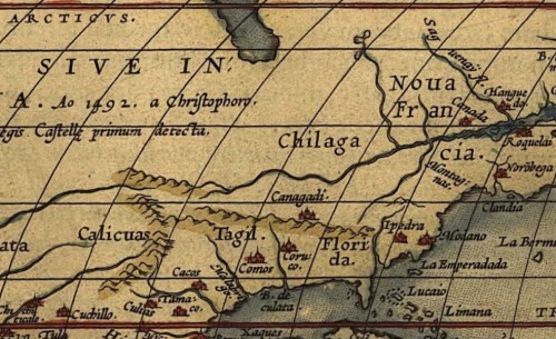
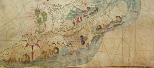
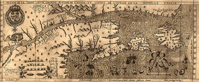
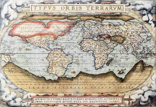
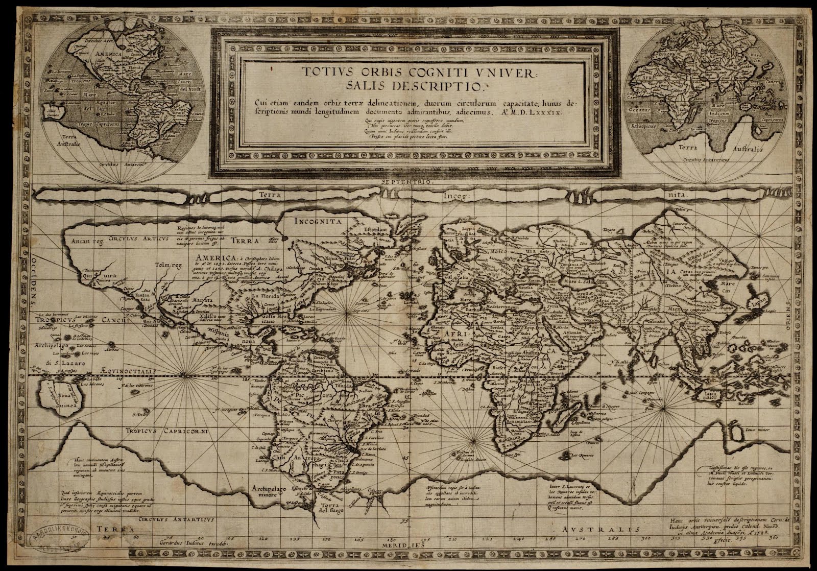
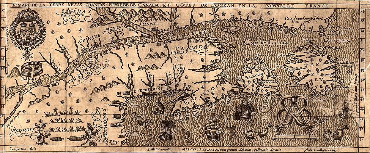
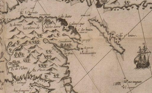
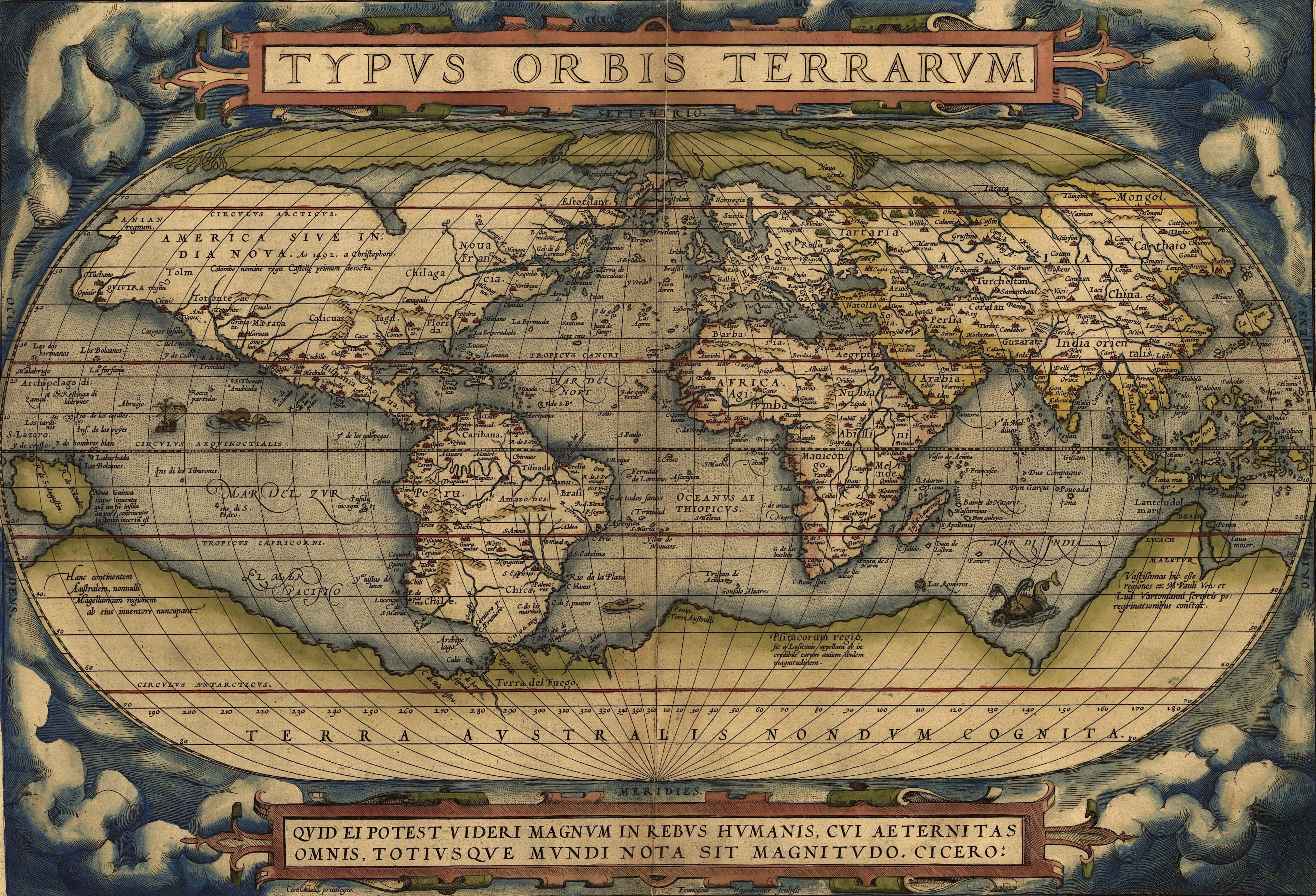
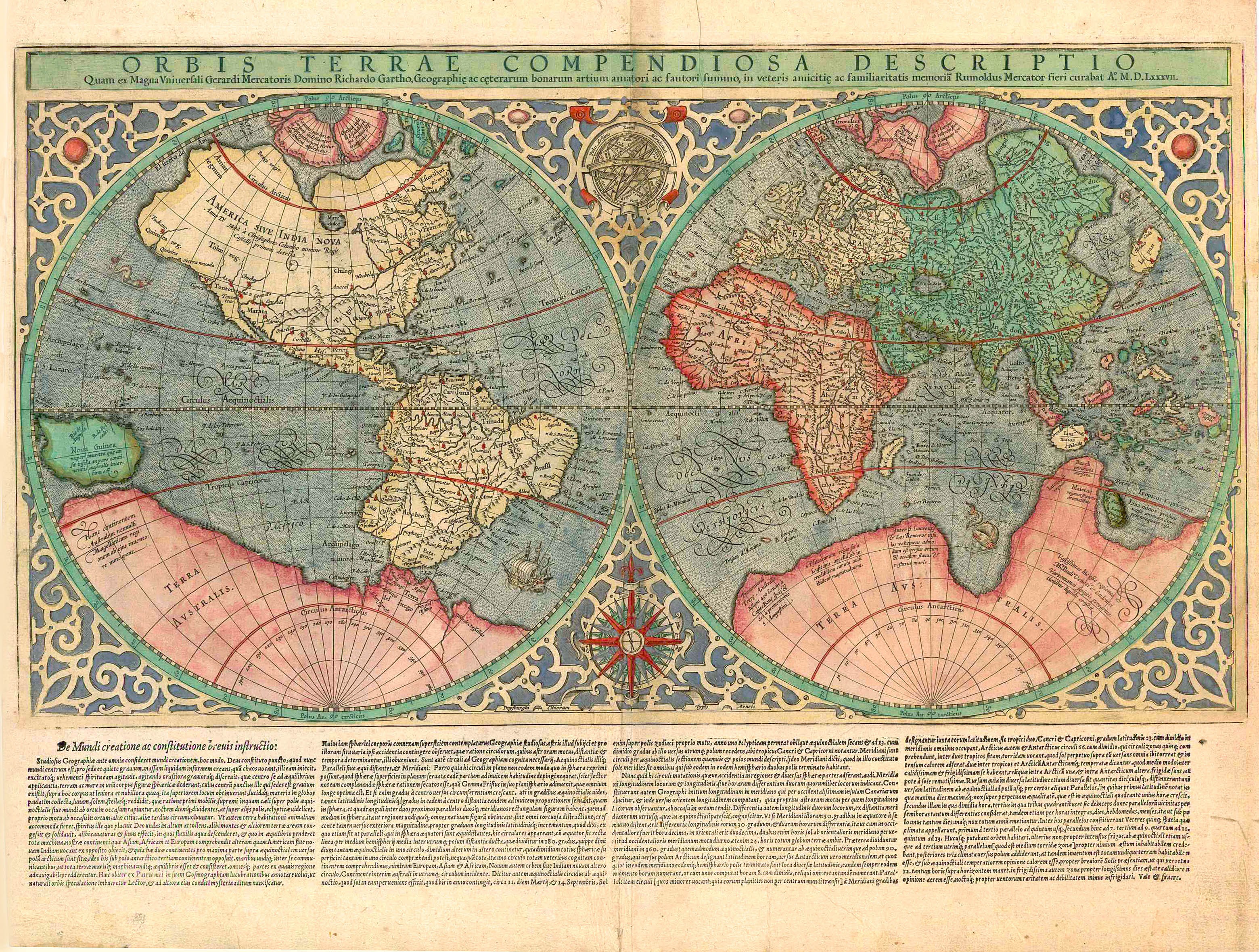
Whereas the Vallard atlas offered an inviting illustration of the benefits of settlement along the riverine network with potential Amerindian trading partners, Champlain’s maps of 1604, 1608, and 1638 compiled convincing arguments for the logic of New France’s settlement, based both on the Dictionary that Cartier had compiled and the even more intense engagement of native Amerindians in hopes to secure a monopoly in the fur trade and, as he sought to learn from them a convincing route and, after his 1612 commission, to “search for a free passage by which to reach the country called China.” The potential of such a route had been long advanced in the Ortelian 1570 “Typus Orbis Terrarum,” but was not cartographically realized, as the interior of “Nova Francia” left unmapped beyond Cartier’s account, through the de Jode map of 1589.

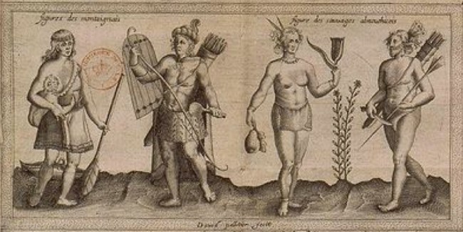
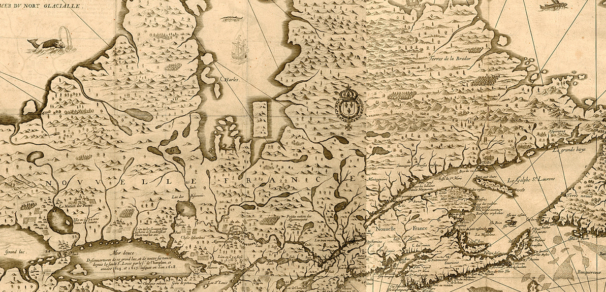
Champlain was trained as a nautical cartographer, but unlike the pictorial maps prepared from nautical charts in the French Dieppe school, whose pictorial images attracted nautical exploration in ways I’ve discussed, Champlain’s printed maps invited a French readers to examine a region about which there was particular curiosity. The chorography of New France that Champlain prepared as hydrographer to Henri IV detailed a less imagined view of the region’s topography and navigability, mapping inhabitants of North America with considerable care: Champlain’s map boasted of the possible benefits of furthering direct contact with several indigenous of the region, combining his own surveys and charts with knowledge to showcase knowledge of the indigenous inhabitants of the region and their centers of habitation gathered from native Innu peoples who lived there–known by Champlain as the Montaignais and Etechimani–whose inhabitation of the region was poorly mapped and previously “unknown.” By presenting himself as an “honest broker” of information about the new world, in other words, although the map may be seen as mapping the St. Lawrence Valley for future settlement, although the map made the land “New France,” and the title for his book “voyages en France nouvelle” of 1608 was probably chosen, as its discussion of “Sauvages,” by a publisher, its appearance presented a charge to open the St. Lawrence valley for interaction with locals as much as colonial settlement, shifting the dynamic between European metropole and the outlying areas of North America’s coast.
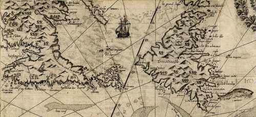
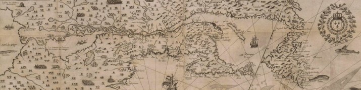
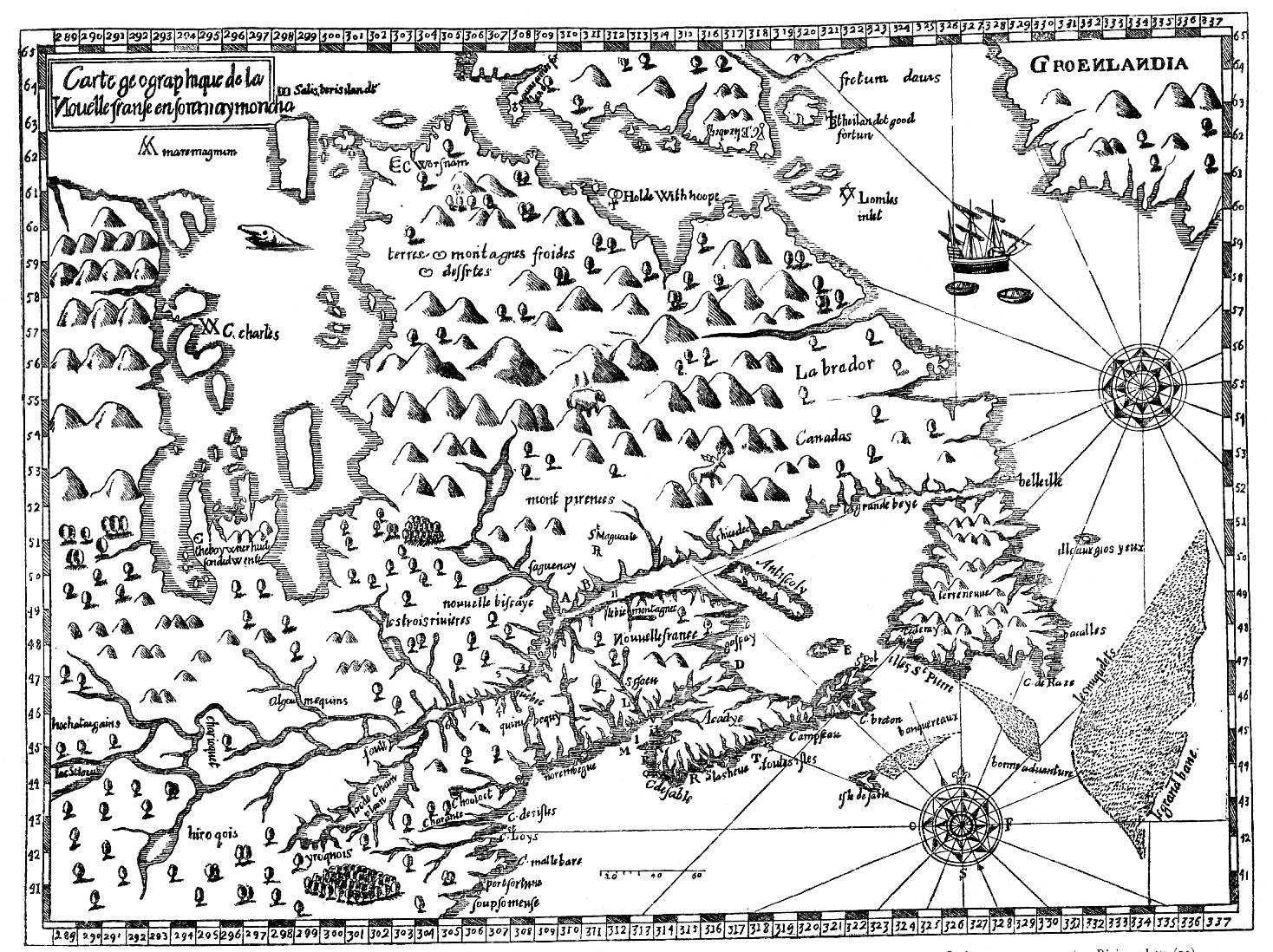
If it was included in a book, not surviving in editions with the map that seems intended to accompany it, the early map designed in 1608 registered a fascination with native cultures, not linking the “Sauvage” to the pagan, but to a different lifestyle, before a primary urge to transform Amerindians through Catholic conversion and intermarriage with the French probably informed by his increased contact with and dependence on missionaries by the 1630s. In the map of New France he had engraved in 1612, an expansive regional map of New France, detailed the coasts of islands that he had first travelled among extensively along its coast and the riverine network to the Great Lakes he first saw or described–and whose path Champlain pursued to gain the most complete monopoly of the fur trade, rather than the search for silver and gold that the French king hoped to pursue, which increasingly come to subsidize his expeditions.
In shifting the mapping of New France from a tradition of nautical charting to the medium of terrestrial mapping, Champlain both gave his maps richly ethnographic material functions that allowed him to stage broader arguments for the region’s future exploration, even as he continued to raise the possibility and promise of mapping routes of trade to the east by a Northwest passage. The engraved regional map of New France detailed the coasts of islands that he had first travelled among extensively along its coast and the riverine network to the Great Lakes he first saw or described as he sought to gain advantages in the fur trade. The current exhibit Moving with the River organized at a museum in Ottawa, CA,s then saddled with the unfortunate name of the Museum of Civilization, seems to live down the name of the museum: it examines the role played by the St. Lawrence River in Canadian identity from its place as an avenue of Champlain’s contact and alliance with native peoples. Yet Champlain mapped the region for French readers to pivot from nautical maps of coasts of Acadia and Newfoundland, parlaying skills of mapping developed on the west coast of France and voyages to the Indies, to exploit the legibility terrestrial map-making to chart future ties of trade and the prospect of potential intermarriage of peoples that was far less hewing to ideals of civilizing.
* * * * *
His expansive maps of the region and its inhabitants shifted his brief from mapping sites of settlement in New France to mapping inland avenues for trade on a web of rivers and lakes. The maps command our attention for how they provided a compelling record of the region for French readers by introducing them to it alternately as a site for potential settlement, commerce, and conversion–combining the ends of mapping and combining several formats of mapping that had often been previously held distinct competencies or forms of expertise and subject-matter. In an almost improvisational way, Champlain was adapting his mapping techniques for new audiences that the printed maps might address. Whereas Champlain’s initial project of nautical mapping echoed a conception of Canada voiced Marguerite of Navarre, who saw “Canada” as an island (and possible obstacle to voyage to the orient), the engravings that he provided during his many trips to the region re-mapped an image of the region as an area of trade and settlement, embodying a network of routes of trade around where he founded the first French cities in the New World.
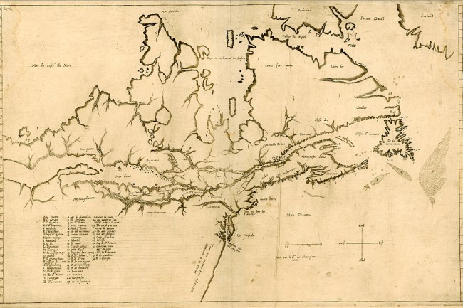
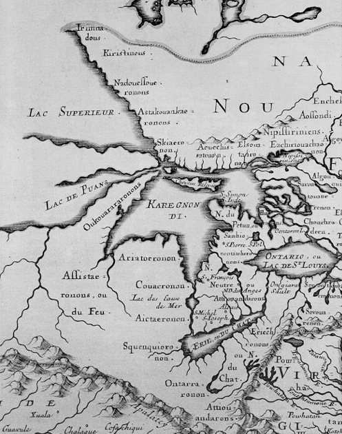
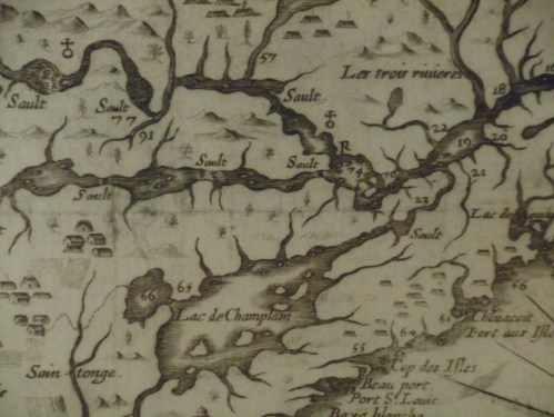
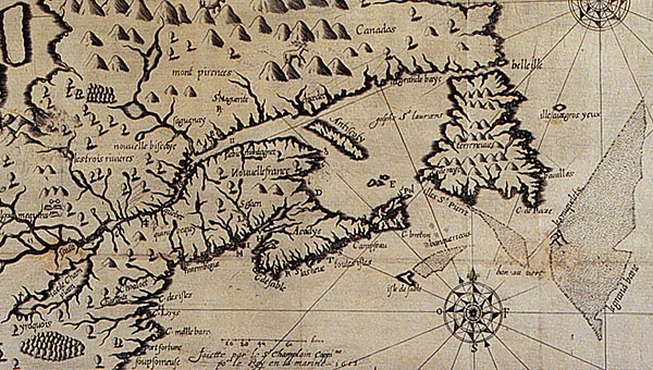
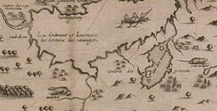
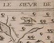
The map that he designed in 1608 redefined French readers’ relation to the New World in a magisterial synthesis of nautical and terrestrial cartography, bridging charting and surveying to map the mouth of the river that Cartier had earlier entered to the inland region known as the Great Lakes that would be so profitable for fur trading, after he concluded a lasting peace with native tribes to allow French settlement. The map suggests a new sense of having mapped lasting peace in New France. A lower left cartouche conspicuously mapped the inhabitants of the region from whom Champlain he was asked to make a treaty with and from whom he learned so much. Champlain not only conducted peace with the Montaignais, but relied on native accounts to map much of the Great Lakes–trusting Algonquin accounts of the upper St. Lawrence and eastern Great Lakes, openly seeking them out to map of the region from Lake Ontario to Lake Erie, and mapping its imagined relation to a great saltwater sea. Although it is doubtful he traveled beyond the current site of Montreal on the St. Lawrence, where he began to write his text–but amplified the map beyond where he had traveled by incorporating Algonquin accounts obtained in 1603–the imagined expanse of New France created a New World with the hint of the promise of a North-West passage, and ample evidence of trading partners along the river’s path.
Champlain’s printed account of 1608 consciously exploited the term of “Sauvages” or ‘forest-dwellers’ popularized by the arrival at the royal French court of native North Americans. The term was not derogatory, but described the forest-dwellers who since an alliance of 1602 had helped orient himself in the region, and whose considerable attention after their visit to the royal court increased the interest in the work he prepared at just short of thirty years, Des Sauvages: ou voyage de Samuel Champlain, de Brouages, faite en la France nouvelle l’an 1603 [“Concerning the Primitives: Or Travels of Samuel Champlain of Brouages, Made in New France in the Year 1603“]. Indeed, the term–if introduced by his publisher, advertised his status as a privileged informant, more than a map-maker, that echoed his first post aiding a secret agent and member of the royal household in Brittany.
Champlain styled himself as a principal informant about New World life for the French public. At roughly the same time Native Peoples arrived at Henry IV’s court and piqued interest in “Sauvages” among court figures, the striking title capitalized on wide curiosity in the figure of the New World Native, rather than as a derogatory term, in ways that opened the map to further readings as a site of conversion and commerce alike, calling the natives likely to welcome Catholic colonizers from France for the order that they would provide, and concepts of prayer they would introduce, even if “most of them live like brute beasts” (1603: 117) and often in ritual dances “stripped themselves stark naked” (1603: 107-8; 180). Champlain wrote admiringly of their government, costumes, nautical knowledge and bravery, offering that “I hold that they would quickly become good Christians if their lands were colonized [je tiens que qui leur monstreroit à vivre & enseigner le labourage des terres, & autres choses, ils l’apprendroient fort bien],” his work would in ways provoke debates about the possibility of conversion for Jesuits, and about the limits of converting, civilizing or “Frenchifying [franciser]” Amerindian natives. When Champlain sought to teach Amerindians the nature of a beneficent God and the efficacy of prayer to Amerindians, he presented their absence of religious ceremonies as akin to their absence of law , but did not see why this could be changed: “You see why I believe they have no laws, nor know what it means to worship and pray to God [je croy qu’il n’y a aucune loy parmy eux, ne sçavent que c’est d’adorer & prier Deu],” he wrote; yet “I believe that they would be quickly brought round to being Good Christians if their lands were colonized, which they might well mostly desire [croy que promptement ils seroient reduicts bons Chretiens si l’on habitoit leurs terres, ce qui’ils desireroient la plus part].” (Only later, among debates between the limits of conversion to French customs among Recollect and Jesuit missionaries, did the notion of a “sauvage” become associated with a pagan.)
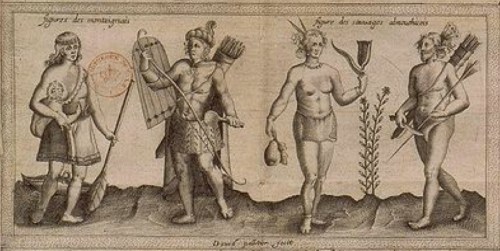
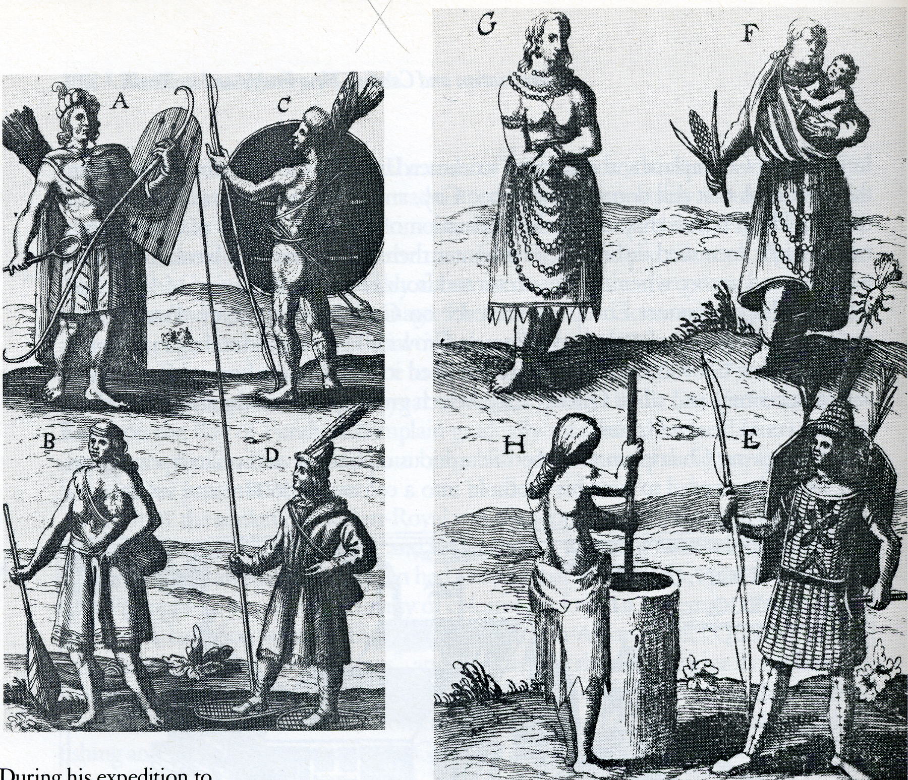
Champlain’s richly ethnographic account provided little sense of natives’ nobility, but his images of these warriors–the Montaignais had encouraged the French to be their allies against the Iroquois–reflected in his sustained interest in “their countries . . . and forms of assembly,” as well as their songs, clothing, hunting practices, food, tobacco, and snowshoes, as well as hairstyles, public oratory and dance-steps.
Champlain’s dependence on native accounts of the region led to his expansion of ties with natives on the Saguenay River that Cartier had earlier encountered. Indeed, in 1602 Champlain concluded a treaty or peace with the natives that he called the Montaignais, native Americans on the St. Lawrence’s shoreline and Labrador and Quebec and those he called the Etchemin [Maliseet], and later the Algonquin, admiring the superior quality of their furs to those he had seen in the future Nova Scotia; Henri II eagerly founded the Acadia and Canada Company and granted it a monopoly on the fur trade which Champlain was to help protect. The map recorded to some extent the longest-standing alliance Europeans created with Natives–or “sauvages,” as he put it–to that point, much as Champlain himself discussed their “nations” and treated their leaders as heads of state. The “sauvages” who Champlain had ‘tamed’ were displayed in the map, as something of a token of what he saw as his accomplishment: it seems that two of these peoples had returned from France while as he was in Tadoussac, increasing the possibility of the alliance, as did a treaty against their Iroquois enemies–dragging the French into a conflict lasting through the eighteenth century.
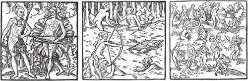
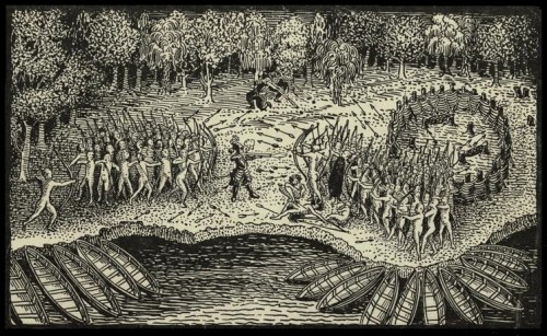
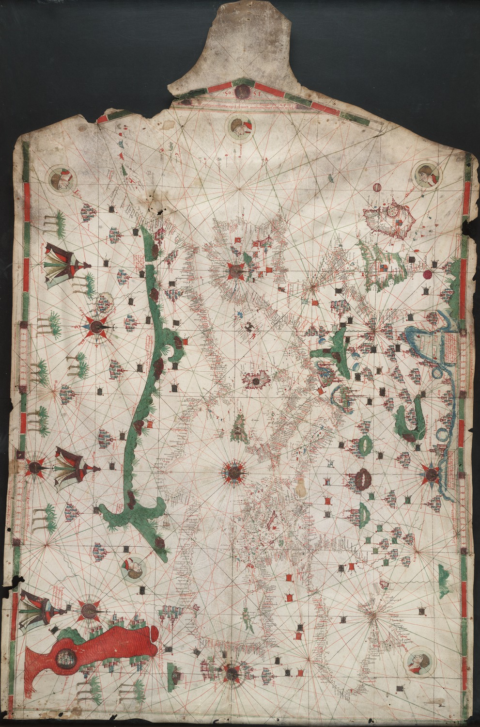
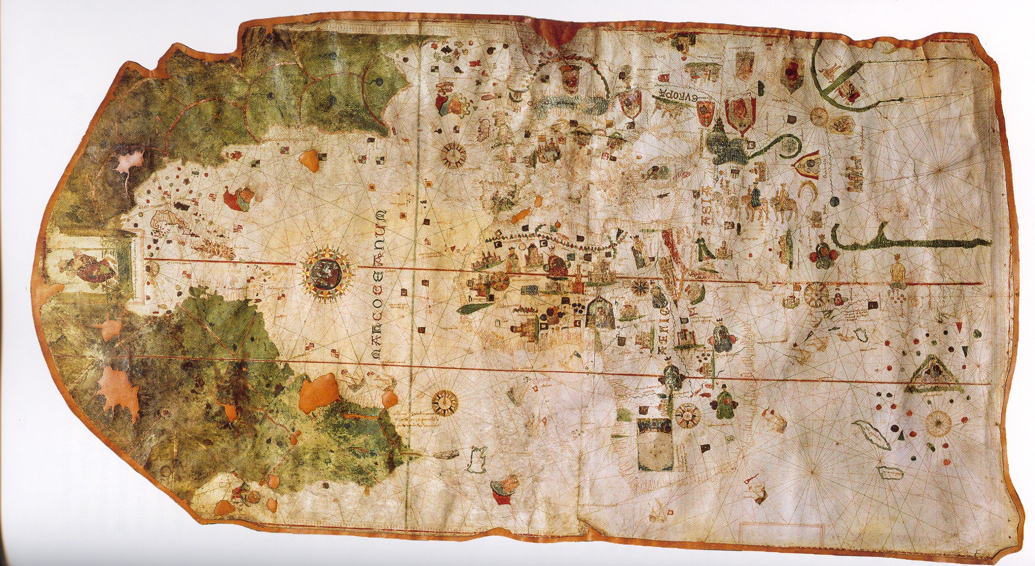
For Champlain, the engraved map was a complex and subtle register to mediate his encounter with New World, unlike the pictorialized charts of the Dieppe school before Champlain’s birth that rendered natives hunts such as the “Vallard” atlas.
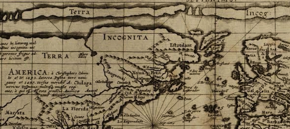
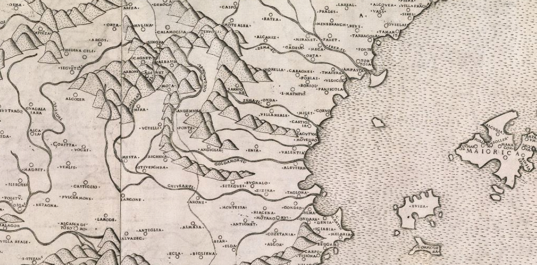
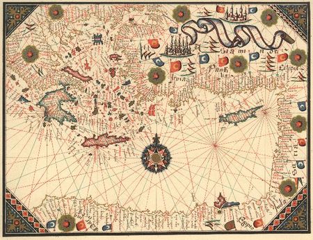
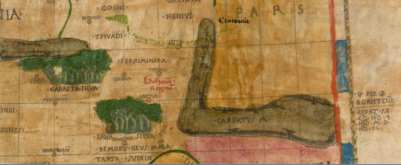
Although the atlases of the Dieppe school, as Vallard atlas above from the Huntington, or the Harleian Map, presented enticing images of natives along green river-banks, attempting to attract interest in their settlement through images of peaceful relations with local inhabitants Champlain’s maps promoted the settlement of a region poorly known to Europeans still “Terra Incognita” as late as 1589, if contiguous with New France, as in this Dutch map of Cornelis de Jode, one of the competitors with the French in the potentially lucrative fur trade, as well as in the charts of Nicolas Nicolai’s Isolario for Henri II.
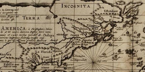
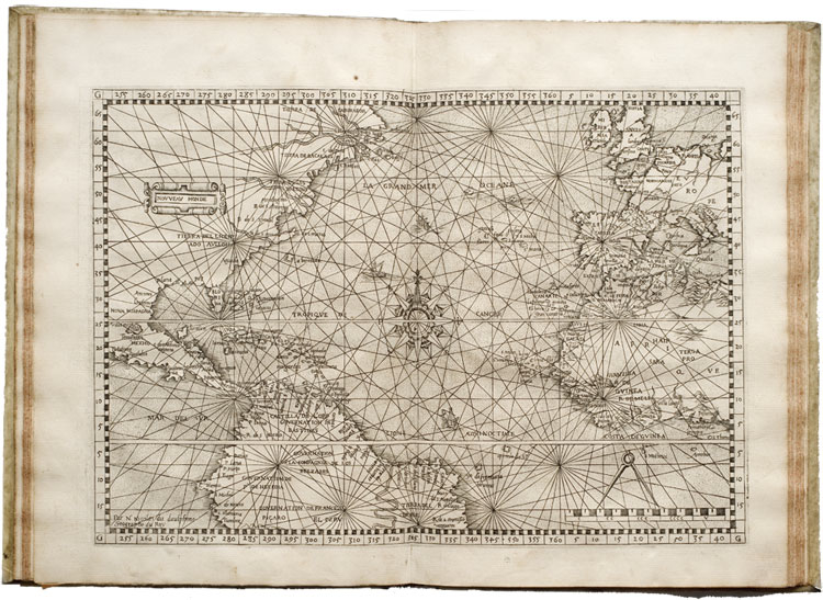
The map Champlain drafted of the interior contrasted strongly to the routes of potential Atlantic trade that Nicolas Nicolai, predecessor as royal hydrographer for Henri II, created to foreground routes of potential trade, which plotted routes to North America in his Isolario and 1548 Navigazioni del mondo novo, reprinted through the late 1560s, whose paucity of detail revealed limited knowledge of the Montaignais at the mouth of the Saguenay and only vague knowledge of anything about the land through with the river’s course runs, and focus on the Indies as a locus of trade, limiting New France to the mouth of the St. Lawrence.

In the series of maps that he made which provide something of his increased encounters with New World natives, and search for new potential trading partners, Champlain shifted his sights dramatically to the unknown rivers of the interior that he explored not by ship–as he was familiar from his first voyages of 1598, but by canoe. After several natives the French knew as the Montaignais or “mountain-people” had travelled to the French court of Henry IV, popularizing the term–and category–Champlain adopted the term of New World curiosities as subjects worthy of description and mediation in a map.
The geographic and ethnographic detail in Champlain’s map of 1608 reflect not only curiosity with the figure of the “Sauvage,” but Champlain’s decisive engagement in tribal disputes in attempting to secure fur trading rights–as well as rivers’ course. The map reflected not only the considerable inter-breeding of French settlers and fishermen with the nomadic natives they called “mountain-men” or mountaineers because of their knowledge of the hills at the mouth of the St. Lawrence, and since the contact promised further knowledge of the region. Rather than follow the precedent of nautical map, familiar in from the picturesque images of “Canada” in the manuscript atlases of the Dieppe school whose pictorial images had promoted the material benefits nautical exploration from the time of Champlain’s childhood, or maps of the New World that first circulated in engraved in France. Unlike these maps, Champlain’s maps situated the Atlantic islands around modern Nova Scotia and the Bay of Fundy on meridians in ways that gave a material presence to the northern expanses of North America to Hudson Bay and past Lake Ontario, in ways that offered readers a material record of geographic fixity as well as documenting the goods, mapping both products and routes for future mercantile expansion in the New World for which Henry IV was so desirous, by placing its inhabitants as crucial figures who might both be converted to Catholicism and be active partners in colonial trade. (The legend continued far after the settlement of Canada: Claude Levi-Strauss remembered in Tristes Tropiques that an older Frenchmen described the Nambikwara as “sauvages“–and never otherwise—as if “on l’eût cru débarqué en quelque Canada, aux côtés de Cartier ou de Champlain.” Levi-Strauss may have made a similar connection in contemplating their “sauvagerie” when describing his arrival at a land “as large as France and three-quarters unexplored,” by filled with nomadic indigenous peoples.)
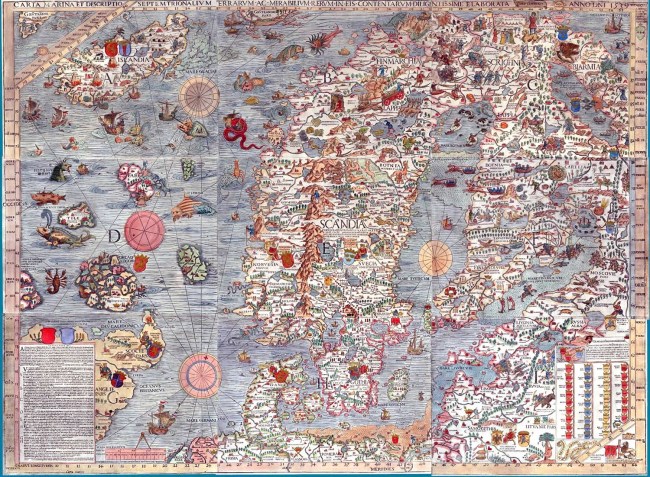
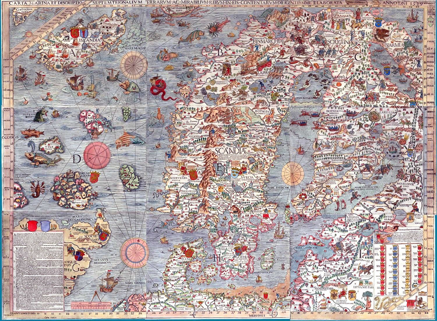
Although Champlain’s first mission as Royal Hydrographer seemed to have been to establish a permanent seat of settlement for France in the New World, his maps both lent greater fixity to place; if Cosgrove suggested that the “geographic indeterminacy [of islands] also increased their imaginative resonance,” Champlain’s New France supplanted the colored islands on the edges of earlier world maps with newly determined coordinates. Indeed, he noted routes of trade and objects of interest with far more restraint than the abundance of fantastic creatures in marine maps of northern seas like the chart that the Swedish patriot and priest Olaus Magnus drafted as a comprehensive visual geographic history of Scandinavia and surrounding waters in 1538, with Roman artisans, as a graphic register of the arctic seas.
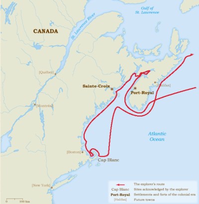
The maps printed in Paris that traced Champlain’s explorations of North America for French readers mirrored a shift from a nautical network of travel around the coasts of Newfoundland and the present Nova Scotia, where he founded the first French cities in the New World of Port-Royal and St.-Croixe as outposts of trade in minerals or furs.
The terrestrial maps that Champlain would later design reflect a shift form a network of routes of nautical travel, seeking to found outposts for trading ports in the New World, to a search for inland connections to new networks of trade in furs to secure the monopoly on the fur trade that Jacque Cartier described: a position from which he sought to both better understand and present a convincing picture of a network of trade in the interior. After years spent mapping possible seats of France’s first city or entrepot in the New World in Acadia, Maine, the Bay of Fundy, and even down to Cape Cod, Champlain had returned to France to print the map–the precursor of subsequent printed maps of 1612, 1631 and 1638, each of which seems to punctuate twenty-one voyages Champlain made to the New World–and turned his attention to the interior, a decision that probably encouraged him to decide to attract Jesuit missionaries from 1614 to help establish colonies in New France.
Champlain’s terrestrial maps of 1608, 1613 and 1637 present gradual syntheses of the assiduous reconnaissance in a New World he visited over in twenty voyages, each giving greater materiality to the project of exploring and settling New France. The intense return to map-making suggests a new attempt to define the primacy of a Francophone version of the medium of maps, as well as to seek increased funding and support of his own voyages and contact with natives in the New World. If Champlain was indeed raised as a Huguenot, as suggested in archival research of baptismal records which place his family in La Rochelle, it is striking that his detailed map distinctly privileged the legibility of the New World more than the maps he drew on the basis of his earlier voyages to the Barbadoes and Indies as commander of a Spanish ship: the detailed prospect that they presented for exploring lines of contact with Natives placed him among the Huguenot ministers Henri IV cultivated to develop his kingdom’s economy and infrastructure, but to do so in the new setting of New France, much as the Sieur de Monts, a Calvinist, had been granted the rights to the territory of Acadia (Nova Scotia), by Henri IV, “to cultivate, to cause to be peopled, and to search for gold and silver mines from the forty-sixth to the fortieth degree North latitude,” despite his Calvinism–enjoining him to teach Catholicism to the Micmac natives. (It also placed him in a coterie of suspected reformists who include Ortelius, among those who stressed the transparency of the map as a printed text.) The religious background of Champlain may be striking, given his close cooperation with Jesuits and other orders, but seems echoed his sailing with Récollet missionaries in 1615, a small group of reformed Friars Minor repressed in the French Revolution, who arrived in Quebec City, and only later with Jesuit missions in Acadia and in Ontario and Quebec from 1609. (The Récollet were far more hopeful of introducing French customs to Amerindians than their Jesuits brethren.)
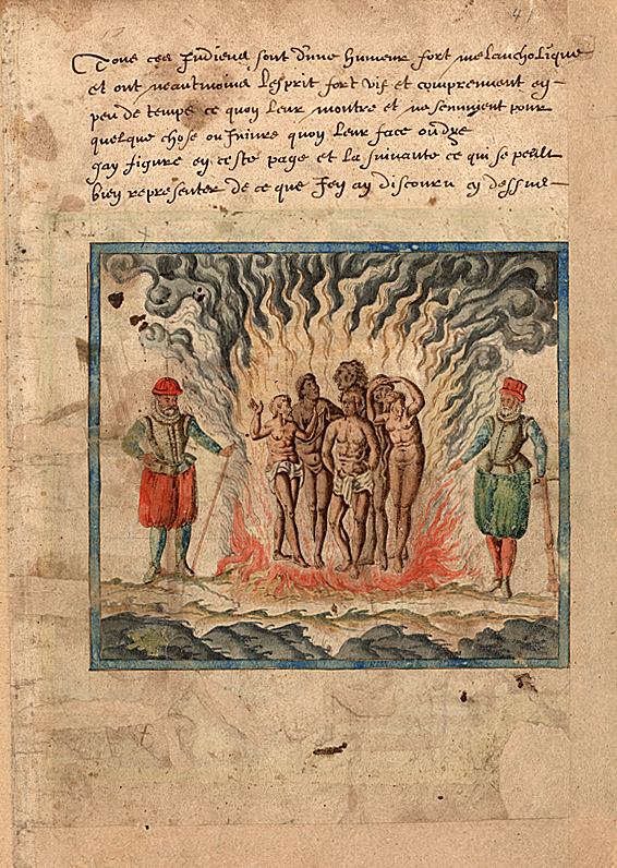
The image of New World natives indeed strongly contrast to the striking image he had earlier described, when sailing to Santo Domingo as commander of a Spanish ship, of the horrors of witnessing burning of unconverted natives–no doubt a scene that haunted him–and provided a model for cultivating new models of exchange in New France.
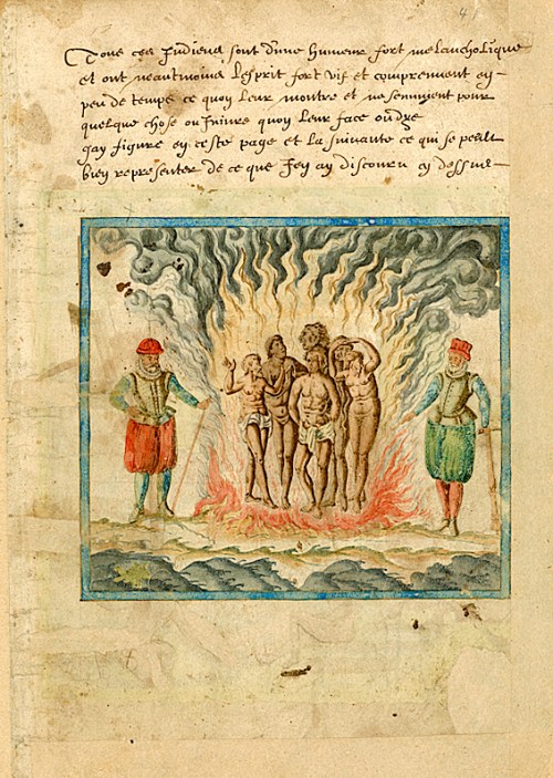
The stunning and particularly striking image from the Brief Discours documented the torture of natives who did not convert to Catholicism at the hands of the Spanish, “Indians Burned by the Inquisition,” must have stuck in Champlain’s mind as an opposition of pagan and European–he argued the “evil treatment” that caused Indians to flee to the hills at the Spaniards’ approach, he noted in a manuscript in collections of the John Carter Brown Library. In contrast, existing intermarriage among natives and French sailors created less of a duality of otherness if not a greater appreciation of cultural difference.
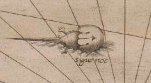
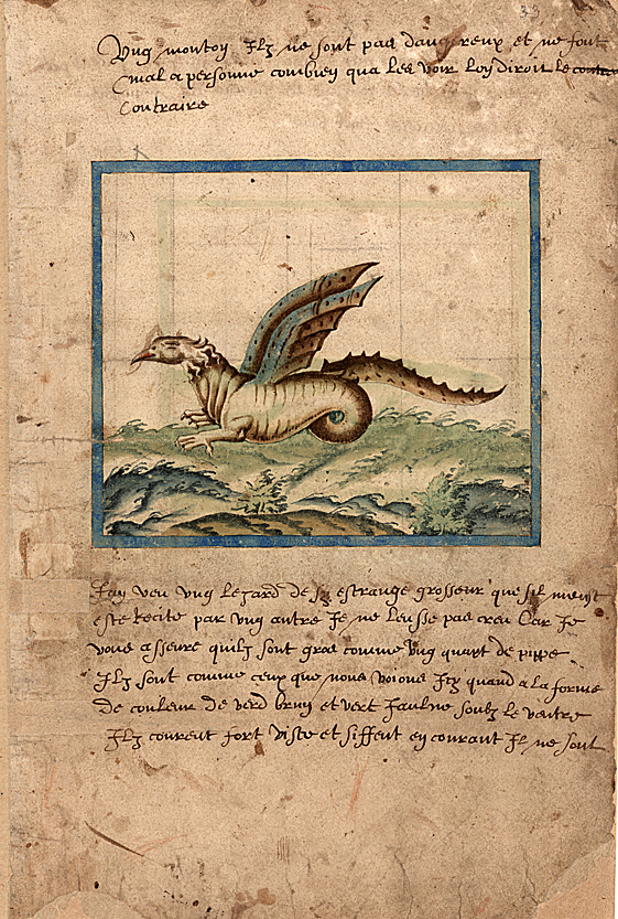
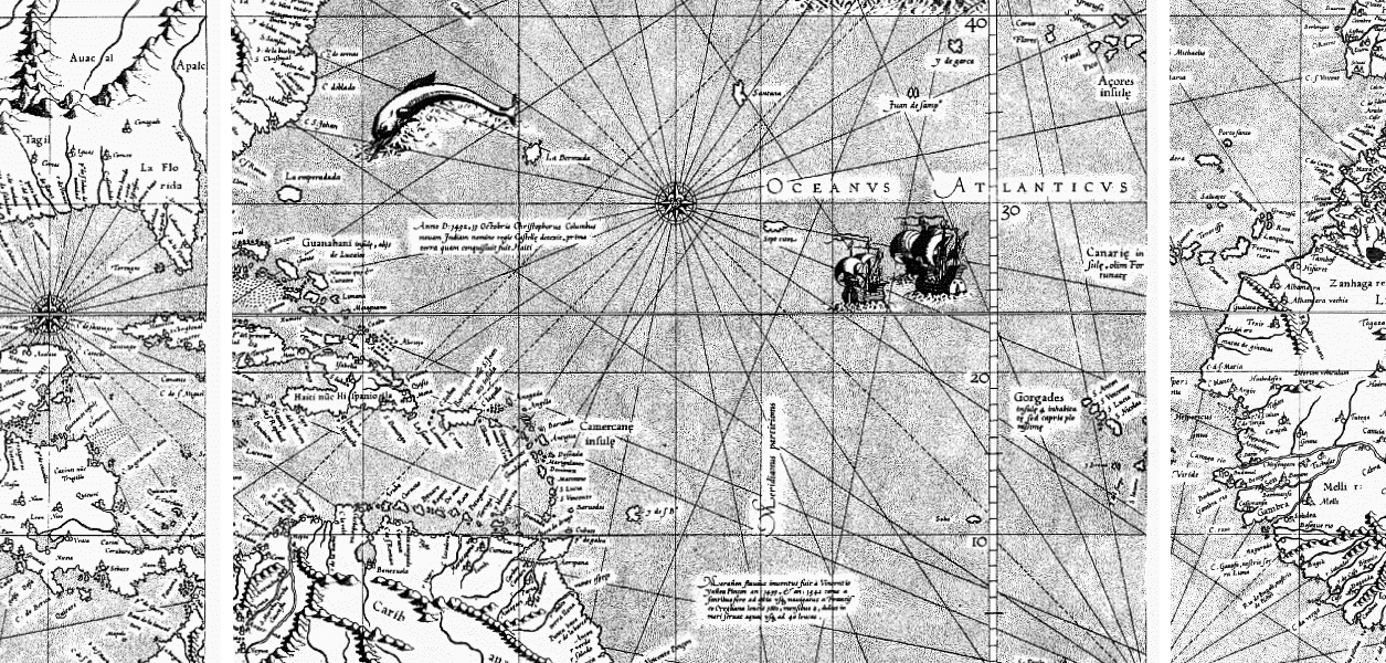
The 1598-1601 manuscript “Breif discours” about his travels to the Indies included a prized description of the local dragons that Champlain described as indigenous to the region, as Susan Danforth of the John Carter Brown has also noted, whose care reveals his deep attention to preserving a record based most likely on native accounts–“dragons of strange shape, having a head approaching to that of an eagle, wings like a bat, a body like a lizard and only two rather large feet, the tail somewhat scaly” who are in appearance “as large as a sheep, but not dangerous, and do no harm to anybody, though to see them one would say the contrary.” While Champlain probably did not see these dragons, pictured in his manuscript below, they were a central to his description, and his care at their description echoed the interest in fantastic creatures in the New World, which later informed his later striking descriptions of the Gougou in the Bay of Chaleur, a “terrible monster” male but “in the form of a woman, but very frightful, and so large that the masts of a sailing vessel would not reach [her] waist” which “possessed pockets” on her body where the Gougou stored its captives before eating them.
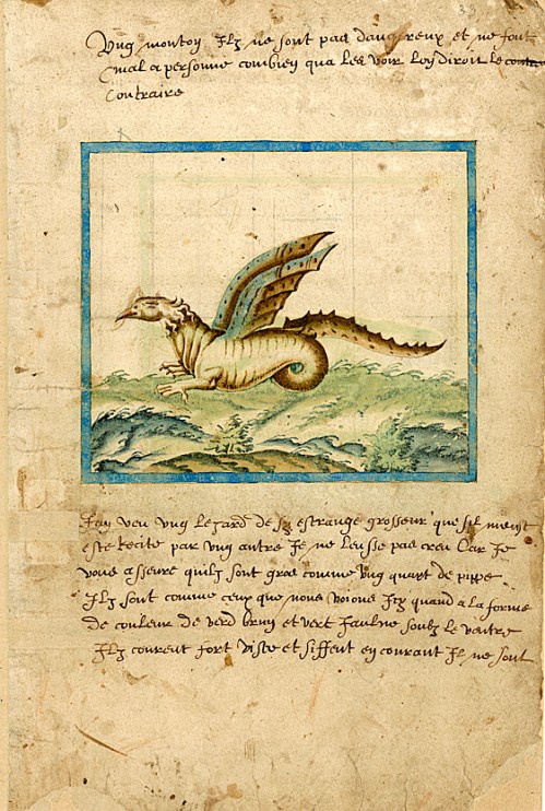
If his account is only slightly incredible, Champlain similarly trusted his native informants accounts of the Gougou, from whom several natives told him of their escape, and others of having heard the Gougou’s “horrible noises” as they passed by its home: “What makes me believe what they say,” Champlain wrote, “is the fact that all the savages fear it, and tell such strange things about it that if I were to record all they say it would be regarded as a myth; but I hold that this is the dwelling place of some devil that torments them”–translating the legend into a Christian cosmology, as much as in credulous tones. He did not draw the Gougou in his maps, but readily included information from a range of local informants.
Although Champlain’s continued dependence on native informants, including the Montaignais and Etechemani, depicted in the 1608 map as we have seen. Their relation to the French were no doubt closer than many may have realized: members of these tribes who allied with the French increasingly may have intermarried with French settlers, becoming the first New World allies of French after their decisive conclusion of peace in 1603–described in the Museum of Civilization as the first durable peace with New World natives. The treaty must have blurred such clear oppositions among natives brooked by earlier cartographers, if they did not explicitly return to the map as collaborators or co-authors if not guides. His subsequent dependence on native informants may have further encouraged by the intermarriage of Montaignais and Etechemani, the New World allies of French from 1603, with traders and sailors, and led Champlain to dignify them as noble warriors–and to study their arts of oratory, politics, and political order, as well as their dress. The cartouche blurred such clear oppositions, increasing the subjectivity of these warriors more as objects of curiosity than as collaborators or co-authors of his maps.
Indeed, they suggest Champlain’s hope to pursue a lucrative trade in furs that Cartier hoped to secure. For Champlain, the map was a complex and subtle register to mediate his own encounter with New World. Indeed, the rich detail of the maps of the Dieppe school, like the fantastic maps of mountains of Nutmeg and Cinnamon in the imaginary continent of Java la Grande conjured in maps of the Dieppe school–discussed in an earlier post–may have lead Champlain to promote equivalent trading routes, and map the imagined wealth of trade routes that would nurture an imagined French empire, and to place images of sought-after beavers and otters which populate the surface of he prepared in his 1612 map.
Similar dreams of trade motivated the creation of these promotional atlases to win sponsorship and support of future voyages, to an extent realized when Champlain gained far more extensive privileges and support to expand the fur trade. The engraved maps Champlain composed during over twenty voyages to the New World turn attention from the charting of routes of sea-travel where France might establish a seat of maritime investigation to upriver trade on what is now the St. Lawrence or “rivière de Canada.”
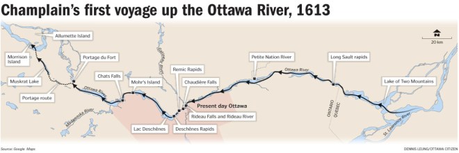
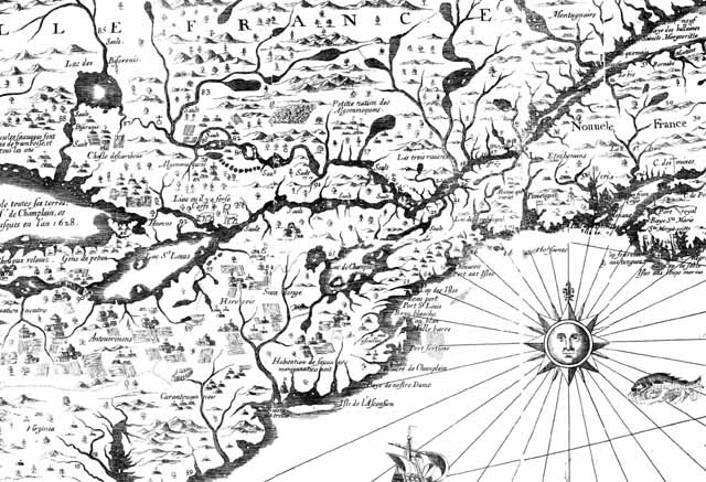
His maps from 1613 most always were left rivers as the St. Lawrence and Hudson Bay conveniently open-ended, as if to suggest the possibility of linking areas of trade and bodies of water by transcontinental navigation along a North-West passage that responded to his charge, and secured further voyages in the New World he increasingly adopted as his charge and of which he became raconteur and rapporteur. In seeking to establish trade with native peoples led him to travel for reasons of commerce, as much as exploration, he charted advantageous sites for dominating the fur-trade from the Saguenay to the St. Lawrence, and inland to the lakes later named the Huron, Erie and Ontario, of which he learned from Native informants, encountering natives on the great river who remembered Cartier’s arrival and capture of their chief almost seventy years earlier but were eager to cultivate trading ties, choosing the city of Stadacona as a center of trade and describing its lands as uninhabited. Champlain’s far more expansive map of 1613 presented a comprehensive case for joining the nautical exploration of the shores, with their rich marine fish, to travels into the interior, with its rich traffic in beaver pelts, on an accurate meridian; it also prefigured Champlain would continued to seek greater trading routes in the interior after his 1615 journeys to the Hudson Bay, even if he discovered the ruse of a direct route to Cathay, traveling up the Ottawa River to Lake Nipissing and the Georgian Bay in Lake Huron, and crossing Lake Ontario–regions that his 1608 map show as open for settlement, minimizing the local presence of native nomadic tribes.
The alliance that Champlain formed with Montaignais and Etchemin [Algonquin] tribes from provided a turning point in introducing native informants into maps of New France, and indeed in the mapping of New France as a community open to French trade. When Champlain turned up the St. Lawrence to gain dominance in the pelt trade from the Dutch and English, he depended on Native guides. He had admired the Iroquois for their navigational skills–he relied on the sailing skills he had learned in France’s coast. But as he increasingly dedicated himself to inland mapping for possible commerce routes, focussing on the riverine paths that he would open to trading for fur pelts, exploring what would be the St. Lawrence and its tributaries, traveling upriver to found the city of Montreal. There is some evidence of how Champlain relied increasingly on native interlocutors to determine place-names in his map; his subsequent founding of Ottawa–perhaps as his sites had shifted.
The more expansive and detailed 1618 map of New France, meant to accompany an account in his 1619 Voyages of his travails and unsuccessful battles against native peoples while attempting to discover a Northwest Passage that obsessed him from 1615, and provide a tantalizing teaser of potential routes to continue to explore, as much as it describes a region which he had become such a primary informant. The map printed in 1619 in Paris staked out an argument for continuing to fund his successive voyages not only of exploration but of potential commerce, leaving open much of the possibility of arriving at a route to the Orient and China across polar ice as a hint of future riches that he wanted to pursue. Champlain’s 1619 “La Nouvelle France,” engraved in Paris, narrated his own exploration of the region in detail through 1618, now focussing on his travails in the course of exploration; the Voyages describe unsuccessful battles with Native Americans as a tale of frustration and self-sacrifice in enlarging the surface of the map for French readers at a new stage in their mission of settling the New World.
Whereas Champlain had charted French towns on the coasts of his first voyages of 1598 and 1602 with Francophone toponyms as Port Royal in the current Prince Edward Country or Sante-Croix between 1604 and 1605, the maps mirror his decisive move inland and engage native inhabitants and guides in founding cities from Quebec in the voyage of 1608. And in later periods, Champlain engage the Iroquois at Lake Champlain in 1619 to modern Montreal and Ottawa in his later travels with the Huron guides to lake Ontario of 1615, meeting the “Cheveaux-Relevés” (Odawa), whose painted and pierced faces Champlain noted, as he offered their chief a hatchet in exchange for a map drawn on tree-bark with charcoal of the expanse of the region around the Georgian Bay (III: 43-5), in what they took as a symbol of their future alliance, most likely, rather than the securing of a new trade route.
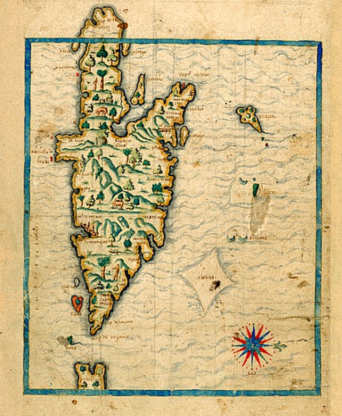
The title and inclusion of a topical notion of cartography Champlain practiced in this ‘chorography’ of New France contrast with the abstract universalist perspective associated with early modern maps. It is interesting to observe some connections between Champlain’s own ethnographic perspective in the charts drawn when had sailed to the Indies and Santo Domingo, serving commander as a ship of his uncle which was leased for a voyage to the “Indies” in 1599-1600, and whose “Brief discours” provided a model he expanded upon in the far more extensive geographic cartographies he executed of New France for the French King. While the map of Santo Domingo recalls a book of islands, the mapping of New France suggests less a bound area of trade, so much as a region of continued engagement.
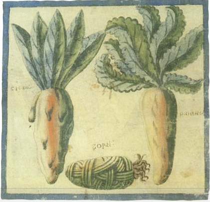
There is another continuity with the maps he drew of the Indies in the late sixteenth century. Each provided a detailed account of the economic advantages of each site he explored–including the notation of the suitability of copper mines or existence of gold–revealing their deep reliance on a material culture of New World goods, as in this rendering of the Cassava.

Champlain famously even included a rendering of a New World dragon–boasting it was completely harmless despite its appearance, as if to create interest in the beast–indicating what would be a longstanding curiosity in recording foreign fruits or animals in naturalistic detail. Champlain’s work reflects keen interest both in the marketing of New World goods–copper mines or the availability of gold; beaver pelts; marine seals; horseshoe-crabs–and a sites of raspberries or cod, potential products of economic value, if not curiosities that demonstrated knowledge of the terrain. In the cartouche in the lower boundary of his 1608 map of New France, appear images of almost botanical naturalism for readers hungry for pictorial detail on natural curiosities and material goods:

Champlain’s maps of the Bay of Fundy and eastern seaboard, drawn as he searched for sites of potential cities in three years of intense chart-making along the Atlantic coast in Acadia, and sailing from Cape Cod to Maine, and before his later voyages turned from nautical to terrestrial cartography, tracing the inland riverine paths, were long focussed on regions that the French crown determined were of economic interest. The equation of the ‘voyage’ with ‘the savage’ raises multiple questions, however, as much as reveal his skills of terrestrial hydrography, both about the medium of the map, and the roles maps played between travel literature and a concerted program to promote New World trade for which France was eager.
The Royal Hydrographer engaged an established model for mapping in print by noting the rivers that created an area of future commerce and trading in mapping New France. In the same year that Bougereau’s Le Theatre francoys (1594) delineated hydrographic routes of travel and the borders of the principal fluvial basins, for readers, demonstrating courses of travel and commerce as sources of the country’s nourishment and “natural ornament” by its detailed hydrography, which had challenged both royal cartographers as Jolivet or the valet de chambre et geographe ordinaire de roi in his surveys of the Bourbonnais, and to encompass the hydrographic network that united regions of trade so important to Henry IV and his ministers, and may have led Louis XIV from 1665 to later fund the construction of a Canal du Midi linking the Atlantic and Mediterranean. Bougereau’s maps already focussed on the network of commerce that rivers enabled in the realm as they knit together regions whose inhabitants were bitterly divided by confessions:
If Oronce Finé, Nicolas and Bougeraux sought to create a united chorographic image of the religiously divided nation, as Peters has argued in Mapping Discord, their precedents of hydrographic mapping certainly created a dynamic charge for crafting a chorography of the French presence in the New World. If rivers and fluvial networks were the central focus of the more detailed chorographic images that royal cartographers delineated in France, the river as a source of trade and network of exploration among native nomadic tribes was thematized in Champlain’s maps. Indeed, the river became the central vehicle of transport and terrestrial portage, as Champlain and a small body of French men adopted the vehicle of the canoe to move from Tadoussec, the major post for previous fur-trading, and Quebec, the city he had founded in the 1608 voyage, moving inland after obtaining the charge to “search for a free passage by which to reach the country called China” that he had gained in 1612.
Champlain was convinced in the form of a Northern Sea, probably based on responses from Native guides to his questions about the river’s paths and its relation to the great salt-water body that they described. His attempts to seek protection of trade routes led to increased siding with Huron and Algonquin natives against the Iroquois, traveling up the St. Lawrence by boat and abandoning his large ships to move to native-made canoes from 1613, traveling in the Great Lakes and up what is now the Ottawa River, reaching the Georgian Bay using native crafts of canoes to cross the network of rivers and lakes, and by 1615 traveling up the Oneida River.
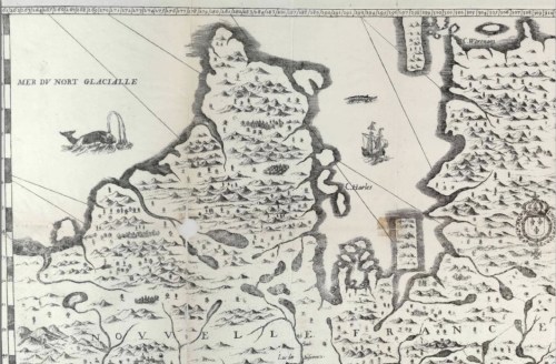
The notion of such a passage was already retained in Dutch global maps by de Jode, pictured below, but the inland route he hoped to obtain promised a more advantageous and direct route–much as Mercator, relying on Cartier, had drawn the Saguenay and St. Lawrence as extending to a freshwater body–“hic mare est dulcium aquarium, cujus terminum ignorari Canadenses ex relatu Saguenaiensium aiunt“–whose end was unknown to the natives on the Saguenay; Ortelius had showed the great lakes as extending to the Arctic Sea.
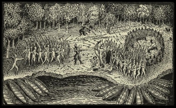
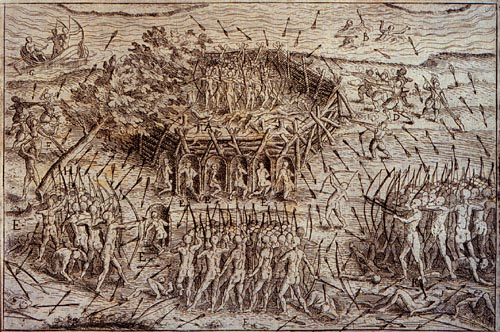
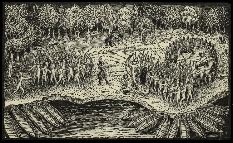
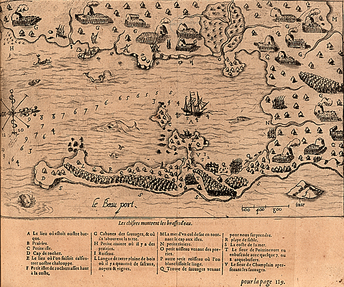
As Champlain came to trade with Huron, Algonquin, and Montagnais, he responded to their appeals to fight against the Iriquois in ways that expanded the charge he had gained to broker piece in 1612 Charter to become enmeshed in local conflicts, using gun-fire at the same time as he confronted the warrior skills of provoked Iroquois. The images that he drafted reveal an even greater level of violence to other images of the New World, dramatically documenting his immersion within local conflicts, as this description of resisting the attacks of Iriquois in 1608 printed in 1613; the image of Champlain holding his firearms against the Iroquois cast natives in a positive as allies, and placed Champlain in a heroic pose in a rare surviving image.
The native bows and canoes echoed images of Staden’s encounter in his popular travelogue, yet the far more sophisticated attention to their dress and customs reveal Champlain’s attention to their culture and society to a far greater extent, evident in the attention to the Algonquin in his writings of 1615-17, pictured below Staden’s earlier woodcut images:
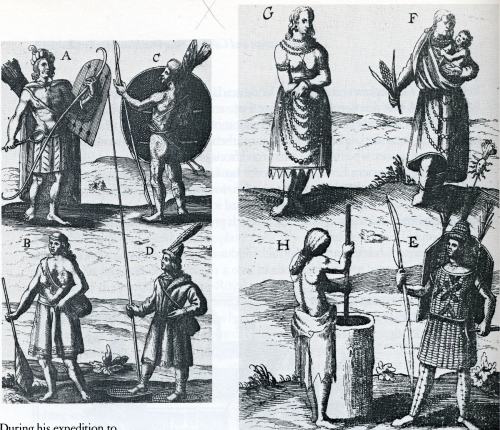
The detailed attention to the particulars of their costume and dress, formal postures, and family structures provided a detailed map of their society as befit allies he cultivated for the French monarchy, and whom he would increasingly depend upon as he continued to seek new routes to expand French settlement inland along the region’s rivers–as well as to seek a pathway to arriving at the Pacific through the frozen waters of the north. (Levi Strauss must have seen Champlain, indeed, as a sort of model for ethnographic observation, even if he attributed an elder Frenchman’s distaste for the Nambikwara to echoing Champlain’s remove from the customs of “les sauvages.”)
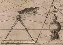
The map Champlain compiled by 1613 mapped his travels adopted the criteria of proof long applied to terrestrial maps , accurate meridians, and the emblems of his craft as cartographer–a surveyor’s compass and scale bar–which overshadowed the rhumb lines of charts, and reflected his new interest in a northern bay. The northwest passage that became the prime object of his 1615 westward journey in the map he made of his voyages in 1616, which, though not included in his 1619 Voyages, provided a convincing record of an open path to the north or northwest passage for which he had so assiduously searched, seems to have been encouraged by the natives from whom he sought increased assistance, and who provided him with the materials for an expanded trade that funded his successive New World voyages.

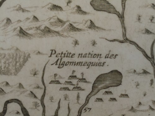
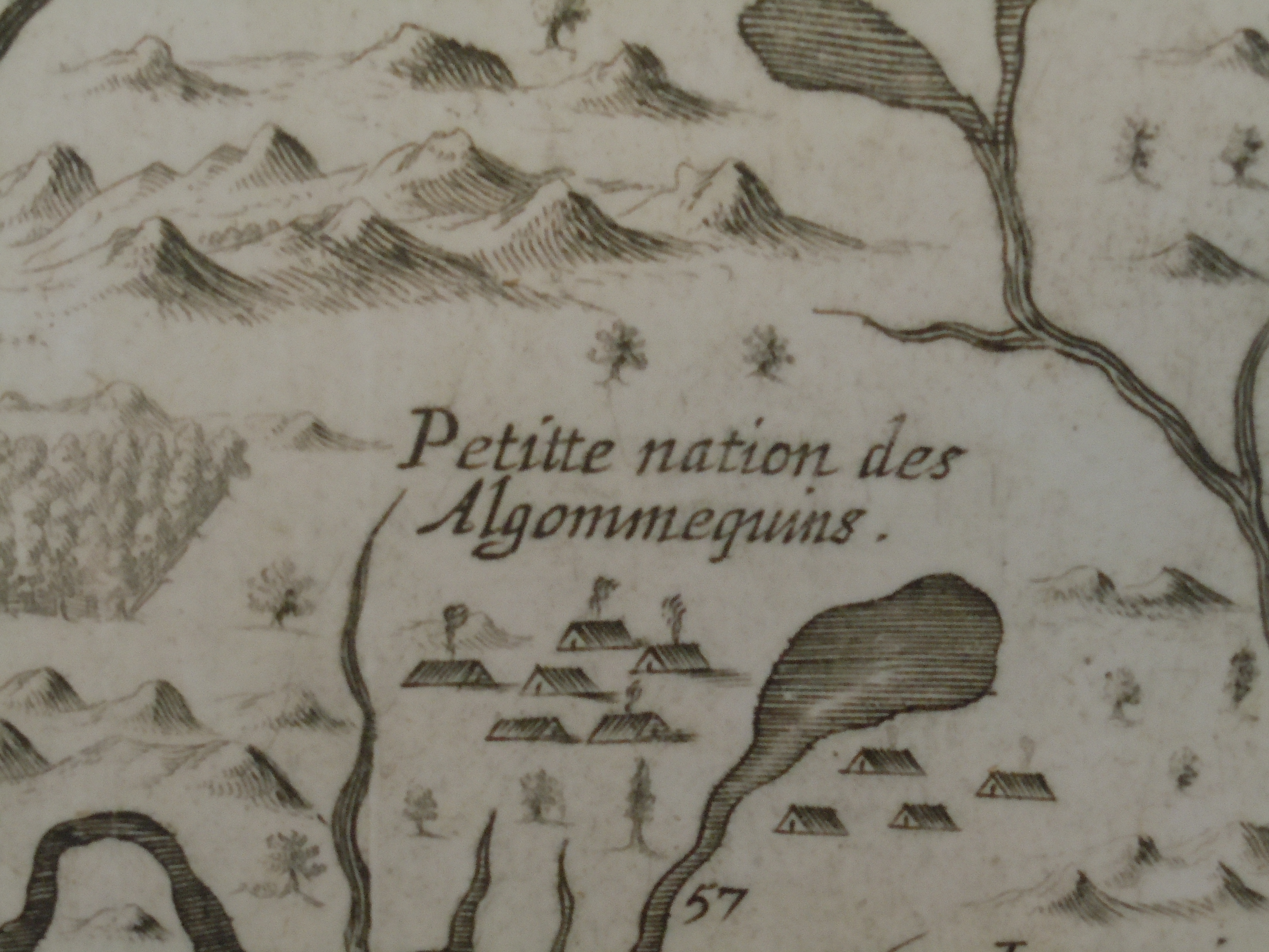
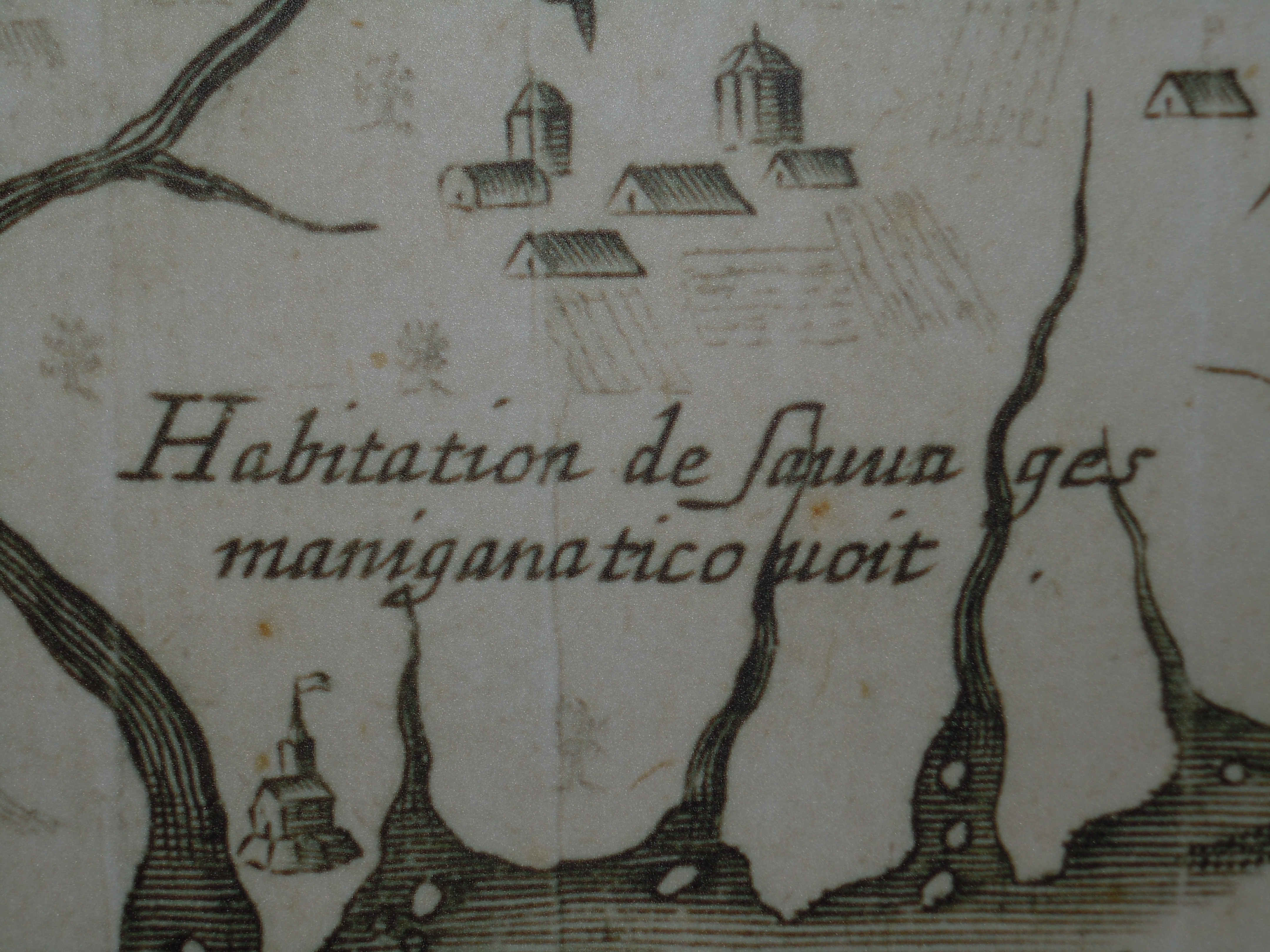
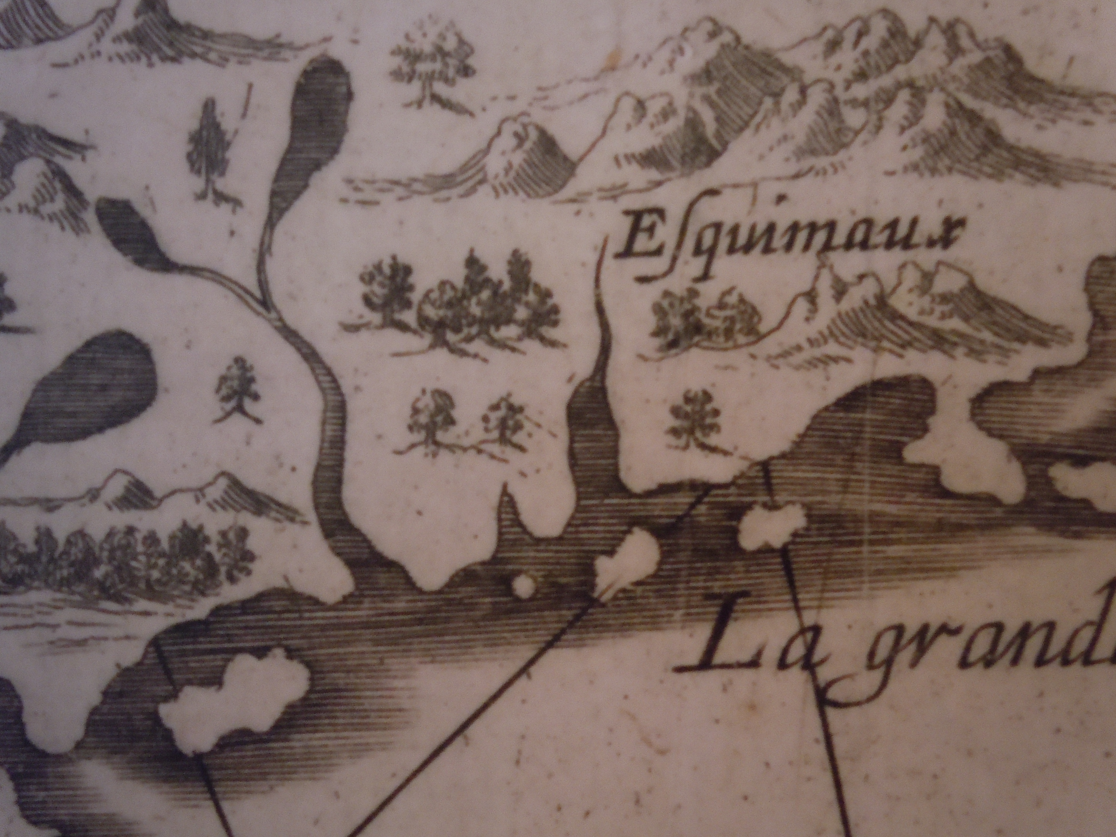
These maps of the Hudson Bay, region of Ontario, and great rivers across New France stand in contrast to the form of isolari, even as they borrow from them in showing the islands that cluster around the coast of New France. As he travelled inland on the St. Lawrence to the site of Quebec, the town of Champlain boasted in his journal with the zeal of the European that “all this lovely area was uninhabited,” as its residents had fled before the arrival of the French, and conveniently “abandoned it for fear of Iroquois raiders.” So it is not, perhaps, surprising, that the savages assumed a primary role in the marketing of this book, as did images of the same native peoples appear banished from the surface of Champlain’s maps of 1602 or 1613: the maps lacked inhabitants, and provided a sort of advertisement for future sites of trading posts with Francophone Catholic names, in contrast to the 1638 map’s display of Native settlements and “nations” or “petites nations,” and detailed images of the Algonquin and their customs, dress, and families.
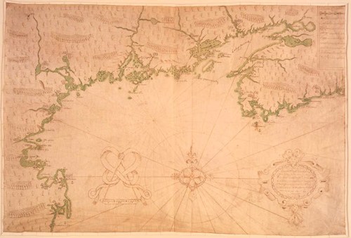
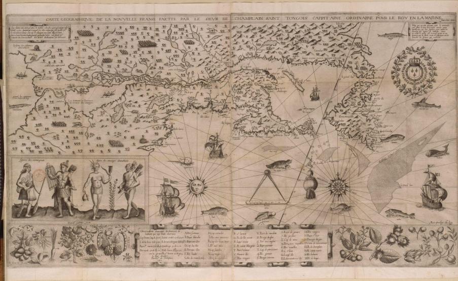
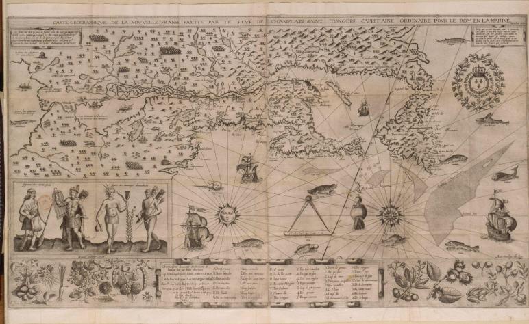
So much was probably what viewers had come to expect from a map of the New World–as well as because of the fact that the importance of securing the fur trade from the early 17th century led the French to enter into a longtime war between Native Peoples in the hopes to protect trading routes. The more expansive and elegant “Carte Geographique de la Nouvelle France par le Sieur de Champlain, . . . Cappitaine Ordinaire Pour le Roy en la Marine” of 1612 would also banish most all of the native inhabitants from the territory it depicted, as if to erase the very wars that he had begun, moving them to the status of curiosities in separate parts of a cartouche. By that time, a royal charter gave him licence to negotiate alliances in the name of the monarch, and he more openly charted the open lands that his privilege from the King had charged him to explore. The map commanded assent from readers in new ways that extended Champlain’s own bid for authority of organizing routes of trade in the New World. After returning to the Bay of Fundy, founding the French city of Port-Royal on the coast of Nova Scotia in 1605, as a new site for the St.-Croix island settlement in 1604, as a seat for the French in the New World. After three years of intense chart-making along the Atlantic coast in Acadia for seats for colonies from Cape Cod to Maine–he visited Cape Cod twice in reconnaissance voyages to the “beau port” of what is now Gloucester during the summers 1605 and 1606 to search for further sites for possible trade and explored possible areas of settlement in the Bay of Fundy.
After mapping options and noting their advantages, he turned from charting sites for possible trading posts on the coasts, all of which met with limitations, to mapping courses of trade along riverine paths by which he could gain advantage over Dutch or English traders through the alliances he developed with the region’s inhabitants. Champlain proceeded up the river after growing disillusioned after having no further suitable sites for colonies on the Atlantic in previous voyages and eager to map out a route for further trade. His later famous voyage of 1608 led him to sail inland up the St. Lawrence where in June sought to found a French base beyond the treading post of Tadoussac at the Saguenay River’s mouth, and followed Cartier’s route north seeking dominance in the fur trade with his new Montaignais and Etchemin allies, and later with the Huron and Odawa peoples.
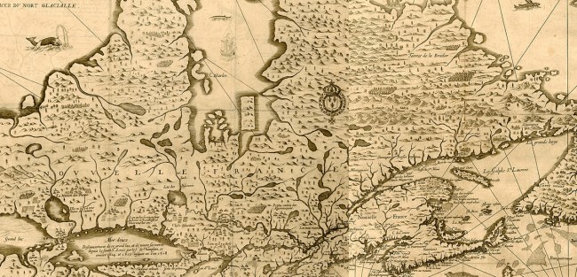
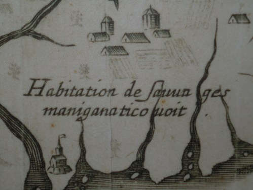
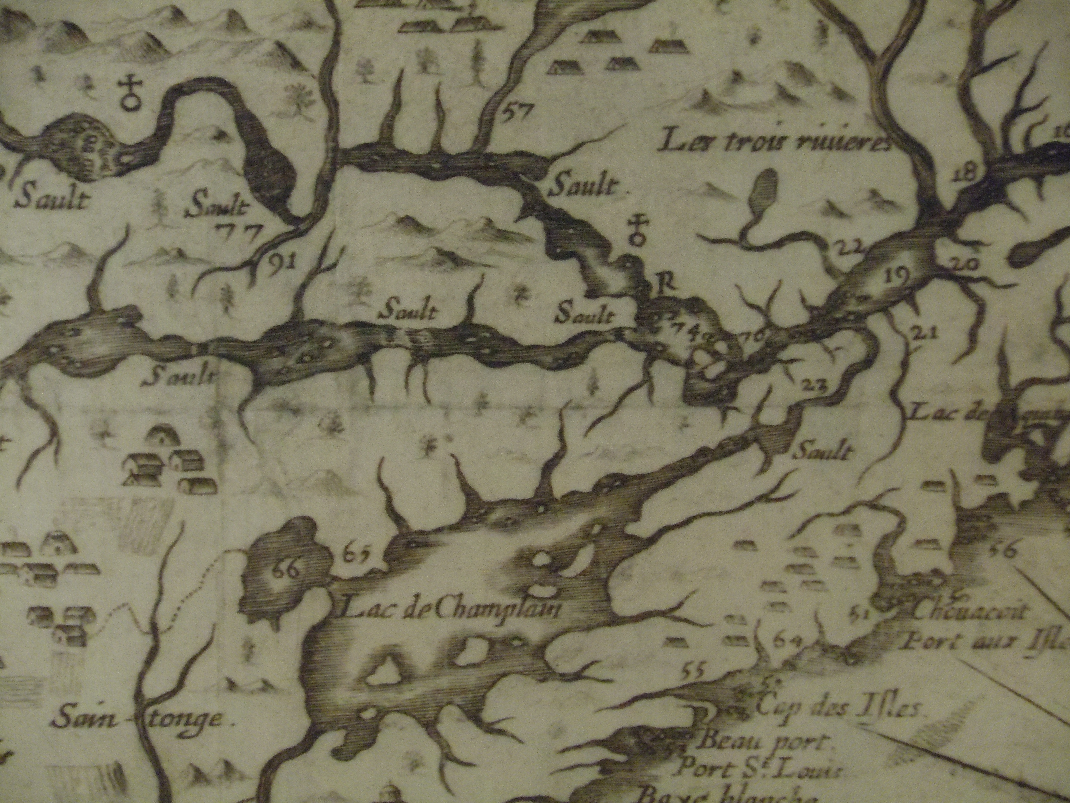
As the later itineraries of his over 20 voyages turned from nautical to riverine paths, Champlain seems to have interacted even more with native guides to explore his potential course. Did this create a lack of trust between him and his interlocutors, as he sought to develop an authoritative record of potential trading routes? There must have been some ambivalence with which he engaged native peoples as he moved up the St. Lawrence river, entering the territory with a group of men he came to call “sauvages” in his Journals, even as he allied with them. The term “sauvages” had far less to do with Champlain’s personal perceptions than the currency that the image of the savage had gained in early modern France, and as talismanic of the New World. Champlain was dependent on native indications and advice as he sailed upstream in Cartier’s footsteps: his immersion in native culture on the river, rather than on his ocean-bound craft, surely marked a shift in his attitudes perhaps visible in maps he drafted after his manuscripts: by the 1638 map, he not only noted native habitations with interest, but described the precise locations of the “nation of the Algomequins [Algonquins]” or the “nations of Montaignais,” French names for local nomadic tribes; Champlain acknowledged their own possession of territory, reflecting both the durable treaties he had made with them and assigning their fixed sites of habitation in an unprecedented manner by recognizing their spatial location on his 1638 map.
Mapping the settlement of Canada by the natives they called Montaignais, Etechemins, and Iroquois became central to the project of mapping the rivers and coasts of New France, and particularly as important an artery of trade as the river known as the St. Lawrence, much as it was central to the understanding of the New World in later periods.
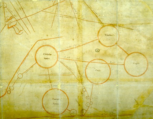
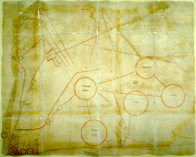
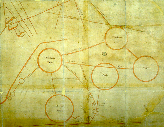
Although it is difficult to know what sort of help natives provided in mapping the interior of modern Ontario, it is instructive to examine a later map that an unidentified Chickasaw mapmaker presented to the Governor of Carolina that described the situation of native nations near the banks of the Mississippi River, in this copy of a map “Drawn upon a Deer Skin by an Indian Cacique and Presented to Francis Nicholson Esqr. Governour of Carolina,” covering some 700,000 square miles from Texas to New York around 1723. The unidentified Chickasaw mapmaker distinguished each native nation that inhabited the region in relation to local rivers–and notes the tribes allied with the French who surrounded the Chickasaw:
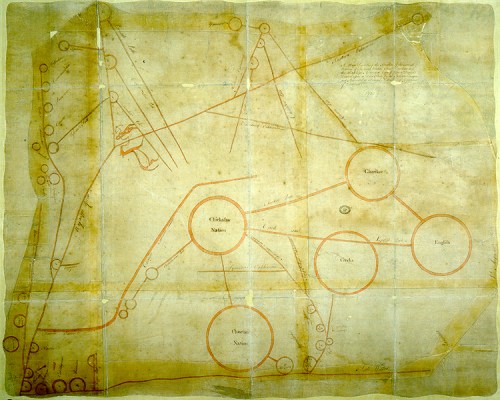
Did Champlain encounter similar oral descriptions of different nations, or did he translate these terms into French? This Chickasaw map of about a century later demarcated the positions of native residences primarily in relation to the river, noting natives allied with the French by a simple “F”:
The Algonquin relations about the upper St. Lawrence on which Champlain depended were later mapped, but must have included considerable information about neighboring tribes. After Champlain had left his ships and traveled inland, he had deepened his relations with the native guides who took him on the “Iriquois trail” up the river. He was drawn further inland out of the need to reach further inland trading posts to secure advantages in the fur trade, as much as exploration; but perhaps his attitudes shifted as he traveled beyond the trading post of Tadoussec in his 1608 voyage from France, and adopted native place-names, perhaps reflecting some dependence on local guides. In fact, he seems to have come to adopt Native names for the first time in his cartographical career, arriving at a narrowing of the river [“Kebec” = “where the river narrows”] where he chose to found a city of trade whose cliffs could be adequately defended, and choosing it to translate into French.
He described the site of the future city as abandoned, perhaps by natives who fled the Iroquois: in fact, the place was deserted after Small Pox devastations. Quebec was the third city he founded in the New World: “I could not find any more suitable or better situated than the point of Quebec [at July 3 1608], so called by the natives, which was covered with nut-trees.”
The arrival of the French paradoxically had earlier both cleared the map of the Native inhabitants he had come to call “Sauvages,” much as he had renamed the cities in New France with Christian place-names in his very first chart-like maps:
As Champlain grew enmeshed with the rivalries of native informants who defined the project of mapping and the larger still project, never completed, of actualizing deep belief in the ability to reach Pacific Ocean and an imagined route to Cathay–and the maps seem to reveal this search for a North-West passage–probably on the basis of what informants told him about a river that opened to an ocean, either the Mississippi or Hudson, or perhaps a sort of white lie.

Champlain was similar intermediary, converting local knowledge of riverine paths and lakes to his own land-charts, and trying to exploit local knowledge to discover a North-West passage that had eluded the English or Dutch, but which Iroquois or Huron led him to believe: this was in a sense the real war that he had engaged in, struggling for more exact knowledge of the land.
The famous woodcut images by which he narrated his own involvement in what was the beginning of the Iroquois War in 1608–the first sustained military engagement with native inhabitants in which France remained so long involved. The images reveal the extent to which, as a royal hydrographer, Champlain knew well natives’ experience in canoes as tools of river-navigation–the careful detail was no doubt in part a reference to his own mapping skills, presumably to recall his dependence on native guides, moving between the native world and providing new information for future trade routes to the naval officials at the French court who might encourage future voyages.
There must have been a degree of ambivalence in the elevation of the “savage” or “sauvage” for Champlain. Historians have suggested that he used the term to refer to his guides and the natives who accompanied him on the “Iroquois trail,” as they ate raw meat, and as he introduced his young twelve year old French bride to the men with whom he did regular business. His riverine navigations were the basis of the travels that occasioned the narrative, of contact with fur traders and exploration of what would be the Great Lakes, on which he was assisted by numerous guides, but whose inhabitation of local areas he had earlier regularly omitted. Natives sketched the routes of rivers and travel in the sand and on birch bark: Champlain learned the lay-out of local hydrography from them, and probably not only achieved his migration up the St. Lawrence but gained increased convictions of a route to Cathay that lured him up the river further, as informants described the sort of river that opened to the Ocean that he must have sought to question them in order to find. When he followed the river past modern Ottawa in canoes, by portages between rivers and lakes, traveling past Allumettes Island to Lake Nipissing, Lake Ontario and Lake Huron after 1615, in search of the great salt-water sea Hudson Bay, he appears to incorporated sketches from local mapmakers in his maps, as the somewhat odd rectangular islands from his 1632 “Carte de la Nouvelle France, augmenteé . . . par le Sr. de Champlain, captaine de le Roy [Map of New France, expanded since the previous one, by Sieur de Champlain, Captain for the King]”–a map which, despite its greater accuracy, depended on native sketches for lands west of Montreal, or to the north in the Hudson Bay.
Is there a chance that Native Peoples convinced him of the path for a what became later known as the “North-West Passage,” eager to appease him in his search to discover a path that would bring further economic wealth to France as an empire?
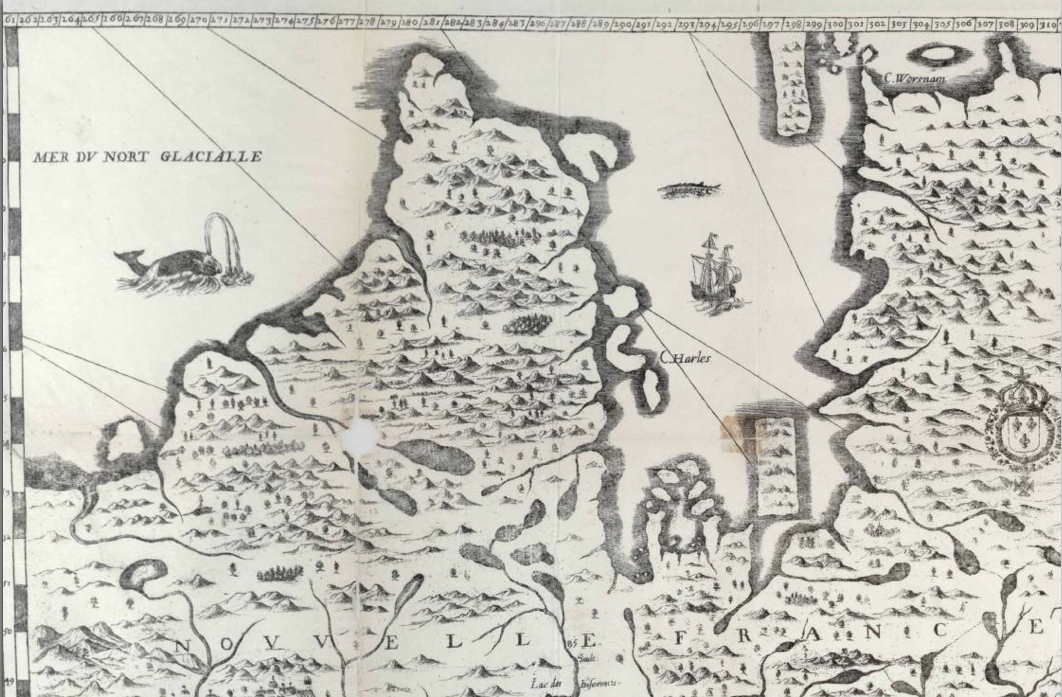
The New France that he surveyed on these travels was striking not only for its extension to the interior, but filled a similar taste for depicting the inhabitants at first-hand that he had removed from the land itself that he surveyed. The map seems also hopeful of a Western opening to water, and suggests a rich alluvial plain in the Americas. The image of an unending plain of voyage continued until the early eighteenth century, when cartographers noted that “The country is laid out in such a way that by means of the St. Lawrence one can travel everywhere inland, thanks to the lake which leads to its source in the West and the rivers that flow into it along its shores, opening the way to the North and the South,” Jean Talon wrote in 1670 to the French monarch, echoing the North-West passage Champlain sought to indicate in leaving open the “Mer du Nort Glacialle” to which boats cold easily arrive.
Champlain’s maps of both 1612, 1618 and 1635 suggest a combine the rhumb lines of nautical cartography and surveyor’s tools, and present geographic maps as of considerably increased precision, the final of which portrayed New France “on the true Meridian” that combined the accuracy of topical mapping of New France’s topography while describing the advantages of nautical access that New France offered, in ways that continue to echo the cartographical imaginary of an isolario or book of islands, to which he almost rendered the Great Lakes as an extension.

A sign of his whole-heartedly identification of himself with the construction of his 1632 map may lie in the common interpretation of the centrally-located image of the sun’s face as a concealed portrait Champlain, a center from which rays spread across the map’s surface as if to illuminate the complex coastline and the detailed network of rivers and lakes in its interior.

The image of New France that was transmitted in the work of Nicolas Sanson from Champlain’s work effectively erased any analogous ethnographic components, although Sanson retained the toponomy of native towns in New France that still often survives.
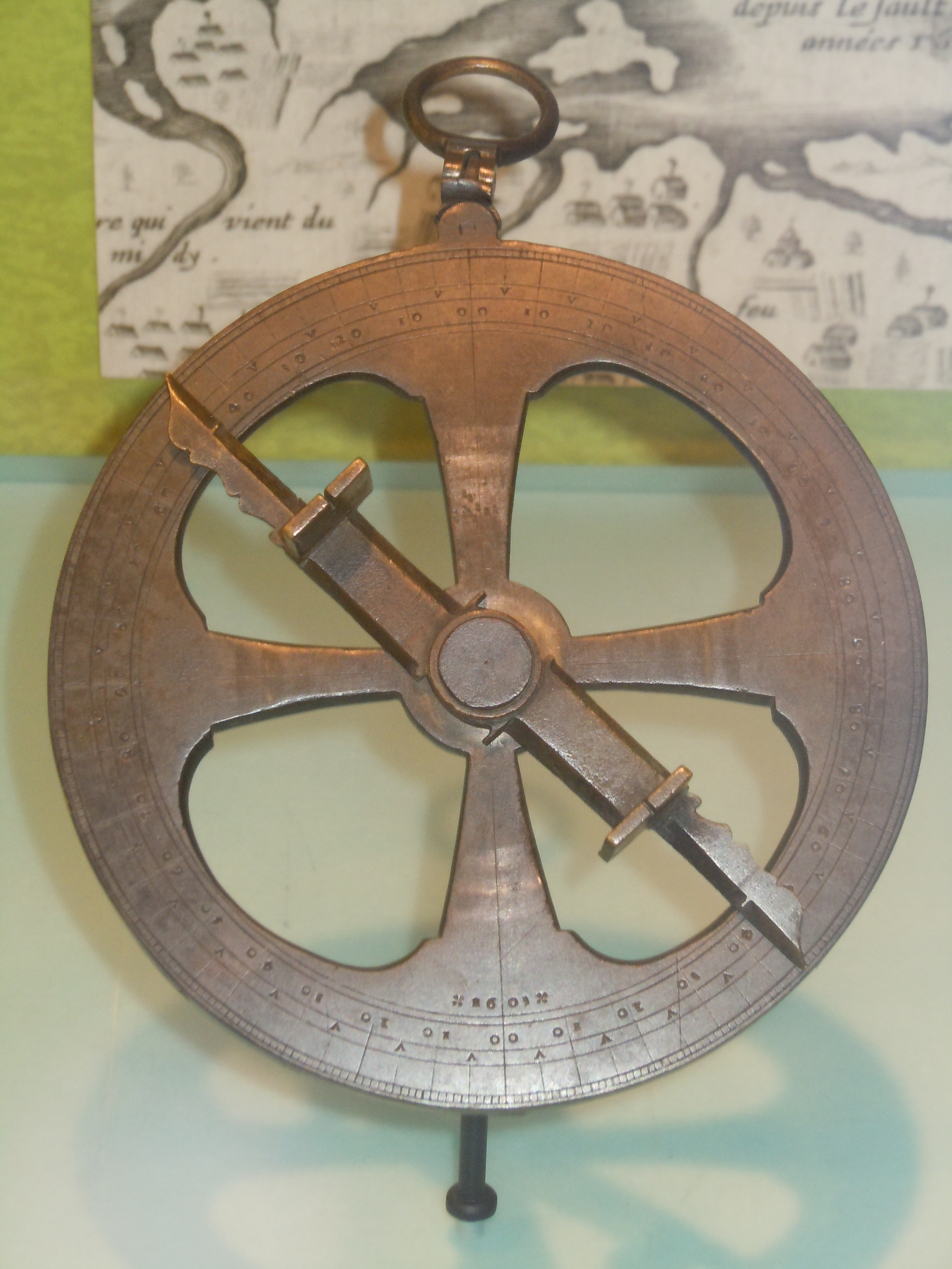
Yet Champlain’s terrestrial mapping of the region’s future settlement is his legend. The surveying instrument or mariner’s astrolabe of French manufacture found near the Ottawa River in Muskrat Lake, and dating from the early seventeenth century that is enshrined at the Museum of Civilization under glass as a treasure, believed to have been used by Champlain to perform sightings for his survey of the region–and a talisman of his ability to transform multiple sightings to a surface of uniform continuity–is preserved in Ottawa’s Museum of Civilization under glass as a material relic of mapping of New France; although its provenance is impossible to substantiate, its seventeenth-century instrument of surveying is presented as the medium of Champlain’s is relation to the project of mapping New France.

No image of Samuel de Champlain exists, but the image of the explorer popularized in prints as the below, that imagine native witnesses to his expertise as in awe of the terrestrial surveying he performed to chart his entry, as if to erase his own role in helping Champlain map the region. His awe is perhaps a reflection of Champlain’s ability to expand his nautical chart by meridians–and to assemble his inland map without clear base-lines.
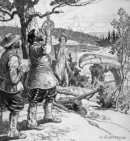
The engraving of course erased or whitewashed dependence on Native informants and their knowledge of the river. By evoking unknowing amazement at Champlain’s instrument, the notion is to mythologize his acquisition of the country through a map–a classic if all too familiar 19th-century narrative of modern competence and expertise.
The narrative was launched in part by his inscription of the lake bearing his name in the map.
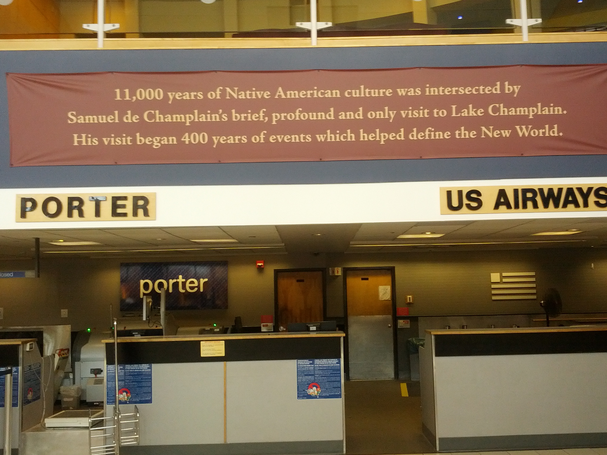
If there are traces that Champlain left of his encounters all over the surface of the map of 1612, traces of the encounter are prominently celebrated in Burlington, Vermont, site of Lake Champlain and Champlain College, where recent interest on the relation of the namesake of the Lake–and celebration of his relatively enlightened contact with native peoples–are commemorated in multiple banners (and maps) that decorate the local airport.

As befits the proposal of expanded commercial traffic in the territory of New France, in his map of the region Champlain embedded multiple sightings native animals traded there on its surface–otters and beavers, whose pelts were particularly valued, and whales or native fruits–encouraging readers to peer into the content of the map’s surface they scanned for further natural curiosities.
But unlike the fairly fantastic sea-creatures depicted with abundance in sea charts, the marine seals, beavers, otters, horseshoe-crabs and other local curiosities in his 1632 map transform what was known as a “frozen wilderness” of little interest to the French court into a surface of abundance and copious meaning, and land of commercial plenty.


But it was the inhabitants of the land that Champlain knew–his informants–that were in part his cartographic assistants as well, and are depicted in greatest detail, but wearing costumes to separate and distinguish them from the French readers of Champlain’s maps, but offered an object of wonder at which to gaze at the inhabitation of New France that the map revealed: but from objects of wonder who participated in the crafting of the map, however, the native inhabitant were effect transformed to subjects of conversion.
In preparing this post, I was inspired by an exhibit at the Canadian Museum of Civilization/Musée des civilizations in Ottawa CA, Moving with the River. Any and all errors in my discussion of Champlain’s maps are of course my own; the maps of Champlain’s travels depicted in this post appear on the Museum’s website. I’ve also adopted passages of the recent editions of Des Sauvages in Samuel de Champlain before 1604, ed. Conrad E. Heidenreich and K. Janet Ritch (2010).


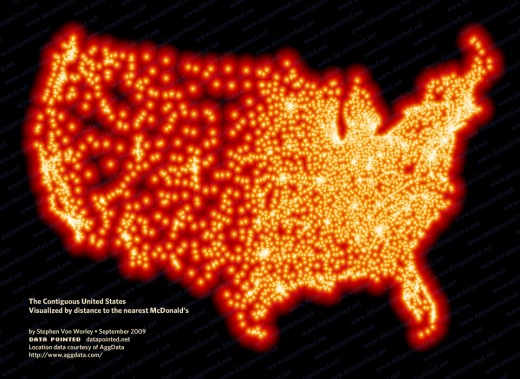
 There is clearly a culture of overeating waiting to be mapped. But one cannot say the map has a clear cultural origin–so much is it rooted in food purveyors, and a food network of factory farms, as much as economy. Obesity was recently mapped in 2010 by the World Health Organization for both men and women, in ways surely reflect the local economy, but also show a resistance to obesity, if we can call it that, in areas as Irish or Frenchmen, although lack of food in Afghanistan contributed to limit average male BMI in that war-zone.


 The infographic maps unsurprisingly onto the CDC’s mapping of 2010 obesity trends provides a striking picture of the spatial concentration of the obese.


