Tag Archives: globalism

The Cognitive Clouding of Global Warming: Paris and Pittsburgh; Creditors and Debtors

The argument of America First seems to have been extended to its logical conclusion as the apparently selected President of the United States has single-handedly subtracted the nation from a map of climate change.  By denying the place of the United States in the Paris Climate Accords, President Trump seems, in the most charitable interpretation, to have acted on his own instincts for what was the benefit that accrued to the country in the very short term, and after looking at the balance books of the United States government for what might have been the first time, decided that America had no real part in the map of the future of a warming world.  Rather than outright denying global warming or climate change, Trump decided that the conventions established to contain it by the world’s nations had no immediate advantage for the United States.  

The result wasn’t really to subtract the United States from the ecumene, but from the phenomenon or at least the collective reaction of the world to climate change, and openly declare the supremacy of his own personal opinion–as if by executive fiat–on the matter. The personal position which he advanced was so personal, perhaps, to be presented in terms of his own clouded thinking on the matter, or at least by seizing it to create what he saw as a wedge between national consistencies, and to use wildly incommensurate forms of data to create the impression of his own expertise on the issue–and to mislead the nation.  For Donald Trump took advantage of his having Presidential podium to diss the Paris Accords by a torrent of alliteration developed by a clever speechwriter as resting on a “cornucopia of dystopian, dishonest and discredited data.”  Even if one wants to admire the mesmerizingly deceptive excess of alliteration, the notion of rooting an initial response to planetary climate change in the perspective of one nation–the United States of America–which produced the lion’s share of greenhouse gasses–is only designed to distort.  

By pretending to unmask the Paris Accords as in fact a bum economic deal for the United States, as if it were solely designed to “handicap” one national economy, set a sad standard for the values of public office.  For as Trump dismissed data on climate change as discredited with mock-rage, and vowed that the entire affair had been designed by foreign groups who had already “collectively cost America trillions of dollars through tough trade practices” and were desiring to continue to inflict similar damage.

But the large future on trade imbalances–which he treated as the bottom line–he staged a spectacle of being aggrieved that seemed to take on the problems of the nation, with little sense of what was at stake.  Trump’s televised live speech was preeminently designed only to distract from the data on which the Accords had been based.  And even as Trump sought to pound his chest by describing the Accord as a “bad deal for Americans,” that in truth “to the exclusive benefit of other countries.”  By turning attention to an America First perspective on global warming, Trump sought to replace the international scope of the challenge–and intent of the much-negotiated Climate Accords–by suggesting that it obscured American interests, even if it only took America’s good will for granted.  As if explaining to his televised audience that the agreement only “disadvantages the United States in relation to other countries,” with the result of “leaving American workers–who [sic] I love–. . . to absorb the cost in terms of lost jobs [and] lower wages,” he concealed the actual economics of withdrawing from the Accords were buried beneath boasts to have secured “350 billion of military and economic development for the US” and to help American businesses, workers, taxpayers, and citizens.  

In continuing to dismiss the data out of hand about the expanded production of greenhouse gasses, Trump seems to seek to overturn the deceptions of data visualizations that have alerted the United States and world about the consequences of unrestrained or unbridled climate change. Trump ridiculed the true target of the nearly universally approved Accords, scoffing at the abilities to reduce global temperatures; instead, he concentrated on broad figures of lost jobs in manufacturing and industries that are in fact small sectors of the national economy, and incommensurable with the dangers of ignoring global warming and climate change, or the exigencies of taking steps to counter its recent growth.

global warming
Increased Likelihood of Temperature Surpassing Previous Records by 2050 and 2080

oceanic-warming
Sea Surface Temperatures against a Historical Baseline of a Century Ago/Climate Central

As if years of accumulated data of earth observation could be dismissed as deceptive out of hand by executive authority, independent of an accurate judgement of its measurement, Trump dismissed expert opinion with the air of a true populist whose heart lay in the defense of the American people and their well-being–as if they could be abstracted and prioritized above the world’s  Trump’s largely rambling if gravely delivered comments in the Rose Garden press conference that painted himself as daily fighting for the country cemented the alliance of populism and a war on science by its odd substitution of bad economic data for good scientific data.  

The switch is one in which his administration has specialized.  His address certainly culminated an outright dismissal of scientific conclusions based on a distorted America First picture of the world, where a stolid declaration that “the United States will withdraw from the Paris Climate Accords” made sense as form of national defense–despite the potential global catastrophe that rising global temperatures and sea surface temperatures threaten. Is the technique of juxtaposing statistics and muddying data an attempt to undermine evidence, or an illustration of his insecurity with giving authority to data, or to scientific authority, the mirrors his concern about concealing “his profound illiteracy,” or his insecurity about illiteracy, that linguist Geoffrey Nunberg argues not only distance his own speech from words, and discredits their currency, but an insecurity of having to rely on language and linguistic skills alone, in ways that might be well seen as analogues to his plentiful use of all caps on social media, as stepping outside of the language of public life to a medium more direct and complicit with his audience, if outside the usage standards of a written language.

The catastrophes were minimized by being argued to be based on “discredited data” in a bizarre flourish designed to dismiss scientific concensus  Trump conspicuously faulted not only the “discredited” but distracting nature of data  in the speech he gave in the Rose Garden on June 1, 2017 that supposedly justified his announcement of withdrawing from the Paris Climate Accords in 2015 to limit heat-trapping emissions of carbon fuels that have been tied to observed climate change.  Rather than foreground the international nature of the accords among agreed upon by almost 200 nations, trump advanced the need to heed local interests, perversely, but even more perversely argued that the Accords resulted from disinformation.  He spoke to the world to chastise their recognition of scientific observations, in so doing destabilizing not only global alliances but undermining a long-negotiated climate policy by pulling the rug out from long accepted consensus not only of climate scientists but a role of national leadership that sought to remedy the failure of the Kyoto Protocol of 1997.  Trump turned his back on the Climate Accords on how to curb greenhouse gas emissions  by proclaiming their unfairness to American interests, and attacking unwanted constraints on American industry, through his own deployment of data that was even more discredited as an excuse to walk away from the prospect of a greener world.

Exiting the Green.png  Al Drago/New York Times

1. If Trump steered the nation away from green energy and into darkness, Vladimir Putin seemed to mock Trump’s rationale for the withdrawal when he mused, jokingly but ever so darkly, that “maybe the current [U.S.] president thinks they are not fully thought-through,” making open fun of Donald Trump’s image of global leadership by wryly noting in ways that echoed the absurdity of Trump’s defense of the local in place of the global.  “We don’t feel here that the temperature is going hotter here, . . . I hear they are saying it snowed in Moscow today and its raining here, very cold,” Putin noted, as if relishing undermining long-established trends in climate data by invoking a populist championing of local knowledge as if it trumped the advantages of earth observation that satellite observation has long provided.   Populism trumped expertise and Putin laughed at the possibility that the Accords might soon fail as a result.

Given the longstanding desire of Moscow to be released from constraints on exploring the billions of tons of Arctic oil on which Russia has chosen to gamble, Trump’s almost purposive blindness to a changing environmental politics of the global economy astounds for its parochialism, and its championing of place to dismiss undeniable effects of climate change that seems closely tied to carbon emissions.  For with a false populism that championed the limited perspective of one place in the world–or one’s own personal experience–Trump dismissed the maps and projections of climate change, on the basis that the “deal” was simply “BAD.”  And as a man who views everything as yet another deal, while he pronounced readiness to “renegotiate” an accord he sought to cast as a failure of President Obama to represent America’s interests, the rebuke fell flatly as the accord was never designed to be renegotiable.

Putin’s remarks were met by scattered laughter of recognition, and some smirks at the decision of the American president to withdraw form a long-negotiated set of accords to the collective dismay of our military and environmental allies, and its implicit endorsement of deniers of climate change.  The potential “axis of mass destruction” France’s climate minister has cautioned against might indeed be one of mass distraction.  For in dismissing and indeed disdaining the historical accords to limit carbon emissions, Trump sought a soundbite sufficient to stoke suspicions the climate treaty.  He sought to cast it as yet another deeply rigged system of which he had taken to compulsively warning Americans.  Such a metaphor of bounty was jarring to reconcile with onerous economic burdens cited as the prime motivations for deciding to reject the Paris Accords on Climate Change.  The jarring cognitive coinage seemed to connote its negative by a disorienting litotes; but perhaps the most striking element of the entire news conference was that Trump offered no data that backed up his own pronouncements and appearance of steadfast or only obstinate personal resolve.

Before the coherence of the embodiment of climate change in maps, Trumps jarringly juxtaposed radically different sorts of statistic to snow the nation–and the world–by disorienting his audience, on which Trump turned to a litany of complaints and perceived offenses striking for providing no data of any sort, save several bits of false data.  As much as Trump betrayed uneven command over the data on climate change, as if embedding discrete numbers in unclear fashion that supported a self-evident argument, as if they addressed one of the most carefully documented changes in the atmosphere of the world.  By juxtaposing a threat that “could cost Americans as much as 2.7 million lost jobs by 2025“–a number described as extreme but decontextualized to exaggerate its effect, framed by the dismissive statement  “Believe me, this is not what we need!“– with a projected small temperature decrease of two tenths of a degree Celsius–“Think of that!  This much”–as if to indicate the minuscule return that the “deal” offered to the United States that would have made it worthy accepting its costs–

sub-buzz-27555-1496436714-1

The gesture seemed designed to juxtapose the honesty of direct communication with the deceit of the experts.   Trump’s notion of direct communication concealed the surreal enjambment of disproportionate numbers more striking by the difference of their scale than their meaning.  Of a piece with his citation of partial statistics that exaggerate his points, from “95 Million not in the U.S. labor force” as if to imply they are all unsuccessfully looking for work, targeting some 8 million immigrants as “illegal aliens”ready for deportation, or how immigrants coast American taxpayers “billions of dollars a year.”   Such large figures deploy discredited data difficult to process to conjure fears by overwhelming audience, distracting from specific problems with large numbers that communicate an illusion of expertise, or even overwhelm their judgment by talking points disseminated in deeply questionable media sources.

If the power of this juxtaposition of unrelated numbers gained their effectiveness because of a lack of numeracy–Trump’s claim of 100 million social media followers lumps his followers on Twitter, Facebook and Instagram, many of whom may be the same people, and other fake persona —the numbers seem to exist for their rhetorical effect alone, as if to awe by their size and dismiss by the miniscule benefits they might provide. The point of contrasting such large and small statistics was to suggest the poor priorities of the previous administration, and dilute form the consensus reached on the modeling of climate change.  To be sure, the Trump administration also barters in fake facts on Fox News Sunday. inflating the number of jobs in coal industries, that show a misleading sense of the government’s relation to the national economy, generating a range of falsehoods that disable fact-checking, obscuring the fact that the global marketplace increasingly gives preference to cleaner energy and clean energy jobs more quickly others sectors of our national economy beyond energy industries.  The ties of Trump’s administration to fossil fuels–from the Secretary of State to the Secretary of Energy to the Secretary of the Interior down–employ the obsfuscating tactics of fossil fuel industries to obscure benefits of low-carbon fuels.  Indeed, the inability to “renegotiate” a deal where each nation set its own levels of energy usage rendered Trump’s promise of the prospect of renegotiation meaningless and unclear, even if it was intended to create the appearance of him sounding reasonable and amiable enough on nightly television news.

Broad hands.png
Cheriss May/Spia via AP

Another point of the citation of false data was to evoke a sense of false populism, by asking how the Accords could ever add up.  In isolating foregrounded statistics great and small, tightly juxtaposed for rhetorical effect, the intent seems consciously to bombard the audience to disorienting effect.  We know Trump has disdain for expertise, and indeed the intersection between a sense of populism with disdain or rejection of science may be endemic:  in formulating responses to a global question like climate change that he has had no familiarity with save in terms of margins of profits and regulations.  Rather than consulting experts, the President has prepared for public statements by consulting sympathetic FOX media figures like Kimberly Guilfoyle who pander by endorsing the notion of a climate conspiracy–not experts, who use data as obscuring foils, suggesting an ecology of information originating from pro-fossil fuel industry groups.

Continue reading

Leave a comment

Filed under data visualization, data visualizations, Donald J. Trump, Global Warming, statistics

Fit to Print?

The iconography by which maps address their viewers might be framed in productive ways within historically situated economies of visual attention with interesting results.  For as much as they reflect practices of production, the ways that maps have engaged viewers who struggled with new ways to grasp expanse reveal a dialectic between graphic invention and a larger marketplace images, despite the tendency of those who style themselves historians of cartography to focus on their formal qualities or the mathematics of geographic production.  From their insertion at conspicuous places within some of the earliest printed world histories, mapmakers actively courted readers’ attention by crafting increasingly persuasive claims in aesthetically challenging ways, and by raising the stakes of their abilities to process expanse.  The promise to crafting a satisfying harmony of comprehensive global coverage has long existed in uneasy balance with their narratives.

The success by which cartography and art communicate globalism might benefit from tracing the ways in which globes have long tried to engage their viewers’ attention.  The woodcut of a world map below, designed circa 1490, defined a global purview for readers in ways intended to be cognitively satisfying, promising to orient them to unseen regions by scattered rivers and landmarks, even if they did so by using means that seem antiquated, being both of restricted scope and mediated by inherited ideologies of empire, Christocentric beliefs, and specifically Eurocentric models.  But the promise of expanding horizons led this bold two-page map to be prominently placed in a universal history to mark the recession of waters in a post-diluvian world, suspended in the hands of Noah’s three sons–Shem, Japheth, and Ham–serves as a blank slate to inscribe a global history that proceeds to span across generations to the Resurrection of Christ.

If the map of the world is crude by what we think of as modern standards, and possesses no clear spatial indices, the symbolic power of a planisphere of clearly Ptolemaic origins was modern:  the engraved schema provides ways of orienting viewers to the lavishly illustrated book’s s expansive content as a comprehensive condensation of collective histories about the world’s regions–making good on the recent authority of such projections along latitude and longitude to reveal an aggregate history charging the growth of worldly and ecclesiastical power over the emergent consciousness of a global expanse, centered roughly on Jerusalem, inscribing a succession of empires over terrestrial space.  Indeed, the discoveries of the New Worlds that were mentioned in the 1493 Nuremberg Chronicle (a compilation of universal history of somewhat scholastic origins known as the Liber chronicarum or “Book of Chronicles”) occupy small place in the service of describing the chronology of a succession of imperial ages that culminated in the ascension of the Holy Roman Emperor Maximilian I.  The early world map that seems to have derived from a Florentine archetype was used to describe the recession of waters after the Noahic flood in ways whose power existed to set the stage for the rise of Greek and European empires, rather than the discoveries.


world chronNuremberg Chronicle (1491); fol. 13 (Anton Koberger, Nuremberg)


If maps no longer convey such a stable sense of narrative progress, and such an engraving would no longer seem a marvel, most maps do considerable work in engaging an economy of visual attention.  The world is with fewer open spaces than it was for Noah’s three sons, and global history resists linear narratives, despite the resilience of similarly terrifying apocalyptic notes, at times fed by a rage for biblical prophecy that generated sufficient demand for tracking daily fluctuations of a Rapture Index available for online consultation.

Globalization demands adequate expression by a visual image that can engage its viewers, hopefully by more than the material underside of the interlinked–perhaps a map more fully revealing of the shifting nature of individuals’ relation to the inhabited world.  At a time when the earth is crisscrossed with media systems whose signals are relayed along 6,300 tonnes of satellites–and over 8,000 physical objects that orbit its surface and will outlast its inhabitants as a necklace of debris–we lack maps of how we inhabit the world or have remade our relation to it.

satelites-espacio-google world view

f52b92777d7ed50b6fe40c82165a2476

Such computer-generated visualizations offer the chance to visualize the satellites that track our changing global positions and information flows, relaying media world-wide over a multiplicity of interconnections:  the image reveals what lies outside our visual abilities or comprehension–and which we would be otherwise all too apt to forget otherwise– by using government data to allow us to visualize the multiple layers at which satellites orbit our planet, even if they make it hard to track the wide array of signals that they transmit, intercept or surveil.  But they were absent from the multiple covers that served to catch readers’ attention in the global-themed relaunch issue of the New York Times Magazine, a striking photograph of a suspended glowing globe, shot in a studio setting with an exposure that disorientingly overlaps the toponyms of Africa and South America, whose equatorial line seems to cut the globe in an unfamiliar place.

The maps offer an angle to contemplate the stunning long-exposure image of a rotating globe editors of the Magazine recently commissioned from photographer Matthew Pillsbury as a cover illustrating the rapidly changing world for a relaunch issue.  The lit globe seeks to communicate both “the idea of chaos in the world, and how this is something we have all learned to deal with,” the design director observed.  But the cover of the New York Times Magazine designed by Pillsbury demands attention both for how it holds the viewer’s interest and renders the globe as its ostensible subject.  The photograph is an artistic interpretation, and compelling illustration that reveals multiple relations between art and cartography, as much as it describes the relations between nature and culture or between news media and globalization.  But if the image was intended to convey the “speed at which our world is changing” to readers, and presumably represent the news covered in its pages, it gives pause–even as an image that reflects on current quandaries of abilities to sustain the successful illusion of a promise of comprehensive news coverage in an ever-changing world.


1.  The almost transient shadow toponymy in the globe as Pillsbury managed to photograph so that the names of Venezuela, Bolivia, and Brazil congregate in a ghostly region off the shore of Africa, and Europe is suitably displaced to its upper regions, suggests the shifting focus of the news, and even questions the familiarity of reading the globe though that most conventional didactic of mapping forms, a globe of the sort one might have encountered in a schoolroom when learning about world geography for the first time:  the apparent overlapping of continents and blurring of the northern hemisphere destabilize our surety of global geography in an intriguing way, set, disembodied, above the words “HELLO, WORLD,” ask we re-examine the map we thought we knew.

The five-color globe that appears in the header to this post is, in fact, while a welcome departure from the templates of Google Maps, similarly opaque in the very inscrutability of the very glittering image of earlier attempts to map the earth that it offers.  Pillsbury’s long-exposure photograph of a spinning lit globe deserves interest as an advertisement of how the newspaper of record mediates news from a perspective that narrates a version of world news increasingly interlinked and less stable through a strikingly retro medium of mapping as a glowing globe.  The photograph addresses how the shifting of what once seemed immovable territorial boundaries circa 1989 have not only been redrawn but shift with an unforeseen fluidity challenging to comprehend.  Yet more than inviting us to interrogate relations, or the mobility of global populations and goods, the image almost aesthetically distances the spinning globe from viewer as much as it reveals levels of entanglement of places to one another and intensified contesting of sovereignty.  The blurred five-color surface of the spinning globe seems to abstract mapping from human geography.  It not only suggests the opacity of its ostensible subject; indeed, it almost asks the observer to throw up their hands in something passing for marvel at the illegibility of a large area of familiar regions, and at the increasing entanglement of current events.  It almost revels in being intentionally opaque, however, as if to say that the old indices of orientation just won’t work or clearly be commensurate to the take on current events that it will describe.


2.  To be sure, in an age of the proliferation of maps on multiple platforms and hand-held devices, it’s refreshing to rehabilitate the schoolroom globe, and almost ask us about our current world’s distance from it.  Oddly, however, Pillsbury’s cover employs an almost antiquated didactic object, a school map, relinquishing interactive mapping tools, to suggest the quick-changing world.  By spinning a schoolroom globe at high velocity to craft a visual pun to illustrate global change, the cover raises as many questions as it answers.  What seems a conservative cartographical format-if here used somewhat tongue in cheek–as an icon of cartographical authority is almost prosaic.  The sheen of the surface takes advantage of the conventional five-color globe of the world to seem to suggest a surface whose very colors and hues are so blurred to render them and all surface toponymy illegible, as much as an image of totality of global relations.  As may befit the newspaper of record, the globe is steadfastly traditional in its familiar five-color design:  it suggests a space by no means fixed, where boundaries around countries are redrawn and surfaces blurred for all practical purposes, but only tweaks the most standard image of the global coverage to suggest a disorienting sense in which we might lose familiarity in its geographical contours, rather than promise truly comprehensive coverage.  

For the globe’s illegibly blurred surface almost erases the considerable varieties of mapping by which we’ve come increasingly to understand and orient ourselves to the world, and almost relinquishes hopes for a new ethics of a world view, but just suggest the inadequacy of imagining the ideas of terrestrial location, proximity and geopolitics as received from earlier school globes.

RP-30501-2

Is it that the idea of boundaries of knowledge are just not so clearly fixed after all, or that the problem of providing a single authoritative viewpoint is being explicitly acknowledged?  What does it seek to illuminate?

12-Raised-Relief-Ocean-Adventurer--pTRU1-2910038dt

More troubling, Pillsbury’s photograph of a glowing globe offers us no place to decipher almost a single word:  the effect is almost to see words swimming across its ghostly surface, unlike the transient figures that inhabit urban spaces in his stunning body of photographs of urban spaces.  The notion of a commission from the photographer to create an image of global coverage might be misplaced.  For Pillsbury has worked primarily in cities like New York, Paris, Venice, or London, using his knowledge of the local to much advantage, as well as Japan, more recently, where he’s taken advantage of a Guggenheim Fellowship to  turn his lens toward explorations of Tokyo’s public spaces.  His subjects have been less global than relentlessly cosmopolitan in scope.  Pillsbury’s recognizable style is more than a sign that the Times seeks to cultivate readers as the hip newspaper of record by the image in this post’s header, as much as suggest an actual global purview of different spaces.  The picture is almost a way of conveying just how difficult the job of the news is to convey all that’s fit to print, in a time when the world seems spinning faster than ever before.


3.  As an artist who has investigated the relations of crowds to urban space the spaces in New York that he knows well, often working to illuminate the “performance” of identity in interior or cavernous public spaces where individuals and crowds congregate, Pillsbury has cleverly employed extended exposure to blur the boundaries among individuals  in urban space and place.  The result is to question the relation of the individual to settings that might be otherwise familiar.  The extended exposure of the globe is less of a site for staging events or a setting, than a surface just out of contact with the viewer’s eye.  Despite the suitability of Pillsbury’s medium to observations of the interaction between individuals and images, or crowds visiting museums, such images are effective as encouraging ongoing visual investigations by expanding time in exposures from a few minutes to an hour that is collapsed into a single image.  They indicate the changing “geographic imagination” by which we all inhabit different spaces.  The spinning globe is photographed less to offer a record of lived space than an almost fetishized surface as an object, more than inviting viewers to consider the spaces that they inhabit; if the urban spaces can never be stopped or reduced to a purely static form, the globe is always in motion and hard to perceive save by the brightly lit sheen it presents.  It recalls a past legibility of space, rather than propose a prospect of continued legibility.

The photograph on the cover of the Times Magazine, despite its candy colors, contains a clear note of melancholy of the absence of hopes for adopting a clear relation to space, even as it radiates contentedness in that realization.  The photograph is perhaps best taken as a meta-observation on the success with which maps can continue to command interest in a changing world.  The candy-colored globe is an icon of cosmopolitanism, not primarily oriented toward coverage, blurring the notion of one-to-one signification, and almost attesting to its own inadequacy.  That is not, however, the most confident self-image for journalism to project.  And it hardly helps that we have to wade through about fifty pages of full-color advertisements for high-level commodities and financial services, speckled with small articles, until we find articles about the world in the Times‘ recent “Global Issue” that meet the promise its title posed, but raise some of the issues about which we might want to learn if we could better distinguish its spinning surface after all.


Spinning a Globe to show speedNew York Times Magazine


4.  The photograph interstingly contrasts to how Pillsbury regularly runs long exposures to pose topics of visual interest that invite us to look at how spaces are inhabited in new ways, raising compelling questions about the construction of space and how we live in it, the globe’s familiar surface offers more of an elusive object of desire and a commodity–and not provide a space that invites us into it, and whose business invites us to sort outs its contradictions.  For if the issue doesn’t really invite us to look at the world, so much as the advertisements suggest the globalized economy it serves, the sort of select writing that we have to wade through glossy ads to find is a deserved reward, but hardly a point of entrance.

Another of Pillsbury’s images of a strikingly similar color palette suggests the pronounced permeability of place to humans, and explores a living geography defined by human interaction in ways static maps can rarely either work to successfully register.

Pillsbury_Matthew_RobotRestaurantTokyoTV14628_2014_0© Matthew Pillsbury / Courtesy of Benrubi Gallery, NYC


But the ghostly presence of the illegible globe almost suggests a world that can’t be grasped, about which we are as mesmerized as challenged to process information.  Rather than invite the reader to interpret global space, the image seems a farewell to geography as a matrix of information, rather than the promise of global coverage made by most earlier symbolic maps in newspaper mast-heads or the animated backdrops of nightly news television shows.


globe by paraidesNew York Times


One senses that there is less interest in the history of an icon of spatial inter-relations, and networks of relationships, than an insider knowledge of how far we have come from the sorts of globes we used to use in school.  The photograph seems to gesture, however, to a long history in the twentieth century that takes the globe as a promise of the coverage that the news–or a news channel–could offer, if its iconic role seems to have considerably atrophied as it grew increasingly antiquated in current news graphics, which cultivate far more dynamic modes of visual engagement.


5.  The iconic marquis of De Lauer’s News Stand in Oakland, CA, whose range of international papers made it a mecca of the hard-to-find remains a survivor of the on-line.  The globe of its marquis dates from the Cuban Missile Crisis, as is perhaps evident in its charmingly corny magnification of the United States.  The globe so prominent behind the name “De Lauer’s” in the marquis provides a notable predecessor of the symbolic promise of mediating global information, and the purchase of the authority of the globe as a promise of the delivery of objective information to a shifting readership of news; even if the prominence of the United States on the map belies the fact of the range of international news it continues to sell, the marquis illustrated the inter-connected nature of the world delivered in print daily to the door of an Oakland news stand.


DeLauer's StorefrontOakland, CA

The image of the newscaster reading the globe was easily transposed to early television news for some years as an authoritative setting of addressing a public audience of viewers, back when news was of a considerably more univocal enterprise.  What now seems too a tired template for breaking news has retreated to a background of increasingly schematic form, no longer the authoritative site of enunciation from a position of expertise it was for Walter Cronkite’s newsroom, even as the studio backdrop map was recently reinstated for current newscasts.  The map in front of which Cronkite spoke was something of the objective correlative of  the reliability of the individual newscaster, or a sign promising continued confidence in his pronouncements, and was updated in the famous equal area Goode homolosine projection that was adopted for CBS Evening News.


cronkite

Cronkite sd

cronkite wall map

 Walter Cronkite (c. 1968)

It’s unclear if this is still the case, even if the network has recently resurrected the same backdrop, it seems to lack comparable authority.

r-SCOTT-PELLEY-large570

The stability of the globe has atrophied in network news, receding to a backdrop with strikingly less signifying power.  The globe has become a glyph of reduced prominence and authority–not only because of compelling graphics, but as its meaningfulness seems increasingly worn and holds less promise or stages a narrative of global coverage not clearly attached to a somewhat overly tired symbol.  No longer corresponding to the omnipresence of proliferating online maps in our worlds and on our other screens, the world map seems a superadded surplus, almost an older piece of mental furniture pressed into new service.

abc

The world map is often pressed into service as a supporting graphic rather than an authoritative point of reference:

world news.

cbs4

15_after_effects_news_template

2

It’s hard to say how much a static map can pose the pretense of authoritatively describing a terrain that seems so rapidly shifting and whose dynamics of power it could hardly capture.  It is difficult to assert  the globe’s a promise of comprehensive coverage, or successful a medium to hold the viewer’s attention.


6.  To be sure, the continued promise that the globe makes is not truly able to be taken so seriously, as well, given the multiplicity of news sources that we tend to presume, and the difficulty of assuming that one source would credibly count as a fount for universal coverage.  Although global coverage remains an icon of authority, the geographical distribution of news items printed in the Boston Globe, MIT’s Center for Civic Media‘s project “Mapping the Globe” demonstrates, by showing the return on the promise of global purview promised in the newspaper’s masthead against its stories–demonstrating a predictably skewed coverage in 2011-15.  If reflective of recent global “hot-spots” in Egypt, Syria, Pakistan, and Iraq in that period, the skewed nature of their current coverage directs attention to and mediates a picture of global politics to its readers which one can easily re-imagine as distorting actual its proportions in response to proportions of the paper’s coverage:

boston globe:world

While this partly depends on the paper’s distribution, and putting news on the table that will grab attention–and this interactive map will allow viewers to investigate the map at much further depth, below its surface, by hyperlinks to the exact stories about each region that they can scroll through, as if by a toponymical indexing of the newspaper’s coverage of recent events:

boston globe news

Articles per capita MA

It raises questions of the picture of the world that we see refracted in the news stories that the Globe prints, and what it effectively filters out of the mix to provide its coverage of news.

glboal map

The result, based on a morphing of the world map by data about stories related to countries in the Guardian newspaper, 2010-2012, was remapped accordingly by the energetic and enterprising cartographer Benjamin Hennig, in a cartogram that reveals the distortion of hemispheric privileging of space in the newspaper’s coverage, while maintaining the actual land/water ratio:  the result instructively magnifies the mideast, US, and Europe, echoing of distortions of the Mercator globe, while magnifying the AfPak region and Iraq, much of the Middle East, and both Japan and the Koreas:

GuardianNewsWithoutUK2010to2012_AllStories

Even without actually drawing an proportional cartogram of global areas covered in stories that reach print, such as that created by developers of Worldmapper, from Hennig to Danny Dorling, which rescale the size of nations in proportion to how often it is mentioned in online news items, or to create metrics of places corresponding to the size of articles newspapers devote attention to them–and perhaps have retained active bureaus–newspapers hard-wire our brains to a global map or worldview we all too readily internalize.  The worldview leads us to expect stories from regions of the world, and to suddenly make space for others–Ukraine; Liberia; Nigeria–aware that they may suddenly may disappear.  This might be called the world we bring to the paper, as we first click on its homepage or physically open its pages, as much as the world that the paper covers.  But the blurred world of shifting toponymy that Pillsbury preserves is more often one that lies just out of reach.

In terms of the acknowledgement of the blinders by which the world’s news is actually mediated, it’s nice to close with the combined tension of peace and violence created by the coexistence of obliteration of information and an ideal of harmony refigured by far more ironical image created by Maurizio Cattelan and Pier Paolo Ferrari for the same Magazine.  Cattelan and Ferrari provocatively painted of a repainting of the globe’s surface that both conveys a suggestion of blissed-out harmony of the island of the lower forty-eight states, and a terror of obliterating all existing toponymy save that in the forty-eight states between the Atlantic and Pacific oceans, save the partly obscured lettering noting both oceans.  This masking of a map shows an optimistically if terrifyingly blinkered news, a sense that the world is best in our hands when we’ve obliterated most all that is outside our immediate purview, prepared by what seems a man in a dark blue serge suit, who is calmly and decisively moving a brush studiously to conceal most of the surface of the inhabited world with baby blue paint, in a sort of Brave New World image of preparing What We Want To See as much as ‘All the News that’s Fit to Print’–and wonder if its consequences are so pure–and who is the suitably anonymous man in the blue serge suit who is doing the overpainting, anyways.   (It echoes the rendition of a perpetually sunny scenery in Google Maps, though even Google is more forthright in offering geographical coverage.  But it would be hard to offer less than shown below.)

Cattelan DetailCattelan/Ferrari

The multi-media image of a painted-over globe seems to record the censoring of what we need to know, and what is to be seen–and presents us with the manicured image of what we know best if not a view of the world where censorship is the new norm.  In the post-Snowden world, we cannot help but think about NSA’s efforts to infiltrate internet carriers and compromise global telecommunications networks without concern for international law–or treatises with the sovereignty of neighboring countries in the Caribbean:  in this globe there is “an equal measure of terror and peace,” although  the peace lies in obscuring of the world outside of the United States by blanketing the entire world with coats of light turquoise latex paint.

Cattelan's US 48Cattelan/Ferrari (detail)

Both images provoke us to consider the ways that the image provide commentaries on news as a space for learning around the world, or to orient ourselves to the dynamics by which we describe and are invited to investigate the world.

The mediated nature of news is, of course, not so tacitly commented on by the image of the editorial team that assembled the updated Magazine, young folks huddled around a large-screen Apple monitor of pretty similar ethnic identity and economic background, preparing the image of the world that will be soon ready to be consumed.  Has the screen replaced the globe?

22edlet_ss-slide-U7WL-articleLargeNew York Times

Leave a comment

Filed under Art and Cartography, globalization, news coverage, news graphics, News Maps

Maps, Mapping, Globalism: Imaging the Ecumene’s Expanse

That most ancient of words, Oikumene, expanded from the Greek “oikos” to designate a dwelling or residence, or ecumene denoted less the technical abilities of mapping or tools for describing of the world than the demarcation of inhabited lands in which civilized people or members of the church existed:  but the divulgation and expansion of the notion of mapping abilities have in recent years, since the explosion of information databases and during intense globalization since the 1980s, extended the notion of the ecumene that has grown to extend beyond the map.  It increasingly is invested as a terms with ethical connotations to understand or foreground humanity’s relation to its environment–or retake the human from the map–at a time when virtually no part of the world is not inhabited.  Indeed, the possibility of drawing frontiers between an uninhabited and inhabited world–or of defining limits of the inhabitable world–is so diminished that the concept of bounding areas are not clear; the areas of the earth that are no longer inhabited, its “open spaces” or unsettled areas have catastrophically declined in the past twenty years.

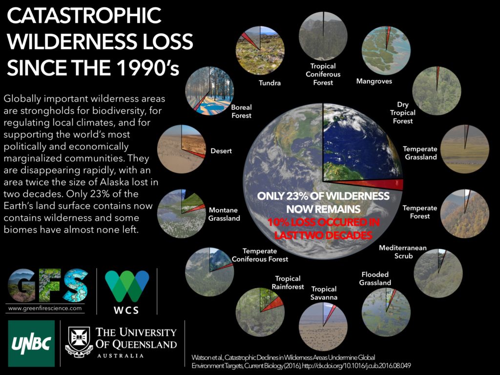
But the continued interest we have in describing how we occupy the world, if not demarcating the boundaries of the world, is at the center of the data flows and databases we process in GIS and that increasingly lie at our finger tips.  The instant generation of maps of the inhabited areas of the world have paralleled the catastrophic decline since the 1990s, when a tenth of existing wildlife declined and the catastrophic losses of wildlife confirmed at the  IUCN World Conservation Congress:  the shocking fact that only 23 percent of wilderness remains doesn’t even include the future effects of global warming, the current crisis in history’s tragedies mankind is currently in the process of having created or on its way to create.  Indeed, the destruction of wilderness–what are deemed intact landscapes that are mostly free of human disturbance–has perhaps most radically changed the nature of the inhabited world.  Since the “Last of the Wild” map was first published in 2002, the loss of almost a tenth of formerly uninhabited lands in the last decade is the most rapid expansion of human settlement of the planet, with some 3.3 million sq km of once-uninhabited lands lost, of which 2.7 million sq km2 are considered globally significant–a loss of some carbon biomass in forests destroys a resource that offsets atmospheric CO2.

wild_infographic2-1-1-1024x768

But let’s return to maps, such realities being to painful for me to contemplate.  Even as the entire earth is now inhabited, much is to be gained in the concept of actively mapping expanse both by preserving an analytic relation to that image of expanse, too often rendered abstractly in computer-generated cartographical media, and encouraging an analytic relation to how the material contents of maps embody space.  Crafting an image of the inhabited world as a bound expanse enjoyed a somewhat neglected historical lineage as a form of knowing the nature of an inhabited world and of orienting viewers or readers to the expanding unknown from the Roman empire:  the considerable intellectual heft of the term inherited from ancients–Eratosthenes, Ptolemy, and Strabo–and its signification of the inhabited and inhabitable earth informed most Renaissance maps and atlases, in which practices of mapping gained new epistemic ends as mediating comprehensive knowledge.

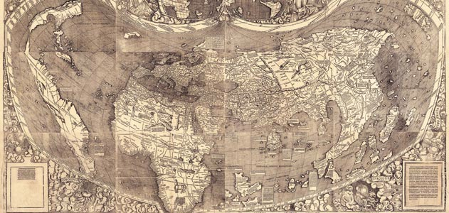
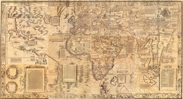
The comprehensive genre of the atlas, an illustrated set of maps promising true global coverage of lands linked by seas, developed in concert with the knowledge that the inhabited world extended beyond earlier imagined confined, and borrowed an expansiveness previously limited to nautical cartography or mapping.  The description of the distance to the edges of the world, if inherited from antiquity, provided a model for understanding the nature of the discoveries for the educated audiences among whom the first maps of the terrestrial ecumene first circulated both in manuscript and print–from the illuminated codices produced in Florence to the massive twelve-sheet wall-map announcing the Columban discoveries that the erudite Martin Waldseemüller compiled in the early sixteenth century Strasbourg from the school at nearby Saint-Dié-des-Vosges.

.

Waldseemuller-Map-631

The visual qualities of mapping, symbolized as an expansive landscape, cast the embrace of the inhabited world with qualities of perceptual transcendence over its variations and divisions.  Ancient geographic treatises included few maps; but mapping the ecumene created a relation of expanse and an observer’s eye in the late fifteenth century by organizing and ordering the globe’s inhabitation.  And although it’s odd to think of the ecumene as an inheritance of ancient geography that’s still employed, the inheritance mapping the inhabited earth resonates with Geographic Information Systems–although fashioning an image of the world’s geography has little of the ethical intent it seems to have enjoyed in both the ancient and early modern worlds.  When we daily orient ourselves to how space is inhabited on our computer screens, iPhones, or androids, we frame an image that bounds a record of how space is inhabited either to orient us to where we are going or how the presence of cars, people, bacilli, or weather defines the inhabit world.  Paradoxically, the growth of GIS technology has increased the manner of ways we can chart the inhabitation and presence of man in space, if it has not increased how we define its continuity, it has also provoked both a Renaissance of mapping and a crisis in the authority of the map as a representational record of the ecumene and its bound, as well as its bounded nature.

While the rest of this post isn’t exactly heavy lifting, but is stuff I’m still processing and finding my way around.

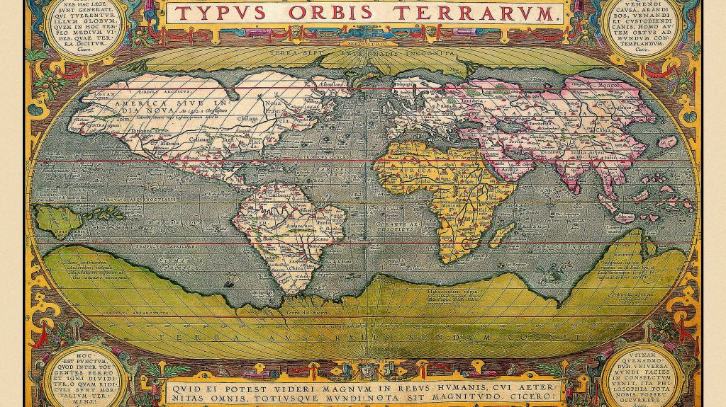
1.  The assemblage of maps in a sequence of global coverage was identified with the cultural distinction Ptolemy gave to the project of world-mapping on a graticule of meridians and parallels, to be sure, both compressing a growing sense of the world’s navigable expanse and indexing its toponymy along climactic zones.  The term ecumene challenged the mental imagination by encompassing local variety in a capacious global category, ordering a global map in a neatly bounded surface beyond the Indian Sea, and up to the limits of known land, in a feat of mental dexterity as much as precise or accurate map of exactly determined scale.  The lower boundary of the map copiously noted “terra incognita,” as later projections–and left it at that, as an expansive white space that exists beyond the sea and lakes of the moons, as this Florentine map includes, adopting the notion of an extensive northern ocean to frame the inhabited world–even while seeing the Indian Ocean as closed.

800px-Claudius_Ptolemy-_The_World

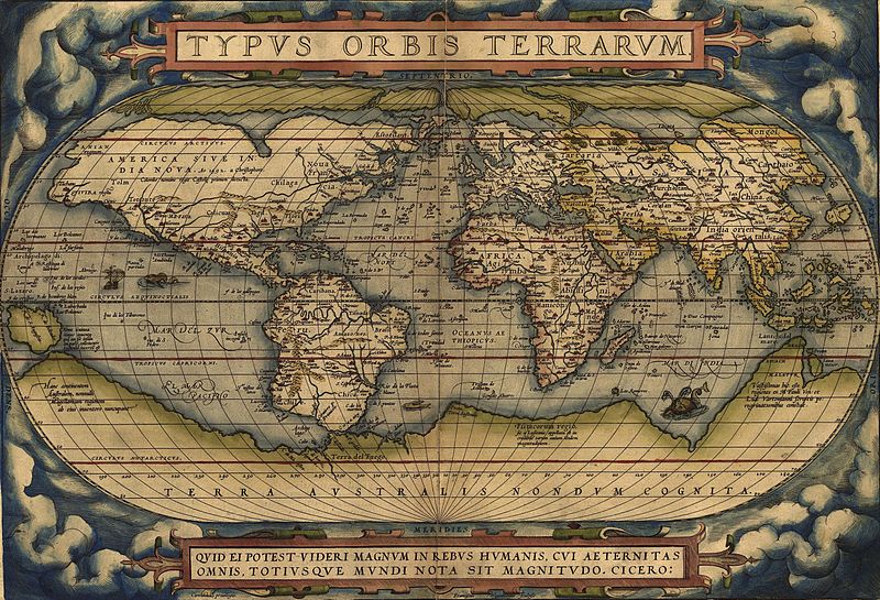
Indeed, even as the world grew more detailed and other continents were registered as inhabited, as in the Ortelian planisphere, the growth of regions of terra incognito expanded, as if to parallel the known regions which were designated by naturalistic landscapes:  the unknown regions of “America dive India Nova” were paralleled with the imagined “Terra Australis,” a later configuration of the mythical Java la Grande.

800px-orteliusworldmap1570

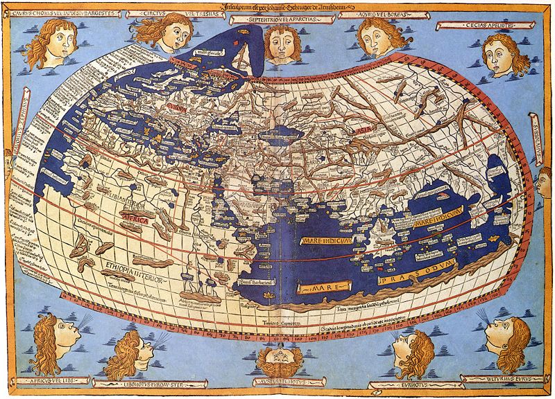
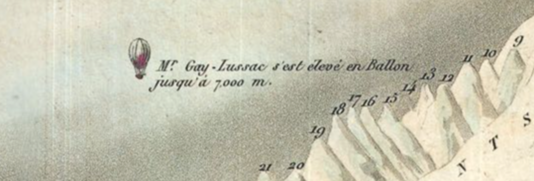
The ancient Greek astronomer and scientist Claudius Ptolemy proposed using terrestrial maps on geometrically derived parallels and meridians as tools of portmanteau-like capacity to comprehend terrestrial spaciousness, by segmenting the world’s inhabited surface by degrees of longitude.  The notion of mapping totality was particularly fertile for early map-readers a decade before 1492.  The tools for mapping the ecumene or inhabited world provided an ambitious compendium of global knowledge, although the geographic knowledge of the world was limited–and still was by the time of this world map, illuminated circa 1482:  although restricting the ecumene for modern eyes, its capacious reach extends south to inner Ethiopia and northward, beyond its broken frame, to embrace northernmost isles beyond Thule.  Rings of uninhabited islands indeed constituted, John Gillis has recently noted, part of the mental furniture on the boundaries of the inhabited world for most fifteenth-century men, and suggested a comforting bounding of the world that seemed to illustrate its protection and insulation, lying as it did between uninhabitable climactic zones and far-off seas.

The ethno-centered ancient term maintained a sense of charting the world’s recognizable inhabitants or those that mattered to the readers of maps:  so, in the Augustan age, Roman’s referred to the expanse of the empire as the ecumene, beyond which lived barbarians.  But even as it retained a bounded sense for Renaissance readers, the totalizing image of an ecumene provided a way to imagine the population of an expanse greater than lay in the ken of most–and to understand coherence within a world that included information from far-off lands, even if many fifteenth-century people lacked clear geographic categories of spatial division of an inhabited terrestrial expanse.  The edges of the earth were oddly clear for a period that suggests limited familiarity with expanse: the monsters and extraordinary riches found there were included in fifteenth-century editions of Ptolemy’s handbook of world geography, including elephants in the island of Taprobane, beyond India, trees that had leaves year-round, multitudes of serpents, and cannibals.  These were the signs of the world beyond what humans knew, and included the bare-footed gymnosophists of India.

The compendious divisions of this mental map in a sense informed an engraved world map printed as the sixth page of the 1493 Nuremberg Chronicle, or “Book of Chronicles,” a “universal” history that promised a temporal compendium of world history, embracing historical ages in order to be able depict the division of continents from its creation through after the recession of waters in the Noahic flood through the succession of worldly empires that Augustine and Orosius had famously described–a work that captured the early taste for engravings as mediating information in Renaissance Nuremberg.   Romans discussed their empire as the ecumene, imitating how Greek geographers discussed an ecumene at whose fringes lived fundamentally other foreign Peoples, outside the scope of human concern and beyond the limits of human inhabitability; the world-map in the Chronicle placed outside its borders the excluded races of  Cynocephali, one-footed Sciopods, reverse-footed Antipods, bearded women, and one-eyed cyclopean monsters.  These lay outside the three regions divided among Noah’s three sons Shem, Japhet and Ham, or ecumene, and outside its image of the inhabitable world where humans dwelled, but also reflected the new world that the recession of waters in the Noahic flood had revealed to human sight, and the projection of the world that its editor included registered the shock of the prospectus terrarum that the lessening of global waters worldwide revealed–and the ecumene it unveiled:

SECUNDA ETAS MUNDI


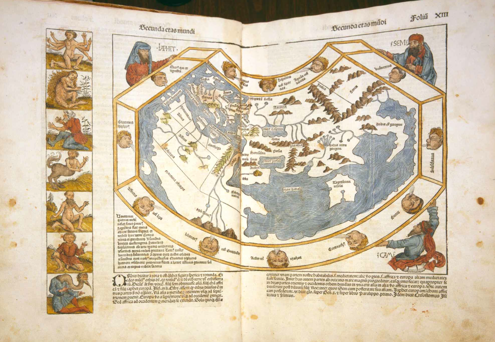
Hand-illuminated versions suggests significant curiosity in these creatures placed outside of the map’s ruled boundary who dwelled in a different space from the river-nourished environment of what one supposed to lie on the edges the habited world:


Secunda Aetas Mundi


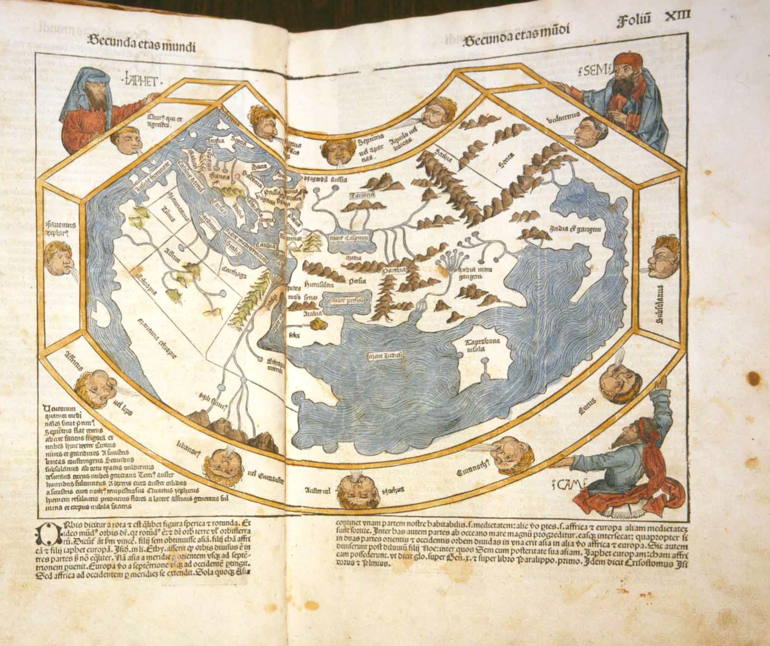
The ecumene had of course already expanded dramatically by 1490 or 1493 that challenged thought about its both its boundedness and uniformity and cartographical forms to represent spatial expanse.  It continued to expand dramatically in the following years for readers of maps.  Similar monstrous races were included on its peripheries:  in the northern limits of Asia, a boundary of the inhabited world, even in Martin Waldseemüller’s learned Carta marina of 1516–both in response to literary sources and travelogues as well as the mental furniture of the bounded region of human habitability.  Many of these races were left off of the map as “an empirically known space,” for the very reason that they challenged and threatened a human space, and the boundaries of the world revealed by maritime exploration were unknown–even if sea monsters were increasingly banished from the more the edges and unknown areas of the more refined world maps, as the Carta marina.


Waldseemuller 1516 carta nautica


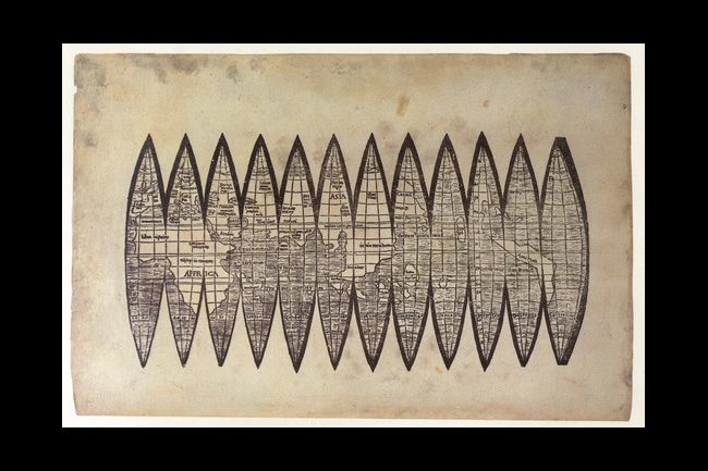
The consciousness of limits of habitability or human settlement was a graphic expression of Strabo’s mandate that geographers show the world’s inhabited part, as much as its inhabitants or populations to readers to satisfy curiosity and to respond to a need to describe its limits, as much as its totality:  “the geographer must describe the inhabited world in its known parts, neglect its unknown regions, as well as what is out of reach” (II, 5,5), placing a primacy on describing those parts of the world or communities in which humans live.  Although most fifteenth-century people did not easily domesticate the idea of an extensive space, let alone an undifferentiated expanse, picturing the unity and comprehensiveness of the ecumene became a basis for thinking about expanse, and comprehending difference:  the image of the ecumene in the Nuremberg Chronicle became a basis for continuing a rambling shapeless narrative grounded in a series of embedded or potted histories of place, each defined around an individual city and city view:  the ecumene was the landscape, if you will, in which each was situated.  There is often limited notation of a matrix of parallels and meridians in what might be called a readable fashion in early Ptolemaic maps:  it helped make space legible and material–or a sense that they are conventions of understanding the dramatic contraction of global space, but not indices of way-finding or marking place, as in these gores, identified with Waldseemüller’s school of cartography, ostensibly made for a small globe.


waldseemuller_map_found_4_7_2012


What has happened to the notion of the ecumene?  Even as the Ptolemaic ecumene was expanded, the community embraced in the map grew, rather than being abandoned, if New Worlds were processed into a map that reduced the prominence of Europe at the center of the inhabited world.  But the expanse of the ecumene held together, as it were, a sequence of regional maps, partly because the concept contained the promise that the whole world could be divided and known in synoptic form in a series of synoptic images that reconciled spatiality and territoriality.  Although mapping the continuity of expanse undergirded Renaissance cartographical images, the precision offered considerable wiggle-room, as it was limited only to the known.  But the division of space into bounded records of expanse were influential; the “chorographical” map of community became a counterpart of the totalizing coverage of a geographic projection.  To be sure, such maps responded to the diversity of ecumene that were discovered.  And maps provided models to mediate culturally fragmented collectivities, and fashion coherence across confessionally-divided communities– as the national map Oronce Fine designed of France to the French national atlases of the late sixteenth century to the English maps of Christopher Saxton, or Philip and Peter Apian’s maps of Central Europe, or a cycle of maps of the Italian peninsula that Egnazio Danti organized for a corridor leading to the apartments of Catholic Pope, discussed in an earlier post.  The coherence of each of these regions provided a sort of microcosm to the ancient geographic ecumene as it gestured to the wold that Romans civilized.


2.  The second half of this blogpost shifts focus.  In ways that less linked to cartographical models, it uses the notion of an ecumene to interrogate the survival of a  mapped global space in more modern mapping techniques.  We now lack similar boundary lines, of course, and measure contact among its regions rather than being awed by the immensity of the world’s expanse.  But the same term gained an ethical heft  in Enlightened thought to express a mandate for cosmopolitans to inhabit the world to become citizens of its entire expanse and cultures.  This shift in meaning, often thought of as a rupture, suggests continuities with the contemplative uses of globes for ancients as signs of learning or stoic remove.  The modern recuperation of the ecumene, distinct from its sense of the community of Christians (inherited from the Enlightenment) or the community of mankind is more striking as a relation to a lived environment, in ways that recuperates the ontological category of ecumene in order to describe and refer to the “humanized” world in which we now live–whose surface is more fully inhabited than ever before, but its nature shaped and informed by humanity both in regional environments and as a whole.

Augustin Berque has emphasized the benefits of attending to a relation, described by Tissier, between man and the planet in his 1993 article in the journal Persée, striking for how they dispense with the very category of a map if provocative for how they recuperate the ancient term in an ethical sense.  The term “ecumenical” oriented the term to the continuity in a community of believers.  But the ethos recuperated by Berque refers to what is human in the world, and a way of being, stripped of a fixed ethnocentric perspective.  By locating the “oikumenal” in terms of human geography stripped of a cartographical foundation, his sense eerily prefigures the images of the inhabited world that are both the benefits and costs of GIS as a basis for judging one’s own relation to the global world.  Berque has removed this ancient term of encyclopedic or positivistic coverage as a material register of geographic toponomy and the ancient craft of map making that embodied a fixed relation to the world.  His construction of an ecumene encompassing human society and its relation to the environment melds nature and culture in ways similar to the ancient term in its ethical connotations.  But his usage oddly dispenses with its graphic construction in favor of a global consciousness:  for in calling attention to the “ecumene,” has removed mankind’s relation with the earth’s surface is removed from a simple demonstrative function of the map:  much as the medium of GIS  defines the inhabitation of the world from one slant or subject, Berque asks us to embrace the multiple effects of mankind on the planet.

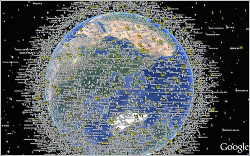
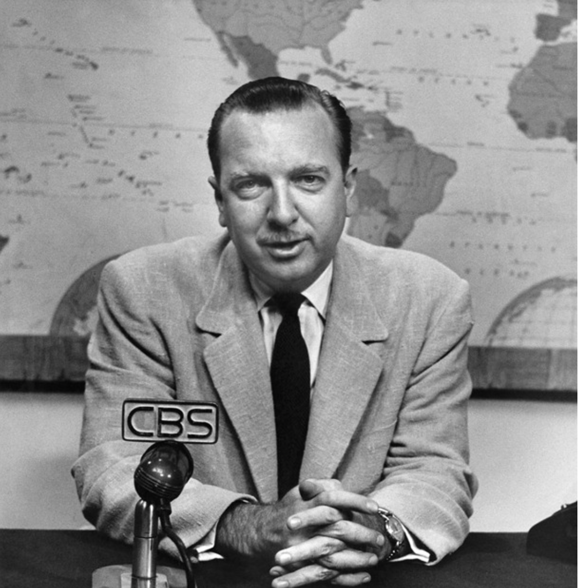
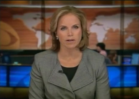
Berque believed that with the humanization of the planet complete, and the physical planet dominated by the effects of human life, more emphasis should be placed on a phenomenological analysis of the relation of subject an ambient by this Greek term, now removed from mapping practices to embrace human geography as a tool to consider the relation of man and his [made] environments. Putting aside the value of Berque’s point, the disposition of this philosophical standpoint  reflects the deconstruction of the privileged place of the terrestrial map and of geographic knowledge in GIS, and the image it perpetuates of the inscription of a human geography.  The relation of man and his planet–or the effects of man on the planet–are now the scope of a wide range of GIS maps of human habitation and Google Earth, or maps of influenza, infections and disease in data visualizations or geographic metadata catalogues, whose aim shift from physical geography to the place of mankind in it.  Increasingly, we are prepped to see the world nightly with a false immediacy of the nightly news, less focussed on territorial boundaries than a token of comprehensive coverage, prepped for consumption much as the newscasters who present an account of the “daily novelties” are prepped and outfitted in the apparatus of a news room.


Newscaster prepping.png.JPG


As put it eloquently (and cleverly) by Bruno Latour and friends, our ideas of territory so clearly derive from maps that the digital ubiquity of mapping places us into a new relation to territory:   we now navigate not based on “some resemblance between the map and the territory but on the detection of relevant cues . . .  to go through a heterogeneous set of datapoints” by which to move from different posts to gain new bearings.  We are always navigating a new relation to territory, or understand territorial models, not assuming defined and predetermined boundaries.  This notion of the environment is based on an ability to read signs of its inhabitation and peopling, rather than with reference to previously mapped territories, and is rooted on the ability to navigate by using maps on a screen, rather than on paper–in which the lack of resemblance indeed has further purchase (and persuasive power) as a gain in both certainty and objectivity.


3.  The analytic nature of the reader’s relation to GIS maps is less based on embodying place or expanse in a cartographical manner, because it is not rooted in mimetic qualities.  For the map, in much GIS, is used essentially as the primary field to encrypt variations in data, and removed from any pictorially descriptive function.  Put better, the map is something of a found object, a template, an objective construction in which we sort out the real information that is displayed upon it in an appealingly objective fashion, but one that lacks an orientational power rooted in mimetic claims and indeed turns away from making any actual mimetic claims:


usmap9

Indeed, the underlying positivism of the objectivity of the map is recycled in most visualizations that are rooted in GIS.  If modernity, as Doreen Massey put it, involved “a particular hegemonic understanding of the nature of space itself, and of the relation between space and society,” drawing expanse on multiple computational platforms in GIS has decoupled space from a precise location:  we now know from a true “view from nowhere.”  The differentiation of terrain or local constructions of space are of less interest than the projection of meaning on a map that is treated as a screen, and several significant local markers may be absent or not noted.  Shifting scale by moving a cursor does not create a more readable space, but provides a very odd reframing of space as a unit that is not comprehended by the reader, but able viewed simultaneously at multiple scales of changing parameters, zoomed into and out of, and adjusted on a digitized scale bar. Our current National Research Council argues in its spatial literacy report on spatial thinking that “the important thing is that they allow for the spatialization of data and use a range of types and amounts of data,” lending primacy to the readability of data over the analytic or representational basis of map-making.

What is physical geography, after all, in many of these maps?  The prime mandate is to map one’s relation to the environment in a readable fashion, rather than to encode layers of local topography or meaning, and to streamline the map to allow its reconfiguration in different datasets that prepare for readability, rather than granularity or density of meaning.  Again, this is based not in mimesis, and no longer based on the notion or mimetic projection of territory:


MacArthur Freeway 11-00

Children's Hospital 11-51

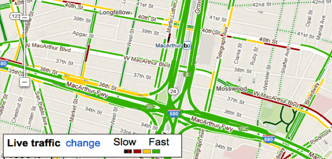
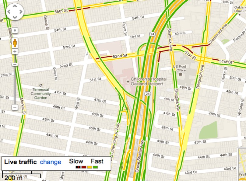
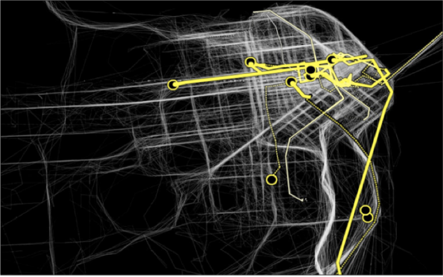
If we speed this up, to look at a sort of time-stop photography of cabs in San Francisco’s downtown area, as did Stamen design in a pioneering map that combined aesthetics and the abundant database of the surveillance operations of Google Maps, and is based on readings taken from the GPS data of the Yellow Cab Company of San Francisco, available also as a film:

Stamen Cabs

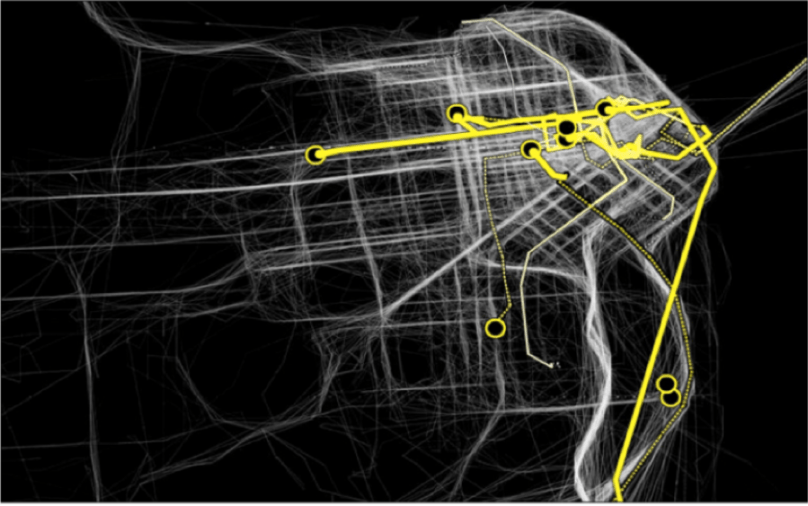
Or, in Shawn Allen’s map/photo, which resembles a direct transcription of the taxicab scene in downtown San Francisco on June 15, 2012:

Shawn Allen's map:photo

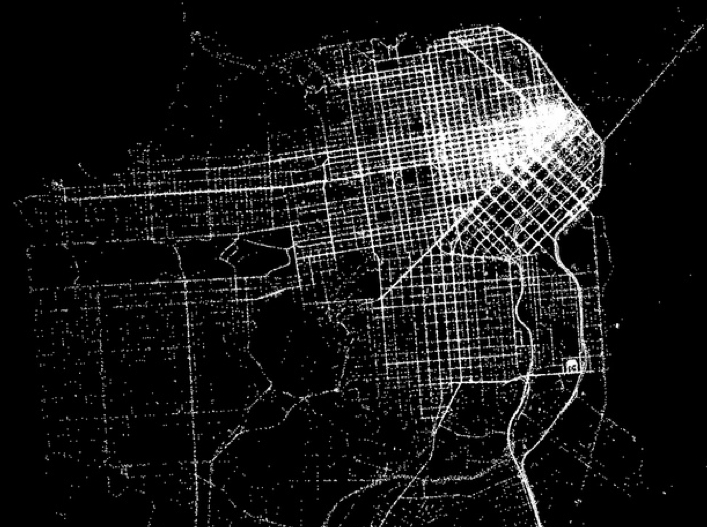
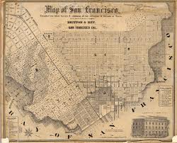
Does an impoverishment of spatial literacy or toponymy result from such containers of datasets that use maps as formats?  The omniscience and transcendence of the map viewer is immeasurably increased, but the viewer is the receptacle of data, as much as the perceiver of the scene:  new currents are configured and new flows revealed, as data from a variety of sources are richly encrypted into the surface of any given image, compressing the sort of media to which we might have access to a single screen.  One has a different sort of relation to a screen than to a variegated surface, reading a way of configuring information in different ways:  but the difficulty with the screen in particular is its lack of a sense of spatial embodiment. Compare it to an earlier map of the same region, not at all sparing with information but bending backwards to compress legible content within a description of the city’s environment:

sfharbor

These are, perhaps, essentially different modes of data compression, based not only on distinct tacit presumptions, with one angled toward data flows, rather than to the ostensible objectivity of a perceptual model.   But the difficulty to embody data flows can generate an oddly 2-D superficiality that forsakes the very quality transcendence to which earlier ecumene aspired.  Data-streams provide a selective mapping that illuminates one angle of analysis, as it were, rather than aspiring to process an image of the entire city’s or world’s actual inhabitation.

Let’s however insist on being more concrete.  When used to display shifts in a census, the map below displays data removed from topography or centers of population density, and is a data visualization without refined conventions to process its content or meaning for viewers, even if its meaning is quite serious and subject quite human, because it displays information on a static template with little interpretive key–since this map is less of an autonomous and self-standing unit of meaning than a map that demands to be read in reference to familiarity with a map of the distribution of the state’s population:

CO2 emissions


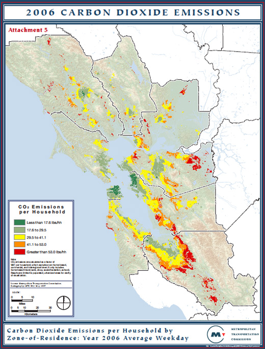
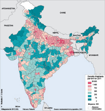
The above map of CO2 emissions of Northern California households elegantly foregrounds one specific reading of the relation of man to the environment. The challenge raised by such an elegant map is to retain communicative flexibility of the conventions of terrestrial mapping, however.  In any GIS map, there is the anger of emptying the format of project from content such as topographic variations, specific local detail, or the dynamic relations of space and habitation within a map:  the conventions of the format gains an iconic or symbolic register alone, in short, and is considerably impoverished as a description of terrestrial habitation when it serves as a field to display data flows or project a database.  One issue is to combine the data with how the analytic framework of the map integrates word and image or creates a structural distribution–something like the poetics of mapping–rather than employ maps as a passive container for spatial information instead of actively creating a way of thinking about space. The mapping of the results of a census regularly lack a sense of topographic variation or differentiation of urban and rural population which would render it more meaningful, and give a plasticity to its already remarkable contents as readable content.  This partly lies in the lack of a dynamic relation between the visual field of the map and its reading, as in this map of the regional variations in the India’s regional population per square kilometer:


dastes_F2


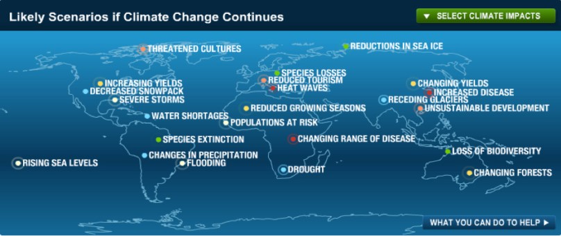
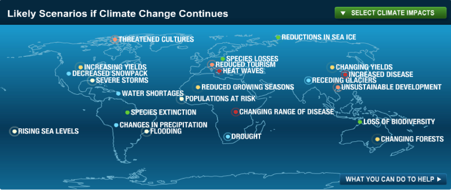
The map does not exploit its own conventions of orienting readers to space or expanse.  But GIS mapping offers a significant range of angles by which to read and explain its content.  The relevance of clarifying readers’ relations to the environment are in fact pressing, as revealed on this interactive map–which even includes an option for the reader to learn in detail what s/he can do to help:


Scenarios of Global Warming


At the same time as this pessimistic picture of the actual eventualities of climate change in the age of the anthropocene, the radically shifting nature of a world which is no longer shaped by proximity, or challenged by distance.  The map of internet penetration suggests, rather than a new map of inequalities alone, the new obstacles to the penetration and responses to messages worldwide, and, no doubt, contributed to the difficulty of the transport of needed goods and medical supplies to western Africa during the current epidemic of Ebola, which seems to have left populations scarred by the difficulty in transatlantic communication, as much as the lack of adequate maps, as OSM-H has shown, of adequate mapping on the ground.


2000px-InternetPenetrationWorldMap.svg


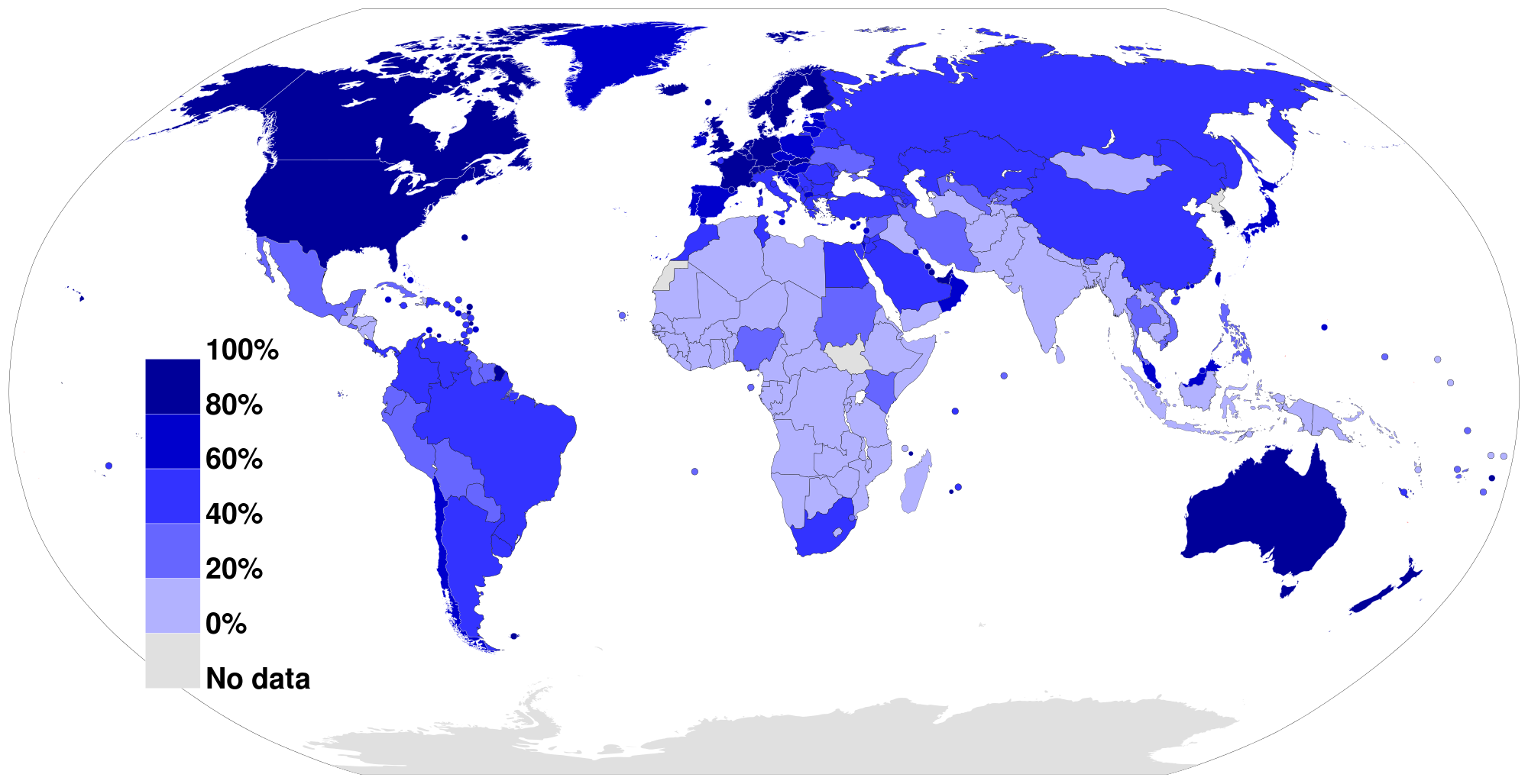
Indeed, the map of internet penetration, for all its unpleasant echoes of a colonializing perspective, where first-world countries receive greatest coverage, reveals the extreme difficulties of penetration of all of the coastal countries of West Africa–unlike Nigeria–where the highly contagious virus has proved most difficult to be contained, and information about  the virus less able to be widely disseminated.

Are the edges of the penetration of the internet the most vulnerable edges of the inhabited world, and as the edges of the accessibility and sharing of human information the most vulnerable to cataclysm?


4.  To some extent, this takes us back to Berque’s notion of the ecumene.  But the relative thin-ness of encrypting data projection on the map is so less fine-grained to impoverish the relation between reader and map or registers of engaging readers:  the granularity of the map is particularly great perhaps because the map’s visual qualities are less closely joined with its textual ones, or the hypertext only uses the map as a static schema. There seems the danger of how maps direct our attention to spatial variations and complexity with the proliferation of maps as visual media across different venues and platforms, and a dissipation of the authority of demarcating expanse or of compacting data in a uniform surface.  Perhaps this recalls Berque’s notion of the ecumene as a set of relations to the environment, which can be read in different ways rather than in one way.

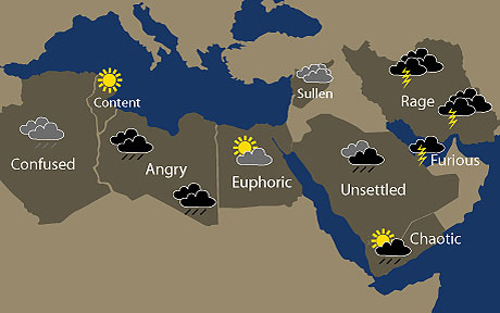
The question of habitation has become turned, like a prism, to illuminate new points of view and angles of perception, a topography of habitation indeed seems beside the point.  After all, there are no real areas of the globe that are not inhabited, and the questions of orienting individuals to space seem more pressing than ever on ethical, ecological, and moral grounds alike–if not of just making sense of the effects with which man inhabits space. In a somewhat ponderous post, let’s offer a comic conclusion, however, rather than carping about media for mapping in an age of digital reproduction and increasing vectors of data flow.  The GIS map has become a versatile demographic tool to reframe questions and reveal spatial links, possible vectors of influence or pathways of causation, and indeed maps of emotions or violence.  The question is at root what sort of remove it places the map reader to interpret those vectors on its surface.  There is a temptation to deflate the authority of the descriptive value of such a matrix for its lack of fine grain.  Amidst the attempt to map the Arab Spring there was the inevitable  GIS irony of naturalizing political movements with the ephemerality of a weather map–more a mental map of what the media presented, to be sure, rather than a map designed to orient its content to a reader practiced in interpreting a map’s construction or its conventions.  The map has the value for its viewers of an illusion of transparency and a medium of omniscience:


middleeast_map21_1829864a


Or GIS-inspired variations on sabre-rattling from the American right, which was openly alarmist (if not antic) in tone, against a backdrop from Wikipedia commons:


ZIO_middle_east_map_jpg_big_1


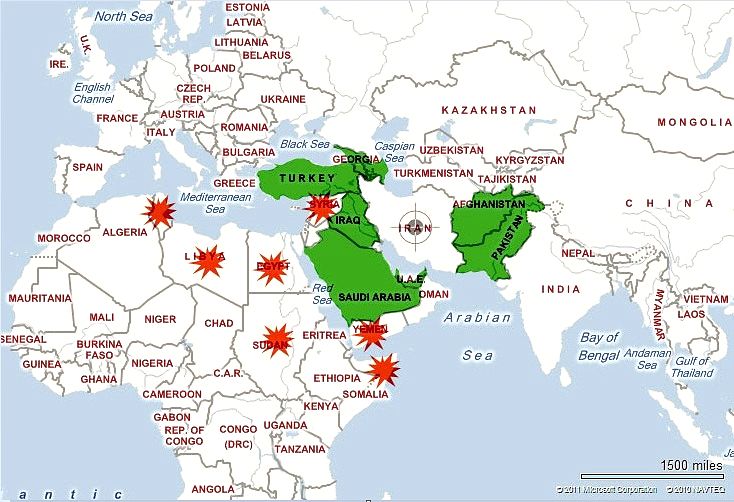
These pseudo-news maps come from the GIS family of signs, even if they are not based on actual data.  They orient viewers with a wiki-like remove. It makes sense that at this point ecumene denotes more of an ethical stance to describe man’s relation to the environment, shifting from to what that process of inhabitation might mean; there is no demand for graphically rendering the inhabited world, but rather the ways mankind inhabits the earth and has filled and marked its space.  But there is a loss of mapping habitations. And so map making in the flexible media of GoogleMaps is no longer an expandable portmanteaux of fine grain, but rather a matrix of data streams where one charts multiple consequences of inhabitation rather the local terrain.  If we no longer have Sciopods outside of our human realm, we lose a sense of an ethics of mapping or even of relating to maps when we dispense altogether with practices of map-making.

Leave a comment

Filed under anthropocene, data visualizations, globalism, Google Maps, metageography, Ptolemaic geography

Up in the Air

Guy Lussac en Ballon
The balloonist Joseph-Louis Gay-Lussac, who set a record for ballooning of 7,016 meters in 1804, flying in his hot air balloon beside the Himalayas, in Andriveau-Goujon’s 1834 Tableaux Comparatif et Figuré (Paris 1834).  The ballooning record was only broken in 1862.

The crisp condensation of an array of multiple mountains and rivers by their magnitudes in a uniform scale and imagined plane represents an image of the coherence of scientific knowledge by its transformation of nature into a single reference tool.   The etched “comparative map” reveals an exquisite conflation of legibility and the cartographic surface: it contains not only a database of Humboldtian proportions, but information about the nature of the world’s tallest mountain ranges, volcanic eruptions, longest rivers, and even some waterfalls in Peru–although not the waterfalls in Yosemite, which were not yet discovered or surveyed, or Andes.  The map, if prosaic, is a register of the first age of globalism, before maps of air-travel or internet bandwidth, but processing and echoing a new taste for global aspirations in a post-Napoleonic era, in the elegance of lithographic form.

Containing, and finding a unique way of dominating the increased expanse of the natural world, the popular comparative chart of rivers, mountains, and waterfalls of the world first printed by Bulla & Fontana in 1828– based on Darton’s far more stodgily titled “New and Improved View of the Comparative Heights of the Principal Mountains and Lengths of the Principal Rivers of the World” (1823)–offers more than an episode of cartographical entertainment. The landscape that it opened for viewers suggested something like a popular panorama, in cartographic detail, a prospective view of global scope the likes of which was on the cutting edge of popular entertainments and sophisticated cosmopolitanism of a global map.

As it was redesigned to accommodate increased information and encompass a greater global purview in its qualitative imagery, the map became something of an assertion of the unboundedness of post-Napoleonic levels of global knowledge, and a celebration of data.  Encyclopedically growing through the complex 1834 chart of Andriveau and Goujon celebrated the addition of new claims of knowledge as a domestication of the natural world by indices of scale, even if it abandoned the orientation of the viewer to their geographic locations or spatial relations in a purely idealized record of the mastery of global proportions–the illusion of a growing global mastery illustrated by the comprehending a proliferation of local qualitative detail in its frame in encyclopedic detail.

bulla and fontana
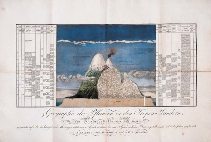
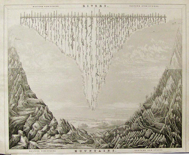
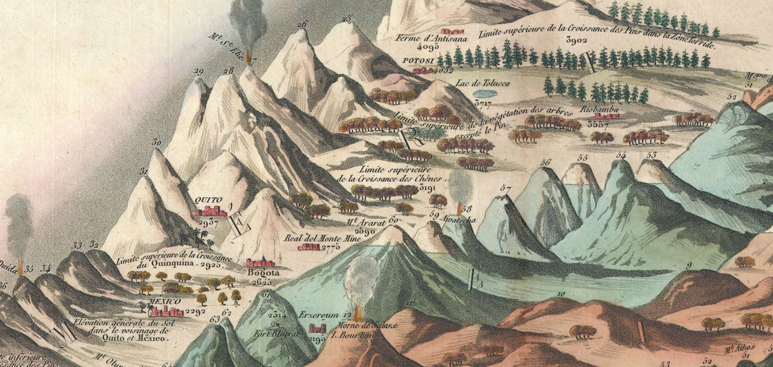
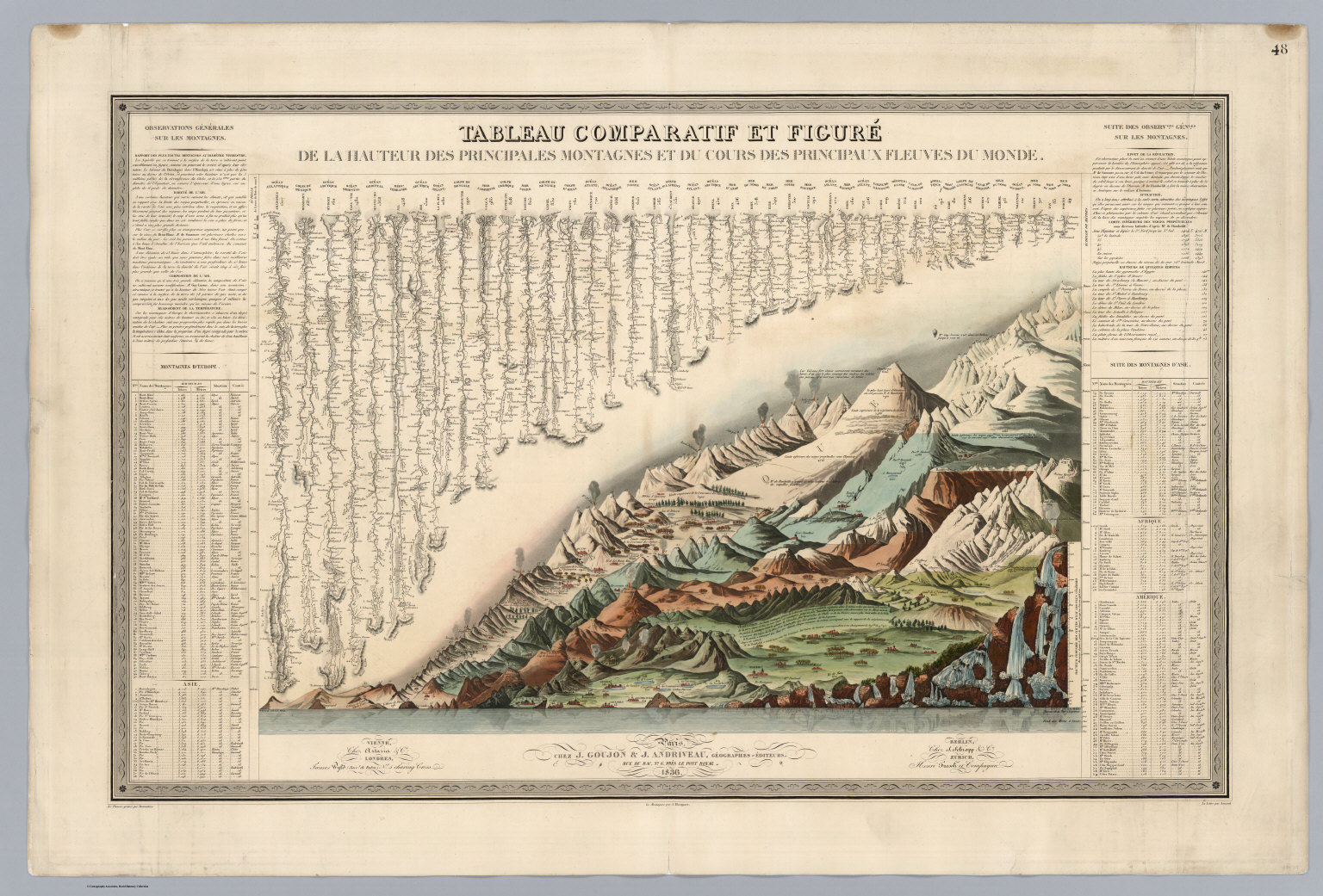
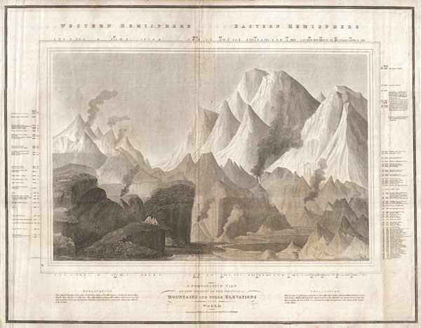
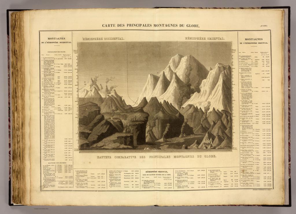
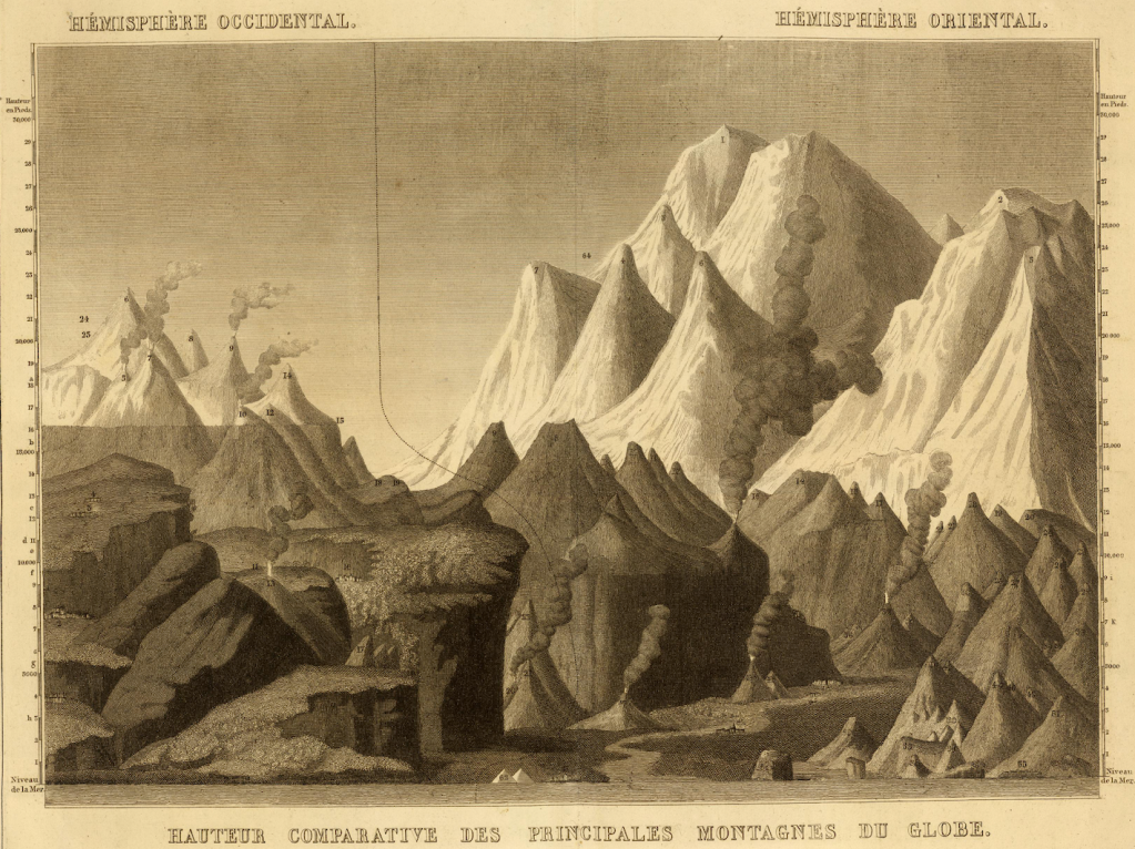
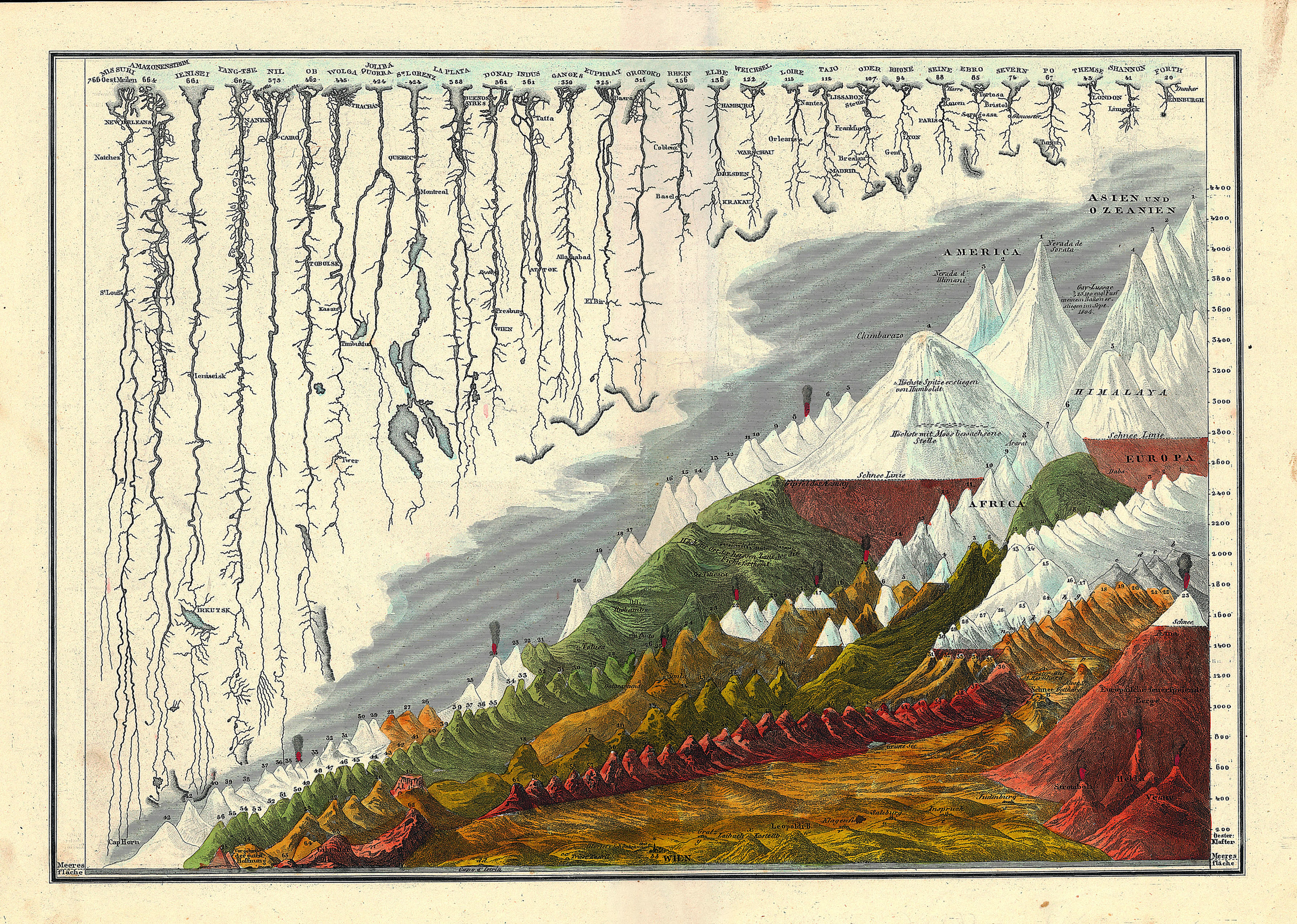
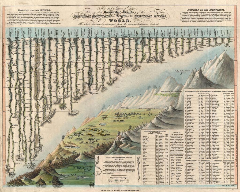
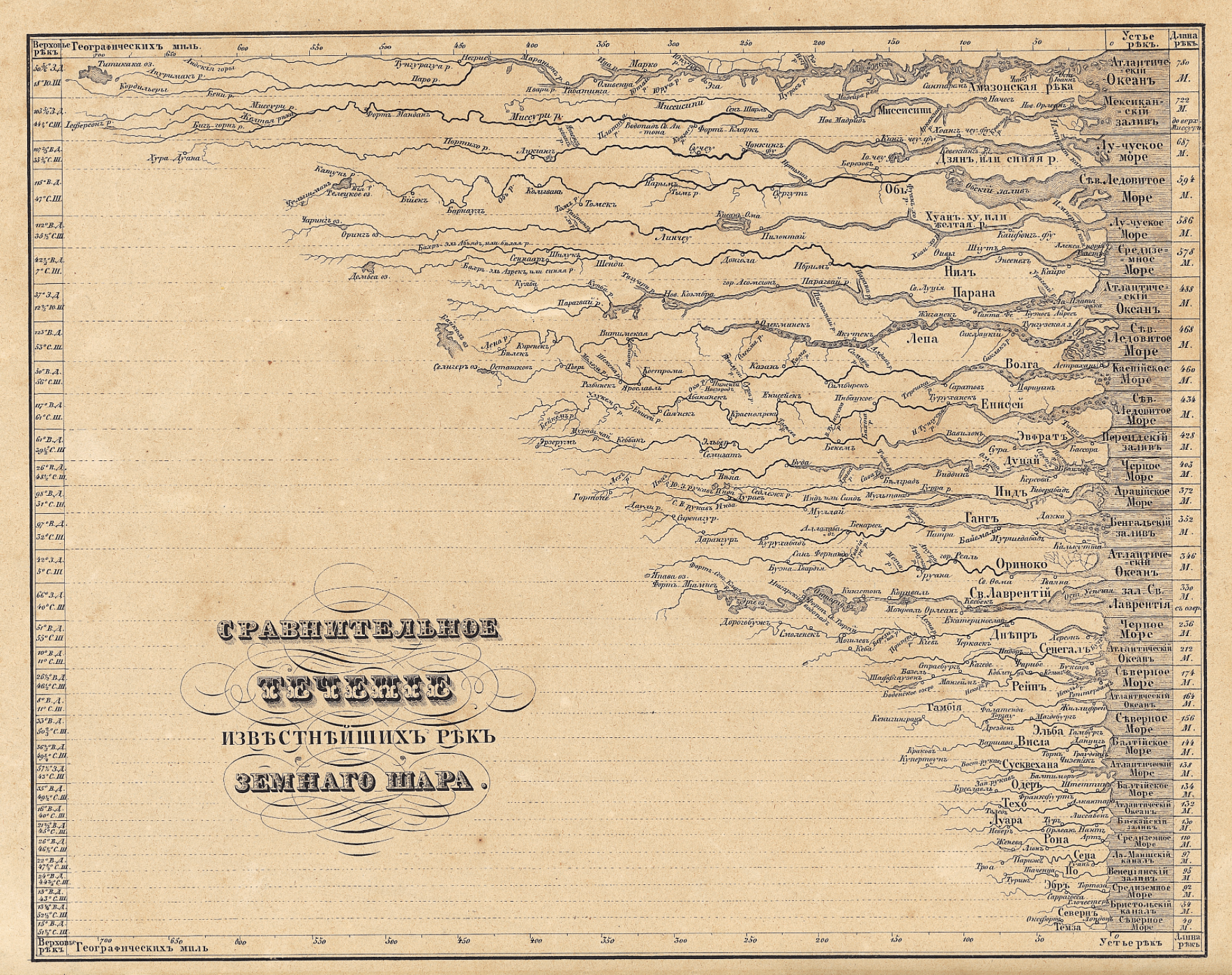
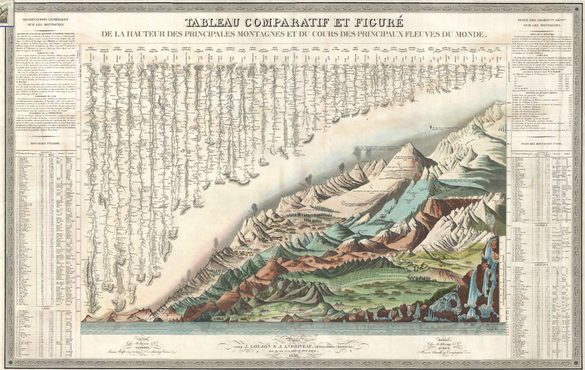
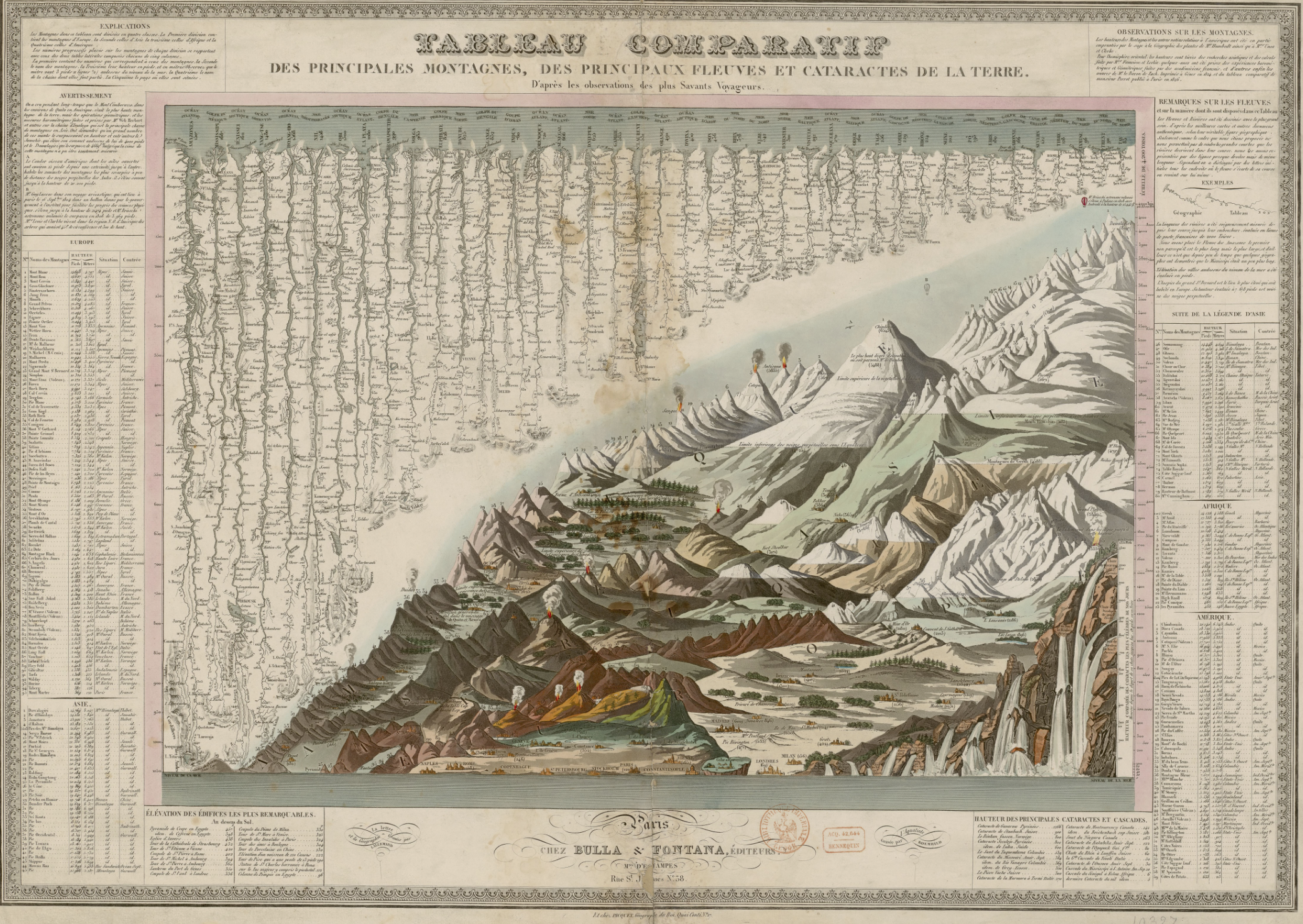
Bulla & Fontana, Tableau Comparatif des principales montagnes, des principaux fleuves, et cataractes de la terre

The vertiginous pleasure of the lithographic map lay in the combination of metric precision and exactitude with utter abstraction from place. The marvels of the world were presented, as it were, in a mental landscape of the geomorphological features of the known world, abstracted from territoriality or national divisions, in a gloriously unified view of the world.

The terribly successful genre of mapmaking essentially offered an elegant compilation of human achievements as well as of the natural world–from the pyramids, to the tallest buildings in cities, and highest ascension made by a voyage in a helium balloon.  Despite its encyclopedic scope and the range of data it processed, the “table” is human-sized, a large wall-map abel to be readily scanned, in order to digest spatial immensity to a scale designed at a human dimension for exploring a virtual record of the natural world that seemed to distill a global atlas to one sheet:  the findings it collated derive from first-hand observations, each concretized in a clearly pictorial fashion so that it can be immediately recognized and understood.  If the aerial triumph of ballooning as a transcendence of the everyday was well-known from the late eighteenth-century aerial flight over the English channel by a French-American team, accomplished in 1785, the celebrated flight of the hot-air balloon was an emblem of the national transcendence offered in the comprehensive map, breaking the bounds of national survey.

1785 British Channel crossed by balloon.png

The most striking single detail that dates the map is the place it accords Gay-Lassac’s recent triumphant ascent to 7000 meters in a hot-air balloon of 1808, noted in the sky of the Tableaux, just above the mountain range of the Himalayas.  Perhaps more importantly for readers, the height of the balloon was just above the highest elevation that Humboldt himself had climbed (5914 feet), as well as the highest levels at which vegetative life–for lichen, 5488.  As it rises above this barrier of living vegetation, and beyond the furthest height of the German explorer, the lone balloon is a triumph of the modern world, and an exploration of the unknown that was great as the ascension of peaks or waterfalls.  The balloonist suggests a sort of French victory in the transcendence of previous bounds of knowledge, and a sign of national pride for the Andriveau-Goujon workshop (fl. 1805-94).

Readers of the map could not only recognize the transcendent flight of Gay-Lussac, but could project themselves into a range of comparable adventures.  The map is not in any familiar sense a projection–or a uniform transference of a conformal expanse to fixed bounds.  There’s not even a pretense of uniformity in the map, because the assembled landscape discards usual cartographical operations that ensure continuity, fix orientation, establish directionality, or claim exact measures of adjacency.  All are sacrificed for one criteria of scale–height–that provides a lens by which the cartographer’s fantasia of representing how space can be viewed.

The notion of such a mental transcendence of space-and idealization of the basis of knowledge–was of deeply Humboldtian spin, and rested on his neo-Kantian comparative categorization of the relative height at which he scaled Mt. Chimborazo to place it in the context of the scaling of Mt. Blanc, Vesuvius, and the elevation of Quito. The scaling of mountains provided a sense not only of worldly retreat–as, for example, Petrarch, who ascended Mt. Ventoux for a new look on life and worldly vanity–but of global triumphalism of geographic plates, trumpeting natural knowledge of the Andes as a register of global sophistication by tallying a comprehensive compendium of all terrestrial mountains of in a panoptic survey of heights.

GeographiederPflanzen-humboldt-1806

Unlike Humboldt, however, the atmospheric ascension of the balloonist implies an imagined prospective of an actual landscape, where the pictorial embraces, domesticities, and processes the comparative, and presents a pictorial unity of comprehensive scope–in ways that echoed how the prospect of ballooning was long associated with maps.

The synthesis is truly cartographical because of how it “writes” space against uniform indices to offer a domestication of geographic diversity and variety within the inhabited world–even while abandoning actual inter-relationships.  A fantasy of mapping, stripped of coordinates, enlists the familiar repertory of cartographic conventions of accuracy to offer a compendium of statistical knowledge.  The cartographer abandons the usual cartographical conventions of noting spatial orientation, directionality, or adjacency, as well as cartographical signs, but transfers statistical measurements to a pictorial view in which heights can be viewed in relation to one another.  This popular format of mapping uses our familiarity with mapped space to sacrifice the need to record or establish location to fashion a comparative collation of known topographic variations.  Optimistically, it shows the world as a unity and unified landscape, without divisions of nationality, in a project in which knowledge about the world is curiously disembodied (in numbers) and re-embodied in a single tableaux of global synthesis.

Gilbert’s Modern Atlas (1840)

The elegant steel plate from Gilbert’s Modern Atlas, 1840 arranged the world’s rivers and the heights of its mountains by length across an imagined chasm, juxtaposing Western and Eastern Hemisphere, running off from the spine of the bifold plate, even abandoning indices in a prospective view of the globe’s natural splendor that suggest a reduction of natural philosophy to one triumphal prospective view: akin to an unveiling of a natural harmony of revealed knowledge, the cleverly combined plate of Rivers with Mountains is not only an economic illustration of information but encourages an imagination of how rivers descend from the mountain ranges that flank them–including the now-iconic figure of Guy-Lussac’s aerialist feat as a way of entering the tallest heights ascended by man in the upper left and upper right as an index of human achievement before this natural splendor, as if to ask the reader to imagine achieving a view over this imaginary landscape from an awesome prospective, if not the landscape that it might afford.

Although there are no recognizable cartographic indices in the, the Tableaux comparatif reveals a familiarity with the collation of information in mapped space, rising above the range of important cities that formed points of spatial orientation on most maps–including, but by no means limited to, Paris, Rome, London, Geneva, Mexico, Bogota, and Quito, among others, that were noted prominently in the various maps and pocket atlases that its printers also produced, Whereas most maps map itineraries, routes, pathways, or memorable sites of human interaction, the Tableaux is a compendium that draws from different human experiences, correlated with one another in a space that does not exist, but assembled in a single whole.  It is a sort of surrogate for the totality of what we know about the inhabited world and its bounds, and the victory of the diffusion of a form of cartographic writing:  its readers were able to place each of the world’s greatest rivers in their geographic situation,–but now afforded a chance to measure (or rank) the Nile beside the far longer Amazon and Mississippi, in order to decontextualize and historicize the limits of global knowledge, and afford a transcendent view.  

As the ascension of the balloonist occupies a crucial pride of place in the 1834 map, verticality is the implicit theme of the map, which registers heights and lengths, to be sure, but focussed on the collation of knowledge by elevations, including forest lines, barometric readings of the elevations of cities, and heights of mountain ascents to make it a repeated object of visual curiosity that merits intensive scrutiny to local landscape detail.

elevations

The Tableaux stands as the culmination of known science, and the triumph of the map–and Geography–as a subject able to comprehend the physical sciences.  One might take the map may be a final redaction of the Ortelian ecumene (the inhabited world),  which it processes for the mind’s eye, but takes the idiom of a pictorial landscape to decontextualize the abstracted record of geographical knowledge.  And also to the observer’s eye:  for the data accumulated and synthesized is clearly both “figured” and “represented” to be readily recognized by viewers familiar with maps. The synoptic register of mountains, rivers, waterfalls and rivers that exploited the four-color potential of maps.  The image was based on a map first assembled in Paris during the 1820s, before being widely reprinted in schoolbooks or atlases through the century as a compendium.

Inscribing the landscape with remarks on vegetation and marking the turning points of ports on rivers, which the cartographer has straightened for adequate comparison as if from a laundry line, the picture is a representation of the use of the inhabited world as well as of the limits of its inhabitability, and a condensation of all that needs to be known about the world and all one shall, presumably, ever know.

bulla and fontana
5796000
ComparativeMountains-thomson-1817

The collage-like landscape, if impossible, placed global features for the observer in a way that reflected their own competency and sophistication, boasting its accuracy and transparency in the manner of a geographic map.  

Rather than constitute a new genre, the assembly of the world’s principle mountains had become a sub-genre of geographical knowledge, echoing the French taste for lists, perhaps, and the mastery of geomorphological features in ways ways that suggest an imaginary landscape, and the power of placing the world’s known mountains beneath the viewer’s eyes, as the hemispheric division of principle mountains of note suggested, in this 1825 atlas that abandons territorial bounds, but presents the romantic mountainous landscape as divided between the hemispheres,–with the ancient Egyptian pyramids, topics of huge touristic attraction that were almost included in a French patrimony in the post-Napoleonic period, if by erudition alone, front and center–

Carte des principales montagnes du globe. Hauteur comparative des principales montagnes du globe. Fonderie et Imprimerie de J. Carez. (Paris 1825)
“Montagne du Globe: Hémisphère Occidental/Hémisphere Oriental,” Bossange/Carez 1825

–between both hemispheres, as if in a signature of French erudition. The synthesis of global triumphalism in a pictorial landscape is the triumph, as it were, of pictorials over borders, in a graphic synthesis of volcanic and ice-capped glacial mountains arranged for the viewer in a landscape panorama of sheer verticality, measured on a scale rooted, at its base, by the limits of human achievements–the Egyptian pyramids.

Instead of offering any spatial or directional frame of reference, the Tableaux is strikingly framed by statistical tables that serve as the basis for its ordering of space–an imaginary space, that compiles locations in relation to one another, without correspondence to actual directionality or adjacency.  Adjacency and orientation are sacrificed in the hope of registering human measurements and achievements of measurement, conducted “après les observation des plus savants voyageurs” with the truth-claims familiar from geographic maps, but by expanding its level of synthetic view and the scope and range of its qualitative content o a degree that few earlier geographic maps had ever dared.  By collating these measurements in a truly utopic map, the cartographer transformed these multiple observations into a single scene that viewers could readily survey–in a supremely confident of compendium of collective observations that demand our trust, and promise to enlighten ourselves about the world’s entire form.  The arrangement of these observations in a map allow us to measure distances in ways that were not possible, moreover, in a simple map:  in a map, we see a river, like the Nile, as difficult to measure given its many twists and turns to its source, but all–even the Amazon–are now laid out in their relative lengths for easy measurement.  

This format of mapping, both for its synthetic scope and pedagogic utility, was extremely popular. Indeed, the genre was so popular as a synthetic view of space that it was widely imitated–if without the detail of the French balloonist.  An undated German reprinting grouped ranges of mountains not only by size, but actual geographic location in continents, as if the map was somehow an image of the members of different continental families–elevation of mountain ranges trumping coextensiveness of global expanse:

The imagined landscape of global topography, newly indexed for ready consultation, imagined the landscape as a library catalogue.  A contemporary Russian chart comparing rivers expanded on the genre in its own manner, displaying rivers as if their estuaries lined up to open to a contiguous body of water, to facilitate their comparison:

Russian Rivers

More often, this variety of map disembodied rivers or topographic markers from its surrounding landscape, oddly tracing the outlines of aqueous bodies alone:

images

All exemplify a recognized cartographical imaginary; the geographical compendia became popular tools to synthesize information for schoolchildren at their fingertips. The abstraction of the Ortelian globalism that reconciled topography with political bounds was dismissed, with a French wave of the hand, in a sort of cartographical magic trick that reduced space to a flat surface of the engraving, and hierarchalized rivers by size.

Abraham Ortelius, Typus Orbis Terrarum

To be sure, John Thompson’s earlier undated “Comparative View of the Heights of the Principal Mountains and other Elevations in the World,” dated to 1817, presented a composite prospect of mountain tops from different hemispheres, in something of a cartographic collage that took advantage of the aesthetics of landscape to abandon the principles of coherence or spatial proximity that paramount in most geographical maps.  Thompson, a Scottish cartographer, united the relative heights of the mountain tops of the eastern and western hemispheres, comparing the presence of buildings, cities, vegetation limits, and even fauna in an aestheticization of empirical observations that bridged Ecuador’s Mount Chimborazo, beside which flies an Andean Condor at an altitude of 21,000 feet, and figured Alexander von Humboldt himself scaling the peak, as well as Lake Toluca, Quito, Caracas, and Mexico City, in the same frame as Nepal’s Dhaulagiri, 27,677 feet–promising a global prospect if without either the Chilean peaks or Himalayas. 

ComparativeMountains-thomson-1817

If the map of mountains echoes Humboldt’s maps of mountains, Thompson had issued the first comparative atlas of rivers–“A Comparative View of the Lengths of the Principal Rivers of Scotland” which had a purely choreographic intent, in 1822, in one of the first comparative river chart of the century, just after his inclusion of the comparative chart showing the height of global mountains for the 1817 edition of his “New General Atlas” (Edinburgh), which built on Humboldt’s 1805 work–and also acknowledged that dependence by including Humboldt in his map, scaling Mt. Chimborazo.  The map of Scotland’s rivers offered an even more pictorial rendition of the many rivers that watered Scotland’s heaths–and is striking for representing the same sort of Kantian transcendence that inspired Humboldt’s own work.

Comparative Veiw oft he Lengths of the Principle Rivers of Schotland

“Comparative View of the Lengths of the Principal Rivers of Scotland” (1822) (Courtesy Rumsey Associates)

But the esthetic appeal of the composite map’s original designers and cartographers, Bulla and Fontana, had designed it in the 1820s as a landscape for viewers to enter and explore in ways that Thompson did not fully exploit, so careful was he to preserve and synthesize the newly arrived data of naturalists.  The slightly later Bulla and Fontana Tableaux comparatif retains the four-color format of printed maps; the original Bulla and Fontana from 1826 was exquisitely hand-colored in a range of manners that spectacularly heighten its coherence as a landscape that is inviting to the eye:  the warmth of these hand-painted colors is hard to ignore, and contributed to how the map was cast as a landscape picture.

The set of impressive rivers that emerge from the upper edge of the Tableaux extend, for example, from a grassy region near their mouths, the waterfalls are thunderously crashing with white spray, the snowy peaks with their blueish hues imposingly weigh heavily upon the stoney landscape beneath them:  the mountain ranges indeed fill up the yellow frame of measured indices, which serves as a pictorial frame for the scene, unlike the neo-classical border that frames a band of white in the later Tableaux.   In Bulla and Fontana’s map, the icy light-green valley underneath the mountain ranges invites eyes,and suggests a reserve of ice from which one can believe the set of lengthening waterfalls contain the freezing cold run-off of icy plateaux.  It seems that this wonderful post-Enlightenment map not only synthesizes measurements, but presented to the post-Napoleonic Europe the harmony of a state of total geographic knowledge as another green world, in true Renaissance fashion, in a sort of bucolic land that was both richly irrigated, filled with waters indicated by the synecdoche of waterfalls,and ready to be cultivated by man, even as Europe had been dissolved by wars and the migrations of soldiers and military campaigns planned in military maps.

Comparatif, 1836.png

Goujon and Andriveau, Tableau Comparatif et Figure de la Hauteur des Principales Montagnes et du Cours des Principaux Fleuves du Monde (1836)

The 1836 expansion of the comparative chart of mountains, rivers, and waterfalls engraved was produced by the prolific cartographic partnership Goujon and Andriveau, and proved particularly popular–meeting a clear demand for the investigation of natural spectacles such as volcanos, whose synchronized explosions are rendered on the visual center of the map that claims one’s visual attention in almost all of its parts, echoing the memory of the global influence of the eruption of Mount Tambora during the Napoleonic Wars, perhaps illustrating a sense of the climatological inter-relations even in a map that abandoned the rendering of accurate geographical relations:  volcanoes almost provided an acknowledgment, almost, of knowledge of the ecological complexity, after actual inter-relations had been abandoned in the name of the economy of map-engraving.

Volcanos

Both include the easily overlooked detail of the balloonist who surveys the landscape. The balloonist seems to be something of the hero of this scene, who has not only entered into the picture but, in one’s imagination, is able to survey the entire expanse that lies below.  His view would be what would look more like a map, even though what we see reflects the range of geographic knowledge that we can collate through our own unsurpassed cartographical abilities.

Leave a comment

Filed under air travel, fluvial maps, mapping nature, natural history, pictorial maps