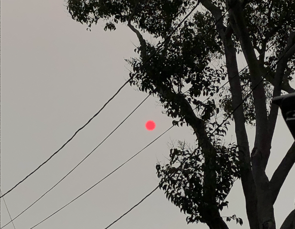
We think of earth, wind and fire as elements. Or we used to. For the possibility of separating them is called into question in the Bay Area, as wind sweeps the smoke of five to seven fires, or fire complexes, across the skies, we are increasingly likely to see them as layers, which interact in a puzzle we have trouble figuring out. Indeed, the weirdly haunting daily and hourly maps of air quality map the atmospheric presence of particulate matter by isochrones brought late summer blues to the Bay Area. Blue skies of the Bay Area were colored grey, burnt orange, and grey again as cartoon plumes of soot flooded the skies in a new sort of pyrocumulus clouds that turned the sun red, offering a disembodied traffic sign telling us to stop.
Clara Brownstein/October 1, 2020
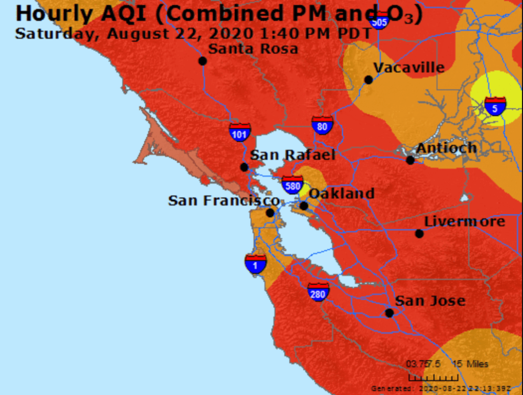
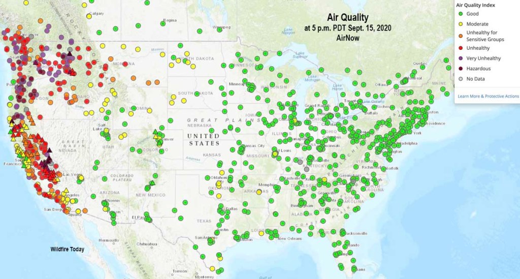
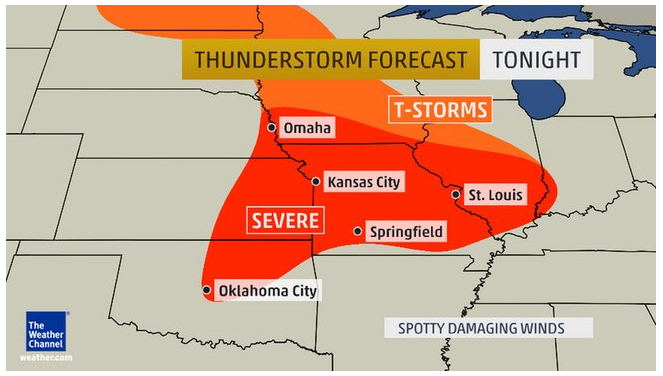
Fire season began by remapping the town in terrifying red that registered “unhealthful,” but almost verging on the “hazardous” level of brown, based on local sensors monitoring of ozone, but is also registering a deeper history defined by an absence of rain, the lack of groundwater, the hotter temperatures of the region and the dry air. The map is both existential, and ephemeral, but also the substrate of deep climate trends.
AQI Chart on Saturday, August 22, 2020/AirNow (EPA)
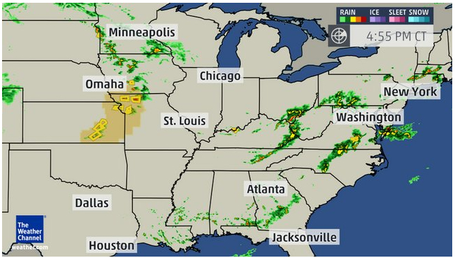
Is fire an element we had never before tracked so attentively in maps? We did not think it could travel, or had feet. But wildfire smoke had blanketed the region, in ways that were not nearly as visible as it would be, but that the real-time map registers at the sort of pace we have become accustomed in real-time fire maps that we consult with regularity to track the containment and perimeters of fires that are now spreading faster and faster than they ever have in previous years. And soon after we worried increasingly about risks of airborne transmission of COVID-19, this fire season the intensity of particulate pollutants in the atmosphere contributed intense panic to the tangibility of mapping the pyrocumulus plumes that made their way over the Bay Area in late August. As the danger of droplets four micrometers in diameter remaining airborne seemed a factor of large-scale clusters, the waves of black carbon mapped in the Bay Area became a second sort of airborne pathogen made acutely material in layers of real-time Air Quality charts.
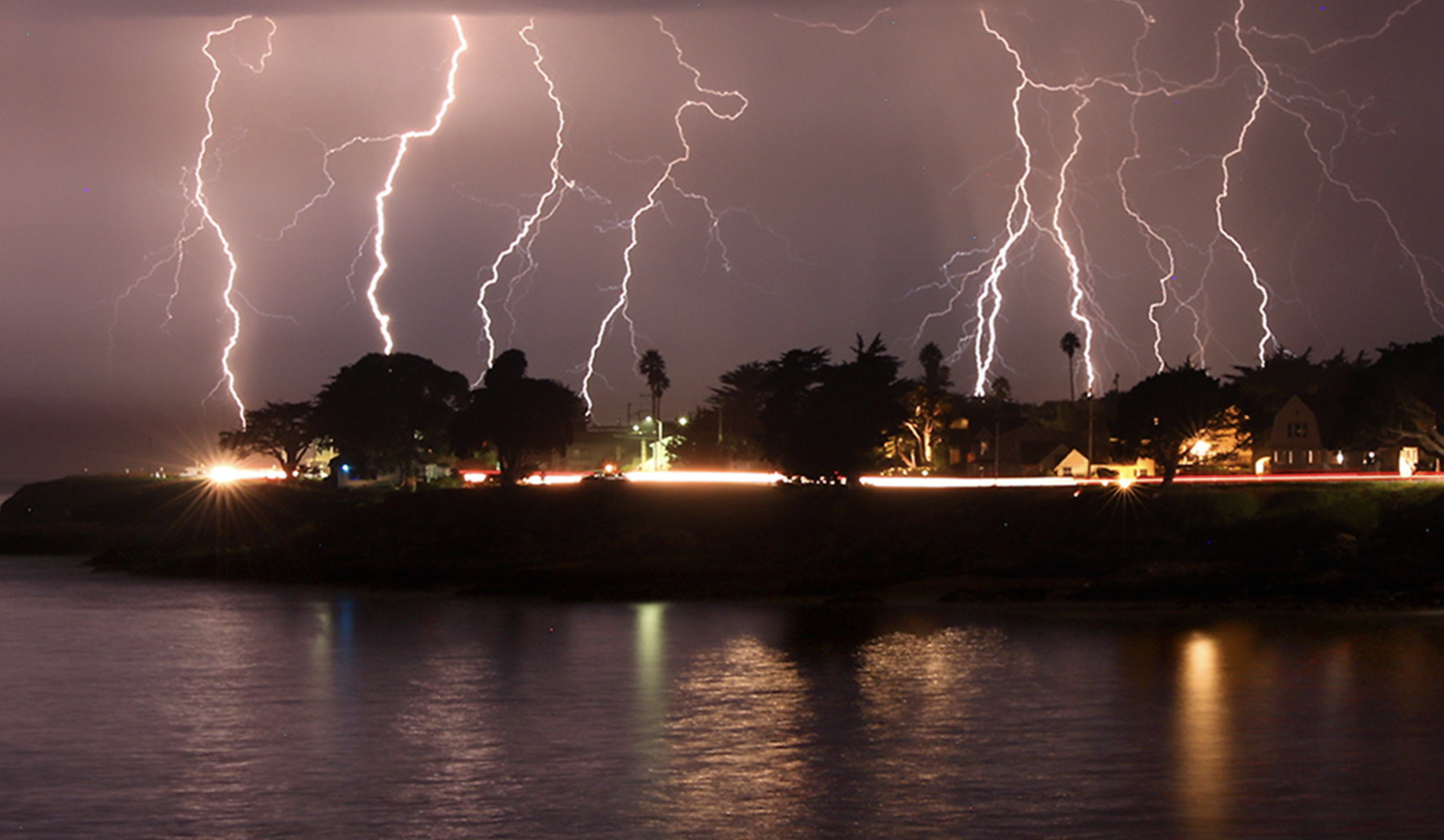
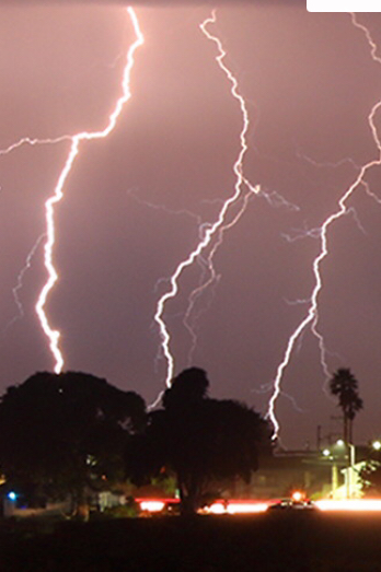
The boundaries of fire risk charts and indeed fire perimeters seemed suddenly far more fluid than we had been accustomed. When we make our fire maps with clear edges, however, it is striking that almost we stop registering the built environment, or inhabited world. As if by the magic of cartographical selectivity, we bracket the city–the sprawling agglomeration of the Bay Area–from the maps tracking the destructiveness and progress we call advancing wildfires, and from the isochronal variations of air quality that we can watch reflecting wind patterns and air movements in accelerated animated maps, showing the bad air that migrates and pool over the area I life. The even more ephemeral nature of these maps–they record but one instant, but are outdated as they are produced, in ways that fit the ecoystem of the Internet if also the extremes of the new ecosystem of global warming–the isochrones seem somewhat fatalistic, as they are both removed from human agency–as we found out in the weeks after the Lightning Siege of 2020 that seemed a spectacle of the natural world that rivaled the art of Walter de Maria in their grandiosity of time-lapse photography–
–the horizontal line of artificial light from Santa Cruz, unlike the images that De Maria created from The Lighting Field, remind us of the overlap between inhabited spaces where conflagrations in the dry wildlands that spread as the fires struck, and in way far less difficult to aestheticize than The Lightning Field set in a desert removed from human population, but was built as an isolated field for time-stop photography.
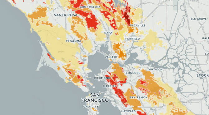
The CZU complex brought widespread devastation across areas of extra urban expansion in the Santa Cruz Mountains was almost a map that registered the expansion of residences to the very borders of forests. We haven’t ever faced the problem of maintaining and clearing in weather this dry, even if we have mapped the clustering of fires in the wild land-urban interface: but the strikes ignited underbrush lain like kindling, on the boundaries of the raging fire complexes. If the burning of underbrush by fire mitigation squads seeks to create fire lines in the mountainous landscape to create new perimeters to forestall the advance of major fires, working along a new fire line even as what is still called wildfier smoke travels across the nation, far beyond the Bay Area.
While watching the movement of fires that them in inhabited areas like shifting jigsaw pieces that destroy the landscape across which they move. These marked the start of megafires, that spread across state boundaries and counties, but tried to be parsed by state authorities and jurisdictions, even if, as Jay Inslee noted, this is a multi-state crisis of climate change that has rendered the forests as fuel by 2017–for combined drought and higher temperatures set “bombs, waiting to go off” in our forests, in ways unable to be measured by fire risk that continues to be assessed in pointillist terms by “fuel load” and past history of fires known as the “fire rotation frequency.” When these bombs go off, it is hard to say what state boundary lines mean.
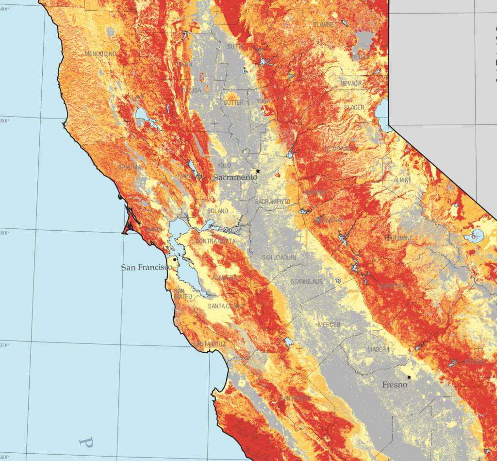
Fire Threat Risk Assessment Map, 2007
If San Francisco famously lies close to natural beauty, the Bay Area, where I live, lies amidst of a high risk zone, where daily updates on fire risk is displayed prominent and with regularity in all regional parks. These maps made over a decade ago setfire standards for building construction in a time of massive extra-urban expansion. But risk has recently been something we struggled to calculate as we followed the real-time updates of the spread of fires, smoke, and ash on tenterhooks and with readiness and high sense of contingency, anxiety already elevated by rates of coronaviurs that depended on good numbers: fire risk was seen as an objective calculation fifteen years ago, but was now not easy to determine or two rank so crisply by three different shades.
Fire Risk Map, 2007
When thunderstorms from mid-August brought the meteorological curiosity of nearly 12,000 dry lightening dry strikes from mid to late August 2020, they hit desiccated forests with a shock. The strikes became as siege as they set over three hundred and fifty-seven fires across the state, that rapidly were communicated into expansive “complexes” of brush fires.
We map these fires by state jurisdictions, and have cast them as such in policy, by borders or the perimeters we hope to contain barely grasp the consequences of how three quarters of a million acres burned up suddenly, and smoke from the cluster of fires rose in columns that spread across state boundary lines as far as Nebraska, and how fire complexes that spread across three million acres that would soon create a layer of soot across the west, eerily materialized in layers of GIS ESRI maps of environmental pollutants, while toxic particulate mater released in plumes of black carbon by the fires cover the state, rendering the sun opaque where I live, in the Bay Area, now Pompeii by the Bay as smoke at toxic levels blanketed much of the state.
They even more serious map, to be sure, was of fire spread: but the maps of air quality set the entire western seaboard apart from the nation, as if threatening to have it fall into the ocean and split off from the United States,–even if the burning of its open lands was more of a portent of things to come, they were a historical anomaly, lying outside the record of fire burns or air quality, if the poor air quality traced the origin of black carbon columns of smoke that would rise into the nation’s atmosphere.
The first six months of 2016 brought the greatest increase in global warming in recent years, and a rise in temperature that far surpassed all previous records–and occasioned a rapid melting of polar ice challenging to map as well as to imagine in all its cascading consequences. The 378th consecutive month of land and water temperatures far above twentieth-century averages, as per the World Meteorological Organization, became an occasion to wonder how “many more surprises are ahead of us”for the director of the World Climate Research Program, and brought the arrival of strikingly new consequences of climate change with the unearthing of unmarked graves, as the once-fixed boundary to what had constituted the northern boundary of continents has begun to retreat.
A set of such surprises have already arrived. The increased melting of what were once thought permanently frozen regions of arctic permafrost first awoke dormant but contagious anthrax. While this latest development provided a note of panic, it seems only emblematic of the eventual cascading of after-effects that the melting of the arctic stands to bring, and of the difficulty to place them in any coherent narrative. Yet while we use maps to organize a range of data on climate change, it’s also true that the emergence of anthrax in the Siberian tundra provides a poignant illustration of the “surprises” that climate change will bring. And while the world has not known smallpox cases since 1977, the contraction of the permafrost stands to reveal extinct smallpox, and indeed prehistoric viruses of up to 30,000 years old, as cattle graves are newly exhumed from permafrost. The last smallpox epidemic in Siberia dates only from the 1890s, but the buried bodies by the Kolyma river have appeared as if by unexpected time-travel with Smallpox DNA, raising the possibility of with the unearthing of riverbanks, and sites of burial of both infected animals and diseased bodies as the ground thaws. Areas infected with anthrax spores release by preternatural global warming are being cordoned off, but the revived viruses and spores may travel widely in water in ways difficult if not impossible to map.
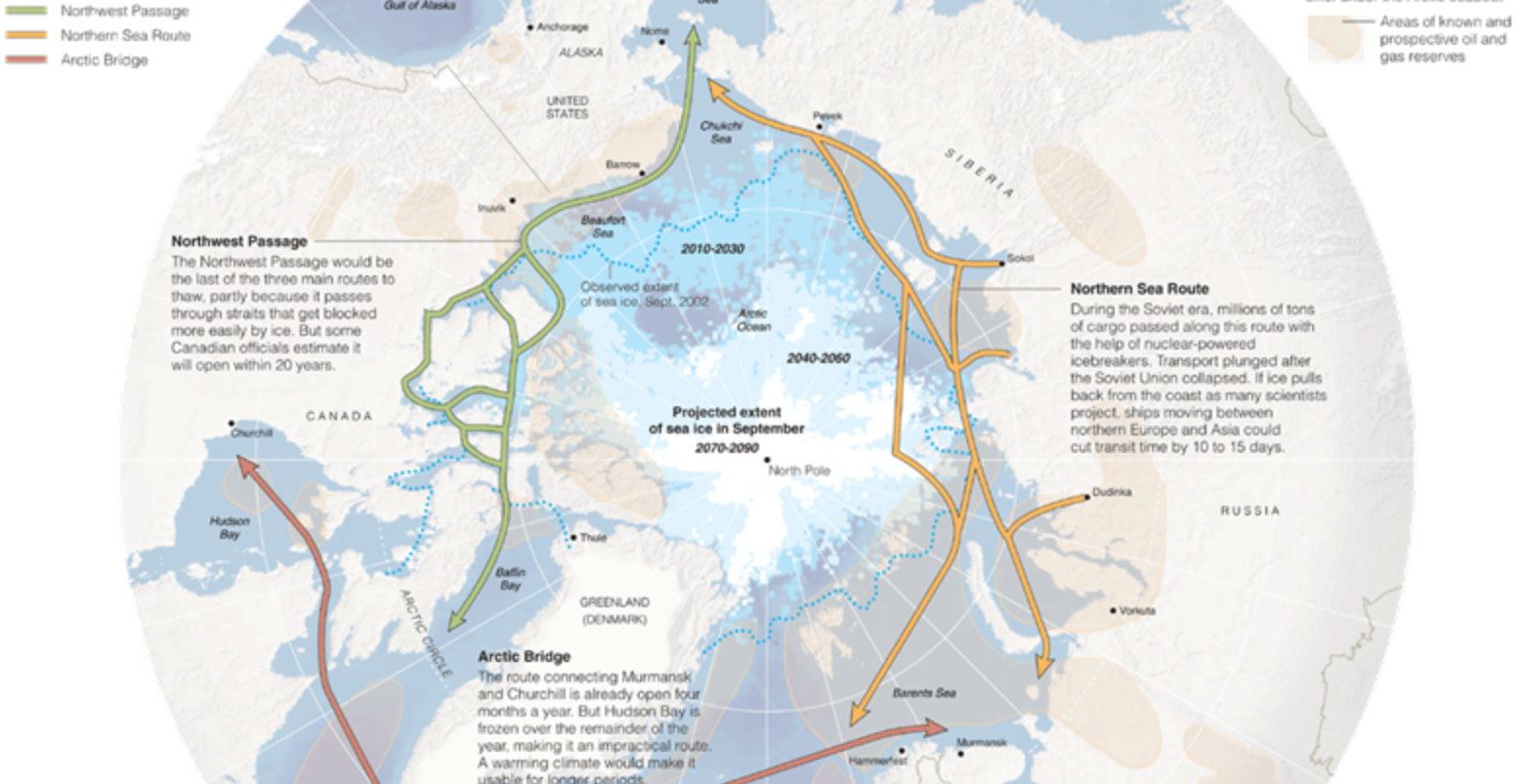
As we seem to be opening up much of the north pole and an Arctic Ocean for multiple new shipping routes, in ways that have led to projections of expanding trade-routes with names that reference imagined passageways like the Northwest Passage, the imagined increased shrinkages and thinning of layers polar ice due to global melting are understood as opening up new routes to nautical shipping as ice retreats from much of the arctic regions–but which, if they were only understood in the abstract in 2013, are now becoming increasingly concrete in the range of consequences that can cascade from them.
The arrival of a period of pronounced decline in arctic sea ice has produced a newly palpable intimations of the vanishing of what were once expanses of ice.
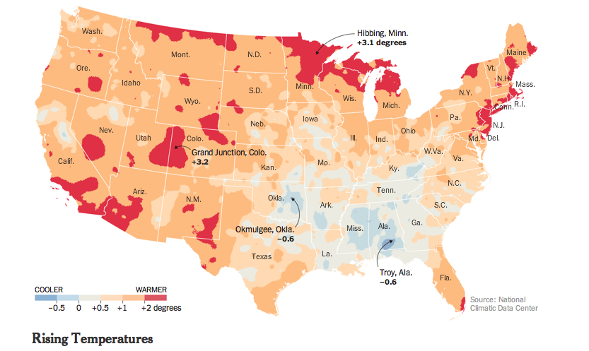
The color-saturated mapping of regional changes in temperature across the contiguous United States provided a commanding visual for the front page of the New York Times of May 6 to capture changes in the US climate: placed on conspicuously above the fold and standing alone, just below the headlines, the graphic served multiple functions in a strikingly effective way. The weather map that was first released by the Obama White House elegantly and effectively served–in ways that words could not–to combine several narratives of climate change that synthesized the findings of a recent committee of scientists on the wide-ranging effects of global warming. This is an unprecedented victory of the map, the most effective single tool to describe the complex process of a veritable cascade of environmental shifts, by selectively focussing on a known variable of local warmth. The orange and bright reds of the map arrest the eye in ways an article or headline could not, and effectively provoke a cascading set of side-effects and reactions to occur in readers’ minds that served to grasp the finality of warming’s consequences. As one mind quickly moves off the map of stark changes of temperature to the effects of future droughts and increased aridity of soil, consequent crop-shortages, and subsiding ground-levels, imagining the marked depletion of cool air, streams and rivers that would dry, and an increasing dependence on energy to create artificially cool environments.
Although it is static, the historical map suggests a spectral future forecast for the nation that dramatically moved from back pages to headline news. It mirrored a roll-out of the announcement as part of a dialogue with weathercasters on television news programs in a gambit to engage the public in the question of climate change. Indeed, the graphic mimicked the presentation of weather maps on TV, images of the national forecast that the Weather Channel has made all too familiar. Even if the map documents changes of the previous century, it shares the iconic status of the sort of severe weather forecast that The Weather Channel has accustomed us to interpret and to see. We’re now trained so often to interpret and to read similarly colorized climatological forecasts to trace regional emergencies that the Times‘ map seemed to recuperate these conventions to make a polemic point not so much about the past–“US Climate Has Already Changed”–but about the possible futures that the map forebode. For weather maps offer the most acceptable medium of future predictions, where they have currency as credible tools for short-term forecasting.
The range of information in the map that summarized a century of rapidly shifting local climate temperatures How could such a gamut of consequences be convincingly understood or presented other than in a map? The visual immediately triggered multiple questions of effects on species, forests, farmlands, new sorts of vegetation, and shifting insect populations described in the article, which a reader some decades ago would be challenged to link. The effectiveness with which the map implicitly summarized the ramifications of these potential changes, or provoked its readers to react to its orange and read heat-distributions, presented an ominous vision of the future, as well as the historical past of a century of warming weather that the headline announced. As if with the ominous fatality with which science fiction authors like Arthur C. Clarke described the future of a world battered by asteroids, the map opened up a view on the consequences of environmental change in a future world, even if its headline announced an event firmly rooted in the past century, synthesizing as it did the findings of two periods in the past hundred years.
The finality with which the map released by John P. Holdren documented a change that had already occurred across the nation’s regions, but made it to every weather bureau and station across the country, as if to maximize the newfound familiarity of audiences to engage meteorological maps as a way of making its own polemic (and of course partly political) point of how drastically rising temperatures stand to redraw the familiarity of the world. Extending far beyond earlier warnings voiced by the UN, or the pronouncements of an Inter-Governmental Panel on Climate Change whose report documented the melting of the ice-caps and collapse of sea ice in the arctic, the migration of many fish out of their habitats, and impending dangers of rising seas. Perhaps these global images were too remote, or difficult to visualize. The powerful invocation of the weathercaster seemed to give greater reality to the scary prognostic in the contiguous United States, and concretized the multiple threats of climate change in an image that confirms the changing nature of the ground beneath our feet. Some may criticize the focus on the United States alone in an interconnected world, as if the isolation of our country’s climate somehow removed it from a global problem and dilemma, or placed undue emphasis on the effects of emissions on the climate in the US. But the image of actual experiences spurs a call for reaction and response, and, in an echo of the tactics of the Obama administration, reveals the increased “cartographical literacy” in the reading and interpreting forecasts in persuasive national weather maps.
The emulation of the televised weather forecast is no doubt what makes the map appear so immediately effective.
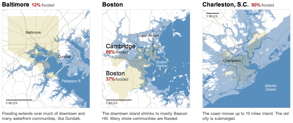
The map of the entire country was in ways a counterpart to the images of November 2012, around the time of Hurricane Sandy, simply titled “What Could Disappear,” which asked viewers to imaging the shifting coastlines of rising seas, and pictured the coasts that rising ocean waters could redefine, submerging beneath the sea low-lying areas of what we consider habitable land–as well as flooding all of Galveston, TX and some 45% of Long Beach.
The New York Times
But rather than engage with complex claims of climatological futurology, the front-page graphic was both at the same time historical in perspective and even more apocalyptic. In announcing or intoning “US Climate Has Already Changed,” it reminded us of the consequences of rising temperatures at a historical remove that was still part of our present and an uneasy glimpse to the future we have mad, using tense whose finality foreclosed debate in quite incontrovertible ways. The map’s comparison of temperatures over a century effectively resolved debates, separating the actual consequences of climate change on a familiar environment from debate about its mechanism and reminding us of its man-made origin, and untangling the dangers of the changes that it wrought from the cascading (if terrifying) mechanism of ocean levels rising, habitats altering, fish migrating, the extinction of species, and deaths of coral reefs. The map was able to link itself to a multiplicity of lived experiences and actual fact, and conjure a scarier–precisely since undefined–picture of what was to come–an era of increasing heat. (Its associations might almost be as apocalyptic as the hallucinatory surreal dream from a 1959 episode from Rod Serling’s The Twilight Zone, “The Midnight Sun,” in which the earth exits its elliptical orbit and moves toward the sun, warming the nation so much as to induce crazed radio weathercasters to stray incoherently off script and panicked Americans to flee abandoned cities en masse to Canada in search of cooler climes.)
The particularly powerful graphic of the map of regional variations in rising temperatures was quite devastating in its depiction of how–despite some regional differences–none save rare pockets of settled land experienced anything approaching a decline in reported weather temperatures. For those that did, mostly concentrated in the lower Mississippi basin, they experienced quite slight declines: it presented an image of a continent on fire, almost about to be consumed by flames, burning from its edges, if, the accompanying article noted, increasingly soaked by torrential rains.
The New York Times
The growth of areas already warmer on an average of some two degrees suggested an encroaching of scarlet red blotches across the land from all sides, particularly in southern California and Arizona, Utah and New Mexico, the northern eastern seaboard, and the Great Lakes, with Bob Dylan’s native Hibbing seeing the greatest temperature change of over a massive three degrees. The map powerfully synthesized the effects of human-induced climate change in ways that are not only impossible to rebut, using findings of a national committee that has been in existence for over a decade–but was by far the most effective among the various interactive graphics it released. The simple synthesis in a four-color map of the contiguous US immediately showed rising temperatures in some of the more inhabited areas of the nation, from New Mexico to Southern California, to the New York-Washington corridor.
In selecting a map to represent the consequences of climate change that were detailed in the report, the images suggested less of an infographic than a sort of disease map of a climate that has gone off the tracks. Even if it might be faulted from its insistence on removing the US from the world, and focussing on one place within a complex web, as well as flattening its findings in cartographical form, the image is powerfully links the land to a set of abstract changes we cannot fully comprehend, but whose effects we can perceive. This is the stunning victory of the static map.
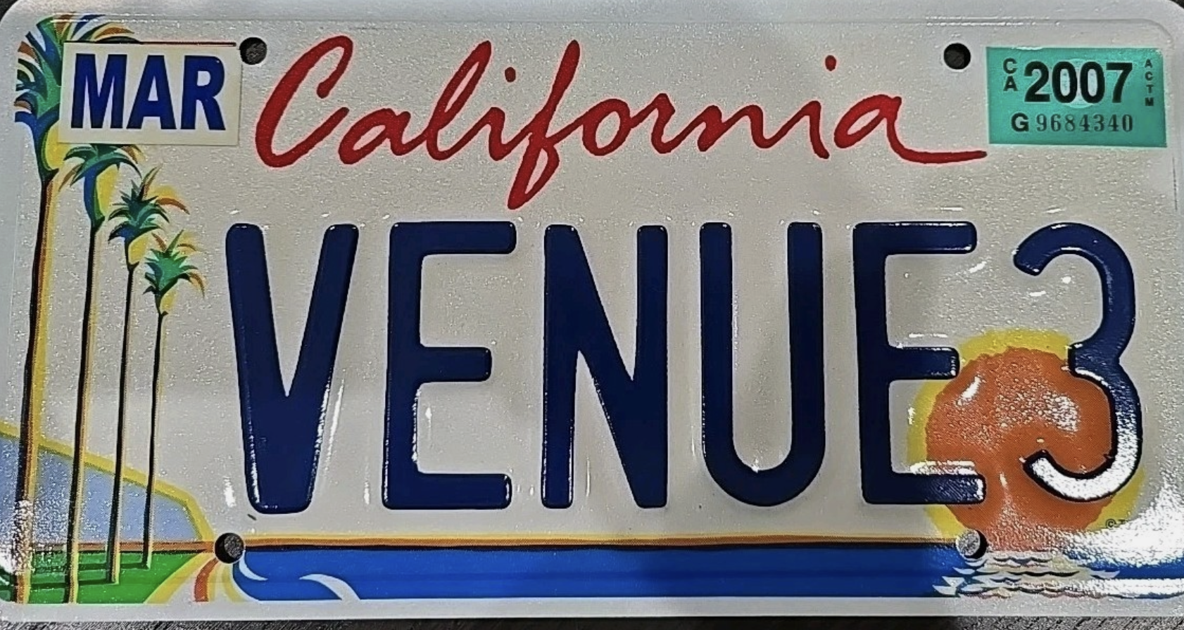
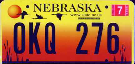
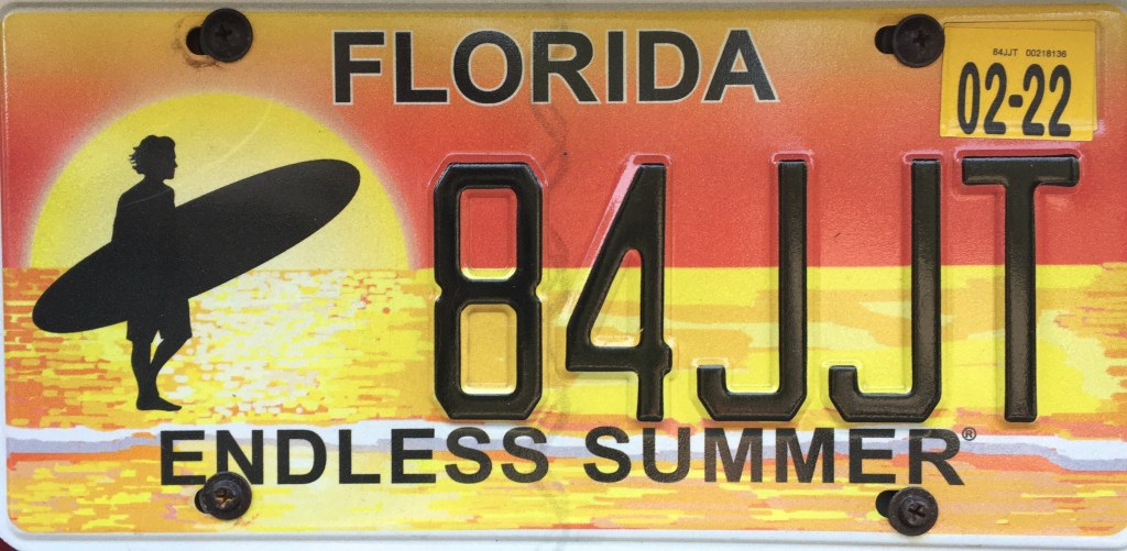
In a world where much inhabited land has become paved, and indeed where paved roads interrupt habitat, ecosystems, and formerly open land, the icon of the America license plate has perhaps rather unsurprisingly become a token of a bucolic sense of place. The images on license plates are not perhaps intentionally advertisements for travel, but often appear to be–from the designation of Oregon as the “Pacific Wonderland” to the promotion of California beaches as a perennial sunset, lined with palms, or Florida as a site of admittedly man-made orange groves.
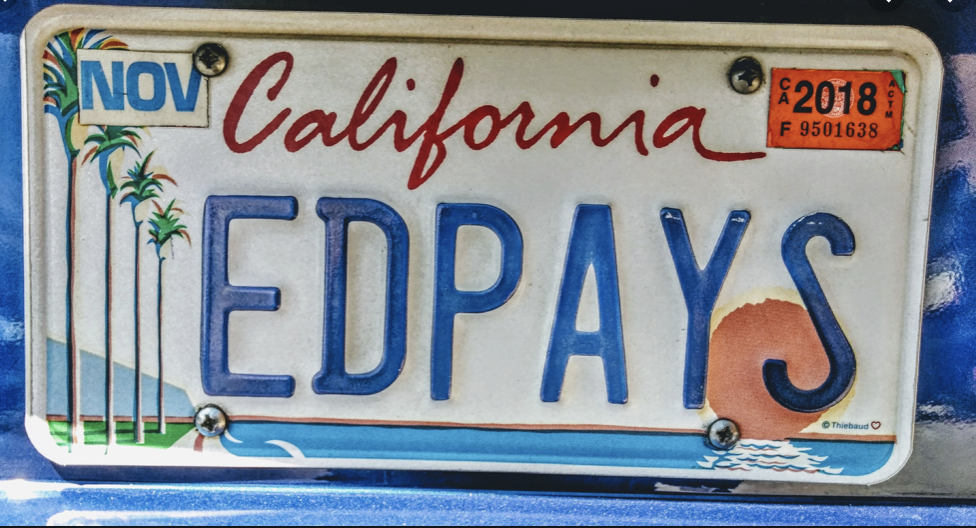
If cars offer a bit of a billboard of the driver, my own adoptive motorized state of California set a new standard for defining itself by wonderful license plate designed by California painter Wayne Theibaud as an arts plate specially designed to represent California, “Coastline,” whose iconic design of a beach, palms and setting sun in a single panel have funded arts education programs premiered in 1994–the license plate whose sales and renewals have generated over $74 million for the California Arts Council, as “Coastline” is a perpetual gift to his adopted state set a standard publicizing California’s ability to offer artists assistance by a dedicated website for license plates! The sun-drench he’d optimism of the world-view of Theibaud seemed to be distilled, reframed from a painted panel to nestle within the rounded curves of the license plate, the neoprene colors of a sewing sun seemingly a gesture the surfing culture of the coastline that was being depicted–the image was called “Coastline,” even if this was not the entire state–as if offering anyone a utopic view of the state’s riches on its Pacific Coast Highway, a site of intensely scenic traffic in the state, if the volume of traffic on Highway One, or PCH, is pretty hard to determine, and varies dramatically with road closures due to mudslides, fires, and vehicles.
If Theibaud’s work is far more often exhibited in museums worldwide–as well as in Davis!–while other designers of license plates are less well-known, the shift in designing the license plate as an alternative map of automobile registration–and presumably its drivers residence–offers a unique way to establish place on the road, to stake a sense of location on the increasingly mobile crowded highways on which we travel, reminding ourselves of locatedness, even while we are on the road. If the late California painter Wayne Theibaud argued that ‘the best abstract painting . . . is one that comes from something, but it may not be evident,’ calling its process an invitation to ‘speculate and paint the picture of your own devising.’
The experience of driving down coastal California is evoked by and seems to have inspired the license plate he was commissioned to designed to fund state art education programs, the abstract forms of the painting also inspired the artist to make a statement of the power of pictorial arts– they now go for about a hundred dollars on eBay, so valued are they as forms of art of their own as an image which “captures the beauty of the California beach sunset,” evoking a place that we might have long considered, looking only at maps, something that attracts one to drive around, with an automotive experience of its own. While Theibaud probably didn’t only expect folks to study them on the highway, or from behind the wheel, the illustration of place from an abstract expressionist who indulged himself and his viewers with cakes, gumballs, and roadways offers an idealized if familiar driving experience, moving directly into a blinding setting sun with one’s eye on the road.
The neoprene palette that Theibaud adopted was familiar from his other word, and quite enchanting, transforming or mutating the everyday into an electric view of modern life that let us see the quotidian with new eyes. (To be fair, while Theibaud was showcasing his California roots by that neon ocean blue and setting sun, he was only embraced as a California artist after having found less success in art markets outside the state, and after he became a carpet-bagger in reverse, rolling his canvases up into his old car and driving cross-country to find a New York dealer, with fellow-painter Mel Ramos. The road trip that led the UC Davis faculty member to return to be celebrated as a local pop artist led to the commission for a state’s license plate that expressed his deep concern with the public interest,–if not the most reproduced image of his pictorial corpus–confirming his status as a California artist, for whom California’s landscapes and cityscapes became almost staples of abstract expression, rather radically suggest one might best experience the place by car.
But the dayglo colors he indulged in the license plate whose setting sun is almost an abstraction, extending an orange horizon line that frames the vivid blue ocean and seems to intersect with Theibaud’s road, transformed dayglo palette into a sense of place, if it creates an icon of the state that privileged its coastal highways to Los Angeles, if not the Davis-San Francisco commute. The energy of the bright, open skies that distinguish the state is conjured by the bright colors of the palette that Theibaud, a former sign-painter, chose to express himself–
–are hardly similar to the colors one might find on a map, so much as Sherwin-Williams, but they convey an almost abstract idea of place, conjuring the coastline that was increasingly identified with California, as much as a basis to illustrate a specific landscape, or place: it is almost a state of mind. The frame of the license plate lay at angle to the actual color palette of spectacular coastal scenery the highway offered, transfigured through a Southern California imagination of an artist born in Arizona who grew up in Long Beach, who must have often commuted to the southlands; I’d bet was happy to ignore the bumper-to-bumper bottlenecks at either end of the expressway, despite rewarding views of the San Gabriel mountains as one enters LA, for a romantic coastal view.
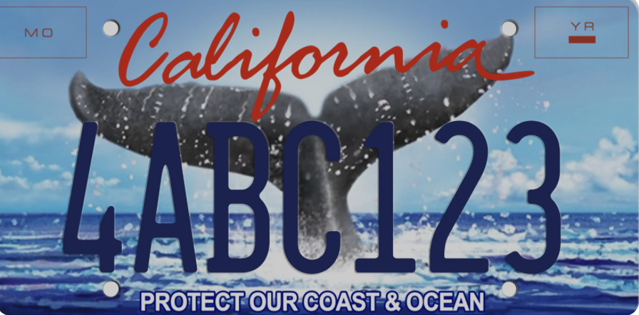
Thiebaud’s pioneering work on metal is hardly the high point of Theibaud’s rich artistic career. But it prefigured the vast expansion of not vanity plates, but pictorial maps, or counter-maps to the maps we depend on to navigate roadways that allow us to meet our destinations. And in an age when the world increasing arrives to us in license plates in a way radically removed from the road, in short visual statements, the way that these pictorial images of an unbuilt site, distilling a purity of place on the license plate that rarely exists on the roads themselves. For if the highway offers an unfolding of space and landscape by which we promise to be endlessly entertained, it was no coincidence that Theibaud’s shore-centered perspective in Coastline dialectically generated, as if to illuminate other landscapes that it occluded despite its expansiveness, of mountain ranges–and even to enter the oceanic expanse of its coast–ocean water delightfully dripping off the tale of the whales offshore its coastal waters–in the so called “Whale Tale” plate of the California Coastal Commission–as a new sort of imperative on the license plate, transcending a landlocked place–
–that oasertes the unique privileges of Californians as coastal residents by its injunction to dedicate ourselves to coastal protection as if driving on roads were compatible with a clean coastal ocean.
What is the recent turn to shift from vanity plates to license plates that bear testimony to our personal of world improvement? An unforeseen outcome of Theibaud’s creative design may have led many o to wear on your car, or encouraged privileged Angelinos to indulge options of alternative fantasy landscapes, indulging their own artistic skills on a broad cartographic take on the state, to model possibly more preferable to options the state offers, mostly modeled after screen shots of an age of iPhone tourism, that has helped reinforce a bounteous relationship to the land.
Does the alphanumeric annotation born of computer texting suggest an origin for this image of Half Dome? Could Thiebaud have imagined unleashing the futility of self-designated artists to project alternative image of the state, having pioneered and opened the potential fertility of license plates as canvases? As if in reaction to Theibaud’s preference for the warmer colors of his coastline, the ranges of mountains rising behind the sea became a default alternative in recent years, or the most part, even in environmentally conscious variations to call attention to the mission of Keeping Tahoe Blue–substituting the treasured lake amidst snow-capped Sierras for the coastline of the Pacific–
–far starker and more angular than the smoothed curves of Thiebaud’s version of Margaritaville. The mountains are to be sure, if angular, a welcome prospective that acknowledges the ranges that are the spine of the state, hardly as austerely patriotic bent of the South Dakota’s sculpted faces–
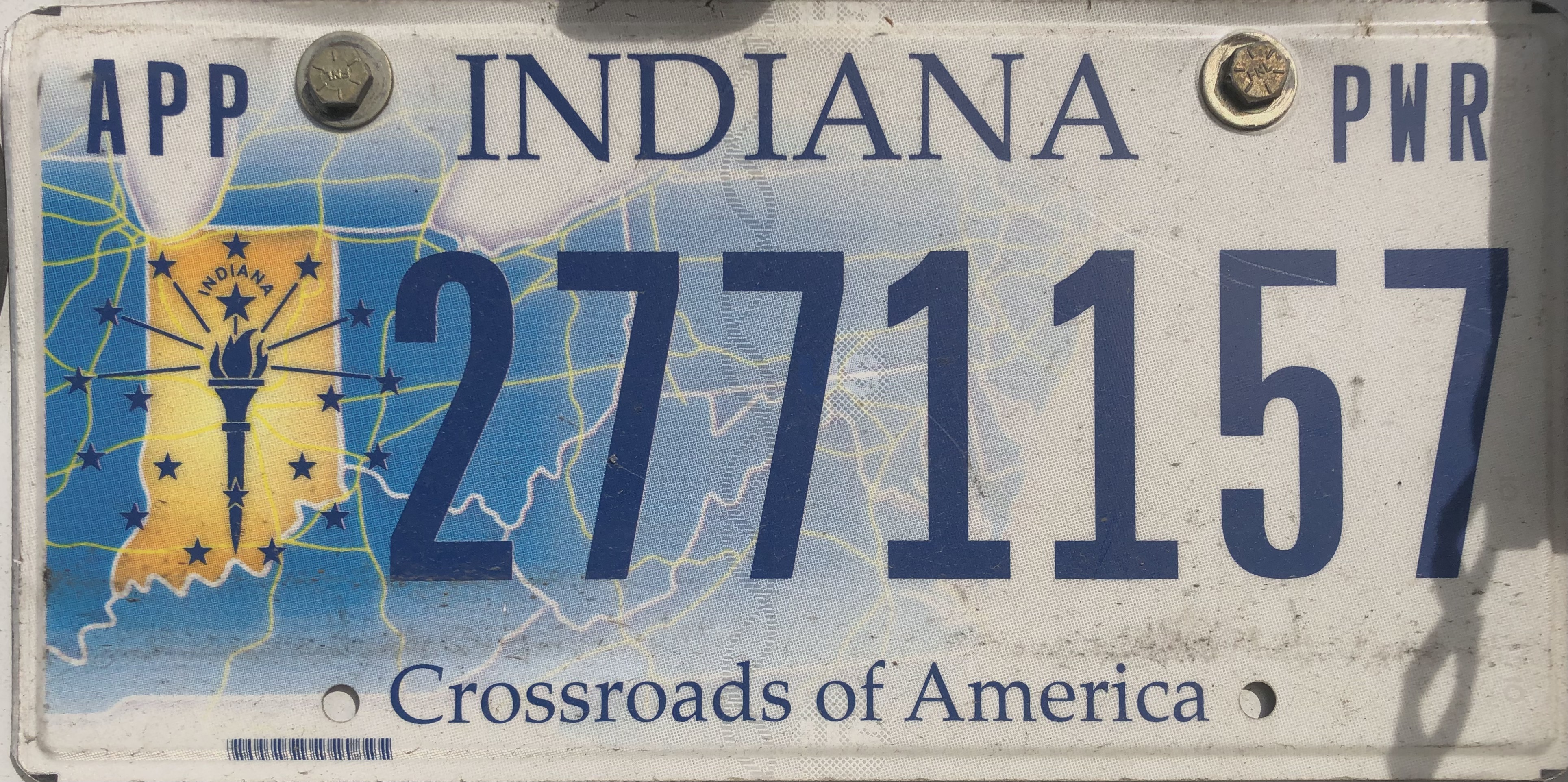
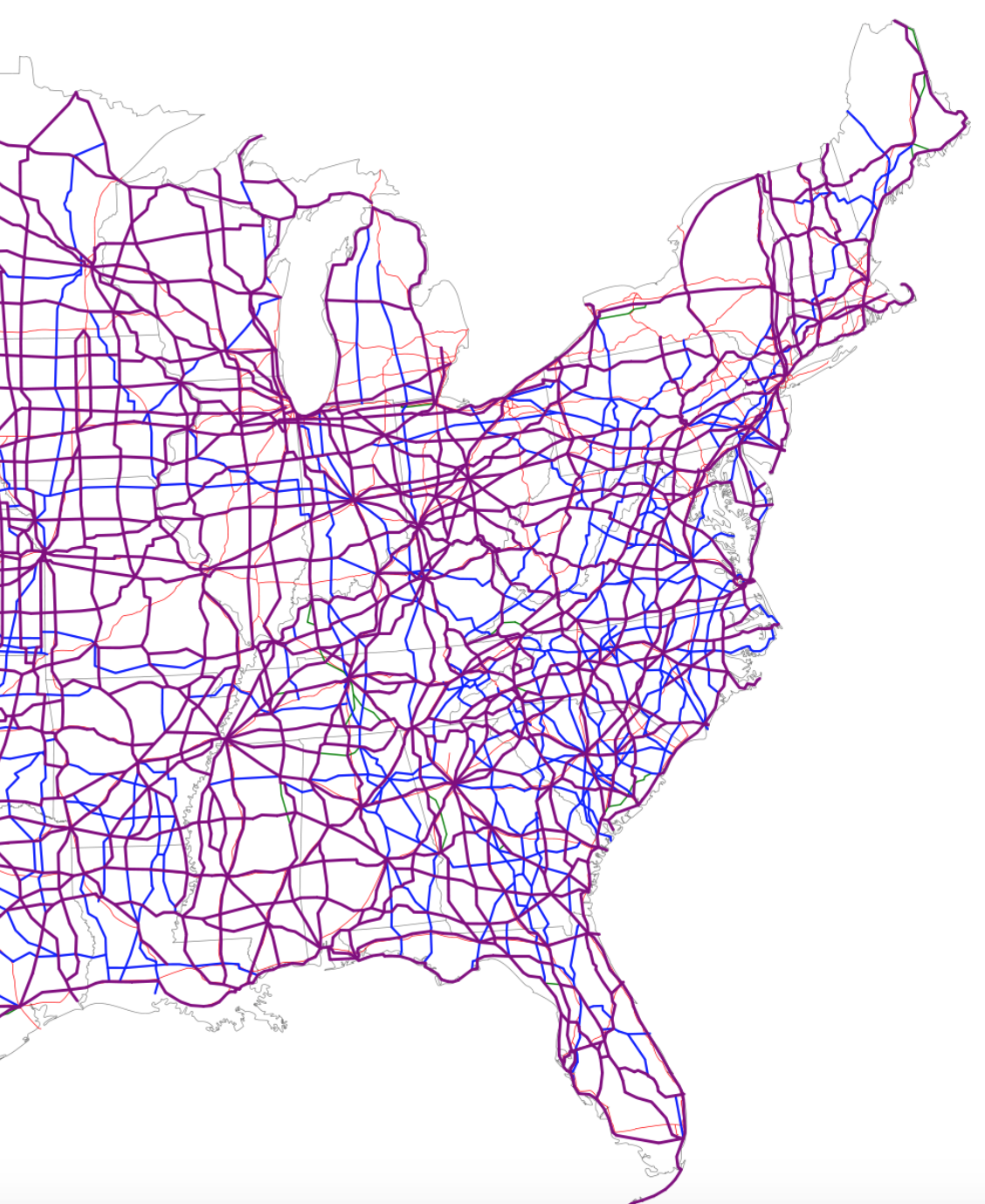
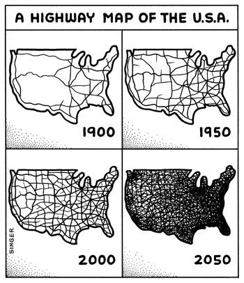
Indeed, the ideal view mediated by the license plate, if not God’s Eye, is about as far from the road as one could get, and intentionally so–a far cry from the plates on trucks that one might see from the midwest, that take the highway map–and geographic image of the state as the center of the USA–that seems unique in reminding one of the highway system left tacit in most license plates!
Its design prompts one to remember the central location of Indiana on those unfolded highway maps, in deed, making it an outlier that might very well prove the rule and the thesis of this post. But if the plate was a unashamed symbolization of the power of the midwestern state it maps at the nexus of highways that constitute the nation’s cartographic center, pictorial plates have been adopted in recent years, perhaps encouraged by embossed landscapes, in pictorial detail that almost seek to restore a sense of specificity of place in order to compensate for the placeless spatiality that most motorists experience on most paved highways. Was this due to the death of the paper map, I started to wonder? Or the replacement of physical maps with GPS guidance systems? What of the fate of the maps whose forms used to once define license plates?
Bear me out.
The recognition of place in the frames of plates, increasingly born of qualitative arts, emerged in the 1950s, after all, in reaction to the growth of drives on highways, and the velocity of interstate travel. If cars sped across the landscape, glimpsing roadside scenery without fixed orientation, did the landscapes of license plate promised a sort of counterpoint?
Can this official design–here retaining the vague outline of the form of the state, panhandle to the keys–meet a need for place to compensate for the anomie of the skein of the highway systems and web of interstates that now cover much of the countryside, and indeed constitute almost a space of their own, unmoored from place?
A Highway Map of the USA
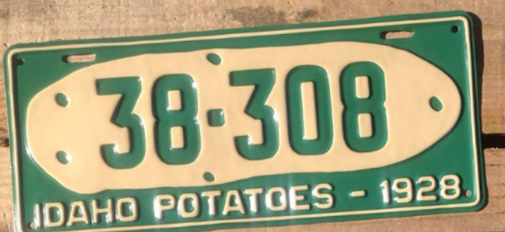
Indeed, the rough condensed history of our roadways often seem to have assumed a sense of replacing the places that they traverse or connect, as corridors of transit may have replaced the dominant sense, for many Americans, of where they are located or what sense of place they occupy in the heterotopia of the road. There is a story that this all began with the potato, the early move of Idaho to rebrand itself as the site of its bumper crop, as if reminding viewers it stood in balance with the open road or the future of technology, as if producing a bumper crop just before the Stock Market crash that led so many to rely on supplementing their meals with potatoes that the first pictorial plate in the United States may well have lost some of its luster.
But the humbler hope of agrarian Idaho’s earthy Secretary of State was not only to attract tourists by a flashy “gold potato” but boost the image of a state beyond an alphanumeric identification or serial design, by a visual symbol of pride that have been claimed to have so radically enlisted artistic license in promoting the state’s self-image to create changed atttitudes to the plate as a space to register not only ownership, but a changed relation to an actual geographic place.
While the image of the potato on a field of green may have been akin to promoting the “new gold” of potatoes to Idaho farmers, to inspire regional settlement, it may be that the interest in promoting interest in the place of the potato would bolster tourism in an increasingly automotive culture, and the Secretary of State must have had some sense in the contrast of the rootedness of the spud in Idaho fields with the cars speeding along its interstate, perhaps headed to the Grand Canyon or Mt. Rushmore, and compel pride of place to make Idaho worth a detour for some time–or even plant one’s roots (or irregularly shaped tubers) for future rewards.
For the first pictorial plate that affirmed the state’s agrarian economy may have been a bit tongue in cheek, a far cry from the open spaces that emerge with a sense of optimistic longing, able to conceal the fact that one is driving in space at high speeds, which if they have included some politicized slogans–as New Hampshire’s commanding assertion, dating back to the Revolutionary War, to “Live Free or Die,” adopted by Gov. Meldrim Thomson as a point of pride to leave his imprint on the sensibility of his state, although the adoption at the height of division around the Vietnam War seemed a summon conservative patriotism, if adoption of the two-fisted motto seemed to manufacture the semblance of a timeless tradition.
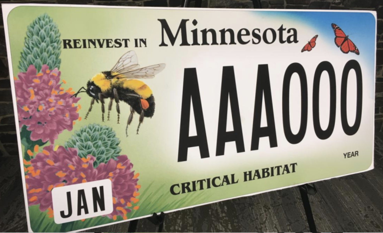
The rise of new symbols for states that went beyond a map was suggested in the glorious image of Oregon’s pristine rivers, without a map or even a landscape, in the tones of the incredible fish who return to the state perpetually, traveling along long coastal rivers from the Pacific–the massive Columbia, Snake, Klamath, or Umpquah–by the ghostly rainbow salmon, that suggest the site of wilderness and confluence with the Pacific ocean, to denote the bounteous riches of the state.
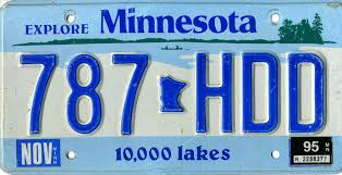
As the legends and mottoes of license plates has expanded far beyond that golden spud, to promote a sense of locality that was perhaps less in the earth but similarly evocative of a landscape able to be experienced above the ground. If historian Rick Just argued “license plates became a different thing after that potato,” screen printing and graphic design have allowed the license plate to become a cartographic and pictorial surface of their own, and a sight for the optimistic reinvention of place, as much as a tourist advert: if there was a change in motto as Arizona decided to follow suit with a catch moth, and stamped “Grand Canyon State” on its plates in 1940, as World War II meant that fewer and fewer families visited the national park’s gorgeous trails, and, in the boom of the postwar era, Minnesota beautified itself as a ‘Land of 10,000 Lakes.” The visual surface of the plate has become a site of increasing multiplication of attempts to refashion states as places within the small acreage of the license plate itself, creating idyllic scenes that denoted place, as if in response to the placelessness of being on the road.
The politicization of the design of these most common designators of place on cars, the license plate, is hardly surprising. After all, the rise of the proprietorial sense of designing ones own plates is not a far jump to that of viewing the format of the license plats as if this designation of plate were not forms of public writing. Even without considering the broad notion of what sort of writing this constitutes, the readiness to treat license plate design as if it were an avenue for freedom of speech or a form of expression reveals an identification with self and car to an expressive form and on a semantic plane.
The sorts of legal claims for freedom of speech–or plate–suggests not only an acceptance of the license plate in political discourse, but a pronounced shift not only in the aesthetics but in the use and construction of license plate design from the rudiments of denoting site of registration in the past. If the license plate has only emerged in the past twenty years as a surface of almost pictorial illustration, the purposeful playing with its surface as a sight of design suggests the expansion of graphic design, and understandings of the map as an image of identity. While the gold potato may recall the many maps of the “Gold Regions of California” that were present from 1851 in how Charles Drayton Gibbs promised prospective buyers he had mapped in “Golden California,” using suggesting color choices to suggest where prospectors might do well to look–
the fantastic places of license plates have expanded with both creativity and cartographic guile, showing increasing abandon about their objectivity, and staking greater premium on piquing interest from moving motorists and passersby.
For during the past twenty years, we have come to identify the content of one’s plates as transcends an identificatory tag, expanding its graphic opportunities as an occasion to raise state revenues and provide vanity illustrations of individualization on the highway and driveway at considerable costs. Perhaps it is worth asking how this relates not only to freedom of expression, but to our sense of place. It is perhaps on account of the massive growth of graphic designers and graphic arts, as well as the ease of printing airbrush designs on metallic surfaces, that the license plate, that modest of all surfaces, has recently become something of an advertisement–along the lines of U-Haul moves; the images on license plates have become evocative landscapes that almost embed viewers in their content, depicting a sense of place that seems more alluring than neutrally mapped. Indeed, the growth of new landscape icons on the license plates that are seen on the road seems to have inspired the coterie of graphic designers at Ars Tecnica to assign an award for the “ugliest license plate” to appear, at the start of the new millennium.
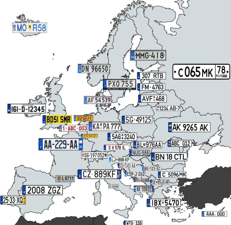
The elevation of the license plate as a site of destination and akin to a tourist advertisement suggested the rise of advertising as much as the pragmatics of automobile registration. The expansion of the world of graphic design to the license plate that suggests a shifting notion to place, as much as of graphic templates in the age of photoshop, but betrays a search for transforming the plate, akin to the car, to a site of identity and meaning, that is deeply tied to the driver’s sense of self, or a convergence of state interests to the desires of drivers, evident in expansive menus of graphic design that DMV’s offer owners of cars, and that offer a gallery on the road, offering a diversity that is sharply American, and seems quite unlike the maps that one might make of European license plates, pre-EU.
Far from seeing the plate as an official signifier, the rise of graphically complex plates moved a stable signifier of location and regional provenance. Beyond being a form of taxonomic classification, or an add-on for vehicle registration, the personalization of plates have brought a search to capture the essence of place of patently nauseating kitsch–
–that summons the struggle for place to still exist in a post-map world, as much as it conjures a sense of place that we might really recognize, as if an affective image that tries to appeal to the state’s residents, by its increasing remove from the geographical map–and far more numinous and faux evocative sense of landscape meant to evoke the magic of place.
Such a change might well correspond to a sense of the increasing placelessness of a nation that lacks clear edges, and where states have an identity almost invisible save in electoral votes. If the representational unit of the state has declined in national politics, for all practical purposes, there is a sense of reclaiming local identity in the license plate in increasingly immaterial political map.
Indeed, the victory of such airbrushed images of landscapes–instead of maps–seem all too often akin to advertisements for tourist travel, airbrushed imagery, which as much as claiming to evoke a sense of place suggests something akin to perpetual placelessness of an alteration of rural and urbanized landscapes blending into one another, almost suggestive of an appeal for place before the increasing lack of differentiation of the national landscape, even when evoking a map to give stability to a fleeting sense of place.
n
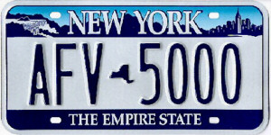
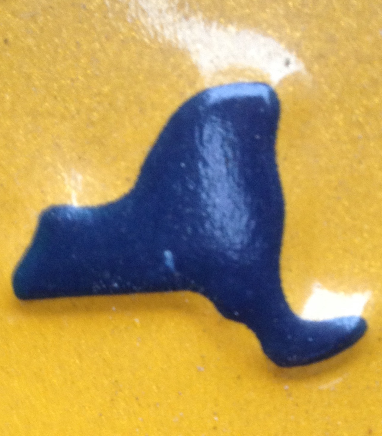
Indeed, despite the radically limited cartographical content of the raised state pictured on the New York State license plate, a considerable effort was invested in affirming the iconic centrality of the state, even it it is a barely recognizable or distinguished blob of paint when raised metal when at close hand.
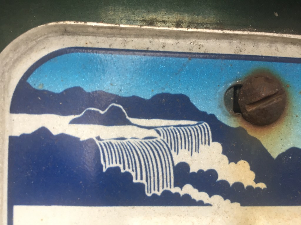
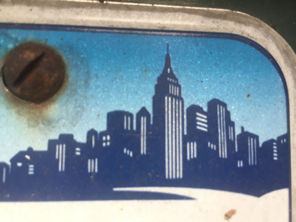
To be sure, New York license plate design is distinguished by its ability to comprehend a broad geographic unity, and functions as a mapping as an illusion shrinking the geographical distances between, say, Niagara Falls and Manhattan in a somewhat short-lived attempt to spread across the economically and culturally quite diverse state–
–as if to champion the miracle of the transport of water in its hydrological infrastructure, where the water of northern reserves are channeled downhill to fit urban appetites and needs: the parking of two vignettes of quite different scenes, demographics, and even political inclinations, links the upper state and the metropolis of New York City (or Manhattan), by moving from the bucolic scene of Niagara Falls, an abundant cascade of water and iconic from postcard view, to the image of the Empire State Building in the concrete skyline, linking built and natural environments in persuasive ways that the state map may in some ways fail to do so effectively any more, using the old role of vignettes to construct a new affective regional identity–
–that trumps actual geographic continuity, if embedding both in an imagined skyline, itself bridged by the words “New York.” more than reality. The license plate relies on the map, even if only as an atrophied remained, as a hyphen between alphanumeric license numbers, to create this bridge, and remind us of the affective relation to a region!
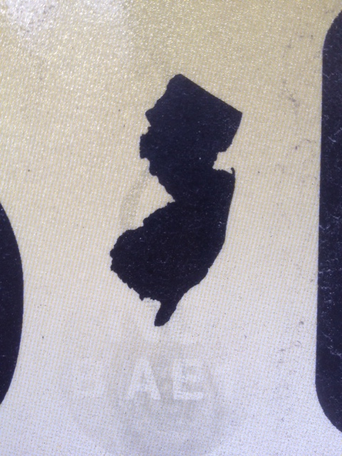
Although these dramatically reduced maps are but tokens, a visual pause between digits, numbers, or letters, and have lost geographic identifying functions for most states, they affirm a sense of unity. The placement of small, raised maps in northeast states–New York; New Jersey; Connecticut; and, to an extent, but in a different fashion, Pennsylvania–suggests a survival of the cartographical as a remainder of which some states are not ready to let go or consign to the dustbin of history, even in an age of GPS and digitized maps. Not really a visual fetish, but a designator of place, distinguished by an exaggerated appendix of Long Island, the New York image is no doubt the most familiar and recognizable, even if its edges are quite abstractly smoothed so that they provide little resemblance to an actual map, which is reduced to a mere token.
While the map is paired by a similar centrality of New Jersey in license plates in the greater metropolitan area–and in the image of the ‘keystone state’ that is used to punctuate Pennsylvania plates, the diminished centrality of the map in license plates suggests a certain sense of loss, and a sense of bolstering the symbolic currency of the meaning of the old jigsaw puzzle map.
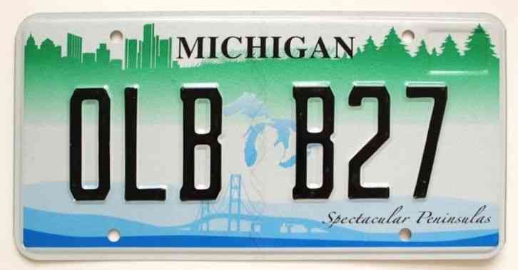
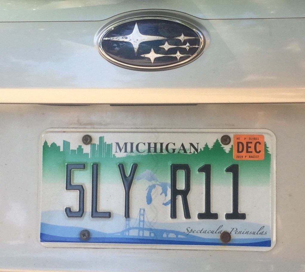
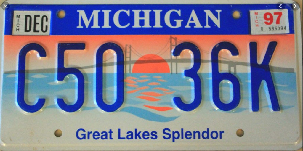
To be sure, there is an ativistic survival of maps migrated into some license plate templates, as if to curry favor among an older audience–that continue to try to reconcile the built horizon of Detroit and the bridge that spans the great lakes with the blue icon of those majestic bodies of water themselves, which, while in fact spanning several states and two nations, provide a symbolic shorthand for the state and its unity to the Upper Peninsula, as well as foregrounding or advertising its spectacular peninsulas–
–as the sun setting over Lake Michigan, in the prospect of “Great Lakes Splendor” shows a sunset through the iconic span of the bridge, foregrounds the landscape’s unity by cool blues lake waters.
The issue may be relatively pronounced. For unlike other states, save Hawaii, and no other non-cosstal states actually bridge bodies of water in their sovereign space. Indeed, if maps provide the most familiar and powerful ways of uniting space in a coherent fashion, the problem of coherence in the “other border state” are profound.
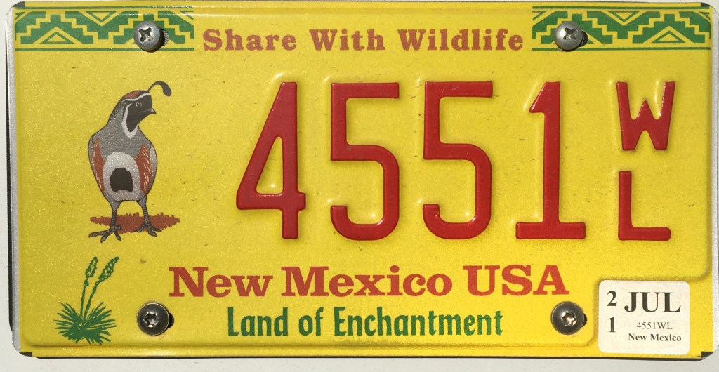
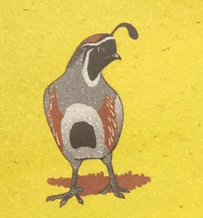
There is a cure pleasure, indeed, in attempts to restore a sense of native habitat, all too rare in the license plates I have studied, by foregrounding the natives quail of New Mexico–an added treat when this motorist discovered it was a feature that was an option at his DMV, and a way, perhaps, to compensate for deep guilt at the change of global atmosphere that the release of carbon and greenhouse gases the driving of the car–even if it is electric–releases while on the road.
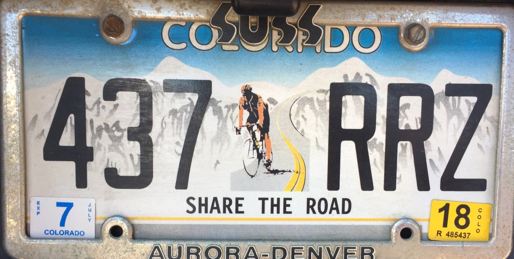
–if the inclusion of an actual non-automobile driving person to watch out for on the road seems to be one of the more important injections that would lead the license plates to be seen as a valuable injunction drivers should not lose sight–in this case, quite brilliantly fit within the Rocky Mountains of the Rocky Mountain state.
A strikingly similar generic skyline was adopted not only for Colorado, the Rocky Mountain State, but in grisaille tones, by the state of Montana, less sporting, perhaps but with a broad deep-ground perspective that situated the state on the edge of the mountains, using the greytone minimalism to suggest a broadly atmospheric setting, if with markedly less snow.
In late January, my daughter Clara wrote with conviction that “Great adventures in eating must include the all-important meal known as the dessert,” and confessed “I could not live with out dessert.” We could all live without desertification, or the expanse of areas of the world on the that threaten to become enlargements of existing uncultivable land, which the United Nations in 2007 declared “the greatest environmental challenge” and a particular emergency in sub-Saharan Africa that could provoke an impending displacement of some 50 million people within the decade. Several countries have tried to contain the expanding regions of deserts by planting trees, restore grasslands or introduce plants to stem eroding soils, the huge expense of using water and of using water that evaporates as often as it feeds plants, is far less effective or practical than it might seem as an ecological bulwark.
Scientists have debated and struggled to understand the causes and origins of the growth of deserts across the world, asking whether the underlying causes lie with declining rainfall, a severe drought that began in a period leading to the 1980s, and how to place local measurements of vegetation that revealed flourishing vegetation near barren landscapes of desertification. The British ecologist Stephen Prince expressed his frustration at assembling a larger picture of desertification based on data that he described as “pinpricks in a map” which failed to assemble a larger picture by studying vegetation from space by using time-lapse photos of the area of the African Sahel caused famines across sub-Saharan Africa to assemble an image that better revealed relations between local conditions across a huge expanse, of which this photograph by Andrew Heavens created a synthetic document that reveals the broad proportions by which the desert encroached on arable land:
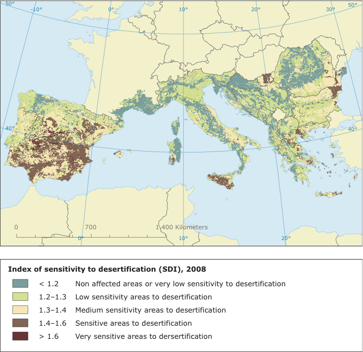
The phenomenon is not limited to Sub-Saharan Africa, moreover, as an image of the variety of microclimates in which the threats of sensitivity to desertification has been mapped in the fertile region of the Mediterranean basin:
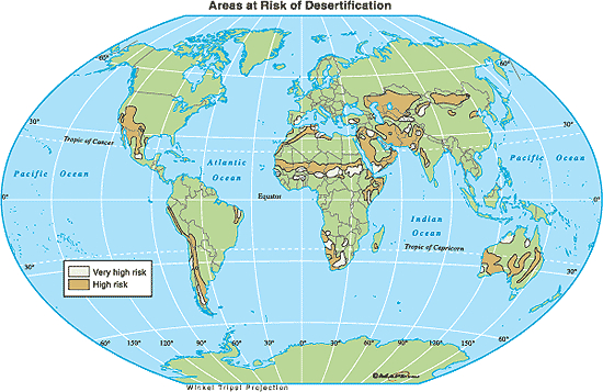
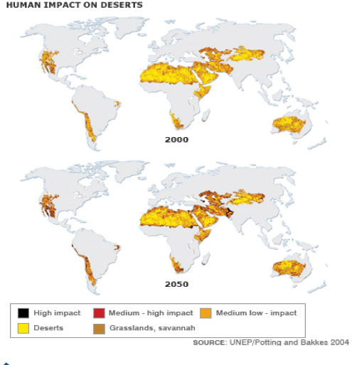
The challenge lies in understanding the global proportions of desertification–revealed in the below map that notes expanding deserts by tan bands–in a coherent understanding of the huge variations of local contexts from Asia to Anatolia to Patagonia to Australia to the western United States:
The global risks of desertification–most prominently on five continents–have been dramtically heightened in recent years not only by global warming, but our own practices of land use, the Zimbabwe-born environmentalist and ecologist Allan Savory notes, describing it as a “cancer” of the world’s drylands, a “perfect storm” resulting from huge increases in population and land turning to desert at a time of climate change. The areas of land turning to desert are not only occurring in dry lands, but in the lack of any use of the land that leaves it bare and removes it from land-use. Savory has argued in a persuasive and recent TED talk that the global dangers of desertification has multiple consequences, of which climage change is only one.
The growth of areas of desertification are apparent in this satellite view, which reveals the extent of a global process of desertification not confined to Africa’s Sahara, but already progressed across quite large regions of both North and South America as well, on account of rapidly accelerating changes in micro-climates world-wide:
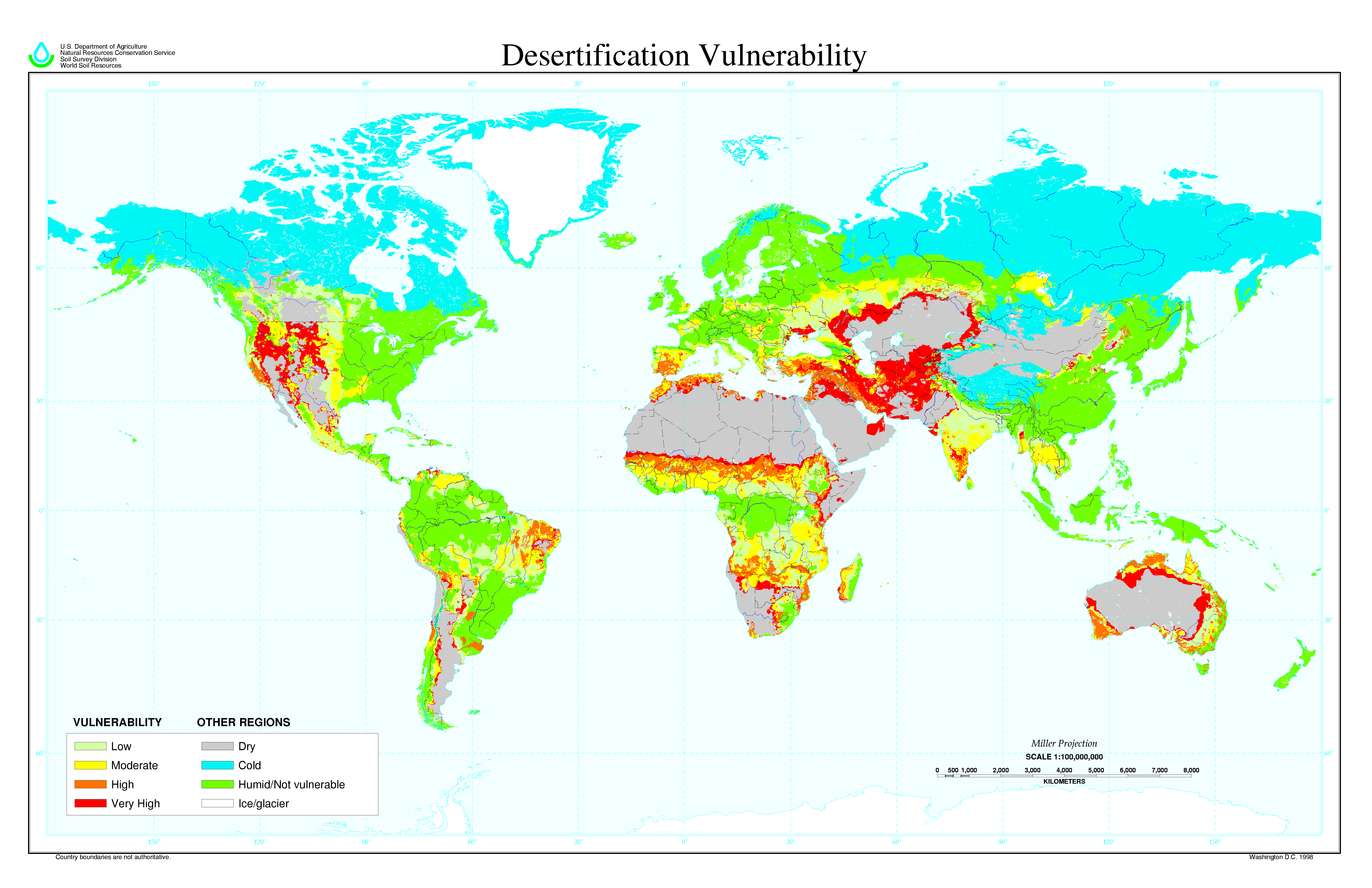
The expanses of desertification are even more apparent in a global projection of our newfound vulnerability to desertification, that illustrates the massive degree of changes in the world’s land, in part effected by the bunching and moving of animals, largely encouraged by federal governments who reduced the lands open to cattle grazing in the belief that good land-management practices meant protecting plants from grazing animals:
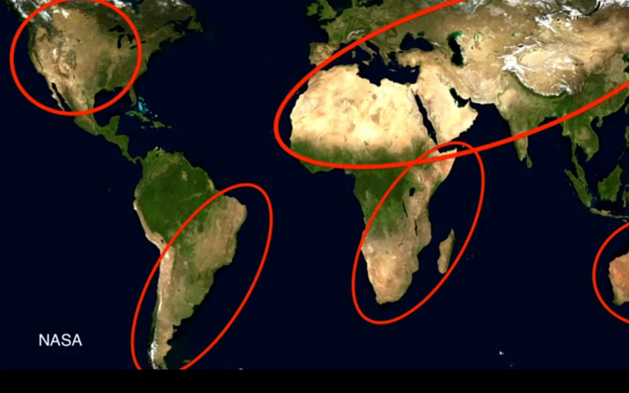
The above map made by the United States Department of Agriculture-NRCS, Soil Science Division, reveals the dangers of expanding desertification at an extremely fine grain. We can view this map by highlighting the expanses threatened by increased desertification in this world-wide satellite view, whose regions ringed in red highlight the areas of a dramatic increase of desertification and an apparently unstoppable cascade of deep environmental change and release of carbon gasses:
The difficulty of understanding the causes of desertification arose from a deeply unholistic ecological view of the nature of microclimates begun 10,000 years ago but rapidly increasing now. Savory asks us to relate this to the hugely artificial contraction in the number of herds grazing land seen in recent years, creating a resulting very high vulnerability to desertification–noted in bright red–that would result in carbon-releasing bare soil, threatening to increase climate change, much as does the burning of one million hectares of grass-lands in the continent of Africa alone. Savory argues that the only alternative open to mankind is to use bunched herds of animals, in order to mimic nature, whose waste could act as mulch help to both store carbon and break down the methane gases that would be released by bare or unfertilized–and bare–soil.
Such mimicry of nature would effectively repatriate grasslands by introducing the planned pasturing animals and livestock like goats to regions bare of grass or already badly eroding–and has lead to the return of grasses, shrubs, and even trees and rivers in regions of Africa, Patagonia and Mexico, with beneficial consequences to farmers and food supplies. By the planning the movements of herds alone, replicating the effects of nature can turn back the threat of desertification by movable herds of sheep and cows, already increased in some areas by 400% to dramatic effects of returning grasslands to denuded regions of crumbly soil and straggling grasses. Even in areas of the accelerating decay of grasslands and growth of bare soil, Savory argues, we can both provide more available food and combat hunger through planned pasturing, and reducing a large threats of climate change that would remain even if we eliminated the worldwide use of fossil fuels. He argues that we can both take carbon out of the air and restore it to grasslands’ soils that would return us to pre-industrial levels, based on a deeper appreciation of the ecological causation of desertification and by replacing rejected notions of land-management, actively reducing the frontiers of desertification. Although Savory does not note or perhaps need to call attention to the risks of the huge displacement of populations and consequent struggles over arable lands, planning the repatriation of land by animals would provide mulch and fertilizers to rapidly effect a return of grasslands in only a manner of several years.
The prognostication of the expansion of the desert is not often as mapped as the rising of ocean waters in the media. But it may offer a more accurate map of the alternative over the next fifty years, and hint at the huge attendant consequences:
(I’m including a post by Susan Macmillan on Allan Savory’s March TED talk here.)
We read more maps than ever before, and rely on maps to process and embody information that seems increasingly intangible by nature. But we define coherence in maps all too readily, without the skepticism that might be offered by an ethics of reading maps that we all to readily consult and devour. Paradoxically, the map, which long established a centering means to understand geographical information, has become regarded uncritically. As we rely on maps to organize our changing relation to space, do we need to be more conscious of how they preset information? While it is meant to be entertaining, this blog examines the construction of map as an argument, and proposition, to explore what the ethics of mapping might be. It's a labor of love; any support readers can offer is appreciated!


