Tag Archives: American Community Survey

Variations on Our Fragile Union: Small Stores across 40,000 Zip Codes

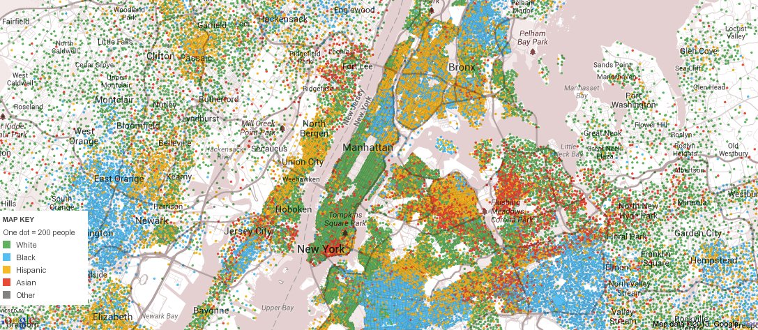
Any maps create quite powerful tools to knit regional divides into coherent forms.  The order of maps serve both to fabricate harmony of a whole from its parts and for showing its divides, in ways data visualizations make increasingly clear.  If the origins of “chorographies” were illustrations of communities, and aestheticizations of their harmony, we’ve become increasingly interested in and attuned to visualize divides, as much as visualize unity, to explain the symptoms of divisions where they might be most evident, and use the format of the map to demonstrate compelling evidence of the fractures that divide, and explore how ideology ever came to “cluster so predictably,” in with geography,” as Steven Pinker nicely put it, and if different conceptions of human nature exist in different parts of the country. We’ve all been all too familiar with the recent remapping of these divisions, increasingly evident  in our political discourse, and affirmed in different ways by posing a set of choropleth maps as points of departure in order to chart, gloss and explain the extent of our divides by the range of data available on local differences across our fragile union.

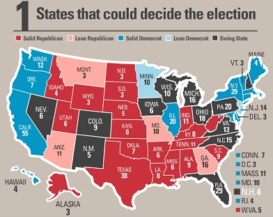
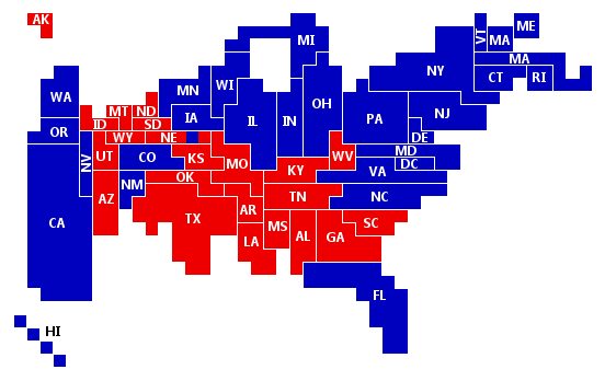
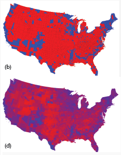
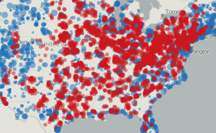
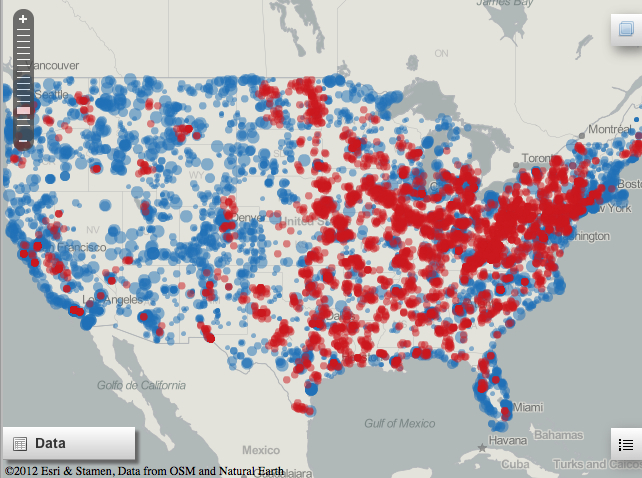
As we approach Christmas and the season of gift-buying upon us, it makes sense, as Philip Bump, with some help from folks at Esri and Stamen, suggests, to consider the stores where we realize shopping habits and alternatives as criteria that increasingly divide us–and consider the consequences such divisions hold.  Indeed, the divided commercial topography in many regions of America reveal–even more than real estate–a deeply drawn set of cultural divides rarely considered in attempts to understand our fractured political landscape:  so dense are the clustering of large stores in certain areas that they obscure the legibility of place names.  In ways that reflect something like a Google Maps query “shopping at private business near [ZIP code]”, the distribution of data suggests how the landscape of shopping shifts in regions of the United States that provide a deeply qualitative record of our society.  But rather than generate a list of sites, or map all stores, selective parsing of large scale vs. independent shops provides a neat filter to measure the commercial contours of the landscape in ways that won’t so much correlate as reflect a composite image of the lower forty-eight. What’s the new political topography of the United States?  Well, perhaps it’s less red states vs. blue states, here shown in two views of the divisions between Democrats (blue) and Republicans (red)–by data here parsed at county level and by intensity of affinities–map a deep set of social divides that have strikingly played out in weirdly clear geographical blocks in presidential elections.

As Steven Pinker put it, “Regardless of who wins the presidential election, we already know now how most of the electoral map will be colored, which will be close to the way it has been colored for decades.”  Why, indeed, are some red states so red, and other states so blue?  Is this a sign of a divide between rural and urban inhabitants and political preferences–or is it deeper, and, if so, how did we become so divided in our imaginary of what the nation should be?  Are these maps creating differences, or do they reveal some of the deeply-set social divisions codified by Mason and Dixon as a latitudinal divide, but whose division is now reflected ban urban/rural divide? We all know that the last few elections have been stunningly fragmenting–

votes-  red v blue, by county and interest level

In a coy reference to collective mapping, Aaron Black of the Washington Post used Gallup’s annual rankings of which states are the most conservative and which are the most liberal to create a heat map of populations across the nation, employing the popular cartographical device so often adapted in infographics to chart virtual a spectrum of political opinion, which, while less intended to emphasize the fixity of divides within current public opinion, showed that outside of Alabama and Wyoming, the number of self-declared “conservatives” in the country does not follow such a close divide:  yet it is hard to find a less changing term than “conservative” and “liberal,” and these don’t map onto the breaks in voting that have recurred across four presidential elections.

%22Open Heat Map%22Washington Post

But the pressing question of where these divides actually lie have led folks to return to maps with considerable zeal–both as powerful heuristic vehicles of statistical measurement and projection, and to find possible answers for these real divides.  The prevalence of infographics and talk radio have conspired to make this a real issue of political debate for the The American Conservative, where Patrick J. Buchanan placed the question of secession on the front burner this year, corralling red state secessionists and blue-state secessionists into the same category as folks who acknowledge we either face increasing ungovernability due to geographic expanse or having little in common:  the issue of what we have in common, not much of a question for the very notion of a nation or state was in the past understood to balance multiple interests, may be less the question than the “spirit of intransigence” that we face in most political debates.   Does this have to do with the vociferous defense of issues that won’t be debated, or the fact that we have been all too often poising debates in quasi-imperial essentializations of what is un-American?  Or is it due to “lifestyle”?

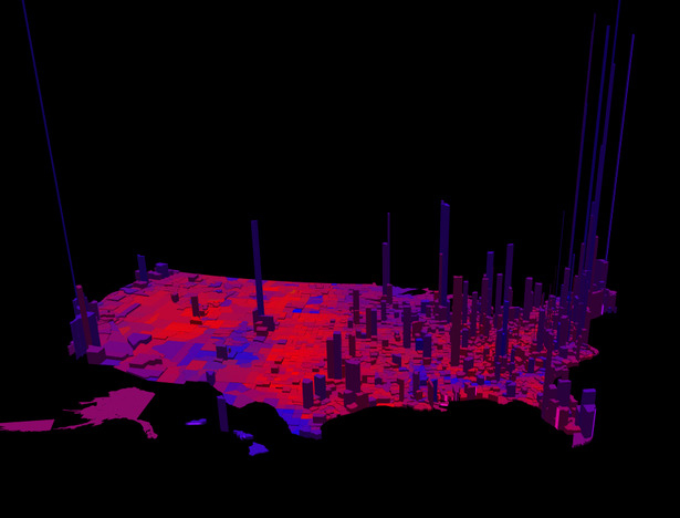
Can we remap these divisions along lines of population density, as Robert Vanderbai of  Princeton University has argued, whose compellingly recast the electoral map to reveal how two alternate styles of sociability came to inhabit one land.  By throwing the stark red/blue political topography into 3D relief, Vanderbai invites us to look at that divide, not fractured by different data, but mapped onto density so that we might better understand our electoral maps:

Blue v. Red Topo Raised

The divisions in the electorate have also, of course, encouraged the weirdly popular but loosely credibly parsing of local attitudes across the nation.

Despite the hugely informative value of this density distribution, the question of how the distribution of the landscape we have created might be as well illustrated by the commercial topography we have created, and the space that they create.   For the interesting map that charts a distribution between the majority dominance of large box-stores or chain-stores over smaller privately-owned stores suggests a unique landscape that we have become all too used to inhabit, and a measure of density all its own–but not necessarily in tandem with Vanderbai’s glorious and striking distribution of a two-color bar-chart.  Although Vanderbai’s chart makes the compelling case that our distribution of electoral votes no longer in fact reflects the population distribution in the country–and indeed the possibility of the winner of a popular vote losing the number of votes in the electoral college–the map is less than informative of the landscape we have created in the United States–a landscape that is still being repeatedly surveyed.  To be sure this reflects or is a reflection of density, but also offers an alternate index of social topography.

Let’s peak at the regions that Bump has created, in far more fuzzy fashion, by agglomerating the number of stores across its 40,000 zip codes, and taking a measure of those regions where large retailers show a clear dominance to the extent that they have pushed out all but one privately owned retailer, noted in reds of varied intensity, versus those blue dots where privately owned retailers constitute the majority, and the corridors that this creates, despite its lack of clear contours.  While the ZIP-code breakdown is reflective of the new concentration of wealth on the eastern corridor, the relative decline in incomes provides a clearer index of where such box stores (predominantly discount retailers, who appeal to the pocketbooks of their customers) will tend to concentrate.

Fuzzy USA

Income by County:2012

The contours of these divides provide a basis for re-examining the arguments implicit in most recent choropleths, and thinking about the nation we are poised to become.  Although not exactly mirroring the levels of declining income, one can detect in the areas of the spread of the big red superstores a reflection of the yellow states with median incomes below $22,126 a year, showing a selective density of big bog scores pushing in toward Denver, and congregating around Michigan, the Great Lakes, Iowa and near Arkansas.

Red Crawling INland to Denver

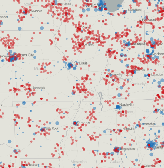
Starting small, for example, take the data that Natural Earth and OSM mappers help reveal about the new topography of shopping in the Midwest, that both reflects density but even more the sorts of incomes that can support private businesses:  as one moves outside of urban areas, the proportion of zip codes composed almost or entirely of exclusively large retail stores rises in clusters, often clustering (predictably) about pockets in precisely those cities also able to support small businesses:

Density?

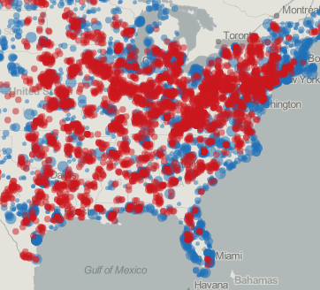
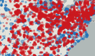
The blurring of the map, in a far fuzzier version at larger scale, suggests a veritable field of red that is almost aligned in belts, and creates a strong contrast to many parts of the country lying further west . . . where they seem to choke off privately owned stores.

Fuzzy Mid-West

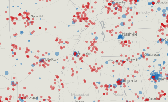
Returning to view the southern reaches of the country a greater scale, the discreet stores in much of South appear as oases of small businesses in relatively open land–presumably where small businesses don’t crest above a level of 50%– in Nashville, Atlanta, and Memphis:

Southern US

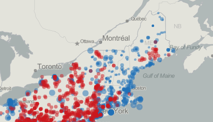
Looking at the odd distribution of the Eastern seaboard, a region where large stores appear to dominate the landscape of all but the coastal corridor, and gain a distinct density as one moves inland and approaches a different economy.

Fuzzy NE

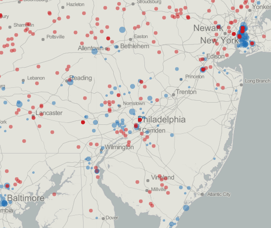
A more fine-grained view of the same region–focussing on New York to Baltimore–reveals a more complicated topography, but echoes the general division between small pockets of private stores and box stores that choke out the competition, being the chain stores that they are, which, with relatively cheaper real estate at malls that can be bought up and leased out by developers, creates a new division between our populations that may be deeper than–if it is created by–a gap in income or disposable wealth.  Interestingly, an abundance of privately held, smaller stores is often concentrated around smaller towns, as well as taking on density at large cities.

New York to Philadelphia

What sort of social topography does this create?

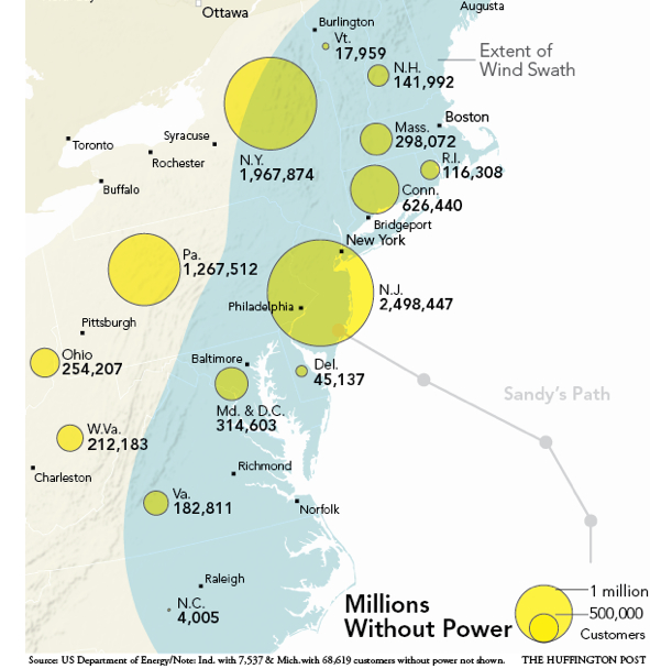
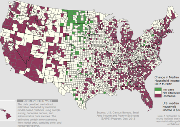
The distribution of stores has not been indexed for growth rates, but might be measured against recent census findings about declining incomes.  The depressing image of the appropriately colored “brown” marking declining median household incomes in a period of just five years nicely captures the tone of depression of much of the country, and the difficulty of political classes to capture much backing outside the venting of folks whose incomes have declined.  Despite the aversion of a serious depression after the banking crisis, we’ve been hardly hit.

Median Income Changes, 2007-12

But the choking off of private businesses might be a sad consequence of these declining incomes, and the road trip searching for big bargains at Dollar Discounts that might be taking up the weekend breaks of much of the country.  While demanding further investigation, the number of chain stores that have emerged across in the country surely reflect the declining incomes in the nation, as much as changing costs of real estate.  And these m

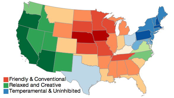
The proliferating choropleths that have emerged to explain our social divisions, something of a tour of data visualizations that have duplicated like rabbits on the web will reveal, have in fact tried to uncover divisions in moods as dividing the country–although this map, with the authority of a DSM, seems to assign fixed moods to the boundaries between states that we have come to internalized, so nurtured are we in reading data visualizations as records of objective truth.

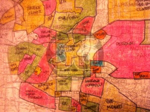
On one extreme, the heuristic value of those boundaries between states are fetishized in a spectacular fashion in America’s Mood Map, which uses statistics originally published in the Journal of Personality and Social Psychology to detect underlying differences of constitution–the personal, rather than the political–that creates an odd visualization whose  very terms (“relaxed and creative”; “friendly and creative”; “uninhibited”) make it sound like we’d all really get along quite well, aside from difficulties of understanding tone, and downplays any political division by recasting the map in terms of something like affect.  By ostensibly mapping divides of personality types and tabling the political, this map even invites you to find the state that best matches your mood, if one is to believe self-reported data.  (The division was parsed, with a straight face, as reflecting weather–hypnotized by the ubiquity of the weather-map and seeking to invest something like objectivity in the odd color-scheme below as something that revealed actual differences to invest the odd graphic with similar credibility–for more on the notion of mapping how “different regions have different personalities” in a data visualization, look here.)

America's Mood Map


Regional essentialization has proceeded, in an attempt to map the country as made of different nations.  In the drive to map national divides, Frank Jacobs parsed nine nations of North America on largely economic criteria, rather than personality, distinguishing regions of similar economic production, and casting each as a separate GDP, based on concepts of the uniqueness of our nation from WaPo journalist Joel Garreau, and again granting them stark objectivity via a choroplethic map that similarly served to instantiate diverse regions of the continent:


GDP map Is this a proposal for introducing new tariff lines?  If so, how much such a distinction makes sense–what about that “Empty Quarter”?  what on earth do they do, and how can they exist?–can be tabled.  And the future of the “foundry,” if it rests on metallurgy, is certainly on the rocks.  And what does Quebec produce, aside from fleurs-de-lis? Colin Woodard sought to describe national divides into some eleven groups, arguing that we’ve “we’ve never been a nation-state in European sense,” for all who imagined the possibility of American political unity, and wrote a slim book that recast the Progressive notions of a ‘melting pot’ by explaining that each region reflected its own distinct stock, and illuminate differences to which our democracy, supposedly, had unfortunately rendered us blind–but whose divisions Woodard appears to suggest might explain all American history, including the Civil War, up to the spread of the Tea Party.  Woodard’s pedantic mapping of distinct regional variations combines racial essentialism and a “revenge of geography” to point up our innate fragmentation: ELeven Nations

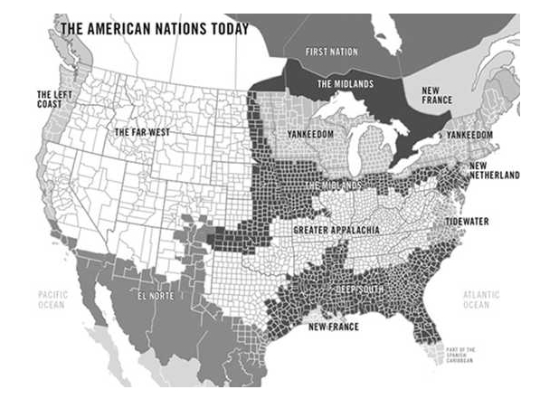
The distinctions were starkly mapped in alternative iterations of the “American Nations” were presented as a key to better understand ourselves, as if to hold a mirror to the land:


American Nations Sean Wilkinson Design


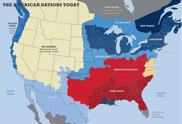
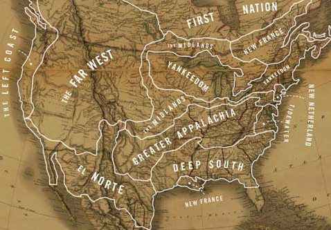
Sean Wilkinson Design Woodard’s work extrapolated from the historian David Hackett Fischer’s argument about the differences in the settlement of different regions–particularly the northeast and south–by different Anglo cultures, and the effects of Anglo farmers who settled the northeast from the Scots-Irish herders who settled the Deep South, and from the work of many anthropologists and the psychologist Richard Nisbett on the culture of honor in the South.  But despite some  neatness in registering cultural differences in the map, it doesn’t take huge skill to reveal the culture of separateness in the Deep South, and a floating barrier of “Appalachia”–the ‘light South’–around it;  yet problems arise when one moves from the map to individual experiences. Despite the evocative names with which other regions are endowed, from Tidewater to the New Netherlands, their relative stability or homogeneity as entities comes to break down, as does the notion that their boundaries are so firm.  The odd coherence that he supposes in such regions as “New France”–would Québécois see anything similarly to folks in Louisiana or even New Orleans, let alone accept them as affines?–and other regions–how isolated and cut apart is this “Left Coast” today?  What could ever be mapped as weirdly as Yankeedom, and is it still alive?–seem animated by an ethnic essentialism belied by the shifting map of ethnic divides and affiliations in the United States.

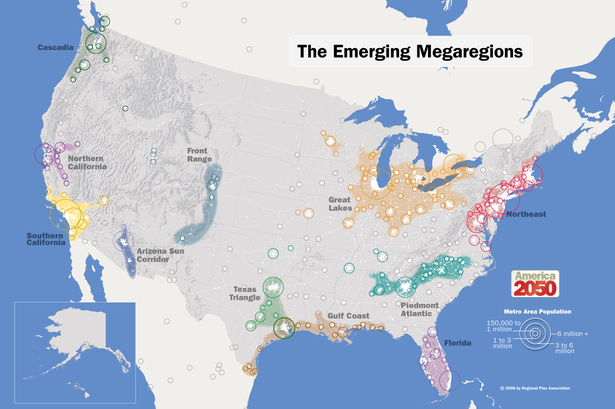
And it is not clear that these areas will retain meaning with and over time–although the deep danger of which the map is something of a symptom is a pronounced lack of national belonging across the land!  Woodard’s sense that American history “all goes back to who settled those regions and where they came from” flattens history, and would not be readily recognized by any local inhabitants. No doubt these can be traced to the deep and unavoidable social divides and fissures that exist in our country, and to the different parts that different regions have played in the culture wars.  Perhaps it might make sense to adopt an approaching demographic forecasting, less entrenched in the categories used today, and the apparent generation of megaregions.


2050_Map_Megaregions2008_150-thumb-615x409-106683


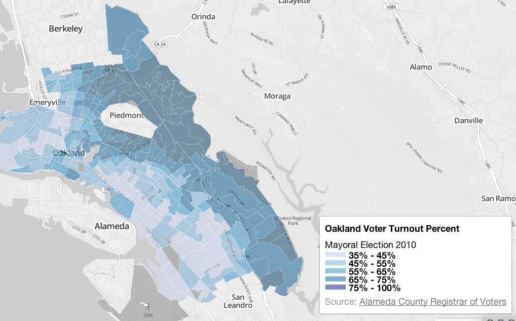
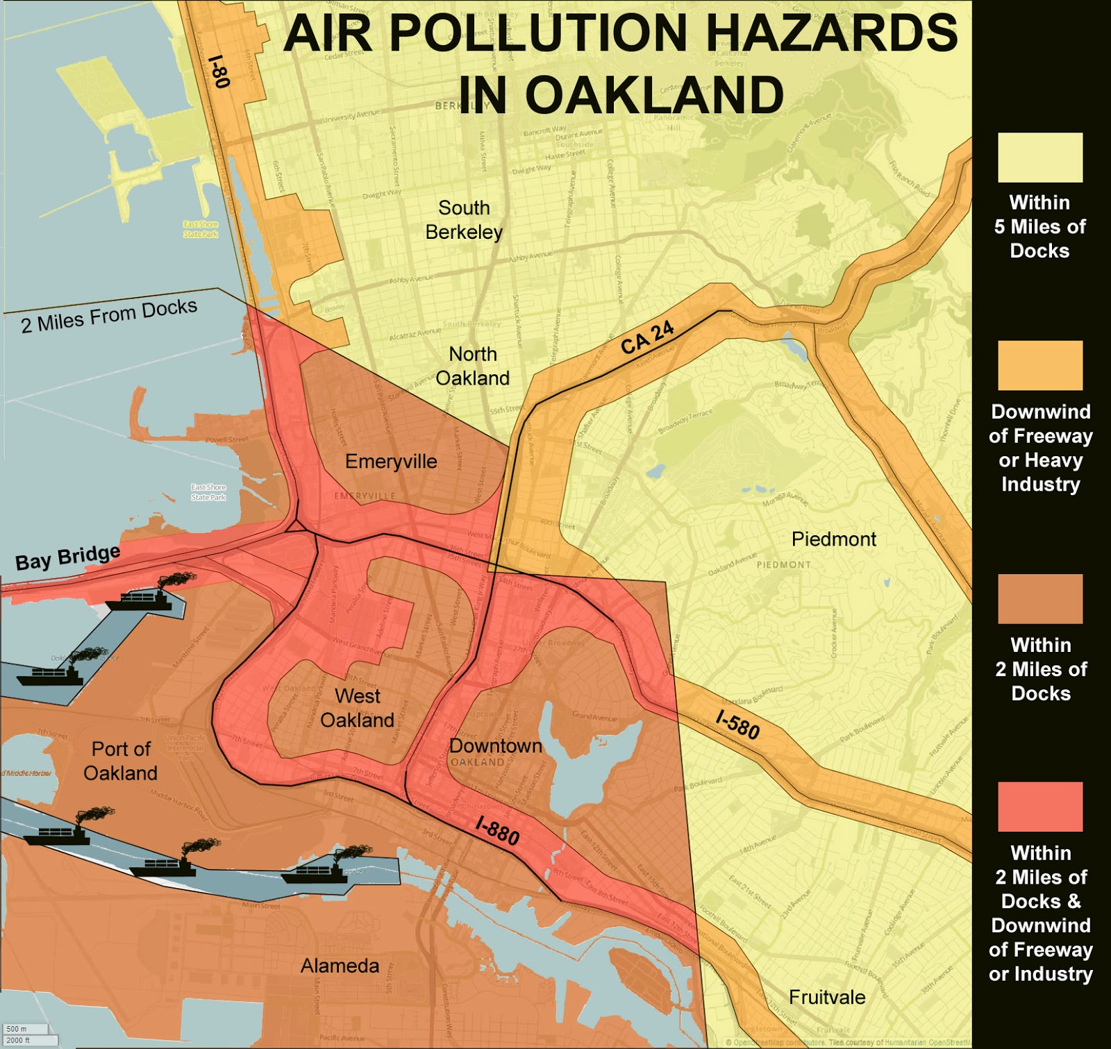
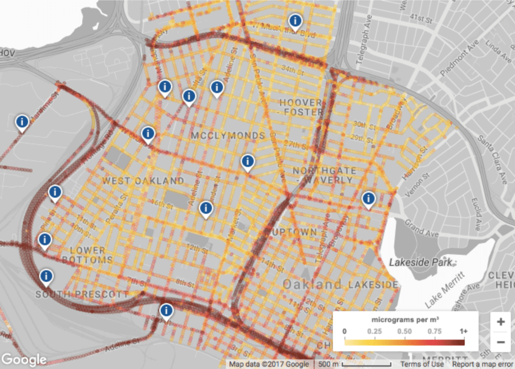
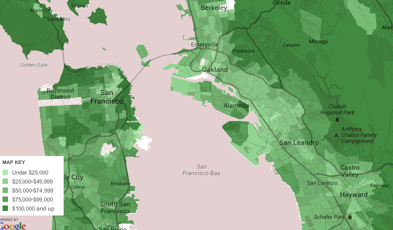
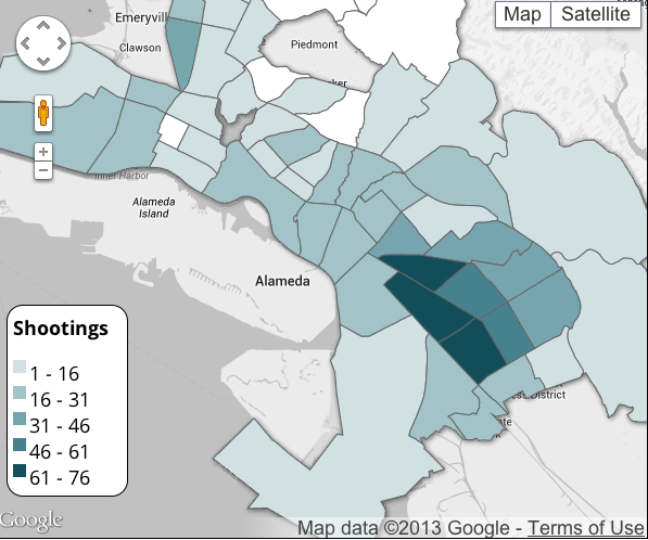
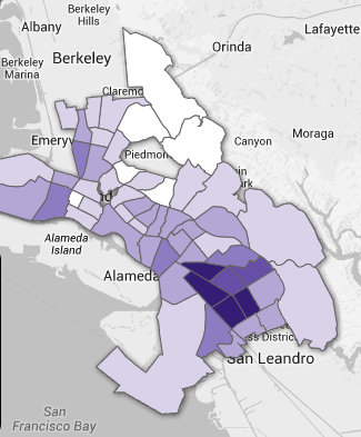
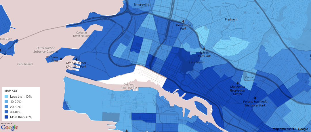
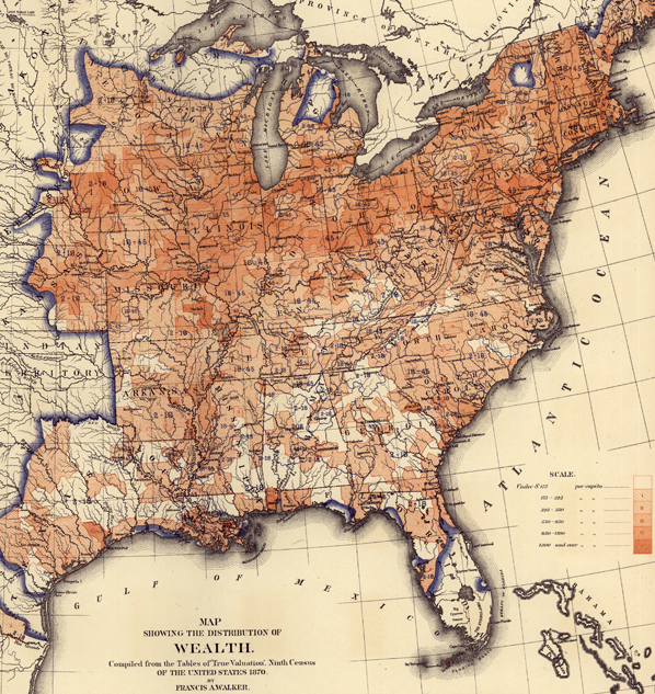
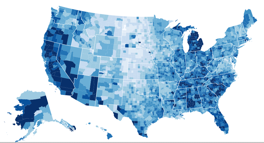
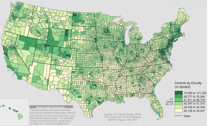
There are, of course, true socioeconomic divides that fragment the country in all too real ways.  The frighteningly influential role of real estate in shaping the country is sadly evident when we map residential space by income, and illuminate truly early modern concentrations of wealth.  Using the American Community Survey to map a choropleth by variables of income, real estate, and educational levels attained, we can perform something like an archeology of the national map, digging deeper to examine the real divides among its inhabitants.  Dividing regions of the country by median level of income, clear pockets of navy blue surprise the eye and remind us about the unavoidability of underlying social divides–that, I’ve elsewhere argued, mirror local reception of the Affordable Care Act.


income


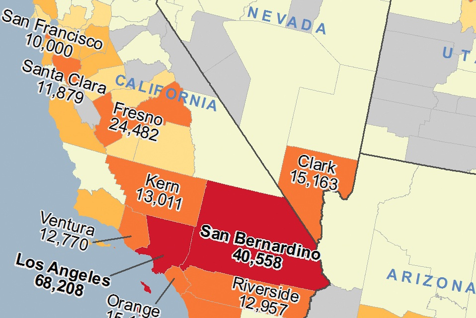
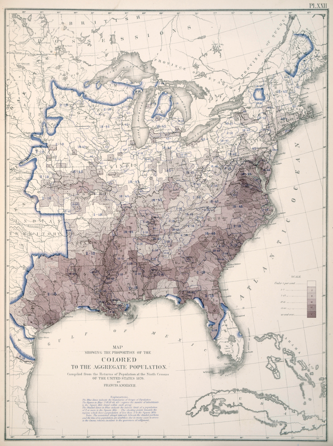
Or, again with an eye to the opposition to the ACA, long after the Great Society, we can divide our choros by clearly drawn concentrations of poverty as much as wealth, using a distribution of  local populations living below the poverty line in each of the nation’s counties that reveals a similar concentration of poverty in the deep south and southwest:


poverty


Not to mention the map–which somewhat scarily illustrates parallels–of the percentages of adults over 25 years of age who did not complete High School, in a sort of national map of educational attainment as they are reported in US Census figures:


Over 25 w:o High School Diplomas?


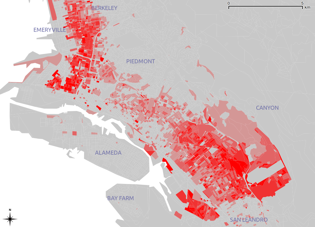
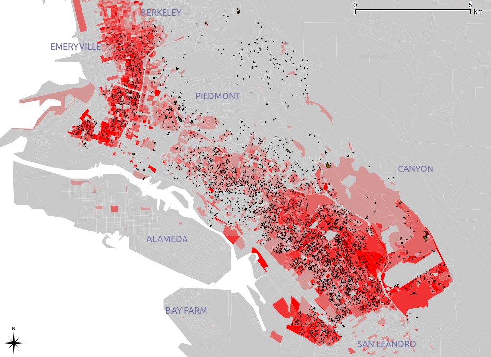
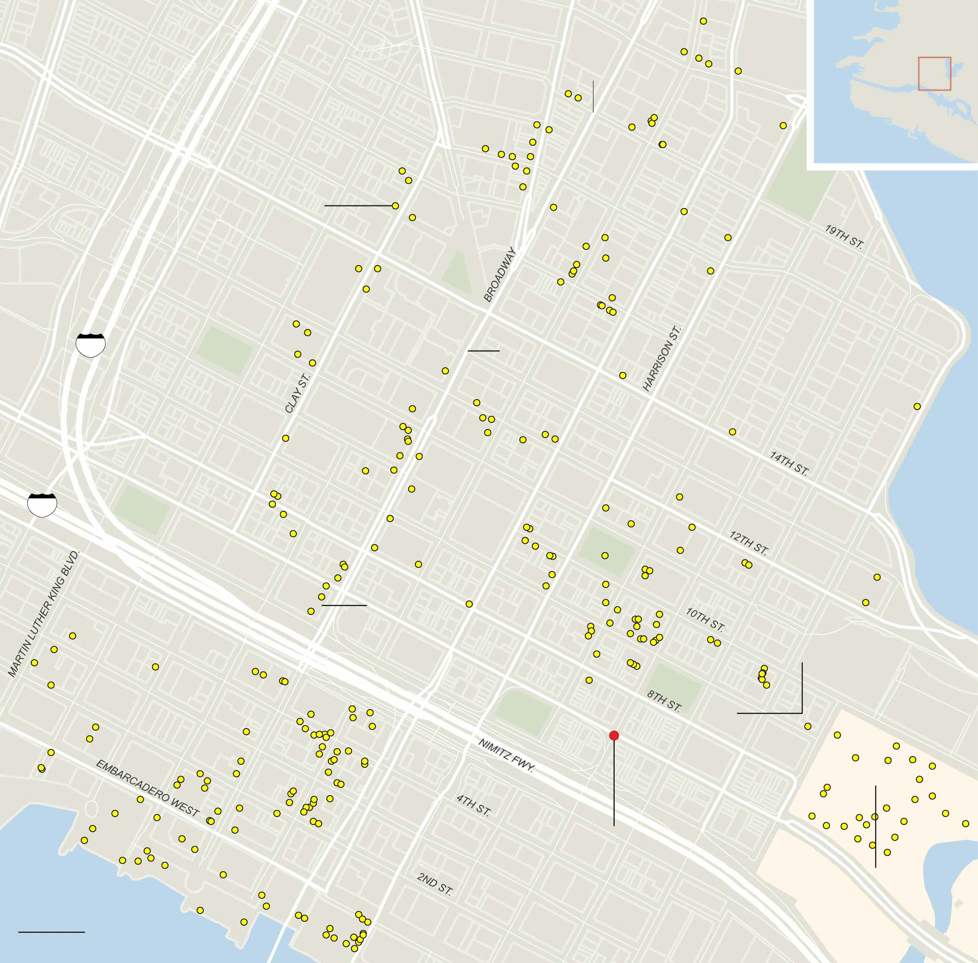
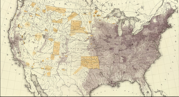
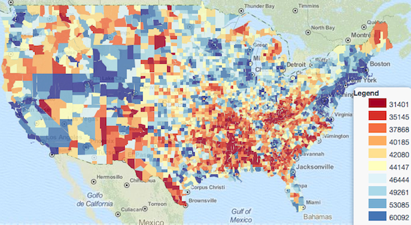
These stunning choropleths, courtesy Calvin Metcalf, Kyle Box and Laura Evans, reveal a Southwest and deep South we knew, but weren’t ready to acknowledge.  They tell an interesting story as to why Virginia and Florida belong less to the Old South–or to what it has become.   To look more closely at a comparison of other local trends in the Community Survey, look here. Yet we might do well to look elsewhere to map national divides, and new databases to grasp our emergent geographic divisions and continental divides.  While real estate markets have much to do with the divides, we seem to have individuated the intersection between density and real estate across state-lines, by taking the presence or absence of small businesses in our communities as a sort of tipping point.  For the benchmark of zips with one or more privately owned businesses reveal a major fracturing of the local landscapes in the country, oddly resonant with our divided electorate.  The huge regional discrepancies of coasts and interior needs to be read with density, in ways that few openly consider, as a means to map the habitation of the landscape, shifting from questions of bodies, ethnic composition, or other criteria, toward the nature of interaction between self and place that shops afford, and even the sorts of relations to objects that are synthesized in the contractual relations of the marketplace, not to mention the stimulation and relative criteria of judgment that a diverse marketplace affords customers. The below map of the nation is limited to those spots with no or one small businesses within the ZIP in question (the red dots, which often cluster and overlap, and are more intensely red to reflect the intensity of that concentration) and zip codes which are distinguished by a majority of small businesses (blue dots).  While this omits large regions of the country–where there are an intermediate percentages of small businesses, and they don’t register–those are of course the very regions where large stores are equivalent or exceed small businesses, making them likely sites of the inevitable large box stores.  And the selective optic of the map is precisely its virtue as a portrait of contemporary agora, or our evolving landscape of exchange.


small shops:large shops


In ways of considerable sociological significance, the map reflects the landscape we’ve made for our country, or we make for our selves, by mapping some of the sites where we define ourselves to what is left of the public sphere.  The map may indeed suggest some interesting sociological detail about where the country is heading, with interesting correlations to level of educational completion below which it lies.  There is something that goes beyond or beside a decay of discrimination, but leads to a shift in one’s relation to the market and how one is a participant or spectator in a collective activity, in the geography of box stores that can be mapped across America.   The dominance in a mental universe of Home Depot, Walgreens, Wal Mart, Dollar General, Target, Lucky, Thrifty, Family Dollar, Dollar Tree and even Sports Authority exposes a topography of disorientation and dislocation, rooted in the offshore production of goods and plastics, undermining face-to-face encounters in 24/7 Emporia that offer the best deals may well conceal endemic conditions of placelessness and timelessness:  in a country where 80% of the stores nearest to anyone are large retail chains, one has to interrogate the ramifications of what sense of social space we retain:   as we become consumers in another Holiday Season, bracing ourselves for sales, what sort of social change lies in no longer having a corner store? Where’s the analysis of this shift of commercial topography when you need it?

In ways rich with sociological significance, the map tells much about how store-goers orient themselves to the publish sphere, direct consciousness to the relation of goods’ producers, and regard the social contract or social nexus as a given or negotiated part of the status quo.  For as much as it lies in our pocket-books, perhaps the deepest divide among us of all lies in the landscapes where we spend it.  Perhaps the deepest divides of all rest on not so much in levels of income or consumption across the lower 48, so much as the shops available for perusing or spending time–and the attachments to place, to space, to objects, and indeed behavior pursuant from them, which inevitably cascade from how much time inhabitants devote to patrolling the aisles of brightly lit box stores of Sam Walton–rather than looking in at local businesses to greet their owners and examine their wares.  Based on a search for the places where “small business really thrives” in the lower forty-eight among the nation’s 40,000 zip codes, data from OpenStreetMap has allowed a map of the sorts of stores in each–noting in red those zip codes hosting none or one small businesses, whereas those where small businesses constituted an outright majority enjoy varied shades of baby blue.  The resulting small-business texturing of the country provides a valuable index for looking at–or reading, if not actively interpreting–the nature of its communities, and an alternate American Community Survey of its own.

While this doesn’t exactly correspond to a political divide, it may tell us more about what sort of a nation we’ve become–and what sort of commercial contacts that we value, or personal contacts we are able to cultivate to the owners of shops, places more likely to apt local products.   The division of red vs. blue is less reflective of a political divide, but seems to offer itself as an alternative metric to those above introduced to measure social divides, and belongs in the company of other social indicators taken as prognostics of political divides in the electorate, if not of an alternate community survey.


small shops:large shops


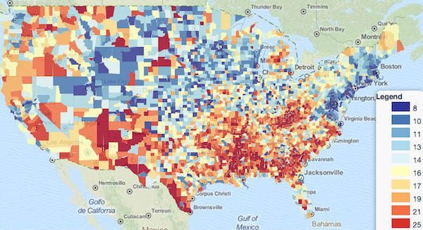
In ways that do not map directly onto the distribution of real estate–shown in the first map from data of the American Community Survey above–as one might expect, the topography of shopping that it indicates suggests deep social divides to which Nate Silver might pay some attention:  while the coasts are brightly blue, in California we can detect the conservative central valley and interior; the absence of blue in much of the central states is shocking, and preponderance of red throughout the south–save coastal Florida–overwhelms, although the Northwest seems reliably blue.  In Minnesota and Wisconsin, the red blotches shade to pink and dissipate; Texas seems divided with deep red concentrations.  Indeed, the problematic position of Pennsylvania in the national picture is nicely illustrated by its deep red isolation, whereas privately run business dominates the Northeast Atlantic seaboard, particularly north of New York, as well as in much of New England:


Pennsylvania?


The irony is hopefully apparent, given that the defenders of Republicans are presented as the champions of free enterprise.  Maybe they are:  they are not, it seems, defensive of independent shops or businesses. The sea of red in the middle of the country, but seems a growing miasma that doesn’t necessarily respect political affiliations, but also bodes pretty badly for the survival of a culture of localism, at least in terms of the future (and profitability) of independent business:


Growing Miasma


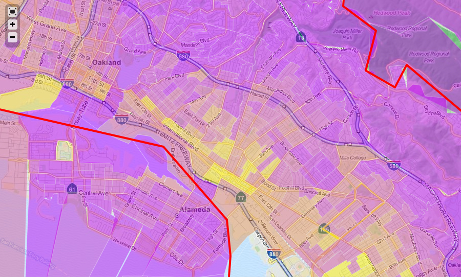
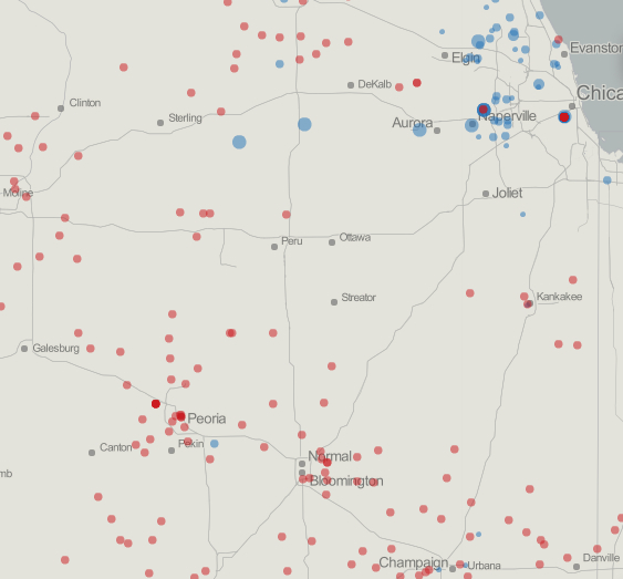
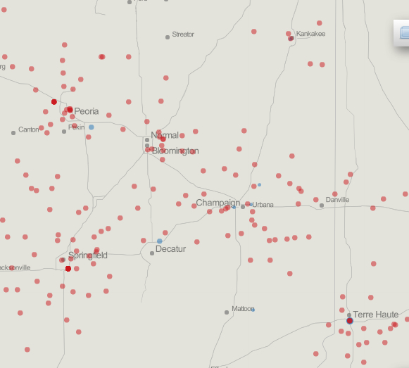
The map, in the image it offers of the Midwest, reveals a striking clumping of regions without independent businesses–clumps not necessarily paralleling cities–the like of which is probably a major shift in our society the likes of which the world may have never seen:


MidWest


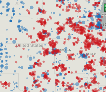
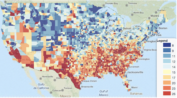
Those places with greater income may simply be ready to foot the extra bill for local boutiques, some will say, or forget the offers of Amazon’s free shipping:  but we see a deeper divide, I’d argue, shaped by the market as much as responding to lines of wealth, and conditioned by all those aisles of shopping centers illuminated by starkly lit flourescent lights, lured by the slogan “Save Money.  Live better,” and names like Dollar Tree and Family Dollar that remind shoppers to keep the bottom line first and foremost in their shopping experience, rather than cultivating stores that might provide more jobs to their neighborhoods.   (Even if their parking lots may use LED lighting, most stores have a sort of blinding or blanching flickering flourescent light so recognizable that it seems potentially addictive as a unique neurological experience.) We can see a new mapping of the landscape around cities, which, if we take only the midwest, emerge as something like islands with private stores, surrounded by areas of box stores that cluster around the nearby highways and urban belts, to take Chicago and St. Louis; smaller towns are dominated by zip codes dedicated to large chains:


Around Chicago

St. Louis

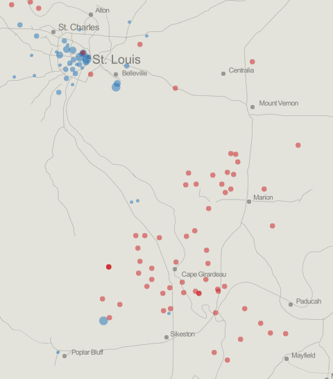
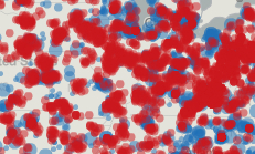
And in the deep interior, many zips feature the near-absence of anything but larger super-chains:

In Illinois

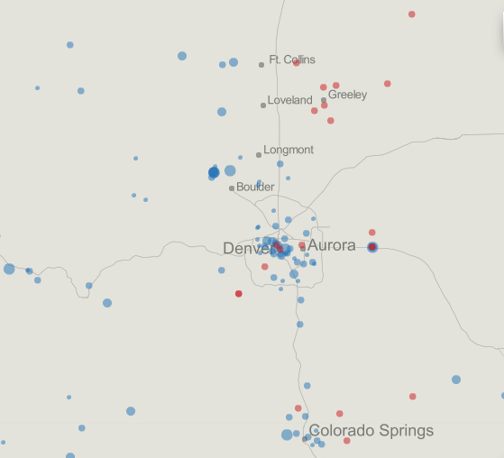
And we can see the fracturing of a political landscape in divided states–such as Colorado–where diverse concepts of the geography of sales, as it were, present different models of a lived landscape, almost cheek by jowl, alternating between spaces of chain stores and a telling density around Boulder, Denver, and Colorado Springs–with a few exceptions–of small businesses.  In some ways, this reflects the deep debates in the state on such issues as gun-control, birth-control, ecology and a more nuanced or complex relation to federalism.

Complicated Colorado


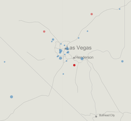
Where we shop is increasingly what we are not only because of our attachment to objects or commodities, but how we are oriented to the world through the market–and as we map our relation to markets in different ways,  the ongoing onslaught of this attack of the big box stores has deep repercussions for our society’s unity.  Go forth and map as you do your holiday shopping . . . To be honest, some of the maps derived from this data don’t make immediate sense to me, or at least jibe with my own experience, such as the large number of small businesses found in Las Vegas, although I suppose this reflects the definition of a “small business.”


Las Vegas?

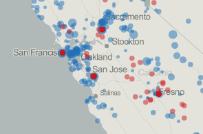
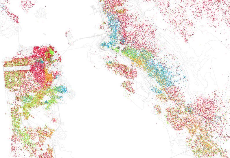
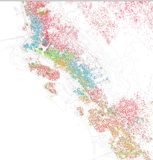
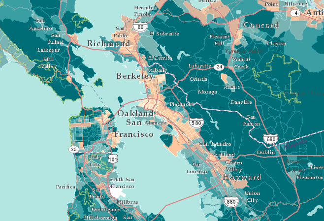
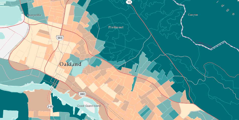
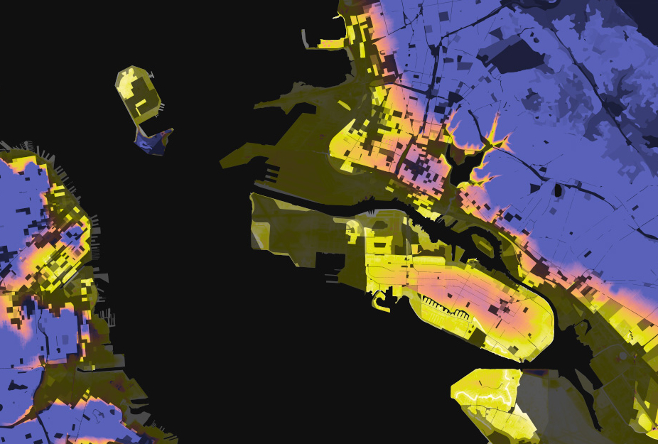
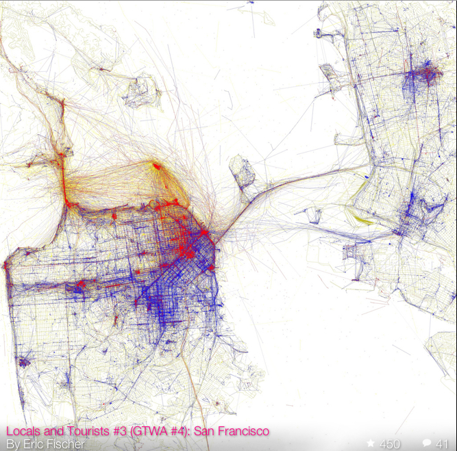
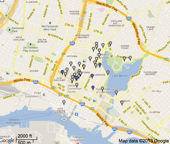
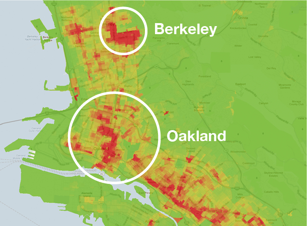
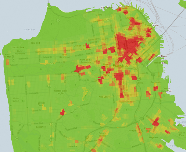
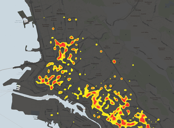
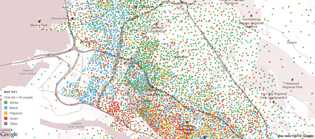
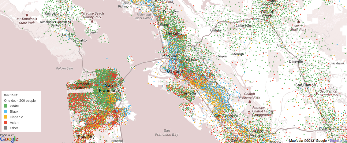
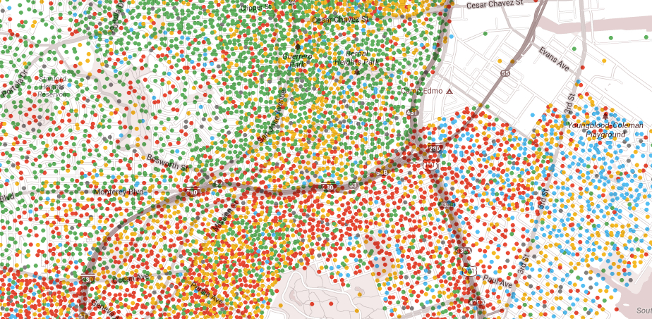
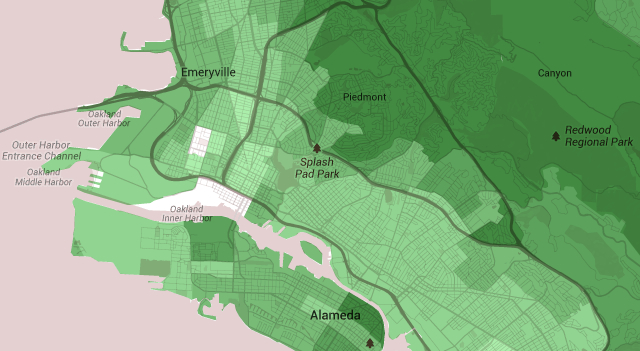
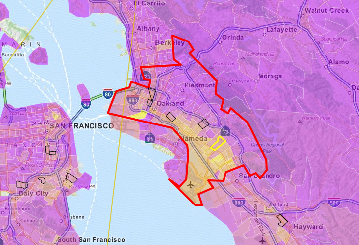
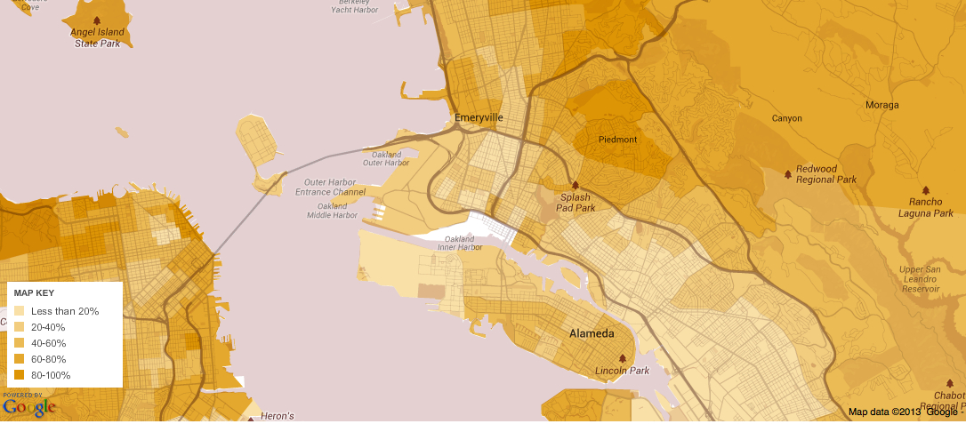
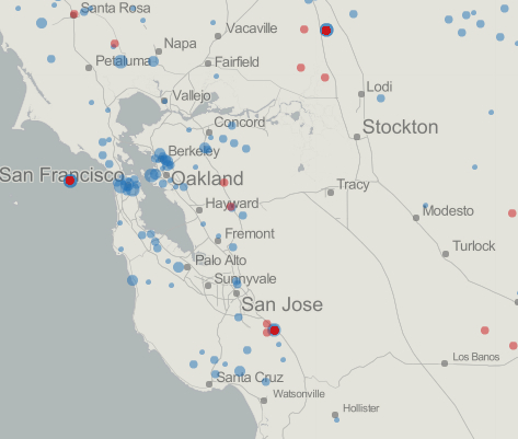
But the image of the Bay Area is somewhat recognizable, and recognizably blue.


Bay Area

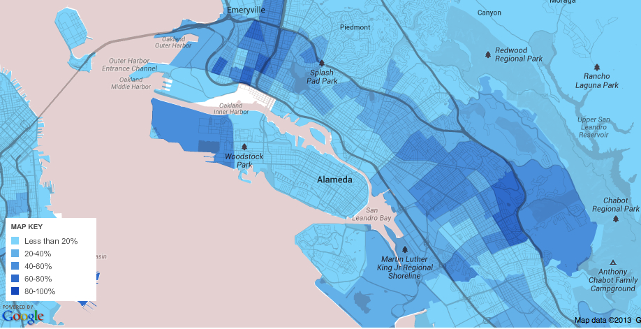
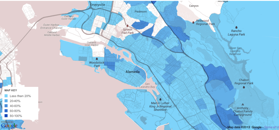
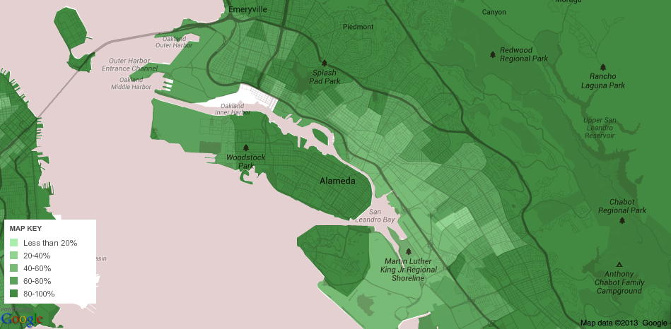
Yet a broader landscape and context emerges as one expands to adjacent ZIP codes in order to include bordering strip malls, including those inevitable and all too visible nearby strings of outlets, and sections of highway that are dotted exclusively with box stores.


Bay Area Large

Leave a comment

Filed under American Community Survey, choropleth maps, Mapping Box Stores and Small Businesses, OSM, Red states v. Blue States, Red States/Blue States

More Better Mapping of Oakland’s Populations

OAKLAND

Maps have long been described or conceived as windows–analogous in ways to pictorial perspective–that invite viewers to look into a space in new ways.  But both word maps as the above, made of the names of Oakland’s almost 150 different neighborhoods, or more statistically derived data visualizations of the city are mirrors that present a less homogeneous or continuous image of the city that we want to see:  if the roughly type-set image above suggest a make-do approach of the somewhat scruffy post-industrial port city with big loading docks, but erase its dirt or drastically depressed areas with lively type.

Data visualizations offer mirrors of the city’s inhabitants and shifting neighborhoods that are both dependent on the source-data that they use, and how they obtained it, but also on the dynamic layers that digital mapping allows us to place as overlays on the base-map of the city’s mountains and shores.  While these maps are only as good as the data that they use, they reflect back some of the divisions in the city that we might not otherwise notice or want to see.

And while not based in prose in the same manner as the Ozan Berke’s word-map that nicely knit together the city’s 146 vastly different neighborhoods, they offer ways of reading the city’s multiple divides.  The increased data that is available from Open Oakland and other sources will doubtless offer further–and far more refined–images of the city’s deep differences and their bridging, and can serve as better and more detailed maps of its populations.  But in the meantime, the sorts of mirrors these maps offer can also provide ways to imagine paths toward a future for Oakland, and better understand ways forward in its public policies.  Many of them draw from the American Community Survey, created by the US Census and discussed in earlier posts, but all seek to focus attention on the city and to serve, as mirrors, to show differently refracted visions of its divides, in the hope that few distort Oakland’s diverse populations.

A famous image of the distinctly uneven distributions of Oakland’s inhabitants is clear in a recent mashup of maps of the Bay Area Rapid Transit system’s public transport map–or, more simply, BART map–with the very zip codes that the American Community Survey mapped, which offers a condensation of the remarkable disparities and differences between income, education, child health and life expectancy at separate stations on the same public transport lines:

BART Health Map:Life Expectancy at BART stops

While, to be sure, the system includes suburbs such as Walnut Creek or Fremont, its focus on the East Bay  immediately indicates the deep divisions in a city where a BART stop can take one between areas of over ten years difference in life expectancy, and two more stops down either line sees life expectancy rise by seven or eight years once again.  The huge rise in childhood hospitalizations because of asthma in the City Center–far greater than in Fruitvale–suggests the unique pollution habits of a city whose air quality is still shaped by its proximity to a port.

The image of the diverse city whose neighborhoods are bound together as one unit starts to reveal fissures when one examines its ethnic and voting distribution at a somewhat finer grain, adding to the historical variations in the picture of the city summarized and surveyed in an earlier post.  The problem of mapping those populations adequately, both to reveal the ongoing inequalities and spatial injustice within the city, is not inherent in the city’s structure or divisions, but something that compels visualization in a myriad of ways, and in which we can look for different understandings of the shifting nature of the city’s socioeconomic (and sociocultural) divides.  As well as mapping the lay of the land, mapping the habitation of space creates even more of a “mirror” on the organization of th eplace.

Census_Mosaic

The census mosaic only shows part of the inhabitants’ picture.  Indeed, perhaps a “racial dot” map can be rehabilitated, rendering one dot/twenty-five people, to create a rough distribution Bay Area-wide that respects the looser definition of “neighborhoods,” and does not impose strict racial segregation, as in this image by Eric Fischer, using red dots representing whites, blue representing blacks, green representing Asian and orange Latino populations, in trying to prevent  overlapping and blending of color-points,  and better to define neighborhoods as an ethnic or racial enclave:

Racial Map SF--25:dot Eric Fischer
Oakland Alone--Fischer

Fischer seeks to respect Bill Rankin’s cautionary words that boundaries of neighborhoods are never so stark as on informational graphics, and that a cartographical index of one dot for twenty-five people is better able to allow “transitions also [to] take place [registered] through gradients and gaps” in the map’s surface, suggesting an urban geography without clear boundary lines, clear spatial differentials clearly emerge across the neighborhoods of Oakland, CA:

And while the city was once historically predominantly black, or African American, in its population, one still found clearly define enclaves of blacks that are, sadly, starkly isolated in census blocks, based on results of the 2005-9 U.S. Census:

2005-2009 % Afr Am Oakland

One can map, in relation to the racial composition of the city, the relative percentages of kids in public schools, one index of its community, and the stark dividing lines created by some of its highways and major roads, which divide the regions of the hills from the flats, where few kids attend private schools.

Elementary School Kids in Private Schools

This is given much further definition by the map of those who have completed high school, already used in in my earlier post in a slightly different version, which suggests a chasm between cultures of neighborhood far deeper than race alone.

High School Graduation

Perhaps the starkest underpinnings of this cultural divide is a map using the 2010 Census to define an ESRI visualization, of the city’s divide in income levels in the city and outlying areas:

oakland's Income in bay Area

Which one can zoom into for the City of Oakland, revealing a clearer divide in incomes around  Highway 24, still using Census Blocks, that again reveals some intermingling albeit with sharp divergences in Oakland that stand in sharp contrast to the larger Bay area:

Median household Income East Bay-Oakland in it

To track a deep change in the population of the city that occurred in only recent years,  Pietro Calogero tracked racial displacement from many neighborhoods that illuminate this divide in incomes, around the aftermath o California’s housing crisis.  The map of foreclosed real estate in west and southeast Oakland, the former “industrial areas,” which stand in sharp contrast to wealthier areas in the hills, to illuminate an economic ravaging of the city that shows up in no other way in a simple map–and indeed masks innumerable individual stories of foreclosure and moving out:

Foreclosures OAK

Although perhaps the map of foreclosed houses is difficult to tie to race, Calogero comes closest to revealing stories with a map in choosing to map how African American families were in fact disproportionately effected by foreclosures, and how former African American neighborhoods were gutted from the inside out as residence became unsustainable:

African Americans and Foreclosure in Oakland

The effective narrative of racial displacement that these dynamic maps isolate and present is not only compelling, but raises questions of social justice–and perhaps of social justice and urban mapping.   Despite the broad interpretation of displacement, both when occupied by owner or purchased as an investment, the clear overlap between categories of race and foreclosure seems not only unjust, but a deep crisis, underscoring and mirroring the deep segregation that continues in so many American cities.

And the repercussions of this sort of segregation are evident in the apparent disenfranchisement of despair, revealed in this simple map of voter participation that Ofurhe Igbinedion so astutely thought to create from Alameda County electoral data, which shows a valley of voter absenteeism in an area where the 2010 voting held low potential or positive prospect:

Oakland Voter Turnout

(Igbinedion’s striking–and dismaying–map, reduced in size above, may be viewed in far greater detail here, and will be posted in full with a commentary at http://www.infoalamedacounty.org).

The huge fall-off in turnout among the same population of a territory of disclosure suggests a political disconnect scary in its dimensions, if sadly typical for most American inner cities.  But the cavities of voter turnout in an election for which turnout was itself particularly high–or just short of 75% (74.52%)–suggests a sense of a politics of abandonment.  What, indeed, did the election accomplish for a large percentage of the city?   What resonance did the candidates even hold, or could they hold?  The topography of disenfranchisement is arresting if not puncturing of a vision of a city united in its neighborhoods, and sort of undoes the unity of its own mapping of continuity.

It is a sort of inversion of density.  Mapping the density of population in Oakland by census blocks reveals not only clear neighborhood divides but a uniquely geographic dispersal of demographics, most dense between the freeways and thinning out to the hills and the flats:

Oak Pop Density

There may be real reasons for not living by the shore below the freeway:  the area is not only late-industrial, but the ships spewing sulfur dioxide and pollutants exceeding standards for vehicles that are registered in the United States create a spew of particulate matter over the downtown area not confined to West Oakland, but reaching in to Chinatown, Emeryville and the Downtown area, areas downwind of the port, in this truly terrifying map, posted in 2013 by Sarah Brady and Alfred Twu, and charting the sulfur dioxide and particulate emissions of ships, using the Port of Oakland Emissions Inventory:

oakland-port-and-highway-air-pollution-map

The map reveals regions with air pollution up to 10 times the national average a couple of miles from the port, but whose effects increase risks of cancer and asthma extending twenty miles inland, creating a poorly-known map of particulate matter as an argument to raise pollution standards in Oakland’s port.  Notwithstanding the much-vaunted clean-up of the Port of Oakland, which were aimed primarily at legal safeguards at the level of diesel particulate emissions–emissions that have been largely blamed for sever respiratory problems among local residents–which have indeed decreased from 261 tons to some 77 tons in seven years. (If this was a reduction of 70%, the stated goal of the Port is to further reduce the emissions by 80% by 2020; since July 2009, ships have been required to use low-sulfur fuels within twenty-five miles of the coast, however, and the sulfur-dioxide emissions tied to asthma are not likely to decrease.). And a clearer drilling down of this data–for long, but one station for monitoring air quality even exiusted in Oakland, on Grand Avenue and Poplar, revealing how a stream of heavy trucks with diesel engines that power through the industrial region, and emit particulate matter to Chinatown and Fruitvale:

tHoodline via Google

The data visualization of micrograms of particulate matter per cubic m suggests how much this “tale of two freeways” needs to be examined in detail, and how many questions of environmental justice that the unregulated emission of particulate matter deisel engines disseminates across urban streets: the citizen science group  West Oakland Environmental Indicators Project (WOEIP) is currently engaged in a more detailed study and analysis of West Oakland air quality which the Environmental Defense Fund has helped fund, and they will parrtner with UC Berkeley, to create a clearer distribution of particulate matter of different levels–including ultra fine particulate that can cross the blood/brain barrier–in different regions, with special attention to the possible impact of ultra fine in the exhaust entering West Oakland and other neighborhoods from the 880 freeway and McArthur Maze–emitting some 22 known carcinogens in the urban environment. Both traffic arteries move dangerously high levels of particulate matter through sensitive communities including schools, hospitals, clinics, and childcare centers, in what Emeryville City Council members have come to call a “Carpocalypse.”

MacArthur Maze/Bella Nathan

Despite the suspiciously long silencing of interrogating the clear environmental quandaries of living near freeways, and silence about the impact of the heavy trucking tied to the Port of Oakland on the nearby poorer industrial neighborhood, would the release of such an array of carcinogenic matter be tolerated in other neighborhoods? The demand to use the rail lines to transport coal through Oakland’s Emeryville and West Oakland to the revitalized Port could be placed on the back burner of future city planners and cargo terminal directors in decisive fashion if levels of particulate matter to which residents are exposed is found to reveal: although the Oakland City Council barred proposed handling and storage of coal and petroleum coke at the Port for Oakland Bulk and Oversized Terminal LLC at a parcel the Army abandoned in 1999 that is new the harbor, a ban supported strongly by the Sierra Club and San Francisco Baykeeper. (Any port workers with prolonged exposure would be exposed to even greater health risks.)

The ban is argued to constrain foreign and interstate commerce on which the Port depends, and the city cannot regulate or restrict; coal transit was only banned after the land parcel was purchased and local jurisdiction over rail-borne coal shipments are unclear, despite its potentially aggravating environmental effects: the city has only lost the suit, indeed, as the effects of coal trains have not been studied as a vector of air pollution, despite fears that coal dust could blow off the open-topped cars able to lose up to one ton of dust between mines and port, and release 60,000 pounds of toxic fine particulate matter, on top of the diesel fumes emitted by their locomotives.

Can maps prove that the open-air transport of coal, designed for export, indeed pose a significant public health danger for Oakland residents? Although adding further diesel fumes and coal dust to Bay Area air–especially the dust of bitumenous coal mined in Utah, which has been encouraged by the Trump administration, lifting restrictions on strip mining and extraction of coal that would travel through Oakland, for which the Utah Transportation Commission has been instrumental in negotiating export rights at Oakland’s terminal, without any consultation or contributions of Oakland city council or residents–in April 2015, or before the first hearings in Oakland to study the health effects of the transport of coal and coke, and a broad–over three quarters of Oaklanders–opposition to the transport of coal on railway lines increasingly close to city residences cheek by jowl and often running along I-880–adding significantly to already dangerous levels of particulate matter by diesel engines and open-air cars bearing coal to the Port of Oakland that is in many ways emblematic of the city’s old industrial zone. After a downturn in Utah coal production in 2009, and hopes located the expansion of opening new areas of mining and new mines in 2011, opening the former Grand Staircase Escalante National Monument was long on the front burner of the coal industry–long before Trump told supporters in Salt Lake that “very distant bureaucrats . . . don’t know your land, truly, and don’t care for your land like you do,” and technically oened the regions to coal extraction–even if few corporations have undertaken to negotiate with the BLM for exploring old mines to operate in coalfields that the state had mapped, as if to entice speculation back in 2008.

Utah, Annual Review and Forecast, Coal Production and Distribtuion

Although local jurisdictions are with limited authority over the goods shipped by rail companies like BNSF, but do have authority over marine export. However, most existing studies on coal transport examine different grades of coal through rural areas and populations,–not large cities already possessing dangerously high levels of particulate matter that are densely inhabited. (Oakland has in response terminated construction on the old Army base, but is currently faces suit again.). The question of rail lines that would carry coal-bearing freight in close proximity to schools, churches, parks, and residences in downtown Oakland–a site of commercial revitalization–may raise attention to environmental hazards that West Oakland would even face far more.

OSM map of Rail Lines and I-880 near Port of Oakland CA

The data visualization of micrograms of particulate matter per cubic m suggests how much this “tale of two freeways” needs to be examined in detail, and how many questions of environmental justice that the unregulated emission of particulate matter deisel engines disseminates across urban streets: the citizen science group Woing its own study of West Oakland air quality in partnership with UC Berkeley, with funding from EDF, to create a better visualization of how environmental toxins are released in high-traffic corridors, and create new demand for remediation and social justice.

It’s not uncommon to value (and inhabit) property away from the shoreline.  Examining relations between elevation and population density in the wake of the shifting consciousness of the relation between water-elevation and land-use after Hurricane Sandy, Stephen von Worley offered the following interesting alternative visualization mapping elevation and population density on a spectrum moving from white to yellow to orange to blue, to show the sharp divide between hills and flats in the East Bay:

Stephen Whorley, Elevation and Poopulation Density (2010)
scale von whorley

A nice register of how this space is actually used or perceived, and, equally important, moved through, based on a collation of the adjustments to Open Street Maps of the city, suggests the well-travelled nature of Oakland’s major arteries and downtown roads.   How might this be registered in the surface of the map? is a question that is nicely resolved in this map of Oakland’s self-mapping of its major roadways.

Oakland, McConchie-every line, every point- Oakland

Alan McConchie–Stamen design

The Open Street Map view of Oakland, rendered so distinctively by Alan McConchie, tells a perfect story of the inhabitation of Oakland’s space by its routes of mobility, recalling the sort of GPS-derived maps increasingly common from artists like Jeremy Wood, who practiced “drawing with GPS” as a line of work:  it would be interesting to be able to map street-use at different times of the day, if possible, though deriving data of the abandonment of downtown Oakland when dark is undoubtedly difficult.

The divergence of nighttime and daytime is evoked, if not measured, in Michal Migurski’s brilliant layering of a “heat map” of crime–based on police visits per unit of time–over an OSM template, both layered with a semitransparent streets that interact smoothly with the underlaid data; the combination of layers effectively allowed Migurski to adapt a heat-map of crime to downtown Oakland, using police visits per unit of time as a metric as part of his active and for its time particularly innovative Oakland Crimespotting, in the hope that the HeatMap APIs won’t obscure either context or specifics, and provide a legible text.

map-13

One could argue that this mapping of hot-spots excessively illuminates those areas of BART stops, where more police calls would tend to occur–and, in the case of 12th street and downtown, more street folks congregate.  But the increased number of calls provides a basis to register local attention to crime and property protection, or how the city sees itself.

WATCHING Oakland

And how Oakland maps its own crime, or tends to monitor its own possessions, is foregrounded in this striking map of the downtown density of security cameras, often placed in response to fears as much as evidence.  This final map of the installation of security cameras downtown points up the increased anxieties of its safety, almost in response to and the perceived need to monitor public life, and registers the odd dynamic of a downtown business zone that has few residents, and whose topography of suspicion vastly changes as one moves from daytime into night–when downtown is increasingly abandoned by workers or street populations.

We’re clearly fascinated by the different images of the city’s different composition and divides, and in understanding how best to work within them, or to heal them as best we can. The mapping of security cameras–if focussed in the downtown area–reveals a sense of deep divides, and a perceived in security, no doubt partly voiced as inadequate police coverage among businesses, as much as the city’s residents.  This map, also a mirror, in part doubtlessly contributes to the image Oakland projects, an image that is underscored by deep divide Eric Fischer revealed in his remarkable ‘Bay Area’ map of photographs uploaded by “tourists” v. “locals,” red v. blue, in a database that charts a tale of the visual interest of two cities:

Eric Fischer- Locals v non-Locals in SF:Oak

There are many other, more positive maps of the city’s populations, no doubt, and other mirrors that reveal great changes in the city’s diverse communities.  But only by understanding the lay of the land, as it were, and situation of these communities, can we hope to understand the unique challenges that the city faces.

The ambitious investment by a generous benefactor of a whopping $34 million in Oakland’s job-training and education efforts in the summer of 2015 may be the start of a broader investment in what the city has to offer.  The distribution of needed resources by the San Francisco Foundation seems both brave and smartly apportioned:  the decision to focus on specific neighborhoods, and improve the access of those regions to both in-school training and potentially productive housing to public health and from public instruction to community arts groups seems a good one, and breaks down along lines that the city could use, with East Oakland getting an important and much-needed injection:

OaklandOpportunityImpactOverview-1024x663

If many public services are lacking in Oakland–and the poor fit between local economy and job-training has been endemic to much of the city–this seems at least to be a fortunate and very well-intentioned start.

The huge impact on introducing training and resources for early childhood education, trauma and health specialities, and, in part, conflict resolution, provides an important start to break from the deep divisions that have long been present in public education, and the lack of needed resources for many public schools not located in neighborhoods that are able to subsidize or assist needed programs.

Impact on Oak Schools

2 Comments

Filed under city maps, data visualization, environmental footprint, Oakland, urban racial divisions

Oakland Represented Variously: What We See When We Map Oakland’s Inhabitants

The range of ‘open’ online data that is available for a city such as San Francisco showcases the city’s clear definition of a public space.  Although there are plenty of spaces of local meaning and importance in Oakland, from the site of Occupy near the mayor’s office to nearby Chinatown and Lake Merritt, or from Fruitvale Station to west Oakland urban farms and on to Alameda, the fragmented nature of public space is difficult to map coherently.

When it comes to public space, the East Bay and Oakland–despite a rich variety of parks, an estuary, and increasing vitality of Jack London Square–is a polycentric sprawl, its former downtown interrupted by freeways, and open boulevards dotted with closed commercial centers, beauty supply zones, or dense interchanges.  This is in part due to how little the diverse areas and neighborhoods of the city know themselves.  How to map the inhabitants of Oakland, CA, given the considerable diversity across neighborhoods?  Does it exist as a unified social space, or what image of the city emerges?  By looking at some of the census maps of the city, and mining the range of information compiled in them by displaying their data in mapped form, we can process and digest the complexly variegated nature to view its population’s profile.  (Indeed, the problems of politically representing the complex composition of a somewhat divided city were revealed in the most recent mayoral election of 2014.)

The sprawling city challenges the abilities of the social cartographer as much as the post-modern space of Los Angeles, even in this real-estate view.  Maps of any scale organize social space by relevance, preparing a selective record of its inhabitation and revealing networks for ready consultation.  Maps of any scale create a simulacrum or construct of social reality, as much as simply orient their readers:  the city’s salient features highlighted and network of organization explained, omitting other spaces and residents. We might start by acknowledging how the below bird’s-eye view of Oakland from c. 1900, of unknown origin, celebrating the city’s settlement and early Bay Area Real Estate:  the engraving showcases an open urban grid as an area becoming future realtors to its shores:  if mostly green and largely uninhabited, presents a prospective view of the city-port as a commercial center, showcasing notable houses of prosperous residents that distinguished Oakland’s built environment, and beckoning viewers to its estuary and the man-made shores of its new Lake as if to shift our attention from the city of San Francisco.

Oakland 1900

Elevated or “bird’s eye” views praising urban identity and architecture such as this anonymous print had a long tradition.  Such imagined constructions that gained currency as encomiastic forms, often complemented by poetic paens to their social harmony.  If the artist who engraved and designed the elevated map is not known, the presentation of the city’s growing physical plant and street structure echoed the architectural elegance of earlier urban views, as the visual encomia to the elegance of architectonic form of Venice in the virtuosic perspective designed by Jacopo de’ Barbari circa 1500 of his own creation.  De’ Barbari exploited skills of perspective to craft a graphic and pictorial encomia to his native city’s architecture and burgeoning wealth to trumpet its social distinction; an earlier elevated view of Florence, sold by the cartographer and engraver Francesco Rosselli similarly celebrated and displayed the architecture of his native city.  De Barbari famously employed to evoke the harmonious order of his city, also lying in close proximity to surrounding wetlands, by displaying its distinctive harmony–vaunting its delicate socio-political balance figuratively by deploying his mastery of creating a previously unimaginable perspective to considerable effect, showing the density of its architecture in the watery surroundings.

Jacopo_de'_Barbari_-_Plan_of_Venice_-_WGA01270

Even if much of present Oakland seems a bit of a blank slate, whose territory expands from its port and the man-made lake built to beautify its urban estuary, the print of c. 1900 divides plots and settled acreage, as the surrounding images of buildings that testify.  This is not only a pictorial space, but an attempt–as the Rosselli and de’ Barbari maps–to show the social space as harmoniously mapped to a pictorial space of representation, and distinguish the city as a microcosm of the world.  Both maps offer  sophisticated visual glosses on the ancient notion of a “chorography” or qualitative view of a community, elegantly overlaying and equating their imaginary perspectival space with he social spaces of each city.

Can we create a modern chorography of Oakland that both displays and comprehends its dynamic heterogeneity, or would the city split into social divides?  Google Maps clearly fails to do so, but what would a comparable mapping of Oakland’s populations look like, perhaps mapped from the ground up–in the manner that Jacopo labored to achieve?

OAK Topographical

There was clear redlining of much of the East Bay’s residential areas in real estate maps for the East Bay cities dating from the Depression, in which Home Owners Loan Corporation rated neighborhoods for the refinancing of mortgages  that amounts to a reflection of the value of property in the East Bay, and reveal an odd mosaic of the city that privileged some regions, but also include a clear redlining of those regions by the Bay and the main arteries of transportation that continue to define Oakland’s port.  The red-lining of the city’s residential areas in the New Deal structured the city’s social geography in  imaginary construction ofways that reflect the continued exclusion of African Americans and blacks from the market of legitimate home mortgage in much of America through the 1960s, described so compellingly by Ta- Nehisi Coates, and in Oakland not only reflect the deep divides in residential ownership but created social disparities but record scars that make the city’s future harmony particularly difficult to re-imagine.  The zones of imbalanced opportunities for home ownership that long existed in the city created perpetuated deep social divides among its residents, often left without the chances of refinancing that were available to many other residents from the 1930s in the United States, as its port and low-lying areas became victims to a classic image of “blight” with roots in its deep abandonment by the public good in ways not yet overcome.

OaklandBerkeleyHOLCmap

From the first settling after the San Francisco earthquake of the Oakland hills, the demographic divides Oakland’s settlement seem to have been reflected in the value of residential ownership in its neighborhoods in ways revealed in the fractures lines of the map of the Home Owners’ Loan Corporation, and which have continued to divide its neighborhoods even after a period of urban growth.  The absence of clear neighborhoods or community organizations around the major traffic arteries that Oakland has long been defined by at its port and older shipping canals created something like a social divide not only in this early HOLC map, but that has been perpetuated within the socioeconomic divisions that were so starkly reflected in the “red-lining” of urban real estate.

Redlining By the Shore

Even if Oakland has been billed a “livable city,” the “split personality” is revealed in the divides starkly illuminated by a map of social lifestyles generated by an ESRI tapestry charting dominant lifestyles–purple noting High Society; blue “upscale avenues;” teal “Metropolis;” light bright blue “metro trendsetters;” green “seniors;” and tan and brown “inner city,” “highrise,” or “up and coming.”

The map shows the city’s split personality:

esri dominant lifestyle est bay

In a year that boasted crowd-sourced mapping of the San Francisco Bay, organizing the demographic divides that continue to shape Oakland deserves our sustained attention–and the varieties of viewing the divisions and distributions in the settlement of Oakland’s space.  Unlike San Francisco, dominated by some 359 skyscrapers in its downtown and other regions, Oakland is far more geographically disperse and diffuse, with only a small number of buildings over fifty meters all clustered by Lake Merritt–including those noted in blue, under consideration or construction.
Skyscrapers in Oakland-  50 meters

The recent ambitious and brave investment intended to equalize these clear socioeconomic divisions and to prevent them from being perpetuated by public services from schooling to economic opportunity is a step in the right direction and, based on a back-of-the-envelop calculation, seems to have its priorities and direction of resources fairly straight in how it has decided to invest in Oakland’s neighborhoods’ futures.

OaklandOpportunityImpactOverview-1024x663Distribution of San Francisco Foundation’s Investment in Oakland

But how to frame and orient the viewer of a map of the city’s demographic divisions is fraught, given the difficulty of uniting Oakland as a whole, or even in abstracting an analogously unified image that connects its disparate inhabitants.  The network that bounds the city was advanced rather optimistically in a map that elegantly promoted the lost or abandoned system of Key Cars whose web linked downtown Oakland to the Temescal and Alameda–the infrastructure for the local economy that it did up until its complete dismantling by 1959.

Map of Oakland and Vicinity- Key Car System

The serviced networks that any map foregrounds, even one of transit routes, engage their readers by networks of inter-relationships.   The above map affirms a network of transportation for their rider, suggesting the ways that the infrastructure by which the Key-Car systems united downtown Oakland and the vicinity–much in the manner current BART maps promise to link everywhere in the East Bay in a radius to Point Richmond, Brentwood, and San Jose.  The current BART network may link the Bay Area, indeed, as Oakland seems to be forsaken as being the economic it was by transit authorities and Bay Area residents.

But Oakland is also a city whose social space was long both divided and eviscerated, as the network of streetcar transit was dismantled, the railroad stations that centered the town from the 1880s declined or closed, preparing for the razing of the West Oakland residences of many porters for the MacArthur maze, long before the collapse of the I-880 Cypress Freeway in the 1989 Loma Prieta earthquake–and the subsequent massive shifts in home-ownership as a large number of houses went underwater after 2007 led to a wave of foreclosures that was almost distributed across the city, and which redefined its social space once again.

FORE_MAP

The divides and diversity in Oakland make the mapping of the city of particular interest as tools to understand its social reality.  In a society where we are regularly mapped and surrounded by maps, the critical of reading maps is recognized as an important tool to negotiate and mediate lived social space.  What sorts of divides and continuities emerge in a city like Oakland, historically defined by considerable racial diversity and income disparity?  How to map so many variations in one place?

When Denis Wood and John Fels described the map as an ideological construction of space or territory, they took time to examine the surrounding ‘paratext’ to maps as keys or markers that revealed the ideological construction of the space within the “nature” of the map, created by interpretive legends and iconography, as well as the semiotic conventions of the map itself:  yet interactive urban maps provide much more of a creative cartographical conventions and treat the map as something like an open text.

In their critical examination of the authority inherent in the medium of the map, The Nature of Maps, Wood and Fels argue that the relation between a map and territory exists through how cartography–as much as cartographers–“constructs the natural world” in relation to other sign systems, construing the relation of a ‘map’ to ‘territory’ by how maps inescapably make their subject ideological.  Taking as their case in point maps of nature, they argue the order of maps demand assent from readers through what they call the ‘postings’ and the relays that the map creates to the world it ostensibly depicts, and the new understandings of space it creates.  Wood and Fels argue “relays” in maps, tied to the texts inherent in them or positioning in books or  paratexts, which uniquely promote the construction of meaning, effectively organizing complex mental spaces to understand nature in maps, whose structure demands assent to create truth-claims about nature, and transform the space of the natural world into a structure by which nature is spatialized as known.  The Barbari and Rosselli views assert an ideology of the local, spatializing the city as it is best viewed and encomiastically celebrated as a microcosm, even though the “paratexts” by which one reads a map are left tacit for their viewers.

Yet the map does not begin from an empty space, so much as it is rooted in a space that is inhabited:  it indeed tracks multiple networks of inhabitation.

Oak 1871 Birds Eye View

Tempting as it is to argue that social space fills in the empty space of a geographic region, the maps of Oakland’s inhabitants suggest a remaking of the city’s social space–and present an image of the remaking of that space viewed from the ground up.  For rather than providing a fixed or authoritative transcription of space that promotes “a standard scientific model” that creates a “mirror of nature . . . through geometry and measurement,” as Harley wrote was endemic to the discipline of cartography, or invest authority in a single map, the variety of Google Maps templates to plot data from the US Census for the years 2005-9 create a set of multiple maps in themselves each provisional, which they invite viewers to act by ordering their content.  It is perhaps no surprise that, in an age when maps proliferate, and we are both regularly mapped and surrounded by maps, the appeal of the website is that it provides tools to select variables and determine geographic parameters about the city that we can know:  indeed, their interactive nature provide a shifting notion of a map as a graphic fixity.  Wood and Fells primarily examined the organization of space within the printed map, critically reading map’s insertion in printed texts and their relation to the semiotics of written legends.

The compilations of maps based on census data offer, at a far greater granularity than other maps, to divide space by variable criteria of income, race, or level of education to offer what might be treated as elements of a composite picture of the city’s inhabitants–from the ground up–rather than demanding assent to a given cartographical record.  In a sense, the interactive maps below start a discussion about the nature of mapped space from which one can begin to examine the city’s social space.  The interactive map creates an open text whose variables and criteria users can create.

They provide a basis to question, critique and re-evaluate question the dominance of stereotypical categories of local violence or gangs as relevant descriptors of the city, but provide a bit more complex picture of its social composition.  For the interest of these maps lie in how viewers map them as simulacra against their mental maps, rather than in their mimetic claims:  ‘simulacra’ since all maps are both filters of information that parse the relevance of social space and embody a coherent order of space, providing deeply social tools for reading.   Rather assigning integrity to the map as a unique document, we can understand its ‘social life’ through how each creates and constitutes its own social reality for readers:  the Google Maps templates offer a basis to refract socio-economic distributions in the city, rather than fetishize the authority of the given map as a form that commands assent; the familiar templates increase the improvised nature of the comparative mapping exercise.  But Matthew Block, Shan Carter, and Alan Maclean are also particularly inventive graphic artists in how they use of Google Maps–especially in comparison to how it is usually used by others.

The interactive maps created from the Census Bureau’s American Community Survey provide tools to track social realities across the nation, and filters to view specific variables in each zip-code and neighborhood.  I’m interested how maps embody Oakland as a coherent entity, and in Oakland a test-case to examine maps as embodiments of space and to illustrate spatial divides, as well as to filter different aspects of social space.  The interactive maps devised by Block, Carter, and Maclean employ Google Maps templates to invite viewers to process the coherence and divides within data from the US Census in spatial terms, using data for the years 2005-9 to create multiple maps, generated on demand, that refract or mediate statistical realities in visual formats which provide compelling ways to embody and understand social realities from the ground up. The statistical “maps” map at stunningly finer grain that reality–by “Mapping America: Every City, Every Block,” as they boast–that use tools of mapping creative interventions to analyze the Bay Area and its inhabited landscape; the mapping forms offer tools more than vehicles to demonstrate variables of race, income, education, or presence of recent immigrants, offering alternative models by which the region might both be mapped and, by extension, surrogate realities by which its composition might be known.  As much as surrogate realities, they refract pieces of that reality that we must juggle and assemble for ourselves, less attentive to the semantics of the Google Maps frame than their content. One might compare them to conventional maps based on skimpier data, to which their detail and agility provide a sort of foil–starting from the graphic charting crime-density in the Bay Area based on the police blotter.

Berkeley:Oakland Crime Density

The map is surprising for how the area immediately around the campus is a thick blotch of indelible red, bleeding into its nearby areas and along Telegraph Avenue like indelible ink.  Most of this “crime” is based on calls to the Police Dept., including a significant number of calls about problems of noise around fraternity row:  the impermeable barrier both around campus can be explained by the different policing agency that supervises the university’s campus, and the boundary of the Berkeley Hills to the East.  Crime is mapped not only indiscriminately, but distributed to reflect the contours of public complaints, as much as actual crimes.  Although the red splotches and streaks around much of Oakland and focused in its downtown seems in keeping with the difficulty of maintaining control over the dispersive city, while around UC Berkeley are dense stains of intense crimson that corresponds to the frequency of calls that the local police receive near campus.  It is interesting to contrast the map to that of San Francisco–where a huge amount of crime is clustered in the downtown, near the Embarcadero, Tenderloin, and Mission and some pockets around Van Ness–in a broad field of relatively crime-free green.

SF Crime Density

And so, if we shift mapping forms to a sort of heat-sensitive map of the violence committed and reported, the hot-spots of Oakland are more readily apparent–almost as a diffuse miasma of violence spread over neighborhoods like a viral form whose trajectory is difficult to explain or track:  heat-sensitivity is an apt cartographical metaphor of the subject charted:

eastbay_violent crime

The map of hot-spots of violent crime provides a different picture, if a tragic one, extending along the city’s major streets deep into East Oakland.  One might ask how this maps onto the city’s racial diversity. Given common predispositions, it might make sense to reflect on the city’s composition with greater granularity.  Does violence correlates to the complex ethnic or racial distribution of the city?  or to income?  or to gangs, as often suggested?  The interest of the interactive maps lies how viewers map these simulacra against their own individual mental maps, as much as in their mimetic claims:  ‘simulacra’ since all maps are both filters of information that parse the relevance of social space, providing deeply social tools for reading.   Rather assigning integrity to the map as a unique document, we can understand its ‘social life’ through how each creates and constitutes its own social reality for readers. Aside from the heat-spots in West Oakland, race is not a determining factor in a clear a way at all, although the ethnic diversity of Oakland–a historically African American city with a rapidly shrinking number of areas dominated by African American populations.  It’s in fact striking that the greatest mix of black and hispanic Oaklanders in any neighborhood occurs on the edges of Oakland:  and that the island of Piedmont is the only area that’s white.

oakland-racial-map

Census Block legend

The same data can readily be re-mapped to present a distinctly different picture of the city, emphasizing urban diversity, by using the US Census Bureau’s data from 2005-9, using the American Community Survey.  Block, Carter and Maclean exploit the Google Maps platform to embed Census data in color-coded terms, which shows small pockets of African American concentration by light blue, but relative integration with the greatest concentration of Asians near Chinatown downtown.  The below aggregates units of fifty people, rather than proportional composition, to provide finer granularity of the population and of each neighborhood in Oakland, if in a less than dynamic manner:

Race in Oakland Google Mapped

Oakland’s complex diversity might well be compared to the clearer clustering in other urban regions of the Bay Area, where whites are more concentrated in clearly bound neighborhoods, and Asians similarly concentrated in areas around Golden Gate park (Inner and Outer Sunset)–if with considerable overlap of Asian and Hispanic populations in the Mission:

Mapping Race across Bay Area

%22Greater Mission%22

Far more sharply defined geographies of racial separation define New York City, where property values create the starkly demarcated racial composition of  Manhattan, and concentrations of blacks in outlying peripheries in the Bronx, New Jersey, Queens, and Brooklyn, as well as part of Harlem:

NYC Racial Map from 20005-9 census

We see a different picture of Oakland if we look at outside racial self-identification, but examine economic diversity at a finer grain in its neighborhoods.

Back to the Bay Area, stark income divides define the landscape of Oakland in this map of median family incomes in the same dataset, more than race:

Oakland Household Income Mean

More specifically, the map reveals clear divides and income troughs where median incomes have sunk below $25,000, often reflecting food deserts and islands of an evil toxic brew of desperation, hungry desire, and distraction:

Below 25,000

For Oakland, the website Spotcrime employs catchy icons to track arrests (handcuffs); arson (flames); assaults (fists); burglaries (masked faces under hats); robberies (men running with money-bags); shootings (cross-hairs); thefts (purple silhouettes of men running); and vandalisms (green cans of spray paint spraying red), creating a detailed map to set off mental alarms in the name of a call to “know your neighborhood’s dangers”:

Assaults, Arrests, Arson, Burglary, Robbery, Shooting, Theft, Vandalism

Even if the violence and theft are predominantly in low-income areas, where the map dutifully foregrounds these impressive icons, doesn’t it remove a lot about what good happens in the same low-income areas?  After counting 1, 077 shooting incidents in Oakland in 2011 with 1, 594 victims of guns–the largest category among which (140) belonged to minors, and the greatest sub-group 16-year-olds (40) and 17-year-olds (38)–John Osborne used Google Maps to represent in a fairly schematic way the urban distribution of fatal shootings by neighborhood:

Shooting Map in Oakalnd 2012

The terrifying concentration of aggregates off International Boulevard, a major thoroughfare in East Oakland, past Fruitvale Avenue, the overwhelming majority of whose suspects are male.  In abstracting each as discrete, of course, the map is less successful underlying ties to both prostitution rings or drug deals, so much as a platform to make claims about gangs or organized crime.  The following map of victims of shootings reveals an even somewhat scarier density in the identical area of West Oakland:

Victims in oakland 2011

What kind of image of Oakland emerges?  It’s difficult to map it clearly.  One striking effect of the greater scale and definition of the maps based on the 2010 census is that the considerable proportion of resident immigrants in the city, which reveals a considerably high percentage–often more than half and up to 70% if not almost 80% in West Oakland, across from Alameda–of foreign-born residents, which demonstrates a considerable geographic mobility among residents that seems specific to the area:  Oakland has long been a cosmopolitan center that attracted the displaced to its margins.

Oakland Foreign Born Map

Immigration is not criminality, but suggests the margins of the city are where the displaced arrive:  displacement might be something of a thread in Oakland’s history, from the arrival of (far more wealthy) San Franciscans after the 1906 earthquake in Piedmont to the Chinese-American railroad laborers who settled downtown, the railway porters whose families created a large community in West Oakland from the 1880s, and workers for the shipyards, or rich communities of Eritreans, Africans, Native Americans (Lakota or Dakota), Hispanic, Hmong, Vietnamese, Somalians and Congolese who most live in cheaper housing and are likely to be taken advantage of in varied ways.  As of 2004, Oakland somehow ranked tenth in the US for the largest number of immigrants, according to the 2006 Census, despite a less vigorous local economy, and almost 30% of its entire population is foreign-born.   The margins of the city somehow remain greater and far larger than its center.

But Oakland remains known, despite this mobility, despite the presence of city gangs, a more deep-seated and almost endemic presence and prime descriptor of the city.  One can–and many do–blame gang-violence, or the competition for turf; but the violence is difficult to separate from prostitution and drug-related crime, not necessarily competition between gangs or gang-related activities, even though gangs do suggest a culture of violence.

Gangs in Oakland

Gangs are difficult to measure, although the intensity of turf-wars would seem to make it easy to use the map as an indicator of violence.

Yet if one looks at a broader map of “gangs,” the variables seem impossible to keep constant, even in a hand-drawn map of gangs in East LA from 1978 purporting to decode ‘insider knowledge’ about a topography of violence, but provides only the sketchiest of tools:

1978-eastlos-gang-map-oplg-300x224

The difficulty of attributing meaning to the mapping of gangs is more apparent if one notes their widespread presence, given this–perhaps unreliable–map taken off of a “National Gang Map” which reveals a dramatic concentration of gangs and gang members in the Westernmost states:

National Gang Map

Perhaps their presence itself reveals an attempt to make meaning from life or to carve it out of one’s social terrain to the greatest extent that is possible. One compelling map maps educational attainment–with the brightest yellow indicating an inability or difficulty to complete High School at 70%–with less than high school completion hovering around 40% among families.

Education--Less than high School degree

In the Bay Area at large, the failure of education in the Foothill-International area is striking, and is doubtless also some degree of failure in socialization if not of public education, and maps a continuing challenge for the city’s School Board and public schools.

70% no HS Bzy Area

And a corresponding map of college-educated Oakland reveals a bounded drop in below 20%, more roughly characterized at 5-14% with a BA, with large numbers of closely bordering districts hovering between 5-8%:  this might be one measure of the cultural insulation and isolation of the region, if not a clear barrier to what is often described as an ‘achievement gap.’

College-Educated Oakland

Those empty tan regions are a measure of the difficulty of shifting a divide between different Oaklands, because it maps a cross-generational or at least temporal divide in the given area over time.  The heterogeneity of Oakland is nonetheless striking even in its inequalities, to turn back to map racial diversity of Bay Area generated in bright colors on the NYT website of Block, Carter and McLean, since it suggests a picture of considerable promise.

Racial Composition OAK in Bay Area

But of course a map is not a picture.   It is a picture of variability, which can shift depending on one’s chosen criteria.  In the distribution of income levels in North Oakland, aggregating incomes of twelve families reveals a telling integration of an income-mix more striking and apparent than the in the above demographic models:  despite a scattering of upper-income levels across this North Oakland area from Emeryville, across San Pablo, and up to Broadway Terrace and Grand Avenue, lower income levels are present virtually throughout the region, with the exception of East of Broadway, although Broadway provides a clear dividing line of high incomes and lower ones, and the 880 corridor below MacArthur dotted with light blue markers.

my-neighborhood-income-map

The color-coded map of relative incomes provides us with some possibly meaningful correspondences to the hot-spots in crime.  But I wouldn’t advance the sort of argument that maps crime–or gun-violence–onto variations in household income.  The pictures of the city offer limited tools that suggest possible sites of research that might help to connect these dots.  But they offer useful, ground-up mappings of the city’s inhabitants.

Processing the relations among inhabitants of Oakland offers a way to renegotiate your relation to the city as a whole.  Mapping is about navigating, as well as processing, a surfeit of information, and about making the connections among it, grosso modo, that exist.  The fine grain of the census maps provides both a corrective to our preconceptions, and the start of something like a more fair–and illuminating–map of the city’s social space.

4 Comments

Filed under Oakland, Oakland CA, open data, Racial Diversity, US Census

Infographics in America

If the nineteenth century America has been often described as an era of geographic integration, perhaps no one more than the ambitious statistician Francis Amasa Walker created a new way of seeing the nation that foregrounded both the local differences that continued to divide the nation, but staked out the challenges for integration that the country faced in geographical terms.  His extremely influential 1874 Statistical Atlas, based on the unprecedented 1870 US Census that he directly supervised and made the case before Congress about the undeniable need for funding, whose maps created an image of the challenges of national unity that remained in the republic in the wake of the Civil War in which he had fought:  the Statistical Atlas extends the enterprise of the expanded Census, validating how statistics present a synoptic picture of the political economy–illustrating relations of the local to the polity across continuous United States as if processing part of a mental effort of consolidation.

Even before the unprecedentedly bitter electoral divide of 1876, Walker advanced maps as providing a new way to embody the polity through the visual records derived from statistical aggregates.  Although Walker’s subsequent tabulation of the data on immigrants in the late nineteenth century led him to fear their arrival as threatening the nation’s productivity, based on his perception of the depth of racial differences to the national polity, and encouraged others to do so, he advanced the embodiment of statistics in geographic maps, in ways no doubt influenced by his close collaboration with his father, the economist Amasa Walker.  In ways that prepared a basis for his use of maps to express the contested electoral results of 1876, Walker treated maps as coherent statements about the nation’s divides otherwise not able to be articulated, as a basis to start debate about the well-being of its political economy.  (His maps were so convincing, indeed, in framing a question of geographical organization, that they may have encouraged a narrative of continental integration only recently challenged by investigations into local and regional geographies.)


Walker's Image of the Nation's PopulationMapping Population Density in the US, 1870 (Francis Amasa Walker)


Susan Schulten has recently advanced the quite compelling argument that Walker’s innovations constituted gave the “invention of the infographic” distinctly American roots.  Her argument spoke appositely to the almost obsessive return in recent elections to infographics that suggested the likely tendencies of voters, and indeed often reframed a narrative of division into “red” and “blue” states–and even designated some “purple”–in ways that revealed an undeniable undercurrent that verged on obsession of questions of national unity and division that were of the very sort that Walker had similarly sought to address when he undertook the reformation of the decennial Census in 1869 at an amazingly young age of twenty-nine–no doubt with insight as to the ability to advance and illustrate the distinct distribution of space that the nation occupied.

Even as a staggering proliferation of maps of electoral zones flooded airwaves, newswires and web during the 2012 election, Schulten traced the invention of the American infographic to the innovative visualizations of data and government statics by an enterprising statistical mapper who after working to organize the 1870 Census, not only drew up a comprehensive reform of the census but treated its findings to create a “statistical survey” that came to  embody the nation’s political and economic unity.  While earlier Censuses were strikingly unscientific, Walker advanced issues of political economy in maps as an extension of his expansion of the decennial census, organizing the tabulation of population, agriculture, mortality and manufacturing data on 39 million Americans, and placing prime importance on geographically orienting statistics as tools to better visualize the nature of social and economic divisions after the Civil War in which he had fought and been grievously injured.

Walker’s maps framed the issue of integration in legible fashion–and produced them to allow the fate of the nation’s unity and division to be processed for a wider audience than would have otherwise confronted them–they did so since they readily processed statistics that went far beyond physical phenomena to chart the racial composite by which the national economy could be understood, moving beyond existing models of its physical geology–which he also included in the Statistical Atlas

walker-map-geologyPrinceton University (from Statistical Atlas, 1874)

–to attempts to embody the composition of its human inhabitants whose aggregates were earlier not clearly understood, in what was indeed the first public census to count African Americans who were former slaves as part of the nation’s fabric.

Colored in Aggregate

Colored Populations in the United States (1874) (Courtesy of Princeton University Library)

Walker’s advocacy of such choreographic statistical maps as snapshots of the political economy led to an invitation to join the editorial board of the New York Times–which he declined, probably since he continued publishing in competitors from Scribners’ Monthly to Harpers’ New Monthly, emerging as a public intellectual of originally progressive bent.  For Walker had convinced the US Congress to adopt a variety of projects that used recent lithographic techniques and statistical correlations to use the results of the 1870 US Census map an coherently compelling image of the nation’s situation for public debate.  If all maps reflect both the character and competency of their makers, Walker’s maps reflect the excitement and tenacity of mining data from the Ninth US Census of 1870 that he had compiled with congressional authority, compiling, correlating, and refining the image of the distribution of wealth, illness, and health to a degree that had not ever been earlier achieved.

He engaged in mapmaking in print as a form of public discourse that elevated the statistical map as a tool for envisioning the nation as an aggregate.  Walker’s early involvement with late nineteenth-century newspapers like the Springfield Republican Newspaper as well, from the late 1860s, at the Atlantic Monthly, in fact no doubt encouraged his trust in the power of such organs of public debate–and the power of printed supplements based on the US Census, several of which he published for Harpers’ New Monthly, as well as in Scribner’s Monthly, The Century and North American Quarterly, in ways that no doubt led to his conviction in the infographic as a way to shape public debate on political economy, population density, home servitude, and the working classes.  Walker’s position as Chief of the Bureau of Statistics and Taxes may have helped him use his position as Superintendent of the fifth US Census at just twenty-nine to present the project of the first Statistical Atlas of the country, a project which he expanded in the 1880 Census, whose unprecedented twenty-two volumes collected an even greater range of information than ever previously collated and greatly refined the unscientific nature of previous decennial censuses.

Francis Amasa Walker saw the U.S. Census not only as a way to view populations of states, but to expand the vision of and the likeness of the nation by the more arduous measure of density per square mile, and to then use that image to chart the distribution of the national population as a demographic tool.  He worked with the census to conceive of the map as a measure for mapping complementary sets of data, by mapping relations between density and select quantifiable variables, mapping population density against wealth distribution, literacy, childbirth rates and disease–but not voting preference–in maps that created a legible record of the country, whose public good he convinced the US Congress to fund Atlases in 1872 and 1873.  By transferring statistical observations into a detailed picture of the nation, he began from a base layer of the contours by which its population was distributed, without focussing on jurisdictional bounds, in ways that effectively augmented the independent authority of maps as media of sociological investigation and public communication to an extent that had never before been the case, but established a central place for detailed choropleths in the American Grain.

Walker's Image of the Nation's Population

The maps are stunning choropleths that exploit lithographic techniques to picture the national population in great detail.  Walker started from the initial map of density, using the census of 1870, of which he was superintendent at the age of 29, and whose possibility for converting into cartographical form he seems to have readily perceived.  The plans led to the publication in 1874 of the Census’ data, in an initial atlas that totaled just fifty-six pages, each map of which has a degree of detail never seen as a visual embodiment of the nation, but emphasized its distribution of population and industry to an extent never realized–and, at least among its readership, posited questions of national coherence that concretize concerns for the country’s political economy:

Mapping Density in US

Density of Population in 1870–including African-Americans as well as Whites

For the first time, they also offer a mode to integrate African-American former slaves within a national economy, and posit a detailed, comprehensive and analytic image of population density across the north and south that suggest the value not only of statistics but of imaging the nation and its divisions in a decennial census.  The embodiment of issues formed as Assistant Secretary of the Treasury placed issues of political economy before the eyes of their readers in especially effective ways.
The fine grain of variations provided a new way to look at the nation, as the compelling lithographic choropleths of Alexander Bache, by using line-engraving to chart the population rather than topography as their concern, or coastlines or hydrography, than the shifts that the 1870 census revealed.  If riverine paths were noted, the South looked distinct when one saw the vast “gaps” or absences of population in much of the rural areas of Kentucky, Tennessee, and Georgia, and indeed the concentration of the population most entirely along rivers where agricultural trade grew.
Population Distribution chloropleth
The image of population density dramatically grew in Ohio, Indiana, and Illinois, in ways that charted the new image of the nation, and must have posed questions of how  population density mapped onto the distribution of wealth, or, an extension of it, childbirth rates, in order to refine and better understand the picture of national population it put forth.
Virginia to Georgia Chloropleth

Things got more complicated and more exciting when Walker mapped the distribution of wealth among these densities of population, in ways that helped reveal the uneven distribution of incomes across the post-war nation, and revealed a conspicuous ongoing divide between northern and southern states that related to industry but also to the extreme impoverishment of much of the population in the southern states that would continue to be a contradiction and difficult conundrum in the nation:

Mapping the Distribution of Wealth

The sort of graduated shaded in maps that Walker created provided something of a counter-map to the symbolic uses of mapping as a way to envision national unity, and pinpointed questions of the intractable nature of differentials of wealth.  If pockets of wealth extended deep West into Iowa and Kansas, and lit up Illinois, Ohio, and Pennsylvania in deep auburn hues, the Mason Dixon line was a divide in how wealth was distributed whose light ochre and pockets of white were rarely interrupted by redoubts of wealth, almost entirely along the coast or select segments of the Mississippi River.  His maps adopted the recent precision of mapping population density against its distribution that had been pioneered by Alexander Bache’s compelling visualization of the records of the 1860 Census with the German emmigre engraver Edwin Hergesheimer

The detailed cross-tabulation of population and wealth seems a bit of an odd ancestor of the modern infographic, although their kinship is clearly recognized.  For the image of Walker demanded the sort of detailed attention as a picture of the nation to which the compacting of information or metadata in the range of infographics generated by GIS programs rarely provide.  If Walker anticipated GIS in a fashion, the rapidity of generating the infographic that synthesized metadata with amazing facility and rapidity rarely demands the sort of attention that Walker’s images command.  In part, the lithographic medium habituated viewers to the parsing of refined distinctions in the economic landscape that variations of shading revealed:  the starkest of our blue/red maps with some pink or light blue question marks are removed from the fine-toothed sort of distinctions drawn in the census, or from a similar statistical subtlety.

But the proliferation of the infographic so readily produced and tabulated provides less of a reference tool than an attempt to hold onto the permanence of a snapshot provides within the rapidly shifting and changing landscape that often seems adrift in the electoral sea.  The questions that Walker asked–distribution of wealth, literacy, disease rates–are rarely raised in the infographics we see most frequently, even excepting Fox News’ proclivity for the infographics that perpetuate stark divisions.  The ‘mediazation’ of the modern infographic as a labor saving device not for observers, but whose construction demanded a more limited investment of detailed attention, has created a new assembly-line production of images of limited refinement, whose authority rests on their mapping substrates, rather than on the measurements they mediate and encode.

The limited subtlety of the infographic suggests not only their ideological points, but a shift in what might be called, with the late Michael Baxandall, a “period eye” to express the tastes of interpreting images from media to the viewing map–the habitual practices by which we look to maps in an age of the rapid-fire production of new infographics each day for broad consumption and, also, ratings appeal–or how infographics snappily  process an argument in a bottom-line nature, rather than approach the social topography whose complexities we’d maybe rather not want to detect or explore at close range:

Affordable-Care-Act-1-C5918

Most items that bear the name of infographics might not be data visualizations, or even use the map as a tool to construct the meaning of its contents, since the map is so often and so readily abstracted from the territory. Maybe a map might even suggest what we might want to keep distance from, rather than to consider up-close:

Top Party Schools

These pilfered objects are a bit extreme, but their divorce from any sense of geographic meaning is somehow telling.  Sure, these are something like visual jokes, but they make the point I want to make about the liabilities and deceptiveness that the using maps to organize contemporary infographics reveal that adopt maps to bolster their suasive abilities as much as frame a problem.  The mock-maps–the second based on an episode of Ira Glass’s “This American Life” by E. J. Fox, from a series he titles “This American Infographic”– illustrate the problem of the need that cartographical infographics fill, of both adopting the authority of the map (without containing much geographic information) and of using it to display the ready access to metadata that most images of GPS presume–or, in the most banal but most common case, the weather maps on the Weather Channel–and that most folks expect.  Data-mining becomes replaced by graphic design tools imported from the world of advertising, and the maps are a blunt instrument to make blunt arguments, or present an image of the status quo:  the big parties happen at big state universities.

Maps are especially powerful tools to process information for viewers.   Some less ridiculous examples of infographics reveal some surprisingly similar attempts at using mapping forms or mapping syntax to preserve an illusion of omniscience and often to illuminate or make a comment about national unity.  But they also often use maps in ways that, unlike the maps  derived from government censuses that Walker examined with considerable care to demographic variables, conceals an absence of  analytically meaningful argument.  They treat the map as a form of metadata that reduces analytic specificity–from a map of the “battleground states” that effectively uses a format of mapping in order to suggest either the limited support for the Democratic party in the nation (by using a shade of yellow closer to red than blue) or indicate the deeply flawed nature of the democratic process to their viewers.

Recall the sort of maps that were all the rage when Schulten described Walker’s innovative practice, if you can bear it.  Rather than resting on numeracy or the tabulation of relative measures of difference by a statistical model, the map foregrounds the indeterminate nature of places where polling was within a margin of error, rooted less in mathematical literacy but in pollsters’ relative ability of prediction.  The mediazation of the map is removed from a mathematics of mapping or an expectation of refinement, for it is almost more of a symbolization of a politics of stasis or an electoral divide:

photo

The greater refinement of other maps that shaded “tending towards” in lighter colors foregrounded the unpredictable nature of voters’ preferences, more than the composition of the electorate, as they seem to table the question of national coherence or cohesiveness as a whole other issue.

2012-swing-state-map

In each of these admittedly varied cases, mapping indicates an aura of accuracy or invests a sense of stability in the face of indeterminate data.  The map is a totem by virtue of its processing of information from varied diverse sources, but the map blunts potentially far more precise tools that seem to divide the polity and focusses on electoral results.   The questions of numeracy that divide the nation are less based in a tabulation of data or statistical familiarity; the block-hues of states mute meaning analysis.

Blocks of red in the map seem possible of being emptied of geographic meaning.  One famous FOX infographic purported to identify a strategy for Republican victory, but undermined the very legitimacy of this potential scenario for the attentive few by mislabeling the states it purported to count with accuracy–as well as deceptively reinterpreting polling trends:

%22Western Path%22

The absence of an expectation of reading measurements beyond numerical addition are evident in a map more reminiscent of the refined criteria of a jigsaw puzzle than in puzzling questions of national unity or ideological difference:

electoral colors map

In part, ideological differences are just not that pronounced, and the maps are oriented to processing polling numbers that were changing like a stock-market ticker-tape, rather than providing a firm basis for a national portrait.  But the father of the infographic would most certainly not be pleased.  The adoption and diffusion of mapping forms in infographics provide metadata constructions perhaps most significant for how they quash related questions or discussions, by ordering a massive amount of data whose impression of preponderance is more likely to take away one’s breath than pose a question, and is almost always likely to conceal an argument.

To some extent, of course, the new elevation of infographics is the creation of the new media economy.  There’s an odd dynamic of devaluing of the analytic power of the map at the same time as elevating its explanatory power.  The map, in an age of reduced news content, seems to substitute for the strength of an analytic news story, as a GPS program produces a snappy infographic that seems both content-heavy and a pleasing amuse-bouche.  The need to process different news sources or on-the-ground informants might be both excused and avoided, where we can come up with a symbolic rendering of what happened, even if we don’t need to look so closely at what its causes or its actual ramifications were.  The absence of analytics in the infographic–which presents, as with the weather, the state of things as they are as an actuality that does not need further analysis or attention to local variation–is perhaps its most pernicious feature as a medium.  They stand at a remove from the maps that the great nineteenth century statistical geographer Francis A. Walker so valuably labored to design.

We develop infographics such as the following by crunching some obtainable numbers–in an image that unsurprisingly perhaps uses the residue of a weather map as its base–to tell a story that collapses multiple different narratives into a single set of information that the viewer can quickly process.  The iconic map that was diffused after the last election was less about fault lines or divisions in the nation, than a cartogram of the new image of alliances in the nation, where the entire midwest stood as a block of blue with the Western states:

Final_2008_electoral_cartogram

That is not to say that infographics can tell a subtler story of similarly chorographic proportions, to describe the image of unemployment in 2003, for example in the country:

choropleth of unemployment in US 2003

But at what cost?  Choropleths such as the below seem to remove individual experience from their comprehensive picture–and provide a “big picture” that is actually difficult if  to comprehend for all the metadata they synthesize.  And they present an intractable image of a social divide whose dark bands of dark blue reveal a density of those out of work that only grew by 2008 in the very same areas:

choropleth of unemployment in US 2008

There was a similar crunching of numbers at a remove from individual experience of tragedy in a map of electric outages suffered as a result of Hurricane Sandy, providing a purview of outages from Augusta to Raleigh.  The map is powerful and striking, but also elided the stories of its destructions or narrative of its meteorology with an easy infographic of a sort of least common denominator to everyone can easily relate of the lights going out.

infographic on power outages from Sandy

These maps erase their inhabitants. So what, then, we might ask, is the territory?

The ghost of Walker, and continued prestige of his aesthetics, have led Nathan Yau of Flowing Data to provide a comparable set of visualizations that embody our national territory, based on the ongoing statistical surveys of the American Community Survey of 2010, to “revive” the project of a Statistical Survey in the footsteps of his august predecessor, noting with some evident pain the absence of any plans by the US government’s Census Bureau to produce one after 2000, perhaps due to the high costs of the Census itself–and the recent Republican-led effort to even claim that the decennial Survey is an unconstitutional invasion of privacy–even though it provides the best basis for the apportionment of government funds, and one of the clearest demographic portraits of the country–that tarred the survey in no uncertain terms as “intrud[ing] on people’s lives, just like the Environmental Protection Agency or the bank regulators,” according to Daniel Webster, an inspiringly named first-term Republican congressman from Florida, who questioned the random nature of the survey as illustrating its “unscientific” value, despite its assessment of over three million American households in considerable demographic detail about their occupations, housing, literacy, languages spoken at home and at work, and levels of education, as well as their approximate computer use.

Perhaps with some premonition of the dangers of resting our democracy on the thin infographics consumed by watchers of television news, the self-published Survey Yau published online imitated the august elegance and clarity of Walker’s maps to point up the absence of needed visualization of the data that the Census compiles.  The images–able to be bought individually as posters–suggest the deep presence of Walker’s idiom of visualization within our current media circus, when the proliferation of news maps from various outlets and Graphics Depts. seem dislodged from the interest of the public good.  Yau’s project was may seem to have obviated need for an impartial assessment of all the data that the Census compiled.  Indeed, while the Times, which once offered Walker a seat on its editorial board, created a brilliantly colored set of interactive visualizations based on data from 2005-9, Yau offered nostalgic images that embodied the images of the nation that the government has puzzlingly withheld, with climatological and agricultural data that provide a similarly detailed atlas of the coterminous United States which, in an age overflowing with data visualizations, remind us of the need to preserve a picture of the nation to ensure we keep the public informed.

Yau

FlowingData

The detail of the maps, set in a sepia background with shadings that somewhat approximate the exacting palette of Hergesheimer’s half-tones, provide a set of gradations of population as revealed in the data of the 2013 ACS,

population-density

FlowingData

Or, to depart from the demographic and verge into the statistics of the environment, the distribution of levels of rainfall,

weather-rain

FlowingData

wetlands
water-landcover-wetlands1FlowingData

or landcover:

landcover-forest1

The data waits to be visualized, and the simple monocular visualizations capture its complexion with quite understated elegance.  While less rooted in concerns of political economy, the visualization hearkens back to a unified choreography that we often seem to lack–even if it only pictures tornadoes–in ways that go beyond the existential qualities of weather maps as records of the present day.

Tornadoes

FlowingData

To be sure, the political economy of the nation has become so fragmented that it is hard to visualize by such clearcut lines or shadings, even though the Times’ visualization of the American Community Survey similarly uses the map as a surface on which to throw the composition of the nation–and the nation’s cities–into relief, here drawing on the Survey to present the complexity of the population of an actually quite segregated New York:

ACS 2005?

from New York Times–“Mapping America: Every City, Every Block

Should such mages serve to whet your appetite for better visualizations that embody an accurate image of the nation, folks based in the Bay Area might want to check out how the students at UC Berkeley’s I-School stack up against Fox News, Huffington Post, the New York Times, and even Francis A. Walker, by looking at the results that are now showcased at http://www.ischool.berkeley.edu/newsandevents/events/finalprojects2013.  (The website promises to present recent graphic charts of Changing BehaviorsEnhancing Information Systems, and Information Organization and Tools that have been refined over the last three years.)

Leave a comment

Filed under data visualizations, GIS, infographics, political economy, statistics