Category Archives: Stamen design

Facebook Tracks Migrations across Borders: Harvesting Data, Ten Years In

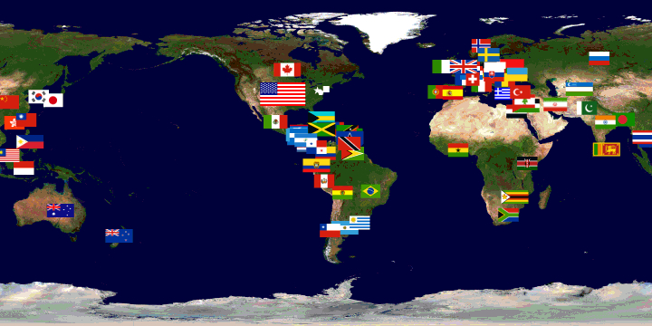
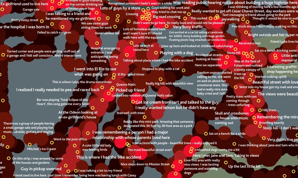
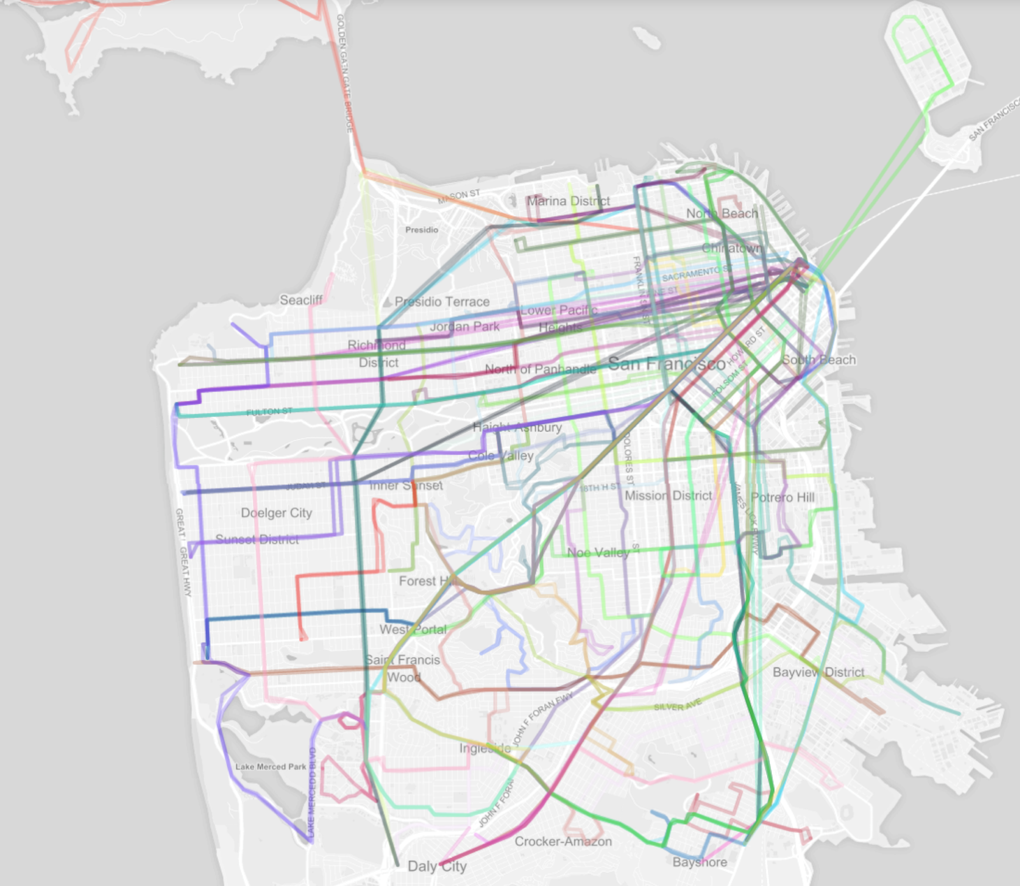
The pleasures of all forms of mapping respond to the deeply satisfying ends to which they process ties across space for viewers, allowing them ways to access space through spatial networks that one never before had the pleasure to observe:  and watching these connections and webs appear in a graphic template gives one a new sense of imagining travel across space, but also an almost innate pleasure of seeing how places are tied.  The multiple frogleaps between shores and across countries in the above world map suggests a shifting notion of the inhabited world.  With Facebook at its tenth anniversary, the immense amount of data that the social network generates offers opportunities to map impressive patterns of interconnectedness which shift attention from those borders which have long defined nation-states or indeed the bounds between land and sea.

In ways that might well be signs of the times, and surely aim to chart a sort of post-modernity, the maps of connected identities offer striking ways to see the world less in terms of its divisions than the links web-based communication allows one to harvest.  Indeed, without depending on the nation as the unit of meaning:  Facebook’s project of comprehensive social graphing has maps populations and social networking by tracking a combination of individuals and aggregates over space–at least, across self-reported locations.  Facebook has already showcased its data as a means to map friendships in ways that suggest a new way of reporting linkages in the very sort of social networks it promotes.  If all maps map human knowledge, these data maps also visualize space outside of spatial constraints:  but a new type of mapping emerges by tracing populations on the basis of how its users self-identify as birth cities and cities of current residence.  For Facebook engineers map actual spatial distributions by big data of the sort economists admire measuring, but most have found hard to discern.  They are worth attending to in some detail, not only to ask about the data on which they are based, but to examine the beauty of their construction.  By charting patters so compelling, they also force one to wonder whether the real story they tells go beyond the reach of the world-wide web–and what ways to best understand the geographical connectedness they actually reveal.  Perhaps we can begin by asking what sort of vertiginous views they offer of the world and its inhabitants, and how we can best relate to the stunning images that Facebook engineers seem to have taken such pleasure to produce–and whose visual economy seems so pleasurable to view.

After a decade of storing Facebook-generated data in a thick dossier of computer files, Facebook claims the ability for a sort of aggregate mapping, but one that erases individual stories:   its aggregates conceal the somewhat obvious fact that it tracks the self-selected members of Facebook users, and showcases them as if they offered a comprehensive enough record of the inhabited world to base a definitive social graph of global populations.  Perhaps Facebook users are the population that we want to notice, or the population that it makes sense to track–but this limitation of data is a liability as much as a strength–and because it treats the usual boundaries that have long offered practical constraints to travel and exchange as superseded, aside from the unstated boundary lines that divide China or North Korea from the other countries of the East.  The map suggests a new sort of human knowledge of connectivity and of the different sorts of markets, presumably, that those who are web-connected participate and are attracted by or move within.  The map that results is striking both because of its erasures of the border-lines and boundaries–and maps webs and arcs of population links without clear reference to spatial directionality.  The skein of ties that emerges has become somewhat iconic, and has also provided a sort of template or inspiration for the map of users’ “migrations” or shifting geographic locations in ways considered below.

Given the intentional elision of individual story-lines that is characteristic of the data being harvested, it’s important to try to untangle the maps it makes from the data on which they are based–if only to understand the bias of the picture they present:  a demographic restricted to their users, as well as based on data that is self-reported and without any objective control.  Rather than tracing the unidirectional movement associated with moments of migration driven by famine, slavery, war or ethnic tensions, the strikingly geometric maps Facebook engineers created reveal patterns of connectedness of special interest in tracking geographic mobility, but also in mapping (and perhaps describing) the new patterns of interconnectedness Facebook engineers would probably like to associate with the Facebook networking site.  The oddness of using the self-generated information on a site of social networking as demographic data may reveal a thirst for processing big data; once invested with the aura of objectivity, the collective patterns it reveals can erase individual stories as much as synthesize completely credible and coherent narratives.Connectedness is fascinating to track.  And such information like place of birth and city of residence are not considered categories massaged for personal advancement.  But the internet offers enough screens of concealment and opportunities for disguise that the social graphs Facebook makes tend not only to lack objectivity, but base themselves on data pontentially massaged by users–who, living in the suburbs of one city or in a nearby village, may report themselves as living in the best-known largest nearby city readily recognized, less in an act of deception, but in ways mistakenly treated as objective in character.

If all maps tell stories in how they embody meaning, the stories that the maps based on Facebook data suggests demand unpacking, if only since their numbers are so apparently comprehensive and large, as well as the stories that they submerge.  One story they promote, which we might not accept, promotes an increasingly inter-connected world; others that it conceals is the specific stories about who is connected to whom and why.  With almost half of Facebook users identifying two hundred friends, the webs created by the data purely of Facebook connections reveals an inter-connectivity that privileges the densest distribution of populations in North America and a broad sense of Europe, with a particularly active groups of users also dispersed in Central America, Peru, Argentina, Anatolia (Turkey), Nigeria, South Africa, Pakistan and India, and Indonesia.  This map of global “friendships,” developed by Facebook intern Paul Butler in 2011, offers a “social graph” of some 500 million people, linking users’ friendships to actual coordinates of latitude and longitude to create a visualization in a sort of media mash-up, illuminated by an intense if other-worldly backlit glow of FB blue.  The map of social networking that results suggests not only who is networked, rather than density of habitation but of course also maps the density of the culture of social networking that has come to stand, especially for Facebook, as a sort of index of modernization.  The equality between Facebook use and modernity recalls how closely the ‘Twitterverse’ maps onto the maps onto the global flight-paths of airline routes, as new study has found, suggesting that airline connections between cities provide a statistically valid proxy for twittering to sites beyond one’s own hometown–and the ties that Twitter makes in virtual terms should not be in any way that distinct, after all, since “Twitter is part of the real world” as is the internet, as Matthew Battles astutely observed, and tweeting is shaped by real-world social ties, even if it offers a new media for communication.  But it would seem a misleading inversion of cause and effect to take tweeting as an out-and-out proxy for modernization, equating it with the tracing of ties commerce and capital flows.

The question is not about the data of Twitter vs. Facebook, but about how big data is used to create the multitude of variant maps generated by Facebook media, including this map of ties among its users.  The multitude of variant maps generated by Facebook media seem particularly striking for their post-modernity in how they elide or ignore the frontier as a primary unit of meaning in world maps.  Is this map an illustration of of the acceptance of Facebook as a part of one’s identity, and do the great arcs themselves constitute something of an accurate index or emblem of post-modernity?  While Facebook is actively interested in promoting is own ability for harvesting data, many of the maps of friendship, migration, and social ties of course read a lot like images of its ability to promote social networking.  The arcs of light that map online ties not only mirror the sort of etherial airline map that seems as good a predictor of twitter ties–does this suggest the similar likelihood of access to airplanes as access to tweeting?–but a gauzy penumbra spun around the earth’s inhabitants who sit spellbound before backlit screens, luxuriating in the proxy embrace of on-line connections and affections? It’s always important to ask what sorts of abstractions that any map seeks to communicate through the tenuous bonds they draw linking actual regions.

Paul Butler's map of friendships

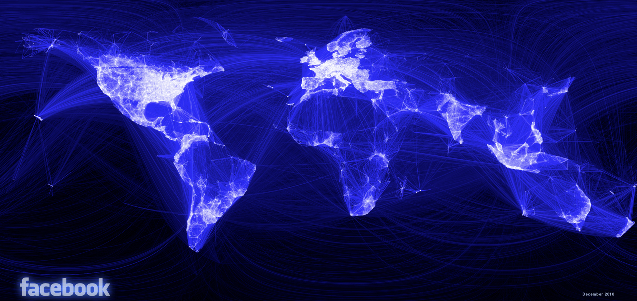
Is this a new story the habitation of the select areas of the information-sharing world that Facebook links?   The above image tells one story about the inhabitants of the world, or rather of a specific world,  and a strikingly suggestive one in how Facebook’s data defines the worlds inhabitants as its users.  For there is no doubt a certain amount of estrangement from other forms of communication that this image, linking pairs of cities weighted for how many friendships exist between them, also maps, varying the intensity and brightness of lines’ coloring by the number of friendships shared as a way of mapping “real human relationships” across space in ways that Facebook does not note explicitly:  the map devised by Facebook’s infrastructural engineering team is a map of the very distances that Facebook as a medium is best able to bridge.  If perhaps just as revealing of access to computers, digital literacy, and wealth, the arc drawn across the empty spaces of deep blue that are oceans charts the networks of inter-connectivity among which news travels, memes grow, personalized photos shared, and a sort of quasi-information society exists, by the construction of the social network on which it travels.  This “globology” reflects less the currents of cultural contact, migration, and exchange that define global history, but something analogous to the cartographical flattening of it, viewed through access to the options of like, connect, dislike, or share that Facebook offers its users.  It charts the options that have shaped, to one extent or another, a transnational psychology of communication.

Which makes the ambitions of Facebook engineers to map patterns of “coordinated migration” an interesting case in mining of new trends in geographic mobility from the massive amounts of data that they collect, if only because of its goals to map actual spatial position over time.  The somewhat-recent maps of what FB term “coordinated migration,” based on the patterns of relocation that emerge from self-reported data of the site of birth and current location of FB users.  The result of the database’s collation is to track and define the lines of the global phenomenon of urban migration, once reserved for larger industrial cities or metropoles, but not significantly broadened across the world, both to population growth and a drying up rural prospects and jobs in the magnets of urban metropoles.  The idealized format of these arcs of migration create a social scientific aura of explanatory simplicity, and serve to affirm the notion that individual itineraries respond to an economic marketplace.  The boast of Facebook to chart such pathways with accuracy has been critiqued for its use of private data without evaluation through the scrutiny by peer review, and may deviate from standards of impartially objectively derived data, or by using publicly listed self-identification to endow with the graphic objectivity (or appearance of it) on a map.  The maps make tacit claim to reveal the real attraction of populations both from neighboring cities in the same country, or, in South East Asia and India, from neighboring countries, by the web of tiny green arcs discussed in greater detail below, provide a useful filter for sort of big data economists have problems measuring of global migration, and indeed to distinguish quantifiable migration numbers and patterns in different regions of the world.  Once again, frontiers are less significant than the ties of cities that the data input by Facebook users enter into their pages, and which they map.

Underlying questions remain, but seem to be waiting for further or future analysis.  For one, how, Sheryl Sandberg, do these patterns of migration map out along gender lines?  In mapping “destination cities” by red dots, and “origin cities” by blue, the design group Stamen has helped render a smooth arcs of migration as a set of naturalized movements, in order to throw into relief the relative density of a phenomenon of “coordinated migration” around the world, but creates a naturalized web.  They give one useful key to read meaning from these idealized arcs by setting them against a global map coloring regions of relative urban growth in 2000-12 pale yellow, in the sort of compelling image  compressing a density of variables to simple graphic forms of which Tufte would be proud:  routes replace cities that they link, or that appear as numinous purple blurs that remind us of the messiness of mobility; the crossing of frontiers replaces frontiers, which must be deciphered by the limited role of crossings from China, whose very existence is only implied by paths of emigrants abroad.

Coordinated Migration #2

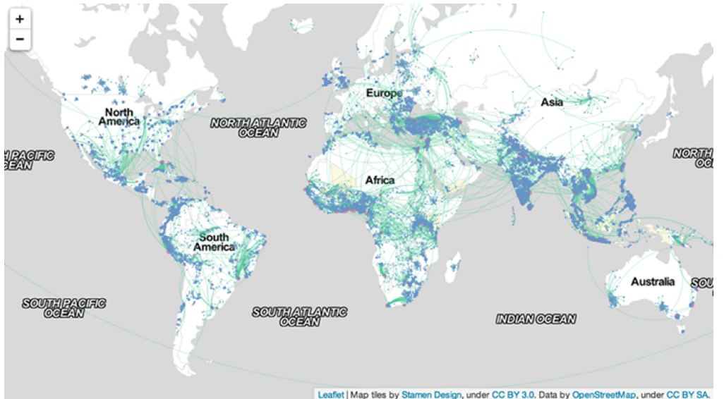
The mottled blotches of blotting-paper blue to which the thickest green trails lead indicate the fastest growing markets of production that provide the magnets from nearby countries as well as for regional residents.  The linking that the map tracks suggests a sense of populations in flux, and of the market-driven nature of the migrations that Facebook’s data tracks, and whose intense mobility is a sign of relative modernization as much as social unrest.  The broader linkages such data implies between Facebook and the global process of modernization is, certainly, good publicity, no doubt, if largely on the level of a subconscious association.

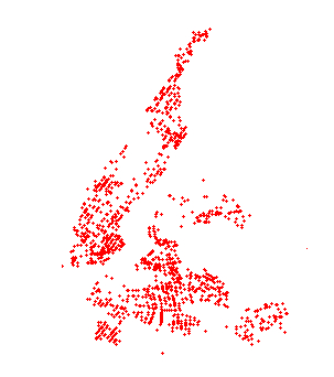
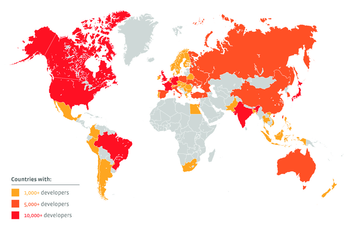
But the emergence of what Facebook has christened in quasi-sociological jargon as “destination cities” might be taken with a grain of salt.  But the data that Facebook has so far collected is also an inversion of a somewhat embarrassing incident that occurred at Facebook back in 2010, when Pete Warden devised with the inventive project to scrape the public Facebook profiles of 210 million users in the United States to derive the clustering of networks that divided the country according to FB ties, creating his own national map, but then withdrawing the offering of the data as public when Facebook threatened suit, but had to allow him to keep up the map he derived from the data–brilliant if only for its definition of clusters that would never be rendered in a printed map, with eponymous if imagined toponyms as SocialistanMormonia or winning ones like Stayathomia, designating the greater northeast and midwest–a region viewed by most as revealing less geographic mobility, but which wouldn’t appreciate that name.

United FB regions

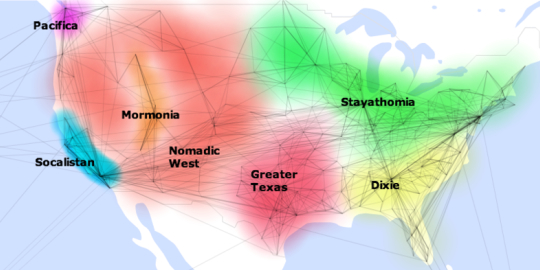
The map, soon taken down, may have encouraged a sort of counter-posting of a heat-map that announced the world-wide distribution of Facebook developers, which seems designed to celebrate their global geographic diversity, rather than social or geographic segregation, to dispel the notion that they are concentrated in the United States or, in terms of the city where most FB developers live, San Francisco.  (The coloration of whole countries based on local concentrations of software developers finds all of North America painted red.)

Facebook-Developer-Heat-Map

But the huge amount of data that Facebook has developed in a decade-long harvest is hard not to want to map, if only to see what sort of visualizations it produces.  And the three or four maps they issued tracking the benefits of ten years of social networking have led to the claim to reveal new patterns of social migration to cities or urban metropoles that are the equivalents of hot-spots in a globalized world.  The shading yellow of regions the World Bank found marked by high “urbanization growth” over the same period–2000 to 2012–creates a simple context to situate the migration, although it would only really make sense to chart that growth in population over a broader period  corresponding pressures that impacted those who were migrating in ways tracked during this period as a way of registering, or so Facebook would like us to think, some of the primary forces that have reconfigured a globalized world on which Facebook has a clear take.  The cities noted as cross-national destinations reveals a sense of global mobility and inter-connectedness with which Facebook wants to promote, to be sure, linking a sense of globalism with its product’s global reach, but wrap the world in a skein of green lines link with differing intensity selective cities an towns, suddenly giving prominence to the links of a potentially economically prominent demographic.

Coordinated Migration #2

The elegantly arcs of migration charted from original residences are quite impressive localized illustrations of geographical mobility:  if the result might not be truly comparable to how Aude Hofleitner, Ta Virot Chiraphadhanakul and Bogdan State have decided to evoke the many “large-scale migrations [that] are an important part of human history,” the chart reveals micro-patterns of geographic mobility by neat green lines would make a social historian turn green with envy, mapping “flows” from hometowns to current cities.  The responsible social historian would ask whether those nice curved swirls map along a symmetry misleading in portraying actual paths that those migrations took–many, one could speculate, were routed through multiple other cities or post-modern metropoles, as the line connecting any two points anywhere is rarely a perfectly smooth trajectory or arc:  the visualization betrays, in this sense, the data-centered models from which they derive, and are, in a sense, less revealing of a picture of actual populations.  But the floral patterns they create, spinning from blue-dots of geographic origins to red dots of final destination or current habitation, document a fairly radical shift toward urban in-migration, reminiscent of nineteenth-century Europe, and a huge attraction to sites in coastal west Africa, not only Lagos, whose urban population’s growth by almost one-fifth reflecting the expansion of the city and oil-production, but also Dakar, Accra–whose urban growth also approached 20%–, Ghana, the Gulf of Guinea, and Nairobi, as well as Dar es Salaam.  (One suspects that this is but a shadow of the true migration of populations, since it only represents data from the social network that Facebook runs, and is silent about its very selective picture of folks with internet access and net-literacy.)  But the migration of Nigerians it tracks to Lagos is nonetheless prominent.

Could this data not be usefully cross-mapped with the growth or social compositions of destination cities in more provocative ways?  What sort of visualization would that create?  Can it be refined, by accessing data like the changed place of Facebook users over time, creating a somewhat more messy, but perhaps more informative, way of tracing patterns of migration, than a graphic that seeks to underscore as well as illustrate the notion of a “coordinated migration” from smaller towns to metropoles?  To be sure, the arcs used to denote the alleged concentration of migration area a way of softening the image of Facebook’s data, making it more organic part of the map, and not serve as an apparatus of any accuracy.  The arcs are aesthetically engaging as a way to illustrate each “destination city” by its reach to its hinterland–or to other cities of origin–to visualize and showcase the massive amounts of data that it has collected, much in the way that Facebook has engaged in multiple ways to visualize the scope and extent of data that it generates over a huge expanse of the world, if not to suggest it forms a way of tracking the inhabited world, under the name of Data Science, always keeping that data anonymous.

The map of major destinations of folks in the two year period of 2010-12 is striking for how it reveals a changing face of global socio-professional mobility that seems specific to some classes.  The usage of circle arcs in the streamlined OSM cartographical data is almost as misleading as it gets if one thinks that the arcs mirror the messiness of routes of actual spatial migration.  But the abstraction of defined population currents offers an abstraction of presumably “eminently hirable” individuals looking for more profitable lines of work, linking the Facebook populations with the up and coming professionals of the future, as much as with job mobility.  The yellow highlighted areas of notable urban population growth create a backdrop that increased the legibility of this slightly restricted map, and others below–one  wishes for a bit deeper patterns of urbanization and rural pressures–at times far preceding the decade we are describing in these maps.

Coordianted Migration--Africa

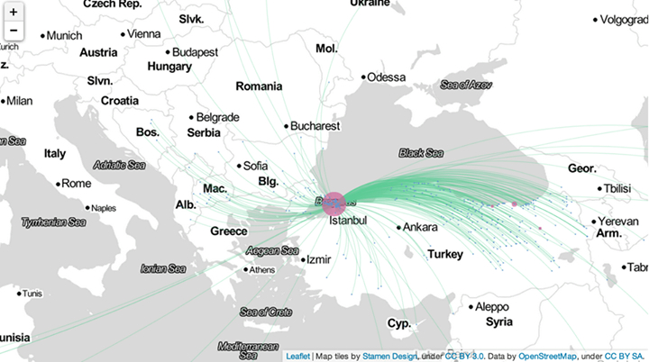
The graphics are particularly striking visually, and effective as compelling images of global patterns, even if they also might not be that deeply informative:   they trace a collective social history of urban in-migration in Istanbul, the city Facebook’s researchers found to have the greatest “coordinated migration,” largely as it is the greatest metropole in a largely rural but rapidly “westernizing” country whose infrastructure has greatly transformed–as if Facebook use was a predictable index of economic modernity and, by extension, growing markets for its advertisers.  The foci Facebook’s data has illuminated here indicates as “growth towns” such destinations as Nairobi, Lagos, Port Harcourt, Accra, Kumasi, Kampala, and Dar es Salaam, but purged of the living conditions in those sites.

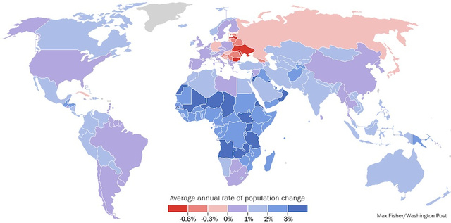
But a more complex super-imposition or layering of not only urbanization, but annual rates of populations’ change worldwide, in ways that the United Nations has also charted in ways that would be of particular importance for such coordinated migrations, which focus, say, not only on Mali’s and Kenya’s urbanization, but growth in Zambia, the Central African Republic, Chad and Tanzania–and explain why these are to differing degrees loci of the very migratory pressures that Facebook has detected.  (All data deserves to be mapped, but the Facebook seem to privilege almost exclusively the very data that they generated, in order to showcase the trends that its use is able to detect, but some maps are misleading enough that they are perhaps less better drawn.  This leads to some complications, both since the data is not made public and controlled, but also since it is not able to be combined by other data or metrics in responsible ways.)

Population Growth UN Charts

The transformation that these maps chart might be one of the huge expansion of internet users–the maps map their own data, after all.  The clustering of such users in a rapidly growing city like Istanbul is particularly compelling, and interesting reveals the huge amount of in-migration from the less sparsely populated areas of Anatolia around the Black Sea that led to the city’s growth by almost 12% in 2010-12.  It would especially profit from a charting to areas of the city–if possible–or the expansion of the city itself, as well as the growth of other Turkish cities from which those arriving in Istanbul hail:  are these towns declining, and just dying, or are they also growing at a comparable rate?  Do folks moving to Istanbul list actual home-towns, or the nearest large villages?  Istanbul is perhaps also unique in being a modern metropole drawing educated populations from many nearby Macedonia, Bosnia, Bulgaria, Albania and Hungary, as well, it seems, the Ukraine–in a sense of the rebirth of the Ottoman Empire, but in ways distinctively lopsided to the East:  a blanket of green gauze of strings of differing intensity whose arcs blankets the northern regions of Anatolia bordering on the Black Sea.

To Istanbul!

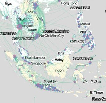
The simplified elegant light green arcs in the above map and its above counterparts stand in quite sharp contrast to the rapid circulation of populations mapped in what is by far the densest and in senses most complex map groups India, South-East Asia (Thailand, Cambodia, Vietnam, Philippines, Singapore, and Malaysia)–almost a data-overload itself–or of the specific stories of these immigrants.  Of course, the question of why this region–embracing really at least three, but probably four sub-regions, should be seen as a collective is not clear, but it is essentially “the rest of the world” aside from the main regions Facebook has parsed.   The graphic suggests a far more massive amount of mobility that is almost difficult to distill to a single image or map.  (China is absent from the dataset, because internet use is so less common; public self-identification is also no doubt far more rare, and foreign, anyways.)   There was quite explosive growth in this period in Bangkok (significantly over 10%), Hyderabad (a bit under 15%, or 14.4%), and Chennai (also slightly under 15%, or 14.4%); one wonders more about the social demographics that motivated this growth, and how much of it maps onto the Facebook users who it maps.

The loss of the stories of individuals who are immigrating to cities is almost part of the point of these maps:  there is no story that needs to be told about this immigration, because it is a process of migration that responds to uniform global pressures we all recognize, which are specific to the demographic of Facebook’s users.  This sense of a story is far from Satyajit Rays’s vision of “The Big City” of the immigration of rural villagers to their new life of searching for commercial employment in the banks, mechanical sales, and lawyers electrified Calcutta.  For the migration to the city that dominates each regional state–rather, the data charts the growth of emerging metropoles as Chennai, in southern India:  it charts mobility from cities to cities, inter-city mobility, among a I-think-that-I’m-probably-quite-employable demographic of relatively educated Facebook users who are most often online, and would coincidentally provide a selective demographic for advertisers to reach.  Indeed, large swaths of rural territories are essentially unmapped, save by the intersecting bright green arcs that cross over their terrain, as if without Facebook users, they did not deserve to be mapped–or, at least, without necessary data, fall out of it–as if to locate the intensity of migrations around its rim, although quite a few sole threads of migration originate from its empty interior.

The image of a growing South Asia is, however, particularly interesting for the number of itineraries it traces out of China, migrating to Taiwan and Hong Kong for the most part, as well as South Korea and the Philippines; the active clustering of Facebook users along the coast suggests that it is were the true action is occurs, as if to rewrite the attention usually paid to charting China’s escalating economic growth.  The vibrancy of ties across borders (and across seas) is striking, as a certain demographic seems irresistibly drawn by Taiwan, and others to Thailand (Bangkok) or Cambodia and Vietnam, whose arcs reveal notably dense ties of geographic mobility.

Coordinated Migration--Asia

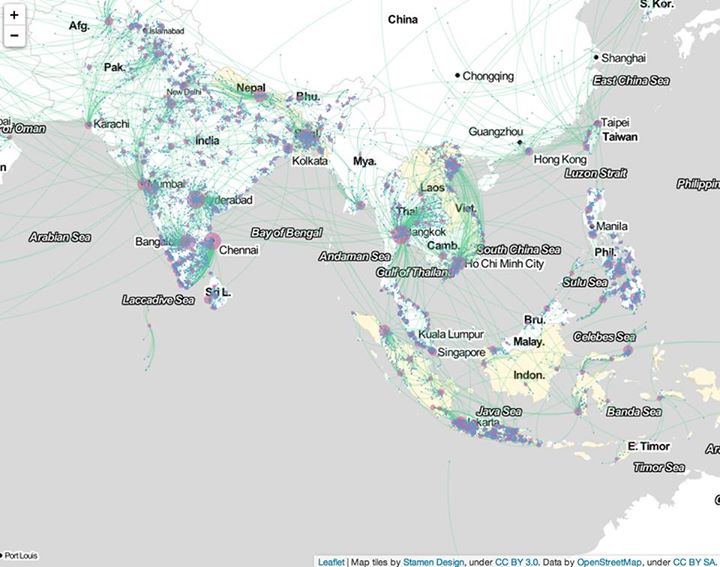
Whose stories is revealed in this amazingly dense map of neat green arcs, which, if they simplify the messiness of the individual stories they collectively track, seem intended to create a sense of a coherent network of meaning that might not be present in the area’s economy but is actually extra-national in nature:  these migrations seem links of like to like, and of educated to industry.  One however wishes for greater resolution in an image such as the above:  what is going on in the Philippines, for example, where Manila is not so much the central hub one might expect, but that each island seems to have its own centers of aggregation and congregation, is unclear; out- and in-migration also seems mixed, as it does around Djakarta and to an extent in southern India and Sri Lanka.  Would a close up, say, of Polynesia or at least of the area around Singapore be of help in discerning what patterns of “coordinated migration” might emerge? The huge urbanization of Java, Bali, Indonesia, Laos and Vietnam, and the circulation in populations in the rapidly growing region, as well as any other political and economic pressures on this sea of population shifts.  Many of the arrivals in Bangkok are from within Thailand, moreover, rather than from other countries, suggesting a very traditional pattern of migration within linguistic and cultural units, rather than the global circulation that such maps might be expected to chart, or might at first glance appear; similar interior migrations characterize Vietnam and, it seems, the Philippines, where much migration even appears specific to each island.  How, to use a metric that Facebook has cleverly adopted in its map of friendships across nations, can one view these ties through the lens of shared languages or linguistic similarities?

Philippines

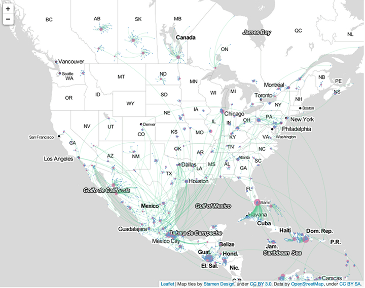
There appears considerably less defined patterns of migration, it bears observing, in the United States.  What does this mean, or might it indicate?  (Or, which seems likely, are Facebook users in the United States just less interested in noting the cities where they live after they geographically relocate, by updating their profiles?)

The patterns provide a new way of reading ties within the map that trump, or erase, geographic proximity, in ways that seem of interest in tracking, for example, the shifts of economical mobility that might be tied or associated with NAFTA.  What is one to make of the far lesser webs of connection or migration in the North America, where there seems, save for the Cubans who have arrived in Miami, far less social mobility or a zero-sum game?  Facebook works–and thinks–in coordinated networks in this case, and finds little similar coordinated migration within North American cities; even in the international migrations from Mexico and Cuba, which seem to be potentially overstated–they reflect the number of Cubans in Miami that state their origin as Havana or Cuba; one can detect less of a coordinated action than a mass movement, in the case of migration from Mexico, than what might be  of a phenomenon chain migration, rather than one independently coordinated, and determined more by family links than economic need.  Three different patterns of migration seem to be evident in the three countries shown below–even though the Stamen projection seems to erase national boundaries or borders by rendering them as equivalent to regions or states:  Canadian cities draw amost exclusively from the surrounding province,  unlike most of the US, save North Dakota and New Mexico; Mexico shows active cross-national migration patterns, perhaps based on familial ties, the engineers note, to such major destination cities as Chicago, Houston, Dallas, and Los Angeles.

Coordinated Migration in US

So do the above mapped elegantly detailed distributions, given the selective nature of their self-reported data, mean anything definite at all? The skein of green lines of differing intensities wrap the world in a variety of ways that contrast, for a start, with a simple map of flight paths:  what remains untold, however, is exactly what demographic the Facebook family has been able to attract.

It is hard to say what they mean exactly, as a result, or how much they provide indices of mass migrations, even though this quite valuable data should by no means be dismissed.  Since it depends on self-reporting of information, they capture a small number of the actual migrations that occur between countries, by migrants who are less likely to log their travels in internet profiles or lists of friends, but the data that the engine of Facebook has, ten years into its existence, managed to compile, and is now eager to show the world that they are able to track.  Of course, the data is only data–and it’s of interest to create a map of data, if only to see what results.  And the somewhat over-determined data of who uses Facebook–folks who are geographically removed from their loved ones?–may be difficult to map as a trend.  It provides a compelling collective visualization among folks who belong to that demographic that often reveals the persistent meaning  of the local and regional in a so-called globalized world.  Perhaps it doesn’t really map a world that is less rooted in geography–Google, after all, generates the GDP of a small country in itself, after all–and where place isn’t supposed to be so great a determining factor or constraint in most markets and lines of work.  The question is what such trends of migration–if that is what’s being charted–mean, and what corner they raise on a map of larger trends of relocation.

Leave a comment

March 5, 2014 · 3:04 pm

Encoding Narratives in Maps

In surveying artists’ maps at the recent symposium “Mapping and its Discontents,” Katherine Harmon celebrated how “creative cartographies” oriented viewers to a narrative about place.  If most of the presentations made viewers re-think the nature of map making as an art and science, Harmon’s attention to how the art of mapping create narratives about place at the symposium sponsored by UC Berkeley’s College of Environmental Design suggest the inadequacy of separating  “cartography” and “art” by examining the map as an art of orientation–by how maps invite viewers relate lived space to the space that they create.  In a symposium that raised questions about the seductiveness of the ability of how better-defined datasets can make maps that better capture processes we want to describe, it was refreshing to shift focus to how cartographical arts register an individual relation to place.  Indeed, if several papers in the symposium struggled over how to bridge map and narrative–do we need to depend less on maps?  to be seduced less by its promises of truth?–each artist returns to the dialogic relation map instill between viewers by orienting viewers to their content in ways that pose questions about the lack of personal detail in an undifferentiated record of space.

In a sense, the survey of artists’ maps on which Harmon organized and explored exposed the artistic values in which all cartographical practices are embedded.  But they also pointed up the narrative ends to which cartographical forms were so particularly suited as joint representations and explorations of space.  All maps engage their readers’ appetite for knowing a place, and even revise it, by creating a relation–a “map”–between personal knowledge and the residue of collective knowledge distributed in the design of their surface.  The narrative possibilities for registering personal knowledge of space are particularly inviting in such an ostensibly objective framework of geographical denotation:  Harmon called attention to the particularly eloquent transformation or adaptation of how the framework of mapping offers both a compelling and legible text by the forms of “deep mapping” that technology now allows–and the expressive form for deeply personal narratives they offer even as they threaten to lose specific details in the very process of generalizing a record of a uniform space.

In an age where we are deluged by maps in all sectors of life, the tracing of these artistic strategies of mapping seems a recuperation of maps as orienting tools and arts of orientation, and this post surveys some of the maps that she presented, some known from other works, as serving to orient viewers in a practice of mapping that is often too removed or alienated from individual experience.  For the ways that cartography can serve as a practice for engaging our different understandings of space in particularly inventive ways maps both feed cognitive by orienting viewers to place in revisionary (and potentially liberating) ways–by engaging viewers n how they uncover meanings about spaces one already thought one knew or believed to have been recorded in existing maps, by creating dialogue about spatial relations as much as to generalize a record of space.

Harmon’s presentation showed less interest in how to tell stories in a map than in using mapping to register personal familiarity with place, by orienting viewers to the multiple personal networks in a mapped social space.  The “creative cartographies” recuperate the artistic basis of mapping as arts of individual and collective orientation that exploited the structure of synthesizing spatial knowledge in a combination of ways.  The narratives each cartographer creatively located in maps exploit the innate curiosity maps invite by orienting viewers.  Harmon distinguished the narratives that several maps create; the “creative cartographers” all draw connections between the specificity of individual narratives plotted in maps and their structural designs.  If the “discontents” of mapping lay in the anonymity of the maps of public space that were universalized for their readers in many digitized mapping projects and by government planning agencies from Rio di Janiero to Beijing to Ho Chi Minh city to Zagreb to the Google Earth platform, creative cartographers exploit the inventiveness invitations of maps place oneself in space by the power of making meaningful cartographical spaces by balancing them with a personal reading of place.

Harmon invited the symposium to follow how creative maps buck the conceit of large data samples to inscribe maps with the personal meaning from a particular perspective–and in so doing, turn the abstracted nature of cartographical practice on its head, reminding us how such “scientific” practices are embedded in a discourse on the arts.  Indeed, as they engaged scientific practices of cartography, they adopted the tools of mapping in as tools to chart a distinctively individual relation to a known space, rather than a universalized one–or, rather, they novelistically use the format of map-making to universalize the particular situated perception of space that maps rarely include or note.

Harmon emphasized in her own visually stunning and compelling presentation the narrative content in these creative maps as setting into space individual stories about space that pointedly contrast with the de-personalized map and emphasized their own personal knowledge.  She showed a set of creative cartographies that exist in a dialogic relation to our own knowledge of a place, moreover, and, more deeply, out knowledge of objective–as well as subjective–renderings of it, making creative maps particularly neat ways of opening up new perspectives on a space that fence in interesting ways with our own.  Indeed, maps have a unique power to illuminate the relation between our story and our surroundings, as much as to tell stories of their own about how we understand place.

The cognitive webs of connections that maps both embody and render visible and concrete have the effect of never seeing ourselves as isolated.  They rather allow us to map our place in a set of other stories and narratives about place, in ways that are deeply social as well as rooted individual cognition.  And perhaps the most problematic subject of mapping such an individual narrative–or restoring its centrality–is in as frequently a re-mappped event as the September 11 tragedy, whose multiple mapping has accreted more meaning on the event–as if it needed this injection–to erase its personal narratives, and imposed meanings on the event that have almost obliterated our memories of its occurrence, and our relation to its immense tragedy.

It is interesting how she began from 9/11–an event that illustrated the tyranny of the map in the public imagination, and a touchstone for how a local event effectively mapped a geopolitical relationship to the world, albeit a quite distorting one.  The event is not only ripe for re-mapping, but demanded a resourcefulness in using mapping forms to forge new networks of meaning in an over-rehearsed geographic conceit.  The artist Karin Shneider effectively re-mapped our cognitive understanding of events of 9/11–and the cognitive space of the twin towers–that  re-framed memory of their destruction and the death of their unfortunate occupants in plate-glass maps inscribed with the commuter routes those who were tragically killed had taken on that morning as they arrived at work.  The sounds of breaking plate-glass were inseparable for many observers of the twin towers’ collapse on September 11.  In Shneider’s commemorative map, individualized etched glass plates restore both the fragility of their lives, and the integrity of each life that overlapped that day, providing a commemorative cognitive map of the event that viewers to consider how the event tied these lives together so tragically, tracing the routes each took to remind us of the voyages each performed that day.   The set of maps commemorate the deaths of some 2,752 individuals by distilling the circumstances of their spatial intersection, giving specificity to that over-photographed and documented event by emphasizing their now unrecoverable perspectives with the evocation of personal letters or diary entries, so unlike the opacity we usually identify with maps, inviting us to see through their commutes to remember the loss of individual life.  The map of approaches to a final intersection replaces the all too familiar rendering of collision courses of two airplanes on September 11.


9:11 flight paths mapped


Shneider’s composite of overlapping maps remind us of the very difficulty of recuperating individual narratives in such an over-narrated event–mapping the mess of lives that intersected fortuitously that morning, and which will no longer be with us.  They reframe an event too often framed as a war on “terrorism,” “clash of civilizations,” or a sign of barbarity and civilization in distorting and exploitative ways, moreover, giving transparence to the very surface of the map.  The absence of a one narrative that unites these paths is, indeed, a great part of the effectiveness of capturing such multiple individual itineraries within one map.

The decided lack of spatial narrative–but a snapshot summary of the lives that intersected on that day in early September–is evident in a quite different map that, oddly, interestingly emphasized the international origins of those who lost lives that day, perhaps in an attempt to remove its violence from a narrative of opposition, and disturbingly cast the loss of lives in terms of the quite different-order abstraction of individual nations:


wtc world map flags

That map’s argument is disquieting because of how it erases individuality.

Mapping can be a clarification of such tragedy, however.  The far more delicate set of superimposed plate-glass maps Harmon described stands in contrast to the anonymity of this map, or the very disembodied and abstracted map of the routes that these hijacked planes took, by inscribing their paths at a complete remove from individual lives.  Indeed, even the inscription of names of those killed in the event at the site itself on a granite plaque, evocative of the Vietnam Veteran’s Memorial, oddly strips them of individuality–unlike how the reflecting stone surface of the Vietnam War Memorial designed by Maya Lin invites viewers to touch individual names on its surface, as if to try to map abruptly curtailed lives.


VVM-TouchWall


The inscription of the names of the dead of 9/11, unlike Maya Lin’s monument, offers no attempt to embody the event–or to express the multiplicity of narratives that that event so tragically condensed.

At another extreme of mapping the 9/11 tragedy lies the grotesque dis-humanized blood-flecked map, so sensationally printed by the New York Post, allegedly based on a map fire-fighters compiled of human remains, as a broadside intended to vilify plans to construct a mosque nearby the site–a map so shockingly dispersive in its energies that rather than embodying the 2,752 deaths it seems to chart, aggressively alarms its viewer with an explosion of meaning impossible to process save by recoiling in horror from its tabulation of human remains near the scene of impact:

Blood-specked map WTC

For if the violently voyeuristic map seeks to dignify the site’s sanctity by delineating the violent loss of life, its superfluity of meaning is something of a recapitulation of violence, attempting to shock the viewer as does the inset photography, by providing some access to the history of the event.

Scheider’s creative cartography also stands in eloquent counterpoint to the abstract cartography of that emptiest of maps, of PATH commuter routes, which she adopts as something of a basis to trace a palimpsest of commutes:


PATH_system_map


The problem of how maps evoke or shift a familiar narrative motivates the inventive ways itineraries are combined with maps to upend their abstraction, or the spatial oppositions that they create and reify.  Daniel Zeller recuperated the itinerary as a unit of spatial knowledge in imagined maps linking two sites of worship in two different religions by imagining their proximity, and almost delineating an imagined route of pilgrimage that might link their footprints.  Zeller used his deep study of topographic maps and satellite imagery to forge an imagined spatial tie between the Vatican and Masjid al-Haram, the mosque at Mecca, as if to bridge ties between two sites removed from one another in such popular and political discourse alike, by connecting them as if on an individual footpath.  By tracing the footprint of each in graphite, and imagining a windy route of pilgrimage that might actually connect them in “Vatican/al Haram,” using the extreme precision to actively embody and create real spatial ties–


Vatican:Al Haram


–with attentiveness to precision evident in this detail of the links he creatively mapped between both houses of worship.
Zeller Vat al Haram--detail

Departing from digital simulations that often create information overload,  Zeller’s craft-like remapping places with the symbolic continuity that maps create to all too improbably link two sites so often separately segregated in the global imagination.

Bridging divides through a pathway that itself unites or crosses cultures is the theme of Asma Ahmed Shikoh’s beautiful acrylic “Van Wyck Boulevard,” part of her project “Home.”  Shikoh’s art maps her status as a Pakistani artist trained in Karachi who moved to New York:  “Home” brilliantly reclaimed the craft traditions of mapping, recasting the NYC subway map as an Urdu manuscript and within a geometrical design borrowed from the Islamic Al Hambra, in Spain, to reexamine its functional status, and its role as an icon of urban belonging at the same time as mapping a Muslim diaspora–precisely by casting the map of the path of the MTA’s “F” line that took her to her first home in the city.  Shikoh reconfigured the map in a painted form of distinct coloration, engaging its form as well as using language as a tool to assert my identity and make the new place my own.”   The widely reproduced and iconic subway map served as a template to assert and recreate the familiar embodiment of the subway lines as a constellation of meaning invested with a narrative intent that the location of stations on this diagram rarely possesses: only by  “transliterating every stop, was painstaking, repetitive, and yet therapeutic for a newcomer” that traced a narrative through a process of remapping and making the city her own– using the subway map to transcend the increasing construction of a dichotomous divide between East and West, and re-center her identity (and immigrant identity) in the mobile paths of New York City’s subways.

Van Wyck Blvd


Cross-generational mobility was mapped through the shifting degrees of access or familiarity with space across generations in a map of the town of Sheffield, Harmon noted, when Dr. William Bird traced i the limits of known space created across generations living on an aerial view of the city that redefines the mapping of “city limits.”  The chart of the boundaries of a “known world” where children were entitled to walk unaccompanied in Sheffield provides a far more general (and very poignant) map of a demographic group’s relation to space, investing the map with particular narrative and expressive properties beyond that of a spatial register.

How Children Lost the Right to Roam in Four Generations (2007) employs the format of aerial photography to map the ambits at which children were allowed to walk on their own in the same neighborhood in one family.  The result of comparing the increasingly restricted spaces parents tolerated wondering illustrates and documents the daramatic contraction of the consderable freedom eight year old George Thomas enjoyed in 1926 in Sheffield.  His parents, not able to afford the tram’s fare, let him to walk six miles to fish on his own.  The erosion of the English commons is a trope of the enclosures of the early nineteenth century, and the lack of urban exploration a more contemporary concern for city-dwellers who find their children less adventurous in making the out of doors their own.  But the more recent specificity of Bird’s roaming map shows the harrowing circumscription of space up to the present:  George’s great-grandson Edward, on a tether of some 300 yards, and with few liberties to roam at will unsupervised, possessed less of a spatial narrative of his relation to the far more industrialized region of Sheffield today, as his mother’s was far diminished from that of his Grandfather Jack or the wide range of space George was trusted to personally navigate.  The narrative of a restricting relation of the person to space in mapped by the narrowing boundary lines in Sheffield:


How Children Lost the Right to Roam


As much as describe the changes in Sheffield’s geography and the story of its expanding industrialization, the map presents a strikingly local microhistory which echoes and encapsulates frequently expressed concerns about the lack of exploring a safe urban space.

It was made in the capacity as health officer to Natural England, to substantiate a concern for Bird’s belief in the benefits access to grassy areas, ponds, and trees brought to kid’s behavior and school work, and question the healthiness of the narrowing relations of space from George, his son Jack, his daughter Vicki and the eight-year-old Ed.  The creativity of these practices of cartography bucks basing maps on their synthesis of a large data sample, by questioning how maps can be creatively rooted in a narrative of individual experience, even in ways that preserve their value as a collective register of the experience of space–and how a Google Maps template might be distinctly personalized as a record of spatial knowledge.

Discontents with Google Earth maps lie precisely in the deeply problematic recuperation of a cartographical art that they perpetuate for their users.  And so Jeff Sisson focussed on the spatial meanings and consequences of the threatened disappearance of the Bodega as an institution and anchor to urban communities in New York by crafting an interactive Bodega Map within the city’s expanse.  In charting the survival of a store central to communities across different neighborhoods, the map almost anticipated the recent turn against Mayor Michael Bloomberg’s New York that the recent De Blasio victory seems to portend.  In tracing the footprint of the institution of the Bodega, Sisson selects stores pressed out of existence in the absence of rent control for shops in the city’s expansive real estate market, and provide evidence of a vanishing urban culture of diversity.

Sisson’s website invites all visitors to place Bodegas in local neighborhoods to elevate the individual discovery of a community store, in an exercise of collective crowd-sourced participatory mapping that displaces the archipelagic city’s usual contour lines by rather trying to map the local meanings of these distinctive and useful stores within local communities, in ways that invite one to insert one’s narrative connection to the colorful local Bodega so long an urban fixture situated at odd street-corners, combining such mapping resources as Google Earth, Google Maps, and Flickr snapshots of facades and marquees of individual family run stores.

Bodega Map

gkjarvis


The project “Mapping Bodegas” tracks processes of micro-urbanism, by marking sites of interaction and stages to which communities respond, to reflects on the danger of their erasure from the city’s map and its neighborhoods, as well as to preserve meaningful “hot-spots” of collective memory within outlines of the specific neighborhoods they nourished.  This infusion of narrative content is, to be sure, one reaction or response to the universalized abstraction of an anodynely marked places of interest in the space of Google maps, with something approaching a zero-degree of the denotative signs of registering affect or place.  It is in reaction to this lack of narrative that Adam Bartholl staged his public sculpture “Map,” creatively appropriated the blandly uniform “inverted tears” of a Google map push pins by placing these physical objects in the very center of Arles–on the hexadecimal longitude and latitude GoogleEarth uses to denote Arles.

The discontent with the abstraction of our knowledge of place in Google Earth led Adam Bartholl to remind us of the increased distance between iconic cartographical markers Google employs so blithely in its tiles and knowledge of places they denote.  By the co-option or appropriation of the sign of place in geolocation practices in the public square of Arles, Harmon argued, Bartholl reminded us how the marker shapes (and fails to capture) our sense of place, as we use it to make our narratives of travel:  by placing a larger than life physical embodiment of such a dayglo pushpin in the exact center of Arles’ public square on the altitude and longitude where it occurs in Google Earth, Bartholl asked us to confront a physical embodiment of a sign we too often internalize without interrogating its affectless muteness as a sign as itself a denaturing of place.


map-arles-2-600

map-arles-1-600

Arles?  It happened right here . . .

map-arles-3-600

On a more political level of the silences concealed in many maps, and the environmental consequences of these silences, Harmon turned to the failures of mapping ecological disasters of Bonga oil spill and  transformation of the Niger delta.  What are the limits of Google maps in tracking the multiple levels of ecological disaster within the Delta, seat to a preserve of some 600 million barrels of recoverable oil mapped in 2001, but whose mapping silenced the complex narrative of regional toxic pollution that has spun out around those platforms and oil rigs.

bonga3


The delta, an oil-rich area long plagued by irresponsible levels of annual oil spillage greater than in the Gulf of Mexico Deepwater Horizon disaster of 2010, is a site of widespread flares on rigs, and, as a very poor area where oil was found close to the surface, of dirty DIY oil refining and extraction have created deep-set ecological disasters through the Delta–over 7,000 spills from 1970 to 2000, some spewing at least 9 million barrels of crude into wetlands that sustain millions of local trades from fishing to agriculture, and where consistently poor clean-up of spills have eroded increasingly fragile local communities and economies in an image that, viewed from space, appears both ecologically fragile and remarkably pristine.


600px-STS61C-42-72

How to map the devastating ravages to the local environment, whose production the Nigerian government is economically dependent, is particularly problematic since the oil-rich delta is the source of 90% of the country’s foreign earnings.  Regular under-reporting of spills by NOSDRA–the Nigerian Oil Spill Detection and Response Agency–to keep in line with corporate claims led to a failure to register the escape of up to 60,000 barrels of oil in 2011  from one Floating Production Storage and Offloading Facility at the Niger delta’s mouth by Shell oil (Nigeria’s major client) in Bonga, or 1979 spill of 570,000 barrels of crude, also by Royal Shell–eroding the environment all up the Delta, by the devastating toxic effects of acid rain that are only starting to be mapped–from the ruin of coastal livelihoods and fisheries to deadening formerly plentiful fields of kola nuts.

How to map or embody the narrative of the destruction of an ecosystem?  This time-lapse map seems as disembodied as Vassily Kandinsky’s “Einige Krise,” but charted decade-long oil flares in surrounding coastal waters spewing crude into the air, in color-coded fashion since the expansion of oil drilling in the Deepwater Bonga project since 1993–blue from 1995; green 2000; red 2006–as the outlines of an ecological disaster since deepwater drilling began–and whose mapping almost defies narrative:

nigerian_satellite_photos

Several Circles


If the agglomeration of colored dots in this time-lapse map suggests pattern, the distribution mirrors the division of the Delta and surrounding waters by prospecting leases for locally administered oil fields since 1993, but only starts to map the disastrous consequences for the environment of this massive release of crude into the ecosystem and its local economy:


Deep Prospect Nigeria Oil and Gas Concessions Map - Deep-Prospect

While the slick produced at Deepwater was not at first mapped, it occurred on a 2011 Google Earth view charting oil slick on the ocean’s surface:

Bonga Bongo Delta in Niger Delta-Nnimmo


This map provided one of the few media sources documenting the Bonga spill not provided by Royal Shell Oil itself.  Indeed, it only starts to track the implications of the spills, fires, and leaks in the Delta that constitute the largest wetlands in all Africa rich with swamps, estuaries, rivers and streams, and can only suggest the extent to which forests and mangroves are being polluted by spills from a network of pipelines, acid rain, and water-borne or rain-borne oil slick–rain regularly returns drops of crude oil to formerly fertile region–where oil is relatively close to the surface has led to a distortion of the environmental perils of oil extraction–and over one thousand abandoned oil spill sites in the over-drilled Delta, with huge environmental consequences–often blamed on the ships that regularly illegally siphon crude from the pipelines that criss-cross the delta.


nigeria_gas_1979


Google Earth views used by Sky Truth to map the 2011 Shell Deepwater spill barely chart the environmental devastation on the Delta rivers.   The map that almost leaves one speechless in how the beauty of its sinuous detail chart the slicks of oil that have contaminated a once-healthy delta’s agricultural wealth; this NOAA aerial photography created by the United States Navy rebut the oil multinational’s silence as to the spill’s scope or devastating consequences, whose silences have only recently been targets of international blame, and obscured some 474 spills in one area during 2012 alone.  Perhaps  the recent expansion of Nigerian crowd-sourced mapping projects may shift these cartographical silences, but the burden for mapping the disaster has not been met.


Deepwater Spill Nigeria

Shell Deepwater Spill

_70948662_3fb361eb-02d8-417c-aeaa-1e42c23e8ef4


The narratives that these aerial image of considerable beauty recover present a counter-narrative to that of the corporations that distanced themselves from the Bonga spill, and perhaps a case of maps speaking truth to authority.  These maps begin to tell a story of the transformation of the land–and the destruction of the environment they map.  These maps foreground new narratives about the Google Earth format that invite a broader story to be told about the event, and to fill the silence of Shell’s official narrative about the quantity or causes for the massive spill–and the blanket denial that any of the oil ever reached the coastline, and all barrels were successfully dispersed in the ocean waters, and seek “unconditional license to contain and disperse the Bonga oil spill” itself.  Without these Google maps, Shell Oil would have retained a monopoly about the production of truth about the devastating Bonga spill.


Sleipner A


Can a narrative emerge of this event from the perspective of those who dwell in the Delta, to capture the consequences of the toxic transformation of the land they live and work in, or those for its non-human inhabitants?

Some semantic possibilities of expanding the ecological narrative of place were suggested in the tracking of growth of Chesapeake Bay grasses,  in a mapping project using data to track changes in the growth and density of grasses around the largest estuary in the United States particularly illustrative of the subtleties of overlaps to achieve the sort of deep mapping that Google Earth would not allow.  The Stamen interactive map frames a unique narrative of the restoration of the estuary ecosystem incorporating data from over forty years across some forty years, redirecting data to create an image of where the estuary might later develop:  the time-sensitive visualization of data about salinity, water-temperature and bathymetry with the restorations of bay grasses who are the subject of this narrative of ecological restoration, to offer a powerful–and positive–interactive map about the local recuperation of environmental health, by synthesizing a wide range of data from the EPA officials and local institutions about an area to reverse effects of chemical pollutants on wildlife and grasslands that viewers can read or virtually explore as unfolding over time, in ways that press against the technological boundaries of cartography as an art.


Chesapeake Bay Program


If this graphic visualization of the watershed appears a document only of the growth of grasses, as we unpack the map we realize the expanse of the effects of the possibly narratives of human interventions in the landscape that it presents–both on the ecosystem of the estuary and to possibilities of our future relation to that very dynamic environmental space–a space we better know through our more multi-leveled representations of it.

The art of registering knowledge of place has expanded to comprehend new personal individual narratives of fine grain by a GPS revision of the Google Map view of a city.  Indeed, the maps of Christian Nolde and Ingrid Burrington both seek to recuperate the density of specific narratives of encounters in urban space that echo and engage the emerging forms of mapping by which Google seeks to plot points of interest for its users on the maps of cities that they visit, so that they might include selected points of interest, sites of beauty to visit, or local stores and commercial districts of interest judging by one’s web history.  Both Nolde and Burrington used GPS to create a synthesis of these individualized maps of the city in ways that anticipated the announcement of Google’s plans.

Christian Nolde employed GPS technologies to register of feelings related to place in his emotional map of San Francisco (2007), created during a tenure at Northern Exposure.  After collecting on data gathered by a galvanic skin response by which participants’ physiological responses, he keyed them to places that he transposed to a GPS map of the city’s locations, as if to trace itineraries in a city usually mapped by city blocks or along district lines.  The maps seeks to register responses to a location or geographic environment on individual emotions, in a sort of counter-map synthesized individual responses into something like an encounter with places of specific individual resonance in the city, in a record “visualizing the emotional space of the city” by objectively tracing an alternate topography in 2007.


Emotional Map SF


This map has a texture of accommodating the individual storyline or narrative that makes its reading an active part of its enjoyment, by engaging individual storylines in a dazzling if fragmentary novelistic detail, challenging the legibility of the map’s surface of significant local depth for readers who can take the time to delve into the map to read the actions that its maker associated with a specific place, but which would be ‘overlooked’ by scanning the broader path of his itineraries across the city:


detail SF emotion map

GPS was used, in other words, to contextualize multiple narrative fragments in a composite view of the emotional significance of urban space  by tracing if a residue of collective emotions on its surface.  The completed artifact combines multiple spaces of reading, augmenting the notions of position that he noted in GPS at specific way stations by his own transient or apparently ephemeral personal reaction to the city at a specific place–“beautiful street with lovely houses”; “went into my house and got my mail”; “This is where I had the bike accident”; “i was remembering a person I had a major relationship with whose parents lived here”–that foreground the personal in ways GPS cannot alone register.

The practice of GPS creates a synthesis of discrete meanings rarely associated with geospatial mapping, and puts a premium on emotional or associative precision, as much as the abstraction of terrestrial locations.  A similar desire to base a map on personal narratives to record the city as an emotive space led Ingrid Burrington to take data from Craig’s List “missed connections” as the data to reveal a hidden distribution of the desire for half-glimpsed connections in her “Loneliness Map” (2009-11), included in an earlier exhibit of personal maps Harmon earlier curated.

The map’s unique pinpoint form focusses observers’ attention on mini-moments of “missed connections” in the course of the day against a map of physical topography and street intersections, as if to present the variations among missed connections as an emotional terrain or urban psychogeography, creating a new sense of reading mapped data to register a notion first used by situationists such as Guy Debord.


burrington-ingrid-online-image-main

Burrington--Missed Connections


Such collected ‘mini-moments’ trump the topography of the city, tracking personal attachment to selective moments in urban space as more meaningful than the mapping of the outlines of its streets that create a new experience of reading the map’s surface.  They recall the Mappiness (LSE) smartphone app, which disrupts the relative abstraction of space in a GPS framework by registering our own states of happiness on a map.

The map becomes a site to register individual travels through the city in a collective document, or a capacious holder of narratives, as tangible with resonance as any map might ever be.  And the very tangibility of this record of encounter that maps allow, even with limited qualitative content, suggest the underlying basis of cartography as an art.

1 Comment

Filed under 9/11, Art and Cartography, Chesapeake Bay, Google Earth, Google Maps, Guy Debord, Jeff Sisson, Karin Shneider, Katherine Harmon, Mapiness, Mapping and its Discontents, Mapping Bonga deepwater drilling, Masjid al-Haram, Niger Delta, Stamen design

Cartographic Selectivity and the “Objectivity Question”

The comments elicited by readers of the imagined maps of Manhattan island  that I discussed in my last post were so interesting because they mistook the selective criteria of mapping for their objectivity.  The personalized maps featured in the Magazine of this past Sunday’s New York Times appropriated cartographical tools to  render personal spaces in the anonymous city, recalling the way we map the neighborhoods we live in and how they change with time.  But readers of the online version blamed them for offering limited perspectives of the city.  This was especially true of those posted by former city-dwellers who didn’t recognize the city as it existed in their own minds–or maps, and felt that their own mental maps were under-represented or neglected and just, sadly, not there.  We all have subjective maps that divide social space in our minds, that don’t line up at all with judging the accuracy or objectivity of maps.  As Becky Cooper, the curator of these maps, puts it:  “I’m really, really bad at geography. But I think it helped me to see maps more as biography.”  Cooper’s collection of maps are very different from, say, Cohen and Augustyn’s volume Maps of Manhattan that Tony Hiss introduced.  And they only gesture to what Henry James called the city’s “primal topographic curse”–its street grid–or the many neighborhoods that can be mapped and were mapped in the island.

Some blame might be assigned the limited demographic range of those invited to map their memories of the city, or map their memories of particular sites in a far more diverse city:  the selective criteria that each adopts might just as well be read as an invitation (or opportunity) to map your own image of the city, and otherwise unremarkable sites that you remember in identical cartographical outlines.  These maps transfigured existing maps of the inhabited island, mapping the island as inhabited by you, mapping individual memories, objectivity be damned and cartography full speed ahead:  rather than erase the role of the cartographer, behind the veil of objectivity, the cartographer becomes you.

The practice of selective notation of what qualify as a prominent site fits an age when AAA sells Trip Tik Guides that pride themselves as  accurate routing maps for trips, consciously designed as counterparts to comprehensive road maps of a region.  Trip Tik Guides hearken to medieval route-maps, providing a very selective guide–if a comfortingly narrow guide–to a world where we may all too often suffer from information overload:  they winnow the basics from the maps, a service that the AAA folks are proud to offer for any twelve destinations from any zip code.  AAA meets ADD, in other words:  these maps can help us decide what to pay attention to, or allow us to read a map when we might be too easily distracted by its contents to navigate effectively with them, or be tempted to stray off course by the inviting name of a region or a coastline that can’t fit our itineraries, or just help us plan an itinerary for our entire weekend trip.

Objectivity or the rhetoric of objectivity are central to the market for terrestrial maps.  But that rhetoric should not conceal that all maps are not only selective, but use selective criteria to make sense of space.  The  sharpness of contrasts of their selectivity as records that orient us to space–and the mental ties their selective criteria create in space–is a measure of the usefulness of maps as tools to think about a space that seems a dauntingly undifferentiated expanse before we’ve been there to visit and make it our own.

In the medieval maps known as “mappaemundi,” or maps that represent the world, “the religious importance of towns . . . determined their location and their prominence,” as John Gillis put it, rather than their location or size.  There seems some comfort in not plotting a sense of space, and of privileging Jerusalem’s position  in how medieval T-in-O maps, and the early printed world maps that retain the Holy City as their center, for the very reason that not many places even needed to be named other than Jerusalem in a map of global space.    The divisions of space in this 1485 world map suggests less interest in comprehensively identifying places or dividing space to scale than describing the configuration of lands around the city called “hierusa” and Holy Land, even as it claims to “lay everything before our eyes,” including the origins of our oceans, including “the sources of the Red Sea and the Indian Ocean”:


macrobian_1483

Most of the map, including the “terra incognita” of the mythical Antipodes, is blank.  Before the increasing

population of space, terrestrial expanse was still more or less undifferentiated in 1493, when sites worthy of memory were few, and maps’ contents were not read by audiences familiar with few places or sites.

Regional identifications were few, and confined to known landmarks and major rivers, all of which are less detailed than the sons of Noah, Shem, Japheth, and Ham, who hold the planisphere by its corners, as if it were a tablecloth, or the puffed cheeks of the nine curly-headed winds who float in the intermediate frame:


Schedel map small


So we might ask what are the criteria that we use to differentiate space, as much as wonder about the accuracy with which we denote place.  The new emphasis in maps of ordering place by terrestrial coordinates of location defined a model for reading space in quantifiable or measurable terms, in which a graticule of parallels and meridians offered terms for the viewer to judge distance and scale.

The selective criteria of later maps reflected not only knowledge of toponymy, or discovery an abundance of place-names, previously unknown, but the cartographical ability to delineate meanings in space.  Successful criteria of selectivity allow maps to make space available to the viewers, and cartography provides a sort of public ‘good’ to understand public space.

Although this sort of juxtaposition would not be possible to most, precise urban surveys allow maps of provocative maps of overlays, presenting maps less as sources of information than a sort of resource to “think about” space and imagine public space, particularly advantageous to urban planners.  I had hoped to include different maps of the UC Berkeley campus, one that construed spatial relations on directions, another by mapping creeks, and the last highlighting in blue routes lanes of wheelchair accessibility.  Each differently privileges information for different readers–and offers multiple views of the very same ‘space’–one concerned with routes of access and travel, another with spatial orientation to finding the individual buildings for university classes.


wc accessile campus routes ucb


large_campus_map


Let’s turn to San Francisco’s space, however–more challenging to map and more recognizable, and offering examples more semantically complex.  The below maps explicitly construe relations that are hidden to observers, although with considerable spatial precision, as this visualization that performs a layover between crime, trees, and cabs in San Francisco, overlapping three data sets to  visualize a Venn diagram. This is not a simple visualization of data, but a unique topography based on selective criteria:  the concentration downtown of cabs (and hence potential witnesses or bystanders) do not lessen crime more effectively than the planting of trees; though it’s hard to see trees as an active crime-deterrent, the overlay tells us about how we construct our neighborhoods as living spaces.  Or, as the man who made the map, Shawn Allen, put it, “I’m still not sure if it’s significant, or even interesting, but here it is.


cabs, crimes, trees in sf.


The versatility and value of the selectivity mapping techniques depends on the readiness of the cartographer to perfect a legible iconography–as well as its ability to surprise and invite viewers to reconsider space by revisiting the socio-economic differentiation of a space that we might already daily move through.

The mapping of food access is a good case in point of how maps make space look different.  Although this map includes no toponyms or place-names, the synthesis of data into a tricolor spectrum of a data overlap creates a topography of food choices available in each neighborhood.  It poses questions of how food constitutes a neighborhood’s attraction and the constraints its inhabitants face, or consider how these choices arose.  Another map employs a color-drenched spectrum, glowing in flourescent hues that denote relative access to food markets across the city:  the spectrum dominates names of the city neighborhoods, to reveal a topography of food that underlies their divisions.

FoodMarketScore


One might better understand the constraints its inhabitants face by a more traditional map of retail stores–both in terms of different regions’ quality of life, as well as real public health risks.  This alternate data visualization is at a finer grain, identifying seven varieties of sites of retail food stores of different colors, with liquor and convenience stores noted by a simple dot of black.  This makes the map both more detailed and less easily readable for some, but provides a meaningful view of the city’s urban space.


Retail foods SF


Successfully selective criteria can help create a map that is a better public resource.  To craft these maps of neighborhoods better, we’ve even begun to push against the preference for the visual, in maps poised to break sense-based walls as well as esthetic boundaries to register an aural dimension:


Sound Map of Missionjpg

3 Comments

Filed under Food Maps, Mapping Manhattan, San Francisco, sound maps, Stamen design, T-in-O, UC Berkeley Campus Map

Re-Mapping San Francisco

The late, great outlaw historian of cartography, J. B. Jackson, founder of Landscape and a Lone Ranger of the Berkeley hills, argued that the geography of the freeway was a dominant but rarely appreciated subject of academic study.  For Jackson argued that despite much study of maps and topography, cars coursing through space provided a new experience of space itself, and one that was poised to become the dominant way we experience the landscape.  Contrasting the space of the highway to the space of Mexica adobes, Jackson believed he identified the problem of writing about the experience of national space in the twentieth century, explored in a series of essays on the shifting perception of geography and highways, and the mapping of the new settlement of space.

Rebecca Solnit published a lovely article that might be seen as an expansion of some of Jackson’s points, but which takes a map as emblematic of the ways that commute routes suggest the dangers of such a shifting of the inhabitation of San Francisco’s public space.  For Solnit, the 2012 map that has been called “The City from the Valley” reflects the precipitous housing market of San Francisco as it makes evident the “invisible” network of a series of unmarked bus stops that ferry workers not to freedom, but to work.  The maps mark what Solnit describes as the arrival of “Google Invaders” in the city, and she sees it as concretizing the menace that an influx of new cash from Silicon Valley workers that has flooded the San Francisco real estate market, and effectively placing many of its current residents–focussing on the artists who have made the city their own–not only at a disadvantage, but as the apartments were they lived become targets of eviction.  As apartment buildings they lived in are converted from rental units to feed the insatiable demand for housing, the rising market prices of housing are met by an audience which uses a separate transit system–and renders unoriginal whatever organic community and economy Jane Jacobs saw as the basis for the American city.

The “shadow” transit network of private busses that ferry workers to extra urban employers who pay low taxes–and none to the city–tells us much about the way the Valley feeds the city, and the ways the city stands in relation to the Valley.  The mapping of transit contrasts, for example, to the apparent organic unity of the city’s transit system plotted from OpenStreetMaps, whose individually colored lines ferry workers and tourists within what seems its discreet organism:

SF TRANSIT

Solnit has recently immersed  herself in the problems of mapping San Francisco, and her piece brings together some of the familiarity with San Francisco as a residential city with an eery foreboding that San Francisco has come to symbolize a lifestyle with appeal among a breed of commuters to behemoths of Silicon Valley, who she characterizes as faceless sorts, ferried by dark-windowed private buses operated by each employer, as if Storm Troopers in suits.  The possibility of buying real estate in this city faces a squeeze generated by hugely wealthy potential residents who work outside the city, contribute minimally to its quality of life, and rely on corporate subsidized commuter buses that undermine the prospect of public transportation–and adopt a new means to use the urban infrastructure for tech workers to travel to their jobs in Silicon Valley not sharing revenues with the city.

bus trips research

Solnit included with her complex and more multi-faceted argument is captured a single map of the new private transport routes that have been introduced, as a shadow system of urban transit, by Google, Apple, and EBay:  Geoffrey A. Fowler crowed  that “A San Francisco design firm has literally drawn a map showing how the city and Silicon Valley are growing closer together through a network of private corporate buses” in The Wall Street Journal, heralding the growth of a new archipelago insulated by new commute routes that linked monied preserves.  Calling the network “the future of transit,” the routes are designated for corporate workers, rather than urban residents, and ferries them along special corridors from residences to places of work, severing connections to the places where they live without using municipal transport or brining benefits through local highway tolls.  The transit system that serves this new population of inhabitants working in the Valley reveals a sort of parallel existence of a financial network that has vampyrically sucked or absorbed the housing market, and daily moves to work at a remove from the city’s space on multiple peninsula shuttles whose opaque windows move folks to their work away from home, and funnel every increasing salaries into the housing market:  or, to reverse metaphors, the map that shows movement to and from the Valley might be seen as mapping not only the routes of busses that were not known publicly before the publication might be taken as emblematic of the influx of Silicon Valley money that increasingly feeds San Francisco’s population.

While such lines are private, and the sites of stops secret, the Stamen group used Field Papers to do an ethnographic mapping of private bus routes based on first-hand observation in order to create an alternate “atlas” from data traced by hand, and then scanned back and retraced in GIS systems like QGIS or OpenStreetMap.  The result is to publish the shadow routes that the private bus lines use to ferry workers from San Francisco to Silicon Valley.  Its designers devised the routes that these large busses with wifi and dark glass windows take to provide an elite mode of conveyance to work to contrast it to the existing transportation networks that serve the city, based on careful observations and plotting of such private bus routes based on close observations of the pathways that the buses actually take, using Field Notes to sketch the routes then assembled into a synthetic coherent system.  And they have called it “The City and The Valley” to highlight the unique relation of a city where residents increasingly go to the suburbs to work, and money from the Valley enters the city to inflate its astronomically ascendant rents.

stamen-bus-fieldpapers2

By plotting and publishing a rendering of the network of private busses against an OpenStreetMaps base-map, the exclusive commuter system could be charted in winking reference to a famous public transit system–Massimo Vignelli’s 1972 MTA map of the New York Subway, whose comprehensive Graphics Standard Manual invested something like modernity to the public transit system of New York City–that highlighted the exclusive clientele that the buses were created to attract, but imagining one would be able to similarly move between their lines in a nice conceit.

Private Bus Lines in San Francisco

The map provides a basis to define the corridors of transit for those who are looking where to buy their houses that will guarantee access to the restaurants, theater, clubs, cafes or aura of their new chosen city of residence, San Francisco, in which they have arrive, and was indeed drafted by a small design firm most of whose workers live in the Mission–and have seen the busses rather than ever taken them.  Solnit argues that the network of private busses effectively created a snare for its current inhabitants by forcing up real estate prices to unreasonable rates:  the map addresses those bus riders who work for Google, Ebay, Facebook, Apple, Yahoo and Electronic Arts, and has itself already even been used by over-eager developers in Bernal Heights to show the convenience of location to these corporate buses, and promote the ease of access to private bus lines that their neighborhood allows.

The adoption of iconography from the familiar image of its public transport, the Bay Area Rapid Transit system, is telling.  Urban routes of transportation are mapped but dwarfed by the major corridors of the bright yellow stream of Google commuters,––– overflowing the commute from Lombard and Filmore to Van Ness, accompanied by a strong bright blue line of Apple workers.

The colors reference the Vignelli map, but also seem to replace or revise the familiar image of BART routes, while appropriating the schema of primary colors that designate the Colma, Richmond, Pittsburg/Bay Point, Dublin/Pleasanton and Fremont routes.  The subtle shifting of colors from the solid green, red, orange, yellow, and deep blue of BART lines seems undeniable:  the day glo colors of the Private Bus Lines map are both more hip, squeaky clean and somehow more oblivious to their urban surroundings.

system-map

Jackson theorized freeway views created a relation to space that deserved to be acknowledged, and called for buildings to respond to its landscape.  The darkened windows of private buses obliterate any relation to the landscape serve as pods that ferry highly paid workers from home to work, so that they needn’t be harried by the urban space that ostensibly surrounds them.  They are less interested in a relation to space, or the navigation of lived space, than the preparation of a speedy route of commute.

Leave a comment

Filed under BART, Private Transit Busses, Rebecca Solnit, San Francisco, Stamen design