Monthly Archives: August 2020

Earth, Wind, and Fire

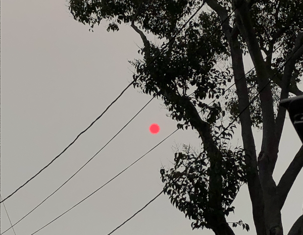
We think of earth, wind and fire as elements. Or we used to. For the possibility of separating them is called into question in the Bay Area, as wind sweeps the smoke of five to seven fires, or fire complexes, across the skies, we are increasingly likely to see them as layers, which interact in a puzzle we have trouble figuring out. Indeed, the weirdly haunting daily and hourly maps of air quality map the atmospheric presence of particulate matter by isochrones brought late summer blues to the Bay Area. Blue skies of the Bay Area were colored grey, burnt orange, and grey again as cartoon plumes of soot flooded the skies in a new sort of pyrocumulus clouds that turned the sun red, offering a disembodied traffic sign telling us to stop.

Clara Brownstein/October 1, 2020

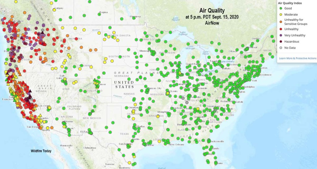
Fire season began by remapping the town in terrifying red that registered “unhealthful,” but almost verging on the “hazardous” level of brown, based on local sensors monitoring of ozone, but is also registering a deeper history defined by an absence of rain, the lack of groundwater, the hotter temperatures of the region and the dry air. The map is both existential, and ephemeral, but also the substrate of deep climate trends.

AQI Chart on Saturday, August 22, 2020/AirNow (EPA)

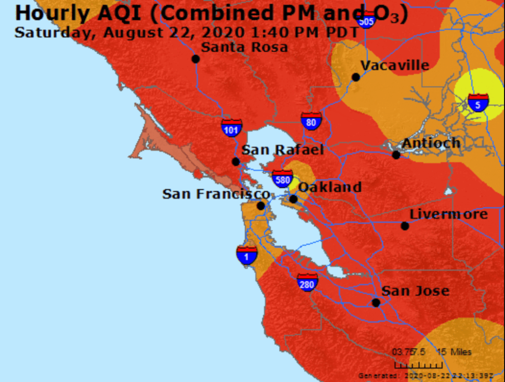
Is fire an element we had never before tracked so attentively in maps? We did not think it could travel, or had feet. But wildfire smoke had blanketed the region, in ways that were not nearly as visible as it would be, but that the real-time map registers at the sort of pace we have become accustomed in real-time fire maps that we consult with regularity to track the containment and perimeters of fires that are now spreading faster and faster than they ever have in previous years. And soon after we worried increasingly about risks of airborne transmission of COVID-19, this fire season the intensity of particulate pollutants in the atmosphere contributed intense panic to the tangibility of mapping the pyrocumulus plumes that made their way over the Bay Area in late August. As the danger of droplets four micrometers in diameter remaining airborne seemed a factor of large-scale clusters, the waves of black carbon mapped in the Bay Area became a second sort of airborne pathogen made acutely material in layers of real-time Air Quality charts.

The boundaries of fire risk charts and indeed fire perimeters seemed suddenly far more fluid than we had been accustomed. When we make our fire maps with clear edges, however, it is striking that almost we stop registering the built environment, or inhabited world. As if by the magic of cartographical selectivity, we bracket the city–the sprawling agglomeration of the Bay Area–from the maps tracking the destructiveness and progress we call advancing wildfires, and from the isochronal variations of air quality that we can watch reflecting wind patterns and air movements in accelerated animated maps, showing the bad air that migrates and pool over the area I life. The even more ephemeral nature of these maps–they record but one instant, but are outdated as they are produced, in ways that fit the ecoystem of the Internet if also the extremes of the new ecosystem of global warming–the isochrones seem somewhat fatalistic, as they are both removed from human agency–as we found out in the weeks after the Lightning Siege of 2020 that seemed a spectacle of the natural world that rivaled the art of Walter de Maria in their grandiosity of time-lapse photography–

Shmuel Thaler, CZU Lightning Strikes
Walter de Maria, Lightning Field, 1977
Shmuel Thaler, CZU Complex (2020), detail

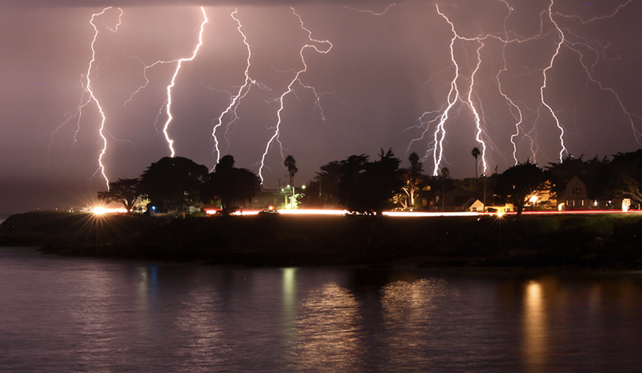
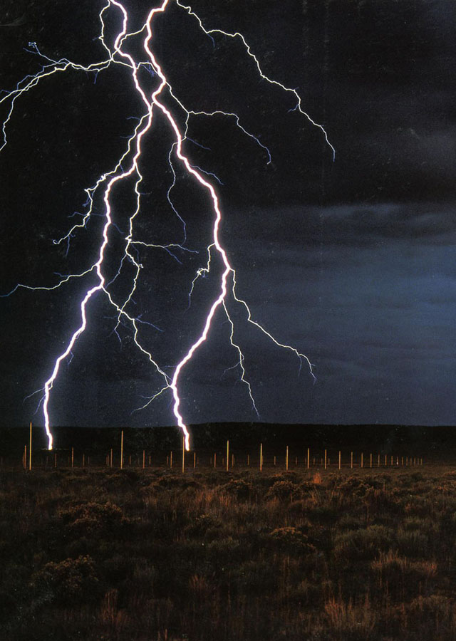
–the horizontal line of artificial light from Santa Cruz, unlike the images that De Maria created from The Lighting Field, remind us of the overlap between inhabited spaces where conflagrations in the dry wildlands that spread as the fires struck, and in way far less difficult to aestheticize than The Lightning Field set in a desert removed from human population, but was built as an isolated field for time-stop photography.

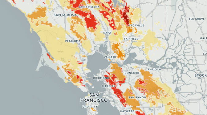
The CZU complex brought widespread devastation across areas of extra urban expansion in the Santa Cruz Mountains was almost a map that registered the expansion of residences to the very borders of forests. We haven’t ever faced the problem of maintaining and clearing in weather this dry, even if we have mapped the clustering of fires in the wild land-urban interface: but the strikes ignited underbrush lain like kindling, on the boundaries of the raging fire complexes. If the burning of underbrush by fire mitigation squads seeks to create fire lines in the mountainous landscape to create new perimeters to forestall the advance of major fires, working along a new fire line even as what is still called wildfier smoke travels across the nation, far beyond the Bay Area.

While watching the movement of fires that them in inhabited areas like shifting jigsaw pieces that destroy the landscape across which they move. These marked the start of megafires, that spread across state boundaries and counties, but tried to be parsed by state authorities and jurisdictions, even if, as Jay Inslee noted, this is a multi-state crisis of climate change that has rendered the forests as fuel by 2017–for combined drought and higher temperatures set “bombs, waiting to go off” in our forests, in ways unable to be measured by fire risk that continues to be assessed in pointillist terms by “fuel load” and past history of fires known as the “fire rotation frequency.” When these bombs go off, it is hard to say what state boundary lines mean.

Fire Threat Risk Assessment Map, 2007

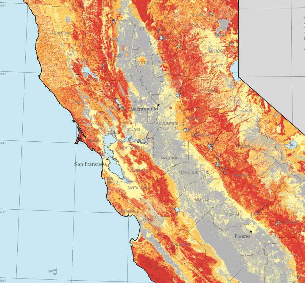
If San Francisco famously lies close to natural beauty, the Bay Area, where I live, lies amidst of a high risk zone, where daily updates on fire risk is displayed prominent and with regularity in all regional parks. These maps made over a decade ago setfire standards for building construction in a time of massive extra-urban expansion. But risk has recently been something we struggled to calculate as we followed the real-time updates of the spread of fires, smoke, and ash on tenterhooks and with readiness and high sense of contingency, anxiety already elevated by rates of coronaviurs that depended on good numbers: fire risk was seen as an objective calculation fifteen years ago, but was now not easy to determine or two rank so crisply by three different shades.

Fire Risk Map, 2007

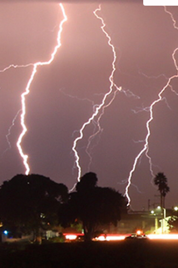
When thunderstorms from mid-August brought the meteorological curiosity of nearly 12,000 dry lightening dry strikes from mid to late August 2020, they hit desiccated forests with a shock. The strikes became as siege as they set over three hundred and fifty-seven fires across the state, that rapidly were communicated into expansive “complexes” of brush fires.

We map these fires by state jurisdictions, and have cast them as such in policy, by borders or the perimeters we hope to contain barely grasp the consequences of how three quarters of a million acres burned up suddenly, and smoke from the cluster of fires rose in columns that spread across state boundary lines as far as Nebraska, and how fire complexes that spread across three million acres that would soon create a layer of soot across the west, eerily materialized in layers of GIS ESRI maps of environmental pollutants, while toxic particulate mater released in plumes of black carbon by the fires cover the state, rendering the sun opaque where I live, in the Bay Area, now Pompeii by the Bay as smoke at toxic levels blanketed much of the state.

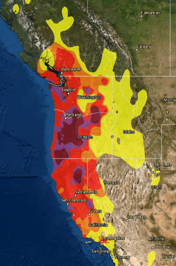
They even more serious map, to be sure, was of fire spread: but the maps of air quality set the entire western seaboard apart from the nation, as if threatening to have it fall into the ocean and split off from the United States,–even if the burning of its open lands was more of a portent of things to come, they were a historical anomaly, lying outside the record of fire burns or air quality, if the poor air quality traced the origin of black carbon columns of smoke that would rise into the nation’s atmosphere.

Wilfire Today, AQI Map/Sept-15, 2020
Continue reading

4 Comments

Filed under Active Fire Mapping, American West, Climate Change, data visualization, fires

President of Some?

Donald Trump has presented a new notion of the Presidency to the United States: the open claim to be President of only some of the nation, and to have that model of Presidential rule become the standard for political decisions. This policy was not Trump’s own decision: the retreat from any interest in bipartisan governance that had been the basis for American politics for two hundred years began in the pitched nature of pointed acrimony in the United States Senate that erased the decorum and respect among different interests in a model of collective action for over two centuries.

Already by 2011, the nation divided into spectral schema suggesting slight chance of local bipartisan governance, disguising often narrow margins of political victory, despite eighteen states where Republicans controlled both the legislature and governor’s mansion in 2011, some eighteen were split.

Republican States, 2011

While the pitched fervor of some of our national divisions bears the imprint of faith-based movements, they are replicated in the pointillistic logic of the electoral plans of REDMAP–a concerted attempt of regional redistricting. For the reconfiguration of electoral districts has staked out a problem of governance as a strategy of victory that would erode the project of governance, by privileging “states” as an amassing of electoral votes,– rather than positing the coherence of the interests of the nation as a whole. The concept of governance seems fragmented, bolstered by regionalism, states rights discourse, and the cruel new isolationism of go-it-aloneism.

Recast in the optics of the 2020 election as a choice between “darkness” and “light” of truly terrifyingly Manichean proportions, evoking near-apocalyptic scenarios to recast public debate as issues of identitarian self-interest. The divide of states on the 2000 electoral map, which didn’t change much over eight years, enshrined a blue versus red state logic, dovetailing with a deeper plan of retaining electoral control. This was the map was dramatized on election night in a television drama that suggested the contingency of voting preferences, and the election night reveal of the electoral map in the seventh season of The West Wing, in 2006. At a time television newscasters needed to remind their audience states shaded blue sent electors to vote for Democrat Matt Santos (modeled in 2004 on then-Illinois State Senator Barack Obama, who just delivered the nominating speech at another convention), red ones for his Republic opponent, Arnie Vinick–Campaign Director colored a dry-erase board as results were announced.

The West Wing, “Election Night” (April 2006)

Obama provided a model for Santos as a candidate not defined by race, pivoting from race to underlying unity among red and blue states, but the restate-blue state divide was militarized. And when Barack Obama was re-elected in 2012, the Republican state legislators in Virginia, Michigan, Wisconsin, Pennsylvania, and Ohio adopted the idea of ensuring Republican victories by rigging the Electoral College according to the congressional districts that they had redesigned, rather than in bulk, in the hopes to skew the distribution of electors by the congressional districts they had guaranteed would be firmly red, having designed districts that even in what were considered “blue” states had “red” legislatures. m so that districts would be assured that they would not be “outvoted” by urban metro areas would dictate a future.

This gave rise to the logic that asserted the “rural” non-metro regions should reclaim a place at the table by recrafting representational politics to give new meaning to those who increasingly feared–or felt–that their vote just didn’t count but felt that their futures on the line. By redrawing districts, legislatures magnify rural interests outside large metro areas, offering a logic magnifying their political representation through congressional districts as power bases and political divides: not by blue and red states, but by a red republic, in need of its voice. The plan to self-segregate matched a strategy of segregating separate electoral votes from the popular vote worked by recasting electoral districts on party-skewed lines, independent of any geographic shape save benefitting one party, at the expense of another, at violence to the republic. It was echoed in a tactic of political obstructionism that provided the logic for “red” areas to be increasingly opposed to current governmental policy in the Obama administration.

The reduction of debate between parties may have begun on a local level, but metastasized nationally in legislative maps. The rationale of legislative bodies has shifted on local levels from a representational logic of governance to a pitched battle–as only one party wields legislative power in all but one state in the union.

The Current Partisan Power Play (2019)

The disorienting nature of an overdetermined power play means that there is not much discussion or debate in the local states, or legislative bodies, but a sectarian consolidation of demographic identity as destiny.

The division of parties cast “red” and “blue” as forms of governance essentialized the color-choices made in news maps as almost existential terms. Indeed, the increased casting of the 2020 Presidential election as a battle between “light” and “dark” was gained distinctly apocalyptic undertones fit for the age of the Coronavirus, mapping the current elections as a referendum of the “future of American democracy” or, for President Trump, a “bright future” and “dark future” whose oppositional terms echo a religious eschatology. Was it any coincidence that the separatist blood-stained banner of the Confederacy reappeared at Trump campaign rallies in 2016, jumping the logic of a chromatic divide into opposing visions that could be understood as a nation divided in war?

Brandon Miles of Deland, Fla., left, Brandon Partin, of Deland, Fla., center, and Michael Miles, of Deland, Fla., at a rally for Donald J. Trump in Kissimmee, Fla., on Thursday.
Brandon Partin of Deland, FL, releases Confederate Flag For Trump at 2016 Trump Campaign Rally in Kissimmee, FLA/Evan Vucci

As candidates proclaim themselves to constituents as an “ally of light, not darkness,” the choice of the election has turned on the complexion of the nation’s political future in ways that concretize the removal of maps of support of political parties as an existential struggle for the nation’s soul, removed from questions of political representation.

The eery blocks of political division were apparent in the long led-up to the election, as the fracture lines in the nation were only less apparent because of increasing tension as to which way the highly colored states in play would slide, and how the electoral prism would mediate the popular vote.

The notion that a specter of socialism haunts America, to be promoted by the Democratic Party, is the conclusion to a logic of deeply sectarian politics of belonging.

The politics deployed wrenching topoi of danger and difference, in terms not only of grievances, but of a starkly divided landscape that raised the question of the very possibility of political consensus and the pragmatics of political representation. And while rooted in the renewed role of religious zeal in partisan politics, the fervor of opposition to–and defense of reducing insurance for pre-existing conditions–by laws like the Patient Protection and Affordable Care Act–Obamacare–as if they were articles of faith.

Yet as the 2020 election had quickly shaped up into a contest of chromatic separatism–

–the deeply oppositional dynamics of the divided landscape bode deep difficulties in governability.

2016 Presidential Election, County by County Voting Predictions
Continue reading

3 Comments

Filed under COVID-19, data collection, data visualization, democratic representation, public health

Sneak Attacks?

The anniversary of the bombing of Hiroshima gives one pause as it marks the emergence of a world of remote military strikes conducted by GPS, or on a UTM grid that cast agency at a distance from ethics or ethical choice. One thinks not only of the global cartoons of global expanse that seemed to unroll geopolitical spaces for their American readers, but of the new ethics of point-based precision. For the point-based maps created vertiginously elevated the subjectivity of their readers across the 40,000 maps produced between 1941-45 by the U.S. Army Map Service so as to remove most Americans from all sense of a shared ethical framework of humanity as the first atomic bomb was dropped on the city of Hiroshima.

The framing of military invasion as a game of geospatial dominance discounted the massive incalculable loss of human life in campaigns of prolonged fire-bombing and atomic holocaust. While the American military insisted that radiation burns were but “Tokyo tales,” as the government mole in the New York Times, William Laurence, asserted, due to the levels of radioactivity of the Atom Bomb, the cartoon suggested this was but the latest case of action at a distance, asserting a clear causality between the “invasion” of the city in Hawai’i, recently part of Japan, and the drawing and quartering that the explosive man-made catastrophe. The disembodied head miming words of feigned apology invoke a racist stereotype of a hasty apology delivered in pidgin English, disproportionate to the cascading effects it brought.

The oddness of this cartoon rests in its effective displacement of responsibility for the start of the atomic age. Indeed, the narrative this cartoon bears traces of how this new spherical global space suggested suggested a territorial dominance across the new spaces of air travel: the cartoon that appeared after the atom bombs were dropped on Hiroshima and Nagasaki on August 6, 1945 are particularly striking as it appears to remove any sense of the agency of atomic holocaust; it cast the explosive logic of the atom bomb as a delayed quid pro quo response to the “Jap Sneak Attack” of 1941; it asked readers to consider not the effects or impact of the atom bomb, but, rather evasively, who really was “the Fellow who Lighted the Fuse,” as if he were to blame: before any images of the destruction of both cities was described, the Chicago Tribune included testimony of Enola Gay crew members, hailing from Chicago, as an exclusive, with a discussion of the physics of atomic bombs and a reminder that a number of B-29 bombers were posed for further destructive missions.

The front-page color cartoon hid the explosion of the Atom Bomb over Hiroshima, offering an occluded view on a spherical globe: in colorfully eye-catching attractive Hearst style, the colorful cartoon map was the sole visual documentation of the bomb’s effects, masking the devastation of its impact by the geopolitical logic that led to dropping an atom bomb. The only sense of agency in the cartoon is that poor fellow, his head now rising into the sky, severed from his body, as his bloody knife, patriotic flag for the Empire of Japan, and his military boots and gloves were imagined to be blasted far above the globe’s atmosphere. While the cartoon surely registered the global significance of the dropping of the A Bomb over a densely populated city across the Pacific Ocean, the responsibility for doing so was identified with a racialized floating head, finally severed not only from limbs but militaristic flag that suggested a rising sun of Pacific domination, but was now distastefully merged with a stereotype of obsequiousness that belies militancy. Is the beheaded soldier who once wielded a now shattered sword sorry for the catastrophe of the atom bomb?

Carey Orr, “the Fellow Who Lighted the Fuse,” American Newspaper Repository

In fact, he is apologizing, or is forced to apologize, for similar stereotypical sneakiness of earlier attacking Pearl Harbor. The informed American reading the cartoon recognizes as clearly traceable to dropping the atom bomb, by a link as evident as the arcing flightpath by which Boeing B-29 Superfortress the Enola Gay carried the 9,000 pound Little Boy to drop 26,000,000 pounds of high explosives on Japanese civilians.

The spent match that lies on the “big island” of Hawai’i marks the site of where Japanese bombers attacked an extra-territorial military base, at Pearl Harbor. The map serves to help process the devastating precedent of aerial destruction. And it shifts the destructive impact of the bomb, incongruously, to a palette of a sunset just removed from U.S. territory, where the curling fuse that we can only see as running across the Pacific theater leads to a land lying behind global curvature of the earth, that almost occludes the global significance of introducing the atomic age. The bomb is an illustration of the end of the war by the victory of military mapping, and an affirmation of the fact that the only map is global now. But the ethics of that map are more than problematic. It carries a clear sense of “out of sight, out of mind,” imbuing the deaths of over a hundred thousand Japanese civilians–in an odd mirror reflection of the fears of Japanese attacking United States territory–with a sense of victory, painted as the conclusion to the war that Japanese single-handedly begun. The cartoon is a rather concerted shirking of collective responsibility for immediately killing 70,000 Japanese civilians and killing another 50,000 by radiation poisoning created a precedent of instantaneous mass slaughter. It must be paired with the sustained campaign of military disinformation that William “Atomic Bill” Laurence drove, downplayed any destructive effects of the atomic blast’s radiation levels as purely “Japanese propaganda,” as if to conceal its own efforts to portray the role of radiation in contributing to particularly painful and gruesome deaths.

As U.S. President Harry S. Truman would explain to the world that the delivery of the bomb had released nothing less than “the force from which the sun draws its power . . . against those who had brought war to the Far East,” in an impromptu lesson of nuclear physics, the payload of greater power than 20,000 tons of TNT, describing the bomb in empyrean terms that took one’s eyes off the ground as an act of “harnessing of the basic power of the universe” against the Japanese empire that had taken the rising sun as its emblem and flag, as if he was righting the natural order of the universe by using the sun’s awesome power to right the imbalance of a natural order and to deliver destruction in a purely retributive fashion. If almost a quarter of Americans stated after Japan’s surrender that they would have accepted the destructive explosive powers of more bombs earlier in the war, press dispatches claimed that the bombing would not leave any greater medical injuries than conventional bombs; as mortal effects of the absorption of radiation became clear, Lt. General Leslie Groves, having directed the atom bomb program, affirmed the same logic, enjoining reporters who “did not like the way we ended [the war], to remember who started it.” How many times had Lt. Gen. Grove, observing the same map, had arrived at the conclusion after contemplating the range of air routes the bombers would take, as a way of rationalizing the inhumanity of the event by reducing its devastation to the military logic of quid pro quo retribution for military deaths.

Lt. General Groves Observes Map of Air Routes to Japan
A journalist stands on the former site of a movie theater in Hiroshima, Japan, in September 1945, one month after the United States dropped an atomic bomb on the city.
Journalist Surveys Damage of Hiroshima Bomb, September, 1945/Stanley Troutman

Who, indeed, was making the sneak attack? If the yellow and orange hued pyrocumulus clouds caused by atomic blasts suggested the fireball of a nuclear or atomic explosion, the cartoon clearly referenced not only the explosion that left 200,000 estimated dead in its immediate aftermath, but the fireball of the atomic explosion as a sunset of the Japanese Empire. The first dropping of an atomic bomb on civilian population by the United States–

–was sunset of the Japanese empire, seen from the empyrean perspective of the navigation of aeronautical space that allowed its delivery at precise global coordinates. Did newspaper readers who smiled at the grotesque cartoon vicariously delighting in the ability of precise targeting on geospatial coordinates to target two cities for atomic devastation, without considering the humanity of their civilian inhabitants? Or did it prepare the consumption of the news of the delivery of the payload

To be sure Hearst Newspapers had long promoted the Pacific as a theater of national jingoism in which the Hawai’ian islands were exaggerated as a potential site of struggle, frequently distorted as of defensible American interests; Hearst Newspapers Sunday Section of comics portrayed the contest in cartoons of racist tenor, as an antiquated samurai in full ceremonial armor confronted a spry Uncle Sam.

Windsor McKay, 1913

But the explicit use of a spherical projection to accentuate the aerial targeting of sites of bombing in Japan–and indeed of Japanese civilian populations–was both an assertion of the mastery of the maps that aviators followed in releasing Little Boy and Fat Boy, and a sense of the logic of the spherical projection as the conclusion of World War II. Early in the Pacific theater’s military expansion, to be sure, the Japanese Empire had carefully mapped the island in the paper maps that the imperial army drafted for all its soldiers to hold in fold-out versions in elegant form to foreground specific aerial and marine routes to the islands historically inhabited Japanese famers–

–the mountainous outcropping of islands righted by oceanic waters were remapped as the target of aerial bombers attack in 1941 in ways that the atomic bomb was imagined to respond as an analogous incursion into territorial rights. The results were far more terribly destructive, but seen as cementing the territorial retreat of Japanese empire across the Pacific. To be sure, the attack on the United States Naval Base had killed 2,300 Americans in 1941, when Japanese planes attacked the Mighty Seventh Fleet, sinking twelve ships and destroying the U.S.S. Arizona completely destroyed and capsizing the U.S.S. Oklahoma. But the logic of the global map creates a terrifyingly false equality of quid pro quo, or an eye for an eye, in spatial terms, linking the continuity of the spherical projection that enabled the American bombers to target Hiroshima and Nagasaki as a commensurate response to the 1941 Air Raid. The logic of the globe smooths over the disproportionate scale of the atomic bomb’s deadly payload and the attack on U.S. territory for American newspaper readers.

Yet in ways that are perhaps impossible to map, or to take stock of in its full consequences, the atomic fireball left massive human fatalities and injuries in its immediate radius, far beyond the devastation at the site of impact where buildings were flattened, leaving third degree radiation burns far beyond its alleged target, striking civilians both more violently and more deeper within the logic of war than was ever imagined. As if treating the sinking of the U.S.S. Arizona and capsizing of the U.S.S. Oklahoma as attacks on the actual landlocked states in the territorial United States, the treacherous logic of the continuity of the map’s surface created a false equivalence for cartoon readers that recast the dropping of an atomic bomb as a glorious imperial gesture.

The popular newspaper cartoon for the Hearst Sunday daily provided a rationalization of the explosion in maps that provide a continued basis for reflection on the scope of aerial bombardment, departing from the maps of worldly retreat of Japanese Empire on which American newspapers had focussed and were created by late August 1945 by the U.S. Army Information Branch, as if to justify the impact of one devastating attack.

Japanese Empire from 1895 to 19 August, 1945/Army Transportation Corps, Aug. 27 1945
University of North Texas Libraries

Many cartoons of the atomic bomb dropped by the U.S. Army were explicitly racist or misguidedly celebratory. This famous front-pager made open reference, perhaps fitting Chicago, where Rand McNally was based, as the spherical projection enabled dominance of aerial space and mastery of the virtual space of air strikes: the globe was now not inhabited by people, but a spherical surface over which one flew. And while the sign planted on the unidentified island of Oahu is suggested to be the site of the spent match that started it all, omitting that the 1941 aerial attack was staged on a military base–Pearl Harbor–rather than on a civilian population. The colors of the apocalyptic conflagration are muted, as we see only harm coming to the scattered limbs and bloodied knife of a caricature of the Japanese soldier scattered in a stratosphere.

Continue reading

Leave a comment

Filed under atom bomb, atomic age, geopolitics, Hiroshima, Pearl Harbor