Monthly Archives: May 2014

Mapping the Inequities of the Anthropocene

The notion of the Age of the Anthropocene has inspired an attempt to pinpoint the thresholds of contemporary environmental change.  The recent maps that register the shifts in the Air Quality Index at specific sites offer a way to register the impact of anthropogenic impact on the breathed environment that are especially compelling in tracing the momentous impact that man-made industry–and specifically the burning of coal–has in propelling global inhabitants into an age of the Anthropocene, and indeed in impacting local environments.  The changes of global climates pose peculiar difficulties of mapping by placing ourselves as viewers outside of the momentous changes they describe.  For the notion of mapping the arrival of the Anthropocene–or the signs of the visible impact humans left on the environment raises questions of how a map can trace the footprint humans have left on the earth’s biosphere.  If the epoch of the Anthropocene challenges one to position oneself outside the very processes in which one knowingly or unknowingly takes part, or indeed capture the consequences of a geological change in the biosphere to human life.

Do the differences of the AQI provide a sufficiently compelling map of the local dangers of potentially catastrophic environmental change?  Recent “revisionist ecologists” or self-styled pragmatists have called for forging or discovering possible “Paths Toward a ‘Good’ Anthropocene,” as Andy Revkin discussed at his New York Times Dot Earth blog, which stresses not the ecological evils of a narrative of global pollution, but the potential that values determine necessarily tough choices, striking debate that has reverberated in the Twitterverse as a perilous promise or a necessary evil under the hashtag #Anthropocene.  Revkin’s “Paths to a ‘Good’ Anthropocene,” has struck a nerve as subverting the core beliefs of Environmentalism by tweaking it with the prefix New, under the banner of eco-pragmatism.  One part of the basis for such “eco-pragmatism” seems to be the tired nature of the narrative of environmental ecology–or rather, of the alarmist hue that, for Keith Kloor, has morphed over the years from talk of a plundered planet a sixth extinction, and a baked planet to characterizing a planet under severe ecological pressure from multiple directions.  The narrative of the anthropocene, an odd term adopted in common parlance, narrates less a disaster than a widespread constellation of impacts of the human on our notions of nature, of sexual reproduction and differentiation, of genetic transmission, and on the geological record or livability of the atmosphere.

Can maps help this debate, by charting a differentiated view of “impact” and its geographical differentiation and spatial distribution, or in other words tracking anthropogemoc changes in hopes to mitigate its effects?

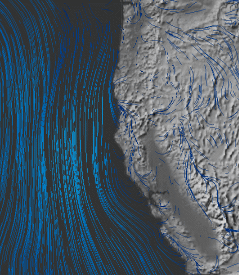
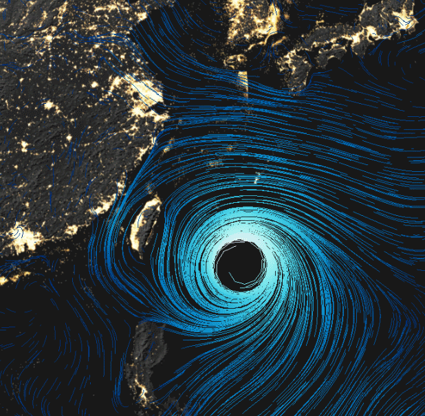
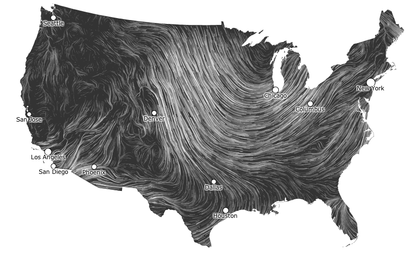
Can practices of mapping offer means to capture and conjure that constellation of changes, or tools visualize the momentous mechanisms of climatological change in which the human is folded into the environment–and economic activity inscribed in nature–that might most effectively communicate its arrival?  Can effects of the Anthropocene be tracked over space?  As Shakespeare imagined “his cheeke the map of daies out-worne” in Sonnet 68, as if the face were a map of temporal changes wrought by time,  so that “when beauty liv’d and dy’ed as flowers do now,/ Before these bastard signes of faire were borne,/ Or durst inhabite on a living brow,” the maps below of local levels of air pollution bear the scars of time and global capital. To track the disparities that mark the close of the Holocene is to trace the introduction of previously unforeseen limits on the expansion of human activities and indeed the sphere of human freedom.   While the entrance into the Anthropocene has been laid at the footstep of industrialized nations with considerable justification, rather than being understood only as a category of geological time, the odd currency of the geological term with a geography of the earth’s habitabilty.  

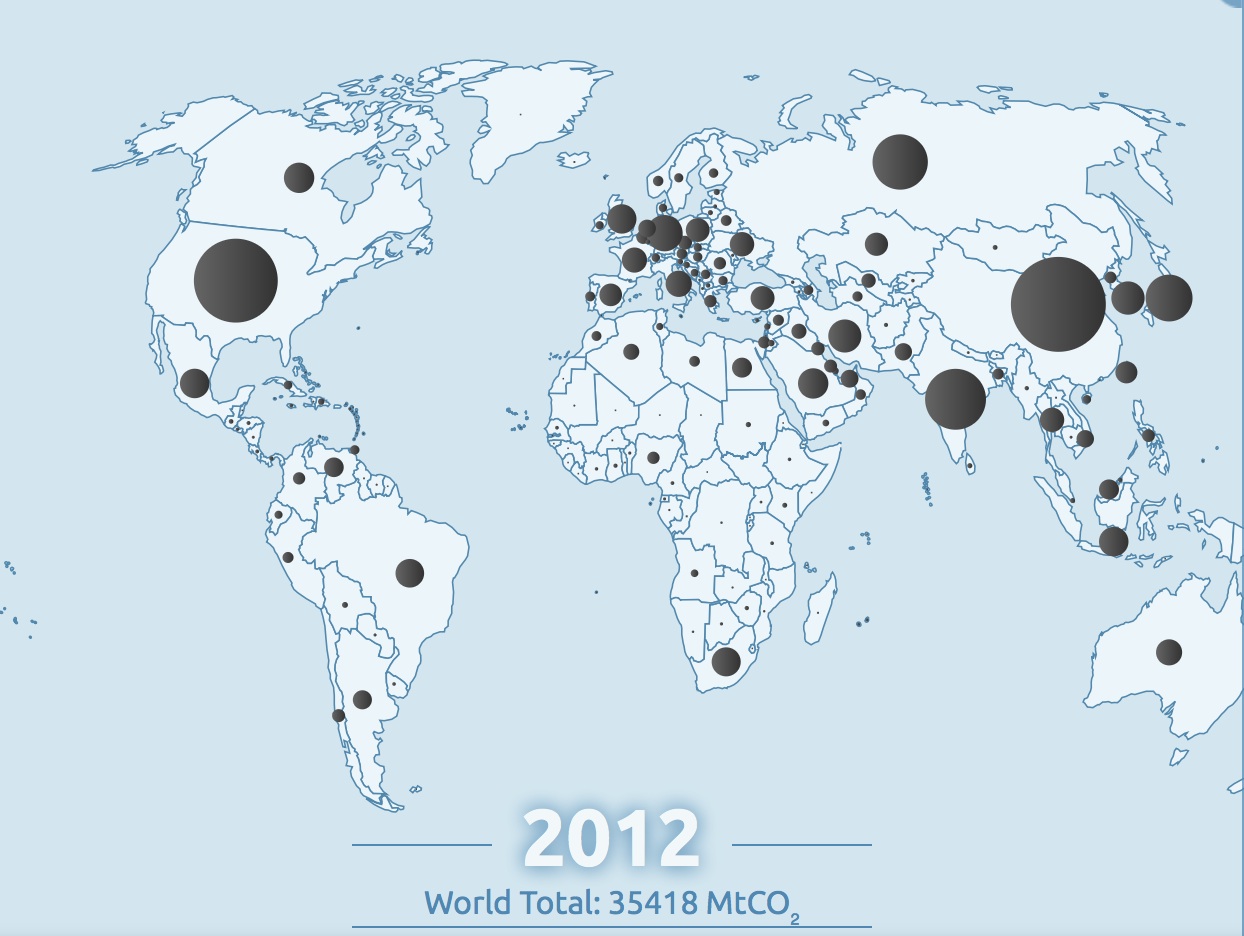
The difficulty–if not near-impossibility–of returning to a healthier presence of CO2 in our atmosphere “from [current levels] to at most 350 ppm” voiced by climatologist Dr. James Hansen–and the organization 350.org– might be less easily solved than they hope, and might even risk orienting discourse on the Anthropocene toward remediation and restoration of equilibria.  Indeed the hope for such a return to a level of safety from current levels surpassing 400 ppm are not only a huge change from early eighteenth-century levels of 275 ppm, may distract attention from the deeper consequences of the enmeshing of the human in the biosphere:  the deeper inequities of our globalized economy are revealed in a more variegated map of our entrance to the Anthropocene.   The disproportionate contribution of industrialized countries to carbon emissions create well-known ethical questions of the distribution of shared responsibility for a crisis in climate change given the unequal distribution of the anthropogenic origins of climate change, emblematized by the disparities in fossil fuel emissions worldwide–which most ominously ballooned from the mid-1960s to the present day.

Carbon Emissions

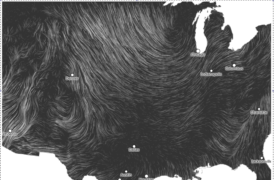
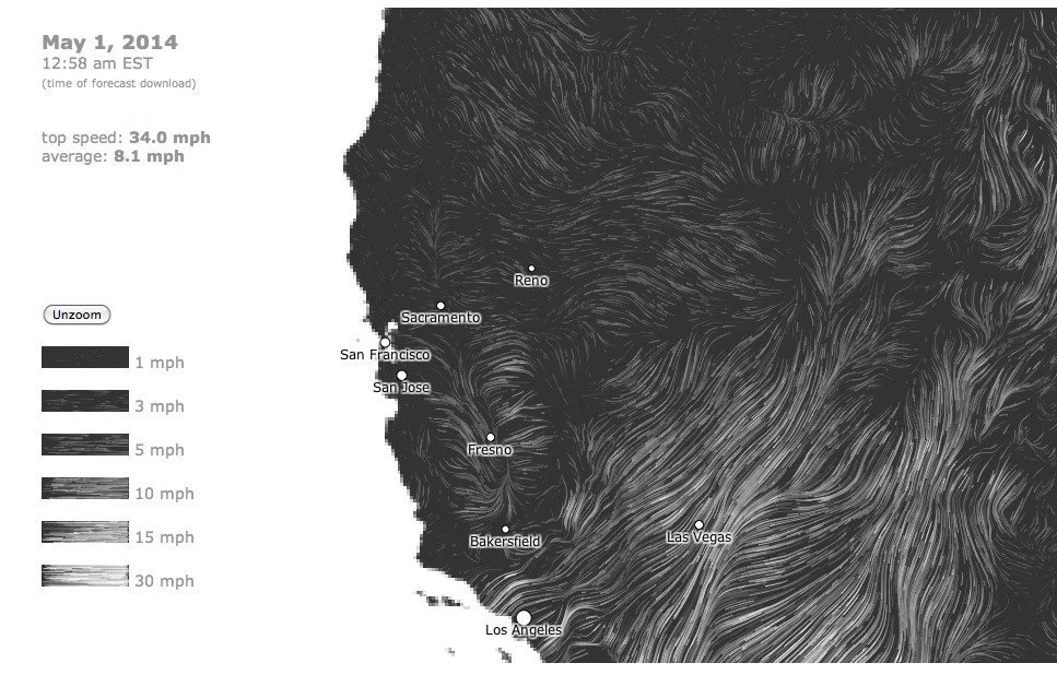
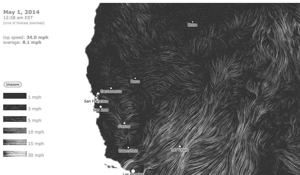
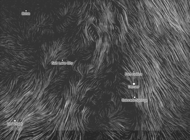
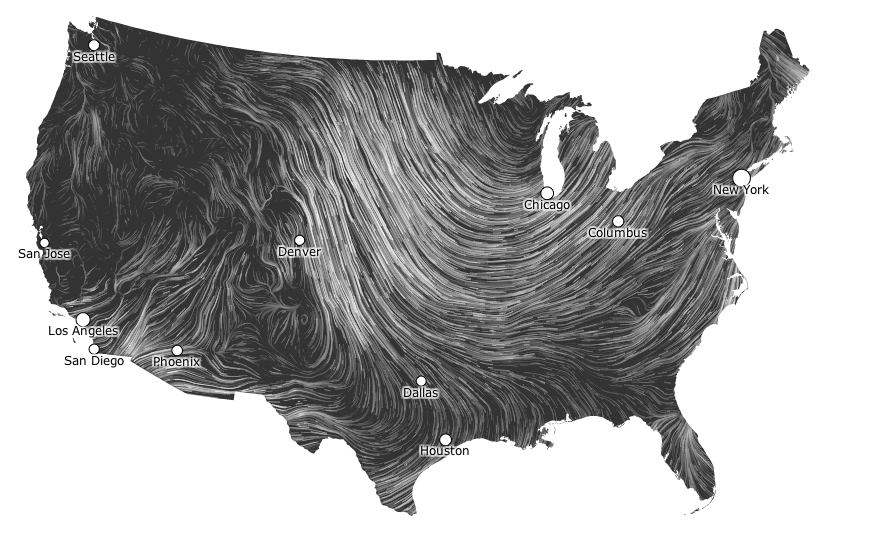
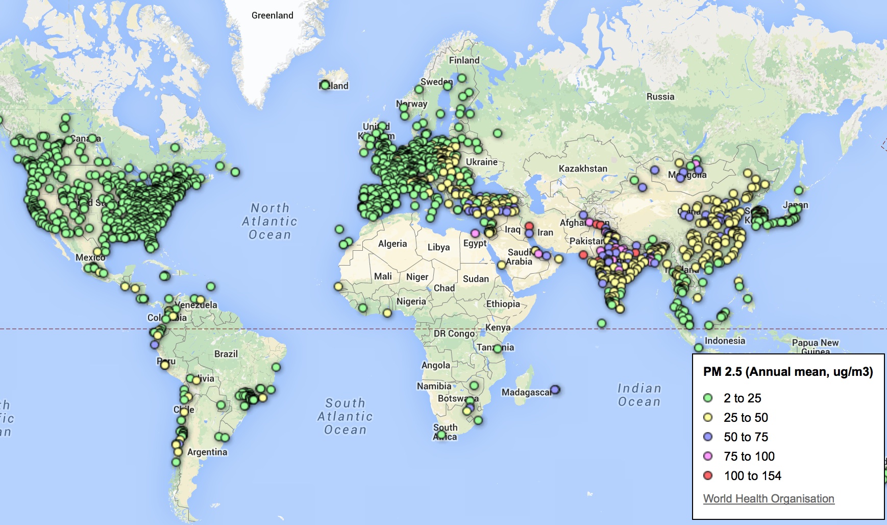
Despite the use of maps to localize disparities in fossil fuel emissions, map smog map smog or define localized ozone holes, no greater detail is available in maps than disparities in air quality.   As we struggle undertake to trace such disparities, it is especially striking web-based maps reveals deep discrepancies in how levels of pollution have constrained questions of habitability at local levels, already evident in the imbalances revealed in data taken from the World Health Organization of the variations in the distribution of local means of small particle matter less than 2.5 microns across the earth.

Global Particulate Matter 2:5 WHO

The challenge of translating changes in the biosphere to a static map is not easy.  Even visualizing the range of changes runs the risk of reducing or distracting the intensity of their impact.  Dipesh Chakrabarty has aptly observed how environmental change constitutes “as a geophysical force, [a situation where] we now wield a different kind of agency as well – one that takes us beyond the subject/object dichotomy, beyond all views that see the human as ontologically endowed beings, beyond questions of justice and human experience.” For the very reason that we are immersed in its changes, we are challenged to read the record of massive changes and shifts in global environment of the sort registered in a map.

But the regional distributions of variations in that manmade environments have been recently readily synthesized on a Google Maps API to provide a scary spectrum of how we alter polluted air quality in real time:  the shifts in select areas of the world–even if these areas which release pollutants that of course disperse worldwide–reveal one image of the uneven distribution of our entrance into the era of the Anthropocene. And although the ethics surrounding the degree to which over-industrialized countries have over-contributed to the advancing of markers of the dawn of the Anthropocene–from global warming to increased CO2 emissions to ocean salinity–the spectrum of the local distribution of air pollutants demands to be read.  The coding of such pollutants in the AQI keys each region by its departure from acceptable levels of health–and indeed the departure from standards of the Holocene, based on different levels or parts per million of contaminants able to lodge in the lung.

legend with promos

If the dawn of the Anthropocene presents itself as a counter-discourse to a globalized economy, raising the multiple specters of the risks and dangers of unfettered economic development and growth, it reflects inescapable constraints on those very practices and presumption of human liberties:  for it articulates “biogeochemical processes which [not only clearly] imperil the human species’ life-support system; it is also the antithesis of a politico-ontological condition central to modernity: freedom,” as Ben Dibley has observed in his Seven Theses on the Anthopocene, and articulate the parameters or constraints in which human freedom must henceforth now be re-understood–constraints in which mechanisms of the market might be able to secure and to perpetuate livable conditions of an easily habitable space.

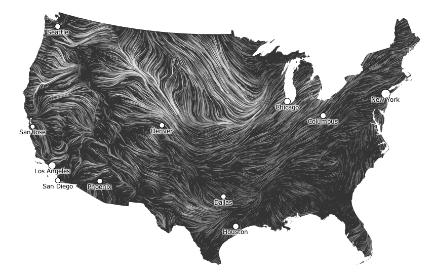
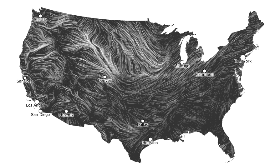
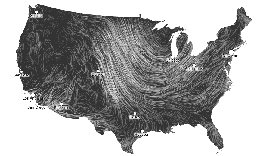
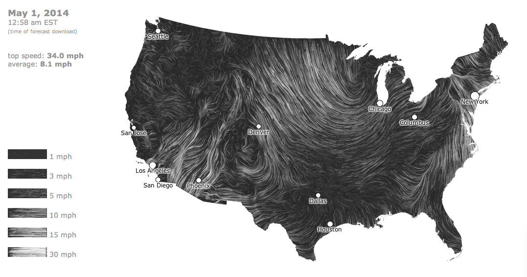
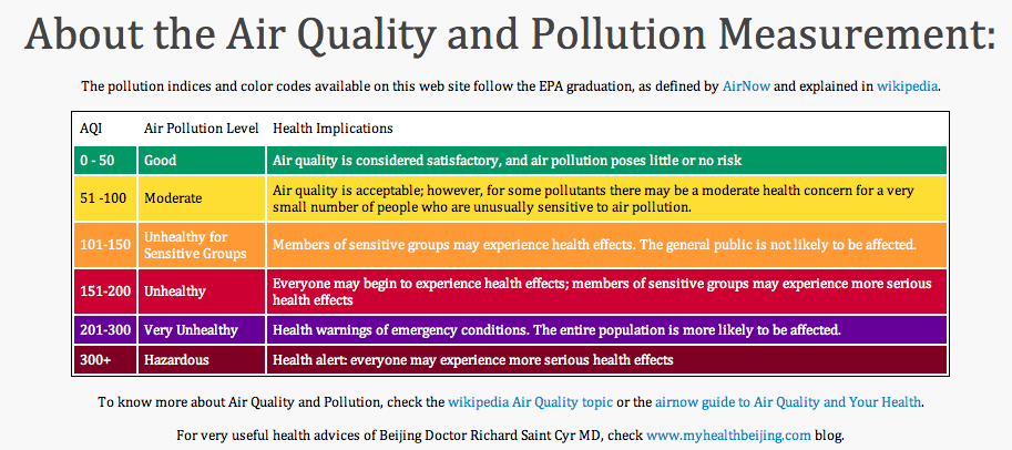
Mapping real-time concentrations of pollutants offer snapshots of specific moments, rather than images of a geological “deep time” or defining a single tipping point of long-term ecological flows.  But the discrepancies in global air pollution registered in a real-time air quality index map charts reported measurements of airborne pollutants in a Google Maps API to trace a shifting canvas of how we are now engaged in the alteration of the environment. While misleading to some, in its claim that “Good” levels of pollution exist in many regions, the distribution raises stunning divisions in the levels of local atmospheric contamination based on air quality indices.   As of today, the map suggested particularly localized pockets of pollutants, with a surprisingly large number of sites marked red (Unhealthy; 151-200 AQI, as defined by AirNow) and violet (Very Unhealthy, 201-300 AQI), and three sites in Delhi, Finland, Austria, and Coyhaique, Chile viewed of Hazardous air quality levels of over 300, which qualifies for a health alert. This sort of mapping of the man-made environment, where discrepancies in air pollution can be readily registered, offers something of a map of anthropogenic effects.  Variations in pollutants offer blunt tools to trace the disparities of anthropogenic impact on the global atmosphere–or to register a “local” distribution of the geophysical forces of the impact of Anthropocene.

pokets of pollutants

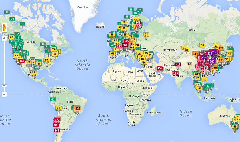
As one scrolls across or zooms in to discern the different distribution of colored placards that dot the map’s familiarly and largely light green surface, one readily flags something like environmental divides across both large regions of the global atmosphere, as well as specific noticeable differences of place, no doubt relating to industry, and shifting standards that raise the question of whether entrance to the Anthropocene is indeed the other side of the coin of globalization, or how much local, regional, and indeed striking national differences persist in this mapping of inhaled air, clustering in individual countries’ different standards of emissions for industry or automobiles.

Mapping Air Divides

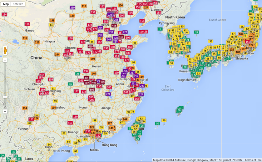
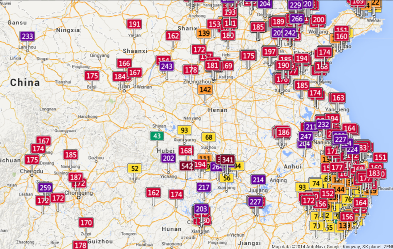
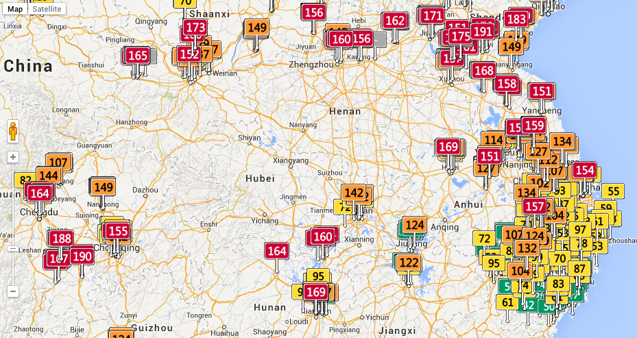
The cartographical labels in the above map tracking air-pollutants offers a new grounds for the label “Red China” by the density of its clustering of unhealthy levels of air pollution as of this May 22:

%22Red%22 China

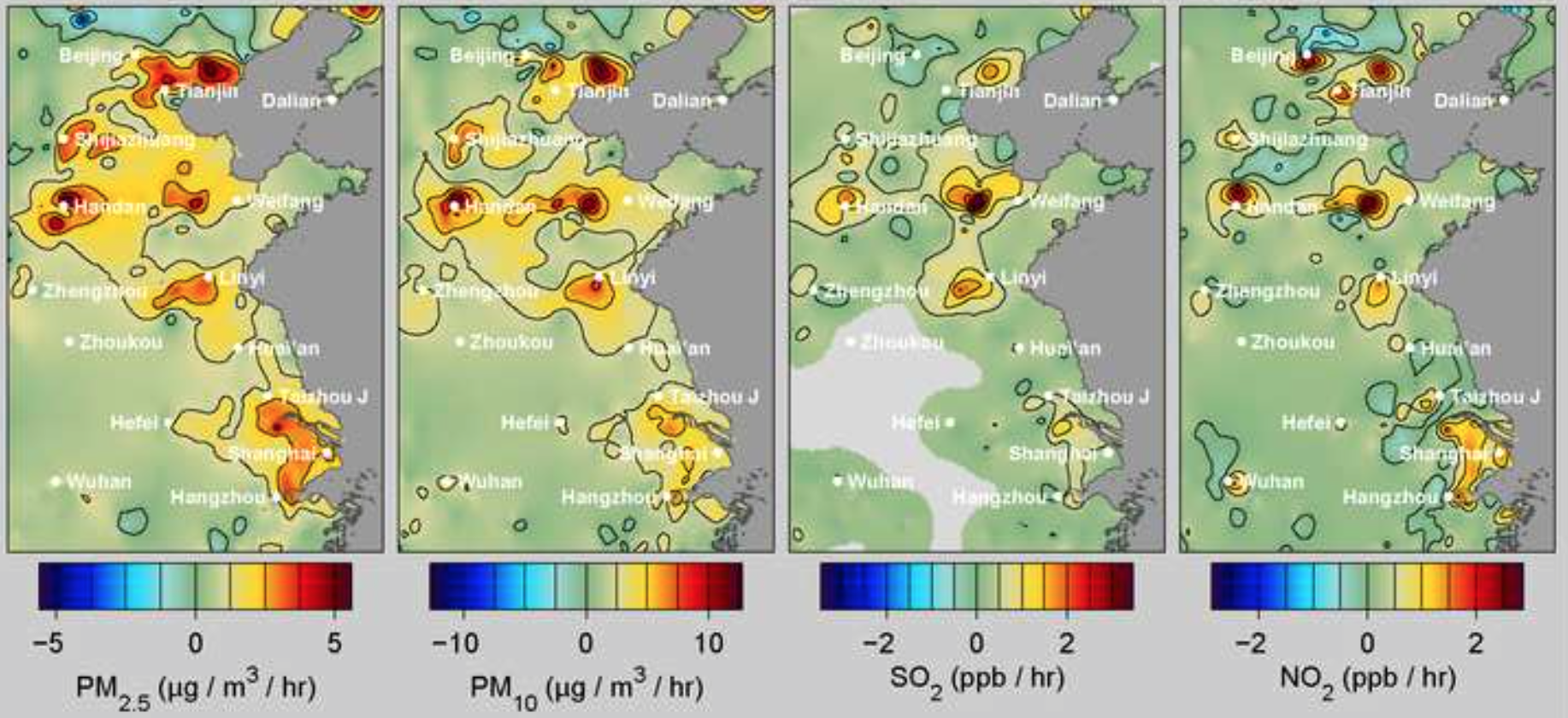
A recent study from the researchers at  Berkeley Earth has measured the devastating effects of such levels of pollution, caused mostly by coal-burning, on China’s population, and does better by discriminating the levels of specific pollutants:  the lack of restrictions on coal-burning contributes a devastating number of deaths of 4,400 Chinese each day, totaling some 1.6 million annually, on account of the diffusion of airborne particles of less than 2.5 microns in diameter–able not only to lodge in the lungs, but be absorbed into the bloodstream, in ways that t take the notion of the Anthropocene to the level of the embodied.  Based on hourly readings at some 1,500 stations in mainland China, Taiwan and Korea, the distribution of almost entirely man-made pollutants can be tied with relative certainty to increasing rates of asthma, strokes, lung cancer, and heart attacks.  And the numbers are shocking, from the concentration of particulate matter in the particularly pungent sulfur dioxide, released by burning fossil fuels, or nitrogen dioxides, a toxic pollutant emitted from the widespread combustion of petrochemicals:

PPB China
Alarmingly high levels of pollutants greater than 2 ppb/hour.

It is no surprise that sites of industry where coal-burning is allowed offer more clearly defined sites of concentration of Sites of industry divide and readily distinguish air quality dramatically worldwide and in North America, revealing the local impact of the human on the biosphere:

Lake Eirie pollutants in air around Lake Bad Air Belt in Georgia, May 21 3 pm

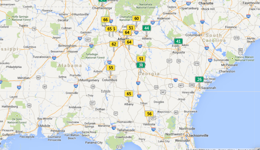
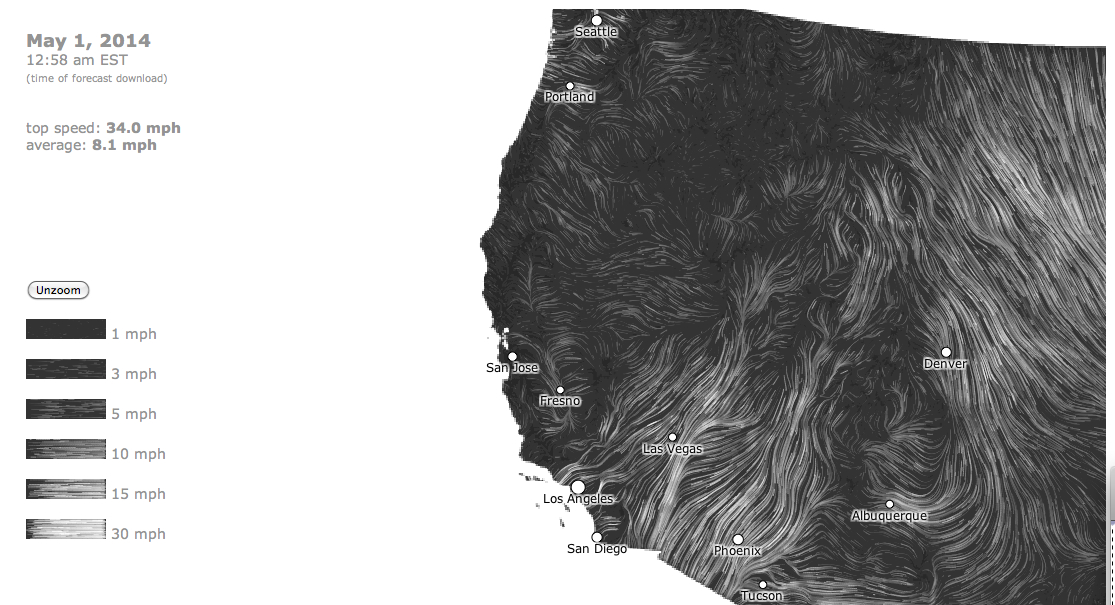
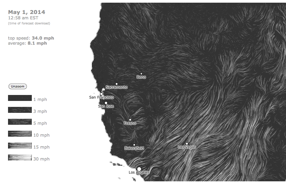
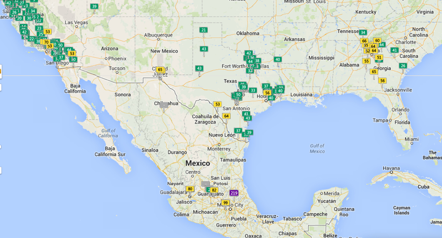
The largely “green” California, whose ocean rim encourages a high quality of air, even with its own well-known pockets of pollution in its Southlands:

California Green? May 21, 3-18

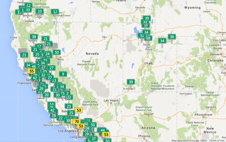
Piled up green rectangles don’t all equally signify healthy air quality, one should again note, but the discrepancies from Los Angeles to Tijuana, Mexico are nice to place in relief.

Southern California Air

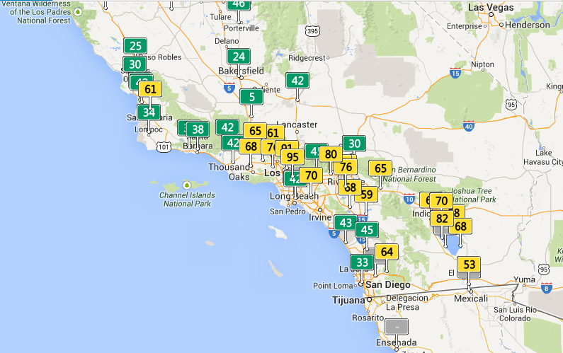
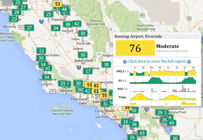
Given the increased amounts of small particulate matter of a radius of less than 2.5 microns in much of southern California, whose clickable feature show the somewhat overly bulky embedding of data in this world map–

PM 2.5

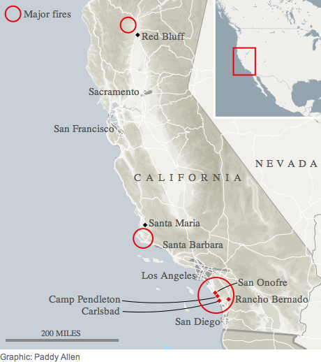
the proportion of this particularly pernicious pollutants to entering and lodging within human lungs can’t help but recall a current rash of uncontrolled fires searing southern California’s coastline this mid-May, themselves tied to the effects of human presence:

California Fires mid-May 2014

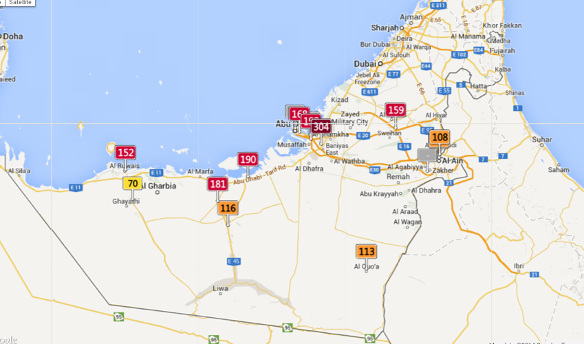
Such considerably broad variations in air quality force one to wander more broadly over the slippy map’s surface,  exploring ties, evoked in how Ben Dibley’s characterized the Anthropocene as newly emerging global apparatus folding global economic relations in the geographic that creates the “terrestrial infrastructure for global capital.” The arrival of an Anthropocene, Dibley clarifies, “signals a geological interval since the industrial revolution, where, through its activities, through its numbers, the human species has emerged as a geological force now altering the planet’s biosphere,” evident in the exponential growth of the human population and the arrival of new geographical strata of Anthropocene rock built to serve the needs of ever-expanding inhabitants:  concrete highways, sidewalks, parking lots, airports and landing strips, or Superfund sites of toxic waste or garbage patches and trash vortices, steel shopping centers, loading zones, or the earlier mines, garbage dumps, and railroad depots that collectively signify the remaking of the inhabited world, but whose totality comes to create parameters for future growth.  The changing global apparatus to the earth system in which the human is an agent appears the underside of a narrative of modernization, whose inescapable telos is not emancipation from natural forces or limits, but entrapment by them:  freedoms to pursue economic development become the primary threats to the support system enabling human life.  Despite difficulties in relying on Google Maps as a measure of the constraints on that freedom, the measure of atmospheric pollutants lift a corner on the increasingly circumscribed limits that actually curtail individual freedom. Its measurement is particularly compelling for what they suggest about how economic development tied to the project of modernity come to constrain the world’s continued inhabitation by human life–as the pernicious nature of the development of Abu Dhabi throws into relief.

Emirates and Abu Dhabi 5.21, 3-10

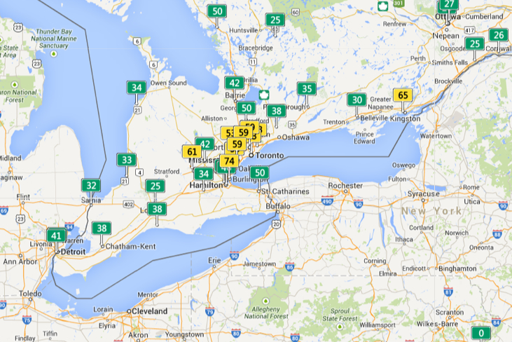
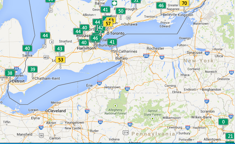
This sort of a map is predicated on the numbers on which it is based.  The variations in measurements of air quality are striking on the Canadian border, perhaps revealing different standards or sampling practices.

Lower Canada

Europe offers interesting variations in quality of healthy air, with most danger signs located in the UK and North Sea:

%22Europe%22 in Air Pollutedness   Ireland, North Sea and Germany may 21, 3 pm

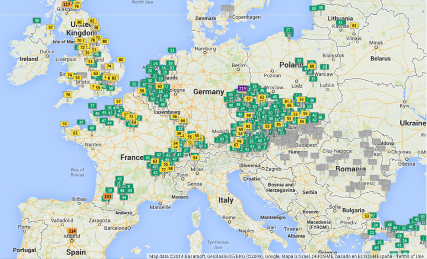
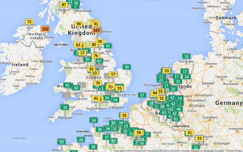
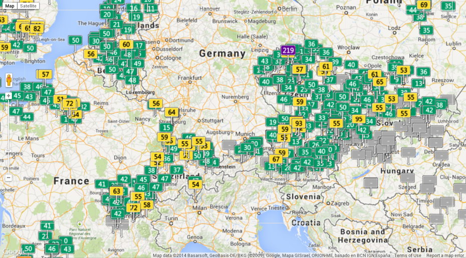
Central Europe, thought a bear of industry and coal, seems both highly monitored and at the same time roughly comparable to England:

EU Air

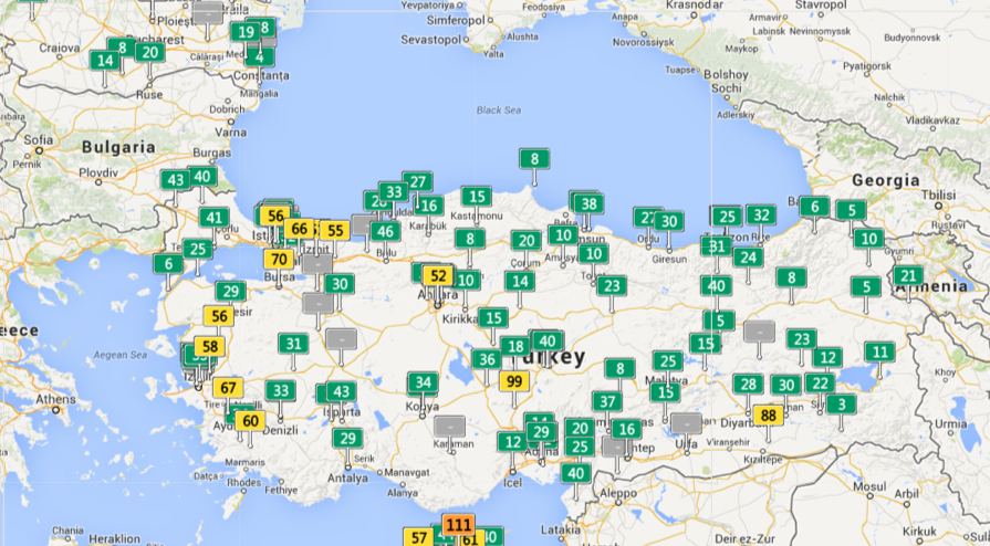
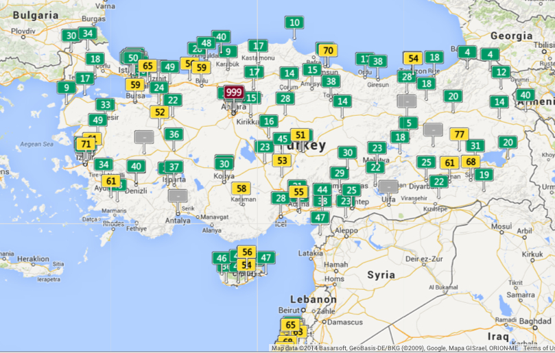
But the pocket of air quality that is literally off the charts one day near to Ankara–999–raises questions about how relatively low readings are in cities quite nearby.

Ankara and Turkey, May 21 3-06 pm

To be sure, Anatolia can also, in other real-time maps, seem quite green on other days:

Anatolia can also be so Green

Real-time air pollution seems egregiously under-reported in South Asia, however, despite real high readings in two concentrations that seem quite situated at first glance:

Southern Asia:india

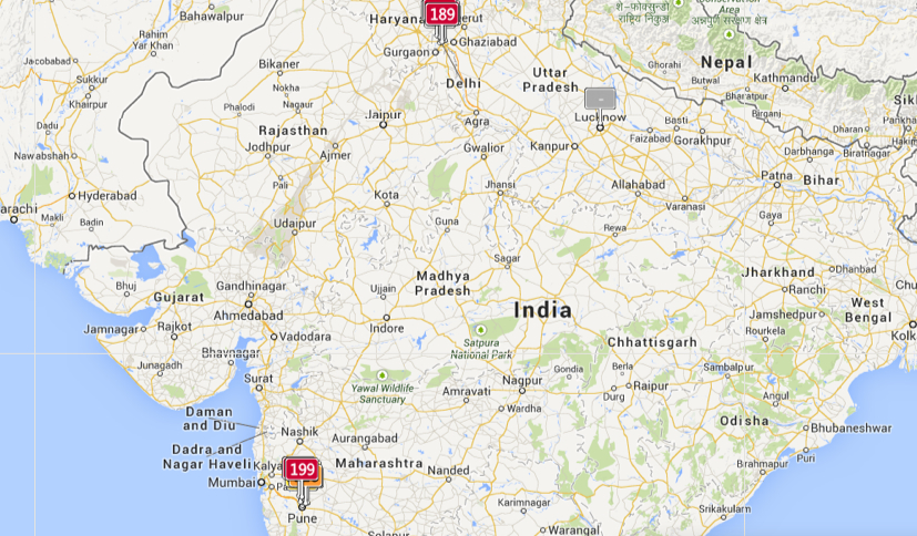
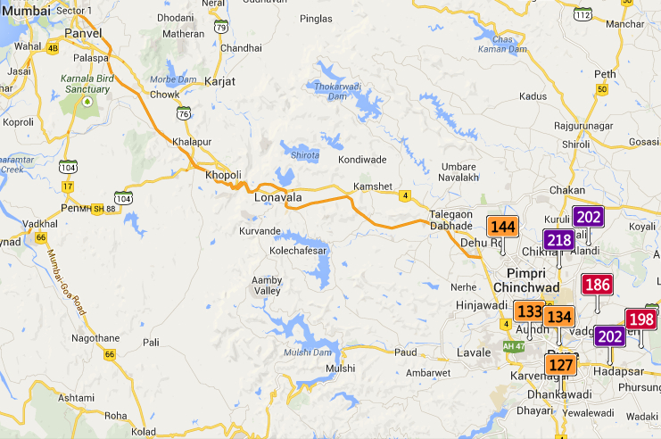
But a slightly magnified scale reveals greater local detail in a polluted zone:

near Rajiv Gandhi Infotech Park

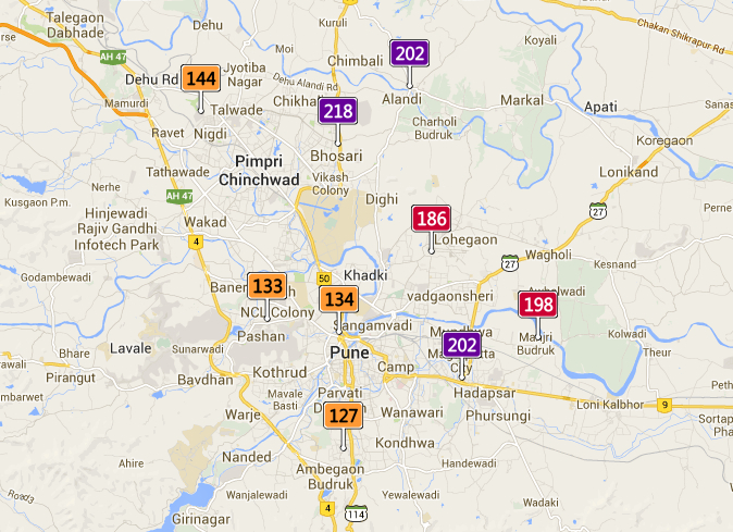
Even if the readings of unhealthy air quality around Pune and Mumbai, if concern for alarm, are not comparable to Ankara:

Near Mumbai   Pune--Very Unhealthy!

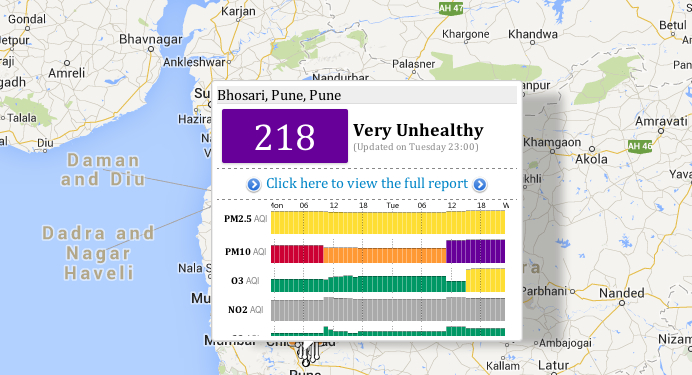
The accessibility of a full report of air quality of any place on a pop-up screen suggest a level of detail, to be sure, that this post does not do justice. But one is impelled to marvel at the stark inequities in the Anthropocene, both surprising and unjust, from Mexico City to Ankara or China:

Mexico City at continental divide   Ankara and Turkey, May 21 3-06 pm

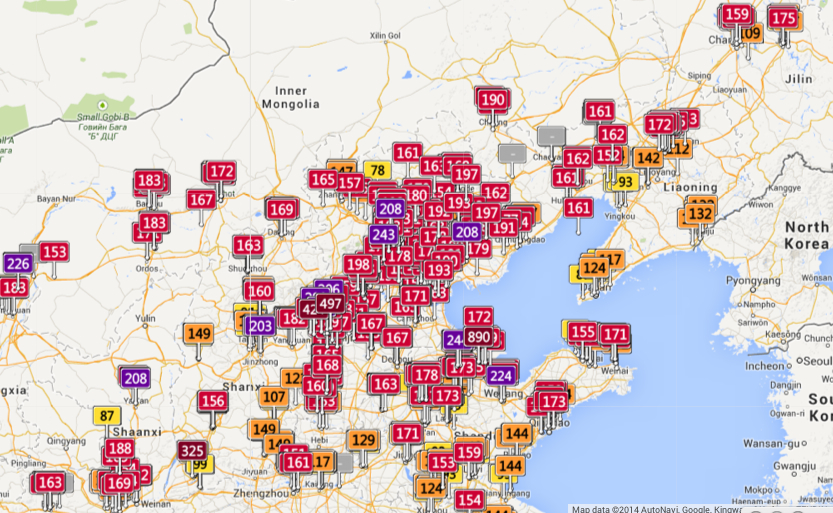
The striking global inequalities of concentrations of air pollution that seem particulate endemic across China cannot, however, help but give pause for the hazardous concentrations of particulate matter that they indicate.

Chinese Cities

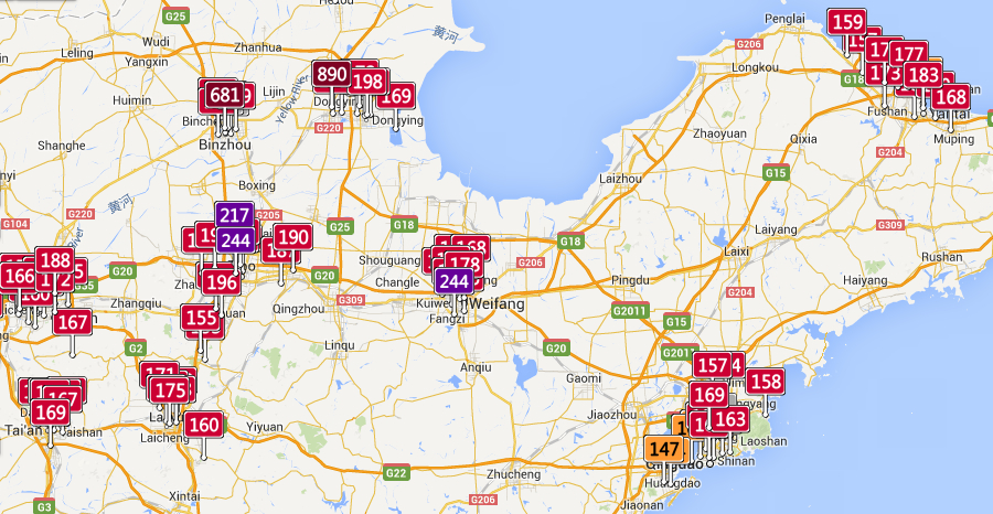
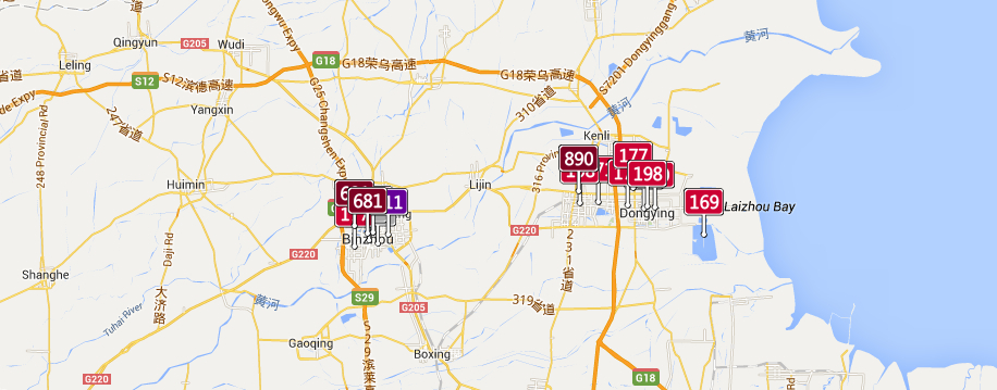
Despite a dangerously uniform measurement of particulate matter (AQI) verging on or surpassing 200, the concentration in Shanxi provide is particularly striking near its shore, and reaches an apex of 890 in Shangdong province, despite poor air quality of particular unhealthiness in the gulf:

Shanxi Province, pocketsin ports

The remarkably high levels of air pollutants along the Yellow River is particularly alarming and striking, since pockets of particulate matter of less than 10 microns, particularly dangerous to the respiratory system, approach hazardous levels in Shangdong (890), and even finer–and more dangerous–clusterings of much more dangerous particulate matter of diameter less than 2 microns, able to lodge more deeply in the lungs, reach hazardous levels in Bizhou.  Have the health risks been conceived?

Clusters in Binzhou   Binzhou

In the south of China, from Chengu to Hubei to Anhui provinces, one can trace a stream of red flags along rivers, and multiple regions of unhealthy air quality deep in the interior:

Chengdu to Hubei

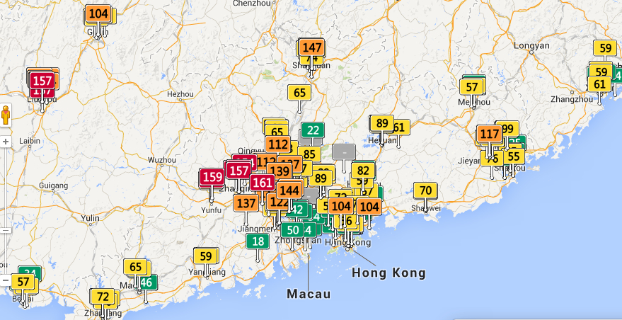
The far better air quality in the Guangdong region, in sharp contrast, reveals concentrations of airborne pollutants outside of the port of Hong Kong.

Guangdong Province-outside Hong Kong

But what to make, on the eve of the accord between China and Russia on natural gas pipelines, of the apparent absence of limits on air pollutants in so very much of the PRC?

Mapping Air Divides

The commercial tie-in is rather obvious, and the map may be a marketing device for masks made to filter out particulate matter, in a wonderful example of cartographical product placement:
Facemasks

Leave a comment

Filed under 'Good' Anthrpocene, 350.org, Andy Revkin, anthropocene, AQI, Berkeley Earth, Mapping Air Pollutants, Mapping Air Quality

Mapping a Century of Rising Heat

RISING Temperatur esNew York Times

The color-saturated mapping of regional changes in temperature across the contiguous United States provided a commanding visual for the front page of the New York Times of May 6 to capture changes in the US climate:  placed on  conspicuously above the fold and standing alone, just below the headlines, the graphic served multiple functions in a strikingly effective way.  The weather map that was first released by the Obama White House elegantly and effectively served–in ways that words could not–to combine several narratives of climate change that synthesized  the findings of a recent committee of scientists on the wide-ranging effects of global warming.  This is an unprecedented victory of the map, the most effective single tool to describe the complex process of a veritable cascade of environmental shifts, by selectively focussing on a known variable of local warmth.   The orange and bright reds of the map arrest the eye in ways an article or headline could not, and effectively provoke a cascading set of side-effects and reactions to occur in readers’ minds that served to grasp the finality of warming’s consequences.  As one mind quickly moves off the map of stark changes of temperature to the effects of future droughts and increased aridity of soil, consequent crop-shortages, and subsiding ground-levels, imagining the marked depletion of cool air, streams and rivers that would dry, and an increasing dependence on energy to create artificially cool environments. 

Although it is static, the historical map suggests a spectral future forecast for the nation that dramatically moved from back pages to headline news.  It mirrored a roll-out of the announcement as part of a dialogue with weathercasters on television news programs in a gambit to engage the public in the question of climate change.  Indeed, the graphic mimicked the presentation of weather maps on TV, images of the national forecast that the Weather Channel has made all too familiar.  Even if the map documents changes of the previous century, it shares the iconic status of the sort of severe weather forecast that The Weather Channel has accustomed us to interpret and to see.  We’re now trained so often to interpret and to read similarly colorized  climatological forecasts to trace regional emergencies that the Times‘ map seemed to recuperate these conventions to make a polemic point not so much about the past–“US Climate Has Already Changed”–but about the possible futures that the map forebode.  For weather maps offer the most acceptable medium of future predictions, where they have currency as credible tools for short-term forecasting.

Thuderstorm Forecast

The range of information in the map that summarized a century of rapidly shifting local climate temperatures How could such a gamut of consequences be convincingly understood or presented other than in a map?  The visual immediately triggered multiple questions of effects on species, forests, farmlands, new sorts of vegetation, and shifting insect populations described in the article, which a reader some decades ago would be challenged to link.   The effectiveness with which the map implicitly summarized the ramifications of these potential changes, or provoked its readers to react to its orange and read heat-distributions, presented an ominous vision of the future, as well as the historical past of a century of warming weather that the headline announced.  As if with the ominous fatality with which science fiction authors like Arthur C. Clarke described the future of a world battered by asteroids, the map opened up a view on the consequences of environmental change in a future world, even if its headline announced an event firmly rooted in the past century, synthesizing as it did the findings of two periods in the past hundred years.

The finality with which the map released by John P. Holdren documented a change that had already occurred across the nation’s regions, but made it to every weather bureau and station across the country, as if to maximize the newfound familiarity of audiences to engage meteorological maps as a way of making its own polemic (and of course partly political) point of how drastically rising temperatures stand to redraw the familiarity of the world.  Extending far beyond earlier warnings  voiced by the UN, or the pronouncements of an Inter-Governmental Panel on Climate Change whose  report documented the melting of the ice-caps and collapse of sea ice in the arctic, the migration of many fish out of their habitats, and impending dangers of rising seas.  Perhaps these global images were too remote, or difficult to visualize.  The powerful invocation of the weathercaster seemed to give greater reality to the scary prognostic in the contiguous United States, and concretized the multiple threats of climate change in an image that confirms the changing nature of the ground beneath our feet.  Some may criticize the focus on the United States alone in an interconnected world, as if the isolation of our country’s climate somehow removed it from a global problem and dilemma, or placed undue emphasis on the effects of emissions on the climate in the US.  But the image of actual experiences spurs a call for reaction and response, and, in an echo of the tactics of the Obama administration, reveals the increased “cartographical literacy” in the reading and interpreting forecasts in persuasive national weather maps.  

Forecast and Warming

The emulation of the televised weather forecast is no doubt what makes the map appear so immediately effective.

The map of the entire country was in ways a counterpart to the images of November 2012, around the time of Hurricane Sandy, simply titled “What Could Disappear,” which asked viewers to imaging the shifting coastlines of rising seas, and pictured the coasts that rising ocean waters could redefine, submerging beneath the sea low-lying areas of what we consider habitable land–as well as flooding all of Galveston, TX and some 45% of Long Beach.


What Could be Lost The New York Times
 

But rather than engage with complex claims of climatological futurology, the front-page graphic was both at the same time historical in perspective and even more apocalyptic.  In announcing or intoning “US Climate Has Already Changed,” it reminded us of the consequences of rising temperatures at a historical remove that was still part of our present and an uneasy glimpse to the future we have mad, using tense whose finality foreclosed debate in quite incontrovertible ways.  The map’s comparison of temperatures over a century effectively resolved debates, separating the actual consequences of climate change on a familiar environment from debate about its mechanism and reminding us of its man-made origin, and untangling the dangers of the changes that it wrought from the cascading (if terrifying) mechanism of ocean levels rising, habitats altering, fish migrating, the extinction of species, and deaths of coral reefs.  The map was able to link itself to a multiplicity of lived experiences and actual fact, and conjure a scarier–precisely since undefined–picture of what was to come–an era of increasing heat.  (Its associations might almost be as apocalyptic as the hallucinatory surreal  dream from a 1959 episode from Rod Serling’s The Twilight Zone, “The Midnight Sun,” in which the earth exits its elliptical orbit and moves toward the sun, warming the nation so much as to induce crazed radio weathercasters to stray incoherently off script and panicked Americans to flee abandoned cities en masse to Canada in search of cooler climes.)

The particularly powerful graphic of the map of regional variations in rising temperatures was quite devastating in its depiction of how–despite some regional differences–none save rare pockets of settled land experienced anything approaching a decline in reported weather temperatures.  For those that did, mostly concentrated in the lower Mississippi basin, they experienced quite slight declines:  it presented an image of a continent on fire, almost about to be consumed by flames, burning from its edges, if, the accompanying article noted, increasingly soaked by torrential rains.

RISING TemperaturesThe New York Times

The  growth of areas already warmer on an average of some two degrees suggested an encroaching of scarlet red blotches across the land from all sides, particularly in southern California and Arizona, Utah and New Mexico, the northern eastern seaboard, and the Great Lakes, with Bob Dylan’s native Hibbing seeing the greatest temperature change of over a massive three degrees.  The map powerfully synthesized the effects of human-induced climate change in ways that are not only impossible to rebut, using findings of a national  committee that has been in existence for over a decade–but was by far the most effective among the various interactive graphics it released.  The simple synthesis in a four-color map of the contiguous US immediately showed rising temperatures in some of the more inhabited areas of the nation, from New Mexico to Southern California, to the New York-Washington corridor.

In selecting a map to represent the consequences of climate change that were detailed in the report, the images suggested less of an infographic than a sort of disease map of a climate that has gone off the tracks.  Even if it might be faulted from its insistence on removing the US from the world, and focussing on one place within a complex web, as well as flattening its findings in cartographical form, the image is powerfully links the land to a set of abstract changes we cannot fully comprehend, but whose effects we can perceive.  This is the stunning victory of the static map.

2 Comments

Filed under "Midnight Sun", global warming, Inter-Governmental Panel on Climate Change, John P. Holdren, Rod Serling, The Weather Channel, weather maps, weathercasting

Windswept Lands

Warm wins that rise in the high plains have increasingly driven the fires that have devastated California, hurricanes battered our costs, and driven unprecedented showers that have flooded southeastern Texas.  But winds are rarely mapped, or even perceivable in maps, although winds were once a central part of the maps known as portolan charts designed when the primary means of long-distance voyaging was navigation.  But data now stands to integrate the winds–once shown as heads that buffeted human history or at least human travel–


venice Agnese_Portolan Atlas


00but are increasingly able to be incorporated into our own maps of disasters, if only to fully understand the fluidity and vulnerability to which we are exposed by high winds.  Indeed, it is increasingly clear that we are better able to read the relations of geographic locations and the information of data visualizations only by including the winds in their surfaces, at the same rank, or level, as the sites of human habitation that maps have long prized.   But if the winds shown on global maps are confined to its margins as embodied personifications, less quantifiable than the graticule of longitude and latitude but vestiges of an older traditional of nautical charting where the provided directionality as well as the force of gales that would provide a basis to orient one’s sails,


rosellimap700


the place of the winds are able to be inscribed on the surfaces of many recent data maps.

The ready availability of huge datasets about wind-strength indeed offers multiple formats for modeling an increasingly dynamic relation to space, and perhaps to incorporate them within the legibility of the map .  Indeed, the processing of remotely sensed data allows for frighteningly rapid condensation and synthesis of what can be called information within a single map.  And the recent NOAA based on modeling weather conditions in a real-time wind map is particularly neat in how it invests the currents of air that swirl above land and sea with a hue of their own, as if to invest them with character as a subject of mapping and give them a new level of visibility.  Set against a night sky, where details such as topography or ocean currents are conspicuously silenced, the lines of winds appear in neon blue relief off the California coast, showing an elegance of serpentine motions are tracked with far more wonder than the static terrestrial map:

wind

The flowing electric blue lines used to render wind move with a sleekness as if to promise immediate access to meteorological actuality that seem to blend the screen with current wind conditions, and provide that most fantastic of illusions of a map of the present-day that almost sends tingles up our neck in providing a map of events that seem actually to be transpiring.  The maps have in fact led reporters to gush thanks to the US government for its funding of the project with tax dollars, creating new conditions for the visibility of currents of air to which we are ineluctably drawn in an almost zen manner.  The GIF suggests a mapping that is based on looking at the overlooked, or rendering the smoothest of airborne sensations with cartographic legibility.  It echoes the recent ability to encode data from sensing stations in a transfixing image of swirling gusts that seems far more animated than the flat topographical base map that lies beneath.

sssss

The attraction of these maps is more visual, in fact, and somehow more seriously phenomenological, than having to do with geographical information, save as it suggests the increasingly fluid nature of all information flows.

The dynamic nature of wind maps renders an idealized perspective whose content asymptotically approaches a view that is almost entirely abstracted or removed from the inhabited world, based on the mathematical models for projecting and tracing the currents and intensity of wind over land:  indeed, in the marvelously idealized data-driven maps, wind currents create whirls of whorls over the lower forty-eight.  The website hint.fm uses real-time images of the inroads winds make across the territory of the United States, distinguishing gradations of gustiness by wisps of differing intensity to describe a space not only removed from the inhabited world, but whose elegant tracery enacts an aerial drama across in an artificially demarcated mapped space too vast to comprehend, but offers a sort of atmospheric ballet of the wind’s shifting directionality and intensity, as if traced by a multitude of individually situated geographically dispersed weather vanes oriented by the shifting winds across the lower forty eight.

Wind Map website image

If the image recalls something like a smoke-filled room, it is more of a wind-filled continent, where blowing winds cross borders, rivers, and plains in an image of the bounds of the contiguous forty-eight states.  The cartographers, or artists of technological visualization, Fernanda Viégas and Martin Wattenberg are dedicated to “work [that] explores the joys of revelation” and in converting local data to suggest natural currents that existed before highways carved the continent into itineraries–like the “blue roads” of rivers run across the land–but their constantly shifting trails mark a weirdly curved space in a situated perspective rarely able to have been captured before.  Even on a “mild day,” the winds give a sort of dramatic intensity to the organization of space oddly removed from the cartographer’s art, which is quite passive in the sense of offering a surface to be inscribed by the movement of the air, as wind curves around the nation’s great plains in currents of a recognizable patterns or flows that approximate stop-action photography.

wind_west_to_east

Looping Denver

Sure, there are specific moments of meteorological intensity when winds line up in a recognizable pattern–a tornado or hurricane–in ways that define a geographic focus of interest or attention, as in the vortex of Hurricane Isaac as it approached New Orleans,

wind_isaac_zoom

but all too often the dispersal of attention is the rule, as one watches the patterns that winds themselves generate.

This charting of currents is one of the most precious dreams of early map-makers:  to chart the very presence of winds across the land and sea, early symbolized by the rhumb lines that were so important for nautical navigation in early modern and medieval charts, where they communicated the basis of projecting travel across oceans otherwise rarely noted or known how to be represented in the surface of the map itself:  even the lines surfaces of the waves on which ships gently rock and sea monsters rear their heads is only a suggestion of the winds that run across their surface.

Olaus Magnus

The wind-map is abstracted from territoriality in a sense, as were the oceans:  its formal focus on the United States, derives from its synthesis of predictions of the National Digital Forecast DatabaseLaura Kurgan has suggested how much the big data of cartographical operations like Google Maps or Google Earth were not only enabled but indebted–and informed by–the declassification of satellite views during the Clinton administration, which created something of a boondoggle of available data for American mapping firms, if it also informed the very strategies of global surveillance that Google inherited:   the delicate wind-maps Viégas and Wattenberg conceived and coded suggest less of a governed land than a territory inhabited by air, in which the unfurling curling currents of wind estheticize the bounded nature of territory:  migrations of flows of air that course above the terrain, tracing inroads of whitespace into the blackened map of the lower forty-eight until, over a sufficient amount time, the entire region would be wiped white or erased by air currents, and present only where wind-velocity was nil, in an atmospheric vanishing act of a truly windswept land, where winds course across by crossing out space and inevitably white-washing inhabited lands.

Winds over US whitening out whitening #3

Drained Nation Whitening #6

In another sense, the wind maps register the messiness of local interaction, so absent from the idealized rendering of the map, even if that interaction and specificity lies above where human interaction occurs, and creates a network of a sort that is constantly reconfigured before our eyes as it is drawn and redrawn in trajectories with comet-like tails.

Modelling Wind Flows 12-58 EST-4

The modeling of wind gusts across the contiguous United States suggests a new sense of the spectatorship of the D3 map, although real-time of the map qualities maintain an illusion of an actual meteorological surveillance of the skies.  Just as we cannot watch the unfurling of wind-currents of different velocities over the space that is mapped, they define the dispersal of wind currents across space as if at a remove from actual habitation:  the fine lines that recall stop-action tracing of six levels of gustiness across the nation are extraneous to sites of habitation, because habitations are not what is being described, or included in the data that drives the map:  the conventions recall streets or waterways or rivers, but follow a set of mathematically modelled swirls and whorls that render air apparent over the land that we more usually map, in a view to currents far above the ground.  And yet the mesmerizing drama of modeling data of wind currents is so elegant and engaging that it is hard to stop watching: its ambitious organization charts a record of our world at a remove from the categories of mapping that we are more habituated to scan.  In a way, the windmap is the most elegantly estheticized of terrestrial or worldly maps, because it is also the most etherial.

USA Windswhirls May 1 12-58

What is the subject of the map is the flow of data that is so oddly anthropomorphic, casting the map as a hirsute surface and second skin, even as it describes the velocity of air currents above the land abstracted from any view of place?  Do the wind-currents create or seem to sculpt a sense of place in their whirls and eddies, giving a concrete palpability to the map’s surface that somehow runs against the flattened isotropic surface of a map?  Is it still a map, now that any sense of spatial indices are erased, and centers of habitation are dramatically reduced?  Or is it a screen?  One of the beauties of this projection is that as one zooms in to the ground, further cities appear in the map, providing the needed points of reference that would be too busy in the larger scale versions, where they would obscure the beauty and drama of the inroads made by the winds that circulate across the lands.

Shaggy USA

There is specific period eye that is attracted to the data visualization, familiar with reading data distributions rather than describing a topographic space in naturalistic terms of portrayal.  If the United States seems a shaggy dog, the most mesmerizing of D3 tricks in the book is to watch the ongoing expansion of wind currents across the Rocky Mountains, Desert, and California, from an imagined t-zero at which the calculations are assumed to begin, as winds begin to be inscribed, as if on an etch-a-sketch in reverse, and give contours and form to the blank black area that the first screen seems to map, suddenly giving it a texture that is specific to a date and time when the download of whether data began, until it gains something of a meteorological image of wind flows.

West Coast Winds 1

Califn Currents #3

Calif Currents #4

Calif Currents #5

Californai Currents #7

Is this sort of data visualization, as attractive as it is, a map?  The processing of the distribution of air currents is difficult to stop watching because of the elegance with which it makes us look at the winds that we notice but have such a hard time collectively grasping, and because of the currents, eddies, whirlpools and lines of different flow that the wind map increasingly reveals, so that it gains a coherence in itself that it initially lacked. The idea of mapping air is intensely appealing, because it acts, as a map, to make visible what is so easily overlooked or otherwise has no concrete identity by which to be grasped.  The parallel currents, if approximating a familiar natural appearance of a hirsute coat, are nonetheless quite conceptually difficult to envision in their relations to one another or totality.  The best reaction is one of wonder–wonder at being able to find a visual residue tracking the unrelated sensation of wind:  this is mapping, in a sense, as an exercise in synesthesia, where sight replaces the sensation of wind on skin.

There are elements of translating sense-based observations to a format of visual modelling in all maps, but the oddity of removing the array of wind-velocity from sense-peception of course seems odd because one rarely thinks of spatially locating winds with precision or fixity.  With closer examination of the trajectories of gustiness one notices, first, the odd pockets of calm across the land, oddly coincident with some cities, and probably not only because their buildings block the velocity or intensity of air flow, in what can appear like racing currents or overlain strands:

Pockets of Calm?

And then the country, as it is inevitably drawn by an invisible hand of the forces of the winds, cumulatively gains the contours that it originally lacked:

Modelling Wind Flows 12-59 ESTModelling 12-58 EST--3Modelling Wind Flows 12-58 EST-4

1 Comment

Filed under CityLab, comet-like tails, D3, Fernanda Viégas, Google Maps, hint.fm, Martin Wattenberg, National Digital Forecast Database, NOAA, wind-maps