While we’ve been driving ourselves to distraction with the distortion of the electoral maps, projecting the failure of our system of government in the specter of “tied” electoral contests in which the vote is thrown to the House of Representatives, rather than anyone having a vote, we as if realizing the real fears of disenfranchisement that are all too palpable in the current status quo. The possibilities of choosing a President in a polarized nation have led, not only to consecutive weeks of polling so closely within the margin of error to be set many to rip out their hair, but also inevitably ratcheting up the fears of violence–and violent confrontation–at the polls.
As if a concrete version of swinging, the fears of fists swinging at the polls seemed all too real, perhaps in the memory of January 6 still fresh in some minds, and the major actors, decentralized and all-male actors seeming to respond to Trump’s rhetoric, claiming that they would “show up” at the polls, as Ohio-based groups posted “the task is simply too important to trust to regular normies,” legal norms, or boards of election. All ratcheted up fears that the election would be stolen, amplifying anxieties about the authority or legitimacy of the election. by taunts that “FREE MEN DO NOT OBEY PUBLIC SERVANTS” on alt right social messaging platforms before Election Day. The Proud Boys, famous for having been told by Donald Trump in past Presidential debates to “stand down and stand by,” now stood “locked, loaded, and ready for treasonous voter fraud.” The demonization of public servants and the civil service, only to be amplified by the Trump White House in later months, was indeed launched within the election.
The feared violence did not happen, but a violent shock seemed present as votes were counted in a new electoral map, as the battleground states that had long been contested seem to have folded, and shifted red. But Trump’s ties to the Proud Boys–or the ties that were not only seen on January 6, but even back to the “stand down and stand by” remarks in the Clinton-Trump debate that curried so much favor with the radical alt right group. Indeed, they raise the question of whether, even if violence at the polls or voter intimidation did not occur, it still makes sense to map the electors in purely partisan terms, in this most polarized of ages, and how much that polarization rests on the personal power that Donald Trump has gained. But we have retained the map of “red” and “blue” states as a visual shorthand, dating twenty years ago on the television news, that has dominated our understanding of partisan divisions, and indeed been naturalized as a shorthand of political brand, able to take the metaphorical temperature of the nation and “decide” its leadership–even if the cartographic shorthand may be outdated in the era of the strongman. And we have forgotten how narrow the election was, as Trump has claimed a “mandate” while in fact loosing the popular vote, on the basis of winning six swing states–as if those close margins of victory, and a failure to gain a majority of the votes in what was for all practical purposes a two-candidate race, led to an electoral map that was rather divided–and offered little consensus–despite an illusion of a continuity of red states, rooted in the less educated and more economically disadvantaged ones, who bought Trump’s deceptive assurances of the arrival of lower prices on food and gas.
Have we allowed our minds–and our journalists’ minds–to become too filtered by the distorting principles of electoral maps? William Galston, an observer of elections and insider who worked for four presidential campaigns, ran with this cartographic metaphor, noting that if political parties had gained and lost ground in states and regions in earlier eras, we “live in an era of closely contested presidential elections without precedent in the past century.” As one candidate promises to divide us like we have never been divided, we are divided by the smallest of shifts in voting patterns, the electoral map of “the contemporary era resembles World War One, with a single, mostly immobile line of battle and endless trench warfare”–that reflect the increasingly and unprecedentedly sharp partisan tenor of our politics. Galston argued this was increasingly true in 2020, the election when states’ partisan opposition seemed to harden over forty years–if not sixty?–despite the interruptions of the Clinton and Obama years, the rare excerptions. But this divided landscape gained a terrifying sharpness that crystallized in how seven “battlegrounds” decided the election in 2024, justifying outsized attention from Presidential campaigns in the 2024 election.
Even as the United States Justice Dept. monitored twenty-seven states–and some eighty-six jurisdictions!–to ensure compliance with federal voting rights laws, prevent voter intimidation, and law enforcement agencies were braced for violence, no cases occurred–despite tangible fears of violence or intimidation. But the shock of the red map lead to existential worries of a story that ended in the wrong way. If 77,000 votes from Wisconsin, Michigan, and Pennsylvania put Trump in the White House the first time, in 2016, a big push from all three states did the trick by promises to a Christian Right. Even if Harris cut Trump’s lead in the battleground states, Trump continued his advantage in battlegrounds of the light blue Democratic victories of 2020. And so the first returns in the Election Day scenario of the 2024 suggested a shift in the landscape rightwards, a mass shift Trumpwards, in fact, that had not been seen before, a shift in collective action and identity voters adopted en masse–as if rejecting partisan allegiances to run against the polarization of the past–
CBS News/November 7, 2024
–that provided a new landscape by the evening of November 7 of increased margins of victory from 5% to as much as 20% among for the party that had undeniably become, as many fretted, the Party of Trump, in ways that tested the carving up of the electorate into demographic groups or genders.
The array of arrows lurching red seemed to blanket the nation appeared nothing less than a major electoral paradigms. And the victory of Trump was not a victory of the GOP, but a confirmation, in some sense, of the full takeover of the Republican Party by Trump’s promises of making things right again, promises that seemed more concrete in its details–even if they were largely vague assurances, moral victories of slim benefit like the restoration of values and end of access to abortion–promises at well in exurbs, far from cities and urban disturbances, from private equity to prisons to gaming to casinos to gun advocates, finding a gospel of mall government and low taxes, a salve to anger at pandemic restrictions, an exurbia on the edges of cities, fleeing all disturbances to an elusive status quo, believing hopes of bracketing costs of global warming and near gaining a critique of Trump’s abundant lack of any actual economic plans.
CNN, November 7, 2024
The sudden parsing of the flow of margins erased the red state-blue state electoral map, with a precinct- or county-based tally of margins from the previous election, seeking to size up candidates by socioeconomic or other groups, but confronting an apparent large-scale shift of the electorate. Trump’s victory was not overwhelming in its margins, but re-mapped most large stretches of the country red left the notion of “red” states in the past, to augur a new landscape for the United States–not only in domestic policies, but, of course, its relations to the wider world. But it was more than decisive, and the “break” in many districts once dependably mapped as Democratic voters to Republican suggested a wake-up call, even if the election was by no means a landslide: it felt like one, and that nagged one’s mind and would in days to come. And, perhaps more importantly, the perception of a landslide–even if it was by small margins–was exultantly viewed as a license to remake the government, remake the presidency, and redefine the role of government.
The bitter truth Trump did well among, non white voters, lower-income Americans, and women cannot be explained easily, and surely not by class-based disaffection from Democratic candidates.
Red Shift across American Landscape Showed a Decrease in but 240 Political Counties/New York Times
Despite fears of violence, the eery absence of any disturbances paralleled the rightward swing of the American electorate, evident in the rightward swing of voters not only in those seven “swing states” but the great majority of counties across the nation evident as the first votes were tabulated on election night. This was a punch to the right, a lurch right save spots in Georgia, South Carolina and Michigan–once considered swing states, to be sure, but now trending red. How did all the so-called “swing states,” uncertain in their voting practices but which we had been reminded from the summer, would, in fact, be selecting the President as much as the country, swing red in ways that seemed more overdetermined than seeming news?
The map hit viewers like a slap in the face, a rude awakening of heart-breaking disconnect with America, but was also cause for a recognition of deep-lying and relatively dark undercurrents that found grounds to turn away from a convincing female candidate, even in favor of a convicted felon. The bomb threats on election across swing states provoked fears of a conspiracy of Russian origins, but the lurch seemed terrifyingly home-grown and domestic, and seemed profound. It was only as more votes came in, early results revealed a shift of over 90% toward Donald Trump, a terrifying landscape indeed, but as the votes continued to be tabulated nationwide, the electoral map and the tally of votes suggested a narrow victory, in many senses, as more votes came in from California–but revealed the stubborn draw of this year’s Republican candidate, former President Donald Trump, who attracted voters across many of the states once thought in play. Candidate Trump currently only leads the vote count by 2.5 million votes nationwide, but the large turnout paradoxically benefitted him, suggested the special draw that he had as a candidate among many voters, from a far more “diverse” background than Republicans had indeed ever assembled.
The light pink areas that were not so dominated by Republican voters presented a fractured landscape that broke the wrong way, and did so by small margins and very much perhaps for not the right reasons. But the break in votes was striking, as if able to be mapped as continuous regions. We are still haunted and traumatized by the mapping of the way the national population had split in 2016,–of siloed blue towers, removed from he rest of the land, a hived off vision of politics that we faced with frustration as Trump entered the White House for the first time–winning the backing of the interior forty-eight with an intensity not reflected in any earlier polls.
We had pored over those maps that haunted our minds with endless precision as data arrived on county and district level, to search for signs of the anatomy of the loss, hoping to grasp the gaping division of the national vote. Did Trump’s continued appeal redraw the political landscape, or was there something wrong baked into aggregating the general will? Did tailored talking points about access to abortion and an attack on price-gouging fail to motivate voters, or provide a convincing narrative of steering a more vital economy, or at least a convincing trust in the law?
Or, the voting map almost seems to beg the question, were we relying on the wrong maps as we focus on electoral maps, and ceaselessly made new maps for electoral prediction, seeking to craft multiple scenarios for how electoral votes would fall out this time, scenarios whose endless proliferation seemed a suspension of agency? The real maps of the election lie far outside demographic metrics not mapped by demographics or class or race or gender divides, but a space of a lost community, where the battle cry to Make America Great Again exercised undeniable appeal.
The massive scale of the red shift evident by the morning after Election Day was a wake-up call that suggested a changed landscape. The red arrows lurching right seemed evidence of a disconnect of Democratic campaigns and candidates that provoked an immediate introspection and conveyed the shock many felt in he nation. Amazingly, rather than the election being close in any way, it seemed, the election that was long said to come down to thin margins of voters, per the polls, were upended. Trump’s margins built on 2020 and significantly grew in 2,367 counties nationwide. The red arrows overwhelmed any of the fears of heightened violence in Trump’s political rhetoric elected, with the demonization of opponents, or indeed just suggested they were meaningful rallying cries far more successful than polls had showed or political junkies had expected.
The southwest and states east of the Sierras magnify the effects of global warming in the intensity of their aridity. But global warming reveals a new relation of regions to overheating, and reveals the depths of inflexibility to accommodate water scarcity, as well as the tragedy of its effects. As aridity of the soil and reduction of groundwater reaches unprecedented scales, our passivity is accentuated as we are suspended before maps that try to visualize unprecedented aridity magnified by global warming and its magnifying effects.
For the cascading effects of warming on the land and environment might be mapped in ways that cannot essentialize the greater “aridity” of the region, but the effects of increased aridity of soil, air moisture, and dry air on a region that we have remade into a region of food supplies, agriculture, and livestock, but, beyond, on hydropower. While the Colorado mountains long provided an effective basin to gather rainwater for western states that have been funneled to state reservoirs for agricultural irrigation, the man-made irrigation networks were drying up as the snowpack determinedly fell, and warmer temperatures evaporated what snowpack fell.
The logic of this longstanding pattern of appropriation of water from across the Colorado Basin was in a sense begun with the Hoover Dam, but was, writ large, organized by very process of appropriating water rights to redistribute water that had been enshrined in California from the turn of the century, circa 1914 and the policies of filling reservoirs to redistribute water rights. While we have considered appropriative water rights a distinct feature of how water is redistributed unique to the Golden state, the appropriation of water rights by reshuffling of water in state’s now precarious supplies how diverts over 99 million acre feet of surface water diverted along the Sacramento and San Joaquin Rivers to farmland, created a powerhouse of national agriculture. Much of the 75 million acre feet that flow from reservoirs across the state evaporates before it arrives at crops, however–far more that actually reaches the farms or cities.
–and the growing heat of the Great Plains have likewise diminished surface flow of the Colorado Basin already reduced by diminished rainfall. The increasingly warmer atmosphere of recent years has created a new “Arid Region” of the United States, of even greater aridity than when it was first mapped by John Wesley Powell in 1890, and the renewed aridity of the region not only challenges the calculus of water distribution according by appropriative rights that is structured by the Interstate Compact, but the very logic of redistributing water.
The past two decades have seen the departure of seven trillion gallons from Lake Mead, the largest reservoir on the Colorado River, holding rainflow from the Upper Basin before it crests the Hoover Dam. The drop will trigger hydrologic stresses across western states, as ever ever-increasing amounts of water are sucked up into drying out air and atmosphere, requiring more abundant irrigation of croplands and grazing grounds. This new and expanded “Arid Region” suggests a return of the repressed, returning at even greater scale and aridity to haunt the nation by a lack of groundwater again.
Evapotranspiration Rates in Colorado River Basin, Landsat 13
that is not to say it ever left. But the solutions of diversion have been undermined by the cascading effects of climate change and increasing temperatures, across an expanse of irrigated lands where water from the Upper Colorado, as from the western slopes of the Sierra Nevada, are funneled to cities, farms, and irrigation projects, and used to generate electricity. Even as Californians and westerners face the threat of further fires more destructive than any in recorded history–potentially enough to energize an implausible recall effort in the state of California–we face the problems of managing not only historic drought, mandated energy shortages, reduced water supplies. The climate crisis appears to have provoked a deep crisis in leadership, but one without easy means of resolution.
The most improbable political candidates–global warming skeptics after Donald Trump’s heart–have argued drought, wildfire, and electrical storms reveal Gavin Newsom’s lack of leadership, even as they stridently object to aggressive climate legislation aimed at emissions reduction as restraining the free market business,– preferring a free market approach for all climes that would be the laissez-faire redistribution of water to the highest bidder, monetizing a scarce resource to consolidate financial profits and gain in response to diminished water supplies.
As more water is being released from Upper Basin reservoirs to make up for the shortfall in Lake Powell, but the shortage of water in Lake Mead–the largest reservoir in the United States–to less than 40% capacity by 2022 will mean reducing water for lower basin states like Arizona of 812,000 acre-feet, Nevada–by 21,000 acre feet, and Mexico, by 80,000, that have led to the call for new “water markets” to be created across the western states. Indeed, even western states no longer carry the brunt of increased use of freshwater for irrigation–
High Country News
–the demand for conserving water in agriculture is increasingly incumbent on western states, so much so that the shift to less water-intensive crops–like California’s almonds–at a time when many crops require more irrigation, and a shift toward fewer acres of pasturage for livestock–good luck–have become a necessity. Increasing the efficiency of irrigation systems is necessary–ending customs of flooding fields, increasing drip irrigation, center-pivot irrigation, or micro-irrigation, in a New Deal for agriculture, even regulating irrigation systems before water markets price rural communities out of their accustomed access to freshwater. The increased trend toward shifting the distribution of water by “water markets” from lower- to higher-value use is dangerous for farmers, and indeed all rural areas, but also for the western ecology, as it would be the most difficult to preserve water in rural communities or farming areas less able to pay for pricing of water for higher use-value, although they currently consume over 70% of the water in the Colorado basin, or encourage sustainability in regions that are increasingly facing realities of sustained drought, if not megadrought of unprecedented intensity.
United Stated Drought Monitor for Western States, October 2021
Yet the systems of allocating water from the Colorado River by a system of dams, diversions, and canals have led to broad calls to end further projects of water diversion, as the diversion of water to western states may be drying up itself by up leads to calls for new policies of allocating water, not based on the highest bidder, as the river we have made increasingly mobile across boundaries will be divided or redivided between agriculture, urban use, indigenous Americans, and land trusts, as we are in need of redefining the working basis for conserving the redistribution of water rights beyond capture and diversion, and outside of existing water markets and appropriative water rights within states. While the Bureau of Land Reclamation has run the reservoirs, dams, canals, and hydroelectric plants and contracting with individual districts, a broad reconception of practices of regulating water markets, allocations of water, and costs of large-scale water diversion, as demand for water outstrips supply.
Yet as increased farmers are withdrawing water from the ground, or from rivers, from California’s Central Valley to the Lower Colorado River Basin, in Arizona, New Mexico, and Nevada, the need to reduce the eighty percent of water dedicated to agriculture across the west will demand new practices of conservation, beyond what John Wesley Powell mapped, in 1880, when he advocated new practices of land use, as climate change increasingly destabilizes the Basin, including the thirty sovereign Native American tribes along the river basin. The need to manage demand and riverflow that will begin with the start of the “Tier One Shortage” from 2022, will introduce new rules on water-use and supply that stand to reduce the amount of water flowing to Arizona by a third. Water diversion from the Colorado River has transformed the land west of the hundredth meridian by re-engineering its flow to make the “desert bloom.” Yet the recent dramatic reduction of rainfall, river flow, and increased aridity of the lands, leave us contemplating the viability of relying on water diversion.
John Wesley Powell, “Arid Region of the United States, showing Drainage Zones” (1880)
The new arid region is reflected in weather maps, but will be a region of radically reduced piped water and a new landscape of hydrologic diversion. If the “Arid Region” was mapped in earth-tones of clear distinction as a cautionary way by explorer and geologist John Wesley Powell, to alert the government to the distinct climate of lands west of the hundredth meridian, the recent area is both based on more detailed and specific remote sensing records, often from satellite observation, but suggests a far more complex area to manage.
For the western states are linked, both by projects of water diversion, and by hydropower, to a region where rainfall and snowpack has declined, and far less water enters into the river-flow of the rivers whose diversion allowed the expansion of agriculture and livestock across the western states. Due to global warming, the earlier “arid region” expanded, returning bigger and better than ever since it was described as extending west from the hundredth meridian by John Wesley Powell, in one of the foundational maps of climate aridity. In today’s parched California, dangerously low levels of rainfall across the central valley seem to belong to the Arid Region. But we have hardly come to terms with its new expanse or migrating edges. The “lands of the ‘Arid Region'” that Powell had hand-colored with earth-tones to communicate the dramatically falling rainfall west of the hundredth meridian long ago mapped a biting response to the eagerness of homesteaders to Go West, cautioning about constraints on water-rights that division by states–rather than drainage districts–would bring. If current rainfall maps of USDA or EPA seem to engage in dialogue with Powell’s old polemical cry, the limited traction of mapping policy against increased pressures of climate change place most maps in a sort of Scylla and Charybdis, located not in the Straits of Messina, but the scissors of decreased rainfall, rising temperatures, and lack of groundwater retention.
1. The problems of managing water rights and ensuring flow are now far greater than what Powell’s creative palette of before the fact overlays even imaged was able to depict, and was a puzzle beyond the interlocking pieces of drainage districts that he–as if akin to the first puzzle-boards composed of hand-painted maps, as this forty-nine piece puzzle map of ca. 1849, painted by Kelly & Levin, of the similar region, that curiously compressed the western United States. Was Powell’s map indicative of the difficulty of solving the puzzle of allocating water resources across arid western states?
Puzzle “Map of California, Mexico, Texas and the United States,” ca. 1849, Kelly & Levin. Boston MA
While the puzzle pieces rarely echoed the shapes of individual states, undoubtedly because o the difficulty of their cutting the contours of states, the puzzling of how the rivers of the west would align with states in this roughly contemporary 1880 Milton Bradley map-puzzle, an “Outline Map of the United States,” posed by including light blue rivers across a map with little sense of varied topography.
ca. 1860, M. H. Traubel, Lith., Philadelphia PA/American Antiquarian Society
In contrast to the resolution of assembling individual pieces of a map of fixed bounds, the expanded arid region mapped by remote sensing spans a farther territory and expanse, and raises deep questions of access to water or even soil moisture in a region that developed as an agricultural breadbasket and locus of husbandry of livestock.
The growing puzzle broached by how the water supply of the west will be reassigned is rarely faced or addressed, although it is ruminated upon as the sub-text–or super-text?–of terrifying maps of rising aridity and low rainfall across the western states, that magnify a new “arid region” with less clear suggestion of an outcome of land management but pause before the cyclically compounded effects of rising heat, low soil moisture, limited run-off, and the specter of drastic irrigation cuts.
Current remotely sensed maps use far less clearly set boundaries or edges of water-shortages, but pose similarly pressing puzzles of how to resolve the appropriative logic of water rights, as drought intensity reduces the water that once flowed from the “upper basin” of the Colorado, feeding the river and redistributed water, and even more surface water is lost to evaporation.
The puzzle of hydrological access to land-water has become so curtailed across western states, that increased pumping of groundwater risking depleting aquifers by draining vital aquifers, irreparably damaging rivers and riverine waters. The New Arid Region, afflicted by far more aridity and low soil moisture than at any time, parallel to increased global suffering of warming and increased heat, the persistence of private water “rights” to agrarian expanse stand increasingly on a collision course with global warming throughout the new arid West in ways we have yet to address, even as we recognize that we are facing a climate emergency of the sort without precedent in modern memory.
2. No single visualization can, perhaps, adequately come to terms with the unprecedented aridity of the recent years. For no visualization can fully capture the cascading and magnified effects of declining water and soil health, and their effects on ecosystems, as much as on livestock or irrigated crops: the distance from reduced irrigation and new climate specters demands an intensified map. But the terrifying nature of the intense aridity of western states in part lies in how we have seem to forgot the semi-arid nature of the region. The deeper effects of a drying out atmosphere were evident in the huge deficit in water vapor in the past decade during the “fire season” from August to September, dramatically unlike how fire fighters navigated the same terrain in previous decades, when many fire containment strategies were developed and many active firefighters had trained. The map is one that should raise immediate fears of the loss of a landscape of future irrigation, and the need for tightening agricultural belts and shifting our conceptions of food supply and water budgets–as well as the same landscape’s increased combustability and inability to manage or control by an old playbook.
Decreased Water Vapor Present in the Air in Past Decade from Two to Three Decades Previous
The previous month has brought an even more pronounced record of drought across the Upper Basin of the Colorado on which so much hydropower relies, as do other schemes of water diversion.
US Drought Monitor for Colorado River Basin, September 23 2021/Brad Rippey, USDA
The revelation of a new intensity of exceptional drought in many pockets of the Upper Basin of the Colorado River presses the bounds of how we imagine dryness, aridity, and their consequences, even as we rely on older methods of fire-fighting, and fire-prevention, and outdated models of water diversion and energy resources.
The historical denial of what John Wesley Powell had already called the “Arid Region” west of the hundredth meridian, has become a snare for ecological disaster translating into a process of the drying out of long-irrigated zones, with consequences that the nation has not been able to comprehend–and demand a New Deal of their own to replace the diversion of water and generation of energy in the Hoover Dam. Or have we forgotten the intensity of a differential of climate, soil moisture, and increased aridity that Powell long ago mapped in order to illustrate the new regime of government its unique atmospheric conditions it would require, using his uniquely designed palette to hint at the best way to organize the region of water scarcity according to the units that its drainage districts–rather than the state lines surveyed by latitude and longitude?
John Wesley Powell, “Arid Region of the United States, Showing Drainage Districts” (1890)
Powell had explored the canyons, rivers, and plains, as he addressed the Senate Select Committee on the Reclamation of Arid Lands in 1890, he crafted an eloquent seven-color map of rich earth-tones to impress readers with the sensitivity of the region’s texture and urge restraint for expanding the westward flow of homesteaders with hopes to make the desert bloom. Indeed, by circumscribing areas for which sufficient water in this “Arid Region” would be able to providently allow future settlement, Powell neatly divided areas for settlement in a region by hydrographic basins collecting sufficient rainfall for farming. Whereas rainfall maps of previous years mapped a blank spot of water scarcity, Powell hoped to direct attention by a devising a map of the region’s subdivisions that called attention to its soil quality and decreased moisture, focussing on its distinctly variegated terrain in ways foreign to Senators in Washington. Powell hoped to convince who were removed from the region to acknowledge the commanding constraints created by these drainage districts for all future agricultural development and settlement–an unpopular position that ran against the notion of allocating free land in an age of expansive homesteading. If the image of a “drainage district” was foreign to existing state lines, Powell’s image of an “arid region” long haunted the geography of the American West–and contributed in no small part to the subsequent reengineering of the waters of the Colorado River.
In light of the dramatically increased aridity now endemic to the western states, Powell’s map gains terrifying relevance as western states enter severe drought, placing the breaks on once-expanding developments across western states. Powell’s map articulated a historical vision of the limited infrastructure of water in the American west. While the technologies of irrigation that allowed such a massive project of damming and canalization only later developed, did his map inspire the need for a project of such scale as a better model of land management? The intensified aridity that afflicts the western states responds not only to low levels of rainfall. We continue to hope groundwater depletion that afflicts the lower basin won’t extend to the Upper Basin of the Colorado River that has captured water on which so many farmers rely–and thirty-five million north of the border and three million living in Mexico depend, across its Lower Basin. The escalating megadrought has created pressures across the overpopulated west that the water-sharing model Powell proposed for drainage districts cannot resolve, but the distinct forms of water management he advocated have been forgotten, as the declining water level on the Colorado River seems a time bomb as its waters have fallen so far below capacity that while the waters that drain from the Upper Colorado into Lake Mead, the largest reservoir in the western states, are only 37% full, and Lake Powell stands at 34% capacity. As less and less water enters the river system of a drying-out west, the future of the river on which so many rely for irrigation and energy is all but uncertain.
Lake Mead, May 2021
Demand for water in the upper basin and older technologies have meant far less water reaches the lower basin, but what does has been redistributed across western states–absolutely none reaches the ocean at the river’s old delta. Supplies of surface water and groundwater barely provide for the border region, as the overdraft of the basin’s aquifers have made trans-border water management a crisis often overlooked in favor of water management north of the border. As unprecedented soil aridity currently seems to run off the rails, after three summers of no rainfall have depleted soil moisture, may remind us how we have missed the lesson of Powell’s map of instilling new set attitudes toward the land, as the volume of riverflow consistently dropped as it crosses the Mexico border since the filling of the Glen Canyon Dam.
Does selective amnesia underlie how we map the drying out of the west? Most data vis of rising temperatures and low rainfall across the western states is already magnifying and escalating the effects of unprecedented heat over twenty years in a deeply melancholic vein, daunted by the scale of dryness across such an interstate expanse, and passive before an absence of atmospheric moisture that seems a modern casualty of global over-heating. If we were already “living in the future” in California’s frequent and increasingly extreme fire regimes, the multi-hued data visualizations electrify the landscape–and not with power or hydro-energy, but by the all-too familiar color ramp of the extremes of climate change we have been trying hard not to normalize. These images chart a landscape that has gotten away from us, outside seasonality changes, making the American West a cautionary case study for global climate change inspires melancholy.
The additive logic and graphic syntax of maps, long before the separate map-“layers” that accommodate information from GPS, provided a basis to define the fungibility of water and the emergence of “rights” to water across the Arid Region, enabling the idea of governing the transference of water and water “rights” across the region, that separated water from the landscape and environment. The flow of water had long been understood and reconstrued in the west by a logic of irrigation needs–and the “rights” to unpolluted water for livestock raising, pasturage, and agricultural needs of land owners–that was removed from conserving groundwater needs. The increased nature of the fungibility of water as able to be transacted across basins, state lines, and counties reflects the legal fiction of considering water as a “good” tied to the needs of property owners, that, long before global warming, had already sanctioned the removing water from the ground.
If we use metaphors rooted in temporality that try to come to scale with the new era of global warming that cut down and perhaps minimize the era of water scarcity. in which we are entering–“heat waves,” for example, that broke records in states from Washington to Idaho in June and July, breaking or matching records of hot temperatures, the levels of aridity that have allowed the ground to grow arid and degrade have not only led to a spate of western wildfires, but have changed the levels of soil moisture over the long term in ways we have difficulty to map in the scale of our weather maps, or even the maps of the U.S. Drought Monitor, as the cascading influence of such unprecedentedly dry conditions–where stresses on river water create extraction of groundwater that stresses aquifers and groundwater supplies–can be scarcely imagined, or confined to the conventions and color ramps of weather maps.
We have struggled for decades to process the cascading effects of waves of unprecedented heat that over time have produced a drying out of soil and reservoirs over the past twenty years, resulting in an expanded and far more destructive fire season and parched lands whose effects we cannot fully come to terms or comprehend, as we have not seen or experienced the extent of dryness of subsoil, soil, and low rainfall which the US Drought Monitor seems to have mapped, as drought expanded not across the entire Pacific Northwest, from Oregon to Idaho, or 86% of Idaho–by the land’s combustibility, impossible to read without premonitions of lost forests–including old growth forests–melancholic fears more than tinged by an acute sense of a lack of agency.
The sense of struggle with an absence of agency–at the same time as an almost moral urgency–reflects the difficult to process such absence of water as a landscape we have inherited from the rapidly accelerating dynamics of climate change. The history of the increased aridity is all the more poignant as a source of melancholy not only because exceptional drought was the standard before President Trump, and a national emergency before his Presidency. We have failed to register this national emergency with the same immediacy, even as the theater of the border was magnified in disproportionate ways in public discourse on migration. The sense of melancholy is compounded as the map seems haunted, if only tacitly, and perhaps without acknowledgment, by the fact that the head of the USGS in 1890 admonishingly illustrated virtually the same basins now suffering severe and moderate drought as distinguished by semi-aridity–if the current levels are nothing like those faced over a century ago, when the transition of public to private lands. We have recently mapped the substantial threat of increased aridity to the Great Plains–less than a tenth of whose croplands are irrigated–where farmers depend entirely on rainfall to grow soybeans, sunflowers, cotton, and winter wheat, the fear of greater “dry spells” as anthropogenic emissions drive decreasing rainfall and groundwater reserves–a term that tries to convince us they are not permanent–led red flags to be drawn in broad brushstrokes in those states, where extreme and exceptional ‘drought’ .
But climate change has created a new concept of “water stress”–stresses best be pictured not by the isotherms of weather maps, but the watersheds and drainage districts that were the basis of Powell’s revolutionary map, and matching the very region of the Arid Zone where the soil scientist Powell turned viewers’ attention to the crucial index of ground and soil moisture, the true determinant of the future of agrarian settlement and the future of food. The regions determined of greatest future stress were the very basins that Powell mapped, and suggest the relevance of his map, as well as his caution of the difficulties of governance in an area of severe water stress-stress being understood and indexed as a relation between supply and demand, as well as rainfall, in national watersheds.
3. The “Arid Region” of the Untied States had been austerely and admonishingly described by John Wesley Powell as a geologist to caution against the administration of its future settlement with a level of clarity that reveals his Methodist upbringing. It is hard to know how clearly we can ever parse aridity, in an age when rising temperatures have unremittingly drained soil of water. As if informed by a deep respect for the map as a clarity of record, possessing the power to reorient readers to the world by preaching a new relation to the land, Powell had placed a premium on cartographic form as a tool to re-envision local governance–and prepared his striking eight-color map of the limited rainwater that arrives west of the hundredth meridian, the eastern border of what he baptized as the Arid Region, an almost zonal construction akin to a torrid zone.
The imposing title of this reclassification of the interior of the United States revealed Powell’s own keen sense of the map as a visual record of the territory, whose transparency as a record of the quality of the land would be a basis for all discussion of settlement. Powell parlayed his own deep study of the geography of the Colorado Basin to query the value of parsing the administration of water rights by state lines in 1890, convinced of the need to oversee later apportionment outside the jurisdiction of the arbitrary boundaries of western states, but joined them to his sense of duty of preparing a legible map of striking colors to convey the constraints and difficulties for its future settlement– not only by the scarcity of the threads of rivers curled against its topography, but the few watersheds.
Powell trusted the map might mark the opening of the “Great American Desert” in order to alert the US Congress that the dry lands west of the hundredth meridian was a divide. Even if the meridian no longer marking as clear a divide of reduced rainfall, as we confront the growth with unprecedented degree of global warming of a parched west–both in terms of reduced rainfall and declining soil quality–it may serve as a model for the map we need for the future governance and administration of already contested water rights. Powell’s place in the long story of soil quality reflects how neatly the American west as a microcosm of global warming is rooted in the conversion of public lands to private ownership, into which warming has thrown such a significant wrench.
Arid Region of the United States, Showing Drainage Basins (1890)
For the Arid Region’s aridity has since been unremittingly magnified, producing a region more arid than we have ever experienced and struggle to find an adequate color ramp adequate. But we would do well to try to map the forgetfulness of that arid region, even as we confront the quandary of the stubborn continuity of sustained dryness of a megadrought enduring multiple years, compounding the aridity of the soil, and multiplying fire dangers–and the conditions of combustibility of the region–far beyond what the west has ever known or Powell imagined possible. If aridity of soils and poor land quality has spiraled out of control due to “global warming,” raising questions about the future of farms and livestock, the absence of groundwater and surface water alike, global warming demand we shift from national lenses of water shortage to beyond American territory,–but also to discuss the warping nature of national lenses on the remaking of the sediment of the west–and Colorado Basin.
The difficulties of parsing river-flow by “states” as helpful political aggregations for future settlement was rebutted by the map, which sought to direct attention to the aridity of the ground’s soils to orient its administration in a region where water was destined to remain front and center on settlers’ and residents minds for the foreseeable future. The subsequent attempt to jerry-rig the question of scarcity of water by entitlements that rely on re-apportioning unused water escaped the constraints Powell located in the basic common denominator of groundwater.
As much as the region needs to be mapped outside a national context–despite the national nature of climate tracking–the hope of revealing imbalances of the drought indeed exist across borders, and impact water-sharing agreements, much as the smoke from recent northwest fires has traveled across the Pacific northwest. National territory is as meaningless an analytic category for global warming, or water scarcity, which, this blogpost argues, exists in a global contest of migration, as the migration or transborder transit of fires’ smoke.
4. The conditions of aridity that Powell described in the Colorado Basin and its neighbors offer an oddly productive image of the dryness of the ground, in an era before irrigation, that may be useful for how we can come to terms with the fear of a suspension of irrigation across western states. But it is as if the very definition of aridity was forgotten, as infrastructures of irrigation have re-mapped the region that John Wesley Powell in 1890 mapped as an area of difficult agrarian settlement, as farmlands of agrarian fertility and wealth. Powell proposed to view the “arid region” of the United States east of the Rockies with a clarity approaching scripture in a powerful eight-color map to instructively show how limited water constrained settlement of the region after surveying the Colorado Basin.
Powell probably imagined his map in somewhat revisionary as much as rebarbative, reorienting attention to the dry nature of the soil of the semi-arid region of the Colorado Basin by parsing it in areas by which the availability of water constrainted the settlement of the “open” government lands of the west, obscuring that they were seized from indigenous, to correct the mythic geography propounded by official state-sponsored geologists. Unlike Powell, most state geologists had boosterishly endorsed a site for future pasturage, to be enriched by unknown artesian springs, and ripe for settlement by homesteaders, and Powell’s map posed a more tempered image of resettlement that would obey the laws of the availability of water in the Colorado plateaux and other regions he knew so well, cautioning against the encouragement of settlement and sale to prospective farmers in ways that have improbably made the map something of an icon of conservationist thought. Against promise of prospective bucolic lands of pasture, the dry colors chasten viewers by communicating scarcity of water of drainage basins.
The arid region that Powell correctively propounded was long inscribed in the psycho-geography of the United States to be forgotten, but the arrival of irrigation infrastructure allowing irrigation of western states continues to inform, even in our own era of global warming, the return of the boosterist slogan “where water flows, food grows,” that is still raised in Northern California’s San Joaquin Valley, to protest “cuts to farmwater” in the recent order of an “emergency curtailment” across rivers of the Sacramento-San Joaquin Delta watershed — essentially the entire Central Valley. The recourse to an engineering “miracle” of making water flow uphill and redistributing more water from reservoirs contest calls for conservation–and only demand the further construction of dams, reservoirs, and water storage for better irrigation. The very promises that the flow of the Colorado River would irrigate lands, that made good on the promises made to homesteaders by describing the region to settlers as a New Canaan, where the growth of future streamflow and even rainfall that had never been documented, would make it suitable for the expansion of animal pasturing and farming, suggests a mythic geography of timeless bounty has replaced its actual conditions.
Friant-Kern Canal Flowing past Kern Dam/Septmeber 2020, Eric Paul Zamora, Fresno Bee
The mythic geography led to a rewriting of America’s irrigation infrastructure that in itself may be one of those pieces of infrastructure just no longer adaptable to extreme climate change. And as we face the scale of the national emergency of water shortages about to be triggered by falling reservoir levels, the crisis of using and recycling water, and the inefficiency of desalination plants of riverwater and groundwater, on which the world currently relies–and were predicted by the US Bureau of Reclamation back in 2003 to provide a “sustainable” solution to the dwindling water provided by the Colorado River, which had allowed the unexpected expansion of the settlement of western states. While desalination plants currently generate worldwide over 3.5 billion gallons daily, with 50 million gallons produced daily in Carlsbad, CA alone, desalination plants in one hundred and twenty counties, only half using sea-water, its energy expense justified as Colorado River decreased, promoted as a “sustainable and drought-proof water supply in Southern California” in an era of climate change, as if to calm our concerns at the dramatically decreased groundwater of western states.
Reclamation scientists assured the nation in 2016 of future recharge in the Upper Colorado Basin would offset temperature increases in their modeling scenarios through 2099, projecting basin-wide precipitation, the fears of the persistence of a mega-drought of extreme aridity with little recharge that may last decades has left fifty-sevens million living in drought conditions across the west according to the U.S. Drought Monitor, that has brought a new era of mega-fires. The thin blue line of the Colorado River is but a crack or thread coursing through a combustible landscape in this recent map of the expansion of unprecedented extreme drought in western states from National Geographic:
For all the disturbing and disquieting elegant if terrifying spread of deep red isotherms in Riley D. Champine’s map, the consequences of such exceptionally below-average levels of precipitation and aridity are difficult to comprehend as cumulative and deep in our nation’s history, as well as the effect of man-made climate change.
The utter saturation of this data vis of growing dryness of a region where rain far below previous norms fell forces the viewer to process an undue range of measures of aridity that they must struggle to process-if the deep orange and reds approaching emergency warning to suggest that surely a climate emergency is at hand. The absence of text in the visualization invites viewers to acknowledge they stand an eery remove of familiarity with an irrevocably landscape, posing unspoken if also unanswered questions about hydrological infrastructure in the Colorado basin, and greater west, that all but erases the geopolitical formation of this landscape–interruption of a rich color ramp at the southwestern border compartmentalize the large-scale decline in precipitation apart from national categories; but the danger lies in its focus on the economically developed north, more than the global south, as if it lacked adequate resources to prudently respond to groundwater shortages, but as an emergency for the developed world.
The focus of the climate emergency is on a large scale, daunting the possibility of individual response, but focussing on prudence at a local level, even if its scale is not defined, questions whether state politics can even resolve the intensity of the dilemma of declining rainfall levels below a thirty-year norm, a deviation on so broad a scale to be impossible to process save in local terms, but that omits the way the basin has been engineered as a site where groundwater now all but fails to accumulate, increasing the basin’s deep aridity more than the color ramp reveals.
The trust that Powell placed in his maps stand in sharp contrast to the “purple” coloration of regions of extreme heat introduced across western states to suggest so many “red-flag” warnings of excessive heat. In a year already tied with 2017 for receiving “excessive heat” warnings from the National Weather Service, already in early summer at a rate that is increasingly alarming, purple designates the need for caution when leaving air-conditioned environments, and suggests the booming of electric cooling across the west: the metric of a prediction of temperatures reaching 105°F for a two-hour stretch has paralleled the debate in Washington on infrastructure spending that suggest a similar disconnect that Powell confronted when he tried to describe the need for constraints on planning settlement west of the hundredth meridian in 1890.
Four Excessive Heat Warnings issued from late May 2021 have introduced yet a new color to prominence in National Weather Service maps, the new deep purple was introduced in weather maps in 1997 as a venture of the NWS into health alerts; rarely used in other weather maps, which in recent years have shifted from urban areas to large stretches of the nation, shifting from a use of red to designate high temperatures to purple to designate risk of triple-digit temperatures, especially in man-made surfaces like asphalt (able to rise to 170°-180° Fahrenheit–territory of third-degree burns–or cars which can rise thirty degrees above air temperature.
Heat Advisories, July 11, 2021/National Weather Service
During the decade before 2003, the water-level of Lake Mead had begun to decline precipitously, inaugurating a historical decline that led it to fall to but 35% of its storage abilities. While the decline was not more precipitous than the two earlier declines in its water-levels in the reservoir from the mid-1950’s and mid-1960’s, the current decline in storage capacity of what is the largest reservoir of water in the United States has raised the unthinkable and unimaginable arrival of water cutbacks, as Arizona’s share of the Colorado River’s waters will be reduced by 7%, and Mexico–where the Colorado runs–will lose 5% of its share, in a scenario never foreseen in the dam’s history, but that reflects the increased aridity of the watershed from which the Colorado River draws. The decline to 1,075 feet in the reservoir’s depth that triggered the Tier 1 reductions in flow may only be a harbinger of the arrival of future Tier 2 reductions, should Lake Mead drop to 1,065 feet, as is expected in 2023, and raises the fear of a Tear 3 reduction, should the lake level fall below 1,025 feet, reducing the water allocated to western cities. In ways that the infrastructure of irrigating the Arid District of the United States could never have foreseen, the arrival of the driest period that the basin has ever experienced in 1200 years has brought longer periods of drier weather without rainfall that have reduced the riverwater that fills the reservoir.
The declining level of Lake Mead plunged below average lake elevation of 1173 feet, by 2003, in ways that should have sent alarms across the west, were we not consumed by a war against terror. The Bush administration’s attacks on global warming grew, questioning the science of global warming and the dangers of increasing aridity. But the disconnect between the expectation for irrigation by the farming industry and farming states was dismissed, with global warming and climate change, as temporary shifts that wouldn’t alter the landscape of irrigation or river flow.
In an age it is disturbingly familiar for news maps to place us on tenterhooks by grabbing our attention, the existential urgency of the blanket of the continent with icy arctic air was no exception. But if the images of sudden entrance of frigid air shocked most states in the union and lower forty eight, the farther one collapsed the week of freezing cold, the more one could see a clarion call for the re-entrance into the Paris Accords. It was as if NOAA visualizers of meteorological disturbances, newly liberated, were free to show the dangerous consequences of the tippy polar vortex and uncertain weather in an era of extreme climate change. Bright color ramps foregrounded falling temps in rich magenta or icy blue were almost off the charts, from the uppermost end of the spectrum in their duration–below–or in the low temperatures that were advanced–in maps that push the boundaries of expectations with urgency.
As maps of the hours the nation was plunged into subzero trace a purple cold front advanced all the way into the deep south as it spread across the continent from up north, the continent shivered under the icy blues over the mid-February cold spell. As we re-enter global climate accords, and consider what global accords can come to terms with climate change, it seems opportune to consider the alerts that remotely sensed mappings of our changing global climate chart. The chromatic intensity jarred with the familiar spectrum of meteorological maps to shock the viewer: the map challenged any reader to try to place the arrival of cold air and hours below freezing in a frame of reference, to dismiss the incursion of icy air up to the US-Mexico border as an irregular occurrence, more than a harbinger of premonition of the cascading effects of extreme weather, let alone a warning of the limits of our national infrastructure to adjust to it.
If the focus of the NOAA maps of the National Weather Service fulfilled their mandate by focussing on the territoriality of the United States, these images and the news maps made of them communicated a sense of national violation, if not of the injustice of the incursion of such unexpected freezing temperatures and Arctic air, as if it were an unplanned invasion of the lifestyle, expectations, energy policy, and even of the electric grid of the United States, oddly affirming the American exceptionalism of the United States’ territory and climate, as if the meteorological maps that confounded predictions were not a global climactic change.
And in the maps of the fall in national temperatures, as in the header to this post, the news that the nation witnessed a frozen core spread south to the southwest, almost reaching the border, seemed to shift our eyes from a border that was mapped and remapped as permeable to migration, to a map of unpreparedness for climate change, almost echoing the systemic denial of climate change that has been a virtual pillar of the Trump Presidency on the eve when Donald Trump had permanently relocated to Mar a Lago, one of the last areas of the nation that was not hit by the subzero temperature anomalies that spread across north Texas, Oklahoma, Kansas, Missouri, New Mexico and Iowa, plunging the many states we though of as “red” during the past election an icy deep blue interior in mid-February down to the Gulf Coast–as if the colors were a national crisis not of our own making for a nation that had obsequiously voted Republican, withdrawn from the Paris Accords, and allowed the warmer temperatures to be located only in the state where Donald Trump was now residing in Mar a Lago.
–that , as the week of arctic air’s arrival wore on, the newspaper of record glossed by a color ramp of low temperatures few residents southern states expected to be plunged into subzero surroundings. The color ramp they chose to chart how gelid air poured set off a cascade of events and disasters nicely demonstrated cascading effects of climate change on the nation, as the shock of low temperatures sucked the national attention away from the border, and begged one to come to terms with the challenge of climate emergencies in global terms. The frozen core of the nation was a wake-up call, re-re-rendering the familiar Red, White and Blue in faded out terms of the distorted levels of cold the nation currently confronts–the increased escalation of which we are projected to face.
The entrance of gelid air from a polar vortex poured across much of the midwest in unrelenting fashion. Plunging subzero temps hit the Texas coast that overloaded electric grids and shocked weather maps that seemed out of whack even for mid-February, as even the sunbelt of the southwest turned gelid cold as subzero temperatures arrived over a week, plunging the arctic neckline down into Texas, and almost across the southwestern border.
While we are increasingly deadened by data visualizations that track the infectious spread of COVID-19 across the world and country, their logic has often been implicit. As much as tracking real-time data of deaths and “hot-spots” in the world and the nation, we trust the data viz to orient us to the infectious landscape to better gain understanding of viral spread. We seek to grasp nature of the virus’ transmission, and perhaps hope that we can better grasp its spread. We depend on these daily updates to retain a sense of agency in the chaos, but realize that they are provisional, contingent, and selective snapshots, based on testing, and exist at a time delay from the virus’ actual distribution–without much predictive value. We maddeningly realize they are dependent on testing rates and reporting, and only as good as the datasets which they re-present.
On the heels of a 5% statewide positivity rate on December 5, 2020, California was declared in a state of shut down in all its counties. It almost seems that such graphics have started to fail us, as the spread of the virus overflows the boundaries of the map and permeates its space. The choropoleth renders individual counties all but indistinct, the state drowned in widespread infections, with only a few of its less populated regions as refuges. With a flood of purple overflowing the coastal counties, the delta, the Central Valley, and the entire south of the state, was there even any point in mapping the danger of viral spread beyond a state of red alert?
Dec. 5, 2020
While mapping offers little comfort in the era of saturation of heightened risk, the color-codes alert inhabitants to the danger of increased stresses on the public health system–as much as visualization challenges to translate tools of data aggregation to visualize the pandemic., as December 6 rates grew by December 19. As we shift to map a decreasingly multi-colored state by the moderate, substantial and widespread virus, and widespread cases seem to flood the state, the map offers a security of some sort of monitoring of the pandemic’s spatial spread.
The sea of purple is like Spinal Tap going raising the volume “up to eleven,” and are a sign that we are in unexplored territory that won’t be accommodated by a simple color ramp–or, indeed, a familiar cartographic iconography among our current tools of styling space. While we are used to maps embodying meaning, what the colors of the map embody–beyond risk–is unknown. To be sure, at a time when fatalities from the coronavirus in the south of the state have skyrocketed from the middle of the month, hitting records in ways terrible to even contemplate, the field of purple is a deeply human story of loss, as a surge of hospitalizations have flooded the entire healthcare community, and stretched facilities of critical care beyond anything we have known, filling half of intensive care beds in LA County at Christmas. 2020 enough to make it hard to feel any relief in the close of a calendar year, as if that unit still held any meaning, and very grim about 2021: and while the CDC allowed that there may already be a new, more contagious strain, in the nation two days before Christmas, the arrival of the more contagious strain in California and Colorado increased alarm before New Year’s.
San Francisco Chronicle, December 6 2020
SF Chronicle, December 19, 2020
How to get a handle on the novel coronavirus that we have been pressing against COVID-19 dashboards since March to grasp better, and will we able to do so in 2021?
Whatever sense agency the maps impart, it is an agency that is only as good as the compromised sense of agency that we expect in an era of geolocation, on which most maps track reports of infection. Even as we face the rather grim warning that we are waiting for the arrival of a vaccine that, in the Bay Area, rates of immunization face steep obstacles of vaccine distribution due to pragmatics of freezer space required, training of extra health care workers, and monitoring and tracking the two-stage process of vaccination, we will depend for public sanity on maintaining clear communication in maps. The actual tracking of the novel coronavirus doesn’t translate that well to a state-wide model, or a choropleth, although it is the method for public health advisories that makes most sense: we do not have small-scale public health supervision in most of the nation, although they exist at some counties. The stressed Departments of Public Health in areas are without resources to manage COVID-19 outbreaks, public health compliance, or retaliations for public health violations: and the effort to create public health councils to manage compliance and violations of public health orders may be seen by some as an unneeded bureaucracy, but will give local governments resilience in dealing with an expanding epidemic, at the same time as governmental budgets are stressed, and no body of law about COVID violations exists.
Rather than map on a national or state-wide level, we can best gain a sense of how much virus is out there and how it moves through attempts of contact tracing–even if the increasing rates of infection may have gone beyond the effectiveness of contact tracing as a methodology that was not quickly adapted by a federal government the prioritized the rush to a vaccine. The basis for such a map in LA county can reveal the broad networks of contagion, often starting in small indoor gatherings across the region, and moving along networks of spatial mobility across the city and San Fernando Valley, and help embody the disease’s vectors of transmission as we watch mortality tallies on dashboards that give us little sense of agency before rising real-time tolls.
ESRI
If such ESRI maps suggest a masterful data tracing and compilation project, the data is large, but the format a glorification of the hand-drawn maps of transmission that led to a better understanding of the progress of Ebola on the ground in 2014, used by rural clinics in western African countries like Liberia and Rwanda to stop the infectious disease’s transmission and monitor the progress of contagion to limit it–as well as to involve community members in the response to the virus’ deadly spread.
We may have lost an opportunity for the sort of learning experience that would be most critical to mitigate viral spread in the United States, as no similar public educational outreach was adopted–and schools, which might have provided an important network for diffusing health advisories to families, shifted predominantly to distance learning and providing meals, but we became painfully aware of the lack of a health infrastructure across America, as many openly resisted orders to mask or to remain indoors that they saw as unsubstantiated restrictions of liberty, not necessary measures.
Hand-Drawn Public Health Map of Ebola Transmission in Liberia(2014)
We are beyond contact tracing, however, and struggling with a level of contagion that has increased dramatically with far more indoor common spaces and geographic mobility. Yet the broad public health alerts that these “news maps” of viral spread offer readers omits, or perhaps ignores, the terrifying mechanics of its spread, and the indoor spaces in which we know the virus is predominantly acquired. The rise of newly infectious mutated strains of the novel coronavirus was in a sense inevitable, but the rising tension of what this means for the geographical distribution and danger of the coronavirus for our public health system is hard to map to assess its wide distribution, and we take refuge in mitigation strategies we can follow.
Why have we not been more vigilant earlier to adapt the many indoor spaces in which the virus circulates? It bears noting that the spread of virus in the state was undoubtedly intensified by over a hundred deaths and 10,000 cases of infection to spread in the density of a carceral network, which seems an archipelago incubating the spread of viral infections in the state. We only recently mapped the extent of viral spread across nineteen state prisons by late December 2020, tracked by the Los Angeles Times, but often omitted from public health alerts–
Coronavirus Cases Reported in Nineteen California Prisons, Dec. 21, 2020
–and the density of Long-Term Care centers of assisted living across the state, which were so tragically long centers of dangers of viral spread, as the New York Times and Mapbox alerted us as the extreme vulnerabilty of elder residents of nursing homes, skilled nursing facilities, retirement homes, assisted-living facilities, residential care homes who cannot live alone was noted across the world. The data that was not provided in the grey-out states interrupted the spread of infections among those often with chronic medical conditions was not surprising, epidemiologically, but terrifying in its escalation of the medical vulnerability of already compromised and vulnerable populations–and steep challenges that the virus posed.
unlike those greyed out states that fail to release data on deaths linked to COVID-19 infections, congregate on the California coast: while the New York Times depicted point-based data of the over 100,000 COVID-related deaths in nursing homes are a small but significant share of COVID deaths, exposure for populations with extraordinarily high probability of possessing multiple possibilities for co-morbidities is probably only a fraction of infections.
We strain to find metrics to map the risk-multipliers that might be integrated into our models for infectious spread. It seems telling to try to pin the new wave of infections in a state like California to increased contact after Thanksgiving–a collective failure of letting up on social distancing in place since March–as the basis for a post-Thanksgiving boom in many regions of the state, using purely the spatial metrics of geolocation that are most easily aggregated from cell phone data in the pointillist tracking of individual infections in aggregate.
New York Times/CueBiq Mobility Data
Based on cell-phone data of geolocation, a proxy for mobility or social clustering that offered a metric to track Americans’ social proximity and geogarphical mobility–including at shopping centers, oceanside walks in open spaces, and even take-out food curbside pickups, as well as outdoor meals and highway travel, few counties curbed aggregation as one might hope–although the fifty foot metric accepts the many outdoor congregations that occurred, well within the Cuebiq metric, wearing or without masks. A magenta California registered pronounced proximity, grosso modo, discounting any mindful innovative strategies in the state.
Increased Spatial Closeness within Fifty Feet/CueBiq/Graphic NBC News, Nigel Chiwaya and Jiachan Wu
It is stunning to have a national metric for voluntary mobility, rough as it is, to measure internalization of social distancing protocols and potential danger of a post-holiday COVID-19 bump. To be sure, we are stunned by geolocation tools to aggregate but risk neglecting the deeper infrastructures that undergird transmission, from forced immobility. While geolocation tools offer opportunities for collective aggregating whose appeal has deep historical antecedents in measuring contagion and anticipating viral transmission by vectors of spatial proximity, geospatial tools create a geolocation loop in visualizations which, however “informative” perpetuate a spatiality that may not clearly overlap with the actual spatiality of viral transmission.
Even if we demanded to map what were the novel coronavirus had “hot-spots” in mid- to late March, as if processing the enormity of the scale we didn’t know how to map, aggregating data without a sense of scale.
March 26, 2020
Across the summer, it seems best to continue to map daily numbers of cases, relying on whatever CDC or hospital data from Hopkins we had, trying to aggregate the effects of the virus that was spreading across the country whose government seemed to provide little economic or medical plan, in maps that tallied the emergence of new cases, as new hotspots appeared across the land, meriting attention difficult to direct.
We are plowing infections and mortality with abandon in a steady diet of data visualizations that purport to grasp disease spread, that were once weighted predominantly to the New York area, even as they spread throughout the nation by the end of March, but remaining in the thousands, at that point, as even that low threshold was one by which we were impressed. The tracking of the local incidence of reported cases seemed to have meaning to grasp the meaning of transmission, with a pinpoint accuracy that was assuring, even if we had no way to understand the contagion or no effective strategy to contain it. But we boasted data visualizations to do so, focussing on the nation as if to contain its spread in antiquatedly national terms, for a global pandemic, not mapping networks of infection but almost struggling to process the data itself.
After all, the John Snow’s cholera maps of John Snow are the modern exemplars foregrounded in data visualization courses as game-changing images as convincingly precise pictures of infection progressing from a water pumps in London neighborhoods is often seen as a gold standard in the social efficacy of the data visualization and information display. The elevation of the pinpoint mapping of cholera mortality in relation to a water pump from which the deadly virus was transmitted in a nineteenth-century London neighborhood:
John Snow, “Cholera Deaths in Soho”
The Snow Map so successfully embodies a convincing image of contagion that it has taken on a life of its own in data vis courses, almost fetishized as a triumphant use of the plotting of data that precisely geolocated mortality statistics allow, and can indeed be transposed onto a map of the land to reveal the clustering of death rates around the infamous Broad St. pump, that created a legible vector of the transmission of diseases in the Soho neighborhood, so convincing to be touted as a monument of the data sciences.
Open-Air Water Pumps Tainted by Cholera measured in John Snow’s Map
Snow is lauded for having effectively showed that, in ways that changed scientific practices of collective observation and public health: rather than being communicated by miasmatic infections that spread to low-lying London from the Thames, mortality rates could gain a legibility in proximity to a pump that transmitted an infectious virus, often presented as a conceptual leap of Copernican proportions (which it was, when contrasted to miasma that emanated from the Thames to low-lying areas–if it anticipated a bacteriological understanding of viral transmission). The association of danger with the water procured on errands from neighborhood pumps however replaced the noxious vapors of a polluted river, as in earlier visualizations of the miasma that lifted the noxious fumes of the polluted Thames river to unfortunate low-lying urban neighborhoods, who were condemned by urban topography to be concentrations of a density of deaths of more striking proportions and scale than had been seen in the collective memory.
Snow made his argument by data visualizations to convince audiences, but he mapped with a theory of contagion. But if Snow’s maps works on how the virus is communicated in outdoor spaces–and how a single site of transmission can provide a single focus for the aggregation of mortality cases, COVID-19 is an infection that is most commonly contracted in indoor spaces, shared airspace, and the recycled unfiltered air of close quarters. And the indoor spaces where COVID-19 appears to be most often transmitted stands at odds with the contraction in outdoor common spaces of the street and service areas of water pumps, that create the clear spacial foci of Snow’s map, and the recent remapping by Leah Meisterlin that seeks to illuminate the urban spaces of the contraction of cholera in a digital visualization as a question of intersecting spatialities.
Current visualization tools compellingly cluster a clear majority of cholera deaths in proximity to a publicly accessible pump where residents drew water where viral pathogens that had colonized its handle. But we lack, at this point, a similarly convincing theory of the transmission of the novel coronavirus SARS-CoV-2.
But the logics of COVID-19’s communication is nowhere so crisp, and difficult to translate to a register that primarily privileges spatial contiguity and proximity–it is not a locally born disease, but a virus that mutates locally across a global space: a pandemic. And although contact-tracing provides a crucial means of trying to track in aggregate who was exposed to infection, we lack any similarly clear theory to metaphorically grasp the contagion–and are increasingly becoming aware of the central role of its mutation to a virus both more infection and that spreads with greater rapidity in confronting the expansive waves of infection in the United States–as if an escalated virulence grew globally in the first months of this rapidly globalized pandemic.
Our dashboards adopted the new versions of web Mercator, perhaps unhelpfully, to offer some security in relation to the nature of viral spread, which, if they served as a way of affirming its truly global scope–
NextStrain
–also suggested that global traffic of the virus demands its own genomic map, as the virus migrates globally, outside strictly spatial indices of global coverage, and that perhaps spatial indices were not the best, in the end, for accounting for a virus that had began to develop clear variants, if not to mutate as scarily as many feared, into a more virulent form.
And it may be that a genomic map that allow the classification of viral strains of genomic variability demand their own map: for as we learn that genomic mutation and variation closely determines and affects etiology, communication of the viral strains offers yet a clearer illustration that globalization articulates any point in terrestrial space to a global network, placing it in increased proximity to arbitrary point not visible in a simple map, but trigger its own world-wide network of markedly different infectiousness or virulence.
NextStrain
From December 4 2019, indeed, we could track emergent variants of the virus best outside of a spatial scale, as much as it reminded us that the very mobility of individuals across space increased the speed and stakes of viral contagion, and the difficulty to contain viral spread, in the interconnected world where viral variation recalled a flight map, set of trade routes, or a map of the flow of financial traffic or even of arms. Mutations were understood to travel worldwide, with a globalism that a spatial map might be the background, but was indeed far removed, as we moved beyond questions of contact tracing to define different sizes of genomic mutation and modifications that we could trace by the scale of mutations, not only the actual places where the virus had arrived.
Was place and space in fact less important in communicating the nature of COVID-19’s increasing virulence?
The maps of genomic variation traced not only the globalization of the virus, but its shifting character, and perhaps etiology across some thirty variants by late April, that show both the global spread of the virus, and the distinct domination of select strains at certain locations, in way that researchers later theorized the ability to “track” mutations with increasing precision. If researchers in Bologna defined six different variants of coronavirus from almost 50,000 genomes that had been mapped globally in laboratory settings to map variants of the virus whose signatures showed little more variability than strains of the flu in June, variations of signatures seemed a manner to map the speed of coronavirus that had traveled globally from by February 202 to the lungs of the late Franco Orlandi, an eighty-three year old retired truck driver from Nembro, Italy, whose family could not place China on a map when, following diagnostic protocol, attendant physicians in Bergamo asked if Orlandi had, by chance, happen to have traveled to China recently.
NextStrain
Despite lack of serious mutation, thankfully, the data science of genomic sequencing of the COVID-19 cases triggered by genomic mutations of SARS-CoV-2 genome of just under 30,000 nucleotides, has experienced over time over 353,000 mutation events, creating a difficult standard for transmission into equivalent hot spots: some hot spots of some mutations are far more “hot” than others, if we have tried to plot infections and mortality onto race, sex, and age, it most strikingly correlates to co-morbidities, if all co-morbidities are themselves also indictors of mortality risk. While the mutations have suggested transmission networks, have the presence of different levels of mutations also constantly altered the landscape of viral transmission?
It makes sense that the viral variant was tracked in Great Britain, the vanguard of genomic sequencing of the novel coronavirus as a result not only of laboratory practices but the embedded nature of research in the National Health Services and the monitoring of public health and health care. Enabled by a robust program of testing, of the some 150,000 coronavirus genomes sequenced globally, England boasts half of all genomic data. Rather than being the site of mutations, Britain was as a result the site where the first viral variant was recognized and documented, allowing Eric Volz and Neil Ferguson of Imperial College London to examined nearly 2,000 genomes of the variant they judged to be roughly 50% more transmissible than other coronavirus variants, magnifying the danger of contagious spread in ways feared to unroll on our dashboards in the coming months. As teams at the London School of Hygiene and Tropical Medicine studied the variant in late 2020 in southeast England, they found it to be 56% more transmissible than other variants, and raised fears of further mutations in ways that rendered any map we had even more unstable.
The virus SARS-CoV-2 can be expected to mutate regularly and often. While England boasts about half of all global genomic data on the virus, of the 17 million cases of SARS-CoV-2 infections in the United States, only 51,000 cases of the virus were sequenced–and the failure to prioritize viral sequencing in America has exposed the nation to vulnerabilities. And although California has sequenced 5-10,000 genomes a day of the novel coronavirus samples by December, and Houston’s Methodist Hospital have mapped 15,000 sequences as it watches for new viral variants; an American Task Force on viral variants will be rolled out early in 2021, as the discovery of viral mutations haves spread across five states in the western, eastern, and northwestern United States. While it is not clear that the viral variant or mutations would be less susceptible to polyclonal vaccines, most believe variants would emerge that would evade vaccine-induced immunity.
While I was phone banking in Texas, Nevada, and other states in months before the 2020 election, I fielded a surprising number of questions of access to absentee ballots and mail-in voting, as well as being assured by many voters that they had refrained from mailing in ballots, and were planning to drop their ballots off directly in polling stations, or brave the lines, to ensure their votes counted. I’d like to think they did. (The woman I reached in Texas who had moved from Nevada and was awaiting an absentee ballot to arrive two days before the election, past the deadline of registering in Texas, may have not.)
Even as we repeatedly review”Trump’s final days of rage and denial,” and charges of fraudulence and the robbery of red states from the Grand Old Party’s self-appointed King haunt public White House pronouncements and social media posts, the electoral map that provide the formal reduction of how votes were tallied is cast as a contested ground, questioned on the basis of voting machines, absentee ballots, and socially distanced voting practices, as if these inherently distance the franchise and undermine democratic practice. Donald Trump invites the nation to squint at the map, examine its mediated nature and instability, querying the resolution of any election as, shockingly, only a handful of congressional Republicans admit he lost a month after voters cast seven million votes for his opponent, whose victory 88% of Republicans in Congress refuse to acknowledge.
Unlike other elections, for a month after Election Day–November 3, 2020–the nation waited in eery limbo, uncertain about the legitimacy of the election so that even by December 2, CNN was projecting victors in several “swing” states. Although the New York Times and AP projected the conclusion of the election on paper, announcing late-arriving news of electoral victory almost a full week after Election Day, seeking to invest a sense of conclusion in a protracted debates–if oddly channeling “Dewey Defeats Truman.”
New York Times, November 8, 2020
The inset map still indicated three states still “not called.” But the new President Elect appeared boosted by the classic alliance of Democratic voters that Donald Trump saw as unlikely, and had failed to align in 2016.
Months after Election Day, CNN was still “projecting” Biden’s surpassing the electoral vote threshold of 270, shifting two midwestern and one southern state to the Democratic column, with Arizona: the delay of verification in a range of legal gambits still being followed by the Trump campaign, which raised over $170 million to press its case for recounts, investigations into allegations voter fraud through the Save America PAC, disorientingly stubbornly refusing to admit the validity of the electoral map, and even repeating, into December, hopes that an opening for a Trump victory materialize if one state select electors, to reassemble the swath of red that flooded the national map back in 2015 as if playing a puzzle: “If we win Georgia, everything falls in place!” The electoral map was something of an idol of the Republican Party, as Donald Trump’s hopes for electoral victory faded, but refused to recede into mid-December.
CNN, December 2 2020
Weeks after Election Day, we entered into a weirdly protracted attempt to game the electoral map, long after the initial tallying of votes had ceased. A range of recounts, hand-counts, investigations of absentee ballots and even querying of the legitimacy of voting machines have been launched to challenge the representational validity of the electoral map in ways that should give us pause for how it aimed to undermine the representational value of the voting practices. In querying the functions of the map as representation–by querying the tabulation of votes that comprise the electoral map–Trump has stoked tensions in representational democracy. With unsettling abandon, Trump stoked national tensions by refusing to acknowledge he did not win the election, as if determined to break with Presidential decorum for a final time, as if seeking to leave a legacy of disruption in his wake.
To be sure, gaming the electoral college has emerged as a recognized campaign strategy in 2020, increasingly distancing the franchise of the nation, as campaigns focussed with assiduity on the prospect not of “swing state” voters as in the past, but in flipping or holding a slate of states, that left the electoral map rendered as a sort of jigsaw puzzle that would add up to 270 votes from the electoral college, as the Wall Street Journal reminded us by mapping the Republican “game plan” that Donald Trump long knew he faced for holding onto tot the states where often slim majorities put him in office, as Democrats aimed to flip states to their column: the rhetoric of “gaming” the map to create the victorious outcome was echoed in the news cycle,–and not only in the Journal–in ways that seemed to have dedicated the distribution of public rallies that Donald Trump held long before announcing his candidacy officially, almost as soon as he entered office, in an attempt to solidify the bonds of the red expanse he celebrated as America’s heartland with his political charisma.
If Trump may have wished he didn’t take the southern states so much for granted, he had targeted Pennsylvania, Florida, and Montana–as well as Arizona and Nevada–by staging rallies, in those pre-COVID years, as if to shore up his support as if investing in the electoral votes of 2020.
If that map from National Public Radio, based Cook’s Political Report and the White House, only takes us through 2019, the campaign stops of Biden and Trump show a density to Pennsylvania, Michigan, Wisconsin, Florida, and North Carolina that suggest the depths of commitment to the gaming of the electoral map, and a deep battle in Arizona between the population centers in Phoenix and its suburbs and more rural regions.
The metaphor of “gaming” the map was hard to stop, and its logic seems to have inevitably led to the endless endgame that may result in clogging the nation’s courts with suits about the circumstances of mail-in voting in multiple states. Trump’s insistence in claiming the election not “over,” as if unfamiliar with someone else setting the parameters for television attention, speechless at the unfolding of a narrative shattering conviction of his inability to lose–that “in the end, I always win“–is not only a deepest reluctance to admit losing.
The logic of the gaming of the electoral map clearly has him and his campaign in its sway. The deeply personal sense of the election as a referendum on him and his family may have been rooted in a sense o the legal difficulties that his loss might pose: among the many emails that were sent to his base, pleading for campaign donations to the “Save America” PAC, which seemed the last line of defense to Make America Great Again,” supporters were begged to do their part in “DEFENDING THE ELECTION” and hope they hadn’t “ignored Team Trump, Eric, Lara, Don, the Vice President AND you’ve even ignored the President of the United States” given how much was on the line. The sense of impending alarm reminds us of the confidence that Trump lodged in preserving the red electoral map of 2016, a confidence that seemed almost born from his ability tot game the electoral map yet again, and overcome the polls even after they pollsters had tried to recalibrate their predictive strategies and demographic parsing of the body politic.
1. The very close margins voting margins suggest we narrowly escaped an alternative history of a second Trump term, and can explain the tenacious grip that Trump seems to have had on an alternative outcome, an outcome that he has tried to game in multiple ways and strategies that eerily echoes with the strategies of gaming the electoral map that seems to have occurred through the orchestration of telling postal delays, delayed returns of absentee ballots, and the strategic gaming of the distribution of a distanced franchise. It forces us to contemplate the counterfactual history of the far darker reality of a scenario where his expectations came true. Indeed, it should make us consider the closeness of overturning democracy. In was as if the reporting of the timestamped electoral map of Saturday, November 7 that was an inset of the Times only encouraged resistance to admitting the failure of Trump to preserve the “red swath” of 2016 across what coastal elites long bracketed as “flyover country,” where the effects of economic recession had never stopped.
New York Times, November 8 2020, “Results as of Saturday at 10:30 Eastern/ Map Shows Maine and Nebraska statewide vote
It had almost happened. In Trump’s White House, a boisterous watch party was underway, crowded with FOX anchors, watching the big screen that FOX results showed to the audience, anticipating the reality of a second Trump term. But all of a sudden, Trump was so incredulous he refused to admit seeing Arizona called at 11:20 as a Biden victory, shouting to no one in particular, “Get that result changed!” Hoping to calm her triggered boss, who must have been catapulted into alternate scenarios of having to leave the White House where he had expected to encamp, former FOX employee Hope Hicks fretted about the newsfeed.
Could the map be changed? Trump was frustrated at his in ability to manipulate the news, and already apprehensive at what endgame was in store. At this point, it seems, Trump’s every-ready servile son-in-law, Jared Kushner, hurriedly placed a direct call to Rupert Murdoch to rectify the call, assuring better data would arrive from Arizona’s COVID-denying governor, Doug Ducey (R), to restore the state’s redness on the electoral map, in desperate hopes of jerry-rigging his electoral fortunes. Back in 2016, Trump had indeed only won Arizona by the narrowest of margins–by about half of the margin by which Romney won in 2012–and only third-party candidates’ popularity concealed that Democrats boosted margins of victory in precincts beyond Republicans, flipping seventy precincts to their column–perhaps as Maricopa County featured a PAC that attracted millions of dollars to defeating Sheriff Joe Arpaio’s bid to consolidate an anti-immigrant agenda.
Trump quickly recognized the danger a flipped state posed to hopes for another red swath, as the contestation over the state that he had hoped to pry from the Democratic map was a poor omen of the election, and needed to be stayed.
In 2017, Trump was so enamored of the expanse of his electoral victory to given paper copies to White House visitors–until he framed a version for the West Wing, five months after the election. And if the state is visibly fragmented in an identical mosaic in the map that Trump framed in the White House, the brilliant red of nearby Nevada and bright red diagonal suggest the state was more firmly in Republican hands than we might remember. After hoping that The Washington Post might celebrate his hundredth day in office by featuring the “impressive” the electoral map on its front page, his pride in the map led it framed the map in the West Wing, a reporter from One America News Network obligingly showed.
This alternate world of electoral victory created what must have been a prominent counter-factual map that had dominated the Trump team’s plans for victory in 2020. The White House watch party must have been haunted by the very same map of which Trump was so proud.
We read more maps than ever before, and rely on maps to process and embody information that seems increasingly intangible by nature. But we define coherence in maps all too readily, without the skepticism that might be offered by an ethics of reading maps that we all to readily consult and devour. Paradoxically, the map, which long established a centering means to understand geographical information, has become regarded uncritically. As we rely on maps to organize our changing relation to space, do we need to be more conscious of how they preset information? While it is meant to be entertaining, this blog examines the construction of map as an argument, and proposition, to explore what the ethics of mapping might be. It's a labor of love; any support readers can offer is appreciated!

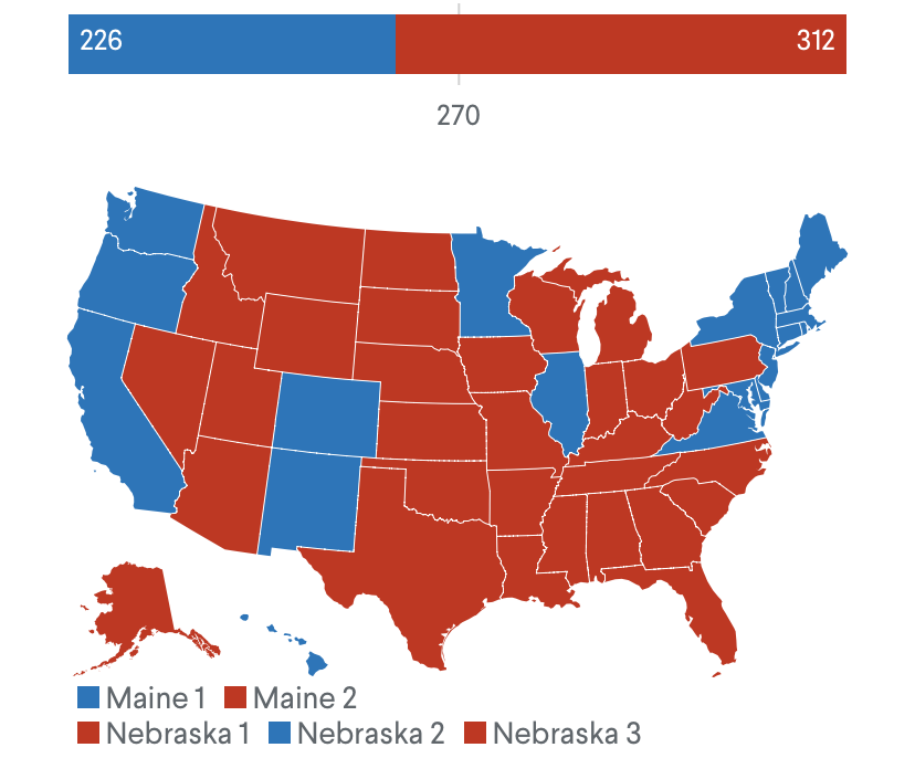

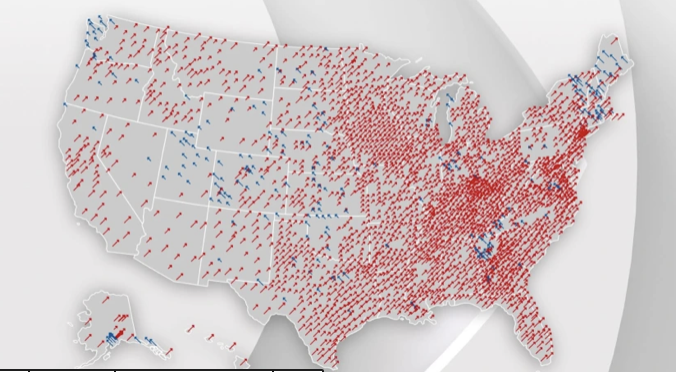


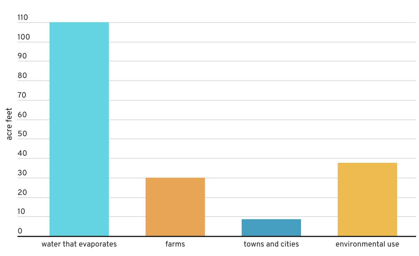
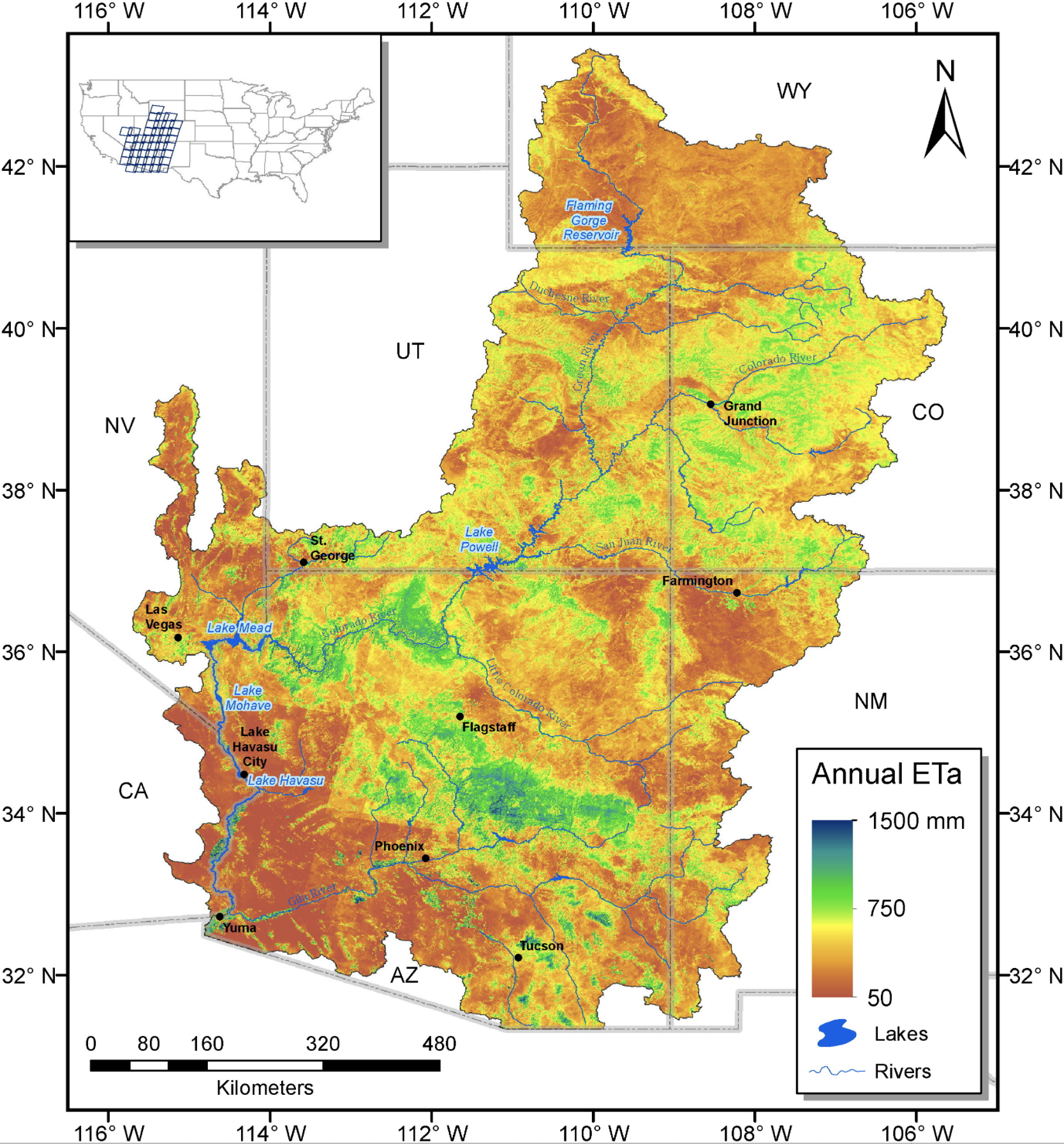


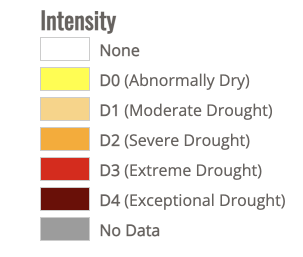
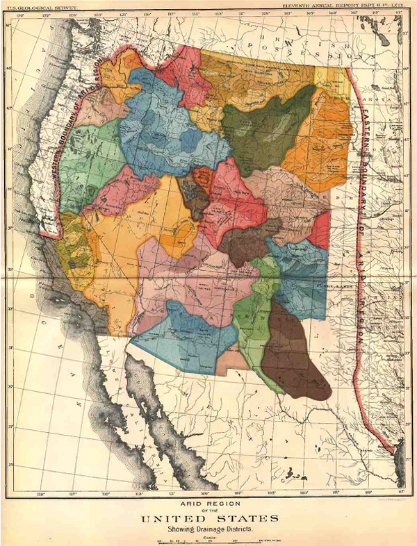


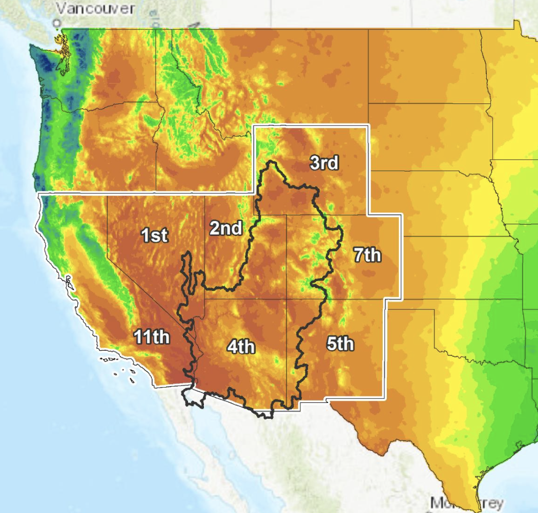

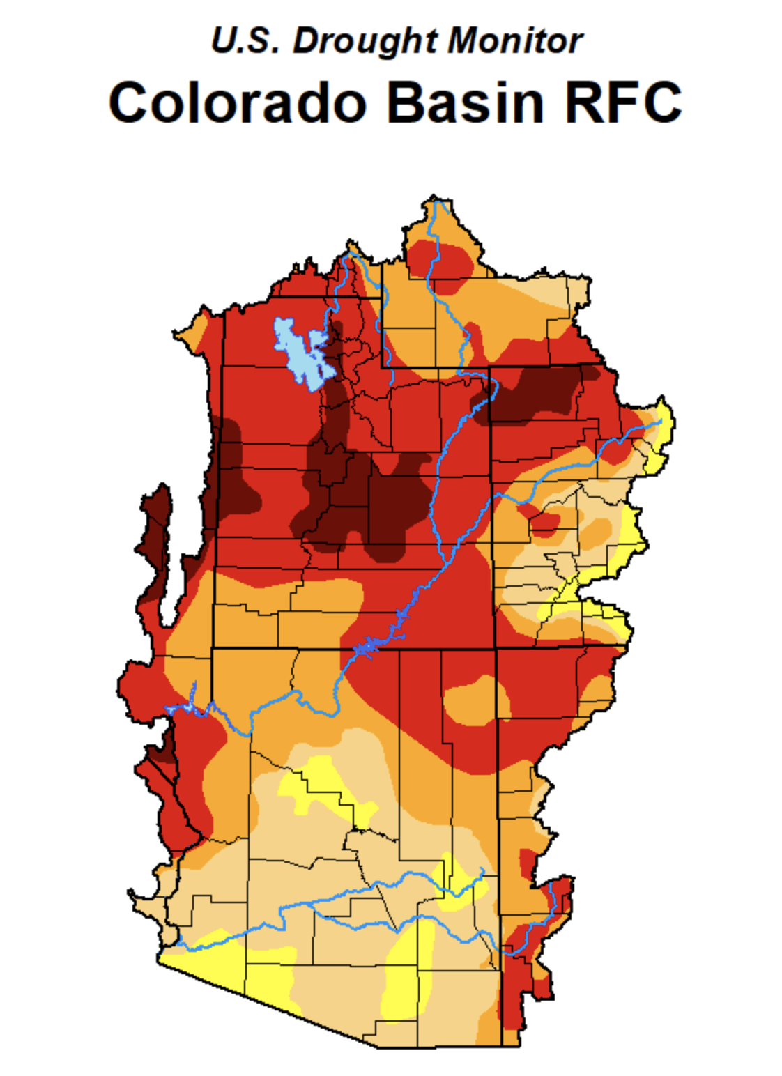
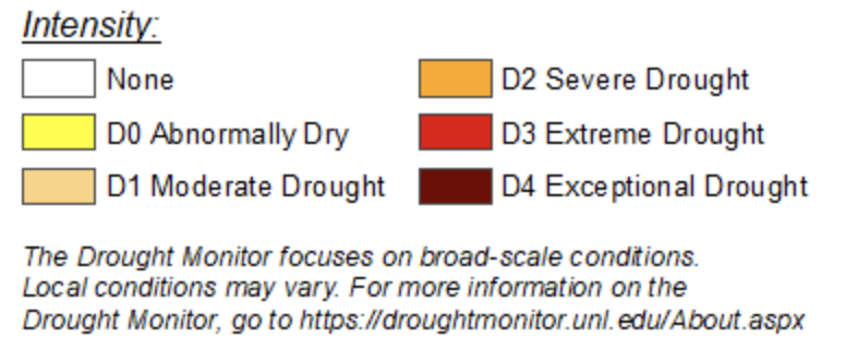
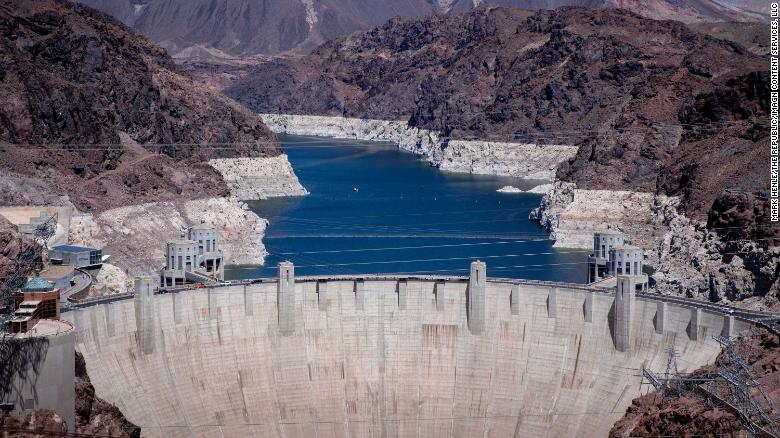


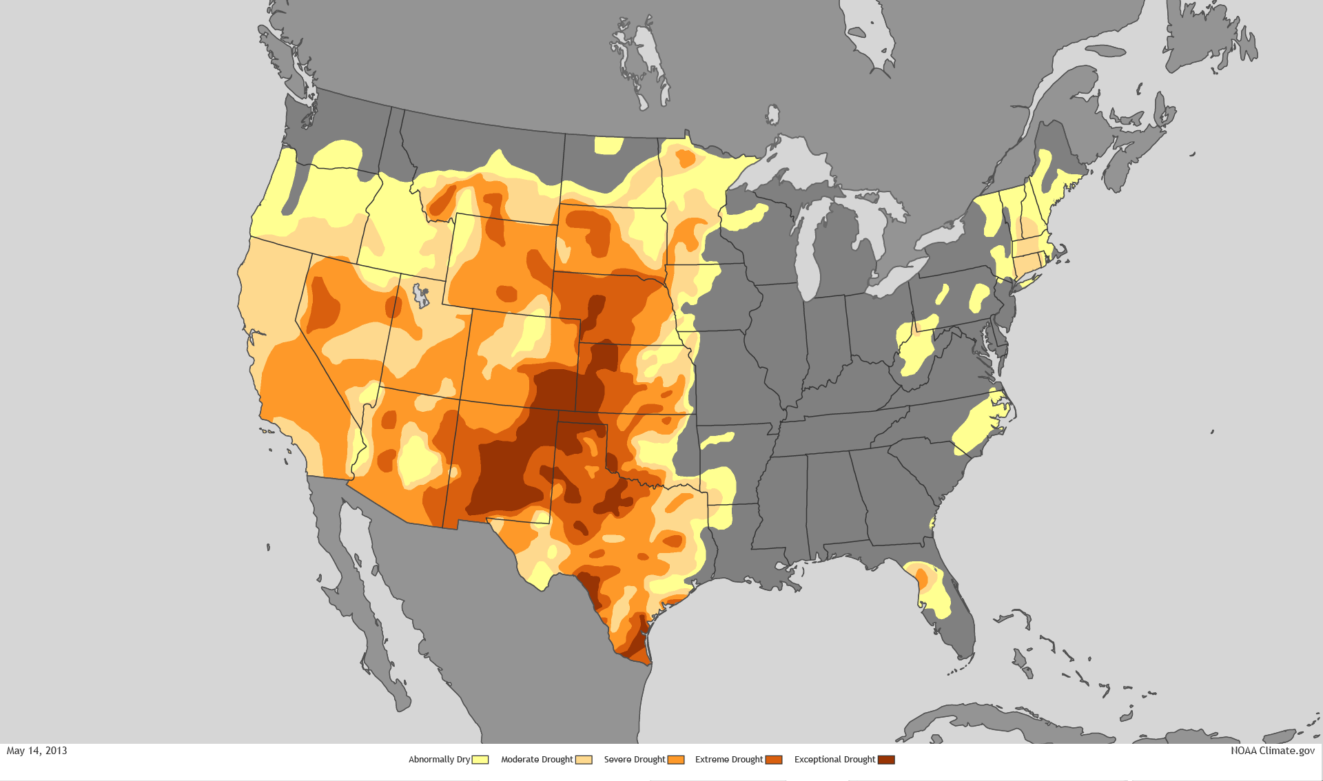
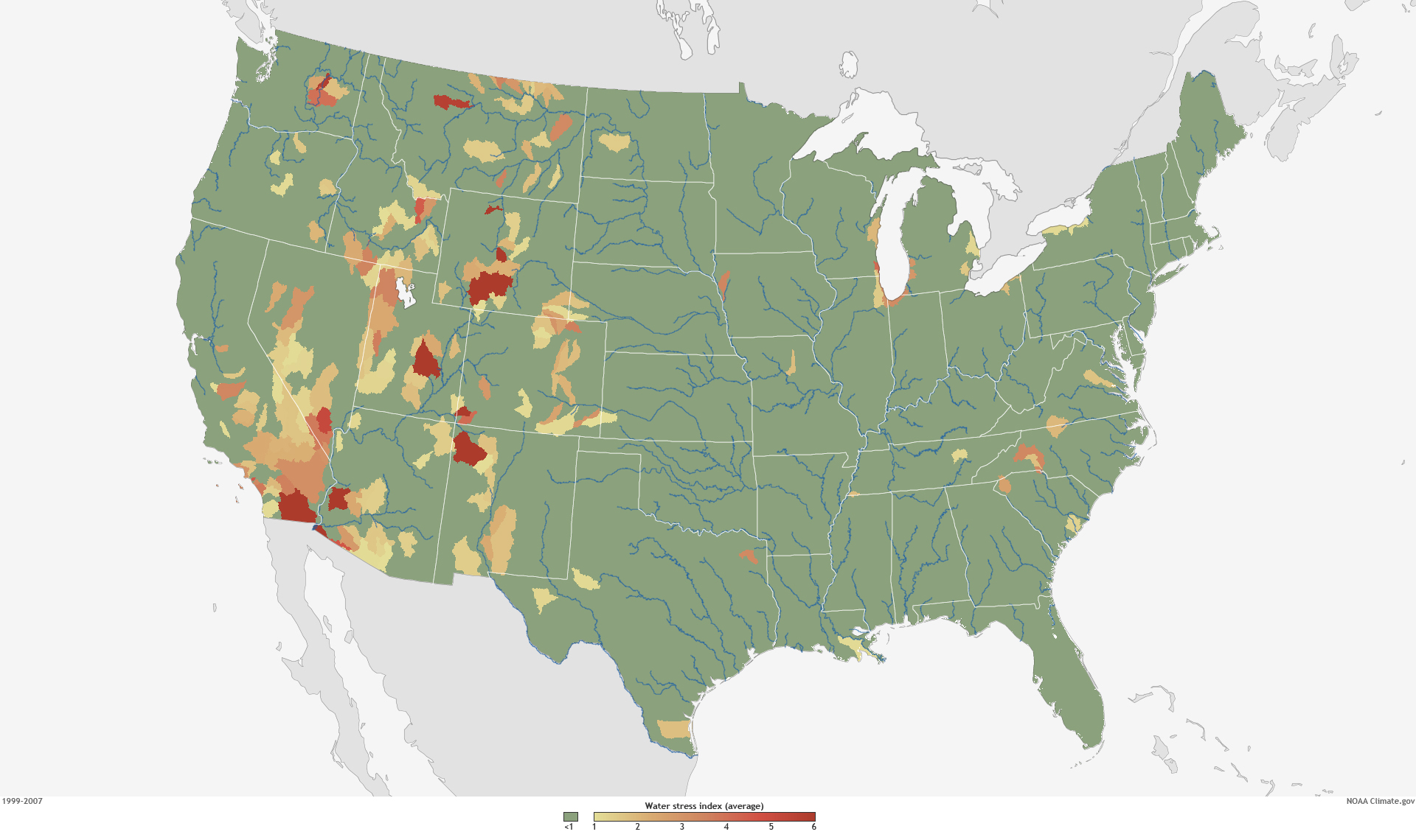

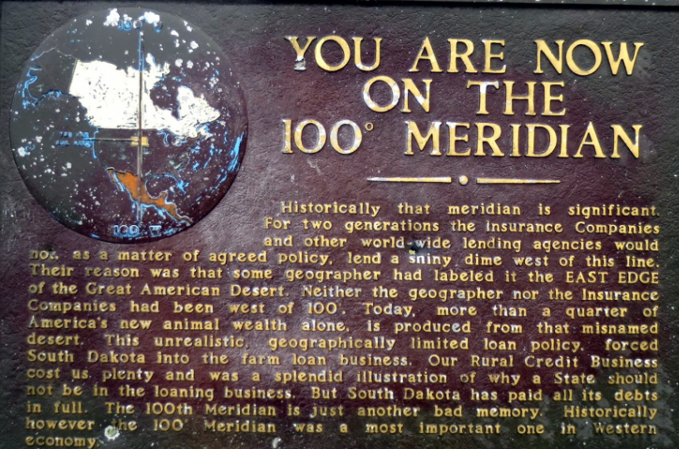

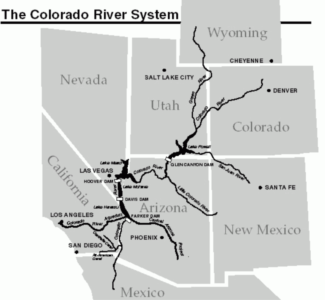


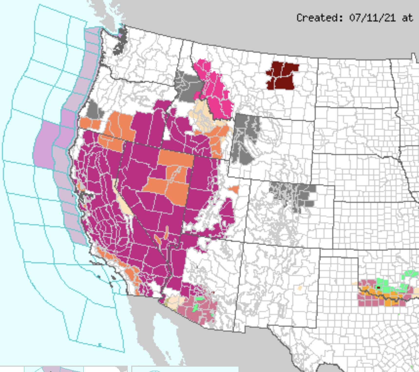


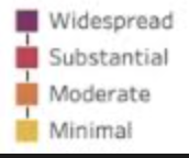

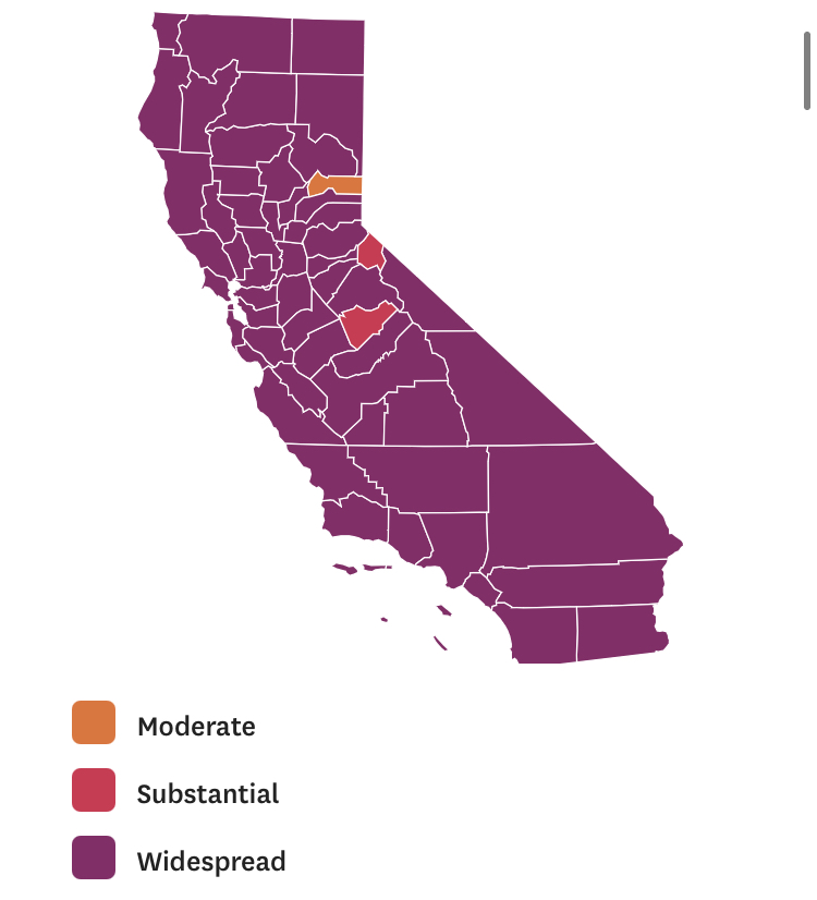


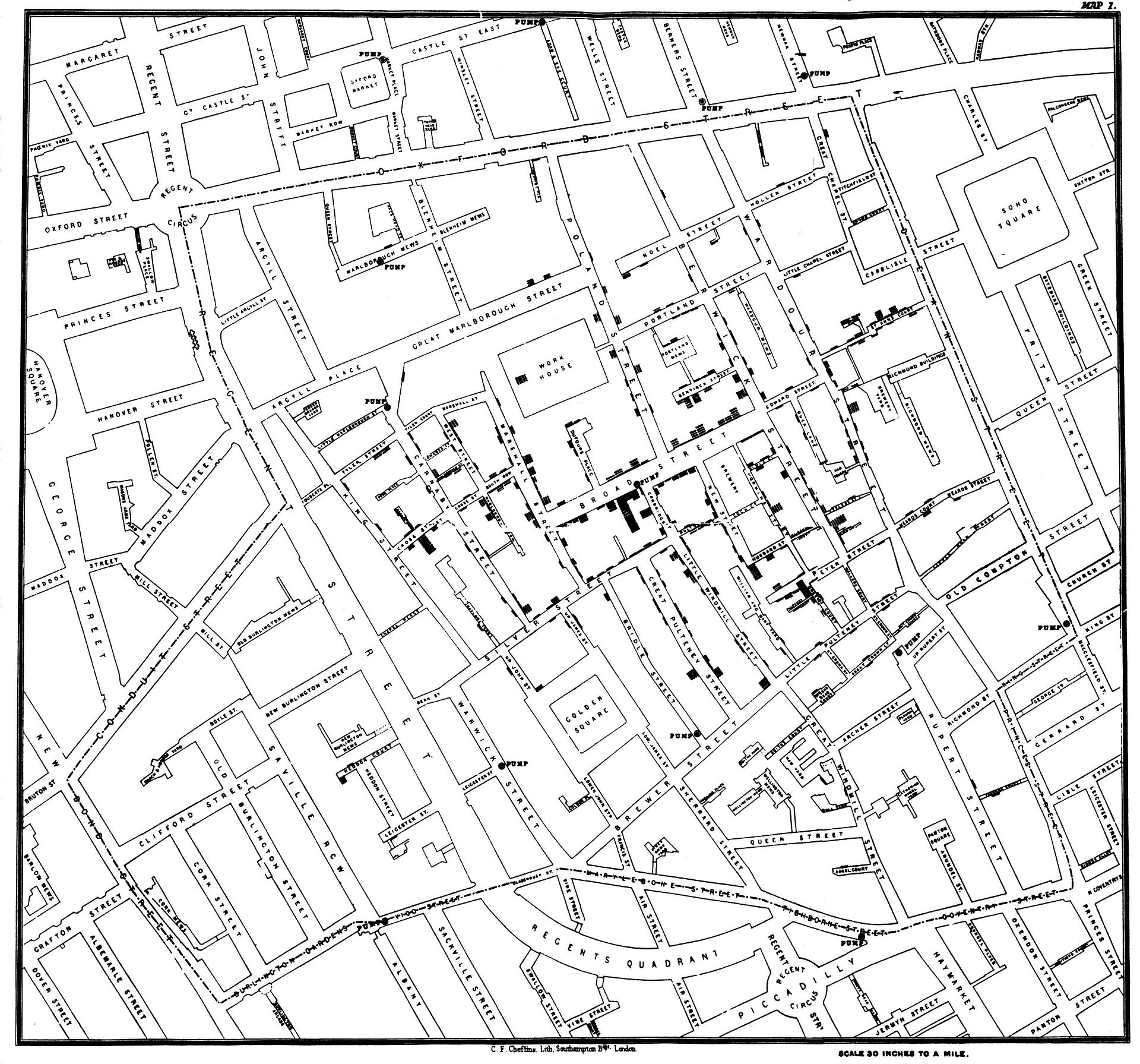
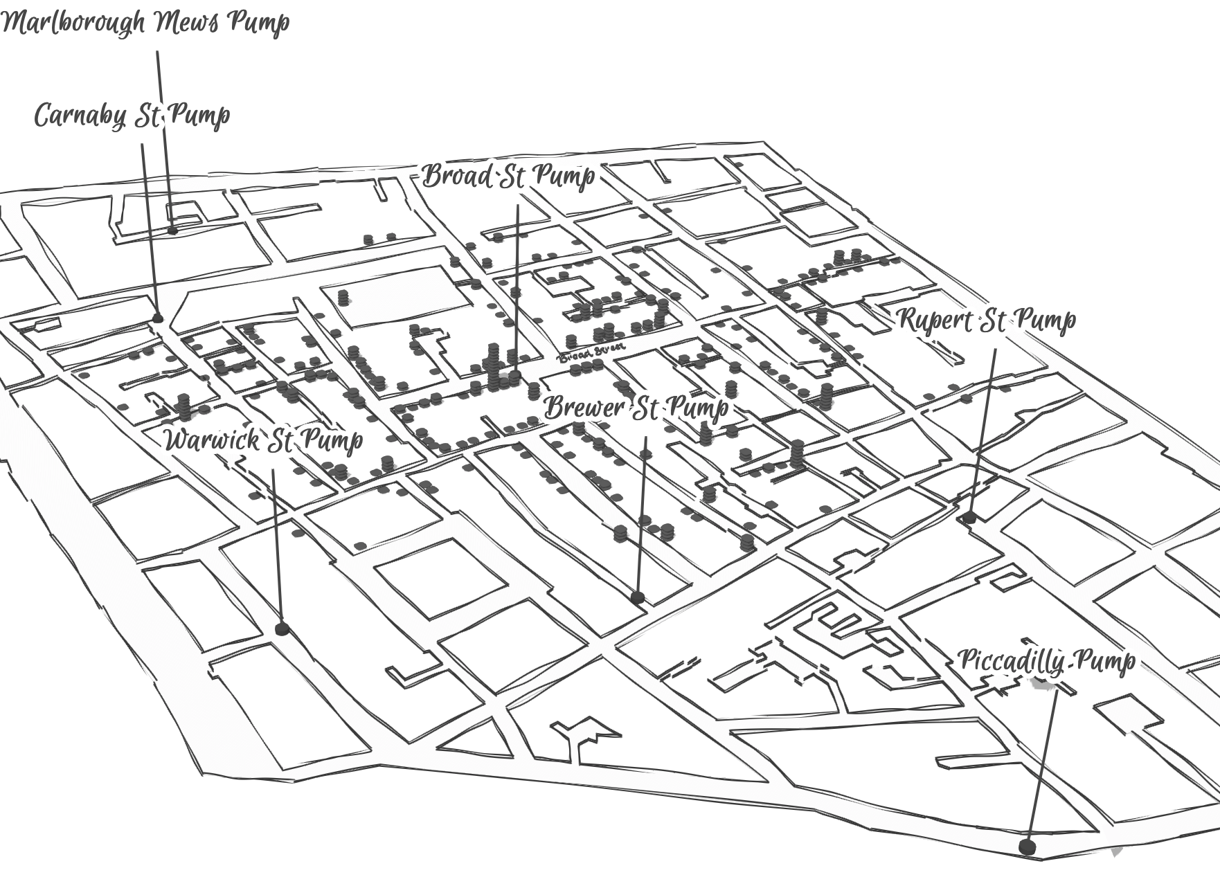

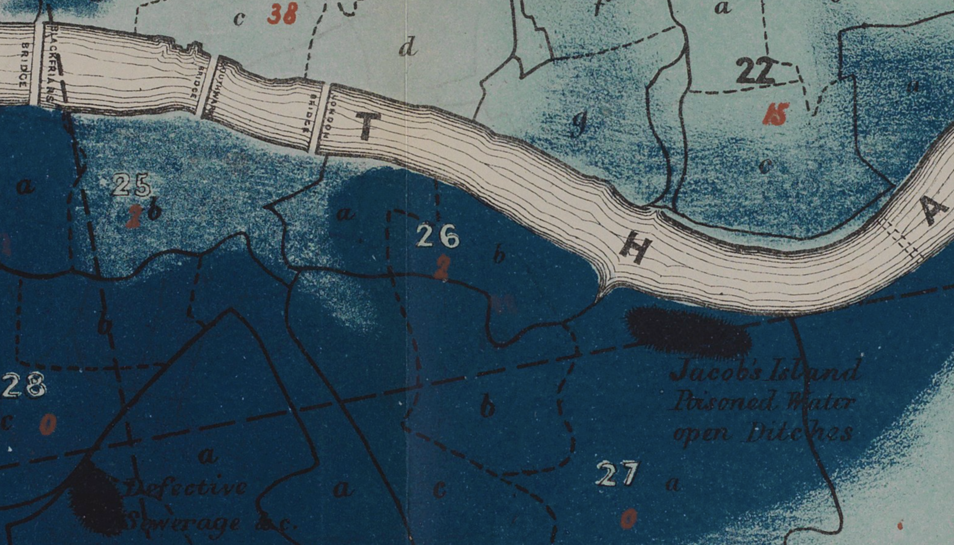


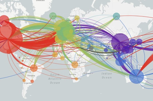


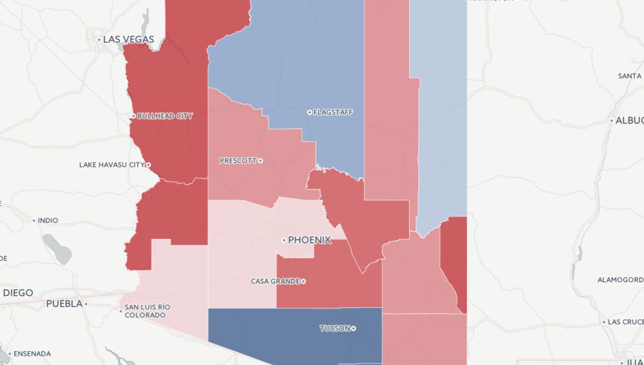


