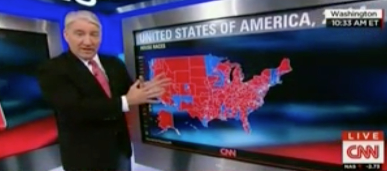
Long before Barack Obama was a candidate for President of the United States, he took time to chastise the nation about the tyranny of the infographic that divided the nation. Obama used the occasion of his endorsement of John Kerry’s nomination at the Democratic convention in Chicago to remind the nation of the danger of presuming the divide red states from blue states by the clear chromatic fashion that already increasingly increasingly filtered electoral maps of the United States, and has since come to haunt us in the Trump victory of 2016. And if we were energized by the notion of “swing states” that might be shifted to the Democratic column back in 2012 and 2008 that increased the involvement and political participation of many in the electoral grid, the resurgent immobility of the electoral map divided between what seem to be continuous regions parsed into “red states” and “blue states”–
–as if it were permanent divide as well as a fluid choropleth that refracted the spectrum of the American flag. Indeed, the stability of the fractured electoral divide invest a sense of permanence as an electoral landscape, as the two-color infographic seems to have crept into our unconscious: while it may be a proxy for an urban-rural distinction that has been championed both by the Trump campaign and as a dominant gloss of the infographic, has the divide invaded our consciousness in ways we are able to gain little distance?
America was, after all, once collectively energized at the prospect of tilting against the inevitability of a red-blue divide in the nation. If Barack Obama sought to chasten readers of infographics in order to breath life into Kerry’s 2004 nomination as Democratic candidate for the United States presidency, his words were not only energizing, but prophetic of his own candidacy. For they articulated the possibility of transcending electoral divides as a touchstone of his campaign strategy, foreshadowing Obama’s later electoral success. And when we hear Donald Trump’s celebration of the “heartland” as the ‘Real America’ as if it might be searched for and found on the map, somewhere far away from “coastal elites” or intellectuals, it serves to conceal Trump’s truly narrow electoral victory by articulating a “real America” with which we on the coasts lost touch. The spate of much-publicized post-election pilgrimages into the “heartland” by Mark Zuckerberg as self-defined coastal elites sought to find”normal America” needs to be rethought: it seems to project a creation of the very infographics we’ve long consumed to understand democracy, or as a surrogate for democratic elections, more than a real place. For where we find “the real America” alleged in so many maps in the contiguous sea of red–
–we have recently found that the red is both far more fractured, and even often echoes the very sort of “news deserts” that are associated with the dominance of local news in media markets dominated by the Sinclair Broadcast Group, whose dissemination of a right-wing agenda to the televisions of 40% of Americans seems to have increased polarization in the last election. The decline of local press–and the absence of paper newspapers–seem in another reminder of how the end of the local reporting poses deep dangers to our democracy–and invites unpredicted sorts of vulnerabilities.
Vox, using dSinclair Broadcasting Group data cross-checked with Nielsen; darker areas denote where Sinclair runs more than one station
The divide between red and blue masks the dominant place of far more determining sites of constituencies that are more up for grabs–and my determine the election as extra-urban areas that are demographically distinct, and difficult to cast as blue or red. The refusal to divide the nation into red and blue states, an increasingly meaningless unit, opened the possibility for change that the dominance of infographics in mediating and reframing our democracy has militated against.
Back when Obama energized the convention by reassuring the nation as well as delegates who had assembled in Chicago that, despite the evidence of infographics, the fissures of a fractured body politic that many maps continued to project were not destined to divide the nation: “We’re not red states and blue states; we’re all Americans,” Obama urged, “standing up together for the red, white and blue,” even if we were powerfully represented as contentious factions on electoral maps. The reservations that Obama expressed was compelling as an alternative vision of national unity; it in a sense under-wrote the mantra of “Hope” for a new way of seeing the nation, although this division seemed to return with a vengeance in 2016, as if it haunts the nation.
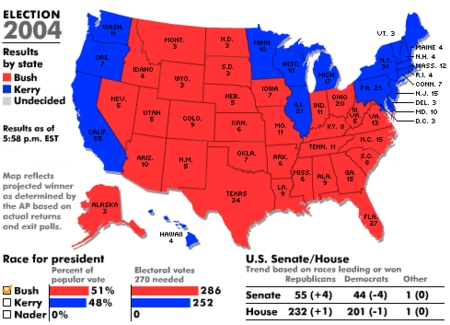
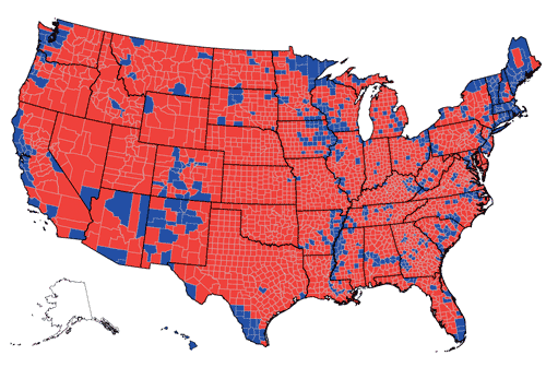
The divide was, perversely, as powerful back in 2004, back when Obama first chastised the nation so firmly for having adopted the divide as inevitable. So rhetorically powerful was the visual image of national unity as a rebuke to the fracturing of the map to announce Obama’s oratorical eloquence to the nation. It seemed a healing balm for a riven republic, even as the 2004 election, despite its clarity of divisions by state, trumpeted in a powerful infographic that suggested isolated bodies of blue set apart form an apparently alienated flyover country that blared bright red indignantly–
USA Today/BeldarBlog
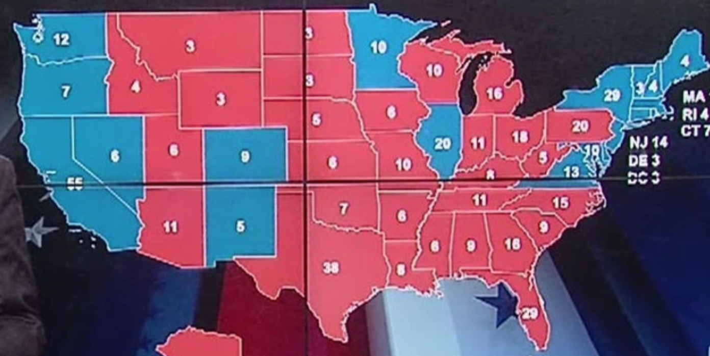
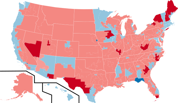
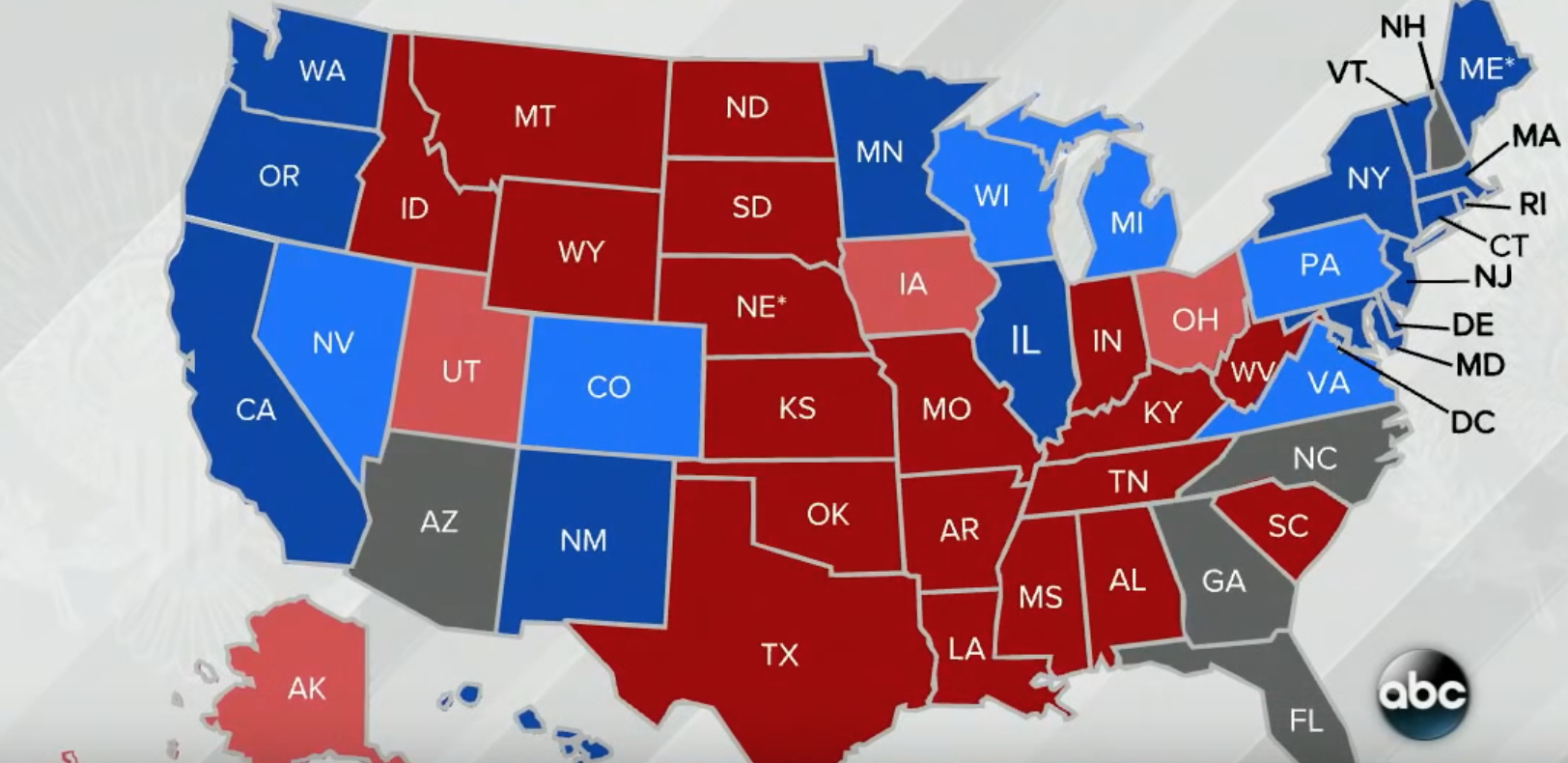
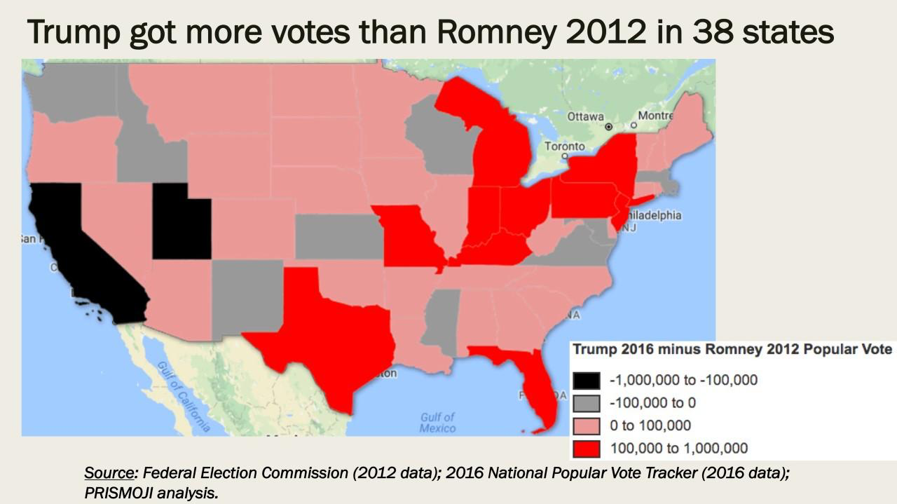
–in ways that were echoed if not accentuated in the county-by-county breakdown that USA Today issued the day after, and the way Bush dominated what have been called the “battle-ground” states–then Arkansas, Florida, Minnesota, Missouri, New Hampshire, New Mexico, Nevada, Ohio, West Virginia, Pennsylvania–as he did nationwide, even if the distribution didn’t break down at all so smoothly along state “lines”–
–to muster the bulk of electoral votes out of the hands of California, Illinois and New York and served to create a solid electoral alliance all the better able to isolate Texas.
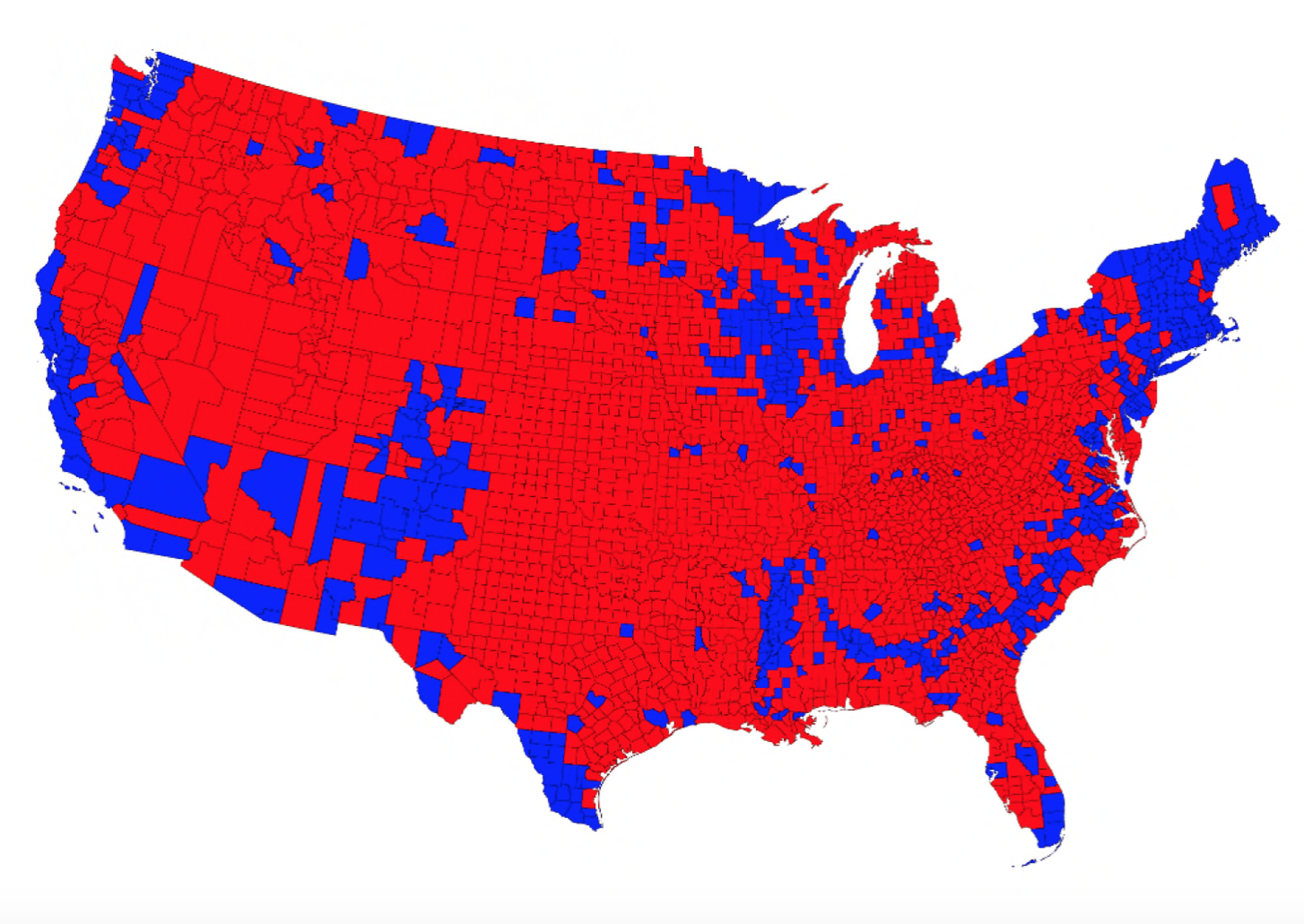
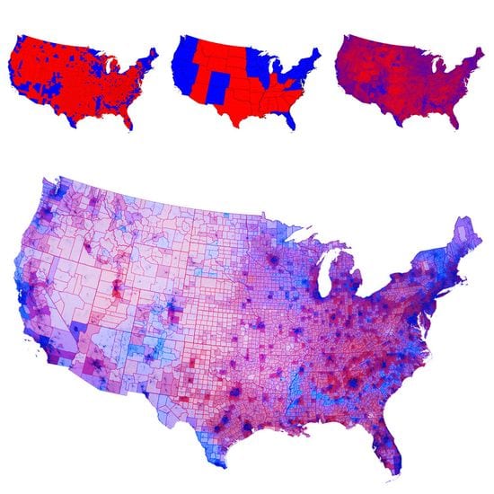
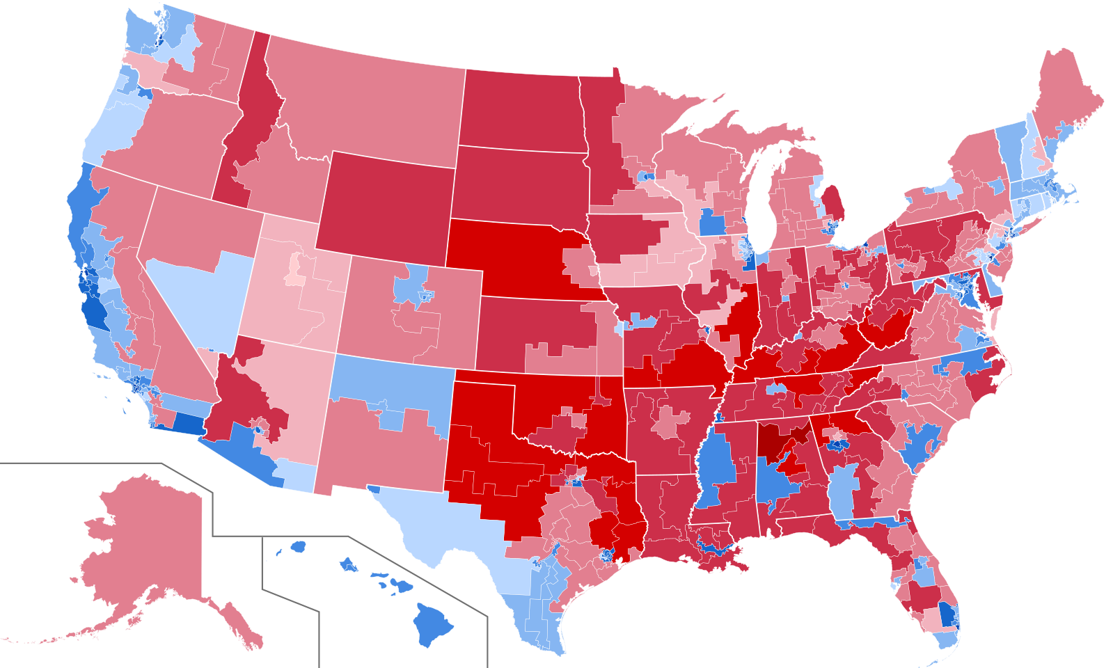
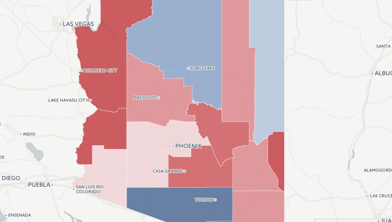
The “real America” might well lie in the edges of the blue and red, or the “purple” counties where political debate needs to be foster and occur. Indeed, the image of divisiveness haunted the political imaginary of the nation so much the nation may have yearned for imagining a new collectivity by 2008. Despite the fragmenting of the electoral map that occurred in 2004, where states seemed to vote red in their entirety, it might be noted that the same map could be resolved, in a district-by-district image of magnitudes, in a far more complex picture of the deeper red areas perhaps aligning more clearly with states than the more selective distribution of the strongest Democratic voters concentrated in regions voting Democratic–the “blue”–
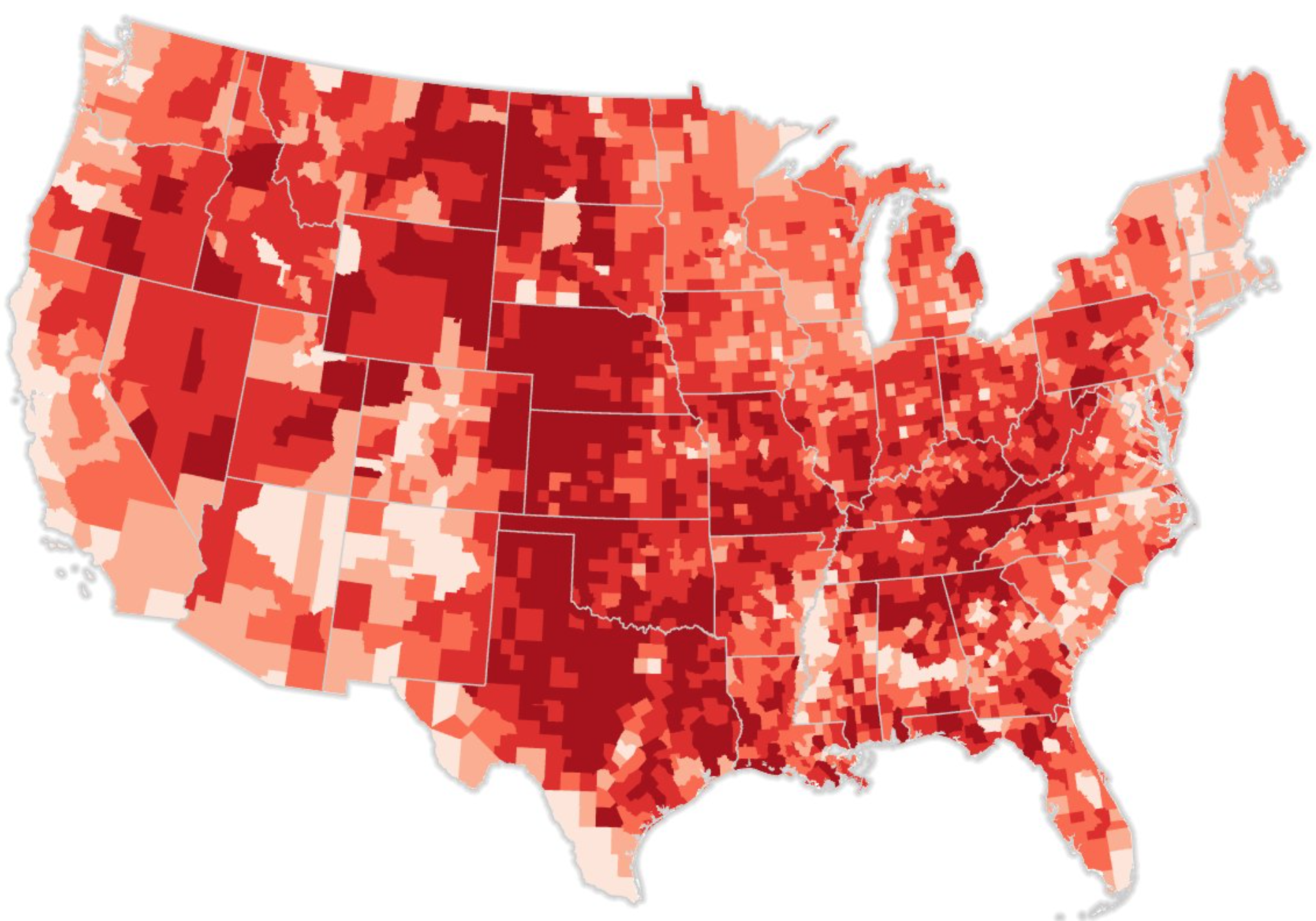
–that is echoed in the far more complex county-by-county picture of 2016, whose shadings are much more telling of political truths: despite the image of a “heartland” or a true America that is red, many of the areas that seem deep red on the electoral map are indeed light pink or shaded, and suggest that these areas–the less polarized–might be the “real” America much more than the deep red areas, which seem in fact the most remote.
The fracturing of the electoral map by manipulating media was not new to such outlets as Sinclair Broadcasting Group: Trump turned to the Sinclair Broadcasting Group, noted Media Matters, for interviews to reach a broader demographic, using a group notorious for revealing their boosterism for conservative causes, from ordering stations in 2004 to run anti-John Kerry segments over normal programming over the country–
–using 173 television stations in 81 markets along “180 program streams” in 51 markets:
 Gray Television Group Station Map
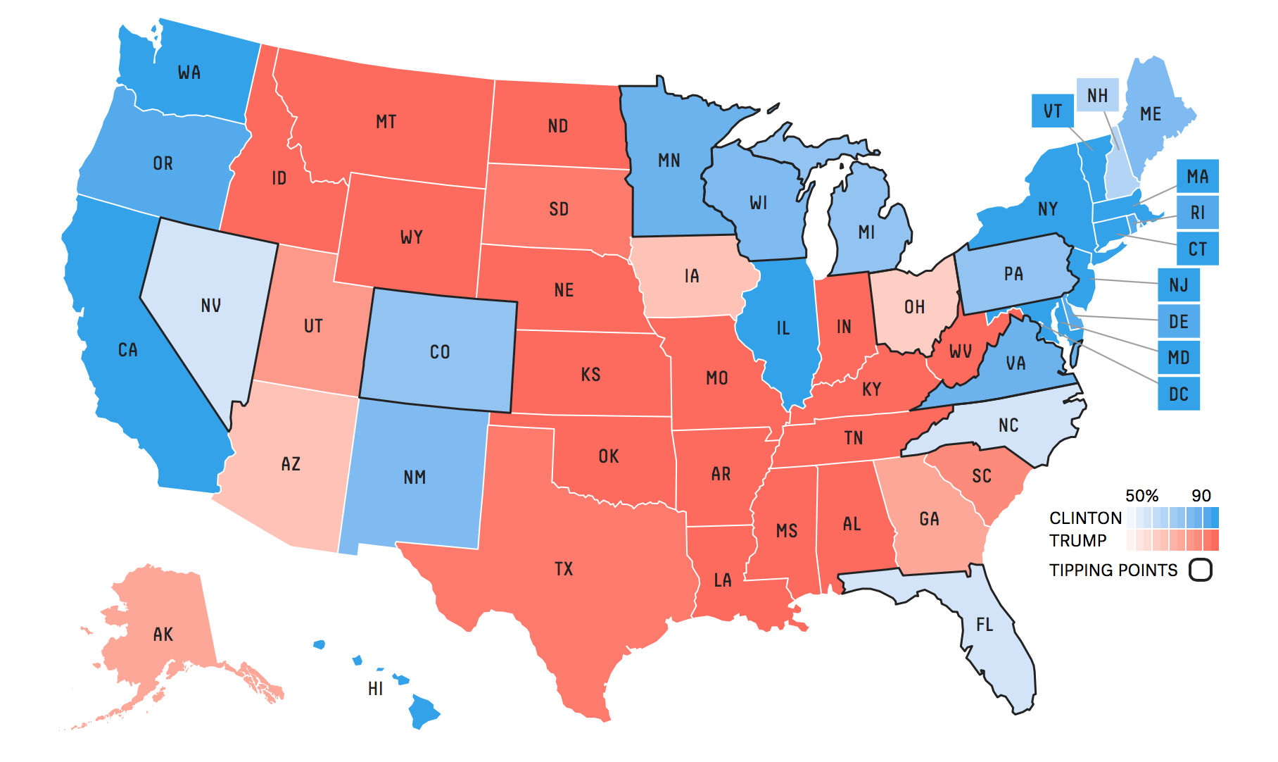
–as Trump sought to eat into Hillary Clinton’s midsummer lead in national polls, by speaking to voting markets in newly “purple” regions as Iowa, Michigan, Wisconsin, Florida, Colorado, and West Virginia, to circumnavigate traditional media outlets. We would do well to remember that, in ways that raised raised eyebrows for some, that by November 8, 2016, areas like Iowa, Ohio, North Dakota and Arizona were suddenly shifting pink–as would Florida and North Carolina, suddenly an increasingly light blue.
1. There was a time when the red state/blue state divide was not so powerful in our minds. The power of such an image of electoral unity was already so ingrained in 2004 that its rejection provided more than a powerful rhetorical image for the man who would be elected President in 2008. The image of a nation that departed from a fractured infographic became central, in many ways, to Obama’s campaign, and a powerful image of a new political future. Obama recalled the problematic nature of the chromatic division in his own campaigns several times, most famously, perhaps, to rebuke the danger of returning to a chromatic divide in 2012. In the heat of the Presidential campaign for his second term, President Obama redeployed the refrain in a tweet simply asserting that “There are no red states and blue states, just the United States,” as if to dispatch or denaturalize the splintered red state-blue geography that haunted our diet of infographics in Presidential campaigns. When Obama penned the figure of speech in 2004, before addressing the Democratic Convention in Chicago, John Kerry so quickly recognized its rhetorical power that he asked to adopt the image in delivering his acceptance of the 2004 nomination, although we’ll always remember it as Obama’s.
State Senator Obama warned somewhat prophetically of the difficulties implicit in any national mapping that ran against national interests; the junior Senator from Illinois took pundits to task for presenting a picture of the nation that served only “to slice and dice our country into red states and blue states–red states for Republicans, blue states for Democrats.” Obama called out the two-color maps as perpetuating a harmful vision, apt to diminish voters’ sense of their ability to effect political change, and diminishing voters’ agency, by inscribing the voting patterns in a static map that fractured the nation into blocks of like-mindedness as if to portray electoral results as predetermined and not contingent. (The notion of “swing-states” would only emerge as a way to challenge the authority of this two-color map, of course, during Obama’s own 2008 candidacy.)
But the divides that we have come to perpetuate again in the 2016 Presidential election may suggest that the divides were less starkly drawn between red and blue district than Daily Kos Elections calculations suggest, which shows the dissonance between the map of congressional districts were poor vehicles to mediate the popular vote: for a map of districts distorts geography; the increased crowding of the population in districts that vote “blue.” Yet can the divide in the nation in fact be best understood by continuing to contemplate this fracturing, and not attending to the sites of smaller electoral margins–where the decision occurs, or at least which create a sense of tipping points, where the truly consequential electoral decisions seem to be increasingly made? Obama’s caution not to be seduced by slicing and dicing the country seems particularly perceptive, and suggests the danger of trusting a chromatic divide of the country.
Xenocrypt
2. Obama’s phrase has gained a quite surprising second life in the recent unpacking of how the electoral outcome of the election was sought to be strategically manipulated through the manufacture of a clearer red-blue divide through the voting patterns of purple states. What were words of caution have gained a new concrete sense after the indictments released by Robert S. Mueller III have revealed outside interest in sharpening contrasts in the electoral map in the 2016 Presidential race, that suggests that the infographic has indeed gained an upper hand in the electoral process in even more dangerous ways than Obama had described.
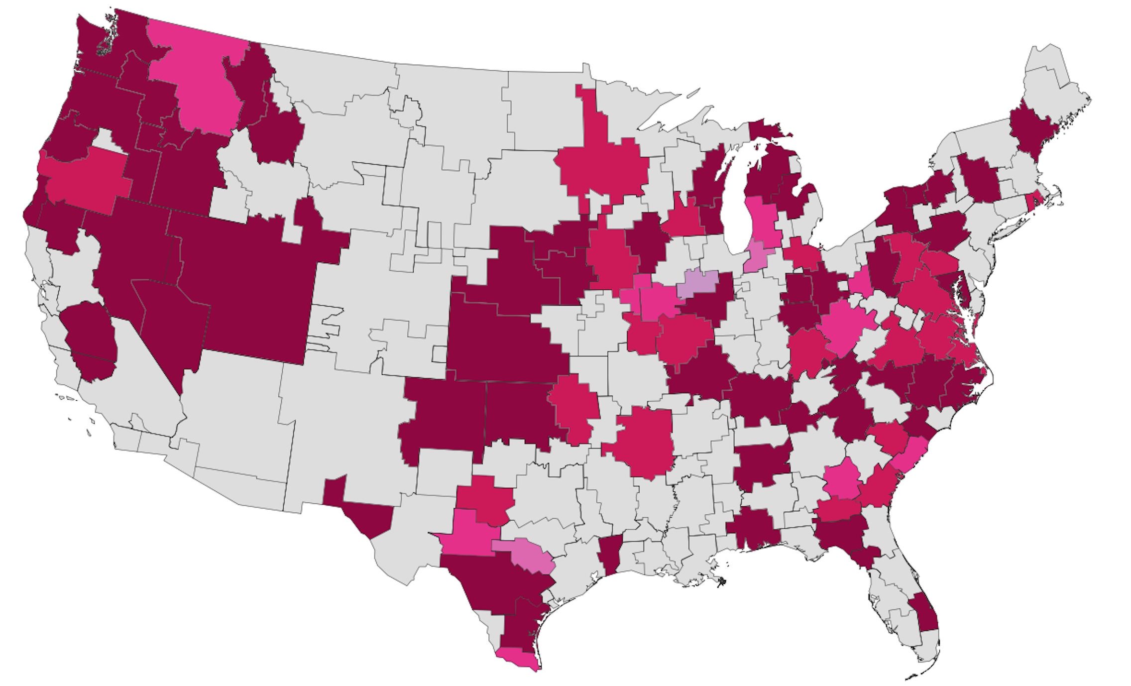
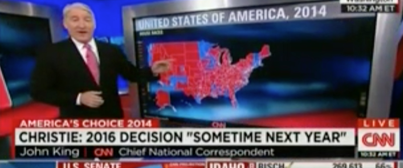
It’s indeed pretty hard to see the United States divided into “red” and “blue” states, isolated from the world, in the same way again, as if each state shaded pink, light blue or strong red and dark blue in complete autonomy, showing their political temperatures in isolation of from the outside world. Indeed, although the 2014 House of Representative race was striking for its salmon pinkness–and the deep red of the US-Mexico border, as well as Iowa, such colors are increasingly difficult to be seen as self-contained or removed from the larger world.
2014 House of Representatives Mid-Term Election
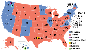
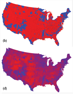
Back when Senator Barack Obama so eloquently endorsed John Kerry as a presidential candidate, his admonition–or quite gentle–scolding struck such a chord not only as an effective image of patriotic identity, and not a reality check. But the powerful phrasing became a theme of his campaign, and it was unsurprising when Obama returned to it in his 2008 victory speech in Grant Park, and welcomed the good news of what seemed a remapping of the United States, and he took the time to congratulate American voters for having “sent a message to the world that we have never been just . . . a collection of red states and blue states” and which confirmed that, appearances to the contrary, we “are, and will always be, the United States of America.” The words had reverberated in many ears with a sense of freshness, from when they were first uttered, as if seeking to disabuse television audiences of the image that had haunted the nation from before the 2000 election, but which had stuck uncomfortably in the background of the nation’s cerebral cortex, creating an image of sharp divisions,–even if those divisions were far less clear on the ground even in 2004, as Obama had suggested–but full of chromatic variations, even when they appeared entrenched, with some eighteen to twenty states mapped in varied shades of purple. The blurred nature of this dive into voting habits as much as patterns suggests a point-value to political preferences that is misleading, but as a snapshot of the body politic, it suggests diagnostic tool that was valued in altering electoral outcomes as much as the image of individual agency that Bascom Guffin worked to create, using the concept that political scientist Robert Vanderbei had in fact developed for the 2004 Presidential race. For the map suggested the actuality of the more complicated chromatic divides that Obama had then recently described.
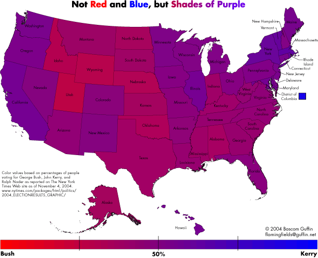 Bascom Guffin, “Purple Nation”
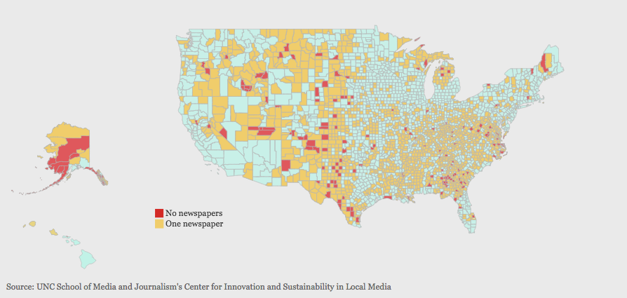
Yet the dynamic of the purple regions seems to have been increasingly changed by the emergence in many places of “news deserts”–sites of no or only one local newspaper–in a phenomenon that is increasingly internet-driven, and reinforced by the growing number of news deserts across the nation. As mapped in interactive form on Carto to reveal the spaces afflicted by the least local news sources–counties with no or one local newspaper, zero suggested by the lightest pink or one by salmon–
 Columbia Journalism review/C. Chisolm
–the holes within the information network of much of the nation can be observed that intersect with once purple areas in striking ways, and the hollowing out of a news community in both rural and some urban areas. The growth of “media deserts” up to 2014 mirror the end of Obama’s second term, and the growth of an alt right movement that has gained an increasingly dominant voice in the American political landscape, where the diminution of local news sources has altered the nature of public opinion have left increasing swaths of the nation dependent on online news sources, altering the information economy in decisive ways that helped allow red/blue cleavages to grow, and polarizing news agencies to reach a larger and more decisive constituency.
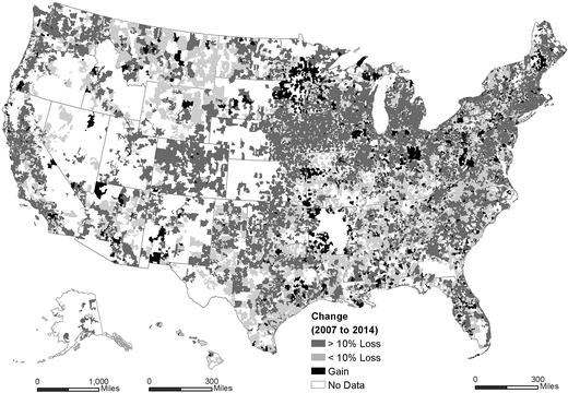
Even more compellingly, it suggests the end of an economy of local news over much of the nation. huge gaping holes have widened to leave the nation like a hunk of Swiss cheese, in the southwest, modest, and northwest, as the outbreak of three wobbly but hovering blobs over the nation–including the southwestern border, whose hollowing has left them increasingly susceptible and open to both greater malleability and less reporting of the local consequences of issues of national debate. In this setting, it is no surprise, perhaps, that internet-driven concerns about immigration, crime, and terrorist threats have been stoked and enflamed with greater ease–and populations most easily subject to outside interference because they lacked the resilience of local news. In what almost seems a free speech violation, and a difficulty of generating public debate, the growing holes of such news deserts–which, much as it would deprive epidemiologists of needed tools to measure local rates of the growth of infectious disease or influenza–create barriers to assess the local impact of issues exclusively cast in national terms? Is a decline of local reporting indicative of a qualitative change in the nature of communities, now more likely to adopt oppositional agendas rather than articulate their own? Or is the rise of “news deserts” congruent with the increase in broadcast news that casts both global policy and national politics in increasingly oppositional terms?
 Dom Smith/Stat News
The expansion of such “news deserts” where no or only one source of news exists, according to the American Alliance for Audited Media. AAUM measured the number of papers that reached at least 1% of each county, and haven’t converted to an exclusively digital form, as a proxy for the decline of news publications, and the increasing reliance on non-local media; while a focus on newspapers is questionable in an era of the dominance of television and on-line news, the hope to measure and map the reduction of local media within issues about issues of national consequence suggested the distinct shift in public debate. Indeed, shuttering many smaller news publications, both urban and suburban, deprive communities of a local voice in events that seem to spin far beyond the local in increasingly challenging ways, and place global issues–undocumented immigrants; terrorist threats; refugees–in relation to local concerns in ways both challenging and difficult to grasp.
 Columbia Journalism Review–light pink without local news sources; salmon with one
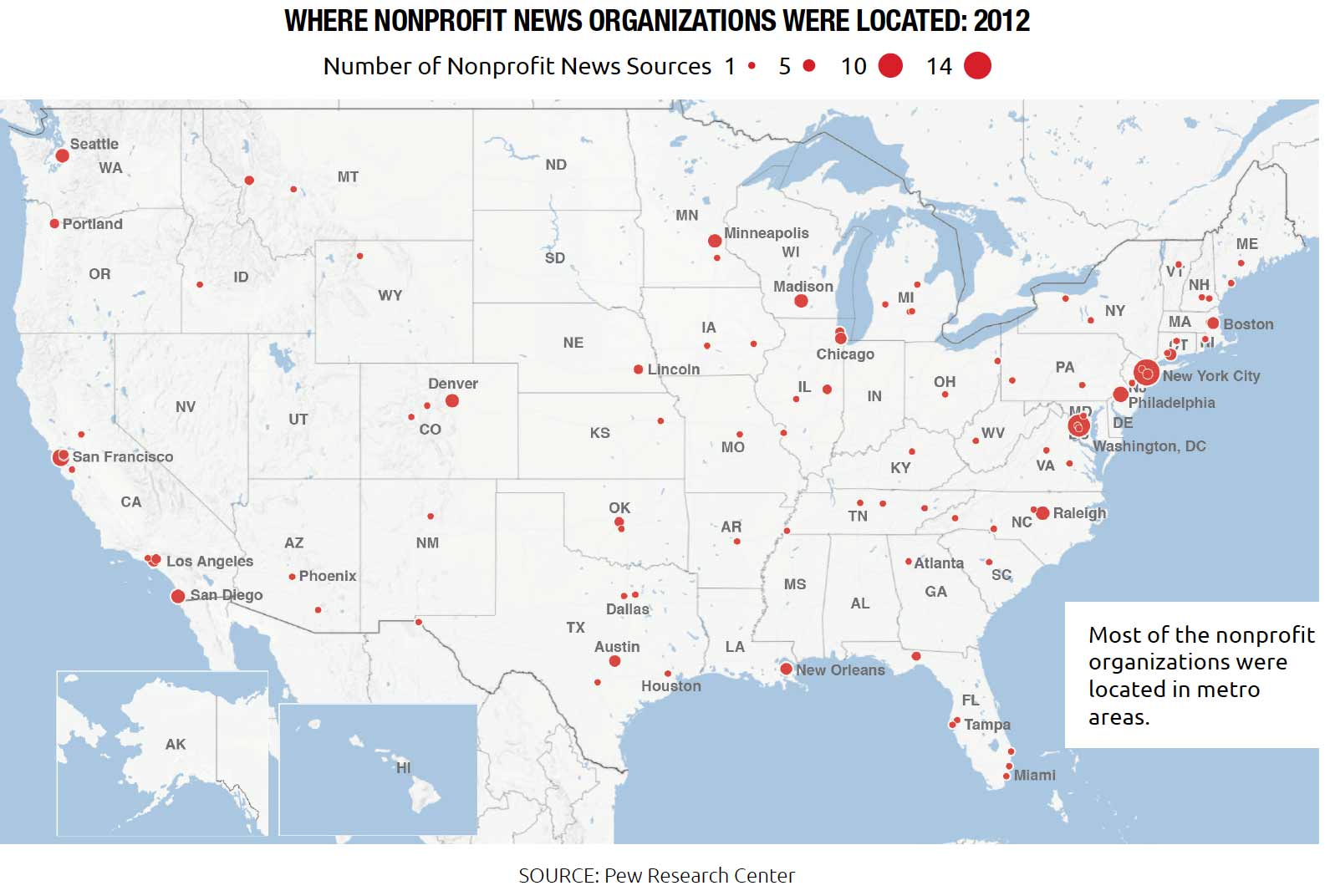
Considered another ways, the near-absence of non-profit news sources outside of metro areas, and few sources of information were available in small towns, and indeed outside the coasts–understanding the “news desert” as an absence of non-profit news, a dearth felt nationwide save in several cities as Denver, Austin, New Orleans, Madison, and Minneapolis–and to consider the different information markets that exist in much of the nation where Trump performed so stunningly.
Each graphic invites us to examine the category and meaning of the ‘news desert,’ a term by no means clearly defined in an era of online news. Is the fear that a common concern of news media that may itself loose analytic force? Thomas Jefferson insisted that “The cornerstone of democracy rests on the foundation of an educated electorate,” but the expansion of areas without local news venues or voices, or meaningful political endorsements, suggests not only a dangerous remove from national issues, but a vulnerability to external threats in an age where most get their news online and through Facebook feeds–and the expansion of online news threatens to make it impossible for all to feel themselves able to stay informed.
 Dom Smith/Stat News
The gaping holes in the above GIF suggests a growing eating out of public opinion. The hugely successful appeal of Trump’s candidacy in areas of relatively low news presence is not a surprise. Trump was himself quite acutely aware “I doubt I would be here if it weren’t for social media, to be honest with you,” as he told FOX Business Network as the election approached. Trump’s avoidance of the mainstream media was notorious, although the success with which this became a strategy blindsided many. But the sectarian–if not almost Manichean–divisions between red states and blue have been fostered and promoted by a decline in non-partisan or non-profit news sources. And in a new range of articles on the increasingly partisan news offices at FOX or Sinclair Broadcasting, which reaches 39 percent of households in the country before its pending merger with Tribune Media. Sinclair’s strategy of integrating national messages with local news suggests particularly dangerous ways of masquerading as local news–and driving fear in increasingly oppositional ways, accentuating the blue/red infographic in ways that were not even on Obama’s radar, although he perceptively sensed the divide emanated from screens more than it existed on the ground.
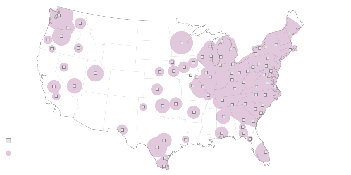
3. The increasingly oppositional divisions are not evident in a stark division of political preference and allegiance within the current national map, and enabled a targeting of the parsing of populations and festering of divides. Indeed, the success of the Trump team may lie in the address of the purplest populations of the nation, in which the success of the Trump vote can be mapped in what seems an inverse relation to printed news subscriptions: ‘news deserts’ provided a crucial core constituency for Trump’s success, or at least correlate strongly, if one takes the shaky database of newspaper subscriptions that has been provided by the Alliance for Audited Media–an admittedly incomplete dataset whose questionable focus on subscriptions to local newspapers–not really adequate as a proxy for “news deserts” in an age of television and national news, but perhaps suggestive of the power of the local editorial endorsement–even if the description of “traditional news outlets” remains a questionable metric for access to news information.
 Limited Subscriptions to Local Newspapers in America
The growth of online news seems to have removed regions of the south and northwest from the figure of the local newspaper reporter. Such a divide echoes the rural/urban divide, and may indicate the remove of much of the polity from public opinion, and a deep-set resistance to opinions broadcast from both coasts during the election seems rooted in the erosion of news communities in ways that demand to be mapped. The growth of venues such as Sinclair Broadcasting provided ways of growing this divide–or fissure–through a virtual stranglehold on news sources in many sites.
4. Obama successfully downplayed deep differences between red states and blue states by more than powerful and affecting rhetorical device. His bridging of a chromatic divide was not only stirring not only to those in cities, but comforting in small towns. By 2008, Obama’s audience were happy to accept as an invitation as his own coinage, and take it as an invitation to put aside animosity across electoral divides. But the very notion of such a blue state-red state divide–and the prominence in such a divide of the purple–has recently gained new meaning and relevance in Robert S. Mueller III’s recent indictment charging thirteen Russians of waging information wars during the election. For the Russians who were identified as arriving from 2014 aimed to splinter existing political divides by fostering increased dissensus and distrust in the political system in the “purple” states as those where the election of 2016 could be most effectively swung. Indeed, the very vulnerability of the political imaginary that foregrounded a red state-blue state divide for the global image of American politics made something of an unforeseen return, when it was announced that the Russian operatives who had toured several states to conduct something of a political ethnography of the abilities to create greater political divisions and distrust in the political system focussed on the sensitivity of “purple states” as sites to increase and exploit existing political divides, and create increased political tensions in the United States through the results of its elections.
Taking the occasion of the 2016 Presidential election as an occasion to increase political distrust, and for slicing and dicing the nation For the targeting of what were described as “purple states,” in an unforessen appropriation of maps of a less polarized “Purple America” made after the divisive presidential election of 2000, by political scientist Robert J. Vanderbei . The new visualization was widely adopted by the news media as a dynamic form of infographic, using colors exclusively to communicate the political temperature of Americans. Yet the image gained a new second life as it provided a ground-plan for planting social media interventions, Special Counsel Mueller’s indictment reveals that the figure of speech, as well as a concrete metaphor, served to target disrupting political consensus from 2014. Indeed, “purple America” provided not only a target for winning over the electorate for both political parties, but a target for disrupting consensus evident as much from outside of the United States as from within.
If purple can come to seem a sign of vulnerability, this is in large part because of the possibilities of warping through the electoral college produces clear divides, but which indeed offers a sense of stability–affirming a sense of continuities all too easily disrupted by the dogmatic prism of a red state/blue state electoral map, with a brightest red–actually pink–in the Texas panhandle and Dakotas, but the nation is decisively mottled; even in the divisive 2004 electoral map, “red” only dominated Wyoming, Utah, and Idaho, and redness was evident in blue states, as bluenesses in reds. Drilling down so far is not, in many cases, an adequate picture of the political process, but offers a counter-map to the electoral map, that reflects a sense of cartographical insufficiency.
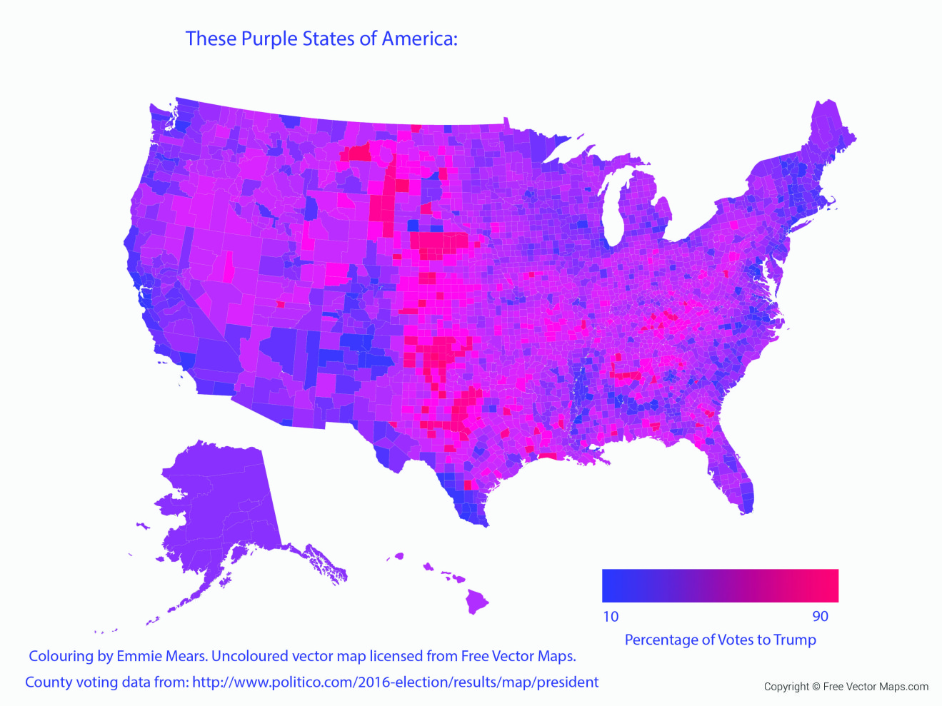 Emmie Mears, “These Purples States of America”
Emmie Mears’ deeper dive into the data is a striking photoshop map and suggests an even greater expanse of purple. The contiguity of purple shades that run the vast extent of the nation pointedly challenged the polarities shared by pundits, and reveals, even in the 2016 Presidential race, a widespread admixture of voting tendencies. Although Obama’s stirring image of overcoming political divides is often retrospectively cast as pandering to patriotism, it increasingly seems an accurate prognosis of a problem waiting to happen. While Mears’ visualization was intended to affirm the plurality of political opinions, to undo the tension of oppositional confrontation that was generated already in the nightly news, the danger of adopting such a syntax of a census–familiar from the Dustin Cable’s Racial Dot map or the American Community Survey, which show both diversity and stark lines of ethnicity, education, and income, the danger of the vesting of political preference as a question of character–and not a selection in a given time and place–of course dilutes the representational institutions, and poses the problem of whether a two-party system can ever be able to refract our political diversity.
But it also suggests the broad openings for undermining that consensus, as the recent indictment of thirteen Russians who conducted preparatory ethnography as they planned a long-term project of disrupting American political consensus that would intersect in unforeseen ways with the candidacy of Donald Trump–a long-time fringe candidate, whose ascendancy to the oval office had been represented as an unsavory alternate future in Doonesbury, but whose own deep hunger for approval, recognition, and adulation seems to have created a tenacity to court audiences without much attention to the public good. Whether or not Trump shared the vision of the electoral map as ripe for exploitation, although his own deep attachment to the two-color outcome of the electoral map hints at how overjoyed he was with the results, the echo chamber of social media certainly helped dilute the deep purpleness of America that political scientists had mapped.
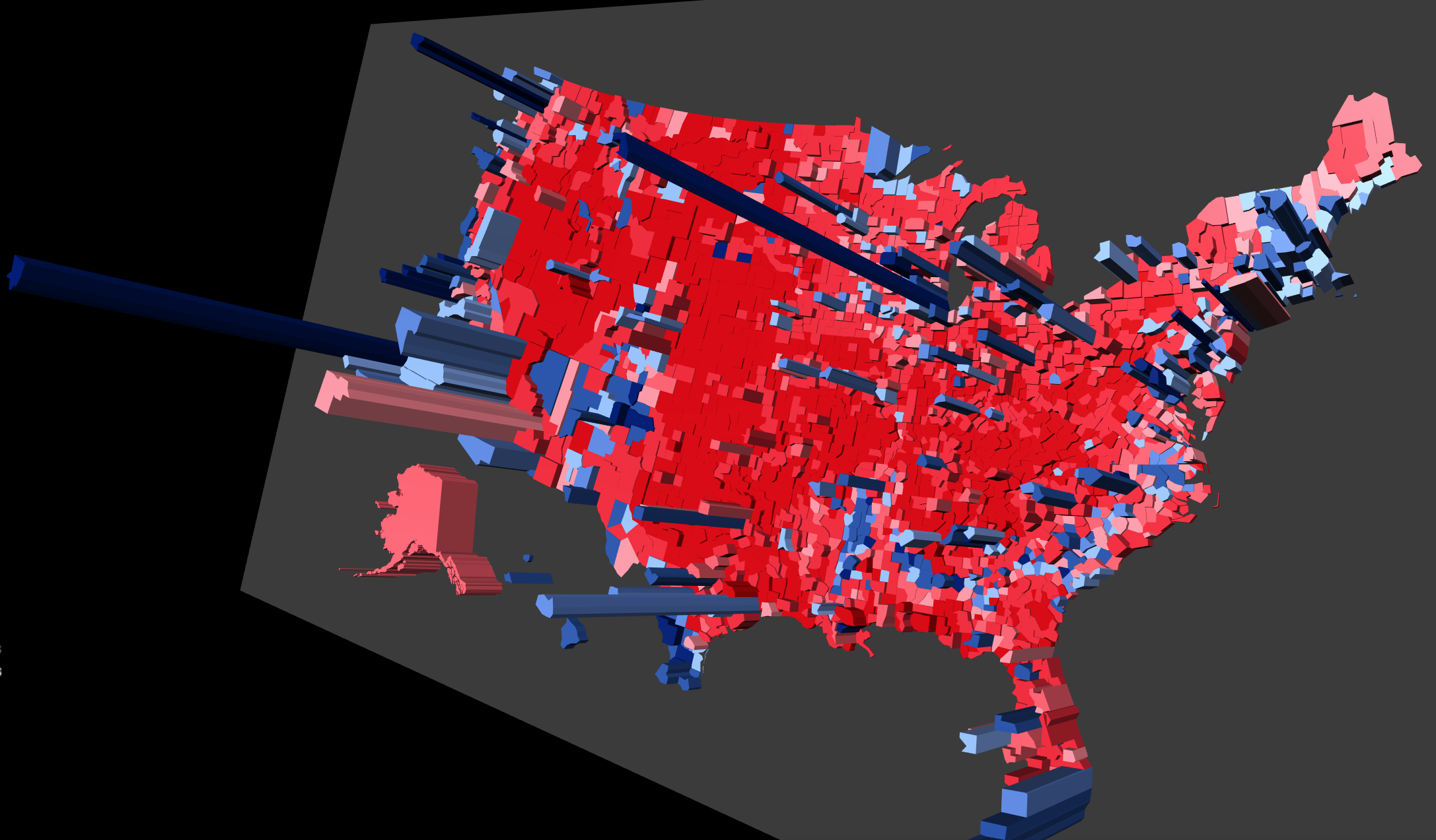
5. If it’s the case that Trump proudly selected a framed map of the distorted division of electoral votes in the White House as one of the first images to be displayed to visitors, he certainly took deep satisfaction at the outcome which was in part the result of targeting public opinion in divisive ways, even if many of the most powerful and divisive images that announced his campaign promises to the public seem to have derived from suspiciously identified social media sources. The gap in population density between flatland of the regions of “red America” is thrown into a relief in a prism map that offers a county-results in a tiltable 3-D electoral map between counties voting Trump from those voting Clinton, a gap evident in economic integration, education, and lifestyle, that reminds us of the gap in media coverage increasingly centered in cities; but if it corrects the distorted flatland of an electoral map, it surely exaggerates that yawning gap, as its blue/red dichotomy erased the purple nature of so many counties where social media news feeds helped worked to fill that gap, allowing Facebook feeds to play an increased role in forming a surrogate public opinion that could effectively intensify existing political divides, so that they appear even more extreme that in previous elections with the sort of “political intensity” that indicted Russians planned to foment. Did the extension of first amendment Free Speech laws to cover data-driven bots and platforms designed to work by keeping viewers engaged help expand the blue/red divisions that we’ve come to accept in the electoral map?
 Blueshift
Indeed, the current rash of twitterbots that issued viral memes from #ReleasetheMemo to #Guncontrolnow and #Parklandshooting that hail from Russia–if not St. Petersburg–need to be held to different standards than First amendment rights, but under if seen as speech acts, protected First amendment, although originating in foreign lands, they are able to gain a pressing reality in our politics for their consumers and followers. The shape of such activity seems especially prominent in creating an apparent groundswell of the alt Right in the last election. When Mueller’s indictment forced social media giant Twitter was forced to purge thousands of newly suspected automated bots posting from overseas that Twitter’s legal division had seen as protected by Free Speech, deleting 50,000 accounts linked to Russian bots created such sudden drops in the numbers of the followers of figures like white nationalist Richard Spencer or long-time Trump promoter Bill Mitchell that they were suspected as victims of a purge of followers of the alt right. If the move provoked cries of censorship, we were reminded how much twitter shaped the election in the valleys of areas colored red, where a third of pro-Trump tweets among over a million tweets issued by automated bots, and pro-Trump rallies belying his lower standings in most polls save on Facebook, as millions of bots nudged the geography of the map from behind the scenes through an unforseen barrage of propagandistic images and texts that directed the mental attention of a Durkheimian collective.
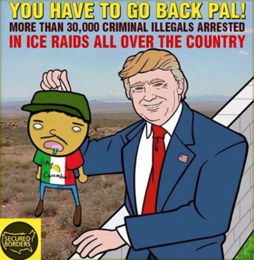
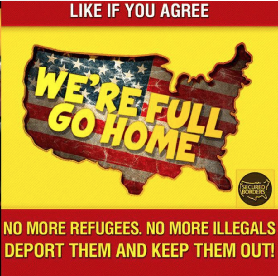
Many images displayed by accounts suspected of originating overseas, as of the platform ‘Secured Borders,’ create a quite viscerally striking image of the very geopolitical imaginary that the Trump campaign openly promoted. But if they echo Trump’s rhetoric, the deeply offensive images identifying migrants as vermin, as if to deny them of legal rights, derive from a right-wing imaginary already current in central Europe, as other images used in Trump’s political commercials, showing hoards of immigrants racing across border, and betray historical roots in Nazi visual propaganda. These images created a geographical imaginary rooted in fear, indeed, and promote a geopolitical imaginary–a divide made visibly clear in cartoonish ways in the contrast between the barren lands to one side of the wall and the green lands across it, where the suited Father Figure Donald Trump stands wearing his red tie and flag pin, in a new and creepy image of the defender of the nation–as if to protect the greenness of its grass. (The creepy smile and richly solid comb over look so little like our supposed President, it is quite oddly designed, if replete with visual triggers, and its hortatory text lacking a comma, its limited punctuation seeming poorly proofread.)
6. Such a reality seems to heighten not only the “political intensity” but heighten divides along what we map in red/blue terms, despite the limited explanatory power of an electoral flatland’s gaps between blue peaks of populated centers and the far redder expanses. Even after refining the flat electoral map, by adopting opacities to render margins of victory, retaining a contrast designed to foreground sharp differences fails to register the range of purple regions that turned red, driven toward an intensity of political involvement or disaffection by memes of social media still protected as “free” speech.
The issue is not only, moreover, the troll accounts that were tied to a Russian “troll factory” outside of St. Petersburg, Russia. For the so-called ‘factories’ that mined images designed to provoke visceral responses that would trump reflection released a steady feed of fake news, based on innuendo and insinuation as well as outright slander and attack, that polluted the global media, as they were actively retweeted by the Washington Post, Jack Dorsey, CNN’s Jake Tapper, to fed an information ecosystem that was waiting to be poisoned, as some 3,000 global news outlets inadvertently included tweets originating from confirmed Kremlin-linked troll accounts in upwards of 11,000 “news” articles as the 2016 Presidential election approached, based on an analysis of over 2,700 Twitter handles confirmed to be linked by Twitter to the Internet Research Agency, a group tied to Russian intelligence–including David Duke (@DrDavidDuke), Sen. John Coryn (@JohnCornyn), Kellyanne Conway (@KellyannePolls), FOX News host Sean Hannity (@seanhannity), Brad Parscale (@parscale), Anthony Scaramucci (@Scaramucci), former White House press secretary Sean Spicer (@seanspicer), and Sen. Ted Cruz (@tedcruz)–in ways that transformed Twitter into a tool of information war. By targeting audiences by zip-code, education, and wealth, raising the specter of those who “come to our country to change our traditions,” and increasing the fear and specter of unwanted refugees.
 Meltwater
Tweets on new issues of 2016, from illegal immigration to voter fraud, circulated from Russian plants–in cringe-inducing claims such as “If Hillary wins, she will amnesty 30+ million illegal aliens and Republicans will never win an election again”, or “#VoterFraud by counting tens of thousands ineligible mail-ins for Hillary votes being reported in Broward County FL”–mirrored the fears of a “rigged” system and election that Trump had repeatedly conjured, and created a new meme in American political discourse that increased skepticism about the political process.
The overlap between many purple regions and regions with distinct patterns of consuming news in print or online media would have only magnified the divides where social media platforms spread disinformation–that infamous “fake news”–to gain a purchase as real in our political system. Even if the possibility of infection by viral posts can’t yet be traced or measured with certainty as a map, the disinformation moved by bots or “troll factories” created a pitched battle of electoral intensity, that was staged around electoral votes or at least along fomenting clearly defined geographic/regional divides that Russians charged with visiting states in the United States to gain a sense of their ability to exploit a divided political landscape didn’t even need to travel to America to apprehend, as infographics clearly served as a readily available primer on how best to foment increased divisions. Indeed, even by creating a distracting static whose constant beat eroded dialogue or trust, from internet accusations of the murder of Justice Antonin Scalia, deep distrust of naming a successor, and a year-long vacancy of his seat, as Mitch McConnell forced the sort of divisive deadlock only able to intensify political opposition. (While the diffusion of the demand among Republicans began from McConnell’s quick tweet incited a sort of collective resistance, issued hours after Scalia expired in Texas, and lent broad currency to the numerous questions about conspiracies of the nature of his death that circulated online. The false populism in many ways echoed Trumpism, issued an hour after Scalia was confirmed as dead, and generated disruptive memes on social media–“OMG They killed Scalia” “I hope an autopsy is done to make sure Obama didn’t have him killed”– which supported an unprecedented, as Glenn Thrush and Burgess Everett reminded us, “rebuke of President Obama’s authority” and “categorical rejection of anyone Obama chose to nominate,” irrespective of their merits, to disrupted trust in political consensus during the Republican and Democratic primaries. (Was it a surprise that McConnell, the senior senator from deep red Kentucky, playing the part of a disruptor, in late August single-handedly blocked bipartisan decisions to alert the American public to FBI reports of Russia’s unwanted involvement in the presidential election, from staging cyberattacks to ties to the campaign of Donald J. Trump?)
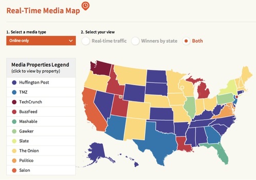
The entrance of this gambit within the context of the political election indeed led all Republican nominees to adopt the issue that drove a wedge between red and blue states and their respective media outlets, in what was cast as a rebuke to President Obama’s lack of respect for the institution of Congress to pursue “his personal agenda.” A yawning gap between red and blue counties reveals the disconnect in our social fabric but of the consumption of news, and sources of opinion, about which the “troll factory” charged with launching disruptive messages into America’s Presidential election from St. Petersburg were able to play a disproportionately outsized role. The divide was plain in this 2013 map of print news consumption, where yellow shows the swath of land getting news principally from USA Today, a year later by online outlets Huffington Post and TMZ, where the investment in social media may have had particularly pronounced leverage. And in a period of increased attachment to divisive news sources that intensified an absence of dialogue between political parties, the expansion of divisive posts on social media platforms helped to undermine civic discourse.
7. When Jared Kushner openly boasted that his father-in-law Donald was able to secure a deal with one of the largest media broadcasters in the United States–the Sinclair Broadcasting Group to ensure superior media coverage, and presumably promote attack ads, he suggested that the Trump team was on board in broadcasting their message to purple states within the political map–targeting a similar audience than that reflected in the yellow expanse below of states that were the most apt to share news stories in 2013–areas that already ran pretty red.
 Media Map Showing Most Shared News in Each State (2013)
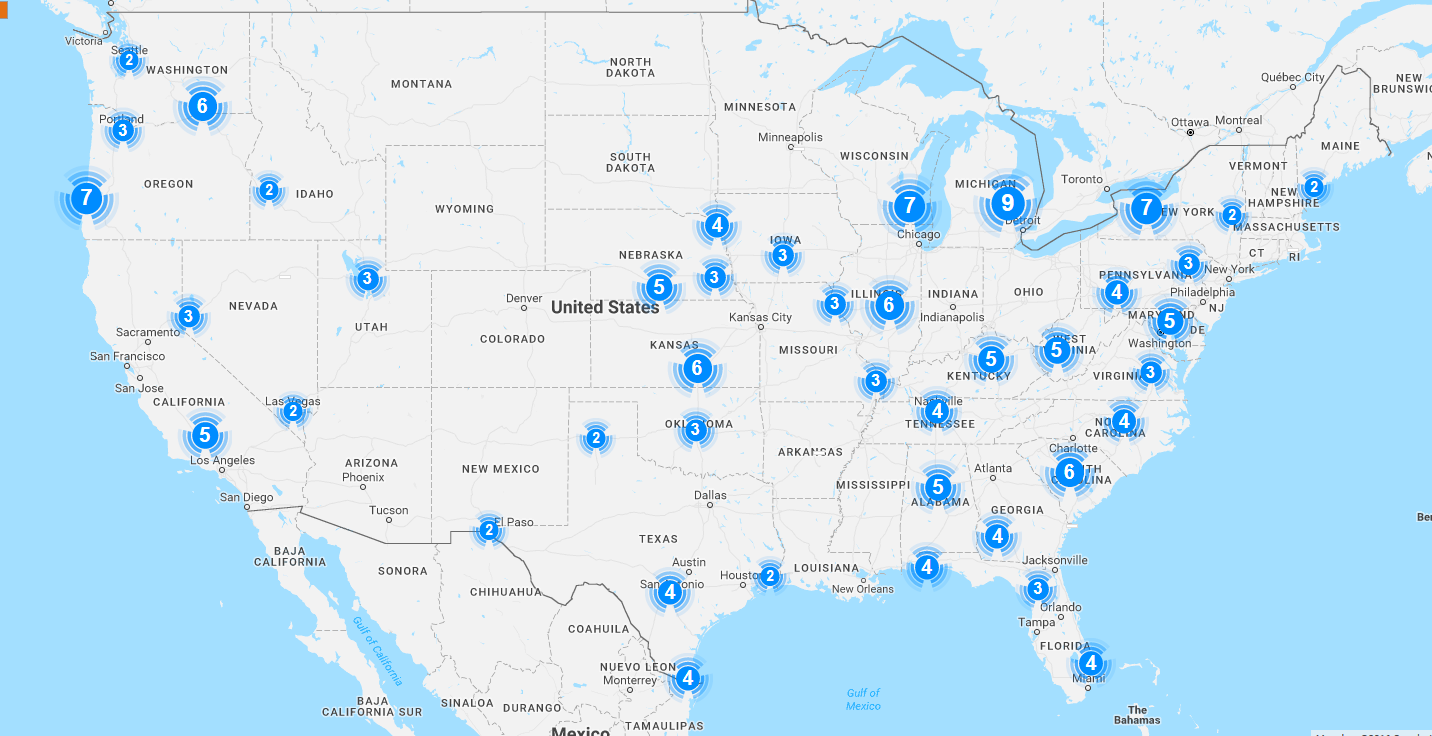
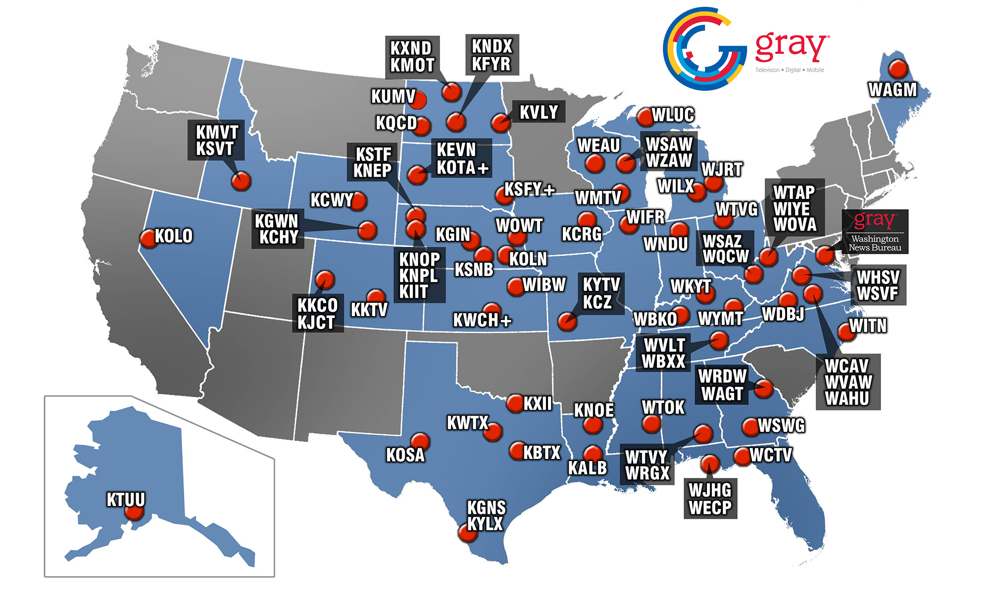
The metaphorical trolling of the country that foreground the imminent threat terrorists pose to the nation, raise suspicions about Barack Obama’s or Hilary Clinton’s motivations for being President and ties to suspicious organizations, by the same Sinclair Broadcasting Group. In ways that recall the media attack ads manufactured abroad, news segments ran on the dangers that immigration poses across the nation’s southern border from anchors of chains of local news stations owned by Sinclair Broadcast Group, a media conglomerate which regularly issues “must-run” segments of news to its 173 affiliates, whose involvement in local news markets is now posed to enter urban areas–and making the news corporation the largest in the nation, with 233 stations. Did the news group offer a disinformation of its own, now seemingly only poised to grow into an urban market with its acquisition of Tribune media?
Would this expand the map’s red?
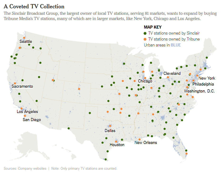
The splitting of news constituencies reached by the Sinclair Group along an urban/rural divide that reflects the Trump’s “heartland” has been noted, and since 2013 offered a basis for “managing” a constellation of stations that worked around FCC regulations on media consolidation that are intended to promote local news diversity. The lack of diversity in the 38% of households that they reached–now posed to reach 72%–already offered a powerful megaphone for addressing residents in “purple” states–in the Midwest, West, and Southwest–and mirror the “gaping holes” of news deserts, where local news sources are increasingly absent.
 Technical.ly
It is not surprising to see Trump’s FCC to take steps that actively aided the expansion of Sinclair media into American households by merging with Tribune Media, by adopting a loophole that once pertains to UHF broadcasting–and is long technologically obsolete–to allow low-budget stations to grow, thereby allowing it to grow beyond the ceiling of 39% of a national audience to diffuse a fairly reactionary message if one maps its media footprint in ways that would allow it to address more than 39% of its existing market.
Politico mapped existing Sinclair stations against their media footprint
8. Although it was habitual to take what seems Obama’s fondness for the phrase as a sense of its particular rhetorical effectiveness, a more charitable interpretation of his attachment to the phrase might be intimations of the deeply corrosive nature of the metaphorical divide of the nation. The image of an electoral divide perpetuated by pollsters and pundits was shown to haunt the nation not only in the 2016 Presidential election but, as we have heard in the recent expansive indictment that Mueller issued accusing Russian operatives who travelled the United States seeking strategies to sew discord “in the U.S. political system” from 2014. Traveling in Colorado, New Mexico, Michigan, Illinois, Texas, they defined their mission as oriented along that very divide. Defendants Mssrs. Krylova, Bogacheva, and Bovda were charged with conspiracy for not disclosing the motivations of their travels in the United States posing as tourists, developed the idea of targeting “purple states” as sites to foment the greatest divisions–seeking to “create ‘political intensity through supporting radical groups” and transform fictitious personas into “leaders of ‘public opinion’ in the United States” by hundreds of social media account. While traveling in America a “real U.S. person” advised that they
should focus their
activities on "purple states" like Colorado, Virginia & Florida.
–and the principle of “targeting ‘purple states'” returned in later months as a ground-plan to disrupt the election, and sew a deeper sense of distrust within our democracy. Even if the term “purple states” that emerged as sites of targeting may not have been seen as sites where social media platforms could have substantially increased authority, the success of increasing divisiveness readily responded to stark divisions on the map.
The parlance learned in the United States was shaped in the media sphere to enlarge factional divides, if the notion of “Purple America” had been born to give complexity to a blue state versus red state divide. Avatars on fictitious social media accounts used the categories of political scientists to amplify existing prejudices from troll factories in St. Petersburg, often pedaling prejudices that gained greater reality in what seemed public opinion as the election approached. The “information warfare” waged on social media that was an odd spin on globalization, that kicked into gear with racial prejudice channeled by Russian hipsters working round the clock in twelve-hour shifts from a designated “Facebook department” in Taylorist fashion within a “troll factory”: the surprising success of targeting voters in the United States was based on extensive mapping of political divisions, and a design to exploit them through social media. Were the addictive apparatus of a medium that seeks to command the attention of observers part of the plan?
Such images, texts, comments, and posts designed to stoke divisions were based on ventriloquizing Americans, but pushing the envelope on the standards of address: in a scene straight of Adam Smith’s pin-making factories, the web of disinformation that was spun from Americans’ social media fabric extended not only what seemed to the Russian who created them incredibly “believed [to be] written by their own people,” and even worked directly with the Trump campaign to coordinate rallies in purple states like Florida. If Trump didn’t detect that the divisiveness Russian trolls devised on Facebook feeds incriminated his campaign, because Mueller did not reveal direct ties between the desire of the Internet Research Agency to sew disinformation and division was distant from his own campaign–“Obama was President up do, and beyond, the 2016 election. So why didn’t he do something about Russian meddling?”–what Trump confidently imagined to be a wellspring of popular support for his candidacy may well only have intersect with the more successful than anticipated adoption of the Russian trolls’ stories in Facebook platforms that created the intense emotional involvement which drove an under-the-radar aspect to the campaign, from images linking Hillary Clinton to Satanism to targeted voter suppression to diffusing enthusiasm by openly promoting third-party candidates as effective protest votes.
Indeed, Facebook and Twitter did the heavy lifting of ensuring that trolling from St. Petersburg were sent out across America, and to effectively mask the diffusion of messages along various social networking platforms to create something like an inadequate surrogate for public opinion–even as Facebook was foreign to Russian social networking when the Internet Research Agency was begun in 2014.
The Internet Research Agency, perhaps an acronymic pun on the Irish Republican Army, worked to foment what seemed a similar faith-based war by manipulating styled prejudices to “spread distrust” to online communities they had infiltrated, warning of misleading “hype and hatred . . . forcing Blacks to vote for Killary” to “Woke Blacks” Instagram accounts in October 2016–weeks before the election–and adding “we would surely be better off without voting AT ALL” than cast a vote for the Democratic candidate. As well as unleashing an unprecedented epidemic of trolling, the St. Petersburg “troll factory” staffed by 900 employees posted over thousand times each week at the height of the election from over one hundred Facebook, Twitter, and Instagram accounts, in ways that magnified the rifts in the isolated filter bubbles had previously existed in order to turn them against one another. When Eli Pariser in 2011 coined the phrase to describe the dangers of isolating information ecosystems in selective news feeds forming virtual echo chambers of false comfort in an insulated information bubble,
the tools of social media sites enabled the splintering to actual communities in an almost mechanical fashion of cause and effect, as if sending ripples able to create the sort of electoral disruption in strategic ways. In doing so, they mirror the very danger of which President Obama in his final public speech cautioned against “retreat into our own social media feeds” as rendering Americans uncritical information consumers [who] start accepting information, whether its true or not, that fits our opinions, instead of basing our opinions on evidence that is out there.” The warning delivered after the election of Donald Trump and delivered in Chicago saw Obama trying to move out of the bubble, and was delivered near to where his 2008 victory speech celebrating an America able to transcend its image as a nation divided between red states and blue states. But the bubbles in which selective calls to not go to the polls or demonize the Democratic candidate were launched as narratives may have made them difficult to detect or counteract.
The sort of fragmentation that troll factories Mueller has charged were orchestrated from abroad are described as being planned after reconnaissance in the United States. The same divides, it is important to remember, could have been as easily gleaned online. And even if trips to the United States are described as developed by operatives traveling to the United States to discover, much the same sort of prejudice pedaled in postings crafted in St. Petersburg to disrupt the Presidential election based on a fractured public politics could have been gleaned form an infographic. The disruptiveness of disinformation created feedback loops that only mimicked oppositional racism as much as it mimicked back prejudices observed in ethnographic study of American social media Facebook groups.
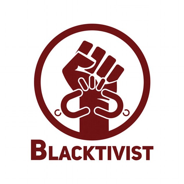
Indeed, the stories of Russian hipsters working twelve-hour days on posting divisive comments on Facebook from 2014-16 in St Petersburg, posing as Americans, and required to write an essay in English on Hillary Clinton to determine whether they were suitable for the job, suggests just how invested the foreign government was in addressing social media to purple states to influence the election’s outcome, and doing their best to dissuade blacks and other minorities from supporting Hilary Clinton, despite an overall eligible voting population that was more racially and ethnically diverse than ever, according to Pew Research, but for the first time blacks declined as a share of voters since 2004. Black voters were not only among the “three major voter suppression operations” Trump advisors worked to lower turn-out, with white liberals and young women, but one of the most successful efforts seemingly tied to Trump’s director of data digital operation in his San Antonio headquarters, Brad Parscale, whose nightly electoral simulations seemed aimed at providing a basis for to partly its data into a new news organization, mirrors techniques of turnout suppression adopted by destabilizing social media divides. Facebook accounts such as the “Blacktivist” page that urged that voting for Jill Stein–a candidate with close ties to Russia–was “not a wasted vote,” clearly recycled historical images of African-American nationalism and solidarity, in hopes to decrease voter turn-out in Maryland. The use of the emblem may seek to re-engineer the energy of black voters for past Democratic Presidential victories, and to scare others who might see it. With other accounts openly urging Muslim voters to boycott the election, the goal was to dilute and splinter the very coalitions that the Clinton campaign assembled by sowing distrust–and indeed, to exploit social media by triggering a clear emotional response, more than making an argument.
The studies of social media patterns that began from at least 2014, which were, as if by coincidence, marked by huge Republican gains in Senate and House under a banner of the most angry national midterm elections to be directed against a sitting President, was effectively amplified with the encouragement and traction that the bitterness of 2014 elections had set across the southern states and deep south, southwestern Texas along the US-Mexico border, and in formerly ‘blue’ or ‘purple’ states–creating a particularly obstructionist House of Representatives that succeeded to obstruct so any of the policies President Obama sought to pursue in his final two years.

National results of the 2014 House races, showing Republican gains in bright red
9. The proliferation of robo-posts seeking to foster divisiveness upped the ante far more than Sinclair Broadcasting, but the two seem to have mutually reinforced one another–if not using strikingly similar tactics. The divisiveness continued by injecting increasingly radicalized terms of political debate, and even fundamentalist notions of apocalypticism, that seemed foreign to American political debate, depicting Hillary Clinton as increasingly satanic and promoting open borders, promoting division and distrust around bizarre social media memes. The offensive cartoonish images promoted by the IRA-sponsored “Secured Borders” borders account, designed to appeal to Trump’s supporters and introducing an icon of his campaign, resembled the icon of the United States Border Patrol to create an image that not only recalled its official insignia–

Actual Border Patrol Insignia

Fencing on US-Mexico Border
–but did so to link a specific presidential candidate to patriotism in extreme ways, celebrating the at of rejecting refugees and asylum-seekers and increasing border protection as a need for national protection, creating a false equivalence if there ever was one, and straining any logical linkages. (The conceit of “liking” advocating political isolationism is a bizarre mashup of Facebook’s prescriptive language of immediate unconsidered emotional reaction and a political position with all too dangerous political consequences. Was the irony of using social media to raise questions of border protection not ever perceived? or was the idea to root the image of a tough border so deeply in one’s mind, that one didn’t think that clearly about its politics, consequences or implications?)
Indeed, an ethnographic study of Facebook groups might target alone groups living on the southern border, Christian fundamentalists, white supremacists and Black Lives Matter as potential groups to manipulate to stoke divisiveness on partisan lines, and sow disorder on the performance of a two-party system by gaming electoral geography. There is hope in puncturing the filter-bubbles of Facebook groups, however, by the increased calling out of the need for resolve on a true issue–gun control–too regularly and dismissively side-lined by the staged political debates that were shared in posts, and which seems, if only because of the strength of its blunt actuality, to puncture social media with an urgency that can’t be denied.
10. The decision to direct a social media focus on purple states as sites where divides would stand the greatest chance to disrupt or even to tweak the electoral results reveals a bizarre recycling of what was designed as a classificatory map to increase divisions, and gave a distinctly new ideological flavor and torque to the left-wing concepts of swing states that were so successfully promoted within the 2008 Obama campaign. By recycling attention-getting image of chromatic divides developed for television audiences, purple states emerged as targets for online spooking, and Facebook aggregation gained traction around affective ideas like casting the color red was a form of patriotism.
But the notion of pressing advantages on social media in states purple, but maybe able to be nudged Republican, provided the deepest rationale for division. Defendants, posing as members of the group “Being Patriotic,” under the guise of that patriotism offered the idea of pressing their advantage by the notion of a wedge in purple states. The defendants offered in emails, “we’ve got an idea. Florida is still a purple state and we need to paint it red. If we lose Florida, we lose America. We can’t let it happen, right? What about organizing a YUGE pro-Trump flash mob in every Florida town?” on August 2, 2106, and offered, “We clearly understand that the elections winner will be predestined [sic] by purple states.” While not brilliant as strategy, as a selective basis to sew distrust and disorder in one of the most over-polled elections ever, where we watched the results of multiple daily polls as if to deliver the odds on horse races, tweaking the electoral map toward a new color combination was enough.
The “purple” region gained the most striking new sense as sites of information warfare in the United States over a period of years–in ways that might be detached from the actual campaign. The figure of speech born of data visualizations gained a newfound torque as a form of divisiveness, and the chromatic metaphor operative force, as “focusing on purple states such as Florida” became, for the fictional identity “Josh Hamilton,” a strategy proposed by a false grassroots efforts that was communicated to Trump campaign officials. White most tracks were concealed, a few were not. And although the Trump campaign didn’t need to be advised, necessarily, “to focus on ‘purple’ states like Colorado, Virginia, and Florida,” the targeting of areas where there didn’t seem a clear polarity promised to create a far starker one. But Russian use of a language of infographics served to materialize, in a starkly divided map, existing fault-lines that one needed only to exploit, push apart, and throw into relief to engineer a surprising electoral result, using images that recovered more subtly shaded areas where blue met red as tools that were able to be exploited to show the world a far more bitterly divided United States, as if even raising the specter of a deep red region could sow considerable distrust in a Democratic system, or just vacate whatever appeal its constitutional rights held in Russia and Central Europe.
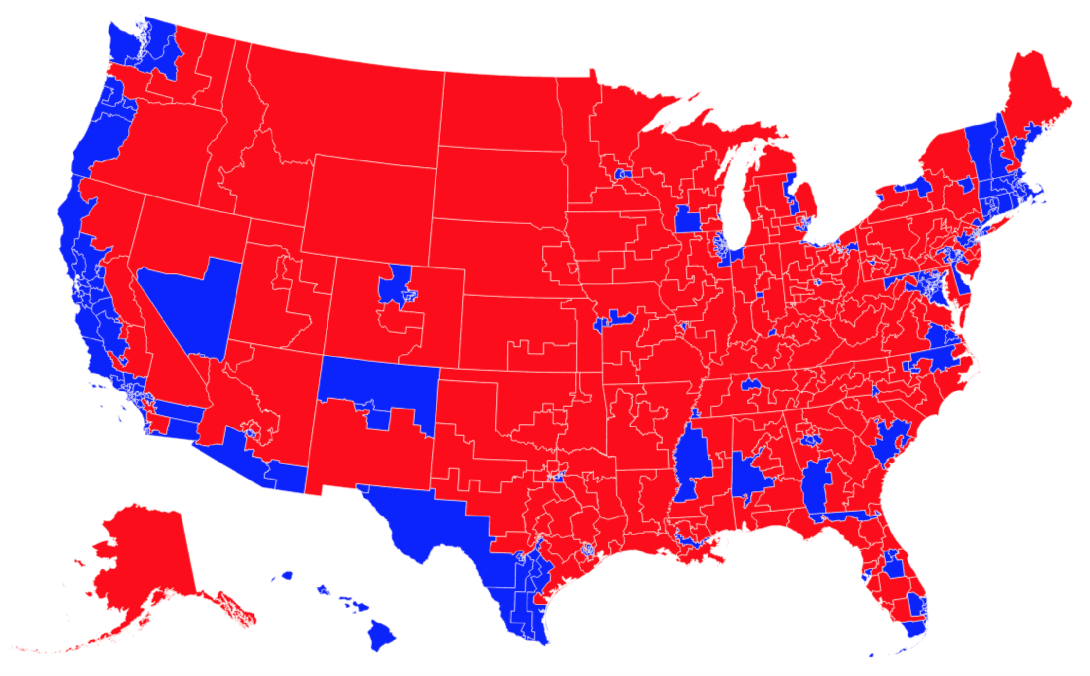
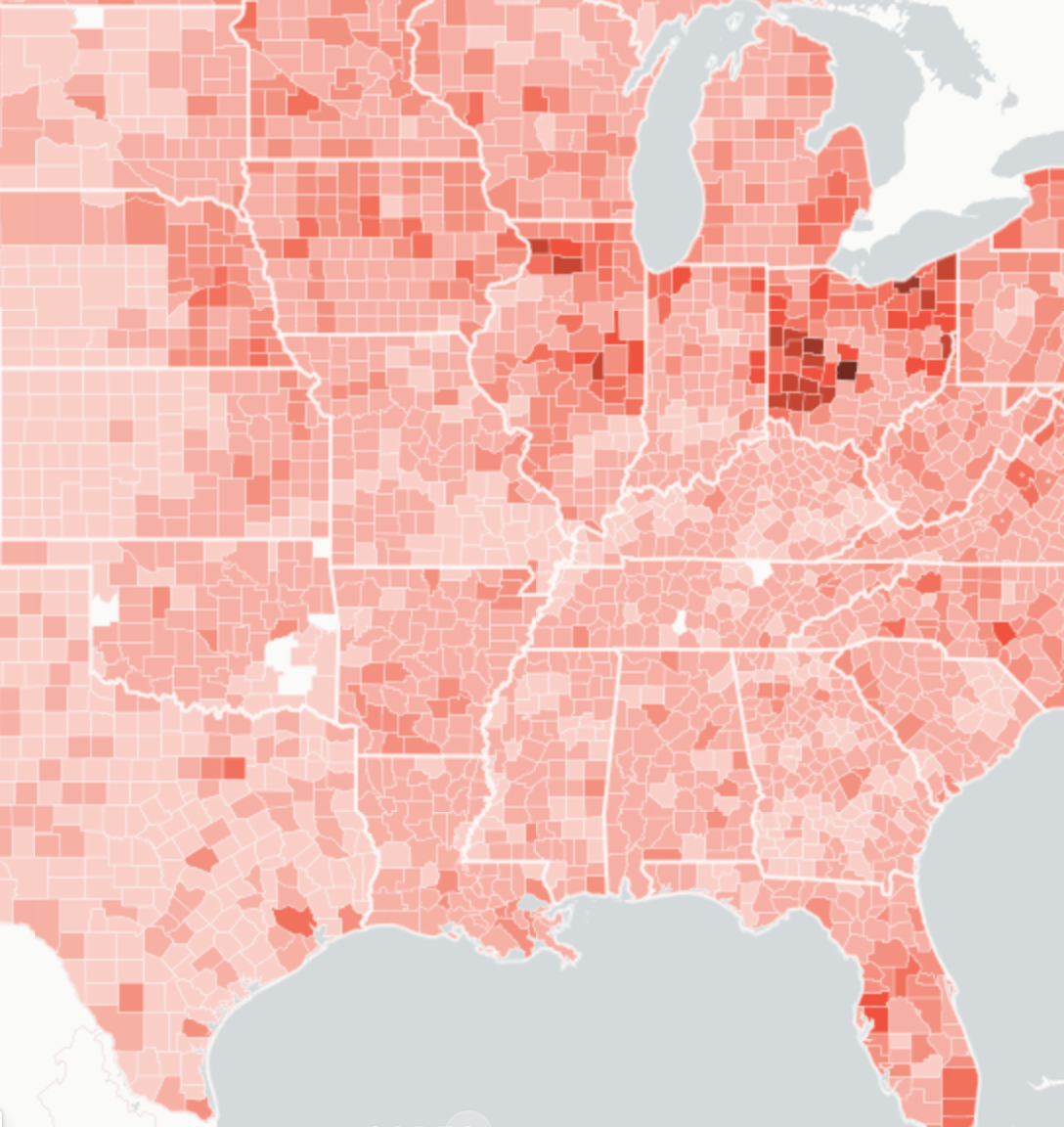
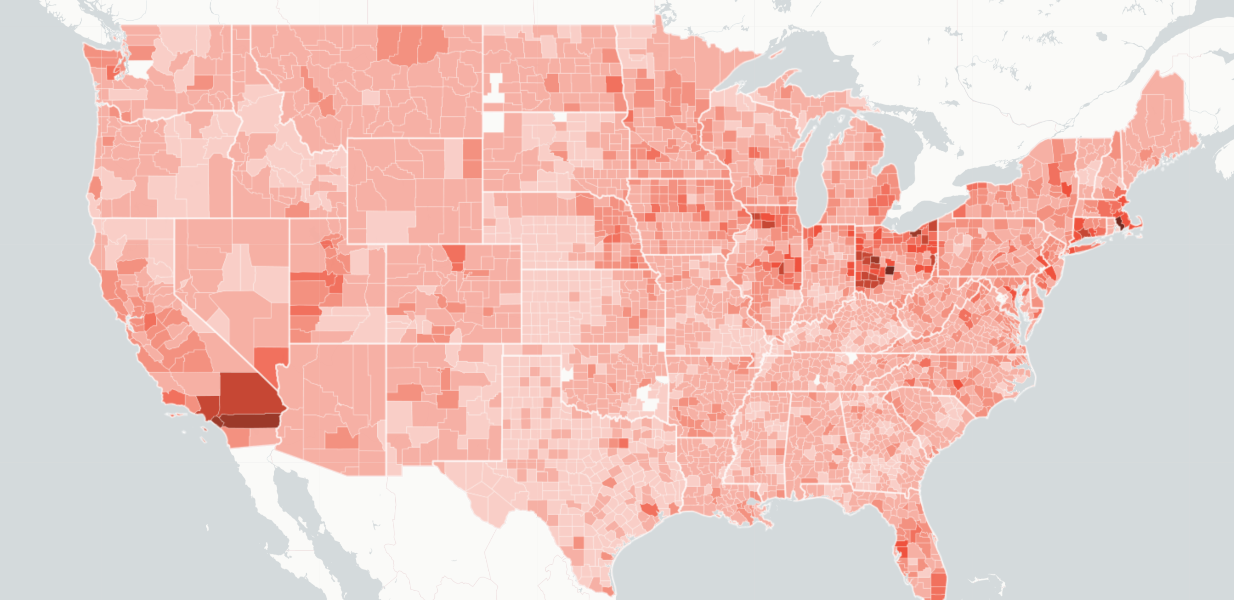
New York Times: 2016 United States presidential election results by county
The organizing of false grassroots efforts according to the Mueller indictment not only to organize rallies that would “focus on purple states,” but to create a divide in doing so that best exploited divisions in our electoral maps. Indeed, the notion of such a divide that had been picked up by Nate Silver and across the art of political forecasting was not something that would have had to come from any sort of special informant, being in the air of 2016 and widely broadcast on the airwaves, as the “Purple America” coined right after the divisive presidential election of 2000, by Vanderbei, as a way to come to terms with starkness of the opposition between Bush v. Gore; Vanderbei recast what seemed a polarity in the context of a variety of political opinion, leading to articles after 2004 to insist that America is not divided into sub-nations, or on the brink of a second Civil War, and continued to map the mutation of purple America in future elections.
11. The conceit of Purple America rescued to some extent the simplified opposition implied by a chromatic divide between red v. blue. Articles ran entitled “Most Americans live in Purple America, not Red or Blue America” rather than in a blue or red state, created a sense of consensus and diversity, befitting a democracy, but the yawning gaps in areas of intense redness meant that purpleness provided a language of opportunity for those seeking to grow division and craft heightened political dissensus. Vanderbei offered the original “Purple America” to help refine a clearer statistical image of the dynamics hidden between the political polarization of a body politic, and to give greater agency to a varied range of political opinions in most states. By embodying a red flyover zone, or a blueing of the coasts, the intention was to encourage a deeper dive into the national vote, as well as to retire the tired glossing of the electoral map: the bridging of a division that Obama would make in his speech in support of John Kerry’s Presidential candidacy fenced the hegemony of a similar symbolic divide, and cast it as at its root dangerous to democracy.
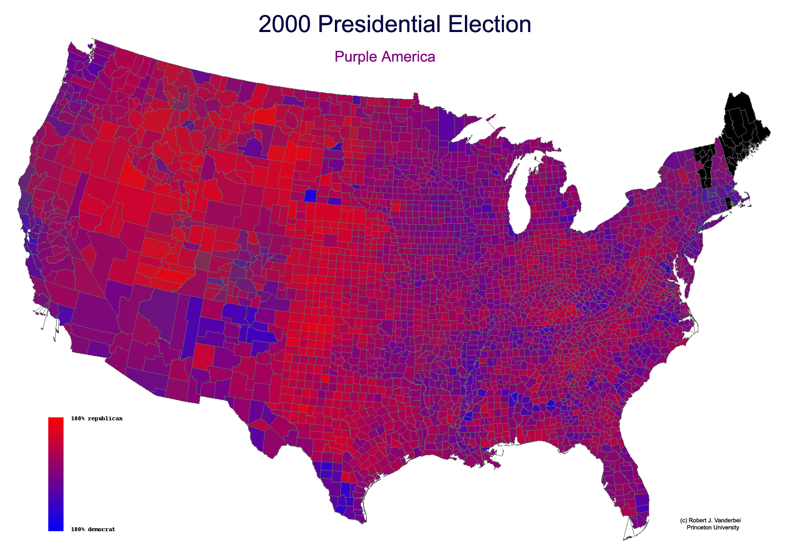
Purple America (2000)
But it didn’t remain there. The migration of a language designed for a broad market of TV news infographics to a language of political operatives interested in subverting the democratic process is perhaps instructive. The map was perhaps replayed in the media as it contained sufficient dramatic tension to foreground problems of crafting political consensus, as if social policies and political opinions were identified with an area in the country, and as if every issue in the political platform was fundamentally designed to capture a divisive issue of political debate–around abortion, social security, gun control, climate change or global warming, environmental regulation, and monetary policy or fiscal restraint–whereas the options on the table were not, in fact, that divergent.
The maps however naturalized the divisions, and, paradoxically, left them open to be exploited, perhaps not so much since we were fractured into filter bubbles as because pundits wanted to create the necessary degree of dramatic tension, and to craft and foreground the dramatic arc of an election season, as if the notion of a ground-plan and an electoral strategy could be portrayed and represented as a military as much as a political one. The guiding metaphor of divisiveness and division that was foregrounded in this map–as if blocks of population existed with one preference, despite the subtler variations in voting, despite the blue/red divide imposed by majority victory–
–even if such a decision, a sort of hold-over from a pre-parliamentary languages of democracy, that privileged the notion of a ruling party in a quasi-monarchical way, obscured the variations once one drilled down into voting patterns–
–but obscured the huge number of “ghost votes” across the less inhabited areas, where isolated communities, suspended outside of the metropoles, were magnified in an electoral college that robustly enhanced their political voice in ways bluntly reflected by the flatness of the two-color map in stubborn wasy. But as Chris Howard, inspired by the blended voting maps created by Robert J. Vanderbei of the 2012 election that showed purple America, and the cartograms of Mark Newman, transparencies could capture the magnification of political voices of low-density in the electoral map, in ways that might have suggested the potential for electoral disruption to those seeking to do so–even if such a perverse reading of the language of infographics was hard to imagine.
The graphic language, migrating from electoral processes to the nightly news, may have provided a basis for newscasters to naturalize a drama of political contestation, more than conversation. Whereas we are increasingly talking not of “states” that suggest the fragmentation of the union, we live in an increasing economic divide largely oriented not along pitched lines of battle, but by urban/rural divisions, if the divide is belied in the flat pasteurization of space of electoral maps. The growth of megacities across America have raised multiple divisions electoral maps fail to capture, with its fundamental insistence on the county as a unit of voting, despite the increasing evacuation of its meaning as a unit of political representation. But as a metaphor, or master-trope, the fracturing of states was something of an invitation to a foreign nation to seize up and try to pry apart, however, as French cartographer Luc Guillmot showed in an alternative cartogram, sized by votes in red states in the so-called heartland of the midwest, in the manner of Ben Hennig’s cartograms.
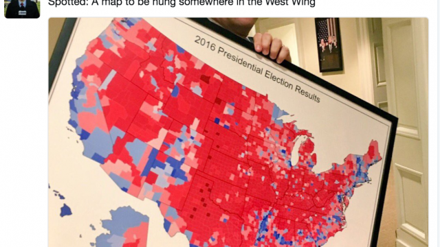
But President Obama’s own words come back to haunt us. In the electoral maps for the 2016, indeed, the masking of gradations of division produced the sense of a democratic result we were bound to accept–
–even if it brought an intensified red that was really clinched at the margins, or in Texas, Florida, Michigan and Virginia, but whose deep red “heartland” created the sense for the victor that he was indeed recognized by the “real Americans” he so desired to court. Trump was so taken with the electoral map to have it framed, and has been so personally obsessed with imagining the scale of his supposed victory to be present in the intensity of the square mileage of red hued states to take a truly personal offense at the idea that voters swayed by Facebook pages and Instagram groups are seen as diminishing the status of his victory, and an election he imagines a total victory he pulled off by bravado, and dismiss concern of dangerous effects of foreign disturbances of the voting process.
12. Widespread exploitation of such divisions, and indeed the language of opposition, subverted the democratic process by a vision of polarization that maps reinforced. And by exploiting that narrow margin of purple states of the nation, local consensus was ready to be flipped, and precedents of civility overturned. By stoking an an enthusiasm that few saw as even in reach on the eve of electoral night, America seemed to fall into two camps, but with the electoral collect staying clearly in Clinton’s camp. (The hold on the lighter blue states like Florida and North Carolina were tenuous, however, and the loss in Colorado, Wisconsin, Michigan and Pennsylvania tipped the scales.)
If the blue states seem able to hug the red core to prevent it overflowing to both coasts, the glare of the divisions between blue and red states was so starkly naturalized to masquerade the extent to which flipping purple states would in fact flip much more of the nation red, and alter the outcome of the electoral count in ways that renders the flat dichotomy of a two-color prediction irrelevant. The flipping of purple and pink states upset the predictive power of a map, but did so in ways that seem only to have reinstated the logic of the divided nation we have created in our infographics which may, in the end run, do far less to inform.
The fact stubbornly remains that it wouldn’t involve that much demographic science or pinpoint precision polling to know that enough pressure in the purple states could create a crisis in consensus enough to blur the outcome of the vote. But we clearly can’t go back again to seeing the national shores as creating a red/blue divide that is taking the current temperature of public opinion in each state, in isolation from the rest of the world.


 Detail of above
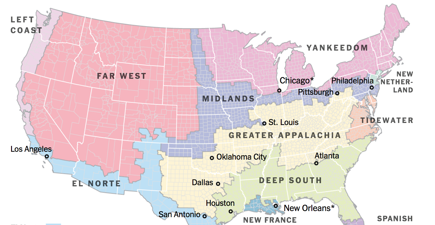
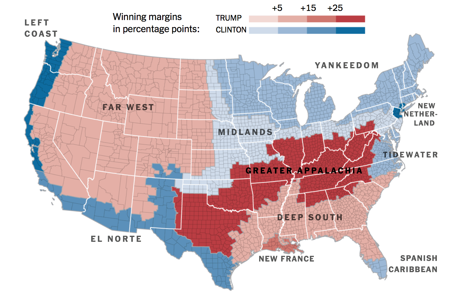
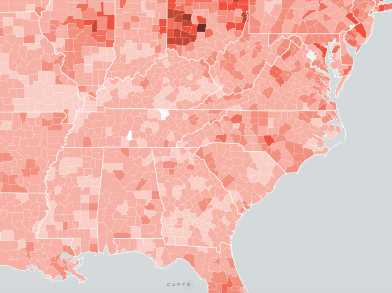
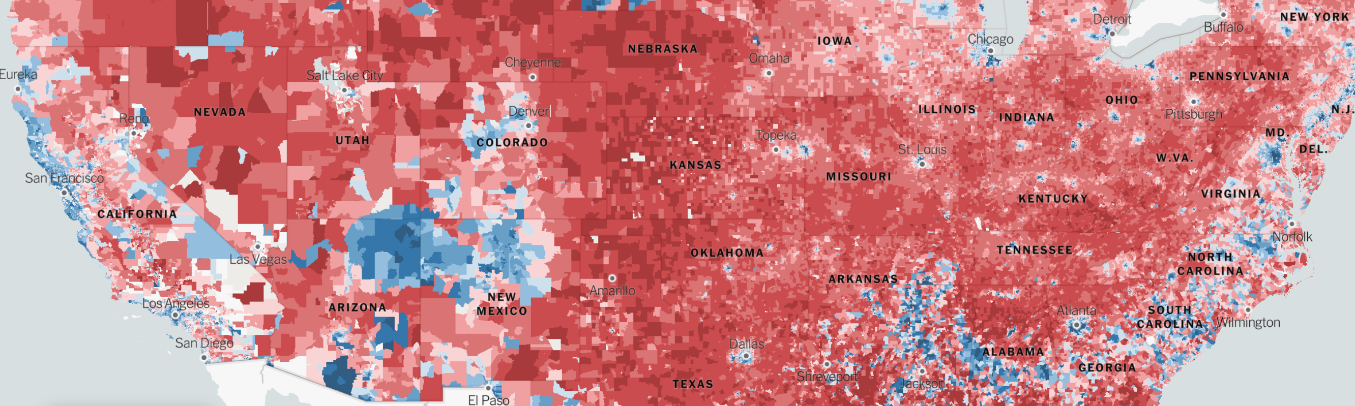
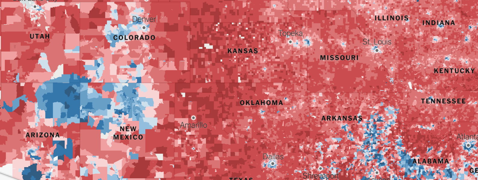
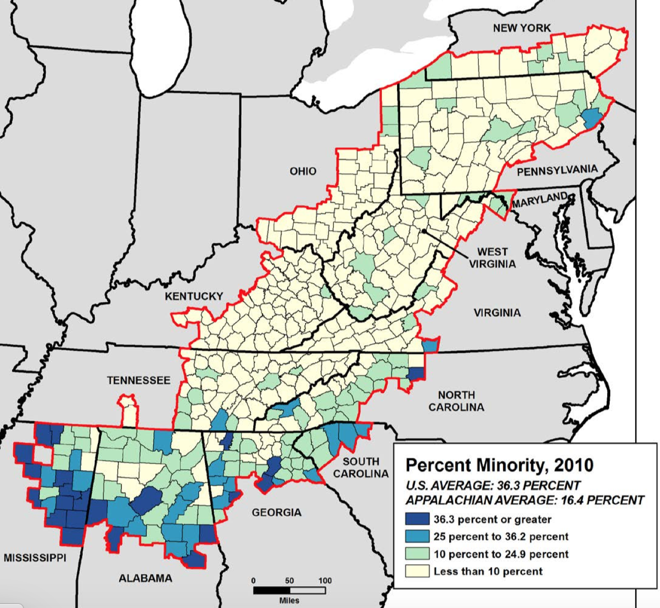
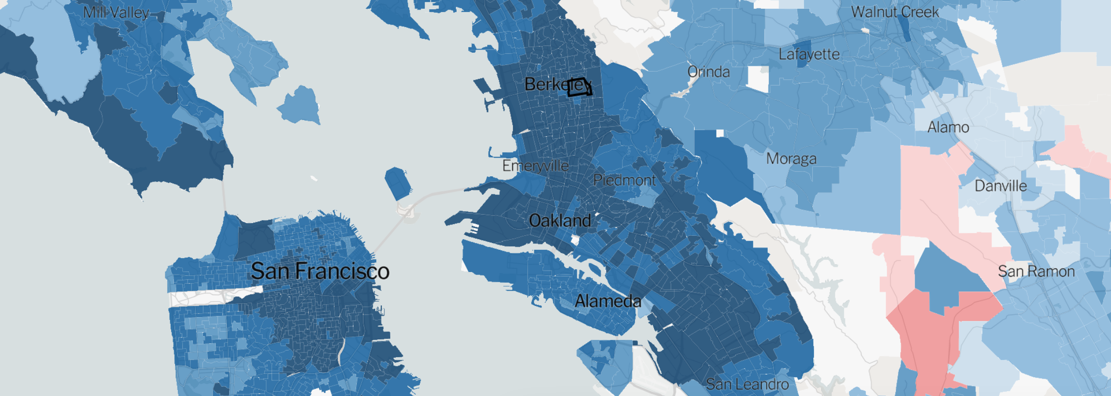
 Area roughly corresponding to Greater Appalachia/Mapbox/New York Times
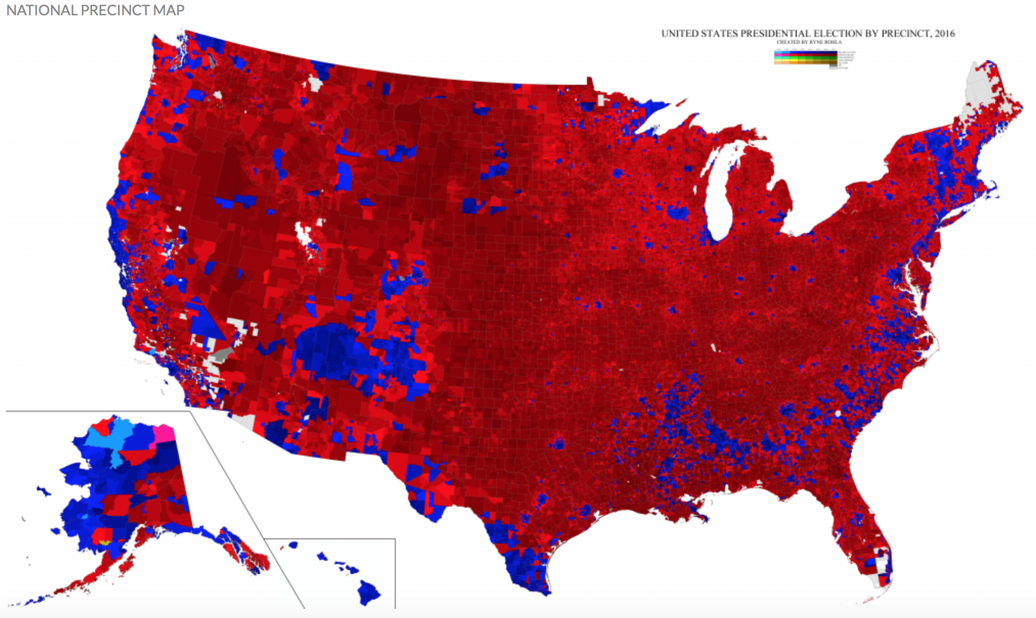
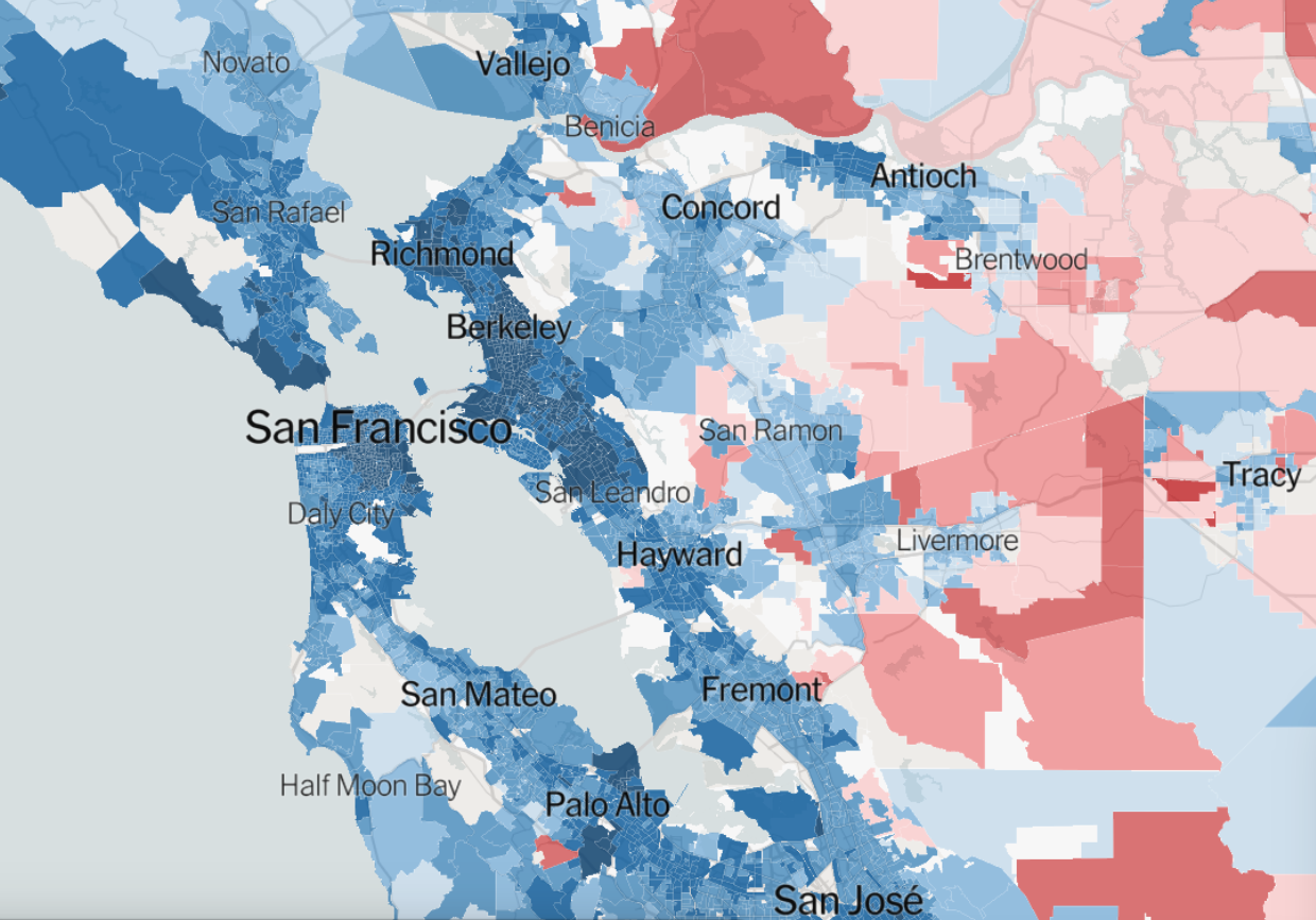
 Ryne Rhola/Mapbox (2018), 2016 US Presidential Election


