
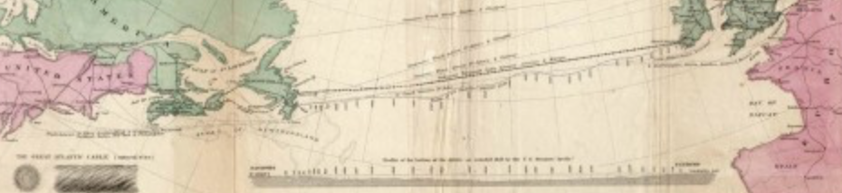
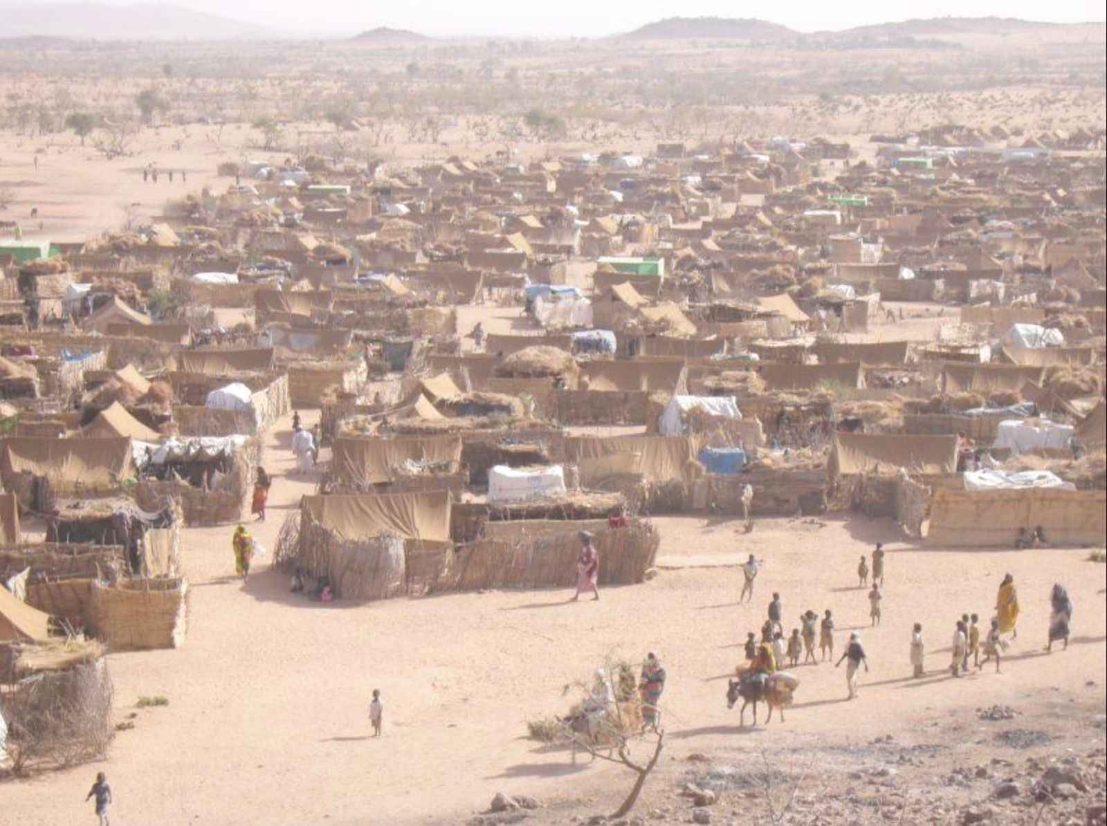
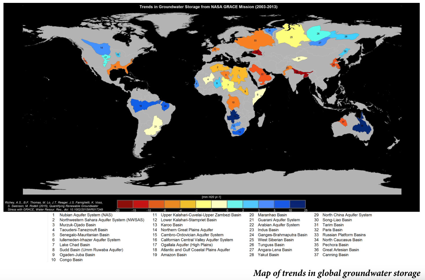
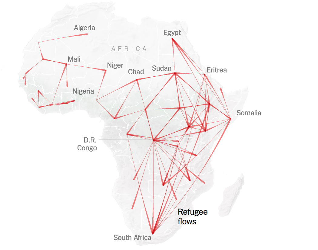
As we attempt to navigate the ever-expanding seas of data in the information economy, we can overlook the extent to which data streams run underneath the world’s seas to create a quite concrete sense of the interlinked. For such cables underlie the increasing notion of geographical proximity we experience daily, from the world of big finance to mundane online transactions. Ocean floor mapping had barely begun when the first cable was laid underneath the Atlantic, connecting England to the United States by being painstakingly laid by throwing thousands of kilometers of telegraph cable overboard ships from wooden beams loaded with cable, moving from the middle of the Atlantic in two opposite directions. The efforts that lasted four years, begun in 1854, created a subaquatic bridge of metal wire, by 1858, eight years after the first cable beneath the English Channel, brought nearly riotous celebrations in New York City,–where the latin of the first functional transatlantic cable led to citywide celebrations.
Crowing that “at last the great problem is solved,” Walt Whitman heralded the achievement of the laying of the Atlantic Telegraph as a precedent that “set all doubts are forever at rest as to the practicability of spanning the world with telegraph wire–of joining Europe, Asia, Africa, America and Australia together by electric current,” at the same time as revelers invaded City Hall. The celebration of the shrinking of the world was an early mark of globalization, and the erasing of continental frontiers. The image of electricity as a fluid able to be channeled, controlled, and conveyed, all the while insulated from harm, provided a basis for joining America to the Old World, founding father Benjamin Franklin had argued a century earlier, tying Philadelphia to the capitals of European learning, beyond state governance–long before a national electric grid. While the seashore was being celebrated as a discovery of the wild in an increasingly overpaid world, the laying of cable was an achievement worthy of celebration beyond previous limits of human travel, erasing all natural obstacle and edgess, if the cable’s breaking quickly emerged as the weak links of a triumphal vision of globalization: the increased vulnerability of internet cables in recent years, whether in the North Sea or Baltic or off the coast of Africa, suggested the material fragility of transnational networks of finance, communications, and audiovisual streaming we are overeager to naturalize, forgetting that they rest on infrastructure. If we want to see ourselves as modern, and globalized, overly eager to forget or deny the fragility of global linkages.
Even if the cable broke in four years, the insulating jute fibers wrapped around the wires eaten through by a hungry worm, the steel casing of cables’ housing was reengineered against breakage in punishing conditions of the ocean floor, the protection of deepsea cables has extended as an independent offhosre infrastructure we all depend, at depths of over 20,000 feet below. The electric lines were almost in fact a country apart. Several generations earlier, the founding father of America, Benjamin Franklin, animatedly announced “Electricity is a vast country, of which we know only some bordering provinces; it is yet unreasonable to give a map of it, and pretend to assign the laws by which it is governed.” The metaphor is pretty stock, but the map he imagined might have as its basis a way of attaching pre-revolutionary Philadelphia to the wider world, as, even by the Schuylkill, “we are in a fair way of soon becoming as well acquainted with that terrible element, as with . . . the invention of the air-pump,” by advancing the new nation into new realms by drawing electricity from the thundering sky, using silk as an insulator to protect the experimenter flying the kite from the shock of electromagnetic charge drawn from the heavens on the string on which he had suspended a key.
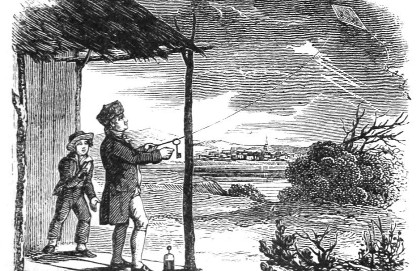
Benjamin Franklin was quite eager to imagine the European innovation of Teutonic scientists with sparks and charges to be recreated in the colonial entrepôt, imagining that the fearsome world of a fluid “electrical fire” might be “collected” and “drawn off” as a resource of generative power, if he imagined the kite would be flown from a window indoors, harvesting electricity from the heavens as a fluid resource that might be understood by market dynamics as flowing in directions and along straight lines. Franklin seemed to imagine electricity as a new resource of fluid wealth, drawn from the heavens and generated out of the air, whose currency might be gathered to be redircted across borders of nations or state jurisdictions, as if from as yet unmapped lands.
The attempts to map the current iteration of underseas cables that carry internet signals rather than only electric charge as a new vital network of a global economy, in inevitable need of repair but also of maintenance, demanding to be mapped as it runs outside of the limits of state governance. But the map of electric cables and WiFi lines across the oceans increasingly in need of mapping as the infrastructure of underwater current seems a country apart, a region offshore and hidden in the deeps. The generative power of electricity by which Franklin was so excited seemed able to be channeled through bodies, human and animal, as a dynamic “currency,” whose oscillating flows mirrored market transactions, as if it were able to suture the global division of continents by new “bonds” that carried and put in circulation the bipolar interface as a harmonized market, anticipating underseas cables, but depended on the material ties.

The hopes of governance of a network of cables suggest almost a living structure of its own. The cables are the material substrate of our sociability and economic ties, but a have become increasingly difficult to map in necessary detail or expanse to scale. The mid-nineteenth century optimism of joining continents by underseas cable were imagined as a network that spun out from London, contracting the surface of a world that appeared the ghost of a British Empire, the delicate web of tangled underseas cables of fiber optic cable, that now are estimated to extend across the global seabed to connect most of the world’s data plans and streams at over 1.4 million km, along the ocean’s floor, buffeted by currents, mudslides, and even the lines of fishing trawlers, even as the global spinning out of submarine cables has grown astoundingly over the past thirty-five years, since the first fiber-optic cable extended on the Atlantic Ocean’s seabed floor in 1988, by ATT, France Télécom, and British Telecom, with an optimism mirroring the first underseas cable of the mid-nineteenth century.
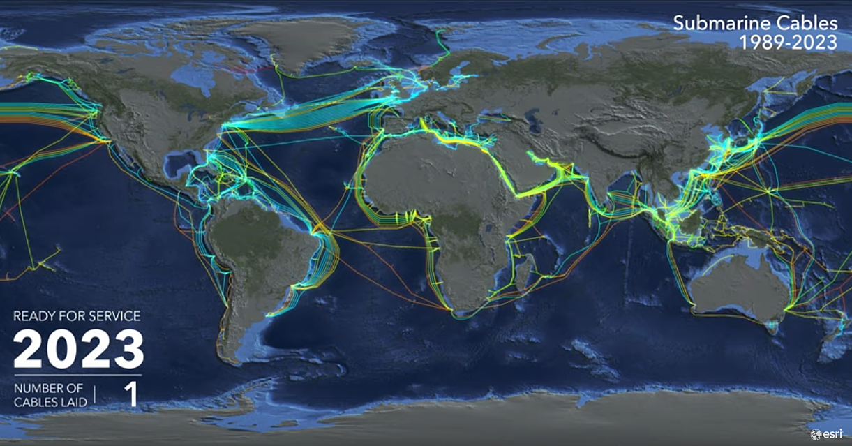
The mapping of such cables–carrying not only telegraph signals, as in the 1800’s, and, much later, wifi along fiber-optic lines wrapped in steel, lie among the hundreds of cables that would collective run over a million miles back to back beneath the earth’s oceans. The criss-crossing of underwater canyons and deepwater divides, linking the financial transfers, ensure the continued global transit of messaging signals, and internet providers’ continued service, in a complement to the satellites which ring the planet in outer space. Although the satellites are only be able to carry a fraction of the information that the cables send between continents that hug the seabed: satellites can indeed only carry a half of a percent of the traffic that courses across underseas cables, making them a vital infrastructure on which we increasingly depend in more ways that we imagine. The hidden infrastructure of the hidden deep suggests a network that is terrifyingly fragile, and is able to be mapped in quite concrete terms as a material substrate on which globalization can be mapped if its fragility can be maintained, and the dangers of underseas breakage and disruption prevented against.

1. The global impact of the underseas cable was, to be sure, seamlessly felt to be a contraction of the global surface analogous to shipping routes of trade, as they were mapped in an 1893 global map trumpeting shipping routes and cables that contracted the world’s surface as the dawn of a new era of an earlier globalization.


The World on Mercator’s Projection, Showing Sailing Routes and Underseas Cables/1893
The smoothly curved hatched routes of lain cable that crossed from England to the Boston and Newfoundland underseas promised the realization of the globalization that Whitman had celebrated, if Thoreau turned a cold shoulder, predictably, to the “grandeur of this creates achievement of the Nineteenth Century.” Thoreau was not impressed at the cables of telegraphy, who found its benefits rested on illusion as much as advances, in his predictable skepticism, as “pretty toys which distract our attention from serious things,” presciently fearing the contents of the first messages born by underseas cables were more frivolous messages than ones of import, worrying that the haste of the construction of telegraph cables proceeded more quickly than there was information needing to communicate. But the amount of economic transactions, speculations, and data flows that are flowing under the world’s oceans outstrip the powers of reflection, or indeed comprehension.
For the American Poet, it confirmed the “practicality of communicating across the Atlantic,” on the eve of America’s Civil War, was a triumphant enterprise whose “immensity” threw cold water on doublers was cast in disturbingly radicalized terms, to be sure, as a bond that liberalized a bond by which “Saxon extends the hand of amity to Saxon,” of an “all-conquering race that is always progressing and extending its power and influence, whether in the icy Arctic and Antarctic or in the tropical heats of India” by “lighting flashes from shore to shore: Whitman sung the “chord of communication” that would “vibrate forever with the peaceful messages of commernse, the lightning-winged words of the press, and the thousand anxious queries of individual affection to the health and happiness of the absent and the loved” in the Brooklyn Daily Times, as an ethnic triumphalism that “conquered time and space . . by man’s inventive power” as a sublime achievement. And the raptures into which the transatlantic cable set the poet who so desired worldly unity in 1858 saw the miracle of allowing the world to “reason together,” “without the aid of palpable agencies” suggests a fascinating promotion of a discourse network uniting Old and New Worlds whose map was aptly chosen by Telegeography as a harbinger of a new horizon of information exchange in the twenty-first century.
And even as the landlubbers Leopold Bloom and Stephen Dedalus paused with the hoi polloi of actual sailors in a wooden cabman’s structure in Dublin, overhearing Italian and imagining the opening of new routes to London–not to say that they had ever traveled extensively–“fell to woolgathering on the enormous dimensions of the water about the globe, and ineluctably found the conversation of others turn to “talking about accidents at sea, ships lost in a fog, collisions with icebergs, all that sort of thing,” in 1904, the contraction of global transit cannot but be seen as a precedent of the smoothening of information transit today, pace James Joyce.
2. The spans of privately funded fiber optic undersea cables that have been lain across oceans floors, some stretching over 28,000 kilometers, are a literalization of global circumnavigation. They provide an image of global networking as well as offering the most massive engineering feat on earth that is hidden to human sight–and are more an emblem of globlization, in many ways, than the contraction of global space. And the rapidity with which further cable is being lain to link the world’s data flows along faster and more secure lines of communication mirrors global interconnectedness–senses of connectivity and warping past concepts of proximity, unifying the differently owned cables. Conjuring of a surprising antiquated format of charting coyly suggests the increasing interconnectivity of the Information Age, and it also channels the extreme novelty of being interlinked. The retro iconography of a chat channels the very claims of modernity that TeleGeography, a global telecom, pioneered to channel information–and done so by familiarizing viewers with a distinctly concept of space by how we are increasingly interlinked on information highways often concealed far beneath the sea. Rather than naturalize an image of high-speed connections, the clever choice to rehabilitate a slightly romanticized earlier mapping of oceanic expanse suggests the new space of online data. And it takes the notion of the electronic frontier seriously, by seeking to orient viewers to the new mental space that such sunken data lines create. If the map of the bridging of oceanic by sunken internet cables domesticizes the transcendence of distance through the increasing interconnectedness of information flows.
There is clear pleasure in the retrograde mode of mapping also reveals the actual distances that the physical substrate of the World Wide Web inhabits in so doing, and suggests that we would do well to remember the physical substrate by which the global financial economy is interlinked. To be sure, the format of the map echoes laying the first undersea cables across the Pacific, in the mid-nineteenth century in 1850, when the thrill of mapping the expanse of undersea cable was mapped for the first time enabled possibilities of direct communication networks in the Anglophone world that the poet Walt Whitman himself–he who asked readers ponder the image of a thousand acres, and the linkages among all Americans, and in older age would celebrate the inauguration of the first transcontinental railroad.
Whitman provided a vertiginous reaction that registered the excitement that the cable trigged in the United States in a rather short newspaper article of 1858 focussed on the “moral effect of the Atlantic cable” on the nation, which barely touched on its technological triumph: it is striking that Whitman, long practice in the material practices of setting type to mediate the human voice, celebrated the technology of the cables laid under the ocean by wooden boats as linking communication between England and the United States, as Anglophone nation, by a cutting edge technology of deeply spiritual significance by which he was fascinated. The piece is a sort of meditation on human geography, or the aesthetics of space that the cable changed in a profoundly deep historical–as well as submarine–manner, bridging distances of communication in new ways.
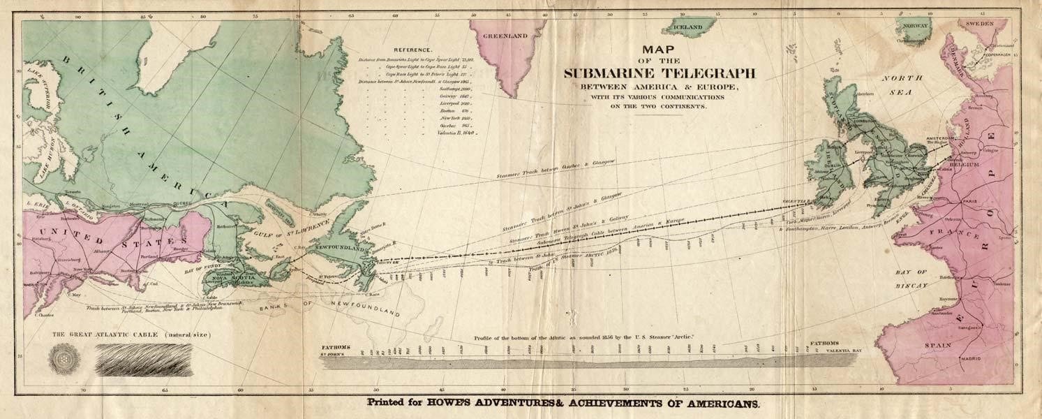
Whitman was long fascinated by the compilation of voices in type, and networks of communication that spanned nations as the railroad. In 1858, already an established poet, he celebrated the cable as as a material network for transporting semaphore, if not human voice, transcending space and binding England and America in truly inseparable ways as a sign of the fostering of global peace–attracting much popular celebration, even if he judged it would not “bring one iota of personal benefit” to the majority of American inhabitants, the electrification of “unbounded excitement” makes it seem as if the internet was introduced to all, in democratic fashion, generating a level of excitement, evoked in the map below of the Submarine Telegraph, worthy of “glorifying a grand scientific achievement” that outstripped any “merely material considerations” by its ability to “thrill every breast with admiration and triumph” in ecstatic terms: Whitman waxed poetic as he praised how “the sentiment of union that makes the popular heart beat and quiver,” more than its technological advantage, imagining that the network set a deep tie spanning the Anglophone world betwden two countries “no longer [able] to keep each other at arms-length.”
The role of technology in furthering the natural relations within or coherence of a nation–a point of fascination common to the institutional infrastructure of America Whitman also celebrated of his own poems–was almost cartographically conceived as a way of unveiling unities within the world able to bridge space, and even, at times, time, able to transport and convey messages that depended on oceanic travel.
Was the technology of the Submarine Cable an extension of the national unity Whitman already celebrated of the United States? The bond that the cable created was cast as a profound historical event, leading England and the United States to set aside any rivalries, having forged this deeper bond of both “heart and feeling”–the network was a deep-lying embodiment of shared purpose, even if it was not seen! Perhaps its very invisibility added to its power. Whitman had celebrated in the 1855 Leaves of Grass the very conceit of achieving such a “merge” through his poetic voice, a merge between peoples, races, and classes; he was open to the idea that the Cable achieved a merge between nations, allowing voices or at least semaphore to span space. Accordingly, he invested the transatlantic coupling of two nations with almost spiritual dimensions. The cable’s laying open new chapter of global history opened by triumphs of ingenuity, skill and technology was less of interest than the “exultation with which it has been greeted and the unbounded enthusiasm with which it has everywhere been received” to foster a sentiment “that makes the States throb with tumultuous emotions and thrills every breast with admiration and triumph.” The cable indeed became a form of sexual congress and intimacy between continents, for Whitman, as much as a communications network, the cable from Newfoundland a fundamentally triumph over international dissensus.
Can one imagine a better promoter of the sort of information highway that realizing poetic goals “material bond for the transmission of news of the rise and fall of stocks,” as Whitman seems to merge his role as newspaperman and poet to celebrate the mystical resonance of cable that would make the designers of the internet applaud. Whitman was amazed that the “mighty outburst of enthusiasm all over the land” that the laying of the cable provoked in the United States, greater than any in his recollection, beyond other celebrations of the nation: the apparent contradiction that “Probably to an immense majority, the Telegraph Cable will not bring one iota of personal benefit” would be outweighed by the “union of the Anglo-Saxon race, henceforth forever to be a unit.”
Whitman was almost anticipating how TeleGeography didn’t only borrow the antiquated iconography of marine charts to celebrate globalization, but found a precedent to celebrate relying high fiber optic cable across the ocean floor: a communications network has perhaps rarely been cast so openly in spiritually elevating terms by someone not its promoter. There was of course considerable physical effort, and much planning, now unseen, as well as the loss of thousands of cable underwater for several years, until warships, loaded with cable, divided the oceanic span by setting off from a point in the midst of the Atlantic in opposite directions, to create a subaquatic bridge, after having lost kilometers of metal wire, by 1858.
The first message took over sixteen hours to arrive in full from England’s Queen Victoria to U.S. President Buchanan, by undersea cable–
The shrinking of distances was a powerful breakthrough of the ability to map space in different metrics, however, than every seemed possible for transatlantic travel. And it’s hence quite apt that the antiquated techniques of mapping global relations were reprised by the folks at TeleGeography to remap the current global growth of internet cables by the syntax and aesthetics from an Age of Discovery.
The appealing charting of the hidden network of submarine cables designed by TeleGeography didn’t only borrow the antiquated iconography of marine charts from an Age of Discovery in order to promote the expanding spread of submarine fiber-optic cables in amusing ways. For the image served to suggest the shifts in spatial connectedness that such increasingly rapid data flows have allowed, and to suggest a map that, in focussing on the seas–and the overlooked areas of marine space–returned to an interesting if somewhat overlooked spatial metaphor to consider and visualize the extent to which global financial networks and information systems move in particularly flexible ways across the permeable boundaries of nations, if not the degree to which national units have ceased to be the confines that matter, as cross-border flows are increasingly the primary sorts of traffic that matter to be mapped.
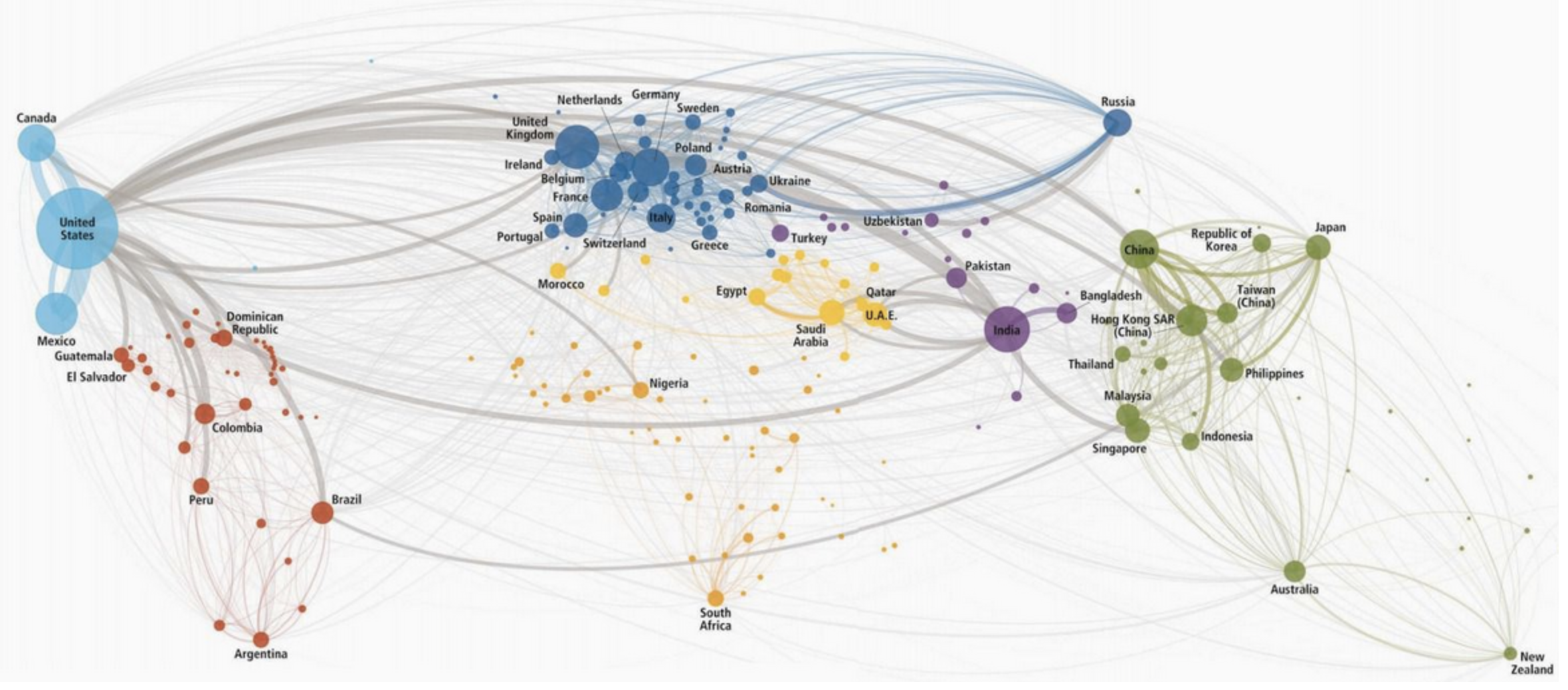
4. A more familiar global remapping of phone calls,constructed on a study by students of business, Pankaj Ghemawat and Steven A. Altman, partly funded by the logistics firm DHL, an approximate quantification of globalization was made by the metrics of cross-border telephone calls in 2012 worldwide, in which the thickness corresponds to the minutes spent on the phone–and presumably the closeness of connections, if filtered through the relative costs of calls and the ability to pay them.
In a sense, the chart featured by TeleGeography openly incorporates less data, while noting the varied speeds of connections, in an image of interconnectedness, and positions itself less as a cutting edge snapshot of globalization or globalized than at the dawn of the possibilities of future interconnectedness that the laying of fiber-optic cables of greater speed can promote. If the map of telephone calls raises questions of information flows, some 41 percent originating in what the authors identified as “advanced economies” to “emerging economies,” and only a small fraction (9%) originating in an “emerging economy,” the technology may also illustrate the precise demographic that continue to adopt telephony: the authors observe that the dominant “calling patterns” reflect “interactions due to immigrants,” with most international calls being placed from the United States to Mexico and India, countries of first-generation immigrants–rather than reflecting actual information flows.
TeleGeography seems decidedly optimistic about the possibilities for global circumnavigation fibre-optic cables can promote. In place of offering a map of actual flows of data, or a revealing look at where cables lie, the adoption of an aestheticized image and iconography of the nautical chart to map the ever-expanding web of cables that connect the world advances an argument about the sorts of ties cables facilitate, in order to illustrate and promote the ever-increasing multiplicity of ways information can travel across the globe without regard for the bounds of the nation-state. Even as we bemoan NAFTA, or raise concerns about the Trans-Pacific Partnership, the networks of cables that currently span the terrestrial sphere divide into 285 separate privately owned segments show a coherent network has rapidly grown–its extent more than doubling in length over the past three years–and seems poised to only grow in coming years, to render national protectionism a thing of the past: the map leaves viewers only to imagine its benefits. While not seeking to quantify actual data flows, the scope of the map seems to be to naturalize the broad range of traffic lying such cables allows, if it is also jumps backwards over the many traditions of oceanogapahical mapping to show a seafloor that is not marked by drifting continental plates and scars of underwater earthquake activity–
NOAA
–but a smooth surface of cables that seem to be lain without ever encountering natural obstructions or topographical variations in the ocean floor.
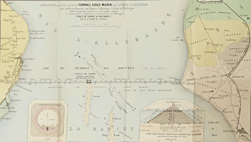
The expansion of transcontinental submarine travel was on the cutting edge of the 1850s, and the laying of miles of lost submarine cables the Atlantic floor may have led Thome de Gamonde to realize hopes for a tunnel between England and France that parallel the previous laying of cable–
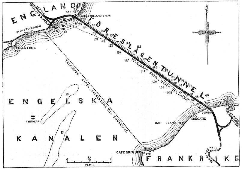
–and project the first underwater tunnel linking England and France in 1855 for rail, a project stopped for “strategic reasons” though the idea of such a chunnel–imagined by Napoleon’s mining engineer of mines as conveying horse-drawn carriages–
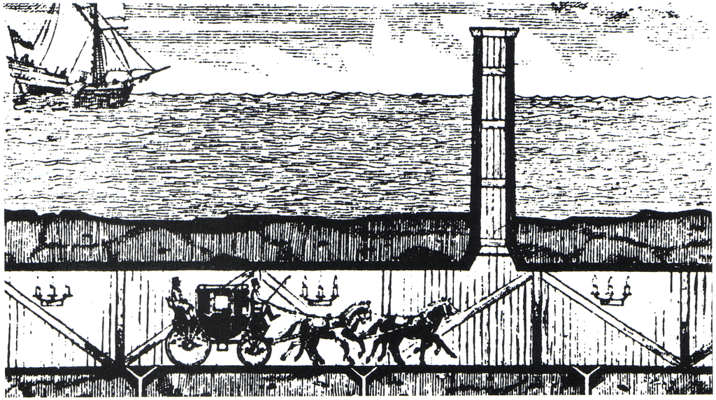
–was only completed until Francois Mitterand was driven by Rolls Royce (a concession?) to board the inaugural train.
The linkage between the nations was a feet of boring a hole, but bridged the very question of territoriality that the first plans of the 1855 version, presented to both Napoleon III and Queen Victoria to be forged through undersea rock, as if piercing the earth’s mantle–
–posed to territorial bounds, and the definition of sovereignty.
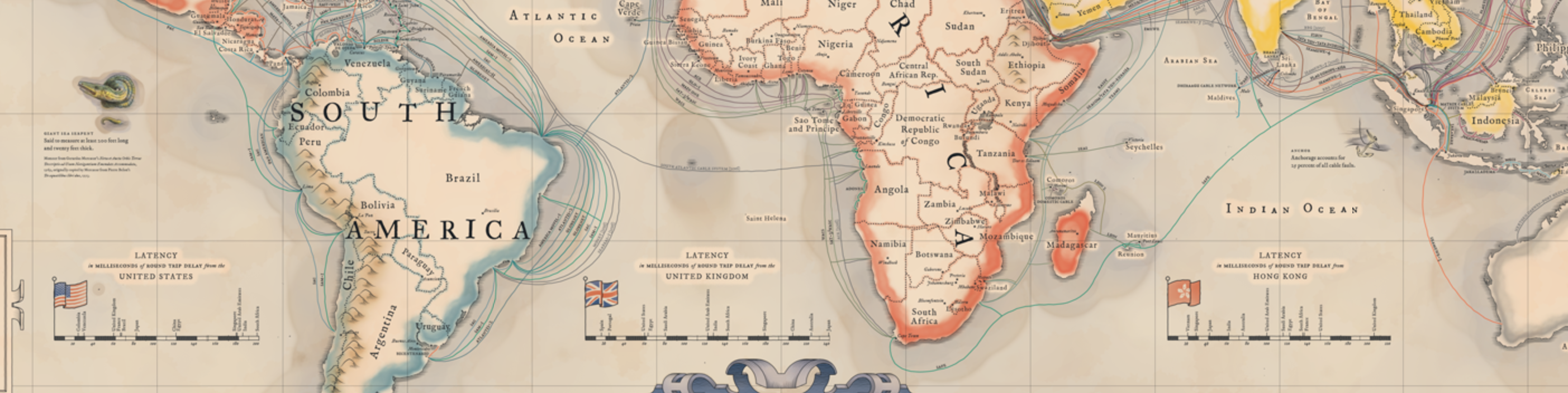
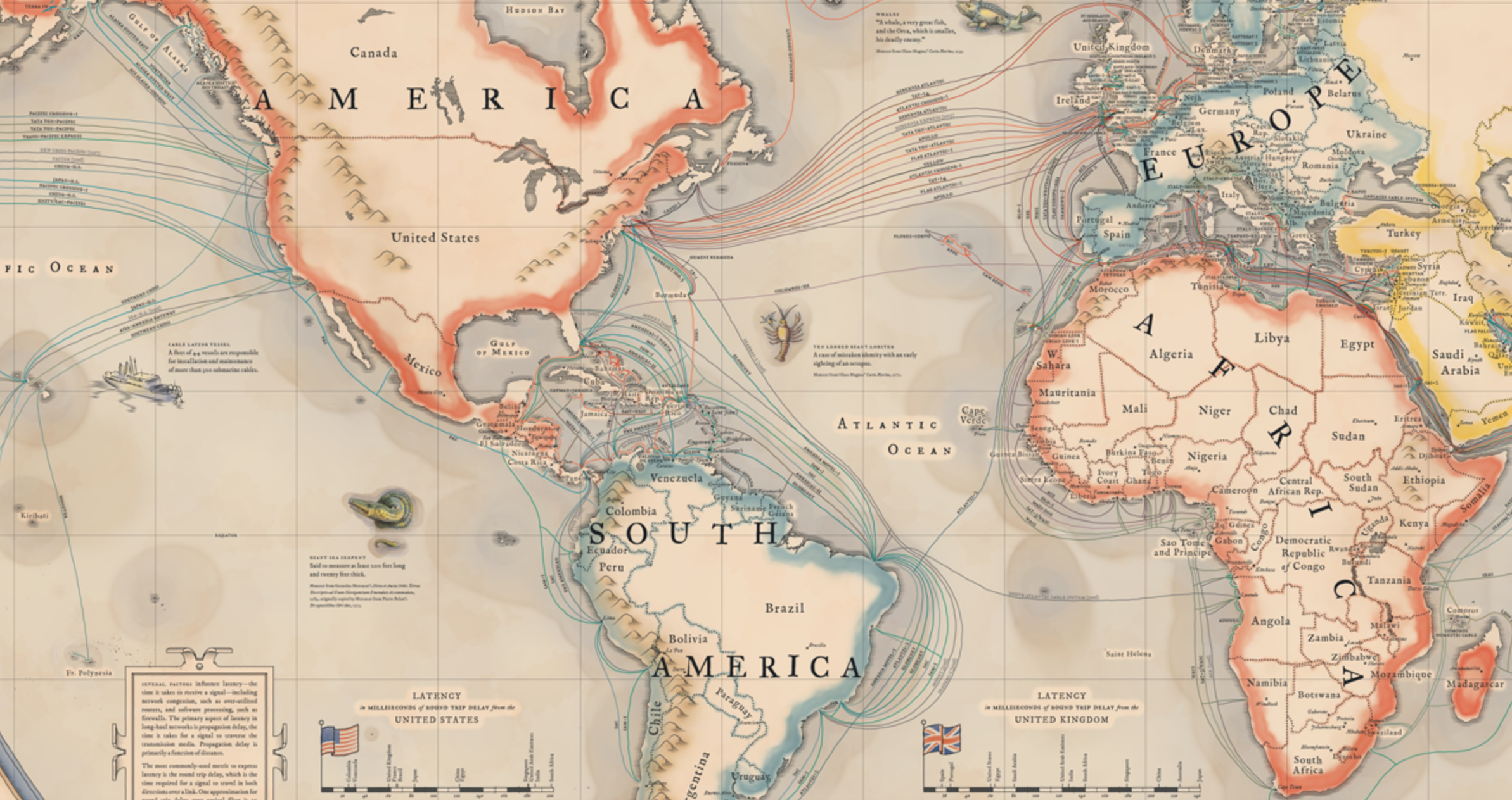
5. The submarine network of cable now totals upwards of 550,000 miles. Although it is never seen above ground, and lies concealed beneath the seas, it now seems to animate most international commerce. There is a pleasant irony in adopting the decorative aspects of marine charts to map a contemporary image of global circumnavigation, since they gesture to deep shifts in the seas of information, but also evoke the marvel of rendering visible what is all but unseen. The exact locations of such cables are not displayed, of course, but the stylized presence suggests a decidedly early modern form of boastfulness–“according to the best Authorities [and] with all the latest Discoveries to the PRESENT PERIOD,” the extent to which the infrastructure of the Information Age spans the seas. What once was a site of marvels revealed by the officer turned conservationist Jacques Cousteau is a field for information carriers, even if monsters inhabit its depths.
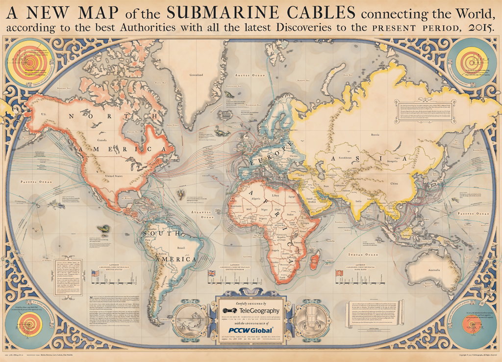
The “New Map” updates the recent rapid exponential expansion of the network fiber optic cables in recent years as a sort of corporate promotion, rehabilitating the marine chart to naturalize the submarine network that now carries a large share of global financial and administrative information worldwide. Retrospectively mapping the expansion of this exoskeleton of the anthropocene ignores the technologies on which such mapping suggest, recalling the abilities to technologically harness steam, wind, and power to recreate the romance and adventure of global circumnavigation in an updating of the 1873 romance and fast-paced adventure Jules Verne told of a race against the mechanized clock by a constellation of transit networks.
For much as Verne offered a quickly paced adventure mildly disguised celebration of technological unification of the globe, the retrograde if glorious map masking as an engraved superimposing high-fibre cables on image of the ocean as understood in days gone conceals the clear corporate interests or material technology that underpin the Information Age. And the recent expansion of a trans-continental high-tension submarine fiber network able to carry 26.2 terrabits/second of data across the undersea floor–which once took seventeen hours and forty minutes–is an awesome acceleration of time that unbinds us from all accustomed temporal constraints in a dizzying fashion. Even as Russian and other spy ships are operating in dangerously close proximity to the cables that carry an infrastructure of global communications that maintain the illusion of the open exchange of information across territorial bounds. (The safety of the antiqued map dispels any such fears of disruption of information exchange in its friendly presentation of a mysterious unknown underwater world.). And now that 99% of global internet traffic occurs thousands of feet undersea–from Netflix to now literally offshore financial transactions to email, the more black-boxing a map can perform, the better!
The appeal of the map not only is of an oceanic unknown–but an act of traversing the very national boundaries that seemed so solidly perpetuated in paper maps. The map of the oceanic unknown celebrates the laying of a material web of the world wide web as if it were another oceanographical detail, but masks the unseen nature of the cables that were lain in hidden fashion underneath the seas: indeed, rather than the slightly earlier Verne-ian classic of 1870 with which it is often paired, the map doesn’t heaven to futuristic science, but sublimated a similar story of submarine itineraries. Indeed, the map offers a picturesque recuperation of an aesthetics of global unity that serves to reframe the newly prominent submarine network that ships recently strung across the ocean floor. It conceals the labor and mechanical drudgery of doing so–both the engineering or the fragility of the fibre-optic network, and the material basis of an electromagnetic carrier lurking deep under the seas. In the Cable Map Greg Mahlknecht coded, the spans of current cables already connect hubs of communication across oceans at varied but increasing speeds, now approaching 26.2 terabits/sec across an astounding 6,6000 km from Virginia Beach to Bilbao, Spain. And while the depths of such cables is not apparent in most maps, the lodging of the cables on the ocean bedrock, 8,000 meters beneath sea-level, is argued to promise the “stability” of such an infrastructure that seem removed from the effects of human interventions from such old-fashioned add-ons to the seafloor as anchors or submarines.
And the planned additions to the network, in part enabled by warming waters, are poised to greatly expand:

The work that the map modeled after an engraving of global seas does is serious, for it integrates the growing network of fiber-optic cable at the ocean’s floor into the seascape that nautical charts showed as a light blue watery expanse. For as the price for fiber-optic cables precipitously dropped since 2000, this material infrastructure of global financial markets has not only grown, but kept up with the rapid improvement in network communication along a growing network of 250,000 km of submarine cable most folks have limited knowledge, and whose public image is in need of better PR, the more eye candy the better. The complex web of what Russ Fordyhce of Infinera has slyly called “the workhorse of the Internet” using fiber optic–a seemingly antiquated technology in an age of streaming and cellular towers, in a high-speed fiber network able to carry internet traffic that roots a virtual world. Such high-pressure sub-sea links expanded subsea capacity by an Intelligent Transport Network, expanding the network of undersea cables to meet broadband needs across the word by 100G flows.
6. The increased speed of such expanded capacity for submarine transport is akin to a living network of “intelligence transport.” But it also suggests a massive updating of our notions of transportation, by a restricted number of undersea fiber cables that seem staged to supersede cable networks in providing bandwidth. The pictorial addition of such fairly florid decorative detail from nautical charts to invest the routes of hidden submarine cables’ with an aesthetic that both caused it to be named one of the best maps of 2015 and exemplifies how to lie with maps, if the current expansion of fiber network capacities suggest that the network of just four years ago are indeed antiquated by the Infinera and other organizations promising to transport data at significantly greater and greater speeds.
The 2015 map, published online, but emulating the paper map, seems to conceal the extent of work that went into not only laying the cable, but ensuring that it was not disrupted, but blended seamlessly into the surrounding submarine landscape. FLAG–the Fiberoptic Link Around the Globe–after all offered a sort of modern updating of the boast of Jules Verne’s Phineas Fogg. For Fogg wagered £20,000 that the speed of the combination of trains and steamboats would allow him to travel around the globe so that he could return to the very same seat he occupied in the Reform Club in London in only eighty days–a boast based on his trust in the speed of modern conveyances of steam travel. For Fogg’s image of interconnectedness was realized in the copper cables that conducted telegraphy traffic.
These telegraphy cables lain under the Atlantic by the 1880s by the Eastern Telegraph Company across the Atlantic and Pacific, which by 1901 linked England to North America, India and Malay in a network of communications that offers a vision of corporate interconnection spanning the expanse of the British Empire and providing it with an efficient communications system that was its administrative and commercial underpinning.
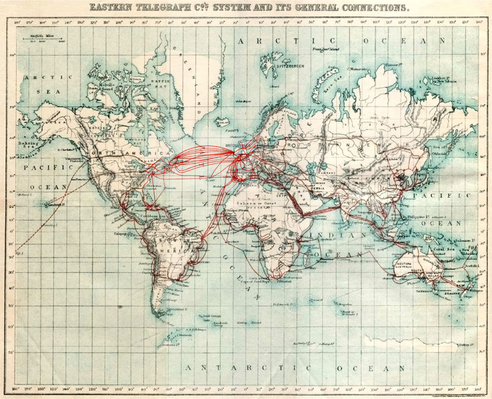
Eastern Telegraph Company (1901), planned cables shown by dotted lines–Wikimedia
But rather than perform the feat of circumnavigation, the matrix of underwater internet cables is based on the creation of a submarine matrix to carry any message anywhere all the time–when it can be linked to an on-land cable–save, that is, in Antarctica, where the frigid waters, for now, would freeze the cable and disable it. Fogg staked his wager after noticing a map showing the construction of British rail exchanges that allowed long-distance transit across India, believing in his ability to achieve global circumnavigation on a network of carriers, based on his trust as a passenger and subject of the British Empire–and the infrastructure the enabled news, commerce, and administrative connections to travel with velocity, leading twenty-four of the thirty ships capable of laying cable-laying to be owned by British firms by 1896. The framed cartouche in the upper right of the 2015 Submarine Cable Map echoes the triumphalism of the “present day” in boasting of the achievements by which, since “the first intercontinental telephony submarine cable system TAT-1 connected North America to Europe in 1958 with an initial capacity of 640 Kbps, . . . . transatlantic cable capacity has compounded 38% per year to 27 Tbps in 2013,” as US-Latin American capacity has nearly quadrupled.
The map, revealing the material network to what most of us perceive as coursing through the air, less effectively places the course of cables in evidence than depicts their now naturalized course. The seascape of the Information Age seems, indeed, to demand the naturalizing of the courses of submarine cables, shown as so many shipping lines, running across the Atlantic and to the Caribbean, around the coast of Africa, from India to Singapore and to Hong Kong and Japan, before coursing across the Pacific. Is its quaint cartographical pastoralization of the courses of communication under the oceans, we see a reverse rendering of a materialized image of globalization, disguised by a faux nostalgia for the mapping of the as yet unknown world that will be revealed by the impending nature of an even greater increase of data flows. Indeed, the breakneck speeds of data transport are noted prominently in some of the cartouches framed at the base of the map, which suggest the two-fold subject of the map itself: both the routes of cables that were laid on the ocean floor, and the speed of data transport their different latency allowed. The cartouche is a nice rendering of the corporate promise of delivering data that TeleGeography presumably makes to its customers, despite the different ownership of many of the stretches of cable that exist, and the lack of harmony, proportionality or geometric design in how the cables are in fact lain.
That the network of submarine cable retains a curious focus on relays in England that is a telling relic of the nineteenth century.
The internet’s network still seems to start in England in Porthcurno, moving to Spain and through the Strait of Gibraltar, across the Mediterranean to Alexandria and then turn down the Gulf of Suez through the Red Sea, and around the Arabian Peninsula to Dubai, before moving across the Indian Ocean to Bombay and on to Malaysia and through the South China Sea to Hong Kong and up the coast of China, it creates an even more expansive set of exchanges and relays than Fogg faced. For while Fogg was dependent on rail to traverse the United States as well as much of Europe, where he could pass through the Suez Canal to reach a steamer engine, and then cross India by train, before getting a ship at Calcutta to Hong Kong and Yokohama, the multiplicity of connections and switches that the submarine cables create disrupt any sense of linearity and carry information at unheard of speed–fiber-optic cables carry information at a velocity that satellite transmission cannot approach or rival.
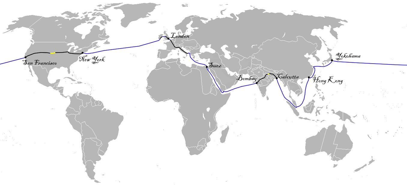
Voyage of Phineas Fogg by rail, steamship, and boat–Wikimedia
The relays of paired cables now enable the instantaneous transmission of information between continents realize a nineteenth century fantasy of an interlinked world in ways that expanded beyond contemplation, the possibility of visiting the countries that FLAG traces are actually verges on impossibility–if only since the network offers multiple pathways of simultaneous transit.
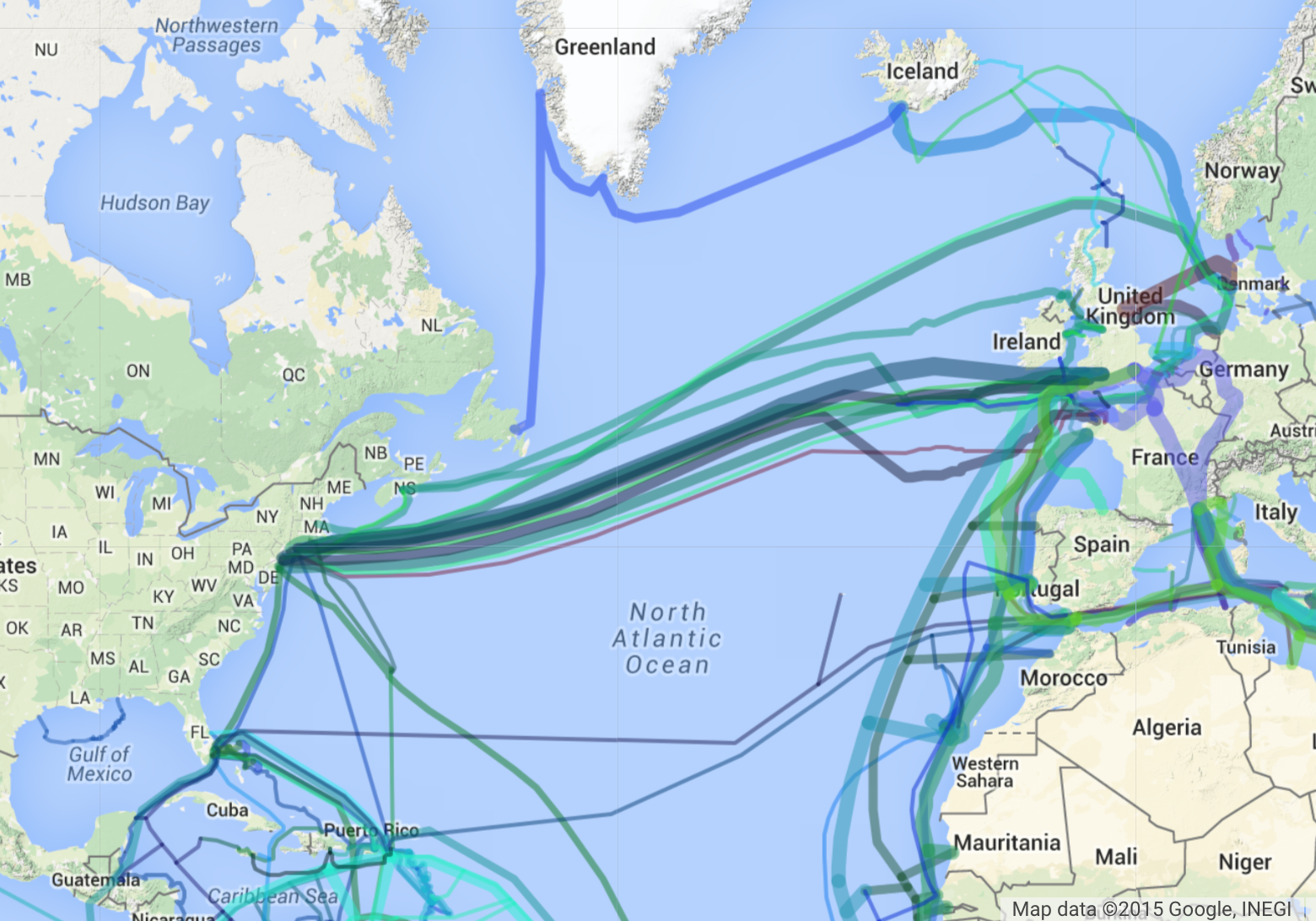
The ambitions of those earlier Telegraph cables in connecting the world far transcends Fogg’s plan to create a path by which he could move between transit hubs. His plans are dwarfed by the ambitions of modernity of the range of active and future underwater cable revealed in Greg’s Cable Map in ways that suggest the ambitions of creating an ever-more intensely interlinked world, where increasing number cables have been laid to fashion the actual physical infrastructure of the internet.
Greg’s Cable Map (click here for detail on each lines)
We often render the “hidden world” of privately owned transatlantic and other cables as a separate underseas world of cables lying on the seabed, able to be disrupted at its nodes, but removed from alike the shoreline and terrestrial world.
In strong distinction from such an image, the recuperation of something like nautical engraving by TeleGeography makes the clever point of naturalizing the greatest infrastructure of the Information Age–one that sometimes seems to have outweighed investment in the visible infrastructures of our cities and roads–within the currents of our seas, and as colored by the very hues by which the land is mapped as if to show the seamlessness of the communicative bridges that they create.
Given the extreme overload of data that these maps reveal–and the eeriness of a world created by the extent of cable laid–It’s in fact quite apt that the telecom firm TeleGeography showcased the interconnected nature of global communications this year by adopting the style of nineteenth-century cartographical tools. It’s probably not at all a coincidence that in this age of big data, there’s a deep romance in the symbolic reclaiming of the crisply engraved lines of nineteenth-century cartography that folks like Nathan C. Yau of FlowingData pioneered in the online publication of a Statistical Atlas of the United Sates with New Data, refiguring information of the 2010 Census and 2013 American Community Survey. Although designed in bits, the maps emulate the engraved delineations created for Francis Amasa Walker’s first Atlas: Yau announced he had done out of some disgust that budget cuts prevented the Bureau of the Census from creating the atlas displaying its data in a Census Atlas–despite its success in accumulating so much data.
A quite clever and versatile graphic designer, Yau has often publicly posted sequences of detailed non-dynamic maps that evoke the lithographic detail and crisp objectivity with which Walker created multiple legible embodiments as the Director of the US Census from 1870, when his interest in data processing led a set of new maps of the nation to be printed in Harpers Magazine, and the Census to grow to 22 volumes. So well are we trained in grasping information via elegant visual forms that Yau bemoaned the absence of a similarly set of stately maps by evoking the project Walker envisioned as a form of mapping serving the public good: and his online images embody data lying in the repository of Census data, from geological records to the distribution of human populations–and digest data to recognizable form, whose individual snapshots seem a nostalgic embodiment of data available from the American Community Survey.
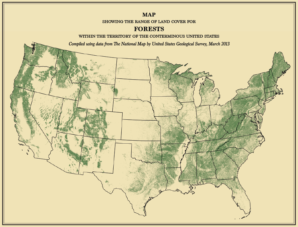
FlowingData, “Map Showing the Area of Land Cover for Forests within the Territory of the Coterminous United States” (2015) from data compiled by American Community Survey (2013)

Flowing Data, “Map Showing Five Degrees of Density, the Distribution of Population” (2015) from American Community Survey (2013)
It is somewhat less expected that the format of an engraved or traditional map be showcased to reveal the system of submarine cables lying on the ocean’s floor: few would consider the invisible network with nostalgia for the medium of the paper map.
To be sure, the very subject of internet cables are more appropriately rendered in an appropriately futuristic mode that habituates us to its ambitions by expanding the colors of a public transit map to reveal an image of an interlinked world–

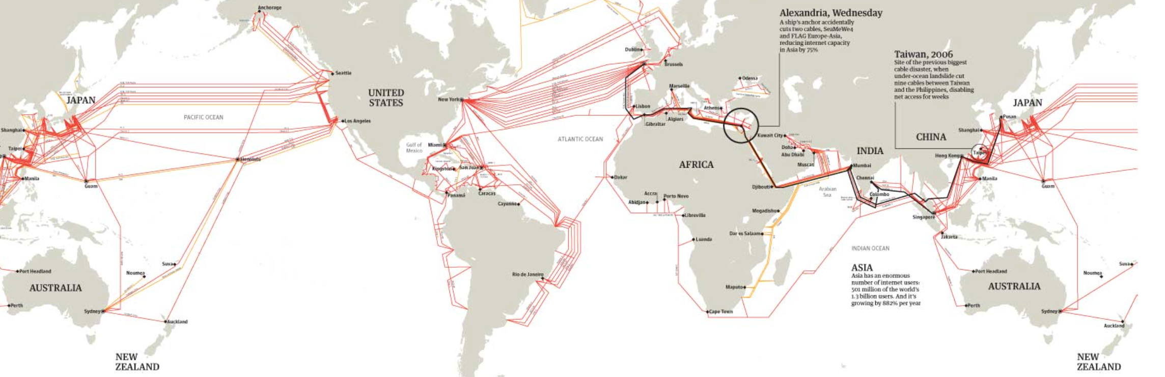
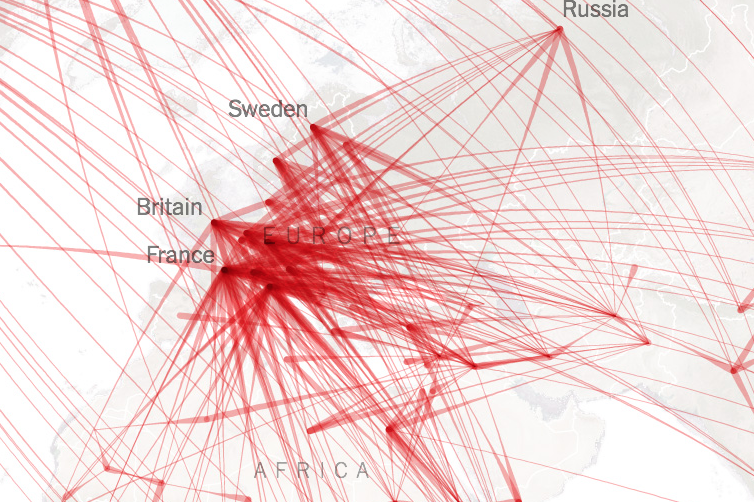
The decision to “go retro” breaks conspicuously with such a choice for the futuristic design, and accommodates the multiplying extent of fiber optic cables that have been laid across the world’s waters so as to network the globe. Only in 2014, TeleGeography issued a staggering map of the improvements in linkages of relays in submarine cable systems, suggesting the extent of the interlinked world to which we have become familiar not only thanks to Edward Snowden, but to our reliance on global data flows that increasingly enable financial markets worldwide, surpassing material constraints.
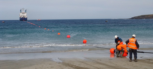
Such a map is overly schematic, indeed, since many of the cables’ paths are not openly disclosed. From the land, we cannot see the landing sites where such fiber-optic cables go underwater, as Trevor Paglen has recently reminded us, in a series of diptychs that contrast the cables barely concealed in NOAA maps and the otherwise placid landscapes of the beaches beneath which they run; few realize the extent to which the information that travels on them is likely to be monitored as a form of mass surveillance, which we are far more likely to associate with satellites or surveillance, but are in fact far more efficient.
But the complexity of the how information is carried along such cables is as boggling to the mind as the awesomeness of its ambitions. Perhaps recognizing the sense of overwhelming its readers with data overloads in its maps, the 2015 map of submarine cables from Telegeography updated the format of an engraved map, and put in online in a fully zoomable form, to allow one to examine its lovingly rendered detail in a map that harkens back to charts of nautical discoveries but celebrates the rapidity of delivering information in an updated version of the corporate triumphalism of the Eastern Telegraph Company. That map, which boasts in evocative language to be revised “according to the best Authorities with all the latest Discoveries,” foregrounds the multiple linkages of fiber optic cables that carry the vast majority of communications–of which “oversea” satellites link but a fraction–so efficiently they at first carried upwards of a thousandfold as much data compared to the older copper cables that lay below the sea recently–280 Mbps of data per pair–and moved 100 Gbps across the Atlantic by 2012–and the prediction 39 Tbsp is even feared to barely satisfy demand. For transatlantic cable have come to carry some 95% of international voice and data traffic, and are viewed as a fundamental–if unseen–part of our global infrastructure, potentially vulnerable to disastrous interruption or disruption.
The familiarity of the “New Map of the Submarine Cables connecting the World” is not only charming; it is a somewhat subtle naturalization of the new materiality of information flows so that they are regarded as a part of our new lived environment. To be sure, the paths of cables are highly stylized, as if they fit within the oceans’ currents, although they sacrifice accuracy even though they suggest their private ownership and considerable density.
The open-ness of this mapping of submarine cables has been rare until recently–as recently as 2009, the location of the cable that arrives in the UK at Cornwall Beach was kept secret even on military maps, although commercial fishing trawlers and other boats are provided with access to them, somewhat paradoxically but unsurprisingly, lest they run across and damage the undersea cables that relay so many vital data flows across the globe under the seas, and whose severing could potentially come at a cost of as much as $1.5 million per hour.
The actual density of such cables laid at the bottom of the sea is not displayed on the above map, of course, which conceals their precise locations or the complexity of their routes, which are tantamount to secrets of state and off most maps.
The map designed by TeleGeography is indeed a romanticized vision of the pathways that information courses around the world, undersea, in an information age; the recuperation of the iconography more familiar from a printed map of the seas than the layers of a web map or data visualization naturalize the presence of such submarine cables in an odd exercise of familiarization. We might be more suspect of the cartographical tricks of rendering, naturalizing the courses that submarine cables take when we examine the definitive maps of actual submarine cables or study the extent of such offshore cables in an interactive map and more carefully scrutinize their actual expanse. (Such maps are not actual renderings of their situation on the seabed, if the stark layers that chart these cables are decidedly less harmoniously balanced with the light shades of the mock-engraving, Submarine Cables Connecting the World.)
Decidedly fanciful if naturalistic sea monsters could denote the limits of the known world or the boundaries of secure navigation in many early modern charts, the inclusion of this most pictorial of cartographical iconographies familiar from early engraved maps are aptly appropriated to suggest the absence or gaps in the interlinked nature of space and of what passes as our sense of continuity in 2015–as well, on a not so subliminal level, to evoke the dangers of their disruption.

So naturalized is its cartographical iconography that the map suggests the new environment of internet cables in which we live. This naturalization might be nowhere more evident than in the exotic appearances of marine creatures included in its seas. A longstanding historical association exists between sea monsters with the North Sea, after monsters were first rendered as crowding its overflowing oceans in glorious detail by the bishop-geographer Olaus Magnus in his 1539 map of the land and waters around Scandinavia, who seems to have borrowed from bestiaries to illustrate the dangers that sailors would face in its waters, and to delight his readers and attest to the variety of the created world.
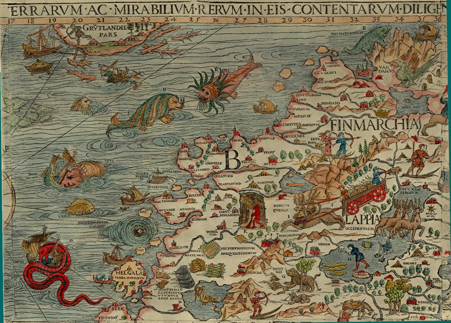
James Ford Bell Library, University of Minnesota
A strikingly similar sort of horned seal and spouting fish quite appropriately make an appearance in the 2015 Submarine Cable Map of TeleGeography within the North Sea and Arctic Ocean, as if to suggest the frigid waters that restrict the services such cables deliver–the spouting animals and seal lifted from Olaus Magnus’ Marine Chart frolic just beyond the regions that are currently covered by the cables’ crowded course.
Is this a hidden representation of what actual spatial limits constrain where countries are able to lie further submarine cable? Or is our dependence on underseas cable not a new affordance that we are unlikely to want to leave, demanding we fall back on the paper maps of the ocean floors as we attempt to repair, reconnect, and preserve the networks of cable on which we increasingly have come to depend? Telecommunications giants like Orange, the French communications company, have come to employ a miniature dedicated marine fleet of repair ships, on call 24-7, to address the dangers of cables broken due to mudslides, tsunami, ships setting anchor, trawling nets, or deepwater avalanches arriving with detailed nautical charts and grapnels to locate, capture, and rejoin the ends of cables in order to lift them up from the ocean floor to splice, repair, and then allow them to sink again to the ocean floor, keeping the fiber-optic network alive, for the time being, as if it were a living being, in need of rewiring and surgical repair. Several secret fleets are dedicated to repair what might well be the world’s most important infrastructure–and perhaps the infrastructure that has most enabled the phenomena of globalization–

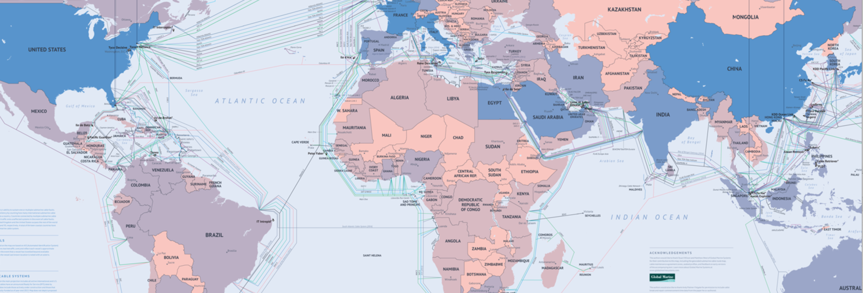
Active and Planned Underseas Internet Fiber-Optic Cables, 2024/TeleGeography
The hundreds of thousands of miles of slender cables that lie on seabed paths along the world’s oceans floor is an apt image of globalization, aptly colored in deep sea blue by the Verge, remind us how fragile so much the oceanic expanse we neglect in our increasingly landlocked era is in the globalized world, linking Europe to Asia and erasing the divisions of continents, demanding constant attention for subsea repairs, ensuring the global network that carries bank transfers, internet communications, and an international economy can survive across borders, shepherding signals across the ocean deep we neglect at our own risk.


