While we are increasingly deadened by data visualizations that track the infectious spread of COVID-19 across the world and country, their logic has often been implicit. As much as tracking real-time data of deaths and “hot-spots” in the world and the nation, we trust the data viz to orient us to the infectious landscape to better gain understanding of viral spread. We seek to grasp nature of the virus’ transmission, and perhaps hope that we can better grasp its spread. We depend on these daily updates to retain a sense of agency in the chaos, but realize that they are provisional, contingent, and selective snapshots, based on testing, and exist at a time delay from the virus’ actual distribution–without much predictive value. We maddeningly realize they are dependent on testing rates and reporting, and only as good as the datasets which they re-present.
On the heels of a 5% statewide positivity rate on December 5, 2020, California was declared in a state of shut down in all its counties. It almost seems that such graphics have started to fail us, as the spread of the virus overflows the boundaries of the map and permeates its space. The choropoleth renders individual counties all but indistinct, the state drowned in widespread infections, with only a few of its less populated regions as refuges. With a flood of purple overflowing the coastal counties, the delta, the Central Valley, and the entire south of the state, was there even any point in mapping the danger of viral spread beyond a state of red alert?
Dec. 5, 2020
While mapping offers little comfort in the era of saturation of heightened risk, the color-codes alert inhabitants to the danger of increased stresses on the public health system–as much as visualization challenges to translate tools of data aggregation to visualize the pandemic., as December 6 rates grew by December 19. As we shift to map a decreasingly multi-colored state by the moderate, substantial and widespread virus, and widespread cases seem to flood the state, the map offers a security of some sort of monitoring of the pandemic’s spatial spread.
The sea of purple is like Spinal Tap going raising the volume “up to eleven,” and are a sign that we are in unexplored territory that won’t be accommodated by a simple color ramp–or, indeed, a familiar cartographic iconography among our current tools of styling space. While we are used to maps embodying meaning, what the colors of the map embody–beyond risk–is unknown. To be sure, at a time when fatalities from the coronavirus in the south of the state have skyrocketed from the middle of the month, hitting records in ways terrible to even contemplate, the field of purple is a deeply human story of loss, as a surge of hospitalizations have flooded the entire healthcare community, and stretched facilities of critical care beyond anything we have known, filling half of intensive care beds in LA County at Christmas. 2020 enough to make it hard to feel any relief in the close of a calendar year, as if that unit still held any meaning, and very grim about 2021: and while the CDC allowed that there may already be a new, more contagious strain, in the nation two days before Christmas, the arrival of the more contagious strain in California and Colorado increased alarm before New Year’s.
San Francisco Chronicle, December 6 2020
SF Chronicle, December 19, 2020
How to get a handle on the novel coronavirus that we have been pressing against COVID-19 dashboards since March to grasp better, and will we able to do so in 2021?
Whatever sense agency the maps impart, it is an agency that is only as good as the compromised sense of agency that we expect in an era of geolocation, on which most maps track reports of infection. Even as we face the rather grim warning that we are waiting for the arrival of a vaccine that, in the Bay Area, rates of immunization face steep obstacles of vaccine distribution due to pragmatics of freezer space required, training of extra health care workers, and monitoring and tracking the two-stage process of vaccination, we will depend for public sanity on maintaining clear communication in maps. The actual tracking of the novel coronavirus doesn’t translate that well to a state-wide model, or a choropleth, although it is the method for public health advisories that makes most sense: we do not have small-scale public health supervision in most of the nation, although they exist at some counties. The stressed Departments of Public Health in areas are without resources to manage COVID-19 outbreaks, public health compliance, or retaliations for public health violations: and the effort to create public health councils to manage compliance and violations of public health orders may be seen by some as an unneeded bureaucracy, but will give local governments resilience in dealing with an expanding epidemic, at the same time as governmental budgets are stressed, and no body of law about COVID violations exists.
Rather than map on a national or state-wide level, we can best gain a sense of how much virus is out there and how it moves through attempts of contact tracing–even if the increasing rates of infection may have gone beyond the effectiveness of contact tracing as a methodology that was not quickly adapted by a federal government the prioritized the rush to a vaccine. The basis for such a map in LA county can reveal the broad networks of contagion, often starting in small indoor gatherings across the region, and moving along networks of spatial mobility across the city and San Fernando Valley, and help embody the disease’s vectors of transmission as we watch mortality tallies on dashboards that give us little sense of agency before rising real-time tolls.
ESRI
If such ESRI maps suggest a masterful data tracing and compilation project, the data is large, but the format a glorification of the hand-drawn maps of transmission that led to a better understanding of the progress of Ebola on the ground in 2014, used by rural clinics in western African countries like Liberia and Rwanda to stop the infectious disease’s transmission and monitor the progress of contagion to limit it–as well as to involve community members in the response to the virus’ deadly spread.
We may have lost an opportunity for the sort of learning experience that would be most critical to mitigate viral spread in the United States, as no similar public educational outreach was adopted–and schools, which might have provided an important network for diffusing health advisories to families, shifted predominantly to distance learning and providing meals, but we became painfully aware of the lack of a health infrastructure across America, as many openly resisted orders to mask or to remain indoors that they saw as unsubstantiated restrictions of liberty, not necessary measures.
Hand-Drawn Public Health Map of Ebola Transmission in Liberia(2014)
We are beyond contact tracing, however, and struggling with a level of contagion that has increased dramatically with far more indoor common spaces and geographic mobility. Yet the broad public health alerts that these “news maps” of viral spread offer readers omits, or perhaps ignores, the terrifying mechanics of its spread, and the indoor spaces in which we know the virus is predominantly acquired. The rise of newly infectious mutated strains of the novel coronavirus was in a sense inevitable, but the rising tension of what this means for the geographical distribution and danger of the coronavirus for our public health system is hard to map to assess its wide distribution, and we take refuge in mitigation strategies we can follow.
Why have we not been more vigilant earlier to adapt the many indoor spaces in which the virus circulates? It bears noting that the spread of virus in the state was undoubtedly intensified by over a hundred deaths and 10,000 cases of infection to spread in the density of a carceral network, which seems an archipelago incubating the spread of viral infections in the state. We only recently mapped the extent of viral spread across nineteen state prisons by late December 2020, tracked by the Los Angeles Times, but often omitted from public health alerts–
Coronavirus Cases Reported in Nineteen California Prisons, Dec. 21, 2020
–and the density of Long-Term Care centers of assisted living across the state, which were so tragically long centers of dangers of viral spread, as the New York Times and Mapbox alerted us as the extreme vulnerabilty of elder residents of nursing homes, skilled nursing facilities, retirement homes, assisted-living facilities, residential care homes who cannot live alone was noted across the world. The data that was not provided in the grey-out states interrupted the spread of infections among those often with chronic medical conditions was not surprising, epidemiologically, but terrifying in its escalation of the medical vulnerability of already compromised and vulnerable populations–and steep challenges that the virus posed.
unlike those greyed out states that fail to release data on deaths linked to COVID-19 infections, congregate on the California coast: while the New York Times depicted point-based data of the over 100,000 COVID-related deaths in nursing homes are a small but significant share of COVID deaths, exposure for populations with extraordinarily high probability of possessing multiple possibilities for co-morbidities is probably only a fraction of infections.
We strain to find metrics to map the risk-multipliers that might be integrated into our models for infectious spread. It seems telling to try to pin the new wave of infections in a state like California to increased contact after Thanksgiving–a collective failure of letting up on social distancing in place since March–as the basis for a post-Thanksgiving boom in many regions of the state, using purely the spatial metrics of geolocation that are most easily aggregated from cell phone data in the pointillist tracking of individual infections in aggregate.
New York Times/CueBiq Mobility Data
Based on cell-phone data of geolocation, a proxy for mobility or social clustering that offered a metric to track Americans’ social proximity and geogarphical mobility–including at shopping centers, oceanside walks in open spaces, and even take-out food curbside pickups, as well as outdoor meals and highway travel, few counties curbed aggregation as one might hope–although the fifty foot metric accepts the many outdoor congregations that occurred, well within the Cuebiq metric, wearing or without masks. A magenta California registered pronounced proximity, grosso modo, discounting any mindful innovative strategies in the state.
Increased Spatial Closeness within Fifty Feet/CueBiq/Graphic NBC News, Nigel Chiwaya and Jiachan Wu
It is stunning to have a national metric for voluntary mobility, rough as it is, to measure internalization of social distancing protocols and potential danger of a post-holiday COVID-19 bump. To be sure, we are stunned by geolocation tools to aggregate but risk neglecting the deeper infrastructures that undergird transmission, from forced immobility. While geolocation tools offer opportunities for collective aggregating whose appeal has deep historical antecedents in measuring contagion and anticipating viral transmission by vectors of spatial proximity, geospatial tools create a geolocation loop in visualizations which, however “informative” perpetuate a spatiality that may not clearly overlap with the actual spatiality of viral transmission.
Even if we demanded to map what were the novel coronavirus had “hot-spots” in mid- to late March, as if processing the enormity of the scale we didn’t know how to map, aggregating data without a sense of scale.
March 26, 2020
Across the summer, it seems best to continue to map daily numbers of cases, relying on whatever CDC or hospital data from Hopkins we had, trying to aggregate the effects of the virus that was spreading across the country whose government seemed to provide little economic or medical plan, in maps that tallied the emergence of new cases, as new hotspots appeared across the land, meriting attention difficult to direct.
We are plowing infections and mortality with abandon in a steady diet of data visualizations that purport to grasp disease spread, that were once weighted predominantly to the New York area, even as they spread throughout the nation by the end of March, but remaining in the thousands, at that point, as even that low threshold was one by which we were impressed. The tracking of the local incidence of reported cases seemed to have meaning to grasp the meaning of transmission, with a pinpoint accuracy that was assuring, even if we had no way to understand the contagion or no effective strategy to contain it. But we boasted data visualizations to do so, focussing on the nation as if to contain its spread in antiquatedly national terms, for a global pandemic, not mapping networks of infection but almost struggling to process the data itself.
After all, the John Snow’s cholera maps of John Snow are the modern exemplars foregrounded in data visualization courses as game-changing images as convincingly precise pictures of infection progressing from a water pumps in London neighborhoods is often seen as a gold standard in the social efficacy of the data visualization and information display. The elevation of the pinpoint mapping of cholera mortality in relation to a water pump from which the deadly virus was transmitted in a nineteenth-century London neighborhood:
John Snow, “Cholera Deaths in Soho”
The Snow Map so successfully embodies a convincing image of contagion that it has taken on a life of its own in data vis courses, almost fetishized as a triumphant use of the plotting of data that precisely geolocated mortality statistics allow, and can indeed be transposed onto a map of the land to reveal the clustering of death rates around the infamous Broad St. pump, that created a legible vector of the transmission of diseases in the Soho neighborhood, so convincing to be touted as a monument of the data sciences.
Open-Air Water Pumps Tainted by Cholera measured in John Snow’s Map
Snow is lauded for having effectively showed that, in ways that changed scientific practices of collective observation and public health: rather than being communicated by miasmatic infections that spread to low-lying London from the Thames, mortality rates could gain a legibility in proximity to a pump that transmitted an infectious virus, often presented as a conceptual leap of Copernican proportions (which it was, when contrasted to miasma that emanated from the Thames to low-lying areas–if it anticipated a bacteriological understanding of viral transmission). The association of danger with the water procured on errands from neighborhood pumps however replaced the noxious vapors of a polluted river, as in earlier visualizations of the miasma that lifted the noxious fumes of the polluted Thames river to unfortunate low-lying urban neighborhoods, who were condemned by urban topography to be concentrations of a density of deaths of more striking proportions and scale than had been seen in the collective memory.
Snow made his argument by data visualizations to convince audiences, but he mapped with a theory of contagion. But if Snow’s maps works on how the virus is communicated in outdoor spaces–and how a single site of transmission can provide a single focus for the aggregation of mortality cases, COVID-19 is an infection that is most commonly contracted in indoor spaces, shared airspace, and the recycled unfiltered air of close quarters. And the indoor spaces where COVID-19 appears to be most often transmitted stands at odds with the contraction in outdoor common spaces of the street and service areas of water pumps, that create the clear spacial foci of Snow’s map, and the recent remapping by Leah Meisterlin that seeks to illuminate the urban spaces of the contraction of cholera in a digital visualization as a question of intersecting spatialities.
Current visualization tools compellingly cluster a clear majority of cholera deaths in proximity to a publicly accessible pump where residents drew water where viral pathogens that had colonized its handle. But we lack, at this point, a similarly convincing theory of the transmission of the novel coronavirus SARS-CoV-2.
But the logics of COVID-19’s communication is nowhere so crisp, and difficult to translate to a register that primarily privileges spatial contiguity and proximity–it is not a locally born disease, but a virus that mutates locally across a global space: a pandemic. And although contact-tracing provides a crucial means of trying to track in aggregate who was exposed to infection, we lack any similarly clear theory to metaphorically grasp the contagion–and are increasingly becoming aware of the central role of its mutation to a virus both more infection and that spreads with greater rapidity in confronting the expansive waves of infection in the United States–as if an escalated virulence grew globally in the first months of this rapidly globalized pandemic.
Our dashboards adopted the new versions of web Mercator, perhaps unhelpfully, to offer some security in relation to the nature of viral spread, which, if they served as a way of affirming its truly global scope–
NextStrain
–also suggested that global traffic of the virus demands its own genomic map, as the virus migrates globally, outside strictly spatial indices of global coverage, and that perhaps spatial indices were not the best, in the end, for accounting for a virus that had began to develop clear variants, if not to mutate as scarily as many feared, into a more virulent form.
And it may be that a genomic map that allow the classification of viral strains of genomic variability demand their own map: for as we learn that genomic mutation and variation closely determines and affects etiology, communication of the viral strains offers yet a clearer illustration that globalization articulates any point in terrestrial space to a global network, placing it in increased proximity to arbitrary point not visible in a simple map, but trigger its own world-wide network of markedly different infectiousness or virulence.
NextStrain
From December 4 2019, indeed, we could track emergent variants of the virus best outside of a spatial scale, as much as it reminded us that the very mobility of individuals across space increased the speed and stakes of viral contagion, and the difficulty to contain viral spread, in the interconnected world where viral variation recalled a flight map, set of trade routes, or a map of the flow of financial traffic or even of arms. Mutations were understood to travel worldwide, with a globalism that a spatial map might be the background, but was indeed far removed, as we moved beyond questions of contact tracing to define different sizes of genomic mutation and modifications that we could trace by the scale of mutations, not only the actual places where the virus had arrived.
Was place and space in fact less important in communicating the nature of COVID-19’s increasing virulence?
The maps of genomic variation traced not only the globalization of the virus, but its shifting character, and perhaps etiology across some thirty variants by late April, that show both the global spread of the virus, and the distinct domination of select strains at certain locations, in way that researchers later theorized the ability to “track” mutations with increasing precision. If researchers in Bologna defined six different variants of coronavirus from almost 50,000 genomes that had been mapped globally in laboratory settings to map variants of the virus whose signatures showed little more variability than strains of the flu in June, variations of signatures seemed a manner to map the speed of coronavirus that had traveled globally from by February 202 to the lungs of the late Franco Orlandi, an eighty-three year old retired truck driver from Nembro, Italy, whose family could not place China on a map when, following diagnostic protocol, attendant physicians in Bergamo asked if Orlandi had, by chance, happen to have traveled to China recently.
NextStrain
Despite lack of serious mutation, thankfully, the data science of genomic sequencing of the COVID-19 cases triggered by genomic mutations of SARS-CoV-2 genome of just under 30,000 nucleotides, has experienced over time over 353,000 mutation events, creating a difficult standard for transmission into equivalent hot spots: some hot spots of some mutations are far more “hot” than others, if we have tried to plot infections and mortality onto race, sex, and age, it most strikingly correlates to co-morbidities, if all co-morbidities are themselves also indictors of mortality risk. While the mutations have suggested transmission networks, have the presence of different levels of mutations also constantly altered the landscape of viral transmission?
It makes sense that the viral variant was tracked in Great Britain, the vanguard of genomic sequencing of the novel coronavirus as a result not only of laboratory practices but the embedded nature of research in the National Health Services and the monitoring of public health and health care. Enabled by a robust program of testing, of the some 150,000 coronavirus genomes sequenced globally, England boasts half of all genomic data. Rather than being the site of mutations, Britain was as a result the site where the first viral variant was recognized and documented, allowing Eric Volz and Neil Ferguson of Imperial College London to examined nearly 2,000 genomes of the variant they judged to be roughly 50% more transmissible than other coronavirus variants, magnifying the danger of contagious spread in ways feared to unroll on our dashboards in the coming months. As teams at the London School of Hygiene and Tropical Medicine studied the variant in late 2020 in southeast England, they found it to be 56% more transmissible than other variants, and raised fears of further mutations in ways that rendered any map we had even more unstable.
The virus SARS-CoV-2 can be expected to mutate regularly and often. While England boasts about half of all global genomic data on the virus, of the 17 million cases of SARS-CoV-2 infections in the United States, only 51,000 cases of the virus were sequenced–and the failure to prioritize viral sequencing in America has exposed the nation to vulnerabilities. And although California has sequenced 5-10,000 genomes a day of the novel coronavirus samples by December, and Houston’s Methodist Hospital have mapped 15,000 sequences as it watches for new viral variants; an American Task Force on viral variants will be rolled out early in 2021, as the discovery of viral mutations haves spread across five states in the western, eastern, and northwestern United States. While it is not clear that the viral variant or mutations would be less susceptible to polyclonal vaccines, most believe variants would emerge that would evade vaccine-induced immunity.
The forced monotone of Donald Trump’s public address to the nation on March 12 was a striking contrast from his most recent State of the Union address. He sought to calm the nation as it faced the pandemic of the novel coronavirus COVID-19 in what was perhaps his most important public address. On the verge of breaking beneath the gravity of circumstances that spun far out of his control, however, rather than show his customary confidence, Trump seemed a President scrambling and in panic mode trying to rehearse stale tropes, but immobilized by events.
President Trump tried to look as presidential as possible, re-inhabiting a role of authority that he had long disdained, as he was forced to address a nation whose well-being he was not in control. The national narrative, as it was begun by WHO’s declaration of a pandemic, was perhaps seen as a narrative which seemed to spin out of his control, below his eyes, as he tried to calm markets by addressing the nation in what he must have imagined to have been as reassuring tones as he could summon. With his hands grasped but thumbs flickering, as if they were a fire under which he sat, as if he were wriggling like a kid strapped in the back seat of a car where he was a passenger to God-knows-where, wrestling with the increasing urgency that his aides demanded he address the outbreak of the virus in the United States that he had long tried to deny. Serial flag-waving continued to fuel President Trump’s attacks on China and the World Health Organization, as if trying to toe the line of adherence to America First policies of nationalism before a global catastrophe, that did not compute. If America First as a doctrine allows little room for empathy, affirming national greatness and the importance of a logic of border closures was all he could offer, and would be predictably lacking reassurance or empathy as he attempted to create a connection at a defining moment of his Presidency, but looked particularly pained.
March 11, 2020
If Trump rarely trusted himself to make hand gestures as he plighted through the speech, thumbs flickering, hands clasped, he every so often seemed distinctly out of synch with his austere surroundings, gold curtains drawn to reveal two flags, barely aware, perhaps, that the eyes of the world were very much on his performance in this new sound studio to which he was not fully accustomed, trying to explain that he had undertaken measures that had made us safe, even if he must have been worrying that the lack of worry he had been projecting and urging in previous weeks had risen across the nation, and his performance was not calming them at all. He was tasked with describing the vulnerability of the nation to the novel coronavirus whose effects he had downplayed repeatedly, but was no longer able to dismiss, and no longer able to concede posed a far greater threat to the American economy than the danger of “illegal” migrants he had so often pointed to as a cause of national decline: the virus that had already crossed our borders repeatedly, since the first cases of COVID-19 were diagnosed in San Jose and Seattle, would potentially bring down his presidency, and he lacked any ability to explain the scale of the effects of the virus that he had effectively helped release by ignoring warning signs.
Oval Office address of Wednesday, March, 11, 2020. Doug Mills / The New York Times)
The link of America to the world defined in his America First candidacy–even made the very identification of a pandemic difficult to process. And he did so in the starkest national backdrop possible, vaunting his closing of borders, suspension of “flights” from China, and ties to Europe–even as he encouraged Americans to return from abroad, and had allowed unmonitored entrance of Europeans and world travelers into New York that would make it the site of the entrance of the disease to the majority of American cities where the viral load arrived, with over 900 people entering America through New York daily for months after China suspended travel from Wuhan on January 23–after China called the outbreak “controllable” on New Year’s Eve. The declaration that echoed the concerns of the World Health Organization may have been buried in global celebrations, even as Trump blamed it for starting a sense of false complacence before undeniably “real” news that he feared would come to define his Presidency.
Trump was unable to accept declarations of the World Health Organization had just called the coronavirus outbreak–an outbreak which, we now know, he had in fact been hearing alerts from American intelligence as early as November 17, about the outbreak of cases of the novel coronavirus in Hubei province, rather than January, when initial infections in the United States were reported. As much as Trump found it difficult to admit the vulnerability of the United States to a global pandemic–or to the recommendations issued by WHO–who set the caduceus that symbolized medical ethics authority over the North American continent–at which he bristled at the notion of a global scope of edicts across boundaries, as if a map where national divides were erased as if it compromised national authority for a disease the President has been uncannily persistent in localizing in China, even before an increasing preponderance of evidence of its global circulation and transmission over a series of months.
Fabric Coffrini, AFP
As cascading fears grew in markets across the world, Trump was perhaps forced to realize his new relation to the world, even as the German stock exchanges plummeted as the measures he announced seem either difficult to process, or failing to address the importance of maintaining trade ties–or of taking adequately prudent steps of public health.
Slumping in his seat at the Resolute Desk, perhaps contemplating how no predecessor had ever delivered on air unprepared remarks from the desk, and visibly discomfited in doing so. He must have hoped to make up for his televised performance by sending surrogates scrambling to social media, issuing clarifications for misstatements–as the exemption offered U.S. citizens to return from China, or the exemption of Ireland, as well as England, and an assurance that trade would “in no way be affected” by the ban, as markets had reacted poorly to his performance. While it seemed that Trump was cognitively unable to process the possibility of a crumbling American economy–and a decline of America’s place in a global economy–under his watch, a prospect faced since he had met with airline executives with whom he discussed the effects of stopping flights of foreign nationals from China in a March 4 meeting, offering them a bailout that limited the impact economic effects of heightened travel advisories, is it possible he had no sense of the massive fallout on the national economy?
March 11 Address/Ralph Orlowski/Reuters
As Trump spoke, global markets not only failed to register confidence–but plummeted, as he revealed no clear plans to to call for social distancing to contain the spread of the virus, and revealed that lack of national preparation for confronting an infectious disease that had no vaccine. He may have remembered that he had outright fired a former cabinet member, barely remembered in the rogue’s gallery of administration, Tom Bossert, who had demanded preparedness “against pandemics” and a “comprehensive biodefence strategy” of the sort the previous administration of Pres. Barack Obama had tried to institute, or that a simulation of a pandemic that could devastate the American economy and kill up to half a million revealed in October 2019 “just how underfunded, underprepared and uncoordinated the federal government would be for a life-or-death battle with a virus for which no treatment existed.”
It seems likely he was rather trying to conceal the massive scale of lying to the nation about the effects of an economic downturn unprecedented in scale, but which the increased lines at Wuhan’s Tianyou Hospital the previous November had already indicated had a problem of infectious diseases on their hands that would have a potentially global consequence. Trump tried to spin the consequences as purely local, in an unprecedented wishful thinking whose scale of deception far exceeded the pathological deceits he had long taken to perpetrate on investors, business partners, and even on family members–from hiding his older brother’s treasured trucks that were a Christmas gift and then admonishing him not to cry, or he would destroy them before his eyes. Even as satellite imagery showed a clear rush to hospital emergency rooms in Wuhan in November, as clusters of cars marked in red crowded the emergency rooms that revealed “a steep increase in volume starting in August 2019 and culminating in a peak in December 2019,” when China began epidemiological investigations that led to identifying and sequence of the novel coronavirus by January 12, ten days before the city went on lockdown to contain its spread.
Annotated Satellite Photographs of Wuhan’s Tianyou Hospital in September 2019
While Trump registered no alarm at the arrival of the very pandemic whose global impact American simulations feared would cripple the national economy, he tried to offer spin on having closed borders to the virus, as if it were not already diffused within the country, in a mind over matter sort of exercise that suggested limits purchase on reality, as if he was able to recognize the risk earlier administrations had identified as a national priority.
Among crowd-sourced mapping projects, Cat Tracker is something of an innovation: rather than map a human environment, it is dedicated to mapping the motions of specific outdoor cats–their individual, day-by-day itineraries–rather than create something like a comprehensive map of a region, such as the HOT (Humanitarian Open Street Map Team) mapping of West Africa to track cases of Ebola. But the mechanics of mapping are strikingly similar, if perhaps not destined for a larger audience. While the HOT team uses the Bing imagery to trace a set of shape-files on different quadrants of Liberia or Sierra Leone, high-accuracy GPS sensors attached to the harnesses of individual cats provide the overlay for maps of cities to which they are resident, so one can imagine the regular radius of their strolls.
User experience designer Alex Lee took the time to track his own cat’s motion by an attachable GPS sensor, tracing his motion around a London neighborhood over a few days to track her explorations around his home.
Where Kitty might go might be quite restricted, and be ompholocentrically concentrated about where she can count on being fed. Researchers had earlier argued in 2011 that the meanderings of domestic cats are far more spatially restricted or circumspect than the zones of feral cats, one of whom roamed over 1,350 acres in rural areas–the domesticated cat only roamed in the area designated yellow, or usually less than two acres:
The issues of the rise of feral cats, and the danger of zoonotic transmission of protozoal diseases like toxoplasmosis is a serious issue that is only increased by the considerable breadth of their geographic wanderings.
The availability of sensor-laden harnesses to fit domestic cats with accurate GPS sensors has most rapidly expanded, however, and provoked a parsing of feline itineraries that might strike some as just TMI–although they carry the promise to provide a better sense of how cats interact with their urban environments, and engagement with urban wildlife. While the initial tracking of cats might map as something like noise–
an image of itineraries over several days might distinguish paths or even register that one time that the cat’s owners were out of town, and their pet made an itinerary to their old house in the hope of finding food when it could not locate them otherwise, traveling unerringly for almost a full mile.
Creating a more complicated overlay distinguishing different days allows one to trace a clear record of the cat’s relation to its environment–and the potential incursions cats make into the wooded areas around towns such as Raleigh, NC, where Cat Tracker has posted feline itineraries mapped with the North Carolina Museum of Natural Sciences and an online database dedicated to tracking animal movement, Movebank.
Tallulah K seems to have been attracted by a variety of surrounding rural prey or targets, but avoided most major roads:
Sometimes cat travels seem to record instances driven by car, as a record of feline meanderings over multiple days shown below. (It is unlikely, if possible, that cat space and human space were so completely congruent.)
Similar results of GPS tracking, perhaps especially entertaining to cat-owners who let their felines out of doors and wonder about their whereabouts, might provide a composite map of cats from different houses in a single neighborhood, in an attempt to find out what cat-roaming was about, or if it followed any particular logic at all–or what their relations might be called one another’s routes.
Royal Veterinary College, Structure & Motion Lab
The maps tracked by the Royal Veterinary College offer a basis to answer questions of how cat space maps onto human space, as much as to merely document feline itineraries.
Mapping cats in Surrey may seem like a bizarre surveillance of the domesticated:
Despite the sense that the signs tracking cats have limited legibility, do they signify a premonition of things to come? On the one hand, this seems an extension of our own expectations for tracking and searching geographic locations. Mapping seems to have its own logic here, providing the very terms by which we can undertake the variety of projects that technology allows. Perhaps we’re experimentally using our technologies on our allegedly domesticated animals, as we affix ankle-bracelets with GPS trackers onto sex offenders, and map their residence and whereabouts, at the same as we get used to being tracked ourselves.
That is not to say that the same technology does not have other benefits, or that it should be demonized: but it suggests a fear of wandering, and a potentially intrusive sense of helicopter parenting, if one in which we bring our pets into our surveillance world. But we can look at the other side of the coin as easily, through the attempts to control the ravages that our highways or marine travels perpetuate on wild species. A recent project of GreenInfo Network, with the Santa Clara Valley Open Space Authority, near the city of San Jose, suggested as much. The client wanted to ensure that Highway 101, a well-trafficked artery, could be mitigated in its effects of cutting across an active habitat corridor of wildlife, and specifically how bobcat roadkill could be reduced, and a series of recommendations about the roadway made to the Peninsula Open Space Trust, Since the road runs through a habitat connector, and there is little chance of moving it, the map provider used telemetry data of bobcats’ movements to make recommendations about problematic areas of bobcat’s motions, in the hopes of making recommendations on underground tunnels and alternative transit routes; the image of bobcat itineraries, if echoing to some extent that of domestic cats, was revealed a dense tangle of crossings–
–of feline wanderings and itineraries around the busy road that, in this case, ran through the habitats where bobcats had long lived.
The result was rather astonishing in context: rather than tracking the cat as a possession, the routes were tracked to be tried to be protected, as interested parties and stake-holders were interested to do, and the pathways of feline travel could be preserved in the sense of an on-road onslaught from humans who the bobcats had no clear idea why they were driving across the land they had long wandered.
New fears that the infectious Ebola virus might mutate into an airborne disease have triggered deep anxieties of national safety in recent weeks–and elicited fears about national preparedness rarely–if ever–raised before the arrival of Thomas Eric Duncan at Texas Health Presbyterian in Dallas, Texas. Those fears are insistently restated and summoned in the range of monitory posters affixed in all hospitals across the country, creating a widespread mapping of the dangers of the spread of disease far more alarmist about the possible proximities of infection than about geographic knowledge: the point is almost to suggest that this modern disease, or potential third plague, will itself transcend spatial categories of the past, for the very reason that the possibility of contagion is augmented through the connections created by airplane travel and indeed that epidemiological understanding of the danger of infection by the disease is mapped as if mediated by the vagaries of the inter-connections afforded by the networks of global airplane travel–even if infection by the disease depends on the exchange of bodily fluids.
The not-so-reassuring sign at an Oakland, CA hospital reminds viewers to remap their possible relations to the disease, and be mindful of the network of possible communication of the Ebola virus by the vector of airline flights, much like that which brought Eric Duncan to Dallas, and the interconnected nature of a disease’s communication in a globalized world.
The rise of one case of infection that spread in that hospital helped further to transform a dire health emergency located only in West Africa into a danger seeming to lie at the edges of a nation increasingly obsessed with patrolling its borderlands. How did a virus whose expansion as a world health emergency was so sadly ignored for months as it spread in West Africa come to be re-dimensioned as a subject that, with a dose of posturing, was a concern of national security? The answer partly lies in the steep challenge to spatially orient individuals to the possible pathways of viral infection, and to hold the fears of potentially new pathways for its contagious transmission at bay. (The infections of two nurses exposed to the disease raised fears of the abilities that we have to contain the illness in a hospital setting early on.) Even if concerns that Ebola virus may mutate lack much grounds, given the virus’s unchanging nature over time, the mutation of mapping the spread of a disease in West Africa to tracking possible pathways of communication outside the continent has provoked far more intense reactions than did news of the spread of the virulent disease over several previous months.
Fear is difficult to quantify by exact metrics or measures. But the increasing density of levels of tweeting with the term or hashtag of Ebola offers a barometer of alarm about Ebola virus’s transmission. For the 271 million active users of Twitter exploded with 140-character pronouncements about the arrival of the infectious disease across the Atlantic, beyond the expected boundaries in which the highly infectious disease had been first tracked over several previous months. The rapid expansion of tweets mentioning Ebola illustrates how the virus came to infiltrate (and infect) social media world-wide exploded from the first of October, when the increasing density of tweets in the United States’ 52.7 active users so drastically grew. The twitter maps show a marked explosion mentioning or tagged #Ebola dating from the announcement an infected Thomas Eric Duncan, a Liberian-American afflicted with the Ebola virus was being treated for the disease in Dallas on September 30. Within a week, and for the week before his recent death, the virus had migrated to national news when the arrival of a patient afflicted with Ebola in the United States had raised questions of how his arrival had not only been permitted, but how the way that Duncan had gone untreated after arriving at an emergency room in Texas Health Presbyterian in Dallas opened the avenue to the infection. Even as confidence grew that health risks were minimized, the density of tweets that illuminated the country insistently up to just three days before his death, as if threads that so inundated the twittersphere had themselves grown so intense so as to obliterate the boundaries of the United States, so intensely exchanged were tweets to overload the mapping abilities by firing off some 6,000 tweets per minute with astounding rapidity, compared, according to Time, to a frequency of 100 tweets per minute in the days before September 30.
At the risk of attributing the nation one identity, Twitter users across the country were suddenly passing news of the virus’s arrival in the United States with newfound intensity, in ways that don’t only betray the mass-enrollment of the medium’s 48.2 million US-based users. The electrifying confirmation of the actual arrival of an Ebola-infected patient spread throughout the country in something like a Great Fear which had been prepared for by the unrelenting news of the infectious virus’s spread across the Atlantic. While acknowledged, the disease’s spread–or the hashtag–was less clearly an issue of the moment that merited tweeting about.
The mapping of geo-tagged tweets with the hashtag Ebola had dramatically mushroomed as early as October 1–or from the moment news of the arrival in Dallas of the tragically infected Duncan spread. They register the panic generated as word got out quite quickly that the first case of infection had arrived, undetected, in the United States, not only at the Dallas airport but in Dallas itself, to a local family, in ways that seemed suddenly to confirm both the permeability of our borders and the lack of geographic remove of a virus whose infectious virulence was widely known, but appeared contained in West Africa. While in mid-September, the extreme intensity of tweeting appears limited to the major cities in the United States, the proliferation of twittered conversations by October 1 triggered something of an information about the arrival of the term in public debate and led to issues that had no prior tie to the infectious disease. The tweet that the CDC issued describing the spread of the disease by contact with bodily fluids —
#Ebola is spread by direct contact w/bodily fluids of a sick person or exposure to contaminated objects, like needles pic.twitter.com/lVjLoWYBki
–retweeted over 4200 times, bearing the calming words “Ebola poses no significant risk to the United States“–have been balanced by numerous alarmist tweets of the arrival of infected airplane passengers who entered the nation’s purportedly poorly guarded borders and inadequately monitored points of entry.
From a concentration of alarmed tweets largely the coasts of the continental United States, messaging proliferated after the Duncan’s identification as a case of Ebola in the Homeland with an unheard of density that overwhelmed the nation’s cyberspace and clogged up the twitter sphere in something of an information overload as Ebola became the hot topic of 140 characters.
It is interesting that while the United States was set aglow with alarmist tweets, as was England, the countries across our borders, Mexico and Canada, show relatively low traffic–as to mark the rebirth of Ebola as a national phenomenon with Duncan’s arrival, at times, by October 2-5, in a startlingly uniform manner across the nation, whose tweeting density cartographically overwhelmed registration of its own borders: the radii of tweets expanded beyond the shorelines of the continental United States, as if registering the overwhelming nature of national attention to the virus on the internet. If as early as this last summer, tweets had wondered, with the first news of Americans infected with Ebola to return to the US in hopes of being cured, “How many degrees of separation are between you and #Ebola?,” our friends at Fox posted a handy projection whose alarmist tone seems designed to stoke fears by casting the disease as a national problem by mapping potential treatment centers within our shores, to suggest where those afflicted with the contagious virus might be transported in due time:
Coming shortly before the WHO declared the outbreak an “International Health Emergency” on August 8, the mapping of CDC Quarantine Stations on the nightly news recast the problem of mapping Ebola’s contagion as a problem that might be located within our shores, rather than across the Atlantic ocean. After all, the map reoriented our attention in relation to the Ebola story as if it were now a national issue.
(The BBC map of early October 2014 that tracked the future displacement of patients that contracted Ebola virus while in West Africa showed the eventual global ramifications of the virus, before the first known case where Ebola virus was contracted in the United States, spreading new fears of transmission that involved state, local, and federal officials; it provides a strikingly poor notion of the spread of the vectors of contagion–
BBC
based as it is on a map of countries, rather than pathways of infection, and illustrates the high levels of anxieties around placing Ebola in space.)
The expanding radiation of tweets from major cities charts the emergence of a geographically removed epidemiological crisis of Ebola within the national borders of the United States around a very precise date. From a phenomenon that was confined to major US cities on a September 28 twitter map, whose points of greatest density were confined to Baltimore and Bethesda, the New York area, Charlotte and Atlanta–
September 30 provided a burst of tweets from Dallas in the center of the country, consumed by tweets–
–which went national by the first day of October that suggest the knitting together of the national twittersphere with new focus by Oct 2 as the entire country increasingly tweeted about the virus’ spread grew to overwhelm the messages that Americans posted on the Internet:
The limitations on tweeting in mid-September in the United States–mostly confined earlier to the northeast and Los Angeles, as well as Texas, was truly explosive. #Ebola developed conversations in many fronts, at the same time as it was inevitably poised to enter public discourse about the nature of the United States’ borders, until regular checks and screenings at airports and screening agents in full protective gear, poised with thermal guns to greet visitors from the most severely Ebola-stricken nations like Liberia, Sierra Leone, and Guinea, in order to detect elevated temperatures that might betray signs of the fever associated with the virus, and, should need be, placed in quarantine. But even as attempts to start screening procedures in hospitals and airports, the fears about the invisibility of the disease, and the difficulty of detecting those infected in the earliest stages, has triggered deep-set anxieties (if not paranoid fears) into which several politicians have, however improbably, sought to tap, in ways that create a powerful new hybrid between infectious pathways and national threats. The difficulty of screening folks who arrive in the country on all flight pathways leaving countries afflicted with Ebola–given that no U.S. Airlines actually fly to West Africa, outside of Lagos and Dakar–and that any restriction of imports to the region would paralyze local responders. (One of the more widely diffused maps of the accelerated viral communication air flights from West Africa could encourage imagined the arrival of Ebola from Dakar to New York and Washington, DC alone, rather than Dallas.)
Mother Jones
A subsequent more DIY iteration of a similar map projecting the dangers of contagion from airplane flights, if one of considerably more questionable politics, imagined the multiple flight-paths, this time from Lagos as vectors of disease from Ebola-afflicted countries:
Such maps raise impossible questions of how to quarantine for Ebola linked to questions of national safety, and oddly removed from a global context in which pathways of viral communication might be charted–or the global count that now exceeds 4,000 deaths. They have led to multiple maps of the global cases of Ebola to be charted on Wikipedia to more alarmist WordPress blogs, to come to terms with the spread of the fatal disease whose name is now on everyone’s lips–often suggesting, with the intensity of an infographic, information that is somehow being withheld or not fully released to the public. (The rise of such self-made maps of Ebola, often using data on a Google maps template, has put it into the hands of all to act as muckrakers and unmask the new dangers of the virus’s future spread.)
The “inside story” that has developed on Ebola’s transmission have no doubt generated the spread of miniblogs about Ebola across the twitterverse. Even the screening measures that are able to be introduced at airports, CNN reminds us, are, in the words of Laurie Garrett, author of The Coming Plague, “something to calm the nerves of the American people, the British people, the French people, and so on” as if this were a first-world problem of anxiety-control; Mary Schiavo, former Inspector General of the US Department of Transportation, dismissed them as “entirely window dressing, because we have to do something,” but have little sense of what to do at any rate. Schiavo cautioned “there’s much more that needs to be done to keep people safe,” as if the government were being lax. Yet for a disease that does not reveal symptoms for some three weeks after infection, the tracking of potential vectors of transmission is extremely difficult, if not impossible. On a related front, shortly after Texas Governor Rick Perry announced at Texas Health Presbyterian that “Professionals on every level of the chain of command know what to do to minimize this potential risk to the people of Texas and this country,” mutated over the following week to a message from a Border Control agent in the Rio Grande Valley that “we might not know how to respond [my italics added].” “Did they train up or come up with a plan to respond to this? I don’t know,” he added, spinning up new fears in the mind of the general public and linking border-mania to Ebola. The tie between Ebola and our borders materialized the threat of the virus as a “homeland risk” in ways that prepared for its entrance into national debate; members of Congress like Rep. Duncan Hunter (R-Calif.) preposterously describe Ebola as “another instance of the federal government ignoring the ongoing problems on the U.S.-Mexico border.”
Thomas Eric Duncan’s arrival in Dallas weeks after the mapping of imagined pathways of contagion itself suggests a far more complex threats of a network of indirect flight paths than can be revealed in a map of direct flights from Dakar–and reminds us that the danger of infection on airplanes is far less than the transport of the infected. The data overload mapped on Twitterfeeds reveals how Americans came to suddenly process their relation to a disease that had arrived on their shores, some seven months after volunteers first rushed to West Africa in hopes to contain the disease’s spread. The delay was astounding, as was the revealing of the increasingly limited and mutable nature of the attention spans that might be measured by Twitter feeds–and the inevitably metastisization of debate about the arrival of West Africans with the disease not only by airplane–a vector of transmission long feared as it almost inevitably hybridized with other discourses on national vulnerability. The first warning from a border guard about the danger of Ebola entering the United States in the Rio Grande came from the suspected apprehension of an Ethiopian, so widespread was the fear of African provenance of the disease that had come to appear as if it lurked just across our borders.
Did the relative lack of tweeting on Ebola in Mexico suggest a lack of interest in the spread of Ebola there, or just the absence of how the disease so readily intersected with fears about the preservation of boundaries?
Despite the confidence of the CDC at the abilities to control and staunch the spread of the disease, a panic rapidly grew around the vulnerability that the arrival of Duncan in Dallas suddenly suggested itself across the United States. For his illness, the story of his rejection at the hospital, and his ability to pass undetected through the Monrovia airport, beyond the fears stoked by quarantining of those with whom he had close contact, offered evidence that our borders were not secured. The anxieties that were unleashed were either cunningly paired or themselves latched onto, as if by haphazard association, the obsession with borders in the United States, from the wall that has been constructed to keep out Mexican immigrants from the country; fear of illegal migration was openly conflated with the arrival of a threat from which the US government was insufficiently protecting its citizens. And in a triumph of isolationist thought, talk radio foresaw that should any US soldiers be dispatched to help with the treatment of West African countries that lack an public health infrastructure, they would turn into vectors for the disease to be brought to the US, in something like a homeland security threat some even cast as a plot to inflict punishment on current residents of the United States for sins of slave-holding, linking the severity of the infectious disease in Liberia to the founding of the nation by former US slaves in a despicable bout of geographic free-association and tragicomic transhistorical whimsy.
The story of #Ebola, it was proved, not only has legs, but will travel with the rapidity of the infectious disease itself, in ways that make it the most attention-getting news item at a time when political pundits are thirsty for news stories that would be able to make a big impact and circulate. The contrast in twitter maps over the course of just two weeks is striking, as is the spike at the time of the announcement of Duncan’s arrival on US soil:
And by October 3, the United States seemed distinctly obsessed, aside from non-Twitter users in Montana:
October 3
October 4
October 5
Much of this retweeting seems to have lain not only in an understandable fear, as the knowledge grew about levels of Duncan’s compelling tragedy and inadequacy of his care, but much of the tweets were no doubt panic-inspired 140 character alarms, a condensed Great Fear in miniature, as the shock that lurked behind Duncan’s tragic history mutated into intense fears about national vulnerability and preparedness–or national safety.
The notion that Ebola should mutate from a global public health emergency to national threat seems particularly cruel, since the long-threatening virus has suddenly gained such widespread traction after being grafted onto free-floating fears for national security. A categorical confusion occurred bout the infectious nature of Ebola, which mutated as make Ebola’s attack on the lining of internal organs suddenly gained immediacy. Despite the concern about the future spread Ebola outbreaks historically confined to West and Central Africa, the illusion of the geographical remove of Ebola created a compartmentalization of public health responses that were suddenly, with Duncan’s arrival in the United States, been breached:
Several public response, as manifested in Pennsylvania health posters, predictably seem considerably more measured:
But the fears of how Ebola disrupts previous models of the communication of especially virulent diseases seems to reflect how it stands to disrupt our categories of thought, breaking imagined gulfs between cultures and bridging oceanic expanse, in ways that even the utmost vigilance creates no barrier for. And in an era when making barriers to immigration, to terrorism, and to the new nature of risk. The readiness to install teams of officials equipped with infrared temperature guns to take the temperatures of all passengers arriving from Liberia, Sierra Leone, and Guinea is by no means a fool-proof method or one even guaranteed to detect the presence of the virus among all passengers, but the intensity of the screening procedures enacted by the CDC’s division on global migration and quarantine (who knew it existed?) to be conducted by customs and border protection officials from the Department of Homeland Security–wearing Homeland Security badges–who are already mobilized and stationed at John F. Kennedy International airport, and already invested with authority to stop and search all international travelers. Eventually, their place is to be taken by members of the Coast Guard and eventually medical workers under contract with the government at five airports, but the men conducting the “expanded screening measures” are supervised by the Office of Homeland Security’s unit if US Customs and Border Protection.
The link was present in fear of border-crossing allowed the risk of Ebola to grow so expansively across the country. But the breach was apparent not in the breaking of any actual national boundaries, but in the new category of the “homeland”–from airport screening to border stations to the protections that the government can offer to its residents–in a way that made no real sense, but that suddenly invested a new logic in Ebola virus that allowed it to move from the far-off to the close-at-hand. All of a sudden, the disease acquired a new identity as it became a “homeland risk.”
That said, we might do well to pause, even given the dangers that outbreaks of Ebola poses, over the multiple other risks for death in the nation.
Business Insider
For the magnification of the local risk of screening for Ebola, for all its rootedness in a deep instinct for self-protection, seems to mark a turn away from an epidemic that is already worldwide–in a dramatically misleading graphic which, while this map by AmericanXplorer13 has made its way to Wikipedia, misleadingly suggested that local transmission of the virus has spread throughout the Eurozone and to at least three states in the US.
“Map of Ebola Outbreak – 1 October 2014″ by AmericanXplorer13 – Created with tools from Kartograph, released under the AGPL license
The irresponsibility of such a map, or self-made data-visualization, even though it was careful to note that no deaths from Ebola had yet occurred in several regions, almost intimated that the spread of the virus from West Africa, or out of the zone of its “widespread transmission,” had breached the barrier of containment. Far better is the graphic from the New York Times, which transposed the same data to a far less troublesome data vis, but is so striking for how it attached a medical narrative to the two cases contracted out of Africa it described, but where the slight narratives of different coloration contrast with the anonymity of the ochre spaces that mark “Countries with Ebola outbreaks,” as if the responsibility lay with their governments. How can one, indeed, give individual faces to the upwards of a thousand cases contracted each week.
New York Times
The problem that we face of mapping the international health crisis of Ebola demands more informative ways to map the virus’s transmission. We are in danger, even in our hospitals, of transmitting cartographies of fear that derive from a demand of soothing incoming patients’ deeply seated fears about the virus as if it might be indeed airborne–when will it mutate, and where?–instead of providing accurate information. Indeed, the expansion of those countries included in the info graphics that confront patients in a rather hastily affixed sign taped to the welcoming desk found at the entrance of a basic hospital in northern California–where no cases have been reported as of yet, and where no Ebola treatment centers exist–dramatically magnify the precautions taken with those arriving from “countries with outbreaks,” building on the immediacy of the case of Thomas Eric Duncan in ways that seem designed more to prey upon fears than truly to calm nerves.
The odd adoption of afrocentric colors in the warming poster–green, orange-yellow, and red–evoking an African flag or a Kente cloth fabric or a Rastafarian trim–both tries to remove the disease spatially as resolutely African, and to locate it as a by-product of cultural and human migration that has arrived on our shores.
Tracking the progressive advance of Ebola virus in West Africa in an animated HealthMap projection created an eery sense of inevitability of the virus’ unprecedentedly rapid diffusion. But the mapping on a Google Maps platform so removes the virulent spread of the virus from any context, noting suspected and confirmed infections and fatalities in a bubble map, to poorly embody the scale and scope of threat of contagion. Omitting the distinct terrain over which the strain has expanded from rural areas to urban slums, and the complex vectors of the new strain’s transmission almost conceal the reasons why this outbreak has been so hard to contain adequately, and leave one raising perhaps unanswerable questions about the delay of an orchestrated or more effective response to contain or try to control its increasingly exponential spread.
The rapidity with which microbes from the very rainforest allows the virus spread to highly vulnerable populations of Guinea, Liberia and Sierra Leone, as well as, recently, both Nigeria and Senegal–populations particularly vulnerable to the current strain–foregrounded in a time-lapse sequence of those infected with the deadly virus uses a Google Maps platform and template to map the spread, but might be taken as something of a challenge to better map the virus by refining our image of the virus’ transmission and catastrophic spread. If such widely circulated maps provide a basis for describing the challenge of containing the virus’ spread, they also present a challenge for better mapping the transmission of Ebola virus and reviewing reasons for slow response, perhaps as we hoped the contagion would not emerge to be so virulent as it has become. Were we confident in the containment of the disease, or were we not mapping the multiplication of pathways of its transmission? What sort of maps can we now make to better understand the specific distribution of the disease? Did our own reliance and use of apparently exacting maps, which were only as good as the data that they were fed, conceal a delay in broadcasting early warning signs to the world?
If this is the case, it makes sense to ask if an unwarranted trust in the metrics of mapping has contributed to a lack of clear understanding or reporting on how the disease has spread. The outbreak that has outpaced previous outbreaks of the virus in central Africa challenge our models for mapping Ebola the spread of the deadly virus–whose mortality rate has at times been estimated as high as 90%. Even notwithstanding the low resistance of the populations of West Africa, and its location in a region of recent urbanization–unlike the rural areas of Central Africa where outbreaks had been previously confined–the unprecedented levels of human-to-human transmission challenge us to map the contagion we seek to control in ways that can best process the very rapid transmission of the virus and its advance across six countries with varying rapidity.
The numbers noting rate of mortality in the above map threatens to overwhelm our sense about the virus’s spread by privileging the rapidity of its contagion and not examining causes for its diffusion or vectors of its virulence. The HealthMap announcements have become the recognizable image of its spread. But despite the apparent authoritative HealthMap graphics as mapping the disease’s first appearance on March 19, a full “nine days before the World Health Organization formally announced the epidemic,” notwithstanding the considerably large investment in Health Map of the US government’s Intelligence Advanced Research Projects Activity (IARPA), rather than standing at the forefront of health reporting and surveillance, the first maps HealthMap issued in fact antedate the first news conference of the Guinea’s Department of Health of the Ebola outbreak, reported in the first news articles on a “hemorrhagic fever” which summarized the news conference of the Director of Disease Prevention, Dr. Sakoba Keita. While we have focussed on the HealthMap graphics for the authoritative clarity with which they mapped the virulent disease’s outbreak, forecasting systems played little role in detecting the virus–and little advanced news of the outbreak beyond traditional news sources.
The rhetoric of the map has masked the lag that occurred in the first diffusion of news reports of the hemorrhagic disease. The unfolding of the maps of the disease’s spread display a similar reluctance to listen or observe on the ground, but rather to synthesize data in what has become something like a proxy for direct observation or reporting. The limited spatial context for the generic Google Maps platform used on HealthMap especially obscures, on account of its lack of spatial precision, the complexity of new vectors and sources of transmission that differentiate this outbreak from Ebola outbreaks in the Democratic Republic of Congo over the past fourteen years. For it maps the disease only by registering numbers in vague national conglomerates–often using incomplete numbers reported by local agencies. While the first cases appear to the Guinean forest, the spread infection to urban areas and slums offers a powerful chart of the outbreak that–unlike earlier outbreaks of Ebola in central Africa–gained a virulence that challenged both public health authorities and residents who had little exposure to the animal-born disease.
The crowding of states with tan and brown bubbles to designate human suspected or confirmed infections obscure the dynamics and dangers of Ebola’s transmission to a rapidly urbanizing landscape, and are silent on the dangers of confronting the wide range of potential pathways of its transmission that we seek–and indeed are ethically obliged–to contain. Maps provide forms for embodying as well as tracking diseases, practices of mapping can both communicate the exponential expansion of fatalities of infected victims across space, and suggest potential future strategies for their containment. Were we only hoping that, as earlier outbreaks in the Central African Republic or DRC, the West African outbreak would be contained, without considering the multiplication of vectors by for its contagion, or the new terrain and new populations to which it had spread? Or did we fail to map its dangers as quickly as we could have done?
1. The lack of qualitative or specific details in these maps treat them as registers of the exponential expansion of epidemiological updates. Whereas no previous outbreak of a strain of the diseases has produced more than several hundred cases, the virulence of the specific strain of Ebola, previous confined to rural areas, may rest in the multiple vectors of its transmission and the difficulty containing new vectors for the transmission of Ebola, easily communicated through contact with bodily fluids or blood, leading to a far greater expansion of human-to-human transmission of the disease than occurred in recent history. Shock at its spread displaces the vectors of contagion by which Ebola has so rapidly and virulently spread. Indeed, the current reproductive rate of the disease suggests its expansion will continue most dramatically.
When epidemiologist Michael T. Osterholm warns “the Ebola epidemic in West Africa has the potential to alter history as much as any plague has ever done,” the comparison may illustrate both its extreme danger and potential significance, and a need to reconsider how we have charted the contagion’s spread. Plague was, of course, misunderstood as a miasma and not examined as being transmitted from the bacteria carried on fleas resident in rats. While we don’t still know the natural reservoir of the virus, or the relations between different strains of Ebola virus, the pathways of its contagion challenge our ability to map the vectors of viral transmission–and the mapping tools we might better use to contextualize its virulent spread from its epicenter in the Guinean forests. Despite repeated warnings of the dangers that the consumption of infected carcasses as bush meat constituted a neglected source of its transmission, the expansion of human-to-human transmission has obscured its animal-born origins. The continued possibilities for infection from the meat of carcasses of animals infected with the virus moreover creates new problems as the WHO works to contain the spread of microbes dwelling in the very rainforest that spread to vulnerable populations in Guinea to recur in Liberia and Sierra Leone, as well as Senegal and Nigeria–whose populations seem particularly vulnerable to the current strain.
The need for a map that charts the spatial transmission of the disease, which has itself proceeded jump borders and region divides with ease. Such boundary lines name the different public health authorities that are forced to face the ravages of Ebola, which may offer a haphazard barometer to calibrate the global danger of the danger, but might obscure the ways humans were infected by the virus in recent months. Already by March 23, cases of the virus were suspected near where it claimed its first victims:
HealthMap/Boston Children’s Hospital
The first documented documented cross-border spread of the disease, according to tropical medicine specialist Dr. Estrella Lasry, occurred in late March–about the time that the outbreak was first reported by Guinean authorities to the WHO. In over just a month, by April 20, the distribution of suspected cases had dramatically grown, in ways that would have already suggested the substantial threat of its growing incidence of what had been confined to inland areas, and had not been associated with the region: the migration of the disease from forested and rural areas to cities marked the first time urban occurrence of hemorrhagic fevers in urban slums, in crowded areas where it dramatically spread, overwhelming health care workers whom it affected in great numbers, and the fear of its international spread prompted military-enforced cordon sanitaire at border areas, as more affluent areas trusted in their access to superior health care protected them from the growing diffusion of the infectious disease even as it spread.
HealthMap/Boston Children’s Hospital
The concentration of infections seem relatively concentrated, but had taken on particular virulence on in Liberia–a country with limited health care facilities or health-care workers. And by July 8, the area of those infected by disease had grown broader and deeper in density, and any hopes that the outbreak would stay in a concentrated area disappeared, although international attention was only gained as the virus arrived in Nigeria in later that month.
HealthMap/Boston Children’s Hospital
And on August 5, as the contagious virus decisively multiplied in Nigeria, which, one would think, eyebrows were first raised:
HealthMap/Boston Children’s Hospital
The number of confirmed cases not only had grown, but the number of confirmed cases in Guinea and Liberia indicated that the disease was spreading both toward the Côte d’Ivoire. As of September 16, the virus had grown to new proportions and scarp, an epidemiological emergency only partly intimated by the crowded bubbles that hint at the changed profile of the infection even as they offer frustratingly few tools to process it:
HealthMap/Boston Children’s Hospital
Providing a means of grasping the spread of a disease and the dangers that it poses is an inherent property of the map, but the obstinacy of not reading the disease’s widespread infection is difficult to explain fully. Could it be that the multiplication of the vectors for the disease’s transmission were inadequately mapped?
Yet plotting confirmed incidence of Ebola tells only part of the story of the expanding risks of infection in the sub-Saharan continent, and the silences of the HealthMap graphic compromise its informative value. Recent predictions that the spread of infection by Ebola across West Africa will continue for twelve to eighteen months have confirm, if this was needed, the global scope of the health disaster, as the cascading influence of the spreading contagion for which we have no vaccine challenge the region’s food security. The expected spread of Ebola virus in new areas will continue to raise compelling questions of the ethics of care–and of the availability of provisional vaccines that will be developed as they are tested–as more than 70,000 people in much of sub-Saharan Africa seem to lie at risk–according to the fifty-two received alerts for Ebola in just a week in mid-September.
HealthMap/Boston Children’s Hospital
How did it travel so quickly after being apparently contained so long? How safe can it even be to remain, at this time, in Liberia, or to send medical doctors and workers, needed nurses, and temporary hospitals there?
This post focusses attention on the ethics of how we have mapped the virulent disease both at a remove from the landscape and surroundings where it has occurred, and the sense it makes to continue to tabulate confirmed or suspected cases of infection. For we have charted the current spread of Ebola virus spread to at risk populations, suppressing panic at its exponentially expanding scope, as we try to imagine how the infections might be contained by charting the number of humans infected, omitting the virus’ relation to vectors of transmission or hosts that may warp the dangers faced by people who might become infected in coming months. Although there is the danger that the current strain may mutate to an air-born virus, as some fear, tracking its human-to-human transmission might be placed into better relief by considering both the paths by which the virus migrated into urban areas and jumped to humans from animal hosts.
A chief difficulty of continuing to map Ebola against a base map of national frontiers and boundaries is that it contains the virus lies in locating it within fixed boundaries and perimeters–and misleadingly suggest a controlled outbreak. Maps of the region foreground numbers of dead and infected along a blank topography, moreover, in ways that conceal the potential for a qualitatively rich map of the virus’ spread from the Guinean forests, where the recurrence of the highly contagious disease first broke out in humans. Such projections of the virus ignore important questions of how the vectors or courses of transmission the outbreak have made it so difficult to contain: for we often read the maps for the possibility for human-to-human contagion, although the spread of the virus seems to mirror the possibility of several sources of Ebola’s transmission to humans from its animal hosts.
Indeed, the spread of the virus mirrors the fragility of the broadleaf forests that run from Guinea to Sierra Leone in the West and the Cote d’Ivoire, Liberia, Nigeria and Togo to the East, mapped below–an ecosystem that is an environmental “hot-spot” whose diversity is so endangered by slash-and-burn agriculture and irresponsible mining to be among the most “critically fragmented regions” in the world. The terrain reflects the contours of regions in which Ebola has spread from the very bats and primates from whom we believe the highly contagious strains of Ebola jumped. We neglect at our peril possibilities of recurrent transmission from animal hosts as we seek to map the spread of contagion at a remove from the continued consumption of such animal host as “bush meats.” The widespread contacts with meats of monkeys, rat, and bats–all affected by the virus–from the fragmented forest may have contributed to its spread to more heavily populated regions where we are now struggling to contain its transmission.
The coincidence of these regions suggests the need to map distributions of animal inhabitants as we chart Ebola’s dramatic spread across areas it rarely occurred previously–beyond the transmission of the virus by human hosts. The spread of the disease has occurred without proper precautions or an establishment of best medical practices. The worst Ebola outbreak ever confronted by doctors and medical staff was regularly met without necessary protective gear in many West African hospitals for much of the summer. As if in a terrifying apotheosis of Ivan Illich’s argument of the abundance of “iatrogenic” diseases whose transmission grows in hospital settings, we face descriptions of the frequency with which hospital beds and rooms covered with smeared feces, urine, or blood–the very prime vectors for contracting the virus–were the norm.
The inadequacy of facilities to control or treat the highly infectious disease’s spread has been facilitated not only by health-care breakdowns but an inadequate understanding or mapping of its epidemiological causes, masked in the above graphic, leading President Obama to propose the contribution of multiple mobile hospitals in order to bolster local health-care. As we brace for waves of panic, challenges to food security with a far more limited harvest, and rising food prices, map-makers will be challenged to chart the waves of multiple impact of the simple virus across the continent.
Have we understood the best models for mapping a disease that has been imagined as specific to humans, but which has not only infected as it has jumped to humans from the animal population, but seems to have jumped from rain forest populations of fruit bats, antelope, great apes, and chimpanzees through local food supplies? Although once the virus has migrated to humans, further pathways of infection will be human-borne, the continued danger of Ebola’s spread through meats and contact with animals’ blood suggest a proliferation of the virus’ impact we need to assess in order to contain most effectively. Controlling the transmission of the virus’ transmission, which can occur through contact with the effusion of blood or bodily fluids from infected bodies, or spread from contact with cadavers, is now feared to spread to up to fifteen nations–of which some 22 million people stand to be at risk. The maps of the risk of the infection have, indeed, displaced maps of actual infections or local mortality rates as the focus of international news–as what was at first a West African phenomenon has been replaced by a startling “heat map” of the broader populations at risk for virulent disease, whose infection of which is shown as spreading like an unstoppable cancer across Central Africa toward the Democratic Republic of the Congo and Burundi.
The eye-catching graphic in the Daily Mirror used data of at-risk populations across Africa to create a graphic of the disease boring a radioactive hole in the continent’s interior. But the numerous absences and silences in this attention-getting infographic–as the Google projections of confirmed cases and deaths from Ebola in this post’s header–distort its communication by the remove at which they lie from the local landscape.
Daily Mirror; Sunday, September 14
Is this eye-grabbing graphic most informative guide to the progress of the devastating disease, if it tracks the range or human infection by Ebola alone? And could one better understand the multiple “populations at risk” that it illuminates, not only in Guinea, Sierra Leone, Liberia and the Ivory Coast, but Togo, Angola, Uganda, Cameroon, the CAR, DRC, and Burundi by the migration of the virus and the local transmission of viral infection? Would this offer a better base map to chart the containment of successive waves of infection? How would this change our notion of the best practices for the effective containment of the disease?
2. The World Health Organization hoped last month to control the outbreak of Ebola over nine months to only 20,000 human infections. But difficulties of controlling numerous vectors of the transmission of the disease through contact with bodily fluids now suggests the reality of soon facing 20,000 cases in one month that will be increasingly difficult to contain.
Ebola’s spread raises questions of the best practices of mapping the devastating outbreak, and of communicating Ebola virus’s transmission: so physically devastating and gruesome is the virus, which is notoriously difficult to contain with success, or even to treat by intravenous replenishment, that viewing the virus outside the lens of human-to-human transmission is difficult. But the huge risks of transmission compels we consider what criteria to adopt to map to best process the disease’s spread and contagion. National maps of the distribution of illness make little sense in communicating that spread. The rapidity with which microbes focussed in the very rainforest that seem to have spread to vulnerable populations in Guinea to recur in Liberia and Sierra Leone, as well as Senegal–whose populations seem particularly vulnerable to the current strain. The outbreak at first concentrated in these three countries was no doubt encouraged by their increasingly urbanized and interconnected populations, especially among the high levels of poor who live in dense slums, whose populations who depend on the foraging of “bush meats”–the term for local animals in surrounding rain forests on which many depends. Such animals not only seem the hosts from which Ebola “jumped” to humans, but have themselves, due to deforestation, suffered from shrinking forest land, moreover, in ways that have restricted their regional habitat (and that of the virus)–augmenting the risk of a “spillover” of Ebola across species in these regions that it is deeply unethical not to map.
The silences of the info graphic conceals deep changes, including the expansion of a network of roads that have multiplied routes of contact of meats from rural areas to urban slums, that have shifted the ecosystem of the Ebola virus itself. As we consider turning our attention to mapping the location of the virus and its varied hosts, we stand to gain much from what might be called a “deep map” of Ebola both less widely discussed and understood, for all the emphasis on the dangers of eating bush meats, and better communicate what underlies the disease’s dramatic distribution.
FAO
Absences of endangered forests are by no means the only silences of info graphics depicting the virus’s spread. The most prevalent way of mapping Ebola’s incidence by national boundaries and human habitation presents a striking contrast with the extent to which its hosts have been bats and other animals as rats and monkeys–whose consumed flesh is known as “bush meats.” The meats constitute a prevalent form of nutrition among poor in a region without traditions of husbandry. As much as the virus might be easily contracted by person-to-person contact, we may have focussed on contact of infected bodies, given both the horrors of hemorrhaging and bleeding in an uncontrolled manner so horrible watch and humiliating to experience, and our belief in familiar microbial transmission of influenza or other microbial diseases. This concentration on hand-to-hand contact may however have perhaps led us to focus on the bodily fluids of the infected as a vector of the transmission of the disease. Although such meats are now publicly prohibited from consumption by several governments, animals such as bats seem frequent hosts of the virus, although few mappings of the incidence of bat colonies have been attempted to determine the possibilities or potential for the virus’ geographical spread. Could one map not only the presence of disease in populations of fruit bats, a common for of bush meat, and the routes of their harvesting and transport for sale to urban markets?
Such a practice of mapping is recognized by Oxford researcher Nick Golding as necessary to offer “the first step towards understanding where outbreaks of the disease might occur in the future,” as well as help “prepare for future outbreaks and to deal with the current one we need to understand how human movements cause the disease to spread once it has entered the human population.” Indeed, while the disease is found in animals over a broad territory, the outbreaks of disease among these animals are rare, and the ability to detect infections in animals militate against the ease of such mapping, the ability to synthesize a variety of social and environmental factors where Ebola might be transmitted to people from host animals might be mapped in order to be correlated with the past occurrence of human infection from Ebola.
The mapping of such possible animal hosts of Ebola is not new or unavailable. But a mapping of the simple distributions of animals who serve as hosts for Ebola–from fruit bats to chimpanzees to cane rats–provides a basis to examine the entrance of Ebola virus into local food chains.
To do so would present a compelling alternative mode to track spread of the virus from the first epicenter in Guinea to Liberia and Sierra Leone ,where it has been particularly virulent, and to Nigeria, and illuminate links that exist from the surrounding forests from urban centers on which health authorities have concentrated attention. To process the alarming spread of Ebola virus across West Africa, our use of maps to track the illness poses unique questions of how a virus judged to be hosted by animals (fruit bats or great apes or chimpanzees) in the continent’s interior has rapidly spread along its coastal populations as well as rural regions, that demand more advanced tools of mapping to track adequately.
As we synthesize increased data about the precise location of Ebola’s initial outbreak, its pathways of infection, as well as its future risks, it makes sense to increasingly adopt such models to process the virus’ geographic distribution.
3. The recent closure of national borders follows the logic of quarantines for those infected with the virus, and reflecting the maps that specify nations whose citizens have been infected with the virus–rather than of controlling the vectors of its transmission. Might pathways of the handling and consumption of meats be mapped against the spread of Ebola, to create a more complex map of the virus’ diffusion as we work to contain its spread most effectively? Examining other pathways for the transmission and contraction of Ebola might lead to a more effective attempts to contain its spread, to be sure, even as we focus on rates of suspected or confirmed infections that are reported by national agencies or available to the World Health Organization and CDC, and at least complicate the picture maps might offer of its containment. As it is, the progress of Ebola from rainforest environments is often labeled a “social problem” difficult to contain due to “deep-seated beliefs and cultural practices” as well as inadequate health care, and not mapped on the ground. One stares at the progress of figures of mortality and infection in maps, questioning if they even display the full range of the infected, hoping to contain their future spread across the continent, without describing the range of narratives or social processes that have facilitated the contagious disease that they purportedly track.
We have most often mapped the outbreaks and incidence of Ebola across West Africa by tallying infections and mortality in bubble maps that show sovereign frontiers, but might better map to trace the complex narratives by tracking so viciously contagious a virus against the changed landscapes where it has spread to understand the climates and environments in which it has appeared as we seek to contain the over 4,366 cases of infection so far confirmed. Despite valuable charts and tables that “map” the spread of Ebola virus across West Africa from March 2014, the tally of infections hardly begin to process the shock of the dramatic levels of mortality but both barely chart the striking process of the disease, at the same time as their alarmist tone effectively heightens our deepest fears of contagion.
The recent proliferation of web-based maps chart the unfolding of the incidence of a virus previously successfully contained in remote areas in the African continent, but long feared to spread beyond its shores, as we picture terrifying screens for scenarios of a global health crisis caused by the tendril-like threads that seem to move from hosts with such ease as to complicate their vectors of transmission and confound the idea of what it would be to map the disease’s spread: as we come to conceive of Ebola as able to move from contact with an infected individual’s bodily fluids, mapping the spread of the virus seems the only way to grasp the meaning of its reappearance and difficulties of its containment. (The complication for West African food security as the virus has both increasingly claimed lives of rural populations and spread to the interior of the continent.) The microbe’s spread is poised to create a devastating web of indirect risks of global proportions, where risks of transmission have grown, despite a widespread ramping up of clinical trials by GlaxoSmithKline.
By tracking the virus as if it were transmitted has spread only by human-to-human contact, and by excluding the transmission of the different strains of the virus from animals, we may be short-sighted in perpetuating only a part of the picture of Ebola’s rapid spread. Alternate scenarios for viral containment among local populations forecast situations where the possible numbers of individuals infected by rates Ebola virus could range from 20,000, if conditions stay roughly the same, to as high as 60,000 if conditions worsen–and, should conditions for treatment and containment improve, or a vaccine developed for humans, below 20,000. Although the geographic migration of the deadly disease is challenging to track, the maps we make of its incidence raise as many questions as they do red flags and suggest the importance of dedicating attention to Ebola’s spread.
The ways in which we map the virus raises questions of what sort of story we want to tell about the rapid spread of Ebola virus. Ebola is transmitted by contact with the blood or liquids of the infected. But the spread of the virulent strain is due not only to human-to-human contact–as suggested in many of the maps or the most inflammatory prognostications of possible avenues of its future global spread–but also in the body fluids or tissue of other hosts, such as animals, whose distribution are for more difficult to map. As we contemplate the litany encoded in the distribution of over 2,400 deaths caused by the virus and over 4,700 infected, according to recent metrics of its fearsome spread, and a huge future fatality rate, given the absence of any vaccine; notwithstanding several promises to start testing a vaccine for humans, limited successes have been reached for individual treatment, despite the recovery of two Americans flown to Atlanta. The pathways of the virus need to be mapped both from its first confirmed cases in March 2014 and from the case suspected in Guinea in December, 2013: but difficulties to chart multiple possible vectors of transmission complicate the effect or informative nature of a tally of those infected, or afflicted. (While we do not have a vaccine, the tremendous gravity of the situation is evident in the WHO’s recent acceptance of that experimental drugs to treat Ebola patients would indeed be ethical so long as it involves patients’ consent.)
Such maps may erase the very vectors and hosts in ways that obstruct a clear understanding or picture of the terrifying process of the disease across the continent–as we risk essentializing the disease or seeing it as a consequence of inadequate health care. The drastic manner that the virus dissolves linings of the internal organs of the body by hemorrhaging and bleeding, perpetuate images designed doubtless to increase fears of the further spread of disease whose very symptoms–the discharge of blood and bodily fluids from bodily orifices, and, as blood fails to coagulate, something like the dissolution of linings of bodily organs–so horrific to experience so as to obscure other vectors for Ebola’s transmission. (Practices for treatment by intravenous replenishment of blood and electrolytes pin hopes on the reconstitution of one’s bodily fluids.) But the practice of mapping the disease’s incidence may tell only partial stories about the incidence of illness, and offer narratives inadequate to translate into health policies: for they ignore the danger of the transmission of Ebola in animal meat, and the migration of the disease from rural to urban environments.
Has our fear of the transmission or communication of Ebola by contact with bodily fluids led us to focus, as in the case of SARS, only on the bodies of those afflicted with the disease? Ebola virus was almost only found in Africa since its discovery in 1976, fears of its migration off of the continent have almost subsumed understanding of the contradictions of its apparent localization in central Africa, where the first cases were discovered in Zaire and Sudan, contained on account of their remote locations, but with high fatality rates in all its strains. The absence of a vaccine or isolated antibody, the basis for much modern medicine, have increased deep fears about human-to-human communication of the viral disease, exploited in such films as Contagion and partly domesticated by the marketing of stuffed Ebola microbes. The paramount questions of its containment and isolation–the goal of the World Health Organization–and the difficulty of raises questions of how medical supplies, infection control, and treatments can be maintained, and the ethics of medical treatment without tested vaccines, as the geographical spread of the disease across two geographically removed regions faces problems of being contained–especially when its communication is not well understood or studied. The most recent panic provoked by the arrival of two infected Americans infected with Ebola virus in Atlanta’s Emory University hospital elicited immediate fears of the expansion of the virus and sympathy.
But the existing caseload of Ebola victims in all countries seems likely to surge in coming weeks across West Africa, and its spread difficult if not impossible to contain, despite attempts to do so by quarantine. The virus’ spread have not been mapped in nearly the sufficiently sophisticated tools to comprehend the nature of its virulence. We continue to privilege human contact with blood, sweat, bodily fluids, or diarrhea of human victims, so terrifying is the apparent breakdown of bodily structures Ebola provokes. The difficulty of administrating the intravenous electrolytes to stave of its terrifying spread is all but secure, and the HazMat suits and protective gear mandated to be worn in the presence of cadavers of Ebola’s victims or the infected underscore needs to circumscribe contact with the diseased. Indeed, the fixation on the confinement of the bodies of the ill in continued disputes over plans to quarantine Ebola victims suggest a difficulty of mapping the disease’s spread by local governments and international health organizations. For while Doctors Without Borders/Médecins sans frontières doubts the value of quarantines ill in “death houses” to contain the virus–pointing to the number of cases that will go unreported and the risk of lack of food and clean water for those with the virus–even if they have also established isolation houses in hopes to contain the virus from spreading to further states as the Ivory Coast. But attention to the constraining of bodies may obscure other avenues for outbreaks of the disease
Yet the logic of its spread may have been poorly mapped in relation to the environments where its progress has been most terrifying. The challenge of how to project the expanse of widespread waves of infection by Ebola virus across much of West Africa are hardly met by a static map of the region in which it has spread–which treats the environment as a passive field against which the viral infection has spread. As of August 31, the WHO reported over 3,600 confirmed, probable, or suspected cases of Ebola virus in West Africa,–and the number of people affected by the haemorrhagic disease has indeed recently exponentially grown, as reported cases have multiplied by over 50%. Could a mapping of the sites of outbreak and transmission of the virus offer a way of telling a story about the physically ravaging and highly contagious virus, or even process the sheer information overload of so many infected or deceased? Mapping the virus’ rapid and terrifying spread, as much charting its incidence from Guinea to Senegal, and beyond Nigeria, through their populations to Sierra Leone or Nigeria since its first appearance risks projecting fears of the danger of communicating the virus to populations worldwide that remove it from any cause, and limit our response. This post seeks to raise several questions about what shown in the organization of information in these data maps–and if one is not just tallying demographics not readily updated and lacking clear geographic specificity–and how to map the local outbreak as a global health risk. As we continue to process further information about the vectors of infection and the needs to contain infection among animals as well as humans, we can hope for more effective mapping of the incidence of Ebola, both in relation to urban centers, slums, and rural areas, as well as to areas of forests from which bush meats come.
National Geographic
4. The problem of charting local emergencies has become one of mapping a health crisis of truly global proportions. Even if it is now confined to a region in equatorial Africa, mapping the communication of the virus raises question of what it means to track the outbreak of Ebola, its relation to previous outbreaks, and the incubation of the disease that allowed its rapid spread. The relative lack of epidemiological sophistication by which maps tally reported cases of infection or mortality in bubbles fails to capture how the very geography that facilitated the contagious’ virus rapid spread by treating the base map of the virus’ communication as an oddly static field, and viewing humans either as potential vectors of infection or passive victims. For most of the maps of Ebola’s rapid spread seem to confirm the scariest fears of “losing the battle to contain” the virus for which there is no known vaccine, and which has previously ravaged the African continent. Geographic containment of the disease is a priority of the World Health Organization, the data maps of its spread in West Africa have offered a screen on which to project fears and concerns of outpacing efforts to control a disease whose spread through bodily fluids of people or animals–and the possibly placing the virus into broader circulation among humans once again.
This highly infectious variant of previous Ebola outbreaks in the continent appears to have been likely underreported since the possible earliest case last December. While known vectors of its communication are poised to multiply, the practice of containment is impossible to achieve by quarantine and isolation of patients in sick-houses or containment of traffic between national borders: while the sealing of national borders in hopes to create barriers that might prevent the cross-country mobility among the possibly infected stands at odds with recent rapid expanding urbanization and geographic mobility in growing cities of this very region: demographic changes brought by increasing urbanization, deforestation and geographical mobility have transformed West Africa’s living geography in the past decade, effectively bringing the city closer to forests where the epicenters of past Ebola outbreaks. Yet the specter of confined borders or the creation of confines stands to create undue stress on relations between doctors and local populations to slow the infection’s spread or arrival of medical staff and supplies, if not generate panic and mutual distrust within local populations at the same time as weekly count of infected exceed 500, with many likely to be unreported.
Quarantines have offered somewhat effective means of containing Ebola. Their prevalence as a tool to combat Ebola echoes attempts to contain plague in seventeenth-century Italian cities, when the isolating the afflicted within cordoned city-state or regions as soon as possible fit new understandings of the transmission of disease by individual bodies. Quarantines separated people known to carry the plague, segregated by analogy to goods exposed to plague or disease that remained for periods of forty days [quaranta giorni] in order that miasmatic “pestilential air” could dissipate, and the rapidly growing numbers of those infected with plague be effectively circumscribed. The practice of quarantine emerged before plague hospitals, and the same sort of isolation once again emerged as a coordinated reaction to unidentified virulent diseases such as the recent outbreak of SARS: quarantine managed plague with shifting efficacy from 1347-52, as cities instituted quarantines of neighborhoods or goods in the face of a disease against which there was no known or effective medical response–encouraged or facilitated by the drawing of a fixed spatial boundary on terrestrial maps, as in this late seventeenth-century plan of the barriers that would contain the plague in seventeenth-century Bari.
Is this emphasis on the human-to-human transmission of disease the correct strategy to apply to Ebola? The spatial containment of bodies of the infected and ill–who are often asked to lie in isolation wards that are deemed an effective death sentence for those effectively removed from medical care–oddly mirrors early modern reactions to pestilence despite our more effective concepts of tracking disease: although effective if they occurred quickly, the scope of Ebola virus in the region suggests a range of factors have shaped true transmission of a disease beyond close contact with bodily fluids, or its human hosts: are human bodies rightly presumed to be the sole agents in need of containment, and the sole subjects to be confined?
Containing Plague in Bari (1690)
Is an emphasis on the danger of human-to-human transmission, the sort of transmission that quarantines seeks to limit, an adequate response? Closed national borders have so far followed the logic of quarantines for those infected with the virus–rather than of controlling the vectors of its transmission. If barriers have contained disease when created quickly, the vectors of Ebola’s transmission are so challenging to map to make analogous quarantines by cordoning off West African regions offer a sort of exemplum of the misleading picture of the pathways of infection that the Ebola virus might exploit. Fifty thousand people were quite recently forcibly barricaded in Monrovia to isolate the Ebola virus’ spread, limiting access of inhabitants to food or drinkable water and no doubt increasing their desperation, fearfulness and sense of fatality. The first two Americans reported to be infected with Ebola virus, Dr. Kent Brantly and Nancy Writebo, have been transported from the continent, and to Atlanta, to recuperate in isolation chambers set up by the CDC in Emory University Hospital, the former recently released after being cured. Is such a dramatic contrast in understandings of the etiology or response to the disease unconscionable? With numbers of those affected by the Ebola virus now seem destined to rise exponentially, with some West African countries experiencing an increase of 50% last week, the specter of further quarantines and fears of the airborne transmission of the virus are misplaced. Although the contact with dead or ill bodies is one clear means of transmission of the disease, its long strands are rooted in the body’s fluids–and its most virulent strain yet encountered seem able to have “jumped” from animal meat to humans, and prove particularly difficult to contain in cases where the disease is advanced.
The initial response of the United States Center for Disease Control and Prevention was to issue bulletins restricting non-essential travel to Guinea, Liberia and Sierra Leone, in the hopes to create distance between the US and the re-emergence of the disease. African nations followed suit, terrified by re-emergence of the deadly virus and the lack of any public health response that was deemed effective: Nigerian airlines cancelled flights to Freetown and Monrovia in an attempt to contain human contact with the infected; Nigerians angrily blamed airplanes for allowing passengers infected with Ebola to enter the country as opening the pathways to transmission of the disease. But presumption that victims of Ebola constitute the prime subjects needing to be contained, or quarantined, or that the disease could be bound and frozen, kept within the boundaries of states where the virus, not only hamper coordinating medical reactions to Ebola and needed supplies, as well as food, but offer a no-exit strategy that may fail to contain the disease or address the actual vectors and incubators of its rapid geographical spread through several cities across the central Continent. If trade provides a crucial means for the communication of disease, which is not only particularly aggressive but may mutate in the face of resistance.
Rather than being an isolated instance, historian Tom Koch, who has studied the uses of maps to embody the spatial distribution of diseases from the early modern period to the present, warns that “rapid viral and bacterial evolution brought on by globalization and its trade practices” pose deep challenges to how we contain future outbreaks of disease as well as to our practices of medical protocol and ethics. The reactions suggest a terrifying widespread return of medical quarantine as we face increasing fears of contagion as unable to be contained. The need for containment is itself echoed in the mirrors maps manufacture about the disease’s rapid spread, and what better maps might exist in an age when our mapping abilities to track the transmission and probable bearers of the highly infectious virus.
5. The figure of infected victims of Ebola crossing national borders has become a standard and repeated image of the transmission of disease and the challenges of its containment. A widely read report of late July described with considerable panic the arrival in an airplane of a man infected with Ebola who collapsed in the airport of Lagos, Nigeria, infected with the Ebola virus. It provoked increased fears about the very vectors of Ebola’s transmission, including airborne transmission (which is impossible) and exposure to the environments where the bodily fluids of its victims have been present.
The communicative value of even the most accurate epidemiological maps of the virus’ rapid outbreak may have failed their readers–as this powerful visualization from National Geographic–in communicating the nature of its transmission, despite its terrifying suggestion of its spread in West Africa serves to emphasize the global threats that Ebola’s spread pose. Although disease maps provide clear tools to understand the spread and pathways of communication of a disease, the highly virulent and rapidly moving nature of the virus, whose spreading transmission has multiplied because of both growing density of urban population sizes and the increasingly interconnected nature of populations in the region. Given the increased health risks that are the result of huge changes in West African urban geography, both the simple tally of cases of Ebola the snapshot-like nature of most distributions by country only skim the surface of the depth of multiple stories–and terrifying fears–about the virus’ rapid spread across the West African coast. For the story of Ebola is increasingly about the new vectors of transmission that result from the relation of the cities to the interior, in ways obscured by data distributions that collectively group numbers of cases and deaths–mutely enumerating the daunting count of those infected and deceased, but without telling a clear story about its geographical spread across a rapidly urbanizing region.
National Geographic
The spread of Ebola across four nations since April, when it was first reported to have spread from an epicenter in a rural Guinea, is unprecedented in the relative rarity of its geographic spread and the rapid bodily decline of those it has infected raises questions of how medical supplies, infection control, and treatments can be maintained, across two geographically removed regions–as the existing caseload of Ebola will likely surge in coming weeks. The odd mapping of the incidence of Ebola by nation contrasts with the extent to which the hosts of bats and other animals whose flesh is consumed known as “bush meats”–and not person-to-person contact alone, despite the horrors of hemorrhaging and bleeding in an uncontrolled manner so horrible watch and humiliating to experience. Although such meats are currently prohibited from consumption, the virus’ rapid spread provokes fears of containing increasingly porous boundaries between nations in West Africa, but such containment and isolation may discount other sources of the bearers of disease at multiple sites, or the over two thousand afflicted with Ebola. And, if bats are indeed the hosts of the virus, few mapping of the incidence of bat colonies have been attempted to determine the possibilities or potential for the virus’ geographical spread. Could one map not only the presence of disease in populations of fruit bats, a common for of bush meat, and the routes of their harvesting and transport for sale to urban markets, as a basis for the spread of the virus from the first perceived epicenter in Guinea to Liberia and Sierra Leone where it has been particularly virulent, as well as Nigeria. Might pathways of the handling and consumption of meats be mapped against the disease?
Is the danger of the disease’s fatality underestimated in the graphic posted above?
6. Can we explain the dangers of its communication by maps that do not adequately chart the spread of the virus’ outbreak by a range of vectors? The effort of humanitarian mappers, using OpenStreetMap mapping templates, readily applied mapping techniques to track the first outbreak of infections from April 2014 occasioned an early attempt to trace the spread of the virus from rural areas, and define its Guinean epicenter and routes of travel to coastal towns from the regions around Gueckedou, as Doctors without Borders requested the OpenStreetMap Humanitarian team to map the outbreak in an effort to define with greater precision the spread and immediate impact of the disease, using Bing’s high-res imagery of the region, and maps from Airbus Defense and Space as well as overlaying satellite images with MapBox Streets/Digital Globe to track incidence with a resolution absent altogether from most large-scale maps. The collective effort of 200 mappers to locate over 100,000 buildings and some hundreds of miles of roadways supplemented the absence of adequate maps of the region of Guinea, the site of the first hemorrhaging confirmed caused by Ebola virus. At the same time as worries already began of the spread of the virus to Liberia and Sierra Leone, the mapping helped establish the epicenter in Guinea and radius of the outbreak. Despite the far greater complexity and geographic range of Ebola’s spread, such maps might be beneficially integrated with other overlays in attempts to try to understand the mechanisms of its rapid spread in an area for which we often lack adequate maps.
The level of local detail in such early maps already pinpointed the breadth of its transmission, and raises questions about the role of human-to-human transmission as the sole vector of the virus, which has been argued by the World Health Organization in July to have been transmitted by wild animals, such as bats, but in addition to bush meats from wild animals, in the local pig farms that often play hosts to the bats.
Some of the precision of these maps has been lost in the later maps that seem emphasize occurrences of probable or confirmed and suspected cases in “countries” and regional “districts,” rather than in an inter-related web of the transmission of the disease. The result of the tracking of cases came to embody the sources and centers of fears of its spread, as the confirmed or probably cases of infection were mapping against the continent as a whole, so that the spread of infections gained a new look on the map as a field of red that demanded to be contained, juxtaposed by the specters of historical sites of infection, as if to augment local fears of its future spread, and to understand the migration from regions of Guinea and Sierra Leone to other ports along the shoreline of West Africa as Dakar, suggesting that the spread of the virus has not only outstripped medical abilities in the area, but that the spread of the disease invaded an entire district which would need to be isolated or quarantined–as requested most recently by Theo Nicol, Sierra Leone’s Minister of Information–and not public health officials–to respond to the spread of the disease into the country, in ways Doctors without Borders (MSF) cautioned were without benefits and in face quite detrimental to medical care, nourishment, or establishing needed trust of medical professionals: the mapping of confirmed cases as if confined to a given administrative region reflects a reality of public health administration, but a distorting image if one would like to map the vectors of its communication. (The historical cases of former outbreaks of Ebola in the CDR or South Africa were another strain of the virus, and, while reaching into the collective memory, not related to this outbreak, which began with a similar jump of the virus from animals to humans.)
The spread of Ebola in West Africa in relation to “Historical Cases” magnify its danger, but oddly contain the virus to the African continent’s sub-Saharan regions.
7. The mapping of “historical cases” of related Ebola virus outbreaks may introduce more than a bit of a red herring. For although they similarly seem to have begun from similar reservoirs of monkey or bat hosts, relations between the viruses is not clearly understood, despite similarities between the Guinea virus and the Zaire Ebola virus (EBOV) lineage; nor are links between their different reservoir species or hosts and the virus outbreaks understood, although the relations are presumed in the coloration of the above inset map of the African continent. The vectors of viral transmission may create a map quite distinct from the earlier inland growth of Ebola in both Central and South Africa. For outbreaks of Ebola may have all been incubated first within the animal populations in ways not communicated in the above maps. At the same time, the natural cycle of transmission of Ebola within the forest remains largely unknown, creating problems understanding its transmission–although its appearance in and transmission from animal populations has been clearly identified as the basis for its spread at the forest’s edge in rural Guinea.
The spread of the virus across three countries by late July already made it the deadliest breakout of the contagious virus in the continent as it moved from Guinea to other edges of the forested interior, in ways that the CDC map below does not clearly describe, but explain the odd dispersion of cases reported around the border between Guinea and Sierra Leone. When Liberia shut most of its border points in late July in an effort to contain the disease and halt the virus, it had already spread across at least four nations, leaving possibilities of its future containment optimistic at best, in an attempt to isolate the migration of infected individuals given deep preoccupations at continued geographic mobility in the region.
The confines created around those districts with suspected or confirmed cases in April, shortly after the spread of the deadly virus had been mapped, misleadingly places the problems of quarantine on each nation–Mali; Guinea; Sierra Leone; Liberia–and not to define the impact of infections on local society or analyze the channels of its transmission, apparently able to have jumped national boundaries with ease in areas. We perform a far less sophisticated mode of mapping outbreaks by identifying its incidence in isolated districts, without the greater geographic or spatial specificity the OSM map tried to chart–and perhaps have provided a misleading map that raises false hopes for being a ground-plan to its spatial or geographic containment. But the multiplication of incidence has of course made the process of mapping impossible, and fears of under-reporting widespread. Such a mapping might be particularly important, however, since the evidence suggests that the combination of increasing human penetration into rain forests, and increased human contact with meats in urban centers–in addition, most significantly, geographical mobility between goods from rainforest areas to growing urban slums, creating channels and microclimates that are increasingly likely to change the patterns of the transmission of Ebola in ways maps might better track in order that the virus could be more effectively contained. In an era when satellite-based mapping and GIS systems could make questions of human penetration into forests, contact with animals, distribution of bats and other species, and population density in urban slums where Ebola has spread could stand to be mapped in quite potentially significant epidemiological ways.
The recent growth of populations in West Africa that are living in urban slums from the Ivory Coast to Senegal suggest an especially dangerous topography for Ebola’s growth, which is left silent or unspoken in most infographics of the region, despite its significance in understanding the social shifts that magnify the transmission of the deadly virus.
The considerable growth in urban areas and slums in Conakry, Bamako, and Dakar make them terrifying incubators for human hosts, again absent from infographics of Ebola’s current spread.
The distinctions of local distributions are unfortunately erased in flat “impact maps” which highlight danger zones of travel, and not effectively map the virus’ transmission and spread or the environments in which it has grown–the flat colors of data maps, prepared relatively quickly with whatever data is at hand about Ebola, and not the region, seem almost to hide, rather than try to foreground, the dangers of the virus’ spread and the dangers of its migration from rural to urban areas.
At the start of the virus’ spread, attempts to localize its incidence expanded the number of fine-grain maps in circulation–although the mapping of incidence onto the urban and rural environments was rare, as were fears and concerns about the mutation of the virulent disease. The rapidity with which Ebola spread through Liberia and to Senegal makes the distinction between “confirmed” or “suspected” cases, or indeed an administrative mapping of the topography of Ebola less valuable in understanding its transmission or the possibilities of its potential spread by vectors or the overlap of incidence with even a road map of nations that might track the paths of geographical mobility by which removed outbreaks could be related to one another. Although fourteen of Liberia’s fifteen counties report cases of Ebola, what does such a spatial distribution tell us about the disease save of the dangers that the administrative response must face? Data on the large numbers of populations of the slums of Monrovia were not even available to the United Nations in its mapping of slum populations, shown above, from 2009–although the terrifying density of populations in urban slums in growing cities in Sierra Leone, Guinea, or the Cote d’Ivoire are striking, as is the massive urban growth of the city of Dakar (Senegal) or Conakry (Guinea), not to mention the large city of Bamako, which lies terrifyingly near to the suspected cases of Ebola in one district of Mali. (There seems no data available in the UN map of urbanization about Monrovia.)
If in 1990 there were only some 24 cities in Africa whose population exceeded one million, the number of cities with more than a million inhabitants had doubled by 2011, and has exceeded that proportion by 2014, and many of these urban agglomerations are concentrated in West Africa in ways that have dramatically shifted the landscapes across which Ebola has so far most intensely spread.
The movement of the virus to these cities was terrifyingly close in April, when it seemed inevitable, or evident, but few measures of adequate containment were articulated or in place as the virus advanced from Guinea to Mali and Liberia. But the shifts of urbanization that have occurred in the region were oddly absent in most of the maps that describe the disease’s spread in districts of Guinea, Sierra Leone, Liberia, and Mali–the size of urban populations only become prominently realized in maps of contagion after the virus arrived in Dakar.
8. Boundaries between states however provide a limited information to allow us to track the disease’s spread or its scope. The responses to the spread of highly infectious virus by August was to shut the borders crossings and frontiers between nations, in a terrifyingly shortsighted miscalculation of the spatial geography of viral containment, and misplaced allocation of resources, since the virus had already spread to Guinea. When Liberia shut most of its border points in order to contain the virus’ progress to the south, was the area of infection from Gueckedou already too progressed to rely on national frontiers as a basis to staunch its spread? Were other possible causes or vectors of disease less addressed?
While the map rightfully suggests the importance of human-to-human transmission, it oddly omits the very animal populations that both suffer from the disease and from whom Ebola is prone or apt to jump. Closed national borders follows the logic of quarantines for those infected with the virus–rather than of controlling the vectors of its transmission.
Continued consumption of bush meats across much of West Africa suggests a far likely route for the transmission of Ebola than person-to person contact. The difficulties of preventing the consumption of bush meats that were infected with the disease–including fruit bats, rats and monkeys–though widely suspected to be as the chief bridge between humans and animals in the region. The transmission of disease in meats–either uncooked or by butchery–can cause itself multiple centers for the transmission of the disease from infected humans, not tracked by the concentration on human incubators of the disease. Despite the current ban on consuming bush meats, the possibilities of such a transfer of the virus through consumption poses a decisively high risk and is potentially difficult to enforce. Many villagers openly blame the arrival of medical teams for the virus’ spread, even as fruit bats and antelopes and rats have disappeared from the markets of the main towns, attempts at curbing the consumption of animals that are both plentiful in the forests and provide a prime staple to meet local nutritional needs of urban and rural poor in an area without animal husbandry; such curbs on the butchery and sale of bush meats are however most often met with incredulity among many–“Banning bush meat means a new way of life, which is unrealistic”–in regions without animal husbandry, and the eating of potentially uncooked meats or handling of dead infected animals from the forests effectively multiply the potential for further human-to-human transmission of the disease. A ban on consuming bush meats–Liberia forbade its consumption and shopkeepers selling bus meats were jailed in attempts to retract its consumption in Nigeria–was less effective in practice, and pushed trade underground. Bans on the importation of bush meats into London reveals fears of the meats as vectors of transmission that are difficult to control in West Africa, but have gained less attention than they deserve.
Ahmed Jallannzoe, EPA
9. The policy seems to hope to contain the spread of bodily fluids that are associated with its transmission from those inhabitants infected with Ebola, as if the enforcement of clear boundaries could prevent future transmission in an era when far great border-crossing and dramatically increased interconnectedness of urban populations across West Africa. Indeed, the mapping of the epicenter of its “outbreak” seem to be beyond the point, if important to register, in dealing with its spread: the unwarranted closing confines with Sierra Leone and Liberia rests on the conception that human-to-human transmission constitutes the sole or primary sources of its incubation. But this inference may be false, according to Mapping the Zoonotic niche of Ebola virus disease in Africa, who suggest that the transmission from infected humans is in fact surprisingly low. The absence of attention of a topography of the network of transmission of the disease, and of the presence in animals, as well as humans, would offer a far more complete picture of its transmission beyond the numeric tabulation of the dead in datasets.
What could a more dynamic terrestrial mapping of the spread of disease show, beyond the fears for its further expansion? In what ways does the embodiment of the virus’ spread in maps of the districts of West African nations poorly communicate the nature of its spread–or the relations between Ebola virus’ spread and recently increased connections between large urban centers on the coasts to rainforest areas previously less often penetrated by purveyors of goods for urban food markets. Indeed, health authorities would do well to monitor then expanded unrestricted or reviewed traffic of foodstuffs and plants from vendors who move with increased access to the deforested rainforest areas on new roads into growing cities, even if the virus is already out of the bag: for the very roads linking regions that were previously with far less contact with one another create new pathways for rapid transmission of the virus, as much as they might be seen as forms of regional modernization.
Other maps might offer unwarranted alarmist images of the potential pathways of Ebola’s feared future spread. The justifiably intense fears now emerging about the uncontrolled spread of this hemorrhagic fever have grown after the spotting of several cases in Senegal and seems possible to be transmitted on any flight out of Dakar within the contents of a plane’s shipments. We map the increased fears of cross-border transmissions of the dread disease in a particularly terrifying fashion, forecasting future distributions of illness by transposing a map of airplane flights from Dakar into a graphic that might be read as one of the exponential growth of the airborne transmission of a disease, in ways that misleadingly label the global health crisis as one of transmitting Ebola out of Africa, rather than trying to contain or understand the mechanics of its rapid spread on the ground trough far greater international aid before the outbreak itself is truly cataclysmic, and no longer possible to be mapped locally:
Despite the good intent to emphasize the global nature of the epidemic, the graphic removes attention from the on-the-ground story that the same magazine had been tracking so compellingly. For all the knowing ways of getting the attention of readers of a progressive magazine, the image of the proliferation of Ebola on airplane flights may even minimize the questions of either its spread on the ground or provoke a rhetoric of quarantine. The map of airplane flights from Senegal’s capital does suggest the huge changes in human connectivity that have emerged in the past decade, as if they stand to change the transmission of the deadly virus into a focus of global attention. But the alarmist tenor of the map, which colors potentially affected countries in yellow as if to display how much of the globe could be touched by the bodily fluids from infected passengers leaving Dakar, suggests only potential channels of travel–and is not in facet based on actual reporting of disease.
The map almost seems to advocate the need to pursue a logic of quarantine and containment, so terrifying is the scenario of the virus’ potential spread. Do the flight pathways tracked by Google Flight Search map potentially expanding pathways of Ebola virus’ communication in ways that play upon our fears, and, even as they ostensibly invite us to consider how the disease might be contained, deflect questions from situation on the ground that we are all too likely to see as if it is far removed? Or are we already there, given the recent mapping of 140 alerts for the hemorrhagic virus that are already evident worldwide on HealthMap?
In the case of West Africa, might it be prudent, as Pigott, Golding et al. suggest, to monitor the presence of disease in fruit bat populations and Great Ape populations to try to contain the outbreak of a disease whose outbreak is commonly associated with hunting and butchering, as much as contact with infected humans’ bodily fluids? Despite the risks of contagion from the fluids of the dead, the mapping of diseased populations is often the most fearsome–and least preventative–means to track Ebola’s incubation and chart the virus’ spread. Do such maps effectively perpetuate ungrounded fears of human-to-human transmission by regarding infected local inhabitants to be exclusive vehicles of contagion, since they are the subjects whose mapped distribution minimize the attention we might pay to the transmission of the disease by animals and especially rodents, monkeys, pigs, and widely ranging populations of fruit bats?
Rather than being a purely human-borne disease, despite the huge multiplication of human-to-human transmission, the transmission of Ebola through animals, uncooked bush meats, including apes, fruit bats, rats, porcupines, and non-human vectors has dramatically grown since from August. The geographic spread of the virus did not follow regions that were geographically contiguous, but spread from multiple epicenters in the region, in ways perhaps dependent on animal hosts and the possible cross-species jumping of the disease from bats to apes and others. The maps of local health authorities and treatment centers against the spread of reported instances of Ebola offer images of overwhelmed health institutions which surrounded by the virus’ spread, hampered from reaching inland areas affected: major treatment centers in the region appear to be swallowed in a sea of Ebola infections, themselves overwhelmed by risks of infection they are inadequate to handle. They exploit justified fear of the virus as a source of infection by displaying the paucity of hospitals field laboratories to study to the incubators of the virus’ spread or be trusted to staunch it, as well as the deep need for international aid to contain the further spread of the virus and care for its victims.
CDC
The map charts the spread of a disease as overwhelming medical capacities which are positioned in a far smaller area than the areas where confirmed case of Ebola have been reported. Its design of placing the few clusters of treatment centers far removed from the expanse of afflicted almost confirms the decreased trust between healers and patients for a virus which not only lacks commensurate medical response: treatment centers seem lacking in ways that could stave off the dangers of the virus’ inland spread.
The authoritarian images of control over cities by armed forces, or militias that fumigate streets or men in white HazMat suits, recuperating the body of the dead that were formerly attended by family, suggest an imagery of antibiotics and antiviral spray in Monrovia’s Duwala marketplace, as if to acknowledge the fatalism of the virus’ spread and the only means of stopping it with antibiotics and law and order–notwithstanding the huge potential risks of panic. (Indeed, the huge risks of decreased harvests and local food supplies, whose prices are poised to spike to levels never seen in West Africa, have already led the UN and FAO to secure and transport masses of foods from rice to maize and cassava. Even the recent ban on consuming bush meat may further dry up other needed sources of nutrition.) The promise for the arrival of American soldiers and military–while a needed reinforcement of personnel–cannot but raise fears and questions about the future multiplication of vectors of transmission of the disease, and of their arrival without coordination of the application of best resources to policy of containment.
Stringer/Reuters
AP Photo/Abbas Dulleh
10. The unprecedented intensity of this West African outbreak has moved from Guinea in March 2014 and then Liberia and Sierra Leone, onto Nigeria and the Democratic Republic of Congo, reveal a potential multiplication of vectors of infection clearly knowing no national bounds and beyond the mandate of any local authority. But it does little to provide a causation image of the historical necrology of Ebola it mutely registers, and places so suggestively to the apparently geographically broader, if less virulent, outbreak of Ebola in earlier years:
The BBC’s info graphic illustrates the intensity and increased risks that the current outbreak of Ebola poses. But in projecting the data onto a relatively blank base map, it oddly removes attention from the situation on the ground that it fails to map sufficient detail. The reluctance to encode further information than that disseminated by WHO and CDC creates a limited view of the transmission of Ebola on the ground, despite the impressive use of intense coloring to focus our attention on the expanse of its recent outbreak. Despite data from such apparently reliable sources as the WHO and CDC, the map offers few guides for reading its mapping the incidence of outbreaks of and fatalities of Ebola virus by proportional nested circles, and presumes that the variants are Ebola are not different from each other, although it does suggest a broadly focussed geographic incidence in a similar region–and apparently similar ecosystems, putting aside the outlying outbreak in South Africa. The absence of individual or collective narratives that it tells leaves one confronting the sheer numbers of the outbreaks, but hanging in the air. Might the mute order of the data distribution be more helpfully placed in overlap with other data, in order to foreground its relation to other potential causes of these viral outbreaks?
Even less helpful, of course, are the maps that redden the entire central band of the continent as a source of infectious viral disease. The maps that are proliferating online and in the news tell us little of epidemiological value about Ebola virus’ spread, so much as they reveal the chance of infecting the entire continent, reminding viewers of the multiple sites of the outbreak and recent spread of the virus across the expanse of much of the central continent in alarmist fashion, as if to suggest the danger of neglecting the disease that had previously dedicated the Ivory Coast and CAR.
To be sure, the detailed country by country regional spread of the illness suggests the benefits and needs of clearer tracking, and a unique topography for the pathways viral transmission has so far taken, raising multiple questions about the relation between human and animal vectors that encouraged the unique topography within which it has most rapidly spread, but also the distinct topography among reported victims of the disease. Are these counts accurate, one wonders–do they rely on accurate door-to-door screening to tabulate the numbers of those afflicted by Ebola-like illnesses, or depend on the counts of health authorities and hospitals?–and can they forecast its future spread? When the World Health Organization is now predicting some over 20,000 cases of a disease that has no known cure, the limited areas of exposure seem reassuring, but the map of confirmed cases offer little sense of a road-map to its future cure–even if they misleadingly suggested areas of its containment last July.
11. The difficulty of establishing a clean dataset on the ground in these regions is, in a sense, compounded by the exclusive mapping of human cases of the transmission of the disease–which has, at the same time as displaying particular virulence in humans, been widely reported across populations of great apes across Africa–including the gorilla and chimpanzee–to an extent which has so far not been mapped or not mapped with nearly the same prominence as human cases and deaths. Hunting and handling of bush meats appear the most likely causes of outbreaks of the virus, although the dangers of human-to-human transmission are particularly high risk during home care and funerary preparation of infected cadavers. At the same time, they discount the extent to which the increased urbanization of West Africa–and its own expansive rise of urban populations–create a human density where the disease might be difficult or impossible to contain, and the vectors of its transmission uncontrollably spread.
Much of the mapping of the occurrence of Ebola outbreaks past or current occurs without noting Ebola’s presence in apes or fruit-bat population. As if significant, they somewhat stubbornly retain the boundaries of the modern sovereign states. In this late-July chart from the Economist, has the cumulative spread of the virus was mapped against the population of fruit bats who are credible vector of transmission across species throughout the continent, to judge band in this case it is based on a rough mapping of the ecosystem where fruit bats live, rather than the number of bats who are themselves hosts for the disease or, say, infected apes. (And the result seems equally–if not more–alarmist, since not all fruit bats can be said to carry the virus, and the scientificity of the image that it presents undermines the intensity of this localized outbreak on the Western coast.)
The Economist
Reading the map, one imagines its spread was a public health crisis reveals the poor quality of public health in Africa, rather than that most western medicine has been particularly ill-equipped to understand the spread or the vectors of its disease. But the map oddly conceals the different viruses of Ebola that have appeared in the past fifty years in Africa, and the increased virulence of the current disease. For although the incidence of Ebola in the Central African Republic now seem to be confirmed as a separate, less virulent strain, the overlap in the map of incidence and the bat population suggest the danger that infected animals transmit the disease in ways not constrained by human-to-human contact.
Meanwhile, the map omits the routes of the transmission of the butchery and migration of uncooked meats to cities and slums on rainforest-to-city roads that seem to be a major route for the disease’s transmission. The difficulties of reaching rural areas where the dependence on bush meats is particularly intense–and distrust of foreign doctors or medicine has the potential to be considerably stronger–might create a distinct map that foreign aid organizations might approach the growing epidemic. Local insistence against the danger of consuming bush meats that might be uncooked or handling raw meats and widespread refusal to accept the interpretations of medical aid workers in much of the continent poses a serious health risk–and underscore the importance of confronting this resistance in providing aid to West Africa. The reasons why a base-map of the habitat of infected fruit bats and bush meat consumption have been less prominent in the mapping of the outbreak suggests the limits of relying on base-maps to understand the spread of the disease.
12. The recent dependence on the recycling of existing geographic and news maps of West Africa have been less informative of the vectors of transmission or incubation of the deadly virus. They almost indeed seem to generate the illusion we are able to locate and control the disease whose spread we are still at such pains to try to control by effective quarantine–the three-day country-wide “lockdown” that is proposed in Sierra Leone suggest a desperation at confronting the disease, with the rationale of taking an updated count of mortality rates and number of those afflicted, and may well provoke a deeper erosion of trust between the sick and health-care providers, that would encourage many to disguise the symptoms of illness or not seek out care, at the very time that a better understanding of the basis for its spread need to be understood.
Despite the intentionally misleading opinion of the Nigerian government asserted that the haemorrhagic disease in question was in fact not Ebola virus, but Dengue–though this has few grounds for being true–provided an interesting distribution of this insect-transmitted disease across specific latitudinal parameters might lead us to re-dimension our own ways of mapping Ebola against a variety of base-maps, perhaps focussing less exclusively on human victims–even as we mourn their tragic deaths, and see such deaths as a barometer of the global catastrophe of the virus’ spread–by shifting from the counting of the dead that Ebola has claimed than the animal vectors which communicate the deadly virus, or the changes in human populations from urban population density that have increased the transport of meats and butcher shops that have made it more likely for people to come into contact with the deadly virus.
We read more maps than ever before, and rely on maps to process and embody information that seems increasingly intangible by nature. But we define coherence in maps all too readily, without the skepticism that might be offered by an ethics of reading maps that we all to readily consult and devour. Paradoxically, the map, which long established a centering means to understand geographical information, has become regarded uncritically. As we rely on maps to organize our changing relation to space, do we need to be more conscious of how they preset information? While it is meant to be entertaining, this blog examines the construction of map as an argument, and proposition, to explore what the ethics of mapping might be. It's a labor of love; any support readers can offer is appreciated!


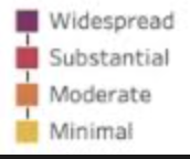

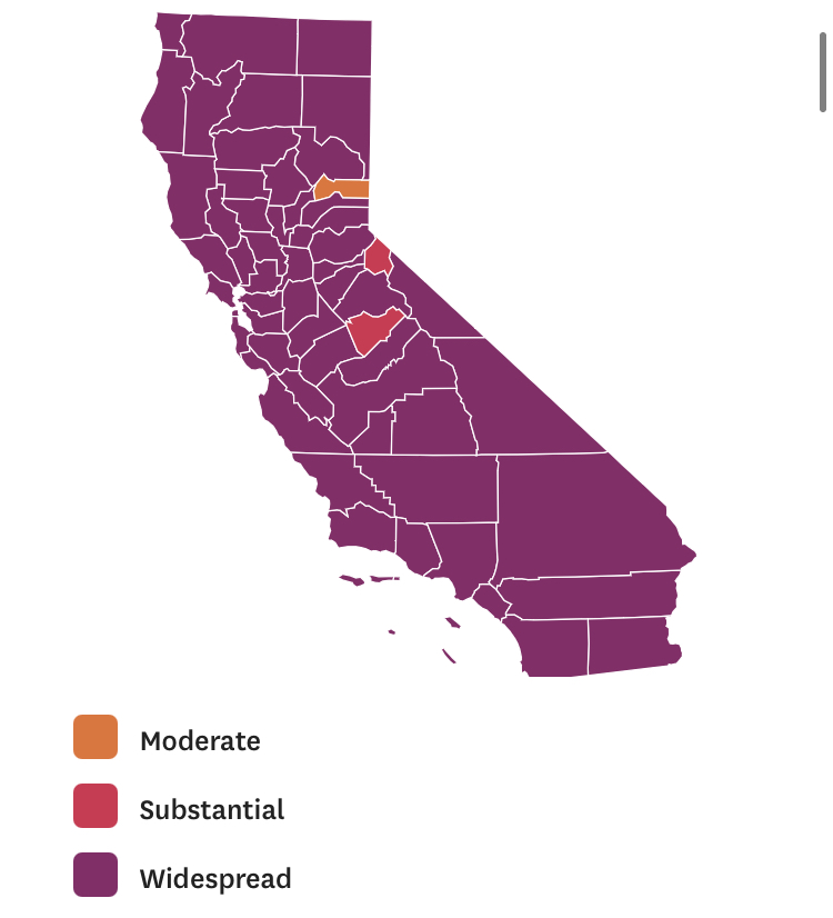


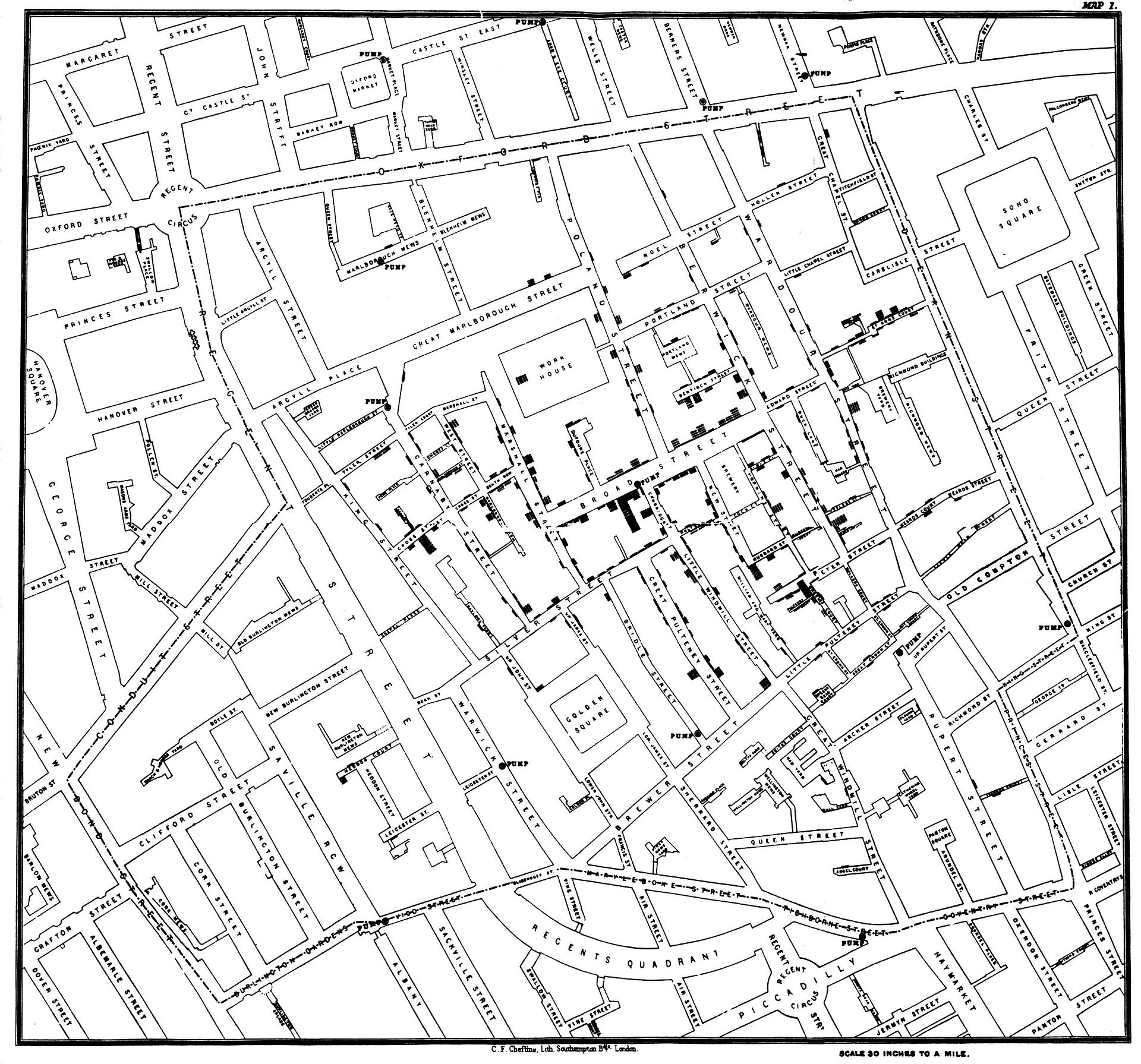
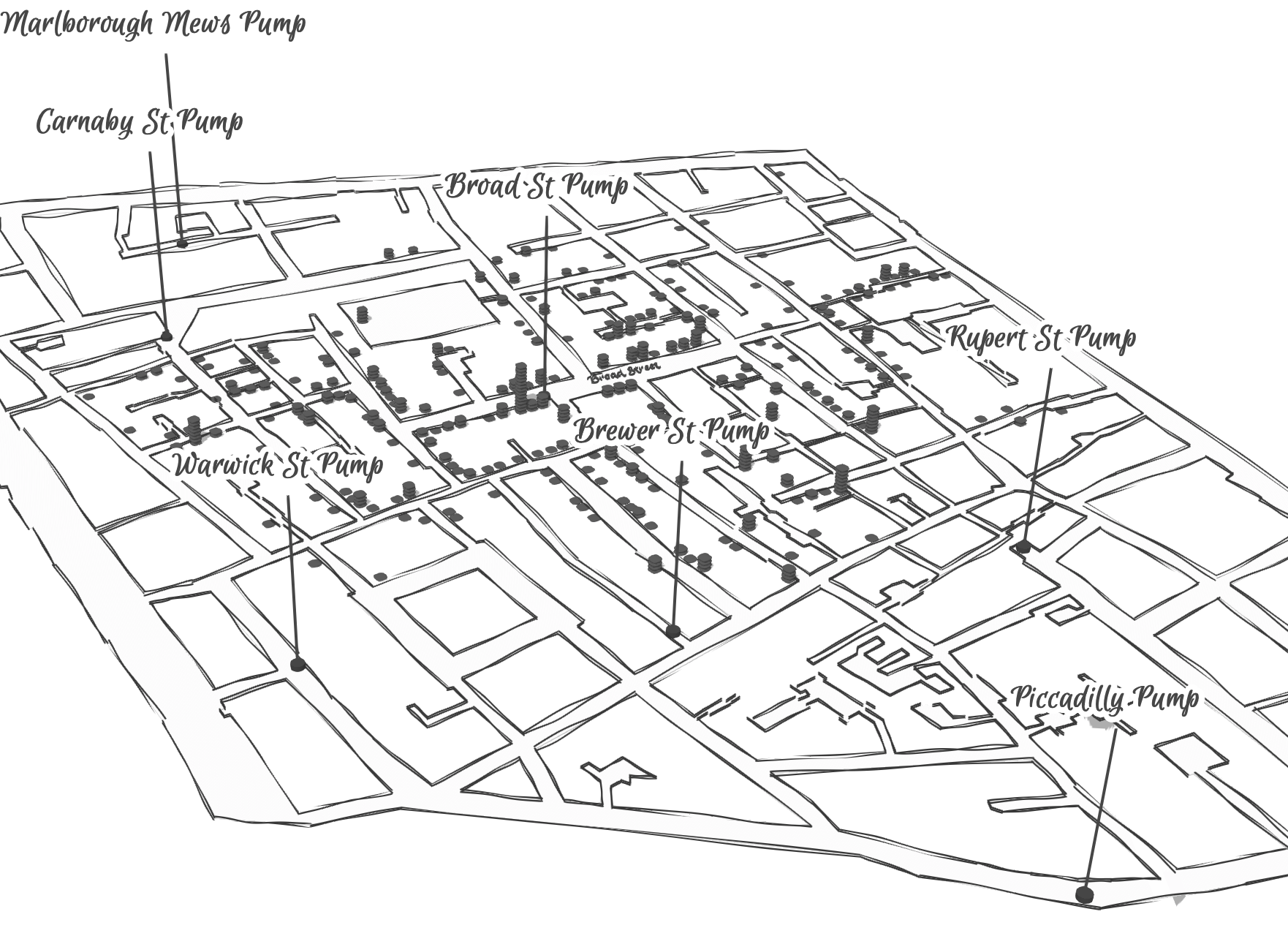

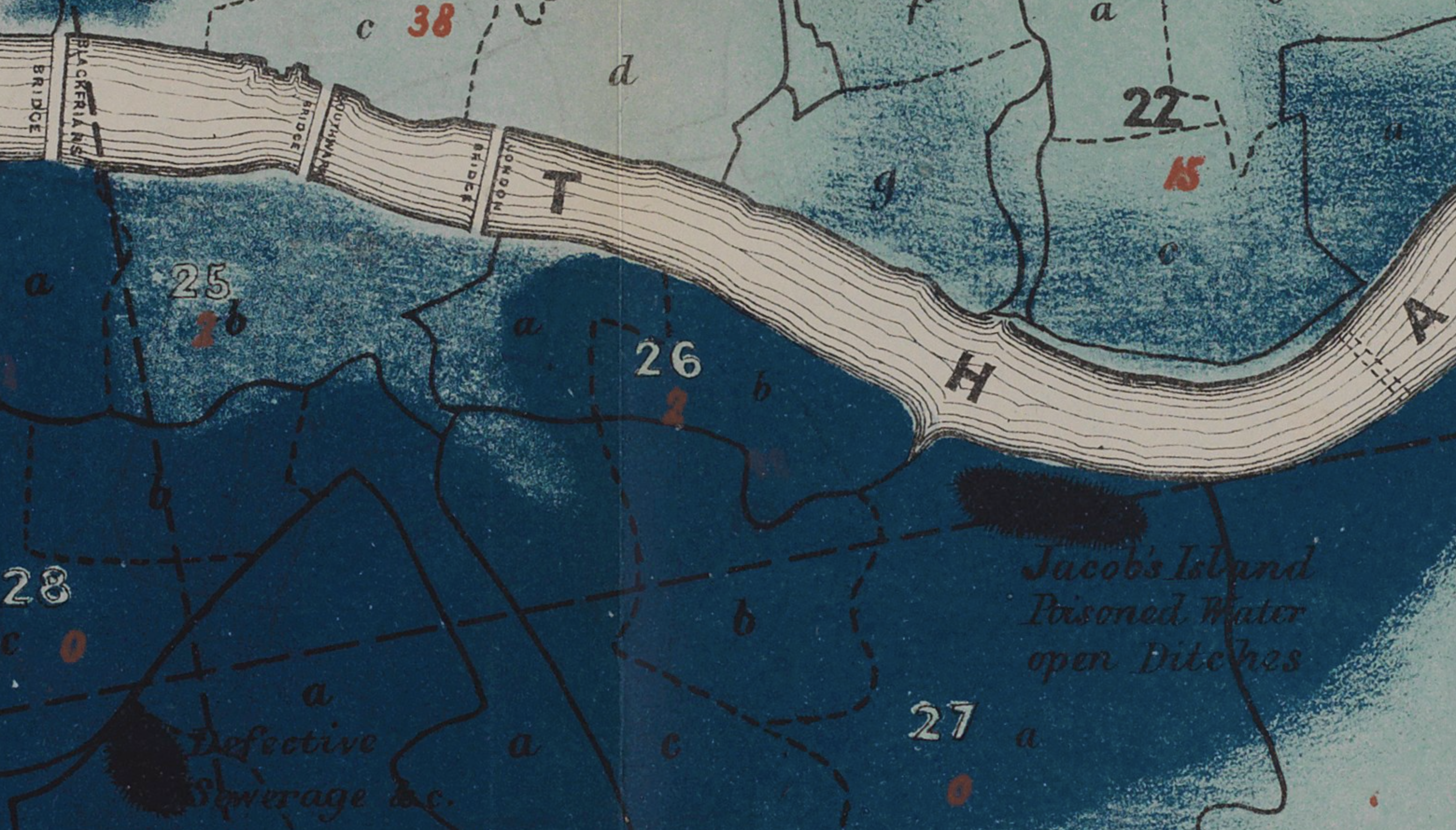


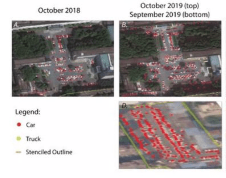
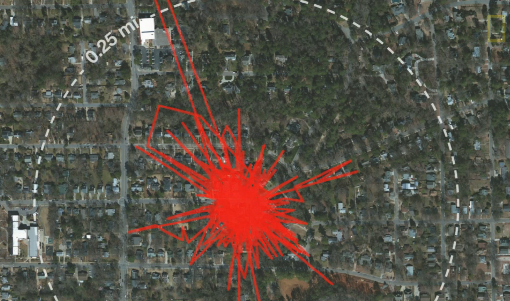
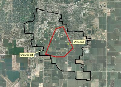
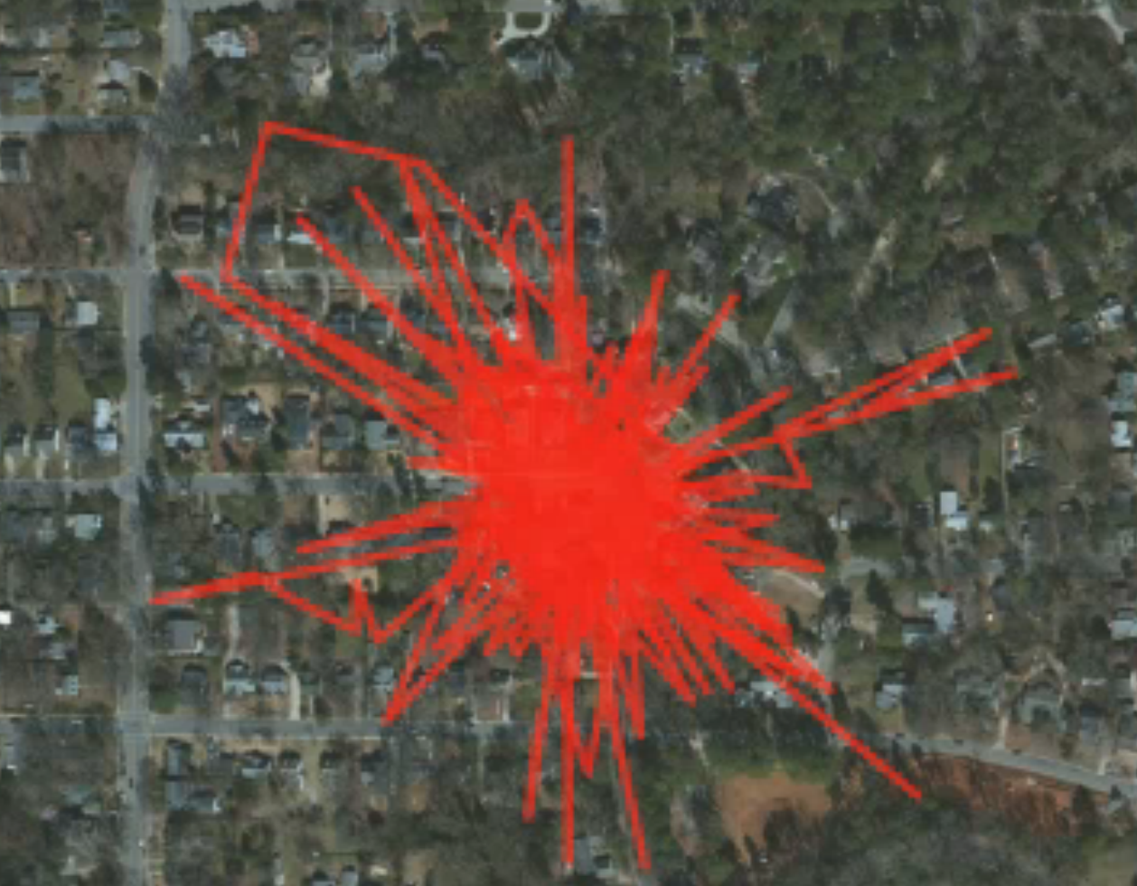
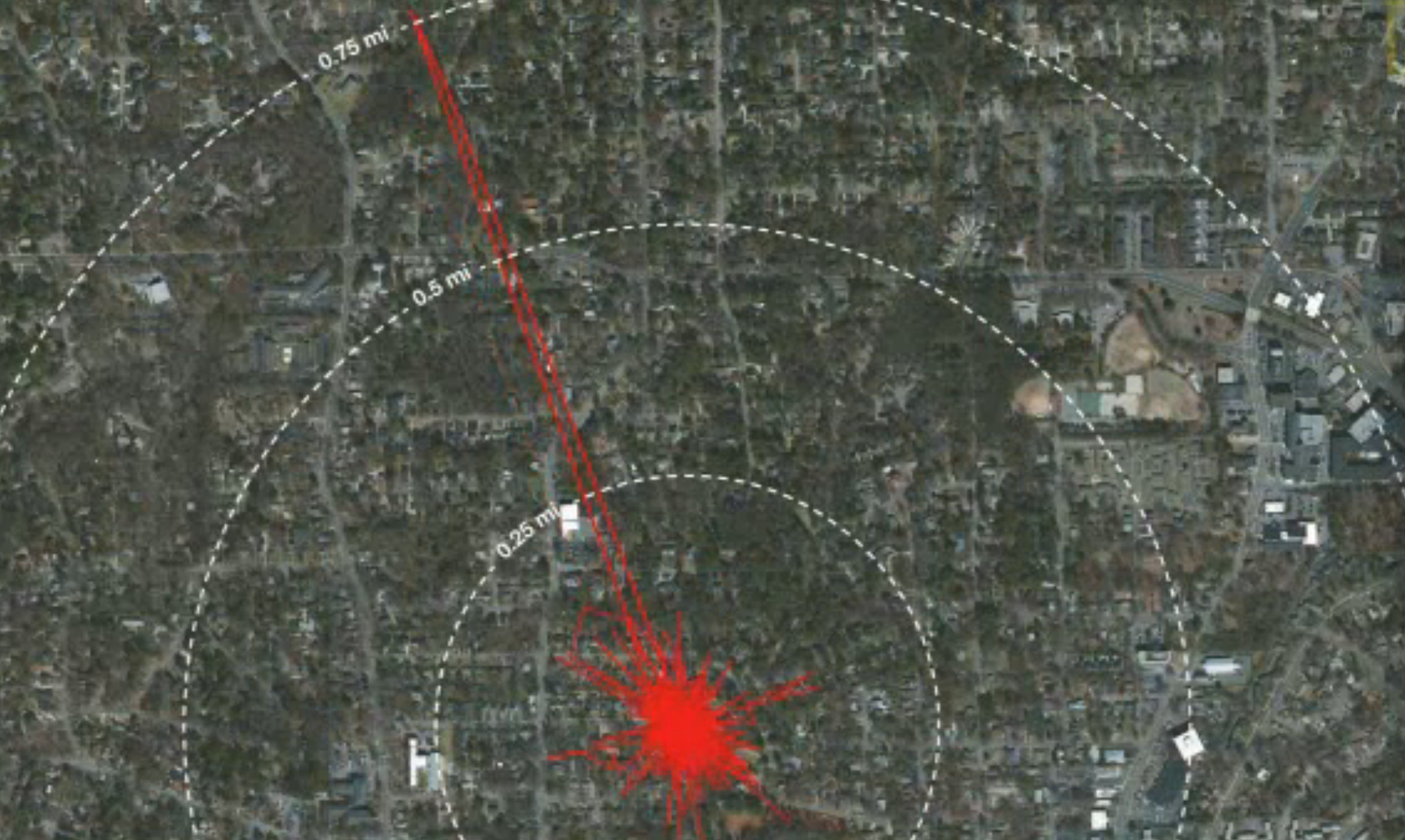
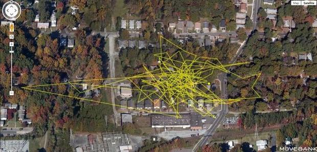
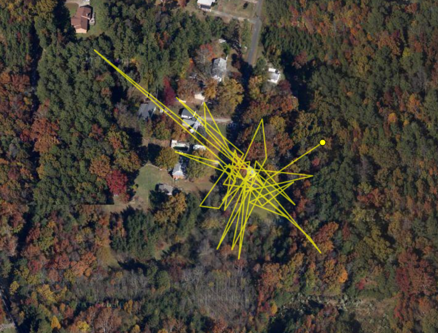
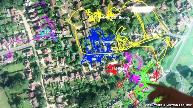
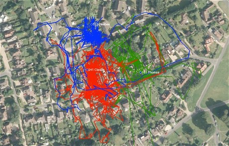
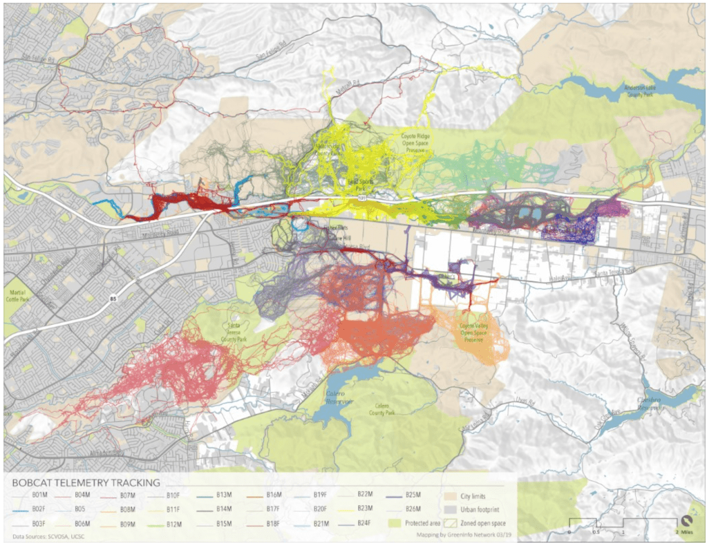
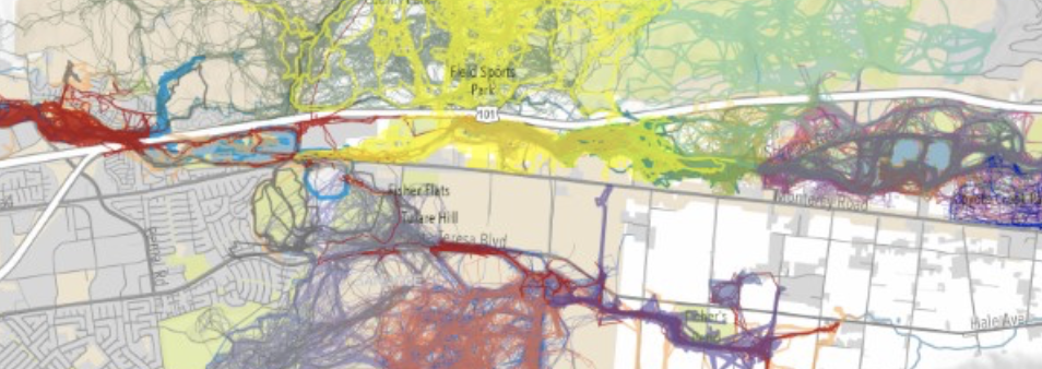

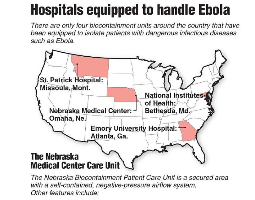
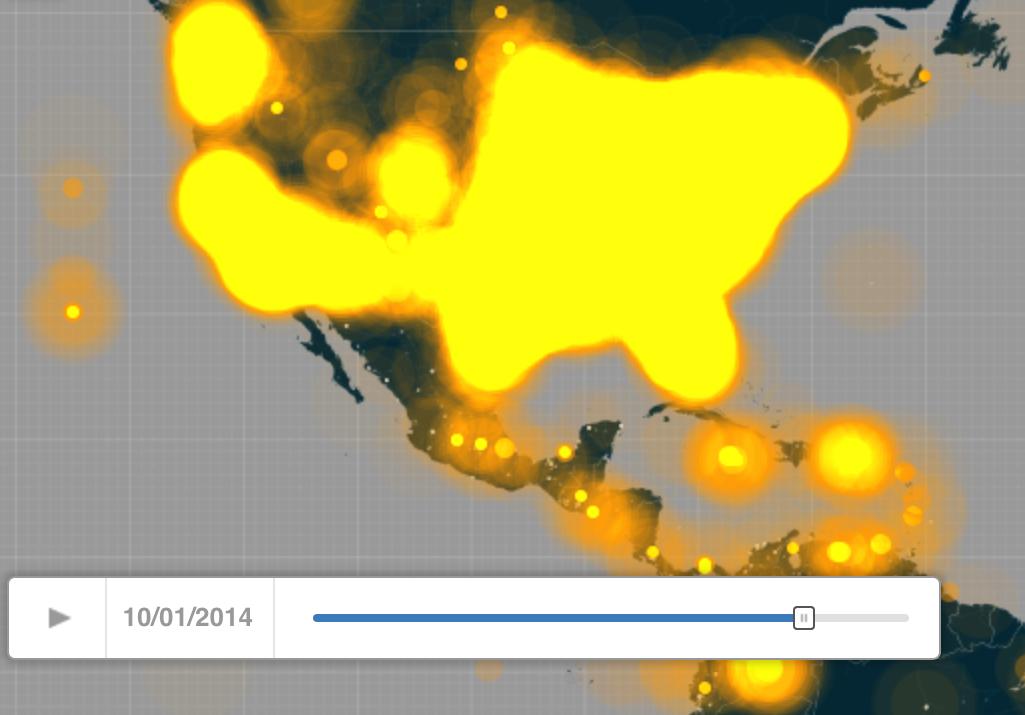
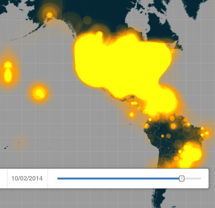


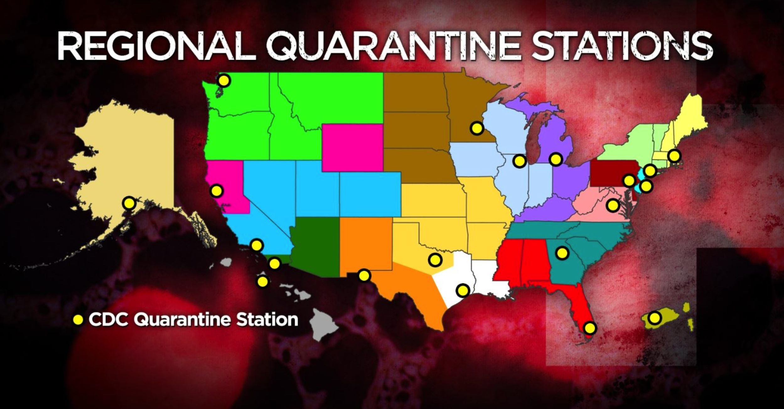


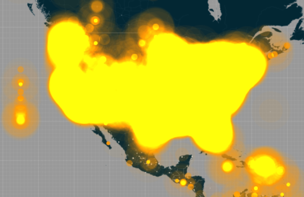


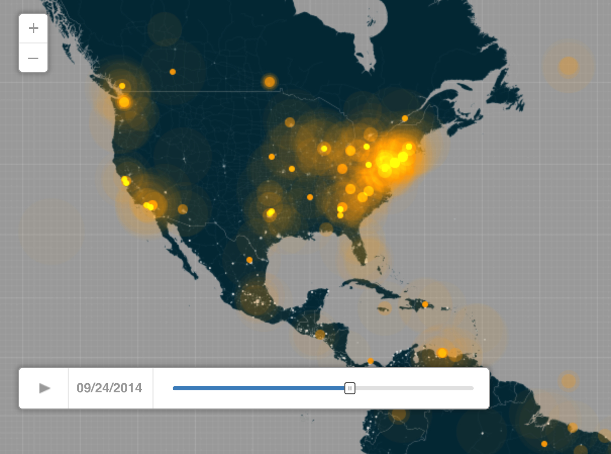


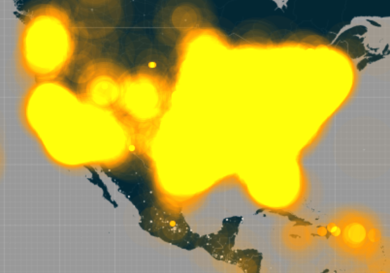


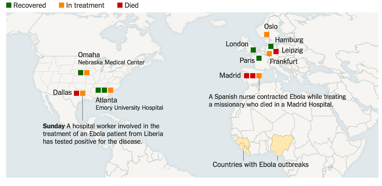

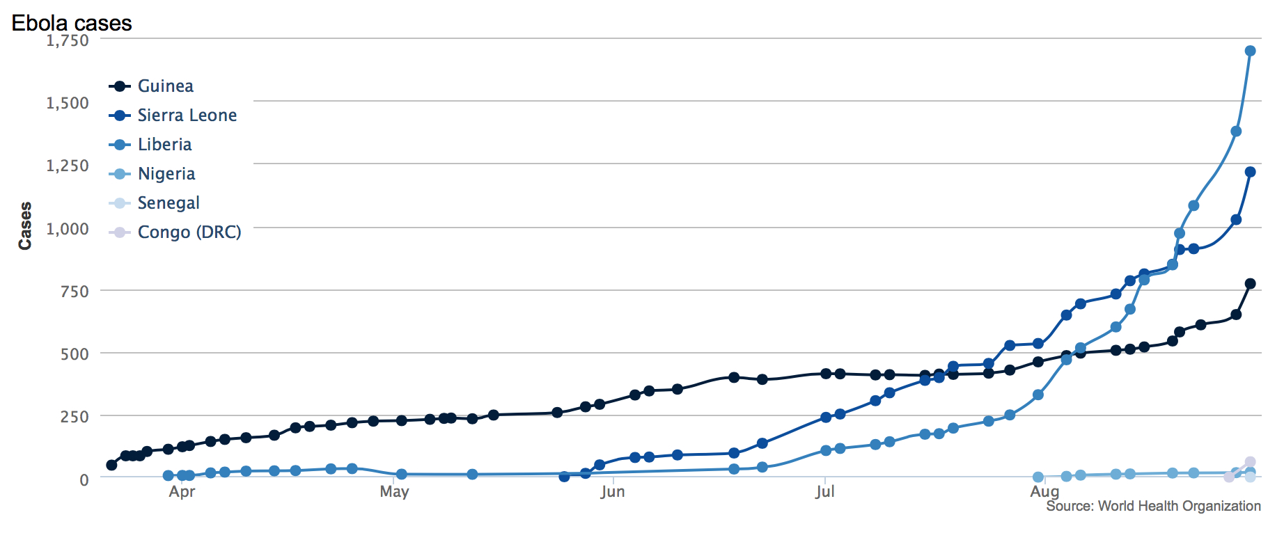
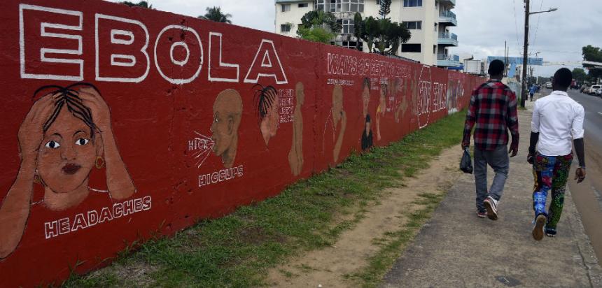
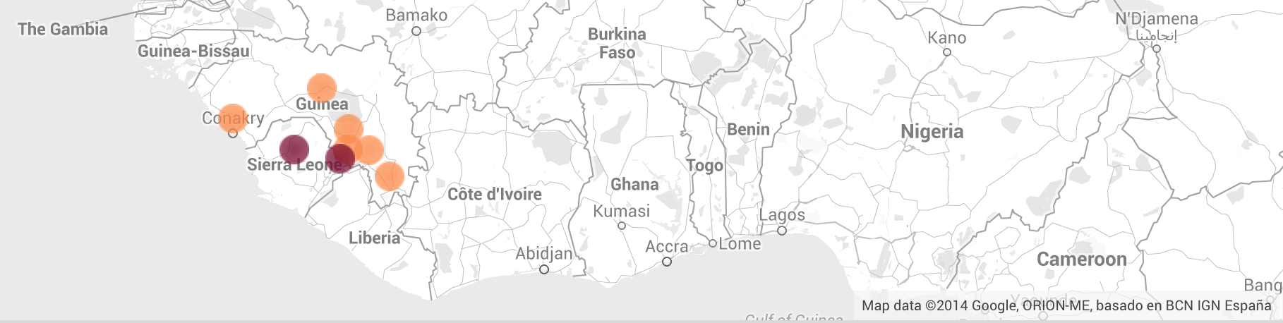
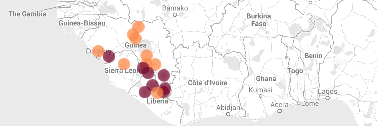
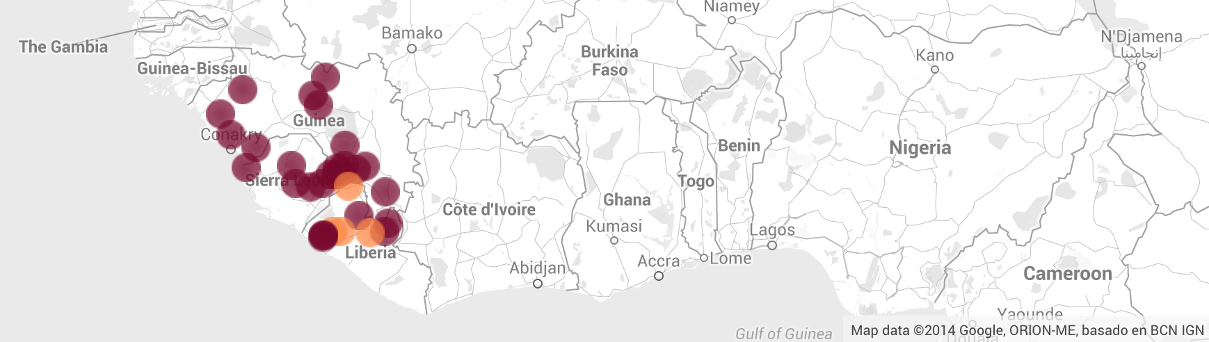
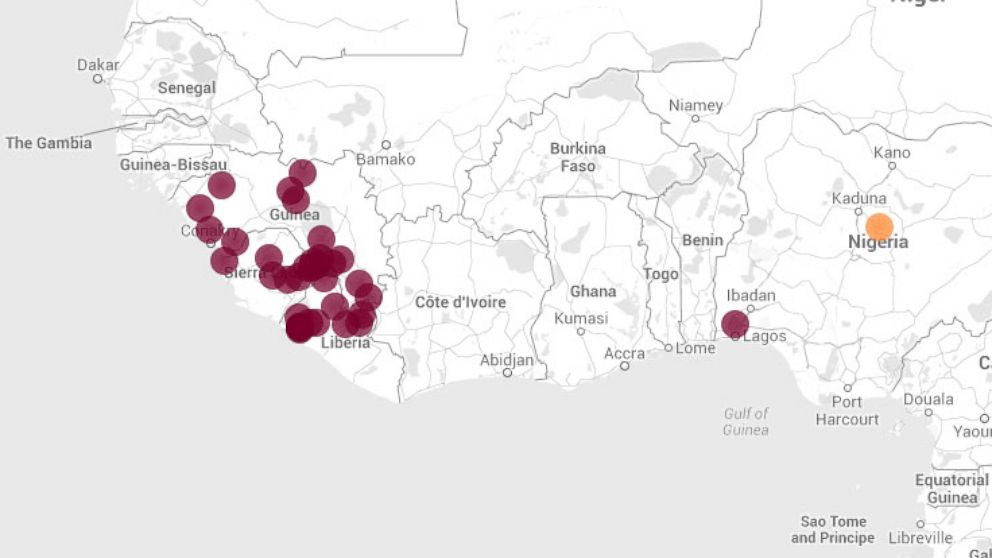
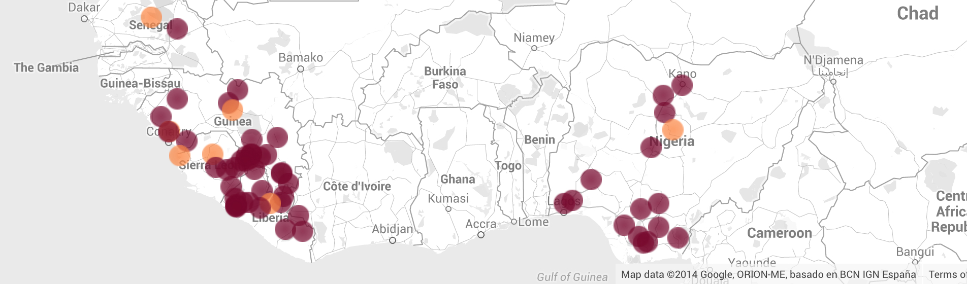
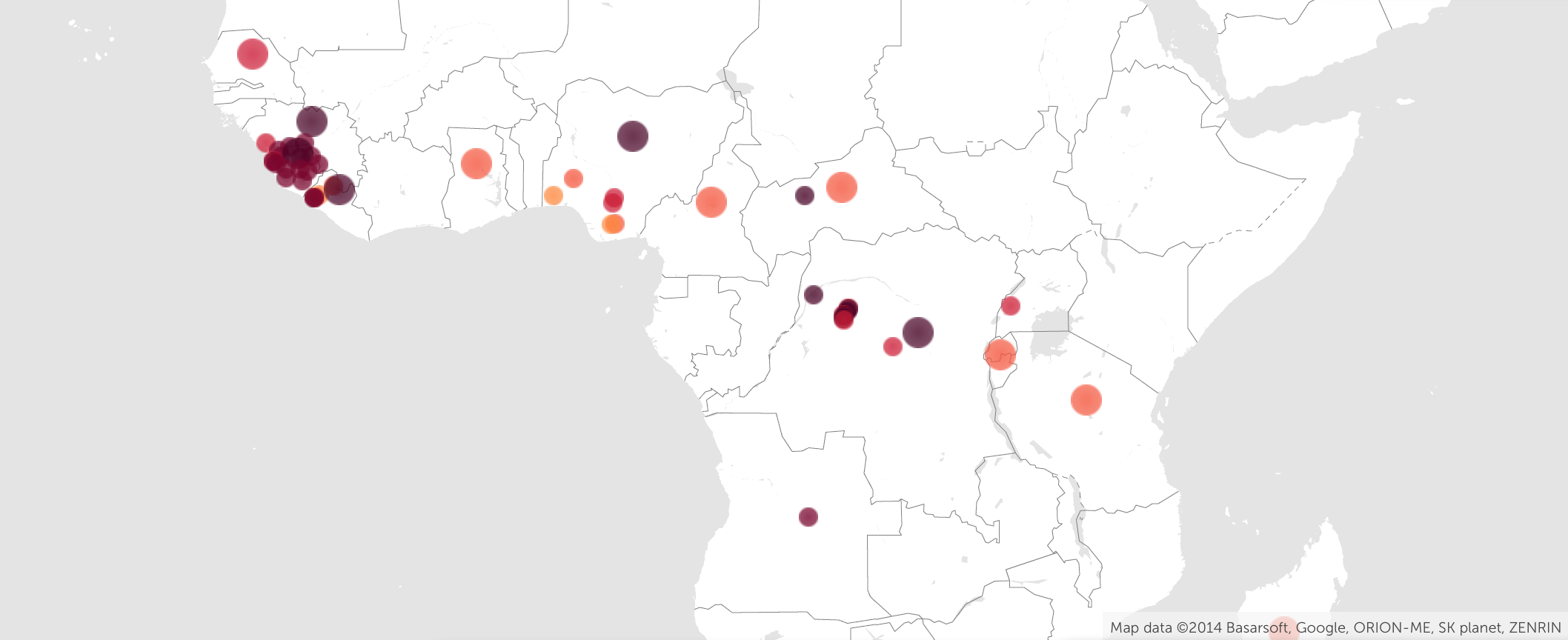
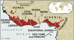
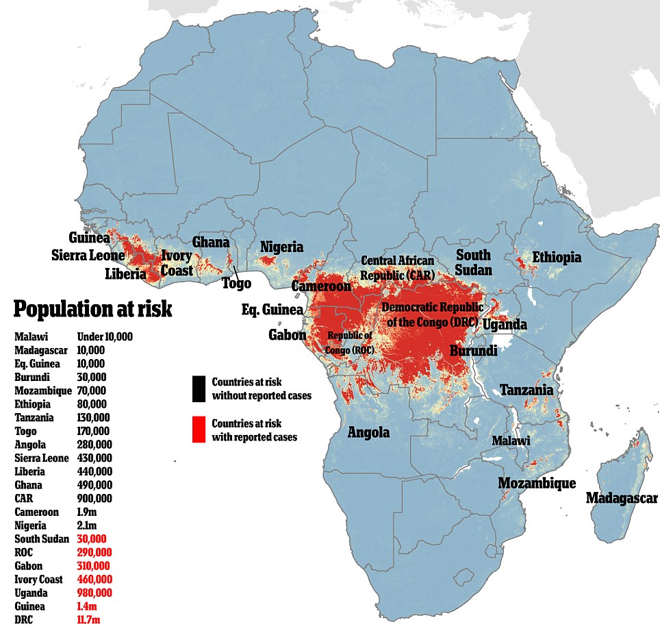
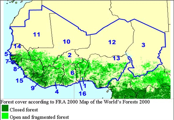
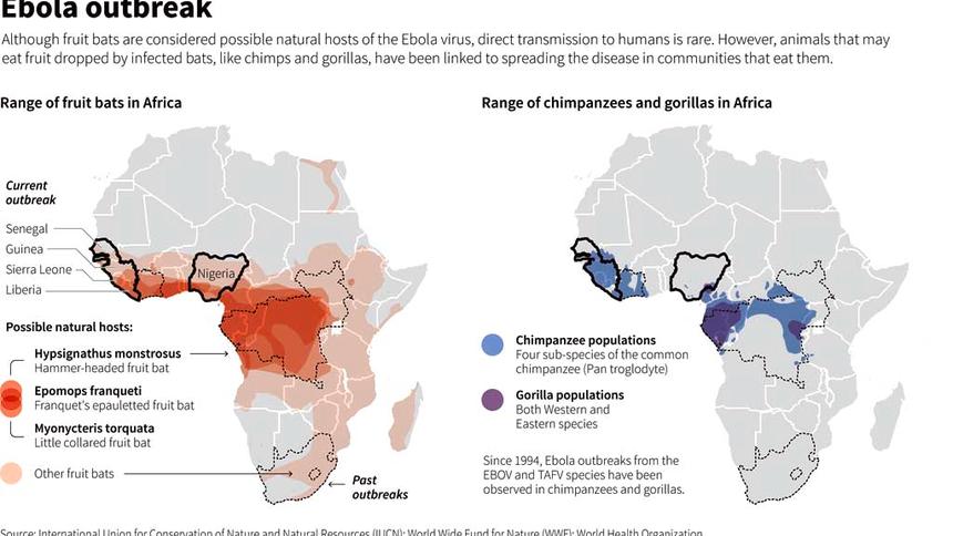
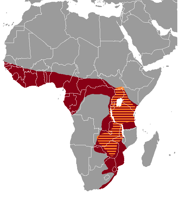
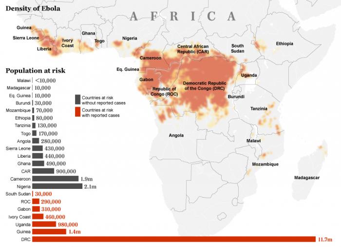

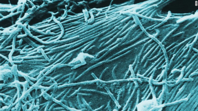
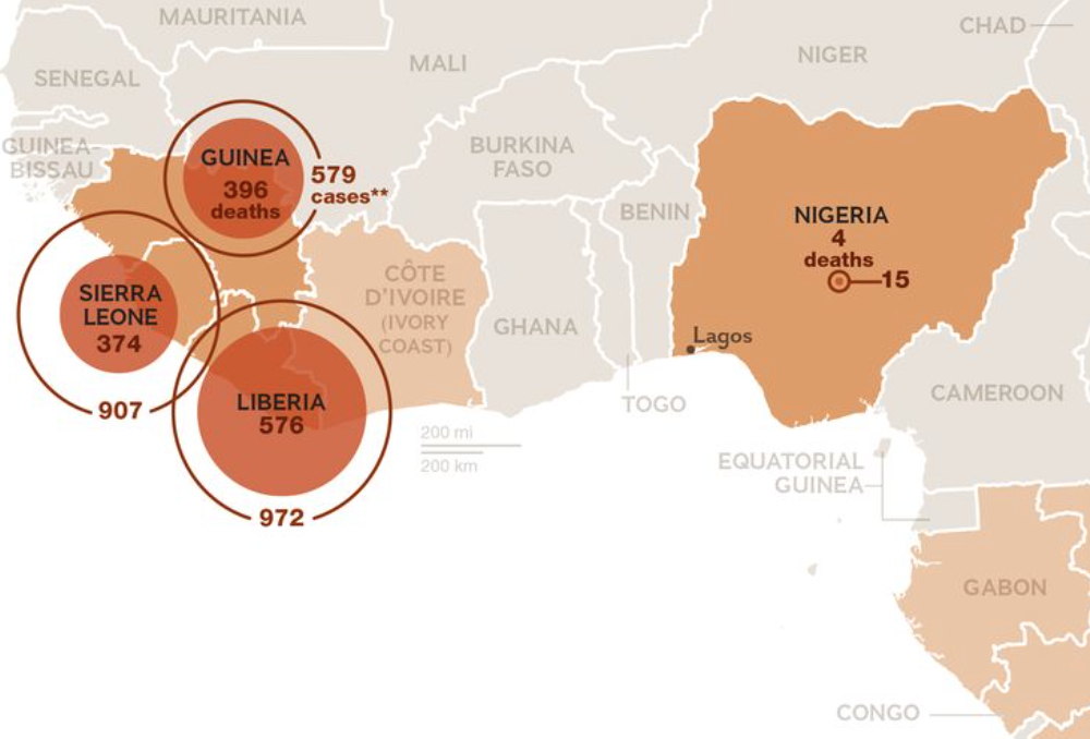
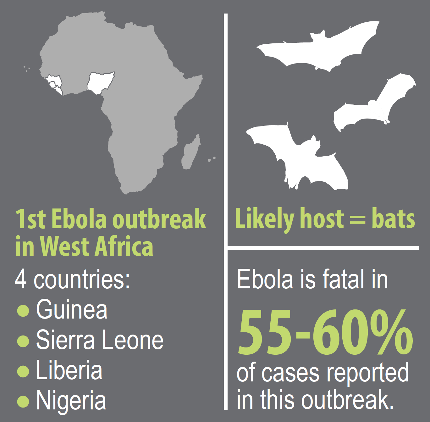
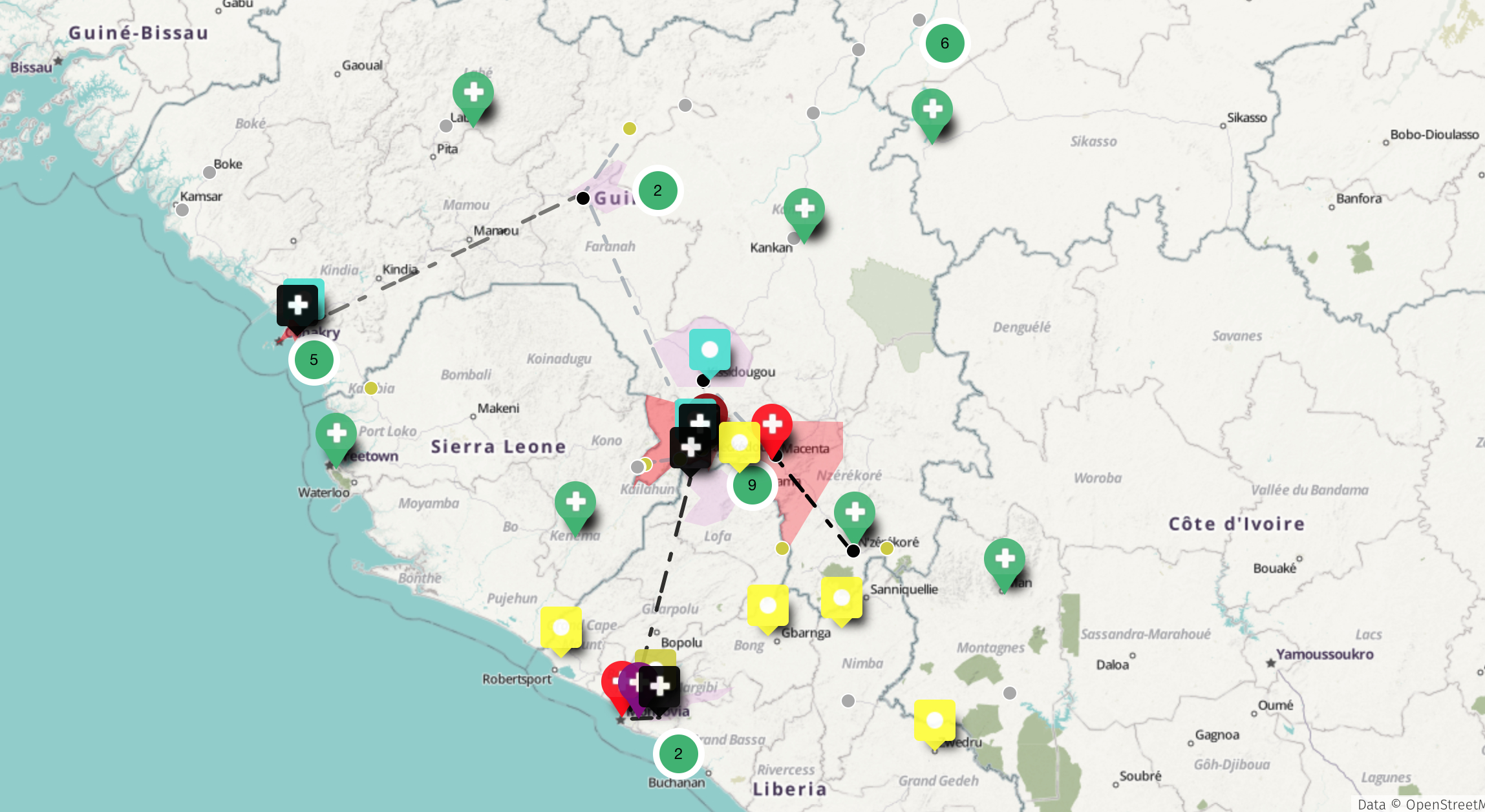

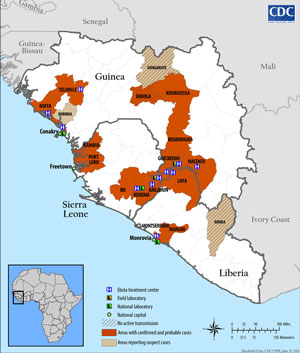
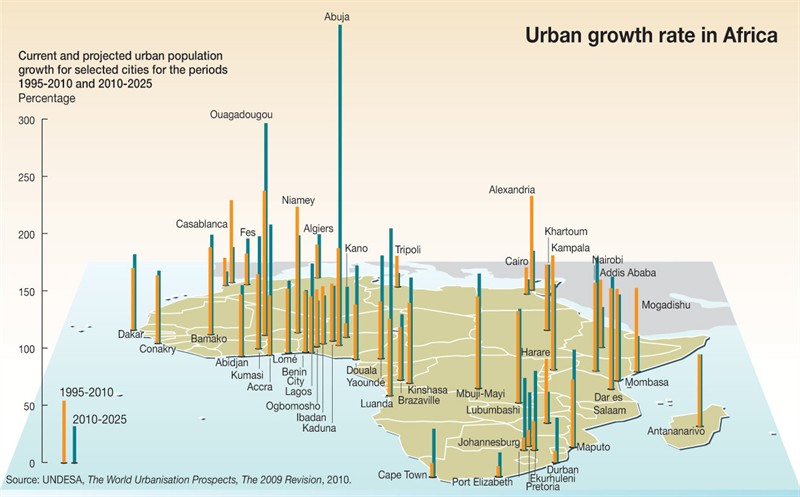
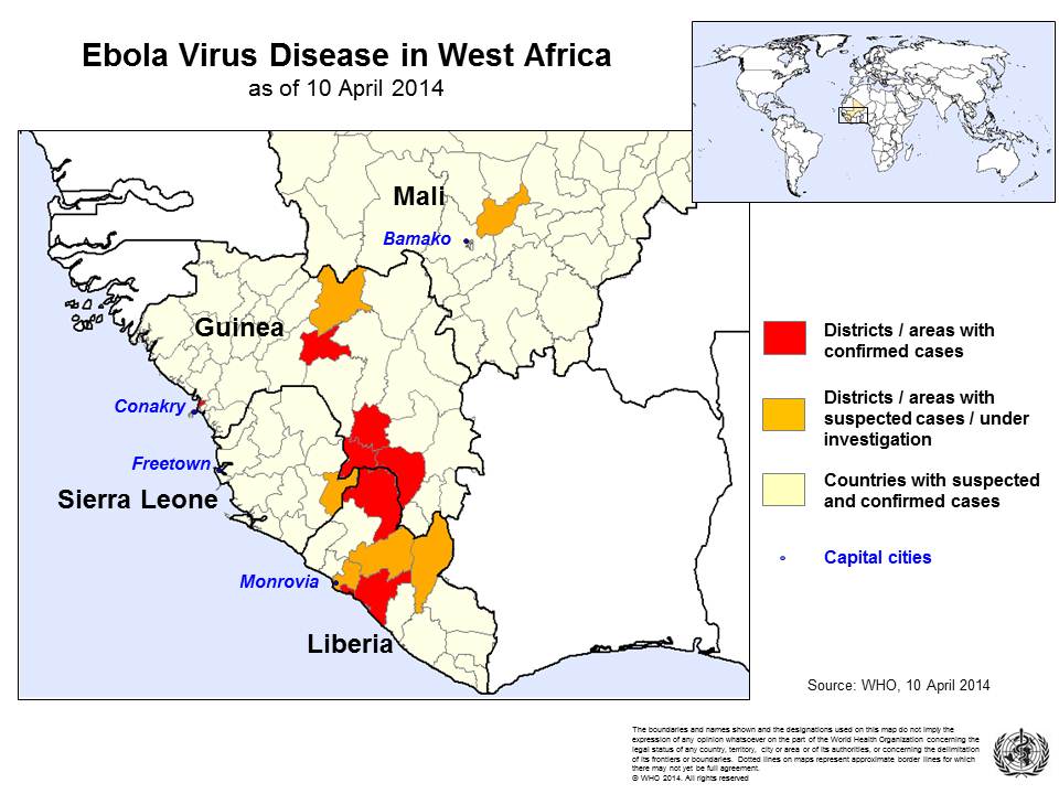
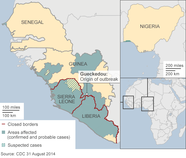
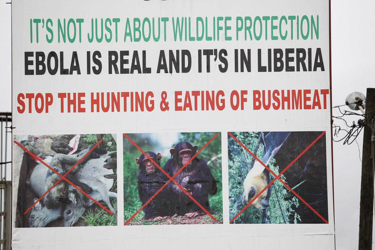
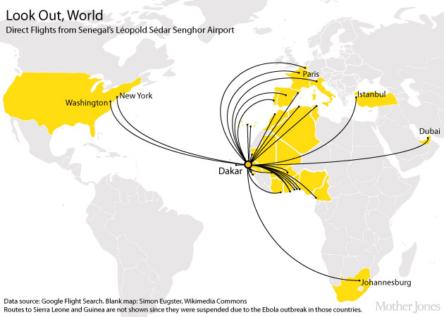
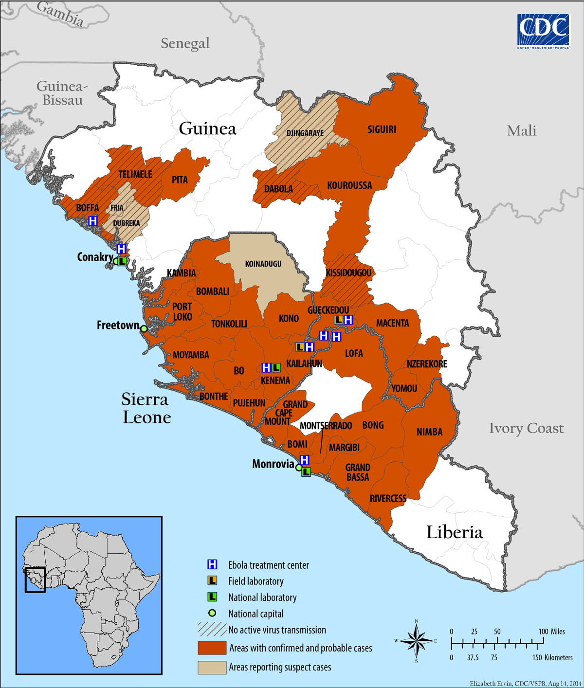
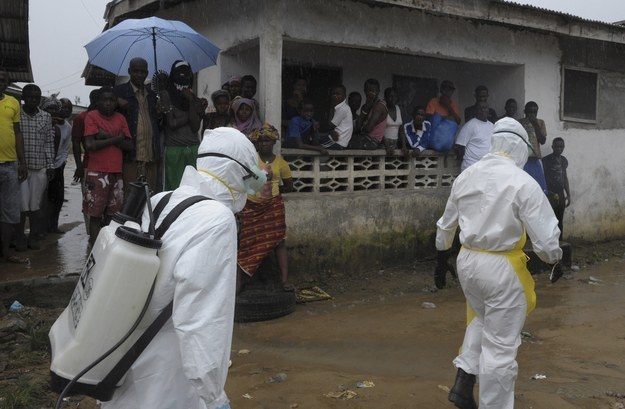
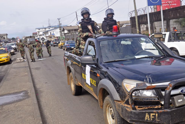

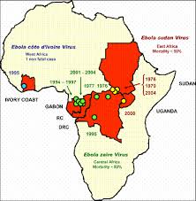
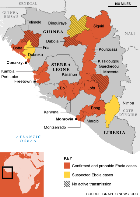
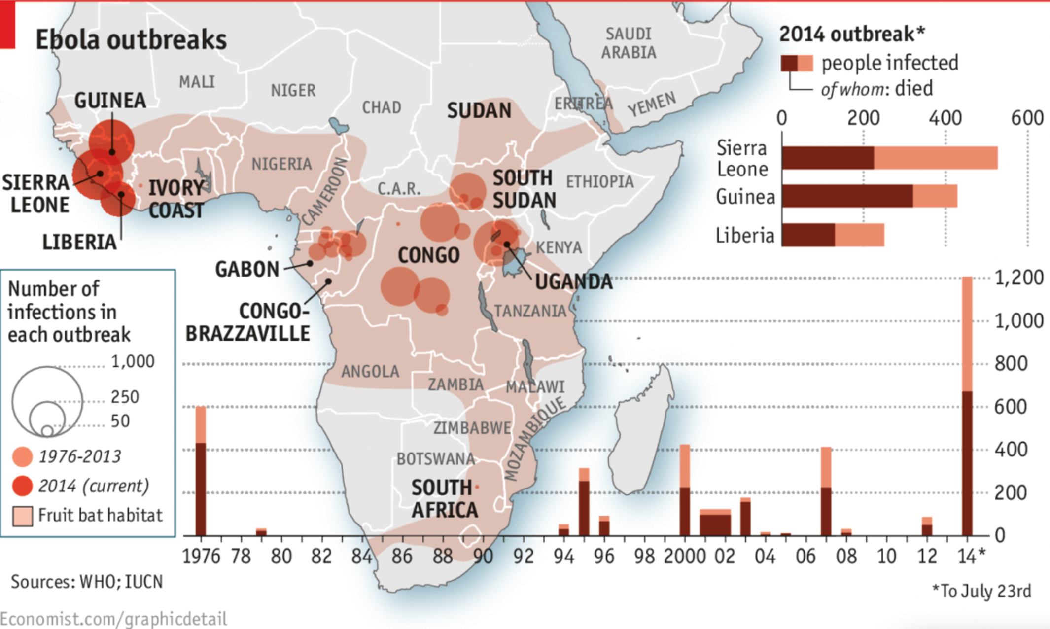

