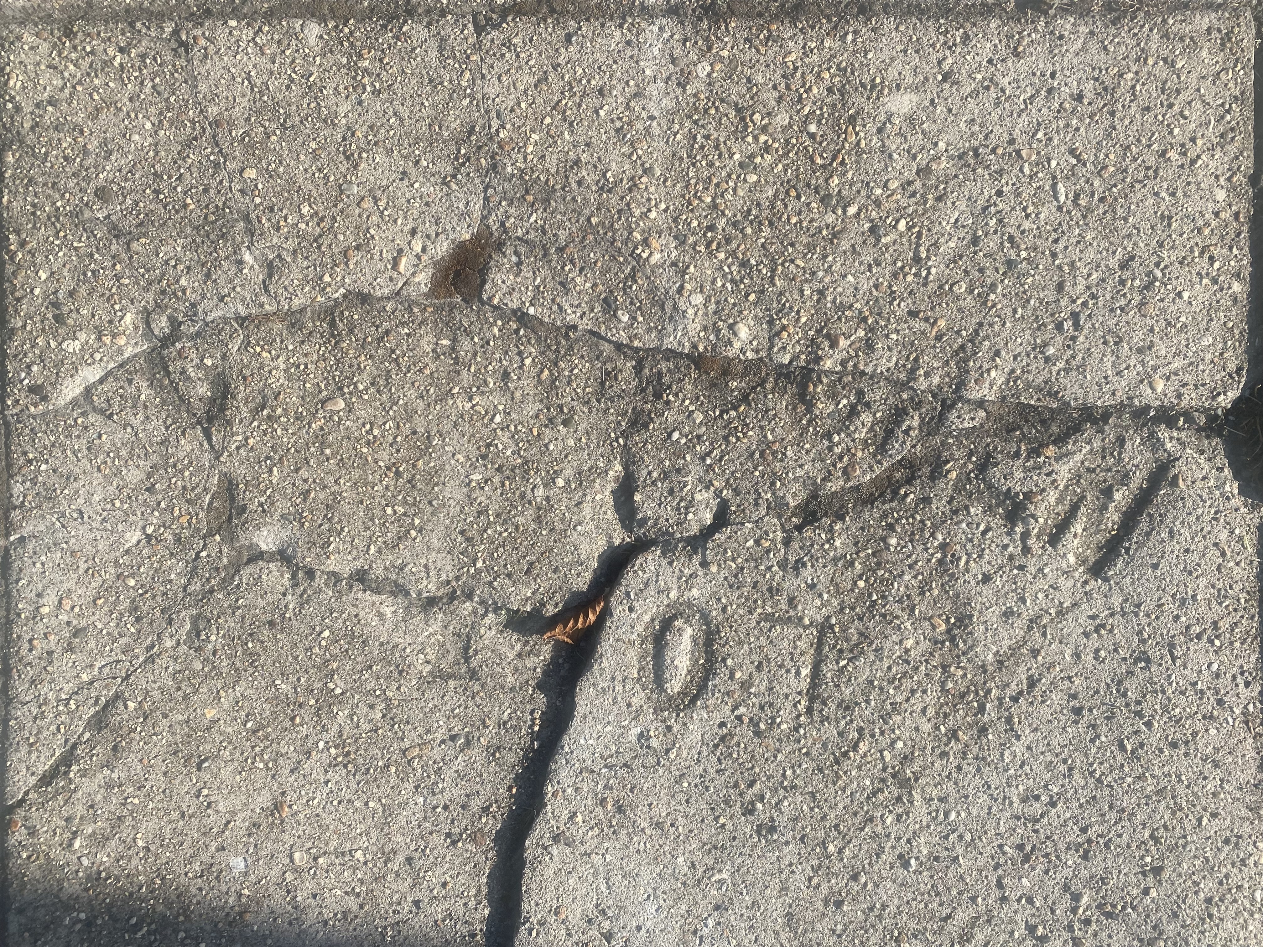
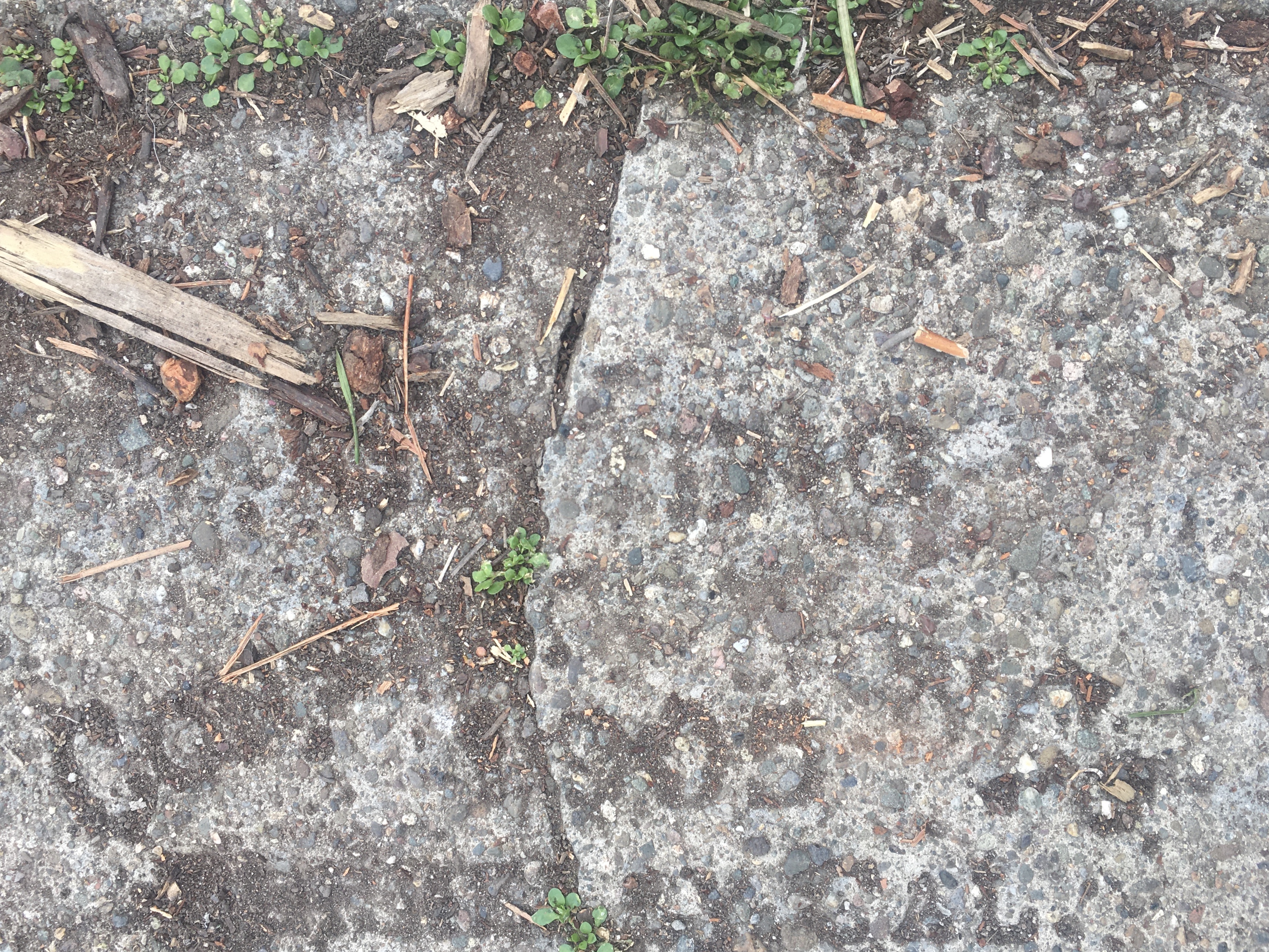
Seeking direction in the coronavirus pandemic, isolated amidst escalating anxieties, increased vulnerability to a virus crossing borders brought a vulnerability our infrastructures seemed more than ever to be unable to sustain. Introspective spiraling was tempered by alarm, walking became a part of my daily schedule, and a form of boundary crossing as the boundaries of lie seemed hemmed in. The shock at the unaccustomed sense of the unknown of our medical futures made the evanescent markers of the past seem more remote, even as we turned to stories of plagues of earlier times for guides and signposts to process the realities of the pandemic and new normal of pandemic life. And it was while walking on those daily attempts to calm one’s nerves and take stock from new reserves of energy that I grew more aware of the cracks in the pavement and tarred roads over which I walked so compulsively, uncomfortably wrestling with the steep divides of infections and social fissures around medical care that the pandemic suddenly revealed, stripping away all veneer of normality.
For the breaks in our society were being brilliantly placed before my eyes in stunning relief by data visualizations, each time I refreshed the daily newspaper. As I cast my eyes down at the comforting stenciled names of the artisans who helped pave the streets of Berkeley CA, surprisingly still remaining after all these yeas, that seemed both a present form of memento mori of a distant past, that immediately as it was conjured, acquired a sense of being graves,–or the long unseen markers of past time, and a symbolic resilience of confident signs of creation and a belief in progress. Was there a possibility of a sense of redemption in the lives of those who left them? Even if progress is increasingly cast as a continued expansion of property, these signs of what seemed an inescapably remote age and interesting dialogues with our own. Was this a form of imaginary time travel, more than a new dimension of the flâneur of an age of disaster of which we were on the brink? Or was reading such markers stenciled in concrete just a distraction from meditating on mortality, the evidence of an overweening desire to claim property for residences and drive up a real estate market in the past, just a foretaste of the current overbuilt footprint of the East Bay?

If historically far more attention is devoted to the poor streets of Oakland, Berkeley, and the East Bay, the pandemic provided a new focus on the pavement that I started to hit every day, imagining the traces that I might see of old ghosts of the city, in way that even took my eyes off of the trees.
The downcast eyes of the pandemic may have had to do with that, but so did the sense of searching for some sort of redemption in the cast blocks of concrete that were underfoot, finding a sort of more tangible reading source than the screens that seemed the only medium that provided opportunities to gain bearings on a situation that was spinning out of control, as if we could ever feel less in control of our future. The older sidewalk stamps that I passed on the edge between Berkeley and Oakland
Was not the pandemic almost as crucial an intervening event in our sense of political stability or the instability of our institutions, after all, as the internet itself? The erosion of a sense of foundations, or of any firm foundation, seemed posed by the rising rates of infection, hospitalization, and mortality, that we had no clear ability as humans to focus on beside the rising numbers of graves we were confronted, and the ghosts of this old pavement seemed ready to exhume to fill the void.
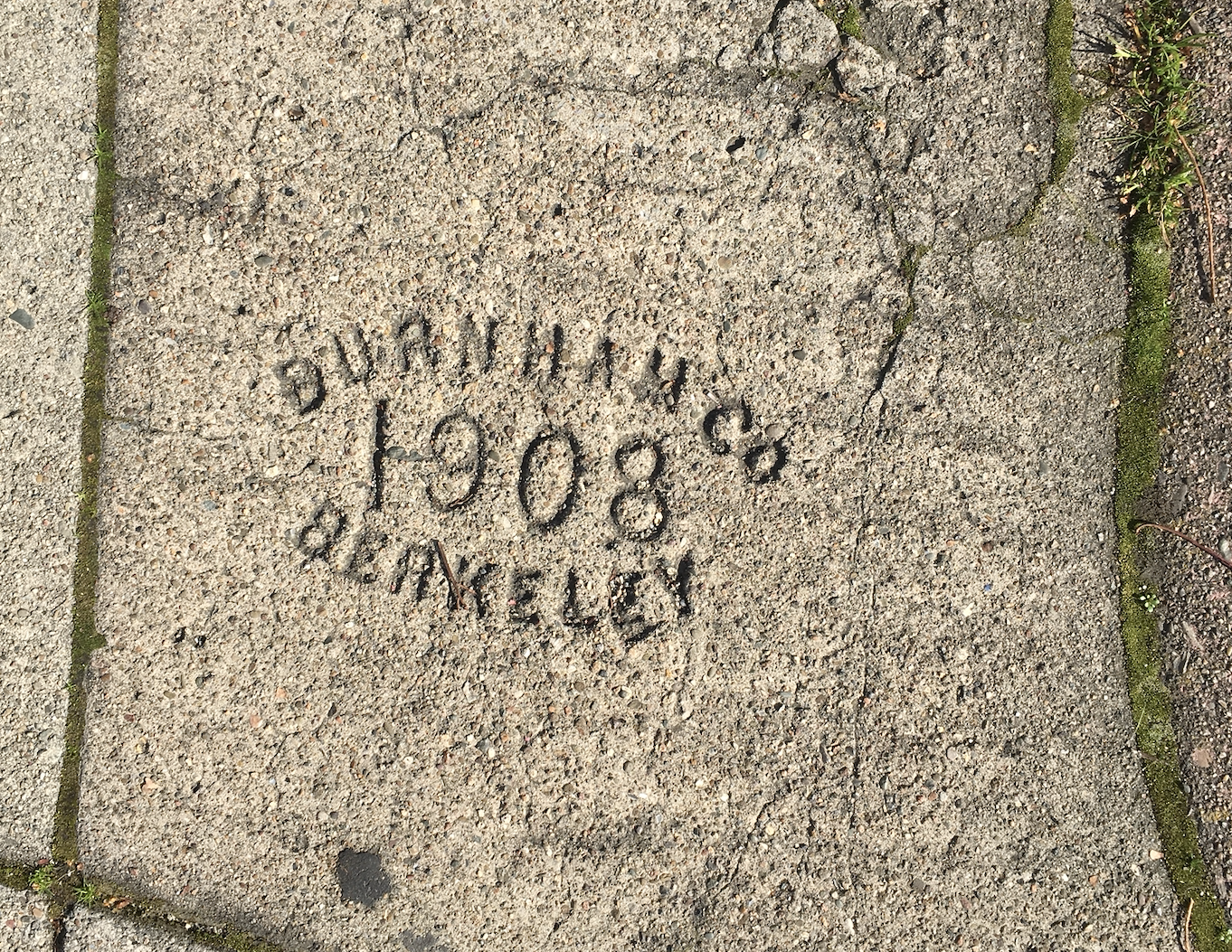
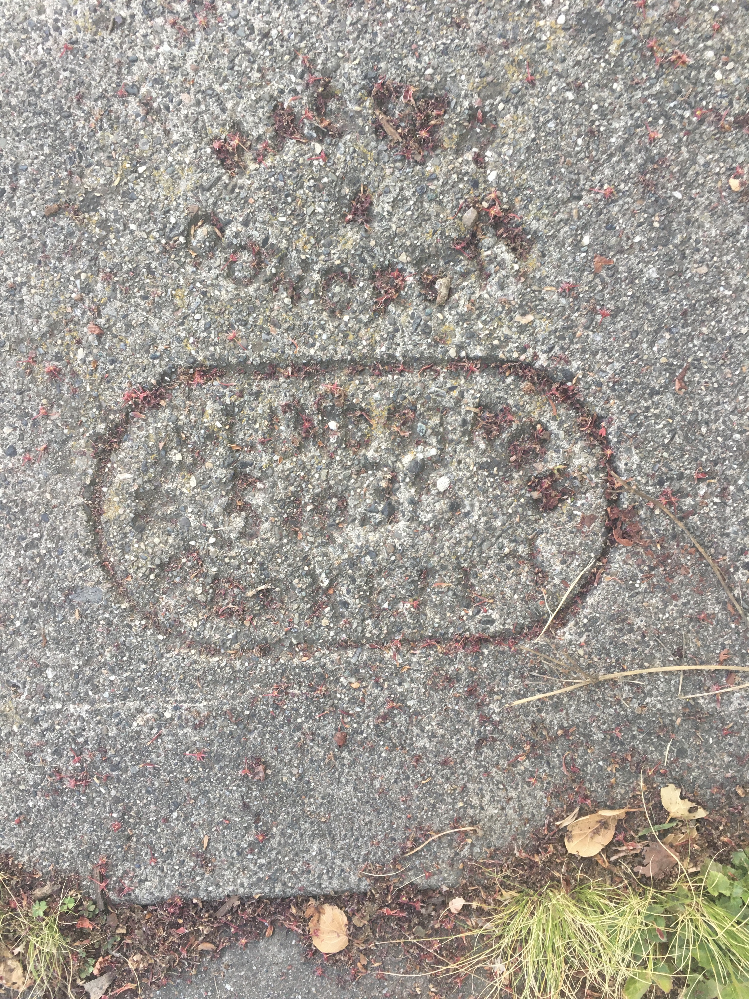
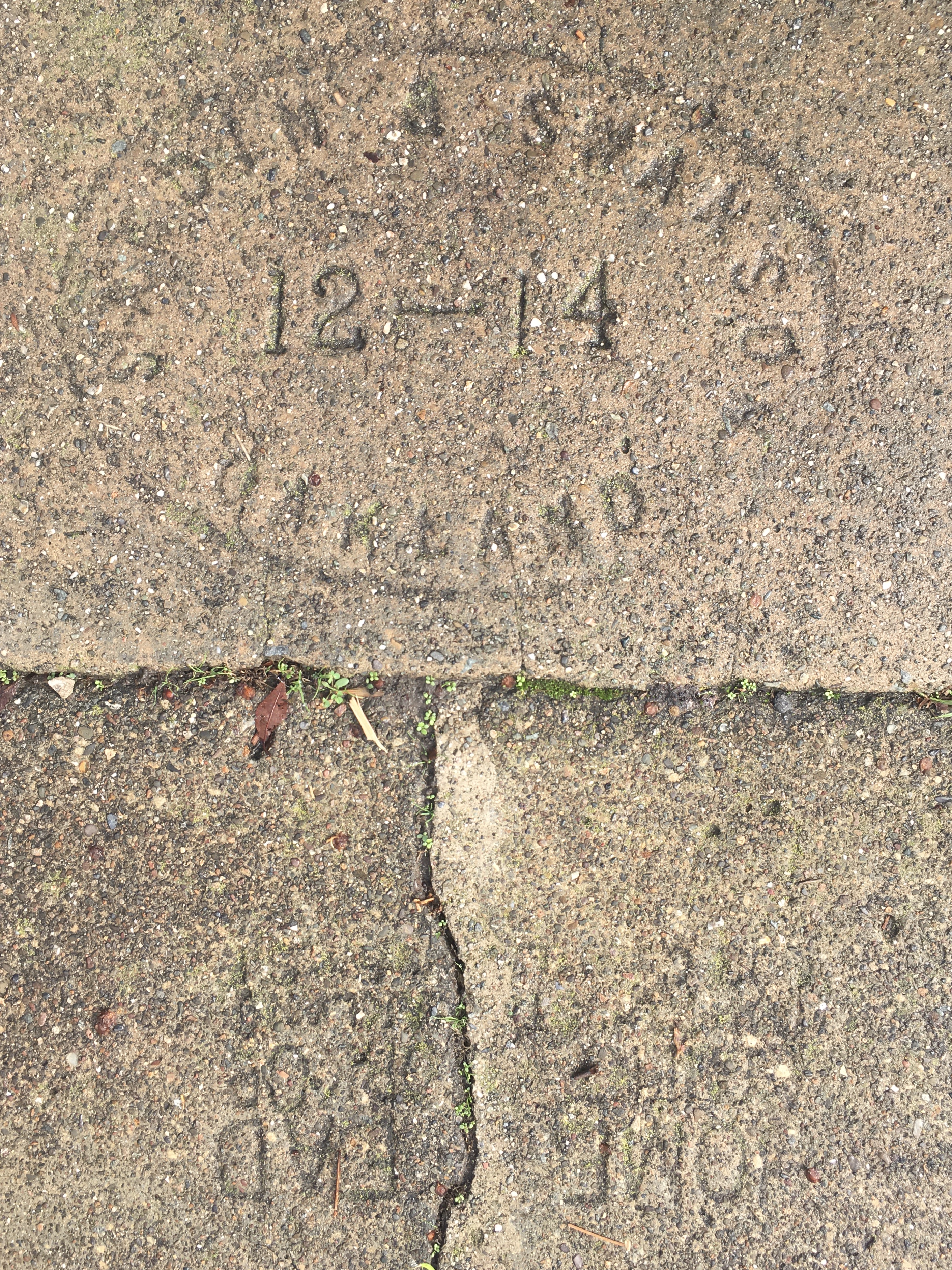
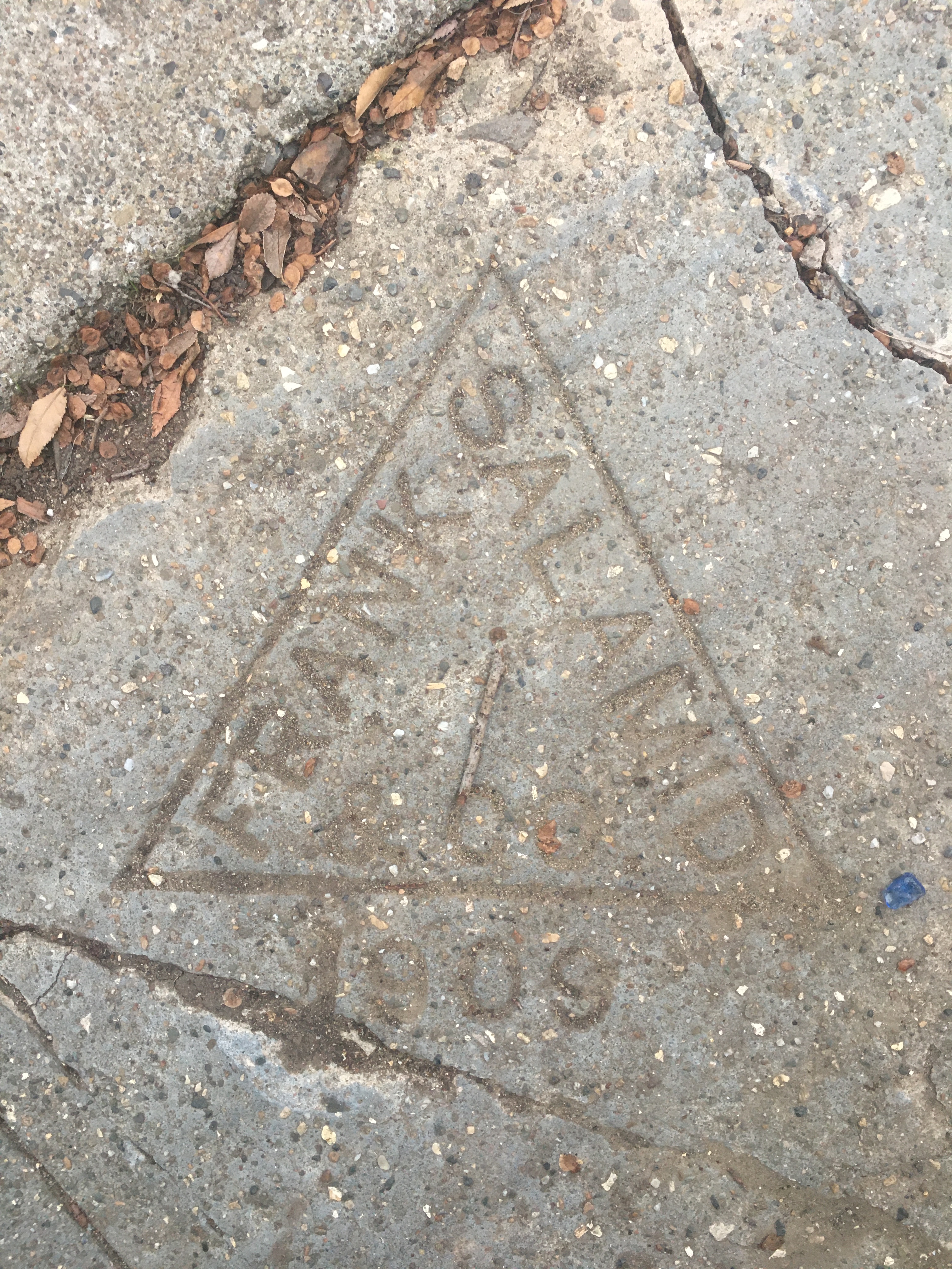
If it was often inescapable that so many of the names stamped into the sidewalks and pressed into pavements I pounded daily in walks around Berkeley and Oakland CA belonged to men who were immigrants–the Apodacas of Oakland; the venerable J.H. Fitzmaurice; Nat Lena of Sorrento, Italy–the stamps that were calling cards and toeholds of economic respectability open to white men of limited education in earlier eras, as the covered carriage of Levi Strauss, –were reminders of the melting pot of a city whose stable expansion stood at uneasy counterpoint with the present pandemic. All of a sudden, if cracked with the weight of time, the name of C. B. Lindgren popped from the pavement with the seemingly far-off date of 1907, reminding me of a college roommate of the same surname, from California who cultivated, as we all did, the airs of an artisan back in 1982.
Was this akin to an archeological discovery of a quasi-ancient past? it seemed so! Trapped in tenuous relation to the present, walks around Berkeley CA became a release into a new temporality, and escape from a temporality of mortality that seemed to be a countdown to something new: and if many turned to trees as the sentinels of monuments to a more living present, as if in a combination of the historian and flâneur, I started to seek out imprints of the contractors and pavers who had covered Berkeley’s and north Oakland’s residential communities over a century ago with pedestrian pavement. Each print provided evidence of their arrival, from the century’s start of the century, through the 1940s, in booms of post-war expansion beside wartime stamps. Such underfoot surfaces offered “points of historical interest” that were an untaped form of creative tourism, as we were seeking tangible signs of a sociable present that was frayed. As much as trees, these provided a new way of thinking about time, of living with radical uncertainty, and of seeking a foundation by securing existential as much as epistemic stability in such uncertain times.
The discovery of the seemingly stable past world of experts of street paving opened underfoot I fancied, with new deliberateness, I was discovering, uncovering or only first noticing a removed past world of the paving underfoot, of unseen traces of a new anthropogenic modeling of the local environment of the East Bay. Sidewalk stamps became something like way-stations for mapping the new known world, even offering a sense of the optimistic preparation of ground surface impermeability and landcover change as glimpses of the century-old stamped concrete traces of an evanescent but far more stable past.

2739 Ellsworth Avenue, Berkeley CA

2308 Prince Street, Berkeley CA
Were these simple declarations pressed in the concrete sidewalks not once optimistic heralds of a new age of paved ground cover, of sidewalks that were tied to restricting housing and covenants, or a sort of sociability among the ghosts of lost neighborhoods walking among old communities? They became resonant and made suddenly poignant in an era or episode of increased social distancing by its very materiality, and oddly comforting voices of partners on the empty sidewalks of Berkeley, the sole surviving testaments of the conversion of land in the East Bay at a mid-point where a century previous, per Malcolm Margolin, that learned historian of place, “herds of elk and antelope dotted the hills,” “grizzly bears lumbered down creeks to fish for silver salmon and steelhead trout” two hundred years ago, in lands of “inexpressible fertility” of a Virgilian bucolic age that had been covered by the mute surfaces of pavement rooted in Lockeian notions of property and land holding.
2747 Claremont Avenue, Berkeley CA
As my own sense of mental stability seemed less clear, I was actually tracing a psycho-geography of the city as a flâneur, taking in the lost traces of social stratification and land conversion of an earlier era, as if announcing the rise of local real estate values. As much as a “loafer,” I gained a new sense of myself as a saunterer, in updated Thoreauvian terms, looking not at wildlife on river banks, as I started searching sidewalks for these traces of human settlement seemed an act of resistance to the tracing of patterns of mortality we watched every day. if there was a sense that these names of the past echoed back a sense of land dispossession and private property, the paltry value that these sidewalks seemed to have punctured the rising cost of living and housing in the area I lived, where I’d likely never become a homeowner, but where the pandemic gave me a weird sense–perhaps even weirdly comforting!–of the elusiveness of monetary value of these expensive homes across the San Francisco Bay, helping me search for historical perspective on the present. This was a time, after all, when the problem of East Bay identity was suddenly on the front burner of Berkeley, Oakland and Alameda like never before, where the growth of home ownership as a new Berkeley innovation borough a sense of the fungibility and ownership of land that arrived with a new set of techniques, markers, and apparatus of contractors, absorbing immigrants as architects of a new urban space. The arriviste property owners of Berkeley seemed ready to stake a new vision of the Bay Area as bounded space, in ways that the landscape of brooks, creeks, and mountains, as well as the porous edges of shorelands and shorelines, hadn’t really been fully imprinted or defined.
As infection rates rose, and we were immersed in a real-time reaction to a pandemic, sidewalk walking passed was adventure in an age of social distancing. Perhaps it was that as COVID-19 made us enter another period of anxiety unlike the recent past, new viruses sending us to the seventeenth century, contemplating these names seemed fossilized traces of previous moments left in the cement of my Berkeley neighborhood provided a tactile story that seemed necessary to embrace. Paradoxically, I had long read these stamps without much attention to dates, or to their temporal remove. But the proximity of these long dead men whose imprints lie across Berkeley and Oakland, perhaps more than other cities, gained new legibility, or acquired a legibility to me as I walked around a bit aimlessly, looking for orientation, and finding it, surprisingly, not on a screen but underfoot. While the prints near my own house were mostly from the 1930s, along Shattuck Avenue, finding multiplied sites of “historical interest” seemed a mending or attending to the community, able to be imagined as in the public interest.
The return to walking during the pandemic–fed by a rather shell-shocked need for processing, for finding connections, or restoring deeply stressed and frayed ones, made the elegant crisp lines of stamps pass for forms of sociability certainty, and encounters, as if one could assemble the history of paved space with a certainty revealed more clearly than the new period unfolding in real time.

F.E. Nelson, 1920 (?)/Fulton Street in Downtown Berkeley
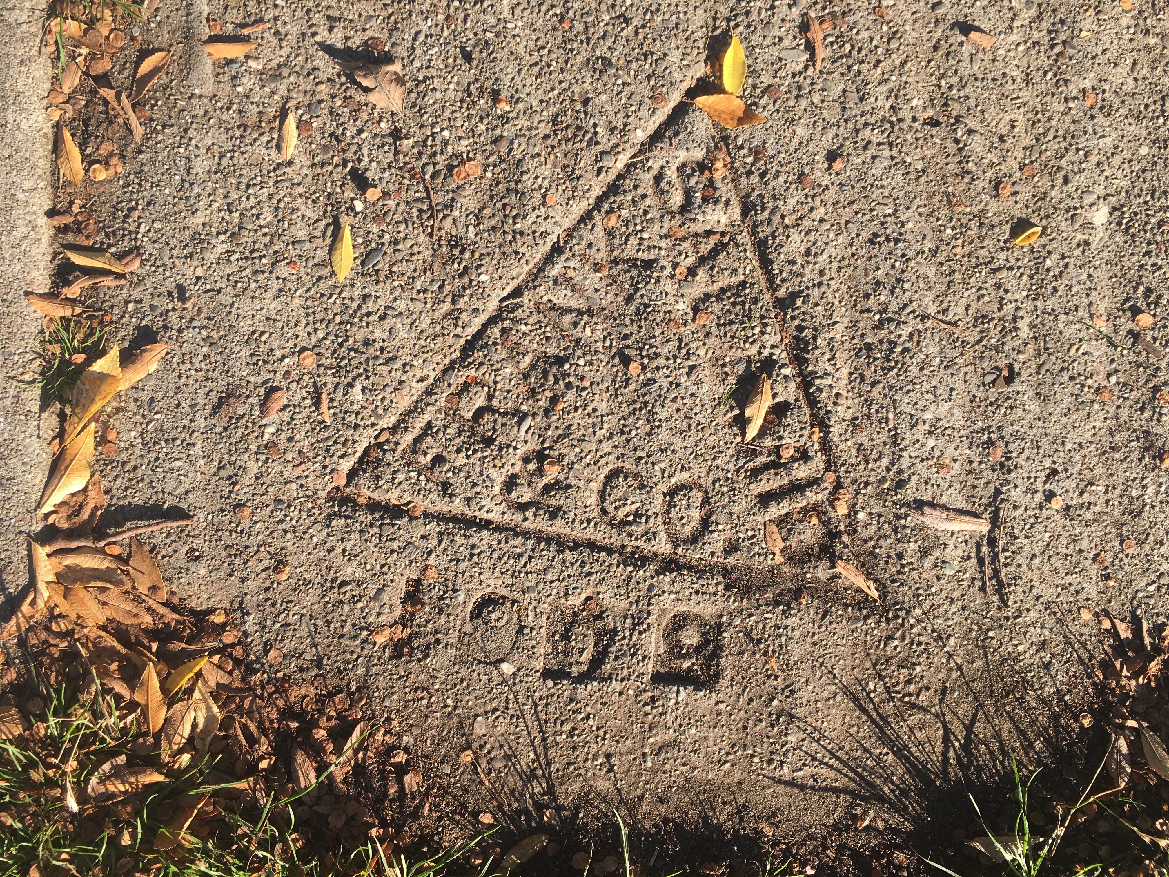
I didn’t know anything about F.E. Nelson, but the escutcheon of the contractor whose work from as early as 1910 off Piedmont Ave. that continued on sidewalk stretches through the 1920s seemed a line of time that placed a sense of history into the stretches of cement that they poured and smoothed for individual homes, material traces of urbanization and built space that paralleled the start of an anthropogenic period of the paving of land in the Bay Area that marked the end of an earlier nature of land use and the carving of space into neighborhoods that might be seen as a form of settler colonialism and possession, cementing a sense of an ending to the indigenous land use practices studied in Berkeley by Peter Nelson (no relation as far as I know), taking ownership of residences in an urban agglomeration of the past, if one of far less density or land value than today. As an era of ever increasing percentage of pavement and resurfaced space across northern California, and the Bay Area, detecting hints of the first paving, a century ago, that began to shift earlier notions of land use, offered more than a sense of psychic stability. As I walked up Channing Street, I read the stamps of sequential years form the Esterly Co, sequential stamps of the early twentieth century from the start of the previous century, dated by hand in a single graffito–

1611 Channing, Berkeley CA
It was a material record of a past presented with some reassurance to the pedestrian that the ground was solid. The apparent antiquity of these markers of early paved surfaces, not resurfaced for over a century in a pocket of relatively low real estate development and mobility, became not a sign of privilege but reassuringly comforting as a continuity of a bedrock of shared life, or a solid sense of place, in the past lives of pavers whose names I had never noticed before.
They now somehow seemed characters to compensate for empty streets in a state when the Shelter in Place policy and work from home ethos reduced foot traffic, some of which had blurred the sidewalk markers left in concrete by contractors as a sign of their skill in engineering pedestrian space. It seemed a form of writing or inscription that evolved in some sense since the more rudimentary public lettering of some earlier dates–a stamp of 1907 was among the earliest near by house–on Woolsey Street–if an early evidence of a distinct modernism of the start of paved life.
C. J. Lindgren, Prince Street
These inscriptions stamped in the pavement of old contractors–“sidewalk stamps,” many have it, or simply “imprints”–were always something I had overlooked. But if Robert Musil argued in prewar Europe that the remarkable thing about the intentional urban monument was that it was something that went unseen–“that one does not notice them;” that “there is nothing in the world that is as invisible as a monument”–and that their impact receded as they became part of an urban landscape, as if displaced by the media environments of the twentieth century as outdated in their materiality, these stamps gained an unforeseen monumentality as they seemed far more human than the monuments of escalating rates of infection, mortality, and jaggedly time-series graphs of mortality that broke parameters with regularity. The monuments seemed more human, more impressive, as a site of the lived environment I had somehow overlooked, so that even feint imprints, worn by the feet of past pedestrian traffic, seemed to stare back at me, in some recognition, from a temporal divide, as evidence of a pedestrianized space of the local past. If set by homeowners, to be sure, several of the imprints seem relics of a. past I could not fail to see as staking out the pedestrianized spaces of other pasts as I walked to a volunteer shift, offering access to a different sense of place from the U.S. Depression, barely left on their footworn surfaces. I was perhaps too ready to interpret as a marker of older pedestrian paths that were once walked down.

2200 Carleton Street, Berkeley CA
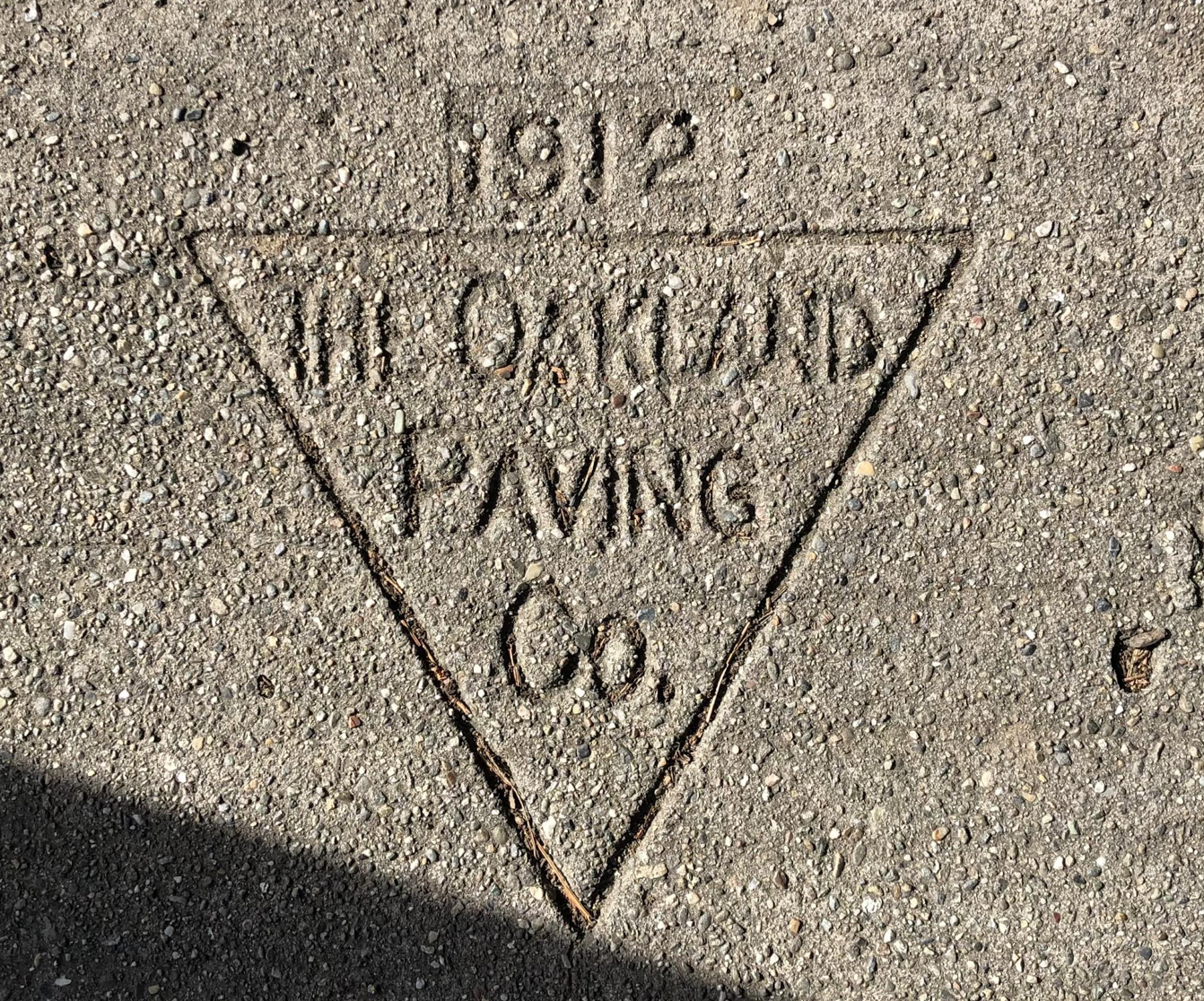
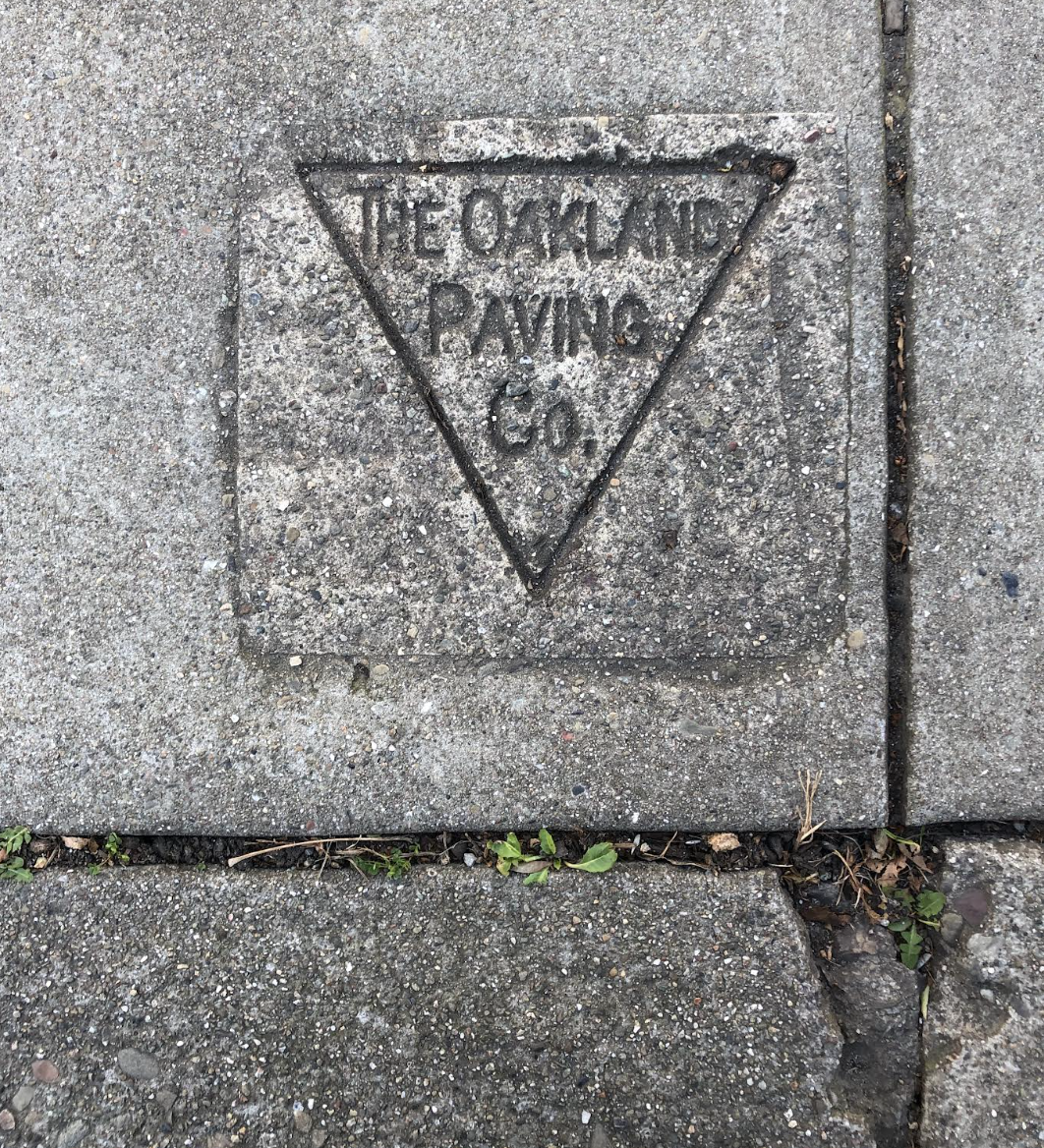
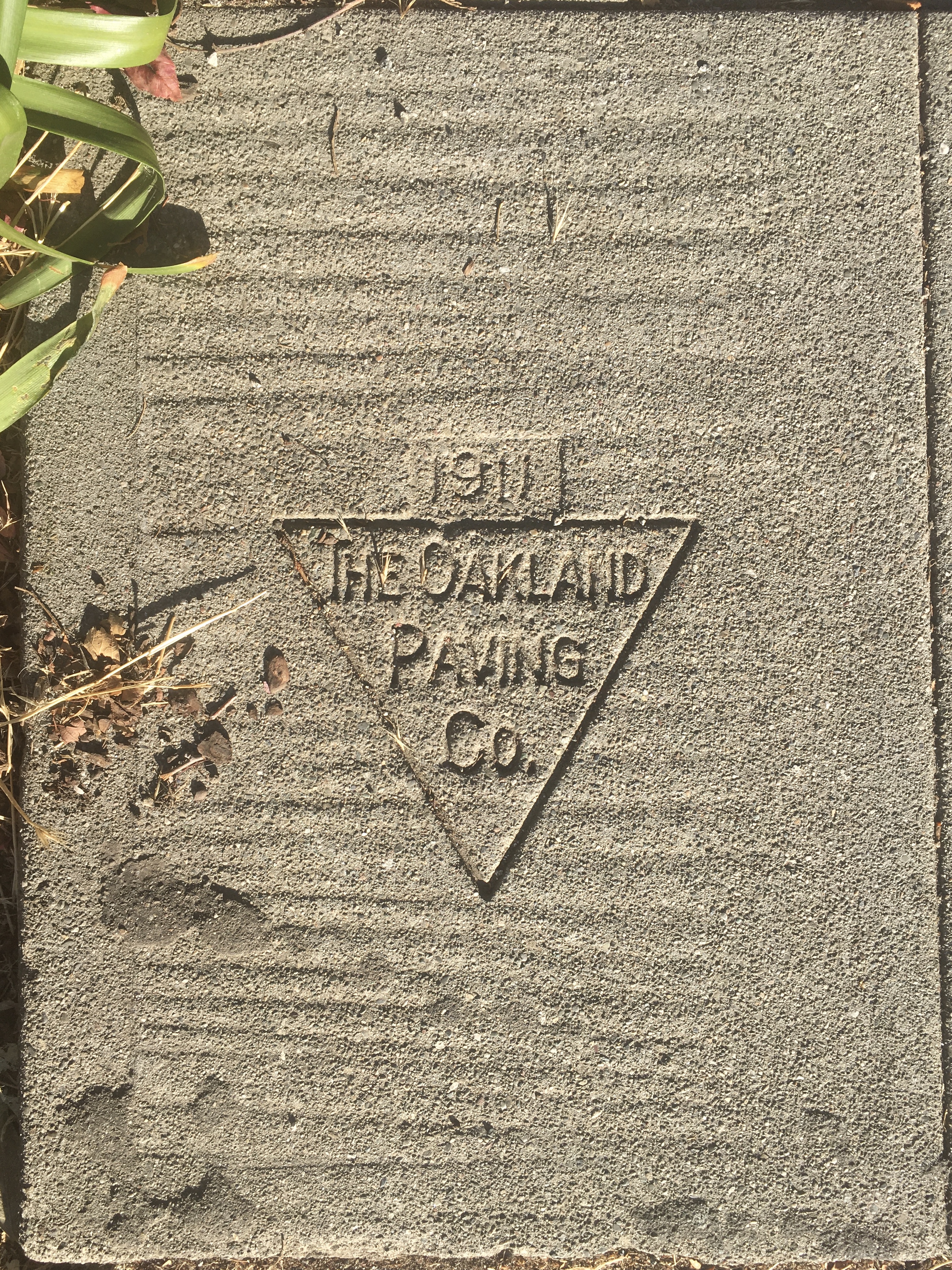
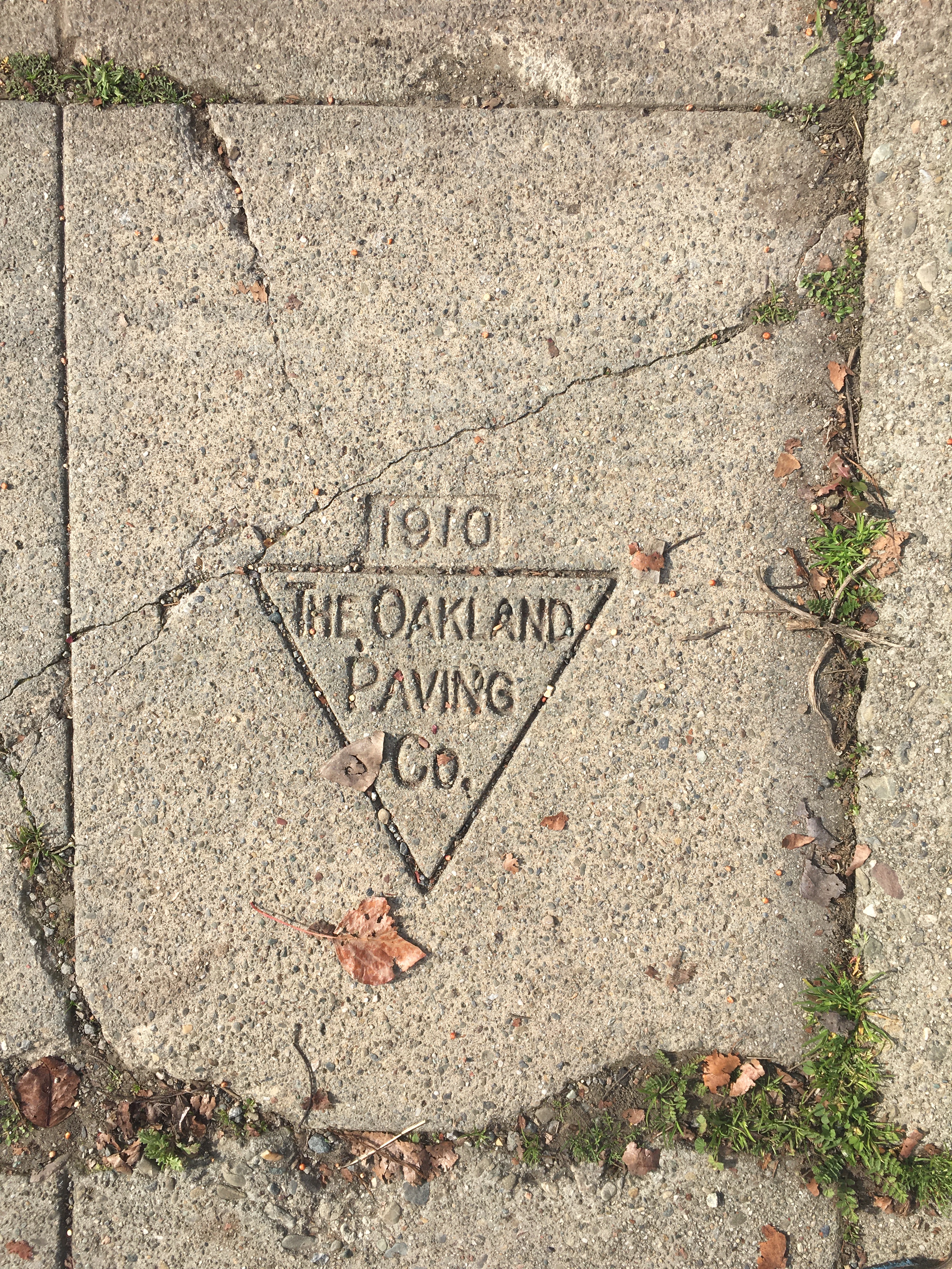
Few regarded these imprints as monuments–if, as I saw with some surprise, years later, the imprint of the very same firm that had paved sidewalks in my neighborhood off of Prince St., the Oakland Paving Co., had not only paved sidewalks deep into Berkeley in the early twentieth century–
2201 Woolsey St., Berkeley CA
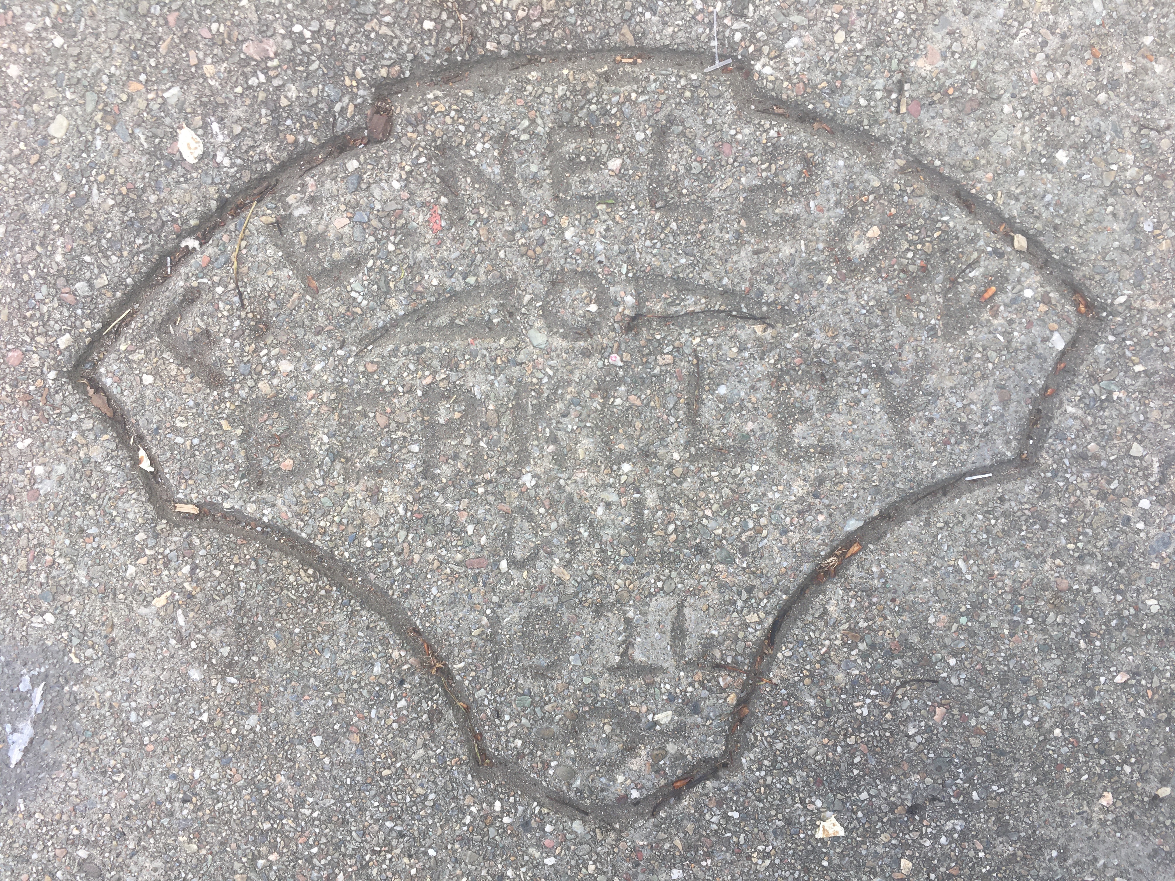
–had indeed merited museumification as a historical relic and as a monument–in the driveway to the colonial revival residence I found housed the Berkeley Historical Society, housed in an old turn-of-the- century 1902 gated house close by the university in one of Berkeley’s first residential districts–as if the Society had by its good graces preserved this old relic, of a slightly different font of a stamp, maybe dating from different date, that seemed to confirm its archeological value as a marker–the lettering used in an imprint stamped 1911 up the street from my home, without inverted “n”‘s or a uniform font.
2318 Durant St., Berkeley CA
But the following of the evidence of what I took as a pedestrianized spaces of the sidewalk seemed a humanization of space, in a time of existential estrangement and uncertainty. As I walked in horror at escalating mortality rates, the names popped out as if they gained status as unrecognized improvised memorials–as much as humanized space. The shift reminded me of the effect cultivated intentionally in literal “stumbling blocks,” or stolpersteine, placed in urban pavement in Berlin and, later, other German cities, as monuments that gained such immediate relevance that they spread to Belgium, France, Italy, Poland, Hungary, Moldavia, Lithuania, Slovenia, Croatia, and Ukraine. These stones, set in existing pavement to make walkers “stumble” in a pavement of memory, to pause and read least we fail to recognize the scale of loss of former inhabitants, were at least operations. As I payed respects to F. E. Nelson, for example, or the paving of Fulton Street’s few houses, this was almost better than a novel; to be sure, he was never violently and systematically evicted with force, or killed with his family, but the record Nelson left on the ground, or the man in his crew who inadvertently inverted a letter in his name, seemed insight to a moment in an early manmade past. Was the same man unsure what year it was, 1900 or 1920?

2180 Dwight St., Berkeley CA
But these were not names of such living ghosts, if left without the intentionality I started to invested in them. I imagined an Oakland aristocracy on the scriptorium of the sidewalk, as I came to recognize as an aristocracy of the pavement, those artisan families of the venerable Schnoor, the generations of Greek pavers of the Salamids, from Frank to A[nthony], or the Oakland Paving Co. The city of Berkeley has long passed costs of repaving onto home owners, and the process of paving was on most residential neighborhoods done piecemeal, residential house by residential house, for the most part, rather than, as in many cites, by urban planners: the traces of voices of the past seemed, as ghosts to be alive in new ways, paradoxically, in the emptier sidewalks I navigated in the pandemic, as I turned to them for signs of life in what felt like a project of excavating lived space as living space had suddenly contracted.
Was there a sense of self-reliance of the most odd search for virtue, in this identification of the lettering of pavers’ signs? If the ornate frames of some might reveal the prosperity after World War I, when the escutcheons of pavers seemed to court the art nouveaux, as did some older service building facades, the intact notion of many of these signatures in the cement seemed like signs of turning to face the present, or to face an other, or enacting a sort of conversation at a time when conservations were so stressed. This was a sense of a deep history lying flat for any pedestrian on the sidewalks pavings that were done for single homes in Oakland and of particular historic density in the neighborhood where I had moved, where I didn’t know the names of neighbors as much as the contractors who had surfaced the sidewalks. These names, like imaginary memoranda, seemed missives from a forgotten era, as a counter-map all of a sudden before the maps purporting to track contagious spread of COVID-19, spikes of mortality rates from New York City and other global hot-spots, that sent a shuddering x-ray of sorts on the social order of the nation.
If the scrivener was the lowliest order of scribe, often overlooked, as administrative copyists who seemed to embrace the role embracing public servants, notaries, scribes, accountants and petitioners of an earlier era, before a current era of specialization and deputized proxy, the names pressed in the pavement were akin to witnesses of the spread of private housing beneath the open skies of the Bay Area. And if ominous markings of stenciled black spray-paint had alerted pedestrians in North Oakland to the sites of black-owned houses in communities of African American homeownership, the sidewalk imprints served as scribal residue of reminders of the shifting grounds of home ownership, that I became increasingly attuned to tracking in the pandemic, as remaining signs of a tangible relation to the past, least it be lost, in an era of increasing insecurity so that one didn’t have to feel quite so rudderless.
It was in the pandemic that I discovered how many had curiously remained legible underfoot, untouched by the spate of remodels, in many blocks of Berkeley and Oakland, offering a tangible collective testimonial of the past, that seemed suddenly reassuring as an act of bearing witness, when we were uncertain of what we were bearing witness to. As the testimonies of the lowly scriveners who produced a volume of work that went unseen under the the edifice of legal productions they sustained, as the description of the copying clerk hired to “prepare an extraordinary quantity of deeds to copy” who impressed his employer by his “modest, quiet, gentlemanly demeanor, and his intense application to his duties” evoked Bartleby the Scrivener, for Melville, the dates names seemed a form of public writing to sustain the city of an earlier era, to which I might have escaped or placed myself at an angle to the present.
These scriveners of cement traced the block-by-block settlement of Berkeley. long before its gentrification, perhaps, but anticipating it in personal stretches of sidewalks of grades of cement from different local quarries,–they could not prefer not to, but they etched urban social stratification. in ways that anticipate our own era of increasingly starkly drawn social inequalities. If I had tried to gain a moral compass in relation to the increasing deaths that were evident, say, in the creation of the largest mass grave in Hart’s Island in New York City, the site of burial of unclaimed bodies of those kin or without family relations. As the oldest site for the burial of the unclaimed and poor for over a century was opened again as a resting place for the unclaimed victims of COVID-19, the reopened cemetary legally owned by New York States’s Prisons, was emblematic of the loss of life and deep wound that the pandemic placed in the city where I grew up, on another coast, where few sidewalks bore any name.

COVID-19 BZrial at Hart’s island, New York City February 22 2021/Lucas Jackson Reuters
The mass grave in this new Potter’s Field was emblematic of the early modern nature of our collective confrontation with mortality and disease, in those days when the principles of infection or possibility of vaccination was remote. A sign of the utter failure of community, or of communal practices being stretched to the breaking point, and unprecedented stress placed on our system of public health, the sense of a need for finding home and community and the face-to-face–all those targets of Weberianism–emerged at full force. In contrast, the names on the ground each morning or late afternoon walks were not only a way of marking space, but ordering time.
I was reading the names of these pavers, strikes were long left on Berkeley’s sidewalks, were tabulated as part of its distinctive built landscape, as points of contact less overwhelming, as small drops of mortality, as it were, less overpowering and more measured, if as intense, that tied me to a world before. the so-called Spanish Flu, and to the work lives of a measured past as a way of restoring a face-to-face community I was without. If the sidewalk became a sort of re-enchantment of space, it was a form of mapping, or remapping, by reading old traces stamped in concrete, spatially sorted out as traces of the city past in very human signage of the earlier century.
We could only stare, open-mouthed, at the visualizations aptly showing the ballooning infection and mortality rates by growing red splotches, akin to the blood coughed up by tubercular patients, along the map. All the while trying to grasp the scale of death and their rate of growth, we contemplated the possibility of ever “flattening the curve,” but were often even gawking as a passive spectator of dashboards of exponentially growing cases, like the first observer of a new mortality map. The effect was a bit disarming, like loosing our purchase or indeed stability or being, like historian of science Lorraine Daston put it, feeling one’s way in the dark like an early modern scientist, wondering if we had any purchase on how infections spread. The sense of place seemed to deepen, however, not only because we traveled less in California, where we tended to shelter in place, and even the ambient noise of car traffic fell, but we developed something like a new sense of place, perhaps as a reassurance given the insecurity of most maps of infection the news cycle seemed to blare. In their place, the names etched, stamped or traced by framed imprints seemed to gain volume, as if to echo the building of old space,
As if remembering the intentionality of a “need to walk,” to explore the areas where we live,” imagining a destination we were approaching, even if we did so without having anything so precise or fixed in mind, we seemed to disengage from the GPS in healthy ways while traveling more on foot. Rebecca Solnit found a sense of place serves as a “sixth sense,” and described the need to cultivate “an internal compass and map made by memory and spatial perception together,” in Savage Dreams–an important book on the landscape wars in the American West that describes the relation to the landscape as a form of civil disobedience. The time-stamped sidewalk stamps that I began to notice in new ways as they seemed to speak to me around the sidewalks of Berkeley, CA seemed a compass on a pandemic by returning attention to an imagined if real local community of the long dead, in which I tried to find some stability as our web social contacts shrunk. Walking in my neighborhood, I was remotely observing a flurry of activity of residential sidewalk paving–at a temporal remove was an act of cultivating that sixth sense of spatial perception, finding forgotten landscapes and a surprising sense of spaciousness in the scriptorium of the sidewalk, developing an almost unhealthy focus on the materiality of names set in cement more than a century ago as if they offered a reassuringly material past. The stamped icons were often almost baroque, art deco, or geometric forms, seemed haiku paring name and date, as if one could trace some hidden web of work set on sidewalks in the lost reality of years past. Every so often, beside them, I ran across the oddly humor flash historical marker, probably dating to the rise of preservation local movements, that poked fun of the historical certification of points of interest and places of note–aluminum markers in the ground of mock erudition of historical distance as if by readers of Thomas Pynchon–
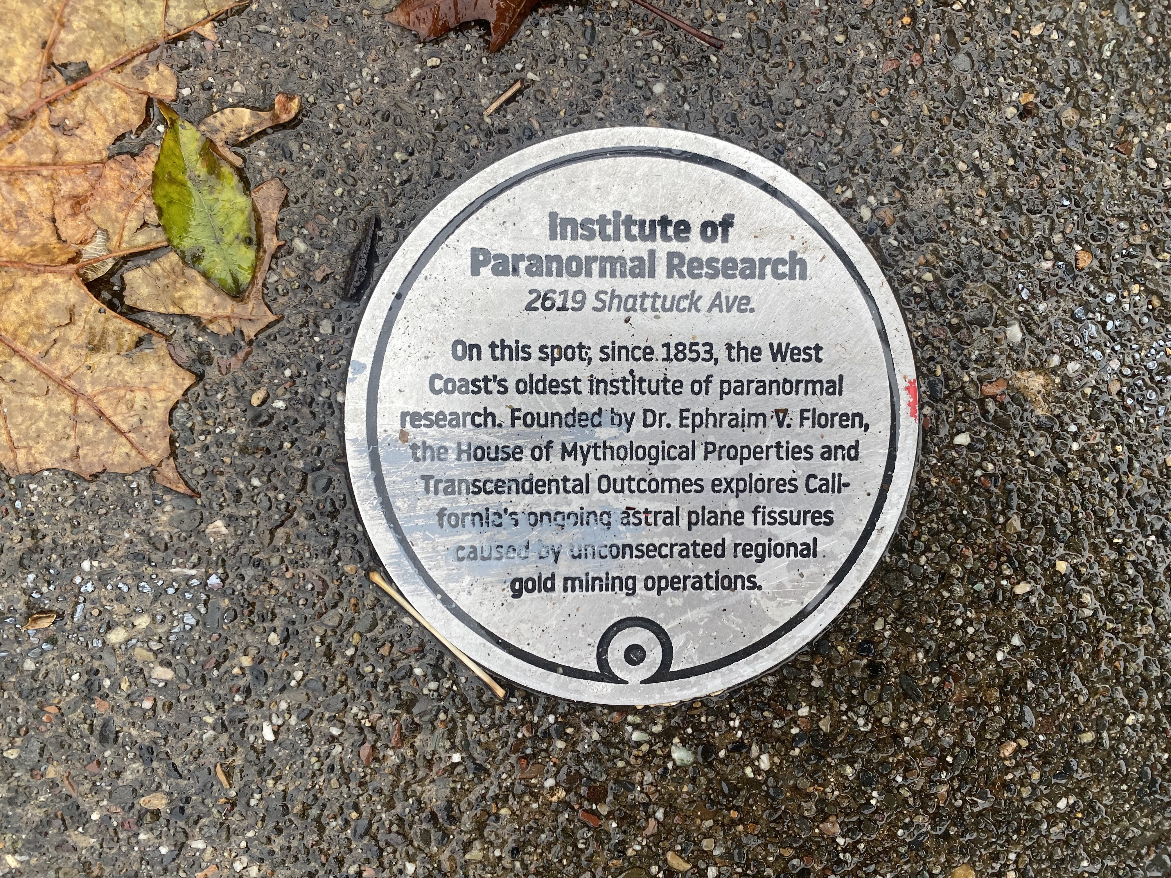
–that conjured a larger cast of fictional characters with Pynchonian names such as Dr. Ephraim V. Floren, claimed to have founded the very Instituted of Paranormal Research along Berkeley’s main automotive drag, in the hopes of rectify the fissures created by the prospectors who arrived in the Gold Rush as California was mapped for prospectors who arrived in the Gold Rush, not native inhabitants, wreaking grievous fissures of the astral plane. Were these spiritual ruptures created by an increased recognition of how the gold-diggers who arrived seeking fortune disrupted native burial sites and communities, disrupting sacred sites by disinterring burial grounds of the displaced indigenous inhabitants of the West Coast, excavating native remains with an abandoned Tony Platt had helped to trace in the early 2000’s, from the Yurok lands of what was once O-pyúweg, in current Humboldt County, to the Sierras, in an early genocide that no doubt disturbed the astral plane? The notion of such a center outside the land grant university that was based on dispossession of native lands seemed apt, founded, per the plaque, long before Ishi moved to Kroeber Hall.
I increasingly wish I could be so removed from place to an astral plane. As much as I wanted to critique the present, I wanted to winnow the amount of information–and lack of it–by which I was alternatively overwhelmed. Could one adopt a clear critical stance by removing oneself from newsfeeds? The absence of walking on the streets seemed a zen-like reprieve from online stress, there were far fewer aperçus of the urban to discover in questing about with one’s eyes alert to the surroundings, but the sidewalk stamps seemed to gain a weight I’d hardly noticed in the past, as if marks of another, removed, maybe more harmonious time. If the figure of the flâneur is associated with a passionate connoisseur of the bustle of urban life, the relative emptiness of Berkeley CA became a space of which I was keenly aware not because of the fabric of the city or alienation of capitalism, but the relation that I had to the sidewalks beneath my feet, and the encoding of telegraphic scripts they offered in the worn cement of another time of over a century ago. The strikes from 1918, 1906 and 1904 suggested a town only emerging from the conventions of real estate and private residences that now fill the streets of Berkeley today, as signs of an early form of settlement–or early real estate market that seemed to boom already before the San Francisco great earthquake of 1906, that terrifying horizontal displacement of the San Andreas fault that in less than a minute sent powerful rumbles from its offshore epicenter across the region and, destroying many houses and buildings to displace many across the bay.
These old stamps, as I ventured outdoors on long walks, offered contact less with the bustle of inhabited spaces, than their increasingly resonant echoes of pasts, but were almost something suddenly worth study. The stamps stood for a new sort of contact with urban space, that almost made me stop in puzzlement and take me out of the present-day. This seemed a sort of urban archeology of the everyday, encountering what might be a sort of architecture at my feet. On these walks, perhaps, I was maybe channeling the first self-proclaimed botanist of the pavement, Walter Benjamin, trying to formulate an urban critique by situating myself in new surroundings. The stamps seemed, for a time, something like talismans able to redirect cynicism of the moment.
The stamps set before local single family residences before the wars of the twentieth century were signs of a booming real estate market, but an industrialization of pedestrian life. While I’d never thought much about Berkeley or California in concrete terms before the 1920s, the stamps of pre-war Berkeley traced a settlement of urban space with a tactile nature–and the slip of that inverted “N” in stamps of the Oakland Paving Co, an accident of setting letters, welcome as an ability to touch the past, as if newly conscious of a more contingent present I seemed to have lost clear compass bearings on. Maybe in response to unneeded panic, I welcomed the remapping of a community in these old stamps as if they were reassuring names, as if in contact with the traces that these engineers of the sidewalks left on the ground below my feet, whose often elegant geometric escutcheons seemed like clues of local housing patterns and portals to another time.
The sudden sense of connoisseurship of the pressed pavement seemed an earlier letterpress era of print, a sense of legibility far easier to decode than viral transmission, mutation, and decoding genomes, but also a removal from the present. As I was starting to find my footing to walk in these almost abandoned streets, the dissociative rhythm of finding markers from an earlier time seemed a way to escape the present and its anxieties. I started to find a sense of a lost order that seemed to be traced on the pavement as I walked the empty sidewalks in the late afternoon, streets abandoned, names started to seem lists, or even doubled as a set of gravestones, as if infected by the growing sense of mortality as I felt its weirdly imposing effects.
I spend a huge amount of time, walking, as if emptying my mind, facing the stoic silence of stamps set into those stony surfaces, as welcome recognizable touchstones. Perhaps they offered antiquarian busywork, as if cataloguing signs of time past kept at bay the uncomfortable sense of pausing any natural rhythm of the day, or a reprieve from anxieties that hinted at an “oceanic” feeling of Sigmund Freud cast as a sense of oneness with the world. The improbable survival of such stamps offered a reminder of past, if also of loss, whose very fragility was testified by being obsured or erased by foot traffic–as an early stamp on Benevenue Ave., near by local community independent coffee shop that the main online source on these curious stamps omits–the sidewalk before the 1922 building was paved by an Italian-American immigrant duo of pavers based in Oakland, whose incursions into Berkeley date from 1922.

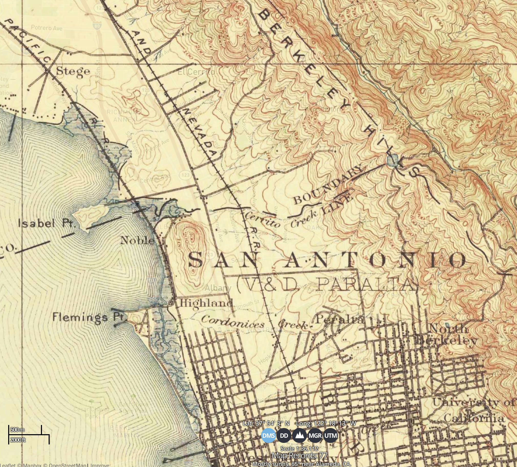
The talismanic names seemed able to ward off the cynicism of the moment. At the time, with little script , and an illusory sense of the stoppage of time dominant in my conscious, the sidewalk markers of old and long-dead pavers seemed to speak to me. Amidst the tally of a surrogate for psychic stability of sorts amidst increased step-counts and improvised destinations of an oddly existential air, I was looking for a path for stability and seeking distance on the pandemic in the century-old stamps set in the concrete pavement like early claims of private property. The puzzle of this piecemeal paving of sidewalks, driveways, and pathways before houses seemed itself an imrprovised formation of a “city” as a real estate gambit, evident in the early maps–this from 1906–of the area on the Berkeley-Oakland border where I live.

The map that was in essence the streetplan for the area I was renavigating by pavers’ marks was the included in thick green outlining the ‘Fire District’ in San Francisco, the proximate disaster all but absent from the Oakland and Berkeley maps, on its recto, a destroyed zone of the city where for several days after April 18, 1906, a fires had raged that killed 3,000 and displaced many more: the disaster was not included or in evidence int he map, that seemed hardly to register the shock or aftershock of the minds of those who used it. But as thirty fires consumed over 490 city blocks, and 25,000 buildings, the disaster brought the overflow or migration to the East Bay: arcs drawn over the map registered the distance from the Main Line of the Southern & Pacific railroad and thick green lines the Key Company bus lines, that linked the East Bay and San Jose, in the map of 1906, as if mapping the distance from San Francisco, for those who had to leave the city.
If echoing the concentric zone maps designed by the urban sociologist Ernest Burgess to map the sociological organization of criminality, race, and other social groups in the young metropolis of Chicago, mapping “dubious dancehalls,” the composition of families, the sharing of domestic space with lodgers or relatives, or diagnosed manic-depressives to better understand the “subcommunities” of urban space. The “zone maps” that plotted Burgess’ social observation were rather–familiar from the Bay Area?–be used to reflect or map “commute time.”
Perhaps there is not evidence in the pavers of the “hidden wars of the American West” Solnit so powerfully traced–if they were effectively reclaiming once indigenous land as private property, that battle had been effectively lost. But the immigrants who paved these pathways in a piecemeal fashion with realtors suggested the mosaic of the East Bay’s past. The wars of private property and single-family housing were fought on its front lines in Berkeley, as it turns out, and the conventions and contracts among private real estate owners and real estate schemes that were the seeds of Berkeley–and, for that matter, of the University of California’s premier campus, relocated with plans of William Hillegass and Franics Kittredge Shattuck to sell a portion of land to the University of California. (Shattuck and Hillegass had partnered in a livery stable in what is downtown Oakland, by the current Jack London Square, and the streets to which they lent their names in Berkeley defined parameters for the old College of California.). And those distance arcs emanating out to Berkeley from downtown Oakland illustrate the demand for real estate that led a flurry of sidewalks to be built, transforming the landscape in years after the 1906 earthquake.
The sidewalks preserved traces of these stamps, of less storied men, isolated fragments not worn by footsteps of pedestrians or lost to time. Their survival seemed to provide way stations that were guides to a lost trail of the built residences in the East Bay by resourceful men, suddenly invested with a weird heroism I’d been loath to attribute as crafting the stability of a past geography of early twentieth urbanization and public space, even as our social fabric had tragically frayed. These unknown men who left definite traces in the sidewalk stamps of what now seems modesty–Blake & Bilger Company, founders of the Oakland Paving Co.; J. Catucci, Gen[eral] Con[tractor]; Spring Construction Co.; C. Burnham–seemed like heroes of the forging of an earlier city, even if it was more of an extra-urban enclave.


Unlike the screaming outside and overbold pronouncements, the reticence of the geometric sigla pressed into concrete were the safe spaces in a pandemic filled with disinformation and dread. As each inch of the public sphere was filled with cautions or false security, the hidden trail was a weird way of giving some purpose to long walks in the early morning and late afternoon. If critique was a way of distancing oneself from online panic, the strikes provided a sense of grounding
The forgotten names on sidewalks of these old engineers of the city not only hearkened a sense of modernity, not yet obscured by the shuffle of feet and still peeking over a century of pedestrian traffic, time-stamped with barely legible dates like 1908, 1904, 1906, or 1912, but exultant markers of the achievement of modernity: they had paved the ancestral Ohlone lands for private residence, and the boosterish hiving off of private residences, just before but no doubt stimulated by the great quake across the bay–when the twenty foot movement of one tectonic plate sent so many suddenly homeless fleeing San Francisco seeking temporary security in the old East Bay, increasingly consumed by real estate markets of time past. I was, of. course, retreating from the datascreens of mortality and hospitalization, of COVID infections and of excess mortality, finding a more tactile antiquarianism in the insignia and escutcheons of an earlier era that were basically old advertisements for the benefits of solid, level paving, whose date maybe was primarily an indicator of how long they would endured. And it was that endurance that appealed to me in an age of suddenly and unexpectedly heightened awareness of all of our contingency.

The stamps of pavers was in a way a placement of “Berkeley” on the map, 1899-1918. If many, seeking orientation to what was unfolding, exasperated at the overflow of global maps of pandemic spread that were intellectually impossible to balance with one’s fears for those loved, many looked to the classics–Defoe’s Journal of a Plague Year, Manzoni’s The Betrothed, or Camus’ The Plague. (A copy of the latter arrived for my daughter by post, as if to keep her up with the latest existential quandaries, although it remained unread.) The texts framed in the ground, set like time capsules of a past century, seemed to provide a weirdly comforting grounding–if not orientation–as if they became the deep history of place against our quandary. Indeed, the paths that I seemed to be tracing or finding of the paving of sidewalks outside of single-family homes seemed to be a path-finding, of sorts, to the landscape of private property by which the East Bay landscape is now predominantly defined. What more apt way to witness the pandemic unfold?
What could one read effectively, anyways? As we isolated in place, I tended came to consult the inscriptions stamped on the pavement by contractors, as if they were the neighborhood elders. For in the moments of small excursions by foot, and in walking increasingly only on foot, despite diminished pedestrian encounters, I looked for bearings from epidemiological disorientation in the sense of deep time that the sidewalk stamps of my Berkeley neighborhood offered, as if to gain from the a sort of psychic stability. The discovery one day of a 1912 stamp set twice in the concrete before a house that did not look nearly that old began a search to escape to the traces of a past world on the Berkeley-Oakland border, but continued as the sidewalk stamps of earlier generations became a solitary hunt for. a lost community, or a substitute for the sidewalk sociability that I treasured as neighborhood life.
Walking more widely with less in mind than other periods, I began to read these imprints as transactional sites of memories, on the pavement I daily walked up to where Claremont Avenue bound from 1905 a subdivision promising residents “sunshine and hills” in single family residences. The close cousin of the imprint framed a trans-dimensional memory of place, history, and housing that seemed to pop into relief on relatively empty Oakland streets. And when I found, nearby, a set of stamps from 1904 from the same company, the sense of imagining the pouring of the streets I walked with regularity, before and after dinner, as a solace form the anxiety of deep disruptions of urban contexts. In a weirdly isolated search for social reparations, I seemed to find a sense of solace in imagining their historical context: tracing the dates and legibility of these signs of the security of a community that was frayed.
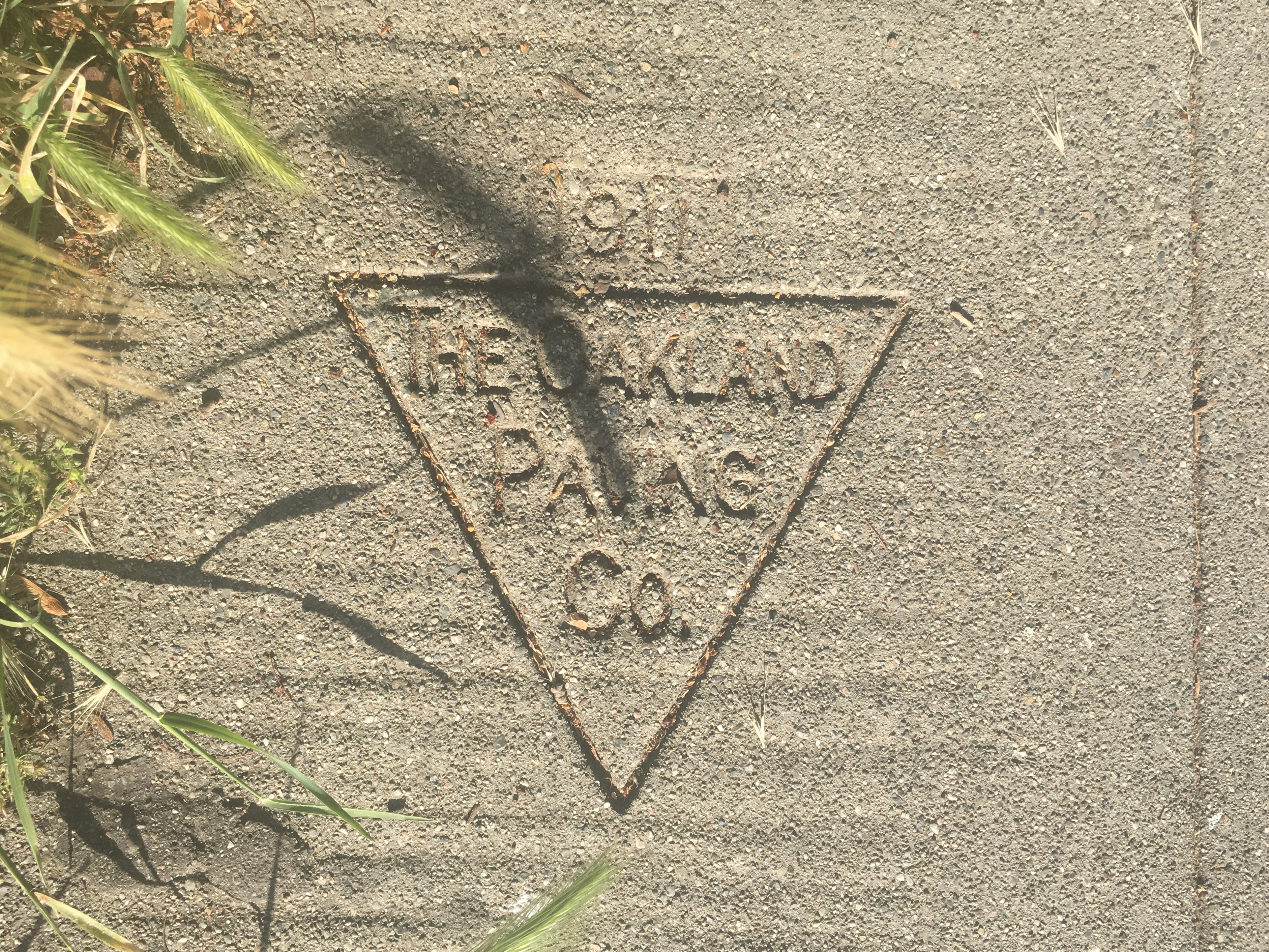
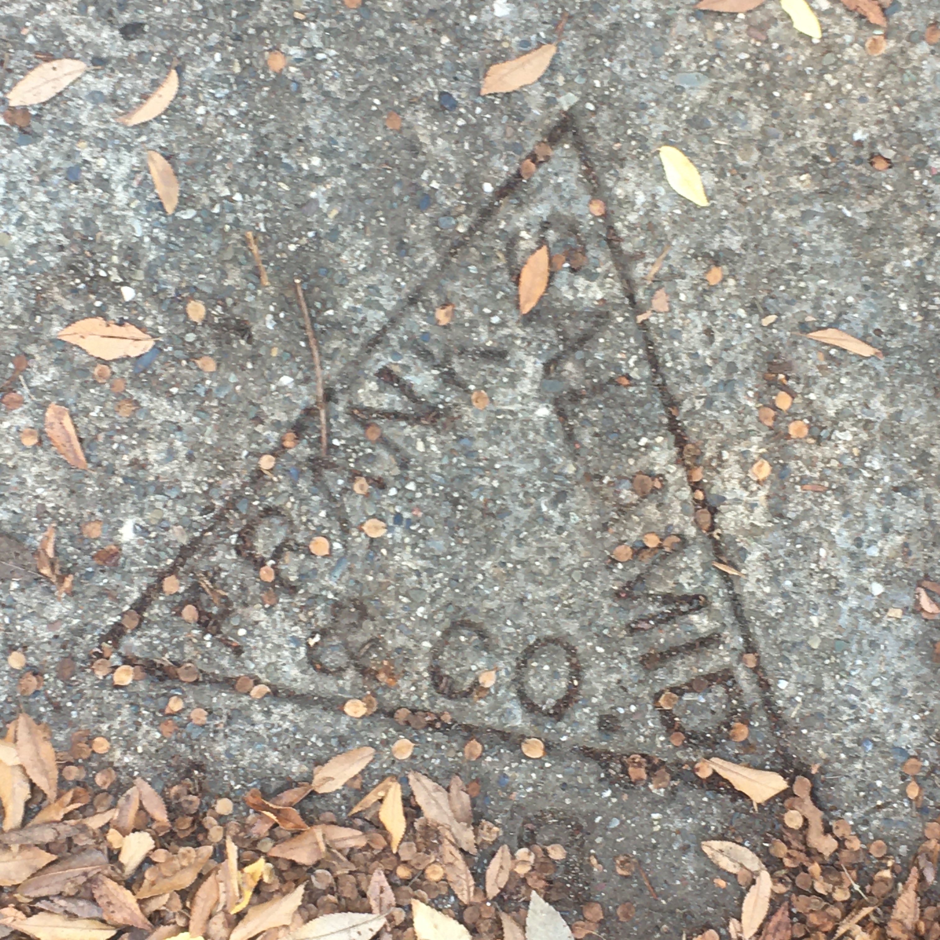
The Oakland Paving Company, 1911/Prince St., Berkeley, CA
Oakland Paving Company, 1904/2619 Newbury St., Berkeley CA
I came to think of the imprints pavers had stamped on the ground as a surviving unnoticed network, a reassuring social network I could help rise from the dead to reconstruct traces of an imagined past village community, when concrete was mined from Oakland, Albany, and Emeryville quarries. On walks, I became the imagined intermediary of a past I had not noticed, communing silently with men like Blake & Bilger, Frank Salamid, the Schnoor Bros. (or their progenitor, Paul, who showed up as early as 1908) and even the Oakland Pavement Co. as I traced the local genealogies on what must have been the newly modern form of paved sidewalks that were a feature of what had emerged soon after the San Francisco Earthquake of 1906 as a site of single family residences, and a refuge, in those days, from fears of tremors. The comforting company of these inscriptions that from an earlier era, predating World War I or World War II, and the catastrophes of the twentieth century, seemed a perfectly available form of escapism, at first, to navigate the world that was until recently uncomfortably crowded by the false fraternity of Tech. Bros poaching local real estate–and raising its prices–from Silicon Valley.
Amidst the challenges faced by the nation, amidst the rising specter of increasingly apparent deep-set inequalities, disparities, and deficits of public health, I fancied to be able to uncover an old urban infrastructure encoded in the century-old names stamped into the ground, pavers’ stamps of a tactile legibility I’d long ignored, but seemed removed from the dizzying distance of records of mortality, hospitalization, and viral spread that seemed almost impossible to comprehend or assess, and both reassuringly material–and present. The imprints on local sidewalks gained an increased interface that I’d rarely felt, even after living in North Oakland and Berkeley for far over twenty-five years, as the names of long passed contractors, cement pavers, and construction firms appeared as offering evidence of a sort of urban infrastructure, revealing a lot about place and the longstanding status of the single-family residences in my neighborhood; reading the scattering of cement inscriptions excavating a sense of place by sidewalk engineers, tracing a deep archeology of place that was shaped by real estate markets, social inequalities, and a half-way house of urbanization in the early days of the expansion of the East Bay to which I retreated readily, as if reading signs from what seemed the first pavers of the ground.
The earliest “strikes” dated were from over a century and a quarter ago–1899 or 1905, and even a 1901 and 1904–the majority charted the expansion of the city, and the shifting cast of characters who framed driveways, pavement, and on the city streets, offering a distraction from that peeled me from confusion or fears of contraction of the virus. Moving up the street on which I live, confined to the 2000’s blocks, I started reading the ground as a remove from the global, even imagining a lost village community of the time when mining pavement came from local quarries, engineers had names, that fictionally rooted me in ways that seemed welcome. If in Graduate School as an early modern historian, we’d joked that we were spending summers on researching the unexplored archives of early modern Oakland and its relation to the Mediterranean economy, riffing on the great French historian Fernand Braudel’s insistence to expand n the perspectives on historical time, space, and even periodization or events, it seemed that traces of early modern Oakland lay in the cracked pavement at my feet, a neglected history of neglected records as deep as they were confine to the superficial, at my feet, tracing mobility patterns in Oakland and Berkeley in a profound way that one could tease out to read the city in concrete, even as the raging pandemic traversed borders and challenged medical science.

As I walked to coffee and manufactured errands, taking stock of the empty streets, the individual imprints left by pavers from between the 1906 earthquake and the Great War seemed a form of public memory. Perhaps there was a greater sensitivity to them to champion as we were debating memory as a nation, if at a far less local scale. The stamps set in concrete sidewalks near by house staked a claim for permanence, before the Great War, and before the ‘Spanish’ Flu raged, trumpeting with an optimism the newly constructed lands of a built East Bay.
The sidewalks of sold lots of what were once indigenous lands staked a claim as a new part of the city, expanded be the entry of folks from the city across the bay, but also an entitlement of lots for new housing–literally, titles–that the real estate corporations and construction firms built, a sense of a signature on the ground that was asserting a new form of mapping residential neighborhoods. And taking these imprints, as the 1911 one I came across near my house, invitations to think about time, and about the new contours of place, I came to think of them as a secret sort of map, very much imbued with the materiality of a receded past that still informed the neighborhoods, the troweling of sidewalk lain over a century ago suddenly seeming both an optimistic assertion of permanence and a melancholy record of the past, when the landscape was redefined by concrete resurfacing. But these were heralds of the single-family residence, testimony to early work paving the sidewalks or driveways of individual lots, distant echoes of that gospel of propertied American individualism, that seems to have hurt us so in dealing with the pandemic as a problem of public health, or occasion to invest in public health policy.
There is something similar about these prints that recalls the early wall-building, before the establishment of the law, that Romulus had staked around Rome’s limits that separated the civilization of the city from the surrounding barbarism, as pathways and roads that, as Vico had it, into the institutions of human society by the building of roads and walls around fields.

The legibility that these sidewalks assumed as part of a historical record, long overlooked, seemed almost a source of security, and a form of memorialization, far more than antiquarian curiosity. Perhaps the prsence of fewer pedestrians altered human geography to remind me of the delicate construction of our sense of place, the flat surface of the pavement provided a weird surrogate for the absence of familiar faces on the street. In an age when we were reading webmaps, synthesizing global data of infection rates across countries and states, the local lens of the pavement had a concrete sense of specificity that those webmaps lacked.
–that even if undated seem far older evidence of the Oakland Paving Co., lugging cement quarried from the old Bilger Quarry in Oakland’s Pleasant Valley that from 1910 offered, as “The Oakland Paving Co.” met the need for metamorphosed sandstone for macadam and concrete to pave Berkeley’s sidewalks, in the years after the San Francisco Earthquake, meeting the demand for paved streets in the East Bay over a century ago. My historical training seemed to click into gear, shifting from the webmaps of the pandemic’s spread to the poetics of the paving of the sidewalks I had long pounded since arriving in the East Bay almost thirty years ago, without giving much notice to reading what was lying under my feet, as the geography of the repaving of the city popped into unexpected historical relief as the mute stones started to speak as I looked down at them.

This rediscovering of the local in the midst of the pandemic was a remapping of place, as we were trying to process global maps modeling the spread of infections and, soon, mortality, that almost resembled a flight path map without the vectors of transmission that we were asked to reconstruct. For in contrast to the smooth sections of finely grained grey paving, the mixed macadam of earlier eras surprisingly offered a site of dialogue and historical orientation as material culture, a point of dialogue while moving far less to meditate about how we mapped space and place. As the numbers of flights contracted, and we grew less global, we measured ourselves in relation to a global pandemic that we seemed only oddly able to see in local terms. But perhaps this was, yet again, only another iteration of the fate of globalization.

The global diminution of air traffic occurred as we were tracking the spread of a virus across national borders, moving in global webs of claustrophobic mobility and transportation across borders with a heightened smoothness that was forging transnational linkages of the most deadly sort, eroding the concept or use of national sovereignty over public health, the lines of these early pavers of sidewalks offered a local text whose superficiality seemed oddly comforting to trace and almost profound, meta-geographic markers of an earlier era before gridded space was widely accessible–as if it offered another way of negotiating with the dead. As global traffic slowed, and we sheltered in place, and afternoon or morning somewhat aimless walks became a form of meditation, the sidewalks became a weirdly present interlocutor.

As much as fiction provided a respite from the specter of infection that became existential as it approached our space, blurring boundaries and destabilizing ourselves left us searching for a playbook, pavement provided a needed form of orientation, the work calendar interrupted. The storied names of the pavers of the cement sidewalks on the Berkeley-Oakland bore offered a parallel text to one of loss, as the names of contractors and pavers gained presence as a story of urbanization, and urban inequities, reactivated by the landscapes of loss.
The old sidewalk stamps left by pavers’ that dotted the border between these Bayside cities of a patriarch of one of the family of pavers whose work fed the city’s increased population after the 1906 Earthquake killed over 3,000 and destroyed 28,000 buildings–leaving some 25,000 homeless, growing the East Bay residential centers seemed in the pandemic to gain a commemorative cast as sites of mourning.
On or about April 18, 1906, the pavement set by men who owned quarries in different parts of the East Bay–Oakland; Rockridge; Berkeley; El Cerrito–set a new infrastructure for residential housing, whose echoes we still felt on the edges of a real estate market of extreme gentrification. The evidence of earlier construction firms who seized once indigenous lands was less evident as a pedestrian while sheltering in place in Berkeley, CA, than the materiality of these signs perhaps monitory and perhaps memorializing, but literally concrete. The crisp lettering left by the Spring Construction Co. on Regent Street and Benvenue Street on Berkeley’s southern border was spied by Lincoln Cushing on a schoolyard in Albany, without a date, and far crisper capitols.

In a season of increasing questions of commemoration, memorialization, and remembrance that were rising across the country, the sense of a hidden topography able to be traced by rose to the sidewalk’s surface. Once seemingly stolid “pavement strikes” set on sidewalks of north Oakland of the post-quake era seemed almost ephemeral, whose status as signs of the old expansion of an residential neighborhood might have seemed monumental–Look upon my works, Ye Mighty, and despair!–seemed suddenly transient signs, an old geography peaking up at intervals amidst transforming real estate markets that have carved up the East Bay over the last twenty years. The post-quake signatures left by pavers from College Avenue–“Paul Schnoor, 1909“–to off Ashby–“Oakland Pavement Co, 1904,” with an inverted “N”–or off Telegraph Avenue–“Burnham Co., 1908“–plotted the booming if not forgotten benchmarks of a past, revealed the engagement of the engineers of new neighborhoods by agents who elevated themselves during the Depression by elevating themselves 1920’s to 1940’s as “Masters of Concrete” as if engineers of place and built space on the blurred border between Oakland and Berkeley.
Was I walking in an old urban topography to escape the present, or looking to these benchmarks with a knowing sense of the lack of stability that they offered, peaking through a landscape of high gentrification as oddly uncomfortable echoes of a distant past?
Walking around my neighborhood with increasing frequency, I began to think of myself as not wandering to coffee shops and errands, but, more purposefully, as we all needed to embrace a sense of purse, doing research in the concrete archives of North Oakland sidewalks, searching for material signs of the past. When Walter Benjamin famously described the flâneur not only as a stroller, but as engaged critic of modernity whose act of navigating urban space had its own intentionality, in Franz Hessel’s Sapzieren in Berlin, moving in open urban spaces as an act of resistance, not bound by planning grids, but to appreciate “its charming disorder, branches crackling underfoot, the rustling of leaves on neglected narrow paths.” If Benjamin saw urban walking as “botanizing the pavement;’ the cracked concrete names traced a natural history of Oakland. amidst scattered leaves that told a hidden history.
Before the moniker “Master 4 Concrete” adorned pavers’ strikes in the 1920, these signatures seemed deeply fragile, yet a remapping of streets I fancied to watch from a distance. Like rare surviving benchmarks of a past Bay Area built on Ohlone land, these century0old names evidence of the reshaping of the settlement of the Bay for Anglo residences, that survived by chance, seemed oddly transient sites. I almost mapped them not as signs of pride taken in careful work, but as something like the mass graves under the sidewalks, mortality in the air, and signs of a sense of transience, as much as permanence, as they gained something of almost Ozymandian resonance asking me to look upon the manufacture of such sidewalks as I seeemed to, in fact, despair, a grim sort of flâneuring indeed.
These were the architects of a new sense of modern built space, after all, that paralleled the growth of the first writers on public walking–the art of the flâneur won currency, after Baudelaire as one who “walks the city to experience it,” in 1863, even if I was walking to experience its absence and the pastness of its past. The encounter of a name of the once venerable patriarch of a family of pavers, forename slightly cut short by the repaving of part of College Avenue, was akin to evidence of the dense artificial stone paving of 1908, on the Oakland-Berkeley border, two years after the Great Earthquake sent tent-camps of refugees to the East Bay, as one of the first forms of urban infrastructure of crushed stone–paved sidewalks!–laid quarried sandstone, basalt, jasper, gravel, and schist over macadam to create a walkable urban space, sometimes sandwiched within new cement blocks.

I walked to remember the city, and to know it, to distance our destabilizing sense of not knowing that we find comfort in putting to work these humanist texts to gauge their relations of illness in a epidemic or pandemic, to reactivate their readings of texts that have lain dormant in whatever ways they could? The flattening sense of the pandemic oddly echoed the trumpeting of globalists in the benefits of a flat world, as the virus seemed to move across global cruises, in airplanes and airports, in conference centers, restaurants, trading routes, and motorcycle rallies, unmooring our own sense of controlling space or situating ourselves in a “safe” space. And if I found Montréal’s public health outfits warned me against such lounging and pedestrian familiarity on a visit to the city–no flâneuring, please!–the attempt to gain purchase on the city with some distance in Oakland seemed second-nature.
The attempt to gain purchase on space, or on the global space of disease, led me to look at the flatness of space that I negotiated on walks, examining the pavement of Berkeley CA to find orientation in the markers on the pavement, often left as stamps in the concrete by the sidewalk pavers whose lives and urban infrastructure I payed more attention to as a reminder of the incomprehensible loss of life. The stability of these old paving marks suggested a sense of the often overlooked–if not unexamined–traces of urban infrastructure, that expanded from the time that horse-drawn wagons carried gravel from quarries as far as Alameda or El Cerrito to motorized fleets carrying over 300,000 cubic yards of gravel, macadam, and rock around the Bay Area.
These often broken sidewalks seemed grim evidence of the breakdown of our public health framework. While no one much cites Tom Friedman these days, “disease” was one of the few ways in which the world appeared unflat for the journalist who became a booster of globalization: the “un-flat” nature of India and China was, Friedman feared, most apparent in risks of disease, but where he argued the internet offered the closest to salvation of an impending flattening; yet the rise of this new emergent disease arose on account of accelerated modernization of China where the encroaching of urban expansion and growth into the hinterland from where this new pathogen seem to have hailed, per the World Health Organization. And we looked at the maps of infection’s spread from this point in the map to find that the world was indeed rather flat, in the unpredictable pathways it frictionlessly spread among populations by trains, planes, and ships without any barriers among developed countries, in the shock that we suddenly perceived that regarding this pathogen, the world was hardly “un-flat” at all, and the flattening effects of technologies of sequencing of the virus were less pronounced than how the virus moved along or disrupted the “large, complex, global supply chains extending across oceans” that for Friedman were such an unmitigated good that the “unflat” experience of the world was remedied by Bill Gates.


We are, or were, trying to process a topography of death rates but fell back looking for tools to process the effects of the arrival “emergent infectious diseases” as we entertained their origins in the degradation of ecosystems and encroachment of formerly protective boundaries between humans and animals that have increased the risks of pandemic disease as zoonotic diseases have entered densely inhabited cities as if marauding dogs. The incommensurability of all earlier literature with the global pandemic is nicely suggested in Phase Six, a pandemic novel Jim Shepherd was writing as the COVID-19 outbreak occurred in Wuhan, whose ominous title was “designating for anyone who might have missed it by this point by this point that a global pandemic was officially underway.” The weird rapidity of the transport of that RNA strand that so readily replicated in human bodies by zoonotic transmission traced and mapped from the global wildlife trade. The dry imprints of once wet cement stamped as evidence of an earlier sense of place, and somehow seemed to speak to the tangibility of an earlier era, which I read them as if from the other side of a temporal divide.
In the piercing sunlight of several days when I was most likely to walk, the intriguing nature of the stamps took me to a present while the virus was taking us all over the world. Shepherd was in the course of telling a global story in compelling local detail as COVID-19 broke, but after Global Public Health reported 90% of epidemiologists foresaw the emergence of a pathogen, not yet identified, would lead to over 150 million deaths. The toll was one-and-a-half to three times as great the global influenza pandemic of 1918-20. Shepherd may literalize ’emergent diseases’ of unknown transmission vectors and incubation for the pathogen that emerged from the frozen tundra that was being mined for rare metals, one of the array of cataclysms of global melting with which we have not yet come to terms, as CDC epidemiologists valiantly struggle to map in a chilling novel pointed up fears of a pandemic suddenly unfolding in real time. It was as if the world had caught up with the fictive world he was writing, and as I was caught up with pre-pandemic fiction that imagined the now-arrived present, an eery Moebius strip was complete.
We returned to the influenza pandemic misidentified as the “Spanish” Flu, to seek bearings on the growth of an actual pandemic threat, feeling a vulnerability for which we lacked clear guidelines of response. The recurrence of the dates before the Spanish Flu arrived in San Fransisco that I crossed on some stretches of pavement alone seemed significant as they suggested an apparent lacuna in the marks left on Berkeley sidewalks and across North Oakland’s residential geography. As I stared at the pavement on nearly abandoned streets, scanning the asphalt for signs of understanding, I found the strikes of old contractors or pavers something like an interruption or a punctum, making me pause in my tracks. COVID was forcing us to come to terms with those we lost, in new ways, and as I took breaks for psychological balance, single names seemed like community remembrances of those forgotten in the last century. I had recently moved from one of the leafier areas of north Oakland to an area of far “oranger” hue, at least not of the kelly green canopy I’d been accustomed, and the marks left by pavers were perhaps more evident, as the streets were certainly less populated than they once were.
As the United States closed its borders in response to the global spread of COVID, and the virus spread across the globe, while we all studied global maps of virus vectors, variants, and mutations to try to track its spread, I walked in neighborhood streets with a combination of apprehension and a need to find solid ground, or tried to affirm the signs of the community where I lived. It was perhaps not by accident that the contractor Richard Schwartz identified the massive growth that the city experienced after the 1906 San Francisco earthquake, as refugees expanded the population of Berkeley and its paved streets by half in a month–growing from 26,000 residents to 38,000 overnight, as Berkeley and Oakland set up large refugee camps and tent cities in response to an unexpected influx of unhoused. As COVID-19 plunged many into poverty, increased gaps in wealth, and dispossessed many, and placed refugees in crisis, I searched the cracked sidewalks of my own city for signs of our relation to a global crisis.

Many then fleeing San Francisco arrived in settlements despite the absence of infrastructure–the largest number displaced arrived in vacant lots open on Adams Point, north of Lake Merritt, if not in the military camps that were set up in San Francisco, if not the “earthquake cottages” on wooden platforms, akin to the “tiny homes” in Oakland and Alameda for unhoused and at risk youth or now via AirBNB. In Berkeley, settlements were quickly established without galvanized steel to accommodate those suddenly unhoused, creating a landscape of refugees living in lots.

(c) 2006 Regents of the University of California/Bancroft Library
As we processed the pandemic, we were, predictably ever more addicted to comprehending global maps than narratives, as if finding increased justification for social media addiction in refreshing dashboards of hotspots, hoping for bearings on the infections, hospitalizations, and deaths might arrive. We seemed to be tabulating in our heads and reading from the newfound authority of our screens, internalizing geodata of uncertain authority, it was increasingly therapeutic to imagine the pleasure of discovering new geodata on neighborhood sidewalks, making alternative maps that seemed affirming in my mind. Movement curtailed to some extent, the antique pavers’ strikes on the sidewalks seemed akin to dated billboards above a ringroad, each dated name seemed a refreshingly concrete reminder of location and located-ness in the modern pavement set a century ago. As I walked in more confined places than usual around the streets that lay effectively as they did when the earthquake hit and the exodus of refugees to Berkeley occurred, seeking stable ground and hopeful of new residences–at a time when few streets seemed to yet exist or be paved above Claremont Avenue, and few lots were even sold.

Although the exact border between Oakland and Berkeley had changed, and many streets’ names by the Bay, my flâneur-like walks seemed to track or investigate the expansion of residential sidewalks as if to observe the expansion of modern life at a historical distance. I began to walk to navigate that shadow geography of the past, by old marks on the pavement, opening the archive of stamps left on the concrete sidewalks in order to date residential neighborhoods or look for early clues in paving, to sketch something like a metageography of the neighborhood to keep the present at bay.

Map of Oakland, Alameda and Berkeley (1906)/Detail of South Berkeley and North Oakland, courtesy Rumsey Collection
As he developed and expanded Leaves of Grass at the turn of the last century, Walt Whitman about 1890 evoked the “populous pavement” in his Manhattan. The near abandoned pavements of the north Oakland residence where I seemed to spy a strike from as early as 1906 outside of my door, much abraded by footsteps and time, the triangular stamp of the venerable firm “Blake and Bilger” dated 1907–the year after the arrival of San Franciscan refugees in the East Bay–suddenly triggered a sense of deep time that hanging out with these pavement marks in solitary morning or late afternoon walks seemed therapeutic, a distance point as the name of the population of dead contractors removed me a different time, one where the Bilger Quarry by what is now Pleasant Valley from 1910 offered, as “The Oakland Paving Co.,” more than enough metamorphosed sandstone for macadam and concrete to pave Berkeley’s streets, if that pavement was clearly cracking over time. But the company that had sent its mark, complete with inverted N’s, from at least 1904 offered evidence of a

The pavers’ strikes popped from the pavement as discoveries of surviving snapshots of the residential expansion that escalated in the East Bay accelerated from around the time of the 1906 San Francisco Earthquake, in a search for residential stability and safety became, mutatis mutandis, sites of bearing and orientation on the pandemic’s escalating trends.

The areas of sidewalk paving that seem to start from around California Street in Berkeley seemed to offer teasing traces of the past history of the region, peaking out as an older archeology of place. But the divide that was clearest followed the divide of Shattuck Avenue, where I lived, a divide above which, as an elderly black homeowner who is my neighbor noted, lived not a demographic defined by race–but “racists.” Or was the divide Sacramento Avenue, the closest to the Bay that I saw marks of the veritable paver Paul Schnoor, whose signature on the pavement that dates from 1908 was “Schnoor & Son,” probably from before World War I and predating strikes of the growing business identified on other sidewalks as “Schnoor Bros.,” one of the most common Oakland strikes from 1918 through 1927.
The sharp racial divide of residential housing formed in the Bay Area was an earlier deep demographic fault line in Berkeley, where contractors stamped newly laid pavement in 1922, 1928, 1930, 1931, or even around the same time Benjamin elevated the street-walker to the level of a critic of the corrosive effects of modernity and capitalism in Paris, as much as a chronicler of the present that Baudelaire imagined, a witness to the divides that afflicted modern life, who walks the streets to register modern pains in street signs, crowds, facades, or fashions of dress. What, exactly, was not to criticize? The pavement that seemed so often to be cracked around these contractors’ early strikes stood as a sharp reminder of the fraying social fabric and aspirations undergirding this isolated residential community.
Of course, the streets were more empty in the pandemic, but the faces of past divides seemed to open like an archive set in concrete beneath my feet, peaking out at rare intervals. The strikes of pavers seemed akin to sites of geolocation to map the transformation of the Bay Area by the paving of residential roads, premonitions perhaps of the terrifying escalation of real estate prices that have led the population of unhoused to jump in Oakland by almost 50% from 2017 to 2019, the worst in the Bay Area, and encampments to grow in Berkeley by a full 13%.
The set of historical stamps I’d so often overlooked assumed a sense of a forgotten narrative central to the neighborhood’s shaping, long overlooked; they were perhaps snapshots of a history of effective segregation of residential community, that echoed the social stresses that emerged so clearly in the pandemic. I started to photograph them, as if to document this shadow geography of north Oakland, as much as looking into the past, to avoid the present; I was of course trying to map fixed surface or meaning in the ground as so much that unfolding in the maps of rates of infection with which we were all interfacing too often.
I passed dated markers which on increasingly empty streets seemed to regain their role of marking laid sidewalk as they were memorials–many reaching out as witnesses from the very time that Benjamin wrote of the transformation of urban space in Paris’ new social divides of urban spectatorship. Several, I noted, were from the first decade of the century, dates or final digits at times abraded with time or just left off–as if to suggest the rapid business of sidewalk paving contractors faced in Oakland from 1906, one of the earliest imprints I detected from the Blake & Bilger Company of Contractors, who would soon afterwards merged with the Oakland Paving Company, as if to declare the near-monopoly that the quarry then located on Pleasant Valley near 51st Street afforded adequate gravel to pave city streets.

The individual stretches of residential pavement in North Oakland and Berkeley, a consequence of the historical sales of residential units which contractors paved and signed with strikes to advertise their wares, gave sidewalks a board-game quality, the different years of whose laying seemed to jump out like snapshots of the past, suggesting a topography of settlement and residential units of the city years before the Earthquake of San Francisco of 1906 and its related fire encouraged settlement across the bay.

If contractors’ strikes provided clues for the old residential neighborhood, ephemera, miraculously not rubbed out or repaved from gentrification, I smiled at the interruption of strikes of concrete contractors by a geomarker that seemed of the early days of mapping, when we were only beginning to internalize geolocations by our handheld phones. The paving of streets before World War I and the post-war pandemic of the Spanish Flu seemed eerily present in the pavement, staring back at me, as an image of the modernity of Oakland CA, on cracked old residential sidewalk of 60th Street, just above Telegraph,

that promised a “Home Stead” in the street, an early imprint left by an Italian-American immigrant paver, Frank Salamid, who legend has it left his career as a barber to pave Oakland’s residential streets after the 1906 Earthquake hit, creating a new market for urban homes. The name “Salamid” now recurs on so many North Oakland streets over a period of forty years, per geographer Andrew Aldren; the stamps of his brother, Angelo, who had emigrated in 1914, were among the first recognizable words my daughter used to recognize. Aldren, who richly charted the traces of contractors like Frank and Angelo Salamid on Oakland streets as “fossils in the city’s hardscape,” long before the Pandemic hit, the evolution of stamps Frank and Angelo’s contracting company left indeed date from 1909, soon after the quake forced the city’s expansion and sale of residential properties, but the snapshot near my preferred coffee shop offered a surprising view of another time, surviving in surprisingly crisply drawn cuts.
When I cleared the leaves, it seemed to reveal it was set from 1909, and a nearby stamp around the corner suggested Frank Salamid had begun to ply his craft of concrete masonry by paving some of the sidewalks in the area where Angelo would continue at a later date, when he took over the company and its stamp became a squat diamond.
The pandemic period produced a maddening claustrophobia over time, of trying to find diversions and also novelties in increasingly restricted familiar routes, as the sense of discovery was dulled in moving in a time we seemed to have lost direction, and collectively as much as individually demanded better bearings. Was there a meta-geographic meaning in these century old strikes, that might root meaning in a period we were inescapably addicted on our news feeds to daily data vis of infection rates, mortality rates, and hospitalizations, feeling the fraying of the social fabric suddenly intensify?
The pleasures of the truly metageographic conceit that was set on this part of Berkeley’s pavement seemed to interrupt or puncture the deep anxiety with which those other datamaps haunted my mind, as a single geographic point in space became the focus of my attention.

I had to laugh when I came across the “Antipodes Sandwich” geomarker planted in one spot of concrete–a precise spot of geographic coordinates on a urban cul de sac, if maybe not so precise as would warrant the fanciful proposal to place a piece of bread to make a sandwich.
Less able to concentrate to narratives, I took short interruptions of the problems of processing rising tallies. And if one pandemic drive was a compulsion to follow rates of infections, mortality, virus variants, and, now vaccination rates, to try to make order of world whose disorder seems more prominent than ever, in the forced calm of the cone of social distancing.
As much as reading narratives, we were all trying to put together stories, and the ephemeral markings I walked past on the way to get my morning coffee seemed more pregnant with meaning, the stylized signatures in antique letterings in contractors’s strikes on the modern pavement of the past seemed messages of another time.

As we scrutinized maps of the progress of the pandemic in the United States, trying to understand the pathways on which it travelled–the circulated air of hotels, airports, airplanes, or hospital wings, and the terrifyingly expanded topography of elder care across the world–the solid pavement offered a comforting concreteness, rooting familiarity in an apparently comforting sense of place.
The old marks not obliterated or scuffed off by the feet of pedestrians seemed reassuring, marks of the first residential sidewalks on the Oakland-Berkeley border constituted a “metageographical pavement” along an unclear differentiation of Berkeley and Oakland, ephemeral markings of an age of industrial production and expansion of the turn of the century, when the first residential sidewalks were lain for individual residences, in a sort of patchwork quilt of sidewalks that distinguish the region from most modern urban pedestrian space.
Looking at these old signs of another era, I guiltily found inappropriate comfort in a “boring passion for minutia” by displacing attention from the pandemic in new ways. Sophie Atkinson re-read Robert Walser’s solitary pilgrimages with new appreciation in the pandemic–an attachment to walking without destinations–that found timely resonances of a comforting cosmopolitan nature during her extended walks in lockdown London. There was something of a sense of reclaiming the the known environment by these mobile practices of visiting the streets on which one had only recently walked, without any worry of infection or infection’s spread, as if one was steeling oneself by a reactivation of one’s investment in space. Walser, poetic prophet of post-modernity, she walked daily in search of an unexpected suddenly “significant phenomena, valuable to see and to feel,” by which “the lore of the country and the lore of nature are revealed.” As if on a similar sort of pilgrimage, searching for terms to discuss the comfort walks provided, observing and studying “every smallest thing,” an effacing self-surrender helped me to attend to local details of the material detritus of the overpaved world, as a way of remapping boundaries and proving his abilities to leave circumstances of confinement, was balanced with a drive for distancing current complaints–less with an eye to one’s destination, than a practice of re-orientation.
This was not contentment, but almost a policing of boundaries. There seemed something like a hidden network that was suggested by these old markers set in the wet concrete some generations ago–before the Spanish Flu, or before two World Wars, or our own Forever Wars, in the seemingly troweled imprint left four blocks East of my house, where I was first surprised to see evidence of the sidewalk paving that grew to accommodate Berkeley’s new residential neighborhoods where I currently lived, but whose once intentional bucolic remove suddenly seemed in fact quite distant indeed. Et in Arcadia Ego, indeed.

2308 Prince Street, Berkeley CA
Travel beyond the nearby counties effectively curtailed, I walked without any destination, for bearings on the situation. But I gained distance and escape, perversely, by looking, as if with renewed distance, at the strikes that local pavers left on the streets of Berkeley, circa 1909, casting myself in an unproductive flight of pandemic provoked anxiety and fancy at looking at what seemed archeological ruins of a present past. As the cracked common spaces in Oakland and the United States seemed increasingly apparent, I was trying not to aestheticize the broken pavement as ruins, but to find in them a basis for the social fragmentation of the pandemic, if not the frayed social fabric it revealed, as if to try, a bit naively, to map a sense of its deep divides. As the ground seemed to be cracking under our feet each day of the pandemic, the mute voices of these pavers of the past animated by imagining the marks they, long dead, had set in the ground as a distinct signature of modernity–J.E. Nelson, C.J. Lindgren, Esterly Construction Co, dating from at least 1904-12 in Berkeley and Oakland.
\Many of these names recur through stamps from the 1920s, unsurprisingly, as it began to seem almost a form of observance to notice how these long left signs their lives threaded through the Berkeley community that I now walked.


Was there a sense of familiarity of the pavement as a retreat or respite from the internet searches for information about the pandemic? The stamps following the 1906 Earthquake across the Bay framed the streets in another disaster, but seemed to offer a weirdly satisfying concrete relation to the past. The reveries of this solitary walker turned to an invisible sort of map, an alternate local map, as I sought some signs for needed security that lacked in the daily count of morality and hospitalization in the pavement that promised something like access to an elusive if somehow tangible past.
My favorite as i walked up Prince Street to my neighborhood coffee shop, a struggling site of collectivity, each morning, was the overeager Esterly family’s Construction Corp. seemed to so benefit from a booming business post-quake to not even keep up with the years, circa 1907-08, as the concrete sidewalk pavers filled increasing orders for paving residences in the developing residential areas on the South side–areas where the pavement had miraculously endured, with houses, as the residential communities intensified.
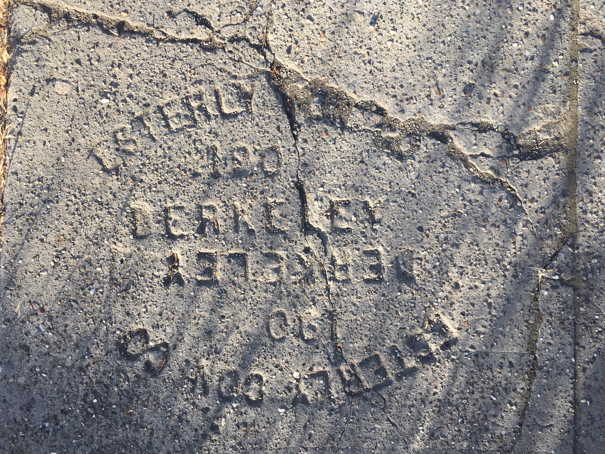
While this mark left by Esterly Consruction Co. is technically left undated, lacking a final digit, the strike and its concrete mix echoes and parallels a nearby stamp on Alcatraz Ave of 1907.

As if reading a one-to-one map that lay atop the neighborhood I lived, whose trades were apparent on the ground, I bore down on the micro-geography of the concrete sidewalks near my house, reading the names of pavers traced in the pavement as if ports of access to different ages. For the years that pavers stamped in strikes a century earlier, taking some sort of comfort in the clarity of the dates of their creation, mapping a sense of their coherence as benchmarks of an earlier era in the unstable ground beneath my feet, as if seeking a measure of clarity, a point of bearing on the area I’d been living in Berkeley CA but sought new purchase. The flat statements of these names and dates, dislodged of much context, and telegraphic in meaning, seemed to hint at a deep history of bordering, private property, and the establishment of a single-residence zoning in Berkeley I had never fully taken the time to appreciate–a truly “deep history” that haunted the area where I had comfortably sheltered in place, lying on the surface of the sidewalks where we had never thought to look, the detritus of Oakland’s modern space.

And at the same time as I started to haunt the corners of the internet, to construct an immigration narrative of my own family from Austro-Hungary and the Lower Carpathian region, during the sense of social isolation of the first pandemic year, as a sort of inversion or compensation for social isolation, the meditation on the isolated names pressed on the pavement of a century ago–around the first time that the boats carrying my family docked in New York and Montreal, from 1890s to the 1920s, the streets of Berkeley were paved. On morning and afternoon walks, as if fancifully tracing evidence of a deep history of the neighborhood as if in compensation for social distancing, digging deeper to an elusive past as I walked.
If the strikes of pavers were not reflective of the building of houses constructed in this largely residentially zoned area, paving city streets and sidewalks was an important movement of urban modernization, an early urban infrastructure, now invisible, along with the installation of sewer systems, electrical wiring, and gas pipes–the sort of urban infrastructure that was now being so deeply tried. While I often seemed to notice a stamp bearing of an even earlier year–1886!–revealed “1986” after clearing away pine needles; Mason McDuffie planned the first residential developments in Oakland in 1887, but the late 1890’s were rare to see on local pavements. If the driveways made by C.E. Orff or Jepsen in the 1920s and later, remaining some of the few unrepaved sidewalks in the area of Berkeley I had recently moved, an early planned residential neighborhood of the early twentieth century.
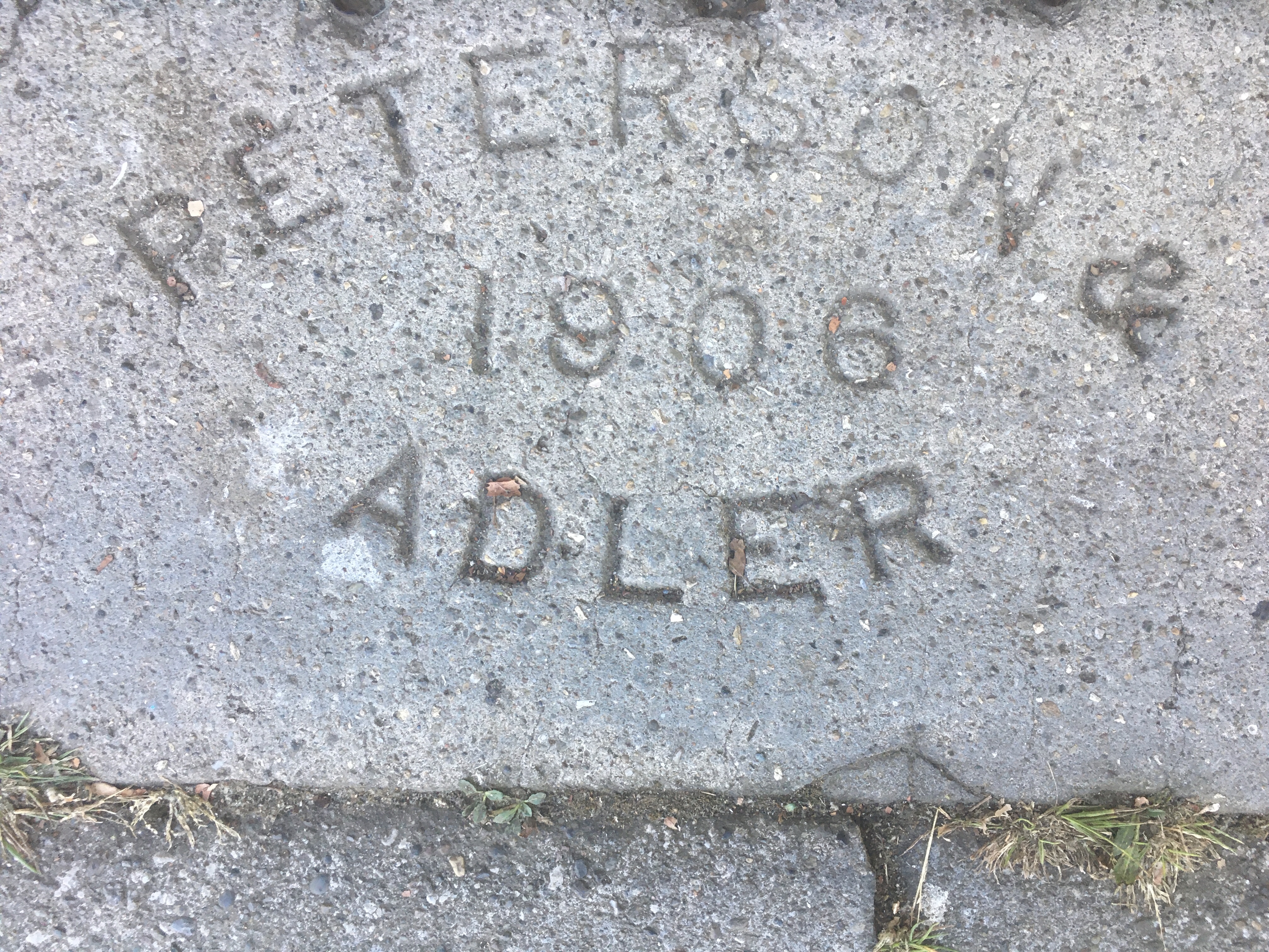

I’ve long considered paving as among the earliest of urban infrastructures. In the late nineteenth-century, the norm of dirt streets were replaced by downtown sidewalks made by pressed bituminous concrete, over rocks, surfaces of compound cement concrete–“art[ificial] concrete”–of sand, cement, and aggregate provided a modern form of building the city and urban neighborhood. Unlike in the East Coast where I grew up, the paving of sidewalk remained, as common in the western cities, provided by local property owners, and I could trace the urban plant of the city through the ostensibly ephemeral often anonymous marks left by pavers. I became fascinated with the uniquely dated texture they gave city streets, as if they offered a hidden architecture of urban space.

As if on an archeological dig, I traced signs in the sidewalk while walking absent-mindedly as evidence of the impact of the housing boom after the 1906 San Francisco earthquake on the micro-geography of the pavement, unpacking what seemed hidden history of the local, lying in plain sight underfoot, where they survived, marking the redesign of the residential community in the very years of the destruction of downtown San Francisco in the 1906 Earthquake and Great Fire that sent many across the bay in search of firmer land and residential property.

I discovered a virtual collective of old librarians, local historians, sidewalk aficionados with iPhones, with interest in filling cel phone memories with images of the evidence of the ground. In an age of increased atomization, the stone signatures seemed an imagined lost community of the area that were compiling the traces of trans-bay migration of a century ago, now a map that might be read as a dispersed set of portals to root oneself in a deeper sense of place and of time, rooted in the scare of the 1906 fire that sent many across the San Francisco Bay and nourished by the hope to segregate new communities, by the rise of covenants among residential communities, evident in post=1910 cities after the Great Migration, but already present in the late nineteenth century, but that flourished in the building of new gates, fences, and policies not limited to concrete, in which local builders like Mason McDuffie had specialized before segregated housing was outlawed, as groups like the Claremont Improvement Club adopted strict covenants that limited home ownership to those of “pure Caucasian blood,” reflecting the adoption of racial hierarchies in censuses from 1850, founding Claremont Park as a pastoral residential community below the Berkeley Hills by 1905, just before the earthquake, advertised in a color brochure complete with map, addressed to an imaginary “San Francisco businessman” as a site for calm repose across the bay, before the earthquake rattled San Francisco homeowners.

If The Oakland Paving Co.’s imprints of 1904 and 1912 near my house–earlier than Oakland sidewalks made from cement from the Upper Rockridge Quarry on Pleasant Valley and Broadway, used from 1910–suggest the value of paving on Berkeley’s expanding residential borders. The tasteful emblem of the inverted triangle on the sidewalks near the submerged Temescal Creek, undergrounded by culvert in north Oakland for elegant private residences off Claremont Ave. or to repave residential Berkeley streets for newly built neighborhoods, a transformation being a case of boundary drawing and social exclusion.
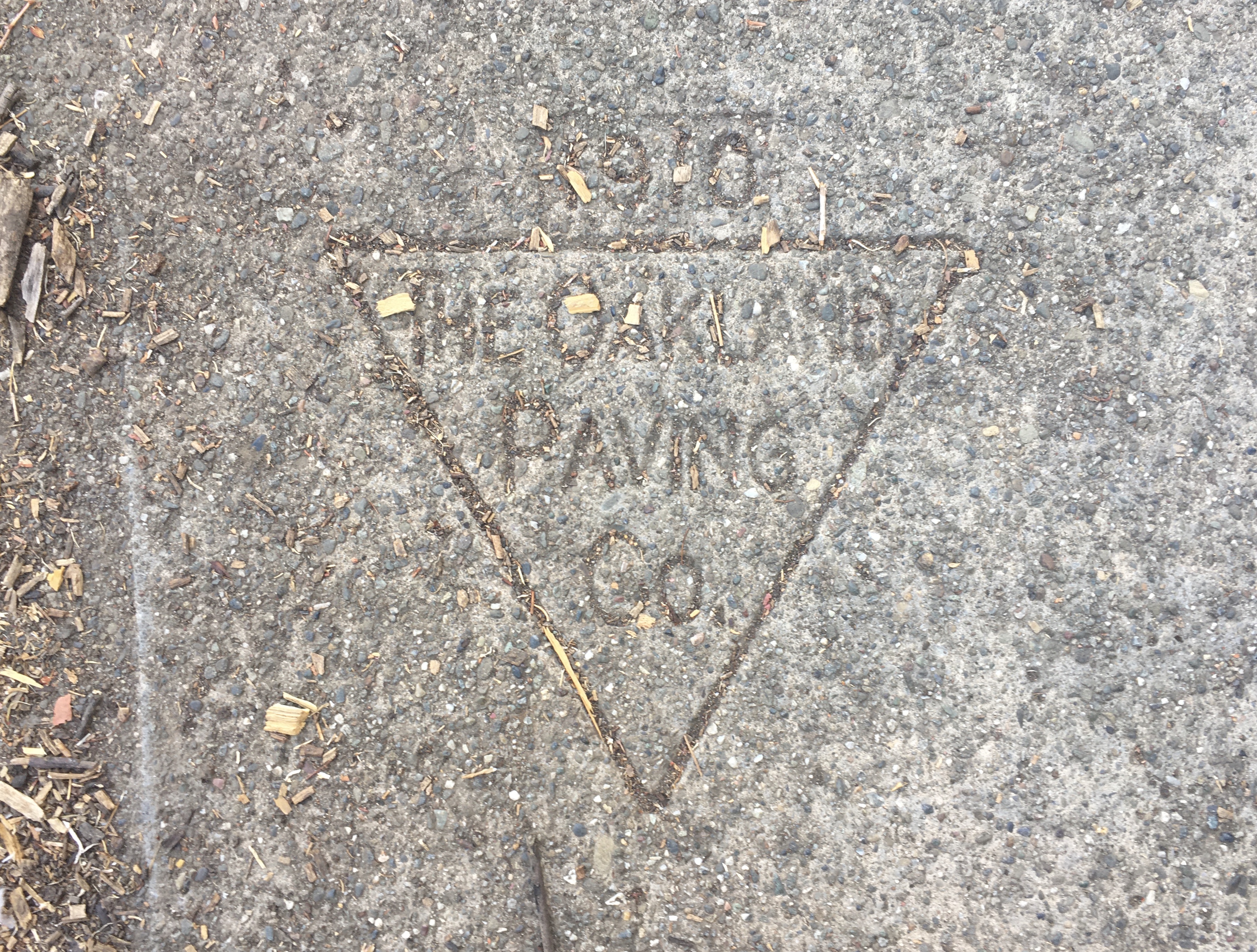
–or finding the same paver’s craft on Ellsworth Street in Berkeley, closer to my house,–
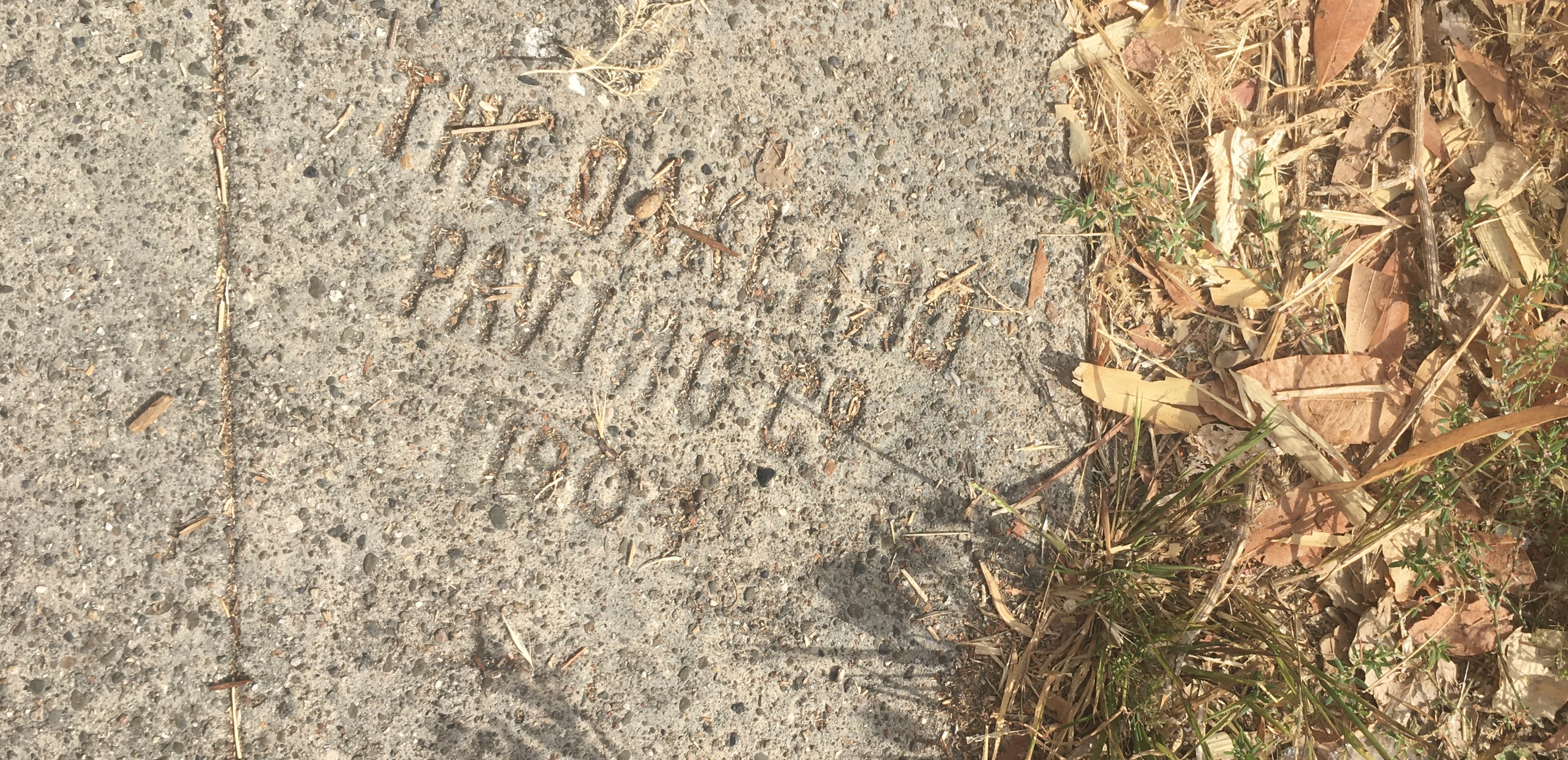
Some stamps lain by contractors, often specific to the day, seemed to set a basis for a residential neighborhood that seemed to be fraying in the pandemic, but that they seemed to remind me of, as ghosts of the un-remote past. If Lewis Carroll famously described a one-to-one map that had not ever been unfolded–“the grandest idea of all! We actually made a map of the country, on the scale of a mile to the mile!” that “has never been spread out” as farmers objected it would block out the sunlight, a map rolled out where it peaked through from the past; segregation of Berkeley’s neighborhoods began before 1906, promising areas of exclusively “residential character” removed from the “advancing tide” of “flats or shops,” in neighborhoods whose exclusively “residential character” was the result of racially restrictive clauses in property deeds and covenants on which developers like Mason McDuffie relied to boost their investment in neighborhoods’ exclusivity, hiring Frederick Law Olmstead to design the Claremont Hotel and Claremont Park community at a geographic remove from the city. The residential lifestyle allowed children to roam “out of doors! out of doors!” without night clubs or alcohol in prominent places, in East Bay enclaves exclusively for “Caucasian buyers”–not for “any person other than of the Caucasian race,” home ownership policies stipulated, with the result of mapping an exclusive residential neighborhood as early as 1905-1911 in the East Bay, or just before the Earthquake hit.
The shaping of that past neighborhood peaked up from the ground at select spots during the pandemic, revealing another world that rhymed in disturbing ways with inequalities today. If by 1907, West Berkeley was distinguished by streetlights, paved streets, telephones, and factories like soap and glassworks, and an industrial development fueled by the influx refugees from the city, invisible lines became increasingly important to define and defend. The new pavement added before World War I modernized the area of Berkeley and North Oakland for home owners in a new language of real estate and social class. As I seemed to be able to detect the names of a new generation of contractors of the post-quake years–Frank Salamid, J. O. Adler, and others–the rapidity of making a residential area, from below San Pablo Avenue up to College Avenue, seemed to gain focus, which I would not have detected with anything like that attention if time hadn’t paused, or seemed to pause, in pandemic days.


Jorge Luis Borges’s Del rigor en la ceincia embraced the conceit soon after World War II, describing, as American military engineers re-drafted national maps by geospatial coordinates that wrapped around the world, described a society that abandoned one-to-one map coexisting with the nation’s territory as it became “cumbersome”, as this large paper map was reduced to tattered fragments in some “western Deserts,” I imagined I found hints and clues that were central to the spatiality of South Berkeley’s Oakland border in the time-stamped impressions preserved in the pavement underfoot, as I embraced a sort of exploration of the surviving evidence as if excavated clues. The turn of the century provided an origins story for the residential community and its divides.

If roads to hell are paved with good intentions, the pavement strikes that stood out as marking space and time paved a space for single-family residences, sections of residential sidewalk paved for individual houses, bearing signatures of the forgotten artisans who converted what was once an empty property lot into a site of residence, leaving a sign of the quality of their work and the promise of future expansion of residences: these very pavers set the ground-plan of home-owners’ neighborhoods, the foundation of a shadow property association of the past. The sense of these strikes as something set by past lives–and defining past neighborhoods–was a microgeography dating from the early twentieth century, even before the Spanish Flu, but seemed to define as set a part a new area of paved sidewalks for single-family residences, that were newly settled after having been sold as, presumably, unpaved lots, probably at the edge of Berkeley, if now along the line of a north Oakland-Berkeley divide. The turn of the century definition of the comforts of home ownership across the Bay from San Francisco, defined as a preserve of private property, was a story that was inscribed in the pavement, if one I rarely took stock of or knew. The stenciled names below my feet revealed a topography of social differences and dividing lines. Was this a new form of memory, that I had been walking over and was suddenly, as much of the nation, trying to piece together?
The concrete sidewalk offered a tangible sense of the past, at the same time as a refreshingly tangible sense of time. At the same time as I looked up to notice a flower, tree, or park in new ways after weeks of deprivation of contact over the first year of the pandemic, as we continued to shelter in place, but my eyes turned to the ground in hopes for transcendence or finding some sort of different news, as if signs on the ground described possible sites of contact with an earlier world.
Was this only being middle aged? Or were there some deeper transactions I might have with the pavement, few other interlocutors being present on the city streets, as if in confirmation that we had entered a new era? As if walking with downcast eyes for unnoticed signs of old benchmarks and pavers’ names, I traced contracting and expanding routes as a pedestrian, looking downward to find meaning. And compelled by the keen awareness of temporality that seems to have affected me most at the start of the Pandemic, wondering what sort of era into which we were entering, and if we would ever leave it, the physical remove of these strikes, many from before the Spanish Flu which so many had seen or tried to see as a precedent for the diffusion of illness across the nation, and across the world, with high mortality rates, seemed to leave me scrambling for dates in hopes for drawing such seemingly futile senses of equivalence–or for reminders of a time before pandemics–as if rediscovering a new material relation to the past.

As newspapers came to be too exhausting to read and depressing in news, or the dashboards devised by tracking apps devised to convert databases of infections to the palettes of webmaps for ready legibility,–

–even as we had no clear sense of the mechanism or spread of contagion, or the arrival of the first cases of infection in California and the United States. If walks seemed to create a fragile measure of normalcy, tentatively, before electrifying news, the comfort of the tangibility of old traces on concrete seemed a form of security. If Walter Benjamin had famously looked back on the dangers of mechanical reproduction as a premonition of fascist media in the 1930s, after fleeing Nazi Germany to Paris, perhaps the craft-like manual nature of the individual imprints struck from frames and contractors individual signatures from bygone eras of Oakland and Berkeley’s past–strikes that continue to the present, and current dates–offered a reassuring micro geography of meaning. Seeking something far more fixed on which to focus than the rising rates of infection whose statistics seemed both the focus of much news reporting–if suspect as incomplete–I searched for fixed meaning about the local in these stamps, that seemed to fix a map of urbanization. And the old stamps in the neighborhood I lived from 1908 or 1912 began to trace a web of their own of urban paving, as I spied a 1901 stamp–suspiciously early?–off of Telegraph Avenue for the Oakland Paving Co., or followed the family histories contained in the stamp of Paul Schnoor’s early 1908 stamps to the expansion before the Great War of the new firm Schnoor and Son on a Rockridge driveway, cast in concrete, in 1912-13, and the prolific heirs of the Schnoor Bros. across much of Oakland from the 1920s to 1930s, a boom era of paving by all likelihood and surviving evidence on the sidewalks on which I started to daily walk.
This was a way of re-navigating my neighborhood, at a remove from the present, contemplating a deep history when we were in overdrive processing web-maps of the diffusion of the virus we were loath to call a pandemic, and as human-to-human transmission of the disease was confirmed and teh CDC warned us that “disruption to everyday life may be severe,” in mid-February, in what would seemed one of the understatements of the millennium. Was this a new wartime, as the global pandemic was declared by March, 2020, with its echoes of a global war? Critic Benjamin had of course fled Germany seeking signs of reorientation in the course of the flâneur in Paris, habituating himself with the modern sense of the streets as an exotic immersion in the senses. For me, the thin sense of contact that these stones offered in the time of social distancing were a far more muted surprise, meeting a search for sold testimonies in concrete form, as it were. It elevated wanderings as a new form of “botanizing the pavement” abandoned by most other passersby. Moving along empty streets without familiar faces, I read names of the architects of the sidewalk, taking comfort in and searched for names as if I could better acquaint myself with where we were.
I half-humorously fantasized that I was remapping space–that the odd exercise in antiquarianism on which I was thrown back, my daily work rhythm stopped, was a tiny effort to rectify inequality, a micro-reparation of the increased evidence of the social costs that the pandemic revealed.
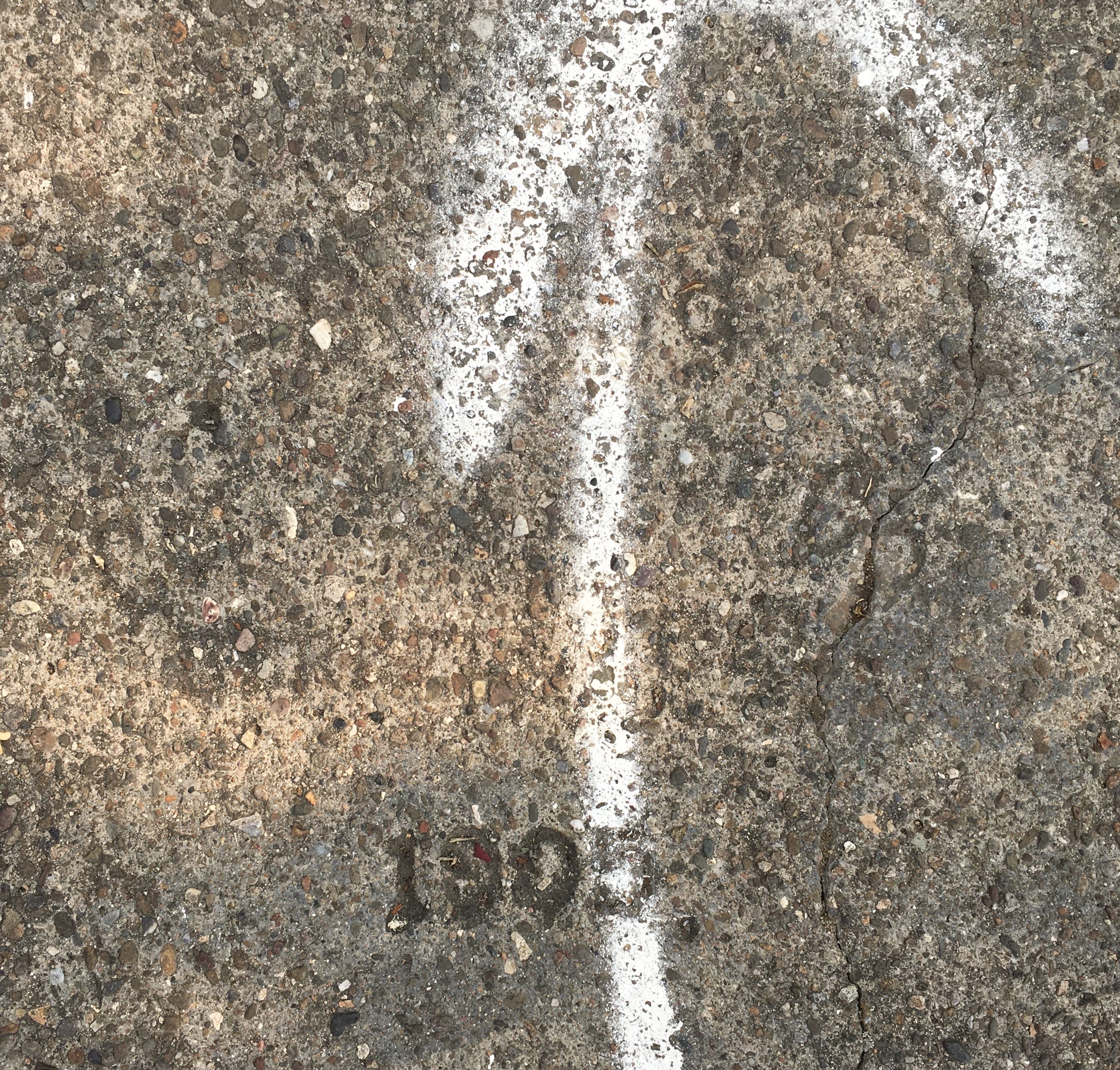
How could such rates of infection be processed, especially as they were woefully incomplete? The epistemic unease at the security of mapping, or objectivity of these data maps that were queried, questioned, and re-examined, contrasted with the pressing urgency of trying to read the multiplying varieties of the novel virus itself, suggesting just how much we were still learning and needed to learn; the conceit of tallying the signs that seemed in full gave my apparently aimless walks a sense of purpose, as a form of reparation for a world out of whack, whose discrepancies of health-care, infection rates, and uneven levels of public trust seemed finally unmasked and on full view. Amidst the pandemic’s increasingly uncertain ground, I started to walk farther than usual from home, and walk with greater intensity of seeking an imagined goal, or justify my new status as something of a flâneur, dedicated to find the first pavers of main arteries like Telegraph Avenue and College Avenue in Berkeley CA from around 1908-9–the imprint of “Burnham,” or shortly after the Great Fire and Earthquake of 1906, met outmigration from San Francisco across the Bay, was registered by the surviving names of pavers, sharing the name of a contemporary city planner, Daniel Burnham, who worked in San Francisco and others, as the Spring Construction Co, who helped create local urban monuments as the Claremont Hotel.

–or the overworn escutcheon on Telegraph Avenue, off Alcatraz, apparently lain in 1909.
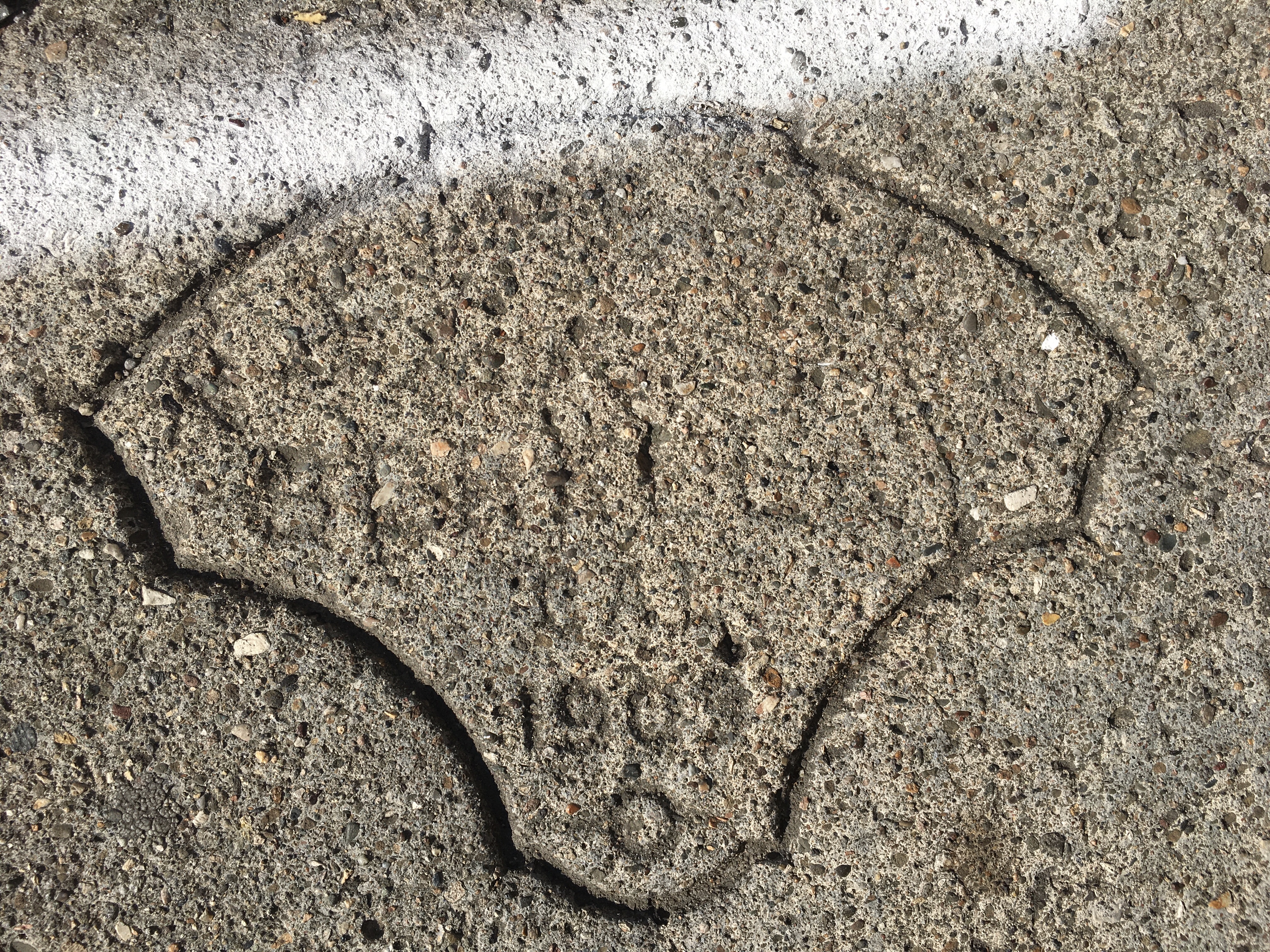
The names echoed the Berkeley-Oakland divide, from the 1905 paving strike of Spring Concrete Co., Berkeley, at the old craftsman house sitting at 3100 Benvenue Avenue., on the outside limit of the Berkeley border, to where the Berkeley-Oakland border emerges on College Avenue, at what is now the home of La Farine bakery, emblazoned by escutcheon strike of an industrious local family of pavers–the Schnoor Bros. who bridge three generations–dated 1924.
The doorway is non-descript, but the strike is evidence of sidewalk paving enshrined steep divides of income, today reflected in differences of infection rates among contiguous Bay Area cities, historically marked, long before their recent gentrification, by an open racial as well as a very steep economic divide. If sidewalk paving began by marketing “‘art’ stone”–artificial stone–by contractors as a modern replacement for brick or wooden boards, the lots that were sold for houses in residential areas shaped by laying wet concrete mix.
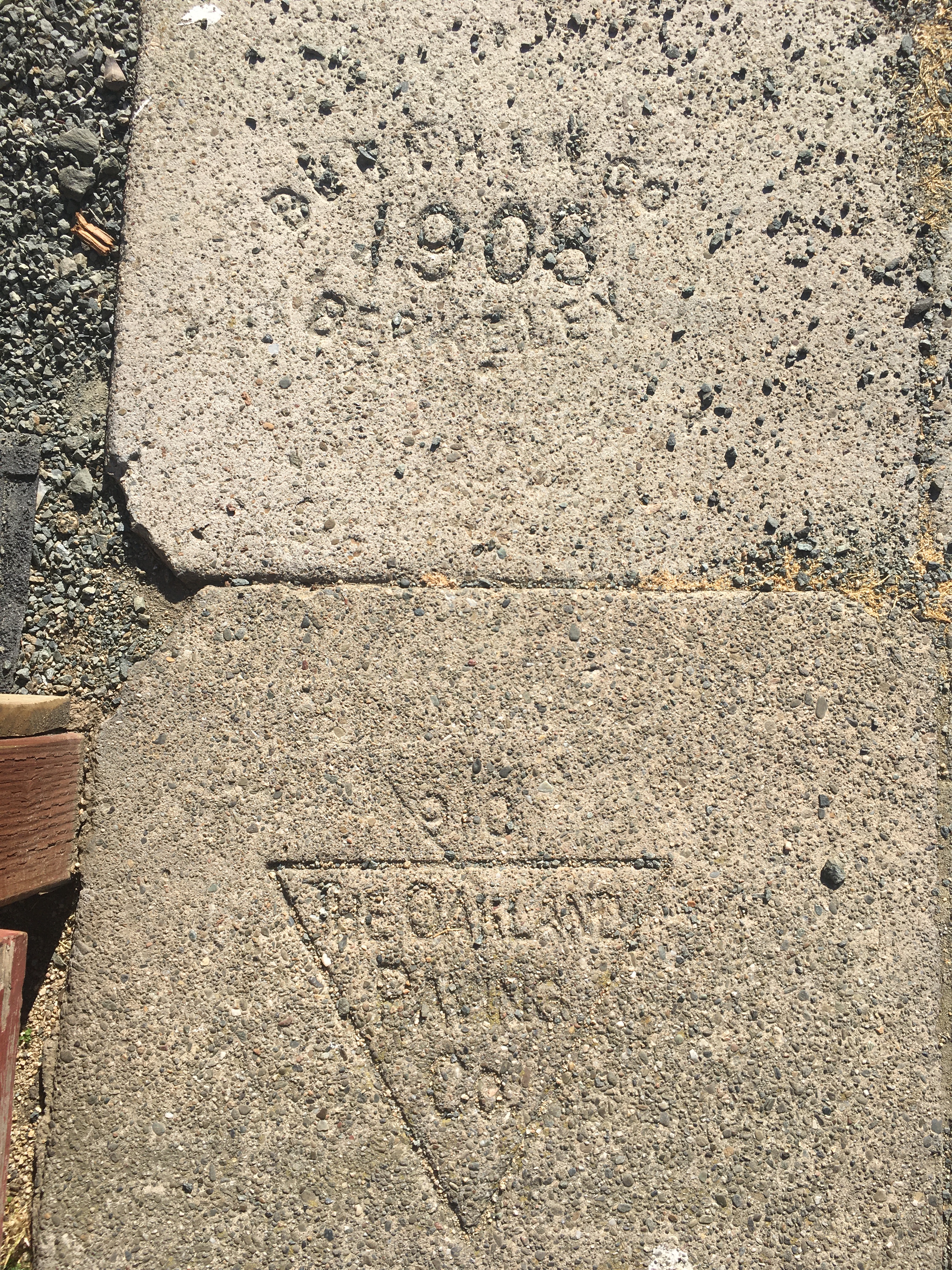
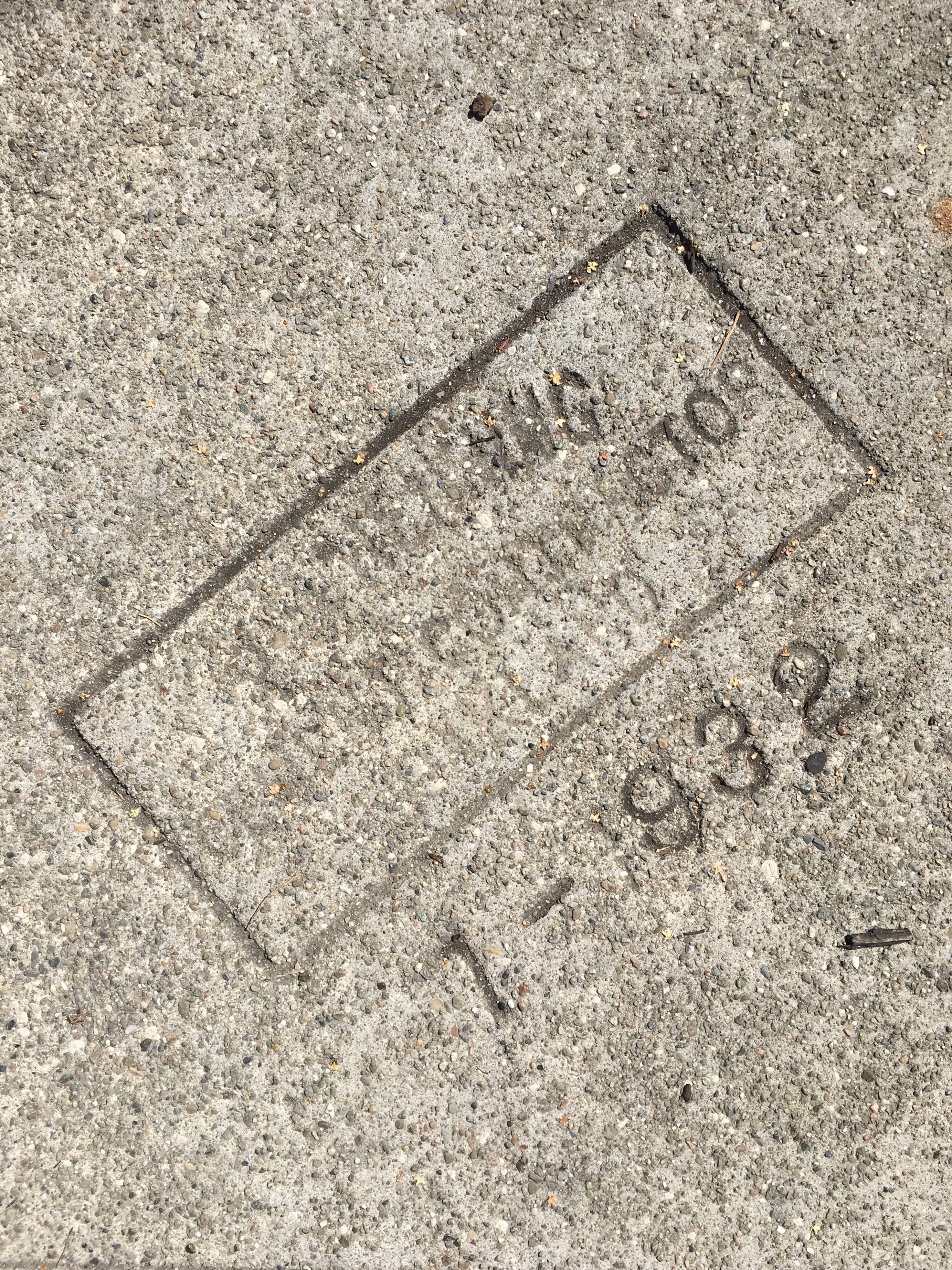
Were these Italian craftsmen keen to take the job as masons to craft the cement with necessary smoothness as they entered the city’s economy, or were they just arriving at the right time? Signing the paved sidewalk was not only the reflection of a craft–“Whenever a skilled person makes something using their hands, that’s craft,” reminds historian of craft Glenn Adamson–but a deep if superficial craft of memory. In staking out of regions for settlement along a clear Berkeley-Oakland divide, these strikes along the border set the terms for a terrain of marking out new residential areas of home ownership. Were these pavers not leaving tokens of their craft as contractors, in defining often Arts & Crafts residences in Berkeley CA, registering the imprint of their own handiwork, or just leaving their mark in the city?
Was one indeed able to map, as I imagined, the arrival of the very sidewalk of Spring Co. Concrete to the quarry John Hopkins Spring acquired on the former Berryman ranch in North Berkeley, site of Spring Construction Company, mined from conglomerate in what is now La Loma Park in North Berkeley, whose was quarried in North Berkeley 1904-9, and after areas near Codornices Park, Cerrito Canyon, that helped pave much of Thousand Oaks, and pavement bearing the Blake & Bilger triangular imprint to the Blake & Bilger quarry on Glen Echo Creek, near the Rockridge shopping center, owned by the Claremont Country Club, today, a site of mining metamorphosed sandstone, later run by the Oakland Paving Co.? Or was it from Blake’s El Cerrito quarry? A micro-geography of East Bay pavements seemed a hidden geography in itself waiting to be unpacked, of the quarrying and fragmenting of the hillsides of the East Bay–leading to an opening of quarries in Diamond Canyon, Hayward, prospecting in Livermore, as the search for sources of limestone, metamorphosed sandstone, quartz chert, and basalt grew in the early twentieth century with a greater demand for dressing the surfaces of sidewalks in locally sourced concrete. The Jepsen Bros. had owned quarries from 1912 to pave driveways and sidewalks that extended from Albany to North Oakland and beyond.


On often directionless walks seeking peacefulness, I looked with unaccustomed intensity at uninhabited streets for a sense of grounding, if not re-assessment, if the search may well have begun as my eyes looked downward as if by default. Walks without a destination led me to seek a perspective in an imagined sort of convalescence–a respite from oppressive data visualizations that were hardly a means to come to terms with the collective obituaries framed in the unfamiliar concept of “cumulative” deaths. I was struck by the somewhat random dates on the sidewalk in my Berkeley neighborhood, where “1911” arrested my eye–before the Spanish Flu pandemic!–or 1909, 1930, or 1936 pavers left inscribed nearby. If as a flâneur of the pandemic, finding and collecting the names of pavers seemed almost a search for transcendence by composing an alternate necrology of the neighborhood, as if a form of dealing with death, as the estimated deaths inexorably rose–even if they were all undercounts. The surety of walking offered an alternate form of tallying, as names of pavers became memorializations of individuals, akin to an imagined meeting, as if gathering information for an imagined alternative report; my income low, and indeed dubious, there seemed to be some ready temporary comfort in the small enchantments of the sidewalk to balanced with the global tragedy with perhaps few counterparts, if we often invoked the Influenza Pandemic of 1917-18.
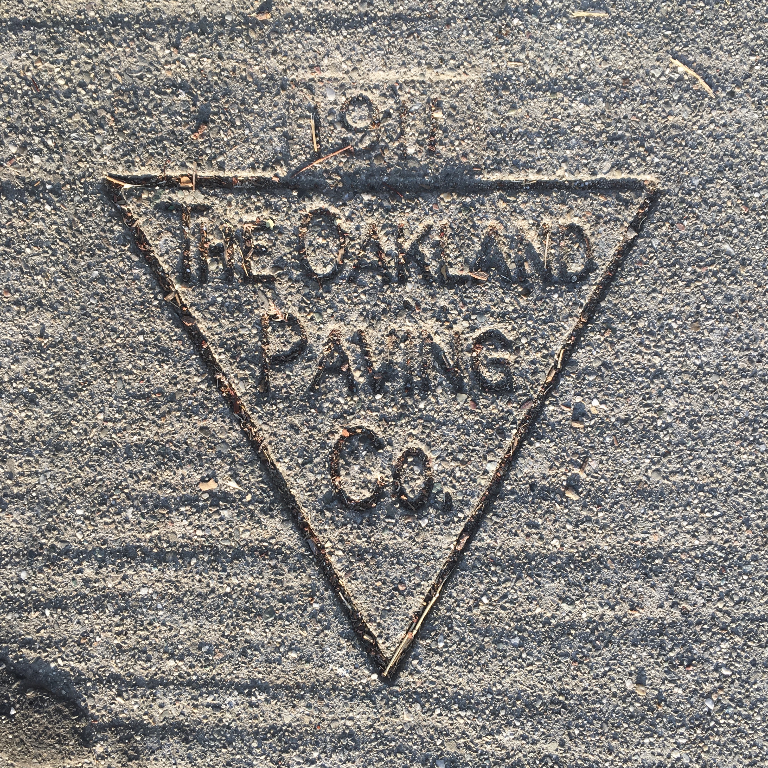
The traces of grading the porous pavement were as visible as a laying of concrete that was smoothed out a century ago; just three to four hundred paces eastward, across Telegraph Avenue, the earlier strike peaked out of pavement cracking with more evident signs of time, where the paver seems to have left off a final digit, situating letters or plugs in a grid of sorts to arrange a company logo, that seemed a partner record of the material past.

I was bearing down on the local with a similar intensity on often aimless walks, as if searching for evidence or bearings. For turning to the local detail as a site of something like transcendence became a way of distancing a global disaster, or holding it at bay–and a profession of tracking a local topography of mortality as well. If Walser’s walking led to the melancholic realization that “I was a poor prisoner between heaven and earth, and that all men were miserably imprisoned in this way,” after his flights of fancy, the dates and names on the ground provided some sort of grounding that I needed to process mortality rates and the shifting maps of infection rates.
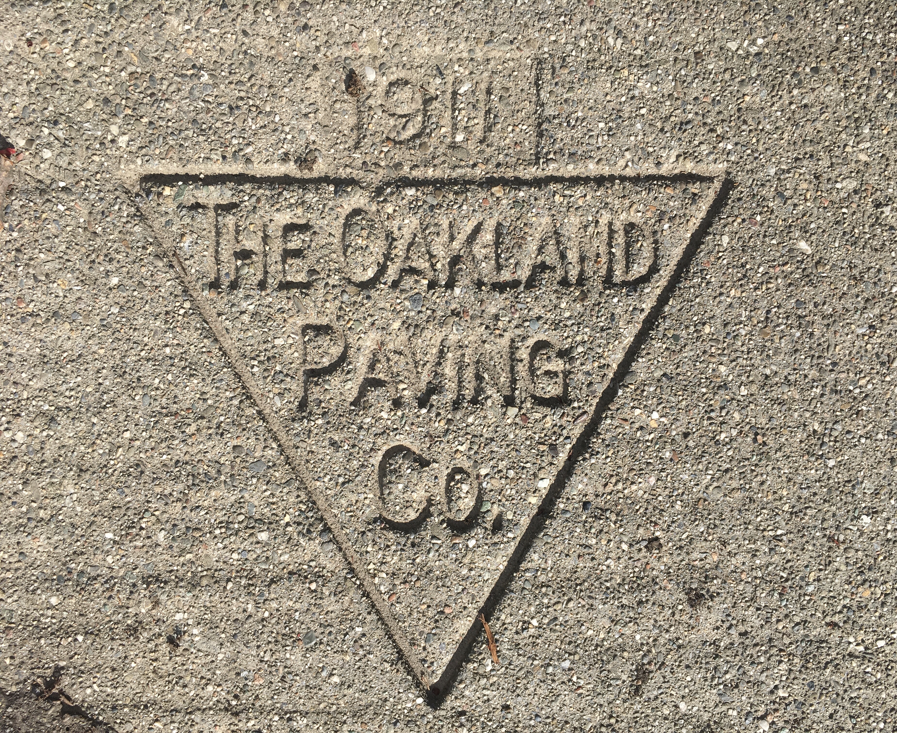
For all the rapid creation of charts of mortality rates that were painstaking crafted by epidemiologists and journalists in line charts that projected different possible counts, our expectations for certain data were frustrated as if looking into the abyss of mortality: the very fact that only a bit more than half of global deaths are registered–six in ten, the ballpark figure of the World Health Organization tells us, if 98% in Europe and 91% in America; the death toll of the novel coronavirus in Wuhan is guesstimated to be up to ten times as great as the reported 4,848 in the capital of the Hubei province, or as much as half a million, if reported global deaths pushed beyond four point two million, dizzying numbers if incomplete.

The complexity of crafting a simple line graph of confirmed deaths and those due to complications of COVID-19 had us contemplating line graphs as specters of human mortality, whose complicated crafting don’t conceal so much as reveal the limits of certainty, and made me search not for global but grounds for transcendence underfoot. And in the days of social distancing, on walks that seemed perhaps aimless, but tried to find a sense of balance before the rising curves, following traces of the past set in the pavement seemed a sort of escape from the rising numbers, if not a destination. Daily walking was a rediscovery, as the trips from the house where I lived became less important for their points of arrival, pressing against the boundaries of the present condition, less in flight from something, than a type of convalescence from watching disparate rates of mortality and hospitalization rise, as my attention attended to something else.
If figures of infections, hospitalization, and mortality death haunted the air, solitary walking became a response to a restlessness–in the morning or late afternoon–and I was readily accepting the sense of the walks as haunted, or with added melancholy, in ways that seemed states of distraction and something of a befriending of loneliness, if not what past as sociability. Walking, for Walser, offered peacefulness as a way of seeking out being arrested by coming across the individual name, and the odd specificity of the date at which the pavement was lain, smoothed and left to set. Walter Benjamin felt that the walks the author devotedly took must be understood as with a spirit of discovery as a form of convalescence, “newly sensitized to the outside world,” there was perhaps a search for collective convalescence in the undue attentiveness birdsong, flowers, pavers’ names, as if struggling to combat or imagine a future remove from an overwhelming melancholia. In history graduate school, a friend and I had listened to slightly more senior students describe summer research plans of visiting archives with lightly veiled satisfaction, and imagined our intent to exploit the unexamined archives of early modern Oakland, where we lived, echoing how the French historian of the Mediterranean, Fernand Braudel, had described Istanbul’s unstudied archival treasures of Mediterranean trade, in his own search to gain a new perspective on deep time of a longue durée that seemed more than ever sadly out of reach.
It almost seems, in retrospect, as if I was discovering the existence of that very archive of lost communities inscribed in the pavement strikes–bearing dates from the 1920s and 1930s, at times a decade after the turn of the century–a material archive of early modern artisans or craftsmen who were technologists of the community that defined the old edges of built space and its boundaries, of an era before pandemics, and before, even, the Influenza pandemic of 1917 to which we reached back for bearings in search for a precedent for reactions to the spread of COVID-19, and how the pandemic was challenging modern notions of transmission, contagion, science and even space.
I gathered names on the ground as if points of orientation, finding stamps and strikes of pavers whose names were set in the pavement with century ago an alternate register of mortality. The dizzying sense of temporal distance offered a perspective a century ago–before the 1918-20 pandemic of the “Spanish” Flu entered California, were somehow a distance on our own sense of modernity and the disarming unpreparedness for the pandemic, which seemed as if we were entering a new era, and indeed one of historical rupture. As if a new historical epoch, of an end of confidence of modern control over the spread of disease, whether of the control of inter-species jumps of viruses, and a new range of “zoonotic” diseases, or the mutation of the new viruses that arose, if not from global warming, from

Early pavers’ names are a bit ubiquitous in many of the older residential neighborhoods of Berkeley, CA, where the developers of lots seem to have regularly paved sections of sidewalks for tracts where houses were built, giving them on odd patchwork nature, and resulting in pavements that are often repositories of information of historical development and the segregation of areas.
which I read as if I were uncovering an often unread archive paved beneath my feet in the micro-geography of my neighborhood, in images with only retrospective senses of clarity, as we tried to come to terms with the historic nature of the pandemic’s spread. Strikes left by early pavers–“Burnham-1908;” “F. Stolte-1930;” “P. Barelle-1938;” “J. Anderson 1936”–of names and dates presented as epigraphic evidence beneath my feet akin to levels of time, v snapshots of a stratigraphy of the Berkeley-Oakland neighborhood I lived, “Burnham” resonantly echoing that of a contemporary urban planner, as I gathered evidence about the area I wandered, as if it were a profession.

For if earlier years of the possible pandemics feared to spread globally had been numerous–near-misses of the fear of H1N1 expanding globally in 2009, of MERS in 2013, Ebola in 2014, and Zika in 2016–the coronavirus spread in ways unseen since the avian-born pandemic of 1918-19, harder to map, track, or conceptualize; visualizing the virus became a cottage industry and a collective rush to create the best visualizations possible. As I tried to retreat from the spread of infections and hospitalization, and indeed the growing uncertainty of both tallies, the dates beneath by feet on the pavements along the Oakland-Berkeley border provided a form of retreat, pavement punctuated by dates that seemed–1909; 1923; 1938; 1930–to mark a sense of the anonymous architects of this urban border. With less of a sense of transport and reverie than Walser, if with a similar dedication to what he called, only partly facetiously, his berüf–“without walking, I would be dead, and my profession would be destroyed”–the sense of opening oneself to “thinking, pondering, drilling, digging, speculating, investigating, researching, and walking” gained a sense of investigating the quite deep history of breaks in neighborhoods in the micro-geography that I started to examine as etched in concrete. Whoever “walks only half-attentive, with only half his spirit . . . is worth nothing,” Walser said of the dedication he assumed, while walking, attentive to houses, advertisements, social transactions, as if to re-familiarize himself with the world as a therapy–to “take fresh bearings,” with a degree of industry, as a “Field Marshall, surveying all circumstances, and drawing all contingencies and reverses into that net of his,” in a calculus of metropolitan space, if with far fewer social transactions–but in fact mostly to “maintain contact with the living world,” lest we be shut at home, before the virtual remove of Zoom.
The paving of the street that defined the edge of the exclusive Oakland neighborhood formerly a farm until 1905–set aside for an upscale residential community–had been paved by the local quarry in 1912. The date gave me new bearings on the present, that gained a spiritual side, as well as a form of taking bearings: Walser found a microcosm of the world and lovely homes, “walking and contemplating nature,” richer than what Walter Benjamin cast as “botanizing the pavement,” albeit a lovely phrase–for me, the collection of older marks on the pavement began as a curiosity, but turned to navigating historical levels inscribed in a surface as lines of exclusion and inclusion that the earliest dated pavers’ strikes bore witness, and made up for the few numbers of people on the street, in what seemed among the earlier surviving sidewalks that were paved in the this neighborhood.
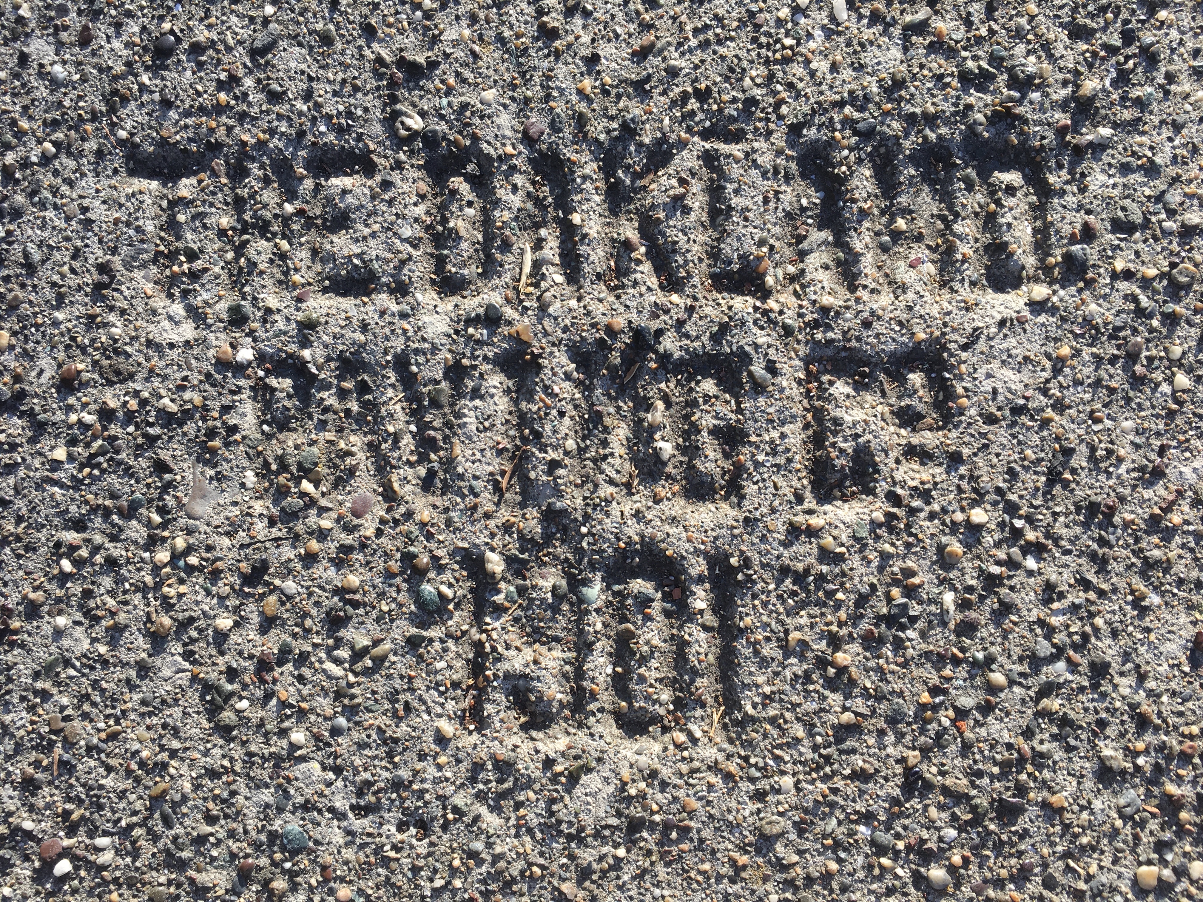
The paving of this Oakland-Berkeley area was defined by early residential zoning, restricting local populations to whites and often by income, effectively, and expressed in stipulations of residential home-ownership. The border was increasingly legible in the local maps of mortality and COVID-19 infections. Putting into relief my sense of the fuzzy border of gentrification, one could not be struck by the discrepancy of increased infections-as, later, increased vaccination rates–between Berkeley and Oakland. The barrier seem, in my own neighborhood, loosely defined, but defined different expectations and experiences of the virus, poorly understood if only read by that odious term, concealing so much, of “comorbidities.” As we discussed how much the novel coronavirus was indeed a sort of rupture, or how significant COVID-19 was both epidemiologically and, at a deeper level, historically–wondering if the possible narrative of an endpoint of escalating infections would be a return to “normal,” or if “normal” really made sense as a place to return–the architecture of this local municipal border seemed to make sense as something I sought. to decipher in what might be called, perhaps uncharitably, an episode of pandemic flânerie, or a search for a space for reflection and a hope for distance that city walking might offer to cope.

Did it make sense to look retrospectively at the ‘Spanish’ Flu, or why no historical ruptures were created by its spread? The maps offered a chilling reminder of the difficulty of stopping its spread to populated areas, across the nation, that was oddly comforting in the progression of pandemics over space if haunted by rising curves of mortality. And as we watched our own time-series graphs of the temporal progression of rates of death and mortality, questioning the undercounts, role of co-morbidities, and trying to peak under the hood of the data visualizations to grasp its spread, the dizzying global scale of infection rates, hospitalization rates, and mortality rates gave us all on the fly crash-courses in demography and epidemiology which we had to admit our grasp was pretty unclear. The learning curve was so daunting, if so basic, that it seemed for a historian more important to gain distance in the past, and preceding pandemics.
As we tried to map the progress of the coronavirus, its origins, and contraction in different rates, we turned with security to the clearest form of visualizing the pandemic, the time-tested time-series line graph, that basic tool of visualization most fit for something so daunting as mortality, which had been a basis for tallying the estimated total of the fifty million killed in the 1918-19 “Spanish” Flu pandemic, a tally of mortality we would later approach. While the 1918-19 pandemic was a removed event, the curves of mortality on time-series graphs tracked a sense of the compression of deaths to a linearity of time; rates were tallied weekly of the avian-born pandemic in an eerily identical graphic space of data visualization, which was echoed in the similar kinship of tools adopted to contain its spread–masks, hand washing, quarantine–as tracking the progression of time across the old x-axis and the rates of hard to comprehend escalating deaths along the y-axis distanced them with a helpful sense of anonymity.
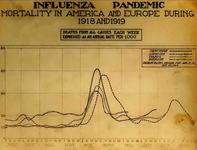
As much as we were braced by how the progress of the pandemic revealed vulnerabilities of public health systems, the pandemic had posed stress test of the global information network–both in charting and sharing information about infections and identification of the coronavirus genome, and in educating the public about its treatment, and locating access to accurate sources of information.
The difficult to process nature of arranging these humblest of graphs in terms of total cases of COVID-19–a basic tally, but one hard to say was accurate; new cases per day, a metric that seemed to suggest how much of a handle we had on the pandemic’s spread; confirmed cases per million; or the rates of infection in different nations, that oddly removed the spread of mortality as if we were viewing the challenge of combatting the virus as a spectator sport. Due to the official public denial of its danger or threat in the United States, and in the proliferation of online newsletters, uneven public tracking of infection rates by the CDC, multiple sources of ostensibly authoritative advice from whether it was healthy to exercise outdoors given the dangers of droplet dispersal from others, needs for frequent hand washing or gel disinfectant, and dangers of pubic space grew. We moved through space differently, in the Bay Area, projecting to different degrees a cone of six feet distance, internalizing distance as a social good as we sought to remeasure our relation to a fractured social body.

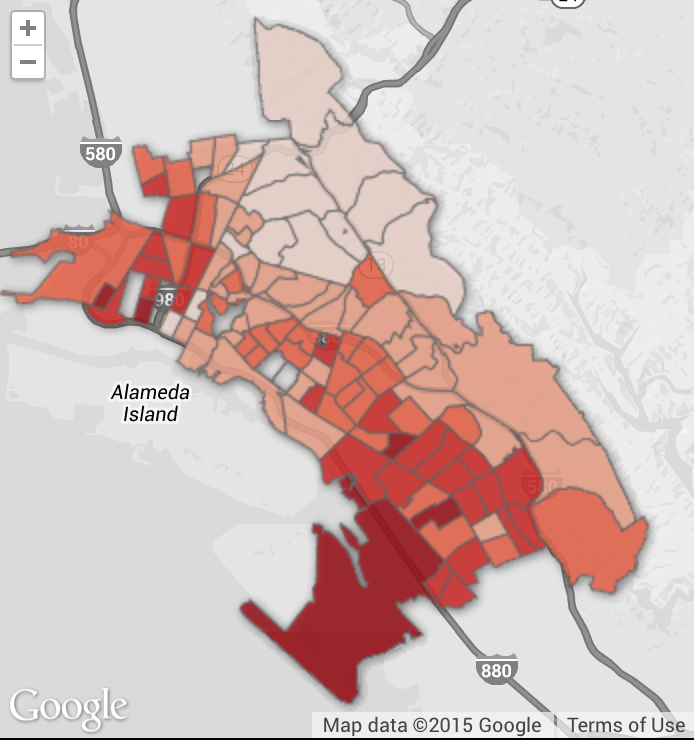
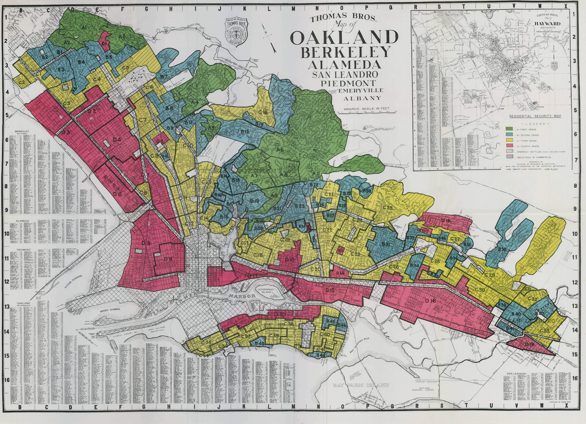
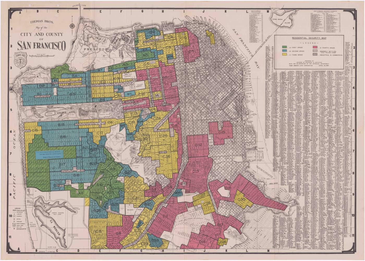
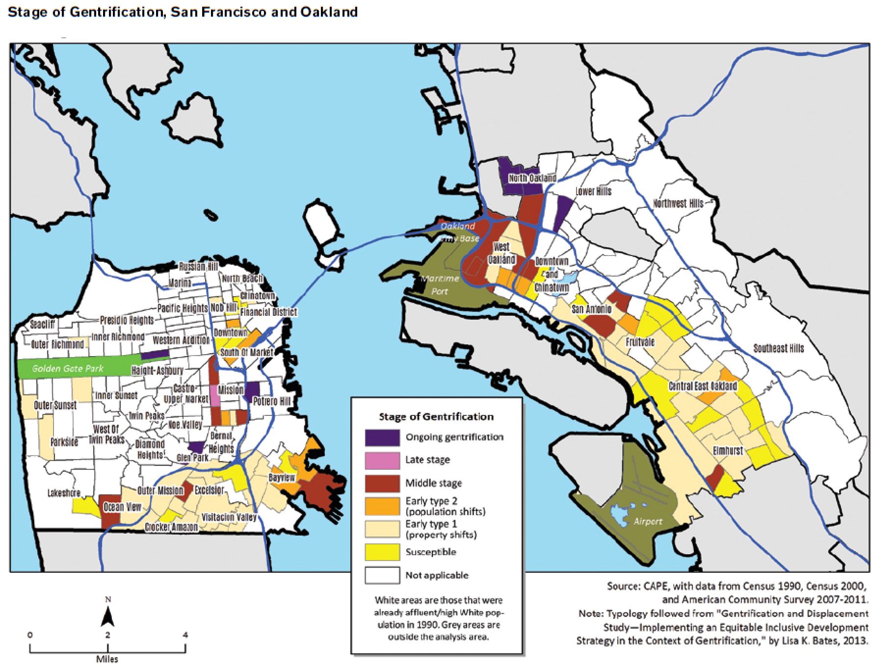
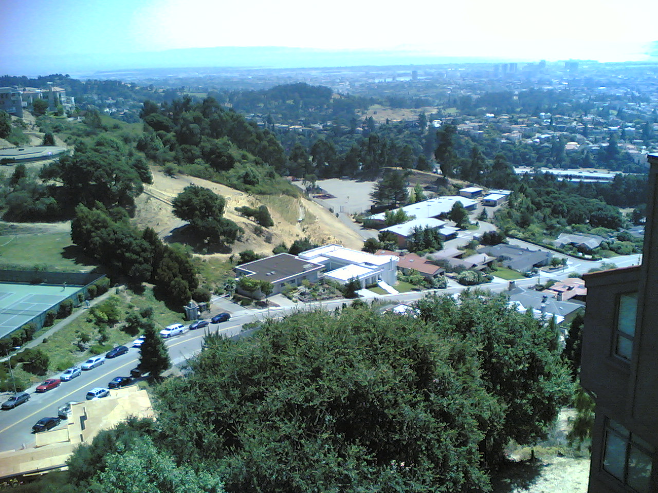
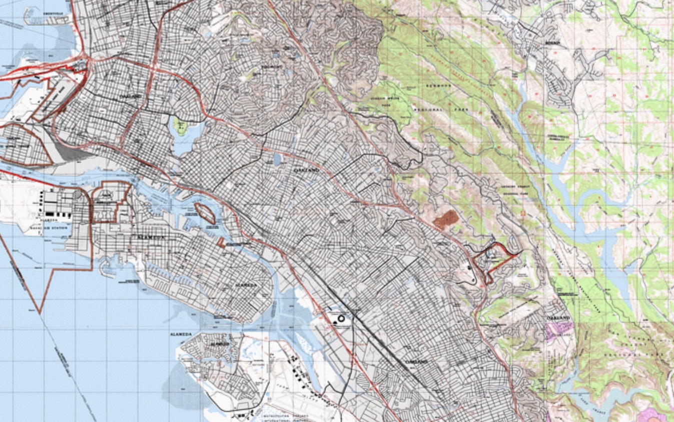
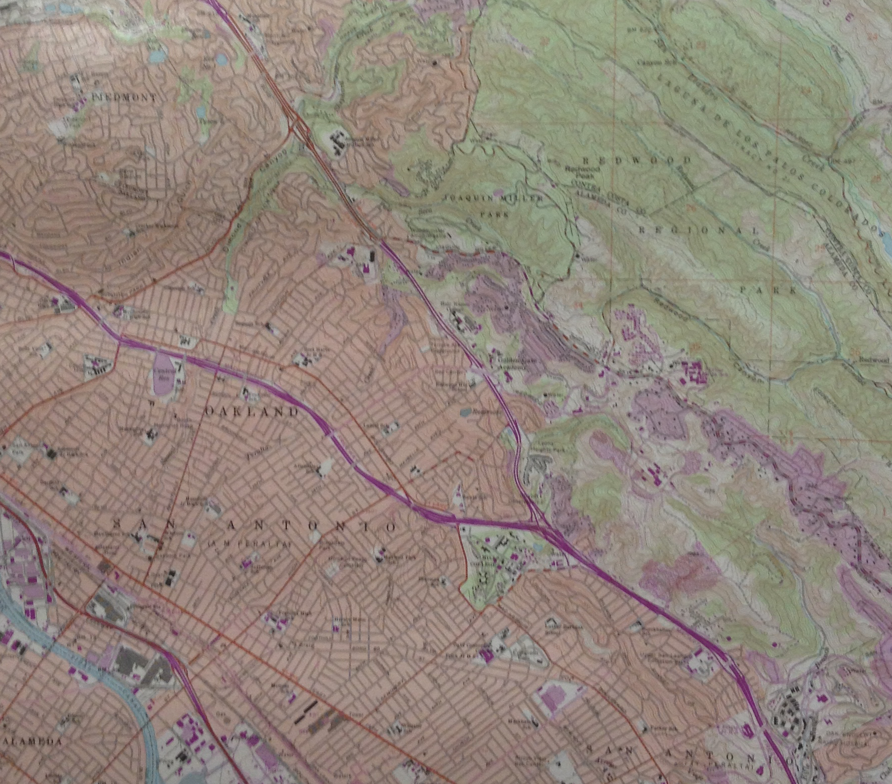
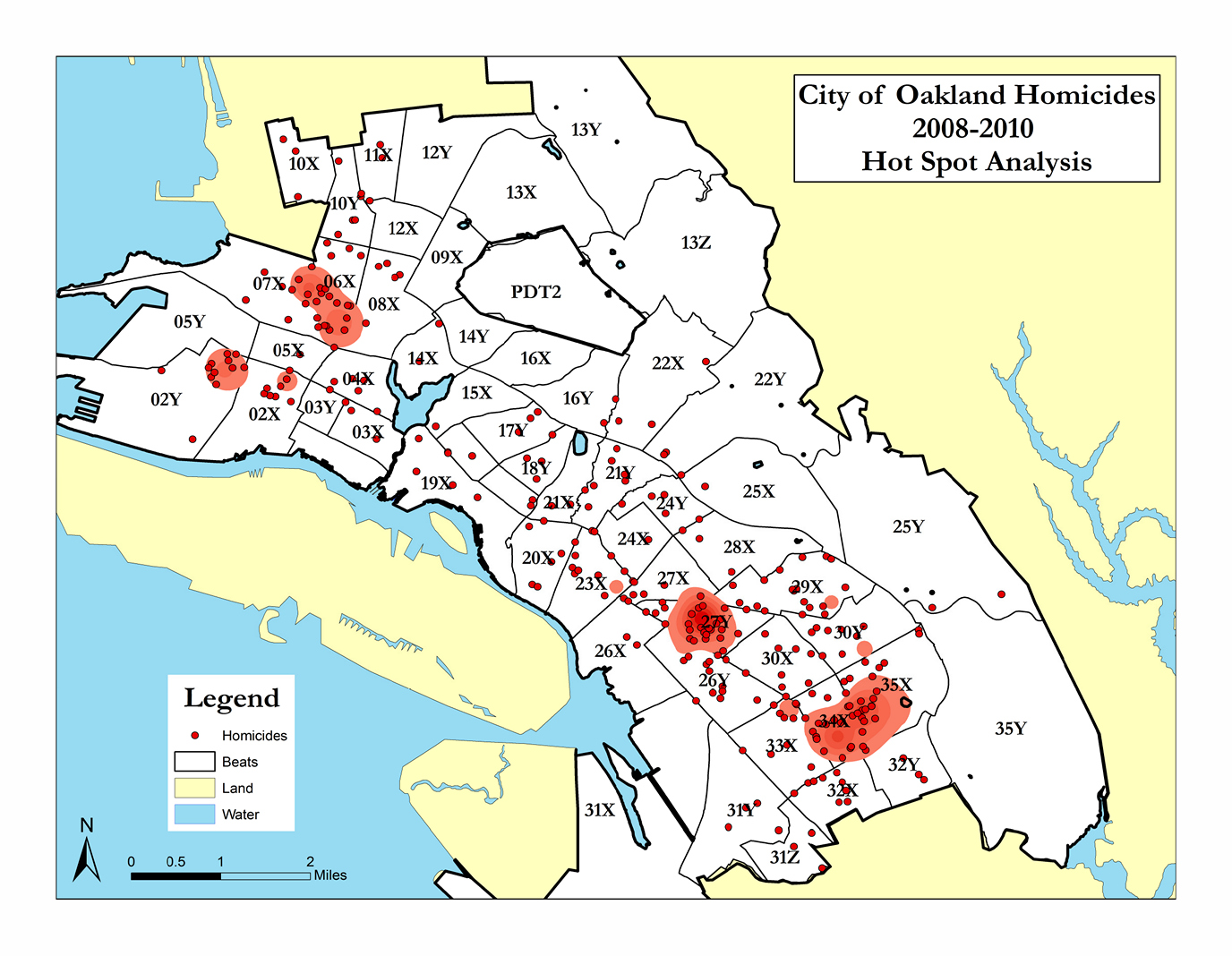
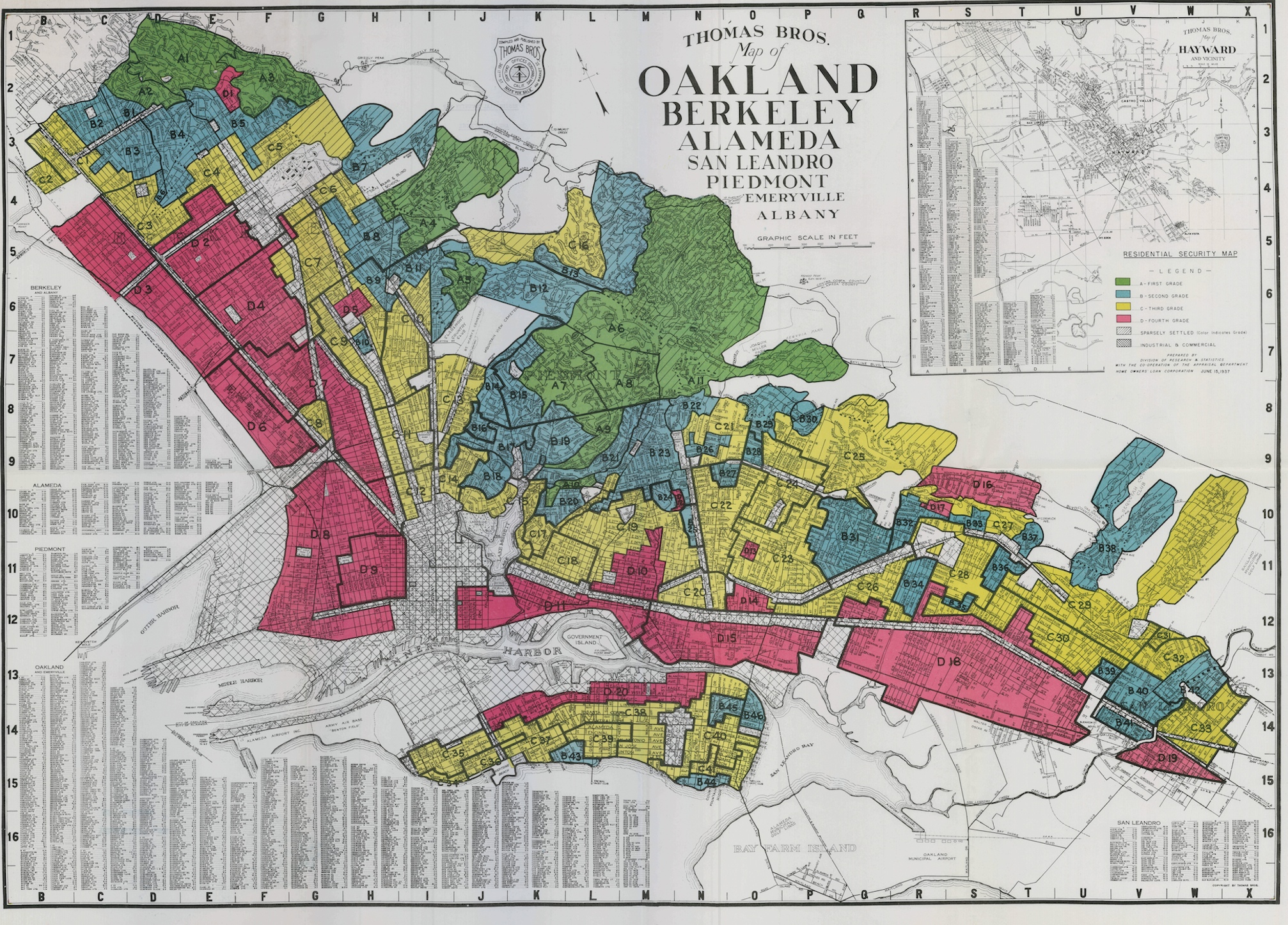
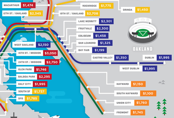
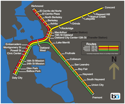
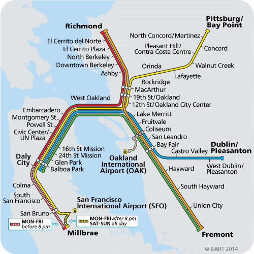
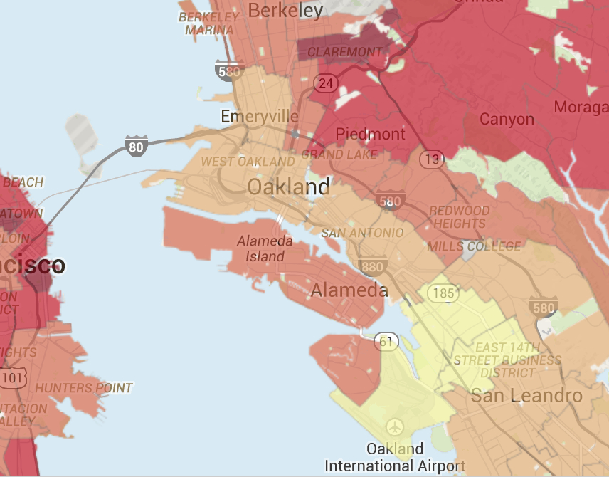
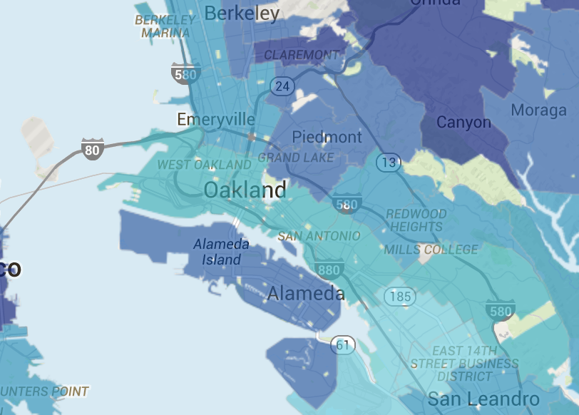

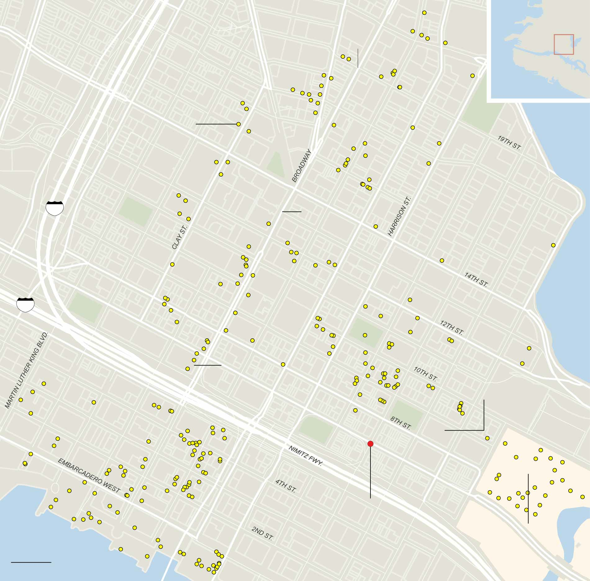
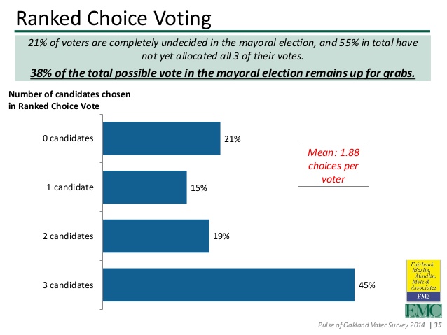
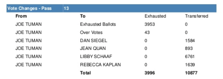
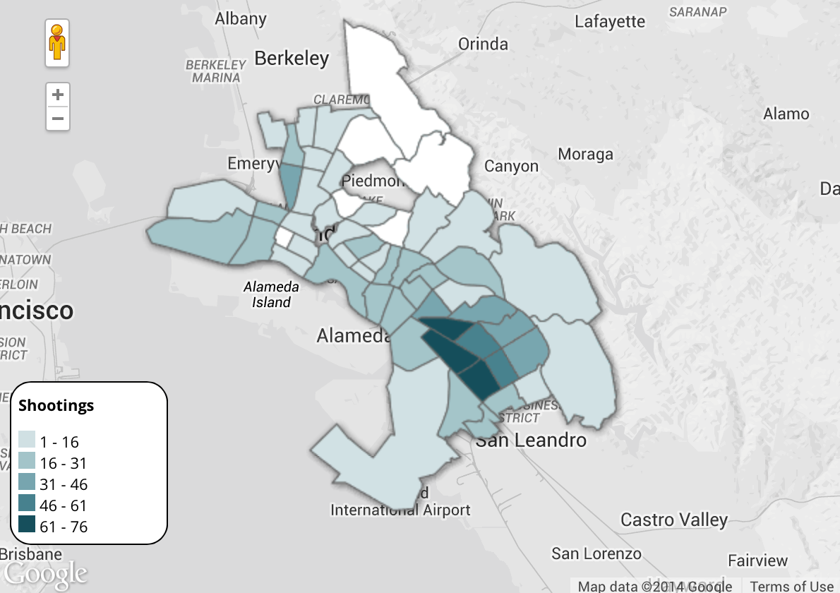
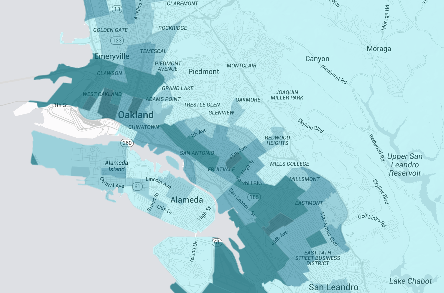

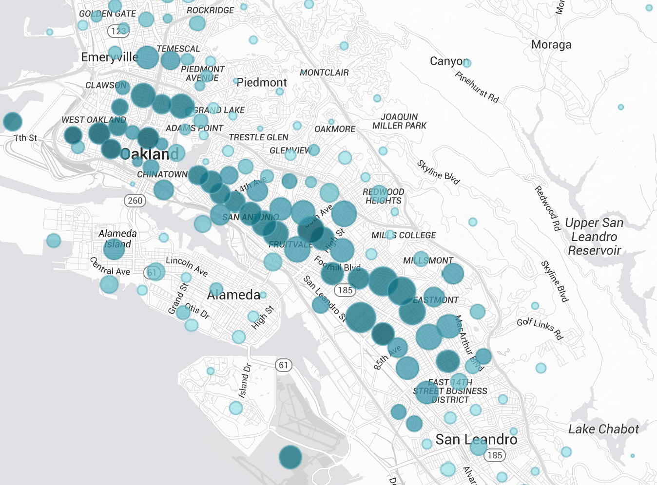
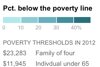
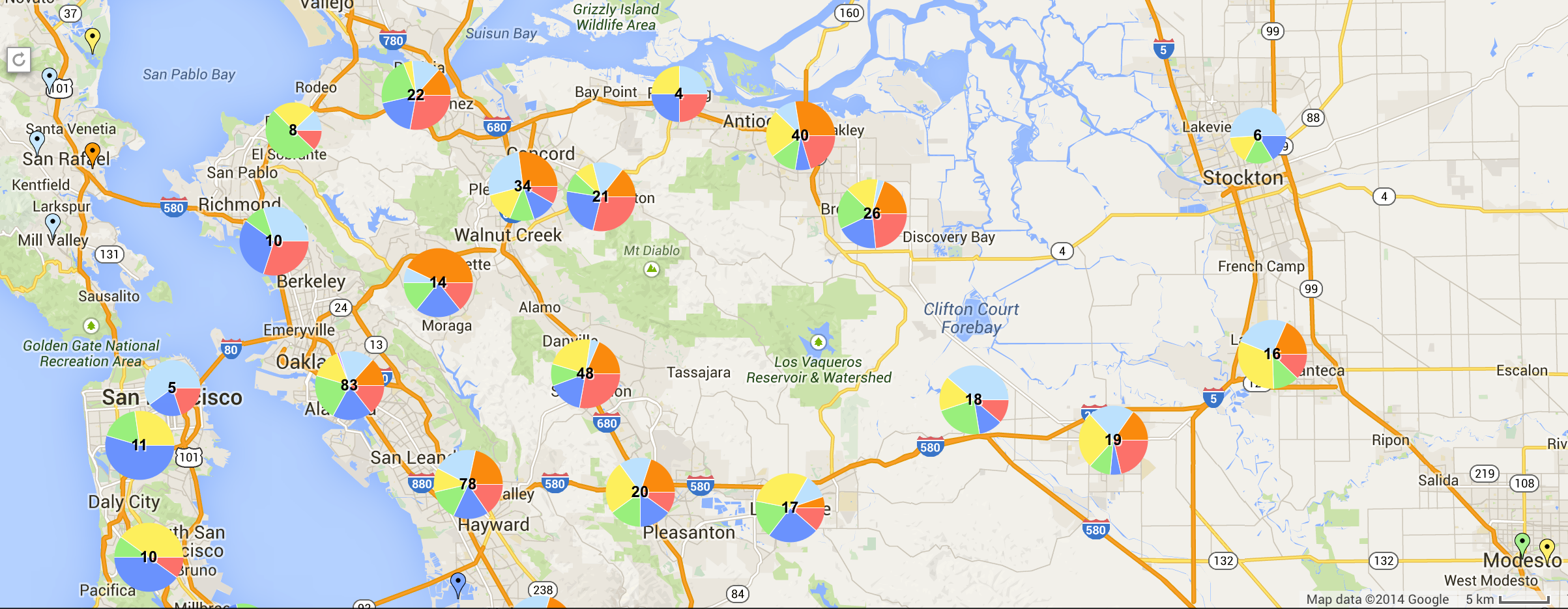
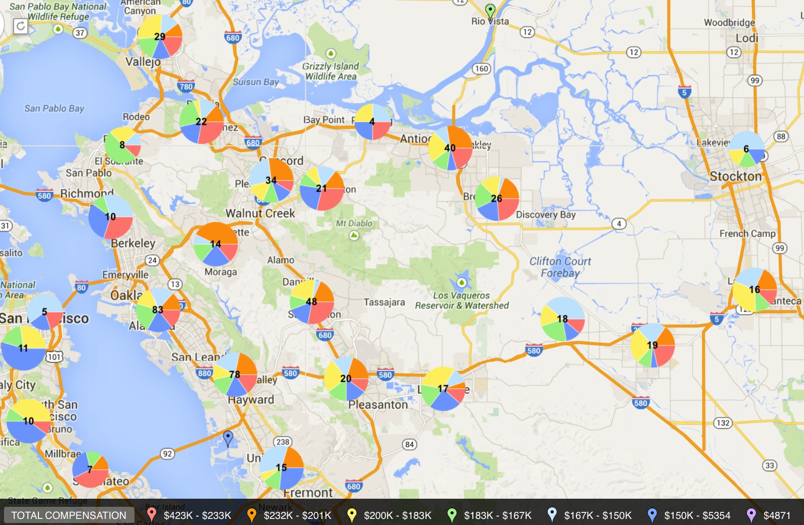
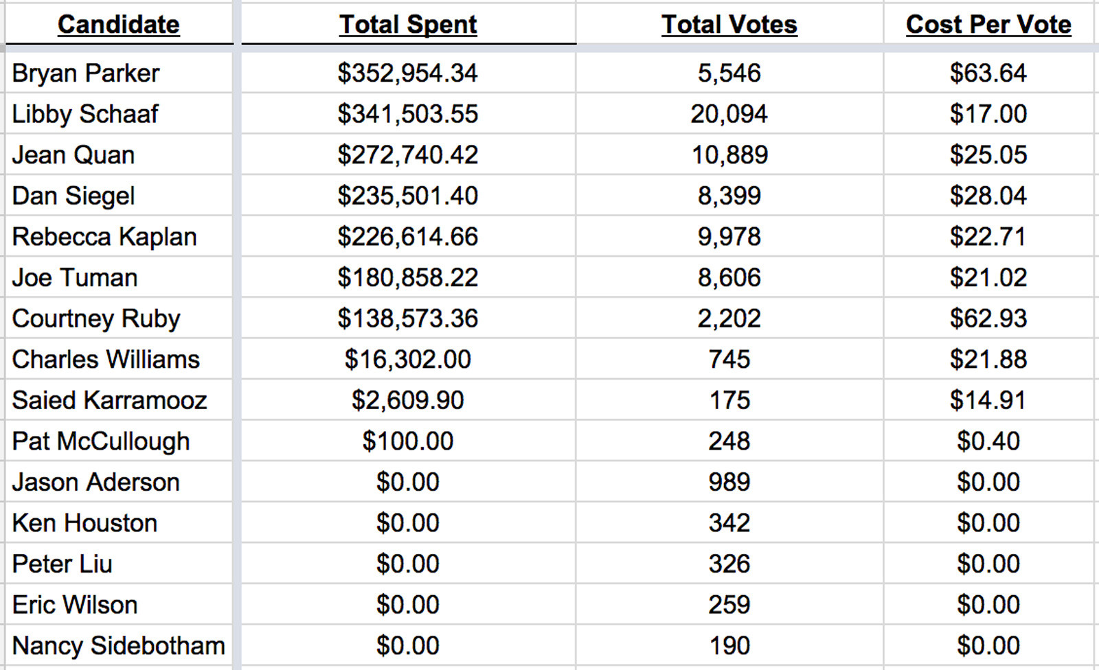
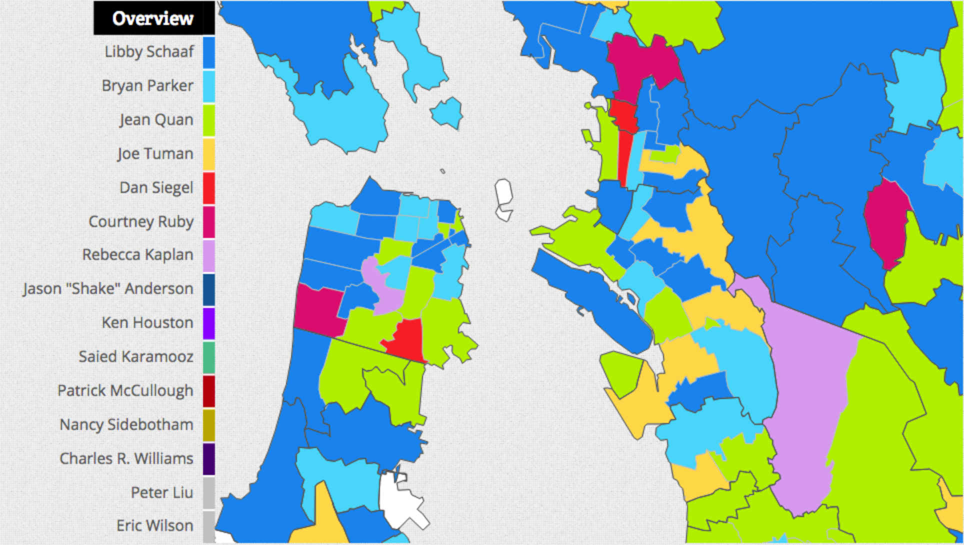
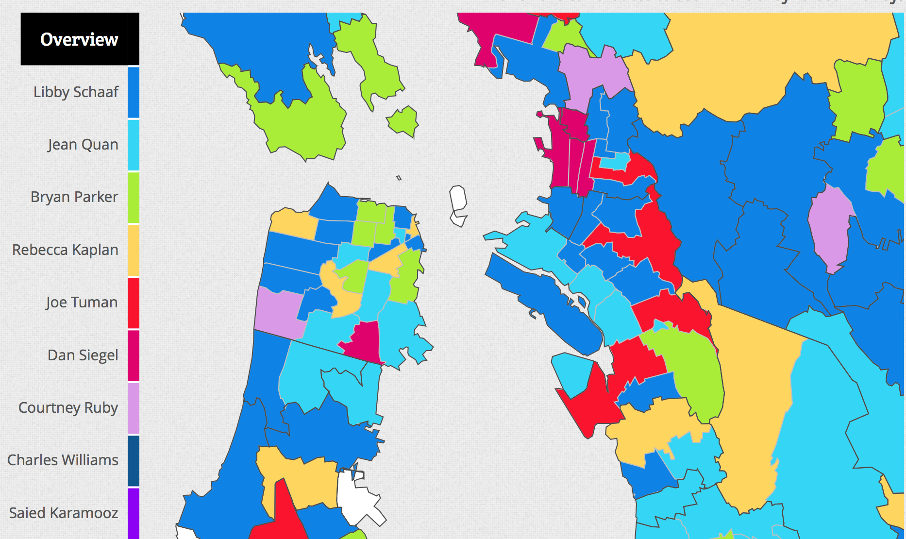
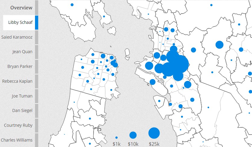
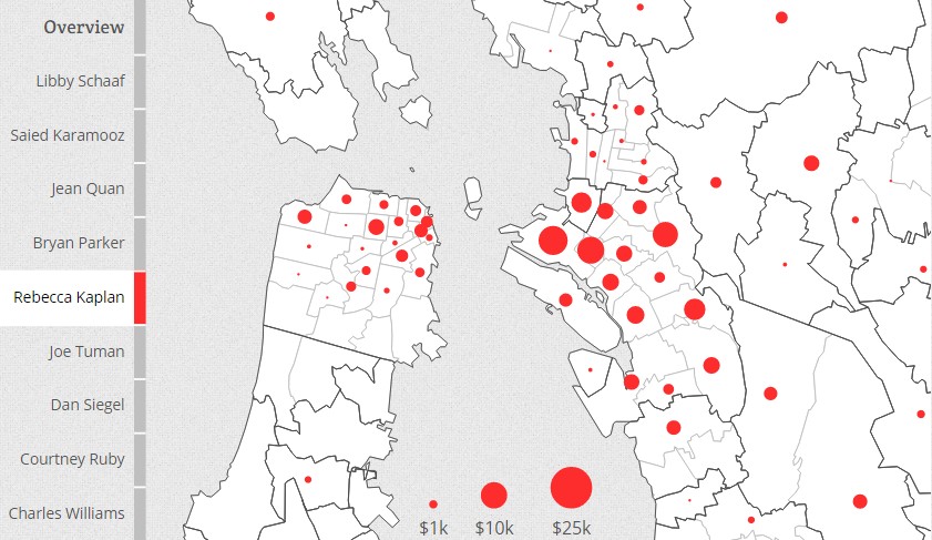
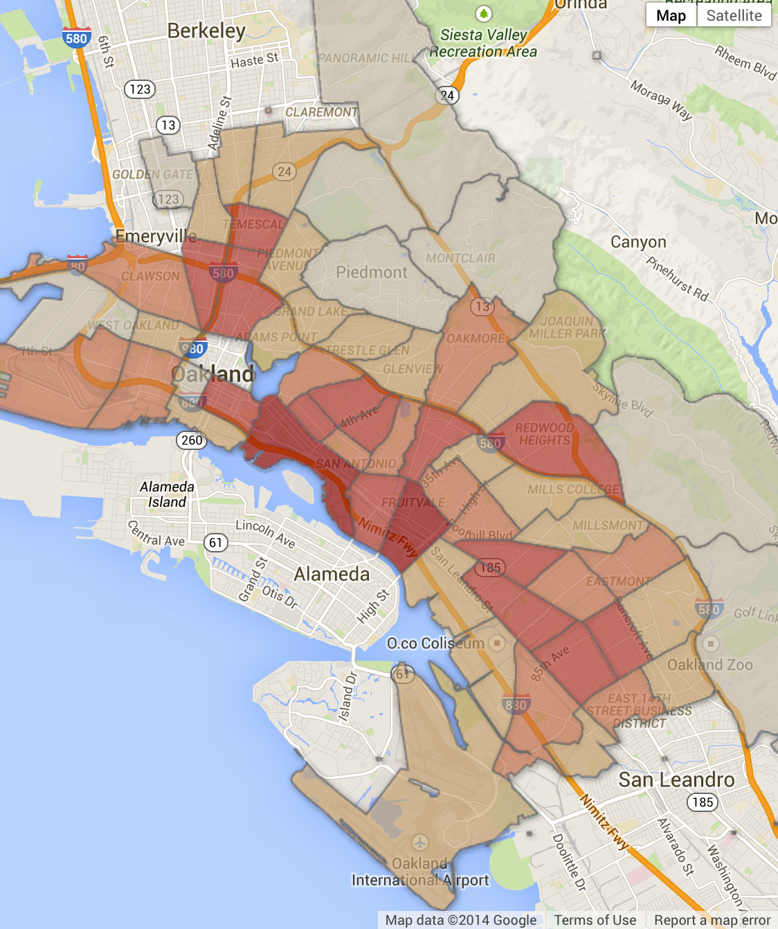
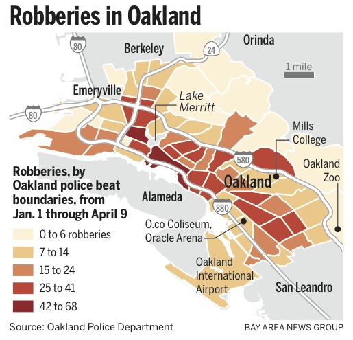
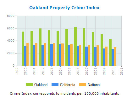
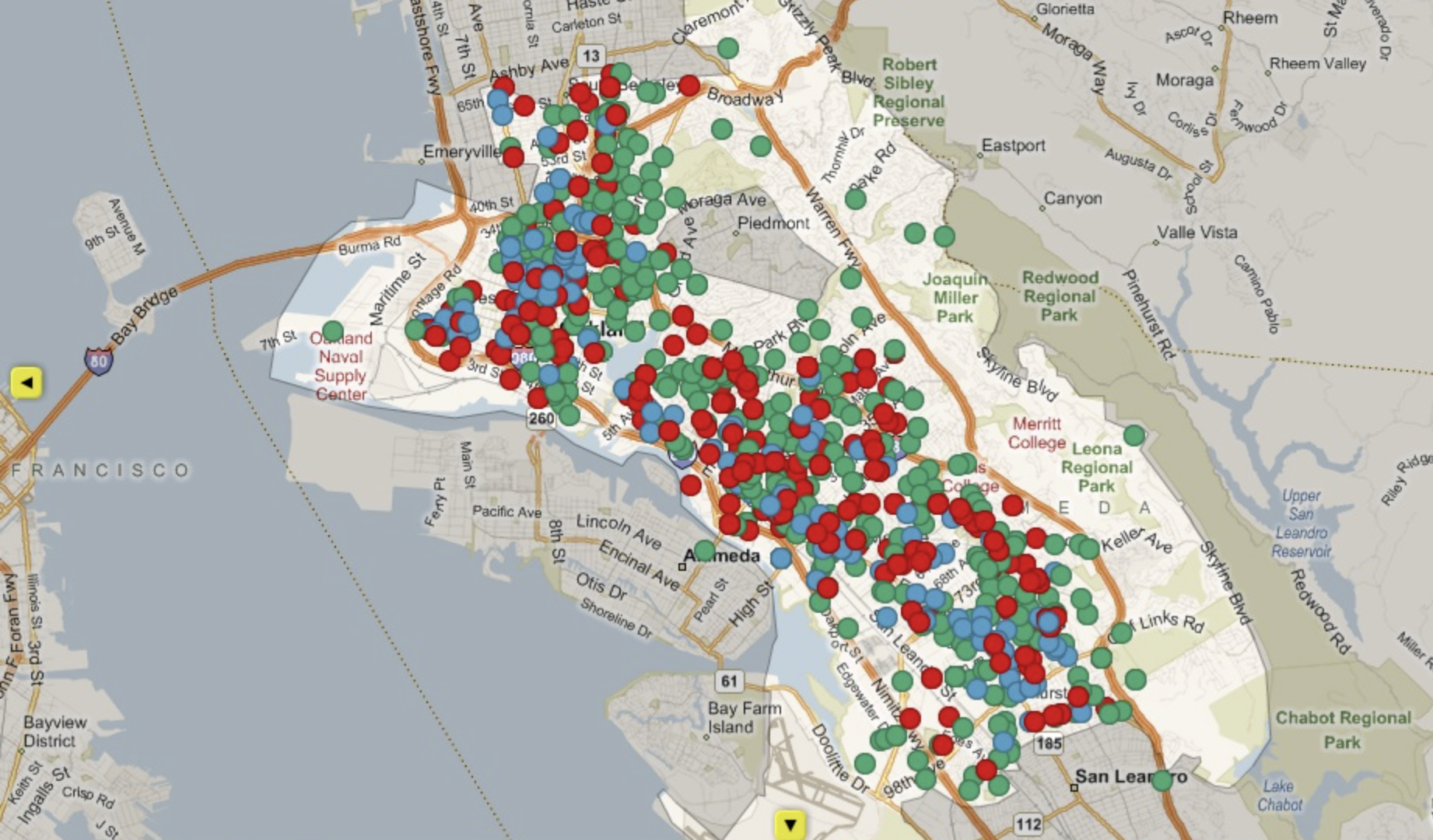
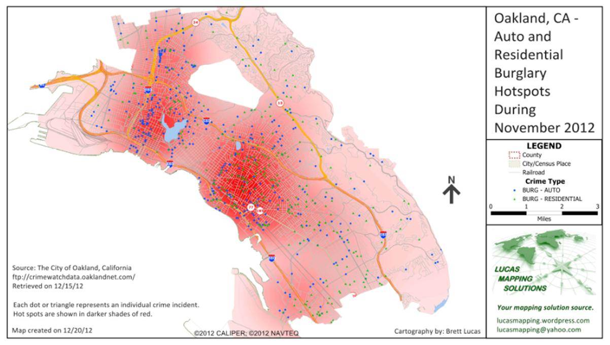
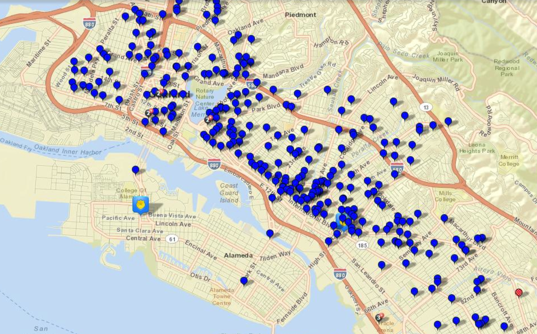
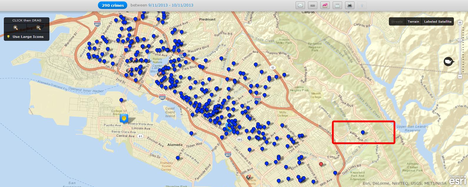
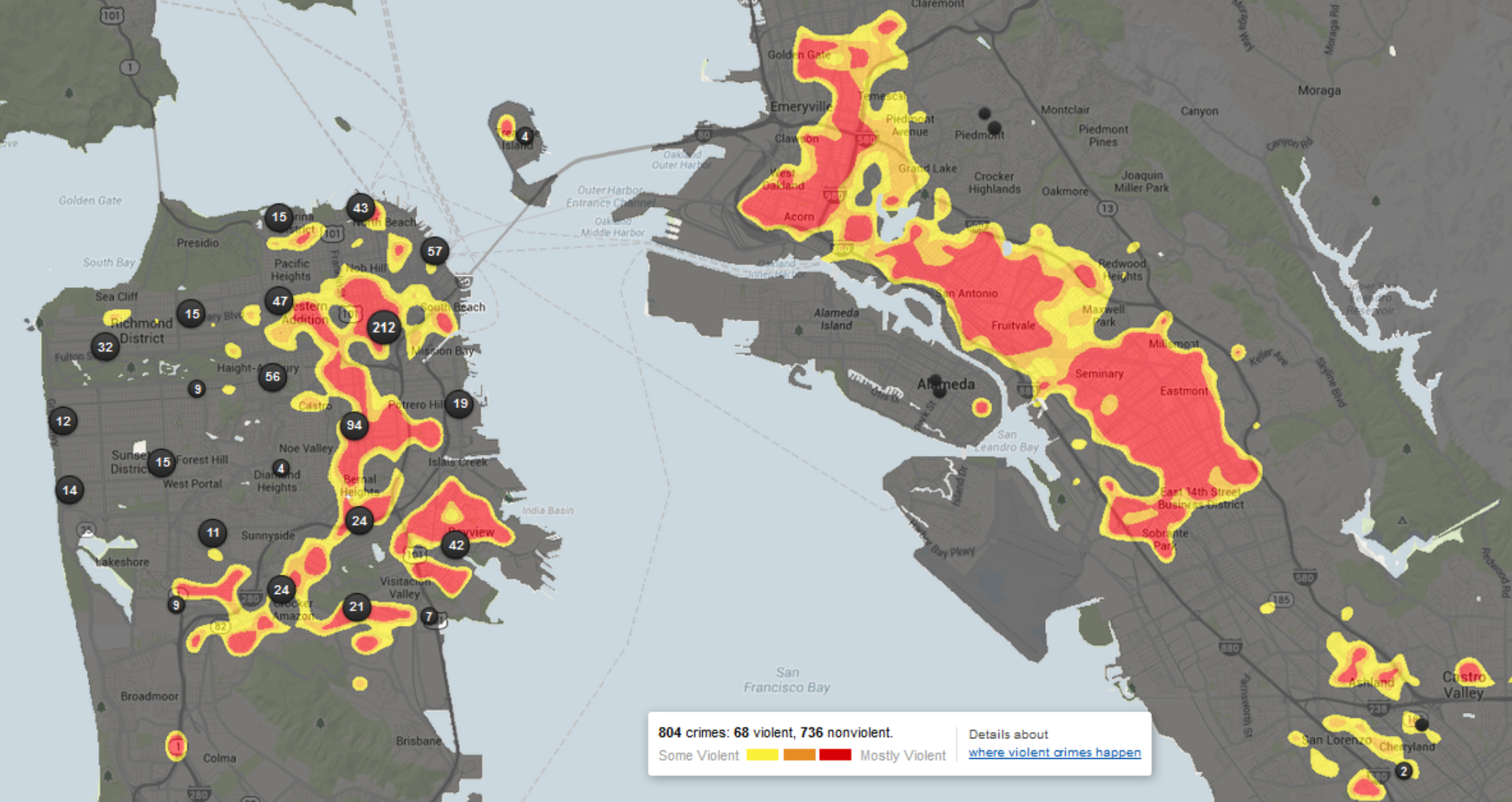
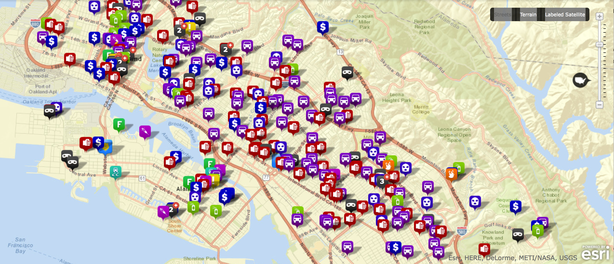
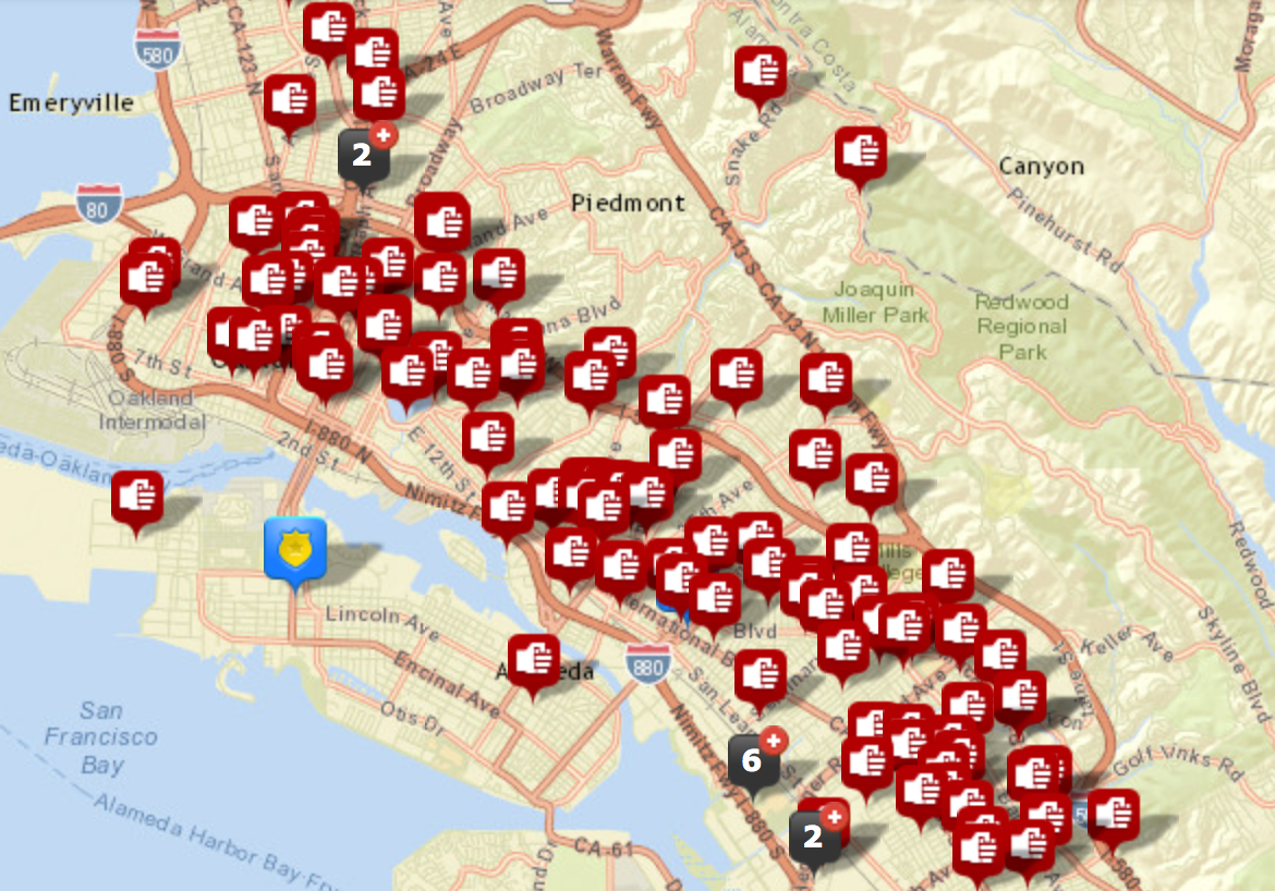
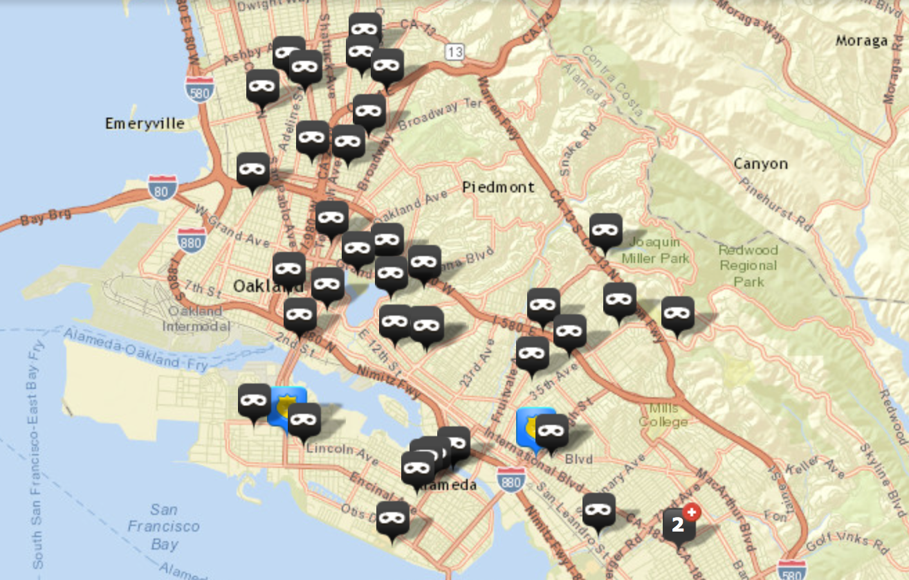
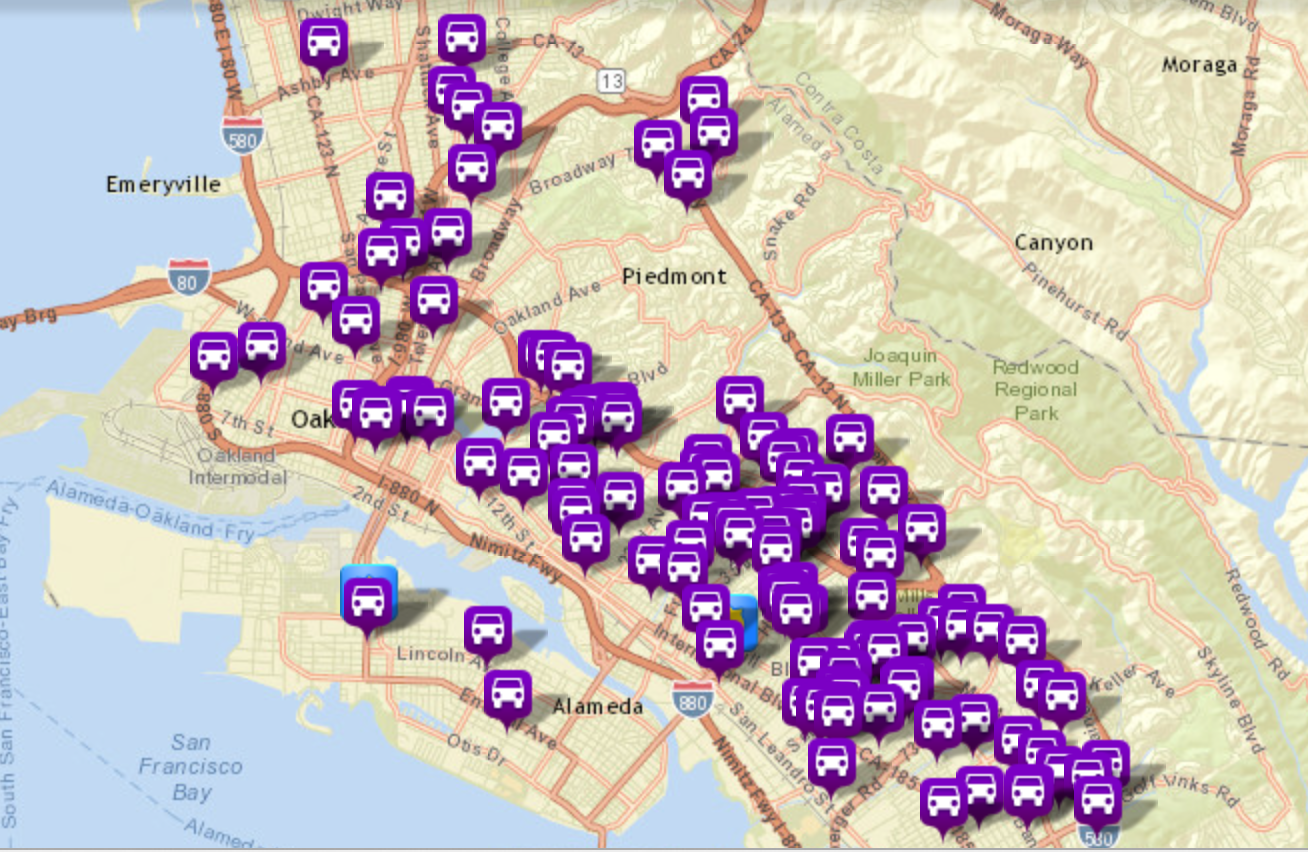

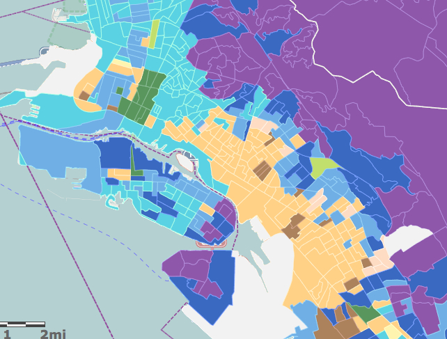
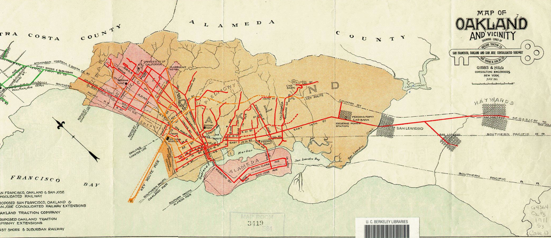
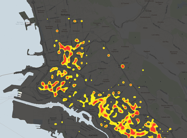
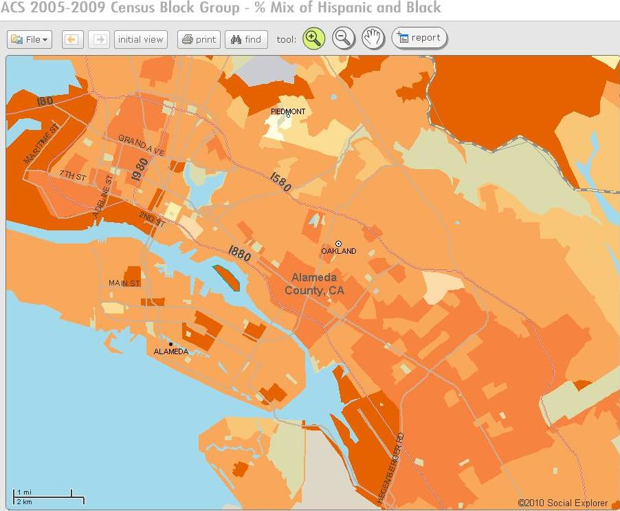
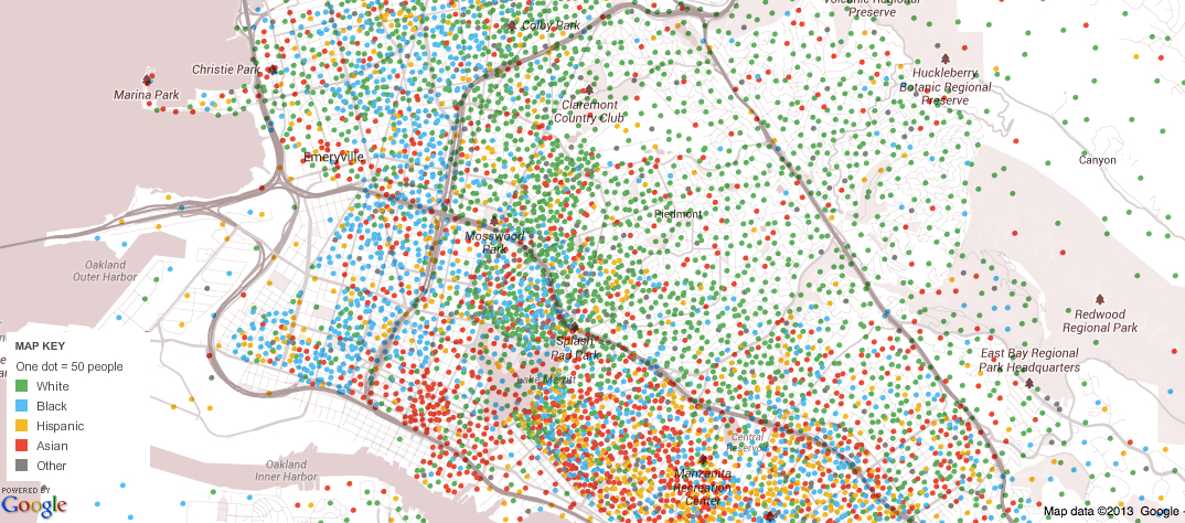
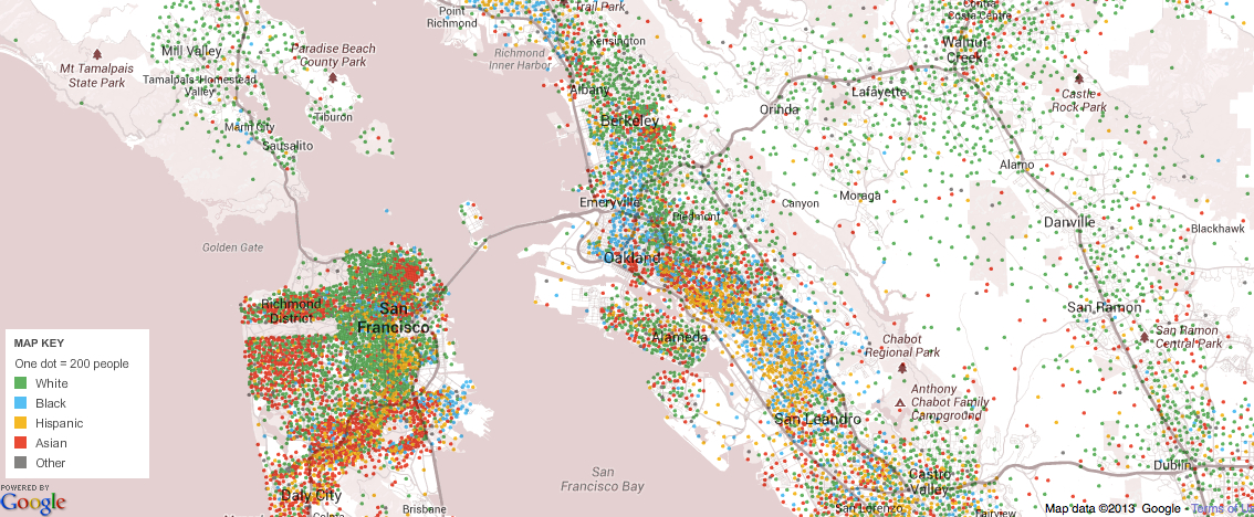
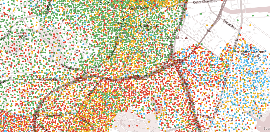
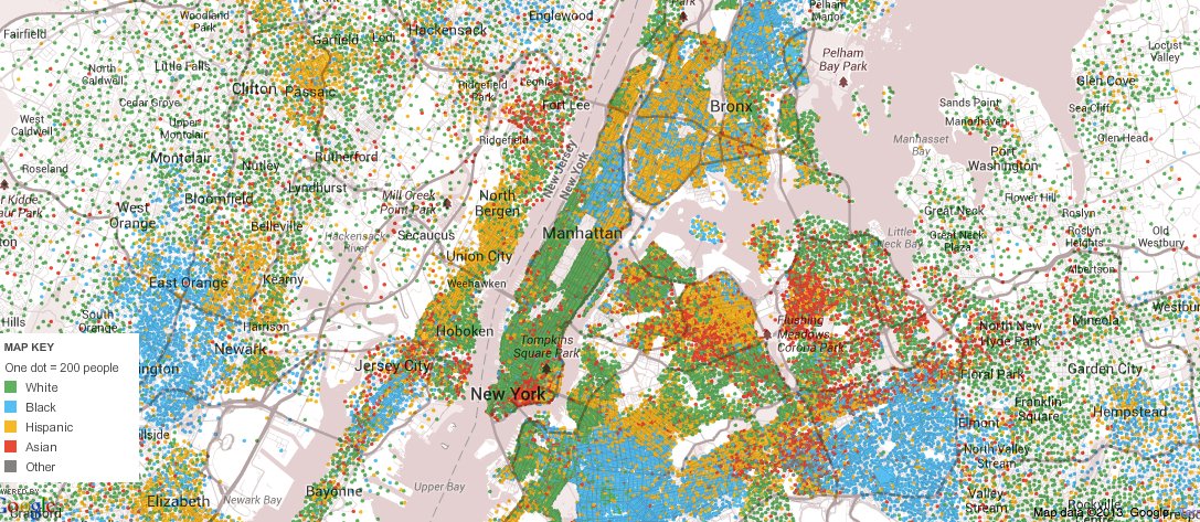
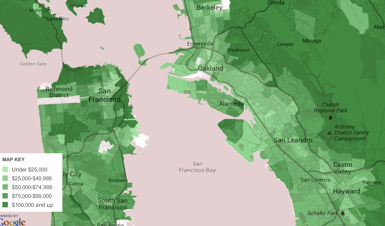
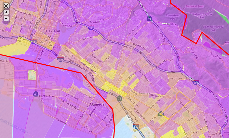
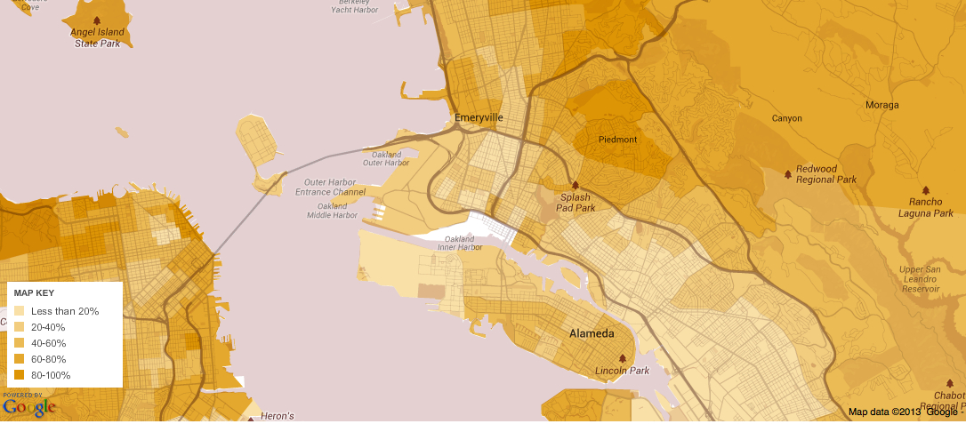
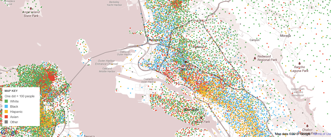
![Desnity of Population [of US]](https://dabrownstein.com/wp-content/uploads/2013/04/desnity-of-population-of-us.jpg)