Tag Archives: globalization

Arctic Circles

On our annual northward migration to Ottawa this December, we gathered around the unused fireplace in an unheated living room during the warmest Canadian Christmas in personal experience–as well as in the public record for Atlantic Canada, where local records for rainfall have surpassed all earlier recorded years.  Perhaps because of this, discussion turned to ownership of the North Pole for the first time for some time, as what was formerly a featureless area of arctic ice has become, as a receding polar ice-sheet exposes possible sites of petroleum mining, to become an area of renewed land grabs and claims of territoriality, as their value for nations is primarily understood in a global market of energy prospecting.  

The story of the new mapping of territorial claims around the arctic ice cap goes back decades, to the exploration of offshore polar drilling, but the exposure of land raises new questions for mapping because boundaries of polar sovereignty are contested, even as oil companies have speculated by modeling sites of future exploration for petroleum deposits. In sharp contrast to the clear lines of sovereignty that were drawn along Antarctica, the ongoing disputes of the Arctic have become protracted indeed, only more contested as global warming and polar melting open the long-frozen shipping routes that have long been imagined across polar regions, opening up new fantasies and geographic imaginaries of globalization. While Antarctica remains sectorized with clear stability in the geopolitical maps per the C.I.A.’s World Factbook, the stability seven claims to ownership far less contested or open to international debate as no petroleum has been detected under the ice shelf, the southern lands that host McMurdo Station host stations occupied by sixteen governments, in a sort of tacit comity for goals of research, distributing rights but with both Russia and the United States refusing so far to recognize any as valid. And so although Argentina, Australia, Chile, France, New Zealand, Norway, and UK are eager to claim regions as their own, as if everyone can have a slice of the frozen pie, the lack of contestation and minimal interest in the sector between 90 degrees west and 150 degrees west stands in contrast to the intense mapping and remapping of the North Pole.

Maps are long primarily used as strategic tools to assert land claims and sovereign bounds. But this may seem increasingly foolhardy in an age that is defined by globalization, and where global warming seems to threaten to further blur the staking out of sovereign divides. Is this only another reason to the multiplication of assertions of arctic claims to melting lands? Although one assumption circulated that the place was Canadian by birthright—birthright to the Arctic?–since it is so central to national mythistory.  

But there’s as much validity for its claims as the more strident claim the explorer Artur Chilingarov made to justify his planting of a Russian tricolor in the murky ocean bed 2.5 miles below the North Pole, during the 2007 polar expedition of the Mir submarine, with the timeless claim of Soviet-era bluntness, “The Arctic has always been Russian.”  Canadian PM Steven Harper did not hesitate a bit before decrying these claims to territoriality, warning his nation of the danger of Russian plans for incursions into the arctic in his tour of Canada’s North, thumping his chest and professing ongoing vigilance against Russia’s “imperial” arctic “imperial” as a national affront in addressing troops participating in military maneuvers off Baffin island as recently as in 2014.

Harper’s speech might have recalled the first proposal to carve pie-shaped regions in a sectorization of the North Pole first made by the early twentieth-century Canadian senator, the honorable Pascal Poirier, when he full-throatedly proposed to stake Canada’s sovereign claims to land “right up to the pole” and transform what had been a terra nullius into an image of objective territory seemed once again at stake.  Poirier claimed jurisdictional contiguity in declaring “possession of all lands and islands situated in the north of the Dominion.”  Poirier’s project of sectorizing the frozen arctic sea and its islands, first launched shortly after Peary’s polar expedition, has regained its relevance in an age of global warming, arctic melting and climate change.  But the reaction to the expanding Arctic Ocean in a language of access to a market of commodities has inflected and infected his discussion of the rights of territoriality, in ways that have obscured the deeper collective problems and dilemmas that the eventuality of global warming–and arctic melting–broadly pose.

Arctic Teritorial Claims

Encyclopedia Brittanica

The question of exactly where the arctic lies, and how it can be bounded within a territory, or, one supposes, how such an economically beneficial “good” that was part of how parts of the north pole might get away from Canada, has its roots in global warming–rather than in conquest.  The dramatically rapid shrinkage of ice in the Arctic Sea has raised newly pressing issues of sovereignty; the widespread melting of arctic ice has made questions of the exploitation of its natural resources and potential routes of trade has made questions of the ownership of the Arctic ocean–the mapping of the territorial rights to the seas–increasingly pressing, as some 14 million square kilometers of Arctic Ocean have emerged not only as open for exploration, but as covering what has been estimated as 13% or more of total reserves of oil remaining to be discovered world wide.

20141220_IRM937

 The Economist

While it seemed unrelated to the ice melting from nearby roofs, or large puddles on the streets of Ottawa, conflicting and contested territorial claims that have recolored most maps of the Arctic so that its sectors recall the geopolitical boardgame RISK, that wonderful material artifact of the late Cold War.  Rather than map the icy topography of the region as a suitably frosty blue, as Rand McNally would long have it, we now see contested sectors of the polar regions whose borderlands lie along the Lomonosov Ridge (which runs across the true pole itself).  The division of the pole so that it looks like post-war Berlin is an inevitable outcome of the fact that the arctic is warming at twice the rate of the rest of the planet, resulting in the opening of an area that was for so long rarely mapped, and almost always colored white with shades of picturesque light blue to suggest its iciness.

The lands newly revealed in the northern climes have however led territorial claims of sovereignty to be staked by a four-color scheme of mapping.  The uncovering of arctic lands–in addition to new technologies for underwater oil extraction and sensing–have complicated the existing maps of ocean waters premised upon expanding existing territorial waters an additional 278 kilometers beyond what can be proven to be an extension of a landmasses’ continental shelf–expanding since 1984 the rights to Arctic waters of the United States, Denmark, and Canada, according to consent to the United Nation’s Law of the Sea Convention (UNICLOS) which sought to stabilize on scientific grounds competing claims to arctic sovereignty.

Arctic Boudnary Disputes

The issues have grown in complex ways as the melting of Arctic ice has so dramatically expanded in recent years, exposing new lands to territorial claims that can be newly staked on a map that unfortunately seems more and more to resemble the surface of a board games.  Even more than revealing areas that were historically not clearly mapped for centuries, the melting of the polar cap’s ice in the early twenty-first century has precipitated access to the untapped oil and gas reserves—one eight of global supplies—and the attendant promise of economic gains.  Due to the extreme rapidity with which polar temperatures have recently risen in particular, the promises of economic extraction have given new urgency to mapping the poles and the ownership of what holes will be drilled there for oil exploration:  instead of being open to definition by the allegedly benevolent forces of the free market, the carving up of the arctic territories and disputes over who “owns” the North Pole are the nature follow-through of a calculus of national interests.  The recent opening up of new possibilities of cross-arctic trade that didn’t involve harnessed Alaskan Huskies drawing dog sleds.  But the decline in the ice-cover of the arctic, as it was measured several years ago, already by 2011 had opened trade routes like the Northwest Passage that were long figures of explorers’ spatial imaginaries, but are all of a sudden being redrawn on maps that raise prospects of new commercial routes.   New regions assume names long considered but the figments of the overly active imaginations of early modern European arctic explorers and navigators in search of the discovery of sea routes to reach the Far East.

20120616_SRM980
The Expanded Shipping Routes of Global Warming: The Melting North,” The Economist

On the one hand, these maps are the end-product of the merchant-marine wish-fulfillment of the eighteenth-century wishful mapping of the French Admiral Bartholomew de Fonte, whose maps promised that he had personally discovered several possible courses of overcoming a trade-deficit caused by British domination of the Atlantic waters, allowing easy access to the South Seas.  The imagination of such routes proliferated in a set of hopeful geographies of trade which weren’t there in the late eighteenth century, of which de Fonte’s General Map of the Discoveries is an elegant mixture of fact and fiction, and imagined polar nautical expeditions of a fairly creative sort, presenting illusory open pathways as new discoveries to an audience easily persuaded by mapping pathways ocean travel, even if impassable, and eager to expand opportunities for trade by staking early areas of nautical sovereignty to promise the potential navigational itineraries from Hudson Bay or across the Tartarian nation of the polar pygmies:

arctic1772-full-1

Open-ended geographies of land-masses were given greater credibility by the dotted lines of nautical itineraries from a West Sea above California to Kamchatka, a peninsula now best-known to practiced players of the board-game RISK:

0078em

As well as imagine the increase potential shipping routes that can speed existing pathways of globalization, in fact, the meteorological phenomenon of global warming has also brought a global swarming to annex parts of the pole in confrontational strategies reminiscent of the Cold War that tear a page out of the maps, which give a similar prominence to Kamchatka, of the board game ‘RISK!’  Will their growth lead to the naming of regions that we might be tempted to codify in a similarly creatively improvised manner–even though the polar cap was not itself ever included in the imaginative maps made for successive iterations of the popular game of global domination made for generations of American boys–and indeed provided a basis for a subconscious naturalization of the Cold War–even while rooting it in the age of discoveries and large, long antiquated sailing ships, for the benefit of boys.

pic324841

RISK (1968)  

Following versions took a less clearly vectorized approach, imagining a new constellation of states, but also, for the first time, including animals, and updating those schooners to one sleeker ship!

1 living room, dining room, kitchen IMG_1319

Risk!, undated  

The more updated current gameboard is curiously more attentive to the globe’s shorelines, as if foregrounding their new sense of threatened in-between areas, on some subconscious areas, that are increasingly prone to flooding, and less inviolable, but also suggesting an increasingly sectorized world of geopolitics, less rooted in individual. nation-states..

risk-1

Risk–current board

Will future editions expand to include the poles as well, before they melt in entirety, as the ways that they become contested among countries percolate in the popular imagination?

We must await to see what future shorelines codified in the special ‘Global Warming Edition’ of RISK–in addition to those many already in existence in the gaming marketplace.

If the game boards suggest Christmas activities of time past, the ongoing present-day game of polar domination seems to be leading to an interesting combination of piece-moving and remapping with less coordinated actions on the parts of its players.  We saw it first with Russia’s sending the Mir up to the North, which precipitated how Norway claimed territoriality of a sizable chunk of Arctic waters around the island of Svalbard; then Denmark on December 15 restocked its own claims, no doubt with a bit of jealousy for Norwegian and Swedish oil drilling, to controlling some 900,000 square kilometers of arctic ocean north of Greenland, arguing that they in fact belong to its sovereign territories, and that geology reveals the roots of the so-called Lomonosov Ridge itself as an appendage of Greenland–itself a semi-autonomous region of Denmark, upping up the ante its claims to the pole.

While the Russians were happy to know that their flag was strategically but not so prominently placed deep, deep underwater in the seabed below the poles, the problem of defining the territorial waters of the fast-melting poles upped the ante for increasing cartographical creativity.   Recognized limits of 200 nautical miles defines the territorial waters where economic claims can be made, but the melting of much of the Arctic Ocean lays outside the claims of Canada (although it, too, hopes to stake sovereignty to a considerable part of the polar continental shelf), by extending sovereign claims northward from current jurisdictional limits to divide the mineral wealth.  Were the Lomosonov Ridge–which isn’t moving, and lies above Greenland–to become a new frontier of the Russian state, Russian territory would come to include the pole itself.

LOMOSONOV RIDGE.png

Bill Rankin/National Geographic

The actual lines of territorial division aside, the diversity of names of the single region indicate the competing claims of sovereignty that exist, as if a historical palimpsest, within an actual map of the polar region:  from the Amundsen Basin lies beside the Makarov Basin, the Yermak Plateau beside the Lena Trough and Barents Plain, suggesting the multiple claims of naming and possession as one approached the North Pole, without even mentioning Franz Josef Land.

LOMOSONOV RIDGE
amundsen basin dotted lines of contestation?.png
Contestation of the Pole

While the free market isn’t able to create an exactly equanimous or impartial division of land-claims, the new levels of Denmark’s irrational exuberance over mineral wealth led the country to advance new claims for owning the north pole, and oil-rich Norway eager to assert its rights to at least a sixth of the polar cap, given its continued hold on the definition of the northern lands.  The increasing claims on proprietary rights of polar ownership among nations has lead international bodies such as the United Nations Conventions on the Law of the Seas (UNICLOS) to hope to codify the area peaceably by shared legal accords–presumably before the ice-cover all melts.

The maps of speculation of the “Arctic Land Grab” is economically driven and suggests an extension of offshore speculation for oil and gas that has long roots, but which never imagined that these claims would be able to be so readily concretized in terms of a territorial map as the melting of the ice cap now suggests.  But as technical maps of prospecting are converted into maps with explicit territorial claims, planned or lain lines of pipe are erased, and the regions newly incorporated as sites of territoriality in ways that earlier cartographers would never have ventured.

rankin polar maps
Bill Rankin/Radical Cartography

The existence of laid or planned pipeline by which to pump and stream oil across much of Upper Canada from the Chukchi Sea, North Slope, and MacKenzie Delta have long been planned by Canadians.  Similarly, the Russian government, echoing earlier claims of Russian stars to straddle the European and Asian continents, have claimed the underwater Lomosonov Ridge as part of the country’s continental shelf, even if it lies outside the offshore Exclusive Economic Zone, as is permitted by UNICLOS–so long as the edge of the shelf is defined.

Canada has taken the liberty to remap its own territory this April, in ways that seem to up the ante in claims to arctic sovereignty.  In updating the existing map of 2006 to make it appear more ice exists in the Arctic than it had in the past,  the Atlas of Canada Reference Map seems to augment its own sovereign claims to a region in ways clothed in objectivity:  even as arctic ice-cover undeniably rapidly melts in a decades-long trend, the ice-cover in the region is greatly expanded in this map, in comparison to that of 2006, and the northern parts of Canada are given a polemic prominence in subtle ways by the use of a Lambert conformal conic projection and a greatly expanded use of aboriginal toponymy to identify lands that even belong to different sovereignty–as Greenland, here Kalaalit Nunaat–in terms that link them to indigenous Canadians, and by extension to the nation.  Both tools of mapping appear to naturalize Canadian claims to the Arctic in a not so subtle fashion.  Moreover, the map stakes out exclusive economic zones around Arctic regions:  even as the Arctic rapidly melts, for example, disputed islands near Greenland, like Hans Island, are shown clearly as lying in Canadian waters.

Canada with Polar Claims, Parks

Perhaps what exists on paper trumps reality, creating an authoritative image of an expanded Arctic–a white plume that expands the amount of Arctic ice beyond the rendering of the Arctic Sea in its earlier if now outdated predecessor.

It is instructive to look backwards, to grasp the earlier strategic sense invested in the Kamchatka Sea, before it migrated into Risk! The earlier pre-fifty-states rendering of this Russian area as an independent sea, fed by the Kamchatka River, was seen as an area apart from the Pacific, bound by the archipelagos of a future Alaska that were imagined to bound the region, as if to create an oceanic theater of entirely Russian dominance, above the “eastern ocean” of the Pacific, and almost entirely ringed by what must have seemed to have been essentially Russian lands.

The above map has, of course, nary a reference to a pole, but an expanded sea remaining fully open to navigation with charts.

What exists on paper, once officially sanctioned, seems to stand as if it will continue to trump the rapidly shrinking extent of arctic ice.  The map trumps reality by blinding the viewer, ostrich-like fashion, or keeping their head deeply buried in the proverbial sand.  The decision to show the thirty-year median of sea-ice extent in September in the years between 1981 to 2010 brings the map into line with the way that Environment Canada computes sea-ice extent.  And the augmentation of Inuit toponymy for regions near the Arctic recognizes the indigenous role in shaping Canada’s toponym.  But it would be hard to say that either would be advanced if they did not have the effect of expanding Canadian sovereignty to the arctic.  The reality it maps clearly mirrors the shifting interests of the state at a time of the shrinking of Arctic ice due to climate change, more closely than it shows the effects of global warming on the ice-cover of the northern regions, let alone in the Arctic itself.  With more maps that diminish the effects of global warming, the orienting functions of the map seem to be called into question in themselves.

Merry Christmas indeed!

3 Comments

Filed under arctic, arctic melting, Climate Change, climate monitoring, global warming

Crafting an Imaginary Atlas for a Dystopianly Disproportionate World

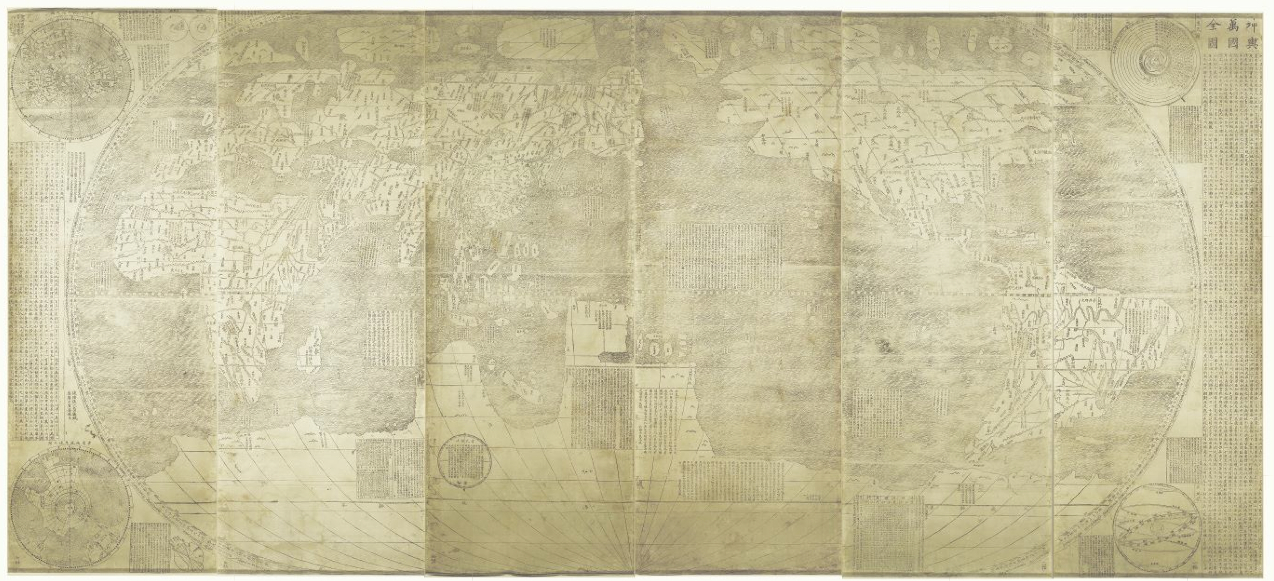
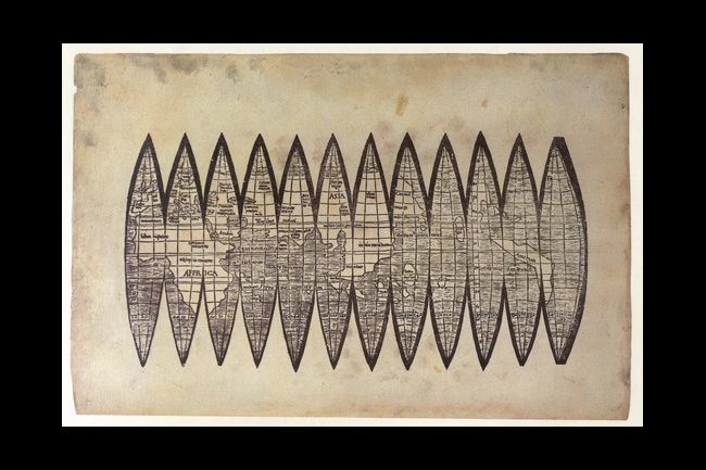
What is one to make of the silkscreen prints Hong Hao assembles from digitized versions of antiquated printed world maps?  While dispensing with anything like an exact correspondence to the world, each creates a fantasia of borderlands, and offers something of a wry response to the frustration at imbalances of globalization, as much as they appropriate antiquated cartographical conventions and forms.  Hao’s silkscreen prints manipulate scans of older global maps, he’s argued, as a set of confines or parameters to draw the world in new ways, but in doing so deploy the conventions of mapping to empty the familiar authority of the conventions of cartography.  The huge success of his production of world maps in the series Selected Scriptures, which this ambitious and eclectic printmaker began in the 1990s, but dramatically expanded after 1995, have reached a demanding public.  Is there appeal how they question how we see nations as best described on a map as they make foreign–and winkingly poke fun at–the authority of the print map as a register of the nation-state or territorial boundary lines?  Or does it lie in the special appeal of their static form, presented as a classical sewn binding of an encyclopedia, in an age when most of the maps we use are downloadable networked media?  In an age of online and digitized maps, Hao seems careful  to design the sequence of maps as situated and constructed forms, that open to the viewer in the site of a stable book.

But the maps that he produces also chart an increasingly globalized world, no longer subject to the confines of antiquated or inherited cartographical forms he creatively has appropriated, and seem to gesture to the construction of a warped world of a less clear balance of power or status quo, concealing many unseen networks of financial exchange or political relations.  The introduction of corporate logos, upbeat slogans, and fractures of linguistic translation into the imaginary corpus of maps Hao has produced with astonishing invention and rapidity question not only the hold of the power of maps but the medium of mapping, by dislodging the conventions of mapping from a familiar story and by suggesting the outdated nature of narratives of bounded territories and balances of power, as well as to indicate the increasingly skewed nature of global relations.  If Hao has chosen the silkscreened image to be confined by antiquated formats of mapping, unlike the screens we use to view maps on hand-held devices, his crafted silkscreens take the map as a liberatory form to reorganize global space in something of a provisory or provisional fashion for their viewers to contemplate.  In ways that dispense with notions of geographic correspondence or way-finding, and adopt the conventions of mapping to undermine western narratives, Hao distances us from paper Rand McNally maps in ways as appealing as they are successful on the international art market.   In appropriating Western conventions for viewing global space, Hao surely comments on the power of mapping as a symbolic form and graphic practice, if only by undermining and defamiliarizing the coherence of the map as a record of familiar territory:  not only do his silkscreen prints mutate forms of mapping, by altering names, locations of countries, color-schema and mirroring continents in wry ways, but adds weird arrows, graphs, and currents mark the ties of countries and continents.  Rather than confusing the surface of the map, the direction of viewers’ attention to the map seem to reveal fractures and imbalances in the globalized world, even if in ways that seem to undermine–or question–the map’s own claims to reality, by releasing the map from claims of accuracy or indeed truth-claims.

The appeal of these images among his other attempts to synthesize an eclectic variety of scaned brightly colored objects from everyday life seem quite distinct.  For not only do they indulge in the translation of maps to Chinese culture (and a global art market), but they raise questions of how all maps are translations of reality in ways that are comforting in an age of the web-based map.  If Hao severs the map from claims of precision or forms of way-finding, he rehabilitate antiquated structures of mapmaking, now somewhat foreign to our period eye, to orient us to the impossibility of proportional mapping in a truly disproportionate globalized world.  The images Hao defines are extremely popular as a sort of response to the failure of globalization, and indeed the failure to create a new map of the modern world.  The sustained return to the map as a medium seems quite unlike the numerous ways that artists have long referenced the authority–and formal objectivity–of mapping as a register of the political status quo, in how they question the vision of global unity that maps and politics that maps have so long bequeathed.   For if Hao uses the palette of mapping as a clear set of constraints to in Selected Scriptures, an inventive sequence of silkscreen prints that create revisionary maps of the world’s countries, begun from 1992-95,  dismantle the oppressive presence of the map in our world to question the new hybridization of map making by moving it out of a “western” art.  There is a sense for many art critics of a Duchampian inspiration; each seem to announce “This Is A Map,” or maybe even “This is a New Atlas” as a ready-made form.  Hao reached back to the conventions and forms of printed Rand McNally-esque mapping forms–if not an earlier cartographical sublime–appropriating the claims of novelty and reduction of information as an elegant and economic statement of truth to make an artifact that  lies between found objects and the “ready-made,” even as his final products seems to satirically advertise their own cheapness and untrustworthiness as a vehicle:  the translation of the format of mapping in much of these works not only undermines its authority, but suggests an impatient and persistent attempt to find meaning in the map.

Hao’s sequences of silkscreen prints chart dystopia in faux open pages of an imagined traditional thread-bound Chinese encyclopedic text–as if to create the fictional broader corpus of which each form part.  While they do not pose as recreations of an actual experiential world, they seem to comments on the mapping of the world that have particularly pressing urgency to the material presence of the map in an age that is increasingly online.  Hao’s work, including imaginary pagination from the encyclopedia of knowledge from which they ostensibly derive, register glimpses of an atlas that charts the oppressive nature of global divisions, or an imagined atlas of the social construction of space, if not of an attempt to start dialogue with a “new world order.”  The prints appeal s a way of romancing the hand-made map, in an age of the web-based maps and a surfeit of digitized data, however, by recycling such foreign, if familiar, conventions of printed maps to orient the viewer to a disorienting world.  In place of the data visualizations that chart the process of globalization, Hong’s recourse to screening maps to show inequalities and disparities seems by no means accidental.  For Hao takes the map’s surface as a field for further manipulation:  the world seems an open book, in the silkscreen prints shown below, made after the original series, and use the cartographical surface as a charged field for modification, inversion, and inscription, adopting the abilities offered by digitization to create a mock-permanence in his prints.

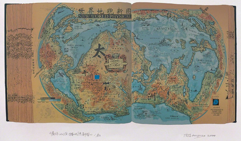
Take two examples.  The very mutability of the medium of mapping in his work suggest not the tyranny of modern mapping, but the provisory nature with which maps translate space for their viewers, and the indiscriminate nature of how they present global inter-relations as a space that can be read in “Selected Scripture, page 1999, The Memory of Millennium” (2000).  If all maps are translations, these are quizzical ones, as much as physical ones–filled with corrections, misprints, and ways of subverting their own iconic authority as maps, and glimpses of an imagined atlas of a nonexistent world.


NEW WORLD PHYSICAL 2000

Latest Practical World Map


In the first, the excavated distorted “North America Ocean” and “South America Ocean” are dotted by odd arms and insignia, their actual confines warped to create imagined lakes and emblems of airplanes and Microsoft, unlike the “Asia Ocean,” and oceans become land mass.


America's Microsoft Explorers


In the scanned maps Hong has altered and manipulated, America might be expanded, renamed as the PRC, Asia folded into obscurity save Japan, and Canada foreshortened into a swelling United States, all to upset viewers’ expectations for reading their surface, which he reiterated in “New Political Map, 2” (2000), “New Political Map, Which One” or “New World No. 1” (2000), repeatedly playing with the constraints of mapped space in ways that not only skew actual relations, but invite us to recognize the arbitrariness with which we map our mental space or are accustomed to do so.


%22New World No. 1%22 p. 2001


Hong Hao was trained in printmaking, and values the medium of silkscreen prints as versatile tools not only to sort objects and create catalogue, but to treat the map as an ordering device.  The series of Selected Scriptures, which are distinct from much of his work in their ostensible unity, are distinct from Hao’s interest in sequence of assemblages that are characterized as mosaics of found objects, for the maps he has invented are anything but disinterested collections of visual information or compilations of objects.   Hao’s sharply observed maps are not aestheticizations, so much sharply observed post-modern satires, and comments about the recoding of information systems and the processes of the translation of information that occur in maps.  In his powerful series based on the clever appropriation of older maps, the antiquated nature of the maps allows them to be treated as a new expressive field.   For Hao’s Selected Scriptures (1992-2000) seems to ask us to about the role of visualizations in suggesting the global imbalances of networks of power often removed from actual terrestrial relations in an our over-mapped world, treating the map less as a totalitarian constraint or a set of fixed conventions than something like a musical piece that could be assembled, varied, and reorganized in sharply provocative ways.  Hao has created skillful digital transpositions of world maps in his silkscreen on heavy wove paper, as if to recall their craftsmanship and artifice to contrast to the mechanical reproduction of serially produced maps of topical concerns.  The contrast of materials of their subject and handmade production recall the power with which printed maps once assembled the lived world, in ways that masked all its inequalities and absence of proportions, working within the structure of the maps to undermine their content and reveal the very inequalities that they concealed.  Hao has claimed to be especially attracted to historical maps as being “capable of inspiring ideas on what we take as common knowledge” and as “almost the most direct and most economical way to know the world.”  But the economy of mapping by no means limits his variation of his range of artistic expression in this series:  Selected Scriptures exploit this economy of graphic expression and its organization as an inspirational guide for playing with their formal transcription of space, redeploying the map as a new arrangement of space in works that bear such self-titled silkscreen prints as “Latest Practical World Map,” “New Political World,” or “New World Physical“–to cite the prominent English typeface in his Selected Scriptures series.

Several of Hao’s set of maps, which appear below, capture the promises of how maps make new claims to organize the world’s totality in readily legible ways that make us look at maps in new ways, alternately whimsical, quizzical and ironic look at space.   In an age of online and digitized maps characterized by the near-constant mapping of financial transactions, geographic locations, and activities, Hao’s images are less about “found” maps than the rediscovery of the assembly of space from digitized images maps and varied map detritus that he wields and transfers onto his chosen medium.  For he has adopted the particularly copious formal syntax of mapping, preserving the appearance of cheaply printed maps that he emulates, to ask how successfully maps might ever translate an image of our world, subtly reshaping their economy to upset their meanings–evacuating the map of any sense of wayfaring tools, but enriching its symbolic form.


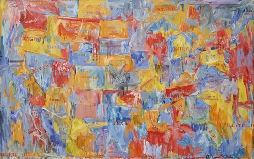
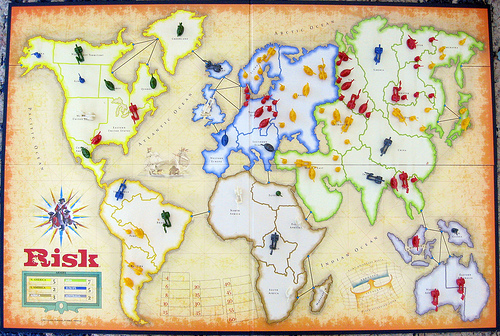
1.  The formats of mapping that Hao appropriates are, of course, removed by several generations from our own notion of map-use or the medium of mapping in modern life.  If it is increasingly confusing how to orient oneself to an increasingly imbalanced world whose inequities have been put on display in how news media often ignores most inequities in the inhabited world–not to mention the disproportionate threats of global warming to ecosystems, regional economies, and global food supplies–Hao assembles more light-hearted–if deadly serious–maps that invites us to engage the mystifications on maps.  Artists have long worked with maps.  But rather than offering an aestheticization of the map’s surface, as Jasper Johns, whose re-used the familiar image of the names of states in the United States, repainted to transform a well-known image,  converting familiar conventions of maps to encaustic, in an etherial blurred space of dripping paint that obscured clear lines of legal divides, and render the conventions of four-color mapping a ghostly haunting blur rather than a symbol of space–


CRI_159124


–Hong Hao actively remakes the surface of the map as a map.  And his works demand to be taken for that reason as maps, or at least as interventions in practices of mapping, rather than images that appropriate cartographical images, conventions, and signs.

Hao’s maps map, of course, a globalized space as a space into which the artist makes his own interventions, although his work is in ways resonant with Johns’ evacuation of mapping forms.  For Hao’s maps re-assemble the disparities and tyranny of the globalized (over-mapped) world.  The disparities within the global economy has the danger of being recapitulated, of course, in ways that he lampoons.  The collective atlas that he imagines, which collectively run against the global maps we carry around in our heads, or the maps that we use to try to come to terms with unimaginably complex implications of global military constellations and warming processes.  Already, in a work that predates the Selected Scriptures, Hao’s “The World Distribution of Guided Missiles” [sic] (1992), a monochrome silkscreen print replete with the mythical beasts and figures that recall the figures on medieval portolan charts for ocean travel, shocks us with the explicit charting of state secrets.  It also suggests a new playful engagement of the map as a communicative form, even as he works to expand the boundaries of a map’s informational value.  When he locates the bulk of guided missiles in Antarctica, the effect expands the map as a record of inhabited space, repurposing of the cartographical iconography with which he knowingly plays:  in this map, the effect is oddly to diminish the appearance of the world’s size:  at the close of Operation Desert Storm, of Gulf War, and the inundation of airwaves with images of US fighter jets on a sustained campaign of aerial bombing more extensive than expected, and provoked counter-attacks, Hao imagined the world as cowering from missiles poised for launch in the “World Distribution” silkscreen i seem to translate the cheaply printed paper ink map into his own image that magnified China at its approximate center.  As much as translating western cartography into a new art language of classical Chinese origin, Hao seems to confront the difficulty of mapping power in this and his many subsequent silkscreen prints.


World Distribution of Guided Missiles (1992)


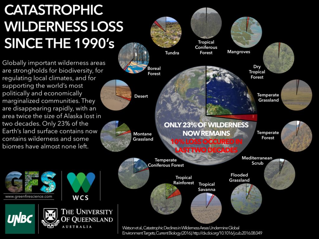
The disproportionate prejudices in these maps are well-known.  Global warming, a concept few can claim to understand, is also the,  most mapped–if perhaps most disproportionately mis-mapped–is repeatedly wrestled with in a variety of maps that try to lend the process a concrete appearance.  Despite the fact that 40% of the world’s population lives within sixty miles of the shore, and  200 million people live within five meters of sea-level, the disparity of the dangers of shifting shorelines that are poised to shift dramatically with global warming are only partly evident in an interactive “Global Heat Map” produced by the Union of Concerned Scientists:  and the extreme dangers that the shifting shorelines poses for low-lying countries is by no means limited to the United States, even if this sometimes seems the case in our own news media or the relative blindness or radical shortsightedness government working papers on shoreline sensitivity–subtitled “American Starts to Prepare–on the impacts of global flooding of low-lying lands.  (Even if there are exceptions in American media publications.)  The deepening disparities of our own mental maps–evident in the apparent perplexity that one out of six Americans in where in the world Ukraine is located, according to the Washington Post, which almost makes one wonder if the survey was credible or if it generated sarcastic responses–the lopsided maps we contain may make Hao’s imaginary  corpus of lost maps apt commentaries on global inter-relations, as much as a formal syntax for creative expression.  But they grapple, if in a light-hearted way, with the problems of mapping the globalized world.


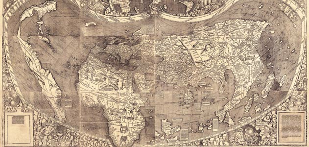
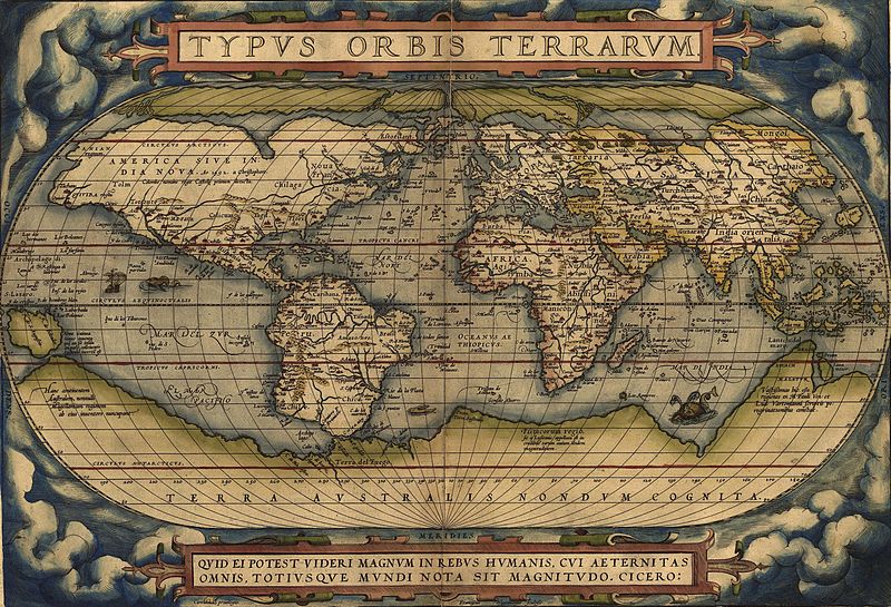
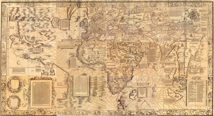
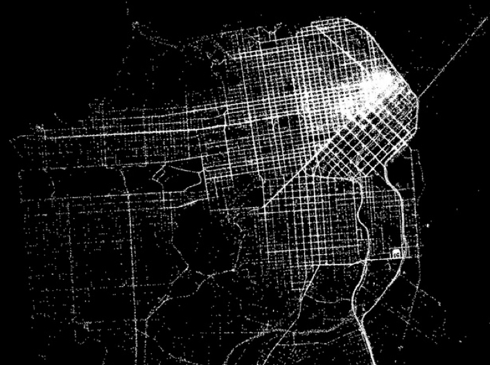
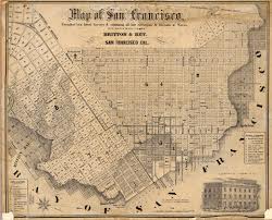
2.  Hao’s work is a retrospective recreation of a cartographical sublime that reaches back to a lost medium of paper maps.  The particular productivity of mapping as a new form of invention in Hao’s work from the late 1990s, suggests a particular neat coincidence of how maps speak to power, or power through maps, that interestingly mirrors the growth of online mapping:  although Google Maps was only launched just less than a decade ago, in 2005, shortly after Steve Coast created a free, editable map of the world, OpenStreetMap, based on Wikipedia, in 2004, the first online mapping service, MapQuest, If OpenStreetMap responded to the inability to freely download government-run and tax-funded projects like the Ordnance Survey in England, as these mapping projects have expanded, the epistemic remove of maps such as those that Hao uses–and the apparent chronological distance of a map created by silkscreen, but belonging to a printed encyclopedia bound as a classical Chinese book–gains new appeal as a rehabilitation of mapping as an aesthetic medium and as a tool for imagining and locating geopolitical abstractions.  Unintentionally, the rise of GPS and geocaching as modes of map making, satellite imagery, digital searchability, the branding of Google Maps and the Google map viewer, and dramatic expansion of use in over one million websites of the Google’s API, have conspired to so remove the five-color map from our “period eye”, that its epistemological antiquity may be increasingly difficult to distinguish from the thread-bound classical encyclopedia Hao’s Selected Scriptures referenced.  (Google’s corporate logo is absent from Selected Scriptures, but the presence of Internet Explorer and other corporate insignia suggest a need to locate the web-based map on the borders of what we once new as the world’s inhabited territories.)

Yet the weird notions of contiguity of a flattened earth that Google Maps has perversely re-introduced–reinstating a continuous block of Eurasia and Africa, for example, isolating China, Australia, and North America–mirrors the  oddness with which Google Maps has rehabilitated its own variant of the long-discredited and cartographically retrograde biases of the Mercator projection, a handy solution to the flattening of the earth’s surface to coordinates of straight lines of latitude and longitude but which amply distorts its surface, irrespective of actual land-mass, but whose convenient centering on Europe provides the basis for all Google-derived web-maps.  (China’s role in this internet society is contested, with most social networking sites banned in the country, including Facebook from 2008, Twitter from 2009, and Google+ as it was introduced–despite relative open-ness to LinkedIn, reborn in China as 领英, pronounced “ling ying”).


Contiguity in Google Maps


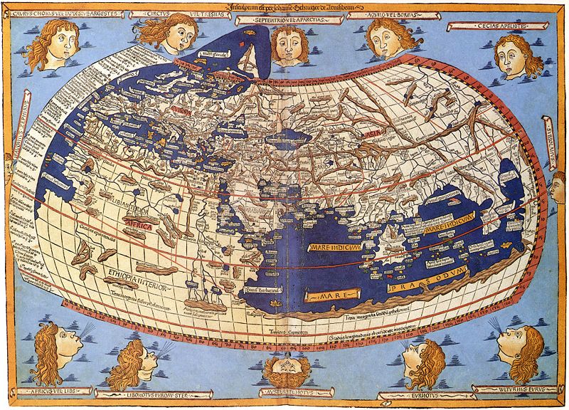
For all the personalized coziness of the Google Maps Navigation, Google Street View, or My Maps, this close variant of the quite retrograde Mercator projection has perpetuated a primarily targets that Hong skewers as a frozen model of global relationships of power, which is striking for how it eerily corresponds to Hao’s “New Political World” (1995), whose evocation of the modernity of rewriting the world’s geopolitical structures is not only reminiscent of the early modern cartographers Mercator or Ortelius–the former’s “Nova et Aucta Orbis Terrae Descriptio ad Usum Navigantium Emendate Accommodata” [“New and more complete representation of the terrestrial globe] properly adapted for use in navigation]” of 1569 and the Nova totius terrarum orbis geographica ac hydrographica tabula . . .” of 1570–but also to announce new political configuration of landmasses in relation to one another.  Although Hao didn’t prominently include Google’s logo among the logos of international corporations  in the sequences of maps he has designed from 1995, his work succeeds by upsetting our Westernized confidence in mapping, more than playing with cartographers’ formal conventions.

And if Ortelius prided himself on drawing national boundaries and distinguishing the world’s expanding number of continents, Hao’s silkscreen prints take pleasure in redrawing boundaries, reconfiguring the shapes of countries, and shifting and switching toponyms, as if to describe a world less defined by boundaries than the continued symbolic authority that maps have long continued to exercise.   Indeed, rather than accessing or retrieving data in the format of a map, we are presented a map in the legible form of an open book and private space, even if we are invited to imagine the audience of readers for whom such a map might be mechanically reproduced.

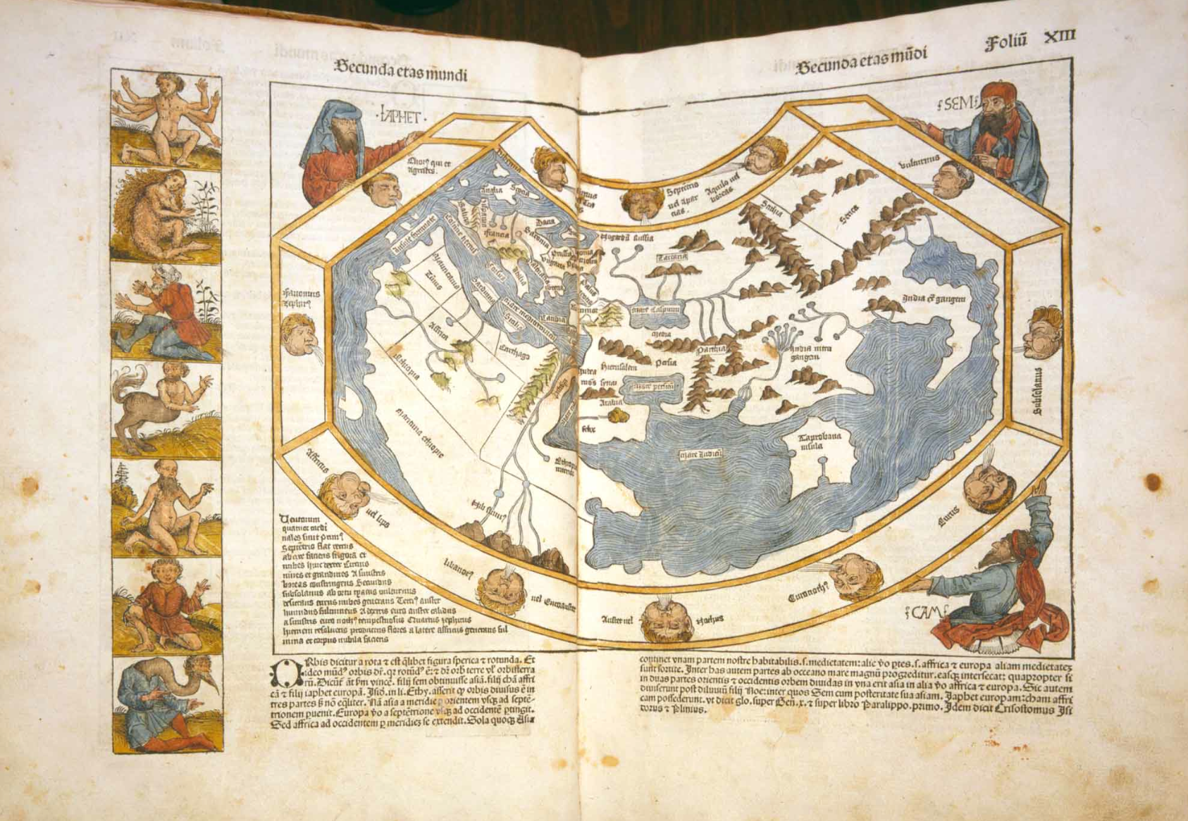
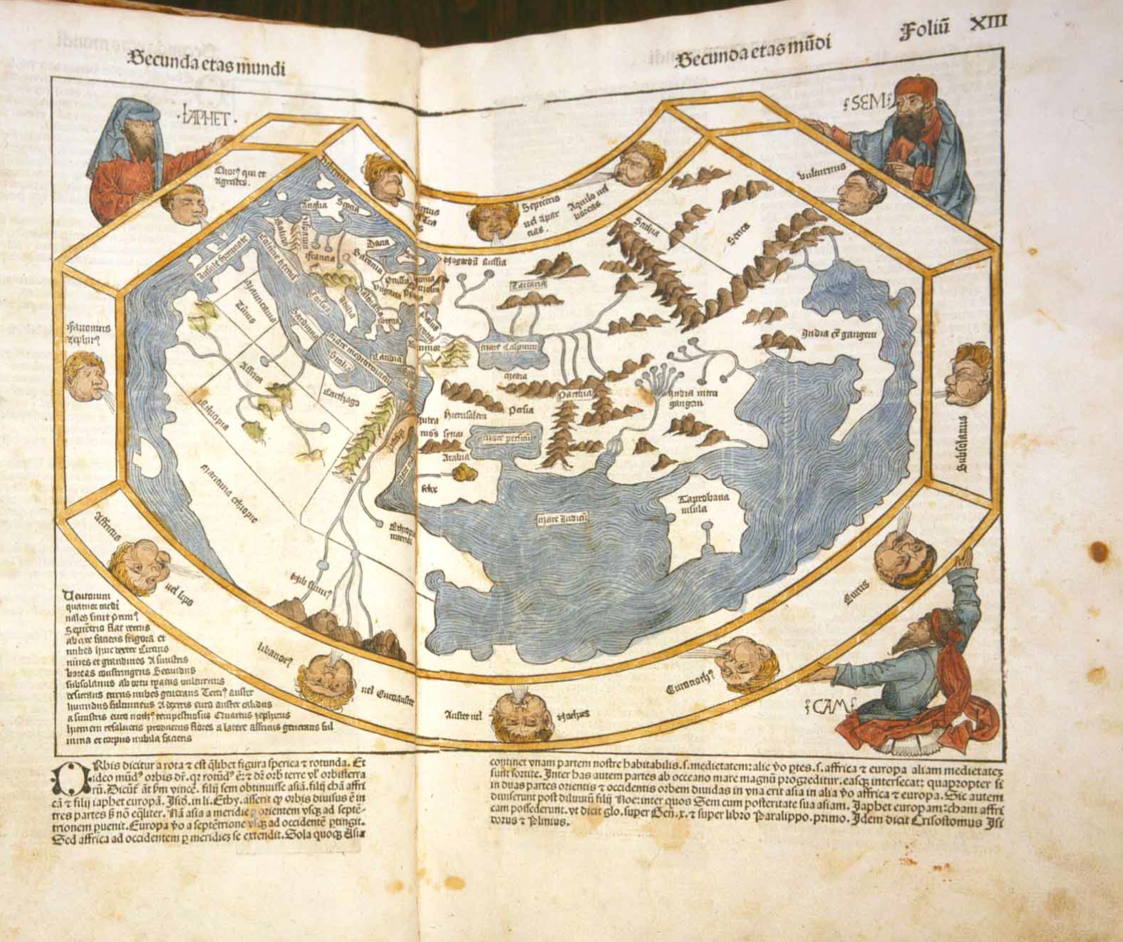
The maps are forms of imagining a conscious redesign of the balance of power and populations that antiquated static maps once mapped.  Indeed, Hao’s reassembly of the map may as a form of memory might even recall the famous translation of the Ortelian project in 1602 by Matteo Ricci, working with the astronomer, mathematician and geographer Li Zhizao (1565-1630), who engraved it, in ways that affirmed the dynamic and interactive nature of the actually static nature of a woodcut print map.  (Although Hao may not reference this famous notion of cartographical translation, his appropriation of the format of world-mapping seems to intentionally reverse the trajectory of Ricci’s importation of cartographical iconography and place-names on a somewhat comparably busy and densely crowded symbolic field.)

Ricci Map 1602James Ford Bell Library

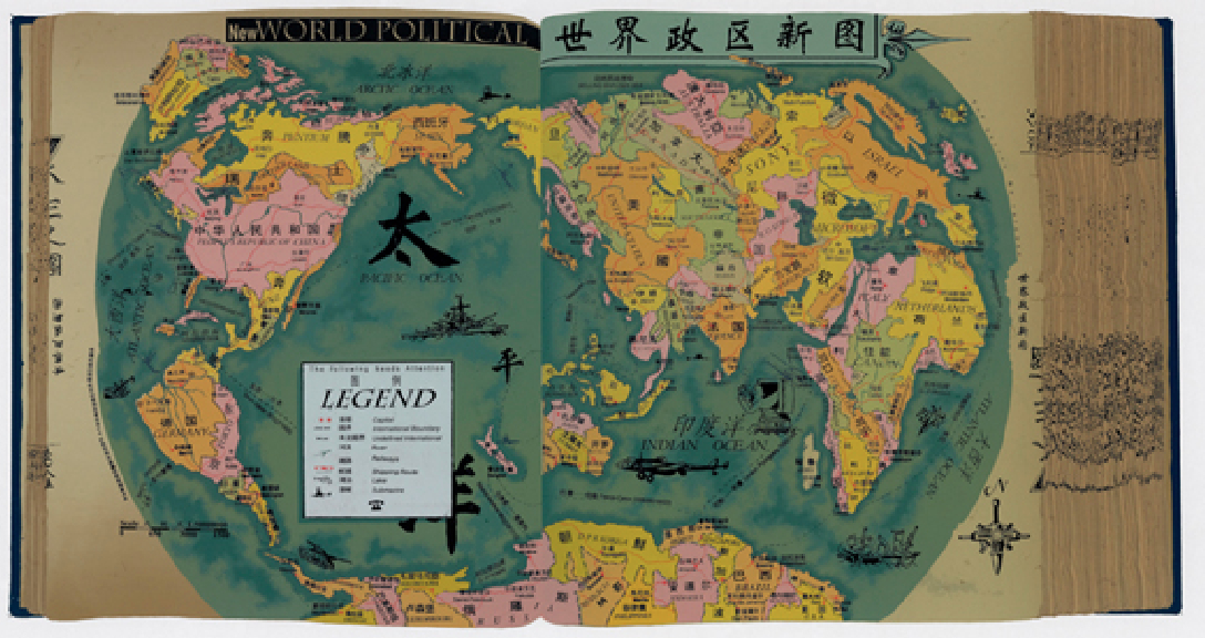
Hao’s subversion of western mapping as a national political tool is often too crudely cast as reaction to the western–and American–dominance of constructing the world map, and an incorporation of traditional cartographical tools within a “Chinese” art.  This is too simple, and too readily essentializes “western” and “Chinese,” and where these works of art lie in relation to map making as a craft–or how Hao’s art relates to the currency of the mash-up as a map.  For Hao works with antiquated maps–indeed, making maps, rather than than only find them, to play new stories out on their surfaces–and indeed its distance from the imbalances of authority in our geopolitical world.  Reading the surface of the distribution of political power in the eponymous “New Political World” (1999) in the Selected Scriptures project playfully inverts the notions of legibility to demonstrate a balance of power regularly elided:  the playful projection of geopolitical values is exploited to present a new way of reading a familiar demarcation of terrestrial expanse divided by naturalized boundary lines, playing fast and freely with some of the iconography from news maps or other cartographical images.

If we love to read maps to move across space, and cross frontiers drawn in space, the shifting toponymy and place-names that we encounter in the imaginary Atlas of Hao’s device opens up a world we’re sad to read but that we can at the same time also recognize as something that the anonymous mapmaker has synthesized.  Hao’s work suggests a uniquely hybrid creation, as well as a satirical relationship to the Rand McNally political atlas, which seems its primary target at first.  Hao, who graduated from the Beijing Academy of Fine Arts the year of the suppression of protests in Tiananmen Square, has specialized in transposing digitized images to silkscreen prints that skew the actual geography of the world in his prints, much as they play with the reproduction of five-color maps in print culture with the format of an hand-made artist’s book, but derive from reproduced images scanned, digitally altered, and reproduced as silk screened images, linking traditional crafts, the Cultural Revolution, and modern digitized media to deconstruct and repackage (or redeploy) the map as a political statement.

The weird translation of cartographical images is part and parcel of the project, evident in the irony of the most “accurate” map in the Selected Scriptures, the “World Defenge Layouy Map” [sic] (1992), a variant based on Hao’s earlier 1992 work:


Scriptures Hao

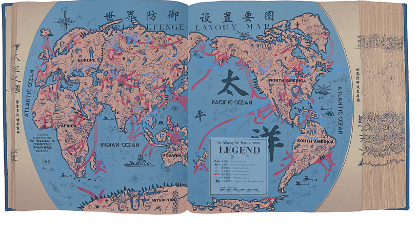
Hao’s new map of nations illuminates military power by relatives geographical sizes of nations to reflect military power, recycling the map as a metaphor.  As much as it suggests a cheap reproduction, with its title seems suspiciously printed in uniformly spaced letters, the image of a “new political order” is meant to dislodge our expectations for reading a map centered on t:  and on the map, although the pathways of world travel include a sailing junk, but are dominated by fighter jets among large pinyin characters that immediately strike a western viewer, and reminding us that all maps are both constructions and translations and that, indeed, the power of the map in part lies in its success in translating reality to a seamless whole.  In Hao’s Scriptures, the integrity of the map is disrupted by the shifted orientation in the digitized images of names, landmasses, and pastel hues, as if to recall the mass-produced posters on cheap paper that recall Maoist times, the upbeat candy-colored pastels worthy of PAAS Easter Egg paints rather than a five-color map.  They describe a scary surface of disproportionate global powers, with the PRC at their center, now straddling the Atlantic and Pacific, whose places are oddly reversed, as if one emptied a Rand McNally map of toponyms and reshuffled their location, as if to mock the faux disinterested nature of maps from the  perspective of the current PRC, which finds itself somehow between the Atlantic and Pacific, in the place of North America, an expansive Israel to the North, and the United States displaced from its position of power:


%22New Political World%22Metropolitan Museum of Art


3.  Artists have been making maps–or using maps to make art–since before the first printed atlas, if not since the first globe.  But Hao takes the map to excavate it of meaning, and ask about the oppressive world system we have inherited, playing with the oppressiveness of that system and the almost light-hearted pastels of artificial colors (pink, yellow, orange, blue and green) we use to divide the inhabited world in printed maps to suggest that the map has little bearing on it.   The odd remoteness of the historical map offers a “tool to think” that exposes the discrepancies of our mental maps of geo-bodies.  Hao all but ignores the actual geographical contents that are the ostensible subject of a map:   and as the project progressed, the maps he creates have an increasingly ironic organization of space.  Reading the surface of the distribution of political power as referenced in the eponymous “New Political World” (1999) plays with notions of legibility that are regularly erased or elided within print maps, but seem especially pregnant with the distance of time:  the playful adoption of the map’s projection of geopolitical values is exploited in Hao’s work in order to present a new way of reading a familiar demarcation of terrestrial expanse that is divided into naturalized boundary lines, playing fast and freely with some of the iconography from news maps or other cartographical images:  Hao’s map of nations illuminates military power by relatives geographical sizes of nations to reflect military power, but even its title seems suspiciously printed in uniformly spaced letters:  and on the map, although the pathways of world travel include a sailing junk, but are dominated by fighter jets among large pinyin characters that immediately strike a western viewer, reminding us that all maps are both constructions and translations.

The power of the map in part lies in its success in translating reality, so that the PRC now occupies where we expect the United States:


New PRCMetropolitan Museum of Art


The humorous reconfiguration of space in these maps transpose space and place with a flighty flippancy foreign to any actual land map.  Why is Hong Kong now at the mouth of the Mississippi, in the place of New Orleans?  The legibility of the rest of the world is almost made ridiculed, not only as the ocean off of what seem Alaska’s shores is labeled “Atlantic Ocean,” but since the region is actually Uganda, nestled beside the newly bordered Israel and Chad, creating a perverse geopolitical world that seems an absurdist collage of what might be:  as the People’s Republic of China now occupies, save in Florida and parts of Norther California, most of the land that one might associate with the United States; to the north, Israel lies lazily across current Canada; London is dispatched to the South Pole; Canada is relocated to a strip of diagonal land in Eastern Africa, beside the Indian Ocean; Europe divided between Vietnam and Mozambique as if their names are dislocated from the geographic fields in which we are accustomed to find and locate them.

Hong Hao all but ignores the actual geographical contents that are the ostensible subject of a map:   and as the project progressed, the maps he creates have an increasingly ironic organization of space.   Many of Hao’s works trumpet their modernity in analogous, if tongue-in-cheek fashion–“The New Political World Map” (1995); “The New World Survey Map” (1995-96); “The New Geographical World,” Selected Scriptures p. 3085 (2000)–as if they offer windows on a newly registered reality to readers. Is ‘place’ less of a signifier, in the map, than the global distribution of power?   The sizes of countries are ordered, not only in terms of the military and economic power of nations, but in ways that upend the semantics of the legibility of space, despite the familiar color-scheme.  The result is often a fairly scary image whose totality one pays far more attention to, decoding the configuration of countries and assessing their sizes with an eye to power perhaps far more than geographic relationships, which are–witness the fighter jets–of far less import today.  The clearly cultivated flimsiness of a mistranslated map, standing askew to the actual world and placing Asia at its center, pushing mirror reflections of Europe to its margins, and dispensing with America, in ways that not only skew spatial relationships but show the reproduced map as a field for staging imbalances of power.


New Political World Hao

National Gallery of Canada
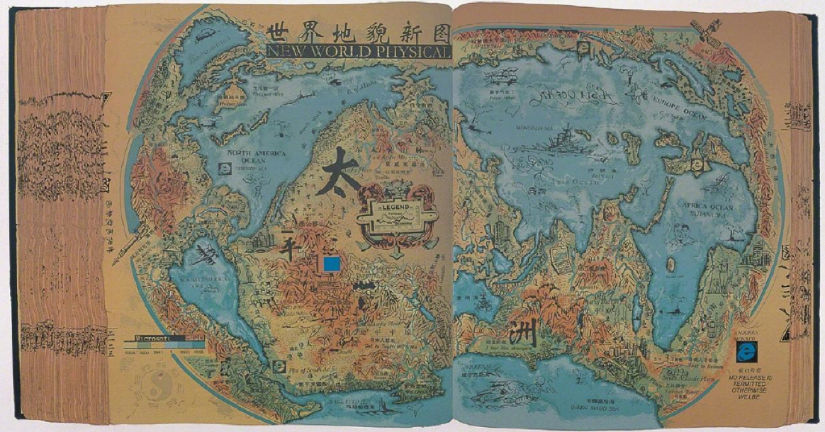


hong_hao_art_atlas2_400

Selected Scriptures, p. 1999, The Memory of the Millennium” (2000) assembles a grab-bag of cartographical inventions around an inversion of land and water, so that oceans that connect and separate continents now seem landmasses:  as if to exploit the map not only as construction, but assemblage of cultural artifacts that desperately press space into readily legible terms, Hao presses the fertility of the format of the map as a signifier into his service to new extents:  emblazoned with the prominent descriptive legend “New World Physical,” the map is difficult to orient oneself to even more than his earlier work, its oceans (NORTH AMERICAN OCEAN; AFRICA OCEAN; EUROPE OCEAN) erase landmasses, as if to repurpose this most conservative of media so that where once lay land, oceans are overburdened with objects.  Weird graphs erase any familiar promise of the legibility of mapped space.  The didactic iconography of educational maps becomes a repository for graphs, varied iconographic detritus from warships and the logo of internet explorer:


Memory of the Millenium (2000) Artsy Artis


The playful array of translations in the map–both translations among mechanical processes of reproduction, and contexts for viewing maps, as well as translations of map-signs, conventions, and toponymy–play with the “novelty” of the map and its antiquated medium to make a new material object for readership.  By using a base-map, scanned from a four-color map of Westernized derivation that seems printed on foolscap typical of the posters of the Cultural Revolution, which Hao cast in the form of a traditional hand-made book in  a set of individual silkscreens, as if it belonged to a corpus of lost maps in the Chinese tradition, rather than informed by Western cartography.   We are a far cry from the Eurocentric “Map Translator” functions, if the adherence to a cartographical structure and the color-scheme is oddly familiar:  Hao takes the the levels of translation, indeed, in a much more playful and wryly sarcastic direction that exploits the almost generative fertility of the proliferation of meanings in mapping forms, that consciously reveals the power of mapping forms that are left as a neutral backdrop in the image that uses the Google Translate API.  To be sure, unlike the Google API, the maps Hao crafts, if in their collective dizzy the viewer in percussive ways, rather than retrieve or access data, present a fixed tableaux.


Map Translator_Nation State


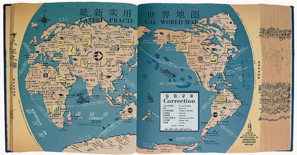
Some of the other imagined pages Hao designed from Essential Scriptures of 1995, as “Latest Practical World Map,” manipulate and lampoon the sense of practicality of a map, even as they introduce emblems of consumerism as much as militarism within the map the maps themselves, in ways that play with their surfaces by renaming continents so that countries, continents, and cities are no longer recognizable, hydrography abstractly symbolized and an eery globalism illustrated in the surface of the map itself–and slogans such as “Be satisfied” or “Be careful” will later give way to those of free market neo-conservatism, from “Control, gain, own, exploit” to “Fame and fortune:  you can have both”:  these maps have been compared suggestively to a traditional Chinese landscape in which the manipulation of the conventions of landscape become a register for a subjective state of mind, although in Hao manipulates conventions takes aim at their ostensible objectivity, and indeed the images of globalism they present:  the conceptions let silent in the map are used as commentaries on mapping practices, or on the concepts of globalism.  Or, the map becomes a surface for an almost random generator of slogans and injunctions–“BE SATISFIED,” “BE LONELY,” “BE CAREFOL,” “DON’T BELIEVE,” “BE LONELY”–that suggest the alienation of its viewers.   Whatever constitutes the practicality of a map, the combination of odd translations, even odder graphs, juxtapositions of slogans and generic injunctions uses the historical remove of the map-as-image and inscribed surface to puncture its utility and authority, and point up some of the odd ways of reading truth into maps.


Latest Practical World Map bigArtis


4.  What, indeed, constitutes practicality in a map, and how is the translation of the world to “practical” terms defined?  Practicality suggests that it offers ease of ready consultation by readers, but we find a surplus of significations that mimic many maps in their almost distracting quality.  Many of the slogans that are on the map–“NO RELEAE IS TERMITED OTHERWISE WILL BE–subvert any sort of reading for sense.  Indeed, Hao’s intentional layering of odd  translations (BE CAREFOL), odd graphs, juxtapositions of slogans and generic injunctions uses the historical quality of the map-as-image to puncture the very notion of utility, and point up some of the odd ways of reading truth into maps.

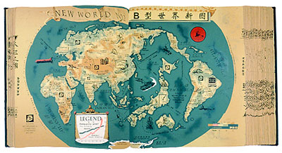
Hao’s “New World Survey Map” engages playfully with the ways maps symbolize the proportionality of space in powerful ways, reduced Asia, as it magnifies Japan, but shows the globe wonderfully distorted with the magnification of Europe and America, in a playful accentuation of the disproportionate distribution of weapons and political influence.  Or is this the image of the political order that the West–or an exaggerated and hugely magnified Europe and [North] America and Japan–purports to create and legitimize at such political organs as the UN Security Council?  In the below map, the “legend” is of little help, but the map says enough, shrinking oceanic expanse and magnifying countries that are bloated in the disproportionate attention that they receive from news channels, or in international political bodies, as if to render a map based on their prominence in a world historical record or online news-sources:


New Topographical  World Map


This utterly “othered” “New World Survey Map” (1995) punctures the hegemony of the map, and stubbornly it refuses to relinquish the truth-claims of a map:  if the westernized cartographical tradition to diminish all Asia save the Japanese, which it so greatly magnifies.


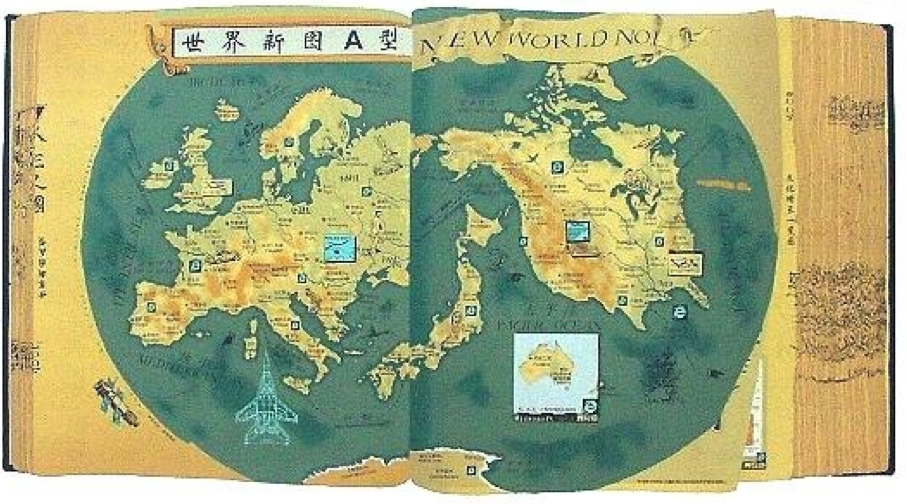
5.  The invention of re-inscribing the cartographical surface in these silkscreen prints provided Hao with a particularly rich vein of production among his varied projects, and one that met a large audience.  “New World No. 1” (2000), Selected Scriptures, p. 2001, contracts the known world to a scary picture of three imagined continents or landmasses, surrounded by warships, arms, and satellites that suggest their military might:  where the Typus Orbis Terrarum is a contraction of Eurasia and the United States, who bracket the vastly expanded island of Japan, improbably raised to the status of a Superpower among them, and only a hint of Antarctica to the south.   America is emblazoned by iconic “lounging ladies” between Las Vegas and Texas, this map is emblazoned by the odd emblems of progress from the ancient Skylab to Internet Explorer, as if this “New World No 1″‘s order were antiquated already, its seas haunted by blueprints of jet fighters or warships, inhabited surface surrounded by satellites circulating its perimeter, as if floating in outer space.


New World No ! bitArtis


The image of a new book of world history and global powers is particularly powerful, not only for disturbing the mapping of a stable geopolitical orders that maps perpetuate, in a sort of inversion of the Peters’ projection disturbed our preconceptions for seeing the world as imitating or mirroring a political order, but inviting us as viewers to make and remake the maps that perpetuate political orders and biases in our minds, and how the an atlas for a disproportionately under-represented world might be renegotiated by its readers.   The reproduction of these cartographical orders of representing global powers becomes a sustaining theme in Hao’s work, so infinite and unending is the variety of silkscreen maps that he produced, almost haunting by the disproportionate images of the world and by maps as the flimsiest of representations that continued to be accorded a significant weight for so long:  the map is lampooned as a reproduction, albeit one with deep westernized connotations of arrogating claims for totality to itself, while presenting a diminished image of what it purports to map.  Indeed, the flimsiness of its reproducibility is evident in the difficulties of its translation, laden with “corrections” and odd graphs seem to record the map’s remove from the viewer, lampoon the tyranny of its own absurd assertions.


Latest Practical World Map bigArtis


6.  Hong Hao is by no means alone in questioning the inheritance of mapping forms.  His work is evocative of Ai Wei Wei’s interest in the hybridization of Western commercial logos and ‘traditional’ art forms, apparent in his powerful statement of the naturalization of his “Map of China,” (中国地图) (2006).  Ai Wei Wei’s work that might be said to literally translate a map of the frontiers of China into the stolidity of a classically Chinese material–wood of Qing dynasty temples–that might be verging on sacrilege.  The “map” suggests the consolidation of the official map of China from fragments of the past, as much as a terrifying isolationism, unlike Hong Hao’s odd global refigurations.  Yet Wei is far less interested in the symbolic conventions and legibility of the map than what might be called its iconic form–even if his work indulges in some of the same questions of the synthesis of old materials and practices with modern symbolic forms, and the translation of maps to new media.

Yet rather than present the “fantastic and absurd” world “governed by violence and greed,” Ai’s art-map forces us to find the map in and that is refigured from it, even as it asserts the isolation and frontiers of the unit of the Peoples’ Republic of China, as if a continuous tree trunk.  In translating actual geographic frontiers to something that looks like it emerged from a 3D printer more than a map, Ai Wei Wei invites viewers to linger over the shifts in shading on its face, even as it distances the map as powerful construction, emptying the stale medium of the map of its stale symbolic authority by translating it to another medium:  in the above, the PRC is fashioned out of Qing dynasty wood; the below, out of recycled cartographical imagery.


Ai Wei Wei

New PRCMetropolitan Museum of Art


Both images ask what sorts of opaque surfaces, rather than mirrors, something like a map creates.  But  perhaps the playful irony of distancing any of the positive associations–if any still remain–from globalism in a more engaging view of the legible conventions of a bounded map, Wei comments on the fetishization of the form of the map and its delineation of naturalized frontiers.  Hong Hao’s work seems more engaging, and more familiar, because it speaks more incessantly to our own habits of reading of maps, and the increased business of the making of the map’s surface as a format that increasingly unceasingly begs to be read and re-read.  Hao returns us, with comfort as well as to produce considerable unease, to the reading of the map’s surface, making fun of its transparency and referentiality at a time when online maps dispense with claims for transparency or signification that now seem to be artifacts of letterpress typesetting or print.  Hao’s maps recall objects of serial production–and he indeed seems to be serially producing such artifacts for an eager art market–in ways that recall habits and formats of reading space that are in many ways no longer accessible or familiar, but which register the difficulty of the possibility of undertaking an ethical mapping of the inhabited world.  Not connected, and not networked, Hao’s almost serially reproduced maps gesture to the translation of the authority of the static map from another time.  Rather than offer images delivered by the screen or accessed remotely, even if he does not think so, Hao’s maps translate back to western eyes as cartographical eye candy and comfort food.

Leave a comment

Filed under Beijing Academy of Arts, Google Translate, Hong Hao, Map Translator, OpenStreetMap, silkscreened maps

Maps, Mapping, Globalism: Imaging the Ecumene’s Expanse

That most ancient of words, Oikumene, expanded from the Greek “oikos” to designate a dwelling or residence, or ecumene denoted less the technical abilities of mapping or tools for describing of the world than the demarcation of inhabited lands in which civilized people or members of the church existed:  but the divulgation and expansion of the notion of mapping abilities have in recent years, since the explosion of information databases and during intense globalization since the 1980s, extended the notion of the ecumene that has grown to extend beyond the map.  It increasingly is invested as a terms with ethical connotations to understand or foreground humanity’s relation to its environment–or retake the human from the map–at a time when virtually no part of the world is not inhabited.  Indeed, the possibility of drawing frontiers between an uninhabited and inhabited world–or of defining limits of the inhabitable world–is so diminished that the concept of bounding areas are not clear; the areas of the earth that are no longer inhabited, its “open spaces” or unsettled areas have catastrophically declined in the past twenty years.

But the continued interest we have in describing how we occupy the world, if not demarcating the boundaries of the world, is at the center of the data flows and databases we process in GIS and that increasingly lie at our finger tips.  The instant generation of maps of the inhabited areas of the world have paralleled the catastrophic decline since the 1990s, when a tenth of existing wildlife declined and the catastrophic losses of wildlife confirmed at the  IUCN World Conservation Congress:  the shocking fact that only 23 percent of wilderness remains doesn’t even include the future effects of global warming, the current crisis in history’s tragedies mankind is currently in the process of having created or on its way to create.  Indeed, the destruction of wilderness–what are deemed intact landscapes that are mostly free of human disturbance–has perhaps most radically changed the nature of the inhabited world.  Since the “Last of the Wild” map was first published in 2002, the loss of almost a tenth of formerly uninhabited lands in the last decade is the most rapid expansion of human settlement of the planet, with some 3.3 million sq km of once-uninhabited lands lost, of which 2.7 million sq km2 are considered globally significant–a loss of some carbon biomass in forests destroys a resource that offsets atmospheric CO2.

wild_infographic2-1-1-1024x768

But let’s return to maps, such realities being to painful for me to contemplate.  Even as the entire earth is now inhabited, much is to be gained in the concept of actively mapping expanse both by preserving an analytic relation to that image of expanse, too often rendered abstractly in computer-generated cartographical media, and encouraging an analytic relation to how the material contents of maps embody space.  Crafting an image of the inhabited world as a bound expanse enjoyed a somewhat neglected historical lineage as a form of knowing the nature of an inhabited world and of orienting viewers or readers to the expanding unknown from the Roman empire:  the considerable intellectual heft of the term inherited from ancients–Eratosthenes, Ptolemy, and Strabo–and its signification of the inhabited and inhabitable earth informed most Renaissance maps and atlases, in which practices of mapping gained new epistemic ends as mediating comprehensive knowledge.

The comprehensive genre of the atlas, an illustrated set of maps promising true global coverage of lands linked by seas, developed in concert with the knowledge that the inhabited world extended beyond earlier imagined confined, and borrowed an expansiveness previously limited to nautical cartography or mapping.  The description of the distance to the edges of the world, if inherited from antiquity, provided a model for understanding the nature of the discoveries for the educated audiences among whom the first maps of the terrestrial ecumene first circulated both in manuscript and print–from the illuminated codices produced in Florence to the massive twelve-sheet wall-map announcing the Columban discoveries that the erudite Martin Waldseemüller compiled in the early sixteenth century Strasbourg from the school at nearby Saint-Dié-des-Vosges.

.

Waldseemuller-Map-631

The visual qualities of mapping, symbolized as an expansive landscape, cast the embrace of the inhabited world with qualities of perceptual transcendence over its variations and divisions.  Ancient geographic treatises included few maps; but mapping the ecumene created a relation of expanse and an observer’s eye in the late fifteenth century by organizing and ordering the globe’s inhabitation.  And although it’s odd to think of the ecumene as an inheritance of ancient geography that’s still employed, the inheritance mapping the inhabited earth resonates with Geographic Information Systems–although fashioning an image of the world’s geography has little of the ethical intent it seems to have enjoyed in both the ancient and early modern worlds.  When we daily orient ourselves to how space is inhabited on our computer screens, iPhones, or androids, we frame an image that bounds a record of how space is inhabited either to orient us to where we are going or how the presence of cars, people, bacilli, or weather defines the inhabit world.  Paradoxically, the growth of GIS technology has increased the manner of ways we can chart the inhabitation and presence of man in space, if it has not increased how we define its continuity, it has also provoked both a Renaissance of mapping and a crisis in the authority of the map as a representational record of the ecumene and its bound, as well as its bounded nature.

While the rest of this post isn’t exactly heavy lifting, but is stuff I’m still processing and finding my way around.

1.  The assemblage of maps in a sequence of global coverage was identified with the cultural distinction Ptolemy gave to the project of world-mapping on a graticule of meridians and parallels, to be sure, both compressing a growing sense of the world’s navigable expanse and indexing its toponymy along climactic zones.  The term ecumene challenged the mental imagination by encompassing local variety in a capacious global category, ordering a global map in a neatly bounded surface beyond the Indian Sea, and up to the limits of known land, in a feat of mental dexterity as much as precise or accurate map of exactly determined scale.  The lower boundary of the map copiously noted “terra incognita,” as later projections–and left it at that, as an expansive white space that exists beyond the sea and lakes of the moons, as this Florentine map includes, adopting the notion of an extensive northern ocean to frame the inhabited world–even while seeing the Indian Ocean as closed.

800px-Claudius_Ptolemy-_The_World

Indeed, even as the world grew more detailed and other continents were registered as inhabited, as in the Ortelian planisphere, the growth of regions of terra incognito expanded, as if to parallel the known regions which were designated by naturalistic landscapes:  the unknown regions of “America dive India Nova” were paralleled with the imagined “Terra Australis,” a later configuration of the mythical Java la Grande.

800px-orteliusworldmap1570

The ancient Greek astronomer and scientist Claudius Ptolemy proposed using terrestrial maps on geometrically derived parallels and meridians as tools of portmanteau-like capacity to comprehend terrestrial spaciousness, by segmenting the world’s inhabited surface by degrees of longitude.  The notion of mapping totality was particularly fertile for early map-readers a decade before 1492.  The tools for mapping the ecumene or inhabited world provided an ambitious compendium of global knowledge, although the geographic knowledge of the world was limited–and still was by the time of this world map, illuminated circa 1482:  although restricting the ecumene for modern eyes, its capacious reach extends south to inner Ethiopia and northward, beyond its broken frame, to embrace northernmost isles beyond Thule.  Rings of uninhabited islands indeed constituted, John Gillis has recently noted, part of the mental furniture on the boundaries of the inhabited world for most fifteenth-century men, and suggested a comforting bounding of the world that seemed to illustrate its protection and insulation, lying as it did between uninhabitable climactic zones and far-off seas.

The ethno-centered ancient term maintained a sense of charting the world’s recognizable inhabitants or those that mattered to the readers of maps:  so, in the Augustan age, Roman’s referred to the expanse of the empire as the ecumene, beyond which lived barbarians.  But even as it retained a bounded sense for Renaissance readers, the totalizing image of an ecumene provided a way to imagine the population of an expanse greater than lay in the ken of most–and to understand coherence within a world that included information from far-off lands, even if many fifteenth-century people lacked clear geographic categories of spatial division of an inhabited terrestrial expanse.  The edges of the earth were oddly clear for a period that suggests limited familiarity with expanse: the monsters and extraordinary riches found there were included in fifteenth-century editions of Ptolemy’s handbook of world geography, including elephants in the island of Taprobane, beyond India, trees that had leaves year-round, multitudes of serpents, and cannibals.  These were the signs of the world beyond what humans knew, and included the bare-footed gymnosophists of India.

The compendious divisions of this mental map in a sense informed an engraved world map printed as the sixth page of the 1493 Nuremberg Chronicle, or “Book of Chronicles,” a “universal” history that promised a temporal compendium of world history, embracing historical ages in order to be able depict the division of continents from its creation through after the recession of waters in the Noahic flood through the succession of worldly empires that Augustine and Orosius had famously described–a work that captured the early taste for engravings as mediating information in Renaissance Nuremberg.   Romans discussed their empire as the ecumene, imitating how Greek geographers discussed an ecumene at whose fringes lived fundamentally other foreign Peoples, outside the scope of human concern and beyond the limits of human inhabitability; the world-map in the Chronicle placed outside its borders the excluded races of  Cynocephali, one-footed Sciopods, reverse-footed Antipods, bearded women, and one-eyed cyclopean monsters.  These lay outside the three regions divided among Noah’s three sons Shem, Japhet and Ham, or ecumene, and outside its image of the inhabitable world where humans dwelled, but also reflected the new world that the recession of waters in the Noahic flood had revealed to human sight, and the projection of the world that its editor included registered the shock of the prospectus terrarum that the lessening of global waters worldwide revealed–and the ecumene it unveiled:

SECUNDA ETAS MUNDI


Hand-illuminated versions suggests significant curiosity in these creatures placed outside of the map’s ruled boundary who dwelled in a different space from the river-nourished environment of what one supposed to lie on the edges the habited world:


Secunda Aetas Mundi


The ecumene had of course already expanded dramatically by 1490 or 1493 that challenged thought about its both its boundedness and uniformity and cartographical forms to represent spatial expanse.  It continued to expand dramatically in the following years for readers of maps.  Similar monstrous races were included on its peripheries:  in the northern limits of Asia, a boundary of the inhabited world, even in Martin Waldseemüller’s learned Carta marina of 1516–both in response to literary sources and travelogues as well as the mental furniture of the bounded region of human habitability.  Many of these races were left off of the map as “an empirically known space,” for the very reason that they challenged and threatened a human space, and the boundaries of the world revealed by maritime exploration were unknown–even if sea monsters were increasingly banished from the more the edges and unknown areas of the more refined world maps, as the Carta marina.


Waldseemuller 1516 carta nautica


The consciousness of limits of habitability or human settlement was a graphic expression of Strabo’s mandate that geographers show the world’s inhabited part, as much as its inhabitants or populations to readers to satisfy curiosity and to respond to a need to describe its limits, as much as its totality:  “the geographer must describe the inhabited world in its known parts, neglect its unknown regions, as well as what is out of reach” (II, 5,5), placing a primacy on describing those parts of the world or communities in which humans live.  Although most fifteenth-century people did not easily domesticate the idea of an extensive space, let alone an undifferentiated expanse, picturing the unity and comprehensiveness of the ecumene became a basis for thinking about expanse, and comprehending difference:  the image of the ecumene in the Nuremberg Chronicle became a basis for continuing a rambling shapeless narrative grounded in a series of embedded or potted histories of place, each defined around an individual city and city view:  the ecumene was the landscape, if you will, in which each was situated.  There is often limited notation of a matrix of parallels and meridians in what might be called a readable fashion in early Ptolemaic maps:  it helped make space legible and material–or a sense that they are conventions of understanding the dramatic contraction of global space, but not indices of way-finding or marking place, as in these gores, identified with Waldseemüller’s school of cartography, ostensibly made for a small globe.


waldseemuller_map_found_4_7_2012


What has happened to the notion of the ecumene?  Even as the Ptolemaic ecumene was expanded, the community embraced in the map grew, rather than being abandoned, if New Worlds were processed into a map that reduced the prominence of Europe at the center of the inhabited world.  But the expanse of the ecumene held together, as it were, a sequence of regional maps, partly because the concept contained the promise that the whole world could be divided and known in synoptic form in a series of synoptic images that reconciled spatiality and territoriality.  Although mapping the continuity of expanse undergirded Renaissance cartographical images, the precision offered considerable wiggle-room, as it was limited only to the known.  But the division of space into bounded records of expanse were influential; the “chorographical” map of community became a counterpart of the totalizing coverage of a geographic projection.  To be sure, such maps responded to the diversity of ecumene that were discovered.  And maps provided models to mediate culturally fragmented collectivities, and fashion coherence across confessionally-divided communities– as the national map Oronce Fine designed of France to the French national atlases of the late sixteenth century to the English maps of Christopher Saxton, or Philip and Peter Apian’s maps of Central Europe, or a cycle of maps of the Italian peninsula that Egnazio Danti organized for a corridor leading to the apartments of Catholic Pope, discussed in an earlier post.  The coherence of each of these regions provided a sort of microcosm to the ancient geographic ecumene as it gestured to the wold that Romans civilized.


2.  The second half of this blogpost shifts focus.  In ways that less linked to cartographical models, it uses the notion of an ecumene to interrogate the survival of a  mapped global space in more modern mapping techniques.  We now lack similar boundary lines, of course, and measure contact among its regions rather than being awed by the immensity of the world’s expanse.  But the same term gained an ethical heft  in Enlightened thought to express a mandate for cosmopolitans to inhabit the world to become citizens of its entire expanse and cultures.  This shift in meaning, often thought of as a rupture, suggests continuities with the contemplative uses of globes for ancients as signs of learning or stoic remove.  The modern recuperation of the ecumene, distinct from its sense of the community of Christians (inherited from the Enlightenment) or the community of mankind is more striking as a relation to a lived environment, in ways that recuperates the ontological category of ecumene in order to describe and refer to the “humanized” world in which we now live–whose surface is more fully inhabited than ever before, but its nature shaped and informed by humanity both in regional environments and as a whole.

Augustin Berque has emphasized the benefits of attending to a relation, described by Tissier, between man and the planet in his 1993 article in the journal Persée, striking for how they dispense with the very category of a map if provocative for how they recuperate the ancient term in an ethical sense.  The term “ecumenical” oriented the term to the continuity in a community of believers.  But the ethos recuperated by Berque refers to what is human in the world, and a way of being, stripped of a fixed ethnocentric perspective.  By locating the “oikumenal” in terms of human geography stripped of a cartographical foundation, his sense eerily prefigures the images of the inhabited world that are both the benefits and costs of GIS as a basis for judging one’s own relation to the global world.  Berque has removed this ancient term of encyclopedic or positivistic coverage as a material register of geographic toponomy and the ancient craft of map making that embodied a fixed relation to the world.  His construction of an ecumene encompassing human society and its relation to the environment melds nature and culture in ways similar to the ancient term in its ethical connotations.  But his usage oddly dispenses with its graphic construction in favor of a global consciousness:  for in calling attention to the “ecumene,” has removed mankind’s relation with the earth’s surface is removed from a simple demonstrative function of the map:  much as the medium of GIS  defines the inhabitation of the world from one slant or subject, Berque asks us to embrace the multiple effects of mankind on the planet.

Berque believed that with the humanization of the planet complete, and the physical planet dominated by the effects of human life, more emphasis should be placed on a phenomenological analysis of the relation of subject an ambient by this Greek term, now removed from mapping practices to embrace human geography as a tool to consider the relation of man and his [made] environments. Putting aside the value of Berque’s point, the disposition of this philosophical standpoint  reflects the deconstruction of the privileged place of the terrestrial map and of geographic knowledge in GIS, and the image it perpetuates of the inscription of a human geography.  The relation of man and his planet–or the effects of man on the planet–are now the scope of a wide range of GIS maps of human habitation and Google Earth, or maps of influenza, infections and disease in data visualizations or geographic metadata catalogues, whose aim shift from physical geography to the place of mankind in it.  Increasingly, we are prepped to see the world nightly with a false immediacy of the nightly news, less focussed on territorial boundaries than a token of comprehensive coverage, prepped for consumption much as the newscasters who present an account of the “daily novelties” are prepped and outfitted in the apparatus of a news room.


Newscaster prepping.png.JPG


As put it eloquently (and cleverly) by Bruno Latour and friends, our ideas of territory so clearly derive from maps that the digital ubiquity of mapping places us into a new relation to territory:   we now navigate not based on “some resemblance between the map and the territory but on the detection of relevant cues . . .  to go through a heterogeneous set of datapoints” by which to move from different posts to gain new bearings.  We are always navigating a new relation to territory, or understand territorial models, not assuming defined and predetermined boundaries.  This notion of the environment is based on an ability to read signs of its inhabitation and peopling, rather than with reference to previously mapped territories, and is rooted on the ability to navigate by using maps on a screen, rather than on paper–in which the lack of resemblance indeed has further purchase (and persuasive power) as a gain in both certainty and objectivity.


3.  The analytic nature of the reader’s relation to GIS maps is less based on embodying place or expanse in a cartographical manner, because it is not rooted in mimetic qualities.  For the map, in much GIS, is used essentially as the primary field to encrypt variations in data, and removed from any pictorially descriptive function.  Put better, the map is something of a found object, a template, an objective construction in which we sort out the real information that is displayed upon it in an appealingly objective fashion, but one that lacks an orientational power rooted in mimetic claims and indeed turns away from making any actual mimetic claims:


usmap9

Indeed, the underlying positivism of the objectivity of the map is recycled in most visualizations that are rooted in GIS.  If modernity, as Doreen Massey put it, involved “a particular hegemonic understanding of the nature of space itself, and of the relation between space and society,” drawing expanse on multiple computational platforms in GIS has decoupled space from a precise location:  we now know from a true “view from nowhere.”  The differentiation of terrain or local constructions of space are of less interest than the projection of meaning on a map that is treated as a screen, and several significant local markers may be absent or not noted.  Shifting scale by moving a cursor does not create a more readable space, but provides a very odd reframing of space as a unit that is not comprehended by the reader, but able viewed simultaneously at multiple scales of changing parameters, zoomed into and out of, and adjusted on a digitized scale bar. Our current National Research Council argues in its spatial literacy report on spatial thinking that “the important thing is that they allow for the spatialization of data and use a range of types and amounts of data,” lending primacy to the readability of data over the analytic or representational basis of map-making.

What is physical geography, after all, in many of these maps?  The prime mandate is to map one’s relation to the environment in a readable fashion, rather than to encode layers of local topography or meaning, and to streamline the map to allow its reconfiguration in different datasets that prepare for readability, rather than granularity or density of meaning.  Again, this is based not in mimesis, and no longer based on the notion or mimetic projection of territory:


MacArthur Freeway 11-00

Children's Hospital 11-51

If we speed this up, to look at a sort of time-stop photography of cabs in San Francisco’s downtown area, as did Stamen design in a pioneering map that combined aesthetics and the abundant database of the surveillance operations of Google Maps, and is based on readings taken from the GPS data of the Yellow Cab Company of San Francisco, available also as a film:

Stamen Cabs

Or, in Shawn Allen’s map/photo, which resembles a direct transcription of the taxicab scene in downtown San Francisco on June 15, 2012:

Shawn Allen's map:photo

Does an impoverishment of spatial literacy or toponymy result from such containers of datasets that use maps as formats?  The omniscience and transcendence of the map viewer is immeasurably increased, but the viewer is the receptacle of data, as much as the perceiver of the scene:  new currents are configured and new flows revealed, as data from a variety of sources are richly encrypted into the surface of any given image, compressing the sort of media to which we might have access to a single screen.  One has a different sort of relation to a screen than to a variegated surface, reading a way of configuring information in different ways:  but the difficulty with the screen in particular is its lack of a sense of spatial embodiment. Compare it to an earlier map of the same region, not at all sparing with information but bending backwards to compress legible content within a description of the city’s environment:

sfharbor

These are, perhaps, essentially different modes of data compression, based not only on distinct tacit presumptions, with one angled toward data flows, rather than to the ostensible objectivity of a perceptual model.   But the difficulty to embody data flows can generate an oddly 2-D superficiality that forsakes the very quality transcendence to which earlier ecumene aspired.  Data-streams provide a selective mapping that illuminates one angle of analysis, as it were, rather than aspiring to process an image of the entire city’s or world’s actual inhabitation.

Let’s however insist on being more concrete.  When used to display shifts in a census, the map below displays data removed from topography or centers of population density, and is a data visualization without refined conventions to process its content or meaning for viewers, even if its meaning is quite serious and subject quite human, because it displays information on a static template with little interpretive key–since this map is less of an autonomous and self-standing unit of meaning than a map that demands to be read in reference to familiarity with a map of the distribution of the state’s population:

CO2 emissions


The above map of CO2 emissions of Northern California households elegantly foregrounds one specific reading of the relation of man to the environment. The challenge raised by such an elegant map is to retain communicative flexibility of the conventions of terrestrial mapping, however.  In any GIS map, there is the anger of emptying the format of project from content such as topographic variations, specific local detail, or the dynamic relations of space and habitation within a map:  the conventions of the format gains an iconic or symbolic register alone, in short, and is considerably impoverished as a description of terrestrial habitation when it serves as a field to display data flows or project a database.  One issue is to combine the data with how the analytic framework of the map integrates word and image or creates a structural distribution–something like the poetics of mapping–rather than employ maps as a passive container for spatial information instead of actively creating a way of thinking about space. The mapping of the results of a census regularly lack a sense of topographic variation or differentiation of urban and rural population which would render it more meaningful, and give a plasticity to its already remarkable contents as readable content.  This partly lies in the lack of a dynamic relation between the visual field of the map and its reading, as in this map of the regional variations in the India’s regional population per square kilometer:


dastes_F2


The map does not exploit its own conventions of orienting readers to space or expanse.  But GIS mapping offers a significant range of angles by which to read and explain its content.  The relevance of clarifying readers’ relations to the environment are in fact pressing, as revealed on this interactive map–which even includes an option for the reader to learn in detail what s/he can do to help:


Scenarios of Global Warming


At the same time as this pessimistic picture of the actual eventualities of climate change in the age of the anthropocene, the radically shifting nature of a world which is no longer shaped by proximity, or challenged by distance.  The map of internet penetration suggests, rather than a new map of inequalities alone, the new obstacles to the penetration and responses to messages worldwide, and, no doubt, contributed to the difficulty of the transport of needed goods and medical supplies to western Africa during the current epidemic of Ebola, which seems to have left populations scarred by the difficulty in transatlantic communication, as much as the lack of adequate maps, as OSM-H has shown, of adequate mapping on the ground.


2000px-InternetPenetrationWorldMap.svg


Indeed, the map of internet penetration, for all its unpleasant echoes of a colonializing perspective, where first-world countries receive greatest coverage, reveals the extreme difficulties of penetration of all of the coastal countries of West Africa–unlike Nigeria–where the highly contagious virus has proved most difficult to be contained, and information about  the virus less able to be widely disseminated.

Are the edges of the penetration of the internet the most vulnerable edges of the inhabited world, and as the edges of the accessibility and sharing of human information the most vulnerable to cataclysm?


4.  To some extent, this takes us back to Berque’s notion of the ecumene.  But the relative thin-ness of encrypting data projection on the map is so less fine-grained to impoverish the relation between reader and map or registers of engaging readers:  the granularity of the map is particularly great perhaps because the map’s visual qualities are less closely joined with its textual ones, or the hypertext only uses the map as a static schema. There seems the danger of how maps direct our attention to spatial variations and complexity with the proliferation of maps as visual media across different venues and platforms, and a dissipation of the authority of demarcating expanse or of compacting data in a uniform surface.  Perhaps this recalls Berque’s notion of the ecumene as a set of relations to the environment, which can be read in different ways rather than in one way.

The question of habitation has become turned, like a prism, to illuminate new points of view and angles of perception, a topography of habitation indeed seems beside the point.  After all, there are no real areas of the globe that are not inhabited, and the questions of orienting individuals to space seem more pressing than ever on ethical, ecological, and moral grounds alike–if not of just making sense of the effects with which man inhabits space. In a somewhat ponderous post, let’s offer a comic conclusion, however, rather than carping about media for mapping in an age of digital reproduction and increasing vectors of data flow.  The GIS map has become a versatile demographic tool to reframe questions and reveal spatial links, possible vectors of influence or pathways of causation, and indeed maps of emotions or violence.  The question is at root what sort of remove it places the map reader to interpret those vectors on its surface.  There is a temptation to deflate the authority of the descriptive value of such a matrix for its lack of fine grain.  Amidst the attempt to map the Arab Spring there was the inevitable  GIS irony of naturalizing political movements with the ephemerality of a weather map–more a mental map of what the media presented, to be sure, rather than a map designed to orient its content to a reader practiced in interpreting a map’s construction or its conventions.  The map has the value for its viewers of an illusion of transparency and a medium of omniscience:


middleeast_map21_1829864a


Or GIS-inspired variations on sabre-rattling from the American right, which was openly alarmist (if not antic) in tone, against a backdrop from Wikipedia commons:


ZIO_middle_east_map_jpg_big_1


These pseudo-news maps come from the GIS family of signs, even if they are not based on actual data.  They orient viewers with a wiki-like remove. It makes sense that at this point ecumene denotes more of an ethical stance to describe man’s relation to the environment, shifting from to what that process of inhabitation might mean; there is no demand for graphically rendering the inhabited world, but rather the ways mankind inhabits the earth and has filled and marked its space.  But there is a loss of mapping habitations. And so map making in the flexible media of GoogleMaps is no longer an expandable portmanteaux of fine grain, but rather a matrix of data streams where one charts multiple consequences of inhabitation rather the local terrain.  If we no longer have Sciopods outside of our human realm, we lose a sense of an ethics of mapping or even of relating to maps when we dispense altogether with practices of map-making.

Leave a comment

Filed under anthropocene, data visualizations, globalism, Google Maps, metageography, Ptolemaic geography