
There is something disorientation about imagining a network designed to vacuum up information from the highways and byways that is been routed in 150 states, spying on pipelines in at some 700 servers located into a “massive distributed Linux cluster.”  The image assures total coverage: the notion of complete coverage in Antarctica near Darwin is impressive, if baffling: is this a route for transmitting information particularly preferred by crafty agents of terror? The “coverage” of information is rooted in Indonesia and the Middle East, mapping Al-Andalus and the major hubs of airplane travel.
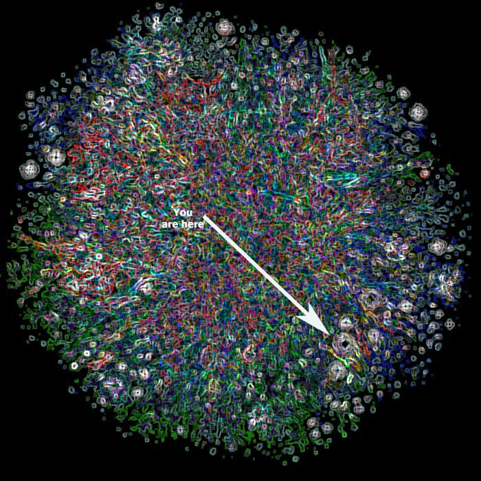
The sites mine what travels on a dandelion bloom, whose network can be mapped in iridescent chromatic richness:
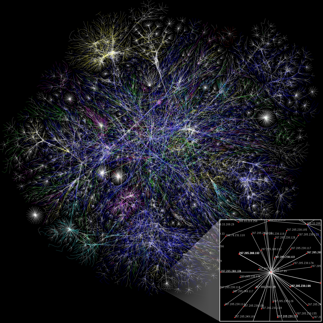
But whose pathways work more like this, on imagined axons or the skeins of established information highways:
All maps select information of relevance that they embody for the viewer in something like a readable form–and remove it from the viewer so that they can be understood. It’s pretty hard actually to orient oneself in the above maps, but, then again, impossible to extrapolate the map of sites to fish for metadata in the network defined by the X-Keyscore system, which truly seems more omnipresent than localized.
To lend immediacy to their content, maps render data visible–by concretizing the abstract numbers of a database or measurements of local sighting, and removing it from the viewer. Yet if the data flow on the internet resists any clear an easy visualization–maps of observing metadata are bound to stand at a greater remove from actuality, as the sites of viewing what is intercepted from routers filter the information pipeline, from which multiple if not infinite skeins of internet channels spread out–the almost uniform dispersion of outposts intersect information pipelines to communicate the creepiness of the expanse of surveillance; the outposts snooping data flows intersect the routes information travel we can’t even see.
The remove of the map from what it is supposed to map seems something like the twin of the newly revealed datamaps made using information released in WikiLeaks about counted civilian deaths during the Iraq war. The maps, created from data posted on the Guardian’s datablog, also stand at something like a remove from reality, though only because they make us feel sad at the remove of the theater of war to an alternate theater: they reinforce the geographic remove of that theater of war from the viewer, as we look at their mute confetti flecks to understand accidental deaths that are so difficult to grasp–these deaths really have little way to be understood at all, save as the residue of the presence of armed forces, and map the disorientation of forces as much as the injuries and fatalities they enumerate.
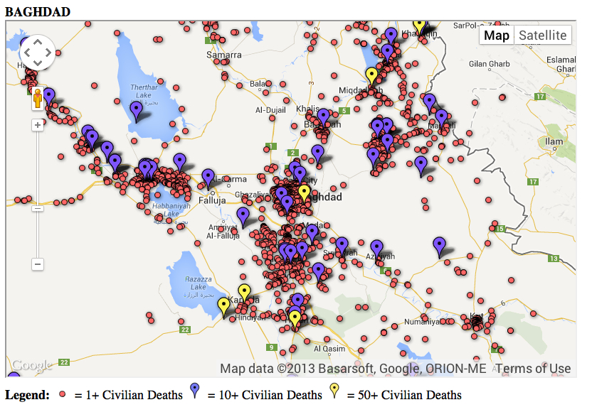
The limits of the SIGACTS database – Significant Actions -have been noted, restriced as they are to deaths reported by the Muti-National units in Iraq, we can’t but note the failure to create coherent meaning in the map that notes deaths by orange confetti dots in a Baghdad neighborhood through markers almost identical to the Keyscore map that situate the some of the 45,497 deaths the database counted in the city.

The data sets projected on a Google Earth image of the city are striking for how they omit so much hidden information, to be sure; they almost lift a corner only on the end of the lives whose abrupt closure is marked by a symbol more akin to a red bullet-hole than to confetti.
More expansive maps of the civilian deaths in this theater of war challenge our abilities of understanding, abstract data of deaths from the havoc they have wrecked and can only mutely denote. Mike Brennan of Drexel University used the data to focus selectively on civilian deaths alone, some 66,081 recorded of the 109,032 deaths in total for the period, aggregating group deaths of fifty or more by a yellow marker, and ten or more by a violet pin, to better render the distribution or topography of violence in the theater of war:
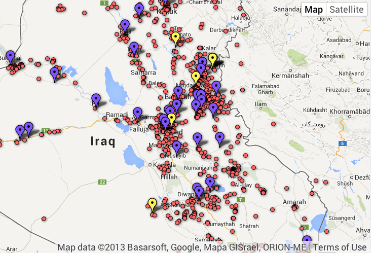
Civilian Deaths in Iraq: individual; 10+; 50+
The psychic remove of war-deaths in the map is only intensified by the ability of the viewer to position themselves in changing relation to their contents, and zoom in on areas to better scrutinize the unintended ending of lives around Baghdad; as we do, we can better distinguish all of those red dots from the purple pins that mark deaths of 10 or more, and those yellow ones that denote fifty deaths and above, and find even greater problems disaggregating these colored confetti as the records of individual lives.
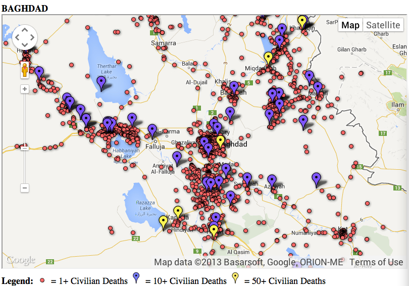
There is growing amazement as one looks closer, both at assessing the ground-conditions as we remind ourselves about the violence that unfolded there–and there–and there–on the maps Brennan processed from WikiLeaks data.
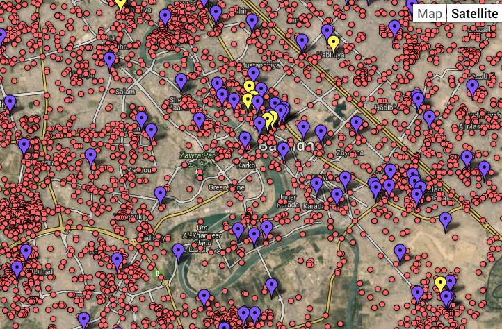
These maps produce only a sad sort of wonder at their scope, removed as they are from an actual theater of war, and displayed on a generic map of the region’s roads, rivers, and lakes. There is an even more surreal remove of the number of deaths from the calm of its Google Earth satellite view in this alternate format of datamapping dating from 2010:

These images of datasets are a landscape to which we were in denial–and which we were not supposed to ever see, but removed from the landscape of war in which these deaths occurred, and the aggregating of deaths is in fact removed from the landscapes where they occurred.
To be sure, the map of sites of the surveillance of data piplines is at a similar remove from the users of the internet that it ostensibly is intended to track. Moving back to the metadata, the “map” of points of entry into information pipelines illustrates the information-trawling constructed from 2008 is itself something that stands at a remove from war, and might show viewers how at that time our eyes were removed from the above maps of civilian casualties. The comparison might seem sloppy, but suggests how many eyes were, hungry for a different sort of data, and suggest a further remove from actualities.

It’s not much to observe that the illusion of the stability its technology detection and monitoring of communications stands at an even further remove from the world.
The visible locations that X-Keyscore promised obscured the mapping of civilian injuries and deaths–a “hidden” cost of war that have alarmingly jumped in Afghanistan, according to a recent UN report, reaching 3,852 in the first six months of this year, almost a third more than last year. Is locating and decrypting start-ups protected by a VPN (Virtual Private Network) also form of mapping, amidst a massive data-dragnet of over 20 terabytes every day, that helps us take our eyes off the map, and from what we need to see?


