
There is little comfort to be taken in the recent announcement that the United States has been overtaken as the world’s nation with the greatest number of obesely overweight citizens by Mexico. As Mexico collectively surpassed the symbolic statistical benchmark of the 31.8% obesity of citizens in the United States, this was clearly never meant as a cause for self-congratulation about the reduction of our own waist-lines. The announcement that almost 1/3 of Mexico’s citizens were obese allowed it to surpass the United States among the world’s most over-weight, and also illustrates the rapid success of a model of mass-produced food consumption in a post-NAFTA world where the popularity of fast-food and sugar-laden drinks has dramatically grown south of the border.
The real story behind the story is the relation of how our habits of food consumption have shifted the total body weight of the nation over the past several decades from the mid-1980s–and the much-noted radical changes in percentages of obesity throughout the entire lower forty-eight since 2000 in this dynamically animated time-stop choropleth map, which seems to constitute something of a watershed that opens the floodgates to weight-gain through 2005, in a preview to the drama of over-consumption of edibles narrated in “Supersize Me!”:

 There is clearly a culture of overeating waiting to be mapped. But one cannot say the map has a clear cultural origin–so much is it rooted in food purveyors, and a food network of factory farms, as much as economy. Obesity was recently mapped in 2010 by the World Health Organization for both men and women, in ways surely reflect the local economy, but also show a resistance to obesity, if we can call it that, in areas as Irish or Frenchmen, although lack of food in Afghanistan contributed to limit average male BMI in that war-zone.


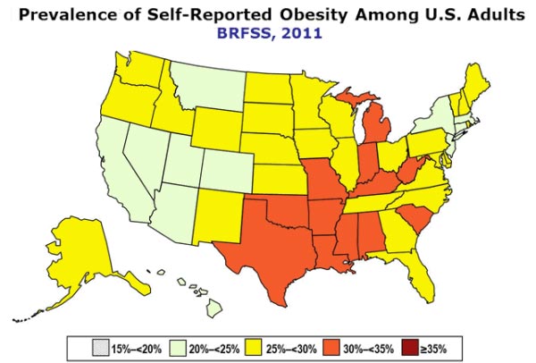
Scarier, and mirroring eating trends, is the rising obesity among those college-age, and the alarming concentration of an over-50% rate five years ago in Alabama and Mississippi, for what this tells us about the future picture of the nation, this courtesy Miller-McClune:
 The infographic maps unsurprisingly onto the CDC’s mapping of 2010 obesity trends provides a striking picture of the spatial concentration of the obese.

To start to add finer grain and greater questions of causation to the CDC infographics–and to unpack the information that they provide–we might do well to test the correlation to eating habits and with diet. For a start, we might look at the clever data visualizations based on aggregates that Stephen von Worley devised to chart fast-food preferences nation-wide to interrogate McDonald’s’ market-share monopoly of the fast-food chains that line the nation’s highways. Starting from a visualization of the continuous United States that plotted the nearest McDonalds from any point in the nation–that reveals at its brightest spots the near ubiquity of a McDonalds restaurant at certain nodes in the country–the brightest lights signify the points of least travel to the Golden Arches in September of 2009.
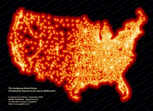
As much as providing a new picture of the question of our nation’s actual continuity, von Worley’s slightly tactless visualization raises interesting questions about the options for food available in specific parts of the country, and the possibility to discern clusters along national interstates, from California’s I-5 to route 95 in Florida, or along specific regions, like Long Island and the Chicago area:
After winnowing down the over 36,000 restaurants to the eight largest, but to prevent one from outshining the others, von Worley maps the three most dominant fast-food purveyor among eight contenders in different colors across space–McDonald’s (black), Burger King (red), Wendy’s (yellow), Jack-in-the-Box (magenta), Sonic (the Oklahoma-based America’s Drive-In; periwinkle), Diary Queen (cream), Carl’s Junior (green) and Hardee’s (cyan). Although devised with the intent was to question the market-dominance of McDonalds, von Worley also elegantly illuminated a dense distribution of burger-consumption as national food swamps, and by weighting stores at a 4:2:1 ratio the limited variety that underlie the illusion of a landscape of uniform food-choice:

The data distribution unsurprisingly overlaps with those states whose inhabitants share a BMI that tends to be supersized, looking at the final frame from the animated colored choropleths above.

As an expert data visualizer if not an artist, von Worley seems aware of these implications, although his upbeat brightly-colored points gives a pop-art aesthetic to spectacular maps of gluts of fast-food chains that hint at stretches of food swamps (where access to prepared foods or processed food outweighs fresh food) across the nation. Indeed, von Worley started by mapping the total area controlled by fast-food chains, to compare McDonald’s and its competitors, as if to imagine of local resistance to the evil ‘burger force’ that must be overthrown at all costs in an openly Manichean vision of the world of burgerland:

As suggested, von Worley hoped that the growth of the evil empire Ray Kroc could be reversed should competitors join forces against the Big Mac seems wrong headed–rendering here in utopian pastels–that cast Jack-in-the-Box and Wendy’s as Davids to McDonald’s Goliath as a landscape of dayglo colors, where the black of McDonalds presented something of a plague or blotch infecting, as if a cancer, much of New York, western Massachusetts, Vermont, and Chicago.

Von Worley wanted to map the degree to which McDonald’s locations are only dominant in the North-East. But his data visualization is oddly not so concerned about the lack of variety at these stores, or the sort of dietary habits that the map maps.
His recent dedication to measuring the burgerscape, both by taking into account both the distances likely to be traveled for folks to spend money on food to weight places folks are more likely to travel to indulge, and introducing scalable model of market dominance. The data visualization maps a glut of burger consumption in specific regions that is striking, placing Mississippi in an expanse from Dallas-Fort Worth (upper left cluster) to the Mississippi Delta, where yellow clusters mark Jacksonville, MI, and ports are dotted with fast-food chains. The burger density is striking, even if von Worley’s chipper aesthetic sensibility belies the glut of consuming all that factory-farmed meat and animal grease: for the pied pastels of von Worley’s pointillist mapping of fast food locales transmute eating habits to pop art.

If it is less artery clogging, also note the flourishing fast-food ecosystem that flourishes across multiple microclimates stretching from Atlanta, Georgia to Charlotte, North Carolina:

And the visualization of the dense outcroppings of stores that promise a variety–even without noting In-n-Out, A & W, or Taco Bell–suggest the redefinition of the urban foodscape in a city like Phoenix, even if the food-markets in the city are not so dominated by our friend Mickey Dee:

One of the few historically informed maps in van Worley’s visualization of the colorful beefspace so densely clustered in the Southern United States does not concern the mapping of lived space, but a perspective from the moment when the seeds of a new topography of fast-food eating began, which makes one want to extend the animated choropleth back it time to the veritable big-bang of the very beefspace that led to all those brightly colored food swamps:

But, as with any map, one must move from the local to the global: for the real story underlying the effects of sedentarism or over-eating on salty or sugary pseudo-foods is a global one. The FAO recently found that “For the first time, the number of overweight individuals worldwide rivals those who are underweight,” citing the findings of the Worldwatch Institute that measured both at 1.1 billion worldwide; obesity now emerges as a problem equal to malnutrition in ways rarely anticipated earlier. An “obesity map” of global scale finds a notable jump in obesity rates of 5% in just three years in China, and the startling growth in numbers of obese across sub-Saharan Africa, Colombia, as well as among north African or Middle Eastern women; it places both problems in the very same national spaces:


Hi Dan, I read your Musings on Maps with great interest. You certainly have a very original approach. Thanks for putting me on the list. Barney Rosenthal