
The mosaic of ethnicities in the United States today appears so inclusive and diverse that echoes of the state’s sanctioning of the forcible spatial segregation of one ethnic group –Japanese Americans–would seem impossibly remote in time and culture until quite recently. But the tragic and yet state-sponsored episode of Japanese internment by the US military reveals the existence of historical rifts in the historical landscape of the American West, which not only resonate with a history of exclusionary practices, but suggest a striking geography along which practices of exclusion were effected and organized by means of existing maps. And the recent invocation of executive order 9066 by Donald Trump, seventy-four years later, when over 110,000 Americans of Japanese descent were forcibly removed from their own houses and relocated to camps of internment as a precedent for the relocation of resident aliens–which Trump has called a “tough thing,” but refused to condemn in any way–“I would have had to be there at the time to tell you, to give you a proper answer”–not only to cave to his instincts of fueling prejudice if not racial violence among Americans, but to celebrate a precedent for treating illegal immigrants as alien enemies with no understanding of history or the law. As the grossly illegal and shameful episode of internment was cited as a basis for racial profiling during the state of exception of War on Terror by Michelle Malkin, the horrific readiness to accept the episode of internment of those with Japanese ancestry as a part of the American legal tradition is not only an instance of unlearning but an act of amnesia that is utterly irresponsible.
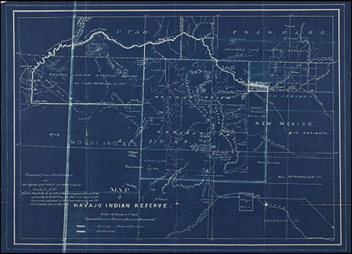
And yet, the continued reference of the non-state spaces of American internment in much of the current American West suggests the survival of the landscape that internment produced. The partitioning of space in maps enabled the exclusionary strategies, moreover, which have a striking overlay with earlier landscapes of exclusion. Despite a stated mission to keep the country “safe” in the face of the shock of war, detainment of Japanese Americans was not at all something of a historical unicum, but rather fit within landscape of ethnic opposition with possible roots in the nineteenth century, whose secret geography informed the use of sites of sequestering those stripped of citizenship at the start of the twenty-first century. The space of Native American reserves, or reservations, had been mapped by F. E. Leupp of the Bureau of Indian Affairs in 1905 as if it were a hidden nation within a nation–land set off from the four-color map of the United States, if largely concentrated in the lands west of the hundredth meridian–

–an image of spatial separateness that continued by 1941.

The memory of the experience of internment was far more suddenly and deeply inscribed in the national landscape at a single moment, however, if one not without historical precedents. T
he permission Executive Order 9066 gave the Secretary of War to “prescribe military areas . . . from which any or all persons may be excluded” from 1942 that enabled an internal “enemy” population to be stripped of citizenship. The establishment of an archipelago of confinement across Arizona, inland California, and Nevada echoed the confinement of native populations–and resonates with recent attempts to define areas of detainment as “off the map” and consequently removed from legal oversight in ways that we might be all too apt to associate with the Cold War–as much as it was improvised. The geography of the confinement of Japanese Americans provides an instance of something not like race warfare, but the opposition of the state to its enemies perhaps as telling as the geography of ghostly munitions of the Cold War from missile silos, remains of nuclear testing, facilities for storing and developing plutonium, and anti-missile radar that dot the landscapes of Arizona, Nevada, New Mexico, and South Dakota.
In mapping the inclusiveness of national diversity, we are increasingly reminded of the ethnic classification of the nation’s population by the carving out of predictions of the behavior of the electorate at the polls–partly because the distribution is so relatively easy to map, partly because how such divisions map onto political parties is a growing riddle, not only since it is less clear that their increasing political voice maps onto a single agenda, but also because of the scare of predictions of white-minority status by 2045. For the apparent cultural remove of the arrogance of an administration that formally instituted the forced geographic relocation of Japanese Americans to camps away from the west coast seems an odd artifact stoked by the proto-fascist flames ignited by the fear of war.
Might it rather be comprehended as a part of California history? If the episode of Japanese American relocation seems removed from the state’s current mosaic of diversity, it has eery ties to the hidden history of the West–and the political landscape of recent years. Although when trains transported individuals to hidden locations inland,their forced displacement for the general safety of “all” was promoted as coalescing home front–based on their predesignation as “enemies of the state” in ways that have recurred in recent years. It pays to return to them to excavate the map of displacement that defined the west coast, and situate its occurrence within a landscape of longue durée.
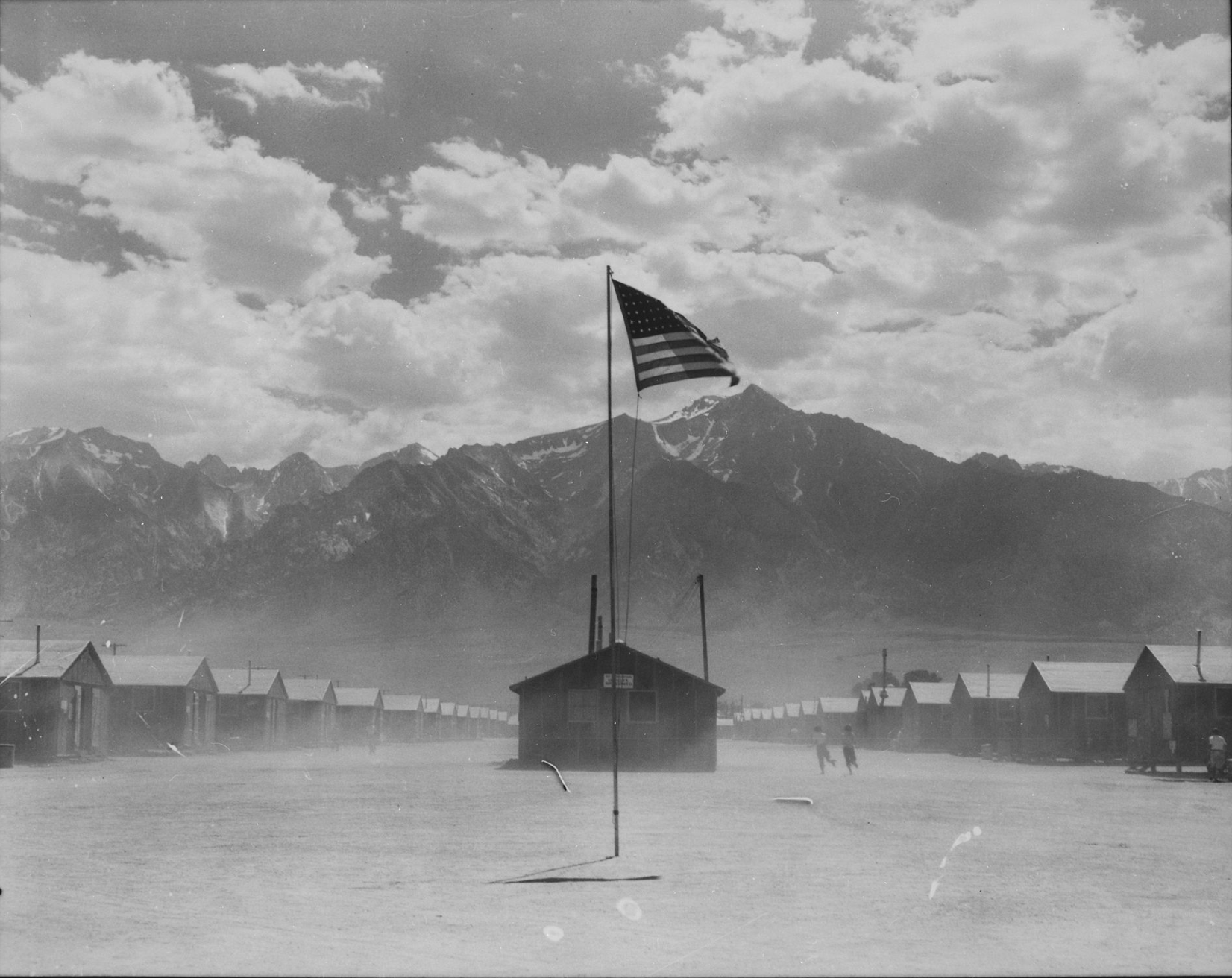
The interned painter Chiura Obata was a devoted student of the western landscape of the United States, particularly in Yosemite Park, and created an image that inescapably suggests the portents of a shifting political landscape while interned in Topaz, in his quite contemplative painting of the deeply and heavily smeared reddened sky over the stark landscape of the Relocation Camp where he was interned, after having taught art at the University of California, at a War Relocation Camp that opened its doors in September 11, 1942.
 Chiura Obata, “Sunset, Water-Tower, Topaz, March 20 1943” painted in the Topaz Relocation Camp
The smears of rust-colored cirrus clouds that Obata drew as reflected on Utah’s barren desert landscape at the Topaz War Relocation Center overwhelms the barbed wire fences barely discernible beneath telephone wires, lending the landscape a monumentality that dwarfs a makeshift guard tower, and creates red lines like scars across the land. Rather than treat the landscape relocation and internment camps as a panicked response to fears of impending military attack, the rapidity of relocation along fault lines in a political landscape that we may have too readily repressed, when the landscape has been forcibly divided along ethnic or cultural lines in terms of belonging–a division that seems to have been rehabilitated in recent years.
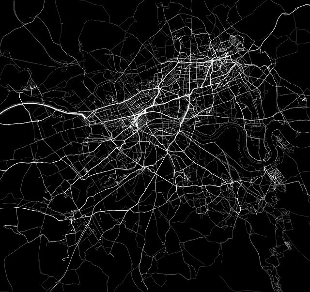
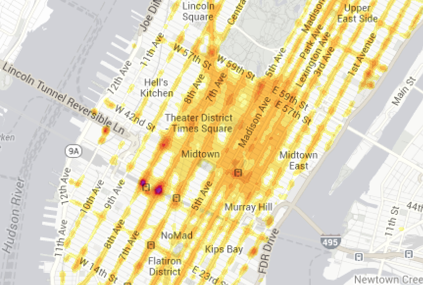
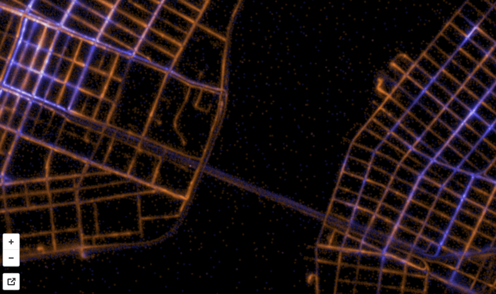
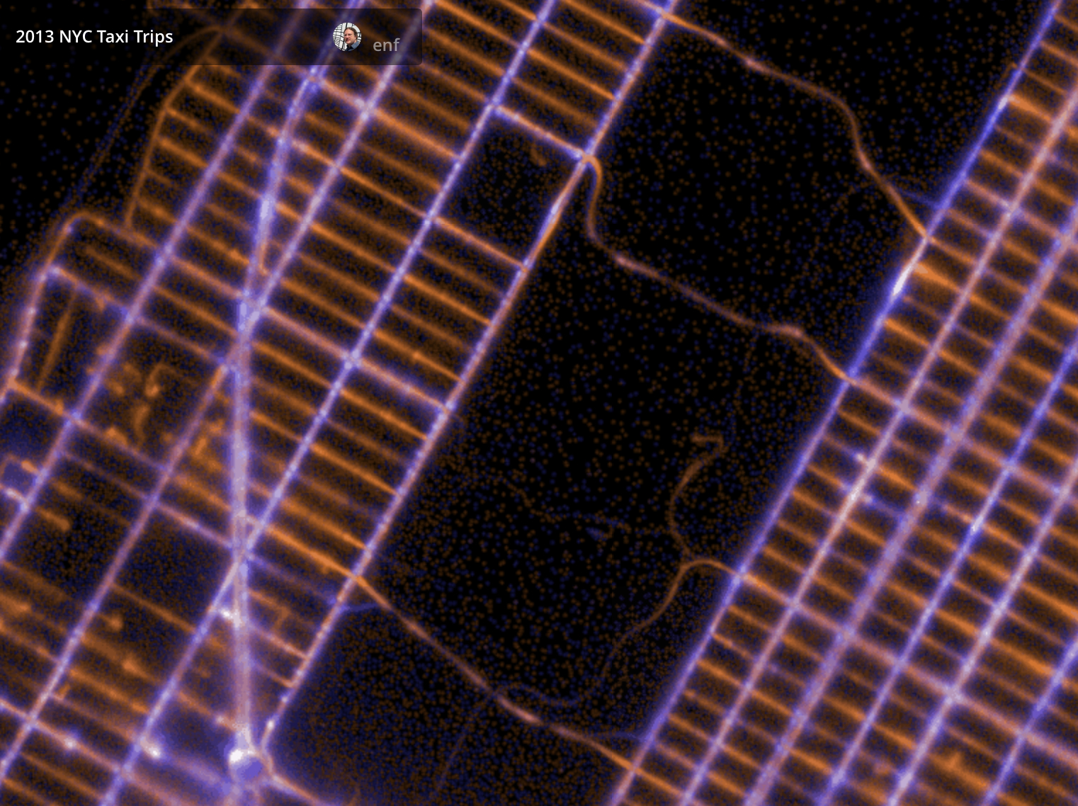
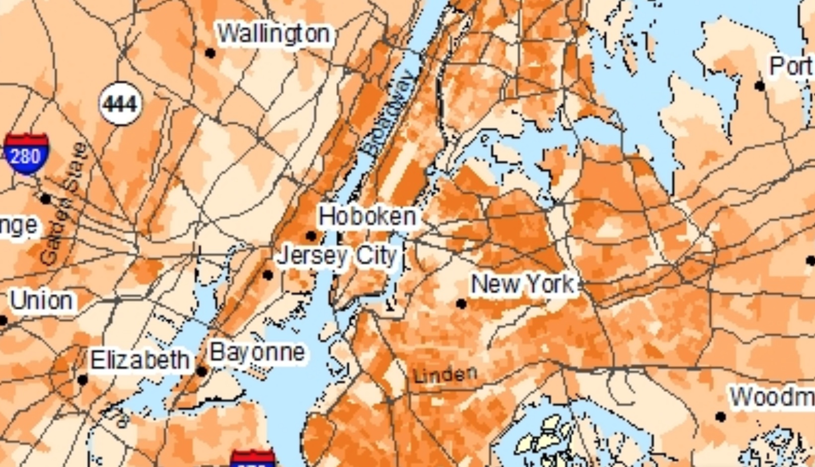
1. The recent mapping of the notion of “diversity” based on data culled into one of the appealing visualizations displayed on the website of Trulia–the realtor which seems primarily in the business of making us feel good about the prospective places where we might live, if we really and truly had our druthers–expanded the maps of demographic density designed by Randal Olson in more interactively searchable ways that offer an opportune starting point for this post. The dynamic visualization is based on self-reported Census data promised to capture the current “racial/ethnic” composition of regions across the country where smallest difference existed between a dominant ethnic subset and secondary ethnic group, ranking the relative levels of “diversity” by that metric across the country’s largest metropolitan areas–from Oakland to San Francisco to New York to Houston to San Jose–so that we might better envision the ethnic compositions of the neighborhoods where we live in an era where ethnic diversity seems the closest metric we’ll ever get to what’s cosmopolitan. It is, however, a map of strong ethnic integration that contrasts with the clearcut demarcation of otherness in the map of several generations past that is the header to this post..

The data visualization is impressive despite its clear limitations–especially evident in the broad equivalences that it draws implicitly between the uniformity of “diversity” as a transparent derivative of data of variety. Building on data encoded in Dustin Cable’s “Racial Dot Map,” Trulia provides a metric for “diversity” that ignores exact ethnicities, providing a new way of reading a single argument in the 2012 data of ethnic differences that Cable encoded by five different colors–which can be read as a follow-up map of the image of ethnic segregation in the map with which the musing of this post began.

The Trulia map of America’s Racial Kaleidoscope nonetheless offers an interesting and somewhat jarring image for all of its superficiality, even with apparent bearing on the sociology of the red state/blue state divide. For all the very slipperiness of “ethnic/racial” categories as meaningful demographic tools of parsing populations–when were these two terms ever equivalent seen as surrogates for one another, and how do the categories of the 2010 Census, which use such undifferentiated envelopes as “Asian” or “Black” or “Hispanic, Latino, or Spanish origin” as authoritative diverse to parse populations?–to image diversity, there may be some meaning able to be extracted in the visualizations that show their difference and distance from a historical past, when ethnic differences seemed far more starkly inscribed in a pre-globalized world.
For the folks at Trulia created a visualization to map “diversity” that erases whatever degrees of actual racial or ethnic integration exist within counties. While this may hardly offer a metric of actual “diversity,” the visualization reveals California as the largest continuous body of “diverse” ethnic groups in the country and of its sharpest non-“majority white” areas:
Even without introducing the potentially complexifying newly trending category of the “transracial,” or those individuals who, to use another term diffused in online media thanks to Rachel Dolezal, realized or felt that they were “miscarried”–a term that has touched a clear nerve, given the unclear meaning “race” retains in contemporary America, and the uncomfortable nature of the term. Where Trulia finds diversity to be concentrated in coastal regions and objectively present in a range of areas that seems to correlate with sites where the home-buying market is tight, the visualization seems most useful to force us to ask what diversity means–as well as to mask the sort of rhetoric of ethnic opposition that so often scarred the landscape of the west.
2. “Diversity” is a new world, but may once have led to the one of the clearest instances in US history of the forced marginalization of a population of citizens during the early years of American engagement in World War II. Despite the frustrating failure of imposing categories to classify the composition of our national population at the start of the twenty-first century, the cultural remove at which Japanese ethnicity became a basis for the forced migration of citizens must be balanced with the proximity of the recent circumscription of individual rights. If panic and fear unjustifiably provoked the systematically organized deportation of Americans of Japanese ancestry–in which a strong dose of economic resentment may have played a large role–the act of remapping civil rights in the United States, if seriously compromised, also sanctioned the remapping of rights in ways that both built on and provided some rather scary precedents.
Did the confinement of a considerable section of the population–and indeed the confinement of a somewhat arbitrarily reclassified class of citizens–created something of a crucial precedent to redefine the rights of citizens by unilateral executive fiat? The decision to reclassify a segment of the American population recalls the legal justification for a “state of emergency” which the “crown jurist of the Third Reich” Carl Schmitt notoriously advanced as an adequate rationale to suspend rights in the hopes to re-establish order, responsibility for which, Schmitt argued, ultimately lay with the sovereign alone, but whose actions created shared bonds preceded the very notion of the state–and rested in a political nature of the opposition between friend and enemy. In a cold-hearted logic ways recently revived in George W. Bush’s administration, such an occurrence “extreme emergency” could justify the suspension of the constitution and law, with striking similarity to the political state of emergency by which internment was justified and understood–and was associated with a state of war, both by Schmitt and in the War on Terror of the early twenty-first century. Nowhere is this more evident than in the remapping of California during the Japanese Evacuation Program, where Japanese Americans were segregated from all “exclusion areas” in the name of a political imperative that transcended political practice.
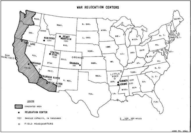
The institutional order that was created between zones of confinement and zones of exclusion in the “Evacuation Map” created “in satisfaction of the impelling military necessity created by total war with Japan” defined some 108 individual “exclusion areas,” in each of which approximately 1,000 persons were evacuated–allegedly totaling the 100,000 persons evacuated during the two weeks between March 24 and June 6. Many were concentrated in the Pacific Northwest. But the repartitioning of the West in terms of Military Area 1 and Military Area 2–a sort of Newspeak of Orwellian resonance–was premised on the presiding rationality of political belonging against the otherness of Japanese Americans that is so foundational in Schmitt’s thought. The exceptionality of “wartime” provided the basis for suspending their right, and insisting on the primacy of the political for redividing national space, and suspending legal or constitutional precedent by a political mandate that, for Schmitt, would indeed historically and existentially precede any legal or constitutional order.

What sort of networks would have allowed the forced migration of a large section of the Japanese American population to internment camps? The imposition of such a nation-wide policy of legislated relocation remains conceptually remote, both as a practice and conceptual possibility, let alone as one accepted by the region’s residents. Its logic lies in the legend to the map, which echoes a truly Schmittian rhetoric of a “state of emergency” in which constitutional rights are suspended; the necessity of “the political” reveals the deep opposition based on “otherness” whose rationality is revealed in its legend. This state of “otherness” was clearly inscribed in the landscape of the two areas of Military Areas, rather than states and superimposed upon states, is linked to “wartime,” but which echoes of the earlier political orders of the American West: its legend offers the underlying logic of the state of emergency during which local division was inscribed.
The partitioning of the same region that seems particularly noted for its diversity–the western region of California–as in the framing of an “Exclusion Zone” that was deemed so sensitive in its concentration of state secrets to be off-limits to members identified with Japanese immigrants that they could be stripped of constitutional rights–and forced to board trains from the cities to anodynely-named “Relocation Centers” that were located in the state’s interior–suggests a civilian partitioning of the country not only in the name of war-time exigency, but in fact a paranoia that was fueled not by actual military dangers or actual risks of espionage, in retrospect, but something that was more fed by a combination of opportunism and on-the-ground animosity and ethnic dislike. If the notion of such dislike might have lain in economic competition, the ethnic opposition was reified in the boundaries of otherness exposed on the map.
The network of relocation camps are often seen as a unicum–and as something like a quite particular circumstantial combination of jealousy for a group of successful immigrants who had often lived in distinct settlements, and whose difference was now cast into political relief, both by the war, and the culture of imperial allegiance that Japanese were seen as increasingly ready to adopt. But the very network of the camps of resettlement recapitulated narratives of the European occupation of Native America by completely effacing an imaginary frontier between Native Lands and European-American pioneers, placed in evidence by the confining of native peoples in discrete sites that were later known as “reservations,” the bounded areas of the absence of any existence of a Native/American divide across the very western states from which Japanese Americans were banned–and indeed denied narratives of racial or ethnic differentiation, where the destruction of the frontier was replaced by the contained presence of the Native populations in reservations, at the same time as many other reservations were reclaimed as military sites for engineers or the army, in the demand for a wartime effort, even as Native American languages were adopted, as they had been in World War One, to encode military communications and Native Americans participated in huge numbers in the US Army.
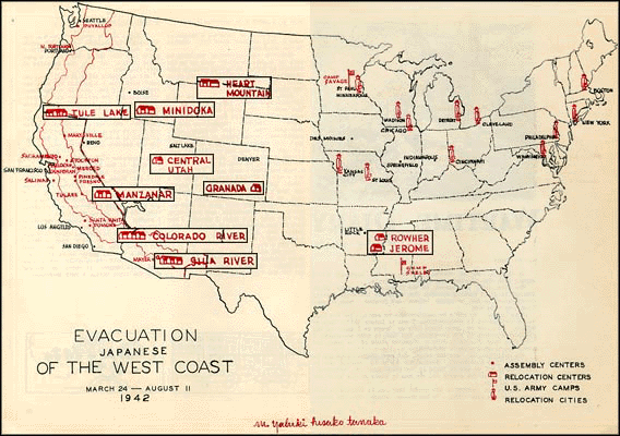
The rapid constitution of new networks to displace Japanese Americans from their former homes to the periphery of what became defined as Military Area One in the United States was enabled by the infrastructure of railroads that linked cities to removed “War Relocation Centers” in areas where their inhabitants would not be easily noticed or indeed seen. The forcible relocation of Japanese Americans was largely enacted and by non-military authorities, but led to the removal of the large number of immigrants to the country to remote areas, cordoned off from sight, in the four months from March, 1942, by which time some ten centers of “war[-time] relocation” were established that removed Japanese Americans from the coast region that they had increasingly migrated in the past thirty years, to areas where they were less likely to be noticed, and the stripping of their civil rights–and allegedly inalienable liberties–were not even seen.
The deep suspicion of ethnic difference created a proclivity to separate Japanese American citizens as a military threat. Yet as early as 1930, the Office of Naval Intelligence began surveillance on Japanese communities in Hawaii, wary of the military power of Japan. And from 1936, the same Office in fact compiled lists of those Japanese to be “the first to be placed in a concentration camp in the event of trouble” between the countries–long before the idea of confinement camps were broached as a possibility on American soil.
That list would become the Custodial Detention Index, compiled in 1939-41 with help from the Federal Bureau of Investigation as a tabulation one of explicitly “Alien Enemy Control” as enumerating those ostensibly “engaged in subversive activities” or actions deemed “detrimental to the internal security of the United States.” The list was drawn up a decade after further Japanese immigration to the United States had been banned in 1924, and significantly before Executive Order 9066, issued on February 19, 1942, allowed regional military commanders to designate “military areas” from which “any or all persons may be excluded.” The establishment by the civilian-run War Relocation Agency of what were very euphemistically termed “relocation centers,” together with the six internment camps run by the US Department of Justice, were officially built to house all Japanese-Americans who had been removed from the “exclusion zone” that stretched across the entire western coast of the United States, after March, 1942.
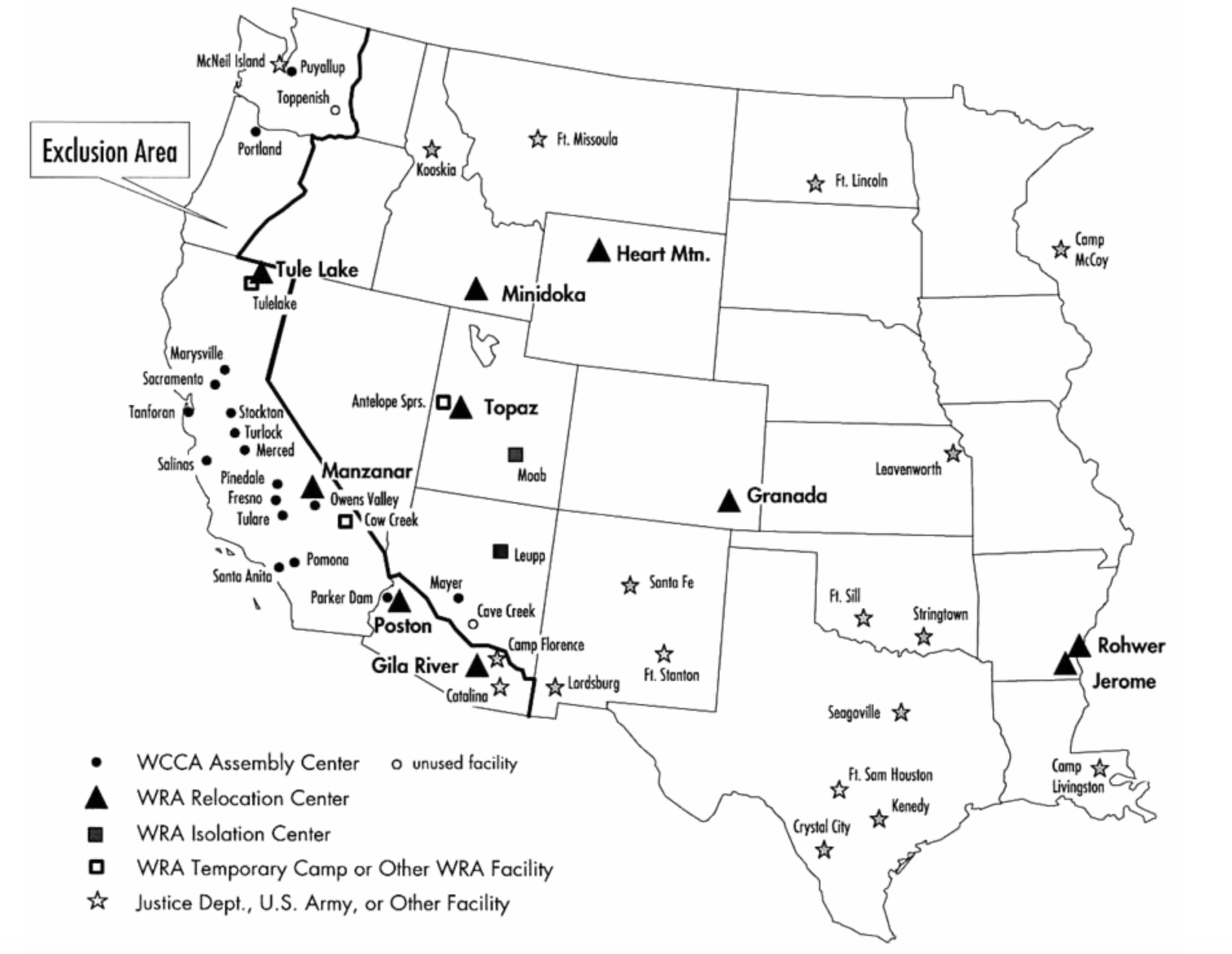
Although the scope of detention was not widely known, or discussed in contemporary maps, a relatively recent map of the Assembly Centers and Internment camps emphasized their existence and geographic distribution in areas that were removed from population centers, lending greater prominence to their considerable geographical remove from areas Japanese Americans had settled and the inhospitable places to which these forced relocations in internment camps occurred–in the desert, in relatively abandoned villages of the High Sierra, in areas often excluded from common maps.

Ben Pease
The reparative remapping of such sites as Poston and Gila River to our common memory offers a wonderful way to start to come to terms with the network of civilian-administered internment camps that place into relief a less well-documented or perhaps fully apprehended scale of the effective apparatus of state surveillance and that was in place of over 125,000 Japanese Americans into the desert-liike interior of the country for ostensible reasons of suspicions of a Fifth Column in the country of fully US naturalized citizens, who were stripped of all civil liberties.
The stark existence of such an “Exclusion Zone” or ten euphemistically named ‘relocation centers’ to which Japanese-Americans were without distinction detained from 1942 were inhumanely mapped in purely logistical terms to evacuate the western coast of ethnic Japanese with amazingly well-coordinated efficiency over six months with the sort of reflexive unreflectiveness so often characteristic during the unfolding of events occurring during a war: but the sites were also intentionally created as sites absent from federal law–or international conventions–and in a sense existed as black spots on the national map.

Such practices of forced relocation to sites far removed from cities near the shoreline–and ostensibly near sensitive military sites–depended on a very systematic division and re-assignment of Japanese Americans suddenly dispossessed of their ownership of houses, land, and real estate, which was imagined in a quite cartographical manner–as the movement of Japanese Americans from coastal cities and communities on trains removed them to remote places, as if to expunge their memories, and in locating Japanese Americans in remote areas allowed to be forgotten and go unseen. The subsequent destruction of any buildings, gardens, or evidence of confinement after the war, when the spaces of confinement were promptly shuttered after January 2, 1945–again by executive order–erased any evidence of the space that were bulldozed and razed, effacing memories of the internment, no doubt more problematic after the discovery of Nazi Concentration Camps. Despite the total lack of support for accusations of security threats, suspicion seems to have reigned. If the construction of Internment Camps were officially mandated to be situated in places deemed “climates suitable for people,” from the newly created Military Area #1–western Washington and Oregon; western California; Southern Nevada–to the Mississippi, in ways that created a new geography of the United States during wartime, ostensibly for reasons of state. Yet living in quasi-military improvised unheated barracks ringed by barbed wire that enclosed the thirty to forty blocks of barracks separated by empty spaces, patrolled by soldiers from watchtowers, lacking any privacy or cooking equipment or kitchens, and without any medicine or medical institutions, with only improvised medical care and with nothing but cots in collective rooms, such containment centers were undeniably more than austere–they were dehumanizing by intent. And while not dedicated to a project of ethnic cleansing, they were motivated by a sense of deep suspicion based on ethnicity alone, and reflect a similar fantasia of spatial containment and confinement that was enabled by a new attitude to space that the wartime maps of the Civil Control Administration reveal. The landscape coded in pale pastels masks and obscures the violence of collectively reclassifying Japanese-Americans as if “internal enemies”–and as threats to the national state–within national political discourse in truly Schmittian terms.
Within the intentionally dispersive extended archipelago of camps, removed from centers of habitation, inmates were largely supervised or overseen by the Wartime Civil Control Administration–a civilian unit–because of falsified reports of a proclivity to espionage. Such reports were diffused largely through the military and future Department of Defense (then Department of War) and were also fostered by intense lobbying efforts of white or Anglo farmers (who saw the Japanese American farmers as a threat) encouraged the perpetuation of a race-based paranoia. Even though J. Edgar Hoover at the FBI doubted that any real threat was posed by Japanese Americans, the decision to confine seems to have been preemptively made to quiet a home front: President Roosevelt’s issuance of Executive Order 9066 led to over 112,000 Japanese Americans to be moved to effective prison camps located in nine states–California, Arizona, Utah, Wyoming, Colorado, Texas, Arkansas, and the porto-state of Alaska. Although two-thirds had already gained citizenship, they were asked to submit to loyalty oaths and swear not to interfere with the ongoing war effort that had consumed the country. And were excluded from much of the country. The internment sites were removed in the interior–and located in “Military Area 2”–whose definition somewhat bizzarely, and, quite Orwellianly, departed from the boundary lines of individual states.
They created a new logic of displacement and of the suspension of individual rights. 3. We associate the transport of prisoners as human chattel destined for ethnic cleansing on trains with Hitler’s Final Solution, perhaps the paradigmatic instance of the forced migration of populations becoming a national project and mission. But the national network of trains similarly provided the basis for the relatively fast geographic removal of US citizens of Japanese descent across the state from Exclusion Areas, effecting the legal reclassification of citizenship in was that oddly reflected the claims of spatial purification that the abstract order of maps almost inspires. The spectrum of pastel colors of the map issued by the Western Defense Command of the Exclusion Areas where men, women, and children of Japanese ancestry were forbidden to set foot conceals its violent measures.

The process of internal evacuation conducted “in satisfaction of the impelling military necessity created by total war with Japan” created an “evacuee population” in the United States whose movement was to be controlled and supervised by military forces, ostensibly to remove them from areas where there was any military presence that might be observed. When immigrants from Japan had been banned from becoming naturalized citizens of the United States–from either owning any property of their own or the ability to vote–Japanese Americans formed independent communities of their own in the western United States, often with separate schools. The forced transport of Japanese Americans to sites where they were stripped of citizenship and pursuant rights created something of a new standard for the imposition of classification on naturalized citizens for unstated reasons of possible danger to “state secrets”–although the actual likelihood of any attempted infiltration or espionage on existing military installations was not particularly credible. Forced transportation from communities in San Francisco, Los Angeles, and Seattle created an archipelago of the confined not only in California–and prevented from entering “exclusion zones” that came to include almost one-third of the country, eliminating the presence of Japanese Americans in anywhere save the less densely populated lands of the interior. While ostensibly directed against possible espionage of those sensitive military areas “from which any or all persons may be [rightfully[ excluded,” the expansion of exclusion zones to constitute a large share of the country became something of a pretense to redirect populations to areas where they were not seen. Not only was a third of the Territory of Hawai’i Japanese–between 140,00 and 150,000–in ways that make it ethnically complex, almost 127,000 Japanese Americans were listed in the 1940 Census as living in the country, mostly in California, Oregon and Washington, of which 40,869 resident aliens, born in Japan.
 The rapidly expanding rate at which camps opened across the country over five months testify to the paranoia and unjustified fears that fed the relatively quick establishment of similar internment camps where local rights were suspended or stripped, and the role of the rail in moving a sizable sector of the population nationwide:
This quite carefully planned and strikingly extensive network to move populations from Assembly Centers to Relocation Centers–all since anodynely named–allowed the significant expansion of the areas of exclusion from which Japanese were not allowed to set foot. They were codified quite rapidly in the months after the December 1941 attack on Pearl Harbor led to all of “Japanese ancestry” to be reclassified as potential security threats, despite little evidence of their disloyalty, as attempts to argue against imprisonment that fell on deaf ears: six weeks after Pearl Harbor was attacked, after some ethnic Japanese living in Hawaii helped a downed airman, leading to a questioning of their ability to not be imperial subjects and “unassailable” as such, set the basis for a new geography of confinement and exclusion of Japanese from public areas that Earl Warren spearheaded, creating the basis to prevent ethnic Japanese from entering exclusion zones” of almost a third of the country–and encouraging by May 1942 all Japanese to be moved to network of assembly centers and readied for transport to permanent relocation centers across the country.
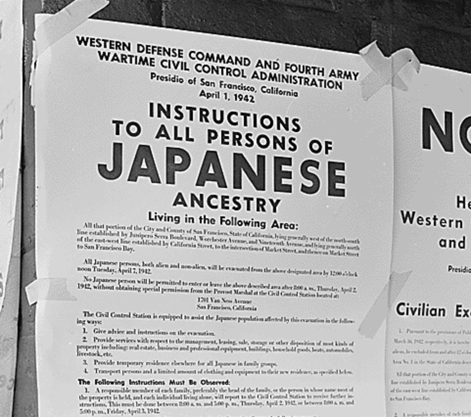
The declarative bluntness of the administrative languages in the authoritative public notices placed in the street corners of cities such as San Francisco that trumpeted the specter of foreign racial “ancestry” of Japanese Americans–
or the expanse of almost a third of the country from which Japanese Americans had been displaced–
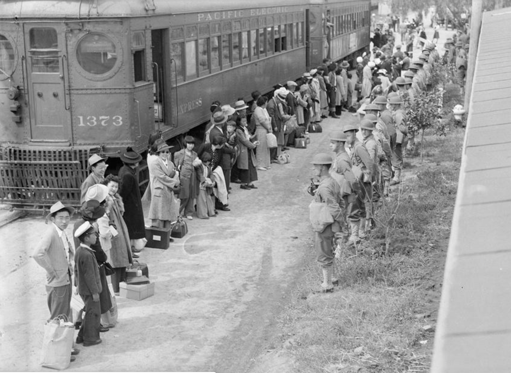
cannot speak to the surprised faces of the deported who arrived by train in Arcadia, California, fresh from San Pedro, and the machinery that brought them there, and the helmeted soldiers who are staring down those recently stripped of citizenship, who don’t seem to have fully fathomed the reasons for their fate, or what perhaps the suspension of all legal rights would mean.
The role of the trains in moving populations in California would have paralleled the travels that the young Steve Reich made with his governess across the country from Los Angeles to New York in 1939 and 1940, and the “music documentary” he composed that retrospectively juxtapose those trips with the contemporaneous forced transport of European Jewry for ethnic cleansing. Reich’s travels occurred almost immediately before Japanese-Americans were moved en masse from Los Angeles to Relocation Centers as Poston or Gila River. Rendered in the propulsive straining tempo of violins that alternately suggest accelerating pistons and air raid sirens, and accompanied by parallel intonations of porters calling railway stops and voices of survivors, Reich’s braiding of memories intentionally evoked parallel lived geographic relocations as fantasia of forced displacement that mechanized electric rail travel allowed.

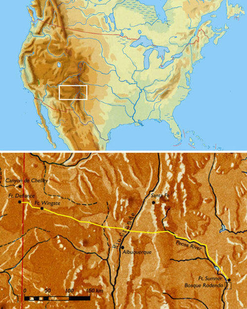
4. Was there a precedent for such forced movement under military oversight, in the confinement of native Americans in much of the American West to “reservations”, in a manner that Adolf Hitler himself has been noted to have particularly admired for the effective reorganization of the population of the West? (Hitler was a large fan of Karl May as well as Fenimore Cooper; Navajo reservations provided not only an architectural model for early concentration camps, according to John Toland, which he took as a promise of the extermination of those unable to be “civilized,” in a bizarre bit of cross-cultural reading.) The precedent of the forced 1864 “Long March” of over 300 miles–some fifty of which in fact occurred between designed to create forced migrations of American Indians from more potentially valuable mineralogical resources to reservations of contracting size.
For between 1864-6 of up to eighteen days attempted an ethnic cleansing of Navajo, from the ancestral homelands of hunters and gatherers located in current northeastern Arizona and northwestern New Mexico to the Bosque Redondo internment camp on the Pecos River nearby Fort Sumner–an internment camp that was itself an attempt at ethnic cleansing, where some 3,500 Navajo men, women, and children died and that stood as an inspiration of the possibilities of ethnic cleansing to the Nazi party, as did the camp for Boer prisoners in South Africa, and perhaps a model for the first plans to deport Jews to the area of Lubin to die of disease. (The image of the confined Native American was potent: Karl May remained among Hitler’s preferred authors, and Hitler continued to read May’s stories of the grizzled white cowboy Old Shatterhand as Führer and personally recommended to his officers, David Meier notes, during the Russian campaign–perhaps providing a model for the forced marches of prisoners of war to death camps.)
The forced migration of a hunting and gathering migratory tribe to an arid 40-square-mile reservation with contaminated water, to face failing crops, disease and raids from neighbouring tribes is a not-so-hidden part of the landscape of the “wild” west that must have been present in the minds of those who administered the transportation of Japanese Americans to sequestered sites of minimal economic or strategic value.
While such equivalences in atrocity can hardly be drawn, and should not be encouraged, it remains striking on a conceptual and genealogical level that so many of the camps of internment for Japanese Americans were geographically located not only on state land, but at times on the very reservations on which Native Americans were actually confined–and restricted–in ways that provided a powerful precedent for such practices of territorial confinement and surveillance.
The Poston Relocation Center, for example, built on the Colorado River Indian Tribes Reservation in Arizona, working to provide the Reservation with electricity; the Leupp Isolation Center on the Navajo Reservation in Arizona, northwest of Winslow; the Gila River Camp, approved in March 18, 1942, for 10,00, over pointed objections of the Gila River Indian Tribe; Tule Lake in an area that was the ancestral home of the Modoc, surviving members of whom were exiled to Oklahoma in 1873; Manzanar, located in the Owens Valley, in an area whose farmlands were worked by Shoshone and Paiutes for some time. In these circumscribed and well-defined areas, the Constitution was deemed not to apply. Despite no clear reaction between the Relocation Authorities and future Bureau of Indian Affairs, the director of the War Relocation Authority, Dillon S. Meyer, from 1950 to 1953 worked as the Commissioner of the Bureau of Indian Affairs.
5. Few of these sites of isolation were known to the public, moreover, or showcased in the media, with the exception the “show-camp” of Gila River, Arizona. But the existence of a “hidden geography” necessitated the show-camp among the numerous centers of sequestration Japanese-Americans might have faced. Lying quite literally “off the map,”and not appearing on maps of the west save in those redacted by the government, the internment camps provide more than a solely symbolic predecessors of what Trevor Paglen has so accurately characterized as the “blank spots on the map Trevor Paglen described, run by the National Security Administration, in the wake of the newfound popularity of the juridical writings of Carl Schmitt.
For the that became centers for the rendition of foreign nationals deemed security threats, like dry lakebed of Groom Lake, the area of the testing of the U2 missiles and other military aircraft in Area 51, run by the Air Force, or the National Data Center, sites run by the government but which lie outside the legal administration of the state, perversely, and in which the suspension of constitutional rights that Schmitt had claimed was argued to similarly apply.
The suspension of constitutional rights for the American-Japanese who were sequestered has an analogously long set of precedents of its own: the forced displacement of Native Americans had been an established government policy and project for over sixty years in the nineteenth century, based on denying precedence to claims of residence in lands they had traditionally occupied.
The result created some unique patterns and combinations of interior settlement. The Japanese Americans in one region came to outnumber the Mohave and Chemahuevi in the area of the desert where they had confined: the Office of Indian Affairs, indeed, ran many camps together with the War Relocation Authority, based on the hope was to use Japanese labor to construct larger spaces of confinement for Native tribes–either using the confined to confine tribes already stripped of land, or using the dispossessed to create spaces of confinement for the nation-state that had stripped them of their own property–by the canalization of the desert or the construction of newly electrified living quarters. Native Americans as the Cherokee had earlier been confined to “internment camps” before these were termed “reservations–internment camps whose plans may have served as models for the confinement of Jews in what became Death Camps–in World War II, the US also displaced Aleut people from the Pribilof Islands to internment camps located in Southeast Alaska.
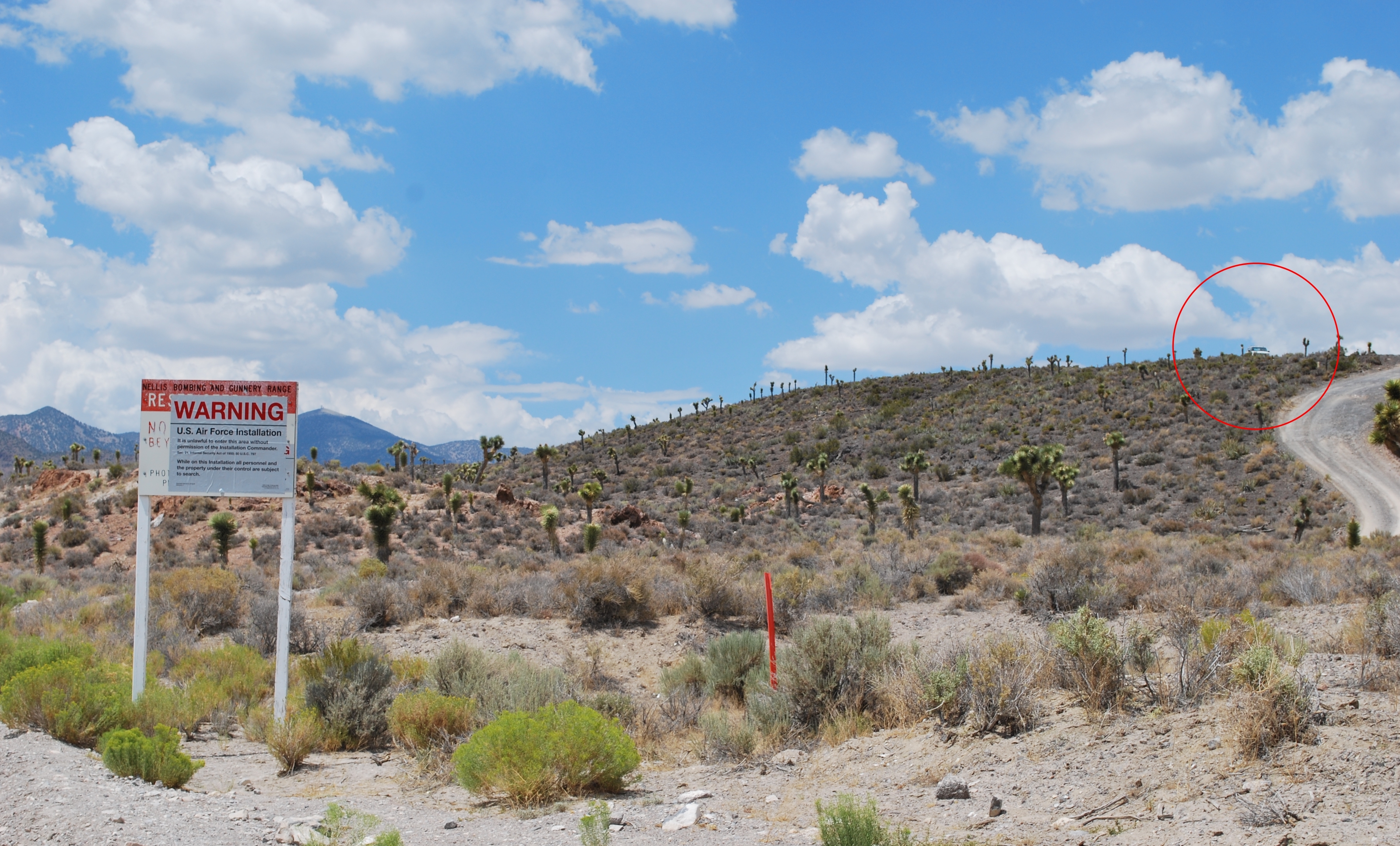
Do such sites of isolation provide an alternate genealogy for the foundation of rendition sites–“blank spots on the map“–that the NSA much more recently operated at a similar remove from the coasts, public memory, or legal oversight? Do they provide one genealogy of the “black areas” of the law that allow the invocation of state secrets by the government and especially by the Air Force and CIA, but also the Department of Justice of Alberto Gonzalez, where the torturous logic of Schmitt’s emphasis on the state’s right to name its enemies regained respect, partly through the validity that the conservative icon Leo Strauss had given his “political theology” as one way for a strong state to unite men against “evil”: it is tempting to see what role Schmitt had in providing a precedent to invoke state secrets privilege to shore up the “black worlds” of the NSA, where extraordinary rendition of foreigners like Khaled El-Masri or the Canadian Maher Arar occur, and Groom Lake stays black–and effectively off the map–removing the construction of Air Force bases in Area 51 from criminal persecution, and effectively sanction violations of both federal law and the international Convention Against Torture in some locations. Indeed, the establishment of Relocation Camps mirror and echo the temporal creation of military sites in Southern Nevada that sprung up in the 1950s, nearby Area 51, which has been imagined both as a site of alien abductions and an alleged site for the US military to dedicated efforts to converting alien aircraft, have long remained hidden, and most probably not only to conceal contact with extra-terrestrial life for reasons of state. The recently expanding government centers tied to extradition offer an an odd gloss on the myths of alien crafts’ conversion to the US military. In a perverse fantasy of military omnipotence and natural providence, where for some the US Government is believed by many to have inherited the manifest destiny of the nation into the otherworldly relations to alien life. Just past Death Valley National Park, the Nevada Test Site and Yucca Mountain almost constitute the areas that the nation has removed from most maps–
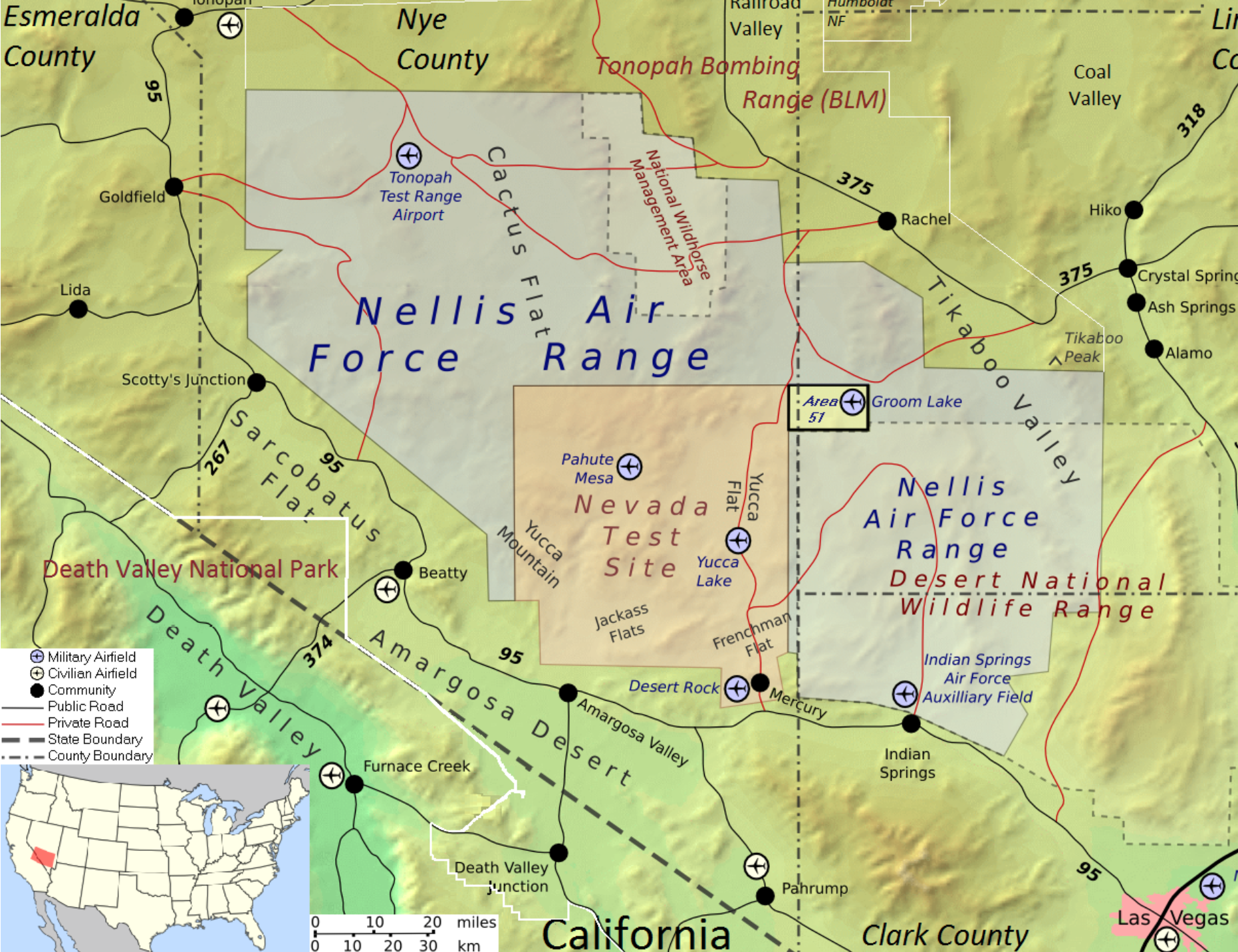
–even if the secretive area around Region 51 and Groom Lake, just above the Nellis Air Force Range near Las Vegas, became best-known as sites of an secretive space of rendition and imagined extraterritoriality.
Is the ideal mapping of these areas as removed from oversight, and not subject to prosecution, not only a relic of the Cold War, but a region rich with precedence as offering a theater of opposing the enemy, to maintain enmity, in Schmitt’s curious words, and to maintain such enmities to cultivate the primacy of action, and sustain a not-so-hidden sort of political theology? If nothing else, it is an odd through-the-looking-glass sort of authenticity that seems located in these areas hidden from oversight. The imagined extraterritoriality which the government entertains is after all a sort of fictive escape from recognizing rights agreed to be accorded individuals, by the escapist alternative of removing them from the actual map: it is as if, by leaving the map blank where they lie, the conventional rights accorded to all who inhabit the actual world are somehow exempted by their placement off of the recognized map, and outside the nominally universal rights that are accorded citizens by US law and by international legal conventions. The map, in this sense, seems to have more power for removing people from international treaties and standards that the law could otherwise allow. 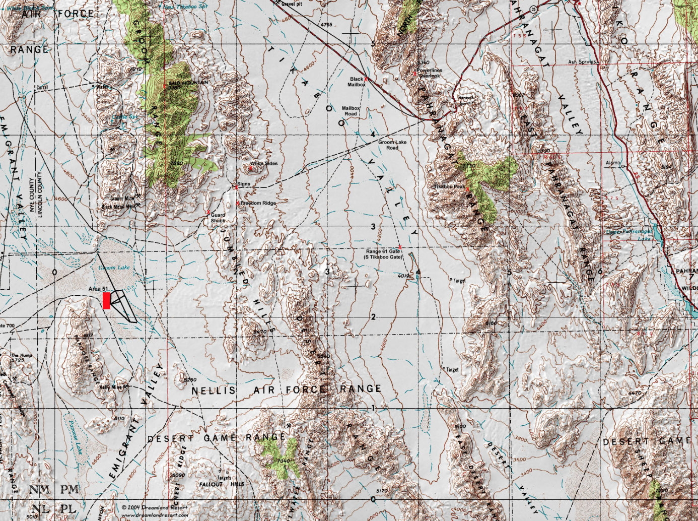
Is this a landscape of paranoia, whose contours were poisonously sculpted by a nuclear arms race of the Cold War–or a map of a secret history of sequestration, whereby an expanding nation state subtracted places from judicial review and removed them from public scrutiny?


