
Significant celebratory buzz has accompanied the recent images that “map” the distribution of matter and heat in the early universe. Let’s stop on the word map, however, as we admire their content. It might be worth it to consider how their content became considered as a map–as opposed to a simple image or visualization–to tell us about how we see maps. Back when Arno Penzias and Robert Woodrow Wilson first accidentally recorded background microwave radiation resonating through the universe while at Bell Labs in Murray Hill, NJ, they were so puzzled that they paused before reporting their results, trying to make sense of the buzzing in the background by cleaning their instruments of registration and even scooping some fifty pounds of accumulated pigeon poop out of their massive antenna. They knew the significance of the sound, but weren’t quite sure of how to make sense of the measurements. And so they checked multiple times before they went public about their observations, because their was no clear way to imagine what form that background static took. They barely had images of background static–a hum that barely registered, and was not even imagined as able to be visualized.
The reconstruction of their results was hardly a map, since the detection of background radiation was so slight and the images itself so trace-like and whispily diaphanous. What radiation did register showed, according to a modern reconstruction, something like a very primitive radar or sonar or the ghostly shadows of an ultrasound–after all, this is the afterglow, as it were, of the Big Bang explosion that first scattered the universe’s matter:

While a reconstruction, this image provides a basis to trace a history of background radiation images that reveals how their forms of visualization were seen as retrospectively mapping the distribution of matter just after the time of the Big Bang. The COBE probe dramatically clarified these measurements by 1989, using satellite measurements to differentiate something of a clearer visualization or intensity map of remaining background radiation eery afterglow corresponding to variations in local temperatures. This is somewhat like an early form of medical imaging, and is reminiscent of an MRI with isotopes or coloring agents injected in a bloodstream, highlighting areas with a sort of detailed fuzziness.

The COBE probe gave important confirmation of the “lumpiness” or uneven distribution of matter–in other words, it suggested that there was already a sort of map of the distribution of densities in the 10 to 34 seconds after the Big Bang, with long-term consequences for our universe’s configuration: variations in density were defining elements of the background radiation distribution COBE showed. The evolution of the universe’s size increased this lumpiness, as concentrations of matter in specific places created disparate gravitational pulls Other images oddly suggested continents and oceans by their terraqueous color-scheme, which indeed recalled a terrestrial map, if something like a relief map of considerable granularity:

The metaphor of a relief map is helpful. Despite bluriness even of a later 1992 image from the Cosmic Background Explorer Probe (COBE), whose forms are less reminiscent of a familiar oval terrestrial projection than a map of heat distribution, and plots the temperature changes in revealed by the background radiation on galactic coordinates: it maps the after-image of a primeval heat-distribution, giving a sense of matter distribution that gave off light and created the iridescent glow. But it seemed to lack the detail of a map so much as a visualization or imaging with considerably great lumpiness or variations in cosmic microwave background radiation that resulted from that primeval explosion:

The enormous augmentation of detail within the image that the larger Microwave Anisotropy Probe generated after it was sent to space in June of 2001 provided a far more detailed picture than earlier believed possible. To be sure, its acronym aside, this didn’t look like anything we’d call a map that recorded a uniform distribution of space. But the visualization of emissions published in 2003 based on a year of data collection was of truly stunning detail as “an image of infant universe”–the map of temperature variations was a big improvement from the first “baby pictures of the universe” taken by Cosmic Background Imager high in the Andes. (Each ‘map’ has been announced to the public with considerable fanfare focussing on the wonder of recording this image of background radiation in any visually readable form.)
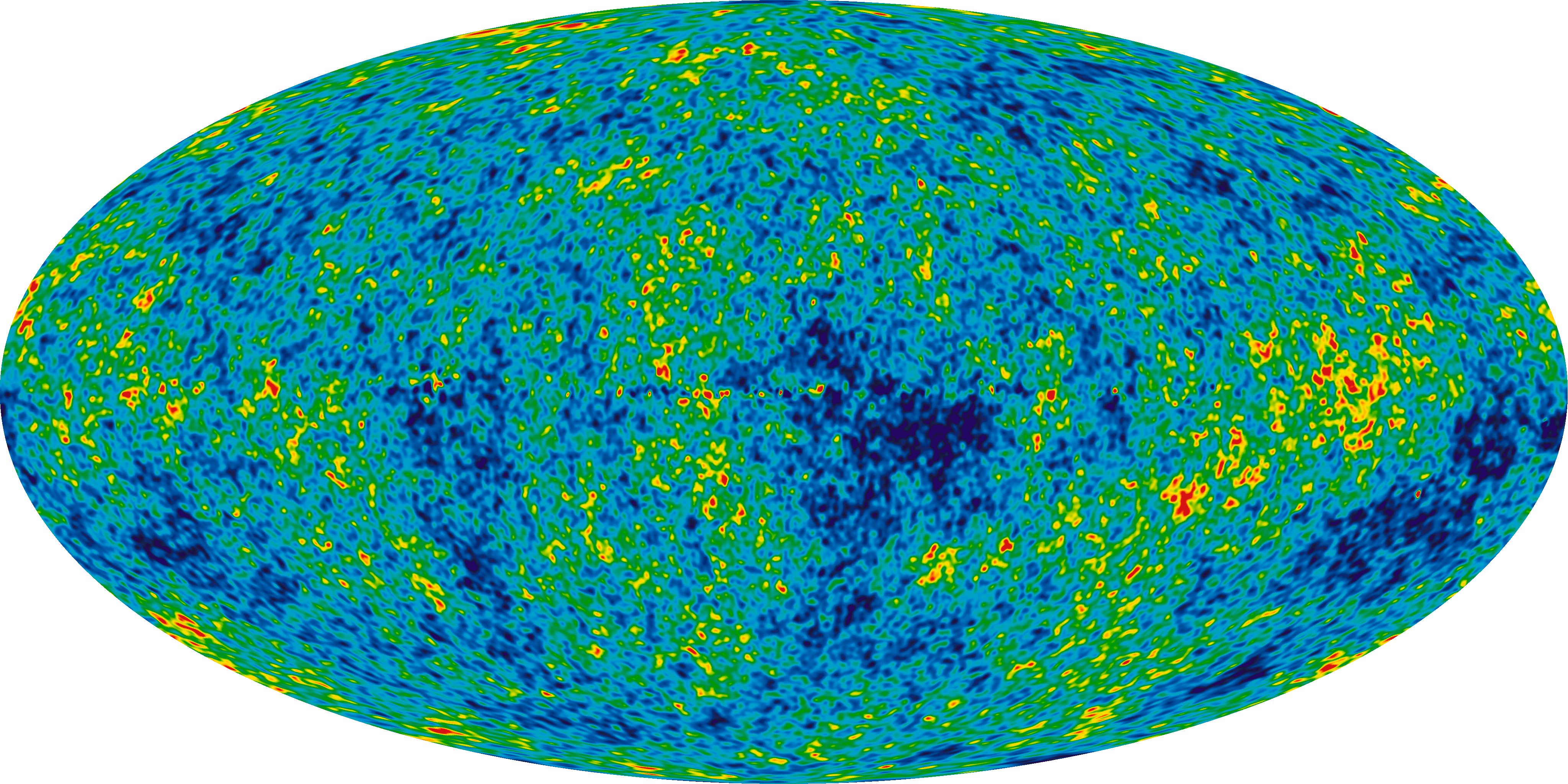
To improve the resolution of this “picture,” the later WMAP spacecraft, an improved named after the cosmologist gist David Todd Wilkinson, a physicist who was researching background radiation when Penzias and Wilson first got their results. The WMAP employed reflecting Gregorian dish mirrors to register background radiation at a far greater resolution with a 45-fold greater sensitivity than the COBE probe. The exquisite heat-variations compiled temperature fluctuations in the “Cosmic Dark Ages” 380,000 years after the Big Bang, “mapping” the last scattering of light from the explosion. The findings set a new basis for imaging the landscape of the early universe, supporting the current Standard Model of Cosmology, and revealing a picture of a universe in which dark energy played a significant role. It depicts with unprecedented granularity a record of of heat variations astounding even when shrunk to the size of a 4-by-6 index-card:
 .
.
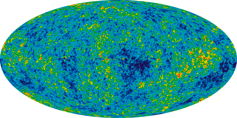
Leaving aside the embedding of “map” in the handy acronym of the WMAP, or the Wilkinson Microwave Anisotropy Probe, the beauty of its synthesis of data was called an “image” of background cosmic radiation, more than a “map” of the early universe, in 2003, as when 3-year data were released in 2006. The oval projections used to compile an all-sky image of temperature fluctuations reveal the spots and clusters that grew to form galaxies, was a massive effort of data collection. Take a moment to click on this image of the some 15 billion years past, and examine its variations in detail, revealed a striking lacking any uniformity:
The images of the universe published several days ago were universally presented as a map, is a similar data synthesis based on data accumulated over 15 months. The sensitivities revealed below in a heat map of readings from the orbiting Max Planck space telescope. They suggest an even more surprisingly variegated distribution of matter that looks closer to something like a continental division of the world, as if the macrocosm prefigured the microcosm of earth, but seems even more un-uniformly distributed and, as astronomers put it, more “lumpy”:

The image, like a world map, is a visual register of knowledge, as well as a basis for future research and theory-checking, condensing substantial empirical information and sightings. It provides a partial confirmation of the age of the universe, and grounds to support the Big Bang model and theory of cosmic inflation. (This image suggests decreases the amount of so-called “Dark Matter” that is around, and caused some adjustment of the dates of time since that huge explosion.) As such, the “map” seems to reveal our ability and interest to the stock of progress, see some new directions for work, and be satisfied we have something (at last) like a fine-grained map based on these results, even without the identifying names or signs of orientation we expect from land maps.
How does it offer viewers a map? For one, it presents a sort of key unlocking a mysterious architecture, and something like a hidden architecture of the world that is analogous in its potential meanings as the human genome map. Synthesizing a huge amount meaning, much in the manner the human genome project, both reveal a sort of master-code in meta-data scientific images that seem mythical master-maps of knowledge. The earliest image of the universe is also stunningly beautiful in the variations that it reveals with an almost palpable resolution and the sheer beauty of delineating a primeval topography of matter is stunning if not mind-boggling given it is recording a skyscape of some billions of years ago: the sheer “beauty” of the image, admired by cosmologists like David N. Spergel, qualifies the refined synthesis of variations as a “map” as well as a registration, and as revealing a distribution of local temperatures, even though it is not that comprehensible as a record of space.
But the data compilation also interestingly fits how expectations for mapping have radically shifted since the widespread acceptance of GIS, or computer-generated images not based on individual images or transcriptions but compiled as graphics, whereas earlier visualizations would not have been so readily classified as maps. The broad purchase of maps as intellectual tools and visual bases for further inquiry is reflected in the large number of media maps that are daily diffused on the web, Television, and other platforms of visual consumption. While we used to consider maps drawn renderings based on hard data or derived from surveying tools, the acceptance of computer-generated images makes us ready to call the synthesis as a map. The refinement of its color schema and what might be called its greater resolution or granularity suggests the broad popular currency of something like a projected heat map that project changes in summer temperatures as a result of global warming–or the palpability of abstract blobs of bright red coloration in weather maps denotes heat fronts.
The below maps for example chart the projected growth of summer temperatures for the years 2050 and 2090, and make an immediately felt and particularly vivid argument even by abstract forms, in which the earth assumes a temperature in relation to previous summertime highs:

The Plank image of the universe meets the demand to have an actual image of what was then, as well as of a readable synthesis of data.
Of course, it’s a much more satisfying picture, and one of considerable technical dexterity and achievement. More to the point, it is a synthesis of astronomical observations, whose measurements are correlated to assemble what seems a continuous and coherent whole. And that makes it a map, after all, in an age of data correlation. It doesn’t have any of the symbolic recognizability of anything like a global projection, to be sure, or contain any orienting words or textual signs, but the notion of an early differentiation into degrees of lumpiness of matter is as compelling an image as we’re likely to get or could reasonably hope. Indeed, the “baby photograph” metaphor is pushed to new heights at the same time–“fatter than expected“–and interest in the image’s general bumpiness. The new language of the topography of the Big Bang is what the map allows, and where its beauty lies.
It’s an amazingly satisfying as an image that allows us to peer so far back in time and try to grasp what it is we see before us on its surface. The elegance of the detail of its data of sources of heat allows us to feel, or sensorily apprehend, aspects like the “lumpiness” and lack of uniformity in the early universe, and to start to grasp what an odd terrain of matter it was.
It’s also a way that the distribution of matter, in its untouched, pristine state, returns to us even in the age of the anthropocene.

