Category Archives: Google Maps

Re-Writing Mapped Space: Maps as Texts

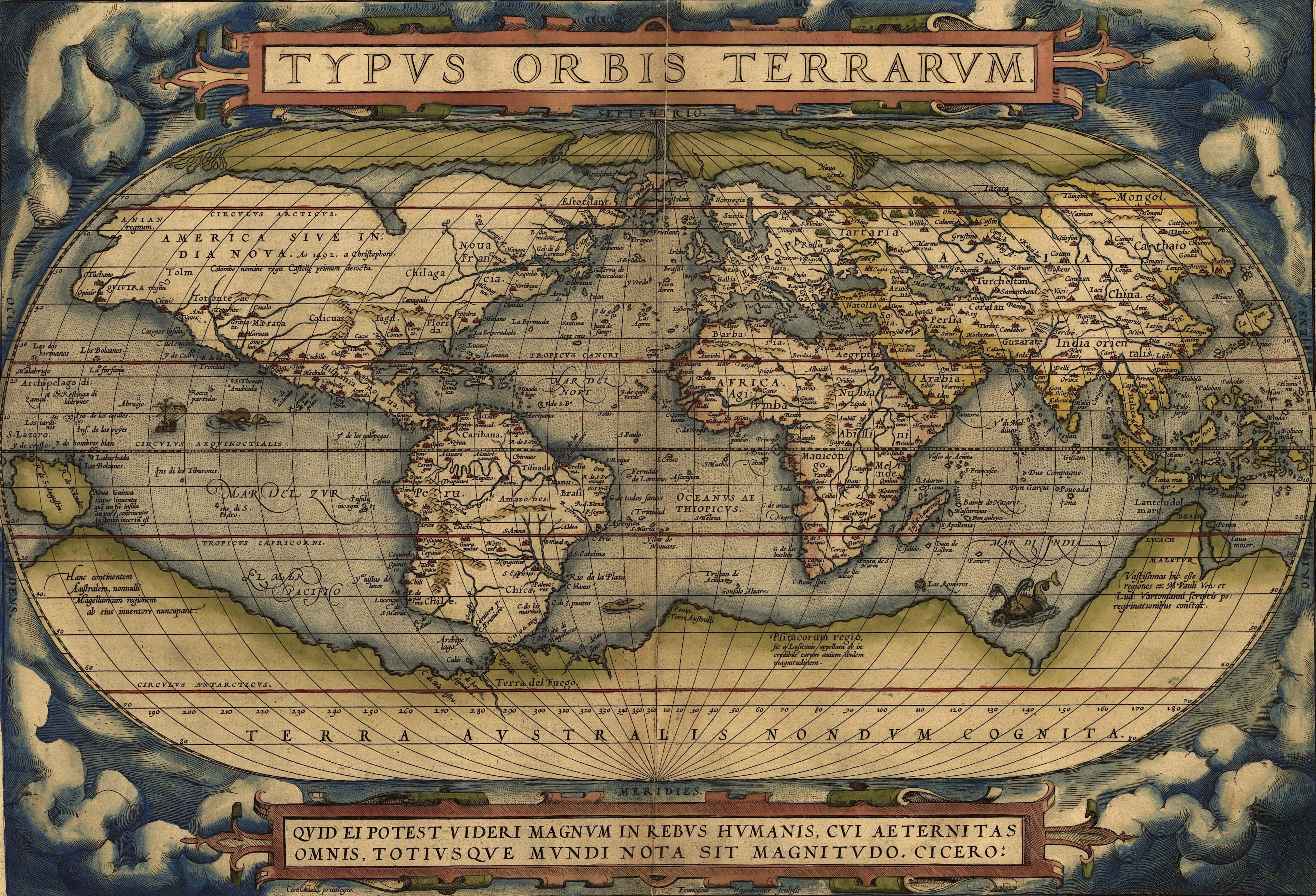
The Atlas of True Names   (2008) promises a legible cartographical surface clarifying confusions–although this enterprise is, in fact, less of a rebuttal to the deceptions of maps than based on whimsical fancy, the placid surface and mutely authoritative capitals of its densely written surface are something like a response to the comprehensive coverage of Google Maps.  Here, erudition crowds the visual surface of the map that draws its viewer onward across its surface on something more like a treasure hunt for amusement than a normal trajectory through space.  The text-based format of the map, whose traditional appearance and muted topographic coloring are equivalent to a calm reassuring voice, are a very retro surface, but as one looks closer, familiarity gives way to surprise:  for the translation of each place-name into the literal meaning of its signifier unpacks the familiar surface of the map.  The product on view gives new meaning to legible cartographical representations of expanse–or for that matter to maps as texts–by providing a map of the “true meanings” of toponymy in other maps, by a kind of reductio ad absurdum of etymological origins.

As we look at it, to be sure, we seem to be falling down something of a rabbit-hole, of which maps hang on each side, as for Alice; for the map  retains few familiar names.  The maps in the Atlas of True Names remind us of the extent to which our understanding of mapped space is determined by the location of names we read on maps’ surfaces, as much as other map signs.  Rather than use big data, the map of North America boasts data as small, and apparently as old, as one can get:


USA_1000


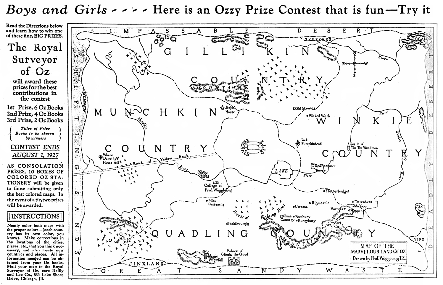
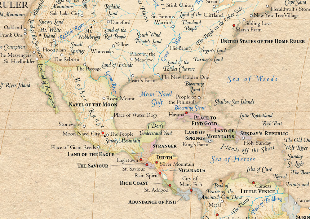
There’s more than a bit of wacked-out humor in the map’s subversion of the schoolroom hanging map used to study the states’ capitals or high-school text of history.  But just as the notion of “United States of The Home Ruler” seems inconceivable in a pre-Homeland Security world, and independent of etymological reconstruction, between the staid “Land of Settlement” and prosaic “Navel of the Moon,” the politics by which this atlas retrofits the map as object merit examination as remapping an inhabited space.  As much as a novelty, the marketing of this atlas returns us to the map we grew up with, and winkingly suggests what good map-readers we are.

In recasting such a familiar region with “true” place-names, map-reading becomes an exercise not only of re-reading toponyms with a thesaurus in hand, but an exercise of refamiliarizing ourselves with the naming of places that we know.  The notion of locating truth in maps might unintentionally echo an eery undercurrent scarily similar to the right-wing thirst for transparency in politics:  the shifted place-names of this project of re-mapping boasts the title of the “The Atlas of True Names” as if to curry to a skepticism in how place-names determined by multiple interests–even if the exercise in whimsy also aspires to enchantment.  Replacing the names we’d expect encourages to read the cartographical surface with the sort of pleasure of discovery of place-names we might have while headed to a radiant Emerald City past Truth Mountain, Winkie River and Rigamarole.

1927 Oz Map


But we’re in Kansas; not in Winkie-Land.  For American readers, the flattening of places into a register of quasi-scriptural authority of place seems to be an echo of the sort of national essentialism of the map–even if this was far removed from what the pleasant couple who designed it in their native Lübeck, here the “Lovely City,” might have actually intended.  Indeed, the negotiation of place names that began from custom and usage, is all but erased in the replacement of toponymy with a “true” origin that leaves Texas “Land of Friends” and Maine the “Land of Folks” and just reminds us of the darned problems of relating signifiers to signified.  Cuba as “Place to Find Gold” is transposed from a treasure map, but once removed from “X-marks-the-spot” deictic pointers, seems robbed of meaning.

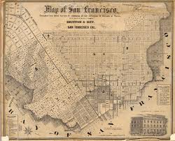
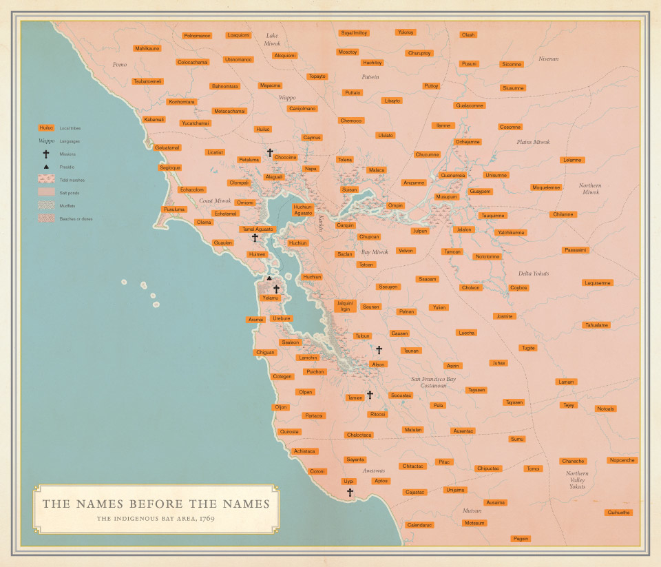
Consider, for one, the range of names that were lost or purged from the maps that we use to navigate the Bay Area alone, let alone the entire American West, in this intensive compilation of native names for place in circa 1760 since erased from our own cartographical records of the same area:


Solnit_Names_070610-1


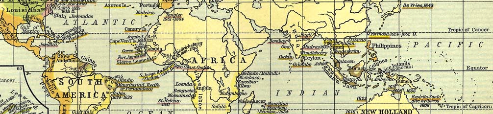
Or consider the active role of colonizers in the renaming of regions, places and islands over time and human history so evident in the band around the equator:


Colonization around Equator


Which brings us to the odd title of the atlas, sold for an unclear audience.  The claim to be “true” seems particularly questionable in its flattening of the historical richness  of the thick descriptions any map recapitulates.  While I don’t want to question or assail the attempt to “re-enchant” a space whose meanings mutated over time, the problem of viewing the layers of history as a matter of direct translation forgets that the past of any place is itself another country, if not a sequence of multiple worlds, that a one-to-one re-matching also threatens to impoverish at the same time as essentialize.   And as much as re-enchanting, there’s the sense that this pair of married cartographers, Stephan Hormes and Silke Peust, put their readers in the position of Alice, who “had not the slightest idea what Latitude was, or Longitude either, but she thought they were nice grand words to say,” but found the words compelling and so intelligent. Truthfulness and maps are an odd combination:  the map is a register of actuality, but a polyglot rendering of actuality.

Yet as if disclosing hidden knowledge, even while barely maintaining a straight face, the unwitting effect of the “True Names” project is to flatten the historical accretion but also multi-cultural negotiations that provide the back story of the formation of place-names on the map.  The heaviness of “The Land of Settlement” that overhangs the familiar forty-eight, and the prosaic “Land of Cloudy Water” and “Land of the Shallow Water” aside, and even the romance of the “Land of the People with Dugout Canoes,” or “Land of Folks,” the notion is that this map has the true stuff for its readers.  Like the “Houses at the Foot of the Mountains” or the “Land of the People with Tall Caps” north of modern Pakistan.

The Anglicized toponymy of place is not only an etymological translation, but a sort of re-rendering of loci that invests the surface of the map with a epic-like declarative identification.  Of course, you don’t have to wander far:  Paris is the “City of Boat-Men,” and England (Great Britain) “Great Land of the Tattoed,” as any reader of Julius Caesar’s Gallic Wars might remember his description of the blue-painted men standing on the cliffs of Dover.  Hormes created the map together with his wife with aspirations to recreate ” an insight into what the people saw when they first looked at a place, almost with the eyes of children” as they encountered its topography, as if wandering for the first time in a country before time and seeking to capture local particularities, or to see the place for the mythical primeval time.

The inspiration of this map, and indeed for the treatment of mapping as a commercial enterprise, is less a report actual localities or surveying, than a removed activity of toponymic transcription, here under the guise or mask of Teutonic erudition more than compilation of unknown spaces; the idea is to make known space unknown or known again.  The aim is a sort of time-travel and a wiping clean of the slate of culture:   “Through the maps, we wanted to show what they saw,” he explained, eliding the palimpsestic quality of the map itself.  But the standards are not particularly high, as the goal seems to be to amuse.  There’s a certain failure to capture the acts of translation whereby a current English or American name descended from a French or other place-name, as Buffalo NY from belle fleuve, or for that matter recast “Rome” which appears as “Central City,” or even New York’s stint as New Amsterdam until 1644:  and even as late as 1630, colonists noted the divergent spellings of Mattachusetts, Massatusetts Bay, and Massachusetts, without seeing the need to arrive at orthographic stability.  And so perhaps a history of toponyms’ mutation can be included in the online version, bedecked with hypertext.   But learning is not the point, of course; and neither is a history of usage.

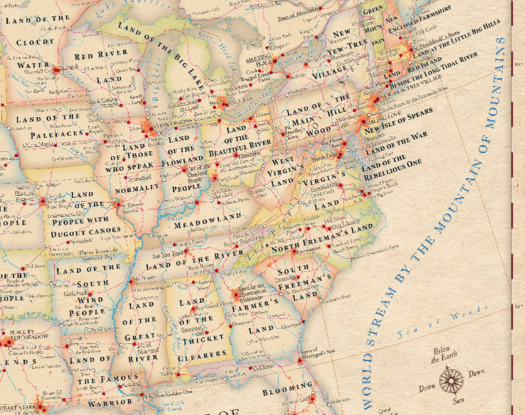
There is quite a bit of fun in imagining the renaming of the continuous 48 states with new identities like recasting Illinois as the “Land of Those Who Speak Well” or “Land of the Pale Faces,” even though the latter might now cover the entire continent:


map detail North America


The imaginative etymological reconstructions are a source of delight, if they don’t always successfully re-enchant mapped space and may also raise eyebrows.  Few won’t love such place-names like the “Land of the Cloud Water” or “The Sea of Weeds” or “Navel of the Moon” that give a quasi-biblical authority to what we usually read on the surface of the map most of us have known from first or second grade. Even despite the familiarity of some names–“Oakland” and “Salt Lake City” among them on the map, the diversity and history of the transmission of place-names are somehow flattened out to a single surface in one fell typographical stroke. It might be, moreover, that the location of ‘trueness’ in the names suggests both a sense of what the surface of the map usually hides and a barely conceals the right-wing paranoia at a conspiracy perpetrated even against us map-readers–echoing if not somehow analogous to the fears of a conspiracy that the falsity of Barack Obama’s Hawaiian birth-certificate has been recently reconfirmed which vigilant readers of the Wall Street Journal continue to post in the responses to articles for whoever is listening.  The renaming of “true” place-names somehow contains an element of rectifying the deceits long perpetuated by state-trained cartographers obscure, with a healthy skepticism toward the authority transmitted in maps:  this almost seems  the latest echo of Richard Hofstadter’s paranoid streak that shapes politics, in which politics was an “arena for angry minds” –if not in such Manichaean terms as Hofstadter argued, but rather a sense that the signifiers associated with the place might be better decoupled from them, lest we naturalize the map’s surface, or mistake it for the territory.

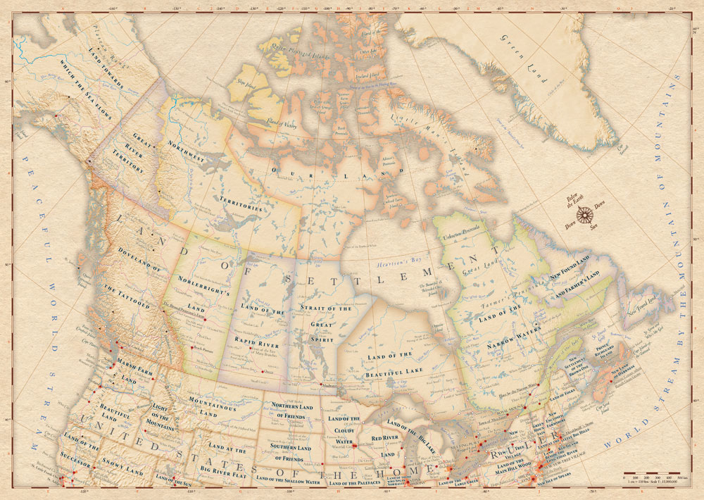
One can imagine the scriptural significance that certain readers would paradoxically invest in the 2008 corpus of maps.  Although the two practiced cartographers mobilized an array of Old World erudition, and they clearly took some pleasure in tracing back, from the port of Halifax, “Remote Corner where Rough Grass Grows,” the act of renaming was something of an inversion of the cartographer’s task of “put[ting] as much information as possible in a single image.”   For in this case, the image is not what makes the information assembled accessible after all, so much as a the quasi-scriptural authority invested, with some imaginative leaps, in place-names that repopulate its surface, and shift the ground beneath one’s feet.  How is Hudson’s Bay (and other places linked to proper names) given true immediacy when Heartion’s Bay? Quasi-scriptural is not a misnomer given the solemn intoning of places like “Land Towards which the Sea Flows” or “Mountainous Land” across the map.


Einfaches CMYK


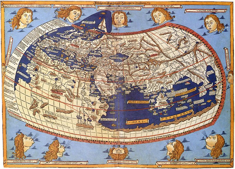
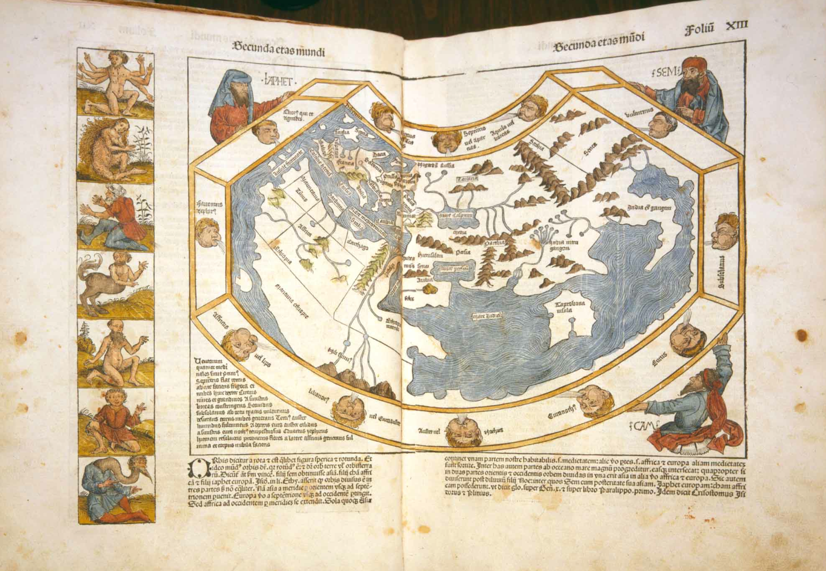
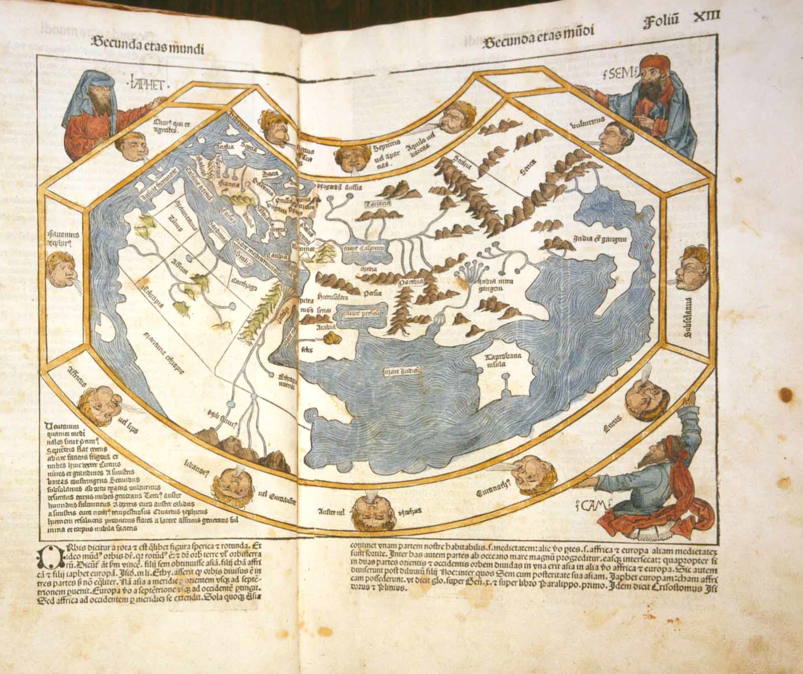
The sort of transparent legibility of the printed word seems vaguely Lutheran in its notion of a return to a scriptural truth, and indeed it echoes the enjoyment Luther himself took in including in his German-language Bible a supplemental map of the Holy Land.  The map, derived from the circa 1509 map Lucas Cranach had engraved of the region, was intended to satisfy readers’ curiosity of Holy place-names.  The reprinted version of Cranach’s map, with its toponymy expanded, is an example of the promise print offered to the legibility of the surface of the map.  Here is a version reprinted in a Dutch Bible of the 1542, revealing the course of Exodus and lending concrete meaning to those temporally removed events so that one could witness them anew:


Cranach Bible Map Holy Land toponyms


The sort of legibility that print promised provided access to an assembly of spatial relations that was not earlier in the ken of most readers.  The landscape map that provides a basis to understand Exodus invested a material presence to a set of quasi-mystical names long transmitted without a clear sense of their actual locations.   We are now perhaps not reading a map, but playing something like a post-modern parlor game. In contrast to Cranach’s useful collation of toponyms in the sacred text, many of these etymological reconstructions are amusing to imagine as modern road maps.

“Mom and Dad!  We’re finally at the City of Many Fish!  And I can see the Peak of the Bearer-of-the-Annointed-One Dove in the distance!” “Hurray!  We’re at Place by the Meadow in the Land of Friends!  Let’s get out of the car!”  This is the absurdism of etymological archeology, erasing the traces of population or local history in the hopes of a new essentialism of world myth. While all this is overwhelming, a focus on one contested region of the world–and attendant diminishing of wacky amusement that comes with time and repeated map-reading–suggests the odd comfort that comes from an erasure of the multicultural contexts of the evolution of place-names discussed, among others, by how George R. Stewart famously romanced American toponymy in his historical account of place-naming that traced in a somewhat dry manner the negotiation of practices place-naming, ceremonies of possession, and textual corruptions mediated and brokered by inter-cultural contact and aspirations, documenting the translation of French or Indian terms to Anglicized place-names or orthographic shifts over time.

Indeed, a somewhat reverse pattern of trying to map primeval names for places from their modern proper nouns seem to cast some doubt on the philological rigor of the project as a whole:  the city first identified in the map’s first edition as “New Wild Boar Village,” was back-traced from “Nova Eboraca” (New York), despite the boar having questionable homonymic relationship.  (‘New Yew-Tree Village,’ reads the current map, although one isn’t sure how that relates to an earlier encounter with space not mediated by a number of encounters with lexicons; old maps, which might have provided “New Amsterdam,” are not noted or considered.)  Yet the prosaic image of yew-trees offer little sense of what York meant to the Romans or Britons, and the Latin toponymy might not even have been primarily vegetal in intent.  Other familiar places seem similarly distorted by an etymological imaginary or fanciful but sloppy erudition:  “Saint Little Frank One” seems a forced upstream etymology of “San Francisco,” inanely confounding “frank” as proper name and adjective.  And how does “United States of the Home,” with its unintended echo of the Homeland Security Department, line up with Amerigo Vespucci?   Why (on earth) is the city of fallen angels, “Los Angeles,” more transparently or truly registered as “The Messengers”?

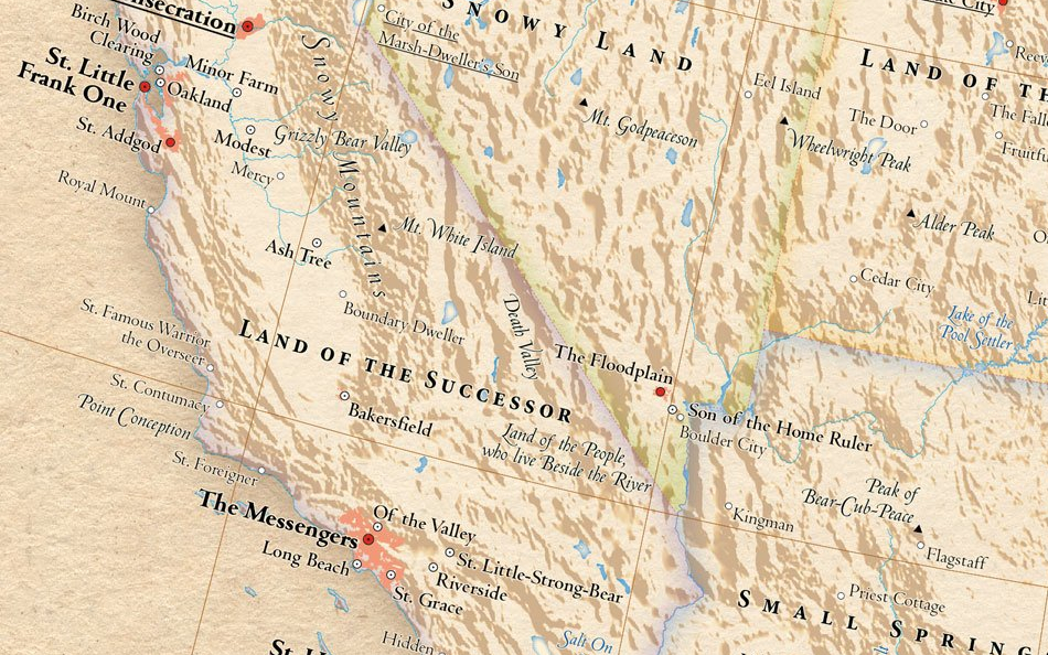
What’s gained in the new linguistic transparency that this re-insertion of English toponymy for a rich cultural canvas of the surface of the map?  The more circumscribed focus on a map of the western US and southern California make more clear what’s lost in the flattening of historical encounter with space, however much it might satisfy the English Only crowd, a sanitized landscape where we are given the impression of being able to truly understand what the foreign tongue both mystified and masqueraded as euphonious for our ears, so present in much of the American midwest.


Sample_W_US-1


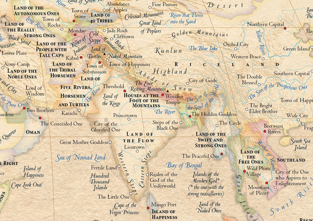
Some of the unsettling unheimlichkeit of the map may derive from the impression that the place-names have been taken off the map, put in a vat of acid, or a very hot rinse, and then put back in place on its surface.  Recasting the map as something like a Google Translator program’s reading of place seems to respond to fears of the messiness of globalization, by rewriting the maps in our own lingua franca to erase the multicultural messiness found on the map.  With everything has now been translated to English, at last, a properly legible text promises a true uniformity to project English only on any foreign labeling of place, extricating the map entire from its web of polyglot diversity in a newly proprietary way. The result is something of a comic fantasy of map-reading that has a somewhat J. R. R. Tolkein-ish tinge, or, in the case of the Land of Five Rivers, Horsemen, and Turtles, the sound of Dada-ist language poetry that calls into question the cultural specificity of very process of naming places on maps.  “Once the names have been taken back to their roots and translated into English,” Hormes and Peust boast, “it is immediately apparent that our own world has an extraordinary affinity with Middle-earth,” we learn, “clearly rooted in Man’s observation of his natural environment and [the] physical location of a settlement.”  (Holmes admitted that his own interest in maps can be traced back to a childhood obsession with The Lord of the Rings, which presents a toponymy “so clear that  every child understands it,”–even before the cinematic recreation of Mt. Doom let it enter most kids’ imaginations–in his map the Mediterranean is after all “The Sea of Middle Earth.”)

Am I wrong to see something monolithic and oddly neo-fascist in their alleged “re-enchantment” of a drawn, or re-written, cartographical space?  The sort of verbal dominance over localities may be less explicit, but it is somehow just as insidious, if not tongue-in-cheek about the authority maps hold. I don’t mean to be so harsh.  Although its authors openly aspired “restore an element of enchantment to the world we all think we know so well,” and allow readers to “take a look at the world with fresh eyes,”  even the Atlas of True Names “United States of the Home Ruler” or “Great Land of the Tattooed” playfully suggests a level of transparency to the map that seems to push  back against globalization by returning to a familiar idiom and tongue.


California


If Stewart’s classic study of American toponymy traced the negotiation with American Indian place-names, the reduction to one language is a cultural flattening of the surface of the map, in a somewhat paradoxical Enlightenment project of making inhabited space visible–or lisable–in the sense that legibility trumps space or cultural remove.  But the mobilization of this linguistic erudition into an enterprise pushing back against the world connected by the internet to restore wonder of creating an identifiable relation to space onto the surface of the individual map. The problem with attempting to restore such a sense of wonder is magnified when we deal with other cultures, where one finds echoes of the land of Marco Polo on the Spice Route, from the “Land of the Tribal Homelands” and “Land of the Fire-Keepers” (Azerbajan) along the “Golden Mountains” to “Riceland” (China); the “Town of Happiness” lies comfortably near the “City of One Who Aspires to Enlightenment,” perhaps the city of naked philosophers or gymnosophists inhabiting the edges of the worlds mapped by medieval men.


sample_w_asia


There is a certain Teutonic Enlightened strain in the bleaching of past history in the name of one mother (or father) tongue.  Shifting the names of places is a way of getting you to pay attention to the entire surface of the map for something surprising or out of the ordinary, but also flattens the aura of far-off places in a sadly normative fashion, creating something like a new level of two-dimensionality by robbing places of the imagined accretions and associations all place-names have.  There’s something sad of the absence of the romance of the map that results, in which even London seems pretty absurd as the “Unfordable River Town,” though the unaffordable river town it might be.


England--IMpotance of


Indeed, the romance of space is entirely tied to the euphonious nature of place.  Even Frances Mayes herself might have trouble writing about the Tuscan Sun by living outside The Blossoming One, in the sun-drenched Hilly Mountains–the very practice of cross-cultural translation that she professes is itself flattened by the absent assonance in the  toponymy that these maps of Italy and Tuscany afford budding poets.  Even though “The Land of Calves” and “Rainland” seem romantically appealing in their own right:  but they don’t sound like the euphonious landscape filled with ginestre and tromboni, as well as the lovely vibrant tastes of basilico.


Italy in English


White-washed to an English rooted in etymological derivations, the landscape is in an odd way de-peopled or depopulated as it is removed from how place is spoken, and re-mapped, by the people living in its landscape.  There’s a child-like naiveté we get from reading the maps’ place-names, which mystify even the locations that we know all too well. There is the odd sense that from a space in fragments, these cartographers are trying to create a new wonder of the whole, arrogating authority of naming to themselves in the name of recuperating an initial primeval confrontation with a topographic landscape.  The task seems in part to invest immediacy in the world as it is encountered in each place in a comprehensive topographic map–without considering the synthetic nature of the fabrication of cartographical space, and although this seems at odds with the synthetic construction of a uniform distribution of spatial relations.  It seems the cartographers took a digitized image to re-write the toponyms they found with evocative substitutes, but chose to keep some, as “Oakland,” “Riverside,”  “Long Beach,” or “Salt Lake City,” as such were sufficient topographic descriptors in themselves.  In seeking to preserve the essence of each name as much as they can, they may unwittingly undermine  forging continuity in the heterogeneous surfaces of mapped space.

2 Comments

Filed under "Atlas of True Names", cartographic whimsy, Frances Mayes, Google Maps, historical maps, Middle Earth, native toponymy, Winkie-Land

Mapping Exploding Shit

It’s interesting that not long after the fertilizer plant in West, Texas exploded in flames last Wednesday, the scene showed up for many viewers on Google Maps, as a sort of vicarious version of spectatorship:  the map noted sites of interest, while Reddit user OverR created a custom map in which he identified areas that had been evacuated of inhabitants and site of the original natural gas leak blamed for the explosion, noting its epicenter by a bright red pushpin:


Google Map West Texas

How can a tragedy that created fifteen deaths and many more wounded be mapped?  Why the rush of curiosity to map its occurrence, and debating where the explosion had occurred online:  “I believe the location of the video is actually on the south side of that chainlink-surrounded field,”  noted nelsonblaha.  “The west side, where streetview is available and where you have the video marked, does not have any fence matching that pattern of vertical poles.”

After someone vandalized the map by shifting markers and someone else deleted it from the server, he reposted, attentive to maintaining the map as if for public knowledge.  The phenomenon of mapping the plant and its storage tanks of fertilizer was a way to grapple with the airlifted wounded ferried to hospitals, after local hospitals in West reached capacity.  Beyond a tool of spatial orientation, the map was a way to process an event that was shattering in itself, and the question if residents even knew that the silos stored fertilizer, as they tried to remap the explosion to the sites they knew in their memory: “My mother said she was aware it was a fertilizer storage facility, though my father did not know, assuming grain,” Thalassicus1 noted.  “She was prepared to evacuate us if the place showed signs of danger. Anyone out of eyesight of the could be unaware it existed, especially if new in town. It’s in a somewhat remote corner of town which hopefully limited casualties.”  And then:  “It’s eerie because my brother and I used to play just a few dozen paces away from the blast site, literally across the street in the playground you can see on google maps.”

The map only started to orient viewers to the still unexplained tragedy of the explosion that occurred twenty miles north of Waco just before 9:00 p.m. Eastern Time, or during dinnertime in West, immediately wounding 160.  The icon for the explosion was a group of leaping flames:


Reddit R


We have heard many times over the past few years how fertilizer and ammonium nitrate plays a crucial role in home-made bombs.  It’s perhaps a surprise that since 1921 there are only records of some 17 accidental explosions at a fertilizer plant, and only four disastrous explosions of ammonium nitrate accidents caused over 100 deaths.  The  explosion in West, Texas is more confusing since the majority of these accidents occurred some time ago–just over sixty-six years ago, a ship containing fertilizer exploded at the port of the Texas City, a blast of some 2300 tons of ammonium killing 581; a 1921 explosion of a BASF plant in Oppau, Germany killed 561; the 1951 explosion of a plant of fertilizer in Belgium claimed 189 lives.  In 1924 in Nixon, NJ, an explosion killed 18 at the Nixon Nitration Works, and trucks of ammonium nitrate exploded in 1959 in Oregon (killing 14) and Kansas City in 1968 (killing 23); 1994 saw a huge explosion in Port Neal at a plant of some 5700 tons of ammonium that left 4 dead.  The Canadian Press has created the following interactive map of other ammonium nitrate explosions since 1921.

The current explosion killed 15, ten of whom were first responders and firemen, as well as destroying a nursing home, middle school, and some sixty-five homes.  It raises questions about how progressive deregulation of industry and attacks on the EPA encouraged–if unwittingly–the lack of oversight given that no monitors been present at the facility for some six years.  There were not any sprinklers in this facility, as well as no containing walls for the eventuality of fire:  nor did they report the 270 tons of ammonium nitrate stored in the facility.  We might start to map the effects of deregulation on such accidents, if the space was not already destroyed.

What makes a fertilizer plant explode?  Lack of regulations would be a good place to start to look.  As a reminder of how present the presence of the fertilizer industry is in our country alone, and how many are nitrogen-based (noted by red points), creating the highly flammable ammonium nitrate:


Fertilizer Plants in the USA


It is striking that there is at least one per state; one disaster waiting to happen and to be seen on the map, and not hidden in the landscape.  Only if an explosion again happens will the sites of tragedy be mapped in greater detail.

Leave a comment

Filed under ammonium nitrate, Google Maps, mapping fertilizer plants, Texas

Maps, Mapping, Globalism: Imaging the Ecumene’s Expanse

That most ancient of words, Oikumene, expanded from the Greek “oikos” to designate a dwelling or residence, or ecumene denoted less the technical abilities of mapping or tools for describing of the world than the demarcation of inhabited lands in which civilized people or members of the church existed:  but the divulgation and expansion of the notion of mapping abilities have in recent years, since the explosion of information databases and during intense globalization since the 1980s, extended the notion of the ecumene that has grown to extend beyond the map.  It increasingly is invested as a terms with ethical connotations to understand or foreground humanity’s relation to its environment–or retake the human from the map–at a time when virtually no part of the world is not inhabited.  Indeed, the possibility of drawing frontiers between an uninhabited and inhabited world–or of defining limits of the inhabitable world–is so diminished that the concept of bounding areas are not clear; the areas of the earth that are no longer inhabited, its “open spaces” or unsettled areas have catastrophically declined in the past twenty years.

But the continued interest we have in describing how we occupy the world, if not demarcating the boundaries of the world, is at the center of the data flows and databases we process in GIS and that increasingly lie at our finger tips.  The instant generation of maps of the inhabited areas of the world have paralleled the catastrophic decline since the 1990s, when a tenth of existing wildlife declined and the catastrophic losses of wildlife confirmed at the  IUCN World Conservation Congress:  the shocking fact that only 23 percent of wilderness remains doesn’t even include the future effects of global warming, the current crisis in history’s tragedies mankind is currently in the process of having created or on its way to create.  Indeed, the destruction of wilderness–what are deemed intact landscapes that are mostly free of human disturbance–has perhaps most radically changed the nature of the inhabited world.  Since the “Last of the Wild” map was first published in 2002, the loss of almost a tenth of formerly uninhabited lands in the last decade is the most rapid expansion of human settlement of the planet, with some 3.3 million sq km of once-uninhabited lands lost, of which 2.7 million sq km2 are considered globally significant–a loss of some carbon biomass in forests destroys a resource that offsets atmospheric CO2.

wild_infographic2-1-1-1024x768

But let’s return to maps, such realities being to painful for me to contemplate.  Even as the entire earth is now inhabited, much is to be gained in the concept of actively mapping expanse both by preserving an analytic relation to that image of expanse, too often rendered abstractly in computer-generated cartographical media, and encouraging an analytic relation to how the material contents of maps embody space.  Crafting an image of the inhabited world as a bound expanse enjoyed a somewhat neglected historical lineage as a form of knowing the nature of an inhabited world and of orienting viewers or readers to the expanding unknown from the Roman empire:  the considerable intellectual heft of the term inherited from ancients–Eratosthenes, Ptolemy, and Strabo–and its signification of the inhabited and inhabitable earth informed most Renaissance maps and atlases, in which practices of mapping gained new epistemic ends as mediating comprehensive knowledge.

The comprehensive genre of the atlas, an illustrated set of maps promising true global coverage of lands linked by seas, developed in concert with the knowledge that the inhabited world extended beyond earlier imagined confined, and borrowed an expansiveness previously limited to nautical cartography or mapping.  The description of the distance to the edges of the world, if inherited from antiquity, provided a model for understanding the nature of the discoveries for the educated audiences among whom the first maps of the terrestrial ecumene first circulated both in manuscript and print–from the illuminated codices produced in Florence to the massive twelve-sheet wall-map announcing the Columban discoveries that the erudite Martin Waldseemüller compiled in the early sixteenth century Strasbourg from the school at nearby Saint-Dié-des-Vosges.

.

Waldseemuller-Map-631

The visual qualities of mapping, symbolized as an expansive landscape, cast the embrace of the inhabited world with qualities of perceptual transcendence over its variations and divisions.  Ancient geographic treatises included few maps; but mapping the ecumene created a relation of expanse and an observer’s eye in the late fifteenth century by organizing and ordering the globe’s inhabitation.  And although it’s odd to think of the ecumene as an inheritance of ancient geography that’s still employed, the inheritance mapping the inhabited earth resonates with Geographic Information Systems–although fashioning an image of the world’s geography has little of the ethical intent it seems to have enjoyed in both the ancient and early modern worlds.  When we daily orient ourselves to how space is inhabited on our computer screens, iPhones, or androids, we frame an image that bounds a record of how space is inhabited either to orient us to where we are going or how the presence of cars, people, bacilli, or weather defines the inhabit world.  Paradoxically, the growth of GIS technology has increased the manner of ways we can chart the inhabitation and presence of man in space, if it has not increased how we define its continuity, it has also provoked both a Renaissance of mapping and a crisis in the authority of the map as a representational record of the ecumene and its bound, as well as its bounded nature.

While the rest of this post isn’t exactly heavy lifting, but is stuff I’m still processing and finding my way around.

1.  The assemblage of maps in a sequence of global coverage was identified with the cultural distinction Ptolemy gave to the project of world-mapping on a graticule of meridians and parallels, to be sure, both compressing a growing sense of the world’s navigable expanse and indexing its toponymy along climactic zones.  The term ecumene challenged the mental imagination by encompassing local variety in a capacious global category, ordering a global map in a neatly bounded surface beyond the Indian Sea, and up to the limits of known land, in a feat of mental dexterity as much as precise or accurate map of exactly determined scale.  The lower boundary of the map copiously noted “terra incognita,” as later projections–and left it at that, as an expansive white space that exists beyond the sea and lakes of the moons, as this Florentine map includes, adopting the notion of an extensive northern ocean to frame the inhabited world–even while seeing the Indian Ocean as closed.

800px-Claudius_Ptolemy-_The_World

Indeed, even as the world grew more detailed and other continents were registered as inhabited, as in the Ortelian planisphere, the growth of regions of terra incognito expanded, as if to parallel the known regions which were designated by naturalistic landscapes:  the unknown regions of “America dive India Nova” were paralleled with the imagined “Terra Australis,” a later configuration of the mythical Java la Grande.

800px-orteliusworldmap1570

The ancient Greek astronomer and scientist Claudius Ptolemy proposed using terrestrial maps on geometrically derived parallels and meridians as tools of portmanteau-like capacity to comprehend terrestrial spaciousness, by segmenting the world’s inhabited surface by degrees of longitude.  The notion of mapping totality was particularly fertile for early map-readers a decade before 1492.  The tools for mapping the ecumene or inhabited world provided an ambitious compendium of global knowledge, although the geographic knowledge of the world was limited–and still was by the time of this world map, illuminated circa 1482:  although restricting the ecumene for modern eyes, its capacious reach extends south to inner Ethiopia and northward, beyond its broken frame, to embrace northernmost isles beyond Thule.  Rings of uninhabited islands indeed constituted, John Gillis has recently noted, part of the mental furniture on the boundaries of the inhabited world for most fifteenth-century men, and suggested a comforting bounding of the world that seemed to illustrate its protection and insulation, lying as it did between uninhabitable climactic zones and far-off seas.

The ethno-centered ancient term maintained a sense of charting the world’s recognizable inhabitants or those that mattered to the readers of maps:  so, in the Augustan age, Roman’s referred to the expanse of the empire as the ecumene, beyond which lived barbarians.  But even as it retained a bounded sense for Renaissance readers, the totalizing image of an ecumene provided a way to imagine the population of an expanse greater than lay in the ken of most–and to understand coherence within a world that included information from far-off lands, even if many fifteenth-century people lacked clear geographic categories of spatial division of an inhabited terrestrial expanse.  The edges of the earth were oddly clear for a period that suggests limited familiarity with expanse: the monsters and extraordinary riches found there were included in fifteenth-century editions of Ptolemy’s handbook of world geography, including elephants in the island of Taprobane, beyond India, trees that had leaves year-round, multitudes of serpents, and cannibals.  These were the signs of the world beyond what humans knew, and included the bare-footed gymnosophists of India.

The compendious divisions of this mental map in a sense informed an engraved world map printed as the sixth page of the 1493 Nuremberg Chronicle, or “Book of Chronicles,” a “universal” history that promised a temporal compendium of world history, embracing historical ages in order to be able depict the division of continents from its creation through after the recession of waters in the Noahic flood through the succession of worldly empires that Augustine and Orosius had famously described–a work that captured the early taste for engravings as mediating information in Renaissance Nuremberg.   Romans discussed their empire as the ecumene, imitating how Greek geographers discussed an ecumene at whose fringes lived fundamentally other foreign Peoples, outside the scope of human concern and beyond the limits of human inhabitability; the world-map in the Chronicle placed outside its borders the excluded races of  Cynocephali, one-footed Sciopods, reverse-footed Antipods, bearded women, and one-eyed cyclopean monsters.  These lay outside the three regions divided among Noah’s three sons Shem, Japhet and Ham, or ecumene, and outside its image of the inhabitable world where humans dwelled, but also reflected the new world that the recession of waters in the Noahic flood had revealed to human sight, and the projection of the world that its editor included registered the shock of the prospectus terrarum that the lessening of global waters worldwide revealed–and the ecumene it unveiled:

SECUNDA ETAS MUNDI


Hand-illuminated versions suggests significant curiosity in these creatures placed outside of the map’s ruled boundary who dwelled in a different space from the river-nourished environment of what one supposed to lie on the edges the habited world:


Secunda Aetas Mundi


The ecumene had of course already expanded dramatically by 1490 or 1493 that challenged thought about its both its boundedness and uniformity and cartographical forms to represent spatial expanse.  It continued to expand dramatically in the following years for readers of maps.  Similar monstrous races were included on its peripheries:  in the northern limits of Asia, a boundary of the inhabited world, even in Martin Waldseemüller’s learned Carta marina of 1516–both in response to literary sources and travelogues as well as the mental furniture of the bounded region of human habitability.  Many of these races were left off of the map as “an empirically known space,” for the very reason that they challenged and threatened a human space, and the boundaries of the world revealed by maritime exploration were unknown–even if sea monsters were increasingly banished from the more the edges and unknown areas of the more refined world maps, as the Carta marina.


Waldseemuller 1516 carta nautica


The consciousness of limits of habitability or human settlement was a graphic expression of Strabo’s mandate that geographers show the world’s inhabited part, as much as its inhabitants or populations to readers to satisfy curiosity and to respond to a need to describe its limits, as much as its totality:  “the geographer must describe the inhabited world in its known parts, neglect its unknown regions, as well as what is out of reach” (II, 5,5), placing a primacy on describing those parts of the world or communities in which humans live.  Although most fifteenth-century people did not easily domesticate the idea of an extensive space, let alone an undifferentiated expanse, picturing the unity and comprehensiveness of the ecumene became a basis for thinking about expanse, and comprehending difference:  the image of the ecumene in the Nuremberg Chronicle became a basis for continuing a rambling shapeless narrative grounded in a series of embedded or potted histories of place, each defined around an individual city and city view:  the ecumene was the landscape, if you will, in which each was situated.  There is often limited notation of a matrix of parallels and meridians in what might be called a readable fashion in early Ptolemaic maps:  it helped make space legible and material–or a sense that they are conventions of understanding the dramatic contraction of global space, but not indices of way-finding or marking place, as in these gores, identified with Waldseemüller’s school of cartography, ostensibly made for a small globe.


waldseemuller_map_found_4_7_2012


What has happened to the notion of the ecumene?  Even as the Ptolemaic ecumene was expanded, the community embraced in the map grew, rather than being abandoned, if New Worlds were processed into a map that reduced the prominence of Europe at the center of the inhabited world.  But the expanse of the ecumene held together, as it were, a sequence of regional maps, partly because the concept contained the promise that the whole world could be divided and known in synoptic form in a series of synoptic images that reconciled spatiality and territoriality.  Although mapping the continuity of expanse undergirded Renaissance cartographical images, the precision offered considerable wiggle-room, as it was limited only to the known.  But the division of space into bounded records of expanse were influential; the “chorographical” map of community became a counterpart of the totalizing coverage of a geographic projection.  To be sure, such maps responded to the diversity of ecumene that were discovered.  And maps provided models to mediate culturally fragmented collectivities, and fashion coherence across confessionally-divided communities– as the national map Oronce Fine designed of France to the French national atlases of the late sixteenth century to the English maps of Christopher Saxton, or Philip and Peter Apian’s maps of Central Europe, or a cycle of maps of the Italian peninsula that Egnazio Danti organized for a corridor leading to the apartments of Catholic Pope, discussed in an earlier post.  The coherence of each of these regions provided a sort of microcosm to the ancient geographic ecumene as it gestured to the wold that Romans civilized.


2.  The second half of this blogpost shifts focus.  In ways that less linked to cartographical models, it uses the notion of an ecumene to interrogate the survival of a  mapped global space in more modern mapping techniques.  We now lack similar boundary lines, of course, and measure contact among its regions rather than being awed by the immensity of the world’s expanse.  But the same term gained an ethical heft  in Enlightened thought to express a mandate for cosmopolitans to inhabit the world to become citizens of its entire expanse and cultures.  This shift in meaning, often thought of as a rupture, suggests continuities with the contemplative uses of globes for ancients as signs of learning or stoic remove.  The modern recuperation of the ecumene, distinct from its sense of the community of Christians (inherited from the Enlightenment) or the community of mankind is more striking as a relation to a lived environment, in ways that recuperates the ontological category of ecumene in order to describe and refer to the “humanized” world in which we now live–whose surface is more fully inhabited than ever before, but its nature shaped and informed by humanity both in regional environments and as a whole.

Augustin Berque has emphasized the benefits of attending to a relation, described by Tissier, between man and the planet in his 1993 article in the journal Persée, striking for how they dispense with the very category of a map if provocative for how they recuperate the ancient term in an ethical sense.  The term “ecumenical” oriented the term to the continuity in a community of believers.  But the ethos recuperated by Berque refers to what is human in the world, and a way of being, stripped of a fixed ethnocentric perspective.  By locating the “oikumenal” in terms of human geography stripped of a cartographical foundation, his sense eerily prefigures the images of the inhabited world that are both the benefits and costs of GIS as a basis for judging one’s own relation to the global world.  Berque has removed this ancient term of encyclopedic or positivistic coverage as a material register of geographic toponomy and the ancient craft of map making that embodied a fixed relation to the world.  His construction of an ecumene encompassing human society and its relation to the environment melds nature and culture in ways similar to the ancient term in its ethical connotations.  But his usage oddly dispenses with its graphic construction in favor of a global consciousness:  for in calling attention to the “ecumene,” has removed mankind’s relation with the earth’s surface is removed from a simple demonstrative function of the map:  much as the medium of GIS  defines the inhabitation of the world from one slant or subject, Berque asks us to embrace the multiple effects of mankind on the planet.

Berque believed that with the humanization of the planet complete, and the physical planet dominated by the effects of human life, more emphasis should be placed on a phenomenological analysis of the relation of subject an ambient by this Greek term, now removed from mapping practices to embrace human geography as a tool to consider the relation of man and his [made] environments. Putting aside the value of Berque’s point, the disposition of this philosophical standpoint  reflects the deconstruction of the privileged place of the terrestrial map and of geographic knowledge in GIS, and the image it perpetuates of the inscription of a human geography.  The relation of man and his planet–or the effects of man on the planet–are now the scope of a wide range of GIS maps of human habitation and Google Earth, or maps of influenza, infections and disease in data visualizations or geographic metadata catalogues, whose aim shift from physical geography to the place of mankind in it.  Increasingly, we are prepped to see the world nightly with a false immediacy of the nightly news, less focussed on territorial boundaries than a token of comprehensive coverage, prepped for consumption much as the newscasters who present an account of the “daily novelties” are prepped and outfitted in the apparatus of a news room.


Newscaster prepping.png.JPG


As put it eloquently (and cleverly) by Bruno Latour and friends, our ideas of territory so clearly derive from maps that the digital ubiquity of mapping places us into a new relation to territory:   we now navigate not based on “some resemblance between the map and the territory but on the detection of relevant cues . . .  to go through a heterogeneous set of datapoints” by which to move from different posts to gain new bearings.  We are always navigating a new relation to territory, or understand territorial models, not assuming defined and predetermined boundaries.  This notion of the environment is based on an ability to read signs of its inhabitation and peopling, rather than with reference to previously mapped territories, and is rooted on the ability to navigate by using maps on a screen, rather than on paper–in which the lack of resemblance indeed has further purchase (and persuasive power) as a gain in both certainty and objectivity.


3.  The analytic nature of the reader’s relation to GIS maps is less based on embodying place or expanse in a cartographical manner, because it is not rooted in mimetic qualities.  For the map, in much GIS, is used essentially as the primary field to encrypt variations in data, and removed from any pictorially descriptive function.  Put better, the map is something of a found object, a template, an objective construction in which we sort out the real information that is displayed upon it in an appealingly objective fashion, but one that lacks an orientational power rooted in mimetic claims and indeed turns away from making any actual mimetic claims:


usmap9

Indeed, the underlying positivism of the objectivity of the map is recycled in most visualizations that are rooted in GIS.  If modernity, as Doreen Massey put it, involved “a particular hegemonic understanding of the nature of space itself, and of the relation between space and society,” drawing expanse on multiple computational platforms in GIS has decoupled space from a precise location:  we now know from a true “view from nowhere.”  The differentiation of terrain or local constructions of space are of less interest than the projection of meaning on a map that is treated as a screen, and several significant local markers may be absent or not noted.  Shifting scale by moving a cursor does not create a more readable space, but provides a very odd reframing of space as a unit that is not comprehended by the reader, but able viewed simultaneously at multiple scales of changing parameters, zoomed into and out of, and adjusted on a digitized scale bar. Our current National Research Council argues in its spatial literacy report on spatial thinking that “the important thing is that they allow for the spatialization of data and use a range of types and amounts of data,” lending primacy to the readability of data over the analytic or representational basis of map-making.

What is physical geography, after all, in many of these maps?  The prime mandate is to map one’s relation to the environment in a readable fashion, rather than to encode layers of local topography or meaning, and to streamline the map to allow its reconfiguration in different datasets that prepare for readability, rather than granularity or density of meaning.  Again, this is based not in mimesis, and no longer based on the notion or mimetic projection of territory:


MacArthur Freeway 11-00

Children's Hospital 11-51

If we speed this up, to look at a sort of time-stop photography of cabs in San Francisco’s downtown area, as did Stamen design in a pioneering map that combined aesthetics and the abundant database of the surveillance operations of Google Maps, and is based on readings taken from the GPS data of the Yellow Cab Company of San Francisco, available also as a film:

Stamen Cabs

Or, in Shawn Allen’s map/photo, which resembles a direct transcription of the taxicab scene in downtown San Francisco on June 15, 2012:

Shawn Allen's map:photo

Does an impoverishment of spatial literacy or toponymy result from such containers of datasets that use maps as formats?  The omniscience and transcendence of the map viewer is immeasurably increased, but the viewer is the receptacle of data, as much as the perceiver of the scene:  new currents are configured and new flows revealed, as data from a variety of sources are richly encrypted into the surface of any given image, compressing the sort of media to which we might have access to a single screen.  One has a different sort of relation to a screen than to a variegated surface, reading a way of configuring information in different ways:  but the difficulty with the screen in particular is its lack of a sense of spatial embodiment. Compare it to an earlier map of the same region, not at all sparing with information but bending backwards to compress legible content within a description of the city’s environment:

sfharbor

These are, perhaps, essentially different modes of data compression, based not only on distinct tacit presumptions, with one angled toward data flows, rather than to the ostensible objectivity of a perceptual model.   But the difficulty to embody data flows can generate an oddly 2-D superficiality that forsakes the very quality transcendence to which earlier ecumene aspired.  Data-streams provide a selective mapping that illuminates one angle of analysis, as it were, rather than aspiring to process an image of the entire city’s or world’s actual inhabitation.

Let’s however insist on being more concrete.  When used to display shifts in a census, the map below displays data removed from topography or centers of population density, and is a data visualization without refined conventions to process its content or meaning for viewers, even if its meaning is quite serious and subject quite human, because it displays information on a static template with little interpretive key–since this map is less of an autonomous and self-standing unit of meaning than a map that demands to be read in reference to familiarity with a map of the distribution of the state’s population:

CO2 emissions


The above map of CO2 emissions of Northern California households elegantly foregrounds one specific reading of the relation of man to the environment. The challenge raised by such an elegant map is to retain communicative flexibility of the conventions of terrestrial mapping, however.  In any GIS map, there is the anger of emptying the format of project from content such as topographic variations, specific local detail, or the dynamic relations of space and habitation within a map:  the conventions of the format gains an iconic or symbolic register alone, in short, and is considerably impoverished as a description of terrestrial habitation when it serves as a field to display data flows or project a database.  One issue is to combine the data with how the analytic framework of the map integrates word and image or creates a structural distribution–something like the poetics of mapping–rather than employ maps as a passive container for spatial information instead of actively creating a way of thinking about space. The mapping of the results of a census regularly lack a sense of topographic variation or differentiation of urban and rural population which would render it more meaningful, and give a plasticity to its already remarkable contents as readable content.  This partly lies in the lack of a dynamic relation between the visual field of the map and its reading, as in this map of the regional variations in the India’s regional population per square kilometer:


dastes_F2


The map does not exploit its own conventions of orienting readers to space or expanse.  But GIS mapping offers a significant range of angles by which to read and explain its content.  The relevance of clarifying readers’ relations to the environment are in fact pressing, as revealed on this interactive map–which even includes an option for the reader to learn in detail what s/he can do to help:


Scenarios of Global Warming


At the same time as this pessimistic picture of the actual eventualities of climate change in the age of the anthropocene, the radically shifting nature of a world which is no longer shaped by proximity, or challenged by distance.  The map of internet penetration suggests, rather than a new map of inequalities alone, the new obstacles to the penetration and responses to messages worldwide, and, no doubt, contributed to the difficulty of the transport of needed goods and medical supplies to western Africa during the current epidemic of Ebola, which seems to have left populations scarred by the difficulty in transatlantic communication, as much as the lack of adequate maps, as OSM-H has shown, of adequate mapping on the ground.


2000px-InternetPenetrationWorldMap.svg


Indeed, the map of internet penetration, for all its unpleasant echoes of a colonializing perspective, where first-world countries receive greatest coverage, reveals the extreme difficulties of penetration of all of the coastal countries of West Africa–unlike Nigeria–where the highly contagious virus has proved most difficult to be contained, and information about  the virus less able to be widely disseminated.

Are the edges of the penetration of the internet the most vulnerable edges of the inhabited world, and as the edges of the accessibility and sharing of human information the most vulnerable to cataclysm?


4.  To some extent, this takes us back to Berque’s notion of the ecumene.  But the relative thin-ness of encrypting data projection on the map is so less fine-grained to impoverish the relation between reader and map or registers of engaging readers:  the granularity of the map is particularly great perhaps because the map’s visual qualities are less closely joined with its textual ones, or the hypertext only uses the map as a static schema. There seems the danger of how maps direct our attention to spatial variations and complexity with the proliferation of maps as visual media across different venues and platforms, and a dissipation of the authority of demarcating expanse or of compacting data in a uniform surface.  Perhaps this recalls Berque’s notion of the ecumene as a set of relations to the environment, which can be read in different ways rather than in one way.

The question of habitation has become turned, like a prism, to illuminate new points of view and angles of perception, a topography of habitation indeed seems beside the point.  After all, there are no real areas of the globe that are not inhabited, and the questions of orienting individuals to space seem more pressing than ever on ethical, ecological, and moral grounds alike–if not of just making sense of the effects with which man inhabits space. In a somewhat ponderous post, let’s offer a comic conclusion, however, rather than carping about media for mapping in an age of digital reproduction and increasing vectors of data flow.  The GIS map has become a versatile demographic tool to reframe questions and reveal spatial links, possible vectors of influence or pathways of causation, and indeed maps of emotions or violence.  The question is at root what sort of remove it places the map reader to interpret those vectors on its surface.  There is a temptation to deflate the authority of the descriptive value of such a matrix for its lack of fine grain.  Amidst the attempt to map the Arab Spring there was the inevitable  GIS irony of naturalizing political movements with the ephemerality of a weather map–more a mental map of what the media presented, to be sure, rather than a map designed to orient its content to a reader practiced in interpreting a map’s construction or its conventions.  The map has the value for its viewers of an illusion of transparency and a medium of omniscience:


middleeast_map21_1829864a


Or GIS-inspired variations on sabre-rattling from the American right, which was openly alarmist (if not antic) in tone, against a backdrop from Wikipedia commons:


ZIO_middle_east_map_jpg_big_1


These pseudo-news maps come from the GIS family of signs, even if they are not based on actual data.  They orient viewers with a wiki-like remove. It makes sense that at this point ecumene denotes more of an ethical stance to describe man’s relation to the environment, shifting from to what that process of inhabitation might mean; there is no demand for graphically rendering the inhabited world, but rather the ways mankind inhabits the earth and has filled and marked its space.  But there is a loss of mapping habitations. And so map making in the flexible media of GoogleMaps is no longer an expandable portmanteaux of fine grain, but rather a matrix of data streams where one charts multiple consequences of inhabitation rather the local terrain.  If we no longer have Sciopods outside of our human realm, we lose a sense of an ethics of mapping or even of relating to maps when we dispense altogether with practices of map-making.

Leave a comment

Filed under anthropocene, data visualizations, globalism, Google Maps, metageography, Ptolemaic geography