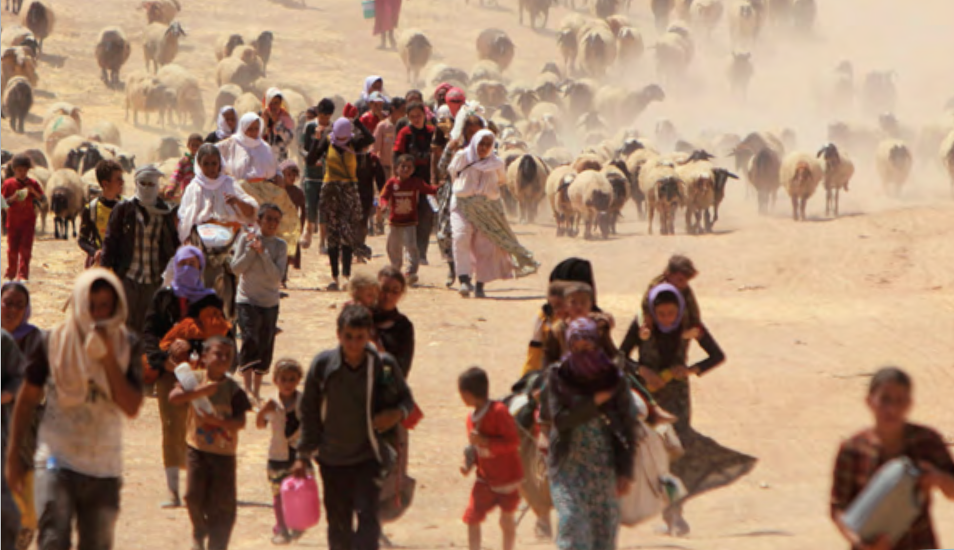
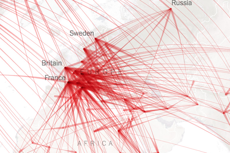
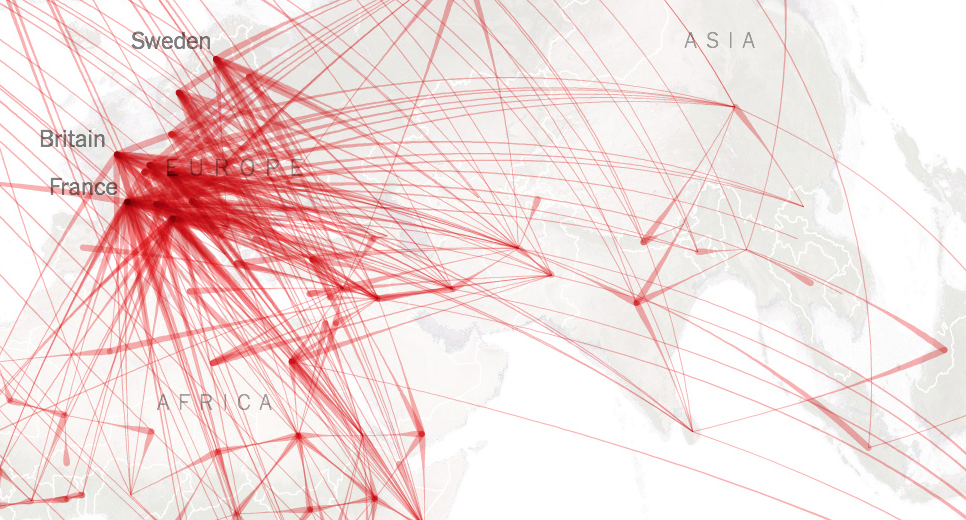
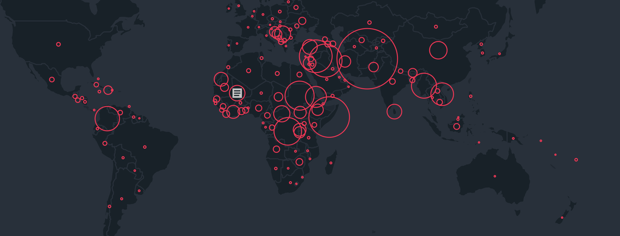
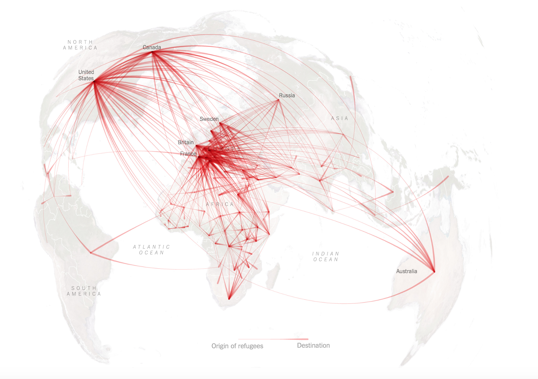
Almost any graphic is inadequate to represent the plight of displaced refugees. The aggregate numbers astound: the sixty countries from which 30,000 people were forced to leave their countries each day over the previous year. While these numbers reflect only those designated candidates for asylum and refugee status–and do not reflect the extent to which those fleeing from persecution and have expanded so dramatically–the image charts the number of asylum-seekers that grew to over 1.2 million in 2014. Yet the quantities of those considered for refugee status can hardly be adequately processed, let alone mapped in aggregate–or the recognition of refugee status processed on Europe’s borderlands. The map of refugee flight in red arcs across a map lacking political frontiers and boundaries seeks to foreground just how frantic the desperate search for pathways to new homes have become, and how wide-ranging these itineraries. If they seek to provide a sort of negative to the privileged paths of an age of increased air travel and suggest the desperation of forced spatial migration, they silence the actual stories of refugees.
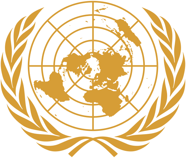
What sort of stories does this simplified map simply omit? The stories of those journeys are interrupted by death, while they are far smaller, of course remain absent: the perilous trajectories of individuals fleeing Syria, Iraq, Africa, Indonesia, Afghanistan and Pakistan however risk not only their lives, but increasingly their legal status as they undertake huge geographic migrations in search of new homes elsewhere, traveling by boat, on foot, or along paths promised by human traffickers. The sleek image, despite its attempted accuracy, shows the intensity of itineraries as embossed on the map as if to disfigure the notion of global unity that runs against the very narrative of global unity implicit in a iconic equidistant azimuthal projection centered on the North Pole which emphasized global harmony as World War II was tried to be forgotten, which as the official flag adopted by the United Nations adopted in October, 1947 promoted an image of global unity:
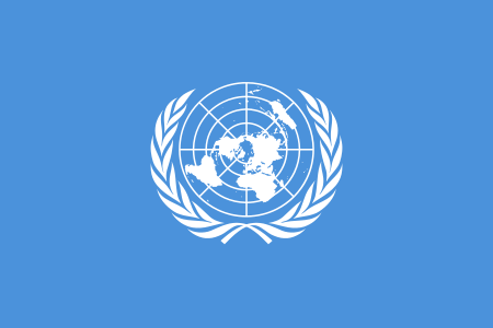
Harrison Polar Map/Official UN Flag
But the problem of effectively mediating the growing plight of stateless and displaced from “hot-spots” across the world poses not only a problem of the geographic imagination, but of the ethics of mapping. For the aggregate mapping of those deserving or awarded refugee status not only presses the limits of the data visualization, bound to simplify itineraries of refugees far more fragmented and indirect than can be mapped, but that no data visualization can group the individual stories that the sheer numbers of those displaced by conflict and violence are barely possible to comprehend. Refugee traffic suggests a level of instability difficult to condense in any map: and is “traffic” not a fatally flawed metaphor, suggesting a possibility of monitoring or policing, bureaucratically inflected, blind to varied reasons for the rapid growth of refugees?
The hot-spots from which those crossing borders were readily recognized as refugees were increasingly focussed on wealthier countries since before World War II, but the growth in those granted humanitarian status as refugees had already been defined around clear epicenters back in 2007, when millions of the population in Pakistan, Syria, Palestine, and Iran were accorded status, after having crossed borders, as refugees, and large numbers of asylum seekers in the United States, Canada, and Europe had started to grow–the map, which seems an earlier version of the decentered azimuthal projection later chosen by the graphics editor and cartographer at the New York Times, similarly serves to suggest the global nature of a problem largely centered in the Middle East.
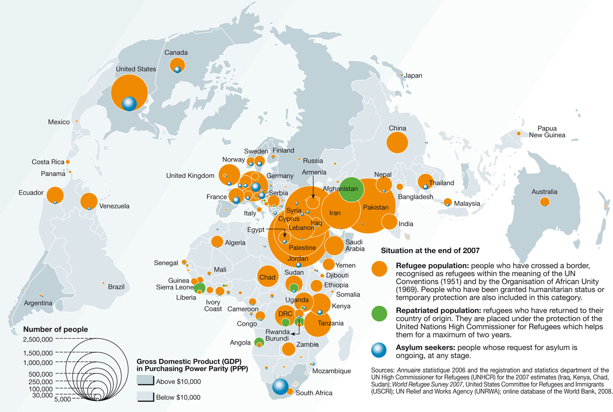
The choice of trying to map the data of those declared refugee to show the arcs of their arrival from global hot spots on a decentered azimuthal terrestrial projection aptly maps the crowding of the globally displaced in 2014. But the choice of transferring the collective itineraries to a global projection–in a sort of perverse mapping of flight paths suggests the most deeply troubling side of global inter-connectedness, and perhaps its deepest source of stress–by scarring the world’s surface in a frenetic criss-cross of arcs. UNHCR data of the global monitoring of refugees’ origins and points of arrival in new homes served to reveal an aggregate picture of resettlement in “Global Trends in Migration of Refugees” based on the accordance of refugee status, but in doing so erases the complex negotiation of the fate of asylum seekers, as well as the painfulness of the itineraries the globally displaced increasingly suffer. Is it ethical to hope to draw equivalences of the growing problem those claiming asylum as refugees by showing their arrival along idealized clean arcs?
Are we in danger, moreover, of representing refugees by the designation that western countries who grant them asylum accord them, for lack of complete or adequate data of the dynamics of displacement and mass-migration?
1. The graphic seems apt by rendering a scarred world. But it also seems an all too cool comment on the violent status quo, in which the number of displaced people raising risks by falling back on a modernist aesthetic that fails to capture the violence of displacement and indeed the placelessness of the refugees: the distinctive azimuthal projection, whose particular properties orients the world around the common locus of refugees’ eventual destinations, so as to suggest the range of their flights, rendering the range of collective arcs of geographic displacement at a uniform scale. Although the projection, which echoes the cartographical rendering of a global space in the flag of the United Nations, illustrates the actual global consequences of the heartbreaking tragedy of over fifty million refugees and internally displaced (IDP’s) across the world, their fortunes remain impossible to map, and difficult to visualize. Indeed, despite the difficulties of mapping those displaced, and problems of protracted displacement that have eroded societies, images often remain far more powerful than maps.
By mapping the aggregate destinations of the displaced by flared arcs, of uniform size, the visualization maps the eventual destinations of refugees, as determined according to the UN’s Refugee Agency, and foregrounds the question of their destination rather than the reasons for their displacement. The costs of such an omission are considerable. The question of how to represent displacement, and how to mediate the experience of the refugee, raises questions of how to visualize population within a map. The record numbers of those forced to flee their homes over the past year raise questions of whether resettlement can ever be enough–and if the tragedy incurred by displacement, without a clear destination and often just beyond the borders of the country one fled, trapped in war zones, or stranded in temporary settlements, aggregate trends of displacement seem oddly removed from refugees’ experience.
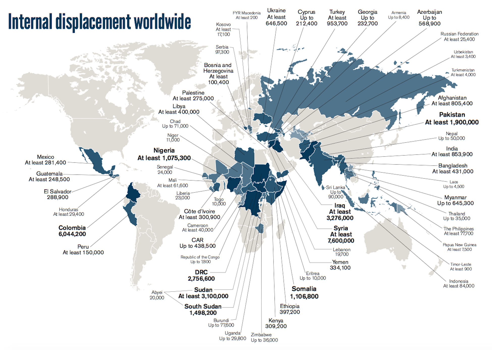
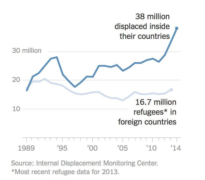
For while the smooth arcs of geographic relocation data are compelling, they transform the often desperate flight of refugees by an aesthetics of minimalism that rather reduces the scope of the spatial displacement that the terrifying numbers of persecuted refugees experience, and foregrounds the sites at which the displaced arrive–perhaps to remind us of the distance of the United States’ retention of an annual ceiling of resettling 70,000 refugees–and not the unrepresentable scope of the violence of spatial dislocation and tragedy of searing social disruptions. The deepest difficulty to represent is the precipitous slide toward poverty, hunger, and poor health care of most refugees, whose arcs of travel are both far from smooth, but so rocky and economically destabilizing that the challenges of orienting oneself to its crisis are indeed immense. And they only begin to chart the number of internally displaced and causes and scale of displacement–and the lack of political will that protracted displacement and flight have created on the ground, in their abstraction of refugee flows. For while the distribution of internal displacement challenges one to create a compelling graphic, the dynamics of displacement by the Norwegian Internal Displacement Monitoring Center across some sixty countries seem so difficult to embody–or process–that to demand clearer visualization to comprehend the scope of internal displacement of those who are rarely granted asylum–or are accorded the so desired status of refugees.
In its gesturing to the equidistant azimuthal projection of the United Nations, the visualization of refugee traffic evokes the clear ideals of the UN as an institution in its refusal to privilege a specific geographical centering.
The focus in the visualization on UNHCR data of resettlement emphasizes a narrative of resettlement, even some sixty years after UNHCR first directed global attention to the “World Refugee Year” in 1959, with hopes “to encourage additional opportunities for permanent refugee solutions through voluntary repatriation, resettlement or integration, on a purely humanitarian basis.” For in showing clean arcs that deliver the displaced, analogously to a frenetic set of flight paths, collapsing the time of one year, the tragedy of the unsettled are oddly ignored. For although the flared arcs on the projection effectively pose questions to the reader about the impact of refugees’ arrival in Europe and wealthier countries, it shifts the question provocatively from the human rights abuses and disasters which provoke such flight–and ignores the terrifyingly young age of so many refugees, over half of whom are less than eighteen.
In seeking to grasp the scope of statelessness and displacement, and the psychic as well as economic questions of displacement, can’t we do better?
2. Representing the global crisis of the displaced is by no means simple, and data visualizations are often inadequate to represent the travails of the refugee. But although the movement of the displaced mirrors what UNHCR determined were the destinations of the displaced in 2014, the minimalist projection of terrestrial expanse oddly and dissonantly removes them from the humanitarian crises that created their displacement: the countries noted in the terrestrial projection recedes into the background behind bright flared arcs that trace in aggregate the migratory paths refugees actually took in ways almost abstracted from experience–and in ways that may effectively unintentionally serve to diminish their plight by expressing it in an aggregate. While an alternating focus on Southern Sudan, Syria, Iraq, Ukraine and Burma where many have been forced to flee their homes can afflict the most clear-headed with a temporary case of Attention Deficit Disorder as they puzzle at the multiple crises that convulse refugees to flee, leaving millions of Iraqis (2+), Syrians (3.2+), and Rohyingya to remain stateless, their flight is rarely linear, and the omission of the uncertainty of any refugee’s path or flight is troubling.
If the global visualization illustrates the increased intensity of the problem of displaced refugees over the previous year, even as it tracks the scars that divide it. By using a set of specific points to another on a globe centered on where the greatest refugee traffic occurred, the data vis represents actual distances to countries of asylum, displaying pathways of asylum refugees took on a map of accurate distances, and traffic of truly global scope. Although the densely crowded red arcs obscure much of France, Germany, and other sites of destination for the displaced as if to exaggerate an influx of to Europe, they illustrate a growing recognition that the scale of human displacement is a global crisis–as much as a crisis of resettling refugees.
The array of intersecting red arcs in the map underscores the proximity of an inter-related world, and provocatively foregrounds the increasingly global scope of a multiplying crisis of displaced persons that have come to scar much of the world’s surface. The problem of how to synthesize the diverse local experiences displacing increasing refugees across the globe both internally and to other countries is resolved by using UNHCR data to map the growing traffic of the displaced that the we will increasingly be challenged to come to terms. Yet what of the image of interconnectedness that they reveal? While foregrounded in an equidistant projection that renders evident the symbolic unity of around a nexus of departure of refugees from Africa, Syria, and Ukraine who arrive in Europe, the crimson arcs literally cut across the image of coherent harmony emphasized in the azimuthal projection, by locating sites at uniform distances to emphasize its unified image of the inhabited world–the same reasons it was adopted in different form in the flag of the United Nations–which also downplays the very national differences and frontiers more often inscribed in terrestrial maps, using an equidistant azimuthal projection of the world centered on its pole to project an ideal of global harmony.
The data visualization “Global Trends of Migration” foregrounds a marred world, however. In it, the sites of refugees’ arrival is often even rendered illegible, disorientingly, by blotches of solid red created by converging flared red arcs. Was there a somewhat alarmist decision to flare the ends of these arcs at the sites of the “arrival” of refugees, as has been suggested elsewhere by Martin Grand Jean? For Grand Jean observes that in doing so, the concentration of apparent endings attract greater visual attention than the sites from which persons are displaced, or the intensity of the displacement: we hide our eyes from the atrocities, in short, and the true nature of the crisis and humanitarian disaster, perhaps in ways informed by UNHCR data on the need to better process refugee flow. One might go farther in this critique: for in flaring such endpoints, the image not only oddly downplays the sites of emergency from which they seek asylum, and the unmitigated tragedy of those who remain displaced, but conveys a sense that the flights are smooth.
To be sure, the very term “traffic” that recurs to describe the “Trends in Global Migration of Refugees” seems a bit of an oblique misnomer. It almost obfuscates the experience of those who were only recently forced to flee their homes, as much as render them for the viewer. For the elegant aggregation of such a uniquely tragic dataset may not fully come to terms with the growing global tragedy of the apparently unmitigated spread of refugees from an expanding range of sites–and the steep human rights challenges the exponential expansion of global or internal exiles creates. Although the attempt to synthesize UNHCR data and map those flows offer one of the clearest tools by which to process, comprehend and synthesize the rapid expansion of individuals who were forcibly displaced over the past year, and come to term with that expansion. But it hardly comes to terms with the desperation of their travails or the difficulty of their departures. Indeed, by covering much of Europe in busy red blotches it disarmingly foregrounds and describes the arrival of refugees who have successfully left their countries–more than the mechanics of their displacement. And there is a sense, almost paranoiac, and to be resisted, that the arrival of these streams of refugees who enter the Eurozone almost threaten to cancel its identity.
What is lost in the image’s busily crowded surface is perhaps made up for by the frenetic intensity it uses to ask us to confront such trajectories of tragedy and desperation. But as an illustration, the elegance of the visualization seems to mislead viewers through its concentration on a geometry of arrival–and the smoothness with which it invests the desperation of forced departures. Despite its impressive effects, there seem multiple reservations about the possibility of creating an adequate data visualization. In translating the tragic dataset of forced migrations as a point-to-point correspondence, its simplification approximates the wide geographic itineraries of that the globally displaced have been forced to seek–and understates the tortuously complex paths they actually followed.
Indeed, tensions are implicit in the stark modernist aesthetics of rendering the paths of refugees and the global imperative to address the pressing refugee problems that raise questions of the ethics of mapping the displaced. The cool modernist aesthetics of “Trends in Global Migration” obscure the messiness of refugees’ own lives. In recent years, the Refugee Highway and others have sought to address in foregrounding the global “hotspots” of mass-migration–by combining qualitative and quantitative data. They have tried to reveal what open routes exist for those seeking asylum and capturing the resourcefulness of the refugee–noting possible destinations of asylum, and sites of resettlement, or differentiating between routes taken in fleeing by land and sea to help viewers appreciate the scope of the refugee disaster. In the image below, Refugee Highway reveals the presence of airplanes over industrialized nations where more refugees are apt to settle or seek asylum suggests the steep symbolic liabilities of Wallace’s stark “Global Trends.”
 The Refugee Highway
Another alternative visualization, proposed by Grand Jean on the basis of the very same UNHCR 2014 database, places less visual emphasis on the sites of refugees’ arrival, or sites of eventual asylum, but use similar lines as the red arcs of migration, apt for suggesting bloody scars but less illuminating of the proportions of displaced and, as Grand Jean nicely notes, not weighted in any way, so that the 6,000 Mexican refugees that arrive in Canada are illustrated in an equivalent manner to the million refugees from Syrian territory that have arrived in Lebanon. Gran Jean has generously proposed an alternative visualization that salutary in varying the thickness of lines that denote refugees’ displacement from sites of humanitarian crisis that confronts the limits of doing justice to the representation of displacement, sacrificing the modernist aesthetics of the image to ensure its greater readability:
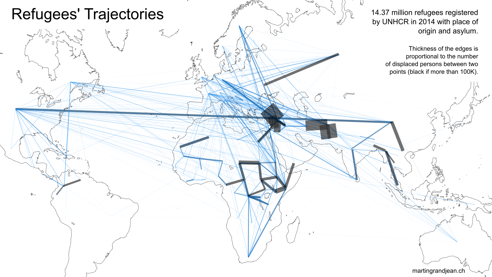
Martin Grand Jean
The attention Grand Jean returns to the sites of displacement can be easily rendered in ways that distinguish the different regions and countries from which the 14.37 refugees UNHCR registered have sought asylum, using color to start to distinguish the sites from which refugees were displaced–and start to diminish the information overload of the data visualization of this global crisis.
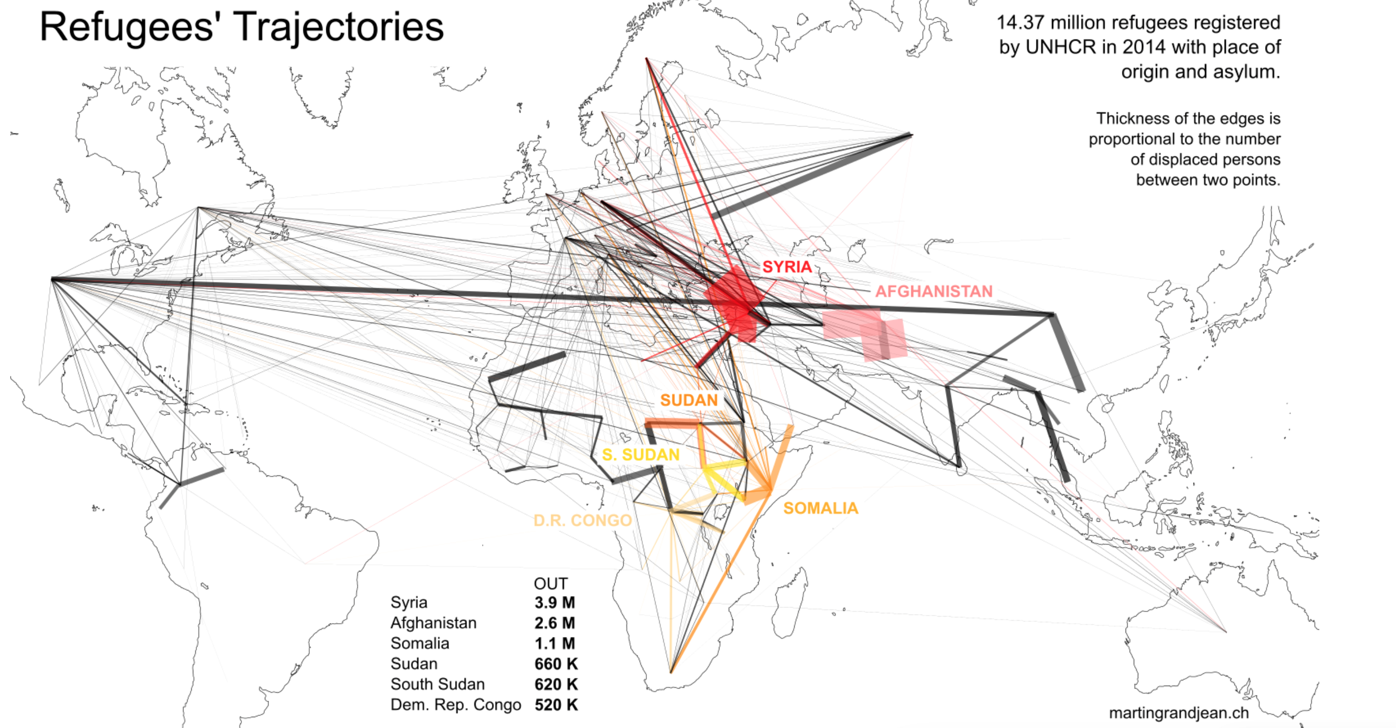
Martin Grand Jean
There is value to imitating the information overload created by the expanding crisis of global refugees, but it raises questions of the ethics of mapping disasters. Much as it is difficult to comparatively map the multiplications of centers of forcible displacement, it is difficult to even heuristically approximate the varied qualitative circumstances of the world of the refugee–as much as one would like to grasp the extent of the desperation of exile from the boundaries and neighborhoods of one’s former home.
2. The elegant economy of the jaw-dropping visualization in the Times of the refugee crisis compellingly transposes the aggregation of annual refugees to illustrate its deeply global nature. The crisis of those forcibly displaced on a symbolic level by the harmony of uniform spatial relations–in the mode of early modern cordiform maps–although, of course, those thin red lines of scarification disrupt whatever harmony exists across the globe, despite the attention that it calls to its inter-relations, in the manner of the polar azimuthal projection surrounded by two olive branches of peace that was designed as an emblem of the United Nations to suggest the proportional representation of the continents, and lack of privileging one area of the world by Donal McLaughlin, who interest in the transparency of visual communication led him to propose its design in 1946 as a seal for the UNO.
The popularity of the visualization of “Global Trends” lies in its success in cleanly sorting a significantly large dataset in a readily legible terms in ways that insist on the proximity of accumulated crises dispersed across the globe in isolation from one another–but which affect the world and demand a global response.
\
One unarticulated if implicit institutional message of the equidistant polar projection in the “Global Trends” graphic is that it captures the pressure that the displaced place on the ideals expressed by the equidistant polar azimuthal projection featured on the UN flag.
Even if the very globalization of a refugee crisis makes it hard to focus on the status of those forcibly displaced or the context of collective hot-spots from which folks have fled, so clearly does it abstract individual itineraries of flight from their local contexts, the intensity of its busy red lines captures the overwhelming image of desperation, even if limited to those who have found asylum–not the refugee camps clustering on the borders of Syria, Sudan and Myanmar–it captures the intensity of forced migrations worldwide, if not the circumstances of their internal displacements or their deaths in transit and at sea. The poor and often perilous conditions of the camps and settlements are left off of the map, as it were, as are the circumstances of ocean travel often brokered by human traffickers.
For the greatest lie and fabrication in the narrative of Global Trends of Displacement is the illusion it perpetuates that all refugees possess and have a destination–and indeed that all refugees arrive. The extreme unmessiness of rendering the actual tragedy of refugees’ itineraries in purified form with a coolness worthy of Le Corbusier or Eero Salonen frames the crisis of refugees as if tracking airplanes’ movement or allocating resources. To an extent, this is the result of the UNHCR dataset, which focuses on the arrival in camps or countries of asylum, rather than displacement or the camps were refugees and fleeing persons congregate along the borders of nearby countries. But the visualization deriving from the data provides readers with a quite misleading illustration of the crisis at hand. For in concealing local details, they obscure both the individual stories of sacrifice as well as the conditions or scarcities that has driven such a steep expansion of fleeing across what have often increasingly become quite shaky and undefined border-lines, readily renegotiated in theaters of war.
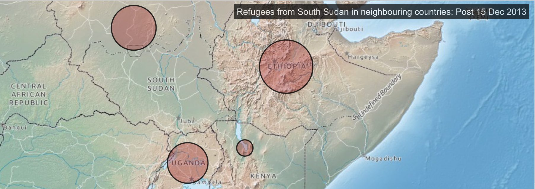 UNHCR, Refugees from Southern Sudan by mid-December, 2013
Rather, the image created communicates an impression of cleanly engineered arcs of geographical mobility and direct paths to resettlement. Unlike earlier visualizations, the elegant red arcing lines adopted in “Global Trends” present the UNHCR data as if to suggest that all refugees arrive–even though the dataset is of course only about those who do seek asylum and resettle elsewhere, and predominantly in countries far removed from their homelands. This narrative of spatial displacement may obscure a deeper set of narratives of dislocation.
One sacrifices a sense of the local in the arching red lines in the gripping aggregation of global refugees over the past year in “Global Trends,” also pictured the header to this post. The data vis indeed broached the difficulties of comprehending what has increasingly and ultimately become a global crisis at the end of an age of empire in readily comprehensible terms. Although the paths of refugees’ flights threatens to muddy the specific travails from which folks are forced to flee in the data visualization, as well as their specific circumstances and travails, it synthesizes and processes the almost unsustainable streams of forced flights from refugee hot spots by foregrounding the actual routes of displacement–while misleadingly suggesting that all refugees found future homes.
Indeed, it maps the unmappable by mapping the pathways of those forcibly displaced: yet of the 60 million displaced globally, the map focusses on the 14 million (almost a quarter of those displaced worldwide) who have left their countries in 2014 alone, offering what is probably an under-estimation of the encyclopedia of travails that can never, at another level, map or synthesize–as if the routes of fleeing can ever be adequately represented by being sketched on the perfectly engineered arcs akin to the smoothly engineered pathways of multiple airplane flights along which a very different demographic travels. Refugees are of course unlikely to experience such travel, more characteristic of readers of the Times, who would surely be prone to recognize the map as a sad perversion of global flight paths, converging on Eruopean capitals, the United States, Canada, and Australia.
One feels only awe at the overwhelming nature this sort of dataset, itself difficult and dizzying to process because it offers little real cue for orienting oneself to the complex totality of narratives it collectively encodes. Whether the augmentation of refugees worldwide can be seen as a quantifiable crisis–and removed from human terms and individual costs–is a question that cannot be here addressed. But the conversion of the crisis into human flows is a compelling way to try to come to terms with how we’ve come to inhabit the world in rather chilling ways, by plotting some of the data from the United Nations High Commissioner on Refugees on a global projection centered on the primary areas of regional crisis–not without posing the question of why such a global focus of the refugee crisis exists. The nexus of the refugee “crisis” is so widely spatially distributed, indeed, to leave its “focus” dizzying as one tries to better internally process the extent of displacement worldwide:
3. The frenetic business of the long distance “traffic” pictured on the global map can also be reorganized and viewed, or disaggregated, piecemeal, luckily, in order to make some sense of the terrifying abundance–or obesity?–of the disturbing dataset whose aggregation reveals the close relations between countries in an age of globalization, if it cannot threaten to obscure the dramatic narratives of individual experience. The data is condensed into misleadingly orderly (if dizzyingly distracting) mesh of intersecting red lines, arcing over the earth’s surface and boundaries–as if to capture the global nature of the crisis, but which painfully erase the multiple individual narratives of struggle, internal displacement, and blossoming of the unplanned cities of refugee camps, and the different material and environmental constraints against which refugees have to contend and struggle. The comforting illusion that each refugee has a destination–or endpoint–ignore the improvised settlements now dot maps of Jordan, Turkey, Chad and South Sudan, and hold some two million souls, or the deaths of refugees in transit or at sea–runs against the demand for an adequate dynamic map of their own, as if in a sort of reverse map of sites of human habitation inscribed on maps.
Such a map would describe dislocation in greater detail than the valiant ESRI “story map” of those refugee camps administered by the UNHCR, whose slippy map invites one to inspect the numbers of displaced in different camps, but stands at a significant remove from their actual circumstances or experiences of displacement of the story it purports to tell.
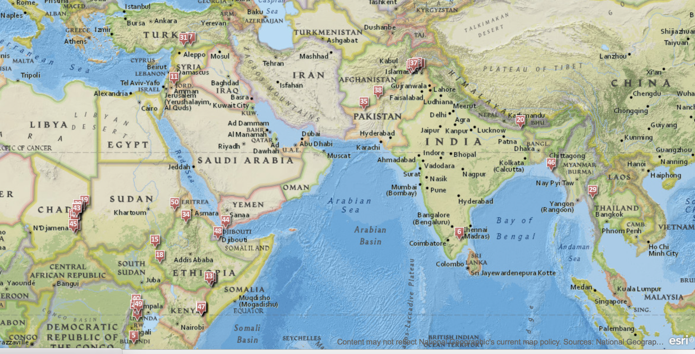 Fifty Most Populous Refugee Camps (an ESRI story-map)
 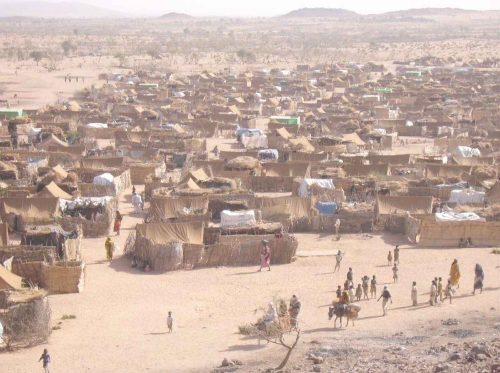 Darfur Refugee Camp in Chad
 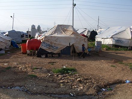 Arbat Transfer Camp for Syrian Refugees in Iraqi Kurdistan
4. Could one rather include in such a map variables such as the length of time required for transit from each country, the amount of time required for transit, or the possibility of making such travel–all potential ways to represent the ordeal of displacement in ways that viewers might understand? Or could one indicate the violence of the displacement in a quantitative way?
Indeed, the focus of the data vis on the routes of migration that refugees take runs against the widely accepted and reported truth that the number of internally displaced persons has expanded far beyond the growth of refugees seeking asylum in recent years–also reported by Sergio Peçanha–if the growth of IDP’s worldwide has surely increased the desperation of those refugees who leave countries of origin.
The greatest single lie that this elegant map of refugees across the world tells in its distribution of a dataset is that all refugees have a destination to which the flee that can be mapped–a lie that the red arcs that imitate the paths of air traffic encourage. For the paths of those fleeing are of course rarely so removed from the ground or so truly globalized in their dispersion. In addition, there is a shift of attention from the sites where a truly unmanageable set of crises for refugees exists to the density of points of arrival in European countries as France, Germany, England, Italy, and Sweden, as well as Australia, Canada and the US–all rendered by but a single point or nexus of arrival, or destination–and often obscured by clotted red lines. Does this detract the readers’ attention from the sites of humanitarian emergency that prompted the rush of refugees? The crowded the image evokes the image of something like a blood splatter, the result of the expansion of the intensity of combat in multiple theaters that, after all, set the mechanisms of displacement in motion, which the practice of aggregation erased. In ways that imitate the The Refugee Project’s attempt to map arcs of resettlement of those seeking asylum since 1975 in interactive fashion within a single globe, the density of lines that converge in Europe and elsewhere suggest the deeply linked question of the global multiplication of forcibly removed refugees, and the proliferation of a forcible statelessness across so much of the modern world.
But, on the other hand, the visualization’s immediate popularity, registered by wide retweeting, responds to the cognitive difficulty–if not impossibility–of coming to terms in a clear-headed manner with the dizzying multiplication of growing numbers of refugees and internally displaced people in our increasingly destabilized world. There is considerable clarity in how the orderly arcs mirror the readily recognizable form of a map of destinations of flights, if there is something truly odd in how they represent the terrifyingly troubled transit of peoples in times of war. Perhaps the map aptly captures in symbolic fashion the desperate flight from regions in its numbers alone, acting like a sort of blood splatter map on the world–although one where the wounds seem to lie in those countries that receive refugees, rather than the sites of the violence that provoked their transit.
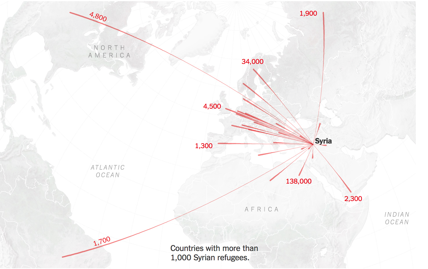
For the greatest difficulty with the data visualization remains the remove of its narrative content from the subjective experiences of the refugees than the absorption of refugees in their new countries, and the apparent equivalence that it draws between both the proportion of refugees or the experiences of refugees from different countries. Hence, the conspicuous inclusion of numbers of departed whose final destinations were a specific country and the foregrounding of the names of those countries that were most likely destinations in the developed world–the United States, Canada, France, and Sweden among them–several countries were a sharply xenophobic ultra-right has been recently recognized as on the rise. Take, for instance, the dispersion or draining of Syrian populations, which despite its orderly symmetry offers only a stripping of data to approximate the ongoing struggles on its disintegrating borders. During the recent Civil War, some 11.6 million people, almost half of its entire population, have been displaced, half arriving in Egypt, and only a relatively fortunate few arriving in European or industrialized/westernized nations. Representing the length of time required for resettlement would at least be a surrogate and index for the nature of the experience of refugees that would be a possibly more ethical model for mapping displacement than the dispersion of the Syrian population on simple arcs–without notation of how many displaced Syrians remain, and omit the distortion suggested below of a smoothly engineered migration from refugee camps.
 New York Times
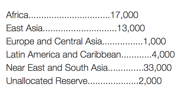
5. The infographic maps but one corner of the dilemma of global refugees. One way that the infographic must be read is in dialogue of the as-yet limited reactions of advanced economies to the growing global refugee crisis, to be sure, at a time when it may make less sense to retain the attitudes of protectionism and fears of immigration, evident in the expansion of only 70,000 refugees to the United States during Fiscal Year (FY) 2015 on the basis of “humanitarian concerns” as “in the national interest,” and the retention of limits of admissions in accordance with clear ceilings for each region. For does such an imposition of such ceilings come to terms with the global desperation felt by the displaced?
There is an obligation to come to terms with the steep fears of immigration and better help readers better wrestle with the plight of the displaced.
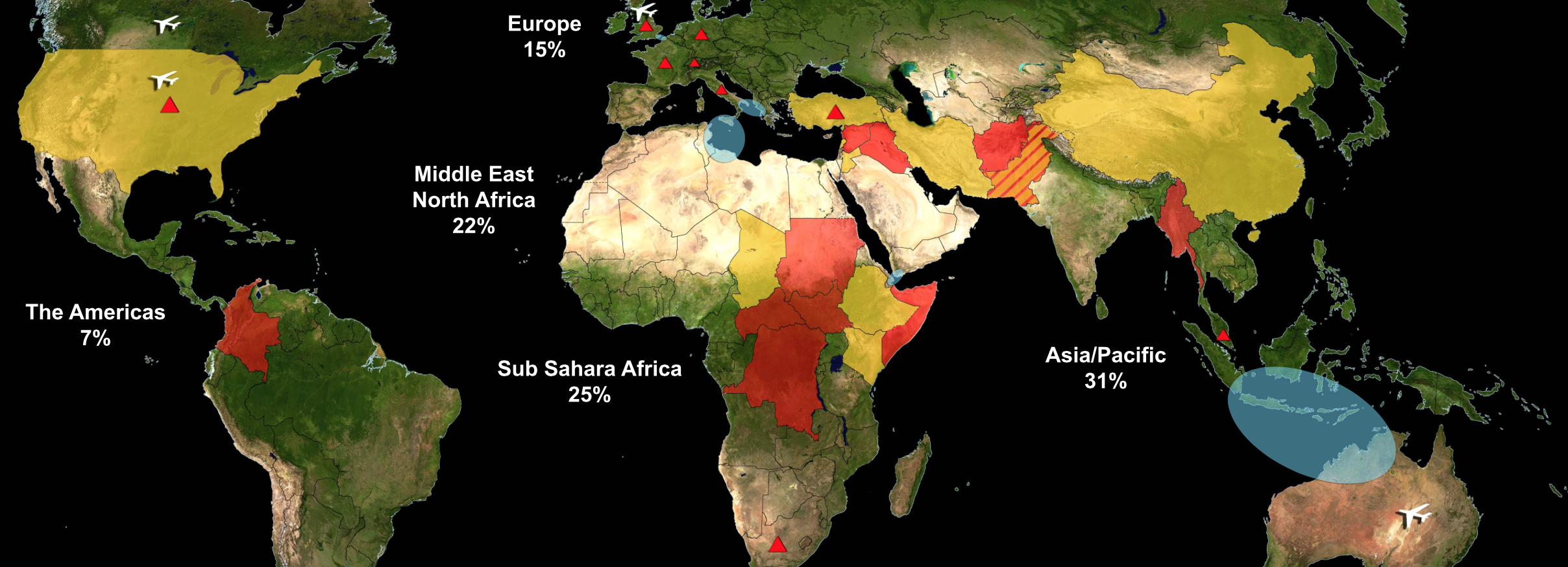
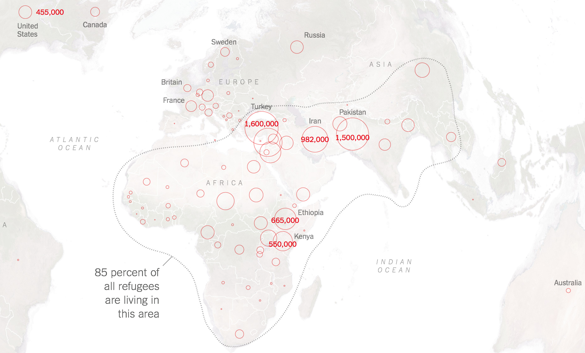
An untold understory of the infographic that is less evident in the image used in this post’s header is the considerable concentration of a huge proportion of refugees–some 85% by the count of the United Nations High Commissioner for Refugees–in one specific geographic region, and the lack of resources that are effectively able to be devoted to these refugees’ fates. (And this may well be an underestimation of population flows among the internally displaced.) The majority congregate in regions running from Turkey to Southeast Asia, past Ethiopia to Kenya and the Central African Republic, although one imagines that the displaced in Ukraine are just absent from the dataset, and less able to be accurately measured by the UN numbers. The region populated by millions of displaced is circled by dotted lines below. In each of these regions, most relatively impoverished, refugees are often exchanged among countries with limited resources to process compelling human needs–for example, Ethiopia holds 665,000 refugees from Somalia and South Sudan–where they are bound to press further upon limited existing resources and fragile economies.
What will be the result of these interconnections–and whether they won’t demand far greater global interconnectedness–is not clear.
But the ongoing expansion of refugees in areas where there is no clear governmental or administrative organization will prove especially difficult to map adequately, despite the compelling nature of the “Recent Trends” visualization, such trends are poised to expand in future years, especially from Ukraine as well as Syria and Myanmar.
It seems most likely that, at some level, the data visualization of the destinations of refugees as seeking asylum from their country of origin unconsciously records how far we have come from the optimism of picturing the possibility of global unity the United Nations auspiciously hoped to inaugurate in 1946–by the agency which compiled the UNHCR database.
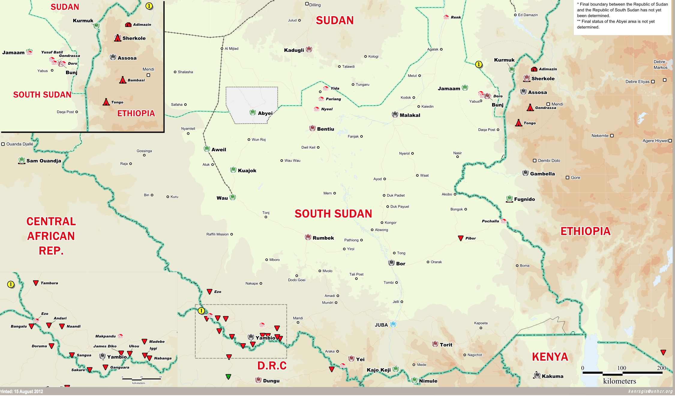
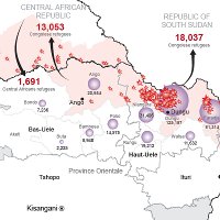
6. There is a significant difficulty, of course, in mapping refugees and the increased clustering of camps that they create in so-called demilitarized border zones. For each image condenses multiple narratives that one wishes one could tease out, but confronts an image in which one sees limited apparent possibility of resolution save further instability. South Sudan possessed some of the greatest emergency of the refugees of modern times and the twenty-first century both in the some 700,000+ asylum-seeking refugees in neighboring countries at most recent count and one and a half million plus internally displaced persons (IDP’s) within its fragile boundaries, many driven by intense food shortages as well as by an increasingly militarized and fearful situation: almost a third of the country’s population lack food. Emergency refugee activities have haven mapped in South Sudan from 2012. Even as the subsequent refugee crisis generated in the Syrian Civil War has further pressed credulity, South Sudan exemplifies a refugee situation spun out of control with no clear resolution, before which one stares at the map agape,–almost conscious of the continuing inadequacy of ever resolving its narrative in the immediate future. Back in 2012, UNHCR helpfully mapped refugee settlements (camps) and clusters of individual refugees–denoted in the second map of South Sudan below by inverted triangles; refugee settlements are shown by pink houses–spread both to camps in Ethiopia, and less organized communities on the borders of poor (and undeveloped) countries like the Democratic Republic of Congo or Central African Republic, states with their resources already spread thin.
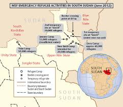
UNHCR By 2013, the number of displaced was combined with arrivals of those displaced from nearby areas and states:
By 2014, about three-quarters of a million displaced persons were displaced and 4.9 million were in need of assistance as the borders continued to be particularly permeable and fear drove displaced persons out of the country:
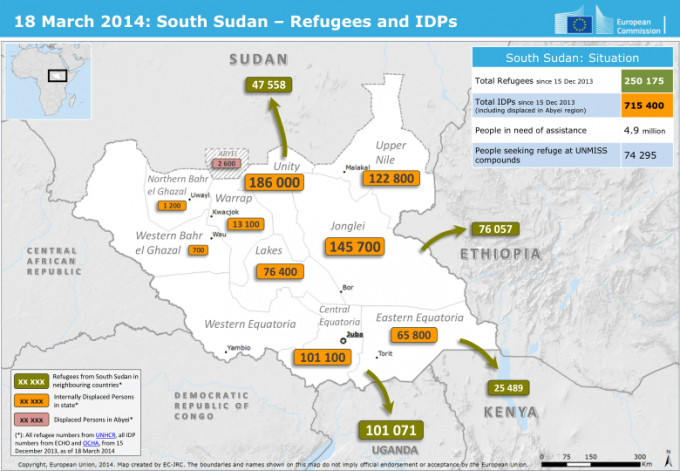
The continued displacement of refugees has only grown considerably during 2015, with increased fighting in South Sudan and the Upper Nile states, at the same time as water and sanitation has continued to deteriorate across the region. Spurring the possibility for increased refugees, food insecurity of food has grown–as food grows more scarce–in ways that the visualization leaves silent but might provide a telling under-map of the flow of refugees across increasingly fragile borders, in situation maps that foreground departure and the failure of containment within civil society. Such maps obscure the systemic problems that are bound to make the tally of refugee counts only tic higher over time, perhaps, which might be revealed in deeper layers to suggest the levels of instability that afflict the region. One telling map to compare reveals the increasingly imperiled aquifers and drastically declining availability groundwater.
If we consider the drought to be located in California’s central Valley–a thin orange strip by the Pacific Ocean–the decrease in groundwater NASA satellites have mapped over the past decade quite dramatically extends across the Sudd Basin and Lower Chad Basin in Africa and the entire Nubian Aquifer System and the Congo Basin–as it groundwater shortages has drastically grown across the Arabian aquifer and Indus Basin over the same time. Water is not the sole issue here, of course, but the unrest that scarcity provokes demands mapping, and GIS visualization, as a layer below the civil society, which in much of Africa and regions without and which never saw the need for infrastructures of water transport is no doubt particularly acute.
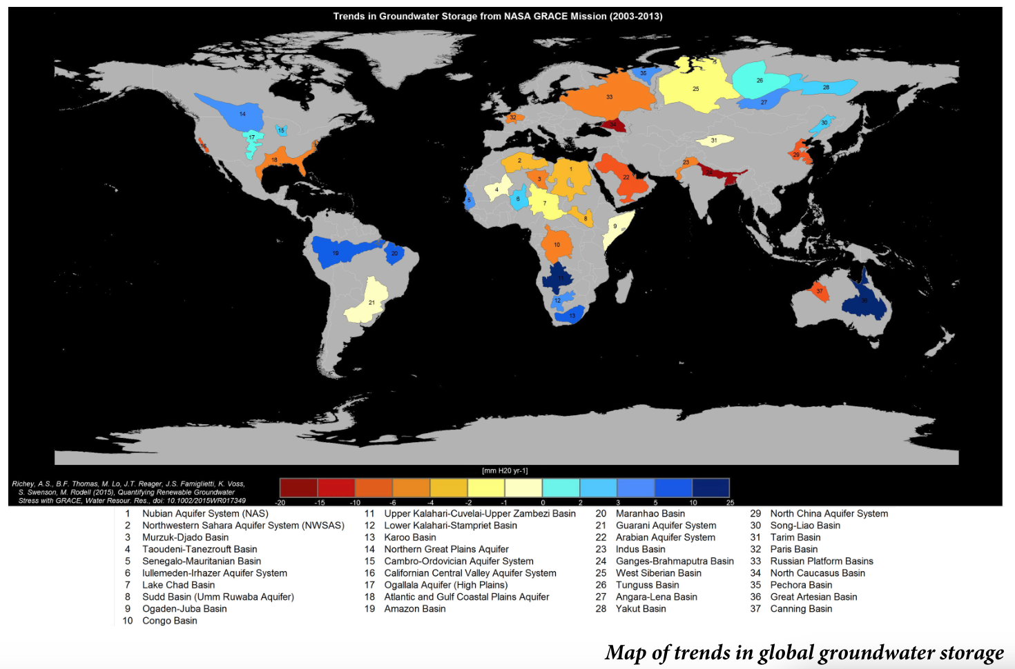

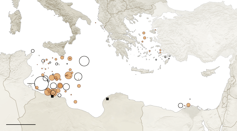
The consequences of depleted aquifers and groundwater across the Lake Chad Basin, Sudd Basin and the Nubian Aquifer System (NAS)–the greatest body of fresh water in the Nile basin, and Congo Basin have provoked a catastrophe of global proportions, while we returned to the possibilities of the contagious spread of Ebola across the world as if it were the sole apocalypse on our mental radar for much of the past year. The rise of fatal–or near-fatal–the expansion of those attempting to flee food shortages and declining economies in Africa have appeared in or occasioned increasing news reports from the western media, as Italians have called in increasingly strident tones for all of Europe to turn its attention to focus on the flight of refugees in the Mediterranean ocean–which the Italian navy can barely respond to in adequate manner, and create a web across the Mediterranean simplified in the red routes below. Already the most “deadly stretch of water for refugees and migrants” in 2012, the refugee crisis intensified in 2014–often encouraged by human traffickers who deceptively promise perilous passage that is often not followed through, perhaps making this current year–2015–the most deadly in recent memory for those attempting the crossing in ships as they flee humanitarian disasters in Libya in ways that have only begun to be quantified and mapped.
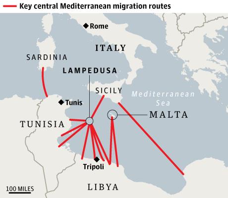 The Guardian

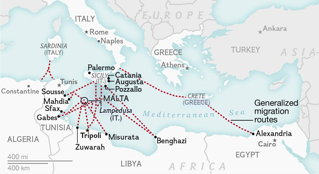 National Geographic
The complex story of tragedy and loss that the map conceals is difficult to communicate in conventional cartographical forms, as the each circle represents the suspected or confirmed loss of human passengers.
One understory to this migration, without doubt, is the huge refugee crisis across the Sub-Saharan continent, where 15 million have been displaced in the past year alone:
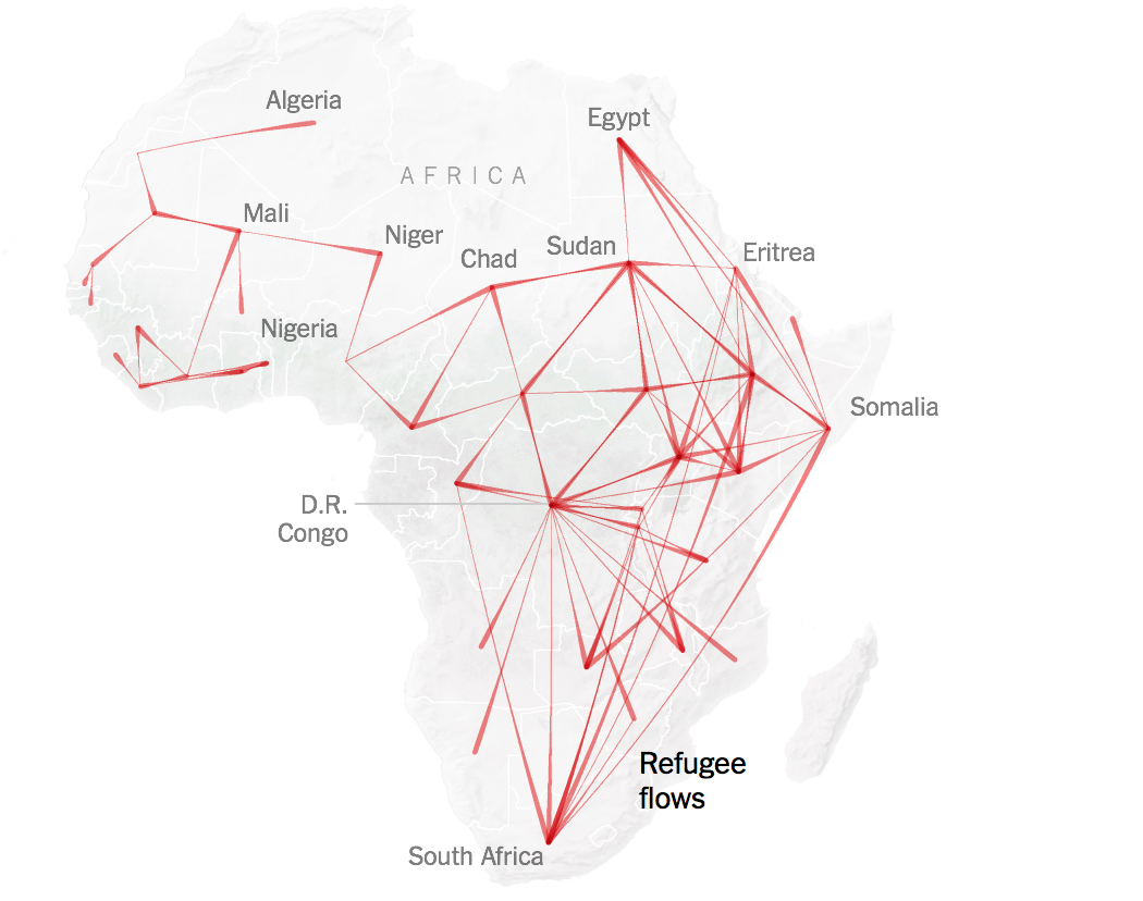
The “refuge flows” are oddly almost not with a human face, as if they seem a triangular exchange of goods. As we map refugee traffic in a manner that suggests that the flows of people are removed from a dynamics of struggle on the ground, but guided by an invisible hand or able to be imagined as a coherent network of flow, as if they at times arrive and depart from the same place, we lose a sense of the human costs of the deep scars that they draw over the surface of the inhabited world.
 But these overlapping and crisscrossed waves of displacement, if terribly difficult to disentangle, are compressed into so many misleadingly orderly arcs: their stark form and geometric curvature elided or erasef the struggle, or indeed desperation, that we know companies the experiences of all refugees, and show an image of migration that may be as good as it gets. It surely sends an alarm about the status and state of the stateless refugees forced to flee their homes that forces us to negotiate our own relation to the changed face of the world. But its curved red lines decisively and assertively arrogate the numbers of those who have sought asylum into smoothly completed arcs in an oddly unproblematic way, given the scarcity of solutions at hand.