Tag Archives: Facebook

The Less Visible Paths of Economic Giving

At the same time as Pope Francis elegantly entreats all to view the world less through the distortions of economic markets–and without forgetting those who are all too often overlooked–we rightly grapple with ways of imagining global inequalities, working to view the world less in terms of economic markets of commercial exchange or banking centers.  For Francis asks us to find a way to map the debt the producers of greenhouse gases owe to developing countries, lest their weight fall on poorer countries, rather than industrialized countries bearing their cost, and as well as a way of correcting the usurious rates of lending money, by guarding against those “oppressive lending systems . . . which generate further poverty.”  The United Nations served as the  setting to stage a dramatically and radically revised ” Urbi et orbi” address by the first transatlantic pontiff, and one deeply conscious of that status.  Francis enjoined us to imagine a common good–chastened by the harms of seeing social needs only in terms of economics.  The moral injunction to consider the deepening economic imbalances of national debt recalls the difficulties of picturing a more equal and more ethical distribution of space, taking stock of the globalized world outside dominant patterns of economic exchange.

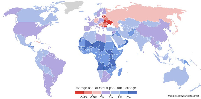
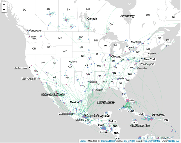
If oppressive systems of lending create states mired in relatively equally distributed poverty, and others increasingly less egalitarian–as JapanSouth Africa and the United States–poorer individuals or countries all too easily fall through the cracks and off the mental map that privileges dominant economies.  Indeed, so obsessed have we become with noting, accepting, and internalizing property lines that we seem trapped into forgotting the actual distribution of inequalities in our country.  The warping of economic conditions in the United States alone–a warping toxic for local politics, and compassion–are nicely illustrated in microcosm in a glorious if grotesque GIF Max Galko offered, via Metrocosm.  In its warping of a planimetric image of national space, it seeks to track the terribly troubling distortion of civic space by wickedly substituting residential values on land to reveal hypertrophied concentrations of capital in a few regions—mapping value onto land in ways that display the drastic diminution of housing stock in far more regions of the lower forty-eight that contract out of sight.

af6689aa5

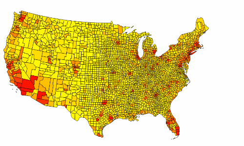
Metrocosm, based on data from US Census and Lincoln Institute of Land Policy


The bloated property values of urban and exurban areas are hardly signs of a healthily beating heart, but a Rabelasian image–if it weren’t also such a very accurate illustration of our current national political quagmire of using a map to create consensus when concentrations of wealth looks so different than the one which determines our representational government, and a clear social commentary and scathing socioeconomic critique.  For how can we create a clearer map of priorities, when the very levelness of a playing field is so distorted beyond recognition?  The cartographical contraction of so many areas that seem overlooked seems also a metaphor, as tNew York City, Miami, San Francisco, Seattle, Orange County and Chicago acquire hideously gargantuan proportions to seem countries of their own, as they assume their relative values of residential properties, leaving the majority of the country to disappear within the folds of their overvaluation and market-driven expansion, as if to show the difficulty with which market valuation maps onto our own space.  All this to raise questions of how a map of global economic relations might best begun to be traced, or how we might imagine the disruptive inequality on our perceptions of space–and, indeed, the inequalities that spatial orders increasingly come to reflect and perpetuate?

Does this image of a “beating” heart only map the absence of empathy in a map?

1.  For economic exchanges seem strikingly complicit in perpetuating inequalities, if only by diminishing those very inequities of economic productivity perpetuated in most maps fail to adequately attend or obscure.  One might hope, with geographer Andrew Linford, and Martin Lewis, the benefits of a map illuminating the inequities of global disparities in economic productivity–and try to use such a map to address how both regional and national disparities, often oddly dividing coastal areas from poorer interiors, might be overcome, and the ways that what pass as concerted attempts to do so often only shore them up. But such a map only confirms the sorts of distortions that most are only too aware already exist.

GDP Density

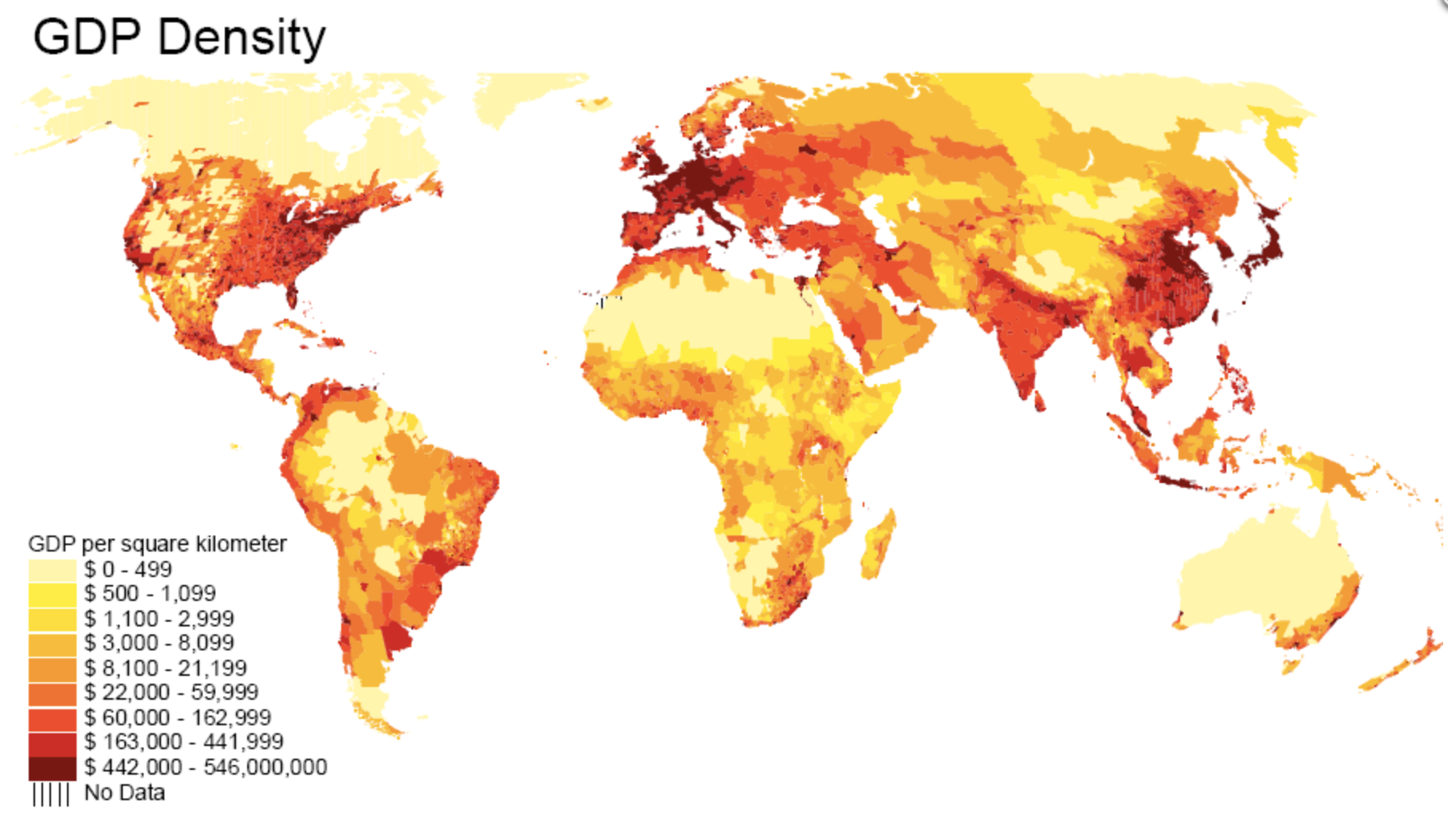
Geocurrents global  map of GDP Density (2011)

The illusion of equality is more often maintained by the belief that by mapping all aspects of the earth we are ensuring a sense of equality for all, or allowing no inequities to be hidden from view–as if the projects of world-mapping, and exposing to the public eye, is a means of responding to global needs–rather than obscuring these inequalities.

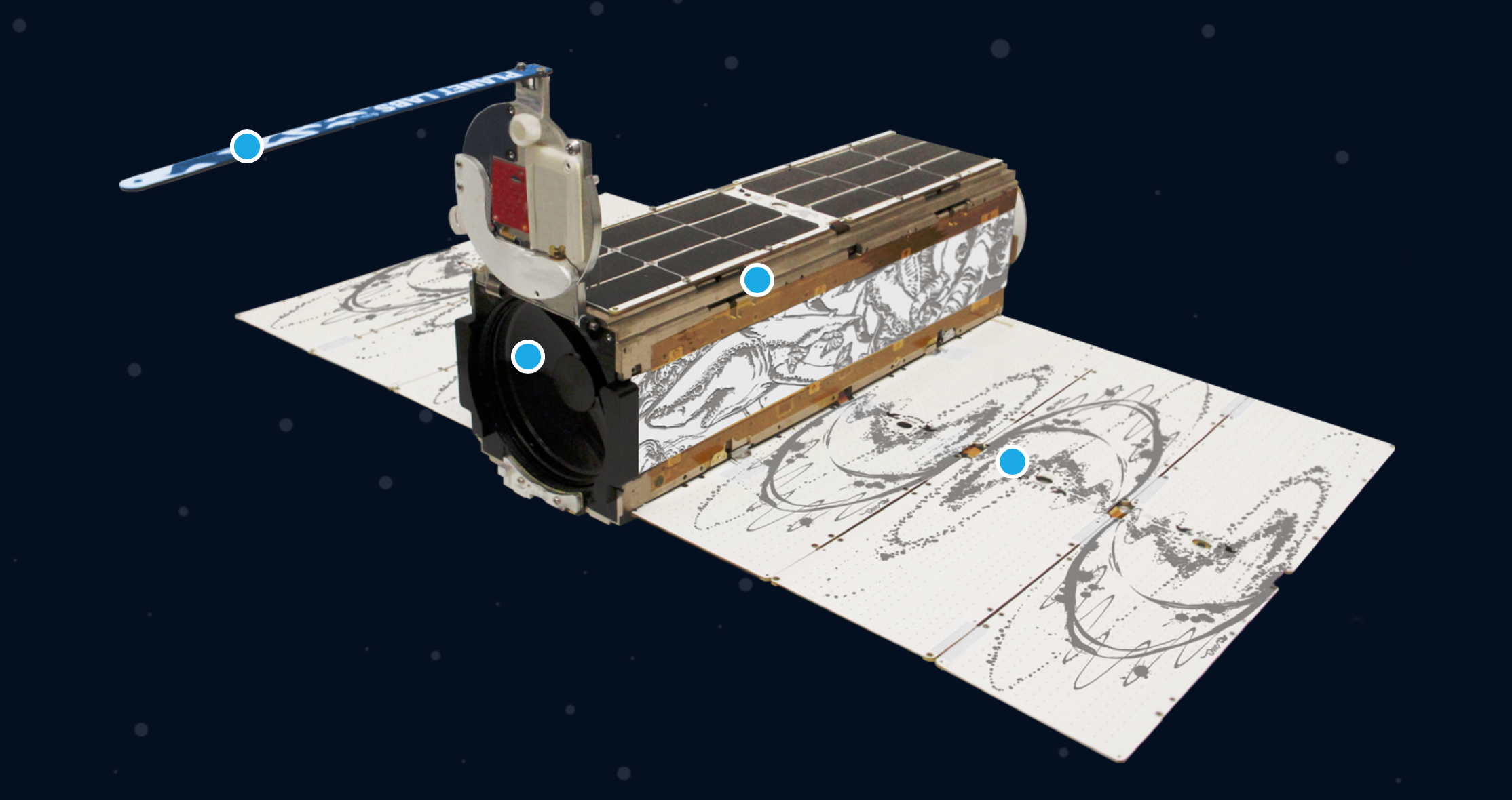
2.  Or can this even be captured in a map?  It bears noting that even if we have a totalistic map of global coverage, we tend to not come to terms with the depth of inequities and wealth, so obsessed we’ve become with what we can record as if it was a picture of the status quo.  In an age where outfits like Planet Labs or their friendly competitors at DigitalGlobe readily provide satellite-generated images that map the surface of the earth from space for their client base at an astounding resolution of two to three meters, what’s being mapped omits the truly important transactions, exchanges, money-laundering, and other financial transactions that underlie the ever more globalized economy.  Even as the platforms of Geo Big Data may appear comprehensive in detail, the undercurrents of these claims provokes questions about what they fail to communicate. Perhaps the very promise of totality for such claims of whole-Earth imagery–to be sure, at lower resolution for the state of Israel, by a ‘flock’ of “Dove” Satellites–only confirms that the real action lies elsewhere:  maybe in those shifting currents less readily subject to be seen, tracked or so readily surveyed, as much as on the edges of urban and rural life.  After all, if one accepts a uniform mathematical grid as a way of mapping, one omits any local knowledge of place, andy any notion of representation.

Satellite Dove

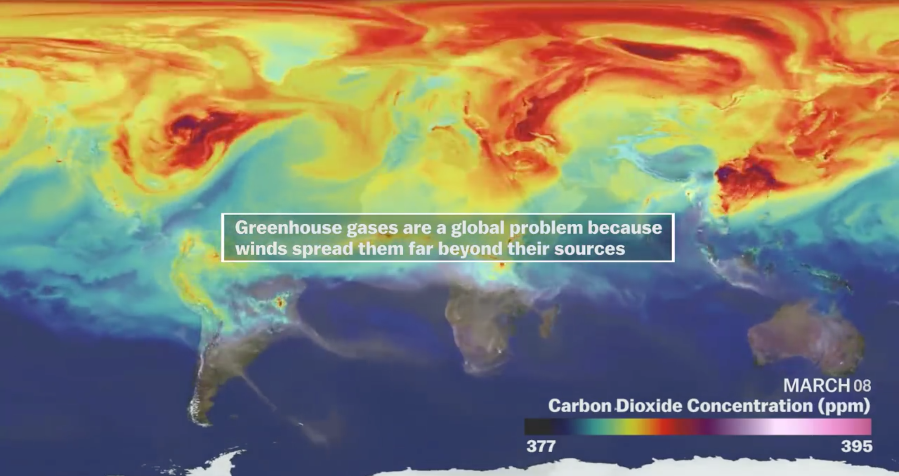
There must be more that resists such ready capture–from the rampant inequalities of wealth that organize our cities to the disparities of wealth around the world.  What other underground streams of electronic or financial transfers can we trace?  These streams constitute the new mare nostrum, the non-territorial terrain on which both worldly power and economic activities are waged, and run across the boundaries of either a settled or defined geopolitical space.  But the space of climate change is one that is best rendered as transcending a map of territorial bounds or geopolitical space that is rooted in the antiquated notion of “countries,” which not only seem increasingly removed from our planet’s fate–

Screen Shot 2015-07-13 at 8.21.05 PM

–but from it’s actual experience.

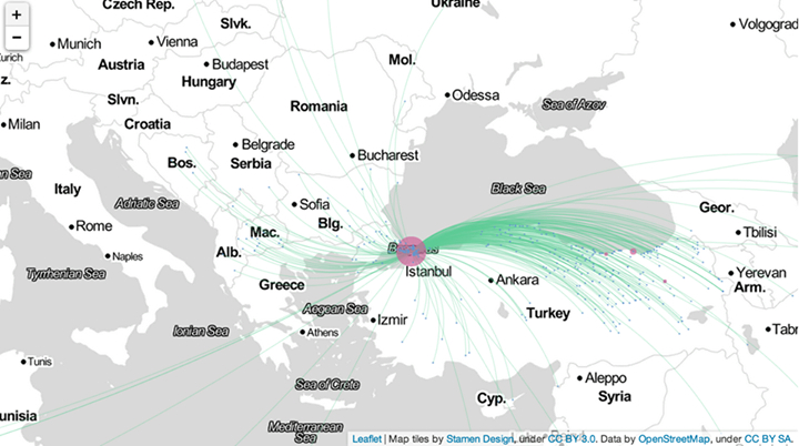
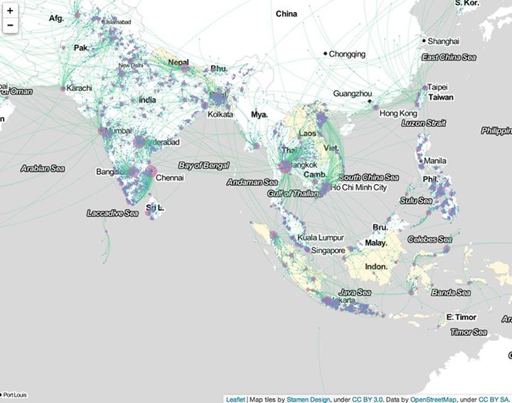
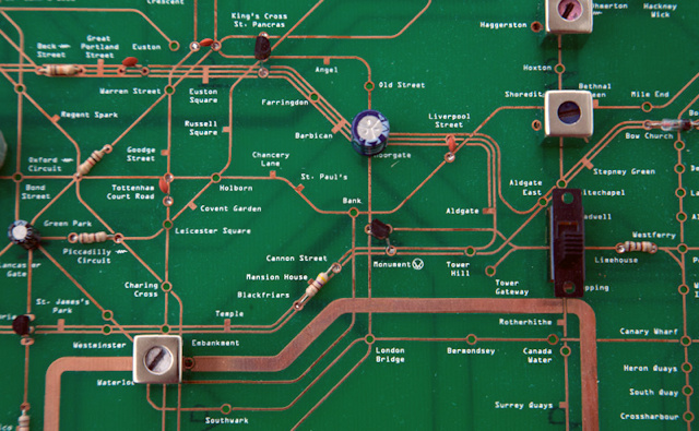
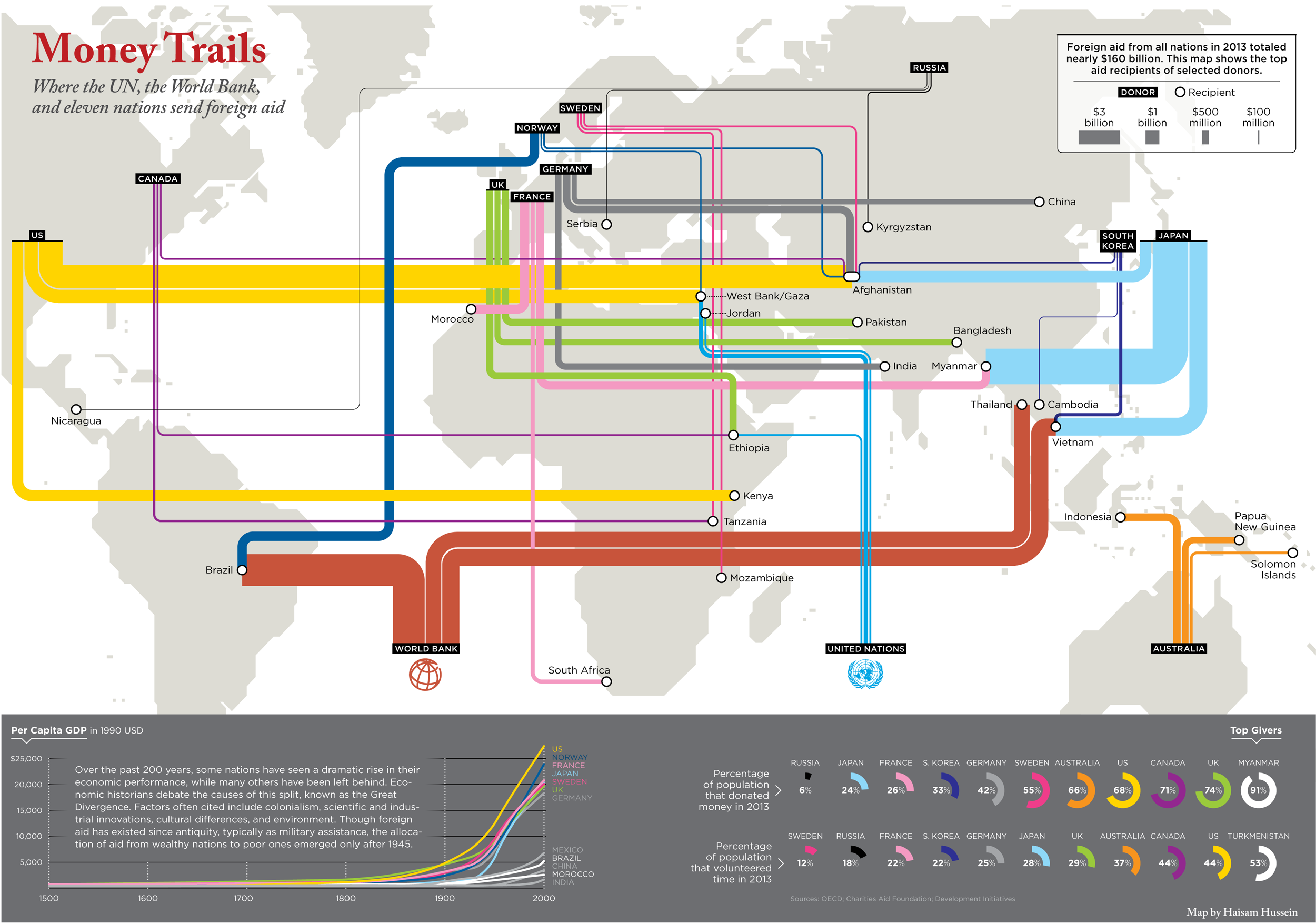
3.  The map “Money Trails” traces the actual paths of the disbursement of funds by the UN, World Bank, and 11 industrialized nations to reveal the distortion of global ties transcending geopolitical space.  So much seems revealed in the major unmapped pathways that structure our increasingly disturbingly decentered globe–which infographic artist Haisam Hussein used to map the distribution “foreign aid” in the pastel hues and curving bars reminiscent of the London Tube Map that the engineer Harry Beck so cleverly devised on the model of a simple circuit board–but which suggest a decentered lack of familiarity, and raise the stakes on processing how foreign aid is allocated, as much as to explain the circulation of funds with an air of transparency.

31_philanthropymap

Lapham’s Quarterly

Hussein’s uncanny infographic tacitly calls attention to the status of Aid as an artifact of the Western World (to which Beck so clearly belonged), even if the destinations of most of the billions tend to arrive at destinations whose open circles peripheral to or far outside the west, from Afghanistan, Myanmar, Vietnam, Brazil, Kenya or the West Bank–as well as India and Ethiopia.  Beck’s design had once simplified the confusion that Londoners faced in confronting underground routes by simplifying the Tub to a circuit’s dense pathways in ways riders quickly came to disentangle:

beckcb

What does it mean for huge sums of foreign aid to travel as they do, through such sanctioned if somehow secret hidden pathways of economic exchange?  Can one begin to disentangle their distribution by different agencies and governments, and the parallels sources of foreign aid dispatched to those needy, or to enter into a logic of their distribution?  Can one ever expect the distribution of Foreign Aid to run along such clearly defined pathways?

4.  In an age where the vast majority of financial transactions occur online and data centers channel chains of information with increasing speed, the paths of financial transactions are rarely transparently mapped.  Although we accept multiple ways of mapping and surveilling the world, but mapping the global exchange of money and financial assistance are less clearly established–if only because the mobility of money presents far less easy or a static image and is less about clear relations between place than often undisclosed channels of exchange.  If we know the GDP of different countries, national debt, global debt, or even map government debt as a percentage of GDP–we can rank countries’ relative consciousness of balance of payments, or the ability with which debt is able to be sustained, while those deepest crimson threaten to drop from view or implode:

l_2108_fd0c07716bed57e5759d1025fa89e780

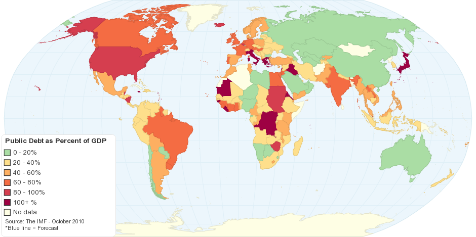
Such a static distribution of debt offers a basis not to consider the distribution of productivity; it describes the ability of countries to carry debt even if carrying this load provides the basis to perpetuate their global roles.

The basis for understanding the circulation of money around the globe raise questions of the continued relevance of connectivity, distribution, and indeed the privileged point of orientation to the circulation of power.  For a map that privileges clear boundary lines of jurisdiction serves to regard each nation as an autonomous economic actor, but in an era of the paperless transaction of funds, the map that continues to privilege territoriality seems not only out of date, but increasingly irrelevant to describing the process of globalization.

One might also see the development of aid as a holding pattern or mode for tacitly creating consensus and uniting an increasingly uneven playing field of the economic state of play.  If empires were once seen as controlling the sea and mapping control of navigational spaces, the notion of the “Freedom of Seas” or Mare Liberum that Grotius proposed as the basis for mercantilism in the early seventeenth century have long ceased to be the basis or the illustration of imperial mandates:  whereas the concept of the Freedom of the Seas was in ways an extension of ancient Romans’ control over the Mediterranean, the ocean is no longer the screen to project projects of dominion than are the pathways of aid whose currents more aptly flow from centers of geopolitical power–and can only be mapped in far more fractured, and indeed postmodern, globalist terms, where economic aid is tied to the opening of markets as well as political ties–and might be far more challenging to map.  The sea is no longer the primary surface of economic exchange, and the relatively recent migration of monetary exchanges onto virtual space poses unique challenges to trace.

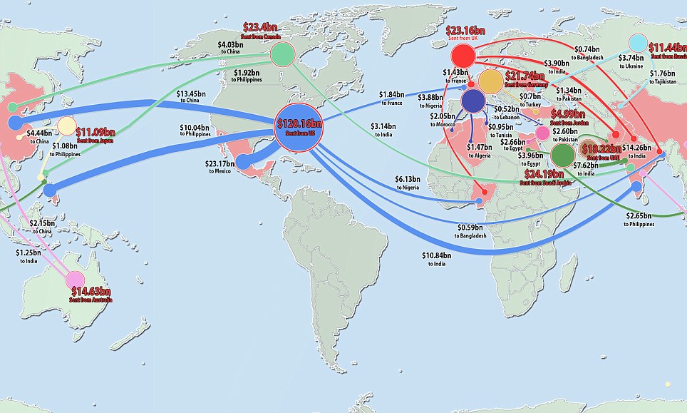
The less visible pathways and more visible tentacles by which foreign aid is dispensed may not only lend coherence to our national markets, despite the dramatic inequalities that continue to exist across the inhabited world–the expansion of aid may indeed make it ethically and conscionably possible to live in its huge differences of well-being and lifestyles that we wouldn’t be able to otherwise ignore.  An astounding $530 billion was informally sent, through unofficial channels, by immigrants, in 2012, according to the World Bank, in ways that might represent the economy of a sizable nation–and a huge uptick over the $132 billion sent in 2011.  The pathways of finance suggest a new model of global circulation of giving and receiving that offers something like an underlayer of the global economy.

Migrant money graphic.jpg

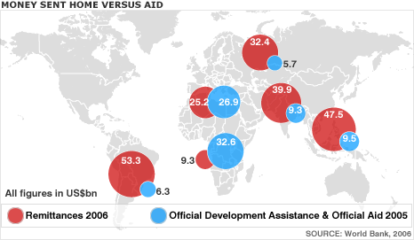
As of 2006, the money sent home from industrialized countries in the form of individual remittances was for the most part (outside of Africa) significantly larger than the official development assistance and foreign aid worldwide, according to the World Bank, whose donor countries commit to sustainable development or poverty reduction in ways that provide a plan for dealing with economic disparities.

remittance_world_466

But the dramatic expansion of foreign aid far more often travels along official currents, supported by a logic that demands some excavation of internationalist motivations that transcend mere economic need.

5.  While the notion of Christian charity was long linked to the local public use of personal wealth, as upper-class Roman elites gave money as they wanted to civic causes in much of Europe and North Africa, the flows of philanthropy that have been increasingly institutionalized have become ever more difficult to trace and complex to map as foreign aid has tried to reduce growing income disparities worldwide.  Giving is institutionalized by governments–and by United Nations organizations with the World Bank and their non-profit NGO allies, but mapping flows of philanthropy are far from the sorts of local giving of the past.  Increasingly mediated by non-national entities, the flow of funds in an era of global cash flows and transfers is increasingly dematerialized or immaterial, even when growing to the inconceivable amount of $160 Billion.

Perhaps rendering them concretely provokes more surprise than recognition as the courses of capital are remapped on a geographical projection.  And when Haisam Hussein chose to map trails of foreign aid against the famous transit map of a city once the financial center of world markets, as if to map the spatial contraction of the global economy to several principal routes of financial disbursement, the map suggests not only the mobility of money, but the degree to which the major economies like the United states and Japan, as well as Norway, Sweden, England, Germany, France, Australia and Canada pump money into a global system of credit that sustain global markets, helped primarily by the World Bank, and basically bankrolled by eleven nations, including Japan, Canada, the US, Britain, Sweden, Australia, Russia and South Korea–who exclude the “other area,” left grey on the map, of the People’s Republic of China.

Money Trails and UN

Lapham’s Quarterly

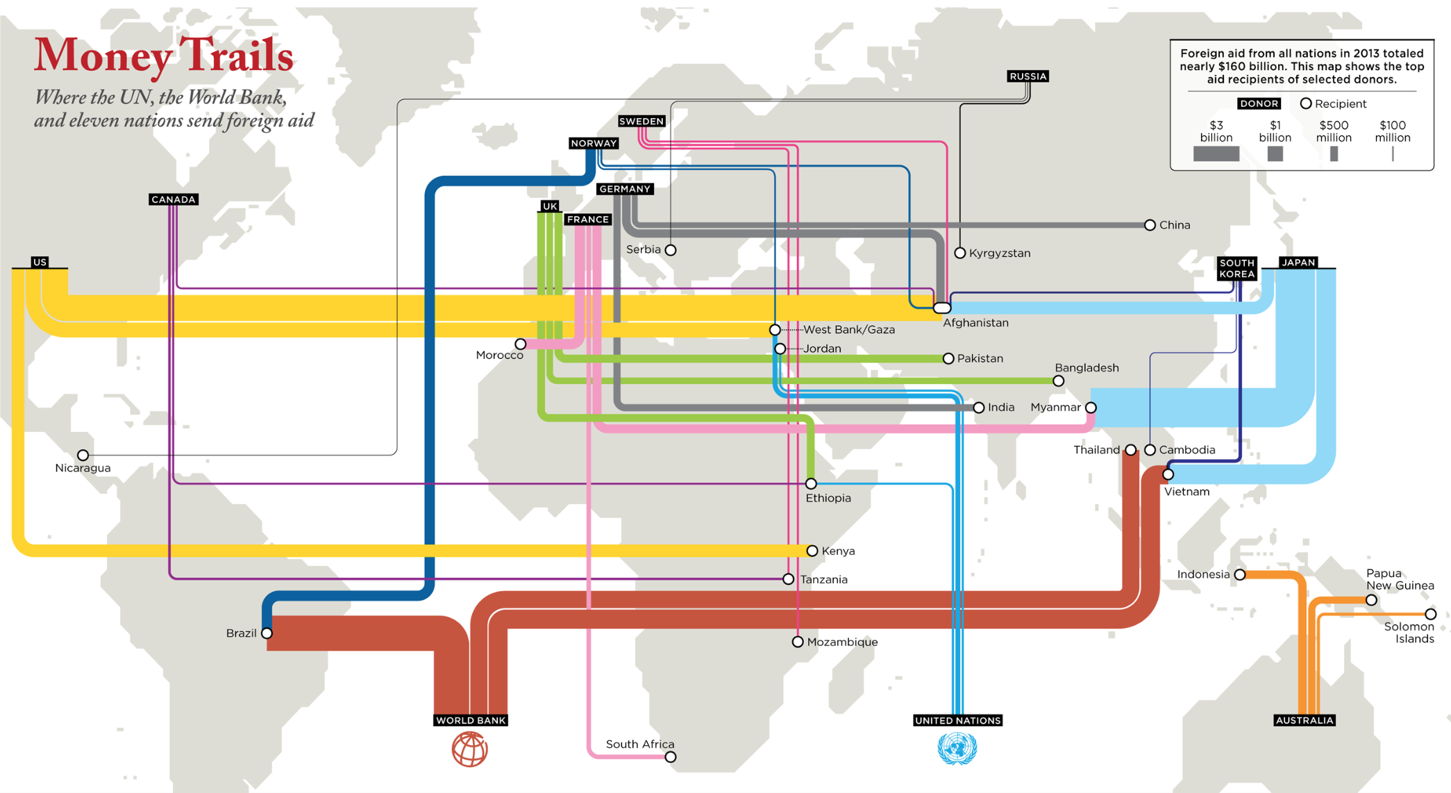
The money flows are modernistically represented as if to show the progressive possibilities of aid in streamlined terms, the distribution is at the same time  in no way equal and strikingly disproportionate and the larger flows of aid dissonantly disruptive of the modernistic design–the pathways of economic aid are clearly and lopsidedly dominated by the nations of the northern hemisphere.  Despite the modernism of the routes, the disproportionate paths on which aid travels disrupts the symmetry of its so sleek tube lines, as distortedly large baby blue rivers dominate the map as they flow from Japan beside yellow-gold currents from the United States, reminding one of the deeply engrained national inequalities that underpin much “giving” today–and dazzling us with an array of colors and flows that leads us almost to forget the global presence of the PRC, or the grey persistence of global poverty.

But the selective nature of support seems particularly striking–with, as of 2013, the UK tied to Pakistan, Ethiopia and Bangladesh, the US to Kenya, Gaza and the West Bank, and Afghanistan, Australia to its neighbors Indonesia, Papua New Guinea, and the Solomon Islands, Norway to Brazil, and France to Myanmar and Morocco.  The routes for disbursing foreign aid are hardly a process of global circulation, but provide something like a strategy for promoting the possible circulation of global funds.

31_philanthropymap

Lapham’s Quarterly

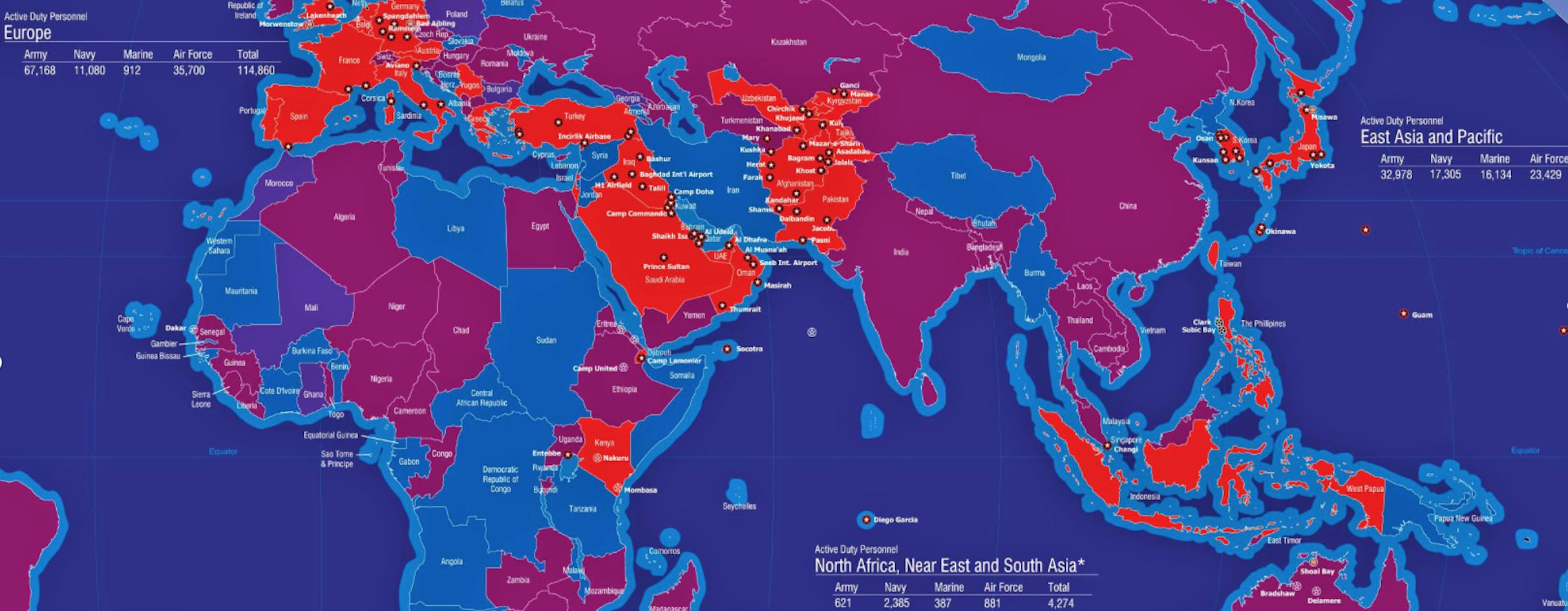
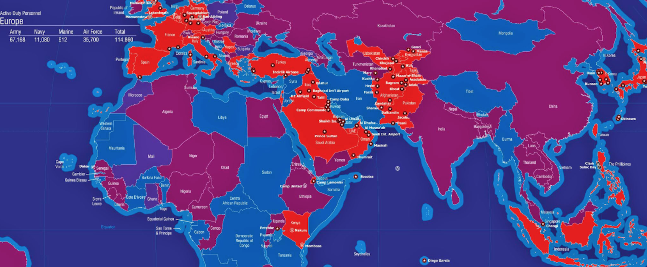
The circulation of “aid” is in part a sort of shadow-map that helps shore up and support the  US military’s presence.  The spread of what seems an extended carte blanche to settle the US military in bases abroad has grown steadily since World War II, and has currently grown to spread to over 800 foreign bases in 160 other countries and territories outside the United States–excluding Afghanistan and Iraq, sustained at a cost of over $156 Billion annually.  The current constellation of what Chalmers Johnson called “base world”–a parallel imaging of military extraterritoriality–of which the Pentagon lists not only 174 US “base sites” in Germany, 113 in Japan, and 83 in South Korea, but hundreds more in around 80 countries, including Bahrain, Bulgaria, Colombia, Kenya, and Qatar:  if those countries colored bright red are hosting actual basis, those in purple are hosting US troops, and those in dark blue are countries where the US government is currently negotiating the presence of troops, and the rare spots of a lighter shade of blue mark those with “no evident” US military presence–limited to Mongolia, Tibet, Burma, North Korea and Iran, and the northern and central Africa nations of Libya, Somalia, the Central African Republic, Democratic Republic of the Congo, and Sudan.  (But one never knows.)

globalmilitarism58_14

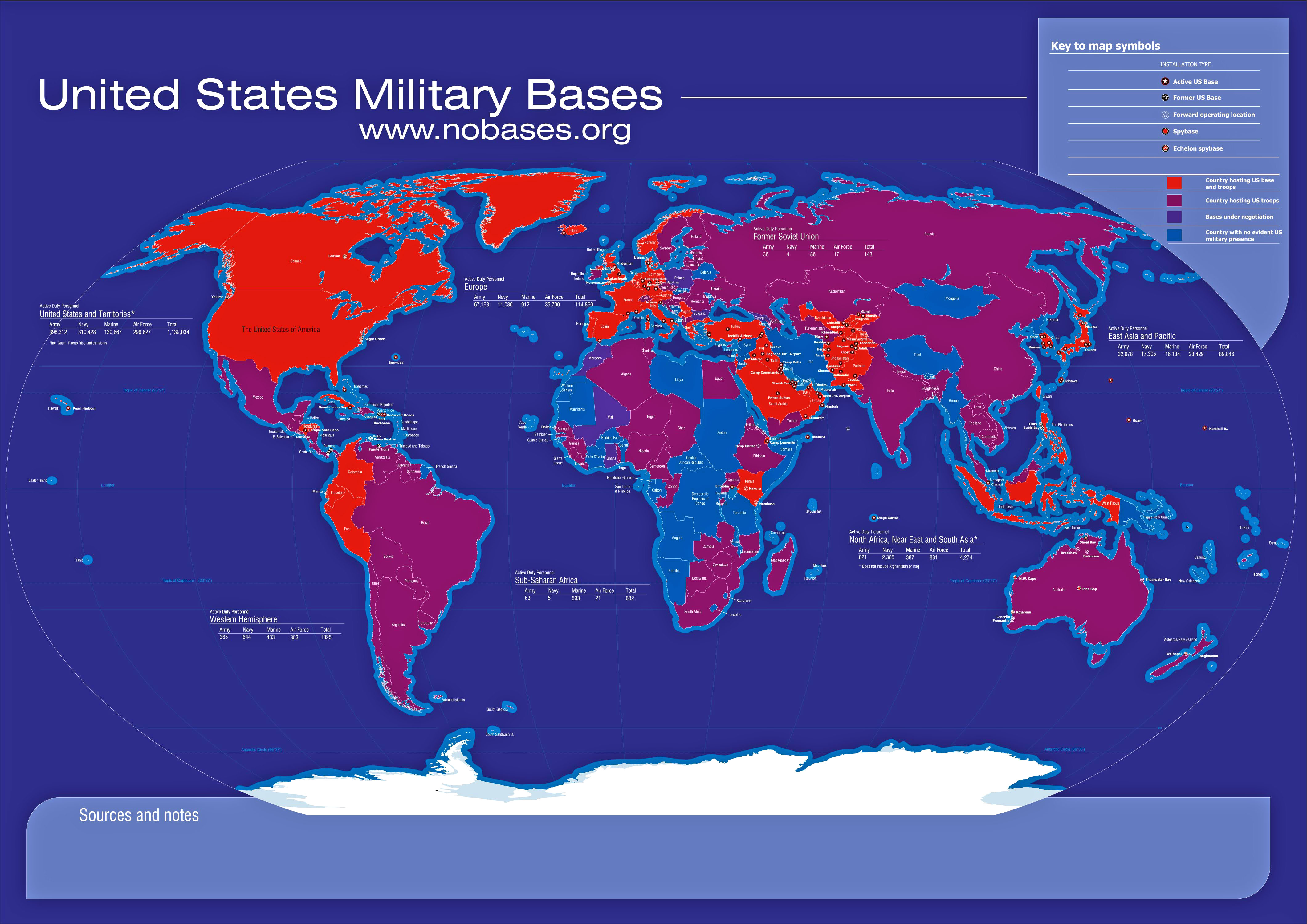
While one might rightly wonder why the army, navy, and marines are based so widely over an “empire of bases,” the cost to the government is no doubt not only expressed in the cost of running the bases that are outposts of Americana where one would think oneself to be geographically removed.

A closer look at those sites of centers of active duty of US soldiers–not including the recent theaters of war of Afghanistan and Iraq–shows a diaspora of bases across the globe that the Department of Defense sustains, allowing the US to have a greater presence worldwide than any actual nation, empire, or people, in seems the underside of globalization, as well as the fantasy of a paranoid extra-national archipelago of active duty that may respond to a vision of global danger:

Active Duty Map

Is foreign economic “aid” somehow a tacitly understood bribe to continue to tolerate such an expansive military presence, or to negotiate with nations for the possibility of securing a future base, or some other sort of economic open-ness?  Is it an excuse to overcome resistance to perpetuating ongoing military presences, or a new way of strategically and cynically waging a global war of chess?

Hosting US Bases

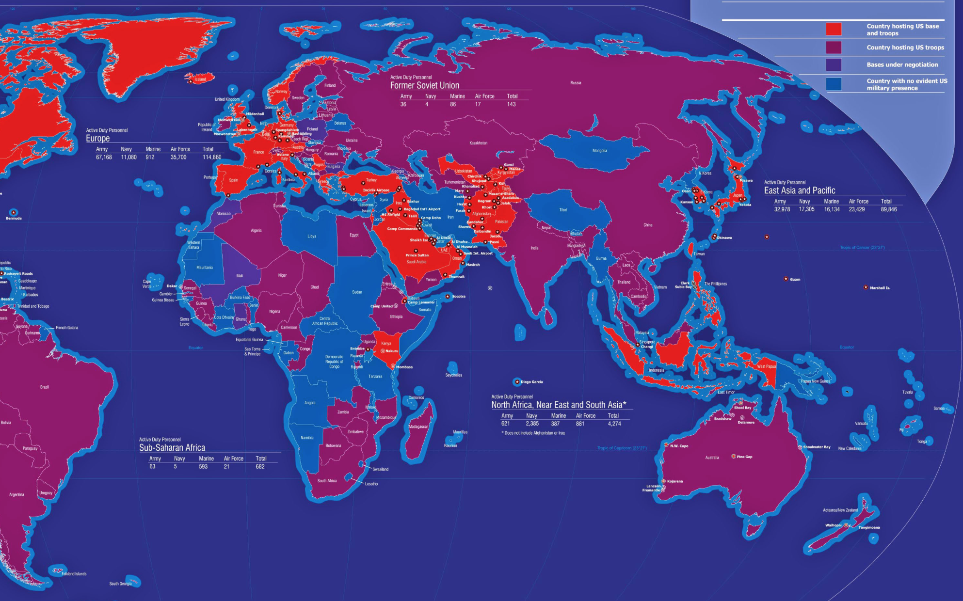
The image of active duty soldiers settled in bases across what might be called Eurasia reveals an often unmapped constellation of sites of settlement, far different from the cities that usually appear on a political atlas or any map.

Active Duty in EurASIA

6.  The World Bank does not primarily speak, despite what its name might assure us, for the world, and may charge usurious fees, but a counter-geography suggest the limits of the pathways Hussein so cleverly mapped from a first-world perspective.

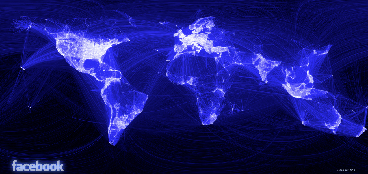
For an unspoken and often ignored “other map” of economic aid, as well as, perhaps, of the “soft money” that allows military and economic expansion, flows not from the World Bank or United States, of course, but from China–all too absent from our own eyes, much as the very same region of the world is so conspicuously absent from maps of Facebook “friending” and “likes” in ways that makes one smirk with superiority at the eerily blacked-out region of a world otherwise illuminated by “friendships” and photo exchange.  The same area not so oddly omitted from the map of global foreign aid, since it is not our aid or the sort of aid sought to be mapped, is actually of course not nearly so passive, or lacking networks of giving.  Although Facebook’s ““Friendship Map” tracks networking, as much as it registers an increasingly vibrant emotional pulse of the digital culture of linking that grips much the globe, leaves a blank space of seep blue or empty lacuna in tracing over 1.5 billion friendships–half of its users have successfully “friended” over 200 other users.  The largest hole of social network gapes over China–though one still can’t really expunge its territory from a map–although the map only reflects individual and collective investment in social media.

5236592-3x2-700x467

Global visualisation of every connection between two people on Facebook

Perhaps the map is far more distorting than admit it to be.

In the more real world of global finances, funding provides an image of governmentally that reigns in the massive economic disequilibria around the world at at time of dramatically curtailed prosperity.  China’s foreign aid reveals distinctly different paths of money to North Korea, Srl Lanka, Sub-Saharan Africa–including Ethiopia and Sierra Leone–and Ecuador; aid is proffered with quite different degrees of riskiness, in ways that suggest the large number of risky bets that China seems to be making in “foreign investment”–described here as something unlike and distinct from “aid” or charitable giving, but as something of a gambit of clearly strategic scope of investing in future markets or potential future sources of food:
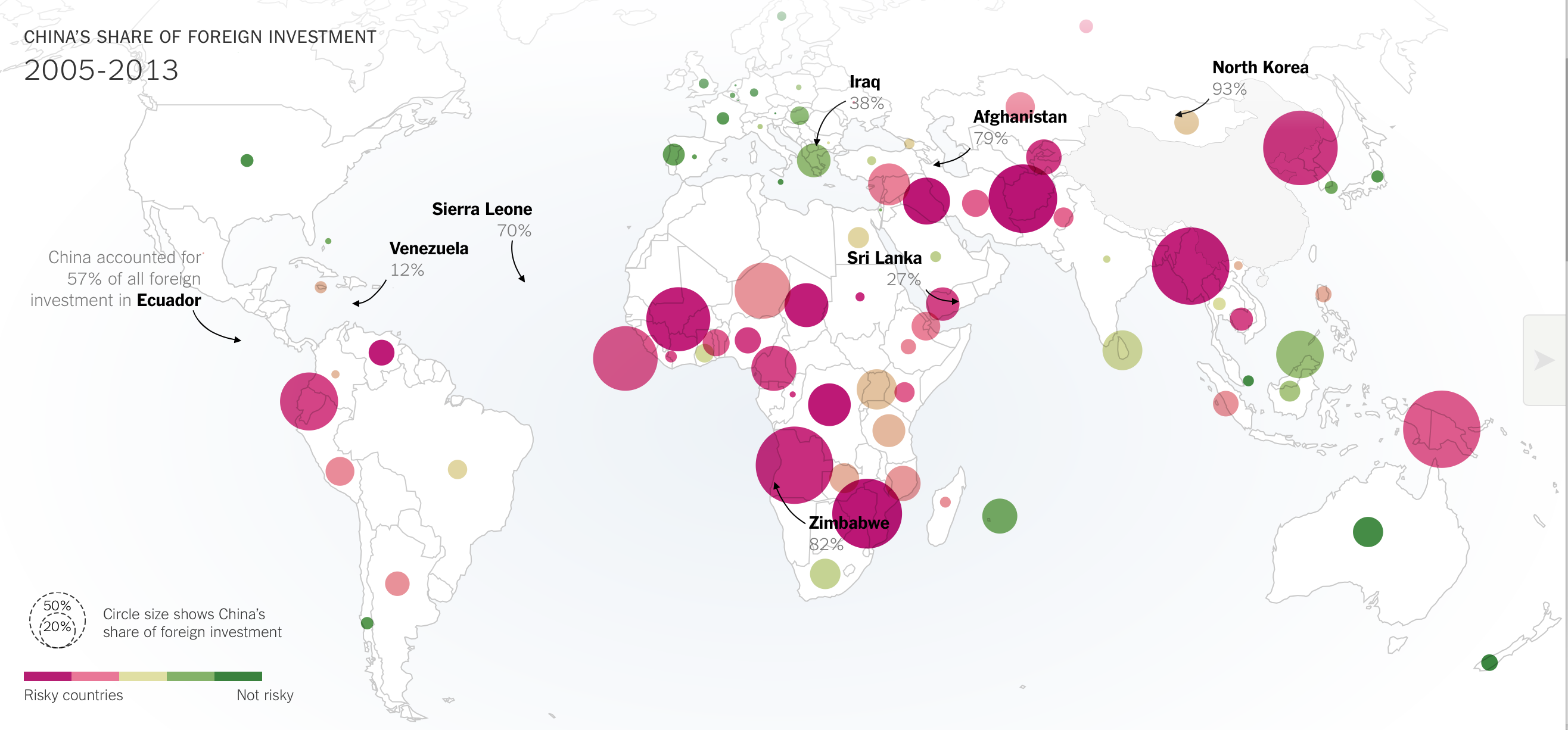
China's investment and riskiness of its investing

New York Times

Yet the degree of cumulative investment deserves attention as an alternate visualization of globalization that is not scary, but nonetheless can’t help but be salutary at least in illustrating global imbalances as a counterpoint:
China's Investment, 2005-13:NYT

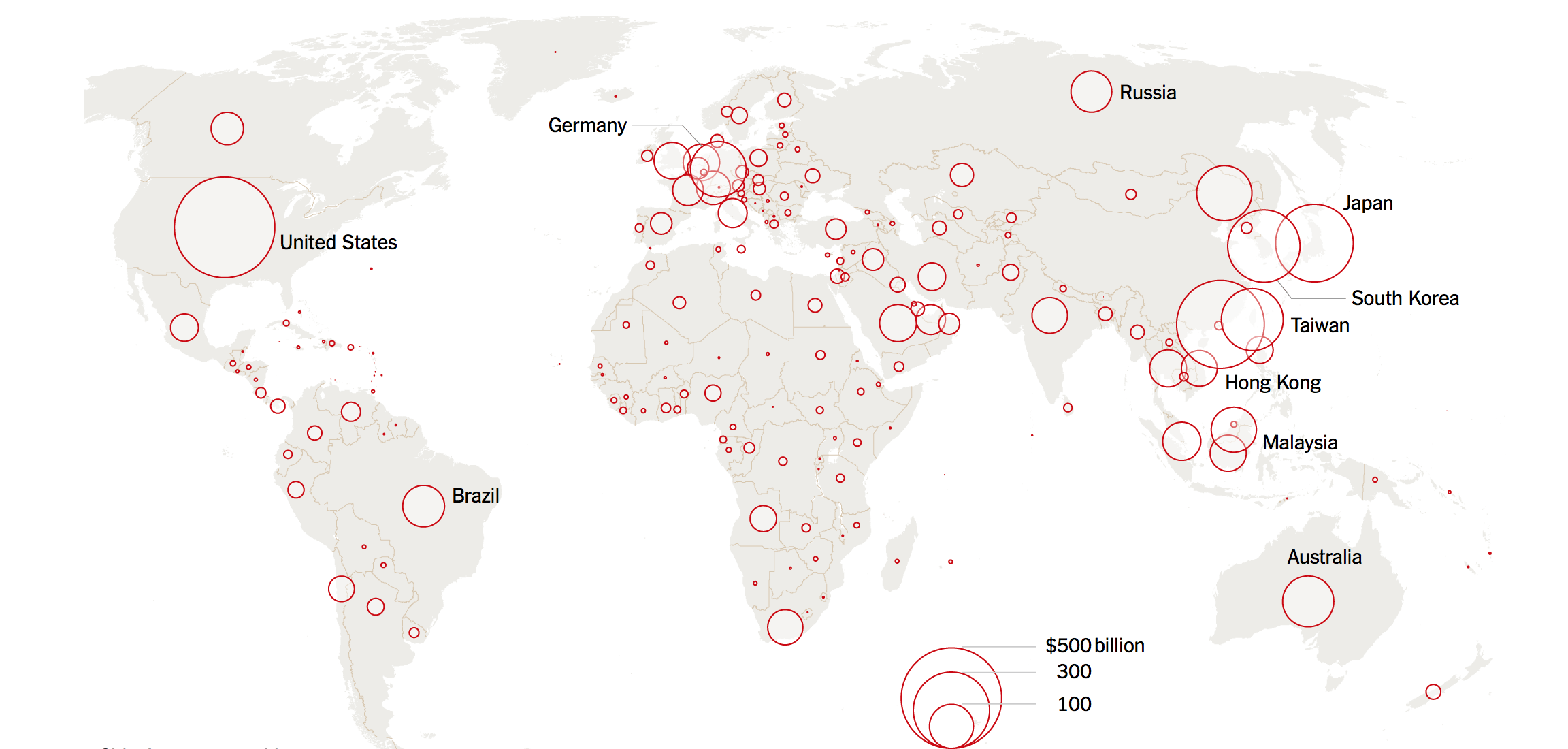
One can further profitably compare this to the aggregate numbers of Chinese exports and imports go, to see its economy’s global reach, and ask why the range of its “giving” or aid is ommited from the above map–in ways that suggests the degrees of strings attached to it.  The size of exports suggests a complementary set of ties to areas in Europe, the United States, Japan, and South Korea, as well as Australia and South Africa, where a smaller degree of aid arrives–no doubt with invisible strings of its own implicitly attached.

Value of Chinese Imports and Exports Worldwide 2015Value of Chinese Imports and Exports Worldwide 2015New York Times

These somewhat silent and far less evident paths of “giving” and GDP, as well as export values, seek to map a more dynamic image of the current state-of-play of globalization as a sort of state of flux, even if its economic ecosystem is all too often obscured, but also a screen for introspection of the proportions of globalization and its sins.  After all, whoever gives themselves the mantle of global authority most convincingly seems to get to draw the map. Or to decide that it might be time to reconsider the current map of giving, and foreign aid.

2 Comments

Filed under Foreign Aid, globalization, infographics, mapping economic inequalities

Facebook Tracks Migrations across Borders: Harvesting Data, Ten Years In

The pleasures of all forms of mapping respond to the deeply satisfying ends to which they process ties across space for viewers, allowing them ways to access space through spatial networks that one never before had the pleasure to observe:  and watching these connections and webs appear in a graphic template gives one a new sense of imagining travel across space, but also an almost innate pleasure of seeing how places are tied.  The multiple frogleaps between shores and across countries in the above world map suggests a shifting notion of the inhabited world.  With Facebook at its tenth anniversary, the immense amount of data that the social network generates offers opportunities to map impressive patterns of interconnectedness which shift attention from those borders which have long defined nation-states or indeed the bounds between land and sea.

In ways that might well be signs of the times, and surely aim to chart a sort of post-modernity, the maps of connected identities offer striking ways to see the world less in terms of its divisions than the links web-based communication allows one to harvest.  Indeed, without depending on the nation as the unit of meaning:  Facebook’s project of comprehensive social graphing has maps populations and social networking by tracking a combination of individuals and aggregates over space–at least, across self-reported locations.  Facebook has already showcased its data as a means to map friendships in ways that suggest a new way of reporting linkages in the very sort of social networks it promotes.  If all maps map human knowledge, these data maps also visualize space outside of spatial constraints:  but a new type of mapping emerges by tracing populations on the basis of how its users self-identify as birth cities and cities of current residence.  For Facebook engineers map actual spatial distributions by big data of the sort economists admire measuring, but most have found hard to discern.  They are worth attending to in some detail, not only to ask about the data on which they are based, but to examine the beauty of their construction.  By charting patters so compelling, they also force one to wonder whether the real story they tells go beyond the reach of the world-wide web–and what ways to best understand the geographical connectedness they actually reveal.  Perhaps we can begin by asking what sort of vertiginous views they offer of the world and its inhabitants, and how we can best relate to the stunning images that Facebook engineers seem to have taken such pleasure to produce–and whose visual economy seems so pleasurable to view.

After a decade of storing Facebook-generated data in a thick dossier of computer files, Facebook claims the ability for a sort of aggregate mapping, but one that erases individual stories:   its aggregates conceal the somewhat obvious fact that it tracks the self-selected members of Facebook users, and showcases them as if they offered a comprehensive enough record of the inhabited world to base a definitive social graph of global populations.  Perhaps Facebook users are the population that we want to notice, or the population that it makes sense to track–but this limitation of data is a liability as much as a strength–and because it treats the usual boundaries that have long offered practical constraints to travel and exchange as superseded, aside from the unstated boundary lines that divide China or North Korea from the other countries of the East.  The map suggests a new sort of human knowledge of connectivity and of the different sorts of markets, presumably, that those who are web-connected participate and are attracted by or move within.  The map that results is striking both because of its erasures of the border-lines and boundaries–and maps webs and arcs of population links without clear reference to spatial directionality.  The skein of ties that emerges has become somewhat iconic, and has also provided a sort of template or inspiration for the map of users’ “migrations” or shifting geographic locations in ways considered below.

Given the intentional elision of individual story-lines that is characteristic of the data being harvested, it’s important to try to untangle the maps it makes from the data on which they are based–if only to understand the bias of the picture they present:  a demographic restricted to their users, as well as based on data that is self-reported and without any objective control.  Rather than tracing the unidirectional movement associated with moments of migration driven by famine, slavery, war or ethnic tensions, the strikingly geometric maps Facebook engineers created reveal patterns of connectedness of special interest in tracking geographic mobility, but also in mapping (and perhaps describing) the new patterns of interconnectedness Facebook engineers would probably like to associate with the Facebook networking site.  The oddness of using the self-generated information on a site of social networking as demographic data may reveal a thirst for processing big data; once invested with the aura of objectivity, the collective patterns it reveals can erase individual stories as much as synthesize completely credible and coherent narratives.Connectedness is fascinating to track.  And such information like place of birth and city of residence are not considered categories massaged for personal advancement.  But the internet offers enough screens of concealment and opportunities for disguise that the social graphs Facebook makes tend not only to lack objectivity, but base themselves on data pontentially massaged by users–who, living in the suburbs of one city or in a nearby village, may report themselves as living in the best-known largest nearby city readily recognized, less in an act of deception, but in ways mistakenly treated as objective in character.

If all maps tell stories in how they embody meaning, the stories that the maps based on Facebook data suggests demand unpacking, if only since their numbers are so apparently comprehensive and large, as well as the stories that they submerge.  One story they promote, which we might not accept, promotes an increasingly inter-connected world; others that it conceals is the specific stories about who is connected to whom and why.  With almost half of Facebook users identifying two hundred friends, the webs created by the data purely of Facebook connections reveals an inter-connectivity that privileges the densest distribution of populations in North America and a broad sense of Europe, with a particularly active groups of users also dispersed in Central America, Peru, Argentina, Anatolia (Turkey), Nigeria, South Africa, Pakistan and India, and Indonesia.  This map of global “friendships,” developed by Facebook intern Paul Butler in 2011, offers a “social graph” of some 500 million people, linking users’ friendships to actual coordinates of latitude and longitude to create a visualization in a sort of media mash-up, illuminated by an intense if other-worldly backlit glow of FB blue.  The map of social networking that results suggests not only who is networked, rather than density of habitation but of course also maps the density of the culture of social networking that has come to stand, especially for Facebook, as a sort of index of modernization.  The equality between Facebook use and modernity recalls how closely the ‘Twitterverse’ maps onto the maps onto the global flight-paths of airline routes, as new study has found, suggesting that airline connections between cities provide a statistically valid proxy for twittering to sites beyond one’s own hometown–and the ties that Twitter makes in virtual terms should not be in any way that distinct, after all, since “Twitter is part of the real world” as is the internet, as Matthew Battles astutely observed, and tweeting is shaped by real-world social ties, even if it offers a new media for communication.  But it would seem a misleading inversion of cause and effect to take tweeting as an out-and-out proxy for modernization, equating it with the tracing of ties commerce and capital flows.

The question is not about the data of Twitter vs. Facebook, but about how big data is used to create the multitude of variant maps generated by Facebook media, including this map of ties among its users.  The multitude of variant maps generated by Facebook media seem particularly striking for their post-modernity in how they elide or ignore the frontier as a primary unit of meaning in world maps.  Is this map an illustration of of the acceptance of Facebook as a part of one’s identity, and do the great arcs themselves constitute something of an accurate index or emblem of post-modernity?  While Facebook is actively interested in promoting is own ability for harvesting data, many of the maps of friendship, migration, and social ties of course read a lot like images of its ability to promote social networking.  The arcs of light that map online ties not only mirror the sort of etherial airline map that seems as good a predictor of twitter ties–does this suggest the similar likelihood of access to airplanes as access to tweeting?–but a gauzy penumbra spun around the earth’s inhabitants who sit spellbound before backlit screens, luxuriating in the proxy embrace of on-line connections and affections? It’s always important to ask what sorts of abstractions that any map seeks to communicate through the tenuous bonds they draw linking actual regions.

Paul Butler's map of friendships

Is this a new story the habitation of the select areas of the information-sharing world that Facebook links?   The above image tells one story about the inhabitants of the world, or rather of a specific world,  and a strikingly suggestive one in how Facebook’s data defines the worlds inhabitants as its users.  For there is no doubt a certain amount of estrangement from other forms of communication that this image, linking pairs of cities weighted for how many friendships exist between them, also maps, varying the intensity and brightness of lines’ coloring by the number of friendships shared as a way of mapping “real human relationships” across space in ways that Facebook does not note explicitly:  the map devised by Facebook’s infrastructural engineering team is a map of the very distances that Facebook as a medium is best able to bridge.  If perhaps just as revealing of access to computers, digital literacy, and wealth, the arc drawn across the empty spaces of deep blue that are oceans charts the networks of inter-connectivity among which news travels, memes grow, personalized photos shared, and a sort of quasi-information society exists, by the construction of the social network on which it travels.  This “globology” reflects less the currents of cultural contact, migration, and exchange that define global history, but something analogous to the cartographical flattening of it, viewed through access to the options of like, connect, dislike, or share that Facebook offers its users.  It charts the options that have shaped, to one extent or another, a transnational psychology of communication.

Which makes the ambitions of Facebook engineers to map patterns of “coordinated migration” an interesting case in mining of new trends in geographic mobility from the massive amounts of data that they collect, if only because of its goals to map actual spatial position over time.  The somewhat-recent maps of what FB term “coordinated migration,” based on the patterns of relocation that emerge from self-reported data of the site of birth and current location of FB users.  The result of the database’s collation is to track and define the lines of the global phenomenon of urban migration, once reserved for larger industrial cities or metropoles, but not significantly broadened across the world, both to population growth and a drying up rural prospects and jobs in the magnets of urban metropoles.  The idealized format of these arcs of migration create a social scientific aura of explanatory simplicity, and serve to affirm the notion that individual itineraries respond to an economic marketplace.  The boast of Facebook to chart such pathways with accuracy has been critiqued for its use of private data without evaluation through the scrutiny by peer review, and may deviate from standards of impartially objectively derived data, or by using publicly listed self-identification to endow with the graphic objectivity (or appearance of it) on a map.  The maps make tacit claim to reveal the real attraction of populations both from neighboring cities in the same country, or, in South East Asia and India, from neighboring countries, by the web of tiny green arcs discussed in greater detail below, provide a useful filter for sort of big data economists have problems measuring of global migration, and indeed to distinguish quantifiable migration numbers and patterns in different regions of the world.  Once again, frontiers are less significant than the ties of cities that the data input by Facebook users enter into their pages, and which they map.

Underlying questions remain, but seem to be waiting for further or future analysis.  For one, how, Sheryl Sandberg, do these patterns of migration map out along gender lines?  In mapping “destination cities” by red dots, and “origin cities” by blue, the design group Stamen has helped render a smooth arcs of migration as a set of naturalized movements, in order to throw into relief the relative density of a phenomenon of “coordinated migration” around the world, but creates a naturalized web.  They give one useful key to read meaning from these idealized arcs by setting them against a global map coloring regions of relative urban growth in 2000-12 pale yellow, in the sort of compelling image  compressing a density of variables to simple graphic forms of which Tufte would be proud:  routes replace cities that they link, or that appear as numinous purple blurs that remind us of the messiness of mobility; the crossing of frontiers replaces frontiers, which must be deciphered by the limited role of crossings from China, whose very existence is only implied by paths of emigrants abroad.

Coordinated Migration #2

The mottled blotches of blotting-paper blue to which the thickest green trails lead indicate the fastest growing markets of production that provide the magnets from nearby countries as well as for regional residents.  The linking that the map tracks suggests a sense of populations in flux, and of the market-driven nature of the migrations that Facebook’s data tracks, and whose intense mobility is a sign of relative modernization as much as social unrest.  The broader linkages such data implies between Facebook and the global process of modernization is, certainly, good publicity, no doubt, if largely on the level of a subconscious association.

But the emergence of what Facebook has christened in quasi-sociological jargon as “destination cities” might be taken with a grain of salt.  But the data that Facebook has so far collected is also an inversion of a somewhat embarrassing incident that occurred at Facebook back in 2010, when Pete Warden devised with the inventive project to scrape the public Facebook profiles of 210 million users in the United States to derive the clustering of networks that divided the country according to FB ties, creating his own national map, but then withdrawing the offering of the data as public when Facebook threatened suit, but had to allow him to keep up the map he derived from the data–brilliant if only for its definition of clusters that would never be rendered in a printed map, with eponymous if imagined toponyms as SocialistanMormonia or winning ones like Stayathomia, designating the greater northeast and midwest–a region viewed by most as revealing less geographic mobility, but which wouldn’t appreciate that name.

United FB regions

The map, soon taken down, may have encouraged a sort of counter-posting of a heat-map that announced the world-wide distribution of Facebook developers, which seems designed to celebrate their global geographic diversity, rather than social or geographic segregation, to dispel the notion that they are concentrated in the United States or, in terms of the city where most FB developers live, San Francisco.  (The coloration of whole countries based on local concentrations of software developers finds all of North America painted red.)

Facebook-Developer-Heat-Map

But the huge amount of data that Facebook has developed in a decade-long harvest is hard not to want to map, if only to see what sort of visualizations it produces.  And the three or four maps they issued tracking the benefits of ten years of social networking have led to the claim to reveal new patterns of social migration to cities or urban metropoles that are the equivalents of hot-spots in a globalized world.  The shading yellow of regions the World Bank found marked by high “urbanization growth” over the same period–2000 to 2012–creates a simple context to situate the migration, although it would only really make sense to chart that growth in population over a broader period  corresponding pressures that impacted those who were migrating in ways tracked during this period as a way of registering, or so Facebook would like us to think, some of the primary forces that have reconfigured a globalized world on which Facebook has a clear take.  The cities noted as cross-national destinations reveals a sense of global mobility and inter-connectedness with which Facebook wants to promote, to be sure, linking a sense of globalism with its product’s global reach, but wrap the world in a skein of green lines link with differing intensity selective cities an towns, suddenly giving prominence to the links of a potentially economically prominent demographic.

Coordinated Migration #2

The elegantly arcs of migration charted from original residences are quite impressive localized illustrations of geographical mobility:  if the result might not be truly comparable to how Aude Hofleitner, Ta Virot Chiraphadhanakul and Bogdan State have decided to evoke the many “large-scale migrations [that] are an important part of human history,” the chart reveals micro-patterns of geographic mobility by neat green lines would make a social historian turn green with envy, mapping “flows” from hometowns to current cities.  The responsible social historian would ask whether those nice curved swirls map along a symmetry misleading in portraying actual paths that those migrations took–many, one could speculate, were routed through multiple other cities or post-modern metropoles, as the line connecting any two points anywhere is rarely a perfectly smooth trajectory or arc:  the visualization betrays, in this sense, the data-centered models from which they derive, and are, in a sense, less revealing of a picture of actual populations.  But the floral patterns they create, spinning from blue-dots of geographic origins to red dots of final destination or current habitation, document a fairly radical shift toward urban in-migration, reminiscent of nineteenth-century Europe, and a huge attraction to sites in coastal west Africa, not only Lagos, whose urban population’s growth by almost one-fifth reflecting the expansion of the city and oil-production, but also Dakar, Accra–whose urban growth also approached 20%–, Ghana, the Gulf of Guinea, and Nairobi, as well as Dar es Salaam.  (One suspects that this is but a shadow of the true migration of populations, since it only represents data from the social network that Facebook runs, and is silent about its very selective picture of folks with internet access and net-literacy.)  But the migration of Nigerians it tracks to Lagos is nonetheless prominent.

Could this data not be usefully cross-mapped with the growth or social compositions of destination cities in more provocative ways?  What sort of visualization would that create?  Can it be refined, by accessing data like the changed place of Facebook users over time, creating a somewhat more messy, but perhaps more informative, way of tracing patterns of migration, than a graphic that seeks to underscore as well as illustrate the notion of a “coordinated migration” from smaller towns to metropoles?  To be sure, the arcs used to denote the alleged concentration of migration area a way of softening the image of Facebook’s data, making it more organic part of the map, and not serve as an apparatus of any accuracy.  The arcs are aesthetically engaging as a way to illustrate each “destination city” by its reach to its hinterland–or to other cities of origin–to visualize and showcase the massive amounts of data that it has collected, much in the way that Facebook has engaged in multiple ways to visualize the scope and extent of data that it generates over a huge expanse of the world, if not to suggest it forms a way of tracking the inhabited world, under the name of Data Science, always keeping that data anonymous.

The map of major destinations of folks in the two year period of 2010-12 is striking for how it reveals a changing face of global socio-professional mobility that seems specific to some classes.  The usage of circle arcs in the streamlined OSM cartographical data is almost as misleading as it gets if one thinks that the arcs mirror the messiness of routes of actual spatial migration.  But the abstraction of defined population currents offers an abstraction of presumably “eminently hirable” individuals looking for more profitable lines of work, linking the Facebook populations with the up and coming professionals of the future, as much as with job mobility.  The yellow highlighted areas of notable urban population growth create a backdrop that increased the legibility of this slightly restricted map, and others below–one  wishes for a bit deeper patterns of urbanization and rural pressures–at times far preceding the decade we are describing in these maps.

Coordianted Migration--Africa

The graphics are particularly striking visually, and effective as compelling images of global patterns, even if they also might not be that deeply informative:   they trace a collective social history of urban in-migration in Istanbul, the city Facebook’s researchers found to have the greatest “coordinated migration,” largely as it is the greatest metropole in a largely rural but rapidly “westernizing” country whose infrastructure has greatly transformed–as if Facebook use was a predictable index of economic modernity and, by extension, growing markets for its advertisers.  The foci Facebook’s data has illuminated here indicates as “growth towns” such destinations as Nairobi, Lagos, Port Harcourt, Accra, Kumasi, Kampala, and Dar es Salaam, but purged of the living conditions in those sites.

But a more complex super-imposition or layering of not only urbanization, but annual rates of populations’ change worldwide, in ways that the United Nations has also charted in ways that would be of particular importance for such coordinated migrations, which focus, say, not only on Mali’s and Kenya’s urbanization, but growth in Zambia, the Central African Republic, Chad and Tanzania–and explain why these are to differing degrees loci of the very migratory pressures that Facebook has detected.  (All data deserves to be mapped, but the Facebook seem to privilege almost exclusively the very data that they generated, in order to showcase the trends that its use is able to detect, but some maps are misleading enough that they are perhaps less better drawn.  This leads to some complications, both since the data is not made public and controlled, but also since it is not able to be combined by other data or metrics in responsible ways.)

Population Growth UN Charts

The transformation that these maps chart might be one of the huge expansion of internet users–the maps map their own data, after all.  The clustering of such users in a rapidly growing city like Istanbul is particularly compelling, and interesting reveals the huge amount of in-migration from the less sparsely populated areas of Anatolia around the Black Sea that led to the city’s growth by almost 12% in 2010-12.  It would especially profit from a charting to areas of the city–if possible–or the expansion of the city itself, as well as the growth of other Turkish cities from which those arriving in Istanbul hail:  are these towns declining, and just dying, or are they also growing at a comparable rate?  Do folks moving to Istanbul list actual home-towns, or the nearest large villages?  Istanbul is perhaps also unique in being a modern metropole drawing educated populations from many nearby Macedonia, Bosnia, Bulgaria, Albania and Hungary, as well, it seems, the Ukraine–in a sense of the rebirth of the Ottoman Empire, but in ways distinctively lopsided to the East:  a blanket of green gauze of strings of differing intensity whose arcs blankets the northern regions of Anatolia bordering on the Black Sea.

To Istanbul!

The simplified elegant light green arcs in the above map and its above counterparts stand in quite sharp contrast to the rapid circulation of populations mapped in what is by far the densest and in senses most complex map groups India, South-East Asia (Thailand, Cambodia, Vietnam, Philippines, Singapore, and Malaysia)–almost a data-overload itself–or of the specific stories of these immigrants.  Of course, the question of why this region–embracing really at least three, but probably four sub-regions, should be seen as a collective is not clear, but it is essentially “the rest of the world” aside from the main regions Facebook has parsed.   The graphic suggests a far more massive amount of mobility that is almost difficult to distill to a single image or map.  (China is absent from the dataset, because internet use is so less common; public self-identification is also no doubt far more rare, and foreign, anyways.)   There was quite explosive growth in this period in Bangkok (significantly over 10%), Hyderabad (a bit under 15%, or 14.4%), and Chennai (also slightly under 15%, or 14.4%); one wonders more about the social demographics that motivated this growth, and how much of it maps onto the Facebook users who it maps.

The loss of the stories of individuals who are immigrating to cities is almost part of the point of these maps:  there is no story that needs to be told about this immigration, because it is a process of migration that responds to uniform global pressures we all recognize, which are specific to the demographic of Facebook’s users.  This sense of a story is far from Satyajit Rays’s vision of “The Big City” of the immigration of rural villagers to their new life of searching for commercial employment in the banks, mechanical sales, and lawyers electrified Calcutta.  For the migration to the city that dominates each regional state–rather, the data charts the growth of emerging metropoles as Chennai, in southern India:  it charts mobility from cities to cities, inter-city mobility, among a I-think-that-I’m-probably-quite-employable demographic of relatively educated Facebook users who are most often online, and would coincidentally provide a selective demographic for advertisers to reach.  Indeed, large swaths of rural territories are essentially unmapped, save by the intersecting bright green arcs that cross over their terrain, as if without Facebook users, they did not deserve to be mapped–or, at least, without necessary data, fall out of it–as if to locate the intensity of migrations around its rim, although quite a few sole threads of migration originate from its empty interior.

The image of a growing South Asia is, however, particularly interesting for the number of itineraries it traces out of China, migrating to Taiwan and Hong Kong for the most part, as well as South Korea and the Philippines; the active clustering of Facebook users along the coast suggests that it is were the true action is occurs, as if to rewrite the attention usually paid to charting China’s escalating economic growth.  The vibrancy of ties across borders (and across seas) is striking, as a certain demographic seems irresistibly drawn by Taiwan, and others to Thailand (Bangkok) or Cambodia and Vietnam, whose arcs reveal notably dense ties of geographic mobility.

Coordinated Migration--Asia

Whose stories is revealed in this amazingly dense map of neat green arcs, which, if they simplify the messiness of the individual stories they collectively track, seem intended to create a sense of a coherent network of meaning that might not be present in the area’s economy but is actually extra-national in nature:  these migrations seem links of like to like, and of educated to industry.  One however wishes for greater resolution in an image such as the above:  what is going on in the Philippines, for example, where Manila is not so much the central hub one might expect, but that each island seems to have its own centers of aggregation and congregation, is unclear; out- and in-migration also seems mixed, as it does around Djakarta and to an extent in southern India and Sri Lanka.  Would a close up, say, of Polynesia or at least of the area around Singapore be of help in discerning what patterns of “coordinated migration” might emerge? The huge urbanization of Java, Bali, Indonesia, Laos and Vietnam, and the circulation in populations in the rapidly growing region, as well as any other political and economic pressures on this sea of population shifts.  Many of the arrivals in Bangkok are from within Thailand, moreover, rather than from other countries, suggesting a very traditional pattern of migration within linguistic and cultural units, rather than the global circulation that such maps might be expected to chart, or might at first glance appear; similar interior migrations characterize Vietnam and, it seems, the Philippines, where much migration even appears specific to each island.  How, to use a metric that Facebook has cleverly adopted in its map of friendships across nations, can one view these ties through the lens of shared languages or linguistic similarities?

Philippines

There appears considerably less defined patterns of migration, it bears observing, in the United States.  What does this mean, or might it indicate?  (Or, which seems likely, are Facebook users in the United States just less interested in noting the cities where they live after they geographically relocate, by updating their profiles?)

The patterns provide a new way of reading ties within the map that trump, or erase, geographic proximity, in ways that seem of interest in tracking, for example, the shifts of economical mobility that might be tied or associated with NAFTA.  What is one to make of the far lesser webs of connection or migration in the North America, where there seems, save for the Cubans who have arrived in Miami, far less social mobility or a zero-sum game?  Facebook works–and thinks–in coordinated networks in this case, and finds little similar coordinated migration within North American cities; even in the international migrations from Mexico and Cuba, which seem to be potentially overstated–they reflect the number of Cubans in Miami that state their origin as Havana or Cuba; one can detect less of a coordinated action than a mass movement, in the case of migration from Mexico, than what might be  of a phenomenon chain migration, rather than one independently coordinated, and determined more by family links than economic need.  Three different patterns of migration seem to be evident in the three countries shown below–even though the Stamen projection seems to erase national boundaries or borders by rendering them as equivalent to regions or states:  Canadian cities draw amost exclusively from the surrounding province,  unlike most of the US, save North Dakota and New Mexico; Mexico shows active cross-national migration patterns, perhaps based on familial ties, the engineers note, to such major destination cities as Chicago, Houston, Dallas, and Los Angeles.

Coordinated Migration in US

So do the above mapped elegantly detailed distributions, given the selective nature of their self-reported data, mean anything definite at all? The skein of green lines of differing intensities wrap the world in a variety of ways that contrast, for a start, with a simple map of flight paths:  what remains untold, however, is exactly what demographic the Facebook family has been able to attract.

It is hard to say what they mean exactly, as a result, or how much they provide indices of mass migrations, even though this quite valuable data should by no means be dismissed.  Since it depends on self-reporting of information, they capture a small number of the actual migrations that occur between countries, by migrants who are less likely to log their travels in internet profiles or lists of friends, but the data that the engine of Facebook has, ten years into its existence, managed to compile, and is now eager to show the world that they are able to track.  Of course, the data is only data–and it’s of interest to create a map of data, if only to see what results.  And the somewhat over-determined data of who uses Facebook–folks who are geographically removed from their loved ones?–may be difficult to map as a trend.  It provides a compelling collective visualization among folks who belong to that demographic that often reveals the persistent meaning  of the local and regional in a so-called globalized world.  Perhaps it doesn’t really map a world that is less rooted in geography–Google, after all, generates the GDP of a small country in itself, after all–and where place isn’t supposed to be so great a determining factor or constraint in most markets and lines of work.  The question is what such trends of migration–if that is what’s being charted–mean, and what corner they raise on a map of larger trends of relocation.

Leave a comment

March 5, 2014 · 3:04 pm

Empire of All You Can Survey

In writing on Google Maps’ ambitions to map the world, Adam Fisher invokes Jorge Luis Borges‘ one-paragraph fable of how the Cartographers Guild “struck a Map of the Empire” at a 1:1 scale with its entirety, “On Exactitude in Science.”   Fisher evokes it in comparison to the massive collation of geographical coordinates in the virtual map Google Earth and Google’s project of remapping the world:  and although he does not note this, in Borges’ story, the map “which coincided point for point” with the empire is abandoned by generations “not so fond of the Study of Cartography as their Forebears.”

The map of the imperial cartographers Borges described stand as something of a reductio–or perhaps extensioad absurdam of the very sort of large-scale mapping that was first adopted in the English Ordnance Survey–a large-scale project of highly detailed national mapping begun in 1791 prototypically English in its character, ambition and scope.  What might be the largest (and longest lasting) mapping project ever undertaken might be worth some retrospective comparison.  The ambitious project of the Ordnance Survey of offering a highly detailed national map of six inches to the mile–since the 1950s, continuing at a scale of 1:10,000–set something of a standard for protecting the nation.  Originally aimed for one inch to 1000 yards (1:36,000), its framework was set by the Principal Triangulation of Great Britain (1783–1853), but its product served to record a legible record of all British lands.  The aim of the Ordnance Survey was to create a comprehensive record of Britain for ready consultation for defense against potential (French) invaders, and the instantiation of mapping of the nation has long been tied to military ends, whose tabulation of an exact correspondence to place provided an account of national resources and needs.  Borges’ evocation at the end of his tale of the continued presence of shreds of the paper map in remote deserts of the empire that he described is so very apposite because of how the comprehensive map-weaving in Google Earth renders any state-run project of paper mapping as so antiquated to be unrecognizable–and leaving any in shreds–although what the massive and glorious project reveals about map reading might be better explored.

The global map of Google assembles is of a qualitatively other order:   for one, it is an interactive exercise of letting the consumer decide what to map, or providing a selective map for their preferences or needs.  But more broadly, it is mapping for world-domination of the market for maps, which has no clear end-product.  And not only the market:  the interactive nature of Google Maps aims to make it inseparably fused to the minds of its users, suggests Michael Jones, chief technology officer at Google and co-founder of Keyhole, one of the first companies to offer online satellite views  suggests in a nice interview with James Fallows in the Atlantic.  For Jones, Google Maps  provide an “extra-smartness” due to their ready availability as interactive media,  effectively ramping up everyone’s IQ by 20 points and working toward offering a “continuous stream of guidance and information.”  Most users have so internalized the interactive map, the founder of Keyhole argues, that “they get so upset if the tools are inaccurate or let them down:  they feel like a fifth of their brain has been taken out.”  The aim is not to unfold Google Earth over a territory, but situate the map’s readability in our heads:  after 6,000-10,000 years, we’ve turned a bend and mapping has become both interactive and personal, or there is far less of a boundary between the personal and the map.

The map is no longer static, but both only and constantly being framed in an interactive fashion.  As well as change the nature of maps, it alters the nature of map readership in profoundly interesting ways, because of how it organizes and translates data into a new sort of platform.  Unlike a project of mapping national coherence, seems designed to offer a model for marketing maps that includes the ability to toggle directly into a visible record of place–“Street View”–that includes the now-familiar tagging of addresses, locations, and monuments that seemed once to be the semantic dominion of Facebook.  We can now see everything in the map, at incredibly high resolution, so we can prepare for trips of business, commerce, or pleasure by taking a look at the always-sunny record of the topography of wherever we might be heading when relying on Google’s Street View to take us there.

Whereas Borges described how the remnants of that hugely expansive paper map once coextensive with the empire that the cartographers created as lying only in the outlying deserts, Google hopes to overturn the notion of the paper map itself–leaving it shredded, or rather recycled–with everyone pulling up maps of their own on the screens of Android smart phones.  (Think of the cache of searched maps that one leaves, as a sort of paper trail, complete with search history and places navigated:  such information is not stored, Google says, but would give a veritable system of surveillance that the NSA must be eager to get its hands on, no matter what the recent ruling of Judge Richard J. Leon’s recent rebuke of mass surveillance practices, by questioning their violation of constitutional rights–no matter how ill-fated their attempt to mine big data to geo-locate global populations.  The “personalization” of the map as an interactive medium is widely seen as a surpassing of its static medium and becoming a web interface, introducing functions of zooming, panning, and rotating 360 degrees on a pin, qualitatively unlike a road atlas and even threatening to dethrone the TripTik.  For the “view” that Google aims to synthesize, linking the technologies of Keyhole and Google Earth and creates its illusion of continuity by how the alchemy of how digitized photography seamlessly melds images tagged with exact geographic coordinates.

The excitement of translating global meridians as a scheme of reference are gone, as are the excitement of working from a single base-line, to be extended outwards by triangulation, that so distinguished the Principal Triangulation and its American emulator, the Point of Beginning–a starting point of the calculation of rectangular land-surveying that took on somewhat suitable evangelical tones for the New World, after the Royal Society tracked the Mason-Dixon line.  For the mapping of the territory of the US shaped the configuration of states from the ascertaining of the base-line that determined the rectangular surveying of the United States further West–


map_point_of_beginning


One thinks of a similar line not at the Continental Divide, but the line surveyed dividing the continents of Asia and Europe at a precise point in Russian lands–a point that was cause for continued debate from the time of Catherine the Great as to the European location of Russia’s capital cities, viewed from a train on the way from Yekaterinberg to Vladimir, one encounters a simple obelisk to note the division.


obelisk:  Europe is to the left!Derek Low


The stem division is inscribed along this frontier in monumental form at multiple sites, or in elegantly neorealist terms at another site, similarly in a wilderness, as if a monument that few would view until they arrived to see it or passed by:


p1030748


These material markers use statuary monumentality to remind passersby of the definitive nature of the line between continents that they traverse.

Google Maps (and Google Earth) is less concerned to create a correspondence within the conventions of maps to order space within a nation than to create a map outside sovereign bounds.  If there is a clear spatial marking of the “Point of Beginning” where the survey that determined state lines and lots drawn east of the Mississippi, the folks at Google have no interest to place a place where their mapping project begins; the premium is rather to capture all the points of view so accessible a mouse-click away.  There will be no reason or interest to mark an actual boundary line, was the case on the centenary of determining the boundary of 1786:   the marker celebrated the triumph of the conventions of the cartographical line in ways that Google won’t ever need to do, since their world mapping is entirely virtual, dispensing with or downplaying conventions like map-signs.


Beginning_Point_of_the_U.S._Public_Land_Survey_Ohio


When Google maps, there is no need for mere monuments–or the practice of verifying base-lines.  The empire of the visible that Google aims to construct is animated by the indexing of digital photographs that can be reassembled at the viewer’s will; Google will offer them upon demand.  The paradox is that little actual measurement is expected, but rather that lines of data flow must be secured:  programs can synthesize the photographs that are uploaded into Google’s Street View or Google Earth, and provide a way of moving from the street map to a representation of what it looks like to be outside the map–allowing one to toggle between “Map,” “Terrain,” and “Street-View”–the holy trinity of their App–to immerse oneself in the map wherever one is, without any need for future surveys, and in ways that show to all who care the skeletal nature of a simple map.  The map is dead, in the sense of a drawn map whose conventions are about translation, but long live the map as a visual record!

There is something like a back-end move in Street View, or Google Earth, as the photograph (or a million digital photographs, seamlessly woven together) substitutes for and comes to replace the map.  The symbolization of space in a street plan or road-map becomes a heuristic device for exploration, in ways that is only a hollow echo of the photographs synthesized in Street View, which are so much more satisfyingly real:  the innovation of the satellite views of Keyhole, acquired by Google and the basis for Google Earth, allows the direct proximity for viewing place, and exploring space, that seems to go through the other side of the map itself, or be a proxy mirror on what the map maps.  Google began its quest to assemble the world on the slippy screen by downloading–or purchasing–the newly declassified LandSat satellite photographs of the world’s surface, and by purchasing and synthesizing the U.S.G.S. surveys of our nation’s road maps:  little was newly mapped here, but the world was newly mapped, in the sense that it was now made available to a larger audience than it had ever been mapped for.  The empire of map-signs did not live long, however, because the unique marketing vehicle of Street View, which set Google Maps off from others, afforded viewers something more palpable and immediate (and more gratifying) than a mere map, and whose skeletal form is revealed by toggling among alternative views:  the map as the ultimate eye-candy and as the vehicle of voyeurism, where one wouldn’t have to be content with lines on a piece of paper, but could gloriously pan around and, yes, turn one’s attention to a perpetually sunny record of whatever one wanted to see.  (“Keyhole” technology all too appropriately allowed the very zooming into high-resolution satellite views of Earth that Google now provides, as if to engage the voyeuristic interest in reading maps that the static map did not allow, and has become central to the interactivity of Google Earth.)

Why would one chose to go back to the map, or explore the map as a medium in itself?  In a neat slight of hand, there suddenly is no map, in the sense that the map is trumped as the primary register of negotiating with place, and one can suddenly see through it.  The question then becomes less a map that is co-extensive with the world, but an image-mine that dispenses with the need to make any maps.  Sure, Google is going around and checking the relations of roads and one-way turns on their road maps.   The end of doing so is to create for its users a point of view that never needs to be redefined:  much as Denis Cosgrove argued the point of view of medieval maps was often understood as the eye of God, Google Maps provides a point of view somewhat like a Leibnizian eye of a God ever-present everywhere.   OpenStreetMap is often cast as a competitor to Google Maps, is pushing in the quite contrary direction not only in the open-ness of its A.P.I., but in preserving continued relevance for the map as a collective compilation of data and meaning–and preserving both the activity of transcription we all call mapping, but is always also mapping to help us better figure out our relation to how we occupy spatial expanse.  For as much as Google Earth might be seen as the modern corollary to “the Art of Cartography attained such Perfection that the map of a single Province occupied the entirety of a City” in Borges’ story, geo-caching Street View images in Google Earth suggests another parable.  Much as Yertle the Turtle, King of the Pond, proudly proclaimed himself Emperor of All He Could See, until Mack burped, Google feeds our inner Yertles, more than maps the spaces we occupy.

While the evocation of The Principal Triangulation of Great Britain may seem odd, the massive project of data collation set a standard that has long driven our notion of the land-map.  Google Maps creates a persuasive illusion of totality of the visible world that often does not map human networks or their environmental consequences, and which may leave us blind to them even as it champions map-reading as something like a spectator sport.  Google Earth’s dominance as a medium raises questions about what other sorts of networks are left unmapped, or what other methods of dynamic mapping might represent social networks, but that are less clearly revealed in its maps–or are obscured–in the seamlessly knit sunlit world that we track in the slippy maps of the open screens of our androids and other Google Earth browsers.

1 Comment

Filed under Google, Google Earth, Google Maps, Keyhole, OpenStreetMaps (OSM), Principal Triangulation of Great Britain