
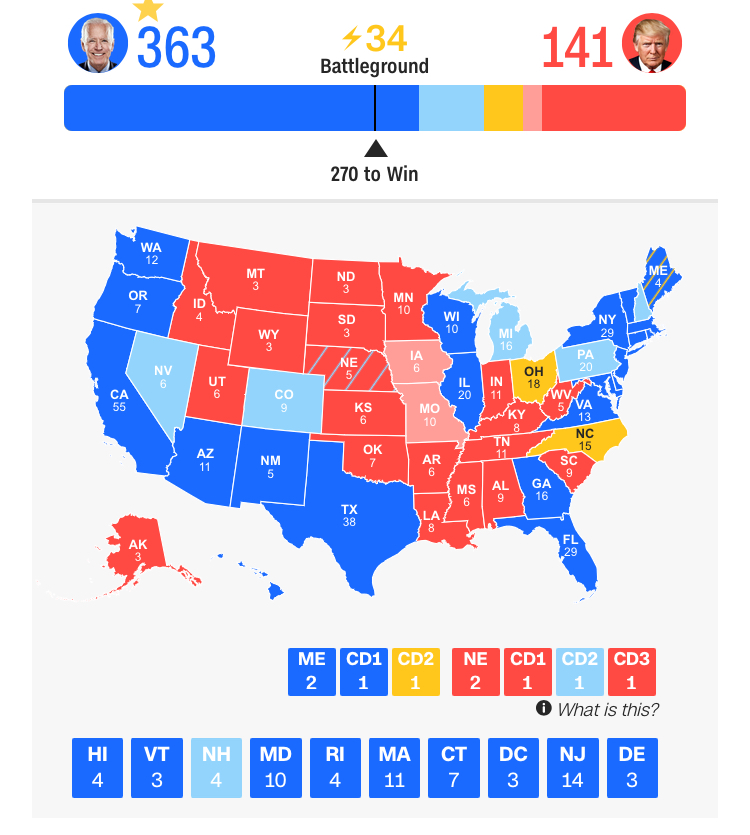
The entry of the data visualizations into the pitched narrative of the Presidential election is not new. If thought to begin in the collective unfolding of the election-night drama on television screens, as the casting of ballots long understood as a collective action of union has prompted a narrative of division, CNN offers a new model to personally intervene on one’s iPhone or android, as if to offer the means to ramp up agency on social media, inviting users to tap on one’s personal screen to build-your-own electoral map, perhaps to assuage one’s heightened anxiety, granting the illusion to allow yourself for entering your own alternative future. Echoing the algorithmic thinking of tallying “pathways to victory” we’d been following to exist the Trump Era with increased desperation, courtesy FiveThirtyEight and others, we imagined scenarios of the electoral constellation that might prepare for the dawning of something like a new age. As different campaigns used maps to assert “multiple pathways to victory,” the statistical likelihood of a victory seemed to suspend agency, in ways that would come to haunt the nation, in the aftermath of the election, as the tally of the vote was questioned in multiple ways, undermining the accuracy of the tally of individual votes, and injecting a degree of suspicion deeply dangerous to democracy–but elevated in the name of ‘transparency.’
The standard map of the United States became a model for the President’s personal lawyer to present “evidence” by appealing the vote, long after the votes were tabulated, and winner declared, in a new form of aftermath for an election we had never experienced. If the security of paper ballots were put into question by the question of “hanging chads” that demanded hand counts with observers back in 2000, a weeks-long battle that suspended any announcement of a victor in a divided nation, that demanded “optical evidence” of the will of voters, by scrutinizing some 537 votes out of the entire nation in order to determine the victor of the electoral college, and forestall the celebrations of Democrats over the nation who expected that victory was at hand, the aftermath became distilled in 2020 to the contestation of an electoral map, the map that had come to mediate the election, as the President’s lawyer, looking like Frankenstein, returned from the dead, declared the continued existence of “multiple pathways to victory”–the very phrase that Joseph R. Biden’s circle had announced in predicting his victory.
The “post-truth” announcement was not only post-truth, but a dumbed down version of voting before multiple American flags, presenting the states that the map labeled “red” that had voted for Biden to be at basis “red states,” and inevitably destined to fall into President Trump’s column. The news conference that was presented at Republican National Committee headquarters on November, 19, almost three weeks after the election was held, seemed to reclaim states’ electors as if they were enemy territory, as Trump’s legal team insisted that a spate of “irregularities in the voting system” had created numerous bases for serious fraudulence in tallies of the voting process.
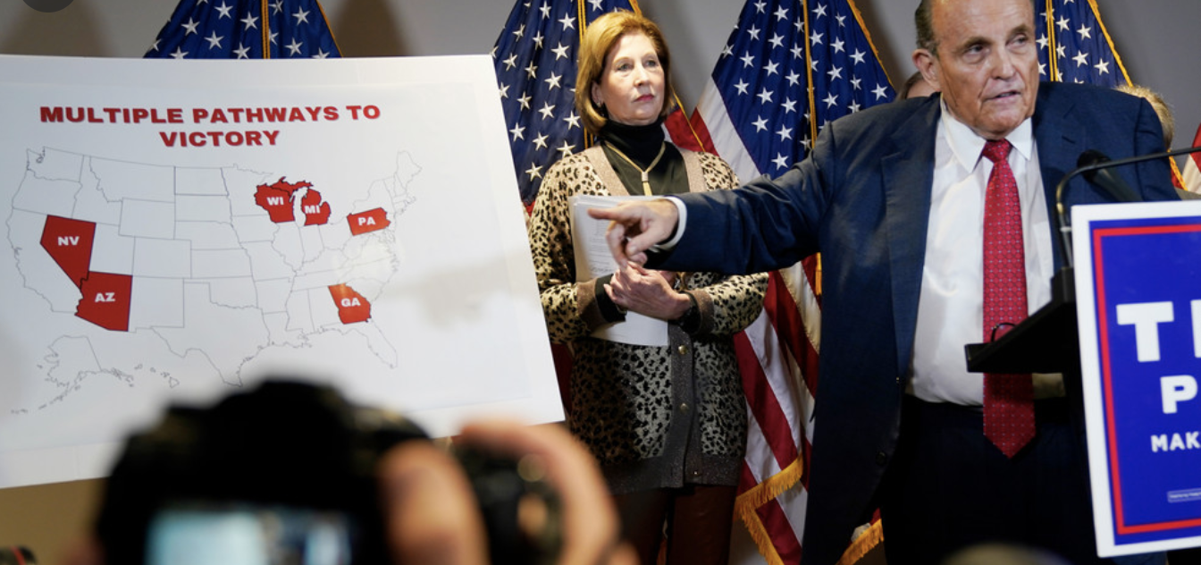
The made-for-TV moment that was designed to circulate online as an iconic image crystallized the post-truth debates about the actual results of the election–a basis for the myth of a “stolen victory” that would continue until the tragically violent insurrectionary invasion of the U.S. Capitol building on January 6, 2021, a readily recognized power play of seizing the electoral map from the networks, denying the role of the media or television networks from making a prediction or declaring the victor, and deciding to gesture to the selective distortion of the electoral map as if it was evidence of the true “map” of the election, as the image of five “battleground” electoral states that the Trump campaign was announcing were the basis of its campaign to Keep America Great or Make It Great Again focussed, in a new use of Cold War rhetoric, on removing “outrageous iron curtain of censorship.”

The results of the Presidential election in these states were not particularly close, and did not recall the nail-biter of 2000, twenty years ago, when the inspection of paper ballots by impartial judges provided an unplanned basis for showcasing the legal efforts of moving the election to the United States Supreme Court as a final authoritative arbiter of electoral results.

But if votes in either Michigan or Pennsylvania were hard to say were not conclusive, without either a legal theory or strategy to discard the existing tallies of the election, without disenfranchising hundreds of thousands, the post-truth campaign posited a systematic lack of vigilance of Democrats to play rough and tumble with registered voters and enshrined voting practices, arguing that the norms of voting practices were so systematically violated both in the voting machines themselves, especially paperless touch-screen voting machines that were argued to be open to manipulation, as well as the farming of ballots, and unreliability of mail-in voting practices.
The proliferating basis of instability for the tabulation of votes–the foundation of the democratic process–was argued to be inherently imperfect and corrupted at its root, suggesting the election was stolen. The argument that a small Texas company had made–“Allied Security Operations Group”–posited all software used in Smartmatic voting machines demonized as designed by a corporation with ties to Venezuelan founders: the basis among staunchly conservative activists to push a sense of widespread voting fraud–perpetuated on Newsmax in Dominion voting machines–was launched not by experts, but a myth of fraudulenceWashington Post has tied to Texas businessman Russell J. Ramsland, Jr., Trump advocates would adopt to discredit the outcomes of voting tallies already tabulated in battleground states.
The story of deep skepticism about the outcome of the election was in many ways nourished by the relative indeterminacy of possible outcomes for 2020, all of them hinging on battleground states that would push the electoral college one way or another. If the process seemed to remove the voting systems from the voters, the unfounded conspiracy theory Ramsland endorsed and boosted trotted out the shaky foundations of democratic institutions with readiness to defend the outcome they sought–and seemed to find consolation in an iconic map that painted these “swing” states a uniform red.
The fetishization of these deeply unstable and diverse states as uniformly “red”–and red as the identity that must be defended against the misinterpretation of magically “reassigned” surplus votes, performed by software in offshore databases run by multinationals, suggested the danger of diminishing the “red map” that Republicans have long dedicated themselves to enshrine–a map that has become so iconic since the 2016 Presidential election to seem like destiny to enter the once-hallowed walls of the West Wing of the White House among other furnishings quite early in the Trump Presidency–
–as if to preserve that magic moment of Election night that was such a surprise on national TV, even if, as has been widely observed far, far beyond this blog, and since Trey Yingst tweeted the image back in May, 2017, the choropleth is far from suited to represent popular consensus or the massive adulation he craves, as it erased the actual presence of voters, in favor of a snazzy graphic, made to shock for TV.

If Trump might have been better off ignoring the red state-blue state divide as an inherent part of our political topography, the choropleth that purported to find continuity and coherence among states as a reflection of consensus became a favorite handout of the early Trump years, one given out to visitors as if to remind them who is now in charge. Yet the surety of this red consensus now comes to haunt the news media again, and can, we hope, no longer be so readily recast as if it were truth, not propaganda, hung on the walls of the White House as a poster and dispensed to visitors to mask the President’s own insecurity at having lost the popular vote.

The accusations that seem to have found particularly fertile ground on one side of a digital divide, increasingly skeptical of the “irregularities” in the tabulation of votes without a paper trail, and ready to doubt the need to question faith in the electoral process as itself an erosion of democracy–a questioning that led to the belief that the hacking of voting machines were at the basis of a pernicious electoral fraud which would overturn the election that a third of American still consider fraudulent. The cartographic affidavit that was presented with the air of an undertaker as all courts had officially thrown out Trump’s case for voter fraud–even as new lawsuits proliferated, originating from Texas and filed by Texas Attorney General Ken Paxton (R) with members of the Trump campaign and seventeen Republican attorneys general, who seemed to sanction a new standard of electoral authenticity. The figure of Giuliani, unfortunately and unintentionally channeling the image of the Don Corleone characters in the five mafia families he prosecuted when he worked for the Southern District of New York, who offered an icon of Republican attempts to strong-arm an electoral map into submission.

We’ve rarely had so divisive a President as Donald Trump, who has sought to divide the country by race, region, religion, and income, and the hopes for emerging with a new vision of the union are slim–making the amount of weight and meaning that rests on the map appear greater than ever. How it would spin out was unclear, but the red block that Trump had pulled to the considerable surprise of all political pundits was promised to be able to be chipped away at in multiple ways, sketched by so many algorithmic story maps as alternate “paths to victory.”
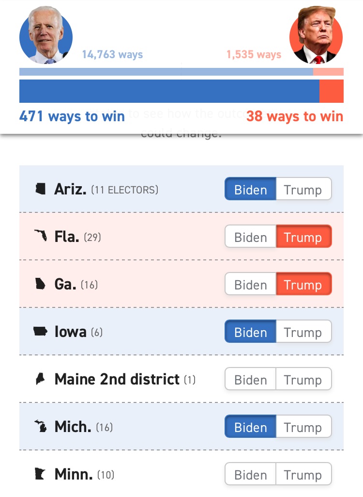
The array of paths each candidate faced–though we focussed on Biden’s range of options and winced at those of Trump–could be organized in what seems a rehearsal for the glossing of possible eventualities, as multiple data visualizations that led to alternative futures like so many forking roads out of a dark, dark wood.
The hope to find coherence in the map seems even greater than ever, as if it might finally purge the divides of the last four to six years. There was a grim sense of being defeated by the electoral map during the 2016 and 2020 election, with the skewing of electoral votes to low-density rural states–skewed further by the increasing distance at which those local problems appear from Washington, DC. The configuration of the electors, as the configuration of the federal representative government, are compromised by giving more pull to residents of many rural states and creating a red block that one can only hope to chip away at in the age of coronavirus either by online donations, phone-banking, or, at this late stage, by imagining alternative futures, and playing around with the map to see how the post-election endgame will play.
This election, sequestered behind our walls, often having already cast our ballot, the parlor game of playing with the CNN interactive graphics may come as a relief offering an interactive model for adjusting and tweaking the electoral map, playing out alternative scenarios whose conclusion and potential endgames we can indulge ourselves and to an extent confront our fears in this most anxiety-producing of elections by imagining alternative scenarios playing out, using a tentative set of color choices, more familiar from polls than television, to suggest the possible outcomes of the elections as we try to assemble the final tabulations of the vote, and the disputes that may arrive in each locality about margins of victory this time round, hoping to heal the abrupt chromatic divide still huring from 2016, using polls’ take on “battleground” states to game outcomes of potential electoral maps.

The above (imagined) electoral map would be the narrowest of Democratic victories, but affirm some deep divides across the nation from 2016, but might be arrived at only after recounts and disputes. The fantasy map suggests not only the open-ended nature of the vote this year, where the large number of absentee ballots tabulated during the pandemic poses problem of tabulation exacerbated by local restrictions on when the tally of votes is able to begin.
But cognitively trained as we were over the previous months–conditioned?–to entertain multiple contingencies of electoral paths “to victory” in the ecosystem of data visualizations, schooled by the acumen of considering “paths to victory” entertained by Nate Silver, the CNN maps offered not only a parlor game, but a rehearsal for glossing electoral configurations based that might emerge on November 3, 2020, should we be forced to entertain multiple “pathways to victory” that might emerge–or, as it happened, remain–as the evening proceeded. They cued possible narrative scripts.
In retrospect, of course, we could barely imagine an electoral map that was so delicately balanced on tenterhooks. The dramatic unfolding of multiple “roads to 270” suggested a possibility to reclaim the dominant metaphors from sports, pace Silver, to a narrative of democracy. Although some petulantly suggested that the mail-in ballot was more than a bummer but a trap, presenting more possibilities of limiting votes and discarding ballots, by making us more dependent on mail delivery and USPS, the expectations for vote-counting that were a byproducts of the COVID era may well have furthered democratic discourse, and the focus of the voting drive, as well as affirming the democratic centrality of the mail: as much as provide a route for the current joyless hack of a Postmaster General to intervene in the expression public will, the narrative of tabulating every vote and creating a true paper record was an unexpected reform of the tally of votes and voting process, as tabulation foregrounded political participation as a schooling in votes nowhere more evident than in the unexpected drama of the slowing down of the tabulation of votes and arrival of data into the electoral map provided an unexpected lesson of democracy.

We expected little conclusiveness in the electoral map on election night, even into the wee hours, unlike the intense drama of earlier years. The election will continue even after the counts are finalized in each state, as it is bound to be contested in perhaps ongoing and painful ways, if it proceeds not only to polling places but up through the federal courts, as new complaints about the validity of votes are posed by the Republican Party. The hope to restrict the franchise in any way possible plays to fears not only of aliens who are exercising a vote, but a new array of restrictions on the franchise.

And we could fear an endgame destined to subvert the narrative drama once located only on the electoral map, its narrative unhinged from the map, pursued in cases that debate the ways votes were tallied, compiled, tabulated beyond November 3. Nate Silver’s map as not purely prognostic. If it reinforces the deeply divided nation fractured on broad-based faults of terrifyingly portentous contiguity, it suggests a painful endgame narrative, as court cases were pressed, recounts demanded, and charges of illegal voting launched in the face of attempts to aggregate votes from mail-in ballots in states predicted to “go blue.” The possibility of such “I can’t go on, I’ll go on” was not at all appealing.
Even if static, the alternative electoral maps staged a sort of drama of hypotheticals that anticipated the dangers of deep dissatisfaction across the nation. There is a deep fear that if no souther state “flip blue,” even a truly “tenuous win” might be almost pyrrhic. The narrative is grim, if its end result may have positive elements. Is its biggest impact not in delivering a President–the outcome of the electoral system–but, this year, it is also a map of the painful endgame of litigating the vote, even if the nation is haunted by a Mason-Dixon latitudinal divide among electors which most of the nation valiantly hoped we somehow might soon put behind us.
The narrative is displaced from the election. While Nate Silver notoriously went wrong in prognosticating 2016, he reminds us, in case we forgot, “Trump didn’t win the last election by that much.” This year the true terrifying story may well be the aftermath, and the difficulty to call the election, and what this means for the nation–which is a narrative that one may only gloss from the map, which threatens not to materialize in any trustworthy way until all the votes are counted–and all legal battles around their tabulation are hopefully resolved. But the most despicable sort of battles about VOTER ID, and the deeply divisive questions of the legitimacy of who could cast a ballot, were immersed in the heady waters of debates about immigration, seemed game for inclusion, as eighteen states now require VOTER ID, in ways that pose broad risks for disenfranchisement that local administration of elections threaten to perpetuate, after the refusal to amend the historic Voting Rights Act whose teeth were removed.
As other nations puzzle over the arcane methods for employing an electoral college that dilutes the actual popular vote that is distributed among apparently aristocratic holdovers of electors, but is in fact far closer to an ideal model citizenry of those honorable to place nation first over sectarian interests, the passionate intensity of division made such ideals seem destined for planned obsolescence, for reasons maybe not far removed from media technologies.
The liberating nature we find in designing our own DIY electoral maps on our peripherals offer more than a fun exercise in alternative realities in a national compact; playing with the maps are far more effective and engaged than most other forms of narcotics for assuaging anxiety, and do lower blood pressure. There was some pleasant chutpah to seeing Phillipe Reines put out his own prediction of an overwhelming Biden electoral victory that kept Trump below 200 electors, on November 2 2020, with a prescience reveals that the narrative was indeed there to be unpacked.
There was a sense of liberation in the ability to easily enter alternate futures, thanks to CNN graphics team and your smart phone, of greater national harmony–if the possibility of harmony seems in many places pretty illusory or lost, across the red dust bowl of arid lands Great Plains, echoing John Wesley Powell’s “lands of the arid region,” now only starting to be imagined to be rendered other than red, and Appalachia. This alienated “forgotten” American persists even in the DYI electoral map that not based on tabulations of votes. But such a map seems telling: tapping states to flip their votes invest a sense of agency in our ability to make possible predictions, even more important than the vote: we have ingested so many polls in news maps, there is something liberating in playing with the electoral map ourselves, gaming multiple scenarios, fidgeting with the map as an outlet for nervous energy as we wonder how those polls will translate to an electoral map,–
–and how those states will add up to produce the only numeric legend the will really in the end count.
If we once relied on television pundits to explain the translation of the “raw” popular vote and the possibility of a win of electoral victory without a popular vote victory–then a deeply doubted as an eventuality–in describing the contest for “the percentage of the republican vote” as an obscure statistical construct. When even in the 1980 election, pundits bemoaned this “long electoral season,” the “magic map”

By tapping out a new narrative of the prospective election, we do feel momentarily more secure. Our blood pressure lowers as we imagine a less pitched future, or the possibility of consensus, even if all evidence points to the contrary. But there is something deeply disappointing that if voting is a form of asserting agency, as votes in many states have been diluted, decreasing the value for many of even casting a ballot of significance in California or Illinois, where Ken Bone defends his vote for Libertarian Jo Jorgensen by reminding the nation no way that his state will not go blue, that we turn to a data vis of our own making for comfort, or, more likely, for a bunch of cool tweets about both the election and, more likely, how the treacherous endgame will proceed. In some ways, the map is more about the narrative that might be associated with it, at this point, but, conditioned by polls, it peaks our interest, even if it is contingent.
While news maps increasingly set themselves up against polls in previous elections, the instability of how the polls will translate into the final electoral map has been interrupted in multiple ways in 2020–as perhaps in 2016–as we have become increasingly aware of filters of how possible narratives by which votes translate to maps. We are painfully aware of deeper limitations on access to voting, of the arrival of ballots by mail, the problems of their tabulation, and indeed of the potential manipulations of votes, all of which will doubtless determine the final map–all before the validity of votes are litigated. The finality of the electoral map will be less quick in arriving, this year, until all the votes are counted.
We have grown dependent, perhaps, on the resolution of elections in deeply symbolic maps that settle the convulsive nature of presidential elections, if this year the convulsions threaten to continue into an open-ended endgame. The introduction of large plastic models of the nation in which states were lit in alternate colors seems an artifact of the television age, but also of the amassing of computational power that was illusionistically illustrated in this “behind the scenes” view of an on air newsroom that assuaged the nation’s tense drama on November 2, 1976, as the “magic wall” mounted behind the newscasters became a sort of altar of runic consequences, needing to be interpreted and reinterpreted in the course of the evening by the honing of expertise not in statistics or law but in tabulating votes.
The introduction of the “magic wall” was a screen for the lack of consensus, aiming to gloss national consensus and national identity, as banks of computers created the illusion of greater accuracy than the polls long in the national news. But the lo-tech map worked driven by colored gels and translucent plastic, as wizardry and showmanship to met demand for compelling visual entertainment. This was very much the electoral map that seemed to have finality, but had all the smoke and mirrors of the Wizard of Oz, with only the most illusory of connection between those banks of computers and the big map illuminated on the wall, in ways that seemed to recall the national technological miracle of the moon landing.

Cassie Mackin, John Chancellor, David Brinkley, and Tom Brokaw. (Indiana Historical Society / NBC)

(NBC via Getty Images)
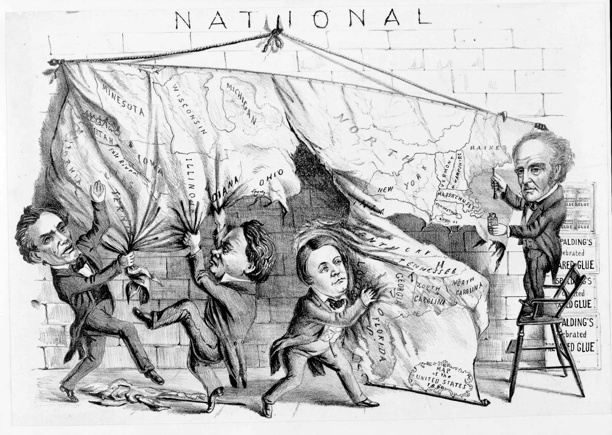
It was really awfully low tech, and really made for TV, but the result was to promise a conclusive sense of finality. The modernity of this map, before which the NBC anchors posed, illustrates the different ways that each state might go, affirming the contingency of the election, but it served most of all as an advertisement inviting us to look forward to the narration of the drama of tabulation on the “magic map” in the NBC studios that night. It is hard to look forward to the tabulation of votes this year save apprehensively. While we think of the drama of electoral maps as first waged on television screens, the tradition began in print, even if it translated in seemingly clear-cut ways to the map, erasing the messiness of the divided distributions of local votes.
Rather than being the creation of the technology of colorized television screens, paralleled the continental unity of the United States, two-color maps were devised to illustrate the problem of fabricating national unity by the graphics department of Harpers–and intended not to illustrate national divides and fractures, but the possibility of uniting them by electoral votes. And even if the technology of the CNN build-your-own electoral map was designed to be used on handhelds, assembly of the electoral map offers a calming narrative conclusion of the convulsions loosened during the election, a magic resolution that the “magic map” quite satisfyingly symbolically performed. (The very resolution of this narrative is what the midnight cry, “Stop counting the votes!” sought desperately to forestall.)

While by 1880 an increasing number of states were tallied by electors–albeit with quite a large skew in concession to the Deep South that no longer exists–the passing question of consensus was placed into greater relief by the Civil War and the reflexive reaction to Reconstruction, across the voting block of the extended region of the deep South, more rooted in an economy of enslavement. But the state-by-state colored infographic has a healthy roots in print, as a rendering of national unity, albeit with a slightly different north-south divide, one that echoed, on the ground, a division between rural and urban space. Although the partisan colors were of course flipped in 1880, and the south was solidly Democratic, and the blue Republican, those colors were but code, as the pro-Republican antislavery Harpers knew well, for segregationist policies implemented by the retrenchment of slavery states to reject Reconstruction.

The editorial cartoonist at Harpers, Thomas Nast, adopted the electoral map as a sort of partisan boast of unity–and a prognostic of healing a country that was both literally and figuratively divided by the Mississippi River, as all in the country knew, the site of the densest aggregation of the plantation economy that had defined the rural south, and was the true term for which “rural” stood. The divide that was aimed to be healed by the map, in a sort of thaumaturgical way that was deeply mystical as an illustration of the compact, was rooted in how a party would embrace the nation, Thomas Nast tied to clarify in 1880, as the project of Reconstruction run by Republicans was perhaps already on its last legs, sure the “Republican Animal Will Carry It” in 1879, assuring the continued stability of the nation even in the face of national divides.
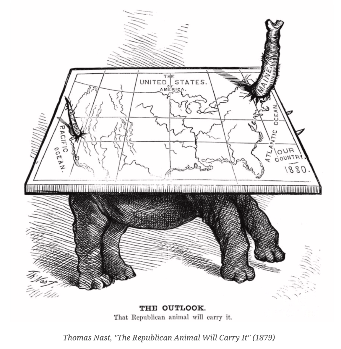
There was, in short, a sense of a hope of some coherence in the map, as strong Republican support in Maine and California sustained the nation’s unity in a party whose vote was the basis not only for carrying the election, but carrying the nation. The suppression of the deepest of national divides were the fear that the electoral map sought to resolve. If many of the territories in the continent of Our country” had no vote, the Republicans would carry the nation, from Maine to California, lending coherence to a nation that was divided in its economy and social vision.
As we wrestle with the notion of representing national unity, and often turn to smart screens for help in resolving the quandaries of national divisions and divides, we are dealing not only with the conventions of the map, or distributions of the electors, but the new narratives of the nation they give rise.
The image of a divided electoral nation persisted after Reconstruction, with the magic number–without the suspicious border states of New Mexico and Arizona voting, and no vote being conceded to the Indian Land of the frontier in Oklahoma, suggested Teddy Roosevelt the Republican would coast to victory from coast to coast, in an eery echoes of a blue-red divide, translating the spread of the popular vote to an equable of national unity.

We now look at maps on our devices, far more familiar with the semantic of the data visualization and the deep dive into its make-up, than finding finality in any map in 2020: our map will be shifting over several days, as the adjustment of ridiculously narrow margins of state votes translate their uneven social topography and urban-rural divides into the tallying of absentee ballots, that often leading to late counts from cities. We see electoral divides not in terms of regions, or geographic collectives, but according to polls that are rather parsed in demographic clusters and divides of ethnicity, age, economics, class and gender, the divides seem more apparent–even if these divides are less meaningful than the nation’s deep political architecture.
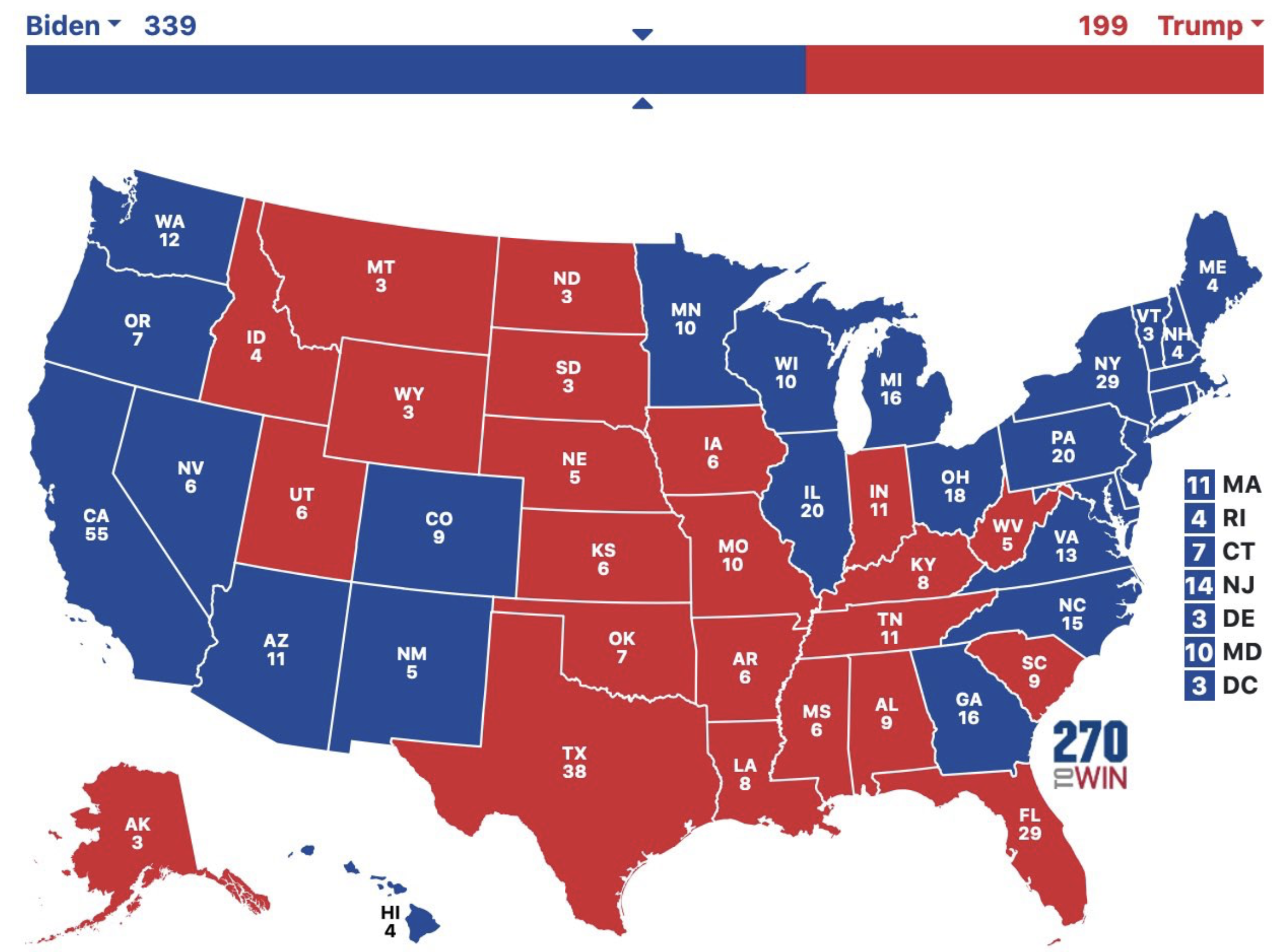
The interest in tapping states on a screen to contemplate alternate scenarios, as 538 offers us in a range of endless narratives and maps of electoral outcomes, is not designed to suggest contingency, but ramps up expectations for the difficulty of finding resolution in any map alone. We need a better narrative, perhaps, than any map can provide. Even the map of a substantially solid Biden victory–both electorally and on the ground, imagining both Texas and Florida solid blue, and Pennsylvania too–is a map that would be fractured, solid red around the Mississippi, that seems to peak out from beneath the map, and remind us of our deepest divides.

Afterthought, November 4, 4:00 p.m.
The possibility of assembling the unity of a map whose divides seem more accentuated than ever before, often divided by deep animus, may well be even more difficult, as the very election practices are called into question by the nation’s chief executive. We will need a lot of interpretive powers, patience, and familiarity with an open-ended narrative to prioritize the tabulation of votes to have a truly “coherent” map or one that presents a convincingly coherent national narrative, as President Trump questions whether “legally cast ballots” in Arizona–and perhaps Nevada–might be misleadingly putting Biden over the top, currying longstanding charges of the corruption of standards of national citizenship once again from 2016.

The fear that American cities and states encourage illegal migrants to vote not only in local elections, but in federal elections, led South Carolina Rep. Jeff Duncan to introduce a H.R. 6482, preventing federal funds arriving in cities that “permits individuals who are not citizens of the United States to vote in elections for State or local office,” inverting the restriction of the voice of disenfranchised by nourishing specters of rigged federal elections.
As the ballots continue to be counted, and as we wait in hopes for a new national narrative to be assembled, even with an alarmingly aged group of political leaders affirmed for our new U.S. Congress, we can hope for the hypothetical map as promising perhaps something like balance, even if rooted in increasingly stark lines of division, as the best we can hope.

The map is not a pretty picture, and the narrative it suggests uncertain and perhaps without much hope for coherence as we face a national pandemic.
This was, to be sure, a spin on Nate Silver’s path that we hadn’t quite ever imagined, and perhaps no one had, so fixated on Pennsylvania were we as an electoral lynchpin of twenty votes–we like big numbers to put us over, like Florida (29) or California (55), but with New York, Wisconsin, Illinois and California, the constellation for an improbable victory of abandoning the Deep South seemed apparent. The rise of favorability of western states revealed the conundrum that if the incorrectly aggregated “Latino vote” lost the Democrats Florida, and Texas, the stubbornness of antipathy to Trump’s immigration policies across the West–combined with the gift of “Joemaha”–led to a path of Michigan, Nevada and Arizona, might tally the magic 270 to reflect the fact what might be a 3,000,000 margin of votes could abandon the south, but not relinquish hopes for a future southern majority.
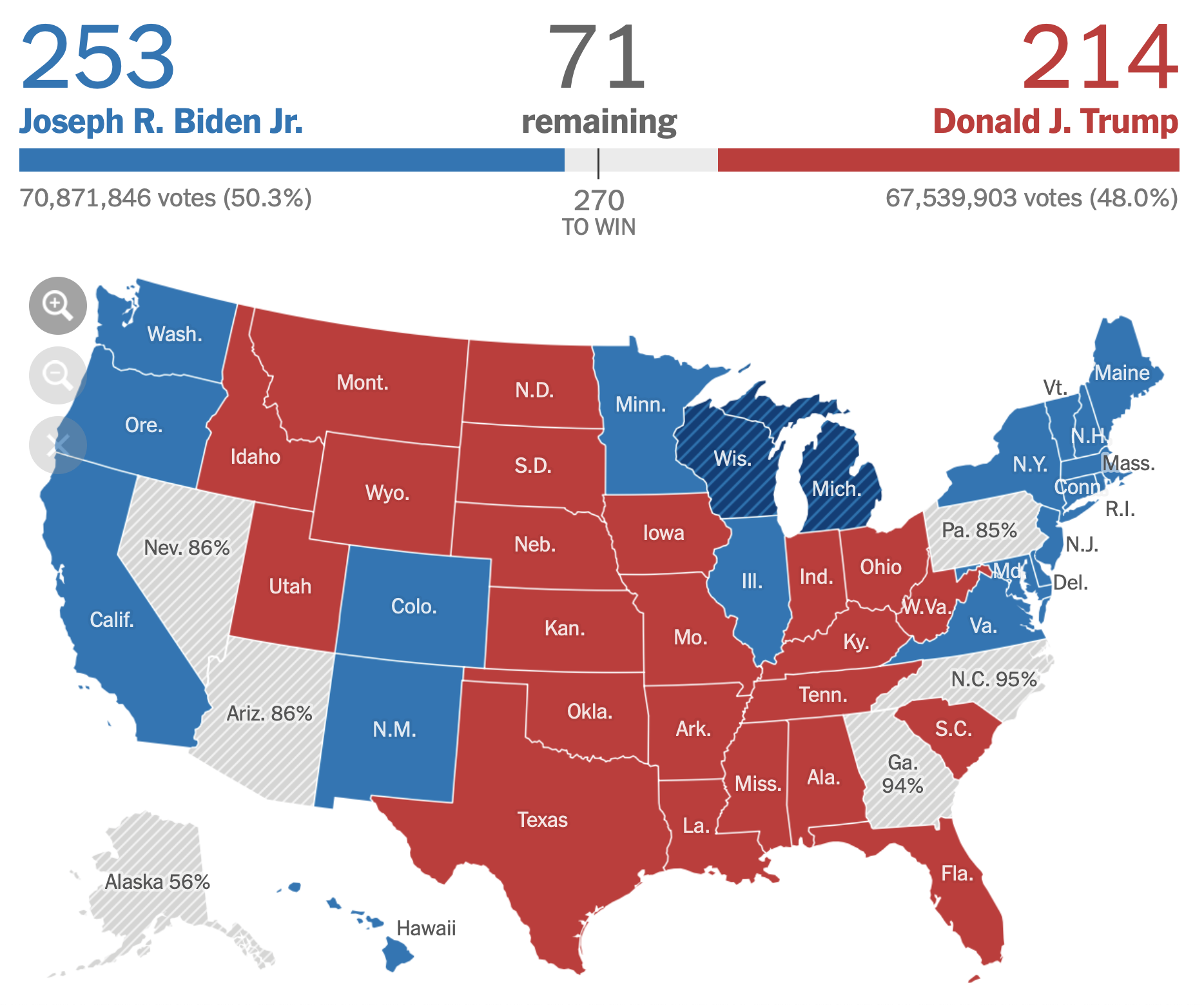
Even if that margin was as slim as imaginable, that seemed a potential road to a narrative of potential consensus that a year ago seemed out of reach. The disturbing continuity of all that red, moreover, concealed some pretty deep changes underground, from Texas to Mississippi to Florida to Georgia to North Carolina, leaving the map of red far less rooted in the territory than it once was.

